totalRows = 15
sample(fromPool, ChooseSize, replace=F) # replace=F means cannot repeat, if fromPool is smaller than ChooseSize and cannot repeat, so not enough pool, so make it repeatable to work
e.g.
sample(2, totalRows, replace = TRUE, prob=c(0.9,0.1))
sample(1:totalRows, totalRows/5, replace=F)
11 2 4
sample(1:3, 4, replace=F)
Error: cannot take a sample larger than the population when 'replace = FALSE'
use of sample_frac() functionlibrary(ggplot2)
index1 = sample_frac(diamonds, 0.1)
str(index1)
tibble [5,394 x 10] (S3: tbl_df/tbl/data.frame)
Data Frame is a list of vectors of equal length
to create a dataframe:
n = c(2,3,5)
s = c('a','b','c')
b = c(TRUE, FALSE, FALSE)
df = data.frame(n,s,b)
Components of dataframe:
header, column names, data row, name of the row cell single square bracket "[]", comma
Functions:
nrow(), ncol(), head()
Inport Data:
read.table("mydata.txt")
read.csv("mydata.csv")
retrieve the column vector by the double square bracket or the "$" operator
mtcars[[9]]
mtcars[["am"]]
mtcars$am
mtcars[,"am"]
retrieve a column slice with the single square bracket "[]"
mtcars[1]
mtcars["mpg"]
mtcars[c("mpg", "hp")]
Data frame Row Slice
mtcars[24,]
mtcars[c(3,24),]
mtcars["camaro z28",]
mtcars[c("datsun 710","camaro z28"),]
# MLFundStat and Hangseng Fund Stat
#=================
MLFundStat.html
the computation is long, it is possible to cut time by adjusting the cutdate variable.
this should be modified to new version using r chart.
# Start Of R
#=================
Sys.setlocale(category = 'LC_ALL', 'Chinese')
use the .Rprofile.site file to run R commands for all users when their R session starts.
D:\R-3.5.1\etc\Rprofile.site
See: Initialization at startup.
#c:\R-4.2.1\etc\Rprofile.site
#loadhistory("C:\Users\User\Desktop\.Rhistory")
check environment: Sys.getenv()
This command could be an environment set:
Sys.setenv(FAME="/opt/fame")
Start Of R Initialization
set rstudio locale
to check locale: Sys.getlocale()
LC_COLLATE=Chinese (Simplified)_China.936;LC_CTYPE=Chinese (Simplified)_China.936;LC_MONETARY=Chinese (Simplified)_China.936;LC_NUMERIC=C;LC_TIME=Chinese (Simplified)_China.936"
to permanently change to english:
open C:\R-4.0.3 file Rprofile.site
add last line:
Sys.setlocale("LC_ALL","English")
Startup : Initialization at Start of an R Session
Description
In R, the startup mechanism is as follows.
Unless --no-environ was given on the command line, R searches for site and user files to process for setting environment variables.
The name of the site file is the one pointed to by the environment variable R_ENVIRON; if this is unset, R_HOME/etc/Renviron.site is used (if it exists, which it does not in a "factory-fresh" installation).
The name of the user file can be specified by the R_ENVIRON_USER environment variable; if this is unset, the files searched for are .Renviron in the current or in the user's home directory (in that order).
See "Details" for how the files are read.
Then R searches for the site-wide startup profile file of R code unless the command line option --no-site-file was given.
The path of this file is taken from the value of the R_PROFILE environment variable (after tilde expansion).
If this variable is unset, the default is R_HOME/etc/Rprofile.site, which is used if it exists (which it does not in a "factory-fresh" installation). (it contains settings from the installer in a "factory-fresh" installation). This code is sourced into the base package.
Users need to be careful not to unintentionally overwrite objects in base, and it is normally advisable to use local if code needs to be executed: see the examples.
Then, unless --no-init-file was given, R searches for a user profile, a file of R code.
The path of this file can be specified by the R_PROFILE_USER environment variable (and tilde expansion will be performed).
If this is unset, a file called .Rprofile is searched for in the current directory or in the user's home directory (in that order).
The user profile file is sourced into the workspace.
Note that when the site and user profile files are sourced only the base package is loaded, so objects in other packages need to be referred to by e.g.utils::dump.frames or after explicitly loading the package concerned.
R then loads a saved image of the user workspace from .RData in the current directory if there is one (unless --no-restore-data or --no-restore was specified on the command line).
Next, if a function .First is found on the search path, it is executed as .First().
Finally, function .First.sys() in the base package is run.
This calls require to attach the default packages specified by options("defaultPackages").
If the methods package is included, this will have been attached earlier (by function .OptRequireMethods()) so that namespace initializations such as those from the user workspace will proceed correctly.
A function .First (and .Last) can be defined in appropriate .Rprofile or Rprofile.site files or have been saved in .RData.
If you want a different set of packages than the default ones when you start, insert a call to options in the .Rprofile or Rprofile.site file.
For example, options(defaultPackages = character()) will attach no extra packages on startup (only the base package) (or set R_DEFAULT_PACKAGES=NULL as an environment variable before running R).
Using options(defaultPackages = "") or R_DEFAULT_PACKAGES="" enforces the R system default.
On front-ends which support it, the commands history is read from the file specified by the environment variable R_HISTFILE (default .Rhistory in the current directory) unless --no-restore-history or --no-restore was specified.
The command-line option --vanilla implies --no-site-file, --no-init-file, --no-environ and (except for R CMD) --no-restore Under Windows, it also implies --no-Rconsole, which prevents loading the Rconsole file.
Arguments
Details
Note that there are two sorts of files used in startup: environment files which contain lists of environment variables to be set, and profile files which contain R code.
Lines in a site or user environment file should be either comment lines starting with #, or lines of the form name=value. The latter sets the environmental variable name to value, overriding an existing value.
If value contains an expression of the form ${foo-bar}, the value is that of the environmental variable foo if that exists and is set to a non-empty value, otherwise bar.
(If it is of the form ${foo}, the default is "".) This construction can be nested, so bar can be of the same form (as in ${foo-${bar-blah}}).
Note that the braces are essential: for example $HOME will not be interpreted.
Leading and trailing white space in value are stripped. value is then processed in a similar way to a Unix shell: in particular the outermost level of (single or double) quotes is stripped, and backslashes are removed except inside quotes.
On systems with sub-architectures (mainly Windows), the files Renviron.site and Rprofile.site are looked for first in architecture-specific directories, e.g.R_HOME/etc/i386/Renviron.site. And e.g..Renviron.i386 will be used in preference to .Renviron.
See Also
For the definition of the "home" directory on Windows see the rw-FAQ Q2.14.
It can be found from a running R by Sys.getenv("R_USER").
.Last for final actions at the close of an R session. commandArgs for accessing the command line arguments.
There are examples of using startup files to set defaults for graphics devices in the help for windows.options. X11 and quartz.
An Introduction to R for more command-line options: those affecting memory management are covered in the help file for Memory.
readRenviron to read .Renviron files.
For profiling code, see Rprof.
Examples
# NOT RUN {
## Example ~/.Renviron on Unix
R_LIBS=~/R/library
PAGER=/usr/local/bin/less
## Example .Renviron on Windows
R_LIBS=C:/R/library
MY_TCLTK="c:/Program Files/Tcl/bin"
## Example of setting R_DEFAULT_PACKAGES (from R CMD check)
R_DEFAULT_PACKAGES='utils,grDevices,graphics,stats'
# this loads the packages in the order given, so they appear on
# the search path in reverse order.
## Example of .Rprofile
options(width=65, digits=5)
options(show.signif.stars=FALSE)
setHook(packageEvent("grDevices", "onLoad"), function(...) grDevices::ps.options(horizontal=FALSE))
set.seed(1234)
.First = function() cat("\n Welcome to R!\n\n")
.Last = function() cat("\n Goodbye!\n\n")
## Example of Rprofile.site
local({ # add MASS to the default packages, set a CRAN mirror old = getOption("defaultPackages"); r = getOption("repos") r["CRAN"] = "http://my.local.cran" options(defaultPackages = c(old, "MASS"), repos = r) ## (for Unix terminal users) set the width from COLUMNS if set cols = Sys.getenv("COLUMNS") if(nzchar(cols)) options(width = as.integer(cols)) # interactive sessions get a fortune cookie (needs fortunes package) if (interactive()) fortunes::fortune()
})
## if .Renviron contains
FOOBAR="coo\bar"doh\ex"abc\"def'"
## then we get
# > cat(Sys.getenv("FOOBAR"), "\n")
# coo\bardoh\exabc"def'
# }
# Encoding Problems
To write text UTF8 encoding on Windows
Firstly, set encoding
options(encoding = "UTF-8")
To write text UTF8 encoding on Windows one has to use the useBytes=T options in functions like writeLines or readLines:
txt = "在"
writeLines(txt, "test.txt", useBytes=T)
readLines("test.txt", encoding="UTF-8")
[1] "在"
writeLines(wholePage, theFilename, useBytes=T)
The UTF-8 BOM is a sequence of bytes at the start of a text stream
(0xEF, 0xBB, 0xBF) that allows the reader to more reliably guess a file as being encoded in UTF-8.
Normally, the BOM is used to signal the endianness of an encoding, but since endianness is irrelevant to UTF-8, the BOM is unnecessary.
According to the Unicode standard, the BOM for UTF-8 files is not recommended
#=================
# Encoding Problems
Sys.getlocale()
getOption("encoding")
options(encoding = "UTF-8")
Encoding(txtstring) = "UTF-8"
Encoding(txtstring)
txtstring
Sys.setlocale
Sys.setlocale(category = 'LC_ALL', 'Chinese')
Sys.setlocale(category = "LC_ALL", locale = "chs")
Sys.setlocale(category = "LC_ALL", locale = "cht") # fanti
Note:
default: options("encoding" = "native.enc")
statTxtFile = "test.txt"
write("建设银行", statTxtFile, append=TRUE)
result file is ansi
add:
options("encoding" = "UTF-8")
write("建设银行", statTxtFile, append=TRUE)
result file is utf-8
mytext = "this is my text"
Encoding(mytext)
options(encoding = "UTF-8")
getOption("encoding")
options(encoding='native.enc')
getOption("encoding")
iconvlist()
theHeader = "http://qt.gtimg.cn/r=2&q=r_hk"
onecode = "02009"
con = url(paste0(theHeader,onecode), encoding = "GB2312")
thepage=readLines(con)
close(con)
Info=unlist(strsplit(thepage,"~"))
codename=Info[2]
codename
Encoding(codename)
==================
readLines(textConnection("Z\u00FCrich", encoding="UTF-8"), encoding="UTF-8")
readLines(filename, encoding="UTF-8")
readLines(con = stdin(), n = -1L, ok = TRUE, warn = TRUE, encoding = "unknown", skipNul = FALSE)
# note! the chiname encoding is ok inside R, but will be wrong when write to file by local pc locale, to solve the problem, set Sys.setlocale(category = 'LC_ALL', 'Chinese')
readLines(con = file("Unicode.txt", encoding = "UCS-2LE"))
close(con)
unique(Encoding(A)) # will most likely be UTF-8
==================
guess_encoding(pageHeader)
pageHeader = repair_encoding(pageHeader, from="utf-8")
pageHeader = repair_encoding(pageHeader, "UTF-8")
iconv(pageHeader, to="UTF-8")
Encoding(pageHeader) = "UTF-8"
Sys.getlocale("LC_ALL")
https://rpubs.com/mauriciocramos/encoding
==================
Read text as UTF-8 encoding
the following reads in encoding twice and works but reasons unknown
readLines(textConnection("Z\u00FCrich", encoding="UTF-8"), encoding="UTF-8")
[1] "Zürich"
==================
the page source claim to be using UTF-8 encoding:
meta http-equiv="Content-Type" content="text/html; charset=utf-8"
So, the question is, are they really using a different enough encoding,
or can we just convert to utf-8, guessing that any errors will be negligible?
A quick and dirty approach just force utf-8 using iconv:
TV_Audio_Video = read_html(iconv(page_source[[1]], to = "UTF-8"), encoding = "utf8")
In general, this is a bad idea - better to specify the encoding it's from.
In this case, maybe the error is theirs, so this quick and dirty approach might be ok.
to remove leading zeros
substr(t,regexpr("[^0]",t),nchar(t))
Pop up message in windows 8.1
use the tcl/tk package in R to create a messageBox.
Here is a very simple example:
require(tcltk)
tkmessageBox(title = "Title of message box",
message = "Hello, world!", icon = "info", type = "ok")
library(tcltk)
tk_messageBox(type='ok',message='I am a tkMessageBox!')
different types of messagebox (yesno, okcancel, etc).
See ?tk_messageBox.
or
use cmd
system('CMD /C "ECHO The R process has finished running && PAUSE"',
or
use hta
in one line:
mshta "about:<script>alert('Hello, world!');close()</script>"
or
mshta "javascript:alert('message');close()"
or
mshta.exe vbscript:Execute("msgbox ""message"",0,""title"":close")
mshta "about:<script src='file://%~f0'></script><script>close()</script>" %*
msg = paste0(
'mshta ',
"\"about:<script>alert('Hello, world!');close()</script>\""
)
to show web page, use script to create
#=================
Pop up message in windows 8.1
c.bat: start MessageBox.vbs "This will be shown in a popup."
MessageBox.vbs :
Set objArgs = WScript.Arguments
messageText = objArgs(0)
MsgBox messageText
in fact, save a file named test.vbs with content:
MsgBox "some message"
double click the file will run directly
# options("scipen"=999)
# format(xx, scientific=F)
# options("scipen"=100, "digits"=4)
# getOption("scipen")
# or as.integer(functionResult);
df = data.frame(matrix(ncol = 10000, nrow = 0))
colnames(df) = c("a", "b," "c")
rm(list=ls())
Extracting a Single, Simple Table
The first step is to load the ¡§XML¡¨ package,
then use the htmlParse() function to read the html document into an R object,
and readHTMLTable() to read the table(s) in the document.
The length() function indicates there is a single table in the document, simplifying our work.
The plot3d() function in the rgl package
library(rgl)
open3d()
attach(mtcars)
plot3d(disp,wt,mpg, col = rainbow(10))
library(stringr)
#============
library(stringr)
library(htmltools)
library(threejs)
data(mtcars)
data = mtcars[order(mtcars$cyl),]
uv = tabulate(mtcars$cyl)
col = c(rep("red",uv[4]),rep("yellow",uv[6]),rep("blue",uv[8]))
row.names(mtcars)
scatterplot3d(data[,c(3,6,1)],
labels=row.names(mtcars),
size=mtcars$hp/100,
flip.y=TRUE,
color=col,renderer="canvas")
tabulate(bin, nbins = max(1, bin, na.rm = TRUE))
tabulate takes the integer-valued vector bin and counts the number of times each integer occurs in it.
tabulate(c(2,3,3,5), nbins = 10)
[1] 0 1 2 0 1 0 0 0 0 0
table(c(2,3,3,5))
2 3 5
1 2 1
tabulate(c(-2,0,2,3,3,5)) # -2 and 0 are ignored
[1] 0 1 2 0 1
tabulate(c(-2,0,2,3,3,5), nbins = 3)
[1] 0 1 2
tabulate(factor(letters[1:10])
[1] 1 1 1 1 1 1 1 1 1 1
Scatterplot3d: 3D graphics - R software and data visualization
There are many packages in R (RGL, car, lattice, scatterplot3d, …) for creating 3D graphics.
This tutorial describes how to generate a scatter pot in the 3D space using R software and the package scatterplot3d.
scaterplot3d is very simple to use and it can be easily extended by adding supplementary points or regression planes into an already generated graphic.
It can be easily installed, as it requires only an installed version of R.
The iris data set will be used:
data(iris)
head(iris) Sepal.Length Sepal.Width Petal.Length Petal.Width Species
1 5.1 3.5 1.4 0.2 setosa
2 4.9 3.0 1.4 0.2 setosa
3 4.7 3.2 1.3 0.2 setosa
4 4.6 3.1 1.5 0.2 setosa
5 5.0 3.6 1.4 0.2 setosa
6 5.4 3.9 1.7 0.4 setosairis data set gives the measurements of the variables sepal length and width, petal length and width, respectively, for 50 flowers from each of 3 species of iris.
The species are Iris setosa, versicolor, and virginica.
The function scatterplot3d()
A simplified format is:
scatterplot3d(x, y=NULL, z=NULL)
x, y, z are the coordinates of points to be plotted.
The arguments y and z can be optional depending on the structure of x.
In what cases, y and z are optional variables?
Case 1 : x is a formula of type zvar ~ xvar + yvar.
xvar, yvar and zvar are used as x, y and z variables
Case 2 : x is a matrix containing at least 3 columns corresponding to x, y and z variables, respectively
Basic 3D scatter plots
# Basic 3d graphics
scatterplot3d(iris[,1:3])# Change the angle of point view
scatterplot3d(iris[,1:3], angle = 55)
The argument pch and color can be used:
scatterplot3d(iris[,1:3], pch = 16, color="steelblue")
Read more on the different point shapes available in R : Point shapes in R
Change point shapes by groups
shapes = c(16, 17, 18)
shapes = shapes[as.numeric(iris$Species)]
scatterplot3d(iris[,1:3], pch = shapes)
Read more on the different point shapes available in R : Point shapes in R
Change point colors by groups
colors = c("#999999", "#E69F00", "#56B4E9")
colors = colors[as.numeric(iris$Species)]
scatterplot3d(iris[,1:3], pch = 16, color=colors)
Read more about colors in R: colors in R
Change the global appearance of the graph
The arguments below can be used:
grid: a logical value.
If TRUE, a grid is drawn on the plot.
box: a logical value.
If TRUE, a box is drawn around the plot
Remove the box around the plot
scatterplot3d(iris[,1:3], pch = 16, color = colors,
grid=TRUE, box=FALSE)
Note that, the argument grid = TRUE plots only the grid on the xy plane.
In the next section, we’ll see how to add grids on the other facets of the 3D scatter plot.
Add grids on scatterplot3d
This section describes how to add xy-, xz- and yz- to scatterplot3d graphics.
We’ll use a custom function named addgrids3d().
The source code is available here : addgrids3d.r.
The function is inspired from the discussion on this forum.
A simplified format of the function is:
addgrids3d(x, y=NULL, z=NULL, grid = TRUE,
col.grid = "grey", lty.grid=par("lty")) x, y, and z are numeric vectors specifying the x, y, z coordinates of points.
x can be a matrix or a data frame containing 3 columns corresponding to the x, y and z coordinates.
In this case the arguments y and z are optional
grid specifies the facet(s) of the plot on which grids should be drawn.
Possible values are the combination of “xy”, “xz” or “yz”.
Example: grid = c(“xy”, “yz”).
The default value is TRUE to add grids only on xy facet.
col.grid, lty.grid: the color and the line type to be used for grids
Add grids on the different factes of scatterplot3d graphics:
# 1.
Source the function
source('http://www.sthda.com/sthda/RDoc/functions/addgrids3d.r')
# 2.
3D scatter plot
scatterplot3d(iris[, 1:3], pch = 16, grid=FALSE, box=FALSE)
# 3.
Add grids
addgrids3d(iris[, 1:3], grid = c("xy", "xz", "yz"))
The problem on the above plot is that the grids are drawn over the points.
The R code below, we’ll put the points in the foreground using the following steps:
An empty scatterplot3 graphic is created and the result of scatterplot3d() is assigned to s3d
The function addgrids3d() is used to add grids
Finally, the function s3d$points3d is used to add points on the 3D scatter plot
# 1.
Source the function
source('~/hubiC/Documents/R/function/addgrids3d.r')
# 2.
Empty 3D scatter plot using pch=""
s3d = scatterplot3d(iris[, 1:3], pch = "", grid=FALSE, box=FALSE)
# 3.
Add grids
addgrids3d(iris[, 1:3], grid = c("xy", "xz", "yz"))
# 4.
Add points
s3d$points3d(iris[, 1:3], pch = 16)
The function points3d() is described in the next sections.
Add bars
The argument type = “h” is used.
This is useful to see very clearly the x-y location of points.
scatterplot3d(iris[,1:3], pch = 16, type="h",
color=colors)
Modification of scatterplot3d output
scatterplot3d returns a list of function closures which can be used to add elements on a existing plot.
The returned functions are :
xyz.convert(): to convert 3D coordinates to the 2D parallel projection of the existing scatterplot3d.
It can be used to add arbitrary elements, such as legend, into the plot.
points3d(): to add points or lines into the existing plot
plane3d(): to add a plane into the existing plot
box3d(): to add or refresh a box around the plot
Add legends
Specify the legend position using xyz.convert()
The result of scatterplot3d() is assigned to s3d
The function s3d$xyz.convert() is used to specify the coordinates for legends
the function legend() is used to add legends to plots
s3d = scatterplot3d(iris[,1:3], pch = 16, color=colors)
legend(s3d$xyz.convert(7.5, 3, 4.5), legend = levels(iris$Species),
col = c("#999999", "#E69F00", "#56B4E9"), pch = 16)
It’s also possible to specify the position of legends using the following keywords: “bottomright”, “bottom”, “bottomleft”, “left”, “topleft”, “top”, “topright”, “right” and “center”.
Read more about legend in R: legend in R.
Specify the legend position using keywords
# "right" position
s3d = scatterplot3d(iris[,1:3], pch = 16, color=colors)
legend("right", legend = levels(iris$Species),
col = c("#999999", "#E69F00", "#56B4E9"), pch = 16)# Use the argument inset
s3d = scatterplot3d(iris[,1:3], pch = 16, color=colors)
legend("right", legend = levels(iris$Species),
col = c("#999999", "#E69F00", "#56B4E9"), pch = 16, inset = 0.1)
What means the argument inset in the R code above?
The argument inset is used to inset distance(s) from the margins as a fraction of the plot region when legend is positioned by keyword.
( see ?legend from R).
You can play with inset argument using negative or positive values.
# "bottom" position
s3d = scatterplot3d(iris[,1:3], pch = 16, color=colors)
legend("bottom", legend = levels(iris$Species),
col = c("#999999", "#E69F00", "#56B4E9"), pch = 16)
Using keywords to specify the legend position is very simple.
However, sometimes, there is an overlap between some points and the legend box or between the axis and legend box.
Is there any solution to avoid this overlap?
Yes, there are several solutions using the combination of the following arguments for the function legend():
bty = “n” : to remove the box around the legend.
In this case the background color of the legend becomes transparent and the overlapping points become visible.
bg = “transparent”: to change the background color of the legend box to transparent color (this is only possible when bty != “n”).
inset: to modify the distance(s) between plot margins and the legend box.
horiz: a logical value; if TRUE, set the legend horizontally rather than vertically
xpd: a logical value; if TRUE, it enables the legend items to be drawn outside the plot.
Customize the legend position
# Custom point shapes
s3d = scatterplot3d(iris[,1:3], pch = shapes)
legend("bottom", legend = levels(iris$Species),
pch = c(16, 17, 18),
inset = -0.25, xpd = TRUE, horiz = TRUE)# Custom colors
s3d = scatterplot3d(iris[,1:3], pch = 16, color=colors)
legend("bottom", legend = levels(iris$Species),
col = c("#999999", "#E69F00", "#56B4E9"), pch = 16,
inset = -0.25, xpd = TRUE, horiz = TRUE)# Custom shapes/colors
s3d = scatterplot3d(iris[,1:3], pch = shapes, color=colors)
legend("bottom", legend = levels(iris$Species),
col = c("#999999", "#E69F00", "#56B4E9"),
pch = c(16, 17, 18),
inset = -0.25, xpd = TRUE, horiz = TRUE)
In the R code above, you can play with the arguments inset, xpd and horiz to see the effects on the appearance of the legend box.
Add point labels
The function text() is used as follow:
scatterplot3d(iris[,1:3], pch = 16, color=colors)
text(s3d$xyz.convert(iris[, 1:3]), labels = rownames(iris),
cex= 0.7, col = "steelblue")
Add regression plane and supplementary points
The result of scatterplot3d() is assigned to s3d
A linear model is calculated as follow : lm(zvar ~ xvar + yvar).
Assumption : zvar depends on xvar and yvar
The function s3d$plane3d() is used to add the regression plane
Supplementary points are added using the function s3d$points3d()
The data sets trees will be used:
data(trees)
head(trees) Girth Height Volume
1 8.3 70 10.3
2 8.6 65 10.3
3 8.8 63 10.2
4 10.5 72 16.4
5 10.7 81 18.8
6 10.8 83 19.7
This data set provides measurements of the girth, height and volume for black cherry trees.
3D scatter plot with the regression plane:
# 3D scatter plot
s3d = scatterplot3d(trees, type = "h", color = "blue",
angle=55, pch = 16)
# Add regression plane
my.lm = lm(trees$Volume ~ trees$Girth + trees$Height)
s3d$plane3d(my.lm)
# Add supplementary points
s3d$points3d(seq(10, 20, 2), seq(85, 60, -5), seq(60, 10, -10),
col = "red", type = "h", pch = 8)
scatterplot3d(data[,c(3,6,1)],
scatterplot3dinteractive 3d scatterplotsInteractive 3D Scatterplotscomplete guide to 3D visualizationData Visualization3D and 4D graphThree.js Fundamentals
#============
scatterplot3d(data[,c(3,6,1)],
labels=row.names(mtcars),
size=mtcars$hp/100,
flip.y=TRUE,
color=col,renderer="canvas")
# Gumball machine
N = 100
i = sample(3, N, replace=TRUE)
x = matrix(rnorm(N*3),ncol=3)
lab = c("small", "bigger", "biggest")
scatterplot3d(x, color=rainbow(N), labels=lab[i],
size=i, renderer="canvas")
# Example 1 from the scatterplot3d package (cf.)
z = seq(-10, 10, 0.1)
x = cos(z)
y = sin(z)
scatterplot3d(x,y,z, color=rainbow(length(z)),
labels=sprintf("x=%.2f, y=%.2f, z=%.2f", x, y, z))
# Interesting 100,000 point cloud example, should run this with WebGL!
N1 = 10000
N2 = 90000
x = c(rnorm(N1, sd=0.5), rnorm(N2, sd=2))
y = c(rnorm(N1, sd=0.5), rnorm(N2, sd=2))
z = c(rnorm(N1, sd=0.5), rpois(N2, lambda=20)-20)
col = c(rep("#ffff00",N1),rep("#0000ff",N2))
scatterplot3d(x,y,z, color=col, size=0.25)
cat("\014") CLS Screen
#
match returns a vector of the positions
v1 = c("a","b","c","d")
v2 = c("g","x","d","e","f","a","c")
x = match(v1,v2)
6 NA 7 3
v1 %in% v2
TRUE FALSE TRUE TRUE
x = match(v1,v2,nomatch=-1)
6 -1 7 3
%in% returns a logical vector indicating if there is a match or not
this check whether an element is inside a group
#=============
this check whether an element is inside a group
v = c('a','b','c','e')
'b' %in% v
check vector includes in 31:37 %in% 0:36
#=============
31:37 %in% 0:36
if(all(31:36 %in% 0:36)){cat("good")}
#
dmInfo=data.matrix(Info) # convert dataframe to matrix, but the row and column is exchanged
#
bob = data.frame(lapply(bob, as.character), stringsAsFactors=FALSE) #Change numeric to characters
#
write.csv(Info,quote=FALSE, row.names = FALSE) # write csv is the proper way to write the datafile
#
attach an excel file in R:
1: Install packages XLConnect and foreign and run both libraries
2: abcd = readWorksheet(loadWorkbook('file extension'),sheet=1)
#
allocate vector of size 1.7 Gb
Try memory.limit() for the current memory limit Use memory.limit (size=50000) to increase memory limit. Try using a cloud based environment,
try using package slam
use factors
Concatenate and Split Strings in R
==================================
use the paste() function to concatenate
strsplit() function to split
pangram = "The quick brown fox jumps over the lazy dog"
strsplit(pangram, " ")
"The" "quick" "brown" "fox" "jumps" "over" "the" "lazy" "dog"
the unique elements
unique() function
unique(tolower(words))
"the" "quick" "brown" "fox" "jumps" "over" "lazy" "dog"
# find duplicates
# the intersect function is used for different set, not in inside a vector
# instead, use the duplicated function will be OK.
words = unlist(strsplit(pangram, " "))
words = tolower(words)
duplicated(words)
words[duplicated(words)]
arr = sample(1:36,6,replace=TRUE)
cat(arr, "\n")
arr[duplicated(arr)]
# test run remove duplicate items from a vector
originalArr = c(1,1,3,4,5,5,6,7,8,8,8,8,9,9)
cat(originalArr, "\n")
# find out duplicates
removeItems = unique(originalArr[duplicated(originalArr)]) # use unique to remove repeated duplicates
cat(removeItems, "\n")
finalArr = originalArr
for(item in removeItems){
cat("remove this:", item," ")
cat("they are:", which(finalArr == item)," ")
finalArr = finalArr[-(which(finalArr == item))]
cat("result vec:", finalArr, "\n")
}
# unique will not remove duplicates
originalArr = unique(originalArr)
# rmItems(fmList, itemList) remove itemList from fmList
rmItems <- function(fmList, itemList){
commons = unique(fmList[fmList %in% itemList])
for(item in commons){fmList = fmList[-(which(fmList == item))]}
return(fmList)
}
rmItems(originalArr, removeItems)
# R base functions
duplicated(): for identifying duplicated elements and
unique(): for extracting unique elements,
distinct() [dplyr package] to remove duplicate rows in a data frame.
R split Function
================
split() function divides the data in a vector.
unsplit() funtion do the reverse.
split(x, f, drop = FALSE, ...)
split(x, f, drop = FALSE, ...) = value
unsplit(value, f, drop = FALSE)
x: vector, data frame
f: indices
drop: discard non existing levels or not
# R not recognizing Chinese characters
# I have this saved as a script in RStudio:
# this works without problem in windows 8.1
a <- "中文"
cat("这是中文", a)
aaa = readline(prompt="输入汉字:")
cat(aaa)
This seems to be a Windows/UTF-8 encoding problem.
It works if you use eval(parse('test.R', encoding = 'UTF-8')) instead of source().
I try to use read_csv to read my csv file and the source code as follow:
ch4sample <- "D:/Rcode/最近一年內.csv"
ch4sample.exp1 <-read_csv(ch4sample, col_names = TRUE)
Unfortunately, the R console was showing the error message
You might use list.files() function to find out how R names these files, and refer to them that way.
For example
> list.files()
[1] "community_test" "community-sandbox.Rproj"
[3] "poobär.r"
To source .R file saved using UTF-8 encoding
first of all:
Sys.setlocale(category = 'LC_ALL', 'Chinese')
and then source(filename, encoding = 'UTF-8')
but remember to save output file in utf
list objects in the working environment
ls()
data() will give you a list of the datasets of all loaded packages
help(package = "datasets")
show structure of datasets
dataStr = function(package="datasets", ...)
{
d = data(package=package, envir=new.env(), ...)$results[,"Item"]
d = sapply(strsplit(d, split=" ", fixed=TRUE), "[", 1)
d = d[order(tolower(d))]
for(x in d){ message(x, ": ", class(get(x))); message(str(get(x)))}
}
dataStr()
x = read.csv("anova.csv",header=T,sep=",")
#=============
x = read.csv("anova.csv",header=T,sep=",")
Subtype,Gender,Expression
A,m,-0.54
A,m,-0.8
Split the "Expression" values into two groups based on "Gender" variable,
"f" for female group, and
"m" for male group:
>g = split(x$Expression, x$Gender)
>g
$f
[1] -0.66 -1.15 -0.30 -0.40 -0.24 -0.92 0.48 -1.68 -0.80 -0.55 -0.11 -1.26
$m
[1] -0.54 -0.80 -1.03 -0.41 -1.31 -0.43 1.01 0.14 1.42 -0.16 0.15 -0.62
Calculate the length, mean value of each group:
sapply(g,length)
f m
135 146
sapply(g,mean)
f m
-0.3946667 -0.2227397
You may use lapply, return is a list:
lapply(g,mean)
unsplit() function combines the groups:
unsplit(g,x$Gender)
Apply
=====
m = matrix(data=cbind(rnorm(30, 0), rnorm(30, 2), rnorm(30, 5)), nrow=30, ncol=3)
apply(m, 1, mean)
a 1 in the second argument, giving the mean of each row.
apply(m, 2, mean)giving the mean of each column.
apply(m, 2, function(x) length(x[x<0])) # count -ve values
apply(m, 2, function(x) is.matrix(x))
apply(m, 2, is.vector)
apply(m, 2, function(x) mean(x[x>0]))
#=========
ma = matrix(c(1:4, 1, 6:8), nrow = 2)
apply(ma, 1, table)
apply(ma, 1, stats::quantile)
apply(ma, 2, mean)
apply(m, 2, function(x) length(x[x<0]))
sapply lapply rollapply
sapply(1:3, function(x) x^2)
lapply return a list:
lapply(1:3, function(x) x^2)
use unlist with lapply to get a vector
sapply(1:3, function(x, y) mean(y[,x]), y=m)
A=matrix(1:9, 3,3)
B=matrix(4:15, 4,3)
C=matrix(8:10, 3,2)
MyList=list(A,B,C)
Z=sapply(MyList,"[", 1,1 )
#==========
te=matrix(1:20,nrow=2)
sapply(te,mean) # this is a vector, order arrange in matrix direction
matrix(sapply(te,mean),nrow=2) # this is changed to matrix
subset()
apply()
sapply()
lapply()
tapply()
aggregate()
apply apply a function to the rows or columns of a matrix
M = matrix(seq(1,16), 4, 4)
apply(M, 1, min)
lapply apply a function to each element of a list in turn and get a list back
x = list(a = 1, b = 1:3, c = 10:100)
lapply(x, FUN = length)
sapply apply a function to each element of a list in turn, but you want a vector back
x = list(a = 1, b = 1:3, c = 10:100)
sapply(x, FUN = length)
vapply squeeze some more speed out of sapply
x = list(a = 1, b = 1:3, c = 10:100)
vapply(x, FUN = length, FUN.VALUE = 0L)
mapply apply a function to the 1st elements of each, and then the 2nd elements of each, etc., coercing the result to a vector/array as in sapply
Note:
mApply(X, INDEX, FUN, …, simplify=TRUE, keepmatrix=FALSE)
from Hmisc package
is different from
mapply(FUN, ..., MoreArgs = NULL, SIMPLIFY = TRUE, USE.NAMES = TRUE)
Examples
#Sums the 1st elements, the 2nd elements, etc.
mapply(sum, 1:5, 1:5, 1:5)
[1] 3 6 9 12 15
mapply(rep, 1:4, 4:1)
mapply(rep, times = 1:4, x = 4:1)
mapply(rep, times = 1:4, MoreArgs = list(x = 42))
mapply(function(x, y) seq_len(x) + y,
c(a = 1, b = 2, c = 3), # names from first
c(A = 10, B = 0, C = -10))
word = function(C, k) paste(rep.int(C, k), collapse = "")
utils::str(mapply(word, LETTERS[1:6], 6:1, SIMPLIFY = FALSE))
mapply(function(x,y){x^y},x=c(2,3),y=c(3,4))
8 81
values1 = list(a = c(1, 2, 3), b = c(4, 5, 6), c = c(7, 8, 9))
values2 = list(a = c(10, 11, 12), b = c(13, 14, 15), c = c(16, 17, 18))
mapply(function(num1, num2) max(c(num1, num2)), values1, values2)
a b c
12 15 18
Map A wrapper to mapply with SIMPLIFY = FALSE, so it is guaranteed to return a list
rapply For when you want to apply a function to each element of a nested list structure, recursively
tapply For when you want to apply a function to subsets of a vector and the subsets are defined by some other vector, usually a factor
lapply is a list apply which acts on a list or vector and returns a list.
sapply is a simple lapply (function defaults to returning a vector or matrix when possible)
vapply is a verified apply (allows the return object type to be prespecified)
rapply is a recursive apply for nested lists, i.e. lists within lists
tapply is a tagged apply where the tags identify the subsets
apply is generic: applies a function to a matrix's rows or columns
by a "wrapper" for tapply. The power of by arises when we want to compute a task that tapply can't handle
aggregate can be seen as another a different way of use tapply if we use it in such a way
xx = c(1,3,5,7,9,8,6,4,2,1,5)
duplicated(xx)
xx[duplicated(xx)]
Accessing dataframe by names:
mtcars["mpg"]
QueueNo = 12
mtcars[QueueNo,"mpg"]
some functions to remember
charToRaw(key)
as.raw(key)
A motion chart is a dynamic chart to explore several indicators over time.
subset(airquality, Temp > 80, select = c(Ozone, Temp))
subset(airquality, Day == 1, select = -Temp)
subset(airquality, select = Ozone:Wind) with(airquality, subset(Ozone, Temp > 80))
## sometimes requiring a logical 'subset' argument is a nuisance nm = rownames(state.x77) start_with_M = nm %in% grep("^M", nm, value = TRUE)
subset(state.x77, start_with_M, Illiteracy:Murder) # but in recent versions of R this can simply be
subset(state.x77, grepl("^M", nm), Illiteracy:Murder)
join 3 dataframes
library("plyr")
join() function
names(gdp)[3] = "GDP"
names(life_expectancy)[3] = "LifeExpectancy"
names(population)[3] = "Population"
gdp_life_exp = join(gdp, life_expectancy)
development = join(gdp_life_exp, population)
subset() function
dev_2005 = subset(development, Year == 2005)
dev_2005_big = subset(dev_2005, GDP >= 30000)
development_motion = subset(development_complete, Country %in% selection)
library(googleVis)
gvisMotionChart() function
motion_graph = gvisMotionChart(development_motion, idvar = "Country", timevar = "Year")
plot(motion_graph)
motion_graph = gvisMotionChart(development_motion, idvar = "Country", timevar = "Year", xvar = "GDP", yvar = "LifeExpectancy", sizevar = "Population")
development_motion$logGDP = log(development_motion$GDP)
motion_graph = gvisMotionChart(development_motion, idvar = "Country", timevar = "Year", xvar = "logGDP", yvar = "LifeExpectancy", sizevar = "Population")
my_list[[1]] extracts the first element of the list my_list, and my_list[["name"]] extracts the element in my_list that is called name.
If the list is nested you can travel down the heirarchy by recursive subsetting.
mylist[[1]][["name"]] is the element called name inside the first element of my_list.
A data frame is just a special kind of list, so you can use double bracket subsetting on data frames too.
my_df[[1]] will extract the first column of a data frame and my_df[["name"]] will extract the column named name from the data frame.
names() and str() is a great way to explore the structure of a list.
i in 1:ncol(df)
This is a pretty common model for a sequence: a sequence of consecutive integers designed to index over one dimension of our data.
What might surprise you is that this isn't the best way to generate such a sequence, especially when you are using for loops inside your own functions. Let's look at an example where df is an empty data frame:
df = data.frame()
1:ncol(df)
for (i in 1:ncol(df)) {
print(median(df[[i]]))
}
Our sequence is now the somewhat non-sensical: 1, 0. You might think you wouldn't be silly enough to use a for loop with an empty data frame, but once you start writing your own functions, there's no telling what the input will be.
A better method is to use the seq_along() function.
if you grow the for loop at each iteration (e.g. using c()), your for loop will be very slow.
A general way of creating an empty vector of given length is the vector() function.
It has two arguments: the type of the vector ("logical", "integer", "double", "character", etc.) and the length of the vector.
Then, at each iteration of the loop you must store the output in the corresponding entry of the output vector, i.e. assign the result to output[[i]]. (You might ask why we are using double brackets here when output is a vector. It's primarily for generalizability: this subsetting will work whether output is a vector or a list.)
A time series can be thought of as a vector or matrix of numbers,
along with some information about what times those numbers were recorded. This information is stored in a ts object in R.
read in some time series data from an xlsx file using read_excel(),
a function from the readxl package,
and store the data as a ts object.
Use the read_excel() function to read the data from "exercise1.xlsx" into mydata.
mydata = read_excel("exercise1.xlsx")
Create a ts object called myts using the ts() function.
myts = ts(mydata[,2:4], start = c(1981, 1), frequency = 4)
The first step in any data analysis task is to plot the data.
Graphs enable you to visualize many features of the data, including patterns, unusual observations, changes over time, and relationships between variables.
The features that you see in the plots must then be incorporated into the forecasting methods that you use.
Just as the type of data determines which forecasting method to use, it also determines which graphs are appropriate.
You will use the autoplot() function to produce time plots of the data.
In each plot, look out for outliers, seasonal patterns, and other interesting features.
Use which.max() to spot the outlier in the gold series.
library("fpp2")
autoplot(a10)
ggseasonplot(a10)
An interesting variant of a season plot uses polar coordinates, where the time axis is circular rather than horizontal.
ggseasonplot(a10, polar = TRUE)
beer = window(a10, start=1992)
autoplot(beer)
ggseasonplot(beer)
Use the window() function to consider only the ausbeer data from 1992 and save this to beer.
Set a keyword start to the appropriate year.
x = tryCatch( readLines("wx.qq.com/"), warning=function(w){ return(paste( "Warning:", conditionMessage(w)));},
error = function(e) { return(paste( "this is Error:", conditionMessage(e)));},
finally={print("This is try-catch test. check the output.")});
x = c(sort(sample(1:20, 9)), NA)
#===================
x = c(sort(sample(1:20, 9)), NA)
y = c(sort(sample(3:23, 7)), NA)
union(x, y)
intersect(x, y)
setdiff(x, y)
setdiff(y, x)
setequal(x, y)
alist = readLines("alist.txt")
blist = readLines("blist.txt")
out = setdiff(blist, alist)
writeClipboard(out)
use of sample command:
newData = sample[sample$x > 0 & sample$y > 0.4, ]
# To skip 3rd iteration and go to next iteration
#===================
# To skip 3rd iteration and go to next iteration
for(n in 1:5) {
if(n==3) next
cat(n)
}
googleVis chart
#===================
googleVis chart
===============
library(googleVis)
Line chart
==========
df=data.frame(country=c("US", "GB", "BR"),
val1=c(10,13,14), val2=c(23,12,32))
Line = gvisLineChart(df)
plot(Line)
Scatter chart
=======================
# example 1
dat = data.frame(x=c(1,2,3,4,5), y1=c(0,3,7,5,2), y2=c(1,NA,0,3,2))
plot(gvisScatterChart(dat, options=list(lineWidth=2, pointSize=2, width=900, height=600)))
# example 2, women
Scatter = gvisScatterChart(women,
options=list(
legend="none", lineWidth=1, pointSize=2,
title="Women", vAxis="{title:'weight (lbs)'}",
hAxis="{title:'height (in)'}", width=900, height=600)
)
plot(Scatter)
# example 3
ex3dat = data.frame(x=c(1,2,3,4,5,6,7,8), y1=c(0,3,7,5,2,0,8,6), y2=c(1,NA,0,3,2,6,4,2))
ex3 = gvisScatterChart(ex3dat,
options=list(
legend="none", lineWidth=1, pointSize=2,
title="ex3", vAxis="{title:'weight (lbs)'}",
hAxis="{title:'height (in)'}", width=900, height=600)
)
plot(ex3)
# Note: to plot timeline chart, arrange the time in x axis, beginning with -ve and the last is 1 to show the sequence
#===================
install.packages("readr")
library(readr)
to read rectangular data (like csv, tsv, and fwf)
readr is part of the core tidyverse
library(tidyverse)
readr supports seven file formats with seven read_ functions:
read_csv(): comma separated (CSV) files
read_tsv(): tab separated files
read_delim(): general delimited files
read_fwf(): fixed width files
read_table(): tabular files where columns are separated by white-space.
read_log(): web log files
#==========
Grabbing HTML Tags
\b[^>]*>(.*?) matches the opening and closing pair of a specific HTML tag.
Anything between the tags is captured into the first backreference.
The question mark in the regex makes the star lazy, to make sure it stops before the first closing tag rather than before the last, like a greedy star would do.
This regex will not properly match tags nested inside themselves, like in one two one.
<([A-Z][A-Z0-9]*)\b[^>]*>(.*?) will match the opening and closing pair of any HTML tag.
Be sure to turn off case sensitivity.
The key in this solution is the use of the backreference \1 in the regex.
Anything between the tags is captured into the second backreference.
This solution will also not match tags nested in themselves
find the new item
#==========
find the new item
theList = c("00700","02318","02007")
newList=c("03333","01398","02007")
newList[!(newList %in% theList)]
formating numbers
#==========
formating numbers
a = seq(1,101,25)
sprintf("%03d", a)
format(round(a, 2), nsmall = 2)
the match function:
#==========
the match function:
match(x, table, nomatch = NA_integer_, incomparables = NULL)
%in%
match returns a vector of the positions of (first) matches of its first argument in its second.
Corpus= c('animalada', 'fe', 'fernandez', 'ladrillo')
Lexicon= c('animal', 'animalada', 'fe', 'fernandez', 'ladr', 'ladrillo')
Lexicon %in% Corpus
Lexicon[Lexicon %in% Corpus]
Machine Learning:
Machine Learning with R and TensorFlowmachine-learning-in-r-step-by-stepAn Introduction to Machine Learning with Rmxnetimage classificationImage Recognition & Classification with Keras
#==========
Machine Learning:
The caret package
Caret contains wrapper functions that allow you to use the exact same functions for training and predicting with dozens of different algorithms. On top of that, it includes sophisticated built-in methods for evaluating the effectiveness of the predictions you get from the model.
Use The Titanic dataset
Training a model
training a bunch of different decision trees and having them vote
Random forests work pretty well in *lots* of different situations, so I often try them first.
Evaluating the model
Cross-validation is a way to evaluate the performance of a model without needing any other data than the training data.
Making predictions on the test set
Improving the model
to handle error 404 when scraping: use tryCatch()
#==========
to handle error 404 when scraping: use tryCatch()
for (i in urls) {
tmp = tryCatch(readLines(url(i), warn=F), error = function (e) NULL)
if (is.null(tmp)) {
next() # skip to the next url.
}
}
#==========
try(readLines(url), silent = TRUE)
tryCatch(readLines(url), error = function (e) conditionMessage(e))
# Create a vector x
x <- 1:10
# Add Gaussian noise with mean 0 and standard deviation 0.1
noise <- rnorm(length(x), mean = 0, sd = 0.1)
# Add noise to the vector x
x_noisy <- x + noise
# Print the original and noisy vectors
print(x)
print(x_noisy)
Generate Random Numbers
Method 1: Generate One Random Number
#generate one random number between 1 and 20
runif(n=1, min=1, max=20)
Method 2: Generate Multiple Random Numbers
#generate five random numbers between 1 and 20
runif(n=5, min=1, max=20)
Method 3: Generate One Random Integer in sample pool
sample(1:20, 1)
Method 4: Generate Multiple Random Integers in sample pool
#generate five random integers between 1 and 20 (sample with replacement)
sample(1:20, 5, replace=TRUE)
#generate five random integers between 1 and 20 (sample without replacement)
sample(1:20, 5, replace=FALSE)
# Generate Random Number From Uniform Distribution
> runif(1) # generates 1 random number
[1] 0.3984754
> runif(3) # generates 3 random number
[1] 0.8090284 0.1797232 0.6803607
> runif(3, min=5, max=10) # define the range between 5 and 10
[1] 7.099781 8.355461 5.173133
# Generate Random Number From Normal Distribution
> rnorm(1) # generates 1 random number
[1] 1.072712
> rnorm(3) # generates 3 random number
[1] -1.1383656 0.2016713 -0.4602043
> rnorm(3, mean=10, sd=2) # provide our own mean and standard deviation
[1] 9.856933 9.024286 10.822507
Four normal distribution functions:
#==========
Four normal distribution functions:
R - Normal Distribution
Distribution of data is normal means, on plotting a graph with the value of the variable in the horizontal axis and the count of the values in the vertical axis we get a bell shape curve.
The center of the curve represents the mean of the data set.
In the graph, fifty percent of values lie to the left of the mean and the other fifty percent lie to the right of the graph.
This is referred as normal distribution in statistics.
R has four in built functions to generate normal distribution.
They are:
dnorm(x, mean, sd)
pnorm(x, mean, sd)
qnorm(p, mean, sd)
rnorm(n, mean, sd)
dnorm()
This function gives height of the probability distribution at each point for a given mean and standard deviation.
# Create a sequence of numbers between -10 and 10 incrementing by 0.1.
x <- seq(-10, 10, by = .1)
# Choose the mean as 2.5 and standard deviation as 0.5.
y <- dnorm(x, mean = 2.5, sd = 0.5)
# Give the chart file a name.
png(file = "dnorm.png")
plot(x,y)
# Save the file.
dev.off()
When we execute the above code, it produces the following result −
pnorm()
This function gives the probability of a normally distributed random number to be less that the value of a given number.
It is also called "Cumulative Distribution Function".
# Create a sequence of numbers between -10 and 10 incrementing by 0.2.
x <- seq(-10,10,by = .2)
# Choose the mean as 2.5 and standard deviation as 2.
y <- pnorm(x, mean = 2.5, sd = 2)
# Give the chart file a name.
png(file = "pnorm.png")
# Plot the graph.
plot(x,y)
# Save the file.
dev.off()
When we execute the above code, it produces the following result −
qnorm()
This function takes the probability value and gives a number whose cumulative value matches the probability value.
# Create a sequence of probability values incrementing by 0.02.
x <- seq(0, 1, by = 0.02)
# Choose the mean as 2 and standard deviation as 3.
y <- qnorm(x, mean = 2, sd = 1)
# Give the chart file a name.
png(file = "qnorm.png")
# Plot the graph.
plot(x,y)
# Save the file.
dev.off()
When we execute the above code, it produces the following result −
rnorm()
This function is used to generate random numbers whose distribution is normal.
It takes the sample size as input and generates that many random numbers. We draw a histogram to show the distribution of the generated numbers.
# Create a sample of 50 numbers which are normally distributed.
y <- rnorm(50)
# Give the chart file a name.
png(file = "rnorm.png")
# Plot the histogram for this sample.
hist(y, main = "Normal DIstribution")
# Save the file.
dev.off()
When we execute the above code, it produces the following result −
RNORM Generates random numbers from normal distribution
rnorm(n, mean, sd)
rnorm(1000, 3, .25) Generates 1000 numbers from a normal with mean 3 and sd=.25
DNORM Probability Density Function(PDF)
dnorm(x, mean, sd)
dnorm(0, 0, .5) Gives the density (height of the PDF) of the normal with mean=0 and sd=.5.
dnorm returns the value of the normal distribution given parameters for x, μ, and σ.
# x = 0, mu = 0 and sigma = 0
dnorm(0, mean = 0, sd = 1)
dnorm(1, mean = 1.2, sd = 0.5) # result: 0.7365403
change x to dataset
dataset = seq(-3, 3, by = .1)
dvalues = dnorm(dataset)
plot(dvalues, # y = values and x = index
xaxt = "n", # Don't label the x-axis
type = "l", # Make it a line plot
main = "pdf of the Standard Normal",
xlab= "Data Set")
compare the data with dnorm:
dataset = c( 5, 1,2,5,3,5,6,4,7,4,5,4,8,6,3,3,6,5,4,3,4,3,4,3)
plot(dvalues, # y = values and x = index
xaxt = "n", # Don't label the x-axis
type = "l", # Make it a line plot
main = "pdf of the Standard Normal",
xlab= "Data Set")
to create a dnorm of a dataset to compare with current dataset
make a cut index
cutindex = seq(min(dataset),max(dataset),length = 10)
yfit = dnorm(cutindex, mean=mean(dataset), sd=sd(dataset))
lines(cutindex, yfit)
# Kernel Density Plot
d = density(mtcars$mpg) # returns the density data
plot(d) # plots the results
# Filled Density Plot
d = density(mtcars$mpg)
plot(d, main="Kernel Density of Miles Per Gallon")
polygon(d, col="red", border="blue")
Kernel density estimation is a technique that let's you create a smooth curve given a set of data.
PNORM Cumulative Distribution Function
(CDF) pnorm(q, mean, sd)
pnorm(1.96, 0, 1) Gives the area under the standard normal curve to the left of 1.96, i.e. ~0.975
QNORM Quantile Function – inverse of
pnorm qnorm(p, mean, sd)
qnorm(0.975, 0, 1) Gives the value at which the CDF of the standard normal is .975, i.e. ~1.96
Note that for all functions, leaving out the mean and standard deviation would result in default values of mean=0 and sd=1, a standard normal distribution.
pnorm students scoring higher than 84
#==========
pnorm students scoring higher than 84
> pnorm(84, mean=72, sd=15.2, lower.tail=FALSE)
[1] 0.21492
Answer
The percentage of students scoring 84 or more in the college entrance exam is 21.5%.
plot a histogram of 1000
draws from a normal distribution with mean 10, standard deviation 2.
#==========
plot a histogram of 1000 draws from a normal distribution with mean 10, standard deviation 2.
set.seed(seed)
x = rnorm(1000, 10, 2)
plot(x)
hist(x)
Using a QQ plot. Assess the normality:
qqnorm(x)
qqline(x)
In statistics, a Q–Q (quantile-quantile) plot is a probability plot,
which is a graphical method for comparing two probability distributions by plotting their quantiles against each other.
First, the set of intervals for the quantiles is chosen.
A point (x, y) on the plot corresponds to one of the quantiles of the second distribution (y-coordinate) plotted against the same quantile of the first distribution (x-coordinate).
Thus the line is a parametric curve with the parameter which is the number of the interval for the quantile.
format leading zeros
#==========
format leading zeros
formatC(1, width = 2, format = "d", flag = "0")
"01"
formatC(125, width = 5, format = "d", flag = "0")
"00125"
https://stackoverflow.com/questions/47133072/how-to-extract-images-from-a-scanned-pdf
http://www.xpdfreader.com/pdfimages-man.html
http://www.xpdfreader.com/download.html
https://rdrr.io/cran/metagear/src/R/PDF_extractImages.R
pdfimages a.pdf -j
Quote a string to be passed to an operating system shell.
Usage:
shQuote(string, type = c("sh", "csh", "cmd", "cmd2"))
#("PDF to PPM")
files <- list.files(path = dest, pattern =
"pdf", full.names = TRUE)
lapply(files, function(i){
shell(shQuote(paste0("pdftoppm -f 1 -l 10 -r 300 ", i,".pdf", " ",i)))
})
You could also just use the CMD prompt and type
pdftoppm -f 1 -l 10 -r 300 stuff.pdf stuff.ppm
OCR Extract Text from Images
download
Using the Tesseract OCR engine in R
library(tesseract)
i = "https://upload.wikimedia.org/wikipedia/commons/thumb/9/97/Chineselanguage.svg/1200px-Chineselanguage.svg.png"
chi <- tesseract("chi_sim")
text <- ocr(i, engine = chi)
cat(text) # In love
# text <- ocr(i) # for english, default engine
library(tesseract)
eng <- tesseract("eng")
text <- tesseract::ocr("http://jeroen.github.io/images/testocr.png", engine = eng)
cat(text)
results <- tesseract::ocr_data("http://jeroen.github.io/images/testocr.png", engine = eng)
# list the languages have installed.
tesseract_info()
$datapath
[1] "/Users/jeroen/Library/Application Support/tesseract4/tessdata/"
$available
[1] "chi_sim" "eng" "osd"
chinese character recognition using Tesseract OCR
download chinese trained data (it will be a file like chi_sim.traineddata) and add it to your tessdata folder.
C:/Users/User/AppData/Local/tesseract4/tesseract4/tessdata/
To download the file https://github.com/tesseract-ocr/tessdata/raw/master/chi_sim.traineddata
library(tesseract)
chi <- tesseract("chi_sim")
datapath = "C:/Users/User/Desktop/testReact/"
setwd(datapath)
shell(shQuote("D:/XpdfReader-win64/xpdf-tools-win-4.03/bin64/pdfimages a.pdf -j"))
allFiles <- list.files(path = datapath, pattern =
"jpg", full.names = TRUE)
allText = character()
# for(i in allFiles){
for(file in 1:5){
i = allFiles[file]
cat(i, "\n")
text <- tesseract::ocr(i, engine = chi)
allText = c(allText, text)
}
setwd(datapath)
Sys.setlocale(category = 'LC_ALL', 'Chinese')
options("encoding" = "UTF-8")
sink("result.txt")
cat(allText, sep="\n")
sink()
options("encoding" = "native.enc")
thepage = readLines("result.txt", encoding="UTF-8")
thepage = gsub(" ","", thepage)
sink("resultNew.txt")
cat(thepage, sep="\n")
sink()
thepage = readLines("resultNew.txt", encoding="UTF-8")
thepage = gsub("。","。\n", thepage)
sink("resultNew.txt")
cat(thepage, sep="\n")
sink()
Tesseract-OCR 實用心得Xpdf language support packages with XpdfViewer, XpdfPrint, XpdfText
First, download whichever language support package(s) you need and unpack them.
You can unpack them anywhere you like – in step 3, you'll set up the config file with the path to wherever you unpacked them.
Create an xpdfrc configuration file (if you haven't done this already).
All of the Glyph & Cog tools read an (optional) configuration file with various global settings. To use this config file with the Windows DLLs and COM components, simply create a text file called "xpdfrc" in the same directory as the DLL, COM component, or ActiveX control. This must be a plain text file (not Word or RTF) with no file name extension (correct: xpdfrc; incorrect: xpdfrc.txt).
Documentation on the configuration settings, i.e., available commands for the xpdfrc file, can be found in the documentation for the DLL or COM component.
Each language support package comes with a file called "add-to-xpdfrc". You need to insert the contents of that file into your own xpdfrc file (created in step 2). This information includes pointers to the various files installed when you unpacked the language support package – make sure you modify these paths to match your install directory.
The GPG/PGP key used to sign the packages is available here, or from the PGP keyservers (search for xpdf@xpdfreader.com).
https://cran.r-project.org/web/packages/tesseract/vignettes/intro.html
tesseract_info() to show environment
remember to copy the train data to:
C:/Users/william/AppData/Local/tesseract4/tesseract4/tessdata/
High Quality OCR in RUsing the Tesseract OCR engine in R實用心得 Tesseract-OCR
train tessdata library
creating training dataimprove characters recognitionlots of tessdata traindatatessdata langdataTraineddata Files
Tesseract ocr train tessdata library on batch with lots of single character image
If they are of same font, put them in a multi-page TIFF and conduct training on it.
jTessBoxEditor can help you with the TIFF merging and box editing.
jTessBoxEditor
Here is a summary:
3. The more data, the better the OCR result, so repeat (1) and (2) until you have at least 4 pages. Limit is 32
4. Execute tesseract command to obtain the box files
5. Edit the box file using the bbTesseract editing tool
6. Execute tesseract command to generate the data files (clustering)
7. Rename files with "vie." prefix and copy the files to tessdata directory, overriding the existing data
8. Run OCR on the original images to validate your work. The accuracy rate should be in the high 90%
So that the community can benefit from your work, please submit your data files. They will be posted in the VietOCR's Download page. Be sure to indicate the names of the fonts that you have trained for, so users can know which data set they should load into tessdata directory when OCRing their document.
training tesseract models from scratch
tesseract extra spaces in result when ocr chinese
# workaround to remove extra spaces in OCR result
# https://github.com/tesseract-ocr/tesseract/issues/991, 988 and 1009
This fix can be applied via adding the following to the config file and then running combine_tessdata.
preserve_interword_spaces 1
SetVariable("preserve_interword_spaces", false);
these files need to be fixed:
tessdata/chi_sim/chi_sim.config
tessdata/chi_tra/chi_tra.config
tessdata/jpn/jpn.config
tessdata/tha/tha.config
tessdata_best/chi_sim/chi_sim.config
tessdata_best/chi_tra/chi_tra.config
tessdata_best/jpn/jpn.config
tessdata_best/tha/tha.config
fixed tessdata_best/jpn_vert/jpn_vert.config which is included by tessdata_best/jpn/jpn.config
The name of the site environment variable R_ENVIRON
#==========
The name of the site environment variable R_ENVIRON
"R_HOME/etc/Renviron.site"
the default is "R_HOME/etc/Rprofile.site"
Sys.getenv("R_USER")
Examples
## Example ~/.Renviron on Unix
R_LIBS=~/R/library
PAGER=/usr/local/bin/less
## Example .Renviron on Windows
R_LIBS=C:/R/library
MY_TCLTK="c:/Program Files/Tcl/bin"
## Example of setting R_DEFAULT_PACKAGES (from R CMD check)
R_DEFAULT_PACKAGES='utils,grDevices,graphics,stats'
# this loads the packages in the order given,
so they appear on
# the search path in reverse order.
## Example of .Rprofile
options(width=65,
digits=5)
options(show.signif.stars=FALSE)
setHook(packageEvent("grDevices",
"onLoad"),
function(...) grDevices::ps.options(horizontal=FALSE))
set.seed(1234)
.First = function() cat("\n Welcome to R!\n\n")
.Last = function() cat("\n Goodbye!\n\n")
## Example of Rprofile.site
local({
# add MASS to the default packages,
set a CRAN mirror
old = getOption("defaultPackages"); r = getOption("repos")
r["CRAN"] = "http://my.local.cran"
options(defaultPackages = c(old,
"MASS"),
repos = r)
## (for Unix terminal users) set the width from COLUMNS if set
cols = Sys.getenv("COLUMNS")
if(nzchar(cols)) options(width = as.integer(cols))
# interactive sessions get a fortune cookie (needs fortunes package)
if (interactive())
fortunes::fortune()
})
## if .Renviron contains
FOOBAR="coo\bar"doh\ex"abc\"def'"
## then we get
# > cat(Sys.getenv("FOOBAR"),
"\n")
# coo\bardoh\exabc"def'
How to Convert Factor into Numerical?
#==========
How to Convert Factor into Numerical?
When you convert factors to numeric,
first you should convert it into characters and then convert into numeric.
as.numeric(as.character(X))
Df$column=as.numeric(as.factor(df$column)
as.integer(as.factor(region))
options(error=recover)
#==========
options(error=recover)
recover {utils}
Browsing after an Error
This function allows the user to browse directly on any of the currently active function calls, and is suitable as an error option.
The expression options(error = recover) will make this the error option.
Usage
recover()
When called, recover prints the list of current calls, and prompts the user to select one of them.
The standard R browser is then invoked from the corresponding environment;
the user can type ordinary R language expressions to be evaluated in that environment.
Turning off the options() debugging mode in R
options(error=NULL)
Extract hyperlink from Excel file in R
#==========
library(XML)
# rename file to .zip
my.zip.file = sub("xlsx", "zip", my.excel.file)
file.copy(from = my.excel.file, to = my.zip.file)
# unzip the file
unzip(my.zip.file)
# unzipping produces a bunch of files which we can read using the XML package
# assume sheet1 has our data
xml = xmlParse("xl/worksheets/sheet1.xml")
# finally grab the hyperlinks
hyperlinks = xpathApply(xml, "//x:hyperlink/@display", namespaces="x")
To repair Hyperlink address corrupted:
copy file to desk top and rename to zip file
open zip file and locate: \xl\worksheets\_rels
open the sheet1.xml.rels with editor
remove all text: D:\Users\Lawht\AppData\Roaming\Microsoft\Excel\
Extract part of a string
#==========
x = c("75 to 79", "80 to 84", "85 to 89")
substr(x, start = 1, stop = 2)
substr(x, start, stop)
x = "1234567890"
substr(x, 5, 7)
"567"
alter grades
#==========
alter grades
locate the word
get the line location
alter the score table
#==========
locate the word
v = c('a','b','c','e')
'b' %in% v ## returns TRUE
match('b',v) ## returns the first location of 'b', in this case: 2
subv = c('a', 'f')
subv %in% v ## returns a vector TRUE FALSE
is.element(subv, v) ## returns a vector TRUE FALSE
which()
which('a' == v) #[1] 2 4 For finding all occurances as vector of indices
grep() returns a vector of integers, which indicate where matches are.
yo = c("a", "a", "b", "b", "c", "c")
grep("b", yo) # [1] 3 4
ROC="中華民國 – 維基百科,自由的百科全書"
grep("中華民國",ROC)
Partial String Matching
pmatch("med", c("mean", "median", "mode")) # returns 2
This package helps us execute javascript code in R
#Loading both the required libraries
library(rvest)
library(V8)
#URL with js-rendered content to be scraped
link = 'https://food.list.co.uk/place/22191-brewhemia-edinburgh/'
#Read the html page content and extract all javascript codes that are inside a list
emailjs = read_html(link) %>% html_nodes('li') %>% html_nodes('script') %>% html_text()
# Create a new v8 context
ct = v8()
#parse the html content from the js output and print it as text
read_html(ct$eval(gsub('document.write','',emailjs))) %>% html_text()
info@brewhemia.co.uk
Thus we have used rvest to extract the javascript code snippet from the desired location (that is coded in place of email ID) and used V8 to execute the javascript snippet (with slight code formatting) and output the actual email (that is hidden behind the javascript code).
####################
Getting email address through rvest
You need a javascript engine here to process the js code.
R has got V8.
Modify your code after installing V8 package:
library(rvest)
library(V8)
link = 'https://food.list.co.uk/place/22191-brewhemia-edinburgh/'
page = read_html(link)
name_html = html_nodes(page,'.placeHeading')
business_adr = html_text(adr_html)
tel_html = html_nodes(page,'.value')
business_tel = html_text(tel_html)
emailjs = page %>% html_nodes('li') %>% html_nodes('script') %>% html_text()
ct = v8()
read_html(ct$eval(gsub('document.write','',emailjs))) %>% html_text()
This function can be used to download a file from the Internet.
download.file(url, destfile, method, quiet = FALSE, mode = "w",
cacheOK = TRUE,
extra = getOption("download.file.extra"),
headers = NULL, ...)
example:
destfile <- "C:/Users/User/Desktop/aaaa.jpg"
url <- "https://i.pinimg.com/originals/22/2d/b8/222db84256aecf2a7532dcb1a3bab9af.jpg"
download.file(url, destfile, mode = "w", method='curl')
method
Method to be used for downloading files. Current download methods are "internal", "wininet" (Windows only) "libcurl", "wget" and "curl", and there is a value "auto": see ‘Details’ and ‘Note’.
The method can also be set through the option "download.file.method": see options().
quiet
If TRUE, suppress status messages (if any), and the progress bar.
mode
character. The mode with which to write the file. Useful values are "w", "wb" (binary), "a" (append) and "ab". Not used for methods "wget" and "curl". See also ‘Details’, notably about using "wb" for Windows.
cacheOK
logical. Is a server-side cached value acceptable?
extra
character vector of additional command-line arguments for the "wget" and "curl" methods.
headers
named character vector of HTTP headers to use in HTTP requests. It is ignored for non-HTTP URLs. The User-Agent header, coming from the HTTPUserAgent option (see options) is used as the first header, automatically.
...
allow additional arguments to be passed, unused.
Passing arguments to R script
Passing arguments to R script
Rscript --vanilla testargument.R iris.txt newname
To avoid Rscript.exe loop forever for keyboard input:
use this:
cat("a string please: ");
a = readLines("stdin",n=1);
L specifies an integer type, rather than a double, it uses only 4 bytes per element
the function as.integer is simplified yb "L " suffix
> str(1)
num 1
> str(1L)
int 1
reorders the rows of the data.table DT by the column(s) provided (a, b) by reference, always in increasing order.
marks those columns as key columns by setting an attribute called sorted to DT.
The reordering is both fast (due to data.table's internal radix sorting) and memory efficient (only one extra column of type double is allocated).
When is setkey() required?
For grouping operations, setkey() was never an absolute requirement.
That is, we can perform a cold-by or adhoc-by.
A key is basically an index into a dataset, which allows for very fast and efficient sort, filter, and join operations.
These are probably the best reasons to use data tables instead of data frames (the syntax for using data tables is also much more user friendly, but that has nothing to do with keys).
library(data.table)
dt=data.table(read.table("wAveTable.txt", header=TRUE, colClasses=c('character', 'numeric', 'numeric')))
colnames(dt)
"Code" "WAve5" "WAve10"
dt[WAve5 > 5, ]
summary(dt[WAve5 = 5, ])
summary(dt[WAve5 %between% c(7,9), ])
data.table dt subset rows using i, and manipulate columns with j, grouped according to by dt[i, j, by]
Create a data.table data.table(a = c(1, 2), b = c("a", "b"))
convert a data frame or a list to a data.table setDT(df) or as.data.table(df)
Subset data.table rows using i dt[1:2, ]
subset data.table rows based on values in one or more columns dt[a > 5, ]
data.table Logical Operators To Use In i >,<,<=,>=, |, !,&, is.na(),!is.na(), %in%, %like%, %between%
data.table extract column(s) by number. Prefix column numbers with “-” to drop dt[, c(2)]
data.table extract column(s) by name dt[, .(b, c)]
create a data.table with new columns based on the summarized values of rows dt[, .(x = sum(a))]
compute a data.table column based on an expression dt[, c := 1 + 2]
compute a data.table column based on an expression but only for a subset of rows dt[a == 1, c := 1 + 2]
compute a data.table multiple columns based on separate expressions dt[, `:=`(c = 1 , d = 2)]
delete a data.table column dt[, c := NULL]
convert the type of a data.table column using as.integer(), as.numeric(), as.character(), as.Date(), etc.. dt[, b := as.integer(b)]
group data.table rows by values in specified column(s) dt[, j, by = .(a)]
group data.table and simultaneously sort rows according to values in specified column(s) dt[, j, keyby = .(a)]
summarize data.table rows within groups dt[, .(c = sum(b)), by = a]
create a new data.table column and compute rows within groups dt[, c := sum(b), by = a]
extract first data.table row of groups dt[, .SD[1], by = a]
extract last data.table row of groups dt[, .SD[.N], by = a]
perform a sequence of data.table operations by chaining multiple “[]” dt[…][…]
reorder a data.table according to specified columns setorder(dt, a, -b), “-” for descending
data.table’s functions prefixed with “set” and the operator “:=” work without “=” to alter data without making copies in memory
df = as.data.table(df) setDT(df)
extract unique data.table rows based on columns specified in “by”. Leave out “by” to use all columns unique(dt, by = c("a", "b"))
return the number of unique data.table rows based on columns specified in “by” uniqueN(dt, by = c("a", "b"))
rename data.table column(s) setnames(dt, c("a", "b"), c("x", "y"))
data.table Syntax DT[ i , j , by], i refers to rows. j refers to columns. by refers to adding a group
data.table Syntax arguments DT[ i , j , by], with, which, allow.cartesian, roll, rollends, .SD, .SDcols, on, mult, nomatch
data.table fread() function to read data, mydata = fread("https://github.com/flights_2014.csv")
data.table select only 'origin' column returns a vector dat1 = mydata[ , origin]
data.table select only 'origin' column returns a data.table dat1 = mydata[ , .(origin)] or dat1 = mydata[, c("origin"), with=FALSE]
data.table select column dat2 =mydata[, 2, with=FALSE]
data.table select column Multiple Columns dat3 = mydata[, .(origin, year, month, hour)], dat4 = mydata[, c(2:4), with=FALSE]
data.table Dropping Column adding ! sign, dat5 = mydata[, !c("origin"), with=FALSE]
data.table Dropping Multiple Columns dat6 = mydata[, !c("origin", "year", "month"), with=FALSE]
data.table select variables that contain 'dep' use %like% operator, dat7 = mydata[,names(mydata) %like% "dep", with=FALSE]
data.table Rename Variables setnames(mydata, c("dest"), c("Destination"))
data.table rename multiple variables setnames(mydata, c("dest","origin"), c("Destination", "origin.of.flight"))
data.table find all the flights whose origin is 'JFK' dat8 = mydata[origin == "JFK"]
data.table Filter Multiple Values dat9 = mydata[origin %in% c("JFK", "LGA")]
data.table selects not equal to 'JFK' and 'LGA' dat10 = mydata[!origin %in% c("JFK", "LGA")]
data.table Filter Multiple variables dat11 = mydata[origin == "JFK" & carrier == "AA"]
data.table Indexing Set Key tells system that data is sorted by the key column
data.table setting 'origin' as a key setkey(mydata, origin), 'origin' key is turned on. data12 = mydata[c("JFK", "LGA")]
data.table Indexing Multiple Columns setkey(mydata, origin, dest), key is turned on. mydata[.("JFK", "MIA")] # First key 'origin' matches “JFK” second key 'dest' matches “MIA”
data.table Indexing Multiple Columns equivalent mydata[origin == "JFK" & dest == "MIA"]
data.table identify the column(s) indexed by key(mydata)
data.table sort data using setorder() mydata01 = setorder(mydata, origin)
data.table sorting on descending order mydata02 = setorder(mydata, -origin)
data.table Sorting Data based on multiple variables mydata03 = setorder(mydata, origin, -carrier)
data.table Adding Columns (Calculation on rows) use := operator, mydata[, dep_sch:=dep_time - dep_delay]
data.table Adding Multiple Columns mydata002 = mydata[, c("dep_sch","arr_sch"):=list(dep_time - dep_delay, arr_time - arr_delay)]
data.table IF THEN ELSE Method I mydata[, flag:= 1*(min < 50)] ,set flag= 1 if min is less than 50. Otherwise, set flag =0.
data.table IF THEN ELSE Method II mydata[, flag:= ifelse(min < 50, 1,0)] ,set flag= 1 if min is less than 50. Otherwise, set flag =0.
data.table build a chain DT[ ] [ ] [ ], mydata[, dep_sch:=dep_time - dep_delay][,.(dep_time,dep_delay,dep_sch)]
data.table Aggregate Columns mean mydata[, .(mean = mean(arr_delay, na.rm = TRUE),
data.table Aggregate Columns median median = median(arr_delay, na.rm = TRUE),
data.table Aggregate Columns min min = min(arr_delay, na.rm = TRUE),
data.table Aggregate Columns max max = max(arr_delay, na.rm = TRUE))]
data.table Summarize Multiple Columns all the summary function in a bracket, mydata[, .(mean(arr_delay), mean(dep_delay))]
data.table .SD operator implies 'Subset of Data'
data.table .SD and .SDcols operators calculate summary statistics for a larger list of variables
data.table calculates mean of two variables mydata[, lapply(.SD, mean), .SDcols = c("arr_delay", "dep_delay")]
data.table Summarize all numeric Columns mydata[, lapply(.SD, mean)]
data.table Summarize with multiple statistics mydata[, sapply(.SD, function(x) c(mean=mean(x), median=median(x)))]
data.table Summarize by group 'origin mydata[, .(mean_arr_delay = mean(arr_delay, na.rm = TRUE)), by = origin]
data.table Summary by group useing keyby= operator mydata[, .(mean_arr_delay = mean(arr_delay, na.rm = TRUE)), keyby = origin]
data.table Summarize multiple variables by group 'origin' mydata[, .(mean(arr_delay, na.rm = TRUE), mean(dep_delay, na.rm = TRUE)), by = origin], or mydata[, lapply(.SD, mean, na.rm = TRUE), .SDcols = c("arr_delay", "dep_delay"), by = origin]
data.table remove non-unique / duplicate cases with unique() setkey(mydata, "carrier"), unique(mydata)
data.table remove duplicated setkey(mydata, NULL), unique(mydata), Note : Setting key to NULL is not required if no key is already set.
data.table Extract values within a group mydata[, .SD[1:2], by=carrier], selects first and second values from a categorical variable carrier.
data.table Select LAST value from a group mydata[, .SD[.N], by=carrier]
data.table window function frank() dt = mydata[, rank:=frank(-distance,ties.method = "min"), by=carrier], calculating rank of variable 'distance' by 'carrier'.
data.table cumulative sum cumsum() dat = mydata[, cum:=cumsum(distance), by=carrier]
data.table lag and lead with shift() shift(variable_name, number_of_lags, type=c("lag", "lead")), DT = data.table(A=1:5), DT[ , X := shift(A, 1, type="lag")], DT[ , Y := shift(A, 1, type="lead")]
data.table %between% operator to define a range DT = data.table(x=6:10), DT[x %between% c(7,9)]
data.table %like% to find all the values that matches a pattern DT = data.table(Name=c("dep_time","dep_delay","arrival"), ID=c(2,3,4)), DT[Name %like% "dep"]
data.table Inner Join Sample Data: (dt1 = data.table(A = letters[rep(1:3, 2)], X = 1:6, key = "A")), (dt2 = data.table(A = letters[rep(2:4, 2)], Y = 6:1, key = "A")), merge(dt1, dt2, by="A")
data.table Left Join merge(dt1, dt2, by="A", all.x = TRUE)
data.table Right Join merge(dt1, dt2, by="A", all.y = TRUE)
data.table Full Join merge(dt1, dt2, all=TRUE)
Convert a data.table to data.frame setDF(mydata)
convert data frame to data table setDT(), setDT(X, key = "A")
data.table Reshape Data dcast.data.table() and melt.data.table()
data.table Calculate total number of rows by month and then sort on descending order mydata[, .N, by = month] [order(-N)], The .N operator is used to find count.
data.table Find top 3 months with high mean arrival delay mydata[, .(mean_arr_delay = mean(arr_delay, na.rm = TRUE)), by = month][order(-mean_arr_delay)][1:3]
data.table Find origin of flights having average total delay is greater than 20 minutes mydata[, lapply(.SD, mean, na.rm = TRUE), .SDcols = c("arr_delay", "dep_delay"), by = origin][(arr_delay + dep_delay) > 20]
data.table Extract average of arrival and departure delays for carrier == 'DL' by 'origin' and 'dest' variables mydata[carrier == "DL", lapply(.SD, mean, na.rm = TRUE), by = .(origin, dest), .SDcols = c("arr_delay", "dep_delay")]
data.table Pull first value of 'air_time' by 'origin' and then sum the returned values when it is greater than 300 mydata[, .SD[1], .SDcols="air_time", by=origin][air_time > 300, sum(air_time)]
extract flickr image
seek .context-thumb
get background-image
convert _m.jpg -> _b.jpg
https://live.staticflickr.com/2941/15170815109_f81b1994d2_m.jpg
https://live.staticflickr.com/2941/15170815109_f81b1994d2_b.jpg
R Web Scraping
get started xpath selectorsR Web Scraping Rvestwebscraping-using-readlines-and-rcurlxmlTreeParse, htmlTreeParsegetting web data parsing xml htmlerror in r no applicable method for xpathapplyParse and process XML (and HTML) with xml2
==================
web_page = readLines("http://www.interestingwebsite.com")
web_page = read.csv("http://www.programmingr.com/jan09rlist.html")
# General-purpose data wrangling
library(tidyverse)
# Parsing of HTML/XML files
library(rvest)
# String manipulation
library(stringr)
# Verbose regular expressions
library(rebus)
# Eases DateTime manipulation
library(lubridate)
==================
install.packages("RCurl", dependencies = TRUE)
library("RCurl")
library("XML")
past = getURL("http://www.iciba.com/past", ssl.verifypeer = FALSE) # getURL cannot work
webpage = read_html("http://www.iciba.com/past") # getURL cannot work
jan09_parsed = htmlTreeParse(jan09)
==================
http://www.iciba.com/past
ul class="base-list switch_part" class
library('rvest')
library(tidyverse)
url = 'http://www.iciba.com/past'
webpage = readLines(url, warn=FALSE)
webpage = read_html(webpage)
grappedData = html_nodes(webpage,'.base-list switch_part')
parseData = htmlTreeParse(webpage)
rank_data = html_text(grappedData)
html_node("#mw-content-text > div > table:nth-child(18)")
html_table()
the function htmlParse() which is equivalent to xmlParse(file, isHTML = TRUE)
output = htmlParse(webpage)
class(output)
To parse content into an R structure :
htmlTreeParse() which is equivalent to htmlParse(file, useInternalNodes = FALSE)
output = htmlTreeParse(webpage)
class(output)
htmlTreeParse(file) especially suited for parsing HTML content
returns class "XMLDocumentContent" (R data structure)
equivalent to
xmlParse(file, isHTML = TRUE, useInternalNodes = FALSE)
htmlParse(file, useInternalNodes = FALSE)
root =xmlRoot(output)
xmlChildren(output)
xmlChildren(xmlRoot(output))
XMLNodeList
Functions for a given node
Function Description
xmlName() name of the node
xmlSize() number of subnodes
xmlAttrs() named character vector of all attributes
xmlGetAttr() value of a single attribute
xmlValue() contents of a leaf node
xmlParent() name of parent node
xmlAncestors() name of ancestor nodes
getSibling() siblings to the right or to the left
xmlNamespace() the namespace (if there’s one)
to parse HTML tables using R
sched = readHTMLTable(html, stringsAsFactors = FALSE)
The html.raw object is not immediately useful because it literally contains all of the raw HTML for the entire webpage. We can parse the raw code using the xpathApply function which parses HTML based on the path argument, which in this case specifies parsing of HTML using the paragraph tag.
html.raw=htmlTreeParse('http://www.dnr.state.mn.us/lakefind/showreport.html?downum=27013300',
useInternalNodes=T )
html.parse=xpathApply(html.raw, "//p", xmlValue)
# evaluate input and convert to text
txt = htmlToText(url)
==================
url = 'http://www.iciba.com/past'
webpage = readLines(url, warn=FALSE)
scraping_wiki = read_html(webpage)
scraping_wiki %>% html_nodes("h1") %>% html_text()
url = 'testvibrate.html'
webpage = readLines(url, warn=FALSE)
x = read_xml(webpage)
xml_name(x)
===========
This cannot work in office
library(rvest)
Sys.setlocale(category = 'LC_ALL', 'Chinese')
webpage = read_html("http://www.iciba.com/haunt")
ullist = webpage %>% html_nodes("ul")
content = ullist[2] %>% html_text()
content = gsub("n.| |\n|adj.|adv.|prep.|vt.|vi.|&","",content)
content = gsub(",|;"," ",content) %>% strsplit(split = " ") %>% unlist() %>% sort() %>% unique()
paste0("past","\t",capture.output(cat(content)))
R scraping html text example
scraping-html-text
library(rvest)
scraping_wiki = read_html("https://en.wikipedia.org/wiki/Web_scraping")
scraping_wiki %>% html_nodes("h1")
scraping_wiki %>% html_nodes("h2")
scraping_wiki %>% html_nodes("h1") %>% html_text()
scraping_wiki %>% html_nodes("h2") %>% html_text()
p_nodes = scraping_wiki %>% html_nodes("p")
length(p_nodes)
p_text = scraping_wiki %>% html_nodes("p") %>% html_text()
p_text[1]
p_text[5]
ul_text = scraping_wiki %>% html_nodes("ul") %>% html_text()
length(ul_text)
ul_text[1]
substr(ul_text[2], start = 1, stop = 200)
li_text = scraping_wiki %>% html_nodes("li") %>% html_text()
length(li_text)
li_text[1:8]
li_text[104:136]
all_text = scraping_wiki %>% html_nodes("div") %>% html_text()
body_text = scraping_wiki %>% html_nodes("#mw-content-text") %>% html_text()
# read the first 207 characters
substr(body_text, start = 1, stop = 207)
# read the last 73 characters
substr(body_text, start = nchar(body_text)-73, stop = nchar(body_text))
# Scraping a specific heading
scraping_wiki %>% html_nodes("#Techniques") %>% html_text()
## [1] "Techniques"
# Scraping a specific paragraph
scraping_wiki %>% html_nodes("#mw-content-text > p:nth-child(20)") %>% html_text()
# Scraping a specific list
scraping_wiki %>% html_nodes("#mw-content-text > div:nth-child(22)") %>% html_text()
# Scraping a specific reference list item
scraping_wiki %>% html_nodes("#cite_note-22") %>% html_text()
# Cleaning up
library(magrittr)
scraping_wiki %>% html_nodes("#mw-content-text > div:nth-child(22)") %>% html_text()
scraping_wiki %>% html_nodes("#mw-content-text > div:nth-child(22)") %>% html_text() %>% strsplit(split = "\n") %>% unlist() %>% .[. != ""]
library(stringr)
# read the last 700 characters
substr(body_text, start = nchar(body_text)-700, stop = nchar(body_text))
# clean up text
body_text %>%
str_replace_all(pattern = "\n", replacement = " ") %>%
str_replace_all(pattern = "[\\^]", replacement = " ") %>%
str_replace_all(pattern = "\"", replacement = " ") %>%
str_replace_all(pattern = "\\s+", replacement = " ") %>%
str_trim(side = "both") %>%
substr(start = nchar(body_text)-700, stop = nchar(body_text))
################
# rvest tutorials
https://blog.rstudio.com/2014/11/24/rvest-easy-web-scraping-with-r/
https://blog.gtwang.org/r/rvest-web-scraping-with-r/
https://www.rdocumentation.org/packages/rvest/versions/0.3.4
https://www.datacamp.com/community/tutorials/r-web-scraping-rvest
https://stat4701.github.io/edav/2015/04/02/rvest_tutorial/
https://lmyint.github.io/post/dnd-scraping-rvest-rselenium/
################
# parse guancha
library(rvest)
pageHeader="https://user.guancha.cn/main/content?id=181885"
pagesource = read_html(pageHeader)
################
# parse RTHK and metroradio
library(rvest)
pageHeader = "http://news.rthk.hk/rthk/ch/latest-news.htm"
pagesource = read_html(pageHeader)
className = ".ns2-title"
keywordList = html_nodes(pagesource, className)
html_text(keywordList)
pageHeader = "http://www.metroradio.com.hk/MetroFinance/News/NewsLive.aspx"
pagesource = read_html(pageHeader)
className = ".n13newslist"
keywordList = html_nodes(pagesource, className)
className = "a"
keywordList = html_nodes(keywordList, className)
html_text(keywordList)
################
# parse xhamster
library(rvest)
pageHeader = "https://xhamster.com/users/fredlake/photos"
pagesource = read_html(pageHeader)
className = ".xh-paginator-button"
keywordList = html_nodes(pagesource, className)
html_text(keywordList)
html_name(keywordList)
html_attrs(keywordList)
thelist = unlist(html_attrs(keywordList))
length(keywordList)
as.numeric(html_text(keywordList[length(keywordList)]))
pagesource %>% html_nodes(className) %>% html_text() %>% as.numeric()
for ( i in keywordList ) {
qlink = html_nodes(s, ".gallery-thumb")
cat("Title:", html_text(qlink), "\n")
qviews = html_nodes(s, "name")
cat("Views:", html_text(qviews), "\n")
}
################
# parse text and href
pageHeader = "http://news.rthk.hk/rthk/ch/latest-news.htm"
pagesource = read_html(pageHeader)
className = ".ns2-title"
keywordList = html_nodes(pagesource, className)
className = "a"
a = html_nodes(keywordList, className)
html_text(a)
html_attr(a, "href")
################
# extract huanqiu.com gallery
pageHeader = "https://china.huanqiu.com/gallery/9CaKrnQhXac"
pagesource = read_html(pageHeader)
className = "article"
keywordList = html_nodes(pagesource, className)
className = "img"
img = html_nodes(keywordList, className)
html_attr(img, "src")
html_attr(img, "data-alt")
################
# html_nodes samples
html_nodes(".a1.b1")
html_nodes(".b1:not(.a1)") # Select class contains b1 not a1:
html_nodes(".content__info__item__value")
html_nodes("[class='b1']")
html_nodes("center")
html_nodes("font")
html_nodes(ateam, "center")
html_nodes(ateam, "center font")
html_nodes(ateam, "center font b")
html_nodes("table") %>% .[[3]] %>% html_table()
html_nodes("td")
html_nodes() returns all nodes
html_nodes(pagesource, className)
html_nodes(pg, "div > input:first-of-type"), "value")
html_nodes(s, ".gallery-thumb")
html_nodes(s, "name")
html_nodes(xpath = '//*[@id="a"]')
ateam %>% html_nodes("center") %>% html_nodes("td")
ateam %>% html_nodes("center") %>% html_nodes("font")
td = ateam %>% html_nodes("center") %>% html_nodes("td")
td %>% html_nodes("font")
if (utils::packageVersion("xml2") > "0.1.2") {
td %>% html_node("font")
}
# To pick out an element at specified position, use magrittr::extract2
# which is an alias for [[
library(magrittr)
ateam %>% html_nodes("table") %>% extract2(1) %>% html_nodes("img")
ateam %>% html_nodes("table") %>% `[[`(1) %>% html_nodes("img")
# Find all images contained in the first two tables
ateam %>% html_nodes("table") %>% `[`(1:2) %>% html_nodes("img")
ateam %>% html_nodes("table") %>% extract(1:2) %>% html_nodes("img")
# XPath selectors ---------------------------------------------
# If you prefer, you can use xpath selectors instead of css:
html_nodes(doc, xpath = "//table//td")).
# chaining with XPath is a little trickier - you may need to vary
# the prefix you're using - // always selects from the root node
# regardless of where you currently are in the doc
ateam %>% html_nodes(xpath = "//center//font//b") %>% html_nodes(xpath = "//b")
read_html()
html_node() # to find the first node
html_nodes(doc, "table td") # to find the all node
html_nodes(doc, xpath = "//table//td"))
html_name() # the name of the tag
html_tag() # Extract the tag names
html_text() # Extract all text inside the tag
html_attr() Extract the a single attribute
html_attrs() Extract all the attributes
# html_attrs(keywordList) this cannot use id, just list all details
# html_attr(keywordList, "id") this select the ids
# html_attr(keywordList, "href") this select the hrefs
html_nodes("#titleCast .itemprop span")
html_nodes("#img_primary img")
html_nodes("div.name > strong > a")
html_attr("href")
html_text(keywordList, trim = FALSE)
html_name(keywordList)
html_children(keywordList)
html_attrs(keywordList)
html_attr(keywordList, "[href]", default = NA_character_)
parse with xml()
then extract components using
xml_node()
xml_attr()
xml_attrs()
xml_text() and xml_name()
Parse tables into data frames with
html_table().
Extract, modify and submit forms with
html_form()
set_values()
submit_form().
Detect and repair encoding problems with
guess_encoding() Detect text encoding
repair_encoding() repair text encoding
Navigate around a website as if you’re in a browser with
html_session()
jump_to()
follow_link()
back()
forward()
Extract, modify and submit forms with
html_form(),
set_values()
and submit_form()
The toString() function collapse the list of strings into one.
html_node(":not(#commentblock)") # exclude tags
######### demos #########
# Inspired by https://github.com/notesofdabbler
library(rvest)
library(tidyr)
page = read_html("http://www.zillow.com/homes/for_sale/....")
houses = page %>% html_nodes(".photo-cards li article")
z_id = houses %>% html_attr("id")
address = houses %>% html_node(".zsg-photo-card-address") %>% html_text()
price = houses %>% html_node(".zsg-photo-card-price") %>% html_text() %>% readr::parse_number()
params = houses %>% html_node(".zsg-photo-card-info") %>% html_text() %>% strsplit("\u00b7")
beds = params %>% purrr::map_chr(1) %>% readr::parse_number()
baths = params %>% purrr::map_chr(2) %>% readr::parse_number()
house_area = params %>% purrr::map_chr(3) %>% readr::parse_number()
################
pagesource %>% html_nodes("table") %>% .[[3]] %>% html_table()
read_html(doc) %>% html_nodes(".b1:not(.a1)") # Select class contains b1 not a1:
# [1] text2 use the attribute selector:
read_html(doc) %>% html_nodes("[class='b1']")
# [1] text2 Select class contains both:
read_html(doc) %>% html_nodes(".a1.b1") # this is 'and' operation
# [1] text1
combine class and ID in CSS selector
div#content.sectionA # this is 'and' operation
=====================
select 2 classes in 1 tag
Select class contains b1 not a1:
read_html(doc) %>% html_nodes(".b1:not(.a1)")
use the attribute selector:
read_html(doc) %>% html_nodes("[class='b1']")
Select class contains both:
read_html(doc) %>% html_nodes(".a1.b1") # this is 'and' operation
=====================
standard CSS selector specify either or both
html_nodes(".content__info__item__value, skill") # the comma is 'or' operation
{xml_nodeset (4)}
[1] 5h 59m 42s
[2] Beginner + Intermediate
[3] September 26, 2013
[4] 82,552
# has both classes in_learning_page
html_nodes(".content__info__item__value.skill") # this is 'and' operation
{xml_nodeset (1)}
[1] Beginner + Intermediate
in_learning_page %>%
html_nodes(".content__info__item__value") %>%
str_subset(., "viewers")
h = read_html(text)
h %>% html_nodes(xpath = '//*[@id="a"]') %>% xml_attr("value")
html_attr(html_nodes(pg, "div > input:first-of-type"), "value")
ateam %>% html_nodes("center") %>% html_nodes("td")
ateam %>% html_nodes("center") %>% html_nodes("font")
td = ateam %>% html_nodes("center") %>% html_nodes("td")
# When applied to a list of nodes, html_nodes() returns all nodes,
# collapsing results into a new nodelist.
td %>% html_nodes("font")
# nodes, it returns a "missing" node
if (utils::packageVersion("xml2") > "0.1.2") {
td %>% html_nodes("font")
sort() rank() order()
Rank references the position of the value in the sorted vector and is in the same order as the original sequence
Order returns the position of the original value and is in the order of sorted sequence
The graphic below helps tie together the values reported by rank and order with the positions from which they come.
x = c(1, 8,9, 4)
sort(x)
1 4 8 9
# the original position in the sorted order
rank(x)
1 3 4 2
# the sorted position in the original position
order(x)
1 4 2 3
d1 = data.frame(y1=c(1,2,3),y2=c(4,5,6))
d2 = data.frame(y1=c(3,2,1),y2=c(6,5,4))
d3 = data.frame(y1=c(7,8,9),y2=c(5,2,6))
mylist = list(d1, d2, d3)
names(mylist) = c("List1","List2","List3")
mylist[1] # same as mylist$List1
mylist[[2]][1,2] # access an element inside a dataframe
mylist[[2]][2,2] # same as mylist$List2[2,2]
to concate another dataframe:
d4 = data.frame(y1=c(2,5,8),y2=c(1,4,7))
mylist[[4]] = d4
to create an empty list:
data = list()
We can use either [, [[ or $ operator to access columns of data frame.
> x["Name"]
Name
1 John
2 Dora
> x$Name
[1] "John" "Dora"
> x[["Name"]]
[1] "John" "Dora"
> x[[3]]
[1] "John" "Dora"
Accessing with [[ or $ is similar. However, it differs for [ in that, indexing with [will return us a data frame but the other two will reduce it into a vector.
Accessing like a matrix
Data frames can be accessed like a matrix by providing index for row and column.
To illustrate this, we use datasets already available in R. Datasets that are available can be listed with the command library(help = "datasets").
We will use the trees dataset which contains Girth, Height and Volume for Black Cherry Trees.
A data frame can be examined using functions like str() and head().
> str(trees)
'data.frame': 31 obs. of 3 variables:
$ Girth : num 8.3 8.6 8.8 10.5 10.7 10.8 11 11 11.1 11.2 ...
$ Height: num 70 65 63 72 81 83 66 75 80 75 ...
$ Volume: num 10.3 10.3 10.2 16.4 18.8 19.7 15.6 18.2 22.6 19.9 ...
> head(trees,n=3)
Girth Height Volume
1 8.3 70 10.3
2 8.6 65 10.3
3 8.8 63 10.2
We can see that trees is a data frame with 31 rows and 3 columns. We also display the first 3 rows of the data frame.
Now we proceed to access the data frame like a matrix.
> trees[2:3,] # select 2nd and 3rd row
Girth Height Volume
2 8.6 65 10.3
3 8.8 63 10.2
> trees[trees$Height > 82,] # selects rows with Height greater than 82
Girth Height Volume
6 10.8 83 19.7
17 12.9 85 33.8
18 13.3 86 27.4
31 20.6 87 77.0
> trees[10:12,2]
[1] 75 79 76
We can see in the last case that the returned type is a vector since we extracted data from a single column.
This behavior can be avoided by passing the argument drop=FALSE as follows.
> trees[10:12,2, drop = FALSE]
Height
10 75
11 79
12 76
# access first row by index, returns a data.frame
x[1,]
# access first row by "name", returns a data.frame
> x["1",]
# access first row returns a vector
use as.numeric
str(as.numeric(wAveTable["1",]))
unlist which keeps the names.
str(unlist(wAveTable["1",]))
use transpose and as.vector
str(as.vector(t(wAveTable["1",])[,1]))
use only as.vector cannot convert to vector
str(as.vector(wAveTable["1",]))
# convert dataframe to matrix
data.matrix(wAveTable)
grade = c("low", "high", "medium", "high", "low", "medium", "high")
# using factor to count the frequency
foodfac = factor(grade)
summary(foodfac)
max(summary(foodfac))
min(summary(foodfac))
levels(foodfac)
nlevels(foodfac)
summary(levels(foodfac))
# use of table to count frequency:
table(grade)
sort(table(grade))
table(grade)[1]
max(table(grade))
summary(table(grade))
# this locate the max item:
table(grade)[which(table(grade) == max(table(grade)))]
# change to dataframe and find the max item:
theTable = as.data.frame(table(grade))
theTable[which(theTable$Freq == max(theTable$Freq)),]
# use of the count function in plyr:
library(plyr)
count(grade)
count(mtcars, 'gear')
# use of the which function:
which(letters == "g")
x = c(1,5,8,4,6)
which(x == 5)
which(x != 5)
5 must have R programming tools
1) RStudio
2) lintr
If you come from the world of Python, you’ve probably heard of
linting.
Essentially, linting
analyzes your code for readability.
It makes sure you don’t produce code that looks like this:
# This is some bad R code
if ( mean(x,na.rm=T)==1) { print(“This code is bad”); } # Still bad code because this line is SO long
There are
many things wrong with this code.
For starters, the code is too long.
Nobody likes to read code with seemingly endless lines.
There are also no spaces after the comma in the
mean() function, or any spaces between the
== operator.
Oftentimes data science is done hastily, but linting your code is a good reminder for creating portable and understandable code.
After all, if you can’t explain what you are doing or how you are doing it, your data science job is incomplete.
lintr is an R package, growing in popularity, that allows you to lint your code.
Once you install lintr, linting a file is as easy as
lint("filename.R") .
3) Caret
Caret, which you can find on
CRAN, is central to a data scientist’s toolbox in R.
Caret allows one to quickly develop models, set cross-validation methods and analyze model performance all in one.
Right out of the box, Caret abstracts the various interfaces to user-made algorithms and allows you to swiftly create models from averaged neural networks to boosted trees.
It can even handle parallel processing.
Some of the models caret includes are: AdaBoost, Decision Trees & Random Forests, Neural Networks, Stochastic Gradient Boosting, nearest neighbors, support vector machines — among the most commonly used machine learning algorithms.
4) Tidyverse
You may not have heard of
tidyverse as a whole, but chances are, you’ve used one of the packages in it.
Tidyverse is a set of unified packages meant to make data science…
easyr (classic R pun).
These packages alleviate many of the problems a data scientist may run into when dealing with data, such as loading data into your workspace, manipulating data, tidying data or visualizing data.
Undoubtedly, these packages make dealing with data in R more efficient.
It’s incredibly easy to get Tidyverse, you just run
install.packages("tidyverse") and you get:
ggplot2: A popular R package for creating graphics
dplyr: A popular R package for efficiently manipulating data
tidyr: An R package for tidying up data sets
readr: An R package for reading in data
purrr: An R package which extends R’s functional programming toolkit
purrr Tutorialtibble: An R package which introduces the
tibble (tbl_df), an enhancement of the data frame
By and large, ggplot2 and dplyr are some of the most common packages in the R sphere today, and you’ll see countless posts on StackOverflow on how to use either package.
(Fine Print: Keep in mind, you can’t just load everything with library(tidyverse) you must load each individually!)
5) Jupyter Notebooks or R Notebooks
Data science
MUST be transparent and reproducible.
For this to happen, we have to see your code! The two most common ways to do this are through
Jupyter Notebooks or
R Notebooks.
Essentially, a notebook (of either kind) allows you to run R code block by block, and show output block my block.
We can see on the left that we are summarizing the data, then checking the output.
After, we plot the data, then view the plot.
All of these actions take place within the notebook, and it makes analyzing both output and code a simultaneous process.
This can help data scientists collaborate and ease the friction of having to open up someone’s code and understand what it does.
Additionally, notebooks also make data science
reproducible, which gives validity to whatever data science work you do!
Honorable Mention: Git
Last but not least, I want to mention Git.
Git is a
version control system.
So why use it? Well, it’s in the name.
Git allows you to keep versions of the code you are working on.
It also allows multiple people to work on the same project and allows those changes to be attributed to certain contributors.
You’ve probably heard of
Github, undoubtedly one of the most popular git servers.
You can visit my website at
www.peterxeno.com and my Github at
www.github.com/peterxeno
error handling code should read up on:
(expr) — evaluates expression
warning(…) — generates warnings
stop(…) — generates errors
result = tryCatch(
expr = { 1 + 1 },
error = function(e){ message("error message.") },
warning = function(w){ message("warning message.") },
finally = { message("tryCatch is finished.") }
)
Note that you can also place multiple expressions in the "expressions part" (argument expr of tryCatch())
if you wrap them in curly brackets.
example
# This don't let the user interrupt the code
i = 1
while(i < 3) {
tryCatch({ Sys.sleep(0.5)
message("Try to escape") },
interrupt = function(x) { message("Try again!")
i <= i + 1
})
}
example
readUrl = function(url) {
out = tryCatch(
{ message("This is the 'try' part")
readLines(con=url, warn=FALSE)
},
error = function(cond) {
message(paste("URL not exist:", url))
message("Here's the original error message:")
message(cond)
# Choose a return value in case of error
return(NA)
},
warning=function(cond) {
message(paste("URL caused a warning:", url))
message("Here's the original warning message:")
message(cond)
# Choose a return value in case of warning
return(NULL)
},
finally={
# executed finally regardless success or error.
# wrap the in curly brackets ({...}); to run more than one expression, otherwise just have 'finally={expression}'
message("Some message at the end")
}
)
return(out)
}
e.g.
x = tryCatch(
readLines("wx.qq.com/"),
warning=function(w){ return(paste( "Warning:", conditionMessage(w)));},
error = function(e) { return(paste( "this is Error:", conditionMessage(e)));},
finally={print("This is try-catch test. check the output.")}
);
a retry function:
retry = function(dothis, max = 10, init = 0){
suppressWarnings( tryCatch({
if(init<max) dothis},
error = function(e){retry(dothis, max, init = init+1)}
)
)
}
dothis = function(){do somthing}
Download Image
Download Image
when opened with windows image viewer it also says it is corrupt. The reason for this is that you don't have specified the mode in the download.file statement.
Try this:
download.file(y,'y.jpg', mode = 'wb')
download.file('http://78.media.tumblr.com/83a81c41926c1da585916a5c092b4789/tumblr_or0y0vdjOP1rttk8po1_1280.jpg','y.jpg', mode = 'wb')
To view the image in R
library(jpeg)
jj = readJPEG("y.jpg",native=TRUE)
plot(0:1,0:1,type="n",ann=FALSE,axes=FALSE)
rasterImage(jj,0,0,1,1)
The error indicate that either the file doesn't exist or the source() command an incorrect path.
call another R program from R program
source("program_B.R")
to view all the functions present in a package
To list all objects in the package use ls
ls("package:Hmisc")
Note that the package must be attached.
To list all strings
lsf.str("package:dplyr")
lsf.str("package:Hmisc")
To see the list of currently loaded packages use
search()
Alternatively calling the help would also do, even if the package is not attached:
help(package = dplyr)
help(package = Hmisc)
Finally, use RStudio which provides an autocomplete function.
So, for instance, typing Hmisc:: in the console or while editing a file will result in a popup list of all dplyr functions/objects.
cut2
Function like cut but left endpoints are inclusive.
install.packages("Hmisc")
library(Hmisc)
alist = c(-15,18,2,5,4,-7,-5,-3,-1,0,2,1,5,4,6)
breaks = c(-5,-3,-1,0,1,3,5)
table(cut2(alist, breaks))
Reference A Data Frame Column
with the double square bracket "[[]]" operator.
LastDayTable[["Vol"]]
or
LastDayTable$Vol
or
LastDayTable[,"Vol"]
Writing data to a file
Problem
You want to write data to a file.
Solution
Writing to a delimited text file
The easiest way to do this is to use write.csv(). By default, write.csv() includes row names, but these are usually unnecessary and may cause confusion.
# A sample data frame
data = read.table(header=TRUE, text='
subject sex size
1 M 7
2 F NA
3 F 9
4 M 11
')
# Write to a file, suppress row names
write.csv(data, "data.csv", row.names=FALSE)
# Same, except that instead of "NA", output blank cells
write.csv(data, "data.csv", row.names=FALSE, na="")
# Use tabs, suppress row names and column names
write.table(data, "data.csv", sep="\t", row.names=FALSE, col.names=FALSE)
Saving in R data format
write.csv() and write.table() are best for interoperability with other data analysis programs. They will not, however, preserve special attributes of the data structures, such as whether a column is a character type or factor, or the order of levels in factors. In order to do that, it should be written out in a special format for R.
Below are are three primary ways of doing this:
The first method is to output R source code which, when run, will re-create the object. This should work for most data objects, but it may not be able to faithfully re-create some more complicated data objects.
# Save in a text format that can be easily loaded in R
dump("data", "data.Rdmpd")
# Can save multiple objects:
dump(c("data", "data1"), "data.Rdmpd")
# To load the data again:
source("data.Rdmpd")
# When loaded, the original data names will automatically be used.
The next method is to write out individual data objects in RDS format. This format can be binary or ASCII. Binary is more compact, while ASCII will be more efficient with version control systems like Git.
# Save a single object in binary RDS format
saveRDS(data, "data.rds")
# Or, using ASCII format
saveRDS(data, "data.rds", ascii=TRUE)
# To load the data again:
data = readRDS("data.rds")
It’s also possible to save multiple objects into an single file, using the RData format.
# Saving multiple objects in binary RData format
save(data, file="data.RData")
# Or, using ASCII format
save(data, file="data.RData", ascii=TRUE)
# Can save multiple objects
save(data, data1, file="data.RData")
# To load the data again:
load("data.RData")
An important difference between saveRDS() and save() is that, with the former, when you readRDS() the data, you specify the name of the object, and with the latter, when you load() the data, the original object names are automatically used. Automatically using the original object names can sometimes simplify a workflow, but it can also be a drawback if the data object is meant to be distributed to others for use in a different environment.
Debugging a script or function
Problem
You want to debug a script or function.
Solution
Insert this into your code at the place where you want to start debugging:
browser()
When the R interpreter reaches that line, it will pause your code and you will be able to look at and change variables.
In the browser, typing these letters will do things:
c
Continue
n (or Return)
Next step
Q
quit
Ctrl-C
go to top level
When in the browser, you can see what variables are in the current scope.
ls()
To pause and start a browser for every line in your function:
debug(myfunction)
myfunction(x)
Useful options
By default, every time you press Enter at the browser prompt, it runs the next step. This is equivalent to pressing n and then Enter. This can be annoying. To disable it use:
options(browserNLdisabled=TRUE)
To start debugging whenever an error is thrown, run this before your function which throws an error:
options(error=recover)
If you want these options to be set every time you start R, you can put them in your ~/.Rprofile file.
Options Settings
options(digits = 3)
Usage
options(...)
getOption(x)
.Options
Arguments
... any options can be defined, using name = value. However, only the ones below are used in ``base R''.
Further, options('name') == options()['name'], see the example.
prompt a string, used for R's prompt; should usually end in a blank (" ").
continue a string setting the prompt used for lines which continue over one line.
width controls the number of characters on a line. You may want to change this if you re-size the window that R is running in.
digits controls the number of digits to print when printing numeric values. It is a suggestion only.
editor sets the default text editor, e.g., for edit. Set from the environment variable VISUAL on UNIX.
pager the (stand-alone) program used for displaying ASCII files on R's console. Defaults to `$R_HOME/bin/pager' on UNIX.
browser default HTML browser used by help.start() on UNIX.
mailer default mailer used by bug.report(). can be "none".
contrasts the default contrasts used in model fitting such as with aov or lm. A character vector of length two, the first giving the function to be used with unordered factors and the second the function to be used with ordered factors.
expressions sets a limit on the number of nested expressions that will be evaluated. This is especially important on the Macintosh since stack overflow is likely if this is set too high.
keep.source When TRUE, the default, the source code for functions loaded by is stored in their "source" attribute, allowing comments to be kept in the right places. This does not apply to functions loaded by library.
na.action the name of a function for treating missing values (NA's) for certain situations.
papersize the paper format used for graphics printing; currently read-only, set by environment variable R_PAPERSIZE, or in `config.site'.
printcmd the command used for graphics printing; currently read-only, set by environment variable R_PRINTCMD, or in `config.site'.
show.signif.stars, show.coef.Pvalues logical, affecting P value printing, see print.coefmat.
ts.eps the relative tolerance for certain time series (ts) computations.
error an expression governing the handling of non-catastrophic errors such as those generated by stop as well as by signals and internally detected errors. The default expression is NULL: see stop for the behaviour in that case. The function dump.frames provides one alternative that allows post-mortem debugging.
show.error.messages a logical. Should error messages be printed? Intended for use with try or a user-installed error handler.
warn sets the handling of warning messages. If warn is negative all warnings are ignored. If warn is zero (the default) warnings are stored until the top–level function returns. If fewer than 10 warnings were signalled they will be printed otherwise a message saying how many (max 50) were signalled. A top–level variable called last.warning is created and can be viewed through the function warnings. If warn is one, warnings are printed as they occur. If warn is two or larger all warnings are turned into errors.
echo logical. Only used in non-interactive mode, when it controls whether input is echoed. Command-line options --quiet and --slave set this initially to FALSE.
verbose logical. Should R report extra information on progress? Set to TRUE by the command-line option --verbose.
device a character string giving the default device for that session.
CRAN The URL of the preferred CRAN node for use by update.packages. Defaults to http://cran.r-project.org.
unzip the command used unzipping help files. Defaults to "internal" when the internal unzip DLL is used.
x a character string holding one of the above option names.
Details
Invoking options() with no arguments returns a list with the current values of the options.
To access the value of a single option, one should use getOption("width"), e.g., rather than options("width") which is a list of length one.
The default settings of some of these options are
prompt "> " continue "+ "
width 80 digits 7
expressions 500 keep.source TRUE
show.signif.stars TRUE show.coef.Pvalues TRUE
na.action na.omit ts.eps 1e-5
error NULL warn 0
echo TRUE verbose FALSE
Others are set from environment variables or are platform-dependent.
Value
A list (in any case) with the previous values of the options changed, or all options when no arguments were given.
Examples
options() # printing all current options
op = options(); str(op) # nicer printing
# .Options is the same:
all(sapply(1:length(op), function(i) all(.Options[[i]] == op[[i]])))
options('width')[[1]] == options()$width # the latter needs more memory
options(digits=20)
pi
# set the editor, and save previous value
old.o = options(editor="nedit")
old.o
options(op) # reset (all) initial options
options('digits')
## set contrast handling to be like S
options(contrasts=c("contr.helmert", "contr.poly"))
## on error, terminate the R session with error status 66
options(error=quote(q("no", status=66, runLast=FALSE)))
stop("test it")
options(papersize="a4")
options(editor="notepad")
options(tab.width = 2)
options(width = 130)
options(digits=4)
options(stringsAsFactors=FALSE)
options(show.signif.stars=FALSE)
grDevices::windows.options(record=TRUE)
options(prompt="> ")
options(continue="+ ")
.libPaths("C:/my_R_library")
local({r = getOption("repos")
r["CRAN"] = "http://cran.case.edu/"
options(repos=r)})
.First = function(){
library(lattice)
library(Hmisc)
source("C:/mydir/myfunctions.R")
cat("\nWelcome at", date(), "\n")
}
.Last = function(){
cat("\nGoodbye at ", date(), "\n")
}
data.table vs data.frame
data.table vs data.frameIntroduction to data.tableJOINing data in R using data.table♦Advanced tips and tricks with data.table
X = data.table(a=1:5, b=6:10, c=c(5:1))
length(X[b %between% c(7,9)])
length(X[b %inrange% c(7,9)])
# inrange()
Y = data.table(a=c(8,3,10,7,-10), val=runif(5))
range = data.table(start = 1:5, end = 6:10)
Y[a %inrange% range]
https://stackoverflow.com/questions/16652533/insert-a-row-in-a-data-table
insert-a-row-in-a-data-table
dt1 = list(1,4,7)
rbind(dt1, X)
dt1 = data.table(1,4,7)
rbindlist(list(dt1, X))
===================
use data.frame
df = data.frame( name=c("John", "Adam"), date=c(3, 5) )
Extract exact matches:
subset(df, date==3)
nrow(subset(df, date==3))
Extract matches in range:
subset(df, date>4 & date<6)
name date
2 Adam 5
capture.output(options(), file="temp.txt")
capture.output to string vector
outvec= capture.output(options())
writing functions
a simple function:
square = function(x){x*x}
to square a vector:
x = c(1,3,5)
square(x)
to square a matrix:
x = cbind(c(1,3),c(5,7))
square(x)
to return a list of objects, use list():
square = function(x){return(list(x*x,x*x*x))}
square(x)
using debug() to debug:
debug(square)
square(x-a)
using print to debug in function:
square = function(x){
print(x)
print(x*x)
x*x
}
using stop() and stopifnot() to write your own error msg:
squareRoot = function(x){
if(x<0){
stop("cannot use negative number!")
}
sqrt(x)
}
squareRoot(-1)
good function practices:
keep short function
write comments
try with examples
use debug and error msg
Just to start at the very beginning here is the classic introduction to C — helloA.c:
#include >stdio.h>main() { printf("Hello World!\n");}#include >stdio.h>
main() {
printf("Hello World!\n");
}#include >stdio.h>
main() {
printf("Hello World!\n");
}
On Unix/Linux systems you can compile this exciting bit of C code with make which will take care of starting up the compiler with the right compiler flags and arguments.
Then just run our new executable at the command line;
$ make helloAcc helloA.c -o helloA$ ./helloAHello World!$ make helloA
cc helloA.c -o helloA
$ ./helloA
Hello World!$ make helloA
cc helloA.c -o helloA
$ ./helloA
Hello World!
To make this executable easier to run from our R session, we’ll create a file named wrappers.R where we will put a wrapper function that will invoke this C code:
# Wrapper function to invoke "helloA" at the shell.helloA >- function() { system(paste(getwd(),"helloA",sep="/"))}# Wrapper function to invoke "helloA" at the shell.
helloA >- function() {
system(paste(getwd(),"helloA",sep="/"))
}# Wrapper function to invoke "helloA" at the shell.
helloA >- function() {
system(paste(getwd(),"helloA",sep="/"))
}
And now we can start up R and try out our new function.
> source('wrappers.R')> helloA()Hello World!> source('wrappers.R')
> helloA()
Hello World!> source('wrappers.R')
> helloA()
Hello World!
OK, that example was included primarily for those out there who haven’t seen C code in a while.
But it walked us through all the necessary steps that we will repeat as things get more complicated: write C code; compile; write R wrapper function; invoke from R.
In the example above, we didn’t accept any arguments or return anything to R.
We also started up two separate processes (R and ‘helloA’), each with their own memory space.
One of the main reasons to call C code directly from R is to avoid system calls and keep our data in a single memory space.
The bigger your datasets and the more often you call your C code, the more important this becomes.
Crawling with C
The most basic method for calling C code from R is to use the .C() function described in the System and foreign language interfaces section of the Writing R Extensions manual.
Other methods exist including the .Call() and .External() functions but we’ll stick with the simplest version for this post.
Make R Beep
KERNEL32 FunctionsMake R Beep
rundll32.exe Kernel32.dll,Beep 550,1000
rundll32.exe cmdext.dll,MessageBeepStub
rundll32 user32.dll,MessageBeep
BOOL Beep(
DWORD dwFreq,
DWORD dwDuration
);
C:\Windows\Media\Delta
install.packages("audio")
library(audio)
# play(x, rate, ...)
# x = audioSample(sin(1:8000/10), 8000)
# play(x)
# 10000 is the set of numbers, 10 is the freq code
play(sin(c(2000:1000,1500:2000) / 3))
play(sin(1:10000/3))
Sys.sleep(1)
play(sin(1:10000/4))
Sys.sleep(1)
play(sin(1:10000/5))
Sys.sleep(1)
play(sin(1:10000/6))
Sys.sleep(1)
play(sin(1:10000/7))
Sys.sleep(1)
play(sin(1:10000/8))
Sys.sleep(1)
play(sin(1:10000/9))
Sys.sleep(1)
play(sin(1:10000/10))
Sys.sleep(1)
play(sin(1:10000/20))
Sys.sleep(1)
play(sin(1:10000/30))
Sys.sleep(1)
The alarm function. It works by sending \a to the console
alarm()
cat('Hello world!\a')
alarm doesn't work so created a function that does actually make noise.
beep = function(n = 3){
for(i in seq(n)){
system("rundll32 user32.dll,MessageBeep -1")
Sys.sleep(.5)
}
}
On MacOSX you can let the computer speak:
system("say Just finished!")
and you can also change the artificial voice that will speak:
system("say -v Kathy Just finished!")
Use shell.exec("url") to open some YouTube clip on Windows
playing some music
shell.exec("foo/Born.to.be.wild.mp3")
Use notify-send command:
system("notify-send \"R script finished running\"")
Plays a typical Windows sound, which is usually on any Windows
#Function with loop, press Esc to stop
alarm3 = function(){
system("cmd.exe",input="C:/Windows/WinSxS/amd64_microsoft-windows-shell-sounds_31bf3856ad364e35_10.0.17134.1_none_fc93088a1eb3fd11/tada.wav")
Sys.sleep(1)
}
shell("C:/Users/User/Music/freesound/cmdmp3.exe C:/Users/User/Music/freesound/12.mp3")
Play a random sound
# Update all packages and "ping" when it's ready
# danger! will take a long time and may get wrong result
library(beepr)
update.packages(ask=FALSE); beep()
#Play a fanfare instead of a "ping".
beep("fanfare")
#or
beep(3)
# Play a random sound
beep(0)
beep(sound = 1, expr = NULL)
Arguments
sound character string or number specifying what sound to be played by either specifying one of the built in sounds or specifying the path to a wav file. The default is 1.
Possible sounds are:
"ping" "coin" "fanfare" "complete" "treasure" "ready" "shotgun" "mario" "wilhelm" "facebook" "sword"
beep("shotgun")
library(beepr)
alist = c("ping", "coin", "fanfare", "complete", "treasure", "ready", "shotgun", "mario", "wilhelm", "facebook", "sword")
for(item in alist){
cat(item, "\n")
beep(item)
Sys.sleep(5)
}
read clipboard
simply use: readClipboard()
this gives too many columns:
read.table(file = "clipboard", sep = ",")
# Create a data frame with missing data
d <- data.frame(
name = c("Abhi", "Bhavesh", "Chaman", "Dimri"),
age = c(7, 5, 9, 16),
ht = c(46, NA, NA, 69),
school = c("yes", "yes", "no", "no"))
filter() Function
# Finding rows with NA value
d %>% filter(is.na(ht))
# Finding rows with no NA value
d %>% filter(!is.na(ht))
arrange() Function
# Arranging name according to the age
arrange(d, age)
select() and rename() Function# startswith() function
# select only ht data
select(d, starts_with("ht"))
# -startswith() function
# everything except ht data
select(d, -starts_with("ht"))
# select column 1 to 2
select(d, 1: 2)
# select only column heading containing 'a'
select(d, contains("a"))
# select only column heading which matches 'na'
select(d, matches("na"))
mutate() and transmute() function
# create variable x3 which is sum of height and age
mutate(d, x3 = ht + age)
# creates new data frame x3 which is sum of height and age
transmute(d, x3 = ht + age)
summarise() function
# Calculating mean of age
summarise(d, mean = mean(age))
# Calculating min of age
summarise(d, med = min(age))
# Calculating max of age
summarise(d, med = max(age))
# Calculating median of age
summarise(d, med = median(age))
sample_n() and sample_frac() function
# select three rows
sample_n(d, 3)
# select 50 % of the rows
sample_frac(d, 0.50)
There can be various ways through which you can integrate R with JavaScript.
Here I am discussing the following methods that I prefer for Rand Javascript integration.
1. Deploy R openR open
Through Deploy R opens you can easily embed results of various R functions like- data and charts into any application.
This specific structure is an open source server-based system planned especially for R, which makes it simple to call the R code at a real time.
The workflow for this is simple: first, the programmer develops R script which is then published on the Deploy R server.
The published R script that can be executed from any standard application using DeployR API.
Using client libraries JavaScript now can make calls to the server.
The results returned by the call can be embedded into the displayed or processed according to the application.
2. Open CPU JavaScript API
This offers straightforward RPC and information input/Output through Ajax strategies that can be fused in JavaScript of your HTML page.
Visualization with R and JavaScript
R Graph Gallery
You can make use of numerous JavaScript libraries that help in creating web functionality for dynamic data visualizations for R.
Here I will be elaborating some of those tools like D3, Highchart, and leaflet.
You can quickly implement these tools in your R and program knowledge of JavaScript is not mandatory for this.
As I have already mentioned that R is an open source analytical software, it can create high dimensional data visualizations.
Ggplot2 is a standout among the most downloaded bundle that has helped R to accomplish best quality level as a data visualization tool.
Javascript then again is a scripting dialect in which R can be consolidated to make data visualisation.
Numerous javascript libraries can help in creating great intuitive plots, some of them are d3.Js, c3.js, vis.js, plotly.js, sigma.js, dygraphs.js.
HTM widgets act as a bridge between R and JavaScript.
It is the principal support for building connectors between two languages.
The flow of a program for HTM widgets r can be visualized as under:
• Information is perused into R
• Data is handled (and conceivably controlled) by R
• Data is changed over to JavaScript Object Notation (JSON) arrange
• Information is bound to JavaScript
• Information is prepared (and conceivably controlled) by JavaScript
• Information is mapped to plotting highlights and rendered
Now let us discuss some of the data visualization packages:
• r d3 package
Data-driven documents or d3 is one of the popular JavaScript visualization libraries.
D3 can produce visualization for almost everything including choropleths, scatter plots, graphs, network visualizations and many more.
Multiple R packages are using only D3 plotting methods.
You can refer r d3 package tutorials to learn about this.
Creating a D3.js bar chart in Rr2d3 - R Interface to D3 Visualizationsr2d3: R Interface to D3 VisualizationsLearning D3r2d3 examples
• ggplot2
It is really very easy to create plots in R, but you may ask me whether it is same for creating custom plots, the answer is “yes”, and that is the primary motivation behind why ggplot came into existence.
With ggplot, you can make complex multi-layered designs effectively.
Here you can start plotting with axes then add points and lines.
But the only drawback that it has it is relatively slower than base R, and new developers might find it difficult to learn.
• Leaflet
The leaflet has found its profound use in GIS (mapping), this is an open source library.
The R packages that backings this is composed and kept up by RStudio and ports.
Using this developer can create pop up text, custom zoom levels, tiles, polygon, planning and many more.
The ggmap bundle of javaScript can be utilised for the estimation of the latitude and longitude.
• Lattice
Lattice helps in plotting visualized multivariate data.
Here you can have tilled plots that help in comparing values or subgroups of a given variable.
Here you will discover numerous lattice highlights has been acquired as utilizes grid package for its usage.
The underlying logic used by lattice is very much similar to base R.
• visNetwork
For the graphical representation of nodes and edges, the visual network is referred.
Vis.js is a standout amongst the most famous library among numerous that can do this sort of plotting.
visNetwork is the related with R package for this.
Network plots ought to be finished remembering nodes and edges.
For visNetwork, these two should be separated into two different data frames one for the nodes and the other
• Highcarter
This is another visualization tool which is very similar to D3.
You can use this tool for a variety of plots like line, spline, arealinerange, column range, polar chart and many more.
For the commercial use of Highcarter, you need to get a license while for the non-commercial you don’t need one.
Highcarter library can be accessed very easily using various chart () functions.
Using this function, you can create a plot in a single task.
This function is very much similar to qplot() of ggplot2 of D3.
chart () can produce different types of scenarios depending on the data inputs and specifications.
• RColor Brewer
With this package, you can use color for your plots, graphs, and maps.
This package works nicely with schemes.
• Plotly
It is a well distinguish podium for data visualization that works inordinately with R and Python notebook.
It has similarity with the high career as both are known for interactive plotting.
But here you get some extra as it offers something that most of the package don’t like contour plots, candlestick chart, and 3d charts.
• SunTrust
It is the way for representing data visualization as it nicely describes the sequence of events.
The diagram that it produces speaks about itself.
You don’t need an explanation for the chart as it is self-explanatory.
• RGL
For creating three-dimensional plots in R you should check out RGL.
It has comparability with lattice, and on the off chance that you are an accomplished R developer you will think that its simple.
• Threejs
This is an R package and an HTML widget that helps in incorporating several data visualization from the JavaScript library.
Some of the visualization function three are as follows:
• Graphjs: this is used for implementing 3D interactive data visualization.
This function accepts igraph as the first argument.
This manages definition for nodes and edges.
• Scatterplot3js: this function is used for creating three dimensional scatter plot.
• Globejs: this function of JavaScript is used for plotting surface maps and data points on earth.
• Shiny
The most significant benefit of JavaScript visualization is it can be implanted voluntarily into the web application.
They can be injected into several frameworks, one of such context of R development is shiny.
Shiny is created and maintained by R Studio.
It is a software application development instrument, to a great extent employed for making wise interfaces with R.
R shiny tutorial will take in more about shiny.
Shiny is a podium for facilitating R web development.
Connecting R with javascript using libraries
Web scuffling has formed into an original piece of examination as through this movement you can pucker your required information.
But the data should be extracted before any web developer start to insert javascript render content into the web page.
To help in such situation R has an excellent package called V8 which acts as an interface to JavaScript.
R v8 is the most generally utilized capacity utilized for interfacing r in javascript.
You can undoubtedly implement JS code in R without parting the current session.
The library function used for this is rvest().
To run the JavaScript in R, we need a context handler, within that context handler you can start programming.
Then you can export the R data into JavaScript.
Some other JavaScript libraries that help in analytical programming such as Linear Regression, SVMs etc.
are as follows:
• Brain.js()
• Mljs
• Webdnn
• Convnetjs
Integrating R and Javascript/HTML Application
Rserve package
There is javascript implementation of Rserve client available rserve-js.
You can call R from javascript efficiently using Rserve package.
FastRWeb
FastRWeb is an infrastructure that allows any webserver to use R scripts for generating content on the fly, such as web pages or graphics.
URLs are mapped to scripts and can have optional arguments that are passed to the R function run from the script.
For example http://my.server/cgi-bin/R/foo.png?n=100 would cause FastRWeb to look up a script foo.png.R, source it and call run(n="100").
So for example the script could be as simple as
run = function(n=10, ...) {
p = WebPlot(800, 600)
n = as.integer(n)
plot(rnorm(n), rnorm(n), col=2, pch=19)
p
}
This can potentially then be called using JavaScript to dynamically load images and display them.
building R server REST API's that I can call from external app
httpuv
You can use httpuv to fire up a basic server then handle the GET/POST requests. The following isn't "REST" per se, but it should provide the basic framework:
library(httpuv)
library(RCurl)
library(httr)
app = list(call=function(req) {
query = req$QUERY_STRING
qs = httr:::parse_query(gsub("^\\?", "", query))
status = 200L
headers = list('Content-Type' = 'text/html')
if (!is.character(query) || identical(query, "")) {
body = "\r\n"
} else {
body = sprintf("\r\na=%s", qs$a)
}
ret = list(status=status,
headers=headers,
body=body)
return(ret)
})
message("Starting server...")
server = startServer("127.0.0.1", 8000, app=app)
on.exit(stopServer(server))
while(TRUE) {
service()
Sys.sleep(0.001)
}
stopServer(server)
R SQLite
install.packages("RSQLite")
Or install the latest development version from GitHub with:
devtools: Tools to Make Developing R Packages Easier
sometimes use remotes:
remotes::install_github()
remotes::install_github("kbroman/broman")
# install.packages("devtools")
devtools::install_github("rstats-db/RSQLite")
To install from GitHub, you’ll need a development environment.
Basic usage
library(DBI)
# Create an ephemeral in-memory RSQLite database
con = dbConnect(RSQLite::SQLite(), ":memory:")
dbListTables(con)
## character(0)
dbWriteTable(con, "mtcars", mtcars)
dbListTables(con)
## [1] "mtcars"
dbListFields(con, "mtcars")
## [1] "mpg" "cyl" "disp" "hp" "drat" "wt" "qsec" "vs" "am" "gear"
## [11] "carb"
dbReadTable(con, "mtcars")
## mpg cyl disp hp drat wt qsec vs am gear carb
## 1 21.0 6 160.0 110 3.90 2.620 16.46 0 1 4 4
...
# You can fetch all results:
res = dbSendQuery(con, "SELECT * FROM mtcars WHERE cyl = 4")
dbFetch(res)
## mpg cyl disp hp drat wt qsec vs am gear carb
## 1 22.8 4 108.0 93 3.85 2.320 18.61 1 1 4 1
...
dbClearResult(res)
# Or a chunk at a time
res = dbSendQuery(con, "SELECT * FROM mtcars WHERE cyl = 4")
while(!dbHasCompleted(res)){
chunk = dbFetch(res, n = 5)
print(nrow(chunk))
}
## [1] 5
## [1] 5
## [1] 1
# Clear the result
dbClearResult(res)
# Disconnect from the database
dbDisconnect(con)
Acknowledgements
Many thanks to Doug Bates, Seth Falcon, Detlef Groth, Ronggui Huang, Kurt Hornik, Uwe Ligges, Charles Loboz, Duncan Murdoch, and Brian D.
Ripley for comments, suggestions, bug reports, and/or patches.
R Operator Syntax and Precedence
:: ::: access variables in a namespace
$ @ component / slot extraction
[ [[ indexing
^ exponentiation (right to left)
- + unary minus and plus
: sequence operator
%any% special operators (including %% and %/%)
* / multiply, divide
+ - (binary) add, subtract
< > <= >= == != ordering and comparison
! negation
& && and
| || or
~ as in formulae
-> ->> rightwards assignment
= <= assignment (right to left)
= assignment (right to left)
? help (unary and binary)
%% indicates x mod y (“x modulo y”) # modulo 餘數
%/% indicates integer division # quotient 商
exampleRPackage
The exampleRPackage can be installed from github:
# install.packages("devtools")
devtools::install_github("mvuorre/exampleRPackage")
The file you are reading now is the package’s README, which describes how to create R packages with functions, data, and appropriate documentation.
A Simple Example of Using replyr::gapply
It’s a common situation to have data from multiple processes in a “long” data format.
It’s also natural to split that data apart to analyze or transform it, per-process — and then to bring the results of that data processing together, for comparison.
Such a work pattern is called “Split-Apply-Combine”.
A simple example of one such implementation, replyr::gapply, from package, replyr.
K-means clustering
K-means is a clustering techniques that subdivide the data sets into a set of k groups, where k is the number of groups pre-specified by the analyst.
Determining the optimal number of clusters: use factoextra::fviz_nbclust()
Shiny is a package from RStudio that lets you produce interactive web pages.
You build a page with some control widgets and a handler that does something dependent on the value of those widgets.
You can build your interface programmatically or create a boilerplate html page that gets filled in by control and output widgets.
A conceptually similar pattern is implemented by the rpanel package, but this uses the tcltk toolkit.
A panel is created, control widgets added, and callbacks on the controls can run R code to, for example, update a plot.
qq plot example
Here's the rpanel version:
require(rpanel)
# box-cox transform
bc.fn = function(y, lambda) {
if (abs(lambda) < 0.001)
z = log(y) else z = (y^lambda - 1)/lambda
}
# qqplot of transformed data
qq.draw = function(panel) {
z = bc.fn(panel$y, panel$lambda)
qqnorm(z, main = paste("lambda =", round(panel$lambda, 2)))
panel
}
# create a new panel with some initial data
panel = rp.control(y = exp(rnorm(50)), lambda = 1)
# add a slider that calls qq.draw on change
rp.slider(panel, lambda, -2, 2, qq.draw)
Run these functions and you should see a slider and a graphics window.
Move the slider to modify the plot.
Note that this might not work too well under RStudio because of the way the embedded RStudio graphics device captures output.
And here is the shiny version, which comes in two files living in their own folder. ui.R and server.R
First qqplot/ui.R:
library(shiny)
# this defines our page layout
shinyUI(pageWithSidebar(
headerPanel("qqplot example"),
sidebarPanel(
# a slider called 'lambda':
sliderInput("lambda", "Lambda value", min = -2, max = 2, step=0.01, value = 0)
),
mainPanel(
# the main panel is the plotted output from qqplot:
plotOutput("qqPlot")
)
))
and qqplot/server.R:
library(shiny)
shinyServer(function(input, output) {
# b-c transform
bc.fn = function(y, lambda) {
if (abs(lambda) < 0.001)
z = log(y) else z = (y^lambda - 1)/lambda
}
# initial data
y = exp(rnorm(50))
# here's the qqplot method:
output$qqPlot = reactivePlot(function() {
z = bc.fn(y, input$lambda)
qqnorm(z, main = paste("lambda =", round(input$lambda, 2)))
})
})
With that done, launch the app with:
runApp("qqplot")
that should open up the page in your web browser.
Hit break, stop, or control-C to quit.
Notes
The rpanel plot updates as you drag the slider, whereas shiny updates only when you let go of the slider.
I find that when I hit Control-C and break a running shiny app, then my tcltk windows go all unresponsive until I quit R and start again.
Threading issues? This is on Linux.
I've always had problems with tcltk widgets going unresponsive on me, or ending up unkillable.
The shiny UI looks, well, “shiny”, but the rpanel interface looks a bit old and not very exciting (if you can get excited by user interfaces).
Using the tkrplot package, you can build integrated rpanel packages with controls and plots in the same window.
Without it, you are stuck with separate graphics and control windows.
Which should I use?
How do I know?! Shiny looks better, but I do like the update on drag of rpanel - it gives you much better feedback as you control the plot.
Maybe this can be done in shiny with some additional work.
I don't really like the two-file method of shiny.
Looking at the code I see the files just get sourced in, so conceivably it could be possible to run shiny apps just by specifying the shinyServer and shinyUI functions - but shiny monitors the server.R and ui.R file for changes and updates the application, which is quite nice.
So there's the basic existential dilemma.
Choice.
I can even throw some more things into the mix if you want - there' RServe, or RApache with gWidgetsWWW and probably many many more.
I'm sure we can all agree that the days of needing Java and Apache Tomcat to deploy R applications to the web are now over (http://sysbio.mrc-bsu.cam.ac.uk/Rwui/tutorial/quick_tour.html).
I might try and implement some more of the rpanel examples in shiny shortly.
Or why don't you have a go, and publish your works here?
A = matrix(
c(2, 4, 3, 1, 5, 7), # the data elements
nrow=2, # number of rows
ncol=3, # number of columns
byrow = TRUE) # fill matrix by rows
cross tabulations
Contingency TableXtabs exercises
a chart is different from a table
a chart is a graphic representation
a table is a numeric representation
frequaency table is a single row table
cross tabulations, 列联表, contingency tables, 又称交互分类表 按两个或更多变量分类时所列出的频数表。
R provides many methods for creating frequency and contingency tables.
generate frequency tables using the table( ) function, table( ) function can also create cross tab, table( ) can also generate multidimensional tables based on 3 or more categorical variables.
generate tables of proportions using the prop.table( ) function
generate marginal frequencies using margin.table( )
# 2-Way Frequency Table using table() function
attach(mtcars)
mytable = table(mtcars$gear,mtcars$cyl) # A will be rows, B will be columns
mytable # print table
# 2-Way Frequency Table using xtabs()
y = xtabs(~ cyl + gear, mtcars) # xtabs gives row and col labels
margin.table(mytable, 1) # A frequencies (summed over B)
margin.table(mytable, 2) # B frequencies (summed over A)
prop.table(mytable) # cell percentages
prop.table(mytable, 1) # row percentages
prop.table(mytable, 2) # column percentages
# 3-Way Frequency Table
mytable = table(A, B, C)
mytable = table(mtcars$gear,mtcars$cyl,mtcars$mpg)
mytable
# 3-Way Frequency Table
mytable = xtabs(~A+B+c, data=mydata)
mytable = xtabs(~gear+cyl+mpg, mtcars)
summary(mytable) # chi-square test of indepedence
Frequencies and Crosstabs
lista = c(1:5)
listb = c(6:10)
listc = paste0(lista, " ",listb)
lista
listb
listc
1 2 3 4 5
6 7 8 9 10
"1 6" "2 7" "3 8" "4 9" "5 10"
data from files:
lista = readLines("list1.txt")
listb = readLines("list2.txt")
listc = paste0(lista, " ",listb)
sink("list3.txt")
cat(listc, sep="\n")
sink()
note: may use cbind in dataframe
lista = c(1:5)
listb = c(6:10)
listc = c(11:15)
MC = matrix() # this is an empty matrix
MB = matrix( c(lista,listb,listc), nrow=5, ncol=3) # a 3 column matrix
MC = cbind(MB[,1],MB[,3]) # now MC is a two column matrix
RGtk2Playing with GUIs in R with RGtk2GUI building in R: gWidgets vs Deducer
require("RGtk2")
window = gtkWindow()
window["title"] = "Calculator"
frame = gtkFrameNew("Calculate")
window$add(frame)
box1 = gtkVBoxNew()
box1$setBorderWidth(30)
frame$add(box1) #add box1 to the frame
box2 = gtkHBoxNew(spacing= 10) #distance between elements
box2$setBorderWidth(24)
TextToCalculate= gtkEntryNew() #text field with expresion to calculate
TextToCalculate$setWidthChars(25)
box1$packStart(TextToCalculate)
label = gtkLabelNewWithMnemonic("Result") #text label
box1$packStart(label)
result= gtkEntryNew() #text field with result of our calculation
result$setWidthChars(25)
box1$packStart(result)
box2 = gtkHBoxNew(spacing= 10) # distance between elements
box2$setBorderWidth(24)
box1$packStart(box2)
Calculate = gtkButton("Calculate")
box2$packStart(Calculate,fill=F) #button which will start calculating
Sin = gtkButton("Sin") #button to paste sin() to TextToCalculate
box2$packStart(Sin,fill=F)
Cos = gtkButton("Cos") #button to paste cos() to TextToCalculate
box2$packStart(Cos,fill=F)
model=rGtkDataFrame(c("double","integer"))
combobox = gtkComboBox(model)
#combobox allowing to decide whether we want result as integer or double
crt = gtkCellRendererText()
combobox$packStart(crt)
combobox$addAttribute(crt, "text", 0)
gtkComboBoxSetActive(combobox,0)
box2$packStart(combobox)
DoCalculation=function(button)
{
if ((TextToCalculate$getText())=="") return(invisible(NULL)) #if no text do nothing
#display error if R fails at calculating
tryCatch(
if (gtkComboBoxGetActive(combobox)==0)
result$setText((eval(parse(text=TextToCalculate$getText()))))
else (result$setText(as.integer(eval(parse(text=TextToCalculate$getText()))))),
error=function(e)
{
ErrorBox = gtkDialogNewWithButtons("Error",window, "modal","gtk-ok", GtkResponseType["ok"])
box1 = gtkVBoxNew()
box1$setBorderWidth(24)
ErrorBox$getContentArea()$packStart(box1)
box2 = gtkHBoxNew()
box1$packStart(box2)
ErrorLabel = gtkLabelNewWithMnemonic("There is something wrong with your text!")
box2$packStart(ErrorLabel)
response = ErrorBox$run()
if (response == GtkResponseType["ok"])
ErrorBox$destroy()
}
)
}
PasteSin=function(button)
{
TextToCalculate$setText(paste(TextToCalculate$getText(),"sin()",sep=""))
}
PasteCos=function(button)
{
TextToCalculate$setText(paste(TextToCalculate$getText(),"cos()",sep=""))
}
#however button variable was never used inside
#functions, without it gSignalConnect would not work
gSignalConnect(Calculate, "clicked", DoCalculation)
gSignalConnect(Sin, "clicked", PasteSin)
gSignalConnect(Cos, "clicked", PasteCos)
Now it works like planned.
library(RGtk2)
createWindow = function()
{
window = gtkWindow()
label = gtkLabel("Hello World")
window$add(label)
}
createWindow()
gtk.main() # this will create error
# using this will loop dead
gtkMain()
To keep the scripts and algorithm secret
by saving functions using save().
For example, here's a function f() you want to keep secret:
f = function(x, y) { return(x + y)}
Save it :
save(f, file = 'C:\\Users\\Joyce\\Documents\\R\\Secret.rda')
And when you want to use the function:
load("C:\\Users\\Joyce\\Documents\\R\\Secret.rda")
Save all functions in separate files,
put them in a folder and have one plain old .R script
loading them all in and executing whatever.
Zip the whole thing up and distribute it to whoever.
Maybe even compile it into a package.
Effectively the whole thing would be read-only then.
This solution isn't that great though.
You can still see the function in R by typing the name of the function
so it's not hidden in that sense.
But if you open the .rda files their contents are all garbled.
It all depends really on how experienced the recipients of your code are with R.
One form of having encrypted code is implemented in the petals function in the TeachingDemos package.
it would only take intermediate level programing skills to find the hidden code,
however it does take deliberate effort and the user would not be able to claim having seen the code by accident.
You would then need some type of license agreement in place to enforce any no peeking agreements.
Well you are going to need R installed on the deployment machine.
Test if characters are in a string
grepl("abc", "abcde")
note: RE will be applied, take care of the expression
Logistic regression, also called a logit model, is used to model dichotomous outcome variables.
Logistic regression is a method for fitting a regression curve, y = f(x), when y is a categorical variable.
The typical use of this model is predicting y given a set of predictors x. The predictors can be continuous, categorical or a mix of both.
一般的線性迴歸都是連續數值,例如身高或體重。
但有些情況下的應變數為類別,例如生還與否(1或0),就可以採用Logistic Regression。
Logistic Regression有幾項要點,
1.他需要應變數為類別變項
2.他會給出一個式子,帶入自變數後(可為連續變項或類別變項),會得出一個值
3.這個值稱為勝算比
以鐵達尼號乘客名單的資料作為範例分析
model1 = glm(data = titanic_passenger, family = binomial(link= formula = survival~fare, logit = "" na.action="na.exclude) <
summary(model1)
其中fare 對 survival 的對數機率為 0.013108
勝算比為exp(0.013108)=1.013085
多一英鎊,多1%生還率。
參考資料
Logistic迴歸模型R语言逻辑回归分析How to perform a Logistic Regression in R一維空間優化方法:optimize()R 統計軟體 作者:陳鍾誠R 統計軟體(6) – 迴歸分析
Grouping functions (tapply, by, aggregate) and the *apply family
R has many *apply functions.
Much of the functionality of the *apply family is covered by the extremely popular plyr package, the base functions remain useful and worth knowing.
apply - When you want to apply a function to the rows or columns of a matrix (and higher-dimensional analogues); not generally advisable for data frames as it will coerce to a matrix first.# Two dimensional matrix
M = matrix(seq(1,16), 4, 4)
# apply min to rows
apply(M, 1, min)
[1] 1 2 3 4
# apply max to columns
apply(M, 2, max)
[1] 4 8 12 16
# 3 dimensional array
M = array( seq(32), dim = c(4,4,2))
# Apply sum across each M[*, , ] - i.e Sum across 2nd and 3rd dimension, look from top is an area
apply(M, 1, sum)
# Result is one-dimensional
[1] 120 128 136 144
# Apply sum across each M[*, *, ] - i.e Sum across 3rd dimension
apply(M, c(1,2), sum)
# Result is two-dimensional
[,1] [,2] [,3] [,4]
[1,] 18 26 34 42
[2,] 20 28 36 44
[3,] 22 30 38 46
[4,] 24 32 40 48
If you want row/column means or sums for a 2D matrix, be sure to investigate the highly optimized, lightning-quick colMeans, rowMeans, colSums, rowSums.
lapply - When you want to apply a function to each element of a list in turn and get a list back.
This is the workhorse of many of the other *apply functions.
Peel back their code and you will often find lapply underneath.
x = list(a = 1, b = 1:3, c = 10:100)
lapply(x, FUN = length)
$a
[1] 1
$b
[1] 3
$c
[1] 91
lapply(x, FUN = sum)
$a
[1] 1
$b
[1] 6
$c
[1] 5005
sapply - When you want to apply a function to each element of a list in turn, but you want a vector back, rather than a list.
If you find yourself typing unlist(lapply(...)), stop and consider sapply.
x = list(a = 1, b = 1:3, c = 10:100)
# Compare with above; a named vector, not a list
sapply(x, FUN = length)
a  b  c
1  3 91

sapply(x, FUN = sum)
a    b    c
1    6 5005
In more advanced uses of sapply it will attempt to coerce the result to a multi-dimensional array, if appropriate.
For example, if our function returns vectors of the same length, sapply will use them as columns of a matrix:
sapply(1:5,function(x) rnorm(3,x))
If our function returns a 2 dimensional matrix, sapply will do essentially the same thing, treating each returned matrix as a single long vector:
sapply(1:5,function(x) matrix(x,2,2))
Unless we specify simplify = "array", in which case it will use the individual matrices to build a multi-dimensional array:
sapply(1:5,function(x) matrix(x,2,2), simplify = "array")
Each of these behaviors is of course contingent on our function returning vectors or matrices of the same length or dimension.
vapply - When you want to use sapply but perhaps need to squeeze some more speed out of your code.
For vapply, you basically give R an example of what sort of thing your function will return, which can save some time coercing returned values to fit in a single atomic vector.
x = list(a = 1, b = 1:3, c = 10:100)
# Note that since the advantage here is mainly speed, this
# example is only for illustration.
We're telling R that
# everything returned by length() should be an integer of length 1.

vapply(x, FUN = length, FUN.VALUE = 0L)
a  b  c
1  3 91
mapply - For when you have several data structures (e.g. vectors, lists) and you want to apply a function to the 1st elements of each, and then the 2nd elements of each, etc., coercing the result to a vector/array as in sapply.
This is multivariate in the sense that your function must accept multiple arguments.
#Sums the 1st elements, the 2nd elements, etc.

mapply(sum, 1:5, 1:5, 1:5)
[1]  3  6  9 12 15
#To do rep(1,4), rep(2,3), etc.
mapply(rep, 1:4, 4:1)
[[1]]
[1] 1 1 1 1

[[2]]
[1] 2 2 2

[[3]]
[1] 3 3

[[4]]
[1] 4
Map - A wrapper to mapply with SIMPLIFY = FALSE, so it is guaranteed to return a list.Map(sum, 1:5, 1:5, 1:5)
[[1]]
[1] 3
[[2]]
[1] 6
[[3]]
[1] 9
[[4]]
[1] 12
[[5]]
[1] 15
rapply - For when you want to apply a function to each element of a nested list structure, recursively.
To give you some idea of how uncommon rapply is, I forgot about it when first posting this answer! Obviously, I'm sure many people use it, but YMMV.
rapply is best illustrated with a user-defined function to apply:
# Append ! to string, otherwise increment
myFun = function(x){
    if(is.character(x)){
      return(paste(x,"!",sep=""))
    }
    else{
      return(x + 1)
    }
}

#A nested list structure
l = list(a = list(a1 = "Boo", b1 = 2, c1 = "Eeek"),
          b = 3, c = "Yikes",
          d = list(a2 = 1, b2 = list(a3 = "Hey", b3 = 5)))

# Result is named vector, coerced to character
rapply(l, myFun)

# Result is a nested list like l, with values altered
rapply(l, myFun, how="replace")
tapply - For when you want to apply a function to subsets of a vector and the subsets are defined by some other vector, usually a factor.
The black sheep of the *apply family, of sorts.
The help file's use of the phrase "ragged array" can be a bit confusing, but it is actually quite simple.
A vector:
x = 1:20
A factor (of the same length!) defining groups:
y = factor(rep(letters[1:5], each = 4))
Add up the values in x within each subgroup defined by y:
tapply(x, y, sum)
 a  b  c  d  e
10 26 42 58 74
More complex examples can be handled where the subgroups are defined by the unique combinations of a list of several factors.
tapply is similar in spirit to the split-apply-combine functions that are common in R (aggregate, by, ave, ddply, etc.) Hence its black sheep status.
Slice vector
We can use lapply() or sapply() interchangeable to slice a data frame.
We create a function, below_average(), that takes a vector of numerical values and returns a vector that only contains the values that are strictly above the average.
below_ave = function(x) {
ave = mean(x)
return(x[x > ave])
}
Compare both results with the identical() function.
dataf_s= sapply(dataf, below_ave)
dataf_l= lapply(dataf, below_ave)
identical(dataf_s, dataf_l)
x = list(1, 2, 3)
serialize(x, NULL)
The serialize() function is used to convert individual R objects into a binary format that can be communicated across an arbitrary connection. This may get sent to a file, but it could get sent over a network or other connection.
Convert an R Object to a Character String
x = c("a", "b", "aaaaaaaaaaa")
toString(x)
toString(x, width = 8)
rvest: scraping the web using R
What can you do using rvest?
Create an html document from a url, a file on disk or a string containing html with html().
Select parts of an html document using css selectors: html_nodes().
Learn more about it using vignette(“selectorgadget”) after installing and loading rvest in R.
CSS selectors are used to select elements based on properties such as id, class, type, etc.
Selector Gadget website
Extract components with html_tag() (the name of the tag), html_text() (all text inside the tag), html_attr() (contents of a single attribute) and html_attrs() (all attributes).
These are done after using html_nodes().
HTML tags normally come in pairs like <tagname>content</tagname>.
In the examples we go through below, the content is usually contained between the
tags.
You can also use rvest with XML files: parse with xml(), then extract components using xml_node(), xml_attr(), xml_attrs(), xml_text() and xml_tag().
Parse tables into data frames with html_table().
Extract, modify and submit forms with html_form(), set_values() and submit_form().
Detect and repair encoding problems with guess_encoding() and repair_encoding().
Then pass the correct encoding into html() as an argument.
Navigate around a website as if you’re in a browser with html_session(), jump_to(), follow_link(), back(), forward(), submit_form() and so on.
(This is still a work in progress).
The package also supports using magrittr for commands.
Also have a look at the three links below for some more information:
rvest package on Githubrvest documentation on CRANrstudio blog on rvest
Starting off simple: Scraping The Lego Movie on imdb
#install.packages("rvest")

library(rvest)

# Store web url
lego_movie = html("http://www.imdb.com/title/tt1490017/")

#Scrape the website for the movie rating
rating = lego_movie %>%
  html_nodes("strong span") %>%
  html_text() %>%
  as.numeric()
rating
## [1] 7.8
# Scrape the website for the cast
cast = lego_movie %>%
  html_nodes("#titleCast .itemprop span") %>%
  html_text()
cast
##  [1] "Will Arnett"     "Elizabeth Banks" "Craig Berry"
##  [4] "Alison Brie"     "David Burrows"   "Anthony Daniels"
##  [7] "Charlie Day"     "Amanda Farinos"  "Keith Ferguson"
## [10] "Will Ferrell"    "Will Forte"      "Dave Franco"
## [13] "Morgan Freeman"  "Todd Hansen"     "Jonah Hill"
#Scrape the website for the url of the movie poster
poster = lego_movie %>%
  html_nodes("#img_primary img") %>%
  html_attr("src")
poster
## [1] "http://ia.media-imdb.com/images/M/MV5BMTg4MDk1ODExN15BMl5BanBnXkFtZTgwNzIyNjg3MDE@._V1_SX214_AL_.jpg"

# Extract the first review
review = lego_movie %>%
  html_nodes("#titleUserReviewsTeaser p") %>%
  html_text()
review
## [1] "The stand out feature of the Lego Movie for me would be the way the Lego Universe was created.
The movie paid great attention to detail making everything appear as it would made from Lego, including the water and clouds, and the surfaces people walked on all had the circles sticking upwards a Lego piece would have.
Combined with all the yellow faces, and Lego part during building, I was convinced action took place in the Lego Universe.A combination of adult and child friendly humour should entertain all, the movie has done well to ensure audiences of all ages are catered to.
The voice cast were excellent, especially Liam Neeson's split personality police officer, making the 2 personalities sound distinctive, and giving his Bad Cop the usual Liam Neeson tough guy.
The plot is about resisting an over-controlling ruler, highlighted by the name of the hero's \"resistance piece\".
It is well thought through, well written, and revealing at the right times.
Full of surprises, The Lego Movie won't let You see what's coming.
Best animated film since Wreck it Ralph! Please let there be sequels."
Scraping indeed.com for jobs
# Submit the form on indeed.com for a job description and location using html_form() and set_values()
query = "data science"
loc = "New York"
session = html_session("http://www.indeed.com")
form = html_form(session)[[1]]
form = set_values(form, q = query, l = loc)

# The rvest submit_form function is still under construction and does not work for web sites which build URLs (i.e. GET requests.
It does seem to work for POST requests).

#url = submit_form(session, indeed)

# Version 1 of our submit_form function
submit_form2 = function(session, form){
  library(XML)
  url = XML::getRelativeURL(form$url, session$url)
  url = paste(url,'?',sep='')
  values = as.vector(rvest:::submit_request(form)$values)
  att = names(values)
  if (tail(att, n=1) == "NULL"){
    values = values[1:length(values)-1]
    att = att[1:length(att)-1]
  }
  q = paste(att,values,sep='=')
  q = paste(q, collapse = '&')
  q = gsub(" ", "+", q)
  url = paste(url, q, sep = '')
  html_session(url)
}

# Version 2 of our submit_form function
library(httr)
# Appends element of a list to another without changing variable type of x
# build_url function uses the httr package and requires a variable of the url class
appendList = function (x, val)
{
  stopifnot(is.list(x), is.list(val))
  xnames = names(x)
  for (v in names(val)) {
    x[[v]] = if (v %in% xnames && is.list(x[[v]]) && is.list(val[[v]]))
      appendList(x[[v]], val[[v]])
    else c(x[[v]], val[[v]])
  }
  x
}

# Simulating submit_form for GET requests
submit_geturl = function (session, form)
{
  query = rvest:::submit_request(form)
  query$method = NULL
  query$encode = NULL
  query$url = NULL
  names(query) = "query"

  relativeurl = XML::getRelativeURL(form$url, session$url)
  basepath = parse_url(relativeurl)

  fullpath = appendList(basepath,query)
  fullpath = build_url(fullpath)
  fullpath
}

# Submit form and get new url
session1 = submit_form2(session, form)

# Get reviews of last company using follow_link()
session2 = follow_link(session1, css = "#more_9 li:nth-child(3) a")
reviews = session2 %>% html_nodes(".description") %>% html_text()
reviews
## [1] "Custody Client Services"
## [2] "An exciting position on a trading floor"
## [3] "Great work environment"
## [4] "A company that helps its employees to advance career."
## [5] "Decent Company to work for while you still have the job there."
# Get average salary for each job listing based on title and location
salary_links = html_nodes(session1, css = "#resultsCol li:nth-child(2) a") %>% html_attr("href")
salary_links = paste(session$url, salary_links, sep='')
salaries = lapply(salary_links, .
%>% html() %>% html_nodes("#salary_display_table .salary") %>% html_text())
salary = unlist(salaries)

# Store web url
data_sci_indeed = session1

# Get job titles
job_title = data_sci_indeed %>%
  html_nodes("[itemprop=title]") %>%
  html_text()

# Get companies
company = data_sci_indeed %>%
  html_nodes("[itemprop=hiringOrganization]") %>%
  html_text()

# Get locations
location = data_sci_indeed %>%
  html_nodes("[itemprop=addressLocality]") %>%
  html_text()

# Get descriptions
description = data_sci_indeed %>%
  html_nodes("[itemprop=description]") %>%
  html_text()

# Get the links
link = data_sci_indeed %>%
  html_nodes("[itemprop=title]") %>%
  html_attr("href")
link = paste('[Link](https://www.indeed.com', link, sep='')
link = paste(link, ')', sep='')

indeed_jobs = data.frame(job_title,company,location,description,salary,link)

library(knitr)
kable(indeed_jobs, format = "html")
job_title
company
location
description
salary
link
Data Scientist
Career Path Group
New York, NY 10018 (Clinton area)
Or higher in Computer Science or related field.
Design, develop, and optimize our data and analytics system….
Experience with unstructured data analysis.
Humana is seeking an experienced statistician with demonstrated health and wellness data analysis expertise to join…
Data providers can also use 1010data to share and monetize their data.
1010data is the leading provider of Big Data Discovery and data sharing solutions….
Experience managing and growing a data science team.
Data Scientist - Intelligent Solutions.
Analyze communications data and Utilize statistical natural…
Lead the analytical team for Data Solutions.
Graduate degree from a renowned institution in any advanced quantitative modeling oriented discipline including but…
Code experience in a production environment (familiar with data structures, parallelism, and concurrency).
We aim to organize the world’s scientific information…
As a Data Scientist in the Data Integration group, you will be involved in the process of integrating data to enable analyses of patterns and relationships…
The Data Analyst will support a wide variety of projects and initiatives of the Data Science Group, including the creation of back-end data management tools,…
# Attempt to crawl Columbia Lionshare for jobs
session = html_session("http://www.careereducation.columbia.edu/lionshare")
form = html_form(session)[[1]]
form = set_values(form, username = "uni")
#Below code commented out in Markdown

#pw = .rs.askForPassword("Password?")
#form = set_values(form, password = pw)
#rm(pw)
#session2 = submit_form(session, form)
#session2 = follow_link(session2, "Job")
#form2 = html_form(session2)[[1]]
#form2 = set_values(form2, PositionTypes = 7, Keyword = "Data")
#session3 = submit_form(session2, form2)

# Unable to scrape because the table containing the job data uses javascript and doesn't load soon enough for rvest to collect information
There isn't any equivalent to checking if the document finishes loading before scraping the data.
The general recommendation appears to be using something entirely different such as Selenium to scrape web data.
Selenium, automating web browsers
If you are webscraping with Python chances are that you have already tried urllib, httplib, requests, etc.
These are excellent libraries, but some websites don’t like to be webscraped.
In these cases you may need to disguise your webscraping bot as a human being.
Selenium is just the tool for that.
Selenium is a webdriver: it takes control of your browser, which then does all the work.
Hence what the website “sees” is Chrome or Firefox or IE; it does not see Python or Selenium.
That makes it a lot harder for the website to tell your bot from a human being.
Selenium tutorial
4 Types of Classification Tasks in Machine Learning
This tutorial is divided into five parts; they are:
Classification Predictive Modeling
Binary Classification
Multi-Class Classification
Multi-Label Classification
Imbalanced Classification
Classification Predictive Modeling
There are many different types of classification algorithms for modeling classification predictive modeling problems.
There is no good theory on how to map algorithms onto problem types; instead, it is generally recommended that a practitioner use controlled experiments and discover which algorithm and algorithm configuration results in the best performance for a given classification task.
Classification predictive modeling algorithms are evaluated based on their results. Classification accuracy is a popular metric used to evaluate the performance of a model based on the predicted class labels. Classification accuracy is not perfect but is a good starting point for many classification tasks.
Instead of class labels, some tasks may require the prediction of a probability of class membership for each example. This provides additional uncertainty in the prediction that an application or user can then interpret. A popular diagnostic for evaluating predicted probabilities is the ROC Curve.
There are perhaps four main types of classification tasks that you may encounter; they are:
Binary Classification
Multi-Class Classification
Multi-Label Classification
Imbalanced Classification
Let's take a closer look at each in turn.
Binary Classification
The class for the normal state is assigned the class label 0 and the class with the abnormal state is assigned the class label 1.
It is common to model a binary classification task with a model that predicts a Bernoulli probability distribution for each example.
The Bernoulli distribution is a discrete probability distribution that covers a case where an event will have a binary outcome as either a 0 or 1. For classification, this means that the model predicts a probability of an example belonging to class 1, or the abnormal state.
Popular algorithms that can be used for binary classification include:
Logistic Regression
k-Nearest Neighbors
Decision Trees
Support Vector Machine
Naive Bayes
Some algorithms are specifically designed for binary classification and do not natively support more than two classes; examples include Logistic Regression and Support Vector Machines.
Next, let's take a closer look at a dataset to develop an intuition for binary classification problems.
We can use the make_blobs() function to generate a synthetic binary classification dataset.
The example below generates a dataset with 1,000 examples that belong to one of two classes, each with two input features.
# example of binary classification task
from numpy import where
from collections import Counter
from sklearn.datasets import make_blobs
from matplotlib import pyplot
# define dataset
X, y = make_blobs(n_samples=1000, centers=2, random_state=1)
# summarize dataset shape
print(X.shape, y.shape)
# summarize observations by class label
counter = Counter(y)
print(counter)
# summarize first few examples
for i in range(10):
print(X[i], y[i])
# plot the dataset and color the by class label
for label, _ in counter.items():
row_ix = where(y == label)[0]
pyplot.scatter(X[row_ix, 0], X[row_ix, 1], label=str(label))
pyplot.legend()
pyplot.show()
Running the example first summarizes the created dataset showing the 1,000 examples divided into input (X) and output (y) elements.
The distribution of the class labels is then summarized, showing that instances belong to either class 0 or class 1 and that there are 500 examples in each class.
Next, the first 10 examples in the dataset are summarized, showing the input values are numeric and the target values are integers that represent the class membership.
(1000, 2) (1000,)
Counter({0: 500, 1: 500})
[-3.05837272 4.48825769] 0
[-8.60973869 -3.72714879] 1
[1.37129721 5.23107449] 0
[-9.33917563 -2.9544469 ] 1
[-11.57178593 -3.85275513] 1
[-11.42257341 -4.85679127] 1
[-10.44518578 -3.76476563] 1
[-10.44603561 -3.26065964] 1
[-0.61947075 3.48804983] 0
[-10.91115591 -4.5772537 ] 1
Finally, a scatter plot is created for the input variables in the dataset and the points are colored based on their class value.
We can see two distinct clusters that we might expect would be easy to discriminate.
Scatter Plot of Binary Classification Dataset
Multi-Class Classification
Multi-class classification refers to those classification tasks that have more than two class labels.
Examples include:
Face classification.
Plant species classification.
Optical character recognition.
Unlike binary classification, multi-class classification does not have the notion of normal and abnormal outcomes. Instead, examples are classified as belonging to one among a range of known classes.
The number of class labels may be very large on some problems. For example, a model may predict a photo as belonging to one among thousands or tens of thousands of faces in a face recognition system.
Problems that involve predicting a sequence of words, such as text translation models, may also be considered a special type of multi-class classification. Each word in the sequence of words to be predicted involves a multi-class classification where the size of the vocabulary defines the number of possible classes that may be predicted and could be tens or hundreds of thousands of words in size.
It is common to model a multi-class classification task with a model that predicts a Multinoulli probability distribution for each example.
The Multinoulli distribution is a discrete probability distribution that covers a case where an event will have a categorical outcome, e.g. K in {1, 2, 3, …, K}. For classification, this means that the model predicts the probability of an example belonging to each class label.
Many algorithms used for binary classification can be used for multi-class classification.
Popular algorithms that can be used for multi-class classification include:
k-Nearest Neighbors.
Decision Trees.
Naive Bayes.
Random Forest.
Gradient Boosting.
Algorithms that are designed for binary classification can be adapted for use for multi-class problems.
This involves using a strategy of fitting multiple binary classification models for each class vs. all other classes (called one-vs-rest) or one model for each pair of classes (called one-vs-one).
One-vs-Rest: Fit one binary classification model for each class vs. all other classes.
One-vs-One: Fit one binary classification model for each pair of classes.
Binary classification algorithms that can use these strategies for multi-class classification include:
Logistic Regression.
Support Vector Machine.
Next, let's take a closer look at a dataset to develop an intuition for multi-class classification problems.
We can use the make_blobs() function to generate a synthetic multi-class classification dataset.
The example below generates a dataset with 1,000 examples that belong to one of three classes, each with two input features.
# example of multi-class classification task
from numpy import where
from collections import Counter
from sklearn.datasets import make_blobs
from matplotlib import pyplot
# define dataset
X, y = make_blobs(n_samples=1000, centers=3, random_state=1)
# summarize dataset shape
print(X.shape, y.shape)
# summarize observations by class label
counter = Counter(y)
print(counter)
# summarize first few examples
for i in range(10):
print(X[i], y[i])
# plot the dataset and color the by class label
for label, _ in counter.items():
row_ix = where(y == label)[0]
pyplot.scatter(X[row_ix, 0], X[row_ix, 1], label=str(label))
pyplot.legend()
pyplot.show()
Running the example first summarizes the created dataset showing the 1,000 examples divided into input (X) and output (y) elements.
The distribution of the class labels is then summarized, showing that instances belong to class 0, class 1, or class 2 and that there are approximately 333 examples in each class.
Next, the first 10 examples in the dataset are summarized showing the input values are numeric and the target values are integers that represent the class membership.
(1000, 2) (1000,)
Counter({0: 334, 1: 333, 2: 333})
[-3.05837272 4.48825769] 0
[-8.60973869 -3.72714879] 1
[1.37129721 5.23107449] 0
[-9.33917563 -2.9544469 ] 1
[-8.63895561 -8.05263469] 2
[-8.48974309 -9.05667083] 2
[-7.51235546 -7.96464519] 2
[-7.51320529 -7.46053919] 2
[-0.61947075 3.48804983] 0
[-10.91115591 -4.5772537 ] 1
Finally, a scatter plot is created for the input variables in the dataset and the points are colored based on their class value.
We can see three distinct clusters that we might expect would be easy to discriminate.
Scatter Plot of Multi-Class Classification Dataset
Multi-Label Classification
Multi-label classification refers to those classification tasks that have two or more class labels, where one or more class labels may be predicted for each example.
Consider the example of photo classification, where a given photo may have multiple objects in the scene and a model may predict the presence of multiple known objects in the photo, such as “bicycle,” “apple,” “person,” etc.
This is unlike binary classification and multi-class classification, where a single class label is predicted for each example.
It is common to model multi-label classification tasks with a model that predicts multiple outputs, with each output taking predicted as a Bernoulli probability distribution. This is essentially a model that makes multiple binary classification predictions for each example.
Classification algorithms used for binary or multi-class classification cannot be used directly for multi-label classification. Specialized versions of standard classification algorithms can be used, so-called multi-label versions of the algorithms, including:
Multi-label Decision Trees
Multi-label Random Forests
Multi-label Gradient Boosting
Another approach is to use a separate classification algorithm to predict the labels for each class.
Next, let's take a closer look at a dataset to develop an intuition for multi-label classification problems.
We can use the make_multilabel_classification() function to generate a synthetic multi-label classification dataset.
The example below generates a dataset with 1,000 examples, each with two input features. There are three classes, each of which may take on one of two labels (0 or 1).
# example of a multi-label classification task
from sklearn.datasets import make_multilabel_classification
# define dataset
X, y = make_multilabel_classification(n_samples=1000, n_features=2, n_classes=3, n_labels=2, random_state=1)
# summarize dataset shape
print(X.shape, y.shape)
# summarize first few examples
for i in range(10):
print(X[i], y[i])
Running the example first summarizes the created dataset showing the 1,000 examples divided into input (X) and output (y) elements.
Next, the first 10 examples in the dataset are summarized showing the input values are numeric and the target values are integers that represent the class label membership.
(1000, 2) (1000, 3)
[18. 35.] [1 1 1]
[22. 33.] [1 1 1]
[26. 36.] [1 1 1]
[24. 28.] [1 1 0]
[23. 27.] [1 1 0]
[15. 31.] [0 1 0]
[20. 37.] [0 1 0]
[18. 31.] [1 1 1]
[29. 27.] [1 0 0]
[29. 28.] [1 1 0]
Imbalanced Classification
Imbalanced classification refers to classification tasks where the number of examples in each class is unequally distributed.
Typically, imbalanced classification tasks are binary classification tasks where the majority of examples in the training dataset belong to the normal class and a minority of examples belong to the abnormal class.
Examples include:
Fraud detection.
Outlier detection.
Medical diagnostic tests.
These problems are modeled as binary classification tasks, although may require specialized techniques.
Specialized techniques may be used to change the composition of samples in the training dataset by undersampling the majority class or oversampling the minority class.
Examples include:
Random Undersampling.
SMOTE Oversampling.
Specialized modeling algorithms may be used that pay more attention to the minority class when fitting the model on the training dataset, such as cost-sensitive machine learning algorithms.
Examples include:
Cost-sensitive Logistic Regression.
Cost-sensitive Decision Trees.
Cost-sensitive Support Vector Machines.
Finally, alternative performance metrics may be required as reporting the classification accuracy may be misleading.
Examples include:
Precision.
Recall.
F-Measure.
Next, let's take a closer look at a dataset to develop an intuition for imbalanced classification problems.
We can use the make_classification() function to generate a synthetic imbalanced binary classification dataset.
The example below generates a dataset with 1,000 examples that belong to one of two classes, each with two input features.
# example of an imbalanced binary classification task
from numpy import where
from collections import Counter
from sklearn.datasets import make_classification
from matplotlib import pyplot
# define dataset
X, y = make_classification(n_samples=1000, n_features=2, n_informative=2, n_redundant=0, n_classes=2, n_clusters_per_class=1, weights=[0.99,0.01], random_state=1)
# summarize dataset shape
print(X.shape, y.shape)
# summarize observations by class label
counter = Counter(y)
print(counter)
# summarize first few examples
for i in range(10):
print(X[i], y[i])
# plot the dataset and color the by class label
for label, _ in counter.items():
row_ix = where(y == label)[0]
pyplot.scatter(X[row_ix, 0], X[row_ix, 1], label=str(label))
pyplot.legend()
pyplot.show()
Running the example first summarizes the created dataset showing the 1,000 examples divided into input (X) and output (y) elements.
The distribution of the class labels is then summarized, showing the severe class imbalance with about 980 examples belonging to class 0 and about 20 examples belonging to class 1.
Next, the first 10 examples in the dataset are summarized showing the input values are numeric and the target values are integers that represent the class membership. In this case, we can see that most examples belong to class 0, as we expect.
(1000, 2) (1000,)
Counter({0: 983, 1: 17})
[0.86924745 1.18613612] 0
[1.55110839 1.81032905] 0
[1.29361936 1.01094607] 0
[1.11988947 1.63251786] 0
[1.04235568 1.12152929] 0
[1.18114858 0.92397607] 0
[1.1365562 1.17652556] 0
[0.46291729 0.72924998] 0
[0.18315826 1.07141766] 0
[0.32411648 0.53515376] 0
Finally, a scatter plot is created for the input variables in the dataset and the points are colored based on their class value.
We can see one main cluster for examples that belong to class 0 and a few scattered examples that belong to class 1. The intuition is that datasets with this property of imbalanced class labels are more challenging to model.
Scatter Plot of Imbalanced Binary Classification Dataset
In this tutorial, you discovered different types of classification predictive modeling in machine learning.
Specifically, you learned:
Classification predictive modeling involves assigning a class label to input examples.
Binary classification refers to predicting one of two classes and multi-class classification involves predicting one of more than two classes.
Multi-label classification involves predicting one or more classes for each example and imbalanced classification refers to classification tasks where the distribution of examples across the classes is not equal.
html_node, html_nodes
html_node retrieves the first element it encounter,
while html_nodes returns each matching element in the page as a list.
use html_nodes instead of html_node.
The toString() function collapse the list of strings into one.
library(rvest)
pagesource = read_html("url")
testpost = pagesource %>%
html_nodes("#contentmiddle>:not(#commentblock)") %>%
html_text %>%
as.character %>%
toString
The overall flow is to login, go to a web page collect information, add it a dataframe and then move to the next page.
library(rvest)
#Address of the login webpage
login = "https://stackoverflow.com/users/login?ssrc=head&returnurl=http%3a%2f%2fstackoverflow.com%2f"
#create a web session with the desired login address
pgsession = html_session(login)
pgform = html_form(pgsession)[[2]] #in this case the submit is the 2nd form
filled_form = set_values(pgform, email="*****", password="*****")
submit_form(pgsession, filled_form)
#pre allocate the final results dataframe.
results = data.frame()
#loop through all of the pages with the desired info
for (i in 1:5)
{
#base address of the pages to extract information from
url = "http://stackoverflow.com/users/**********?tab=answers&sort=activity&page="
url = paste0(url, i)
page = jump_to(pgsession, url)
#collect info on the question votes and question title
summary = html_nodes(page, "div .answer-summary")
question = matrix(html_text(html_nodes(summary, "div"), trim=TRUE), ncol=2, byrow = TRUE)
#find date answered, hyperlink and whether it was accepted
dateans = html_node(summary, "span") %>% html_attr("title")
hyperlink = html_node(summary, "div a") %>% html_attr("href")
accepted = html_node(summary, "div") %>% html_attr("class")
#create temp results then bind to final results
rtemp = cbind(question, dateans, accepted, hyperlink)
results = rbind(results, rtemp)
}
#Dataframe Clean-up
names(results) = c("Votes", "Answer", "Date", "Accepted", "HyperLink")
results$Votes = as.integer(as.character(results$Votes))
results$Accepted = ifelse(results$Accepted=="answer-votes default", 0, 1)
The loop in this case is limited to only 5 pages.
User specific values is ******.
xml_remove()
By using xml_remove(), you can literally remove any nodes
text = '
1
2
3
4
'
html_tree = read_html(text)
#select nodes you want to remove
hidden_nodes = html_tree %>% html_nodes(".hidden")
close_nodes = html_tree %>% html_nodes(".tr0.close.notule")
#remove those nodes
xml_remove(hidden_nodes)
xml_remove(close_nodes)
html_tree %>% html_table()
filter out nodes with rvest
By using xml_remove(), you can literally remove those nodes
text = '
Basic Syntax:
expression(character)
parse(text = character)
deparse(expression)
expression() function creates object of the expression.
parse() function converts character class to an object.
deparse() function turns unevaluated expressions into character strings.
x1 = expression(2^2) # create string expresion to object
eval(x1) # 4
x2 = "3^4"
x2 = parse(text = x2) # convert string object to expression
eval(x2) # 81
# writeAlarmHtml
writeAlarmHtml=function(dataVector){
objName =deparse(substitute(dataVector)) # return the vector to name
outputFilename = paste0(codeTableName," ",objName, format(Sys.Date(), format="%y%m%d"), '.html')
}
When to use CPUs vs GPUs vs TPUs?
Behind every machine learning algorithm is hardware crunching away at multiple gigahertz.
You may have noticed several processor options when setting up Kaggle notebooks, but which one is best for you? In this blog post, we compare the relative advantages and disadvantages of using CPUs (Intel Xeon*) vs GPUs (Nvidia Tesla P100) vs TPUs (Google TPU v3) for training machine learning models that were written using tf.keras (Figure 1**).
We’re hoping this will help you make sense of the options and select the right choice for your project.
How we prepared the test
In order to compare the performance of CPUs vs GPUs vs TPUs for accomplishing common data science tasks, we used the tf_flowers dataset to train a convolutional neural network, and then the exact same code was run three times using the three different backends (CPUs vs GPUs vs TPUs; GPUs were NVIDIA P100 with Intel Xeon 2GHz (2 core) CPU and 13GB RAM.
TPUs were TPUv3 (8 core) with Intel Xeon 2GHz (4 core) CPU and 16GB RAM).
The accompanying tutorial notebook demonstrates a few best practices for getting the best performance out of your TPU.
For example:
Using a dataset of sharded files (e.g., .TFRecord)
Using the tf.data API to pass the training data to the TPU
Using large batch sizes (e.g. batch_size=128)
By adding these precursory steps to your workflow, it is possible to avoid a common I/O bottleneck that otherwise prevents the TPU from operating at its full potential.
You can find additional tips for optimizing your code to run on TPUs by visiting the official Kaggle TPU documentation.
How the hardware performed
The most notable difference between the three hardware types that we tested was the speed that it took to train a model using tf.keras.
The tf.keras library is one of the most popular machine learning frameworks because tf.keras makes it easy to quickly experiment with new ideas.
If you spend less time writing code then you have more time to perform your calculations, and if you spend less time waiting for your code to run, then you have more time to evaluate new ideas (Figure 2).
tf.keras and TPUs are a powerful combination when participating in machine learning competitions!
For our first experiment, we used the same code (a modified version*** of the official tutorial notebook) for all three hardware types, which required using a very small batch size of 16 in order to avoid out-of-memory errors from the CPU and GPU.
Under these conditions, we observed that TPUs were responsible for a ~100x speedup as compared to CPUs and a ~3.5x speedup as compared to GPUs when training an Xception model (Figure 3).
Because TPUs operate more efficiently with large batch sizes, we also tried increasing the batch size to 128 and this resulted in an additional ~2x speedup for TPUs and out-of-memory errors for GPUs and CPUs.
Under these conditions, the TPU was able to train an Xception model more than 7x as fast as the GPU from the previous experiment****.
The observed speedups for model training varied according to the type of model, with Xception and Vgg16 performing better than ResNet50 (Figure 4). Model training was the only type of task where we observed the TPU to outperform the GPU by such a large margin.
For example, we observed that in our hands the TPUs were ~3x faster than CPUs and ~3x slower than GPUs for performing a small number of predictions (TPUs perform exceptionally when making predictions in some situations such as when making predictions on very large batches, which were not present in this experiment).
To supplement these results, we note that Wang et.
al have developed a rigorous benchmark called ParaDnn [1] that can be used to compare the performance of different hardware types for training machine learning models.
By using this method Wang et.
al were able to conclude that the performance benefit for parameterized models ranged from 1x to 10x, and the performance benefit for real models ranged from 3x to 6.8x when a TPU was used instead of a GPU (Figure 5).
TPUs perform best when combined with sharded datasets, large batch sizes, and large models.
Price considerations when training models
While our comparisons treated the hardware equally, there is a sizeable difference in pricing. TPUs are ~5x as expensive as GPUs ($1.46/hr for a Nvidia Tesla P100 GPU vs $8.00/hr for a Google TPU v3 vs $4.50/hr for the TPUv2 with “on-demand” access on GCP ).
If you are trying to optimize for cost then it makes sense to use a TPU if it will train your model at least 5 times as fast as if you trained the same model using a GPU.
We consistently observed model training speedups on the order of ~5x when the data was stored in a sharded format in a GCS bucket then passed to the TPU in large batch sizes, and therefore we recommend TPUs to cost-conscious consumers that are familiar with the tf.data API.
Some machine learning practitioners prioritize the reduction of model training time as opposed to prioritizing the reduction of model training costs.
For someone that just wants to train their model as fast as possible, the TPU is the best choice.
If you spend less time training your model, then you have more time to iterate upon new ideas.
But don’t take our word for it — you can evaluate the performance benefits of CPUs, GPUs, and TPUs by running your own code in a Kaggle Notebook, free-of-charge.
Kaggle users are already having a lot of fun and success experimenting with TPUs and text data: check out this forum post that describes how TPUs were used to train a BERT transformer model to win $8,000 (2nd prize) in a recent Kaggle competition.
Which hardware option should you choose?
In summary, we recommend CPUs for their versatility and for their large memory capacity.
GPUs are a great alternative to CPUs when you want to speed up a variety of data science workflows, and TPUs are best when you specifically want to train a machine learning model as fast as you possibly can.
You can get better results by optimizing your code for the specific hardware that you are using and we think it would be especially interesting to compare runtimes for code that has been optimized for a GPU to runtimes for code that has been optimized for a TPU.
For example, it would be interesting to record the time that it takes to train a gradient-boosted model using a GPU-accelerated library such as RAPIDS.ai and then to compare that to the time that it takes to train a deep learning model using a TPU-accelerated library such as tf.keras.
What is the least amount of time that one can train an accurate machine learning model? How many different ideas can you evaluate in a single day? When used in combination with tf.keras, TPUs allow machine learning practitioners to spend less time writing code and less time waiting for their code to run — leaving more time to evaluate new ideas and improve one’s performance in Kaggle Competitions.
Footnotes
* CPU types vary according to variability.
In addition to the Intel Xeon CPUs, you can also get assigned to either Intel Skylake, Intel Broadwell, or Intel Haswell CPUs.
GPUs were NVIDIA P100 with Intel Xeon 2GHz (2 core) CPU and 13GB RAM.
TPUs were TPUv3 (8 core) with Intel Xeon 2GHz (4 core) CPU and 16GB RAM).
** Image for Figure 1 from https://cloud.google.com/blog/products/ai-machine-learning/cloud-tpu-breaks-scalability-records-for-ai-inference, with permission.
*** The tutorial notebook was modified to keep the parameters (e.g. batch_size, learning_rate, etc) consistent between the three different backends.
**** CPU and GPU experiments used a batch size of 16 because it allowed the Kaggle notebooks to run from top to bottom without memory errors or 9-hr timeout errors.
Only TPU-enabled notebooks were able to run successfully when the batch size was increased to 128.
Diff function – Difference between elements of vector
Differences between elements of a vector
diff(x, lag = 1, differences = 1)
x – numeric vector
lag-an integer indicating how many lags to use.
Difference- order of difference
# diff in r examples
> x=c(1,2,3,5,8,13,21)
> diff(x)
[1] 1 1 2 3 5 8
The diff function provides the option “lag”.
The default specification of this option is 1.
If we want to increase the size of the lag, we can specify the lag option within the diff command as follows:
x = c(5, 2, 10, 1, 3)
diff(x, lag = 2) # Apply diff with lag
# 5 -1 -7
Example of difference function in R with lag 1 and differences 2:
#difference function in R with lag=1 and differences=2
diff(c(2,3,5,18,4,6,4),lag=1,differences=2)
First it is differenced with lag=1 and the result is again differenced with lag=1
So the output will be
[1] 1 11 -27 16 -4
ie. get the lag difference result, and then redo the difference again on the result:
2,3,5,18,4,6,4
1,2,13,-14,2,-2
1,11,-27,16,-4
cut2 function
cut2(x, cuts, m, g, levels.mean, digits, minmax=TRUE, oneval=TRUE)
Cut a Numeric Variable into Intervals
but left endpoints are inclusive and labels are of the form [lower, upper), except that last interval is [lower,upper].
x = runif(1000, 0, 100)
z = cut2(x, c(10,20,30))
table(z)
table(cut2(x, g=10)) # quantile groups
table(cut2(x, m=50)) # group x into intevals with at least 50 obs.
To clear up the memory
rm(list = ls())
.rs.restartR() # this will restart
memory.size(max=T) # gives the amount of memory obtained by the OS
memory.size(max=F) # gives the amount of memory being used
m = matrix(runif(10e7), 10000, 1000)
memory.size(max=F)
To clear up the memory
gc()
memory.size(max=F)
# still some memory being used
remove XML nodes
Node ModificationPackage XML
#find parent nodes
parent= review %>% html_nodes("blockquote")
#find children nodes to exclude
toremove=parent %>% html_node("div.bbcode_container")
#remove nodes
xml_remove(toremove)
The xml_remove() can be used to remove a node (and it’s children) from a tree.
library(XML)
r = xmlRoot(doc)
removeNodes(r[names(r) == "location"])
Comment out block of code
if(FALSE) {
all your code
}
Reading XML data
Data in XML format are rarely organized in a way that would allow the xmlToDataFrame function to work.
You're better off extracting everything in lists and then binding the lists together in a data frame:
require(XML)
data = xmlParse("http://forecast.weather.gov/MapClick.php?lat=29.803&lon=-82.411&FcstType=digitalDWML")
xml_data = xmlToList(data)
> install.packages("XML")> library(XML)
text = paste0("<bookstore><book>","<title>Everyday Italian</title>","<author>Giada De Laurentiis</author>","<year>2005</year>","</book></bookstore>")
Parse the XML file
xmldoc = xmlParse(text)
rootNode = xmlRoot(xmldoc)
rootNode[1]

xmlToDataFrame(nodes = getNodeSet(xmldoc, "//title"))
xmlToDataFrame(nodes = getNodeSet(xmldoc, "//author"))
xmlToDataFrame(nodes = getNodeSet(xmldoc, "//book"))

newdf = xmlToDataFrame(getNodeSet(xmldoc, "//book"))
newdf = xmlToDataFrame(getNodeSet(xmldoc, "//title"))
Extract XML data:
> data = xmlSApply(rootNode,function(x) xmlSApply(x, xmlValue))
text = paste0("<CD>","<TITLE>Empire Burlesque</TITLE>","<ARTIST>Bob Dylan</ARTIST>","<COUNTRY>USA</COUNTRY>","<COMPANY>Columbia</COMPANY>","<PRICE>10.90</PRICE>","<YEAR>1985</YEAR>","</CD>")
xmldoc = xmlParse(text)
rootNode = xmlRoot(xmldoc)
rootNode[1]
Convert the extracted data into a data frame:
> cd.catalog = data.frame(t(data),row.names=NULL)
Verify the results
The xmlParse function returns an object of the XMLInternalDocument class, which is a C-level internal data structure.
The xmlRoot() function gets access to the root node and its elements.
We check the first element of the root node:
> rootNode[1]

$CD
<CD>
  <TITLE>Empire Burlesque</TITLE>
  <ARTIST>Bob Dylan</ARTIST>
  <COUNTRY>USA</COUNTRY>
  <COMPANY>Columbia</COMPANY>
  <PRICE>10.90</PRICE>
  <YEAR>1985</YEAR>
</CD>
attr(,"class")
[1] "XMLInternalNodeList" "XMLNodeList"
To extract data from the root node, we use the xmlSApply() function iteratively over all the children of the root node.
The xmlSApply function returns a matrix.
To convert the preceding matrix into a data frame, we transpose the matrix using the t() function.
We then extract the first two rows from the cd.catalog data frame:
> cd.catalog[1:2,]
             TITLE       ARTIST COUNTRY     COMPANY PRICE YEAR
1 Empire Burlesque    Bob Dylan     USA    Columbia 10.90 1985
2  Hide your heart Bonnie Tyler      UK CBS Records  9.90 1988
XML data can be deeply nested and hence can become complex to extract.
Knowledge of XPath will be helpful to access specific XML tags.
R provides several functions such as xpathSApply and getNodeSet to locate specific elements.
Extracting HTML table data from a web page
Though it is possible to treat HTML data as a specialized form of XML, R provides specific functions to extract data from HTML tables as follows:
> url = "http://en.wikipedia.org/wiki/World_population"

webpage = read_html(url)
output = htmlParse(webpage)
tables = readHTMLTable(output)
world.pop = tables[[5]]

table.list = readHTMLTable(output, header=F)

u = "https://en.wikipedia.org/wiki/List_of_countries_and_dependencies_by_population"
webpage = read_html(u)
tables = readHTMLTable(webpage)
names(tables)
The readHTMLTable() function parses the web page and returns a list of all tables that are found on the page.
For tables that have an id attribute, the function uses the id attribute as the name of that list element.
We are interested in extracting the "10 most populous countries," which is the fifth table; hence we use tables[[5]].
Extracting a single HTML table from a web page
A single table can be extracted using the following command:
> table = readHTMLTable(url,which=5)
Specify which to get data from a specific table.
R returns a data frame.
use xpathSApply to extract html
library(rvest)
library(XML) # this is v. imp
html = read_html("https://williamkpchan.github.io/LibDocs/GoNotes.html", followlocation = TRUE)
or
html = readLines("https://williamkpchan.github.io/LibDocs/GoNotes.html", followlocation = TRUE)
doc = htmlParse(html, asText=TRUE)
plain.text = xpathSApply(doc, "//h2", xmlValue)
cat(paste(plain.text, collapse = "\n"))
pageHeader = "http://www.hkej.com/template/dnews/jsp/toc_main.jsp"
html = read_html(pageHeader, followlocation = TRUE)
doc = htmlParse(html, asText=TRUE)
plain.text = xpathSApply(doc, "//a", xmlValue)
cat(paste(plain.text, collapse = "\n"))
XPath is a powerful language that is often used for scraping the web.
It allows you to select nodes or compute values from an XML or HTML document and is actually one of the languages that you can use to extract web data using Scrapy.
The other is CSS and while CSS selectors are a popular choice, XPath can actually allow you to do more.
With XPath, you can extract data based on text elements' contents, and not only on the page structure.
So when you are scraping the web and you run into a hard-to-scrape website, XPath may just save the day (and a bunch of your time!).
This is an introductory tutorial that will walk you through the basic concepts of XPath, crucial to a good understanding of it, before diving into more complex use cases.
The basics
Consider this HTML document:
<html>
  <head>
    <title>My page</title>
  </head>
  <body>
    <h2>Welcome to my <a href="#">page</a></h2>
    <p>This is the first paragraph.</p>
    <!-- this is the end -->
  </body>
</html>
XPath handles any XML/HTML document as a tree.
This tree's root node is not part of the document itself.
It is in fact the parent of the document element node (<html> in case of the HTML above).
This is how the XPath tree for the HTML document looks like:
As you can see, there are many node types in an XPath tree:
Element node: represents an HTML element, a.k.a an HTML tag.
Attribute node: represents an attribute from an element node, e.g. “href” attribute in <a href=”http://www.example.com”>example</a>.
Comment node: represents comments in the document (<!-- … -->).
Text node: represents the text enclosed in an element node (example in <p>example</p>).
Distinguishing between these different types is useful to understand how XPath expressions work.
Now let's start digging into XPath.
Here is how we can select the title element from the page above using an XPath expression:
/html/head/title
This is what we call a location path.
It allows us to specify the path from the context node (in this case the root of the tree) to the element we want to select, as we do when addressing files in a file system.
The location path above has three location steps, separated by slashes.
It roughly means: start from the ‘html’ element, look for a ‘head’ element underneath, and a ‘title’ element underneath that ‘head’.
The context node changes in each step.
For example, the head node is the context node when the last step is being evaluated.
However, we usually don't know or don’t care about the full explicit node-by-node path, we just care about the nodes with a given name.
We can select them using:
//title
Which means: look in the whole tree, starting from the root of the tree (//) and select only those nodes whose name matches title.
In this example, // is the axis and title is the node test.
In fact, the expressions we've just seen are using XPath's abbreviated syntax.
Translating //title to the full syntax we get:
/descendant-or-self::node()/child::title
So, // in the abbreviated syntax is short for descendant-or-self, which means the current node or any node below it in the tree.
This part of the expression is called the axis and it specifies a set of nodes to select from, based on their direction on the tree from the current context (downwards, upwards, on the same tree level).
Other examples of axes are: parent, child, ancestor, etc -- we’ll dig more into this later on.
The next part of the expression, node(), is called a node test, and it contains an expression that is evaluated to decide whether a given node should be selected or not.
In this case, it selects nodes from all types.
Then we have another axis,child, which means go to the child nodes from the current context, followed by another node test, which selects the nodes named as title.
So, the axis defines where in the tree the node test should be applied and the nodes that match the node test will be returned as a result.
You can test nodes against their name or against their type.
Here are some examples of name tests:
Expression
Meaning
/html
Selects the node named html, which is under the root.
/html/head
Selects the node named head, which is under the html node.
//title
Selects all the title nodes from the HTML tree.
//h2/a
Selects all a nodes which are directly under an h2 node.
And here are some examples of node type tests:
Expression
Meaning
//comment()
Selects only comment nodes.
//node()
Selects any kind of node in the tree.
//text()
Selects only text nodes, such as "This is the first paragraph".
//*
Selects all nodes, except comment and text nodes.
We can also combine name and node tests in the same expression.
For example:
//p/text()
This expression selects the text nodes from inside p elements.
In the HTML snippet shown above, it would select "This is the first paragraph.".
Now, let’s see how we can further filter and specify things.
Consider this HTML document:
<html>
  <body>
    <ul>
      <li>Quote 1</li>
      <li>Quote 2 with <a href="...">link</a></li>
      <li>Quote 3 with <a href="...">another link</a></li>
      <li><h2>Quote 4 title</h2> ...</li>
    </ul>
  </body>
</html>
Say we want to select only the first li node from the snippet above.
We can do this with:
//li[position() = 1]
The expression surrounded by square brackets is called a predicate and it filters the node set returned by //li (that is, all li nodes from the document) using the given condition.
In this case it checks each node's position using the position() function, which returns the position of the current node in the resulting node set (notice that positions in XPath start at 1, not 0).
We can abbreviate the expression above to:
//li[1]
Both XPath expressions above would select the following element:
<li class="quote">Quote 1</li>
Check out a few more predicate examples:
Expression
Meaning
//li[position()%2=0]
Selects the li elements at even positions.
//li[a]
Selects the li elements which enclose an a element.
//li[a or h2]
Selects the li elements which enclose either an a or an h2 element.
//li[ a [ text() = "link" ] ]
Selects the li elements which enclose an a element whose text is "link".
Can also be written as //li[ a/text()="link" ].
//li[last()]
Selects the last li element in the document.
So, a location path is basically composed by steps, which are separated by / and each step can have an axis, a node test and a predicate.
Here we have an expression composed by two steps, each one with axis, node test and predicate:
<span style="font-weight: 400;">//li[ 4 ]/h2[ text() = "Quote 4 title" ]</span>
And here is the same expression, written using the non-abbreviated syntax:
/descendant-or-self::node()
/child::li[ position() = 4 ]
/child::h2[ text() = "Quote 4 title" ]
We can also combine multiple XPath expressions in a single one using the union operator |.
For example, we can select all a and h2 elements in the document above using this expression:
//a | //h2
Now, consider this HTML document:
<html>
  <body>
    <ul>
      <li id="begin"><a href="https://scrapy.org">Scrapy</a></li>
      <li><a href="https://scrapinghub.com">Scrapinghub</a></li>
      <li><a href="https://blog.scrapinghub.com">Scrapinghub Blog</a></li>
      <li id="end"><a href="http://quotes.toscrape.com">Quotes To Scrape</a></li>
    </ul>
  </body>
</html>
Say we want to select only the a elements whose link points to an HTTPS URL.
We can do it by checking their hrefattribute:
//a[starts-with(@href, "https")]
This expression first selects all the a elements from the document and for each of those elements, it checks whether their href attribute starts with "https".
We can access any node attribute using the @attributename syntax.
Here we have a few additional examples using attributes:
Expression
Meaning
//a[@href="https://scrapy.org"]
Selects the a elements pointing to https://scrapy.org.
//a/@href
Selects the value of the href attribute from all the a elements in the document.
//li[@id]
Selects only the li elements which have an id attribute.
More on Axes
We've seen only two types of axes so far:
descendant-or-self
child
But there's plenty more where they came from and we'll see a few examples.
Consider this HTML document:
<html>
  <body>
    <p>Intro paragraph</p>
    <h1>Title #1</h1>
    <p>A random paragraph #1</p>
    <h1>Title #2</h1>
    <p>A random paragraph #2</p>
    <p>Another one #2</p>
    A single paragraph, with no markup
    <div id="footer"><p>Footer text</p></div>
  </body>
</html>
Now we want to extract only the first paragraph after each of the titles.
To do that, we can use the following-sibling axis, which selects all the siblings after the context node.
Siblings are nodes who are children of the same parent, for example all children nodes of the body tag are siblings.
This is the expression:
//h1/following-sibling::p[1]
In this example, the context node where the following-sibling axis is applied to is each of the h1 nodes from the page.
What if we want to select only the text that is right before the footer? We can use the preceding-sibling axis:
//div[@id='footer']/preceding-sibling::text()[1]
In this case, we are selecting the first text node before the div footer ("A single paragraph, with no markup").
XPath also allows us to select elements based on their text content.
We can use such a feature, along with the parent axis, to select the parent of the p element whose text is "Footer text":
//p[ text()="Footer text" ]/..
The expression above selects <div id="footer"><p>Footer text</p></div>.
As you may have noticed, we used .. here as a shortcut to the parent axis.
As an alternative to the expression above, we could use:
//*[p/text()="Footer text"]
It selects, from all elements, the ones that have a p child which text is "Footer text", getting the same result as the previous expression.
You can find additional axes in the XPath specification: https://www.w3.org/TR/xpath/#axes
Wrap up
XPath is very powerful and this post is just an introduction to the basic concepts.
If you want to learn more about it, check out these resources:
http://zvon.org/comp/r/tut-XPath_1.html
http://fr.slideshare.net/scrapinghub/xpath-for-web-scraping
https://blog.scrapinghub.com/2014/07/17/xpath-tips-from-the-web-scraping-trenches/
And stay tuned, because we will post a series with more XPath tips from the trenches in the following months.
to handle UTF
options("encoding" = "native.enc") # this is the natural environment
Sys.setlocale(category = 'LC_ALL', 'Chinese') # to show chinese
# Sys.getlocale()
# options("encoding")
theNewsHeader = readLines("newsHeader.txt", encoding="UTF-8") # load UTF-8 file
options("encoding" = "UTF-8") # write UTF-8
sink("temp.html")
R jsonlite to handle JSON
install.packages("jsonlite")
library(jsonlite)
# convert data frame to JSON array
my.json = toJSON(mtcars)
# convert JSON array to data frame
my.df = fromJSON(my.json)
# check data equality
all.equal(mtcars, my.df)
[1] TRUE
- set simplifyVector to FALSE, fromJSON will keep the raw JSON structure
ie, convert to list
fromJSON(json, simplifyVector = FALSE)
- fromJSON will convert multiple JSON structures to data frame
we may convert JSOn to data frame, and after fiddling, toJSON back to JSON.
- fromJSON will convert JSON matrix to R matrix
- higher order dimension JSON will be converted to R matrixs
# convert numeric matrix to JSON
m <- matrix(c(1,22,23,34,4,87,23,7,92), nrow=3, byrow=T)
colnames(m)<-c('X1','X2','X3')
toJSON(m)
# convert numeric matrix to character
m <- matrix(as.character(m),nrow=nrow(m))
toJSON(m)
Extract Components from Lists
Using [ ]
to extract a list components
Using [[ ]]
to extract only a single component
dataset = sample(1:20,100, replace= TRUE)
breaks = seq(0, 20, by=2)
datasetCategory = cut(dataset, breaks, right=FALSE)
dataset.freq = table(datasetCategory)
barplot(dataset.freq) # this show every category but not cumulative
We then compute its cumulative frequency with cumsum, add a starting zero element, and plot the graph.
cumfreq0 = c(0, cumsum(dataset.freq))
plot(breaks, cumfreq0, # plot the data
main="Old Faithful Eruptions", # main title
xlab="dataset minutes", # x−axis label
ylab="cumulative frequency graph") # y−axis label
lines(breaks, cumfreq0) # join the points
to prevent scientific notation
Use a large positive value like 999 in options:
options(scipen=999)
to revert it back, the default scipen is 0
process daily data
# kline_dayqfq={"code":0,"msg":"","data":{"hk00700":{"qfqday":[["2020-01-14","410.000","400.400","413.000","396.600","26827634.000",{},"0.000","1086386.492"],
library(jsonlite)
urlAddr = "http://web.ifzq.gtimg.cn/appstock/app/hkfqkline/get?_var=kline_dayqfq¶m=hk00700,day,,,40,qfq"
my.json = readLines(urlAddr, warn=F)
my.json = gsub("kline_dayqfq=","",my.json) # remove the leading command
my.dataframe = fromJSON(my.json)
my.dataframe = my.dataframe[[3]][[1]][[1]] # 40 obs., list of list
# chr "2020-01-14" Date 1
# chr "410.000" open 2
# chr "400.400" close 3
# chr "413.000" high 4
# chr "396.600" low 5
# chr "26827634.000" Qty 6
# Named list() 7
# chr "0.000" 8
# chr "1086386.492" Amt 9
my.dataframe[[1]][1] # date
my.dataframe[[1]][3] # close
for (i in 1:40){ # remove column 7
my.dataframe[[i]] = my.dataframe[[i]][-(7:8)]
}
dataMatrix = matrix(unlist(my.dataframe), nrow=40, ncol=7) # convert to matrix
process minute data
# {"code":0,"msg":"","data":{"hk00981":{"data":[{"date":"20200311","data":["0930 14.460 346508","0931 14.460 1564508",
library(jsonlite)
urlAddr = "http://web.ifzq.gtimg.cn/appstock/app/day/query?code=hk00981"
my.json = readLines(urlAddr, warn=F)
my.dataframe = fromJSON(my.json)
# str(my.dataframe), only the third item is useful
# List of 3
# $ code: int 0
# $ msg : chr ""
# $ data:List of 1
my.dataframe = my.dataframe[[3]][[1]][[1]] # 5 obs. of 3 variables:"date" "data" "prec"
# names(my.dataframe)
my.list = my.dataframe[[2]] # this object is a list of five vectors, most recent day on top
datalist = unlist(my.list) # this is all strings in one vector
statistics of minute data
# {"code":0,"msg":"","data":{"hk00981":{"data":[{"date":"20200311","data":["0930 14.460 346508","0931 14.460 1564508",
library(jsonlite)
urlAddr = "http://web.ifzq.gtimg.cn/appstock/app/day/query?code=hk00388"
my.json = readLines(urlAddr, warn=F)
my.dataframe = fromJSON(my.json)
# str(my.dataframe), only list 3 is useful
# List of 3
# $ code: int 0
# $ msg : chr ""
# $ data:List of 1
my.dataframe = my.dataframe[[3]][[1]][[1]] # 5 obs. of 3 variables:"date" "data" "prec", 5 obs for 5days
# names(my.dataframe)
my.list = my.dataframe[[2]] # this object is a list of five vectors, nearest day on top
datalist = unlist(my.list) # this is all strings in one vector
datalist = gsub("^.* ","",datalist) # this is the amount
datalist = round(as.numeric(datalist)/10000,0) # units in wan
datalist = sort(datalist)
datalist = datalist[-(1:20)]
datalist = datalist[-( (length(datalist)-20):length(datalist))] # remove the extremes
# max(datalist); min(datalist); length(datalist)
sections = cut(datalist, breaks = 100)
table(sections)
barplot(table(sections))
cumulative sums
plot(cumsum(table(sections)))
library(crayon)
cat(blue("Hello", "world!\n"))
Genaral styles
reset, bold
blurred (usually called ‘dim’, renamed to avoid name clash)
italic (not widely supported)
underline, inverse, hidden
strikethrough (not widely supported)
Text colors
black, red, green, yellow, blue, magenta, cyan, white
silver (usually called ‘gray’, renamed to avoid name clash)
Background colors
bgBlack, bgRed, bgGreen, bgYellow, bgBlue, bgMagenta, bgCyan, bgWhite
Styling
The styling functions take any number of character vectors as arguments, and they concatenate and style them:
Crayon defines the %+% string concatenation operator, to make it easy to assemble stings with different styles.
cat("... to highlight the " %+%
red("search term") %+%
" in a block of text\n")
Styles can be combined using the $ operator:
cat(yellow$bgMagenta$bold('Hello world!\n'))
See also combine_styles().
Styles can also be nested, and then inner style takes precedence:
cat(green(
'I am a green line ' %+%
blue$underline$bold('with a blue substring') %+%
' that becomes green again!\n'
))
define your own themes:
error = red $ bold
warn = magenta $ underline
note = cyan
cat(error("Error: subscript out of bounds!\n"))
cat(warn("Warning: shorter argument was recycled.\n"))
cat(note("Note: no such directory.\n"))
See Also make_style() for using the 256 ANSI colors.
Examples
cat(blue("Hello", "world!"))
cat("... to highlight the " %+% red("search term") %+%
" in a block of text")
cat(yellow$bgMagenta$bold('Hello world!'))
cat(green(
'I am a green line ' %+%
blue$underline$bold('with a blue substring') %+%
' that becomes green again!'
))
error = red $ bold
warn = magenta $ underline
note = cyan
cat(error("Error: subscript out of bounds!\n"))
cat(warn("Warning: shorter argument was recycled.\n"))
cat(note("Note: no such directory.\n"))
style - Add Style To A String
Usage
style(string, as = NULL, bg = NULL)
cat(style("I am pink\n", "pink"))
cat(style("#4682B433\n", "#4682B433"))
cat(style("#002050\n", "#002050"))
rgb()
To use the function:
rgb(red, green, blue, alpha) : quantity of red (between 0 and 1), of green and of blue, and finally transparency (alpha).
newcolor = rgb(0.5, 0.2, 0.1, 0.8)
newcolor
"#80331ACC"
cat(style("newcolor\n", newcolor)) # note, without quotation marks
make_style
pink = make_style("pink")
bgMaroon = make_style(rgb(0.93, 0.19, 0.65), bg = TRUE)
cat(bgMaroon(pink("pink style.\n")))
## Create a new style for pink and maroon background
make_style(pink = "pink")
make_style(bgMaroon = rgb(0.0, 0.3, 0.3), bg = TRUE)
"pink" %in% names(styles())
"bgMaroon" %in% names(styles())
cat(style("I am pink, too!\n", "pink"))
cat(style("I am pink, too!\n", "pink", bg = "blue")) # color will change
cat(style("I am pink, too!\n", "pink", bg = "bgMaroon"))
cat(style("I am pink, too!\n", "pink", bg = "cyan"))
print strings with wordwraps
strwrap(astring, width = 110, indent = 5, exdent = 2))
use writeLines to print it
note: control characters inside string will be ignored.
astring = "Substituted with the text matched by the capturing group that can be found by counting as many opening parentheses of named or numbered capturing groups as specified by the number from right to left starting at the backreference."
writeLines(strwrap(astring, width = 110, indent = 5, exdent = 2))
R.utils withTimeout()
withTimeout() from package R.utils, in concert with tryCatch(), might provide a cleaner solution.
For example:
require(R.utils)
for(i in 1:5) {
tryCatch(
expr = {
withTimeout({Sys.sleep(i); cat(i, "\n")},
timeout = 3.1)
},
TimeoutException = function(ex) cat("Timeout. Skipping.\n")
)
}
# 1
# 2
# 3
# Timeout. Skipping.
# Timeout. Skipping.
In the artificial example above:
The first argument to withTimeout() contains the code to be evaluated within each loop.
The timeout argument to withTimeout() sets the time limit in seconds.
The TimeoutException argument to tryCatch() takes a function that is to be executed when an iteration of the loop is timed out.
drawing SVG
RIdeogram: drawing SVG graphicsMagick: Advanced Image-ProcessingAnimating an SVG
svglite + ggsave function
Saving a plot as an SVG
sample code:
require("ggplot2")
#some sample data
head(diamonds)
#to see actually what will be plotted and compare
qplot(clarity, data=diamonds, fill=cut, geom="bar")
#save the plot in a variable image to be able to export to svg
image=qplot(clarity, data=diamonds, fill=cut, geom="bar")
#This actually save the plot in a image
ggsave(file="test.svg", plot=image, width=10, height=8)
Package ‘TTR’
Technical Trading Rules
x=c(1,2,4,3,5,6,5,4,5,6,7,9,10,11,10)
Usage
SMA(x, n = 4)
EMA(x, n = 4)
DEMA(x, n = 4)
WMA(x, n = 4, wts = 1:n)
EVWMA(price, volume, n = 4)
ZLEMA(x, n = 4, ratio = NULL)
VWAP(price, volume, n = 4)
VMA(x, w, ratio = 1)
HMA(x, n = 20)
ALMA(x, n = 9, offset = 0.85, sigma = 6)
Weighted moving average WMA
Exponential moving average EMA
EMA is more exagerating
自然语言处理中的Transformer和BERT
2018年马上就要过去,回顾深度学习在今年的进展,让人印象最深刻的就是谷歌提出的应用于自然语言处理领域的BERT解决方案,BERT: Pre-training of Deep Bidirectional Transformers for Language Understanding(
https://arxiv.org/abs/1810.04805)。
BERT解决方案刷新了各大NLP任务的榜单,在各种NLP任务上都做到state of the art。
这里我把BERT说成是解决方案,而不是一个算法,因为这篇文章并没有提出新的算法模型,还是沿用了之前已有的算法模型。
BERT最大的创新点,在于提出了一套完整的方案,利用之前最新的算法模型,去解决各种各样的NLP任务,因此BERT这篇论文对于算法模型完全不做介绍,以至于在我直接看这篇文章的时候感觉云里雾里。
但是本文中,我会从算法模型到解决方案,进行完整的诠释。
本文中我会分3个部分进行介绍,第一部分我会大概介绍一下NLP的发展,第二部分主要讲BERT用到的算法,最后一部分讲BERT具体是怎么操作的。
在介绍BERT之前,我们先看看另外一套方案。
我在第一部分说过,BERT并不是第一个提出预训练加微调的方案,此前还有一套方案叫GPT,这也是BERT重点对比的方案,文章在这,Improving Language Understanding by Generative Pre-Training(
https://s3-us-west-2.amazonaws.com/openai-assets/research-covers/language-unsupervised/language_understanding_paper.pdf)。
GPT的模型结构和BERT是相同的,都是图2.10的结构,只是BERT的模型规模更加庞大。
GPT是这么预训练的,在一个8亿单词的语料库上做训练,给出前文,不断地预测下一个单词。
比如这句话,Winter is coming,当给出第一个词Winter之后,预测下一个词is,之后再预测下一个词coming。
不需要标注数据,通过这种无监督训练的方式,得到一个预训练模型。
我们再来看看BERT有什么不同。
BERT来自于Bidirectional Encoder Representations from Transformers首字母缩写,这里提到了一个双向(Bidirectional)的概念。
BERT在一个33亿单词的语料库上做预训练,语料库就要比GPT大了几倍。
预训练包括了两个任务,第一个任务是随机地扣掉15%的单词,用一个掩码MASK代替,让模型去猜测这个单词;第二个任务是,每个训练样本是一个上下句,有50%的样本,下句和上句是真实的,另外50%的样本,下句和上句是无关的,模型需要判断两句的关系。
这两个任务各有一个loss,将这两个loss加起来作为总的loss进行优化。
下面两行是一个小栗子,用括号标注的是扣掉的词,用[MASK]来代替。
正样本:我[MASK](是)个算法工程师,我服务于WiFi万能钥匙这家[MASK](公司)。
负样本:我[MASK](是)个算法工程师,今天[MASK](股票)又跌了。
我们来对比下GPT和BERT两种预训练方式的优劣。
GPT在预测词的时候,只预测下一个词,因此只能用到上文的信息,无法利用到下文的信息。
而BERT是预测文中扣掉的词,可以充分利用到上下文的信息,这使得模型有更强的表达能力,这也是BERT中Bidirectional的含义。
在一些NLP任务中需要判断句子关系,比如判断两句话是否有相同的含义。
BERT有了第二个任务,就能够很好的捕捉句子之间的关系。
图3.1是BERT原文中对另外两种方法的预训练对比,包括GPT和ELMo。
ELMo采用的还是LSTM,这里我们不多讲ELMo。
这里会有读者困惑,这里的结构图怎么跟图2.10不一样?如果熟悉LSTM的同学,看到最右边的ELMo,就会知道那些水平相连的LSTM其实只是一个LSTM单元。
左边的BERT和GPT也是一样,水平方向的Trm表示的是同一个单元,图中那些复杂的连线表示的是词与词之间的依赖关系,BERT中的依赖关系既有前文又有后文,而GPT的依赖关系只有前文。
图3.1
讲完了这两个任务,我们再来看看,如何表达这么复杂的一个训练样本,让计算机能够明白。
图3.2表示“my dog is cute, he likes playing.”的输入形式。
每个符号的输入由3部分构成,一个是词本身的embedding;第二个是表示上下句的embedding,如果是上句,就用A embedding,如果是下句,就用B embedding;最后,根据Transformer模型的特点,还要加上位置embedding,这里的位置embedding是通过学习的方式得到的,BERT设计一个样本最多支持512个位置;将3个embedding相加,作为输入。
需要注意的是,在每个句子的开头,需要加一个Classification(CLS)符号,后文中会进行介绍,其他的一些小细节就不说了。
图3.2
完成预训练之后,就要针对特定任务就行微调了,这里描述一下论文中的4个例子,看图3.4。
首先说下分类任务,分类任务包括对单句子的分类任务,比如判断电影评论是喜欢还是讨厌;多句子分类,比如判断两句话是否表示相同的含义。
图3.4(a)(b)是对这类任务的一个示例,左边表示两个句子的分类,右边是单句子分类。
在输出的隐向量中,取出CLS对应的向量C,加一层网络W,并丢给softmax进行分类,得到预测结果P,计算过程如图3.3中的计算公式。
在特定任务数据集中对Transformer模型的所有参数和网络W共同训练,直到收敛。
新增加的网络W是HxK维,H表示隐向量的维度,K表示分类数量,W的参数数量相比预训练模型的参数少得可怜。
图3.3图3.4
我们再来看问答任务,如图3.4(c),以SQuAD v1.1为例,给出一个问题Question,并且给出一个段落Paragraph,然后从段落中标出答案的具体位置。
需要学习一个开始向量S,维度和输出隐向量维度相同,然后和所有的隐向量做点积,取值最大的词作为开始位置;另外再学一个结束向量E,做同样的运算,得到结束位置。
附加一个条件,结束位置一定要大于开始位置。
最后再看NER任务,实体命名识别,比如给出一句话,对每个词进行标注,判断属于人名,地名,机构名,还是其他。
如图3.4(d)所示,加一层分类网络,对每个输出隐向量都做一次判断。
可以看到,这些任务,都只需要新增少量的参数,然后在特定数据集上进行训练即可。
从实验结果来看,即便是很小的数据集,也能取得不错的效果。
Delete Files unlink("data.txt")
Delete Files and Directories. unlink deletes the file(s) or directories specified by x .
Usage. unlink(x, recursive = FALSE, force = FALSE)
scan
Read data into a vector or list from the console or file.
cat("TITLE extra line", "2 3 5 7", "11 13 17", file = "ex.data", sep = "\n")
pp = scan("ex.data", skip = 1, quiet = TRUE)
scan("ex.data", skip = 1)
scan("ex.data", skip = 1, nlines = 1) # only 1 line after the skipped one
scan("ex.data", what = list("","","")) # flush is F -> read "7"
scan("ex.data", what = list("","",""), flush = TRUE)
unlink("ex.data") # tidy up
## "inline" usage
scan(text = "1 2 3")
Copy an R data.frame to an Excel spreadsheet
write.excel = function(x,row.names=FALSE,col.names=TRUE,...) {
write.table(x,"clipboard",sep="\t",row.names=row.names,col.names=col.names,...)
}
write.excel(my.df)
and finally Ctr+V in Excel :)
copy a table x to the clipboard preserving the table structure
reads a file into data frame in table format
x = read.table("tp.txt",header=T,sep="\t");
copy a table from the clipboard
x = read.table("clipboard",header=F,sep="\t");
reading text file with multiple space as delimiter
change delimiter.
" " refers to one whitespace character.
"" refers to any length whitespace as being the delimiter
data = read.table(file, header = F , nrows = 100, sep = "" , na.strings ="", stringsAsFactors= F)
distributed programming
reasons for distributed programming:
To speed up a process or piece of code
To scale up an interface or application for multiple users
SparkR: R on Apache Spark
SparkR provides an R frontend to Apache Spark and using Spark’s distributed computation engine allows us to run large scale data analysis from the R shell.
To get started you need to set up a Spark cluster.
SETUP APACHE SPARK STANDALONE CLUSTER ON MULTIPLE MACHINE
The Spark documentation, without using Mesos or YARN as your cluster manager
Spark Standalone Mode
Once you have Spark set up, see Wendy Yu's tutorial on SparkR
She also shows how to integrate H20 with Spark which is referred to as 'Sparkling Water'.
R has been shipping with a base library parallel.
In a nutshell, you can just do something like
mclapply(1:nCores, someFunction())
and the function someFunction() will be run in parallel over nCores.
A default value of half your physical cores may be a good start.
High Performance Computing
matrix operation
MatA = matrix(1:9, nrow = 3)
MatB = matrix(9:1, nrow = 3)
MatA + MatB
> A = matrix(c(2,3,-2,1,2,2),3,2)
> A
[,1] [,2]
[1,] 2 1
[2,] 3 2
[3,] -2 2
Is Something a Matrix
> is.matrix(A)
[1] TRUE
> is.vector(A)
[1] FALSE
Multiplication by a Scalar
> c = 3
> c*A
[,1] [,2]
[1,] 6 3
[2,] 9 6
[3,] -6 6
Matrix Addition & Subtraction
> B = matrix(c(1,4,-2,1,2,1),3,2)
> B
[,1] [,2]
[1,] 1 1
[2,] 4 2
[3,] -2 1
> C = A + B
> C
[,1] [,2]
[1,] 3 2
[2,] 7 4
[3,] -4 3
> D = A - B
> D
[,1] [,2]
[1,] 1 0
[2,] -1 0
[3,] 0 1
Matrix Multiplication
> D = matrix(c(2,-2,1,2,3,1),2,3)
> D
[,1] [,2] [,3]
[1,] 2 1 3
[2,] -2 2 1
> C = D %*% A
> C
[,1] [,2]
[1,] 1 10
[2,] 0 4
> C = A %*% D
> C
[,1] [,2] [,3]
[1,] 2 4 7
[2,] 2 7 11
[3,] -8 2 -4
> D = matrix(c(2,1,3),1,3)
> D
[,1] [,2] [,3]
[1,] 2 1 3
> C = D %*% A
> C
[,1] [,2]
[1,] 1 10
> C = A %*% D
Error in A %*% D : non-conformable arguments
Transpose of a Matrix
> AT = t(A)
> AT
[,1] [,2] [,3]
[1,] 2 3 -2
[2,] 1 2 2
> ATT = t(AT)
>ATT
[,1] [,2]
[1,] 2 1
[2,] 3 2
[3,] -2 2
R matrix with 1 row
specify drop = FALSE to stop R coercing a matrix or array to the lowest possible number of dimensions.
x <- matrix(1:4,ncol=2)
x[1,]
[1] 1 2
x[1,,drop=F]
[,1] [,2]
[1,] 1 3
Common Vectors
Unit Vector
> U = matrix(1,3,1)
> U
[,1]
[1,] 1
[2,] 1
[3,] 1
Zero Vector
> Z = matrix(0,3,1)
> Z
[,1]
[1,] 0
[2,] 0
[3,] 0
Common Matrices
Unit Matrix
> U = matrix(1,3,2)
> U
[,1] [,2]
[1,] 1 1
[2,] 1 1
[3,] 1 1
Zero Matrix
> Z = matrix(0,3,2)
> Z
[,1] [,2]
[1,] 0 0
[2,] 0 0
[3,] 0 0
Diagonal Matrix
> S = matrix(c(2,3,-2,1,2,2,4,2,3),3,3)
> S
[,1] [,2] [,3]
[1,] 2 1 4
[2,] 3 2 2
[3,] -2 2 3
> D = diag(S)
> D
[1] 2 2 3
> D = diag(diag(S))
> D
[,1] [,2] [,3]
[1,] 2 0 0
[2,] 0 2 0
[3,] 0 0 3
Identity Matrix
> I = diag(c(1,1,1))
> I
[,1] [,2] [,3]
[1,] 1 0 0
[2,] 0 1 0
[3,] 0 0 1
Symmetric Matrix
> C = matrix(c(2,1,5,1,3,4,5,4,-2),3,3)
> C
[,1] [,2] [,3]
[1,] 2 1 5
[2,] 1 3 4
[3,] 5 4 -2
> CT = t(C)
> CT
[,1] [,2] [,3]
[1,] 2 1 5
[2,] 1 3 4
[3,] 5 4 -2
Inverse of a Matrix
> A = matrix(c(4,4,-2,2,6,2,2,8,4),3,3)
> A
[,1] [,2] [,3]
[1,] 4 2 2
[2,] 4 6 8
[3,] -2 2 4
> AI = solve(A)
> AI
[,1] [,2] [,3]
[1,] 1.0 -0.5 0.5
[2,] -4.0 2.5 -3.0
[3,] 2.5 -1.5 2.0
> A %*% AI
[,1] [,2] [,3]
[1,] 1 0 0
[2,] 0 1 0
[3,] 0 0 1
> AI %*% A
[,1] [,2] [,3]
[1,] 1 0 0
[2,] 0 1 0
[3,] 0 0 1
Inverse & Determinant of a Matrix
> C = matrix(c(2,1,6,1,3,4,6,4,-2),3,3)
> C
[,1] [,2] [,3]
[1,] 2 1 6
[2,] 1 3 4
[3,] 6 4 -2
> CI = solve(C)
CI
[,1] [,2] [,3]
[1,] 0.2156863 -0.25490196 0.13725490
[2,] -0.2549020 0.39215686 0.01960784
[3,] 0.1372549 0.01960784 -0.04901961
> d = det(C)
> d
[1] -102
Rank of a Matrix
> A = matrix(c(2,3,-2,1,2,2,4,7,0),3,3)
> A
[,1] [,2] [,3]
[1,] 2 1 4
[2,] 3 2 7
[3,] -2 2 0
> matA = qr(A)
> matA$rank
[1] 3
> A = matrix(c(2,3,-2,1,2,2,4,6,-4),3,3)
> A
[,1] [,2] [,3]
[1,] 2 1 4
[2,] 3 2 6
[3,] -2 2 -4
> matA = qr(A)
> matA$rank
[1] 2
# note column 3 is 2 times column 1
Number of Rows & Columns
> X = matrix(c(3,2,4,3,2,-2,6,1),4,2)
> X
[,1] [,2]
[1,] 3 2
[2,] 2 -2
[3,] 4 6
[4,] 3 1
> dim(X)
[1] 4 2
> r = nrow(X)
> r
[1] 4
> c = ncol(X)
> c
[1] 2
Computing Column & Row Sums
# note the uppercase S
> A = matrix(c(2,3,-2,1,2,2),3,2)
> A
[,1] [,2]
[1,] 2 1
[2,] 3 2
[3,] -2 2
> c = colSums(A)
> c
[1] 3 5
> r = rowSums(A)
> r
[1] 3 5 0
> a = sum(A)
> a
[1] 8
Computing Column & Row Means
# note the uppercase M
> cm = colMeans(A)
> cm
[1] 1.000000 1.666667
> rm = rowMeans(A)
> rm
[1] 1.5 2.5 0.0
> m = mean(A)
> m
[1] 1.333333
Horizontal Concatenation
> A
[,1] [,2]
[1,] 2 1
[2,] 3 2
[3,] -2 2
> B = matrix(c(1,3,2,1,4,2),3,2)
> B
[,1] [,2]
[1,] 1 1
[2,] 3 4
[3,] 2 2
> C = cbind(A,B)
> C
[,1] [,2] [,3] [,4]
[1,] 2 1 1 1
[2,] 3 2 3 4
[3,] -2 2 2 2
Vertical Concatenation (Appending)
> C = rbind(A,B)
> C
[,1] [,2]
[1,] 2 1
[2,] 3 2
[3,] -2 2
[4,] 1 1
[5,] 3 4
[6,] 2 2
Matrix Operations in R
A * B Element-wise multiplication
A %*% B Matrix multiplication
A %o% B Outer product. AB'
crossprod(A,B)
crossprod(A) A'B and A'A respectively.
t(A) Transpose
diag(x) Creates diagonal matrix with elements of x in the principal diagonal
diag(A) Returns a vector containing the elements of the principal diagonal
diag(k) If k is a scalar, this creates a k x k identity matrix. Go figure.
solve(A, b) Returns vector x in the equation b = Ax (i.e., A-1b)
solve(A) Inverse of A where A is a square matrix.
ginv(A) Moore-Penrose Generalized Inverse of A.
ginv(A) requires loading the MASS package.
y=eigen(A) y$val are the eigenvalues of A
y$vec are the eigenvectors of A
y=svd(A) Single value decomposition of A.
y$d = vector containing the singular values of A
y$u = matrix with columns contain the left singular vectors of A
y$v = matrix with columns contain the right singular vectors of A
R = chol(A) Choleski factorization of A. Returns the upper triangular factor, such that R'R = A.
y = qr(A) QR decomposition of A.
y$qr has an upper triangle that contains the decomposition and a lower triangle that contains information on the Q decomposition.
y$rank is the rank of A.
y$qraux a vector which contains additional information on Q.
y$pivot contains information on the pivoting strategy used.
cbind(A,B,...) Combine matrices(vectors) horizontally. Returns a matrix.
rbind(A,B,...) Combine matrices(vectors) vertically. Returns a matrix.
rowMeans(A) Returns vector of row means.
rowSums(A) Returns vector of row sums.
colMeans(A) Returns vector of column means.
colSums(A) Returns vector of column sums.
R is especially handy with linear algebra.
Its built-in data types like vectors and matrices mesh well with built-in functions like eigenvalue and determinant solvers and dynamic indexing capabilities.
Vector Assignment
x = c(1, 2, 3, 4)
In most contexts, = can be switched with =.
The function assign() can also be used:
assign('x', c(1, 2, 3, 4))
Assignments can also be made in the other direction:
c(1, 2, 3, 4) -> x
Vector Operations
Vectors can also be used in a variety of ways.
The operation y = c(x, 0, x) would assign a vector 1, 2, 3, 4, 0, 1, 2, 3, 4 to variable y.
Vectors can be freely multiplied and added by constants:
v = 2*x + y + 1
Note that this operation is valid even when x and y are different lengths.
In this case, R will simply recycle x (sometimes fractionally) until it meets the length of y.
Since y is 9 numbers long and x is 4 units long, x will be repeated 2.25 times to match the length of y.
The arithmetic operators +, -, *, /, and ^ can all be used.
log, exp, sin, cos, tan, sqrt, and more can also be used.
max(x) and min(x) represent the largest and smallest elements of a vector x, and length(x) is the number of elements in x.
sum(x) gives the total of the elements in x, and prod(x) their product.
mean(x) calculates the sample mean, and var(x) returns the sample variance.
sort(x) returns a vector of the same size as x with elements arranged in increasing order.
Generating Sequences
R has many methods for generating sequences of numbers.
1:30 is the same as c(1, 2, …, 29, 30).
The colon as the highest priority in an expression, so2*1:15 will return c(2, 4, …, 28, 30) instead of c(2, 3, …, 14, 15).
30:1 may be used to generate the sequence backwards.
The seq() function can also be used to generate sequences.
seq(2,10) returns the same vector as 2:10.
In seq(), one can also specify the length of the step in which to take: seq(1,2,by=0.5) returns c(1, 1.5, 2).
A similar function is rep(), which replicates an object in various ways.
For example, rep(x, times=5) will return five copies of x end-to-end.
Logical Vectors
Logical values in R are TRUE, FALSE, and NA.
Logical vectors are set by conditions.
val = x > 13 sets val as a vector of the same length as x with values TRUE where the condition is met and FALSE where the condition is not.
The logical operators in r are <, <=, >, >=, ==, and !=, which mean less than, less than or equal to, greater than, greater than or equal to, equality, and inequality.
Missing Values
The function is.na(x) returns a logical vector of the same size as x with TRUE if the corresponding element to x is NA.
x == NA is different from is.na(x) since NA is not a value but a marker for an unavailable quantity.
A second type of ‘missing value’ is that which is produced by numerical computation, such as 0/0.
In this case, NaN (Not a Number) values are treated as NA values; that is, is.na(x) will return TRUE for both NA and NaN values.
is.nan(x) can be used only for identifying NaN values.
Indexing Vectors
The first kind of indexing is through a logical vector.
y = x[!is.na(x)] sets y to the values of x that are not equal to NA or NaN.
(x+1)[(!is.na(x)) & x>0] -> z sets z to the values of x+1 that are not Na or NaN and larger than 0.
A second method is with a vector of positive integral quantities.
In this case, the values must be in the set {1, 2, …, length(x)}.
The corresponding elements of the vector are selected and concatenated in that order to form a result.
It is important to remember that unlike in other languages, the first index in R is 1 and not 0.
x[1:10] returns the first 10 elements of x, assuming length(x) is not less than 10.
c(‘x’, ‘y’)[rep(c(1,2,2,1), times=4)] produces a character vector of length 16, where ‘x’, ‘y’, ‘y’, ‘x’ is repeated four times.
A vector of negative integral numbers specifies the values to be excluded rather than included.
y = x[-(1:5)] sets y to all but the first five values of x.
Lastly, a vector of character strings can be used when an object has a names attribute to identify its components.
With fruit = c(1, 2, 3, 4), one can set the names of each index of the vector fruit with names(fruit) = c(‘mango’, ‘apple’, ‘banana’, ‘orange’).
Then, one can call the elements by name with lunch = fruit[c(‘apple’, ‘orange’)].
The advantage of this is that alphanumeric names can sometimes be easier to remember than indices.
Note that an indexed expression can also appear on the receiving end of an assignment, in which the assignment is only performed on those elements of a vector.
For example, x[is.na(x)] = 0 replaces all NA and NaN values in vector x with the value 0.
Another example: y[y<0] = -y[y<0] has the same effect as y = abs(y).
The code simply replaces all the values that are less than 0 with the negative of that value.
Arrays & Matrices
Arrays
An array is a subscripted collection of data entries, not necessarily numeric.
A dimension vector is a vector of non-negative integers.
If the length is k then the array is k-dimensional.
The dimensions are indexed from one up to the values given in the dimension vector.
A vector can be used by R as an array as its dim attribute.
If z were a vector of 1500 elements, the assignment dim(z) = c(100, 5, 3) would mean z is now treated as a 100 by 5 by 3 array.
Array Indexing
Individual elements of an array can be referenced by giving the name of the array followed by the subscripts in square brackets, separated by columns.
A 3 by 4 by 6 vector a could have its first value called via a[1, 1, 1] and its last value called via a[3, 4, 6].
a[,,] represents the entire array; hence, a[1,1,] takes the first row of the first 2-dimensional cross-section in a.
Indexing Matrices
The following code generates a 4 by 5 array: x = array(1:20, dim = c(4,5)).
Arrays are specified by a vector of values and the dimensions of the matrix.
Values are calculated top-down first, left-right second.
array(1:4, dim = c(2,2)) would return
1 3
2 4
and not
1 2
3 4
Negative indices are not allowed in index matrices.
NA and zero values are allowed.
Outer Product of 2 Arrays
An important operation on arrays is the outer product.
If a and b are two numeric arrays, their outer product is an array whose dimension vector is obtained by concatenating the two dimension vectors and whose data vector is achieved by forming all possible products of elements of the data vector of a with those of b.
The outer product is calculated with the operator %o%:
ab = a %o% b
Another way to achieve this is
ab = outer(a, b, ‘*’)
In fact, any function can be applied on two arrays using the outer() function.
Suppose we define a function f = function(x, y) cos(y)/(1+x²).
The function could be applied to two vectors x and y via z = outer(x, y, f).
Demonstration: All Possible Determinants of 2x2 Single-Digit Matrices
Consider the determinants of 2 by 2 matrices [a, b; c, d] where each entry is a non-negative integer from 0 to 9.
The problem is to find the determinants of all possible matrices in this form and represent the frequency of which the value occurs with a high density plot.
Rephrased, find the probability distribution of the determinant if each digit is chosen independently and uniformly at random.
One clever way of doing this uses the outer(0 function twice.
d = outer(0:9,0:9)
fr = table(outer(d, d, ‘-’))
plot(fr, xlab = ‘Determinant’, ylab = ‘Frequency’)
The first line assigns d to this matrix:
The second line uses the outer() function again to calculate all possible determinants, and the last line plots it.
Generalized Transpose of an ArrayThe function aperm(a, perm) can be used to permute an array a.
The argument perm must be the permutation of the integers {1,…, k} where k is the number of subscripts in a.
The result of the function is an array of the same size as a but with the old dimension given by perm[j] becoming the new j-th dimension.
An easy way to think about it is a generalization of transposition for matrices.
If A is a matrix, then B is simply the transpose of A:
B = aperm(A, c(2, 1))
In these special cases the function t() performs a transposition.
Matrix Multiplication
The operator %*% is used for matrix multiplication.
If A and B are square matrices of the same size, A*B is the element-wise product of the two matrices.
A %*% B is the dot product (matrix product).
If x is a vector, then x %*% A %*% x is a quadratic form.
crossprod() performs cross-products; thus, crossprod(X, y) is the same as the operation t(X) %*% y, but more efficient.
diag(v), where v is a vector, gives a diagonal matrix with elements of the vector as the diagonal entries.
diag(M), where m is a matrix, gives the vector of the main diagonal entries of M (the same convention as in Matlab).
diag(k), where k is a single numeric value, returns a k by k identity matrix.
Linear Equations and Inversion
Solving linear equations is the inverse of matrix multiplication.
When
b = A %*% x
with only A and b given, vector x is the solution of the linear equation system.
This can be solved quickly in R with
solve(A, b)
Eigenvalues and Eigenvectors
The function eigen(Sm) calculates the eigenvalues and eigenvectors of a symmetric matrix Sm.
The result is a list, with the first element named values and the second named vectors.
ev = eigen(Sm) assigns this list to ev.
ev$val is the vector of eigenvalues of Sm and ev$vec the matrix of corresponding eigenvectors.
For large matrices, it is better to avoid computing the eigenvectors if they are not needed by using the expression
evals = eigen(Sm, only.values = TRUE)$values
Singular Value Decomposition and Determinants
The function svd(m) takes an arbitrary matrix argument, m, and calculates the singular value decomposition of m.
This consists of a matrix of orthonormal columns U with the same column space as m, a second matrix of orthonormal columns V whose column space is the row space of m and a diagonal matrix of positive entries D such that
m = U %*% D %*% t(V)
det(m) can be used to calculate the determinant of a square matrix m.
Least Squares Fitting & QR Decomposition
The function lsfit() returns a list giving results of a least squares fitting procedure.
An assignment like
ans = lsfit(X, y)
gives results of a least squares fit where y is the vector of observations and X is the design matrix.
ls.diag() can be used for regression diagnostics.
A closely related function is qr().
b = qr.coef(Xplus,y)
fit = qr.fitted(Xplus,y)
res = qr.resid(Xplus,y)
These compute the orthogonal projection of y onto the range of X in fit, the projection onto the orthogonal complement in res and the coefficient vector for the projection in b.
Forming Partitioned Matrices
Matrices can be built up from other vectors and matrices with the functions cbind() and rbind().
cbind() forms matrices by binding matrices horizontally (column-wise), and rbind() binds matrices vertically (row-wise).
In the assignment X = cbind(arg_1, arg_2, arg_3, …) the arguments to cbind() must be either vectors of any length, or columns with the same column size (the same number of rows).
rbind() performs a corresponding operation for rows.
tcl/tk package to create messageBox
library(tcltk)
tkmessageBox(
title = "Hello Friends Title",
message = "Hello, world! message",
icon = "warning",
detail="This is the message details",
type = "ok")
tk_messageBox(
message,
icon = c("error", "info", "question", "warning")
type = c("ok", "okcancel", "yesno", "yesnocancel", "retrycancel", "abortretryignore"),
default = "", ...)
must be -default, -detail, -icon, -message, -parent, -title, or -type.
Arguments
title
character
string specifying title for dialog window
message
character
string specifying message displayed inside the alert extra arguments
A list of other arguments is shown here:
default character string specifying the default button of the dialog
detail
character string specifying a secondary message, usually displayed in a smaller font under the main message
parent
object of the class tkwin representing the window of the application for which this dialog is being posted.
type
character
string specifying predefined set of buttons to be displayed (askquestion only).
Possible values are:
abortretryignore
displays three buttons whose symbolic names are ‘abort’, ‘retry’ and ‘ignore’
ok
displays one button whose symbolic name is ‘ok’
okcancel
displays two buttons whose symbolic names are ‘ok’ and ‘cancel’
retrycancel
displays two buttons whose symbolic names are ‘retry’ and ‘cancel’
yesno
displays two buttons whose symbolic names are ‘yes’ and ‘no’
yesnocancel displays three buttons whose symbolic names are ‘yes’, ‘no’ and ‘cancel’
Machine Learning in R for beginners
This small tutorial is meant to introduce you to the basics of machine learning in R: it will show you how to use R to work with KNN.
Introducing: Machine Learning in R
Machine learning is a branch in computer science that studies the design of algorithms that can learn.
Typical machine learning tasks are concept learning, function learning or “predictive modeling”, clustering and finding predictive patterns.
These tasks are learned through available data that were observed through experiences or instructions, for example.
Machine learning hopes that including the experience into its tasks will eventually improve the learning.
The ultimate goal is to improve the learning in such a way that it becomes automatic, so that humans like ourselves don’t need to interfere any more.
This small tutorial is meant to introduce you to the basics of machine learning in R: more specifically, it will show you how to use R to work with the well-known machine learning algorithm called “KNN” or k-nearest neighbors.
Using R For k-Nearest Neighbors (KNN)
The KNN or k-nearest neighbors algorithm is one of the simplest machine learning algorithms and is an example of instance-based learning, where new data are classified based on stored, labeled instances.
More specifically, the distance between the stored data and the new instance is calculated by means of some kind of a similarity measure.
This similarity measure is typically expressed by a distance measure such as the Euclidean distance, cosine similarity or the Manhattan distance.
In other words, the similarity to the data that was already in the system is calculated for any new data point that you input into the system.
Then, you use this similarity value to perform predictive modeling.
Predictive modeling is either classification, assigning a label or a class to the new instance, or regression, assigning a value to the new instance.
Whether you classify or assign a value to the new instance depends of course on your how you compose your model with KNN.
The k-nearest neighbor algorithm adds to this basic algorithm that after the distance of the new point to all stored data points has been calculated, the distance values are sorted and the k-nearest neighbors are determined.
The labels of these neighbors are gathered and a majority vote or weighted vote is used for classification or regression purposes.
In other words, the higher the score for a certain data point that was already stored, the more likely that the new instance will receive the same classification as that of the neighbor.
In the case of regression, the value that will be assigned to the new data point is the mean of its k nearest neighbors.
Step One. Get Your Data
Machine learning usually starts from observed data.
You can take your own data set or browse through other sources to find one.
Built-in Datasets of R
This tutorial uses the Iris data set, which is very well-known in the area of machine learning.
This dataset is built into R, so you can take a look at this dataset by typing the following into your console:
iris
# Print first lines
head(iris)
Step Two. Know Your Data
Just looking or reading about your data is certainly not enough to get started!
You need to get your hands dirty, explore and visualize your data set and even gather some more domain knowledge if you feel the data is way over your head.
Probably you’ll already have the domain knowledge that you need, but just as a reminder, all flowers contain a sepal and a petal.
The sepal encloses the petals and is typically green and leaf-like, while the petals are typically colored leaves.
For the iris flowers, this is just a little bit different, as you can see in the following picture:
Initial Overview Of The Data Set
First, you can already try to get an idea of your data by making some graphs, such as histograms or boxplots.
In this case, however, scatter plots can give you a great idea of what you’re dealing with: it can be interesting to see how much one variable is affected by another.
In other words, you want to see if there is any correlation between two variables.
You can make scatterplots with the ggvis package, for example.
Note that you first need to load the ggvis package:
# Load in `ggvis`
library(ggvis)

# Iris scatter plot
iris %>% ggvis(~Sepal.Length, ~Sepal.Width, fill = ~Species) %>% layer_points()
You see that there is a high correlation between the sepal length and the sepal width of the Setosa iris flowers, while the correlation is somewhat less high for the Virginica and Versicolor flowers: the data points are more spread out over the graph and don’t form a cluster like you can see in the case of the Setosa flowers.
The scatter plot that maps the petal length and the petal width tells a similar story:
iris %>% ggvis(~Petal.Length, ~Petal.Width, fill = ~Species) %>% layer_points()
You see that this graph indicates a positive correlation between the petal length and the petal width for all different species that are included into the Iris data set.
Of course, you probably need to test this hypothesis a bit further if you want to be really sure of this:
# Overall correlation `Petal.Length` and `Petal.Width`
cor(iris$Petal.Length, iris$Petal.Width)
# Return values of `iris` levels
x=levels(iris$Species)
# Print Setosa correlation matrix
print(x[1])
cor(iris[iris$Species==x[1],1:4])
# Print Versicolor correlation matrix
print(x[2])
cor(iris[iris$Species==x[2],1:4])
# Print Virginica correlation matrix
print(x[3])
cor(iris[iris$Species==x[3],1:4])
You see that when you combined all three species, the correlation was a bit stronger than it is when you look at the different species separately: the overall correlation is 0.96, while for Versicolor this is 0.79.
Setosa and Virginica, on the other hand, have correlations of petal length and width at 0.31 and 0.32 when you round up the numbers.
Tip: are you curious about ggvis, graphs or histograms in particular? Check out our histogram tutorial and/or ggvis course.
After a general visualized overview of the data, you can also view the data set by entering
# Return all `iris` data
iris
# Return first 5 lines of `iris`
head(iris)
# Return structure of `iris`
str(iris)
However, as you will see from the result of this command, this really isn’t the best way to inspect your data set thoroughly: the data set takes up a lot of space in the console, which will impede you from forming a clear idea about your data.
It is therefore a better idea to inspect the data set by executing head(iris) or str(iris).
Note that the last command will help you to clearly distinguish the data type num and the three levels of the Species attribute, which is a factor.
This is very convenient, since many R machine learning classifiers require that the target feature is coded as a factor.
Remember that factor variables represent categorical variables in R.
They can thus take on a limited number of different values.
A quick look at the Species attribute through tells you that the division of the species of flowers is 50-50-50.
On the other hand, if you want to check the percentual division of the Species attribute, you can ask for a table of proportions:
# Division of `Species`
table(iris$Species)
# Percentual division of `Species`
round(prop.table(table(iris$Species)) * 100, digits = 1)
Note that the round argument rounds the values of the first argument, prop.table(table(iris$Species))*100 to the specified number of digits, which is one digit after the decimal point.
You can easily adjust this by changing the value of the digits argument.
Profound Understanding Of Your Data
Let’s not remain on this high-level overview of the data! R gives you the opportunity to go more in-depth with the summary() function.
This will give you the minimum value, first quantile, median, mean, third quantile and maximum value of the data set Iris for numeric data types.
For the class variable, the count of factors will be returned:
# Summary overview of `iris`
summary(....)
# Refined summary overview
summary(....[c("Petal.Width", "Sepal.Width")])
As you can see, the c() function is added to the original command: the columns petal width and sepal width are concatenated and a summary is then asked of just these two columns of the Iris data set.
Step Three. Where To Go Now?
After you have acquired a good understanding of your data, you have to decide on the use cases that would be relevant for your data set.
In other words, you think about what your data set might teach you or what you think you can learn from your data.
From there on, you can think about what kind of algorithms you would be able to apply to your data set in order to get the results that you think you can obtain.
From there on, you can think about what kind of algorithms you would be able to apply to your data set in order to get the results that you think you can obtain.
Tip: keep in mind that the more familiar you are with your data, the easier it will be to assess the use cases for your specific data set.
The same also holds for finding the appropriate machine algorithm.
For this tutorial, the Iris data set will be used for classification, which is an example of predictive modeling.
The last attribute of the data set, Species, will be the target variable or the variable that you want to predict in this example.
Note that you can also take one of the numerical classes as the target variable if you want to use KNN to do regression.
Step Four. Prepare Your Workspace
Many of the algorithms used in machine learning are not incorporated by default into R.
You will most probably need to download the packages that you want to use when you want to get started with machine learning.
Tip: got an idea of which learning algorithm you may use, but not of which package you want or need? You can find a pretty complete overview of all the packages that are used in R right here.
To illustrate the KNN algorithm, this tutorial works with the package class:
library(.....)
If you don’t have this package yet, you can quickly and easily do so by typing the following line of code:
install.packages("<package name>")Remember the nerd tip: if you’re not sure if you have this package, you can run the following command to find out!
any(grepl("<name of your package>", installed.packages()))
Step Five. Prepare Your Data
After exploring your data and preparing your workspace, you can finally focus back on the task ahead: making a machine learning model.
However, before you can do this, it’s important to also prepare your data.
The following section will outline two ways in which you can do this: by normalizing your data (if necessary) and by splitting your data in training and testing sets.
Normalization
As a part of your data preparation, you might need to normalize your data so that its consistent.
For this introductory tutorial, just remember that normalization makes it easier for the KNN algorithm to learn.
There are two types of normalization:
example normalization is the adjustment of each example individually, while
feature normalization indicates that you adjust each feature in the same way across all examples.
So when do you need to normalize your dataset?
In short: when you suspect that the data is not consistent.
You can easily see this when you go through the results of the summary() function.
Look at the minimum and maximum values of all the (numerical) attributes.
If you see that one attribute has a wide range of values, you will need to normalize your dataset, because this means that the distance will be dominated by this feature.
For example, if your dataset has just two attributes, X and Y, and X has values that range from 1 to 1000, while Y has values that only go from 1 to 100, then Y’s influence on the distance function will usually be overpowered by X’s influence.
When you normalize, you actually adjust the range of all features, so that distances between variables with larger ranges will not be over-emphasised.
Tip: go back to the result of summary(iris) and try to figure out if normalization is necessary.
The Iris data set doesn’t need to be normalized: the Sepal.Length attribute has values that go from 4.3 to 7.9 and Sepal.Width contains values from 2 to 4.4, while Petal.Length’s values range from 1 to 6.9 and Petal.Width goes from 0.1 to 2.5.
All values of all attributes are contained within the range of 0.1 and 7.9, which you can consider acceptable.
Nevertheless, it’s still a good idea to study normalization and its effect, especially if you’re new to machine learning.
You can perform feature normalization, for example, by first making your own normalize() function.
You can then use this argument in another command, where you put the results of the normalization in a data frame through as.data.frame() after the function lapply() returns a list of the same length as the data set that you give in.
Each element of that list is the result of the application of the normalize argument to the data set that served as input:
YourNormalizedDataSet = as.data.frame(lapply(YourDataSet, normalize))
Test this in the DataCamp Light chunk below!
# Build your own `normalize()` function
normalize = function(x) {
num = x - min(x)
denom = max(x) - min(x)
return (num/denom)
}
# Normalize the `iris` data
iris_norm = .............(......(iris[1:4], normalize))
# Summarize `iris_norm`
summary(.........)
For the Iris dataset, you would have applied the normalize argument on the four numerical attributes of the Iris data set (Sepal.Length, Sepal.Width, Petal.Length, Petal.Width) and put the results in a data frame.
Tip: to more thoroughly illustrate the effect of normalization on the data set, compare the following result to the summary of the Iris data set that was given in step two.
Training And Test Sets
In order to assess your model’s performance later, you will need to divide the data set into two parts: a training set and a test set.
The first is used to train the system, while the second is used to evaluate the learned or trained system.
In practice, the division of your data set into a test and a training sets is disjoint: the most common splitting choice is to take 2/3 of your original data set as the training set, while the 1/3 that remains will compose the test set.
One last look on the data set teaches you that if you performed the division of both sets on the data set as is, you would get a training class with all species of “Setosa” and “Versicolor”, but none of “Virginica”.
The model would therefore classify all unknown instances as either “Setosa” or “Versicolor”, as it would not be aware of the presence of a third species of flowers in the data.
In short, you would get incorrect predictions for the test set.
You thus need to make sure that all three classes of species are present in the training model.
What’s more, the amount of instances of all three species needs to be more or less equal so that you do not favour one or the other class in your predictions.
To make your training and test sets, you first set a seed.
This is a number of R’s random number generator.
The major advantage of setting a seed is that you can get the same sequence of random numbers whenever you supply the same seed in the random number generator.
set.seed(1234)
Then, you want to make sure that your Iris data set is shuffled and that you have an equal amount of each species in your training and test sets.
You use the sample() function to take a sample with a size that is set as the number of rows of the Iris data set, or 150.
You sample with replacement: you choose from a vector of 2 elements and assign either 1 or 2 to the 150 rows of the Iris data set.
The assignment of the elements is subject to probability weights of 0.67 and 0.33.
ind = sample(2, nrow(iris), replace=TRUE, prob=c(0.67, 0.33))Note that the replace argument is set to TRUE: this means that you assign a 1 or a 2 to a certain row and then reset the vector of 2 to its original state.
This means that, for the next rows in your data set, you can either assign a 1 or a 2, each time again.
The probability of choosing a 1 or a 2 should not be proportional to the weights amongst the remaining items, so you specify probability weights.
Note also that, even though you don’t see it in the DataCamp Light chunk, the seed has still been set to 1234.
Remember that you want your training set to be 2/3 of your original data set: that is why you assign “1” with a probability of 0.67 and the “2”s with a probability of 0.33 to the 150 sample rows.
You can then use the sample that is stored in the variable ind to define your training and test sets:
# Compose training set
iris.training = ....[ind==1, 1:4]
# Inspect training set
head(................)
# Compose test set
iris.test = ....[ind==2, 1:4]
# Inspect test set
head(...........)
Note that, in addition to the 2/3 and 1/3 proportions specified above, you don’t take into account all attributes to form the training and test sets.
Specifically, you only take Sepal.Length, Sepal.Width, Petal.Length and Petal.Width.
This is because you actually want to predict the fifth attribute, Species: it is your target variable.
However, you do want to include it into the KNN algorithm, otherwise there will never be any prediction for it.
You therefore need to store the class labels in factor vectors and divide them over the training and test sets:
# Compose `iris` training labels
iris.trainLabels = iris[ind==1,5]
# Inspect result
print(iris.trainLabels)
# Compose `iris` test labels
iris.testLabels = iris[ind==2, 5]
# Inspect result
print(iris.testLabels)
Step Six. The Actual KNN Model
Building Your Classifier
After all these preparation steps, you have made sure that all your known (training) data is stored.
No actual model or learning was performed up until this moment.
Now, you want to find the k nearest neighbors of your training set.
An easy way to do these two steps is by using the knn() function, which uses the Euclidian distance measure in order to find the k-nearest neighbours to your new, unknown instance.
Here, the k parameter is one that you set yourself.
As mentioned before, new instances are classified by looking at the majority vote or weighted vote.
In case of classification, the data point with the highest score wins the battle and the unknown instance receives the label of that winning data point.
If there is an equal amount of winners, the classification happens randomly.
Note: the k parameter is often an odd number to avoid ties in the voting scores.
# Build the model
iris_pred = ...(train = iris.training, test = iris.test, cl = iris.trainLabels, k=3)
# Inspect `iris_pred`
.........
You store into iris_pred the knn() function that takes as arguments the training set, the test set, the train labels and the amount of neighbours you want to find with this algorithm.
The result of this function is a factor vector with the predicted classes for each row of the test data.
Note that you don’t want to insert the test labels: these will be used to see if your model is good at predicting the actual classes of your instances!
You see that when you inspect the the result, iris_pred, you’ll get back the factor vector with the predicted classes for each row of the test data.
Step Seven. Evaluation of Your Model
An essential next step in machine learning is the evaluation of your model’s performance.
In other words, you want to analyze the degree of correctness of the model’s predictions.
For a more abstract view, you can just compare the results of iris_pred to the test labels that you had defined earlier:
# Put `iris.testLabels` in a data frame
irisTestLabels = data.frame(................)
# Merge `iris_pred` and `iris.testLabels`
merge = data.frame(........., ...............)
# Specify column names for `merge`
names(.....) = c("Predicted Species", "Observed Species")
# Inspect `merge`
merge
You see that the model makes reasonably accurate predictions, with the exception of one wrong classification in row 29, where “Versicolor” was predicted while the test label is “Virginica”.
This is already some indication of your model’s performance, but you might want to go even deeper into your analysis.
For this purpose, you can import the package gmodels:
install.packages("package name")
However, if you have already installed this package, you can simply enter
library(gmodels)
Then you can make a cross tabulation or a contingency table.
This type of table is often used to understand the relationship between two variables.
In this case, you want to understand how the classes of your test data, stored in iris.testLabels relate to your model that is stored in iris_pred:
CrossTable(x = iris.testLabels, y = iris_pred, prop.chisq=FALSE)Note that the last argument prop.chisq indicates whether or not the chi-square contribution of each cell is included.
The chi-square statistic is the sum of the contributions from each of the individual cells and is used to decide whether the difference between the observed and the expected values is significant.
From this table, you can derive the number of correct and incorrect predictions: one instance from the testing set was labeled Versicolor by the model, while it was actually a flower of species Virginica.
You can see this in the first row of the “Virginica” species in the iris.testLabels column.
In all other cases, correct predictions were made.
You can conclude that the model’s performance is good enough and that you don’t need to improve the model!
Machine Learning in R with caret
In the previous sections, you have gotten started with supervised learning in R via the KNN algorithm.
As you might not have seen above, machine learning in R can get really complex, as there are various algorithms with various syntax, different parameters, etc.
Maybe you’ll agree with me when I say that remembering the different package names for each algorithm can get quite difficult or that applying the syntax for each specific algorithm is just too much.
That’s where the caret package can come in handy: it’s short for “Classification and Regression Training” and offers everything you need to know to solve supervised machine learning problems: it provides a uniform interface to a ton of machine learning algorithms.
If you’re a bit familiar with Python machine learning, you might see similarities with scikit-learn!
In the following, you’ll go through the steps as they have been outlined above, but this time, you’ll make use of caret to classify your data.
Note that you have already done a lot of work if you’ve followed the steps as they were outlined above: you already have a hold on your data, you have explored it, prepared your workspace, etc.
Now it’s time to preprocess your data with caret!
As you have done before, you can study the effect of the normalization, but you’ll see this later on in the tutorial.
You already know what’s next! Let’s split up the data in a training and test set.
In this case, though, you handle things a little bit differently: you split up the data based on the labels that you find in iris$Species.
Also, the ratio is in this case set at 75-25 for the training and test sets.
# Create index to split based on labels
index = createDataPartition(iris$Species, p=0.75, list=FALSE)
# Subset training set with index
iris.training = iris[.......,]
# Subset test set with index
iris.test = iris[-.........,]
You’re all set to go and train models now! But, as you might remember, caret is an extremely large project that includes a lot of algorithms.
If you’re in doubt on what algorithms are included in the project, you can get a list of all of them.
Pull up the list by running names(getModelInfo()), just like the code chunk below demonstrates.
Next, pick an algorithm and train a model with the train() function:
# Overview of algos supported by caret
names(getModelInfo())
# Train a model
model_knn = train(iris.training[, 1:4], iris.training[, 5], method='knn')
Note that making other models is extremely simple when you have gotten this far; You just have to change the method argument, just like in this example:
model_cart = train(iris.training[, 1:4], iris.training[, 5], method='rpart2')
Now that you have trained your model, it’s time to predict the labels of the test set that you have just made and evaluate how the model has done on your data:
# Predict the labels of the test set
predictions=predict(object=model_knn,iris.test[,1:4])
# Evaluate the predictions
table(predictions)
# Confusion matrix
confusionMatrix(predictions,iris.test[,5])
Additionally, you can try to perform the same test as before, to examine the effect of preprocessing, such as scaling and centering, on your model.
Run the following code chunk:
# Train the model with preprocessing
model_knn = train(iris.training[, 1:4], iris.training[, 5], method='knn', preProcess=c("center", "scale"))
# Predict values
predictions=predict.train(object=model_knn,iris.test[,1:4], type="raw")
# Confusion matrix
confusionMatrix(predictions,iris.test[,5])
Move On To Big Data
Congratulations! You’ve made it through this tutorial!
This tutorial was primarily concerned with performing basic machine learning algorithm KNN with the help of R.
The Iris data set that was used was small and overviewable; Not only did you see how you can perform all of the steps by yourself, but you’ve also seen how you can easily make use of a uniform interface, such as the one that caret offers, to spark your machine learning.
But you can do so much more!
If you have experimented enough with the basics presented in this tutorial and other machine learning algorithms, you might want to find it interesting to go further into R and data analysis.
Machine Learning in R with Example
As a kid, you might have come across a picture of a fish and you would have been told by your kindergarten teachers or parents that this is a fish and it has some specific features associated with it like it has fins, gills, a pair of eyes, a tail and so on.
Now, whenever your brain comes across an image with those set of features, it automatically registers it as a fish because your brain has learned that it is a fish.
That's how our brain functions but what about a machine? If the same image is fed to a machine, how will the machine identify it to be a fish?
This is where Machine Learning comes in.
We'll keep on feeding images of a fish to a computer with the tag "fish" until the machine learns all the features associated with a fish.
Once the machine learns all the features associated with a fish, we will feed it new data to determine how much has it learned.
In other words, Raw Data/Training Data is given to the machine, so that it learns all the features associated with the Training Data.
Once, the learning is done, it is given New Data/Test Data to determine how well the machine has learned.
Let us move ahead in this Machine Learning with R blog and understand about types of Machine Learning.
Types of Machine Learning
Supervised Learning:
Supervised Learning algorithm learns from a known data-set(Training Data) which has labels to make predictions.
Regression and Classification are some examples of Supervised Learning.
#Classification:
Classification determines to which set of categories does a new observation belongs i.e. a classification algorithm learns all the features and labels of the training data and when new data is given to it, it has to assign labels to the new observations depending on what it has learned from the training data.
For this example, if the first observation is given the label "Man" then it is rightly classified but if it is given the label "Woman", the classification is wrong.
Similarly for the second observation, if the label given is "Woman", it is rightly classified, else the classification is wrong.
#Regression:
Regression is a supervised learning algorithm which helps in determining how does one variable influence another variable.
Over here, "living_area" is the independent variable and "price" is the dependent variable i.e. we are determining how does "price" vary with respect to "living_area".
Unsupervised Learning:
Unsupervised learning algorithm draws inferences from data which does not have labels.
Clustering is an example of unsupervised learning.
"K-means", "Hierarchical", "Fuzzy C-Means" are some examples of clustering algorithms.
In this example, the set of observations is divided into two clusters.
Clustering is done on the basis of similarity between the observations.
There is a high intra-cluster similarity and low inter-cluster similarity i.e. there is a very high similarity between all the buses but low similarity between the buses and cars.
Reinforcement Learning:
Reinforcement Learning is a type of machine learning algorithm where the machine/agent in an environment learns ideal behavior in order to maximize its performance.
Simple reward feedback is required for the agent to learn its behavior, this is known as the reinforcement signal.
Let's take pacman for example.
As long as pacman keeps eating food, it earns points but when it crashes against a monster it loses it's life.
Thus pacman learns that it needs to eat more food and avoid monsters so as to improve it's performance.
Implementing Machine Learning with R:
Linear Regression:
We'll be working with the diamonds data-set to implement linear regression algorithm:
Description of the data-set:
Prior to building any model on the data, we are supposed to split the data into "train" and "test" sets.
The model will be built on the "train" set and it's accuracy will be checked on the "test" set.
We need to load the "caTools" package to split the data into two sets.
library(caTools)
"caTools" package provides a function "sample.split()" which helps in splitting the data.
sample.split(diamonds$price,SplitRatio = 0.65)->split_index
65% of the observations from price column have been assigned the "true" label and the rest 35% have been assigned "false" label.
subset(diamonds,split_index==T)->train
subset(diamonds,split_index==F)->test
All the observations which have "true" label have been stored in the "train" object and those observations having "false" label have been assigned to the "test" set.
Now that the splitting is done and we have our "train" and "test" sets, it's time to build the linear regression model on the training set.
We'll be using the "lm()" function to build the linear regression model on the "train" data.
We are determining the price of the diamonds with respect to all other variables of the data-set.
The built model is stored in the object "mod_regress".
lm(price~.,data = train)->mod_regress
Now, that we have built the model, we need to make predictions on the "test" set.
"predict()" function is used to get predictions.
It takes two arguments: the built model and the test set.
The predicted results are stored in the "result_regress" object.
predict(mod_regress,test)->result_regress
Let's bind the actual price values from the "test" data-set and the predicted values into a single data-set using the "cbind()" function.
The new data-frame is stored in "Final_Data"
cbind(Actual=test$price,Predicted=result_regress)->Final_Dataas.data.frame(Final_Data)->Final_Data
A glance at the "Final_Data" which comprises of actual values and predicted values:
Let's find the error by subtracting the predicted values from the actual values and add this error as a new column to the "Final_Data":
(Final_Data$Actual- Final_Data$Predicted)->errorcbind(Final_Data,error)->Final_Data
A glance at the "Final_Data" which also comprises of the error in prediction:
Now, we'll go ahead and calculate "Root Mean Square Error" which gives an aggregate error for all the predictions
rmse1=sqrt(mean(Final_Data$error^2))rmse1
Going ahead, let's build another model, so that we can compare the accuracy of both these models and determine which is a better one.
We'll build a new linear regression model on the "train" set but this time, we'll be dropping the ‘x' and ‘y' columns from the independent variables i.e. the "price" of the diamonds is determined by all the columns except ‘x' and ‘y'.
The model built is stored in "mod_regress2":
lm(price~.-y-z,data = train)->mod_regress2
The predicted results are stored in "result_regress2" predict(mod_regress2,test)->result_regress2
Actual and Predicted values are combined and stored in "Final_Data2":
cbind(Actual=test$price,Predicted=result_regress2)->Final_Data2as.data.frame(Final_Data2)->Final_Data2
Let's also add the error in prediction to "Final_Data2"
(Final_Data2$Actual- Final_Data2$Predicted)->error2cbind(Final_Data2,error2)->Final_Data2
A glance at "Final_Data2":
Finding Root Mean Square Error to get the aggregate error:
rmse2=sqrt(mean(Final_Data2$error^2))
We see that "rmse2" is marginally less than "rmse1" and hence the second model is marginally better than the first model.
Classification:
We'll be working with the "car_purchase" data-set to implement recursive partitioning which is a classification algorithm.
Let's split the data into "train" and "test" sets using "sample.split()" function from "caTools" package.
library(caTools)
65% of the observations from ‘Purchased' column will be assigned "TRUE" labels and the rest will be assigned "FALSE" labels.
sample.split(car_purchase$Purchased,SplitRatio = 0.65)->split_values
All those observations which have "TRUE" label will be stored into ‘train' data and those observations having "FALSE" label will be assigned to ‘test' data.
subset(car_purchase,split_values==T)->train_datasubset(car_purchase,split_values==F)->test_data
Time to build the Recursive Partitioning algorithm:
We'll start off by loading the ‘rpart' package:
library(rpart)
"Purchased" column will be the dependent variable and all other columns are the independent variables i.e. we are determining whether the person has bought the car or not with respect to all other columns.
The model is built on the "train_data" and the result is stored in "mod1".
rpart(Purchased~.,data = train_data)->mod1
Let's plot the result:
plot(mod1,margin = 0.1)text(mod1,pretty = T,cex=0.8)
Now, let's go ahead and predict the results on "test_data".
We are giving the built rpart model "mod1" as the first argument, the test set "test_data" as the second argument and prediction type as "class" for the third argument.
The result is stored in ‘result1' object.
predict(mod1,test_data,type = "class")->result1
Let's evaluate the accuracy of the model using "confusionMatrix()" function from caret package.
library(caret)confusionMatrix(table(test_data$Purchased,result1))
The confusion matrix tells us that out of the 90 observations where the person did not buy the car, 79 observations have been rightly classified as "No" and 11 have been wrongly classified as "YES".
Similarly, out of the 50 observations where the person actually bought the car, 47 have been rightly classified as "YES" and 3 have been wrongly classified as "NO".
We can find the accuracy of the model by dividing the correct predictions with total predictions i.e. (79+47)/(79+47+11+3).
K-Means Clustering:
We'll work with "iris" data-set to implement k-means clustering:
Let's remove the "Species" column and create a new data-set which comprises only the first four columns from the ‘iris' data-set.
iris[1:4]->iris_k
Let us take the number of clusters to be 3.
"Kmeans()" function takes the input data and the number of clusters in which the data is to be clustered.
The syntax is : kmeans( data, k) where k is the number of cluster centers.
kmeans(iris_k,3)->k1
Analyzing the clustering:
str(k1)
The str() function gives the structure of the kmeans which includes various parameters like withinss, betweenss, etc, analyzing which you can find out the performance of kmeans.
betweenss : Between sum of squares i.e. Intracluster similarity
withinss : Within sum of square i.e. Intercluster similarity
totwithinss : Sum of all the withinss of all the clusters i.e.Total intra-cluster similarity
A good clustering will have a lower value of "tot.withinss" and higher value of "betweenss" which depends on the number of clusters ‘k’ chosen initially.
The time is ripe to become an expert in Machine Learning to take advantage of new opportunities that come your way.
This brings us to the end of this "Machine Learning with R" blog.
I hope this blog was informative fruitful.
put the whole if else statement in one line
if (TRUE) 1 else 3
You have to use {} for allows the if statement to have more than one line.
quit R
if logout,
quit("yes")
Run R scripts from the Windows command line (CMD)
This use library RDCOMClient to send summary information to colleges with Microsoft Outlook
There are two ways to do that.
use batch file looks like this.
"C:\Program Files\R\R-3.4.3\bin\Rscript.exe" C:\Users\myusername\Documents\R\Send_Outlook_Email.R
The second one looks like this.
"C:\Program Files\R\R-3.4.3\bin\R.exe" CMD BATCH C:\Users\myusername\Documents\R\Send_Outlook_Email.R
Remember to use quotation marks when there is space in the file path.
Locate the position of patterns in a string
library("stringr")
fruit = "apple banana pear pineapple"
str_locate(fruit, "ea")
str_locate_all(fruit, "ea")
str_locate, an integer matrix.
First column gives start postion of match, and second column gives end position
str_locate_all a list of integer matrices.
trim string
x = "This string is moderately long"
strtrim(x, 20)
iconv(x, from, to, sub=NA)
‘i’ stands for ‘internationalization’.
Usage
iconv(x, from, to, sub=NA)
Arguments
x A character vector.
from A character string describing the current encoding.
to A character string describing the target encoding.
sub character string. If not NA it is used to replace any non-convertible bytes in the input.
(This would normally be a single character, but can be more.
If "byte", the indication is "<xx>" with the hex code of the byte.
Details
The names of encodings and which ones are available (and indeed, if any are) is platform-dependent.
On systems that support R's iconv you can use "" for the encoding of the current locale, as well as "latin1" and "UTF-8".
iconvlist()
On many platforms iconvlist provides an alphabetical list of the supported encodings.
On others, the information is on the man page for iconv(5) or elsewhere in the man pages (and beware that the system command iconv may not support the same set of encodings as the C functions R calls).
Unfortunately, the names are rarely common across platforms.
Elements of x which cannot be converted (perhaps because they are invalid or because they cannot be represented in the target encoding) will be returned as NA unless sub is specified.
Some versions of iconv will allow transliteration by appending //TRANSLIT to the to encoding: see the examples.
Value
A character vector of the same length and the same attributes as x.
Note
Not all platforms support these functions.
See Also
localeToCharset, file.
Examples
## Not run:
iconvlist()
## convert from Latin-2 to UTF-8: two of the glibc iconv variants.
iconv(x, "ISO_8859-2", "UTF-8")
iconv(x, "LATIN2", "UTF-8")
## Both x below are in latin1 and will only display correctly in a
## latin1 locale.
(x = "fa\xE7ile")
charToRaw(xx = iconv(x, "latin1", "UTF-8"))
## in a UTF-8 locale, print(xx)
iconv(x, "latin1", "ASCII") # NA
iconv(x, "latin1", "ASCII", "?") # "fa?ile"
iconv(x, "latin1", "ASCII", "") # "faile"
iconv(x, "latin1", "ASCII", "byte") # "faile"
# Extracts from R help files
(x = c("Ekstr\xf8m", "J\xf6reskog", "bi\xdfchen Z\xfcrcher"))
iconv(x, "latin1", "ASCII//TRANSLIT")
iconv(x, "latin1", "ASCII", sub="byte")
## End(Not run)
encoding error with read_html
hodgenovice R expertencoding error with read_html
url = "http://www.chinanews.com/scroll-news/news1.html"
thekeyword = "新闻"
read_page = lapply(unique(iconvlist()), function(encoding_attempt) {
# Optional print statement to show progress since this takes time
# print(match(encoding_attempt, iconvlist()) / length(iconvlist()))
read_attempt = tryCatch(expr=read_html(url, encoding=encoding_attempt),
error=function(condition) NA,
warning=function(condition) message(condition))
read_attempt = as.character(read_attempt)
fisrtLine = grep(thekeyword, read_attempt)
if(length(fisrtLine)>0){
cat(encoding_attempt, "\n")
cat(read_attempt[fisrtLine], "\n")
}
})
names(read_page) = unique(iconvlist())
# 2. See which encodings correctly display some complex characters
read_phrase = lapply(read_page, function(encoded_page)
if(!is.na(encoded_page))
html_text(html_nodes(encoded_page, ".content_right")))
# ended up with encodings which could be sensible...
encoding_shortlist = names(read_phrase)[read_phrase == "新闻"]
encoding_shortlist
sink("testResult.txt")
print(read_page)
sink()
retriveFile = as.character(read_html(url, warn=F, encoding = "UTF-16"))
fisrtLine = grep(thekeyword, retriveFile)
fisrtLine
Object-oriented programming (OOP)
a programming paradigm based on the concept of "objects",
which can contain data, in the form of fields (often known as attributes or properties),
and code, in the form of procedures (often known as methods).
A feature of objects is an object's procedures that can access and often modify the data fields of the object with which they are associated (objects have a notion of "this" or "self").
In OOP, computer programs are designed by making them out of objects that interact with one another.
OOP languages are diverse, but the most popular ones are class-based, meaning that objects are instances of classes, which also determine their types.
Many of the most widely used programming languages (such as C++, Java, Python, etc.) are multi-paradigm and they support object-oriented programming to a greater or lesser degree, typically in combination with imperative, procedural programming.
Significant object-oriented languages include Java, C++, C#, Python, R, PHP, JavaScript, Ruby, Perl, Object Pascal, Objective-C, Dart, Swift, Scala, Kotlin, Common Lisp, MATLAB, and Smalltalk.
Reference classes
R has three object oriented (OO) systems: [[S3]], [[S4]] and Reference Classes (where the latter were for a while referred to as [[R5]], yet their official name is Reference Classes).
This page describes this new reference-based class system.
Reference Classes (or refclasses) are new in R 2.12.
They fill a long standing need for mutable objects that had previously been filled by non-core packages like R.oo, proto and mutatr.
While the core functionality is solid, reference classes are still under active development and some details will change.
The most up-to-date documentation for Reference Classes can always be found in ?ReferenceClasses.
There are two main differences between reference classes and S3 and S4:
Refclass objects use message-passing OO
Refclass objects are mutable: the usual R copy on modify semantics do not apply
These properties makes this object system behave much more like Java and C#.
Surprisingly, the implementation of reference classes is almost entirely in R code - they are a combination of S4 methods and environments.
This is a testament to the flexibility of S4.
Particularly suited for: simulations where you’re modelling complex state, GUIs.
Note that when using reference based classes we want to minimise side effects, and use them only where mutable state is absolutely required.
The majority of functions should still be “functional”, and side effect free.
This makes code easier to reason about (because you don’t need to worry about methods changing things in surprising ways), and easier for other R programmers to understand.
Limitations: can’t use enclosing environment - because that’s used for the object.
Classes and instances
Creating a new reference based class is straightforward: you use setRefClass.
Unlike setClass from S4, you want to keep the results of that function around, because that’s what you use to create new objects of that type:
# Or keep reference to class around.
Person = setRefClass("Person")
Person$new()
A reference class has three main components, given by three arguments to setRefClass:
contains, the classes which the class inherits from.
These should be other reference class objects:
setRefClass("Polygon")
setRefClass("Regular")
# Specify parent classes
setRefClass("Triangle", contains = "Polygon")
setRefClass("EquilateralTriangle",
contains = c("Triangle", "Regular"))
fields are the equivalent of slots in S4.
They can be specified as a vector of field names, or a named list of field types:
setRefClass("Polygon", fields = c("sides"))
setRefClass("Polygon", fields = list(sides = "numeric"))
The most important property of refclass objects is that they are mutable, or equivalently they have reference semantics:
Polygon = setRefClass("Polygon", fields = c("sides"))
square = Polygon$new(sides = 4)
triangle = square
triangle$sides = 3
square$sides
methods are functions that operate within the context of the object and can modify its fields.
These can also be added after object creation, as described below.
setRefClass("Dist")
setRefClass("DistUniform", c("a", "b"), "Dist", methods = list(
mean = function() {
(a + b) / 2
}
))
You can also add methods after creation:
# Instead of creating a class all at once:
Person = setRefClass("Person", methods = list(
say_hello = function() message("Hi!")
))
# You can build it up piece-by-piece
Person = setRefClass("Person")
Person$methods(say_hello = function() message("Hi!"))
It’s not currently possible to modify fields because adding fields would invalidate existing objects that didn’t have those fields.
The object returned by setRefClass (or retrieved later by getRefClass) is called a generator object.
It has methods:
new for creating new objects of that class.
The new method takes named arguments specifying initial values for the fields
methods for modifying existing or adding new methods
help for getting help about methods
fields to get a list of fields defined for class
lock locks the named fields so that their value can only be set once
accessors a convenience method that automatically sets up accessors of the form getXXX and setXXX.
Methods
Refclass methods are associated with objects, not with functions, and are called using the special syntax obj$method(arg1, arg2, ...).
(You might recall we’ve seen this construction before when we called functions stored in a named list).
Methods are also special because they can modify fields.
This is different
We’ve also seen this construct before, when we used closures to create mutable state.
Reference classes work in a similar manner but give us some extra functionality:
inheritance
a way of documenting methods
a way of specifying fields and their types
Modify fields with <=.
Will call accessor functions if defined.
Special fields: .self (Don’t use fields with names starting with .
as these may be used for special purposes in future versions.)
initialize
Common methods
Because all refclass classes inherit from the same superclass, envRefClass, they a have common set of methods:
obj$callSuper:
obj$copy: creates a copy of the current object.
This is necessary because Reference Classes classes don’t behave like most R objects, which are copied on assignment or modification.
obj$field: named access to fields.
Equivalent to slots for S4.
obj$field("xxx") the same as obj$xxx.
obj$field("xxx", 5) the same as obj$xxx = 5
obj$import(x) coerces into this object, and obj$export(Class) coerces a copy of obj into that class.
These should be super classes.
obj$initFields
R S3 Class
In this article, you will learn to work with S3 classes (one of the three class systems in R programming).
S3 class is the most popular and prevalent class in R programming language.
Most of the classes that come predefined in R are of this type.
The fact that it is simple and easy to implement is the reason behind this.
How to define S3 class and create S3 objects?
S3 class has no formal, predefined definition.
Basically, a list with its class attribute set to some class name, is an S3 object.
The components of the list become the member variables of the object.
Following is a simple example of how an S3 object of class student can be created.
> # create a list with required components
> s = list(name = "John", age = 21, GPA = 3.5)
> # name the class appropriately
> class(s) = "student"
> # That's it! we now have an object of class "student"
> s
$name
[1] "John"
$age
[1] 21
$GPA
[1] 3.5
attr(,"class")
[1] "student"
This might look awkward for programmers coming from C++, Python etc.
where there are formal class definitions and objects have properly defined attributes and methods.
In R S3 system, it's pretty ad hoc.
You can convert an object's class according to your will with objects of the same class looking completely different.
It's all up to you.
How to use constructors to create objects?
It is a good practice to use a function with the same name as class (not a necessity) to create objects.
This will bring some uniformity in the creation of objects and make them look similar.
We can also add some integrity check on the member attributes.
Here is an example.
Note that in this example we use the attr() function to set the class attribute of the object.
# a constructor function for the "student" class
student = function(n,a,g) {
# we can add our own integrity checks
if(g>4 || g<0) stop("GPA must be between 0 and 4")
value = list(name = n, age = a, GPA = g)
# class can be set using class() or attr() function
attr(value, "class") = "student"
value
}
Here is a sample run where we create objects using this constructor.
> s = student("Paul", 26, 3.7)
> s
$name
[1] "Paul"
$age
[1] 26
$GPA
[1] 3.7
attr(,"class")
[1] "student"
> class(s)
[1] "student"
> s = student("Paul", 26, 5)
Error in student("Paul", 26, 5) : GPA must be between 0 and 4
> # these integrity check only work while creating the object using constructor
> s = student("Paul", 26, 2.5)
> # it's up to us to maintain it or not
> s$GPA = 5
Methods and Generic Functions
In the above example, when we simply write the name of the object, its internals get printed.
In interactive mode, writing the name alone will print it using the print() function.
> s
$name
[1] "Paul"
$age
[1] 26
$GPA
[1] 3.7
attr(,"class")
[1] "student"
Furthermore, we can use print() with vectors, matrix, data frames, factors etc.
and they get printed differently according to the class they belong to.
How does print() know how to print these variety of dissimilar looking object?
The answer is, print() is a generic function.
Actually, it has a collection of a number of methods.
You can check all these methods with methods(print).
> methods(print)
[1] print.acf*
[2] print.anova*
...
[181] print.xngettext*
[182] print.xtabs*
Non-visible functions are asterisked
We can see methods like print.data.frame and print.factor in the above list.
When we call print() on a data frame, it is dispatched to print.data.frame().
If we had done the same with a factor, the call would dispatch to print.factor().
Here, we can observe that the method names are in the form generic_name.class_name().
This is how R is able to figure out which method to call depending on the class.
Printing our object of class "student" looks for a method of the form print.student(), but there is no method of this form.
So, which method did our object of class "student" call?
It called print.default().
This is the fallback method which is called if no other match is found.
Generic functions have a default method.
There are plenty of generic functions like print().
You can list them all with methods(class="default").
> methods(class="default")
[1] add1.default* aggregate.default*
[3] AIC.default* all.equal.default
...
How to write your own method?
Now let us implement a method print.student() ourself.
print.student = function(obj) {
cat(obj$name, "\n")
cat(obj$age, "years old\n")
cat("GPA:", obj$GPA, "\n")
}
Now this method will be called whenever we print() an object of class "student".
In S3 system, methods do not belong to object or class, they belong to generic functions.
This will work as long as the class of the object is set.
> # our above implemented method is called
> s
Paul
26 years old
GPA: 3.7
> # removing the class attribute will restore as previous
> unclass(s)
$name
[1] "Paul"
$age
[1] 26
$GPA
[1] 3.7
Writing Your Own Generic Function
It is possible to make our own generic function like print() or plot().
Let us first look at how these functions are implemented.
> print
function (x, ...)
UseMethod("print")
<bytecode: 0x0674e230>
<environment: namespace:base>
> plot
function (x, y, ...)
UseMethod("plot")
<bytecode: 0x04fe6574>
<environment: namespace:graphics>
We can see that they have a single call to UseMethod() with the name of the generic function passed to it.
This is the dispatcher function which will handle all the background details.
It is this simple to implement a generic function.
For the sake of example, we make a new generic function called grade.
grade = function(obj) {
UseMethod("grade")
}
A generic function is useless without any method.
Let us implement the default method.
grade.default = function(obj) {
cat("This is a generic function\n")
}
Now let us make method for our class "student".
grade.student = function(obj) {
cat("Your grade is", obj$GPA, "\n")
}
A sample run.
> grade(s)
Your grade is 3.7
In this way, we implemented a generic function called grade and later a method for our class.
R Inheritance
In this article, you’ll learn everything about inheritance in R.
More specifically, how to create inheritance in S3, S4 and Reference classes, and use them efficiently in your program.
Inheritance is one of the key features of object-oriented programming which allows us to define a new class out of existing classes.
This is to say, we can derive new classes from existing base classes and adding new features.
We don’t have to write from scratch.
Hence, inheritance provides reusability of code.
Inheritance forms a hierarchy of class just like a family tree.
Important thing to note is that the attributes define for a base class will automatically be present in the derived class.
Moreover, the methods for the base class will work for the derived.
Below, we discuss how inheritance is carried out for the three different class systems in R programming language.
Inheritance in S3 Class
S3 classes do not have any fixed definition.
Hence attributes of S3 objects can be arbitrary.
Derived class, however, inherit the methods defined for base class.
Let us suppose we have a function that creates new objects of class student as follows.
student = function(n,a,g) {
value = list(name=n, age=a, GPA=g)
attr(value, "class") = "student"
value
}
Furthermore, we have a method defined for generic function print() as follows.
print.student = function(obj) {
cat(obj$name, "\n")
cat(obj$age, "years old\n")
cat("GPA:", obj$GPA, "\n")
}
Now we want to create an object of class InternationalStudent which inherits from student.
This is be done by assigning a character vector of class names like class(obj) = c(child, parent).
> # create a list
> s = list(name="John", age=21, GPA=3.5, country="France")
> # make it of the class InternationalStudent which is derived from the class student
> class(s) = c("InternationalStudent","student")
> # print it out
> s
John
21 years old
GPA: 3.5
We can see above that, since we haven’t defined any method of the form print.InternationalStudent(), the method print.student() got called.
This method of class student was inherited.
Now let us define print.InternationalStudent().
print.InternationalStudent = function(obj) {
cat(obj$name, "is from", obj$country, "\n")
}
This will overwrite the method defined for class student as shown below.
> s
John is from France
We can check for inheritance with functions like inherits() or is().
> inherits(s,"student")
[1] TRUE
> is(s,"student")
[1] TRUE
Inheritance in S4 Class
Since S4 classes have proper definition, derived classes will inherit both attributes and methods of the parent class.
Let us define a class student with a method for the generic function show().
# define a class called student
setClass("student",
slots=list(name="character", age="numeric", GPA="numeric")
)
# define class method for the show() generic function
setMethod("show",
"student",
function(object) {
cat(object@name, "\n")
cat(object@age, "years old\n")
cat("GPA:", object@GPA, "\n")
}
)
Inheritance is done during the derived class definition with the argument contains as shown below.
# inherit from student
setClass("InternationalStudent",
slots=list(country="character"),
contains="student"
)
Here we have added an attribute country, rest will be inherited from the parent.
> s = new("InternationalStudent",name="John", age=21, GPA=3.5, country="France")
> show(s)
John
21 years old
GPA: 3.5
We see that method define for class student got called when we did show(s).
We can define methods for the derived class which will overwrite methods of the base class, like in the case of S3 systems.
Inheritance in Reference Class
Inheritance in reference class is very much similar to that of the S4 class.
We define in the contains argument, from which base class to derive from.
Here is an example of student reference class with two methods inc_age() and dec_age().
student = setRefClass("student",
fields=list(name="character", age="numeric", GPA="numeric"),
methods=list(
inc_age = function(x) {
age <= age + x
},
dec_age = function(x) {
age <= age - x
}
)
)
Now we will inherit from this class.
We also overwrite dec_age() method to add an integrity check to make sure age is never negative.
InternationalStudent = setRefClass("InternationalStudent",
fields=list(country="character"),
contains="student",
methods=list(
dec_age = function(x) {
if((age - x)<0) stop("Age cannot be negative")
age <= age - x
}
)
)
Let us put it to test.
> s = InternationalStudent(name="John", age=21, GPA=3.5, country="France")
> s$dec_age(5)
> s$age
[1] 16
> s$dec_age(20)
Error in s$dec_age(20) : Age cannot be negative
> s$age
[1] 16
In this way, we are able to inherit from the parent class.
R Reference Class
In this article, you will learn to work with reference classes in R programming which is one of the three class systems (other two are S3 and S4).
Reference class in R programming is similar to the object oriented programming we are used to seeing in common languages like C++, Java, Python etc.
Unlike S3 and S4 classes, methods belong to class rather than generic functions.
Reference class are internally implemented as S4 classes with an environment added to it.
How to define a reference class?
Defining reference class is similar to defining a S4 class.
Instead of setClass() we use the setRefClass() function.
> setRefClass("student")
Member variables of a class, if defined, need to be included in the class definition.
Member variables of reference class are called fields (analogous to slots in S4 classes).
Following is an example to define a class called student with 3 fields, name, age and GPA.
> setRefClass("student", fields = list(name = "character", age = "numeric", GPA = "numeric"))
How to create a reference objects?
The function setRefClass() returns a generator function which is used to create objects of that class.
> student = setRefClass("student",
fields = list(name = "character", age = "numeric", GPA = "numeric"))
> # now student() is our generator function which can be used to create new objects
> s = student(name = "John", age = 21, GPA = 3.5)
> s
Reference class object of class "student"
Field "name":
[1] "John"
Field "age":
[1] 21
Field "GPA":
[1] 3.5
How to access and modify fields?
Fields of the object can be accessed using the $ operator.
> s$name
[1] "John"
> s$age
[1] 21
> s$GPA
[1] 3.5
Similarly, it is modified by reassignment.
> s$name = "Paul"
> s
Reference class object of class "student"
Field "name":
[1] "Paul"
Field "age":
[1] 21
Field "GPA":
[1] 3.5
Warning Note
In R programming, objects are copied when assigned to new variable or passed to a function (pass by value).
For example.
> # create list a and assign to b
> a = list("x" = 1, "y" = 2)
> b = a
> # modify b
> b$y = 3
> # a remains unaffected
> a
$x
[1] 1
$y
[1] 2
> # only b is modified
> b
$x
[1] 1
$y
[1] 3
But this is not the case with reference objects.
Only a single copy exist and all variables reference to the same copy.
Hence the name, reference.
> # create reference object a and assign to b
> a = student(name = "John", age = 21, GPA = 3.5)
> b = a
> # modify b
> b$name = "Paul"
> # a and b both are modified
> a
Reference class object of class "student"
Field "name":
[1] "Paul"
Field "age":
[1] 21
Field "GPA":
[1] 3.5
> b
Reference class object of class "student"
Field "name":
[1] "Paul"
Field "age":
[1] 21
Field "GPA":
[1] 3.5
This can cause some unwanted change in values and be the source of strange bugs.
We need to keep this in mind while working with reference objects.
To make a copy, we can use the copy() method made availabe to us.
> # create reference object a and assign a’s copy to b
> a = student(name = "John", age = 21, GPA = 3.5)
> b = a$copy()
> # modify b
> b$name = "Paul"
> # a remains unaffected
> a
Reference class object of class "student"
Field "name":
[1] "John"
Field "age":
[1] 21
Field "GPA":
[1] 3.5
> # only b is modified
> b
Reference class object of class "student"
Field "name":
[1] "Paul"
Field "age":
[1] 21
Field "GPA":
[1] 3.5
Reference Methods
Methods are defined for a reference class and do not belong to generic functions as in S3 and S4 classes.
All reference class have some methods predefined because they all are inherited from the superclass envRefClass.
> student
Generator for class "student":
Class fields:
Name: name age GPA
Class: character numeric numeric
Class Methods:
"callSuper", "copy", "export", "field", "getClass", "getRefClass",
"import", "initFields", "show", "trace", "untrace", "usingMethods"
Reference Superclasses:
"envRefClass"
We can see class methods like copy(), field() and show() in the above list.
We can create our own methods for the class.
This can be done during the class definition by passing a list of function definitions to methods argument of setRefClass().
student = setRefClass("student",
fields = list(name = "character", age = "numeric", GPA = "numeric"),
methods = list(
inc_age = function(x) {
age <= age + x
},
dec_age = function(x) {
age <= age - x
}
)
)
In the above section of our code, we defined two methods called inc_age() and dec_age().
These two method modify the field age.
Note that we have to use the non-local assignment operator <= since age isn’t in the method’s local environment.
This is important.
Using the simple assignment operator = would have created a local variable called age, which is not what we want.
R will issue a warning in such case.
Here is a sample run where we use the above defined methods.
> s = student(name = "John", age = 21, GPA = 3.5)
> s$inc_age(5)
> s$age
[1] 26
> s$dec_age(10)
> s$age
[1] 16
R S4 Class
In this article, you’ll learn everything about S4 classes in R; how to define them, create them, access their slots, and use them efficiently in your program.
Unlike S3 classes and objects which lacks formal definition, we look at S4 class which is stricter in the sense that it has a formal definition and a uniform way to create objects.
This adds safety to our code and prevents us from accidentally making naive mistakes.
How to define S4 Class?
S4 class is defined using the setClass() function.
In R terminology, member variables are called slots.
While defining a class, we need to set the name and the slots (along with class of the slot) it is going to have.
Example 1: Definition of S4 class
setClass("student", slots=list(name="character", age="numeric", GPA="numeric"))
In the above example, we defined a new class called student along with three slots it’s going to have name, age and GPA.
There are other optional arguments of setClass() which you can explore in the help section with ?setClass.
How to create S4 objects?
S4 objects are created using the new() function.
Example 2: Creation of S4 object
> # create an object using new()
> # provide the class name and value for slots
> s = new("student",name="John", age=21, GPA=3.5)
> s
An object of class "student"
Slot "name":
[1] "John"
Slot "age":
[1] 21
Slot "GPA":
[1] 3.5
We can check if an object is an S4 object through the function isS4().
> isS4(s)
[1] TRUE
The function setClass() returns a generator function.
This generator function (usually having same name as the class) can be used to create new objects.
It acts as a constructor.
> student = setClass("student", slots=list(name="character", age="numeric", GPA="numeric"))
> student
class generator function for class “student” from package ‘.GlobalEnv’
function (...)
new("student", ...)
Now we can use this constructor function to create new objects.
Note above that our constructor in turn uses the new() function to create objects.
It is just a wrap around.
Example 3: Creation of S4 objects using generator function
> student(name="John", age=21, GPA=3.5)
An object of class "student"
Slot "name":
[1] "John"
Slot "age":
[1] 21
Slot "GPA":
[1] 3.5
How to access and modify slot?
Just as components of a list are accessed using $, slot of an object are accessed using @.
A slot can be modified through reassignment.
> # modify GPA
> s@GPA = 3.7
> s
An object of class "student"
Slot "name":
[1] "John"
Slot "age":
[1] 21
Slot "GPA":
[1] 3.7
Modifying slots using slot() function
Similarly, slots can be access or modified using the slot() function.
> slot(s,"name")
[1] "John"
> slot(s,"name") = "Paul"
> s
An object of class "student"
Slot "name":
[1] "Paul"
Slot "age":
[1] 21
Slot "GPA":
[1] 3.7
Methods and Generic Functions
As in the case of S3 class, methods for S4 class also belong to generic functions rather than the class itself.
Working with S4 generics is pretty much similar to S3 generics.
You can list all the S4 generic functions and methods available, using the function showMethods().
Example 4: List all generic functions
> showMethods()
Function: - (package base)
Function: != (package base)
...
Function: trigamma (package base)
Function: trunc (package base)
Writing the name of the object in interactive mode prints it.
This is done using the S4 generic function show().
You can see this function in the above list.
This function is the S4 analogy of the S3 print() function.
Example 5: Check if a function is a generic function
> isS4(print)
[1] FALSE
> isS4(show)
[1] TRUE
We can list all the methods of show generic function using showMethods(show).
We can write our own method using setMethod() helper function.
For example, we can implement our class method for the show() generic as follows.
setMethod("show",
"student",
function(object) {
cat(object@name, "\n")
cat(object@age, "years old\n")
cat("GPA:", object@GPA, "\n")
}
)
Now, if we write out the name of the object in interactive mode as before, the above code is executed.
> s = new("student",name="John", age=21, GPA=3.5)
> s # this is same as show(s)
John
21 years old
GPA: 3.5
In this way we can write our own S4 class methods for generic functions.
play-birthday-music
library("dplyr")
library("audio")
notes = c(A = 0, B = 2, C = 3, D = 5, E = 7, F = 8, G = 10)
pitch = "D D E D G F# D D E D A G D D D5 B G F# E C5 C5 B G A G"
duration = c( rep( c(0.75, 0.25, 1, 1, 1, 2), 2),
0.75, 0.25, 1, 1, 1, 1, 1, 0.75, 0.25, 1, 1, 1, 2)
bday = data_frame(pitch = strsplit(pitch, " ")[[1]], duration = duration)
bday =
bday %>%
mutate(octave = substring(pitch, nchar(pitch)) %>%
{suppressWarnings(as.numeric(.))} %>%
ifelse(is.na(.), 4, .),
note = notes[substr(pitch, 1, 1)],
note = note + grepl("#", pitch) -
grepl("b", pitch) + octave * 12 + 12 * (note < 3),
freq = 2 ^ ((note - 60) / 12) * 440)
tempo = 120
sample_rate = 44100 # this is MP3 sample freq, the freq resolution is 40Hz
# the A4 freq is 440Hz
# the A#4 freq is 466Hz
# the Ab4 freq is 415Hz
# A3 (220) A4 (440) A5 (880) C6 (1046.502)
make_sine = function(freq, duration) {
wave = sin( seq(0, duration /tempo *60, 1 /sample_rate) *freq *2 *pi)
fade = seq(0, 1, 50 /sample_rate)
wave * c(fade, rep(1, length(wave) - 2 * length(fade)), rev(fade))
}
bday_wave = mapply(make_sine, bday$freq, bday$duration) %>% do.call("c", .)
play(bday_wave)
There's a few points to note.
The default octave for the notes is octave 4, where A4 is at 440 Hz (the note used to tune the orchestra).
Octaves change over at C, so C3 is one semitone higher than B2.
The reason for the fade in make_sine is that without it there are audible pops when starting and stopping notes.
simple way:
library("audio")
bday = load.wave(bday_file)
play(bday)
S4 objects, slot
A slot can be seen as a part, element or a "property" of S4 objects.
Say you have a car object, then you can have the slots "price", "number of doors", "type of engine", "mileage".
Slots can be accessed in numerous ways :
> aCar@price
> slot(aCar,"typeEngine")
We can test for the presence of missing values via the is.na() function.
# remove na in r - test for missing values (is.na example)
test = c(1,2,3,NA)
is.na(test)
In the example above, is.na() will return a vector indicating which elements have a na value.
na.omit() – remove rows with na from a list
This is the easiest option.
The na.omit() function returns a list without any rows that contain na values.
try na.omit() or na.exclude()
max( na.omit(vec) )
# remove na in r - remove rows - na.omit function / option
ompleterecords = na.omit(datacollected)
Passing your data frame through the na.omit() function is a simple way to purge incomplete records from your analysis.
It is an efficient way to remove na values in r.
complete.cases() – returns vector of rows with na values
The na.omit() function relies on the sweeping assumption that the dropped rows (removed the na values) are similar to the typical member of the dataset.
We accomplish this with the complete.cases() function.
This r function will examine a dataframe and return a vector of the rows which contain missing values.
We can examine the dropped records and purge them if we wish.
# na in R - complete.cases example
fullrecords =  collecteddata[!complete.cases(collecteddata)] droprecords =  collecteddata[complete.cases(collecteddata)]
Fix in place using na.rm
For certain statistical functions in R, you can guide the calculation around a missing value through including the na.rm parameter (na.rm=True).
The rows with na values are retained in the dataframe but excluded from the relevant calculations.
Support for this parameter varies by package and function, so please check the documentation for your specific package.
This is often the best option if you find there are significant trends in the observations with na values.
Use the na.rm parameter to guide your code around the missing values and proceed from there.
We prepared a guide to using na.rm.
NA Values and regression analysis
Removal of missing values can distort a regression analysis.
This is particularly true if you are working with higher order or more complicated models.
Fortunately, there are several options in the common packages for working around these issues.
If you are using the lm function, it includes a na.action option.
As part of defining your model, you can indicate how the regression function should handle missing values.
Two possible choices are na.omit and na.exclude.
na.omit will omit all rows from the calculations.
The na.exclude option removes na values from the R calculations but makes an additional adjustment (padding out vectors with missing values) to maintain the integrity of the residual analytics and predictive calculations.
This is often more effective that procedures that delete rows from the calculations.
You also have the option of attempting to “heal” the data using custom procedures.
In this situation, map is.na against the data set to generate a logical vector that identifies which rows need to be adjusted.
From there, you can build your own “healing” logic.
create a empty zero-length vector
numeric()
logical()
character()
integer()
double()
raw()
complex()
vector('numeric')
vector('character')
vector('integer')
vector('double')
vector('raw')
vector('complex')
All return 0 length vectors of the appropriate atomic modes.
Export R tables to HTML
library(tableHTML)
#create an html table
tableHTML(mtcars)
#and to export in a file
write_tableHTML(tableHTML(mtcars), file = 'myfile.html')
h2o max_depth
Available in: GBM, DRF, XGBoost, Isolation Forest
Hyperparameter: yes
Description
This specifies the maximum depth to which each tree will be built.
A single tree will stop splitting when there are no more splits that satisfy the min_rows parameter, if it reaches max_depth, or if there are no splits that satisfy this min_split_improvement parameter.
In general, deeper trees can seem to provide better accuracy on a training set because deeper trees can overfit your model to your data.
Also, the deeper the algorithm goes, the more computing time is required.
This is especially true at depths greater than 10.
At depth 4, 8 nodes, for example, you need 8 * 100 * 20 trials to complete this splitting for the layer.
One way to determine an appropriate value for max_depth is to run a quick Cartesian grid search.
Each model in the grid search will use early stopping to tune the number of trees using the validation set AUC, as before.
The examples below are also available in the GBM Tuning Tutorials folder on GitHub.
The max_depth default value varies depending on the algorithm.
library(h2o)
h2o.init()
# import the titanic dataset
df = h2o.importFile(path = "http://s3.amazonaws.com/h2o-public-test-data/smalldata/gbm_test/titanic.csv")
dim(df)
head(df)
tail(df)
summary(df, exact_quantiles = TRUE)
# pick a response for the supervised problem
response = "survived"
# the response variable is an integer.
# we will turn it into a categorical/factor for binary classification
df[[response]] = as.factor(df[[response]])
# use all other columns (except for the name) as predictors
predictors = setdiff(names(df), c(response, "name"))
# split the data for machine learning
splits = h2o.splitFrame(data = df,
ratios = c(0.6, 0.2),
destination_frames = c("train", "valid", "test"),
seed = 1234)
train = splits[[1]]
valid = splits[[2]]
test = splits[[3]]
# Establish a baseline performance using a default GBM model trained on the 60% training split
# We only provide the required parameters, everything else is default
gbm = h2o.gbm(x = predictors, y = response, training_frame = train)
# Get the AUC on the validation set
h2o.auc(h2o.performance(gbm, newdata = valid))
# The AUC is over 94%, so this model is highly predictive!
[1] 0.9480135
# Determine the best max_depth value to use during a hyper-parameter search.
# Depth 10 is usually plenty of depth for most datasets, but you never know
hyper_params = list( max_depth = seq(1, 29, 2) )
# or hyper_params = list( max_depth = c(4, 6, 8, 12, 16, 20) ), which is faster for larger datasets
grid = h2o.grid(
hyper_params = hyper_params,
# full Cartesian hyper-parameter search
search_criteria = list(strategy = "Cartesian"),
# which algorithm to run
algorithm = "gbm",
# identifier for the grid, to later retrieve it
grid_id = "depth_grid",
# standard model parameters
x = predictors,
y = response,
training_frame = train,
validation_frame = valid,
# more trees is better if the learning rate is small enough
# here, use "more than enough" trees - we have early stopping
ntrees = 10000,
# smaller learning rate is better, but because we have learning_rate_annealing,
# we can afford to start with a bigger learning rate
learn_rate = 0.05,
# learning rate annealing: learning_rate shrinks by 1% after every tree
# (use 1.00 to disable, but then lower the learning_rate)
learn_rate_annealing = 0.99,
# sample 80% of rows per tree
sample_rate = 0.8,
# sample 80% of columns per split
col_sample_rate = 0.8,
# fix a random number generator seed for reproducibility
seed = 1234,
# early stopping once the validation AUC doesn't improve by at least
# 0.01% for 5 consecutive scoring events
stopping_rounds = 5,
stopping_tolerance = 1e-4,
stopping_metric = "AUC",
# score every 10 trees to make early stopping reproducible
# (it depends on the scoring interval)
score_tree_interval = 10)
# by default, display the grid search results sorted by increasing logloss
# (because this is a classification task)
grid
# sort the grid models by decreasing AUC
sorted_grid = h2o.getGrid("depth_grid", sort_by="auc", decreasing = TRUE)
sorted_grid
# find the range of max_depth for the top 5 models
top_depths = sortedGrid@summary_table$max_depth[1:5]
min_depth = min(as.numeric(top_depths))
max_depth = max(as.numeric(top_depths))
> sorted_grid
#H2O Grid Details
Grid ID: depth_grid
Used hyper parameters:
- max_depth
Number of models: 15
Number of failed models: 0
Hyper-Parameter Search Summary: ordered by decreasing auc
max_depth model_ids auc
1 13 depth_grid_model_6 0.9552831783601015
...
15 1 depth_grid_model_0 0.9478162862778248
It appears that max_depth values of 9 to 27 are best suited for this dataset, which is unusually deep.
Median
The middle most value in a data series is called the median.
The median() function is used in R to calculate this value.
data = c( 1, 2, 2, 2,3,3, 4, 7, 9 )
median(data) # Find the median 3
find mode
the value that has highest number of occurrences in a dataset
R does not have a standard in-built mode function
x = c(1,2,1,2,3,4,5,5,4,3,2,3,4)
getModes = function(x) {
ux = unique(x)
tab = tabulate(match(x, ux))
ux[tab == max(tab)]
}
getModes(x) # 2 3 4 three modes here
h2o Course Prerequisites
sample codes
http://docs.h2o.ai/h2o/latest-stable/h2o-docs/data-munging/merging-data.html
http://docs.h2o.ai/h2o/latest-stable/h2o-docs/data-science/algo-params/max_depth.html.
familiar with pandas
http://pandas.pydata.org/pandas-docs/stable/10min.html
R and Python+Pandas
https://www.slideshare.net/ajayohri/python-for-r-users
Basic Stats
https://mathwithbaddrawings.com/2016/07/13/why-not-to-trust-statistics/
http://www.itl.nist.gov/div898/handbook/eda/section3/eda366.htm
most important to understand the normal distribution and standard deviation:
https://en.wikipedia.org/wiki/Standard_deviation
https://students.brown.edu/seeing-theory
linear regression
advice intermixed with xkcd cartoons on stats:
http://livefreeordichotomize.com/2016/12/15/hill-for-the-data-scientist-an-xkcd-story
Confusion Matrix
http://www.dataschool.io/simple-guide-to-confusion-matrix-terminology/
Bias/Variance
http://scott.fortmann-roe.com/docs/BiasVariance.html
https://elitedatascience.com/bias-variance-tradeoff
https://en.wikipedia.org/wiki/Bias_of_an_estimator#Bias.2C_variance_and_mean_squared_error
droplevels
removes unused levels of a factor.
x = factor(c(3, 4, 8, 1, 5, 4, 4, 5)) # Example factor vector
x = x[- 1] # Delete first entry
Our example vector consists of five factor levels: 1, 3, 4, 5, and 8.
However, the vector itself does not include the value 3.
The factor level 3 might therefore be dropped.
x_drop = droplevels(x) # Apply droplevels in R
x_drop
# 4 8 1 5 4 4 5
# Levels: 1 4 5 8
h2o samples
library(h2o)
h2o.init()
h2oiris = as.h2o( droplevels(iris[1:100,]))
h2oiris
class(h2oiris)
h2o.levels(h2oiris, 5)
write.csv( mtcars, file = 'mtcars.csv') # create local data
h2omtcars = h2o.importFile( path = 'mtcars.csv')
h2omtcars
h2obin = h2o.importFile( path = 'https://stats.idre.ucla.edu/stat/data/binary.csv') # load online data
gbmModel = h2o.gbm( x = c('Month', 'DayOfWeek', 'Distance'), y = 'IsDepDelayed', training_frame = airlinesTrainData) # train model use GBM
h2o.varimp(gbmModel) # find variable importance
xgBoostModel = h2o.xgboost( x = c('Month', 'DayOfWeek', 'Distance'), y = 'IsDepDelayed', training_frame = airlinesTrainData) # xgb model
h2o.predict( gbmModel, airlinesTrainData) # predict
# https://stats.idre.ucla.edu/other/dae/
# http://docs.h2o.ai/h2o/latest-stable/h2o-docs/data-science/gbm.html
# http://docs.h2o.ai/h2o/latest-stable/h2o-docs/data-science/gbm.html#defining-a-gbm-model
# https://dzone.com/articles/how-do-you-measure-if-your-customer-churn-predicti
Gradient Boosting Machine
Gradient boosting is a machine learning technique for regression and classification problems, which produces a prediction model in the form of an ensemble of weak prediction models, typically decision trees.
H2O's Gradient Boosting Machine (GBM) offers a Stochastic GBM, which can increase performance quite a bit compared to the original GBM implementation.
Now we will train a basic GBM model
The GBM model will infer the response distribution from the response encoding if not specified explicitly through the "distribution" argument.
A seed is required for reproducibility.
gbm_fit1 = h2o.gbm(
x = x, y = y, training_frame = train, model_id = "gbm_fit1", seed = 1)
Next we will increase the number of trees used in the GBM by setting "ntrees=500".
The default number of trees in an H2O GBM is 50, so this GBM will trained using ten times the default.
Increasing the number of trees in a GBM is one way to increase performance of the model, however, you have to be careful not to overfit your model to the training data by using too many trees.
To automatically find the optimal number of trees, you must use H2O's early stopping functionality.
This example will not do that, however, the following example will.
gbm_fit2 = h2o.gbm(
x = x, y = y, training_frame = train, model_id = "gbm_fit2",
#validation_frame = valid, only used if stopping_rounds > 0
ntrees = 500, seed = 1)
We will again set "ntrees = 500", however, this time we will use early stopping in order to prevent overfitting (from too many trees).
All of H2O's algorithms have early stopping available, however early stopping is not enabled by default (with the exception of Deep Learning).
There are several parameters that should be used to control early stopping.
The three that are common to all the algorithms are: "stopping_rounds", "stopping_metric" and "stopping_tolerance".
The stopping metric is the metric by which you'd like to measure performance, and so we will choose AUC here.
The "score_tree_interval" is a parameter specific to the Random Forest model and the GBM.
Setting "score_tree_interval = 5" will score the model after every five trees.
The parameters we have set below specify that the model will stop training after there have been three scoring intervals where the AUC has not increased more than 0.0005.
Since we have specified a validation frame, the stopping tolerance will be computed on validation AUC rather than training AUC.
gbm_fit3 = h2o.gbm(
x = x, y = y, training_frame = train, model_id = "gbm_fit3",
validation_frame = valid, #only used if stopping_rounds > 0
ntrees = 500, score_tree_interval = 5, #used for early stopping
stopping_rounds = 3, #used for early stopping
stopping_metric = "AUC", #used for early stopping
stopping_tolerance = 0.0005, #used for early stopping
seed = 1)
Let's compare the performance of the two GBMs
gbm_perf1 = h2o.performance(model = gbm_fit1, newdata = test)
gbm_perf2 = h2o.performance(model = gbm_fit2, newdata = test)
gbm_perf3 = h2o.performance(model = gbm_fit3, newdata = test)
# Print model performance
gbm_perf1
gbm_perf2
gbm_perf3
# Retreive test set AUC
h2o.auc(gbm_perf1) # 0.682765594191
h2o.auc(gbm_perf2) # 0.671854616713
h2o.auc(gbm_perf3) # 0.68309902855
To examine the scoring history, use the "scoring_history" method on a trained model.
If "score_tree_interval" is not specified, it will score at various intervals, as we can see for "h2o.scoreHistory()" below.
However, regular 5-tree intervals are used for "h2o.scoreHistory()".
The "gbm_fit2" was trained only using a training set (no validation set), so the scoring history is calculated for training set performance metrics only.
h2o.scoreHistory(gbm_fit2)
When early stopping is used, we see that training stopped at 105 trees instead of the full 500.
Since we used a validation set in "gbm_fit3", both training and validation performance metrics are stored in the scoring history object.
Take a look at the validation AUC to observe that the correct stopping tolerance was enforced.
h2o.scoreHistory(gbm_fit3)
Look at scoring history for third GBM model
plot(gbm_fit3, timestep = "number_of_trees", metric = "AUC")
plot(gbm_fit3, timestep = "number_of_trees", metric = "logloss")
4. Deep Learning
H2O's Deep Learning algorithm is a multilayer feed-forward artificial neural network.
It can also be used to train an autoencoder.
In this example we will train a standard supervised prediction model.
Train a default DL
First we will train a basic DL model with default parameters.
The DL model will infer the response distribution from the response encoding if it is not specified explicitly through the "distribution" argument.
H2O's DL will not be reproducible if it is run on more than a single core, so in this example, the performance metrics below may vary slightly from what you see on your machine.
In H2O's DL, early stopping is enabled by default, so below, it will use the training set and default stopping parameters to perform early stopping.
dl_fit1 = h2o.deeplearning(x = x,
y = y,
training_frame = train,
model_id = "dl_fit1",
seed = 1)
Train a DL with new architecture and more epochs.
Next we will increase the number of epochs used in the GBM by setting "epochs=20" (the default is 10).
Increasing the number of epochs in a deep neural net may increase performance of the model, however, you have to be careful not to overfit your model to your training data.
To automatically find the optimal number of epochs, you must use H2O's early stopping functionality.
Unlike the rest of the H2O algorithms, H2O's DL will use early stopping by default, so for comparison we will first turn off early stopping.
We do this in the next example by setting "stopping_rounds=0".
dl_fit2 = h2o.deeplearning(
x = x, y = y, training_frame = train, model_id = "dl_fit2",
#validation_frame = valid, only used if stopping_rounds > 0
epochs = 20, hidden= c(10,10),
stopping_rounds = 0, # disable early stopping
seed = 1)
Train a DL with early stopping This example will use the same model parameters as "dl_fit2".
This time, we will turn on early stopping and specify the stopping criterion.
We will also pass a validation set, as is recommended for early stopping.
dl_fit3 = h2o.deeplearning(
x = x, y = y, training_frame = train, model_id = "dl_fit3",
validation_frame = valid, #in DL, early stopping is on by default
epochs = 20, hidden = c(10,10),
score_interval = 1, #used for early stopping
stopping_rounds = 3, #used for early stopping
stopping_metric = "AUC", #used for early stopping
stopping_tolerance = 0.0005, #used for early stopping
seed = 1)
Let's compare the performance of the three DL models
dl_perf1 = h2o.performance(model = dl_fit1, newdata = test)
dl_perf2 = h2o.performance(model = dl_fit2, newdata = test)
dl_perf3 = h2o.performance(model = dl_fit3, newdata = test)
Print model performance
dl_perf1
dl_perf2
dl_perf3
# Retreive test set AUC
h2o.auc(dl_perf1) # 0.6774335
h2o.auc(dl_perf2) # 0.678446
h2o.auc(dl_perf3) # 0.6770498
# Scoring history
h2o.scoreHistory(dl_fit3)
# Scoring History:
timestamp duration training_speed epochs
1 2016-05-03 10:33:29 0.000 sec 0.00000
2 2016-05-03 10:33:29 0.347 sec 424697 rows/sec 0.86851
3 2016-05-03 10:33:30 1.356 sec 601925 rows/sec 6.09185
4 2016-05-03 10:33:31 2.348 sec 717617 rows/sec 13.05168
5 2016-05-03 10:33:32 3.281 sec 777538 rows/sec 20.00783
6 2016-05-03 10:33:32 3.345 sec 777275 rows/sec 20.00783
# iterations samples training_MSE training_r2
1 0 0.000000
2 1 99804.000000 0.14402 0.03691
3 7 700039.000000 0.14157 0.05333
4 15 1499821.000000 0.14033 0.06159
5 23 2299180.000000 0.14079 0.05853
6 23 2299180.000000 0.14157 0.05333
# training_logloss training_AUC training_lift
1
2 0.45930 0.66685 2.20727
3 0.45220 0.68133 2.59354
4 0.44710 0.67993 2.70390
5 0.45100 0.68192 2.81426
6 0.45220 0.68133 2.59354
# training_classification_error validation_MSE validation_r2
1
2 0.36145 0.14682 0.03426
3 0.33647 0.14500 0.04619
4 0.37126 0.14411 0.05204
5 0.32868 0.14474 0.04793
6 0.33647 0.14500 0.04619
# validation_logloss validation_AUC validation_lift
1
2 0.46692 0.66582 2.53209
3 0.46256 0.67354 2.64124
4 0.45789 0.66986 2.44478
5 0.46292 0.67117 2.70672
6 0.46256 0.67354 2.64124
# validation_classification_error
1
2 0.37197
3 0.34716
4 0.34385
5 0.36544
6 0.34716
# Look at scoring history for third DL model
plot(dl_fit3, timestep = "epochs", metric = "AUC")
5. Naive Bayes model
The Naive Bayes (NB) algorithm does not usually beat an algorithm like a Random Forest or GBM, however it is still a popular algorithm, especially in the text domain (when your input is text encoded as "Bag of Words", for example).
The Naive Bayes algorithm is for binary or multiclass classification problems only, not regression.
Therefore, your response must be a factor instead of a numeric.
First we will train a basic NB model with default parameters.
nb_fit1 = h2o.naiveBayes(
x = x, y = y, training_frame = train, model_id = "nb_fit1")
Train a NB model with Laplace Smoothing
One of the few tunable model parameters for the Naive Bayes algorithm is the amount of Laplace smoothing.
The H2O Naive Bayes model will not use any Laplace smoothing by default.
nb_fit2 = h2o.naiveBayes(
x = x, y = y, training_frame = train, model_id = "nb_fit2", laplace = 6)
Let's compare the performance of the two NB models
nb_perf1 = h2o.performance(model = nb_fit1, newdata = test)
nb_perf2 = h2o.performance(model = nb_fit2, newdata = test)
# Print model performance
nb_perf1
nb_perf2
# Retreive test set AUC
h2o.auc(nb_perf1) # 0.6488014
h2o.auc(nb_perf2) # 0.6490678
repeating-things
There are several related function in R which allow you to apply some function to a series of objects (eg. vectors, matrices, dataframes or files). They include:
lapply
sapply
tapply
aggregate
mapply
apply
Each repeats a function or operation on a series of elements, but they differ in the data types they accept and return. What they all in common is that order of iteration is not important. This is crucial. If each each iteration is independent, then you can cycle through them in whatever order you like. Generally, we argue that you should only use the generic looping functions for, while, and repeat when the order or operations is important. Otherwise reach for one of the apply tools.
lapply and sapply
lapply applies a function to each element of a list (or vector), collecting results in a list. sapply does the same, but will try to simplify the output if possible.
Lists are a very powerful and flexible data structure that few people seem to know about. Moreover, they are the building block for other data structures, like data.frame and matrix. To access elements of a list, you use the double square bracket, for example X[[4]] returns the fourth element of the list X. If you don’t know what a list is, we suggest you read more about them, before you proceed.
Basic syntax
result = lapply(a list or vector, a function, ...)
This code will also return a list, stored in result, with same number of elements as X.
Usage
lapply is great for building analysis pipelines, where you want to repeat a series of steps on a large number of similar objects. The way to do this is to have a series of lapply statements, with the output of one providing the input to another:
first.step = lapply(X, first.function) second.step = lapply(first.step, next.function)
The challenge is to identify the parts of your analysis that stay the same and those that differ for each call of the function. The trick to using lapply is to recognise that only one item can differ between different function calls.
It is possible to pass in a bunch of additional arguments to your function, but these must be the same for each call of your function. For example, let’s say we have a function test which takes the path of a file, loads the data, and tests it against some hypothesised value H0. We can run the function on the file
“myfile.csv” as follows.
result = test("myfile.csv", H0=1)
We could then run the test on a bunch of files using lapply:
files = c("myfile1.csv", "myfile2.csv", "myfile3.csv") result = lapply(files, test, H0=1)
But notice, that in this example, the only this that differs between the runs is a single number in the file name. So we could save ourselves typing these by adding an extra step to generate the file names
files = lapply(1:10, function(x){paste0("myfile", x, ".csv")}) result = lapply(files, test, H0=1)
The nice things about that piece of code is that it would extend as long as we wanted, to 10000000 files, if needed.
Example - plotting temperature for many sites using open weather data
Let’s look at the weather in some eastern Australian cities over the last couple of days. The website
openweathermap.com provides access to all sorts of neat data, lots of it essentially real time. We’ve parcelled up some on the nicercode website to use. In theory, this sort of analysis script could use the weather data directly, but we don’t want to hammer their website too badly. The code used to generate these files is here.
We want to look at the temperatures over the last few days for the cities
cities = c("Melbourne", "Sydney", "Brisbane", "Cairns")
The data are stored in a url scheme where the Sydney data is at
http://nicercode.github.io/guides/repeating-things/data/Sydney.csv and so on.
The URLs that we need are therefore:
urls =
 sprintf("http://nicercode.github.io/guides/repeating-things/data/%s.csv",
         cities) urls
[1] "http://nicercode.github.io/guides/repeating-things/data/Melbourne.csv"
[2] "http://nicercode.github.io/guides/repeating-things/data/Sydney.csv"
[3] "http://nicercode.github.io/guides/repeating-things/data/Brisbane.csv"
[4] "http://nicercode.github.io/guides/repeating-things/data/Cairns.csv"
We can write a function to download a file if it does not exist:
download.maybe = function(url, refetch=FALSE, path=".") {
 dest = file.path(path, basename(url))
 if (refetch || !file.exists(dest))
   download.file(url, dest)
 dest
}
and then run that over the urls:
path = "data" dir.create(path, showWarnings=FALSE) files = sapply(urls, download.maybe, path=path) names(files) = cities
Notice that we never specify the order of which file is downloaded in which order; we just say “apply this function (download.maybe) to this list of urls. We also pass the path argument to every function call. So it was as if we’d written
download.maybe(urls[[1]], path=path) download.maybe(urls[[2]], path=path) download.maybe(urls[[3]], path=path) download.maybe(urls[[4]], path=path)
but much less boring, and scalable to more files.
The first column, time of each file is a string representing date and time, which needs processing into R’s native time format (dealing with times in R (or frankly, in any language) is a complete pain). In a real case, there might be many steps involved in processing each file. We can make a function like this:
load.file = function(filename) {
 d = read.csv(filename, stringsAsFactors=FALSE)
 d$time = as.POSIXlt(d$time)
 d
}
that reads in a file given a filename, and then apply that function to each filename using lapply:
data = lapply(files, load.file) names(data) = cities
We now have a list, where each element is a data.frame of weather data:
head(data$Sydney) time temp temp.min temp.max
1 2013-06-13 23:00:00 12.66 8.89 16.11
2 2013-06-14 00:00:00 15.90 12.22 20.00
3 2013-06-14 02:00:00 18.44 16.11 20.00
4 2013-06-14 03:00:00 18.68 16.67 20.56
5 2013-06-14 04:00:00 19.41 17.78 22.22
6 2013-06-14 05:00:00 19.10 17.78 22.22
We can use lapply or sapply to easy ask the same question to each element of this list. For example, how many rows of data are there?
sapply(data, nrow)Melbourne Sydney Brisbane Cairns
97 99 99 80
What is the hottest temperature recorded by city?
sapply(data, function(x) max(x$temp))Melbourne Sydney Brisbane Cairns
12.85 19.41 22.00 31.67
or, estimate the autocorrelation function for each set:
autocor = lapply(data, function(x) acf(x$temp, lag.max=24))plot(autocor$Sydney, main="Sydney")plot(autocor$Cairns, main="Cairns")
I find that for loops can be easier to plot data, partly because there is nothing to collect (or combine) at each iteration.
xlim = range(sapply(data, function(x) range(x$time))) ylim = range(sapply(data, function(x) range(x[-1]))) plot(data[[1]]$time, data[[1]]$temp, ylim=ylim, type="n",
    xlab="Time", ylab="Temperature") cols = 1:4 for (i in seq_along(data))
 lines(data[[i]]$time, data[[i]]$temp, col=cols[i])
plot(data[[1]]$time, data[[1]]$temp, ylim=ylim, type="n",
xlab="Time", ylab="Temperature") mapply(function(x, col) lines(x$time, x$temp, col=col),
data, cols)$Melbourne
NULL
$Sydney
NULL
$Brisbane
NULL
$Cairns
NULL
Parallelising your code
Another great feature of lapply is that is makes it really easy to parallelise your code. All computers now contain multiple CPUs, and these can all be put to work using the great multicore package.
result = lapply(x, f)   #apply f to x using a single core and lapply
library(multicore) result = mclapply(x, f) #same thing using all the cores in your machine
tapply and aggregate
In the case above, we had naturally “split” data; we had a vector of city names that led to a list of different data.frames of weather data. Sometimes the “split” operation depends on a factor. For example, you might have an experiment where you measured the size of plants at different levels of added fertiliser - you then want to know the mean height as a function of this treatment.
However, we’re actiually going to use some data on ratings of seinfeld episodes, taken from the [Internet movie Database]
(http://www.reddit.com/r/dataisbeautiful/comments/1g7jw2/seinfeld_imdb_episode_ratings_oc/).
library(downloader) if (!file.exists("seinfeld.csv"))
 download("https://raw.github.com/audy/smalldata/master/seinfeld.csv",
          "seinfeld.csv") dat = read.csv("seinfeld.csv", stringsAsFactors=FALSE)
Columns are Season (number), Episode (number), Title (of the episode), Rating (according to IMDb) and Votes (to construct the rating).
head(dat) Season Episode Title Rating Votes
1 1 2 The Stakeout 7.8 649
2 1 3 The Robbery 7.7 565
3 1 4 Male Unbonding 7.6 561
4 1 5 The Stock Tip 7.8 541
5 2 1 The Ex-Girlfriend 7.7 529
6 2 1 The Statue 8.1 509
Make sure it’s sorted sensibly
dat = dat[order(dat$Season, dat$Episode),]
Biologically, this could be Site / Individual / ID / Mean size /
Things measured.
Hypothesis: Seinfeld used to be funny, but got progressively less good as it became too mainstream. Or, does the mean episode rating per season decrease?
Now, we want to calculate the average rating per season:
mean(dat$Rating[dat$Season == 1])[1] 7.725mean(dat$Rating[dat$Season == 2])[1] 8.158
and so on until:
mean(dat$Rating[dat$Season == 9])[1] 8.323
As with most things, we could automate this with a for loop:
seasons = sort(unique(dat$Season)) rating  = numeric(length(seasons)) for (i in seq_along(seasons))
 rating[i] = mean(dat$Rating[dat$Season == seasons[i]])
That’s actually not that horrible to do. But we it could be nicer. We first split the ratings by season:
ratings.split = split(dat$Rating, dat$Season) head(ratings.split)$`1`
[1] 7.8 7.7 7.6 7.8
$`2`
[1] 7.7 8.1 8.0 7.9 7.8 8.5 8.7 8.5 8.0 8.0 8.4 8.3
$`3`
[1] 8.3 7.5 7.8 8.1 8.3 7.3 8.7 8.5 8.5 8.6 8.1 8.4 8.5 8.7 8.6 7.8 8.3
[18] 8.6 8.7 8.6 8.0 8.5 8.6
$`4`
[1] 8.4 8.3 8.6 8.5 8.7 8.6 8.1 8.2 8.7 8.4 8.3 8.7 8.5 8.6 8.3 8.2 8.4
[18] 8.5 8.4 8.7 8.7 8.4 8.5
$`5`
[1] 8.6 8.4 8.4 8.4 8.3 8.2 8.1 8.5 8.5 8.3 8.0 8.1 8.6 8.3 8.4 8.5 7.9
[18] 8.0 8.5 8.7 8.5
$`6`
[1] 8.1 8.4 8.3 8.4 8.2 8.3 8.5 8.4 8.3 8.2 8.1 8.4 8.6 8.2 7.5 8.4 8.2
[18] 8.5 8.3 8.4 8.1 8.5 8.2
Then use sapply to loop over this list, computing the mean
rating = sapply(ratings.split, mean)
Then if we wanted to apply a different function (say, compute the per-season standard error) we could just do:
se = function(x)
 sqrt(var(x) / length(x)) rating.se = sapply(ratings.split, se)
plot(rating ~ seasons, ylim=c(7, 9), pch=19) arrows(seasons, rating - rating.se, seasons, rating + rating.se,
      code=3, angle=90, length=0.02)
But there’s still repetition there. Let’s abstract that away a bit.
Suppose we want a:
1. response variable (like Rating was)
2. grouping variable (like Season was)
3. function to apply to each level
This just writes out exactly what we had before
summarise.by.group = function(response, group, func) {
 response.split = split(response, group)
 sapply(response.split, func)
}
We can compute the mean rating by season again:
rating.new = summarise.by.group(dat$Rating, dat$Season, mean)
which is the same as what we got before:
identical(rating.new, rating)[1] TRUE
Of course, we’re not the first people to try this. This is exactly what the tapply function does (but with a few bells and whistles, especially around missing values, factor levels, additional arguments and multiple grouping factors at once).
tapply(dat$Rating, dat$Season, mean)1 2 3 4 5 6 7 8 9
7.725 8.158 8.304 8.465 8.343 8.283 8.441 8.423 8.323
So using tapply, you can do all the above manipulation in a single line.
There are a couple of limitations of tapply.
The first is that getting the season out of tapply is quite hard. We could do:
as.numeric(names(rating))[1] 1 2 3 4 5 6 7 8 9
But that’s quite ugly, not least because it involves the conversion numeric -> string -> numeric.
Better could be to use
sort(unique(dat$Season))[1] 1 2 3 4 5 6 7 8 9
But that requires knowing what is going on inside of tapply (that unique levels are sorted and data are returned in that order).
I suspect that this approach:
first = function(x) x[[1]] tapply(dat$Season, dat$Season, first)1 2 3 4 5 6 7 8 9
1 2 3 4 5 6 7 8 9
is probably the most fool-proof, but it’s certainly not pretty.
However, the returned format is extremely flexible. If you do:
The aggregate function provides a simplfied interface to tapply that avoids this issue. It has two interfaces: the first is similar to what we used before, but the grouping variable now must be a list or data frame:
aggregate(dat$Rating, dat["Season"], mean) Season x
1 1 7.725
2 2 8.158
3 3 8.304
4 4 8.465
5 5 8.343
6 6 8.283
7 7 8.441
8 8 8.423
9 9 8.323
(note that dat["Season"] returns a one-column data frame). The column ‘x’ is our response variable, Rating, grouped by season. We can get its name included in the column names here by specifying the first argument as a data.frame too:
aggregate(dat["Rating"], dat["Season"], mean) Season Rating
1 1 7.725
2 2 8.158
3 3 8.304
4 4 8.465
5 5 8.343
6 6 8.283
7 7 8.441
8 8 8.423
9 9 8.323
The other interface is the formula interface, that will be familiar from fitting linear models:
aggregate(Rating ~ Season, dat, mean) Season Rating
1 1 7.725
2 2 8.158
3 3 8.304
4 4 8.465
5 5 8.343
6 6 8.283
7 7 8.441
8 8 8.423
9 9 8.323
This interface is really nice; we can get the number of votes here too.
aggregate(cbind(Rating, Votes) ~ Season, dat, mean) Season Rating Votes
1 1 7.725 579.0
2 2 8.158 533.0
3 3 8.304 496.7
4 4 8.465 497.0
5 5 8.343 452.5
6 6 8.283 385.7
7 7 8.441 408.0
8 8 8.423 391.4
9 9 8.323 415.0
If you have multiple grouping variables, you can write things like:
<div class='bogus-wrapper'><figcaption></figcaption><div class=”highlight”><table><tr><td class=”gutter”><pre class=”line-numbers”>1
</pre></td><td class='code'><pre>aggregate(response ~ factor1 + factor2, dat, function)</pre></td></tr></table></div></div>
to apply a function to each pair of levels of factor1 and factor2.
replicate
This is great in Monte Carlo simulation situations. For example.
Suppose that you flip a fair coin n times and count the number of heads:
trial = function(n)
 sum(runif(n) < 0.5) # could have done a binomial draw...
You can run the trial a bunch of times:
trial(10)[1] 4trial(10)[1] 4trial(10)[1] 6
and get a feel for the results. If you want to replicate the trial
100 times and look at the distribution of results, you could do:
replicate(100, trial(10)) [1] 4 4 5 6 8 5 5 7 3 5 6 4 4 3 5 3 6 7 2 6 6 4 5 4 4 4 4 5 6 5 4 2 6 5 6
[36] 5 6 8 5 6 4 5 4 5 5 5 4 7 3 5 5 6 4 6 4 6 4 4 4 6 3 5 5 7 6 7 5 3 4 4
[71] 5 6 8 5 6 2 5 7 6 3 5 9 3 7 6 4 5 3 7 3 3 7 6 8 5 4 6 7 4 3
and then you could plot these:
plot(table(replicate(10000, trial(50))))
for loops
“for” loops shine where the output of one iteration depends on the result of the previous iteration.
Suppose you wanted to model random walk. Every time step, with 50% probability move left or right.
Start at position 0
x = 0
Move left or right with probability p (0.5 = unbiased)
p = 0.5
Update the position
x = x + if (runif(1) < p) -1 else 1
Let’s abstract the update into a function:
step = function(x, p=0.5)
 x + if (runif(1) < p) -1 else 1
Repeat a bunch of times:
x = step(x) x = step(x)
To find out where we got to after 20 steps:
for (i in 1:20)
 x = step(x)
If we want to collect where we’re up to at the same time:
nsteps = 200 x = numeric(nsteps + 1) x[1] = 0 # start at 0 for (i in seq_len(nsteps))
 x[i+1] = step(x[i]) plot(x, type="l")
Pulling that into a function:
random.walk = function(nsteps, x0=0, p=0.5) {
 x = numeric(nsteps + 1)
 x[1] = x0
 for (i in seq_len(nsteps))
   x[i+1] = step(x[i])
 x
}
We can then do 30 random walks:
walks = replicate(30, random.walk(100)) matplot(walks, type="l", lty=1, col=rainbow(nrow(walks)))
Of course, in this case, if we think in terms of vectors we can actually implement random walk using implicit vectorisation:
random.walk = function(nsteps, x0=0, p=0.5)
 cumsum(c(x0, ifelse(runif(nsteps) < p, -1, 1)))
walks = replicate(30, random.walk(100)) matplot(walks, type="l", lty=1, col=rainbow(nrow(walks)))
Which reinforces one of the advantages of thinking in terms of functions: you can change the implementation detail without the rest of the program changing.
increase the max print rows limit
getOption("max.print")
options(max.print=999999)
parallel processing: foreach package
loops are incredibly inefficient at processing data in R.
iters=10 #number of iterations in the loop
ls=vector('list',length=iters) #vector for appending output
strt=Sys.time() #start time
for(i in 1:iters){ #loop
cat(i,'\n') #counter
to.ls=rnorm(1e6)
to.ls=summary(to.ls)
ls[[i]]=to.ls #export
}
print(Sys.time()-strt) #end time
# Time difference of 2.944168 secs
repeated the above code with an increasing number of iterations, 10 to 100 at intervals of 10.
iters=seq(10,100,by=10) #iterations to time
times=numeric(length(iters)) #output time vector for iteration sets
for(val in 1:length(iters)){ #loop over iteration sets
cat(val,' of ', length(iters),'\n')
to.iter=iters[val]
ls=vector('list',length=to.iter) #vector for appending output
strt=Sys.time() #start time
for(i in 1:to.iter){ #same for loop as before
cat(i,'\n')
to.ls=rnorm(1e6)
to.ls=summary(to.ls)
ls[[i]]=to.ls #export
}
times[val]=Sys.time()-strt #end time
}
library(ggplot2) #plot the times
to.plo=data.frame(iters,times)
ggplot(to.plo,aes(x=iters,y=times)) +
geom_point() +
geom_smooth() +
theme_bw() +
scale_x_continuous('No. of loop iterations') +
scale_y_continuous ('Time in seconds')
Fig: Processing time as a function of number of iterations for a simple loop.
The processing time increases linearly with the number of iterations.
Again, processing time is not extensive for the above example.
Suppose we wanted to run the example with ten thousand iterations.
We can predict how long that would take based on the linear relationship between time and iterations.
mod=lm(times~iters) #predict times
predict(mod,newdata=data.frame(iters=1e4))/60
# 45.75964
This is all well and good if we want to wait around for 45 minutes.
Running the loop in parallel would greatly decrease this time.
I want to first illustrate the problem of running loops in sequence before I show how this can done using the foreach package.
If the above code is run with 1e4 iterations, a quick look at the performance metrics in the task manager (Windows 7 OS) gives you an idea of how hard your computer is working to process the code.
My machine has eight processors and you can see that only a fraction of them are working while the script is running.
Fig: Resources used during sequential processing of a for loop.
Running the code using foreach will make full use of the computer's processors.
Individual chunks of the loop are sent to each processor so that the entire process can be run in parallel rather than in sequence.
Here's how to run the code with 1e4 iterations in parallel.
That is, each processor gets a finite set of the total number of iterations, i.e., iterations 1–100 goes to processor one, iterations 101–200 go to processor two, etc. The output from each processor is then comiled after the iterations are completed.
#import packages
library(foreach)
library(doParallel)
iters=1e4 #number of iterations
#setup parallel backend to use 8 processors
cl=makeCluster(8)
registerDoParallel(cl)
#start time
strt=Sys.time()
#loop
ls=foreach(icount(iters)) %dopar% {
to.ls=rnorm(1e6)
to.ls=summary(to.ls)
to.ls
}
print(Sys.time()-strt)
stopCluster(cl)
#Time difference of 10.00242 mins
Running the loop in parallel decreased the processing time about four-fold.
Although the loop generally looks the same as the sequential version, several parts of the code have changed.
First, we are using the foreach function rather than for to define our loop.
The syntax for specifying the iterator is slightly different with foreach as well, i.e., icount(iters) tells the function to repeat the loop a given number of times based on the value assigned to iters.
Additionally, the convention %dopar% specifies that the code is to be processed in parallel if a backend has been registered (using %do% will run the loop sequentially).
The functions makeCluster and registerDoParallel from the doParallel package are used to create the parallel backend.
Another important issue is the method for recombining the data after the chunks are processed. By default, foreach will append the output to a list which we've saved to an object.
The default method for recombining output can be changed using the .combine argument.
Also be aware that packages used in the evaluated expression must be included with the .packages argument.
The processors should be working at full capacity if the the loop is executed properly.
Note the difference here compared to the first loop that was run in sequence.
Fig: Resources used during parallel processing of a for loop.
A few other issues are worth noting when using the foreach package.
These are mainly issues I've encountered and I'm sure others could contribute to this list.
The foreach package does not work with all types of loops.
For example, I chose the above example to use a large number (1e6) of observations with the rnorm function.
I can't say for certain the exact type of data that works best, but I have found that functions hat take a long time when run individually are generally handled very well.
Interestingly, decreasing the number of observations and increasing the number of iterations may cause the processors to not run at maximum efficiency (try rnorm(100) with 1e5 iterations). I also haven't had much success running repeated models in parallel.
The functions work but the processors never seem to reach max efficiency.
The system statistics should cue you off as to whether or not the functions are working.
I also find it bothersome that monitoring progress seems is an issue with parallel loops.
A simple call using cat to return the iteration in the console does not work with parallel loops.
The most practical solution I've found is described here, which involves exporting information to a separate file that tells you how far the loop has progressed.
Also, be very aware of your RAM when running processes in parallel.
I've found that it's incredibly easy to max out the memory, which not only causes the function to stop working correctly, but also makes your computer run like garbage.
Finally, I'm a little concerned that I might be destroying my processors by running them at maximum capacity.
The fan always runs at full blast leading me to believe that critical meltdown is imminent.
I'd be pleased to know if this is an issue or not.
That's it for now.
I have to give credit to this tutorial for a lot of the information in this post.
Vectorised
E = sapply(1:10000, function(n) {max.eig(5, 1)})
summary(E)
Min. 1st Qu. Median Mean 3rd Qu. Max.
0.7615 1.9150 2.2610 2.3160 2.6470 5.2800
Here eigenvalues are calculated from 10000 function calls, all of which use the same parameters.
The distribution of the resulting eigenvalues is plotted in the histogram below.
Generating these data took a couple of seconds on my middle-of-the-range laptop.
Not a big wait.
But it was only using one of the four cores on the machine, so in principle it could have gone faster.
We can make things more interesting by varying the dimensions of the matrix.
sapply(1:5, function(n) {max.eig(n, 1)})
Or changing both the dimensions (taking on integral values between 1 and 5) and the standard deviation (running through 1, 2 and 3).
sapply(1:5, function(n) {sapply(1:3, function(m) {max.eig(n, m)})})
The results are presented in an intuitive matrix. Everything up to this point is being done serially.
Enter foreach
library(foreach)
At first sight, the foreach library provides a slightly different interface for vectorisation. We’ll start off with simple repetition.
times(10) %do% max.eig(5, 1)
That just executes the function with the same arguments 10 times over. If we want to systematically vary the parameters, then instead of times() we use foreach().
foreach(n = 1:5) %do% max.eig(n, 1)
The results are returned as a list, which is actually more reminiscent of the behaviour of lapply() than sapply(). But we can get something more compact by using the .combine option.
foreach(n = 1:5, .combine = c) %do% max.eig(n, 1)
That’s better. Now, what about varying both the dimensions and standard deviation? We can string together multiple calls to foreach() using the %:% nesting operator.
foreach(n = 1:5) %:% foreach(m = 1:3) %do% max.eig(n, m)
I have omitted the output because it consists of nested lists: it’s long and somewhat ugly. But again we can use the .combine option to make it more compact.
foreach(n = 1:5, .combine = rbind) %:% foreach(m = 1:3) %do% max.eig(n, m)
foreach(n = 1:5, .combine = cbind) %:% foreach(m = 1:3) %do% max.eig(n, m)
You can choose between combining using cbind() or rbind() depending on whether you want the output from the inner loop to form the columns or rows of the output.
There’s lots more magic to be done with .combine.
You can find the details in the informative article Using The foreach Package by Steve Weston.
You can also use foreach() to loop over multiple variables simultaneously.
foreach(n = 1:5, m = 1:5) %do% max.eig(n, m)
But this is still all serial…
Filtering
One final capability before we move on to parallel execution, is the ability to add in a filter within the foreach() statement.
library(numbers)
foreach(n = 1:100, .combine = c) %:% when (isPrime(n)) %do% n
Here we identify the prime numbers between 1 and 100 by simply looping through the entire sequence of values and selecting only those that satisfy the condition in the when() clause. Of course, there are more efficient ways to do this, but this notation is rather neat.
Going Parallel
Making the transition from serial to parallel is as simple as changing %do% to %dopar%.
foreach(n = 1:5) %dopar% max.eig(n, 1)
Warning message:
executing %dopar% sequentially: no parallel backend registered
The warning gives us pause for thought: maybe it was not quite that simple? Yes, indeed, there are additional requirements. You need first to choose a parallel backend. And here, again, there are a few options. We will start with the most accessible, which is the multicore backend.
Multicore
Multicore processing is provided by the doMC library. You need to load the library and tell it how many cores you want to use.
library(doMC)
registerDoMC(cores=4)
Let’s make a comparison between serial and parallel execution times.
library(rbenchmark)
benchmark(
+ foreach(n = 1:50) %do% max.eig(n, 1),
+ foreach(n = 1:50) %dopar% max.eig(n, 1)
+ )
The overall execution time is reduced, but not by the factor of 4 that one might expect.
This is due to the additional burden of having to distribute the job over the multiple cores.
The tradeoff between communication and computation is one of the major limitations of parallel computing, but if computations are lengthy and there is not too much data to move around then the gains can be excellent.
On a single machine you are limited by the number of cores. But if you have access to a cluster then you can truly take things to another level.
Cluster
The foreach() functionality can be applied to a cluster using the doSNOW library. We will start by using doSNOW to create a collection of R instances on a single machine using a SOCK cluster.
library(doSNOW)
cluster = makeCluster(4, type = "SOCK")
registerDoSNOW(cluster)
benchmark(
+ foreach(n = 1:50) %do% max.eig(n, 1),
+ foreach(n = 1:50) %dopar% max.eig(n, 1)
+ )
stopCluster(cluster)
There is an improvement in execution time which is roughly comparable to what we got with the multicore implementation. Note that when you are done, you need to shut down the cluster.
Next we will create an MPI cluster consisting of 20 threads.
cluster = makeCluster(20, type = "MPI")
#
registerDoSNOW(cluster)
#
benchmark(
+ foreach(n = 1:100) %do% max.eig(n, 1),
+ foreach(n = 1:100) %dopar% max.eig(n, 1)
+ )
There is an improvement in performance, with the parallel job running roughly 3 times as quickly.
How about a slightly more complicated example? We will try running some bootstrap calculations. We start out with the serial implementation.
random.data = matrix(rnorm(1000000), ncol = 1000)
bmed = function(d, n) median(d[n])
library(boot)
#
sapply(1:100, function(n) {sd(boot(random.data[, n], bmed, R = 10000)$t)})
First we generated a big array of normally distributed random numbers. Then we used sapply to calculate bootstrap estimates for the standard deviation of the median for each columns of the matrix.
The parallel implementation requires a little more work: first we need to make the global data (the random matrix and the bootstrap function) available across the cluster.
clusterExport(cluster, c("random.data", "bmed"))
Then we spread the jobs out over the cluster nodes. We will do this first using clusterApply(), which is part of the snow library and is the cluster analogue of sapply(). It returns a list, so to get a nice compact representation we use unlist().
results = clusterApply(cluster, 1:100, function(n) {
+ library(boot)
+ sd(boot(random.data[, n], bmed, R = 10000)$t)
+ })
head(unlist(results))
The foreach implementation is a little neater.
results = foreach(n = 1:100, .combine = c) %dopar% {
library(boot); sd(boot(random.data[, n], bmed, R = 10000)$t)
}
head(results)
stopCluster(cluster)
The key in both cases is that the boot library must be loaded on each of the cluster nodes as well so that its functionality is available. Simply loading the library on the root node is not enough!
repeating timer by r asynchronously
The future package:
library("future")
plan(multiprocess)
myfun = function() {
future(fun2())
return(1+1)
}
Unless fun2() is function used purely for its side effects, you typically want to retrieve the value of that future expression, which you do as:
f = future(fun2())
y = fun3()
v = value(f)
z = v + y
An alternative is to use the %=% operator as in:
v %=% fun2()
y = fun3()
z = v + y
FYI, if you use
plan(cluster, workers = c("n1", "n3", "remote.server.org"))
then the future expression is resolved on one of those machines. Using
plan(future.BatchJobs::batchjobs_slurm)
will cause it to be resolved via a Slurm job scheduler queue.
Launching tasks with futureA Future for Rexample of new R promises package
Set a timer in R to execute a program
executing same code block every 15 seconds:
interval = 15
x = data.frame()
repeat {
startTime = Sys.time()
x = rbind.data.frame(x, sum(data)) #replace this line with your code/functions
sleepTime = startTime + interval - Sys.time()
if (sleepTime > 0)
Sys.sleep(sleepTime)
}
Or:
print_test=function(x){
if(condition)
{
Sys.sleep(x);
cat("hello world");
print_test(x);
}
}
print_test(15)
What Is a Formula in R?
Formula allow you to capture two things:
An unevaluated expression
The context or environment in which the expression was created
In R the tilde operator ~ characterizes formulas With this operator, you say: "capture the meaning of this code, without evaluating it" You can think of a formula in R as a "quoting" operator
# A formula
d = y ~ x + b
The variable on the left-hand side of a tilde (~) is called the "dependent variable", while the variables on the right-hand side are called the "independent variables" and are joined by plus signs +.
You can access the elements of a formula with the help of the square brackets: [[and ]].
f = y ~ x + b
# Retrieve the elements at index 1 and 2
f[[1]] ## "~"
f[[2]] ## y
f[[3]] ## x + b
Why Use Formulae in R?
Formulas are powerful, general-purpose tools that allow you to capture the values of variables without evaluating them so that they can be interpreted by the function
Also, you use these R objects to express a relationship between variables.
For example, in the first line of code in the code chunk below, you say "y is a function of x, a, and b"
y ~ x + a + b
## y ~ x + a + b
More complex formulas like the code chunk below:
Sepal.Width ~ Petal.Width | Species
## Sepal.Width ~ Petal.Width | Species
Where you mean to say "the sepal width is a function of petal width, conditioned on species"
Using Formulas in R
How To Create a Formula in R
1.With the help of ~ operator 2.Some times you need or want to create a formula from an R object, such as a string. In such cases, you can use the formula or as.formula() function
"y ~ x1 + x2"
## [1] "y ~ x1 + x2"
h = as.formula("y ~ x1 + x2")
h = formula("y ~ x1 + x2")
How To Concatenate Formulae
To glue or bring multiple formulas together, you have two option:
Create separate variables for each formula and then use list()
# Create variables
i = y ~ x
j = y ~ x + x1
k = y ~ x + x1 + x2

# Concatentate
formulae = list(as.formula(i),as.formula(j),as.formula(k))
Use the lapply() function, where you pass in a vector with all of your formulas as a first argument and as.formula as the function that you want to apply to each element of that vector
# Join all with "c()"
l = c(i, j, k)

# Apply "as.formula" to all elements of "f"
lapply(l, as.formula)
[[1]] ## y ~ x
[[2]] ## y ~ x + x1
[[3]] ## y ~ x + x1 + x2
Formula Operators
"+" for joining
"-" for removing terms
":" for interaction
"*" for crossing
"%in%" for nesting
"^" for limit crossing to the specified degree
# Use multiple independent variables
y ~ x1 + x2 ## y ~ x1 + x2
# Ignore objects in an analysis
y ~ x1 - x2 ## y ~ x1 - x2
What if you want to actually perform an arithmetic operation? you have a couple of solutions:
1.You can calculate and store all of the variables in advance 2.You use the I() or "as-is" operator: y ~ x + I(x^2)
How To Inspect Formulas in R
You saw functions such as attributes(), typeof(), class(), etc
To examine and compare different formulae, you can use the terms() function:
m = formula("y ~ x1 + x2")
terms(m)
## y ~ x1 + x2
## attr(,"variables")
## list(y, x1, x2)
## attr(,"factors")
##    x1 x2
## y   0  0
## x1  1  0
## x2  0  1
## attr(,"term.labels")
## [1] "x1" "x2"
## attr(,"order")
## [1] 1 1
## attr(,"intercept")
## [1] 1
## attr(,"response")
## [1] 1
## attr(,".Environment")
## <environment: R_GlobalEnv>
class(m)
## [1] "formula"
typeof(m)
## [1] "language"
attributes(m)
## $class
## [1] "formula"
##
## $.Environment
## <environment: R_GlobalEnv>
If you want to know the names of the variables in the model, you can use all.vars.
print(all.vars(m))
## [1] "y"  "x1" "x2"
To modify formulae without converting them to character you can use the update() function:
update(y ~ x1 + x2, ~. + x3)
## y ~ x1 + x2 + x3
y ~ x1 + x2 + x3
## y ~ x1 + x2 + x3
Double check whether you variable is a formula by passing it to the is.formula() function.
# Load "plyr"
library(plyr)

# Check "m"
is.formula(m)
## [1] TRUE
Texts = c("Let the stormy clouds chase, everyone from the place ☁ ♪ ♬",
"See you soon brother ☮ ",
"A boring old-fashioned message" )
gsub("[^\x01-\x7F]", "", Texts)
[1] "Let the stormy clouds chase, everyone from the place "
[2] "See you soon brother "
[3] "A boring old-fashioned message"
Details: You can specify character classes in regex's with [ ].
When the class description starts with ^ it means everything except these characters.
Here, I have specified everything except characters 1-127, i.e. everything except standard ASCII and I have specified that they should be replaced with the empty string.
Display a popup from a batch file
The goal is to display a popup, the calling batch file must stop and wait the popup closing.
Using powershell
echo calling popup
powershell [Reflection.Assembly]::LoadWithPartialName("""System.Windows.Forms""");[Windows.Forms.MessageBox]::show("""rgagnon.com""", """HowTo""",0)>nul
echo we are back!
Using MHTA
echo calling popup
mshta javascript:alert("rgagnon.com\n\nHowTo!");close();
echo we are back!
Regular CMD
echo calling popup
START /WAIT CMD /C "ECHO rgagnon.com && ECHO HowTo && ECHO. && PAUSE"
echo we are back!
Using JScript
@if (@x)==(@y) @end /***** jscript comment ******
@echo off
echo calling popup
cscript //E:JScript //nologo "%~f0" "%~nx0" %*
echo we are back!
exit /b 0
@if (@x)==(@y) @end ****** end comment *********/
var wshShell = WScript.CreateObject("WScript.Shell");
wshShell.Popup("HowTo", -1, "rgagnon.com", 16);
select after the nth word form a string
library(stringr)
a="starting anything goes from here now"
res = gsub("^(\\w+\\s){1}","",a)
res
res = gsub("^(\\w+\\s){3}","",a)
res
res = gsub("^(\\w+\\s){4}","",a)
res
Plans the projects by analyzing the project activities.
Projects are broken down to individual tasks or activities, which are arranged in logical sequence.
It is also decided that which tasks will be performed simultaneously and which other sequentially.
A network diagram is prepared, which presents visually the relationship between all the activities involved and the cost for different activities.
Network analysis helps designing, planning, coordinating, controlling and in decision-making in order to accomplish the project economically in the minimum available time with the limited available resources.
The network analysis fulfills the objectives of reducing total time, cost, idle resources, interruptions and conflicts.
Managerial applications of network analysis are as follows:
Assembly line scheduling,
Research and development,
Inventory planning and control,
Shifting of manufacturing plant from one site to another,
Launching of new products and advertising campaigns,
Control of traffic flow in cities,
Budget and audit procedures,
Launching space programmes,
Installation of new equipments,
Long-range planning and developing staffing plans, etc.
Network techniques:
A number of network techniques:
PERT- Programme Evaluation and Review Technique
CPM- Critical Path Method
RAMS- Resource Allocation and Multi-project Scheduling
PEP- Programme Evolution Procedure
COPAC- Critical Operating Production Allocation Control
MAP- Manpower Allocation Procedure
RPSM- Resource Planning and Scheduling Method
LCS- Least Cost Scheduling
MOSS- Multi-Operation Scheduling System
PCS- Project Control System
GERT- Graphical Evaluation Review Technique.
R will always source the Rprofile.site file first.
On Windows, the file is in the C:\Program Files\R\R-n.n.n\etc directory.
You can also place a .Rprofile file in any directory that you are going to run R from or in the user home directory.
At startup, R will source the Rprofile.site file.
It will then look for a .Rprofile file to source in the current working directory.
If it doesn't find it, it will look for one in the user's home directory.
There are two special functions you can place in these files.
.First( ) will be run at the start of the R session and .Last( ) will be run at the end of the session.
# Sample Rprofile.site file
# Things you might want to change
# options(papersize="a4")
# options(editor="notepad")
# options(pager="internal")
# R interactive prompt
# options(prompt="> ")
# options(continue="+ ")
# to prefer Compiled HTML
help options(chmhelp=TRUE)
# to prefer HTML help
# options(htmlhelp=TRUE)
# General options
options(tab.width = 2)
options(width = 130)
options(graphics.record=TRUE)
.First = function(){
library(Hmisc)
library(R2HTML)
cat("\nWelcome at", date(), "\n")
}
.Last = function(){
cat("\nGoodbye at ", date(), "\n")
}
Managing R
with .Rprofile, .Renviron, Rprofile.site, Renviron.site, rsession.conf, and repos.conf
Upon startup, R and RStudio look for a few different files you can use to control the behavior of your R session, for example by setting options or environment variables.
In the context of RStudio Team, these settings are often used to set RStudio Server Pro to search for packages in an RStudio Package Manager repository.
This article is a practical guide to how to set particular options on R startup.
General information on how to manage R package environments is available at environments.rstudio.com , and a deeper treatment of R process startup is available in this article.
Here is a summary table of how to control R options and environment variables on startup.
More details are below.
File
Who Controls
Level
Limitations
.Rprofile
User or Admin
User or Project
None, sourced as R code.
.Renviron
User or Admin
User or Project
Set environment variables only.
Rprofile.site
Admin
Version of R
None, sourced as R code.
Renviron.site
Admin
Version of R
Set environment variables only.
rsession.conf
Admin
Server
Only RStudio settings, only single repository.
repos.conf
Admin
Server
Only for setting repositories.
.Rprofile
.Rprofile files are user-controllable files to set options and environment variables.
.Rprofile files can be either at the user or project level.
User-level .Rprofile files live in the base of the user's home directory, and project-level .Rprofile files live in the base of the project directory.
R will source only one .Rprofile file.
So if you have both a project-specific .Rprofile file and a user .Rprofile file that you want to use, you explicitly source the user-level .Rprofile at the top of your project-level .Rprofile with source("~/.Rprofile").
.Rprofile files are sourced as regular R code, so setting environment variables must be done inside a Sys.setenv(key = "value") call.
One easy way to edit your .RProfile file is to use the usethis::edit_r_profile() function from within an R session.
You can specify whether you want to edit the user or project level .Rprofile.
.Renviron
.Renviron is a user-controllable file that can be used to create environment variables.
This is especially useful to avoid including credentials like API keys inside R scripts.
This file is written in a key-value format, so environment variables are created in the format:
Key1=value1
Key2=value2
...
And then Sys.getenv("Key1") will return "value1" in an R session.
Like with the .Rprofile file, .Renviron files can be at either the user or project level.
If there is a project-level .Renviron, the user-level file will not be sourced.
The usethis package includes a helper function for editing .Renviron files from an R session with usethis::edit_r_environ().
Rprofile.site and Renviron.site
Both .Rprofile and .Renviron files have equivalents that apply server wide.
Rprofile.site andRenviron.site (no leading dot) files are managed by admins on RStudio Server and are specific to a particular version of R. The most common settings for these files involve access to package repositories.
For example, using the shared-baseline package management strategy is generally done from an Rprofile.site.
Users can override settings in these files with their individual .Rprofile files.
These files are set for each version of R and should be located in R_HOME/etc/.
You can findR_HOME by running the command R.home(component
= "home") in a session of that version of R.
So, for example, if you find that R_HOME is /opt/R/3.6.2/lib/R, theRprofile.site for R 3.6.2 would go in /opt/R/3.6.2/lib/R/etc/Rprofile.site.
rsession.conf and repos.conf
RStudio Server allows server admins to configure particular server-wide R package repositories via the rsession.conf and repos.conf files.
Only one repository can be configured in rsession.conf.
If multiple repositories are needed, repos.conf should be used.
Details on configuring RStudio Server with these files are in this support article.
R startup mechanism is as follows
Unless --no-environ was given on the command line, R searches for site and user files to process for setting environment variables.
The name of the site file is the one pointed to by the environment variable R_ENVIRON; if this is unset, ‘R_HOME/etc/Renviron.site’ is used (if it exists, which it does not in a ‘factory-fresh’ installation).
The name of the user file can be specified by the R_ENVIRON_USER environment variable; if this is unset, the files searched for are ‘.Renviron’ in the current or in the user's home directory (in that order).
See ‘Details’ for how the files are read.
Then R searches for the site-wide startup profile file of R code unless the command line option --no-site-file was given.
The path of this file is taken from the value of the R_PROFILE environment variable (after tilde expansion).
If this variable is unset, the default is ‘R_HOME/etc/Rprofile.site’, which is used if it exists (it contains settings from the installer in a ‘factory-fresh’ installation).
This code is sourced into the base package.
Users need to be careful not to unintentionally overwrite objects in base, and it is normally advisable to use local if code needs to be executed: see the examples.
Then, unless --no-init-file was given, R searches for a user profile, a file of R code.
The path of this file can be specified by the R_PROFILE_USER environment variable (and tilde expansion will be performed).
If this is unset, a file called ‘.Rprofile’ is searched for in the current directory or in the user's home directory (in that order).
The user profile file is sourced into the workspace.
Note that when the site and user profile files are sourced only the base package is loaded, so objects in other packages need to be referred to by e.g. utils::dump.frames or after explicitly loading the package concerned.
R then loads a saved image of the user workspace from ‘.RData’ in the current directory if there is one (unless --no-restore-data or --no-restore was specified on the command line).
Next, if a function .First is found on the search path, it is executed as .First().
Finally, function .First.sys() in the base package is run.
This calls require to attach the default packages specified by options("defaultPackages").
If the methods package is included, this will have been attached earlier (by function .OptRequireMethods()) so that namespace initializations such as those from the user workspace will proceed correctly.
A function .First (and .Last) can be defined in appropriate ‘.Rprofile’ or ‘Rprofile.site’ files or have been saved in ‘.RData’.
If you want a different set of packages than the default ones when you start, insert a call to options in the ‘.Rprofile’ or ‘Rprofile.site’ file.
For example, options(defaultPackages = character()) will attach no extra packages on startup (only the base package) (or set R_DEFAULT_PACKAGES=NULL as an environment variable before running R).
Using options(defaultPackages = "") or R_DEFAULT_PACKAGES="" enforces the R system default.
On front-ends which support it, the commands history is read from the file specified by the environment variable R_HISTFILE (default ‘.Rhistory’ in the current directory) unless --no-restore-history or --no-restore was specified.
The command-line option --vanilla implies --no-site-file, --no-init-file, --no-environ and (except for R CMD) --no-restore Under Windows, it also implies --no-Rconsole, which prevents loading the ‘Rconsole’ file.
Details
Note that there are two sorts of files used in startup: environment files which contain lists of environment variables to be set, and profile files which contain R code.
Lines in a site or user environment file should be either comment lines starting with #, or lines of the form name=value.
The latter sets the environmental variable name to value, overriding an existing value.
If value contains an expression of the form ${foo-bar}, the value is that of the environmental variable foo if that exists and is set to a non-empty value, otherwise bar.
(If it is of the form ${foo}, the default is "".) This construction can be nested, so bar can be of the same form (as in ${foo-${bar-blah}}).
Note that the braces are essential: for example $HOME will not be interpreted.
Leading and trailing white space in value are stripped.
value is then processed in a similar way to a Unix shell: in particular the outermost level of (single or double) quotes is stripped, and backslashes are removed except inside quotes.
On systems with sub-architectures (mainly Windows), the files ‘Renviron.site’ and ‘Rprofile.site’ are looked for first in architecture-specific directories, e.g. ‘R_HOME/etc/i386/Renviron.site’.
And e.g. ‘.Renviron.i386’ will be used in preference to ‘.Renviron’.
Note
It is not intended that there be interaction with the user during startup code.
Attempting to do so can crash the R process.
The startup options are for Rgui, Rterm and R but not for Rcmd: attempting to use e.g. --vanilla with the latter will give a warning or error.
Unix versions of R have a file ‘R_HOME/etc/Renviron’ which is read very early in the start-up processing.
It contains environment variables set by R in the configure process, and is not used on R for Windows.
R CMD check and R CMD build do not always read the standard startup files, but they do always read specific Renviron files.
The location of these can be controlled by the environment variables R_CHECK_ENVIRON and R_BUILD_ENVIRON.
If these are set their value is used as the path for the Renviron file; otherwise, files ‘~/.R/check.Renviron’ or ‘~/.R/build.Renviron’ or sub-architecture-specific versions are employed.
If you want ‘~/.Renviron’ or ‘~/.Rprofile’ to be ignored by child R processes (such as those run by R CMD check and R CMD build), set the appropriate environment variable R_ENVIRON_USER or R_PROFILE_USER to (if possible, which it is not on Windows) "" or to the name of a non-existent file.
See Also
For the definition of the ‘home’ directory on Windows see the ‘rw-FAQ’ Q2.14.
It can be found from a running R by Sys.getenv("R_USER").
.Last for final actions at the close of an R session.
commandArgs for accessing the command line arguments.
There are examples of using startup files to set defaults for graphics devices in the help for windows.options.
An Introduction to R for more command-line options: those affecting memory management are covered in the help file for Memory.
readRenviron to read ‘.Renviron’ files.
For profiling code, see Rprof.
Examples
## Not run:
## Example ~/.Renviron on Unix
R_LIBS=~/R/library
PAGER=/usr/local/bin/less
## Example .Renviron on Windows
R_LIBS=C:/R/library
MY_TCLTK="c:/Program Files/Tcl/bin"
## Example of setting R_DEFAULT_PACKAGES (from R CMD check)
R_DEFAULT_PACKAGES='utils,grDevices,graphics,stats'
# this loads the packages in the order given, so they appear on
# the search path in reverse order.
## Example of .Rprofile
options(width=65, digits=5)
options(show.signif.stars=FALSE)
setHook(packageEvent("grDevices", "onLoad"),
function(...) grDevices::ps.options(horizontal=FALSE))
set.seed(1234)
.First = function() cat("\n Welcome to R!\n\n")
.Last = function() cat("\n Goodbye!\n\n")
## Example of Rprofile.site
local({
# add MASS to the default packages, set a CRAN mirror
old = getOption("defaultPackages"); r = getOption("repos")
r["CRAN"] = "http://my.local.cran"
options(defaultPackages = c(old, "MASS"), repos = r)
## (for Unix terminal users) set the width from COLUMNS if set
cols = Sys.getenv("COLUMNS")
if(nzchar(cols)) options(width = as.integer(cols))
# interactive sessions get a fortune cookie (needs fortunes package)
if (interactive())
fortunes::fortune()
})
## if .Renviron contains
FOOBAR="coo\bar"doh\ex"abc\"def'"
## then we get
# > cat(Sys.getenv("FOOBAR"), "\n")
# coo\bardoh\exabc"def'
## End(Not run)
R-Studio size/positioning
R-Studio size/positioning changing from screen to screen
The following worked (windows):
Note that launching RStudio in this way will only disable GPU rendering for that particular RStudio session (that is, only for RStudio sessions that see that environment variable active). If you'd like to make this change more permanently, you can directly modify RStudio Desktop's options file. The option file is located at:
Windows
%APPDATA%\Roaming\RStudio\desktop.ini
In each case, you can modify the entry called desktop.renderingEngine and set it to software to force software rendering. For example:
[General]
desktop.renderingEngine=software
Introduction to V8 for R
V8 is Google’s open source, high performance JavaScript engine. It is written in C++ and implements ECMAScript as specified in ECMA-262, 5th edition. The V8 R package builds on the C++ library to provide a completely standalone JavaScript engine within R:
# Create a new context
ct = v8()

# Evaluate some code
ct$eval("var foo = 123")
ct$eval("var bar = 456")
ct$eval("foo + bar")
[1] "579"
A major advantage over the other foreign language interfaces is that V8 requires no compilers, external executables or other run-time dependencies. The entire engine is contained within a 6MB package (2MB zipped) and works on all major platforms.
# Create some JSON
cat(ct$eval("JSON.stringify({x:Math.random()})")){"x":0.5580623043314792}# Simple closure
ct$eval("(function(x){return x+1;})(123)")[1] "124"
However note that V8 by itself is just the naked JavaScript engine. Currently, there is no DOM (i.e. no window object), no network or disk IO, not even an event loop. Which is fine because we already have all of those in R. In this sense V8 resembles other foreign language interfaces such as Rcpp or rJava, but then for JavaScript.
Loading JavaScript Libraries
The ct$source method is a convenience function for loading JavaScript libraries from a file or url.
ct$source(system.file("js/underscore.js", package="V8"))
ct$source("https://cdnjs.cloudflare.com/ajax/libs/crossfilter/1.3.11/crossfilter.min.js")
Data Interchange
By default all data interchange between R and JavaScript happens via JSON using the bidirectional mapping implemented in the jsonlite package.
ct$assign("mydata", mtcars)
ct$get("mydata")
mpg cyl disp hp drat wt qsec vs am gear carb
Mazda RX4 21.0 6 160.0 110 3.90 2.620 16.46 0 1 4 4
Mazda RX4 Wag 21.0 6 160.0 110 3.90 2.875 17.02 0 1 4 4
Datsun 710 22.8 4 108.0 93 3.85 2.320 18.61 1 1 4 1
...
Volvo 142E 21.4 4 121.0 109 4.11 2.780 18.60 1 1 4 2
Alternatively use JS() to assign the value of a JavaScript expression (without converting to JSON):
ct$assign("foo", JS("function(x){return x*x}"))
ct$assign("bar", JS("foo(9)"))
ct$get("bar")
[1] 81
Function Calls
The ct$call method calls a JavaScript function, automatically converting objects (arguments and return value) between R and JavaScript:
ct$call("_.filter", mtcars, JS("function(x){return x.mpg < 15}")) mpg cyl disp hp drat wt qsec vs am gear carb
Duster 360 14.3 8 360 245 3.21 3.570 15.84 0 0 3 4
Cadillac Fleetwood 10.4 8 472 205 2.93 5.250 17.98 0 0 3 4
Lincoln Continental 10.4 8 460 215 3.00 5.424 17.82 0 0 3 4
Chrysler Imperial 14.7 8 440 230 3.23 5.345 17.42 0 0 3 4
Camaro Z28 13.3 8 350 245 3.73 3.840 15.41 0 0 3 4
It looks a bit like .Call but then for JavaScript instead of C.
Interactive JavaScript Console
A fun way to learn JavaScript or debug a session is by entering the interactive console:
# Load some data
data(diamonds, package = "ggplot2")
ct$assign("diamonds", diamonds)
ct$console()
From here you can interactively work in JavaScript without typing ct$eval every time:
var cf = crossfilter(diamonds)
var price = cf.dimension(function(x){return x.price})
var depth = cf.dimension(function(x){return x.depth})
price.filter([2000, 3000])
output = depth.top(10)
To exit the console, either press ESC or type exit. Afterwards you can retrieve the objects back into R:
output = ct$get("output")
print(output)
warnings, errors and console.log
Evaluating invalid JavaScript code results in a SyntaxError:
# A common typo
ct$eval('var foo = 123;')
Error in context_eval(join(src), private$context, serialize): SyntaxError: Unexpected token '<'
JavaScript runtime exceptions are automatically propagated into R errors:
# Runtime errors
ct$eval("123 + doesnotexit")
Error in context_eval(join(src), private$context, serialize): ReferenceError: doesnotexit is not defined
Within JavaScript we can also call back to the R console manually using console.log, console.warn and console.error. This allows for explicitly generating output, warnings or errors from within a JavaScript application.
ct$eval('console.log("this is a message")')this is a messagect$eval('console.warn("Heads up!")')Warning: Heads up!ct$eval('console.error("Oh no! An error!")')Error in context_eval(join(src), private$context, serialize): Oh no! An error!
A example of using console.error is to verify that external resources were loaded:
ct = v8()
ct$source("https://cdnjs.cloudflare.com/ajax/libs/crossfilter/1.3.11/crossfilter.min.js")
ct$eval('var cf = crossfilter || console.error("failed to load crossfilter!")')
The Global Namespace
Unlike what you might be used to from Node or your browser, the global namespace for a new context if very minimal. By default it contains only a few objects: global (a reference to itself), console (for console.log and friends) and print (an alias of console.log needed by some JavaScript libraries)
ct = v8(typed_arrays = FALSE);
ct$get(JS("Object.keys(global)"))
[1] "print" "console" "global"
If typed arrays are enabled it contains some additional functions:
ct = v8(typed_arrays = TRUE);
ct$get(JS("Object.keys(global)"))
[1] "print" "console" "global"
A context always has a global scope, even when no name is set. When a context is initiated with global = NULL, it can still be reached by evaluating the this keyword within the global scope:
ct2 = v8(global = NULL, console = FALSE)
ct2$get(JS("Object.keys(this).length"))
[1] 1ct2$assign("cars", cars)
ct2$eval("var foo = 123")
ct2$eval("function test(x){x+1}")
ct2$get(JS("Object.keys(this).length"))[1] 4ct2$get(JS("Object.keys(this)"))[1] "print" "cars" "foo" "test"
To create your own global you could use something like:
ct2$eval("var __global__ = this")
ct2$eval("(function(){var bar = [1,2,3,4]; __global__.bar = bar; })()")
ct2$get("bar")
[1] 1 2 3 4
Syntax Validation
V8 also allows for validating JavaScript syntax, without actually evaluating it.
ct$validate("function foo(x){2*x}")[1] TRUEct$validate("foo = function(x){2*x}")[1] TRUE
This might be useful for all those R libraries that generate browser graphics via templated JavaScript. Note that JavaScript does not allow for defining anonymous functions in the global scope:
ct$validate("function(x){2*x}")[1] FALSE
To check if an anonymous function is syntactically valid, prefix it with ! or wrap in (). These are OK:
ct$validate("(function(x){2*x})")[1] TRUEct$validate("!function(x){2*x}")[1] TRUE
Callback To R
A recently added feature is to interact with R from within JavaScript using the console.r API`. This is most easily demonstrated via the interactive console.
ctx = v8()
ctx$console()
From JavaScript we can read/write R objects via console.r.get and console.r.assign. The final argument is an optional list specifying arguments passed to toJSON or fromJSON.
// read the iris object into JS
var iris = console.r.get("iris")
var iris_col = console.r.get("iris", {dataframe : "col"})

//write an object back to the R session
console.r.assign("iris2", iris)
console.r.assign("iris3", iris, {simplifyVector : false})
To call R functions use console.r.call. The first argument should be a string which evaluates to a function. The second argument contains a list of arguments passed to the function, similar to do.call in R. Both named and unnamed lists are supported. The return object is returned to JavaScript via JSON.
//calls rnorm(n=2, mean=10, sd=5)
var out = console.r.call('rnorm', {n: 2,mean:10, sd:5})
var out = console.r.call('rnorm', [2, 20, 5])

//anonymous function
var out = console.r.call('function(x){x^2}', {x:12})
There is also an console.r.eval function, which evaluates some code. It takes only a single argument (the string to evaluate) and does not return anything. Output is printed to the console.
console.r.eval('sessionInfo()')
Besides automatically converting objects, V8 also propagates exceptions between R, C++ and JavaScript up and down the stack. Hence you can catch R errors as JavaScript exceptions when calling an R function from JavaScript or vice versa. If nothing gets caught, exceptions bubble all the way up as R errors in your top-level R session.
//raise an error in R
console.r.call('stop("ouch!")')

//catch error from JavaScript
try {
  console.r.call('stop("ouch!")')
} catch (e) {
  console.log("Uhoh R had an error: " + e)
}
//# Uhoh R had an error: ouch!
sprintf Function
Basic R Syntax of sprintf:
sprintf("%f", x)
Definition of sprintf:
The sprintf function returns character objects containing a formatted combination of input values.
Example 1: Format Decimal Places with sprintf Function in R
x = 123.456 # Create example data
The default number of decimal places is six digits after the decimal point
sprintf("%f", x) # sprintf with default specification
# "123.456000"
We can control the number of decimal places by adding a point and a number between the percentage sign and the f.
For instance, we can print ten digits after the decimal point…
sprintf("%.10f", x) # sprintf with ten decimal places
# "123.4560000000"
…or we can round our numeric input value to only two digits after the decimal point:
sprintf("%.2f", x) # sprintf with two rounded decimal places
# "123.46"
Note: The output of sprintf is a character string and not a numeric value as the input was.
Example 2: Format Places Before Decimal Point
sprintf also enables the formatting of the number of digits before the decimal separator.
We can tell sprintf to print all digits before the decimal point, but no digits after the decimal point…
sprintf("%1.0f", x) # sprintf without decimal places
# "123"
…or we can print a certain amount of leading blanks before our number without decimal places (as illustrated by the quotes below)…
sprintf("%10.0f", x) # sprintf with space before number
# " 123"
…or with decimal places…
sprintf("%10.1f", x) # Space before number & decimal places
# " 123.5"
…or we can print blanks at the right side of our output by writing a minus sign in front of the number within the sprintf function:
sprintf("%-15f", x) # Space on right side
# "123.456000 "
Example 3: Print Non-Numeric Values with sprintf (e.g. + or %)
It is also possible to combine numeric with non-numeric inputs.
The following R code returns a plus sign in front of our example number…
sprintf("%+f", x) # Print plus sign before number
# "+123.456000"
…and the following R code prints a percentage sign at the end of our number:
paste0(sprintf("%f", x), # Print %-sign at the end of number
"%")
# "123.456000%"
Example 4: Control Scientific Notation
The sprintf R function is also used to control exponential notation in R.
The following syntax returns our number as scientific notation with a lower case e…
sprintf("%e", x) # Exponential notation
# "1.234560e+02"
…and the following code returns an upper case E to the RStudio console:
sprintf("%E", x) # Exponential with upper case E
# "1.234560e+02"
Example 5: Control Amount of Decimal Zeros
We can also control the amount of decimal zeros that we want to print to the RStudio console.
The following R code prints our example number without any decimal zeros…
sprintf("%g", x) # sprintf without decimal zeros
# "123.456"
…the following R code returns our example number * 1e10 in scientific notation…
sprintf("%g", 1e10 * x) # Scientific notation
# "1.23456e+12"
…and by adding a number before the g within the sprintf function we can control the amount of decimal zeros that we want to print:
sprintf("%.13g", 1e10 * x) # Fixed decimal zeros
# "1234560000000"
Example 6: Several Input Values for sprintf Function
So far, we have only used a single numeric value (i.e. our example data object x) as input for sprintf.
However, the sprintf command allows as many input values as we want.
Furthermore, we can print these input values within more complex character strings.
Have a look at the following sprintf example:
sprintf("Let's create %1.0f more complex example %1.0f you.", 1, 4)
# "Let's create 1 more complex example 4 you."
The first specification (i.e. %1.0f) within the previous R code corresponds to the input value 1 and the second specification corresponds to the input value 4.
Of cause we could use sprintf in even more complex settings.
Have a look at the sprintf examples of the R help documentation, if you are interested in more complex examples:
Figure 1: Complex sprintf Examples in R Help Documentation.
Examples
## be careful with the format: most things in R are floats
## only integer-valued reals get coerced to integer.
sprintf("%s is %f feet tall\n", "Sven", 7.1) # OK
try(sprintf("%s is %i feet tall\n", "Sven", 7.1)) # not OK
try(sprintf("%s is %i feet tall\n", "Sven", 7)) # OK
## use a literal % :
sprintf("%.0f%% said yes (out of a sample of size %.0f)", 66.666, 3)
## no truncation:
sprintf("%1.f",101)
## re-use one argument three times, show difference between %x and %X
xx = sprintf("%1$d %1$x %1$X", 0:15)
xx = matrix(xx, dimnames=list(rep("", 16), "%d%x%X"))
noquote(format(xx, justify="right"))
## More sophisticated:
sprintf("min 10-char string '%10s'",
c("a", "ABC", "and an even longer one"))
n = 1:18
sprintf(paste("e with %2d digits = %.",n,"g",sep=""), n, exp(1))
## Using arguments out of order
sprintf("second %2$1.0f, first %1$5.2f, third %3$1.0f", pi, 2, 3)
## Using asterisk for width or precision
sprintf("precision %.*f, width '%*.3f'", 3, pi, 8, pi)
## Asterisk and argument re-use, 'e' example reiterated:
sprintf("e with %1$2d digits = %2$.*1$g", n, exp(1))
## re-cycle arguments
sprintf("%s %d", "test", 1:3)
sprintf(fmt, …)
Create a character string that contains values from R objects.
fmt – A character string with some occurrences of %s, which will be places that object values are inserted.
… – The R objects to be inserted.
The number of items should correspond to the number of %s occurrences in fmt.
Example.
x = 2349
sprintf("Substitute in a string or number: %s", x)
"Substitute in a string or number: 2349"
sprintf("Can have multiple %s occurrences %s", x, "- got it?")
"Can have multiple 2349 occurrences - got it?"
Creating Custom Themes for RStudio
rsthemes
Creating an rstheme
Another straightforward method would be to copy an existing rstheme and then modify the values.
Because of the structure of the elements being styled, not all the CSS rule sets may end up being used.
Below is a table that describes the most relevant selectors, which tmTheme scope they correspond to, if any, and how they impact the style of RStudio.
Selector Scope Description
.ace_bracket Overrides default styling for matching bracket highlighting provided by Ace.
.ace_comment comment Changes the color and style of comments.
.ace_constant constant Changes the color and style of constants like TRUE, FALSE, and numeric literals.
.ace_constant.ace_language constant.language Changes the color and style of language constants like TRUE and FALSE.
This rule set will override rules in .ace_constant for language constants.
Also in RMarkdown files, everything surrounded in *.
.ace_constant.ace_numeric constant.numeric Changes the color and style of numeric literals.
This value will override the settings in the “constant” scope, if set.
Also in RMarkdown files, everything surrounded in **.
.ace_cusor Changes the color and style of the text cursor in the editor window.
.ace_editor Changes the default color and background of the RStudio editor windows.
This selector will usually be the first in a list of other selectors for the same rule set, such as .rstudio-themes-flat.ace_editor_theme and so on.
.ace_gutter Changes the color and style of the gutter: the panel on the left-hand side of the editor which holds line numbers, breakpoints, and fold widgets.
.ace_gutter-active-line Changes the color and style of the gutter at the active line in the editor.
.ace_heading Changes the color and style of headings in RMarkdown documents.
.ace_indent-guide Changes the color and style of the indent guide, which can be enabled or disabled through Global Options > Code > Display > Show indent guides.
.ace_invisible Changes the color and style of invisible characters, which can be enabled or disabled through Global Options > Code Display > Show whitespace characters.
.ace_keyword keyword Changes the color and style of keywords like function, if, else, stop, and operators.
.ace_keyword.ace_operator keyword.operator Changes the color and style of operators like (, ), =, +, and -.
This value will override the settings in the .ace_keyword block for operators, if set.
.ace_meta.ace_tag meta.tag Changes the color and style of metadata tags in RMarkdown documents, like title and output.
.ace_marker-layer .ace_active-debug-line marker-layer.active_debug_line Changes the color and style of the highlighting on the line of code which is currently being debugged.
.ace_marker-layer .ace_bracket Changes the color and style of the highlighting on matching brackets.
.ace_marker-layer .ace_selection Changes the color and style of the highlighting for the currently selected line or block of lines.
.ace_markup.ace_heading markup.heading Changes the color and style of the characters that start a heading in RMarkdown documents.
.ace_print-margin Changes the color and style, if applicable, of the line-width margin that can be enabled or disabled through Global Options > Code > Display > Show margin.
.ace_selection.ace_start Changes the color and style of the highlighting for the start of the currently selected block of lines.
.ace_string string Changes the color and style of string literals.
.ace_support.ace_function support.function Changes the color and style of code blocks in RMarkdown documents.
In addition to these rule sets, you will also find a number of rule sets related to the Terminal pane, with selectors that include .terminal or selectors that begin with .xterm.
It is possible to change these values as well, but it may be advisable to keep a back up copy of your original theme in case you don’t like any of the changes.
There are also a number of classes that can be used to modify parts of RStudio unrelated to the editor.
These classes are all prefixed with rstheme_, with the exception of dataGridHeader and themedPopupPanel.
Any classes you find in the html of RStudio which are not prefixed with rstheme_, ace_, or explicitly listed in this article are subject to change at anytime, and so are unsafe to use in custom themes.
Since an rstheme is just CSS, anything that you can do with CSS you can do in an rstheme.
Testing Changes to a Theme
If you’re modifying a theme which has already been added to RStudio, you may need to restart RStudio desktop in order to make the changes take effect.
Sharing a Theme
Once you’re satisfied with your theme, you can easily share it with anyone by simply sharing the tmTheme or rstheme file.
You can find rstheme files in
C:\Users\(your user account)\Documents\.R\rstudio\themes on Windows
You can also use the theme related functions provided in the RStudio API to save a local copy of your converted theme.
If you upload your rstheme file to a URL-addressable location, you can also share a snippet of code that anyone can run to try your theme:
rstudioapi::addTheme("http://your/theme/path/theme.rstheme", apply = TRUE)
This will download, install, and apply the theme immediately on the user’s machine.
theme in RStudio
Monokai theme
Select a theme from this theme editor and save it to your machine as a .tmTheme file.
Add the theme in RStudio.
RStudio automatically creates an .rstheme file from that.
the rstheme file in Users/Eric/Documents/.R/rstudio/themes folder (Windows machine).
Open the file in text editor and find the .ace entry that matches the one you want to change.
This will have an rgba value similar to: background-color: rgba(238, 252, 81, 0.8);
Note that the last value is the alpha (transparency) value and should be between 0 and 1.
Altering RStudio Editor Themechange colors in RstudioEditing R studio theme in cache.css theme file
There's a much faster way to deal with this and 100% doable.
Open RStudio with your favourite Editor theme and open an .R script
Inspect the Source layout (Right-click>Inspect) and Ctrl + f an unique class selector such as .ace_comment.
In the matched CSS rules box in the side pane copy an attribute as unique as possible (i.e. color: #0088FF; I use Cobalt theme).
Go to RStudio's install path and dive into /www/rstudio/.
As jorloff rightly said, you'll find a bunch of files like this: VERYUGLYNAME.cache.css.
Open all of them with your favourite text editor as administrator.
Find in files: Ctrl+ Shift + f (in sublime text) and type the unique attribute value you previously chosed.
BOOM, there you have it.
Now delight yourself editing your crazy style, but remember to back it up first!
As Jonathan said, RStudio's editor is based on ACE themes, so all clases have the ace_ prefix.
Take your time inspecting and understanding the editor hierarchy.
I recommend you to take some time inspecting the html code to understand its structure.
The editor starts in id="rstudio_source_text_editor"
i am new to R Studio and i would like to share how i was able to customize the color scheme of R Studio:
How to change the color of comments in Rstudio
Rstudio Pane Appearance > Set editor theme to monokai
Right click on editor pane > Inspect > find the specific file name (i.e. 838C7F60FB885BB7E5EED7F698E453B9.cache.css)
Open drive C > open Progam Files folder > open Rstudio folder
Open www folder > rstudio folder > find the 838C7F60FB885BB7E5EED7F698E453B9.cache.css (name of the theme you want to change)
Make a backup copy of the original
Change .ace_comment {color: #75715E} to .ace_comment {color: #F92672} > save to another location (don't change file name)
Copy the recently saved code and paste it in rstudio folder (step 4) > replace the original 838C7F60FB885BB7E5EED7F698E453B9.cache.css file with the modified 838C7F60FB885BB7E5EED7F698E453B9.cache.csss file
Click continue
Quit Rstudio
Open Rstudio
Check if the color of comment has changed from nightsand(#75715E) to orchid(#F92672)
I am using RStudio 1.0.136.
According to all the posts, right click on the Editor -> Inspect.
The Web Inspector comes up and shows the Elements tab.
Then click the Sources tab, select "Only enable for this session", click "Enable Debugging" button.
You will see the code for the theme xxxxxxx.cache.css file.
If nothing in the editor, try the left top "Show Navigator" button right under the "Elements" menu.
Select the .css file in the list and it should open.
My line number seems dim.
So changed color: #222; to color: #818222; in this section: (forgive my bad color sense).
And you can see the color change right away! How amazing!
.ace_gutter {
background-color: #3d3d3d;
background-image: -moz-linear-gradient(left, #3D3D3D, #333);
background-image: -ms-linear-gradient(left, #3D3D3D, #333);
background-image: -webkit-gradient(linear, 0 0, 0 100%, from(#3D3D3D), to(#333));
background-image: -webkit-linear-gradient(left, #3D3D3D, #333);
background-image: -o-linear-gradient(left, #3D3D3D, #333);
background-image: linear-gradient(left, #3D3D3D, #333);
background-repeat: repeat-x;
border-right: 1px solid #4d4d4d;
text-shadow: 0px 1px 1px #4d4d4d;
color: #818222;
}
@skan mentioned selected words are too dim.
I have the same problem.
So here I found it:
.ace_marker-layer .ace_selected-word {
border-radius: 4px;
border: 8px solid #ff475d;
box-shadow: 0 0 4px black;
}
I changed border: 8px solid #ff475d;.
It is now very bright, or may be too bright.
Anyway, it works.
Thanks for every one.
And hope this can help.
This is for current session only.
Now you know which .css to modify and what you should do, it will be easy to modify the original .css file to keep it permanent.
file or folder is locked after script quited
switch to other folder before quit
setwd("C:/Users/User/Desktop")
Write file as UTF-8 encoding
Write file as UTF-8 encoding in R for Windows
While the R uses UTF-8 encoding as default on Linux and Mac OS, the R for Windows does not use UTF-8 as default. So reading and writing UTF-8 files are something troublesome on Windows. In this article, I will show you a small script to help UTF-8 encoding.
options("encoding" = "UTF-8")
t2 = "®"
getOption("encoding")
Encoding(t2) = "UTF-8"
sink("test.txt")
cat("123")
cat(t2)
sink()
Sys.getlocale('LC_CTYPE')
writeLines(Sys.setlocale("LC_CTYPE", locale), con)
Sys.setlocale("LC_CTYPE")
options("encoding" = "UTF-8") # set encoding to utf when write file
Sys.getlocale(category = "LC_ALL") # read status
Sys.setlocale(category = "LC_ALL", locale = "") # reset to english internally
sink("test.txt")
cat("123")
cat(t2)
sink()
S4 Classes
The Basic Idea
The S4 approach differs from the S3 approach to creating a class in that it is a more rigid definition.
The idea is that an object is created using the setClass command.
The command takes a number of options.
Many of the options are not required, but we make use of several of the optional arguments because they represent good practices with respect to object oriented programming.
We first construct a trivial, contrived class simply to demonstrate the basic idea.
Next we demonstrate how to create a method for an S4 class.
This example is a little more involved than what we saw in the section on S3 classes.
In this example, the name of the class is FirstQuadrant, and the class is used to keep track of an (x,y) coordinate pair in the first quadrant.
There is a restriction that both values must be greater than or equal to zero.
There are two data elements, called slots, and they are called x and y.
The default values for the coordinate is the origin, x=0 and y=0.
######################################################################
# Create the first quadrant class
#
# This is used to represent a coordinate in the first quadrant.
FirstQuadrant = setClass(
# Set the name for the class
"FirstQuadrant",
# Define the slots
slots = c( x = "numeric", y = "numeric" ),
# Set the default values for the slots. (optional)
prototype=list( x = 0.0, y = 0.0 ),
# Make a function that can test to see if the data is consistent.
# This is not called if you have an initialize function defined!
validity=function(object){
if((object@x < 0) || (object@y < 0)) {
return("A negative number for one of the coordinates was given.")
}
return(TRUE)
}
)
Note that the way to access one of the data elements is to use the “@” symbol.
An example if given below.
In the example three elements of the class defined above are created.
The first uses the default values for the slots, the second overrides the defaults, and finally an attempt is made to create a coordinate in the second quadrant.
> x = FirstQuadrant()
> x
An object of class "FirstQuadrant"
Slot "x":
[1] 0
Slot "y":
[1] 0
> y = FirstQuadrant(x=5,y=7)
> y
An object of class "FirstQuadrant"
Slot "x":
[1] 5
Slot "y":
[1] 7
> y@x
[1] 5
> y@y
[1] 7
> z = FirstQuadrant(x=3,y=-2)
Error in validObject(.Object) :
invalid class “FirstQuadrant” object: A negative number for one of the coordinates was given.
> z
Error: object 'z' not found
In the next example we create a method that is associated with the class.
The method is used to set the values of a coordinate.
The first step is to reserve the name using the setGeneric command, and then the setMethod command is used to define the function to be called when the first argument is an object from the FirstQuadrant class.
# create a method to assign the value of a coordinate setGeneric(name="setCoordinate",
def=function(theObject,xVal,yVal)
{
standardGeneric("setCoordinate")
}
)
setMethod(f="setCoordinate",
signature="FirstQuadrant",
definition=function(theObject,xVal,yVal)
{
theObject@x = xVal
theObject@y = yVal
return(theObject)
}
)
It is important to note that R generally passes objects as values.
For this reason the methods defined above return the updated object.
When the method is called, it is used to replace the former object with the updated object.
> z = FirstQuadrant(x=2.5,y=10)
> z
An object of class "FirstQuadrant"
Slot "x":
[1] 2.5
Slot "y":
[1] 10
> z = setCoordinate(z,-3.0,-5.0)
> z
An object of class "FirstQuadrant"
Slot "x":
[1] -3
Slot "y":
[1] -5
Note that the validity function given in the original class definition is not called.
It is called when an object is first defined.
It can be called later, but only when an explicit request is made using the validObject command.
Creating an S4 Class
An S4 class is created using the setClass() command.
At a minimum the name of the class is specified and the names of the data elements
(slots) is specified.
There are a number of other options, and just as a matter of good practice we also specify a function to verify that the data is consistent (validation), and we specify the default values (the prototype).
In the last section of this page,
S4 inheritance, we include an additional parameter used to specify a class hierarchy.
In this section we look at another example, and we examine some of the functions associated with S4 classes.
The example we define will be used to motivate the use of methods associated with a class, and it will be used to demonstrate inheritance later.
The idea is that we want to create a program to simulate a cellular automata model of a predator-prey system.
We do not develop the whole code here but concentrate on the data structures.
In particular we will create a base class for the agents.
In the next section we will create the basic methods for the class.
In the inheritance section we will discuss how to build on the class to create different predators and different prey species.
The basic structure of the class is shown in Figure 1.
Figure 1.
Diagram of the base class, Agent, used for the agents in a simulation.
The methods for this class are defined in the following section.
Here we define the class and its slots, and the code to define the class is given below:
######################################################################
# Create the base Agent class
#
# This is used to represent the most basic agent in a simulation.
Agent = setClass(
# Set the name for the class
"Agent",
# Define the slots
slots = c(
location = "numeric",
velocity = "numeric",
active = "logical"
),
# Set the default values for the slots.
(optional)
prototype=list(
location = c(0.0,0.0),
active = TRUE,
velocity = c(0.0,0.0)
),
# Make a function that can test to see if the data is consistent.
# This is not called if you have an initialize function defined!
validity=function(object)
{
if(sum(object@velocity^2)>100.0) {
return("The velocity level is out of bounds.")
}
return(TRUE)
}
)
Now that the code to define the class is given we can create an object whose class is Agent.
> a = Agent()
> a
An object of class "Agent"
Slot "location":
[1] 0 0
Slot "velocity":
[1] 0 0
Slot "active":
[1] TRUE
Before we define the methods for the class a number of additional commands are explored.
The first set of functions explored are the
is.object and the isS4 commands.
The is.object command determines whether or not a variable refers to an object.
The isS4
command determines whether or not the variable is an S4 object.
The reason both are required is that the isS4 command alone cannot determine if a variable is an S3 object.
You need to determine if the variable is an object and then decide if it is S4 or not.
> is.object(a)
[1] TRUE
> isS4(a)
[1] TRUE
The next set of commands are used to get information about the data elements, or slots, within an object.
The first is the slotNames
command.
This command can take either an object or the name of a class.
It returns the names of the slots associated with the class as strings.
> slotNames(a)
[1] "location" "velocity" "active"
> slotNames("Agent")
[1] "location" "velocity" "active"
The getSlots command is similar to the slotNames command.
It takes the name of a class as a string.
It returns a vector whose entries are the types associated with the slots, and the names of the entries are the names of the slots.
> getSlots("Agent")
location velocity active
"numeric" "numeric" "logical"
> s = getSlots("Agent")
> s[1]
location
"numeric"
> s[[1]]
[1] "numeric"
> names(s)
[1] "location" "velocity" "active"
The next command examined is the getClass command.
It has two forms.
If you give it a variable that is an S4 class it returns a list of slots for the class associated with the variable.
If you give it a character string with the name of a class it gives the slots and their data types.
> getClass(a)
An object of class "Agent"
Slot "location":
[1] 0 0
Slot "velocity":
[1] 0 0
Slot "active":
[1] TRUE
> getClass("Agent")
Class "Agent" [in ".GlobalEnv"]
Slots:
Name: location velocity active
Class: numeric numeric logical
The final command examined is the slot command.
It can be used to get or set the value of a slot in an object.
It can be used in place of the “@” operator.
> slot(a,"location")
[1] 0 0
> slot(a,"location") = c(1,5)
> a
An object of class "Agent"
Slot "location":
[1] 1 5
Slot "velocity":
[1] 0 0
Slot "active":
[1] TRUE
Creating Methods
We now build on the Agent class defined above.
Once the class and its data elements are defined we can define the methods associated with the class.
The basic idea is that if the name of a function has not been defined, the name must first be reserved using the setGeneric
function.
The setMethod can then be used to define which function is called based on the class names of the objects sent to it.
We define the methods associated with the Agent method given in the previous section.
Note that the validity function for an object is only called when it is first created and when an explicit call to the
validObject function is made.
We make use of the validObject
command in the methods below that are used to change the value of a data element within an object.
# create a method to assign the value of the location setGeneric(name="setLocation",
def=function(theObject,position)
{
standardGeneric("setLocation")
}
)
setMethod(f="setLocation",
signature="Agent",
definition=function(theObject,position)
{
theObject@location = position
validObject(theObject)
return(theObject)
}
)
# create a method to get the value of the location setGeneric(name="getLocation",
def=function(theObject)
{
standardGeneric("getLocation")
}
)
setMethod(f="getLocation",
signature="Agent",
definition=function(theObject)
{
return(theObject@location)
}
)
# create a method to assign the value of active setGeneric(name="setActive",
def=function(theObject,active)
{
standardGeneric("setActive")
}
)
setMethod(f="setActive",
signature="Agent",
definition=function(theObject,active)
{
theObject@active = active
validObject(theObject)
return(theObject)
}
)
# create a method to get the value of active setGeneric(name="getActive",
def=function(theObject)
{
standardGeneric("getActive")
}
)
setMethod(f="getActive",
signature="Agent",
definition=function(theObject)
{
return(theObject@active)
}
)
# create a method to assign the value of velocity setGeneric(name="setVelocity",
def=function(theObject,velocity)
{
standardGeneric("setVelocity")
}
)
setMethod(f="setVelocity",
signature="Agent",
definition=function(theObject,velocity)
{
theObject@velocity = velocity
validObject(theObject)
return(theObject)
}
)
# create a method to get the value of the velocity setGeneric(name="getVelocity",
def=function(theObject)
{
standardGeneric("getVelocity")
}
)
setMethod(f="getVelocity",
signature="Agent",
definition=function(theObject)
{
return(theObject@velocity)
}
)
With these definitions the data elements are encapsulated and can be accessed and set using the methods given above.
It is generally good practice in object oriented programming to keep your data private and not show them to everybody willy nilly.
> a = Agent()
> getVelocity(a)
[1] 0 0
> a = setVelocity(a,c(1.0,2.0))
> getVelocity(a)
[1] 1 2
The last topic examined is the idea of overloading functions.
In the examples above the signature is set to a single element.
The signature is a vector of characters and specifies the data types of the argument list for the method to be defined.
Here we create two new methods.
The name of the method is resetActivity, and there are two versions.
The first version accepts two arguments whose types are Agent and
logical.
This version of the method will set the activity slot to a given value.
The second version accepts two arguments whose types are
Agent and numeric.
This version will set the activity to TRUE and then set the energy level to the value passed to it.
Note that the names of the variables in the argument list must be exactly the same.
# create a method to reset the velocity and the activity setGeneric(name="resetActivity",
def=function(theObject,value)
{
standardGeneric("resetActivity")
}
)
setMethod(f="resetActivity",
signature=c("Agent","logical"),
definition=function(theObject,value)
{
theObject = setActive(theObject,value)
theObject = setVelocity(theObject,c(0.0,0.0))
return(theObject)
}
)
setMethod(f="resetActivity",
signature=c("Agent","numeric"),
definition=function(theObject,value)
{
theObject = setActive(theObject,TRUE)
theObject = setVelocity(theObject,value)
return(theObject)
}
)
This definition of the function yields two options for the
resetActivity function.
The decision to determine which function to call depends on two arguments and their type.
For example, if the first argument is from the Agent class and the second is a value of
TRUE or FALSE, then the first version of the function is called.
Otherwise, if the second argument is a number the second version of the function is called.
> a = Agent()
> a
An object of class "Agent"
Slot "location":
[1] 0 0
Slot "velocity":
[1] 0 0
Slot "active":
[1] TRUE
> a = resetActivity(a,FALSE)
> getActive(a)
[1] FALSE
> a = resetActivity(a,c(1,3))
> getVelocity(a)
[1] 1 3
Inheritance
A class’ inheritance hiearchy can be specified when the class is defined using the contains option.
The contains option is a vector that lists the classes the new class inherits from.
In the following example we build on the Agent class defined in the previous section.
The idea is that we need agents that represent a predator and two prey.
We will focus on two predators for this example.
The hierarchy for the classes is shown in
Figure 2..
In this example we have one Prey class that is derived from the Agent class.
There are two predator classes, Bobcat and Lynx.
The Bobcat class is derived from the Agent class, and the Lynx class is derived from the Bobcat class.
We will keep this very simple, and the only methods associated with the new classes is a move method.
For our purposes it will only print out a message and set the values of the position and velocity to demonstrate the order of execution of the methods associated with the classes.
Figure 2.
Diagram of the predator and prey classes derived from the Agent class.
The first step is to create the three new classes.
######################################################################
# Create the Prey class
#
# This is used to represent a prey animal
Prey = setClass(
# Set the name for the class
"Prey",
# Define the slots - in this case it is empty...
slots = character(0),
# Set the default values for the slots.
(optional)
prototype=list(),
# Make a function that can test to see if the data is consistent.
# This is not called if you have an initialize function defined!
validity=function(object)
{
if(sum(object@velocity^2)>70.0) {
return("The velocity level is out of bounds.")
}
return(TRUE)
},
# Set the inheritance for this class
contains = "Agent"
)
######################################################################
# Create the Bobcat class
#
# This is used to represent a smaller predator
Bobcat = setClass(
# Set the name for the class
"Bobcat",
# Define the slots - in this case it is empty...
slots = character(0),
# Set the default values for the slots.
(optional)
prototype=list(),
# Make a function that can test to see if the data is consistent.
# This is not called if you have an initialize function defined!
validity=function(object)
{
if(sum(object@velocity^2)>85.0) {
return("The velocity level is out of bounds.")
}
return(TRUE)
},
# Set the inheritance for this class
contains = "Agent"
)
######################################################################
# Create the Lynx class
#
# This is used to represent a larger predator
Lynx = setClass(
# Set the name for the class
"Lynx",
# Define the slots - in this case it is empty...
slots = character(0),
# Set the default values for the slots.
(optional)
prototype=list(),
# Make a function that can test to see if the data is consistent.
# This is not called if you have an initialize function defined!
validity=function(object)
{
if(sum(object@velocity^2)>95.0) {
return("The velocity level is out of bounds.")
}
return(TRUE)
},
# Set the inheritance for this class
contains = "Bobcat"
)
The inheritance is specified using the contains option in the
setClass command.
Note that this can be a vector allowing for multiple inheritance.
We choose not to use that to keep things simpler.
If you are feeling like you need more self-loathing in your life you should try it out and experiment.
Next we define a method, move, for the new classes.
We will include methods for the Agent, Prey, Bobcat, and Lynx classes.
The methods do not really do anything but are used to demonstrate the idea of how methods are executed.
# create a method to move the agent.
setGeneric(name="move",
def=function(theObject)
{
standardGeneric("move")
}
)
setMethod(f="move",
signature="Agent",
definition=function(theObject)
{
print("Move this Agent dude")
theObject = setVelocity(theObject,c(1,2))
validObject(theObject)
return(theObject)
}
)
setMethod(f="move",
signature="Prey",
definition=function(theObject)
{
print("Check this Prey before moving this dude")
theObject = callNextMethod(theObject)
print("Move this Prey dude")
validObject(theObject)
return(theObject)
}
)
setMethod(f="move",
signature="Bobcat",
definition=function(theObject)
{
print("Check this Bobcat before moving this dude")
theObject = setLocation(theObject,c(2,3))
theObject = callNextMethod(theObject)
print("Move this Bobcat dude")
validObject(theObject)
return(theObject)
}
)
setMethod(f="move",
signature="Lynx",
definition=function(theObject)
{
print("Check this Lynx before moving this dude")
theObject = setActive(theObject,FALSE)
theObject = callNextMethod(theObject)
print("Move this Lynx dude")
validObject(theObject)
return(theObject)
}
)
There are a number of things to note.
First each method calls the
callNextMethod command.
This command will execute the next version of the same method for the previous class in the hierarchy.
Note that
I have included the arguments (in the same order) as those called by the original function.
Also note that the function returns a copy of the object and is used to update the object passed to the original function.
Another thing to note is that the methods associated with the Lync,
Bobcat, and Agent classes arbitrarily change the values of the position, velocity, and activity for the given object.
This is done to demonstrate the changes that take place and reinforce the necessity for using the callNextMethod function the way it is used here.
Finally, it should be noted that the validObject command is called in every method.
You should try adding a print statement in the validity function.
You might find that the order is a bit odd.
You should experiment with this and play with it.
There are times you do not get the expected results so be careful!
We now give a brief example to demonstrate the order that the functions are called.
In the example we create a Bobcat object and then call the move method.
We next create a Lynx object and do the same.
We print out the slots for both agents just to demonstrate the values that are changed.
> robert = Bobcat()
> robert
An object of class "Bobcat"
Slot "location":
[1] 0 0
Slot "velocity":
[1] 0 0
Slot "active":
[1] TRUE
> robert = move(robert)
[1] "Check this Bobcat before moving this dude"
[1] "Move this Agent dude"
[1] "Move this Bobcat dude"
> robert
An object of class "Bobcat"
Slot "location":
[1] 2 3
Slot "velocity":
[1] 1 2
Slot "active":
[1] TRUE
>
>
>
> lionel = Lynx()
> lionel
An object of class "Lynx"
Slot "location":
[1] 0 0
Slot "velocity":
[1] 0 0
Slot "active":
[1] TRUE
> lionel = move(lionel)
[1] "Check this Lynx before moving this dude"
[1] "Check this Bobcat before moving this dude"
[1] "Move this Agent dude"
[1] "Move this Bobcat dude"
[1] "Move this Lynx dude"
> lionel
An object of class "Lynx"
Slot "location":
[1] 2 3
Slot "velocity":
[1] 1 2
Slot "active":
[1] FALSE
convert named character to vector
a = unname(resultTable[,1][which(klineWave[,7]==TRUE)])
Neural Network Models in R
Neural Network (or Artificial Neural Network) has the ability to learn by examples.
Activation Functions
Activation function defines the output of a neuron in terms of a local induced field.
Activation functions are a single line of code that gives the neural nets non-linearity and expressiveness.
There are many activation functions.
Some of them are as follows (Source):
Identity function is a function that maps input to the same output value.
It is a linear operator in vector space.
Also, known straight line function where activation is proportional to the input.
In Binary Step Function, if the value of Y is above a certain value known as the threshold, the output is True(or activated), and if it’s less than the threshold, then the output is false (or not activated).
It is very useful in the classifier.
Sigmoid Function called S-shaped functions.
Logistic and hyperbolic tangent functions are commonly used sigmoid functions.
There are two types of sigmoid functions.
Binary Sigmoid Function is a logistic function where the output values are either binary or vary from 0 to 1.
Bipolar Sigmoid Function is a logistic function where the output value varies from -1 to 1.
Also known as Hyperbolic Tangent Function or tanh.
Ramp Function: The name of the ramp function is derived from the appearance of its graph.
It maps negative inputs to 0 and positive inputs to the same output.
ReLu stands for the rectified linear unit (ReLU).
It is the most used activation function in the world.
It output 0 for negative values of x.
Implementation of a Neural Network in R
Install required package
Let's first install the neuralnet library:
# install package
install.packages("neuralnet")
Updating HTML index of packages in '.Library'
Making 'packages.html' ...
done
Create training dataset
Let's create your own dataset.
Here you need two kinds of attributes or columns in your data: Feature and label.
In the table shown above, you can see the technical knowledge, communication skills score and placement status of the student.
So the first two columns(Technical Knowledge Score and Communication Skills Score) are features and third column(Student Placed) is the binary label.
# creating training data set
TKS=c(20,10,30,20,80,30)
CSS=c(90,20,40,50,50,80)
Placed=c(1,0,0,0,1,1)
# Here, you will combine multiple columns or features into a single set of data
df=data.frame(TKS,CSS,Placed)
Let's build a NN classifier model using the neuralnet library.
First, import the neuralnet library and create NN classifier model by passing argument set of label and features, dataset, number of neurons in hidden layers, and error calculation.
# load library
require(neuralnet)

# fit neural network
nn=neuralnet(Placed~TKS+CSS,data=df, hidden=3,act.fct = "logistic",
               linear.output = FALSE)
Here,
  - Placed~TKS+CSS, Placed is label annd TKS and CSS are features.
 - df is dataframe,
 - hidden=3: represents single layer with 3 neurons respectively.
 - act.fct = "logistic" used for smoothing the result.
 - linear.ouput=FALSE: set FALSE for apply act.fct otherwise TRUE
Plotting Neural Network
Let's plot your neural net model.
# plot neural network
plot(nn)
Create test dataset
Create test dataset using two features Technical Knowledge Score and Communication Skills Score
# creating test set
TKS=c(30,40,85)
CSS=c(85,50,40)
test=data.frame(TKS,CSS)
Predict the results for the test set
Predict the probability score for the test data using the compute function.
## Prediction using neural network
Predict=compute(nn,test)
Predict$net.result
0.9928202080
0.3335543925
0.9775153014
Now, Convert probabilities into binary classes.
# Converting probabilities into binary classes setting threshold level 0.5
prob = Predict$net.result
pred = ifelse(prob>0.5, 1, 0)
pred
1
0
1
Predicted results are 1,0, and 1.
Pros and Cons
Neural networks are more flexible and can be used with both regression and classification problems.
Neural networks are good for the nonlinear dataset with a large number of inputs such as images.
Neural networks can work with any number of inputs and layers.
Neural networks have the numerical strength that can perform jobs in parallel.
There are more alternative algorithms such as SVM, Decision Tree and Regression are available that are simple, fast, easy to train, and provide better performance.
Neural networks are much more of the black box, require more time for development and more computation power.
Neural Networks requires more data than other Machine Learning algorithms.
NNs can be used only with numerical inputs and non-missing value datasets.
A well-known neural network researcher said "A neural network is the second best way to solve any problem.
The best way is to actually understand the problem,"
Use-cases of NN
NN's wonderful properties offer many applications such as:
Pattern Recognition: neural networks are very suitable for pattern recognition problems such as facial recognition, object detection, fingerprint recognition, etc.
Anomaly Detection: neural networks are good at pattern detection, and they can easily detect the unusual patterns that don’t fit in the general patterns.
Time Series Prediction: Neural networks can be used to predict time series problems such as stock price, weather forecasting.
Natural Language Processing: Neural networks offer a wide range of applications in Natural Language Processing tasks such as text classification, Named Entity Recognition (NER), Part-of-Speech Tagging, Speech Recognition, and Spell Checking.
Neural Net Package Examples
library("neuralnet")
Going to create a neural network to perform square rooting
Type ?neuralnet for more information on the neuralnet library
Generate 50 random numbers uniformly distributed between 0 and 100 And store them as a dataframe
traininginput =  as.data.frame(runif(50, min=0, max=100))
trainingoutput = sqrt(traininginput)
Column bind the data into one variable
trainingdata = cbind(traininginput,trainingoutput)
colnames(trainingdata) = c("Input","Output")
Train the neural network Going to have 10 hidden layers Threshold is a numeric value specifying the threshold for the partial derivatives of the error function as stopping criteria.
net.sqrt = neuralnet(Output~Input,trainingdata, hidden=10, threshold=0.01)
Plot the neural network
plot(net.sqrt, rep = "best")
Test the neural network on some training data
testdata = as.data.frame((1:10)^2) #Generate some squared numbers
net.results = compute(net.sqrt, testdata) #Run them through the neural network
Lets see what properties net.sqrt has
ls(net.results)## [1] "net.result" "neurons"
Lets see the results
print(net.results$net.result)## [,1]
## [1,] 0.995651087
## [2,] 2.004949735
## [3,] 2.997236258
## [4,] 4.003559121
## [5,] 4.992983838
## [6,] 6.004351125
## [7,] 6.999959828
## [8,] 7.995941860
## [9,] 9.005608807
## [10,] 9.971903887
Lets display a better version of the results
cleanoutput = cbind(testdata,sqrt(testdata),
                     as.data.frame(net.results$net.result))
colnames(cleanoutput) = c("Input","Expected Output","Neural Net Output")
print(cleanoutput)
## Input Expected Output Neural Net Output
## 1 1 1 0.995651087
## 2 4 2 2.004949735
## 3 9 3 2.997236258
## 4 16 4 4.003559121
## 5 25 5 4.992983838
## 6 36 6 6.004351125
## 7 49 7 6.999959828
## 8 64 8 7.995941860
## 9 81 9 9.005608807
## 10 100 10 9.971903887
sin function
Generate random data and the dependent variable
x = sort(runif(50, min = 0, max = 4*pi))
y = sin(x)

data = cbind(x,y)
Create the neural network responsible for the sin function
library(neuralnet)
sin.nn = neuralnet(y ~ x, data = data, hidden = 5, stepmax = 100000, learningrate = 10e-6,
                    act.fct = 'logistic', err.fct = 'sse', rep = 5, lifesign = "minimal",
                    linear.output = T)
## hidden: 5 thresh: 0.01 rep: 1/5 steps: stepmax min thresh: 0.01599376894
## hidden: 5 thresh: 0.01 rep: 2/5 steps: 7943 error: 0.41295 time: 0.73 secs
## hidden: 5 thresh: 0.01 rep: 3/5 steps: 34702 error: 0.02068 time: 3.13 secs
## hidden: 5 thresh: 0.01 rep: 4/5 steps: 4603 error: 0.4004 time: 0.41 secs
## hidden: 5 thresh: 0.01 rep: 5/5 steps: 3582 error: 0.26375 time: 0.34 secs## Warning: algorithm did not converge in 1 of 5 repetition(s) within the
## stepmax
Visualize the neural network
plot(sin.nn, rep = "best")
Generate data for the prediction of the using the neural net;
testdata= as.data.frame(runif(10, min=0, max=(4*pi)))
testdata
## runif(10, min = 0, max = (4 * pi))
## 1 1.564816433
## 2 4.692188270
## 3 10.942269605
## 4 11.432769193
## 5 1.528565797
## 6 4.277983023
## 7 7.863112004
## 8 3.233025098
## 9 4.212822393
## 10 11.584672483
Calculate the real value using the sin function
testdata.result = sin(testdata)
Make the prediction
sin.nn.result = compute(sin.nn, testdata)
sin.nn.result$net.result
## [,1]
## [1,] 1.04026644587
## [2,] -0.99122081475
## [3,] -0.77154683268
## [4,] -0.80702735515
## [5,] 1.03394587608
## [6,] -0.91997356615
## [7,] 1.02031970677
## [8,] -0.08226873533
## [9,] -0.89463523567
## [10,] -0.81283835083
Compare with the real values:
better = cbind(testdata, sin.nn.result$net.result, testdata.result, (sin.nn.result$net.result-testdata.result))
colnames(better) = c("Input", "NN Result", "Result", "Error")

better
## Input NN Result Result Error
## 1 1.564816433 1.04026644587 0.99998212049 0.040284325379
## 2 4.692188270 -0.99122081475 -0.99979597259 0.008575157839
## 3 10.942269605 -0.77154683268 -0.99857964177 0.227032809091
## 4 11.432769193 -0.80702735515 -0.90594290260 0.098915547446
## 5 1.528565797 1.03394587608 0.99910842368 0.034837452408
## 6 4.277983023 -0.91997356615 -0.90712021799 -0.012853348159
## 7 7.863112004 1.02031970677 0.99995831846 0.020361388309
## 8 3.233025098 -0.08226873533 -0.09130510334 0.009036368006
## 9 4.212822393 -0.89463523567 -0.87779026852 -0.016844967152
## 10 11.584672483 -0.81283835083 -0.83144207031 0.018603719479
Calculate the RMSE:
library(Metrics)
rmse(better$Result, better$`NN Result`)
## [1] 0.08095028855
Plot the results:
plot(x,y)
plot(sin, 0, (4*pi), add=T)
x1 = seq(0, 4*pi, by=0.1)
lines(x1, compute(sin.nn, data.frame(x=x1))$net.result, col="green")
neuralnet: Training of neural networksNeural Network Models Activation FunctionsSimple example neuralnet()Fitting a neural networkNeural Net Package ExamplesFitting a neural networkNeural Network in RCreating & Visualizing Neural Network in R
Examples
require(neuralnet)
TKS=c(20,10,30,20,80,30,10,30,20,80,30,30,10,30,20,80,30,30)
CSS=c(90,20,40,50,50,80,50,50,80,50,50,20,40,50,50,80,50,50)
Placed=c(1,0,0,0,1,1)
df=data.frame(TKS,CSS,Placed)
nn=neuralnet(
Placed~TKS+CSS,
data=df, hidden=3, act.fct = "logistic",
linear.output = FALSE)
TKS=c(10,20,55,25,30,20)
CSS=c(15,50,30,35,20,80)
test=data.frame(TKS,CSS)
Predict=compute(nn,test)
ifelse(Predict$net.result>0.5, 1, 0)
Examples
# Binary classification
nn <- neuralnet(Species == "setosa" ~ Petal.Length + Petal.Width, iris, linear.output = FALSE)
# Multiclass classification
nn <- neuralnet(Species ~ Petal.Length + Petal.Width, iris, linear.output = FALSE)
# Custom activation function
softplus <- function(x) log(1 + exp(x))
nn <- neuralnet((Species == "setosa") ~ Petal.Length + Petal.Width, iris,
linear.output = FALSE, hidden = c(3, 2), act.fct = softplus)
Commonly used Machine Learning Algorithms (with Python and R Codes)
Overview
1. Linear Regression
2. Logistic Regression
3. Decision Tree
4. SVM (Support Vector Machine)
5. Naive Bayes
6. kNN (k- Nearest Neighbors)
7. K-Means
8. Random Forest
9. Dimensionality Reduction Algorithms
10. Gradient Boosting Algorithms
Major focus on commonly used machine learning algorithms
Algorithms covered- Linear regression, logistic regression, Naive Bayes, kNN, Random forest, etc.
Learn both theory and implementation of these algorithms in R and python
Introduction
We are probably living in the most defining period of human history.
The period when computing moved from large mainframes to PCs to cloud.
But what makes it defining is not what has happened, but what is coming our way in years to come.
What makes this period exciting and enthralling for someone like me is the democratization of the various tools and techniques, which followed the boost in computing.
Welcome to the world of data science!
Today, as a data scientist, I can build data-crunching machines with complex algorithms for a few dollars per hour.
But reaching here wasn't easy! I had my dark days and nights.
Are you a beginner looking for a place to start your data science journey? Presenting two comprehensive courses, full of knowledge and data science learning, curated just for you to learn data science (using Python) from scratch:Introduction to Data ScienceCertified Program: Data Science for Beginners (with Interviews)
Who can benefit the most from this guide?
What I am giving out today is probably the most valuable guide, I have ever created.
The idea behind creating this guide is to simplify the journey of aspiring data scientists and machine learning enthusiasts across the world.
Through this guide, I will enable you to work on machine learning problems and gain from experience.
I am providing a high-level understanding of various machine learning algorithms along with R & Python codes to run them.
These should be sufficient to get your hands dirty.
Essentials of machine learning algorithms with implementation in R and Python
I have deliberately skipped the statistics behind these techniques, as you don't need to understand them at the start.
So, if you are looking for statistical understanding of these algorithms, you should look elsewhere.
But, if you are looking to equip yourself to start building machine learning project, you are in for a treat.
How it works: This algorithm consist of a target / outcome variable (or dependent variable) which is to be predicted from a given set of predictors (independent variables).
Using these set of variables, we generate a function that map inputs to desired outputs.
The training process continues until the model achieves a desired level of accuracy on the training data.
Examples of Supervised Learning: Regression, Decision Tree, Random Forest, KNN, Logistic Regression etc.
2. Unsupervised Learning
How it works: In this algorithm, we do not have any target or outcome variable to predict / estimate.
It is used for clustering population in different groups, which is widely used for segmenting customers in different groups for specific intervention.
Examples of Unsupervised Learning: Apriori algorithm, K-means.
3. Reinforcement Learning:
How it works: Using this algorithm, the machine is trained to make specific decisions.
It works this way: the machine is exposed to an environment where it trains itself continually using trial and error.
This machine learns from past experience and tries to capture the best possible knowledge to make accurate business decisions.
Example of Reinforcement Learning: Markov Decision Process
List of Common Machine Learning Algorithms
Here is the list of commonly used machine learning algorithms.
These algorithms can be applied to almost any data problem:
Linear Regression
Logistic Regression
Decision Tree
SVM
Naive Bayes
kNN
K-Means
Random Forest
Dimensionality Reduction Algorithms
Gradient Boosting algorithms
GBM
XGBoost
LightGBM
CatBoost
1. Linear Regression
It is used to estimate real values (cost of houses, number of calls, total sales etc.) based on continuous variable(s).
Here, we establish relationship between independent and dependent variables by fitting a best line.
This best fit line is known as regression line and represented by a linear equation Y= a *X + b.
The best way to understand linear regression is to relive this experience of childhood.
Let us say, you ask a child in fifth grade to arrange people in his class by increasing order of weight, without asking them their weights! What do you think the child will do? He / she would likely look (visually analyze) at the height and build of people and arrange them using a combination of these visible parameters.
This is linear regression in real life! The child has actually figured out that height and build would be correlated to the weight by a relationship, which looks like the equation above.
In this equation:
Y – Dependent Variable
a – Slope
X – Independent variable
b – Intercept
These coefficients a and b are derived based on minimizing the sum of squared difference of distance between data points and regression line.
Look at the below example.
Here we have identified the best fit line having linear equation y=0.2811x+13.9.
Now using this equation, we can find the weight, knowing the height of a person.
Linear Regression is mainly of two types: Simple Linear Regression and Multiple Linear Regression.
Simple Linear Regression is characterized by one independent variable.
And, Multiple Linear Regression(as the name suggests) is characterized by multiple (more than 1) independent variables.
While finding the best fit line, you can fit a polynomial or curvilinear regression.
And these are known as polynomial or curvilinear regression.
Here's a coding window to try out your hand and build your own linear regression model in Python:
R Code
#Load Train and Test datasets
#Identify feature and response variable(s) and values must be numeric and numpy arrays
x_train = input_variables_values_training_datasets
y_train = target_variables_values_training_datasets
x_test = input_variables_values_test_datasets
x = cbind(x_train,y_train)
# Train the model using the training sets and check score
linear = lm(y_train ~ ., data = x)
summary(linear)
#Predict Output
predicted= predict(linear,x_test)
2. Logistic Regression
Don't get confused by its name! It is a classification not a regression algorithm.
It is used to estimate discrete values ( Binary values like 0/1, yes/no, true/false ) based on given set of independent variable(s).
In simple words, it predicts the probability of occurrence of an event by fitting data to a logit function.
Hence, it is also known as logit regression.
Since, it predicts the probability, its output values lies between 0 and 1 (as expected).
Again, let us try and understand this through a simple example.
Let's say your friend gives you a puzzle to solve.
There are only 2 outcome scenarios – either you solve it or you don't.
Now imagine, that you are being given wide range of puzzles / quizzes in an attempt to understand which subjects you are good at.
The outcome to this study would be something like this – if you are given a trignometry based tenth grade problem, you are 70% likely to solve it.
On the other hand, if it is grade fifth history question, the probability of getting an answer is only 30%.
This is what Logistic Regression provides you.
Coming to the math, the log odds of the outcome is modeled as a linear combination of the predictor variables.
odds= p/ (1-p) = probability of event occurrence / probability of not event occurrence
ln(odds) = ln(p/(1-p))
logit(p) = ln(p/(1-p)) = b0+b1X1+b2X2+b3X3....+bkXk
Above, p is the probability of presence of the characteristic of interest.
It chooses parameters that maximize the likelihood of observing the sample values rather than that minimize the sum of squared errors (like in ordinary regression).
Now, you may ask, why take a log? For the sake of simplicity, let's just say that this is one of the best mathematical way to replicate a step function.
I can go in more details, but that will beat the purpose of this article.
R Code
x = cbind(x_train,y_train)
# Train the model using the training sets and check score
logistic = glm(y_train ~ ., data = x,family='binomial')
summary(logistic)
#Predict Output
predicted= predict(logistic,x_test)
Furthermore..
There are many different steps that could be tried in order to improve the model:
including interaction terms
removing features
regularization techniques
using a non-linear model
3. Decision Tree
This is one of my favorite algorithm and I use it quite frequently.
It is a type of supervised learning algorithm that is mostly used for classification problems.
Surprisingly, it works for both categorical and continuous dependent variables.
In this algorithm, we split the population into two or more homogeneous sets.
This is done based on most significant attributes/ independent variables to make as distinct groups as possible.
For more details, you can read: Decision Tree Simplified.
source: statsexchange
In the image above, you can see that population is classified into four different groups based on multiple attributes to identify ‘if they will play or not'.
To split the population into different heterogeneous groups, it uses various techniques like Gini, Information Gain, Chi-square, entropy.
The best way to understand how decision tree works, is to play Jezzball – a classic game from Microsoft (image below).
Essentially, you have a room with moving walls and you need to create walls such that maximum area gets cleared off with out the balls.
So, every time you split the room with a wall, you are trying to create 2 different populations with in the same room.
Decision trees work in very similar fashion by dividing a population in as different groups as possible.
More: Simplified Version of Decision Tree AlgorithmsR Code
library(rpart)
x = cbind(x_train,y_train)
# grow tree
fit = rpart(y_train ~ ., data = x,method="class")
summary(fit)
#Predict Output
predicted= predict(fit,x_test)
4. SVM (Support Vector Machine)
It is a classification method.
In this algorithm, we plot each data item as a point in n-dimensional space (where n is number of features you have) with the value of each feature being the value of a particular coordinate.
For example, if we only had two features like Height and Hair length of an individual, we'd first plot these two variables in two dimensional space where each point has two co-ordinates (these co-ordinates are known as Support Vectors)
Now, we will find some line that splits the data between the two differently classified groups of data.
This will be the line such that the distances from the closest point in each of the two groups will be farthest away.
In the example shown above, the line which splits the data into two differently classified groups is the black line, since the two closest points are the farthest apart from the line.
This line is our classifier.
Then, depending on where the testing data lands on either side of the line, that's what class we can classify the new data as.
More: Simplified Version of Support Vector MachineThink of this algorithm as playing JezzBall in n-dimensional space.
The tweaks in the game are:
You can draw lines/planes at any angles (rather than just horizontal or vertical as in the classic game)
The objective of the game is to segregate balls of different colors in different rooms.
And the balls are not moving.
R Code
library(e1071)
x = cbind(x_train,y_train)
# Fitting model
fit =svm(y_train ~ ., data = x)
summary(fit)
#Predict Output
predicted= predict(fit,x_test)
5. Naive Bayes
It is a classification technique based on Bayes’ theorem with an assumption of independence between predictors.
In simple terms, a Naive Bayes classifier assumes that the presence of a particular feature in a class is unrelated to the presence of any other feature.
For example, a fruit may be considered to be an apple if it is red, round, and about 3 inches in diameter.
Even if these features depend on each other or upon the existence of the other features, a naive Bayes classifier would consider all of these properties to independently contribute to the probability that this fruit is an apple.
Naive Bayesian model is easy to build and particularly useful for very large data sets.
Along with simplicity, Naive Bayes is known to outperform even highly sophisticated classification methods.
Bayes theorem provides a way of calculating posterior probability P(c|x) from P(c), P(x) and P(x|c).
Look at the equation below:
Here,
P(c|x) is the posterior probability of class (target) given predictor (attribute).
P(c) is the prior probability of class.
P(x|c) is the likelihood which is the probability of predictor given class.
P(x) is the prior probability of predictor.
Example: Let's understand it using an example.
Below I have a training data set of weather and corresponding target variable ‘Play'.
Now, we need to classify whether players will play or not based on weather condition.
Let's follow the below steps to perform it.
Step 1: Convert the data set to frequency table
Step 2: Create Likelihood table by finding the probabilities like Overcast probability = 0.29 and probability of playing is 0.64.
Step 3: Now, use Naive Bayesian equation to calculate the posterior probability for each class.
The class with the highest posterior probability is the outcome of prediction.
Problem: Players will pay if weather is sunny, is this statement is correct?
We can solve it using above discussed method, so P(Yes | Sunny) = P( Sunny | Yes) * P(Yes) / P (Sunny)
Here we have P (Sunny |Yes) = 3/9 = 0.33, P(Sunny) = 5/14 = 0.36, P( Yes)= 9/14 = 0.64
Now, P (Yes | Sunny) = 0.33 * 0.64 / 0.36 = 0.60, which has higher probability.
Naive Bayes uses a similar method to predict the probability of different class based on various attributes.
This algorithm is mostly used in text classification and with problems having multiple classes.
R Code
library(e1071)
x = cbind(x_train,y_train)
# Fitting model
fit =naiveBayes(y_train ~ ., data = x)
summary(fit)
#Predict Output
predicted= predict(fit,x_test)
6. kNN (k- Nearest Neighbors)
It can be used for both classification and regression problems.
However, it is more widely used in classification problems in the industry.
K nearest neighbors is a simple algorithm that stores all available cases and classifies new cases by a majority vote of its k neighbors.
The case being assigned to the class is most common amongst its K nearest neighbors measured by a distance function.
These distance functions can be Euclidean, Manhattan, Minkowski and Hamming distance.
First three functions are used for continuous function and fourth one (Hamming) for categorical variables.
If K = 1, then the case is simply assigned to the class of its nearest neighbor.
At times, choosing K turns out to be a challenge while performing kNN modeling.
More: Introduction to k-nearest neighbors : Simplified.
KNN can easily be mapped to our real lives.
If you want to learn about a person, of whom you have no information, you might like to find out about his close friends and the circles he moves in and gain access to his/her information!
Things to consider before selecting kNN:
KNN is computationally expensive
Variables should be normalized else higher range variables can bias it
Works on pre-processing stage more before going for kNN like an outlier, noise removal
Python Code
'''
The following code is for the K-Nearest Neighbors
Created by - ANALYTICS VIDHYA
'''
# importing required libraries
import pandas as pd
from sklearn.neighbors import KNeighborsClassifier
from sklearn.metrics import accuracy_score
# read the train and test dataset
train_data = pd.read_csv('train-data.csv')
test_data = pd.read_csv('test-data.csv')
# shape of the dataset
print('Shape of training data :',train_data.shape)
print('Shape of testing data :',test_data.shape)
# Now, we need to predict the missing target variable in the test data
# target variable - Survived
# seperate the independent and target variable on training data
train_x = train_data.drop(columns=['Survived'],axis=1)
train_y = train_data['Survived']
# seperate the independent and target variable on testing data
test_x = test_data.drop(columns=['Survived'],axis=1)
test_y = test_data['Survived']
'''
Create the object of the K-Nearest Neighbor model
You can also add other parameters and test your code here
Some parameters are : n_neighbors, leaf_size
Documentation of sklearn K-Neighbors Classifier:
https://scikit-learn.org/stable/modules/generated/sklearn.neighbors.KNeighborsClassifier.html
'''
model = KNeighborsClassifier()
# fit the model with the training data
model.fit(train_x,train_y)
# Number of Neighbors used to predict the target
print('\nThe number of neighbors used to predict the target : ',model.n_neighbors)
# predict the target on the train dataset
predict_train = model.predict(train_x)
print('\nTarget on train data',predict_train)
# Accuray Score on train dataset
accuracy_train = accuracy_score(train_y,predict_train)
print('accuracy_score on train dataset : ', accuracy_train)
# predict the target on the test dataset
predict_test = model.predict(test_x)
print('Target on test data',predict_test)
# Accuracy Score on test dataset
accuracy_test = accuracy_score(test_y,predict_test)
print('accuracy_score on test dataset : ', accuracy_test)
R Code
library(knn)
x = cbind(x_train,y_train)
# Fitting model
fit =knn(y_train ~ ., data = x,k=5)
summary(fit)
#Predict Output
predicted= predict(fit,x_test)
7. K-Means
It is a type of unsupervised algorithm which solves the clustering problem.
Its procedure follows a simple and easy way to classify a given data set through a certain number of clusters (assume k clusters).
Data points inside a cluster are homogeneous and heterogeneous to peer groups.
Remember figuring out shapes from ink blots? k means is somewhat similar this activity.
You look at the shape and spread to decipher how many different clusters / population are present!
How K-means forms cluster:
K-means picks k number of points for each cluster known as centroids.
Each data point forms a cluster with the closest centroids i.e. k clusters.
Finds the centroid of each cluster based on existing cluster members.
Here we have new centroids.
As we have new centroids, repeat step 2 and 3.
Find the closest distance for each data point from new centroids and get associated with new k-clusters.
Repeat this process until convergence occurs i.e. centroids does not change.
How to determine value of K:
In K-means, we have clusters and each cluster has its own centroid.
Sum of square of difference between centroid and the data points within a cluster constitutes within sum of square value for that cluster.
Also, when the sum of square values for all the clusters are added, it becomes total within sum of square value for the cluster solution.
We know that as the number of cluster increases, this value keeps on decreasing but if you plot the result you may see that the sum of squared distance decreases sharply up to some value of k, and then much more slowly after that.
Here, we can find the optimum number of cluster.
R Code
library(cluster)
fit = kmeans(X, 3) # 5 cluster solution
8. Random Forest
Random Forest is a trademark term for an ensemble of decision trees.
In Random Forest, we've collection of decision trees (so known as “Forest”).
To classify a new object based on attributes, each tree gives a classification and we say the tree “votes” for that class.
The forest chooses the classification having the most votes (over all the trees in the forest).
Each tree is planted & grown as follows:
If the number of cases in the training set is N, then sample of N cases is taken at random but with replacement.
This sample will be the training set for growing the tree.
If there are M input variables, a number m<<M is specified such that at each node, m variables are selected at random out of the M and the best split on these m is used to split the node.
The value of m is held constant during the forest growing.
Each tree is grown to the largest extent possible.
There is no pruning.
For more details on this algorithm, comparing with decision tree and tuning model parameters, I would suggest you to read these articles:
Introduction to Random forest – SimplifiedComparing a CART model to Random Forest (Part 1)Comparing a Random Forest to a CART model (Part 2)Tuning the parameters of your Random Forest modelR Code
library(randomForest)
x = cbind(x_train,y_train)
# Fitting model
fit = randomForest(Species ~ ., x,ntree=500)
summary(fit)
#Predict Output
predicted= predict(fit,x_test)
9. Dimensionality Reduction Algorithms
In the last 4-5 years, there has been an exponential increase in data capturing at every possible stages.
Corporates/ Government Agencies/ Research organisations are not only coming with new sources but also they are capturing data in great detail.
For example: E-commerce companies are capturing more details about customer like their demographics, web crawling history, what they like or dislike, purchase history, feedback and many others to give them personalized attention more than your nearest grocery shopkeeper.
As a data scientist, the data we are offered also consist of many features, this sounds good for building good robust model but there is a challenge.
How'd you identify highly significant variable(s) out 1000 or 2000? In such cases, dimensionality reduction algorithm helps us along with various other algorithms like Decision Tree, Random Forest, PCA, Factor Analysis, Identify based on correlation matrix, missing value ratio and others.
To know more about this algorithms, you can read “Beginners Guide To Learn Dimension Reduction Techniques“.
library(stats)
pca = princomp(train, cor = TRUE)
train_reduced = predict(pca,train)
test_reduced = predict(pca,test)
10. Gradient Boosting Algorithms
10.1.
GBM
GBM is a boosting algorithm used when we deal with plenty of data to make a prediction with high prediction power.
Boosting is actually an ensemble of learning algorithms which combines the prediction of several base estimators in order to improve robustness over a single estimator.
It combines multiple weak or average predictors to a build strong predictor.
These boosting algorithms always work well in data science competitions like Kaggle, AV Hackathon, CrowdAnalytix.
More: Know about Boosting algorithms in detail
library(caret)
x = cbind(x_train,y_train)
# Fitting model
fitControl = trainControl( method = "repeatedcv", number = 4, repeats = 4)
fit = train(y ~ ., data = x, method = "gbm", trControl = fitControl,verbose = FALSE)
predicted= predict(fit,x_test,type= "prob")[,2]
GradientBoostingClassifier and Random Forest are two different boosting tree classifier and often people ask about the difference between these two algorithms.
10.2.
XGBoost
Another classic gradient boosting algorithm that's known to be the decisive choice between winning and losing in some Kaggle competitions.
The XGBoost has an immensely high predictive power which makes it the best choice for accuracy in events as it possesses both linear model and the tree learning algorithm, making the algorithm almost 10x faster than existing gradient booster techniques.
The support includes various objective functions, including regression, classification and ranking.
One of the most interesting things about the XGBoost is that it is also called a regularized boosting technique.
This helps to reduce overfit modelling and has a massive support for a range of languages such as Scala, Java, R, Python, Julia and C++.
Supports distributed and widespread training on many machines that encompass GCE, AWS, Azure and Yarn clusters.
XGBoost can also be integrated with Spark, Flink and other cloud dataflow systems with a built in cross validation at each iteration of the boosting process.
To learn more about XGBoost and parameter tuning, visit https://www.analyticsvidhya.com/blog/2016/03/complete-guide-parameter-tuning-xgboost-with-codes-python/.
require(caret)
x = cbind(x_train,y_train)
# Fitting model
TrainControl = trainControl( method = "repeatedcv", number = 10, repeats = 4)
model= train(y ~ ., data = x, method = "xgbLinear", trControl = TrainControl,verbose = FALSE)
OR
model= train(y ~ ., data = x, method = "xgbTree", trControl = TrainControl,verbose = FALSE)
predicted = predict(model, x_test)
10.3. LightGBM
LightGBM is a gradient boosting framework that uses tree based learning algorithms.
It is designed to be distributed and efficient with the following advantages:
Faster training speed and higher efficiency
Lower memory usage
Better accuracy
Parallel and GPU learning supported
Capable of handling large-scale data
The framework is a fast and high-performance gradient boosting one based on decision tree algorithms, used for ranking, classification and many other machine learning tasks.
It was developed under the Distributed Machine Learning Toolkit Project of Microsoft.
Since the LightGBM is based on decision tree algorithms, it splits the tree leaf wise with the best fit whereas other boosting algorithms split the tree depth wise or level wise rather than leaf-wise.
So when growing on the same leaf in Light GBM, the leaf-wise algorithm can reduce more loss than the level-wise algorithm and hence results in much better accuracy which can rarely be achieved by any of the existing boosting algorithms.
Also, it is surprisingly very fast, hence the word ‘Light'.
Refer to the article to know more about LightGBM: https://www.analyticsvidhya.com/blog/2017/06/which-algorithm-takes-the-crown-light-gbm-vs-xgboost/
Python Code:
data = np.random.rand(500, 10) # 500 entities, each contains 10 features
label = np.random.randint(2, size=500) # binary target
train_data = lgb.Dataset(data, label=label)
test_data = train_data.create_valid('test.svm')
param = {'num_leaves':31, 'num_trees':100, 'objective':'binary'}
param['metric'] = 'auc'
num_round = 10
bst = lgb.train(param, train_data, num_round, valid_sets=[test_data])
bst.save_model('model.txt')
# 7 entities, each contains 10 features
data = np.random.rand(7, 10)
ypred = bst.predict(data)
R Code:
library(RLightGBM)
data(example.binary)
#Parameters
num_iterations = 100
config = list(objective = "binary", metric="binary_logloss,auc", learning_rate = 0.1, num_leaves = 63, tree_learner = "serial", feature_fraction = 0.8, bagging_freq = 5, bagging_fraction = 0.8, min_data_in_leaf = 50, min_sum_hessian_in_leaf = 5.0)
#Create data handle and booster
handle.data = lgbm.data.create(x)
lgbm.data.setField(handle.data, "label", y)
handle.booster = lgbm.booster.create(handle.data, lapply(config, as.character))
#Train for num_iterations iterations and eval every 5 steps
lgbm.booster.train(handle.booster, num_iterations, 5)
#Predict
pred = lgbm.booster.predict(handle.booster, x.test)
#Test accuracy
sum(y.test == (y.pred > 0.5)) / length(y.test)
#Save model (can be loaded again via lgbm.booster.load(filename))
lgbm.booster.save(handle.booster, filename = "/tmp/model.txt")
If you're familiar with the Caret package in R, this is another way of implementing the LightGBM.
require(caret)
require(RLightGBM)
data(iris)
model =caretModel.LGBM()
fit = train(Species ~ ., data = iris, method=model, verbosity = 0)
print(fit)
y.pred = predict(fit, iris[,1:4])
library(Matrix)
model.sparse = caretModel.LGBM.sparse()
#Generate a sparse matrix
mat = Matrix(as.matrix(iris[,1:4]), sparse = T)
fit = train(data.frame(idx = 1:nrow(iris)), iris$Species, method = model.sparse, matrix = mat, verbosity = 0)
print(fit)
10.4. Catboost
CatBoost is a recently open-sourced machine learning algorithm from Yandex.
It can easily integrate with deep learning frameworks like Google's TensorFlow and Apple's Core ML.
The best part about CatBoost is that it does not require extensive data training like other ML models, and can work on a variety of data formats; not undermining how robust it can be.
Make sure you handle missing data well before you proceed with the implementation.
Catboost can automatically deal with categorical variables without showing the type conversion error, which helps you to focus on tuning your model better rather than sorting out trivial errors.
Learn more about Catboost from this article: https://www.analyticsvidhya.com/blog/2017/08/catboost-automated-categorical-data/
Python Code:
import pandas as pd
import numpy as np
from catboost import CatBoostRegressor
#Read training and testing files
train = pd.read_csv("train.csv")
test = pd.read_csv("test.csv")
#Imputing missing values for both train and test
train.fillna(-999, inplace=True)
test.fillna(-999,inplace=True)
#Creating a training set for modeling and validation set to check model performance
X = train.drop(['Item_Outlet_Sales'], axis=1)
y = train.Item_Outlet_Sales
from sklearn.model_selection import train_test_split
X_train, X_validation, y_train, y_validation = train_test_split(X, y, train_size=0.7, random_state=1234)
categorical_features_indices = np.where(X.dtypes != np.float)[0]
#importing library and building model
from catboost import CatBoostRegressormodel=CatBoostRegressor(iterations=50, depth=3, learning_rate=0.1, loss_function='RMSE')
model.fit(X_train, y_train,cat_features=categorical_features_indices,eval_set=(X_validation, y_validation),plot=True)
submission = pd.DataFrame()
submission['Item_Identifier'] = test['Item_Identifier']
submission['Outlet_Identifier'] = test['Outlet_Identifier']
submission['Item_Outlet_Sales'] = model.predict(test)
R Code:
set.seed(1)
require(titanic)
require(caret)
require(catboost)
tt = titanic::titanic_train[complete.cases(titanic::titanic_train),]
data = as.data.frame(as.matrix(tt), stringsAsFactors = TRUE)
drop_columns = c("PassengerId", "Survived", "Name", "Ticket", "Cabin")
x = data[,!(names(data) %in% drop_columns)]y = data[,c("Survived")]
fit_control = trainControl(method = "cv", number = 4,classProbs = TRUE)
grid = expand.grid(depth = c(4, 6, 8),learning_rate = 0.1,iterations = 100, l2_leaf_reg = 1e-3, rsm = 0.95, border_count = 64)
report = train(x, as.factor(make.names(y)),method = catboost.caret,verbose = TRUE, preProc = NULL,tuneGrid = grid, trControl = fit_control)
print(report)
importance = varImp(report, scale = FALSE)
print(importance)
Projects
Now, its time to take the plunge and actually play with some other real datasets.
So are you ready to take on the challenge? Accelerate your data science journey with the following Practice Problems:
Predict number of upvotes on a query asked at an online question & answer platform
Files Manipulation
Creating Files and Directories
dir.create("new_folder")
file.create("new_text_file.txt")
Copying a file / folder
file.copy("source_file.txt", "destination_folder")
# list all files in current directory
list.files()
# list all files in another directory
list.files("C:/path/to/somewhere/else")
# delete a file
unlink("some_file.csv")
# check if a file exists
file.exists("C:/path/to/file/some_file.txt")
Get the base name of a file
basename("C:/path/to/file.txt")
get the directory name of a file
dirname("C:/path/to/file.txt")
Get a file’s extension
library(tools)
file_ext("C:/path/to/file.txt") # returns "txt"
launch a file
shell.exec("C:/path/to/file/some_file.txt")
# or file.show to launch a file
file.show("C:/path/to/file/some_file.txt")
file.rename
file.rename(statusList, paste0(format(Sys.Date(), format="%m%d")," ",format(Sys.time(), "%H%M")," ",statusList))
# Goals: A first look at R objects - vectors, lists, matrices, data frames.
# To make vectors "x" "y" "year" and "names"
x = c(2,3,7,9)
y = c(9,7,3,2)
year = 1990:1993
names = c("payal", "shraddha", "kritika", "itida")
# Accessing the 1st and last elements of y --
y[1]
y[length(y)]
# To make a list "person" --
person = list(name="payal", x=2, y=9, year=1990)
person
# Accessing things inside a list --
person$name
person$x
# To make a matrix, pasting together the columns "year" "x" and "y"
# The verb cbind() stands for "column bind"
cbind(year, x, y)
# To make a "data frame", which is a list of vectors of the same length --
D = data.frame(names, year, x, y)
nrow(D)
# Accessing one of these vectors
D$names
# Accessing the last element of this vector
D$names[nrow(D)]
# Or equally,
D$names[length(D$names)]
Sorting
# Goal: To do sorting.
#
# The approach here needs to be explained. If `i' is a vector of
# integers, then the data frame D[i,] picks up rows from D based
# on the values found in `i'.
#
# The order() function makes an integer vector which is a correct
# ordering for the purpose of sorting.
D = data.frame(x=c(1,2,3,1), y=c(7,19,2,2))
D
# Sort on x
indexes = order(D$x)
D[indexes,]
# Print out sorted dataset, sorted in reverse by y
D[rev(order(D$y)),]
Prices and returns
# Goal: Prices and returns
# I like to multiply returns by 100 so as to have "units in percent".
# In other words, I like it for 5% to be a value like 5 rather than 0.05.
---------------
# I. Simulate random-walk prices, switch between prices & returns.
---------------
# Simulate a time-series of PRICES drawn from a random walk
# where one-period returns are i.i.d. N(mu, sigma^2).
ranrw = function(mu, sigma, p0=100, T=100) {
cumprod(c(p0, 1 + (rnorm(n=T, mean=mu, sd=sigma)/100)))
}
prices2returns = function(x) {
100*diff(log(x))
}
returns2prices = function(r, p0=100) {
c(p0, p0 * exp(cumsum(r/100)))
}
cat("Simulate 25 points from a random walk starting at 1500 --\n")
p = ranrw(0.05, 1.4, p0=1500, T=25)
# gives you a 25-long series, starting with a price of 1500, where
# one-period returns are N(0.05,1.4^2) percent.
print(p)
cat("Convert to returns--\n")
r = prices2returns(p)
print(r)
cat("Go back from returns to prices --\n")
goback = returns2prices(r, 1500)
print(goback)
---------------
# II. Plenty of powerful things you can do with returns....
---------------
summary(r); sd(r) # summary statistics
plot(density(r)) # kernel density plot
acf(r) # Autocorrelation function
ar(r) # Estimate a AIC-minimising AR model
Box.test(r, lag=2, type="Ljung") # Box-Ljung test
library(tseries)
runs.test(factor(sign(r))) # Runs test
bds.test(r) # BDS test.
---------------
# III. Visualisation and the random walk
---------------
# I want to obtain intuition into what kinds of price series can happen,
# given a starting price, a mean return, and a given standard deviation.
# This function simulates out 10000 days of a price time-series at a time,
# and waits for you to click in the graph window, after which a second
# series is painted, and so on. Make the graph window very big and
# sit back and admire.
# The point is to eyeball many series and thus obtain some intuition
# into what the random walk does.
visualisation = function(p0, s, mu, labelstring) {
N = 10000
x = (1:(N+1))/250 # Unit of years
while (1) {
plot(x, ranrw(mu, s, p0, N), ylab="Level", log="y",
type="l", col="red", xlab="Time (years)",
main=paste("40 years of a process much like", labelstring))
grid()
z=locator(1)
}
}
# Nifty -- assuming sigma of 1.4% a day and E(returns) of 13% a year
visualisation(2600, 1.4, 13/250, "Nifty")
# The numerical values here are used to think about what the INR/USD
# exchange rate would have looked like if it started from 31.37, had
# a mean depreciation of 5% per year, and had the daily vol of a floating
# exchange rate like EUR/USD.
visualisation(31.37, 0.7, 5/365, "INR/USD (NOT!) with daily sigma=0.7")
# This is of course not like the INR/USD series in the real world -
# which is neither a random walk nor does it have a vol of 0.7% a day.
# The numerical values here are used to think about what the USD/EUR
# exchange rate, starting with 1, having no drift, and having the observed
# daily vol of 0.7. (This is about right).
visualisation(1, 0.7, 0, "USD/EUR with no drift")
---------------
# IV. A monte carlo experiment about the runs test
---------------
# Measure the effectiveness of the runs test when faced with an
# AR(1) process of length 100 with a coeff of 0.1
set.seed(101)
one.ts = function() {arima.sim(list(order = c(1,0,0), ar = 0.1), n=100)}
table(replicate(1000, runs.test(factor(sign(one.ts())))$p.value < 0.05))
# We find that the runs test throws up a prob value of below 0.05
# for 91 out of 1000 experiments.
# Wow! :-)
# To understand this, you need to look up the man pages of:
# set.seed, arima.sim, sign, factor, runs.test, replicate, table.
# e.g. say ?replicate
Writing functions
# Goals: To write functions
# To write functions that send back multiple objects.
# FIRST LEARN ABOUT LISTS --
X = list(height=5.4, weight=54)
print("Use default printing --")
print(X)
print("Accessing individual elements --")
cat("Your height is ", X$height, " and your weight is ", X$weight, "\n")
# FUNCTIONS --
square = function(x) {
return(x*x)
}
cat("The square of 3 is ", square(3), "\n")
# default value of the arg is set to 5.
cube = function(x=5) {
return(x*x*x);
}
cat("Calling cube with 2 : ", cube(2), "\n") # will give 2^3
cat("Calling cube : ", cube(), "\n") # will default to 5^3.
# LEARN ABOUT FUNCTIONS THAT RETURN MULTIPLE OBJECTS --
powers = function(x) {
parcel = list(x2=x*x, x3=x*x*x, x4=x*x*x*x);
return(parcel);
}
X = powers(3);
print("Showing powers of 3 --"); print(X);
# WRITING THIS COMPACTLY (4 lines instead of 7)
powerful = function(x) {
return(list(x2=x*x, x3=x*x*x, x4=x*x*x*x));
}
print("Showing powers of 3 --"); print(powerful(3));
# In R, the last expression in a function is, by default, what is
# returned. So you could equally just say:
powerful = function(x) {list(x2=x*x, x3=x*x*x, x4=x*x*x*x)}
Amazing R vector notation
# Goal: The amazing R vector notation.
cat("EXAMPLE 1: sin(x) for a vector --\n")
# Suppose you have a vector x --
x = c(0.1,0.6,1.0,1.5)
# The bad way --
n = length(x)
r = numeric(n)
for (i in 1:n) {
r[i] = sin(x[i])
}
print(r)
# The good way -- don't use loops --
print(sin(x))
cat("\n\nEXAMPLE 2: Compute the mean of every row of a matrix --\n")
# Here's another example. It isn't really about R; it's about thinking in
# matrix notation. But still.
# Let me setup a matrix --
N=4; M=100;
r = matrix(runif(N*M), N, M)
# So I face a NxM matrix
# [r11 r12 ... r1N]
# [r21 r22 ... r2N]
# [r32 r32 ... r3N]
# My goal: each column needs to be reduced to a mean.
# Method 1 uses loops:
mean1 = numeric(M)
for (i in 1:M) {
mean1[i] = mean(r[,i])
}
# Alternatively, just say:
mean2 = rep(1/N, N) %*% r # Pretty!
# The two answers are the same --
all.equal(mean1,mean2[,])
#
# As an aside, I should say that you can do this directly by using
# the rowMeans() function. But the above is more about pedagogy rather
# than showing you how to get rowmeans.
cat("\n\nEXAMPLE 3: Nelson-Siegel yield curve\n")
# Write this asif you're dealing with scalars --
# Nelson Siegel function
nsz = function(b0, b1, b2, tau, t) {
tmp = t/tau
tmp2 = exp(-tmp)
return(b0 + ((b1+b2)*(1-tmp2)/(tmp)) - (b2*tmp2))
}
timepoints = c(0.01,1:5)
# The bad way:
z = numeric(length(timepoints))
for (i in 1:length(timepoints)) {
z[i] = nsz(14.084,-3.4107,0.0015,1.8832,timepoints[i])
}
print(z)
# The R way --
print(z = nsz(14.084,-3.4107,0.0015,1.8832,timepoints))
cat("\n\nEXAMPLE 3: Making the NPV of a bond--\n")
# You know the bad way - sum over all cashflows, NPVing each.
# Now look at the R way.
C = rep(100, 6)
nsz(14.084,-3.4107,0.0015,1.8832,timepoints) # Print interest rates
C/((1.05)^timepoints) # Print cashflows discounted @ 5%
C/((1 + (0.01*nsz(14.084,-3.4107,0.0015,1.8832,timepoints))^timepoints)) # Using NS instead of 5%
# NPV in two different ways --
C %*% (1 + (0.01*nsz(14.084,-3.4107,0.0015,1.8832,timepoints)))^-timepoints
sum(C * (1 + (0.01*nsz(14.084,-3.4107,0.0015,1.8832,timepoints)))^-timepoints)
# You can drop back to a flat yield curve at 5% easily --
sum(C * 1.05^-timepoints)
# Make a function for NPV --
npv = function(C, timepoints, r) {
return(sum(C * (1 + (0.01*r))^-timepoints))
}
npv(C, timepoints, 5)
# Bottom line: Here's how you make the NPV of a bond with cashflows C
# at timepoints timepoints when the zero curve is a Nelson-Siegel curve --
npv(C, timepoints, nsz(14.084,-3.4107,0.0015,1.8832,timepoints))
# Wow!
# ---------------------------------------------------------------------------
# Elegant vector notation is amazingly fast (in addition to being beautiful)
N = 1e5
x = runif(N, -3,3)
y = runif(N)
method1 = function(x,y) {
tmp = NULL
for (i in 1:N) {
if (x[i] < 0) tmp = c(tmp, y[i])
}
tmp
}
method2 = function(x,y) {
y[x < 0]
}
s1 = system.time(ans1 = method1(x,y))
s2 = system.time(ans2 = method2(x,y))
all.equal(ans1,ans2)
s1/s2 # On my machine it's 2000x faster
Amazing R indexing notation
# Goal: To show amazing R indexing notation, and the use of is.na()
x = c(2,7,9,2,NA,5) # An example vector to play with.
# Give me elems 1 to 3 --
x[1:3]
# Give me all but elem 1 --
x[-1]
# Odd numbered elements --
indexes = seq(1,6,2)
x[indexes]
# or, more compactly,
x[seq(1,6,2)]
# Access elements by specifying "on" / "off" through booleans --
require = c(TRUE,TRUE,FALSE,FALSE,FALSE,FALSE)
x[require]
# Short vectors get reused! So, to get odd numbered elems --
x[c(TRUE,FALSE)]
# Locate missing data --
is.na(x)
# Replace missing data by 0 --
x[is.na(x)] = 0
x
# Similar ideas work for matrices --
y = matrix(c(2,7,9,2,NA,5), nrow=2)
y
# Make a matrix containing columns 1 and 3 --
y[,c(1,3)]
# Let us see what is.na(y) does --
is.na(y)
str(is.na(y))
# So is.na(y) gives back a matrix with the identical structure as that of y.
# Hence I can say
y[is.na(y)] = -1
y
Making latex tabular objects
# Goal: To make latex tabular out of an R matrix
# Setup a nice R object:
m = matrix(rnorm(8), nrow=2)
rownames(m) = c("Age", "Weight")
colnames(m) = c("Person1", "Person2", "Person3", "Person4")
m
# Translate it into a latex tabular:
library(xtable)
xtable(m, digits=rep(3,5))
# Production latex code that goes into a paper or a book --
print(xtable(m,
caption="String",
label="t:"),
type="latex",
file="blah.gen",
table.placement="tp",
latex.environments=c("center", "footnotesize"))
# Now you do \input{blah.gen} in your latex file.
# You're lazy, and want to use R to generate latex tables for you?
data = cbind(
c(7,9,11,2),
c(2,4,19,21)
)
colnames(data) = c("a","b")
rownames(data) = c("x","y","z","a")
xtable(data)
# or you could do
data = rbind(
c(7,2),
c(9,4),
c(11,19),
c(2,21)
)
# and the rest goes through identically.
Associative arrays / hashes
# Goal: Associative arrays (as in awk) or hashes (as in perl).
# Or, more generally, adventures in R addressing.
# Here's a plain R vector:
x = c(2,3,7,9)
# But now I tag every elem with labels:
names(x) = c("kal","sho","sad","aja")
# Associative array operations:
x["kal"] = 12
# Pretty printing the entire associative array:
x
# This works for matrices too:
m = matrix(runif(10), nrow=5)
rownames(m) = c("violet","indigo","blue","green","yellow")
colnames(m) = c("Asia","Africa")
# The full matrix --
m
# Or even better --
library(xtable)
xtable(m)
# Now address symbolically --
m[,"Africa"]
m["indigo",]
m["indigo","Africa"]
# The "in" operator, as in awk --
for (colour in c("yellow", "orange", "red")) {
if (colour %in% rownames(m)) {
cat("For Africa and ", colour, " we have ", m[colour, "Africa"], "\n")
} else {
cat("Colour ", colour, " does not exist in the hash.\n")
}
}
# This works for data frames also --
D = data.frame(m)
D
# Look closely at what happened --
str(D) # The colours are the rownames(D).
# Operations --
D$Africa
D[,"Africa"]
D["yellow",]
# or
subset(D, rownames(D)=="yellow")
colnames(D) = c("Antarctica","America")
D
D$America
Matrix notation (portfolio computations in financial economics)
# Goal:
# A stock is traded on 2 exchanges.
# Price data is missing at random on both exchanges owing to non-trading.
# We want to make a single price time-series utilising information
# from both exchanges. I.e., missing data for exchange 1 will
# be replaced by information for exchange 2 (if observed).
# Let's create some example data for the problem.
e1 = runif(15) # Prices on exchange 1
e2 = e1 + 0.05*rnorm(15) # Prices on exchange 2.
cbind(e1, e2)
# Blow away 5 points from each at random.
e1[sample(1:15, 5)] = NA
e2[sample(1:15, 5)] = NA
cbind(e1, e2)
# Now how do we reconstruct a time-series that tries to utilise both?
combined = e1 # Do use the more liquid exchange here.
missing = is.na(combined)
combined[missing] = e2[missing] # if it's also missing, I don't care.
cbind(e1, e2, combined)
# There you are.
Reading files
Reading a file with a few columns of numbers, and look at what is there.
# Goal: To read in a simple data file, and look around it's contents.
# Suppose you have a file "x.data" which looks like this:
# 1997,3.1,4
# 1998,7.2,19
# 1999,1.7,2
# 2000,1.1,13
# To read it in --
A = read.table("x.data", sep=",",
col.names=c("year", "my1", "my2"))
nrow(A) # Count the rows in A
summary(A$year) # The column "year" in data frame A
# is accessed as A$year
A$newcol = A$my1 + A$my2 # Makes a new column in A
newvar = A$my1 - A$my2 # Makes a new R object "newvar"
A$my1 = NULL # Removes the column "my1"
# You might find these useful, to "look around" a dataset --
str(A)
summary(A)
library(Hmisc) # This requires that you've installed the Hmisc package
contents(A)
describe(A)
Reading a file involving dates
# Goal: To read in a simple data file where date data is present.
# Suppose you have a file "x.data" which looks like this:
# 1997-07-04,3.1,4
# 1997-07-05,7.2,19
# 1997-07-07,1.7,2
# 1997-07-08,1.1,13
A = read.table("x.data", sep=",",
col.names=c("date", "my1", "my2"))
A$date = as.Date(A$date, format="%Y-%m-%d")
# Say ?strptime to learn how to use "%" to specify
# other date formats. Two examples --
# "15/12/2002" needs "%d/%m/%Y"
# "03 Jun 1997" needs "%d %b %Y"
# Actually, if you're using the ISO 8601 date format, i.e. # "%Y-%m-%d", that's the default setting and you don't need to
# specify the format.
A$newcol = A$my1 + A$my2 # Makes a new column in A
newvar = A$my1 - A$my2 # Makes a new R object "newvar"
A$my1 = NULL # Delete the `my1' column
summary(A) # Makes summary statistics
Reading in a file made by CMIE's Business Beacon program
# Goal: To read in files produced by CMIE's "Business Beacon".
# This assumes you have made a file of MONTHLY data using CMIE's
# Business Beacon program. This contains 2 columns: M3 and M0.
A = read.table(
# Generic to all BB files --
sep="|", # CMIE's .txt file is pipe delimited
skip=3, # Skip the 1st 3 lines
na.strings=c("N.A.","Err"), # The ways they encode missing data
# Specific to your immediate situation --
file="bb_data.text",
col.names=c("junk", "date", "M3", "M0")
)
A$junk = NULL # Blow away this column
# Parse the CMIE-style "Mmm yy" date string that's used on monthly data
A$date = as.Date(paste("1", as.character(A$date)), format="%d %b %Y")
Reading and writing both ascii files and binary files. Also, measure speed of these.
# Goal: Reading and writing ascii files, reading and writing binary files.
# And, to measure how much faster it is working with binary files.
# First manufacture a tall data frame:
# FYI -- runif(10) yields 10 U(0,1) random numbers.
B = data.frame(x1=runif(100000), x2=runif(100000), x3=runif(100000))
summary(B)
# Write out ascii file:
write.table(B, file = "/tmp/foo.csv", sep = ",", col.names = NA)
# Read in this resulting ascii file:
C=read.table("/tmp/foo.csv", header = TRUE, sep = ",", row.names=1)
# Write a binary file out of dataset C:
save(C, file="/tmp/foo.binary")
# Delete the dataset C:
rm(C)
# Restore from foo.binary:
load("/tmp/foo.binary")
summary(C) # should yield the same results
# as summary(B) above.
# Now we time all these operations --
cat("Time creation of dataset:\n")
system.time({
B = data.frame(x1=runif(100000), x2=runif(100000), x3=runif(100000))
})
cat("Time writing an ascii file out of dataset B:\n")
system.time(
write.table(B, file = "/tmp/foo.csv", sep = ",", col.names = NA)
)
cat("Time reading an ascii file into dataset C:\n")
system.time(
{C=read.table("/tmp/foo.csv", header = TRUE, sep=",", row.names=1)
})
cat("Time writing a binary file out of dataset C:\n")
system.time(save(C, file="/tmp/foo.binary"))
cat("Time reading a binary file + variablenames from /tmp/foo.binary:\n")
system.time(load("/tmp/foo.binary")) # and then read it in from binary file
Sending an R data object to someone else
file.
# Goals: Lots of times, you need to give an R object to a friend,
# or embed data into an email.
# First I invent a little dataset --
set.seed(101) # To make sure you get the same random numbers as me
# FYI -- runif(10) yields 10 U(0,1) random numbers.
A = data.frame(x1=runif(10), x2=runif(10), x3=runif(10))
# Look at it --
print(A)
# Writing to a binary file that can be transported
save(A, file="/tmp/my_data_file.rda") # You can give this file to a friend
load("/tmp/my_data_file.rda")
# Plan B - you want pure ascii, which can be put into an email --
dput(A)
# This gives you a block of R code. Let me utilise that generated code
# to create a dataset named "B".
B = structure(list(x1 = c(0.372198376338929, 0.0438248154241592,
0.709684018278494, 0.657690396532416, 0.249855723232031, 0.300054833060130,
0.584866625955328, 0.333467143354937, 0.622011963743716, 0.54582855431363
), x2 = c(0.879795730113983, 0.706874740775675, 0.731972594512627,
0.931634427979589, 0.455120594473556, 0.590319729177281, 0.820436094887555,
0.224118480458856, 0.411666829371825, 0.0386105608195066), x3 = c(0.700711545301601,
0.956837461562827, 0.213352001970634, 0.661061500199139, 0.923318882007152,
0.795719761401415, 0.0712125543504953, 0.389407767681405, 0.406451216200367,
0.659355078125373)), .Names = c("x1", "x2", "x3"), row.names = c("1",
"2", "3", "4", "5", "6", "7", "8", "9", "10"), class = "data.frame")
# Verify that A and B are near-identical --
A-B
# or,
all.equal(A,B)
Make a "zoo" object, for handling time-series data.
# Goal: Make a time-series object using the "zoo" package
A = data.frame(date=c("1995-01-01", "1995-01-02", "1995-01-03", "1995-01-06"),
x=runif(4),
y=runif(4))
A$date = as.Date(A$date) # yyyy-mm-dd is the default format
# So far there's nothing new - it's just a data frame. I have hand-
# constructed A but you could equally have obtained it using read.table().
# I want to make a zoo matrix out of the numerical columns of A
library(zoo)
B = A
B$date = NULL
z = zoo(as.matrix(B), order.by=A$date)
rm(A, B)
# So now you are holding "z", a "zoo" object. You can do many cool
# things with it.
# See http://www.google.com/search?hl=en&q=zoo+quickref+achim&btnI=I%27m+Feeling+Lucky
# To drop down to a plain data matrix, say
C = coredata(z)
rownames(C) = as.character(time(z))
# Compare --
str(C)
str(z)
# The above is a tedious way of doing these things, designed to give you
# an insight into what is going on. If you just want to read a file
# into a zoo object, a very short path is something like:
# z = read.zoo(filename, format="%d %b %Y")
Exporting and importing data.
# Goal: All manner of import and export of datasets.
# Invent a dataset --
A = data.frame(
name=c("a","b","c"),
ownership=c("Case 1","Case 1","Case 2"),
listed.at=c("NSE",NA,"BSE"),
# Firm "b" is unlisted.
is.listed=c(TRUE,FALSE,TRUE),
# R convention - boolean variables are named "is.something"
x=c(2.2,3.3,4.4),
date=as.Date(c("2004-04-04","2005-05-05","2006-06-06"))
)
# To a spreadsheet through a CSV file --
write.table(A,file="demo.csv",sep = ",",col.names = NA,qmethod = "double")
B = read.table("demo.csv", header = TRUE, sep = ",", row.names = 1)
# To R as a binary file --
save(A, file="demo.rda")
load("demo.rda")
# To the Open XML standard for transport for statistical data --
library(StatDataML)
writeSDML(A, "/tmp/demo.sdml")
B = readSDML("/tmp/demo.sdml")
# To Stata --
library(foreign)
write.dta(A, "/tmp/demo.dta")
B = read.dta("/tmp/demo.dta")
# foreign::write.foreign() also has a pathway to SAS and SPSS.
Reading .gz .bz2 files and URLs
# Goal: Special cases in reading files
# Reading in a .bz2 file --
read.table(bzfile("file.text.bz2")) # Requires you have ./file.text.bz2
# Reading in a .gz file --
read.table(gzfile("file.text.gz")) # Requires you have ./file.text.bz2
# Reading from a pipe --
mydata = read.table(pipe("awk -f filter.awk input.txt"))
# Reading from a URL --
read.table(url("http://www.mayin.org/ajayshah/A/demo.text"))
# This also works --
read.table("http://www.mayin.org/ajayshah/A/demo.text")
# Hmm, I couldn't think of how to read a .bz2 file from a URL. How about:
read.table(pipe("links -source http://www.mayin.org/ajayshah/A/demo.text.bz2 | bunzip2"))
# Reading binary files from a URL --
load(url("http://www.mayin.org/ajayshah/A/nifty_weekly_returns.rda"))
Directly reading Microsoft Excel files
Using xlsx package
There are two main functions in xlsx package for reading both xls and xlsx Excel files: read.xlsx() and read.xlsx2()
The simplified formats are:
read.xlsx(file, sheetIndex, header=TRUE)
read.xlsx2(file, sheetIndex, header=TRUE)
# read.xlsx(file, 1) # read first sheet
xlsData = read.xlsx("D:/Dropbox/STK/!!! STKMon !!!/analysis.xlsx", 1) # test run xlsx only
Using readxl package
install.packages("readxl")
library("readxl")
my_data <- read_excel("a.xls")
my_data <- read_excel("a.xlsx")
library(gdata)
a = read.xls("file.xls", sheet=2) # This reads in the 2nd sheet
# Look at what the cat dragged in
str(a)
# If you have a date column, you'll want to fix it up like this:
a$date = as.Date(as.character(a$X), format="%d-%b-%y")
a$X = NULL
# Also see http://tolstoy.newcastle.edu.au/R/help/06/04/25674.html for
# another path.
Graphs
A grid of multiple pictures on one screen
# Goal: To make a panel of pictures.
par(mfrow=c(3,2)) # 3 rows, 2 columns.
# Now the next 6 pictures will be placed on these 6 regions. :-)
# Let me take some pains on the 1st
plot(density(runif(100)), lwd=2)
text(x=0, y=0.2, "100 uniforms") # Showing you how to place text at will
abline(h=0, v=0)
# All these statements effect the 1st plot.
x=seq(0.01,1,0.01)
par(col="blue") # default colour to blue.
# 2 --
plot(x, sin(x), type="l")
lines(x, cos(x), type="l", col="red")
# 3 --
plot(x, exp(x), type="l", col="green")
lines(x, log(x), type="l", col="orange")
# 4 --
plot(x, tan(x), type="l", lwd=3, col="yellow")
# 5 --
plot(x, exp(-x), lwd=2)
lines(x, exp(x), col="green", lwd=3)
# 6 --
plot(x, sin(x*x), type="l")
lines(x, sin(1/x), col="pink")
Making PDF files that go into books/papers
# Goal: Make pictures in PDF files that can be put into a paper.
xpts = seq(-3,3,.05)
# Here is my suggested setup for a two-column picture --
pdf("demo2.pdf", width=5.6, height=2.8, bg="cadetblue1", pointsize=8)
par(mai=c(.6,.6,.2,.2))
plot(xpts, sin(xpts*xpts), type="l", lwd=2, col="cadetblue4",
xlab="x", ylab="sin(x*x)")
grid(col="white", lty=1, lwd=.2)
abline(h=0, v=0)
# My suggested setup for a square one-column picture --
pdf("demo1.pdf", width=2.8, height=2.8, bg="cadetblue1", pointsize=8)
par(mai=c(.6,.6,.2,.2))
plot(xpts, sin(xpts*xpts), type="l", lwd=2, col="cadetblue4",
xlab="x", ylab="sin(x*x)")
grid(col="white", lty=1, lwd=.2)
abline(h=0, v=0)
A histogram with tails in red
# Goal: A histogram with tails shown in red.
# This happened on the R mailing list on 7 May 2004.
# This is by Martin Maechler <maechler@stat.math.ethz.ch>, who was
# responding to a slightly imperfect version of this by
# "Guazzetti Stefano" <Stefano.Guazzetti@ausl.re.it>
x = rnorm(1000)
hx = hist(x, breaks=100, plot=FALSE)
plot(hx, col=ifelse(abs(hx$breaks) < 1.669, 4, 2))
# What is cool is that "col" is supplied a vector.
Show recessions using filled colour in a macro time-series plot
# Goal: Display of a macroeconomic time-series, with a filled colour
# bar showing a recession.
years = 1950:2000
timeseries = cumsum(c(100, runif(50)*5))
hilo = range(timeseries)
plot(years, timeseries, type="l", lwd=3)
# A recession from 1960 to 1965 --
polygon(x=c(1960,1960, 1965,1965),
y=c(hilo, rev(hilo)),
density=NA, col="orange", border=NA)
lines(years, timeseries, type="l", lwd=3) # paint again so line comes on top
# alternative method -- though not as good looking --
# library(plotrix)
# gradient.rect(1960, hilo[1], 1965, hilo[2],
# reds=c(0,1), greens=c(0,0), blues=c(0,0),
# gradient="y")
Plotting two series on one graph, one with a left y axis and another with a right y axis.
# Goal: Display two series on one plot, one with a left y axis
# and another with a right y axis.
y1 = cumsum(rnorm(100))
y2 = cumsum(rnorm(100, mean=0.2))
par(mai=c(.8, .8, .2, .8))
plot(1:100, y1, type="l", col="blue", xlab="X axis label", ylab="Left legend")
par(new=TRUE)
plot(1:100, y2, type="l", ann=FALSE, yaxt="n")
axis(4)
legend(x="topleft", bty="n", lty=c(1,1), col=c("blue","black"),
legend=c("String 1 (left scale)", "String 2 (right scale)"))
Probability and statistics
Tables, joint and marginal distributions
# Goal: Joint distributions, marginal distributions, useful tables.
# First let me invent some fake data
set.seed(102) # This yields a good illustration.
x = sample(1:3, 15, replace=TRUE)
education = factor(x, labels=c("None", "School", "College"))
x = sample(1:2, 15, replace=TRUE)
gender = factor(x, labels=c("Male", "Female"))
age = runif(15, min=20,max=60)
D = data.frame(age, gender, education)
rm(x,age,gender,education)
print(D)
# Table about education
table(D$education)
# Table about education and gender --
table(D$gender, D$education)
# Joint distribution of education and gender --
table(D$gender, D$education)/nrow(D)
# Add in the marginal distributions also
addmargins(table(D$gender, D$education))
addmargins(table(D$gender, D$education))/nrow(D)
# Generate a good LaTeX table out of it --
library(xtable)
xtable(addmargins(table(D$gender, D$education))/nrow(D),
digits=c(0,2,2,2,2)) # You have to do | and \hline manually.
# Study age by education category
by(D$age, D$gender, mean)
by(D$age, D$gender, sd)
by(D$age, D$gender, summary)
# Two-way table showing average age depending on education & gender
a = matrix(by(D$age, list(D$gender, D$education), mean), nrow=2)
rownames(a) = levels(D$gender)
colnames(a) = levels(D$education)
print(a)
# or, of course,
print(xtable(a))
Requires this data file
# Get the data in place --
load(file="demo.rda")
summary(firms)
# Look at it --
plot(density(log(firms$mktcap)))
plot(firms$mktcap, firms$spread, type="p", cex=.2, col="blue", log="xy",
xlab="Market cap (Mln USD)", ylab="Bid/offer spread (bps)")
m=lm(log(spread) ~ log(mktcap), firms)
summary(m)
# Making deciles --
library(gtools)
library(gdata)
# for deciles (default=quartiles)
size.category = quantcut(firms$mktcap, q=seq(0, 1, 0.1), labels=F)
table(size.category)
means = aggregate(firms, list(size.category), mean)
print(data.frame(means$mktcap,means$spread))
# Make a picture combining the sample mean of spread (in each decile)
# with the weighted average sample mean of the spread (in each decile),
# where weights are proportional to size.
wtd.means = by(firms, size.category,
function(piece) (sum(piece$mktcap*piece$spread)/sum(piece$mktcap)))
lines(means$mktcap, means$spread, type="b", lwd=2, col="green", pch=19)
lines(means$mktcap, wtd.means, type="b", lwd=2, col="red", pch=19)
legend(x=0.25, y=0.5, bty="n",
col=c("blue", "green", "red"),
lty=c(0, 1, 1), lwd=c(0,2,2),
pch=c(0,19,19),
legend=c("firm", "Mean spread in size deciles",
"Size weighted mean spread in size deciles"))
# Within group standard deviations --
aggregate(firms, list(size.category), sd)
# Now I do quartiles by BOTH mktcap and spread.
size.quartiles = quantcut(firms$mktcap, labels=F)
spread.quartiles = quantcut(firms$spread, labels=F)
table(size.quartiles, spread.quartiles)
# Re-express everything as joint probabilities
table(size.quartiles, spread.quartiles)/nrow(firms)
# Compute cell means at every point in the joint table:
aggregate(firms, list(size.quartiles, spread.quartiles), mean)
# Make pretty two-way tables
aggregate.table(firms$mktcap, size.quartiles, spread.quartiles, nobs)
aggregate.table(firms$mktcap, size.quartiles, spread.quartiles, mean)
aggregate.table(firms$mktcap, size.quartiles, spread.quartiles, sd)
aggregate.table(firms$spread, size.quartiles, spread.quartiles, mean)
aggregate.table(firms$spread, size.quartiles, spread.quartiles, sd)
Distribution of sample mean and sample median
# Goal: Show the efficiency of the mean when compared with the median
# using a large simulation where both estimators are applied on
# a sample of U(0,1) uniformly distributed random numbers.
one.simulation = function(N=100) { # N defaults to 100 if not supplied
x = runif(N)
return(c(mean(x), median(x)))
}
# Simulation --
results = replicate(100000, one.simulation(20)) # Gives back a 2x100000 matrix
# Two kernel densities --
k1 = density(results[1,]) # results[1,] is the 1st row
k2 = density(results[2,])
# A pretty picture --
xrange = range(k1$x, k2$x)
plot(k1$x, k1$y, xlim=xrange, type="l", xlab="Estimated value", ylab=")
grid()
lines(k2$x, k2$y, col="red")
abline(v=.5)
legend(x="topleft", bty="n",
lty=c(1,1),
col=c("black", "red"),
legend=c("Mean", "Median"))
The bootstrap
Getting started with the `boot' package in R for bootstrap inference
The package boot has elegant and powerful support for
bootstrapping. In order to use it, you have to repackage your
estimation function as follows.
R has very elegant and abstract notation in array indexes. Suppose
there is an integer vector OBS containing the elements 2,
3, 7, i.e. that OBS = c(2,3,7);. Suppose x is a
vector. Then the notation x[OBS] is a vector containing
elements x[2], x[3] and x[7]. This beautiful notation works for x as a
dataset (data frame) also. Here are demos:
# For vectors --
> x = c(10,20,30,40,50)
> d = c(3,2,2)
> x[d]
[1] 30 20 20
# For data frames --
> D = data.frame(x=seq(10,50,10), y=seq(500,100,-100))
> t(D)
1 2 3 4 5
x 10 20 30 40 50
y 500 400 300 200 100
> D[d,]
x y
3 30 300
2 20 400
2.1 20 400
Now for the key point: how does the R boot package work? The R
package boot repeatedly calls your estimation function,
and each time, the bootstrap sample is supplied using an integer
vector of indexes like above. Let me show you two examples of how you
would write estimation functions which are compatible with the
package:
samplemean = function(x, d) {
return(mean(x[d]))
}
samplemedian = function(x, d) {
return(median(x[d]))
}
The estimation function (that you write) consumes data
x and a vector of indices d. This function
will be called many times, one for each bootstrap replication. Every
time, the data `x' will be the same, and the bootstrap sample `d' will
be different.
At each call, the boot package will supply a fresh set of indices
d. The notation x[d] allows us to make a brand-new vector (the
bootstrap sample), which is given to mean() or median(). This reflects
sampling with replacement from the original data vector.
Once you have written a function like this, here is how you would
obtain bootstrap estimates of the standard deviation of the
distribution of the median:
b = boot(x, samplemedian, R=1000) # 1000 replications
The object `b' that is returned by boot() is interesting and
useful. Say ?boot to learn about it. For example, after making
b as shown above, you can say:
print(sd(b$t[,1]))
Here, I'm using the fact that b$t is a matrix containing 1000 rows
which holds all the results of estimation. The 1st column in it is the
only thing being estimated by samplemedian(), which is the sample
median.
The default plot() operator does nice things when fed with this
object. Try it: say plot(b)
Dealing with data frames
Here is an example, which uses the bootstrap to report the ratio of
two standard deviations:
library(boot)
sdratio = function(D, d) {
E=D[d,]
return(sd(E$x)/sd(E$y))
}
x = runif(100)
y = 2*runif(100)
D = data.frame(x, y)
b = boot(D, sdratio, R=1000)
cat("Standard deviation of sdratio = ", sd(b$t[,1]), "\n")
ci = boot.ci(b, type="basic")
cat("95% CI from ", ci$basic[1,4], " - ", ci$basic[1,5], "\n")
Note the beautiful syntax E = D[d,] which gives you a
data frame E using the rows out of data frame D that are specified by
the integer vector d.
Sending more stuff to your estimation function
Many times, you want to send additional things to your estimation
function. You're allowed to say whatever you want to boot(), after you
have supplied the two mandatory things that he wants. Here's an
example: the trimmed mean.
The R function mean() is general, and will also do a trimmed
mean. If you say mean(x, 0.1), then it will remove the most extreme
10% of the data at both the top and the bottom, and report the mean of
the middle 80%. Suppose you want to explore the sampling
characteristics of the trimmed mean using boot(). You would write this:
trimmedmean = function(x, d, trim=0) {
return(mean(x[d], trim/length(x)))
}
Here, I'm defaulting trim to 0. And, I'll allowing the caller to
talk in the units of observations, not fractions of the data. So the
user would say "5" to trim off the most extreme 5 observations at the
top and the bottom. I convert that into fractions before feeding this
to mean().
Here's how you would call boot() using this:
b = boot(x, trimmedmean, R=1000, trim=5)
This sends the extra argument trim=5 to boot, which sends it on to
our trimmedmean() function.
Finding out more
The boot() function is very powerful. The above examples only
scratch the surface. Among other things, it does things like the block
bootstrap for time-series data, randomly censored data, etc. The
manual can be accessed by saying:
library(boot)
?boot
but what you really need is the article Resampling Methods in R:
The boot package by Angelo J. Canty, which appeared
in the December 2002 issue of R News.
Also see the web appendix to An R and S-PLUS Companion to
Applied Regression by John Fox [pdf],
and a tutorial by Patrick Burns [html].
Return to R by exampleAjay Shah
ajayshah at mayin dot org
Notes on boot()
# Goals: Do bootstrap inference, as an example, for a sample median.
library(boot)
samplemedian = function(x, d) { # d is a vector of integer indexes
return(median(x[d])) # The genius is in the x[d] notation
}
data = rnorm(50) # Generate a dataset with 50 obs
b = boot(data, samplemedian, R=2000) # 2000 bootstrap replications
cat("Sample median has a sigma of ", sd(b$t[,1]), "\n")
plot(b)
# Make a 99% confidence interval
boot.ci(b, conf=0.99, type="basic")
Doing MLE with your own likelihood function
Roll your own likelihood function with R
This document assumes you know something about maximum likelihood
estimation. It helps you get going in terms of doing MLE in R. All
through this, we will use the "ordinary least squares" (OLS) model
(a.k.a. "linear regression" or "classical least squares" (CLS)) as the
simplest possible example. Here are the formulae
for the OLS likelihood, and the notation that I use.
There are two powerful optimisers in R: optim() and nlminb().
This note only uses optim(). You should also explore nlminb().
You might find it convenient to snarf
a tarfile of all the .R programs involved in this page.
Writing the likelihood function
You have to write an R function which computes out the likelihood
function. As always in R, this can be done in several different
ways.
One issue is that of restrictions upon parameters. When the search
algorithm is running, it may stumble upon nonsensical values - such as
a sigma below 0 - and you do need to think about this. One traditional
way to deal with this is to "transform the parameter space". As an
example, for all positive values of sigma, log(sigma) ranges from
-infinity to +infinity. So it's safe to do an unconstrained search
using log(sigma) as the free parameter.
Here is the OLS likelihood, written in a few ways.
Confucius he said, when you write a likelihood function, do take
the trouble of also writing it's gradient (the vector of first
derivatives). You don't absolutely need it, but it's highly
recommended. In my toy experiment, this seems to be merely a question
of speed - using the analytical gradient makes the MLE go faster. But
the OLS likelihood is unique and simple; it is globally quasiconcave
and has a clear top. There could not be a simpler task for a
maximisation routine. In more complex situations, numerical
derivatives are known to give more unstable searches, while analytical
derivatives give more reliable answers.
Now that I've written the OLS likelihood function in a few ways,
it's natural to ask: Do they all give the same answer? And, which is
the fastest?
I wrote a simple R program in order
to learn these things. This gives the result:
True theta = 2 4 6
OLS theta = 2.004311 3.925572 6.188047
Kick the tyres --
lf1() lf1() in logs lf2() lf3()
A weird theta 1864.956 1864.956 1864.956 1864.956
True theta 1766.418 1766.418 1766.418 1766.418
OLS theta 1765.589 1765.589 1765.589 1765.589
Cost (ms) 0.450 0.550 1.250 1.000
Derivatives -- first let me do numerically --
Derivative in sigma -- 10.92756
Derivative in intercept -- -8.63967
Derivative in slope -- -11.82872
Analytical derivative in sigma -- 10.92705
Analytical derivative in beta -- -8.642051 -11.82950
This shows us that of the 4 ways of writing it, ols.lf1() is the
fastest, and that there is a fair match between my claimed analytical
gradient and numerical derivatives.
A minimal program which does the full MLE
Using this foundation, I can jump to a self-contained and minimal R program which does the full job. It
gives this result:
True theta = 2 4 6
OLS theta = 2.004311 3.925572 6.188047
Gradient-free (constrained optimisation) --
$par
[1] 2.000304 3.925571 6.188048
$value
[1] 1765.588
$counts
function gradient
18 18
$convergence
[1] 0
$message
[1] "CONVERGENCE: REL_REDUCTION_OF_F <= FACTR*EPSMCH"
Using the gradient (constrained optimisation) --
$par
[1] 2.000303 3.925571 6.188048
$value
[1] 1765.588
$counts
function gradient
18 18
$convergence
[1] 0
$message
[1] "CONVERGENCE: REL_REDUCTION_OF_F <= FACTR*EPSMCH"
You say you want a covariance matrix?
MLE results --
Coefficient Std. Err. t
Sigma 2.000303 0.08945629 22.36068
Intercept 3.925571 0.08792798 44.64530
X 6.188048 0.15377325 40.24138
Compare with the OLS results --
Estimate Std. Error t value Pr(>|t|)
(Intercept) 3.925572 0.08801602 44.60065 7.912115e-240
X[, 2] 6.188047 0.15392722 40.20112 6.703474e-211
The file minimal.R also generates this picture:
Measurement about the full MLE
The R optim() function has many different paths to MLE. I wrote a simple R program in order to learn
about these. This yields the result:
True theta = 2 4 6
OLS theta = 2.004311 3.925572 6.188047
Hit rate Cost
L-BFGS-B, analytical 100 25.1
BFGS, analytical 100 33.1
Nelder-Mead, trans. 100 59.2
Nelder-Mead 100 60.5
L-BFGS-B, numerical 100 61.2
BFGS, trans., numerical 100 68.5
BFGS, numerical 100 71.2
SANN 99 4615.5
SANN, trans. 96 4944.9
The algorithms compared above are:
L-BFGS-B, analytical. This uses L-BFGS-B which is a
variant of BFGS which allows "box" constraints (you can specify a
permitted range for each parameter). This uses the ols.gradient()
function to do analytical derivatives. It is the fastest (25.1
milliseconds on my machine) and works 100% of the time.
BFGS, analytical. This uses BFGS instead of L-BFGS-B --
i.e. no constraints are permitted. Analytical derivatives are used.
Nelder-Mead, trans.. Nelder-Mead is a derivative-free
algorithm. It does not need you to write the gradient. This variant
uses the log() transformation in order to ensure that sigma is positive.
Nelder-Mead This is Nelder-Mead without the transformation.
L-BFGS-B, numerical This is the same L-BFGS-B but instead
of giving him analytical derivative, I leave optim() to fend for himself
with numerical derivatives. A worse than doubling of cost!
BFGS, trans., numerical This uses plain BFGS, with
the log() transformation to ensure that sigma stays positive, but using
numerical derivatives.
BFGS, numerical This is plain BFGS, with no transformation
to ensure a sane sigma, and using numerical derivatives.
SANN This is a stochastic search algorithm based on
simulated annealing. As you see, it failed for 1% of the runs. It is
very costly. The attraction is that it might be more effective at
finding global maxima and in "staying out of troublesome territory".
SANN trans. This uses the log() transform for sigma
and does the search using simulated annealing.
Notes on MLE
# Goal: To do OLS by MLE.
# OLS likelihood function
# Note: I am going to write the LF using sigma2=sigma^2 and not sigma.
ols.lf1 = function(theta, y, X) {
beta = theta[-1]
sigma2 = theta[1]
if (sigma2 <= 0) return(NA)
n = nrow(X)
e = y - X%*%beta # t() = matrix transpose
logl = ((-n/2)*log(2*pi)) - ((n/2)*log(sigma2)) - ((t(e)%*%e)/(2*sigma2))
return(-logl) # since optim() does minimisation by default.
}
# Analytical derivatives
ols.gradient = function(theta, y, X) {
beta = theta[-1]
sigma2 = theta[1]
e = y - X%*%beta
n = nrow(X)
g = numeric(length(theta))
g[1] = (-n/(2*sigma2)) + (t(e)%*%e)/(2*sigma2*sigma2) # d logl / d sigma
g[-1] = (t(X) %*% e)/sigma2 # d logl / d beta
return(-g)
}
X = cbind(1, runif(1000))
theta.true = c(2,4,6) # error variance = 2, intercept = 4, slope = 6.
y = X %*% theta.true[-1] + sqrt(theta.true[1]) * rnorm(1000)
# Estimation by OLS --
d = summary(lm(y ~ X[,2]))
theta.ols = c(sigma2 = d$sigma^2, d$coefficients[,1])
cat("OLS theta = ", theta.ols, "\n\n")
cat("\nGradient-free (constrained optimisation) --\n")
optim(c(1,1,1), method="L-BFGS-B", fn=ols.lf1,
lower=c(1e-6,-Inf,-Inf), upper=rep(Inf,3), y=y, X=X)
cat("\nUsing the gradient (constrained optimisation) --\n")
optim(c(1,1,1), method="L-BFGS-B", fn=ols.lf1, gr=ols.gradient,
lower=c(1e-6,-Inf,-Inf), upper=rep(Inf,3), y=y, X=X)
cat("\n\nYou say you want a covariance matrix?\n")
p = optim(c(1,1,1), method="L-BFGS-B", fn=ols.lf1, gr=ols.gradient,
lower=c(1e-6,-Inf,-Inf), upper=rep(Inf,3), hessian=TRUE,
y=y, X=X)
inverted = solve(p$hessian)
results = cbind(p$par, sqrt(diag(inverted)), p$par/sqrt(diag(inverted)))
colnames(results) = c("Coefficient", "Std. Err.", "t")
rownames(results) = c("Sigma", "Intercept", "X")
cat("MLE results --\n")
print(results)
cat("Compare with the OLS results --\n")
d$coefficients
# Picture of how the loglikelihood changes if you perturb the sigma
theta = theta.ols
delta.values = seq(-1.5, 1.5, .01)
logl.values = as.numeric(lapply(delta.values,
function(x) {-ols.lf1(theta+c(x,0,0),y,X)}))
plot(sqrt(theta[1]+delta.values), logl.values, type="l", lwd=3, col="blue",
xlab="Sigma", ylab="Log likelihood")
grid()
The strange Cauchy distribution
# Goals: Scare the hell out of children with the Cauchy distribution.
# A function which simulates N draws from one of two distributions,
# and returns the mean obtained thusly.
one.simulation = function(N=100, distribution="normal") {
if (distribution == "normal") {
x = rnorm(N)
} else {
x = rcauchy(N)
}
mean(x)
}
k1 = density(replicate(1000, one.simulation(20)))
k2 = density(replicate(1000, one.simulation(20, distribution="cauchy")))
xrange = range(k1$x, k2$x)
plot(k1$x, k1$y, xlim=xrange, type="l", xlab="Estimated value", ylab=")
grid()
lines(k2$x, k2$y, col="red")
abline(v=.5)
legend(x="topleft", bty="n",
lty=c(1,1),
col=c("black", "red"),
legend=c("Mean of Normal", "Mean of Cauchy"))
# The distribution of the mean of normals collapses into a point;
# that of the cauchy does not.
# Here's more scary stuff --
for (i in 1:10) {
cat("Sigma of distribution of 1000 draws from mean of normal - ",
sd(replicate(1000, one.simulation(20))), "\n")
}
for (i in 1:10) {
cat("Sigma of distribution of 1000 draws from mean of cauchy - ",
sd(replicate(1000, one.simulation(20, distribution="cauchy"))), "\n")
}
# Exercise for the reader: Compare the distribution of the median of
# the Normal against the distribution of the median of the Cauchy.
An example of simulation-based inference
# Goal: An example of simulation-based inference.
# This is in the context of testing for time-series dependence in
# stock market returns data.
# The code here does the idea of Kim, Nelson, Startz (1991).
# We want to use the distribution of realworld returns data, without
# needing assumptions about normality.
# The null is lack of dependence (i.e. an efficient market).
# So repeatedly, the data is permuted, and the sample ACF is computed.
# This gives us the distribution of the ACF under H0: independence, but
# while using the empirical distribution of the returns data.
# Weekly returns on Nifty, 1/1/2002 to 31/12/2003, 104 weeks of data.
r = c(-0.70031182197603, 0.421690133064168, -1.20098072984689, 0.143402360644984, 3.81836537549516, 3.17055939373247, 0.305580301919228, 1.23853814691852, 0.81584795095706, -1.51865139747764, -2.71223626421522, -0.784836480094242, 1.09180041170998, 0.397649587762761, -4.11309534220923, -0.263912425099111, -0.0410144239805454, 1.75756212770972, -2.3335373897992, -2.19228764624217, -3.64578978183987, 1.92535789661354, 3.45782867883164, -2.15532607229374, -0.448039988298987, 1.50124793565896, -1.45871585874362, -2.13459863369767, -6.2128068251802, -1.94482987066289, 0.751294815735637, 1.78244982829590, 1.61567494389745, 1.53557708728931, -1.53557708728931, -0.322061470004265, -2.28394919698225, 0.70399304137414, -2.93580952607737, 2.38125098034425, 0.0617697039252185, -4.14482733720716, 2.04397528093754, 0.576400673606603, 3.43072725191913, 2.96465382864843, 2.89833358015583, 1.85387040058336, 1.52136515035952, -0.637268376944444, 1.75418926224609, -0.804391905851354, -0.861816058320475, 0.576902488444109, -2.84259880663331, -1.35375536139417, 1.49096529042234, -2.05404881010045, 2.86868849528146, -0.258270670200478, -4.4515881438687, -1.73055019137092, 3.04427015714648, -2.94928202352018, 1.62081315773994, -6.83117945164824, -0.962715713711582, -1.75875847071740, 1.50330330252721, -0.0479705789653728, 3.68968303215933, -0.535807567290103, 3.94034871061182, 3.85787174417738, 0.932185956989873, 4.08598654183674, 2.27343783689715, 1.13958830440017, 2.01737201171230, -1.88131458327554, 1.97596267156648, 2.79857144562001, 2.22470306481695, 2.03212951411427, 4.95626853448883, 3.40400972901396, 3.03840139165246, -1.89863129741417, -3.70832135042951, 4.78478922155396, 4.3973589590097, 4.9667050392987, 2.99775078737081, -4.12349101552438, 3.25638269809945, 2.29683376253966, -2.64772825878214, -0.630835277076258, 4.72528848505451, 1.87368447333380, 3.17543946162564, 4.58174427843208, 3.23625985632168, 2.29777651227296)
# The 1st autocorrelation from the sample:
acf(r, 1, plot=FALSE)$acf[2]
# Obtain 1000 draws from the distribution of the 1st autocorrelation
# under the null of independence:
set.seed = 101
simulated = replicate(1000, acf(r[sample(1:104, replace=FALSE)], 1, plot=FALSE)$acf[2])
# At 95% --
quantile(simulated, probs=c(.025,.975))
# At 99% --
quantile(simulated, probs=c(.005,.995))
# So we can reject the null at 95% but not at 99%.
# A pretty picture.
plot(density(simulated), col="blue")
abline(v=0)
abline(v=quantile(simulated, probs=c(.025,.975)), lwd=2, col="purple")
abline(v=acf(r, 1, plot=FALSE)$acf[2], lty=2, lwd=4, col="yellow")
Four standard operations with standard distributions
# Goal: Standard computations with well-studied distributions.
# The normal distribution is named "norm". With this, we have:
# Normal density
dnorm(c(-1.96,0,1.96))
# Cumulative normal density
pnorm(c(-1.96,0,1.96))
# Inverse of this
qnorm(c(0.025,.5,.975))
pnorm(qnorm(c(0.025,.5,.975)))
# 1000 random numbers from the normal distribution
summary(rnorm(1000))
# Here's the same ideas, for the chi-squared distribution with 10 degrees
# of freedom.
dchisq(c(0,5,10), df=10)
# Cumulative normal density
pchisq(c(0,5,10), df=10)
# Inverse of this
qchisq(c(0.025,.5,.975), df=10)
# 1000 random numbers from the normal distribution
summary(rchisq(1000, df=10))
Two CDFs and a two-sample Kolmogorov-Smirnoff test
# Goal: Given two vectors of data,
# superpose their CDFs
# and show the results of the two-sample Kolmogorov-Smirnoff test
# The function consumes two vectors x1 and x2.
# You have to provide a pair of labels as `legendstrings'.
# If you supply an xlab, it's used
# If you specify log - e.g. log="x" - this is passed on to plot.
# The remaining args that you specify are sent on into ks.test()
two.cdfs.plot = function(x1, x2, legendstrings, xlab=", log=", ...) {
stopifnot(length(x1)>0,
length(x2)>0,
length(legendstrings)==2)
hilo = range(c(x1,x2))
par(mai=c(.8,.8,.2,.2))
plot(ecdf(x1), xlim=hilo, verticals=TRUE, cex=0,
xlab=xlab, log=log, ylab="Cum. distribution", main=")
grid()
plot(ecdf(x2), add=TRUE, verticals=TRUE, cex=0, lwd=3)
legend(x="bottomright", lwd=c(1,3), lty=1, bty="n",
legend=legendstrings)
k = ks.test(x1,x2, ...)
text(x=hilo[1], y=c(.9,.85), pos=4, cex=.8,
labels=c(
paste("KS test statistic: ", sprintf("%.3g", k$statistic)),
paste("Prob value: ", sprintf("%.3g", k$p.value))
)
)
k
}
x1 = rnorm(100, mean=7, sd=1)
x2 = rnorm(100, mean=9, sd=1)
# Check error detection --
two.cdfs.plot(x1,x2)
# Typical use --
two.cdfs.plot(x1, x2, c("X1","X2"), xlab="Height (metres)", log="x")
# Send args into ks.test() --
two.cdfs.plot(x1, x2, c("X1","X2"), alternative="less")
Simulation to measure size and power of a test
# Goal: Simulation to study size and power in a simple problem.
set.seed(101)
# The data generating process: a simple uniform distribution with stated mean
dgp = function(N,mu) {runif(N)-0.5+mu}
# Simulate one FIXED hypothesis test for H0:mu=0, given a true mu for a sample size N
one.test = function(N, truemu) {
x = dgp(N,truemu)
muhat = mean(x)
s = sd(x)/sqrt(N)
# Under the null, the distribution of the mean has standard error s
threshold = 1.96*s
(muhat < -threshold) || (muhat > threshold)
} # Return of TRUE means reject the null
# Do one experiment, where the fixed H0:mu=0 is run Nexperiments times with a sample size N.
# We return only one number: the fraction of the time that H0 is rejected.
experiment = function(Nexperiments, N, truemu) {
sum(replicate(Nexperiments, one.test(N, truemu)))/Nexperiments
}
# Measure the size of a test, i.e. rejections when H0 is true
experiment(10000, 50, 0)
# Measurement with sample size of 50, and true mu of 0.
# Power study: I.e. Pr(rejection) when H0 is false
# (one special case in here is when the H0 is actually true)
muvalues = seq(-.15,.15,.01)
# When true mu < -0.15 and when true mu > 0.15,
# the Pr(rejection) veers to 1 (full power) and it's not interesting.
# First do this with sample size of 50
results = NULL
for (truth in muvalues) {
results = c(results, experiment(10000, 50, truth))
}
par(mai=c(.8,.8,.2,.2))
plot(muvalues, results, type="l", lwd=2, ylim=c(0,1),
xlab="True mu", ylab="Pr(Rejection of H0:mu=0)")
abline(h=0.05, lty=2)
# Now repeat this with sample size of 100 (should yield a higher power)
results = NULL
for (truth in muvalues) {
results = c(results, experiment(10000, 100, truth))
}
lines(muvalues, results, lwd=2, col="blue")
legend(x=-0.15, y=.2, lwd=c(2,1,2), lty=c(1,2,1), cex=.8,
col=c("black","black","blue"), bty="n",
legend=c("N=50", "Size, 0.05", "N=100"))
Regression
Doing OLS
# Goal: Simulate a dataset from the OLS model and obtain
# obtain OLS estimates for it.
x = runif(100, 0, 10) # 100 draws from U(0,10)
y = 2 + 3*x + rnorm(100) # beta = [2, 3] and sigma = 1
# You want to just look at OLS results?
summary(lm(y ~ x))
# Suppose x and y were packed together in a data frame --
D = data.frame(x,y)
summary(lm(y ~ x, D))
# Full and elaborate steps --
d = lm(y ~ x)
# Learn about this object by saying ?lm and str(d)
# Compact model results --
print(d)
# Pretty graphics for regression diagnostics --
par(mfrow=c(2,2))
plot(d)
d = summary(d)
# Detailed model results --
print(d)
# Learn about this object by saying ?summary.lm and by saying str(d)
cat("OLS gave slope of ", d$coefficients[2,1],
"and a error sigma of ", d$sigma, "\n")
## I need to drop down to a smaller dataset now --
x = runif(10)
y = 2 + 3*x + rnorm(10)
m = lm(y ~ x)
# Now R supplies a wide range of generic functions which extract
# useful things out of the result of estimation of many kinds of models.
residuals(m)
fitted(m)
AIC(m)
AIC(m, k=log(10)) # SBC
vcov(m)
logLik(m)
Dummy variables in regression
# Goal: "Dummy variables" in regression.
# Suppose you have this data:
people = data.frame(
age = c(21,62,54,49,52,38),
education = c("college", "school", "none", "school", "college", "none"),
education.code = c( 2, 1, 0, 1, 2, 0 )
)
# Here people$education is a string categorical variable and
# people$education.code is the same thing, with a numerical coding system.
people
# Note the structure of the dataset --
str(people)
# The strings supplied for `education' have been treated (correctly) as
# a factor, but education.code is being treated as an integer and not as
# a factor.
# We want to do a dummy variable regression. Normally you would have:
# 1 Chosen college as the omitted category
# 2 Made a dummy for "none" named educationnone
# 3 Made a dummy for "school" named educationschool
# 4 Ran a regression like lm(age ~ educationnone + educationschool, people)
# But this is R. Things are cool:
lm(age ~ education, people)
# ! :-)
# When you feed him an explanatory variable like education, he does all
# these steps automatically. (He chose college as the omitted category).
# If you use an integer coding, then the obvious thing goes wrong --
lm(age ~ education.code, people)
# because he's thinking that education.code is an integer explanatory
# variable. So you need to:
lm(age ~ factor(education.code), people)
# (he choose a different omitted category)
# Alternatively, fix up the dataset --
people$education.code = factor(people$education.code)
lm(age ~ education.code, people)
#
# Bottom line:
# Once the dataset has categorical variables correctly represented as factors, i.e. as
str(people)
# doing OLS in R induces automatic generation of dummy variables while leaving one out:
lm(age ~ education, people)
lm(age ~ education.code, people)
# But what if you want the X matrix?
m = lm(age ~ education, people)
model.matrix(m)
# This is the design matrix that went into the regression m.
Generate latex tables of OLS results
# Goal: To make a latex table with results of an OLS regression.
# Get an OLS --
x1 = runif(100)
x2 = runif(100, 0, 2)
y = 2 + 3*x1 + 4*x2 + rnorm(100)
m = lm(y ~ x1 + x2)
# and print it out prettily --
library(xtable)
# Bare --
xtable(m)
xtable(anova(m))
# Better --
print.xtable(xtable(m, caption="My regression",
label="t:mymodel",
digits=c(0,3,2,2,3)),
type="latex",
file="xtable_demo_ols.tex",
table.placement = "tp",
latex.environments=c("center", "footnotesize"))
print.xtable(xtable(anova(m),
caption="ANOVA of my regression",
label="t:anova_mymodel"),
type="latex",
file="xtable_demo_anova.tex",
table.placement = "tp",
latex.environments=c("center", "footnotesize"))
# Read the documentation of xtable. It actually knows how to generate
# pretty latex tables for a lot more R objects than just OLS results.
# It can be a workhorse for making tabular out of matrices, and
# can also generate HTML.
`Least squares dummy variable' (LSDV) or `fixed effects' model
# Goals: Simulate a dataset from a "fixed effects" model, and
# obtain "least squares dummy variable" (LSDV) estimates.
#
# We do this in the context of a familiar "earnings function" -
# log earnings is quadratic in log experience, with parallel shifts by
# education category.
# Create an education factor with 4 levels --
education = factor(sample(1:4,1000, replace=TRUE),
labels=c("none", "school", "college", "beyond"))
# Simulate an experience variable with a plausible range --
experience = 30*runif(1000) # experience from 0 to 20 years
# Make the intercept vary by education category between 4 given values --
intercept = c(0.5,1,1.5,2)[education]
# Simulate the log earnings --
log.earnings = intercept +
2*experience - 0.05*experience*experience + rnorm(1000)
A = data.frame(education, experience, e2=experience*experience, log.earnings)
summary(A)
# The OLS path to LSDV --
summary(lm(log.earnings ~ -1 + education + experience + e2, A))
Estimate beta of Sun Microsystems using data from Yahoo finance
Elaborate version
# Goal: Using data from Yahoo finance, estimate the beta of Sun Microsystems
# for weekly returns.
# This is the `elaborate version' (36 lines), also see terse version (16 lines)
library(tseries)
# I know that the yahoo symbol for the common stock of Sun Microsystems
# is "SUNW" and for the S&P 500 index is "^GSPC".
prices = cbind(get.hist.quote("SUNW", quote="Adj", start="2003-01-01", retclass="zoo"),
get.hist.quote("^GSPC", quote="Adj", start="2003-01-01", retclass="zoo"))
colnames(prices) = c("SUNW", "SP500")
prices = na.locf(prices) # Copy last traded price when NA
# To make weekly returns, you must have this incantation:
nextfri.Date = function(x) 7 * ceiling(as.numeric(x - 1)/7) + as.Date(1)
# and then say
weekly.prices = aggregate(prices, nextfri.Date,tail,1)
# Now we can make weekly returns --
r = 100*diff(log(weekly.prices))
# Now shift out of zoo to become an ordinary matrix --
r = coredata(r)
rj = r[,1]
rM = r[,2]
d = lm(rj ~ rM) # Market model estimation.
print(summary(d))
# Make a pretty picture
big = max(abs(c(rj, rM)))
range = c(-big, big)
plot(rM, rj, xlim=range, ylim=range,
xlab="S&P 500 weekly returns (%)", ylab="SUNW weekly returns (%)")
grid()
abline(h=0, v=0)
lines(rM, d$fitted.values, col="blue")
Terse version.
# Goal : Terse version of estimating the beta of Sun Microsystems
# using weekly returns and data from Yahoo finance.
# By Gabor Grothendieck.
library(tseries)
getstock = function(x)
c(get.hist.quote(x, quote = "Adj", start = "2003-01-01", compress = "w"))
r = diff(log(cbind(sp500 = getstock("^gspc"), sunw = getstock("sunw"))))
mm = lm(sunw ~ ., r)
print(summary(mm))
range = range(r, -r)
plot(r[,1], r[,2], xlim = range, ylim = range,
xlab = "S&P 500 weekly returns (%)", ylab = "SUNW weekly returns (%)")
grid()
abline(mm, h = 0, v = 0, col = "blue")
Nonlinear regression
# Goal: To do nonlinear regression, in three ways
# By just supplying the function to be fit,
# By also supplying the analytical derivatives, and
# By having him analytically differentiate the function to be fit.
#
# John Fox has a book "An R and S+ companion to applied regression"
# (abbreviated CAR).
# An appendix associated with this book, titled
# "Nonlinear regression and NLS"
# is up on the web, and I strongly recommend that you go read it.
#
# This file is essentially from there (I have made slight changes).
# First take some data - from the CAR book --
library(car)
data(US.pop)
attach(US.pop)
plot(year, population, type="l", col="blue")
# So you see, we have a time-series of the US population. We want to
# fit a nonlinear model to it.
library(stats) # Contains nonlinear regression
time = 0:20
pop.mod = nls(population ~ beta1/(1 + exp(beta2 + beta3*time)),
start=list(beta1=350, beta2=4.5, beta3=-0.3), trace=TRUE)
# You just write in the formula that you want to fit, and supply
# starting values. "trace=TRUE" makes him show iterations go by.
summary(pop.mod)
# Add in predicted values into the plot
lines(year, fitted.values(pop.mod), lwd=3, col="red")
# Look at residuals
plot(year, residuals(pop.mod), type="b")
abline(h=0, lty=2)
# Using analytical derivatives:
model = function(beta1, beta2, beta3, time) {
m = beta1/(1+exp(beta2+beta3*time))
term = exp(beta2 + beta3*time)
gradient = cbind((1+term)^-1,
-beta1*(1+term)^-2 * term,
-beta1*(1+term)^-2 * term * time)
attr(m, 'gradient') = gradient
return(m)
}
summary(nls(population ~ model(beta1, beta2, beta3, time),
start=list(beta1=350, beta2=4.5, beta3=-0.3)))
# Using analytical derivatives, using automatic differentiation (!!!):
model = deriv(~ beta1/(1 + exp(beta2+beta3*time)), # rhs of model
c('beta1', 'beta2', 'beta3'), # parameter names
function(beta1, beta2, beta3, time){} # arguments for result
)
summary(nls(population ~ model(beta1, beta2, beta3, time),
start=list(beta1=350, beta2=4.5, beta3=-0.3)))
Standard tests
# Goal: Some of the standard tests
# A classical setting --
x = runif(100, 0, 10) # 100 draws from U(0,10)
y = 2 + 3*x + rnorm(100) # beta = [2, 3] and sigma is 1
d = lm(y ~ x)
# CLS results --
summary(d)
library(sandwich)
library(lmtest)
# Durbin-Watson test --
dwtest(d, alternative="two.sided")
# Breusch-Pagan test --
bptest(d)
# Heteroscedasticity and autocorrelation consistent (HAC) tests
coeftest(d, vcov=kernHAC)
# Tranplant the HAC values back in --
library(xtable)
sum.d = summary(d)
xtable(sum.d)
sum.d$coefficients[1:2,1:4] = coeftest(d, vcov=kernHAC)[1:2,1:4]
xtable(sum.d)
Using orthogonal polynomials
# Goal: Experiment with fitting nonlinear functional forms in
# OLS, using orthogonal polynomials to avoid difficulties with
# near-singular design matrices that occur with ordinary polynomials.
# Shriya Anand, Gabor Grothendieck, Ajay Shah, March 2006.
# We will deal with noisy data from the d.g.p. y = sin(x) + e
x = seq(0, 2*pi, length.out=50)
set.seed(101)
y = sin(x) + 0.3*rnorm(50)
basicplot = function(x, y, minx=0, maxx=3*pi, title=") {
plot(x, y, xlim=c(minx,maxx), ylim=c(-2,2), main=title)
lines(x, sin(x), col="blue", lty=2, lwd=2)
abline(h=0, v=0)
}
x.outsample = seq(0, 3*pi, length.out=100)
# Severe multicollinearity with ordinary polynomials
x2 = x*x
x3 = x2*x
x4 = x3*x
cor(cbind(x, x2, x3, x4))
# and a perfect design matrix using orthogonal polynomials
m = poly(x, 4)
all.equal(cor(m), diag(4)) # Correlation matrix is I.
par(mfrow=c(2,2))
# Ordinary polynomial regression --
p = lm(y ~ x + I(x^2) + I(x^3) + I(x^4))
summary(p)
basicplot(x, y, title="Polynomial, insample") # Data
lines(x, fitted(p), col="red", lwd=3) # In-sample
basicplot(x, y, title="Polynomial, out-of-sample")
predictions.p = predict(p, list(x = x.outsample)) # Out-of-sample
lines(x.outsample, predictions.p, type="l", col="red", lwd=3)
lines(x.outsample, sin(x.outsample), type="l", col="blue", lwd=2, lty=2)
# As expected, polynomial fitting gives terrible results out of sample.
# These IDENTICAL things using orthogonal polynomials
d = lm(y ~ poly(x, 4))
summary(d)
basicplot(x, y, title="Orth. poly., insample") # Data
lines(x, fitted(d), col="red", lwd=3) # In-sample
basicplot(x, y, title="Orth. poly., out-of-sample")
predictions.op = predict(d, list(x = x.outsample)) # Out-of-sample
lines(x.outsample, predictions.op, type="l", col="red", lwd=3)
lines(x.outsample, sin(x.outsample), type="l", col="blue", lwd=2, lty=2)
# predict(d) is magical! See ?SafePrediction
# The story runs at two levels. First, when you do an OLS model,
# predict()ion requires applying coefficients to an appropriate
# X matrix. But one level deeper, the polynomial or orthogonal-polynomial
# needs to be utilised for computing the X matrix based on the
# supplied x.outsample data.
# If you say p = poly(x, n)
# then you can say predict(p, new) where predict.poly() gets invoked.
# And when you say predict(lm()), the full steps are worked out for
# you automatically: predict.poly() is used to make an X matrix and
# then prediction based on the regression results is done.
all.equal(predictions.p, predictions.op) # Both paths are identical for this
# (tame) problem.
A function that takes a model specification as an argument
# Goal: R syntax where model specification is an argument to a function.
# Invent a dataset
x = runif(100); y = runif(100); z = 2 + 3*x + 4*y + rnorm(100)
D = data.frame(x=x, y=y, z=z)
amodel = function(modelstring) {
summary(lm(modelstring, D))
}
amodel(z ~ x)
amodel(z ~ y)
Time-series analysis
ARMA estimation, diagnostics, forecasting
# Goals: ARMA modeling - estimation, diagnostics, forecasting.
# 0. SETUP DATA
rawdata = c(-0.21,-2.28,-2.71,2.26,-1.11,1.71,2.63,-0.45,-0.11,4.79,5.07,-2.24,6.46,3.82,4.29,-1.47,2.69,7.95,4.46,7.28,3.43,-3.19,-3.14,-1.25,-0.50,2.25,2.77,6.72,9.17,3.73,6.72,6.04,10.62,9.89,8.23,5.37,-0.10,1.40,1.60,3.40,3.80,3.60,4.90,9.60,18.20,20.60,15.20,27.00,15.42,13.31,11.22,12.77,12.43,15.83,11.44,12.32,12.10,12.02,14.41,13.54,11.36,12.97,10.00,7.20,8.74,3.92,8.73,2.19,3.85,1.48,2.28,2.98,4.21,3.85,6.52,8.16,5.36,8.58,7.00,10.57,7.12,7.95,7.05,3.84,4.93,4.30,5.44,3.77,4.71,3.18,0.00,5.25,4.27,5.14,3.53,4.54,4.70,7.40,4.80,6.20,7.29,7.30,8.38,3.83,8.07,4.88,8.17,8.25,6.46,5.96,5.88,5.03,4.99,5.87,6.78,7.43,3.61,4.29,2.97,2.35,2.49,1.56,2.65,2.49,2.85,1.89,3.05,2.27,2.91,3.94,2.34,3.14,4.11,4.12,4.53,7.11,6.17,6.25,7.03,4.13,6.15,6.73,6.99,5.86,4.19,6.38,6.68,6.58,5.75,7.51,6.22,8.22,7.45,8.00,8.29,8.05,8.91,6.83,7.33,8.52,8.62,9.80,10.63,7.70,8.91,7.50,5.88,9.82,8.44,10.92,11.67)
# Make a R timeseries out of the rawdata: specify frequency & startdate
gIIP = ts(rawdata, frequency=12, start=c(1991,4))
print(gIIP)
plot.ts(gIIP, type="l", col="blue", ylab="IIP Growth (%)", lwd=2,
main="Full data")
grid()
# Based on this, I decide that 4/1995 is the start of the sensible period.
gIIP = window(gIIP, start=c(1995,4))
print(gIIP)
plot.ts(gIIP, type="l", col="blue", ylab="IIP Growth (%)", lwd=2,
main="Estimation subset")
grid()
# Descriptive statistics about gIIP
mean(gIIP); sd(gIIP); summary(gIIP);
plot(density(gIIP), col="blue", main="(Unconditional) Density of IIP growth")
acf(gIIP)
# 1. ARMA ESTIMATION
m.ar2 = arima(gIIP, order = c(2,0,0))
print(m.ar2) # Print it out
# 2. ARMA DIAGNOSTICS
tsdiag(m.ar2) # His pretty picture of diagnostics
## Time series structure in errors
print(Box.test(m.ar2$residuals, lag=12, type="Ljung-Box"));
## Sniff for ARCH
print(Box.test(m.ar2$residuals^2, lag=12, type="Ljung-Box"));
## Eyeball distribution of residuals
plot(density(m.ar2$residuals), col="blue", xlim=c(-8,8),
main=paste("Residuals of AR(2)"))
# 3. FORECASTING
## Make a picture of the residuals
plot.ts(m.ar2$residual, ylab="Innovations", col="blue", lwd=2)
s = sqrt(m.ar2$sigma2)
abline(h=c(-s,s), lwd=2, col="lightGray")
p = predict(m.ar2, n.ahead = 12) # Make 12 predictions.
print(p)
## Watch the forecastability decay away from fat values to 0.
## sd(x) is the naive sigma. p$se is the prediction se.
gain = 100*(1-p$se/sd(gIIP))
plot.ts(gain, main="Gain in forecast s.d.", ylab="Per cent",
col="blue", lwd=2)
## Make a pretty picture that puts it all together
ts.plot(gIIP, p$pred, p$pred-1.96*p$se, p$pred+1.96*p$se,
gpars=list(lty=c(1,1,2,2), lwd=c(2,2,1,1),
ylab="IIP growth (%)", col=c("blue","red", "red", "red")))
grid()
abline(h=mean(gIIP), lty=2, lwd=2, col="lightGray")
legend(x="bottomleft", cex=0.8, bty="n",
lty=c(1,1,2,2), lwd=c(2,1,1,2),
col=c("blue", "red", "red", "lightGray"),
legend=c("IIP", "AR(2) forecasts", "95% C.I.", "Mean IIP growth"))
We will be using the RCurl and XML package to help us with the scrapping.
Let’s use the Eurovision_Song_Contest as an example.
The XML package has plenty functions that can allow us to scrape the data.
Usually we are extracting information based on the tags of the web pages.
##### SCRAPPING CONTENT OFF WEBSITES ######
require(RCurl)
require(XML)
# XPath is a language for querying XML
# //Select anywhere in the document
# /Select from root
# @select attributes. Used in [] brackets

#### Wikipedia Example ####
url = "https://en.wikipedia.org/wiki/Eurovision_Song_Contest"
txt = getURL(url) # get the URL html code

# parsing html code into readable format
PARSED = htmlParse(txt)

# Parsing code using tags
xpathSApply(PARSED, "//h1")

# strops code and return content of the tag
xpathSApply(PARSED, "//h1", xmlValue) # h1 tag
xpathSApply(PARSED, "//h3", xmlValue) # h3 tag
xpathSApply(PARSED, "//a[@href]") # a tag with href attribute

# Go to url
# Highlight references
# right click, inspect element
# Search for tags
xpathSApply(PARSED, "//span[@class='reference-text']",xmlValue) # parse notes and citations
xpathSApply(PARSED, "//cite[@class='citation news']",xmlValue) # parse citation news
xpathSApply(PARSED, "//span[@class='mw-headline']",xmlValue) # parse headlines
xpathSApply(PARSED, "//p",xmlValue) # parsing contents in p tag
xpathSApply(PARSED, "//cite[@class='citation news']/a/@href") # parse links under citation. xmlValue not needed.
xpathSApply(PARSED, "//p/a/@href") # parse href links under all p tags
xpathSApply(PARSED, "//p/a/@*") # parse all atributes under all p tags

# Partial matches - subtle variations within or between pages.
xpathSApply(PARSED, "//cite[starts-with(@class, 'citation news')]",xmlValue) # parse citataion news that starts with..
xpathSApply(PARSED, "//cite[contains(@class, 'citation news')]",xmlValue) # parse citataion news that contains.

# Parsing tree like structure
parsed=   htmlTreeParse(txt, asText = TRUE)
Scrape content (BBC)
When you know the structure of the data.
All you need to do is to find the correct function to scrape.
##### BBC Example ####
url = "https://www.bbc.co.uk/news/uk-england-london-46387998"
url = "https://www.bbc.co.uk/news/education-46382919"
txt = getURL(url) # get the URL html code

# parsing html code into readable format
PARSED = htmlParse(txt)
xpathSApply(PARSED, "//h1", xmlValue) # h1 tag
xpathSApply(PARSED, "//p", xmlValue) # p tag
xpathSApply(PARSED, "//p[@class='story-body__introduction']", xmlValue) # p tag body
xpathSApply(PARSED, "//div[@class='date date--v2']",xmlValue) # date, only the first is enough
xpathSApply(PARSED, "//meta[@name='OriginalPublicationDate']/@content") # sometimes there is meta data.
Create simple BBC scrapper
Sometimes, creating a function will make your life better and make your script look simpler.
##### Create simple BBC scrapper #####
# scrape title, date and content
BBCscrapper1= function(url){
  txt = getURL(url) # get the URL html code
  PARSED = htmlParse(txt) # Parse code into readable format
  title = xpathSApply(PARSED, "//h1", xmlValue) # h1 tag
  paragraph = xpathSApply(PARSED, "//p", xmlValue) # p tag
  date = xpathSApply(PARSED, "//div[@class='date date--v2']",xmlValue) # date, only the first is enough
  date = date[1]
  return(cbind(title,date))
  #return(as.matrix(c(title,date)))
}

# Use function that was just created.
BBCscrapper1("https://www.bbc.co.uk/news/education-46382919")
## title
## [1,] "Ed Farmer: Expel students who defy initiations ban, says dad"
## date
## [1,] "29 November 2018"
Keeping it neat
Using the plyr package helps to arrange the data in an organised way.
## Putting the title and date into a dataframe
require(plyr)
#url
url= c("https://www.bbc.co.uk/news/uk-england-london-46387998", "https://www.bbc.co.uk/news/education-46382919")
## ldply: For each element of a list, apply function then combine results into a data frame
#put into a dataframe
ldply(url,BBCscrapper1)
## title
## 1 Man murdered widow, 80, in London allotment row
## 2 Ed Farmer: Expel students who defy initiations ban, says dad
## date
## 1 29 November 2018
## 2 29 November 2018
Web Scrapping (Part 2)
This example below is taken from code kindly written by David stillwell.
Some editing has been made to the original code.
Scrape from Wiki tables
You have learned how to scrape viewership on wikipedia and content on web pages.
This section is about scrapping data tables online.
# Install the packages that you don't have first.
library("RCurl") # Good package for getting things from URLs, including https
library("XML") # Has a good function for parsing HTML data
library("rvest") #another package that is good for web scraping. We use it in the Wikipedia example

#####################
### Get a table of data from Wikipedia
## all of this happens because of the read_html function in the rvest package
# First, grab the page source
us_states = read_html("https://en.wikipedia.org/wiki/List_of_U.S._states_and_territories_by_population") %>% # piping
  # then extract the first node with class of wikitable
  html_node(".wikitable") %>%
  # then convert the HTML table into a data frame
  html_table()
Scrape from online tables
If we can have two data tables that have at least one column with the same name, then we can merge them together.
The main idea is to link the data together to run simple analysis.
In this case we can get data about funding given to various US states to support building infrastructure to improve students’ ability to walk and bike to school.
######################
url = "http://apps.saferoutesinfo.org/legislation_funding/state_apportionment.cfm"
funding=htmlParse(url) #get the data

# find the table on the page and read it into a list object
funding= XML::readHTMLTable(funding,stringsAsFactors = FALSE)

funding.df = do.call("rbind", funding) #flatten data
# Contain empty spaces previously.
colnames(funding.df)[1]= c("State") # shorten colname to just State.

# Match up the tables by State/Territory names
# so we have two data frames, x and y, and we're setting the columns we want to do the matching on by setting by.x and by.y
mydata = merge(us_states, funding.df, by.x="State, federal district, or territory", by.y="State")
# it looks pretty good, but note that we're down to 50 US States, because the others didn't match up by name
# e.g. "District of Columbia" in the us_states data, doesn't match "Dist. of Col." in the funding data

#Replace the total spend column name with a name that's easier to use.
colnames(mydata)[18] = "total_spend"

#  We need to remove commas so that R can treat it as a number.
mydata[,"Population estimate, July 1, 2017[4]"] = gsub(",", ", mydata[,"Population estimate, July 1, 2017[4]"])
mydata[,"Population estimate, July 1, 2017[4]"] = as.numeric(mydata[,"Population estimate, July 1, 2017[4]"]) #this converts it to a number data type

# Now we have to do the same thing with the funding totals, which are in a format like this: $17,309,568
mydata[,"total_spend"] = gsub(",", ", mydata[,"total_spend"]) #this removes all commas
mydata[,"total_spend"] = gsub("\\$", ", mydata[,"total_spend"]) #this removes all dollar signs. We have a \\ because the dollar sign is a special character.
mydata[,"total_spend"] = as.numeric(mydata[,"total_spend"]) #this converts it to a number data type

# Now we can do the plotting
options(scipen=9999) #stop it showing scientific notation
plot(mydata[,"Population estimate, July 1, 2017[4]"], mydata[,"total_spend"])
## What's does the correlation between state funding and state population look like?
cor(mydata[,"Population estimate, July 1, 2017[4]"], mydata[,"total_spend"]) # 0.9924265 - big correlation!## [1] 0.9885666
Plot funding data on map
Perhaps it might be more interesting to see how the data is like on a map.
We can utilise map_data function in the ggplot package to help us with that.
Again, with a bit of data manipulation, we can merge the data table that contains the longitude and latitude information together with the funding data across different states.
require(ggplot2)
all_states = map_data("state") # states
colnames(mydata)[1] = "state" # rename to states
mydata$state = tolower(mydata$state) #set all to lower case
Total = merge(all_states, mydata, by.x="region", by.y = 'state') # merge data
# we have data for delaware but not lat, long data in the maps
i = which(!unique(all_states$region) %in% mydata$state)

# Plot data
ggplot() +
  geom_polygon(data=Total, aes(x=long, y=lat, group = group, fill=Total$total_spend),colour="white") +
  scale_fill_continuous(low = "thistle2", high = "darkred", guide="colorbar") +
  theme_bw()  +
  labs(fill = "Funding for School" ,title = "Funding for School between 2005 to 2012", x=", y=") +
  scale_y_continuous(breaks=c()) +
  scale_x_continuous(breaks=c()) +
  theme(panel.border =  element_blank(),
        text = element_text(size=20))
XPath for Web Scraping
XPath for Web Scraping
We have already learned about Web Scraping Technology in our previous post Web Scraping Using Beautiful Soup in Python. In addition to that, a learner/developer might also be interested in fetching nodes/elements from the HTML or XML document using XPaths.
XPath For Web Scraping with R:
This article essentially elaborates on XPath and explains how to use XPath for web scraping with R Programming language.
What is XPath
XPath stands for XML Path Language.
It is a query language to extract nodes from HTML or XML documents.
Required Tools and Knowledge
R Programming Language
XML Package
HTML/XML
How to get XPath in Mozilla Firefox Browser
Let us see how to find out XPath of any element on www.opencodez.com using the Mozilla Firefox browser.
We want to identify the XPath for the heading text of the first article on the home page.
When we right-click on the highlighted element, we can find the Inspect Element option.
A screenshot is attached below.
Observing the element HTML Code, we can identify that our target text is contained in the ‘a' tag.
(highlighted in blue at the lower section of the screenshot).
Next, we need to right-click on the blue highlight.
Another box with several options opens up.
Click on “Copy” which will show us new options.
There will be an XPath option also.
Click on that.
Have a look at it in the below screenshot.
Copy this XPath in any text file and check how does it look like.
The XPath copied is /html/body/div[2]/div/div/div/div[1]/div[1]/article[1]/header/h2/a.
Absolute and Relative XPath
Absolute Path –
The XPath provided above is called the absolute path.
It starts with ‘/' and traverses from the root node to the target node.
Let us take a look if this XPath is correctly identified by Firefox.
The set of commands is provided below.
Absolute Path
library(XML)
url = "https://www.opencodez.com/"
source = readLines(url, encoding = "UTF-8")
parsed_doc = htmlParse(source, encoding = "UTF-8")
xpathSApply(parsed_doc, path = '/html/body/div[2]/div/div/div/div[1]/div[1]/article[1]/header/h2/a', xmlValue)
12345
library(XML)url = "https://www.opencodez.com/"source = readLines(url, encoding = "UTF-8")parsed_doc = htmlParse(source, encoding = "UTF-8")xpathSApply(parsed_doc, path = '/html/body/div[2]/div/div/div/div[1]/div[1]/article[1]/header/h2/a', xmlValue)
When we run the commands in R Studio, we find that the result is a NULL.
The corrected XPath is provided below.
Absolute XPath
xpathSApply(parsed_doc, path = '/html/body/div[1]/div[1]/div[1]/div[1]/div[1]/div[1]/article[1]/header/h2/a', xmlValue)
xpathSApply(parsed_doc, path = '/html/body/div[1]/div[1]/div[1]/div[1]/div[1]/div[1]/article[1]/header/h2/a', xmlValue)
xpathSApply is a function available in the XML library in R.
xmlValue is the argument we need to pass so that we get the value of the target node.
In our case its the heading of the article.
Relative Path –
We can create a short and concise path to our target node by using ‘//' to jump between nodes.
For example, the above absolute path can also be written as //h2/a.
This path also points to our target ‘a' tag.
There can be other ways to represent this path as well.
Now let us take a look at the command to extract the heading text.
Relative XPath
xpathSApply(doc = parsed_doc, path ="//h2/a", xmlValue)[1]
xpathSApply(doc = parsed_doc, path ="//h2/a", xmlValue)[1]
The output is a character vector with 22 values in it.
A snapshot of the output is provided below.
Hence we need to fetch the first text by using [1] in the command.
Other ways to represent XPaths
Wildcard Operator * –
The wildcard operator * matches any (single) node with an arbitrary name at its position.
In our case, a wildcard operated XPath will look like below.
Wildcard XPath
(xpathSApply(doc = parsed_doc, path ="//h2/*", xmlValue))[1]
(xpathSApply(doc = parsed_doc, path ="//h2/*", xmlValue))[1]
Wildcard Operator .
and ..
–
Here we are going to explain two more operators ‘.' and ‘..' and its usage in the XPath command.
The .
operator selects the current nodes (or self-axis) in a selected node-set.
The ..
operator selects the node one level up the hierarchy from the current node.
Let us all try this for ourselves.
Do share the commands or scenarios in the comments where any difficulty is faced.
Numerical Predicate –
Some predicates or functions can also be used to pinpoint nodes using position, last or count in the command.
Our target node XPath will change in the below manner.
Numerical Predicates
#Position
xpathSApply(doc = parsed_doc, path ="//h2[position()=1]", xmlValue)[1]
#Last
xpathSApply(doc = parsed_doc, path ="//h2[last()]", xmlValue)[1]
#Count
xpathSApply(parsed_doc,"//h2[count(.//a)>0]", xmlValue)[1]
#PositionxpathSApply(doc = parsed_doc, path ="//h2[position()=1]", xmlValue)[1] #LastxpathSApply(doc = parsed_doc, path ="//h2[last()]", xmlValue)[1] #CountxpathSApply(parsed_doc,"//h2[count(.//a)>0]", xmlValue)[1]
Position –
We are trying to locate all the h2 tags which have got the first position in the node tree structure.
As explained earlier, this will generate a character of 22 values.
Our ‘position' command extracts the first value because of [1] in the command.
Last –
Similar to the above, all the h2 tags which are last in the tree structure will be extracted.
The first value can be fetched using [1].
We can experiment to fetch other article headings by changing the value inside the box bracket.
Count –
The command looks a bit scary!! But don't be.
It simply extracts all the h2 nodes which have got ‘a' tag present.
If we observe the ‘h2' tags in the HTML code, we will notice that all the ‘h2' tags do have a child tag ̵#8216;a' and so this command is the same as the one we saw in the relative path section.
With the presence of [1], it allows us to fetch the first article heading text.
If you were facing issues working with the .
operator command as suggested earlier, this example should provide you with some understanding.
Text Predicate –
We can also locate some nodes with the manipulation of text related predicates.
Explaining this will require a change in our target node.
Text predicates help us in cases where we want to extract text which contains a specific word or characters or let say has a length condition on characters.
Let us see some commands.
Contains –
Text Predicate
library(stringr)
xpathSApply(parsed_doc,"//a[contains(text(), '10')]", xmlValue)
library(stringr)xpathSApply(parsed_doc,"//a[contains(text(), '10')]", xmlValue)
The above command will throw a list of headings that have got 10 in its text.
The output snapshot is provided below.
Starts-with –
When we want to fetch text of any attribute which starts with a particular string pattern, we can use starts-with predicate in the command.
Attributes in any tag are addressed using ‘@' symbol.
Have a look at the command.
Do try to understand the output for this and let us know if you face any difficulty.
starts-with
xpathSApply(parsed_doc,"//a[starts-with(./@title, '10')]", xmlValue)
xpathSApply(parsed_doc,"//a[starts-with(./@title, '10')]", xmlValue)
XPath Node Relations –
A very interesting way to prepare XPaths is by understanding the tree analogy of the nodes in the HTML code structure.
As is usual in describing tree-structured data formats, we employ notation based on family relationships (child, parent, grandparent, …) to describe the between-node relations.
The construction of a proper XPath statement that employs this feature follows the pattern node1/relation::node2, where node2 has a specific relation to node1.
Let us see some examples.
Ancestor –
Ancestor
xpathSApply(parsed_doc,"//a/ancestor::article", xmlValue)
xpathSApply(parsed_doc,"//a/ancestor::article", xmlValue)
The command locates and fetches all the article tags which are an ancestor to a tag.
Child –
Child
xpathSApply(parsed_doc,"//div[position()=1]/child::article", xmlValue)
xpathSApply(parsed_doc,"//div[position()=1]/child::article", xmlValue)
The command locates and fetches all article tags which is a child of div tag in the first position in the tree structure.
There are many other such relations that we can utilize like a sibling, preceding-sibling, descendant, following, etc.
Conclusion –
I hope you found this step by step detailed guide on XPath for Web Scraping with R useful.
There are many more options with which we can create XPaths apart from the ones we have explained in this article.
It is encouraged that the reader tries these commands themselves to practice and gain a deeper understanding of a faster smoother experience with Web Scraping.
Do comment if you want to understand any specific XPath command, if you face any error or you want to know about any other concept related to Web Scraping.
web scraping
url = 'http://www.r-datacollection.com/materials/html/fortunes.html'
install.packages('XML')
library(XML)
parsed_doc = htmlParse(url)
parsed_doc = htmlParse(getURL(apple.news.url, .encoding = 'utf8'))
分析 html
這邊用絕對路徑抓取 Tag 裡的文字
xpathApply : 會多加 Tag 屬性
xpathSApply : 只抓取文字
xpathSApply(doc = parsed_doc, path = '/html/body/div/p/i')
相對路徑 ( 推薦 ) : 兩條斜線
xpathSApply(doc = parsed_doc, path = '//div/p/i')
/* 簡化 */
xpathSApply(parsed_doc, '//div/p/i')
萬用字元
<div>底下所有 i
xpathSApply(parsed_doc, '//html/body/div/*/i')
[[1]]
<i>'What we have is nice, but we need something very different'</i>
[[2]]
<i>'R is wonderful, but it cannot work magic'</i>
抓取條件
.. : 上一層
xpathSApply(parsed_doc, '//title/..')
<head>
<title>Collected R wisdoms</title>
</head>
| : 或
xpathSApply(parsed_doc, '//address | //title')
[[1]]
<title>Collected R wisdoms</title>
[[2]]
<address>
<a href="www.r-datacollectionbook.com">
<i>The book homepage</i>
</a>
<a/>
</address>
利用變數 text2 節省時間,下次要用就直接呼叫
text2 = c(address = '//address', title = '//title')
xpathSApply(parsed_doc, text2)
節點關係
ancestor : 由當前節點向上,從父節點至根節點
xpathSApply(parsed_doc, '//a/ancestor::div')
xpathSApply(parsed_doc, '//a/ancestor::div//i')
/* 說明 */
a 節點以上是 div 的
a 節點以上是 div 的 i
節點底下有 title 的都抓下來,title 上面有兩層,所以會有兩組結果
xpathSApply(parsed_doc, '//title/ancestor::*')
ancestor-or-self : 由當前節點向上,從當前節點 到父節點直至根節點,就是多一組包含自己
xpathSApply(parsed_doc, '//title/ancestor-or-self::*')
attribute : 抓出屬性
xpathSApply(parsed_doc, '//a/attribute::*')
/* 結果 */
href
"https://stat.ethz.ch/mailman/listinfo/r-help"
href
"www.r-datacollectionbook.com"
xpathSApply(parsed_doc, '//div/attribute::*')
/* 結果 */
id lang date lang date
"R Inventor" "english" "June/2003" "english" "October/2011"
child : 子節點
xpathSApply(parsed_doc, '//div/child::h1')
/* 說明 */
div 底下是 h1 的
descendant : 底下所有子節點,不管第幾層
descendant-or-self : 多一個自己
xpathSApply(parsed_doc, '//div/descendant::*')
following : 當前節點的後續節點(子節點除外)
xpathSApply(parsed_doc, "//div/following::*")
following-sibling : 同一層兄弟底下
xpathSApply(parsed_doc, "//div/following-sibling::*")
namespace : 命名空間搜尋
xpathSApply(parsed_doc, "*[name() = 'div']")
parent : 父節點
xpathSApply(parsed_doc, "//i/parent::a")
/* 說明 */
i 的上一層是 a
preceding : 上一個兄弟節點
xpathSApply(parsed_doc, "//i/preceding::a")
/* 說明 */
i 上一個兄弟是 a
preceding-sibling : 同一層兄弟
xpathSApply(parsed_doc, "//body/preceding-sibling::*")
self : 自己
xpathSApply(parsed_doc, "//body/self::*")
屬性抓值
text() : 第一個結果包含文字
xpathSApply(parsed_doc,"//*[text()='The book homepage']")
attribute : 屬性,用 @ 表示
xpathSApply(parsed_doc,"//div[@id='R Inventor']")
xpathSApply(parsed_doc,"//div[@date='October/2011']")
string-length() : 字串的長度
xpathSApply(parsed_doc, '//h1[string-length() > 5]')
/* 說明 */
字串長度大於5
contains(str1,str2) : 包含屬性
xpathSApply(parsed_doc, "//*[contains(text(),'Source')]")
/* 說明 */
文字包含 Source
starts-with(str1,str2) : 字串開頭
xpathSApply(parsed_doc,"//i[starts-with(text(),'The')]")
/* 說明 */
開頭是 The
substring-before : 篩選條件之前
substring-after : 篩選條件之後
xpathSApply(parsed_doc,"//div[substring-before(@date,'/')='June']")
/* 說明 */
屬性是 date 裡面 / 之前是 June 的
xpathSApply(parsed_doc, "//a[substring-after(@href,'k.') = 'com']")
not() : 不包含的
xpathSApply(parsed_doc,"//div[not(contains(@id,'Inventor'))]")
local-name() : 網頁名稱
xpathSApply(parsed_doc,"//*[local-name()='address']")
[[1]]
<address>
<a href="www.r-datacollectionbook.com">
<i>The book homepage</i>
</a>
<a/>
</address>
count() : 節點個數
xpathSApply(parsed_doc,"//div[count(.//a)>0]")
/* 說明 */
.就是div自己,數字可改
position() : 位置
xpathSApply(parsed_doc,"//div/p[position()=1]")
/* 說明 */
div 底下第一個 p,數字可改
last() : 最後一個節點
xpathSApply(parsed_doc,"//div/p[last()]")
萃取函式
| Function | 回傳值
| xmlValue | 節點內容
| xmlName | Tag名稱
| xmlAttrs | 所有屬性
| xmlGetAttr | 指定屬性
| xmlChildren | 子節點
| xmlSize | 節點數量
範例
xpathSApply(parsed_doc,"//title", xmlValue)
xpathSApply(parsed_doc,"//div",xmlAttrs)
xpathSApply(parsed_doc,"//div",xmlGetAttr,"lang")
xpathSApply(parsed_doc,"//div/*",xmlName)
xpathSApply(parsed_doc,"//div",xmlChildren)
xpathSApply(parsed_doc,"//body",xmlSize) => 7
自己寫函示
return : 回傳值
require() : 引用, 比如說 require ( stringr )
my-lower = function(x) {
x = tolower(xmlName(x))
x
}
xpathSApply(parsed_doc,"//div//i",fun = my-lower)
ggplot
library("ggplot2")
p = ggplot(mtcars) +
geom_point(aes(x = wt, y = mpg, colour = factor(gear))) +
facet_wrap(~am) +
# Economist puts x-axis labels on the right-hand side
scale_y_continuous(position = "right")
## Standard
p + theme_economist() + scale_colour_economist()
# Change axis lines to vertical
p + theme_economist(horizontal = FALSE) + scale_colour_economist() + coord_flip()
## White panel/light gray background
p + theme_economist_white() + scale_colour_economist()
## All white variant
p + theme_economist_white(gray_bg = FALSE) + scale_colour_economist()
## The Economist uses ITC Officina Sans
library("extrafont")
p + theme_economist(base_family="ITC Officina Sans") + scale_colour_economist()
## Verdana is a widely available substitute
p + theme_economist(base_family="Verdana") + scale_colour_economist()
A basic plot
# load data
managers_energy = read.csv("managers_energy_data.csv")
simulation = read.csv("simulation.csv")
Next, we'll make a basic ggplot. Compared to other plotting languages, ggplot syntax might seem weird at first. In ggplot, we build the plot one layer at a time. The first thing we do is create a blank canvas by calling the ggplot() command:
# blank ggplot
manager_plot = ggplot()
This creates a blank ggplot called manager_plot. To this canvas, we'll add different 'geometric objects'. In ggplot notation, these geometric objects are called a geom. The geom tells ggplot how we want the data represented. To represent the data using points, we use geom_point. To represent the data using lines, we use geom_line, and so on. Here we'll use points:
# basic ggplot syntax
manager_plot = ggplot() + geom_point()
This is the basic syntax of a ggplot chart. We first evoke ggplot, and then add features to the plot using the + sign.
Next we need to add data. Inside geom_point, we tell ggplot to use managers_energy as the source data:
# add data
manager_plot = ggplot() + geom_point(data = managers_energy)
We can also put the command data = managers_energy inside the ggplot() command, as in ggplot(data = managers_energy). Personally, I don't like to do this because my plots usually combine different datasets. Putting the data inside the ggplot() command locks the whole chart into using only that data.
Next, we tell ggplot about the 'aesthetics' we want, using the aes() command. We tell ggplot that the x-axis should plot energy_pc and the y-axis should plot managers_employment_share. This gives us the syntax for a basic ggplot:
# basic plot of managers vs. energy use
manager_plot = ggplot() + geom_point(data = managers_energy,
aes(x = energy_pc, y = managers_employment_share))
Refining the chart
The secret to good data visualization, I've found, is the refinements that come after you've created a basic chart. These refinements highlight the aspects of the data that you want to showcase.
First, let's refine the size of our data points. My philosophy is that the point size of scatter plots should vary inversely with the number of points. If you have only a few data observations, you want large points so you can see the data. But if you have many data observations (thousands or millions), you want to shrink the point size so that you can actually see all the data.
In our managers plot, we've go quite a few data observations. So let's shrink the point size from the ggplot default. To do this, we'll put size = 0.8 inside geom_point. For reasons that I'll discuss later, this size command doesn't go inside the aesthetic command aes().
# smaller point size
manager_plot = ggplot() +
geom_point( data = managers_energy,
size = 0.8,
aes(x = energy_pc, y = managers_employment_share))
Reducing the point size in our scatter plot gives us:
fig_02_size
Smaller point size
The next thing I notice about the plot is that the data is crushed against the origin. When you see this happen, it's a good sign that you need to use logarithmic scales. Log scales spread the data out so that we can see variation in all the observations, not just the largest ones.
Let's tell ggplot to use logarithmic scales instead of linear scales:
# add log scales
manager_plot = manager_plot +
scale_x_log10() +
scale_y_log10()
Here I'm using an interesting feature of ggplot --- it let's you recursively add layers to your plot. Having defined manager_plot, we tell ggplot to change the axes by adding commands to the original plot. To be honest, I don't use this recursive feature very often. But it's useful here because I can highlight the new code that I've adding with each refinement to the chart. Changing to log scales gives us:
fig_03_log_scale
Add log scales
Now the scatter plot looks much better. We can actually see the trend across countries.
Next, let's tweek the values on the axes. When log scales span only a few orders of magnitude, I like to add numbers in between the factors of ten. To change the axis numbers, we use the breaks command. To make custom breaks, we use the concatenate command c(). If I wanted axis labels of 1, 5, and 10, I'd write breaks = c(1, 5, 10). Here's the custom breaks that I'll use:
# better axis breaks
manager_plot = manager_plot +
scale_x_log10(breaks = c(5,10,20,50,100,200,500,1000)) +
scale_y_log10(breaks = c(0.1,0.2,0.5,1,2,5,10,20))
This gives a plot with better axis numbers:
fig_04_breaks
Better axis breaks
Next, let's fix our axis labels. By default, ggplot will use your variable names as the axis labels. This is rarely what you want in your final plot. To change the axis labels we use the command labs(). While we're at it, we'll add a title to the chart using ggtitle():
# descriptive labels and title
manager_plot = manager_plot +
labs(x = "Energy use per capita (GJ)",
y = "Managers (% of Total Employment)" ) +
ggtitle("Managers Employment vs. Energy Use")
Now our plot has better labels:
fig_05_labels
Descriptive labels and title
Adding simulation data
To our empirical data, we'll now add the simulation data. We're going to use one of the nicest features of ggplot: the ability to use color to represent changes in a variable. To do this, we put the color command inside the aesthetics, aes().
In our simulation, we want energy_pc on the x-axis, managers_employment_share on the y-axis, and span_of_control in color. To plot this using points, we write:
#plot simulation data with span of control indicated by color
geom_point(data = simulation,
aes(x = energy_pc,
y = managers_employment_share,
color = span_of_control)
)
The logic here is that any aesthetic getting mapped onto variables goes inside the aes() command. If I wanted point size to be a function of the span_of_control, I would write:
# point size as function of span of control
geom_point(data = simulation,
aes(x = energy_pc,
y = managers_employment_share,
size = span_of_control)
)
But if I want to set the size of points to a single value, this goes outside the aes() command.
# point size has a single value
geom_point(data = simulation,
size = 0.1,
aes(x = energy_pc,
y = managers_employment_share,
color = span_of_control)
)
Let's add the simulation data to our management plot. We want the simulation data to appear under the empirical data, so we have to add it to the ggplot before adding the empirical data.
Because we don't want the simulation data to overwhelm the empirical data, we're going to make the simulation data partially transparent. This makes it feel like it's in the background.
In ggplot, we set the transparency of our points using the alpha command. alpha = 0 is completely transparent. alpha = 1 is completely opaque. We'll add alpha = 0.3 inside our geom. Heres the code with the simulation data added to the empirical data, along with all the refinements so far:
# add simulation data
manager_plot = ggplot() +
geom_point(data = simulation,
size = 0.1,
alpha = 0.3,
aes(x = energy_pc,
y = managers_employment_share,
color = span_of_control)
) +
geom_point(data = managers_energy,
size = 0.8,
aes(x = energy_pc,
y = managers_employment_share)
) +
scale_x_log10(breaks = c(5,10,20,50,100,200,500,1000)) +
scale_y_log10(breaks = c(0.1,0.2,0.5,1,2,5,10,20)) +
labs(x = "Energy use per capita (GJ)",
y = "Managers (% of Total Employment)") +
ggtitle("Managers Employment vs. Energy Use")
This code gives us:
fig_06_simulation
Add simulation data
More refinements
After adding the simulation data, we need to do more plot refining. First, the simulation data spans a far greater range than the empirical data. So now our empirical data is compressed into the corner of the chart. We don't want that.
We'll fix this by limiting the x-y range of the chart using the command coord_cartesian(). Inside the command we put the x and y range that we want. I'll restrict x to range from 5 to 1000 and y from 0.1 to 30. We use the concatenate function c() to denote these limits:
# limit plot range
manager_plot = manager_plot +
coord_cartesian(xlim = c(5,1000), ylim = c(0.1,30))
Our plot now looks like this:
fig_07_cartesion
Limit plot range
Notice that ggplot has again used variable names to label the plot, this time for the color legend. We fix this using the labs() command. We want to label the color scale "Span of Control", so we write:
# descriptive label for color legend
manager_plot = manager_plot +
labs(color = "Span of Control")
We get:
fig_08_span_label
Descriptive label for color legend
Adding the label creates a new problem. The label is too long and compresses the graph. To fix this, we add a line split to the label using \n:
# line break in legend label
manager_plot = manager_plot +
labs(color = "Span of\nControl")
We now get:
fig_09_span_label_line
Line break in legend label
Now let's refine the colors used by ggplot to represent the span of control. By default, ggplot uses shades of blue. I prefer to use the whole color spectrum. To represent the span of control using a rainbow with 8 colors, we write:
# rainbow colors for span of control
manager_plot = manager_plot +
scale_color_gradientn( colours = rainbow(8) )
Now the chart is starting to pop!
fig_10_rainbow
Rainbow colors for span of control
But if we're picky (and we should be), we see that the rainbow on the color legend is upside down compared to the rainbow in the chart. Let's fix that by reversing the direction of the legend:
# reverse color legend
manager_plot = manager_plot +
scale_color_gradientn(colours = rainbow(8),
guide = guide_colourbar(reverse = T))
Now the legend and the chart have matching rainbows:
fig_11_rainbow_reverse
Reverse direction of color legend
The plot theme
The default ggplot theme uses a grey background. We can change the theme using the theme command. I prefer the black and white theme, theme_bw():
# black and white theme
manager_plot = manager_plot + theme_bw()
Our plot now looks like this:
fig_12_black_white
Black and white theme
I also prefer serif fonts over sans-serif. Let's change the font to Times:
# change font to Times
manager_plot = manager_plot +
theme(text=element_text(size = 10, family="Times"))
Our chart is looking close to the final version:
fig_13_times
Change font to Times
The last thing we'll do is add my personal theme that I use for all my plots. This theme removes the grid lines and flips the tick marks to the inside of the plot box. It also centeres the plot title and makes it bold. Here's the code:
theme(panel.grid.major = element_blank(),
panel.grid.minor = element_blank(),
plot.title = element_text(face="bold", size = rel(1), hjust = 0.5),
axis.line = element_line(color = "black"),
axis.title.x = element_text(vjust= 0, size=rel(0.9)),
axis.title.y = element_text(vjust= 1.1, size=rel(0.9)),
axis.text.x = element_text(margin=margin(5,5,0,0,"pt")),
axis.text.y = element_text(margin=margin(3,5,0,3,"pt")),
axis.ticks.length = unit(-0.7, "mm"),
text=element_text(size = 10, family="Times"))
Putting all the steps together, here's the finished code for the graphic:
# all code with custom theme
manager_plot = ggplot() +
geom_point(data = simulation,
size = 0.1,
alpha = 0.3,
aes(x = energy_pc,
y = managers_employment_share,
color = span_of_control)
) +
geom_point(data = managers_energy,
size = 0.8,
aes(x = energy_pc,
y = managers_employment_share)
) +
scale_x_log10(breaks = c(5,10,20,50,100,200,500,1000)) +
scale_y_log10(breaks = c(0.1,0.2,0.5,1,2,5,10,20)) +
labs(x = "Energy use per capita (GJ)",
y = "Managers (% of Total Employment)",
color = "Span of \nControl") +
ggtitle("Managers Employment vs. Energy Use") +
coord_cartesian(xlim = c(5,1000), ylim = c(0.1,30)) +
scale_color_gradientn(colours = rainbow(8),
guide=guide_colourbar(reverse = T) ) +
theme_bw() +
theme(panel.grid.major = element_blank(),
panel.grid.minor = element_blank(),
plot.title = element_text(face="bold", size = rel(1), hjust = 0.5),
axis.line = element_line(color = "black"),
axis.title.x = element_text(vjust= 0, size=rel(0.9)),
axis.title.y = element_text(vjust= 1.1, size=rel(0.9)),
axis.text.x = element_text(margin=margin(5,5,0,0,"pt")),
axis.text.y = element_text(margin=margin(3,5,0,3,"pt")),
axis.ticks.length = unit(-0.7, "mm"),
text=element_text(size = 10, family="Times"))
ggplot youtube
download YouTube data in R using tuber and purrr
download YouTube data
Accessing YouTube's metadata such as views, likes, dislikes and comments is simple in R thanks to thetuberinstall.packages("tuber")
library(tuber) # youtube API
library(magrittr) # Pipes %>%, %T>% and equals(), extract().
library(tidyverse) # all tidyverse packages
library(purrr) # package for iterating/extracting data
1) Enable the APIs
First head over to your Google APIs dashboard (you’ll need an account for this).
Click on “ENABLE APIS AND SERVICES”.
This will bring up a laundry list of APIs, but we only need the four pertaining to YouTube (see below) and the Freebase API.
Click on the search bar and type in YouTube and you should see four options.
Enable all of them.
IMPORTANT you’ll also have to search for and enable the Freebase API.
2) Create your credentials
After these have been enabled, you’ll need to create credentials for the API.
Click on the Credentials label on the left side of your Google dashboard (there should be a little key icon next to it).
After clicking on the Credentials icon, you’ll need to select the OAuth client ID option.
Create your OAuth
Here is where we name our app and indicate it’s an “Other” Application type.
We’re told we’re limited to 100 sensitive scope logins until the OAuth consent screen is published.
That’s not a problem for us, so we can copy the client ID and client secret
After clicking on the copy icons, we save them into two objects in RStudio (client_id and client_secret).
client_id = "XXXXXXXXX"
client_secret = "XXXXXXXXX"
3) Authenticate the application
Now you can run tuber’s yt_oauth() function to authenticate your application.
I included the token as a blank string (token = '') because it kept looking for the .httr-oauth in my local directory (and I didn’t create one).
# use the youtube oauth
yt_oauth(app_id = client_id,
         app_secret = client_secret,
         token = '')
Provided you did everything correct, this should open your browser and ask you to sign into the Google account you set everything up with (see the images below).
You’ll see the name of your application in place of “Your application name”.
After signing in, you’ll be asked if the YouTube application you created can access your Google account.
If you approve, click “Allow.”
This should give you a blank page with a cryptic, Authentication
complete.
Please close this page and return to R. message.
Accessing YouTube data
Great! Now that we’re all set up, we will download some data into RStudio.
Be sure to check out the reference page and the YouTube API reference doc on how to access various meta data from YouTube videos.
We’ll download some example data from Dave Chappelle’s comedy central playlist, which is a collection of 200 of his most popular skits.
Downloading the playlist data
We will be using the playlistId from the url to access the content from the videos.
Here is some information on the playlistId parameter:
The playlistId parameter specifies the unique ID of the playlist for
which you want to retrieve playlist items.
Note that even though this
is an optional parameter, every request to retrieve playlist items
must specify a value for either the id parameter or the playlistId
parameter.
Dave Chappelle’s playlist is in the url below.
We pass it to the stringr::str_split() function to get the playlistId out of it.
dave_chappelle_playlist_id = stringr::str_split(
    string = "https://www.youtube.com/playlist?list=PLG6HoeSC3raE-EB8r_vVDOs-59kg3Spvd",
    pattern = "=",
    n = 2,
    simplify = TRUE)[ , 2]
dave_chappelle_playlist_id

[1] "PLG6HoeSC3raE-EB8r_vVDOs-59kg3Spvd"
Ok–we have a vector for Dave Chappelle’s playlistId named dave_chappelle_playlist_id, now we can use the tuber::get_playlist_items() to collect the videos into a data.frame.
DaveChappelleRaw = tuber::get_playlist_items(filter =
             c(playlist_id = "PLG6HoeSC3raE-EB8r_vVDOs-59kg3Spvd"),
                                           part = "contentDetails",
                                  # set this to the number of videos
                                              max_results = 200)
We should check these data to see if there is one row per video from the playlist (recall that Dave Chappelle had 200 videos).
# check the data for Dave Chappelle
DaveChappelleRaw %>% dplyr::glimpse(78)
Observations: 200
Variables: 6
$ .id <chr> "items1", "items2", "items3", "item…
$ kind <fct> youtube#playlistItem, youtube#playl…
$ etag <fct> "p4VTdlkQv3HQeTEaXgvLePAydmU/G-gTM9…
$ id <fct> UExHNkhvZVNDM3JhRS1FQjhyX3ZWRE9zLTU…
$ contentDetails.videoId <fct> oO3wTulizvg, ZX5MHNvjw7o, MvZ-clcMC…
$ contentDetails.videoPublishedAt <fct> 2019-04-28T16:00:07.000Z, 2017-12-3…
Collecting statistics from a YouTube playlist
Now that we have all of the video ids (not .id), we can create a function that extracts the statistics for each video on the playlist.
We’ll start by putting the video ids in a vector and call it dave_chap_ids.
dave_chap_ids = base::as.vector(DaveChappelleRaw$contentDetails.videoId)
dplyr::glimpse(dave_chap_ids)
chr [1:200] "oO3wTulizvg" "ZX5MHNvjw7o" "MvZ-clcMCec" "4trBQseIkkc" ...
tuber has a get_stats() function we will use with the vector we just created for the show ids.
# Function to scrape stats for all vids
get_all_stats = function(id) {
  tuber::get_stats(video_id = id)
}
Using purrr to iterate and extract metadata
Now we introduce a bit of iteration from the purrr package.
The purrr package provides tools for ‘functional programming,’ but that is a much bigger topic for a later post.
For now, just know that the purrr::map_df() function takes an object as .x, and whatever function is listed in .f gets applied over the .x object.
Check out the code below:
# Get stats and convert results to data frame
DaveChappelleAllStatsRaw = purrr::map_df(.x = dave_chap_ids,
.f = get_all_stats)
DaveChappelleAllStatsRaw %>% dplyr::glimpse(78)
Observations: 200
Variables: 6
$ id <chr> "oO3wTulizvg", "ZX5MHNvjw7o", "MvZ-clcMCec", "4trBQse…
$ viewCount <chr> "4446789", "19266680", "6233018", "8867404", "7860341…
$ likeCount <chr> "48699", "150691", "65272", "92259", "56584", "144625…
$ dislikeCount <chr> "1396", "6878", "1530", "2189", "1405", "3172", "1779…
$ favoriteCount <chr> "0", "0", "0", "0", "0", "0", "0", "0", "0", "0", "0"…
$ commentCount <chr> "2098", "8345", "5130", "5337", "2878", "9071", "4613…
Fantastic! We have the DaveChappelleRaw and DaveChappelleAllStatsRaw in two data.frames we can export (and timestamp!)
# export DaveChappelleRaw
readr::write_csv(x = as.data.frame(DaveChappelleRaw),
path = paste0("data/",
base::noquote(lubridate::today()),
"-DaveChappelleRaw.csv"))
# export DaveChappelleRaw
readr::write_csv(x = as.data.frame(DaveChappelleAllStatsRaw),
path = paste0("data/",
base::noquote(lubridate::today()),
"-DaveChappelleAllStatsRaw.csv"))
# verify
fs::dir_ls("data", regexp = "Dave")
Be sure to go through the following purrr tutorials if you want to learn more about functional programming:
R for Data Science by H. Wickham & G.
Grolemundpurrr Tutorial by J.
BryanA purrr tutorial - useR! 2017 by C.
WickhamHappy dev with {purrr} - by C. Fay
Also check out the previous post on using
APIs.
R package library
to remove package: may not work!
remove.packages('dplyr')
to install dplyr, first install Rcpp, one by one
install.packages("Rcpp")
install.packages("dplyr")
this is the c compiler"
C:/RBuildTools/3.4/mingw_64/bin/g++ -I"D:/R-3.4.3/include" -DNDEBUG -O2 -Wall -mtune=generic -c slice.cpp -o slice.o
The downloaded source packages are in
‘C:\Users\User\AppData\Local\Temp\Rtmp0sfeZ8\downloaded_packages’
to manually deleting the dplyr folder
find the folder
Change the Default Library in Rstudio
view the current library path:
.libPaths gets/sets the library trees within which packages are looked for.
.libPaths() # all library trees R knows about
"D:/R-3.4.3/library"
https://stackoverflow.com/questions/31707941/how-do-i-change-the-default-library-path-for-r-packages/42643674
Sorting by Multiple Columns
dataset[with(dataset, order(z, x)),]
dataset[with(dataset, order(-z, b)),]
with dplyr Package arrange Function
library("dplyr")
arrange(data, x2, x3)
with data.table Package
library("data.table")
data_ordered = data
setorder(data_ordered, x2, x3)
data_ordered
In RStudio, the default graphics device is normally "RStudioGD".
Change that to something else: the normal choices are "windows" on Windows
options(device = "windows")
dev.new()
Call dev.new() after changing the option
or try using the windows command before your plot call.
windows()
To open another window, run the command a second time to open a second window.
dev.off() will shut down the window (in the order they were opened by default).
Commenting the following lines in "RStudio\R\Tools.R"
# set our graphics device as the default and cause it to be created/set
.rs.addFunction( "initGraphicsDevice", function()
{
# options(device="RStudioGD")
# grDevices::deviceIsInteractive("RStudioGD")
grDevices::deviceIsInteractive()
})
Remove the names or dimnames attribute of an R object.
unname(obj, force = FALSE)
convert date to a day of week
weekdays(as.Date("201022", format="%y%m%d"))
RGB to Hex converter
rgb(123,212,125, maxColorValue=255)
generate crayon color table
# rgb(123,212,125, maxColorValue=255), edit final commands
sink("colorcmd.txt")
for(i in 0:7){
for(j in 0:7){
for(k in 0:7){
colorCode = rgb(i*32,j*32,k*32, maxColorValue=256)
colorName = gsub("#","c",colorCode)
cat("\n",colorName, '= make_style\\("', colorCode, '"\\)', sep="")
cat(';cat\\(',colorName,'\\(\"',colorCode,"\"\\),\"\\n\\\")", sep="")
}
}
cat("\n")
}
sink()
find repeated characters on same line
for(i in 1:length(jsPrep)){
MultiBracket = length(unlist(gregexpr("\\(", jsPrep[i])))
}
Parallel Computing
Terminology
Let’s just nail down some terminology.
A core is a general term for either a single processor on your own computer (technically you only have one processor, but a modern processor like the i7 can have multiple cores - hence the term) or a single machine in a cluster network.
A cluster is a collection of objecting capable of hosting cores, either a network or just the collection of cores on your personal computer.
A process is a single running version of R (or more generally any program).
Each core runs a single process.
The parallel package
There are a number of packages which can be used for parallel processing in R.
Two of the earliest and strongest were multicore and snow.
However, both were adopted in the base R installation and merged into the parallel package.
library(parallel)
You can easily check the number of cores you have access to with detectCores:
detectCores()## [1] 4
The number of cores represented is not neccessarily correlated with the number of processors you actually have thanks to the concept of "logical CPUs".
For the most part, you can use this number as accurate.
Trying to use more cores than you have available won’t provide any benefit.
Methods of Paralleization
There are two main ways in which code can be parallelized, via sockets or via forking.
These function slightly differently:
The socket approach launches a new version of R on each core.
Technically this connection is done via networking (e.g. the same as if you connected to a remote server), but the connection is happening all on your own computer3 I mention this because you may get a warning from your computer asking whether to allow R to accept incoming connections, you should allow it.
The forking approach copies the entire current version of R and moves it to a new core.
There are various pro’s and con’s to the two approaches:
Socket:
Pro: Works on any system (including Windows).
Pro: Each process on each node is unique so it can’t cross-contaminate.
Con: Each process is unique so it will be slower
Con: Things such as package loading need to be done in each process separately.
Variables defined on your main version of R don’t exist on each core unless explicitly placed there.
Con: More complicated to implement.
Forking:
Con: Only works on POSIX systems (Mac, Linux, Unix, BSD) and not Windows.
Con: Because processes are duplicates, it can cause issues specifically with random number generation (which should usually be handled by parallel in the background) or when running in a GUI (such as RStudio).
This doesn’t come up often, but if you get odd behavior, this may be the case.
Pro: Faster than sockets.
Pro: Because it copies the existing version of R, your entire workspace exists in each process.
Pro: Trivially easy to implement.
In general, I’d recommend using forking if you’re not on Windows.
Note: These notes were compiled on OS X.
Forking with mclapply
The most straightforward way to enable parallel processing is by switching from using lapply to mclapply.
(Note I’m using system.time instead of profvis here because I only care about running time, not profiling.)
library(lme4)## Loading required package: Matrixf = function(i) {
lmer(Petal.Width ~ .
- Species + (1 | Species), data = iris)
}
system.time(save1 = lapply(1:100, f))## user system elapsed
## 2.048 0.019 2.084system.time(save2 = mclapply(1:100, f))## user system elapsed
## 1.295 0.150 1.471
If you were to run this code on Windows, mclapply would simply call lapply, so the code works but sees no speed gain.
mclapply takes an argument, mc.cores.
By default, mclapply will use all cores available to it.
If you don’t want to (either becaues you’re on a shared system or you just want to save processing power for other purposes) you can set this to a value lower than the number of cores you have.
Setting it to 1 disables parallel processing, and setting it higher than the number of available cores has no effect.
Using sockets with parLapply
As promised, the sockets approach to parallel processing is more complicated and a bit slower, but works on Windows systems.
The general process we’ll follow is
Start a cluster with n" role="presentation" style="position: relative;">n nodes.
Execute any pre-processing code necessary in each node (e.g. loading a package)
Use par*apply as a replacement for *apply.
Note that unlike mcapply, this is not a drop-in replacement.
Destroy the cluster (not necessary, but best practices).
Starting a cluster
The function to start a cluster is makeCluster which takes in as an argument the number of cores:
numCores = detectCores()
numCores
## [1] 4cl = makeCluster(numCores)
The function takes an argument type which can be either PSOCK (the socket version) or FORK (the fork version).
Generally, mclapply should be used for the forking approach, so there’s no need to change this.
If you were running this on a network of multiple computers as opposed to on your local machine, there are additional argumnts you may wish to run, but generally the other defaults should be specific.
Pre-processing code
When using the socket approach to parallel processing, each process is started fresh, so things like loaded packages and any variables existing in your current session do not exist.
We must instead move those into each process.
The most generic way to do this is the clusterEvalQ function, which takes a cluster and any expression, and executes the expression on each process.
clusterEvalQ(cl, 2 + 2)## [[1]]
## [1] 4
##
## [[2]]
## [1] 4
##
## [[3]]
## [1] 4
##
## [[4]]
## [1] 4
Note the lack of inheritance:
x = 1
clusterEvalQ(cl, x)
## Error in checkForRemoteErrors(lapply(cl, recvResult)): 4 nodes produced errors; first error: object 'x' not found
We could fix this by wrapping the assignment in a clusterEvalQ call:
clusterEvalQ(cl, y = 1)## [[1]]
## [1] 1
##
## [[2]]
## [1] 1
##
## [[3]]
## [1] 1
##
## [[4]]
## [1] 1clusterEvalQ(cl, y)## [[1]]
## [1] 1
##
## [[2]]
## [1] 1
##
## [[3]]
## [1] 1
##
## [[4]]
## [1] 1y## Error in eval(expr, envir, enclos): object 'y' not found
However, now y doesn’t exist in the main process.
We can instead use clusterExport to pass objects to the processes:
clusterExport(cl, "x")
clusterEvalQ(cl, x)
## [[1]]
## [1] 1
##
## [[2]]
## [1] 1
##
## [[3]]
## [1] 1
##
## [[4]]
## [1] 1
The second argument is a vector of strings naming the variables to pass.
Finally, we can use clusterEvalQ to load packages:
clusterEvalQ(cl, {
  library(ggplot2)
  library(stringr)
})
## [[1]]
## [1] "stringr" "ggplot2" "stats" "graphics" "grDevices" "utils"
## [7] "datasets" "methods" "base"
##
## [[2]]
## [1] "stringr" "ggplot2" "stats" "graphics" "grDevices" "utils"
## [7] "datasets" "methods" "base"
##
## [[3]]
## [1] "stringr" "ggplot2" "stats" "graphics" "grDevices" "utils"
## [7] "datasets" "methods" "base"
##
## [[4]]
## [1] "stringr" "ggplot2" "stats" "graphics" "grDevices" "utils"
## [7] "datasets" "methods" "base"
Note that this helpfully returns a list of the packages loaded in each process.
Using par*apply
There are parallel versions of the three main apply statements: parApply, parLapply and parSapply for apply, lapply and sapply respectively.
They take an additional argument for the cluster to operate on.
parSapply(cl, Orange, mean, na.rm = TRUE)## Tree age circumference
## NA 922.1429 115.8571
All the general advice and rules about par*apply apply as with the normal *apply functions.
Close the cluster
stopCluster(cl)
This is not fully necessary, but is best practices.
If not stopped, the processes continue to run in the background, consuming resources, and any new processes can be slowed or delayed.
If you exit R, it should automatically close all processes also.
This does not delete the cl object, just the cluster it refers to in the background.
Keep in mind that closing a cluster is equivalent to quitting R in each; anything saved there is lost and packages will need to be re-loaded.
Continuing the example
cl = makeCluster(detectCores())
clusterEvalQ(cl, library(lme4))
## [[1]]
## [1] "lme4" "Matrix" "stats" "graphics" "grDevices" "utils"
## [7] "datasets" "methods" "base"
##
## [[2]]
## [1] "lme4" "Matrix" "stats" "graphics" "grDevices" "utils"
## [7] "datasets" "methods" "base"
##
## [[3]]
## [1] "lme4" "Matrix" "stats" "graphics" "grDevices" "utils"
## [7] "datasets" "methods" "base"
##
## [[4]]
## [1] "lme4" "Matrix" "stats" "graphics" "grDevices" "utils"
## [7] "datasets" "methods" "base"system.time(save3 = parLapply(cl, 1:100, f))## user system elapsed
## 0.095 0.017 1.145stopCluster(cl)
Timing this is tricky - if we just time the parLapply call we’re not capturing the time to open and close the cluster, and if we time the whole thing, we’re including the call to lme4.
To be completely fair, we need to include loading lme4 in all three cases.
I do this outside of this Markdown file to ensure no added complications.
The three pieces of code were, with a complete restart of R after each:
### lapply
library(parallel)
f = function(i) {
  lmer(Petal.Width ~ .
- Species + (1 | Species), data = iris)
}

system.time({
  library(lme4)
  save1 = lapply(1:100, f)
})

### mclapply
library(parallel)
f = function(i) {
  lmer(Petal.Width ~ .
- Species + (1 | Species), data = iris)
}

system.time({
  library(lme4)
  save2 = mclapply(1:100, f)
})

### mclapply
library(parallel)
f = function(i) {
  lmer(Petal.Width ~ .
- Species + (1 | Species), data = iris)
}

system.time({
  cl = makeCluster(detectCores())
  clusterEvalQ(cl, library(lme4))
  save3 = parLapply(cl, 1:100, f)
  stopCluster(cl)
})
lapply
mclapply
parLapply
4.237
4.087
6.954
This shows the additional overhead that can occur with the socket approach - it can definitely be faster, but in this case the overhead which is added slows it down.
The individual running time of the single parLapply call is faster.
Also known as "embarrassingly parallel" though I don’t like that term.↩
In this situation, we would actually run slower because of the overhead!↩
The flexibility of this to work across computers is what allows massive servers made up of many computers to work in parallel.↩
Loops and repetitive tasks using lapply
Let’s build a simple loop that uses sample with replacement to do a bootstrap analysis.
In this case, we select Sepal.Length and Species from the iris dataset, subset it to 100 observations, and then iterate across 10,000 trials, each time resampling the observations with replacement.
We then run a logistic regression fitting species as a function of length, and record the coefficients for each trial to be returned.
x = iris[which(iris[,5] != "setosa"), c(1,5)]
trials = 10000
res = data.frame()
system.time({
  trial = 1
  while(trial <= trials) {
    ind = sample(100, 100, replace=TRUE)
    result1 = glm(x[ind,2]~x[ind,1], family=binomial(logit))
    r = coefficients(result1)
    res = rbind(res, r)
    trial = trial + 1
  }
})
## user system elapsed
## 20.031 0.458 21.220
The issue with this loop is that we execute each trial sequentially, which means that only one of our 8 processors on this machine are in use.
In order to exploit parallelism, we need to be able to dispatch our tasks as functions, with one task going to each processor.
To do that, we need to convert our task to a function, and then use the *apply() family of R functions to apply that function to all of the members of a set.
In R, using apply is often significantly faster than the equivalent code in a loop.
Here’s the same code rewritten to use lapply(), which applies a function to each of the members of a list (in this case the trials we want to run):
x = iris[which(iris[,5] != "setosa"), c(1,5)]
trials = seq(1, 10000)
boot_fx = function(trial) {
  ind = sample(100, 100, replace=TRUE)
  result1 = glm(x[ind,2]~x[ind,1], family=binomial(logit))
  r = coefficients(result1)
  res = rbind(data.frame(), r)
}
system.time({
  results = lapply(trials, boot_fx)
})
## user system elapsed
## 19.340 0.553 20.315
Approaches to parallelization
When parallelizing jobs, one can:
Use the multiple cores on a local computer through mclapply
Use multiple processors on local (and remote) machines using makeCluster and clusterApply
In this approach, one has to manually copy data and code to each cluster member using clusterExport
This is extra work, but sometimes gaining access to a large cluster is worth it
Parallelize using: mclapply
The parallel library can be used to send tasks (encoded as function calls) to each of the processing cores on your machine in parallel.
This is done by using the parallel::mclapply function, which is analogous to lapply, but distributes the tasks to multiple processors.
mclapply gathers up the responses from each of these function calls, and returns a list of responses that is the same length as the list or vector of input data (one return per input item).
library(parallel)
library(MASS)

starts = rep(100, 40)
fx = function(nstart) kmeans(Boston, 4, nstart=nstart)
numCores = detectCores()
numCores
## [1] 8system.time(
results = lapply(starts, fx)
)## user system elapsed
## 1.346 0.024 1.372system.time(
results = mclapply(starts, fx, mc.cores = numCores)
)## user system elapsed
## 0.801 0.178 0.367
Now let’s demonstrate with our bootstrap example:
x = iris[which(iris[,5] != "setosa"), c(1,5)]
trials = seq(1, 10000)
boot_fx = function(trial) {
  ind = sample(100, 100, replace=TRUE)
  result1 = glm(x[ind,2]~x[ind,1], family=binomial(logit))
  r = coefficients(result1)
  res = rbind(data.frame(), r)
}
system.time({
  results = mclapply(trials, boot_fx, mc.cores = numCores)
})
## user system elapsed
## 25.672 1.343 5.003
Parallelize using: foreach and doParallel
The normal for loop in R looks like:
for (i in 1:3) {
  print(sqrt(i))
}
## [1] 1
## [1] 1.414214
## [1] 1.732051
The foreach method is similar, but uses the sequential %do% operator to indicate an expression to run.
Note the difference in the returned data structure.
library(foreach)
foreach (i=1:3) %do% {
  sqrt(i)
}
## [[1]]
## [1] 1
##
## [[2]]
## [1] 1.414214
##
## [[3]]
## [1] 1.732051
In addition, foreach supports a parallelizable operator %dopar% from the doParallel package.
This allows each iteration through the loop to use different cores or different machines in a cluster.
Here, we demonstrate with using all the cores on the current machine:
library(foreach)
library(doParallel)
## Loading required package: iteratorsregisterDoParallel(numCores) # use multicore, set to the number of our cores
foreach (i=1:3) %dopar% {
sqrt(i)
}## [[1]]
## [1] 1
##
## [[2]]
## [1] 1.414214
##
## [[3]]
## [1] 1.732051# To simplify output, foreach has the .combine parameter that can simplify return values
# Return a vector
foreach (i=1:3, .combine=c) %dopar% {
sqrt(i)
}## [1] 1.000000 1.414214 1.732051# Return a data frame
foreach (i=1:3, .combine=rbind) %dopar% {
sqrt(i)
}## [,1]
## result.1 1.000000
## result.2 1.414214
## result.3 1.732051
The doParallel vignette on CRAN shows a much more realistic example, where one can use `%dopar% to parallelize a bootstrap analysis where a data set is resampled 10,000 times and the analysis is rerun on each sample, and then the results combined:
# Let's use the iris data set to do a parallel bootstrap
# From the doParallel vignette, but slightly modified
x = iris[which(iris[,5] != "setosa"), c(1,5)]
trials = 10000
system.time({
  r = foreach(icount(trials), .combine=rbind) %dopar% {
    ind = sample(100, 100, replace=TRUE)
    result1 = glm(x[ind,2]~x[ind,1], family=binomial(logit))
    coefficients(result1)
  }
})
## user system elapsed
## 24.117 1.303 4.944# And compare that to what it takes to do the same analysis in serial
system.time({
r = foreach(icount(trials), .combine=rbind) %do% {
ind = sample(100, 100, replace=TRUE)
result1 = glm(x[ind,2]~x[ind,1], family=binomial(logit))
coefficients(result1)
}
})## user system elapsed
## 19.445 0.571 20.302# When you're done, clean up the cluster
stopImplicitCluster()
run a VBS script from R passing arguments to VBS
the VBS as follows:
Dim Msg_Text
Msg_Text = WScript.Arguments(0)
MsgBox("Hello " & Msg_Text)
And then create a system command in R like this:
system_command <- paste("WScript",
'"Msg_Script.vbs"',
'"World"',
sep = " ")
system(command = system_command,
wait = TRUE)
This approach matches the arguments by position.
you could use named arguments instead.
This way, your VBS would look like this:
Dim Msg_Text
Msg_Text = WScript.Arguments.Named.Item("Msg_Text")
MsgBox("Hello " & Msg_Text)
And then create a system command in R like this:
system_command <- paste("WScript",
'"Msg_Script.vbs"',
'/Msg_Text:"World"',
sep = " ")
system(command = system_command,
wait = TRUE)
system(paste("WScript", '"D:/Dropbox/STK/!!! STKMon !!!/playSound.vbs"', sep = " "))
somewhat-hackish solution:
Read the lines from the vbs script into R (using readLines()):
vbs_lines <- readLines(con = "Msg_Script.vbs")
Edit the lines in R by finding and replacing specific text:
colorspace: Manipulating and Assessing Colors and Palettes
https://cran.r-project.org/web/packages/colorspace/vignettes/colorspace.html
The colorspace package provides a broad toolbox for selecting individual colors or color palettes, manipulating these colors, and employing them in various kinds of visualizations.
At the core of the package there are various utilities for computing with color spaces (as the name conveys).
Thus, the package helps to map various three-dimensional representations of color to each other.
A particularly important mapping is the one from the perceptually-based and device-independent color model HCL (Hue-Chroma-Luminance) to standard Red-Green-Blue (sRGB) which is the basis for color specifications in many systems based on the corresponding hex codes (e.g., in HTML but also in R).
For completeness further standard color models are included as well in the package: polarLUV() (= HCL), LUV(), polarLAB(), LAB(), XYZ(), RGB(), sRGB(), HLS(), HSV().
The HCL space (= polar coordinates in CIELUV) is particularly useful for specifying individual colors and color palettes as its three axes match those of the human visual system very well: Hue (= type of color, dominant wavelength), chroma (= colorfulness), luminance (= brightness).
The colorspace package provides three types of palettes based on the HCL model:
Qualitative: Designed for coding categorical information, i.e., where no particular ordering of categories is available and every color should receive the same perceptual weight.
Function: qualitative_hcl().
Sequential: Designed for coding ordered/numeric information, i.e., where colors go from high to low (or vice versa).
Function: sequential_hcl().
Diverging: Designed for coding ordered/numeric information around a central neutral value, i.e., where colors diverge from neutral to two extremes.
Function: diverging_hcl().
To aid choice and application of these palettes there are: scales for use with ggplot2; shiny (and tcltk) apps for interactive exploration; visualizations of palette properties; accompanying manipulation utilities (like desaturation, lighten/darken, and emulation of color vision deficiencies).
More detailed overviews and examples are provided in the articles:
Color Spaces: S4 Classes and UtilitiesHCL-Based Color PalettesHCL-Based Color Scales for ggplot2Palette Visualization and AssessmentApps for Choosing Colors and Palettes InteractivelyColor Vision Deficiency EmulationColor Manipulation and UtilitiesApproximating Palettes from Other PackagesSomewhere over the Rainbow
Installation
The stable release version of colorspace is hosted on the Comprehensive R Archive Network (CRAN) at https://CRAN.R-project.org/package=colorspace and can be installed via
install.packages("colorspace")
The development version of colorspace is hosted on R-Forge at https://R-Forge.R-project.org/projects/colorspace/ in a Subversion (SVN) repository.
It can be installed via
install.packages("colorspace", repos = "http://R-Forge.R-project.org")
For Python users a beta re-implementation of the full colorspace package in Python 2/Python 3 is also available, see https://github.com/retostauffer/python-colorspace.
Choosing HCL-based color palettes
The colorspace package ships with a wide range of predefined color palettes, specified through suitable trajectories in the HCL (hue-chroma-luminance) color space.
A quick overview can be gained easily with the hcl_palettes() function:
library("colorspace")
hcl_palettes(plot = TRUE)
A suitable vector of colors can be easily computed by specifying the desired number of colors and the palette name (see the plot above), e.g.,
q4 = qualitative_hcl(4, palette = "Dark 3")
q4
## [1] "#E16A86" "#909800" "#00AD9A" "#9183E6"
The functions sequential_hcl(), and diverging_hcl() work analogously.
Additionally, their hue/chroma/luminance parameters can be modified, thus allowing for easy customization of each palette.
Moreover, the choose_palette()/hclwizard() app provide convenient user interfaces to perform palette customization interactively.
Finally, even more flexible diverging HCL palettes are provided by divergingx_hcl().
Usage with base graphics
The color vectors returned by the HCL palette functions can usually be passed directly to most base graphics function, typically through the col argument.
Here, the q4 vector created above is used in a time series display:
plot(log(EuStockMarkets), plot.type = "single", col = q4, lwd = 2)
legend("topleft", colnames(EuStockMarkets), col = q4, lwd = 3, bty = "n")
As another example for a sequential palette, we demonstrate how to create a spine plot displaying the proportion of Titanic passengers that survived per class.
The Purples 3 palette is used, which is quite similar to the ColorBrewer.org palette Purples.
Here, only two colors are employed, yielding a dark purple and light gray.
ttnc = margin.table(Titanic, c(1, 4))[, 2:1]
spineplot(ttnc, col = sequential_hcl(2, palette = "Purples 3"))
Usage with ggplot2
To provide access to the HCL color palettes from within ggplot2 graphics suitable discrete and/or continuous gglot2 color scales are provided.
The scales are named via the scheme scale_<aesthetic>_<datatype>_<colorscale>(), where <aesthetic> is the name of the aesthetic (fill, color, colour), <datatype> is the type of the variable plotted (discrete or continuous) and <colorscale> sets the type of the color scale used (qualitative, sequential, diverging, divergingx).
To illustrate their usage two simple examples are shown using the qualitative Dark 3 and sequential Purples 3 palettes that were also employed above.
For the first example, semi-transparent shaded densities of the sepal length from the iris data are shown, grouped by species.
library("ggplot2")
ggplot(iris, aes(x = Sepal.Length, fill = Species)) + geom_density(alpha = 0.6) +
scale_fill_discrete_qualitative(palette = "Dark 3")
And for the second example the sequential palette is used to code the cut levels in a scatter of price by carat in the diamonds data (or rather a small subsample thereof).
The scale function first generates six colors but then drops the first color because the light gray is too light here.
(Alternatively, the chroma and luminance parameters could also be tweaked.)
dsamp = diamonds[1 + 1:1000 * 50, ]
ggplot(dsamp, aes(carat, price, color = cut)) + geom_point() +
scale_color_discrete_sequential(palette = "Purples 3", nmax = 6, order = 2:6)
Palette visualization and assessment
The colorspace package also provides a number of functions that aid visualization and assessment of its palettes.
demoplot() can display a palette (with arbitrary number of colors) in a range of typical and somewhat simplified statistical graphics.
hclplot() converts the colors of a palette to the corresponding hue/chroma/luminance coordinates and displays them in HCL space with one dimension collapsed.
The collapsed dimension is the luminance for qualitative palettes and the hue for sequential/diverging palettes.
specplot() also converts the colors to hue/chroma/luminance coordinates but draws the resulting spectrum in a line plot.
For the qualitative Dark 3 palette from above the following plots can be obtained.
demoplot(q4, "bar")
hclplot(q4)
specplot(q4, type = "o")
The bar plot is used as a typical application for a qualitative palette (in addition to the time series and density plots used above).
The other two displays show that luminance is (almost) constant in the palette while the hue changes linearly along the color “wheel”.
Ideally, chroma would have also been constant to completely balance the colors.
However, at this luminance the maximum chroma differs across hues so that the palette is fixed up to use less chroma for the yellow and green elements.
Note also that in a bar plot areas are shaded (and not just points or lines) so that lighter colors would be preferable.
In the density plot above this was achieved through semi-transparency.
Alternatively, luminance could be increased as is done in the "Pastel 1" or "Set 3" palettes.
Subsequently, the same types of assessment are carried out for the sequential "Purples 3" palette as employed above.
s9 = sequential_hcl(9, "Purples 3")
demoplot(s9, "heatmap")
hclplot(s9)
specplot(s9, type = "o")
Here, a heatmap (based on the well-known Maunga Whau volcano data) is used as a typical application for a sequential palette.
The elevation of the volcano is brought out clearly, using dark colors to give emphasis to higher elevations.
The other two displays show that hue is constant in the palette while luminance and chroma vary.
Luminance increases monotonically from dark to light (as required for a proper sequential palette).
Chroma is triangular-shaped which allows to better distinguish the middle colors in the palette when compared to a monotonic chroma trajectory.
figure margins too large
Every time you are creating plots you might get this error - "Error in plot.new() : figure margins too large".
To avoid such errors you can first check par("mar") output. You should be getting:
[1] 3.1 3.1 3.1 0.6
change to:
par(mar=c(1,1,1,1))
https://cran.r-project.org/web/packages/pacman/pacman.pdf
p_load
Load One or More Packages
This function is a wrapper for library and require.
It checks to see if a package is installed, if not it attempts to install the package from CRAN and/or any other repository in the pacman repository list.
Usage
p_load(..., char, install = TRUE, update = getOption("pac_update"),
character.only = FALSE)
一、ggplot2
ggplot2是R语言强大的可视化包,基于图像语法和分层架构以实现各种高质量的图形。
# ggplot2包安装和加载
library(pacman)
p_load(ggplot2)
二、在一个圆上画散点图
圆是一种美
ggplot2对数据有强大的表示能力,对应着各式各样的图形,可以从简单的散点图到复杂的小提琴图。
以geom_开头的函数族定义了要把数据以一种什么几何体来绘制。
我们先从半径为1的圆上绘制50个点开始。
即每个点(x,y)都对应在单位圆上。
2、半径为1的圆上绘制50个点
# 半径为1的圆上50个点
t = seq(0, 2*pi, length.out = 50)x = sin(t)y = cos(t)df = class="lazy" data-src="https://mmbiz.qpic.cn/mmbiz_png/pMPbyicMFiactibdfoUT7sXQsARXwtvoxqb4dgEPO7Y8Lumic2h3X95bibeYcE8N2ICox6l54pvFWhu4ed2Qtm090Vg/640">
三、螺旋式排列
黄金角的美
植物的叶子呈螺旋状排列。
螺旋线是一条曲线,它从原点开始,随着它绕其旋转而远离该点。
在上面的图中,我们所有的点到原点的距离都是相同的。
将它们螺旋排列的一种简单方法是在x和y乘以一个因子。
我们使用黄金角:
此数字的灵感来自黄金分割率,这是数学史上最著名的数字之一。
黄金分割率和黄金分割角都出现在自然界中意想不到的地方。
除了花瓣和植物叶子,您还会在种子头,松果,向日葵种子,贝壳,螺旋星系,飓风等中找到它们。
3、基于黄金角螺旋排列散点图
# 基于黄金角螺旋排列散点图
points = 500angle = pi * (3 - sqrt(5))
# 环境角计算公式
t = (1:points) * anglex = sin(t)y = cos(t)df = class="lazy" data-src="https://mmbiz.qpic.cn/mmbiz_png/pMPbyicMFiactibdfoUT7sXQsARXwtvoxqbj5YibEGv2YRZKoKMzOFoD3pTeRDDJm9rxteDFvfODKt4s2zEE4eIPsw/640">
四、图像的修饰
精雕细琢
艺术的东西,总是一种恰到好处,不多不少。
使用ggplot2绘制的图形,除了把数据展示出一种美,也增加了一些其它组件,例如:
灰色的背景
水平和垂直的白线组成的网格线
轴的刻度
每个轴上都有一个标题
文本沿着轴方向做了标记
我们移除这些不必要的组件,同时对点的大小、颜色和透明做修饰和配置。
4、图像的修饰
# 图像的修饰
p = ggplot(df, aes(x*t, y*t))p + geom_point(size=8, alpha=0.5, color="darkgreen") + theme( panel.grid = element_blank(),
axis.ticks = element_blank(),
title = element_blank(),
text = element_blank(),
panel.background = element_rect(fill = "white") )
五、蒲公英
迎风而飘
直到现在,所有的点都有相同的外观(大小,颜色,形状和alpha)。
有时,我们希望使点的外观依赖于数据集中的一个变量。
现在我们将设置大小变量。
我们还将改变点的形状。
虽然我们不能吹它,但最终的图像应该会让你想起蒲公英。
5、生成蒲公英
# 生成蒲公英
p = ggplot(df, aes(x*t, y*t))p + geom_point(aes(size = t), alpha = 0.5, shape = 8, color = "black") + theme( panel.grid = element_blank(),
axis.ticks = element_blank(),
title = element_blank(),
text = element_blank(),
panel.background = element_rect(fill = "white"),
legend.position = "none" )
六、向日葵
向阳而生
植物不仅使用黄金角来布置叶子。
在葵花籽的排列中也满足这个规律。
我们稍加修改,就可以绘制出向日葵,真奇妙。
6、生成向日葵
# 生成向日葵
p = ggplot(df, aes(x*t, y*t))p + geom_point(aes(size = t), alpha = 0.5, shape = 17, color = "yellow") + theme( panel.grid = element_blank(),
axis.ticks = element_blank(),
title = element_blank(),
text = element_blank(),
panel.background = element_rect(fill = "darkmagenta"),
legend.position = "none" )
七、角度变化
多姿多彩
通过角度的调整,可以生成多姿多彩的图案,感慨大自然的千变万化和奇妙无穷。
举一例如下。
7、角度变化后新图形
angle = 2.0points = 1000t = (1:points)*anglex = sin(t)y = cos(t)df = class="lazy" data-src="https://mmbiz.qpic.cn/mmbiz_png/pMPbyicMFiactibdfoUT7sXQsARXwtvoxqb8rjAdNDyGDiaciczFGHDpaNJnKbsq2WJH15jQibYcdJtsznBYRlaIo6Qg/640">
八、总结
充分发挥您的想象力
到目前为止,上面所展示的技术可以让我们根据自然的灵感创建无限数量的模式:唯一的限制是个人的想象力。
通过艺术的创造,美丽的欣赏,学习和使用ggplot2包,也是一件有趣的事情。
请发挥您的想象力,从各个方面做修改和创新,生成一幅幅美好的图案,以让人赏心悦目,其乐无穷。
附录:本文完整代码
# ggplot2包安装和加载
library(pacman)p_load(ggplot2)
# 半径为1的圆上50个点
t = seq(0, 2*pi, length.out = 50)x = sin(t)y = cos(t)df = data.frame(t, x, y)p = ggplot(df, aes(x, y))p + geom_point()
# 基于黄金角螺旋排列散点图
points = 500angle = pi * (3 - sqrt(5))
# 环境角计算公式
t = (1:points) * anglex = sin(t)y = cos(t)df = data.frame(t, x, y)p = ggplot(df, aes(x*t, y*t))p + geom_point()
# 图像的修饰
p = ggplot(df, aes(x*t, y*t))p + geom_point(size=8, alpha=0.5, color="darkgreen") + theme( panel.grid = element_blank(),
axis.ticks = element_blank(),
title = element_blank(),
text = element_blank(),
panel.background = element_rect(fill = "white") )
# 生成蒲公英
p = ggplot(df, aes(x*t, y*t))p + geom_point(aes(size = t), alpha = 0.5, shape = 8, color = "black") + theme( panel.grid = element_blank(),
axis.ticks = element_blank(),
title = element_blank(),
text = element_blank(),
panel.background = element_rect(fill = "white"),
legend.position = "none" )
# 生成向日葵
p = ggplot(df, aes(x*t, y*t))p + geom_point(aes(size = t), alpha = 0.5, shape = 17, color = "yellow") + theme( panel.grid = element_blank(),
axis.ticks = element_blank(),
title = element_blank(),
text = element_blank(),
panel.background = element_rect(fill = "darkmagenta"),
legend.position = "none" )angle = 2.0points = 1000t = (1:points)*anglex = sin(t)y = cos(t)df = data.frame(t, x, y)p = ggplot(df, aes(x*t, y*t))p + geom_point(aes(size = t), alpha = 0.5, shape = 17, color = "yellow") + theme( panel.grid = element_blank(),
axis.ticks = element_blank(),
title = element_blank(),
text = element_blank(),
panel.background = element_rect(fill = "darkmagenta"),
legend.position = "none" )
参考资料
1、ggplot2包学习和使用
https://ggplot2.tidyverse.org/reference/
2、黄金角
https://en.wikipedia.org/wiki/Golden_angle
call python script from R with arguments
system('python scriptname')
To run the script asynchronously you can set the wait flag to false.
system('python test.py hello world', wait=FALSE)
https://stackoverflow.com/questions/41638558/how-to-call-python-script-from-r-with-arguments
Move cursor to Console
Ctrl+2
Clear console
Ctrl+L
Move cursor to beginning of line
Home
Move cursor to end of line
End
Navigate command history
Up/Down
Popup command history
Ctrl+Up
Interrupt currently executing command
Esc
Change working directory
Ctrl+Shift+H
Source
Go to File/Function
Ctrl+. [period]
Move cursor to Source Editor
Ctrl+1
Toggle document outline
Ctrl+Shift+O
Toggle Visual Editor
Ctrl+Shift+F4
New document (except on Chrome/Windows)
Ctrl+Shift+N
New document (Chrome only)
Ctrl+Alt+Shift+N
Open document
Ctrl+O
Save active document
Ctrl+S
Save all documents
Ctrl+Alt+S
Close active document (except on Chrome)
Ctrl+W
Close active document (Chrome only)
Ctrl+Alt+W
Close all open documents
Ctrl+Shift+W
Close other documents
Ctrl+Shift+Alt+W
Preview HTML (Markdown and HTML)
Ctrl+Shift+K
Knit Document (knitr)
Ctrl+Shift+K
Compile Notebook
Ctrl+Shift+K
Compile PDF (TeX and Sweave)
Ctrl+Shift+K
Insert chunk (Sweave and Knitr)
Ctrl+Alt+I
Insert code section
Ctrl+Shift+R
Run current line/selection
Ctrl+Enter
Run current line/selection (retain cursor position)
Alt+Enter
Re-run previous region
Ctrl+Alt+P
Run current document
Ctrl+Alt+R
Run from document beginning to current line
Ctrl+Alt+B
Run from current line to document end
Ctrl+Alt+E
Run the current function definition
Ctrl+Alt+F
Run the current code section
Ctrl+Alt+T
Run previous Sweave/Rmd code
Ctrl+Shift+Alt+P
Run the current Sweave/Rmd chunk
Ctrl+Alt+C
Run the next Sweave/Rmd chunk
Ctrl+Alt+N
Source a file
Ctrl+Alt+G
Source the current document
Ctrl+Shift+S
Source the current document (with echo)
Ctrl+Shift+Enter
Send current line/selection to terminal
Ctrl+Alt+Enter
Fold Selected
Alt+L
Unfold Selected
Shift+Alt+L
Fold All
Alt+O
Unfold All
Shift+Alt+O
Go to line
Shift+Alt+G
Jump to
Shift+Alt+J
Expand selection
Ctrl+Shift+Up
Shrink selection
Ctrl+Shift+Down
Next section
Ctrl+PgDn
Previous section
Ctrl+PgUp
Split into lines
Ctrl+Alt+A
Edit lines from start
Ctrl+Alt+Shift+A
Switch to tab
Ctrl+Shift+. [period]
Previous tab
Ctrl+F11
Previous tab (desktop)
Ctrl+Shift+Tab
Next tab
Ctrl+F12
Next tab (desktop)
Ctrl+Tab
First tab
Ctrl+Shift+F11
Last tab
Ctrl+Shift+F12
Navigate back
Ctrl+F9
Navigate forward
Ctrl+F10
Extract function from selection
Ctrl+Alt+X
Extract variable from selection
Ctrl+Alt+V
Reindent lines
Ctrl+I
Comment/uncomment current line/selection
Ctrl+Shift+C
Reflow Comment
Ctrl+Shift+/
Reformat Selection
Ctrl+Shift+A
Show Diagnostics
Ctrl+Shift+Alt+D
Transpose Letters
No shortcut
Move Lines Up/Down
Alt+Up/Down
Copy Lines Up/Down
Shift+Alt+Up/Down
Jump to Matching Brace/Paren
Ctrl+P
Expand to Matching Brace/Paren
Ctrl+Shift+Alt+E
Add Cursor Above Current Cursor
Ctrl+Alt+Up
Add Cursor Below Current Cursor
Ctrl+Alt+Down
Move Active Cursor Up
Ctrl+Alt+Shift+Up
Move Active Cursor Down
Ctrl+Alt+Shift+Down
Find and Replace
Ctrl+F
Find Next
Win: F3, Linux: Ctrl+G
Find Previous
Win: Shift+F3, Linux: Ctrl+Shift+G
Use Selection for Find
Ctrl+F3
Replace and Find
Ctrl+Shift+J
Find in Files
Ctrl+Shift+F
Check Spelling
F7
Rename Symbol in Scope
Ctrl+Alt+Shift+M
Insert Roxygen Skeleton
Ctrl+Alt+Shift+R
Editing (Console and Source)
Undo
Ctrl+Z
Redo
Ctrl+Shift+Z
Cut
Ctrl+X
Copy
Ctrl+C
Paste
Ctrl+V
Select All
Ctrl+A
Jump to Word
Ctrl+Left/Right
Jump to Start/End
Ctrl+Home/End or Ctrl+Up/Down
Delete Line
Ctrl+D
Select
Shift+[Arrow]
Select Word
Ctrl+Shift+Left/Right
Select to Line Start
Alt+Shift+Left
Select to Line End
Alt+Shift+Right
Select Page Up/Down
Shift+PageUp/PageDown
Select to Start/End
Ctrl+Shift+Home/End or Shift+Alt+Up/Down
Delete Word Left
Ctrl+Backspace
Delete Word Right
No shortcut
Delete to Line End
No shortcut
Delete to Line Start
No shortcut
Indent
Tab (at beginning of line)
Outdent
Shift+Tab
Yank line up to cursor
Ctrl+U
Yank line after cursor
Ctrl+K
Insert currently yanked text
Ctrl+Y
Insert assignment operator
Alt+-
Insert pipe operator
Ctrl+Shift+M
Show help for function at cursor
F1
Show source code for function at cursor
F2
Find usages for symbol at cursor (C++)
Ctrl+Alt+U
Completions (Console and Source)
Attempt completion
Tab or Ctrl+Space
Navigate candidates
Up/Down
Accept selected candidate
Enter, Tab, or Right
Dismiss completion popup
Esc
Views
Move focus to Source Editor
Ctrl+1
Zoom Source Editor
Ctrl+Shift+1
Add Source Column
Ctrl+F7
Move focus to Console
Ctrl+2
Zoom Console
Ctrl+Shift+2
Move focus to Help
Ctrl+3
Zoom Help
Ctrl+Shift+3
Move focus to Terminal
Alt+Shift+M
Show History
Ctrl+4
Zoom History
Ctrl+Shift+4
Show Files
Ctrl+5
Zoom Files
Ctrl+Shift+5
Show Plots
Ctrl+6
Zoom Plots
Ctrl+Shift+6
Show Packages
Ctrl+7
Zoom Packages
Ctrl+Shift+7
Show Environment
Ctrl+8
Zoom Environment
Ctrl+Shift+8
Show Viewer
Ctrl+9
Zoom Viewer
Ctrl+Shift+9
Show Git/SVN
Ctrl+F1
Zoom Git/SVN
Ctrl+Shift+F1
Show Build
Ctrl+F2
Zoom Build
Ctrl+Shift+F2
Show Connections
Ctrl+F5
Zoom Connections
Ctrl+Shift+F5
Show Find in Files Results
Ctrl+F6
Zoom Tutorial
Ctrl+Shift+F6
Sync Editor & PDF Preview
Ctrl+F8
Global Options
No shortcut
Project Options
No shortcut
Help
Show Keyboard Shortcut Reference
Alt+Shift+K
Search R Help
Ctrl+Alt+F1
Find in Help Topic
Ctrl+F
Previous Help Topic
Shift+Alt+F2
Next Help Topic
Shift+Alt+F3
Show Command Palette
Ctrl+Shift+P, Ctrl+Alt+Shift+P (Firefox)
Build
Build and Reload
Ctrl+Shift+B
Load All (devtools)
Ctrl+Shift+L
Test Package (Desktop)
Ctrl+Shift+T
Test Package (Web)
Ctrl+Alt+F7
Check Package
Ctrl+Shift+E
Document Package
Ctrl+Shift+D
Debug
Toggle Breakpoint
Shift+F9
Execute Next Line
F10
Step Into Function
Shift+F4
Finish Function/Loop
Shift+F7
Continue
Shift+F5
Stop Debugging
Shift+F8
Plots
Previous plot
Ctrl+Alt+F11
Next plot
Ctrl+Alt+F12
Git/SVN
Diff active source document
Ctrl+Alt+D
Commit changes
Ctrl+Alt+M
Scroll diff view
Ctrl+Up/Down
Stage/Unstage (Git)
Spacebar
Stage/Unstage and move to next (Git)
Enter
Session
Quit Session (desktop only)
Ctrl+Q
Restart R Session
Ctrl+Shift+F10
Terminal
New Terminal
Alt+Shift+R
Move Focus to Terminal
Alt+Shift+M
Previous Terminal
Alt+Shift+F11
Next Terminal
Alt+Shift+F12
Main Menu (Server)
File Menu
Alt+Shift+F
Edit Menu
Alt+Shift+E
Code Menu
Alt+Shift+C
View Menu
Alt+Shift+V
Plots Menu
Alt+Shift+P
Session Menu
Alt+Shift+S
Build Menu
Alt+Shift+B
Debug Menu
Alt+Shift+U
Profile Menu
Alt+Shift+I
Tools Menu
Alt+Shift+T
Help Menu
Alt+Shift+H
Accessibility
Toggle Screen Reader Support
Alt+Shift+/
Toggle Tab Key Always Moves Focus
Ctrl+Alt+Shift+T
Speak Text Editor Location
Ctrl+Alt+Shift+B
Focus Main Toolbar
Alt+Shift+Y
Focus Console Output
Alt+Shift+2
Focus Next Pane
F6
Focus Previous Pane
Shift+F6
opencv Face recognition
opencv.pdf
install.packages("opencv")
Basic stuff:
Face recognition:
unconf <- ocv_read('https://jeroen.github.io/images/unconf18.jpg')
faces <- ocv_face(unconf)
ocv_write(faces, 'faces.jpg')
Or get the face location data:
facemask <- ocv_facemask(unconf)
attr(facemask, 'faces')
Live Webcam Examples
Live face detection:
library(opencv)
ocv_video(ocv_face)
Edge detection:
library(opencv)
ocv_video(ocv_edges)
Combine with Graphics
Replaces the background with a plot:
library(opencv)
library(ggplot2)
# get webcam size
test <- ocv_picture()
bitmap <- ocv_bitmap(test)
width <- dim(bitmap)[2]
height <- dim(bitmap)[3]
png('bg.png', width = width, height = height)
par(ask=FALSE)
print(ggplot2::qplot(speed, dist, data = cars, geom = c("smooth", "point")))
dev.off()
bg <- ocv_read('bg.png')
unlink('pg.png')
ocv_video(function(input){
mask <- ocv_mog2(input)
return(ocv_copyto(input, bg, mask))
})
Put your face in the plot:
# Overlay face filter
ocv_video(function(input){
mask <- ocv_facemask(input)
ocv_copyto(input, bg, mask)
})
Live Face Survey
Go stand on the left if you're a tidier
library(opencv)
# get webcam size
test <- ocv_picture()
bitmap <- ocv_bitmap(test)
width <- dim(bitmap)[2]
height <- dim(bitmap)[3]
# generates the plot
makeplot <- function(x){
png('bg.png', width = width, height = height, res = 96)
on.exit(unlink('bg.png'))
groups <- seq(0, width, length.out = 4)
left <- rep("left", sum(x < groups[2]))
middle <- rep("middle", sum(x >= groups[2] & x < groups[3]))
right <- rep("right", sum(x >= groups[3]))
f <- factor(c(left, middle, right), levels = c('left', 'middle', 'right'),
labels = c("Tidy!", "Whatever Works", "Base!"))
color = I(c("#F1BB7B", "#FD6467", "#5B1A18"))
plot(f, ylim = c(0, 5),
main = "Are you a tidyer or baser?", col = color)
dev.off()
ocv_read('bg.png')
}
# overlays faces on the plot
ocv_video(function(input){
mask <- ocv_facemask(input)
faces <- attr(mask, 'faces')
bg <- makeplot(faces$x)
return(ocv_copyto(input, bg, mask))
})
R timeout: Set maximum request time.
getOption("timeout")
timeout(seconds) # number of seconds to wait for a response until giving up. Can not be less than 1 ms.
remember to load file with utf-8 encoding
historyList = readLines("D:/Dropbox/Public/LibDocs/ChineseMed/醫案.html", encoding="UTF-8")
filter and replace as usual
historyList = gsub(" "," ",historyList)
remember to set encoding when writing file
options("encoding" = "UTF-8")
setwd("C:/Users/User/Desktop")
sink("test.html")
cat(historyList,sep="\n")
sink()
grep chinese characters
v=c("a","b","c","中","e","文")
grep("[\\p{Han}]",v, value = TRUE) # to grep chinese, this not work
grep("[\\p{Han}]", v, value = T, perl = T) # this works
grep("文", v, value = T, perl = T) # this works
retrieving own ip address
issue a system() ipconfig command to operating system:
x <- system("ipconfig", intern=TRUE)
to extract just the ip address:
z <- x[grep("IPv4", x)]
gsub(".*? ([[:digit:]])", "\\1", z)
LibPath: "D:/R-3.4.3/library"
1 "AirPassengers
"Monthly Airline Passenger Numbers 1949-1960"
2 "BJsales
"Sales Data with Leading Indicator"
3 "BJsales.lead (BJsales)
"Sales Data with Leading Indicator"
4 "BOD
"Biochemical Oxygen Demand"
5 "CO2
"Carbon Dioxide Uptake in Grass Plants"
6 "ChickWeight
"Weight versus age of chicks on different diets"
7 "DNase
"Elisa assay of DNase"
8 "EuStockMarkets
"Daily Closing Prices of Major European Stock Indices, 1991-1998"
9 "Formaldehyde
"Determination of Formaldehyde"
10 "HairEyeColor
"Hair and Eye Color of Statistics Students"
11 "Harman23.cor
"Harman Example 2.3"
12 "Harman74.cor
"Harman Example 7.4"
13 "Indometh
"Pharmacokinetics of Indomethacin"
14 "InsectSprays
"Effectiveness of Insect Sprays"
15 "JohnsonJohnson
"Quarterly Earnings per Johnson & Johnson Share"
16 "LakeHuron
"Level of Lake Huron 1875-1972"
17 "LifeCycleSavings
"Intercountry Life-Cycle Savings Data"
18 "Loblolly
"Growth of Loblolly pine trees"
19 "Nile
"Flow of the River Nile"
20 "Orange
"Growth of Orange Trees"
21 "OrchardSprays
"Potency of Orchard Sprays"
22 "PlantGrowth
"Results from an Experiment on Plant Growth"
23 "Puromycin
"Reaction Velocity of an Enzymatic Reaction"
24 "Seatbelts
"Road Casualties in Great Britain 1969-84"
25 "Theoph
"Pharmacokinetics of Theophylline"
26 "Titanic
"Survival of passengers on the Titanic"
27 "ToothGrowth
"The Effect of Vitamin C on Tooth Growth in Guinea Pigs"
28 "UCBAdmissions
"Student Admissions at UC Berkeley"
29 "UKDriverDeaths
"Road Casualties in Great Britain 1969-84"
30 "UKgas
"UK Quarterly Gas Consumption"
31 "USAccDeaths
"Accidental Deaths in the US 1973-1978"
32 "USArrests
"Violent Crime Rates by US State"
33 "USJudgeRatings
"Lawyers' Ratings of State Judges in the US Superior Court"
34 "USPersonalExpenditure
"Personal Expenditure Data"
35 "UScitiesD
"Distances Between European Cities and Between US Cities"
36 "VADeaths
"Death Rates in Virginia (1940)"
37 "WWWusage
"Internet Usage per Minute"
38 "WorldPhones
"The World's Telephones"
39 "ability.cov
"Ability and Intelligence Tests"
40 "airmiles
"Passenger Miles on Commercial US Airlines, 1937-1960"
41 "airquality
"New York Air Quality Measurements"
42 "anscombe
"Anscombe's Quartet of 'Identical' Simple Linear Regressions"
43 "attenu
"The Joyner-Boore Attenuation Data"
44 "attitude
"The Chatterjee-Price Attitude Data"
45 "austres
"Quarterly Time Series of the Number of Australian Residents"
46 "beaver1 (beavers)
"Body Temperature Series of Two Beavers"
47 "beaver2 (beavers)
"Body Temperature Series of Two Beavers"
48 "cars
"Speed and Stopping Distances of Cars"
49 "chickwts
"Chicken Weights by Feed Type"
50 "co2
"Mauna Loa Atmospheric CO2 Concentration"
51 "crimtab
"Student's 3000 Criminals Data"
52 "discoveries
"Yearly Numbers of Important Discoveries"
53 "esoph
"Smoking, Alcohol and (O)esophageal Cancer"
54 "euro
"Conversion Rates of Euro Currencies"
55 "euro.cross (euro)
"Conversion Rates of Euro Currencies"
56 "eurodist
"Distances Between European Cities and Between US Cities"
57 "faithful
"Old Faithful Geyser Data"
58 "fdeaths (UKLungDeaths)" [58"Monthly Deaths from Lung Diseases in the UK"
59 "freeny
"Freeny's Revenue Data"
60 "freeny.x (freeny)
"Freeny's Revenue Data"
61 "freeny.y (freeny)
"Freeny's Revenue Data"
62 "infert
"Infertility after Spontaneous and Induced Abortion"
63 "iris
"Edgar Anderson's Iris Data"
64 "iris3
"Edgar Anderson's Iris Data"
65 "islands
"Areas of the World's Major Landmasses"
66 "ldeaths (UKLungDeaths)" [66"Monthly Deaths from Lung Diseases in the UK"
67 "lh
"Luteinizing Hormone in Blood Samples"
68 "longley
"Longley's Economic Regression Data"
69 "lynx
"Annual Canadian Lynx trappings 1821-1934"
70 "mdeaths (UKLungDeaths)" [70"Monthly Deaths from Lung Diseases in the UK"
71 "morley
"Michelson Speed of Light Data"
72 "mtcars
"Motor Trend Car Road Tests"
73 "nhtemp
"Average Yearly Temperatures in New Haven"
74 "nottem
"Average Monthly Temperatures at Nottingham, 1920-1939"
75 "npk
"Classical N, P, K Factorial Experiment"
76 "occupationalStatus
"Occupational Status of Fathers and their Sons"
77 "precip
"Annual Precipitation in US Cities"
78 "presidents
"Quarterly Approval Ratings of US Presidents"
79 "pressure
"Vapor Pressure of Mercury as a Function of Temperature"
80 "quakes
"Locations of Earthquakes off Fiji"
81 "randu
"Random Numbers from Congruential Generator RANDU"
82 "rivers
"Lengths of Major North American Rivers"
83 "rock
"Measurements on Petroleum Rock Samples"
84 "sleep
"Student's Sleep Data"
85 "stack.loss (stackloss)" [85"Brownlee's Stack Loss Plant Data"
86 "stack.x (stackloss)
"Brownlee's Stack Loss Plant Data"
87 "stackloss
"Brownlee's Stack Loss Plant Data"
88 "state.abb (state)
"US State Facts and Figures"
89 "state.area (state)
"US State Facts and Figures"
90 "state.center (state)
"US State Facts and Figures"
91 "state.division (state)" [91"US State Facts and Figures"
92 "state.name (state)
"US State Facts and Figures"
93 "state.region (state)
"US State Facts and Figures"
94 "state.x77 (state)
"US State Facts and Figures"
95 "sunspot.month
"Monthly Sunspot Data, from 1749 to \"Present\""
96 "sunspot.year
"Yearly Sunspot Data, 1700-1988"
97 "sunspots
"Monthly Sunspot Numbers, 1749-1983"
98 "swiss
"Swiss Fertility and Socioeconomic Indicators (1888) Data"
99 "treering
"Yearly Treering Data, -6000-1979"
100 "trees
"Girth, Height and Volume for Black Cherry Trees"
101 "uspop
"Populations Recorded by the US Census"
102 "volcano
"Topographic Information on Auckland's Maunga Whau Volcano"
103 "warpbreaks
"The Number of Breaks in Yarn during Weaving"
104 "women
"Average Heights and Weights for American Women"
Check value in column is less than the median of that column
df <- data.frame(a = c(1:10), b = rnorm(10), c = rnorm(10))
sapply(df, function(x){ x >= median(x) })
Creating dummies for categorical variables
In situations where we have categorical variables (factors) but need to use them in analytical methods that require numbers (for example, K nearest neighbors (KNN), Linear Regression), we need to create dummy variables.
A dummy variable is a numeric interpretation of the category or level of the factor variable.
That is, it represents every group or level of the categorical variable as a single numeric entity.
Read the data-conversion.csv file and store it in the working directory of your R environment. Install the dummies package. Then read the data:
install.packages("dummies")
library(dummies)
students = read.csv("data-conversion.csv")
Create dummies for all factors in the data frame:
students.new = dummy.data.frame(students, sep = ".")
names(students.new)
[1] "Age" "State.NJ" "State.NY" "State.TX" "State.VA"
[6] "Gender.F" "Gender.M" "Height" "Income"
The students.new data frame now contains all the original variables and the newly added dummy variables. The dummy.data.frame() function has created dummy variables for all four levels of the State and two levels of Gender factors. However, we will generally omit one of the dummy variables for State and one for Gender when we use machine-learning techniques.
We can use the optional argument all = FALSE to specify that the resulting data frame should contain only the generated dummy variables and none of the original variables.
How it works...
The dummy.data.frame() function creates dummies for all the factors in the data frame supplied. Internally, it uses another dummy() function which creates dummy variables for a single factor. The dummy() function creates one new variable for every level of the factor for which we are creating dummies. It appends the variable name with the factor level name to generate names for the dummy variables. We can use the sep argument to specify the character that separates them—an empty string is the default:
dummy(students$State, sep = ".")
State.NJ State.NY State.TX State.VA
[1,] 1 0 0 0
[2,] 0 1 0 0
[3,] 1 0 0 0
[4,] 0 0 0 1
[5,] 0 1 0 0
[6,] 0 0 1 0
[7,] 1 0 0 0
[8,] 0 0 0 1
[9,] 0 0 1 0
[10,] 0 0 0 1
There's more...
In situations where a data frame has several factors, and you plan on using only a subset of these, you will create dummies only for the chosen subset.
Choosing which variables to create dummies for
To create dummies only for one variable or a subset of variables, we can use the names argument to specify the column names of the variables we want dummies for:
students.new1 = dummy.data.frame(students, names = c("State","Gender") , sep = ".")
How to Create dummy variables in R
Why do we need dummy variables in R?
Let us first understand the concept of dummy variables.
Consider a dataset that represents some categorical data values.
Handling such a huge number of categories and groups is a cumbersome task for the machine learning model.
Thus arises the need to treat categorical or level entries.
This is when the concept of dummy entries comes into picture.
A dummy variable is a numeric interpretation of the category or level of the factor variable.
That is, it represents every group or level of the categorical variable as a single numeric entity.
For example, consider a data set that contains a variable ‘Poll' with values ‘Yes' and ‘No'.
Now, in order to represent the two groups as numeric entries, we can create dummies of the same.
So, the transformed dataset would now have two more additional columns as ‘Poll.1' which would represent ‘yes' type values (would assign 1 to all the data rows that are associated with level yes) and ‘Poll.2' for ‘No' type values.
R fast.dummies library to create dummy variables
R provides us with fast.dummies library that contains of dummy_cols() function for the creation of dummy variables at ease.
With dummy_cols() function, one can select the variables for whom the dummies need to be created.
Syntax:
dummy_cols(data, select_columns = 'columns')
Example:
In this example, we have made use of the Bank Load Defaulter dataset.
You can find the dataset here.
Further, we have made use of dummy_cols() function to create dummy variables for the column ‘ed'.
rm(list = ls())
#install.packages('fastDummies')
library('fastDummies')
dta = read.csv("bank-loan.csv",header=TRUE)
dim(dta)
dum = dummy_cols(dta, select_columns = 'ed')
dim(dum)
Output:
As witnessed below, the initial number of columns of the data set equals to 9.
Post creation of dummy variables, the number of columns equals to 14.
All the 5 levels of the ed variable has been segregated as a separate column.
Only those rows which belongs to a certain category are set as 1, rest all values are set to zero(0).
> dim(dta)
[1] 850 9
> dim(dum)
[1] 850 14
What if we need to create dummies for multiple variables in a single shot or at once?
Well, we can then create a list of all the variables for which we need dummies using c() function and pass them as arguments through select_columns.
Example:
rm(list = ls())
#install.packages('fastDummies')
library('fastDummies')
dta = read.csv("bank-loan.csv",header=TRUE)
dim(dta)
dum = dummy_cols(dta, select_columns = c('ed','default'))
dim(dum)
Output:
Here, we have created dummies for both ‘ed' and ‘default' data columns.
> dim(dta)
[1] 850 9
> dum = dummy_cols(dta, select_columns = c('ed','default'))
> dim(dum)
[1] 850 17
R dummies library to create dummy variables
R dummies library can also be used to create dummy data variables for the categorical data columns at ease.
For the same, we can make use of dummy() function that enables us to create dummy entries for selected columns.
Example:
In the below example, we have created dummy variables of the column ‘ed' using dummy() function.
rm(list = ls())
library('dummies')
dta = read.csv("bank-loan.csv",header=TRUE)
dim(dta)
dum = dummy(dta$ed)
dim(dum)
Output:
As seen below, all the levels have been segregated as a different column.
Also, only those data rows that match to the particular level is set to 1 in the column else it is represented as zero.
For example, if the data represents the level ‘ed1', then it is set to 1 else it is set to 0.
Build your own neural network classifier
Introduction
Image classification is one important field in Computer Vision, not only because so many applications are associated with it, but also a lot of Computer Vision problems can be effectively reduced to image classification.
The state of art tool in image classification is Convolutional Neural Network (CNN).
In this article, I am going to write a simple Neural Network with 2 layers (fully connected).
I will first train it to classify a set of 4-class 2D data and visualize the decision boundary.
Second, I am going to train my NN with the famous MNIST data (you can download it here: https://www.kaggle.com/c/digit-recognizer/download/train.csv) and see its performance.
The first part is inspired by CS 231n course offered by Stanford: http://cs231n.github.io/, which is taught in Python.
Data set generation
First, let’s create a spiral dataset with 4 classes and 200 examples each.
library(ggplot2)
library(caret)
N <- 200 # number of points per class
D <- 2 # dimensionality
K <- 4 # number of classes
X <- data.frame() # data matrix (each row = single example)
y <- data.frame() # class labels
set.seed(308)
for (j in (1:K)){
r <- seq(0.05,1,length.out = N) # radius
t <- seq((j-1)*4.7,j*4.7, length.out = N) + rnorm(N, sd = 0.3) # theta
Xtemp <- data.frame(x =r*sin(t) , y = r*cos(t))
ytemp <- data.frame(matrix(j, N, 1))
X <- rbind(X, Xtemp)
y <- rbind(y, ytemp)
}
data <- cbind(X,y)
colnames(data) <- c(colnames(X), 'label')
X, y are 800 by 2 and 800 by 1 data frames respectively, and they are created in a way such that a linear classifier cannot separate them.
Since the data is 2D, we can easily visualize it on a plot.
They are roughly evenly spaced and indeed a line is not a good decision boundary.
x_min <- min(X[,1])-0.2; x_max <- max(X[,1])+0.2
y_min <- min(X[,2])-0.2; y_max <- max(X[,2])+0.2
# lets visualize the data:
ggplot(data) + geom_point(aes(x=x, y=y, color = as.character(label)), size = 2) + theme_bw(base_size = 15) +
xlim(x_min, x_max) + ylim(y_min, y_max) +
ggtitle('Spiral Data Visulization') +
coord_fixed(ratio = 0.8) +
theme(axis.ticks=element_blank(), panel.grid.major = element_blank(), panel.grid.minor = element_blank(),
axis.text=element_blank(), axis.title=element_blank(), legend.position = 'none')
Neural network construction
Now, let’s construct a NN with 2 layers.
But before that, we need to convert X into a matrix (for matrix operation later on).
For labels in y, a new matrix Y (800 by 4) is created such that for each example (each row in Y), the entry with index==label is 1 (and 0 otherwise).
X <- as.matrix(X)
Y <- matrix(0, N*K, K)
for (i in 1:(N*K)){
Y[i, y[i,]] <- 1
}
Next, let’s build a function nnet that takes two matrices X and Y and returns a list of 4 with W, b and W2, b2 (weight and bias for each layer).
I can specify step_size (learning rate) and regularization strength (reg, sometimes symbolized as λ ). For the choice of activation and loss (cost) function, ReLU and softmax are selected respectively.
If you have taken the ML class by Andrew Ng (strongly recommended), sigmoid and logistic cost function are chosen in the course notes and assignment.
They look slightly different, but can be implemented fairly easily just by modifying the following code.
Also note that the implementation below uses vectorized operation that may seem hard to follow.
If so, you can write down dimensions of each matrix and check multiplications and so on.
By doing so, you also know what’s under the hood for a neural network.
# %*% dot product, * element wise product
nnet <- function(X, Y, step_size = 0.5, reg = 0.001, h = 10, niteration){
# get dim of input
N <- nrow(X) # number of examples
K <- ncol(Y) # number of classes
D <- ncol(X) # dimensionality
# initialize parameters randomly
W <- 0.01 * matrix(rnorm(D*h), nrow = D)
b <- matrix(0, nrow = 1, ncol = h)
W2 <- 0.01 * matrix(rnorm(h*K), nrow = h)
b2 <- matrix(0, nrow = 1, ncol = K)
# gradient descent loop to update weight and bias
for (i in 0:niteration){
# hidden layer, ReLU activation
hidden_layer <- pmax(0, X%*% W + matrix(rep(b,N), nrow = N, byrow = T))
hidden_layer <- matrix(hidden_layer, nrow = N)
# class score
scores <- hidden_layer%*%W2 + matrix(rep(b2,N), nrow = N, byrow = T)
# compute and normalize class probabilities
exp_scores <- exp(scores)
probs <- exp_scores / rowSums(exp_scores)
# compute the loss: sofmax and regularization
corect_logprobs <- -log(probs)
data_loss <- sum(corect_logprobs*Y)/N
reg_loss <- 0.5*reg*sum(W*W) + 0.5*reg*sum(W2*W2)
loss <- data_loss + reg_loss
# check progress
if (i%%1000 == 0 | i == niteration){
print(paste("iteration", i,': loss', loss))}
# compute the gradient on scores
dscores <- probs-Y
dscores <- dscores/N
# backpropate the gradient to the parameters
dW2 <- t(hidden_layer)%*%dscores
db2 <- colSums(dscores)
# next backprop into hidden layer
dhidden <- dscores%*%t(W2)
# backprop the ReLU non-linearity
dhidden[hidden_layer <= 0] <- 0
# finally into W,b
dW <- t(X)%*%dhidden
db <- colSums(dhidden)
# add regularization gradient contribution
dW2 <- dW2 + reg *W2
dW <- dW + reg *W
# update parameter
W <- W-step_size*dW
b <- b-step_size*db
W2 <- W2-step_size*dW2
b2 <- b2-step_size*db2
}
return(list(W, b, W2, b2))
}
Prediction function and model training
Next, create a prediction function, which takes X (same col as training X but may have different rows) and layer parameters as input.
The output is the column index of max score in each row.
In this example, the output is simply the label of each class.
Now we can print out the training accuracy.
nnetPred <- function(X, para = list()){
W <- para[[1]]
b <- para[[2]]
W2 <- para[[3]]
b2 <- para[[4]]
N <- nrow(X)
hidden_layer <- pmax(0, X%*% W + matrix(rep(b,N), nrow = N, byrow = T))
hidden_layer <- matrix(hidden_layer, nrow = N)
scores <- hidden_layer%*%W2 + matrix(rep(b2,N), nrow = N, byrow = T)
predicted_class <- apply(scores, 1, which.max)
return(predicted_class)
}
nnet.model <- nnet(X, Y, step_size = 0.4,reg = 0.0002, h=50, niteration = 6000)
## [1] "iteration 0 : loss 1.38628868932674"
## [1] "iteration 1000 : loss 0.967921639616882"
## [1] "iteration 2000 : loss 0.448881467342854"
## [1] "iteration 3000 : loss 0.293036646147359"
## [1] "iteration 4000 : loss 0.244380009480792"
## [1] "iteration 5000 : loss 0.225211501612035"
## [1] "iteration 6000 : loss 0.218468573259166"
predicted_class <- nnetPred(X, nnet.model)
print(paste('training accuracy:',mean(predicted_class == (y))))
## [1] "training accuracy: 0.96375"
Decision boundary
Next, let’s plot the decision boundary.
We can also use the caret package and train different classifiers with the data and visualize the decision boundaries.
It is very interesting to see how different algorithms make decisions.
This is going to be another post.
# plot the resulting classifier
hs <- 0.01
grid <- as.matrix(expand.grid(seq(x_min, x_max, by = hs), seq(y_min, y_max, by =hs)))
Z <- nnetPred(grid, nnet.model)
ggplot()+
geom_tile(aes(x = grid[,1],y = grid[,2],fill=as.character(Z)), alpha = 0.3, show.legend = F)+
geom_point(data = data, aes(x=x, y=y, color = as.character(label)), size = 2) +
theme_bw(base_size = 15) +
ggtitle('Neural Network Decision Boundary') +
coord_fixed(ratio = 0.8) +
theme(axis.ticks=element_blank(), panel.grid.major = element_blank(), panel.grid.minor = element_blank(),
axis.text=element_blank(), axis.title=element_blank(), legend.position = 'none')
MNIST data and preprocessing
The famous MNIST (“Modified National Institute of Standards and Technology”) dataset is a classic within the Machine Learning community that has been extensively studied.
It is a collection of handwritten digits that are decomposed into a csv file, with each row representing one example, and the column values are grey scale from 0–255 of each pixel.
First, let’s display an image.
Now, let’s preprocess the data by removing near zero variance columns and scaling by max(X).
The data is also splitted into two for cross validation.
Once again, we need to create a Y matrix with dimension N by K.
This time the non-zero index in each row is offset by 1: label 0 will have entry 1 at index 1, label 1 will have entry 1 at index 2, and so on.
In the end, we need to convert it back.
(Another way is put 0 at index 10 and no offset for the rest labels.)
Model training and CV accuracy
Now we can train the model with the training set.
Note even after removing nzv columns, the data is still huge, so it may take a while for result to converge.
Here I am only training the model for 3500 iterations.
You can vary the iterations, learning rate and regularization strength and plot the learning curve for optimal fitting.
Prediction of a random image
Finally, let’s randomly select an image and predict the label.
Conclusion
It is rare nowadays for us to write our own machine learning algorithm from ground up.
There are tons of packages available and they most likely outperform this one.
However, by doing so, I really gained a deep understanding how neural network works.
And at the end of the day, seeing your own model produces a pretty good accuracy is a huge satisfaction.
Exploratory data analysis (EDA) is used by data scientists to analyze and investigate data sets and summarize their main characteristics, often employing data visualization methods.
It helps determine how best to manipulate data sources to get the answers you need, making it easier for data scientists to discover patterns, spot anomalies, test a hypothesis, or check assumptions.
EDA is primarily used to see what data can reveal beyond the formal modeling or hypothesis testing task and provides a provides a better understanding of data set variables and the relationships between them.
Exploratory data analysis tools
Specific statistical functions and techniques you can perform with EDA tools include:
Clustering and dimension reduction techniques, which help create graphical displays of high-dimensional data containing many variables.
Univariate visualization of each field in the raw dataset, with summary statistics.
Bivariate visualizations and summary statistics that allow you to assess the relationship between each variable in the dataset and the target variable you’re looking at.
Multivariate visualizations, for mapping and understanding interactions between different fields in the data.
K-means Clustering is a clustering method in unsupervised learning where data points are assigned into K groups, i.e. the number of clusters, based on the distance from each group’s centroid.
The data points closest to a particular centroid will be clustered under the same category.
K-means Clustering is commonly used in market segmentation, pattern recognition, and image compression.
Predictive models, such as linear regression, use statistics and data to predict outcomes.
Types of exploratory data analysis
There are four primary types of EDA:
Univariate non-graphical.
This is simplest form of data analysis, where the data being analyzed consists of just one variable.
Since it’s a single variable, it doesn’t deal with causes or relationships.
The main purpose of univariate analysis is to describe the data and find patterns that exist within it.
Univariate graphical.
Non-graphical methods don’t provide a full picture of the data.
Graphical methods are therefore required.
Common types of univariate graphics include:
Stem-and-leaf plots, which show all data values and the shape of the distribution.
Histograms, a bar plot in which each bar represents the frequency (count) or proportion (count/total count) of cases for a range of values.
Box plots, which graphically depict the five-number summary of minimum, first quartile, median, third quartile, and maximum.
Multivariate nongraphical: Multivariate data arises from more than one variable.
Multivariate non-graphical EDA techniques generally show the relationship between two or more variables of the data through cross-tabulation or statistics.
Multivariate graphical: Multivariate data uses graphics to display relationships between two or more sets of data.
The most used graphic is a grouped bar plot or bar chart with each group representing one level of one of the variables and each bar within a group representing the levels of the other variable.
Other common types of multivariate graphics include:
Scatter plot, which is used to plot data points on a horizontal and a vertical axis to show how much one variable is affected by another.
Multivariate chart, which is a graphical representation of the relationships between factors and a response.
Run chart, which is a line graph of data plotted over time.
Bubble chart, which is a data visualization that displays multiple circles (bubbles) in a two-dimensional plot.
Heat map, which is a graphical representation of data where values are depicted by color.
Exploratory Data Analysis Tools
Some of the most common data science tools used to create an EDA include:
Python: An interpreted, object-oriented programming language with dynamic semantics.
Its high-level, built-in data structures, combined with dynamic typing and dynamic binding, make it very attractive for rapid application development, as well as for use as a scripting or glue language to connect existing components together.
Python and EDA can be used together to identify missing values in a data set, which is important so you can decide how to handle missing values for machine learning.
R: An open-source programming language and free software environment for statistical computing and graphics supported by the R Foundation for Statistical Computing.
The R language is widely used among statisticians in data science in developing statistical observations and data analysis.
Exploratory Data Analysis
Topics: Variation; Visualising distributions;
Typical values; Unusual values; Missing values;
Covariation; A categorical and continuous variable;
Two categorical variables; Two continuous variables;
Patterns and models; ggplot2 calls
Exploratory data analysis, or EDA for short.
EDA is an iterative cycle.
You:
Generate questions about your data.
Search for answers by visualising, transforming, and modelling your data.
Use what you learn to refine your questions and/or generate new questions.
EDA is not a formal process with a strict set of rules.
More than anything, EDA is a state of mind.
During the initial phases of EDA you should feel free to investigate every idea that occurs to you.
Some of these ideas will pan out, and some will be dead ends.
As your exploration continues, you will home in on a few particularly productive areas that you’ll eventually write up and communicate to others.
EDA is an important part of any data analysis, even if the questions are handed to you on a platter, because you always need to investigate the quality of your data.
Data cleaning is just one application of EDA: you ask questions about whether your data meets your expectations or not.
To do data cleaning, you’ll need to deploy all the tools of EDA: visualisation, transformation, and modelling.
Prerequisites
In this chapter we’ll combine what you’ve learned about dplyr and ggplot2 to interactively ask questions, answer them with data, and then ask new questions.
library(tidyverse)
Questions
“There are no routine statistical questions, only questionable statistical
routines.” — Sir David Cox
“Far better an approximate answer to the right question, which is often
vague, than an exact answer to the wrong question, which can always be made
precise.” — John Tukey
Your goal during EDA is to develop an understanding of your data.
The easiest way to do this is to use questions as tools to guide your investigation.
When you ask a question, the question focuses your attention on a specific part of your dataset and helps you decide which graphs, models, or transformations to make.
EDA is fundamentally a creative process.
And like most creative processes, the key to asking quality questions is to generate a large quantity of questions.
It is difficult to ask revealing questions at the start of your analysis because you do not know what insights are contained in your dataset.
On the other hand, each new question that you ask will expose you to a new aspect of your data and increase your chance of making a discovery.
You can quickly drill down into the most interesting parts of your data—and develop a set of thought-provoking questions—if you follow up each question with a new question based on what you find.
There is no rule about which questions you should ask to guide your research.
However, two types of questions will always be useful for making discoveries within your data.
You can loosely word these questions as:
What type of variation occurs within my variables?
What type of covariation occurs between my variables?
The rest of this chapter will look at these two questions.
I’ll explain what variation and covariation are, and I’ll show you several ways to answer each question.
To make the discussion easier, let’s define some terms:
A variable is a quantity, quality, or property that you can measure.
A value is the state of a variable when you measure it.
The value of a
variable may change from measurement to measurement.
An observation is a set of measurements made under similar conditions
(you usually make all of the measurements in an observation at the same
time and on the same object).
An observation will contain several values,
each associated with a different variable.
I’ll sometimes refer to
an observation as a data point.
Tabular data is a set of values, each associated with a variable and an
observation.
Tabular data is tidy if each value is placed in its own
“cell”, each variable in its own column, and each observation in its own
row.
So far, all of the data that you’ve seen has been tidy.
In real-life, most data isn’t tidy, so we’ll come back to these ideas again in tidy data.
Variation
Variation is the tendency of the values of a variable to change from measurement to measurement.
You can see variation easily in real life; if you measure any continuous variable twice, you will get two different results.
This is true even if you measure quantities that are constant, like the speed of light.
Each of your measurements will include a small amount of error that varies from measurement to measurement.
Categorical variables can also vary if you measure across different subjects (e.g. the eye colors of different people), or different times (e.g. the energy levels of an electron at different moments).
Every variable has its own pattern of variation, which can reveal interesting information.
The best way to understand that pattern is to visualise the distribution of the variable’s values.
Visualising distributions
How you visualise the distribution of a variable will depend on whether the variable is categorical or continuous.
A variable is categorical if it can only take one of a small set of values.
In R, categorical variables are usually saved as factors or character vectors.
To examine the distribution of a categorical variable, use a bar chart:
ggplot(data = diamonds) +
geom_bar(mapping = aes(x = cut))
The height of the bars displays how many observations occurred with each x value.
You can compute these values manually with dplyr::count():
diamonds %>%
count(cut)
#> # A tibble: 5 x 2
#> cut n
#> <ord> <int>
#> 1 Fair 1610
#> 2 Good 4906
#> 3 Very Good 12082
#> 4 Premium 13791
#> 5 Ideal 21551
A variable is continuous if it can take any of an infinite set of ordered values.
Numbers and date-times are two examples of continuous variables.
To examine the distribution of a continuous variable, use a histogram:
ggplot(data = diamonds) +
geom_histogram(mapping = aes(x = carat), binwidth = 0.5)
You can compute this by hand by combining dplyr::count() and ggplot2::cut_width():
diamonds %>%
count(cut_width(carat, 0.5))
#> # A tibble: 11 x 2
#> `cut_width(carat, 0.5)` n
#> <fct> <int>
#> 1 [-0.25,0.25] 785
#> 2 (0.25,0.75] 29498
#> 3 (0.75,1.25] 15977
#> 4 (1.25,1.75] 5313
#> 5 (1.75,2.25] 2002
#> 6 (2.25,2.75] 322
#> # … with 5 more rows
A histogram divides the x-axis into equally spaced bins and then uses the height of a bar to display the number of observations that fall in each bin.
In the graph above, the tallest bar shows that almost 30,000 observations have a carat value between 0.25 and 0.75, which are the left and right edges of the bar.
You can set the width of the intervals in a histogram with the binwidth argument, which is measured in the units of the x variable.
You should always explore a variety of binwidths when working with histograms, as different binwidths can reveal different patterns.
For example, here is how the graph above looks when we zoom into just the diamonds with a size of less than three carats and choose a smaller binwidth.
smaller = diamonds %>%
filter(carat < 3)
ggplot(data = smaller, mapping = aes(x = carat)) +
geom_histogram(binwidth = 0.1)
If you wish to overlay multiple histograms in the same plot, I recommend using geom_freqpoly() instead of geom_histogram().
geom_freqpoly() performs the same calculation as geom_histogram(), but instead of displaying the counts with bars, uses lines instead.
It’s much easier to understand overlapping lines than bars.
ggplot(data = smaller, mapping = aes(x = carat, colour = cut)) +
geom_freqpoly(binwidth = 0.1)
There are a few challenges with this type of plot, which we will come back to in visualising a categorical and a continuous variable.
Now that you can visualise variation, what should you look for in your plots? And what type of follow-up questions should you ask? I’ve put together a list below of the most useful types of information that you will find in your graphs, along with some follow-up questions for each type of information.
The key to asking good follow-up questions will be to rely on your curiosity (What do you want to learn more about?) as well as your skepticism (How could this be misleading?).
Typical values
In both bar charts and histograms, tall bars show the common values of a variable, and shorter bars show less-common values.
Places that do not have bars reveal values that were not seen in your data.
To turn this information into useful questions, look for anything unexpected:
Which values are the most common? Why?
Which values are rare? Why? Does that match your expectations?
Can you see any unusual patterns? What might explain them?
As an example, the histogram below suggests several interesting questions:
Why are there more diamonds at whole carats and common fractions of carats?
Why are there more diamonds slightly to the right of each peak than there
are slightly to the left of each peak?
Why are there no diamonds bigger than 3 carats?
ggplot(data = smaller, mapping = aes(x = carat)) +
geom_histogram(binwidth = 0.01)
#
smaller <- diamonds %>% filter(carat < 3)
ggplot(data = smaller, mapping = aes(x = carat)) + geom_histogram(binwidth = 0.1)
# same result:
index = diamonds$carat < 3
smaller1 <- diamonds[index,]
barplot(table(smaller1$carat))
cut_interval(smaller1$carat, n = NULL, length = 0.01)
barplot(table(cut_interval(smaller1$carat, n = NULL, length = 0.02)))
geom_freqpoly() performs the same calculation as geom_histogram(), but uses lines instead.
ggplot(data = smaller, mapping = aes(x = carat, colour = cut)) + geom_freqpoly(binwidth = 0.1)
Clusters of similar values suggest that subgroups exist in your data.
To understand the subgroups, ask:
How are the observations within each cluster similar to each other?
How are the observations in separate clusters different from each other?
How can you explain or describe the clusters?
Why might the appearance of clusters be misleading?
The histogram below shows the length (in minutes) of 272 eruptions of the Old Faithful Geyser in Yellowstone National Park.
Eruption times appear to be clustered into two groups: there are short eruptions (of around 2 minutes) and long eruptions (4-5 minutes), but little in between.
ggplot(data = faithful, mapping = aes(x = eruptions)) +
geom_histogram(binwidth = 0.25)
Many of the questions above will prompt you to explore a relationship between variables, for example, to see if the values of one variable can explain the behavior of another variable.
We’ll get to that shortly.
Unusual values
Outliers are observations that are unusual; data points that don’t seem to fit the pattern.
Sometimes outliers are data entry errors; other times outliers suggest important new science.
When you have a lot of data, outliers are sometimes difficult to see in a histogram.
For example, take the distribution of the y variable from the diamonds dataset.
The only evidence of outliers is the unusually wide limits on the x-axis.
ggplot(diamonds) +
geom_histogram(mapping = aes(x = y), binwidth = 0.5)
There are so many observations in the common bins that the rare bins are so short that you can’t see them (although maybe if you stare intently at 0 you’ll spot something).
To make it easy to see the unusual values, we need to zoom to small values of the y-axis with coord_cartesian():
ggplot(diamonds) +
geom_histogram(mapping = aes(x = y), binwidth = 0.5) +
coord_cartesian(ylim = c(0, 50))
(coord_cartesian() also has an xlim() argument for when you need to zoom into the x-axis.
ggplot2 also has xlim() and ylim() functions that work slightly differently: they throw away the data outside the limits.)
This allows us to see that there are three unusual values: 0, ~30, and ~60.
We pluck them out with dplyr:
unusual = diamonds %>%
filter(y < 3 | y > 20) %>%
select(price, x, y, z) %>%
arrange(y)
unusual
#> # A tibble: 9 x 4
#> price x y z
#> <int> <dbl> <dbl> <dbl>
#> 1 5139 0 0 0
#> 2 6381 0 0 0
#> 3 12800 0 0 0
#> 4 15686 0 0 0
#> 5 18034 0 0 0
#> 6 2130 0 0 0
#> 7 2130 0 0 0
#> 8 2075 5.15 31.8 5.12
#> 9 12210 8.09 58.9 8.06
The y variable measures one of the three dimensions of these diamonds, in mm.
We know that diamonds can’t have a width of 0mm, so these values must be incorrect.
We might also suspect that measurements of 32mm and 59mm are implausible: those diamonds are over an inch long, but don’t cost hundreds of thousands of dollars!
It’s good practice to repeat your analysis with and without the outliers.
If they have minimal effect on the results, and you can’t figure out why they’re there, it’s reasonable to replace them with missing values, and move on.
However, if they have a substantial effect on your results, you shouldn’t drop them without justification.
You’ll need to figure out what caused them (e.g. a data entry error) and disclose that you removed them in your write-up.
Exercises
Explore the distribution of each of the x, y, and z variables
in diamonds.
What do you learn? Think about a diamond and how you
might decide which dimension is the length, width, and depth.
Explore the distribution of price.
Do you discover anything unusual
or surprising? (Hint: Carefully think about the binwidth and make sure
you try a wide range of values.)
How many diamonds are 0.99 carat? How many are 1 carat? What
do you think is the cause of the difference?
Compare and contrast coord_cartesian() vs xlim() or ylim() when
zooming in on a histogram.
What happens if you leave binwidth unset?
What happens if you try and zoom so only half a bar shows?
Missing values
If you’ve encountered unusual values in your dataset, and simply want to move on to the rest of your analysis, you have two options.
Drop the entire row with the strange values:
diamonds2 = diamonds %>%
filter(between(y, 3, 20))
I don’t recommend this option because just because one measurement
is invalid, doesn’t mean all the measurements are.
Additionally, if you
have low quality data, by time that you’ve applied this approach to every
variable you might find that you don’t have any data left!
Instead, I recommend replacing the unusual values with missing values.
The easiest way to do this is to use mutate() to replace the variable
with a modified copy.
You can use the ifelse() function to replace
unusual values with NA:
diamonds2 = diamonds %>%
mutate(y = ifelse(y < 3 | y > 20, NA, y))ifelse() has three arguments.
The first argument test should be a logical vector.
The result will contain the value of the second argument, yes, when test is TRUE, and the value of the third argument, no, when it is false.
Alternatively to ifelse, use dplyr::case_when().
case_when() is particularly useful inside mutate when you want to create a new variable that relies on a complex combination of existing variables.
Like R, ggplot2 subscribes to the philosophy that missing values should never silently go missing.
It’s not obvious where you should plot missing values, so ggplot2 doesn’t include them in the plot, but it does warn that they’ve been removed:
ggplot(data = diamonds2, mapping = aes(x = x, y = y)) +
geom_point()
#> Warning: Removed 9 rows containing missing values (geom_point).
To suppress that warning, set na.rm = TRUE:
ggplot(data = diamonds2, mapping = aes(x = x, y = y)) +
geom_point(na.rm = TRUE)
Other times you want to understand what makes observations with missing values different to observations with recorded values.
For example, in nycflights13::flights, missing values in the dep_time variable indicate that the flight was cancelled.
So you might want to compare the scheduled departure times for cancelled and non-cancelled times.
You can do this by making a new variable with is.na().
nycflights13::flights %>%
mutate(
cancelled = is.na(dep_time),
sched_hour = sched_dep_time %/% 100,
sched_min = sched_dep_time %% 100,
sched_dep_time = sched_hour + sched_min / 60
) %>%
ggplot(mapping = aes(sched_dep_time)) +
geom_freqpoly(mapping = aes(colour = cancelled), binwidth = 1/4)
However this plot isn’t great because there are many more non-cancelled flights than cancelled flights.
In the next section we’ll explore some techniques for improving this comparison.
Exercises
What happens to missing values in a histogram? What happens to missing
values in a bar chart? Why is there a difference?
What does na.rm = TRUE do in mean() and sum()?
Covariation
If variation describes the behavior within a variable, covariation describes the behavior between variables.
Covariation is the tendency for the values of two or more variables to vary together in a related way.
The best way to spot covariation is to visualise the relationship between two or more variables.
How you do that should again depend on the type of variables involved.
A categorical and continuous variable
It’s common to want to explore the distribution of a continuous variable broken down by a categorical variable, as in the previous frequency polygon.
The default appearance of geom_freqpoly() is not that useful for that sort of comparison because the height is given by the count.
That means if one of the groups is much smaller than the others, it’s hard to see the differences in shape.
For example, let’s explore how the price of a diamond varies with its quality:
ggplot(data = diamonds, mapping = aes(x = price)) +
geom_freqpoly(mapping = aes(colour = cut), binwidth = 500)
It’s hard to see the difference in distribution because the overall counts differ so much:
ggplot(diamonds) +
geom_bar(mapping = aes(x = cut))
To make the comparison easier we need to swap what is displayed on the y-axis.
Instead of displaying count, we’ll display density, which is the count standardised so that the area under each frequency polygon is one.
ggplot(data = diamonds, mapping = aes(x = price, y = ..density..)) +
geom_freqpoly(mapping = aes(colour = cut), binwidth = 500)
There’s something rather surprising about this plot - it appears that fair diamonds (the lowest quality) have the highest average price! But maybe that’s because frequency polygons are a little hard to interpret - there’s a lot going on in this plot.
Another alternative to display the distribution of a continuous variable broken down by a categorical variable is the boxplot.
A boxplot is a type of visual shorthand for a distribution of values that is popular among statisticians.
Each boxplot consists of:
A box that stretches from the 25th percentile of the distribution to the
75th percentile, a distance known as the interquartile range (IQR).
In the
middle of the box is a line that displays the median, i.e. 50th percentile,
of the distribution.
These three lines give you a sense of the spread of the
distribution and whether or not the distribution is symmetric about the
median or skewed to one side.
Visual points that display observations that fall more than 1.5 times the
IQR from either edge of the box.
These outlying points are unusual
so are plotted individually.
A line (or whisker) that extends from each end of the box and goes to the
farthest non-outlier point in the distribution.
Let’s take a look at the distribution of price by cut using geom_boxplot():
ggplot(data = diamonds, mapping = aes(x = cut, y = price)) +
geom_boxplot()
We see much less information about the distribution, but the boxplots are much more compact so we can more easily compare them (and fit more on one plot).
It supports the counterintuitive finding that better quality diamonds are cheaper on average! In the exercises, you’ll be challenged to figure out why.
cut is an ordered factor: fair is worse than good, which is worse than very good and so on.
Many categorical variables don’t have such an intrinsic order, so you might want to reorder them to make a more informative display.
One way to do that is with the reorder() function.
For example, take the class variable in the mpg dataset.
You might be interested to know how highway mileage varies across classes:
ggplot(data = mpg, mapping = aes(x = class, y = hwy)) +
geom_boxplot()
To make the trend easier to see, we can reorder class based on the median value of hwy:
ggplot(data = mpg) +
geom_boxplot(mapping = aes(x = reorder(class, hwy, FUN = median), y = hwy))
If you have long variable names, geom_boxplot() will work better if you flip it 90°.
You can do that with coord_flip().
ggplot(data = mpg) +
geom_boxplot(mapping = aes(x = reorder(class, hwy, FUN = median), y = hwy)) +
coord_flip()
Exercises
Use what you’ve learned to improve the visualisation of the departure times
of cancelled vs.
non-cancelled flights.
What variable in the diamonds dataset is most important for predicting
the price of a diamond? How is that variable correlated with cut?
Why does the combination of those two relationships lead to lower quality
diamonds being more expensive?
Install the ggstance package, and create a horizontal boxplot.
How does this compare to using coord_flip()?
One problem with boxplots is that they were developed in an era of
much smaller datasets and tend to display a prohibitively large
number of “outlying values”.
One approach to remedy this problem is
the letter value plot.
Install the lvplot package, and try using
geom_lv() to display the distribution of price vs cut.
What
do you learn? How do you interpret the plots?
Compare and contrast geom_violin() with a facetted geom_histogram(),
or a coloured geom_freqpoly().
What are the pros and cons of each
method?
If you have a small dataset, it’s sometimes useful to use geom_jitter()
to see the relationship between a continuous and categorical variable.
The ggbeeswarm package provides a number of methods similar to
geom_jitter().
List them and briefly describe what each one does.
Two categorical variables
To visualise the covariation between categorical variables, you’ll need to count the number of observations for each combination.
One way to do that is to rely on the built-in geom_count():
ggplot(data = diamonds) +
geom_count(mapping = aes(x = cut, y = color))
The size of each circle in the plot displays how many observations occurred at each combination of values.
Covariation will appear as a strong correlation between specific x values and specific y values.
Another approach is to compute the count with dplyr:
diamonds %>%
count(color, cut)
#> # A tibble: 35 x 3
#> color cut n
#> <ord> <ord> <int>
#> 1 D Fair 163
#> 2 D Good 662
#> 3 D Very Good 1513
#> 4 D Premium 1603
#> 5 D Ideal 2834
#> 6 E Fair 224
#> # … with 29 more rows
Then visualise with geom_tile() and the fill aesthetic:
diamonds %>%
count(color, cut) %>%
ggplot(mapping = aes(x = color, y = cut)) +
geom_tile(mapping = aes(fill = n))
If the categorical variables are unordered, you might want to use the seriation package to simultaneously reorder the rows and columns in order to more clearly reveal interesting patterns.
For larger plots, you might want to try the d3heatmap or heatmaply packages, which create interactive plots.
Exercises
How could you rescale the count dataset above to more clearly show
the distribution of cut within colour, or colour within cut?
Use geom_tile() together with dplyr to explore how average flight
delays vary by destination and month of year.
What makes the
plot difficult to read? How could you improve it?
Why is it slightly better to use aes(x = color, y = cut) rather
than aes(x = cut, y = color) in the example above?
Two continuous variables
You’ve already seen one great way to visualise the covariation between two continuous variables: draw a scatterplot with geom_point().
You can see covariation as a pattern in the points.
For example, you can see an exponential relationship between the carat size and price of a diamond.
ggplot(data = diamonds) +
geom_point(mapping = aes(x = carat, y = price))
Scatterplots become less useful as the size of your dataset grows, because points begin to overplot, and pile up into areas of uniform black (as above).
You’ve already seen one way to fix the problem: using the alpha aesthetic to add transparency.
ggplot(data = diamonds) +
geom_point(mapping = aes(x = carat, y = price), alpha = 1 / 100)
But using transparency can be challenging for very large datasets.
Another solution is to use bin.
Previously you used geom_histogram() and geom_freqpoly() to bin in one dimension.
Now you’ll learn how to use geom_bin2d() and geom_hex() to bin in two dimensions.
geom_bin2d() and geom_hex() divide the coordinate plane into 2d bins and then use a fill color to display how many points fall into each bin.
geom_bin2d() creates rectangular bins.
geom_hex() creates hexagonal bins.
You will need to install the hexbin package to use geom_hex().
ggplot(data = smaller) +
geom_bin2d(mapping = aes(x = carat, y = price))
# install.packages("hexbin")
ggplot(data = smaller) +
geom_hex(mapping = aes(x = carat, y = price))
Another option is to bin one continuous variable so it acts like a categorical variable.
Then you can use one of the techniques for visualising the combination of a categorical and a continuous variable that you learned about.
For example, you could bin carat and then for each group, display a boxplot:
ggplot(data = smaller, mapping = aes(x = carat, y = price)) +
geom_boxplot(mapping = aes(group = cut_width(carat, 0.1)))cut_width(x, width), as used above, divides x into bins of width width.
By default, boxplots look roughly the same (apart from number of outliers) regardless of how many observations there are, so it’s difficult to tell that each boxplot summarises a different number of points.
One way to show that is to make the width of the boxplot proportional to the number of points with varwidth = TRUE.
Another approach is to display approximately the same number of points in each bin.
That’s the job of cut_number():
ggplot(data = smaller, mapping = aes(x = carat, y = price)) +
geom_boxplot(mapping = aes(group = cut_number(carat, 20)))
Exercises
Instead of summarising the conditional distribution with a boxplot, you
could use a frequency polygon.
What do you need to consider when using
cut_width() vs cut_number()? How does that impact a visualisation of
the 2d distribution of carat and price?
Visualise the distribution of carat, partitioned by price.
How does the price distribution of very large diamonds compare to small
diamonds? Is it as you expect, or does it surprise you?
Combine two of the techniques you’ve learned to visualise the
combined distribution of cut, carat, and price.
Two dimensional plots reveal outliers that are not visible in one
dimensional plots.
For example, some points in the plot below have an
unusual combination of x and y values, which makes the points outliers
even though their x and y values appear normal when examined separately.
ggplot(data = diamonds) +
geom_point(mapping = aes(x = x, y = y)) +
coord_cartesian(xlim = c(4, 11), ylim = c(4, 11))
Why is a scatterplot a better display than a binned plot for this case?
Patterns and models
Patterns in your data provide clues about relationships.
If a systematic relationship exists between two variables it will appear as a pattern in the data.
If you spot a pattern, ask yourself:
Could this pattern be due to coincidence (i.e. random chance)?
How can you describe the relationship implied by the pattern?
How strong is the relationship implied by the pattern?
What other variables might affect the relationship?
Does the relationship change if you look at individual subgroups of the data?
A scatterplot of Old Faithful eruption lengths versus the wait time between eruptions shows a pattern: longer wait times are associated with longer eruptions.
The scatterplot also displays the two clusters that we noticed above.
ggplot(data = faithful) +
geom_point(mapping = aes(x = eruptions, y = waiting))
Patterns provide one of the most useful tools for data scientists because they reveal covariation.
If you think of variation as a phenomenon that creates uncertainty, covariation is a phenomenon that reduces it.
If two variables covary, you can use the values of one variable to make better predictions about the values of the second.
If the covariation is due to a causal relationship (a special case), then you can use the value of one variable to control the value of the second.
Models are a tool for extracting patterns out of data.
For example, consider the diamonds data.
It’s hard to understand the relationship between cut and price, because cut and carat, and carat and price are tightly related.
It’s possible to use a model to remove the very strong relationship between price and carat so we can explore the subtleties that remain.
The following code fits a model that predicts price from carat and then computes the residuals (the difference between the predicted value and the actual value).
The residuals give us a view of the price of the diamond, once the effect of carat has been removed.
library(modelr)
mod = lm(log(price) ~ log(carat), data = diamonds)
diamonds2 = diamonds %>%
add_residuals(mod) %>%
mutate(resid = exp(resid))
ggplot(data = diamonds2) +
geom_point(mapping = aes(x = carat, y = resid))
Once you’ve removed the strong relationship between carat and price, you can see what you expect in the relationship between cut and price: relative to their size, better quality diamonds are more expensive.
ggplot(data = diamonds2) +
geom_boxplot(mapping = aes(x = cut, y = resid))
You’ll learn how models, and the modelr package, work in the final part of the book, model.
We’re saving modelling for later because understanding what models are and how they work is easiest once you have tools of data wrangling and programming in hand.
ggplot2 calls
As we move on from these introductory chapters, we’ll transition to a more concise expression of ggplot2 code.
So far we’ve been very explicit, which is helpful when you are learning:
ggplot(data = faithful, mapping = aes(x = eruptions)) +
geom_freqpoly(binwidth = 0.25)
Typically, the first one or two arguments to a function are so important that you should know them by heart.
The first two arguments to ggplot() are data and mapping, and the first two arguments to aes() are x and y.
In the remainder of the book, we won’t supply those names.
That saves typing, and, by reducing the amount of boilerplate, makes it easier to see what’s different between plots.
That’s a really important programming concern that we’ll come back in functions.
Rewriting the previous plot more concisely yields:
ggplot(faithful, aes(eruptions)) +
geom_freqpoly(binwidth = 0.25)
Sometimes we’ll turn the end of a pipeline of data transformation into a plot.
Watch for the transition from %>% to +.
I wish this transition wasn’t necessary but unfortunately ggplot2 was created before the pipe was discovered.
diamonds %>%
count(cut, clarity) %>%
ggplot(aes(clarity, cut, fill = n)) +
geom_tile()
Learning more
If you want to learn more about the mechanics of ggplot2, I’d highly recommend grabbing a copy of the ggplot2 book: https://amzn.com/331924275X.
It’s been recently updated, so it includes dplyr and tidyr code, and has much more space to explore all the facets of visualisation.
Unfortunately the book isn’t generally available for free, but if you have a connection to a university you can probably get an electronic version for free through SpringerLink.
Another useful resource is the R Graphics Cookbook by Winston Chang.
Much of the contents are available online at http://www.cookbook-r.com/Graphs/.
I also recommend Graphical Data Analysis with R, by Antony Unwin.
This is a book-length treatment similar to the material covered in this chapter, but has the space to go into much greater depth.
Tibbles
Tibbles are data.frames that are lazy and surly: they do less (i.e. they don’t change variable names or types, and don’t do partial matching) and complain more (e.g. when a variable does not exist).
Tibbles also have an enhanced print() method which makes them easier to use with large datasets containing complex objects.
Here we will describe the tibble package, which provides opinionated data frames that make working in the tidyverse a little easier.
In most places, I’ll use the term tibble and data frame interchangeably; when I want to draw particular attention to R’s built-in data frame, I’ll call them data.frames.
If this chapter leaves you wanting to learn more about tibbles, you might enjoy vignette("tibble").
Prerequisites
In this chapter we’ll explore the tibble package, part of the core tidyverse.
library(tidyverse)
Creating tibbles
Almost all of the functions that you’ll use in this book produce tibbles, as tibbles are one of the unifying features of the tidyverse.
Most other R packages use regular data frames, so you might want to coerce a data frame to a tibble.
You can do that with as_tibble():
as_tibble(iris)
#> # A tibble: 150 x 5
#> Sepal.Length Sepal.Width Petal.Length Petal.Width Species
#> <dbl> <dbl> <dbl> <dbl> <fct>
#> 1 5.1 3.5 1.4 0.2 setosa
#> 2 4.9 3 1.4 0.2 setosa
#> 3 4.7 3.2 1.3 0.2 setosa
#> 4 4.6 3.1 1.5 0.2 setosa
#> 5 5 3.6 1.4 0.2 setosa
#> 6 5.4 3.9 1.7 0.4 setosa
#> # … with 144 more rows
You can create a new tibble from individual vectors with tibble().
tibble() will automatically recycle inputs of length 1, and allows you to refer to variables that you just created, as shown below.
tibble(
x = 1:5,
y = 1,
z = x ^ 2 + y
)
#> # A tibble: 5 x 3
#> x y z
#> <int> <dbl> <dbl>
#> 1 1 1 2
#> 2 2 1 5
#> 3 3 1 10
#> 4 4 1 17
#> 5 5 1 26
If you’re already familiar with data.frame(), note that tibble() does much less: it never changes the type of the inputs (e.g. it never converts strings to factors!), it never changes the names of variables, and it never creates row names.
It’s possible for a tibble to have column names that are not valid R variable names, aka non-syntactic names.
For example, they might not start with a letter, or they might contain unusual characters like a space.
To refer to these variables, you need to surround them with backticks, `:
tb = tibble(
`:)` = "smile",
` ` = "space",
`2000` = "number"
)
tb
#> # A tibble: 1 x 3
#> `:)` ` ` `2000`
#> <chr> <chr> <chr>
#> 1 smile space number
You’ll also need the backticks when working with these variables in other packages, like ggplot2, dplyr, and tidyr.
Another way to create a tibble is with tribble(), short for transposed tibble.
tribble() is customised for data entry in code: column headings are defined by formulas (i.e. they start with ~), and entries are separated by commas.
This makes it possible to lay out small amounts of data in easy to read form.
tribble(
~x, ~y, ~z,
#--|--|----
"a", 2, 3.6,
"b", 1, 8.5
)
#> # A tibble: 2 x 3
#> x y z
#> <chr> <dbl> <dbl>
#> 1 a 2 3.6
#> 2 b 1 8.5
I often add a comment (the line starting with #), to make it really clear where the header is.
Tibbles vs.
data.frame
There are two main differences in the usage of a tibble vs.
a classic data.frame: printing and subsetting.
Printing
Tibbles have a refined print method that shows only the first 10 rows, and all the columns that fit on screen.
This makes it much easier to work with large data.
In addition to its name, each column reports its type, a nice feature borrowed from str():
tibble(
a = lubridate::now() + runif(1e3) * 86400,
b = lubridate::today() + runif(1e3) * 30,
c = 1:1e3,
d = runif(1e3),
e = sample(letters, 1e3, replace = TRUE)
)
#> # A tibble: 1,000 x 5
#> a b c d e
#> <dttm> <date> <int> <dbl> <chr>
#> 1 2020-10-09 13:55:17 2020-10-16 1 0.368 n
#> 2 2020-10-10 08:00:26 2020-10-21 2 0.612 l
#> 3 2020-10-10 02:24:06 2020-10-31 3 0.415 p
#> 4 2020-10-09 15:45:23 2020-10-30 4 0.212 m
#> 5 2020-10-09 12:09:39 2020-10-27 5 0.733 i
#> 6 2020-10-09 23:10:37 2020-10-23 6 0.460 n
#> # … with 994 more rows
Tibbles are designed so that you don’t accidentally overwhelm your console when you print large data frames.
But sometimes you need more output than the default display.
There are a few options that can help.
First, you can explicitly print() the data frame and control the number of rows (n) and the width of the display.
width = Inf will display all columns:
nycflights13::flights %>%
print(n = 10, width = Inf)
You can also control the default print behaviour by setting options:
options(tibble.print_max = n, tibble.print_min = m): if more than n
rows, print only m rows.
Use options(tibble.print_min = Inf) to always show all rows.
Use options(tibble.width = Inf) to always print all columns, regardless of the width of the screen.
You can see a complete list of options by looking at the package help with package?tibble.
A final option is to use RStudio’s built-in data viewer to get a scrollable view of the complete dataset.
This is also often useful at the end of a long chain of manipulations.
nycflights13::flights %>%
View()
Subsetting
So far all the tools you’ve learned have worked with complete data frames.
If you want to pull out a single variable, you need some new tools, $ and [[.
[[ can extract by name or position; $ only extracts by name but is a little less typing.
df = tibble(
x = runif(5),
y = rnorm(5)
)
# Extract by name
df$x
#> [1] 0.73296674 0.23436542 0.66035540 0.03285612 0.46049161
df[["x"]]
#> [1] 0.73296674 0.23436542 0.66035540 0.03285612 0.46049161
# Extract by position
df[[1]]
#> [1] 0.73296674 0.23436542 0.66035540 0.03285612 0.46049161
To use these in a pipe, you’ll need to use the special placeholder .:
df %>% .$x
#> [1] 0.73296674 0.23436542 0.66035540 0.03285612 0.46049161
df %>% .[["x"]]
#> [1] 0.73296674 0.23436542 0.66035540 0.03285612 0.46049161
Compared to a data.frame, tibbles are more strict: they never do partial matching, and they will generate a warning if the column you are trying to access does not exist.
Interacting with older code
Some older functions don’t work with tibbles.
If you encounter one of these functions, use as.data.frame() to turn a tibble back to a data.frame:
class(as.data.frame(tb))
#> [1] "data.frame"
The main reason that some older functions don’t work with tibble is the [ function.
We don’t use [ much in this book because dplyr::filter() and dplyr::select() allow you to solve the same problems with clearer code (but you will learn a little about it in vector subsetting).
With base R data frames, [ sometimes returns a data frame, and sometimes returns a vector.
With tibbles, [ always returns another tibble.
Exercises
How can you tell if an object is a tibble? (Hint: try printing mtcars,
which is a regular data frame).
Compare and contrast the following operations on a data.frame and equivalent tibble.
What is different? Why might the default data frame behaviours cause you frustration?
df = data.frame(abc = 1, xyz = "a")
df$x
df[, "xyz"]
df[, c("abc", "xyz")]
If you have the name of a variable stored in an object, e.g. var = "mpg",
how can you extract the reference variable from a tibble?
Practice referring to non-syntactic names in the following data frame by:
Extracting the variable called 1.
Plotting a scatterplot of 1 vs 2.
Creating a new column called 3 which is 2 divided by 1.
Renaming the columns to one, two and three.
annoying = tibble(
`1` = 1:10,
`2` = `1` * 2 + rnorm(length(`1`))
)
What does tibble::enframe() do? When might you use it?
What option controls how many additional column names are printed at the footer of a tibble?
0-2pi, steps 15 degree
sinvalue = numeric()
cosvalue = numeric()
sinvalueAdd45 = numeric()
cosvalueAdd45 = numeric()
elements = seq(0, 4*pi, 15*pi/180)
for (i in elements) sinvalue = c(sinvalue, sin(i))
for (i in elements) sinvalueAdd45 = c(sinvalueAdd45, sin(i+45*pi/180))
for (i in elements) cosvalue = c(cosvalue, cos(i))
for (i in elements) cosvalueAdd45 = c(cosvalueAdd45, cos(i+45*pi/180))
sinvalue = round(sinvalue, 4)
sinvalueAdd45 = round(sinvalueAdd45, 4)
cosvalue = round(cosvalue, 4)
cosvalueAdd45 = round(cosvalueAdd45, 4)
cat(sinvalue, ",", sinvalueAdd45, ",", cosvalue, ",", cosvalueAdd45)
datatble filter and grouping
create a data set with four variables
dt <- data.table(
grp = factor(sample(1L:3L, 1e6, replace = TRUE)),
x = rnorm(1e6),
y = rnorm(1e6),
z = sample(c(1:10, NA), 1e6, replace = TRUE)
)
dt[x < -.5, x_cat := "low"]
dt[x >= -.5 & x < .5, x_cat := "moderate"]
dt[x >= .5, x_cat := "high"]
This filters by the condition and then assigns values to x_cat either low, moderate, or high.
options("encoding" = "native.enc")
#options("encoding" = "UTF-8")
Sys.setlocale(category = 'LC_ALL', 'Chinese') # this must be added to script to show chinese
dirStr = "D:/yhzq/T0002/export"
setwd(dirStr)
datafildname = "a210507.txt"
datafile = read.csv(datafildname, encoding="UTF-8", header=F, sep="\t")
head(datafile)
colnames(datafile) <- c("stkCode", "chiName", "U/D","amt","price")
datafile = datafile[,c("stkCode", "chiName", "U/D","amt","price")]
to grep multiple string variables
strs = c("whether in the any", "of the strings", "in the pattern", "in the")
toMatch = c("whether", "in", "pattern")
# use of the paste | method
haveMatch = grep(paste(toMatch,collapse="|"), atr)
matches <- unique(haveMatch)
tab width
The tab width is saved within a user-preference file located at:
C:\Users\william\AppData\Local\RStudio-Desktop\monitored\user-settings\
file:
user-settings
If RStudio is unable to read / write that file for some reason, then it will default back to using 2 spaces for the tab width.
If RStudio is unable to read / write that file for some reason, then it will default back to using 2 spaces for the tab width.
It might be worth trying to reset your RStudio's state: https://support.rstudio.com/hc/en-us/articles/200534577-Resetting-RStudio-Desktop-s-State
table and count function comparison
The table() function gives the counts of a categorical variable, but the output is not a data frame – it’s a table, and it’s not easily accessible like a data frame. You can convert this to a data frame, but the result does not retain the variable name in the corresponding column name.
With Complements to the “plyr” Package
count() to the Rescue!
https://www.r-bloggers.com/2015/02/how-to-get-the-frequency-table-of-a-categorical-variable-as-a-data-frame-in-r/
w = table(mtcars$gear)
class(w)
[1] "table"
to chop large blocks into small blocks
# length of out = 99550
# chop into 20 blocks
for(i in 0:18){
block = out[(i*5000+1):((i+1)*5000)]
sink(paste0(theOutName,i,".html"))
cat(htmlHeader, sep="\n")
cat(block, sep="\n")
cat(htmlTail, sep="\n")
sink()
}
# this is final block
block = out[95001:length(out)]
sink(paste0(theOutName,"20.html"))
cat(htmlHeader, sep="\n")
cat(block, sep="\n")
cat(htmlTail, sep="\n")
sink()
# testing sequence
for(i in 0:18){
cat(i*5000+1,(i+1)*5000, " ")
}
# testing sequence
for(i in 0:18){
cat(i*5000+1,(i+1)*5000, " ")
block = out[(i*5000+1):((i+1)*5000)]
cat(length(block))
}
It includes a diverse collection of functions for automatic language detection.
It also includes indices of lexical diversity, such as type token ratio, MTLD, etc.
koRpus' also provides a plugin for R GUI as well as IDE RKWard that assists in providing graphical dialogs for its basic features.
Know more here.
2 lsa
Latent Semantic Analysis or lsa is an R package that provides routines for performing a latent semantic analysis with R.
The basic idea of this package is that text do have a higher-order or latent semantic structure which is obscured by word usage e.g. through the use of synonyms or polysemy.
Know more here.
3 OpenNLP
OpenNLP provides an R interface to Apache OpenNLP, which is a collection of natural language processing tools written in Java.
OpenNLP supports common natural language processing tasks such as tokenisation, sentence segmentation, part-of-speech tagging, named entity extraction, chunking, parsing and coreference resolution.
Know more here.
4 Quanteda
Quanteda is an R package for managing and analysing text.
It is a fast, flexible, and comprehensive framework for quantitative text analysis in R.
Quanteda provides functionality for corpus management, creating and manipulating tokens and ngrams, exploring keywords in context, forming and manipulating sparse matrices of documents by features and more.
Know more here.
5 RWeka
RWeka is an interface to Weka, which is a collection of machine learning algorithms for data mining tasks written in Java.
It contains tools for data pre-processing, clustering, association rules, visualisation and more.
This package contains an interface code, known as the Weka jar that resides in a separate package called ‘RWekajars'.
Know more here.
6 Spacyr
Spacyr is an R wrapper to the Python spaCy NLP library.
The package is designed to provide easy access to the functionality of spaCy library in a simple format.
One of the easiest methods to install spaCy and spacyr is through the spacyr function spacy_install().
Know more here.
7 Stringr
Stringr is a consistent, simple and easy to use R package that provides consistent wrappers for the string package and therefore simplifies the manipulation of character strings in R.
It includes a set of internally consistent tools for working with character strings, i.e. sequences of characters surrounded by quotation marks.
See Also
Text2vec is an R package which provides an efficient framework with a concise API for text analysis and natural language processing (NLP).
Some of its important features include allowing users to easily solve complex tasks, maximise efficiency per single thread, transparently scale to multiple threads on multicore machines, use streams and iterators, among others.
Know more here.
9 TM
TM or Text Mining Package is a framework for text mining applications within R.
The package provides a set of predefined sources, such as DirSource, DataframeSource, etc.
which handle a directory, a vector interpreting each component as a document, or data frame like structures (such as CSV files), and more.
Know more here.
10 Wordcloud
Wordcloud is an R package that creates pretty word clouds, visualises differences and similarity between documents, and avoids overplotting in scatter plots with text.
The word cloud is a commonly used plot to visualise a speech or set of documents in a clear way.
Know more here.
Text Analysis Packages
A Complete Overview of the Most Useful Packages in R Data Scientists Should Know About for Text Analysis
1. The All-Encompassing: Quanteda
install.packages("quanteda")
library(quanteda)
This ranges from the basics in natural language processing — lexical diversity, text-preprocessing, constructing a corpus, token objects, document-feature matrix) — to more advanced statistical analysis such as wordscores or wordfish, document classification (e.g. Naive Bayes) and topic modelling.
A useful tutorial of the package is the one developed by Kohei Watanabe and Stefan Müller (link).
2. The Transformer: Text2vec
install.packages("text2vec")
library(text2vec)
This package allows you to construct a document-term matrix (dtm) or term co-occurence matrix (tcm) from documents.
As such, you vectorize text by creating a map from words or n-grams to a vector space.
Based on this, you can then fit a model to that dtm or tcm.
This ranges from topic modelling (LDA, LSA), word embeddings (GloVe), collocations, similarity searches and more.
You can find a useful tutorial of the package here.
3. The Adapter: Tidytext
install.packages("tidytext")
library(tidytext)
One of its benefits is that it works very well in tandem with other tidy tools in R such as dplyr or tidyr.
You can find a useful tutorial of the package here.
4. The Matcher: Stringr
install.packages("stringr")
library(stringr)
When it comes to text analysis, stringr is a particularly handy package to work with regular expressions as it provides a few useful pattern matching functions.
Other functions include character manipulation (manipulating individual characters within the strings in character vectors) and whitespace tools (add, remove, manipulate whitespace).
The CRAN — R project has a useful tutorial on the package (link).
5. The Show-Off: Spacyr
install.packages("spacyr")
library(spacyr)spacy_install()spacy_initialize()
Most of you may know the spaCy package in Python.
Well, spacyr provides a convenient wrapper of that package in R, making it easy to access the powerful functionality of spaCy in a simple format.
To access these Python functionalities, spacyr opens a connection by being initialized within your R session.
This package is essential for more advanced natural language processing models — e.g. preparing text for deep learning — and other useful functionalities such as speech tagging, tokenization, parsing etc.
In addition, it also works well in combination with the quanteda and tidytext packages.
You can find a useful tutorial to the package here.
Text mine using NLP techniques
To investigate a collection of text documents (corpus) and find the words (entities) that represent the collection of words in this corpus.
Operation Buggy
Say you are a tester and you are called in to help a DevOps team with their issue management system.
But the only thing you have been given are text documents made by the testers, which are exports of JIRA issues they reported.
They are large documents, and no one (including you) has time to manually read through them.
As a data scientist and QA expert, it’s your job to make sense of the data in the text documents.
What parts of the system were tested, and which system components had the most found issues? This is where Natural Language Processing (NLP) can enter to tackle the problem, and R, the statistical computing environment with different R packages, can be used to perform NLP methods on your data.
(Some packages include: tm, test reuse, openNLP, etc.) The choice of package depends on what you want to analyze with your data.
In this example, the immediate objective is to turn a large library of text into actionable data to:
Find the issues with the highest risks (not the most buggy components of the system, because this component can also contain a lot of trivial issues).
Fix the component of the system with the most issues.
To tackle the problem, we need statistics.
By using the statistical programming language R, we can make statistical algorithms to find the most buggy component of the system under test.
Retrieval of the data
First, we have to retrieve and preprocess the files to enable the search for the most buggy component.
what R packages do we actually need?
These are mentioned in Table 1, including their functions.
Table 1: R packages used
The functions of these R packages will be explained when the R packages are addressed.
Before you start to build the algorithm in R, you first have to install and load the libraries of the R packages.
After installation, every R script first starts with addressing the R libraries as shown below.
library(tm)
library(SnowballC)
library(topicmodels)
You can start with retrieving the dataset (or corpus for NLP).
For this experiment, we saved three text files with bug reports from three testers in a separate directory, also being our working directory (use setwd(“directory”) to set the working directory).
#set working directory (modify path as needed)
setwd(directory)
You can load the files from this directory in the corpus:
#load files into corpus
#get listing of .txt files in directory
filenames = list.files(getwd(),pattern="*.txt") #getwd() represents working directory
Read the files into a character vector, which is a basic data structure and can be read by R.
#read files into a character vector
files = lapply(filenames,readLines)
We now have to create a corpus from the vector.
#create corpus from vector
articles.corpus = Corpus(VectorSource(files))
Preprocessing the data
Next, we need to preprocess the text to convert it into a format that can be processed for extracting information.
An essential aspect involves the reduction of the size of the feature space before analyzing the text, i.e. normalization.
(Several preprocessing methods are available, such as case-folding, stop word removal, stemming, lemmatization, contraction simplification etc.) What preprocessing method is necessary depends on the data we retrieve, and the kind of analysis to be performed.
Here,we use case-folding and stemming.
Case-folding to match all possible instances of a word (Auto and auto, for instance).
Stemming is the process of reducing the modified or derived words to their root form.
This way, we also match the resulting root forms.
# make each letter lowercase
articles.corpus = tm_map(articles.corpus, tolower)
#stemming
articles.corpus = tm_map(articles.corpus, stemDocument);
Create the DTM
The next step is to create a document-term matrix (DTM).
This is critical, because to interpret and analyze the text files, they must ultimately be converted into a document-term matrix.
The DTM holds the number of term occurrences per document.
The rows in a DTM represent the documents, and each term in a document is represented as a column.
We’ll also remove the low-frequency words (or sparse terms) after converting the corpus into the DTM.
We are now ready to find the words in the corpus that represent the collection of words used in the corpus: the essentials.
This is also called topic modeling.
The topic modeling technique we will use here is latent Dirichlet allocation (LDA).
The purpose of LDA is to learn the representation of a fixed number of topics, and given this number of topics, learn the topic distribution that each document in a collection of documents has.
Explaining LDA goes far beyond the scope of this article.
For now, just follow the code as written below.
#LDA
k = 5;
SEED = 1234;
article.lda = LDA(articleDtm2, k, method="Gibbs", control=list(seed = SEED))
lda.topics = as.matrix(topics(article.lda))
lda.topics
lda.terms = terms(article.lda)
If you now run the full code in R as explained above, you will calculate the essentials, the words in the corpus that represent the collection of words used in the corpus.
For this experiment, the results were:
> lda.terms
Topic 1 Topic 2 Topic 3 Topic 4 Topic 5
"theo" "customers" "angela" "crm" "paul"
Topics 1 and 3 can be explained: theo and angela are testers.
Topic 5 is also easily explained: paul is a fixer.
Topic 4, crm, is the system under test, so it’s not surprising it shows up as a term in the LDA, because it is mentioned in every issue by every tester.
Now, we still have topic 2: customers.
Customers is a component of the system under test: crm.
Customers is most mentioned as a component in the issues found by all the testers involved.
Finally, we have found our most buggy component.
Wrap-up
This article described a method we can use to investigate a collection of text documents (corpus) and find the words that represent the collection of words in this corpus.
For this article’s example, R (together with NLP techniques) was used to find the component of the system under test with the most issues found.
R code
library(tm)
library(SnowballC)
library(topicmodels)
# TEXT RETRIEVAL
#set working directory (modify path as needed)
ld
#load files into corpus
#get listing of .txt files in directory
filenames = list.files(getwd(),pattern="*.txt")
#read files into a character vector
files = lapply(filenames,readLines)
#create corpus from vector
articles.corpus = Corpus(VectorSource(files))
# TEXT PROCESSING
# make each letter lowercase
articles.corpus = tm_map(articles.corpus, tolower)
# stemming
articles.corpus = tm_map(articles.corpus, stemDocument);
# Ceate the Document Term Matrix (DTM)
articleDtm = DocumentTermMatrix(articles.corpus, control = list(minWordLength = 3));
articleDtm2 = removeSparseTerms(articleDtm, sparse=0.98)
# TOP MODELING
k = 5;
SEED = 1234;
article.lda = LDA(articleDtm2, k, method="Gibbs", control=list(seed = SEED))
lda.topics = as.matrix(topics(article.lda))
lda.topics
lda.terms = terms(article.lda)
lda.terms
text mining content classification
There are several content classification codes written in R language.
# Install and load required packages
install.packages("tm")
install.packages("e1071")
library(tm)
library(e1071)
# Create a vector of text documents
documents <- c("This is a positive document",
"This is a negative document",
"This document has neutral sentiment")
# Create a corpus
corpus <- Corpus(VectorSource(documents))
# Preprocess the corpus
corpus <- tm_map(corpus, content_transformer(tolower))
corpus <- tm_map(corpus, removePunctuation)
corpus <- tm_map(corpus, removeNumbers)
corpus <- tm_map(corpus, removeWords, stopwords("english"))
corpus <- tm_map(corpus, stripWhitespace)
# Create a document-term matrix
dtm <- DocumentTermMatrix(corpus)
# Convert the document-term matrix to a data frame
df <- as.data.frame(as.matrix(dtm))
# Create a target variable
target <- c("positive", "negative", "neutral")
# Train a support vector machine (SVM) classifier
model <- svm(df, target)
# New documents for classification
new_documents <- c("This is a new positive document",
"This is a new negative document",
"This new document has neutral sentiment")
# Preprocess the new documents
new_corpus <- Corpus(VectorSource(new_documents))
new_corpus <- tm_map(new_corpus, content_transformer(tolower))
new_corpus <- tm_map(new_corpus, removePunctuation)
new_corpus <- tm_map(new_corpus, removeNumbers)
new_corpus <- tm_map(new_corpus, removeWords, stopwords("english"))
new_corpus <- tm_map(new_corpus, stripWhitespace)
# Create a document-term matrix for the new documents
new_dtm <- DocumentTermMatrix(new_corpus, control = list(dictionary = Terms(dtm)))
# Convert the new document-term matrix to a data frame
new_df <- as.data.frame(as.matrix(new_dtm))
# Classify the new documents using the trained model
predictions <- predict(model, new_df)
# Print the predictions
print(predictions)
This code uses the tm package for text mining and preprocessing, and the e1071 package for training a support vector machine (SVM) classifier.
It demonstrates how to train the classifier using a set of labeled documents and then use the trained model to classify new, unseen documents.
Some of the popular text mining packages in R include:
tm (Text Mining Infrastructure): This package provides a framework for text mining tasks such as document preprocessing, creation of document-term matrices, and text analysis. It includes functions for text cleaning, stemming, stop-word removal, and more.
tidytext: This package is part of the tidyverse ecosystem and provides a tidy approach to text mining. It offers functions for converting text data into tidy formats, performing sentiment analysis, and implementing various text mining techniques.
quanteda: This package is designed for quantitative text analysis and provides a fast and flexible framework. It offers functions for creating document-feature matrices, performing tokenization, stemming, and implementing advanced text analysis methods.
textmineR: This package provides tools for text mining, topic modeling, and sentiment analysis. It includes functions for document preprocessing, term frequency analysis, latent semantic analysis, and more.
NLP: This package provides natural language processing capabilities in R. It offers functions for tokenization, part-of-speech tagging, stemming, and entity recognition.
RWeka: This package provides an interface to the Weka machine learning library, which includes several text mining algorithms. It allows you to perform text classification, clustering, and other text mining tasks using Weka's algorithms.
Text Mining and Sentiment Analysis
In the third article of this series, Sanil Mhatre demonstrates how to perform a sentiment analysis using R including generating a word cloud, word associations, sentiment scores, and emotion classification.
Text Mining and Sentiment Analysis: IntroductionText Mining and Sentiment Analysis: Power BI VisualizationsText Mining and Sentiment Analysis: Analysis with R
This is the third article of the "Text Mining and Sentiment Analysis" Series.
The first article introduced Azure Cognitive Services and demonstrated the setup and use of Text Analytics APIs for extracting key Phrases & Sentiment Scores from text data.
The second article demonstrated Power BI visualizations for analyzing Key Phrases & Sentiment Scores and interpreting them to gain insights.
This article explores R for text mining and sentiment analysis.
I will demonstrate several common text analytics techniques and visualizations in R.
Note: This article assumes basic familiarity with R and RStudio.
Please jump to the References section for more information on installing R and RStudio.
The Demo data raw text file and R script are available for download from my GitHub repository; please find the link in the References section.
R is a language and environment for statistical computing and graphics.
It provides a wide variety of statistical and graphical techniques and is highly extensible.
R is available as free software.
It's easy to learn
and use and can produce well designed publication-quality plots.
For the demos in this article, I am using R version 3.5.3 (2019-03-11), RStudio Version 1.1.456
The input file for this article has only one column, the "Raw text" of survey responses and is a text file.
A sample of the first few rows are shown in Notepad++ (showing all characters) in Figure 1.
The demo R script and demo input text file are available on my GitHub repo (please find the link in the References section).
R has a rich set of packages for Natural Language Processing (NLP) and generating plots.
The foundational steps involve loading the text file into an R Corpus, then cleaning and stemming the data before performing analysis.
I will demonstrate these steps and analysis like Word Frequency, Word Cloud, Word Association, Sentiment Scores and Emotion Classification using various plots and charts.
Installing and loading R packages
The following packages are used in the examples in this article:
tm for text mining operations like removing numbers, special characters, punctuations and stop words (Stop words in any language are the most commonly occurring words that have very little value for NLP and should be filtered out.
Examples of stop words in English are "the", "is", "are".)
snowballc for stemming, which is the process of reducing words to their base or root form.
For example, a stemming algorithm would reduce the words "fishing", "fished" and "fisher" to the stem "fish".
wordcloud for generating the word cloud plot.
RColorBrewer for color palettes used in various plots
syuzhet for sentiment scores and emotion classification
ggplot2 for plotting graphs
Open RStudio and create a new R Script.
Use the following code to install and load these packages.
# Install
install.packages("tm") # for text mining
install.packages("SnowballC") # for text stemming
install.packages("wordcloud") # word-cloud generator
install.packages("RColorBrewer") # color palettes
install.packages("syuzhet") # for sentiment analysis
install.packages("ggplot2") # for plotting graphs
# Load
library("tm")
library("SnowballC")
library("wordcloud")
library("RColorBrewer")
library("syuzhet")
library("ggplot2")
Reading file data into R
The R base function read.table() is generally used to read a file in table format and imports data as a data frame.
Several variants of this function are available, for importing different file formats;
read.csv() is used for reading comma-separated value (csv) files, where a comma "," is used a field separator
read.delim() is used for reading tab-separated values (.txt) files
The input file has multiple lines of text and no columns/fields (data is not tabular), so you will use the readLines function.
This function takes a file (or URL) as input and returns a vector containing as many elements as the number of lines in the file.
The readLines function simply extracts the text from its input source and returns each line as a character string.
The n= argument is useful to read a limited number (subset) of lines from the input source (Its default value is -1, which reads all lines from the input source).
When using the filename in this function's argument, R assumes the file is in your current working directory (you can use the getwd() function in R console to find your current working directory).
You can also choose the input file interactively, using the file.choose() function within the argument.
The next step is to load that Vector as a Corpus.
In R, a Corpus is a collection of text document(s) to apply text mining or NLP routines on.
Details of using the readLines function are sourced from: https://www.stat.berkeley.edu/~spector/s133/Read.html .
In your R script, add the following code to load the data into a corpus.
# Read the text file from local machine , choose file interactively
choose.files(default = "", caption = "Select files",
multi = TRUE, filters = Filters, index = nrow(Filters))
text = readLines(file.choose())
# Load the data as a corpus
TextDoc = Corpus(VectorSource(text))
Upon running this, you will be prompted to select the input file.
Navigate to your file and click Open as shown in Figure 2.
Cleaning up Text Data
Cleaning the text data starts with making transformations like removing special characters from the text.
This is done using the tm_map() function to replace special characters like /, @ and | with a space.
The next step is to remove the unnecessary whitespace and convert the text to lower case.
Then remove the stopwords.
They are the most commonly occurring words in a language and have very little value in terms of gaining useful information.
They should be removed before performing further analysis.
Examples of stopwords in English are "the, is, at, on".
There is no single universal list of stop words used by all NLP tools.
stopwords in the tm_map() function supports several languages like English, French, German, Italian, and Spanish.
Please note the language names are case sensitive.
I will also demonstrate how to add your own list of stopwords, which is useful in this Team Health example for removing non-default stop words like "team", "company", "health".
Next, remove numbers and punctuation.
The last step is text stemming.
It is the process of reducing the word to its root form.
The stemming process simplifies the word to its common origin.
For example, the stemming process reduces the words "fishing", "fished" and "fisher" to its stem "fish".
Please note stemming uses the SnowballC package.
(You may want to skip the text stemming step if your users indicate a preference to see the original "unstemmed" words in the word cloud plot)
In your R script, add the following code to transform and run to clean-up the text data.
#Replacing "/", "@" and "|" with space
toSpace = content_transformer(function (x , pattern ) gsub(pattern, " ", x))
TextDoc = tm_map(TextDoc, toSpace, "/")
TextDoc = tm_map(TextDoc, toSpace, "@")
TextDoc = tm_map(TextDoc, toSpace, "\\|")
# Convert the text to lower case
TextDoc = tm_map(TextDoc, content_transformer(tolower))
# Remove numbers
TextDoc = tm_map(TextDoc, removeNumbers)
# Remove english common stopwords
TextDoc = tm_map(TextDoc, removeWords, stopwords("english"))
# Remove your own stop word
# specify your custom stopwords as a character vector
TextDoc = tm_map(TextDoc, removeWords, c("s", "company", "team"))
# Remove punctuations
TextDoc = tm_map(TextDoc, removePunctuation)
# Eliminate extra white spaces
TextDoc = tm_map(TextDoc, stripWhitespace)
# Text stemming - which reduces words to their root form
TextDoc = tm_map(TextDoc, stemDocument)
Building the term document matrix
After cleaning the text data, the next step is to count the occurrence of each word, to identify popular or trending topics.
Using the function TermDocumentMatrix() from the text mining package, you can build a Document Matrix – a table containing the frequency of words.
In your R script, add the following code and run it to see the top 5 most frequently found words in your text.
# Build a term-document matrix
TextDoc_dtm = TermDocumentMatrix(TextDoc)
dtm_m = as.matrix(TextDoc_dtm)
# Sort by descearing value of frequency
dtm_v = sort(rowSums(dtm_m),decreasing=TRUE)
dtm_d = data.frame(word = names(dtm_v),freq=dtm_v)
# Display the top 5 most frequent words
head(dtm_d, 5)
The following table of word frequency is the expected output of the head command on RStudio Console.
Plotting the top 5 most frequent words using a bar chart is a good basic way to visualize this word frequent data.
In your R script, add the following code and run it to generate a bar chart, which will display in the Plots sections of RStudio.
# Plot the most frequent words
barplot(dtm_d[1:5,]$freq, las = 2, names.arg = dtm_d[1:5,]$word,
col ="lightgreen", main ="Top 5 most frequent words",
ylab = "Word frequencies")
The plot can be seen in Figure 3.
One could interpret the following from this bar chart:
The most frequently occurring word is "good".
Also notice that negative words like "not" don't feature in the bar chart, which indicates there are no negative prefixes to change the context or meaning of the word "good" ( In short, this indicates most responses don't mention negative phrases like "not good").
"work", "health" and "feel" are the next three most frequently occurring words, which indicate that most people feel good about their work and their team's health.
Finally, the root "improv" for words like "improve", "improvement", "improving", etc.
is also on the chart, and you need further analysis to infer if its context is positive or negative
Generate the Word Cloud
A word cloud is one of the most popular ways to visualize and analyze qualitative data.
It's an image composed of keywords found within a body of text, where the size of each word indicates its frequency in that body of text.
Use the word frequency data frame (table) created previously to generate the word cloud.
In your R script, add the following code and run it to generate the word cloud and display it in the Plots section of RStudio.
#generate word cloud
set.seed(1234)
wordcloud(words = dtm_d$word, freq = dtm_d$freq, min.freq = 5,
max.words=100, random.order=FALSE, rot.per=0.40,
colors=brewer.pal(8, "Dark2"))
Below is a brief description of the arguments used in the word cloud function;
words – words to be plotted
freq – frequencies of words
min.freq – words whose frequency is at or above this threshold value is plotted (in this case, I have set it to 5)
max.words – the maximum number of words to display on the plot (in the code above, I have set it 100)
random.order – I have set it to FALSE, so the words are plotted in order of decreasing frequency
rot.per – the percentage of words that are displayed as vertical text (with 90-degree rotation).
I have set it 0.40 (40 %), please feel free to adjust this setting to suit your preferences
colors – changes word colors going from lowest to highest frequencies
You can see the resulting word cloud in Figure 4.
The word cloud shows additional words that occur frequently and could be of interest for further analysis.
Words like "need", "support", "issu" (root for "issue(s)", etc.
could provide more context around the most frequently occurring words and help to gain a better understanding of the main themes.
Word Association
Correlation is a statistical technique that can demonstrate whether, and how strongly, pairs of variables are related.
This technique can be used effectively to analyze which words occur most often in association with the most frequently occurring words in the survey responses, which helps to see the context around these words
In your R script, add the following code and run it.
# Find associations
findAssocs(TextDoc_dtm, terms = c("good","work","health"), corlimit = 0.25)
You should see the results as shown in Figure 5.
This script shows which words are most frequently associated with the top three terms (corlimit = 0.25 is the lower limit/threshold I have set.
You can set it lower to see more words, or higher to see less).
The output indicates that "integr" (which is the root for word "integrity") and "synergi" (which is the root for words "synergy", "synergies", etc.) and occur 28% of the time with the word "good".
You can interpret this as the context around the most frequently occurring word ("good") is positive.
Similarly, the root of the word "together" is highly correlated with the word "work".
This indicates that most responses are saying that teams "work together" and can be interpreted in a positive context.
You can modify the above script to find terms associated with words that occur at least 50 times or more, instead of having to hard code the terms in your script.
# Find associations for words that occur at least 50 times
findAssocs(TextDoc_dtm, terms = findFreqTerms(TextDoc_dtm, lowfreq = 50), corlimit = 0.25)
Sentiment Scores
Sentiments can be classified as positive, neutral or negative.
They can also be represented on a numeric scale, to better express the degree of positive or negative strength of the sentiment contained in a body of text.
This example uses the Syuzhet package for generating sentiment scores, which has four sentiment dictionaries and offers a method for accessing the sentiment extraction tool developed in the NLP group at Stanford.
The get_sentiment function accepts two arguments: a character vector (of sentences or words) and a method.
The selected method determines which of the four available sentiment extraction methods will be used.
The four methods are syuzhet (this is the default), bing, afinn and nrc.
Each method uses a different scale and hence returns slightly different results.
Please note the outcome of nrc method is more than just a numeric score, requires additional interpretations and is out of scope for this article.
The descriptions of the get_sentiment function has been sourced from : https://cran.r-project.org/web/packages/syuzhet/vignettes/syuzhet-vignette.html?
Add the following code to the R script and run it.
# regular sentiment score using get_sentiment() function and method of your choice
# please note that different methods may have different scales
syuzhet_vector = get_sentiment(text, method="syuzhet")
# see the first row of the vector
head(syuzhet_vector)
# see summary statistics of the vector
summary(syuzhet_vector)
Your results should look similar to Figure 7.
Figure 7.
Syuzhet vector
An inspection of the Syuzhet vector shows the first element has the value of 2.60.
It means the sum of the sentiment scores of all meaningful words in the first response(line) in the text file, adds up to 2.60.
The scale for sentiment scores using the syuzhet method is decimal and ranges from -1(indicating most negative) to +1(indicating most positive).
Note that the summary statistics of the suyzhet vector show a median value of 1.6, which is above zero and can be interpreted as the overall average sentiment across all the responses is positive.
Next, run the same analysis for the remaining two methods and inspect their respective vectors.
Add the following code to the R script and run it.
# bing
bing_vector = get_sentiment(text, method="bing")
head(bing_vector)
summary(bing_vector)
#affin
afinn_vector = get_sentiment(text, method="afinn")
head(afinn_vector)
summary(afinn_vector)
Your results should resemble Figure 8.
Figure 8.
bing and afinn vectors
Please note the scale of sentiment scores generated by:
bing – binary scale with -1 indicating negative and +1 indicating positive sentiment
afinn – integer scale ranging from -5 to +5
The summary statistics of bing and afinn vectors also show that the Median value of Sentiment scores is above 0 and can be interpreted as the overall average sentiment across the all the responses is positive.
Because these different methods use different scales, it's better to convert their output to a common scale before comparing them.
This basic scale conversion can be done easily using R's built-in sign function, which converts all positive number to 1, all negative numbers to -1 and all zeros remain 0.
Add the following code to your R script and run it.
#compare the first row of each vector using sign function
rbind(
sign(head(syuzhet_vector)),
sign(head(bing_vector)),
sign(head(afinn_vector))
)
Figure 9 shows the results.
Figure 9.
Normalize scale and compare three vectors
Note the first element of each row (vector) is 1, indicating that all three methods have calculated a positive sentiment score, for the first response (line) in the text.
Emotion Classification
Emotion classification is built on the NRC Word-Emotion Association Lexicon (aka EmoLex).
The definition of "NRC Emotion Lexicon", sourced from http://saifmohammad.com/WebPages/NRC-Emotion-Lexicon.htm is "The NRC Emotion Lexicon is a list of English words and their associations with eight basic emotions (anger, fear, anticipation, trust, surprise, sadness, joy, and disgust) and two sentiments (negative and positive).
The annotations were manually done by crowdsourcing."
To understand this, explore the get_nrc_sentiments function, which returns a data frame with each row representing a sentence from the original file.
The data frame has ten columns (one column for each of the eight emotions, one column for positive sentiment valence and one for negative sentiment valence).
The data in the columns (anger, anticipation, disgust, fear, joy, sadness, surprise, trust, negative, positive) can be accessed individually or in sets.
The definition of get_nrc_sentiments has been sourced from: https://cran.r-project.org/web/packages/syuzhet/vignettes/syuzhet-vignette.html?
Add the following line to your R script and run it, to see the data frame generated from the previous execution of the get_nrc_sentiment function.
# run nrc sentiment analysis to return data frame with each row classified as one of the following
# emotions, rather than a score:
# anger, anticipation, disgust, fear, joy, sadness, surprise, trust
# It also counts the number of positive and negative emotions found in each row
d=get_nrc_sentiment(text)
# head(d,10) - to see top 10 lines of the get_nrc_sentiment dataframe
head (d,10)
The results should look like Figure 10.
Figure 10.
Data frame returned by get_nrc_sentiment function
The output shows that the first line of text has;
Zero occurrences of words associated with emotions of anger, disgust, fear, sadness and surprise
One occurrence each of words associated with emotions of anticipation and joy
Two occurrences of words associated with emotions of trust
Total of one occurrence of words associated with negative emotions
Total of two occurrences of words associated with positive emotions
The next step is to create two plots charts to help visually analyze the emotions in this survey text.
First, perform some data transformation and clean-up steps before plotting charts.
The first plot shows the total number of instances of words in the text, associated with each of the eight emotions.
Add the following code to your R script and run it.
#transpose
td=data.frame(t(d))
#The function rowSums computes column sums across rows for each level of a grouping variable.
td_new = data.frame(rowSums(td[2:253]))
#Transformation and cleaning
names(td_new)[1] = "count"
td_new = cbind("sentiment" = rownames(td_new), td_new)
rownames(td_new) = NULL
td_new2=td_new[1:8,]
#Plot One - count of words associated with each sentiment
quickplot(sentiment, data=td_new2, weight=count, geom="bar", fill=sentiment, ylab="count")+ggtitle("Survey sentiments")
You can see the bar plot in Figure 11.
Figure 11.
Bar Plot showing the count of words in the text, associated with each emotion
This bar chart demonstrates that words associated with the positive emotion of "trust" occurred about five hundred times in the text, whereas words associated with the negative emotion of "disgust" occurred less than 25 times.
A deeper understanding of the overall emotions occurring in the survey response can be gained by comparing these number as a percentage of the total number of meaningful words.
Add the following code to your R script and run it.
#Plot two - count of words associated with each sentiment, expressed as a percentage
barplot(
sort(colSums(prop.table(d[, 1:8]))),
horiz = TRUE,
cex.names = 0.7,
las = 1,
main = "Emotions in Text", xlab="Percentage"
)
The Emotions bar plot can be seen in figure 12.
Figure 12.
Bar Plot showing the count of words associated with each sentiment expressed as a percentage
This bar plot allows for a quick and easy comparison of the proportion of words associated with each emotion in the text.
The emotion "trust" has the longest bar and shows that words associated with this positive emotion constitute just over 35% of all the meaningful words in this text.
On the other hand, the emotion of "disgust" has the shortest bar and shows that words associated with this negative emotion constitute less than 2% of all the meaningful words in this text.
Overall, words associated with the positive emotions of "trust" and "joy" account for almost 60% of the meaningful words in the text, which can be interpreted as a good sign of team health.
Conclusion
This article demonstrated reading text data into R, data cleaning and transformations.
It demonstrated how to create a word frequency table and plot a word cloud, to identify prominent themes occurring in the text.
Word association analysis using correlation, helped gain context around the prominent themes.
It explored four methods to generate sentiment scores, which proved useful in assigning a numeric value to strength (of positivity or negativity) of sentiments in the text and allowed interpreting that the average sentiment through the text is trending positive.
Lastly, it demonstrated how to implement an emotion classification with NRC sentiment and created two plots to analyze and interpret emotions found in the text.
C50
C50 finds application in building decision tree algorithms.
Class
‘class’ contains the knn( ) function which provides the food for constructing the k-nearest neighbours algorithm- an easy machine learning algorithm.
The knn( ) function uses the Euclidean distance method to identify the k-nearest neighbours; k is a user-specified number.
e1071
Provides the function naiveBayes( ) based on the simple application of conditional probability.
Let us try to analyse a situation where retailers need to find out what is the probability of a customer to buy bread when he has already bought butter.
Such type of analysis requires conditional probability which can be made available using e1071 package which in turn helps in finding effective business solutions.
Gmodels
During statistical analysis, we may often want to compare relationship between two nominal variables.
To explain this, let’s consider 2 nominal variables, one being ‘Income groups’ (Levels=High, Medium, Low), and the other being ‘Highest level of Education’ (Levels= Undegraduation, Graduation, Post-Graduation).We might be interested to find out whether the Income has a significant relationship with the affordability of the level of education.
Such analysis can be done using CrossTable( ) function available in gmodels package, where the results are represented in a tabular format with rows indicating the levels of one variable and the columns indicating the levels of the other variable.
Kernlab
OCR reads various characters using key dimensions.
The typical machine has to be able to distinguish the letters accurately.
Image processing is perhaps one of the most difficult tasks involved considering the amount of noise present, the positioning and orientation and how the image gets captured.
Support Vector Machine(SVM) models finds extensive applications in pattern recognition fields as it is highly dexterous in learning the complex patterns efficiently.
Neuralnet
Artificial Neural Network Algorithms (ANN) often referred to as ‘deep learning’ can be practised through the ‘neuralnet’ package.
ANN builds a model based on the understanding of how the human brain works by establishing a relationship between the input and the output signals.
RODBC
If the data is stored in SQL databases (Oracle, MySQL) or ODBC(Open Database Connectivity) and needs to be converted into R data frame, then nothing can be as effective as RODBC package to import this data frame.
rpart
For building regression trees.
Regression is a concept which involves establish relationship between a single dependant variable and independent variable(s).Suppose, a product company needs to determine how it’s sales have been due to promotions on TV, Out of Home (OOH), Newspapers, Magazines etc.
The rpart package containing the rpart() function helps explain the variance in the dependant variable( eg.
sales) caused by the independent variables(TV ads, newspaper ads, magazines).
Tm
These days lots of statistical analysis requires thorough processing of text data, be it SMS’s or mails, which involves a lot of tedious efforts.
This kind of analysis might even require removing punctuation marks, numbers and certain unwanted words like ‘but’,’or’ etc.
depending upon the business requirement.
The tm package contains flexible functions like corpus( ) which can read from pdf’s and word documents, and convert the text data into R vector and tm_map() which helps in cleaning the text data( removing blanks, conversion from upper to lower and viceversa etc.), thereby making the data ready for analysis.
Wordcloud
The package ‘wordcloud’ helps to create a diagrammatic representation of words and a user can actually customize the ‘wordcloud’ such as place the high-frequency words closer together in the centre, arrange the words in a random fashion, specify the frequency of a particular word etc.
thereby etching a long lasting impression in anyone’s mind.
Data science is driving the AI market, with organizations looking to leverage AI capabilities for predictive modeling.
To leverage these capabilities, organizations need developers trained in developing Artificial intelligence applications using R.
Businesses all over the world are looking for smarter tools and applications that help them reduce efforts and maximize profits.
Packages for sending emails from R
Here are the R packages you can use for sending emails:
sendmailR A portable solution for sending emails from R (contains a simple SMTP client)
mail An easy to use package for sending emails from R
mailR A wrapper around Apache Commons Email for sending emails from R
blastula A package for creating and sending HTML emails from R through an SMTP server or Mailgun API
blatr A wrapper around Blat – a Windows command line utility that sends emails via SMTP or posts to Usenet via NNTP
gmailR A package for sending emails via the Gmail’s RESTful API
IMmailgun A package for sending emails via the Mailgun API
emayili A package for sending emails from R via an SMTP server
RDCOMClient A Windows-specific package for sending emails in R from the Outlook app
ponyexpress A package to automate email sending from R via Gmail (based on the gmailR package)
We won’t focus on all of them, but we will introduce the most common and convenient options.
Sending emails in R via SMTP
Whichever R package of the following you choose, keep in mind that you need to have an SMTP server to send emails.
In our examples, we’ll be using Mailtrap, a service providing a fake SMTP server for testing.
sendmailR
sendmailR can be used for sending all sorts of email notifications such as completed jobs and scheduled tasks.
At the same time, you can distribute analytical results to stakeholders using this R package as well.
sendmailR is mostly used for SMTP servers without authentication.
That’s why we won’t use Mailtrap in the following examples.
Let’s install the package first:
install.packages("sendmailR",repos="http://cran.r-project.org")
Next, we create a data structure called Server, which is a map with a single key value pair – key: smtpServer, value: smtp.example.io:
Server=list(smtpServer= "smtp.example.io")
Now, let’s write a few R lines to send a simple email:
library(sendmailR)
from = sprintf("<user@sender.com>","The Sender") # the sender’s name is an optional value
to = sprintf("<user@recipient.com>")
subject = "Test email subject"
body = "Test email body"
sendmail(from,to,subject,body,control=list(smtpServer= "smtp.example.io"))
The following code sample is for sending an email to multiple recipients:
from = sprintf("<user@sender.com>","The Sender")
to =sprintf(c("<user@recipient.com>","<user2@recipient.com>", "<user3@recipient.com>")
subject = "Test email subject"
body = "Test email body"
sapply(to,function(x) sendmail(from,to=x,subject,body,control=list(smtpServer= "smtp.example.io"))
And now, let’s send an email with an attachment as well:
from = sprintf("<user@sender.com>","The Sender")
to = sprintf("<user@recipient.com>")
subject = "Test email subject"
body = "Test email body"
attachmentPath ="C:/.../Attachment.png"
attachmentObject =mime_part(x=attachmentPath,name=attachmentName)
bodyWithAttachment = list(body,attachmentObject)
sendmail(from,to,subject,bodyWithAttachment,control=list(smtpServer= "smtp.example.io"))
NB: To send emails with sendmailR, you may also need to configure your machine so it can send emails from your local host.
We’ve covered this step in How To Set Up An SMTP Server.
mailR
If you employ an authentication-based SMTP server, you’d better pick the mailR package.
It’s a wrapper around Apache Commons Email, an email library built on top of the Java Mail API.
Due to this, mailR has a dependency on the rJava package, a low-level interface to Java VM.
This requires Java Runtime Environment to be installed.
You can download it from Oracle.
In case of problems with pointing to the right Java binary, refer to this troubleshooting guide on GitHub.
In practice, this may cause a bit of trouble when deploying in some environments.
Nevertheless, mailR is a rather popular solution to automate sending emails with the R that offers the following:
multiple recipients (Cc, Bcc, and ReplyTo)multiple attachments (both from the file system and URLs)HTML formatted emails
Install the package:
install.packages("mailR",repos="http://cran.r-project.org")
Now, we can use the Mailtrap SMTP server that requires authentication to send an email:
library(mailR)
send.mail(from = "user@sender.com",
to = "user@recipient.com",
subject = "Test email subject",
body = "Test emails body",
smtp = list(host.name = "smtp.mailtrap.io", port = 25,
user.name = "********",
passwd = "******", ssl = TRUE),
authenticate = TRUE,
send = TRUE)
Insert your Mailtrap credentials (user.name and passwd) and pick any SMTP port of 25, 465, 587, 2525.
Here is how to send an email to multiple recipients:
library(mailR)
send.mail(from = "user@sender.com",
to = c("Recipient 1 <user1@recipient.com>", "Recipient 2 <user@recipient.com>"),
cc = c("CC Recipient <cc.user@recipient.com>"),
bcc = c("BCC Recipient <bcc.user@recipient.com>"),
replyTo = c("Reply to Recipient <reply-to@recipient.com>"),
subject = "Test email subject",
body = "Test emails body",
smtp = list(host.name = "smtp.mailtrap.io", port = 25,
user.name = "********",
passwd = "******", ssl = TRUE),
authenticate = TRUE,
send = TRUE)
Now, let’s add a few attachments to the email:
library(mailR)
send.mail(from = "user@sender.com",
to = c("Recipient 1 <user1@recipient.com>", "Recipient 2 <user@recipient.com>"),
cc = c("CC Recipient <cc.user@recipient.com>"),
bcc = c("BCC Recipient <bcc.user@recipient.com>"),
replyTo = c("Reply to Recipient <reply-to@recipient.com>"),
subject = "Test email subject",
body = "Test emails body",
smtp = list(host.name = "smtp.mailtrap.io", port = 25,
user.name = "********",
passwd = "******", ssl = TRUE),
authenticate = TRUE,
send = TRUE,
attach.files = c("./attachment.png", "https://dl.dropboxusercontent.com/u/123456/Attachment.pdf"),
file.names = c("Attachment.png", "Attachment.pdf"), #this is an optional parameter
file.descriptions = c("Description for Attachment.png", "Description for Attachment.pdf")) #this is an optional parameter
Eventually, let’s send an HTML email from R:
library(mailR)
send.mail(from = "user@sender.com",
to = "user@recipient.com",
subject = "Test email subject",
body = "<html>Test <k>email</k> body</html>",
smtp = list(host.name = "smtp.mailtrap.io", port = 25,
user.name = "********",
passwd = "******", ssl = TRUE),
authenticate = TRUE,
send = TRUE)
You can also point to an HTML template by specifying its location, as follows:
body = "./Template.html",
blastula
The blastula package allows you to craft and send responsive HTML emails in R programming.
We’ll review how to send emails via the SMTP server, however, blastula also supports the Mailgun API.
Install the package:
install.packages("blastula",repos="http://cran.r-project.org")
and load it:
library(blastula)
Compose an email using Markdown formatting.
You can also employ the following string objects:
add_readable_time – creates a nicely formatted date/time string for the current time
add_image – transforms an image to an HTML string object
For example,
date_time = add_readable_time() # => "Thursday, November 28, 2019 at 4:34 PM (CET)"
img_file_path = "./attachment.png" # => "<img cid=\"mtwhxvdnojpr__attachment.png\" src=\"data:image/png;base64,iVBORw0KG...g==\" width=\"520\" alt=\"\"/>\n"
img_string = add_image(file = img_file_path)
When composing an email, you will need the c() function to combine the strings in the email body and footer.
You can use three main arguments: body, header, and footer.
If you have Markdown and HTML fragments in the email body, use the md() function.
Here is what we’ve got:
library(blastula)
email =
compose_email(
body = md(
c("<html>Test <k>email</k> body</html>",
img_string
)
),
footer = md(
c(
"Test email footer", date_time, "."
)
)
)
Preview the email using attach_connect_email(email = email)
Now, let’s send the email.
This can be done with the smtp_send() function through one of the following ways:
Providing the SMTP credentials directly via the creds() helper: smtp_send(
email = email,
from = "user@sender.com",
to = "user@recipient.com",
credentials = creds(
host = "smtp.mailtrap.io",
port = 25,
user = "********"
)
)
Using a credentials key that you can generate with the create_smtp_creds_key() function: create_smtp_creds_key(
id = "mailtrap",
host = "smtp.mailtrap.io",
port = 25,
user = "********"
)
smtp_send(
email = email,
from = "user@sender.com",
to = "user@recipient.com",
credentials = creds_key("mailtrap")
)
Using a credentials file that you can generate with the create_smtp_creds_file() function:create_smtp_creds_file(
file = "mailtrap_file",
host = "smtp.mailtrap.io",
port = 25,
user = "********"
)
smtp_send(
email = email,
from = "user@sender.com",
to = "user@recipient.com",
credentials = creds_file("mailtrap_file")
)
NB: There is no way to programmatically specify a password for authentication.
The user will be prompted to provide one during code execution.
emayili
emayili is the last package on our list for sending emails in R via SMTP.
The package works with all SMTP servers and has minimal dependencies.
Install it from GitHub and let’s move on:
install.packages("remotes")
library(remotes)
remotes::install_github("datawookie/emayili")
Emayili has two classes at the core:
envelope – to create emails server – to communicate with the SMTP server
Let’s create an email first:
library(emayili)
email = envelope() %>%
from("user@sender.com") %>%
to("user@recipient.com") %>%
subject("Test email subject") %>%
body("Test email body")
Now, configure the SMTP server:
smtp = server(host = "smtp.mailtrap.io",
port = 25,
username = "********",
password = "*********")
To send the email to multiple recipients, enhance your emails with Cc, Bcc, and Reply-To header fields as follows:
email = envelope() %>%
from("user@sender.com") %>%
to(c("Recipient 1 <user1@recipient.com>", "Recipient 2 <user@recipient.com>")) %>%
cc("cc@recipient.com") %>%
bcc("bcc@recipient.com") %>%
reply("reply-to@recipient.com") %>%
subject("Test email subject") %>%
body("Test email body")
You can also use the attachment() method to add attachments to your email:
email = email %>% attachment(c("./attachment.png", "https://dl.dropboxusercontent.com/u/123456/Attachment.pdf"))
Eventually, you can send your email with:
smtp(email, verbose = TRUE)
Sending emails via Gmail API – gmailR
Today, Gmail is one of the most popular email services.
It provides RESTful API for a bunch of functionalities, such as:
send/receive HTML emails with attachmentsCRUD (create, read, update, and delete) operations with messages, drafts, threads, and labels access control of your Gmail inboxand so on
For sending emails from R via Gmail API, you need two things: the gmailR package and the API access.
Let’s start with the latest, which requires four steps to be done:
Create a project in the Google API Console
Enable Gmail API
Set up credentials and authentication with OAuth 2.0
Download a JSON file with your credentialsWe’ve described all these steps in How to send emails with Gmail API, so feel free to reference this blog post.
After you’ve accomplished the preparation stage, get back to gmailR.
The package is available on CRAN, so you can install, as follows:
install.packages("gmailr", repos="http://cran.r-project.org")
and load in your R script:
library(gmailr)
Now, you can use your downloaded JSON credentials file.
Employ the use_secret_file() function.
For example, if your JSON file is named GmailCredentials.json, this will look, as follows:
use_secret_file("GmailCredentials.json")
After that, create a MIME email object:
email = gm_mime() %>%
gm_to("user@recipient.com") %>%
gm_from("user@sender.com") %>%
gm_subject("Test email subject") %>%
gm_text_body("Test email body")
To create an HTML email, use markup to shape your HTML string, for example:
email = gm_mime() %>%
gm_to("user@recipient.com") %>%
gm_from("user@sender.com") %>%
gm_subject("Test email subject") %>%
gm_html_body("<html>Test <k>email</k> body</html>")
To add an attachment, you can:
use the gm_attach_file() function, if the attachment has not been loaded into R.
You can specify the MIME type yourself using the type parameter or let it be automatically guessed by mime::guess_type
email = gm_mime() %>%
gm_to("user@recipient.com") %>%
gm_from("user@sender.com") %>%
gm_subject("Test email subject") %>%
gm_html_body("<html>Test <k>email</k> body</html>") %>%
gm_attach_file("Attachment.png")
use attach_part() to attach the binary data to your file:
email = gm_mime() %>%
gm_to("user@recipient.com") %>%
gm_from("user@sender.com") %>%
gm_subject("Test email subject") %>%
gm_html_body("<html>Test <k>email</k> body</html>") %>%
gm_attach_part(part = charToRaw("attach me!"), name = "please")
If you need to include an image into HTML, you can use the <img class="lazy" data-src=”cid:xy”> tag to reference the image.
First create a plot to send, and save it to AttachImage.png:
# 1.
use built-in mtcars data set
my_data = mtcars
# 2.
Open file for writing
png("AttachImage.png", width = 350, height = 350)
# 3.
Create the plot
plot(x = my_data$wt, y = my_data$mpg,
pch = 16, frame = FALSE,
xlab = "wt", ylab = "mpg", col = "#2E9FDF")
# 4.
Close the file
dev.off()
Now, create an HTML email that references the plot as foobar:
email = gm_mime() %>%
gm_to("user@recipient.com") %>%
gm_from("user@sender.com") %>%
gm_subject("Test email subject") %>%
gm_html_body(
'<html>Test <k>email</k> body</html>
<br><img class="lazy" data-src="cid:foobar">'
) %>%
gm_attach_file("AttachImage.png", id = "foobar")
Eventually, you can send your email:
gm_send_message(email)
Enjoying this Post?Join Our NewsletterOnly the best content, delivered once a month.
Unsubscribe anytime.
Sending emails from Outlook – RDCOMClient
R has a package for sending emails from Microsoft Outlook as well.
It’s called RDCOMClient and allows you to connect to DCOM architecture, which you can consider an API for communicating with Microsoft Office in Windows environments.
Let’s explore how to connect R to the Outlook app installed on your Windows.
Install RDCOMClient via an option of your choice:
from CRAN:
install.packages("RDCOMClient")
via devtools:
devtools::install_github("omegahat/RDCOMClient")
from the Windows command line:
R CMD INSTALL RDCOMClient
Warning: if you receive a message like package ‘RDCOMClient’ is not available (for R version 3.5.1)” during the installation from CRAN, try to install RDCOMClient from the source repository:
install.packages("RDCOMClient", repos = "http://www.omegahat.net/R")
Load the package, open Outlook, and create a simple email:
library(RDCOMClient)
Outlook = COMCreate("Outlook.Application")
Email = Outlook$CreateItem(0)
Email[["to"]] = "user@recipient.com"
Email[["subject"]] = "Test email subject"
Email[["body"]] = "Test email body"
If you need to change the default From: field and send from a secondary mailbox, use:
Email[["SentOnBehalfOfName"]] = "user@sender.com"
Here is how you can specify multiple recipients, as well as Cc and Bcc headers:
Email[["to"]] = "user1@recipient.com, user2@recipient.com"
Email[["cc"]] = "cc.user@recipient.com"
Email[["bcc"]] = "bcc.user@recipient.com"
To create an HTML email, use [["htmlbody"]].
You can simply add your HTML in the R code as follows:
library(RDCOMClient)
Outlook = COMCreate("Outlook.Application")
Email = Outlook$CreateItem(0)
Email[["to"]] = "user@recipietn.com"
Email[["subject"]] = "Test email subject"
Email[["htmlbody"]] =
"<html>Test <k>email</k> body</html>"
Let’s also add an attachment:
library(RDCOMClient)
Outlook = COMCreate("Outlook.Application")
Email = Outlook$CreateItem(0)
Email[["to"]] = "user@recipient.com"
Email[["subject"]] = "Test email subject"
Email[["htmlbody"]] =
"<html>Test <k>email</k> body</html>"
Email[["attachments"]]$Add("C:/.../Attachment.png")
Now, you can send the email:
outMail$Send()
How to send bulk emails from R?
Let’s say your mail list includes many more than ten recipients and you need to send bulk emails from R.
We’ll show you how this can be done via Web API (gmailR) and SMTP (mailR).
Bulk emails with gmailR
As an example, we’ll inform recipients of how much they won in the lottery.
For this, we need:
an enabled API access on your Google account. an installed gmailr R package.a set of R packages for data iteration: readr, dplyr, and purrr (or plyr as an alternative).a file containing the variable bits (lottery wins), Variables.csv, with the following format:
lastname,firstname,win_amount,email_address
SMITH,JOHN,1234,johnsmith@winner.com
LOCKWOOD,JANE,1234,janelockwood24@example.com
Now, let’s go through the mail steps to create an R script for bulk emails.
Load the packages and files we need:
suppressPackageStartupMessages(library(gmailr))
suppressPackageStartupMessages(library(dplyr))
suppressPackageStartupMessages(library(plyr))
suppressPackageStartupMessages(library(purrr))
library(readr) # => if you don’t have it, run: install.packages("readr", repos="http://cran.r-project.org")
my_dat = read_csv("Variables.csv")
Create a data frame that will insert variables from the file into the email:
this_hw = "Lottery Winners"
email_sender = 'Best Lottery Ever <info@best-lottery-ever.com>'
optional_bcc = 'Anonymous <bcc@example.com>'
body = "Hi, %s.
Your lottery win is %s.
Thanks for betting with us!
"
edat = my_dat %>%
mutate(
To = sprintf('%s <%s>', firstname, email_address),
Bcc = optional_bcc,
From = email_sender,
Subject = sprintf('Lottery win for %s', win_amount),
body = sprintf(body, firstname, win_amount)) %>%
select(To, Bcc, From, Subject, body)
write_csv(edat, "data-frame.csv")
The data frame will be saved to data-frame.csv.
This will provide an easy-to-read record of the composed emails.
Now, convert each row of the data frame into a MIME object using the gmailr::mime() function.
After that, purrr::pmap() generates the list of MIME objects, one per row of the input data frame:
emails = edat %>%
pmap(mime)
str(emails, max.level = 2, list.len = 2)
If you use plyr (install.packages("plyr")), you can do this, as follows:
emails = plyr::dlply(edat, ~ To, function(x) mime(
To = x$To,
Bcc = x$Bcc,
From = x$From,
Subject = x$Subject,
body = x$body))
Specify your JSON credentials file:
use_secret_file("GmailCredentials.json")
And send emails with purrr::safely().
This will protect your bulk emails from failures in the middle:
safe_send_message = safely(send_message)
sent_mail = emails %>%
map(safe_send_message)
saveRDS(sent_mail,
paste(gsub("\\s+", "_", this_hw), "sent-emails.rds", sep = "_"))
List recipients with TRUE in case of errors:
errors = sent_mail %>%
transpose() %>%
.$error %>%
map_lgl(Negate(is.null))
Take a look at the full code now:
suppressPackageStartupMessages(library(gmailr))
suppressPackageStartupMessages(library(dplyr))
suppressPackageStartupMessages(library(plyr))
suppressPackageStartupMessages(library(purrr))
library(readr) # => if you don’t have it, run: install.packages("readr", repos="http://cran.r-project.org")
my_dat = read_csv("Variables.csv")
this_hw = "Lottery Winners"
email_sender = 'Best Lottery Ever <info@best-lottery-ever.com>'
optional_bcc = 'Anonymous <bcc@example.com>'
body = "Hi, %s.
Your lottery win is %s.
Thanks for betting with us!
"
edat = my_dat %>%
mutate(
To = sprintf('%s <%s>', firstname, email_address),
Bcc = optional_bcc,
From = email_sender,
Subject = sprintf('Lottery win for %s', win_amount),
body = sprintf(body, firstname, win_amount)) %>%
select(To, Bcc, From, Subject, body)
write_csv(edat, "data-frame.csv")
emails = edat %>%
pmap(mime)
str(emails, max.level = 2, list.len = 2)
use_secret_file("GmailCredentials.json")
safe_send_message = safely(send_message)
sent_mail = emails %>%
map(safe_send_message)
saveRDS(sent_mail,
paste(gsub("\\s+", "_", this_hw), "sent-emails.rds", sep = "_"))
errors = sent_mail %>%
transpose() %>%
.$error %>%
map_lgl(Negate(is.null))
Bulk emails with mailR
If you want to send bulk emails with SMTP, make sure to have an appropriate SMTP server and install the mailR package.
Once again, we’ll need a .csv file that will contain the data frame you want to integrate into the email.
The data should be separated by a special character such as a comma, a semicolon, or a tab9.
For example:
lastname; firstname; win_amount; email_address
SMITH; JOHN; 1234; johnsmith@winner.com
LOCKWOOD; JANE; 1234; janelockwood24@example.com
What you need to do next:
Build the HTML email body for a given recipient using the message_text function:
message_text = function(x) sprintf('Hello %s %s!\nCongratulation to your win.\nYour prize is XXX.\nBet with the Best Lottery Ever!', x$firstname, x$lastname)
Load the package and read in the mail list:
library(mailR)
mail_list = read.csv2("Variables.csv",as.is=TRUE)
Values in the Variables.csv should be separated with a semicolon (;).
You can configure settings to read the data frame using the read.table or read.csv functions.
Create a file to write the information of each individual row in the mail_list after each email is sent.
my_file = file("mail.out",open="w")
# … write data here
close(my_file)
Perform the batch emailing to all students in the mail list:
for (recipient in 1:nrow(mail_list)) {
body = message_text(mail_list[recipient,])
send.mail(from="info@best-lottery-ever.com",
to=as.character(mail_list[recipient,]$email_address),
subject="Lottery Winners",
body=body,
html=TRUE,
authenticate=TRUE,
smtp = list(host.name = "smtp.mailtrap.io",
user.name = "*****", passwd = "*****", ssl = TRUE),
encoding = "utf-8",send=TRUE)
print(mail_list[recipient,])
Sys.sleep(runif(n=1,min=3,max=6))
#write each recipient to a file
result_file = file("mail.out",open="a")
writeLines(text=paste0("[",recipient,"] ",
paste0(as.character(mail_list[recipient,]),collapse="\t")),
sep="\n",con=result_file)
close(result_file)
}
And here is the full code:
message_text = function(x) sprintf('Hello %s %s!\nCongratulation to your win.\nYour prize is XXX.\nBet with the Best Lottery Ever!', x$firstname, x$lastname)
library(mailR)
mail_list = read.csv2("Variables.csv",as.is=TRUE)
my_file = file("mail.out",open="w")
# … write data here
close(my_file)
for (recipient in 1:nrow(mail_list)) {
body = message_text(mail_list[recipient,])
send.mail(from="info@best-lottery-ever.com",
to=as.character(mail_list[recipient,]$email_address),
subject="Lottery Winners",
body=body,
html=TRUE,
authenticate=TRUE,
smtp = list(host.name = "smtp.mailtrap.io",
user.name = "*****", passwd = "*****", ssl = TRUE),
encoding = "utf-8",send=TRUE)
print(mail_list[recipient,])
Sys.sleep(runif(n=1,min=3,max=6))
#write each recipient to a file
result_file = file("mail.out",open="a")
writeLines(text=paste0("[",recipient,"] ",
paste0(as.character(mail_list[recipient,]),collapse="\t")),
sep="\n",con=result_file)
close(result_file)
}
How to test email sending in R with Mailtrap
If you choose to send emails from R via SMTP, then Mailtrap is what you need for testing.
It’s a universal service with a fake SMTP server underneath.
This means, your test emails are not actually being sent.
They go from your app or any other mail client to the SMTP server and are trapped there.
Thus, you protect your real recipients from an undesirable experience – they won’t receive any of your test emails.
All the aforementioned examples with Mailtrap credentials work in this way.
If you need to test anything else, just replace your SMTP credentials with those of Mailtrap and that’s it.
For this, you need to sign up first using your email, GitHub or Google account.
A FREE FOREVER plan is available! For more on the features and functions provided by Mailtrap, read the Getting Started Guide.
To wrap up
We’ve listed a number of options for sending emails in R, so choose the one that best fits your requirements.
For example, if you need to send hundreds (or even thousands) of emails daily, gmailR may be the best solution.
On the other hand, sending via SMTP is a more common and reliable way and R provides a few packages for this.
So, good luck with your choice!
# grep the topic marks
# topicHead = grep("<div class='topic'>", allYaofang)
# grep the topic end marks
# topicTail = grep("</div>", allYaofang)
headerHead = grep("<h4>", allYaofang)
# grep the topic end marks
headerTail = headerHead[-1] # remove the first head will shift to end mark
headerTail = headerTail -1 # move up one line is the block end
headerTail = c(headerTail,length(allYaofang)) # add the last one
# extract the topic name
# topicName = grep("<h3>", allYaofang)
simple file server
A simple HTTP server to serve filesbuilt-in-web-server
Example code
writeLines("<h1>Hi</H1>", "index.html")
# install.packages("servr")
library(servr)
servr::httd()
# createTcpServer: address already in use
# To stop the server, run servr::daemon_stop(2) or restart your R session
# Serving the directory /Users/st/R/localhost at http://127.0.0.1:7826
Stringr data manipulation Tips and Tricks
Stringr in r
Variety of functions available in stringr package but we are going cover only important functions in our day-to-day data analysis.
library(stringr)
1. Word Length
statement=c("R", "is powerful", "tool", "for data", "analysis")
Suppose if you want to find the length of each word, you can use str_length
statement
"R" "is powerful" "tool" "for data" "analysis"
str_length(statement)
1 11 4 8 8
2. Concatnate
If you want to join the string str_c will be useful.
Market Basket Analysis in R » What Goes With What »
str_c(statement,collapse=" ")
“R is powerful tool for data analysis”
str_c("test",1:10, sep="-")[1] "test-1" "test-2" "test-3" "test-4" "test-5" "test-6" "test-7" "test-8" "test-9"
[10] "test-10"
str_c("test",1:10, sep=",")
[1] "test,1" "test,2" "test,3" "test,4" "test,5" "test,6" "test,7" "test,8" "test,9"
[10] "test,10"
3. NA Replace
Now will see how to handle missing data’s
str_c(c("My Name", NA, "Jhon"),".")
"My Name." NA "Jhon."
So you can see missing value is not concatenated. This we can overcome based on str_replace_na()
replace NA with . or character
str_replace_na(c("My Name", NA, "Jhon"),".")
"My Name" "." "Jhon"
4. String Extraction
If you want to extract the substring then str_sub will be handy.
str_sub(statement,1,5)
"R" "is po" "tool" "for d" "analy"
Now you can see the first 5 characters extracted from the string vector.
Decision Trees in R » Classification & Regression »
If you know the length of the string you can update your string also.
str_sub(statement, 4,-1)="Wow"
statement
"RWow" "is Wow" "tooWow" "forWow" "anaWow"
5. Split
If you want to split the string based on pattern, str_split will be useful.
str_split(statement,pattern=" ")
[[1]]
[1] "RWow"
[[2]]
[1] "is" "Wow"
[[3]]
[1] "tooWow"
[[4]]
[1] "forWow"
[[5]]
[1] "anaWow"
6. Subset
Suppose if you want to subset word in the particular pattern you can make use of str_subset
Handling missing values in R Programming »
str_subset(colors(),pattern="green")
[1] "darkgreen" "darkolivegreen" "darkolivegreen1" "darkolivegreen2"
[5] "darkolivegreen3" "darkolivegreen4" "darkseagreen" "darkseagreen1"
[9] "darkseagreen2" "darkseagreen3" "darkseagreen4" "forestgreen"
[13] "green" "green1" "green2" "green3"
[17] "green4" "greenyellow" "lawngreen" "lightgreen"
[21] "lightseagreen" "limegreen" "mediumseagreen" "mediumspringgreen"
[25] "palegreen" "palegreen1" "palegreen2" "palegreen3"
[29] "palegreen4" "seagreen" "seagreen1" "seagreen2"
[33] "seagreen3" "seagreen4" "springgreen" "springgreen1"
[37] "springgreen2" "springgreen3" "springgreen4" "yellowgreen"
If you want to extract colors start with orange or end with red then ^$ will be helpful
str_subset(colors(),pattern="^orange|red$")
1] "darkred" "indianred" "mediumvioletred" "orange" "orange1"
[6] "orange2" "orange3" "orange4" "orangered" "orangered1"
[11] "orangered2" "orangered3" "orangered4" "palevioletred" "red"
[16] "violetred"
^ indicate the starting of the string and $ indicate string ending with
If you want to extract characters or numbers from string str_extract will be useful
list=c("Hai1", "my 10", "Name 20")
str_extract(list,pattern="[a-z]")
“a” “m” “a”
If you want full word then you can use
str_extract(list,pattern="[a-z]+")
“ai” “my” “ame”
str_count for counting the character
str_count(statement,"[ae]")
0 0 0 0 2
9. Location
str_locate(statement,"[ae]")
start end
[1,] NA NA
[2,] NA NA
[3,] NA NA
[4,] NA NA
[5,] 1 1
str_locate will display the first match
Filtering Data in R 10 Tips -tidyverse package »
Filtering data
tbl <- read.table(file.choose(),header=TRUE,sep=',')
pop <- tbl[c("name","estimate","nochange")]
smallest.state.pop <- min(pop$estimate)
print(pop[pop$estimate==smallest.state.pop,])
10. Lower/Upper case
For lower case letters
str_to_lower(statement)
“rwow” “is wow” “toowow” “forwow” “anawow”
str_to_upper(statement)
“RWOW” “IS WOW” “TOOWOW” “FORWOW” “ANAWOW”
For case, the sensitive first letter in upper case and rest will be lower case
apply family in r apply(), lapply(), sapply(), mapply() and tapply()
str_to_title(statement)
“Rwow” “Is Wow” “Toowow” “Forwow” “Anawow”
?stringr and go to index you will get all stringr functions.
to log in to non-standard forms on a webpage
library(rvest)
url = "http://forum.axishistory.com/memberlist.php"
pgsession <- html_session(url)
pgform <- html_form(pgsession)[[2]]
filled_form <- set_values(pgform, "username" = "username",
"password" = "password")
submit_form(pgsession,filled_form)
memberlist <- jump_to(pgsession, "http://forum.axishistory.com/memberlist.php")
page <- html(memberlist)
usernames <- html_nodes(x = page, css = "#memberlist .username")
data_usernames <- html_text(usernames, trim = TRUE)
example again:
sc <- spark_connect(master = "local")
library(rvest)
#Address of the login webpage
login <- "https://stackoverflow.com/users/login?ssrc=head&returnurl=http%3a%2f%2fstackoverflow.com%2f"
#create a web session with the desired login address
pgsession <- html_session(login)
pgform <- html_form(pgsession)[[2]] #in this case the submit is the 2nd form
filled_form <- set_values(pgform, email="*****", password="*****")
submit_form(pgsession, filled_form)
# pre allocate the final results dataframe.
results <- data.frame()
#loop through all of the pages with the desired info
for (i in 1:5)
{
#base address of the pages to extract information from
url <- "http://stackoverflow.com/users/**********?tab=answers&sort=activity&page="
url <- paste0(url, i)
page <- jump_to(pgsession, url)
#collect info on the question votes and question title
summary <- html_nodes(page, "div .answer-summary")
question <- matrix(html_text(html_nodes(summary, "div"), trim=TRUE), ncol=2, byrow = TRUE)
#find date answered, hyperlink and whether it was accepted
dateans <- html_node(summary, "span") %>% html_attr("title")
hyperlink <- html_node(summary, "div a") %>% html_attr("href")
accepted <- html_node(summary, "div") %>% html_attr("class")
#create temp results then bind to final results
rtemp <- cbind(question, dateans, accepted, hyperlink)
results <- rbind(results, rtemp)
}
#Dataframe Clean-up
names(results) <- c("Votes", "Answer", "Date", "Accepted", "HyperLink")
results$Votes <- as.integer(as.character(results$Votes))
results$Accepted <- ifelse(results$Accepted=="answer-votes default", 0, 1)
Simulate a session in web browser
grep empty string ""
list = c("", "a", "b")
grep("^$", list)
R date, Sys.Date() and format function
date()
"Fri Aug 13 11:04:46 2021"
Sys.Date()
"2021-08-13"
format(Sys.Date(), format="%b %d %Y")
"八月 13 2021"
format(Sys.Date(), format="%y%b%d")
"218月13"
format(Sys.Date(), format="%y%m%d")
"210813"
Character to Date: dates <- as.Date("08/16/1975", "%m/%d/%Y")
Date to Character: as.character(dates)
Sys.setlocale("LC_TIME", "English")
format(Sys.Date(), format="%Y %b %d %a")
Sys.setlocale(category = 'LC_ALL', 'Chinese')
format(Sys.Date(), format="%Y %b %d %a")
shell.exec("\\\\network\\path\\file.bat")
The shell.exec command uses the Windows-associated application to open the file.
Note the double back-ticks.
Pro tip: write.csv(file='tmp.csv',tmpdat);
shell.exec('tmp.csv') is useful (assuming you've associated CSV files with your preferred application for viewing CSV files) for quickly checking output.
Crayon styles
General styles
reset, bold, blurred (usually called dim, renamed to avoid name clash)
italic (not widely supported)
underline, inverse, hidden, strikethrough (not widely supported)
Text colors
black, red, green, yellow, blue, magenta, cyan, white
silver (usually called gray, renamed to avoid name clash)
Background colors
bgBlack, bgRed, bgGreen, bgYellow, bgBlue, bgMagenta, bgCyan. bgWhite
Usage
The styling functions take any number of character vectors as arguments, and they concatenate and style them:
library(crayon)
cat(blue("Hello", "world!\n"))
Crayon defines the %+% string concatenation operator, to make it easy to assemble stings with different styles.
cat("... to highlight the " %+% red("search term") %+% " in a block of text\n")
Styles can be combined using the $ operator:
cat(yellow$bgMagenta$bold('Hello world!\n'))
Styles can also be nested, and then inner style takes precedence:
cat(green(
'I am a green line ' %+%
blue$underline$bold('with a blue substring') %+%
' that becomes green again!\n'
))
It is easy to define your own themes:
error <- red $ bold
warn <- magenta $ underline
note <- cyan
cat(error("Error: subscript out of bounds!\n"))
cat(warn("Warning: shorter argument was recycled.\n"))
cat(note("Note: no such directory.\n"))
256 colors
Most modern terminals support the ANSI standard for 256 colors, and you can define new styles that make use of them. The make_style function defines a new style. It can handle R's built in color names (see the output of colors()), and also RGB specifications, via the rbg() function. It automatically chooses the ANSI colors that are closest to the specified R and RGB colors, and it also has a fallback to terminals with 8 ANSI colors only.
ivory <- make_style("ivory")
bgMaroon <- make_style("maroon", bg = TRUE)
fancy <- combine_styles(ivory, bgMaroon)
cat(fancy("This will have some fancy colors"), "\n")
Installation
devtools::install_github("gaborcsardi/crayon")
library(crayon)
Styles can be combined using the $ operator:
cat(yellow$bgMagenta$bold('Hello world!\n'))
Styles can also be nested, and then inner style takes precedence:
cat(green(
'I am a green line ' %+%
blue$underline$bold('with a blue substring') %+%
' that becomes green again!\n'
))
to define your own themes:
error <- red $ bold
warn <- magenta $ underline
note <- cyan
convert categorical variables into numeric
data.matrix
converting all the variables in a data frame to numeric mode
Factors and ordered factors are replaced by their internal codes.
Example:
mydf <- data.frame(A = letters[1:5],
B = LETTERS[1:5],
C = month.abb[1:5],
D = 1:5)
data.matrix(mydf)
# A B C D
# [1,] 1 1 3 1
# [2,] 2 2 2 2
# [3,] 3 3 4 3
# [4,] 4 4 1 4
# [5,] 5 5 5 5
use unclass() is the same: data.matrix(data.frame(unclass(mydf)))
only to convert factors to numeric
mydf[sapply(mydf, is.factor)] <- data.matrix(mydf[sapply(mydf, is.factor)])
R and Javascript Execution, Libraries, Integration
For what reason somebody might want to incorporate R into web applications?
There are quite a few reasons for this.
When you add R to your solution, a vast opportunity of analytics opens up like statistics, predictive data modelling, forecasting, machine learning, visualization and much more.
R is developed by statisticians, scientists or professional analysts using the script but the reports and the results generated by them on the desktop can be easily emailed or presented in the form of presentation, but that is limiting the business use and other potential uses.
If R is incorporated with JavaScript, then web delivery can happen smoothly, and it can help in making efficient business decision making.
Integrating R into web application naturally becomes quintessential.
Integrate R into JavaScript
There can be various ways through which you can integrate R with JavaScript.
Here I am discussing the following methods that I prefer for Rand Javascript integration.
1. Deploy R openDeployR Open
Through Deploy R opens you can easily embed results of various R functions like- data and charts into any application.
This specific structure is an open source server-based system planned especially for R, which makes it simple to call the R code at a real time.
The workflow for this is simple: first, the programmer develops R script which is then published on the Deploy R server.
The published R script that can be executed from any standard application using DeployR API.
Using client libraries JavaScript now can make calls to the server.
The results returned by the call can be embedded into the displayed or processed according to the application.
2. Open CPU JavaScript APIopencpu.js
This offers straightforward RPC and information input/Output through Ajax strategies that can be fused in JavaScript of your HTML page.
Visualization with R and JavaScript
You can make use of numerous JavaScript libraries that help in creating web functionality for dynamic data visualizations for R.
Here I will be elaborating some of those tools like D3, Highchart, and leaflet.
You can quickly implement these tools in your R and program knowledge of JavaScript is not mandatory for this.
As I have already mentioned that R is an open source analytical software, it can create high dimensional data visualizations.
Ggplot2 is a standout among the most downloaded bundle that has helped R to accomplish best quality level as a data visualization tool.
Javascript then again is a scripting dialect in which R can be consolidated to make data visualisation.
Numerous javascript libraries can help in creating great intuitive plots, some of them are d3.Js, c3.js, vis.js, plotly.js, sigma.js, dygraphs.js.
HTM widgets act as a bridge between R and JavaScript.
htmlwidgets for R
It is the principal support for building connectors between two languages.
The flow of a program for HTM widgets r can be visualized as under:
• Information is perused into R
• Data is handled (and conceivably controlled) by R
• Data is changed over to JavaScript Object Notation (JSON) arrange
• Information is bound to JavaScript
• Information is prepared (and conceivably controlled) by JavaScript
• Information is mapped to plotting highlights and rendered
Now let us discuss some of the data visualization packages:
• r d3 package
Data-driven documents or d3 is one of the popular JavaScript visualization libraries.
D3 can produce visualization for almost everything including choropleths, scatter plots, graphs, network visualizations and many more.
Multiple R packages are using only D3 plotting methods.
You can refer r d3 package tutorials to learn about this.
• ggplot2
It is really very easy to create plots in R, but you may ask me whether it is same for creating custom plots, the answer is “yes”, and that is the primary motivation behind why ggplot came into existence.
With ggplot, you can make complex multi-layered designs effectively.
Here you can start plotting with axes then add points and lines.
But the only drawback that it has it is relatively slower than base R, and new developers might find it difficult to learn.
• Leaflet
The leaflet has found its profound use in GIS (mapping), this is an open source library.
The R packages that backings this is composed and kept up by RStudio and ports.
Using this developer can create pop up text, custom zoom levels, tiles, polygon, planning and many more.
The ggmap bundle of javaScript can be utilised for the estimation of the latitude and longitude.
• Lattice
Lattice helps in plotting visualized multivariate data.
Here you can have tilled plots that help in comparing values or subgroups of a given variable.
Here you will discover numerous lattice highlights has been acquired as utilizes grid package for its usage.
The underlying logic used by lattice is very much similar to base R.
• visNetwork
For the graphical representation of nodes and edges, the visual network is referred.
Vis.js is a standout amongst the most famous library among numerous that can do this sort of plotting.
visNetwork is the related with R package for this.
Network plots ought to be finished remembering nodes and edges.
For visNetwork, these two should be separated into two different data frames one for the nodes and the other
• Highcarter
This is another visualization tool which is very similar to D3.
You can use this tool for a variety of plots like line, spline, arealinerange, column range, polar chart and many more.
For the commercial use of Highcarter, you need to get a license while for the non-commercial you don’t need one.
Highcarter library can be accessed very easily using various chart () functions.
Using this function, you can create a plot in a single task.
This function is very much similar to qplot() of ggplot2 of D3.
chart () can produce different types of scenarios depending on the data inputs and specifications.
• RColor Brewer
With this package, you can use color for your plots, graphs, and maps.
This package works nicely with schemes.
• Plotly
It is a well distinguish podium for data visualization that works inordinately with R and Python notebook.
It has similarity with the high career as both are known for interactive plotting.
But here you get some extra as it offers something that most of the package don’t like contour plots, candlestick chart, and 3d charts.
• SunTrust
It is the way for representing data visualization as it nicely describes the sequence of events.
The diagram that it produces speaks about itself.
You don’t need an explanation for the chart as it is self-explanatory.
• RGL
For creating three-dimensional plots in R you should check out RGL.
It has comparability with lattice, and on the off chance that you are an accomplished R developer you will think that its simple.
• Threejs
This is an R package and an HTML widget that helps in incorporating several data visualization from the JavaScript library.
Some of the visualization function three are as follows:
• Graphjs: this is used for implementing 3D interactive data visualization.
This function accepts igraph as the first argument.
This manages definition for nodes and edges.
• Scatterplot3js: this function is used for creating three dimensional scatter plot.
• Globejs: this function of JavaScript is used for plotting surface maps and data points on earth.
• Shiny
The most significant benefit of JavaScript visualization is it can be implanted voluntarily into the web application.
They can be injected into several frameworks, one of such context of R development is shiny.
Shiny is created and maintained by R Studio.
It is a software application development instrument, to a great extent employed for making wise interfaces with R.
R shiny tutorial will take in more about shiny.
Shiny is a podium for facilitating R web development.
Connecting R with javascript using libraries
Web scuffling has formed into an original piece of examination as through this movement you can pucker your required information.
But the data should be extracted before any web developer start to insert javascript render content into the web page.
To help in such situation R has an excellent package called V8 which acts as an interface to JavaScript.
R v8 is the most generally utilized capacity utilized for interfacing r in javascript.
You can undoubtedly implement JS code in R without parting the current session.
The library function used for this is rvest().
To run the JavaScript in R, we need a context handler, within that context handler you can start programming.
Then you can export the R data into JavaScript.
Some other JavaScript libraries that help in analytical programming such as Linear Regression, SVMs etc.
are as follows:
• Brain.js()
• Mljs
• Webdnn
• Convnetjs
Conclusion:
R and Javascript can practically unlock innumerable possibility in Data Science and Analytics.
Both technologies are working towards developing better integrations, knowledge repositories, libraries and use cases.
It is a good time to use both of this together.
The future looks bright.
Tutorial 1: R talks to JavaScript
1.1 Basic framework
Introduction
In this tutorial, we go through a simple example of interacting with JavaScript(JS) in R.
To create an app, you will need a html file to display your app along with some JS to specify how the app behaves.
And since we want to do all this in R, we also need R.
Diagram 1: JS-R app setup
To make R talk to JS, you need three functions:
ws.send(str0)(“ws” stands for “websocket”): this command lives in JS, and it sends a string to R every time it’s called.
The common usage is ws.send(JSON.stringify(my_complex_data)), where we convert the (JSON) data into a string using JSON.stringify; this function applies to all lists in JS.
ws.onmessage(msg) = function { ... }: this function lives in JS.
It continuously monitors if R has sent JS a message, and it runs the code in the body when it gets a message.
The message contains many things other than your data, and we can use JSON.parse(msg.data) to extract the data from it.
Your R function (well, clearly) lives in R.
It describes what R should do when JS sends R some data.
The input is assumed to be a named list, and the output must also be a named list.
The following is a common pattern to use.
It is very flexible; in fact, all examples in the package are created under this framework.
Additional patterns can be created, but we shall leave that to another tutorial.
Diagram 2: JS-R communication model
Two simple examples
Example 1
JavaScript
ws.send("hi");
ws.onmessage = function(msg) {
var r_data = JSON.parse(msg.data);
console.log(r_data['r_msg']); // this prints the message in JS console
}
R
my_r_function = function(msg) {
print(msg) # this will print the message in R console
list(r_msg = msg) # return the message to JS
}
Example 2
JavaScript
ws.send("JSON.stringify({x:3, y:4})"); // sends a named list in JS to R
ws.onmessage = function(msg) {
var r_data = JSON.parse(msg.data);
console.log(r_data['r_msg'], r_data['z']); // this prints the message in JS console
}
R
my_r_function = function(msg) {
print(msg) # this will print the message in R console
print(msg$x) # expects 3
print(msg$y) # expects 4
list(r_msg = msg, z = rnorm(1)) # return the message to JS
}
1.2 Our first app
Now we are ready to create our first app, which looks like this:
The goal is to get ourselves familiar with the JS-R communication model and the whole app development process.
The full code can be found here.
1.2.1 App interface
First, let’s inspect the interface.
Two comments to make:
To create a slider, you need to specify these three attributes: min, max, oninput.
min, max refers to the minimum and maximum value the slider can take; oninput refers to a function which describes the desired behaviour when the slider is moved.
In html, most things are just containers with different defaults.
Containers are referred to as <div> elements.
1.2.2 Code
Next, let’s decompose and analyse the codes.
# Example 1. This file explores the basic mechanism for R and JS to interact.
rm(list = ls())
library(jsReact)
library(magrittr)
my_html <- create_html() %>%
add_title("Send message") %>%
add_slider(min = "Q", max = "100", oninput = "Show_value(value)") %>%
add_title("Receive message") %>%
add_div(id = "output")
my_html %<>% add_script(
"function show_value(value) {
ws.send(value) ;
}
ws.onmessage = function(msg) {
document .getELementById("output").innerHTML = msg.data;
}")
write_html_to_file(my_html, file = "inst/sample.htm1")
r_fun <- function(msg) { print(msg) }
my_app <- create_appC"inst/sample.htmL", r_fun, insert_socket = T)
start_app(my_app)
The code is divided into four sections: Html, JS, R and others.
Thanks to the jsReact package, the code can be developed entirely in R.
Though as you get more experienced and the app gets more complicated, it is preferable to create the html, js and R files separately.
(Side note: this is where beginners, e.g. me, got tripped up, and this is partly why I created this package.)
Html
The code is fairly self-explanatory.
You create a empty html (create_html), add a title (add_title), a slider(add_slider) and another title, then add a container (add_div).
We give the container an id as later we want to refer to it and update its content.
Javascript
show_value(value) takes the slider value and send the value to R.
ws.onmessage(msg) takes a message from R and display it on the <div> container we created previously.
document.getElementById("_ID_") is the easiest way to refer to a particular element in a html file.
We will use that quite often.
In JS, both function NAME(ARG) {...} and NAME = function(ARG) {...} are valid ways to create functions.
R function
This R function prints the message it gets from the JS side (which is the slider value in our case).
Others
write_html_to_file, create_app and start_app are three functions from the jsReact package that helps you build and run an app.
write_html_to_file writes the html object we created in the previous section to hard-drive.
This is not needed if you supply your own html file.
create_app links the html and the R function you provided (using the model presented in Diagram 2) and creates an app object.
insert_socket is by default TRUE; you could set it to FALSE if you are not doing any R processing.
start_app launches a R server to serve your website.
By default, the address is set to “localhost:9454”, and the website is shown in your viewer.
You can use the option browser = "browser" to open the app with your browser instead.
1.3 Summary
In this tutorial, we went through how to interact with JavaScript in R.
The package jsReact setups a simple framework for this, and the three key functions to know are:
ws.send(str0), ws.onmessage(msg) and your_r_function(named_list0) { named_list1 }.
Along the way, we have also learnt about some useful functions for apps development:
for building the html interface, we have jsReact::add_title, jsReact::add_slider, jsReact::add_div;
for JavaScript, we have document.getElementById('_ID_');
for running the app, we have jsReact::write_html_to_file(), jsReact::create_app(), jsReact::start_app().
I hope you successfully created an app in R, and I shall see you in the next tutorial!
https://kcf-jackson.github.io/jsReact/articles/index.html
The opencpu.js JavaScript client library builds on jQuery to provide Ajax wrappers for calling R from within a web page. The library works on all modern browsers, and lays the foundations for building scalable R web applications.
Apps — develop, ship and deploy standalone R web applications
The opencpu.js library is primarly designed for developing apps. An app is an R package which includes web page(s) that call R functions in the package through the OpenCPU API. Thereby you can easily package, ship and deploy portable, standalone R web applications. A repository of public OpenCPU apps is available at http://github.com/opencpu. Because apps are simply R packages, they are installed just like any other R package:
#install apps: 'stocks', 'markdownapp' and 'nabel'
library(devtools)
install_github(c("stocks", "markdownapp", "nabel"), username="opencpu")
By convention, the web pages are placed in the /inst/www/ directory in the R package. To use an app locally, simply start the opencpu single-user server:
library(opencpu)
opencpu$browse("/library/stocks/www")
opencpu$browse("/library/nabel/www")
The same apps can be installed and accessed on a cloud server by navigating to /ocpu/library/[pkgname]/www/:
https://cloud.opencpu.org/ocpu/library/stocks/wwwhttps://cloud.opencpu.org/ocpu/library/markdownapp/wwwhttps://cloud.opencpu.org/ocpu/library/nabel/www
One app in the public repository is called appdemo. This application contains some minimal examples to demonstrate basic functionality and help you get started with building apps using opencpu.js.
OpenCPU and jQuery — loading the libraries
The latest version of opencpu.js is available from github: https://github.com/jeroenooms/opencpu.js. The jQuery library must be included in your web page before opencpu.js, because one depends on the other. Your application code must be included after opencpu.js.
<script src="js/jquery.js"></script>
<script src="js/opencpu.js"></script>
<script src="js/app.js"></script>
It is recommended to ship a copy of the opencpu.js library with your application or website (as opposed to hotlinking it from some public location). This because the JavaScript library is in active development (0.x version) and the latest version might (radically) change from time to time. Shipping a version of opencpu.js with your app prevents it from breaking with upstream changes in the library. Also it is practical both for development and deployment if your app works offline.
Most functions in opencpu.js call out to $.ajax and return the jqXHR object. Thereby you (the programmer) have full control over the request. Note that the A in Ajax stands for asynchronous, which means each ajax request returns immediately. Server responses are processed using callback functions. This paradigm can be a bit confusing to R users, but it results in flexible, non-blocking applications. If you are new to jQuery, at least familiarize yourself with the jqXHR.done, jqXHR.fail and jqXHR.always methods (see jqXHR).
CORS — cross-domain opencpu requests
The recommended design for OpenCPU apps is to include the web pages in the R package. This results in a standalone application, which is easy to distribute and deploy and can also be used offline. Furthermore, it guarantees that the version of front-end and R code are in sync, and the package manager automatically takes care of dependencies when the app is installed on a server.
However it is also possible to use the opencpu.js library from an external site that is not hosted on OpenCPU. In this case, we must specify the external OpenCPU server using ocpu.seturl():
//set page to communicate to with "mypackage" on server below
ocpu.seturl("//cloud.opencpu.org/ocpu/library/mypackage/R")
Cross domain requests are convenient for development and illustrative examples, see e.g: jsfiddle examples. However, when possible it is still recommended to include a copy of your web pages in the R package for every release of your app. That way you get a nice redistributable app and there is no ambiguity over version compatibility of the front-end (web pages) and back-end (R functions).
Also note that even when using CORS, the opencpu.js library still requires that all R functions used by a certain application are contained in a single R package. This is on purpose, to force you to keep things organized. If you would like to use functionality from various R packages, you need to create an R package that includes some wrapper functions and formally declares its dependencies on the other packages. Writing an R package is really easy these days, so this should be no problem.
JSfiddle — fiddle around with some examples
Since OpenCPU now supports CORS, and so do all major browsers, we started using JSfiddle to illustrate how to use the library. The opencpu jsfiddle homepage lists all our fiddles, and we will keep adding new examples. Many of these examples are actually referenced and explained in this manual page. But if this is all tl;dr, just start playing.
Stateless functions
This chapter describes two high-level functions that are used to call R functions that generate either a plot or return some data. They are easy to use because they directly take the output from the R function; no session management is required.
fun(string) Name of the R function (required)args(object) Function arguments. callback(function) Callback function. Not needed for plot widget. Called with session object.
A fun an easy way to get started is by making plots. The opencpu.js library implements a jquery plugin called rplot which makes it easy to embed live plots in your webpage. For example, consider the R function smoothplot in the stocks package:
#The R function
function(ticker = "GOOG", from = "2013-01-01", to=Sys.time()){
mydata = yahoodata(ticker, from, to);
qplot(Date, Close, data = mydata, geom = c("line", "smooth"));
}
It defines three arguments, each of which optional: ticker, from, and to. These are the arguments that we can pass from the opencpu.js client app. In this example, we only pass the first two arguments.
//JavaScript client code
var ticker = $("#ticker").val();
var req = $("#plotdiv").rplot("smoothplot", {
ticker : ticker,
from : "2013-01-01"
})
//optional: add custom callbacks
req.fail(function(){
alert("R returned an error: " + req.responseText);
});
This creates a plot widget in the #plotdiv element (a div in your html). It calls the R function smoothplot and passes argument values as specified, and displays the generated plot including PNG, PDF, and SVG export links. The final lines specify an error handler, which is optional but recommended. Have a look at the jsfiddle, or the full stocks app to see all of this in action!
fun(string) Name of the R function (required)args(object) Function arguments. complete(function) Callback function. Is called only on success with one arg: R function return value.
With opencpu.js we can use R as a remote calculator. Consider the very simple example of calculating the standard deviation for a vector of numbers. In this case we call the default R function sd in the stats package
var mydata = [1,2,3,4,5,6,7,8,9,10,11,12,13,14,15];
//call R function: stats::sd(x=data)
var req = ocpu.rpc("sd",{
x : mydata
}, function(output){
alert("Standard Deviation equals: " + output);
});
//optional
req.fail(function(){
alert("R returned an error: " + req.responseText);
});
See it in action here. When calling ocpu.rpc, the arguments as well as return value are transferred using JSON. On the R side, the jsonlite package is used to convert between JSON and R objects. Hence, the above code is equivalent to the R code below. The output object is a JSON string which is sent back to the client and parsed by JavaScript.
library(jsonlite)
#parse input from JSON into R
jsoninput = '{"x" : [1,2,3,4,5,6,7,8,9,10,11,12,13,14,15]}'
fnargs = fromJSON(jsoninput)
#the actual function call
result = do.call(stats::sd, fnargs)
#convert result back to JSON
jsonoutput = toJSON(result)
Another example is available here: http://jsfiddle.net/opencpu/9nVd5/. This example calls the lowess function in R, to smooth a bunch of values. This can be useful to remove outliers from noisy data. One difference with the previous example, is that lowess does not return a single value, but a list with two vectors: x and y. See the lowess help page for more detail.
Calls and Sessions
The stateless functions are convenient for applications with a single R function call and a single output (either a plot or the function return value). However, other applications might require more sophisticated interaction with the R session. This section section talks about stateful applications; i.e. the client creates and manipulates objects on the server. Therefore, the difference with before is that calling functions (POST) is decoupled from retrieving output (GET).
State in OpenCPU — managing sessions
Management of state in OpenCPU is quite different from what R users are used to, which can be confusing at first. In OpenCPU, the client does not have a single private R process on the server which handles all incoming requests, such as in e.g. Shiny or in an R terminal session. Instead, OpenCPU is plain HTTP, and therefore each requests is anonymous and stateless. After every function call, OpenCPU cleans (or kills) the R process that was used to handle the request.
However, all outputs of every function call, such as return value, graphics, stdout or files in working directory, are stored on the server, and a session ID is returned to the client. These session IDs can be used to control these outputs on the server in future requests. For example, a client can retrieve outputs in various formats, share them with others, or use stored R objects as arguments in subsequent function calls. Hence to build a statefull application, there is no point in assigning objects to the global environment. Instead, we need to design R functions to return the value of interest. This way the client can call the function, and use its return value in subsequent function calls.
This design has several advantages that are important for scalable applications:
Non blocking: everything is async, your GUI won't block while waiting for R to return.
Robustness: if an R call gets stuck, errors or crashes, it doesn't take down your application.
Concurrency: applications are parallel by design. Clients can perform simultaneous requests and combine results later.
fun(string) Name of the R function (required)args(object) Function arguments. callback(function) Callback function. 1 argument: Session object.
The ocpu.call function is the stateful equivalent of ocpu.rpc. It has the same arguments, but the difference is in the callback function. The ocpu.rpc callback argument is a JSON object containing the data returned by the R function. The ocpu.call callback argument is a Session object. The session object is a javascript class that stores the session ID; it does not contain any actual data. However, from the session object, we can asynchronously retrieve data, plots, files, stdout, etc. See this jsfiddle in action.
//toy example
var req = ocpu.call("rnorm", {n: 100}, function(session){
//read the session properties (just for fun)
$("#key").text(session.getKey());
$("#location").text(session.getLoc());
//retrieve session console (stdout) async
session.getConsole(function(outtxt){
$("#output").text(outtxt);
});
//retrieve the returned object async
session.getObject(function(data){
//data is the object returned by the R function
alert("Array of length " + data.length + ".\nFirst few values:" + data.slice(0,3));
});
})
We can also use the Session object to pass the R value returned by the function call as an argument to a subsequent function call, without ever retrieving the object. All state in OpenCPU is managed by controlling R objects in sessions on the server. This jsfiddle example continues on the previous example, and calculates the variance of the vector generated before, by passing the session object as an argument. A more simple example herevar req1 = ocpu.call("rnorm", {n: 100}, function(session1){
var req2 = ocpu.call("var", {x : session1}, function(session2){
session2.getObject(function(data){
alert("Variance equals: " + data);
});
});
});
Argument Types — passing data to opencpu
In opencpu.js there are 4 types of arguments: a basic JavaScript value/object (automatically converted to R via JSON), a session object (represents an R value from a previous function call), a file and a code snippet. We have already seen examples the first two argument types earlier. Below is an example of using a file as an argument. The file will automatically be uploaded and used to call the R function. See it in action using this jsfiddle.
//This must be HTML5 <input type="file">
var myfile = $("#csvfile")[0].files[0];
var header = true;
//call read.csv in R. File is automatically uploaded
var req = ocpu.call("read.csv", {
"file" : myfile,
"header" : myheader
}, function(session){
//use output here
});
The final type of argument is a code snippet. This injects raw R code into the function call. It is usually recommended to use this type only when really needed, because it requires the client to understand R code, which kills interoperability. But this argument type is useful for example in applications that explicitly let the user do some R coding. See here for a basic example:
//create snippet argument
var x = new ocpu.Snippet($("#input").val());
//perform the request
var req = ocpu.call("mean", {
"x" : x
}, function(session){
//use output here
});
One interesting special case is using a code Snippet when calling the identity function in R. This comes down to executing a raw block of code in a session. Try this jsfiddle to see this in action.
The Session Object — controlling objects, plots, files, etc
The callback argument for ocpu.call() is always a session object. This object does not contain actual data, it just holds a sessoin ID and which can be used to retrieve output from the server. All session objects have the following methods:
session.getKey() Returns: string
Read the session ID. For debugging only.
session.getLoc() Returns: string
Read the session URL. For debugging only.
session.getFileURL( path ) Returns: string
path(string) Path of the file w.r.t. working directory. (required)
The methods below initiate an ajax request and return the jqXHR object. A callback is required to process output.
session.getObject( [ name ] [, data ] [, success ]) Returns: jqXHR
name(string) Name of the object. Usually not required. Defaults to .val which means the function return value. data(object) Arguments for the /json output format. success(function) Callback argument: function return data.
R does not have a standard in-built function to calculate mode.
p = c(132,132,133,134,135,136,136,137,137,138,138,138,139,139,139,140,140,141,141,142,142,142,142,142,143,143,143,144,144,144,144,144,144,144,145,145,145,145,145,145,145,145,146,146,146,146,146,147,148,148,148,148,148,148,148,149,149,149,149,149,151,151,151,152,152,152,152,152,154,154,154,155,156,156,157,157,158,158,158,159)
# Create the function.
getmode <- function(v) {
uniqv <- unique(v) # find the unique catagories
uniqv[which.max(tabulate(match(v, uniqv)))] # find max freq
}
mode = getmode(p)
Frequency Distributions
table(p)
Scatterplots
plot the frequency distributions
plot(table(p))
Histograms
hist(table(p))
The yarrr package (0.0.8)
Great news R pirates! The yarrr package, which contains the pirateplot, has now been updated to version 0.0.8 and is up on CRAN (after hiding in plain sight on GitHub). Let’s install the latest version (0.0.8) and go over some of the updates:
install.packages("yarrr") # Install package from CRAN
library("yarrr") # Load the package!
The most important function in the yarrr package is pirateplot(). What the heck is a pirateplot? A pirateplot is a modern way of visualising the relationship between a categorical independent variable, and a continuous dependent variable. Unlike traditional plotting methods, like barplots and boxplots, a pirateplot is an RDI plotting trifecta which presents Raw data (all data as points), Descriptive statistics (as a horizontal line at the mean — or any other function you wish), and Inferential statistics (95% Bayesian Highest Density Intervals, and smoothed densities).
For a full guide to the package, check out the package guide at CRAN
here.
For now, here are some examples of pirateplots showing off some the package updates.
Up to 3 IVs
You can now include up to three independent variables in your pirateplot. The first IV is presented as adjacent beans, the second is presented in different groups of beans in the same plot, and the third IV is shown in separate plots.
Here is a pirateplot of the heights of pirates based on three separate IVs: headband (whether the pirate wears a headband or not), sex, and eyepatch (whether the pirate wears an eye patch or not):
pirateplot(formula = height ~ sex + headband + eyepatch,
point.o = .1, data = pirates)
Here, we can see that male pirates tend to be the tallest, but there there doesn’t seem to be a difference between those who wear headbands or not, and those who have eye patches or not.
New color palettes
The updated package has a few fun new color palettes contained in the piratepal() function. The first, called ‘xmen’, is inspired by my 90s Saturday morning cartoon nostalgia.
# Display the xmen palette
piratepal(palette = "xmen", trans = .1, # Slightly transparent colors plot.result = TRUE)
Here, I’ll use the xmen palette to plot the distribution of the weights of chickens over time (if someone has a more suitable dataset for the xmen palette let me know!):
pirateplot(formula = weight ~ Time, data = ChickWeight, main = "Weights of chickens by Time", pal = "xmen", gl.col = "gray")
mtext(text = "Using the xmen palette!", side = 3, font = 3)
mtext(text = "*The mean and variance of chicken\nweights tend to increase over time.", side = 1, adj = 1, line = 3.5, font = 3, cex = .7)
The second palette called “pony” is inspired by the Bronys in our IT department.
# Display the pony palette
piratepal(palette = "pony", trans = .1, # Slightly transparent colors plot.result = TRUE)
Here, I’ll plot the distribution of the lengths of movies as a function of their MPAA ratings (where G is for suitable for children, and R is suitable for adults)
pirateplot(formula= time ~ rating, data = subset(movies, time > 0 & rating %in% c("G", "PG", "PG-13", "R")), pal = "pony", point.o = .05, bean.o = 1, main = "Movie times by rating", bean.lwd = 2, gl.col = "gray")
mtext(text = "Using the pony palette!", side = 3, font = 3)
mtext(text = "*Movies rated for children\n(G and PG) tend to be longer \nthan those rated for adults", side = 1, adj = 1, font = 3, line = 3.5, cex = .7)
To see all of the palettes (including those inspired by movies and a transit map of Basel), just run the function with “all” as the main argument
piratepal(palette = "all")
Of course, if you find that these color palettes give you a headache, you can always set the plot to grayscale (or any other color), by specifying a single color in the palette argument. Here, I’ll create a grayscale pirateplot showing the distribution of movie budgets by their creative type:
pirateplot(formula = budget ~ creative.type, data = subset(movies, budget > 0 & creative.type %in% c("Multiple Creative Types", "Factual") == FALSE), point.o = .02, xlab = "Movie Creative Type", main = "Movie budgets (in millions) by rating", gl.col = "gray", pal = "black")
mtext("Using a grayscale pirateplot", side = 3, font = 3)
mtext("*Superhero movies tend to have the highest budgets\n...by far!", side = 1, adj = 1, line = 3, cex = .8, font = 3)
Looks like super hero movies have the highest budgets…by far!
R is a powerful solution to deal with statistics-heavy projects and explore datasets.
It can be used for UX monitoring, data-based predictions, and much more.
Some say the R programming language can do everything and we’re not going to disprove such a bold claim.
What we’re interested in is how you can share the results of your R-based analysis with different stakeholders.
Of all possible channels for this, email is the most common one.
So, let’s explore multiple ways of how to send an email with R.
Packages for sending emails from R
Here are the R packages you can use for sending emails:
A package to automate email sending from R via Gmail (based on the gmailR package).
N/A
N/A
We won’t focus on all of them, but we will introduce the most common and convenient options.
Sending emails in R via SMTP
Whichever R package of the following you choose, keep in mind that you need to have an SMTP server to send emails.
In our examples, we’ll be using Mailtrap, a service providing a fake SMTP server for testing.
sendmailR
sendmailR can be used for sending all sorts of email notifications such as completed jobs and scheduled tasks.
At the same time, you can distribute analytical results to stakeholders using this R package as well.
sendmailR is mostly used for SMTP servers without authentication.
That’s why we won’t use Mailtrap in the following examples.
Let’s install the package first:
install.packages("sendmailR",repos="http://cran.r-project.org")
Next, we create a data structure called Server, which is a map with a single key value pair – key: smtpServer, value: smtp.example.io:
Server=list(smtpServer= "smtp.example.io")
Now, let’s write a few R lines to send a simple email:
library(sendmailR)
from = sprintf("<user@sender.com>","The Sender") # the sender’s name is an optional value
to = sprintf("<user@recipient.com>")
subject = "Test email subject"
body = "Test email body"
sendmail(from,to,subject,body,control=list(smtpServer= "smtp.example.io"))
The following code sample is for sending an email to multiple recipients:
from = sprintf("<user@sender.com>","The Sender")
to =sprintf(c("<user@recipient.com>","<user2@recipient.com>", "<user3@recipient.com>")
subject = "Test email subject"
body = "Test email body"
sapply(to,function(x) sendmail(from,to=x,subject,body,control=list(smtpServer= "smtp.example.io"))
And now, let’s send an email with an attachment as well:
from = sprintf("<user@sender.com>","The Sender")
to = sprintf("<user@recipient.com>")
subject = "Test email subject"
body = "Test email body"
attachmentPath ="C:/.../Attachment.png"
attachmentObject =mime_part(x=attachmentPath,name=attachmentName)
bodyWithAttachment = list(body,attachmentObject)
sendmail(from,to,subject,bodyWithAttachment,control=list(smtpServer= "smtp.example.io"))NB: To send emails with sendmailR, you may also need to configure your machine so it can send emails from your local host.
We’ve covered this step in How To Set Up An SMTP Server.
mailR
If you employ an authentication-based SMTP server, you’d better pick the mailR package.
It’s a wrapper around Apache Commons Email, an email library built on top of the Java Mail API.
Due to this, mailR has a dependency on the rJava package, a low-level interface to Java VM.
This requires Java Runtime Environment to be installed.
You can download it from Oracle.
In case of problems with pointing to the right Java binary, refer to this troubleshooting guide on GitHub.
In practice, this may cause a bit of trouble when deploying in some environments.
Nevertheless, mailR is a rather popular solution to automate sending emails with the R that offers the following:
multiple recipients (Cc, Bcc, and ReplyTo)
multiple attachments (both from the file system and URLs)
HTML formatted emails
Install the package:
install.packages("mailR",repos="http://cran.r-project.org")
Now, we can use the Mailtrap SMTP server that requires authentication to send an email:
library(mailR)
send.mail(from = "user@sender.com",
to = "user@recipient.com",
subject = "Test email subject",
body = "Test emails body",
smtp = list(host.name = "smtp.mailtrap.io", port = 25,
user.name = "********",
passwd = "******", ssl = TRUE),
authenticate = TRUE,
send = TRUE)
Insert your Mailtrap credentials (user.name and passwd) and pick any SMTP port of 25, 465, 587, 2525.
Here is how to send an email to multiple recipients:
library(mailR)
send.mail(from = "user@sender.com",
to = c("Recipient 1 <user1@recipient.com>", "Recipient 2 <user@recipient.com>"),
cc = c("CC Recipient <cc.user@recipient.com>"),
bcc = c("BCC Recipient <bcc.user@recipient.com>"),
replyTo = c("Reply to Recipient <reply-to@recipient.com>"),
subject = "Test email subject",
body = "Test emails body",
smtp = list(host.name = "smtp.mailtrap.io", port = 25,
user.name = "********",
passwd = "******", ssl = TRUE),
authenticate = TRUE,
send = TRUE)
Now, let’s add a few attachments to the email:
library(mailR)
send.mail(from = "user@sender.com",
to = c("Recipient 1 <user1@recipient.com>", "Recipient 2 <user@recipient.com>"),
cc = c("CC Recipient <cc.user@recipient.com>"),
bcc = c("BCC Recipient <bcc.user@recipient.com>"),
replyTo = c("Reply to Recipient <reply-to@recipient.com>"),
subject = "Test email subject",
body = "Test emails body",
smtp = list(host.name = "smtp.mailtrap.io", port = 25,
user.name = "********",
passwd = "******", ssl = TRUE),
authenticate = TRUE,
send = TRUE,
attach.files = c("./attachment.png", "https://dl.dropboxusercontent.com/u/123456/Attachment.pdf"),
file.names = c("Attachment.png", "Attachment.pdf"), #this is an optional parameter
file.descriptions = c("Description for Attachment.png", "Description for Attachment.pdf")) #this is an optional parameter
Eventually, let’s send an HTML email from R:
library(mailR)
send.mail(from = "user@sender.com",
to = "user@recipient.com",
subject = "Test email subject",
body = "<html>Test <k>email</k> body</html>",
smtp = list(host.name = "smtp.mailtrap.io", port = 25,
user.name = "********",
passwd = "******", ssl = TRUE),
authenticate = TRUE,
send = TRUE)
You can also point to an HTML template by specifying its location, as follows:
body = "./Template.html",
blastula
The blastula package allows you to craft and send responsive HTML emails in R programming.
We’ll review how to send emails via the SMTP server, however, blastula also supports the Mailgun API.
Install the package:
install.packages("blastula",repos="http://cran.r-project.org")
and load it:
library(blastula)
Compose an email using Markdown formatting.
You can also employ the following string objects:
add_readable_time – creates a nicely formatted date/time string for the current time
add_image – transforms an image to an HTML string object
For example,
date_time = add_readable_time() # => "Thursday, November 28, 2019 at 4:34 PM (CET)"
img_file_path = "./attachment.png" # => "<img cid=\"mtwhxvdnojpr__attachment.png\" src=\"data:image/png;base64,iVBORw0KG...g==\" width=\"520\" alt=\"\"/>\n"
img_string = add_image(file = img_file_path)
When composing an email, you will need the c() function to combine the strings in the email body and footer.
You can use three main arguments: body, header, and footer.
If you have Markdown and HTML fragments in the email body, use the md() function.
Here is what we’ve got:
library(blastula)
email =
compose_email(
body = md(
c("<html>Test <k>email</k> body</html>", img_string )
),
footer = md(
c("Test email footer", date_time, "." )
)
)
Preview the email using attach_connect_email(email = email)
Now, let’s send the email.
This can be done with the smtp_send() function through one of the following ways:
Providing the SMTP credentials directly via the creds() helper:
smtp_send(
email = email,
from = "user@sender.com",
to = "user@recipient.com",
credentials = creds(
host = "smtp.mailtrap.io",
port = 25,
user = "********"
)
)
Using a credentials key that you can generate with the create_smtp_creds_key() function:create_smtp_creds_key(
id = "mailtrap",
host = "smtp.mailtrap.io",
port = 25,
user = "********"
)
smtp_send(
email = email,
from = "user@sender.com",
to = "user@recipient.com",
credentials = creds_key("mailtrap")
)
Using a credentials file that you can generate with the create_smtp_creds_file() function:
create_smtp_creds_file(
file = "mailtrap_file",
host = "smtp.mailtrap.io",
port = 25,
user = "********"
)
smtp_send(
email = email,
from = "user@sender.com",
to = "user@recipient.com",
credentials = creds_file("mailtrap_file")
)NB: There is no way to programmatically specify a password for authentication.
The user will be prompted to provide one during code execution.
emayili
emayili is the last package on our list for sending emails in R via SMTP.
The package works with all SMTP servers and has minimal dependencies.
Install it from GitHub and let’s move on:
install.packages("remotes")
library(remotes)
remotes::install_github("datawookie/emayili")
Emayili has two classes at the core:
envelope – to create emails
server – to communicate with the SMTP server
Let’s create an email first:
library(emayili)
email = envelope() %>%
from("user@sender.com") %>%
to("user@recipient.com") %>%
subject("Test email subject") %>%
body("Test email body")
Now, configure the SMTP server:
smtp = server(host = "smtp.mailtrap.io",
port = 25,
username = "********",
password = "*********")
To send the email to multiple recipients, enhance your emails with Cc, Bcc, and Reply-To header fields as follows:
email = envelope() %>%
from("user@sender.com") %>%
to(c("Recipient 1 <user1@recipient.com>", "Recipient 2 <user@recipient.com>")) %>%
cc("cc@recipient.com") %>%
bcc("bcc@recipient.com") %>%
reply("reply-to@recipient.com") %>%
subject("Test email subject") %>%
body("Test email body")
You can also use the attachment() method to add attachments to your email:
email = email %>% attachment(c("./attachment.png", "https://dl.dropboxusercontent.com/u/123456/Attachment.pdf"))
Eventually, you can send your email with:
smtp(email, verbose = TRUE)
Sending emails via Gmail API – gmailR
Today, Gmail is one of the most popular email services.
It provides RESTful API for a bunch of functionalities, such as:
send/receive HTML emails with attachments
CRUD (create, read, update, and delete) operations with messages, drafts, threads, and labels
access control of your Gmail inbox
and so on
For sending emails from R via Gmail API, you need two things: the gmailR package and the API access.
Let’s start with the latest, which requires four steps to be done:
Create a project in the Google API Console
Enable Gmail API
Set up credentials and authentication with OAuth 2.0
Download a JSON file with your credentialsWe’ve described all these steps in How to send emails with Gmail API, so feel free to reference this blog post.
After you’ve accomplished the preparation stage, get back to gmailR.
The package is available on CRAN, so you can install, as follows:
install.packages("gmailr", repos="http://cran.r-project.org")
and load in your R script:
library(gmailr)
Now, you can use your downloaded JSON credentials file.
Employ the use_secret_file() function.
For example, if your JSON file is named GmailCredentials.json, this will look, as follows:
use_secret_file("GmailCredentials.json")
After that, create a MIME email object:
email = gm_mime() %>%
gm_to("user@recipient.com") %>%
gm_from("user@sender.com") %>%
gm_subject("Test email subject") %>%
gm_text_body("Test email body")
To create an HTML email, use markup to shape your HTML string, for example:
email = gm_mime() %>%
gm_to("user@recipient.com") %>%
gm_from("user@sender.com") %>%
gm_subject("Test email subject") %>%
gm_html_body("<html>Test <k>email</k> body</html>")
To add an attachment, you can:
use the gm_attach_file() function, if the attachment has not been loaded into R.
You can specify the MIME type yourself using the type parameter or let it be automatically guessed by mime::guess_typeemail = gm_mime() %>%
gm_to("user@recipient.com") %>%
gm_from("user@sender.com") %>%
gm_subject("Test email subject") %>%
gm_html_body("<html>Test <k>email</k> body</html>") %>%
gm_attach_file("Attachment.png")
use attach_part() to attach the binary data to your file:
email = gm_mime() %>%
gm_to("user@recipient.com") %>%
gm_from("user@sender.com") %>%
gm_subject("Test email subject") %>%
gm_html_body("<html>Test <k>email</k> body</html>") %>%
gm_attach_part(part = charToRaw("attach me!"), name = "please")
If you need to include an image into HTML, you can use the <img class="lazy" data-src=”cid:xy”> tag to reference the image.
First create a plot to send, and save it to AttachImage.png:
# 1.
use built-in mtcars data set
my_data = mtcars
# 2.
Open file for writing
png("AttachImage.png", width = 350, height = 350)
# 3.
Create the plot
plot(x = my_data$wt, y = my_data$mpg,
pch = 16, frame = FALSE,
xlab = "wt", ylab = "mpg", col = "#2E9FDF")
# 4.
Close the file
dev.off()
Now, create an HTML email that references the plot as foobar:
email = gm_mime() %>%
gm_to("user@recipient.com") %>%
gm_from("user@sender.com") %>%
gm_subject("Test email subject") %>%
gm_html_body(
'<html>Test <k>email</k> body</html>
<br><img class="lazy" data-src="cid:foobar">'
) %>%
gm_attach_file("AttachImage.png", id = "foobar")
Eventually, you can send your email:
gm_send_message(email)
Sending emails from Outlook – RDCOMClient
R has a package for sending emails from Microsoft Outlook as well.
It’s called RDCOMClient and allows you to connect to DCOM architecture, which you can consider an API for communicating with Microsoft Office in Windows environments.
Let’s explore how to connect R to the Outlook app installed on your Windows.
Install RDCOMClient via an option of your choice:
from CRAN:
install.packages("RDCOMClient")
via devtools:
devtools::install_github("omegahat/RDCOMClient")
from the Windows command line:
R CMD INSTALL RDCOMClientWarning: if you receive a message like package ‘RDCOMClient’ is not available (for R version 3.5.1)” during the installation from CRAN, try to install RDCOMClient from the source repository:install.packages("RDCOMClient", repos = "http://www.omegahat.net/R")
Load the package, open Outlook, and create a simple email:
library(RDCOMClient)
Outlook = COMCreate("Outlook.Application")
Email = Outlook$CreateItem(0)
Email[["to"]] = "user@recipient.com"
Email[["subject"]] = "Test email subject"
Email[["body"]] = "Test email body"
If you need to change the default From: field and send from a secondary mailbox, use:
Email[["SentOnBehalfOfName"]] = "user@sender.com"
Here is how you can specify multiple recipients, as well as Cc and Bcc headers:
Email[["to"]] = "user1@recipient.com, user2@recipient.com"
Email[["cc"]] = "cc.user@recipient.com"
Email[["bcc"]] = "bcc.user@recipient.com"
To create an HTML email, use [["htmlbody"]].
You can simply add your HTML in the R code as follows:
library(RDCOMClient)
Outlook = COMCreate("Outlook.Application")
Email = Outlook$CreateItem(0)
Email[["to"]] = "user@recipietn.com"
Email[["subject"]] = "Test email subject"
Email[["htmlbody"]] =
"<html>Test <k>email</k> body</html>"
Let’s also add an attachment:
library(RDCOMClient)
Outlook = COMCreate("Outlook.Application")
Email = Outlook$CreateItem(0)
Email[["to"]] = "user@recipient.com"
Email[["subject"]] = "Test email subject"
Email[["htmlbody"]] =
"<html>Test <k>email</k> body</html>"
Email[["attachments"]]$Add("C:/.../Attachment.png")
Now, you can send the email:
outMail$Send()
How to send bulk emails from R?
Let’s say your mail list includes many more than ten recipients and you need to send bulk emails from R.
We’ll show you how this can be done via Web API (gmailR) and SMTP (mailR).
Bulk emails with gmailR
As an example, we’ll inform recipients of how much they won in the lottery.
For this, we need:
an enabled API access on your Google account.
an installed gmailr R package.
a set of R packages for data iteration: readr, dplyr, and purrr (or plyr as an alternative).
a file containing the variable bits (lottery wins), Variables.csv, with the following format:
lastname,firstname,win_amount,email_address
SMITH,JOHN,1234,johnsmith@winner.com
LOCKWOOD,JANE,1234,janelockwood24@example.com
Now, let’s go through the mail steps to create an R script for bulk emails.
Load the packages and files we need:
suppressPackageStartupMessages(library(gmailr))
suppressPackageStartupMessages(library(dplyr))
suppressPackageStartupMessages(library(plyr))
suppressPackageStartupMessages(library(purrr))
library(readr) # => if you don’t have it, run: install.packages("readr", repos="http://cran.r-project.org")
my_dat = read_csv("Variables.csv")
Create a data frame that will insert variables from the file into the email:
this_hw = "Lottery Winners"
email_sender = 'Best Lottery Ever <info@best-lottery-ever.com>'
optional_bcc = 'Anonymous <bcc@example.com>'
body = "Hi, %s.
Your lottery win is %s.
Thanks for betting with us!
"
edat = my_dat %>%
mutate(
To = sprintf('%s <%s>', firstname, email_address),
Bcc = optional_bcc,
From = email_sender,
Subject = sprintf('Lottery win for %s', win_amount),
body = sprintf(body, firstname, win_amount)) %>%
select(To, Bcc, From, Subject, body)
write_csv(edat, "data-frame.csv")
The data frame will be saved to data-frame.csv.
This will provide an easy-to-read record of the composed emails.
Now, convert each row of the data frame into a MIME object using the gmailr::mime() function.
After that, purrr::pmap() generates the list of MIME objects, one per row of the input data frame:
emails = edat %>%
pmap(mime)
str(emails, max.level = 2, list.len = 2)
If you use plyr (install.packages("plyr")), you can do this, as follows:
emails = plyr::dlply(edat, ~ To, function(x) mime(
To = x$To,
Bcc = x$Bcc,
From = x$From,
Subject = x$Subject,
body = x$body))
Specify your JSON credentials file:
use_secret_file("GmailCredentials.json")
And send emails with purrr::safely().
This will protect your bulk emails from failures in the middle:
safe_send_message = safely(send_message)
sent_mail = emails %>%
map(safe_send_message)
saveRDS(sent_mail,
paste(gsub("\\s+", "_", this_hw), "sent-emails.rds", sep = "_"))
List recipients with TRUE in case of errors:
errors = sent_mail %>%
transpose() %>%
.$error %>%
map_lgl(Negate(is.null))
Take a look at the full code now:
suppressPackageStartupMessages(library(gmailr))
suppressPackageStartupMessages(library(dplyr))
suppressPackageStartupMessages(library(plyr))
suppressPackageStartupMessages(library(purrr))
library(readr) # => if you don’t have it, run: install.packages("readr", repos="http://cran.r-project.org")
my_dat = read_csv("Variables.csv")
this_hw = "Lottery Winners"
email_sender = 'Best Lottery Ever <info@best-lottery-ever.com>'
optional_bcc = 'Anonymous <bcc@example.com>'
body = "Hi, %s.
Your lottery win is %s.
Thanks for betting with us!
"
edat = my_dat %>%
mutate(
To = sprintf('%s <%s>', firstname, email_address),
Bcc = optional_bcc,
From = email_sender,
Subject = sprintf('Lottery win for %s', win_amount),
body = sprintf(body, firstname, win_amount)) %>%
select(To, Bcc, From, Subject, body)
write_csv(edat, "data-frame.csv")
emails = edat %>%
pmap(mime)
str(emails, max.level = 2, list.len = 2)
use_secret_file("GmailCredentials.json")
safe_send_message = safely(send_message)
sent_mail = emails %>%
map(safe_send_message)
saveRDS(sent_mail,
paste(gsub("\\s+", "_", this_hw), "sent-emails.rds", sep = "_"))
errors = sent_mail %>%
transpose() %>%
.$error %>%
map_lgl(Negate(is.null))
Bulk emails with mailR
If you want to send bulk emails with SMTP, make sure to have an appropriate SMTP server and install the mailR package.
Once again, we’ll need a .csv file that will contain the data frame you want to integrate into the email.
The data should be separated by a special character such as a comma, a semicolon, or a tab9.
For example:
lastname; firstname; win_amount; email_address
SMITH; JOHN; 1234; johnsmith@winner.com
LOCKWOOD; JANE; 1234; janelockwood24@example.com
What you need to do next:
Build the HTML email body for a given recipient using the message_text function:
message_text = function(x) sprintf('Hello %s %s!\nCongratulation to your win.\nYour prize is XXX.\nBet with the Best Lottery Ever!', x$firstname, x$lastname)
Load the package and read in the mail list:
library(mailR)
mail_list = read.csv2("Variables.csv",as.is=TRUE)
Values in the Variables.csv should be separated with a semicolon (;).
You can configure settings to read the data frame using the read.table or read.csv functions.
Create a file to write the information of each individual row in the mail_list after each email is sent.
my_file = file("mail.out",open="w")
# … write data here
close(my_file)
Perform the batch emailing to all students in the mail list:
for (recipient in 1:nrow(mail_list)) {
body = message_text(mail_list[recipient,])
send.mail(from="info@best-lottery-ever.com",
to=as.character(mail_list[recipient,]$email_address),
subject="Lottery Winners",
body=body,
html=TRUE,
authenticate=TRUE,
smtp = list(host.name = "smtp.mailtrap.io",
user.name = "*****", passwd = "*****", ssl = TRUE),
encoding = "utf-8",send=TRUE)
print(mail_list[recipient,])
Sys.sleep(runif(n=1,min=3,max=6))
#write each recipient to a file
result_file = file("mail.out",open="a")
writeLines(text=paste0("[",recipient,"] ",
paste0(as.character(mail_list[recipient,]),collapse="\t")),
sep="\n",con=result_file)
close(result_file)
}
And here is the full code:
message_text = function(x) sprintf('Hello %s %s!\nCongratulation to your win.\nYour prize is XXX.\nBet with the Best Lottery Ever!', x$firstname, x$lastname)
library(mailR)
mail_list = read.csv2("Variables.csv",as.is=TRUE)
my_file = file("mail.out",open="w")
# … write data here
close(my_file)
for (recipient in 1:nrow(mail_list)) {
body = message_text(mail_list[recipient,])
send.mail(from="info@best-lottery-ever.com",
to=as.character(mail_list[recipient,]$email_address),
subject="Lottery Winners",
body=body,
html=TRUE,
authenticate=TRUE,
smtp = list(host.name = "smtp.mailtrap.io",
user.name = "*****", passwd = "*****", ssl = TRUE),
encoding = "utf-8",send=TRUE)
print(mail_list[recipient,])
Sys.sleep(runif(n=1,min=3,max=6))
#write each recipient to a file
result_file = file("mail.out",open="a")
writeLines(text=paste0("[",recipient,"] ",
paste0(as.character(mail_list[recipient,]),collapse="\t")),
sep="\n",con=result_file)
close(result_file)
}
How to test email sending in R with Mailtrap
If you choose to send emails from R via SMTP, then Mailtrap is what you need for testing.
It’s a universal service with a fake SMTP server underneath.
This means, your test emails are not actually being sent.
They go from your app or any other mail client to the SMTP server and are trapped there.
Thus, you protect your real recipients from an undesirable experience – they won’t receive any of your test emails.
All the aforementioned examples with Mailtrap credentials work in this way.
If you need to test anything else, just replace your SMTP credentials with those of Mailtrap and that’s it.
For this, you need to sign up first using your email, GitHub or Google account.
A FREE FOREVER plan is available! For more on the features and functions provided by Mailtrap, read the Getting Started Guide.
To wrap up
We’ve listed a number of options for sending emails in R, so choose the one that best fits your requirements.
For example, if you need to send hundreds (or even thousands) of emails daily, gmailR may be the best solution.
On the other hand, sending via SMTP is a more common and reliable way and R provides a few packages for this.
So, good luck with your choice!
Sending emails via Gmail API – gmailR
Gmail is one of the most popular email services so far, and you will very probably want to use it as a mailbox for your web or mobile app.
It is safe and credible, which is crucial to prevent your emails from going into the spam folder.
That’s why we decided to flesh out how to send emails with Gmail API.
Gmail API – why you should consider using it
The API provides you with a RESTful access to the features you usually have with Gmail:
Send and receive HTML emails
Send and receive emails with attachments
CRUD (create, read, update, and delete) operations with messages, drafts, threads, and labels
Access control of your Gmail inbox
Full search capabilities of the web UI
Perform specific queries
And many more…
Developers love Gmail API because it’s easy to implement.
We’ll talk about that a bit later.
Also, you can use this option for versatile cases like:
automated email sending
mail backup
mail migration from other email services
Resource types and methods
With Gmail API, you can deal with several resource types and manage them using the following methods:
Resource type
Method
Draft an unsent message that you can modify once created
create (creating a new draft)
delete (removing the specified draft)
get (obtaining the specified draft)
list (listing drafts in the mailbox)
send (sending the specified draft according to the To, Cc, and Bcc headers)
update (updating the specified draft’s content)
Message an immutable resource that you cannot modify
batchDelete (removing messages by message ID)
batchModify (modifying labels on the specified messages)
delete (removing the specified message)
get (obtaining the specified message)
import (importing the message into the mailbox (similar to receiving via SMTP))
insert (inserting the message into the mailbox (similar to IMAP)
list (listing messages in the mailbox)
modify (modifying labels on the specified message)
send (sending the specified message according to the To, Cc, and Bcc headers)
trash (transferring the specified message to the trash)
untrash (transferring the specified message from the trash)
Thread a collection of messages within a single conversation
delete (removing the specified thread)
get (obtaining the specified thread)
list (listing threads in the mailbox)
modify (modifying labels in the thread)
trash (transferring the specified thread to the trash)
untrash (transferring the specified thread from the trash)
Label a resource to organize messages and threads (for example, inbox, spam, trash, etc.)
create (creating a new label)
delete (removing the specified label)
get (obtaining the specified label)
list (listing labels in the mailbox)
patch (patching the specified label) – this method supports patch semantics
update (updating the specified label).
History a collection of changes made to the mailbox
list (listing the history of all changes to the mailbox)
If you want to have access to your Gmail from your mobile or web app, you should start with Google Developers Console.
Those who visit this page for the first time ever will have to agree with the Terms of Service and pick their Country of residence.
Then click Select a project and create a new one.
Name your new project and press Create at the bottom.
Step 2: Enable Gmail API
Once that’s done, you can press the Library tab on the left and find yourself in the API Library page.
Enter “Gmail API” in the search bar and click on it once found.
Now, you need to enable the API for your project.
Note that you’ll have to enable it separately for each new project you work on.
Step 3: Credentials and authentication with OAuth 2.0
Once the API is enabled, you’ll be taken to a nice dashboard that says, “To use this API, you may need credentials”.
If you click Create credentials, you’ll have to pass through a set of questions to find out what kind of credentials you need.
We advise you to go another way since we already know what it is: OAuth client ID.
So, click the Credential tab on the left, and then pick OAuth client ID from the drop-down list of the Create Credentials button.
You’ll see the Configure consent screen button.
It will bring you to a page with many fields.
You can just enter the name of your app and specify authorized domains.
Fill in other fields if you want.
Click save and then pick the type of your app (web app, Android, Chrome App, iOS, or other).
After that, name your OAuth Client ID.
Also, enter JavaScript origins and redirect domains for use with requests from a browser or a web server respectively.
Click create to finalize. That’s it.
Download a JSON file with your credentials – you’ll need it later.
Step 4: Pick a quickstart guide
The next step is to select a quickstart guide according to the technology your app is built with.
So far, there are the following options:
API for GoAPI for JavaAPI for RubyAPI for .NETAPI for Node.jsAPI for PHPAPI for PythonAPI for browser (JavaScript)
For mobile apps, there are G Suite APIs for iOS and Android as well.
What you need first in this quickstart guide is the Prerequisites section.
Let’s say your choice is PHP.
In this case, make sure your PHP version corresponds to the given one.
Also, install the JSON extension and the Composer dependency management tool if you haven’t already.
After that, you can install the Google Client Library.
For Java, you’ll need to create a new project structure and the src/main/resources/ directory.
Then, copy the JSON file with credentials to this directory and replace the content of the build.gradle file with this code.
So, pay attention when preparing your project.
Route your test emails to Mailtrap for safe testing.
Step 5: API client library
Google provides client libraries to work with the API:
API client for GoInstallation:
go get -u google.golang.org/api/gmail/v1
go get -u golang.org/x/oauth3/google
In this step, we need to authorize access to your Gmail account from the app, and then you’ll be able to manage emails.
For this, you need to create a file in your working directory.
Below you’ll find the specific file names for each technology.
Copy-paste a corresponding code sample from the chosen Quickstart Guide and run it.
Here are the links to the code samples:
Go
Filename: quickstart.go
Directory: gmail/quickstart/Code sample for Go
Run with: go run quickstart.go
Java
Flinename: GmailQuickstart.java
Directory: src/main/java/Code sample for Java
Run with: gradle run
Ruby
Filename: quickstart.rb
Directory: gmail/quickstart/Code sample for Ruby
Run with: ruby quickstart.rb
.NET
Filename: GmailQuickstart.cs
Directory: gmail/GmailQuickstart/Code sample for .NET
Run by clicking Start in the Visual Studio toolbar
Filename: quickstart.php
Directory: gmail/quickstart/Code sample for PHP
Run with: php quickstart.php
Python
Filename: quickstart.py
Directory: gmail/quickstart/Code sample for Python
Run with: python quickstart.py
JavaScript (browser)
Filename: index.html
Directory: gmail/quickstart/Code sample for browser (JavaScript)
Replace <YOUR_CLIENT_ID> with your client ID and <YOUR_API_KEY> with your API key.
Run with:
python -m SimpleHTTPServer 8000 – for Python 2+
python -m http.server 8000 – for Python 3+
It worked…or not.
Google will warn you about a probable failure of the sample you run to open a new window in your default browser.
If this happens, you’ll need to do it manually.
Copy the URL from the console and paste it in the browser.
It will look like this:
Next, you’ll be asked to either log into your Google account or select one account for authorization.
Press allow and you’ll see all your inbox labels in the SSH shell like this:
Congrats! Gmail API works and you can send your first email.
Step 7: Create an email
To send a message, first you need to create one.
For this, your app can use the drafts.create method which includes:
Creation of a MIME message
Conversion of the message into a base64url encoded string
Creation of a draft
Let’s see how this is done in practice with Python:
def create_message(sender, to, subject, message_text):
message = MIMEText(message_text)
message['to'] = to
message['from'] = sender
message['subject'] = subject
raw_message = base64.urlsafe_b64encode(message.as_string().encode("utf-8"))
return {
'raw': raw_message.decode("utf-8")
}
def create_draft(service, user_id, message_body):
try:
message = {'message': message_body}
draft = service.users().drafts().create(userId=user_id, body=message).execute()
print("Draft id: %s\nDraft message: %s" % (draft['id'], draft['message']))
return draft
except Exception as e:
print('An error occurred: %s' % e)
return None
and PHP
/**
* @param $sender string sender email address
* @param $to string recipient email address
* @param $subject string email subject
* @param $messageText string email text
* @return Google_Service_Gmail_Message
*/
function createMessage($sender, $to, $subject, $messageText) {
$message = new Google_Service_Gmail_Message();
$rawMessageString = "From: <{$sender}>\r\n";
$rawMessageString .= "To: <{$to}>\r\n";
$rawMessageString .= 'Subject: =?utf-8?B?' .
base64_encode($subject) .
"?=\r\n";
$rawMessageString .= "MIME-Version: 1.0\r\n";
$rawMessageString .= "Content-Type: text/html; charset=utf-8\r\n";
$rawMessageString .= 'Content-Transfer-Encoding: quoted-printable' .
"\r\n\r\n";
$rawMessageString .= "{$messageText}\r\n";
$rawMessage = strtr(base64_encode($rawMessageString), array('+' => '-', '/' => '_'));
$message->setRaw($rawMessage);
return $message;
}
/**
* @param $service Google_Service_Gmail an authorized Gmail API service instance.
* @param $user string User's email address or "me"
* @param $message Google_Service_Gmail_Message
* @return Google_Service_Gmail_Draft
*/
function createDraft($service, $user, $message) {
$draft = new Google_Service_Gmail_Draft();
$draft->setMessage($message);
try {
$draft = $service->users_drafts->create($user, $draft);
print 'Draft ID: ' .
$draft->getId();
} catch (Exception $e) {
print 'An error occurred: ' .
$e->getMessage();
}
return $draft;
}Test Your Emails Now
Step 8: Send an email
Once you have created your message, you can either call messages.send or drafts.send to send it.
Here is how it may look:
Python
def send_message(service, user_id, message):
try:
message = service.users().messages().send(userId=user_id, body=message).execute()
print('Message Id: %s' % message['id'])
return message
except Exception as e:
print('An error occurred: %s' % e)
return None
and PHP
/**
* @param $service Google_Service_Gmail an authorized Gmail API service instance.
* @param $userId string User's email address or "me"
* @param $message Google_Service_Gmail_Message
* @return null|Google_Service_Gmail_Message
*/
function sendMessage($service, $userId, $message) {
try {
$message = $service->users_messages->send($userId, $message);
print 'Message with ID: ' .
$message->getId() .
' sent.';
return $message;
} catch (Exception $e) {
print 'An error occurred: ' .
$e->getMessage();
}
return null;
}
Step 8.1: Send an email with attachments
You can also create and send a multi-part MIME message.
For example, this is how it looks with Python:
def send_message(service, user_id, message):
try:
message = service.users().messages().send(userId=user_id, body=message).execute()
print('Message Id: %s' % message['id'])
return message
except Exception as e:
print('An error occurred: %s' % e)
return None
def create_message_with_attachment(sender, to, subject, message_text, file):
message = MIMEMultipart()
message['to'] = to
message['from'] = sender
message['subject'] = subject
msg = MIMEText(message_text)
message.attach(msg)
content_type, encoding = mimetypes.guess_type(file)
if content_type is None or encoding is not None:
content_type = 'application/octet-stream'
main_type, sub_type = content_type.split('/', 1)
if main_type == 'text':
fp = open(file, 'rb')
msg = MIMEText(fp.read().decode("utf-8"), _subtype=sub_type)
fp.close()
elif main_type == 'image':
fp = open(file, 'rb')
msg = MIMEImage(fp.read(), _subtype=sub_type)
fp.close()
elif main_type == 'audio':
fp = open(file, 'rb')
msg = MIMEAudio(fp.read(), _subtype=sub_type)
fp.close()
else:
fp = open(file, 'rb')
msg = MIMEBase(main_type, sub_type)
msg.set_payload(fp.read())
fp.close()
filename = os.path.basename(file)
msg.add_header('Content-Disposition', 'attachment', filename=filename)
message.attach(msg)
raw_message = base64.urlsafe_b64encode(message.as_string().encode("utf-8"))
return {'raw': raw_message.decode("utf-8")}Test your emails before they are sent to real users.
Step 9: Read a specific email from your inbox
It would be weird if you can’t use the API to read messages from Gmail.
Luckily you can by using the get method by the message ID.
Here is how it may look in a Python app:
import base64
import email
def get_messages(service, user_id):
try:
return service.users().messages().list(userId=user_id).execute()
except Exception as error:
print('An error occurred: %s' % error)
def get_message(service, user_id, msg_id):
try:
return service.users().messages().get(userId=user_id, id=msg_id, format='metadata').execute()
except Exception as error:
print('An error occurred: %s' % error)
def get_mime_message(service, user_id, msg_id):
try:
message = service.users().messages().get(userId=user_id, id=msg_id,
format='raw').execute()
print('Message snippet: %s' % message['snippet'])
msg_str = base64.urlsafe_b64decode(message['raw'].encode("utf-8")).decode("utf-8")
mime_msg = email.message_from_string(msg_str)
return mime_msg
except Exception as error:
print('An error occurred: %s' % error)
If the message contains an attachment, expand your code with the following:
def get_attachments(service, user_id, msg_id, store_dir):
try:
message = service.users().messages().get(userId=user_id, id=msg_id).execute()
for part in message['payload']['parts']:
if(part['filename'] and part['body'] and part['body']['attachmentId']):
attachment = service.users().messages().attachments().get(id=part['body']['attachmentId'], userId=user_id, messageId=msg_id).execute()
file_data = base64.urlsafe_b64decode(attachment['data'].encode('utf-8'))
path = ''.join([store_dir, part['filename']])
f = open(path, 'wb')
f.write(file_data)
f.close()
except Exception as error:
print('An error occurred: %s' % error)
Why is Gmail API better or worse than traditional SMTP?
Email protocol used
Simple Mail Transfer Protocol (SMTP) is a set of rules for sending emails either from the sender to the email server or between servers.
Most email service providers use SMTP to send and POP3/IMAP4 to receive emails.
To learn more about these protocols, you can read our IMAP vs.
POP3 vs.
SMTP blog post.
Google also provides the Gmail SMTP server as a free SMTP service.
Application Programming Interface (API) is an interaction channel used by apps, platforms, and codes to reach each other.
With Gmail API, you can send emails using only HyperText Transfer Protocol (HTTP), a set of rules that defines how messages are formatted and transmitted.
How are emails sent?
You can call the API from the app to communicate with an email service that is used to send emails from another server.
For SMTP, a client establishes a TCP connection to the SMTP server and transfers an email.
After authorization, the server sends the email to the recipient’s SMTP server, which, in turn, forwards it to the IMAP4 or POP3 server.
Client and server communicate with each other using SMTP commands and responses.
Authentication
Gmail API uses open authentication (Oauth3), which only lets you request the scope of access you need.
SMTP provides full access to the account using client login and password SMTP authentication.
Quota
The usage limit of Gmail API is one billion quota units per day.
Each method requires a particular number of quota units.
For example, a drafts.create is 10 units and a messages.send is 100 units.
Gmail API enforces standard daily mail sending limits.
Also, keep in mind that the maximum email size in Gmail is 25MB.
SMTP or API?
Each option has its own pros and cons.
SMTP is a widely adopted and easy-to-set-up solution to send emails.
Moreover, you don’t need any coding skills to handle stuff.
Also, you can benefit from using a fake SMTP server such as Mailtrap as a playground for safe email testing.
Besides, it is a great option to automate processes and provide a wide range of functionality for the app.
Also, API can boast an extra level of security, which is crucial if you deal with sending sensitive data in emails.
Send Emails with Gmail API
Gmail is one of the most popular email services so far, and you will very probably want to use it as a mailbox for your web or mobile app.
It is safe and credible, which is crucial to prevent your emails from going into the spam folder.
That’s why we decided to flesh out how to send emails with Gmail API.
Gmail API – why you should consider using it
The API provides you with a RESTful access to the features you usually have with Gmail:
Send and receive HTML emails
Send and receive emails with attachments
CRUD (create, read, update, and delete) operations with messages, drafts, threads, and labels
Access control of your Gmail inbox
Full search capabilities of the web UI
Perform specific queries
And many more…
Developers love Gmail API because it’s easy to implement.
We’ll talk about that a bit later.
Also, you can use this option for versatile cases like:
automated email sending
mail backup
mail migration from other email services
Resource types and methods
With Gmail API, you can deal with several resource types and manage them using the following methods:
Resource type
Method
Draft an unsent message that you can modify once created
create (creating a new draft)
delete (removing the specified draft)
get (obtaining the specified draft)
list (listing drafts in the mailbox)
send (sending the specified draft according to the To, Cc, and Bcc headers)
update (updating the specified draft’s content)
Message an immutable resource that you cannot modify
batchDelete (removing messages by message ID)
batchModify (modifying labels on the specified messages)
delete (removing the specified message)
get (obtaining the specified message)
import (importing the message into the mailbox (similar to receiving via SMTP))
insert (inserting the message into the mailbox (similar to IMAP)
list (listing messages in the mailbox)
modify (modifying labels on the specified message)
send (sending the specified message according to the To, Cc, and Bcc headers)
trash (transferring the specified message to the trash)
untrash (transferring the specified message from the trash)
Thread a collection of messages within a single conversation
delete (removing the specified thread)
get (obtaining the specified thread)
list (listing threads in the mailbox)
modify (modifying labels in the thread)
trash (transferring the specified thread to the trash)
untrash (transferring the specified thread from the trash)
Label a resource to organize messages and threads (for example, inbox, spam, trash, etc.)
create (creating a new label)
delete (removing the specified label)
get (obtaining the specified label)
list (listing labels in the mailbox)
patch (patching the specified label) – this method supports patch semantics
update (updating the specified label).
History a collection of changes made to the mailbox
list (listing the history of all changes to the mailbox)
If you want to have access to your Gmail from your mobile or web app, you should start with Google Developers Console.
Those who visit this page for the first time ever will have to agree with the Terms of Service and pick their Country of residence.
Then click Select a project and create a new one.
Name your new project and press Create at the bottom.
Step 2: Enable Gmail API
Once that’s done, you can press the Library tab on the left and find yourself in the API Library page.
Enter “Gmail API” in the search bar and click on it once found.
Now, you need to enable the API for your project.
Note that you’ll have to enable it separately for each new project you work on.
Step 3: Credentials and authentication with OAuth 2.0
Once the API is enabled, you’ll be taken to a nice dashboard that says, “To use this API, you may need credentials”.
If you click Create credentials, you’ll have to pass through a set of questions to find out what kind of credentials you need.
We advise you to go another way since we already know what it is: OAuth client ID.
So, click the Credential tab on the left, and then pick OAuth client ID from the drop-down list of the Create Credentials button.
You’ll see the Configure consent screen button.
It will bring you to a page with many fields.
You can just enter the name of your app and specify authorized domains.
Fill in other fields if you want.
Click save and then pick the type of your app (web app, Android, Chrome App, iOS, or other).
After that, name your OAuth Client ID.
Also, enter JavaScript origins and redirect domains for use with requests from a browser or a web server respectively.
Click create to finalize. That’s it.
Download a JSON file with your credentials – you’ll need it later.
Step 4: Pick a quickstart guide
The next step is to select a quickstart guide according to the technology your app is built with.
So far, there are the following options:
API for GoAPI for JavaAPI for RubyAPI for .NETAPI for Node.jsAPI for PHPAPI for PythonAPI for browser (JavaScript)
For mobile apps, there are G Suite APIs for iOS and Android as well.
What you need first in this quickstart guide is the Prerequisites section.
Let’s say your choice is PHP.
In this case, make sure your PHP version corresponds to the given one.
Also, install the JSON extension and the Composer dependency management tool if you haven’t already.
After that, you can install the Google Client Library.
For Java, you’ll need to create a new project structure and the src/main/resources/ directory.
Then, copy the JSON file with credentials to this directory and replace the content of the build.gradle file with this code.
So, pay attention when preparing your project.
Route your test emails to Mailtrap for safe testing.
Step 5: API client library
Google provides client libraries to work with the API:
API client for GoInstallation:
go get -u google.golang.org/api/gmail/v1
go get -u golang.org/x/oauth3/google
In this step, we need to authorize access to your Gmail account from the app, and then you’ll be able to manage emails.
For this, you need to create a file in your working directory.
Below you’ll find the specific file names for each technology.
Copy-paste a corresponding code sample from the chosen Quickstart Guide and run it.
Here are the links to the code samples:
Go
Filename: quickstart.go
Directory: gmail/quickstart/Code sample for Go
Run with: go run quickstart.go
Java
Flinename: GmailQuickstart.java
Directory: src/main/java/Code sample for Java
Run with: gradle run
Ruby
Filename: quickstart.rb
Directory: gmail/quickstart/Code sample for Ruby
Run with: ruby quickstart.rb
.NET
Filename: GmailQuickstart.cs
Directory: gmail/GmailQuickstart/Code sample for .NET
Run by clicking Start in the Visual Studio toolbar
Filename: quickstart.php
Directory: gmail/quickstart/Code sample for PHP
Run with: php quickstart.php
Python
Filename: quickstart.py
Directory: gmail/quickstart/Code sample for Python
Run with: python quickstart.py
JavaScript (browser)
Filename: index.html
Directory: gmail/quickstart/Code sample for browser (JavaScript)
Replace <YOUR_CLIENT_ID> with your client ID and <YOUR_API_KEY> with your API key.
Run with:
python -m SimpleHTTPServer 8000 – for Python 2+
python -m http.server 8000 – for Python 3+
It worked…or not.
Google will warn you about a probable failure of the sample you run to open a new window in your default browser.
If this happens, you’ll need to do it manually.
Copy the URL from the console and paste it in the browser.
It will look like this:
Next, you’ll be asked to either log into your Google account or select one account for authorization.
Press allow and you’ll see all your inbox labels in the SSH shell like this:
Congrats! Gmail API works and you can send your first email.
Step 7: Create an email
To send a message, first you need to create one.
For this, your app can use the drafts.create method which includes:
Creation of a MIME message
Conversion of the message into a base64url encoded string
Creation of a draft
Let’s see how this is done in practice with Python:
def create_message(sender, to, subject, message_text):
message = MIMEText(message_text)
message['to'] = to
message['from'] = sender
message['subject'] = subject
raw_message = base64.urlsafe_b64encode(message.as_string().encode("utf-8"))
return {
'raw': raw_message.decode("utf-8")
}
def create_draft(service, user_id, message_body):
try:
message = {'message': message_body}
draft = service.users().drafts().create(userId=user_id, body=message).execute()
print("Draft id: %s\nDraft message: %s" % (draft['id'], draft['message']))
return draft
except Exception as e:
print('An error occurred: %s' % e)
return None
and PHP
/**
* @param $sender string sender email address
* @param $to string recipient email address
* @param $subject string email subject
* @param $messageText string email text
* @return Google_Service_Gmail_Message
*/
function createMessage($sender, $to, $subject, $messageText) {
$message = new Google_Service_Gmail_Message();
$rawMessageString = "From: <{$sender}>\r\n";
$rawMessageString .= "To: <{$to}>\r\n";
$rawMessageString .= 'Subject: =?utf-8?B?' .
base64_encode($subject) .
"?=\r\n";
$rawMessageString .= "MIME-Version: 1.0\r\n";
$rawMessageString .= "Content-Type: text/html; charset=utf-8\r\n";
$rawMessageString .= 'Content-Transfer-Encoding: quoted-printable' .
"\r\n\r\n";
$rawMessageString .= "{$messageText}\r\n";
$rawMessage = strtr(base64_encode($rawMessageString), array('+' => '-', '/' => '_'));
$message->setRaw($rawMessage);
return $message;
}
/**
* @param $service Google_Service_Gmail an authorized Gmail API service instance.
* @param $user string User's email address or "me"
* @param $message Google_Service_Gmail_Message
* @return Google_Service_Gmail_Draft
*/
function createDraft($service, $user, $message) {
$draft = new Google_Service_Gmail_Draft();
$draft->setMessage($message);
try {
$draft = $service->users_drafts->create($user, $draft);
print 'Draft ID: ' .
$draft->getId();
} catch (Exception $e) {
print 'An error occurred: ' .
$e->getMessage();
}
return $draft;
}Test Your Emails Now
Step 8: Send an email
Once you have created your message, you can either call messages.send or drafts.send to send it.
Here is how it may look:
Python
def send_message(service, user_id, message):
try:
message = service.users().messages().send(userId=user_id, body=message).execute()
print('Message Id: %s' % message['id'])
return message
except Exception as e:
print('An error occurred: %s' % e)
return None
and PHP
/**
* @param $service Google_Service_Gmail an authorized Gmail API service instance.
* @param $userId string User's email address or "me"
* @param $message Google_Service_Gmail_Message
* @return null|Google_Service_Gmail_Message
*/
function sendMessage($service, $userId, $message) {
try {
$message = $service->users_messages->send($userId, $message);
print 'Message with ID: ' .
$message->getId() .
' sent.';
return $message;
} catch (Exception $e) {
print 'An error occurred: ' .
$e->getMessage();
}
return null;
}
Step 8.1: Send an email with attachments
You can also create and send a multi-part MIME message.
For example, this is how it looks with Python:
def send_message(service, user_id, message):
try:
message = service.users().messages().send(userId=user_id, body=message).execute()
print('Message Id: %s' % message['id'])
return message
except Exception as e:
print('An error occurred: %s' % e)
return None
def create_message_with_attachment(sender, to, subject, message_text, file):
message = MIMEMultipart()
message['to'] = to
message['from'] = sender
message['subject'] = subject
msg = MIMEText(message_text)
message.attach(msg)
content_type, encoding = mimetypes.guess_type(file)
if content_type is None or encoding is not None:
content_type = 'application/octet-stream'
main_type, sub_type = content_type.split('/', 1)
if main_type == 'text':
fp = open(file, 'rb')
msg = MIMEText(fp.read().decode("utf-8"), _subtype=sub_type)
fp.close()
elif main_type == 'image':
fp = open(file, 'rb')
msg = MIMEImage(fp.read(), _subtype=sub_type)
fp.close()
elif main_type == 'audio':
fp = open(file, 'rb')
msg = MIMEAudio(fp.read(), _subtype=sub_type)
fp.close()
else:
fp = open(file, 'rb')
msg = MIMEBase(main_type, sub_type)
msg.set_payload(fp.read())
fp.close()
filename = os.path.basename(file)
msg.add_header('Content-Disposition', 'attachment', filename=filename)
message.attach(msg)
raw_message = base64.urlsafe_b64encode(message.as_string().encode("utf-8"))
return {'raw': raw_message.decode("utf-8")}Test your emails before they are sent to real users.
Step 9: Read a specific email from your inbox
It would be weird if you can’t use the API to read messages from Gmail.
Luckily you can by using the get method by the message ID.
Here is how it may look in a Python app:
import base64
import email
def get_messages(service, user_id):
try:
return service.users().messages().list(userId=user_id).execute()
except Exception as error:
print('An error occurred: %s' % error)
def get_message(service, user_id, msg_id):
try:
return service.users().messages().get(userId=user_id, id=msg_id, format='metadata').execute()
except Exception as error:
print('An error occurred: %s' % error)
def get_mime_message(service, user_id, msg_id):
try:
message = service.users().messages().get(userId=user_id, id=msg_id,
format='raw').execute()
print('Message snippet: %s' % message['snippet'])
msg_str = base64.urlsafe_b64decode(message['raw'].encode("utf-8")).decode("utf-8")
mime_msg = email.message_from_string(msg_str)
return mime_msg
except Exception as error:
print('An error occurred: %s' % error)
If the message contains an attachment, expand your code with the following:
def get_attachments(service, user_id, msg_id, store_dir):
try:
message = service.users().messages().get(userId=user_id, id=msg_id).execute()
for part in message['payload']['parts']:
if(part['filename'] and part['body'] and part['body']['attachmentId']):
attachment = service.users().messages().attachments().get(id=part['body']['attachmentId'], userId=user_id, messageId=msg_id).execute()
file_data = base64.urlsafe_b64decode(attachment['data'].encode('utf-8'))
path = ''.join([store_dir, part['filename']])
f = open(path, 'wb')
f.write(file_data)
f.close()
except Exception as error:
print('An error occurred: %s' % error)
Why is Gmail API better or worse than traditional SMTP?
Email protocol used
Simple Mail Transfer Protocol (SMTP) is a set of rules for sending emails either from the sender to the email server or between servers.
Most email service providers use SMTP to send and POP3/IMAP4 to receive emails.
To learn more about these protocols, you can read our IMAP vs.
POP3 vs.
SMTP blog post.
Google also provides the Gmail SMTP server as a free SMTP service.
Application Programming Interface (API) is an interaction channel used by apps, platforms, and codes to reach each other.
With Gmail API, you can send emails using only HyperText Transfer Protocol (HTTP), a set of rules that defines how messages are formatted and transmitted.
How are emails sent?
You can call the API from the app to communicate with an email service that is used to send emails from another server.
For SMTP, a client establishes a TCP connection to the SMTP server and transfers an email.
After authorization, the server sends the email to the recipient’s SMTP server, which, in turn, forwards it to the IMAP4 or POP3 server.
Client and server communicate with each other using SMTP commands and responses.
Authentication
Gmail API uses open authentication (Oauth3), which only lets you request the scope of access you need.
SMTP provides full access to the account using client login and password SMTP authentication.
Quota
The usage limit of Gmail API is one billion quota units per day.
Each method requires a particular number of quota units.
For example, a drafts.create is 10 units and a messages.send is 100 units.
Gmail API enforces standard daily mail sending limits.
Also, keep in mind that the maximum email size in Gmail is 25MB.
SMTP or API?
Each option has its own pros and cons.
SMTP is a widely adopted and easy-to-set-up solution to send emails.
Moreover, you don’t need any coding skills to handle stuff.
Also, you can benefit from using a fake SMTP server such as Mailtrap as a playground for safe email testing.
Besides, it is a great option to automate processes and provide a wide range of functionality for the app.
Also, API can boast an extra level of security, which is crucial if you deal with sending sensitive data in emails.
R set CORS-headers
set CORS-headers
cors(jug, path = NULL,
allow_methods = c("POST", "GET", "PUT", "OPTIONS", "DELETE", "PATCH"),
allow_origin = "*", allow_credentials = NULL,
allow_headers = NULL, max_age = NULL,
expose_headers = NULL)
Allow Cross-Origin-Requests
library(beakr)
# Create an new beakr instance
beakr <- newBeakr()
# beakr pipeline
beakr %>%
# Enable CORS
cors() %>%
# Respond to GET requests at the "/hi" route
httpGET(path = "/hi", function(req, res, err) {
print("Hello, World!")
}) %>%
# Respond to GET requests at the "/bye" route
httpGET(path = "/bye", function(req, res, err) {
print("Farewell, my friends.")
}) %>%
# Start the server on port 25118
listen(host = "127.0.0.1", port = 25118, daemon = TRUE)
# ------------------------------------------------------------
# POINT YOUR BROWSER AT:
# * http://127.0.0.1:25118/hi
# * http://127.0.0.1:25118/bye
#
# THEN, STOP THE SERVER WITH stopServer(beakr)
# ------------------------------------------------------------
# Stop the beakr instance server
stopServer(beakr)
Access_control_CORS
Install Rcmdr package
install.packages("Rcmdr")
library(Rcmdr)
R charting
R charts: , Distribution, Correlation, Evolution, Spatial, Part of a whole, Ranking, Flow, Miscellaneous
StreamPlot x and y function {vx,vy} vector chartGraphics with ggplot2, Scatter plot, Line plot, Combination of line and points, Histogram, Density plot, Combination of histogram and densities, Boxplot, Barplot
ridgeline chart visualize the distribution of several numeric variables using the ridgelines package
library(ggridges)
library(ggplot2)
ggplot(diamonds, aes(x = price, y = cut, fill = cut)) +
geom_density_ridges() +
theme_ridges() +
theme(legend.position = "none")
https://r-charts.com/part-whole/hclust/
Hierarchical cluster dendrogram with hclust
df <- USArrests[1:20, ]
Option 1: Plot the hierarchical clustering object with the plot function.
# Distance matrix
d <- dist(df)
# Hierarchical clustering
hc <- hclust(d)
# Dendrogram
plot(hc)
Option 2
Transform the hierarchical clustering output to dendrogram class with as.dendrogram. This will create a nicer visualization.
# Distance matrix
d <- dist(df)
# Hierarchical clustering
hc <- hclust(d)
# Dendrogram
plot(as.dendrogram(hc))
Command Line Execution and Executing Subprocesses
To better understand what’s happening when a subprocess is executed, it is worth revisiting in more detail what happens when a Python or R process is executed on the command line. When the following command is run, a new Python process is started to execute the script.
python path/to/myscript.py arg1 arg2 arg3
During executing, any outputs that are printed to the standard output and standard error streams are displayed back to the console. The most common way this is achieved is via a built in function (print() in Python and cat() or print() in R), which writes a given string to the stdout stream. The Python process is then closed once the script has finished executing.
Running command line scripts in this fashion is useful, but can become tedious and error prone if there are a number of sequential but separate scripts that you wish to execute this way. However it is possible for a Python or R process to execute another directly in a similar way to the above command line approach. This is beneficial as it allows, say a parent Python process to fire up a child R process to run a specific script for the analysis. The outputs of this child R process can then be passed back to the parent Python process once the R script is complete, instead of being printed to the console. Using this approach removes the need to manually execute steps individually on the command line.
Examples
To illustrate the execution of one process by another we are going to use two simple examples: one where Python calls R, and one where R calls Python. The analysis performed in each case is trivial on purpose so as to focus on the machinery around how this is achieved.
Sample R Script
Our simple example R script is going to take in a sequence of numbers from the command line and return the maximum.
# max.R
# Fetch command line arguments
myArgs <- commandArgs(trailingOnly = TRUE)
# Convert to numerics
nums = as.numeric(myArgs)
# cat will write the result to the stdout stream
cat(max(nums))
Executing an R Script from Python
To execute this from Python we make use of the subprocess module, which is part of the standard library. We will be using the function, check_output to call the R script, which executes a command and stores the output of stdout.
To execute the max.R script in R from Python, you first have to build up the command to be executed. This takes a similar format to the command line statement we saw in part I of this blog post series, and in Python terms is represented as a list of strings, whose elements correspond to the following:
['', '', 'arg1' , 'arg2', 'arg3', 'arg4']
An example of executing an R script form Python is given in the following code.
# run_max.py
import subprocess
# Define command and arguments
command ='Rscript'
path2script ='path/to your script/max.R'
# Variable number of args in a list
args = ['11','3','9','42']
# Build subprocess command
cmd = [command, path2script] + args
# check_output will run the command and store to result
x = subprocess.check_output(cmd, universal_newlines=True)
print('The maximum of the numbers is:', x)
The argument universal_newlines=True tells Python to interpret the returned output as a text string and handle both Windows and Linux newline characters. If it is omitted, the output is returned as a byte string and must be decoded to text by calling x.decode() before any further string manipulation can be performed.
Sample Python Script
For our simple Python script, we will split a given string (first argument) into multiple substrings based on a supplied substring pattern (second argument). The result is then printed to the console one substring per line.
# splitstr.py
import sys
# Get the arguments passed in
string = sys.argv[1]
pattern = sys.argv[2]
# Perform the splitting
ans = string.split(pattern)
# Join the resulting list of elements into a single newline
# delimited string and print
print('\n'.join(ans))
Executing a Python Script from R
When executing subprocess with R, it is recommended to use R’s system2 function to execute and capture the output. This is because the inbuilt system function is trickier to use and is not cross-platform compatible.
Building up the command to be executed is similar to the above Python example, however system2 expects the command to be parsed separately from its arguments. In addition the first of these arguments must always be the path to the script being executed.
One final complication can arise from dealing with spaces in the path name to the R script. The simplest method to solve this issue is to double quote the whole path name and then encapsulate this string with single quotes so that R preserves the double quotes in the argument itself.
An example of executing a Python script from R is given in the following code.
# run_splitstr.R
command ="python“
# Note the single + double quotes in the string (needed if paths have spaces)
path2script='"path/to your script/splitstr.py"'
# Build up args in a vector
string ="3523462---12413415---4577678---7967956---5456439"
pattern ="---"
args = c(string, pattern)
# Add path to script as first arg
allArgs = c(path2script, args)
output = system2(command, args=allArgs, stdout=TRUE)
print(paste("The Substrings are:\n", output))
To capture the standard output in a character vector (one line per element), stdout=TRUE must be specified in system2, else just the exit status is returned. When stdout=TRUE the exit status is stored in an attribute called “status”.
Summary
It is possible to integrate Python and R into a single application via the use of subprocess calls. These allow one parent process to call another as a child process, and capture any output that is printed to stdout. In this post we have gone through examples of using this approach to get an R script to call Python and vice versa.
In a future upcoming article will draw on the material of this post and part I, to show a real world example of using Python and R together in an application.
R make an infix operator
`%+=%` = function(e1,e2) eval.parent(substitute(e1 <- e1 + e2))
x = 1
x %+=% 2 ; x
implement increment operator
inc <- function(x)
{
eval.parent(substitute(x <- x + 1))
}
In that case you would call
x <- 10
inc(x)
Increment and decrement by 10.
require(Hmisc)
inc(x) <- 10
dec(x) <- 10
keywordList = gsub("[[:space:]]"," ",keywordList)
The stands for "non-breaking space" which, in the unicode space, has it's own distinct character from a "regular" space (ie " ").
The stands for "non-breaking space" which, in the unicode space, has it's own distinct character from a "regular" space (ie " ").
charToRaw(" foo")
# [1] 20 66 6f 6f
R to call C function
use the Rcpp package.
It allows you to write C++ functions directly in R.
http://adv-r.had.co.nz/Rcpp.html.
C++ functions can be done very fast with these instructions.
library("Rcpp")
cppFunction("
NumericVector addOneToVector(NumericVector vector) {
int n = vector.size();
for (int i = 0; i < n; ++i)
vector[i] = vector[i] + 1.0;
return vector;
}")
Here's a small C code
Step 1: Write the C Program
#include
int func_test() {
for(int i = 0; i < 5; i++) {
printf("The value of i is: %d\n", i);
}
return 0;
}
Step 2: Compile the program using
R CMD SHLIB func_test.c
This will produce a func_test.so file
Step 3: Now write the R Code that invokes this C function from within R Studio
dyn.load("/users/my_home_dir/xxx/ccode/ac.so")
.C("func_test")
Step 4: Output:
.C("func_test")
The value of i is: 0
The value of i is: 1
The value of i is: 2
The value of i is: 3
The value of i is: 4
list()
Then tried the direct method
library("Rcpp")
cppFunction("
NumericVector addOneToVector(NumericVector vector) {
int n = vector.size();
for (int i = 0; i < n; ++i)
vector[i] = vector[i] + 1.0;
return vector;
}")
# Test code to test the function
addOneToVector(c(1,2,3))
Both methods worked superbly. I can now start writing functions in C or C++ and use them in R
Three ways to call C/C++ from R
the function f(x)= 2x.
The .C function interface
Inside a running R session, the .C interface allows objects to be directly accessed in an R session's active memory.
Thus, to write a compatible C function, all arguments must be pointers.
No matter the nature of your function's return value, it too must be handled using pointers.
The C function you will write is effectively a subroutine.
Our function f(x)= 2x, implemented as double_me in the file doubler.c, is shown below.
void double_me(int* x) {
// Doubles the value at the memory location pointed to by x
*x = *x + *x;
}
To compile the C code, run the following line at your terminal:
$ R CMD SHLIB doubler.c
In an R interactive session, run:
dyn.load("doubler.so")
.C("double_me", x = as.integer(5))
$x
[1] 10
Notice that the output of .C is a list with names corresponding to the arguments.
While the above code is pure C, adding C++ code (instead of C) is made possible by using the extern wrapper.
.Call interface
The .Call interface is the more fully featured and complex cousin of the .C interface.
Unlike .C, .Call requires header files that come standard with every R installation.
These header files provide access to a new data type, SEXP.
The following code, stored in the file, doubler2.c, illustrates its use.
#include <R.h>
#include <Rdefines.h>
SEXP double_me2(SEXP x) {
// Doubles the value of the first integer element of the SEXP input
SEXP result;
PROTECT(result = NEW_INTEGER(1)); // i.e., a scalar quantity
INTEGER(result)[0] = INTEGER(x)[0] * 2;
UNPROTECT(1); // Release the one item that was protected
return result;
}
Unlike our experience with the .C interface, double_me2 is a function and does return a value.
While that appeals to intuition, no matter what the native input and output types, they must now live in a SEXP object.
To code double_me2, you must know that there's an integer in the input x, and extract it as if it were the first item in a C array.
For the return value, you must add your integer result to a SEXP object in an equally unnatural way.
The PROTECT function must be used to prevent R's automatic garbage collection from destroying all the objects.
As before, use R at the command line to compile doubler2.c:
$ R CMD SHLIB doubler2.c
Back in the R interactive console, the steps are very similar.
dyn.load("doubler2.so")
.Call("double_me2", as.integer(5))
[1] 10
Notice now that the output is an integer vector instead of a list.
Rcpp and the sourceCpp function
The .C and .Call examples above owe a debt to Jonathan Callahan's entries 8 and 10 of his Using R series.
When the examples started working, I tweeted to share my excitement.
Let's check it out.
In terms of the code alone, it's easy to see where Hadley is coming from.
It's readable, looks just like standard C++ code, and features data types that make intuitive sense.
Our simple function is implemented below, saved in the final static file doubler3.cpp (though, in all humility, it's really just C).
#include <Rcpp.h>
using namespace Rcpp;
// [[Rcpp::export]]
int double_me3(int x) {
// takes a numeric input and doubles it
return 2 * x;
}
I'll refer you to Hadley's article High performance functions with Rcpp for details on Rcpp, but for now, note the “// [[Rcpp::export]]” comment, necessary before each C/C++ function, and the updated #include statement.
Most importantly, notice how the pointers and SEXP objects have been replaced.
Just like our original function f(x), double_me3 takes one integer input and returns one integer output.
After installing the Rcpp package, we're back to the console one final time.
library(Rcpp)
sourceCpp("doubler3.cpp")
double_me3(5)
[1] 10
With Rcpp, the function is waiting for us in the global environment, without even compiling at the command line.
Pretty convenient!
run Python in R
In addition to reticulate, you need Python installed on your system.
You also need any Python modules, packages, and files your Python code depends on.
If you'd like to follow along, install and load reticulate with install.packages("reticulate") and library(reticulate).
To keep things simple, let's start with just two lines of Python code to import the NumPy package for basic scientific computing and create an array of four numbers.
The Python code looks like this:
import numpy as np
my_python_array = np.array([2,4,6,8])
And here’s one way to do that right in an R script:
py_run_string("import numpy as np")
py_run_string("my_python_array = np.array([2,4,6,8])")
The py_run_string() function executes whatever Python code is within the parentheses and quotation marks.
If you run that code in R, it may look like nothing happened.
Nothing shows up in your RStudio environment pane, and no value is returned.
If you run print(my_python_array) in R, you get an error that my_python_array doesn't exist.
But if you run a Python print command inside the py_run_string() function such as
py_run_string("for item in my_python_array: print(item)")
you should see a result.
It’s going to get annoying running Python code line by line like this, though, if you have more than a couple of lines of code.
So there are a few other ways to run Python in R and reticulate.
One is to put all the Python code in a regular .py file, and use the py_run_file() function.
Another way I like is to use an R Markdown document.
R Markdown lets you combine text, code, code results, and visualizations in a single document.
R Markdown lets you combine text, code, code results, and visualizations in a single document.
You can create a new R Markdown document in RStudio by choosing File > New File > R Markdown.
Code chunks start with three backticks (```) and end with three backticks, and they have a gray background by default in RStudio.
This first chunk is for R code—you can see that with the r after the opening bracket.
It loads the reticulate package and then you specify the version of Python you want to use.
(If you don’t specify, it’ll use your system default.)
```{r setup, include=FALSE, echo=TRUE}
library(reticulate)
use_python("/usr/bin/python")
```
This second chunk below is for Python code.
You can type the Python like you would in a Python file.
The code below imports NumPy, creates an array, and prints the array.
```{python}
import numpy as np
my_python_array = np.array([2,4,6,8])
for item in my_python_array:
print(item)
```
Here’s the cool part: You can use that array in R by referring to it as py$my_python_array (in general, py$objectname).
In this next code chunk, I store that Python array in an R variable called my_r_array.
And then I check the class of that array.
```{r}
my_r_array = py$my_python_array
class(my_r_array)
``
It’s a class “array,” which isn’t exactly what you’d expect for an R object like this.
But I can turn it into a regular vector with as.vector(my_r_array) and run whatever R operations I’d like on it, such as multiplying each item by 2.
```{r}
my_r_vector = as.vector(py$my_python_array)
class(my_r_vector)
my_r_vector = my_r_vector * 2
```
Next cool part: I can use that R variable back in Python, as r.my_r_array (more generally, r.variablename), such as
```{python}
my_python_array2 = r.my_r_vector
print(my_python_array2)
```
to avoid command error
error: not recognized as an internal or external command,
operable program or batch file.
use double quote to contain the command
to toggle a boolean
audioSwitch = FALSE
audioSwitch = !audioSwitch
to let go of memory
magick refuses to let go of memory
Running a gc() fixes this issue
https://github.com/wch/webshot
library(webshot)
webshot("https://www.r-project.org/", "r.png")
Using RSelenium
library(RSelenium)
pDrv <- phantomjs(port = 4569L)
remDr <- remoteDriver(browserName = "phantomjs", port = 4569L)
remDr$open()
remDr$navigate("http://www.r-project.org")
remDr$screenshot(file = tf <- tempfile(fileext = ".png"))
shell.exec(tf) # on windows
remDr$close()
rD$server$stop()
RSelenium
#The RSelenium::phantom function is deprecated.
# Alternatively using the wdman package
library(RSelenium)
library(wdman)
pDrv <- phantomjs(port = 4569L)
remDr <- remoteDriver(browserName = "phantomjs", port = 4569L)
remDr$open()
remDr$navigate("http://www.google.com/ncr")
...
...
# clean up
remDr$close()
pDrv$stop()
to avoid keep reassigning random port numbers
library(netstat)
rD <- rsDriver(verbose = TRUE,
port= free_port(),
browserName = 'chrome',
chromever = '83.0.4103.39',
check = TRUE)
Doing all three of the below should cover most cases:
remDr$close()
rm(rD)
gc()
Integration between R and php
There are several options, but one option is to use RApache.
Install RApache as indicated in http://rapache.net/manual.html
Set the Apache directive in httpd.conf which will make sure all files under /var/www/brew are parsed as R scripts
<Directory /var/www/brew>
SetHandler r-script
RHandler brew::brew
</Directory>
Make your R script with your API with file name plot.R and put it under the /var/www/brew folder.
This R script file can e.g. look as follows:
<%
library(rjson)
args <- GET
tmp <- lapply(args, FUN=function(x) strsplit(x, " "))
typeOfData <- tmp[[1]][1]
month <- tmp[[2]][1]
year <- tmp[[3]][1]
output <- list(imgname="imgs/tmax.tiff")
cat(toJSON(output))
%>
Mark the GET
Now you can call your API from PHP as you would call any other webservice by calling http://localhost/brew/plot.R?typeOfData=1&month=2&year=2014.
Replace localhost with the IP of the server where you are hosting the API.
When using RApache, each time you get GET, POST, COOKIES, FILES, SERVER variables which were passed on to the API call.
So if you want to use POST in your call instead of the GET example, go ahead.
See the documentation in http://rapache.net/manual.html for these variables.
Check out Rserve-php.
It uses Rserve as a backend which is a TCP/IP server for R.
Have a look at php-r library on github, it lets you execute R code from PHP (having R interpreter installed on your machine).
How to Integrate R with PHP
This tutorial explains how to integrate R with PHP.
Online reporting tools have gained popularity in recent years.
There is a growing demand to implement advanced analytics in these tools.
Use of advanced analytics help to solve various organization problems such as retaining existing customers or acquiring new customers, increasing customer satisfaction etc.
PHP is one of the most popular programming language to develop websites and online reporting tools.
It has rich functionality to write business logic, however they are not effective when it comes to data science and machine learning.
In the field of data science, R dominates in terms of popularity among statisticians and data scientists with over 10k number of packages.
How to make PHP communicate with R
There are times when you want to showcase the output of R program like charts that you create based on the user inputted data from a web page.
In that case you might want your PHP based web application to communicate with the R script.
When it comes to PHP, it has a very useful function calledexec().
It lets you execute the outside program you provide as the source.
We will be using the very same function to execute the R script you created.
The then generates the graph and we will show the graph in our web page.
The exec function can be used on both the Linux and Windows environments.
On the Linux environment it will open the terminal window to execute the command you set and arguments you specify.
While on the Windows environment it will open the CMD to execute the command you provide along with the arguments you specify.
I will walk you through the process of integrating the R code with PHP web page with code and explanation.
Let's first create a PHP based web form:index.php:
<html>
<head>
<title>PHP and R Integration Sample</title>
</head>
<body>
<div id=”r-output” id=”width: 100%; padding: 25px;”>
<?php
// Execute the R script within PHP code
// Generates output as test.png image.
exec("sample.R");
?>
<img class="lazy" data-src=”test.png?var1.1” alt=”R Graph” />
</div>
</body>
</html>
Now save the file as index.php under your /htdocs/PROJECT-NAME/index.php.Let's create a sample chart using R code.
Write the following code and save it as sample.R file.
x = rnorm(6,0,1)
png(filename="test.png", width=500, height=500)
hist(x, col="red")
dev.off()
Histogram
rnorm(6, 0 ,1) means generating 6 random values with mean 0 and standard deviation 1.
The dev.off() command is used to close the graph.
Once chart created it will save it as the test.png file.
The only downside of this code is that it will create the same test.png file for all the incoming requests.
Meaning if you are creating charts based on user specified inputs, there will always be one test.png file created for various purpose.
Let's understand the code
As specified earlier the exec('sample.R'); will execute the R script.
It in turn generates the test.png graph image.
In the very next line we used the HTML <img /> tag to display the R program generated image on the page.
We used the src=test.png?ver1.1 where ver1.1 is used to invalidate the browser cache and download the new image from server.
All modern browsers supports the browser caching.
You might have experienced some website loads way faster on your repetitive visits.
It's due to the fact that browsers cache the image and other static resources for brief period of time.
How to serve concurrent requests?sample2.R
<html>
<head>
<title>PHP and R Integration Sample</title>
</head>
<body>
<div id=”r-output” id=”width: 100%; padding: 25px;”>
<?php
// Execute the R script within PHP code
// Generates output as test.png image.
$filename = “samplefile”.rand(1,100);
exec("sample2.R 6 “.$filename.");
?>
<img class="lazy" data-src=”.$filename.”.png?var1.1” alt=”R Graph” />
</div>
</body>
</html>
It will help you eliminate the need to using the same test.png file name.
I have used the $filename=”samplefile”.
You can use any random sequence as I have used in the end of the samplefile name.
rand(min, max) will help you generate a random number.
It will help you fix the file overwriting issue.
And you will be able to handle the concurrent requests and server each with unique set of image(s).
You might need to take care of old file removals.
If you are on a linux machine you can setup a cron job which will find and delete the chart image files those are older than 24 hours.
Here is the code to find and remove files:Delete.php
<?php
// set the path to your chart image directory
$dir = "images/temp/";
// loop through all the chart png files inside the directory.
foreach (glob($dir."*.png") as $file) {
// if file is 24 hours old then delete it
if (filemtime($file) < time() - 86400) {
unlink($file);
}
}
?>
Conclusion
Making PHP communicate with R and showcase the result is very simple.
You might need to understand the exec() function and some PHP code if in-case you want to delete those residual files/images generated by your R program.
PHP 呼叫 R 整合教學,線上資料分析與繪圖工具開發
如果您想要開發一個線上分析資料的工具,網頁部份可以使用 PHP、HTML、JavaScript 與 CSS 等傳統技術來處理,而資料的統計分析與繪圖則可以借重 R 語言來解決,以下是常見的幾種 PHP 與 R 語言的整合方式與範例程式碼。
PHP 執行外部 R 指令稿
建立一個 PHP 指令稿,將其命名為 r.php,內容如下:
<html>
<body>
<form action='r.php' method='get'>
輸入 N 值: <input type='text' name='n' />
<input type='submit' />
</form>
<?php
if(isset($_GET['n'])) {
$n = $_GET['n'];
// 以外部指令的方式呼叫 R 進行繪圖
exec("Rscript script.R $n");
// 產生亂數
$nocache = rand();
// 輸出圖檔
echo("<img class="lazy" data-src='output/hist.png?$nocache' />");
}
?>
</body></html>
上面這段程式碼的上半部是一個普通的 HTML form,可以用來送出使用者所輸入的參數,而下半部則是 PHP 的程式碼,在接收使用者輸入的 n 值之後,透過 PHP 的 exec 執行外部程式,而 Rscript 這個程式則是附屬在 R 中的一個程式,只要安裝好 R 之後系統上就會有這個程式,它是專門用來執行 R 指令稿的工具程式。
最後在執行完 R 指令稿之後,要顯示繪圖的結果,由於我們每一次所繪製的圖檔檔名都一樣,所以需要在圖檔後方加上一串亂數,強迫讓瀏覽器重新抓取新的圖檔(也就是不要使用瀏覽器的快取),這樣每次送出新的 n 值才會顯示新的結果。
以下是 script.R 這一個 R 指令稿的內容:
args = commandArgs(TRUE)
# 取得使用者輸入的 N 值
n = args[1]
# 產生資料
x = rnorm(n, 0, 1)
# 繪製直方圖
png(filename="output/hist.png", width = 500, height = 300)
hist(x, col = "orange")
dev.off()
在 R 中我們透過 commandArgs 取得從 shell 中傳入的參數,其中第一個參數就是使用者輸入的 n 值,藉由這樣的方式就可以取得從 PHP 傳過來的資料。
接著產生一些常態分佈的亂數資料,並繪製一張直方圖,我們將圖形儲存至 output 這個目錄中,然後再讓網頁直接讀取這個圖檔,這樣就可以將結果傳給使用者。
這裡我是規劃 output 目錄專門用來放置輸出的圖檔,由於 R 的指令稿會以執行網頁伺服器的使用者(在 Ubuntu Linux 中通常是 www-data)權限來執行,所以請注意目錄權限的設定,要讓伺服器有權限可以寫入這個目錄。
執行的結果會像這樣:
PHP 呼叫 R 的網頁
PHP 開啟管線執行 R 指令稿
以 PHP 的 exec 執行外部的 R 指令稿是一個比較簡單的方式,不過缺點就是它需要另外建立一個單獨的 R 指令稿,如果不想要另外建立一個 R 檔案,可以改用 proc_open 的方式,直接把 R 的指令從 PHP 中透過 Linux 的管線(pipe)寫到 R 的行程(process)中,這樣就可以省去建立 R 檔案的麻煩,以下是一個簡單的範例:
<html><body>
<form action='r.php' method='get'>
輸入 N 值: <input type='text' name='n' />
<input type='submit' />
</form>
<?php
if(isset($_GET['n'])) {
$n = $_GET['n'];
$descriptorspec = array(
0 => array("pipe", "r"), // stdin
1 => array("file", "/tmp/output.txt", "w"),// stdout
2 => array("file", "/tmp/error.txt", "w") // stderr
);
// 以管線的方式執行 R 指令稿進行繪圖
$rproc = proc_open("R --vanilla", $descriptorspec, $pipes);
if (is_resource($rproc)) {
fwrite($pipes[0], "x = rnorm($n, 0, 1);");
fwrite($pipes[0], "png(filename='output/hist.png', width = 500, height = 300);");
fwrite($pipes[0], "hist(x, col = 'orange');");
fwrite($pipes[0], "dev.off();");
fclose($pipes[0]);
proc_close($rproc);
// 產生亂數
$nocache = rand();
// 輸出圖檔
echo("<img class="lazy" data-src='output/hist.png?$nocache' />");
}
}
?>
</body></html>
這個範例我們利用 proc_open 從 PHP 中開啟一個 R 的行程,在開啟新的行程之前,要先以 $descriptorspec 設定好新行程的標準輸入、標準輸出與標準錯誤,此處我們將新 R 行程的標準輸入指定為管線,方便我們直接從 PHP 寫入資料,而 R 的輸出與錯訊息則是導入兩個暫存檔中,通常在開發階段這樣可以方便我們檢視程式是否有正確執行,除錯也比較方便。
將 R 的指令都寫入 R 的行程之後,在呼叫 proc_close 關閉 R 行程之前,要記得先將所有的管線關閉,避免造成 deadlock。
最後一樣照舊將圖檔顯示在網頁上,不管是使用 proc_close 還是 exec 來整合 PHP 與 R,顯示出來的效果看起來都相同,只有內部的程式結構上有些差異而已。
R basic statistics functions
http://www.sthda.com/english/wiki/descriptive-statistics-and-graphics
mean(): Mean
sd(): Standard deviation
var(): Variance
min(): Minimum
maximum(): Maximum
median(): Median
sqrt(16)
numbers <- c(9, 25, 49, 64)
sqrt(numbers)
range(): Range of values (minimum and maximum)
quantile(): Sample quantiles
summary(): Generic function
IQR(): Interquartile range
Measure of central tendency: mean, median, mode
Measure of variablity: gives how “spread out” the data are.
Range: minimum & maximum
Interquartile range: quantile(x, probs = seq(0, 1, 0.25))
Variance and standard deviation: represents the average squared deviation from the mean. The standard deviation is the square root of the variance. It measures the average deviation of the values, in the data, from the mean value.
Median absolute deviation: (MAD) measures the deviation of the values, in the data, from the median value.
Computing an overall summary: summary() function
Case of missing values: na.rm = TRUE
mean(my_data$Sepal.Length, na.rm = TRUE)
Published: June 10, 2020
RStudio is an open-source tool for programming in R.
If you are interested in programming with R, it’s worth knowing about the capabilities of RStudio.
It is a flexible tool that helps you create readable analyses, and keeps your code, images, comments, and plots together in one place.
In this blog post, we’ll cover some of the best features from the free version of RStudio: RStudio Desktop.
We’ve collected some of the top RStudio tips, tricks, and shortcuts to quickly turn you into an RStudio power user!
> install.packages("Dataquest")
Start learning R today with our Introduction to R course — no credit card required!
SIGN UP
1. Navigate Quickly Between Window Panes
RStudio window panes keep important information about your project accessible.
Knowing how to toggle between panes without touching your mouse to move your cursor will save time and improve your workflow.
Use these shortcuts to instantly move between panes:
Control/Ctrl + 1: Source editor (your script)
Control/Ctrl + 2: Console
Control/Ctrl + 3: Help
Control/Ctrl + 4: History
Control/Ctrl + 5: Files
Control/Ctrl + 6: Plots
Control/Ctrl + 7: Packages
Control/Ctrl + 8: Environment
Control/Ctrl + 9: Viewer
If you prefer to only have one pane in view at a time, add Shift to any of the above commands to maximize the pane.
For example, enter Control/Ctrl + Shift + 1 to maximize the R script, notebook, or R Markdown file you are working in.
(Side note: The + we show in the shortcuts means “and”, so there’s no need to actually type the + key.)
But what if you want to return to the standard four-pane view? No problem! Enter Control/Ctrl + Shift + 0:
2. Keyboard Shortcuts
Knowing RStudio keyboard shortcuts will save lots of time when programming.
RStudio provides dozens of useful shortcuts that you can access through the menu at the top: Tools > Keyboard Shortcuts Help.
Another way to access RStudio keyboard shortcuts is with a shortcut! To access shortcuts, type Option + Shift + K on a Mac, or Alt + Shift + K on Linux and Windows.
Here are some of our favorite RStudio shortcuts:
Insert the = assignment operator with Option + - on a Mac, or Alt + - on Linux and Windows.
Insert the pipe operator %>% with Command + Shift + M on a Mac, or Ctrl + Shift + M on Linux and Windows.
Run the current line of code with Command + Enter on a Mac or Control + Enter on Linux and Windows.
Run all lines of code with Command + A + Enter on a Mac or Control + A + Enter on Linux and Windows.
Restart the current R session and start fresh with Command + Shift + F10 on a Mac or Control + Shift + F10 on Linux and Windows.
Comment or uncomment lines with Command + Shift + C on a Mac or Control + Shift + C on Linux and Windows.
Trying to remember a command you submitted earlier? Search the command history from the Console with Command + [up arrow] on a Mac or Control + [up arrow] on Linux and Windows.
There are many more useful shortcuts available, but by mastering the shortcuts above, you’ll be on your way to becoming an RStudio power user!
Another great resource for RStudio shortcuts is the official RStudio cheat sheet available here.
3. Save Time with Code Completion
After you begin typing, a suggestion window will pop up with matching names of functions, objects, and snippets.
You can toggle through the list using the up or down arrows and hit return/Enter to make your selection.
Alternatively, you can utilize a very cool feature called fuzzy matching, which allows you to narrow your search options by entering letters unique to the item you are matching.
You do not need to enter all of the letters as long as your entry matches the order of the string.
Let’s take a look at how these code completion methods work.
First, we’ll select the installed.packages() function by typing part of the function name, and then use arrows to make the selection.
Next, we’ll use fuzzy matching to only enter instd to narrow our selection further:
4. Quickly Find Files and Functions
In RStudio there’s no need to fumble through your folder structure to find files, and there’s no need to dig for functions! Enter the shortcut control/ctrl + . to open the Go to File/Function window and then use your fuzzy matching skills to narrow your selection:
5. Customize the Appearance
RStudio offers a wealth of options to customize the appearance to your liking.
Under the RStudio tab, navigate to Preferences > Appearance to explore the many options available.
A nice feature of RStudio is that you can quickly click through the Editor theme window to preview each theme.
6. Easy Links to Documentation
Under the Help tab in the lower-right window, you’ll find handy links to the online documentation for R functions and R packages.
For example, if we search for information about the install.packages() function using the search bar, the official documentation is returned:
We can also access documentation in the Help tab by prepending a package or function with ?, (e.g. ?install.packages) and running the command into the Console.
With either approach, RStudio auto-fills matching function names as you type!
7. Preview and Save Your Plots
Plots generated during an RStudio session are displayed under the Plots tab in the lower-right window.
In this window, you can inspect your plots by zooming in and out.
If you want to save your plot, you can save the plot as a PDF or image file.
8. Import and Preview Datasets
RStudio makes it easy to import and preview datasets, no coding required! Under the Environment tab in the upper-right window, there is feature that enables you to import a dataset.
This feature supports a variety of formats:
You can even preview the dataset before it is loaded:
And after the dataset is loaded into RStudio, you can view it with the View() command, or by clicking the name of the dataset:
9. Review the Command History with One Click
Earlier, we learned the shortcut to the command history from the console.
RStudio also enables you to view your entire command history in the upper-right window by clicking the History tab:
10. Save Your “Real” Work. Delete the Rest.
Practice good housekeeping to avoid unforeseen challenges down the road.
If you create an R object worth saving, capture the R code that generated the object in an R script file.
Save the R script, but don’t save the environment, or workspace, where the object was created.
To prevent RStudio from saving your workspace, open Preferences > General and un-select the option to restore .RData into workspace at startup.
Be sure to specify that you never want to save your workspace, like this:
Now, each time you open RStudio, you will begin with an empty session.
None of the code generated from your previous sessions will be remembered.
The R script and datasets can be used to recreate the environment from scratch.
11. Organize Your Work with Projects
RStudio offers a powerful feature to keep you organized; Projects.
It is important to stay organized when you work on multiple analyses.
Projects from RStudio allow you to keep all of your important work in one place, including code scripts, plots, figures, results, and datasets.
Create a new project by navigating to the File tab in RStudio and select New Project....
You have the option to create your new project in a new directory, or an existing directory.
RStudio offers dedicated project types if you are working on an R package, or a Shiny Web Application.
RStudio Projects are useful when you need to share your work with colleagues.
You can send your project file (ending in .Rproj) along with all supporting files, which will make it easier for your colleagues to recreate the working environment and reproduce the results.
But if you want seamless collaboration, you may need to introduce package management into your workflow.
Fortunately, RStudio offers a useful tool for package management, renv, that is now compatible with RStudio projects.
We’ll cover renv next.
12. Manage Package Versions with renv
We love R at Dataquest, but managing package versions can be a challenge! Fortunately, R package management is easier than ever, thanks to the renv (“reproducible environment”) package from RStudio.
And now, RStudio includes built-in support for renv.
We won’t get into the details of how to use renv with RStudio projects in this blog because RStudio provides you with the info you need in the link we provided and in the vignette.
But using renv with RStudio can make R package management much easier, so we wanted to let you know!
The renv package is replacing the Packrat package that RStudio used to maintain.
To use the renv package with your RStudio projects upgrade to the latest version of RStudio and then install the renv package with library("renv").
From there you will have the option to use renv with all new projects:
If you would like to use renv with an existing project navigate to Tools > Project Options > Environments and check the box to enable renv:
13. Manage Version Control with GitHub in RStudio
In addition to managing packages in RStudio, you can also use GitHub with RStudio to maintain version control of your projects and R scripts.
Check out this article from GitHub and this article from RStudio for all the information you need to integrate Git into your RStudio workflow.
14. Code Snippets
RStudio offers a very useful feature for inserting common chunks of code, called code snippets.
One of our favorites is the lib snippet that saves you a bit of typing when calling the library() function to load an R package:
After you hit return to select the snippet, the library() function is loaded and the cursor is positioned so you can immediately begin typing the name of the package you want to load:
Our other favorite is the fun snippet that provides a basic template for writing a custom function.
And you can even add snippets of your own! To learn more, check out this article on code snippets from RStudio.
15. Dig Into the Source Code of a Function
If you’d like to investigate the source code of a function, move your cursor to the function of interest and enter F2 (on a Mac you may need to enter fn + F2).
This feature even works for functions loaded from any R packages you use.
16. Function Extraction
If you’ve written a chunk of code that you want to turn into a function, highlight the code chunk and enter control + option X on a Mac, Ctrl + Alt + X on Linux/Windows.
A pop-up will appear that will ask you to select a function name.
After the function name is selected, the inputs and code structure needed to turn your code into a function will be added automatically.
If you have a variable that you would like to extract, highlight the variable and enter control + option V on a Mac, Ctrl + Alt + V on Linux/Windows.
17. Rename in Scope
At some point, you may need to change the name of a function or a variable used in one of your functions.
But using find and replace to do this can be nerve-wracking! Fortunately, RStudio makes it possible to rename in scope.
This means your changes will be limited to the variable or function of interest.
This will prevent you from accidentally replacing a variable of the same name elsewhere in your code script.
To use this feature select the function or variable you want to change and enter control + shift + option + M on a Mac, or Ctrl + Shift + Alt + M on Linux/Windows.
18. Multicursor Support
RStudio supports multiple cursors.
Simply click and drag your mouse while holding down option on a Mac, or Alt on Windows/Linux.
19. Use Python with RStudio and reticulate
RStudio supports coding in python.
The process to get python up and running within RStudio involves these general steps:
Install a base version of Python
Install pip and virtualenv
Create a Python environment in your RStudio project
Activate your Python environment
Install desired Python packages in your environment
Install and configure the R reticulate package to use Python
This article provides the code you’ll need for the steps above.
We tried it out and were able to run python in RStudio in only a few minutes:
For full details, check out this RStudio tutorial.
20. Query SQL Using the DBI Package
There are many ways to run SQL queries in RStudio.
Here are three of the most popular methods, beginning with the DBI package from R.
You’ll start by generating an in-memory SQL database to use in all your SQL query examples.
You’ll generate a SQL database of the well-known “mtcars” dataset.
Here’s the code:
Now write a SQL query to select all cars from the database with a four-cylinder engine.
This command returns a dataframe that you’ll save as dbi_query:
The dataframe looks like this:
21. Query SQL in R Markdown or Using an R Notebook
You can achieve the same result in R Notebook or R Markdown by creating a {sql} code chunk.
Using the connection and database from the first example, run this code:
Specify output.var = "mt_cars_df" to save the results of your query to a dataframe.
This dataframe is a standard R dataframe that is identical to the one you generated in the previous example.
You can use this dataframe in R code chunks to perform analysis or to generate a ggplot, for example:
22. Query SQL with dbplyr
Finally, you’ll use the dbplyr package to write standard dplyr commands that get converted to SQL! Once again, using the connection and database from the first example, you can write a standard filter() call to query the cars with four cylinders, this returns a list object:
If you want to see the SQL code that this command was converted to, you can use the show_query() function from dbplyr:
When you’re satisfied with your query results, you use the collect() function from dbplyr to save your results as a dataframe:
There you have it! Three different approaches to querying a SQL database with similar results.
The only difference between the examples is that the dbplyr method returns a tibble, whereas the first two methods return a standard R dataframe.
To learn more about querying SQL databases with RStudio, check out this article.
23. Take it to the Cloud!
RStudio now offers a cloud-based version of RStudio Desktop called, you guessed it… RStudio Cloud.
RStudio Cloud allows you to code in RStudio without installing software, you only need a web browser.
Work in RStudio Cloud is organized into projects similar to the desktop version, but RStudio Cloud enables you to specify the version of R you wish to use for each project.
RStudio Cloud also makes it easy and secure to share projects with colleagues, and ensures that the working environment is fully reproducible every time the project is accessed.
As you can see, the layout of RStudio Cloud is very similar to RStudio Desktop:
Bonus: Cheatsheets
RStudio has published numerous cheatsheets for working with R, including a detailed cheatsheet on using RStudio! Select cheatsheets can be accessed from within RStudio by selecting Help > Cheatsheets.
Customizing Keyboard Shortcuts in the RStudio IDE
Customizing Keyboard Shortcuts
You can now customize keyboard shortcuts in the RStudio IDE -- you can bind keys to execute RStudio application commands, editor commands, or (using RStudio Addins) even user-defined R functions.
Access the keyboard shortcuts by clicking Tools -> Modify Keyboard Shortcuts...:
You will then see the set of available editor commands (commands that affect the current document's contents, or the current selection), alongside RStudio commands (commands whose actions are scoped beyond just the current editor).
Each row represents a particular command binding -- the command's Name, the keyboard Shortcut it is bound to, and the Scope where that binding is active.
You can modify a command's shortcut by clicking on the cell containing the current shortcut key sequence, and typing the new sequence you'd like to bind the command to. As you type, the current row will be marked to show that the binding has been updated, and the shortcut field will be updated based on the keys entered.
If you made a mistake, you can press Backspace to clear a single key combination, or Delete to reset that binding to the original value it had when the widget was opened.
Commands can be either a single 'key chord'; for example, Ctrl+Alt+F, or also to a sequence of keys, as in Ctrl+X Ctrl+F.
You can also filter, based on the names of commands, by typing within the Filter... search box at the top left, to more easily find commands of interest:
After you've updated the bindings to your liking, click Apply and the shortcuts will be applied to the current session and saved for future sessions.
Handling Conflicts
By default, RStudio application command bindings will override editor command bindings. If an editor command and an RStudio command are both bound to the same key sequence, the RStudio command will take precedence and the editor command will not be executed. Editor commands that are masked by an RStudio command will be crossed out and have a small icon showing the masking command:
If two commands are bound to the same key sequence, then that conflict will be highlighted and displayed in yellow.
Saving and Loading
The RStudio keybindings are saved as JSON files in the directory ~/.R/rstudio/keybindings/ -- you can find the bindings for the editor and RStudio itself at:
RStudio 1.2 and prior
~/.R/rstudio/keybindings/rstudio_commands.json
~/.R/rstudio/keybindings/editor_commands.json
RStudio 1.3+ (Windows)
~/AppData/Roaming/RStudio/keybindings/rstudio_bindings.json
~/AppData/Roaming/RStudio/keybindings/editor_bindings.json
https://www.statmethods.net/management/reshape.html
R provides a variety of methods for reshaping data prior to analysis.
Transpose
Use the t() function to transpose a matrix or a data frame. In the later case, rownames become variable (column) names.
# example using built-in dataset
mtcars
t(mtcars)
The Reshape Package
Hadley Wickham has created a comprehensive package called reshape to massage data. Both an introduction and article are available. There is even a video!
Basically, you "melt" data so that each row is a unique id-variable combination. Then you "cast" the melted data into any shape you would like. Here is a very simple example.
mydata
id
time
x1
x2
1
1
5
6
1
2
3
5
2
1
6
1
2
2
2
4
# example of melt function
library(reshape)
mdata = melt(mydata, id=c("id","time"))newdata
id
time
variable
value
1
1
x1
5
1
2
x1
3
2
1
x1
6
2
2
x1
2
1
1
x2
6
1
2
x2
5
2
1
x2
1
2
2
x2
4
# cast the melted data
# cast(data, formula, function)
subjmeans = cast(mdata, id~variable, mean)
timemeans = cast(mdata, time~variable, mean)subjmeans
id
x1
x2
1
4
5.5
2
4
2.5
timemeans
time
x1
x2
1
5.5
3.5
2
2.5
4.5
There is much more that you can do with the melt( ) and cast( ) functions. See the documentation for more details.
library(Amelia)
missmap(training.data.raw, main = "Missing values vs observed")
drop some columns using the subset() function
data <- subset(training.data.raw, select=c(2,3,5,6,7,8,10,12))
typical approach to replace the NAs
with the average, the median or the mode
data$Age[is.na(data$Age)] <- mean(data$Age,na.rm=T)
change language settings in R
Sys.getenv() gives you a list of all the environment variables that are set,
Sys.setenv sets environment variables
Sys.setenv(LANG = "en")
D:\R-3.5.1\etc\Rprofile.site
Sys.setlocale("LC_ALL","English")
options(scipen=999)
Sys.setenv(LANG = "en")
A linear regression is a statistical model that analyzes the relationship between a response variable (often called y) and one or more variables and their interactions (often called x or explanatory variables).
You make this kind of relationships in your head all the time, for example when you calculate the age of a child based on her height, you are assuming the older she is, the taller she will be.
Linear regression is one of the most basic statistical models out there, its results can be interpreted by almost everyone, and it has been around since the 19th century.
This is precisely what makes linear regression so popular.
It’s simple, and it has survived for hundreds of years.
Even though it is not as sophisticated as other algorithms like artificial neural networks or random forests, according to a survey made by KD Nuggets, regression was the algorithm most used by data scientists in 2016 and 2017.
It’s even predicted it’s still going to be the used in year 2118!
Creating a Linear Regression in R.
Not every problem can be solved with the same algorithm.
In this case, linear regression assumes that there exists a linear relationship between the response variable and the explanatory variables.
This means that you can fit a line between the two (or more variables).
In the previous example, it is clear that there is a relationship between the age of children and their height.
In this particular example, you can calculate the height of a child if you know her age:
$\text{Height} = a + \text{Age} * b$
In this case, “a” and “b” are called the intercept and the slope respectively.
With the same example, “a” or the intercept, is the value from where you start measuring.
Newborn babies with zero months are not zero centimeters necessarily; this is the function of the intercept.
The slope measures the change of height with respect to the age in months.
In general, for every month older the child is, his or her height will increase with “b”.
A linear regression can be calculated in R with the command lm.
In the next example, use this command to calculate the height based on the age of the child.
First, import the library readxl to read Microsoft Excel files, it can be any kind of format, as long R can read it.
To know more about importing data to R, you can take this DataCamp course.
The data to use for this tutorial can be downloaded here.
Download the data to an object called ageandheight and then create the linear regression in the third line.
The lm command takes the variables in the format:
lm([target variable] ~ [predictor variables], data = [data source])
With the command summary(lmHeight) you can see detailed information on the model’s performance and coefficients.
library(readxl)
ageandheight = read_excel("ageandheight.xls", sheet = "Hoja2") #Upload the data
lmHeight = lm(height~age, data = ageandheight) #Create the linear regression
summary(lmHeight) #Review the results
Coefficients.
In the red square, you can see the values of the intercept (“a” value) and the slope (“b” value) for the age.
These “a” and “b” values plot a line between all the points of the data.
So in this case, if there is a child that is 20.5 months old, a is 64.92 and b is 0.635, the model predicts (on average) that its height in centimeters is around 64.92 + (0.635 * 20.5) = 77.93 cm.
When a regression takes into account two or more predictors to create the linear regression, it’s called multiple linear regression.
By the same logic you used in the simple example before, the height of the child is going to be measured by:
Height = a + Age × b1 + (Number of Siblings} × b2
You are now looking at the height as a function of the age in months and the number of siblings the child has.
In the image above, the red rectangle indicates the coefficients (b1 and b2).
You can interpret these coefficients in the following way:
When comparing children with the same number of siblings, the average predicted height increases in 0.63 cm for every month the child has.
The same way, when comparing children with the same age, the height decreases (because the coefficient is negative) in -0.01 cm for each increase in the number of siblings.
In R, to add another coefficient, add the symbol "+" for every additional variable you want to add to the model.
lmHeight2 = lm(height~age + no_siblings, data = ageandheight) #Create a linear regression with two variables
summary(lmHeight2) #Review the results
As you might notice already, looking at the number of siblings is a silly way to predict the height of a child.
Another aspect to pay attention to your linear models is the p-value of the coefficients.
In the previous example, the blue rectangle indicates the p-values for the coefficients age and number of siblings.
In simple terms, a p-value indicates whether or not you can reject or accept a hypothesis.
The hypothesis, in this case, is that the predictor is not meaningful for your model.
The p-value for age is 4.34*e-10 or 0.000000000434.
A very small value means that age is probably an excellent addition to your model.
The p-value for the number of siblings is 0.85.
In other words, there’s 85% chance that this predictor is not meaningful for the regression.
A standard way to test if the predictors are not meaningful is looking if the p-values smaller than 0.05.
Residuals
A good way to test the quality of the fit of the model is to look at the residuals or the differences between the real values and the predicted values.
The straight line in the image above represents the predicted values.
The red vertical line from the straight line to the observed data value is the residual.
The idea in here is that the sum of the residuals is approximately zero or as low as possible.
In real life, most cases will not follow a perfectly straight line, so residuals are expected.
In the R summary of the lm function, you can see descriptive statistics about the residuals of the model, following the same example, the red square shows how the residuals are approximately zero.
How to test if your linear model has a good fit?
One measure very used to test how good is your model is the coefficient of determination or R².
This measure is defined by the proportion of the total variability explained by the regression model.
$R^2 = \frac{\text{Explained Variation of the model}}{\text{Total variation of the model}}$
This can seem a little bit complicated, but in general, for models that fit the data well, R² is near 1.
Models that poorly fit the data have R² near 0.
In the examples below, the first one has an R² of 0.02; this means that the model explains only 2% of the data variability.
The second one has an R² of 0.99, and the model can explain 99% of the total variability.**
However, it’s essential to keep in mind that sometimes a high R² is not necessarily good every single time (see below residual plots) and a low R² is not necessarily always bad.
In real life, events don’t fit in a perfectly straight line all the time.
For example, you can have in your data taller or smaller children with the same age.
In some fields, an R² of 0.5 is considered good.
With the same example as above, look at the summary of the linear model to see its R².
In the blue rectangle, notice that there’s two different R², one multiple and one adjusted.
The multiple is the R² that you saw previously.
One problem with this R² is that it cannot decrease as you add more independent variables to your model, it will continue increasing as you make the model more complex, even if these variables don’t add anything to your predictions (like the example of the number of siblings).
For this reason, the adjusted R² is probably better to look at if you are adding more than one variable to the model, since it only increases if it reduces the overall error of the predictions.
Don’t forget to look at the residuals!
You can have a pretty good R² in your model, but let’s not rush to conclusions here.
Let’s see an example.
You are going to predict the pressure of a material in a laboratory based on its temperature.
Let’s plot the data (in a simple scatterplot) and add the line you built with your linear model.
In this example, let R read the data first, again with the read_excel command, to create a dataframe with the data, then create a linear regression with your new data.
The command plot takes a data frame and plots the variables on it.
In this case, it plots the pressure against the temperature of the material.
Then, add the line made by the linear regression with the command abline.
pressure = read_excel("pressure.xlsx") #Upload the data
lmTemp = lm(Pressure~Temperature, data = pressure) #Create the linear regression
plot(pressure, pch = 16, col = "blue") #Plot the results
abline(lmTemp) #Add a regression line
If you see the summary of your new model, you can see that it has pretty good results (look at the R²and the adjusted R²)
summary(lmTemp)Call:
lm(formula = Pressure ~ Temperature, data = pressure)
Residuals:
Min 1Q Median 3Q Max
-41.85 -34.72 -10.90 24.69 63.51
Coefficients:
Estimate Std.
Error t value Pr(>|t|)
(Intercept) -81.5000 29.1395 -2.797 0.0233 *
Temperature 4.0309 0.4696 8.583 2.62e-05 ***
---
Signif.
codes: 0 '***' 0.001 '**' 0.01 '*' 0.05 '.' 0.1 ' ' 1
Residual standard error: 42.66 on 8 degrees of freedom
Multiple R-squared: 0.902, Adjusted R-squared: 0.8898
F-statistic: 73.67 on 1 and 8 DF, p-value: 2.622e-05
Ideally, when you plot the residuals, they should look random.
Otherwise means that maybe there is a hidden pattern that the linear model is not considering.
To plot the residuals, use the command plot(lmTemp$residuals).
plot(lmTemp$residuals, pch = 16, col = "red")
This can be a problem.
If you have more data, your simple linear model will not be able to generalize well.
In the previous picture, notice that there is a pattern (like a curve on the residuals).
This is not random at all.
What you can do is a transformation of the variable.
Many possible transformations can be performed on your data such as adding a quadratic term $(x^2)$, a cubic $(x^3)$ or even more complex such as ln(X), ln(X+1), sqrt(X), 1/x, Exp(X).
The choice of the correct transformation will come with some knowledge of algebraic functions, practice, trial, and error.
Let’s try with a quadratic term.
For this, add the term “I” (capital "I") before your transformation, for example, this will be the normal linear regression formula:
lmTemp2 = lm(Pressure~Temperature + I(Temperature^2), data = pressure) #Create a linear regression with a quadratic coefficient
summary(lmTemp2) #Review the resultsCall:
lm(formula = Pressure ~ Temperature + I(Temperature^2), data = pressure)
Residuals:
Min 1Q Median 3Q Max
-4.6045 -1.6330 0.5545 1.1795 4.8273
Coefficients:
Estimate Std.
Error t value Pr(>|t|)
(Intercept) 33.750000 3.615591 9.335 3.36e-05 ***
Temperature -1.731591 0.151002 -11.467 8.62e-06 ***
I(Temperature^2) 0.052386 0.001338 39.158 1.84e-09 ***
---
Signif.
codes: 0 '***' 0.001 '**' 0.01 '*' 0.05 '.' 0.1 ' ' 1
Residual standard error: 3.074 on 7 degrees of freedom
Multiple R-squared: 0.9996, Adjusted R-squared: 0.9994
F-statistic: 7859 on 2 and 7 DF, p-value: 1.861e-12
Notice that the model improved significantly.
If you plot the residuals of the new model, they will look like this:
plot(lmTemp2$residuals, pch = 16, col = "red")
Now you don’t see any clear patterns on your residuals, which is good!
Detect Influential Points.
In your data, you may have influential points that might skew your model, sometimes unnecessarily.
Think of a mistake on the data entry and instead of writing “2.3” the value was “23”.
The most common kind of influential point are the outliers, which are data points where the observed response does not appear to follow the pattern established by the rest of the data.
You can detect influential points by looking at the object containing the linear model, using the function cooks.distance and then plot these distances.
Change a value on purpose to see how it looks on the Cooks Distance plot.
To change a specific value, you can directly point at it with ageandheight[row number, column number] = [new value].
In this case, the height is changed to 7.7 of the second example:
ageandheight[2, 2] = 7.7
head(ageandheight)
age
height
no_siblings
18
76.1
0
19
7.7
2
20
78.1
0
21
78.2
3
22
78.8
4
23
79.7
1
You create again the model and see how the summary is giving a bad fit, and then plot the Cooks Distances.
For this, after creating the linear regression, use the command cooks.distance([linear model] and then if you want you can plot these distances with the command plot.
lmHeight3 = lm(height~age, data = ageandheight)#Create the linear regression
summary(lmHeight3)#Review the results
plot(cooks.distance(lmHeight3), pch = 16, col = "blue") #Plot the Cooks Distances.Call:
lm(formula = height ~ age, data = ageandheight)
Residuals:
Min 1Q Median 3Q Max
-53.704 -2.584 3.609 9.503 17.512
Coefficients:
Estimate Std.
Error t value Pr(>|t|)
(Intercept) 7.905 38.319 0.206 0.841
age 2.816 1.613 1.745 0.112
Residual standard error: 19.29 on 10 degrees of freedom
Multiple R-squared: 0.2335, Adjusted R-squared: 0.1568
F-statistic: 3.046 on 1 and 10 DF, p-value: 0.1115Notice that there is a point that does not follow the pattern, and it might be affecting the model.
Here you can make decisions on this point, in general, there are three reasons why a point is so influential:
Someone made a recording error
Someone made a fundamental mistake collecting the observation
The data point is perfectly valid, in which case the model cannot account for the behavior.
If the case is 1 or 2, then you can remove the point (or correct it).
If it's 3, it's not worthy to delete a valid point; maybe you can try on a non-linear model rather than a linear model like linear regression.
Beware that an influential point can be a valid point, be sure to check the data and its source before deleting it.
It’s common to see on statistics books this quote: “Sometimes we throw out perfectly good data when we should be throwing out questionable models.”
Conclusion
You made it to the end! Linear regression is a big LRegressiontopic, and it's here to stay.
Here I presented a few tricks that can help to tune and take the most advantage of such powerful algorithm, yet so simple.
You also learned how to understand what's behind this simple statistical model and how you can modify it according to your needs.
You can also explore other options by typing “?lm” on the R console and looking at the different parameters not covered in here.
If you are interested in diving into statistical models, go ahead and check the course on Statistical Modeling in R.
use RCurl to read file from url
library(RCurl)
pagesource = getURL(theURL, ssl.verifyhost=FALSE, ssl.verifypeer=FALSE)
What are the arguments ssl.verifyhost=F and ssl.verifypeer=F doing?
To be quite honest, I don’t really know.
But if I’m having trouble reading from a URL I try specifying these arguments and changing one or both to FALSE almost always circumvents whatever error I’m getting.
This grabs the content residing at the specified URL, but doesn’t return a data.frame object.
It has simply put the URL’s content into a string.
class(myfile)
[1] "character"
Emoji
Emoji unicode can be found in
https://emojiterra.com/
or searched using search_emoji function.
The search_emoji function will return emoji aliases which can be converted to unicode by emoji function.
install.packages("emojifont")
library(emojifont)
search_emoji('smile')
## [1] "smiley" "smile" "sweat_smile" "smiley_cat"
emoji(search_emoji('smile'))
## [1] "😃" "😄" "😅" "😺" "😸"
cat("😃")
cat("😺")
cat("😸")
search_emoji('trophy')
cat("🏆")
https://github.com/hadley/emo
devtools::install_github("hadley/emo")
emo::ji("poop")
#> 💩
emo::ji("face")
installr is the R package which helps install and update software.
install.packages("installr")
library(installr)
updateR()
To hide internal functions
When writing packages, it is sometimes useful to use leading dots in function names because these functions are somewhat hidden from general view. Functions that are meant to be purely internal to a package sometimes use this.
"somewhat hidden" simply means that the variable (or function) won't normally show up when you list object with ls().
To force ls to show these variables, use ls(all.names=TRUE).
By using a dot as first letter of a variable, you change the scope of the variable itself.
For example:
x <- 3
.x <- 4
ls() # "x"
ls(all.names=TRUE) # ".x" "x"
x # 3
.x # 4
y ~ I(x^3)
The tilde operator is actually a function that returns an unevaluated expression, a type of language object.
The expression then gets interpreted by modeling functions in a manner that is different than the interpretation of operators operating on numeric objects.
The issue here is how formulas and specifically the "+, ":", and "^" operators in them are interpreted.
(A side note: the correct statistical procedure would be to use the function poly when attempting to make higher order terms in a regression formula.)
Within R formulas the infix operators "+", "*", ":" and "^" have entirely different meanings than when used in calculations with numeric vectors.
In a formula the tilde (~) separates the left hand side from the right hand side.
The ^ and : operators are used to construct interactions so x = x^2 = x^3 rather than becoming perhaps expected mathematical powers.
(A variable interacting with itself is just the same variable.)
If you had typed (x+y)^2 the R interpreter would have produced (for its own good internal use), not a mathematical: x^2 +2xy +y^2 , but rather a symbolic: x + y +x:y where x:y is an interaction term without its main effects.
(The ^ gives you both main effects and interactions.)
?formula
The I() function acts to convert the argument to "as.is", i.e. what you expect.
So I(x^2) would return a vector of values raised to the second power.
The ~ should be thought of as saying "is distributed as" or "is dependent on" when seen in regression functions.
The ~ is an infix function in its own right.
You can see that LHS ~ RHS is almost shorthand for formula(LHS, RHS) by typing this at the console:
`~`(LHS,RHS)
#LHS ~ RHS
class( `~`(LHS,RHS) )
#[1] "formula"
identical( `~`(LHS,RHS), as.formula("LHS~RHS") )
#[1] TRUE # cannot use `formula` since it interprets its first argument
This one is likely to always top the list in Machine Learning's most important distributions and theories.
Almost every algorithm in Machine learning strives to strike a right balance between Bias and Variance and this plot clearly explains how struggle is so real (with one decreasing as the other increases)
2. Gini-Impurity vs Entropy
Both Gini (measure of lack of homogeneity) and Entropy (measure of randomness) are measures of impurity of nodes in a Decision Tree.
It is however important to understand the relation between them in order to be able to pick the right metric in a given scenario.
Gini Impurity is usually easier to compute than Entropy (involves logarithmic calculations )
3. Precision vs recall curve
The precision-recall curve shows the tradeoff between precision and recall for different thresholds.
A high area under the curve represents both high recall and high precision, where high precision relates to a low false positive rate, and high recall relates to a low false negative rate.
It can helps us pick the right threshold value depending on what we need.
For e.g if our motive is to reduce Type 1 error, we need to pick high precision whereas if we aim to minimize Type 2 error then we should pick a threshold such that sensitivity or recall is high.
Why do precision have bumpy nature at the end ?
Precision = True Positive / Predicted Results
Recall = True Positive / Actual Results
Predicted Results are likely to vary in each tril, while Actual results are fixed.
Denominator of Precision is a variable : i.e the False positives (negative samples classified as positive) can vary each time in our solution.
Denominator of Recall is a constant : It represents the total Positive cases (i.e True Positive + False Negative) & hence will remain fixed throughout.
That's the reason why Precision has a bumpy end whereas recall/sensitive remains smooth throughout.
4. ROC Curve
An ROC curve (receiver operating characteristic curve) is a graph showing the performance of a classification model at all classification thresholds.
This curve plots two parameters :
Area under this curve (called AUC) and can also be used as a performance metric.
The higher the AUC, better the model.
5. Elbow Curve (K-Means)
Used for the selection of optimal number of clusters in K-means algorithm.
WCSS (Within-Cluster Sum of Square) is the sum of squared distance between each point and the centroid in a given cluster.
When we plot the WCSS with the K (number of clusters) value, the plot looks like an Elbow.
As the number of clusters increases, the WCSS value will start to decrease.
WCSS value is largest when K = 1
6. Scree plot (PCA)
It helps us visualize the percentage of variation explained by each principal component after performing principal component analysis on a high dimensional data.
So in order to pick the right number of principal components to consider for our model, we usually plot this and choose the value which gives us a good enough variance percentage overall.
7. Linear and Logistic Regression curve
For a linearly separable data, we can either have a linear regression or logistic regression.
However the decision boundary cries for both.
We need a curve/line that has all these properties —
extremely low values in the start
extremely high values in the end
and intermediate values in the middle
Both the plots satisfy this property.
However, in case of logistic regression, since there are usually only 2 categories, having a linear straight decision boundary may not work as it is not steep enough & will end up misclassifying points In the sigmoid curve, we have low values for a lot of points, then the values rise all of a sudden, after which we have a lot of high values.
In a straight line though, the values rise from low to high very uniformly, and hence, the “boundary” region, the one where the probabilities transition from high to low is not really present..
Hence we apply a sigmoid transformation to convert it to a sigmoid curve which is smooth at the extremes and almost linear in middle (for moderate values)
8. Support Vector Machines (geometric intuition)
Here is a wonderful article on SVM, one of the most powerful ML algorithms.
Image Source
Here is another great blog in the intuition of SVMs
9. Adaboost Error Function
The final output of the adaboost classifier depends on the sign of the following expression :
where,
ht(x) — output of the weak classifier ‘t'
αt — weight applied to classifier ‘t'
Here, εt is the error term of the classifier ‘t'
Interpretation:
If yt*ht(xi) is positive and α>0, then it is a strong classifier and hence the weight assigned is small.
If yt*ht(xi) is positive and α<0, then it is a weak classifier and hence the weight assigned is large.
If yt*ht(xi) is negative and α>0, then it is a weak classifier and hence the weight assigned is large.
If yt*ht(xi) is negative and α<0, then it is a strong classifier and hence the weight assigned is small.
10. a) Rule of Standard Normal Distribution (Z-distribution)
special normal distribution where the mean is 0 and the standard deviation is 1.
The Empirical Rule states that 99.7% of data observed following a normal distribution lies within 3 standard deviations of the mean.
Under this rule, 68% of the data falls within one standard deviation, 95% percent within two standard deviations, and 99.7% within three standard deviations from the mean.
10. b) Student's T Distribution
The T distribution (also called Student's T Distribution) is a family of distributions that look almost identical to the normal distribution curve, only a bit shorter and wider/fatter.
We use the t distribution instead of the normal distribution, when we have smaller samples.
The larger the sample size, the more the t distribution looks like the normal distribution.
In fact, after 30 samples, the T- distribution is almost exactly like the normal distribution.
Final Thoughts
Once we understand the intuitions behind each of the Machine learning algorithms, we are likely to come across many small, yet crucial concepts which form the very basis of making a decision or choosing the right value for our model.
One of many such concepts were these plots which I found extremely useful while revisiting machine learning algorithms.
Keeping these in mind can be a bit challenging amidst tones of other concepts.
Hence decided to write this short blog compiling them all together.
shell file with space character
output = '"youtube TOC.txt"' # shell file with space character
shell(output)
# testRingSound
output = 'C:/Users/william/Desktop/vbscript/testRingSound.vbs'
shell(output)
# image
output = '补气血.gif'
shell(output)
find end punctuations
[^。!?>;]
remove unicode <U+00A0>
"\u00a0" pattern is incompatible with PCRE regex flavor, to match unicode code points, you need to use \x{00a0} notation.
In R, colors can be specified either by name (e.g col = “red”) or as a hexadecimal RGB triplet (such as col = “#FFCC00”).
You can also use other color systems such as ones taken from the RColorBrewer package.
Built-in color names in R
We will use the following custom R function to generate a plot of color names available in R :
# Generate a plot of color names which R knows about.
#++++++++++++++++++++++++++++++++++++++++++++
# cl : a vector of colors to plots
# bg: background of the plot
# rot: text rotation angle
#usage=showCols(bg="gray33")
showCols = function(cl=colors(), bg = "grey",
cex = 0.75, rot = 30) {
m = ceiling(sqrt(n =length(cl)))
length(cl) = m*m; cm = matrix(cl, m)
require("grid")
grid.newpage(); vp = viewport(w = .92, h = .92)
grid.rect(gp=gpar(fill=bg))
grid.text(cm, x = col(cm)/m, y = rev(row(cm))/m, rot = rot,
vp=vp, gp=gpar(cex = cex, col = cm))
}
The names of the first sixty colors are shown in the following chart :
# The first sixty color names
showCols(bg="gray20",cl=colors()[1:60], rot=30, cex=0.9)
# Barplot using color names
barplot(c(2,5), col=c("chartreuse", "blue4"))
To view all the built-in color names which R knows about (n = 657), use the following R code :
showCols(cl= colors(), bg="gray33", rot=30, cex=0.75)
Specifying colors by hexadecimal code
Colors can be specified using hexadecimal color code, such as “#FFC00”# Barplot using hexadecimal color code
barplot(c(2,5), col=c("#009999", "#0000FF"))
Using RColorBrewer palettes
You have to install the RColorBrewer package as follow :
install.packages("RColorBrewer")RColorBrewer package create a nice looking color palettes.
The color palettes associated to RColorBrewer package can be drawn using display.brewer.all() R function as follow :
library("RColorBrewer")
display.brewer.all()
There are 3 types of palettes : sequential, diverging, and qualitative.
Sequential palettes are suited to ordered data that progress from low to high (gradient).
The palettes names are : Blues, BuGn, BuPu, GnBu, Greens, Greys, Oranges, OrRd, PuBu, PuBuGn, PuRd, Purples, RdPu, Reds, YlGn, YlGnBu YlOrBr, YlOrRd.
Diverging palettes put equal emphasis on mid-range critical values and extremes at both ends of the data range.
The diverging palettes are : BrBG, PiYG, PRGn, PuOr, RdBu, RdGy, RdYlBu, RdYlGn, Spectral
Qualitative palettes are best suited to representing nominal or categorical data.
They not imply magnitude differences between groups.
The palettes names are : Accent, Dark2, Paired, Pastel1, Pastel2, Set1, Set2, Set3
You can also view a single RColorBrewer palette by specifying its name as follow :
# View a single RColorBrewer palette by specifying its name
display.brewer.pal(n = 8, name = 'RdBu')# Hexadecimal color specification
brewer.pal(n = 8, name = "RdBu")## [1] "#B2182B" "#D6604D" "#F4A582" "#FDDBC7" "#D1E5F0" "#92C5DE" "#4393C3" "#2166AC"# Barplot using RColorBrewer
barplot(c(2,5,7), col=brewer.pal(n = 3, name = "RdBu"))
Use Wes Anderson color palettes
This color palettes can be installed and loaded as follow :
# Install
install.packages("wesanderson")
# Load
library(wesanderson)
The available color palettes are :
Use the palettes as follow :
# simple barplot
barplot(c(2,5,7), col=wes.palette(n=3, name="GrandBudapest"))library(ggplot2)
ggplot(iris, aes(Sepal.Length, Sepal.Width, color = Species)) +
geom_point(size = 2) +
scale_color_manual(values = wes.palette(n=3, name="GrandBudapest"))
Create a vector of n contiguous colors
You can also generate a vector of n contiguous colors using the functions rainbow(n), heat.colors(n), terrain.colors(n), topo.colors(n), and cm.colors(n).
# Use rainbow colors
barplot(1:5, col=rainbow(5))
# Use heat.colors
barplot(1:5, col=heat.colors(5))# Use terrain.colors
barplot(1:5, col=terrain.colors(5))
# Use topo.colors
barplot(1:5, col=topo.colors(5))
# Use cm.colors
barplot(1:5, col=cm.colors(5))
Infos
This analysis has been performed using R (ver. 3.1.0).
If you’re a graduate of economics, psychology, sociology, medicine, biostatistics, ecology, or related fields, you probably have received some training in statistics, but much less likely in machine learning.
This is a problem because machine-learning algorithms are much better capable to solve many real-world applications compared with the procedures we learned in statistics class (randomized experiments, significance tests, correlation, ANOVA, linear regression, and so on).
Examples:
You have data on a patient (clinical data such as resting heart rate, laboratory values, etc.) and you want to predict whether this patient will likely suffer from a heart attack soon.
You have sensor data from machines (e.g., temperature, oil pressure, battery charge level, current consumption…) and you want to forecast which machines are likely to fail in the near future in order to prevent these failures (predictive maintenance).
You have data on a lot of customers and you want to predict which of the customer is likely interested in buying a certain new product (think “you might also like…”).
You have images, audio, or video data from, say, satellite images of rainforest districts, X-ray scans of patients, photos of microorganisms, etc., and you want a machine to automatically classify what the images contain (e.g., illegal deforestation, bone fracture, subspecies of microorganisms, …).
(For this type of use case, read also this tutorial).
You have text data, e.g.
from customer e-mails, transcripts of speeches, tweets by politicians, etc., and you want a machine to detect machinelearningtopics in these texts (if you have a case like this, see also this tutorial).
In all of these examples, statistical models are used to solve the problem, but in a different way than how you learned it in “Introduction to Statistics”.
In this post I want to give you a brief introduction what “machine learning” means, what the differences to “classical” statistical procedures are, and how you can train a machine learning model in R for your own use case in 8 simple steps.
What is “machine learning”?
⇧
Think of a facial-recognition app.
How does the app know whether it’s John or rather Jane it’s looking at?
A conventional approach would be: Create an exhaustive list of features about John which can be quantitatively measured for the computer to memorize.
E.g.: Look for short, brown hair, a three-day beard, a prominent nose, a scar on the left forehead, the distance between his eyes is 10.4 centimeters, he often wears a black hat, etc., that’s John.
The problems with this approach are obvious:
Hard-coding these rules is tedious, especially if you want your app to be able to detect hundreds or thousands of different people.
You might have left out one or more important features that differentiate John from others.
You’re probably not a domain expert (e.g., a forensic scientist, a cosmetic surgeon, etc.) who has the time to study each face rigorously.
The machine-learning approach works differently: You feed a computer many pictures labelled “John” or “Jane”, and that’s it, you don’t provide any additional information – rather, you let the machine infer the important features which best discern John from Jane.
It might be that the form of the cheek bones are actually a better predictor of whether or not it’s John on the image, rather than the hair color or the distance between the eyes.
You don’t care, you let the machine figure it out.
Thus, this is a data-driven (inductive) approach, where a machine *learns* the rules how to classify faces (e.g., if X1 and X2 are present, then it’s likely John) from a set of training data.
You don’t specify these rules manually.
This is why machine learning is considered (a subfield of) artificial intelligence: The machine carries out tasks without being explicitly told what to do.
We will discuss how this “learning” works later in this post.
Importantly, to make sure that your program is good at detecting John in new and unseen pictures (e.g., John not wearing a hat, having shaved), you usually reserve a number of pictures of John which are not used during training in order to validate the model (see how accurate the machine can predict out-of-sample, i.e.
data it hasn’t been trained on).
In sum, the essence of machine-learning is: A computer program learns from a set of training data which features are most important for the outcome you want to predict, and then the program can use the aquired skills to predict values in new data it hasn’t seen before.
This is the most important difference to standard statistical approaches where most often, all available data are used to determine the statistical relationship under study (e.g., all respondents from a survey, all patients in a randomized control study… are used to determine whether a vaccine is effective; your main goal is not to leave aside a subset of the study participants to later test the model with unseen new data; rather, your goal is to report the relationships in all of the present data).
The difference between (inferential) statistics vs. machine-learning, and typical examples
⇧
Roughly speaking, there are two types of statistical models: Models to explain vs. models to predict (see, e.g., here for further reading, or this classic paper about the “two cultures” in statistics by Leo Breiman, pioneer of machine-learning models such as the random forest which we will use in this post).
To keep it simple, I’m referring to the former as (inferential) “statistics” and to the latter as “machine-learning” (although machine-learning is a form of applied statistics as well, of course).
Here is an overview table with explanations following below:
“Statistics”
“Machine learning”
Typical goal: Explanation
Typical goal: Prediction
Does X have an effect on Y?
What best predicts Y?
Example: Does a low-carb diet lead to a reduced risk of heart attack?
Example: Given various clinical parameters, how can we use them to predict heart attacks?
Task: Develop research design based on a theory about the data-generating process to identify the causal effect (via a randomized experiment, or an observational study with statistical control variables).
Don’t try out various model specifications until you get your desired result (better: pre-register your hypothesized model).
Task: Try out and tune many different algorithms in order to maximize predictive accuracy in new and unseen test datasets.
A theory about the true data-generating process is useful but not strictly necessary, and often not available (think of, e.g., image recognition).
Parameters of interest: Causal effect size, p-value.
Parameters of interest: Accuracy (%), precision/recall, sensitivity/specificity, …
DON’T: Throw all kinds of variables into the model which might mask/bias your obtained effect (e.g., “spurious correlation”, “collider bias”).
Use whatever features are available and prove to be useful in predicting the outcome.
Use all the data to calculate your effect of interest.
After all, your sample was probably designed to be representative (e.g.
a random sample) of a population.
DON’T: Use all data to train a model.
Always reserve subsets for validation/testing in order to avoid overfitting.
Stylized overview of the differences between statistics and machine-learning
Statistical models – models to explain – are most prevalent in the fields of economics, psychology, medicine, ecology, and related fields.
They typically seek to uncover causal relations, i.e.
explain relationships observed in the real world.
Example: Does a low-carb diet, all other things being equal, lead to a lower risk of suffering from a heart attack? If you want to address this research question, you need a carefully designed study, either in the form of a randomized control trial, or observational data where you control for confounding factors (here is a tutorial on the difference between correlation and causation and what it means to control for confounding factors).
The most important thing is thus to get a good research design.
The statistical model, in the end, may be trivial, such as a simple significance test (what does this mean? –> cf.
here) between the number of heart attacks observed in the experimental vs.
the control group.
By contrast, in machine-learning you want to predict an outcome as accurately as possible.
For instance, you want to predict whether a person suffers from a heart attack or not, based on various clinical parameters.
“Prediction” here does not necessarily refer to things that happen in the future, but more importantly to data that were previously unseen to the algorithm.
You thus want an algorithm that is able to accurately tell whether a person is about to suffer from a heart attack although the algorithm has not seen this particular person before.
In terms of X (cause) and Y (effect), therefore, most statistical studies are concerned with obtaining an estimate for X that is as unbiased as possible.
For instance, eating 100 g fewer carbohydrates per day, by how much does this lower my risk of getting a heart attack in the next year.
A machine-learning model, by contrast, is more concerned with predicting Y as accurately as possible (see, e.g., here).
Indeed – and this might come as a surprise to you – as this paper by Shmueli shows (in the Appendix), you can have a model with wrong causal specifications about X that has greater predictive accuracy regarding Y as opposed to a model that represents the true data generating process.
This is because in big datasets, many features are often highly correlated (say, crime rate, unemployment rate, population density, education, income level etc.
between counties) and if you have wrong assumptions but many, many variables highly correlated to the true predictors, you will end up with a model which is just as good or (for random reasons) even better at predicting your outcome under study.
This has famously lead people to declare that scientific methods are obsolete, “correlation is causation”, and that big data and machine learning can replace classical statistics.
But, we will soon learn the pitfall of this assumption.
In reality, the dichotomy of explanation (statistics) vs. prediction (machine-learning) is over-simplified.
Many causal statistical studies also use their obtained model to predict new and unseen data.
This is in general a good idea because failing to do so contributes to what is known as the replication crisis in science.
Effects from over-fitted models (“I have found a statistically significant interaction between gender and state of origin affecting the probability to get a promotion within the next three years, but this effect only shows in certain industries and only for respondents younger than 30”) are reported in scientific papers, and subsequent studies fail to replicate these often random findings.
Therefore it is always good to perform out-of-sample tests even in explanatory studies such as medical randomized control trials.
If you claim to have found a causal relationship, but it cannot predict new data better than a random guess, then what is the real-world significance of your findings?
Conversely, machine-learning applications can benefit from considering causality, instead of dismissing it as unnecessary.
An example: Survey researchers and political pundits famously failed to predict Donald Trump’s win at the 2016 US presidential elections.
Why was that? The models they used were based on correlations, not causations.
They were working with statistical models where for each election district, the proportion of Republican vs.
Democrat votes was predicted based on the latest survey results enriched with regional parameters such as percentage of Black or White voters, average income, percentage highly educated voters, blue-collar workers, general region (Mid-West, South, New England, etc.).
These were all factors that were correlated with voting Republican or Democrat in the past, so the predictive accuracy of these models had been good.
But, it turned out that White male blue-collar workers from the Mid-West had not voted Democrat in the past because of their ethnicity, education, or region of residence.
These were just correlations without causal implications.
When during the 2016 electoral campaigns, Democrats increasingly focused on machinelearningtopics such as identity politics which appealed more to well-educated urban voters rather than to blue-collar workers from the “rust belt”, many working-class voters favored Trump over Clinton.
This is an example where the causal relations changed over time, and as a consequence, predictive models built on surrogate correlations stopped working.
This is important, because in the same way, your machine-learning models predicting customer retention or machine failure may perform less well over time if the models disregard the true causal relations at work, and if these relationships change over time (e.g., your customer base gets older).
Alright, I apologize for the lengthy introduction.
Hopefully, some of you are still following and this has made sense so far to you.
The bottom line is:
If you are concerned with identifying a causal effect (does my marketing campaign/ vaccine/ product design change/ illegal deforestation have an effect on my product’s sales/ patient survival rates/ social media likes/ athmospheric temperature…), then this is not the tutorial for you.
Look e.g.
here, instead.
If you want to train an algorithm to accurately predict new data, and you have some basic knowledge of R, let’s get to it.
Step 1: Get data
⇧
We are using a small dataset here containing medical records of 303 patients, and we want to predict whether or not they have coronary heart disease.
For you to follow this tutorial, you can download the dataset here.
(If you don’t have a Kaggle account, there are many other places to find this dataset since it’s widely used as a training dataset).
You might recall from statistics or science classes that statistical studies usually start with a research question, theory, literature review, etc., so you might be confused why the first step is getting data rather than theoretical or conceptual considerations.
While I’m not saying this is completely obsolete in a machine-learning project – see the example about the Trump vote above, and indeed it is good to have domain experts in your project team, as we will soon see -, it’s much less important compared with a causal research design.
The more complex a dataset and the less meaningful the features (e.g., pixel values of an image, thousands of columns of IoT data from sensors…), the less likely you add value to your data-driven model with theoretical insights.
Thus, keep in mind the point about changing underlying causal structures, but for now let’s focus on the data and modeling.
Download the file and move it to a folder of your choice, and then in R, run:
library(tidyverse)
library(caret)
library(party)
dat = read.csv("C:/Users/User/Desktop/heart.xls")
names(dat)[[1]] = "age"
dat$target = dplyr::recode(dat$target, `0` = 1L, `1` = 0L)
Where you of course replace “MyFolder” with the path to where you stored the dataset.
Also, you have to install the three packages via, e.g., install.packages(‘tidyverse’) if you don’t have them installed yet, which you will notice if R throws an error when executing the first three lines..
First, let’s clean the data and check for duplicates or missing values.
sapply(dat, function(x) table(is.na(x)))
table(duplicated(dat))
dat = dat[!duplicated(dat),]
The first line gives us the number of missing cases for each column:
Missing values (“TRUE”) by feature column
We see that missingness (is.na) is FALSE for all columns, which is great.
The second line in the code chunk above tells us that there is one duplicated record, which we remove in line 3.
⇧
This is often the most important part, because it tells you most of what is going on in your data.
Let’s start with a plot of histograms for all features.
Note that if your data has 100 columns instead of only 14, you could divide your data into parts of, say, 25 columns each.
Just start the following code chunk with, e.g., dat[,1:25] %>% …
dat %>% gather() %>%
ggplot(aes(x=value)) +
geom_histogram(fill="steelblue", alpha=.7) +
theme_minimal() +
facet_wrap(~key, scales="free")
Histograms of all our variables in our dataset
Here you see the univariate distributions – univariate because you’re looking at one variable at a time, not at bivariate correlations at this point.
The most important variable to look at here is our Y, labeled “target”.
This is coded 1 for patients with heart disease, and 0 for healthy patients.
You can see that the data are not heavily imbalanced, there are only a few more healthy patients than patients with the disease.
Regarding the other categorical features such as sex, you can also see from this graph whether they are imbalanced (1 = male, 0 = female here).
With regard to the continuous variables such as age or maximum heart rate achieved (“thalach”), you can visually check whether they are more or less normally distributed (such as age), or whether they exhibit some distribution that might need some form of normalization or discretization (e.g., “oldpeak”).
You can also see that there are some categorical variables where certain values are represented only rarely among the patients.
For instance, “restecg” has only very few instances of values == 2.
We will deal with this in a minute.
Let’s move on to bivariate statistics.
We are plotting a correlation matrix, in order to
a) check if we have features that are highly correlated (which is problematic for some algorithms), and
b) get a first feeling about which features are correlated with the target (heart disease) and which are not:
cormat = cor(dat %>% keep(is.numeric))
cormat %>% as.data.frame %>% mutate(var2=rownames(.)) %>%
pivot_longer(!var2, values_to = "value") %>%
ggplot(aes(x=name,y=var2,fill=abs(value),label=round(value,2))) +
geom_tile() + geom_label() + xlab(") + ylab(") +
ggtitle("Correlation matrix of our predictors") +
labs(fill="Correlation\n(absolute):")
This prints the following correlation matrix:
Correlation matrix of all our predictor variables
We can see that aside from the diagonal (correlation of a variable with itself, which is 1), we have no problematically strong correlations between our predictors (strong meaning greater than 0.8 or 0.9 here).
If you have many, many features and don’t want to look at 1,000 by 1,000 correlation matrices, you can also print a list of all correlations that are greater than, say, 0.8 with the following code:
highcorr = which(cormat > .8, arr.ind = T)
paste(rownames(cormat)[row(cormat)[highcorr]],
colnames(cormat)[col(cormat)[highcorr]], sep=" vs. ") %>%
cbind(cormat[highcorr])
Now let’s look at the bivariate relations between the predictors and the outcome.
For continuous predictors and a dichotomous outcome (heart disease or no heart disease), box plots are a good way of visualizing a bivariate association:
dat %>% select(-c(sex,cp,ca,thal,restecg,slope,exang,fbs)) %>%
pivot_longer(!target, values_to = "value") %>%
ggplot(aes(x=factor(target), y=value, fill=factor(target))) +
geom_boxplot(outlier.shape = NA) + geom_jitter(size=.7, width=.1, alpha=.5) +
scale_fill_manual(values=c("steelblue", "orangered1")) +
labs(fill="Heart disease:") +
theme_minimal() +
facet_wrap(~name, scales="free")
I’ve de-selected the non-continuous variables in the first line here manually, because I haven’t transformed the categorical variables (say, “ca” or “restecg”) into factors yet, which is of course a bit lazy, but if you have hundreds of features, there are of course more flexible ways to keep only continuous variables for the following plot.
This is what the chunk above returns:
Boxplots of the associations between our continuous predictors and the outcome
You can read this graph as follows: With regard to age, the patients with heart disease (red box) are on average older compared with the patients without heart disease (blue box).
The thick horizontal line within each box denotes the median.
The box encompasses 50% of all cases (i.e.
from the 25 percentile to the 75 percentile).
The jitter points show you where all of the patients are located within each group.
So you see that, yes, heart disease patients are typically older, but you also have a couple of patients younger than 50 in the dataset who have coronary heart disease, and of course many older ones that are healthy.
But comparing the medians, you can see that age, oldpeak, and thalach are better predictors of heart disease compared with chol or trestbps, where the median values are almost equal in both groups.
For our categorical variables, we just use simple stacked barplots to show the differences between healthy and sick patients:
dat %>% select(sex,cp,ca,thal,restecg,slope,exang,fbs,target) %>%
pivot_longer(!target, values_to = "value") %>%
ggplot(aes(x=factor(value), fill=factor(target))) +
scale_fill_manual(values=c("steelblue", "orangered1")) +
geom_bar(position="fill", alpha=.7)+
theme_minimal() +
labs(fill="Heart disease:") +
facet_wrap(~name, scales="free")
Which gives us:
Associations between our categorical predictors and the outcome
Again, you can see at a glance that “fbs” is obviously not a strong predictor of heart disease, whereas “exang” definitely is.
We also see that males are overrepresented in sick patients compared with females.
So far, we have used very simple means to visualize the data.
In my experience, in many applied business use cases, you already know most of what you wanted to know at this stage! A few simple descriptive graphs and indicators most often show you what are the most important predictors, what are the important sub-groups you need to focus on in greater detail, where do you have outliers or a lot of missing data which distorts the overall picture, and so on.
Often, the complicated algorithm later on only confirms what we have seen so far.
So it’s important not to skip this step and always do visual und descriptive inspection of your data.
You might ask, if in many cases bar charts and correlation coefficients is all we need to understand what is going on, why do we need the complicated machine-learning part? That is because while 80% of the explanation is often simple and can be inferred from looking at a graph or table, the other 20% is more complicated and requires domain knowledge and/or more sophisticated statistical analysis.
Our example here perfectly illustrates this point: Older people suffer from heart disease more often than younger people; men are much more likely to get it compared with females; these findings are trivial and everyone can see that from the graphs, no PhD in statistics required.
And these simple associations can already guide clinical practice to a significant degree.
You’re an older male? You’re in a risk group.
You’re a young female? You’re probably fine.
However, there are many more complex relationships at work.
For instance, females often present themselves with different forms of chest pain compared with males.
This is an example for an interaction effect that you couldn’t easily infer from the bivariate graphs above.
Non-linearity, interaction effects, spurious correlations caused by third variables and multi-collinearity, complex data structures (e.g.
time series, nested data…) – these are examples of aspects that cause descriptive inspections to be insufficient when we not only want to find out the most obvious things (older people are more at risk than young people), but also want to get behind the more complex relations.
Step 3: Partition data into training and test datasets
⇧
As you probably know, splitting data into training and test sets is of uttermost importance in order to avoid overfitting your model.
“Overfit” is one of these ubiquitous terms in machine learning, let’s explain this briefly with two examples.
Skip the next couple of paragraphs if this bores you.
Let’s consider the following simple algorithm: “Whenever a patient is male, predict ‘heart disease’, otherwise predict ‘no heart disease’.” This algorithm would have an accuracy of 61% in our dataset, which you can verify by running:
pred = as.factor(ifelse(dat$sex==1,1,0))
confusionMatrix(pred,as.factor(dat$target))
This is better than nothing – always guessing “no heart disease” would be correct in 54% of cases, so the 61% of our “algorithm” are an improvement over this baseline (always check for class imbalance, i.e.
the majority class’ percentage in your outcome, this is your baseline).
This algorithm is often wrong – but we can be quite sure that it would be useful with new data to a similar degree (i.e.
around 61% correct classifications), unless we have a very biased sample and in the total population, males are not suffering from heart disease more often than females.
Contrast this with the following algorithm: “If a person is 77 years old, predict ‘heart disease’.
If the person is 76 or 71 years old, however, predict ‘no heart disease’.
If the person is 69 years old, then it depends: If the serum cholesterol level is between 234 and 239 mg/dl, then predict ‘no heart disease’, but if it’s exactly 254 mg/dl, then predict ‘heart disease’.” And so on, until all of our 303 patients are captured by one of these very specific rules.
You get the idea: We would get an accuracy of 100% in our data if we continued like this.
(By the way, you can generate a full set of these rules by growing a full-size decision tree, see below for example code).
But while this very complex algorithm can correctly classify 100% of our patients in the present dataset, it would probably perform very poorly with new patients.
This is because, for random reasons, all three patients aged 71 in our dataset were healthy whereas the one 77 year-old in our data was sick, but this can certainly not be generalized to a universal law: A new 71 year-old patient would always be classified as healthy by our algorithm, whereas all 77 year-olds would be predicted to have heart disease.
This is obviously nonsense and as a result, despite a supposed accuracy of 100%, our algorithm might fare even worse than the very simple “if male, then sick” rule when applied to new patients.
This is overfitting: The algorithm is too specific and captures everything in our data, even the random noise and idiosyncrasies (for whatever reasons, we have two 40 year-olds with coronary heart disease in our data but only one healthy 40 year-old).
On the one hand, thus, you should not “learn” from all this random noise and be too specific in your classification rules.
On the other hand, of course, you don’t want the algorithm to be too crude (e.g., simply predict a linear increase in diseases with age and nothing else) because you want to capture the true existing associations and interactions that are likely more complex.
This is ensured by judging your algorithm’s performance against an unseen new test dataset, i.e.
out-of-sample.
We create a sequence of random numbers which encompass 70% of our dataset, designate this as “training”, and the rest as a test dataset which will not be touched again until the very end of the analysis:
set.seed(2022)
split = sample(1:nrow(dat), as.integer(0.7*nrow(dat)), F)
train = dat[split,]
test = dat[-split,]
Step 4: Pre-processing and feature engineering
⇧
Pre-processing means that you apply transformations to some or all variables in order to better be able to use them in your models.
Examples: Some models such as neural networks work better if all variables are scaled to mean = 0 and standard deviation = 1.
Or, if a feature has a very skewed distribution (e.g.
monthly income, where you have a few millionaires and an otherwise poor population), it might make sense to take the logarithm to normalize the variable.
Or discretize, e.g.
create 10 bins from “poorest percentile” to “richest percentile”.
This makes sense if theoretically, the difference between earning 1 Million per year and 2 Million per year is less important compared to the difference between earning 30,000 or 60,000 per year.
Because linear models (e.g., linear regression) give you estimates à la “earning one Euro more translates into an effect on Y the size of beta”, these estimates would be heavily influenced by the large numbers of the earners of 1M and 2M where not much changes between these numbers with regard to your Y.
In general, you get a good idea of what you have to do at this step by looking at the graph with the histograms above.
We saw that “age” or “thalach” were pretty much normally distributed, so there’s nothing to do here.
By contrast, “oldpeak” (which measures the S-T depression in an ecg under exercise relative to resting levels) has a skewed distribution: A significant number of patients don’t have any S-T depression, so it might make sense to transform the variable into a dichotomous or otherwise discretiziced variable.
We also want to transform nominal variables with multiple categories (e.g., ethnicity, blood type, etc.) into binary variables for each outcome (also called one-hot encoding, or “dummy variables”).
So instead of one variable with values 1 = Black, 2 = White, 3 = Asian, etc.
you would create several variables “ethnicity_black” (1 or 0), “ethnicity_white” (1 or 0), and so on.
In our dataset at hand, for instance, “cp” refers to 4 different chest pain types.
Some algorithms such as tree-based models can deal with nominal variables, but others such as linear regression or neural networks usually cannot.
There are also a few outliers and data errors.
For instance, the description of the dataset notes that variable “ca” (number of major vessels colored by flouroscopy) has valid values 0 to 3, but we have one observation in the dataset where the value is 4.
We take this and a few other outliers and assign them the modal value (i.e.
the one that is most prevalent).
Different strategies would be listwise deletion (i.e.
drop the whole patient as a case if one value seems suspicious) or multiple imputation (where you replace the value not with the modal value, as we do it here, but a bit more sophisticated based on a model that consideres the other variables as well).
Besides pre-processing we could also do feature engineering at this point – that is, if we have enough domain knowledge to do so.
I don’t.
But for the sake of demonstration, let’s just make something up.
Feature engineering means that you create new variables out of the existing ones because of your knowledge about the data-generating process.
For instance, we have the maximum heart rate achieved in the dataset.
But we know that this is not only a function coronary heart disease, but is also affected by age.
So we could calculate the age-standardized heart rate by simply dividing the heart rate by the patient’s age.
Here, too, it’s important for you to know that some algorithms (e.g.
tree-based models) can map these type of interactions automatically (if given enough data) whereas others such as linear regression do not.
Thus, depending on the model, feature engineering is sometimes not needed at all (e.g., image recognition with convoluted neural networks which capture all interactions (e.g., neighboring pixel color values)), but in other applications it will affect your end result if you do meaningful transformations and interactions with your variables.
We create a function where we apply all of the pre-processing steps.
This allows us to later apply the same function to new data.
For instance, if in the end, you want to deploy your algorithm in an app for doctors to use, you take the new data, apply the pre-processing function we built here, and then let the model (which we will train in a minute) predict the data:
preprocess_data = function(df){
#R Outliers are assigned the modal value
df = df %>% mutate(
restecg = recode(restecg, `2`=1L),
thal = recode(thal, `0`=2L),
ca = recode(ca, `4`=0L))
#Nominal variables
nomvars = c("cp", "ca", "thal", "restecg", "slope")
df[,names(df) %in% nomvars] = sapply(df[,names(df) %in% nomvars], as.character)
dummies = dummyVars(~ ., df)
df = predict(dummies, newdata = df) %>% as.data.frame
#Age-standardized variables
df$hr_age = df$thalach / df$age
df$chol_age = df$chol / df$age
#Oldpeak: Is there any ST depression
df$st = ifelse(df$oldpeak>0,1,0)
return(df[,names(df)!="target"])
}
We then apply the function to both our training and test datasets.
We also create vectors y_train and y_test which consist of only the target (heart disease 1 or 0).
This is not strictly necessary but the clear separation of predictors (x_…) and outcome (y_…) as well as the separation of train and test sets reduces the risk that you accidentally, say, train a model with the target included in the list of predictors, or apply some pre-processing function to your target, etc.
x_train = preprocess_data(train)
x_test = preprocess_data(test)
y_train = factor(train[,"target"], levels=c(1,0))
y_test = factor(test[,"target"], levels=c(1,0))
Step 5: Visualize exemplary algorithm
⇧
This step is optional but it greatly helps you understand what is going on when you subsequently train a more complex algorithm on your data.
We are running and then plotting a simple algorithm, and in my opinion this is also great for presentation slides (e.g.
for management who don’t want to be bothered with the more technical details).
We choose a decision tree here, because this is the foundation of more complex algorithms such as random forests which are widely used with tabular data (3D or 4D data, e.g.
image recognition, is usually done with neural networks only).
Train a simple decision tree on our training data and plot the results:
set.seed(2022)
tree1 = party::ctree(y_train ~ .,
data=cbind(x_train, y_train),
controls = ctree_control(minsplit=10, mincriterion = .9))
plot(tree1)
Decision tree on our training data
How do you read this tree? Starting from the top, the most important feature that can split the data in two most dissimilar subsets (with regard to how often heart disease occurs) is “thal2”, i.e.
wether the patient has a normal blood flow as opposed to a defect from a blood disorder called thalassemia.
If the patient has a normal blood flow (value > 0 , i.e.
1), then we continue to the right branch of the tree, if not, continue to the left.
If the blood flow is normal, then the next most important variable is “thalach”, i.e.
the maximum heart rate achieved during exercise.
You can see that if this is greater than 155 bpm, then we continue to the right where we then check for “ca1”, i.e.
whether one major vessel was colored by flouroscopy.
I’m just pretending here to understand what any of this means, but recall the bar chart above where we saw that 0 vessels colored by flouroscopy was associated with the lowest proportion of patients with coronary heart disease, whereas those with 1, 2 or 3 colored vessels were predominantly diagnosed with heart disease.
In our tree, if ca1 == 0, i.e.
not one major vessel colored, we continue to the left where we reach the end note 14 (second bar from the right).
What do the bars on the bottom of the chart mean? They show the proportion of patients in each bucket with (light grey) vs. without (dark grey) heart disease.
Meaning that end node 14 (second bar from the right) is the group of patients with the lowest risk of having coronary heart disease.
Thus, our algorithm here finds that if you:
don’t have thalassemia,
can achieve a heart rate of more than 155 bpm while exercising, and
don’t have one major vessel colored by flouroscopy,
then we predict “no heart disease” with a 98% probability (i.e.
the proportion of healthy patients in the respective bucket).
If, by contrast, you do have thalassemia, there are 1 or more colored major vessels, and your chest pain type (cp) is not “2” (2 standing for non-anginal pain), then the algorithm predicts “heart disease” with a high confidence.
You can also see that there are several end node buckets (e.g., node 5, node 15) which are quite mixed.
Patients with these combinations of features are not well understood by the algorithm and the predictions are often wrong for these groups.
Now, recall what we discussed about overfitting: Of course we could go into these groups and find more features that separated the healthy from the sick patients.
In fact, if you set the values “minsplit” (minimum number of cases separated at a split) to 1, “minbucket” (minimum number of patients in an endnote) to 0, and “mincriterion” to a small value (p-value to determine if a split is significant), you get a vastly overfitted tree.
Let’s try it out:
set.seed(2022)
tree2 = party::ctree(y_train ~ ., data=cbind(x_train, y_train),
controls = ctree_control(minsplit=1, mincriterion = 0.01,minbucket = 0))
plot(tree2)
Overfitted tree
As you can see, just like we discussed above when we were warning against the dangers of overfitting, the algorithm has come up with very specific rules that often only apply to 2 or 3 people in the dataset.
For instance, if the maximum heart rate achieved is above 109, but below 144, and the patient is male, older than 59 and does not suffer from thalassemia, the algorithm always predicts heart disease.
You can see why this type of algorithm would perform poorly with new, unseen data.
We would want to “prune” this tree of nodes that introduce classification rules that are too idiosyncratic/specific to the training data.
But of course we don’t want to prune nodes that reflect true causal relations, i.e.
the actual data-generating process (which is obviously unknown to us).
Thus, the challenge in any machine-learning model is to get an algorithm that classifies the data with as specific rules as necessary, but without getting too specific and overfit to the training data.
In your real-world application, of course, you don’t grow the second (overfitted) tree, but you can use the first one for presentation slides and as a benchmark for the models which we are about to train.
Step 6: Model training
⇧
We now have a pretty good idea about how the data look like, which factors are associated with the outcome, and thus what to expect from a more complex algorithm.
Let’s start with a random forest which is basically an ensemble of many trees as the one we built in the previous section.
The trick is that each tree is grown with only a random subset of all features considered at each node, and in the end all trees take a vote how to classify a specific patient.
Taking a subset of all features at each run ensures that the trees are less correlated, i.e.
not all of them use the same rules as the example tree shown above.
If there are a few dominant features (such as thalassemia or maximum heart rate in our data), then there will be some trees in our forest grown without these dominant features.
These trees will be better able to classify the subgroup of our patients for whom, for whatever reasons, thalassemia and maximum heart rate are not good predictors of heart disease.
Imagine that for some patients with a specific genetic make-up or a specific pre-existing condition (which we don’t have as information in our dataset so our algorithms cannot use it for classification), factors other than thalassemia and maximum heart rate are important to classify heart disease.
Our first tree in the previous section would be confused about what to predict for these patients.
In our forest, however, there are trees that understand these patients as well.
Thus, an ensemble of learners such as a random forest most often outperforms a single learner.
We use the wrapper function train() from the caret package to train a random forest on our data.
Note that the author of the caret package, Max Kuhn, has moved on to developing the tidymodels package.
I haven’t adapted my workflow to the new package family yet, but for this example here, it doesn’t really matter which package you are using, caret still works just fine (especially since it only provides the wrapper function here which calls the randomforest package).
set.seed(2022)
mod = caret::train(x_train, y_train, method="rf",
tuneGrid = expand.grid(mtry = seq(5,ncol(x_train),by=5)),
trControl = trainControl(method="cv", number=5, verboseIter = T))
mod
With “method = ‘rf'” we tell the train() function to use a random forest.
The tuneGrid argument tells the function which values to try out for tuning parameter “mtry”.
This is a so-called hyperparamter.
As we just discussed, a random forest takes a subset of all features (variables) at each tree node.
The “mtry” parameter specifies how many of the features to consider at each split.
We have 27 features in our training dataset, so if you set mtry == 27, then it’s not a random forest any more, because all features are used and no random selection is applied.
If you set mtry == 1, then the trees will be totally different from each other, but most ones will perform poorly because they are forced to use certain variables at the top split which are maybe not useful.
The lower mtry, the more decorrelated the trees are, and the higher the value, the more features each tree can consider and thus the better the performance of a single tree.
Somewhere between 1 and 27 is the optimal value, and there is no theoretical guidance as to which value should be taken.
It depends on your data at hand, how correlated the features are, whether there are distinct sub-groups where the causal structure of the features works differently, and so on.
The point is: You cannot determine this with “theory” or with general methodological knowledge.
Therefore you have to “tune” these hyperparameters, i.e.
try out different values and see which one works best.
Note the difference to the classical statistical approach.
In a vaccine effectiveness study, you wouldn’t expect to read that the author tried out different models (logit, probit, linear probability, and whatnot) and different parameters until the coefficient of interest (effectiveness of the vaccine) was maximized, this would be considered a violation of academic integrity.
Machine learning, by contrast, in the words of deep learning pioneer Francois Chollet, “isn’t mathematics or physics, where major advances can be done with a pen and a piece of paper.
It’s an engineering science” (Deep Learning with R, 2018, Manning).
You try out different things and use what works best.
Just remember that since you’re optimizing a prediction of Y, you cannot infer causal statements about X.
Hyperparameter tuning is done in the train() function with the tune.grid parameter, where we tell the function to try out values between 5 and the number of our variables (ncol(x_train)).
Finally, note that in the “trainControl” function passed to train(), we specified “method = ‘cv'”.
CV stands for “cross validation”.
Above we stressed the importance of separating training and test datasets.
But inside our training routine, where we try out multiple varations of the random forest algorithm with different values for the parameter “mtry”, how does the function determine which of the specifications “works best”? We don’t touch the test dataset so far.
Which means we have to create another random split, splitting the training data into training and validation sets for the purpose of determining which algorithm works best on the training data.
Since we set “number = 5”, the function creates a validation set of size 1/5 of x_train and takes 4/5 of the data for training.
Now, this would mean we would lose more cases, from 211 patients in our training data we would only use 169 for the actual training.
“Cross validation” therefore repeats this training process and changes the validation set to another fifth of the data.
This is done 5 times in total, so that all parts of the data served as validation set once, and then the results are averaged.
This routine thus lets you use all of your training data and still have train/validation splits in order to avoid overfitting.
Running the code chunk above gives us the following output:
Summary of model training (random forest)
What does this mean? From the summary we can verify that we set up our dataset correctly.
There are 27 features, 211 patients, and two outcomes (1 = heart disease, 0 = no heart disease).
Then you see that five values were tried for the hyperparameter “mtry”.
With each of the values, 5-fold cross validation was performed.
If you look at the accuracy values, you can see that mtry = 10 worked best with our data.
On average (of the five runs using cross-validation), 82.4% of the validation sets (= 42 patients during each run) were classified correctly.
Although this accuracy was obtained with a train/validation split, we still have yet to judge the final evaluation score of the algorithm against the unseen test dataset, because all the patients in the training data were used to train the model at some point, so technically it’s not an “out-of-sample” accuracy.
But before the final evaluation, we want to try out a few more algorithms.
With a random forest, you can obtain a feature importance plot which tells you which of the variables were most often used as the important splits at the top of the trees.
Just run:
plot(varImp(mod), main="Feature importance of random forest model on training data")
Feature importance plot of our random forest
You can see that, unlike our single decision tree on all of the training data, where “thal2” was the most important feature before “ca0”, across an ensemble of 500 different trees, it’s actually “ca0” (= zero major vessels colored by flouroscopy, whatever that means) that ends up the most important predictor, tied with “cp0” (chest pain type 0 = asymptomatic).
Recall that a machine-learning model tuned for prediction such as a random forest cannot be interpreted as revealing causal associations between the predictors and the outcome.
Nevertheless, it can guide clinical practice knowing which features are the most useful for predicting heart disease.
This best works when enriched with domain knowledge about mechanisms and causality.
Next, let’s try out a neural network, simply because many of you will probably associate machine-learning or artificial intelligence in general with artificial neural networks, or deep learning.
In general, it is true that neural networks outperform all other machine-learning algorithms when it comes to the classification of abstract data such as images or videos.
For a more detailed tutorial about how you can build a deep learning algorithm in R, see here.
In cases with classical flat data files such as ours, on the other hand, other algorithms often work equally well or better.
Here, let’s use a simple network with as few lines of code as necessary:
set.seed(2022)
mod2 = caret::train(x_train, y_train, method="avNNet",
preProcess = c("center", "scale", "nzv"),
tuneGrid = expand.grid(size = seq(3,21,by=3), decay=c(1e-03, 0.01, 0.1,0),bag=c(T,F)),
trControl = trainControl(method="cv", number=5, verboseIter = T),
importance=T)
mod2
Here we use the pre-processing steps of centering and scaling the data because, as noted above, neural networks are optimized more easily if the features have similar numerical ranges, instead of, say, maximum heart rate being in the range of 140-200 whereas other features having values bounded by 0 and 1.
Near-zero variance (“nzv”) means that we disregard features where almost all patients have the same value.
Tree-based methods such as random forests are not as sensitive to these issues.
We have a few more tuning parameters here.
“Size” refers to the number of nodes in the hidden layer.
Our network has an input layer of 27 nodes (i.e.
the number of features) and an output layer with one node (the prediction of 1 or 0) and in between, a hidden layer where interactions between the features and non-linear transformations can be learned.
As with other hyperparameters, the optimal size of the hidden layer(s) depend on the data at hand, so we just try out different values.
Decay is a regularization parameter that causes the weights of our nodes to decrease a bit after each round of updating the values after backpropagation (i.e.
the opposite of what the learning rate does wich is used in other implementations of neural networks).
What this means is, roughly speaking, we don’t want the network to learn too ambitiously with each step of adapting its parameters to the evidence, in order to avoid overfitting.
Anyway, as you can see from the code, we have passed 7 different values for “size” to consider, 4 values for “decay”, and two for “bag” (true or false, specifying how to aggregate several networks’ predictions with various random number seeds, which is what the avNNet classifier does, bagging = bootstrap aggregating), so we have 7*4*2 = 56 combinations to try out.
The result:
Output of neural network training
Thus, our best-performing model yields 85.3% accuracy, which is a slight improvement over the random forest.
Again, we can look at a feature importance plot:
plot(varImp(mod2), main="Feature importance of neural network classifier on training data")
Feature importance plot with neural network
It’s slightly different than the plot before, but the top five features are the same, just in a different order.
Note that with “unstable” methods such as neural networks, if you run the same code 10 times, you can end up with ten (slightly) different feature importance lists, but the general pattern of which features are important and which aren’t will be the same.
Let’s try out one last algorithm.
The popular “(extreme) gradient boosted machines” (xgboost) work similar to a random forest, except they proceed sequentially: A first tree is grown, then more weight is put on the badly predicted samples before the next tree is grown.
As a result, in many cases, xgboost outperforms random forests.
Let’s see if this is the case here as well:
set.seed(2022)
mod3 = caret::train(x_train, y_train, method="xgbTree",
tuneGrid = expand.grid(nrounds=c(50,100),max_depth=c(5,7,9),
colsample_bytree=c(0.8,1),subsample=c(0.8,1),
min_child_weight=c(1,5,10),eta=c(0.1,0.3),gamma=c(0,0.5)),
trControl = trainControl(method="cv", number=5, verboseIter = T))
mod3
plot(varImp(mod3), main="Feature importance of XGBoost model on training data")
Here we have more tuning parameters compared with the random forest; I just inserted a few values that I deemed plausible into the tuning grid, but if you want to do serious hyperparameter tuning, you can of course spend a bit more time here determining which combination of parameters works best.
Xgboost is in general quite fast so even though we try out 2*3*2*2*3*2*2 = 288 parameter combinations, running this code should only take a minute at most even on a local machine.
Which means that you could tune even more.
Compare the performance of the three algorithms:
results = data.frame(Model = c(mod$method,mod2$method, mod3$method),
Accuracy = c(max(mod$results$Accuracy), max(mod2$results$Accuracy), max(mod3$results$Accuracy)))
results %>% ggplot(aes(x=Model, y=Accuracy, label=paste(round(100*Accuracy,1),"%"))) +
geom_col(fill="steelblue") + theme_minimal() + geom_label() +
ggtitle("Accuracy in the training data by algorithm")
Comparison of our used algorithms during model training
The neural network actually performed slightly better than the xgboosted tree, although the values are quite similar and if you repeat the model training a couple of times, you might get different results.
With use cases like this, I prefer to go with tree-based models such as random forests or xgboost over neural networks because with the former, I can understand better how the algorithm arrives at its predictions (see our example tree in the previous section).
You could also, of course, visualize a neural network with all the weights obtained during training displayed next to the nodes, it’s not alchemy, but it’s less easily interpreted when you want to reconstruct how the network processes a certain patient.
Anyways, let’s decide at this point that our neural network (“mod2”) was the best model and we want to move forward with it.
Step 7: Model evaluation against the test data
⇧
We now compare our model’s prediction against the reserved test dataset.
These are patients our algorithm has not seen before.
We use the neural network to predict the test data, and then compare the predictions against the actual outcomes:
predictions = predict(mod2, newdata = x_test)
confusionMatrix(predictions, y_test)
Which gives us:
Confusion matrix and summary statistics of our predictions on the test set
As you can see, our out-of-sample predictive accuracy was 87.9%.
The confusion matrix tells us that 40 patients with heart disease were correctly classified, and 40 healthy patients were also correctly classified, but there were 3 patients where our model thought they had heart disease but in reality they didn’t, and, conversely, we overlooked coronary heart disease in 8 patients.
In addition to accuracy, other metrics are often used to evaluate the goodness of a machine-learning algorithm.
Keep in mind that our sample was balanced (47% have heart disease, 53% don’t), whereas in many other use cases, you often have a severe class imbalance (e.g., 99% of customers won’t buy, 1% do buy, or 99% of patients won’t die vs.
1% die), so “99% accuracy” is useless to you as an indicator in these cases.
You can resort to using sensitivity/specificity which are also given in the output (specificity = how many of the true positive cases are detected, which is a useful indicator if the positive cases are rare, and specificity = how many true negatives are correctly classified).
Which of these metrics is more important to you depends on your case, i.e.
your cost function.
In this case, I’d say it’s better to detect all true cases who have the disease, and we can live with a few false positives, so I’d look at sensitivity rather than specificity.
In other cases, you want to avoid many false positives (e.g., spam detection, it’s much more annoying if many of your important work e-mails disappear in the spam folder), so sensitivity is maybe more important.
In addition to these metrics, you also often find precision (proportion of true positive predictions relative to all “positive” predictions), and recall (proportion of true positive predictions relative to all actual positives), and F1 (harmonic mean of precision and recall).
You can get these as well with
precision(predictions, y_test)
recall(predictions, y_test)
F_meas(predictions, y_test)
Step 8: Model deployment
⇧
We don’t cover this step here in great detail, you can refer here for an example of how you can build a shinyapp which you can access from your computer or phone to send new data to your machine-learning model.
This type of app could be used by a doctor to enter a patient’s new values and get the prediction of whether or not coronary heart disease is present (I guess a doctor would be able to figure that out without a machine-learning model with the clinical diagnostics used to get the data, but you get the idea.
For instance, if you were to build a model that does not rely on data that you can only gather in a hospital, such as results from flouroscopy, but rather on data that come solely from standard instruments that every ambulance is carrying, such as ECG, blood pressure, etc., or maybe even recorded by the patients at home themselves, then the whole thing might make more sense.
But again, this is just an example for demonstration purposes).
Let’s just quickly show how you would process new data.
Imagine you have an app, or a spreadsheet, etc., where a doctor can input new data for a new patient.
You read in the spreadsheet, or collect the input data from the app, but here for the sake of demonstration we just enter a new patient’s information like this:
newpatient = data.frame(age=62,sex=1,cp=0,trestbps =130,chol=220, fbs=0, restecg=0,
thalach=161, exang=0, oldpeak=0, slope=0, ca=0, thal=2)
Now unfortunately we cannot just use the preprocessing function we created earlier, because the new dataset does not have all the values for all our dummy variables (e.g., there is only cp == 0 in the new dataset and no instances of 1, 2 or 3).
Which is why we copy the function from above but insert a bit of new code to ensure that all dummy variables are present in the new dataset.
It’s an ugly nested for-loop but whatever works….
preprocess_new_data = function(df){
#Convert features to int like the original dataset
df[,names(df) != "oldpeak"] = purrr::map_df(df[,names(df) != "oldpeak"], as.integer)
df = df %>% mutate(restecg = recode(restecg, `2`=1L),
thal = recode(thal, `0`=2L),
ca = recode(ca, `4`=0L))
#Nominal variables - attention: we don't have all the values for the dummies in the new dataset!
existing_cols = names(x_train)[names(x_train) %in% names(df)]
new_cols = names(x_train)[!names(x_train) %in% names(df)]
df[new_cols] = 0
nomvars = c("cp", "ca", "thal", "restecg", "slope")
for (i in 1:nrow(df)){
for(j in 1:length(nomvars)){
df[i,paste0(nomvars[j],df[nomvars[j]][i])] = 1
}
}
df = df[,names(df) %in% c(existing_cols, new_cols)]
df$hr_age = df$thalach / df$age
df$chol_age = df$chol / df$age
df$st = ifelse(df$oldpeak>0,1,0)
return(df)
}
save(mod2, x_train, preprocess_new_data, file="Heart_disease_prediction.RData")
We saved our trained model and the two other objects needed to pre-process new data.
From now on, when in a new session (or an interactive app etc.), you just need to load the RData file and the libraries (caret, tidyverse), and you can then predict new data as follows:
predict(mod2, newdata = preprocess_new_data(newpatient))
predict(mod2, newdata = preprocess_new_data(newpatient), type="prob")
Result:
Prediction of a new patient (binary and with probabilities)
The first command just predicts yes or no.
For this new patient, we predict “no heart disease”.
With the second command, we also get the probabilities to belong in each class.
We see that the new patient has a 86% probability of being healthy and a 13.9% probability of having coronary heart disease according to our algorithm.
Especially with new data I find it helpful to get the predicted probabilities to get a sense for how certain the algorithm is in assigning this prediction.
Next steps
⇧
After a model is deployed, you often might want to monitor its performance, maybe re-train with new training data when you have collected more real data over time, or when you have learned more things about the causal structure behind your predictions, or when there’s a new fancy algorithm which could improve accuracy compared to your current best model.
Some final remarks: In my experience, the two steps that take up most of the time in a real-world use case are the first and the last one.
In the toy examples used to teach machine learning (such as this one), “get data” just means read in a csv file which is readily available at some url.
In reality, you often have to find a way to get your data from, say, an old SQL server located somewhere in a production plant, or a cloud storage (e.g.
AWS S3), or worse, from various physical machines (e.g.
ECG devices in a hospital).
Thus, the most complicated part of the whole project is often to get access to the data (e.g., query an API with the httr package, or get credentials for a SQL server and then connect to the server with the DBI package), write queries to retrieve the data (e.g.
via SQL code which you can write in R with, e.g., the dbplyr package), schedule your queries so that you regularly get the latest data (e.g., daily cronjob for your R script on a Linux server), merge the data with other relevant datasets – what are we even looking for, what do we need? – and store it somewhere were you can access it for your model training.
Similarly, in the end, you want to deploy your model which might mean setting up a pipeline where new data from the source systems (ECG devices, SQL servers in plants, IoT sensors, etc.) run through your model and the output can be accessed via some app, or is integrated into your company’s BI solution, etc.
This can get complicated in many ways as well.
By contrast, the whole model training is easy in comparison, especially with packages such as tidymodels, caret, keras/tensorflow, Python’s scikit-learn, or various auto-ML packages which make the whole process of pre-processing, feature selection, hyperparameter tuning etc.
very easy.
I’ve read somewhere that it’s the best kept secret among data scientists and machine-learning engineers that they actually just run “import scikit-learn as sklearn” or “library(caret)” and then something such as “train(x,y,model = “fancy_algorithm”) rather than hand-crafting complicated models which many people outside of data science probably think they are doing.
Let’s hope they won’t find out
In my view, thus, the most important skill for you to bring to the table as an aspiring data scientist/machine-learning engineer isn’t so much the ability to write down tensorflow code from scratch.
Rather, it’s the ingenuity to come up with new ideas for how to use existing data to solve business problems or scientific research questions.
This kind of skill will hardly get automated in the near future.
Random forest is a commonly-used machine learning algorithm that combines the output of multiple decision trees to reach a single result.
Decision trees
Since the random forest model is made up of multiple decision trees, it would be helpful to start by describing the decision tree algorithm briefly.
Decision trees start with a basic question, such as, “Should I surf?”
From there, you can ask a series of questions to determine an answer, such as, “Is it a long period swell?” or “Is the wind blowing offshore?”.
These questions make up the decision nodes in the tree, acting as a means to split the data.
Each question helps an individual to arrive at a final decision, which would be denoted by the leaf node.
Observations that fit the criteria will follow the “Yes” branch and those that don’t will follow the alternate path.
Decision trees seek to find the best split to subset the data, and they are typically trained through the Classification and Regression Tree (CART) algorithm.
Metrics, such as Gini impurity, information gain, or mean square error (MSE), can be used to evaluate the quality of the split.
This decision tree is an example of a classification problem, where the class labels are "surf" and "don't surf."
While decision trees are common supervised learning algorithms, they can be prone to problems, such as bias and overfitting.
However, when multiple decision trees form an ensemble in the random forest algorithm, they predict more accurate results, particularly when the individual trees are uncorrelated with each other.
Ensemble methods
Ensemble learning methods are made up of a set of classifiers
— e.g. decision trees
— and their predictions are aggregated to identify the most popular result.
The most well-known ensemble methods are bagging, also known as bootstrap aggregation, and boosting.
In 1996, Leo Breiman introduced the bagging method; in this method, a random sample of data in a training set is selected with replacement—meaning that the individual data points can be chosen more than once.
After several data samples are generated, these models are then trained independently, and depending on the type of task—i.e. regression or classification—the average or majority of those predictions yield a more accurate estimate.
This approach is commonly used to reduce variance within a noisy dataset.
Random forest algorithm
The random forest algorithm is an extension of the bagging method as it utilizes both bagging and feature randomness to create an uncorrelated forest of decision trees.
Feature randomness, also known as feature bagging or the random subspace method (link resides outside ibm.com) (PDF, 121 KB), generates a random subset of features, which ensures low correlation among decision trees.
This is a key difference between decision trees and random forests.
While decision trees consider all the possible feature splits, random forests only select a subset of those features.
If we go back to the “should I surf?” example, the questions that I may ask to determine the prediction may not be as comprehensive as someone else’s set of questions.
By accounting for all the potential variability in the data, we can reduce the risk of overfitting, bias, and overall variance, resulting in more precise predictions.
How it works
Random forest algorithms have three main hyperparameters, which need to be set before training.
These include node size, the number of trees, and the number of features sampled.
From there, the random forest classifier can be used to solve for regression or classification problems.
The random forest algorithm is made up of a collection of decision trees, and each tree in the ensemble is comprised of a data sample drawn from a training set with replacement, called the bootstrap sample.
Of that training sample, one-third of it is set aside as test data, known as the out-of-bag (oob) sample, which we’ll come back to later.
Another instance of randomness is then injected through feature bagging, adding more diversity to the dataset and reducing the correlation among decision trees.
Depending on the type of problem, the determination of the prediction will vary.
For a regression task, the individual decision trees will be averaged, and for a classification task, a majority vote—i.e. the most frequent categorical variable—will yield the predicted class.
Finally, the oob sample is then used for cross-validation, finalizing that prediction.
Benefits and challenges of random forest
There are a number of key advantages and challenges that the random forest algorithm presents when used for classification or regression problems.
Some of them include:
Key Benefits
Reduced risk of overfitting: Decision trees run the risk of overfitting as they tend to tightly fit all the samples within training data.
However, when there’s a robust number of decision trees in a random forest, the classifier won’t overfit the model since the averaging of uncorrelated trees lowers the overall variance and prediction error.
Provides flexibility: Since random forest can handle both regression and classification tasks with a high degree of accuracy, it is a popular method among data scientists.
Feature bagging also makes the random forest classifier an effective tool for estimating missing values as it maintains accuracy when a portion of the data is missing.
Easy to determine feature importance: Random forest makes it easy to evaluate variable importance, or contribution, to the model.
There are a few ways to evaluate feature importance.
Gini importance and mean decrease in impurity (MDI) are usually used to measure how much the model’s accuracy decreases when a given variable is excluded.
However, permutation importance, also known as mean decrease accuracy (MDA), is another importance measure.
MDA identifies the average decrease in accuracy by randomly permutating the feature values in oob samples.
Key Challenges
Time-consuming process: Since random forest algorithms can handle large data sets, they can be provide more accurate predictions, but can be slow to process data as they are computing data for each individual decision tree.
Requires more resources: Since random forests process larger data sets, they’ll require more resources to store that data.
More complex: The prediction of a single decision tree is easier to interpret when compared to a forest of them.
Random forest applications
The random forest algorithm has been applied across a number of industries, allowing them to make better business decisions.
Some use cases include:
Finance: It is a preferred algorithm over others as it reduces time spent on data management and pre-processing tasks.
It can be used to evaluate customers with high credit risk, to detect fraud, and option pricing problems.
Healthcare: The random forest algorithm has applications within computational biology (link resides outside ibm.com) (PDF, 737 KB), allowing doctors to tackle problems such as gene expression classification, biomarker discovery, and sequence annotation.
As a result, doctors can make estimates around drug responses to specific medications.
E-commerce: It can be used for recommendation engines for cross-sell purposes.
⇧
Random Forest is one of the most popular and commonly used algorithms by Data Scientists.
Random forest is a Supervised Machine Learning Algorithmthat is used widely in Classification and Regression problems.
It builds decision trees on different samples and takes their majority vote for classification and average in case of regression.
One of the most important features of the Random Forest Algorithm is that it can handle the data set containing continuous variables,as in the case of regression, and categorical variables,as in the case of classification.
It performs better for classification and regression tasks.
In this tutorial, we will understand the working of random forest and implement random forest on a classification task.
Real-Life Analogy of Random Forest
⇧
Let’s dive into a real-life analogy to understand this concept further.
A student named X wants to choose a course after his 10+2, and he is confused about the choice of course based on his skill set.
So he decides to consult various people like his cousins, teachers, parents, degree students, and working people.
He asks them varied questions like why he should choose, job opportunities with that course, course fee, etc.
Finally, after consulting various people about the course he decides to take the course suggested by most people.
Working of Random Forest Algorithm
⇧
Before understanding the working of the random forest algorithm in machine learning, we must look into the ensemble learning technique.
Ensemble simplymeans combining multiple models.
Thus a collection of models is used to make predictions rather than an individual model.
Ensemble uses two types of methods:
1. Bagging– It creates a different training subset from sample training data with replacement & the final output is based on majority voting.
For example, Random Forest.
2. Boosting– It combines weak learners into strong learners by creating sequential models such that the final model has the highest accuracy.
For example, ADA BOOST, XG BOOST.
As mentioned earlier, Random forest works on the Bagging principle.
Now let’sdive in and understand bagging in detail.
Bagging
Bagging, also known as Bootstrap Aggregation, is the ensemble technique used by random forest.Bagging chooses a random sample/random subset from the entire data set.
Hence each model is generated from the samples (Bootstrap Samples) provided by the Original Data with replacement known as row sampling.
This step of row sampling with replacement is called bootstrap.
Now each model is trained independently, which generates results.
The final output is based on majority voting after combining the results of all models.
This step which involves combining all the results and generating output based on majority voting, is known as aggregation.
Now let’s look at an example by breaking it down with the help of the following figure.
Here the bootstrap sample is taken from actual data (Bootstrap sample 01, Bootstrap sample 02, and Bootstrap sample 03) with a replacement which means there is a high possibility that each sample won’t contain unique data.
The model (Model 01, Model 02, and Model 03) obtained from this bootstrap sample is trained independently.
Each model generates results as shown.
Now the Happy emoji has a majority when compared to the Sad emoji.
Thus based on majority voting final output is obtained as Happy emoji.
Boosting
Boosting is one of the techniques that use the concept of ensemble learning.
A boosting algorithm combines multiple simple models (also known as weak learners or base estimators) to generate the final output.
It is done by building a model by using weak models in series.
There are several boosting algorithms; AdaBoost was the first really successful boosting algorithm that was developed for the purpose of binary classification.
AdaBoost is an abbreviation for Adaptive Boosting and is a prevalent boosting technique that combines multiple “weak classifiers” into a single “strong classifier.” There are Other Boosting techniques.
For more, you can visit
4 Boosting Algorithms You Should Know – GBM, XGBoost, LightGBM & CatBoost
Steps Involved in Random Forest Algorithm
Step 1: In the Random forest model, a subset of data points and a subset of features is selected for constructing each decision tree.
Simply put, n random records and m features are taken from the data set having k number of records.
Step 2: Individual decision trees are constructed for each sample.
Step 3: Each decision tree will generate an output.
Step 4: Final output is considered based on Majority Voting or Averaging for Classification and regression, respectively.
For example: consider the fruit basket as the data as shown in the figure below.
Now n number of samples are taken from the fruit basket, and an individual decision tree is constructed for each sample.
Each decision tree will generate an output, as shown in the figure.
The final output is considered based on majority voting.
In the below figure, you can see that the majority decision tree gives output as an apple when compared to a banana, so the final output is taken as an apple.
Important Features of Random Forest
⇧ Diversity: Not all attributes/variables/features are considered while making an individual tree; each tree is different.
Immune to the curse of dimensionality: Since each tree does not consider all the features, the feature space is reduced.
Parallelization: Each tree is created independently out of different data and attributes.
This means we can fully use the CPU to build random forests.
Train-Test split: In a random forest, we don’t have to segregate the data for train and test as there will always be 30% of the data which is not seen by the decision tree.
Stability: Stability arises because the result is based on majority voting/ averaging.
Difference Between DecisionTree and Random Forest
⇧
Random forest is a collection of decision trees; still, there are a lot of differences in their behavior.
Decision trees Random Forest1. Decision trees normally suffer from the problem of overfitting if it’s allowed to grow without any control.1. Random forests are created from subsets of data, and the final output is based on average or majority ranking; hence the problem of overfitting is taken care of.2. A single decision tree is faster in computation.2. It is comparatively slower.3. When a data set with features is taken as input by a decision tree, it will formulate some rules to make predictions.3. Random forest randomly selects observations, builds a decision tree, and takes the average result.
It doesn’t use any set of formulas.
Thus random forests are much more successful than decision trees only if the trees are diverse and acceptable.
Important Hyperparameters in Random Forest
⇧
Hyperparameters are used in random forests to either enhance the performance and predictive power of models or to make the model faster.
Hyperparameters to Increase the Predictive Power
n_estimators: Number of trees the algorithm builds before averaging the predictions.
max_features: Maximum number of features random forest considers splitting a node.
mini_sample_leaf: Determines the minimum number of leaves required to split an internal node.
criterion: How to split the node in each tree? (Entropy/Gini impurity/Log Loss)
max_leaf_nodes: Maximum leaf nodes in each tree
Hyperparameters to Increase the Speed
n_jobs: it tells the engine how many processors it is allowed to use.
If the value is 1, it can use only one processor, but if the value is -1, there is no limit.
random_state: controls randomness of the sample.
The model will always produce the same results if it has a definite value of random state and has been given the same hyperparameters and training data.
oob_score:OOB means out of the bag.
It is a random forest cross-validation method.
In this, one-third of the sample is not used to train the data; instead used to evaluate its performance.
These samples are called out-of-bag samples.
Coding in Python – Random Forest
⇧
Now let’s implement Random Forest in scikit-learn.
1. Let’s import the libraries.
# Importing the required libraries
import pandas as pd, numpy as np
import matplotlib.pyplot as plt, seaborn as sns
%matplotlib inline
2. Import the dataset.
Python Code:
3. Putting Feature Variable to X and Target variable to y.
# Putting feature variable to X
X = df.drop('heart disease',axis=1)
# Putting response variable to y
y = df['heart disease']
4. Train-Test-Split is performed
# now lets split the data into train and test
from sklearn.model_selection import train_test_split
# Splitting the data into train and test
X_train, X_test, y_train, y_test = train_test_split(X, y, train_size=0.7, random_state=42)
X_train.shape, X_test.shape
5. Let’s import RandomForestClassifier and fit the data.
from sklearn.ensemble import RandomForestClassifier
classifier_rf = RandomForestClassifier(random_state=42, n_jobs=-1, max_depth=5,
n_estimators=100, oob_score=True)
%%time
classifier_rf.fit(X_train, y_train)
# checking the oob score
classifier_rf.oob_score_
6. Let’s do hyperparameter tuning for Random Forest using GridSearchCV and fit the data.
rf = RandomForestClassifier(random_state=42, n_jobs=-1)
params = {
'max_depth': [2,3,5,10,20],
'min_samples_leaf': [5,10,20,50,100,200],
'n_estimators': [10,25,30,50,100,200]
}
from sklearn.model_selection import GridSearchCV
# Instantiate the grid search model
grid_search = GridSearchCV(estimator=rf,
param_grid=params,
cv = 4,
n_jobs=-1, verbose=1, scoring="accuracy")
%%time
grid_search.fit(X_train, y_train)
grid_search.best_score_
rf_best = grid_search.best_estimator_
rf_best
From hyperparameter tuning, we can fetch the best estimator, as shown.
The best set of parameters identified was max_depth=5, min_samples_leaf=10,n_estimators=10
7. Now, let’s visualize
from sklearn.tree import plot_tree
plt.figure(figsize=(80,40))
plot_tree(rf_best.estimators_[5], feature_names = X.columns,class_names=['Disease', "No Disease"],filled=True);
from sklearn.tree import plot_tree
plt.figure(figsize=(80,40))
plot_tree(rf_best.estimators_[7], feature_names = X.columns,class_names=['Disease', "No Disease"],filled=True);
The trees created by estimators_[5] and estimators_[7] are different.
Thus we can say that each tree is independent of the other.
8. Now let’s sort the data with the help of feature importance
⇧
This algorithm is widely used in E-commerce, banking, medicine, the stock market, etc.
For example: In the Banking industry, it can be used to find which customer will default on a loan.
Advantages and Disadvantages of Random Forest Algorithm
1. It can be used in classification and regression problems.
2. It solves the problem of overfittingas output is based on majority voting or averaging.
3. It performs well even if the data contains null/missing values.
4. Each decision tree created is independent of the other; thus, it shows the property of parallelization.
5. It is highly stable as the average answers given by a large number of trees are taken.
6. It maintains diversity as all the attributes are not considered while making each decision tree though it is not true in all cases.
7. It is immune to the curse of dimensionality.
Since each tree does not consider all the attributes, feature space is reduced.
8. We don’t have to segregate data into train and test as there will always be 30% of the data, which is not seen by the decision tree made out of bootstrap.
Disadvantages
1. Random forest is highly complex compared to decision trees, where decisions can be made by following the path of the tree.
2. Training time is more than other models due to its complexity.
Whenever it has to make a prediction, each decision tree has to generate output for the given input data.
Conclusion
⇧
Random forest is a great choice if anyone wants to build the model fast and efficiently, as one of the best things about the random forest is it can handle missing values.
It is one of the best techniques with high performance, widely used in various industries for its efficiency.
It can handle binary, continuous, and categorical data.
Overall, random forest is a fast, simple, flexible, and robust model with some limitations.
Key Takeaways
Random forest algorithm is an ensemble learning technique combining numerous classifiers to enhance a model’s performance.
Random Forest is a supervised machine-learning algorithm made up of decision trees.
Random Forest is used for both classification and regression problems.
Frequently Asked Questions
⇧ Q1. How do you explain a random forest? A.
Random Forest is a supervised learning algorithm that works on the concept of bagging.
In bagging, a group of models is trained on different subsets of the dataset, and the final output is generated by collating the outputs of all the different models.
In the case of random forest, the base model is a decision tree. Q2. How random forest works step by step? A.
The following steps will tell you how random forest works:1. Create Bootstrap Samples: Construct different samples of the dataset with replacements by randomly selecting the rows and columns from the dataset.
These are known as bootstrap samples.2. Build Decision Trees: Construct the decision tree on each bootstrap sample as per the hyperparameters.3. Generate Final Output: Combine the output of all the decision trees to generate the final output. Q3. What are the advantages of Random Forest? A.
Random Forest tends to have a low bias since it works on the concept of bagging.
It works well even with a dataset with a large no.
of features since it works on a subset of features.
Moreover, it is faster to train as the trees are independent of each other, making the training process parallelizable. Q4. Why do we use random forest algorithms? A.
Random Forest is a popular machine learning algorithm used for classification and regression tasks due to its high accuracy, robustness, feature importance, versatility, and scalability.
Random Forest reduces overfitting by averaging multiple decision trees and is less sensitive to noise and outliers in the data.
It provides a measure of feature importance, which can be useful for feature selection and data interpretation.
Supervised learning is a type of machine learning ,were the user is given a data set and he already knows what the correct output should look like, having the idea that there is a relationship between the input and the output.
There are two types of supervised learning :
Regression : Linear Regression is a supervised learning algorithm used for continuous variables.
Simple Linear Regression describes the relation between 2 variables, an independent variable (x) and a dependent variable (y).
Classification : Logistic Regression is a classification type supervised learning model.
Logistic Regression is used when the independent variable x, can be continuous or categorical variable , but the dependent variable (y) is a categorical variable.
Decision tress : The random forest algorithm are built using the decision tress which can be regression or classification in nature.
The decision tress builds model in the form of a tress structure.
It splits you entire dataset into a structure of tress and makes decision on every node.
Now, what is a random forest and why do we need it ? Random forest is a supervised learning algorithm that grows multiple decision tress and complies their results them into one.
It is an ensemble technique made using multiple decision models.
The ensemble technique uses multiple machine learning algorithms to obtain better predictive performance.
Random forest selects random parameters for the decision making i.e its adds additional randomness to the model, while growing the trees.
This leads to searching for the best feature among a random subset of feature which results in a wide diversity that generally results in a better model.
This recipe demonstrates an example on performing Random Forest in R.
Install required packages
⇧
install.packages("dplyr")
library("dplyr")
install.packages("caTools") # For Logistic regression
library(caTools)
install.packages('randomForest') # For generating random forest model
library(randomForest)
install.packages('caret') #
# classification and regression training : The library caret has a function to make prediction.
library(caret)
install.packages('e1071', dependencies=TRUE)
Read the dataset
A dataset on heart disease is taken (classification problem), were predictions are to be made whether a patient has heart disease or not.
The target variable is y : 'target'.
class 0 : patient does not have heart disease
class 1 : patient does not have heart disease
Dataset Description
⇧
age: age in years
sex: sex (1 = male; 0 = female)
cp: chest pain type
Value 1: typical angina
Value 2: atypical angina
Value 3: non-anginal pain
Value 4: asymptomatic
trestbps: resting blood pressure (in mm Hg on admission to the hospital)
chol: serum cholestoral in mg/dl
fbs: (fasting blood sugar > 120 mg/dl) (1 = true; 0 = false)
restecg: resting electrocardiographic results
Value 0: normal
Value 1: having ST-T wave abnormality (T wave inversions and/or ST elevation or depression of > 0.05 mV)
Value 2: showing probable or definite left ventricular hypertrophy by Estes' criteria
thalach: maximum heart rate achieved
exang: exercise induced angina (1 = yes; 0 = no)
oldpeak : ST depression induced by exercise relative to rest
slope: the slope of the peak exercise ST segment
ca: number of major vessels (0-3) colored by flourosopy
thal: 3 = normal; 6 = fixed defect; 7 = reversable defect
target: diagnosis of heart disease (angiographic disease status)
Value 0: < 50% diameter narrowing
Value 1: > 50% diameter narrowing
data = read.csv("http://storage.googleapis.com/dimensionless/ML_with_Python/Chapter%205/heart.csv")
print(head(data))
dim(data) # returns the number of rows and columns in the dataset
summary(data) # summary() function generates the statistical summary of the data
Split the data into train and test data sets
⇧
The training data is used for building a model, while the testing data is used for making predictions.
This means after fitting a model on the training data set, finding of the errors and minimizing those error, the model is used for making predictions on the unseen data which is the test data.
split = sample.split(data, SplitRatio = 0.8)
split
The split method splits the data into train and test datasets with a ratio of 0.8 This means 80% of our dataset is passed in the training dataset and 20% in the testing dataset.
data_train = subset(data, split == "TRUE")
data_test = subset(data, split == "FALSE")
The train dataset gets all the data points after split which are 'TRUE' and similarly the test dataset gets all the data points which are 'FALSE'.
dim(data_train) # dimension/shape of train dataset
head(data_train)
dim(data_test) # dimension/shape of test dataset
head(data_test)
Convert target variable to a factor form
⇧
Since are target variable is a yes/no type variable and the rest are numeric type variables, we convert target variable to a factor form in order to maintain the consistency
data$target = as.factor(data$target)
data_train$target = as.factor(data_train$target)
Finding optimized value of 'm'(random variables)
⇧
tune RF returns the best optimized value of random varaible is 3 corresponding to a OOB of 0% (OOB - prediction error)
bestmtry = tuneRF(data_train,data_train$target,stepFactor = 1.2, improve = 0.01, trace=T, plot= T)
Create a Random forest model
⇧
model = randomForest(target~.,data= data_train)
model
The model summary suggests that, the type of random forest is classification , and 500 random forest trees were created and at every node, the node splits into 3 child nodes .
The confusion matrix suggests that , TP - 115 patients were correctly identified for having a heart disease TN - 81 patients were correctly identifies for not having a heart disease FP - 27 patients were falsely identifies for having a heart disease when infact they did not have a heart disease FN - 14 patients were falsely identifies for not having a heart disease when infact they did have a heart disease
importance(model) # returns the importance of the variables : most siginificant - cp followed by thalach and so on......
varImpPlot(model) # visualizing the importance of variables of the model.
Make predictions on test data
⇧
After the model is created and fitted, this model is used for making predictions on the unseen data values i.e the test dataset.
pred_test = predict(model, newdata = data_test, type= "class")
pred_test
confusionMatrix(table(pred_test,data_test$target)) # The prediction to compute the confusion matrix and see the accuracy score
The confusion matrix shows the clear picture of the test data The accuracy is 83.33% which is pretty good.
{"mode":"full",
"isActive":false}
summary notes for randomForest
install.packages("dplyr")
library("dplyr")
install.packages("caTools") # For Logistic regression
library(caTools)
install.packages('randomForest')
library(randomForest)
Split the data into train and test data sets
split <- sample.split(data, SplitRatio = 0.8)
data_train <- subset(data, split == "TRUE")
data_test <- subset(data, split == "FALSE")
Convert target variable to a factor form
Since target variable is a yes/no type variable and the rest are numeric type variables, we convert target variable to a factor form in order to maintain the consistency
data$target <- as.factor(data$target)
data_train$target <- as.factor(data_train$target)
Create a Random forest model
model <- randomForest(target~., data= data_train)
importance(model) # returns the importance of the variables
varImpPlot(model) # visualizing the importance of variables
Make predictions on test data
pred_test <- predict(model, newdata = data_test, type= "class")
confusionMatrix(table(pred_test,data_test$target)) # compute the confusion matrix and see the accuracy score
Random Forest with Key Predictors
The process of using randomForest package to build an RF model is the same as the decision tree package rpart.
Note also if a dependent (response) variable is a factor, classification is assumed, otherwise, regression is assumed.
So to uses randomForest, we need to convert the dependent variable into a factor.
# convert variables into factor
# convert other attributes which really are categorical data but in form of numbers
train$Group_size <- as.factor(train$Group_size)
sapply(train, class) #confirm types
⇧
Intuition Lecture 126 https://www.udemy.com/machinelearning/learn/lecture/5714412
Lecutre 129 https://www.udemy.com/machinelearning/learn/lecture/5771094
Decision tree algorithms are about splitting the data into classifications to then have an algorithm that will predict where new points of data will land.
Those classifications are based on values of the independent and dependent variables.
Random forests are about having multiple trees, a forest of trees.
Those trees can all be of the same type or algorithm or the forest can be made up of a mixture of tree types (algorithms).
There are some very interesting further metaphorical thoughts that describe how the forest acts (decides).
Again as with Decision Trees the Random Forest is not based on euclidian distances but rather classifications.
Check Working directory getwd() to always know where you are working.
Importing the dataset
⇧
we are after the age and salary and the y/n purchased so in R that’s columns 3-5
dataset = read.csv('Social_Network_Ads.csv')
dataset = dataset[3:5]
Have a look at data
summary(dataset)
## Age EstimatedSalary Purchased
## Min. :18.00 Min. : 15000 Min. :0.0000
## 1st Qu.:29.75 1st Qu.: 43000 1st Qu.:0.0000
## Median :37.00 Median : 70000 Median :0.0000
## Mean :37.66 Mean : 69742 Mean :0.3575
## 3rd Qu.:46.00 3rd Qu.: 88000 3rd Qu.:1.0000
## Max. :60.00 Max. :150000 Max. :1.0000
head(dataset)
## Age EstimatedSalary Purchased
## 1 19 19000 0
## 2 35 20000 0
## 3 26 43000 0
## 4 27 57000 0
## 5 19 76000 0
## 6 27 58000 0
Encoding the target feature, catagorical variable, as factor
⇧
We do this remember because the model we are using doesn’t do this for us.
dataset$Purchased = factor(dataset$Purchased, levels = c(0, 1))
Let’s look again
summary(dataset)
## Age EstimatedSalary Purchased
## Min. :18.00 Min. : 15000 0:257
## 1st Qu.:29.75 1st Qu.: 43000 1:143
## Median :37.00 Median : 70000
## Mean :37.66 Mean : 69742
## 3rd Qu.:46.00 3rd Qu.: 88000
## Max. :60.00 Max. :150000
Splitting the dataset into the Training set and Test set
⇧
General rule of thumb is 75% for split ratio; 75% train, 25% test
# install.packages('caTools')
library(caTools)
set.seed(123)
split = sample.split(dataset$Purchased, SplitRatio = 0.75)
training_set = subset(dataset, split == TRUE)
test_set = subset(dataset, split == FALSE)
Feature Scaling
Feature Scaling - for classification it’s better to do feature scalling additionally we have variables where the units are not the same.
For decision trees we don’t need to do this because the model is not based on euclidian distances, however it will make the graphing faster.
training_set[-3] = scale(training_set[-3])
test_set[-3] = scale(test_set[-3])
Let’s have a look.
head(training_set)
## Age EstimatedSalary Purchased
## 1 -1.7655475 -1.4733414 0
## 3 -1.0962966 -0.7883761 0
## 6 -1.0006894 -0.3602727 0
## 7 -1.0006894 0.3817730 0
## 8 -0.5226531 2.2654277 1
## 10 -0.2358313 -0.1604912 0
Fitting Decision Tree to the Training set
Things are a little different here, we don’t need formula, and other features we just need x and y.
x will be the independent variables (hence the datase -3 removing the column we don’t need), y is the dependent variable.
# install.packages('randomForest')
library(randomForest)
## randomForest 4.6-14
## Type rfNews() to see new features/changes/bug fixes.
classifier = randomForest(x = training_set[-3],
y = training_set$Purchased,
ntree = 500, random_state = 0)
⇧
Now we have the normal CM because we added the class
cm = table(test_set[, 3], y_pred)
cm
## y_pred
## 0 1
## 0 56 8
## 1 7 29
A caption
Visualising the Training set results - Decision Tree
⇧
library(ElemStatLearn)
# declare set as the training set
set = training_set
# this section creates the background region red/green.
It does that by the 'by' which you can think of as the steps in python, so each 0.01 is interpreted as 0 or 1 and is either green or red.
The -1 and +1 give us the space around the edges so the dots are not jammed.
Another way to think of the 'by' as is as the resolution of the graphing of the background
X1 = seq(min(set[, 1]) - 1, max(set[, 1]) + 1, by = 0.01)
X2 = seq(min(set[, 2]) - 1, max(set[, 2]) + 1, by = 0.01)
grid_set = expand.grid(X1, X2)
# just giving a name to the X and Y
colnames(grid_set) = c('Age', 'EstimatedSalary')
# this is the MAGIC of the background coloring
# here we use the classifier to predict the result of each of each of the pixel bits noted above.
NOTE we need class here because we have a y_grid is a matrix!
y_grid = predict(classifier, newdata = grid_set, type = 'class')
# that's the end of the background
# now we plat the actual data
plot(set[, -3],
main = 'Random Forest classification (Training set)',
xlab = 'Age', ylab = 'Estimated Salary',
xlim = range(X1), ylim = range(X2)) # this bit creates the limits to the values plotted this is also a part of the MAGIC as it creates the line between green and red
contour(X1, X2, matrix(as.numeric(y_grid), length(X1), length(X2)), add = TRUE)
# here we run through all the y_pred data and use ifelse to color the dots
# note the dots are the real data, the background is the pixel by pixel determination of y/n
# graph the dots on top of the background give you the image
points(grid_set, pch = '.', col = ifelse(y_grid == 1, 'springgreen3', 'tomato'))
points(set, pch = 21, bg = ifelse(set[, 3] == 1, 'green4', 'red3'))
Visualising the Test set results - Decision Tree
⇧
library(ElemStatLearn)
set = test_set
X1 = seq(min(set[, 1]) - 1, max(set[, 1]) + 1, by = 0.01)
X2 = seq(min(set[, 2]) - 1, max(set[, 2]) + 1, by = 0.01)
grid_set = expand.grid(X1, X2)
colnames(grid_set) = c('Age', 'EstimatedSalary')
# NOTE we need class here because we have a y_grid is a matrix!
y_grid = predict(classifier, newdata = grid_set, type = 'class')
plot(set[, -3], main = 'Random Forest classification (Test set)',
xlab = 'Age', ylab = 'Estimated Salary',
xlim = range(X1), ylim = range(X2))
contour(X1, X2, matrix(as.numeric(y_grid), length(X1), length(X2)), add = TRUE)
points(grid_set, pch = '.', col = ifelse(y_grid == 1, 'springgreen3', 'tomato'))
points(set, pch = 21, bg = ifelse(set[, 3] == 1, 'green4', 'red3'))
Random forests are based on a simple idea: 'the wisdom of the crowd'.
Aggregate of the results of multiple predictors gives a better prediction than the best individual predictor.
A group of predictors is called an ensemble.
Thus, this technique is called Ensemble Learning.
In earlier tutorial, you learned how to use Decision trees to make a binary prediction.
To improve our technique, we can train a group of Decision Tree classifiers, each on a different random subset of the train set.
To make a prediction, we just obtain the predictions of all individuals trees, then predict the class that gets the most votes.
This technique is called Random Forest.
Step 1) Import the data
To make sure you have the same dataset as in the tutorial for decision trees, the train test and test set are stored on the internet.
You can import them without make any change.
library(dplyr)
data_train = read.csv("https://raw.githubusercontent.com/guru99-edu/R-Programming/master/train.csv")
glimpse(data_train)
data_test = read.csv("https://raw.githubusercontent.com/guru99-edu/R-Programming/master/test.csv")
glimpse(data_test)
Step 2) Train the model
One way to evaluate the performance of a model is to train it on a number of different smaller datasets and evaluate them over the other smaller testing set.
This is called the F-fold cross-validation feature.
R has a function to randomly split number of datasets of almost the same size.
For example, if k=9, the model is evaluated over the nine folder and tested on the remaining test set.
This process is repeated until all the subsets have been evaluated.
This technique is widely used for model selection, especially when the model has parameters to tune.
Now that we have a way to evaluate our model, we need to figure out how to choose the parameters that generalized best the data.
Random forest chooses a random subset of features and builds many Decision Trees.
The model averages out all the predictions of the Decisions trees.
Random forest has some parameters that can be changed to improve the generalization of the prediction.
You will use the function RandomForest() to train the model.
Syntax for Randon Forest is
RandomForest(formula, ntree=n, mtry=FALSE, maxnodes = NULL)
Arguments:
- Formula: Formula of the fitted model
- ntree: number of trees in the forest
- mtry: Number of candidates draw to feed the algorithm.
By default, it is the square of the number of columns.
- maxnodes: Set the maximum amount of terminal nodes in the forest
- importance=TRUE: Whether independent variables importance in the random forest be assessed
Note: Random forest can be trained on more parameters.
You can refer to the vignette to see the different parameters.
Tuning a model is very tedious work.
There are lot of combination possible between the parameters.
You don't necessarily have the time to try all of them.
A good alternative is to let the machine find the best combination for you.
There are two methods available:
Random Search
Grid Search
We will define both methods but during the tutorial, we will train the model using grid search
Grid Search definition
The grid search method is simple, the model will be evaluated over all the combination you pass in the function, using cross-validation.
For instance, you want to try the model with 10, 20, 30 number of trees and each tree will be tested over a number of mtry equals to 1, 2, 3, 4, 5.
Then the machine will test 15 different models:
.mtry ntrees
1 1 10
2 2 10
3 3 10
4 4 10
5 5 10
6 1 20
7 2 20
8 3 20
9 4 20
10 5 20
11 1 30
12 2 30
13 3 30
14 4 30
15 5 30
The algorithm will evaluate:
RandomForest(formula, ntree=10, mtry=1)
RandomForest(formula, ntree=10, mtry=2)
RandomForest(formula, ntree=10, mtry=3)
RandomForest(formula, ntree=20, mtry=2)
...
Each time, the random forest experiments with a cross-validation.
One shortcoming of the grid search is the number of experimentations.
It can become very easily explosive when the number of combination is high.
To overcome this issue, you can use the random search
Random Search definition
The big difference between random search and grid search is, random search will not evaluate all the combination of hyperparameter in the searching space.
Instead, it will randomly choose combination at every iteration.
The advantage is it lower the computational cost.
Set the control parameter
You will proceed as follow to construct and evaluate the model:
Evaluate the model with the default setting
Find the best number of mtry
Find the best number of maxnodes
Find the best number of ntrees
Evaluate the model on the test dataset
Before you begin with the parameters exploration, you need to install two libraries.
caret: R machine learning library.
If you have install R with r-essential.
It is already in the library
You can import them along with RandomForest
library(randomForest)
library(caret)
library(e1071)
Default setting
K-fold cross validation is controlled by the trainControl() function
trainControl(method = "cv", number = n, search ="grid")
arguments
- method = "cv": The method used to resample the dataset.
- number = n: Number of folders to create
- search = "grid": Use the search grid method.
For randomized method, use "grid"
Note: You can refer to the vignette to see the other arguments of the function.
You can try to run the model with the default parameters and see the accuracy score.
Note: You will use the same controls during all the tutorial.
# Define the control
trControl = trainControl(method = "cv",
number = 10,
search = "grid")
You will use caret library to evaluate your model.
The library has one function called train() to evaluate almost all machine learning algorithm.
Say differently, you can use this function to train other algorithms.
The basic syntax is:
train(formula, df, method = "rf", metric= "Accuracy", trControl = trainControl(), tuneGrid = NULL)
argument
- `formula`: Define the formula of the algorithm
- `method`: Define which model to train.
Note, at the end of the tutorial, there is a list of all the models that can be trained
- `metric` = "Accuracy": Define how to select the optimal model
- `trControl = trainControl()`: Define the control parameters
- `tuneGrid = NULL`: Return a data frame with all the possible combination
Let's try the build the model with the default values.
set.seed(1234)
# Run the model
rf_default = train(survived~.,
data = data_train,
method = "rf",
metric = "Accuracy",
trControl = trControl)
# Print the results
print(rf_default)
Code Explanation
trainControl(method=”cv”, number=10, search=”grid”): Evaluate the model with a grid search of 10 folder
train(…): Train a random forest model.
Best model is chosen with the accuracy measure.
Output:
## Random Forest
##
## 836 samples
## 7 predictor
## 2 classes: 'No', 'Yes'
##
## No pre-processing
## Resampling: Cross-Validated (10 fold)
## Summary of sample sizes: 753, 752, 753, 752, 752, 752, ...
## Resampling results across tuning parameters:
##
## mtry Accuracy Kappa
## 2 0.7919248 0.5536486
## 6 0.7811245 0.5391611
## 10 0.7572002 0.4939620
##
## Accuracy was used to select the optimal model using the largest value.
## The final value used for the model was mtry = 2.
The algorithm uses 500 trees and tested three different values of mtry: 2, 6, 10.
The final value used for the model was mtry = 2 with an accuracy of 0.78.
Let's try to get a higher score.
Step 2) Search best mtry
You can test the model with values of mtry from 1 to 10
set.seed(1234)
tuneGrid = expand.grid(.mtry = c(1: 10))
rf_mtry = train(survived~.,
data = data_train,
method = "rf",
metric = "Accuracy",
tuneGrid = tuneGrid,
trControl = trControl,
importance = TRUE,
nodesize = 14,
ntree = 300)
print(rf_mtry)
Code Explanation
tuneGrid = expand.grid(.mtry=c(3:10)): Construct a vector with value from 3:10
The final value used for the model was mtry = 4.
## Random Forest
##
## 836 samples
## 7 predictor
## 2 classes: 'No', 'Yes'
##
## No pre-processing
## Resampling: Cross-Validated (10 fold)
## Summary of sample sizes: 753, 752, 753, 752, 752, 752, ...
## Resampling results across tuning parameters:
##
## mtry Accuracy Kappa
## 1 0.7572576 0.4647368
## 2 0.7979346 0.5662364
## 3 0.8075158 0.5884815
## 4 0.8110729 0.5970664
## 5 0.8074727 0.5900030
## 6 0.8099111 0.5949342
## 7 0.8050918 0.5866415
## 8 0.8050918 0.5855399
## 9 0.8050631 0.5855035
## 10 0.7978916 0.5707336
##
## Accuracy was used to select the optimal model using the largest value.
## The final value used for the model was mtry = 4.
The best value of mtry is stored in:
rf_mtry$bestTune$mtry
You can store it and use it when you need to tune the other parameters.
max(rf_mtry$results$Accuracy)
Output:
## [1] 0.8110729
best_mtry = rf_mtry$bestTune$mtry
best_mtry
Output:
## [1] 4
Step 3) Search the best maxnodes
You need to create a loop to evaluate the different values of maxnodes.
In the following code, you will:
Create a list
Create a variable with the best value of the parameter mtry; Compulsory
The library caret has a function to make prediction.
predict(model, newdata= df)
argument
- `model`: Define the model evaluated before.
- `newdata`: Define the dataset to make prediction
prediction =predict(fit_rf, data_test)
You can use the prediction to compute the confusion matrix and see the accuracy score
confusionMatrix(prediction, data_test$survived)
Output:
## Confusion Matrix and Statistics
##
## Reference
## Prediction No Yes
## No 110 32
## Yes 11 56
##
## Accuracy : 0.7943
## 95% CI : (0.733, 0.8469)
## No Information Rate : 0.5789
## P-Value [Acc > NIR] : 3.959e-11
##
## Kappa : 0.5638
## Mcnemar's Test P-Value : 0.002289
##
## Sensitivity : 0.9091
## Specificity : 0.6364
## Pos Pred Value : 0.7746
## Neg Pred Value : 0.8358
## Prevalence : 0.5789
## Detection Rate : 0.5263
## Detection Prevalence : 0.6794
## Balanced Accuracy : 0.7727
##
## 'Positive' Class : No
##
You have an accuracy of 0.7943 percent, which is higher than the default value
Step 6) Visualize Result
Lastly, you can look at the feature importance with the function varImp().
It seems that the most important features are the sex and age.
That is not surprising because the important features are likely to appear closer to the root of the tree, while less important features will often appear closed to the leaves.
varImpPlot(fit_rf)
Output:
varImp(fit_rf)
## rf variable importance
##
## Importance
## sexmale 100.000
## age 28.014
## pclassMiddle 27.016
## fare 21.557
## pclassUpper 16.324
## sibsp 11.246
## parch 5.522
## embarkedC 4.908
## embarkedQ 1.420
## embarkedS 0.000
Summary
We can summarize how to train and evaluate a random forest with the table below:
Decision Trees are versatile Machine Learning algorithm that can perform both classification and regression tasks.
They are very powerful algorithms, capable of fitting complex datasets.
Besides, decision trees are fundamental components of random forests, which are among the most potent Machine Learning algorithms available today.
Training and Visualizing a decision trees in R
Step 1) Import the data
If you are curious about the fate of the titanic, you can watch this video on Youtube.
The purpose of this dataset is to predict which people are more likely to survive after the collision with the iceberg.
The dataset contains 13 variables and 1309 observations.
The dataset is ordered by the variable X.
set.seed(678)
path = 'https://raw.githubusercontent.com/guru99-edu/R-Programming/master/titanic_data.csv'
titanic =read.csv(path)
head(titanic)
Output:
## X pclass survived name sex
## 1 1 1 1 Allen, Miss. Elisabeth Walton female
## 2 2 1 1 Allison, Master. Hudson Trevor male
## 3 3 1 0 Allison, Miss. Helen Loraine female
## 4 4 1 0 Allison, Mr. Hudson Joshua Creighton male
## 5 5 1 0 Allison, Mrs. Hudson J C (Bessie Waldo Daniels) female
## 6 6 1 1 Anderson, Mr. Harry male
## age sibsp parch ticket fare cabin embarked
## 1 29.0000 0 0 24160 211.3375 B5 S
## 2 0.9167 1 2 113781 151.5500 C22 C26 S
## 3 2.0000 1 2 113781 151.5500 C22 C26 S
## 4 30.0000 1 2 113781 151.5500 C22 C26 S
## 5 25.0000 1 2 113781 151.5500 C22 C26 S
## 6 48.0000 0 0 19952 26.5500 E12 S
## home.dest
## 1 St Louis, MO
## 2 Montreal, PQ / Chesterville, ON
## 3 Montreal, PQ / Chesterville, ON
## 4 Montreal, PQ / Chesterville, ON
## 5 Montreal, PQ / Chesterville, ON
## 6 New York, NY
tail(titanic)
Output:
## X pclass survived name sex age sibsp
## 1304 1304 3 0 Yousseff, Mr. Gerious male NA 0
## 1305 1305 3 0 Zabour, Miss. Hileni female 14.5 1
## 1306 1306 3 0 Zabour, Miss. Thamine female NA 1
## 1307 1307 3 0 Zakarian, Mr. Mapriededer male 26.5 0
## 1308 1308 3 0 Zakarian, Mr. Ortin male 27.0 0
## 1309 1309 3 0 Zimmerman, Mr. Leo male 29.0 0
## parch ticket fare cabin embarked home.dest
## 1304 0 2627 14.4583 C
## 1305 0 2665 14.4542 C
## 1306 0 2665 14.4542 C
## 1307 0 2656 7.2250 C
## 1308 0 2670 7.2250 C
## 1309 0 315082 7.8750 S
From the head and tail output, you can notice the data is not shuffled.
This is a big issue! When you will split your data between a train set and test set, you will select only the passenger from class 1 and 2 (No passenger from class 3 are in the top 80 percent of the observations), which means the algorithm will never see the features of passenger of class 3.
This mistake will lead to poor prediction.
To overcome this issue, you can use the function sample().
shuffle_index = sample(1:nrow(titanic))
head(shuffle_index)
Decision tree R code Explanation
sample(1:nrow(titanic)): Generate a random list of index from 1 to 1309 (i.e. the maximum number of rows).
Output:
## [1] 288 874 1078 633 887 992
You will use this index to shuffle the titanic dataset.
titanic = titanic[shuffle_index, ]
head(titanic)
Output:
## X pclass survived
## 288 288 1 0
## 874 874 3 0
## 1078 1078 3 1
## 633 633 3 0
## 887 887 3 1
## 992 992 3 1
## name sex age
## 288
Sutton, Mr. Frederick male 61
## 874
Humblen, Mr. Adolf Mathias Nicolai Olsen male 42
## 1078
O'Driscoll, Miss. Bridget female NA
## 633
Andersson, Mrs. Anders Johan (Alfrida Konstantia Brogren) female 39
## 887
Jermyn, Miss. Annie female NA
## 992
Mamee, Mr. Hanna male NA
## sibsp parch ticket fare cabin embarked home.dest
## 288 0 0 36963 32.3208 D50 S Haddenfield, NJ
## 874 0 0 348121 7.6500 F G63 S
## 1078 0 0 14311 7.7500 Q
## 633 1 5 347082 31.2750 S Sweden Winnipeg, MN
## 887 0 0 14313 7.7500 Q
## 992 0 0 2677 7.2292 C
Step 2) Clean the dataset
The structure of the data shows some variables have NA’s.
Data clean up to be done as follows
Drop variables home.dest,cabin, name, X and ticket
Before you train your model, you need to perform two steps:
Create a train and test set: You train the model on the train set and test the prediction on the test set (i.e. unseen data)
Install rpart.plot from the console
The common practice is to split the data 80/20, 80 percent of the data serves to train the model, and 20 percent to make predictions.
You need to create two separate data frames.
You don’t want to touch the test set until you finish building your model.
You can create a function name create_train_test() that takes three arguments.
create_train_test(df, size = 0.8, train = TRUE)
arguments:
-df: Dataset used to train the model.
-size: Size of the split.
By default, 0.8.
Numerical value
-train: If set to `TRUE`, the function creates the train set, otherwise the test set.
Default value sets to `TRUE`.
Boolean value.You need to add a Boolean parameter because R does not allow to return two data frames simultaneously.
create_train_test = function(data, size = 0.8, train = TRUE) {
n_row = nrow(data)
total_row = size * n_row
train_sample = 1:total_row
if (train == TRUE) {
return (data[train_sample, ])
} else {
return (data[-train_sample, ])
}
}Code Explanation
function(data, size=0.8, train = TRUE): Add the arguments in the function
n_row = nrow(data): Count number of rows in the dataset
total_row = size*n_row: Return the nth row to construct the train set
train_sample = 1:total_row: Select the first row to the nth rows
if (train ==TRUE){ } else { }: If condition sets to true, return the train set, else the test set.
You can test your function and check the dimension.
data_train = create_train_test(clean_titanic, 0.8, train = TRUE)
data_test = create_train_test(clean_titanic, 0.8, train = FALSE)
dim(data_train)
Output:
## [1] 836 8
dim(data_test)
Output:
## [1] 209 8
The train dataset has 1046 rows while the test dataset has 262 rows.
You use the function prop.table() combined with table() to verify if the randomization process is correct.
prop.table(table(data_train$survived))
Output:
##
## No Yes
## 0.5944976 0.4055024
prop.table(table(data_test$survived))
Output:
##
## No Yes
## 0.5789474 0.4210526
In both dataset, the amount of survivors is the same, about 40 percent.
Install rpart.plot
rpart.plot is not available from conda libraries.
You can install it from the console:
install.packages("rpart.plot")
Step 4) Build the model
You are ready to build the model.
The syntax for Rpart decision tree function is:
rpart(formula, data=, method='')
arguments:
- formula: The function to predict
- data: Specifies the data frame- method:
- "class" for a classification tree
- "anova" for a regression tree
You use the class method because you predict a class.
library(rpart)
library(rpart.plot)
fit = rpart(survived~., data = data_train, method = 'class')
rpart.plot(fit, extra = 106
Code Explanation
rpart(): Function to fit the model.
The arguments are:
survived ~.: Formula of the Decision Trees
data = data_train: Dataset
method = ‘class’: Fit a binary model
rpart.plot(fit, extra= 106): Plot the tree.
The extra features are set to 101 to display the probability of the 2nd class (useful for binary responses).
You can refer to the vignette for more information about the other choices.
Output:
You start at the root node (depth 0 over 3, the top of the graph):
At the top, it is the overall probability of survival.
It shows the proportion of passenger that survived the crash.
41 percent of passenger survived.
This node asks whether the gender of the passenger is male.
If yes, then you go down to the root’s left child node (depth 2).
63 percent are males with a survival probability of 21 percent.
In the second node, you ask if the male passenger is above 3.5 years old.
If yes, then the chance of survival is 19 percent.
You keep on going like that to understand what features impact the likelihood of survival.
Note that, one of the many qualities of Decision Trees is that they require very little data preparation.
In particular, they don’t require feature scaling or centering.
By default, rpart() function uses the Gini impurity measure to split the note.
The higher the Gini coefficient, the more different instances within the node.
Step 5) Make a prediction
You can predict your test dataset.
To make a prediction, you can use the predict() function.
The basic syntax of predict for R decision tree is:
predict(fitted_model, df, type = 'class')
arguments:
- fitted_model: This is the object stored after model estimation.
- df: Data frame used to make the prediction
- type: Type of prediction
- 'class': for classification
- 'prob': to compute the probability of each class
- 'vector': Predict the mean response at the node level
You want to predict which passengers are more likely to survive after the collision from the test set.
It means, you will know among those 209 passengers, which one will survive or not.
predict_unseen =predict(fit, data_test, type = 'class')
Code Explanation
predict(fit, data_test, type = ‘class’): Predict the class (0/1) of the test set
Testing the passenger who didn’t make it and those who did.
table_mat = table(data_test$survived, predict_unseen)
table_mat
Code Explanation
table(data_test$survived, predict_unseen): Create a table to count how many passengers are classified as survivors and passed away compare to the correct decision tree classification in R
Output:
## predict_unseen
## No Yes
## No 106 15
## Yes 30 58
The model correctly predicted 106 dead passengers but classified 15 survivors as dead.
By analogy, the model misclassified 30 passengers as survivors while they turned out to be dead.
Step 6) Measure performance
You can compute an accuracy measure for classification task with the confusion matrix:
The confusion matrix is a better choice to evaluate the classification performance.
The general idea is to count the number of times True instances are classified are False.
Each row in a confusion matrix represents an actual target, while each column represents a predicted target.
The first row of this matrix considers dead passengers (the False class): 106 were correctly classified as dead (True negative), while the remaining one was wrongly classified as a survivor (False positive).
The second row considers the survivors, the positive class were 58 (True positive), while the True negative was 30.
You can compute the accuracy test from the confusion matrix:
It is the proportion of true positive and true negative over the sum of the matrix.
With R, you can code as follow:
accuracy_Test = sum(diag(table_mat)) / sum(table_mat)
Code Explanation
sum(diag(table_mat)): Sum of the diagonal
sum(table_mat): Sum of the matrix.
You can print the accuracy of the test set:
print(paste('Accuracy for test', accuracy_Test))
Output:
## [1] "Accuracy for test 0.784688995215311"
You have a score of 78 percent for the test set.
You can replicate the same exercise with the training dataset.
Step 7) Tune the hyper-parameters
Decision tree in R has various parameters that control aspects of the fit.
In rpart decision tree library, you can control the parameters using the rpart.control() function.
In the following code, you introduce the parameters you will tune.
You can refer to the vignette for other parameters.
rpart.control(minsplit = 20, minbucket = round(minsplit/3), maxdepth = 30)
Arguments:
-minsplit: Set the minimum number of observations in the node before the algorithm perform a split
-minbucket: Set the minimum number of observations in the final note i.e. the leaf
-maxdepth: Set the maximum depth of any node of the final tree.
The root node is treated a depth 0
We will proceed as follow:
Construct function to return accuracy
Tune the maximum depth
Tune the minimum number of sample a node must have before it can split
Tune the minimum number of sample a leaf node must have
You can write a function to display the accuracy.
You simply wrap the code you used before:
predict: predict_unseen = predict(fit, data_test, type = ‘class’)
Produce table: table_mat = table(data_test$survived, predict_unseen)
accuracy_tune = function(fit) {
predict_unseen = predict(fit, data_test, type = 'class')
table_mat = table(data_test$survived, predict_unseen)
accuracy_Test = sum(diag(table_mat)) / sum(table_mat)
accuracy_Test
}
You can try to tune the parameters and see if you can improve the model over the default value.
As a reminder, you need to get an accuracy higher than 0.78
control = rpart.control(minsplit = 4,
minbucket = round(5 / 3),
maxdepth = 3,
cp = 0)
tune_fit = rpart(survived~., data = data_train, method = 'class', control = control)
accuracy_tune(tune_fit)
Output:
## [1] 0.7990431
With the following parameter:
minsplit = 4
minbucket= round(5/3)
maxdepth = 3cp=0
You get a higher performance than the previous model.
Congratulation!
Summary
We can summarize the functions to train a decision tree algorithm in R
Library
Objective
Function
Class
Parameters
Details
rpart
Train classification tree in R
rpart()
class
formula, df, method
rpart
Train regression tree
rpart()
anova
formula, df, method
rpart
Plot the trees
rpart.plot()
fitted model
base
predict
predict()
class
fitted model, type
base
predict
predict()
prob
fitted model, type
base
predict
predict()
vector
fitted model, type
rpart
Control parameters
rpart.control()
minsplit
Set the minimum number of observations in the node before the algorithm perform a split
minbucket
Set the minimum number of observations in the final note i.e. the leaf
maxdepth
Set the maximum depth of any node of the final tree.
The root node is treated a depth 0
rpart
Train model with control parameter
rpart()
formula, df, method, control
Note : Train the model on a training data and test the performance on an unseen dataset, i.e. test set.
Random Forest with Key Predictors
The process of using randomForest package to build an RF model is the same as the decision tree package rpart. Note also if a dependent (response) variable is a factor, classification is assumed, otherwise, regression is assumed. So to uses randomForest, we need to convert the dependent variable into a factor.
# convert variables into factor
# convert other attributes which really are categorical data but in form of numbers
train$Group_size = as.factor(train$Group_size)
#confirm types
sapply(train, class)## PassengerId Survived Pclass Sex Age SibSp
## "integer" "factor" "factor" "factor" "numeric" "integer"
## Parch Ticket Embarked HasCabinNum Friend_size Fare_pp
## "integer" "factor" "factor" "factor" "integer" "numeric"
## Title Deck Ticket_class Family_size Group_size Age_group
## "factor" "factor" "factor" "integer" "factor" "factor"
Let us use the same five most related attributes: Pclass, Sex, HasCabinNum, Deck and Fare_pp in the decision tree model2. We use all default parameters of the randomForest.
# Build the random forest model uses pclass, sex, HasCabinNum, Deck and Fare_pp
set.seed(1234) #for reproduction
RF_model1 = randomForest(as.factor(Survived) ~ Sex + Pclass + HasCabinNum + Deck + Fare_pp, data=train, importance=TRUE)
save(RF_model1, file = "./data/RF_model1.rda")
Let us check model’s prediction accuracy.
load("./data/RF_model1.rda")
RF_model1##
## Call:
## randomForest(formula = as.factor(Survived) ~ Sex + Pclass + HasCabinNum + Deck + Fare_pp, data = train, importance = TRUE)
## Type of random forest: classification
## Number of trees: 500
## No. of variables tried at each split: 2
##
## OOB estimate of error rate: 19.3%
## Confusion matrix:
## 0 1 class.error
## 0 505 44 0.08014572
## 1 128 214 0.37426901
We can see that the model uses default parameters: ntree = 500 and mtry = 1. The model’s estimated accuracy is 80.7%. It is 1 - 19.3% (OOB error).
Let us make a prediction on the training dataset and check the accuracy.
# Make your prediction using the validate dataset
RF_prediction1 = predict(RF_model1, train)
#check up
conMat= confusionMatrix(RF_prediction1, train$Survived)
conMat$table## Reference
## Prediction 0 1
## 0 521 112
## 1 28 230# Misclassification error
paste('Accuracy =', round(conMat$overall["Accuracy"],2))## [1] "Accuracy = 0.84"paste('Error =', round(mean(train$Survived != RF_prediction1), 2))## [1] "Error = 0.16"
We can see that prediction on the training dataset has achieved 84% accuracy.
It has made 107 wrong predictions and 516 correct predictions on death. The prediction on survived is 33 wrong predictions out of 235 correct predictions.
The model has an accuracy of 80% after learning, but our evaluation of the training dataset achieves 84%. It has been increased. Compare with the decision tree model2, in which the same attributes were used and the prediction accuracy on the train data was 81%, the accuracy is also increased. Let us make a prediction on the test dataset and submit it to Kaggle to obtain an accuracy score.
# produce a submit with Kaggle required format that is only two attributes: PassengerId and Survived
test$Pclass = as.factor(test$Pclass)
test$Group_size = as.factor(test$Group_size)
#make prediction
RF_prediction = predict(RF_model1, test)
submit = data.frame(PassengerId = test$PassengerId, Survived = RF_prediction)
# Write it into a file "RF_Result.CSV"
write.csv(submit, file = "./data/RF_Result1.CSV", row.names = FALSE)
We can see our random forest model has scored 0.76555 by the Kaggle competition. It is interesting to know that the random forest model has not improved on the test dataset compare with the decision tree model with the same predictors. The accuracy was also 0.76555.
Let us record these accuracies,
# Record the results
RF_model1_accuracy = c(80, 84, 76.555)Random Forest Model in R
⇧
First, let’s create some example data:
set.seed(538946) # Create train data
data_train = data.frame(x = rnorm(10),
y = rnorm(10))
head(data_train) # Print head of train data
Table 1 visualizes the output of the RStudio console that got returned by the previous code and illustrates that our example data is composed of two numerical columns.
This data frame will be used to train our model.
Next, we also have to create a test data frame:
data_test = data.frame(x = rnorm(10)) # Create test data
head(data_test) # Print head of test data
As shown in Table 2, the previous R programming syntax has created another data frame that contains only the predictor column x.
Example 1: Reproduce the Error in UseMethod(“predict”)
⇧ : no applicable method for ‘predict’ applied to an object of class “c(‘double’, ‘numeric’)”
This section illustrates how to replicate the error message Error in UseMethod(“predict”) : no applicable method for ‘predict’ applied to an object of class “c(‘double’, ‘numeric’)”.
Let’s assume that we want to make predictions based on our data using the predict() function.
Then, we might try to use the predict function as shown below:
predict(data_test$x, data_test) # Try to predict values for test data
# Error in UseMethod("predict") :
# no applicable method for 'predict' applied to an object of class "c('double', 'numeric')"
Unfortunately, the previous R code has returned the Error in UseMethod(“predict”) : no applicable method for ‘predict’ applied to an object of class “c(‘double’, ‘numeric’)”.
This is because we have inserted a numeric column as first argument to the predict function instead of a model object.
Let’s solve this problem!
Example 2: Fix the Error in UseMethod(“predict”)
⇧ : no applicable method for ‘predict’ applied to an object of class “c(‘double’, ‘numeric’)”
Example 2 shows how to debug the Error in UseMethod(“predict”) : no applicable method for ‘predict’ applied to an object of class “c(‘double’, ‘numeric’)”.
For this, we first have to estimate a linear regression model based on our train data:
mod = lm(y ~ x, data_train) # Estimate linear regression model
summary(mod) # Summary of linear regression model
# Call:
# lm(formula = y ~ x, data = data_train)
#
# Residuals:
# Min 1Q Median 3Q Max
# -1.79523 -1.09487 0.05202 0.53017 2.10266
#
# Coefficients:
# Estimate Std.
Error t value Pr(>|t|)
# (Intercept) -0.05067 0.44588 -0.114 0.912
# x 0.11632 0.47348 0.246 0.812
#
# Residual standard error: 1.384 on 8 degrees of freedom
# Multiple R-squared: 0.007488, Adjusted R-squared: -0.1166
# F-statistic: 0.06035 on 1 and 8 DF, p-value: 0.8121
Next, we can apply the predict function to our model output and to our test data:
predict(mod, data_test) # Properly to predict values for test data
# 1 2 3 4 5 6
# 0.033310908 -0.071341113 -0.067580482 -0.048135709 -0.151354152 -0.159618208
# 7 8 9 10
# 0.019528408 -0.160007711 0.003183706 0.035468402
This time, the predict function worked perfectly.
Note that this error message may appear with small modifications.
For instance, the error message Error in UseMethod(“predict”) : no applicable method for ‘predict’ applied to an object of class “train” occurrs when applying the predict function to a train object created by the caret package (see here), and the error message Error in UseMethod(“predict”) : no applicable method for ‘predict’ applied to an object of class “c(‘elnet’, ‘glmnet’)” is returned when applying the predict function to an elnet object (see here).
Description
Prototypes are ‘representative’ cases of a group of data points, given the similarity matrix among the points. They are very similar to medoids. The function is named ‘classCenter’ to avoid conflict with the function prototype in the methods package.
Usage
classCenter(x, label, prox, nNbr = min(table(label))-1)
Arguments
x a matrix or data frame
label group labels of the rows in x
prox the proximity (or similarity) matrix, assumed to be symmetric with 1 on the diagonal and in [0, 1] off the diagonal (the order of row/column must match that of x)
nNbr number of nearest neighbors used to find the prototypes.
Details
This version only computes one prototype per class.
For each case in x, the nNbr nearest neighors are found.
Then, for each class, the case that has most neighbors of that class is identified.
The pro- totype for that class is then the medoid of these neighbors (coordinate-wise medians for numerical variables and modes for categorical variables).
This version only computes one prototype per class.
In the future more prototypes may be computed (by removing the ‘neighbors’ used, then iterate).
Value
A data frame containing one prototype in each row.
Examples
data(iris)
iris.rf = randomForest(iris[,-5], iris[,5], prox=TRUE)
iris.p = classCenter(iris[,-5], iris[,5], iris.rf$prox)
plot(iris[,3], iris[,4], pch=21, xlab=names(iris)[3], ylab=names(iris)[4],
bg=c("red", "blue", "green")[as.numeric(factor(iris$Species))],
main="Iris Data with Prototypes")
points(iris.p[,3], iris.p[,4], pch=21, cex=2, bg=c("red", "blue", "green"))
combine
Combine Ensembles of Trees
Description
Combine two more more ensembles of trees into one.
Usage
combine(...)
Arguments
... two or more objects of class randomForest, to be combined into one.
Value
An object of class randomForest.
Note
The confusion, err.rate, mse and rsq components (as well as the corresponding components in
the test compnent, if exist) of the combined object will be NULL.
Examples
data(iris)
rf1 = randomForest(Species ~ ., iris, ntree=50, norm.votes=FALSE)
rf2 = randomForest(Species ~ ., iris, ntree=50, norm.votes=FALSE)
rf3 = randomForest(Species ~ ., iris, ntree=50, norm.votes=FALSE)
rf.all = combine(rf1, rf2, rf3)
print(rf.all)
getTree
Extract a single tree from a forest.
Description
This function extract the structure of a tree from a randomForest object.
Usage
getTree(rfobj, k=1, labelVar=FALSE)
Arguments
rfobj a randomForest object.
k which tree to extract?
labelVar Should better labels be used for splitting variables and predicted class?
Details
For numerical predictors, data with values of the variable less than or equal to the splitting point go
to the left daughter node.
For categorical predictors, the splitting point is represented by an integer, whose binary expansion
gives the identities of the categories that goes to left or right. For example, if a predictor has
four categories, and the split point is 13. The binary expansion of 13 is (1, 0, 1, 1) (because
13 = 1 20 + 0 21 + 1 22 + 1 23 ), so cases with categories 1, 3, or 4 in this predictor get sent
to the left, and the rest to the right.
Value
A matrix (or data frame, if labelVar=TRUE) with six columns and number of rows equal to total
number of nodes in the tree. The six columns are:
left daughter the row where the left daughter node is; 0 if the node is terminal
right daughter the row where the right daughter node is; 0 if the node is terminal
split var which variable was used to split the node; 0 if the node is terminal
split point where the best split is; see Details for categorical predictor
status is the node terminal (-1) or not (1)
prediction the prediction for the node; 0 if the node is not terminal
Examples
data(iris)
## Look at the third trees in the forest.
getTree(randomForest(iris[,-5], iris[,5], ntree=10), 3, labelVar=TRUE)
grow
Add trees to an ensemble
Description
Add additional trees to an existing ensemble of trees.
Usage
## S3 method for class 'randomForest'
grow(x, how.many, ...)
Arguments
x an object of class randomForest, which contains a forest component.
how.many number of trees to add to the randomForest object.
... currently ignored.
Value
An object of class randomForest, containing how.many additional trees.
Note
The confusion, err.rate, mse and rsq components (as well as the corresponding components in the test compnent, if exist) of the combined object will be NULL.
Examples
data(iris)
iris.rf = randomForest(Species ~ ., iris, ntree=50, norm.votes=FALSE)
iris.rf = grow(iris.rf, 50)
print(iris.rf)
importance
Extract variable importance measure
Description
This is the extractor function for variable importance measures as produced by randomForest.
Usage
## S3 method for class 'randomForest'
importance(x, type=NULL, class=NULL, scale=TRUE, ...)
Arguments
x an object of class randomForest.
type either 1 or 2, specifying the type of importance measure (1=mean decrease in accuracy, 2=mean decrease in node impurity).
class for classification problem, which class-specific measure to return.
scale For permutation based measures, should the measures be divided their “standard errors”?
... not used.
Details
Here are the definitions of the variable importance measures.
The first measure is computed from permuting OOB data: For each tree, the prediction error on the out-of-bag portion of the data is recorded (error rate for classification, MSE for regression).
Then the same is done after permuting each predictor variable.
The difference between the two are then averaged over all trees, and nor- malized by the standard deviation of the differences.
If the standard deviation of the differences is equal to 0 for a variable, the division is not done (but the average is almost always equal to 0 in that case).
The second measure is the total decrease in node impurities from splitting on the variable, averaged over all trees.
For classification, the node impurity is measured by the Gini index.
For regression, it is measured by residual sum of squares.
Value
A matrix of importance measure, one row for each predictor variable.
The column(s) are different importance measures.
Examples
set.seed(4543)
data(mtcars)
mtcars.rf = randomForest(mpg ~ ., data=mtcars, ntree=1000,
keep.forest=FALSE, importance=TRUE)
importance(mtcars.rf)
importance(mtcars.rf, type=1)
imports85
The Automobile Data
Description
This is the ‘Automobile’ data from the UCI Machine Learning Repository.
Usage
data(imports85)
Format
imports85 is a data frame with 205 cases (rows) and 26 variables (columns).
This data set consists of three types of entities: (a) the specification of an auto in terms of various characteristics, (b) its assigned insurance risk rating, (c) its normalized losses in use as compared to other cars.
The second rating corresponds to the degree to which the auto is more risky than its price indicates.
Cars are initially assigned a risk factor symbol associated with its price.
Then, if it is more risky (or less), this symbol is adjusted by moving it up (or down) the scale.
Actuarians call this process ‘symboling’.
A value of +3 indicates that the auto is risky, -3 that it is probably pretty safe.
The third factor is the relative average loss payment per insured vehicle year.
This value is normal- ized for all autos within a particular size classification (two-door small, station wagons, sports/speciality, etc...), and represents the average loss per car per year.
Source
Originally created by Jeffrey C. Schlimmer, from 1985 Model Import Car and Truck Specifica- tions, 1985 Ward’s Automotive Yearbook, Personal Auto Manuals, Insurance Services Office, and Insurance Collision Report, Insurance Institute for Highway Safety.
The original data is at http://www.ics.uci.edu/~mlearn/MLSummary.html.
References
1985 Model Import Car and Truck Specifications, 1985 Ward’s Automotive Yearbook.
Personal Auto Manuals, Insurance Services Office, 160 Water Street, New York, NY 10038
Insurance Collision Report, Insurance Institute for Highway Safety, Watergate 600, Washington,
DC 20037
Examples
data(imports85)
imp85 = imports85[,-2] # Too many NAs in normalizedLosses.
imp85 = imp85[complete.cases(imp85), ]
## Drop empty levels for factors.
imp85[] = lapply(imp85, function(x) if (is.factor(x)) x[, drop=TRUE] else x)
stopifnot(require(randomForest))
price.rf = randomForest(price ~ ., imp85, do.trace=10, ntree=100)
print(price.rf)
numDoors.rf = randomForest(numOfDoors ~ ., imp85, do.trace=10, ntree=100)
print(numDoors.rf)
margin
Margins of randomForest Classifier
Description
Compute or plot the margin of predictions from a randomForest classifier.
Usage
## S3 method for class 'randomForest'
margin(x, ...)
## Default S3 method:
margin(x, observed, ...)
## S3 method for class 'margin'
plot(x, sort=TRUE, ...)
Arguments
x an object of class randomForest, whose type is not regression, or a matrix of
predicted probabilities, one column per class and one row per observation. For
the plot method, x should be an object returned by margin.
observed the true response corresponding to the data in x.
sort Should the data be sorted by their class labels?
... other graphical parameters to be passed to plot.default.
Value
For margin, the margin of observations from the randomForest classifier (or whatever classifier that produced the predicted probability matrix given to margin).
The margin of a data point is defined as the proportion of votes for the correct class minus maximum proportion of votes for the other classes.
Thus under majority votes, positive margin means correct classification, and vice versa.
Examples
set.seed(1)
data(iris)
iris.rf = randomForest(Species ~ ., iris, keep.forest=FALSE)
plot(margin(iris.rf))
MDSplot
Multi-dimensional Scaling Plot of Proximity matrix from randomForest
Description
Plot the scaling coordinates of the proximity matrix from randomForest.
Usage
MDSplot(rf, fac, k=2, palette=NULL, pch=20, ...)
Arguments
rf an object of class randomForest that contains the proximity component.
fac a factor that was used as response to train rf.
k number of dimensions for the scaling coordinates.
palette colors to use to distinguish the classes; length must be the equal to the number
of levels.
pch plotting symbols to use.
... other graphical parameters.
Value
The output of cmdscale on 1 - rf$proximity is returned invisibly.
Note
If k > 2, pairs is used to produce the scatterplot matrix of the coordinates.
Examples
set.seed(1)
data(iris)
iris.rf = randomForest(Species ~ ., iris, proximity=TRUE,
keep.forest=FALSE)
MDSplot(iris.rf, iris$Species)
## Using different symbols for the classes:
MDSplot(iris.rf, iris$Species, palette=rep(1, 3), pch=as.numeric(iris$Species))
na.roughfix
Rough Imputation of Missing Values
Description
Impute Missing Values by median/mode.
Usage
na.roughfix(object, ...)
Arguments
object a data frame or numeric matrix.
... further arguments special methods could require.
Value
A completed data matrix or data frame.
For numeric variables, NAs are replaced with column medi- ans.
For factor variables, NAs are replaced with the most frequent levels (breaking ties at random).
If object contains no NAs, it is returned unaltered.
Note
This is used as a starting point for imputing missing values by random forest.
Examples
data(iris)
iris.na = iris
set.seed(111)
## artificially drop some data values.
for (i in 1:4) iris.na[sample(150, sample(20, 1)), i] = NA
iris.roughfix = na.roughfix(iris.na)
iris.narf = randomForest(Species ~ ., iris.na, na.action=na.roughfix)
print(iris.narf)
outlier
Compute outlying measures
Description
Compute outlying measures based on a proximity matrix.
Usage
## Default S3 method:
outlier(x, cls=NULL, ...)
## S3 method for class 'randomForest'
outlier(x, ...)
Arguments
x a proximity matrix (a square matrix with 1 on the diagonal and values between 0
and 1 in the off-diagonal positions); or an object of class randomForest, whose
type is not regression.
cls the classes the rows in the proximity matrix belong to. If not given, all data are
assumed to come from the same class.
... arguments for other methods.
Value
A numeric vector containing the outlying measures.
The outlying measure of a case is computed as n / sum(squared proximity), normalized by subtracting the median and divided by the MAD, within each class.
Examples
set.seed(1)
iris.rf = randomForest(iris[,-5], iris[,5], proximity=TRUE)
plot(outlier(iris.rf), type="h",
col=c("red", "green", "blue")[as.numeric(iris$Species)])
partialPlot
Partial dependence plot
Description
Partial dependence plot gives a graphical depiction of the marginal effect of a variable on the class probability (classification) or response (regression).
Usage
## S3 method for class 'randomForest'
partialPlot(x, pred.data, x.var, which.class,
w, plot = TRUE, add = FALSE,
n.pt = min(length(unique(pred.data[, xname])), 51),
rug = TRUE, xlab=deparse(substitute(x.var)), ylab="",
main=paste("Partial Dependence on", deparse(substitute(x.var))),
...)
Arguments
x an object of class randomForest, which contains a forest component.
pred.data a data frame used for contructing the plot, usually the training data used to con-
truct the random forest.
x.var name of the variable for which partial dependence is to be examined.
which.class For classification data, the class to focus on (default the first class).
w weights to be used in averaging; if not supplied, mean is not weighted
plot whether the plot should be shown on the graphic device.
add whether to add to existing plot (TRUE).
n.pt if x.var is continuous, the number of points on the grid for evaluating partial
dependence.
rug whether to draw hash marks at the bottom of the plot indicating the deciles of
x.var.
xlab label for the x-axis.
ylab label for the y-axis.
main main title for the plot.
... other graphical parameters to be passed on to plot or lines.
Details
The function being plotted is defined as:
plotted is defined as:
where x is the variable for which partial dependence is sought, and xiC is the other variables in
the data. The summand is the predicted regression function for regression, and logits (i.e., log of
fraction of votes) for which.class for classification:
K
1 X
f (x) = log pk (x) log pj (x),
K j=1
where K is the number of classes, k is which.class, and pj is the proportion of votes for class j.
Value
A list with two components: x and y, which are the values used in the plot.
Note
The randomForest object must contain the forest component; i.e., created with randomForest(...,
keep.forest=TRUE).
This function runs quite slow for large data sets.
References
Friedman, J. (2001). Greedy function approximation: the gradient boosting machine, Ann. of Stat.
Examples
data(iris)
set.seed(543)
iris.rf = randomForest(Species~., iris)
partialPlot(iris.rf, iris, Petal.Width, "versicolor")
## Looping over variables ranked by importance:
data(airquality)
airquality = na.omit(airquality)
set.seed(131)
ozone.rf = randomForest(Ozone ~ ., airquality, importance=TRUE)
imp = importance(ozone.rf)
impvar = rownames(imp)[order(imp[, 1], decreasing=TRUE)]
op = par(mfrow=c(2, 3))
for (i in seq_along(impvar)) {
partialPlot(ozone.rf, airquality, impvar[i], xlab=impvar[i],
main=paste("Partial Dependence on", impvar[i]),
ylim=c(30, 70))
}
par(op)
plot
randomForest Plot method for randomForest objects
Description
Plot the error rates or MSE of a randomForest object
Usage
## S3 method for class 'randomForest'
plot(x, type="l", main=deparse(substitute(x)), ...)
Arguments
x an object of class randomForest.
type type of plot.
main main title of the plot.
... other graphical parameters.
Value
Invisibly, the error rates or MSE of the randomForest object. If the object has a non-null test
component, then the returned object is a matrix where the first column is the out-of-bag estimate of
error, and the second column is for the test set.
Note
This function does not work for randomForest objects that have type=unsupervised.
If the x has a non-null test component, then the test set errors are also plotted.
Examples
data(mtcars)
plot(randomForest(mpg ~ ., mtcars, keep.forest=FALSE, ntree=100), log="y")
predict
randomForest predict method for random forest objects
Description
Prediction of test data using random forest.
Usage
## S3 method for class 'randomForest'
predict(object, newdata, type="response",
norm.votes=TRUE, predict.all=FALSE, proximity=FALSE, nodes=FALSE,
cutoff, ...)
Arguments
object an object of class randomForest, as that created by the function randomForest.
newdata a data frame or matrix containing new data. (Note: If not given, the out-of-bag
prediction in object is returned.
type one of response, prob. or votes, indicating the type of output: predicted val-
ues, matrix of class probabilities, or matrix of vote counts. class is allowed,
but automatically converted to "response", for backward compatibility.
norm.votes Should the vote counts be normalized (i.e., expressed as fractions)? Ignored if
object$type is regression.
predict.all Should the predictions of all trees be kept?
proximity Should proximity measures be computed? An error is issued if object$type is
regression.
nodes Should the terminal node indicators (an n by ntree matrix) be return? If so, it is
in the “nodes” attribute of the returned object.
cutoff (Classification only) A vector of length equal to number of classes. The ‘win-
ning’ class for an observation is the one with the maximum ratio of proportion of
votes to cutoff. Default is taken from the forest$cutoff component of object
(i.e., the setting used when running randomForest).
... not used currently.
Value
If object$type is regression, a vector of predicted values is returned. If predict.all=TRUE,
then the returned object is a list of two components: aggregate, which is the vector of predicted
values by the forest, and individual, which is a matrix where each column contains prediction by
a tree in the forest.
If object$type is classification, the object returned depends on the argument type:
response predicted classes (the classes with majority vote).
prob matrix of class probabilities (one column for each class and one row for each
input).
vote matrix of vote counts (one column for each class and one row for each new
input); either in raw counts or in fractions (if norm.votes=TRUE).
If predict.all=TRUE, then the individual component of the returned object is a character matrix
where each column contains the predicted class by a tree in the forest.
If proximity=TRUE, the returned object is a list with two components: pred is the prediction (as
described above) and proximity is the proximitry matrix. An error is issued if object$type is
regression.
If nodes=TRUE, the returned object has a “nodes” attribute, which is an n by ntree matrix, each
column containing the node number that the cases fall in for that tree.
NOTE: If the object inherits from randomForest.formula, then any data with NA are silently
omitted from the prediction. The returned value will contain NA correspondingly in the aggregated
and individual tree predictions (if requested), but not in the proximity or node matrices.
NOTE2: Any ties are broken at random, so if this is undesirable, avoid it by using odd number
ntree in randomForest().
on original Fortran code by Leo Breiman and Adele Cutler.
References
Breiman, L. (2001), Random Forests, Machine Learning 45(1), 5-32.
Examples
data(iris)
set.seed(111)
ind = sample(2, nrow(iris), replace = TRUE, prob=c(0.8, 0.2))
iris.rf = randomForest(Species ~ ., data=iris[ind == 1,])
iris.pred = predict(iris.rf, iris[ind == 2,])
table(observed = iris[ind==2, "Species"], predicted = iris.pred)
## Get prediction for all trees.
predict(iris.rf, iris[ind == 2,], predict.all=TRUE)
## Proximities.
predict(iris.rf, iris[ind == 2,], proximity=TRUE)
## Nodes matrix.
str(attr(predict(iris.rf, iris[ind == 2,], nodes=TRUE), "nodes"))
randomForest
Classification and Regression with Random Forest
Description
randomForest implements Breiman’s random forest algorithm (based on Breiman and Cutler’s original Fortran code) for classification and regression.
It can also be used in unsupervised mode for assessing proximities among data points.
Usage
## S3 method for class 'formula'
randomForest(formula, data=NULL, ..., subset, na.action=na.fail)
## Default S3 method:
randomForest(x, y=NULL, xtest=NULL, ytest=NULL, ntree=500,
mtry=if (!is.null(y) && !is.factor(y))
max(floor(ncol(x)/3), 1) else floor(sqrt(ncol(x))),
weights=NULL,
replace=TRUE, classwt=NULL, cutoff, strata,
sampsize = if (replace) nrow(x) else ceiling(.632*nrow(x)),
nodesize = if (!is.null(y) && !is.factor(y)) 5 else 1,
maxnodes = NULL,
importance=FALSE, localImp=FALSE, nPerm=1,
proximity, oob.prox=proximity,
norm.votes=TRUE, do.trace=FALSE,
keep.forest=!is.null(y) && is.null(xtest), corr.bias=FALSE,
keep.inbag=FALSE, ...)
## S3 method for class 'randomForest'
print(x, ...)
Arguments
data an optional data frame containing the variables in the model.
By default the variables are taken from the environment which randomForest is called from.
subset an index vector indicating which rows should be used. (NOTE: If given, this argument must be named.)
na.action A function to specify the action to be taken if NAs are found. (NOTE: If given, this argument must be named.)
x, formula a data frame or a matrix of predictors, or a formula describing the model to be fitted (for the print method, an randomForest object).
y A response vector. If a factor, classification is assumed, otherwise regression is assumed. If omitted, randomForest will run in unsupervised mode.
xtest a data frame or matrix (like x) containing predictors for the test set.
ytest response for the test set.
ntree Number of trees to grow. This should not be set to too small a number, to ensure that every input row gets predicted at least a few times.
mtry Number of variables randomly sampled as candidates at each split. Note that the default values are different for classification (sqrt(p) where p is number of variables in x) and regression (p/3)
weights A vector of length same as y that are positive weights used only in sampling data to grow each tree (not used in any other calculation)
replace Should sampling of cases be done with or without replacement?
classwt Priors of the classes. Need not add up to one. Ignored for regression.
cutoff (Classification only) A vector of length equal to number of classes. The ‘win-ning’ class for an observation is the one with the maximum ratio of proportion of votes to cutoff. Default is 1/k where k is the number of classes (i.e., majority vote wins).
strata A (factor) variable that is used for stratified sampling.
sampsize Size(s) of sample to draw. For classification, if sampsize is a vector of the length the number of strata, then sampling is stratified by strata, and the elements of sampsize indicate the numbers to be drawn from the strata.
nodesize Minimum size of terminal nodes. Setting this number larger causes smaller trees to be grown (and thus take less time). Note that the default values are different for classification (1) and regression (5).
maxnodes Maximum number of terminal nodes trees in the forest can have. If not given, trees are grown to the maximum possible (subject to limits by nodesize). If set larger than maximum possible, a warning is issued.
importance Should importance of predictors be assessed?
localImp Should casewise importance measure be computed? (Setting this to TRUE will override importance.)
nPerm Number of times the OOB data are permuted per tree for assessing variable importance. Number larger than 1 gives slightly more stable estimate, but not very effective. Currently only implemented for regression.
proximity Should proximity measure among the rows be calculated?
oob.prox Should proximity be calculated only on “out-of-bag” data?
norm.votes If TRUE (default), the final result of votes are expressed as fractions. If FALSE, raw vote counts are returned (useful for combining results from different runs). Ignored for regression.
do.trace If set to TRUE, give a more verbose output as randomForest is run. If set to some integer, then running output is printed for every do.trace trees.
keep.forest If set to FALSE, the forest will not be retained in the output object. If xtest is given, defaults to FALSE.
corr.bias perform bias correction for regression? Note: Experimental. Use at your own risk.
keep.inbag Should an n by ntree matrix be returned that keeps track of which samples are “in-bag” in which trees (but not how many times, if sampling with replacement)
... optional parameters to be passed to the low level function randomForest.default.
Value
An object of class randomForest, which is a list with the following components:
call the original call to randomForest
type one of regression, classification, or unsupervised.
predicted the predicted values of the input data based on out-of-bag samples.
importance a matrix with nclass + 2 (for classification) or two (for regression) columns.
For classification, the first nclass columns are the class-specific measures com-
puted as mean descrease in accuracy. The nclass + 1st column is the mean
descrease in accuracy over all classes. The last column is the mean decrease
in Gini index. For Regression, the first column is the mean decrease in accu-
racy and the second the mean decrease in MSE. If importance=FALSE, the last
measure is still returned as a vector.
importanceSD The “standard errors” of the permutation-based importance measure. For classi-
fication, a p by nclass + 1 matrix corresponding to the first nclass + 1 columns
of the importance matrix. For regression, a length p vector.
localImp a p by n matrix containing the casewise importance measures, the [i,j] ele-
ment of which is the importance of i-th variable on the j-th case. NULL if
localImp=FALSE.
ntree number of trees grown.
mtry number of predictors sampled for spliting at each node.
forest (a list that contains the entire forest; NULL if randomForest is run in unsuper-
vised mode or if keep.forest=FALSE.
err.rate (classification only) vector error rates of the prediction on the input data, the i-th
element being the (OOB) error rate for all trees up to the i-th.
confusion (classification only) the confusion matrix of the prediction (based on OOB data).
votes (classification only) a matrix with one row for each input data point and one
column for each class, giving the fraction or number of (OOB) ‘votes’ from the
random forest.
oob.times number of times cases are ‘out-of-bag’ (and thus used in computing OOB error
estimate)
proximity if proximity=TRUE when randomForest is called, a matrix of proximity mea-
sures among the input (based on the frequency that pairs of data points are in the
same terminal nodes).
mse (regression only) vector of mean square errors: sum of squared residuals divided
by n.
rsq (regression only) “pseudo R-squared”: 1 - mse / Var(y).
test if test set is given (through the xtest or additionally ytest arguments), this
component is a list which contains the corresponding predicted, err.rate,
confusion, votes (for classification) or predicted, mse and rsq (for regres-
sion) for the test set. If proximity=TRUE, there is also a component, proximity,
which contains the proximity among the test set as well as proximity between
test and training data.
Note
The forest structure is slightly different between classification and regression. For details on how
the trees are stored, see the help page for getTree.
If xtest is given, prediction of the test set is done “in place” as the trees are grown. If ytest is also
given, and do.trace is set to some positive integer, then for every do.trace trees, the test set error
is printed. Results for the test set is returned in the test component of the resulting randomForest
object. For classification, the votes component (for training or test set data) contain the votes the
cases received for the classes. If norm.votes=TRUE, the fraction is given, which can be taken as
predicted probabilities for the classes.
For large data sets, especially those with large number of variables, calling randomForest via the
formula interface is not advised: There may be too much overhead in handling the formula.
The “local” (or casewise) variable importance is computed as follows: For classification, it is the
increase in percent of times a case is OOB and misclassified when the variable is permuted. For
regression, it is the average increase in squared OOB residuals when the variable is permuted.
on original Fortran code by Leo Breiman and Adele Cutler.
References
Breiman, L. (2001), Random Forests, Machine Learning 45(1), 5-32.
Breiman, L (2002), “Manual On Setting Up, Using, And Understanding Random Forests V3.1”,
https://www.stat.berkeley.edu/~breiman/Using_random_forests_V3.1.pdf.
Examples
## Classification:
##data(iris)
set.seed(71)
iris.rf = randomForest(Species ~ ., data=iris, importance=TRUE,
proximity=TRUE)
print(iris.rf)
## Look at variable importance:
round(importance(iris.rf), 2)
## Do MDS on 1 - proximity:
iris.mds = cmdscale(1 - iris.rf$proximity, eig=TRUE)
op = par(pty="s")
pairs(cbind(iris[,1:4], iris.mds$points), cex=0.6, gap=0,
col=c("red", "green", "blue")[as.numeric(iris$Species)],
main="Iris Data: Predictors and MDS of Proximity Based on RandomForest")
par(op)
print(iris.mds$GOF)
## The `unsupervised' case:
set.seed(17)
iris.urf = randomForest(iris[, -5])
MDSplot(iris.urf, iris$Species)
## stratified sampling: draw 20, 30, and 20 of the species to grow each tree.
(iris.rf2 = randomForest(iris[1:4], iris$Species,
sampsize=c(20, 30, 20)))
## Regression:
## data(airquality)
set.seed(131)
ozone.rf = randomForest(Ozone ~ ., data=airquality, mtry=3,
importance=TRUE, na.action=na.omit)
print(ozone.rf)
## Show "importance" of variables: higher value mean more important:
round(importance(ozone.rf), 2)
## "x" can be a matrix instead of a data frame:
set.seed(17)
x = matrix(runif(5e2), 100)
y = gl(2, 50)
(myrf = randomForest(x, y))
(predict(myrf, x))
## "complicated" formula:
(swiss.rf = randomForest(sqrt(Fertility) ~ . - Catholic + I(Catholic < 50),
data=swiss))
(predict(swiss.rf, swiss))
## Test use of 32-level factor as a predictor:
set.seed(1)
x = data.frame(x1=gl(53, 10), x2=runif(530), y=rnorm(530))
(rf1 = randomForest(x[-3], x[[3]], ntree=10))
## Grow no more than 4 nodes per tree:
(treesize(randomForest(Species ~ ., data=iris, maxnodes=4, ntree=30)))
## test proximity in regression
iris.rrf = randomForest(iris[-1], iris[[1]], ntree=101, proximity=TRUE, oob.prox=FALSE)
str(iris.rrf$proximity)
## Using weights: make versicolors having 3 times larger weights
iris_wt = ifelse( iris$Species == "versicolor", 3, 1 )
set.seed(15)
iris.wcrf = randomForest(iris[-5], iris[[5]], weights=iris_wt, keep.inbag=TRUE)
print(rowSums(iris.wcrf$inbag))
set.seed(15)
iris.wrrf = randomForest(iris[-1], iris[[1]], weights=iris_wt, keep.inbag=TRUE)
print(rowSums(iris.wrrf$inbag))
rfcv
Random Forest Cross-Valdidation for feature selection
Description
This function shows the cross-validated prediction performance of models with sequentially re-
duced number of predictors (ranked by variable importance) via a nested cross-validation proce-
dure.
Usage
rfcv(trainx, trainy, cv.fold=5, scale="log", step=0.5,
mtry=function(p) max(1, floor(sqrt(p))), recursive=FALSE, ...)
Arguments
trainx matrix or data frame containing columns of predictor variables
trainy vector of response, must have length equal to the number of rows in trainx
cv.fold number of folds in the cross-validation
scale if "log", reduce a fixed proportion (step) of variables at each step, otherwise
reduce step variables at a time
step if log=TRUE, the fraction of variables to remove at each step, else remove this
many variables at a time
mtry a function of number of remaining predictor variables to use as the mtry param-
eter in the randomForest call
recursive whether variable importance is (re-)assessed at each step of variable reduction
... other arguments passed on to randomForest
Value
A list with the following components:
list(n.var=n.var, error.cv=error.cv, predicted=cv.pred)
n.var vector of number of variables used at each step
error.cv corresponding vector of error rates or MSEs at each step
predicted list of n.var components, each containing the predicted values from the cross-
validation
References
Svetnik, V., Liaw, A., Tong, C. and Wang, T., “Application of Breiman’s Random Forest to Mod-
eling Structure-Activity Relationships of Pharmaceutical Molecules”, MCS 2004, Roli, F. and
Windeatt, T. (Eds.) pp. 334-343.
Examples
set.seed(647)
myiris = cbind(iris[1:4], matrix(runif(96 * nrow(iris)), nrow(iris), 96))
result = rfcv(myiris, iris$Species, cv.fold=3)
with(result, plot(n.var, error.cv, log="x", type="o", lwd=2))
## The following can take a while to run, so if you really want to try
## it, copy and paste the code into R.
## Not run:
result = replicate(5, rfcv(myiris, iris$Species), simplify=FALSE)
error.cv = sapply(result, "[[", "error.cv")
matplot(result[[1]]$n.var, cbind(rowMeans(error.cv), error.cv), type="l",
lwd=c(2, rep(1, ncol(error.cv))), col=1, lty=1, log="x",
xlab="Number of variables", ylab="CV Error")
## End(Not run)
rfImpute
Missing Value Imputations by randomForest
Description
Impute missing values in predictor data using proximity from randomForest.
Usage
## Default S3 method:
rfImpute(x, y, iter=5, ntree=300, ...)
## S3 method for class 'formula'
rfImpute(x, data, ..., subset)
Arguments
x A data frame or matrix of predictors, some containing NAs, or a formula.
y Response vector (NA’s not allowed).
data A data frame containing the predictors and response.
iter Number of iterations to run the imputation.
ntree Number of trees to grow in each iteration of randomForest.
... Other arguments to be passed to randomForest.
subset A logical vector indicating which observations to use.
Details
The algorithm starts by imputing NAs using na.roughfix. Then randomForest is called with the
completed data. The proximity matrix from the randomForest is used to update the imputation of
the NAs. For continuous predictors, the imputed value is the weighted average of the non-missing
obervations, where the weights are the proximities. For categorical predictors, the imputed value is
the category with the largest average proximity. This process is iterated iter times.
Note: Imputation has not (yet) been implemented for the unsupervised case. Also, Breiman (2003)
notes that the OOB estimate of error from randomForest tend to be optimistic when run on the data
matrix with imputed values.
Value
A data frame or matrix containing the completed data matrix, where NAs are imputed using proxim-
ity from randomForest. The first column contains the response.
References
Leo Breiman (2003). Manual for Setting Up, Using, and Understanding Random Forest V4.0.
https://www.stat.berkeley.edu/~breiman/Using_random_forests_v4.0.pdf
Examples
data(iris)
iris.na = iris
set.seed(111)
## artificially drop some data values.
for (i in 1:4) iris.na[sample(150, sample(20, 1)), i] = NA
set.seed(222)
iris.imputed = rfImpute(Species ~ ., iris.na)
set.seed(333)
iris.rf = randomForest(Species ~ ., iris.imputed)
print(iris.rf)
rfNews
Show the NEWS file
Description
Show the NEWS file of the randomForest package.
Usage
rfNews()
Value
None.
treesize
Size of trees in an ensemble
Description
Size of trees (number of nodes) in and ensemble.
Usage
treesize(x, terminal=TRUE)
Arguments
x an object of class randomForest, which contains a forest component.
terminal count terminal nodes only (TRUE) or all nodes (FALSE
Value
A vector containing number of nodes for the trees in the randomForest object.
Note
The randomForest object must contain the forest component; i.e., created with randomForest(...,
keep.forest=TRUE).
Examples
data(iris)
iris.rf = randomForest(Species ~ ., iris)
hist(treesize(iris.rf))
tuneRF
Tune randomForest for the optimal mtry parameter
Description
Starting with the default value of mtry, search for the optimal value (with respect to Out-of-Bag
error estimate) of mtry for randomForest.
Usage
tuneRF(x, y, mtryStart, ntreeTry=50, stepFactor=2, improve=0.05,
trace=TRUE, plot=TRUE, doBest=FALSE, ...)
Arguments
x matrix or data frame of predictor variables
y response vector (factor for classification, numeric for regression)
mtryStart starting value of mtry; default is the same as in randomForest
ntreeTry number of trees used at the tuning step
stepFactor at each iteration, mtry is inflated (or deflated) by this value
improve the (relative) improvement in OOB error must be by this much for the search to
continue
trace whether to print the progress of the search
plot whether to plot the OOB error as function of mtry
doBest whether to run a forest using the optimal mtry found
... options to be given to randomForest
Value
If doBest=FALSE (default), it returns a matrix whose first column contains the mtry values searched,
and the second column the corresponding OOB error.
If doBest=TRUE, it returns the randomForest object produced with the optimal mtry.
Examples
data(fgl, package="MASS")
fgl.res = tuneRF(fgl[,-10], fgl[,10], stepFactor=1.5)
varImpPlot
Variable Importance Plot
Description
Dotchart of variable importance as measured by a Random Forest
Usage
varImpPlot(x, sort=TRUE, n.var=min(30, nrow(x$importance)),
type=NULL, class=NULL, scale=TRUE,
main=deparse(substitute(x)), ...)
Arguments
x An object of class randomForest.
sort Should the variables be sorted in decreasing order of importance?
n.var How many variables to show? (Ignored if sort=FALSE.)
type, class, scale
arguments to be passed on to importance
main plot title.
... Other graphical parameters to be passed on to dotchart.
Value
Invisibly, the importance of the variables that were plotted.
Examples
set.seed(4543)
data(mtcars)
mtcars.rf = randomForest(mpg ~ ., data=mtcars, ntree=1000, keep.forest=FALSE,
importance=TRUE)
varImpPlot(mtcars.rf)
varUsed
Variables used in a random forest
Description
Find out which predictor variables are actually used in the random forest.
Usage
varUsed(x, by.tree=FALSE, count=TRUE)
Arguments
x An object of class randomForest.
by.tree Should the list of variables used be broken down by trees in the forest?
count Should the frequencies that variables appear in trees be returned?
Value
If count=TRUE and by.tree=FALSE, a integer vector containing frequencies that variables are used
in the forest. If by.tree=TRUE, a matrix is returned, breaking down the counts by tree (each column
corresponding to one tree and each row to a variable).
If count=FALSE and by.tree=TRUE, a list of integer indices is returned giving the variables used in
the trees, else if by.tree=FALSE, a vector of integer indices giving the variables used in the entire
forest.
Examples
data(iris)
set.seed(17)
varUsed(randomForest(Species~., iris, ntree=100))
randomForest document
find unused factor levels
f <- factor(letters[1:2], levels = letters[1:4])
f
[1] a b
Levels: a b c d
levels(f)
[1] "a" "b" "c" "d"
To see the unused levels:
setdiff(levels(f), f)
[1] "c" "d"
#more efficient for long vectors
setdiff(levels(f), unique(f))
excluding child class
xml_remove function
library(rvest)
#read page
url<-"https://forums.vwvortex.com/showthread.php?8829402-atlas-v6-oil-change-routine"
review <- read_html(url)
#find parent nodes
threads<- review %>% html_nodes("blockquote.postcontent.restore:not(.quote_container)")
#find children nodes to exclude
toremove <- threads %>% html_node("div.bbcode_container")
#remove nodes
xml_remove(toremove)
#convert the parent nodes to text
threads %>% html_text(trim=true)
remove last character of string
i = substr(i, 1, nchar(i)-1)
R programs to communicate with another R program
To communicate between independent R programs, you can make use of interprocess communication (IPC) mechanisms.
There are several approaches you can take to achieve this.
Here are a few common methods:
TCP/IP Socket Communication:
You can establish a client-server architecture using TCP/IP sockets.
One R program can act as a server, listening for incoming connections, while the other R program can act as a client, initiating a connection to the server.
The two programs can then exchange data through the socket connection.
Named Pipes:
Named pipes provide a way for processes to communicate with each other using a FIFO (First-In-First-Out) buffer.
One R program can write data to the named pipe, while the other R program can read from it.
This allows for bidirectional communication between the programs.
Shared Memory:
Shared memory allows multiple processes to access and modify the same memory space.
You can use the R.utils package in R to create shared memory objects that can be accessed by multiple R programs.
This way, you can share data between the programs without the need for explicit communication.
Rserve:
Rserve is a TCP/IP server that allows other programs to connect to R and execute R functions remotely.
You can run an Rserve instance as a separate process, and the other R programs can connect to it to interact with R.
This approach is particularly useful if you want to execute specific R functions in the remote program.
Messaging Systems:
You can use messaging systems like Apache Kafka or RabbitMQ to facilitate communication between R programs.
These systems provide a publish-subscribe or message queue model, allowing programs to send messages to specific topics or queues.
R programs can act as producers or consumers of messages, enabling communication between them.
When implementing communication between independent R programs, it's important to ensure that both programs are running concurrently and can establish communication channels.
You can leverage relevant packages or libraries in R that facilitate the chosen method of communication.
Here's an example of how you can use TCP/IP socket communication in R to establish communication between two independent R programs: one acting as a client and the other as a server.
Server R Program:
# Server program
library(sock)
# Create a TCP/IP server socket
server <- socketCreate(type = "tcp")
# Bind and listen on a specific port
socketBind(server, port = 12345)
socketListen(server)
# Accept incoming connections from clients
client <- socketAccept(server)
# Read data from the client
data <- socketRead(client)
# Process the received data
processedData <- toupper(data)
# Send the processed data back to the client
socketWrite(client, processedData)
# Close the client and server sockets
socketClose(client)
socketClose(server)
Client R Program:
# Client program
library(sock)
# Create a TCP/IP client socket
client <- socketCreate(type = "tcp")
# Connect to the server
socketConnect(client, host = "localhost", port = 12345)
# Send data to the server
data <- "Hello, server!"
socketWrite(client, data)
# Read the processed data from the server
processedData <- socketRead(client)
# Print the processed data
cat("Received from server:", processedData, "\n")
# Close the client socket
socketClose(client)
In this example, the server program creates a TCP/IP server socket, binds it to a specific port (in this case, 12345), and listens for incoming connections using socketCreate, socketBind, and socketListen.
The socketAccept function accepts an incoming connection from a client, and then socketRead reads the data sent by the client.
The server program processes the received data (in this case, converting it to uppercase) and sends the processed data back to the client using socketWrite.
The client program creates a TCP/IP client socket using socketCreate and connects to the server using socketConnect, specifying the server's host and port.
The client program then sends data to the server using socketWrite and reads the processed data from the server using socketRead.
Finally, it prints the received data.
Remember to run the server program first, followed by the client program.
You can modify the code to fit your specific needs, such as handling more complex data or performing additional operations.
用R语言来读取日期和时间
可以使用内置的文件操作功能和日期时间处理函数。
# 读取闹钟日期和时间的文本文件路径
file_path <- "path/to/alarms.txt"
# 存储闹钟日期和时间的向量
alarms <- character()
# 打开文本文件并读取闹钟日期和时间
con <- file(file_path, "r")
while (length(line <- readLines(con, n = 1)) > 0) {
alarms <- c(alarms, line)
}
close(con)
# 处理每个闹钟
for (alarm in alarms) {
# 获取当前日期和时间
current_datetime <- Sys.time()
# 将闹钟日期和时间转换为POSIXct对象
alarm_datetime <- as.POSIXct(alarm, format = "%Y-%m-%d %H:%M:%S")
# 计算下一个闹钟日期和时间
if (alarm_datetime < current_datetime) {
next_alarm <- alarm_datetime + 86400 # 加上一天的秒数
} else {
next_alarm <- alarm_datetime
}
# 计算闹钟触发时间间隔(秒)
interval <- difftime(next_alarm, current_datetime, units = "secs")
# 等待时间间隔并触发闹钟
Sys.sleep(interval)
cat("闹钟日期和时间:", alarm, "\n")
cat("闹钟响铃!\n")
}
在这个示例代码中,您需要将file_path变量设置为包含闹钟日期和时间的文本文件的路径。
代码将打开文件并逐行读取闹钟的日期和时间,然后将其存储在alarms向量中。
每个闹钟的日期和时间应以YYYY-MM-DD HH:MM:SS的格式存储在文本文件中,每行一个闹钟。
代码处理每个闹钟,计算下一个闹钟的日期和时间,并使用Sys.sleep函数等待时间间隔,然后触发闹钟。
在示例代码中,我使用cat函数来显示闹钟日期和时间以及响铃提醒,您可以根据需要进行调整。
communicate between an R and JavaScript in an HTML
using the shiny package in R:
R code (server.R):
library(shiny)
# Define the server logic
server <- function(input, output, session) {
# Define a reactive value to store the data
data <- reactiveVal()
# Function to handle the data received from JavaScript
observeEvent(input$jsData, {
# Process the data received from JavaScript
received_data <- input$jsData
# Store the data in the reactive value
data(received_data)
# Print the received data
print(received_data)
})
# Function to send data to JavaScript
send_data <- function(data) {
# Send the data to JavaScript
session$sendCustomMessage("sendDataToJS", data)
}
# Call the send_data function with some example data
send_data("Hello from R!")
}
# Create a Shiny app
shinyApp(ui = NULL, server = server)
JavaScript code (app.js):
javascript
// Define a custom Shiny input binding
var customBinding = new Shiny.InputBinding();
// Define the event handlers for the input binding
$.extend(customBinding, {
find: function(scope) {
// Find the HTML element with the id "jsData"
return $(scope).find("#jsData");
},
getValue: function(el) {
// Get the value of the HTML element
return $(el).val();
},
subscribe: function(el, callback) {
// Subscribe to changes in the HTML element
$(el).on("change.customBinding", function() {
callback();
});
},
unsubscribe: function(el) {
// Unsubscribe from changes in the HTML element
$(el).off(".customBinding");
}
});
// Register the custom input binding with Shiny
Shiny.inputBindings.register(customBinding);
// Define a function to receive data from R
function receiveDataFromR(data) {
// Display the received data in the HTML element with id "output"
$("#output").text(data);
}
// Call the function to receive data from R
receiveDataFromR("Data received from R!");
// Define a function to send data to R
function sendDataToR() {
// Get the data from the HTML element with id "input"
var data = $("#input").val();
// Send the data to R
Shiny.onInputChange("jsData", data);
}
// Call the function to send data to R
sendDataToR();
HTML code (index.html):
html
R and JavaScript Communication
R and JavaScript Communication
In this example, we use the shiny package in R to create a Shiny app.
The R code defines the server logic, including a reactive value data to store the received data.
The server also defines a function send_data to send data to JavaScript using the sendCustomMessage function.
In the JavaScript code, we define a custom input binding to handle the communication between R and JavaScript.
We also define functions receiveDataFromR and sendDataToR to handle the data received from R and send data to R, respectively.
The HTML code sets up the necessary elements for the communication, such as displaying the received data and providing an input field to send data to R.
The customBinding is applied to the hidden input element with the id "jsData" to establish the communication link.
To run this example, save the R code in a file called server.R, the JavaScript code in a file called app.js, and the HTML code in a file called index.html.
Place all three files in the same directory and open index.html in a web browser.
You should see the R and JavaScript communication in action.
packages used for communication between R and JavaScript
There are other packages in R that can be used for communication between R and JavaScript.
Here are a few examples:
htmlwidgets: This package allows you to create interactive HTML widgets using R and JavaScript.
It provides a framework for building reusable widgets that can be embedded in web pages or R Markdown documents.
You can use existing HTML widgets or create custom widgets using R and JavaScript.
V8: This package provides an interface to the V8 JavaScript engine, allowing you to execute JavaScript code from R.
It enables you to run JavaScript code within your R environment and exchange data between R and JavaScript.
websockets: This package allows you to establish WebSocket connections between R and a web browser or any other WebSocket-capable server.
WebSockets provide a persistent, full-duplex communication channel over a single TCP connection, allowing real-time bidirectional communication between the client (JavaScript) and the server (R).
plumber: This package provides a framework for building HTTP APIs in R.
It allows you to expose R functions as HTTP endpoints, which can be called from JavaScript or any other HTTP client.
You can define the input and output formats, handle data serialization, and perform various operations on the incoming requests and outgoing responses.
These are just a few examples of packages that facilitate communication between R and JavaScript.
Depending on your specific requirements, you may explore other packages or libraries that suit your needs.
example of bidirectional communication using WebSocket
establish a real-time bidirectional communication using WebSocket connections between R and a web browser:
R code (server.R):
library(websockets)
# Function to handle incoming WebSocket messages
on_message <- async function(ws, message) {
# Process the incoming message
message <- paste("Received from client:", message)
print(message)
# Send a response back to the client
response <- "Hello from R!"
await(ws$send(response))
}
# Function to handle WebSocket connection
handle_connection <- async function(ws) {
# Register the message handler
await(ws$receive(on_message))
}
# Run the WebSocket server
server <- async function() {
# Create a WebSocket server
wss <- await(websockets::server_create("localhost", 8765))
# Accept incoming WebSocket connections
while (TRUE) {
ws <- await(websockets::server_accept(wss))
# Handle the WebSocket connection asynchronously
async(handle_connection(ws))
}
}
# Start the WebSocket server
async_run(server())
JavaScript code (client.js):
// Create a WebSocket connection
const socket = new WebSocket("ws://localhost:8765");
// Function to handle incoming WebSocket messages
socket.onmessage = function(event) {
const message = event.data;
console.log("Received from server:", message);
// Send a response back to the server
const response = "Hello from JavaScript!";
socket.send(response);
}
// Function to send a message to the server
function sendMessage() {
const message = "Hello from JavaScript!";
socket.send(message);
}
// Call the function to send a message to the server
sendMessage();
In this example, the R code uses the websockets package to create a WebSocket server.
The on_message function is defined to handle incoming WebSocket messages.
Upon receiving a message, it processes the message, prints it, and sends a response back to the client.
The handle_connection function is responsible for handling the WebSocket connection.
It registers the on_message function to handle incoming messages.
The server function sets up the WebSocket server, accepts incoming WebSocket connections, and asynchronously handles each connection using the handle_connection function.
The JavaScript code establishes a WebSocket connection to the server using the WebSocket object.
It defines an onmessage event handler to handle incoming messages from the server.
When a message is received, it logs it to the console and sends a response back to the server.
The sendMessage function is called to send a message to the server.
To run this example, save the R code in a file called server.R and the JavaScript code in a file called client.js.
Install the websockets package in R by running install.packages("websockets") if you haven't already.
Then, execute the R code in your R environment, and open an HTML file that includes the client.js script in a web browser.
The R server will listen for WebSocket connections, and bidirectional communication will be established between the R server and the web browser.
example V8 in R to communicate with JavaScript
R code (example.R):
library(V8)
# Create a new V8 context
ctx <- v8()
# Define a JavaScript function
js_code <- "
function multiply(a, b) {
return a * b;
}
"
# Evaluate the JavaScript function in the V8 context
ctx$eval(js_code)
# Call the JavaScript function from R
result <- ctx$call("multiply", 5, 3)
print(result)
JavaScript code (script.js):
javascript
// Define a JavaScript function to be called from R
function greetFromJS(name) {
console.log("Hello, " + name + "!");
}
// Call the JavaScript function
greetFromJS("John");
HTML code (index.html):
html
<!DOCTYPE html>
<html>
<head>
<title>R and JavaScript Communication</title>
<script src="https://code.jquery.com/jquery-3.6.0.min.js"></script>
<script src="script.js"></script>
</head>
<body>
<h1>R and JavaScript Communication</h1>
<!-- Display the result from R -->
<div id="output"></div>
<script>
// Define a JavaScript function to receive data from R
function receiveDataFromR(data) {
// Display the received data in the HTML element with id "output"
$("#output").text(data);
}
// Call the function to receive data from R
receiveDataFromR("Data received from R!");
</script>
</body>
</html>
In this example, we use the V8 package in R to communicate with JavaScript.
The R code creates a new V8 context using the v8() function.
It defines a JavaScript function using a string js_code and evaluates it in the V8 context using ctx$eval().
It then calls the JavaScript function multiply from R using ctx$call() and prints the result.
The JavaScript code defines a function greetFromJS that logs a greeting message to the console.
It also calls the receiveDataFromR function, which is defined in the HTML script block.
The HTML code includes the JavaScript file script.js and defines an HTML element with the id "output" to display the result received from R.
To run this example, save the R code in a file called example.R, the JavaScript code in a file called script.js, and the HTML code in a file called index.html.
Place all three files in the same directory and open index.html in a web browser.
You should see the R and JavaScript communication in action, where the R result is displayed in the HTML page, and the JavaScript function is called from the HTML script block.
communication between R and HTML widgets
use the htmlwidgets package in R.
This package provides a framework for creating interactive HTML widgets from R.
程辑包‘htmlwidgets’是用R版本4.2.3 来建造的
R code (example.R):
library(htmlwidgets)
# Define a custom HTML widget
myWidget <- HTMLWidgets::createWidget(
name = "myWidget",
type = "output",
factory = function(el, width, height) {
# Function to receive messages from R
receiveMessage <- function(message) {
# Process the message received from R
# ...
# Perform desired actions based on the message
# ...
}
# Return an object with a function to receive messages
return(list(receiveMessage = receiveMessage))
}
)
# Function to send a message to the HTML widget
sendMessageToWidget <- function(widget, message) {
# Call the receiveMessage function in the HTML widget
widget$receiveMessage(message)
}
# Create an instance of the HTML widget
widgetInstance <- myWidget()
# Send a message to the HTML widget
sendMessageToWidget(widgetInstance, "Hello from R!")
In this example, we define a custom HTML widget using the HTMLWidgets::createWidget() function.
The name parameter specifies the name of the widget, and the factory function is responsible for creating and initializing the widget instance.
Inside the factory function, we define a receiveMessage function that will be called from R to receive messages sent by R.
The sendMessageToWidget function is created to send messages from R to the HTML widget.
It calls the receiveMessage function in the HTML widget instance, passing the desired message as an argument.
To run this example, save the R code in a file called example.R.
Ensure that you have the htmlwidgets package installed by running install.packages("htmlwidgets").
Then, execute the R code in your R environment.
The sendMessageToWidget function sends the message "Hello from R!" to the HTML widget instance.
In the HTML widget implementation, you can define JavaScript functions and event handlers to interact with the widget and respond to messages received from R.
The specific implementation details inside the widget's JavaScript code will depend on the requirements and behavior of your particular HTML widget.
By using this approach, you can establish communication between R and HTML widgets, allowing you to send messages from R and handle them within the HTML widget using the defined functions and event handlers.
example of websockets in R to talk R and HTML
R code (example.R):
library(websocket)
# Define the websocket server URL
server_url <- "ws://localhost:8000"
# Function to handle websocket messages
handle_message <- function(ws, message) {
print(paste("Received message:", message))
# Send a response back to the HTML client
response <- paste("Response from R:", message)
ws$send(response)
}
# Create a websocket connection
ws <- websocket(server_url, onMessage = handle_message)
# Wait for messages indefinitely
websocket:::websocket_wait()
HTML code (index.html):
<!DOCTYPE html>
<html>
<head>
<title>Websockets Communication</title>
<script>
var ws = new WebSocket("ws://localhost:8000");
// Event handler for websocket open
ws.onopen = function() {
console.log("WebSocket connection established.");
// Send a message to R
var message = "Hello from HTML!";
ws.send(message);
};
// Event handler for websocket message
ws.onmessage = function(event) {
var message = event.data;
console.log("Received message from R:", message);
};
</script>
</head>
<body>
<h1>Websockets Communication</h1>
</body>
</html>
In this example, the R code uses the websocket package to create a websocket connection with a specified server URL (ws://localhost:8000).
The handle_message function is defined to handle incoming messages from the HTML client.
In this example, it simply prints the received message and sends a response back to the HTML client.
The HTML code establishes a websocket connection with the R server using the specified server URL.
The onopen event handler is triggered when the connection is successfully established.
In this handler, it sends a message ("Hello from HTML!") to the R server using ws.send().
The onmessage event handler is triggered when a message is received from the R server.
In this example, it simply logs the received message to the console.
To run this example, save the R code in a file called example.R and the HTML code in a file called index.html.
In the R environment, execute the R code.
Then, open index.html in a web browser.
The HTML client will establish a websocket connection with the R server, send a message, and display the received messages from the R server in the browser's console.
You can customize the handling of messages in both R and HTML to suit your specific requirements and implement two-way communication between R and HTML using websockets.
about the \ character
AChoice = "C:/Users/user/Desktop"
setwd(AChoice)
outfile = "test.txt"
sink(outfile)
cat("this is test\\n", "again", sep="\n") # writes a real \
sink()
fileVec = readLines(outfile)
grep("\n", fileVec)
grep("\\n", fileVec)
grep("\\\n", fileVec)
grep("\\\\n", fileVec) # this finds the real \
download file and read_html
pageHeader = "https://www.zaobao.com/news/sea"
download.file(pageHeader, "filedata.txt", mode = "w", method='curl')
pagesource <- read_html("filedata.txt")
className = "div.row a"
keywordList1 <- html_nodes(pagesource, className)
keywordList1 = as.character(keywordList)
Method to be used for downloading files.
Current download methods are "internal", "wininet" (Windows only) "libcurl", "wget" and "curl", and there is a value "auto": see ‘Details’ and ‘Note’.
The method can also be set through the option "download.file.method": see options().
Open File Explorer at specified folder
path = getwd()
#"C:/Users/User/Documents"
path <- normalizePath(path)
#"C:\\Users\\User\\Documents"
text_command <- paste0("powershell explorer ", path)
#"powershell explorer C:\\Users\\User\\Documents"
system(text_command)
invisible(TRUE)
change the open model from "r" to "rb".
fileIn=file("userinfo.csv",open="rb",encoding="UTF-8")
lines = readLines(fileIn, n = rowPerRead, warn = FALSE)
Split the Strings in a Vector
noquote(strsplit("A text I want to display with spaces", NULL)[[1]])
noquote(unlist(strsplit(c("A text", "I want to", "display with spaces"), " ")))
strsplit(x,split,fixed=T)
Where:
X = input data file, vector or a stings.
Split = Splits the strings into required formats.
Fixed = Matches the split or uses the regular expression.
df<-"get%better%every%day"
strsplit(df,split = '%')
df<-"all16i5need6is4a9long8vacation"
strsplit(df,split = "[0-9]+")
df<-"You can"
strsplit(df,split="")
test_dates<-c("24-07-2020","25-07-2020","26-07-2020","27-07-2020","28-07-2020")
test_mat<-strsplit(test_dates,split = "-")
matrix(unlist(test_mat),ncol=3,byrow=T)
note the difference:
df<-"ab>Youa/b> ab>can/b>"
strsplit(df,split="ab>")
df<-"Youa/b> ab>can/b>"
strsplit(df,split="ab>")
remove non-ASCII symbols
remove any non-ASCII symbols with a [^ -~] regex:
gsub("[^ -~]+", "", "I mean totally \xed\xa0\xbd\xed\xb8\x8a")
The pattern means:
[^ - start of a negated character class
-~ - a range of chars in the ASCII table between a space (decimal code 32) and a tilde (decimal code 126)
] - end of the character class
+ - a quantifier, matching the subpattern to the left of it one or more times.
What Is Regression?
Regression is a statistical method that attempts to determine the strength and character of the relationship between a dependent variable and one or more independent variables.
Excel不太适合做多项式回归,虽然可以通过散点图进行添加趋势线拟合结果,但是无法判定模型参数的好坏,以及如何选择项数。
所以最好使用编程语言来实现。
可以使用Python实现,今天补充R语言版本。
多项式回归是一种回归分析方法,它通过使用多项式函数来拟合自变量(输入)和因变量(输出)之间的关系。
在多项式回归中,假设自变量和因变量之间的关系可以用一个多项式函数来近似表示。
多项式回归的一般形式如下:
其中,y是因变量,x是自变量,β0,β1,…,βn 是回归系数,ϵ 是误差项。
多项式回归的优点和缺点优点:
灵活性:可以拟合复杂的数据模式,包括非线性关系。
易于理解和实现:多项式回归模型相对简单,易于解释和实现。
缺点:
过拟合风险:高阶多项式可能导致模型在训练数据上过度拟合,而在新数据上表现不佳。
计算复杂度:随着多项式阶数的增加,计算复杂度增加。
使用R语言进行多项式回归模拟
首先进行数据的生成,为了使用方便,这里就直接在软件里面模拟数据了
# 设置随机数种子以确保可重复性
set.seed(21)
# 生成自变量x
x = runif(100, min = -10, max = 10)
# 生成因变量y,假设y与x的关系为二次多项式
y = 2 + 3*x - 0.5*x^2 + rnorm(100, mean = 0, sd = 5)
# 将数据存储在数据框中
data = data.frame(x = x, y = y)
先简单绘制一下图形,看一下整体的分布情况# 绘制数据分布图
plot(data$x, data$y, main = "广告支出 vs 销售额",
xlab = "广告支出", ylab = "销售额", pch = 19, col = "blue")
从图形上看,不是直线的相关关系,所以不能直接使用一元线形回归。
然后是模型的拟合,还是使用lm函数就行,只是参数需要改成多项,我们这里不知道实际情况的情况下,先使用3次项看一下结构
# 拟合二次多项式回归模型
model = lm(y ~ poly(x, 3), data = data)# 查看模型摘要
summary(model)
Call:
lm(formula = y ~ poly(x, 3), data = data)
Residuals:
Min 1Q Median 3Q Max
-13.4946 -3.2138 0.0554 3.6756 9.0921
Coefficients:
Estimate Std. Error t value Pr(>|t|)
(Intercept) -13.6000 0.4906 -27.719 <2e-16 ***
poly(x, 3)1 166.6193 4.9063 33.960 <2e-16 ***
poly(x, 3)2 -149.2056 4.9063 -30.411 <2e-16 ***
poly(x, 3)3 6.8565 4.9063 1.397 0.165
---
Signif. codes: 0 ‘***’ 0.001 ‘**’ 0.01 ‘*’ 0.05 ‘.’ 0.1 ‘ ’ 1
Residual standard error: 4.906 on 96 degrees of freedom
Multiple R-squared: 0.9559, Adjusted R-squared: 0.9545
F-statistic: 693.4 on 3 and 96 DF, p-value: < 2.2e-16
关键评估参数残差标准误差(Residual Standard Error):这是模型残差的均方根误差,用于衡量模型预测值与实际观测值之间的平均差异。
值越小,表示模型拟合越好。
这里只有4.906,模型拟合效果还不错;
Multiple R-squared:决定系数,表示模型解释的变异占总变异的比例。
值介于0和1之间,越接近1,表示模型解释能力越强;这里是0.9559,已经是非常好的效果了;
Adjusted R-squared:调整后的决定系数,考虑了模型中参数的数量。
当添加不重要的变量时,R-squared可能增加,但Adjusted R-squared可能减少。
这里结果是0.9545,仍然是非常好的结果;
F-statistic:用于检验模型整体显著性的统计量。
如果p值(Pr(>F))小于显著性水平(通常为0.05),则拒绝原假设,认为模型整体显著。
这里p值是2.2e-16,模型整体显著;
Coefficients:模型中每个参数的估计值、标准误差、t值和p值。
t值用于检验参数是否显著不为零,p值用于判断参数的显著性。
通常,p值小于0.05表示参数显著。
这里截距,1,2项都非常显著,但是3项不显著,模型参数还有待调整。
确定最佳多项式次数
确定最佳多项式次数通常涉及交叉验证或使用信息准则(如AIC或BIC)。
以下是使用交叉验证确定最佳多项式次数的代码
# 使用交叉验证确定最佳多项式次数
library(boot)# 定义交叉验证函数
cv_error = function(formula, data, deg, K = 10) {
model = glm(formula, data = data)
return(cv.glm(data, model, K = K)$delta[1])
}
# 计算不同多项式次数的交叉验证误差
cv_errors = sapply(1:10, function(deg) { formula = as.formula(paste("y ~ poly(x,", deg, ")", sep = "")) return(cv_error(formula, data, deg))})
# 找到最小交叉验证误差对应的多项式次数
best_deg = which.min(cv_errors)
# 打印结果
print(paste("Best polynomial degree is", best_deg))
"Best polynomial degree is 2"
最后模型在1-10项之间,得出的结果是2,这也和我们模拟的次数是一样的。
为了更直观,我们把每一次拟合的结果都存下来
把每一次拟合的结果都存下来# 创建一个数据框来存储每个多项式次数的模型参数
coefficients_table = data.frame(Degree = integer(0), Coefficients = character(0))
# 计算不同多项式次数的交叉验证误差和模型参数
for (deg in 1:10) { formula = as.formula(paste("y ~ poly(x,", deg, ")", sep = "")) model = glm(formula, data = data)
# 获取模型参数
coefficients = coef(model) coefficients = coefficients[2:(deg + 1)] # 去除截距项
# 存储结果
coefficients_table[deg, "Degree"] = deg coefficients_table[deg, "Coefficients"] = paste(round(coefficients, 2), collapse = ", ")}
结果就是2次项的时候最优,然后进行可视化展示,把10次结果都进行拟合看一下
par(mfrow = c(2, 5)) # 设置图形布局为2行5列
for (deg in 1:10) {
formula = as.formula(paste("y ~ poly(x,", deg, ")", sep = ""))
model = glm(formula, data = data)
x_pred = seq(min(x), max(x), length.out = 100)
y_pred = predict(model, newdata = data.frame(x = x_pred))
plot(x, y, main = paste("Degree =", deg), xlab = "x", ylab = "y", col = "blue", pch = 19)
lines(x_pred, y_pred, col = "red", lwd = 2)}对新的数据进行预测
最后可以对新的数据进行预测,并绘制预测结果图
# 生成x的预测值
x_pred = seq(min(x), max(x), length.out = 100)y_pred = predict(model, newdata = data.frame(x = x_pred))
# 绘制原始数据和模型预测值
plot(x, y, main = "Polynomial Regression",
xlab = "x", ylab = "y", col = "blue", pch = 19
)
lines(x_pred, y_pred, col = "red", lwd = 2)
legend("topleft",
legend = c("Original Data", "Polynomial Regression"),
col = c("blue", "red"), pch = c(19, NA), lty = c(NA, 1))
trimming video
The basic approach to trimming a video with ffmpeg would be something like this:
ffmpeg -i input.mp4 -ss 00:05:00 -to 00:10:00 -c copy output.mp4
To create a batch file, you can put the following in a text file and save it as something like "trimvideo.bat" and run it in the relevant folder.
@echo off
:: loops across all the mp4s in the folder
for %%A in (*.mp4) do ffmpeg -i "%%A"^
:: the commands you would use for processing one file
-ss 00:05:00 -to 00:10:00 -c copy ^
:: the new file (original_trimmed.mp4)
"%%~nA_trimmed.mp4"
pause
If you wanted to do this through R, you could do something like:
# get a list of the files you're working with
x <- list.files(pattern = "*.mp4")
for (i in seq_along(x)) {
cmd <- sprintf("ffmpeg -i %s -ss 00:05:00 -to 00:10:00 -c copy %_trimmed.mp4",
x[i], sub(".mp4$", "", x[i]))
system(cmd)
}
R call external program and return parameters
External program write results to a txt file and loop from R until value of the text file not null or empty.
External program can also write results to clipboard
vb example:
Set WshShell = WScript.CreateObject("WScript.Shell")
WshShell.Run "cmd.exe /c echo hello world | clip", 0, TRUE
in R, loop until value of clipboard not null
R POST a simple HTML form
with the httr library
library(httr)
url <- "https://www.treasurydirect.gov/GA-FI/FedInvest/selectSecurityPriceDate.htm"
fd <- list(
submit = "Show Prices",
priceDate.year = 2014,
priceDate.month = 12,
priceDate.day = 15
)
resp<-POST(url, body=fd, encode="form")
content(resp)
The rvest library is really just a wrapper to httr.
It looks like it doesn't do a good job of interpreting absolute URLs without the server name.
So if you look at
f1$url
# [1] /GA-FI/FedInvest/selectSecurityPriceDate.htm
you see that it just has the path and not the server name. This appears to be confusing httr.
If you do
f1 <- set_values(f0[[2]], priceDate.year=2014, priceDate.month=12, priceDate.day=15)
f1$url <- url
test <- submit_form(s, f1)
that seems to work.
Perhaps it's a bug that should be reported to rvest.
adding the
style='POST'
parameter to postForm does the trick as well.
In this article, we will learn how to make an HTTP request using the GET method in R Programming Language with httr library.
Installation
httr library is used to make http requests in R language as it provides a wrapper for the curl package.
Install httr package:
install.packages(“httr”)
Making a simple HTTP request
library(httr) will import httr package.
Now to make an HTTP request we will be using GET() of httr package and pass a URL, the GET() will return raw data so we will store it in a variable and then print it using print().Note: You need not use install.packages() if you have already installed the package once.
# installing packages
install.packages("httr")
# importing packages
library(httr)
# GET() method will store the raw data
# in response variable
response < - GET("https://geeksforgeeks.org")
# printing response/data
print(response)
Output:
You might have noticed this output is not exact URL data that’s because it is raw data.
Convert raw data to char format
To convert raw data in char format we need to use rawToChar() and pass variable_name$content in it just like we did in this example.
# installing packages
install.packages("httr")
# importing packages
library(httr)
# GET() method will store the raw
# data in r variable
r < - GET("https://geeksforgeeks.org")
# rawToChar() will convert raw data
# to char and store in response variable
response < - rawToChar(r$content)
# print response
print(response)
Output:
Principal components analysis is an unsupervised machine learning technique that seeks to find principal components – linear combinations of the original predictors – that explain a large portion of the variation in a dataset.
For a given dataset with p variables, we could examine the scatterplots of each pairwise combination of variables, but the sheer number of scatterplots can become large very quickly.
For p predictors, there are p(p-1)/2 scatterplots.
So, for a dataset with p = 15 predictors, there would be 105 different scatterplots!
Fortunately, PCA offers a way to find a low-dimensional representation of a dataset that captures as much of the variation in the data as possible.
If we’re able to capture most of the variation in just two dimensions, we could project all of the observations in the original dataset onto a simple scatterplot.
The way we find the principal components is as follows:
Given a dataset with p predictors: X1, X2, … , Xp,, calculate Z1, … , ZM to be the M linear combinations of the original p predictors where:
Zm = ΣΦjmXj for some constants Φ1m, Φ2m, Φpm, m = 1, …, M.
Z1 is the linear combination of the predictors that captures the most variance possible.
Z2 is the next linear combination of the predictors that captures the most variance while being orthogonal (i.e. uncorrelated) to Z1.
Z3 is then the next linear combination of the predictors that captures the most variance while being orthogonal to Z2.
And so on.
In practice, we use the following steps to calculate the linear combinations of the original predictors:
1. Scale each of the variables to have a mean of 0 and a standard deviation of 1.
2. Calculate the covariance matrix for the scaled variables.
3. Calculate the eigenvalues of the covariance matrix.
Using linear algebra, it can be shown that the eigenvector that corresponds to the largest eigenvalue is the first principal component. In other words, this particular combination of the predictors explains the most variance in the data.
The eigenvector corresponding to the second largest eigenvalue is the second principal component, and so on.
This tutorial provides a step-by-step example of how to perform this process in R.
Step 1: Load the Data
⇧
First we’ll load the tidyverse package, which contains several useful functions for visualizing and manipulating data:
library(tidyverse)
For this example we’ll use the USArrests dataset built into R, which contains the number of arrests per 100,000 residents in each U.S. state in 1973 for Murder, Assault, and Rape.
It also includes the percentage of the population in each state living in urban areas, UrbanPop.
The following code show how to load and view the first few rows of the dataset:
#load data
data("USArrests")
#view first six rows of data
head(USArrests)
Murder Assault UrbanPop Rape
Alabama 13.2 236 58 21.2
Alaska 10.0 263 48 44.5
Arizona 8.1 294 80 31.0
Arkansas 8.8 190 50 19.5
California 9.0 276 91 40.6
Colorado 7.9 204 78 38.7
Step 2: Calculate the Principal Components
⇧
After loading the data, we can use the R built-in function prcomp() to calculate the principal components of the dataset.
Be sure to specify scale = TRUE so that each of the variables in the dataset are scaled to have a mean of 0 and a standard deviation of 1 before calculating the principal components.
Also note that eigenvectors in R point in the negative direction by default, so we’ll multiply by -1 to reverse the signs.
#calculate principal components
results <- prcomp(USArrests, scale = TRUE)
#reverse the signs
results$rotation <- -1*results$rotation
#display principal components
results$rotation
PC1 PC2 PC3 PC4
Murder 0.5358995 -0.4181809 0.3412327 -0.64922780
Assault 0.5831836 -0.1879856 0.2681484 0.74340748
UrbanPop 0.2781909 0.8728062 0.3780158 -0.13387773
Rape 0.5434321 0.1673186 -0.8177779 -0.08902432
We can see that the first principal component (PC1) has high values for Murder, Assault, and Rape which indicates that this principal component describes the most variation in these variables.
We can also see that the second principal component (PC2) has a high value for UrbanPop, which indicates that this principle component places most of its emphasis on urban population.
Note that the principal components scores for each state are stored in results$x. We will also multiply these scores by -1 to reverse the signs:
#reverse the signs of the scores
results$x <- -1*results$x
#display the first six scores
head(results$x)
PC1 PC2 PC3 PC4
Alabama 0.9756604 -1.1220012 0.43980366 -0.154696581
Alaska 1.9305379 -1.0624269 -2.01950027 0.434175454
Arizona 1.7454429 0.7384595 -0.05423025 0.826264240
Arkansas -0.1399989 -1.1085423 -0.11342217 0.180973554
California 2.4986128 1.5274267 -0.59254100 0.338559240
Colorado 1.4993407 0.9776297 -1.08400162 -0.001450164
Step 3: Visualize the Results with a Biplot
⇧
Next, we can create a biplot – a plot that projects each of the observations in the dataset onto a scatterplot that uses the first and second principal components as the axes:
Note that scale = 0 ensures that the arrows in the plot are scaled to represent the loadings.
biplot(results, scale = 0)
From the plot we can see each of the 50 states represented in a simple two-dimensional space.
The states that are close to each other on the plot have similar data patterns in regards to the variables in the original dataset.
We can also see that the certain states are more highly associated with certain crimes than others. For example, Georgia is the state closest to the variable Murder in the plot.
If we take a look at the states with the highest murder rates in the original dataset, we can see that Georgia is actually at the top of the list:
#display states with highest murder rates in original dataset
head(USArrests[order(-USArrests$Murder),])
Murder Assault UrbanPop Rape
Georgia 17.4 211 60 25.8
Mississippi 16.1 259 44 17.1
Florida 15.4 335 80 31.9
Louisiana 15.4 249 66 22.2
South Carolina 14.4 279 48 22.5
Alabama 13.2 236 58 21.2
Step 4: Find Variance Explained by Each Principal Component
⇧
We can use the following code to calculate the total variance in the original dataset explained by each principal component:
#calculate total variance explained by each principal component
results$sdev^2 / sum(results$sdev^2)
[1] 0.62006039 0.24744129 0.08914080 0.04335752
From the results we can observe the following:
The first principal component explains 62% of the total variance in the dataset.
The second principal component explains 24.7% of the total variance in the dataset.
The third principal component explains 8.9% of the total variance in the dataset.
The fourth principal component explains 4.3% of the total variance in the dataset.
Thus, the first two principal components explain a majority of the total variance in the data.
This is a good sign because the previous biplot projected each of the observations from the original data onto a scatterplot that only took into account the first two principal components.
Thus, it’s valid to look at patterns in the biplot to identify states that are similar to each other.
We can also create a scree plot – a plot that displays the total variance explained by each principal component – to visualize the results of PCA:
#calculate total variance explained by each principal component
var_explained = results$sdev^2 / sum(results$sdev^2)
#create scree plot
qplot(c(1:4), var_explained) +
geom_line() +
xlab("Principal Component") +
ylab("Variance Explained") +
ggtitle("Scree Plot") +
ylim(0, 1)
Principal Components Analysis in Practice
⇧
In practice, PCA is used most often for two reasons:
1. Exploratory Data Analysis – We use PCA when we’re first exploring a dataset and we want to understand which observations in the data are most similar to each other.
2. Principal Components Regression – We can also use PCA to calculate principal components that can then be used in principal components regression. This type of regression is often used when multicollinearity exists between predictors in a dataset.
The complete R code used in this tutorial can be found here.
library(tidyverse)
#load data
data("USArrests")
#view first six rows of data
head(USArrests)
#calculate principal components
results <- prcomp(USArrests, scale = TRUE)
#reverse the signs
results$rotation <- -1*results$rotation
#display principal components
results$rotation
#reverse the signs of the scores
results$x <- -1*results$x
#display the first six scores
head(results$x)
#create biplot to visualize results
biplot(results, scale = 0)
#calculate total variance explained by each principal component
var_explained = results$sdev^2 / sum(results$sdev^2)
#create scree plot
qplot(c(1:4), var_explained) +
geom_line() +
xlab("Principal Component") +
ylab("Variance Explained") +
ggtitle("Scree Plot") +
ylim(0, 1)
library(magrittr)
frank_txt <- readLines("frank.txt")
frank_txt %>%
paste(collapse="") %>%
strsplit(split="") %>% unlist %>%
`[`(!. %in% c("", " ", ".", ",")) %>%
table %>%
barplot
Note that you can just stop at the table() and assign the result to a variable, which you can then manipulate however you want, e.g. by plotting it:
char_counts <- frank_txt %>% paste(collapse="") %>%
strsplit(split="") %>% unlist %>% `[`(!. %in% c("", " ", ".", ",")) %>%
table
barplot(char_counts)
data <- head(iris)
library(dplyr)
select() selects columns from data
filter() subsets rows of data
group_by() aggregates data
summarise() summarises data (calculating summary statistics)
arrange() sorts data
mutate() creates new variables
library(dplyr)
library(ISLR)
newspecs <- mutate(auto_specs, hp_to_weight = horsepower / weight)
Clustered heatmaps extend the functionality of standard grid heatmaps by incorporating hierarchical clustering to show relationships between rows and columns.
This added dimension of information makes clustered heatmaps particularly valuable in fields like biology, where they are commonly used to visualize genetic data.
Key Characteristics:Hierarchical Clustering: Clustered heatmaps use hierarchical clustering algorithms to group similar rows and columns together.
This clustering is often displayed as dendrograms (tree-like diagrams) alongside the heatmap, indicating the similarity between different rows or columns.
Color Encoding: As with standard heatmaps, the cell color represents the value of the data point.
The color intensity or hue typically indicates the magnitude of the values, allowing for easy visual differentiation.
Enhanced Patterns and Relationships: By clustering similar rows and columns together, clustered heatmaps make it easier to identify patterns, correlations, and relationships within the data.
This can reveal underlying structures that might not be immediately apparent in a standard heatmap.
Interactive Exploration: Many software tools and libraries allow users to interact with clustered heatmaps, enabling them to zoom in on specific clusters, reorder rows and columns, and explore the data in greater detail.
Clustered Heatmaps
Benefits of Heatmap Visualization
Heatmaps offer several advantages over traditional data visualization methods:
Intuitive Understanding: Colors make it easy to grasp complex data at a glance.
Pattern Recognition: Heatmaps help identify patterns and trends that might be missed in numerical data.
Engagement: The use of color makes heatmaps visually appealing and engaging.
Granularity: Heatmaps provide detailed insights into data, allowing for more granular analysis.
When to Use Heatmap Visualization
Heatmaps are versatile and can be used in various scenarios:
Website Optimization: To understand user behavior and optimize webpage design.
Financial Analysis: To visualize performance metrics and identify areas needing improvement.
Marketing: To track campaign performance and customer engagement.
Scientific Research: To analyze genetic data and other complex datasets.
Geographic Analysis: Visualizing spatial data such as population density, crime rates, or weather patterns.
Sports Analytics: Analyzing player movements, game strategies, or performance metrics.
Best Practices for Using Heatmaps for Data Visualization
To effectively use heatmaps, consider the following best practices:
Choose the Right Color Scale: Selecting an appropriate color scale is crucial.
Sequential scales are ideal for data that progresses in one direction, while diverging scales are suitable for data with a central neutral point and values that can be both positive and negative.
Ensure Sufficient Data: Heatmaps require a large amount of data to be accurate.
Analyzing heatmaps with insufficient data can lead to misleading conclusions.
Combine with Other Analytics: Heatmaps should be used in conjunction with other analytics tools to provide a comprehensive understanding of the data.
For example, combining heatmaps with form analytics can offer deeper insights into user behavior.
Use Legends: Always include a legend to help interpret the color scale used in the heatmap.
This ensures that viewers can accurately understand the data being presented.
Highlight Key Areas: Use heatmaps to draw attention to important areas of the data.
For example, in a website heatmap, highlight areas with the most user interaction to focus on optimizing those sections.
Different Tools for Generating Heatmaps
When it comes to generating heatmaps, several tools stand out for their features, ease of use, and effectiveness.
Here are some of the tools for generating heatmaps:
Microsoft Clarity:
Microsoft Clarity is a free tool that offers heatmaps along with session recordings and other analytics features.
It is designed to help users understand how visitors interact with their website and identify areas for improvement.
Google Analytics (Page Analytics):
Google Analytics offers a heatmap feature through its Chrome extension, Page Analytics.
This tool provides a visual representation of where visitors click on a webpage, helping to identify popular and underperforming elements.
Types of Data Visualization Techniques
Bar Charts: Ideal for comparing categorical data or displaying frequencies, bar charts offer a clear visual representation of values.
Line Charts: Perfect for illustrating trends over time, line charts connect data points to reveal patterns and fluctuations.
Pie Charts: Efficient for displaying parts of a whole, pie charts offer a simple way to understand proportions and percentages.
Scatter Plots: Showcase relationships between two variables, identifying patterns and outliers through scattered data points.
Histograms: Depict the distribution of a continuous variable, providing insights into the underlying data patterns.
Heatmaps: Visualize complex data sets through color-coding, emphasizing variations and correlations in a matrix.
Box Plots: Unveil statistical summaries such as median, quartiles, and outliers, aiding in data distribution analysis.
Area Charts: Similar to line charts but with the area under the line filled, these charts accentuate cumulative data patterns.
Bubble Charts: Enhance scatter plots by introducing a third dimension through varying bubble sizes, revealing additional insights.
Treemaps: Efficiently represent hierarchical data structures, breaking down categories into nested rectangles.
Violin Plots: Violin plots combine aspects of box plots and kernel density plots, providing a detailed representation of the distribution of data.
Word Clouds: Word clouds are visual representations of text data where words are sized based on their frequency.
3D Surface Plots: 3D surface plots visualize three-dimensional data, illustrating how a response variable changes in relation to two predictor variables.
Network Graphs: Network graphs represent relationships between entities using nodes and edges. They are useful for visualizing connections in complex systems, such as social networks, transportation networks, or organizational structures.
Sankey Diagrams: Sankey diagrams visualize flow and quantity relationships between multiple entities. Often used in process engineering or energy flow analysis.
R Heatmap Static and Interactive Visualization
https://www.datanovia.com/en/lessons/heatmap-in-r-static-and-interactive-visualization/
A heatmap (or heat map) is another way to visualize hierarchical clustering.
It’s also called a false colored image, where data values are transformed to color scale.
Heat maps allow us to simultaneously visualize clusters of samples and features.
First hierarchical clustering is done of both the rows and the columns of the data matrix.
The columns/rows of the data matrix are re-ordered according to the hierarchical clustering result, putting similar observations close to each other.
The blocks of ‘high’ and ‘low’ values are adjacent in the data matrix.
Finally, a color scheme is applied for the visualization and the data matrix is displayed.
Visualizing the data matrix in this way can help to find the variables that appear to be characteristic for each sample cluster.
Previously, we described how to visualize dendrograms.
Here, we’ll demonstrate how to draw and arrange a heatmap in R.
R Packages/functions for drawing heatmaps
There are a multiple numbers of R packages and functions for drawing interactive and static heatmaps, including:
heatmap() [R base function, stats package]: Draws a simple heatmap
heatmap.2() [gplots R package]: Draws an enhanced heatmap compared to the R base function.
pheatmap() [pheatmap R package]: Draws pretty heatmaps and provides more control to change the appearance of heatmaps.
d3heatmap() [d3heatmap R package]: Draws an interactive/clickable heatmap
Heatmap() [ComplexHeatmap R/Bioconductor package]: Draws, annotates and arranges complex heatmaps (very useful for genomic data analysis)
Here, we start by describing the 5 R functions for drawing heatmaps.
Next, we’ll focus on the ComplexHeatmap package, which provides a flexible solution to arrange and annotate multiple heatmaps.
It allows also to visualize the association between different data from different sources.
Data preparation
We use mtcars data as a demo data set.
We start by standardizing the data to make variables comparable:
df <- scale(mtcars)
R base heatmap: heatmap()
The built-in R heatmap() function [in stats package] can be used.
A simplified format is:
heatmap(x, scale = "row")x: a numeric matrix
scale: a character indicating if the values should be centered and scaled in either the row direction or the column direction, or none.
Allowed values are in c(“row”, “column”, “none”).
Default is “row”.
# Default plot
heatmap(df, scale = "none")
In the plot above, high values are in red and low values are in yellow.
It’s possible to specify a color palette using the argument col, which can be defined as follow:
Using custom colors:
col<- colorRampPalette(c("red", "white", "blue"))(256)
Or, using RColorBrewer color palette:
library("RColorBrewer")
col <- colorRampPalette(brewer.pal(10, "RdYlBu"))(256)
Additionally, you can use the argument RowSideColors and ColSideColors to annotate rows and columns, respectively.
For example, in the the R code below will customize the heatmap as follow:
An RColorBrewer color palette name is used to change the appearance
The argument RowSideColors and ColSideColors are used to annotate rows and columns respectively.
The expected values for these options are a vector containing color names specifying the classes for rows/columns.
# Use RColorBrewer color palette nameslibrary("RColorBrewer")
col <- colorRampPalette(brewer.pal(10, "RdYlBu"))(256)
heatmap(df, scale = "none", col = col,
RowSideColors = rep(c("blue", "pink"), each = 16),
ColSideColors = c(rep("purple", 5), rep("orange", 6)))
Enhanced heat maps: heatmap.2()
The function heatmap.2() [in gplots package] provides many extensions to the standard R heatmap() function presented in the previous section.
# install.packages("gplots")library("gplots")
heatmap.2(df, scale = "none", col = bluered(100),
trace = "none", density.info = "none")
Other arguments can be used including:
labRow, labColhclustfun: hclustfun=function(x) hclust(x, method=“ward”)
In the R code above, the bluered() function [in gplots package] is used to generate a smoothly varying set of colors.
You can also use the following color generator functions:
colorpanel(n, low, mid, high)
n: Desired number of color elements to be generated
low, mid, high: Colors to use for the Lowest, middle, and highest values.
mid may be omitted.
redgreen(n), greenred(n), bluered(n) and redblue(n)
Pretty heat maps: pheatmap()
First, install the pheatmap package: install.packages(“pheatmap”); then type this:
library("pheatmap")
pheatmap(df, cutree_rows = 4)
Arguments are available for changing the default clustering metric (“euclidean”) and method (“complete”).
It’s also possible to annotate rows and columns using grouping variables.
Interactive heat maps: d3heatmap()
First, install the d3heatmap package: install.packages(“d3heatmap”); then type this:
library("d3heatmap")
d3heatmap(scale(mtcars), colors = "RdYlBu",
k_row = 4, # Number of groups in rows
k_col = 2# Number of groups in columns
)
The d3heamap() function makes it possible to:
Put the mouse on a heatmap cell of interest to view the row and the column names as well as the corresponding value.
Select an area for zooming.
After zooming, click on the heatmap again to go back to the previous display
Enhancing heatmaps using dendextend
The package dendextend can be used to enhance functions from other packages.
The mtcars data is used in the following sections.
We’ll start by defining the order and the appearance for rows and columns using dendextend.
These results are used in others functions from others packages.
The order and the appearance for rows and columns can be defined as follow:
library(dendextend)
# order for rows
Rowv <- mtcars %>% scale %>% dist %>% hclust %>% as.dendrogram %>%
set("branches_k_color", k = 3) %>% set("branches_lwd", 1.2) %>%
ladderize
# Order for columns: We must transpose the data
Colv <- mtcars %>% scale %>% t %>% dist %>% hclust %>% as.dendrogram %>%
set("branches_k_color", k = 2, value = c("orange", "blue")) %>%
set("branches_lwd", 1.2) %>%
ladderize
The arguments above can be used in the functions below:
The standard heatmap() function [in stats package]:
heatmap(scale(mtcars), Rowv = Rowv, Colv = Colv,
scale = "none")
The enhanced heatmap.2() function [in gplots package]:
library(gplots)
heatmap.2(scale(mtcars), scale = "none", col = bluered(100),
Rowv = Rowv, Colv = Colv,
trace = "none", density.info = "none")
The interactive heatmap generator d3heatmap() function [in d3heatmap package]:
library("d3heatmap")
d3heatmap(scale(mtcars), colors = "RdBu",
Rowv = Rowv, Colv = Colv)
Complex heatmap
ComplexHeatmap is an R/bioconductor package, developed by Zuguang Gu, which provides a flexible solution to arrange and annotate multiple heatmaps.
It allows also to visualize the association between different data from different sources.
It can be installed as follow:
if (!requireNamespace("BiocManager", quietly = TRUE))
install.packages("BiocManager")
BiocManager::install("ComplexHeatmap")
Simple heatmap
You can draw a simple heatmap as follow:
library(ComplexHeatmap)
Heatmap(df,
name = "mtcars", #title of legend
column_title = "Variables", row_title = "Samples",
row_names_gp = gpar(fontsize = 7) # Text size for row names
)
Additional arguments:
show_row_names, show_column_names: whether to show row and column names, respectively.
Default value is TRUE
show_row_hclust, show_column_hclust: logical value; whether to show row and column clusters.
Default is TRUE
clustering_distance_rows, clustering_distance_columns: metric for clustering: “euclidean”, “maximum”, “manhattan”, “canberra”, “binary”, “minkowski”, “pearson”, “spearman”, “kendall”)
clustering_method_rows, clustering_method_columns: clustering methods: “ward.D”, “ward.D2”, “single”, “complete”, “average”, … (see ?hclust).
To specify a custom colors, you must use the the colorRamp2() function [circlize package], as follow:
library(circlize)
mycols <- colorRamp2(breaks = c(-2, 0, 2),
colors = c("green", "white", "red"))
Heatmap(df, name = "mtcars", col = mycols)
It’s also possible to use RColorBrewer color palettes:
library("circlize")
library("RColorBrewer")
Heatmap(df, name = "mtcars",
col = colorRamp2(c(-2, 0, 2), brewer.pal(n=3, name="RdBu")))
We can also customize the appearance of dendograms using the function color_branches() [dendextend package]:
library(dendextend)
row_dend = hclust(dist(df)) # row clustering
col_dend = hclust(dist(t(df))) # column clustering
Heatmap(df, name = "mtcars",
row_names_gp = gpar(fontsize = 6.5),
cluster_rows = color_branches(row_dend, k = 4),
cluster_columns = color_branches(col_dend, k = 2))
Splitting heatmap by rows
You can split the heatmap using either the k-means algorithm or a grouping variable.
It’s important to use the set.seed() function when performing k-means so that the results obtained can be reproduced precisely at a later time.
To split the dendrogram using k-means, type this:
# Divide into 2 groups
set.seed(2)
Heatmap(df, name = "mtcars", k = 2)
To split by a grouping variable, use the argument split.
In the following example we’ll use the levels of the factor variable cyl [in mtcars data set] to split the heatmap by rows.
Recall that the column cyl corresponds to the number of cylinders.
# split by a vector specifying rowgroups
Heatmap(df, name = "mtcars", split = mtcars$cyl,
row_names_gp = gpar(fontsize = 7))
Note that, split can be also a data frame in which different combinations of levels split the rows of the heatmap.
# Split by combining multiple variables
Heatmap(df, name ="mtcars",
split = data.frame(cyl = mtcars$cyl, am = mtcars$am),
row_names_gp = gpar(fontsize = 7))
It’s also possible to combine km and split:
Heatmap(df, name ="mtcars", col = mycol,
km = 2, split = mtcars$cyl)
If you want to use other partitioning method, rather than k-means, you can easily do it by just assigning the partitioning vector to split.
In the R code below, we’ll use pam() function [cluster package].
pam() stands for Partitioning of the data into k clusters “around medoids”, a more robust version of K-means.
# install.packages("cluster")library("cluster")
set.seed(2)
pa = pam(df, k = 3)
Heatmap(df, name = "mtcars", col = mycol,
split = paste0("pam", pa$clustering))
Heatmap annotation
The HeatmapAnnotation class is used to define annotation on row or column.
A simplified format is:
HeatmapAnnotation(df, name, col, show_legend)df: a data.frame with column names
name: the name of the heatmap annotation
col: a list of colors which contains color mapping to columns in df
For the example below, we’ll transpose our data to have the observations in columns and the variables in rows.
df <- t(df)
Simple annotation
A vector, containing discrete or continuous values, is used to annotate rows or columns.
We’ll use the qualitative variables cyl (levels = “4”, “5” and “8”) and am (levels = “0” and “1”), and the continuous variable mpg to annotate columns.
For each of these 3 variables, custom colors are defined as follow:
# Define colors for each levels of qualitative variables# Define gradient color for continuous variable (mpg)
col = list(cyl = c("4" = "green", "6" = "gray", "8" = "darkred"),
am = c("0" = "yellow", "1" = "orange"),
mpg = circlize::colorRamp2(c(17, 25),
c("lightblue", "purple")) )
# Create the heatmap annotation
ha <- HeatmapAnnotation(
cyl = mtcars$cyl, am = mtcars$am, mpg = mtcars$mpg,
col = col
)
# Combine the heatmap and the annotation
Heatmap(df, name = "mtcars",
top_annotation = ha)
It’s possible to hide the annotation legend using the argument show_legend = FALSE as follow:
ha <- HeatmapAnnotation(
cyl = mtcars$cyl, am = mtcars$am, mpg = mtcars$mpg,
col = col, show_legend = FALSE
)
Heatmap(df, name = "mtcars", top_annotation = ha)
Complex annotation
In this section we’ll see how to combine heatmap and some basic graphs to show the data distribution.
For simple annotation graphics, the following functions can be used: anno_points(), anno_barplot(), anno_boxplot(), anno_density() and anno_histogram().
An example is shown below:
# Define some graphics to display the distribution of columns
.hist = anno_histogram(df, gp = gpar(fill = "lightblue"))
.density = anno_density(df, type = "line", gp = gpar(col = "blue"))
ha_mix_top = HeatmapAnnotation(
hist = .hist, density = .density,
height = unit(3.8, "cm")
)
# Define some graphics to display the distribution of rows
.violin = anno_density(df, type = "violin",
gp = gpar(fill = "lightblue"), which = "row")
.boxplot = anno_boxplot(df, which = "row")
ha_mix_right = HeatmapAnnotation(violin = .violin, bxplt = .boxplot,
which = "row", width = unit(4, "cm"))
# Combine annotation with heatmap
Heatmap(df, name = "mtcars",
column_names_gp = gpar(fontsize = 8),
top_annotation = ha_mix_top) + ha_mix_right
Combining multiple heatmaps
Multiple heatmaps can be arranged as follow:
# Heatmap 1
ht1 = Heatmap(df, name = "ht1", km = 2,
column_names_gp = gpar(fontsize = 9))
# Heatmap 2
ht2 = Heatmap(df, name = "ht2",
col = circlize::colorRamp2(c(-2, 0, 2), c("green", "white", "red")),
column_names_gp = gpar(fontsize = 9))
# Combine the two heatmaps
ht1 + ht2
You can use the option width = unit(3, “cm”)) to control the size of the heatmaps.
Note that when combining multiple heatmaps, the first heatmap is considered as the main heatmap.
Some settings of the remaining heatmaps are auto-adjusted according to the setting of the main heatmap.
These include: removing row clusters and titles, and adding splitting.
The draw() function can be used to customize the appearance of the final image:
draw(ht1 + ht2,
row_title = "Two heatmaps, row title",
row_title_gp = gpar(col = "red"),
column_title = "Two heatmaps, column title",
column_title_side = "bottom",
# Gap between heatmaps
gap = unit(0.5, "cm"))
Legends can be removed using the arguments show_heatmap_legend = FALSE, show_annotation_legend = FALSE.
Application to gene expression matrix
In gene expression data, rows are genes and columns are samples.
More information about genes can be attached after the expression heatmap such as gene length and type of genes.
expr <- readRDS(paste0(system.file(package = "ComplexHeatmap"),
"/extdata/gene_expression.rds"))
mat <- as.matrix(expr[, grep("cell", colnames(expr))])
type <- gsub("s\\d+_", "", colnames(mat))
ha = HeatmapAnnotation(
df = data.frame(type = type),
annotation_height = unit(4, "mm")
)
Heatmap(mat, name = "expression", km = 5, top_annotation = ha,
show_row_names = FALSE, show_column_names = FALSE) +
Heatmap(expr$length, name = "length", width = unit(5, "mm"),
col = circlize::colorRamp2(c(0, 100000), c("white", "orange"))) +
Heatmap(expr$type, name = "type", width = unit(5, "mm")) +
Heatmap(expr$chr, name = "chr", width = unit(5, "mm"),
col = circlize::rand_color(length(unique(expr$chr))))
It’s also possible to visualize genomic alterations and to integrate different molecular levels (gene expression, DNA methylation, …).
Read the vignette, on Bioconductor, for further examples.
Visualizing the distribution of columns in matrix
densityHeatmap(scale(mtcars))
The dashed lines on the heatmap correspond to the five quantile numbers.
The text for the five quantile levels are added in the right of the heatmap.
Summary
We described many functions for drawing heatmaps in R (from basic to complex heatmaps).
A basic heatmap can be produced using either the R base function heatmap() or the function heatmap.2() [in the gplots package].
The pheatmap() function, in the package of the same name, creates pretty heatmaps, where ones has better control over some graphical parameters such as cell size.
The Heatmap() function [in ComplexHeatmap package] allows us to easily, draw, annotate and arrange complex heatmaps.
This might be very useful in genomic fields.
find second (third...) highest/lowest value in vector
x <- c(12.45,34,4,0,-234,45.6,4)
max( x[x!=max(x)] )
min( x[x!=min(x)] )
difference between require() and library()
benefit of require() is that it returns a logical value by default.
TRUE if the packages is loaded, FALSE if it isn't.
test <- library("abc")
Error in library("abc") : there is no package called 'abc'
test
Error: object 'test' not found
test <- require("abc")
Loading required package: abc
Warning message:
In library(package, lib.loc = lib.loc, character.only = TRUE, logical.return = TRUE, : there is no package called 'abc'
test
[1] FALSE
ABC analysis
是一种很简单的分析方法。
在数据分析中,帕累托分析(Pareto Analysis)和ABC分析(ABC Analysis)是两种常用的分类工具,广泛应用于库存管理、销售分析和客户细分等领域。
帕累托分析又称8/2法则。
在很多情况下,80%的效果来自于20%的原因。
但并不是所有情况都严格遵循8/2的比例,有时可能是7/3或9/1等。
因此,在使用帕累托模型时,需要结合实际情况进行灵活应用。
ABC Analysis classifies inventory items into three categories based on their value and importance to the business:
A (high-value items),
B (medium-value items),
and C (low-value items).
The A items — the most most important — should be managed with extra care and attention.
library(plyr)
# creates fake data
Part.Number = c(rep( letters[15:1], seq_along(letters[15:1]) ))
Price = c(rep( 1:15, seq_along(15:1) ))
Qty.Sold = sample(1:120)
z <- data.frame(Part.Number, Price, Qty.Sold)
z[90:120, ]$Qty.Sold <- z[90:120, ]$Qty.Sold * 10
# summarise Revenue
z.summary <- ddply(z, .(Part.Number), summarise, Revenue = sum(Price * Qty.Sold))
# classify Revenue
z.summary <- within(z.summary, {
Percent.Revenue <- cumsum(rev(sort(Revenue)))/sum(Revenue)
ABC <- ifelse(Percent.Revenue > 0.91, "C",
ifelse(Percent.Revenue < 0.81, "A", "B"))
})
z.summary
# Part.Number Revenue Percent.Revenue ABC
# 1 a 140850 0.4461246 A
# 2 b 113960 0.8070784 A
# 3 c 21788 0.8760892 B
# 4 d 8220 0.9021250 B
# 5 e 7238 0.9250504 C
# 6 f 6390 0.9452900 C
Create Pareto Chart
A Pareto graph is a type of graph that displays the frequencies of the different categories with the cumulated frequencies of the categories.
Step 1: Create the Data for Pareto Chart
Let’s create a data frame with the product and its count.
df <- data.frame(
product=c('A', 'B', 'C', 'D', 'E', 'F'),
count=c(40, 57, 50, 82, 17, 16))
df
product count
1 A 40
2 B 57
3 C 50
4 D 82
5 E 17
6 F 16
Step 2: Create the Pareto Chart
Use of the pareto.chart() function from the qcc package,
library(qcc)
#create Pareto chart
pareto.chart(df$count)
Pareto chart analysis for df$count
Frequency Cum.Freq. Percentage Cum.Percent.
D 82.00000 82.00000 31.29771 31.29771
B 57.00000 139.00000 21.75573 53.05344
C 50.00000 189.00000 19.08397 72.13740
A 40.00000 229.00000 15.26718 87.40458
E 17.00000 246.00000 6.48855 93.89313
F 16.00000 262.00000 6.10687 100.00000
The above table output displays the frequency and cumulative frequency of each product.
Step 3: Modify the Pareto Chart
We can make aesthetic changes in the Pareto chart.
pareto.chart(df$count,
main='Pareto Chart',
col=heat.colors(length(df$count)))
确定聚类数(即K值)是聚类分析中的一个关键问题。
科学地确定合适的聚类数可以提高聚类结果的准确性和解释性。
以下介绍一些常用的方法和技术,用于确定最佳的聚类数。
Residual sum of squares
Sum of Squares: SST, SSR, SSE
sum of squares total (SST)
or the total sum of squares (TSS)
The sum of squares is a statistical measure of variability.
It indicates the dispersion of data points around the mean and how much the dependent variable deviates from the predicted values in regression analysis.
https://365datascience.com/tutorials/statistics-tutorials/sum-squares/
进入 Rstudio 官网:https://posit.co/downloads/ 点击 DOWNLOAD RSTUDIO ---> DOWNLOAD RSTUDIO DESKTOP FOR WINDOWS
4.更换 Rstudio 的 R 版本
Tools--->Global Options
点击 change 更换 R 版本
换完版本不要忘了点击两个 OK, 然后再重启一便RStudio即可,这样就是完全更新完了
升级 R 包
1.输入命令更新 R 包
跑代码的时候可能会遇到 R 包版本不匹配或者附加包不匹配的情况,所以需要更新完 R 版本的同时需要升级我们的 R 包
输入命令直接升级所有 R 包(CRAN、Bioconductor、GitHub)
## 安装rvcheck包
install.packages("rvcheck")
## 加载rvcheck包
library("rvcheck")
#检查R是否有更新
rvcheck::check_r()
rvcheck::update_all(check_R = FALSE,
which =c("CRAN","BioC","github"))
2.复制粘贴 R 包
首先找到旧版本 R 包安装的路径,在命令行中输入.libPaths() 就可以找到 R 包的位置,此处输出的第一个路径为 R 包安装的位置
.libPaths()
[1] "C:/Users/B/AppData/Local/R/win-library/4.4" "C:/Program Files/R/R-4.4.1/library"
打开路径可以发现有两个或三个文件夹,把 4.3 文件内的文件复制粘贴到 4.4 即可
平常更新完 R 版本总是懒得重新安装 R 包,所以就会把自己之前安装的 R 包全部打包压缩好,这样就可以方便自己安装了。
https://github.com/puppeteer/puppeteer
GitHub Star: 88K
开发语言:Node/TypeScript/JavaScript
Puppeteer是一个开源的Node.js库,它通过DevTools协议实现了一些API来控制Chrome或Chromium。
它可以实现浏览器任务的自动化,例如:Web抓取、自动测试和性能监控等。
Puppeteer支持无头模式,允许它在没有图形界面的情况下运行,并提供生成屏幕截图或者PDF,可以模拟用户交互和捕获性能指标等。
它因其功能强大且易于与Web项目集成而被广泛使用。
安装:
npm i puppeteer
使用:
import puppeteer from 'puppeteer';
(async () => {
// Launch the browser and open a new blank page
const browser = await puppeteer.launch();
const page = await browser.newPage();
// Navigate the page to a URL
await page.goto('https://developer.chrome.com/');
// Set screen size
await page.setViewport({width: 1080, height: 1024});
// Type into search box
await page.type('.devsite-search-field', 'automate beyond recorder');
// Wait and click on first result
const searchResultSelector = '.devsite-result-item-link';
await page.waitForSelector(searchResultSelector);
await page.click(searchResultSelector);
// Locate the full title with a unique string
const textSelector = await page.waitForSelector(
'text/Customize and automate'
);
const fullTitle = await textSelector?.evaluate(el => el.textContent);
// Print the full title
console.log('The title of this blog post is "%s".', fullTitle);
await browser.close();
})();
https://github.com/microsoft/playwright-python
GitHub Star:11.4K+
开发语言:Python
Playwright是一个用于实现Web浏览器自动化的Python库。
支持端到端测试,提供强大的功能,支持多浏览器,包括:Chromium、Firefox和WebKit。
Playwright可以实现Web爬虫、自动化表单提交和UI测试等任务,提供了用户交互行为模拟和屏幕截图等工具。
提供了强大的API,能够有效地支持各种Web应用程序测试需求。
安装python依赖:
pip install pytest-playwright playwright
Demo:
import re
from playwright.sync_api import Page, expect
def test_has_title(page: Page):
page.goto("https://playwright.dev/")
# Expect a title "to contain" a substring.
expect(page).to_have_title(re.compile("Playwright"))
def test_get_started_link(page: Page):
page.goto("https://playwright.dev/")
# Click the get started link.
page.get_by_role("link", name="Get started").click()
# Expects page to have a heading with the name of Installation.
expect(page.get_by_role("heading", name="Installation")).to_be_visible()
弦图(chord diagram)又称和弦图。
可以显示不同实体之间的相互关系和彼此共享的一些共通之处,因此这种图表非常适合用来比较数据集或不同数据组之间的相似性。
需要用到circlize包,演示的数据是我们自带的数据集:
library(circlize)
setwd("D:\\test\\ggplot2")
mat<-read.csv("hexiantu.csv",header = T)
ma1<-mat[,c(1,3,5)]
head(ma1)
type phylum value
1 water Act 34.11
2 water Pro 26.08
3 water Cya 18.74
4 water Bac 7.55
5 water Pla 5.26
6 water Ver 1.99
chordDiagram(ma1)
ggdendro是R语言中绘制谱系图的强大工具
# 安装并加载所需的R包
#install.packages('ggdendro')
library(ggdendro)
library(ggplot2)
# 层次聚类
hc <- hclust(dist(USArrests), "ave")
hc
Call:
hclust(d = dist(USArrests), method = "ave")
Cluster method : average
Distance : euclidean
Number of objects: 50
ggdendrogram(hc)
修改一下风格
hcdata <- dendro_data(hc, type = "triangle")
ggdendrogram(hcdata, rotate = TRUE) +
labs(title = "Dendrogram in ggplot2")
15.3 使用ggraph包绘制聚类树图
# 安装并加载所需的R包
#install.packages("ggraph")
library(ggraph)
library(igraph)
library(tidyverse)
library(RColorBrewer)
theme_set(theme_void())
# 构建示例数据
# data: edge list
d1 <- data.frame(from="origin", to=paste("group", seq(1,7), sep=""))
d2 <- data.frame(from=rep(d1$to, each=7), to=paste("subgroup", seq(1,49), sep="_"))
edges <- rbind(d1, d2)
# 我们可以为每个节点添加第二个包含信息的数据帧!
name <- unique(c(as.character(edges$from), as.character(edges$to)))
vertices <- data.frame(
name=name,
group=c( rep(NA,8) , rep( paste("group", seq(1,7), sep=""), each=7)),
cluster=sample(letters[1:4], length(name), replace=T),
value=sample(seq(10,30), length(name), replace=T)
)
#创建一个图形对象
mygraph <- graph_from_data_frame( edges, vertices=vertices)
# 使用ggraph函数绘制聚类树图
ggraph(mygraph, layout = 'dendrogram') +
geom_edge_diagonal()
# 构建测试数据集
d1=data.frame(from="origin", to=paste("group", seq(1,10), sep=""))
d2=data.frame(from=rep(d1$to, each=10), to=paste("subgroup", seq(1,100), sep="_"))
edges=rbind(d1, d2)
# 创建一个顶点数据框架。
层次结构中的每个对象一行
vertices = data.frame(
name = unique(c(as.character(edges$from), as.character(edges$to))) ,
value = runif(111)
)
# 让我们添加一个列,其中包含每个名称的组。
这将是有用的稍后颜色点
vertices$group = edges$from[ match( vertices$name, edges$to ) ]
#让我们添加关于我们将要添加的标签的信息:角度,水平调整和潜在翻转
#计算标签的角度
vertices$id=NA
myleaves=which(is.na( match(vertices$name, edges$from) ))
nleaves=length(myleaves)
vertices$id[ myleaves ] = seq(1:nleaves)
vertices$angle= 90 - 360 * vertices$id / nleaves
# 计算标签的对齐方式:向右或向左
#如果我在图的左边,我的标签当前的角度< -90
vertices$hjust<-ifelse( vertices$angle < -90, 1, 0)
# 翻转角度BY使其可读
vertices$angle<-ifelse(vertices$angle < -90, vertices$angle+180, vertices$angle)
# 查看测试数据
head(edges)
from to
1 origin group1
2 origin group2
3 origin group3
4 origin group4
5 origin group5
6 origin group6
head(vertices)
name value group id angle hjust
1 origin 0.08520282 <NA> NA NA NA
2 group1 0.80271034 origin NA NA NA
3 group2 0.34579104 origin NA NA NA
4 group3 0.84521720 origin NA NA NA
5 group4 0.85891928 origin NA NA NA
6 group5 0.48287801 origin NA NA NA
# 创建一个图形对象
mygraph <- graph_from_data_frame( edges, vertices=vertices )
#绘图
ggraph(mygraph, layout = 'dendrogram', circular = TRUE) +
geom_edge_diagonal(colour="grey") + #设置节点边的颜色
# 设置节点的标签,字体大小,文本注释信息
geom_node_text(aes(x = x*1.15, y=y*1.15, filter = leaf, label=name, angle = angle, hjust=hjust*0.4, colour=group), size=2.5, alpha=1) +
# 设置节点的大小,颜色和透明度
geom_node_point(aes(filter = leaf, x = x*1.07, y=y*1.07, colour=group, size=value, alpha=0.2)) +
# 设置颜色的画板
scale_colour_manual(values= rep(brewer.pal(9,"Paired") , 30)) +
# 设置节点大小的范围
scale_size_continuous(range = c(1,10) ) +
theme_void() +
theme(legend.position="none",plot.margin=unit(c(0,0,0,0),"cm"),
) +
expand_limits(x = c(-1.3, 1.3), y = c(-1.3, 1.3))
16森林图
森林图(Forest Plot)是一种用于展示多个研究结果的图形方法,常用于系荟萃分析(Meta Analysis)。
森林图可以让读者直观地看到不同研究的结果,并通过综合多个研究的结果来得出总体结论。
森林图的关键组成部分有:
(1)每项研究的结果:每一行通常代表一项独立的研究。
每个研究的结果通常以点估计(如平均值或比值比)和其置信区间(通常是95%置信区间)表示。
(2)置信区间:点估计的左右两侧会有水平线,表示该点估计的置信区间。
这条线的长度反映了结果的不确定性。
置信区间越长,表示该研究结果的不确定性越大。
(3)合并结果:图中通常会有一条垂直线,表示无效值(如相对风险为1,或均值差为0)的参考线。
下方会有一个菱形或其他符号,表示合并后的总体结果及其置信区间。
菱形的中心表示合并的点估计,两端表示合并结果的置信区间。
下面,我们用meta和metafor包演示一下森林图的绘制,数据是内置的数据包:
library(meta)
library(metafor)
# 加载数据
data(caffeine)
head(caffeine)
study year h.caf n.caf h.decaf n.decaf D1 D2 D3 D4 D5 rob
1 Amore-Coffea 2000 2 31 10 34 some some some some high low
2 Deliciozza 2004 10 40 9 40 low some some some high low
3 Kahve-Paradiso 2002 0 0 0 0 high high some low low low
4 Mama-Kaffa 1999 12 53 9 61 high high some high high low
5 Morrocona 1998 3 15 1 17 low some some low low low
6 Norscafe 1998 19 68 9 64 some some low some high high
可以看出,数据的结构有:
1.研究内容(study)
2.研究时间(year)
3.头疼的参与者人数-咖啡因组(h.caf)
4.参与者人数-咖啡因组(n.caf)
5.头疼的参与者人数-无咖啡因组(h.decaf)
6.参与者人数-无咖啡因组(n.decaf)
16.1 普通森林图
可以使用meta::forest()函数会对任何类型的meta分析对象创建森林图:
m1 <- metabin(h.caf, n.caf, h.decaf, n.decaf, sm = "OR",
data = caffeine, studlab = paste(study, year))
Warning: Studies with non-positive values for n.e and / or n.c get no weight in
meta-analysis.
forest(m1)
16.2 亚组森林图
通过创建亚组变量,将亚组变量添加到函数中,可以创建亚组森林图。
caffeine$subyear <- ifelse(caffeine$year < 2000, "Before2000", "After2000")
m2 <- metabin(h.caf, n.caf, h.decaf, n.decaf,
data=caffeine, sm = "OR",
studlab=paste(study, " " ,year),
common = TRUE,
random = TRUE,
subgroup = subyear)
Warning: Studies with non-positive values for n.e and / or n.c get no weight in
meta-analysis.
Warning: Studies with non-positive values for n.e and / or n.c get no weight in
meta-analysis.
forest(m2)
a <- system("ls ") # this dosen't work
a <- system("ls ", intern = TRUE) # this works
If intern = TRUE , a character vector giving the output of the command, one line per character string.
system(command,
intern = FALSE,
ignore.stdout = FALSE,
ignore.stderr = FALSE,
wait = TRUE,
input = NULL,
show.output.on.console = TRUE,
minimized = FALSE,
invisible = TRUE,
timeout = 0
)
在Editing里的相关设置主要是为了让代码变得整洁,阅读方便。
其中Soft-wrap R source files可将代码自动折叠,这样可以避免代码过长,需要左右拖动窗口才能查看全部代码。
建议勾选。
但Continue comment when inserting new line不建议勾选,因为有时会出现一行注释已书写完毕,换行是要输入代码而不是继续写注释。
在Display里,Show margin可以取消勾选,这个意义不大,因为每个人的屏幕大小和分辨率是不一样的。
在Saving里,UTF-8位置处,这里是当打开脚本文件时出现了乱码要修改的地方,但一般不会。
Completion是自动补齐,这里的选项都不建议取消勾选,用自动补齐会加快代码的书写速度且不易出错。
在Diagnostics里Check usage of'<-' in function cal可以取消勾选,可以用=替代,之所以会有这么个选项,是因为有时用=可能会出现一些未知的错误,但到现在为止我还没有遇到过。
其他的可根据自己的需要进行勾选,有的不勾选也没关系,反正运行代码的时候,如果某些变量未被定义是会报错提示的。
Console设置
其中Limit output line length to是限制控制台保留多少行数据,如果出现在控制台查看数据缺少前几行的时候可以通过调整这里的数值,使数据显示完全。
Discard pending console input on error一定要勾选,前面的代码运行报错,那后面的代码也大概率会报错,继续运行无意义。
for循环是一个元素一个元素的操作,在R语言中这种做法是比较低效的,更好的做法是向量化操作,也就是同时对一整行/列进行操作,不用逐元素操作,这样可以大大加快运行速度。
apply函数家族就是这样的一组函数,专门实现向量化操作,可替代for循环。
先举个简单的例子,说明下什么是向量化。
假如你有如下一个向量a,你想让其中的每个元素都加1,你不用把每个元素单独拎出来加1:
a <- c(1,2,3,NA)
a + 1 # 直接加1即可,是不是很方便?
## [1] 2 3 4 NA
再举个例子,下面这个数据框中有一些NA除此之外还有一些空白,或者空格。
如何批量替换这些值?
tmp <- data.frame(a = c(1,1,3,4),
b = c("one","two","three","four"),
d = c(""," ",NA,90),
e = c(" ",NA, "",20) )
tmp
## a b d e
## 1 1 one
## 2 1 two <NA>
## 3 3 three <NA>
## 4 4 four 90 20
比如,让NA都变成999。
常规的做法是:检查每一个值,确认它是不是NA,如果是,就改成999,如果不是,就不改。
向量化的做法是:
tmp[is.na(tmp)] <- 999
# tmp[tmp == NA] <- 999 # 错误的做法
tmp
## a b d e
## 1 1 one
## 2 1 two 999
## 3 3 three 999
## 4 4 four 90 20
再比如,让空白的地方变成NA:
tmp[tmp == ""] <- NA
tmp
## a b d e
## 1 1 one <NA>
## 2 1 two 999
## 3 3 three 999 <NA>
## 4 4 four 90 20
为什么还有一些空白?因为有的空白是真空白,有的则是空格!
tmp[tmp == " "] <- NA
tmp
## a b d e
## 1 1 one <NA> <NA>
## 2 1 two <NA> 999
## 3 3 three 999 <NA>
## 4 4 four 90 20
以上示例旨在告诉大家,有很多时候并不需要逐元素循环,向量化是更好的方式。
First, install tidyverse and then load tidyverse and magrittr.
suppressWarnings(suppressMessages(install.packages("tidyverse")))
suppressWarnings(suppressMessages(library(tidyverse)))
suppressWarnings(suppressMessages(library(magrittr)))
Learn the "pipe"
We'll be using the "pipe" throughout this tutorial.
The pipe makes your code read more like a sentence, branching from left to right.
So something like this: f(x)becomes this: x %>% f and something like this: h(g(f(x)))becomes this: x %>% f %>% g %>% h
The "pipe" and is from the magrittr package.
What is tidy data?
"Tidy data" is a term that describes a standardized approach to structuring datasets to make analyses and visualizations easier.
If you've worked with SQL and relational databases, you'll recognize most of these concepts.
The core tidy data principles
There are three principles for tidy data:
Variable make up the columns
Observations make up the rows
Values go into cells
The third principle is almost a given if you've handled the first two, so we will focus on these.
A hypothetical clinical trial to explain variables
A variable is any measurement that can take multiple values.
Depending on the field a dataset comes from, variables can be referred to as an independent or dependent variables, features, predictors, outcomes, targets, responses, or attributes.
Variables can generally fit into three categories: fixed variables (characteristics that were known before the data were collected), measured variables (variables containing information captured during a study or investigation), and derived variables (variables that are created during the analysis process from existing variables).
Here's an example: Suppose clinicians were testing a new anti-hypertensive drug.
They recruit 30 patients, all of whom are being treated for hypertension, and divide them randomly into three groups.
The clinician gives one third of the patients the drug for eight weeks, another third gets a placebo, and the final third gets care as usual.
At the beginning of the study, the clinicians also collect information about the patients.
These measurements included the patient's sex, age, weight, height, and baseline blood pressure (pre BP).
For patients in this hypothetical study, suppose the group they were randomized to (i.e the drug, control, or placebo group), would be considered a fixed variable.
The measured pre BP (and post BP) would be considered the measured variables.
Suppose that after the trial was over–and all of the data were collected–the clinicians wanted a way of identifying the number of patients in the trial with a reduced blood pressure (yes or no)? One way is to create a new categorical variable that would identify the patients with post BP less than 140 mm Hg (1 = yes, 0 = no).
This new categorical variable would be considered a derived variable.
The data for the fictional study I've described also contains an underlying dimension of time.
As the description implies, each patient's blood pressure was measured before and after they took the drug (or placebo).
So these data could conceivably have variables for date of enrollment (the date a patient entered the study), date of pre blood pressure measurement (baseline measurements), date of drug delivery (patient takes the drug), date of post blood pressure measurement (blood pressure measurement taken at the end of the study).
What's an observation?
Observations are the unit of analysis or whatever the "thing" is that's being described by the variables.
Sticking with our hypothetical blood pressure trial, the patients would be the unit of analysis.
In a tidy dataset, we would expect each row to represent a single patient.
Observations are a bit like nouns, in a sense that pinning down an exact definition can be difficult, and it often relies heavily on how the data were collected and what kind of questions you're trying to answer.
Other terms for observations include records, cases, examples, instance, or samples.
What is the data table?
Tables are made up of values.
And as you have probably already guessed, a value is the thing in a spreadsheet that isn't a row or a column.
I find it helpful to think of values as physical locations in a table – they are what lie at the intersection of a variable and an observation.
For example, imagine a single number, 75, sitting in a table.
Column 1
Column 2
Row 1
Row 2
75
We could say this number's location is the intersection of Column 2 and Row 2, but that doesn't tell us much.
The data, 75, is meaningless sitting in a cell without any information about what it represents.
A number all alone in a table begs the question, "seventy-five what?"
This is why thinking of a table as being made of variables (in the columns) and observations (in the rows) helps get to the meaning behind the values in each cell.
After adding variable (column) and observation (row) names, we can see that this 75 is the pre diastolic blood pressure (Pre_Dia_BP) for patient number 3 (patient_3).
Col 1
Pre_Dia_BP
Row 1
patient_3
75
It's also worth pointing out that this same information could be presented in another way:
meas_type
Dia_BP
Row 1
patient_3
pre
75
This arrangement is displaying the same information (i.e.
the pre diastolic blood pressure for patient number 3), but now the column meas_type is containing the information on which blood pressure measurement the 75 represents (pre).
Which one is tidy? In order to answer this, we will build a pet example to establish some basic tidying terminology.
How the "tibble" is better than a table
We will use the call below to create a key-value pair reference tibble.
tibbles are an optimized way to store data when using packages from the tidyverse and you should read more about them here.
We are going to build a tibble from scratch, defining the columns (variables), rows (observations), and contents of each cell (value).
By doing this, we'll be able to keep track of what happens as we rearrange these data.
The goal of this brief exercise is to make key-value pairs easier to see and understand.
Our new object (key_value) is built with the following underlying logic.
Rows are numbered with a number (1–3) and an underscore (_), and always appear at the front of a value.
Columns are numbered with an underscore (_) and a number (1–3), and always appear at the end of a value.
library(tidyr)
library(tibble)
key_value <- tribble(
~row, ~key1, ~key2, ~key3, # These are the names of the columns (indicated with ~)
"1", "1_value_1","1_value_2","1_value_3", # Row 1
"2", "2_value_1", "2_value_2", "2_value_3", # Row 2
"3", "3_value_1", "3_value_2", "3_value_3" # Row 3
)
key_value
So, the value for key1 and row = 1 is 1_value_1; The value for key2 and row = 2 is 2_value_2; and so on.
The first number #_ represents the row (observation) position, the trailing number _# represents the key_ column (variable) position.
Using the tidyr package
tidyr is a package from the tidyverse that helps you structure (or re-structure) your data so its easier to visualize and model.
Here is a link to the tidyr page.
Tidying a data set usually involves some combination of either converting rows to columns (spreading), or switching the columns to rows (gathering).
We can use our key_value object to explore how these functions work.
Using gather
"Gather takes multiple columns and collapses into key-value pairs, duplicating all other columns as needed.
You use gather() when you notice that you have columns that are not variables."
That's how tidyverse defines gather.
Let's start by gathering the three key columns into a single column, with a new column value that will contain all their values.
kv_gathered <- key_value %>%
gather(key, # this will be the new column for the 3 key columns
value, # this will contain the 9 distinct values
key1:key3, # this is the range of columns we want gathered
na.rm = TRUE # handles missing
)
kv_gathered
Notice the structure:
The new key column is now 9 rows, with the values from the three former key1, key2, and key3 columns.
The value column contains all the content from the cells at each intersection of row and the key1, key2, and key3 columns
I call this arrangement of data "stacked." Wickham refers to this as indexed.
But the important takeaway is that we've used gather() to scoop up the data that was originally scattered across three columns and placed them into two columns: key and value.
Using key-value pairs
Key-value pairs pair up keys and values.
This means when we specified key as the name of the new column, the command took the three previous key columns and stacked them in it.
Then we specified value as the name of the new column with their corresponding value pair.
What about the row column? We left this column out of the call because we want it to stay in the same arrangement (i.e.
1,2,3).
When the key and value columns get stacked, these rows get repeated down the column,
Nothing was lost in the process, either.
I can still look at row:3,key:2 and see the resulting value 3_value_2.
Using spread
Now we'll spread the key and value columns back into their original arrangement (three columns of key_1, key_2, & key_3).
The spread description reads: "Spread a key-value pair across multiple columns."
kv_spreaded <- kv_gathered %>%
spread(
key,
value
)
kv_spreaded
Spread moved the values that were stacked in two columns (key and value) into the three distinct key_ columns.
The key-value pairs are the indexes we can use to rearrange the data to make it tidy.
Which version of the key_value is tidy? We stated that tidy data means, "one variable per column, one observation per row," so the arrangement that satisfied this condition is the key_gathered data set.
But I want to stress that without knowledge of what these variables and observations actually contain, we can't really know if these data are tidy.
This article covered its importance in data analytics using the correlation matrix from the corrr package.
Using the famous corrr package to apply it to real-life scenarios aim to summarize and visualize multivariate data.
How Does PCA Work? A 5-Step Guide
PCA only works with quantitative variables.
Principal component methods
Step 1 - Data normalization
By considering the example in the introduction, let’s consider, for instance, the following information for a given client.
Monthly expenses: $300
Age: 27
Rating: 4.5
This information has different scales and performing PCA using such data will lead to a biased result.
This is where data normalization comes in.
It ensures that each attribute has the same level of contribution, preventing one variable from dominating others.
For each variable, normalization is done by subtracting its mean and dividing by its standard deviation.
Step 2 - Covariance matrix
As the same suggests, this step is about computing the covariance matrix from the normalized data.
This is a symmetric matrix, and each element (i, j) corresponds to the covariance between variables i and j.
Step 3 - Eigenvectors and eigenvalues
Geometrically, an eigenvector represents a direction such as “vertical” or “90 degrees”.
An eigenvalue, on the other hand, is a number representing the amount of variance present in the data for a given direction.
Each eigenvector has its corresponding eigenvalue.
Step 4 - Selection of principal components
There are as many pairs of eigenvectors and eigenvalues as the number of variables in the data.
In the data with only monthly expenses, age, and rate, there will be three pairs.
Not all the pairs are relevant.
So, the eigenvector with the highest eigenvalue corresponds to the first principal component.
The second principal component is the eigenvector with the second highest eigenvalue, and so on.
Step 5 - Data transformation in new dimensional space
This step involves re-orienting the original data onto a new subspace defined by the principal components This reorientation is done by multiplying the original data by the previously computed eigenvectors.
It is important to remember that this transformation does not modify the original data itself but instead provides a new perspective to better represent the data.
Applications of Principal Component Analysis
Principal component analysis has a variety of applications in our day-to-day life, including (but by no means limited to) finance, image processing, healthcare, and security.
Finance
Forecasting stock prices from past prices is a notion used in research for years.
PCA can be used for dimensionality reduction and analyzing the data to help experts find relevant components that account for most of the data’s variability.
You can learn more about dimensionality reduction in R in our dedicated course.
Image processing
An image is made of multiple features.
PCA is mainly applied in image compression to retain the essential details of a given image while reducing the number of dimensions.
In addition, PCA can be used for more complicated tasks such as image recognition.
Healthcare
In the same logic of image compression.
PCA is used in magnetic resonance imaging (MRI) scans to reduce the dimensionality of the images for better visualization and medical analysis.
It can also be integrated into medical technologies used, for instance, to recognize a given disease from image scans.
Security
Biometric systems used for fingerprint recognition can integrate technologies leveraging principal component analysis to extract the most relevant features, such as the texture of the fingerprint and additional information.
Real-World Example of PCA in R
Now that you understand the underlying theory of PCA, you are finally ready to see it in action.
This section covers all the steps from installing the relevant packages, loading and preparing the data applying principal component analysis in R, and interpreting the results.
The source code is available from DataCamp’s workspace.
Setting up the environment
To successfully perform this tutorial, you’ll need the following libraries, and each one requires two main steps to be used efficiently:
Install the library to access all the functions.
Load to be able to use all the functions.
corrr package in R
This is an R package for correlation analysis.
It mainly focuses on creating and handling R data frames.
Below are the steps to install and load the library.
install.packages("corrr")
library('corrr')
ggcorrplot package in R
The ggcorrplot package provides multiple functions but is not limited to the ggplot2 function that makes it easy to visualize correlation matrix.
Similarly to the above instruction, the installation is straightforward.
install.packages("ggcorrplot")
library(ggcorrplot)
FactoMineR package in R
Mainly used for multivariate exploratory data analysis; the factoMineR package gives access to the PCA module to perform principal component analysis.
install.packages("FactoMineR")
library("FactoMineR")
factoextra package in R
This last package provides all the relevant functions to visualize the outputs of the principal component analysis.
These functions include but are not limited to scree plot, biplot, only to mention two of the visualization techniques covered later in the article.
Exploring the data
Before loading the data and performing any further exploration, it is good to understand and have the basic information related to the data you will be working with.
Protein data
The protein data set is a real-valued multivariate data set describing the average protein consumption by citizens of 25 European countries.
For each country, there are ten columns.
The first eight correspond to the different types of proteins.
The last one corresponds to the total value of the average values of proteins.
Let’s have a quick overview of the data.
First, we load the data using the read.csv() function, then str() which gives the image below.
protein_data <- read.csv("protein.csv")
str(protein_data)
We can see that the data set has 25 observations and 11 columns, and each variable is numerical, except the Country column, which is a text.
Description of the protein data
Check for null values
The presence of missing values can bias the result of PCA.
Therefore, it is highly recommended to perform the appropriate approach to tackle those values. Our Top Techniques to Handle Missing Values Every Data Scientist Should Know tutorial can help you make the right choice.
colSums(is.na(protein_data))
The colSums() function combined with the is.na() returns the number of missing values in each column.
As we can see below, none of the columns have missing values.
Number of missing values in each column
Normalizing the data
As stated early in the article, PCA only works with numerical values.
So, we need to get rid of the Country column.
Also, the Total column is not relevant to the analysis since it is the linear combination of the remaining numerical variables.
The code below creates new data with only numeric columns.
numerical_data <- protein_data[,2:10]
head(numerical_data)
Before the normalization of the data (only the first five columns are shown)
Now, the normalization can be applied using the scale() function.
data_normalized <- scale(numerical_data)
head(data_normalized)
Normalized data (only first five columns shown)
Applying PCA
Now, all the resources are available to conduct the PCA analysis.
First, the princomp() computes the PCA, and summary() function shows the result.
data.pca <- princomp(data_normalized)
summary(data.pca)
Powered By
R PCA summary
From the previous screenshot, we notice that nine principal components have been generated (Comp.1 to Comp.9), which also correspond to the number of variables in the data.
Each component explains a percentage of the total variance in the data set.
In the Cumulative Proportion section, the first principal component explains almost 77% of the total variance.
This implies that almost two-thirds of the data in the set of 9 variables can be represented by just the first principal component.
The second one explains 12.08% of the total variance.
The cumulative proportion of Comp.1 and Comp.2 explains nearly 89% of the total variance.
This means that the first two principal components can accurately represent the data.
It’s great to have the first two components, but what do they really mean?
This can be answered by exploring how they relate to each column using the loadings of each principal component.
data.pca$loadings[, 1:2]
Loading matrix of the first two principal components
The loading matrix shows that the first principal component has high positive values for both red meat, white meat, eggs, and milk.
However, the values for cereals, pulses, nuts and oilseeds, and fruits and vegetables are relatively negative.
This suggests that countries with a higher intake of animal protein are in excess, while countries with a lower intake are in deficit.
When it comes to the second principal component, it has high negative values for fish, starchy foods, and fruits and vegetables. This implies that the underlying countries’ diets are highly influenced by their location, such as coastal regions for fish, and inland regions for a diet rich in vegetables and potatoes.
Visualization of the principal components
The previous analysis of the loading matrix gave a good understanding of the relationship between each of the first two principal components and the attributes in the data.
However, it might not be visually appealing.
There are a couple of standard visualization strategies that can help the user glean insight into the data, and this section aims to cover some of those approaches, starting with the scree plot.
Scree Plot
The first approach of the list is the scree plot.
It is used to visualize the importance of each principal component and can be used to determine the number of principal components to retain.
The scree plot can be generated using the fviz_eig() function.
fviz_eig(data.pca, addlabels = TRUE)
Scree plot of the components
This plot shows the eigenvalues in a downward curve, from highest to lowest.
The first two components can be considered to be the most significant since they contain almost 89% of the total information of the data.
Biplot of the attributes
With the biplot, it is possible to visualize the similarities and dissimilarities between the samples, and further shows the impact of each attribute on each of the principal components.
# Graph of the variables
fviz_pca_var(data.pca, col.var = "black")
Biplot of the variables with respect to the principal components
Three main pieces of information can be observed from the previous plot.
First, all the variables that are grouped together are positively correlated to each other, and that is the case for instance for white/red meat, milk, and eggs have a positive correlation to each.
This result is surprising because they have the highest values in the loading matrix with respect to the first principal component.
Then, the higher the distance between the variable and the origin, the better represented that variable is.
From the biplot, eggs, milk, and white meat have higher magnitude compared to red meat, and hence are well represented compared to red meat.
Finally, variables that are negatively correlated are displayed to the opposite sides of the biplot’s origin.
Contribution of each variable
The goal of the third visualization is to determine how much each variable is represented in a given component.
Such a quality of representation is called the Cos2 and corresponds to the square cosine, and it is computed using the fviz_cos2 function.
A low value means that the variable is not perfectly represented by that component.A high value, on the other hand, means a good representation of the variable on that component.
fviz_cos2(data.pca, choice = "var", axes = 1:2)
The code above computed the square cosine value for each variable with respect to the first two principal components.
From the illustration below, cereals, pulse nut oilseeds, eggs, and milk are the top four variables with the highest cos2, hence contributing the most to PC1 and PC2.
Variables’ contribution to principal components
Biplot combined with cos2
The last two visualization approaches: biplot and attributes importance can be combined to create a single biplot, where attributes with similar cos2 scores will have similar colors. This is achieved by fine-tuning the fviz_pca_var function as follows:
fviz_pca_var(data.pca, col.var = "cos2",
gradient.cols = c("black", "orange", "green"),
repel = TRUE)
From the biplot below:
High cos2 attributes are colored in green: Cereals, pulses, oilseeds, eggs, and milk.Mid cos2 attributes have an orange color: white meat, starchy food, fish, and red meat.
Finally, low cos2 attributes have a black color: fruits and vegetables,
Combination of biplot and cos2 score
Dimensionality reduction transforms a data set from a high-dimensional space into a low-dimensional space, and can be a good choice when you suspect there are “too many” variables.
An excess of variables, usually predictors, can be a problem because it is difficult to understand or visualize data in higher dimensions.
What Problems Can Dimensionality Reduction Solve?
Dimensionality reduction can be used either in feature engineering or in exploratory data analysis.
For example, in high-dimensional biology experiments, one of the first tasks, before any modeling, is to determine if there are any unwanted trends in the data (e.g., effects not related to the question of interest, such as lab-to-lab differences).
Debugging the data is difficult when there are hundreds of thousands of dimensions, and dimensionality reduction can be an aid for exploratory data analysis.
Another potential consequence of having a multitude of predictors is possible harm to a model.
The simplest example is a method like ordinary linear regression where the number of predictors should be less than the number of data points used to fit the model.
Another issue is multicollinearity, where between-predictor correlations can negatively impact the mathematical operations used to estimate a model.
If there are an extremely large number of predictors, it is fairly unlikely that there are an equal number of real underlying effects.
Predictors may be measuring the same latent effect(s), and thus such predictors will be highly correlated.
Many dimensionality reduction techniques thrive in this situation.
In fact, most can be effective only when there are such relationships between predictors that can be exploited.
When starting a new modeling project, reducing the dimensions of the data may provide some intuition about how hard the modeling problem may be.
Principal component analysis (PCA) is one of the most straightforward methods for reducing the number of columns in the data set because it relies on linear methods and is unsupervised (i.e., does not consider the outcome data).
For a high-dimensional classification problem, an initial plot of the main PCA components might show a clear separation between the classes.
If this is the case, then it is fairly safe to assume that a linear classifier might do a good job.
However, the converse is not true; a lack of separation does not mean that the problem is insurmountable.
The dimensionality reduction methods discussed in this chapter are generally not feature selection methods.
Methods such as PCA represent the original predictors using a smaller subset of new features.
All of the original predictors are required to compute these new features.
The exception to this are sparse methods that have the ability to completely remove the impact of predictors when creating the new features.
This chapter has two goals:
Demonstrate how to use recipes to create a small set of features that capture the main aspects of the original predictor set.
Describe how recipes can be used on their own (as opposed to being used in a workflow object, as in Section 8.2).
The latter is helpful when testing or debugging a recipe.
However, as described in Section 8.2, the best way to use a recipe for modeling is from within a workflow object.
In addition to the tidymodels package, this chapter uses the following packages: baguette, beans, bestNormalize, corrplot, discrim, embed, ggforce, klaR, learntidymodels,32 mixOmics,33 and uwot.
A Picture Is Worth a Thousand… Beans
Let’s walk through how to use dimensionality reduction with recipes for an example data set.
Koklu and Ozkan (2020) published a data set of visual characteristics of dried beans and described methods for determining the varieties of dried beans in an image.
While the dimensionality of these data is not very large compared to many real-world modeling problems, it does provide a nice working example to demonstrate how to reduce the number of features.
From their manuscript:
The primary objective of this study is to provide a method for obtaining uniform seed varieties from crop production, which is in the form of population, so the seeds are not certified as a sole variety.
Thus, a computer vision system was developed to distinguish seven different registered varieties of dry beans with similar features in order to obtain uniform seed classification.
For the classification model, images of 13,611 grains of 7 different registered dry beans were taken with a high-resolution camera.
Each image contains multiple beans.
The process of determining which pixels correspond to a particular bean is called image segmentation.
These pixels can be analyzed to produce features for each bean, such as color and morphology (i.e., shape).
These features are then used to model the outcome (bean variety) because different bean varieties look different.
The training data come from a set of manually labeled images, and this data set is used to create a predictive model that can distinguish between seven bean varieties: Cali, Horoz, Dermason, Seker, Bombay, Barbunya, and Sira.
Producing an effective model can help manufacturers quantify the homogeneity of a batch of beans.
There are numerous methods for quantifying shapes of objects (Mingqiang, Kidiyo, and Joseph 2008).
Many are related to the boundaries or regions of the object of interest.
Example of features include:
The area (or size) can be estimated using the number of pixels in the object or the size of the convex hull around the object.
We can measure the perimeter using the number of pixels in the boundary as well as the area of the bounding box (the smallest rectangle enclosing an object).
The major axis quantifies the longest line connecting the most extreme parts of the object.
The minor axis is perpendicular to the major axis.
We can measure the compactness of an object using the ratio of the object’s area to the area of a circle with the same perimeter.
For example, the symbols “•” and “×” have very different compactness.
There are also different measures of how elongated or oblong an object is.
For example, the eccentricity statistic is the ratio of the major and minor axes.
There are also related estimates for roundness and convexity.
Notice the eccentricity for the different shapes in Figure 16.1.
Figure 16.1: Some example shapes and their eccentricity statistics
Shapes such as circles and squares have low eccentricity while oblong shapes have high values.
Also, the metric is unaffected by the rotation of the object.
Many of these image features have high correlations; objects with large areas are more likely to have large perimeters.
There are often multiple methods to quantify the same underlying characteristics (e.g., size).
In the bean data, 16 morphology features were computed: area, perimeter, major axis length, minor axis length, aspect ratio, eccentricity, convex area, equiv diameter, extent, solidity, roundness, compactness, shape factor 1, shape factor 2, shape factor 3, and shape factor 4.
The latter four are described in Symons and Fulcher (1988).
We can begin by loading the data:
library(tidymodels)
tidymodels_prefer()
library(beans)
It is important to maintain good data discipline when evaluating dimensionality reduction techniques, especially if you will use them within a model.
For our analyses, we start by holding back a testing set with initial_split().
The remaining data are split into training and validation sets:
set.seed(1601)
bean_split <- initial_validation_split(beans, strata = class, prop = c(0.75, 0.125))
#> Warning: Too little data to stratify.
#> • Resampling will be unstratified.
bean_split
#> <Training/Validation/Testing/Total>
#> <10206/1702/1703/13612>
# Return data frames:
bean_train <- training(bean_split)
bean_test <- testing(bean_split)
bean_validation <- validation(bean_split)
set.seed(1602)
# Return an 'rset' object to use with the tune functions:
bean_val <- validation_set(bean_split)
bean_val$splits[[1]]
#> <Training/Validation/Total>
#> <10206/1702/11908>
To visually assess how well different methods perform, we can estimate the methods on the training set (n = 10,206 beans) and display the results using the validation set (n = 1,702).
Before beginning any dimensionality reduction, we can spend some time investigating our data.
Since we know that many of these shape features are probably measuring similar concepts, let’s take a look at the correlation structure of the data in Figure 16.2 using this code.
library(corrplot)
tmwr_cols <- colorRampPalette(c("#91CBD765", "#CA225E"))
bean_train %>%
select(-class) %>%
cor() %>%
corrplot(col = tmwr_cols("black", method = "ellipse")
Figure 16.2: Correlation matrix of the predictors with variables ordered via clustering
Many of these predictors are highly correlated, such as area and perimeter or shape factors 2 and 3.
While we don’t take the time to do it here, it is also important to see if this correlation structure significantly changes across the outcome categories.
This can help create better models.
A Starter Recipe
It’s time to look at the beans data in a smaller space.
We can start with a basic recipe to preprocess the data prior to any dimensionality reduction steps.
Several predictors are ratios and so are likely to have skewed distributions.
Such distributions can wreak havoc on variance calculations (such as the ones used in PCA).
The bestNormalize package has a step that can enforce a symmetric distribution for the predictors.
We’ll use this to mitigate the issue of skewed distributions:
library(bestNormalize)
bean_rec <-
# Use the training data from the bean_val split object
recipe(class ~ ., data = bean_train) %>%
step_zv(all_numeric_predictors()) %>%
step_orderNorm(all_numeric_predictors()) %>%
step_normalize(all_numeric_predictors())
Remember that when invoking the recipe() function, the steps are not estimated or executed in any way.
This recipe will be extended with additional steps for the dimensionality reduction analyses.
Before doing so, let’s go over how a recipe can be used outside of a workflow.
Recipes in the Wild
As mentioned in Section 8.2, a workflow containing a recipe uses fit() to estimate the recipe and model, then predict() to process the data and make model predictions.
There are analogous functions in the recipes package that can be used for the same purpose:
prep(recipe, training) fits the recipe to the training set.
bake(recipe, new_data) applies the recipe operations to new_data.
Figure 16.3 summarizes this.
Let’s look at each of these functions in more detail.
Figure 16.3: Summary of recipe-related functions
Preparing a recipe
Let’s estimate bean_rec using the training set data, with prep(bean_rec):
bean_rec_trained <- prep(bean_rec)
bean_rec_trained
#>
#> ── Recipe ───────────────────────────────────────────────────────────────────────────
#>
#> ── Inputs
#> Number of variables by role
#> outcome: 1
#> predictor: 16
#>
#> ── Training information
#> Training data contained 10206 data points and no incomplete rows.
#>
#> ── Operations
#> • Zero variance filter removed: <none> | Trained
#> • orderNorm transformation on: area, perimeter, major_axis_length, ...
| Trained
#> • Centering and scaling for: area, perimeter, major_axis_length, ...
| Trained
Remember that prep() for a recipe is like fit() for a model.
Note in the output that the steps have been trained and that the selectors are no longer general (i.e., all_numeric_predictors()); they now show the actual columns that were selected.
Also, prep(bean_rec) does not require the training argument.
You can pass any data into that argument, but omitting it means that the original data from the call to recipe() will be used.
In our case, this was the training set data.
One important argument to prep() is retain.
When retain = TRUE (the default), the estimated version of the training set is kept within the recipe.
This data set has been pre-processed using all of the steps listed in the recipe.
Since prep() has to execute the recipe as it proceeds, it may be advantageous to keep this version of the training set so that, if that data set is to be used later, redundant calculations can be avoided.
However, if the training set is big, it may be problematic to keep such a large amount of data in memory.
Use retain = FALSE to avoid this.
Once new steps are added to this estimated recipe, reapplying prep() will estimate only the untrained steps.
This will come in handy when we try different feature extraction methods.
If you encounter errors when working with a recipe, prep() can be used with its verbose option to troubleshoot:
bean_rec_trained %>%
step_dummy(cornbread) %>% # <- not a real predictor
prep(verbose = TRUE)
#> oper 1 step zv [pre-trained]
#> oper 2 step orderNorm [pre-trained]
#> oper 3 step normalize [pre-trained]
#> oper 4 step dummy [training]
#> Error in `step_dummy()`:
#> Caused by error in `prep()`:
#> ! Can't subset columns that don't exist.
#> ✖ Column `cornbread` doesn't exist.
Another option that can help you understand what happens in the analysis is log_changes:
show_variables <-
bean_rec %>%
prep(log_changes = TRUE)
#> step_zv (zv_RLYwH): same number of columns
#>
#> step_orderNorm (orderNorm_Jx8oD): same number of columns
#>
#> step_normalize (normalize_GU75D): same number of columns
Baking the recipe
Using bake() with a recipe is much like using predict() with a model; the operations estimated from the training set are applied to any data, like testing data or new data at prediction time.
For example, the validation set samples can be processed:
bean_val_processed <- bake(bean_rec_trained, new_data = bean_validation)
Figure 16.4 shows histograms of the area predictor before and after the recipe was prepared.
library(patchwork)
p1 <-
bean_validation %>%
ggplot(aes(x = area)) +
geom_histogram(bins = "white", fill = "blue", alpha =
ggtitle("Original validation set data")
p2 <-
bean_val_processed %>%
ggplot(aes(x = area)) +
geom_histogram(bins = "white", fill = "red", alpha =
ggtitle("Processed validation set data")
p1 + p2
Figure 16.4: The area predictor before and after preprocessing
Two important aspects of bake() are worth noting here.
First, as previously mentioned, using prep(recipe, retain = TRUE) keeps the existing processed version of the training set in the recipe.
This enables the user to use bake(recipe, new_data = NULL), which returns that data set without further computations.
For example:
bake(bean_rec_trained, new_data = NULL) %>% nrow()
#> [1] 10206
bean_train %>% nrow()
#> [1] 10206
If the training set is not pathologically large, using this value of retain can save a lot of computational time.
Second, additional selectors can be used in the call to specify which columns to return.
The default selector is everything(), but more specific directives can be used.
We will use prep() and bake() in the next section to illustrate some of these options.
Feature Extraction Techniques
Since recipes are the primary option in tidymodels for dimensionality reduction, let’s write a function that will estimate the transformation and plot the resulting data in a scatter plot matrix via the ggforce package:
library(ggforce)
plot_validation_results <- function(recipe, dat = bean_validation) {
recipe %>%
# Estimate any additional steps
prep() %>%
# Process the data (the validation set by default)
bake(new_data = dat) %>%
# Create the scatterplot matrix
ggplot(aes(x = .panel_x, y = .panel_y, color = class, fill = class)) +
geom_point(alpha = 0.5) +
geom_autodensity(alpha = .3) +
facet_matrix(vars(-class), layer.diag =
scale_color_brewer(palette = "Dark2") +
scale_fill_brewer(palette = "Dark2")
}
We will reuse this function several times in this chapter.
A series of several feature extraction methodologies are explored here.
An overview of most can be found in Section 6.3.1 of M.
Kuhn and Johnson (2020) and the references therein.
The UMAP method is described in McInnes, Healy, and Melville (2020).
Principal component analysis
We’ve mentioned PCA several times already in this book, and it’s time to go into more detail.
PCA is an unsupervised method that uses linear combinations of the predictors to define new features.
These features attempt to account for as much variation as possible in the original data.
We add step_pca() to the original recipe and use our function to visualize the results on the validation set in Figure 16.5 using:
bean_rec_trained %>%
step_pca(all_numeric_predictors(), num_comp = 4) %>%
plot_validation_results() +
ggtitle("Principal Component Analysis")
Figure 16.5: Principal component scores for the bean validation set, colored by class
We see that the first two components PC1 and PC2, especially when used together, do an effective job distinguishing between or separating the classes.
This may lead us to expect that the overall problem of classifying these beans will not be especially difficult.
Recall that PCA is unsupervised.
For these data, it turns out that the PCA components that explain the most variation in the predictors also happen to be predictive of the classes.
What features are driving performance? The learntidymodels package has functions that can help visualize the top features for each component.
We’ll need the prepared recipe; the PCA step is added in the following code along with a call to prep():
library(learntidymodels)
bean_rec_trained %>%
step_pca(all_numeric_predictors(), num_comp =
prep() %>%
plot_top_loadings(component_number <=
scale_fill_brewer(palette = "Paired") +
ggtitle("Principal Component Analysis")
This produces Figure 16.6.
Figure 16.6: Predictor loadings for the PCA transformation
The top loadings are mostly related to the cluster of correlated predictors shown in the top-left portion of the previous correlation plot: perimeter, area, major axis length, and convex area.
These are all related to bean size.
Shape factor 2, from Symons and Fulcher (1988), is the area over the cube of the major axis length and is therefore also related to bean size.
Measures of elongation appear to dominate the second PCA component.
Partial least squares
PLS, which we introduced in Section 13.5.1, is a supervised version of PCA.
It tries to find components that simultaneously maximize the variation in the predictors while also maximizing the relationship between those components and the outcome.
Figure 16.7 shows the results of this slightly modified version of the PCA code:
bean_rec_trained %>%
step_pls(all_numeric_predictors(), outcome = "class", num_comp = 4) %>%
plot_validation_results() +
ggtitle("Partial Least Squares")
Figure 16.7: PLS component scores for the bean validation set, colored by class
The first two PLS components plotted in Figure 16.7 are nearly identical to the first two PCA components! We find this result because those PCA components are so effective at separating the varieties of beans.
The remaining components are different.
Figure 16.8 visualizes the loadings, the top features for each component.
bean_rec_trained %>%
step_pls(all_numeric_predictors(), outcome = "class", num_comp = 4) %>%
prep() %>%
plot_top_loadings(component_number <= "pls") +
scale_fill_brewer(palette = "Paired") +
ggtitle("Partial Least Squares")
Figure 16.8: Predictor loadings for the PLS transformation
Solidity (i.e., the density of the bean) drives the third PLS component, along with roundness.
Solidity may be capturing bean features related to “bumpiness” of the bean surface since it can measure irregularity of the bean boundaries.
Independent component analysis
ICA is slightly different than PCA in that it finds components that are as statistically independent from one another as possible (as opposed to being uncorrelated).
It can be thought of as maximizing the “non-Gaussianity” of the ICA components, or separating information instead of compressing information like PCA.
Let’s use step_ica() to produce Figure 16.9:
bean_rec_trained %>%
step_ica(all_numeric_predictors(), num_comp = 4) %>%
plot_validation_results() +
ggtitle("Independent Component Analysis")
Figure 16.9: ICA component scores for the bean validation set, colored by class
Inspecting this plot, there does not appear to be much separation between the classes in the first few components when using ICA.
These independent (or as independent as possible) components do not separate the bean types.
Uniform manifold approximation and projection
UMAP is similar to the popular t-SNE method for nonlinear dimension reduction.
In the original high-dimensional space, UMAP uses a distance-based nearest neighbor method to find local areas of the data where the data points are more likely to be related.
The relationship between data points is saved as a directed graph model where most points are not connected.
From there, UMAP translates points in the graph to the reduced dimensional space.
To do this, the algorithm has an optimization process that uses cross-entropy to map data points to the smaller set of features so that the graph is well approximated.
To create the mapping, the embed package contains a step function for this method, visualized in Figure 16.10.
library(embed)
bean_rec_trained %>%
step_umap(all_numeric_predictors(), num_comp = 4) %>%
plot_validation_results() +
ggtitle("UMAP")
Figure 16.10: UMAP component scores for the bean validation set, colored by class
While the between-cluster space is pronounced, the clusters can contain a heterogeneous mixture of classes.
There is also a supervised version of UMAP:
bean_rec_trained %>%
step_umap(all_numeric_predictors(), outcome = "class", num_comp = 4) %>%
plot_validation_results() +
ggtitle("UMAP (supervised)")
Figure 16.11: Supervised UMAP component scores for the bean validation set, colored by class
The supervised method shown in Figure 16.11 looks promising for modeling the data.
UMAP is a powerful method to reduce the feature space.
However, it can be very sensitive to tuning parameters (e.g., the number of neighbors and so on).
For this reason, it would help to experiment with a few of the parameters to assess how robust the results are for these data.
Modeling
Both the PLS and UMAP methods are worth investigating in conjunction with different models.
Let’s explore a variety of different models with these dimensionality reduction techniques (along with no transformation at all): a single layer neural network, bagged trees, flexible discriminant analysis (FDA), naive Bayes, and regularized discriminant analysis (RDA).
Now that we are back in “modeling mode,” we’ll create a series of model specifications and then use a workflow set to tune the models in the following code.
Note that the model parameters are tuned in conjunction with the recipe parameters (e.g., size of the reduced dimension, UMAP parameters).
library(baguette)
library(discrim)
mlp_spec <-
mlp(hidden_units = tune(), penalty = tune(), epochs = tune()) %>%
set_engine('nnet') %>%
set_mode('classification')
bagging_spec <-
bag_tree() %>%
set_engine('rpart') %>%
set_mode('classification')
fda_spec <-
discrim_flexible(
prod_degree = tune()
) %>%
set_engine('earth')
rda_spec <-
discrim_regularized(frac_common_cov = tune(), frac_identity = tune()) %>%
set_engine('klaR')
bayes_spec <-
naive_Bayes() %>%
set_engine('klaR')
We also need recipes for the dimensionality reduction methods we’ll try.
Let’s start with a base recipe bean_rec and then extend it with different dimensionality reduction steps:
bean_rec <-
recipe(class ~ ., data = bean_train) %>%
step_zv(all_numeric_predictors()) %>%
step_orderNorm(all_numeric_predictors()) %>%
step_normalize(all_numeric_predictors())
pls_rec <-
bean_rec %>%
step_pls(all_numeric_predictors(), outcome = "class", num_comp = tune())
umap_rec <-
bean_rec %>%
step_umap(
all_numeric_predictors(),
outcome = "class",
num_comp = tune(),
neighbors = tune(),
min_dist = tune()
)
Once again, the workflowsets package takes the preprocessors and models and crosses them.
The control option parallel_over is set so that the parallel processing can work simultaneously across tuning parameter combinations.
The workflow_map() function applies grid search to optimize the model/preprocessing parameters (if any) across 10 parameter combinations.
The multiclass area under the ROC curve is estimated on the validation set.
ctrl <- control_grid(parallel_over = "everything")
bean_res <-
workflow_set(
preproc = list(basic = class ~., pls = pls_rec, umap = umap_rec),
models = list(bayes = bayes_spec, fda = fda_spec,
rda = rda_spec, bag = bagging_spec,
mlp = mlp_spec)
) %>%
workflow_map(
verbose = TRUE,
seed = 1603,
resamples = bean_val,
grid = 10,
metrics = metric_set(roc_auc),
control = ctrl
)
We can rank the models by their validation set estimates of the area under the ROC curve:
rankings <-
rank_results(bean_res, select_best = TRUE) %>%
mutate(method = map_chr(wflow_id, ~ str_split(.x, "_", simplify = TRUE)[1]))
tidymodels_prefer()
filter(rankings, rank <= dplyr::select(rank, mean, model, method)
#> # A tibble: 5 × 4
#> rank mean model method
#> <int> <dbl> <chr> <chr>
#> 1 1 0.996 mlp pls
#> 2 2 0.996 discrim_regularized pls
#> 3 3 0.995 discrim_flexible basic
#> 4 4 0.995 naive_Bayes pls
#> 5 5 0.994 naive_Bayes basic
Figure 16.12 illustrates this ranking.
Figure 16.12: Area under the ROC curve from the validation set
It is clear from these results that most models give very good performance; there are few bad choices here.
For demonstration, we’ll use the RDA model with PLS features as the final model.
We will finalize the workflow with the numerically best parameters, fit it to the training set, then evaluate with the test set:
rda_res <-
bean_res %>%
extract_workflow("pls_rda") %>%
finalize_workflow(
bean_res %>%
extract_workflow_set_result("pls_rda") %>%
select_best(metric = "roc_auc")
) %>%
last_fit(split = bean_split, metrics = metric_set(roc_auc))
rda_wflow_fit <- extract_workflow(rda_res)
What are the results for our metric (multiclass ROC AUC) on the testing set?
collect_metrics(rda_res)
#> # A tibble: 1 × 4
#> .metric .estimator .estimate .config
#> <chr> <chr> <dbl> <chr>
#> 1 roc_auc hand_till 0.995 Preprocessor1_Model1
Pretty good! We’ll use this model in the next chapter to demonstrate variable importance methods.
Chapter Summary
Dimensionality reduction can be a helpful method for exploratory data analysis as well as modeling.
The recipes and embed packages contain steps for a variety of different methods and workflowsets facilitates choosing an appropriate method for a data set.
This chapter also discussed how recipes can be used on their own, either for debugging problems with a recipe or directly for exploratory data analysis and data visualization.
In real world, not every data we work upon has a target variable.
This kind of data cannot be analyzed using supervised learning algorithms.
We need the help of unsupervised algorithms.
One of the most popular type of analysis under unsupervised learning is Cluster analysis.
When the goal is to group similar data points in a dataset, then we use cluster analysis.
In practical situations, we can use cluster analysis for customer segmentation for targeted advertisements, or in medical imaging to find unknown or new infected areas and many more use cases that we will discuss further in this article.
What is Clustering ?
This method is defined under the branch of Unsupervised Learning, which aims at gaining insights from unlabelled data points, that is, unlike supervised learning we don’t have a target variable.
Clustering aims at forming groups of homogeneous data points from a heterogeneous dataset.
It evaluates the similarity based on a metric like Euclidean distance, Cosine similarity, Manhattan distance, etc.
and then group the points with highest similarity score together.
For Example, In the graph given below, we can clearly see that there are 3 circular clusters forming on the basis of distance.
Now it is not necessary that the clusters formed must be circular in shape.
The shape of clusters can be arbitrary.
There are many algortihms that work well with detecting arbitrary shaped clusters.
For example, In the below given graph we can see that the clusters formed are not circular in shape.
Types of Clustering
Broadly speaking, there are 2 types of clustering that can be performed to group similar data points:
Hard Clustering: In this type of clustering, each data point belongs to a cluster completely or not.
For example, Let’s say there are 4 data point and we have to cluster them into 2 clusters.
So each data point will either belong to cluster 1 or cluster 2.
Data Points Clusters
A C1
B C2
C C2
D C1
Soft Clustering: In this type of clustering, instead of assigning each data point into a separate cluster, a probability or likelihood of that point being that cluster is evaluated.
For example, Let’s say there are 4 data point and we have to cluster them into 2 clusters.
So we will be evaluating a probability of a data point belonging to both clusters.
This probability is calculated for all data points.
Data Points Probability of C1 Probability of C2
A 0.91 0.09
B 0.3 0.7
C 0.17 0.83
D 1 0
Uses of Clustering
Now before we begin with types of clustering algorithms, we will go through the use cases of Clustering algorithms.
Clustering algorithms are majorly used for:
Market Segmentation – Businesses use clustering to group their customers and use targeted advertisements to attract more audience.
Market Basket Analysis – Shop owners analyze their sales and figure out which items are majorly bought together by the customers.
For example, In USA, according to a study diapers and beers were usually bought together by fathers.
Social Network Analysis – Social media sites use your data to understand your browsing behaviour and provide you with targeted friend recommendations or content recommendations.
Medical Imaging – Doctors use Clustering to find out diseased areas in diagnostic images like X-rays.
Anomaly Detection – To find outliers in a stream of real-time dataset or forecasting fraudulent transactions we can use clustering to identify them.
Simplify working with large datasets – Each cluster is given a cluster ID after clustering is complete.
Now, you may reduce a feature set’s whole feature set into its cluster ID.
Clustering is effective when it can represent a complicated case with a straightforward cluster ID.
Using the same principle, clustering data can make complex datasets simpler.
There are many more use cases for clustering but there are some of the major and common use cases of clustering.
Moving forward we will be discussing Clustering Algorithms that will help you perform the above tasks.
Types of Clustering Algorithms
At the surface level, clustering helps in the analysis of unstructured data.
Graphing, the shortest distance, and the density of the data points are a few of the elements that influence cluster formation.
Clustering is the process of determining how related the objects are based on a metric called the similarity measure.
Similarity metrics are easier to locate in smaller sets of features.
It gets harder to create similarity measures as the number of features increases.
Depending on the type of clustering algorithm being utilized in data mining, several techniques are employed to group the data from the datasets.
In this part, the clustering techniques are described.
Various types of clustering algorithms are:
Centroid-based Clustering (Partitioning methods)
Density-based Clustering (Model-based methods)
Connectivity-based Clustering (Hierarchical clustering)
Distribution-based Clustering
We will be going through each of these types in brief.
Partitioning methods are the most easiest clustering algorithms.
They group data points on the basis of their closeness.
Generally, the similarity measure chosen for these algorithms are Euclidian distance, Manhattan Distance or Minkowski Distance.
The datasets are separated into a predetermined number of clusters, and each cluster is referenced by a vector of values.
When compared to the vector value, the input data variable shows no difference and joins the cluster.
The primary drawback for these algorithms is the requirement that we establish the number of clusters, “k,” either intuitively or scientifically (using the Elbow Method) before any clustering machine learning system starts allocating the data points.
Despite this, it is still the most popular type of clustering.
K-means and K-medoids clustering are some examples of this type clustering.
2.Density-based Clustering (Model-based methods)
Density-based clustering, a model-based method, finds groups based on the density of data points.
Contrary to centroid-based clustering, which requires that the number of clusters be predefined and is sensitive to initialization, density-based clustering determines the number of clusters automatically and is less susceptible to beginning positions.
They are great at handling clusters of different sizes and forms, making them ideally suited for datasets with irregularly shaped or overlapping clusters.
These methods manage both dense and sparse data regions by focusing on local density and can distinguish clusters with a variety of morphologies.
In contrast, centroid-based grouping, like k-means, has trouble finding arbitrary shaped clusters.
Due to its preset number of cluster requirements and extreme sensitivity to the initial positioning of centroids, the outcomes can vary.
Furthermore, the tendency of centroid-based approaches to produce spherical or convex clusters restricts their capacity to handle complicated or irregularly shaped clusters.
In conclusion, density-based clustering overcomes the drawbacks of centroid-based techniques by autonomously choosing cluster sizes, being resilient to initialization, and successfully capturing clusters of various sizes and forms.
The most popular density-based clustering algorithm is DBSCAN.
A method for assembling related data points into hierarchical clusters is called hierarchical clustering.
Each data point is initially taken into account as a separate cluster, which is subsequently combined with the clusters that are the most similar to form one large cluster that contains all of the data points.
Think about how you may arrange a collection of items based on how similar they are.
Each object begins as its own cluster at the base of the tree when using hierarchical clustering, which creates a dendrogram, a tree-like structure.
The closest pairings of clusters are then combined into larger clusters after the algorithm examines how similar the objects are to one another.
When every object is in one cluster at the top of the tree, the merging process has finished.
Exploring various granularity levels is one of the fun things about hierarchical clustering.
To obtain a given number of clusters, you can select to cut the dendrogram at a particular height.
The more similar two objects are within a cluster, the closer they are.
It’s comparable to classifying items according to their family trees, where the nearest relatives are clustered together and the wider branches signify more general connections.
There are 2 approaches for Hierarchical clustering:
Divisive Clustering
It follows a top-down approach, here we consider all data points to be part one big cluster and then this cluster is divide into smaller groups.
Agglomerative Clustering
It follows a bottom-up approach, here we consider all data points to be part of individual clusters and then these clusters are clubbed together to make one big cluster with all data points.
4.Distribution-based Clustering
Using distribution-based clustering, data points are generated and organized according to their propensity to fall into the same probability distribution (such as a Gaussian, binomial, or other) within the data.
The data elements are grouped using a probability-based distribution that is based on statistical distributions.
Included are data objects that have a higher likelihood of being in the cluster.
A data point is less likely to be included in a cluster the further it is from the cluster’s central point, which exists in every cluster.
A notable drawback of density and boundary-based approaches is the need to specify the clusters a priori for some algorithms, and primarily the definition of the cluster form for the bulk of algorithms.
There must be at least one tuning or hyper-parameter selected, and while doing so should be simple, getting it wrong could have unanticipated repercussions.
Distribution-based clustering has a definite advantage over proximity and centroid-based clustering approaches in terms of flexibility, accuracy, and cluster structure.
The key issue is that, in order to avoid overfitting, many clustering methods only work with simulated or manufactured data, or when the bulk of the data points certainly belong to a preset distribution.
The most popular distribution-based clustering algorithm is Gaussian Mixture Model.
Applications of Clustering in different fields
Marketing: It can be used to characterize & discover customer segments for marketing purposes.
Biology: It can be used for classification among different species of plants and animals.
Libraries: It is used in clustering different books on the basis of Clusteringtopics and information.
Insurance: It is used to acknowledge the customers, their policies and identifying the frauds.
City Planning: It is used to make groups of houses and to study their values based on their geographical locations and other factors present.
Earthquake studies: By learning the earthquake-affected areas we can determine the dangerous zones.
Image Processing: Clustering can be used to group similar images together, classify images based on content, and identify patterns in image data.
Genetics: Clustering is used to group genes that have similar expression patterns and identify gene networks that work together in biological processes.
Finance: Clustering is used to identify market segments based on customer behavior, identify patterns in stock market data, and analyze risk in investment portfolios.
Customer Service: Clustering is used to group customer inquiries and complaints into categories, identify common issues, and develop targeted solutions.
Manufacturing: Clustering is used to group similar products together, optimize production processes, and identify defects in manufacturing processes.
Medical diagnosis: Clustering is used to group patients with similar symptoms or diseases, which helps in making accurate diagnoses and identifying effective treatments.
Fraud detection: Clustering is used to identify suspicious patterns or anomalies in financial transactions, which can help in detecting fraud or other financial crimes.
Traffic analysis: Clustering is used to group similar patterns of traffic data, such as peak hours, routes, and speeds, which can help in improving transportation planning and infrastructure.
Social network analysis: Clustering is used to identify communities or groups within social networks, which can help in understanding social behavior, influence, and trends.
Cybersecurity: Clustering is used to group similar patterns of network traffic or system behavior, which can help in detecting and preventing cyberattacks.
Climate analysis: Clustering is used to group similar patterns of climate data, such as temperature, precipitation, and wind, which can help in understanding climate change and its impact on the environment.
Sports analysis: Clustering is used to group similar patterns of player or team performance data, which can help in analyzing player or team strengths and weaknesses and making strategic decisions.
Crime analysis: Clustering is used to group similar patterns of crime data, such as location, time, and type, which can help in identifying crime hotspots, predicting future crime trends, and improving crime prevention strategies.
Clustering is a very popular technique in data science because of its unsupervised characteristic – we don’t need true labels of groups in data.
In this blog post, I will give you a “quick” survey of various clustering methods applied to synthetic but also real datasets.
What is clustering?
Cluster analysis or clustering is the task of grouping a set of objects in such a way that objects in the same group (called a cluster) are more similar (in some sense or another) to each other than to those in other groups (clusters).
It is a technique of unsupervised learning, so clustering is used when no a priori information about data is available.
This makes clustering a very strong technique for gaining insights into data and making more accurate decisions.
What is it good for?
Clustering is used for:
To gain insight into data, generate hypotheses, detect anomalies, and identify salient features,
To identify the degree of similarity among objects (i.e.
organisms),
As a method for organizing the data and summarising it through cluster prototypes (compression).
Classification to groups
The first use case is to group data, e.g. classify them into groups.
For explanation purposes, I will generate synthetic data from three normal distributions plus three outliers (anomalies).
Let’s load needed packages, generate randomly some data, and show the first use case in the visualization:
library(data.table) # data handling
library(ggplot2) # visualisations
library(gridExtra) # visualisations
library(grid) # visualisations
library(cluster) # PAM - K-medoids
set.seed(54321)
data_example <- data.table(x = c(rnorm(10, 3.5, 0.1), rnorm(10, 2, 0.1),
rnorm(10, 4.5, 0.1), c(5, 1.9, 3.95)),
y = c(rnorm(10, 3.5, 0.1), rnorm(10, 2, 0.1),
rnorm(10, 4.5, 0.1), c(1.65, 2.9, 4.2)))
gg1 <- ggplot(data_example, aes(x, y)) +
geom_point(alpha = 0.75, size = 8) +
theme_bw()
kmed_res <- pam(data_example, 3)$clustering
data_example[, class := as.factor(kmed_res)]
gg2 <- ggplot(data_example, aes(x, y, color = class, shape = class)) +
geom_point(alpha = 0.75, size = 8) +
theme_bw()
define_region <- function(row, col){
viewport(layout.pos.row = row, layout.pos.col = col)
}
grid.newpage()
# Create layout : nrow = 2, ncol = 2
pushViewport(viewport(layout = grid.layout(1, 2)))
# Arrange the plots
print(gg1, vp = define_region(1, 1))
print(gg2, vp = define_region(1, 2))
We can see three nicely divided groups of data.
Anomaly detection
Clustering can be also used as an anomaly detection technique, some methods of clustering can detect automatically outliers (anomalies).
Let’s show visually what it looks like.
anom <- c(rep(1, 30), rep(0, 3))
data_example[, class := as.factor(anom)]
levels(data_example$class) <- c("Anomaly", "Normal")
ggplot(data_example, aes(x, y, color = class, shape = class)) +
geom_point(alpha = 0.75, size = 8) +
theme_bw()
anom <- c(rep(1, 30), rep(0, 3))
data_example[, class := as.factor(anom)]
levels(data_example$class) <- c("Anomaly", "Normal")
ggplot(data_example, aes(x, y, color = class, shape = class)) +
geom_point(alpha = 0.75, size = 8) +
theme_bw()
anom <- c(rep(1, 30), rep(0, 3))
data_example[, class := as.factor(anom)]
levels(data_example$class) <- c("Anomaly", "Normal")
ggplot(data_example, aes(x, y, color = class, shape = class)) +
geom_point(alpha = 0.75, size = 8) +
theme_bw()
Data compression
In an era of a large amount of data (also many times used buzzword - big data), we have problems processing them in real time.
Here clustering can help to reduce dimensionality by its compression feature.
Created clusters, that incorporate multiple points (data), can be replaced by their representatives (prototypes) - so one point.
In this way, points were replaced by its cluster representative (“+”):
data_example[, class := as.factor(kmed_res)]
centroids <- data_example[, .(x = mean(x), y = mean(y)), by = class]
ggplot(data_example, aes(x, y, color = class, shape = class)) +
geom_point(alpha = 0.75, size = 8) +
geom_point(data = centroids, aes(x, y), color = "black", shape = "+", size = 18) +
theme_bw()
Types of clustering methods
Since cluster analysis has been here for more than 50 years, there are a large amount of available methods.
The basic classification of clustering methods is based on the objective to which they aim: hierarchical, non-hierarchical.
The hierarchical clustering is a multi-level partition of a dataset that is a branch of classification (clustering).
Hierarchical clustering has two types of access to data.
The first one, divisive clustering, starts with one big cluster that is then divided into smaller clusters.
The second one, agglomerative clustering, starts with individual objects that are single-element clusters, and then they are gradually merged.
The whole process of hierarchical clustering can be expressed (visualized) as a dendrogram.
The non-hierarchical clustering is dividing a dataset into a system of disjunctive subsets (clusters) so that an intersection of clusters would be an empty set.
Clustering methods can be also divided in more detail based on the processes in the method (algorithm) itself:
Non-hierarchical:
Centroid-based
Model-based
Density-based
Grid-based
Hierarchical:
Agglomerative
Divisive
But which to choose in your use case? Let’s dive deeper into the most known methods and discuss their advantages and disadvantages.
Centroid-based
The most basic (maybe just for me) type of clustering method is centroid-based.
This type of clustering creates prototypes of clusters - centroids or medoids.
The best well-known methods are:
K-means
K-medians
K-medoids
K-modes
K-means
Steps:
Create random K clusters (and compute centroids).
Assign points to the nearest centroids.
Update centroids.
Go to step 2 while the centroids are changing.
Pros and cons:
[+] Fast to compute.
Easy to understand.
[-] Various initial clusters can lead to different final clustering.
[-] Scale-dependent.
[-] Creates only convex (spherical) shapes of clusters.
[-] Sensitive to outliers.
K-means - example
It is very easy to try K-means in R (by the kmeans
kmeans function), only needed parameter is a number of clusters.
km_res <- kmeans(data_example, 3)$cluster
data_example[, class := as.factor(km_res)]
centroids <- data_example[, .(x = mean(x), y = mean(y)), by = class]
ggplot(data_example, aes(x, y, color = class, shape = class)) +
geom_point(alpha = 0.75, size = 8) +
geom_point(data = centroids, aes(x, y), color = "black", shape = "+", size = 18) +
theme_bw()
We can see example, when K-means fails most often, so when there are outliers in the dataset.
K-medoids
The problem with outliers solves K-medoids because prototypes are medoids - members of the dataset.
So, not artificially created centroids, which helps to tackle outliers.
Pros and cons:
[+] Easy to understand.
[+] Less sensitive to outliers.
[+] Possibility to use any distance measure.
[-] Various initial clusters can lead to different final clustering.
[-] Scale-dependent.
[-] Slower than K-means.
K-medoids - example
K-medoids problem can be solved by the Partition Around Medoids (PAM) algorithm (function pam
pam in cluster
cluster package).
kmed_res <- pam(data_example[, .(x, y)], 3)
data_example[, class := as.factor(kmed_res$clustering)]
medoids <- data.table(kmed_res$medoids, class = as.factor(1:3))
ggplot(data_example, aes(x, y, color = class, shape = class)) +
geom_point(alpha = 0.75, size = 8) +
geom_point(data = medoids, aes(x, y, shape = class),
color = "black", size = 11, alpha = 0.7) +
theme_bw() +
guides(shape = "none")
We can see that medoids stayed nicely in the three main groups of data.
The determination of the number of clusters
The disadvantage of centroid-based methods is that the number of clusters needs to be known in advance (it is a parameter of the methods).
However, we can determine the number of clusters by its Internal validation (index).
Basic steps are based on that we compute some internal validation index with many ( K ) and we choose ( K ) with the best index value.
Many indexes are there…
Silhouette
Davies-Bouldin index
Dunn index
etc.
However, every index has similar characteristics:
within−cluster−similaritybetween−clusters−similarity." role="presentation">within−cluster−similaritybetween−clusters−similarity.
so, it is the ratio of the average distances in clusters and between clusters.
Model-based clustering methods are based on some probabilistic distribution.
It can be:
Gaussian normal distribution
Gamma distribution
Student’s t-distribution
Poisson distribution
etc.
Since we cluster multivariate data, model-based clustering uses Multivariate distributions and a so-called Mixture of models (Mixtures -> clusters).
When using clustering with Gaussian normal distribution, we are using the theory of Gaussian Mixture Models (GMM).
GMM
The target is to maximize likelihood:
L(μ1,…,μk,Σ1,…,Σk|x1,…,xn)." role="presentation">L(μ1,…,μk,Σ1,…,Σk|x1,…,xn).
Here, cluster is represented by mean (( \mathbf{\mu} )) and covariance matrix (( \mathbf{\Sigma} )).
So not just centroid as in the case of K-means.
This optimization problem is typically solved by the EM algorithm (Expectation Maximization).
Pros and cons:
[+] Ellipsoidal clusters,
[+] Can be parameterized by covariance matrix,
[+] Scale-independent,
[-] Very slow for high-dimensional data,
[-] Can be difficult to understand.
EM algorithm with GMM is implemented in the mclust
mclust package.
You can optimize various shapes of mixtures (clusters) by the modelNames
modelNames parameter (check the ?mclustModelNames
?mclustModelNames function for more details).
library(mclust)
res <- Mclust(data_example[, .(x, y)], G = 3, modelNames = "VVV", verbose = FALSE)
plot(res, what = "classification")
library(mclust)
res <- Mclust(data_example[, .(x, y)], G = 3, modelNames = "VVV", verbose = FALSE)
plot(res, what = "classification")
library(mclust)
res <- Mclust(data_example[, .(x, y)], G = 3, modelNames = "VVV", verbose = FALSE)
plot(res, what = "classification")
Pretty interesting red ellipse that was created, but generally clustering is OK.
BIC
The Bayesian Information Criterion (BIC) for choosing the optimal number of clusters can be used with model-based clustering.
In the mclust
mclust package, you can just add multiple modelNames
modelNames and it chooses by BIC the best one.
We can try also to vary the dependency of covariance matrix ( \mathbf{\Sigma} ).
res <- Mclust(data_example[, .(x, y)], G = 2:6, modelNames = c("VVV", "EEE", "VII", "EII"), verbose = FALSE)
res
res <- Mclust(data_example[, .(x, y)], G = 2:6, modelNames = c("VVV", "EEE", "VII", "EII"), verbose = FALSE)
res
res <- Mclust(data_example[, .(x, y)], G = 2:6, modelNames = c("VVV", "EEE", "VII", "EII"), verbose = FALSE)
res
## 'Mclust' model object: (EII,6)
##
## Available components:
## [1] "call" "data" "modelName" "n" "d" "G" "BIC" "loglik" "df" "bic" "icl"
## [12] "hypvol" "parameters" "z" "classification" "uncertainty"
## 'Mclust' model object: (EII,6)
##
## Available components:
## [1] "call" "data" "modelName" "n" "d" "G" "BIC" "loglik" "df" "bic" "icl"
## [12] "hypvol" "parameters" "z" "classification" "uncertainty"
## 'Mclust' model object: (EII,6)
##
## Available components:
## [1] "call" "data" "modelName" "n" "d" "G" "BIC" "loglik" "df" "bic" "icl"
## [12] "hypvol" "parameters" "z" "classification" "uncertainty"
plot(res, what = "BIC")
plot(res, what = "BIC")
plot(res, what = "BIC")
The result:
plot(res, what = "classification")
plot(res, what = "classification")
plot(res, what = "classification")
So, the methodology chose 6 clusters - 3 main groups of data and all 3 anomalies in separate clusters.
Density-based
Density-based clusters are based on maximally connected components of the set of points that lie within some defined distance from some core object.
Methods:
DBSCANOPTICS
HDBSCAN
Multiple densities (Multi-density) methods
DBSCAN
In the well-known method DBSCAN, density is defined as neighborhood, where points have to be reachable within a defined distance (( \epsilon ) distance - first parameter of the method), however, clusters must have at least some number of minimal points (second parameter of the method).
Points that weren’t connected with any cluster and did not pass the minimal points criterion are marked as noise (outliers).
Pros and cons:
[+] Extracts automatically outliers,
[+] Fast to compute,
[+] Can find clusters of arbitrary shapes,
[+] The number of clusters is determined automatically based on data,
[-] Parameters (( \epsilon ), minPts) must be set by a practitioner,
[-] Possible problem with neighborhoods - can be connected.
DBSCAN is implemented in the same named function and package, so let’s try it.
library(dbscan)
res <- dbscan(data_example[, .(x, y)], eps = 0.4, minPts = 5)
table(res$cluster)
library(dbscan)
res <- dbscan(data_example[, .(x, y)], eps = 0.4, minPts = 5)
table(res$cluster)
library(dbscan)
res <- dbscan(data_example[, .(x, y)], eps = 0.4, minPts = 5)
table(res$cluster)
##
## 0 1 2 3
## 3 10 10 10
##
## 0 1 2 3
## 3 10 10 10
##
## 0 1 2 3
## 3 10 10 10
data_example[, class := as.factor(res$cluster)]
levels(data_example$class)[1] <- c("Noise")
ggplot(data_example, aes(x, y, color = class, shape = class)) +
geom_point(alpha = 0.75, size = 8) +
theme_bw() +
scale_shape_manual(values = c(3,16,17,18))
data_example[, class := as.factor(res$cluster)]
levels(data_example$class)[1] <- c("Noise")
ggplot(data_example, aes(x, y, color = class, shape = class)) +
geom_point(alpha = 0.75, size = 8) +
theme_bw() +
scale_shape_manual(values = c(3,16,17,18))
data_example[, class := as.factor(res$cluster)]
levels(data_example$class)[1] <- c("Noise")
ggplot(data_example, aes(x, y, color = class, shape = class)) +
geom_point(alpha = 0.75, size = 8) +
theme_bw() +
scale_shape_manual(values = c(3,16,17,18))
We can see that DBSCAN found 3 clusters and 3 outliers correctly when parameters are wisely chosen.
Bananas - DBSCAN result
To demonstrate the strength of DBSCAN, researchers created many dummy artificial datasets, which are many times called bananas.
bananas <- fread("_rmd/t7.10k.dat")
db_res <- dbscan(bananas, eps = 10, minPts = 15)
data_all <- data.table(bananas, class = as.factor(db_res$cluster))
library(ggsci)
ggplot(data_all, aes(V1, V2, color = class, shape = class)) +
geom_point(alpha = 0.75) +
scale_color_d3() +
scale_shape_manual(values = c(3, rep(16, 9))) +
theme_bw()
Bananas - K-means result
km_res <- kmeans(bananas, 9)
data_all[, class := as.factor(km_res$cluster)]
ggplot(data_all, aes(V1, V2, color = class)) +
geom_point(alpha = 0.75) +
scale_color_d3() +
theme_bw()
km_res <- kmeans(bananas, 9)
data_all[, class := as.factor(km_res$cluster)]
ggplot(data_all, aes(V1, V2, color = class)) +
geom_point(alpha = 0.75) +
scale_color_d3() +
theme_bw()
km_res <- kmeans(bananas, 9)
data_all[, class := as.factor(km_res$cluster)]
ggplot(data_all, aes(V1, V2, color = class)) +
geom_point(alpha = 0.75) +
scale_color_d3() +
theme_bw()
K-means here is not a good choice obviously…but these datasets are far from real-world either.
Spectral clustering
Spectral clustering methods are based on the spectral decomposition of data, so the creation of eigen vectors and eigen values.
Steps:
N = number of data, d = dimension of data,
( \mathbf{A} ) = affinity matrix, ( A_{ij} = \exp(- (data_i - data_j)^2 / (2*\sigma^2) ) ) - N by N matrix,
( \mathbf{D} ) = diagonal matrix whose (i,i)-element is the sum of ( \mathbf{A} ) i-th row - N by N matrix,
( \mathbf{L} ) = ( \mathbf{D}^{-1/2} \mathbf{A} \mathbf{D}^{-1/2} ) - N by N matrix,
( \mathbf{X} ) = union of k largest eigenvectors of ( \mathbf{L} ) - N by k matrix,
Renormalising each of ( \mathbf{X} ) rows to have unit length - N by k matrix,
Run K-means algorithm on ( \mathbf{X} ).
Typical use case for spectral clustering
We will try spectral clustering on the Spirals artificial dataset.
data_spiral <- fread("_rmd/data_spiral.csv")
ggplot(data_spiral, aes(x, y, color = as.factor(label), shape = as.factor(label))) +
geom_point(size = 2) +
theme_bw()
data_spiral <- fread("_rmd/data_spiral.csv")
ggplot(data_spiral, aes(x, y, color = as.factor(label), shape = as.factor(label))) +
geom_point(size = 2) +
theme_bw()
data_spiral <- fread("_rmd/data_spiral.csv")
ggplot(data_spiral, aes(x, y, color = as.factor(label), shape = as.factor(label))) +
geom_point(size = 2) +
theme_bw()
Spectral clustering is implemented in the kernlab
kernlab package and specc
specc function.
library(kernlab)
res <- specc(data.matrix(data_spiral[, .(x, y)]), centers = 3)
data_spiral[, class := as.factor(res)]
ggplot(data_spiral, aes(x, y, color = class, shape = class)) +
geom_point(size = 2) +
theme_bw()
library(kernlab)
res <- specc(data.matrix(data_spiral[, .(x, y)]), centers = 3)
data_spiral[, class := as.factor(res)]
ggplot(data_spiral, aes(x, y, color = class, shape = class)) +
geom_point(size = 2) +
theme_bw()
library(kernlab)
res <- specc(data.matrix(data_spiral[, .(x, y)]), centers = 3)
data_spiral[, class := as.factor(res)]
ggplot(data_spiral, aes(x, y, color = class, shape = class)) +
geom_point(size = 2) +
theme_bw()
Let’s it try on more advanced data - compound data.
data_compound <- fread("_rmd/data_compound.csv")
ggplot(data_compound, aes(x, y, color = as.factor(label), shape = as.factor(label))) +
geom_point(size = 2) +
theme_bw()
data_compound <- fread("_rmd/data_compound.csv")
ggplot(data_compound, aes(x, y, color = as.factor(label), shape = as.factor(label))) +
geom_point(size = 2) +
theme_bw()
data_compound <- fread("_rmd/data_compound.csv")
ggplot(data_compound, aes(x, y, color = as.factor(label), shape = as.factor(label))) +
geom_point(size = 2) +
theme_bw()
res <- specc(data.matrix(data_compound[, .(x, y)]), centers = 6)
data_compound[, class := as.factor(res)]
ggplot(data_compound, aes(x, y, color = class, shape = class)) +
geom_point(size = 2) +
theme_bw()
res <- specc(data.matrix(data_compound[, .(x, y)]), centers = 6)
data_compound[, class := as.factor(res)]
ggplot(data_compound, aes(x, y, color = class, shape = class)) +
geom_point(size = 2) +
theme_bw()
res <- specc(data.matrix(data_compound[, .(x, y)]), centers = 6)
data_compound[, class := as.factor(res)]
ggplot(data_compound, aes(x, y, color = class, shape = class)) +
geom_point(size = 2) +
theme_bw()
This is not a good result, let’s try DBSCAN.
db_res <- dbscan(data.matrix(data_compound[, .(x, y)]), eps = 1.4, minPts = 5)
# db_res
data_compound[, class := as.factor(db_res$cluster)]
ggplot(data_compound, aes(x, y, color = class, shape = class)) +
geom_point(size = 2) +
theme_bw()
db_res <- dbscan(data.matrix(data_compound[, .(x, y)]), eps = 1.4, minPts = 5)
# db_res
data_compound[, class := as.factor(db_res$cluster)]
ggplot(data_compound, aes(x, y, color = class, shape = class)) +
geom_point(size = 2) +
theme_bw()
db_res <- dbscan(data.matrix(data_compound[, .(x, y)]), eps = 1.4, minPts = 5)
# db_res
data_compound[, class := as.factor(db_res$cluster)]
ggplot(data_compound, aes(x, y, color = class, shape = class)) +
geom_point(size = 2) +
theme_bw()
Again, the nice result for DBSCAN on the artificial dataset.
Hierarchical clustering
The result of a hierarchical clustering is a dendrogram.
The dendrogram can be cut at any height to form a partition of the data into clusters.
How data points are connected in the dendrogram has multiple possible ways (linkages) and criteria:
Single-linkage
Complete-linkage
Average-linkage
Centroid-linkage
Ward’s minimum variance method
etc.
Criteria:
single-linkage: ( \min { d(a,b):a\in A, b\in B } )
complete-linkage: ( \max { d(a,b):a\in A, b\in B } )
average-linkage: ( \frac{1}{
A
B
}\sum_{a\in A}\sum_{b\in B}d(a,b) )
centroid-linkage: (
c_t - c_s
), where ( c_s ) and ( c_t ) are the centroids of clusters ( s ) and ( t ).
where ( d(a,b) ) is the distance between points ( a ) and ( b ).
I have prepared for you the last use case for most shown methods where data (and clusters) are closely connected, so the closest scenario of real data.
set.seed(5)
library(MASS)
data_connected <- as.data.table(rbind(
mvrnorm(220, mu = c(3.48, 3.4), Sigma = matrix(c(0.005, -0.015, -0.01, 0.09), nrow = 2)),
mvrnorm(280, mu = c(3.8, 3.8), Sigma = matrix(c(0.05, 0, 0, 0.05), nrow = 2)),
mvrnorm(220, mu = c(3.85, 2.9), Sigma = matrix(c( 0.1, 0.03, 0.03, 0.017), nrow = 2))
))
setnames(data_connected, c("V1", "V2"), c("x", "y"))
ggplot(data_connected, aes(x, y)) +
geom_point(alpha = 0.75, size = 2) +
theme_bw()
DBSCAN - result for connected data
Chosen parameters are ( \epsilon = 0.08 ), ( minPts = 18 ).
db_res <- dbscan(data_connected, eps = 0.08, minPts = 18)
db_res <- dbscan(data_connected, eps = 0.08, minPts = 18)
db_res <- dbscan(data_connected, eps = 0.08, minPts = 18)
data_all <- data.table(data_connected, class = as.factor(db_res$cluster))
ggplot(data_all, aes(x, y, color = class)) +
geom_point(alpha = 0.75, size = 2) +
theme_bw()
data_all <- data.table(data_connected, class = as.factor(db_res$cluster))
ggplot(data_all, aes(x, y, color = class)) +
geom_point(alpha = 0.75, size = 2) +
theme_bw()
data_all <- data.table(data_connected, class = as.factor(db_res$cluster))
ggplot(data_all, aes(x, y, color = class)) +
geom_point(alpha = 0.75, size = 2) +
theme_bw()
The result is quite good enough, where the main three core groups are identified.
Let’s change minPts to 10.
db_res <- dbscan(data_connected, eps = 0.08, minPts = 10)
data_all <- data.table(data_connected, class = as.factor(db_res$cluster))
ggplot(data_all, aes(x, y, color = class)) +
geom_point(alpha = 0.75, size = 2) +
theme_bw()
db_res <- dbscan(data_connected, eps = 0.08, minPts = 10)
data_all <- data.table(data_connected, class = as.factor(db_res$cluster))
ggplot(data_all, aes(x, y, color = class)) +
geom_point(alpha = 0.75, size = 2) +
theme_bw()
db_res <- dbscan(data_connected, eps = 0.08, minPts = 10)
data_all <- data.table(data_connected, class = as.factor(db_res$cluster))
ggplot(data_all, aes(x, y, color = class)) +
geom_point(alpha = 0.75, size = 2) +
theme_bw()
We can see a use case where DBSCAN is very sensitive to parameter settings, and you have to be very careful with some automatic settings of these parameters (in your use cases).
K-means - result for connected data
km_res <- kmeans(data_connected, 3)
data_all[, class := as.factor(km_res$cluster)]
ggplot(data_all, aes(x, y, color = class)) +
geom_point(alpha = 0.75, size = 2) +
theme_bw()
km_res <- kmeans(data_connected, 3)
data_all[, class := as.factor(km_res$cluster)]
ggplot(data_all, aes(x, y, color = class)) +
geom_point(alpha = 0.75, size = 2) +
theme_bw()
km_res <- kmeans(data_connected, 3)
data_all[, class := as.factor(km_res$cluster)]
ggplot(data_all, aes(x, y, color = class)) +
geom_point(alpha = 0.75, size = 2) +
theme_bw()
Nice result to be fair for this simple method.
Gaussian model-based clustering result
m_res <- Mclust(data_connected, G = 3, modelNames = "VVV", verbose = FALSE)
data_all[, class := as.factor(m_res$classification)]
ggplot(data_all, aes(x, y, color = class)) +
geom_point(alpha = 0.75, size = 2) +
theme_bw()
m_res <- Mclust(data_connected, G = 3, modelNames = "VVV", verbose = FALSE)
data_all[, class := as.factor(m_res$classification)]
ggplot(data_all, aes(x, y, color = class)) +
geom_point(alpha = 0.75, size = 2) +
theme_bw()
m_res <- Mclust(data_connected, G = 3, modelNames = "VVV", verbose = FALSE)
data_all[, class := as.factor(m_res$classification)]
ggplot(data_all, aes(x, y, color = class)) +
geom_point(alpha = 0.75, size = 2) +
theme_bw()
Almost perfect result, but due to the normality of sampled data.
Spectral clustering result
res <- specc(data.matrix(data_connected[, .(x, y)]), centers = 3)
data_all[, class := as.factor(res)]
ggplot(data_all, aes(x, y, color = class)) +
geom_point(alpha = 0.75, size = 2) +
theme_bw()
res <- specc(data.matrix(data_connected[, .(x, y)]), centers = 3)
data_all[, class := as.factor(res)]
ggplot(data_all, aes(x, y, color = class)) +
geom_point(alpha = 0.75, size = 2) +
theme_bw()
res <- specc(data.matrix(data_connected[, .(x, y)]), centers = 3)
data_all[, class := as.factor(res)]
ggplot(data_all, aes(x, y, color = class)) +
geom_point(alpha = 0.75, size = 2) +
theme_bw()
Very nice result again!
Other types of clustering methods
Other types of clustering methods that were not covered in this blog post are:
Grid-based
Subspace clustering
Multi-view clustering
Based on artificial neural networks (e.g.SOM)
Consensus (ensemble) clustering
Data stream(s) clustering etc.
Conclusions
We have many types of clustering methods
Different datasets need different clustering methods
Automatic determination of a number of clusters can be tricky
Real datasets are usually connected - density-based methods can fail
Outliers (anomalies) can significantly influence clustering results - the solution is to preprocess the data or use density-based clustering
Some methods are not suited for large (or high-dimensional) datasets - model-based or spectral clustering
Some methods are not suited for non-convex clusters - K-means, basic hierarchical clustering
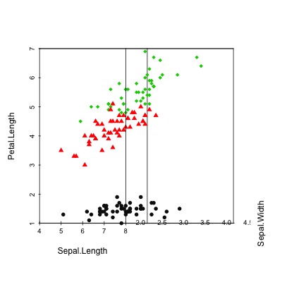
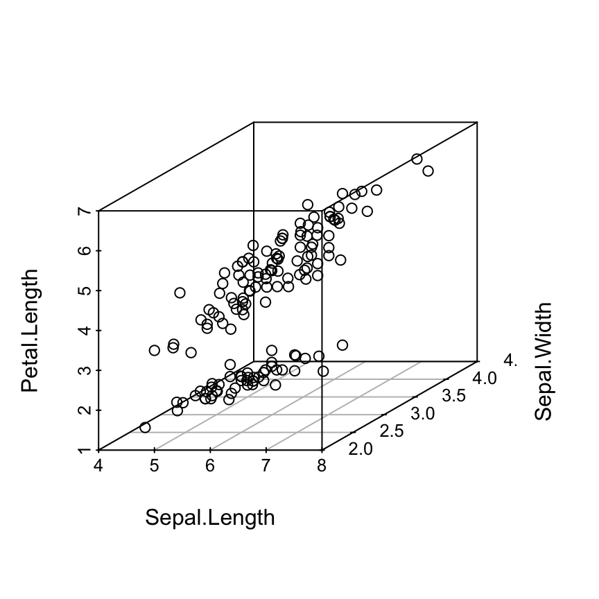
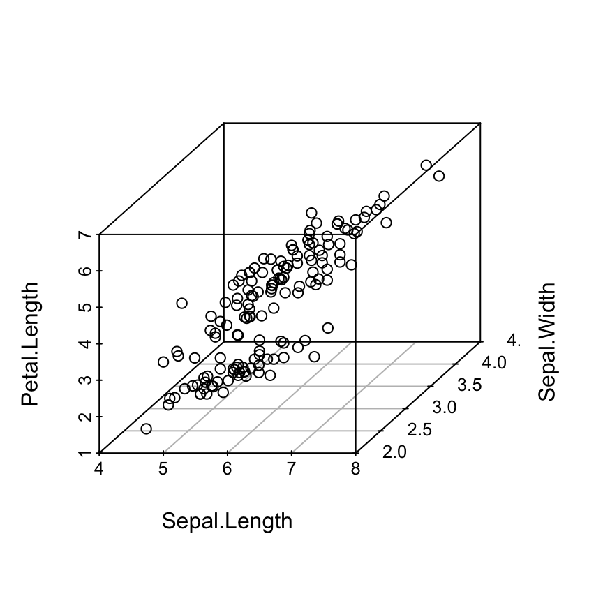
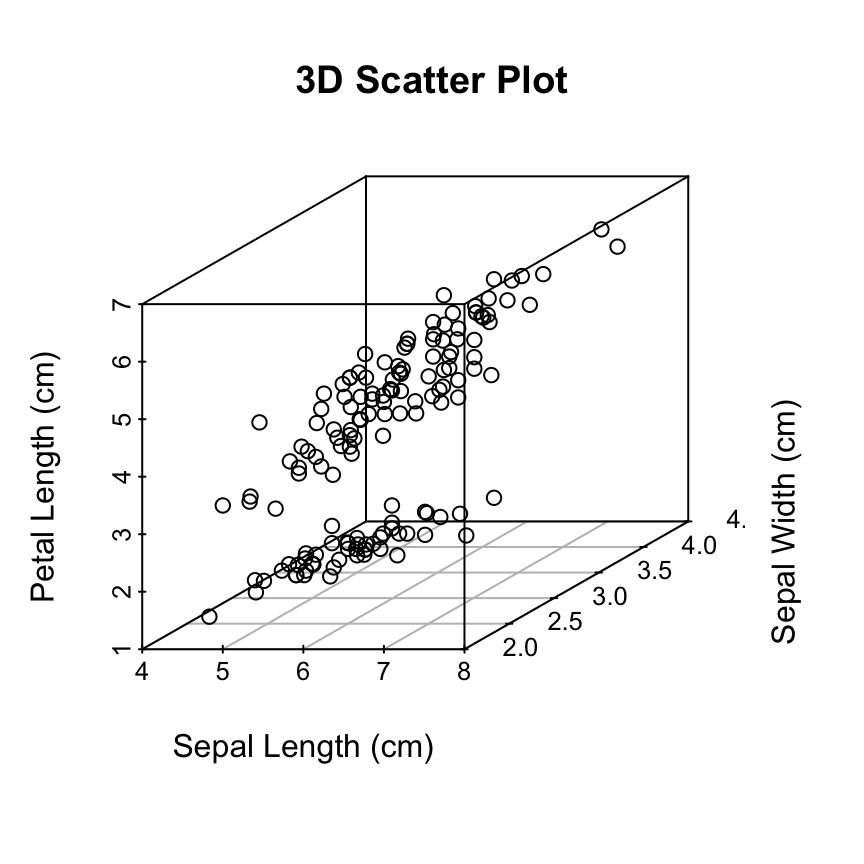
 Read more on the different point shapes available in R : Point shapes in R
 Read more on the different point shapes available in R : Point shapes in R
 Read more about colors in R: colors in R
 Note that, the argument
  The problem on the above plot is that the grids are drawn over the points.
The
The problem on the above plot is that the grids are drawn over the points.
The  The function
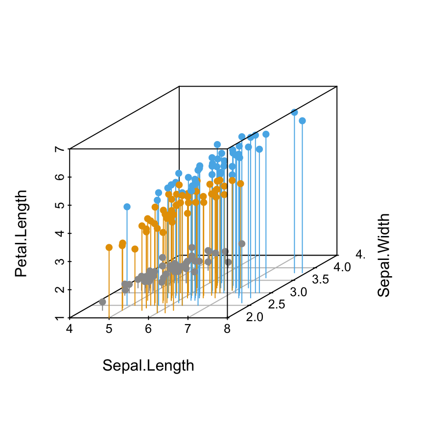
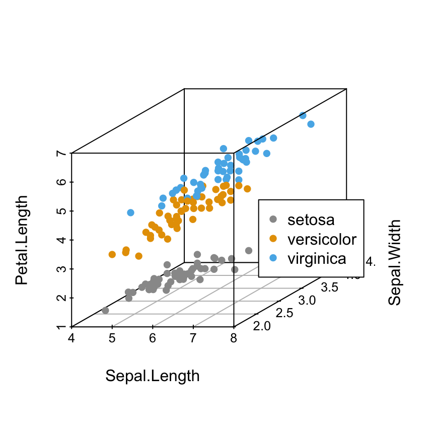
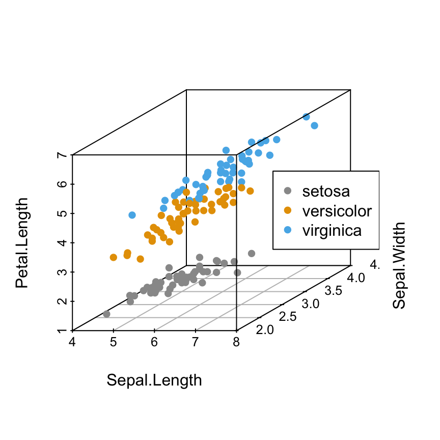
 What means the argument
 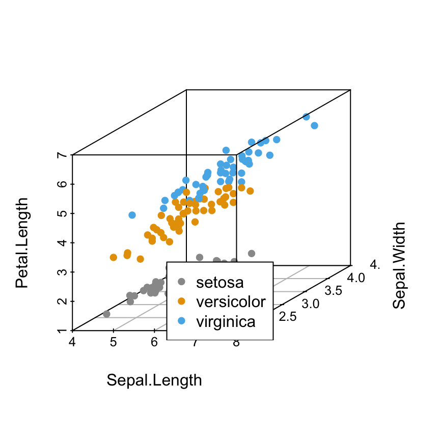 Using keywords to specify the legend position is very simple.
However, sometimes, there is an overlap between some points and the legend box or between the axis and legend box.
Is there any solution to avoid this overlap?
Yes, there are several solutions using the combination of the following arguments for the function
Using keywords to specify the legend position is very simple.
However, sometimes, there is an overlap between some points and the legend box or between the axis and legend box.
Is there any solution to avoid this overlap?
Yes, there are several solutions using the combination of the following arguments for the function 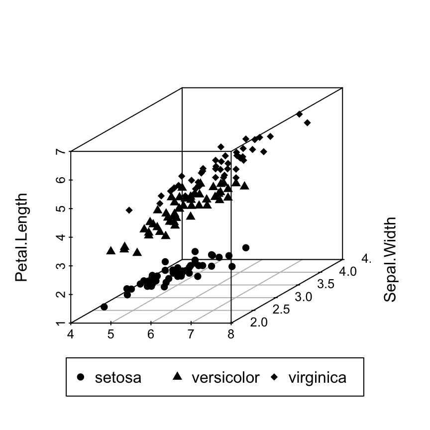
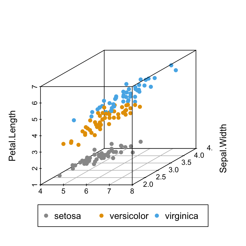
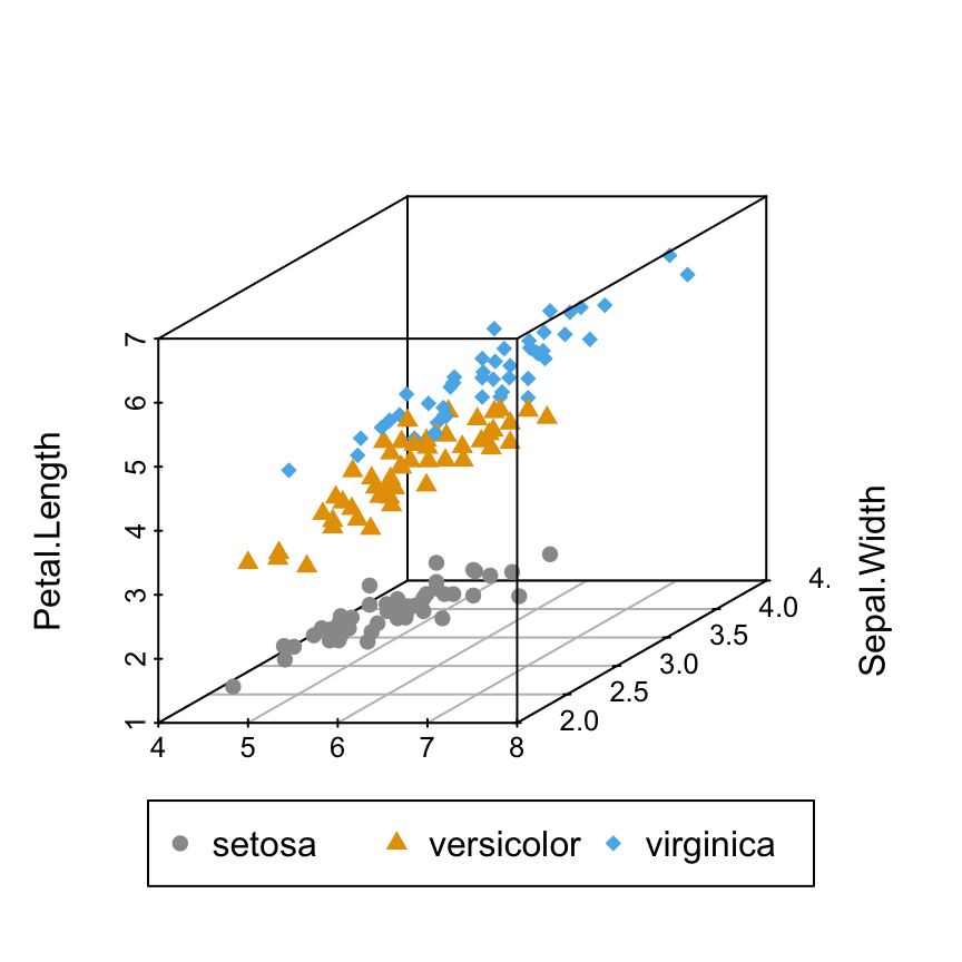 In the R code above, you can play with the arguments inset, xpd and horiz to see the effects on the appearance of the legend box.
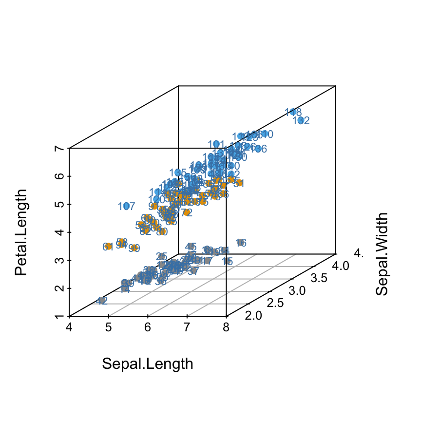
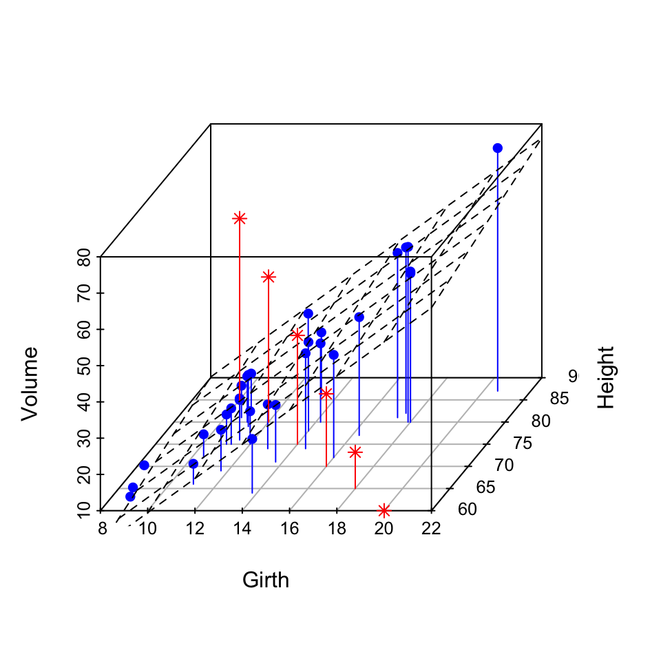
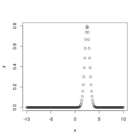
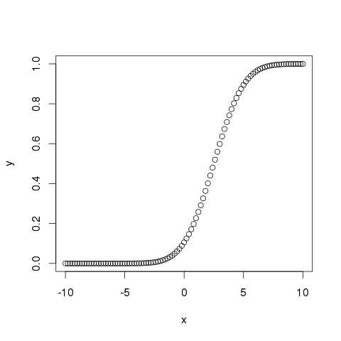
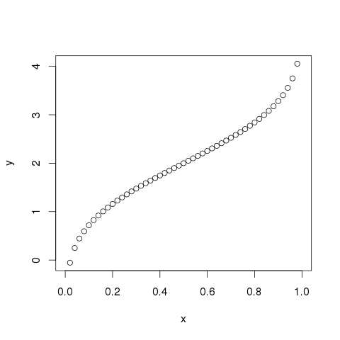
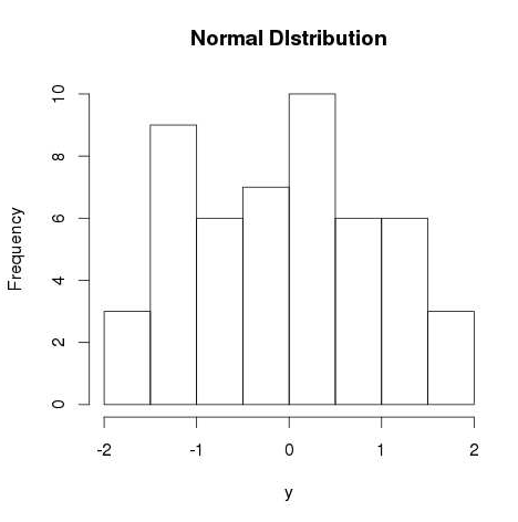 RNORM Generates random numbers from normal distribution
rnorm(n, mean, sd)
rnorm(1000, 3, .25) Generates 1000 numbers from a normal with mean 3 and sd=.25
DNORM Probability Density Function(PDF)
dnorm(x, mean, sd)
dnorm(0, 0, .5) Gives the density (height of the PDF) of the normal with mean=0 and sd=.5.
dnorm returns the value of the normal distribution given parameters for x, μ, and σ.
# x = 0, mu = 0 and sigma = 0
dnorm(0, mean = 0, sd = 1)
dnorm(1, mean = 1.2, sd = 0.5) # result: 0.7365403
change x to dataset
dataset = seq(-3, 3, by = .1)
dvalues = dnorm(dataset)
plot(dvalues, # y = values and x = index
xaxt = "n", # Don't label the x-axis
type = "l", # Make it a line plot
main = "pdf of the Standard Normal",
xlab= "Data Set")
compare the data with dnorm:
dataset = c( 5, 1,2,5,3,5,6,4,7,4,5,4,8,6,3,3,6,5,4,3,4,3,4,3)
plot(dvalues, # y = values and x = index
xaxt = "n", # Don't label the x-axis
type = "l", # Make it a line plot
main = "pdf of the Standard Normal",
xlab= "Data Set")
to create a dnorm of a dataset to compare with current dataset
make a cut index
cutindex = seq(min(dataset),max(dataset),length = 10)
yfit = dnorm(cutindex, mean=mean(dataset), sd=sd(dataset))
lines(cutindex, yfit)
# Kernel Density Plot
d = density(mtcars$mpg) # returns the density data
plot(d) # plots the results
# Filled Density Plot
d = density(mtcars$mpg)
plot(d, main="Kernel Density of Miles Per Gallon")
polygon(d, col="red", border="blue")
Kernel density estimation is a technique that let's you create a smooth curve given a set of data.
PNORM Cumulative Distribution Function
(CDF) pnorm(q, mean, sd)
pnorm(1.96, 0, 1) Gives the area under the standard normal curve to the left of 1.96, i.e. ~0.975
QNORM Quantile Function – inverse of
pnorm qnorm(p, mean, sd)
qnorm(0.975, 0, 1) Gives the value at which the CDF of the standard normal is .975, i.e. ~1.96
Note that for all functions, leaving out the mean and standard deviation would result in default values of mean=0 and sd=1, a standard normal distribution.
RNORM Generates random numbers from normal distribution
rnorm(n, mean, sd)
rnorm(1000, 3, .25) Generates 1000 numbers from a normal with mean 3 and sd=.25
DNORM Probability Density Function(PDF)
dnorm(x, mean, sd)
dnorm(0, 0, .5) Gives the density (height of the PDF) of the normal with mean=0 and sd=.5.
dnorm returns the value of the normal distribution given parameters for x, μ, and σ.
# x = 0, mu = 0 and sigma = 0
dnorm(0, mean = 0, sd = 1)
dnorm(1, mean = 1.2, sd = 0.5) # result: 0.7365403
change x to dataset
dataset = seq(-3, 3, by = .1)
dvalues = dnorm(dataset)
plot(dvalues, # y = values and x = index
xaxt = "n", # Don't label the x-axis
type = "l", # Make it a line plot
main = "pdf of the Standard Normal",
xlab= "Data Set")
compare the data with dnorm:
dataset = c( 5, 1,2,5,3,5,6,4,7,4,5,4,8,6,3,3,6,5,4,3,4,3,4,3)
plot(dvalues, # y = values and x = index
xaxt = "n", # Don't label the x-axis
type = "l", # Make it a line plot
main = "pdf of the Standard Normal",
xlab= "Data Set")
to create a dnorm of a dataset to compare with current dataset
make a cut index
cutindex = seq(min(dataset),max(dataset),length = 10)
yfit = dnorm(cutindex, mean=mean(dataset), sd=sd(dataset))
lines(cutindex, yfit)
# Kernel Density Plot
d = density(mtcars$mpg) # returns the density data
plot(d) # plots the results
# Filled Density Plot
d = density(mtcars$mpg)
plot(d, main="Kernel Density of Miles Per Gallon")
polygon(d, col="red", border="blue")
Kernel density estimation is a technique that let's you create a smooth curve given a set of data.
PNORM Cumulative Distribution Function
(CDF) pnorm(q, mean, sd)
pnorm(1.96, 0, 1) Gives the area under the standard normal curve to the left of 1.96, i.e. ~0.975
QNORM Quantile Function – inverse of
pnorm qnorm(p, mean, sd)
qnorm(0.975, 0, 1) Gives the value at which the CDF of the standard normal is .975, i.e. ~1.96
Note that for all functions, leaving out the mean and standard deviation would result in default values of mean=0 and sd=1, a standard normal distribution.
 x = c(1, 8,9, 4)
sort(x)
1 4 8 9
# the original position in the sorted order
rank(x)
1 3 4 2
# the sorted position in the original position
order(x)
1 4 2 3
x = c(1, 8,9, 4)
sort(x)
1 4 8 9
# the original position in the sorted order
rank(x)
1 3 4 2
# the sorted position in the original position
order(x)
1 4 2 3
 Scatter Plot of Binary Classification Dataset
 Scatter Plot of Multi-Class Classification Dataset
 Scatter Plot of Imbalanced Binary Classification Dataset
 How we prepared the test
In order to compare the performance of CPUs vs GPUs vs TPUs for accomplishing common data science tasks, we used the tf_flowers dataset to train a convolutional neural network, and then the exact same code was run three times using the three different backends (CPUs vs GPUs vs TPUs; GPUs were NVIDIA P100 with Intel Xeon 2GHz (2 core) CPU and 13GB RAM.
TPUs were TPUv3 (8 core) with Intel Xeon 2GHz (4 core) CPU and 16GB RAM).
The accompanying tutorial notebook demonstrates a few best practices for getting the best performance out of your TPU.
For example:
Using a dataset of sharded files (e.g., .TFRecord)
Using the tf.data API to pass the training data to the TPU
Using large batch sizes (e.g. batch_size=128)
By adding these precursory steps to your workflow, it is possible to avoid a common I/O bottleneck that otherwise prevents the TPU from operating at its full potential.
You can find additional tips for optimizing your code to run on TPUs by visiting the official Kaggle TPU documentation.
How the hardware performed
The most notable difference between the three hardware types that we tested was the speed that it took to train a model using tf.keras.
The tf.keras library is one of the most popular machine learning frameworks because tf.keras makes it easy to quickly experiment with new ideas.
If you spend less time writing code then you have more time to perform your calculations, and if you spend less time waiting for your code to run, then you have more time to evaluate new ideas (Figure 2).
tf.keras and TPUs are a powerful combination when participating in machine learning competitions!
How we prepared the test
In order to compare the performance of CPUs vs GPUs vs TPUs for accomplishing common data science tasks, we used the tf_flowers dataset to train a convolutional neural network, and then the exact same code was run three times using the three different backends (CPUs vs GPUs vs TPUs; GPUs were NVIDIA P100 with Intel Xeon 2GHz (2 core) CPU and 13GB RAM.
TPUs were TPUv3 (8 core) with Intel Xeon 2GHz (4 core) CPU and 16GB RAM).
The accompanying tutorial notebook demonstrates a few best practices for getting the best performance out of your TPU.
For example:
Using a dataset of sharded files (e.g., .TFRecord)
Using the tf.data API to pass the training data to the TPU
Using large batch sizes (e.g. batch_size=128)
By adding these precursory steps to your workflow, it is possible to avoid a common I/O bottleneck that otherwise prevents the TPU from operating at its full potential.
You can find additional tips for optimizing your code to run on TPUs by visiting the official Kaggle TPU documentation.
How the hardware performed
The most notable difference between the three hardware types that we tested was the speed that it took to train a model using tf.keras.
The tf.keras library is one of the most popular machine learning frameworks because tf.keras makes it easy to quickly experiment with new ideas.
If you spend less time writing code then you have more time to perform your calculations, and if you spend less time waiting for your code to run, then you have more time to evaluate new ideas (Figure 2).
tf.keras and TPUs are a powerful combination when participating in machine learning competitions!
 For our first experiment, we used the same code (a modified version*** of the official tutorial notebook) for all three hardware types, which required using a very small batch size of 16 in order to avoid out-of-memory errors from the CPU and GPU.
Under these conditions, we observed that TPUs were responsible for a ~100x speedup as compared to CPUs and a ~3.5x speedup as compared to GPUs when training an Xception model (Figure 3).
Because TPUs operate more efficiently with large batch sizes, we also tried increasing the batch size to 128 and this resulted in an additional ~2x speedup for TPUs and out-of-memory errors for GPUs and CPUs.
Under these conditions, the TPU was able to train an Xception model more than 7x as fast as the GPU from the previous experiment****.
For our first experiment, we used the same code (a modified version*** of the official tutorial notebook) for all three hardware types, which required using a very small batch size of 16 in order to avoid out-of-memory errors from the CPU and GPU.
Under these conditions, we observed that TPUs were responsible for a ~100x speedup as compared to CPUs and a ~3.5x speedup as compared to GPUs when training an Xception model (Figure 3).
Because TPUs operate more efficiently with large batch sizes, we also tried increasing the batch size to 128 and this resulted in an additional ~2x speedup for TPUs and out-of-memory errors for GPUs and CPUs.
Under these conditions, the TPU was able to train an Xception model more than 7x as fast as the GPU from the previous experiment****.
 The observed speedups for model training varied according to the type of model, with Xception and Vgg16 performing better than ResNet50 (Figure 4). Model training was the only type of task where we observed the TPU to outperform the GPU by such a large margin.
For example, we observed that in our hands the TPUs were ~3x faster than CPUs and ~3x slower than GPUs for performing a small number of predictions (TPUs perform exceptionally when making predictions in some situations such as when making predictions on very large batches, which were not present in this experiment).
The observed speedups for model training varied according to the type of model, with Xception and Vgg16 performing better than ResNet50 (Figure 4). Model training was the only type of task where we observed the TPU to outperform the GPU by such a large margin.
For example, we observed that in our hands the TPUs were ~3x faster than CPUs and ~3x slower than GPUs for performing a small number of predictions (TPUs perform exceptionally when making predictions in some situations such as when making predictions on very large batches, which were not present in this experiment).

 To supplement these results, we note that Wang et.
al have developed a rigorous benchmark called ParaDnn [1] that can be used to compare the performance of different hardware types for training machine learning models.
By using this method Wang et.
al were able to conclude that the performance benefit for parameterized models ranged from 1x to 10x, and the performance benefit for real models ranged from 3x to 6.8x when a TPU was used instead of a GPU (Figure 5).
TPUs perform best when combined with sharded datasets, large batch sizes, and large models.
To supplement these results, we note that Wang et.
al have developed a rigorous benchmark called ParaDnn [1] that can be used to compare the performance of different hardware types for training machine learning models.
By using this method Wang et.
al were able to conclude that the performance benefit for parameterized models ranged from 1x to 10x, and the performance benefit for real models ranged from 3x to 6.8x when a TPU was used instead of a GPU (Figure 5).
TPUs perform best when combined with sharded datasets, large batch sizes, and large models.
 Price considerations when training models
While our comparisons treated the hardware equally, there is a sizeable difference in pricing. TPUs are ~5x as expensive as GPUs ($1.46/hr for a Nvidia Tesla P100 GPU vs $8.00/hr for a Google TPU v3 vs $4.50/hr for the TPUv2 with “on-demand” access on GCP ).
If you are trying to optimize for cost then it makes sense to use a TPU if it will train your model at least 5 times as fast as if you trained the same model using a GPU.
We consistently observed model training speedups on the order of ~5x when the data was stored in a sharded format in a GCS bucket then passed to the TPU in large batch sizes, and therefore we recommend TPUs to cost-conscious consumers that are familiar with the tf.data API.
Some machine learning practitioners prioritize the reduction of model training time as opposed to prioritizing the reduction of model training costs.
For someone that just wants to train their model as fast as possible, the TPU is the best choice.
If you spend less time training your model, then you have more time to iterate upon new ideas.
But don’t take our word for it — you can evaluate the performance benefits of CPUs, GPUs, and TPUs by running your own code in a Kaggle Notebook, free-of-charge.
Kaggle users are already having a lot of fun and success experimenting with TPUs and text data: check out this forum post that describes how TPUs were used to train a BERT transformer model to win $8,000 (2nd prize) in a recent Kaggle competition.
Which hardware option should you choose?
In summary, we recommend CPUs for their versatility and for their large memory capacity.
GPUs are a great alternative to CPUs when you want to speed up a variety of data science workflows, and TPUs are best when you specifically want to train a machine learning model as fast as you possibly can.
You can get better results by optimizing your code for the specific hardware that you are using and we think it would be especially interesting to compare runtimes for code that has been optimized for a GPU to runtimes for code that has been optimized for a TPU.
For example, it would be interesting to record the time that it takes to train a gradient-boosted model using a GPU-accelerated library such as RAPIDS.ai and then to compare that to the time that it takes to train a deep learning model using a TPU-accelerated library such as tf.keras.
What is the least amount of time that one can train an accurate machine learning model? How many different ideas can you evaluate in a single day? When used in combination with tf.keras, TPUs allow machine learning practitioners to spend less time writing code and less time waiting for their code to run — leaving more time to evaluate new ideas and improve one’s performance in Kaggle Competitions.
Price considerations when training models
While our comparisons treated the hardware equally, there is a sizeable difference in pricing. TPUs are ~5x as expensive as GPUs ($1.46/hr for a Nvidia Tesla P100 GPU vs $8.00/hr for a Google TPU v3 vs $4.50/hr for the TPUv2 with “on-demand” access on GCP ).
If you are trying to optimize for cost then it makes sense to use a TPU if it will train your model at least 5 times as fast as if you trained the same model using a GPU.
We consistently observed model training speedups on the order of ~5x when the data was stored in a sharded format in a GCS bucket then passed to the TPU in large batch sizes, and therefore we recommend TPUs to cost-conscious consumers that are familiar with the tf.data API.
Some machine learning practitioners prioritize the reduction of model training time as opposed to prioritizing the reduction of model training costs.
For someone that just wants to train their model as fast as possible, the TPU is the best choice.
If you spend less time training your model, then you have more time to iterate upon new ideas.
But don’t take our word for it — you can evaluate the performance benefits of CPUs, GPUs, and TPUs by running your own code in a Kaggle Notebook, free-of-charge.
Kaggle users are already having a lot of fun and success experimenting with TPUs and text data: check out this forum post that describes how TPUs were used to train a BERT transformer model to win $8,000 (2nd prize) in a recent Kaggle competition.
Which hardware option should you choose?
In summary, we recommend CPUs for their versatility and for their large memory capacity.
GPUs are a great alternative to CPUs when you want to speed up a variety of data science workflows, and TPUs are best when you specifically want to train a machine learning model as fast as you possibly can.
You can get better results by optimizing your code for the specific hardware that you are using and we think it would be especially interesting to compare runtimes for code that has been optimized for a GPU to runtimes for code that has been optimized for a TPU.
For example, it would be interesting to record the time that it takes to train a gradient-boosted model using a GPU-accelerated library such as RAPIDS.ai and then to compare that to the time that it takes to train a deep learning model using a TPU-accelerated library such as tf.keras.
What is the least amount of time that one can train an accurate machine learning model? How many different ideas can you evaluate in a single day? When used in combination with tf.keras, TPUs allow machine learning practitioners to spend less time writing code and less time waiting for their code to run — leaving more time to evaluate new ideas and improve one’s performance in Kaggle Competitions.
 As you can see, there are many node types in an XPath tree:


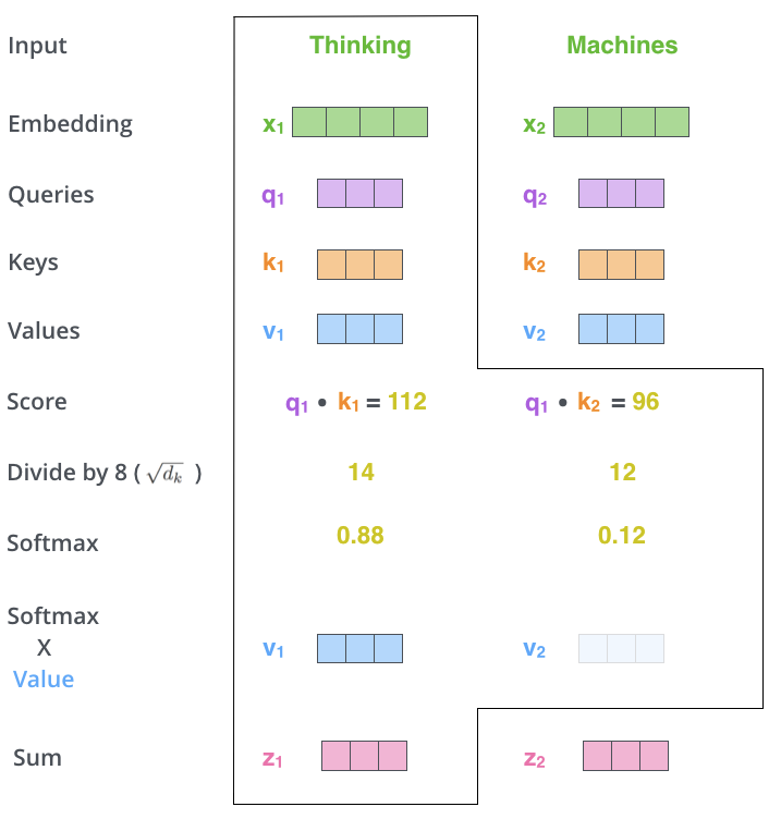
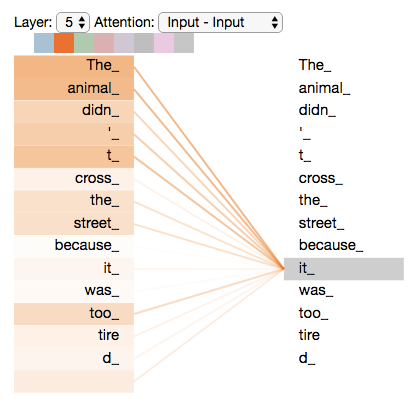

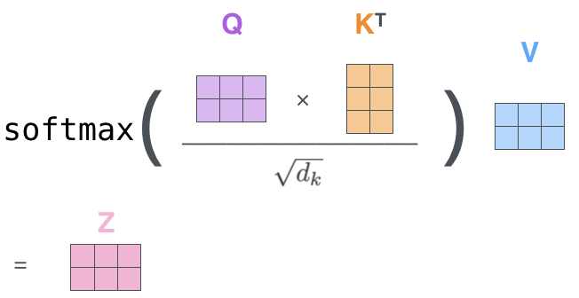
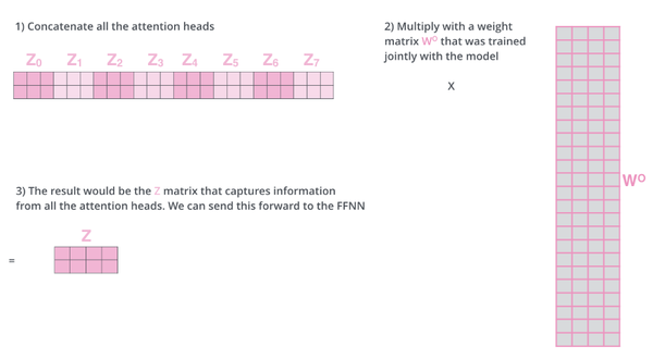

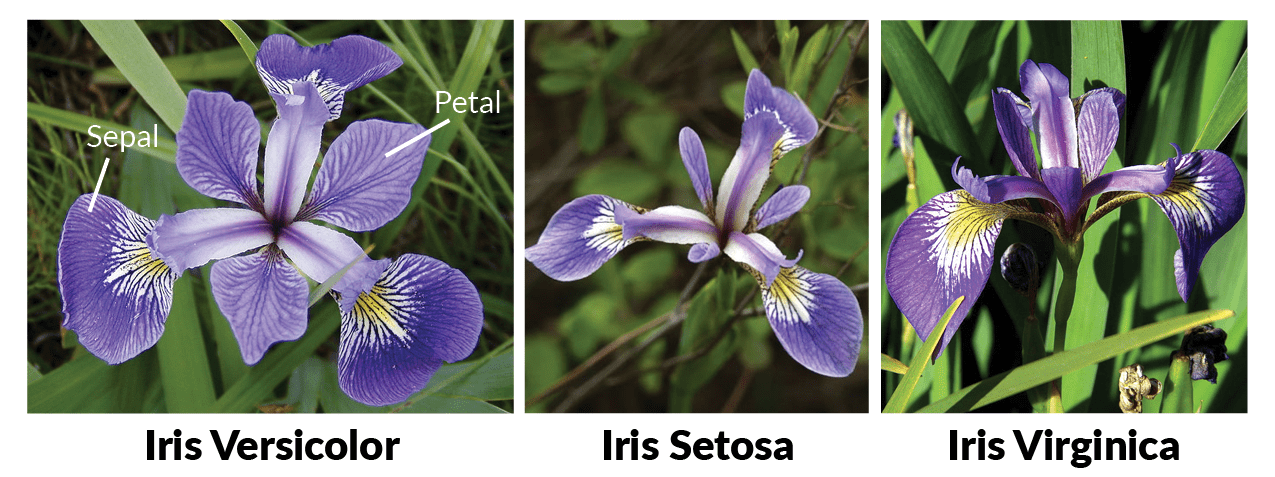
 You see that there is a high correlation between the sepal length and the sepal width of the Setosa iris flowers, while the correlation is somewhat less high for the Virginica and Versicolor flowers: the data points are more spread out over the graph and don’t form a cluster like you can see in the case of the Setosa flowers.
The scatter plot that maps the petal length and the petal width tells a similar story:
You see that there is a high correlation between the sepal length and the sepal width of the Setosa iris flowers, while the correlation is somewhat less high for the Virginica and Versicolor flowers: the data points are more spread out over the graph and don’t form a cluster like you can see in the case of the Setosa flowers.
The scatter plot that maps the petal length and the petal width tells a similar story:
 You see that this graph indicates a positive correlation between the petal length and the petal width for all different species that are included into the Iris data set.
Of course, you probably need to test this hypothesis a bit further if you want to be really sure of this:
# Overall correlation `Petal.Length` and `Petal.Width`
cor(iris$Petal.Length, iris$Petal.Width)
# Return values of `iris` levels
x=levels(iris$Species)
# Print Setosa correlation matrix
print(x[1])
cor(iris[iris$Species==x[1],1:4])
# Print Versicolor correlation matrix
print(x[2])
cor(iris[iris$Species==x[2],1:4])
# Print Virginica correlation matrix
print(x[3])
cor(iris[iris$Species==x[3],1:4])
You see that when you combined all three species, the correlation was a bit stronger than it is when you look at the different species separately: the overall correlation is 0.96, while for Versicolor this is 0.79.
Setosa and Virginica, on the other hand, have correlations of petal length and width at 0.31 and 0.32 when you round up the numbers.
Tip: are you curious about ggvis, graphs or histograms in particular? Check out our histogram tutorial and/or ggvis course.
After a general visualized overview of the data, you can also view the data set by entering
# Return all `iris` data
iris
# Return first 5 lines of `iris`
head(iris)
# Return structure of `iris`
str(iris)
However, as you will see from the result of this command, this really isn’t the best way to inspect your data set thoroughly: the data set takes up a lot of space in the console, which will impede you from forming a clear idea about your data.
It is therefore a better idea to inspect the data set by executing
You see that this graph indicates a positive correlation between the petal length and the petal width for all different species that are included into the Iris data set.
Of course, you probably need to test this hypothesis a bit further if you want to be really sure of this:
# Overall correlation `Petal.Length` and `Petal.Width`
cor(iris$Petal.Length, iris$Petal.Width)
# Return values of `iris` levels
x=levels(iris$Species)
# Print Setosa correlation matrix
print(x[1])
cor(iris[iris$Species==x[1],1:4])
# Print Versicolor correlation matrix
print(x[2])
cor(iris[iris$Species==x[2],1:4])
# Print Virginica correlation matrix
print(x[3])
cor(iris[iris$Species==x[3],1:4])
You see that when you combined all three species, the correlation was a bit stronger than it is when you look at the different species separately: the overall correlation is 0.96, while for Versicolor this is 0.79.
Setosa and Virginica, on the other hand, have correlations of petal length and width at 0.31 and 0.32 when you round up the numbers.
Tip: are you curious about ggvis, graphs or histograms in particular? Check out our histogram tutorial and/or ggvis course.
After a general visualized overview of the data, you can also view the data set by entering
# Return all `iris` data
iris
# Return first 5 lines of `iris`
head(iris)
# Return structure of `iris`
str(iris)
However, as you will see from the result of this command, this really isn’t the best way to inspect your data set thoroughly: the data set takes up a lot of space in the console, which will impede you from forming a clear idea about your data.
It is therefore a better idea to inspect the data set by executing 

 This is where Machine Learning comes in.
We'll keep on feeding images of a fish to a computer with the tag "fish" until the machine learns all the features associated with a fish.
This is where Machine Learning comes in.
We'll keep on feeding images of a fish to a computer with the tag "fish" until the machine learns all the features associated with a fish.
 Once the machine learns all the features associated with a fish, we will feed it new data to determine how much has it learned.
 In other words, Raw Data/Training Data is given to the machine, so that it learns all the features associated with the Training Data.
Once, the learning is done, it is given New Data/Test Data to determine how well the machine has learned.
Let us move ahead in this Machine Learning with R blog and understand about types of Machine Learning.
In other words, Raw Data/Training Data is given to the machine, so that it learns all the features associated with the Training Data.
Once, the learning is done, it is given New Data/Test Data to determine how well the machine has learned.
Let us move ahead in this Machine Learning with R blog and understand about types of Machine Learning.
 Regression and Classification are some examples of Supervised Learning.
 For this example, if the first observation is given the label "Man" then it is rightly classified but if it is given the label "Woman", the classification is wrong.
Similarly for the second observation, if the label given is "Woman", it is rightly classified, else the classification is wrong.
For this example, if the first observation is given the label "Man" then it is rightly classified but if it is given the label "Woman", the classification is wrong.
Similarly for the second observation, if the label given is "Woman", it is rightly classified, else the classification is wrong.
 Over here, "living_area" is the independent variable and "price" is the dependent variable i.e. we are determining how does "price" vary with respect to "living_area".
 Clustering is an example of unsupervised learning.
"K-means", "Hierarchical", "Fuzzy C-Means" are some examples of clustering algorithms.
Clustering is an example of unsupervised learning.
"K-means", "Hierarchical", "Fuzzy C-Means" are some examples of clustering algorithms.
 In this example, the set of observations is divided into two clusters.
Clustering is done on the basis of similarity between the observations.
There is a high intra-cluster similarity and low inter-cluster similarity i.e. there is a very high similarity between all the buses but low similarity between the buses and cars.
In this example, the set of observations is divided into two clusters.
Clustering is done on the basis of similarity between the observations.
There is a high intra-cluster similarity and low inter-cluster similarity i.e. there is a very high similarity between all the buses but low similarity between the buses and cars.

 Description of the data-set:
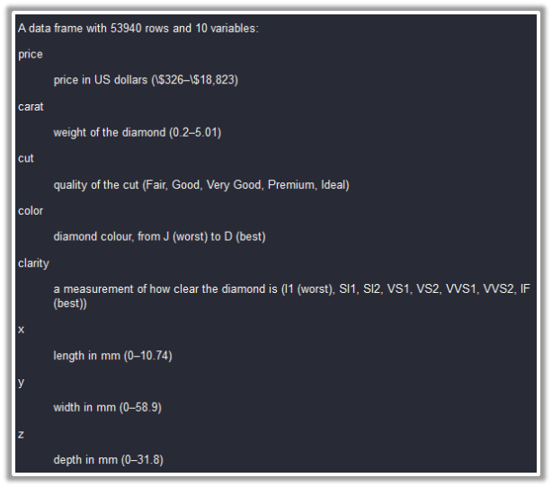 Prior to building any model on the data, we are supposed to split the data into "train" and "test" sets.
The model will be built on the "train" set and it's accuracy will be checked on the "test" set.
We need to load the "caTools" package to split the data into two sets.
Prior to building any model on the data, we are supposed to split the data into "train" and "test" sets.
The model will be built on the "train" set and it's accuracy will be checked on the "test" set.
We need to load the "caTools" package to split the data into two sets.
 Let's find the error by subtracting the predicted values from the actual values and add this error as a new column to the "Final_Data":
 Now, we'll go ahead and calculate "Root Mean Square Error" which gives an aggregate error for all the predictions
 Going ahead, let's build another model, so that we can compare the accuracy of both these models and determine which is a better one.
We'll build a new linear regression model on the "train" set but this time, we'll be dropping the ‘x' and ‘y' columns from the independent variables i.e. the "price" of the diamonds is determined by all the columns except ‘x' and ‘y'.
The model built is stored in "mod_regress2":
Going ahead, let's build another model, so that we can compare the accuracy of both these models and determine which is a better one.
We'll build a new linear regression model on the "train" set but this time, we'll be dropping the ‘x' and ‘y' columns from the independent variables i.e. the "price" of the diamonds is determined by all the columns except ‘x' and ‘y'.
The model built is stored in "mod_regress2":
 We see that "rmse2" is marginally less than "rmse1" and hence the second model is marginally better than the first model.
 Let's split the data into "train" and "test" sets using "sample.split()" function from "caTools" package.


 Let's remove the "Species" column and create a new data-set which comprises only the first four columns from the ‘iris' data-set.
 The str() function gives the structure of the kmeans which includes various parameters like withinss, betweenss, etc, analyzing which you can find out the performance of kmeans.
betweenss : Between sum of squares i.e. Intracluster similarity
withinss : Within sum of square i.e. Intercluster similarity
totwithinss : Sum of all the withinss of all the clusters i.e.Total intra-cluster similarity
A good clustering will have a lower value of "tot.withinss" and higher value of "betweenss" which depends on the number of clusters ‘k’ chosen initially.
The time is ripe to become an expert in Machine Learning to take advantage of new opportunities that come your way.
This brings us to the end of this "
The str() function gives the structure of the kmeans which includes various parameters like withinss, betweenss, etc, analyzing which you can find out the performance of kmeans.
betweenss : Between sum of squares i.e. Intracluster similarity
withinss : Within sum of square i.e. Intercluster similarity
totwithinss : Sum of all the withinss of all the clusters i.e.Total intra-cluster similarity
A good clustering will have a lower value of "tot.withinss" and higher value of "betweenss" which depends on the number of clusters ‘k’ chosen initially.
The time is ripe to become an expert in Machine Learning to take advantage of new opportunities that come your way.
This brings us to the end of this " Below, we discuss how inheritance is carried out for the three different class systems in R programming language.
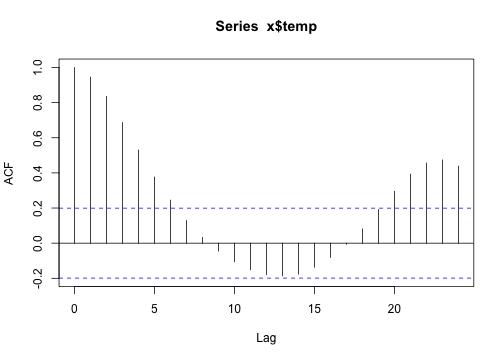
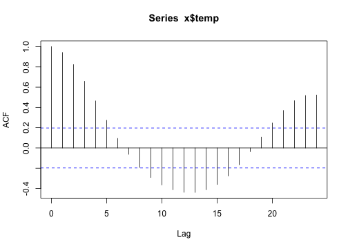
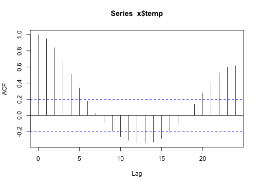
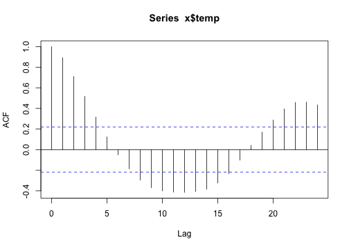
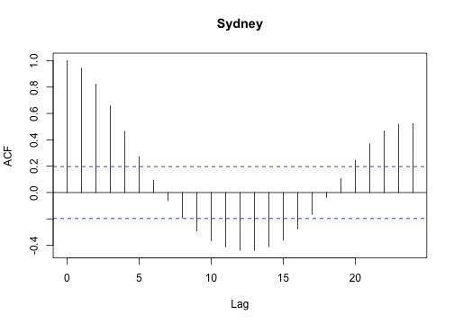
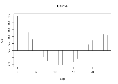 I find that for loops can be easier to plot data, partly because there is nothing to collect (or combine) at each iteration.
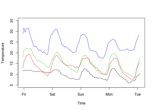

 But there’s still repetition there. Let’s abstract that away a bit.
Suppose we want a:
1. response variable (like Rating was)
2. grouping variable (like Season was)
3. function to apply to each level
This just writes out exactly what we had before
But there’s still repetition there. Let’s abstract that away a bit.
Suppose we want a:
1. response variable (like Rating was)
2. grouping variable (like Season was)
3. function to apply to each level
This just writes out exactly what we had before
 Pulling that into a function:
 Of course, in this case, if we think in terms of vectors we can actually implement random walk using implicit vectorisation:
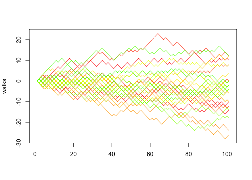 Which reinforces one of the advantages of thinking in terms of functions: you can change the implementation detail without the rest of the program changing.
 Fig: Processing time as a function of number of iterations for a simple loop.
The processing time increases linearly with the number of iterations.
Again, processing time is not extensive for the above example.
Suppose we wanted to run the example with ten thousand iterations.
We can predict how long that would take based on the linear relationship between time and iterations.
mod=lm(times~iters) #predict times
predict(mod,newdata=data.frame(iters=1e4))/60
# 45.75964
This is all well and good if we want to wait around for 45 minutes.
Running the loop in parallel would greatly decrease this time.
I want to first illustrate the problem of running loops in sequence before I show how this can done using the foreach package.
If the above code is run with
Fig: Processing time as a function of number of iterations for a simple loop.
The processing time increases linearly with the number of iterations.
Again, processing time is not extensive for the above example.
Suppose we wanted to run the example with ten thousand iterations.
We can predict how long that would take based on the linear relationship between time and iterations.
mod=lm(times~iters) #predict times
predict(mod,newdata=data.frame(iters=1e4))/60
# 45.75964
This is all well and good if we want to wait around for 45 minutes.
Running the loop in parallel would greatly decrease this time.
I want to first illustrate the problem of running loops in sequence before I show how this can done using the foreach package.
If the above code is run with  Fig: Resources used during sequential processing of a
  Fig: Resources used during parallel processing of a
 Figure 1.
Diagram of the base class, Agent, used for the agents in a simulation.
The methods for this class are defined in the following section.
Here we define the class and its slots, and the code to define the class is given below:
######################################################################
# Create the base Agent class
#
# This is used to represent the most basic agent in a simulation.
Agent = setClass(
# Set the name for the class
"Agent",
# Define the slots
slots = c(
location = "numeric",
velocity = "numeric",
active = "logical"
),
# Set the default values for the slots.
(optional)
prototype=list(
location = c(0.0,0.0),
active = TRUE,
velocity = c(0.0,0.0)
),
# Make a function that can test to see if the data is consistent.
# This is not called if you have an initialize function defined!
validity=function(object)
{
if(sum(object@velocity^2)>100.0) {
return("The velocity level is out of bounds.")
}
return(TRUE)
}
)
Now that the code to define the class is given we can create an object whose class is Agent.
> a = Agent()
> a
An object of class "Agent"
Slot "location":
[1] 0 0
Slot "velocity":
[1] 0 0
Slot "active":
[1] TRUE
Before we define the methods for the class a number of additional commands are explored.
The first set of functions explored are the
is.object and the isS4 commands.
The is.object command determines whether or not a variable refers to an object.
The isS4
command determines whether or not the variable is an S4 object.
The reason both are required is that the isS4 command alone cannot determine if a variable is an S3 object.
You need to determine if the variable is an object and then decide if it is S4 or not.
> is.object(a)
[1] TRUE
> isS4(a)
[1] TRUE
The next set of commands are used to get information about the data elements, or slots, within an object.
The first is the slotNames
command.
This command can take either an object or the name of a class.
It returns the names of the slots associated with the class as strings.
> slotNames(a)
[1] "location" "velocity" "active"
> slotNames("Agent")
[1] "location" "velocity" "active"
The getSlots command is similar to the slotNames command.
It takes the name of a class as a string.
It returns a vector whose entries are the types associated with the slots, and the names of the entries are the names of the slots.
> getSlots("Agent")
location velocity active
"numeric" "numeric" "logical"
> s = getSlots("Agent")
> s[1]
location
"numeric"
> s[[1]]
[1] "numeric"
> names(s)
[1] "location" "velocity" "active"
The next command examined is the getClass command.
It has two forms.
If you give it a variable that is an S4 class it returns a list of slots for the class associated with the variable.
If you give it a character string with the name of a class it gives the slots and their data types.
> getClass(a)
An object of class "Agent"
Slot "location":
[1] 0 0
Slot "velocity":
[1] 0 0
Slot "active":
[1] TRUE
> getClass("Agent")
Class "Agent" [in ".GlobalEnv"]
Slots:
Name: location velocity active
Class: numeric numeric logical
The final command examined is the slot command.
It can be used to get or set the value of a slot in an object.
It can be used in place of the “@” operator.
> slot(a,"location")
[1] 0 0
> slot(a,"location") = c(1,5)
> a
An object of class "Agent"
Slot "location":
[1] 1 5
Slot "velocity":
[1] 0 0
Slot "active":
[1] TRUE
Figure 1.
Diagram of the base class, Agent, used for the agents in a simulation.
The methods for this class are defined in the following section.
Here we define the class and its slots, and the code to define the class is given below:
######################################################################
# Create the base Agent class
#
# This is used to represent the most basic agent in a simulation.
Agent = setClass(
# Set the name for the class
"Agent",
# Define the slots
slots = c(
location = "numeric",
velocity = "numeric",
active = "logical"
),
# Set the default values for the slots.
(optional)
prototype=list(
location = c(0.0,0.0),
active = TRUE,
velocity = c(0.0,0.0)
),
# Make a function that can test to see if the data is consistent.
# This is not called if you have an initialize function defined!
validity=function(object)
{
if(sum(object@velocity^2)>100.0) {
return("The velocity level is out of bounds.")
}
return(TRUE)
}
)
Now that the code to define the class is given we can create an object whose class is Agent.
> a = Agent()
> a
An object of class "Agent"
Slot "location":
[1] 0 0
Slot "velocity":
[1] 0 0
Slot "active":
[1] TRUE
Before we define the methods for the class a number of additional commands are explored.
The first set of functions explored are the
is.object and the isS4 commands.
The is.object command determines whether or not a variable refers to an object.
The isS4
command determines whether or not the variable is an S4 object.
The reason both are required is that the isS4 command alone cannot determine if a variable is an S3 object.
You need to determine if the variable is an object and then decide if it is S4 or not.
> is.object(a)
[1] TRUE
> isS4(a)
[1] TRUE
The next set of commands are used to get information about the data elements, or slots, within an object.
The first is the slotNames
command.
This command can take either an object or the name of a class.
It returns the names of the slots associated with the class as strings.
> slotNames(a)
[1] "location" "velocity" "active"
> slotNames("Agent")
[1] "location" "velocity" "active"
The getSlots command is similar to the slotNames command.
It takes the name of a class as a string.
It returns a vector whose entries are the types associated with the slots, and the names of the entries are the names of the slots.
> getSlots("Agent")
location velocity active
"numeric" "numeric" "logical"
> s = getSlots("Agent")
> s[1]
location
"numeric"
> s[[1]]
[1] "numeric"
> names(s)
[1] "location" "velocity" "active"
The next command examined is the getClass command.
It has two forms.
If you give it a variable that is an S4 class it returns a list of slots for the class associated with the variable.
If you give it a character string with the name of a class it gives the slots and their data types.
> getClass(a)
An object of class "Agent"
Slot "location":
[1] 0 0
Slot "velocity":
[1] 0 0
Slot "active":
[1] TRUE
> getClass("Agent")
Class "Agent" [in ".GlobalEnv"]
Slots:
Name: location velocity active
Class: numeric numeric logical
The final command examined is the slot command.
It can be used to get or set the value of a slot in an object.
It can be used in place of the “@” operator.
> slot(a,"location")
[1] 0 0
> slot(a,"location") = c(1,5)
> a
An object of class "Agent"
Slot "location":
[1] 1 5
Slot "velocity":
[1] 0 0
Slot "active":
[1] TRUE
 Figure 2.
Diagram of the predator and prey classes derived from the Agent class.
The first step is to create the three new classes.
######################################################################
# Create the Prey class
#
# This is used to represent a prey animal
Prey = setClass(
# Set the name for the class
"Prey",
# Define the slots - in this case it is empty...
slots = character(0),
# Set the default values for the slots.
(optional)
prototype=list(),
# Make a function that can test to see if the data is consistent.
# This is not called if you have an initialize function defined!
validity=function(object)
{
if(sum(object@velocity^2)>70.0) {
return("The velocity level is out of bounds.")
}
return(TRUE)
},
# Set the inheritance for this class
contains = "Agent"
)
######################################################################
# Create the Bobcat class
#
# This is used to represent a smaller predator
Bobcat = setClass(
# Set the name for the class
"Bobcat",
# Define the slots - in this case it is empty...
slots = character(0),
# Set the default values for the slots.
(optional)
prototype=list(),
# Make a function that can test to see if the data is consistent.
# This is not called if you have an initialize function defined!
validity=function(object)
{
if(sum(object@velocity^2)>85.0) {
return("The velocity level is out of bounds.")
}
return(TRUE)
},
# Set the inheritance for this class
contains = "Agent"
)
######################################################################
# Create the Lynx class
#
# This is used to represent a larger predator
Lynx = setClass(
# Set the name for the class
"Lynx",
# Define the slots - in this case it is empty...
slots = character(0),
# Set the default values for the slots.
(optional)
prototype=list(),
# Make a function that can test to see if the data is consistent.
# This is not called if you have an initialize function defined!
validity=function(object)
{
if(sum(object@velocity^2)>95.0) {
return("The velocity level is out of bounds.")
}
return(TRUE)
},
# Set the inheritance for this class
contains = "Bobcat"
)
The inheritance is specified using the contains option in the
setClass command.
Note that this can be a vector allowing for multiple inheritance.
We choose not to use that to keep things simpler.
If you are feeling like you need more self-loathing in your life you should try it out and experiment.
Next we define a method, move, for the new classes.
We will include methods for the Agent, Prey, Bobcat, and Lynx classes.
The methods do not really do anything but are used to demonstrate the idea of how methods are executed.
# create a method to move the agent.
setGeneric(name="move",
def=function(theObject)
{
standardGeneric("move")
}
)
setMethod(f="move",
signature="Agent",
definition=function(theObject)
{
print("Move this Agent dude")
theObject = setVelocity(theObject,c(1,2))
validObject(theObject)
return(theObject)
}
)
setMethod(f="move",
signature="Prey",
definition=function(theObject)
{
print("Check this Prey before moving this dude")
theObject = callNextMethod(theObject)
print("Move this Prey dude")
validObject(theObject)
return(theObject)
}
)
setMethod(f="move",
signature="Bobcat",
definition=function(theObject)
{
print("Check this Bobcat before moving this dude")
theObject = setLocation(theObject,c(2,3))
theObject = callNextMethod(theObject)
print("Move this Bobcat dude")
validObject(theObject)
return(theObject)
}
)
setMethod(f="move",
signature="Lynx",
definition=function(theObject)
{
print("Check this Lynx before moving this dude")
theObject = setActive(theObject,FALSE)
theObject = callNextMethod(theObject)
print("Move this Lynx dude")
validObject(theObject)
return(theObject)
}
)
There are a number of things to note.
First each method calls the
callNextMethod command.
This command will execute the next version of the same method for the previous class in the hierarchy.
Note that
I have included the arguments (in the same order) as those called by the original function.
Also note that the function returns a copy of the object and is used to update the object passed to the original function.
Another thing to note is that the methods associated with the Lync,
Bobcat, and Agent classes arbitrarily change the values of the position, velocity, and activity for the given object.
This is done to demonstrate the changes that take place and reinforce the necessity for using the callNextMethod function the way it is used here.
Finally, it should be noted that the validObject command is called in every method.
You should try adding a print statement in the validity function.
You might find that the order is a bit odd.
You should experiment with this and play with it.
There are times you do not get the expected results so be careful!
We now give a brief example to demonstrate the order that the functions are called.
In the example we create a Bobcat object and then call the move method.
We next create a Lynx object and do the same.
We print out the slots for both agents just to demonstrate the values that are changed.
> robert = Bobcat()
> robert
An object of class "Bobcat"
Slot "location":
[1] 0 0
Slot "velocity":
[1] 0 0
Slot "active":
[1] TRUE
> robert = move(robert)
[1] "Check this Bobcat before moving this dude"
[1] "Move this Agent dude"
[1] "Move this Bobcat dude"
> robert
An object of class "Bobcat"
Slot "location":
[1] 2 3
Slot "velocity":
[1] 1 2
Slot "active":
[1] TRUE
>
>
>
> lionel = Lynx()
> lionel
An object of class "Lynx"
Slot "location":
[1] 0 0
Slot "velocity":
[1] 0 0
Slot "active":
[1] TRUE
> lionel = move(lionel)
[1] "Check this Lynx before moving this dude"
[1] "Check this Bobcat before moving this dude"
[1] "Move this Agent dude"
[1] "Move this Bobcat dude"
[1] "Move this Lynx dude"
> lionel
An object of class "Lynx"
Slot "location":
[1] 2 3
Slot "velocity":
[1] 1 2
Slot "active":
[1] FALSE
Figure 2.
Diagram of the predator and prey classes derived from the Agent class.
The first step is to create the three new classes.
######################################################################
# Create the Prey class
#
# This is used to represent a prey animal
Prey = setClass(
# Set the name for the class
"Prey",
# Define the slots - in this case it is empty...
slots = character(0),
# Set the default values for the slots.
(optional)
prototype=list(),
# Make a function that can test to see if the data is consistent.
# This is not called if you have an initialize function defined!
validity=function(object)
{
if(sum(object@velocity^2)>70.0) {
return("The velocity level is out of bounds.")
}
return(TRUE)
},
# Set the inheritance for this class
contains = "Agent"
)
######################################################################
# Create the Bobcat class
#
# This is used to represent a smaller predator
Bobcat = setClass(
# Set the name for the class
"Bobcat",
# Define the slots - in this case it is empty...
slots = character(0),
# Set the default values for the slots.
(optional)
prototype=list(),
# Make a function that can test to see if the data is consistent.
# This is not called if you have an initialize function defined!
validity=function(object)
{
if(sum(object@velocity^2)>85.0) {
return("The velocity level is out of bounds.")
}
return(TRUE)
},
# Set the inheritance for this class
contains = "Agent"
)
######################################################################
# Create the Lynx class
#
# This is used to represent a larger predator
Lynx = setClass(
# Set the name for the class
"Lynx",
# Define the slots - in this case it is empty...
slots = character(0),
# Set the default values for the slots.
(optional)
prototype=list(),
# Make a function that can test to see if the data is consistent.
# This is not called if you have an initialize function defined!
validity=function(object)
{
if(sum(object@velocity^2)>95.0) {
return("The velocity level is out of bounds.")
}
return(TRUE)
},
# Set the inheritance for this class
contains = "Bobcat"
)
The inheritance is specified using the contains option in the
setClass command.
Note that this can be a vector allowing for multiple inheritance.
We choose not to use that to keep things simpler.
If you are feeling like you need more self-loathing in your life you should try it out and experiment.
Next we define a method, move, for the new classes.
We will include methods for the Agent, Prey, Bobcat, and Lynx classes.
The methods do not really do anything but are used to demonstrate the idea of how methods are executed.
# create a method to move the agent.
setGeneric(name="move",
def=function(theObject)
{
standardGeneric("move")
}
)
setMethod(f="move",
signature="Agent",
definition=function(theObject)
{
print("Move this Agent dude")
theObject = setVelocity(theObject,c(1,2))
validObject(theObject)
return(theObject)
}
)
setMethod(f="move",
signature="Prey",
definition=function(theObject)
{
print("Check this Prey before moving this dude")
theObject = callNextMethod(theObject)
print("Move this Prey dude")
validObject(theObject)
return(theObject)
}
)
setMethod(f="move",
signature="Bobcat",
definition=function(theObject)
{
print("Check this Bobcat before moving this dude")
theObject = setLocation(theObject,c(2,3))
theObject = callNextMethod(theObject)
print("Move this Bobcat dude")
validObject(theObject)
return(theObject)
}
)
setMethod(f="move",
signature="Lynx",
definition=function(theObject)
{
print("Check this Lynx before moving this dude")
theObject = setActive(theObject,FALSE)
theObject = callNextMethod(theObject)
print("Move this Lynx dude")
validObject(theObject)
return(theObject)
}
)
There are a number of things to note.
First each method calls the
callNextMethod command.
This command will execute the next version of the same method for the previous class in the hierarchy.
Note that
I have included the arguments (in the same order) as those called by the original function.
Also note that the function returns a copy of the object and is used to update the object passed to the original function.
Another thing to note is that the methods associated with the Lync,
Bobcat, and Agent classes arbitrarily change the values of the position, velocity, and activity for the given object.
This is done to demonstrate the changes that take place and reinforce the necessity for using the callNextMethod function the way it is used here.
Finally, it should be noted that the validObject command is called in every method.
You should try adding a print statement in the validity function.
You might find that the order is a bit odd.
You should experiment with this and play with it.
There are times you do not get the expected results so be careful!
We now give a brief example to demonstrate the order that the functions are called.
In the example we create a Bobcat object and then call the move method.
We next create a Lynx object and do the same.
We print out the slots for both agents just to demonstrate the values that are changed.
> robert = Bobcat()
> robert
An object of class "Bobcat"
Slot "location":
[1] 0 0
Slot "velocity":
[1] 0 0
Slot "active":
[1] TRUE
> robert = move(robert)
[1] "Check this Bobcat before moving this dude"
[1] "Move this Agent dude"
[1] "Move this Bobcat dude"
> robert
An object of class "Bobcat"
Slot "location":
[1] 2 3
Slot "velocity":
[1] 1 2
Slot "active":
[1] TRUE
>
>
>
> lionel = Lynx()
> lionel
An object of class "Lynx"
Slot "location":
[1] 0 0
Slot "velocity":
[1] 0 0
Slot "active":
[1] TRUE
> lionel = move(lionel)
[1] "Check this Lynx before moving this dude"
[1] "Check this Bobcat before moving this dude"
[1] "Move this Agent dude"
[1] "Move this Bobcat dude"
[1] "Move this Lynx dude"
> lionel
An object of class "Lynx"
Slot "location":
[1] 2 3
Slot "velocity":
[1] 1 2
Slot "active":
[1] FALSE
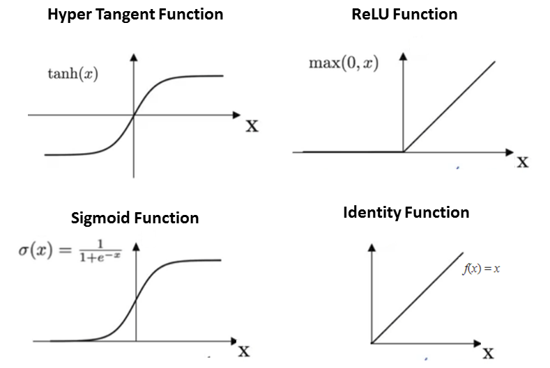
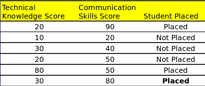
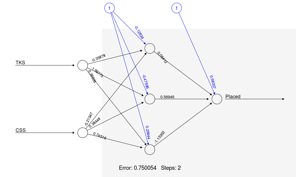
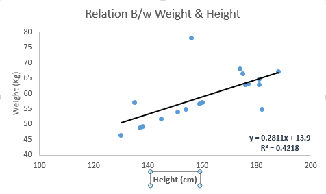 Linear Regression is mainly of two types: Simple Linear Regression and Multiple Linear Regression.
Simple Linear Regression is characterized by one independent variable.
And, Multiple Linear Regression(as the name suggests) is characterized by multiple (more than 1) independent variables.
While finding the best fit line, you can fit a polynomial or curvilinear regression.
And these are known as polynomial or curvilinear regression.
Here's a coding window to try out your hand and build your own linear regression model in Python:
Linear Regression is mainly of two types: Simple Linear Regression and Multiple Linear Regression.
Simple Linear Regression is characterized by one independent variable.
And, Multiple Linear Regression(as the name suggests) is characterized by multiple (more than 1) independent variables.
While finding the best fit line, you can fit a polynomial or curvilinear regression.
And these are known as polynomial or curvilinear regression.
Here's a coding window to try out your hand and build your own linear regression model in Python:
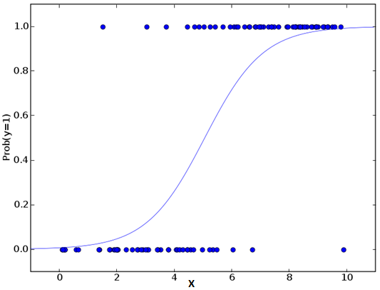
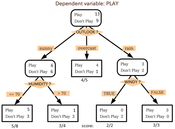 source: statsexchange
In the image above, you can see that population is classified into four different groups based on multiple attributes to identify ‘if they will play or not'.
To split the population into different heterogeneous groups, it uses various techniques like Gini, Information Gain, Chi-square, entropy.
The best way to understand how decision tree works, is to play Jezzball – a classic game from Microsoft (image below).
Essentially, you have a room with moving walls and you need to create walls such that maximum area gets cleared off with out the balls.
source: statsexchange
In the image above, you can see that population is classified into four different groups based on multiple attributes to identify ‘if they will play or not'.
To split the population into different heterogeneous groups, it uses various techniques like Gini, Information Gain, Chi-square, entropy.
The best way to understand how decision tree works, is to play Jezzball – a classic game from Microsoft (image below).
Essentially, you have a room with moving walls and you need to create walls such that maximum area gets cleared off with out the balls.
 So, every time you split the room with a wall, you are trying to create 2 different populations with in the same room.
Decision trees work in very similar fashion by dividing a population in as different groups as possible.
More: Simplified Version of Decision Tree Algorithms
So, every time you split the room with a wall, you are trying to create 2 different populations with in the same room.
Decision trees work in very similar fashion by dividing a population in as different groups as possible.
More: Simplified Version of Decision Tree Algorithms
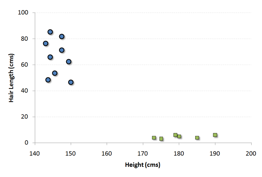 Now, we will find some line that splits the data between the two differently classified groups of data.
This will be the line such that the distances from the closest point in each of the two groups will be farthest away.
Now, we will find some line that splits the data between the two differently classified groups of data.
This will be the line such that the distances from the closest point in each of the two groups will be farthest away.
 In the example shown above, the line which splits the data into two differently classified groups is the black line, since the two closest points are the farthest apart from the line.
This line is our classifier.
Then, depending on where the testing data lands on either side of the line, that's what class we can classify the new data as.
More: Simplified Version of Support Vector Machine
In the example shown above, the line which splits the data into two differently classified groups is the black line, since the two closest points are the farthest apart from the line.
This line is our classifier.
Then, depending on where the testing data lands on either side of the line, that's what class we can classify the new data as.
More: Simplified Version of Support Vector Machine
 Here,
P(c|x) is the posterior probability of class (target) given predictor (attribute).
P(c) is the prior probability of class.
P(x|c) is the likelihood which is the probability of predictor given class.
P(x) is the prior probability of predictor.
Here,
P(c|x) is the posterior probability of class (target) given predictor (attribute).
P(c) is the prior probability of class.
P(x|c) is the likelihood which is the probability of predictor given class.
P(x) is the prior probability of predictor.
 Step 3: Now, use Naive Bayesian equation to calculate the posterior probability for each class.
The class with the highest posterior probability is the outcome of prediction.
Step 3: Now, use Naive Bayesian equation to calculate the posterior probability for each class.
The class with the highest posterior probability is the outcome of prediction.
 KNN can easily be mapped to our real lives.
If you want to learn about a person, of whom you have no information, you might like to find out about his close friends and the circles he moves in and gain access to his/her information!
KNN can easily be mapped to our real lives.
If you want to learn about a person, of whom you have no information, you might like to find out about his close friends and the circles he moves in and gain access to his/her information!

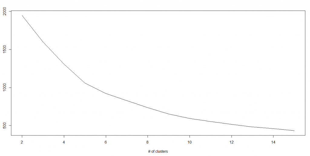


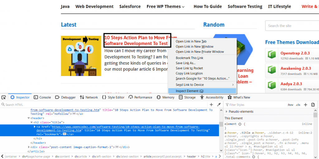 Observing the element HTML Code, we can identify that our target text is contained in the ‘a' tag.
(highlighted in blue at the lower section of the screenshot).
Next, we need to right-click on the blue highlight.
Another box with several options opens up.
Click on “Copy” which will show us new options.
There will be an XPath option also.
Click on that.
Have a look at it in the below screenshot.
Observing the element HTML Code, we can identify that our target text is contained in the ‘a' tag.
(highlighted in blue at the lower section of the screenshot).
Next, we need to right-click on the blue highlight.
Another box with several options opens up.
Click on “Copy” which will show us new options.
There will be an XPath option also.
Click on that.
Have a look at it in the below screenshot.
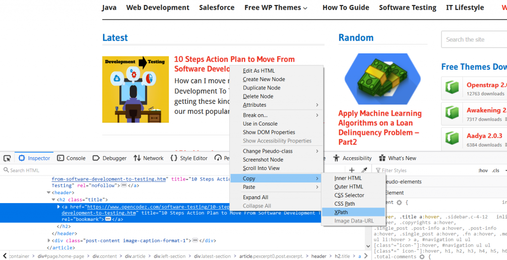 Copy this XPath in any text file and check how does it look like.
The XPath copied is /html/body/div[2]/div/div/div/div[1]/div[1]/article[1]/header/h2/a.
Copy this XPath in any text file and check how does it look like.
The XPath copied is /html/body/div[2]/div/div/div/div[1]/div[1]/article[1]/header/h2/a.


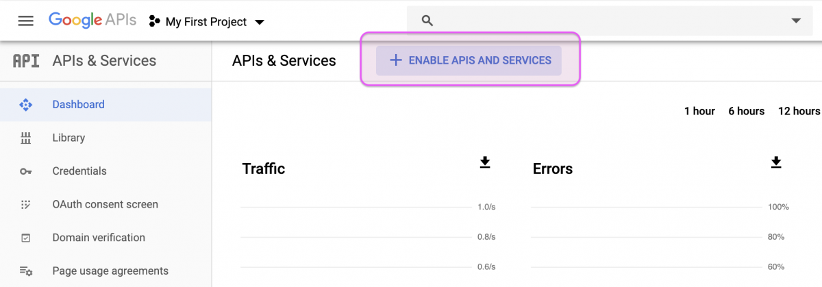 This will bring up a laundry list of APIs, but we only need the four pertaining to YouTube (see below) and the Freebase API.
Click on the search bar and type in YouTube and you should see four options.
Enable all of them.
This will bring up a laundry list of APIs, but we only need the four pertaining to YouTube (see below) and the Freebase API.
Click on the search bar and type in YouTube and you should see four options.
Enable all of them.

 After clicking on the Credentials icon, you’ll need to select the OAuth client ID option.
 We’re told we’re limited to 100 sensitive scope logins until the OAuth consent screen is published.
That’s not a problem for us, so we can copy the client ID and client secret
We’re told we’re limited to 100 sensitive scope logins until the OAuth consent screen is published.
That’s not a problem for us, so we can copy the client ID and client secret
 After clicking on the copy icons, we save them into two objects in RStudio (
 After signing in, you’ll be asked if the YouTube application you created can access your Google account.
If you approve, click “Allow.”
After signing in, you’ll be asked if the YouTube application you created can access your Google account.
If you approve, click “Allow.”
 This should give you a blank page with a cryptic,
  What if we need to create dummies for multiple variables in a single shot or at once?
Well, we can then create a list of all the variables for which we need dummies using c() function and pass them as arguments through select_columns.
Example:
rm(list = ls())
#install.packages('fastDummies')
library('fastDummies')
dta = read.csv("bank-loan.csv",header=TRUE)
dim(dta)
dum = dummy_cols(dta, select_columns = c('ed','default'))
dim(dum)
Output:
Here, we have created dummies for both ‘ed' and ‘default' data columns.
> dim(dta)
[1] 850 9
> dum = dummy_cols(dta, select_columns = c('ed','default'))
> dim(dum)
[1] 850 17
What if we need to create dummies for multiple variables in a single shot or at once?
Well, we can then create a list of all the variables for which we need dummies using c() function and pass them as arguments through select_columns.
Example:
rm(list = ls())
#install.packages('fastDummies')
library('fastDummies')
dta = read.csv("bank-loan.csv",header=TRUE)
dim(dta)
dum = dummy_cols(dta, select_columns = c('ed','default'))
dim(dum)
Output:
Here, we have created dummies for both ‘ed' and ‘default' data columns.
> dim(dta)
[1] 850 9
> dum = dummy_cols(dta, select_columns = c('ed','default'))
> dim(dum)
[1] 850 17


 Now, let’s preprocess the data by removing near zero variance columns and scaling by
  The height of the bars displays how many observations occurred with each x value.
You can compute these values manually with
The height of the bars displays how many observations occurred with each x value.
You can compute these values manually with  You can compute this by hand by combining
  If you wish to overlay multiple histograms in the same plot, I recommend using
  There are a few challenges with this type of plot, which we will come back to in visualising a categorical and a continuous variable.
Now that you can visualise variation, what should you look for in your plots? And what type of follow-up questions should you ask? I’ve put together a list below of the most useful types of information that you will find in your graphs, along with some follow-up questions for each type of information.
The key to asking good follow-up questions will be to rely on your curiosity (What do you want to learn more about?) as well as your skepticism (How could this be misleading?).
There are a few challenges with this type of plot, which we will come back to in visualising a categorical and a continuous variable.
Now that you can visualise variation, what should you look for in your plots? And what type of follow-up questions should you ask? I’ve put together a list below of the most useful types of information that you will find in your graphs, along with some follow-up questions for each type of information.
The key to asking good follow-up questions will be to rely on your curiosity (What do you want to learn more about?) as well as your skepticism (How could this be misleading?).
 #
smaller <- diamonds %>% filter(carat < 3)
ggplot(data = smaller, mapping = aes(x = carat)) + geom_histogram(binwidth = 0.1)
# same result:
index = diamonds$carat < 3
smaller1 <- diamonds[index,]
barplot(table(smaller1$carat))
cut_interval(smaller1$carat, n = NULL, length = 0.01)
barplot(table(cut_interval(smaller1$carat, n = NULL, length = 0.02)))
geom_freqpoly() performs the same calculation as geom_histogram(), but uses lines instead.
ggplot(data = smaller, mapping = aes(x = carat, colour = cut)) + geom_freqpoly(binwidth = 0.1)
Clusters of similar values suggest that subgroups exist in your data.
To understand the subgroups, ask:
How are the observations within each cluster similar to each other?
How are the observations in separate clusters different from each other?
How can you explain or describe the clusters?
Why might the appearance of clusters be misleading?
The histogram below shows the length (in minutes) of 272 eruptions of the Old Faithful Geyser in Yellowstone National Park.
Eruption times appear to be clustered into two groups: there are short eruptions (of around 2 minutes) and long eruptions (4-5 minutes), but little in between.
#
smaller <- diamonds %>% filter(carat < 3)
ggplot(data = smaller, mapping = aes(x = carat)) + geom_histogram(binwidth = 0.1)
# same result:
index = diamonds$carat < 3
smaller1 <- diamonds[index,]
barplot(table(smaller1$carat))
cut_interval(smaller1$carat, n = NULL, length = 0.01)
barplot(table(cut_interval(smaller1$carat, n = NULL, length = 0.02)))
geom_freqpoly() performs the same calculation as geom_histogram(), but uses lines instead.
ggplot(data = smaller, mapping = aes(x = carat, colour = cut)) + geom_freqpoly(binwidth = 0.1)
Clusters of similar values suggest that subgroups exist in your data.
To understand the subgroups, ask:
How are the observations within each cluster similar to each other?
How are the observations in separate clusters different from each other?
How can you explain or describe the clusters?
Why might the appearance of clusters be misleading?
The histogram below shows the length (in minutes) of 272 eruptions of the Old Faithful Geyser in Yellowstone National Park.
Eruption times appear to be clustered into two groups: there are short eruptions (of around 2 minutes) and long eruptions (4-5 minutes), but little in between.
 Many of the questions above will prompt you to explore a relationship between variables, for example, to see if the values of one variable can explain the behavior of another variable.
We’ll get to that shortly.
Many of the questions above will prompt you to explore a relationship between variables, for example, to see if the values of one variable can explain the behavior of another variable.
We’ll get to that shortly.
 There are so many observations in the common bins that the rare bins are so short that you can’t see them (although maybe if you stare intently at 0 you’ll spot something).
To make it easy to see the unusual values, we need to zoom to small values of the y-axis with
There are so many observations in the common bins that the rare bins are so short that you can’t see them (although maybe if you stare intently at 0 you’ll spot something).
To make it easy to see the unusual values, we need to zoom to small values of the y-axis with  (
( To suppress that warning, set
  However this plot isn’t great because there are many more non-cancelled flights than cancelled flights.
In the next section we’ll explore some techniques for improving this comparison.
However this plot isn’t great because there are many more non-cancelled flights than cancelled flights.
In the next section we’ll explore some techniques for improving this comparison.
 It’s hard to see the difference in distribution because the overall counts differ so much:
 To make the comparison easier we need to swap what is displayed on the y-axis.
Instead of displaying count, we’ll display
To make the comparison easier we need to swap what is displayed on the y-axis.
Instead of displaying count, we’ll display  There’s something rather surprising about this plot - it appears that fair diamonds (the lowest quality) have the highest average price! But maybe that’s because frequency polygons are a little hard to interpret - there’s a lot going on in this plot.
Another alternative to display the distribution of a continuous variable broken down by a categorical variable is the boxplot.
A
There’s something rather surprising about this plot - it appears that fair diamonds (the lowest quality) have the highest average price! But maybe that’s because frequency polygons are a little hard to interpret - there’s a lot going on in this plot.
Another alternative to display the distribution of a continuous variable broken down by a categorical variable is the boxplot.
A  Let’s take a look at the distribution of price by cut using
  We see much less information about the distribution, but the boxplots are much more compact so we can more easily compare them (and fit more on one plot).
It supports the counterintuitive finding that better quality diamonds are cheaper on average! In the exercises, you’ll be challenged to figure out why.
We see much less information about the distribution, but the boxplots are much more compact so we can more easily compare them (and fit more on one plot).
It supports the counterintuitive finding that better quality diamonds are cheaper on average! In the exercises, you’ll be challenged to figure out why.
 To make the trend easier to see, we can reorder
  If you have long variable names,
 The size of each circle in the plot displays how many observations occurred at each combination of values.
Covariation will appear as a strong correlation between specific x values and specific y values.
Another approach is to compute the count with dplyr:
The size of each circle in the plot displays how many observations occurred at each combination of values.
Covariation will appear as a strong correlation between specific x values and specific y values.
Another approach is to compute the count with dplyr:
 If the categorical variables are unordered, you might want to use the seriation package to simultaneously reorder the rows and columns in order to more clearly reveal interesting patterns.
For larger plots, you might want to try the d3heatmap or heatmaply packages, which create interactive plots.
If the categorical variables are unordered, you might want to use the seriation package to simultaneously reorder the rows and columns in order to more clearly reveal interesting patterns.
For larger plots, you might want to try the d3heatmap or heatmaply packages, which create interactive plots.
 Scatterplots become less useful as the size of your dataset grows, because points begin to overplot, and pile up into areas of uniform black (as above).
You’ve already seen one way to fix the problem: using the
Scatterplots become less useful as the size of your dataset grows, because points begin to overplot, and pile up into areas of uniform black (as above).
You’ve already seen one way to fix the problem: using the  But using transparency can be challenging for very large datasets.
Another solution is to use bin.
Previously you used
But using transparency can be challenging for very large datasets.
Another solution is to use bin.
Previously you used 
 Another option is to bin one continuous variable so it acts like a categorical variable.
Then you can use one of the techniques for visualising the combination of a categorical and a continuous variable that you learned about.
For example, you could bin
Another option is to bin one continuous variable so it acts like a categorical variable.
Then you can use one of the techniques for visualising the combination of a categorical and a continuous variable that you learned about.
For example, you could bin 

 Why is a scatterplot a better display than a binned plot for this case?
 Patterns provide one of the most useful tools for data scientists because they reveal covariation.
If you think of variation as a phenomenon that creates uncertainty, covariation is a phenomenon that reduces it.
If two variables covary, you can use the values of one variable to make better predictions about the values of the second.
If the covariation is due to a causal relationship (a special case), then you can use the value of one variable to control the value of the second.
Models are a tool for extracting patterns out of data.
For example, consider the diamonds data.
It’s hard to understand the relationship between cut and price, because cut and carat, and carat and price are tightly related.
It’s possible to use a model to remove the very strong relationship between price and carat so we can explore the subtleties that remain.
The following code fits a model that predicts
Patterns provide one of the most useful tools for data scientists because they reveal covariation.
If you think of variation as a phenomenon that creates uncertainty, covariation is a phenomenon that reduces it.
If two variables covary, you can use the values of one variable to make better predictions about the values of the second.
If the covariation is due to a causal relationship (a special case), then you can use the value of one variable to control the value of the second.
Models are a tool for extracting patterns out of data.
For example, consider the diamonds data.
It’s hard to understand the relationship between cut and price, because cut and carat, and carat and price are tightly related.
It’s possible to use a model to remove the very strong relationship between price and carat so we can explore the subtleties that remain.
The following code fits a model that predicts  Once you’ve removed the strong relationship between carat and price, you can see what you expect in the relationship between cut and price: relative to their size, better quality diamonds are more expensive.
 You’ll learn how models, and the modelr package, work in the final part of the book, model.
We’re saving modelling for later because understanding what models are and how they work is easiest once you have tools of data wrangling and programming in hand.
You’ll learn how models, and the modelr package, work in the final part of the book, model.
We’re saving modelling for later because understanding what models are and how they work is easiest once you have tools of data wrangling and programming in hand.

 Table 1: R packages used
The functions of these R packages will be explained when the R packages are addressed.
Before you start to build the algorithm in R, you first have to install and load the libraries of the R packages.
After installation, every R script first starts with addressing the R libraries as shown below.
library(tm)
library(SnowballC)
library(topicmodels)
You can start with retrieving the dataset (or corpus for NLP).
For this experiment, we saved three text files with bug reports from three testers in a separate directory, also being our working directory (use setwd(“directory”) to set the working directory).
#set working directory (modify path as needed)
setwd(directory)
You can load the files from this directory in the corpus:
#load files into corpus
#get listing of .txt files in directory
filenames = list.files(getwd(),pattern="*.txt") #getwd() represents working directory
Read the files into a character vector, which is a basic data structure and can be read by R.
#read files into a character vector
files = lapply(filenames,readLines)
We now have to create a corpus from the vector.
#create corpus from vector
articles.corpus = Corpus(VectorSource(files))
Table 1: R packages used
The functions of these R packages will be explained when the R packages are addressed.
Before you start to build the algorithm in R, you first have to install and load the libraries of the R packages.
After installation, every R script first starts with addressing the R libraries as shown below.
library(tm)
library(SnowballC)
library(topicmodels)
You can start with retrieving the dataset (or corpus for NLP).
For this experiment, we saved three text files with bug reports from three testers in a separate directory, also being our working directory (use setwd(“directory”) to set the working directory).
#set working directory (modify path as needed)
setwd(directory)
You can load the files from this directory in the corpus:
#load files into corpus
#get listing of .txt files in directory
filenames = list.files(getwd(),pattern="*.txt") #getwd() represents working directory
Read the files into a character vector, which is a basic data structure and can be read by R.
#read files into a character vector
files = lapply(filenames,readLines)
We now have to create a corpus from the vector.
#create corpus from vector
articles.corpus = Corpus(VectorSource(files))
 The demo R script and demo input text file are available on my GitHub repo (please find the link in the References section).
R has a rich set of packages for Natural Language Processing (NLP) and generating plots.
The foundational steps involve loading the text file into an R Corpus, then cleaning and stemming the data before performing analysis.
I will demonstrate these steps and analysis like Word Frequency, Word Cloud, Word Association, Sentiment Scores and Emotion Classification using various plots and charts.
The demo R script and demo input text file are available on my GitHub repo (please find the link in the References section).
R has a rich set of packages for Natural Language Processing (NLP) and generating plots.
The foundational steps involve loading the text file into an R Corpus, then cleaning and stemming the data before performing analysis.
I will demonstrate these steps and analysis like Word Frequency, Word Cloud, Word Association, Sentiment Scores and Emotion Classification using various plots and charts.
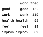 Plotting the top 5 most frequent words using a bar chart is a good basic way to visualize this word frequent data.
In your R script, add the following code and run it to generate a bar chart, which will display in the Plots sections of RStudio.
# Plot the most frequent words
barplot(dtm_d[1:5,]$freq, las = 2, names.arg = dtm_d[1:5,]$word,
col ="lightgreen", main ="Top 5 most frequent words",
ylab = "Word frequencies")
The plot can be seen in Figure 3.
Plotting the top 5 most frequent words using a bar chart is a good basic way to visualize this word frequent data.
In your R script, add the following code and run it to generate a bar chart, which will display in the Plots sections of RStudio.
# Plot the most frequent words
barplot(dtm_d[1:5,]$freq, las = 2, names.arg = dtm_d[1:5,]$word,
col ="lightgreen", main ="Top 5 most frequent words",
ylab = "Word frequencies")
The plot can be seen in Figure 3.
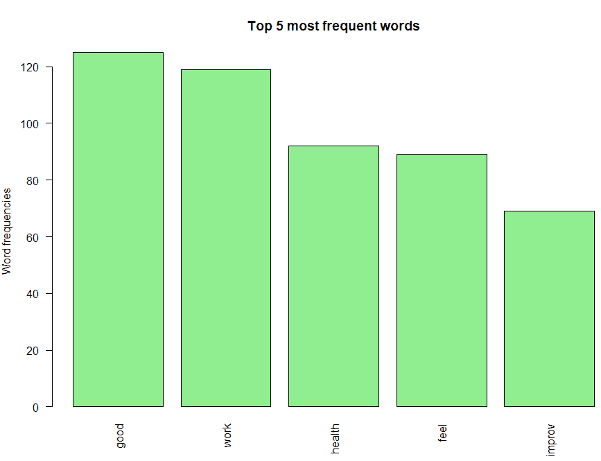 One could interpret the following from this bar chart:
The most frequently occurring word is "good".
Also notice that negative words like "not" don't feature in the bar chart, which indicates there are no negative prefixes to change the context or meaning of the word "good" ( In short, this indicates most responses don't mention negative phrases like "not good").
"work", "health" and "feel" are the next three most frequently occurring words, which indicate that most people feel good about their work and their team's health.
Finally, the root "improv" for words like "improve", "improvement", "improving", etc.
is also on the chart, and you need further analysis to infer if its context is positive or negative
One could interpret the following from this bar chart:
The most frequently occurring word is "good".
Also notice that negative words like "not" don't feature in the bar chart, which indicates there are no negative prefixes to change the context or meaning of the word "good" ( In short, this indicates most responses don't mention negative phrases like "not good").
"work", "health" and "feel" are the next three most frequently occurring words, which indicate that most people feel good about their work and their team's health.
Finally, the root "improv" for words like "improve", "improvement", "improving", etc.
is also on the chart, and you need further analysis to infer if its context is positive or negative
 The word cloud shows additional words that occur frequently and could be of interest for further analysis.
Words like "need", "support", "issu" (root for "issue(s)", etc.
could provide more context around the most frequently occurring words and help to gain a better understanding of the main themes.
The word cloud shows additional words that occur frequently and could be of interest for further analysis.
Words like "need", "support", "issu" (root for "issue(s)", etc.
could provide more context around the most frequently occurring words and help to gain a better understanding of the main themes.
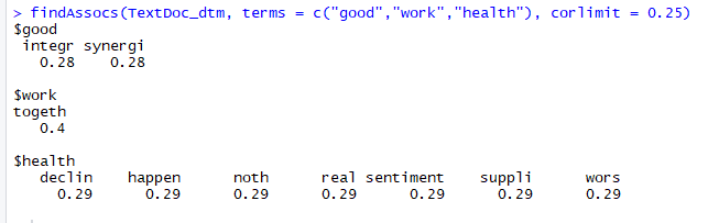 This script shows which words are most frequently associated with the top three terms (
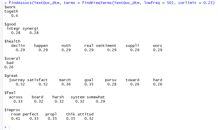
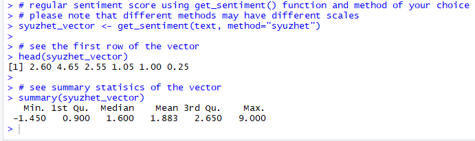
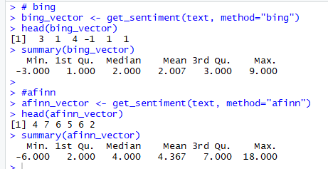
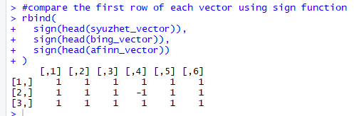
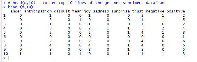
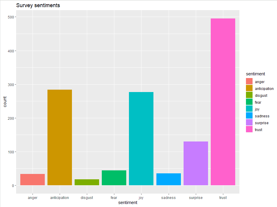
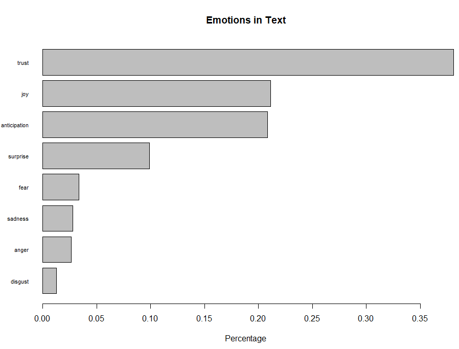
 Diagram 1: JS-R app setup
To make R talk to JS, you need three functions:
Diagram 1: JS-R app setup
To make R talk to JS, you need three functions:
 Diagram 2: JS-R communication model
 The goal is to get ourselves familiar with the JS-R communication model and the whole app development process.
The full code can be found here.
The goal is to get ourselves familiar with the JS-R communication model and the whole app development process.
The full code can be found here.
 Two comments to make:
To create a slider, you need to specify these three attributes:
Two comments to make:
To create a slider, you need to specify these three attributes:  # Example 1. This file explores the basic mechanism for R and JS to interact.
rm(list = ls())
library(jsReact)
library(magrittr)
my_html <- create_html() %>%
add_title("Send message") %>%
add_slider(min = "Q", max = "100", oninput = "Show_value(value)") %>%
add_title("Receive message") %>%
add_div(id = "output")
my_html %<>% add_script(
"function show_value(value) {
ws.send(value) ;
}
ws.onmessage = function(msg) {
document .getELementById("output").innerHTML = msg.data;
}")
write_html_to_file(my_html, file = "inst/sample.htm1")
r_fun <- function(msg) { print(msg) }
my_app <- create_appC"inst/sample.htmL", r_fun, insert_socket = T)
start_app(my_app)
The code is divided into four sections: Html, JS, R and others.
Thanks to the
# Example 1. This file explores the basic mechanism for R and JS to interact.
rm(list = ls())
library(jsReact)
library(magrittr)
my_html <- create_html() %>%
add_title("Send message") %>%
add_slider(min = "Q", max = "100", oninput = "Show_value(value)") %>%
add_title("Receive message") %>%
add_div(id = "output")
my_html %<>% add_script(
"function show_value(value) {
ws.send(value) ;
}
ws.onmessage = function(msg) {
document .getELementById("output").innerHTML = msg.data;
}")
write_html_to_file(my_html, file = "inst/sample.htm1")
r_fun <- function(msg) { print(msg) }
my_app <- create_appC"inst/sample.htmL", r_fun, insert_socket = T)
start_app(my_app)
The code is divided into four sections: Html, JS, R and others.
Thanks to the  The code is fairly self-explanatory.
You create a empty html (
The code is fairly self-explanatory.
You create a empty html (
 This R function prints the message it gets from the JS side (which is the slider value in our case).

 For a full guide to the package, check out the package guide at CRAN
here.
For now, here are some examples of pirateplots showing off some the package updates.
For a full guide to the package, check out the package guide at CRAN
here.
For now, here are some examples of pirateplots showing off some the package updates.
 Here, we can see that male pirates tend to be the tallest, but there there doesn’t seem to be a difference between those who wear headbands or not, and those who have eye patches or not.
 Here, I’ll use the xmen palette to plot the distribution of the weights of chickens over time (if someone has a more suitable dataset for the xmen palette let me know!):
pirateplot(formula = weight ~ Time, data = ChickWeight, main = "Weights of chickens by Time", pal = "xmen", gl.col = "gray")
mtext(text = "Using the xmen palette!", side = 3, font = 3)
mtext(text = "*The mean and variance of chicken\nweights tend to increase over time.", side = 1, adj = 1, line = 3.5, font = 3, cex = .7)
Here, I’ll use the xmen palette to plot the distribution of the weights of chickens over time (if someone has a more suitable dataset for the xmen palette let me know!):
pirateplot(formula = weight ~ Time, data = ChickWeight, main = "Weights of chickens by Time", pal = "xmen", gl.col = "gray")
mtext(text = "Using the xmen palette!", side = 3, font = 3)
mtext(text = "*The mean and variance of chicken\nweights tend to increase over time.", side = 1, adj = 1, line = 3.5, font = 3, cex = .7)
 The second palette called “pony” is inspired by the Bronys in our IT department.
# Display the pony palette
piratepal(palette = "pony", trans = .1, # Slightly transparent colors plot.result = TRUE)
The second palette called “pony” is inspired by the Bronys in our IT department.
# Display the pony palette
piratepal(palette = "pony", trans = .1, # Slightly transparent colors plot.result = TRUE)
 Here, I’ll plot the distribution of the lengths of movies as a function of their MPAA ratings (where G is for suitable for children, and R is suitable for adults)
pirateplot(formula= time ~ rating, data = subset(movies, time > 0 & rating %in% c("G", "PG", "PG-13", "R")), pal = "pony", point.o = .05, bean.o = 1, main = "Movie times by rating", bean.lwd = 2, gl.col = "gray")
mtext(text = "Using the pony palette!", side = 3, font = 3)
mtext(text = "*Movies rated for children\n(G and PG) tend to be longer \nthan those rated for adults", side = 1, adj = 1, font = 3, line = 3.5, cex = .7)
Here, I’ll plot the distribution of the lengths of movies as a function of their MPAA ratings (where G is for suitable for children, and R is suitable for adults)
pirateplot(formula= time ~ rating, data = subset(movies, time > 0 & rating %in% c("G", "PG", "PG-13", "R")), pal = "pony", point.o = .05, bean.o = 1, main = "Movie times by rating", bean.lwd = 2, gl.col = "gray")
mtext(text = "Using the pony palette!", side = 3, font = 3)
mtext(text = "*Movies rated for children\n(G and PG) tend to be longer \nthan those rated for adults", side = 1, adj = 1, font = 3, line = 3.5, cex = .7)
 To see all of the palettes (including those inspired by movies and a transit map of Basel), just run the function with “all” as the main argument
piratepal(palette = "all")
Of course, if you find that these color palettes give you a headache, you can always set the plot to grayscale (or any other color), by specifying a single color in the palette argument. Here, I’ll create a grayscale pirateplot showing the distribution of movie budgets by their creative type:
pirateplot(formula = budget ~ creative.type, data = subset(movies, budget > 0 & creative.type %in% c("Multiple Creative Types", "Factual") == FALSE), point.o = .02, xlab = "Movie Creative Type", main = "Movie budgets (in millions) by rating", gl.col = "gray", pal = "black")
mtext("Using a grayscale pirateplot", side = 3, font = 3)
mtext("*Superhero movies tend to have the highest budgets\n...by far!", side = 1, adj = 1, line = 3, cex = .8, font = 3)
To see all of the palettes (including those inspired by movies and a transit map of Basel), just run the function with “all” as the main argument
piratepal(palette = "all")
Of course, if you find that these color palettes give you a headache, you can always set the plot to grayscale (or any other color), by specifying a single color in the palette argument. Here, I’ll create a grayscale pirateplot showing the distribution of movie budgets by their creative type:
pirateplot(formula = budget ~ creative.type, data = subset(movies, budget > 0 & creative.type %in% c("Multiple Creative Types", "Factual") == FALSE), point.o = .02, xlab = "Movie Creative Type", main = "Movie budgets (in millions) by rating", gl.col = "gray", pal = "black")
mtext("Using a grayscale pirateplot", side = 3, font = 3)
mtext("*Superhero movies tend to have the highest budgets\n...by far!", side = 1, adj = 1, line = 3, cex = .8, font = 3)
 Looks like super hero movies have the highest budgets…by far!
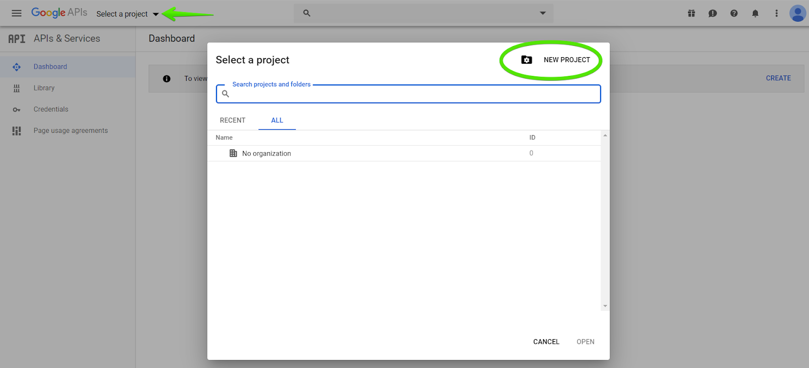

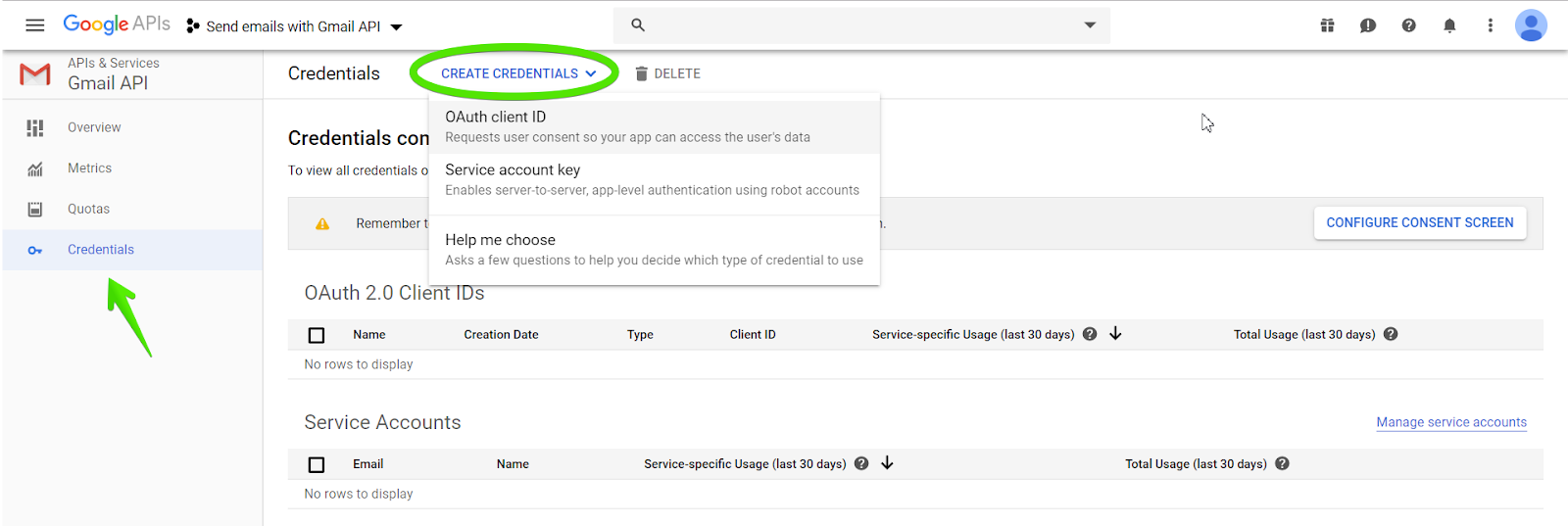


 the function f(x)= 2x.
 Histogram
rnorm(6, 0 ,1) means generating 6 random values with mean 0 and standard deviation 1.
The dev.off() command is used to close the graph.
Once chart created it will save it as the test.png file.
Histogram
rnorm(6, 0 ,1) means generating 6 random values with mean 0 and standard deviation 1.
The dev.off() command is used to close the graph.
Once chart created it will save it as the test.png file.
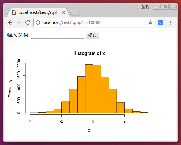 PHP 呼叫 R 的網頁
 RStudio is an open-source tool for programming in R.
If you are interested in programming with R, it’s worth knowing about the capabilities of RStudio.
It is a flexible tool that helps you create readable analyses, and keeps your code, images, comments, and plots together in one place.
In this blog post, we’ll cover some of the best features from the free version of RStudio: RStudio Desktop.
We’ve collected some of the top RStudio tips, tricks, and shortcuts to quickly turn you into an RStudio power user!
> install.packages("Dataquest")
Start learning R today with our Introduction to R course — no credit card required!
SIGN UP
RStudio is an open-source tool for programming in R.
If you are interested in programming with R, it’s worth knowing about the capabilities of RStudio.
It is a flexible tool that helps you create readable analyses, and keeps your code, images, comments, and plots together in one place.
In this blog post, we’ll cover some of the best features from the free version of RStudio: RStudio Desktop.
We’ve collected some of the top RStudio tips, tricks, and shortcuts to quickly turn you into an RStudio power user!
> install.packages("Dataquest")
Start learning R today with our Introduction to R course — no credit card required!
SIGN UP
 We can also access documentation in the
 You can even preview the dataset before it is loaded:
 And after the dataset is loaded into RStudio, you can view it with the
 Now, each time you open RStudio, you will begin with an empty session.
None of the code generated from your previous sessions will be remembered.
The R script and datasets can be used to recreate the environment from scratch.
Now, each time you open RStudio, you will begin with an empty session.
None of the code generated from your previous sessions will be remembered.
The R script and datasets can be used to recreate the environment from scratch.
 If you would like to use
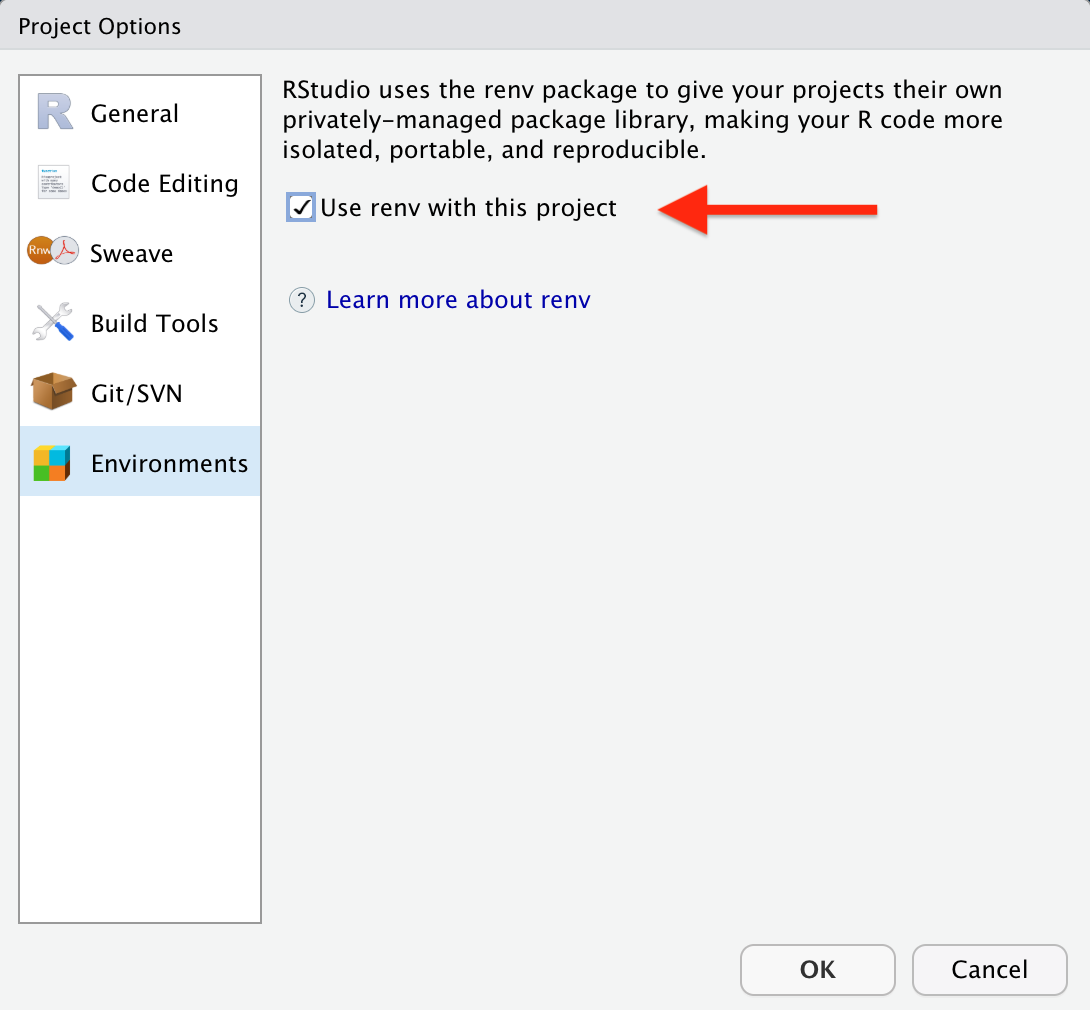
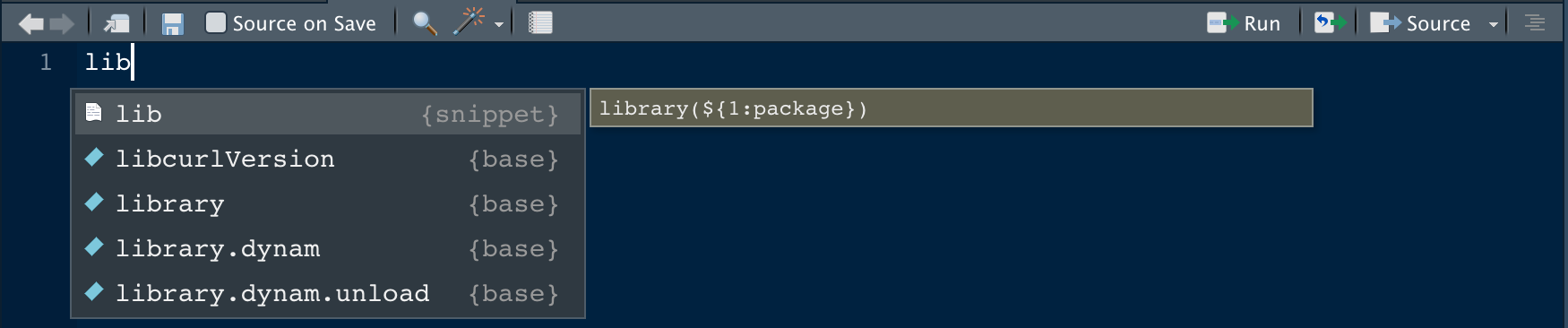 After you hit return to select the snippet, the
  Our other favorite is the fun snippet that provides a basic template for writing a custom function.
And you can even add snippets of your own! To learn more, check out this article on code snippets from RStudio.
Our other favorite is the fun snippet that provides a basic template for writing a custom function.
And you can even add snippets of your own! To learn more, check out this article on code snippets from RStudio.
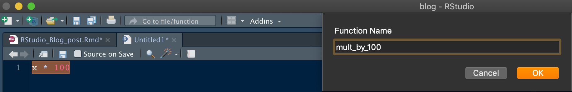 After the function name is selected, the inputs and code structure needed to turn your code into a function will be added automatically.
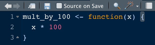 If you have a variable that you would like to extract, highlight the variable and enter
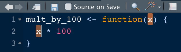
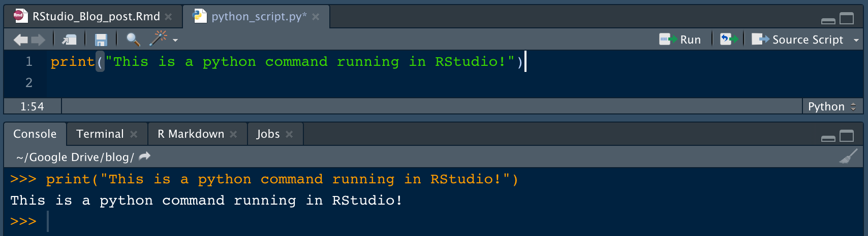 For full details, check out this RStudio tutorial.
 Now write a SQL query to select all cars from the database with a four-cylinder engine.
This command returns a dataframe that you’ll save as
Now write a SQL query to select all cars from the database with a four-cylinder engine.
This command returns a dataframe that you’ll save as  The dataframe looks like this:
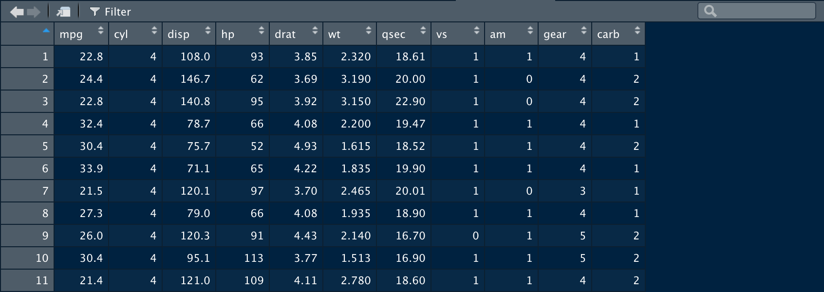
 Specify
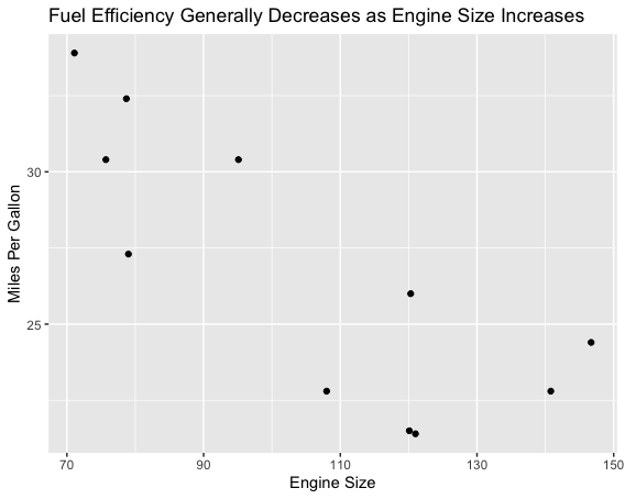
 If you want to see the SQL code that this command was converted to, you can use the
  When you’re satisfied with your query results, you use the
  There you have it! Three different approaches to querying a SQL database with similar results.
The only difference between the examples is that the
There you have it! Three different approaches to querying a SQL database with similar results.
The only difference between the examples is that the 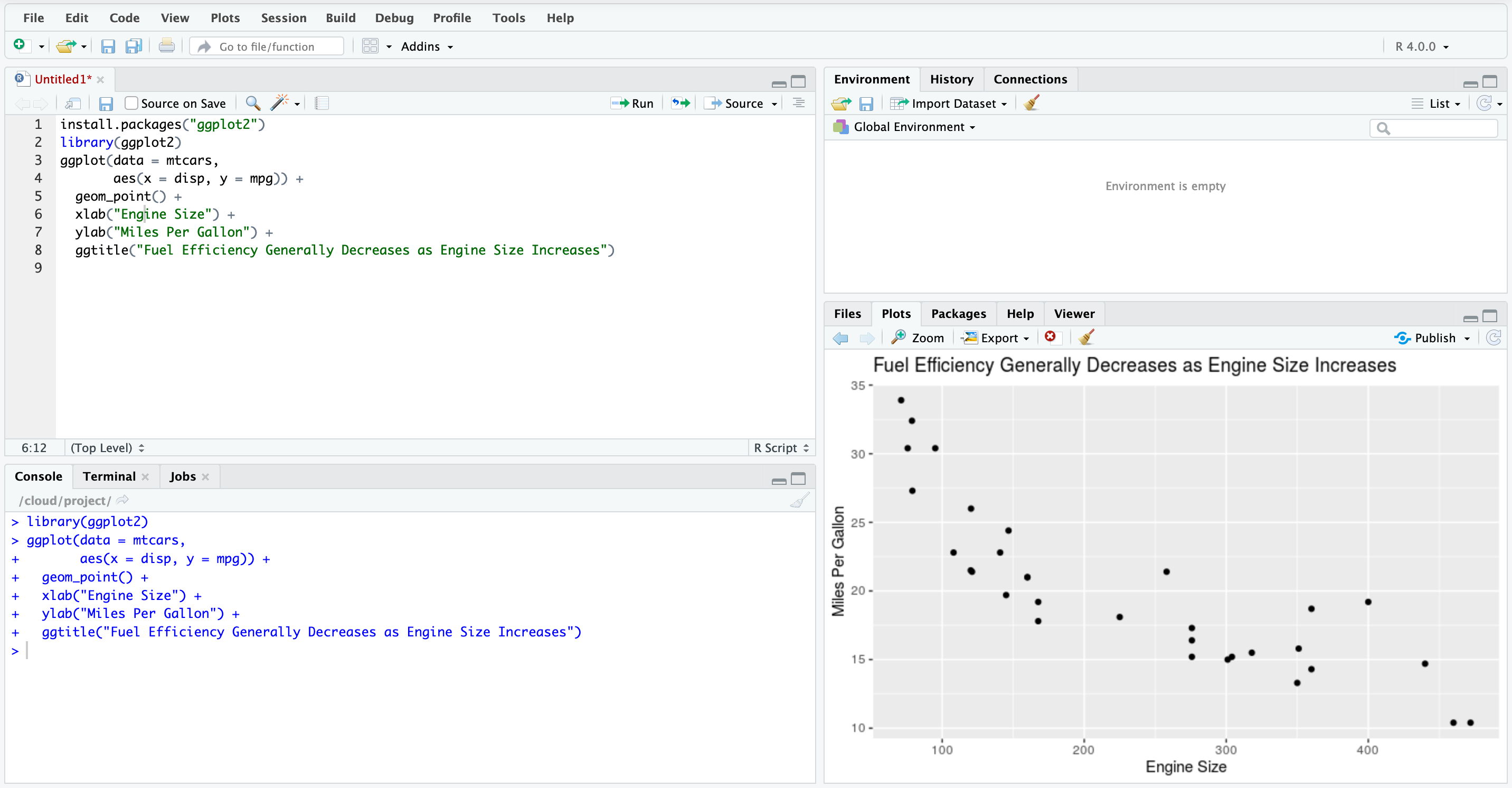
 You will then see the set of available editor commands (commands that affect the current document's contents, or the current selection), alongside RStudio commands (commands whose actions are scoped beyond just the current editor).
 Each row represents a particular command binding -- the command's
  If you made a mistake, you can press
  After you've updated the bindings to your liking, click
  If two commands are bound to the same key sequence, then that conflict will be highlighted and displayed in yellow.

 In this particular example, you can calculate the height of a child if you know her age:
$\text{Height} = a + \text{Age} * b$
In this case, “a” and “b” are called the intercept and the slope respectively.
With the same example, “a” or the intercept, is the value from where you start measuring.
Newborn babies with zero months are not zero centimeters necessarily; this is the function of the intercept.
The slope measures the change of height with respect to the age in months.
In general, for every month older the child is, his or her height will increase with “b”.
A linear regression can be calculated in R with the command
In this particular example, you can calculate the height of a child if you know her age:
$\text{Height} = a + \text{Age} * b$
In this case, “a” and “b” are called the intercept and the slope respectively.
With the same example, “a” or the intercept, is the value from where you start measuring.
Newborn babies with zero months are not zero centimeters necessarily; this is the function of the intercept.
The slope measures the change of height with respect to the age in months.
In general, for every month older the child is, his or her height will increase with “b”.
A linear regression can be calculated in R with the command 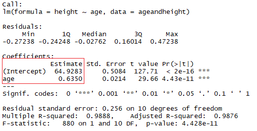
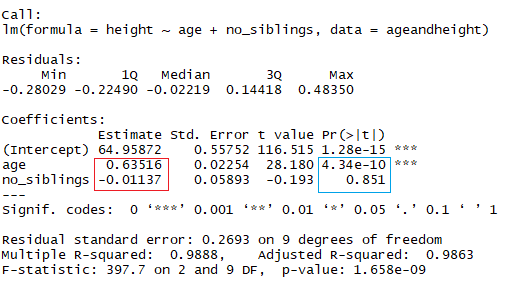 As you might notice already, looking at the number of siblings is a silly way to predict the height of a child.
Another aspect to pay attention to your linear models is the p-value of the coefficients.
In the previous example, the blue rectangle indicates the p-values for the coefficients age and number of siblings.
In simple terms, a p-value indicates whether or not you can reject or accept a hypothesis.
The hypothesis, in this case, is that the predictor is not meaningful for your model.
The p-value for age is 4.34*e-10 or 0.000000000434.
A very small value means that age is probably an excellent addition to your model.
The p-value for the number of siblings is 0.85.
In other words, there’s 85% chance that this predictor is not meaningful for the regression.
A standard way to test if the predictors are not meaningful is looking if the p-values smaller than 0.05.
As you might notice already, looking at the number of siblings is a silly way to predict the height of a child.
Another aspect to pay attention to your linear models is the p-value of the coefficients.
In the previous example, the blue rectangle indicates the p-values for the coefficients age and number of siblings.
In simple terms, a p-value indicates whether or not you can reject or accept a hypothesis.
The hypothesis, in this case, is that the predictor is not meaningful for your model.
The p-value for age is 4.34*e-10 or 0.000000000434.
A very small value means that age is probably an excellent addition to your model.
The p-value for the number of siblings is 0.85.
In other words, there’s 85% chance that this predictor is not meaningful for the regression.
A standard way to test if the predictors are not meaningful is looking if the p-values smaller than 0.05.
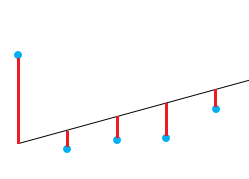 The idea in here is that the sum of the residuals is approximately zero or as low as possible.
In real life, most cases will not follow a perfectly straight line, so residuals are expected.
In the R summary of the lm function, you can see descriptive statistics about the residuals of the model, following the same example, the red square shows how the residuals are approximately zero.
The idea in here is that the sum of the residuals is approximately zero or as low as possible.
In real life, most cases will not follow a perfectly straight line, so residuals are expected.
In the R summary of the lm function, you can see descriptive statistics about the residuals of the model, following the same example, the red square shows how the residuals are approximately zero.
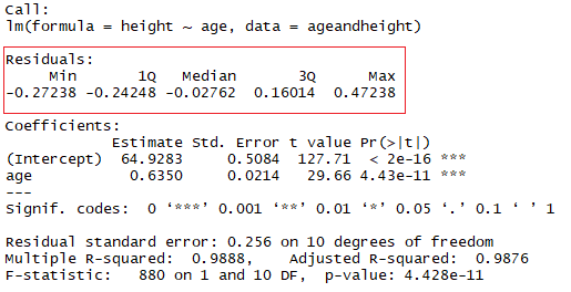
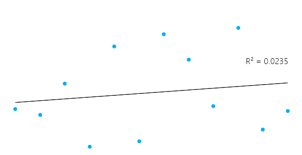
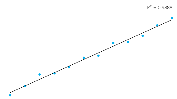 However, it’s essential to keep in mind that sometimes a high R² is not necessarily good every single time (see below residual plots) and a low R² is not necessarily always bad.
In real life, events don’t fit in a perfectly straight line all the time.
For example, you can have in your data taller or smaller children with the same age.
In some fields, an R² of 0.5 is considered good.
With the same example as above, look at the summary of the linear model to see its R².
However, it’s essential to keep in mind that sometimes a high R² is not necessarily good every single time (see below residual plots) and a low R² is not necessarily always bad.
In real life, events don’t fit in a perfectly straight line all the time.
For example, you can have in your data taller or smaller children with the same age.
In some fields, an R² of 0.5 is considered good.
With the same example as above, look at the summary of the linear model to see its R².
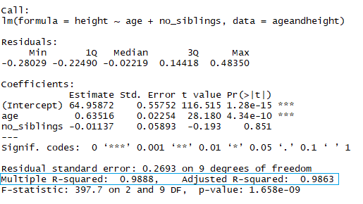 In the blue rectangle, notice that there’s two different R², one multiple and one adjusted.
The multiple is the R² that you saw previously.
One problem with this R² is that it cannot decrease as you add more independent variables to your model, it will continue increasing as you make the model more complex, even if these variables don’t add anything to your predictions (like the example of the number of siblings).
For this reason, the adjusted R² is probably better to look at if you are adding more than one variable to the model, since it only increases if it reduces the overall error of the predictions.
In the blue rectangle, notice that there’s two different R², one multiple and one adjusted.
The multiple is the R² that you saw previously.
One problem with this R² is that it cannot decrease as you add more independent variables to your model, it will continue increasing as you make the model more complex, even if these variables don’t add anything to your predictions (like the example of the number of siblings).
For this reason, the adjusted R² is probably better to look at if you are adding more than one variable to the model, since it only increases if it reduces the overall error of the predictions.
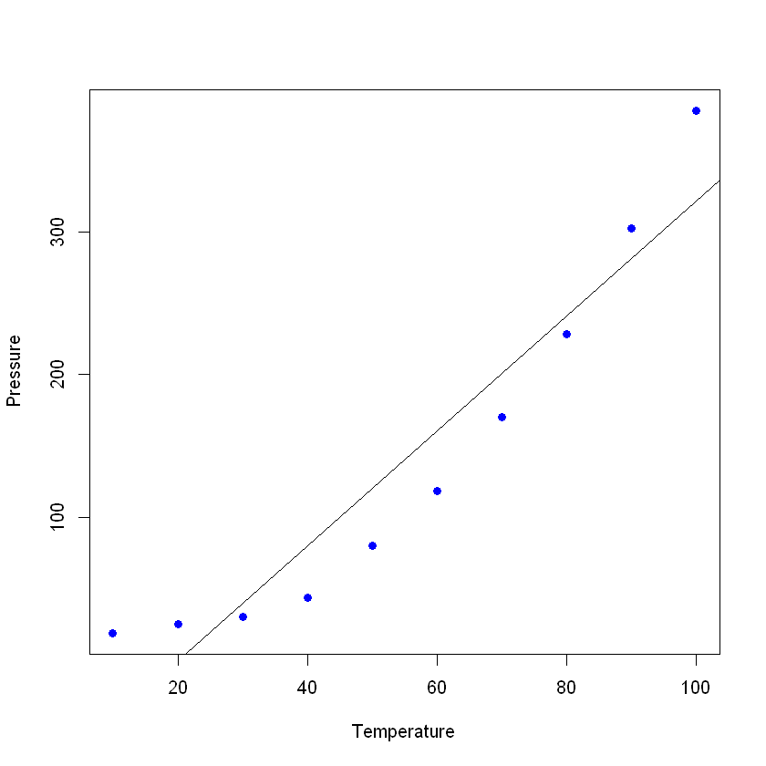 If you see the summary of your new model, you can see that it has pretty good results (look at the R²and the adjusted R²)
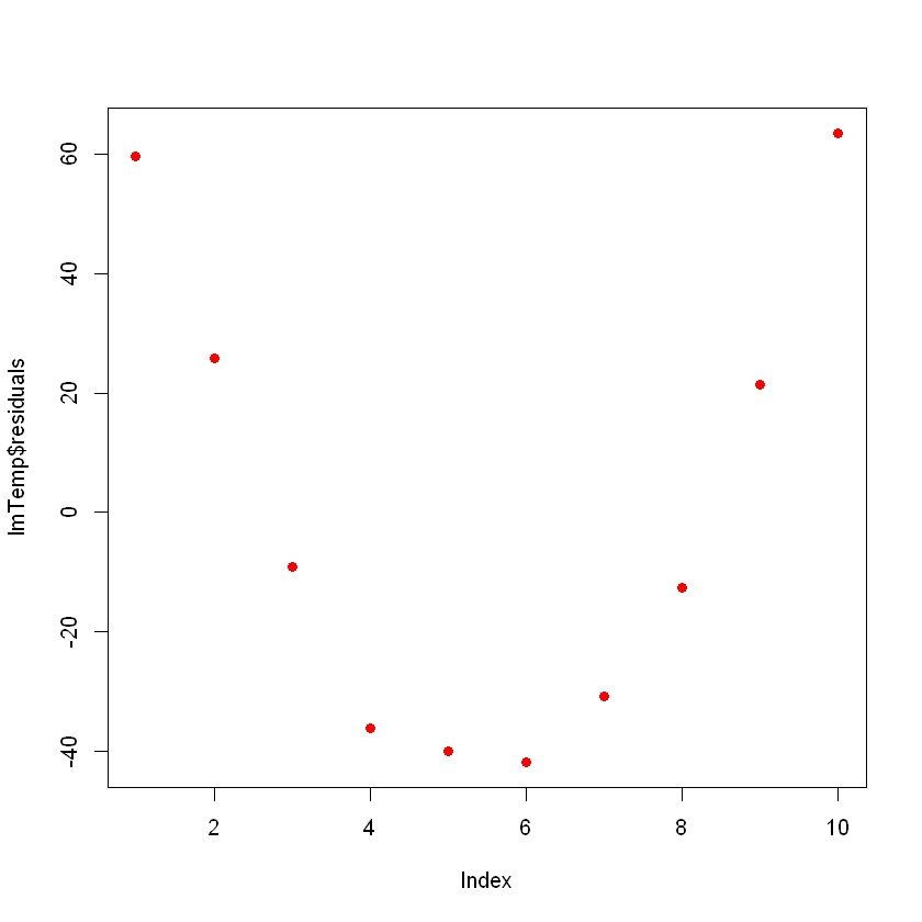 This can be a problem.
If you have more data, your simple linear model will not be able to generalize well.
In the previous picture, notice that there is a pattern (like a curve on the residuals).
This is not random at all.
What you can do is a transformation of the variable.
Many possible transformations can be performed on your data such as adding a quadratic term $(x^2)$, a cubic $(x^3)$ or even more complex such as ln(X), ln(X+1), sqrt(X), 1/x, Exp(X).
The choice of the correct transformation will come with some knowledge of algebraic functions, practice, trial, and error.
Let’s try with a quadratic term.
For this, add the term “I” (capital "I") before your transformation, for example, this will be the normal linear regression formula:
This can be a problem.
If you have more data, your simple linear model will not be able to generalize well.
In the previous picture, notice that there is a pattern (like a curve on the residuals).
This is not random at all.
What you can do is a transformation of the variable.
Many possible transformations can be performed on your data such as adding a quadratic term $(x^2)$, a cubic $(x^3)$ or even more complex such as ln(X), ln(X+1), sqrt(X), 1/x, Exp(X).
The choice of the correct transformation will come with some knowledge of algebraic functions, practice, trial, and error.
Let’s try with a quadratic term.
For this, add the term “I” (capital "I") before your transformation, for example, this will be the normal linear regression formula:
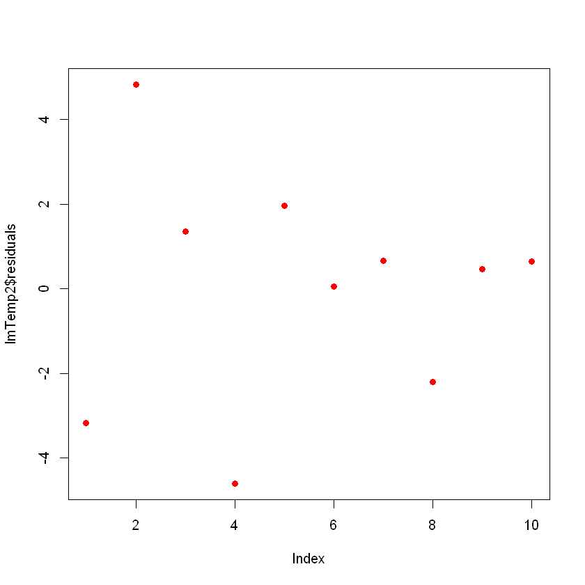 Now you don’t see any clear patterns on your residuals, which is good!
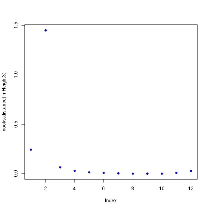


 It is however important to understand the relation between them in order to be able to pick the right metric in a given scenario.
Gini Impurity is usually easier to compute than Entropy (involves logarithmic calculations )
It is however important to understand the relation between them in order to be able to pick the right metric in a given scenario.
Gini Impurity is usually easier to compute than Entropy (involves logarithmic calculations )

 Denominator of Precision is a variable : i.e the False positives (negative samples classified as positive) can vary each time in our solution.
Denominator of Recall is a constant : It represents the total Positive cases (i.e True Positive + False Negative) & hence will remain fixed throughout.
Denominator of Precision is a variable : i.e the False positives (negative samples classified as positive) can vary each time in our solution.
Denominator of Recall is a constant : It represents the total Positive cases (i.e True Positive + False Negative) & hence will remain fixed throughout.

 Area under this curve (called AUC) and can also be used as a performance metric.
The higher the AUC, better the model.
Area under this curve (called AUC) and can also be used as a performance metric.
The higher the AUC, better the model.


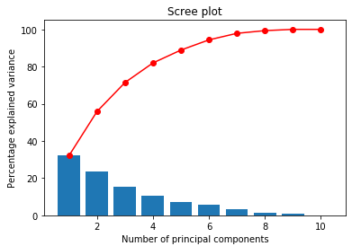
 For a linearly separable data, we can either have a linear regression or logistic regression.
However the decision boundary cries for both.
For a linearly separable data, we can either have a linear regression or logistic regression.
However the decision boundary cries for both.


 where,
ht(x) — output of the weak classifier ‘t'
αt — weight applied to classifier ‘t'
where,
ht(x) — output of the weak classifier ‘t'
αt — weight applied to classifier ‘t'
 Here, εt is the error term of the classifier ‘t'
Interpretation:
Here, εt is the error term of the classifier ‘t'
Interpretation:

 The Empirical Rule states that 99.7% of data observed following a normal distribution lies within 3 standard deviations of the mean.
Under this rule, 68% of the data falls within one standard deviation, 95% percent within two standard deviations, and 99.7% within three standard deviations from the mean.
The Empirical Rule states that 99.7% of data observed following a normal distribution lies within 3 standard deviations of the mean.
Under this rule, 68% of the data falls within one standard deviation, 95% percent within two standard deviations, and 99.7% within three standard deviations from the mean.
 The T distribution (also called Student's T Distribution) is a family of distributions that look almost identical to the normal distribution curve, only a bit shorter and wider/fatter.
We use the t distribution instead of the normal distribution, when we have smaller samples.
The larger the sample size, the more the t distribution looks like the normal distribution.
In fact, after 30 samples, the T- distribution is almost exactly like the normal distribution.
The T distribution (also called Student's T Distribution) is a family of distributions that look almost identical to the normal distribution curve, only a bit shorter and wider/fatter.
We use the t distribution instead of the normal distribution, when we have smaller samples.
The larger the sample size, the more the t distribution looks like the normal distribution.
In fact, after 30 samples, the T- distribution is almost exactly like the normal distribution.

 To view all the built-in color names which R knows about (n = 657), use the following R code :
 There are 3 types of palettes : sequential, diverging, and qualitative.
Sequential palettes are suited to ordered data that progress from low to high (gradient).
The palettes names are : Blues, BuGn, BuPu, GnBu, Greens, Greys, Oranges, OrRd, PuBu, PuBuGn, PuRd, Purples, RdPu, Reds, YlGn, YlGnBu YlOrBr, YlOrRd.
Diverging palettes put equal emphasis on mid-range critical values and extremes at both ends of the data range.
The diverging palettes are : BrBG, PiYG, PRGn, PuOr, RdBu, RdGy, RdYlBu, RdYlGn, Spectral
Qualitative palettes are best suited to representing nominal or categorical data.
They not imply magnitude differences between groups.
The palettes names are : Accent, Dark2, Paired, Pastel1, Pastel2, Set1, Set2, Set3
You can also view a single RColorBrewer palette by specifying its name as follow :
There are 3 types of palettes : sequential, diverging, and qualitative.
Sequential palettes are suited to ordered data that progress from low to high (gradient).
The palettes names are : Blues, BuGn, BuPu, GnBu, Greens, Greys, Oranges, OrRd, PuBu, PuBuGn, PuRd, Purples, RdPu, Reds, YlGn, YlGnBu YlOrBr, YlOrRd.
Diverging palettes put equal emphasis on mid-range critical values and extremes at both ends of the data range.
The diverging palettes are : BrBG, PiYG, PRGn, PuOr, RdBu, RdGy, RdYlBu, RdYlGn, Spectral
Qualitative palettes are best suited to representing nominal or categorical data.
They not imply magnitude differences between groups.
The palettes names are : Accent, Dark2, Paired, Pastel1, Pastel2, Set1, Set2, Set3
You can also view a single RColorBrewer palette by specifying its name as follow :


 Use the palettes as follow :
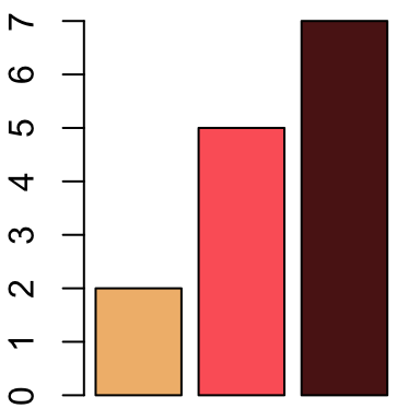
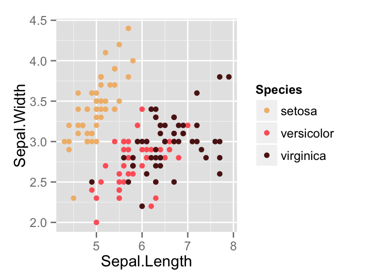
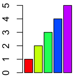
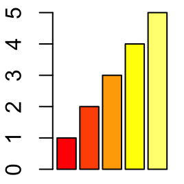

 Missing values (“TRUE”) by feature column
We see that missingness (is.na) is FALSE for all columns, which is great.
The second line in the code chunk above tells us that there is one duplicated record, which we remove in line 3.
Missing values (“TRUE”) by feature column
We see that missingness (is.na) is FALSE for all columns, which is great.
The second line in the code chunk above tells us that there is one duplicated record, which we remove in line 3.
 Histograms of all our variables in our dataset
Here you see the univariate distributions – univariate because you’re looking at one variable at a time, not at bivariate correlations at this point.
The most important variable to look at here is our Y, labeled “target”.
This is coded 1 for patients with heart disease, and 0 for healthy patients.
You can see that the data are not heavily imbalanced, there are only a few more healthy patients than patients with the disease.
Regarding the other categorical features such as sex, you can also see from this graph whether they are imbalanced (1 = male, 0 = female here).
With regard to the continuous variables such as age or maximum heart rate achieved (“thalach”), you can visually check whether they are more or less normally distributed (such as age), or whether they exhibit some distribution that might need some form of normalization or discretization (e.g., “oldpeak”).
You can also see that there are some categorical variables where certain values are represented only rarely among the patients.
For instance, “restecg” has only very few instances of values == 2.
We will deal with this in a minute.
Let’s move on to bivariate statistics.
We are plotting a correlation matrix, in order to
a) check if we have features that are highly correlated (which is problematic for some algorithms), and
b) get a first feeling about which features are correlated with the target (heart disease) and which are not:
cormat = cor(dat %>% keep(is.numeric))
cormat %>% as.data.frame %>% mutate(var2=rownames(.)) %>%
pivot_longer(!var2, values_to = "value") %>%
ggplot(aes(x=name,y=var2,fill=abs(value),label=round(value,2))) +
geom_tile() + geom_label() + xlab(") + ylab(") +
ggtitle("Correlation matrix of our predictors") +
labs(fill="Correlation\n(absolute):")
This prints the following correlation matrix:
Histograms of all our variables in our dataset
Here you see the univariate distributions – univariate because you’re looking at one variable at a time, not at bivariate correlations at this point.
The most important variable to look at here is our Y, labeled “target”.
This is coded 1 for patients with heart disease, and 0 for healthy patients.
You can see that the data are not heavily imbalanced, there are only a few more healthy patients than patients with the disease.
Regarding the other categorical features such as sex, you can also see from this graph whether they are imbalanced (1 = male, 0 = female here).
With regard to the continuous variables such as age or maximum heart rate achieved (“thalach”), you can visually check whether they are more or less normally distributed (such as age), or whether they exhibit some distribution that might need some form of normalization or discretization (e.g., “oldpeak”).
You can also see that there are some categorical variables where certain values are represented only rarely among the patients.
For instance, “restecg” has only very few instances of values == 2.
We will deal with this in a minute.
Let’s move on to bivariate statistics.
We are plotting a correlation matrix, in order to
a) check if we have features that are highly correlated (which is problematic for some algorithms), and
b) get a first feeling about which features are correlated with the target (heart disease) and which are not:
cormat = cor(dat %>% keep(is.numeric))
cormat %>% as.data.frame %>% mutate(var2=rownames(.)) %>%
pivot_longer(!var2, values_to = "value") %>%
ggplot(aes(x=name,y=var2,fill=abs(value),label=round(value,2))) +
geom_tile() + geom_label() + xlab(") + ylab(") +
ggtitle("Correlation matrix of our predictors") +
labs(fill="Correlation\n(absolute):")
This prints the following correlation matrix:
 Correlation matrix of all our predictor variables
We can see that aside from the diagonal (correlation of a variable with itself, which is 1), we have no problematically strong correlations between our predictors (strong meaning greater than 0.8 or 0.9 here).
If you have many, many features and don’t want to look at 1,000 by 1,000 correlation matrices, you can also print a list of all correlations that are greater than, say, 0.8 with the following code:
highcorr = which(cormat > .8, arr.ind = T)
paste(rownames(cormat)[row(cormat)[highcorr]],
colnames(cormat)[col(cormat)[highcorr]], sep=" vs. ") %>%
cbind(cormat[highcorr])
Now let’s look at the bivariate relations between the predictors and the outcome.
For continuous predictors and a dichotomous outcome (heart disease or no heart disease), box plots are a good way of visualizing a bivariate association:
dat %>% select(-c(sex,cp,ca,thal,restecg,slope,exang,fbs)) %>%
pivot_longer(!target, values_to = "value") %>%
ggplot(aes(x=factor(target), y=value, fill=factor(target))) +
geom_boxplot(outlier.shape = NA) + geom_jitter(size=.7, width=.1, alpha=.5) +
scale_fill_manual(values=c("steelblue", "orangered1")) +
labs(fill="Heart disease:") +
theme_minimal() +
facet_wrap(~name, scales="free")
I’ve de-selected the non-continuous variables in the first line here manually, because I haven’t transformed the categorical variables (say, “ca” or “restecg”) into factors yet, which is of course a bit lazy, but if you have hundreds of features, there are of course more flexible ways to keep only continuous variables for the following plot.
This is what the chunk above returns:
Correlation matrix of all our predictor variables
We can see that aside from the diagonal (correlation of a variable with itself, which is 1), we have no problematically strong correlations between our predictors (strong meaning greater than 0.8 or 0.9 here).
If you have many, many features and don’t want to look at 1,000 by 1,000 correlation matrices, you can also print a list of all correlations that are greater than, say, 0.8 with the following code:
highcorr = which(cormat > .8, arr.ind = T)
paste(rownames(cormat)[row(cormat)[highcorr]],
colnames(cormat)[col(cormat)[highcorr]], sep=" vs. ") %>%
cbind(cormat[highcorr])
Now let’s look at the bivariate relations between the predictors and the outcome.
For continuous predictors and a dichotomous outcome (heart disease or no heart disease), box plots are a good way of visualizing a bivariate association:
dat %>% select(-c(sex,cp,ca,thal,restecg,slope,exang,fbs)) %>%
pivot_longer(!target, values_to = "value") %>%
ggplot(aes(x=factor(target), y=value, fill=factor(target))) +
geom_boxplot(outlier.shape = NA) + geom_jitter(size=.7, width=.1, alpha=.5) +
scale_fill_manual(values=c("steelblue", "orangered1")) +
labs(fill="Heart disease:") +
theme_minimal() +
facet_wrap(~name, scales="free")
I’ve de-selected the non-continuous variables in the first line here manually, because I haven’t transformed the categorical variables (say, “ca” or “restecg”) into factors yet, which is of course a bit lazy, but if you have hundreds of features, there are of course more flexible ways to keep only continuous variables for the following plot.
This is what the chunk above returns:
 Boxplots of the associations between our continuous predictors and the outcome
You can read this graph as follows: With regard to age, the patients with heart disease (red box) are on average older compared with the patients without heart disease (blue box).
The thick horizontal line within each box denotes the median.
The box encompasses 50% of all cases (i.e.
from the 25 percentile to the 75 percentile).
The jitter points show you where all of the patients are located within each group.
So you see that, yes, heart disease patients are typically older, but you also have a couple of patients younger than 50 in the dataset who have coronary heart disease, and of course many older ones that are healthy.
But comparing the medians, you can see that age, oldpeak, and thalach are better predictors of heart disease compared with chol or trestbps, where the median values are almost equal in both groups.
For our categorical variables, we just use simple stacked barplots to show the differences between healthy and sick patients:
dat %>% select(sex,cp,ca,thal,restecg,slope,exang,fbs,target) %>%
pivot_longer(!target, values_to = "value") %>%
ggplot(aes(x=factor(value), fill=factor(target))) +
scale_fill_manual(values=c("steelblue", "orangered1")) +
geom_bar(position="fill", alpha=.7)+
theme_minimal() +
labs(fill="Heart disease:") +
facet_wrap(~name, scales="free")
Which gives us:
Boxplots of the associations between our continuous predictors and the outcome
You can read this graph as follows: With regard to age, the patients with heart disease (red box) are on average older compared with the patients without heart disease (blue box).
The thick horizontal line within each box denotes the median.
The box encompasses 50% of all cases (i.e.
from the 25 percentile to the 75 percentile).
The jitter points show you where all of the patients are located within each group.
So you see that, yes, heart disease patients are typically older, but you also have a couple of patients younger than 50 in the dataset who have coronary heart disease, and of course many older ones that are healthy.
But comparing the medians, you can see that age, oldpeak, and thalach are better predictors of heart disease compared with chol or trestbps, where the median values are almost equal in both groups.
For our categorical variables, we just use simple stacked barplots to show the differences between healthy and sick patients:
dat %>% select(sex,cp,ca,thal,restecg,slope,exang,fbs,target) %>%
pivot_longer(!target, values_to = "value") %>%
ggplot(aes(x=factor(value), fill=factor(target))) +
scale_fill_manual(values=c("steelblue", "orangered1")) +
geom_bar(position="fill", alpha=.7)+
theme_minimal() +
labs(fill="Heart disease:") +
facet_wrap(~name, scales="free")
Which gives us:
 Associations between our categorical predictors and the outcome
Again, you can see at a glance that “fbs” is obviously not a strong predictor of heart disease, whereas “exang” definitely is.
We also see that males are overrepresented in sick patients compared with females.
So far, we have used very simple means to visualize the data.
In my experience, in many applied business use cases, you already know most of what you wanted to know at this stage! A few simple descriptive graphs and indicators most often show you what are the most important predictors, what are the important sub-groups you need to focus on in greater detail, where do you have outliers or a lot of missing data which distorts the overall picture, and so on.
Often, the complicated algorithm later on only confirms what we have seen so far.
So it’s important not to skip this step and always do visual und descriptive inspection of your data.
You might ask, if in many cases bar charts and correlation coefficients is all we need to understand what is going on, why do we need the complicated machine-learning part? That is because while 80% of the explanation is often simple and can be inferred from looking at a graph or table, the other 20% is more complicated and requires domain knowledge and/or more sophisticated statistical analysis.
Our example here perfectly illustrates this point: Older people suffer from heart disease more often than younger people; men are much more likely to get it compared with females; these findings are trivial and everyone can see that from the graphs, no PhD in statistics required.
And these simple associations can already guide clinical practice to a significant degree.
You’re an older male? You’re in a risk group.
You’re a young female? You’re probably fine.
However, there are many more complex relationships at work.
For instance, females often present themselves with different forms of chest pain compared with males.
This is an example for an interaction effect that you couldn’t easily infer from the bivariate graphs above.
Non-linearity, interaction effects, spurious correlations caused by third variables and multi-collinearity, complex data structures (e.g.
time series, nested data…) – these are examples of aspects that cause descriptive inspections to be insufficient when we not only want to find out the most obvious things (older people are more at risk than young people), but also want to get behind the more complex relations.
Associations between our categorical predictors and the outcome
Again, you can see at a glance that “fbs” is obviously not a strong predictor of heart disease, whereas “exang” definitely is.
We also see that males are overrepresented in sick patients compared with females.
So far, we have used very simple means to visualize the data.
In my experience, in many applied business use cases, you already know most of what you wanted to know at this stage! A few simple descriptive graphs and indicators most often show you what are the most important predictors, what are the important sub-groups you need to focus on in greater detail, where do you have outliers or a lot of missing data which distorts the overall picture, and so on.
Often, the complicated algorithm later on only confirms what we have seen so far.
So it’s important not to skip this step and always do visual und descriptive inspection of your data.
You might ask, if in many cases bar charts and correlation coefficients is all we need to understand what is going on, why do we need the complicated machine-learning part? That is because while 80% of the explanation is often simple and can be inferred from looking at a graph or table, the other 20% is more complicated and requires domain knowledge and/or more sophisticated statistical analysis.
Our example here perfectly illustrates this point: Older people suffer from heart disease more often than younger people; men are much more likely to get it compared with females; these findings are trivial and everyone can see that from the graphs, no PhD in statistics required.
And these simple associations can already guide clinical practice to a significant degree.
You’re an older male? You’re in a risk group.
You’re a young female? You’re probably fine.
However, there are many more complex relationships at work.
For instance, females often present themselves with different forms of chest pain compared with males.
This is an example for an interaction effect that you couldn’t easily infer from the bivariate graphs above.
Non-linearity, interaction effects, spurious correlations caused by third variables and multi-collinearity, complex data structures (e.g.
time series, nested data…) – these are examples of aspects that cause descriptive inspections to be insufficient when we not only want to find out the most obvious things (older people are more at risk than young people), but also want to get behind the more complex relations.
 Decision tree on our training data
How do you read this tree? Starting from the top, the most important feature that can split the data in two most dissimilar subsets (with regard to how often heart disease occurs) is “thal2”, i.e.
wether the patient has a normal blood flow as opposed to a defect from a blood disorder called thalassemia.
If the patient has a normal blood flow (value > 0 , i.e.
1), then we continue to the right branch of the tree, if not, continue to the left.
If the blood flow is normal, then the next most important variable is “thalach”, i.e.
the maximum heart rate achieved during exercise.
You can see that if this is greater than 155 bpm, then we continue to the right where we then check for “ca1”, i.e.
whether one major vessel was colored by flouroscopy.
I’m just pretending here to understand what any of this means, but recall the bar chart above where we saw that 0 vessels colored by flouroscopy was associated with the lowest proportion of patients with coronary heart disease, whereas those with 1, 2 or 3 colored vessels were predominantly diagnosed with heart disease.
In our tree, if ca1 == 0, i.e.
not one major vessel colored, we continue to the left where we reach the end note 14 (second bar from the right).
What do the bars on the bottom of the chart mean? They show the proportion of patients in each bucket with (light grey) vs. without (dark grey) heart disease.
Meaning that end node 14 (second bar from the right) is the group of patients with the lowest risk of having coronary heart disease.
Thus, our algorithm here finds that if you:
don’t have thalassemia,
can achieve a heart rate of more than 155 bpm while exercising, and
don’t have one major vessel colored by flouroscopy,
then we predict “no heart disease” with a 98% probability (i.e.
the proportion of healthy patients in the respective bucket).
If, by contrast, you do have thalassemia, there are 1 or more colored major vessels, and your chest pain type (cp) is not “2” (2 standing for non-anginal pain), then the algorithm predicts “heart disease” with a high confidence.
You can also see that there are several end node buckets (e.g., node 5, node 15) which are quite mixed.
Patients with these combinations of features are not well understood by the algorithm and the predictions are often wrong for these groups.
Now, recall what we discussed about overfitting: Of course we could go into these groups and find more features that separated the healthy from the sick patients.
In fact, if you set the values “minsplit” (minimum number of cases separated at a split) to 1, “minbucket” (minimum number of patients in an endnote) to 0, and “mincriterion” to a small value (p-value to determine if a split is significant), you get a vastly overfitted tree.
Let’s try it out:
set.seed(2022)
tree2 = party::ctree(y_train ~ ., data=cbind(x_train, y_train),
controls = ctree_control(minsplit=1, mincriterion = 0.01,minbucket = 0))
plot(tree2)
Decision tree on our training data
How do you read this tree? Starting from the top, the most important feature that can split the data in two most dissimilar subsets (with regard to how often heart disease occurs) is “thal2”, i.e.
wether the patient has a normal blood flow as opposed to a defect from a blood disorder called thalassemia.
If the patient has a normal blood flow (value > 0 , i.e.
1), then we continue to the right branch of the tree, if not, continue to the left.
If the blood flow is normal, then the next most important variable is “thalach”, i.e.
the maximum heart rate achieved during exercise.
You can see that if this is greater than 155 bpm, then we continue to the right where we then check for “ca1”, i.e.
whether one major vessel was colored by flouroscopy.
I’m just pretending here to understand what any of this means, but recall the bar chart above where we saw that 0 vessels colored by flouroscopy was associated with the lowest proportion of patients with coronary heart disease, whereas those with 1, 2 or 3 colored vessels were predominantly diagnosed with heart disease.
In our tree, if ca1 == 0, i.e.
not one major vessel colored, we continue to the left where we reach the end note 14 (second bar from the right).
What do the bars on the bottom of the chart mean? They show the proportion of patients in each bucket with (light grey) vs. without (dark grey) heart disease.
Meaning that end node 14 (second bar from the right) is the group of patients with the lowest risk of having coronary heart disease.
Thus, our algorithm here finds that if you:
don’t have thalassemia,
can achieve a heart rate of more than 155 bpm while exercising, and
don’t have one major vessel colored by flouroscopy,
then we predict “no heart disease” with a 98% probability (i.e.
the proportion of healthy patients in the respective bucket).
If, by contrast, you do have thalassemia, there are 1 or more colored major vessels, and your chest pain type (cp) is not “2” (2 standing for non-anginal pain), then the algorithm predicts “heart disease” with a high confidence.
You can also see that there are several end node buckets (e.g., node 5, node 15) which are quite mixed.
Patients with these combinations of features are not well understood by the algorithm and the predictions are often wrong for these groups.
Now, recall what we discussed about overfitting: Of course we could go into these groups and find more features that separated the healthy from the sick patients.
In fact, if you set the values “minsplit” (minimum number of cases separated at a split) to 1, “minbucket” (minimum number of patients in an endnote) to 0, and “mincriterion” to a small value (p-value to determine if a split is significant), you get a vastly overfitted tree.
Let’s try it out:
set.seed(2022)
tree2 = party::ctree(y_train ~ ., data=cbind(x_train, y_train),
controls = ctree_control(minsplit=1, mincriterion = 0.01,minbucket = 0))
plot(tree2)
 Overfitted tree
As you can see, just like we discussed above when we were warning against the dangers of overfitting, the algorithm has come up with very specific rules that often only apply to 2 or 3 people in the dataset.
For instance, if the maximum heart rate achieved is above 109, but below 144, and the patient is male, older than 59 and does not suffer from thalassemia, the algorithm always predicts heart disease.
You can see why this type of algorithm would perform poorly with new, unseen data.
We would want to “prune” this tree of nodes that introduce classification rules that are too idiosyncratic/specific to the training data.
But of course we don’t want to prune nodes that reflect true causal relations, i.e.
the actual data-generating process (which is obviously unknown to us).
Thus, the challenge in any machine-learning model is to get an algorithm that classifies the data with as specific rules as necessary, but without getting too specific and overfit to the training data.
In your real-world application, of course, you don’t grow the second (overfitted) tree, but you can use the first one for presentation slides and as a benchmark for the models which we are about to train.
Overfitted tree
As you can see, just like we discussed above when we were warning against the dangers of overfitting, the algorithm has come up with very specific rules that often only apply to 2 or 3 people in the dataset.
For instance, if the maximum heart rate achieved is above 109, but below 144, and the patient is male, older than 59 and does not suffer from thalassemia, the algorithm always predicts heart disease.
You can see why this type of algorithm would perform poorly with new, unseen data.
We would want to “prune” this tree of nodes that introduce classification rules that are too idiosyncratic/specific to the training data.
But of course we don’t want to prune nodes that reflect true causal relations, i.e.
the actual data-generating process (which is obviously unknown to us).
Thus, the challenge in any machine-learning model is to get an algorithm that classifies the data with as specific rules as necessary, but without getting too specific and overfit to the training data.
In your real-world application, of course, you don’t grow the second (overfitted) tree, but you can use the first one for presentation slides and as a benchmark for the models which we are about to train.
 Summary of model training (random forest)
What does this mean? From the summary we can verify that we set up our dataset correctly.
There are 27 features, 211 patients, and two outcomes (1 = heart disease, 0 = no heart disease).
Then you see that five values were tried for the hyperparameter “mtry”.
With each of the values, 5-fold cross validation was performed.
If you look at the accuracy values, you can see that mtry = 10 worked best with our data.
On average (of the five runs using cross-validation), 82.4% of the validation sets (= 42 patients during each run) were classified correctly.
Although this accuracy was obtained with a train/validation split, we still have yet to judge the final evaluation score of the algorithm against the unseen test dataset, because all the patients in the training data were used to train the model at some point, so technically it’s not an “out-of-sample” accuracy.
But before the final evaluation, we want to try out a few more algorithms.
With a random forest, you can obtain a feature importance plot which tells you which of the variables were most often used as the important splits at the top of the trees.
Just run:
plot(varImp(mod), main="Feature importance of random forest model on training data")
Summary of model training (random forest)
What does this mean? From the summary we can verify that we set up our dataset correctly.
There are 27 features, 211 patients, and two outcomes (1 = heart disease, 0 = no heart disease).
Then you see that five values were tried for the hyperparameter “mtry”.
With each of the values, 5-fold cross validation was performed.
If you look at the accuracy values, you can see that mtry = 10 worked best with our data.
On average (of the five runs using cross-validation), 82.4% of the validation sets (= 42 patients during each run) were classified correctly.
Although this accuracy was obtained with a train/validation split, we still have yet to judge the final evaluation score of the algorithm against the unseen test dataset, because all the patients in the training data were used to train the model at some point, so technically it’s not an “out-of-sample” accuracy.
But before the final evaluation, we want to try out a few more algorithms.
With a random forest, you can obtain a feature importance plot which tells you which of the variables were most often used as the important splits at the top of the trees.
Just run:
plot(varImp(mod), main="Feature importance of random forest model on training data")
 Feature importance plot of our random forest
You can see that, unlike our single decision tree on all of the training data, where “thal2” was the most important feature before “ca0”, across an ensemble of 500 different trees, it’s actually “ca0” (= zero major vessels colored by flouroscopy, whatever that means) that ends up the most important predictor, tied with “cp0” (chest pain type 0 = asymptomatic).
Recall that a machine-learning model tuned for prediction such as a random forest cannot be interpreted as revealing causal associations between the predictors and the outcome.
Nevertheless, it can guide clinical practice knowing which features are the most useful for predicting heart disease.
This best works when enriched with domain knowledge about mechanisms and causality.
Next, let’s try out a neural network, simply because many of you will probably associate machine-learning or artificial intelligence in general with artificial neural networks, or deep learning.
In general, it is true that neural networks outperform all other machine-learning algorithms when it comes to the classification of abstract data such as images or videos.
For a more detailed tutorial about how you can build a deep learning algorithm in R, see here.
In cases with classical flat data files such as ours, on the other hand, other algorithms often work equally well or better.
Here, let’s use a simple network with as few lines of code as necessary:
set.seed(2022)
mod2 = caret::train(x_train, y_train, method="avNNet",
preProcess = c("center", "scale", "nzv"),
tuneGrid = expand.grid(size = seq(3,21,by=3), decay=c(1e-03, 0.01, 0.1,0),bag=c(T,F)),
trControl = trainControl(method="cv", number=5, verboseIter = T),
importance=T)
mod2
Here we use the pre-processing steps of centering and scaling the data because, as noted above, neural networks are optimized more easily if the features have similar numerical ranges, instead of, say, maximum heart rate being in the range of 140-200 whereas other features having values bounded by 0 and 1.
Near-zero variance (“nzv”) means that we disregard features where almost all patients have the same value.
Tree-based methods such as random forests are not as sensitive to these issues.
We have a few more tuning parameters here.
“Size” refers to the number of nodes in the hidden layer.
Our network has an input layer of 27 nodes (i.e.
the number of features) and an output layer with one node (the prediction of 1 or 0) and in between, a hidden layer where interactions between the features and non-linear transformations can be learned.
As with other hyperparameters, the optimal size of the hidden layer(s) depend on the data at hand, so we just try out different values.
Decay is a regularization parameter that causes the weights of our nodes to decrease a bit after each round of updating the values after backpropagation (i.e.
the opposite of what the learning rate does wich is used in other implementations of neural networks).
What this means is, roughly speaking, we don’t want the network to learn too ambitiously with each step of adapting its parameters to the evidence, in order to avoid overfitting.
Anyway, as you can see from the code, we have passed 7 different values for “size” to consider, 4 values for “decay”, and two for “bag” (true or false, specifying how to aggregate several networks’ predictions with various random number seeds, which is what the avNNet classifier does, bagging = bootstrap aggregating), so we have 7*4*2 = 56 combinations to try out.
The result:
Feature importance plot of our random forest
You can see that, unlike our single decision tree on all of the training data, where “thal2” was the most important feature before “ca0”, across an ensemble of 500 different trees, it’s actually “ca0” (= zero major vessels colored by flouroscopy, whatever that means) that ends up the most important predictor, tied with “cp0” (chest pain type 0 = asymptomatic).
Recall that a machine-learning model tuned for prediction such as a random forest cannot be interpreted as revealing causal associations between the predictors and the outcome.
Nevertheless, it can guide clinical practice knowing which features are the most useful for predicting heart disease.
This best works when enriched with domain knowledge about mechanisms and causality.
Next, let’s try out a neural network, simply because many of you will probably associate machine-learning or artificial intelligence in general with artificial neural networks, or deep learning.
In general, it is true that neural networks outperform all other machine-learning algorithms when it comes to the classification of abstract data such as images or videos.
For a more detailed tutorial about how you can build a deep learning algorithm in R, see here.
In cases with classical flat data files such as ours, on the other hand, other algorithms often work equally well or better.
Here, let’s use a simple network with as few lines of code as necessary:
set.seed(2022)
mod2 = caret::train(x_train, y_train, method="avNNet",
preProcess = c("center", "scale", "nzv"),
tuneGrid = expand.grid(size = seq(3,21,by=3), decay=c(1e-03, 0.01, 0.1,0),bag=c(T,F)),
trControl = trainControl(method="cv", number=5, verboseIter = T),
importance=T)
mod2
Here we use the pre-processing steps of centering and scaling the data because, as noted above, neural networks are optimized more easily if the features have similar numerical ranges, instead of, say, maximum heart rate being in the range of 140-200 whereas other features having values bounded by 0 and 1.
Near-zero variance (“nzv”) means that we disregard features where almost all patients have the same value.
Tree-based methods such as random forests are not as sensitive to these issues.
We have a few more tuning parameters here.
“Size” refers to the number of nodes in the hidden layer.
Our network has an input layer of 27 nodes (i.e.
the number of features) and an output layer with one node (the prediction of 1 or 0) and in between, a hidden layer where interactions between the features and non-linear transformations can be learned.
As with other hyperparameters, the optimal size of the hidden layer(s) depend on the data at hand, so we just try out different values.
Decay is a regularization parameter that causes the weights of our nodes to decrease a bit after each round of updating the values after backpropagation (i.e.
the opposite of what the learning rate does wich is used in other implementations of neural networks).
What this means is, roughly speaking, we don’t want the network to learn too ambitiously with each step of adapting its parameters to the evidence, in order to avoid overfitting.
Anyway, as you can see from the code, we have passed 7 different values for “size” to consider, 4 values for “decay”, and two for “bag” (true or false, specifying how to aggregate several networks’ predictions with various random number seeds, which is what the avNNet classifier does, bagging = bootstrap aggregating), so we have 7*4*2 = 56 combinations to try out.
The result:
 Output of neural network training
Thus, our best-performing model yields 85.3% accuracy, which is a slight improvement over the random forest.
Again, we can look at a feature importance plot:
plot(varImp(mod2), main="Feature importance of neural network classifier on training data")
Output of neural network training
Thus, our best-performing model yields 85.3% accuracy, which is a slight improvement over the random forest.
Again, we can look at a feature importance plot:
plot(varImp(mod2), main="Feature importance of neural network classifier on training data")
 Feature importance plot with neural network
It’s slightly different than the plot before, but the top five features are the same, just in a different order.
Note that with “unstable” methods such as neural networks, if you run the same code 10 times, you can end up with ten (slightly) different feature importance lists, but the general pattern of which features are important and which aren’t will be the same.
Let’s try out one last algorithm.
The popular “(extreme) gradient boosted machines” (xgboost) work similar to a random forest, except they proceed sequentially: A first tree is grown, then more weight is put on the badly predicted samples before the next tree is grown.
As a result, in many cases, xgboost outperforms random forests.
Let’s see if this is the case here as well:
set.seed(2022)
mod3 = caret::train(x_train, y_train, method="xgbTree",
tuneGrid = expand.grid(nrounds=c(50,100),max_depth=c(5,7,9),
colsample_bytree=c(0.8,1),subsample=c(0.8,1),
min_child_weight=c(1,5,10),eta=c(0.1,0.3),gamma=c(0,0.5)),
trControl = trainControl(method="cv", number=5, verboseIter = T))
mod3
plot(varImp(mod3), main="Feature importance of XGBoost model on training data")
Here we have more tuning parameters compared with the random forest; I just inserted a few values that I deemed plausible into the tuning grid, but if you want to do serious hyperparameter tuning, you can of course spend a bit more time here determining which combination of parameters works best.
Xgboost is in general quite fast so even though we try out 2*3*2*2*3*2*2 = 288 parameter combinations, running this code should only take a minute at most even on a local machine.
Which means that you could tune even more.
Compare the performance of the three algorithms:
results = data.frame(Model = c(mod$method,mod2$method, mod3$method),
Accuracy = c(max(mod$results$Accuracy), max(mod2$results$Accuracy), max(mod3$results$Accuracy)))
results %>% ggplot(aes(x=Model, y=Accuracy, label=paste(round(100*Accuracy,1),"%"))) +
geom_col(fill="steelblue") + theme_minimal() + geom_label() +
ggtitle("Accuracy in the training data by algorithm")
Feature importance plot with neural network
It’s slightly different than the plot before, but the top five features are the same, just in a different order.
Note that with “unstable” methods such as neural networks, if you run the same code 10 times, you can end up with ten (slightly) different feature importance lists, but the general pattern of which features are important and which aren’t will be the same.
Let’s try out one last algorithm.
The popular “(extreme) gradient boosted machines” (xgboost) work similar to a random forest, except they proceed sequentially: A first tree is grown, then more weight is put on the badly predicted samples before the next tree is grown.
As a result, in many cases, xgboost outperforms random forests.
Let’s see if this is the case here as well:
set.seed(2022)
mod3 = caret::train(x_train, y_train, method="xgbTree",
tuneGrid = expand.grid(nrounds=c(50,100),max_depth=c(5,7,9),
colsample_bytree=c(0.8,1),subsample=c(0.8,1),
min_child_weight=c(1,5,10),eta=c(0.1,0.3),gamma=c(0,0.5)),
trControl = trainControl(method="cv", number=5, verboseIter = T))
mod3
plot(varImp(mod3), main="Feature importance of XGBoost model on training data")
Here we have more tuning parameters compared with the random forest; I just inserted a few values that I deemed plausible into the tuning grid, but if you want to do serious hyperparameter tuning, you can of course spend a bit more time here determining which combination of parameters works best.
Xgboost is in general quite fast so even though we try out 2*3*2*2*3*2*2 = 288 parameter combinations, running this code should only take a minute at most even on a local machine.
Which means that you could tune even more.
Compare the performance of the three algorithms:
results = data.frame(Model = c(mod$method,mod2$method, mod3$method),
Accuracy = c(max(mod$results$Accuracy), max(mod2$results$Accuracy), max(mod3$results$Accuracy)))
results %>% ggplot(aes(x=Model, y=Accuracy, label=paste(round(100*Accuracy,1),"%"))) +
geom_col(fill="steelblue") + theme_minimal() + geom_label() +
ggtitle("Accuracy in the training data by algorithm")
 Comparison of our used algorithms during model training
The neural network actually performed slightly better than the xgboosted tree, although the values are quite similar and if you repeat the model training a couple of times, you might get different results.
With use cases like this, I prefer to go with tree-based models such as random forests or xgboost over neural networks because with the former, I can understand better how the algorithm arrives at its predictions (see our example tree in the previous section).
You could also, of course, visualize a neural network with all the weights obtained during training displayed next to the nodes, it’s not alchemy, but it’s less easily interpreted when you want to reconstruct how the network processes a certain patient.
Anyways, let’s decide at this point that our neural network (“mod2”) was the best model and we want to move forward with it.
Comparison of our used algorithms during model training
The neural network actually performed slightly better than the xgboosted tree, although the values are quite similar and if you repeat the model training a couple of times, you might get different results.
With use cases like this, I prefer to go with tree-based models such as random forests or xgboost over neural networks because with the former, I can understand better how the algorithm arrives at its predictions (see our example tree in the previous section).
You could also, of course, visualize a neural network with all the weights obtained during training displayed next to the nodes, it’s not alchemy, but it’s less easily interpreted when you want to reconstruct how the network processes a certain patient.
Anyways, let’s decide at this point that our neural network (“mod2”) was the best model and we want to move forward with it.
 Confusion matrix and summary statistics of our predictions on the test set
As you can see, our out-of-sample predictive accuracy was 87.9%.
The confusion matrix tells us that 40 patients with heart disease were correctly classified, and 40 healthy patients were also correctly classified, but there were 3 patients where our model thought they had heart disease but in reality they didn’t, and, conversely, we overlooked coronary heart disease in 8 patients.
In addition to accuracy, other metrics are often used to evaluate the goodness of a machine-learning algorithm.
Keep in mind that our sample was balanced (47% have heart disease, 53% don’t), whereas in many other use cases, you often have a severe class imbalance (e.g., 99% of customers won’t buy, 1% do buy, or 99% of patients won’t die vs.
1% die), so “99% accuracy” is useless to you as an indicator in these cases.
You can resort to using sensitivity/specificity which are also given in the output (specificity = how many of the true positive cases are detected, which is a useful indicator if the positive cases are rare, and specificity = how many true negatives are correctly classified).
Which of these metrics is more important to you depends on your case, i.e.
your cost function.
In this case, I’d say it’s better to detect all true cases who have the disease, and we can live with a few false positives, so I’d look at sensitivity rather than specificity.
In other cases, you want to avoid many false positives (e.g., spam detection, it’s much more annoying if many of your important work e-mails disappear in the spam folder), so sensitivity is maybe more important.
In addition to these metrics, you also often find precision (proportion of true positive predictions relative to all “positive” predictions), and recall (proportion of true positive predictions relative to all actual positives), and F1 (harmonic mean of precision and recall).
You can get these as well with
precision(predictions, y_test)
recall(predictions, y_test)
F_meas(predictions, y_test)
Confusion matrix and summary statistics of our predictions on the test set
As you can see, our out-of-sample predictive accuracy was 87.9%.
The confusion matrix tells us that 40 patients with heart disease were correctly classified, and 40 healthy patients were also correctly classified, but there were 3 patients where our model thought they had heart disease but in reality they didn’t, and, conversely, we overlooked coronary heart disease in 8 patients.
In addition to accuracy, other metrics are often used to evaluate the goodness of a machine-learning algorithm.
Keep in mind that our sample was balanced (47% have heart disease, 53% don’t), whereas in many other use cases, you often have a severe class imbalance (e.g., 99% of customers won’t buy, 1% do buy, or 99% of patients won’t die vs.
1% die), so “99% accuracy” is useless to you as an indicator in these cases.
You can resort to using sensitivity/specificity which are also given in the output (specificity = how many of the true positive cases are detected, which is a useful indicator if the positive cases are rare, and specificity = how many true negatives are correctly classified).
Which of these metrics is more important to you depends on your case, i.e.
your cost function.
In this case, I’d say it’s better to detect all true cases who have the disease, and we can live with a few false positives, so I’d look at sensitivity rather than specificity.
In other cases, you want to avoid many false positives (e.g., spam detection, it’s much more annoying if many of your important work e-mails disappear in the spam folder), so sensitivity is maybe more important.
In addition to these metrics, you also often find precision (proportion of true positive predictions relative to all “positive” predictions), and recall (proportion of true positive predictions relative to all actual positives), and F1 (harmonic mean of precision and recall).
You can get these as well with
precision(predictions, y_test)
recall(predictions, y_test)
F_meas(predictions, y_test)
 Prediction of a new patient (binary and with probabilities)
The first command just predicts yes or no.
For this new patient, we predict “no heart disease”.
With the second command, we also get the probabilities to belong in each class.
We see that the new patient has a 86% probability of being healthy and a 13.9% probability of having coronary heart disease according to our algorithm.
Especially with new data I find it helpful to get the predicted probabilities to get a sense for how certain the algorithm is in assigning this prediction.
Prediction of a new patient (binary and with probabilities)
The first command just predicts yes or no.
For this new patient, we predict “no heart disease”.
With the second command, we also get the probabilities to belong in each class.
We see that the new patient has a 86% probability of being healthy and a 13.9% probability of having coronary heart disease according to our algorithm.
Especially with new data I find it helpful to get the predicted probabilities to get a sense for how certain the algorithm is in assigning this prediction.

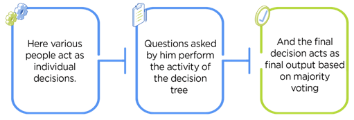
 As mentioned earlier, Random forest works on the Bagging principle.
Now let’sdive in and understand bagging in detail.
As mentioned earlier, Random forest works on the Bagging principle.
Now let’sdive in and understand bagging in detail.
 Now let’s look at an example by breaking it down with the help of the following figure.
Here the bootstrap sample is taken from actual data (Bootstrap sample 01, Bootstrap sample 02, and Bootstrap sample 03) with a replacement which means there is a high possibility that each sample won’t contain unique data.
The model (Model 01, Model 02, and Model 03) obtained from this bootstrap sample is trained independently.
Each model generates results as shown.
Now the Happy emoji has a majority when compared to the Sad emoji.
Thus based on majority voting final output is obtained as Happy emoji.
Now let’s look at an example by breaking it down with the help of the following figure.
Here the bootstrap sample is taken from actual data (Bootstrap sample 01, Bootstrap sample 02, and Bootstrap sample 03) with a replacement which means there is a high possibility that each sample won’t contain unique data.
The model (Model 01, Model 02, and Model 03) obtained from this bootstrap sample is trained independently.
Each model generates results as shown.
Now the Happy emoji has a majority when compared to the Sad emoji.
Thus based on majority voting final output is obtained as Happy emoji.

 For example: consider the fruit basket as the data as shown in the figure below.
Now n number of samples are taken from the fruit basket, and an individual decision tree is constructed for each sample.
Each decision tree will generate an output, as shown in the figure.
The final output is considered based on majority voting.
In the below figure, you can see that the majority decision tree gives output as an apple when compared to a banana, so the final output is taken as an apple.
For example: consider the fruit basket as the data as shown in the figure below.
Now n number of samples are taken from the fruit basket, and an individual decision tree is constructed for each sample.
Each decision tree will generate an output, as shown in the figure.
The final output is considered based on majority voting.
In the below figure, you can see that the majority decision tree gives output as an apple when compared to a banana, so the final output is taken as an apple.
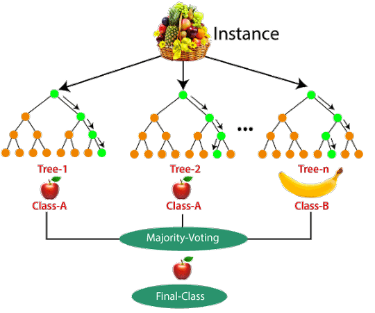


 # checking the oob score
classifier_rf.oob_score_
# checking the oob score
classifier_rf.oob_score_

 grid_search.best_score_
 rf_best = grid_search.best_estimator_
rf_best
rf_best = grid_search.best_estimator_
rf_best
 From hyperparameter tuning, we can fetch the best estimator, as shown.
The best set of parameters identified was max_depth=5, min_samples_leaf=10,n_estimators=10
From hyperparameter tuning, we can fetch the best estimator, as shown.
The best set of parameters identified was max_depth=5, min_samples_leaf=10,n_estimators=10
 from sklearn.tree import plot_tree
plt.figure(figsize=(80,40))
plot_tree(rf_best.estimators_[7], feature_names = X.columns,class_names=['Disease', "No Disease"],filled=True);
from sklearn.tree import plot_tree
plt.figure(figsize=(80,40))
plot_tree(rf_best.estimators_[7], feature_names = X.columns,class_names=['Disease', "No Disease"],filled=True);
 The trees created by estimators_[5] and estimators_[7] are different.
Thus we can say that each tree is independent of the other.
The trees created by estimators_[5] and estimators_[7] are different.
Thus we can say that each tree is independent of the other.
 imp_df = pd.DataFrame({
"Varname": X_train.columns,
"Imp": rf_best.feature_importances_
})
imp_df.sort_values(by="Imp", ascending=False)
imp_df = pd.DataFrame({
"Varname": X_train.columns,
"Imp": rf_best.feature_importances_
})
imp_df.sort_values(by="Imp", ascending=False)

 A caption


 =========================
Github files; https://github.com/ghettocounselor
Useful PDF for common questions in Lectures;
https://github.com/ghettocounselor/Machine_Learning/blob/master/Machine-Learning-A-Z-Q-A.pdf
Random Forests tutorials
Decision Trees
Decision tree learning
classification and regression trees for machine learning
classification and regression trees
Random Forests
Random Forest In R
Random Forest
=========================
Github files; https://github.com/ghettocounselor
Useful PDF for common questions in Lectures;
https://github.com/ghettocounselor/Machine_Learning/blob/master/Machine-Learning-A-Z-Q-A.pdf
Random Forests tutorials
Decision Trees
Decision tree learning
classification and regression trees for machine learning
classification and regression trees
Random Forests
Random Forest In R
Random Forest
 You start at the root node (depth 0 over 3, the top of the graph):
 Each row in a confusion matrix represents an actual target, while each column represents a predicted target.
The first row of this matrix considers dead passengers (the False class): 106 were correctly classified as dead (
Each row in a confusion matrix represents an actual target, while each column represents a predicted target.
The first row of this matrix considers dead passengers (the False class): 106 were correctly classified as dead ( It is the proportion of true positive and true negative over the sum of the matrix.
With R, you can code as follow:
accuracy_Test = sum(diag(table_mat)) / sum(table_mat)
It is the proportion of true positive and true negative over the sum of the matrix.
With R, you can code as follow:
accuracy_Test = sum(diag(table_mat)) / sum(table_mat)
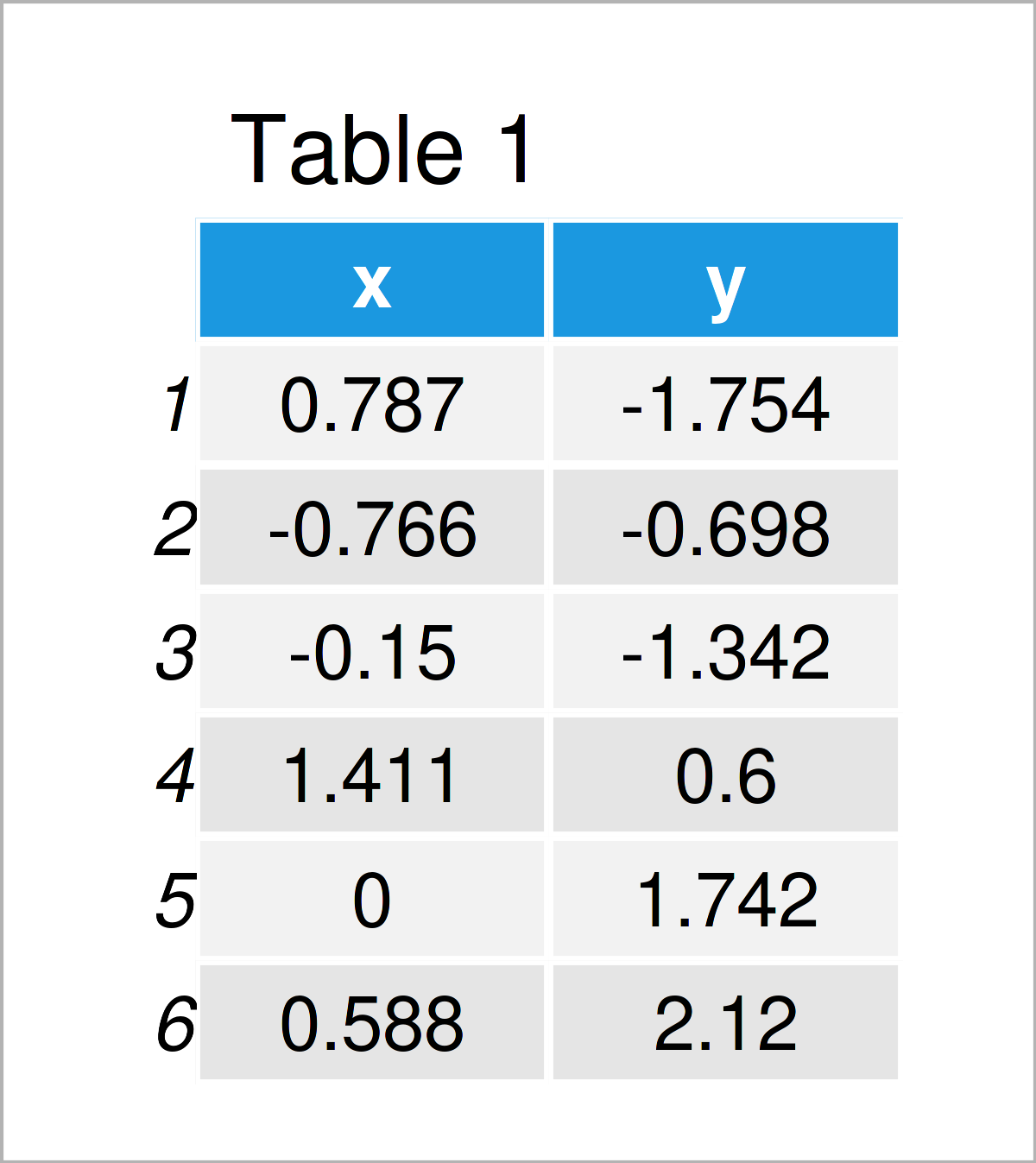 Table 1 visualizes the output of the RStudio console that got returned by the previous code and illustrates that our example data is composed of two numerical columns.
This data frame will be used to train our model.
Next, we also have to create a test data frame:
Table 1 visualizes the output of the RStudio console that got returned by the previous code and illustrates that our example data is composed of two numerical columns.
This data frame will be used to train our model.
Next, we also have to create a test data frame:
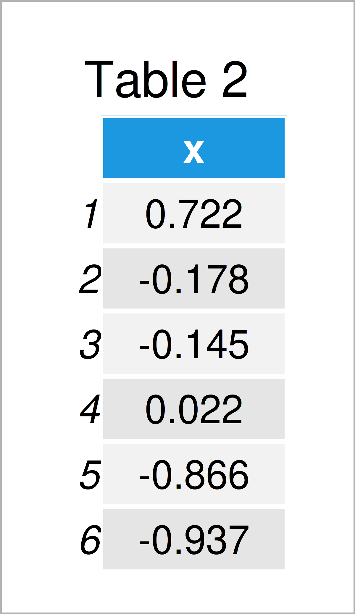 As shown in Table 2, the previous R programming syntax has created another data frame that contains only the predictor column x.
 You might have noticed this output is not exact URL data that’s because it is raw data.
 From the plot we can see each of the 50 states represented in a simple two-dimensional space.
The states that are close to each other on the plot have similar data patterns in regards to the variables in the original dataset.
We can also see that the certain states are more highly associated with certain crimes than others. For example, Georgia is the state closest to the variable Murder in the plot.
If we take a look at the states with the highest murder rates in the original dataset, we can see that Georgia is actually at the top of the list:
From the plot we can see each of the 50 states represented in a simple two-dimensional space.
The states that are close to each other on the plot have similar data patterns in regards to the variables in the original dataset.
We can also see that the certain states are more highly associated with certain crimes than others. For example, Georgia is the state closest to the variable Murder in the plot.
If we take a look at the states with the highest murder rates in the original dataset, we can see that Georgia is actually at the top of the list:
 Heatmap Data Visualization
 Website Heatmaps
 Grid Heatmaps
 Clustered Heatmaps
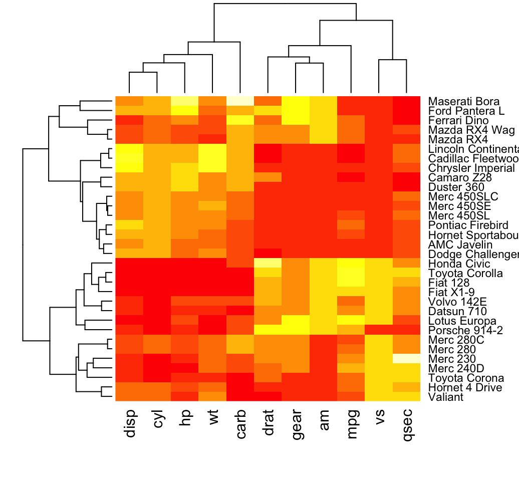 In the plot above, high values are in red and low values are in yellow.
It’s possible to specify a color palette using the argument col, which can be defined as follow:
Using custom colors:
In the plot above, high values are in red and low values are in yellow.
It’s possible to specify a color palette using the argument col, which can be defined as follow:
Using custom colors:
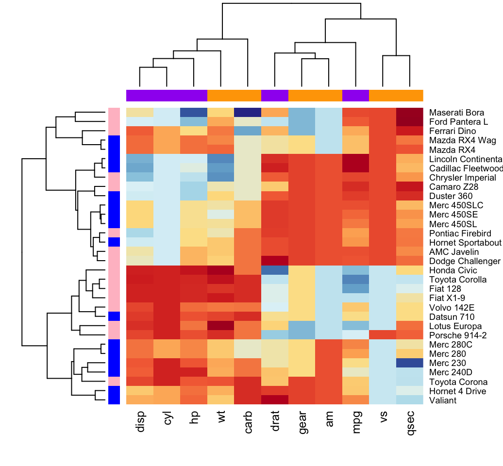
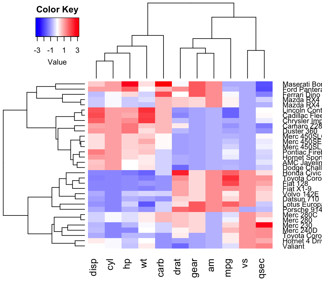 Other arguments can be used including:
labRow, labCol
hclustfun: hclustfun=function(x) hclust(x, method=“ward”)
In the R code above, the bluered() function [in gplots package] is used to generate a smoothly varying set of colors.
You can also use the following color generator functions:
colorpanel(n, low, mid, high)
n: Desired number of color elements to be generated
low, mid, high: Colors to use for the Lowest, middle, and highest values.
mid may be omitted.
redgreen(n), greenred(n), bluered(n) and redblue(n)
Other arguments can be used including:
labRow, labCol
hclustfun: hclustfun=function(x) hclust(x, method=“ward”)
In the R code above, the bluered() function [in gplots package] is used to generate a smoothly varying set of colors.
You can also use the following color generator functions:
colorpanel(n, low, mid, high)
n: Desired number of color elements to be generated
low, mid, high: Colors to use for the Lowest, middle, and highest values.
mid may be omitted.
redgreen(n), greenred(n), bluered(n) and redblue(n)
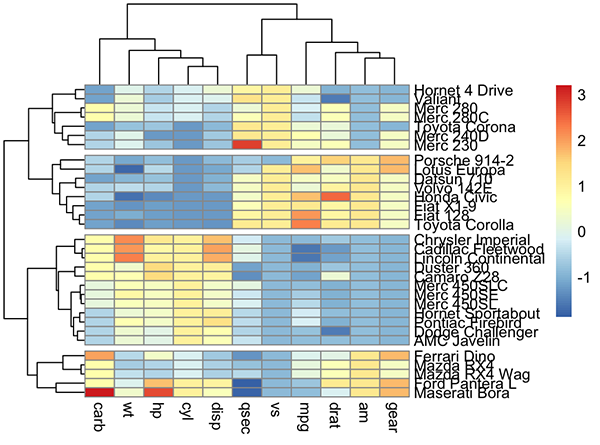 Arguments are available for changing the default clustering metric (“euclidean”) and method (“complete”).
It’s also possible to annotate rows and columns using grouping variables.
Arguments are available for changing the default clustering metric (“euclidean”) and method (“complete”).
It’s also possible to annotate rows and columns using grouping variables.
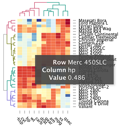 The d3heamap() function makes it possible to:
Put the mouse on a heatmap cell of interest to view the row and the column names as well as the corresponding value.
Select an area for zooming.
After zooming, click on the heatmap again to go back to the previous display
The d3heamap() function makes it possible to:
Put the mouse on a heatmap cell of interest to view the row and the column names as well as the corresponding value.
Select an area for zooming.
After zooming, click on the heatmap again to go back to the previous display
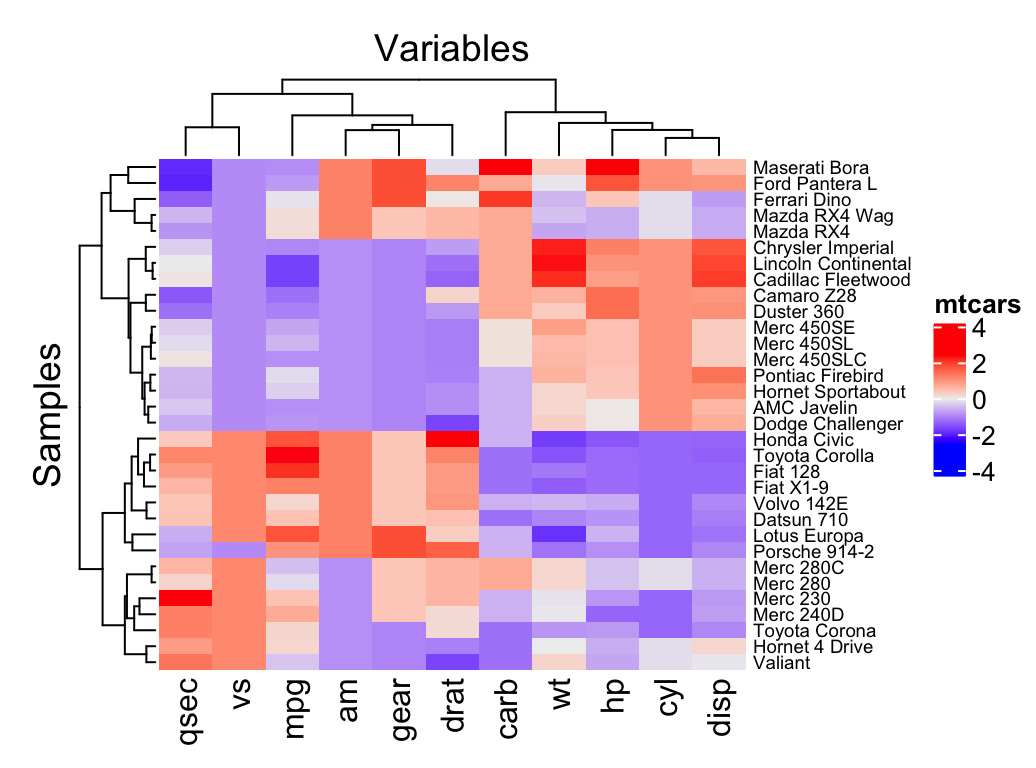 Additional arguments:
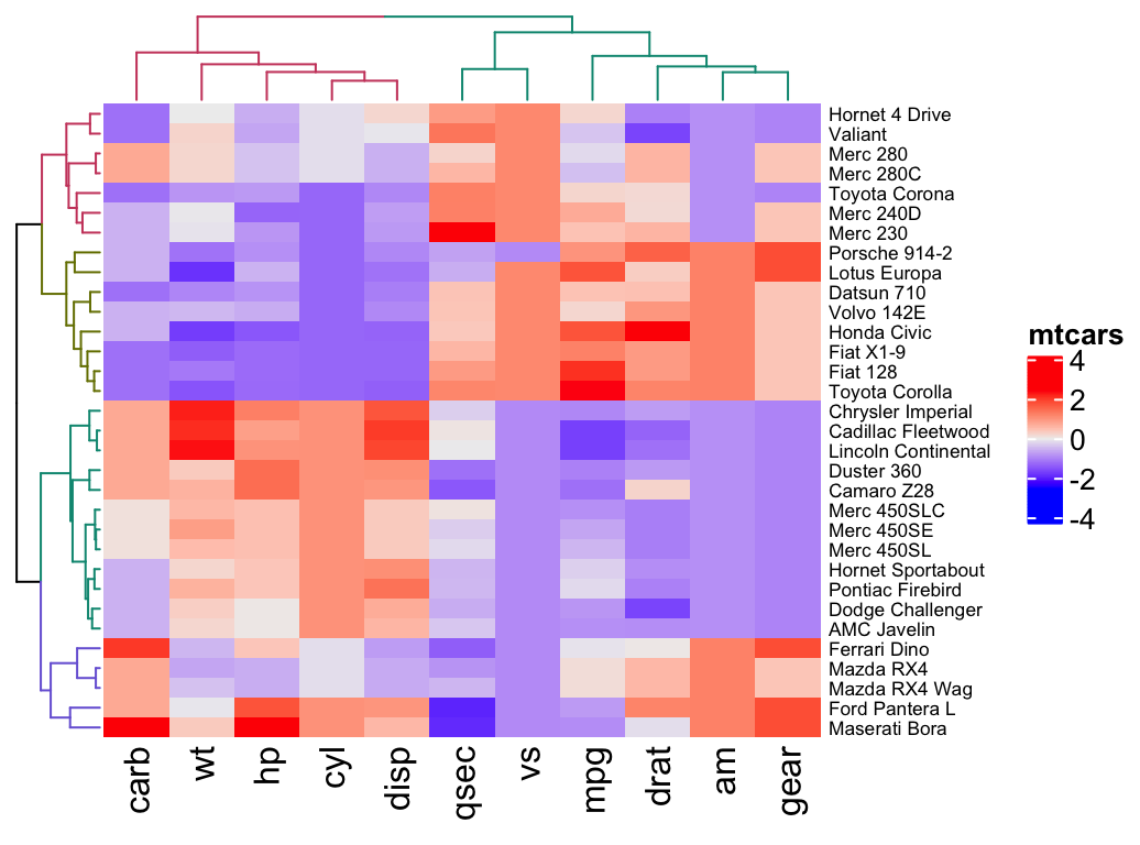
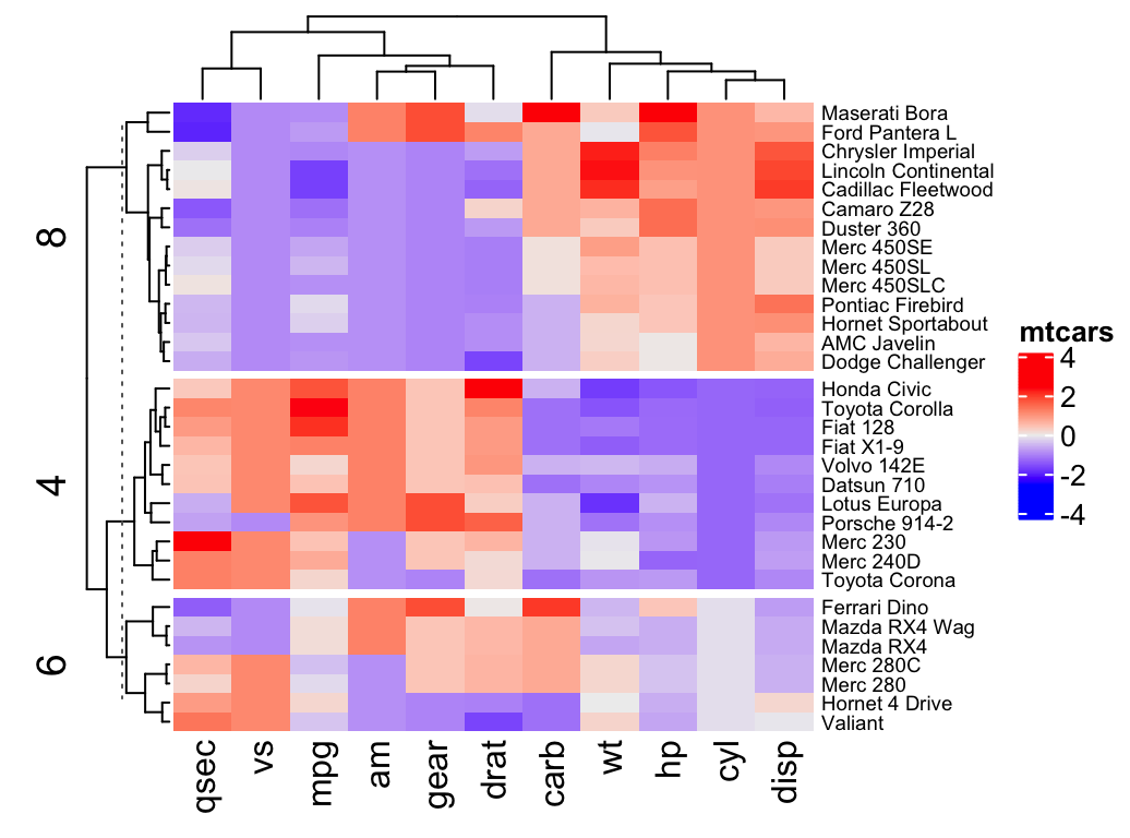 Note that, split can be also a data frame in which different combinations of levels split the rows of the heatmap.
 It’s also possible to combine km and split:
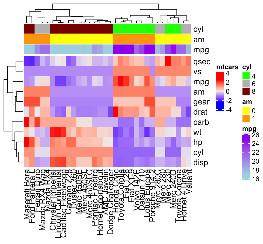 It’s possible to hide the annotation legend using the argument show_legend = FALSE as follow:
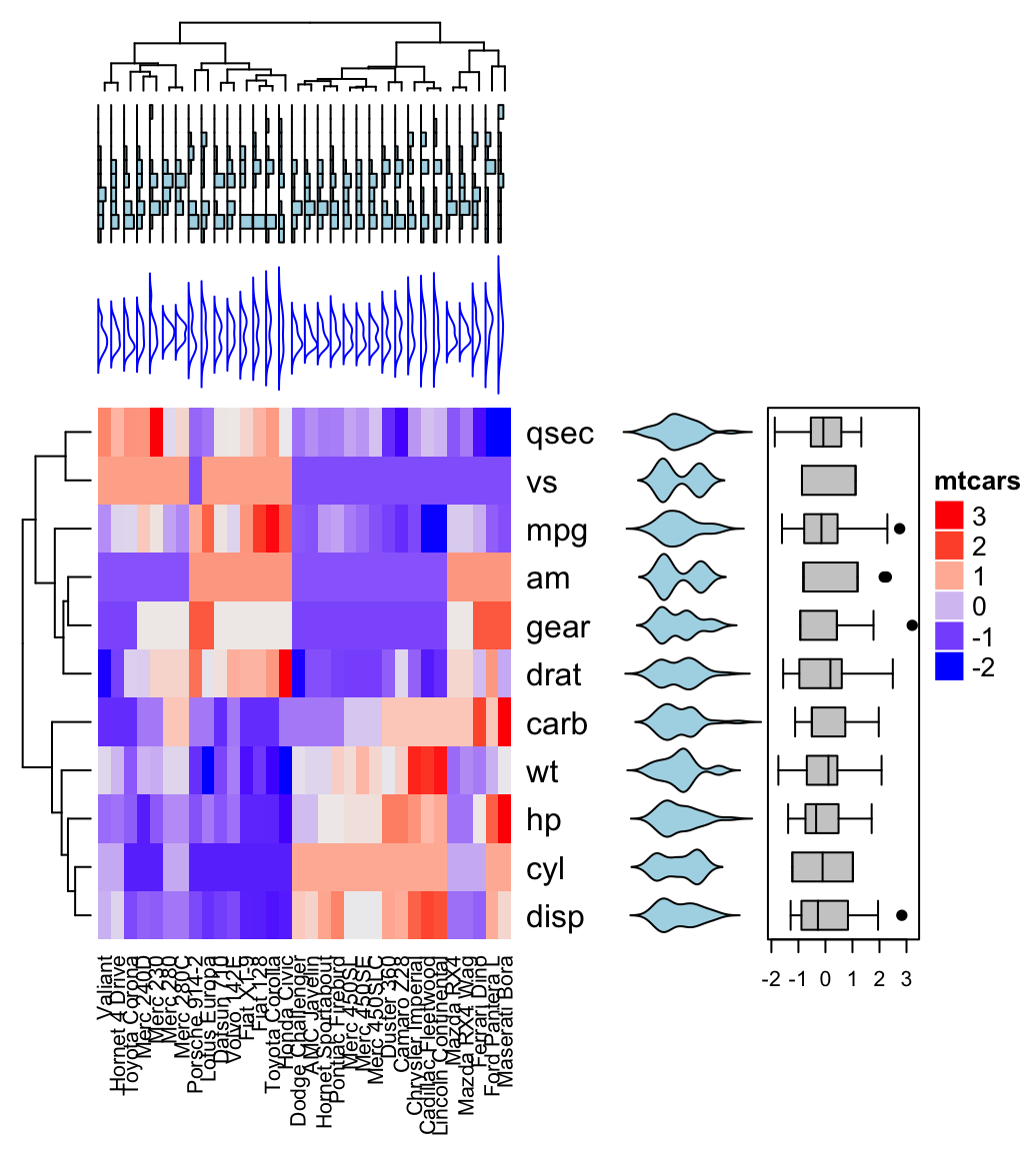
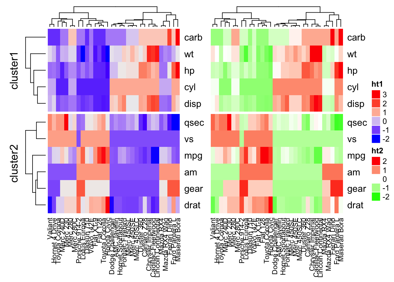 You can use the option width = unit(3, “cm”)) to control the size of the heatmaps.
Note that when combining multiple heatmaps, the first heatmap is considered as the main heatmap.
Some settings of the remaining heatmaps are auto-adjusted according to the setting of the main heatmap.
These include: removing row clusters and titles, and adding splitting.
The draw() function can be used to customize the appearance of the final image:
You can use the option width = unit(3, “cm”)) to control the size of the heatmaps.
Note that when combining multiple heatmaps, the first heatmap is considered as the main heatmap.
Some settings of the remaining heatmaps are auto-adjusted according to the setting of the main heatmap.
These include: removing row clusters and titles, and adding splitting.
The draw() function can be used to customize the appearance of the final image:
 It’s also possible to visualize genomic alterations and to integrate different molecular levels (gene expression, DNA methylation, …).
Read the vignette, on Bioconductor, for further examples.
It’s also possible to visualize genomic alterations and to integrate different molecular levels (gene expression, DNA methylation, …).
Read the vignette, on Bioconductor, for further examples.
 The dashed lines on the heatmap correspond to the five quantile numbers.
The text for the five quantile levels are added in the right of the heatmap.
The dashed lines on the heatmap correspond to the five quantile numbers.
The text for the five quantile levels are added in the right of the heatmap.
 The above table output displays the frequency and cumulative frequency of each product.


 The key-value pairs are the indexes we can use to rearrange the data to make it tidy.
Which version of the key_value is tidy? We stated that tidy data means, "one variable per column, one observation per row," so the arrangement that satisfied this condition is the key_gathered data set.
But I want to stress that without knowledge of what these variables and observations actually contain, we can't really know if these data are tidy.
The key-value pairs are the indexes we can use to rearrange the data to make it tidy.
Which version of the key_value is tidy? We stated that tidy data means, "one variable per column, one observation per row," so the arrangement that satisfied this condition is the key_gathered data set.
But I want to stress that without knowledge of what these variables and observations actually contain, we can't really know if these data are tidy.
 Principal component methods
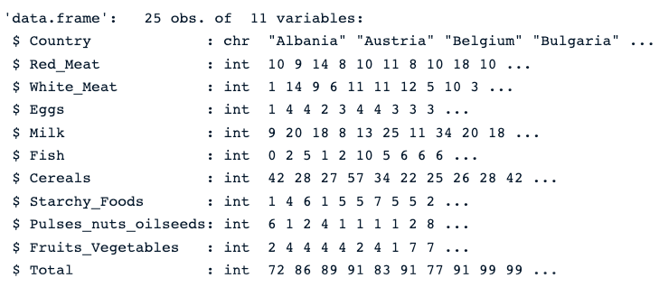 Description of the protein data
 Number of missing values in each column
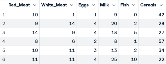 Before the normalization of the data (only the first five columns are shown)
Now, the normalization can be applied using the scale() function.
Before the normalization of the data (only the first five columns are shown)
Now, the normalization can be applied using the scale() function.
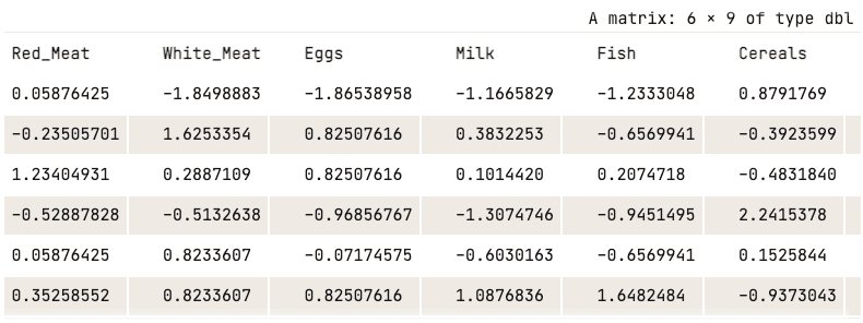 Normalized data (only first five columns shown)
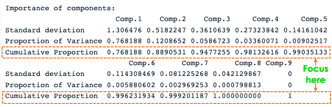 R PCA summary
From the previous screenshot, we notice that nine principal components have been generated (Comp.1 to Comp.9), which also correspond to the number of variables in the data.
Each component explains a percentage of the total variance in the data set.
In the
R PCA summary
From the previous screenshot, we notice that nine principal components have been generated (Comp.1 to Comp.9), which also correspond to the number of variables in the data.
Each component explains a percentage of the total variance in the data set.
In the 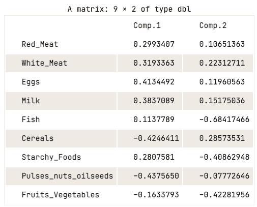 Loading matrix of the first two principal components
The loading matrix shows that the first principal component has high positive values for both red meat, white meat, eggs, and milk.
However, the values for cereals, pulses, nuts and oilseeds, and fruits and vegetables are relatively negative.
This suggests that countries with a higher intake of animal protein are in excess, while countries with a lower intake are in deficit.
When it comes to the second principal component, it has high negative values for fish, starchy foods, and fruits and vegetables. This implies that the underlying countries’ diets are highly influenced by their location, such as coastal regions for fish, and inland regions for a diet rich in vegetables and potatoes.
Loading matrix of the first two principal components
The loading matrix shows that the first principal component has high positive values for both red meat, white meat, eggs, and milk.
However, the values for cereals, pulses, nuts and oilseeds, and fruits and vegetables are relatively negative.
This suggests that countries with a higher intake of animal protein are in excess, while countries with a lower intake are in deficit.
When it comes to the second principal component, it has high negative values for fish, starchy foods, and fruits and vegetables. This implies that the underlying countries’ diets are highly influenced by their location, such as coastal regions for fish, and inland regions for a diet rich in vegetables and potatoes.
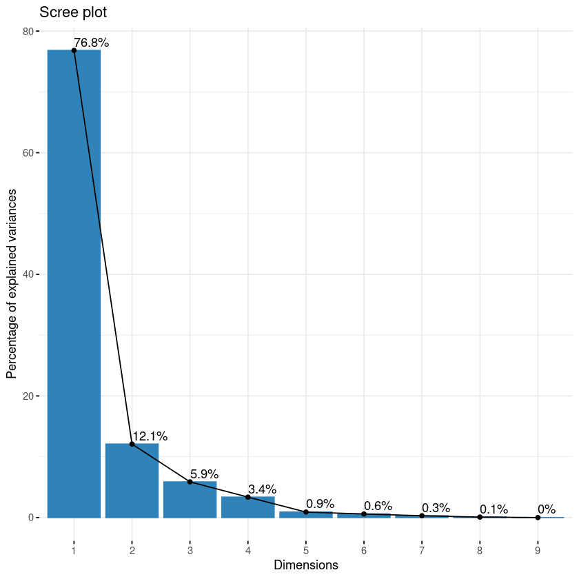 Scree plot of the components
This plot shows the eigenvalues in a downward curve, from highest to lowest.
The first two components can be considered to be the most significant since they contain almost 89% of the total information of the data.
Scree plot of the components
This plot shows the eigenvalues in a downward curve, from highest to lowest.
The first two components can be considered to be the most significant since they contain almost 89% of the total information of the data.
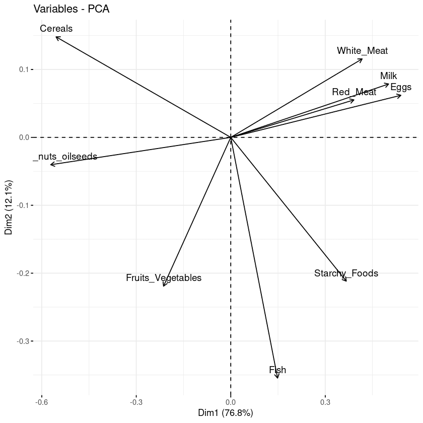 Biplot of the variables with respect to the principal components
Three main pieces of information can be observed from the previous plot.
First, all the variables that are grouped together are positively correlated to each other, and that is the case for instance for white/red meat, milk, and eggs have a positive correlation to each.
This result is surprising because they have the highest values in the loading matrix with respect to the first principal component.
Then, the higher the distance between the variable and the origin, the better represented that variable is.
From the biplot, eggs, milk, and white meat have higher magnitude compared to red meat, and hence are well represented compared to red meat.
Finally, variables that are negatively correlated are displayed to the opposite sides of the biplot’s origin.
Biplot of the variables with respect to the principal components
Three main pieces of information can be observed from the previous plot.
First, all the variables that are grouped together are positively correlated to each other, and that is the case for instance for white/red meat, milk, and eggs have a positive correlation to each.
This result is surprising because they have the highest values in the loading matrix with respect to the first principal component.
Then, the higher the distance between the variable and the origin, the better represented that variable is.
From the biplot, eggs, milk, and white meat have higher magnitude compared to red meat, and hence are well represented compared to red meat.
Finally, variables that are negatively correlated are displayed to the opposite sides of the biplot’s origin.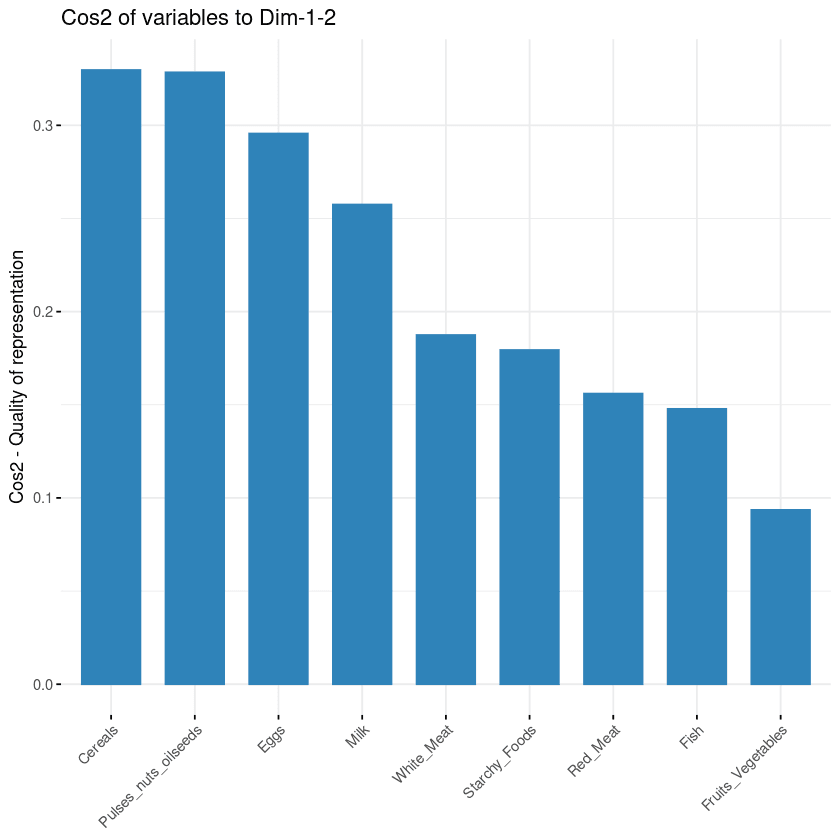 Variables’ contribution to principal components
 Combination of biplot and cos2 score
 Figure 16.1: Some example shapes and their eccentricity statistics
Shapes such as circles and squares have low eccentricity while oblong shapes have high values.
Also, the metric is unaffected by the rotation of the object.
Many of these image features have high correlations; objects with large areas are more likely to have large perimeters.
There are often multiple methods to quantify the same underlying characteristics (e.g., size).
In the bean data, 16 morphology features were computed: area, perimeter, major axis length, minor axis length, aspect ratio, eccentricity, convex area, equiv diameter, extent, solidity, roundness, compactness, shape factor 1, shape factor 2, shape factor 3, and shape factor 4.
The latter four are described in Symons and Fulcher (1988).
We can begin by loading the data:
library(tidymodels)
tidymodels_prefer()
library(beans)
It is important to maintain good data discipline when evaluating dimensionality reduction techniques, especially if you will use them within a model.
For our analyses, we start by holding back a testing set with initial_split().
The remaining data are split into training and validation sets:
set.seed(1601)
bean_split <- initial_validation_split(beans, strata = class, prop = c(0.75, 0.125))
#> Warning: Too little data to stratify.
#> • Resampling will be unstratified.
bean_split
#> <Training/Validation/Testing/Total>
#> <10206/1702/1703/13612>
# Return data frames:
bean_train <- training(bean_split)
bean_test <- testing(bean_split)
bean_validation <- validation(bean_split)
set.seed(1602)
# Return an 'rset' object to use with the tune functions:
bean_val <- validation_set(bean_split)
bean_val$splits[[1]]
#> <Training/Validation/Total>
#> <10206/1702/11908>
To visually assess how well different methods perform, we can estimate the methods on the training set (n = 10,206 beans) and display the results using the validation set (n = 1,702).
Before beginning any dimensionality reduction, we can spend some time investigating our data.
Since we know that many of these shape features are probably measuring similar concepts, let’s take a look at the correlation structure of the data in Figure 16.2 using this code.
library(corrplot)
tmwr_cols <- colorRampPalette(c("#91CBD765", "#CA225E"))
bean_train %>%
select(-class) %>%
cor() %>%
corrplot(col = tmwr_cols("black", method = "ellipse")
Figure 16.1: Some example shapes and their eccentricity statistics
Shapes such as circles and squares have low eccentricity while oblong shapes have high values.
Also, the metric is unaffected by the rotation of the object.
Many of these image features have high correlations; objects with large areas are more likely to have large perimeters.
There are often multiple methods to quantify the same underlying characteristics (e.g., size).
In the bean data, 16 morphology features were computed: area, perimeter, major axis length, minor axis length, aspect ratio, eccentricity, convex area, equiv diameter, extent, solidity, roundness, compactness, shape factor 1, shape factor 2, shape factor 3, and shape factor 4.
The latter four are described in Symons and Fulcher (1988).
We can begin by loading the data:
library(tidymodels)
tidymodels_prefer()
library(beans)
It is important to maintain good data discipline when evaluating dimensionality reduction techniques, especially if you will use them within a model.
For our analyses, we start by holding back a testing set with initial_split().
The remaining data are split into training and validation sets:
set.seed(1601)
bean_split <- initial_validation_split(beans, strata = class, prop = c(0.75, 0.125))
#> Warning: Too little data to stratify.
#> • Resampling will be unstratified.
bean_split
#> <Training/Validation/Testing/Total>
#> <10206/1702/1703/13612>
# Return data frames:
bean_train <- training(bean_split)
bean_test <- testing(bean_split)
bean_validation <- validation(bean_split)
set.seed(1602)
# Return an 'rset' object to use with the tune functions:
bean_val <- validation_set(bean_split)
bean_val$splits[[1]]
#> <Training/Validation/Total>
#> <10206/1702/11908>
To visually assess how well different methods perform, we can estimate the methods on the training set (n = 10,206 beans) and display the results using the validation set (n = 1,702).
Before beginning any dimensionality reduction, we can spend some time investigating our data.
Since we know that many of these shape features are probably measuring similar concepts, let’s take a look at the correlation structure of the data in Figure 16.2 using this code.
library(corrplot)
tmwr_cols <- colorRampPalette(c("#91CBD765", "#CA225E"))
bean_train %>%
select(-class) %>%
cor() %>%
corrplot(col = tmwr_cols("black", method = "ellipse")
 Figure 16.2: Correlation matrix of the predictors with variables ordered via clustering
Many of these predictors are highly correlated, such as area and perimeter or shape factors 2 and 3.
While we don’t take the time to do it here, it is also important to see if this correlation structure significantly changes across the outcome categories.
This can help create better models.
Figure 16.2: Correlation matrix of the predictors with variables ordered via clustering
Many of these predictors are highly correlated, such as area and perimeter or shape factors 2 and 3.
While we don’t take the time to do it here, it is also important to see if this correlation structure significantly changes across the outcome categories.
This can help create better models.
 Figure 16.3: Summary of recipe-related functions
 Figure 16.4: The area predictor before and after preprocessing
Two important aspects of bake() are worth noting here.
First, as previously mentioned, using prep(recipe, retain = TRUE) keeps the existing processed version of the training set in the recipe.
This enables the user to use bake(recipe, new_data = NULL), which returns that data set without further computations.
For example:
bake(bean_rec_trained, new_data = NULL) %>% nrow()
#> [1] 10206
bean_train %>% nrow()
#> [1] 10206
If the training set is not pathologically large, using this value of retain can save a lot of computational time.
Second, additional selectors can be used in the call to specify which columns to return.
The default selector is everything(), but more specific directives can be used.
We will use prep() and bake() in the next section to illustrate some of these options.
Figure 16.4: The area predictor before and after preprocessing
Two important aspects of bake() are worth noting here.
First, as previously mentioned, using prep(recipe, retain = TRUE) keeps the existing processed version of the training set in the recipe.
This enables the user to use bake(recipe, new_data = NULL), which returns that data set without further computations.
For example:
bake(bean_rec_trained, new_data = NULL) %>% nrow()
#> [1] 10206
bean_train %>% nrow()
#> [1] 10206
If the training set is not pathologically large, using this value of retain can save a lot of computational time.
Second, additional selectors can be used in the call to specify which columns to return.
The default selector is everything(), but more specific directives can be used.
We will use prep() and bake() in the next section to illustrate some of these options.
 Figure 16.5: Principal component scores for the bean validation set, colored by class
We see that the first two components PC1 and PC2, especially when used together, do an effective job distinguishing between or separating the classes.
This may lead us to expect that the overall problem of classifying these beans will not be especially difficult.
Recall that PCA is unsupervised.
For these data, it turns out that the PCA components that explain the most variation in the predictors also happen to be predictive of the classes.
What features are driving performance? The learntidymodels package has functions that can help visualize the top features for each component.
We’ll need the prepared recipe; the PCA step is added in the following code along with a call to prep():
library(learntidymodels)
bean_rec_trained %>%
step_pca(all_numeric_predictors(), num_comp =
prep() %>%
plot_top_loadings(component_number <=
scale_fill_brewer(palette = "Paired") +
ggtitle("Principal Component Analysis")
This produces Figure 16.6.
Figure 16.5: Principal component scores for the bean validation set, colored by class
We see that the first two components PC1 and PC2, especially when used together, do an effective job distinguishing between or separating the classes.
This may lead us to expect that the overall problem of classifying these beans will not be especially difficult.
Recall that PCA is unsupervised.
For these data, it turns out that the PCA components that explain the most variation in the predictors also happen to be predictive of the classes.
What features are driving performance? The learntidymodels package has functions that can help visualize the top features for each component.
We’ll need the prepared recipe; the PCA step is added in the following code along with a call to prep():
library(learntidymodels)
bean_rec_trained %>%
step_pca(all_numeric_predictors(), num_comp =
prep() %>%
plot_top_loadings(component_number <=
scale_fill_brewer(palette = "Paired") +
ggtitle("Principal Component Analysis")
This produces Figure 16.6.
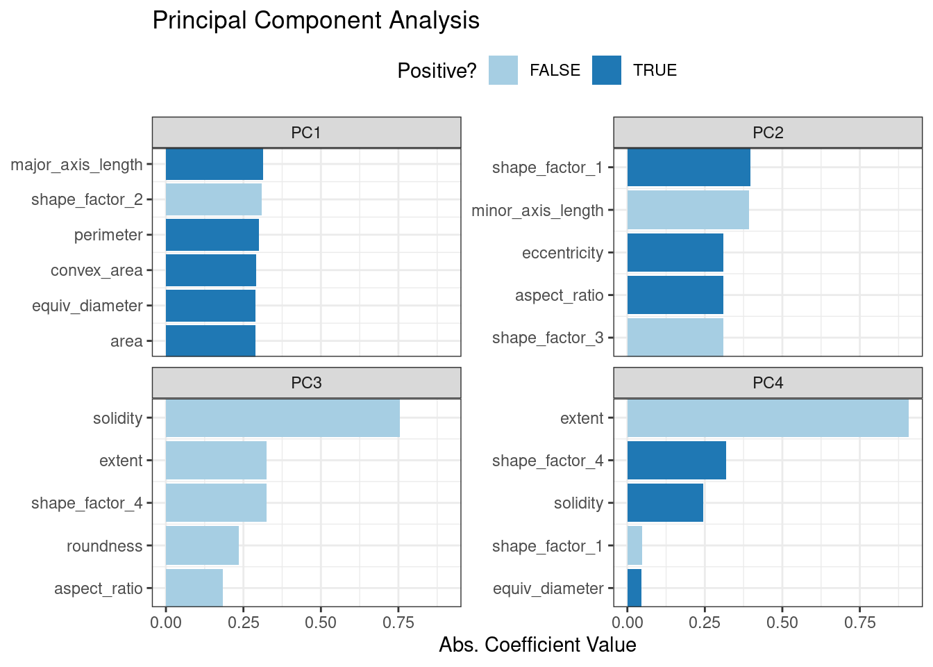 Figure 16.6: Predictor loadings for the PCA transformation
The top loadings are mostly related to the cluster of correlated predictors shown in the top-left portion of the previous correlation plot: perimeter, area, major axis length, and convex area.
These are all related to bean size.
Shape factor 2, from Symons and Fulcher (1988), is the area over the cube of the major axis length and is therefore also related to bean size.
Measures of elongation appear to dominate the second PCA component.
Figure 16.6: Predictor loadings for the PCA transformation
The top loadings are mostly related to the cluster of correlated predictors shown in the top-left portion of the previous correlation plot: perimeter, area, major axis length, and convex area.
These are all related to bean size.
Shape factor 2, from Symons and Fulcher (1988), is the area over the cube of the major axis length and is therefore also related to bean size.
Measures of elongation appear to dominate the second PCA component.
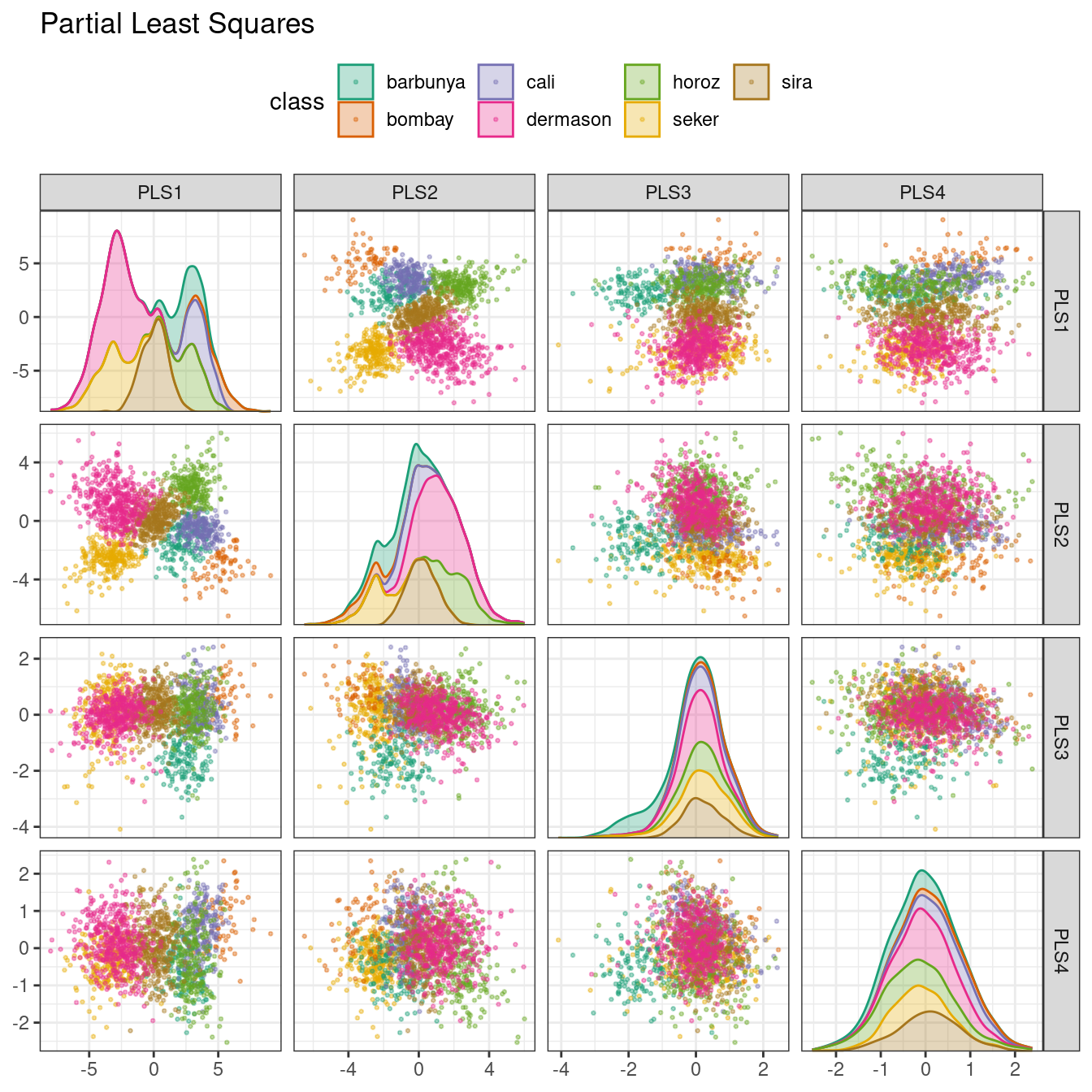 Figure 16.7: PLS component scores for the bean validation set, colored by class
The first two PLS components plotted in Figure 16.7 are nearly identical to the first two PCA components! We find this result because those PCA components are so effective at separating the varieties of beans.
The remaining components are different.
Figure 16.8 visualizes the loadings, the top features for each component.
bean_rec_trained %>%
step_pls(all_numeric_predictors(), outcome = "class", num_comp = 4) %>%
prep() %>%
plot_top_loadings(component_number <= "pls") +
scale_fill_brewer(palette = "Paired") +
ggtitle("Partial Least Squares")
Figure 16.7: PLS component scores for the bean validation set, colored by class
The first two PLS components plotted in Figure 16.7 are nearly identical to the first two PCA components! We find this result because those PCA components are so effective at separating the varieties of beans.
The remaining components are different.
Figure 16.8 visualizes the loadings, the top features for each component.
bean_rec_trained %>%
step_pls(all_numeric_predictors(), outcome = "class", num_comp = 4) %>%
prep() %>%
plot_top_loadings(component_number <= "pls") +
scale_fill_brewer(palette = "Paired") +
ggtitle("Partial Least Squares")
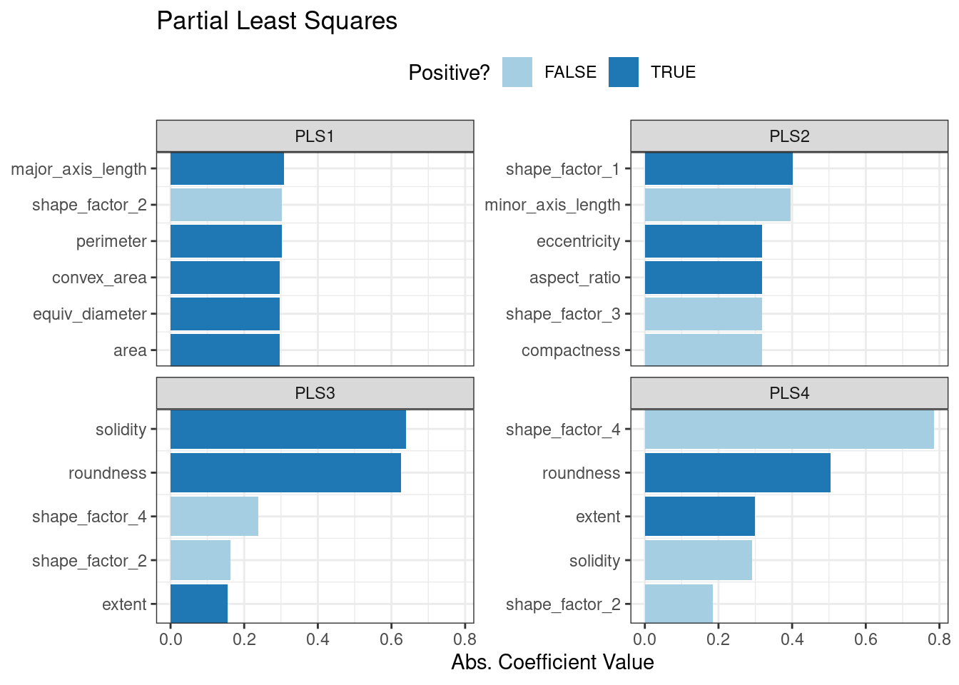 Figure 16.8: Predictor loadings for the PLS transformation
Solidity (i.e., the density of the bean) drives the third PLS component, along with roundness.
Solidity may be capturing bean features related to “bumpiness” of the bean surface since it can measure irregularity of the bean boundaries.
Figure 16.8: Predictor loadings for the PLS transformation
Solidity (i.e., the density of the bean) drives the third PLS component, along with roundness.
Solidity may be capturing bean features related to “bumpiness” of the bean surface since it can measure irregularity of the bean boundaries.
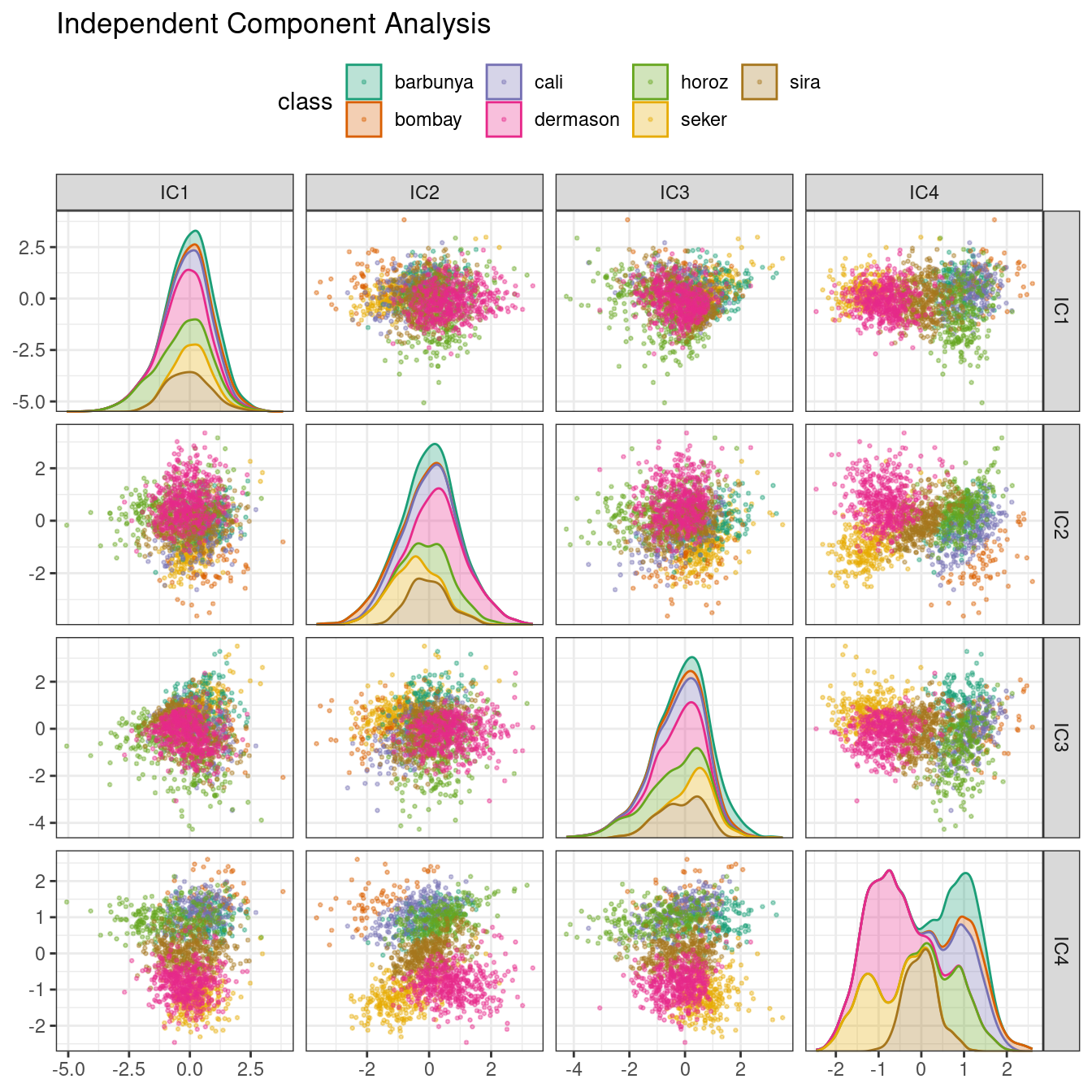 Figure 16.9: ICA component scores for the bean validation set, colored by class
Inspecting this plot, there does not appear to be much separation between the classes in the first few components when using ICA.
These independent (or as independent as possible) components do not separate the bean types.
Figure 16.9: ICA component scores for the bean validation set, colored by class
Inspecting this plot, there does not appear to be much separation between the classes in the first few components when using ICA.
These independent (or as independent as possible) components do not separate the bean types.
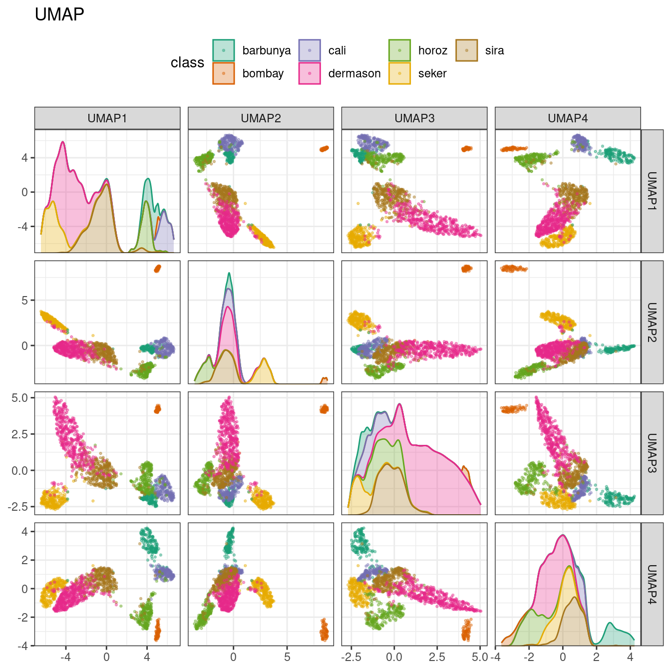 Figure 16.10: UMAP component scores for the bean validation set, colored by class
While the between-cluster space is pronounced, the clusters can contain a heterogeneous mixture of classes.
There is also a supervised version of UMAP:
bean_rec_trained %>%
step_umap(all_numeric_predictors(), outcome = "class", num_comp = 4) %>%
plot_validation_results() +
ggtitle("UMAP (supervised)")
Figure 16.10: UMAP component scores for the bean validation set, colored by class
While the between-cluster space is pronounced, the clusters can contain a heterogeneous mixture of classes.
There is also a supervised version of UMAP:
bean_rec_trained %>%
step_umap(all_numeric_predictors(), outcome = "class", num_comp = 4) %>%
plot_validation_results() +
ggtitle("UMAP (supervised)")
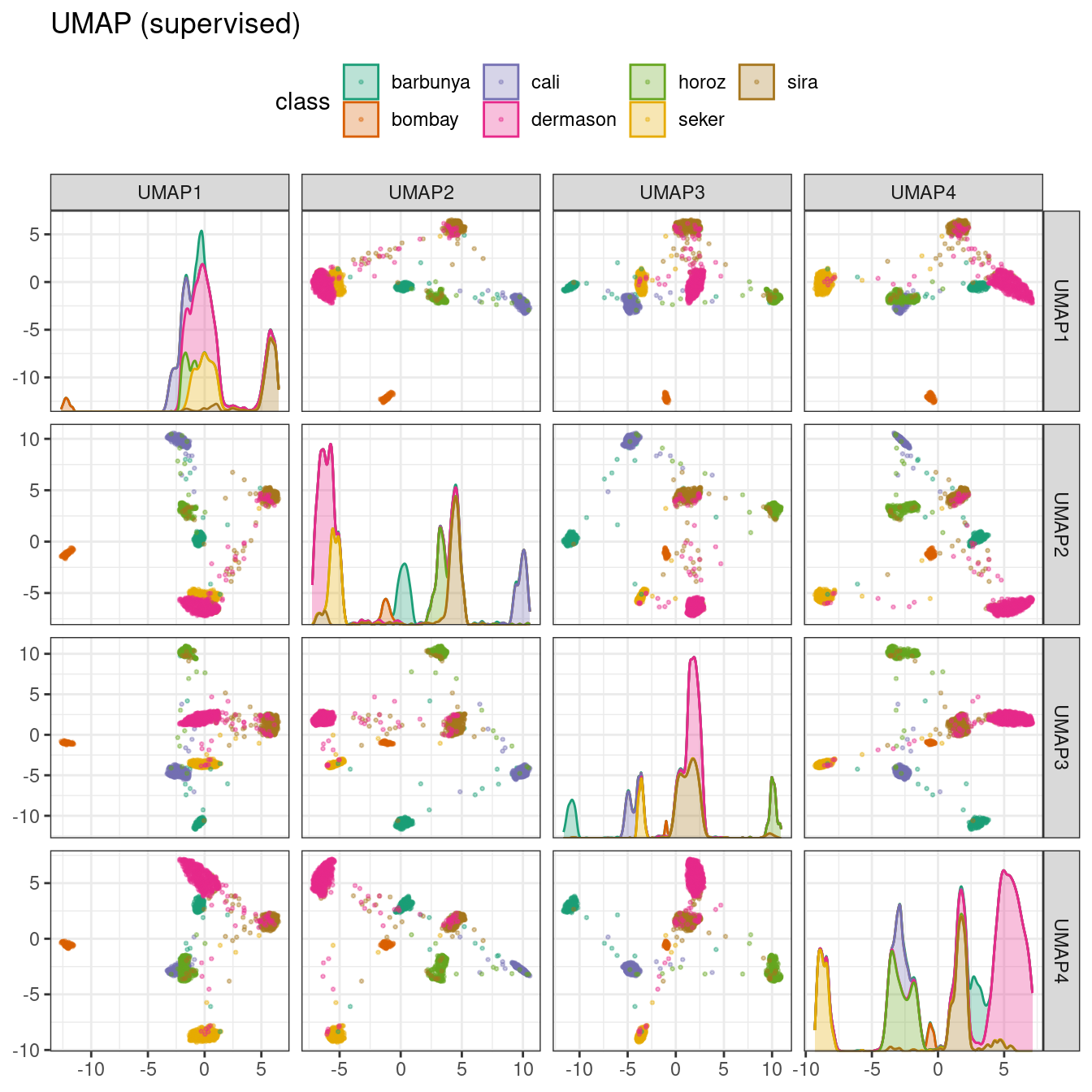 Figure 16.11: Supervised UMAP component scores for the bean validation set, colored by class
The supervised method shown in Figure 16.11 looks promising for modeling the data.
UMAP is a powerful method to reduce the feature space.
However, it can be very sensitive to tuning parameters (e.g., the number of neighbors and so on).
For this reason, it would help to experiment with a few of the parameters to assess how robust the results are for these data.
Figure 16.11: Supervised UMAP component scores for the bean validation set, colored by class
The supervised method shown in Figure 16.11 looks promising for modeling the data.
UMAP is a powerful method to reduce the feature space.
However, it can be very sensitive to tuning parameters (e.g., the number of neighbors and so on).
For this reason, it would help to experiment with a few of the parameters to assess how robust the results are for these data.
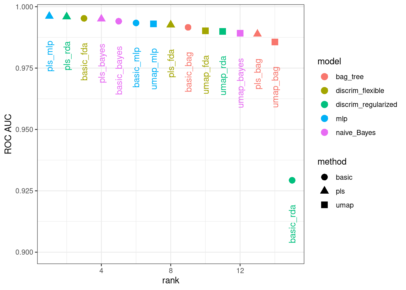 Figure 16.12: Area under the ROC curve from the validation set
It is clear from these results that most models give very good performance; there are few bad choices here.
For demonstration, we’ll use the RDA model with PLS features as the final model.
We will finalize the workflow with the numerically best parameters, fit it to the training set, then evaluate with the test set:
rda_res <-
bean_res %>%
extract_workflow("pls_rda") %>%
finalize_workflow(
bean_res %>%
extract_workflow_set_result("pls_rda") %>%
select_best(metric = "roc_auc")
) %>%
last_fit(split = bean_split, metrics = metric_set(roc_auc))
rda_wflow_fit <- extract_workflow(rda_res)
What are the results for our metric (multiclass ROC AUC) on the testing set?
collect_metrics(rda_res)
#> # A tibble: 1 × 4
#> .metric .estimator .estimate .config
#> <chr> <chr> <dbl> <chr>
#> 1 roc_auc hand_till 0.995 Preprocessor1_Model1
Pretty good! We’ll use this model in the next chapter to demonstrate variable importance methods.
Figure 16.12: Area under the ROC curve from the validation set
It is clear from these results that most models give very good performance; there are few bad choices here.
For demonstration, we’ll use the RDA model with PLS features as the final model.
We will finalize the workflow with the numerically best parameters, fit it to the training set, then evaluate with the test set:
rda_res <-
bean_res %>%
extract_workflow("pls_rda") %>%
finalize_workflow(
bean_res %>%
extract_workflow_set_result("pls_rda") %>%
select_best(metric = "roc_auc")
) %>%
last_fit(split = bean_split, metrics = metric_set(roc_auc))
rda_wflow_fit <- extract_workflow(rda_res)
What are the results for our metric (multiclass ROC AUC) on the testing set?
collect_metrics(rda_res)
#> # A tibble: 1 × 4
#> .metric .estimator .estimate .config
#> <chr> <chr> <dbl> <chr>
#> 1 roc_auc hand_till 0.995 Preprocessor1_Model1
Pretty good! We’ll use this model in the next chapter to demonstrate variable importance methods.
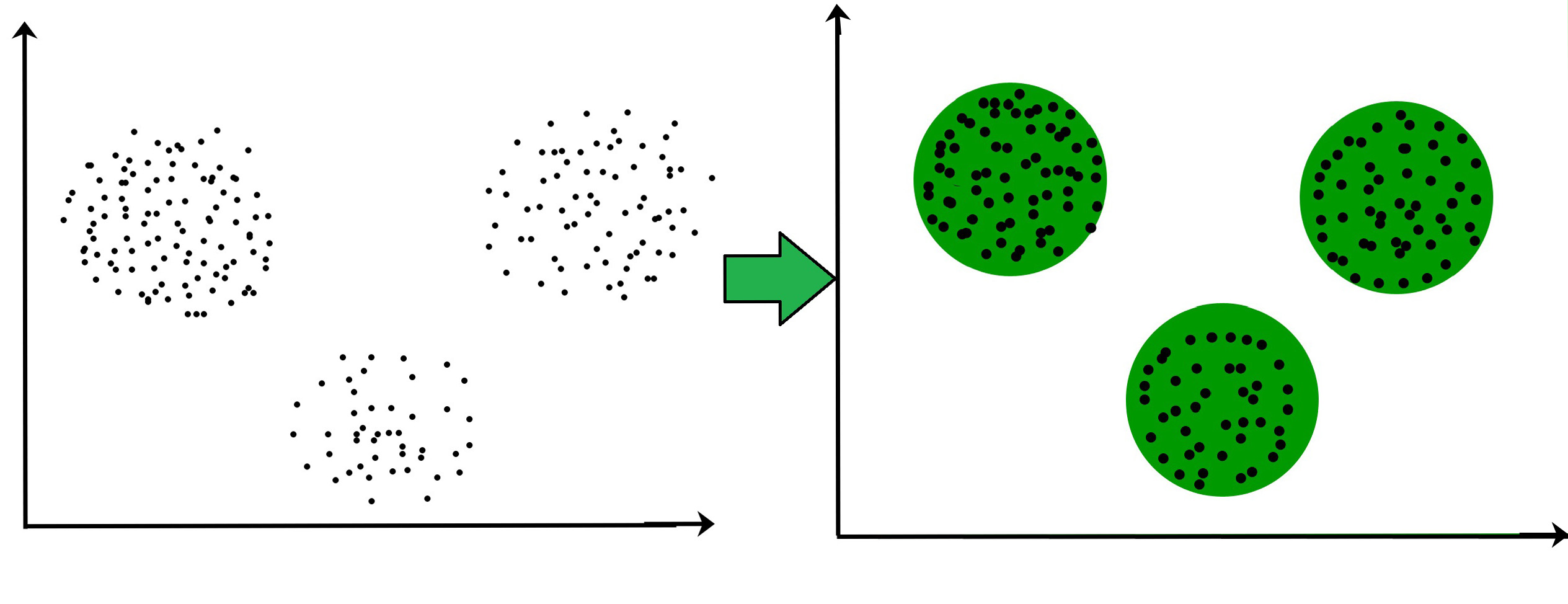 Now it is not necessary that the clusters formed must be circular in shape.
The shape of clusters can be arbitrary.
There are many algortihms that work well with detecting arbitrary shaped clusters.
For example, In the below given graph we can see that the clusters formed are not circular in shape.
Now it is not necessary that the clusters formed must be circular in shape.
The shape of clusters can be arbitrary.
There are many algortihms that work well with detecting arbitrary shaped clusters.
For example, In the below given graph we can see that the clusters formed are not circular in shape.
 We can see three nicely divided groups of data.


 We can see example, when K-means fails most often, so when there are outliers in the dataset.
 We can see that medoids stayed nicely in the three main groups of data.
 data_example[, class := as.factor(km_res_k[[which.min(c(0,diff(unlist(db_km))))]])]
ggplot(data_example, aes(x, y, color = class, shape = class)) +
geom_point(alpha = 0.75, size = 8) +
theme_bw()
data_example[, class := as.factor(km_res_k[[which.min(c(0,diff(unlist(db_km))))]])]
ggplot(data_example, aes(x, y, color = class, shape = class)) +
geom_point(alpha = 0.75, size = 8) +
theme_bw()
data_example[, class := as.factor(km_res_k[[which.min(c(0,diff(unlist(db_km))))]])]
ggplot(data_example, aes(x, y, color = class, shape = class)) +
geom_point(alpha = 0.75, size = 8) +
theme_bw()
data_example[, class := as.factor(km_res_k[[which.min(c(0,diff(unlist(db_km))))]])]
ggplot(data_example, aes(x, y, color = class, shape = class)) +
geom_point(alpha = 0.75, size = 8) +
theme_bw()
data_example[, class := as.factor(km_res_k[[which.min(c(0,diff(unlist(db_km))))]])]
ggplot(data_example, aes(x, y, color = class, shape = class)) +
geom_point(alpha = 0.75, size = 8) +
theme_bw()
data_example[, class := as.factor(km_res_k[[which.min(c(0,diff(unlist(db_km))))]])]
ggplot(data_example, aes(x, y, color = class, shape = class)) +
geom_point(alpha = 0.75, size = 8) +
theme_bw()
 We can see that the Elbow diagram rule chose 4 clusters - makes sense to me actually…
We can also try it with PAM - K-medoids.
kmed_res_k <- lapply(2:6, function(i) pam(data_example[, .(x, y)], i)$clustering)
db_kmed <- lapply(kmed_res_k, function(j) intCriteria(data.matrix(data_example[, .(x, y)]),
j,
"Davies_bouldin")$davies_bouldin)
ggplot(data.table(K = 2:6, Dav_Boul = unlist(db_kmed)), aes(K, Dav_Boul)) +
geom_line() +
geom_point() +
theme_bw()
We can see that the Elbow diagram rule chose 4 clusters - makes sense to me actually…
We can also try it with PAM - K-medoids.
kmed_res_k <- lapply(2:6, function(i) pam(data_example[, .(x, y)], i)$clustering)
db_kmed <- lapply(kmed_res_k, function(j) intCriteria(data.matrix(data_example[, .(x, y)]),
j,
"Davies_bouldin")$davies_bouldin)
ggplot(data.table(K = 2:6, Dav_Boul = unlist(db_kmed)), aes(K, Dav_Boul)) +
geom_line() +
geom_point() +
theme_bw()
kmed_res_k <- lapply(2:6, function(i) pam(data_example[, .(x, y)], i)$clustering)
db_kmed <- lapply(kmed_res_k, function(j) intCriteria(data.matrix(data_example[, .(x, y)]),
j,
"Davies_bouldin")$davies_bouldin)
ggplot(data.table(K = 2:6, Dav_Boul = unlist(db_kmed)), aes(K, Dav_Boul)) +
geom_line() +
geom_point() +
theme_bw()
kmed_res_k <- lapply(2:6, function(i) pam(data_example[, .(x, y)], i)$clustering)
db_kmed <- lapply(kmed_res_k, function(j) intCriteria(data.matrix(data_example[, .(x, y)]),
j,
"Davies_bouldin")$davies_bouldin)
ggplot(data.table(K = 2:6, Dav_Boul = unlist(db_kmed)), aes(K, Dav_Boul)) +
geom_line() +
geom_point() +
theme_bw()
 data_example[, class := as.factor(kmed_res_k[[which.min(c(0,diff(unlist(db_km))))]])]
ggplot(data_example, aes(x, y, color = class, shape = class)) +
geom_point(alpha = 0.75, size = 8) +
theme_bw()
data_example[, class := as.factor(kmed_res_k[[which.min(c(0,diff(unlist(db_km))))]])]
ggplot(data_example, aes(x, y, color = class, shape = class)) +
geom_point(alpha = 0.75, size = 8) +
theme_bw()
data_example[, class := as.factor(kmed_res_k[[which.min(c(0,diff(unlist(db_km))))]])]
ggplot(data_example, aes(x, y, color = class, shape = class)) +
geom_point(alpha = 0.75, size = 8) +
theme_bw()
data_example[, class := as.factor(kmed_res_k[[which.min(c(0,diff(unlist(db_km))))]])]
ggplot(data_example, aes(x, y, color = class, shape = class)) +
geom_point(alpha = 0.75, size = 8) +
theme_bw()
data_example[, class := as.factor(kmed_res_k[[which.min(c(0,diff(unlist(db_km))))]])]
ggplot(data_example, aes(x, y, color = class, shape = class)) +
geom_point(alpha = 0.75, size = 8) +
theme_bw()
data_example[, class := as.factor(kmed_res_k[[which.min(c(0,diff(unlist(db_km))))]])]
ggplot(data_example, aes(x, y, color = class, shape = class)) +
geom_point(alpha = 0.75, size = 8) +
theme_bw()
 It is the same result.