R4DataScience
Must Watch!
Welcome
![Cover image]() This is the website for 'R for Data Science'.
This book will teach you how to do data science with R: You’ll learn how to get your data into R, get it into the most useful structure, transform it, visualise it and model it.
In this book, you will find a practicum of skills for data science.
Just as a chemist learns how to clean test tubes and stock a lab, you’ll learn how to clean data and draw plots—and many other things besides.
These are the skills that allow data science to happen, and here you will find the best practices for doing each of these things with R.
You’ll learn how to use the grammar of graphics, literate programming, and reproducible research to save time.
You’ll also learn how to manage cognitive resources to facilitate discoveries when wrangling, visualising, and exploring data.
This is the website for 'R for Data Science'.
This book will teach you how to do data science with R: You’ll learn how to get your data into R, get it into the most useful structure, transform it, visualise it and model it.
In this book, you will find a practicum of skills for data science.
Just as a chemist learns how to clean test tubes and stock a lab, you’ll learn how to clean data and draw plots—and many other things besides.
These are the skills that allow data science to happen, and here you will find the best practices for doing each of these things with R.
You’ll learn how to use the grammar of graphics, literate programming, and reproducible research to save time.
You’ll also learn how to manage cognitive resources to facilitate discoveries when wrangling, visualising, and exploring data.
1 Introduction
1.1 What you will learn
Data science is a huge field, and there’s no way you can master it by reading a single book.
The goal of this book is to give you a solid foundation in the most important tools.
Our model of the tools needed in a typical data science project looks something like this:
![]() First you must import your data into R.
Once you’ve imported your data, it is a good idea to tidy it.
Once you have tidy data, a common first step is to transform it.
Transformation includes narrowing in on observations of interest (like all people in one city, or all data from the last year), creating new variables that are functions of existing variables (like computing speed from distance and time), and calculating a set of summary statistics (like counts or means).
Together, tidying and transforming are called wrangling, because getting your data in a form that’s natural to work with often feels like a fight!
Once you have tidy data with the variables you need, there are two main engines of knowledge generation: visualisation and modelling.
These have complementary strengths and weaknesses so any real analysis will iterate between them many times.
Visualisation is a fundamentally human activity.
A good visualisation will show you things that you did not expect, or raise new questions about the data.
A good visualisation might also hint that you’re asking the wrong question, or you need to collect different data.
Visualisations can surprise you, but don’t scale particularly well because they require a human to interpret them.
Models are complementary tools to visualisation.
Once you have made your questions sufficiently precise, you can use a model to answer them.
Models are a fundamentally mathematical or computational tool, so they generally scale well.
Even when they don’t, it’s usually cheaper to buy more computers than it is to buy more brains! But every model makes assumptions, and by its very nature a model cannot question its own assumptions.
That means a model cannot fundamentally surprise you.
The last step of data science is communication, an absolutely critical part of any data analysis project.
It doesn’t matter how well your models and visualisation have led you to understand the data unless you can also communicate your results to others.
Surrounding all these tools is programming.
Programming is a cross-cutting tool that you use in every part of the project.
You don’t need to be an expert programmer to be a data scientist, but learning more about programming pays off because becoming a better programmer allows you to automate common tasks, and solve new problems with greater ease.
You’ll use these tools in every data science project, but for most projects they’re not enough.
There’s a rough 80-20 rule at play; you can tackle about 80% of every project using the tools that you’ll learn in this book, but you’ll need other tools to tackle the remaining 20%.
Throughout this book we’ll point you to resources where you can learn more.
First you must import your data into R.
Once you’ve imported your data, it is a good idea to tidy it.
Once you have tidy data, a common first step is to transform it.
Transformation includes narrowing in on observations of interest (like all people in one city, or all data from the last year), creating new variables that are functions of existing variables (like computing speed from distance and time), and calculating a set of summary statistics (like counts or means).
Together, tidying and transforming are called wrangling, because getting your data in a form that’s natural to work with often feels like a fight!
Once you have tidy data with the variables you need, there are two main engines of knowledge generation: visualisation and modelling.
These have complementary strengths and weaknesses so any real analysis will iterate between them many times.
Visualisation is a fundamentally human activity.
A good visualisation will show you things that you did not expect, or raise new questions about the data.
A good visualisation might also hint that you’re asking the wrong question, or you need to collect different data.
Visualisations can surprise you, but don’t scale particularly well because they require a human to interpret them.
Models are complementary tools to visualisation.
Once you have made your questions sufficiently precise, you can use a model to answer them.
Models are a fundamentally mathematical or computational tool, so they generally scale well.
Even when they don’t, it’s usually cheaper to buy more computers than it is to buy more brains! But every model makes assumptions, and by its very nature a model cannot question its own assumptions.
That means a model cannot fundamentally surprise you.
The last step of data science is communication, an absolutely critical part of any data analysis project.
It doesn’t matter how well your models and visualisation have led you to understand the data unless you can also communicate your results to others.
Surrounding all these tools is programming.
Programming is a cross-cutting tool that you use in every part of the project.
You don’t need to be an expert programmer to be a data scientist, but learning more about programming pays off because becoming a better programmer allows you to automate common tasks, and solve new problems with greater ease.
You’ll use these tools in every data science project, but for most projects they’re not enough.
There’s a rough 80-20 rule at play; you can tackle about 80% of every project using the tools that you’ll learn in this book, but you’ll need other tools to tackle the remaining 20%.
Throughout this book we’ll point you to resources where you can learn more.
1.2 How this book is organised
The previous description of the tools of data science is organised roughly according to the order in which you use them in an analysis (although of course you’ll iterate through them multiple times).
In our experience, however, this is not the best way to learn them:
Starting with data ingest and tidying is sub-optimal because 80% of the time
it’s routine and boring, and the other 20% of the time it’s weird and
frustrating.
That’s a bad place to start learning a new subject! Instead,
we’ll start with visualisation and transformation of data that’s already been
imported and tidied.
That way, when you ingest and tidy your own data, your
motivation will stay high because you know the pain is worth it.
Some topics are best explained with other tools.
For example, we believe that
it’s easier to understand how models work if you already know about
visualisation, tidy data, and programming.
Programming tools are not necessarily interesting in their own right,
but do allow you to tackle considerably more challenging problems.
We’ll
give you a selection of programming tools in the middle of the book, and
then you’ll see how they can combine with the data science tools to tackle
interesting modelling problems.
Within each chapter, we try and stick to a similar pattern: start with some motivating examples so you can see the bigger picture, and then dive into the details.
Each section of the book is paired with exercises to help you practice what you’ve learned.
While it’s tempting to skip the exercises, there’s no better way to learn than practicing on real problems.
1.3 What you won’t learn
There are some important topics that this book doesn’t cover.
We believe it’s important to stay ruthlessly focused on the essentials so you can get up and running as quickly as possible.
That means this book can’t cover every important topic.
1.3.1 Big data
This book proudly focuses on small, in-memory datasets.
This is the right place to start because you can’t tackle big data unless you have experience with small data.
The tools you learn in this book will easily handle hundreds of megabytes of data, and with a little care you can typically use them to work with 1-2 Gb of data.
If you’re routinely working with larger data (10-100 Gb, say), you should learn more about data.table.
This book doesn’t teach data.table because it has a very concise interface which makes it harder to learn since it offers fewer linguistic cues.
But if you’re working with large data, the performance payoff is worth the extra effort required to learn it.
If your data is bigger than this, carefully consider if your big data problem might actually be a small data problem in disguise.
While the complete data might be big, often the data needed to answer a specific question is small.
You might be able to find a subset, subsample, or summary that fits in memory and still allows you to answer the question that you’re interested in.
The challenge here is finding the right small data, which often requires a lot of iteration.
Another possibility is that your big data problem is actually a large number of small data problems.
Each individual problem might fit in memory, but you have millions of them.
For example, you might want to fit a model to each person in your dataset.
That would be trivial if you had just 10 or 100 people, but instead you have a million.
Fortunately each problem is independent of the others (a setup that is sometimes called embarrassingly parallel), so you just need a system (like Hadoop or Spark) that allows you to send different datasets to different computers for processing.
Once you’ve figured out how to answer the question for a single subset using the tools described in this book, you learn new tools like sparklyr, rhipe, and ddr to solve it for the full dataset.
1.3.2 Python, Julia, and friends
In this book, you won’t learn anything about Python, Julia, or any other programming language useful for data science.
This isn’t because we think these tools are bad.
They’re not! And in practice, most data science teams use a mix of languages, often at least R and Python.
However, we strongly believe that it’s best to master one tool at a time.
You will get better faster if you dive deep, rather than spreading yourself thinly over many topics.
This doesn’t mean you should only know one thing, just that you’ll generally learn faster if you stick to one thing at a time.
You should strive to learn new things throughout your career, but make sure your understanding is solid before you move on to the next interesting thing.
We think R is a great place to start your data science journey because it is an environment designed from the ground up to support data science.
R is not just a programming language, but it is also an interactive environment for doing data science.
To support interaction, R is a much more flexible language than many of its peers.
This flexibility comes with its downsides, but the big upside is how easy it is to evolve tailored grammars for specific parts of the data science process.
These mini languages help you think about problems as a data scientist, while supporting fluent interaction between your brain and the computer.
1.3.3 Non-rectangular data
This book focuses exclusively on rectangular data: collections of values that are each associated with a variable and an observation.
There are lots of datasets that do not naturally fit in this paradigm: including images, sounds, trees, and text.
But rectangular data frames are extremely common in science and industry, and we believe that they are a great place to start your data science journey.
1.3.4 Hypothesis confirmation
It’s possible to divide data analysis into two camps: hypothesis generation and hypothesis confirmation (sometimes called confirmatory analysis).
The focus of this book is unabashedly on hypothesis generation, or data exploration.
Here you’ll look deeply at the data and, in combination with your subject knowledge, generate many interesting hypotheses to help explain why the data behaves the way it does.
You evaluate the hypotheses informally, using your scepticism to challenge the data in multiple ways.
The complement of hypothesis generation is hypothesis confirmation.
Hypothesis confirmation is hard for two reasons:
You need a precise mathematical model in order to generate falsifiable
predictions.
This often requires considerable statistical sophistication.
You can only use an observation once to confirm a hypothesis.
As soon as
you use it more than once you’re back to doing exploratory analysis.
This means to do hypothesis confirmation you need to 'preregister'
(write out in advance) your analysis plan, and not deviate from it
even when you have seen the data.
We’ll talk a little about some
strategies you can use to make this easier in modelling.
It’s common to think about modelling as a tool for hypothesis confirmation, and visualisation as a tool for hypothesis generation.
But that’s a false dichotomy: models are often used for exploration, and with a little care you can use visualisation for confirmation.
The key difference is how often do you look at each observation: if you look only once, it’s confirmation; if you look more than once, it’s exploration.
1.4 Prerequisites
We’ve made a few assumptions about what you already know in order to get the most out of this book.
You should be generally numerically literate, and it’s helpful if you have some programming experience already.
If you’ve never programmed before, you might find Hands on Programming with R by Garrett to be a useful adjunct to this book.
There are four things you need to run the code in this book: R, RStudio, a collection of R packages called the tidyverse, and a handful of other packages.
Packages are the fundamental units of reproducible R code.
They include reusable functions, the documentation that describes how to use them, and sample data.
1.4.1 R
To download R, go to CRAN, the comprehensive R archive network.
CRAN is composed of a set of mirror servers distributed around the world and is used to distribute R and R packages.
Don’t try and pick a mirror that’s close to you: instead use the cloud mirror, https://cloud.r-project.org, which automatically figures it out for you.
A new major version of R comes out once a year, and there are 2-3 minor releases each year.
It’s a good idea to update regularly.
Upgrading can be a bit of a hassle, especially for major versions, which require you to reinstall all your packages, but putting it off only makes it worse.
1.4.2 RStudio
RStudio is an integrated development environment, or IDE, for R programming.
Download and install it from http://www.rstudio.com/download.
RStudio is updated a couple of times a year.
When a new version is available, RStudio will let you know.
It’s a good idea to upgrade regularly so you can take advantage of the latest and greatest features.
For this book, make sure you have at least RStudio 1.0.0.
When you start RStudio, you’ll see two key regions in the interface:
![]() For now, all you need to know is that you type R code in the console pane, and press enter to run it.
You’ll learn more as we go along!
For now, all you need to know is that you type R code in the console pane, and press enter to run it.
You’ll learn more as we go along!
1.4.3 The tidyverse
You’ll also need to install some R packages.
An R package is a collection of functions, data, and documentation that extends the capabilities of base R.
Using packages is key to the successful use of R.
The majority of the packages that you will learn in this book are part of the so-called tidyverse.
The packages in the tidyverse share a common philosophy of data and R programming, and are designed to work together naturally.
You can install the complete tidyverse with a single line of code:
install.packages("tidyverse")
On your own computer, type that line of code in the console, and then press enter to run it.
R will download the packages from CRAN and install them on to your computer.
If you have problems installing, make sure that you are connected to the internet, and that https://cloud.r-project.org/ isn’t blocked by your firewall or proxy.
You will not be able to use the functions, objects, and help files in a package until you load it with library().
Once you have installed a package, you can load it with the library() function:
library(tidyverse)
#> ── Attaching packages ─────────────────────────────────────── tidyverse 1.3.0 ──
#> ✔ ggplot2 3.3.0 ✔ purrr 0.3.4
#> ✔ tibble 3.0.1 ✔ dplyr 0.8.5
#> ✔ tidyr 1.0.3 ✔ stringr 1.4.0
#> ✔ readr 1.3.1 ✔ forcats 0.5.0
#> ── Conflicts ────────────────────────────────────────── tidyverse_conflicts() ──
#> ✖ dplyr::filter() masks stats::filter()
#> ✖ dplyr::lag() masks stats::lag()
This tells you that tidyverse is loading the ggplot2, tibble, tidyr, readr, purrr, and dplyr packages.
These are considered to be the core of the tidyverse because you’ll use them in almost every analysis.
Packages in the tidyverse change fairly frequently.
You can see if updates are available, and optionally install them, by running tidyverse_update().
1.4.4 Other packages
There are many other excellent packages that are not part of the tidyverse, because they solve problems in a different domain, or are designed with a different set of underlying principles.
This doesn’t make them better or worse, just different.
In other words, the complement to the tidyverse is not the messyverse, but many other universes of interrelated packages.
As you tackle more data science projects with R, you’ll learn new packages and new ways of thinking about data.
In this book we’ll use three data packages from outside the tidyverse:
install.packages(c("nycflights13", "gapminder", "Lahman"))
These packages provide data on airline flights, world development, and baseball that we’ll use to illustrate key data science ideas.
1.5 Running R code
The previous section showed you a couple of examples of running R code.
Code in the book looks like this:
1 + 2
#> [1] 3
#> [1] 3
If you run the same code in your local console, it will look like this:
> 1 + 2
[1] 3
There are two main differences.
In your console, you type after the >, called the prompt; we don’t show the prompt in the book.
In the book, output is commented out with #>; in your console it appears directly after your code.
These two differences mean that if you’re working with an electronic version of the book, you can easily copy code out of the book and into the console.
Throughout the book we use a consistent set of conventions to refer to code:
Functions are in a code font and followed by parentheses, like sum(),
or mean().
Other R objects (like data or function arguments) are in a code font,
without parentheses, like flights or x.
If we want to make it clear what package an object comes from, we’ll use
the package name followed by two colons, like dplyr::mutate(), or
nycflights13::flights.
This is also valid R code.
1.6 Getting help and learning more
This book is not an island; there is no single resource that will allow you to master R.
As you start to apply the techniques described in this book to your own data you will soon find questions that I do not answer.
This section describes a few tips on how to get help, and to help you keep learning.
If you get stuck, start with Google.
Typically adding 'R' to a query is enough to restrict it to relevant results: if the search isn’t useful, it often means that there aren’t any R-specific results available.
Google is particularly useful for error messages.
If you get an error message and you have no idea what it means, try googling it! Chances are that someone else has been confused by it in the past, and there will be help somewhere on the web.
(If the error message isn’t in English, run Sys.setenv(LANGUAGE = "en") and re-run the code; you’re more likely to find help for English error messages.)
If Google doesn’t help, try stackoverflow.
Start by spending a little time searching for an existing answer, including [R] to restrict your search to questions and answers that use R.
If you don’t find anything useful, prepare a minimal reproducible example or reprex.
A good reprex makes it easier for other people to help you, and often you’ll figure out the problem yourself in the course of making it.
There are three things you need to include to make your example reproducible: required packages, data, and code.
Packages should be loaded at the top of the script, so it’s easy to
see which ones the example needs.
This is a good time to check that you’re
using the latest version of each package; it’s possible you’ve discovered
a bug that’s been fixed since you installed the package.
For packages
in the tidyverse, the easiest way to check is to run tidyverse_update().
The easiest way to include data in a question is to use dput() to
generate the R code to recreate it.
For example, to recreate the mtcars
dataset in R, I’d perform the following steps:
Run dput(mtcars) in R
Copy the output
In my reproducible script, type mtcars <- then paste.
Try and find the smallest subset of your data that still reveals
the problem.
Spend a little bit of time ensuring that your code is easy for others to
read:
Make sure you’ve used spaces and your variable names are concise, yet
informative.
Use comments to indicate where your problem lies.
Do your best to remove everything that is not related to the problem.
The shorter your code is, the easier it is to understand, and the
easier it is to fix.
Finish by checking that you have actually made a reproducible example by starting a fresh R session and copying and pasting your script in.
You should also spend some time preparing yourself to solve problems before they occur.
Investing a little time in learning R each day will pay off handsomely in the long run.
One way is to follow what Hadley, Garrett, and everyone else at RStudio are doing on the RStudio blog.
This is where we post announcements about new packages, new IDE features, and in-person courses.
You might also want to follow Hadley (@hadleywickham) or Garrett (@statgarrett) on Twitter, or follow @rstudiotips to keep up with new features in the IDE.
To keep up with the R community more broadly, we recommend reading http://www.r-bloggers.com: it aggregates over 500 blogs about R from around the world.
If you’re an active Twitter user, follow the #rstats hashtag.
Twitter is one of the key tools that Hadley uses to keep up with new developments in the community.
1.7 Acknowledgements
This book isn’t just the product of Hadley and Garrett, but is the result of many conversations (in person and online) that we’ve had with the many people in the R community.
There are a few people we’d like to thank in particular, because they have spent many hours answering our dumb questions and helping us to better think about data science:
Jenny Bryan and Lionel Henry for many helpful discussions around working
with lists and list-columns.
The three chapters on workflow were adapted (with permission), from
http://stat545.com/block002_hello-r-workspace-wd-project.html by
Jenny Bryan.
Genevera Allen for discussions about models, modelling, the statistical
learning perspective, and the difference between hypothesis generation and
hypothesis confirmation.
Yihui Xie for his work on the bookdown
package, and for tirelessly responding to my feature requests.
Bill Behrman for his thoughtful reading of the entire book, and for trying
it out with his data science class at Stanford.
The #rstats twitter community who reviewed all of the draft chapters
and provided tons of useful feedback.
Tal Galili for augmenting his dendextend package to support a section on clustering that did not make it into the final draft.
This book was written in the open, and many people contributed pull requests to fix minor problems.
Special thanks goes to everyone who contributed via GitHub:
Thanks go to all contributers in alphabetical order: adi pradhan, Ahmed ElGabbas, Ajay Deonarine, @Alex, Andrew Landgraf, bahadir cankardes, @batpigandme, @behrman, Ben Marwick, Bill Behrman, Brandon Greenwell, Brett Klamer, Christian G.
Warden, Christian Mongeau, Colin Gillespie, Cooper Morris, Curtis Alexander, Daniel Gromer, David Clark, Derwin McGeary, Devin Pastoor, Dylan Cashman, Earl Brown, Eric Watt, Etienne B.
Racine, Flemming Villalona, Gregory Jefferis, @harrismcgehee, Hengni Cai, Ian Lyttle, Ian Sealy, Jakub Nowosad, Jennifer (Jenny) Bryan, @jennybc, Jeroen Janssens, Jim Hester, @jjchern, Joanne Jang, John Sears, Jon Calder, Jonathan Page, @jonathanflint, Jose Roberto Ayala Solares, Julia Stewart Lowndes, Julian During, Justinas Petuchovas, Kara Woo, @kdpsingh, Kenny Darrell, Kirill Sevastyanenko, @koalabearski, @KyleHumphrey, Lawrence Wu, Matthew Sedaghatfar, Mine Cetinkaya-Rundel, @MJMarshall, Mustafa Ascha, @nate-d-olson, Nelson Areal, Nick Clark, @nickelas, Nirmal Patel, @nwaff, @OaCantona, Patrick Kennedy, @Paul, Peter Hurford, Rademeyer Vermaak, Radu Grosu, @rlzijdeman, Robert Schuessler, @robinlovelace, @robinsones, S’busiso Mkhondwane, @seamus-mckinsey, @seanpwilliams, Shannon Ellis, @shoili, @sibusiso16, @spirgel, Steve Mortimer, @svenski, Terence Teo, Thomas Klebel, TJ Mahr, Tom Prior, Will Beasley, @yahwes, Yihui Xie, @zeal626.
1.8 Colophon
An online version of this book is available at http://r4ds.had.co.nz.
It will continue to evolve in between reprints of the physical book.
The source of the book is available at https://github.com/hadley/r4ds.
The book is powered by https://bookdown.org which makes it easy to turn R markdown files into HTML, PDF, and EPUB.
This book was built with:
sessioninfo::session_info(c("tidyverse"))
#> ─ Session info ───────────────────────────────────────────────────────────────
#> setting value
#> version R version 4.0.0 (2020-04-24)
#> os Ubuntu 16.04.6 LTS
#> system x86_64, linux-gnu
#> ui X11
#> language en_US.UTF-8
#> collate en_US.UTF-8
#> ctype en_US.UTF-8
#> tz UTC
#> date 2020-05-08
#>
#> ─ Packages ───────────────────────────────────────────────────────────────────
#> package * version date lib source
#> askpass 1.1 2019-01-13 [1] CRAN (R 4.0.0)
#> assertthat 0.2.1 2019-03-21 [1] CRAN (R 4.0.0)
#> backports 1.1.6 2020-04-05 [1] CRAN (R 4.0.0)
#> base64enc 0.1-3 2015-07-28 [1] CRAN (R 4.0.0)
#> BH 1.72.0-3 2020-01-08 [1] CRAN (R 4.0.0)
#> broom 0.5.6 2020-04-20 [1] CRAN (R 4.0.0)
#> callr 3.4.3 2020-03-28 [1] CRAN (R 4.0.0)
#> cellranger 1.1.0 2016-07-27 [1] CRAN (R 4.0.0)
#> cli 2.0.2 2020-02-28 [1] CRAN (R 4.0.0)
#> clipr 0.7.0 2019-07-23 [1] CRAN (R 4.0.0)
#> colorspace 1.4-1 2019-03-18 [1] CRAN (R 4.0.0)
#> crayon 1.3.4 2017-09-16 [1] CRAN (R 4.0.0)
#> curl 4.3 2019-12-02 [1] CRAN (R 4.0.0)
#> DBI 1.1.0 2019-12-15 [1] CRAN (R 4.0.0)
#> dbplyr 1.4.3 2020-04-19 [1] CRAN (R 4.0.0)
#> desc 1.2.0 2018-05-01 [1] CRAN (R 4.0.0)
#> digest 0.6.25 2020-02-23 [1] CRAN (R 4.0.0)
#> dplyr * 0.8.5 2020-03-07 [1] CRAN (R 4.0.0)
#> ellipsis 0.3.0 2019-09-20 [1] CRAN (R 4.0.0)
#> evaluate 0.14 2019-05-28 [1] CRAN (R 4.0.0)
#> fansi 0.4.1 2020-01-08 [1] CRAN (R 4.0.0)
#> farver 2.0.3 2020-01-16 [1] CRAN (R 4.0.0)
#> forcats * 0.5.0 2020-03-01 [1] CRAN (R 4.0.0)
#> fs 1.4.1 2020-04-04 [1] CRAN (R 4.0.0)
#> generics 0.0.2 2018-11-29 [1] CRAN (R 4.0.0)
#> ggplot2 * 3.3.0 2020-03-05 [1] CRAN (R 4.0.0)
#> glue 1.4.0 2020-04-03 [1] CRAN (R 4.0.0)
#> gtable 0.3.0 2019-03-25 [1] CRAN (R 4.0.0)
#> haven 2.2.0 2019-11-08 [1] CRAN (R 4.0.0)
#> highr 0.8 2019-03-20 [1] CRAN (R 4.0.0)
#> hms 0.5.3 2020-01-08 [1] CRAN (R 4.0.0)
#> htmltools 0.4.0 2019-10-04 [1] CRAN (R 4.0.0)
#> httr 1.4.1 2019-08-05 [1] CRAN (R 4.0.0)
#> isoband 0.2.1 2020-04-12 [1] CRAN (R 4.0.0)
#> jsonlite 1.6.1 2020-02-02 [1] CRAN (R 4.0.0)
#> knitr 1.28 2020-02-06 [1] CRAN (R 4.0.0)
#> labeling 0.3 2014-08-23 [1] CRAN (R 4.0.0)
#> lattice 0.20-41 2020-04-02 [3] CRAN (R 4.0.0)
#> lifecycle 0.2.0 2020-03-06 [1] CRAN (R 4.0.0)
#> lubridate 1.7.8 2020-04-06 [1] CRAN (R 4.0.0)
#> magrittr 1.5 2014-11-22 [1] CRAN (R 4.0.0)
#> markdown 1.1 2019-08-07 [1] CRAN (R 4.0.0)
#> MASS 7.3-51.5 2019-12-20 [3] CRAN (R 4.0.0)
#> Matrix 1.2-18 2019-11-27 [3] CRAN (R 4.0.0)
#> mgcv 1.8-31 2019-11-09 [3] CRAN (R 4.0.0)
#> mime 0.9 2020-02-04 [1] CRAN (R 4.0.0)
#> modelr 0.1.7 2020-04-30 [1] CRAN (R 4.0.0)
#> munsell 0.5.0 2018-06-12 [1] CRAN (R 4.0.0)
#> nlme 3.1-147 2020-04-13 [3] CRAN (R 4.0.0)
#> openssl 1.4.1 2019-07-18 [1] CRAN (R 4.0.0)
#> pillar 1.4.4 2020-05-05 [1] CRAN (R 4.0.0)
#> pkgbuild 1.0.8 2020-05-07 [1] CRAN (R 4.0.0)
#> pkgconfig 2.0.3 2019-09-22 [1] CRAN (R 4.0.0)
#> pkgload 1.0.2 2018-10-29 [1] CRAN (R 4.0.0)
#> plogr 0.2.0 2018-03-25 [1] CRAN (R 4.0.0)
#> plyr 1.8.6 2020-03-03 [1] CRAN (R 4.0.0)
#> praise 1.0.0 2015-08-11 [1] CRAN (R 4.0.0)
#> prettyunits 1.1.1 2020-01-24 [1] CRAN (R 4.0.0)
#> processx 3.4.2 2020-02-09 [1] CRAN (R 4.0.0)
#> progress 1.2.2 2019-05-16 [1] CRAN (R 4.0.0)
#> ps 1.3.3 2020-05-08 [1] CRAN (R 4.0.0)
#> purrr * 0.3.4 2020-04-17 [1] CRAN (R 4.0.0)
#> R6 2.4.1 2019-11-12 [1] CRAN (R 4.0.0)
#> RColorBrewer 1.1-2 2014-12-07 [1] CRAN (R 4.0.0)
#> Rcpp 1.0.4.6 2020-04-09 [1] CRAN (R 4.0.0)
#> readr * 1.3.1 2018-12-21 [1] CRAN (R 4.0.0)
#> readxl 1.3.1 2019-03-13 [1] CRAN (R 4.0.0)
#> rematch 1.0.1 2016-04-21 [1] CRAN (R 4.0.0)
#> reprex 0.3.0 2019-05-16 [1] CRAN (R 4.0.0)
#> reshape2 1.4.4 2020-04-09 [1] CRAN (R 4.0.0)
#> rlang 0.4.6 2020-05-02 [1] CRAN (R 4.0.0)
#> rmarkdown 2.1 2020-01-20 [1] CRAN (R 4.0.0)
#> rprojroot 1.3-2 2018-01-03 [1] CRAN (R 4.0.0)
#> rstudioapi 0.11 2020-02-07 [1] CRAN (R 4.0.0)
#> rvest 0.3.5 2019-11-08 [1] CRAN (R 4.0.0)
#> scales 1.1.0 2019-11-18 [1] CRAN (R 4.0.0)
#> selectr 0.4-2 2019-11-20 [1] CRAN (R 4.0.0)
#> stringi 1.4.6 2020-02-17 [1] CRAN (R 4.0.0)
#> stringr * 1.4.0 2019-02-10 [1] CRAN (R 4.0.0)
#> sys 3.3 2019-08-21 [1] CRAN (R 4.0.0)
#> testthat 2.3.2 2020-03-02 [1] CRAN (R 4.0.0)
#> tibble * 3.0.1 2020-04-20 [1] CRAN (R 4.0.0)
#> tidyr * 1.0.3 2020-05-07 [1] CRAN (R 4.0.0)
#> tidyselect 1.0.0 2020-01-27 [1] CRAN (R 4.0.0)
#> tidyverse * 1.3.0 2019-11-21 [1] CRAN (R 4.0.0)
#> tinytex 0.22 2020-04-17 [1] CRAN (R 4.0.0)
#> utf8 1.1.4 2018-05-24 [1] CRAN (R 4.0.0)
#> vctrs 0.2.4 2020-03-10 [1] CRAN (R 4.0.0)
#> viridisLite 0.3.0 2018-02-01 [1] CRAN (R 4.0.0)
#> whisker 0.4 2019-08-28 [1] CRAN (R 4.0.0)
#> withr 2.2.0 2020-04-20 [1] CRAN (R 4.0.0)
#> xfun 0.13 2020-04-13 [1] CRAN (R 4.0.0)
#> xml2 1.3.2 2020-04-23 [1] CRAN (R 4.0.0)
#> yaml 2.2.1 2020-02-01 [1] CRAN (R 4.0.0)
#>
#> [1] /home/travis/R/Library
#> [2] /usr/local/lib/R/site-library
#> [3] /home/travis/R-bin/lib/R/library
2 Introduction
The goal of the first part of this book is to get you up to speed with the basic tools of data exploration as quickly as possible.
Data exploration is the art of looking at your data, rapidly generating hypotheses, quickly testing them, then repeating again and again and again.
The goal of data exploration is to generate many promising leads that you can later explore in more depth.
![]() In this part of the book you will learn some useful tools that have an immediate payoff:
Visualisation is a great place to start with R programming, because the
payoff is so clear: you get to make elegant and informative plots that help
you understand data.
In data visualisation you’ll dive into visualisation,
learning the basic structure of a ggplot2 plot, and powerful techniques for
turning data into plots.
Visualisation alone is typically not enough, so in data transformation
you’ll learn the key verbs that allow you to select important variables,
filter out key observations, create new variables, and compute summaries.
Finally, in exploratory data analysis, you’ll combine visualisation and
transformation with your curiosity and scepticism to ask and answer
interesting questions about data.
Modelling is an important part of the exploratory process, but you don’t have the skills to effectively learn or apply it yet.
We’ll come back to it in modelling, once you’re better equipped with more data wrangling and programming tools.
Nestled among these three chapters that teach you the tools of exploration are three chapters that focus on your R workflow.
In workflow: basics, workflow: scripts, and workflow: projects you’ll learn good practices for writing and organising your R code.
These will set you up for success in the long run, as they’ll give you the tools to stay organised when you tackle real projects.
In this part of the book you will learn some useful tools that have an immediate payoff:
Visualisation is a great place to start with R programming, because the
payoff is so clear: you get to make elegant and informative plots that help
you understand data.
In data visualisation you’ll dive into visualisation,
learning the basic structure of a ggplot2 plot, and powerful techniques for
turning data into plots.
Visualisation alone is typically not enough, so in data transformation
you’ll learn the key verbs that allow you to select important variables,
filter out key observations, create new variables, and compute summaries.
Finally, in exploratory data analysis, you’ll combine visualisation and
transformation with your curiosity and scepticism to ask and answer
interesting questions about data.
Modelling is an important part of the exploratory process, but you don’t have the skills to effectively learn or apply it yet.
We’ll come back to it in modelling, once you’re better equipped with more data wrangling and programming tools.
Nestled among these three chapters that teach you the tools of exploration are three chapters that focus on your R workflow.
In workflow: basics, workflow: scripts, and workflow: projects you’ll learn good practices for writing and organising your R code.
These will set you up for success in the long run, as they’ll give you the tools to stay organised when you tackle real projects.
3 Data visualisation
3.1 Introduction
'The simple graph has brought more information to the data analyst’s mind
than any other device.' — John Tukey
This chapter will teach you how to visualise your data using ggplot2.
R has several systems for making graphs, but ggplot2 is one of the most elegant and most versatile.
ggplot2 implements the grammar of graphics, a coherent system for describing and building graphs.
With ggplot2, you can do more faster by learning one system and applying it in many places.
If you’d like to learn more about the theoretical underpinnings of ggplot2 before you start, I’d recommend reading 'The Layered Grammar of Graphics', http://vita.had.co.nz/papers/layered-grammar.pdf.
3.1.1 Prerequisites
This chapter focusses on ggplot2, one of the core members of the tidyverse.
To access the datasets, help pages, and functions that we will use in this chapter, load the tidyverse by running this code:
library(tidyverse)
#> ── Attaching packages ─────────────────────────────────────── tidyverse 1.3.0 ──
#> ✔ ggplot2 3.3.0 ✔ purrr 0.3.4
#> ✔ tibble 3.0.1 ✔ dplyr 0.8.5
#> ✔ tidyr 1.0.3 ✔ stringr 1.4.0
#> ✔ readr 1.3.1 ✔ forcats 0.5.0
#> ── Conflicts ────────────────────────────────────────── tidyverse_conflicts() ──
#> ✖ dplyr::filter() masks stats::filter()
#> ✖ dplyr::lag() masks stats::lag()
That one line of code loads the core tidyverse; packages which you will use in almost every data analysis.
It also tells you which functions from the tidyverse conflict with functions in base R (or from other packages you might have loaded).
If you run this code and get the error message 'there is no package called ‘tidyverse’', you’ll need to first install it, then run library() once again.
install.packages("tidyverse")
library(tidyverse)
You only need to install a package once, but you need to reload it every time you start a new session.
If we need to be explicit about where a function (or dataset) comes from, we’ll use the special form package::function().
For example, ggplot2::ggplot() tells you explicitly that we’re using the ggplot() function from the ggplot2 package.
3.2 First steps
Let’s use our first graph to answer a question: Do cars with big engines use more fuel than cars with small engines? You probably already have an answer, but try to make your answer precise.
What does the relationship between engine size and fuel efficiency look like? Is it positive? Negative? Linear? Nonlinear?
3.2.1 The mpg data frame
You can test your answer with the mpg data frame found in ggplot2 (aka ggplot2::mpg).
A data frame is a rectangular collection of variables (in the columns) and observations (in the rows).
mpg contains observations collected by the US Environmental Protection Agency on 38 models of car.
mpg
#> # A tibble: 234 x 11
#> manufacturer model displ year cyl trans drv cty hwy fl class
#> <chr> <chr> <dbl> <int> <int> <chr> <chr> <int> <int> <chr> <chr>
#> 1 audi a4 1.8 1999 4 auto(l5) f 18 29 p compa…
#> 2 audi a4 1.8 1999 4 manual(m5) f 21 29 p compa…
#> 3 audi a4 2 2008 4 manual(m6) f 20 31 p compa…
#> 4 audi a4 2 2008 4 auto(av) f 21 30 p compa…
#> 5 audi a4 2.8 1999 6 auto(l5) f 16 26 p compa…
#> 6 audi a4 2.8 1999 6 manual(m5) f 18 26 p compa…
#> # … with 228 more rows
Among the variables in mpg are:
displ, a car’s engine size, in litres.
hwy, a car’s fuel efficiency on the highway, in miles per gallon (mpg).
A car with a low fuel efficiency consumes more fuel than a car with a high
fuel efficiency when they travel the same distance.
To learn more about mpg, open its help page by running ?mpg.
3.2.2 Creating a ggplot
To plot mpg, run this code to put displ on the x-axis and hwy on the y-axis:
ggplot(data = mpg) +
geom_point(mapping = aes(x = displ, y = hwy))
![]() The plot shows a negative relationship between engine size (
The plot shows a negative relationship between engine size (displ) and fuel efficiency (hwy).
In other words, cars with big engines use more fuel.
Does this confirm or refute your hypothesis about fuel efficiency and engine size?
With ggplot2, you begin a plot with the function ggplot().
ggplot() creates a coordinate system that you can add layers to.
The first argument of ggplot() is the dataset to use in the graph.
So ggplot(data = mpg) creates an empty graph, but it’s not very interesting so I’m not going to show it here.
You complete your graph by adding one or more layers to ggplot().
The function geom_point() adds a layer of points to your plot, which creates a scatterplot.
ggplot2 comes with many geom functions that each add a different type of layer to a plot.
You’ll learn a whole bunch of them throughout this chapter.
Each geom function in ggplot2 takes a mapping argument.
This defines how variables in your dataset are mapped to visual properties.
The mapping argument is always paired with aes(), and the x and y arguments of aes() specify which variables to map to the x and y axes.
ggplot2 looks for the mapped variables in the data argument, in this case, mpg.
3.2.3 A graphing template
Let’s turn this code into a reusable template for making graphs with ggplot2.
To make a graph, replace the bracketed sections in the code below with a dataset, a geom function, or a collection of mappings.
ggplot(data = <DATA>) +
<GEOM_FUNCTION>(mapping = aes(<MAPPINGS>))
The rest of this chapter will show you how to complete and extend this template to make different types of graphs.
We will begin with the <MAPPINGS> component.
3.2.4 Exercises
Run ggplot(data = mpg).
What do you see?
How many rows are in mpg? How many columns?
What does the drv variable describe? Read the help for ?mpg to find
out.
Make a scatterplot of hwy vs cyl.
What happens if you make a scatterplot of class vs drv? Why is
the plot not useful?
3.3 Aesthetic mappings
'The greatest value of a picture is when it forces us to notice what we
never expected to see.' — John Tukey
In the plot below, one group of points (highlighted in red) seems to fall outside of the linear trend.
These cars have a higher mileage than you might expect.
How can you explain these cars?
![]() Let’s hypothesize that the cars are hybrids.
One way to test this hypothesis is to look at the
Let’s hypothesize that the cars are hybrids.
One way to test this hypothesis is to look at the class value for each car.
The class variable of the mpg dataset classifies cars into groups such as compact, midsize, and SUV.
If the outlying points are hybrids, they should be classified as compact cars or, perhaps, subcompact cars (keep in mind that this data was collected before hybrid trucks and SUVs became popular).
You can add a third variable, like class, to a two dimensional scatterplot by mapping it to an aesthetic.
An aesthetic is a visual property of the objects in your plot.
Aesthetics include things like the size, the shape, or the color of your points.
You can display a point (like the one below) in different ways by changing the values of its aesthetic properties.
Since we already use the word 'value' to describe data, let’s use the word 'level' to describe aesthetic properties.
Here we change the levels of a point’s size, shape, and color to make the point small, triangular, or blue:
![]() You can convey information about your data by mapping the aesthetics in your plot to the variables in your dataset.
For example, you can map the colors of your points to the
You can convey information about your data by mapping the aesthetics in your plot to the variables in your dataset.
For example, you can map the colors of your points to the class variable to reveal the class of each car.
ggplot(data = mpg) +
geom_point(mapping = aes(x = displ, y = hwy, color = class))
![]() (If you prefer British English, like Hadley, you can use
(If you prefer British English, like Hadley, you can use colour instead of color.)
To map an aesthetic to a variable, associate the name of the aesthetic to the name of the variable inside aes().
ggplot2 will automatically assign a unique level of the aesthetic (here a unique color) to each unique value of the variable, a process known as scaling.
ggplot2 will also add a legend that explains which levels correspond to which values.
The colors reveal that many of the unusual points are two-seater cars.
These cars don’t seem like hybrids, and are, in fact, sports cars! Sports cars have large engines like SUVs and pickup trucks, but small bodies like midsize and compact cars, which improves their gas mileage.
In hindsight, these cars were unlikely to be hybrids since they have large engines.
In the above example, we mapped class to the color aesthetic, but we could have mapped class to the size aesthetic in the same way.
In this case, the exact size of each point would reveal its class affiliation.
We get a warning here, because mapping an unordered variable (class) to an ordered aesthetic (size) is not a good idea.
ggplot(data = mpg) +
geom_point(mapping = aes(x = displ, y = hwy, size = class))
#> Warning: Using size for a discrete variable is not advised.
![]() Or we could have mapped
Or we could have mapped class to the alpha aesthetic, which controls the transparency of the points, or to the shape aesthetic, which controls the shape of the points.
# Left
ggplot(data = mpg) +
geom_point(mapping = aes(x = displ, y = hwy, alpha = class))
# Right
ggplot(data = mpg) +
geom_point(mapping = aes(x = displ, y = hwy, shape = class))
![]()
![]() What happened to the SUVs? ggplot2 will only use six shapes at a time.
By default, additional groups will go unplotted when you use the shape aesthetic.
For each aesthetic, you use
What happened to the SUVs? ggplot2 will only use six shapes at a time.
By default, additional groups will go unplotted when you use the shape aesthetic.
For each aesthetic, you use aes() to associate the name of the aesthetic with a variable to display.
The aes() function gathers together each of the aesthetic mappings used by a layer and passes them to the layer’s mapping argument.
The syntax highlights a useful insight about x and y: the x and y locations of a point are themselves aesthetics, visual properties that you can map to variables to display information about the data.
Once you map an aesthetic, ggplot2 takes care of the rest.
It selects a reasonable scale to use with the aesthetic, and it constructs a legend that explains the mapping between levels and values.
For x and y aesthetics, ggplot2 does not create a legend, but it creates an axis line with tick marks and a label.
The axis line acts as a legend; it explains the mapping between locations and values.
You can also set the aesthetic properties of your geom manually.
For example, we can make all of the points in our plot blue:
ggplot(data = mpg) +
geom_point(mapping = aes(x = displ, y = hwy), color = "blue")
![]() Here, the color doesn’t convey information about a variable, but only changes the appearance of the plot.
To set an aesthetic manually, set the aesthetic by name as an argument of your geom function; i.e. it goes outside of
Here, the color doesn’t convey information about a variable, but only changes the appearance of the plot.
To set an aesthetic manually, set the aesthetic by name as an argument of your geom function; i.e. it goes outside of aes().
You’ll need to pick a level that makes sense for that aesthetic:
The name of a color as a character string.
The size of a point in mm.
The shape of a point as a number, as shown in Figure 3.1.
![R has 25 built in shapes that are identified by numbers.
There are some seeming duplicates: for example, 0, 15, and 22 are all squares.
The difference comes from the interaction of the `colour` and `fill` aesthetics.
The hollow shapes (0--14) have a border determined by `colour`; the solid shapes (15--18) are filled with `colour`; the filled shapes (21--24) have a border of `colour` and are filled with `fill`.]() Figure 3.1: R has 25 built in shapes that are identified by numbers.
There are some seeming duplicates: for example, 0, 15, and 22 are all squares.
The difference comes from the interaction of the
Figure 3.1: R has 25 built in shapes that are identified by numbers.
There are some seeming duplicates: for example, 0, 15, and 22 are all squares.
The difference comes from the interaction of the colour and fill aesthetics.
The hollow shapes (0–14) have a border determined by colour; the solid shapes (15–18) are filled with colour; the filled shapes (21–24) have a border of colour and are filled with fill.
3.3.1 Exercises
What’s gone wrong with this code? Why are the points not blue?
ggplot(data = mpg) +
geom_point(mapping = aes(x = displ, y = hwy, color = "blue"))
![]() Which variables in
Which variables in mpg are categorical? Which variables are continuous?
(Hint: type ?mpg to read the documentation for the dataset).
How
can you see this information when you run mpg?
Map a continuous variable to color, size, and shape.
How do
these aesthetics behave differently for categorical vs. continuous
variables?
What happens if you map the same variable to multiple aesthetics?
What does the stroke aesthetic do? What shapes does it work with?
(Hint: use ?geom_point)
What happens if you map an aesthetic to something other than a variable
name, like aes(colour = displ < 5)? Note, you’ll also need to specify x and y.
3.4 Common problems
As you start to run R code, you’re likely to run into problems.
Don’t worry — it happens to everyone.
I have been writing R code for years, and every day I still write code that doesn’t work!
Start by carefully comparing the code that you’re running to the code in the book.
R is extremely picky, and a misplaced character can make all the difference.
Make sure that every ( is matched with a ) and every " is paired with another ".
Sometimes you’ll run the code and nothing happens.
Check the left-hand of your console: if it’s a +, it means that R doesn’t think you’ve typed a complete expression and it’s waiting for you to finish it.
In this case, it’s usually easy to start from scratch again by pressing ESCAPE to abort processing the current command.
One common problem when creating ggplot2 graphics is to put the + in the wrong place: it has to come at the end of the line, not the start.
In other words, make sure you haven’t accidentally written code like this:
ggplot(data = mpg)
+ geom_point(mapping = aes(x = displ, y = hwy))
If you’re still stuck, try the help.
You can get help about any R function by running ?function_name in the console, or selecting the function name and pressing F1 in RStudio.
Don’t worry if the help doesn’t seem that helpful - instead skip down to the examples and look for code that matches what you’re trying to do.
If that doesn’t help, carefully read the error message.
Sometimes the answer will be buried there! But when you’re new to R, the answer might be in the error message but you don’t yet know how to understand it.
Another great tool is Google: try googling the error message, as it’s likely someone else has had the same problem, and has gotten help online.
3.5 Facets
One way to add additional variables is with aesthetics.
Another way, particularly useful for categorical variables, is to split your plot into facets, subplots that each display one subset of the data.
To facet your plot by a single variable, use facet_wrap().
The first argument of facet_wrap() should be a formula, which you create with ~ followed by a variable name (here 'formula' is the name of a data structure in R, not a synonym for 'equation').
The variable that you pass to facet_wrap() should be discrete.
ggplot(data = mpg) +
geom_point(mapping = aes(x = displ, y = hwy)) +
facet_wrap(~ class, nrow = 2)
![]() To facet your plot on the combination of two variables, add
To facet your plot on the combination of two variables, add facet_grid() to your plot call.
The first argument of facet_grid() is also a formula.
This time the formula should contain two variable names separated by a ~.
ggplot(data = mpg) +
geom_point(mapping = aes(x = displ, y = hwy)) +
facet_grid(drv ~ cyl)
![]() If you prefer to not facet in the rows or columns dimension, use a
If you prefer to not facet in the rows or columns dimension, use a . instead of a variable name, e.g.
+ facet_grid(.
~ cyl).
3.5.1 Exercises
What happens if you facet on a continuous variable?
What do the empty cells in plot with facet_grid(drv ~ cyl) mean?
How do they relate to this plot?
ggplot(data = mpg) +
geom_point(mapping = aes(x = drv, y = cyl))
What plots does the following code make? What does . do?
ggplot(data = mpg) +
geom_point(mapping = aes(x = displ, y = hwy)) +
facet_grid(drv ~ .)
ggplot(data = mpg) +
geom_point(mapping = aes(x = displ, y = hwy)) +
facet_grid(.
~ cyl)
Take the first faceted plot in this section:
ggplot(data = mpg) +
geom_point(mapping = aes(x = displ, y = hwy)) +
facet_wrap(~ class, nrow = 2)
What are the advantages to using faceting instead of the colour aesthetic?
What are the disadvantages? How might the balance change if you had a
larger dataset?
Read ?facet_wrap.
What does nrow do? What does ncol do? What other
options control the layout of the individual panels? Why doesn’t
facet_grid() have nrow and ncol arguments?
When using facet_grid() you should usually put the variable with more
unique levels in the columns.
Why?
3.6 Geometric objects
How are these two plots similar?
![]()
![]() Both plots contain the same x variable, the same y variable, and both describe the same data.
But the plots are not identical.
Each plot uses a different visual object to represent the data.
In ggplot2 syntax, we say that they use different geoms.
A geom is the geometrical object that a plot uses to represent data.
People often describe plots by the type of geom that the plot uses.
For example, bar charts use bar geoms, line charts use line geoms, boxplots use boxplot geoms, and so on.
Scatterplots break the trend; they use the point geom.
As we see above, you can use different geoms to plot the same data.
The plot on the left uses the point geom, and the plot on the right uses the smooth geom, a smooth line fitted to the data.
To change the geom in your plot, change the geom function that you add to
Both plots contain the same x variable, the same y variable, and both describe the same data.
But the plots are not identical.
Each plot uses a different visual object to represent the data.
In ggplot2 syntax, we say that they use different geoms.
A geom is the geometrical object that a plot uses to represent data.
People often describe plots by the type of geom that the plot uses.
For example, bar charts use bar geoms, line charts use line geoms, boxplots use boxplot geoms, and so on.
Scatterplots break the trend; they use the point geom.
As we see above, you can use different geoms to plot the same data.
The plot on the left uses the point geom, and the plot on the right uses the smooth geom, a smooth line fitted to the data.
To change the geom in your plot, change the geom function that you add to ggplot().
For instance, to make the plots above, you can use this code:
# left
ggplot(data = mpg) +
geom_point(mapping = aes(x = displ, y = hwy))
# right
ggplot(data = mpg) +
geom_smooth(mapping = aes(x = displ, y = hwy))
Every geom function in ggplot2 takes a mapping argument.
However, not every aesthetic works with every geom.
You could set the shape of a point, but you couldn’t set the 'shape' of a line.
On the other hand, you could set the linetype of a line.
geom_smooth() will draw a different line, with a different linetype, for each unique value of the variable that you map to linetype.
ggplot(data = mpg) +
geom_smooth(mapping = aes(x = displ, y = hwy, linetype = drv))
![]() Here
Here geom_smooth() separates the cars into three lines based on their drv value, which describes a car’s drivetrain.
One line describes all of the points with a 4 value, one line describes all of the points with an f value, and one line describes all of the points with an r value.
Here, 4 stands for four-wheel drive, f for front-wheel drive, and r for rear-wheel drive.
If this sounds strange, we can make it more clear by overlaying the lines on top of the raw data and then coloring everything according to drv.
![]() Notice that this plot contains two geoms in the same graph! If this makes you excited, buckle up.
We will learn how to place multiple geoms in the same plot very soon.
ggplot2 provides over 40 geoms, and extension packages provide even more (see https://exts.ggplot2.tidyverse.org/gallery/ for a sampling).
The best way to get a comprehensive overview is the ggplot2 cheatsheet, which you can find at http://rstudio.com/cheatsheets.
To learn more about any single geom, use help:
Notice that this plot contains two geoms in the same graph! If this makes you excited, buckle up.
We will learn how to place multiple geoms in the same plot very soon.
ggplot2 provides over 40 geoms, and extension packages provide even more (see https://exts.ggplot2.tidyverse.org/gallery/ for a sampling).
The best way to get a comprehensive overview is the ggplot2 cheatsheet, which you can find at http://rstudio.com/cheatsheets.
To learn more about any single geom, use help: ?geom_smooth.
Many geoms, like geom_smooth(), use a single geometric object to display multiple rows of data.
For these geoms, you can set the group aesthetic to a categorical variable to draw multiple objects.
ggplot2 will draw a separate object for each unique value of the grouping variable.
In practice, ggplot2 will automatically group the data for these geoms whenever you map an aesthetic to a discrete variable (as in the linetype example).
It is convenient to rely on this feature because the group aesthetic by itself does not add a legend or distinguishing features to the geoms.
ggplot(data = mpg) +
geom_smooth(mapping = aes(x = displ, y = hwy))
ggplot(data = mpg) +
geom_smooth(mapping = aes(x = displ, y = hwy, group = drv))
ggplot(data = mpg) +
geom_smooth(
mapping = aes(x = displ, y = hwy, color = drv),
show.legend = FALSE
)
![]()
![]()
![]() To display multiple geoms in the same plot, add multiple geom functions to
To display multiple geoms in the same plot, add multiple geom functions to ggplot():
ggplot(data = mpg) +
geom_point(mapping = aes(x = displ, y = hwy)) +
geom_smooth(mapping = aes(x = displ, y = hwy))
![]() This, however, introduces some duplication in our code.
Imagine if you wanted to change the y-axis to display
This, however, introduces some duplication in our code.
Imagine if you wanted to change the y-axis to display cty instead of hwy.
You’d need to change the variable in two places, and you might forget to update one.
You can avoid this type of repetition by passing a set of mappings to ggplot().
ggplot2 will treat these mappings as global mappings that apply to each geom in the graph.
In other words, this code will produce the same plot as the previous code:
ggplot(data = mpg, mapping = aes(x = displ, y = hwy)) +
geom_point() +
geom_smooth()
If you place mappings in a geom function, ggplot2 will treat them as local mappings for the layer.
It will use these mappings to extend or overwrite the global mappings for that layer only.
This makes it possible to display different aesthetics in different layers.
ggplot(data = mpg, mapping = aes(x = displ, y = hwy)) +
geom_point(mapping = aes(color = class)) +
geom_smooth()
![]() You can use the same idea to specify different
You can use the same idea to specify different data for each layer.
Here, our smooth line displays just a subset of the mpg dataset, the subcompact cars.
The local data argument in geom_smooth() overrides the global data argument in ggplot() for that layer only.
ggplot(data = mpg, mapping = aes(x = displ, y = hwy)) +
geom_point(mapping = aes(color = class)) +
geom_smooth(data = filter(mpg, class == "subcompact"), se = FALSE)
![]() (You’ll learn how
(You’ll learn how filter() works in the chapter on data transformations: for now, just know that this command selects only the subcompact cars.)
3.6.1 Exercises
What geom would you use to draw a line chart? A boxplot?
A histogram? An area chart?
Run this code in your head and predict what the output will look like.
Then, run the code in R and check your predictions.
ggplot(data = mpg, mapping = aes(x = displ, y = hwy, color = drv)) +
geom_point() +
geom_smooth(se = FALSE)
What does show.legend = FALSE do? What happens if you remove it?
Why do you think I used it earlier in the chapter?
What does the se argument to geom_smooth() do?
Will these two graphs look different? Why/why not?
ggplot(data = mpg, mapping = aes(x = displ, y = hwy)) +
geom_point() +
geom_smooth()
ggplot() +
geom_point(data = mpg, mapping = aes(x = displ, y = hwy)) +
geom_smooth(data = mpg, mapping = aes(x = displ, y = hwy))
Recreate the R code necessary to generate the following graphs.
![]()
![]()
![]()
![]()
![]()
![]()
3.7 Statistical transformations
Next, let’s take a look at a bar chart.
Bar charts seem simple, but they are interesting because they reveal something subtle about plots.
Consider a basic bar chart, as drawn with geom_bar().
The following chart displays the total number of diamonds in the diamonds dataset, grouped by cut.
The diamonds dataset comes in ggplot2 and contains information about ~54,000 diamonds, including the price, carat, color, clarity, and cut of each diamond.
The chart shows that more diamonds are available with high quality cuts than with low quality cuts.
ggplot(data = diamonds) +
geom_bar(mapping = aes(x = cut))
![]() On the x-axis, the chart displays
On the x-axis, the chart displays cut, a variable from diamonds.
On the y-axis, it displays count, but count is not a variable in diamonds! Where does count come from? Many graphs, like scatterplots, plot the raw values of your dataset.
Other graphs, like bar charts, calculate new values to plot:
bar charts, histograms, and frequency polygons bin your data
and then plot bin counts, the number of points that fall in each bin.
smoothers fit a model to your data and then plot predictions from the
model.
boxplots compute a robust summary of the distribution and then display a
specially formatted box.
The algorithm used to calculate new values for a graph is called a stat, short for statistical transformation.
The figure below describes how this process works with geom_bar().
![]() You can learn which stat a geom uses by inspecting the default value for the
You can learn which stat a geom uses by inspecting the default value for the stat argument.
For example, ?geom_bar shows that the default value for stat is 'count', which means that geom_bar() uses stat_count().
stat_count() is documented on the same page as geom_bar(), and if you scroll down you can find a section called 'Computed variables'.
That describes how it computes two new variables: count and prop.
You can generally use geoms and stats interchangeably.
For example, you can recreate the previous plot using stat_count() instead of geom_bar():
ggplot(data = diamonds) +
stat_count(mapping = aes(x = cut))
![]() This works because every geom has a default stat; and every stat has a default geom.
This means that you can typically use geoms without worrying about the underlying statistical transformation.
There are three reasons you might need to use a stat explicitly:
You might want to override the default stat.
In the code below, I change
the stat of
This works because every geom has a default stat; and every stat has a default geom.
This means that you can typically use geoms without worrying about the underlying statistical transformation.
There are three reasons you might need to use a stat explicitly:
You might want to override the default stat.
In the code below, I change
the stat of geom_bar() from count (the default) to identity.
This lets
me map the height of the bars to the raw values of a \(y\) variable.
Unfortunately when people talk about bar charts casually, they might be
referring to this type of bar chart, where the height of the bar is already
present in the data, or the previous bar chart where the height of the bar
is generated by counting rows.
demo <- tribble(
~cut, ~freq,
"Fair", 1610,
"Good", 4906,
"Very Good", 12082,
"Premium", 13791,
"Ideal", 21551
)
ggplot(data = demo) +
geom_bar(mapping = aes(x = cut, y = freq), stat = "identity")
![]() (Don’t worry that you haven’t seen
(Don’t worry that you haven’t seen <- or tribble() before.
You might be
able to guess at their meaning from the context, and you’ll learn exactly
what they do soon!)
You might want to override the default mapping from transformed variables
to aesthetics.
For example, you might want to display a bar chart of
proportion, rather than count:
ggplot(data = diamonds) +
geom_bar(mapping = aes(x = cut, y = stat(prop), group = 1))
![]() To find the variables computed by the stat, look for the help section
titled 'computed variables'.
You might want to draw greater attention to the statistical transformation
in your code.
For example, you might use
To find the variables computed by the stat, look for the help section
titled 'computed variables'.
You might want to draw greater attention to the statistical transformation
in your code.
For example, you might use stat_summary(), which
summarises the y values for each unique x value, to draw
attention to the summary that you’re computing:
ggplot(data = diamonds) +
stat_summary(
mapping = aes(x = cut, y = depth),
fun.ymin = min,
fun.ymax = max,
fun.y = median
)
#> Warning: `fun.y` is deprecated.
Use `fun` instead.
#> Warning: `fun.ymin` is deprecated.
Use `fun.min` instead.
#> Warning: `fun.ymax` is deprecated.
Use `fun.max` instead.
![]() ggplot2 provides over 20 stats for you to use.
Each stat is a function, so you can get help in the usual way, e.g.
ggplot2 provides over 20 stats for you to use.
Each stat is a function, so you can get help in the usual way, e.g.
?stat_bin.
To see a complete list of stats, try the ggplot2 cheatsheet.
3.7.1 Exercises
What is the default geom associated with stat_summary()? How could
you rewrite the previous plot to use that geom function instead of the
stat function?
What does geom_col() do? How is it different to geom_bar()?
Most geoms and stats come in pairs that are almost always used in
concert.
Read through the documentation and make a list of all the
pairs.
What do they have in common?
What variables does stat_smooth() compute? What parameters control
its behaviour?
In our proportion bar chart, we need to set group = 1.
Why? In other
words what is the problem with these two graphs?
ggplot(data = diamonds) +
geom_bar(mapping = aes(x = cut, y = ..prop..))
ggplot(data = diamonds) +
geom_bar(mapping = aes(x = cut, fill = color, y = ..prop..))
3.8 Position adjustments
There’s one more piece of magic associated with bar charts.
You can colour a bar chart using either the colour aesthetic, or, more usefully, fill:
ggplot(data = diamonds) +
geom_bar(mapping = aes(x = cut, colour = cut))
ggplot(data = diamonds) +
geom_bar(mapping = aes(x = cut, fill = cut))
![]()
![]() Note what happens if you map the fill aesthetic to another variable, like
Note what happens if you map the fill aesthetic to another variable, like clarity: the bars are automatically stacked.
Each colored rectangle represents a combination of cut and clarity.
ggplot(data = diamonds) +
geom_bar(mapping = aes(x = cut, fill = clarity))
![]() The stacking is performed automatically by the position adjustment specified by the
The stacking is performed automatically by the position adjustment specified by the position argument.
If you don’t want a stacked bar chart, you can use one of three other options: "identity", "dodge" or "fill".
position = "identity" will place each object exactly where it falls in
the context of the graph.
This is not very useful for bars, because it
overlaps them.
To see that overlapping we either need to make the bars
slightly transparent by setting alpha to a small value, or completely
transparent by setting fill = NA.
ggplot(data = diamonds, mapping = aes(x = cut, fill = clarity)) +
geom_bar(alpha = 1/5, position = "identity")
ggplot(data = diamonds, mapping = aes(x = cut, colour = clarity)) +
geom_bar(fill = NA, position = "identity")
![]()
![]() The identity position adjustment is more useful for 2d geoms, like points,
where it is the default.
The identity position adjustment is more useful for 2d geoms, like points,
where it is the default.
position = "fill" works like stacking, but makes each set of stacked bars
the same height.
This makes it easier to compare proportions across
groups.
ggplot(data = diamonds) +
geom_bar(mapping = aes(x = cut, fill = clarity), position = "fill")
![]()
position = "dodge" places overlapping objects directly beside one
another.
This makes it easier to compare individual values.
ggplot(data = diamonds) +
geom_bar(mapping = aes(x = cut, fill = clarity), position = "dodge")
![]() There’s one other type of adjustment that’s not useful for bar charts, but it can be very useful for scatterplots.
Recall our first scatterplot.
Did you notice that the plot displays only 126 points, even though there are 234 observations in the dataset?
There’s one other type of adjustment that’s not useful for bar charts, but it can be very useful for scatterplots.
Recall our first scatterplot.
Did you notice that the plot displays only 126 points, even though there are 234 observations in the dataset?
![]() The values of
The values of hwy and displ are rounded so the points appear on a grid and many points overlap each other.
This problem is known as overplotting.
This arrangement makes it hard to see where the mass of the data is.
Are the data points spread equally throughout the graph, or is there one special combination of hwy and displ that contains 109 values?
You can avoid this gridding by setting the position adjustment to 'jitter'.
position = "jitter" adds a small amount of random noise to each point.
This spreads the points out because no two points are likely to receive the same amount of random noise.
ggplot(data = mpg) +
geom_point(mapping = aes(x = displ, y = hwy), position = "jitter")
![]() Adding randomness seems like a strange way to improve your plot, but while it makes your graph less accurate at small scales, it makes your graph more revealing at large scales.
Because this is such a useful operation, ggplot2 comes with a shorthand for
Adding randomness seems like a strange way to improve your plot, but while it makes your graph less accurate at small scales, it makes your graph more revealing at large scales.
Because this is such a useful operation, ggplot2 comes with a shorthand for geom_point(position = "jitter"): geom_jitter().
To learn more about a position adjustment, look up the help page associated with each adjustment: ?position_dodge, ?position_fill, ?position_identity, ?position_jitter, and ?position_stack.
3.8.1 Exercises
What is the problem with this plot? How could you improve it?
ggplot(data = mpg, mapping = aes(x = cty, y = hwy)) +
geom_point()
![]() What parameters to
What parameters to geom_jitter() control the amount of jittering?
Compare and contrast geom_jitter() with geom_count().
What’s the default position adjustment for geom_boxplot()? Create
a visualisation of the mpg dataset that demonstrates it.
3.9 Coordinate systems
Coordinate systems are probably the most complicated part of ggplot2.
The default coordinate system is the Cartesian coordinate system where the x and y positions act independently to determine the location of each point.
There are a number of other coordinate systems that are occasionally helpful.
coord_flip() switches the x and y axes.
This is useful (for example),
if you want horizontal boxplots.
It’s also useful for long labels: it’s
hard to get them to fit without overlapping on the x-axis.
ggplot(data = mpg, mapping = aes(x = class, y = hwy)) +
geom_boxplot()
ggplot(data = mpg, mapping = aes(x = class, y = hwy)) +
geom_boxplot() +
coord_flip()
![]()
![]()
coord_quickmap() sets the aspect ratio correctly for maps.
This is very
important if you’re plotting spatial data with ggplot2 (which unfortunately
we don’t have the space to cover in this book).
nz <- map_data("nz")
ggplot(nz, aes(long, lat, group = group)) +
geom_polygon(fill = "white", colour = "black")
ggplot(nz, aes(long, lat, group = group)) +
geom_polygon(fill = "white", colour = "black") +
coord_quickmap()
![]()
![]()
coord_polar() uses polar coordinates.
Polar coordinates reveal an
interesting connection between a bar chart and a Coxcomb chart.
bar <- ggplot(data = diamonds) +
geom_bar(
mapping = aes(x = cut, fill = cut),
show.legend = FALSE,
width = 1
) +
theme(aspect.ratio = 1) +
labs(x = NULL, y = NULL)
bar + coord_flip()
bar + coord_polar()
![]()
![]()
3.9.1 Exercises
Turn a stacked bar chart into a pie chart using coord_polar().
What does labs() do? Read the documentation.
What’s the difference between coord_quickmap() and coord_map()?
What does the plot below tell you about the relationship between city
and highway mpg? Why is coord_fixed() important? What does
geom_abline() do?
ggplot(data = mpg, mapping = aes(x = cty, y = hwy)) +
geom_point() +
geom_abline() +
coord_fixed()
![]()
3.10 The layered grammar of graphics
In the previous sections, you learned much more than how to make scatterplots, bar charts, and boxplots.
You learned a foundation that you can use to make any type of plot with ggplot2.
To see this, let’s add position adjustments, stats, coordinate systems, and faceting to our code template:
ggplot(data = <DATA>) +
<GEOM_FUNCTION>(
mapping = aes(<MAPPINGS>),
stat = <STAT>,
position = <POSITION>
) +
<COORDINATE_FUNCTION> +
<FACET_FUNCTION>
Our new template takes seven parameters, the bracketed words that appear in the template.
In practice, you rarely need to supply all seven parameters to make a graph because ggplot2 will provide useful defaults for everything except the data, the mappings, and the geom function.
The seven parameters in the template compose the grammar of graphics, a formal system for building plots.
The grammar of graphics is based on the insight that you can uniquely describe any plot as a combination of a dataset, a geom, a set of mappings, a stat, a position adjustment, a coordinate system, and a faceting scheme.
To see how this works, consider how you could build a basic plot from scratch: you could start with a dataset and then transform it into the information that you want to display (with a stat).
![]() Next, you could choose a geometric object to represent each observation in the transformed data.
You could then use the aesthetic properties of the geoms to represent variables in the data.
You would map the values of each variable to the levels of an aesthetic.
Next, you could choose a geometric object to represent each observation in the transformed data.
You could then use the aesthetic properties of the geoms to represent variables in the data.
You would map the values of each variable to the levels of an aesthetic.
![]() You’d then select a coordinate system to place the geoms into.
You’d use the location of the objects (which is itself an aesthetic property) to display the values of the x and y variables.
At that point, you would have a complete graph, but you could further adjust the positions of the geoms within the coordinate system (a position adjustment) or split the graph into subplots (faceting).
You could also extend the plot by adding one or more additional layers, where each additional layer uses a dataset, a geom, a set of mappings, a stat, and a position adjustment.
You’d then select a coordinate system to place the geoms into.
You’d use the location of the objects (which is itself an aesthetic property) to display the values of the x and y variables.
At that point, you would have a complete graph, but you could further adjust the positions of the geoms within the coordinate system (a position adjustment) or split the graph into subplots (faceting).
You could also extend the plot by adding one or more additional layers, where each additional layer uses a dataset, a geom, a set of mappings, a stat, and a position adjustment.
![]() You could use this method to build any plot that you imagine.
In other words, you can use the code template that you’ve learned in this chapter to build hundreds of thousands of unique plots.
You could use this method to build any plot that you imagine.
In other words, you can use the code template that you’ve learned in this chapter to build hundreds of thousands of unique plots.
4 Workflow: basics
You now have some experience running R code.
I didn’t give you many details, but you’ve obviously figured out the basics, or you would’ve thrown this book away in frustration! Frustration is natural when you start programming in R, because it is such a stickler for punctuation, and even one character out of place will cause it to complain.
But while you should expect to be a little frustrated, take comfort in that it’s both typical and temporary: it happens to everyone, and the only way to get over it is to keep trying.
Before we go any further, let’s make sure you’ve got a solid foundation in running R code, and that you know about some of the most helpful RStudio features.
4.1 Coding basics
Let’s review some basics we’ve so far omitted in the interests of getting you plotting as quickly as possible.
You can use R as a calculator:
1 / 200 * 30
#> [1] 0.15
(59 + 73 + 2) / 3
#> [1] 44.7
sin(pi / 2)
#> [1] 1
You can create new objects with <-:
x <- 3 * 4
All R statements where you create objects, assignment statements, have the same form:
object_name <- value
When reading that code say 'object name gets value' in your head.
You will make lots of assignments and <- is a pain to type.
Don’t be lazy and use =: it will work, but it will cause confusion later.
Instead, use RStudio’s keyboard shortcut: Alt + - (the minus sign).
Notice that RStudio automagically surrounds <- with spaces, which is a good code formatting practice.
Code is miserable to read on a good day, so giveyoureyesabreak and use spaces.
4.2 What’s in a name?
Object names must start with a letter, and can only contain letters, numbers, _ and ..
You want your object names to be descriptive, so you’ll need a convention for multiple words.
I recommend snake_case where you separate lowercase words with _.
i_use_snake_case
otherPeopleUseCamelCase
some.people.use.periods
And_aFew.People_RENOUNCEconvention
We’ll come back to code style later, in functions.
You can inspect an object by typing its name:
x
#> [1] 12
Make another assignment:
this_is_a_really_long_name <- 2.5
To inspect this object, try out RStudio’s completion facility: type 'this', press TAB, add characters until you have a unique prefix, then press return.
Ooops, you made a mistake! this_is_a_really_long_name should have value 3.5 not 2.5.
Use another keyboard shortcut to help you fix it.
Type 'this' then press Cmd/Ctrl + ↑.
That will list all the commands you’ve typed that start those letters.
Use the arrow keys to navigate, then press enter to retype the command.
Change 2.5 to 3.5 and rerun.
Make yet another assignment:
r_rocks <- 2 ^ 3
Let’s try to inspect it:
r_rock
#> Error: object 'r_rock' not found
R_rocks
#> Error: object 'R_rocks' not found
There’s an implied contract between you and R: it will do the tedious computation for you, but in return, you must be completely precise in your instructions.
Typos matter.
Case matters.
4.3 Calling functions
R has a large collection of built-in functions that are called like this:
function_name(arg1 = val1, arg2 = val2, ...)
Let’s try using seq() which makes regular sequences of numbers and, while we’re at it, learn more helpful features of RStudio.
Type se and hit TAB.
A popup shows you possible completions.
Specify seq() by typing more (a 'q') to disambiguate, or by using ↑/↓ arrows to select.
Notice the floating tooltip that pops up, reminding you of the function’s arguments and purpose.
If you want more help, press F1 to get all the details in the help tab in the lower right pane.
Press TAB once more when you’ve selected the function you want.
RStudio will add matching opening (() and closing ()) parentheses for you.
Type the arguments 1, 10 and hit return.
seq(1, 10)
#> [1] 1 2 3 4 5 6 7 8 9 10
Type this code and notice you get similar assistance with the paired quotation marks:
x <- "hello world"
Quotation marks and parentheses must always come in a pair.
RStudio does its best to help you, but it’s still possible to mess up and end up with a mismatch.
If this happens, R will show you the continuation character '+':
> x <- "hello
+
The + tells you that R is waiting for more input; it doesn’t think you’re done yet.
Usually that means you’ve forgotten either a " or a ).
Either add the missing pair, or press ESCAPE to abort the expression and try again.
If you make an assignment, you don’t get to see the value.
You’re then tempted to immediately double-check the result:
y <- seq(1, 10, length.out = 5)
y
#> [1] 1.00 3.25 5.50 7.75 10.00
This common action can be shortened by surrounding the assignment with parentheses, which causes assignment and 'print to screen' to happen.
(y <- seq(1, 10, length.out = 5))
#> [1] 1.00 3.25 5.50 7.75 10.00
Now look at your environment in the upper right pane:
![]() Here you can see all of the objects that you’ve created.
Here you can see all of the objects that you’ve created.
4.4 Exercises
Why does this code not work?
my_variable <- 10
my_varıable
#> Error in eval(expr, envir, enclos): object 'my_varıable' not found
Look carefully! (This may seem like an exercise in pointlessness, but
training your brain to notice even the tiniest difference will pay off
when programming.)
Tweak each of the following R commands so that they run correctly:
library(tidyverse)
ggplot(dota = mpg) +
geom_point(mapping = aes(x = displ, y = hwy))
fliter(mpg, cyl = 8)
filter(diamond, carat > 3)
Press Alt + Shift + K.
What happens? How can you get to the same place
using the menus?
5 Data transformation
5.1 Introduction
Visualisation is an important tool for insight generation, but it is rare that you get the data in exactly the right form you need.
Often you’ll need to create some new variables or summaries, or maybe you just want to rename the variables or reorder the observations in order to make the data a little easier to work with.
You’ll learn how to do all that (and more!) in this chapter, which will teach you how to transform your data using the dplyr package and a new dataset on flights departing New York City in 2013.
5.1.1 Prerequisites
In this chapter we’re going to focus on how to use the dplyr package, another core member of the tidyverse.
We’ll illustrate the key ideas using data from the nycflights13 package, and use ggplot2 to help us understand the data.
library(nycflights13)
library(tidyverse)
Take careful note of the conflicts message that’s printed when you load the tidyverse.
It tells you that dplyr overwrites some functions in base R.
If you want to use the base version of these functions after loading dplyr, you’ll need to use their full names: stats::filter() and stats::lag().
5.1.2 nycflights13
To explore the basic data manipulation verbs of dplyr, we’ll use nycflights13::flights.
This data frame contains all 336,776 flights that departed from New York City in 2013.
The data comes from the US Bureau of Transportation Statistics, and is documented in ?flights.
flights
#> # A tibble: 336,776 x 19
#> year month day dep_time sched_dep_time dep_delay arr_time sched_arr_time
#> <int> <int> <int> <int> <int> <dbl> <int> <int>
#> 1 2013 1 1 517 515 2 830 819
#> 2 2013 1 1 533 529 4 850 830
#> 3 2013 1 1 542 540 2 923 850
#> 4 2013 1 1 544 545 -1 1004 1022
#> 5 2013 1 1 554 600 -6 812 837
#> 6 2013 1 1 554 558 -4 740 728
#> # … with 336,770 more rows, and 11 more variables: arr_delay <dbl>,
#> # carrier <chr>, flight <int>, tailnum <chr>, origin <chr>, dest <chr>,
#> # air_time <dbl>, distance <dbl>, hour <dbl>, minute <dbl>, time_hour <dttm>
You might notice that this data frame prints a little differently from other data frames you might have used in the past: it only shows the first few rows and all the columns that fit on one screen.
(To see the whole dataset, you can run View(flights) which will open the dataset in the RStudio viewer).
It prints differently because it’s a tibble.
Tibbles are data frames, but slightly tweaked to work better in the tidyverse.
For now, you don’t need to worry about the differences; we’ll come back to tibbles in more detail in wrangle.
You might also have noticed the row of three (or four) letter abbreviations under the column names.
These describe the type of each variable:
int stands for integers.
dbl stands for doubles, or real numbers.
chr stands for character vectors, or strings.
dttm stands for date-times (a date + a time).
There are three other common types of variables that aren’t used in this dataset but you’ll encounter later in the book:
lgl stands for logical, vectors that contain only TRUE or FALSE.
fctr stands for factors, which R uses to represent categorical variables
with fixed possible values.
date stands for dates.
5.1.3 dplyr basics
In this chapter you are going to learn the five key dplyr functions that allow you to solve the vast majority of your data manipulation challenges:
Pick observations by their values (filter()).
Reorder the rows (arrange()).
Pick variables by their names (select()).
Create new variables with functions of existing variables (mutate()).
Collapse many values down to a single summary (summarise()).
These can all be used in conjunction with group_by() which changes the scope of each function from operating on the entire dataset to operating on it group-by-group.
These six functions provide the verbs for a language of data manipulation.
All verbs work similarly:
The first argument is a data frame.
The subsequent arguments describe what to do with the data frame,
using the variable names (without quotes).
The result is a new data frame.
Together these properties make it easy to chain together multiple simple steps to achieve a complex result.
Let’s dive in and see how these verbs work.
5.2 Filter rows with filter()
filter() allows you to subset observations based on their values.
The first argument is the name of the data frame.
The second and subsequent arguments are the expressions that filter the data frame.
For example, we can select all flights on January 1st with:
filter(flights, month == 1, day == 1)
#> # A tibble: 842 x 19
#> year month day dep_time sched_dep_time dep_delay arr_time sched_arr_time
#> <int> <int> <int> <int> <int> <dbl> <int> <int>
#> 1 2013 1 1 517 515 2 830 819
#> 2 2013 1 1 533 529 4 850 830
#> 3 2013 1 1 542 540 2 923 850
#> 4 2013 1 1 544 545 -1 1004 1022
#> 5 2013 1 1 554 600 -6 812 837
#> 6 2013 1 1 554 558 -4 740 728
#> # … with 836 more rows, and 11 more variables: arr_delay <dbl>, carrier <chr>,
#> # flight <int>, tailnum <chr>, origin <chr>, dest <chr>, air_time <dbl>,
#> # distance <dbl>, hour <dbl>, minute <dbl>, time_hour <dttm>
When you run that line of code, dplyr executes the filtering operation and returns a new data frame.
dplyr functions never modify their inputs, so if you want to save the result, you’ll need to use the assignment operator, <-:
jan1 <- filter(flights, month == 1, day == 1)
R either prints out the results, or saves them to a variable.
If you want to do both, you can wrap the assignment in parentheses:
(dec25 <- filter(flights, month == 12, day == 25))
#> # A tibble: 719 x 19
#> year month day dep_time sched_dep_time dep_delay arr_time sched_arr_time
#> <int> <int> <int> <int> <int> <dbl> <int> <int>
#> 1 2013 12 25 456 500 -4 649 651
#> 2 2013 12 25 524 515 9 805 814
#> 3 2013 12 25 542 540 2 832 850
#> 4 2013 12 25 546 550 -4 1022 1027
#> 5 2013 12 25 556 600 -4 730 745
#> 6 2013 12 25 557 600 -3 743 752
#> # … with 713 more rows, and 11 more variables: arr_delay <dbl>, carrier <chr>,
#> # flight <int>, tailnum <chr>, origin <chr>, dest <chr>, air_time <dbl>,
#> # distance <dbl>, hour <dbl>, minute <dbl>, time_hour <dttm>
5.2.1 Comparisons
To use filtering effectively, you have to know how to select the observations that you want using the comparison operators.
R provides the standard suite: >, >=, <, <=, != (not equal), and == (equal).
When you’re starting out with R, the easiest mistake to make is to use = instead of == when testing for equality.
When this happens you’ll get an informative error:
filter(flights, month = 1)
#> Error: `month` (`month = 1`) must not be named, do you need `==`?
There’s another common problem you might encounter when using ==: floating point numbers.
These results might surprise you!
sqrt(2) ^ 2 == 2
#> [1] FALSE
1 / 49 * 49 == 1
#> [1] FALSE
Computers use finite precision arithmetic (they obviously can’t store an infinite number of digits!) so remember that every number you see is an approximation.
Instead of relying on ==, use near():
near(sqrt(2) ^ 2, 2)
#> [1] TRUE
near(1 / 49 * 49, 1)
#> [1] TRUE
5.2.2 Logical operators
Multiple arguments to filter() are combined with 'and': every expression must be true in order for a row to be included in the output.
For other types of combinations, you’ll need to use Boolean operators yourself: & is 'and', | is 'or', and ! is 'not'.
Figure 5.1 shows the complete set of Boolean operations.
![Complete set of boolean operations.
`x` is the left-hand circle, `y` is the right-hand circle, and the shaded region show which parts each operator selects.]() Figure 5.1: Complete set of boolean operations.
Figure 5.1: Complete set of boolean operations.
x is the left-hand circle, y is the right-hand circle, and the shaded region show which parts each operator selects.
The following code finds all flights that departed in November or December:
filter(flights, month == 11 | month == 12)
The order of operations doesn’t work like English.
You can’t write filter(flights, month == (11 | 12)), which you might literally translate into 'finds all flights that departed in November or December'.
Instead it finds all months that equal 11 | 12, an expression that evaluates to TRUE.
In a numeric context (like here), TRUE becomes one, so this finds all flights in January, not November or December.
This is quite confusing!
A useful short-hand for this problem is x %in% y.
This will select every row where x is one of the values in y.
We could use it to rewrite the code above:
nov_dec <- filter(flights, month %in% c(11, 12))
Sometimes you can simplify complicated subsetting by remembering De Morgan’s law: !(x & y) is the same as !x | !y, and !(x | y) is the same as !x & !y.
For example, if you wanted to find flights that weren’t delayed (on arrival or departure) by more than two hours, you could use either of the following two filters:
filter(flights, !(arr_delay > 120 | dep_delay > 120))
filter(flights, arr_delay <= 120, dep_delay <= 120)
As well as & and |, R also has && and ||.
Don’t use them here! You’ll learn when you should use them in conditional execution.
Whenever you start using complicated, multipart expressions in filter(), consider making them explicit variables instead.
That makes it much easier to check your work.
You’ll learn how to create new variables shortly.
5.2.3 Missing values
One important feature of R that can make comparison tricky are missing values, or NAs ('not availables').
NA represents an unknown value so missing values are 'contagious': almost any operation involving an unknown value will also be unknown.
NA > 5
#> [1] NA
10 == NA
#> [1] NA
NA + 10
#> [1] NA
NA / 2
#> [1] NA
The most confusing result is this one:
NA == NA
#> [1] NA
It’s easiest to understand why this is true with a bit more context:
# Let x be Mary's age.
We don't know how old she is.
x <- NA
# Let y be John's age.
We don't know how old he is.
y <- NA
# Are John and Mary the same age?
x == y
#> [1] NA
# We don't know!
If you want to determine if a value is missing, use is.na():
is.na(x)
#> [1] TRUE
filter() only includes rows where the condition is TRUE; it excludes both FALSE and NA values.
If you want to preserve missing values, ask for them explicitly:
df <- tibble(x = c(1, NA, 3))
filter(df, x > 1)
#> # A tibble: 1 x 1
#> x
#> <dbl>
#> 1 3
filter(df, is.na(x) | x > 1)
#> # A tibble: 2 x 1
#> x
#> <dbl>
#> 1 NA
#> 2 3
5.2.4 Exercises
Find all flights that
Had an arrival delay of two or more hours
Flew to Houston (IAH or HOU)
Were operated by United, American, or Delta
Departed in summer (July, August, and September)
Arrived more than two hours late, but didn’t leave late
Were delayed by at least an hour, but made up over 30 minutes in flight
Departed between midnight and 6am (inclusive)
Another useful dplyr filtering helper is between().
What does it do?
Can you use it to simplify the code needed to answer the previous
challenges?
How many flights have a missing dep_time? What other variables are
missing? What might these rows represent?
Why is NA ^ 0 not missing? Why is NA | TRUE not missing?
Why is FALSE & NA not missing? Can you figure out the general
rule? (NA * 0 is a tricky counterexample!)
5.3 Arrange rows with arrange()
arrange() works similarly to filter() except that instead of selecting rows, it changes their order.
It takes a data frame and a set of column names (or more complicated expressions) to order by.
If you provide more than one column name, each additional column will be used to break ties in the values of preceding columns:
arrange(flights, year, month, day)
#> # A tibble: 336,776 x 19
#> year month day dep_time sched_dep_time dep_delay arr_time sched_arr_time
#> <int> <int> <int> <int> <int> <dbl> <int> <int>
#> 1 2013 1 1 517 515 2 830 819
#> 2 2013 1 1 533 529 4 850 830
#> 3 2013 1 1 542 540 2 923 850
#> 4 2013 1 1 544 545 -1 1004 1022
#> 5 2013 1 1 554 600 -6 812 837
#> 6 2013 1 1 554 558 -4 740 728
#> # … with 336,770 more rows, and 11 more variables: arr_delay <dbl>,
#> # carrier <chr>, flight <int>, tailnum <chr>, origin <chr>, dest <chr>,
#> # air_time <dbl>, distance <dbl>, hour <dbl>, minute <dbl>, time_hour <dttm>
Use desc() to re-order by a column in descending order:
arrange(flights, desc(dep_delay))
#> # A tibble: 336,776 x 19
#> year month day dep_time sched_dep_time dep_delay arr_time sched_arr_time
#> <int> <int> <int> <int> <int> <dbl> <int> <int>
#> 1 2013 1 9 641 900 1301 1242 1530
#> 2 2013 6 15 1432 1935 1137 1607 2120
#> 3 2013 1 10 1121 1635 1126 1239 1810
#> 4 2013 9 20 1139 1845 1014 1457 2210
#> 5 2013 7 22 845 1600 1005 1044 1815
#> 6 2013 4 10 1100 1900 960 1342 2211
#> # … with 336,770 more rows, and 11 more variables: arr_delay <dbl>,
#> # carrier <chr>, flight <int>, tailnum <chr>, origin <chr>, dest <chr>,
#> # air_time <dbl>, distance <dbl>, hour <dbl>, minute <dbl>, time_hour <dttm>
Missing values are always sorted at the end:
df <- tibble(x = c(5, 2, NA))
arrange(df, x)
#> # A tibble: 3 x 1
#> x
#> <dbl>
#> 1 2
#> 2 5
#> 3 NA
arrange(df, desc(x))
#> # A tibble: 3 x 1
#> x
#> <dbl>
#> 1 5
#> 2 2
#> 3 NA
5.3.1 Exercises
How could you use arrange() to sort all missing values to the start?
(Hint: use is.na()).
Sort flights to find the most delayed flights.
Find the flights that
left earliest.
Sort flights to find the fastest (highest speed) flights.
Which flights travelled the farthest? Which travelled the shortest?
5.4 Select columns with select()
It’s not uncommon to get datasets with hundreds or even thousands of variables.
In this case, the first challenge is often narrowing in on the variables you’re actually interested in.
select() allows you to rapidly zoom in on a useful subset using operations based on the names of the variables.
select() is not terribly useful with the flights data because we only have 19 variables, but you can still get the general idea:
# Select columns by name
select(flights, year, month, day)
#> # A tibble: 336,776 x 3
#> year month day
#> <int> <int> <int>
#> 1 2013 1 1
#> 2 2013 1 1
#> 3 2013 1 1
#> 4 2013 1 1
#> 5 2013 1 1
#> 6 2013 1 1
#> # … with 336,770 more rows
# Select all columns between year and day (inclusive)
select(flights, year:day)
#> # A tibble: 336,776 x 3
#> year month day
#> <int> <int> <int>
#> 1 2013 1 1
#> 2 2013 1 1
#> 3 2013 1 1
#> 4 2013 1 1
#> 5 2013 1 1
#> 6 2013 1 1
#> # … with 336,770 more rows
# Select all columns except those from year to day (inclusive)
select(flights, -(year:day))
#> # A tibble: 336,776 x 16
#> dep_time sched_dep_time dep_delay arr_time sched_arr_time arr_delay carrier
#> <int> <int> <dbl> <int> <int> <dbl> <chr>
#> 1 517 515 2 830 819 11 UA
#> 2 533 529 4 850 830 20 UA
#> 3 542 540 2 923 850 33 AA
#> 4 544 545 -1 1004 1022 -18 B6
#> 5 554 600 -6 812 837 -25 DL
#> 6 554 558 -4 740 728 12 UA
#> # … with 336,770 more rows, and 9 more variables: flight <int>, tailnum <chr>,
#> # origin <chr>, dest <chr>, air_time <dbl>, distance <dbl>, hour <dbl>,
#> # minute <dbl>, time_hour <dttm>
There are a number of helper functions you can use within select():
starts_with("abc"): matches names that begin with 'abc'.
ends_with("xyz"): matches names that end with 'xyz'.
contains("ijk"): matches names that contain 'ijk'.
matches("(.)\\1"): selects variables that match a regular expression.
This one matches any variables that contain repeated characters.
You’ll
learn more about regular expressions in strings.
num_range("x", 1:3): matches x1, x2 and x3.
See ?select for more details.
select() can be used to rename variables, but it’s rarely useful because it drops all of the variables not explicitly mentioned.
Instead, use rename(), which is a variant of select() that keeps all the variables that aren’t explicitly mentioned:
rename(flights, tail_num = tailnum)
#> # A tibble: 336,776 x 19
#> year month day dep_time sched_dep_time dep_delay arr_time sched_arr_time
#> <int> <int> <int> <int> <int> <dbl> <int> <int>
#> 1 2013 1 1 517 515 2 830 819
#> 2 2013 1 1 533 529 4 850 830
#> 3 2013 1 1 542 540 2 923 850
#> 4 2013 1 1 544 545 -1 1004 1022
#> 5 2013 1 1 554 600 -6 812 837
#> 6 2013 1 1 554 558 -4 740 728
#> # … with 336,770 more rows, and 11 more variables: arr_delay <dbl>,
#> # carrier <chr>, flight <int>, tail_num <chr>, origin <chr>, dest <chr>,
#> # air_time <dbl>, distance <dbl>, hour <dbl>, minute <dbl>, time_hour <dttm>
Another option is to use select() in conjunction with the everything() helper.
This is useful if you have a handful of variables you’d like to move to the start of the data frame.
select(flights, time_hour, air_time, everything())
#> # A tibble: 336,776 x 19
#> time_hour air_time year month day dep_time sched_dep_time
#> <dttm> <dbl> <int> <int> <int> <int> <int>
#> 1 2013-01-01 05:00:00 227 2013 1 1 517 515
#> 2 2013-01-01 05:00:00 227 2013 1 1 533 529
#> 3 2013-01-01 05:00:00 160 2013 1 1 542 540
#> 4 2013-01-01 05:00:00 183 2013 1 1 544 545
#> 5 2013-01-01 06:00:00 116 2013 1 1 554 600
#> 6 2013-01-01 05:00:00 150 2013 1 1 554 558
#> # … with 336,770 more rows, and 12 more variables: dep_delay <dbl>,
#> # arr_time <int>, sched_arr_time <int>, arr_delay <dbl>, carrier <chr>,
#> # flight <int>, tailnum <chr>, origin <chr>, dest <chr>, distance <dbl>,
#> # hour <dbl>, minute <dbl>
5.4.1 Exercises
Brainstorm as many ways as possible to select dep_time, dep_delay,
arr_time, and arr_delay from flights.
What happens if you include the name of a variable multiple times in
a select() call?
What does the one_of() function do? Why might it be helpful in conjunction
with this vector?
vars <- c("year", "month", "day", "dep_delay", "arr_delay")
Does the result of running the following code surprise you? How do the
select helpers deal with case by default? How can you change that default?
select(flights, contains("TIME"))
5.5 Add new variables with mutate()
Besides selecting sets of existing columns, it’s often useful to add new columns that are functions of existing columns.
That’s the job of mutate().
mutate() always adds new columns at the end of your dataset so we’ll start by creating a narrower dataset so we can see the new variables.
Remember that when you’re in RStudio, the easiest way to see all the columns is View().
flights_sml <- select(flights,
year:day,
ends_with("delay"),
distance,
air_time
)
mutate(flights_sml,
gain = dep_delay - arr_delay,
speed = distance / air_time * 60
)
#> # A tibble: 336,776 x 9
#> year month day dep_delay arr_delay distance air_time gain speed
#> <int> <int> <int> <dbl> <dbl> <dbl> <dbl> <dbl> <dbl>
#> 1 2013 1 1 2 11 1400 227 -9 370.
#> 2 2013 1 1 4 20 1416 227 -16 374.
#> 3 2013 1 1 2 33 1089 160 -31 408.
#> 4 2013 1 1 -1 -18 1576 183 17 517.
#> 5 2013 1 1 -6 -25 762 116 19 394.
#> 6 2013 1 1 -4 12 719 150 -16 288.
#> # … with 336,770 more rows
Note that you can refer to columns that you’ve just created:
mutate(flights_sml,
gain = dep_delay - arr_delay,
hours = air_time / 60,
gain_per_hour = gain / hours
)
#> # A tibble: 336,776 x 10
#> year month day dep_delay arr_delay distance air_time gain hours
#> <int> <int> <int> <dbl> <dbl> <dbl> <dbl> <dbl> <dbl>
#> 1 2013 1 1 2 11 1400 227 -9 3.78
#> 2 2013 1 1 4 20 1416 227 -16 3.78
#> 3 2013 1 1 2 33 1089 160 -31 2.67
#> 4 2013 1 1 -1 -18 1576 183 17 3.05
#> 5 2013 1 1 -6 -25 762 116 19 1.93
#> 6 2013 1 1 -4 12 719 150 -16 2.5
#> # … with 336,770 more rows, and 1 more variable: gain_per_hour <dbl>
If you only want to keep the new variables, use transmute():
transmute(flights,
gain = dep_delay - arr_delay,
hours = air_time / 60,
gain_per_hour = gain / hours
)
#> # A tibble: 336,776 x 3
#> gain hours gain_per_hour
#> <dbl> <dbl> <dbl>
#> 1 -9 3.78 -2.38
#> 2 -16 3.78 -4.23
#> 3 -31 2.67 -11.6
#> 4 17 3.05 5.57
#> 5 19 1.93 9.83
#> 6 -16 2.5 -6.4
#> # … with 336,770 more rows
5.5.1 Useful creation functions
There are many functions for creating new variables that you can use with mutate().
The key property is that the function must be vectorised: it must take a vector of values as input, return a vector with the same number of values as output.
There’s no way to list every possible function that you might use, but here’s a selection of functions that are frequently useful:
Arithmetic operators: +, -, *, /, ^.
These are all vectorised,
using the so called 'recycling rules'.
If one parameter is shorter than
the other, it will be automatically extended to be the same length.
This
is most useful when one of the arguments is a single number: air_time / 60,
hours * 60 + minute, etc.
Arithmetic operators are also useful in conjunction with the aggregate
functions you’ll learn about later.
For example, x / sum(x) calculates
the proportion of a total, and y - mean(y) computes the difference from
the mean.
Modular arithmetic: %/% (integer division) and %% (remainder), where
x == y * (x %/% y) + (x %% y).
Modular arithmetic is a handy tool because
it allows you to break integers up into pieces.
For example, in the
flights dataset, you can compute hour and minute from dep_time with:
transmute(flights,
dep_time,
hour = dep_time %/% 100,
minute = dep_time %% 100
)
#> # A tibble: 336,776 x 3
#> dep_time hour minute
#> <int> <dbl> <dbl>
#> 1 517 5 17
#> 2 533 5 33
#> 3 542 5 42
#> 4 544 5 44
#> 5 554 5 54
#> 6 554 5 54
#> # … with 336,770 more rows
Logs: log(), log2(), log10().
Logarithms are an incredibly useful
transformation for dealing with data that ranges across multiple orders of
magnitude.
They also convert multiplicative relationships to additive, a
feature we’ll come back to in modelling.
All else being equal, I recommend using log2() because it’s easy to
interpret: a difference of 1 on the log scale corresponds to doubling on
the original scale and a difference of -1 corresponds to halving.
Offsets: lead() and lag() allow you to refer to leading or lagging
values.
This allows you to compute running differences (e.g.
x - lag(x))
or find when values change (x != lag(x)).
They are most useful in
conjunction with group_by(), which you’ll learn about shortly.
(x <- 1:10)
#> [1] 1 2 3 4 5 6 7 8 9 10
lag(x)
#> [1] NA 1 2 3 4 5 6 7 8 9
lead(x)
#> [1] 2 3 4 5 6 7 8 9 10 NA
Cumulative and rolling aggregates: R provides functions for running sums,
products, mins and maxes: cumsum(), cumprod(), cummin(), cummax();
and dplyr provides cummean() for cumulative means.
If you need rolling
aggregates (i.e. a sum computed over a rolling window), try the RcppRoll
package.
x
#> [1] 1 2 3 4 5 6 7 8 9 10
cumsum(x)
#> [1] 1 3 6 10 15 21 28 36 45 55
cummean(x)
#> [1] 1.0 1.5 2.0 2.5 3.0 3.5 4.0 4.5 5.0 5.5
Logical comparisons, <, <=, >, >=, !=, and ==, which you learned about
earlier.
If you’re doing a complex sequence of logical operations it’s
often a good idea to store the interim values in new variables so you can
check that each step is working as expected.
Ranking: there are a number of ranking functions, but you should
start with min_rank().
It does the most usual type of ranking
(e.g. 1st, 2nd, 2nd, 4th).
The default gives smallest values the small
ranks; use desc(x) to give the largest values the smallest ranks.
y <- c(1, 2, 2, NA, 3, 4)
min_rank(y)
#> [1] 1 2 2 NA 4 5
min_rank(desc(y))
#> [1] 5 3 3 NA 2 1
If min_rank() doesn’t do what you need, look at the variants
row_number(), dense_rank(), percent_rank(), cume_dist(),
ntile().
See their help pages for more details.
row_number(y)
#> [1] 1 2 3 NA 4 5
dense_rank(y)
#> [1] 1 2 2 NA 3 4
percent_rank(y)
#> [1] 0.00 0.25 0.25 NA 0.75 1.00
cume_dist(y)
#> [1] 0.2 0.6 0.6 NA 0.8 1.0
5.5.2 Exercises
Currently dep_time and sched_dep_time are convenient to look at, but
hard to compute with because they’re not really continuous numbers.
Convert them to a more convenient representation of number of minutes
since midnight.
Compare air_time with arr_time - dep_time.
What do you expect to see?
What do you see? What do you need to do to fix it?
Compare dep_time, sched_dep_time, and dep_delay.
How would you
expect those three numbers to be related?
Find the 10 most delayed flights using a ranking function.
How do you want
to handle ties? Carefully read the documentation for min_rank().
What does 1:3 + 1:10 return? Why?
What trigonometric functions does R provide?
5.6 Grouped summaries with summarise()
The last key verb is summarise().
It collapses a data frame to a single row:
summarise(flights, delay = mean(dep_delay, na.rm = TRUE))
#> # A tibble: 1 x 1
#> delay
#> <dbl>
#> 1 12.6
(We’ll come back to what that na.rm = TRUE means very shortly.)
summarise() is not terribly useful unless we pair it with group_by().
This changes the unit of analysis from the complete dataset to individual groups.
Then, when you use the dplyr verbs on a grouped data frame they’ll be automatically applied 'by group'.
For example, if we applied exactly the same code to a data frame grouped by date, we get the average delay per date:
by_day <- group_by(flights, year, month, day)
summarise(by_day, delay = mean(dep_delay, na.rm = TRUE))
#> # A tibble: 365 x 4
#> # Groups: year, month [12]
#> year month day delay
#> <int> <int> <int> <dbl>
#> 1 2013 1 1 11.5
#> 2 2013 1 2 13.9
#> 3 2013 1 3 11.0
#> 4 2013 1 4 8.95
#> 5 2013 1 5 5.73
#> 6 2013 1 6 7.15
#> # … with 359 more rows
Together group_by() and summarise() provide one of the tools that you’ll use most commonly when working with dplyr: grouped summaries.
But before we go any further with this, we need to introduce a powerful new idea: the pipe.
5.6.1 Combining multiple operations with the pipe
Imagine that we want to explore the relationship between the distance and average delay for each location.
Using what you know about dplyr, you might write code like this:
by_dest <- group_by(flights, dest)
delay <- summarise(by_dest,
count = n(),
dist = mean(distance, na.rm = TRUE),
delay = mean(arr_delay, na.rm = TRUE)
)
delay <- filter(delay, count > 20, dest != "HNL")
# It looks like delays increase with distance up to ~750 miles
# and then decrease.
Maybe as flights get longer there's more
# ability to make up delays in the air?
ggplot(data = delay, mapping = aes(x = dist, y = delay)) +
geom_point(aes(size = count), alpha = 1/3) +
geom_smooth(se = FALSE)
#> `geom_smooth()` using method = 'loess' and formula 'y ~ x'
![]() There are three steps to prepare this data:
Group flights by destination.
Summarise to compute distance, average delay, and number of flights.
Filter to remove noisy points and Honolulu airport, which is almost
twice as far away as the next closest airport.
This code is a little frustrating to write because we have to give each intermediate data frame a name, even though we don’t care about it.
Naming things is hard, so this slows down our analysis.
There’s another way to tackle the same problem with the pipe,
There are three steps to prepare this data:
Group flights by destination.
Summarise to compute distance, average delay, and number of flights.
Filter to remove noisy points and Honolulu airport, which is almost
twice as far away as the next closest airport.
This code is a little frustrating to write because we have to give each intermediate data frame a name, even though we don’t care about it.
Naming things is hard, so this slows down our analysis.
There’s another way to tackle the same problem with the pipe, %>%:
delays <- flights %>%
group_by(dest) %>%
summarise(
count = n(),
dist = mean(distance, na.rm = TRUE),
delay = mean(arr_delay, na.rm = TRUE)
) %>%
filter(count > 20, dest != "HNL")
This focuses on the transformations, not what’s being transformed, which makes the code easier to read.
You can read it as a series of imperative statements: group, then summarise, then filter.
As suggested by this reading, a good way to pronounce %>% when reading code is 'then'.
Behind the scenes, x %>% f(y) turns into f(x, y), and x %>% f(y) %>% g(z) turns into g(f(x, y), z) and so on.
You can use the pipe to rewrite multiple operations in a way that you can read left-to-right, top-to-bottom.
We’ll use piping frequently from now on because it considerably improves the readability of code, and we’ll come back to it in more detail in pipes.
Working with the pipe is one of the key criteria for belonging to the tidyverse.
The only exception is ggplot2: it was written before the pipe was discovered.
Unfortunately, the next iteration of ggplot2, ggvis, which does use the pipe, isn’t quite ready for prime time yet.
5.6.2 Missing values
You may have wondered about the na.rm argument we used above.
What happens if we don’t set it?
flights %>%
group_by(year, month, day) %>%
summarise(mean = mean(dep_delay))
#> # A tibble: 365 x 4
#> # Groups: year, month [12]
#> year month day mean
#> <int> <int> <int> <dbl>
#> 1 2013 1 1 NA
#> 2 2013 1 2 NA
#> 3 2013 1 3 NA
#> 4 2013 1 4 NA
#> 5 2013 1 5 NA
#> 6 2013 1 6 NA
#> # … with 359 more rows
We get a lot of missing values! That’s because aggregation functions obey the usual rule of missing values: if there’s any missing value in the input, the output will be a missing value.
Fortunately, all aggregation functions have an na.rm argument which removes the missing values prior to computation:
flights %>%
group_by(year, month, day) %>%
summarise(mean = mean(dep_delay, na.rm = TRUE))
#> # A tibble: 365 x 4
#> # Groups: year, month [12]
#> year month day mean
#> <int> <int> <int> <dbl>
#> 1 2013 1 1 11.5
#> 2 2013 1 2 13.9
#> 3 2013 1 3 11.0
#> 4 2013 1 4 8.95
#> 5 2013 1 5 5.73
#> 6 2013 1 6 7.15
#> # … with 359 more rows
In this case, where missing values represent cancelled flights, we could also tackle the problem by first removing the cancelled flights.
We’ll save this dataset so we can reuse it in the next few examples.
not_cancelled <- flights %>%
filter(!is.na(dep_delay), !is.na(arr_delay))
not_cancelled %>%
group_by(year, month, day) %>%
summarise(mean = mean(dep_delay))
#> # A tibble: 365 x 4
#> # Groups: year, month [12]
#> year month day mean
#> <int> <int> <int> <dbl>
#> 1 2013 1 1 11.4
#> 2 2013 1 2 13.7
#> 3 2013 1 3 10.9
#> 4 2013 1 4 8.97
#> 5 2013 1 5 5.73
#> 6 2013 1 6 7.15
#> # … with 359 more rows
5.6.3 Counts
Whenever you do any aggregation, it’s always a good idea to include either a count (n()), or a count of non-missing values (sum(!is.na(x))).
That way you can check that you’re not drawing conclusions based on very small amounts of data.
For example, let’s look at the planes (identified by their tail number) that have the highest average delays:
delays <- not_cancelled %>%
group_by(tailnum) %>%
summarise(
delay = mean(arr_delay)
)
ggplot(data = delays, mapping = aes(x = delay)) +
geom_freqpoly(binwidth = 10)
![]() Wow, there are some planes that have an average delay of 5 hours (300 minutes)!
The story is actually a little more nuanced.
We can get more insight if we draw a scatterplot of number of flights vs. average delay:
Wow, there are some planes that have an average delay of 5 hours (300 minutes)!
The story is actually a little more nuanced.
We can get more insight if we draw a scatterplot of number of flights vs. average delay:
delays <- not_cancelled %>%
group_by(tailnum) %>%
summarise(
delay = mean(arr_delay, na.rm = TRUE),
n = n()
)
ggplot(data = delays, mapping = aes(x = n, y = delay)) +
geom_point(alpha = 1/10)
![]() Not surprisingly, there is much greater variation in the average delay when there are few flights.
The shape of this plot is very characteristic: whenever you plot a mean (or other summary) vs. group size, you’ll see that the variation decreases as the sample size increases.
When looking at this sort of plot, it’s often useful to filter out the groups with the smallest numbers of observations, so you can see more of the pattern and less of the extreme variation in the smallest groups.
This is what the following code does, as well as showing you a handy pattern for integrating ggplot2 into dplyr flows.
It’s a bit painful that you have to switch from
Not surprisingly, there is much greater variation in the average delay when there are few flights.
The shape of this plot is very characteristic: whenever you plot a mean (or other summary) vs. group size, you’ll see that the variation decreases as the sample size increases.
When looking at this sort of plot, it’s often useful to filter out the groups with the smallest numbers of observations, so you can see more of the pattern and less of the extreme variation in the smallest groups.
This is what the following code does, as well as showing you a handy pattern for integrating ggplot2 into dplyr flows.
It’s a bit painful that you have to switch from %>% to +, but once you get the hang of it, it’s quite convenient.
delays %>%
filter(n > 25) %>%
ggplot(mapping = aes(x = n, y = delay)) +
geom_point(alpha = 1/10)
![]()
RStudio tip: a useful keyboard shortcut is Cmd/Ctrl + Shift + P.
This resends the previously sent chunk from the editor to the console.
This is very convenient when you’re (e.g.) exploring the value of n in the example above.
You send the whole block once with Cmd/Ctrl + Enter, then you modify the value of n and press Cmd/Ctrl + Shift + P to resend the complete block.
There’s another common variation of this type of pattern.
Let’s look at how the average performance of batters in baseball is related to the number of times they’re at bat.
Here I use data from the Lahman package to compute the batting average (number of hits / number of attempts) of every major league baseball player.
When I plot the skill of the batter (measured by the batting average, ba) against the number of opportunities to hit the ball (measured by at bat, ab), you see two patterns:
As above, the variation in our aggregate decreases as we get more
data points.
There’s a positive correlation between skill (ba) and opportunities to
hit the ball (ab).
This is because teams control who gets to play,
and obviously they’ll pick their best players.
# Convert to a tibble so it prints nicely
batting <- as_tibble(Lahman::Batting)
batters <- batting %>%
group_by(playerID) %>%
summarise(
ba = sum(H, na.rm = TRUE) / sum(AB, na.rm = TRUE),
ab = sum(AB, na.rm = TRUE)
)
batters %>%
filter(ab > 100) %>%
ggplot(mapping = aes(x = ab, y = ba)) +
geom_point() +
geom_smooth(se = FALSE)
#> `geom_smooth()` using method = 'gam' and formula 'y ~ s(x, bs = "cs")'
![]() This also has important implications for ranking.
If you naively sort on
This also has important implications for ranking.
If you naively sort on desc(ba), the people with the best batting averages are clearly lucky, not skilled:
batters %>%
arrange(desc(ba))
#> # A tibble: 19,428 x 3
#> playerID ba ab
#> <chr> <dbl> <int>
#> 1 abramge01 1 1
#> 2 alberan01 1 1
#> 3 allarko01 1 1
#> 4 banisje01 1 1
#> 5 bartocl01 1 1
#> 6 bassdo01 1 1
#> # … with 19,422 more rows
You can find a good explanation of this problem at http://varianceexplained.org/r/empirical_bayes_baseball/ and http://www.evanmiller.org/how-not-to-sort-by-average-rating.html.
5.6.4 Useful summary functions
Just using means, counts, and sum can get you a long way, but R provides many other useful summary functions:
Measures of location: we’ve used mean(x), but median(x) is also
useful.
The mean is the sum divided by the length; the median is a value
where 50% of x is above it, and 50% is below it.
It’s sometimes useful to combine aggregation with logical subsetting.
We haven’t talked about this sort of subsetting yet, but you’ll learn more
about it in subsetting.
not_cancelled %>%
group_by(year, month, day) %>%
summarise(
avg_delay1 = mean(arr_delay),
avg_delay2 = mean(arr_delay[arr_delay > 0]) # the average positive delay
)
#> # A tibble: 365 x 5
#> # Groups: year, month [12]
#> year month day avg_delay1 avg_delay2
#> <int> <int> <int> <dbl> <dbl>
#> 1 2013 1 1 12.7 32.5
#> 2 2013 1 2 12.7 32.0
#> 3 2013 1 3 5.73 27.7
#> 4 2013 1 4 -1.93 28.3
#> 5 2013 1 5 -1.53 22.6
#> 6 2013 1 6 4.24 24.4
#> # … with 359 more rows
Measures of spread: sd(x), IQR(x), mad(x).
The root mean squared deviation,
or standard deviation sd(x), is the standard measure of spread.
The interquartile range IQR(x) and median absolute deviation mad(x)
are robust equivalents that may be more useful if you have outliers.
# Why is distance to some destinations more variable than to others?
not_cancelled %>%
group_by(dest) %>%
summarise(distance_sd = sd(distance)) %>%
arrange(desc(distance_sd))
#> # A tibble: 104 x 2
#> dest distance_sd
#> <chr> <dbl>
#> 1 EGE 10.5
#> 2 SAN 10.4
#> 3 SFO 10.2
#> 4 HNL 10.0
#> 5 SEA 9.98
#> 6 LAS 9.91
#> # … with 98 more rows
Measures of rank: min(x), quantile(x, 0.25), max(x).
Quantiles
are a generalisation of the median.
For example, quantile(x, 0.25)
will find a value of x that is greater than 25% of the values,
and less than the remaining 75%.
# When do the first and last flights leave each day?
not_cancelled %>%
group_by(year, month, day) %>%
summarise(
first = min(dep_time),
last = max(dep_time)
)
#> # A tibble: 365 x 5
#> # Groups: year, month [12]
#> year month day first last
#> <int> <int> <int> <int> <int>
#> 1 2013 1 1 517 2356
#> 2 2013 1 2 42 2354
#> 3 2013 1 3 32 2349
#> 4 2013 1 4 25 2358
#> 5 2013 1 5 14 2357
#> 6 2013 1 6 16 2355
#> # … with 359 more rows
Measures of position: first(x), nth(x, 2), last(x).
These work
similarly to x[1], x[2], and x[length(x)] but let you set a default
value if that position does not exist (i.e. you’re trying to get the 3rd
element from a group that only has two elements).
For example, we can
find the first and last departure for each day:
not_cancelled %>%
group_by(year, month, day) %>%
summarise(
first_dep = first(dep_time),
last_dep = last(dep_time)
)
#> # A tibble: 365 x 5
#> # Groups: year, month [12]
#> year month day first_dep last_dep
#> <int> <int> <int> <int> <int>
#> 1 2013 1 1 517 2356
#> 2 2013 1 2 42 2354
#> 3 2013 1 3 32 2349
#> 4 2013 1 4 25 2358
#> 5 2013 1 5 14 2357
#> 6 2013 1 6 16 2355
#> # … with 359 more rows
These functions are complementary to filtering on ranks.
Filtering gives
you all variables, with each observation in a separate row:
not_cancelled %>%
group_by(year, month, day) %>%
mutate(r = min_rank(desc(dep_time))) %>%
filter(r %in% range(r))
#> # A tibble: 770 x 20
#> # Groups: year, month, day [365]
#> year month day dep_time sched_dep_time dep_delay arr_time sched_arr_time
#> <int> <int> <int> <int> <int> <dbl> <int> <int>
#> 1 2013 1 1 517 515 2 830 819
#> 2 2013 1 1 2356 2359 -3 425 437
#> 3 2013 1 2 42 2359 43 518 442
#> 4 2013 1 2 2354 2359 -5 413 437
#> 5 2013 1 3 32 2359 33 504 442
#> 6 2013 1 3 2349 2359 -10 434 445
#> # … with 764 more rows, and 12 more variables: arr_delay <dbl>, carrier <chr>,
#> # flight <int>, tailnum <chr>, origin <chr>, dest <chr>, air_time <dbl>,
#> # distance <dbl>, hour <dbl>, minute <dbl>, time_hour <dttm>, r <int>
Counts: You’ve seen n(), which takes no arguments, and returns the
size of the current group.
To count the number of non-missing values, use
sum(!is.na(x)).
To count the number of distinct (unique) values, use
n_distinct(x).
# Which destinations have the most carriers?
not_cancelled %>%
group_by(dest) %>%
summarise(carriers = n_distinct(carrier)) %>%
arrange(desc(carriers))
#> # A tibble: 104 x 2
#> dest carriers
#> <chr> <int>
#> 1 ATL 7
#> 2 BOS 7
#> 3 CLT 7
#> 4 ORD 7
#> 5 TPA 7
#> 6 AUS 6
#> # … with 98 more rows
Counts are so useful that dplyr provides a simple helper if all you want is
a count:
not_cancelled %>%
count(dest)
#> # A tibble: 104 x 2
#> dest n
#> <chr> <int>
#> 1 ABQ 254
#> 2 ACK 264
#> 3 ALB 418
#> 4 ANC 8
#> 5 ATL 16837
#> 6 AUS 2411
#> # … with 98 more rows
You can optionally provide a weight variable.
For example, you could use
this to 'count' (sum) the total number of miles a plane flew:
not_cancelled %>%
count(tailnum, wt = distance)
#> # A tibble: 4,037 x 2
#> tailnum n
#> <chr> <dbl>
#> 1 D942DN 3418
#> 2 N0EGMQ 239143
#> 3 N10156 109664
#> 4 N102UW 25722
#> 5 N103US 24619
#> 6 N104UW 24616
#> # … with 4,031 more rows
Counts and proportions of logical values: sum(x > 10), mean(y == 0).
When used with numeric functions, TRUE is converted to 1 and FALSE to 0.
This makes sum() and mean() very useful: sum(x) gives the number of
TRUEs in x, and mean(x) gives the proportion.
# How many flights left before 5am? (these usually indicate delayed
# flights from the previous day)
not_cancelled %>%
group_by(year, month, day) %>%
summarise(n_early = sum(dep_time < 500))
#> # A tibble: 365 x 4
#> # Groups: year, month [12]
#> year month day n_early
#> <int> <int> <int> <int>
#> 1 2013 1 1 0
#> 2 2013 1 2 3
#> 3 2013 1 3 4
#> 4 2013 1 4 3
#> 5 2013 1 5 3
#> 6 2013 1 6 2
#> # … with 359 more rows
# What proportion of flights are delayed by more than an hour?
not_cancelled %>%
group_by(year, month, day) %>%
summarise(hour_prop = mean(arr_delay > 60))
#> # A tibble: 365 x 4
#> # Groups: year, month [12]
#> year month day hour_prop
#> <int> <int> <int> <dbl>
#> 1 2013 1 1 0.0722
#> 2 2013 1 2 0.0851
#> 3 2013 1 3 0.0567
#> 4 2013 1 4 0.0396
#> 5 2013 1 5 0.0349
#> 6 2013 1 6 0.0470
#> # … with 359 more rows
5.6.5 Grouping by multiple variables
When you group by multiple variables, each summary peels off one level of the grouping.
That makes it easy to progressively roll up a dataset:
daily <- group_by(flights, year, month, day)
(per_day <- summarise(daily, flights = n()))
#> # A tibble: 365 x 4
#> # Groups: year, month [12]
#> year month day flights
#> <int> <int> <int> <int>
#> 1 2013 1 1 842
#> 2 2013 1 2 943
#> 3 2013 1 3 914
#> 4 2013 1 4 915
#> 5 2013 1 5 720
#> 6 2013 1 6 832
#> # … with 359 more rows
(per_month <- summarise(per_day, flights = sum(flights)))
#> # A tibble: 12 x 3
#> # Groups: year [1]
#> year month flights
#> <int> <int> <int>
#> 1 2013 1 27004
#> 2 2013 2 24951
#> 3 2013 3 28834
#> 4 2013 4 28330
#> 5 2013 5 28796
#> 6 2013 6 28243
#> # … with 6 more rows
(per_year <- summarise(per_month, flights = sum(flights)))
#> # A tibble: 1 x 2
#> year flights
#> <int> <int>
#> 1 2013 336776
Be careful when progressively rolling up summaries: it’s OK for sums and counts, but you need to think about weighting means and variances, and it’s not possible to do it exactly for rank-based statistics like the median.
In other words, the sum of groupwise sums is the overall sum, but the median of groupwise medians is not the overall median.
5.6.6 Ungrouping
If you need to remove grouping, and return to operations on ungrouped data, use ungroup().
daily %>%
ungroup() %>% # no longer grouped by date
summarise(flights = n()) # all flights
#> # A tibble: 1 x 1
#> flights
#> <int>
#> 1 336776
5.6.7 Exercises
Brainstorm at least 5 different ways to assess the typical delay
characteristics of a group of flights.
Consider the following scenarios:
A flight is 15 minutes early 50% of the time, and 15 minutes late 50% of
the time.
A flight is always 10 minutes late.
A flight is 30 minutes early 50% of the time, and 30 minutes late 50% of
the time.
99% of the time a flight is on time.
1% of the time it’s 2 hours late.
Which is more important: arrival delay or departure delay?
Come up with another approach that will give you the same output as
not_cancelled %>% count(dest) and
not_cancelled %>% count(tailnum, wt = distance) (without using
count()).
Our definition of cancelled flights (is.na(dep_delay) | is.na(arr_delay)
) is slightly suboptimal.
Why? Which is the most important column?
Look at the number of cancelled flights per day.
Is there a pattern?
Is the proportion of cancelled flights related to the average delay?
Which carrier has the worst delays? Challenge: can you disentangle the
effects of bad airports vs. bad carriers? Why/why not? (Hint: think about
flights %>% group_by(carrier, dest) %>% summarise(n()))
What does the sort argument to count() do.
When might you use it?
5.7 Grouped mutates (and filters)
Grouping is most useful in conjunction with summarise(), but you can also do convenient operations with mutate() and filter():
Find the worst members of each group:
flights_sml %>%
group_by(year, month, day) %>%
filter(rank(desc(arr_delay)) < 10)
#> # A tibble: 3,306 x 7
#> # Groups: year, month, day [365]
#> year month day dep_delay arr_delay distance air_time
#> <int> <int> <int> <dbl> <dbl> <dbl> <dbl>
#> 1 2013 1 1 853 851 184 41
#> 2 2013 1 1 290 338 1134 213
#> 3 2013 1 1 260 263 266 46
#> 4 2013 1 1 157 174 213 60
#> 5 2013 1 1 216 222 708 121
#> 6 2013 1 1 255 250 589 115
#> # … with 3,300 more rows
Find all groups bigger than a threshold:
popular_dests <- flights %>%
group_by(dest) %>%
filter(n() > 365)
popular_dests
#> # A tibble: 332,577 x 19
#> # Groups: dest [77]
#> year month day dep_time sched_dep_time dep_delay arr_time sched_arr_time
#> <int> <int> <int> <int> <int> <dbl> <int> <int>
#> 1 2013 1 1 517 515 2 830 819
#> 2 2013 1 1 533 529 4 850 830
#> 3 2013 1 1 542 540 2 923 850
#> 4 2013 1 1 544 545 -1 1004 1022
#> 5 2013 1 1 554 600 -6 812 837
#> 6 2013 1 1 554 558 -4 740 728
#> # … with 332,571 more rows, and 11 more variables: arr_delay <dbl>,
#> # carrier <chr>, flight <int>, tailnum <chr>, origin <chr>, dest <chr>,
#> # air_time <dbl>, distance <dbl>, hour <dbl>, minute <dbl>, time_hour <dttm>
Standardise to compute per group metrics:
popular_dests %>%
filter(arr_delay > 0) %>%
mutate(prop_delay = arr_delay / sum(arr_delay)) %>%
select(year:day, dest, arr_delay, prop_delay)
#> # A tibble: 131,106 x 6
#> # Groups: dest [77]
#> year month day dest arr_delay prop_delay
#> <int> <int> <int> <chr> <dbl> <dbl>
#> 1 2013 1 1 IAH 11 0.000111
#> 2 2013 1 1 IAH 20 0.000201
#> 3 2013 1 1 MIA 33 0.000235
#> 4 2013 1 1 ORD 12 0.0000424
#> 5 2013 1 1 FLL 19 0.0000938
#> 6 2013 1 1 ORD 8 0.0000283
#> # … with 131,100 more rows
A grouped filter is a grouped mutate followed by an ungrouped filter.
I generally avoid them except for quick and dirty manipulations: otherwise it’s hard to check that you’ve done the manipulation correctly.
Functions that work most naturally in grouped mutates and filters are known as window functions (vs. the summary functions used for summaries).
You can learn more about useful window functions in the corresponding vignette: vignette("window-functions").
5.7.1 Exercises
Refer back to the lists of useful mutate and filtering functions.
Describe how each operation changes when you combine it with grouping.
Which plane (tailnum) has the worst on-time record?
What time of day should you fly if you want to avoid delays as much
as possible?
For each destination, compute the total minutes of delay.
For each
flight, compute the proportion of the total delay for its destination.
Delays are typically temporally correlated: even once the problem that
caused the initial delay has been resolved, later flights are delayed
to allow earlier flights to leave.
Using lag(), explore how the delay
of a flight is related to the delay of the immediately preceding flight.
Look at each destination.
Can you find flights that are suspiciously
fast? (i.e. flights that represent a potential data entry error).
Compute
the air time of a flight relative to the shortest flight to that destination.
Which flights were most delayed in the air?
Find all destinations that are flown by at least two carriers.
Use that
information to rank the carriers.
For each plane, count the number of flights before the first delay
of greater than 1 hour.
6 Workflow: scripts
So far you’ve been using the console to run code.
That’s a great place to start, but you’ll find it gets cramped pretty quickly as you create more complex ggplot2 graphics and dplyr pipes.
To give yourself more room to work, it’s a great idea to use the script editor.
Open it up either by clicking the File menu, and selecting New File, then R script, or using the keyboard shortcut Cmd/Ctrl + Shift + N.
Now you’ll see four panes:
![]() The script editor is a great place to put code you care about.
Keep experimenting in the console, but once you have written code that works and does what you want, put it in the script editor.
RStudio will automatically save the contents of the editor when you quit RStudio, and will automatically load it when you re-open.
Nevertheless, it’s a good idea to save your scripts regularly and to back them up.
The script editor is a great place to put code you care about.
Keep experimenting in the console, but once you have written code that works and does what you want, put it in the script editor.
RStudio will automatically save the contents of the editor when you quit RStudio, and will automatically load it when you re-open.
Nevertheless, it’s a good idea to save your scripts regularly and to back them up.
6.1 Running code
The script editor is also a great place to build up complex ggplot2 plots or long sequences of dplyr manipulations.
The key to using the script editor effectively is to memorise one of the most important keyboard shortcuts: Cmd/Ctrl + Enter.
This executes the current R expression in the console.
For example, take the code below.
If your cursor is at █, pressing Cmd/Ctrl + Enter will run the complete command that generates not_cancelled.
It will also move the cursor to the next statement (beginning with not_cancelled %>%).
That makes it easy to run your complete script by repeatedly pressing Cmd/Ctrl + Enter.
library(dplyr)
library(nycflights13)
not_cancelled <- flights %>%
filter(!is.na(dep_delay)█, !is.na(arr_delay))
not_cancelled %>%
group_by(year, month, day) %>%
summarise(mean = mean(dep_delay))
Instead of running expression-by-expression, you can also execute the complete script in one step: Cmd/Ctrl + Shift + S.
Doing this regularly is a great way to check that you’ve captured all the important parts of your code in the script.
I recommend that you always start your script with the packages that you need.
That way, if you share your code with others, they can easily see what packages they need to install.
Note, however, that you should never include install.packages() or setwd() in a script that you share.
It’s very antisocial to change settings on someone else’s computer!
When working through future chapters, I highly recommend starting in the editor and practicing your keyboard shortcuts.
Over time, sending code to the console in this way will become so natural that you won’t even think about it.
6.2 RStudio diagnostics
The script editor will also highlight syntax errors with a red squiggly line and a cross in the sidebar:
![]() Hover over the cross to see what the problem is:
Hover over the cross to see what the problem is:
![]() RStudio will also let you know about potential problems:
RStudio will also let you know about potential problems:
![]()
6.3 Exercises
Go to the RStudio Tips twitter account, https://twitter.com/rstudiotips
and find one tip that looks interesting.
Practice using it!
What other common mistakes will RStudio diagnostics report? Read
https://support.rstudio.com/hc/en-us/articles/205753617-Code-Diagnostics to
find out.
7 Exploratory Data Analysis
7.1 Introduction
This chapter will show you how to use visualisation and transformation to explore your data in a systematic way, a task that statisticians call exploratory data analysis, or EDA for short.
EDA is an iterative cycle.
You:
Generate questions about your data.
Search for answers by visualising, transforming, and modelling your data.
Use what you learn to refine your questions and/or generate new questions.
EDA is not a formal process with a strict set of rules.
More than anything, EDA is a state of mind.
During the initial phases of EDA you should feel free to investigate every idea that occurs to you.
Some of these ideas will pan out, and some will be dead ends.
As your exploration continues, you will home in on a few particularly productive areas that you’ll eventually write up and communicate to others.
EDA is an important part of any data analysis, even if the questions are handed to you on a platter, because you always need to investigate the quality of your data.
Data cleaning is just one application of EDA: you ask questions about whether your data meets your expectations or not.
To do data cleaning, you’ll need to deploy all the tools of EDA: visualisation, transformation, and modelling.
7.1.1 Prerequisites
In this chapter we’ll combine what you’ve learned about dplyr and ggplot2 to interactively ask questions, answer them with data, and then ask new questions.
library(tidyverse)
7.2 Questions
'There are no routine statistical questions, only questionable statistical
routines.' — Sir David Cox
'Far better an approximate answer to the right question, which is often
vague, than an exact answer to the wrong question, which can always be made
precise.' — John Tukey
Your goal during EDA is to develop an understanding of your data.
The easiest way to do this is to use questions as tools to guide your investigation.
When you ask a question, the question focuses your attention on a specific part of your dataset and helps you decide which graphs, models, or transformations to make.
EDA is fundamentally a creative process.
And like most creative processes, the key to asking quality questions is to generate a large quantity of questions.
It is difficult to ask revealing questions at the start of your analysis because you do not know what insights are contained in your dataset.
On the other hand, each new question that you ask will expose you to a new aspect of your data and increase your chance of making a discovery.
You can quickly drill down into the most interesting parts of your data—and develop a set of thought-provoking questions—if you follow up each question with a new question based on what you find.
There is no rule about which questions you should ask to guide your research.
However, two types of questions will always be useful for making discoveries within your data.
You can loosely word these questions as:
What type of variation occurs within my variables?
What type of covariation occurs between my variables?
The rest of this chapter will look at these two questions.
I’ll explain what variation and covariation are, and I’ll show you several ways to answer each question.
To make the discussion easier, let’s define some terms:
A variable is a quantity, quality, or property that you can measure.
A value is the state of a variable when you measure it.
The value of a
variable may change from measurement to measurement.
An observation is a set of measurements made under similar conditions
(you usually make all of the measurements in an observation at the same
time and on the same object).
An observation will contain several values,
each associated with a different variable.
I’ll sometimes refer to
an observation as a data point.
Tabular data is a set of values, each associated with a variable and an
observation.
Tabular data is tidy if each value is placed in its own
'cell', each variable in its own column, and each observation in its own
row.
So far, all of the data that you’ve seen has been tidy.
In real-life, most data isn’t tidy, so we’ll come back to these ideas again in tidy data.
7.3 Variation
Variation is the tendency of the values of a variable to change from measurement to measurement.
You can see variation easily in real life; if you measure any continuous variable twice, you will get two different results.
This is true even if you measure quantities that are constant, like the speed of light.
Each of your measurements will include a small amount of error that varies from measurement to measurement.
Categorical variables can also vary if you measure across different subjects (e.g. the eye colors of different people), or different times (e.g. the energy levels of an electron at different moments).
Every variable has its own pattern of variation, which can reveal interesting information.
The best way to understand that pattern is to visualise the distribution of the variable’s values.
7.3.1 Visualising distributions
How you visualise the distribution of a variable will depend on whether the variable is categorical or continuous.
A variable is categorical if it can only take one of a small set of values.
In R, categorical variables are usually saved as factors or character vectors.
To examine the distribution of a categorical variable, use a bar chart:
ggplot(data = diamonds) +
geom_bar(mapping = aes(x = cut))
![]() The height of the bars displays how many observations occurred with each x value.
You can compute these values manually with
The height of the bars displays how many observations occurred with each x value.
You can compute these values manually with dplyr::count():
diamonds %>%
count(cut)
#> # A tibble: 5 x 2
#> cut n
#> <ord> <int>
#> 1 Fair 1610
#> 2 Good 4906
#> 3 Very Good 12082
#> 4 Premium 13791
#> 5 Ideal 21551
A variable is continuous if it can take any of an infinite set of ordered values.
Numbers and date-times are two examples of continuous variables.
To examine the distribution of a continuous variable, use a histogram:
ggplot(data = diamonds) +
geom_histogram(mapping = aes(x = carat), binwidth = 0.5)
![]() You can compute this by hand by combining
You can compute this by hand by combining dplyr::count() and ggplot2::cut_width():
diamonds %>%
count(cut_width(carat, 0.5))
#> # A tibble: 11 x 2
#> `cut_width(carat, 0.5)` n
#> <fct> <int>
#> 1 [-0.25,0.25] 785
#> 2 (0.25,0.75] 29498
#> 3 (0.75,1.25] 15977
#> 4 (1.25,1.75] 5313
#> 5 (1.75,2.25] 2002
#> 6 (2.25,2.75] 322
#> # … with 5 more rows
A histogram divides the x-axis into equally spaced bins and then uses the height of a bar to display the number of observations that fall in each bin.
In the graph above, the tallest bar shows that almost 30,000 observations have a carat value between 0.25 and 0.75, which are the left and right edges of the bar.
You can set the width of the intervals in a histogram with the binwidth argument, which is measured in the units of the x variable.
You should always explore a variety of binwidths when working with histograms, as different binwidths can reveal different patterns.
For example, here is how the graph above looks when we zoom into just the diamonds with a size of less than three carats and choose a smaller binwidth.
smaller <- diamonds %>%
filter(carat < 3)
ggplot(data = smaller, mapping = aes(x = carat)) +
geom_histogram(binwidth = 0.1)
![]() If you wish to overlay multiple histograms in the same plot, I recommend using
If you wish to overlay multiple histograms in the same plot, I recommend using geom_freqpoly() instead of geom_histogram().
geom_freqpoly() performs the same calculation as geom_histogram(), but instead of displaying the counts with bars, uses lines instead.
It’s much easier to understand overlapping lines than bars.
ggplot(data = smaller, mapping = aes(x = carat, colour = cut)) +
geom_freqpoly(binwidth = 0.1)
![]() There are a few challenges with this type of plot, which we will come back to in visualising a categorical and a continuous variable.
Now that you can visualise variation, what should you look for in your plots? And what type of follow-up questions should you ask? I’ve put together a list below of the most useful types of information that you will find in your graphs, along with some follow-up questions for each type of information.
The key to asking good follow-up questions will be to rely on your curiosity (What do you want to learn more about?) as well as your skepticism (How could this be misleading?).
There are a few challenges with this type of plot, which we will come back to in visualising a categorical and a continuous variable.
Now that you can visualise variation, what should you look for in your plots? And what type of follow-up questions should you ask? I’ve put together a list below of the most useful types of information that you will find in your graphs, along with some follow-up questions for each type of information.
The key to asking good follow-up questions will be to rely on your curiosity (What do you want to learn more about?) as well as your skepticism (How could this be misleading?).
7.3.2 Typical values
In both bar charts and histograms, tall bars show the common values of a variable, and shorter bars show less-common values.
Places that do not have bars reveal values that were not seen in your data.
To turn this information into useful questions, look for anything unexpected:
Which values are the most common? Why?
Which values are rare? Why? Does that match your expectations?
Can you see any unusual patterns? What might explain them?
As an example, the histogram below suggests several interesting questions:
Why are there more diamonds at whole carats and common fractions of carats?
Why are there more diamonds slightly to the right of each peak than there
are slightly to the left of each peak?
Why are there no diamonds bigger than 3 carats?
ggplot(data = smaller, mapping = aes(x = carat)) +
geom_histogram(binwidth = 0.01)
![]() Clusters of similar values suggest that subgroups exist in your data.
To understand the subgroups, ask:
How are the observations within each cluster similar to each other?
How are the observations in separate clusters different from each other?
How can you explain or describe the clusters?
Why might the appearance of clusters be misleading?
The histogram below shows the length (in minutes) of 272 eruptions of the Old Faithful Geyser in Yellowstone National Park.
Eruption times appear to be clustered into two groups: there are short eruptions (of around 2 minutes) and long eruptions (4-5 minutes), but little in between.
Clusters of similar values suggest that subgroups exist in your data.
To understand the subgroups, ask:
How are the observations within each cluster similar to each other?
How are the observations in separate clusters different from each other?
How can you explain or describe the clusters?
Why might the appearance of clusters be misleading?
The histogram below shows the length (in minutes) of 272 eruptions of the Old Faithful Geyser in Yellowstone National Park.
Eruption times appear to be clustered into two groups: there are short eruptions (of around 2 minutes) and long eruptions (4-5 minutes), but little in between.
ggplot(data = faithful, mapping = aes(x = eruptions)) +
geom_histogram(binwidth = 0.25)
![]() Many of the questions above will prompt you to explore a relationship between variables, for example, to see if the values of one variable can explain the behavior of another variable.
We’ll get to that shortly.
Many of the questions above will prompt you to explore a relationship between variables, for example, to see if the values of one variable can explain the behavior of another variable.
We’ll get to that shortly.
7.3.3 Unusual values
Outliers are observations that are unusual; data points that don’t seem to fit the pattern.
Sometimes outliers are data entry errors; other times outliers suggest important new science.
When you have a lot of data, outliers are sometimes difficult to see in a histogram.
For example, take the distribution of the y variable from the diamonds dataset.
The only evidence of outliers is the unusually wide limits on the x-axis.
ggplot(diamonds) +
geom_histogram(mapping = aes(x = y), binwidth = 0.5)
![]() There are so many observations in the common bins that the rare bins are so short that you can’t see them (although maybe if you stare intently at 0 you’ll spot something).
To make it easy to see the unusual values, we need to zoom to small values of the y-axis with
There are so many observations in the common bins that the rare bins are so short that you can’t see them (although maybe if you stare intently at 0 you’ll spot something).
To make it easy to see the unusual values, we need to zoom to small values of the y-axis with coord_cartesian():
ggplot(diamonds) +
geom_histogram(mapping = aes(x = y), binwidth = 0.5) +
coord_cartesian(ylim = c(0, 50))
![]() (
(coord_cartesian() also has an xlim() argument for when you need to zoom into the x-axis.
ggplot2 also has xlim() and ylim() functions that work slightly differently: they throw away the data outside the limits.)
This allows us to see that there are three unusual values: 0, ~30, and ~60.
We pluck them out with dplyr:
unusual <- diamonds %>%
filter(y < 3 | y > 20) %>%
select(price, x, y, z) %>%
arrange(y)
unusual
#> # A tibble: 9 x 4
#> price x y z
#> <int> <dbl> <dbl> <dbl>
#> 1 5139 0 0 0
#> 2 6381 0 0 0
#> 3 12800 0 0 0
#> 4 15686 0 0 0
#> 5 18034 0 0 0
#> 6 2130 0 0 0
#> 7 2130 0 0 0
#> 8 2075 5.15 31.8 5.12
#> 9 12210 8.09 58.9 8.06
The y variable measures one of the three dimensions of these diamonds, in mm.
We know that diamonds can’t have a width of 0mm, so these values must be incorrect.
We might also suspect that measurements of 32mm and 59mm are implausible: those diamonds are over an inch long, but don’t cost hundreds of thousands of dollars!
It’s good practice to repeat your analysis with and without the outliers.
If they have minimal effect on the results, and you can’t figure out why they’re there, it’s reasonable to replace them with missing values, and move on.
However, if they have a substantial effect on your results, you shouldn’t drop them without justification.
You’ll need to figure out what caused them (e.g. a data entry error) and disclose that you removed them in your write-up.
7.3.4 Exercises
Explore the distribution of each of the x, y, and z variables
in diamonds.
What do you learn? Think about a diamond and how you
might decide which dimension is the length, width, and depth.
Explore the distribution of price.
Do you discover anything unusual
or surprising? (Hint: Carefully think about the binwidth and make sure
you try a wide range of values.)
How many diamonds are 0.99 carat? How many are 1 carat? What
do you think is the cause of the difference?
Compare and contrast coord_cartesian() vs xlim() or ylim() when
zooming in on a histogram.
What happens if you leave binwidth unset?
What happens if you try and zoom so only half a bar shows?
7.4 Missing values
If you’ve encountered unusual values in your dataset, and simply want to move on to the rest of your analysis, you have two options.
Drop the entire row with the strange values:
diamonds2 <- diamonds %>%
filter(between(y, 3, 20))
I don’t recommend this option because just because one measurement
is invalid, doesn’t mean all the measurements are.
Additionally, if you
have low quality data, by time that you’ve applied this approach to every
variable you might find that you don’t have any data left!
Instead, I recommend replacing the unusual values with missing values.
The easiest way to do this is to use mutate() to replace the variable
with a modified copy.
You can use the ifelse() function to replace
unusual values with NA:
diamonds2 <- diamonds %>%
mutate(y = ifelse(y < 3 | y > 20, NA, y))
ifelse() has three arguments.
The first argument test should be a logical vector.
The result will contain the value of the second argument, yes, when test is TRUE, and the value of the third argument, no, when it is false.
Alternatively to ifelse, use dplyr::case_when().
case_when() is particularly useful inside mutate when you want to create a new variable that relies on a complex combination of existing variables.
Like R, ggplot2 subscribes to the philosophy that missing values should never silently go missing.
It’s not obvious where you should plot missing values, so ggplot2 doesn’t include them in the plot, but it does warn that they’ve been removed:
ggplot(data = diamonds2, mapping = aes(x = x, y = y)) +
geom_point()
#> Warning: Removed 9 rows containing missing values (geom_point).
![]() To suppress that warning, set
To suppress that warning, set na.rm = TRUE:
ggplot(data = diamonds2, mapping = aes(x = x, y = y)) +
geom_point(na.rm = TRUE)
Other times you want to understand what makes observations with missing values different to observations with recorded values.
For example, in nycflights13::flights, missing values in the dep_time variable indicate that the flight was cancelled.
So you might want to compare the scheduled departure times for cancelled and non-cancelled times.
You can do this by making a new variable with is.na().
nycflights13::flights %>%
mutate(
cancelled = is.na(dep_time),
sched_hour = sched_dep_time %/% 100,
sched_min = sched_dep_time %% 100,
sched_dep_time = sched_hour + sched_min / 60
) %>%
ggplot(mapping = aes(sched_dep_time)) +
geom_freqpoly(mapping = aes(colour = cancelled), binwidth = 1/4)
![]() However this plot isn’t great because there are many more non-cancelled flights than cancelled flights.
In the next section we’ll explore some techniques for improving this comparison.
However this plot isn’t great because there are many more non-cancelled flights than cancelled flights.
In the next section we’ll explore some techniques for improving this comparison.
7.4.1 Exercises
What happens to missing values in a histogram? What happens to missing
values in a bar chart? Why is there a difference?
What does na.rm = TRUE do in mean() and sum()?
7.5 Covariation
If variation describes the behavior within a variable, covariation describes the behavior between variables.
Covariation is the tendency for the values of two or more variables to vary together in a related way.
The best way to spot covariation is to visualise the relationship between two or more variables.
How you do that should again depend on the type of variables involved.
7.5.1 A categorical and continuous variable
It’s common to want to explore the distribution of a continuous variable broken down by a categorical variable, as in the previous frequency polygon.
The default appearance of geom_freqpoly() is not that useful for that sort of comparison because the height is given by the count.
That means if one of the groups is much smaller than the others, it’s hard to see the differences in shape.
For example, let’s explore how the price of a diamond varies with its quality:
ggplot(data = diamonds, mapping = aes(x = price)) +
geom_freqpoly(mapping = aes(colour = cut), binwidth = 500)
![]() It’s hard to see the difference in distribution because the overall counts differ so much:
It’s hard to see the difference in distribution because the overall counts differ so much:
ggplot(diamonds) +
geom_bar(mapping = aes(x = cut))
![]() To make the comparison easier we need to swap what is displayed on the y-axis.
Instead of displaying count, we’ll display density, which is the count standardised so that the area under each frequency polygon is one.
To make the comparison easier we need to swap what is displayed on the y-axis.
Instead of displaying count, we’ll display density, which is the count standardised so that the area under each frequency polygon is one.
ggplot(data = diamonds, mapping = aes(x = price, y = ..density..)) +
geom_freqpoly(mapping = aes(colour = cut), binwidth = 500)
![]() There’s something rather surprising about this plot - it appears that fair diamonds (the lowest quality) have the highest average price! But maybe that’s because frequency polygons are a little hard to interpret - there’s a lot going on in this plot.
Another alternative to display the distribution of a continuous variable broken down by a categorical variable is the boxplot.
A boxplot is a type of visual shorthand for a distribution of values that is popular among statisticians.
Each boxplot consists of:
A box that stretches from the 25th percentile of the distribution to the
75th percentile, a distance known as the interquartile range (IQR).
In the
middle of the box is a line that displays the median, i.e. 50th percentile,
of the distribution.
These three lines give you a sense of the spread of the
distribution and whether or not the distribution is symmetric about the
median or skewed to one side.
Visual points that display observations that fall more than 1.5 times the
IQR from either edge of the box.
These outlying points are unusual
so are plotted individually.
A line (or whisker) that extends from each end of the box and goes to the
There’s something rather surprising about this plot - it appears that fair diamonds (the lowest quality) have the highest average price! But maybe that’s because frequency polygons are a little hard to interpret - there’s a lot going on in this plot.
Another alternative to display the distribution of a continuous variable broken down by a categorical variable is the boxplot.
A boxplot is a type of visual shorthand for a distribution of values that is popular among statisticians.
Each boxplot consists of:
A box that stretches from the 25th percentile of the distribution to the
75th percentile, a distance known as the interquartile range (IQR).
In the
middle of the box is a line that displays the median, i.e. 50th percentile,
of the distribution.
These three lines give you a sense of the spread of the
distribution and whether or not the distribution is symmetric about the
median or skewed to one side.
Visual points that display observations that fall more than 1.5 times the
IQR from either edge of the box.
These outlying points are unusual
so are plotted individually.
A line (or whisker) that extends from each end of the box and goes to the
farthest non-outlier point in the distribution.
![]() Let’s take a look at the distribution of price by cut using
Let’s take a look at the distribution of price by cut using geom_boxplot():
ggplot(data = diamonds, mapping = aes(x = cut, y = price)) +
geom_boxplot()
![]() We see much less information about the distribution, but the boxplots are much more compact so we can more easily compare them (and fit more on one plot).
It supports the counterintuitive finding that better quality diamonds are cheaper on average! In the exercises, you’ll be challenged to figure out why.
We see much less information about the distribution, but the boxplots are much more compact so we can more easily compare them (and fit more on one plot).
It supports the counterintuitive finding that better quality diamonds are cheaper on average! In the exercises, you’ll be challenged to figure out why.
cut is an ordered factor: fair is worse than good, which is worse than very good and so on.
Many categorical variables don’t have such an intrinsic order, so you might want to reorder them to make a more informative display.
One way to do that is with the reorder() function.
For example, take the class variable in the mpg dataset.
You might be interested to know how highway mileage varies across classes:
ggplot(data = mpg, mapping = aes(x = class, y = hwy)) +
geom_boxplot()
![]() To make the trend easier to see, we can reorder
To make the trend easier to see, we can reorder class based on the median value of hwy:
ggplot(data = mpg) +
geom_boxplot(mapping = aes(x = reorder(class, hwy, FUN = median), y = hwy))
![]() If you have long variable names,
If you have long variable names, geom_boxplot() will work better if you flip it 90°.
You can do that with coord_flip().
ggplot(data = mpg) +
geom_boxplot(mapping = aes(x = reorder(class, hwy, FUN = median), y = hwy)) +
coord_flip()
![]()
7.5.1.1 Exercises
Use what you’ve learned to improve the visualisation of the departure times
of cancelled vs. non-cancelled flights.
What variable in the diamonds dataset is most important for predicting
the price of a diamond? How is that variable correlated with cut?
Why does the combination of those two relationships lead to lower quality
diamonds being more expensive?
Install the ggstance package, and create a horizontal boxplot.
How does this compare to using coord_flip()?
One problem with boxplots is that they were developed in an era of
much smaller datasets and tend to display a prohibitively large
number of 'outlying values'.
One approach to remedy this problem is
the letter value plot.
Install the lvplot package, and try using
geom_lv() to display the distribution of price vs cut.
What
do you learn? How do you interpret the plots?
Compare and contrast geom_violin() with a facetted geom_histogram(),
or a coloured geom_freqpoly().
What are the pros and cons of each
method?
If you have a small dataset, it’s sometimes useful to use geom_jitter()
to see the relationship between a continuous and categorical variable.
The ggbeeswarm package provides a number of methods similar to
geom_jitter().
List them and briefly describe what each one does.
7.5.2 Two categorical variables
To visualise the covariation between categorical variables, you’ll need to count the number of observations for each combination.
One way to do that is to rely on the built-in geom_count():
ggplot(data = diamonds) +
geom_count(mapping = aes(x = cut, y = color))
![]() The size of each circle in the plot displays how many observations occurred at each combination of values.
Covariation will appear as a strong correlation between specific x values and specific y values.
Another approach is to compute the count with dplyr:
The size of each circle in the plot displays how many observations occurred at each combination of values.
Covariation will appear as a strong correlation between specific x values and specific y values.
Another approach is to compute the count with dplyr:
diamonds %>%
count(color, cut)
#> # A tibble: 35 x 3
#> color cut n
#> <ord> <ord> <int>
#> 1 D Fair 163
#> 2 D Good 662
#> 3 D Very Good 1513
#> 4 D Premium 1603
#> 5 D Ideal 2834
#> 6 E Fair 224
#> # … with 29 more rows
Then visualise with geom_tile() and the fill aesthetic:
diamonds %>%
count(color, cut) %>%
ggplot(mapping = aes(x = color, y = cut)) +
geom_tile(mapping = aes(fill = n))
![]() If the categorical variables are unordered, you might want to use the seriation package to simultaneously reorder the rows and columns in order to more clearly reveal interesting patterns.
For larger plots, you might want to try the d3heatmap or heatmaply packages, which create interactive plots.
If the categorical variables are unordered, you might want to use the seriation package to simultaneously reorder the rows and columns in order to more clearly reveal interesting patterns.
For larger plots, you might want to try the d3heatmap or heatmaply packages, which create interactive plots.
7.5.2.1 Exercises
How could you rescale the count dataset above to more clearly show
the distribution of cut within colour, or colour within cut?
Use geom_tile() together with dplyr to explore how average flight
delays vary by destination and month of year.
What makes the
plot difficult to read? How could you improve it?
Why is it slightly better to use aes(x = color, y = cut) rather
than aes(x = cut, y = color) in the example above?
7.5.3 Two continuous variables
You’ve already seen one great way to visualise the covariation between two continuous variables: draw a scatterplot with geom_point().
You can see covariation as a pattern in the points.
For example, you can see an exponential relationship between the carat size and price of a diamond.
ggplot(data = diamonds) +
geom_point(mapping = aes(x = carat, y = price))
![]() Scatterplots become less useful as the size of your dataset grows, because points begin to overplot, and pile up into areas of uniform black (as above).
You’ve already seen one way to fix the problem: using the
Scatterplots become less useful as the size of your dataset grows, because points begin to overplot, and pile up into areas of uniform black (as above).
You’ve already seen one way to fix the problem: using the alpha aesthetic to add transparency.
ggplot(data = diamonds) +
geom_point(mapping = aes(x = carat, y = price), alpha = 1 / 100)
![]() But using transparency can be challenging for very large datasets.
Another solution is to use bin.
Previously you used
But using transparency can be challenging for very large datasets.
Another solution is to use bin.
Previously you used geom_histogram() and geom_freqpoly() to bin in one dimension.
Now you’ll learn how to use geom_bin2d() and geom_hex() to bin in two dimensions.
geom_bin2d() and geom_hex() divide the coordinate plane into 2d bins and then use a fill color to display how many points fall into each bin.
geom_bin2d() creates rectangular bins.
geom_hex() creates hexagonal bins.
You will need to install the hexbin package to use geom_hex().
ggplot(data = smaller) +
geom_bin2d(mapping = aes(x = carat, y = price))
# install.packages("hexbin")
ggplot(data = smaller) +
geom_hex(mapping = aes(x = carat, y = price))
![]()
![]() Another option is to bin one continuous variable so it acts like a categorical variable.
Then you can use one of the techniques for visualising the combination of a categorical and a continuous variable that you learned about.
For example, you could bin
Another option is to bin one continuous variable so it acts like a categorical variable.
Then you can use one of the techniques for visualising the combination of a categorical and a continuous variable that you learned about.
For example, you could bin carat and then for each group, display a boxplot:
ggplot(data = smaller, mapping = aes(x = carat, y = price)) +
geom_boxplot(mapping = aes(group = cut_width(carat, 0.1)))
![]()
cut_width(x, width), as used above, divides x into bins of width width.
By default, boxplots look roughly the same (apart from number of outliers) regardless of how many observations there are, so it’s difficult to tell that each boxplot summarises a different number of points.
One way to show that is to make the width of the boxplot proportional to the number of points with varwidth = TRUE.
Another approach is to display approximately the same number of points in each bin.
That’s the job of cut_number():
ggplot(data = smaller, mapping = aes(x = carat, y = price)) +
geom_boxplot(mapping = aes(group = cut_number(carat, 20)))
![]()
7.5.3.1 Exercises
Instead of summarising the conditional distribution with a boxplot, you
could use a frequency polygon.
What do you need to consider when using
cut_width() vs cut_number()? How does that impact a visualisation of
the 2d distribution of carat and price?
Visualise the distribution of carat, partitioned by price.
How does the price distribution of very large diamonds compare to small
diamonds? Is it as you expect, or does it surprise you?
Combine two of the techniques you’ve learned to visualise the
combined distribution of cut, carat, and price.
Two dimensional plots reveal outliers that are not visible in one
dimensional plots.
For example, some points in the plot below have an
unusual combination of x and y values, which makes the points outliers
even though their x and y values appear normal when examined separately.
ggplot(data = diamonds) +
geom_point(mapping = aes(x = x, y = y)) +
coord_cartesian(xlim = c(4, 11), ylim = c(4, 11))
![]() Why is a scatterplot a better display than a binned plot for this case?
Why is a scatterplot a better display than a binned plot for this case?
7.6 Patterns and models
Patterns in your data provide clues about relationships.
If a systematic relationship exists between two variables it will appear as a pattern in the data.
If you spot a pattern, ask yourself:
Could this pattern be due to coincidence (i.e. random chance)?
How can you describe the relationship implied by the pattern?
How strong is the relationship implied by the pattern?
What other variables might affect the relationship?
Does the relationship change if you look at individual subgroups of the data?
A scatterplot of Old Faithful eruption lengths versus the wait time between eruptions shows a pattern: longer wait times are associated with longer eruptions.
The scatterplot also displays the two clusters that we noticed above.
ggplot(data = faithful) +
geom_point(mapping = aes(x = eruptions, y = waiting))
![]() Patterns provide one of the most useful tools for data scientists because they reveal covariation.
If you think of variation as a phenomenon that creates uncertainty, covariation is a phenomenon that reduces it.
If two variables covary, you can use the values of one variable to make better predictions about the values of the second.
If the covariation is due to a causal relationship (a special case), then you can use the value of one variable to control the value of the second.
Models are a tool for extracting patterns out of data.
For example, consider the diamonds data.
It’s hard to understand the relationship between cut and price, because cut and carat, and carat and price are tightly related.
It’s possible to use a model to remove the very strong relationship between price and carat so we can explore the subtleties that remain.
The following code fits a model that predicts
Patterns provide one of the most useful tools for data scientists because they reveal covariation.
If you think of variation as a phenomenon that creates uncertainty, covariation is a phenomenon that reduces it.
If two variables covary, you can use the values of one variable to make better predictions about the values of the second.
If the covariation is due to a causal relationship (a special case), then you can use the value of one variable to control the value of the second.
Models are a tool for extracting patterns out of data.
For example, consider the diamonds data.
It’s hard to understand the relationship between cut and price, because cut and carat, and carat and price are tightly related.
It’s possible to use a model to remove the very strong relationship between price and carat so we can explore the subtleties that remain.
The following code fits a model that predicts price from carat and then computes the residuals (the difference between the predicted value and the actual value).
The residuals give us a view of the price of the diamond, once the effect of carat has been removed.
library(modelr)
mod <- lm(log(price) ~ log(carat), data = diamonds)
diamonds2 <- diamonds %>%
add_residuals(mod) %>%
mutate(resid = exp(resid))
ggplot(data = diamonds2) +
geom_point(mapping = aes(x = carat, y = resid))
![]() Once you’ve removed the strong relationship between carat and price, you can see what you expect in the relationship between cut and price: relative to their size, better quality diamonds are more expensive.
Once you’ve removed the strong relationship between carat and price, you can see what you expect in the relationship between cut and price: relative to their size, better quality diamonds are more expensive.
ggplot(data = diamonds2) +
geom_boxplot(mapping = aes(x = cut, y = resid))
![]() You’ll learn how models, and the modelr package, work in the final part of the book, model.
We’re saving modelling for later because understanding what models are and how they work is easiest once you have tools of data wrangling and programming in hand.
You’ll learn how models, and the modelr package, work in the final part of the book, model.
We’re saving modelling for later because understanding what models are and how they work is easiest once you have tools of data wrangling and programming in hand.
7.7 ggplot2 calls
As we move on from these introductory chapters, we’ll transition to a more concise expression of ggplot2 code.
So far we’ve been very explicit, which is helpful when you are learning:
ggplot(data = faithful, mapping = aes(x = eruptions)) +
geom_freqpoly(binwidth = 0.25)
Typically, the first one or two arguments to a function are so important that you should know them by heart.
The first two arguments to ggplot() are data and mapping, and the first two arguments to aes() are x and y.
In the remainder of the book, we won’t supply those names.
That saves typing, and, by reducing the amount of boilerplate, makes it easier to see what’s different between plots.
That’s a really important programming concern that we’ll come back in functions.
Rewriting the previous plot more concisely yields:
ggplot(faithful, aes(eruptions)) +
geom_freqpoly(binwidth = 0.25)
Sometimes we’ll turn the end of a pipeline of data transformation into a plot.
Watch for the transition from %>% to +.
I wish this transition wasn’t necessary but unfortunately ggplot2 was created before the pipe was discovered.
diamonds %>%
count(cut, clarity) %>%
ggplot(aes(clarity, cut, fill = n)) +
geom_tile()
7.8 Learning more
If you want to learn more about the mechanics of ggplot2, I’d highly recommend grabbing a copy of the ggplot2 book: https://amzn.com/331924275X.
It’s been recently updated, so it includes dplyr and tidyr code, and has much more space to explore all the facets of visualisation.
Unfortunately the book isn’t generally available for free, but if you have a connection to a university you can probably get an electronic version for free through SpringerLink.
Another useful resource is the R Graphics Cookbook by Winston Chang.
Much of the contents are available online at http://www.cookbook-r.com/Graphs/.
I also recommend Graphical Data Analysis with R, by Antony Unwin.
This is a book-length treatment similar to the material covered in this chapter, but has the space to go into much greater depth.
8 Workflow: projects
One day you will need to quit R, go do something else and return to your analysis the next day.
One day you will be working on multiple analyses simultaneously that all use R and you want to keep them separate.
One day you will need to bring data from the outside world into R and send numerical results and figures from R back out into the world.
To handle these real life situations, you need to make two decisions:
What about your analysis is 'real', i.e. what will you save as your
lasting record of what happened?
Where does your analysis 'live'?
8.1 What is real?
As a beginning R user, it’s OK to consider your environment (i.e. the objects listed in the environment pane) 'real'.
However, in the long run, you’ll be much better off if you consider your R scripts as 'real'.
With your R scripts (and your data files), you can recreate the environment.
It’s much harder to recreate your R scripts from your environment! You’ll either have to retype a lot of code from memory (making mistakes all the way) or you’ll have to carefully mine your R history.
To foster this behaviour, I highly recommend that you instruct RStudio not to preserve your workspace between sessions:
![]() This will cause you some short-term pain, because now when you restart RStudio it will not remember the results of the code that you ran last time.
But this short-term pain will save you long-term agony because it forces you to capture all important interactions in your code.
There’s nothing worse than discovering three months after the fact that you’ve only stored the results of an important calculation in your workspace, not the calculation itself in your code.
There is a great pair of keyboard shortcuts that will work together to make sure you’ve captured the important parts of your code in the editor:
Press Cmd/Ctrl + Shift + F10 to restart RStudio.
Press Cmd/Ctrl + Shift + S to rerun the current script.
I use this pattern hundreds of times a week.
This will cause you some short-term pain, because now when you restart RStudio it will not remember the results of the code that you ran last time.
But this short-term pain will save you long-term agony because it forces you to capture all important interactions in your code.
There’s nothing worse than discovering three months after the fact that you’ve only stored the results of an important calculation in your workspace, not the calculation itself in your code.
There is a great pair of keyboard shortcuts that will work together to make sure you’ve captured the important parts of your code in the editor:
Press Cmd/Ctrl + Shift + F10 to restart RStudio.
Press Cmd/Ctrl + Shift + S to rerun the current script.
I use this pattern hundreds of times a week.
8.2 Where does your analysis live?
R has a powerful notion of the working directory.
This is where R looks for files that you ask it to load, and where it will put any files that you ask it to save.
RStudio shows your current working directory at the top of the console:
![]() And you can print this out in R code by running
And you can print this out in R code by running getwd():
getwd()
#> [1] "/Users/hadley/Documents/r4ds/r4ds"
As a beginning R user, it’s OK to let your home directory, documents directory, or any other weird directory on your computer be R’s working directory.
But you’re six chapters into this book, and you’re no longer a rank beginner.
Very soon now you should evolve to organising your analytical projects into directories and, when working on a project, setting R’s working directory to the associated directory.
I do not recommend it, but you can also set the working directory from within R:
setwd("/path/to/my/CoolProject")
But you should never do this because there’s a better way; a way that also puts you on the path to managing your R work like an expert.
8.3 Paths and directories
Paths and directories are a little complicated because there are two basic styles of paths: Mac/Linux and Windows.
There are three chief ways in which they differ:
The most important difference is how you separate the components of the
path.
Mac and Linux uses slashes (e.g.
plots/diamonds.pdf) and Windows
uses backslashes (e.g.
plots\diamonds.pdf).
R can work with either type
(no matter what platform you’re currently using), but unfortunately,
backslashes mean something special to R, and to get a single backslash
in the path, you need to type two backslashes! That makes life frustrating,
so I recommend always using the Linux/Mac style with forward slashes.
Absolute paths (i.e. paths that point to the same place regardless of
your working directory) look different.
In Windows they start with a drive
letter (e.g.
C:) or two backslashes (e.g.
\\servername) and in
Mac/Linux they start with a slash '/' (e.g.
/users/hadley).
You should
never use absolute paths in your scripts, because they hinder sharing:
no one else will have exactly the same directory configuration as you.
The last minor difference is the place that ~ points to.
~ is a
convenient shortcut to your home directory.
Windows doesn’t really have
the notion of a home directory, so it instead points to your documents
directory.
8.4 RStudio projects
R experts keep all the files associated with a project together — input data, R scripts, analytical results, figures.
This is such a wise and common practice that RStudio has built-in support for this via projects.
Let’s make a project for you to use while you’re working through the rest of this book.
Click File > New Project, then:
![]()
![]()
![]() Call your project
Call your project r4ds and think carefully about which subdirectory you put the project in.
If you don’t store it somewhere sensible, it will be hard to find it in the future!
Once this process is complete, you’ll get a new RStudio project just for this book.
Check that the 'home' directory of your project is the current working directory:
getwd()
#> [1] /Users/hadley/Documents/r4ds/r4ds
Whenever you refer to a file with a relative path it will look for it here.
Now enter the following commands in the script editor, and save the file, calling it 'diamonds.R'.
Next, run the complete script which will save a PDF and CSV file into your project directory.
Don’t worry about the details, you’ll learn them later in the book.
library(tidyverse)
ggplot(diamonds, aes(carat, price)) +
geom_hex()
ggsave("diamonds.pdf")
write_csv(diamonds, "diamonds.csv")
Quit RStudio.
Inspect the folder associated with your project — notice the .Rproj file.
Double-click that file to re-open the project.
Notice you get back to where you left off: it’s the same working directory and command history, and all the files you were working on are still open.
Because you followed my instructions above, you will, however, have a completely fresh environment, guaranteeing that you’re starting with a clean slate.
In your favorite OS-specific way, search your computer for diamonds.pdf and you will find the PDF (no surprise) but also the script that created it (diamonds.R).
This is huge win! One day you will want to remake a figure or just understand where it came from.
If you rigorously save figures to files with R code and never with the mouse or the clipboard, you will be able to reproduce old work with ease!
8.5 Summary
In summary, RStudio projects give you a solid workflow that will serve you well in the future:
Create an RStudio project for each data analysis project.
Keep data files there; we’ll talk about loading them into R in
data import.
Keep scripts there; edit them, run them in bits or as a whole.
Save your outputs (plots and cleaned data) there.
Only ever use relative paths, not absolute paths.
Everything you need is in one place, and cleanly separated from all the other projects that you are working on.
9 Introduction
In this part of the book, you’ll learn about data wrangling, the art of getting your data into R in a useful form for visualisation and modelling.
Data wrangling is very important: without it you can’t work with your own data! There are three main parts to data wrangling:
![]() This part of the book proceeds as follows:
In tibbles, you’ll learn about the variant of the data frame that we use
in this book: the tibble.
You’ll learn what makes them different
from regular data frames, and how you can construct them 'by hand'.
In data import, you’ll learn how to get your data from disk and into R.
We’ll focus on plain-text rectangular formats, but will give you pointers
to packages that help with other types of data.
In tidy data, you’ll learn about tidy data, a consistent way of storing
your data that makes transformation, visualisation, and modelling easier.
You’ll learn the underlying principles, and how to get your data into a
tidy form.
Data wrangling also encompasses data transformation, which you’ve already learned a little about.
Now we’ll focus on new skills for three specific types of data you will frequently encounter in practice:
Relational data will give you tools for working with multiple
interrelated datasets.
Strings will introduce regular expressions, a powerful tool for
manipulating strings.
Factors are how R stores categorical data.
They are used when a variable
has a fixed set of possible values, or when you want to use a non-alphabetical
ordering of a string.
Dates and times will give you the key tools for working with
dates and date-times.
This part of the book proceeds as follows:
In tibbles, you’ll learn about the variant of the data frame that we use
in this book: the tibble.
You’ll learn what makes them different
from regular data frames, and how you can construct them 'by hand'.
In data import, you’ll learn how to get your data from disk and into R.
We’ll focus on plain-text rectangular formats, but will give you pointers
to packages that help with other types of data.
In tidy data, you’ll learn about tidy data, a consistent way of storing
your data that makes transformation, visualisation, and modelling easier.
You’ll learn the underlying principles, and how to get your data into a
tidy form.
Data wrangling also encompasses data transformation, which you’ve already learned a little about.
Now we’ll focus on new skills for three specific types of data you will frequently encounter in practice:
Relational data will give you tools for working with multiple
interrelated datasets.
Strings will introduce regular expressions, a powerful tool for
manipulating strings.
Factors are how R stores categorical data.
They are used when a variable
has a fixed set of possible values, or when you want to use a non-alphabetical
ordering of a string.
Dates and times will give you the key tools for working with
dates and date-times.
10 Tibbles
10.1 Introduction
Throughout this book we work with 'tibbles' instead of R’s traditional data.frame.
Tibbles are data frames, but they tweak some older behaviours to make life a little easier.
R is an old language, and some things that were useful 10 or 20 years ago now get in your way.
It’s difficult to change base R without breaking existing code, so most innovation occurs in packages.
Here we will describe the tibble package, which provides opinionated data frames that make working in the tidyverse a little easier.
In most places, I’ll use the term tibble and data frame interchangeably; when I want to draw particular attention to R’s built-in data frame, I’ll call them data.frames.
If this chapter leaves you wanting to learn more about tibbles, you might enjoy vignette("tibble").
10.1.1 Prerequisites
In this chapter we’ll explore the tibble package, part of the core tidyverse.
library(tidyverse)
10.2 Creating tibbles
Almost all of the functions that you’ll use in this book produce tibbles, as tibbles are one of the unifying features of the tidyverse.
Most other R packages use regular data frames, so you might want to coerce a data frame to a tibble.
You can do that with as_tibble():
as_tibble(iris)
#> # A tibble: 150 x 5
#> Sepal.Length Sepal.Width Petal.Length Petal.Width Species
#> <dbl> <dbl> <dbl> <dbl> <fct>
#> 1 5.1 3.5 1.4 0.2 setosa
#> 2 4.9 3 1.4 0.2 setosa
#> 3 4.7 3.2 1.3 0.2 setosa
#> 4 4.6 3.1 1.5 0.2 setosa
#> 5 5 3.6 1.4 0.2 setosa
#> 6 5.4 3.9 1.7 0.4 setosa
#> # … with 144 more rows
You can create a new tibble from individual vectors with tibble().
tibble() will automatically recycle inputs of length 1, and allows you to refer to variables that you just created, as shown below.
tibble(
x = 1:5,
y = 1,
z = x ^ 2 + y
)
#> # A tibble: 5 x 3
#> x y z
#> <int> <dbl> <dbl>
#> 1 1 1 2
#> 2 2 1 5
#> 3 3 1 10
#> 4 4 1 17
#> 5 5 1 26
If you’re already familiar with data.frame(), note that tibble() does much less: it never changes the type of the inputs (e.g. it never converts strings to factors!), it never changes the names of variables, and it never creates row names.
It’s possible for a tibble to have column names that are not valid R variable names, aka non-syntactic names.
For example, they might not start with a letter, or they might contain unusual characters like a space.
To refer to these variables, you need to surround them with backticks, `:
tb <- tibble(
`:)` = "smile",
` ` = "space",
`2000` = "number"
)
tb
#> # A tibble: 1 x 3
#> `:)` ` ` `2000`
#> <chr> <chr> <chr>
#> 1 smile space number
You’ll also need the backticks when working with these variables in other packages, like ggplot2, dplyr, and tidyr.
Another way to create a tibble is with tribble(), short for transposed tibble.
tribble() is customised for data entry in code: column headings are defined by formulas (i.e. they start with ~), and entries are separated by commas.
This makes it possible to lay out small amounts of data in easy to read form.
tribble(
~x, ~y, ~z,
#--|--|----
"a", 2, 3.6,
"b", 1, 8.5
)
#> # A tibble: 2 x 3
#> x y z
#> <chr> <dbl> <dbl>
#> 1 a 2 3.6
#> 2 b 1 8.5
I often add a comment (the line starting with #), to make it really clear where the header is.
10.3 Tibbles vs. data.frame
There are two main differences in the usage of a tibble vs. a classic data.frame: printing and subsetting.
10.3.1 Printing
Tibbles have a refined print method that shows only the first 10 rows, and all the columns that fit on screen.
This makes it much easier to work with large data.
In addition to its name, each column reports its type, a nice feature borrowed from str():
tibble(
a = lubridate::now() + runif(1e3) * 86400,
b = lubridate::today() + runif(1e3) * 30,
c = 1:1e3,
d = runif(1e3),
e = sample(letters, 1e3, replace = TRUE)
)
#> # A tibble: 1,000 x 5
#> a b c d e
#> <dttm> <date> <int> <dbl> <chr>
#> 1 2020-05-08 23:14:55 2020-05-15 1 0.368 n
#> 2 2020-05-09 17:20:05 2020-05-20 2 0.612 l
#> 3 2020-05-09 11:43:44 2020-05-30 3 0.415 p
#> 4 2020-05-09 01:05:01 2020-05-29 4 0.212 m
#> 5 2020-05-08 21:29:18 2020-05-26 5 0.733 i
#> 6 2020-05-09 08:30:15 2020-05-22 6 0.460 n
#> # … with 994 more rows
Tibbles are designed so that you don’t accidentally overwhelm your console when you print large data frames.
But sometimes you need more output than the default display.
There are a few options that can help.
First, you can explicitly print() the data frame and control the number of rows (n) and the width of the display.
width = Inf will display all columns:
nycflights13::flights %>%
print(n = 10, width = Inf)
You can also control the default print behaviour by setting options:
options(tibble.print_max = n, tibble.print_min = m): if more than n
rows, print only m rows.
Use options(tibble.print_min = Inf) to always
show all rows.
Use options(tibble.width = Inf) to always print all columns, regardless
of the width of the screen.
You can see a complete list of options by looking at the package help with package?tibble.
A final option is to use RStudio’s built-in data viewer to get a scrollable view of the complete dataset.
This is also often useful at the end of a long chain of manipulations.
nycflights13::flights %>%
View()
10.3.2 Subsetting
So far all the tools you’ve learned have worked with complete data frames.
If you want to pull out a single variable, you need some new tools, $ and [[.
[[ can extract by name or position; $ only extracts by name but is a little less typing.
df <- tibble(
x = runif(5),
y = rnorm(5)
)
# Extract by name
df$x
#> [1] 0.7330 0.2344 0.6604 0.0329 0.4605
df[["x"]]
#> [1] 0.7330 0.2344 0.6604 0.0329 0.4605
# Extract by position
df[[1]]
#> [1] 0.7330 0.2344 0.6604 0.0329 0.4605
To use these in a pipe, you’ll need to use the special placeholder .:
df %>% .$x
#> [1] 0.7330 0.2344 0.6604 0.0329 0.4605
df %>% .[["x"]]
#> [1] 0.7330 0.2344 0.6604 0.0329 0.4605
Compared to a data.frame, tibbles are more strict: they never do partial matching, and they will generate a warning if the column you are trying to access does not exist.
10.4 Interacting with older code
Some older functions don’t work with tibbles.
If you encounter one of these functions, use as.data.frame() to turn a tibble back to a data.frame:
class(as.data.frame(tb))
#> [1] "data.frame"
The main reason that some older functions don’t work with tibble is the [ function.
We don’t use [ much in this book because dplyr::filter() and dplyr::select() allow you to solve the same problems with clearer code (but you will learn a little about it in vector subsetting).
With base R data frames, [ sometimes returns a data frame, and sometimes returns a vector.
With tibbles, [ always returns another tibble.
10.5 Exercises
How can you tell if an object is a tibble? (Hint: try printing mtcars,
which is a regular data frame).
Compare and contrast the following operations on a data.frame and
equivalent tibble.
What is different? Why might the default data frame
behaviours cause you frustration?
df <- data.frame(abc = 1, xyz = "a")
df$x
df[, "xyz"]
df[, c("abc", "xyz")]
If you have the name of a variable stored in an object, e.g.
var <- "mpg",
how can you extract the reference variable from a tibble?
Practice referring to non-syntactic names in the following data frame by:
Extracting the variable called 1.
Plotting a scatterplot of 1 vs 2.
Creating a new column called 3 which is 2 divided by 1.
Renaming the columns to one, two and three.
annoying <- tibble(
`1` = 1:10,
`2` = `1` * 2 + rnorm(length(`1`))
)
What does tibble::enframe() do? When might you use it?
What option controls how many additional column names are printed
at the footer of a tibble?
11 Data import
11.1 Introduction
Working with data provided by R packages is a great way to learn the tools of data science, but at some point you want to stop learning and start working with your own data.
In this chapter, you’ll learn how to read plain-text rectangular files into R.
Here, we’ll only scratch the surface of data import, but many of the principles will translate to other forms of data.
We’ll finish with a few pointers to packages that are useful for other types of data.
11.1.1 Prerequisites
In this chapter, you’ll learn how to load flat files in R with the readr package, which is part of the core tidyverse.
library(tidyverse)
11.2 Getting started
Most of readr’s functions are concerned with turning flat files into data frames:
read_csv() reads comma delimited files, read_csv2() reads semicolon
separated files (common in countries where , is used as the decimal place),
read_tsv() reads tab delimited files, and read_delim() reads in files
with any delimiter.
read_fwf() reads fixed width files.
You can specify fields either by their
widths with fwf_widths() or their position with fwf_positions().
read_table() reads a common variation of fixed width files where columns
are separated by white space.
read_log() reads Apache style log files.
(But also check out
webreadr which is built on top
of read_log() and provides many more helpful tools.)
These functions all have similar syntax: once you’ve mastered one, you can use the others with ease.
For the rest of this chapter we’ll focus on read_csv().
Not only are csv files one of the most common forms of data storage, but once you understand read_csv(), you can easily apply your knowledge to all the other functions in readr.
The first argument to read_csv() is the most important: it’s the path to the file to read.
heights <- read_csv("data/heights.csv")
#> Parsed with column specification:
#> cols(
#> earn = col_double(),
#> height = col_double(),
#> sex = col_character(),
#> ed = col_double(),
#> age = col_double(),
#> race = col_character()
#> )
When you run read_csv() it prints out a column specification that gives the name and type of each column.
That’s an important part of readr, which we’ll come back to in parsing a file.
You can also supply an inline csv file.
This is useful for experimenting with readr and for creating reproducible examples to share with others:
read_csv("a,b,c
1,2,3
4,5,6")
#> # A tibble: 2 x 3
#> a b c
#> <dbl> <dbl> <dbl>
#> 1 1 2 3
#> 2 4 5 6
In both cases read_csv() uses the first line of the data for the column names, which is a very common convention.
There are two cases where you might want to tweak this behaviour:
Sometimes there are a few lines of metadata at the top of the file.
You can
use skip = n to skip the first n lines; or use comment = "#" to drop
all lines that start with (e.g.) #.
read_csv("The first line of metadata
The second line of metadata
x,y,z
1,2,3", skip = 2)
#> # A tibble: 1 x 3
#> x y z
#> <dbl> <dbl> <dbl>
#> 1 1 2 3
read_csv("# A comment I want to skip
x,y,z
1,2,3", comment = "#")
#> # A tibble: 1 x 3
#> x y z
#> <dbl> <dbl> <dbl>
#> 1 1 2 3
The data might not have column names.
You can use col_names = FALSE to
tell read_csv() not to treat the first row as headings, and instead
label them sequentially from X1 to Xn:
read_csv("1,2,3\n4,5,6", col_names = FALSE)
#> # A tibble: 2 x 3
#> X1 X2 X3
#> <dbl> <dbl> <dbl>
#> 1 1 2 3
#> 2 4 5 6
("\n" is a convenient shortcut for adding a new line.
You’ll learn more
about it and other types of string escape in string basics.)
Alternatively you can pass col_names a character vector which will be
used as the column names:
read_csv("1,2,3\n4,5,6", col_names = c("x", "y", "z"))
#> # A tibble: 2 x 3
#> x y z
#> <dbl> <dbl> <dbl>
#> 1 1 2 3
#> 2 4 5 6
Another option that commonly needs tweaking is na: this specifies the value (or values) that are used to represent missing values in your file:
read_csv("a,b,c\n1,2,.", na = ".")
#> # A tibble: 1 x 3
#> a b c
#> <dbl> <dbl> <lgl>
#> 1 1 2 NA
This is all you need to know to read ~75% of CSV files that you’ll encounter in practice.
You can also easily adapt what you’ve learned to read tab separated files with read_tsv() and fixed width files with read_fwf().
To read in more challenging files, you’ll need to learn more about how readr parses each column, turning them into R vectors.
11.2.1 Compared to base R
If you’ve used R before, you might wonder why we’re not using read.csv().
There are a few good reasons to favour readr functions over the base equivalents:
They are typically much faster (~10x) than their base equivalents.
Long running jobs have a progress bar, so you can see what’s happening.
If you’re looking for raw speed, try data.table::fread().
It doesn’t fit
quite so well into the tidyverse, but it can be quite a bit faster.
They produce tibbles, they don’t convert character vectors to factors,
use row names, or munge the column names.
These are common sources of
frustration with the base R functions.
They are more reproducible.
Base R functions inherit some behaviour from
your operating system and environment variables, so import code that works
on your computer might not work on someone else’s.
11.2.2 Exercises
What function would you use to read a file where fields were separated with
'|'?
Apart from file, skip, and comment, what other arguments do
read_csv() and read_tsv() have in common?
What are the most important arguments to read_fwf()?
Sometimes strings in a CSV file contain commas.
To prevent them from
causing problems they need to be surrounded by a quoting character, like
" or '.
By default, read_csv() assumes that the quoting
character will be ".
What argument to read_csv() do you need to specify
to read the following text into a data frame?
"x,y\n1,'a,b'"
Identify what is wrong with each of the following inline CSV files.
What happens when you run the code?
read_csv("a,b\n1,2,3\n4,5,6")
read_csv("a,b,c\n1,2\n1,2,3,4")
read_csv("a,b\n\"1")
read_csv("a,b\n1,2\na,b")
read_csv("a;b\n1;3")
11.3 Parsing a vector
Before we get into the details of how readr reads files from disk, we need to take a little detour to talk about the parse_*() functions.
These functions take a character vector and return a more specialised vector like a logical, integer, or date:
str(parse_logical(c("TRUE", "FALSE", "NA")))
#> logi [1:3] TRUE FALSE NA
str(parse_integer(c("1", "2", "3")))
#> int [1:3] 1 2 3
str(parse_date(c("2010-01-01", "1979-10-14")))
#> Date[1:2], format: "2010-01-01" "1979-10-14"
These functions are useful in their own right, but are also an important building block for readr.
Once you’ve learned how the individual parsers work in this section, we’ll circle back and see how they fit together to parse a complete file in the next section.
Like all functions in the tidyverse, the parse_*() functions are uniform: the first argument is a character vector to parse, and the na argument specifies which strings should be treated as missing:
parse_integer(c("1", "231", ".", "456"), na = ".")
#> [1] 1 231 NA 456
If parsing fails, you’ll get a warning:
x <- parse_integer(c("123", "345", "abc", "123.45"))
#> Warning: 2 parsing failures.
#> row col expected actual
#> 3 -- an integer abc
#> 4 -- no trailing characters .45
And the failures will be missing in the output:
x
#> [1] 123 345 NA NA
#> attr(,"problems")
#> # A tibble: 2 x 4
#> row col expected actual
#> <int> <int> <chr> <chr>
#> 1 3 NA an integer abc
#> 2 4 NA no trailing characters .45
If there are many parsing failures, you’ll need to use problems() to get the complete set.
This returns a tibble, which you can then manipulate with dplyr.
problems(x)
#> # A tibble: 2 x 4
#> row col expected actual
#> <int> <int> <chr> <chr>
#> 1 3 NA an integer abc
#> 2 4 NA no trailing characters .45
Using parsers is mostly a matter of understanding what’s available and how they deal with different types of input.
There are eight particularly important parsers:
parse_logical() and parse_integer() parse logicals and integers
respectively.
There’s basically nothing that can go wrong with these
parsers so I won’t describe them here further.
parse_double() is a strict numeric parser, and parse_number()
is a flexible numeric parser.
These are more complicated than you might
expect because different parts of the world write numbers in different
ways.
parse_character() seems so simple that it shouldn’t be necessary.
But
one complication makes it quite important: character encodings.
parse_factor() create factors, the data structure that R uses to represent
categorical variables with fixed and known values.
parse_datetime(), parse_date(), and parse_time() allow you to
parse various date & time specifications.
These are the most complicated
because there are so many different ways of writing dates.
The following sections describe these parsers in more detail.
11.3.1 Numbers
It seems like it should be straightforward to parse a number, but three problems make it tricky:
People write numbers differently in different parts of the world.
For example, some countries use . in between the integer and fractional
parts of a real number, while others use ,.
Numbers are often surrounded by other characters that provide some
context, like '$1000' or '10%'.
Numbers often contain 'grouping' characters to make them easier to read,
like '1,000,000', and these grouping characters vary around the world.
To address the first problem, readr has the notion of a 'locale', an object that specifies parsing options that differ from place to place.
When parsing numbers, the most important option is the character you use for the decimal mark.
You can override the default value of . by creating a new locale and setting the decimal_mark argument:
parse_double("1.23")
#> [1] 1.23
parse_double("1,23", locale = locale(decimal_mark = ","))
#> [1] 1.23
readr’s default locale is US-centric, because generally R is US-centric (i.e. the documentation of base R is written in American English).
An alternative approach would be to try and guess the defaults from your operating system.
This is hard to do well, and, more importantly, makes your code fragile: even if it works on your computer, it might fail when you email it to a colleague in another country.
parse_number() addresses the second problem: it ignores non-numeric characters before and after the number.
This is particularly useful for currencies and percentages, but also works to extract numbers embedded in text.
parse_number("$100")
#> [1] 100
parse_number("20%")
#> [1] 20
parse_number("It cost $123.45")
#> [1] 123
The final problem is addressed by the combination of parse_number() and the locale as parse_number() will ignore the 'grouping mark':
# Used in America
parse_number("$123,456,789")
#> [1] 1.23e+08
# Used in many parts of Europe
parse_number("123.456.789", locale = locale(grouping_mark = "."))
#> [1] 1.23e+08
# Used in Switzerland
parse_number("123'456'789", locale = locale(grouping_mark = "'"))
#> [1] 1.23e+08
11.3.2 Strings
It seems like parse_character() should be really simple — it could just return its input.
Unfortunately life isn’t so simple, as there are multiple ways to represent the same string.
To understand what’s going on, we need to dive into the details of how computers represent strings.
In R, we can get at the underlying representation of a string using charToRaw():
charToRaw("Hadley")
#> [1] 48 61 64 6c 65 79
Each hexadecimal number represents a byte of information: 48 is H, 61 is a, and so on.
The mapping from hexadecimal number to character is called the encoding, and in this case the encoding is called ASCII.
ASCII does a great job of representing English characters, because it’s the American Standard Code for Information Interchange.
Things get more complicated for languages other than English.
In the early days of computing there were many competing standards for encoding non-English characters, and to correctly interpret a string you needed to know both the values and the encoding.
For example, two common encodings are Latin1 (aka ISO-8859-1, used for Western European languages) and Latin2 (aka ISO-8859-2, used for Eastern European languages).
In Latin1, the byte b1 is '±', but in Latin2, it’s 'ą'! Fortunately, today there is one standard that is supported almost everywhere: UTF-8.
UTF-8 can encode just about every character used by humans today, as well as many extra symbols (like emoji!).
readr uses UTF-8 everywhere: it assumes your data is UTF-8 encoded when you read it, and always uses it when writing.
This is a good default, but will fail for data produced by older systems that don’t understand UTF-8.
If this happens to you, your strings will look weird when you print them.
Sometimes just one or two characters might be messed up; other times you’ll get complete gibberish.
For example:
x1 <- "El Ni\xf1o was particularly bad this year"
x2 <- "\x82\xb1\x82\xf1\x82\xc9\x82\xbf\x82\xcd"
x1
#> [1] "El Ni\xf1o was particularly bad this year"
x2
#> [1] "\x82\xb1\x82\xf1\x82ɂ\xbf\x82\xcd"
To fix the problem you need to specify the encoding in parse_character():
parse_character(x1, locale = locale(encoding = "Latin1"))
#> [1] "El Niño was particularly bad this year"
parse_character(x2, locale = locale(encoding = "Shift-JIS"))
#> [1] "こんにちは"
How do you find the correct encoding? If you’re lucky, it’ll be included somewhere in the data documentation.
Unfortunately, that’s rarely the case, so readr provides guess_encoding() to help you figure it out.
It’s not foolproof, and it works better when you have lots of text (unlike here), but it’s a reasonable place to start.
Expect to try a few different encodings before you find the right one.
guess_encoding(charToRaw(x1))
#> # A tibble: 2 x 2
#> encoding confidence
#> <chr> <dbl>
#> 1 ISO-8859-1 0.46
#> 2 ISO-8859-9 0.23
guess_encoding(charToRaw(x2))
#> # A tibble: 1 x 2
#> encoding confidence
#> <chr> <dbl>
#> 1 KOI8-R 0.42
The first argument to guess_encoding() can either be a path to a file, or, as in this case, a raw vector (useful if the strings are already in R).
Encodings are a rich and complex topic, and I’ve only scratched the surface here.
If you’d like to learn more I’d recommend reading the detailed explanation at http://kunststube.net/encoding/.
11.3.3 Factors
R uses factors to represent categorical variables that have a known set of possible values.
Give parse_factor() a vector of known levels to generate a warning whenever an unexpected value is present:
fruit <- c("apple", "banana")
parse_factor(c("apple", "banana", "bananana"), levels = fruit)
#> Warning: 1 parsing failure.
#> row col expected actual
#> 3 -- value in level set bananana
#> [1] apple banana <NA>
#> attr(,"problems")
#> # A tibble: 1 x 4
#> row col expected actual
#> <int> <int> <chr> <chr>
#> 1 3 NA value in level set bananana
#> Levels: apple banana
But if you have many problematic entries, it’s often easier to leave as character vectors and then use the tools you’ll learn about in strings and factors to clean them up.
11.3.4 Dates, date-times, and times
You pick between three parsers depending on whether you want a date (the number of days since 1970-01-01), a date-time (the number of seconds since midnight 1970-01-01), or a time (the number of seconds since midnight).
When called without any additional arguments:
parse_datetime() expects an ISO8601 date-time.
ISO8601 is an
international standard in which the components of a date are
organised from biggest to smallest: year, month, day, hour, minute,
second.
parse_datetime("2010-10-01T2010")
#> [1] "2010-10-01 20:10:00 UTC"
# If time is omitted, it will be set to midnight
parse_datetime("20101010")
#> [1] "2010-10-10 UTC"
This is the most important date/time standard, and if you work with
dates and times frequently, I recommend reading
https://en.wikipedia.org/wiki/ISO_8601
parse_date() expects a four digit year, a - or /, the month, a -
or /, then the day:
parse_date("2010-10-01")
#> [1] "2010-10-01"
parse_time() expects the hour, :, minutes, optionally : and seconds,
and an optional am/pm specifier:
library(hms)
parse_time("01:10 am")
#> 01:10:00
parse_time("20:10:01")
#> 20:10:01
Base R doesn’t have a great built in class for time data, so we use
the one provided in the hms package.
If these defaults don’t work for your data you can supply your own date-time format, built up of the following pieces:
- Year
%Y (4 digits).
%y (2 digits); 00-69 -> 2000-2069, 70-99 -> 1970-1999.
- Month
%m (2 digits).
%b (abbreviated name, like 'Jan').
%B (full name, 'January').
- Day
%d (2 digits).
%e (optional leading space).
- Time
%H 0-23 hour.
%I 0-12, must be used with %p.
%p AM/PM indicator.
%M minutes.
%S integer seconds.
%OS real seconds.
%Z Time zone (as name, e.g.
America/Chicago).
Beware of abbreviations:
if you’re American, note that 'EST' is a Canadian time zone that does not
have daylight savings time.
It is not Eastern Standard Time! We’ll
come back to this time zones.
%z (as offset from UTC, e.g.
+0800).
- Non-digits
%. skips one non-digit character.
%* skips any number of non-digits.
The best way to figure out the correct format is to create a few examples in a character vector, and test with one of the parsing functions.
For example:
parse_date("01/02/15", "%m/%d/%y")
#> [1] "2015-01-02"
parse_date("01/02/15", "%d/%m/%y")
#> [1] "2015-02-01"
parse_date("01/02/15", "%y/%m/%d")
#> [1] "2001-02-15"
If you’re using %b or %B with non-English month names, you’ll need to set the lang argument to locale().
See the list of built-in languages in date_names_langs(), or if your language is not already included, create your own with date_names().
parse_date("1 janvier 2015", "%d %B %Y", locale = locale("fr"))
#> [1] "2015-01-01"
11.3.5 Exercises
What are the most important arguments to locale()?
What happens if you try and set decimal_mark and grouping_mark
to the same character? What happens to the default value of
grouping_mark when you set decimal_mark to ','? What happens
to the default value of decimal_mark when you set the grouping_mark
to '.'?
I didn’t discuss the date_format and time_format options to
locale().
What do they do? Construct an example that shows when
they might be useful.
If you live outside the US, create a new locale object that encapsulates
the settings for the types of file you read most commonly.
What’s the difference between read_csv() and read_csv2()?
What are the most common encodings used in Europe? What are the
most common encodings used in Asia? Do some googling to find out.
Generate the correct format string to parse each of the following
dates and times:
d1 <- "January 1, 2010"
d2 <- "2015-Mar-07"
d3 <- "06-Jun-2017"
d4 <- c("August 19 (2015)", "July 1 (2015)")
d5 <- "12/30/14" # Dec 30, 2014
t1 <- "1705"
t2 <- "11:15:10.12 PM"
11.4 Parsing a file
Now that you’ve learned how to parse an individual vector, it’s time to return to the beginning and explore how readr parses a file.
There are two new things that you’ll learn about in this section:
How readr automatically guesses the type of each column.
How to override the default specification.
11.4.1 Strategy
readr uses a heuristic to figure out the type of each column: it reads the first 1000 rows and uses some (moderately conservative) heuristics to figure out the type of each column.
You can emulate this process with a character vector using guess_parser(), which returns readr’s best guess, and parse_guess() which uses that guess to parse the column:
guess_parser("2010-10-01")
#> [1] "date"
guess_parser("15:01")
#> [1] "time"
guess_parser(c("TRUE", "FALSE"))
#> [1] "logical"
guess_parser(c("1", "5", "9"))
#> [1] "double"
guess_parser(c("12,352,561"))
#> [1] "number"

str(parse_guess("2010-10-10"))
#>  Date[1:1], format: "2010-10-10"
The heuristic tries each of the following types, stopping when it finds a match:
logical: contains only 'F', 'T', 'FALSE', or 'TRUE'.
integer: contains only numeric characters (and -).
double: contains only valid doubles (including numbers like 4.5e-5).
number: contains valid doubles with the grouping mark inside.
time: matches the default time_format.
date: matches the default date_format.
date-time: any ISO8601 date.
If none of these rules apply, then the column will stay as a vector of strings.
11.4.2 Problems
These defaults don’t always work for larger files.
There are two basic problems:
The first thousand rows might be a special case, and readr guesses
a type that is not sufficiently general.
For example, you might have
a column of doubles that only contains integers in the first 1000 rows.
The column might contain a lot of missing values.
If the first 1000
rows contain only NAs, readr will guess that it’s a logical
vector, whereas you probably want to parse it as something more
specific.
readr contains a challenging CSV that illustrates both of these problems:
challenge <- read_csv(readr_example("challenge.csv"))
#> Parsed with column specification:
#> cols(
#>   x = col_double(),
#>   y = col_logical()
#> )
#> Warning: 1000 parsing failures.
#>  row col           expected     actual                                                 file
#> 1001   y 1/0/T/F/TRUE/FALSE 2015-01-16 '/home/travis/R/Library/readr/extdata/challenge.csv'
#> 1002   y 1/0/T/F/TRUE/FALSE 2018-05-18 '/home/travis/R/Library/readr/extdata/challenge.csv'
#> 1003   y 1/0/T/F/TRUE/FALSE 2015-09-05 '/home/travis/R/Library/readr/extdata/challenge.csv'
#> 1004   y 1/0/T/F/TRUE/FALSE 2012-11-28 '/home/travis/R/Library/readr/extdata/challenge.csv'
#> 1005   y 1/0/T/F/TRUE/FALSE 2020-01-13 '/home/travis/R/Library/readr/extdata/challenge.csv'
#> ....
...
..................
..........
....................................................
#> See problems(...) for more details.
(Note the use of readr_example() which finds the path to one of the files included with the package)
There are two printed outputs: the column specification generated by looking at the first 1000 rows, and the first five parsing failures.
It’s always a good idea to explicitly pull out the problems(), so you can explore them in more depth:
problems(challenge)
#> # A tibble: 1,000 x 5
#>     row col   expected         actual    file
#>   <int> <chr> <chr>            <chr>     <chr>
#> 1  1001 y     1/0/T/F/TRUE/FA… 2015-01-… '/home/travis/R/Library/readr/extdata/…
#> 2  1002 y     1/0/T/F/TRUE/FA… 2018-05-… '/home/travis/R/Library/readr/extdata/…
#> 3  1003 y     1/0/T/F/TRUE/FA… 2015-09-… '/home/travis/R/Library/readr/extdata/…
#> 4  1004 y     1/0/T/F/TRUE/FA… 2012-11-… '/home/travis/R/Library/readr/extdata/…
#> 5  1005 y     1/0/T/F/TRUE/FA… 2020-01-… '/home/travis/R/Library/readr/extdata/…
#> 6  1006 y     1/0/T/F/TRUE/FA… 2016-04-… '/home/travis/R/Library/readr/extdata/…
#> # … with 994 more rows
A good strategy is to work column by column until there are no problems remaining.
Here we can see that there are a lot of parsing problems with the y column.
If we look at the last few rows, you’ll see that they’re dates stored in a character vector:
tail(challenge)
#> # A tibble: 6 x 2
#>       x y
#>   <dbl> <lgl>
#> 1 0.805 NA
#> 2 0.164 NA
#> 3 0.472 NA
#> 4 0.718 NA
#> 5 0.270 NA
#> 6 0.608 NA
That suggests we need to use a date parser instead.
To fix the call, start by copying and pasting the column specification into your original call:
challenge <- read_csv(
  readr_example("challenge.csv"),
  col_types = cols(
    x = col_double(),
    y = col_logical()
  )
)
Then you can fix the type of the y column by specifying that y is a date column:
challenge <- read_csv(
  readr_example("challenge.csv"),
  col_types = cols(
    x = col_double(),
    y = col_date()
  )
)
tail(challenge)
#> # A tibble: 6 x 2
#>       x y
#>   <dbl> <date>
#> 1 0.805 2019-11-21
#> 2 0.164 2018-03-29
#> 3 0.472 2014-08-04
#> 4 0.718 2015-08-16
#> 5 0.270 2020-02-04
#> 6 0.608 2019-01-06
Every parse_xyz() function has a corresponding col_xyz() function.
You use parse_xyz() when the data is in a character vector in R already; you use col_xyz() when you want to tell readr how to load the data.
I highly recommend always supplying col_types, building up from the print-out provided by readr.
This ensures that you have a consistent and reproducible data import script.
If you rely on the default guesses and your data changes, readr will continue to read it in.
If you want to be really strict, use stop_for_problems(): that will throw an error and stop your script if there are any parsing problems.
11.4.3 Other strategies
There are a few other general strategies to help you parse files:
In the previous example, we just got unlucky: if we look at just
one more row than the default, we can correctly parse in one shot:
challenge2 <- read_csv(readr_example("challenge.csv"), guess_max = 1001)
#> Parsed with column specification:
#> cols(
#>   x = col_double(),
#>   y = col_date(format = ")
#> )
challenge2
#> # A tibble: 2,000 x 2
#>       x y
#>   <dbl> <date>
#> 1   404 NA
#> 2  4172 NA
#> 3  3004 NA
#> 4   787 NA
#> 5    37 NA
#> 6  2332 NA
#> # … with 1,994 more rows
Sometimes it’s easier to diagnose problems if you just read in all
the columns as character vectors:
challenge2 <- read_csv(readr_example("challenge.csv"),
  col_types = cols(.default = col_character())
)
This is particularly useful in conjunction with type_convert(),
which applies the parsing heuristics to the character columns in a data
frame.
df <- tribble(
  ~x,  ~y,
  "1", "1.21",
  "2", "2.32",
  "3", "4.56"
)
df
#> # A tibble: 3 x 2
#>   x     y
#>   <chr> <chr>
#> 1 1     1.21
#> 2 2     2.32
#> 3 3     4.56

# Note the column types
type_convert(df)
#> Parsed with column specification:
#> cols(
#>   x = col_double(),
#>   y = col_double()
#> )
#> # A tibble: 3 x 2
#>       x     y
#>   <dbl> <dbl>
#> 1     1  1.21
#> 2     2  2.32
#> 3     3  4.56
If you’re reading a very large file, you might want to set n_max to
a smallish number like 10,000 or 100,000.
That will accelerate your
iterations while you eliminate common problems.
If you’re having major parsing problems, sometimes it’s easier
to just read into a character vector of lines with read_lines(),
or even a character vector of length 1 with read_file().
Then you
can use the string parsing skills you’ll learn later to parse
more exotic formats.
11.5 Writing to a file
readr also comes with two useful functions for writing data back to disk: write_csv() and write_tsv().
Both functions increase the chances of the output file being read back in correctly by:
Always encoding strings in UTF-8.
Saving dates and date-times in ISO8601 format so they are easily
parsed elsewhere.
If you want to export a csv file to Excel, use write_excel_csv() — this writes a special character (a 'byte order mark') at the start of the file which tells Excel that you’re using the UTF-8 encoding.
The most important arguments are x (the data frame to save), and path (the location to save it).
You can also specify how missing values are written with na, and if you want to append to an existing file.
write_csv(challenge, "challenge.csv")
Note that the type information is lost when you save to csv:
challenge
#> # A tibble: 2,000 x 2
#>       x y
#>   <dbl> <date>
#> 1   404 NA
#> 2  4172 NA
#> 3  3004 NA
#> 4   787 NA
#> 5    37 NA
#> 6  2332 NA
#> # … with 1,994 more rows
write_csv(challenge, "challenge-2.csv")
read_csv("challenge-2.csv")
#> Parsed with column specification:
#> cols(
#>   x = col_double(),
#>   y = col_logical()
#> )
#> # A tibble: 2,000 x 2
#>       x y
#>   <dbl> <lgl>
#> 1   404 NA
#> 2  4172 NA
#> 3  3004 NA
#> 4   787 NA
#> 5    37 NA
#> 6  2332 NA
#> # … with 1,994 more rows
This makes CSVs a little unreliable for caching interim results—you need to recreate the column specification every time you load in.
There are two alternatives:
write_rds() and read_rds() are uniform wrappers around the base
functions readRDS() and saveRDS().
These store data in R’s custom
binary format called RDS:
write_rds(challenge, "challenge.rds")
read_rds("challenge.rds")
#> # A tibble: 2,000 x 2
#>       x y
#>   <dbl> <date>
#> 1   404 NA
#> 2  4172 NA
#> 3  3004 NA
#> 4   787 NA
#> 5    37 NA
#> 6  2332 NA
#> # … with 1,994 more rows
The feather package implements a fast binary file format that can
be shared across programming languages:
library(feather)
write_feather(challenge, "challenge.feather")
read_feather("challenge.feather")
#> # A tibble: 2,000 x 2
#>       x      y
#>   <dbl> <date>
#> 1   404   <NA>
#> 2  4172   <NA>
#> 3  3004   <NA>
#> 4   787   <NA>
#> 5    37   <NA>
#> 6  2332   <NA>
#> # ...
with 1,994 more rows
Feather tends to be faster than RDS and is usable outside of R.
RDS supports list-columns (which you’ll learn about in many models); feather currently does not.
11.6 Other types of data
To get other types of data into R, we recommend starting with the tidyverse packages listed below.
They’re certainly not perfect, but they are a good place to start.
For rectangular data:
haven reads SPSS, Stata, and SAS files.
readxl reads excel files (both .xls and .xlsx).
DBI, along with a database specific backend (e.g.
RMySQL,
RSQLite, RPostgreSQL etc) allows you to run SQL queries against a
database and return a data frame.
For hierarchical data: use jsonlite (by Jeroen Ooms) for json, and xml2 for XML.
Jenny Bryan has some excellent worked examples at https://jennybc.github.io/purrr-tutorial/.
For other file types, try the R data import/export manual and the rio package.
12 Tidy data
12.1 Introduction
'Happy families are all alike; every unhappy family is unhappy in its
own way.' –– Leo Tolstoy
'Tidy datasets are all alike, but every messy dataset is messy in its
own way.' –– Hadley Wickham
In this chapter, you will learn a consistent way to organise your data in R, an organisation called tidy data.
Getting your data into this format requires some upfront work, but that work pays off in the long term.
Once you have tidy data and the tidy tools provided by packages in the tidyverse, you will spend much less time munging data from one representation to another, allowing you to spend more time on the analytic questions at hand.
This chapter will give you a practical introduction to tidy data and the accompanying tools in the tidyr package.
If you’d like to learn more about the underlying theory, you might enjoy the Tidy Data paper published in the Journal of Statistical Software, http://www.jstatsoft.org/v59/i10/paper.
12.1.1 Prerequisites
In this chapter we’ll focus on tidyr, a package that provides a bunch of tools to help tidy up your messy datasets.
tidyr is a member of the core tidyverse.
library(tidyverse)
12.2 Tidy data
You can represent the same underlying data in multiple ways.
The example below shows the same data organised in four different ways.
Each dataset shows the same values of four variables country, year, population, and cases, but each dataset organises the values in a different way.
table1
#> # A tibble: 6 x 4
#>   country      year  cases population
#>   <chr>       <int>  <int>      <int>
#> 1 Afghanistan  1999    745   19987071
#> 2 Afghanistan  2000   2666   20595360
#> 3 Brazil       1999  37737  172006362
#> 4 Brazil       2000  80488  174504898
#> 5 China        1999 212258 1272915272
#> 6 China        2000 213766 1280428583
table2
#> # A tibble: 12 x 4
#>   country      year type           count
#>   <chr>       <int> <chr>          <int>
#> 1 Afghanistan  1999 cases            745
#> 2 Afghanistan  1999 population  19987071
#> 3 Afghanistan  2000 cases           2666
#> 4 Afghanistan  2000 population  20595360
#> 5 Brazil       1999 cases          37737
#> 6 Brazil       1999 population 172006362
#> # … with 6 more rows
table3
#> # A tibble: 6 x 3
#>   country      year rate
#> * <chr>       <int> <chr>
#> 1 Afghanistan  1999 745/19987071
#> 2 Afghanistan  2000 2666/20595360
#> 3 Brazil       1999 37737/172006362
#> 4 Brazil       2000 80488/174504898
#> 5 China        1999 212258/1272915272
#> 6 China        2000 213766/1280428583

# Spread across two tibbles
table4a  # cases
#> # A tibble: 3 x 3
#>   country     `1999` `2000`
#> * <chr>        <int>  <int>
#> 1 Afghanistan    745   2666
#> 2 Brazil       37737  80488
#> 3 China       212258 213766
table4b  # population
#> # A tibble: 3 x 3
#>   country         `1999`     `2000`
#> * <chr>            <int>      <int>
#> 1 Afghanistan   19987071   20595360
#> 2 Brazil       172006362  174504898
#> 3 China       1272915272 1280428583
These are all representations of the same underlying data, but they are not equally easy to use.
One dataset, the tidy dataset, will be much easier to work with inside the tidyverse.
There are three interrelated rules which make a dataset tidy:
Each variable must have its own column.
Each observation must have its own row.
Each value must have its own cell.
Figure 12.1 shows the rules visually.
![Following three rules makes a dataset tidy: variables are in columns, observations are in rows, and values are in cells.]() Figure 12.1: Following three rules makes a dataset tidy: variables are in columns, observations are in rows, and values are in cells.
These three rules are interrelated because it’s impossible to only satisfy two of the three.
That interrelationship leads to an even simpler set of practical instructions:
Put each dataset in a tibble.
Put each variable in a column.
In this example, only
Figure 12.1: Following three rules makes a dataset tidy: variables are in columns, observations are in rows, and values are in cells.
These three rules are interrelated because it’s impossible to only satisfy two of the three.
That interrelationship leads to an even simpler set of practical instructions:
Put each dataset in a tibble.
Put each variable in a column.
In this example, only table1 is tidy.
It’s the only representation where each column is a variable.
Why ensure that your data is tidy? There are two main advantages:
There’s a general advantage to picking one consistent way of storing
data.
If you have a consistent data structure, it’s easier to learn the
tools that work with it because they have an underlying uniformity.
There’s a specific advantage to placing variables in columns because
it allows R’s vectorised nature to shine.
As you learned in
mutate and summary functions, most
built-in R functions work with vectors of values.
That makes transforming
tidy data feel particularly natural.
dplyr, ggplot2, and all the other packages in the tidyverse are designed to work with tidy data.
Here are a couple of small examples showing how you might work with table1.
# Compute rate per 10,000
table1 %>%
  mutate(rate = cases / population * 10000)
#> # A tibble: 6 x 5
#>   country      year  cases population  rate
#>   <chr>       <int>  <int>      <int> <dbl>
#> 1 Afghanistan  1999    745   19987071 0.373
#> 2 Afghanistan  2000   2666   20595360 1.29
#> 3 Brazil       1999  37737  172006362 2.19
#> 4 Brazil       2000  80488  174504898 4.61
#> 5 China        1999 212258 1272915272 1.67
#> 6 China        2000 213766 1280428583 1.67

# Compute cases per year
table1 %>%
  count(year, wt = cases)
#> # A tibble: 2 x 2
#>    year      n
#>   <int>  <int>
#> 1  1999 250740
#> 2  2000 296920

# Visualise changes over time
library(ggplot2)
ggplot(table1, aes(year, cases)) +
  geom_line(aes(group = country), colour = "grey50") +
  geom_point(aes(colour = country))
![]()
12.2.1 Exercises
Using prose, describe how the variables and observations are organised in
each of the sample tables.
Compute the rate for table2, and table4a + table4b.
You will need to perform four operations:
Extract the number of TB cases per country per year.
Extract the matching population per country per year.
Divide cases by population, and multiply by 10000.
Store back in the appropriate place.
Which representation is easiest to work with? Which is hardest? Why?
Recreate the plot showing change in cases over time using table2
instead of table1.
What do you need to do first?
12.3 Pivoting
The principles of tidy data seem so obvious that you might wonder if you’ll ever encounter a dataset that isn’t tidy.
Unfortunately, however, most data that you will encounter will be untidy.
There are two main reasons:
Most people aren’t familiar with the principles of tidy data, and it’s hard
to derive them yourself unless you spend a lot of time working with data.
Data is often organised to facilitate some use other than analysis.
For
example, data is often organised to make entry as easy as possible.
This means for most real analyses, you’ll need to do some tidying.
The first step is always to figure out what the variables and observations are.
Sometimes this is easy; other times you’ll need to consult with the people who originally generated the data.
The second step is to resolve one of two common problems:
One variable might be spread across multiple columns.
One observation might be scattered across multiple rows.
Typically a dataset will only suffer from one of these problems; it’ll only suffer from both if you’re really unlucky! To fix these problems, you’ll need the two most important functions in tidyr: pivot_longer() and pivot_wider().
12.3.1 Longer
A common problem is a dataset where some of the column names are not names of variables, but values of a variable.
Take table4a: the column names 1999 and 2000 represent values of the year variable, the values in the 1999 and 2000 columns represent values of the cases variable, and each row represents two observations, not one.
table4a
#> # A tibble: 3 x 3
#>   country     `1999` `2000`
#> * <chr>        <int>  <int>
#> 1 Afghanistan    745   2666
#> 2 Brazil       37737  80488
#> 3 China       212258 213766
To tidy a dataset like this, we need to pivot the offending columns into a new pair of variables.
To describe that operation we need three parameters:
The set of columns whose names are values, not variables.
In this example,
those are the columns 1999 and 2000.
The name of the variable to move the column names to.
Here it is year.
The name of the variable to move the column values to.
Here it’s cases.
Together those parameters generate the call to pivot_longer():
table4a %>%
  pivot_longer(c(`1999`, `2000`), names_to = "year", values_to = "cases")
#> # A tibble: 6 x 3
#>   country     year   cases
#>   <chr>       <chr>  <int>
#> 1 Afghanistan 1999     745
#> 2 Afghanistan 2000    2666
#> 3 Brazil      1999   37737
#> 4 Brazil      2000   80488
#> 5 China       1999  212258
#> 6 China       2000  213766
The columns to pivot are specified with dplyr::select() style notation.
Here there are only two columns, so we list them individually.
Note that '1999' and '2000' are non-syntactic names (because they don’t start with a letter) so we have to surround them in backticks.
To refresh your memory of the other ways to select columns, see select.
year and cases do not exist in table4a so we put their names in quotes.
![Pivoting `table4` into a longer, tidy form.]() Figure 12.2: Pivoting
Figure 12.2: Pivoting table4 into a longer, tidy form.
In the final result, the pivoted columns are dropped, and we get new year and cases columns.
Otherwise, the relationships between the original variables are preserved.
Visually, this is shown in Figure 12.2.
pivot_longer() makes datasets longer by increasing the number of rows and decreasing the number of columns.
I don’t believe it makes sense to describe a dataset as being in 'long form'.
Length is a relative term, and you can only say (e.g.) that dataset A is longer than dataset B.
We can use pivot_longer() to tidy table4b in a similar fashion.
The only difference is the variable stored in the cell values:
table4b %>%
  pivot_longer(c(`1999`, `2000`), names_to = "year", values_to = "population")
#> # A tibble: 6 x 3
#>   country     year  population
#>   <chr>       <chr>      <int>
#> 1 Afghanistan 1999    19987071
#> 2 Afghanistan 2000    20595360
#> 3 Brazil      1999   172006362
#> 4 Brazil      2000   174504898
#> 5 China       1999  1272915272
#> 6 China       2000  1280428583
To combine the tidied versions of table4a and table4b into a single tibble, we need to use dplyr::left_join(), which you’ll learn about in relational data.
tidy4a <- table4a %>%
  pivot_longer(c(`1999`, `2000`), names_to = "year", values_to = "cases")
tidy4b <- table4b %>%
  pivot_longer(c(`1999`, `2000`), names_to = "year", values_to = "population")
left_join(tidy4a, tidy4b)
#> Joining, by = c("country", "year")
#> # A tibble: 6 x 4
#>   country     year   cases population
#>   <chr>       <chr>  <int>      <int>
#> 1 Afghanistan 1999     745   19987071
#> 2 Afghanistan 2000    2666   20595360
#> 3 Brazil      1999   37737  172006362
#> 4 Brazil      2000   80488  174504898
#> 5 China       1999  212258 1272915272
#> 6 China       2000  213766 1280428583
12.3.2 Wider
pivot_wider() is the opposite of pivot_longer().
You use it when an observation is scattered across multiple rows.
For example, take table2: an observation is a country in a year, but each observation is spread across two rows.
table2
#> # A tibble: 12 x 4
#>   country      year type           count
#>   <chr>       <int> <chr>          <int>
#> 1 Afghanistan  1999 cases            745
#> 2 Afghanistan  1999 population  19987071
#> 3 Afghanistan  2000 cases           2666
#> 4 Afghanistan  2000 population  20595360
#> 5 Brazil       1999 cases          37737
#> 6 Brazil       1999 population 172006362
#> # … with 6 more rows
To tidy this up, we first analyse the representation in similar way to pivot_longer().
This time, however, we only need two parameters:
The column to take variable names from.
Here, it’s type.
The column to take values from.
Here it’s count.
Once we’ve figured that out, we can use pivot_wider(), as shown programmatically below, and visually in Figure 12.3.
table2 %>%
    pivot_wider(names_from = type, values_from = count)
#> # A tibble: 6 x 4
#>   country      year  cases population
#>   <chr>       <int>  <int>      <int>
#> 1 Afghanistan  1999    745   19987071
#> 2 Afghanistan  2000   2666   20595360
#> 3 Brazil       1999  37737  172006362
#> 4 Brazil       2000  80488  174504898
#> 5 China        1999 212258 1272915272
#> 6 China        2000 213766 1280428583
![Pivoting `table2` into a]() Figure 12.3: Pivoting
Figure 12.3: Pivoting table2 into a 'wider', tidy form.
As you might have guessed from their names, pivot_wider() and pivot_longer() are complements.
pivot_longer() makes wide tables narrower and longer; pivot_wider() makes long tables shorter and wider.
12.3.3 Exercises
Why are pivot_longer() and pivot_wider() not perfectly symmetrical?
Carefully consider the following example:
stocks <- tibble(
  year   = c(2015, 2015, 2016, 2016),
  half  = c(   1,    2,     1,    2),
  return = c(1.88, 0.59, 0.92, 0.17)
)
stocks %>%
  pivot_wider(names_from = year, values_from = return) %>%
  pivot_longer(`2015`:`2016`, names_to = "year", values_to = "return")
(Hint: look at the variable types and think about column names.)
pivot_longer() has a names_ptype argument, e.g.
names_ptype = list(year = double()).
What does it do?
Why does this code fail?
table4a %>%
  pivot_longer(c(1999, 2000), names_to = "year", values_to = "cases")
#> Error: Can't subset columns that don't exist.
#> ✖ The locations 1999 and 2000 don't exist.
#> ℹ There are only 3 columns.
What would happen if you widen this table? Why? How could you add a
new column to uniquely identify each value?
people <- tribble(
  ~name,             ~names,  ~values,
  #-----------------|--------|------
  "Phillip Woods",   "age",       45,
  "Phillip Woods",   "height",   186,
  "Phillip Woods",   "age",       50,
  "Jessica Cordero", "age",       37,
  "Jessica Cordero", "height",   156
)
Tidy the simple tibble below.
Do you need to make it wider or longer?
What are the variables?
preg <- tribble(
  ~pregnant, ~male, ~female,
  "yes",     NA,    10,
  "no",      20,    12
)
12.4 Separating and uniting
So far you’ve learned how to tidy table2 and table4, but not table3.
table3 has a different problem: we have one column (rate) that contains two variables (cases and population).
To fix this problem, we’ll need the separate() function.
You’ll also learn about the complement of separate(): unite(), which you use if a single variable is spread across multiple columns.
12.4.1 Separate
separate() pulls apart one column into multiple columns, by splitting wherever a separator character appears.
Take table3:
table3
#> # A tibble: 6 x 3
#>   country      year rate
#> * <chr>       <int> <chr>
#> 1 Afghanistan  1999 745/19987071
#> 2 Afghanistan  2000 2666/20595360
#> 3 Brazil       1999 37737/172006362
#> 4 Brazil       2000 80488/174504898
#> 5 China        1999 212258/1272915272
#> 6 China        2000 213766/1280428583
The rate column contains both cases and population variables, and we need to split it into two variables.
separate() takes the name of the column to separate, and the names of the columns to separate into, as shown in Figure 12.4 and the code below.
table3 %>%
  separate(rate, into = c("cases", "population"))
#> # A tibble: 6 x 4
#>   country      year cases  population
#>   <chr>       <int> <chr>  <chr>
#> 1 Afghanistan  1999 745    19987071
#> 2 Afghanistan  2000 2666   20595360
#> 3 Brazil       1999 37737  172006362
#> 4 Brazil       2000 80488  174504898
#> 5 China        1999 212258 1272915272
#> 6 China        2000 213766 1280428583
![Separating `table3` makes it tidy]() Figure 12.4: Separating
Figure 12.4: Separating table3 makes it tidy
By default, separate() will split values wherever it sees a non-alphanumeric character (i.e. a character that isn’t a number or letter).
For example, in the code above, separate() split the values of rate at the forward slash characters.
If you wish to use a specific character to separate a column, you can pass the character to the sep argument of separate().
For example, we could rewrite the code above as:
table3 %>%
  separate(rate, into = c("cases", "population"), sep = "/")
(Formally, sep is a regular expression, which you’ll learn more about in strings.)
Look carefully at the column types: you’ll notice that cases and population are character columns.
This is the default behaviour in separate(): it leaves the type of the column as is.
Here, however, it’s not very useful as those really are numbers.
We can ask separate() to try and convert to better types using convert = TRUE:
table3 %>%
  separate(rate, into = c("cases", "population"), convert = TRUE)
#> # A tibble: 6 x 4
#>   country      year  cases population
#>   <chr>       <int>  <int>      <int>
#> 1 Afghanistan  1999    745   19987071
#> 2 Afghanistan  2000   2666   20595360
#> 3 Brazil       1999  37737  172006362
#> 4 Brazil       2000  80488  174504898
#> 5 China        1999 212258 1272915272
#> 6 China        2000 213766 1280428583
You can also pass a vector of integers to sep.
separate() will interpret the integers as positions to split at.
Positive values start at 1 on the far-left of the strings; negative value start at -1 on the far-right of the strings.
When using integers to separate strings, the length of sep should be one less than the number of names in into.
You can use this arrangement to separate the last two digits of each year.
This make this data less tidy, but is useful in other cases, as you’ll see in a little bit.
table3 %>%
  separate(year, into = c("century", "year"), sep = 2)
#> # A tibble: 6 x 4
#>   country     century year  rate
#>   <chr>       <chr>   <chr> <chr>
#> 1 Afghanistan 19      99    745/19987071
#> 2 Afghanistan 20      00    2666/20595360
#> 3 Brazil      19      99    37737/172006362
#> 4 Brazil      20      00    80488/174504898
#> 5 China       19      99    212258/1272915272
#> 6 China       20      00    213766/1280428583
12.4.2 Unite
unite() is the inverse of separate(): it combines multiple columns into a single column.
You’ll need it much less frequently than separate(), but it’s still a useful tool to have in your back pocket.
![Uniting `table5` makes it tidy]() Figure 12.5: Uniting
Figure 12.5: Uniting table5 makes it tidy
We can use unite() to rejoin the century and year columns that we created in the last example.
That data is saved as tidyr::table5.
unite() takes a data frame, the name of the new variable to create, and a set of columns to combine, again specified in dplyr::select() style:
table5 %>%
  unite(new, century, year)
#> # A tibble: 6 x 3
#>   country     new   rate
#>   <chr>       <chr> <chr>
#> 1 Afghanistan 19_99 745/19987071
#> 2 Afghanistan 20_00 2666/20595360
#> 3 Brazil      19_99 37737/172006362
#> 4 Brazil      20_00 80488/174504898
#> 5 China       19_99 212258/1272915272
#> 6 China       20_00 213766/1280428583
In this case we also need to use the sep argument.
The default will place an underscore (_) between the values from different columns.
Here we don’t want any separator so we use ":
table5 %>%
  unite(new, century, year, sep = ")
#> # A tibble: 6 x 3
#>   country     new   rate
#>   <chr>       <chr> <chr>
#> 1 Afghanistan 1999  745/19987071
#> 2 Afghanistan 2000  2666/20595360
#> 3 Brazil      1999  37737/172006362
#> 4 Brazil      2000  80488/174504898
#> 5 China       1999  212258/1272915272
#> 6 China       2000  213766/1280428583
12.4.3 Exercises
What do the extra and fill arguments do in separate()?
Experiment with the various options for the following two toy datasets.
tibble(x = c("a,b,c", "d,e,f,g", "h,i,j")) %>%
  separate(x, c("one", "two", "three"))

tibble(x = c("a,b,c", "d,e", "f,g,i")) %>%
  separate(x, c("one", "two", "three"))
Both unite() and separate() have a remove argument.
What does it
do? Why would you set it to FALSE?
Compare and contrast separate() and extract().
Why are there
three variations of separation (by position, by separator, and with
groups), but only one unite?
12.5 Missing values
Changing the representation of a dataset brings up an important subtlety of missing values.
Surprisingly, a value can be missing in one of two possible ways:
Explicitly, i.e. flagged with NA.
Implicitly, i.e. simply not present in the data.
Let’s illustrate this idea with a very simple data set:
stocks <- tibble(
  year   = c(2015, 2015, 2015, 2015, 2016, 2016, 2016),
  qtr    = c(   1,    2,    3,    4,    2,    3,    4),
  return = c(1.88, 0.59, 0.35,   NA, 0.92, 0.17, 2.66)
)
There are two missing values in this dataset:
The return for the fourth quarter of 2015 is explicitly missing, because
the cell where its value should be instead contains NA.
The return for the first quarter of 2016 is implicitly missing, because it
simply does not appear in the dataset.
One way to think about the difference is with this Zen-like koan: An explicit missing value is the presence of an absence; an implicit missing value is the absence of a presence.
The way that a dataset is represented can make implicit values explicit.
For example, we can make the implicit missing value explicit by putting years in the columns:
stocks %>%
  pivot_wider(names_from = year, values_from = return)
#> # A tibble: 4 x 3
#>     qtr `2015` `2016`
#>   <dbl>  <dbl>  <dbl>
#> 1     1   1.88  NA
#> 2     2   0.59   0.92
#> 3     3   0.35   0.17
#> 4     4  NA      2.66
Because these explicit missing values may not be important in other representations of the data, you can set values_drop_na = TRUE in pivot_longer() to turn explicit missing values implicit:
stocks %>%
  pivot_wider(names_from = year, values_from = return) %>%
  pivot_longer(
    cols = c(`2015`, `2016`),
    names_to = "year",
    values_to = "return",
    values_drop_na = TRUE
  )
#> # A tibble: 6 x 3
#>     qtr year  return
#>   <dbl> <chr>  <dbl>
#> 1     1 2015    1.88
#> 2     2 2015    0.59
#> 3     2 2016    0.92
#> 4     3 2015    0.35
#> 5     3 2016    0.17
#> 6     4 2016    2.66
Another important tool for making missing values explicit in tidy data is complete():
stocks %>%
  complete(year, qtr)
#> # A tibble: 8 x 3
#>    year   qtr return
#>   <dbl> <dbl>  <dbl>
#> 1  2015     1   1.88
#> 2  2015     2   0.59
#> 3  2015     3   0.35
#> 4  2015     4  NA
#> 5  2016     1  NA
#> 6  2016     2   0.92
#> # … with 2 more rows
complete() takes a set of columns, and finds all unique combinations.
It then ensures the original dataset contains all those values, filling in explicit NAs where necessary.
There’s one other important tool that you should know for working with missing values.
Sometimes when a data source has primarily been used for data entry, missing values indicate that the previous value should be carried forward:
treatment <- tribble(
  ~ person,           ~ treatment, ~response,
  "Derrick Whitmore", 1,           7,
  NA,                 2,           10,
  NA,                 3,           9,
  "Katherine Burke",  1,           4
)
You can fill in these missing values with fill().
It takes a set of columns where you want missing values to be replaced by the most recent non-missing value (sometimes called last observation carried forward).
treatment %>%
  fill(person)
#> # A tibble: 4 x 3
#>   person           treatment response
#>   <chr>                <dbl>    <dbl>
#> 1 Derrick Whitmore         1        7
#> 2 Derrick Whitmore         2       10
#> 3 Derrick Whitmore         3        9
#> 4 Katherine Burke          1        4
12.5.1 Exercises
Compare and contrast the fill arguments to pivot_wider() and complete().
What does the direction argument to fill() do?
12.6 Case Study
To finish off the chapter, let’s pull together everything you’ve learned to tackle a realistic data tidying problem.
The tidyr::who dataset contains tuberculosis (TB) cases broken down by year, country, age, gender, and diagnosis method.
The data comes from the 2014 World Health Organization Global Tuberculosis Report, available at http://www.who.int/tb/country/data/download/en/.
There’s a wealth of epidemiological information in this dataset, but it’s challenging to work with the data in the form that it’s provided:
who
#> # A tibble: 7,240 x 60
#>   country iso2  iso3   year new_sp_m014 new_sp_m1524 new_sp_m2534 new_sp_m3544
#>   <chr>   <chr> <chr> <int>       <int>        <int>        <int>        <int>
#> 1 Afghan… AF    AFG    1980          NA           NA           NA           NA
#> 2 Afghan… AF    AFG    1981          NA           NA           NA           NA
#> 3 Afghan… AF    AFG    1982          NA           NA           NA           NA
#> 4 Afghan… AF    AFG    1983          NA           NA           NA           NA
#> 5 Afghan… AF    AFG    1984          NA           NA           NA           NA
#> 6 Afghan… AF    AFG    1985          NA           NA           NA           NA
#> # … with 7,234 more rows, and 52 more variables: new_sp_m4554 <int>,
#> #   new_sp_m5564 <int>, new_sp_m65 <int>, new_sp_f014 <int>,
#> #   new_sp_f1524 <int>, new_sp_f2534 <int>, new_sp_f3544 <int>,
#> #   new_sp_f4554 <int>, new_sp_f5564 <int>, new_sp_f65 <int>,
#> #   new_sn_m014 <int>, new_sn_m1524 <int>, new_sn_m2534 <int>,
#> #   new_sn_m3544 <int>, new_sn_m4554 <int>, new_sn_m5564 <int>,
#> #   new_sn_m65 <int>, new_sn_f014 <int>, new_sn_f1524 <int>,
#> #   new_sn_f2534 <int>, new_sn_f3544 <int>, new_sn_f4554 <int>,
#> #   new_sn_f5564 <int>, new_sn_f65 <int>, new_ep_m014 <int>,
#> #   new_ep_m1524 <int>, new_ep_m2534 <int>, new_ep_m3544 <int>,
#> #   new_ep_m4554 <int>, new_ep_m5564 <int>, new_ep_m65 <int>,
#> #   new_ep_f014 <int>, new_ep_f1524 <int>, new_ep_f2534 <int>,
#> #   new_ep_f3544 <int>, new_ep_f4554 <int>, new_ep_f5564 <int>,
#> #   new_ep_f65 <int>, newrel_m014 <int>, newrel_m1524 <int>,
#> #   newrel_m2534 <int>, newrel_m3544 <int>, newrel_m4554 <int>,
#> #   newrel_m5564 <int>, newrel_m65 <int>, newrel_f014 <int>,
#> #   newrel_f1524 <int>, newrel_f2534 <int>, newrel_f3544 <int>,
#> #   newrel_f4554 <int>, newrel_f5564 <int>, newrel_f65 <int>
This is a very typical real-life example dataset.
It contains redundant columns, odd variable codes, and many missing values.
In short, who is messy, and we’ll need multiple steps to tidy it.
Like dplyr, tidyr is designed so that each function does one thing well.
That means in real-life situations you’ll usually need to string together multiple verbs into a pipeline.
The best place to start is almost always to gather together the columns that are not variables.
Let’s have a look at what we’ve got:
It looks like country, iso2, and iso3 are three variables that
redundantly specify the country.
year is clearly also a variable.
We don’t know what all the other columns are yet, but given the structure
in the variable names (e.g.
new_sp_m014, new_ep_m014, new_ep_f014)
these are likely to be values, not variables.
So we need to gather together all the columns from new_sp_m014 to newrel_f65.
We don’t know what those values represent yet, so we’ll give them the generic name "key".
We know the cells represent the count of cases, so we’ll use the variable cases.
There are a lot of missing values in the current representation, so for now we’ll use na.rm just so we can focus on the values that are present.
who1 <- who %>%
  pivot_longer(
    cols = new_sp_m014:newrel_f65,
    names_to = "key",
    values_to = "cases",
    values_drop_na = TRUE
  )
who1
#> # A tibble: 76,046 x 6
#>   country     iso2  iso3   year key          cases
#>   <chr>       <chr> <chr> <int> <chr>        <int>
#> 1 Afghanistan AF    AFG    1997 new_sp_m014      0
#> 2 Afghanistan AF    AFG    1997 new_sp_m1524    10
#> 3 Afghanistan AF    AFG    1997 new_sp_m2534     6
#> 4 Afghanistan AF    AFG    1997 new_sp_m3544     3
#> 5 Afghanistan AF    AFG    1997 new_sp_m4554     5
#> 6 Afghanistan AF    AFG    1997 new_sp_m5564     2
#> # … with 76,040 more rows
We can get some hint of the structure of the values in the new key column by counting them:
who1 %>%
  count(key)
#> # A tibble: 56 x 2
#>   key              n
#>   <chr>        <int>
#> 1 new_ep_f014   1032
#> 2 new_ep_f1524  1021
#> 3 new_ep_f2534  1021
#> 4 new_ep_f3544  1021
#> 5 new_ep_f4554  1017
#> 6 new_ep_f5564  1017
#> # … with 50 more rows
You might be able to parse this out by yourself with a little thought and some experimentation, but luckily we have the data dictionary handy.
It tells us:
The first three letters of each column denote whether the column
contains new or old cases of TB.
In this dataset, each column contains
new cases.
The next two letters describe the type of TB:
rel stands for cases of relapse
ep stands for cases of extrapulmonary TB
sn stands for cases of pulmonary TB that could not be diagnosed by
a pulmonary smear (smear negative)
sp stands for cases of pulmonary TB that could be diagnosed be
a pulmonary smear (smear positive)
The sixth letter gives the sex of TB patients.
The dataset groups
cases by males (m) and females (f).
The remaining numbers gives the age group.
The dataset groups cases into
seven age groups:
014 = 0 – 14 years old
1524 = 15 – 24 years old
2534 = 25 – 34 years old
3544 = 35 – 44 years old
4554 = 45 – 54 years old
5564 = 55 – 64 years old
65 = 65 or older
We need to make a minor fix to the format of the column names: unfortunately the names are slightly inconsistent because instead of new_rel we have newrel (it’s hard to spot this here but if you don’t fix it we’ll get errors in subsequent steps).
You’ll learn about str_replace() in strings, but the basic idea is pretty simple: replace the characters 'newrel' with 'new_rel'.
This makes all variable names consistent.
who2 <- who1 %>%
  mutate(names_from = stringr::str_replace(key, "newrel", "new_rel"))
who2
#> # A tibble: 76,046 x 7
#>   country     iso2  iso3   year key          cases names_from
#>   <chr>       <chr> <chr> <int> <chr>        <int> <chr>
#> 1 Afghanistan AF    AFG    1997 new_sp_m014      0 new_sp_m014
#> 2 Afghanistan AF    AFG    1997 new_sp_m1524    10 new_sp_m1524
#> 3 Afghanistan AF    AFG    1997 new_sp_m2534     6 new_sp_m2534
#> 4 Afghanistan AF    AFG    1997 new_sp_m3544     3 new_sp_m3544
#> 5 Afghanistan AF    AFG    1997 new_sp_m4554     5 new_sp_m4554
#> 6 Afghanistan AF    AFG    1997 new_sp_m5564     2 new_sp_m5564
#> # … with 76,040 more rows
We can separate the values in each code with two passes of separate().
The first pass will split the codes at each underscore.
who3 <- who2 %>%
  separate(key, c("new", "type", "sexage"), sep = "_")
#> Warning: Expected 3 pieces.
Missing pieces filled with `NA` in 2580 rows [243,
#> 244, 679, 680, 681, 682, 683, 684, 685, 686, 687, 688, 689, 690, 691, 692, 903,
#> 904, 905, 906, ...].
who3
#> # A tibble: 76,046 x 9
#>   country     iso2  iso3   year new   type  sexage cases names_from
#>   <chr>       <chr> <chr> <int> <chr> <chr> <chr>  <int> <chr>
#> 1 Afghanistan AF    AFG    1997 new   sp    m014       0 new_sp_m014
#> 2 Afghanistan AF    AFG    1997 new   sp    m1524     10 new_sp_m1524
#> 3 Afghanistan AF    AFG    1997 new   sp    m2534      6 new_sp_m2534
#> 4 Afghanistan AF    AFG    1997 new   sp    m3544      3 new_sp_m3544
#> 5 Afghanistan AF    AFG    1997 new   sp    m4554      5 new_sp_m4554
#> 6 Afghanistan AF    AFG    1997 new   sp    m5564      2 new_sp_m5564
#> # … with 76,040 more rows
Then we might as well drop the new column because it’s constant in this dataset.
While we’re dropping columns, let’s also drop iso2 and iso3 since they’re redundant.
who3 %>%
  count(new)
#> # A tibble: 2 x 2
#>   new        n
#>   <chr>  <int>
#> 1 new    73466
#> 2 newrel  2580
who4 <- who3 %>%
  select(-new, -iso2, -iso3)
Next we’ll separate sexage into sex and age by splitting after the first character:
who5 <- who4 %>%
  separate(sexage, c("sex", "age"), sep = 1)
who5
#> # A tibble: 76,046 x 7
#>   country      year type  sex   age   cases names_from
#>   <chr>       <int> <chr> <chr> <chr> <int> <chr>
#> 1 Afghanistan  1997 sp    m     014       0 new_sp_m014
#> 2 Afghanistan  1997 sp    m     1524     10 new_sp_m1524
#> 3 Afghanistan  1997 sp    m     2534      6 new_sp_m2534
#> 4 Afghanistan  1997 sp    m     3544      3 new_sp_m3544
#> 5 Afghanistan  1997 sp    m     4554      5 new_sp_m4554
#> 6 Afghanistan  1997 sp    m     5564      2 new_sp_m5564
#> # … with 76,040 more rows
The who dataset is now tidy!
I’ve shown you the code a piece at a time, assigning each interim result to a new variable.
This typically isn’t how you’d work interactively.
Instead, you’d gradually build up a complex pipe:
who %>%
  pivot_longer(
    cols = new_sp_m014:newrel_f65,
    names_to = "key",
    values_to = "cases",
    values_drop_na = TRUE
  ) %>%
  mutate(
    key = stringr::str_replace(key, "newrel", "new_rel")
  ) %>%
  separate(key, c("new", "var", "sexage")) %>%
  select(-new, -iso2, -iso3) %>%
  separate(sexage, c("sex", "age"), sep = 1)
12.6.1 Exercises
In this case study I set values_drop_na = TRUE just to make it easier to
check that we had the correct values.
Is this reasonable? Think about
how missing values are represented in this dataset.
Are there implicit
missing values? What’s the difference between an NA and zero?
What happens if you neglect the mutate() step?
(mutate(names_from = stringr::str_replace(key, "newrel", "new_rel")))
I claimed that iso2 and iso3 were redundant with country.
Confirm this claim.
For each country, year, and sex compute the total number of cases of
TB.
Make an informative visualisation of the data.
12.7 Non-tidy data
Before we continue on to other topics, it’s worth talking briefly about non-tidy data.
Earlier in the chapter, I used the pejorative term 'messy' to refer to non-tidy data.
That’s an oversimplification: there are lots of useful and well-founded data structures that are not tidy data.
There are two main reasons to use other data structures:
Alternative representations may have substantial performance or space
advantages.
Specialised fields have evolved their own conventions for storing data
that may be quite different to the conventions of tidy data.
Either of these reasons means you’ll need something other than a tibble (or data frame).
If your data does fit naturally into a rectangular structure composed of observations and variables, I think tidy data should be your default choice.
But there are good reasons to use other structures; tidy data is not the only way.
If you’d like to learn more about non-tidy data, I’d highly recommend this thoughtful blog post by Jeff Leek: http://simplystatistics.org/2016/02/17/non-tidy-data/
13 Relational data
13.1 Introduction
It’s rare that a data analysis involves only a single table of data.
Typically you have many tables of data, and you must combine them to answer the questions that you’re interested in.
Collectively, multiple tables of data are called relational data because it is the relations, not just the individual datasets, that are important.
Relations are always defined between a pair of tables.
All other relations are built up from this simple idea: the relations of three or more tables are always a property of the relations between each pair.
Sometimes both elements of a pair can be the same table! This is needed if, for example, you have a table of people, and each person has a reference to their parents.
To work with relational data you need verbs that work with pairs of tables.
There are three families of verbs designed to work with relational data:
Mutating joins, which add new variables to one data frame from matching
observations in another.
Filtering joins, which filter observations from one data frame based on
whether or not they match an observation in the other table.
Set operations, which treat observations as if they were set elements.
The most common place to find relational data is in a relational database management system (or RDBMS), a term that encompasses almost all modern databases.
If you’ve used a database before, you’ve almost certainly used SQL.
If so, you should find the concepts in this chapter familiar, although their expression in dplyr is a little different.
Generally, dplyr is a little easier to use than SQL because dplyr is specialised to do data analysis: it makes common data analysis operations easier, at the expense of making it more difficult to do other things that aren’t commonly needed for data analysis.
13.1.1 Prerequisites
We will explore relational data from nycflights13 using the two-table verbs from dplyr.
library(tidyverse)
library(nycflights13)
13.2 nycflights13
We will use the nycflights13 package to learn about relational data.
nycflights13 contains four tibbles that are related to the flights table that you used in data transformation:
airlines lets you look up the full carrier name from its abbreviated
code:
airlines
#> # A tibble: 16 x 2
#>   carrier name
#>   <chr>   <chr>
#> 1 9E      Endeavor Air Inc.

#> 2 AA      American Airlines Inc.

#> 3 AS      Alaska Airlines Inc.

#> 4 B6      JetBlue Airways
#> 5 DL      Delta Air Lines Inc.

#> 6 EV      ExpressJet Airlines Inc.
#> # … with 10 more rows
airports gives information about each airport, identified by the faa
airport code:
airports
#> # A tibble: 1,458 x 8
#>   faa   name                          lat   lon   alt    tz dst   tzone
#>   <chr> <chr>                       <dbl> <dbl> <dbl> <dbl> <chr> <chr>
#> 1 04G   Lansdowne Airport            41.1 -80.6  1044    -5 A     America/New_Y…
#> 2 06A   Moton Field Municipal Airp…  32.5 -85.7   264    -6 A     America/Chica…
#> 3 06C   Schaumburg Regional          42.0 -88.1   801    -6 A     America/Chica…
#> 4 06N   Randall Airport              41.4 -74.4   523    -5 A     America/New_Y…
#> 5 09J   Jekyll Island Airport        31.1 -81.4    11    -5 A     America/New_Y…
#> 6 0A9   Elizabethton Municipal Air…  36.4 -82.2  1593    -5 A     America/New_Y…
#> # … with 1,452 more rows
planes gives information about each plane, identified by its tailnum:
planes
#> # A tibble: 3,322 x 9
#>   tailnum  year type           manufacturer   model  engines seats speed engine
#>   <chr>   <int> <chr>          <chr>          <chr>    <int> <int> <int> <chr>
#> 1 N10156   2004 Fixed wing mu… EMBRAER        EMB-1…       2    55    NA Turbo-…
#> 2 N102UW   1998 Fixed wing mu… AIRBUS INDUST… A320-…       2   182    NA Turbo-…
#> 3 N103US   1999 Fixed wing mu… AIRBUS INDUST… A320-…       2   182    NA Turbo-…
#> 4 N104UW   1999 Fixed wing mu… AIRBUS INDUST… A320-…       2   182    NA Turbo-…
#> 5 N10575   2002 Fixed wing mu… EMBRAER        EMB-1…       2    55    NA Turbo-…
#> 6 N105UW   1999 Fixed wing mu… AIRBUS INDUST… A320-…       2   182    NA Turbo-…
#> # … with 3,316 more rows
weather gives the weather at each NYC airport for each hour:
weather
#> # A tibble: 26,115 x 15
#>   origin  year month   day  hour  temp  dewp humid wind_dir wind_speed wind_gust
#>   <chr>  <int> <int> <int> <int> <dbl> <dbl> <dbl>    <dbl>      <dbl>     <dbl>
#> 1 EWR     2013     1     1     1  39.0  26.1  59.4      270      10.4         NA
#> 2 EWR     2013     1     1     2  39.0  27.0  61.6      250       8.06        NA
#> 3 EWR     2013     1     1     3  39.0  28.0  64.4      240      11.5         NA
#> 4 EWR     2013     1     1     4  39.9  28.0  62.2      250      12.7         NA
#> 5 EWR     2013     1     1     5  39.0  28.0  64.4      260      12.7         NA
#> 6 EWR     2013     1     1     6  37.9  28.0  67.2      240      11.5         NA
#> # … with 26,109 more rows, and 4 more variables: precip <dbl>, pressure <dbl>,
#> #   visib <dbl>, time_hour <dttm>
One way to show the relationships between the different tables is with a drawing:
![]() This diagram is a little overwhelming, but it’s simple compared to some you’ll see in the wild! The key to understanding diagrams like this is to remember each relation always concerns a pair of tables.
You don’t need to understand the whole thing; you just need to understand the chain of relations between the tables that you are interested in.
For nycflights13:
This diagram is a little overwhelming, but it’s simple compared to some you’ll see in the wild! The key to understanding diagrams like this is to remember each relation always concerns a pair of tables.
You don’t need to understand the whole thing; you just need to understand the chain of relations between the tables that you are interested in.
For nycflights13:
flights connects to planes via a single variable, tailnum.
flights connects to airlines through the carrier variable.
flights connects to airports in two ways: via the origin and
dest variables.
flights connects to weather via origin (the location), and
year, month, day and hour (the time).
13.2.1 Exercises
Imagine you wanted to draw (approximately) the route each plane flies from
its origin to its destination.
What variables would you need? What tables
would you need to combine?
I forgot to draw the relationship between weather and airports.
What is the relationship and how should it appear in the diagram?
weather only contains information for the origin (NYC) airports.
If
it contained weather records for all airports in the USA, what additional
relation would it define with flights?
We know that some days of the year are 'special', and fewer people than
usual fly on them.
How might you represent that data as a data frame?
What would be the primary keys of that table? How would it connect to the
existing tables?
13.3 Keys
The variables used to connect each pair of tables are called keys.
A key is a variable (or set of variables) that uniquely identifies an observation.
In simple cases, a single variable is sufficient to identify an observation.
For example, each plane is uniquely identified by its tailnum.
In other cases, multiple variables may be needed.
For example, to identify an observation in weather you need five variables: year, month, day, hour, and origin.
There are two types of keys:
A primary key uniquely identifies an observation in its own table.
For example, planes$tailnum is a primary key because it uniquely identifies
each plane in the planes table.
A foreign key uniquely identifies an observation in another table.
For example, flights$tailnum is a foreign key because it appears in the
flights table where it matches each flight to a unique plane.
A variable can be both a primary key and a foreign key.
For example, origin is part of the weather primary key, and is also a foreign key for the airport table.
Once you’ve identified the primary keys in your tables, it’s good practice to verify that they do indeed uniquely identify each observation.
One way to do that is to count() the primary keys and look for entries where n is greater than one:
planes %>%
  count(tailnum) %>%
  filter(n > 1)
#> # A tibble: 0 x 2
#> # … with 2 variables: tailnum <chr>, n <int>

weather %>%
  count(year, month, day, hour, origin) %>%
  filter(n > 1)
#> # A tibble: 3 x 6
#>    year month   day  hour origin     n
#>   <int> <int> <int> <int> <chr>  <int>
#> 1  2013    11     3     1 EWR        2
#> 2  2013    11     3     1 JFK        2
#> 3  2013    11     3     1 LGA        2
Sometimes a table doesn’t have an explicit primary key: each row is an observation, but no combination of variables reliably identifies it.
For example, what’s the primary key in the flights table? You might think it would be the date plus the flight or tail number, but neither of those are unique:
flights %>%
  count(year, month, day, flight) %>%
  filter(n > 1)
#> # A tibble: 29,768 x 5
#>    year month   day flight     n
#>   <int> <int> <int>  <int> <int>
#> 1  2013     1     1      1     2
#> 2  2013     1     1      3     2
#> 3  2013     1     1      4     2
#> 4  2013     1     1     11     3
#> 5  2013     1     1     15     2
#> 6  2013     1     1     21     2
#> # … with 29,762 more rows

flights %>%
  count(year, month, day, tailnum) %>%
  filter(n > 1)
#> # A tibble: 64,928 x 5
#>    year month   day tailnum     n
#>   <int> <int> <int> <chr>   <int>
#> 1  2013     1     1 N0EGMQ      2
#> 2  2013     1     1 N11189      2
#> 3  2013     1     1 N11536      2
#> 4  2013     1     1 N11544      3
#> 5  2013     1     1 N11551      2
#> 6  2013     1     1 N12540      2
#> # … with 64,922 more rows
When starting to work with this data, I had naively assumed that each flight number would be only used once per day: that would make it much easier to communicate problems with a specific flight.
Unfortunately that is not the case! If a table lacks a primary key, it’s sometimes useful to add one with mutate() and row_number().
That makes it easier to match observations if you’ve done some filtering and want to check back in with the original data.
This is called a surrogate key.
A primary key and the corresponding foreign key in another table form a relation.
Relations are typically one-to-many.
For example, each flight has one plane, but each plane has many flights.
In other data, you’ll occasionally see a 1-to-1 relationship.
You can think of this as a special case of 1-to-many.
You can model many-to-many relations with a many-to-1 relation plus a 1-to-many relation.
For example, in this data there’s a many-to-many relationship between airlines and airports: each airline flies to many airports; each airport hosts many airlines.
13.3.1 Exercises
Add a surrogate key to flights.
Identify the keys in the following datasets
Lahman::Batting,
babynames::babynames
nasaweather::atmos
fueleconomy::vehicles
ggplot2::diamonds
(You might need to install some packages and read some documentation.)
Draw a diagram illustrating the connections between the Batting,
Master, and Salaries tables in the Lahman package.
Draw another diagram
that shows the relationship between Master, Managers, AwardsManagers.
How would you characterise the relationship between the Batting,
Pitching, and Fielding tables?
13.4 Mutating joins
The first tool we’ll look at for combining a pair of tables is the mutating join.
A mutating join allows you to combine variables from two tables.
It first matches observations by their keys, then copies across variables from one table to the other.
Like mutate(), the join functions add variables to the right, so if you have a lot of variables already, the new variables won’t get printed out.
For these examples, we’ll make it easier to see what’s going on in the examples by creating a narrower dataset:
flights2 <- flights %>%
  select(year:day, hour, origin, dest, tailnum, carrier)
flights2
#> # A tibble: 336,776 x 8
#>    year month   day  hour origin dest  tailnum carrier
#>   <int> <int> <int> <dbl> <chr>  <chr> <chr>   <chr>
#> 1  2013     1     1     5 EWR    IAH   N14228  UA
#> 2  2013     1     1     5 LGA    IAH   N24211  UA
#> 3  2013     1     1     5 JFK    MIA   N619AA  AA
#> 4  2013     1     1     5 JFK    BQN   N804JB  B6
#> 5  2013     1     1     6 LGA    ATL   N668DN  DL
#> 6  2013     1     1     5 EWR    ORD   N39463  UA
#> # … with 336,770 more rows
(Remember, when you’re in RStudio, you can also use View() to avoid this problem.)
Imagine you want to add the full airline name to the flights2 data.
You can combine the airlines and flights2 data frames with left_join():
flights2 %>%
  select(-origin, -dest) %>%
  left_join(airlines, by = "carrier")
#> # A tibble: 336,776 x 7
#>    year month   day  hour tailnum carrier name
#>   <int> <int> <int> <dbl> <chr>   <chr>   <chr>
#> 1  2013     1     1     5 N14228  UA      United Air Lines Inc.

#> 2  2013     1     1     5 N24211  UA      United Air Lines Inc.

#> 3  2013     1     1     5 N619AA  AA      American Airlines Inc.
#> 4  2013     1     1     5 N804JB  B6      JetBlue Airways
#> 5  2013     1     1     6 N668DN  DL      Delta Air Lines Inc.

#> 6  2013     1     1     5 N39463  UA      United Air Lines Inc.

#> # … with 336,770 more rows
The result of joining airlines to flights2 is an additional variable: name.
This is why I call this type of join a mutating join.
In this case, you could have got to the same place using mutate() and R’s base subsetting:
flights2 %>%
  select(-origin, -dest) %>%
  mutate(name = airlines$name[match(carrier, airlines$carrier)])
#> # A tibble: 336,776 x 7
#>    year month   day  hour tailnum carrier name
#>   <int> <int> <int> <dbl> <chr>   <chr>   <chr>
#> 1  2013     1     1     5 N14228  UA      United Air Lines Inc.

#> 2  2013     1     1     5 N24211  UA      United Air Lines Inc.

#> 3  2013     1     1     5 N619AA  AA      American Airlines Inc.
#> 4  2013     1     1     5 N804JB  B6      JetBlue Airways
#> 5  2013     1     1     6 N668DN  DL      Delta Air Lines Inc.

#> 6  2013     1     1     5 N39463  UA      United Air Lines Inc.

#> # … with 336,770 more rows
But this is hard to generalise when you need to match multiple variables, and takes close reading to figure out the overall intent.
The following sections explain, in detail, how mutating joins work.
You’ll start by learning a useful visual representation of joins.
We’ll then use that to explain the four mutating join functions: the inner join, and the three outer joins.
When working with real data, keys don’t always uniquely identify observations, so next we’ll talk about what happens when there isn’t a unique match.
Finally, you’ll learn how to tell dplyr which variables are the keys for a given join.
13.4.1 Understanding joins
To help you learn how joins work, I’m going to use a visual representation:
![]()
x <- tribble(
  ~key, ~val_x,
     1, "x1",
     2, "x2",
     3, "x3"
)
y <- tribble(
  ~key, ~val_y,
     1, "y1",
     2, "y2",
     4, "y3"
)
The coloured column represents the 'key' variable: these are used to match the rows between the tables.
The grey column represents the 'value' column that is carried along for the ride.
In these examples I’ll show a single key variable, but the idea generalises in a straightforward way to multiple keys and multiple values.
A join is a way of connecting each row in x to zero, one, or more rows in y.
The following diagram shows each potential match as an intersection of a pair of lines.
![]() (If you look closely, you might notice that we’ve switched the order of the key and value columns in
(If you look closely, you might notice that we’ve switched the order of the key and value columns in x.
This is to emphasise that joins match based on the key; the value is just carried along for the ride.)
In an actual join, matches will be indicated with dots.
The number of dots = the number of matches = the number of rows in the output.
![]()
13.4.2 Inner join
The simplest type of join is the inner join.
An inner join matches pairs of observations whenever their keys are equal:
![]() (To be precise, this is an inner equijoin because the keys are matched using the equality operator.
Since most joins are equijoins we usually drop that specification.)
The output of an inner join is a new data frame that contains the key, the x values, and the y values.
We use
(To be precise, this is an inner equijoin because the keys are matched using the equality operator.
Since most joins are equijoins we usually drop that specification.)
The output of an inner join is a new data frame that contains the key, the x values, and the y values.
We use by to tell dplyr which variable is the key:
x %>%
  inner_join(y, by = "key")
#> # A tibble: 2 x 3
#>     key val_x val_y
#>   <dbl> <chr> <chr>
#> 1     1 x1    y1
#> 2     2 x2    y2
The most important property of an inner join is that unmatched rows are not included in the result.
This means that generally inner joins are usually not appropriate for use in analysis because it’s too easy to lose observations.
13.4.3 Outer joins
An inner join keeps observations that appear in both tables.
An outer join keeps observations that appear in at least one of the tables.
There are three types of outer joins:
A left join keeps all observations in x.
A right join keeps all observations in y.
A full join keeps all observations in x and y.
These joins work by adding an additional 'virtual' observation to each table.
This observation has a key that always matches (if no other key matches), and a value filled with NA.
Graphically, that looks like:
![]() The most commonly used join is the left join: you use this whenever you look up additional data from another table, because it preserves the original observations even when there isn’t a match.
The left join should be your default join: use it unless you have a strong reason to prefer one of the others.
Another way to depict the different types of joins is with a Venn diagram:
The most commonly used join is the left join: you use this whenever you look up additional data from another table, because it preserves the original observations even when there isn’t a match.
The left join should be your default join: use it unless you have a strong reason to prefer one of the others.
Another way to depict the different types of joins is with a Venn diagram:
![]() However, this is not a great representation.
It might jog your memory about which join preserves the observations in which table, but it suffers from a major limitation: a Venn diagram can’t show what happens when keys don’t uniquely identify an observation.
However, this is not a great representation.
It might jog your memory about which join preserves the observations in which table, but it suffers from a major limitation: a Venn diagram can’t show what happens when keys don’t uniquely identify an observation.
13.4.4 Duplicate keys
So far all the diagrams have assumed that the keys are unique.
But that’s not always the case.
This section explains what happens when the keys are not unique.
There are two possibilities:
One table has duplicate keys.
This is useful when you want to
add in additional information as there is typically a one-to-many
relationship.
![]() Note that I’ve put the key column in a slightly different position
in the output.
This reflects that the key is a primary key in
Note that I’ve put the key column in a slightly different position
in the output.
This reflects that the key is a primary key in y
and a foreign key in x.
x <- tribble(
  ~key, ~val_x,
     1, "x1",
     2, "x2",
     2, "x3",
     1, "x4"
)
y <- tribble(
  ~key, ~val_y,
     1, "y1",
     2, "y2"
)
left_join(x, y, by = "key")
#> # A tibble: 4 x 3
#>     key val_x val_y
#>   <dbl> <chr> <chr>
#> 1     1 x1    y1
#> 2     2 x2    y2
#> 3     2 x3    y2
#> 4     1 x4    y1
Both tables have duplicate keys.
This is usually an error because in
neither table do the keys uniquely identify an observation.
When you join
duplicated keys, you get all possible combinations, the Cartesian product:
![]()
x <- tribble(
  ~key, ~val_x,
     1, "x1",
     2, "x2",
     2, "x3",
     3, "x4"
)
y <- tribble(
  ~key, ~val_y,
     1, "y1",
     2, "y2",
     2, "y3",
     3, "y4"
)
left_join(x, y, by = "key")
#> # A tibble: 6 x 3
#>     key val_x val_y
#>   <dbl> <chr> <chr>
#> 1     1 x1    y1
#> 2     2 x2    y2
#> 3     2 x2    y3
#> 4     2 x3    y2
#> 5     2 x3    y3
#> 6     3 x4    y4
13.4.5 Defining the key columns
So far, the pairs of tables have always been joined by a single variable, and that variable has the same name in both tables.
That constraint was encoded by by = "key".
You can use other values for by to connect the tables in other ways:
The default, by = NULL, uses all variables that appear in both tables,
the so called natural join.
For example, the flights and weather tables
match on their common variables: year, month, day, hour and
origin.
flights2 %>%
  left_join(weather)
#> Joining, by = c("year", "month", "day", "hour", "origin")
#> # A tibble: 336,776 x 18
#>    year month   day  hour origin dest  tailnum carrier  temp  dewp humid
#>   <int> <int> <int> <dbl> <chr>  <chr> <chr>   <chr>   <dbl> <dbl> <dbl>
#> 1  2013     1     1     5 EWR    IAH   N14228  UA       39.0  28.0  64.4
#> 2  2013     1     1     5 LGA    IAH   N24211  UA       39.9  25.0  54.8
#> 3  2013     1     1     5 JFK    MIA   N619AA  AA       39.0  27.0  61.6
#> 4  2013     1     1     5 JFK    BQN   N804JB  B6       39.0  27.0  61.6
#> 5  2013     1     1     6 LGA    ATL   N668DN  DL       39.9  25.0  54.8
#> 6  2013     1     1     5 EWR    ORD   N39463  UA       39.0  28.0  64.4
#> # … with 336,770 more rows, and 7 more variables: wind_dir <dbl>,
#> #   wind_speed <dbl>, wind_gust <dbl>, precip <dbl>, pressure <dbl>,
#> #   visib <dbl>, time_hour <dttm>
A character vector, by = "x".
This is like a natural join, but uses only
some of the common variables.
For example, flights and planes have
year variables, but they mean different things so we only want to join by
tailnum.
flights2 %>%
  left_join(planes, by = "tailnum")
#> # A tibble: 336,776 x 16
#>   year.x month   day  hour origin dest  tailnum carrier year.y type
#>    <int> <int> <int> <dbl> <chr>  <chr> <chr>   <chr>    <int> <chr>
#> 1   2013     1     1     5 EWR    IAH   N14228  UA        1999 Fixe…
#> 2   2013     1     1     5 LGA    IAH   N24211  UA        1998 Fixe…
#> 3   2013     1     1     5 JFK    MIA   N619AA  AA        1990 Fixe…
#> 4   2013     1     1     5 JFK    BQN   N804JB  B6        2012 Fixe…
#> 5   2013     1     1     6 LGA    ATL   N668DN  DL        1991 Fixe…
#> 6   2013     1     1     5 EWR    ORD   N39463  UA        2012 Fixe…
#> # … with 336,770 more rows, and 6 more variables: manufacturer <chr>,
#> #   model <chr>, engines <int>, seats <int>, speed <int>, engine <chr>
Note that the year variables (which appear in both input data frames,
but are not constrained to be equal) are disambiguated in the output with
a suffix.
A named character vector: by = c("a" = "b").
This will
match variable a in table x to variable b in table y.
The
variables from x will be used in the output.
For example, if we want to draw a map we need to combine the flights data
with the airports data which contains the location (lat and lon) of
each airport.
Each flight has an origin and destination airport, so we
need to specify which one we want to join to:
flights2 %>%
  left_join(airports, c("dest" = "faa"))
#> # A tibble: 336,776 x 15
#>    year month   day  hour origin dest  tailnum carrier name    lat   lon   alt
#>   <int> <int> <int> <dbl> <chr>  <chr> <chr>   <chr>   <chr> <dbl> <dbl> <dbl>
#> 1  2013     1     1     5 EWR    IAH   N14228  UA      Geor…  30.0 -95.3    97
#> 2  2013     1     1     5 LGA    IAH   N24211  UA      Geor…  30.0 -95.3    97
#> 3  2013     1     1     5 JFK    MIA   N619AA  AA      Miam…  25.8 -80.3     8
#> 4  2013     1     1     5 JFK    BQN   N804JB  B6      <NA>   NA    NA      NA
#> 5  2013     1     1     6 LGA    ATL   N668DN  DL      Hart…  33.6 -84.4  1026
#> 6  2013     1     1     5 EWR    ORD   N39463  UA      Chic…  42.0 -87.9   668
#> # … with 336,770 more rows, and 3 more variables: tz <dbl>, dst <chr>,
#> #   tzone <chr>

flights2 %>%
  left_join(airports, c("origin" = "faa"))
#> # A tibble: 336,776 x 15
#>    year month   day  hour origin dest  tailnum carrier name    lat   lon   alt
#>   <int> <int> <int> <dbl> <chr>  <chr> <chr>   <chr>   <chr> <dbl> <dbl> <dbl>
#> 1  2013     1     1     5 EWR    IAH   N14228  UA      Newa…  40.7 -74.2    18
#> 2  2013     1     1     5 LGA    IAH   N24211  UA      La G…  40.8 -73.9    22
#> 3  2013     1     1     5 JFK    MIA   N619AA  AA      John…  40.6 -73.8    13
#> 4  2013     1     1     5 JFK    BQN   N804JB  B6      John…  40.6 -73.8    13
#> 5  2013     1     1     6 LGA    ATL   N668DN  DL      La G…  40.8 -73.9    22
#> 6  2013     1     1     5 EWR    ORD   N39463  UA      Newa…  40.7 -74.2    18
#> # … with 336,770 more rows, and 3 more variables: tz <dbl>, dst <chr>,
#> #   tzone <chr>
13.4.6 Exercises
Compute the average delay by destination, then join on the airports
data frame so you can show the spatial distribution of delays.
Here’s an
easy way to draw a map of the United States:
airports %>%
  semi_join(flights, c("faa" = "dest")) %>%
  ggplot(aes(lon, lat)) +
    borders("state") +
    geom_point() +
    coord_quickmap()
(Don’t worry if you don’t understand what semi_join() does — you’ll
learn about it next.)
You might want to use the size or colour of the points to display
the average delay for each airport.
Add the location of the origin and destination (i.e. the lat and lon)
to flights.
Is there a relationship between the age of a plane and its delays?
What weather conditions make it more likely to see a delay?
What happened on June 13 2013? Display the spatial pattern of delays,
and then use Google to cross-reference with the weather.
13.4.7 Other implementations
base::merge() can perform all four types of mutating join:
inner_join(x, y) |
merge(x, y) |
left_join(x, y) |
merge(x, y, all.x = TRUE) |
right_join(x, y) |
merge(x, y, all.y = TRUE), |
full_join(x, y) |
merge(x, y, all.x = TRUE, all.y = TRUE) |
The advantages of the specific dplyr verbs is that they more clearly convey the intent of your code: the difference between the joins is really important but concealed in the arguments of merge().
dplyr’s joins are considerably faster and don’t mess with the order of the rows.
SQL is the inspiration for dplyr’s conventions, so the translation is straightforward:
inner_join(x, y, by = "z") |
SELECT * FROM x INNER JOIN y USING (z) |
left_join(x, y, by = "z") |
SELECT * FROM x LEFT OUTER JOIN y USING (z) |
right_join(x, y, by = "z") |
SELECT * FROM x RIGHT OUTER JOIN y USING (z) |
full_join(x, y, by = "z") |
SELECT * FROM x FULL OUTER JOIN y USING (z) |
Note that 'INNER' and 'OUTER' are optional, and often omitted.
Joining different variables between the tables, e.g.
inner_join(x, y, by = c("a" = "b")) uses a slightly different syntax in SQL: SELECT * FROM x INNER JOIN y ON x.a = y.b.
As this syntax suggests, SQL supports a wider range of join types than dplyr because you can connect the tables using constraints other than equality (sometimes called non-equijoins).
13.5 Filtering joins
Filtering joins match observations in the same way as mutating joins, but affect the observations, not the variables.
There are two types:
semi_join(x, y) keeps all observations in x that have a match in y.
anti_join(x, y) drops all observations in x that have a match in y.
Semi-joins are useful for matching filtered summary tables back to the original rows.
For example, imagine you’ve found the top ten most popular destinations:
top_dest <- flights %>%
  count(dest, sort = TRUE) %>%
  head(10)
top_dest
#> # A tibble: 10 x 2
#>   dest      n
#>   <chr> <int>
#> 1 ORD   17283
#> 2 ATL   17215
#> 3 LAX   16174
#> 4 BOS   15508
#> 5 MCO   14082
#> 6 CLT   14064
#> # … with 4 more rows
Now you want to find each flight that went to one of those destinations.
You could construct a filter yourself:
flights %>%
  filter(dest %in% top_dest$dest)
#> # A tibble: 141,145 x 19
#>    year month   day dep_time sched_dep_time dep_delay arr_time sched_arr_time
#>   <int> <int> <int>    <int>          <int>     <dbl>    <int>          <int>
#> 1  2013     1     1      542            540         2      923            850
#> 2  2013     1     1      554            600        -6      812            837
#> 3  2013     1     1      554            558        -4      740            728
#> 4  2013     1     1      555            600        -5      913            854
#> 5  2013     1     1      557            600        -3      838            846
#> 6  2013     1     1      558            600        -2      753            745
#> # … with 141,139 more rows, and 11 more variables: arr_delay <dbl>,
#> #   carrier <chr>, flight <int>, tailnum <chr>, origin <chr>, dest <chr>,
#> #   air_time <dbl>, distance <dbl>, hour <dbl>, minute <dbl>, time_hour <dttm>
But it’s difficult to extend that approach to multiple variables.
For example, imagine that you’d found the 10 days with highest average delays.
How would you construct the filter statement that used year, month, and day to match it back to flights?
Instead you can use a semi-join, which connects the two tables like a mutating join, but instead of adding new columns, only keeps the rows in x that have a match in y:
flights %>%
  semi_join(top_dest)
#> Joining, by = "dest"
#> # A tibble: 141,145 x 19
#>    year month   day dep_time sched_dep_time dep_delay arr_time sched_arr_time
#>   <int> <int> <int>    <int>          <int>     <dbl>    <int>          <int>
#> 1  2013     1     1      542            540         2      923            850
#> 2  2013     1     1      554            600        -6      812            837
#> 3  2013     1     1      554            558        -4      740            728
#> 4  2013     1     1      555            600        -5      913            854
#> 5  2013     1     1      557            600        -3      838            846
#> 6  2013     1     1      558            600        -2      753            745
#> # … with 141,139 more rows, and 11 more variables: arr_delay <dbl>,
#> #   carrier <chr>, flight <int>, tailnum <chr>, origin <chr>, dest <chr>,
#> #   air_time <dbl>, distance <dbl>, hour <dbl>, minute <dbl>, time_hour <dttm>
Graphically, a semi-join looks like this:
![]() Only the existence of a match is important; it doesn’t matter which observation is matched.
This means that filtering joins never duplicate rows like mutating joins do:
Only the existence of a match is important; it doesn’t matter which observation is matched.
This means that filtering joins never duplicate rows like mutating joins do:
![]() The inverse of a semi-join is an anti-join.
An anti-join keeps the rows that don’t have a match:
The inverse of a semi-join is an anti-join.
An anti-join keeps the rows that don’t have a match:
![]() Anti-joins are useful for diagnosing join mismatches.
For example, when connecting
Anti-joins are useful for diagnosing join mismatches.
For example, when connecting flights and planes, you might be interested to know that there are many flights that don’t have a match in planes:
flights %>%
  anti_join(planes, by = "tailnum") %>%
  count(tailnum, sort = TRUE)
#> # A tibble: 722 x 2
#>   tailnum     n
#>   <chr>   <int>
#> 1 <NA>     2512
#> 2 N725MQ    575
#> 3 N722MQ    513
#> 4 N723MQ    507
#> 5 N713MQ    483
#> 6 N735MQ    396
#> # … with 716 more rows
13.5.1 Exercises
What does it mean for a flight to have a missing tailnum? What do the
tail numbers that don’t have a matching record in planes have in common?
(Hint: one variable explains ~90% of the problems.)
Filter flights to only show flights with planes that have flown at least 100
flights.
Combine fueleconomy::vehicles and fueleconomy::common to find only the
records for the most common models.
Find the 48 hours (over the course of the whole year) that have the worst
delays.
Cross-reference it with the weather data.
Can you see any
patterns?
What does anti_join(flights, airports, by = c("dest" = "faa")) tell you?
What does anti_join(airports, flights, by = c("faa" = "dest")) tell you?
You might expect that there’s an implicit relationship between plane
and airline, because each plane is flown by a single airline.
Confirm
or reject this hypothesis using the tools you’ve learned above.
13.6 Join problems
The data you’ve been working with in this chapter has been cleaned up so that you’ll have as few problems as possible.
Your own data is unlikely to be so nice, so there are a few things that you should do with your own data to make your joins go smoothly.
Start by identifying the variables that form the primary key in each table.
You should usually do this based on your understanding of the data, not
empirically by looking for a combination of variables that give a
unique identifier.
If you just look for variables without thinking about
what they mean, you might get (un)lucky and find a combination that’s
unique in your current data but the relationship might not be true in
general.
For example, the altitude and longitude uniquely identify each airport,
but they are not good identifiers!
airports %>% count(alt, lon) %>% filter(n > 1)
#> # A tibble: 0 x 3
#> # … with 3 variables: alt <dbl>, lon <dbl>, n <int>
Check that none of the variables in the primary key are missing.
If
a value is missing then it can’t identify an observation!
Check that your foreign keys match primary keys in another table.
The
best way to do this is with an anti_join().
It’s common for keys
not to match because of data entry errors.
Fixing these is often a lot of
work.
If you do have missing keys, you’ll need to be thoughtful about your
use of inner vs. outer joins, carefully considering whether or not you
want to drop rows that don’t have a match.
Be aware that simply checking the number of rows before and after the join is not sufficient to ensure that your join has gone smoothly.
If you have an inner join with duplicate keys in both tables, you might get unlucky as the number of dropped rows might exactly equal the number of duplicated rows!
13.7 Set operations
The final type of two-table verb are the set operations.
Generally, I use these the least frequently, but they are occasionally useful when you want to break a single complex filter into simpler pieces.
All these operations work with a complete row, comparing the values of every variable.
These expect the x and y inputs to have the same variables, and treat the observations like sets:
intersect(x, y): return only observations in both x and y.
union(x, y): return unique observations in x and y.
setdiff(x, y): return observations in x, but not in y.
Given this simple data:
df1 <- tribble(
  ~x, ~y,
   1,  1,
   2,  1
)
df2 <- tribble(
  ~x, ~y,
   1,  1,
   1,  2
)
The four possibilities are:
intersect(df1, df2)
#> # A tibble: 1 x 2
#>       x     y
#>   <dbl> <dbl>
#> 1     1     1

# Note that we get 3 rows, not 4
union(df1, df2)
#> # A tibble: 3 x 2
#>       x     y
#>   <dbl> <dbl>
#> 1     1     1
#> 2     2     1
#> 3     1     2

setdiff(df1, df2)
#> # A tibble: 1 x 2
#>       x     y
#>   <dbl> <dbl>
#> 1     2     1

setdiff(df2, df1)
#> # A tibble: 1 x 2
#>       x     y
#>   <dbl> <dbl>
#> 1     1     2
14 Strings
14.1 Introduction
This chapter introduces you to string manipulation in R.
You’ll learn the basics of how strings work and how to create them by hand, but the focus of this chapter will be on regular expressions, or regexps for short.
Regular expressions are useful because strings usually contain unstructured or semi-structured data, and regexps are a concise language for describing patterns in strings.
When you first look at a regexp, you’ll think a cat walked across your keyboard, but as your understanding improves they will soon start to make sense.
14.1.1 Prerequisites
This chapter will focus on the stringr package for string manipulation, which is part of the core tidyverse.
library(tidyverse)
14.2 String basics
You can create strings with either single quotes or double quotes.
Unlike other languages, there is no difference in behaviour.
I recommend always using ", unless you want to create a string that contains multiple ".
string1 <- "This is a string"
string2 <- 'If I want to include a "quote" inside a string, I use single quotes'
If you forget to close a quote, you’ll see +, the continuation character:
> "This is a string without a closing quote
+
+
+ HELP I'M STUCK
If this happen to you, press Escape and try again!
To include a literal single or double quote in a string you can use \ to 'escape' it:
double_quote <- "\" # or '"'
single_quote <- '\'' # or "'"
That means if you want to include a literal backslash, you’ll need to double it up: "\\".
Beware that the printed representation of a string is not the same as string itself, because the printed representation shows the escapes.
To see the raw contents of the string, use writeLines():
x <- c("\", "\\")
x
#> [1] "\" "\\"
writeLines(x)
#> "
#> \
There are a handful of other special characters.
The most common are "\n", newline, and "\t", tab, but you can see the complete list by requesting help on ": ?'"', or ?"'".
You’ll also sometimes see strings like "\u00b5", this is a way of writing non-English characters that works on all platforms:
x <- "\u00b5"
x
#> [1] "µ"
Multiple strings are often stored in a character vector, which you can create with c():
c("one", "two", "three")
#> [1] "one"   "two"   "three"
14.2.1 String length
Base R contains many functions to work with strings but we’ll avoid them because they can be inconsistent, which makes them hard to remember.
Instead we’ll use functions from stringr.
These have more intuitive names, and all start with str_.
For example, str_length() tells you the number of characters in a string:
str_length(c("a", "R for data science", NA))
#> [1]  1 18 NA
The common str_ prefix is particularly useful if you use RStudio, because typing str_ will trigger autocomplete, allowing you to see all stringr functions:
![]()
14.2.2 Combining strings
To combine two or more strings, use str_c():
str_c("x", "y")
#> [1] "xy"
str_c("x", "y", "z")
#> [1] "xyz"
Use the sep argument to control how they’re separated:
str_c("x", "y", sep = ", ")
#> [1] "x, y"
Like most other functions in R, missing values are contagious.
If you want them to print as "NA", use str_replace_na():
x <- c("abc", NA)
str_c("|-", x, "-|")
#> [1] "|-abc-|" NA
str_c("|-", str_replace_na(x), "-|")
#> [1] "|-abc-|" "|-NA-|"
As shown above, str_c() is vectorised, and it automatically recycles shorter vectors to the same length as the longest:
str_c("prefix-", c("a", "b", "c"), "-suffix")
#> [1] "prefix-a-suffix" "prefix-b-suffix" "prefix-c-suffix"
Objects of length 0 are silently dropped.
This is particularly useful in conjunction with if:
name <- "Hadley"
time_of_day <- "morning"
birthday <- FALSE

str_c(
  "Good ", time_of_day, " ", name,
  if (birthday) " and HAPPY BIRTHDAY",
  "."
)
#> [1] "Good morning Hadley."
To collapse a vector of strings into a single string, use collapse:
str_c(c("x", "y", "z"), collapse = ", ")
#> [1] "x, y, z"
14.2.3 Subsetting strings
You can extract parts of a string using str_sub().
As well as the string, str_sub() takes start and end arguments which give the (inclusive) position of the substring:
x <- c("Apple", "Banana", "Pear")
str_sub(x, 1, 3)
#> [1] "App" "Ban" "Pea"
# negative numbers count backwards from end
str_sub(x, -3, -1)
#> [1] "ple" "ana" "ear"
Note that str_sub() won’t fail if the string is too short: it will just return as much as possible:
str_sub("a", 1, 5)
#> [1] "a"
You can also use the assignment form of str_sub() to modify strings:
str_sub(x, 1, 1) <- str_to_lower(str_sub(x, 1, 1))
x
#> [1] "apple"  "banana" "pear"
14.2.4 Locales
Above I used str_to_lower() to change the text to lower case.
You can also use str_to_upper() or str_to_title().
However, changing case is more complicated than it might at first appear because different languages have different rules for changing case.
You can pick which set of rules to use by specifying a locale:
# Turkish has two i's: with and without a dot, and it
# has a different rule for capitalising them:
str_to_upper(c("i", "ı"))
#> [1] "I" "I"
str_to_upper(c("i", "ı"), locale = "tr")
#> [1] "İ" "I"
The locale is specified as a ISO 639 language code, which is a two or three letter abbreviation.
If you don’t already know the code for your language, Wikipedia has a good list.
If you leave the locale blank, it will use the current locale, as provided by your operating system.
Another important operation that’s affected by the locale is sorting.
The base R order() and sort() functions sort strings using the current locale.
If you want robust behaviour across different computers, you may want to use str_sort() and str_order() which take an additional locale argument:
x <- c("apple", "eggplant", "banana")

str_sort(x, locale = "en")  # English
#> [1] "apple"    "banana"   "eggplant"

str_sort(x, locale = "haw") # Hawaiian
#> [1] "apple"    "eggplant" "banana"
14.2.5 Exercises
In code that doesn’t use stringr, you’ll often see paste() and paste0().
What’s the difference between the two functions? What stringr function are
they equivalent to? How do the functions differ in their handling of
NA?
In your own words, describe the difference between the sep and collapse
arguments to str_c().
Use str_length() and str_sub() to extract the middle character from
a string.
What will you do if the string has an even number of characters?
What does str_wrap() do? When might you want to use it?
What does str_trim() do? What’s the opposite of str_trim()?
Write a function that turns (e.g.) a vector c("a", "b", "c") into
the string a, b, and c.
Think carefully about what it should do if
given a vector of length 0, 1, or 2.
14.3 Matching patterns with regular expressions
Regexps are a very terse language that allow you to describe patterns in strings.
They take a little while to get your head around, but once you understand them, you’ll find them extremely useful.
To learn regular expressions, we’ll use str_view() and str_view_all().
These functions take a character vector and a regular expression, and show you how they match.
We’ll start with very simple regular expressions and then gradually get more and more complicated.
Once you’ve mastered pattern matching, you’ll learn how to apply those ideas with various stringr functions.
14.3.1 Basic matches
The simplest patterns match exact strings:
x <- c("apple", "banana", "pear")
str_view(x, "an")
The next step up in complexity is ., which matches any character (except a newline):
str_view(x, ".a.")
But if '.' matches any character, how do you match the character '.'? You need to use an 'escape' to tell the regular expression you want to match it exactly, not use its special behaviour.
Like strings, regexps use the backslash, \, to escape special behaviour.
So to match an ., you need the regexp \..
Unfortunately this creates a problem.
We use strings to represent regular expressions, and \ is also used as an escape symbol in strings.
So to create the regular expression \. we need the string "\\.".
# To create the regular expression, we need \\
dot <- "\\."

# But the expression itself only contains one:
writeLines(dot)
#> \.

# And this tells R to look for an explicit .
str_view(c("abc", "a.c", "bef"), "a\\.c")
If \ is used as an escape character in regular expressions, how do you match a literal \? Well you need to escape it, creating the regular expression \\.
To create that regular expression, you need to use a string, which also needs to escape \.
That means to match a literal \ you need to write "\\\\" — you need four backslashes to match one!
x <- "a\\b"
writeLines(x)
#> a\b

str_view(x, "\\\\")
In this book, I’ll write regular expression as \. and strings that represent the regular expression as "\\.".
14.3.1.1 Exercises
Explain why each of these strings don’t match a \: "\", "\\", "\\\".
How would you match the sequence "'\?
What patterns will the regular expression \..\..\.. match?
How would you represent it as a string?
14.3.2 Anchors
By default, regular expressions will match any part of a string.
It’s often useful to anchor the regular expression so that it matches from the start or end of the string.
You can use:
^ to match the start of the string.
$ to match the end of the string.
x <- c("apple", "banana", "pear")
str_view(x, "^a")
str_view(x, "a$")
To remember which is which, try this mnemonic which I learned from Evan Misshula: if you begin with power (^), you end up with money ($).
To force a regular expression to only match a complete string, anchor it with both ^ and $:
x <- c("apple pie", "apple", "apple cake")
str_view(x, "apple")
str_view(x, "^apple$")
You can also match the boundary between words with \b.
I don’t often use this in R, but I will sometimes use it when I’m doing a search in RStudio when I want to find the name of a function that’s a component of other functions.
For example, I’ll search for \bsum\b to avoid matching summarise, summary, rowsum and so on.
14.3.2.1 Exercises
How would you match the literal string "$^$"?
Given the corpus of common words in stringr::words, create regular
expressions that find all words that:
Start with 'y'.
End with 'x'
Are exactly three letters long.
(Don’t cheat by using str_length()!)
Have seven letters or more.
Since this list is long, you might want to use the match argument to
str_view() to show only the matching or non-matching words.
14.3.3 Character classes and alternatives
There are a number of special patterns that match more than one character.
You’ve already seen ., which matches any character apart from a newline.
There are four other useful tools:
\d: matches any digit.
\s: matches any whitespace (e.g. space, tab, newline).
[abc]: matches a, b, or c.
[^abc]: matches anything except a, b, or c.
Remember, to create a regular expression containing \d or \s, you’ll need to escape the \ for the string, so you’ll type "\\d" or "\\s".
A character class containing a single character is a nice alternative to backslash escapes when you want to include a single metacharacter in a regex.
Many people find this more readable.
# Look for a literal character that normally has special meaning in a regex
str_view(c("abc", "a.c", "a*c", "a c"), "a[.]c")
str_view(c("abc", "a.c", "a*c", "a c"), ".[*]c")
str_view(c("abc", "a.c", "a*c", "a c"), "a[ ]")
This works for most (but not all) regex metacharacters: $ . | ? * + ( ) [ {.
Unfortunately, a few characters have special meaning even inside a character class and must be handled with backslash escapes: ] \ ^ and -.
You can use alternation to pick between one or more alternative patterns.
For example, abc|d..f will match either ‘'abc'’, or "deaf".
Note that the precedence for | is low, so that abc|xyz matches abc or xyz not abcyz or abxyz.
Like with mathematical expressions, if precedence ever gets confusing, use parentheses to make it clear what you want:
str_view(c("grey", "gray"), "gr(e|a)y")
14.3.3.1 Exercises
Create regular expressions to find all words that:
Start with a vowel.
That only contain consonants.
(Hint: thinking about matching
'not'-vowels.)
End with ed, but not with eed.
End with ing or ise.
Empirically verify the rule 'i before e except after c'.
Is 'q' always followed by a 'u'?
Write a regular expression that matches a word if it’s probably written
in British English, not American English.
Create a regular expression that will match telephone numbers as commonly
written in your country.
14.3.4 Repetition
The next step up in power involves controlling how many times a pattern matches:
?: 0 or 1
+: 1 or more
*: 0 or more
x <- "1888 is the longest year in Roman numerals: MDCCCLXXXVIII"
str_view(x, "CC?")
str_view(x, "CC+")
str_view(x, 'C[LX]+')
Note that the precedence of these operators is high, so you can write: colou?r to match either American or British spellings.
That means most uses will need parentheses, like bana(na)+.
You can also specify the number of matches precisely:
{n}: exactly n
{n,}: n or more
{,m}: at most m
{n,m}: between n and m
str_view(x, "C{2}")
str_view(x, "C{2,}")
str_view(x, "C{2,3}")
By default these matches are 'greedy': they will match the longest string possible.
You can make them 'lazy', matching the shortest string possible by putting a ? after them.
This is an advanced feature of regular expressions, but it’s useful to know that it exists:
str_view(x, 'C{2,3}?')
str_view(x, 'C[LX]+?')
14.3.4.1 Exercises
Describe the equivalents of ?, +, * in {m,n} form.
Describe in words what these regular expressions match:
(read carefully to see if I’m using a regular expression or a string
that defines a regular expression.)
^.*$
"\\{.+\\}"
\d{4}-\d{2}-\d{2}
"\\\\{4}"
Create regular expressions to find all words that:
Start with three consonants.
Have three or more vowels in a row.
Have two or more vowel-consonant pairs in a row.
Solve the beginner regexp crosswords at
https://regexcrossword.com/challenges/beginner.
14.3.5 Grouping and backreferences
Earlier, you learned about parentheses as a way to disambiguate complex expressions.
Parentheses also create a numbered capturing group (number 1, 2 etc.).
A capturing group stores the part of the string matched by the part of the regular expression inside the parentheses.
You can refer to the same text as previously matched by a capturing group with backreferences, like \1, \2 etc.
For example, the following regular expression finds all fruits that have a repeated pair of letters.
str_view(fruit, "(..)\\1", match = TRUE)
(Shortly, you’ll also see how they’re useful in conjunction with str_match().)
14.3.5.1 Exercises
Describe, in words, what these expressions will match:
(.)\1\1
"(.)(.)\\2\\1"
(..)\1
"(.).\\1.\\1"
"(.)(.)(.).*\\3\\2\\1"
Construct regular expressions to match words that:
Start and end with the same character.
Contain a repeated pair of letters
(e.g.
'church' contains 'ch' repeated twice.)
Contain one letter repeated in at least three places
(e.g.
'eleven' contains three 'e's.)
14.4 Tools
Now that you’ve learned the basics of regular expressions, it’s time to learn how to apply them to real problems.
In this section you’ll learn a wide array of stringr functions that let you:
Determine which strings match a pattern.
Find the positions of matches.
Extract the content of matches.
Replace matches with new values.
Split a string based on a match.
A word of caution before we continue: because regular expressions are so powerful, it’s easy to try and solve every problem with a single regular expression.
In the words of Jamie Zawinski:
Some people, when confronted with a problem, think 'I know, I’ll use regular
expressions.' Now they have two problems.
As a cautionary tale, check out this regular expression that checks if a email address is valid:
(?:(?:\r\n)?[ \t])*(?:(?:(?:[^()<>@,;:\\".\[\] \000-\031]+(?:(?:(?:\r\n)?[ \t]
)+|\Z|(?=[\["()<>@,;:\\".\[\]]))|"(?:[^\"\r\\]|\\.|(?:(?:\r\n)?[ \t]))*"(?:(?:
\r\n)?[ \t])*)(?:\.(?:(?:\r\n)?[ \t])*(?:[^()<>@,;:\\".\[\] \000-\031]+(?:(?:(
?:\r\n)?[ \t])+|\Z|(?=[\["()<>@,;:\\".\[\]]))|"(?:[^\"\r\\]|\\.|(?:(?:\r\n)?[
\t]))*"(?:(?:\r\n)?[ \t])*))*@(?:(?:\r\n)?[ \t])*(?:[^()<>@,;:\\".\[\] \000-\0
31]+(?:(?:(?:\r\n)?[ \t])+|\Z|(?=[\["()<>@,;:\\".\[\]]))|\[([^\[\]\r\\]|\\.)*\
](?:(?:\r\n)?[ \t])*)(?:\.(?:(?:\r\n)?[ \t])*(?:[^()<>@,;:\\".\[\] \000-\031]+
(?:(?:(?:\r\n)?[ \t])+|\Z|(?=[\["()<>@,;:\\".\[\]]))|\[([^\[\]\r\\]|\\.)*\](?:
(?:\r\n)?[ \t])*))*|(?:[^()<>@,;:\\".\[\] \000-\031]+(?:(?:(?:\r\n)?[ \t])+|\Z
|(?=[\["()<>@,;:\\".\[\]]))|"(?:[^\"\r\\]|\\.|(?:(?:\r\n)?[ \t]))*"(?:(?:\r\n)
?[ \t])*)*\<(?:(?:\r\n)?[ \t])*(?:@(?:[^()<>@,;:\\".\[\] \000-\031]+(?:(?:(?:\
r\n)?[ \t])+|\Z|(?=[\["()<>@,;:\\".\[\]]))|\[([^\[\]\r\\]|\\.)*\](?:(?:\r\n)?[
 \t])*)(?:\.(?:(?:\r\n)?[ \t])*(?:[^()<>@,;:\\".\[\] \000-\031]+(?:(?:(?:\r\n)
?[ \t])+|\Z|(?=[\["()<>@,;:\\".\[\]]))|\[([^\[\]\r\\]|\\.)*\](?:(?:\r\n)?[ \t]
)*))*(?:,@(?:(?:\r\n)?[ \t])*(?:[^()<>@,;:\\".\[\] \000-\031]+(?:(?:(?:\r\n)?[
 \t])+|\Z|(?=[\["()<>@,;:\\".\[\]]))|\[([^\[\]\r\\]|\\.)*\](?:(?:\r\n)?[ \t])*
)(?:\.(?:(?:\r\n)?[ \t])*(?:[^()<>@,;:\\".\[\] \000-\031]+(?:(?:(?:\r\n)?[ \t]
)+|\Z|(?=[\["()<>@,;:\\".\[\]]))|\[([^\[\]\r\\]|\\.)*\](?:(?:\r\n)?[ \t])*))*)
*:(?:(?:\r\n)?[ \t])*)?(?:[^()<>@,;:\\".\[\] \000-\031]+(?:(?:(?:\r\n)?[ \t])+
|\Z|(?=[\["()<>@,;:\\".\[\]]))|"(?:[^\"\r\\]|\\.|(?:(?:\r\n)?[ \t]))*"(?:(?:\r
\n)?[ \t])*)(?:\.(?:(?:\r\n)?[ \t])*(?:[^()<>@,;:\\".\[\] \000-\031]+(?:(?:(?:
\r\n)?[ \t])+|\Z|(?=[\["()<>@,;:\\".\[\]]))|"(?:[^\"\r\\]|\\.|(?:(?:\r\n)?[ \t
]))*"(?:(?:\r\n)?[ \t])*))*@(?:(?:\r\n)?[ \t])*(?:[^()<>@,;:\\".\[\] \000-\031
]+(?:(?:(?:\r\n)?[ \t])+|\Z|(?=[\["()<>@,;:\\".\[\]]))|\[([^\[\]\r\\]|\\.)*\](
?:(?:\r\n)?[ \t])*)(?:\.(?:(?:\r\n)?[ \t])*(?:[^()<>@,;:\\".\[\] \000-\031]+(?
:(?:(?:\r\n)?[ \t])+|\Z|(?=[\["()<>@,;:\\".\[\]]))|\[([^\[\]\r\\]|\\.)*\](?:(?
:\r\n)?[ \t])*))*\>(?:(?:\r\n)?[ \t])*)|(?:[^()<>@,;:\\".\[\] \000-\031]+(?:(?
:(?:\r\n)?[ \t])+|\Z|(?=[\["()<>@,;:\\".\[\]]))|"(?:[^\"\r\\]|\\.|(?:(?:\r\n)?
[ \t]))*"(?:(?:\r\n)?[ \t])*)*:(?:(?:\r\n)?[ \t])*(?:(?:(?:[^()<>@,;:\\".\[\]
\000-\031]+(?:(?:(?:\r\n)?[ \t])+|\Z|(?=[\["()<>@,;:\\".\[\]]))|"(?:[^\"\r\\]|
\\.|(?:(?:\r\n)?[ \t]))*"(?:(?:\r\n)?[ \t])*)(?:\.(?:(?:\r\n)?[ \t])*(?:[^()<>
@,;:\\".\[\] \000-\031]+(?:(?:(?:\r\n)?[ \t])+|\Z|(?=[\["()<>@,;:\\".\[\]]))|"
(?:[^\"\r\\]|\\.|(?:(?:\r\n)?[ \t]))*"(?:(?:\r\n)?[ \t])*))*@(?:(?:\r\n)?[ \t]
)*(?:[^()<>@,;:\\".\[\] \000-\031]+(?:(?:(?:\r\n)?[ \t])+|\Z|(?=[\["()<>@,;:\\
".\[\]]))|\[([^\[\]\r\\]|\\.)*\](?:(?:\r\n)?[ \t])*)(?:\.(?:(?:\r\n)?[ \t])*(?
:[^()<>@,;:\\".\[\] \000-\031]+(?:(?:(?:\r\n)?[ \t])+|\Z|(?=[\["()<>@,;:\\".\[
\]]))|\[([^\[\]\r\\]|\\.)*\](?:(?:\r\n)?[ \t])*))*|(?:[^()<>@,;:\\".\[\] \000-
\031]+(?:(?:(?:\r\n)?[ \t])+|\Z|(?=[\["()<>@,;:\\".\[\]]))|"(?:[^\"\r\\]|\\.|(
?:(?:\r\n)?[ \t]))*"(?:(?:\r\n)?[ \t])*)*\<(?:(?:\r\n)?[ \t])*(?:@(?:[^()<>@,;
:\\".\[\] \000-\031]+(?:(?:(?:\r\n)?[ \t])+|\Z|(?=[\["()<>@,;:\\".\[\]]))|\[([
^\[\]\r\\]|\\.)*\](?:(?:\r\n)?[ \t])*)(?:\.(?:(?:\r\n)?[ \t])*(?:[^()<>@,;:\\"
.\[\] \000-\031]+(?:(?:(?:\r\n)?[ \t])+|\Z|(?=[\["()<>@,;:\\".\[\]]))|\[([^\[\
]\r\\]|\\.)*\](?:(?:\r\n)?[ \t])*))*(?:,@(?:(?:\r\n)?[ \t])*(?:[^()<>@,;:\\".\
[\] \000-\031]+(?:(?:(?:\r\n)?[ \t])+|\Z|(?=[\["()<>@,;:\\".\[\]]))|\[([^\[\]\
r\\]|\\.)*\](?:(?:\r\n)?[ \t])*)(?:\.(?:(?:\r\n)?[ \t])*(?:[^()<>@,;:\\".\[\]
\000-\031]+(?:(?:(?:\r\n)?[ \t])+|\Z|(?=[\["()<>@,;:\\".\[\]]))|\[([^\[\]\r\\]
|\\.)*\](?:(?:\r\n)?[ \t])*))*)*:(?:(?:\r\n)?[ \t])*)?(?:[^()<>@,;:\\".\[\] \0
00-\031]+(?:(?:(?:\r\n)?[ \t])+|\Z|(?=[\["()<>@,;:\\".\[\]]))|"(?:[^\"\r\\]|\\
.|(?:(?:\r\n)?[ \t]))*"(?:(?:\r\n)?[ \t])*)(?:\.(?:(?:\r\n)?[ \t])*(?:[^()<>@,
;:\\".\[\] \000-\031]+(?:(?:(?:\r\n)?[ \t])+|\Z|(?=[\["()<>@,;:\\".\[\]]))|"(?
:[^\"\r\\]|\\.|(?:(?:\r\n)?[ \t]))*"(?:(?:\r\n)?[ \t])*))*@(?:(?:\r\n)?[ \t])*
(?:[^()<>@,;:\\".\[\] \000-\031]+(?:(?:(?:\r\n)?[ \t])+|\Z|(?=[\["()<>@,;:\\".
\[\]]))|\[([^\[\]\r\\]|\\.)*\](?:(?:\r\n)?[ \t])*)(?:\.(?:(?:\r\n)?[ \t])*(?:[
^()<>@,;:\\".\[\] \000-\031]+(?:(?:(?:\r\n)?[ \t])+|\Z|(?=[\["()<>@,;:\\".\[\]
]))|\[([^\[\]\r\\]|\\.)*\](?:(?:\r\n)?[ \t])*))*\>(?:(?:\r\n)?[ \t])*)(?:,\s*(
?:(?:[^()<>@,;:\\".\[\] \000-\031]+(?:(?:(?:\r\n)?[ \t])+|\Z|(?=[\["()<>@,;:\\
".\[\]]))|"(?:[^\"\r\\]|\\.|(?:(?:\r\n)?[ \t]))*"(?:(?:\r\n)?[ \t])*)(?:\.(?:(
?:\r\n)?[ \t])*(?:[^()<>@,;:\\".\[\] \000-\031]+(?:(?:(?:\r\n)?[ \t])+|\Z|(?=[
\["()<>@,;:\\".\[\]]))|"(?:[^\"\r\\]|\\.|(?:(?:\r\n)?[ \t]))*"(?:(?:\r\n)?[ \t
])*))*@(?:(?:\r\n)?[ \t])*(?:[^()<>@,;:\\".\[\] \000-\031]+(?:(?:(?:\r\n)?[ \t
])+|\Z|(?=[\["()<>@,;:\\".\[\]]))|\[([^\[\]\r\\]|\\.)*\](?:(?:\r\n)?[ \t])*)(?
:\.(?:(?:\r\n)?[ \t])*(?:[^()<>@,;:\\".\[\] \000-\031]+(?:(?:(?:\r\n)?[ \t])+|
\Z|(?=[\["()<>@,;:\\".\[\]]))|\[([^\[\]\r\\]|\\.)*\](?:(?:\r\n)?[ \t])*))*|(?:
[^()<>@,;:\\".\[\] \000-\031]+(?:(?:(?:\r\n)?[ \t])+|\Z|(?=[\["()<>@,;:\\".\[\
]]))|"(?:[^\"\r\\]|\\.|(?:(?:\r\n)?[ \t]))*"(?:(?:\r\n)?[ \t])*)*\<(?:(?:\r\n)
?[ \t])*(?:@(?:[^()<>@,;:\\".\[\] \000-\031]+(?:(?:(?:\r\n)?[ \t])+|\Z|(?=[\["
()<>@,;:\\".\[\]]))|\[([^\[\]\r\\]|\\.)*\](?:(?:\r\n)?[ \t])*)(?:\.(?:(?:\r\n)
?[ \t])*(?:[^()<>@,;:\\".\[\] \000-\031]+(?:(?:(?:\r\n)?[ \t])+|\Z|(?=[\["()<>
@,;:\\".\[\]]))|\[([^\[\]\r\\]|\\.)*\](?:(?:\r\n)?[ \t])*))*(?:,@(?:(?:\r\n)?[
 \t])*(?:[^()<>@,;:\\".\[\] \000-\031]+(?:(?:(?:\r\n)?[ \t])+|\Z|(?=[\["()<>@,
;:\\".\[\]]))|\[([^\[\]\r\\]|\\.)*\](?:(?:\r\n)?[ \t])*)(?:\.(?:(?:\r\n)?[ \t]
)*(?:[^()<>@,;:\\".\[\] \000-\031]+(?:(?:(?:\r\n)?[ \t])+|\Z|(?=[\["()<>@,;:\\
".\[\]]))|\[([^\[\]\r\\]|\\.)*\](?:(?:\r\n)?[ \t])*))*)*:(?:(?:\r\n)?[ \t])*)?
(?:[^()<>@,;:\\".\[\] \000-\031]+(?:(?:(?:\r\n)?[ \t])+|\Z|(?=[\["()<>@,;:\\".
\[\]]))|"(?:[^\"\r\\]|\\.|(?:(?:\r\n)?[ \t]))*"(?:(?:\r\n)?[ \t])*)(?:\.(?:(?:
\r\n)?[ \t])*(?:[^()<>@,;:\\".\[\] \000-\031]+(?:(?:(?:\r\n)?[ \t])+|\Z|(?=[\[
"()<>@,;:\\".\[\]]))|"(?:[^\"\r\\]|\\.|(?:(?:\r\n)?[ \t]))*"(?:(?:\r\n)?[ \t])
*))*@(?:(?:\r\n)?[ \t])*(?:[^()<>@,;:\\".\[\] \000-\031]+(?:(?:(?:\r\n)?[ \t])
+|\Z|(?=[\["()<>@,;:\\".\[\]]))|\[([^\[\]\r\\]|\\.)*\](?:(?:\r\n)?[ \t])*)(?:\
.(?:(?:\r\n)?[ \t])*(?:[^()<>@,;:\\".\[\] \000-\031]+(?:(?:(?:\r\n)?[ \t])+|\Z
|(?=[\["()<>@,;:\\".\[\]]))|\[([^\[\]\r\\]|\\.)*\](?:(?:\r\n)?[ \t])*))*\>(?:(
?:\r\n)?[ \t])*))*)?;\s*)
This is a somewhat pathological example (because email addresses are actually surprisingly complex), but is used in real code.
See the stackoverflow discussion at http://stackoverflow.com/a/201378 for more details.
Don’t forget that you’re in a programming language and you have other tools at your disposal.
Instead of creating one complex regular expression, it’s often easier to write a series of simpler regexps.
If you get stuck trying to create a single regexp that solves your problem, take a step back and think if you could break the problem down into smaller pieces, solving each challenge before moving onto the next one.
14.4.1 Detect matches
To determine if a character vector matches a pattern, use str_detect().
It returns a logical vector the same length as the input:
x <- c("apple", "banana", "pear")
str_detect(x, "e")
#> [1]  TRUE FALSE  TRUE
Remember that when you use a logical vector in a numeric context, FALSE becomes 0 and TRUE becomes 1.
That makes sum() and mean() useful if you want to answer questions about matches across a larger vector:
# How many common words start with t?
sum(str_detect(words, "^t"))
#> [1] 65
# What proportion of common words end with a vowel?
mean(str_detect(words, "[aeiou]$"))
#> [1] 0.277
When you have complex logical conditions (e.g. match a or b but not c unless d) it’s often easier to combine multiple str_detect() calls with logical operators, rather than trying to create a single regular expression.
For example, here are two ways to find all words that don’t contain any vowels:
# Find all words containing at least one vowel, and negate
no_vowels_1 <- !str_detect(words, "[aeiou]")
# Find all words consisting only of consonants (non-vowels)
no_vowels_2 <- str_detect(words, "^[^aeiou]+$")
identical(no_vowels_1, no_vowels_2)
#> [1] TRUE
The results are identical, but I think the first approach is significantly easier to understand.
If your regular expression gets overly complicated, try breaking it up into smaller pieces, giving each piece a name, and then combining the pieces with logical operations.
A common use of str_detect() is to select the elements that match a pattern.
You can do this with logical subsetting, or the convenient str_subset() wrapper:
words[str_detect(words, "x$")]
#> [1] "box" "sex" "six" "tax"
str_subset(words, "x$")
#> [1] "box" "sex" "six" "tax"
Typically, however, your strings will be one column of a data frame, and you’ll want to use filter instead:
df <- tibble(
  word = words,
  i = seq_along(word)
)
df %>%
  filter(str_detect(word, "x$"))
#> # A tibble: 4 x 2
#>   word      i
#>   <chr> <int>
#> 1 box     108
#> 2 sex     747
#> 3 six     772
#> 4 tax     841
A variation on str_detect() is str_count(): rather than a simple yes or no, it tells you how many matches there are in a string:
x <- c("apple", "banana", "pear")
str_count(x, "a")
#> [1] 1 3 1

# On average, how many vowels per word?
mean(str_count(words, "[aeiou]"))
#> [1] 1.99
It’s natural to use str_count() with mutate():
df %>%
  mutate(
    vowels = str_count(word, "[aeiou]"),
    consonants = str_count(word, "[^aeiou]")
  )
#> # A tibble: 980 x 4
#>   word         i vowels consonants
#>   <chr>    <int>  <int>      <int>
#> 1 a            1      1          0
#> 2 able         2      2          2
#> 3 about        3      3          2
#> 4 absolute     4      4          4
#> 5 accept       5      2          4
#> 6 account      6      3          4
#> # … with 974 more rows
Note that matches never overlap.
For example, in "abababa", how many times will the pattern "aba" match? Regular expressions say two, not three:
str_count("abababa", "aba")
#> [1] 2
str_view_all("abababa", "aba")
Note the use of str_view_all().
As you’ll shortly learn, many stringr functions come in pairs: one function works with a single match, and the other works with all matches.
The second function will have the suffix _all.
14.4.1.1 Exercises
For each of the following challenges, try solving it by using both a single
regular expression, and a combination of multiple str_detect() calls.
Find all words that start or end with x.
Find all words that start with a vowel and end with a consonant.
Are there any words that contain at least one of each different
vowel?
What word has the highest number of vowels? What word has the highest
proportion of vowels? (Hint: what is the denominator?)
14.4.2 Extract matches
To extract the actual text of a match, use str_extract().
To show that off, we’re going to need a more complicated example.
I’m going to use the Harvard sentences, which were designed to test VOIP systems, but are also useful for practicing regexps.
These are provided in stringr::sentences:
length(sentences)
#> [1] 720
head(sentences)
#> [1] "The birch canoe slid on the smooth planks."
#> [2] "Glue the sheet to the dark blue background."
#> [3] "It's easy to tell the depth of a well."
#> [4] "These days a chicken leg is a rare dish."
#> [5] "Rice is often served in round bowls."
#> [6] "The juice of lemons makes fine punch."
Imagine we want to find all sentences that contain a colour.
We first create a vector of colour names, and then turn it into a single regular expression:
colours <- c("red", "orange", "yellow", "green", "blue", "purple")
colour_match <- str_c(colours, collapse = "|")
colour_match
#> [1] "red|orange|yellow|green|blue|purple"
Now we can select the sentences that contain a colour, and then extract the colour to figure out which one it is:
has_colour <- str_subset(sentences, colour_match)
matches <- str_extract(has_colour, colour_match)
head(matches)
#> [1] "blue" "blue" "red"  "red"  "red"  "blue"
Note that str_extract() only extracts the first match.
We can see that most easily by first selecting all the sentences that have more than 1 match:
more <- sentences[str_count(sentences, colour_match) > 1]
str_view_all(more, colour_match)
str_extract(more, colour_match)
#> [1] "blue"   "green"  "orange"
This is a common pattern for stringr functions, because working with a single match allows you to use much simpler data structures.
To get all matches, use str_extract_all().
It returns a list:
str_extract_all(more, colour_match)
#> [[1]]
#> [1] "blue" "red"
#>
#> [[2]]
#> [1] "green" "red"
#>
#> [[3]]
#> [1] "orange" "red"
You’ll learn more about lists in lists and iteration.
If you use simplify = TRUE, str_extract_all() will return a matrix with short matches expanded to the same length as the longest:
str_extract_all(more, colour_match, simplify = TRUE)
#>      [,1]     [,2]
#> [1,] "blue"   "red"
#> [2,] "green"  "red"
#> [3,] "orange" "red"

x <- c("a", "a b", "a b c")
str_extract_all(x, "[a-z]", simplify = TRUE)
#>      [,1] [,2] [,3]
#> [1,] "a"  "   "
#> [2,] "a"  "b"  "
#> [3,] "a"  "b"  "c"
14.4.2.1 Exercises
In the previous example, you might have noticed that the regular
expression matched 'flickered', which is not a colour.
Modify the
regex to fix the problem.
From the Harvard sentences data, extract:
The first word from each sentence.
All words ending in ing.
All plurals.
14.4.3 Grouped matches
Earlier in this chapter we talked about the use of parentheses for clarifying precedence and for backreferences when matching.
You can also use parentheses to extract parts of a complex match.
For example, imagine we want to extract nouns from the sentences.
As a heuristic, we’ll look for any word that comes after 'a' or 'the'.
Defining a 'word' in a regular expression is a little tricky, so here I use a simple approximation: a sequence of at least one character that isn’t a space.
noun <- "(a|the) ([^ ]+)"

has_noun <- sentences %>%
  str_subset(noun) %>%
  head(10)
has_noun %>%
  str_extract(noun)
#>  [1] "the smooth" "the sheet"  "the depth"  "a chicken"  "the parked"
#>  [6] "the sun"    "the huge"   "the ball"   "the woman"  "a helps"
str_extract() gives us the complete match; str_match() gives each individual component.
Instead of a character vector, it returns a matrix, with one column for the complete match followed by one column for each group:
has_noun %>%
  str_match(noun)
#>       [,1]         [,2]  [,3]
#>  [1,] "the smooth" "the" "smooth"
#>  [2,] "the sheet"  "the" "sheet"
#>  [3,] "the depth"  "the" "depth"
#>  [4,] "a chicken"  "a"   "chicken"
#>  [5,] "the parked" "the" "parked"
#>  [6,] "the sun"    "the" "sun"
#>  [7,] "the huge"   "the" "huge"
#>  [8,] "the ball"   "the" "ball"
#>  [9,] "the woman"  "the" "woman"
#> [10,] "a helps"    "a"   "helps"
(Unsurprisingly, our heuristic for detecting nouns is poor, and also picks up adjectives like smooth and parked.)
If your data is in a tibble, it’s often easier to use tidyr::extract().
It works like str_match() but requires you to name the matches, which are then placed in new columns:
tibble(sentence = sentences) %>%
  tidyr::extract(
    sentence, c("article", "noun"), "(a|the) ([^ ]+)",
    remove = FALSE
  )
#> # A tibble: 720 x 3
#>   sentence                                    article noun
#>   <chr>                                       <chr>   <chr>
#> 1 The birch canoe slid on the smooth planks.
 the     smooth
#> 2 Glue the sheet to the dark blue background.
the     sheet
#> 3 It's easy to tell the depth of a well.
     the     depth
#> 4 These days a chicken leg is a rare dish.
   a       chicken
#> 5 Rice is often served in round bowls.
       <NA>    <NA>
#> 6 The juice of lemons makes fine punch.
      <NA>    <NA>
#> # … with 714 more rows
Like str_extract(), if you want all matches for each string, you’ll need str_match_all().
14.4.3.1 Exercises
Find all words that come after a 'number' like 'one', 'two', 'three' etc.
Pull out both the number and the word.
Find all contractions.
Separate out the pieces before and after the
apostrophe.
14.4.4 Replacing matches
str_replace() and str_replace_all() allow you to replace matches with new strings.
The simplest use is to replace a pattern with a fixed string:
x <- c("apple", "pear", "banana")
str_replace(x, "[aeiou]", "-")
#> [1] "-pple"  "p-ar"   "b-nana"
str_replace_all(x, "[aeiou]", "-")
#> [1] "-ppl-"  "p--r"   "b-n-n-"
With str_replace_all() you can perform multiple replacements by supplying a named vector:
x <- c("1 house", "2 cars", "3 people")
str_replace_all(x, c("1" = "one", "2" = "two", "3" = "three"))
#> [1] "one house"    "two cars"     "three people"
Instead of replacing with a fixed string you can use backreferences to insert components of the match.
In the following code, I flip the order of the second and third words.
sentences %>%
  str_replace("([^ ]+) ([^ ]+) ([^ ]+)", "\\1 \\3 \\2") %>%
  head(5)
#> [1] "The canoe birch slid on the smooth planks."
#> [2] "Glue sheet the to the dark blue background."
#> [3] "It's to easy tell the depth of a well."
#> [4] "These a days chicken leg is a rare dish."
#> [5] "Rice often is served in round bowls."
14.4.4.1 Exercises
Replace all forward slashes in a string with backslashes.
Implement a simple version of str_to_lower() using replace_all().
Switch the first and last letters in words.
Which of those strings
are still words?
14.4.5 Splitting
Use str_split() to split a string up into pieces.
For example, we could split sentences into words:
sentences %>%
  head(5) %>%
  str_split(" ")
#> [[1]]
#> [1] "The"     "birch"   "canoe"   "slid"    "on"      "the"     "smooth"
#> [8] "planks."
#>
#> [[2]]
#> [1] "Glue"        "the"         "sheet"       "to"          "the"
#> [6] "dark"        "blue"        "background."
#>
#> [[3]]
#> [1] "It's"  "easy"  "to"    "tell"  "the"   "depth" "of"    "a"     "well."
#>
#> [[4]]
#> [1] "These"   "days"    "a"       "chicken" "leg"     "is"      "a"
#> [8] "rare"    "dish."
#>
#> [[5]]
#> [1] "Rice"   "is"     "often"  "served" "in"     "round"  "bowls."
Because each component might contain a different number of pieces, this returns a list.
If you’re working with a length-1 vector, the easiest thing is to just extract the first element of the list:
"a|b|c|d" %>%
  str_split("\\|") %>%
  .[[1]]
#> [1] "a" "b" "c" "d"
Otherwise, like the other stringr functions that return a list, you can use simplify = TRUE to return a matrix:
sentences %>%
  head(5) %>%
  str_split(" ", simplify = TRUE)
#>      [,1]    [,2]    [,3]    [,4]      [,5]  [,6]    [,7]     [,8]
#> [1,] "The"   "birch" "canoe" "slid"    "on"  "the"   "smooth" "planks."
#> [2,] "Glue"  "the"   "sheet" "to"      "the" "dark"  "blue"   "background."
#> [3,] "It's"  "easy"  "to"    "tell"    "the" "depth" "of"     "a"
#> [4,] "These" "days"  "a"     "chicken" "leg" "is"    "a"      "rare"
#> [5,] "Rice"  "is"    "often" "served"  "in"  "round" "bowls." "
#>      [,9]
#> [1,] "
#> [2,] "
#> [3,] "well."
#> [4,] "dish."
#> [5,] "
You can also request a maximum number of pieces:
fields <- c("Name: Hadley", "Country: NZ", "Age: 35")
fields %>% str_split(": ", n = 2, simplify = TRUE)
#>      [,1]      [,2]
#> [1,] "Name"    "Hadley"
#> [2,] "Country" "NZ"
#> [3,] "Age"     "35"
Instead of splitting up strings by patterns, you can also split up by character, line, sentence and word boundary()s:
x <- "This is a sentence.
 This is another sentence."
str_view_all(x, boundary("word"))
str_split(x, " ")[[1]]
#> [1] "This"      "is"        "a"         "sentence." "          "This"
#> [7] "is"        "another"   "sentence."
str_split(x, boundary("word"))[[1]]
#> [1] "This"     "is"       "a"        "sentence" "This"     "is"       "another"
#> [8] "sentence"
14.4.5.1 Exercises
Split up a string like "apples, pears, and bananas" into individual
components.
Why is it better to split up by boundary("word") than " "?
What does splitting with an empty string (") do? Experiment, and
then read the documentation.
14.4.6 Find matches
str_locate() and str_locate_all() give you the starting and ending positions of each match.
These are particularly useful when none of the other functions does exactly what you want.
You can use str_locate() to find the matching pattern, str_sub() to extract and/or modify them.
14.5 Other types of pattern
When you use a pattern that’s a string, it’s automatically wrapped into a call to regex():
# The regular call:
str_view(fruit, "nana")
# Is shorthand for
str_view(fruit, regex("nana"))
You can use the other arguments of regex() to control details of the match:
ignore_case = TRUE allows characters to match either their uppercase or
lowercase forms.
This always uses the current locale.
bananas <- c("banana", "Banana", "BANANA")
str_view(bananas, "banana")
str_view(bananas, regex("banana", ignore_case = TRUE))
multiline = TRUE allows ^ and $ to match the start and end of each
line rather than the start and end of the complete string.
x <- "Line 1\nLine 2\nLine 3"
str_extract_all(x, "^Line")[[1]]
#> [1] "Line"
str_extract_all(x, regex("^Line", multiline = TRUE))[[1]]
#> [1] "Line" "Line" "Line"
comments = TRUE allows you to use comments and white space to make
complex regular expressions more understandable.
Spaces are ignored, as is
everything after #.
To match a literal space, you’ll need to escape it:
"\\ ".
phone <- regex("
  \\(?     # optional opening parens
  (\\d{3}) # area code
  [) -]?   # optional closing parens, space, or dash
  (\\d{3}) # another three numbers
  [ -]?    # optional space or dash
  (\\d{3}) # three more numbers
  ", comments = TRUE)

str_match("514-791-8141", phone)
#>      [,1]          [,2]  [,3]  [,4]
#> [1,] "514-791-814" "514" "791" "814"
dotall = TRUE allows . to match everything, including \n.
There are three other functions you can use instead of regex():
fixed(): matches exactly the specified sequence of bytes.
It ignores
all special regular expressions and operates at a very low level.
This allows you to avoid complex escaping and can be much faster than
regular expressions.
The following microbenchmark shows that it’s about
3x faster for a simple example.
microbenchmark::microbenchmark(
  fixed = str_detect(sentences, fixed("the")),
  regex = str_detect(sentences, "the"),
  times = 20
)
#> Unit: microseconds
#>   expr   min    lq  mean median    uq max neval
#>  fixed  50.3  53.3  93.6   64.5  83.2 596    20
#>  regex 249.5 253.7 268.8  256.9 260.2 451    20
Beware using fixed() with non-English data.
It is problematic because
there are often multiple ways of representing the same character.
For
example, there are two ways to define 'á': either as a single character or
as an 'a' plus an accent:
a1 <- "\u00e1"
a2 <- "a\u0301"
c(a1, a2)
#> [1] "á" "á"
a1 == a2
#> [1] FALSE
They render identically, but because they’re defined differently,
fixed() doesn’t find a match.
Instead, you can use coll(), defined
next, to respect human character comparison rules:
str_detect(a1, fixed(a2))
#> [1] FALSE
str_detect(a1, coll(a2))
#> [1] TRUE
coll(): compare strings using standard collation rules.
This is
useful for doing case insensitive matching.
Note that coll() takes a
locale parameter that controls which rules are used for comparing
characters.
Unfortunately different parts of the world use different rules!
# That means you also need to be aware of the difference
# when doing case insensitive matches:
i <- c("I", "İ", "i", "ı")
i
#> [1] "I" "İ" "i" "ı"

str_subset(i, coll("i", ignore_case = TRUE))
#> [1] "I" "i"
str_subset(i, coll("i", ignore_case = TRUE, locale = "tr"))
#> [1] "İ" "i"
Both fixed() and regex() have ignore_case arguments, but they
do not allow you to pick the locale: they always use the default locale.
You can see what that is with the following code; more on stringi
later.
stringi::stri_locale_info()
#> $Language
#> [1] "en"
#>
#> $Country
#> [1] "US"
#>
#> $Variant
#> [1] "
#>
#> $Name
#> [1] "en_US"
The downside of coll() is speed; because the rules for recognising which
characters are the same are complicated, coll() is relatively slow
compared to regex() and fixed().
As you saw with str_split() you can use boundary() to match boundaries.
You can also use it with the other functions:
x <- "This is a sentence."
str_view_all(x, boundary("word"))
str_extract_all(x, boundary("word"))
#> [[1]]
#> [1] "This"     "is"       "a"        "sentence"
14.5.1 Exercises
How would you find all strings containing \ with regex()
vs. with fixed()?
What are the five most common words in sentences?
14.6 Other uses of regular expressions
There are two useful function in base R that also use regular expressions:
apropos() searches all objects available from the global environment.
This
is useful if you can’t quite remember the name of the function.
apropos("replace")
#> [1] "%+replace%"       "replace"          "replace_na"       "setReplaceMethod"
#> [5] "str_replace"      "str_replace_all"  "str_replace_na"   "theme_replace"
dir() lists all the files in a directory.
The pattern argument takes
a regular expression and only returns file names that match the pattern.
For example, you can find all the R Markdown files in the current
directory with:
head(dir(pattern = "\\.Rmd$"))
#> [1] "communicate-plots.Rmd" "communicate.Rmd"       "datetimes.Rmd"
#> [4] "EDA.Rmd"               "explore.Rmd"           "factors.Rmd"
(If you’re more comfortable with 'globs' like *.Rmd, you can convert
them to regular expressions with glob2rx()):
14.7 stringi
stringr is built on top of the stringi package.
stringr is useful when you’re learning because it exposes a minimal set of functions, which have been carefully picked to handle the most common string manipulation functions.
stringi, on the other hand, is designed to be comprehensive.
It contains almost every function you might ever need: stringi has 244 functions to stringr’s 49.
If you find yourself struggling to do something in stringr, it’s worth taking a look at stringi.
The packages work very similarly, so you should be able to translate your stringr knowledge in a natural way.
The main difference is the prefix: str_ vs.
stri_.
14.7.1 Exercises
Find the stringi functions that:
Count the number of words.
Find duplicated strings.
Generate random text.
How do you control the language that stri_sort() uses for
sorting?
15 Factors
15.1 Introduction
In R, factors are used to work with categorical variables, variables that have a fixed and known set of possible values.
They are also useful when you want to display character vectors in a non-alphabetical order.
Historically, factors were much easier to work with than characters.
As a result, many of the functions in base R automatically convert characters to factors.
This means that factors often crop up in places where they’re not actually helpful.
Fortunately, you don’t need to worry about that in the tidyverse, and can focus on situations where factors are genuinely useful.
15.1.1 Prerequisites
To work with factors, we’ll use the forcats package, which is part of the core tidyverse.
It provides tools for dealing with categorical variables (and it’s an anagram of factors!) using a wide range of helpers for working with factors.
library(tidyverse)
15.1.2 Learning more
If you want to learn more about factors, I recommend reading Amelia McNamara and Nicholas Horton’s paper, Wrangling categorical data in R.
This paper lays out some of the history discussed in stringsAsFactors: An unauthorized biography and stringsAsFactors = <sigh>, and compares the tidy approaches to categorical data outlined in this book with base R methods.
An early version of the paper help motivate and scope the forcats package; thanks Amelia & Nick!
15.2 Creating factors
Imagine that you have a variable that records month:
x1 <- c("Dec", "Apr", "Jan", "Mar")
Using a string to record this variable has two problems:
There are only twelve possible months, and there’s nothing saving you
from typos:
x2 <- c("Dec", "Apr", "Jam", "Mar")
It doesn’t sort in a useful way:
sort(x1)
#> [1] "Apr" "Dec" "Jan" "Mar"
You can fix both of these problems with a factor.
To create a factor you must start by creating a list of the valid levels:
month_levels <- c(
  "Jan", "Feb", "Mar", "Apr", "May", "Jun",
  "Jul", "Aug", "Sep", "Oct", "Nov", "Dec"
)
Now you can create a factor:
y1 <- factor(x1, levels = month_levels)
y1
#> [1] Dec Apr Jan Mar
#> Levels: Jan Feb Mar Apr May Jun Jul Aug Sep Oct Nov Dec
sort(y1)
#> [1] Jan Mar Apr Dec
#> Levels: Jan Feb Mar Apr May Jun Jul Aug Sep Oct Nov Dec
And any values not in the set will be silently converted to NA:
y2 <- factor(x2, levels = month_levels)
y2
#> [1] Dec  Apr  <NA> Mar
#> Levels: Jan Feb Mar Apr May Jun Jul Aug Sep Oct Nov Dec
If you want a warning, you can use readr::parse_factor():
y2 <- parse_factor(x2, levels = month_levels)
#> Warning: 1 parsing failure.
#> row col           expected actual
#>   3  -- value in level set    Jam
If you omit the levels, they’ll be taken from the data in alphabetical order:
factor(x1)
#> [1] Dec Apr Jan Mar
#> Levels: Apr Dec Jan Mar
Sometimes you’d prefer that the order of the levels match the order of the first appearance in the data.
You can do that when creating the factor by setting levels to unique(x), or after the fact, with fct_inorder():
f1 <- factor(x1, levels = unique(x1))
f1
#> [1] Dec Apr Jan Mar
#> Levels: Dec Apr Jan Mar

f2 <- x1 %>% factor() %>% fct_inorder()
f2
#> [1] Dec Apr Jan Mar
#> Levels: Dec Apr Jan Mar
If you ever need to access the set of valid levels directly, you can do so with levels():
levels(f2)
#> [1] "Dec" "Apr" "Jan" "Mar"
15.3 General Social Survey
For the rest of this chapter, we’re going to focus on forcats::gss_cat.
It’s a sample of data from the General Social Survey, which is a long-running US survey conducted by the independent research organization NORC at the University of Chicago.
The survey has thousands of questions, so in gss_cat I’ve selected a handful that will illustrate some common challenges you’ll encounter when working with factors.
gss_cat
#> # A tibble: 21,483 x 9
#>    year marital      age race  rincome    partyid     relig     denom    tvhours
#>   <int> <fct>      <int> <fct> <fct>      <fct>       <fct>     <fct>      <int>
#> 1  2000 Never mar…    26 White $8000 to … Ind,near r… Protesta… Souther…      12
#> 2  2000 Divorced      48 White $8000 to … Not str re… Protesta… Baptist…      NA
#> 3  2000 Widowed       67 White Not appli… Independent Protesta… No deno…       2
#> 4  2000 Never mar…    39 White Not appli… Ind,near r… Orthodox… Not app…       4
#> 5  2000 Divorced      25 White Not appli… Not str de… None      Not app…       1
#> 6  2000 Married       25 White $20000 - … Strong dem… Protesta… Souther…      NA
#> # … with 21,477 more rows
(Remember, since this dataset is provided by a package, you can get more information about the variables with ?gss_cat.)
When factors are stored in a tibble, you can’t see their levels so easily.
One way to see them is with count():
gss_cat %>%
  count(race)
#> # A tibble: 3 x 2
#>   race      n
#>   <fct> <int>
#> 1 Other  1959
#> 2 Black  3129
#> 3 White 16395
Or with a bar chart:
ggplot(gss_cat, aes(race)) +
  geom_bar()
![]() By default, ggplot2 will drop levels that don’t have any values.
You can force them to display with:
By default, ggplot2 will drop levels that don’t have any values.
You can force them to display with:
ggplot(gss_cat, aes(race)) +
  geom_bar() +
  scale_x_discrete(drop = FALSE)
![]() These levels represent valid values that simply did not occur in this dataset.
Unfortunately, dplyr doesn’t yet have a
These levels represent valid values that simply did not occur in this dataset.
Unfortunately, dplyr doesn’t yet have a drop option, but it will in the future.
When working with factors, the two most common operations are changing the order of the levels, and changing the values of the levels.
Those operations are described in the sections below.
15.3.1 Exercise
Explore the distribution of rincome (reported income).
What makes the
default bar chart hard to understand? How could you improve the plot?
What is the most common relig in this survey? What’s the most
common partyid?
Which relig does denom (denomination) apply to? How can you find
out with a table? How can you find out with a visualisation?
15.4 Modifying factor order
It’s often useful to change the order of the factor levels in a visualisation.
For example, imagine you want to explore the average number of hours spent watching TV per day across religions:
relig_summary <- gss_cat %>%
  group_by(relig) %>%
  summarise(
    age = mean(age, na.rm = TRUE),
    tvhours = mean(tvhours, na.rm = TRUE),
    n = n()
  )

ggplot(relig_summary, aes(tvhours, relig)) + geom_point()
![]() It is difficult to interpret this plot because there’s no overall pattern.
We can improve it by reordering the levels of
It is difficult to interpret this plot because there’s no overall pattern.
We can improve it by reordering the levels of relig using fct_reorder().
fct_reorder() takes three arguments:
f, the factor whose levels you want to modify.
x, a numeric vector that you want to use to reorder the levels.
Optionally, fun, a function that’s used if there are multiple values of
x for each value of f.
The default value is median.
ggplot(relig_summary, aes(tvhours, fct_reorder(relig, tvhours))) +
  geom_point()
![]() Reordering religion makes it much easier to see that people in the 'Don’t know' category watch much more TV, and Hinduism & Other Eastern religions watch much less.
As you start making more complicated transformations, I’d recommend moving them out of
Reordering religion makes it much easier to see that people in the 'Don’t know' category watch much more TV, and Hinduism & Other Eastern religions watch much less.
As you start making more complicated transformations, I’d recommend moving them out of aes() and into a separate mutate() step.
For example, you could rewrite the plot above as:
relig_summary %>%
  mutate(relig = fct_reorder(relig, tvhours)) %>%
  ggplot(aes(tvhours, relig)) +
    geom_point()
What if we create a similar plot looking at how average age varies across reported income level?
rincome_summary <- gss_cat %>%
  group_by(rincome) %>%
  summarise(
    age = mean(age, na.rm = TRUE),
    tvhours = mean(tvhours, na.rm = TRUE),
    n = n()
  )

ggplot(rincome_summary, aes(age, fct_reorder(rincome, age))) + geom_point()
![]() Here, arbitrarily reordering the levels isn’t a good idea! That’s because
Here, arbitrarily reordering the levels isn’t a good idea! That’s because rincome already has a principled order that we shouldn’t mess with.
Reserve fct_reorder() for factors whose levels are arbitrarily ordered.
However, it does make sense to pull 'Not applicable' to the front with the other special levels.
You can use fct_relevel().
It takes a factor, f, and then any number of levels that you want to move to the front of the line.
ggplot(rincome_summary, aes(age, fct_relevel(rincome, "Not applicable"))) +
  geom_point()
![]() Why do you think the average age for 'Not applicable' is so high?
Another type of reordering is useful when you are colouring the lines on a plot.
Why do you think the average age for 'Not applicable' is so high?
Another type of reordering is useful when you are colouring the lines on a plot.
fct_reorder2() reorders the factor by the y values associated with the largest x values.
This makes the plot easier to read because the line colours line up with the legend.
by_age <- gss_cat %>%
  filter(!is.na(age)) %>%
  count(age, marital) %>%
  group_by(age) %>%
  mutate(prop = n / sum(n))

ggplot(by_age, aes(age, prop, colour = marital)) +
  geom_line(na.rm = TRUE)

ggplot(by_age, aes(age, prop, colour = fct_reorder2(marital, age, prop))) +
  geom_line() +
  labs(colour = "marital")
![]()
![]() Finally, for bar plots, you can use
Finally, for bar plots, you can use fct_infreq() to order levels in increasing frequency: this is the simplest type of reordering because it doesn’t need any extra variables.
You may want to combine with fct_rev().
gss_cat %>%
  mutate(marital = marital %>% fct_infreq() %>% fct_rev()) %>%
  ggplot(aes(marital)) +
    geom_bar()
![]()
15.4.1 Exercises
There are some suspiciously high numbers in tvhours.
Is the mean a good
summary?
For each factor in gss_cat identify whether the order of the levels is
arbitrary or principled.
Why did moving 'Not applicable' to the front of the levels move it to the
bottom of the plot?
15.5 Modifying factor levels
More powerful than changing the orders of the levels is changing their values.
This allows you to clarify labels for publication, and collapse levels for high-level displays.
The most general and powerful tool is fct_recode().
It allows you to recode, or change, the value of each level.
For example, take the gss_cat$partyid:
gss_cat %>% count(partyid)
#> # A tibble: 10 x 2
#>   partyid                n
#>   <fct>              <int>
#> 1 No answer            154
#> 2 Don't know             1
#> 3 Other party          393
#> 4 Strong republican   2314
#> 5 Not str republican  3032
#> 6 Ind,near rep        1791
#> # … with 4 more rows
The levels are terse and inconsistent.
Let’s tweak them to be longer and use a parallel construction.
gss_cat %>%
  mutate(partyid = fct_recode(partyid,
    "Republican, strong"    = "Strong republican",
    "Republican, weak"      = "Not str republican",
    "Independent, near rep" = "Ind,near rep",
    "Independent, near dem" = "Ind,near dem",
    "Democrat, weak"        = "Not str democrat",
    "Democrat, strong"      = "Strong democrat"
  )) %>%
  count(partyid)
#> # A tibble: 10 x 2
#>   partyid                   n
#>   <fct>                 <int>
#> 1 No answer               154
#> 2 Don't know                1
#> 3 Other party             393
#> 4 Republican, strong     2314
#> 5 Republican, weak       3032
#> 6 Independent, near rep  1791
#> # … with 4 more rows
fct_recode() will leave levels that aren’t explicitly mentioned as is, and will warn you if you accidentally refer to a level that doesn’t exist.
To combine groups, you can assign multiple old levels to the same new level:
gss_cat %>%
  mutate(partyid = fct_recode(partyid,
    "Republican, strong"    = "Strong republican",
    "Republican, weak"      = "Not str republican",
    "Independent, near rep" = "Ind,near rep",
    "Independent, near dem" = "Ind,near dem",
    "Democrat, weak"        = "Not str democrat",
    "Democrat, strong"      = "Strong democrat",
    "Other"                 = "No answer",
    "Other"                 = "Don't know",
    "Other"                 = "Other party"
  )) %>%
  count(partyid)
#> # A tibble: 8 x 2
#>   partyid                   n
#>   <fct>                 <int>
#> 1 Other                   548
#> 2 Republican, strong     2314
#> 3 Republican, weak       3032
#> 4 Independent, near rep  1791
#> 5 Independent            4119
#> 6 Independent, near dem  2499
#> # … with 2 more rows
You must use this technique with care: if you group together categories that are truly different you will end up with misleading results.
If you want to collapse a lot of levels, fct_collapse() is a useful variant of fct_recode().
For each new variable, you can provide a vector of old levels:
gss_cat %>%
  mutate(partyid = fct_collapse(partyid,
    other = c("No answer", "Don't know", "Other party"),
    rep = c("Strong republican", "Not str republican"),
    ind = c("Ind,near rep", "Independent", "Ind,near dem"),
    dem = c("Not str democrat", "Strong democrat")
  )) %>%
  count(partyid)
#> # A tibble: 4 x 2
#>   partyid     n
#>   <fct>   <int>
#> 1 other     548
#> 2 rep      5346
#> 3 ind      8409
#> 4 dem      7180
Sometimes you just want to lump together all the small groups to make a plot or table simpler.
That’s the job of fct_lump():
gss_cat %>%
  mutate(relig = fct_lump(relig)) %>%
  count(relig)
#> # A tibble: 2 x 2
#>   relig          n
#>   <fct>      <int>
#> 1 Protestant 10846
#> 2 Other      10637
The default behaviour is to progressively lump together the smallest groups, ensuring that the aggregate is still the smallest group.
In this case it’s not very helpful: it is true that the majority of Americans in this survey are Protestant, but we’ve probably over collapsed.
Instead, we can use the n parameter to specify how many groups (excluding other) we want to keep:
gss_cat %>%
  mutate(relig = fct_lump(relig, n = 10)) %>%
  count(relig, sort = TRUE) %>%
  print(n = Inf)
#> # A tibble: 10 x 2
#>    relig                       n
#>    <fct>                   <int>
#>  1 Protestant              10846
#>  2 Catholic                 5124
#>  3 None                     3523
#>  4 Christian                 689
#>  5 Other                     458
#>  6 Jewish                    388
#>  7 Buddhism                  147
#>  8 Inter-nondenominational   109
#>  9 Moslem/islam              104
#> 10 Orthodox-christian         95
15.5.1 Exercises
How have the proportions of people identifying as Democrat, Republican, and
Independent changed over time?
How could you collapse rincome into a small set of categories?
16 Dates and times
16.1 Introduction
This chapter will show you how to work with dates and times in R.
At first glance, dates and times seem simple.
You use them all the time in your regular life, and they don’t seem to cause much confusion.
However, the more you learn about dates and times, the more complicated they seem to get.
To warm up, try these three seemingly simple questions:
Does every year have 365 days?
Does every day have 24 hours?
Does every minute have 60 seconds?
I’m sure you know that not every year has 365 days, but do you know the full rule for determining if a year is a leap year? (It has three parts.) You might have remembered that many parts of the world use daylight savings time (DST), so that some days have 23 hours, and others have 25.
You might not have known that some minutes have 61 seconds because every now and then leap seconds are added because the Earth’s rotation is gradually slowing down.
Dates and times are hard because they have to reconcile two physical phenomena (the rotation of the Earth and its orbit around the sun) with a whole raft of geopolitical phenomena including months, time zones, and DST.
This chapter won’t teach you every last detail about dates and times, but it will give you a solid grounding of practical skills that will help you with common data analysis challenges.
16.1.1 Prerequisites
This chapter will focus on the lubridate package, which makes it easier to work with dates and times in R.
lubridate is not part of core tidyverse because you only need it when you’re working with dates/times.
We will also need nycflights13 for practice data.
library(tidyverse)

library(lubridate)
library(nycflights13)
16.2 Creating date/times
There are three types of date/time data that refer to an instant in time:
A date.
Tibbles print this as <date>.
A time within a day.
Tibbles print this as <time>.
A date-time is a date plus a time: it uniquely identifies an
instant in time (typically to the nearest second).
Tibbles print this
as <dttm>.
Elsewhere in R these are called POSIXct, but I don’t think
that’s a very useful name.
In this chapter we are only going to focus on dates and date-times as R doesn’t have a native class for storing times.
If you need one, you can use the hms package.
You should always use the simplest possible data type that works for your needs.
That means if you can use a date instead of a date-time, you should.
Date-times are substantially more complicated because of the need to handle time zones, which we’ll come back to at the end of the chapter.
To get the current date or date-time you can use today() or now():
today()
#> [1] "2020-05-08"
now()
#> [1] "2020-05-08 21:18:59 UTC"
Otherwise, there are three ways you’re likely to create a date/time:
From a string.
From individual date-time components.
From an existing date/time object.
They work as follows.
16.2.1 From strings
Date/time data often comes as strings.
You’ve seen one approach to parsing strings into date-times in date-times.
Another approach is to use the helpers provided by lubridate.
They automatically work out the format once you specify the order of the component.
To use them, identify the order in which year, month, and day appear in your dates, then arrange 'y', 'm', and 'd' in the same order.
That gives you the name of the lubridate function that will parse your date.
For example:
ymd("2017-01-31")
#> [1] "2017-01-31"
mdy("January 31st, 2017")
#> [1] "2017-01-31"
dmy("31-Jan-2017")
#> [1] "2017-01-31"
These functions also take unquoted numbers.
This is the most concise way to create a single date/time object, as you might need when filtering date/time data.
ymd() is short and unambiguous:
ymd(20170131)
#> [1] "2017-01-31"
ymd() and friends create dates.
To create a date-time, add an underscore and one or more of 'h', 'm', and 's' to the name of the parsing function:
ymd_hms("2017-01-31 20:11:59")
#> [1] "2017-01-31 20:11:59 UTC"
mdy_hm("01/31/2017 08:01")
#> [1] "2017-01-31 08:01:00 UTC"
You can also force the creation of a date-time from a date by supplying a timezone:
ymd(20170131, tz = "UTC")
#> [1] "2017-01-31 UTC"
16.2.2 From individual components
Instead of a single string, sometimes you’ll have the individual components of the date-time spread across multiple columns.
This is what we have in the flights data:
flights %>%
  select(year, month, day, hour, minute)
#> # A tibble: 336,776 x 5
#>    year month   day  hour minute
#>   <int> <int> <int> <dbl>  <dbl>
#> 1  2013     1     1     5     15
#> 2  2013     1     1     5     29
#> 3  2013     1     1     5     40
#> 4  2013     1     1     5     45
#> 5  2013     1     1     6      0
#> 6  2013     1     1     5     58
#> # … with 336,770 more rows
To create a date/time from this sort of input, use make_date() for dates, or make_datetime() for date-times:
flights %>%
  select(year, month, day, hour, minute) %>%
  mutate(departure = make_datetime(year, month, day, hour, minute))
#> # A tibble: 336,776 x 6
#>    year month   day  hour minute departure
#>   <int> <int> <int> <dbl>  <dbl> <dttm>
#> 1  2013     1     1     5     15 2013-01-01 05:15:00
#> 2  2013     1     1     5     29 2013-01-01 05:29:00
#> 3  2013     1     1     5     40 2013-01-01 05:40:00
#> 4  2013     1     1     5     45 2013-01-01 05:45:00
#> 5  2013     1     1     6      0 2013-01-01 06:00:00
#> 6  2013     1     1     5     58 2013-01-01 05:58:00
#> # … with 336,770 more rows
Let’s do the same thing for each of the four time columns in flights.
The times are represented in a slightly odd format, so we use modulus arithmetic to pull out the hour and minute components.
Once I’ve created the date-time variables, I focus in on the variables we’ll explore in the rest of the chapter.
make_datetime_100 <- function(year, month, day, time) {
  make_datetime(year, month, day, time %/% 100, time %% 100)
}

flights_dt <- flights %>%
  filter(!is.na(dep_time), !is.na(arr_time)) %>%
  mutate(
    dep_time = make_datetime_100(year, month, day, dep_time),
    arr_time = make_datetime_100(year, month, day, arr_time),
    sched_dep_time = make_datetime_100(year, month, day, sched_dep_time),
    sched_arr_time = make_datetime_100(year, month, day, sched_arr_time)
  ) %>%
  select(origin, dest, ends_with("delay"), ends_with("time"))

flights_dt
#> # A tibble: 328,063 x 9
#>   origin dest  dep_delay arr_delay dep_time            sched_dep_time
#>   <chr>  <chr>     <dbl>     <dbl> <dttm>              <dttm>
#> 1 EWR    IAH           2        11 2013-01-01 05:17:00 2013-01-01 05:15:00
#> 2 LGA    IAH           4        20 2013-01-01 05:33:00 2013-01-01 05:29:00
#> 3 JFK    MIA           2        33 2013-01-01 05:42:00 2013-01-01 05:40:00
#> 4 JFK    BQN          -1       -18 2013-01-01 05:44:00 2013-01-01 05:45:00
#> 5 LGA    ATL          -6       -25 2013-01-01 05:54:00 2013-01-01 06:00:00
#> 6 EWR    ORD          -4        12 2013-01-01 05:54:00 2013-01-01 05:58:00
#> # … with 328,057 more rows, and 3 more variables: arr_time <dttm>,
#> #   sched_arr_time <dttm>, air_time <dbl>
With this data, I can visualise the distribution of departure times across the year:
flights_dt %>%
  ggplot(aes(dep_time)) +
  geom_freqpoly(binwidth = 86400) # 86400 seconds = 1 day
![]() Or within a single day:
Or within a single day:
flights_dt %>%
  filter(dep_time < ymd(20130102)) %>%
  ggplot(aes(dep_time)) +
  geom_freqpoly(binwidth = 600) # 600 s = 10 minutes
![]() Note that when you use date-times in a numeric context (like in a histogram), 1 means 1 second, so a binwidth of 86400 means one day.
For dates, 1 means 1 day.
Note that when you use date-times in a numeric context (like in a histogram), 1 means 1 second, so a binwidth of 86400 means one day.
For dates, 1 means 1 day.
16.2.3 From other types
You may want to switch between a date-time and a date.
That’s the job of as_datetime() and as_date():
as_datetime(today())
#> [1] "2020-05-08 UTC"
as_date(now())
#> [1] "2020-05-08"
Sometimes you’ll get date/times as numeric offsets from the 'Unix Epoch', 1970-01-01.
If the offset is in seconds, use as_datetime(); if it’s in days, use as_date().
as_datetime(60 * 60 * 10)
#> [1] "1970-01-01 10:00:00 UTC"
as_date(365 * 10 + 2)
#> [1] "1980-01-01"
16.2.4 Exercises
What happens if you parse a string that contains invalid dates?
ymd(c("2010-10-10", "bananas"))
What does the tzone argument to today() do? Why is it important?
Use the appropriate lubridate function to parse each of the following dates:
d1 <- "January 1, 2010"
d2 <- "2015-Mar-07"
d3 <- "06-Jun-2017"
d4 <- c("August 19 (2015)", "July 1 (2015)")
d5 <- "12/30/14" # Dec 30, 2014
16.3 Date-time components
Now that you know how to get date-time data into R’s date-time data structures, let’s explore what you can do with them.
This section will focus on the accessor functions that let you get and set individual components.
The next section will look at how arithmetic works with date-times.
16.3.1 Getting components
You can pull out individual parts of the date with the accessor functions year(), month(), mday() (day of the month), yday() (day of the year), wday() (day of the week), hour(), minute(), and second().
datetime <- ymd_hms("2016-07-08 12:34:56")

year(datetime)
#> [1] 2016
month(datetime)
#> [1] 7
mday(datetime)
#> [1] 8

yday(datetime)
#> [1] 190
wday(datetime)
#> [1] 6
For month() and wday() you can set label = TRUE to return the abbreviated name of the month or day of the week.
Set abbr = FALSE to return the full name.
month(datetime, label = TRUE)
#> [1] Jul
#> 12 Levels: Jan < Feb < Mar < Apr < May < Jun < Jul < Aug < Sep < ...
< Dec
wday(datetime, label = TRUE, abbr = FALSE)
#> [1] Friday
#> 7 Levels: Sunday < Monday < Tuesday < Wednesday < Thursday < ...
< Saturday
We can use wday() to see that more flights depart during the week than on the weekend:
flights_dt %>%
  mutate(wday = wday(dep_time, label = TRUE)) %>%
  ggplot(aes(x = wday)) +
    geom_bar()
![]() There’s an interesting pattern if we look at the average departure delay by minute within the hour.
It looks like flights leaving in minutes 20-30 and 50-60 have much lower delays than the rest of the hour!
There’s an interesting pattern if we look at the average departure delay by minute within the hour.
It looks like flights leaving in minutes 20-30 and 50-60 have much lower delays than the rest of the hour!
flights_dt %>%
  mutate(minute = minute(dep_time)) %>%
  group_by(minute) %>%
  summarise(
    avg_delay = mean(arr_delay, na.rm = TRUE),
    n = n()) %>%
  ggplot(aes(minute, avg_delay)) +
    geom_line()
![]() Interestingly, if we look at the scheduled departure time we don’t see such a strong pattern:
Interestingly, if we look at the scheduled departure time we don’t see such a strong pattern:
sched_dep <- flights_dt %>%
  mutate(minute = minute(sched_dep_time)) %>%
  group_by(minute) %>%
  summarise(
    avg_delay = mean(arr_delay, na.rm = TRUE),
    n = n())

ggplot(sched_dep, aes(minute, avg_delay)) +
  geom_line()
![]() So why do we see that pattern with the actual departure times? Well, like much data collected by humans, there’s a strong bias towards flights leaving at 'nice' departure times.
Always be alert for this sort of pattern whenever you work with data that involves human judgement!
So why do we see that pattern with the actual departure times? Well, like much data collected by humans, there’s a strong bias towards flights leaving at 'nice' departure times.
Always be alert for this sort of pattern whenever you work with data that involves human judgement!
ggplot(sched_dep, aes(minute, n)) +
  geom_line()
![]()
16.3.2 Rounding
An alternative approach to plotting individual components is to round the date to a nearby unit of time, with floor_date(), round_date(), and ceiling_date().
Each function takes a vector of dates to adjust and then the name of the unit round down (floor), round up (ceiling), or round to.
This, for example, allows us to plot the number of flights per week:
flights_dt %>%
  count(week = floor_date(dep_time, "week")) %>%
  ggplot(aes(week, n)) +
    geom_line()
![]() Computing the difference between a rounded and unrounded date can be particularly useful.
Computing the difference between a rounded and unrounded date can be particularly useful.
16.3.3 Setting components
You can also use each accessor function to set the components of a date/time:
(datetime <- ymd_hms("2016-07-08 12:34:56"))
#> [1] "2016-07-08 12:34:56 UTC"

year(datetime) <- 2020
datetime
#> [1] "2020-07-08 12:34:56 UTC"
month(datetime) <- 01
datetime
#> [1] "2020-01-08 12:34:56 UTC"
hour(datetime) <- hour(datetime) + 1
datetime
#> [1] "2020-01-08 13:34:56 UTC"
Alternatively, rather than modifying in place, you can create a new date-time with update().
This also allows you to set multiple values at once.
update(datetime, year = 2020, month = 2, mday = 2, hour = 2)
#> [1] "2020-02-02 02:34:56 UTC"
If values are too big, they will roll-over:
ymd("2015-02-01") %>%
  update(mday = 30)
#> [1] "2015-03-02"
ymd("2015-02-01") %>%
  update(hour = 400)
#> [1] "2015-02-17 16:00:00 UTC"
You can use update() to show the distribution of flights across the course of the day for every day of the year:
flights_dt %>%
  mutate(dep_hour = update(dep_time, yday = 1)) %>%
  ggplot(aes(dep_hour)) +
    geom_freqpoly(binwidth = 300)
![]() Setting larger components of a date to a constant is a powerful technique that allows you to explore patterns in the smaller components.
Setting larger components of a date to a constant is a powerful technique that allows you to explore patterns in the smaller components.
16.3.4 Exercises
How does the distribution of flight times within a day change over the
course of the year?
Compare dep_time, sched_dep_time and dep_delay.
Are they consistent?
Explain your findings.
Compare air_time with the duration between the departure and arrival.
Explain your findings.
(Hint: consider the location of the airport.)
How does the average delay time change over the course of a day?
Should you use dep_time or sched_dep_time? Why?
On what day of the week should you leave if you want to minimise the
chance of a delay?
What makes the distribution of diamonds$carat and
flights$sched_dep_time similar?
Confirm my hypothesis that the early departures of flights in minutes
20-30 and 50-60 are caused by scheduled flights that leave early.
Hint: create a binary variable that tells you whether or not a flight
was delayed.
16.4 Time spans
Next you’ll learn about how arithmetic with dates works, including subtraction, addition, and division.
Along the way, you’ll learn about three important classes that represent time spans:
durations, which represent an exact number of seconds.
periods, which represent human units like weeks and months.
intervals, which represent a starting and ending point.
16.4.1 Durations
In R, when you subtract two dates, you get a difftime object:
# How old is Hadley?
h_age <- today() - ymd(19791014)
h_age
#> Time difference of 14817 days
A difftime class object records a time span of seconds, minutes, hours, days, or weeks.
This ambiguity can make difftimes a little painful to work with, so lubridate provides an alternative which always uses seconds: the duration.
as.duration(h_age)
#> [1] "1280188800s (~40.57 years)"
Durations come with a bunch of convenient constructors:
dseconds(15)
#> [1] "15s"
dminutes(10)
#> [1] "600s (~10 minutes)"
dhours(c(12, 24))
#> [1] "43200s (~12 hours)" "86400s (~1 days)"
ddays(0:5)
#> [1] "0s"                "86400s (~1 days)"  "172800s (~2 days)"
#> [4] "259200s (~3 days)" "345600s (~4 days)" "432000s (~5 days)"
dweeks(3)
#> [1] "1814400s (~3 weeks)"
dyears(1)
#> [1] "31557600s (~1 years)"
Durations always record the time span in seconds.
Larger units are created by converting minutes, hours, days, weeks, and years to seconds at the standard rate (60 seconds in a minute, 60 minutes in an hour, 24 hours in day, 7 days in a week, 365 days in a year).
You can add and multiply durations:
2 * dyears(1)
#> [1] "63115200s (~2 years)"
dyears(1) + dweeks(12) + dhours(15)
#> [1] "38869200s (~1.23 years)"
You can add and subtract durations to and from days:
tomorrow <- today() + ddays(1)
last_year <- today() - dyears(1)
However, because durations represent an exact number of seconds, sometimes you might get an unexpected result:
one_pm <- ymd_hms("2016-03-12 13:00:00", tz = "America/New_York")

one_pm
#> [1] "2016-03-12 13:00:00 EST"
one_pm + ddays(1)
#> [1] "2016-03-13 14:00:00 EDT"
Why is one day after 1pm on March 12, 2pm on March 13?! If you look carefully at the date you might also notice that the time zones have changed.
Because of DST, March 12 only has 23 hours, so if we add a full days worth of seconds we end up with a different time.
16.4.2 Periods
To solve this problem, lubridate provides periods.
Periods are time spans but don’t have a fixed length in seconds, instead they work with 'human' times, like days and months.
That allows them work in a more intuitive way:
one_pm
#> [1] "2016-03-12 13:00:00 EST"
one_pm + days(1)
#> [1] "2016-03-13 13:00:00 EDT"
Like durations, periods can be created with a number of friendly constructor functions.
seconds(15)
#> [1] "15S"
minutes(10)
#> [1] "10M 0S"
hours(c(12, 24))
#> [1] "12H 0M 0S" "24H 0M 0S"
days(7)
#> [1] "7d 0H 0M 0S"
months(1:6)
#> [1] "1m 0d 0H 0M 0S" "2m 0d 0H 0M 0S" "3m 0d 0H 0M 0S" "4m 0d 0H 0M 0S"
#> [5] "5m 0d 0H 0M 0S" "6m 0d 0H 0M 0S"
weeks(3)
#> [1] "21d 0H 0M 0S"
years(1)
#> [1] "1y 0m 0d 0H 0M 0S"
You can add and multiply periods:
10 * (months(6) + days(1))
#> [1] "60m 10d 0H 0M 0S"
days(50) + hours(25) + minutes(2)
#> [1] "50d 25H 2M 0S"
And of course, add them to dates.
Compared to durations, periods are more likely to do what you expect:
# A leap year
ymd("2016-01-01") + dyears(1)
#> [1] "2016-12-31 06:00:00 UTC"
ymd("2016-01-01") + years(1)
#> [1] "2017-01-01"
# Daylight Savings Time
one_pm + ddays(1)
#> [1] "2016-03-13 14:00:00 EDT"
one_pm + days(1)
#> [1] "2016-03-13 13:00:00 EDT"
Let’s use periods to fix an oddity related to our flight dates.
Some planes appear to have arrived at their destination before they departed from New York City.
flights_dt %>%
filter(arr_time < dep_time)
#> # A tibble: 10,633 x 9
#> origin dest dep_delay arr_delay dep_time sched_dep_time
#> <chr> <chr> <dbl> <dbl> <dttm> <dttm>
#> 1 EWR BQN 9 -4 2013-01-01 19:29:00 2013-01-01 19:20:00
#> 2 JFK DFW 59 NA 2013-01-01 19:39:00 2013-01-01 18:40:00
#> 3 EWR TPA -2 9 2013-01-01 20:58:00 2013-01-01 21:00:00
#> 4 EWR SJU -6 -12 2013-01-01 21:02:00 2013-01-01 21:08:00
#> 5 EWR SFO 11 -14 2013-01-01 21:08:00 2013-01-01 20:57:00
#> 6 LGA FLL -10 -2 2013-01-01 21:20:00 2013-01-01 21:30:00
#> # … with 10,627 more rows, and 3 more variables: arr_time <dttm>,
#> # sched_arr_time <dttm>, air_time <dbl>
These are overnight flights.
We used the same date information for both the departure and the arrival times, but these flights arrived on the following day.
We can fix this by adding days(1) to the arrival time of each overnight flight.
flights_dt <- flights_dt %>%
mutate(
overnight = arr_time < dep_time,
arr_time = arr_time + days(overnight * 1),
sched_arr_time = sched_arr_time + days(overnight * 1)
)
Now all of our flights obey the laws of physics.
flights_dt %>%
filter(overnight, arr_time < dep_time)
#> # A tibble: 0 x 10
#> # … with 10 variables: origin <chr>, dest <chr>, dep_delay <dbl>,
#> # arr_delay <dbl>, dep_time <dttm>, sched_dep_time <dttm>, arr_time <dttm>,
#> # sched_arr_time <dttm>, air_time <dbl>, overnight <lgl>
16.4.3 Intervals
It’s obvious what dyears(1) / ddays(365) should return: one, because durations are always represented by a number of seconds, and a duration of a year is defined as 365 days worth of seconds.
What should years(1) / days(1) return? Well, if the year was 2015 it should return 365, but if it was 2016, it should return 366! There’s not quite enough information for lubridate to give a single clear answer.
What it does instead is give an estimate, with a warning:
years(1) / days(1)
#> [1] 365
If you want a more accurate measurement, you’ll have to use an interval.
An interval is a duration with a starting point: that makes it precise so you can determine exactly how long it is:
next_year <- today() + years(1)
(today() %--% next_year) / ddays(1)
#> [1] 365
To find out how many periods fall into an interval, you need to use integer division:
(today() %--% next_year) %/% days(1)
#> [1] 365
16.4.4 Summary
How do you pick between duration, periods, and intervals? As always, pick the simplest data structure that solves your problem.
If you only care about physical time, use a duration; if you need to add human times, use a period; if you need to figure out how long a span is in human units, use an interval.
Figure 16.1 summarises permitted arithmetic operations between the different data types.
![The allowed arithmetic operations between pairs of date/time classes.]() Figure 16.1: The allowed arithmetic operations between pairs of date/time classes.
Figure 16.1: The allowed arithmetic operations between pairs of date/time classes.
16.4.5 Exercises
Why is there months() but no dmonths()?
Explain days(overnight * 1) to someone who has just started
learning R.
How does it work?
Create a vector of dates giving the first day of every month in 2015.
Create a vector of dates giving the first day of every month
in the current year.
Write a function that given your birthday (as a date), returns
how old you are in years.
Why can’t (today() %--% (today() + years(1))) / months(1) work?
16.5 Time zones
Time zones are an enormously complicated topic because of their interaction with geopolitical entities.
Fortunately we don’t need to dig into all the details as they’re not all important for data analysis, but there are a few challenges we’ll need to tackle head on.
The first challenge is that everyday names of time zones tend to be ambiguous.
For example, if you’re American you’re probably familiar with EST, or Eastern Standard Time.
However, both Australia and Canada also have EST! To avoid confusion, R uses the international standard IANA time zones.
These use a consistent naming scheme '<area>/<location>', typically in the form '<continent>/<city>' (there are a few exceptions because not every country lies on a continent).
Examples include 'America/New_York', 'Europe/Paris', and 'Pacific/Auckland'.
You might wonder why the time zone uses a city, when typically you think of time zones as associated with a country or region within a country.
This is because the IANA database has to record decades worth of time zone rules.
In the course of decades, countries change names (or break apart) fairly frequently, but city names tend to stay the same.
Another problem is that name needs to reflect not only to the current behaviour, but also the complete history.
For example, there are time zones for both 'America/New_York' and 'America/Detroit'.
These cities both currently use Eastern Standard Time but in 1969-1972 Michigan (the state in which Detroit is located), did not follow DST, so it needs a different name.
It’s worth reading the raw time zone database (available at http://www.iana.org/time-zones) just to read some of these stories!
You can find out what R thinks your current time zone is with Sys.timezone():
Sys.timezone()
#> [1] "UTC"
(If R doesn’t know, you’ll get an NA.)
And see the complete list of all time zone names with OlsonNames():
length(OlsonNames())
#> [1] 607
head(OlsonNames())
#> [1] "Africa/Abidjan" "Africa/Accra" "Africa/Addis_Ababa"
#> [4] "Africa/Algiers" "Africa/Asmara" "Africa/Asmera"
In R, the time zone is an attribute of the date-time that only controls printing.
For example, these three objects represent the same instant in time:
(x1 <- ymd_hms("2015-06-01 12:00:00", tz = "America/New_York"))
#> [1] "2015-06-01 12:00:00 EDT"
(x2 <- ymd_hms("2015-06-01 18:00:00", tz = "Europe/Copenhagen"))
#> [1] "2015-06-01 18:00:00 CEST"
(x3 <- ymd_hms("2015-06-02 04:00:00", tz = "Pacific/Auckland"))
#> [1] "2015-06-02 04:00:00 NZST"
You can verify that they’re the same time using subtraction:
x1 - x2
#> Time difference of 0 secs
x1 - x3
#> Time difference of 0 secs
Unless otherwise specified, lubridate always uses UTC.
UTC (Coordinated Universal Time) is the standard time zone used by the scientific community and roughly equivalent to its predecessor GMT (Greenwich Mean Time).
It does not have DST, which makes a convenient representation for computation.
Operations that combine date-times, like c(), will often drop the time zone.
In that case, the date-times will display in your local time zone:
x4 <- c(x1, x2, x3)
x4
#> [1] "2015-06-01 12:00:00 EDT" "2015-06-01 12:00:00 EDT"
#> [3] "2015-06-01 12:00:00 EDT"
You can change the time zone in two ways:
Keep the instant in time the same, and change how it’s displayed.
Use this when the instant is correct, but you want a more natural
display.
x4a <- with_tz(x4, tzone = "Australia/Lord_Howe")
x4a
#> [1] "2015-06-02 02:30:00 +1030" "2015-06-02 02:30:00 +1030"
#> [3] "2015-06-02 02:30:00 +1030"
x4a - x4
#> Time differences in secs
#> [1] 0 0 0
(This also illustrates another challenge of times zones: they’re not
all integer hour offsets!)
Change the underlying instant in time.
Use this when you have an
instant that has been labelled with the incorrect time zone, and you
need to fix it.
x4b <- force_tz(x4, tzone = "Australia/Lord_Howe")
x4b
#> [1] "2015-06-01 12:00:00 +1030" "2015-06-01 12:00:00 +1030"
#> [3] "2015-06-01 12:00:00 +1030"
x4b - x4
#> Time differences in hours
#> [1] -14.5 -14.5 -14.5
17 Introduction
In this part of the book, you’ll improve your programming skills.
Programming is a cross-cutting skill needed for all data science work: you must use a computer to do data science; you cannot do it in your head, or with pencil and paper.
![]() Programming produces code, and code is a tool of communication.
Obviously code tells the computer what you want it to do.
But it also communicates meaning to other humans.
Thinking about code as a vehicle for communication is important because every project you do is fundamentally collaborative.
Even if you’re not working with other people, you’ll definitely be working with future-you! Writing clear code is important so that others (like future-you) can understand why you tackled an analysis in the way you did.
That means getting better at programming also involves getting better at communicating.
Over time, you want your code to become not just easier to write, but easier for others to read.
Writing code is similar in many ways to writing prose.
One parallel which I find particularly useful is that in both cases rewriting is the key to clarity.
The first expression of your ideas is unlikely to be particularly clear, and you may need to rewrite multiple times.
After solving a data analysis challenge, it’s often worth looking at your code and thinking about whether or not it’s obvious what you’ve done.
If you spend a little time rewriting your code while the ideas are fresh, you can save a lot of time later trying to recreate what your code did.
But this doesn’t mean you should rewrite every function: you need to balance what you need to achieve now with saving time in the long run.
(But the more you rewrite your functions the more likely your first attempt will be clear.)
In the following four chapters, you’ll learn skills that will allow you to both tackle new programs and to solve existing problems with greater clarity and ease:
In pipes, you will dive deep into the pipe,
Programming produces code, and code is a tool of communication.
Obviously code tells the computer what you want it to do.
But it also communicates meaning to other humans.
Thinking about code as a vehicle for communication is important because every project you do is fundamentally collaborative.
Even if you’re not working with other people, you’ll definitely be working with future-you! Writing clear code is important so that others (like future-you) can understand why you tackled an analysis in the way you did.
That means getting better at programming also involves getting better at communicating.
Over time, you want your code to become not just easier to write, but easier for others to read.
Writing code is similar in many ways to writing prose.
One parallel which I find particularly useful is that in both cases rewriting is the key to clarity.
The first expression of your ideas is unlikely to be particularly clear, and you may need to rewrite multiple times.
After solving a data analysis challenge, it’s often worth looking at your code and thinking about whether or not it’s obvious what you’ve done.
If you spend a little time rewriting your code while the ideas are fresh, you can save a lot of time later trying to recreate what your code did.
But this doesn’t mean you should rewrite every function: you need to balance what you need to achieve now with saving time in the long run.
(But the more you rewrite your functions the more likely your first attempt will be clear.)
In the following four chapters, you’ll learn skills that will allow you to both tackle new programs and to solve existing problems with greater clarity and ease:
In pipes, you will dive deep into the pipe, %>%, and learn more
about how it works, what the alternatives are, and when not to use it.
Copy-and-paste is a powerful tool, but you should avoid doing it more than
twice.
Repeating yourself in code is dangerous because it can easily lead
to errors and inconsistencies.
Instead, in functions, you’ll learn
how to write functions which let you extract out repeated code so that
it can be easily reused.
As you start to write more powerful functions, you’ll need a solid
grounding in R’s data structures, provided by vectors.
You must master
the four common atomic vectors, the three important S3 classes built on
top of them, and understand the mysteries of the list and data frame.
Functions extract out repeated code, but you often need to repeat the
same actions on different inputs.
You need tools for iteration that
let you do similar things again and again.
These tools include for loops
and functional programming, which you’ll learn about in iteration.
17.1 Learning more
The goal of these chapters is to teach you the minimum about programming that you need to practice data science, which turns out to be a reasonable amount.
Once you have mastered the material in this book, I strongly believe you should invest further in your programming skills.
Learning more about programming is a long-term investment: it won’t pay off immediately, but in the long term it will allow you to solve new problems more quickly, and let you reuse your insights from previous problems in new scenarios.
To learn more you need to study R as a programming language, not just an interactive environment for data science.
We have written two books that will help you do so:
Hands on Programming with R,
by Garrett Grolemund.
This is an introduction to R as a programming language
and is a great place to start if R is your first programming language.
It
covers similar material to these chapters, but with a different style and
different motivation examples (based in the casino).
It’s a useful complement
if you find that these four chapters go by too quickly.
Advanced R by Hadley Wickham.
This dives into the
details of R the programming language.
This is a great place to start if you
have existing programming experience.
It’s also a great next step once you’ve
internalised the ideas in these chapters.
You can read it online at
http://adv-r.had.co.nz.
18 Pipes
18.1 Introduction
Pipes are a powerful tool for clearly expressing a sequence of multiple operations.
So far, you’ve been using them without knowing how they work, or what the alternatives are.
Now, in this chapter, it’s time to explore the pipe in more detail.
You’ll learn the alternatives to the pipe, when you shouldn’t use the pipe, and some useful related tools.
18.1.1 Prerequisites
The pipe, %>%, comes from the magrittr package by Stefan Milton Bache.
Packages in the tidyverse load %>% for you automatically, so you don’t usually load magrittr explicitly.
Here, however, we’re focussing on piping, and we aren’t loading any other packages, so we will load it explicitly.
library(magrittr)
18.2 Piping alternatives
The point of the pipe is to help you write code in a way that is easier to read and understand.
To see why the pipe is so useful, we’re going to explore a number of ways of writing the same code.
Let’s use code to tell a story about a little bunny named Foo Foo:
Little bunny Foo Foo
Went hopping through the forest
Scooping up the field mice
And bopping them on the head
This is a popular Children’s poem that is accompanied by hand actions.
We’ll start by defining an object to represent little bunny Foo Foo:
foo_foo <- little_bunny()
And we’ll use a function for each key verb: hop(), scoop(), and bop().
Using this object and these verbs, there are (at least) four ways we could retell the story in code:
Save each intermediate step as a new object.
Overwrite the original object many times.
Compose functions.
Use the pipe.
We’ll work through each approach, showing you the code and talking about the advantages and disadvantages.
18.2.1 Intermediate steps
The simplest approach is to save each step as a new object:
foo_foo_1 <- hop(foo_foo, through = forest)
foo_foo_2 <- scoop(foo_foo_1, up = field_mice)
foo_foo_3 <- bop(foo_foo_2, on = head)
The main downside of this form is that it forces you to name each intermediate element.
If there are natural names, this is a good idea, and you should do it.
But many times, like this in this example, there aren’t natural names, and you add numeric suffixes to make the names unique.
That leads to two problems:
The code is cluttered with unimportant names
You have to carefully increment the suffix on each line.
Whenever I write code like this, I invariably use the wrong number on one line and then spend 10 minutes scratching my head and trying to figure out what went wrong with my code.
You may also worry that this form creates many copies of your data and takes up a lot of memory.
Surprisingly, that’s not the case.
First, note that proactively worrying about memory is not a useful way to spend your time: worry about it when it becomes a problem (i.e. you run out of memory), not before.
Second, R isn’t stupid, and it will share columns across data frames, where possible.
Let’s take a look at an actual data manipulation pipeline where we add a new column to ggplot2::diamonds:
diamonds <- ggplot2::diamonds
diamonds2 <- diamonds %>%
dplyr::mutate(price_per_carat = price / carat)
pryr::object_size(diamonds)
#> Registered S3 method overwritten by 'pryr':
#> method from
#> print.bytes Rcpp
#> 3.46 MB
pryr::object_size(diamonds2)
#> 3.89 MB
pryr::object_size(diamonds, diamonds2)
#> 3.89 MB
pryr::object_size() gives the memory occupied by all of its arguments.
The results seem counterintuitive at first:
diamonds takes up 3.46 MB,
diamonds2 takes up 3.89 MB,
diamonds and diamonds2 together take up 3.89 MB!
How can that work? Well, diamonds2 has 10 columns in common with diamonds: there’s no need to duplicate all that data, so the two data frames have variables in common.
These variables will only get copied if you modify one of them.
In the following example, we modify a single value in diamonds$carat.
That means the carat variable can no longer be shared between the two data frames, and a copy must be made.
The size of each data frame is unchanged, but the collective size increases:
diamonds$carat[1] <- NA
pryr::object_size(diamonds)
#> 3.46 MB
pryr::object_size(diamonds2)
#> 3.89 MB
pryr::object_size(diamonds, diamonds2)
#> 4.32 MB
(Note that we use pryr::object_size() here, not the built-in object.size().
object.size() only takes a single object so it can’t compute how data is shared across multiple objects.)
18.2.2 Overwrite the original
Instead of creating intermediate objects at each step, we could overwrite the original object:
foo_foo <- hop(foo_foo, through = forest)
foo_foo <- scoop(foo_foo, up = field_mice)
foo_foo <- bop(foo_foo, on = head)
This is less typing (and less thinking), so you’re less likely to make mistakes.
However, there are two problems:
Debugging is painful: if you make a mistake you’ll need to re-run the
complete pipeline from the beginning.
The repetition of the object being transformed (we’ve written foo_foo six
times!) obscures what’s changing on each line.
18.2.3 Function composition
Another approach is to abandon assignment and just string the function calls together:
bop(
scoop(
hop(foo_foo, through = forest),
up = field_mice
),
on = head
)
Here the disadvantage is that you have to read from inside-out, from right-to-left, and that the arguments end up spread far apart (evocatively called the
dagwood sandwhich problem).
In short, this code is hard for a human to consume.
18.2.4 Use the pipe
Finally, we can use the pipe:
foo_foo %>%
hop(through = forest) %>%
scoop(up = field_mice) %>%
bop(on = head)
This is my favourite form, because it focusses on verbs, not nouns.
You can read this series of function compositions like it’s a set of imperative actions.
Foo Foo hops, then scoops, then bops.
The downside, of course, is that you need to be familiar with the pipe.
If you’ve never seen %>% before, you’ll have no idea what this code does.
Fortunately, most people pick up the idea very quickly, so when you share your code with others who aren’t familiar with the pipe, you can easily teach them.
The pipe works by performing a 'lexical transformation': behind the scenes, magrittr reassembles the code in the pipe to a form that works by overwriting an intermediate object.
When you run a pipe like the one above, magrittr does something like this:
my_pipe <- function(.) {
.
<- hop(., through = forest)
.
<- scoop(., up = field_mice)
bop(., on = head)
}
my_pipe(foo_foo)
This means that the pipe won’t work for two classes of functions:
Functions that use the current environment.
For example, assign()
will create a new variable with the given name in the current environment:
assign("x", 10)
x
#> [1] 10
"x" %>% assign(100)
x
#> [1] 10
The use of assign with the pipe does not work because it assigns it to
a temporary environment used by %>%.
If you do want to use assign with the
pipe, you must be explicit about the environment:
env <- environment()
"x" %>% assign(100, envir = env)
x
#> [1] 100
Other functions with this problem include get() and load().
Functions that use lazy evaluation.
In R, function arguments
are only computed when the function uses them, not prior to calling the
function.
The pipe computes each element in turn, so you can’t
rely on this behaviour.
One place that this is a problem is tryCatch(), which lets you capture
and handle errors:
tryCatch(stop("!"), error = function(e) "An error")
#> [1] "An error"
stop("!") %>%
tryCatch(error = function(e) "An error")
#> Error in eval(lhs, parent, parent): !
There are a relatively wide class of functions with this behaviour,
including try(), suppressMessages(), and suppressWarnings()
in base R.
18.3 When not to use the pipe
The pipe is a powerful tool, but it’s not the only tool at your disposal, and it doesn’t solve every problem! Pipes are most useful for rewriting a fairly short linear sequence of operations.
I think you should reach for another tool when:
Your pipes are longer than (say) ten steps.
In that case, create
intermediate objects with meaningful names.
That will make debugging easier,
because you can more easily check the intermediate results, and it makes
it easier to understand your code, because the variable names can help
communicate intent.
You have multiple inputs or outputs.
If there isn’t one primary object
being transformed, but two or more objects being combined together,
don’t use the pipe.
You are starting to think about a directed graph with a complex
dependency structure.
Pipes are fundamentally linear and expressing
complex relationships with them will typically yield confusing code.
18.4 Other tools from magrittr
All packages in the tidyverse automatically make %>% available for you, so you don’t normally load magrittr explicitly.
However, there are some other useful tools inside magrittr that you might want to try out:
When working with more complex pipes, it’s sometimes useful to call a
function for its side-effects.
Maybe you want to print out the current
object, or plot it, or save it to disk.
Many times, such functions don’t
return anything, effectively terminating the pipe.
To work around this problem, you can use the 'tee' pipe.
%T>% works like
%>% except that it returns the left-hand side instead of the right-hand
side.
It’s called 'tee' because it’s like a literal T-shaped pipe.
rnorm(100) %>%
matrix(ncol = 2) %>%
plot() %>%
str()
#> NULL
rnorm(100) %>%
matrix(ncol = 2) %T>%
plot() %>%
str()
#> num [1:50, 1:2] -0.387 -0.785 -1.057 -0.796 -1.756 ...
![]()
![]() If you’re working with functions that don’t have a data frame based API
If you’re working with functions that don’t have a data frame based API
(i.e. you pass them individual vectors, not a data frame and expressions
to be evaluated in the context of that data frame), you might find %$%
useful.
It 'explodes' out the variables in a data frame so that you can
refer to them explicitly.
This is useful when working with many functions
in base R:
mtcars %$%
cor(disp, mpg)
#> [1] -0.848
For assignment magrittr provides the %<>% operator which allows you to
replace code like:
mtcars <- mtcars %>%
transform(cyl = cyl * 2)
with
mtcars %<>% transform(cyl = cyl * 2)
I’m not a fan of this operator because I think assignment is such a
special operation that it should always be clear when it’s occurring.
In my opinion, a little bit of duplication (i.e. repeating the
name of the object twice) is fine in return for making assignment
more explicit.
19 Functions
19.1 Introduction
One of the best ways to improve your reach as a data scientist is to write functions.
Functions allow you to automate common tasks in a more powerful and general way than copy-and-pasting.
Writing a function has three big advantages over using copy-and-paste:
You can give a function an evocative name that makes your code easier to
understand.
As requirements change, you only need to update code in one place, instead
of many.
You eliminate the chance of making incidental mistakes when you copy and
paste (i.e. updating a variable name in one place, but not in another).
Writing good functions is a lifetime journey.
Even after using R for many years I still learn new techniques and better ways of approaching old problems.
The goal of this chapter is not to teach you every esoteric detail of functions but to get you started with some pragmatic advice that you can apply immediately.
As well as practical advice for writing functions, this chapter also gives you some suggestions for how to style your code.
Good code style is like correct punctuation.
Youcanmanagewithoutit, but it sure makes things easier to read! As with styles of punctuation, there are many possible variations.
Here we present the style we use in our code, but the most important thing is to be consistent.
19.1.1 Prerequisites
The focus of this chapter is on writing functions in base R, so you won’t need any extra packages.
19.2 When should you write a function?
You should consider writing a function whenever you’ve copied and pasted a block of code more than twice (i.e. you now have three copies of the same code).
For example, take a look at this code.
What does it do?
df <- tibble::tibble(
a = rnorm(10),
b = rnorm(10),
c = rnorm(10),
d = rnorm(10)
)
df$a <- (df$a - min(df$a, na.rm = TRUE)) /
(max(df$a, na.rm = TRUE) - min(df$a, na.rm = TRUE))
df$b <- (df$b - min(df$b, na.rm = TRUE)) /
(max(df$b, na.rm = TRUE) - min(df$a, na.rm = TRUE))
df$c <- (df$c - min(df$c, na.rm = TRUE)) /
(max(df$c, na.rm = TRUE) - min(df$c, na.rm = TRUE))
df$d <- (df$d - min(df$d, na.rm = TRUE)) /
(max(df$d, na.rm = TRUE) - min(df$d, na.rm = TRUE))
You might be able to puzzle out that this rescales each column to have a range from 0 to 1.
But did you spot the mistake? I made an error when copying-and-pasting the code for df$b: I forgot to change an a to a b.
Extracting repeated code out into a function is a good idea because it prevents you from making this type of mistake.
To write a function you need to first analyse the code.
How many inputs does it have?
(df$a - min(df$a, na.rm = TRUE)) /
(max(df$a, na.rm = TRUE) - min(df$a, na.rm = TRUE))
This code only has one input: df$a.
(If you’re surprised that TRUE is not an input, you can explore why in the exercise below.) To make the inputs more clear, it’s a good idea to rewrite the code using temporary variables with general names.
Here this code only requires a single numeric vector, so I’ll call it x:
x <- df$a
(x - min(x, na.rm = TRUE)) / (max(x, na.rm = TRUE) - min(x, na.rm = TRUE))
#> [1] 0.289 0.751 0.000 0.678 0.853 1.000 0.172 0.611 0.612 0.601
There is some duplication in this code.
We’re computing the range of the data three times, so it makes sense to do it in one step:
rng <- range(x, na.rm = TRUE)
(x - rng[1]) / (rng[2] - rng[1])
#> [1] 0.289 0.751 0.000 0.678 0.853 1.000 0.172 0.611 0.612 0.601
Pulling out intermediate calculations into named variables is a good practice because it makes it more clear what the code is doing.
Now that I’ve simplified the code, and checked that it still works, I can turn it into a function:
rescale01 <- function(x) {
rng <- range(x, na.rm = TRUE)
(x - rng[1]) / (rng[2] - rng[1])
}
rescale01(c(0, 5, 10))
#> [1] 0.0 0.5 1.0
There are three key steps to creating a new function:
You need to pick a name for the function.
Here I’ve used rescale01
because this function rescales a vector to lie between 0 and 1.
You list the inputs, or arguments, to the function inside function.
Here we have just one argument.
If we had more the call would look like
function(x, y, z).
You place the code you have developed in body of the function, a
{ block that immediately follows function(...).
Note the overall process: I only made the function after I’d figured out how to make it work with a simple input.
It’s easier to start with working code and turn it into a function; it’s harder to create a function and then try to make it work.
At this point it’s a good idea to check your function with a few different inputs:
rescale01(c(-10, 0, 10))
#> [1] 0.0 0.5 1.0
rescale01(c(1, 2, 3, NA, 5))
#> [1] 0.00 0.25 0.50 NA 1.00
As you write more and more functions you’ll eventually want to convert these informal, interactive tests into formal, automated tests.
That process is called unit testing.
Unfortunately, it’s beyond the scope of this book, but you can learn about it in http://r-pkgs.had.co.nz/tests.html.
We can simplify the original example now that we have a function:
df$a <- rescale01(df$a)
df$b <- rescale01(df$b)
df$c <- rescale01(df$c)
df$d <- rescale01(df$d)
Compared to the original, this code is easier to understand and we’ve eliminated one class of copy-and-paste errors.
There is still quite a bit of duplication since we’re doing the same thing to multiple columns.
We’ll learn how to eliminate that duplication in iteration, once you’ve learned more about R’s data structures in vectors.
Another advantage of functions is that if our requirements change, we only need to make the change in one place.
For example, we might discover that some of our variables include infinite values, and rescale01() fails:
x <- c(1:10, Inf)
rescale01(x)
#> [1] 0 0 0 0 0 0 0 0 0 0 NaN
Because we’ve extracted the code into a function, we only need to make the fix in one place:
rescale01 <- function(x) {
rng <- range(x, na.rm = TRUE, finite = TRUE)
(x - rng[1]) / (rng[2] - rng[1])
}
rescale01(x)
#> [1] 0.000 0.111 0.222 0.333 0.444 0.556 0.667 0.778 0.889 1.000 Inf
This is an important part of the 'do not repeat yourself' (or DRY) principle.
The more repetition you have in your code, the more places you need to remember to update when things change (and they always do!), and the more likely you are to create bugs over time.
19.2.1 Exercises
Why is TRUE not a parameter to rescale01()? What would happen if
x contained a single missing value, and na.rm was FALSE?
In the second variant of rescale01(), infinite values are left
unchanged.
Rewrite rescale01() so that -Inf is mapped to 0, and
Inf is mapped to 1.
Practice turning the following code snippets into functions.
Think about
what each function does.
What would you call it? How many arguments does it
need? Can you rewrite it to be more expressive or less duplicative?
mean(is.na(x))
x / sum(x, na.rm = TRUE)
sd(x, na.rm = TRUE) / mean(x, na.rm = TRUE)
write your own functions to compute the variance and skewness of a numeric vector.
Variance is defined as
\[
\mathrm{Var}(x) = \frac{1}{n - 1} \sum_{i=1}^n (x_i - \bar{x}) ^2 \text{,}
\]
where \(\bar{x} = (\sum_i^n x_i) / n\) is the sample mean.
Skewness is defined as
\[
\mathrm{Skew}(x) = \frac{\frac{1}{n-2}\left(\sum_{i=1}^n(x_i - \bar x)^3\right)}{\mathrm{Var}(x)^{3/2}} \text{.}
\]
Write both_na(), a function that takes two vectors of the same length
and returns the number of positions that have an NA in both vectors.
What do the following functions do? Why are they useful even though they
are so short?
is_directory <- function(x) file.info(x)$isdir
is_readable <- function(x) file.access(x, 4) == 0
Read the complete lyrics
to 'Little Bunny Foo Foo'.
There’s a lot of duplication in this song.
Extend the initial piping example to recreate the complete song, and use
functions to reduce the duplication.
19.3 Functions are for humans and computers
It’s important to remember that functions are not just for the computer, but are also for humans.
R doesn’t care what your function is called, or what comments it contains, but these are important for human readers.
This section discusses some things that you should bear in mind when writing functions that humans can understand.
The name of a function is important.
Ideally, the name of your function will be short, but clearly evoke what the function does.
That’s hard! But it’s better to be clear than short, as RStudio’s autocomplete makes it easy to type long names.
Generally, function names should be verbs, and arguments should be nouns.
There are some exceptions: nouns are ok if the function computes a very well known noun (i.e.
mean() is better than compute_mean()), or accessing some property of an object (i.e.
coef() is better than get_coefficients()).
A good sign that a noun might be a better choice is if you’re using a very broad verb like 'get', 'compute', 'calculate', or 'determine'.
Use your best judgement and don’t be afraid to rename a function if you figure out a better name later.
# Too short
f()
# Not a verb, or descriptive
my_awesome_function()
# Long, but clear
impute_missing()
collapse_years()
If your function name is composed of multiple words, I recommend using 'snake_case', where each lowercase word is separated by an underscore.
camelCase is a popular alternative.
It doesn’t really matter which one you pick, the important thing is to be consistent: pick one or the other and stick with it.
R itself is not very consistent, but there’s nothing you can do about that.
Make sure you don’t fall into the same trap by making your code as consistent as possible.
# Never do this!
col_mins <- function(x, y) {}
rowMaxes <- function(y, x) {}
If you have a family of functions that do similar things, make sure they have consistent names and arguments.
Use a common prefix to indicate that they are connected.
That’s better than a common suffix because autocomplete allows you to type the prefix and see all the members of the family.
# Good
input_select()
input_checkbox()
input_text()
# Not so good
select_input()
checkbox_input()
text_input()
A good example of this design is the stringr package: if you don’t remember exactly which function you need, you can type str_ and jog your memory.
Where possible, avoid overriding existing functions and variables.
It’s impossible to do in general because so many good names are already taken by other packages, but avoiding the most common names from base R will avoid confusion.
# Don't do this!
T <- FALSE
c <- 10
mean <- function(x) sum(x)
Use comments, lines starting with #, to explain the 'why' of your code.
You generally should avoid comments that explain the 'what' or the 'how'.
If you can’t understand what the code does from reading it, you should think about how to rewrite it to be more clear.
Do you need to add some intermediate variables with useful names? Do you need to break out a subcomponent of a large function so you can name it? However, your code can never capture the reasoning behind your decisions: why did you choose this approach instead of an alternative? What else did you try that didn’t work? It’s a great idea to capture that sort of thinking in a comment.
Another important use of comments is to break up your file into easily readable chunks.
Use long lines of - and = to make it easy to spot the breaks.
# Load data --------------------------------------
# Plot data --------------------------------------
RStudio provides a keyboard shortcut to create these headers (Cmd/Ctrl + Shift + R), and will display them in the code navigation drop-down at the bottom-left of the editor:
![]()
19.3.1 Exercises
Read the source code for each of the following three functions, puzzle out
what they do, and then brainstorm better names.
f1 <- function(string, prefix) {
substr(string, 1, nchar(prefix)) == prefix
}
f2 <- function(x) {
if (length(x) <= 1) return(NULL)
x[-length(x)]
}
f3 <- function(x, y) {
rep(y, length.out = length(x))
}
Take a function that you’ve written recently and spend 5 minutes
brainstorming a better name for it and its arguments.
Compare and contrast rnorm() and MASS::mvrnorm().
How could you make
them more consistent?
Make a case for why norm_r(), norm_d() etc would be better than
rnorm(), dnorm().
Make a case for the opposite.
19.4 Conditional execution
An if statement allows you to conditionally execute code.
It looks like this:
if (condition) {
# code executed when condition is TRUE
} else {
# code executed when condition is FALSE
}
To get help on if you need to surround it in backticks: ?`if`.
The help isn’t particularly helpful if you’re not already an experienced programmer, but at least you know how to get to it!
Here’s a simple function that uses an if statement.
The goal of this function is to return a logical vector describing whether or not each element of a vector is named.
has_name <- function(x) {
nms <- names(x)
if (is.null(nms)) {
rep(FALSE, length(x))
} else {
!is.na(nms) & nms != "
}
}
This function takes advantage of the standard return rule: a function returns the last value that it computed.
Here that is either one of the two branches of the if statement.
19.4.1 Conditions
The condition must evaluate to either TRUE or FALSE.
If it’s a vector, you’ll get a warning message; if it’s an NA, you’ll get an error.
Watch out for these messages in your own code:
if (c(TRUE, FALSE)) {}
#> Warning in if (c(TRUE, FALSE)) {: the condition has length > 1 and only the
#> first element will be used
#> NULL
if (NA) {}
#> Error in if (NA) {: missing value where TRUE/FALSE needed
You can use || (or) and && (and) to combine multiple logical expressions.
These operators are 'short-circuiting': as soon as || sees the first TRUE it returns TRUE without computing anything else.
As soon as && sees the first FALSE it returns FALSE.
You should never use | or & in an if statement: these are vectorised operations that apply to multiple values (that’s why you use them in filter()).
If you do have a logical vector, you can use any() or all() to collapse it to a single value.
Be careful when testing for equality.
== is vectorised, which means that it’s easy to get more than one output.
Either check the length is already 1, collapse with all() or any(), or use the non-vectorised identical().
identical() is very strict: it always returns either a single TRUE or a single FALSE, and doesn’t coerce types.
This means that you need to be careful when comparing integers and doubles:
identical(0L, 0)
#> [1] FALSE
You also need to be wary of floating point numbers:
x <- sqrt(2) ^ 2
x
#> [1] 2
x == 2
#> [1] FALSE
x - 2
#> [1] 4.44e-16
Instead use dplyr::near() for comparisons, as described in comparisons.
And remember, x == NA doesn’t do anything useful!
19.4.2 Multiple conditions
You can chain multiple if statements together:
if (this) {
# do that
} else if (that) {
# do something else
} else {
#
}
But if you end up with a very long series of chained if statements, you should consider rewriting.
One useful technique is the switch() function.
It allows you to evaluate selected code based on position or name.
#> function(x, y, op) {
#> switch(op,
#> plus = x + y,
#> minus = x - y,
#> times = x * y,
#> divide = x / y,
#> stop("Unknown op!")
#> )
#> }
Another useful function that can often eliminate long chains of if statements is cut().
It’s used to discretise continuous variables.
19.4.3 Code style
Both if and function should (almost) always be followed by squiggly brackets ({}), and the contents should be indented by two spaces.
This makes it easier to see the hierarchy in your code by skimming the left-hand margin.
An opening curly brace should never go on its own line and should always be followed by a new line.
A closing curly brace should always go on its own line, unless it’s followed by else.
Always indent the code inside curly braces.
# Good
if (y < 0 && debug) {
message("Y is negative")
}
if (y == 0) {
log(x)
} else {
y ^ x
}
# Bad
if (y < 0 && debug)
message("Y is negative")
if (y == 0) {
log(x)
}
else {
y ^ x
}
It’s ok to drop the curly braces if you have a very short if statement that can fit on one line:
y <- 10
x <- if (y < 20) "Too low" else "Too high"
I recommend this only for very brief if statements.
Otherwise, the full form is easier to read:
if (y < 20) {
x <- "Too low"
} else {
x <- "Too high"
}
19.4.4 Exercises
What’s the difference between if and ifelse()? Carefully read the help
and construct three examples that illustrate the key differences.
Write a greeting function that says 'good morning', 'good afternoon',
or 'good evening', depending on the time of day.
(Hint: use a time
argument that defaults to lubridate::now().
That will make it
easier to test your function.)
Implement a fizzbuzz function.
It takes a single number as input.
If
the number is divisible by three, it returns 'fizz'.
If it’s divisible by
five it returns 'buzz'.
If it’s divisible by three and five, it returns
'fizzbuzz'.
Otherwise, it returns the number.
Make sure you first write
working code before you create the function.
How could you use cut() to simplify this set of nested if-else statements?
if (temp <= 0) {
"freezing"
} else if (temp <= 10) {
"cold"
} else if (temp <= 20) {
"cool"
} else if (temp <= 30) {
"warm"
} else {
"hot"
}
How would you change the call to cut() if I’d used < instead of <=?
What is the other chief advantage of cut() for this problem? (Hint:
what happens if you have many values in temp?)
What happens if you use switch() with numeric values?
What does this switch() call do? What happens if x is 'e'?
switch(x,
a = ,
b = "ab",
c = ,
d = "cd"
)
Experiment, then carefully read the documentation.
19.5 Function arguments
The arguments to a function typically fall into two broad sets: one set supplies the data to compute on, and the other supplies arguments that control the details of the computation.
For example:
In log(), the data is x, and the detail is the base of the logarithm.
In mean(), the data is x, and the details are how much data to trim
from the ends (trim) and how to handle missing values (na.rm).
In t.test(), the data are x and y, and the details of the test are
alternative, mu, paired, var.equal, and conf.level.
In str_c() you can supply any number of strings to ..., and the details
of the concatenation are controlled by sep and collapse.
Generally, data arguments should come first.
Detail arguments should go on the end, and usually should have default values.
You specify a default value in the same way you call a function with a named argument:
# Compute confidence interval around mean using normal approximation
mean_ci <- function(x, conf = 0.95) {
se <- sd(x) / sqrt(length(x))
alpha <- 1 - conf
mean(x) + se * qnorm(c(alpha / 2, 1 - alpha / 2))
}
x <- runif(100)
mean_ci(x)
#> [1] 0.498 0.610
mean_ci(x, conf = 0.99)
#> [1] 0.480 0.628
The default value should almost always be the most common value.
The few exceptions to this rule are to do with safety.
For example, it makes sense for na.rm to default to FALSE because missing values are important.
Even though na.rm = TRUE is what you usually put in your code, it’s a bad idea to silently ignore missing values by default.
When you call a function, you typically omit the names of the data arguments, because they are used so commonly.
If you override the default value of a detail argument, you should use the full name:
# Good
mean(1:10, na.rm = TRUE)
# Bad
mean(x = 1:10, , FALSE)
mean(, TRUE, x = c(1:10, NA))
You can refer to an argument by its unique prefix (e.g.
mean(x, n = TRUE)), but this is generally best avoided given the possibilities for confusion.
Notice that when you call a function, you should place a space around = in function calls, and always put a space after a comma, not before (just like in regular English).
Using whitespace makes it easier to skim the function for the important components.
# Good
average <- mean(feet / 12 + inches, na.rm = TRUE)
# Bad
average<-mean(feet/12+inches,na.rm=TRUE)
19.5.1 Choosing names
The names of the arguments are also important.
R doesn’t care, but the readers of your code (including future-you!) will.
Generally you should prefer longer, more descriptive names, but there are a handful of very common, very short names.
It’s worth memorising these:
x, y, z: vectors.
w: a vector of weights.
df: a data frame.
i, j: numeric indices (typically rows and columns).
n: length, or number of rows.
p: number of columns.
Otherwise, consider matching names of arguments in existing R functions.
For example, use na.rm to determine if missing values should be removed.
19.5.2 Checking values
As you start to write more functions, you’ll eventually get to the point where you don’t remember exactly how your function works.
At this point it’s easy to call your function with invalid inputs.
To avoid this problem, it’s often useful to make constraints explicit.
For example, imagine you’ve written some functions for computing weighted summary statistics:
wt_mean <- function(x, w) {
sum(x * w) / sum(w)
}
wt_var <- function(x, w) {
mu <- wt_mean(x, w)
sum(w * (x - mu) ^ 2) / sum(w)
}
wt_sd <- function(x, w) {
sqrt(wt_var(x, w))
}
What happens if x and w are not the same length?
wt_mean(1:6, 1:3)
#> [1] 7.67
In this case, because of R’s vector recycling rules, we don’t get an error.
It’s good practice to check important preconditions, and throw an error (with stop()), if they are not true:
wt_mean <- function(x, w) {
if (length(x) != length(w)) {
stop("`x` and `w` must be the same length", call.
= FALSE)
}
sum(w * x) / sum(w)
}
Be careful not to take this too far.
There’s a tradeoff between how much time you spend making your function robust, versus how long you spend writing it.
For example, if you also added a na.rm argument, I probably wouldn’t check it carefully:
wt_mean <- function(x, w, na.rm = FALSE) {
if (!is.logical(na.rm)) {
stop("`na.rm` must be logical")
}
if (length(na.rm) != 1) {
stop("`na.rm` must be length 1")
}
if (length(x) != length(w)) {
stop("`x` and `w` must be the same length", call.
= FALSE)
}
if (na.rm) {
miss <- is.na(x) | is.na(w)
x <- x[!miss]
w <- w[!miss]
}
sum(w * x) / sum(w)
}
This is a lot of extra work for little additional gain.
A useful compromise is the built-in stopifnot(): it checks that each argument is TRUE, and produces a generic error message if not.
wt_mean <- function(x, w, na.rm = FALSE) {
stopifnot(is.logical(na.rm), length(na.rm) == 1)
stopifnot(length(x) == length(w))
if (na.rm) {
miss <- is.na(x) | is.na(w)
x <- x[!miss]
w <- w[!miss]
}
sum(w * x) / sum(w)
}
wt_mean(1:6, 6:1, na.rm = "foo")
#> Error in wt_mean(1:6, 6:1, na.rm = "foo"): is.logical(na.rm) is not TRUE
Note that when using stopifnot() you assert what should be true rather than checking for what might be wrong.
19.5.3 Dot-dot-dot (…)
Many functions in R take an arbitrary number of inputs:
sum(1, 2, 3, 4, 5, 6, 7, 8, 9, 10)
#> [1] 55
stringr::str_c("a", "b", "c", "d", "e", "f")
#> [1] "abcdef"
How do these functions work? They rely on a special argument: ... (pronounced dot-dot-dot).
This special argument captures any number of arguments that aren’t otherwise matched.
It’s useful because you can then send those ... on to another function.
This is a useful catch-all if your function primarily wraps another function.
For example, I commonly create these helper functions that wrap around str_c():
commas <- function(...) stringr::str_c(..., collapse = ", ")
commas(letters[1:10])
#> [1] "a, b, c, d, e, f, g, h, i, j"
rule <- function(..., pad = "-") {
title <- paste0(...)
width <- getOption("width") - nchar(title) - 5
cat(title, " ", stringr::str_dup(pad, width), "\n", sep = ")
}
rule("Important output")
#> Important output -----------------------------------------------------------
Here ... lets me forward on any arguments that I don’t want to deal with to str_c().
It’s a very convenient technique.
But it does come at a price: any misspelled arguments will not raise an error.
This makes it easy for typos to go unnoticed:
x <- c(1, 2)
sum(x, na.mr = TRUE)
#> [1] 4
If you just want to capture the values of the ..., use list(...).
19.5.4 Lazy evaluation
Arguments in R are lazily evaluated: they’re not computed until they’re needed.
That means if they’re never used, they’re never called.
This is an important property of R as a programming language, but is generally not important when you’re writing your own functions for data analysis.
You can read more about lazy evaluation at http://adv-r.had.co.nz/Functions.html#lazy-evaluation.
19.5.5 Exercises
What does commas(letters, collapse = "-") do? Why?
It’d be nice if you could supply multiple characters to the pad argument,
e.g.
rule("Title", pad = "-+").
Why doesn’t this currently work? How
could you fix it?
What does the trim argument to mean() do? When might you use it?
The default value for the method argument to cor() is
c("pearson", "kendall", "spearman").
What does that mean? What
value is used by default?
19.6 Return values
Figuring out what your function should return is usually straightforward: it’s why you created the function in the first place! There are two things you should consider when returning a value:
Does returning early make your function easier to read?
Can you make your function pipeable?
19.6.1 Explicit return statements
The value returned by the function is usually the last statement it evaluates, but you can choose to return early by using return().
I think it’s best to save the use of return() to signal that you can return early with a simpler solution.
A common reason to do this is because the inputs are empty:
complicated_function <- function(x, y, z) {
if (length(x) == 0 || length(y) == 0) {
return(0)
}
# Complicated code here
}
Another reason is because you have a if statement with one complex block and one simple block.
For example, you might write an if statement like this:
f <- function() {
if (x) {
# Do
# something
# that
# takes
# many
# lines
# to
# express
} else {
# return something short
}
}
But if the first block is very long, by the time you get to the else, you’ve forgotten the condition.
One way to rewrite it is to use an early return for the simple case:
f <- function() {
if (!x) {
return(something_short)
}
# Do
# something
# that
# takes
# many
# lines
# to
# express
}
This tends to make the code easier to understand, because you don’t need quite so much context to understand it.
19.6.2 Writing pipeable functions
If you want to write your own pipeable functions, it’s important to think about the return value.
Knowing the return value’s object type will mean that your pipeline will 'just work'.
For example, with dplyr and tidyr the object type is the data frame.
There are two basic types of pipeable functions: transformations and side-effects.
With transformations, an object is passed to the function’s first argument and a modified object is returned.
With side-effects, the passed object is not transformed.
Instead, the function performs an action on the object, like drawing a plot or saving a file.
Side-effects functions should 'invisibly' return the first argument, so that while they’re not printed they can still be used in a pipeline.
For example, this simple function prints the number of missing values in a data frame:
show_missings <- function(df) {
n <- sum(is.na(df))
cat("Missing values: ", n, "\n", sep = ")
invisible(df)
}
If we call it interactively, the invisible() means that the input df doesn’t get printed out:
show_missings(mtcars)
#> Missing values: 0
But it’s still there, it’s just not printed by default:
x <- show_missings(mtcars)
#> Missing values: 0
class(x)
#> [1] "data.frame"
dim(x)
#> [1] 32 11
And we can still use it in a pipe:
mtcars %>%
show_missings() %>%
mutate(mpg = ifelse(mpg < 20, NA, mpg)) %>%
show_missings()
#> Missing values: 0
#> Missing values: 18
19.7 Environment
The last component of a function is its environment.
This is not something you need to understand deeply when you first start writing functions.
However, it’s important to know a little bit about environments because they are crucial to how functions work.
The environment of a function controls how R finds the value associated with a name.
For example, take this function:
f <- function(x) {
x + y
}
In many programming languages, this would be an error, because y is not defined inside the function.
In R, this is valid code because R uses rules called lexical scoping to find the value associated with a name.
Since y is not defined inside the function, R will look in the environment where the function was defined:
y <- 100
f(10)
#> [1] 110
y <- 1000
f(10)
#> [1] 1010
This behaviour seems like a recipe for bugs, and indeed you should avoid creating functions like this deliberately, but by and large it doesn’t cause too many problems (especially if you regularly restart R to get to a clean slate).
The advantage of this behaviour is that from a language standpoint it allows R to be very consistent.
Every name is looked up using the same set of rules.
For f() that includes the behaviour of two things that you might not expect: { and +.
This allows you to do devious things like:
`+` <- function(x, y) {
if (runif(1) < 0.1) {
sum(x, y)
} else {
sum(x, y) * 1.1
}
}
table(replicate(1000, 1 + 2))
#>
#> 3 3.3
#> 100 900
rm(`+`)
This is a common phenomenon in R.
R places few limits on your power.
You can do many things that you can’t do in other programming languages.
You can do many things that 99% of the time are extremely ill-advised (like overriding how addition works!).
But this power and flexibility is what makes tools like ggplot2 and dplyr possible.
Learning how to make best use of this flexibility is beyond the scope of this book, but you can read about in Advanced R.
20 Vectors
20.1 Introduction
So far this book has focussed on tibbles and packages that work with them.
But as you start to write your own functions, and dig deeper into R, you need to learn about vectors, the objects that underlie tibbles.
If you’ve learned R in a more traditional way, you’re probably already familiar with vectors, as most R resources start with vectors and work their way up to tibbles.
I think it’s better to start with tibbles because they’re immediately useful, and then work your way down to the underlying components.
Vectors are particularly important as most of the functions you will write will work with vectors.
It is possible to write functions that work with tibbles (like ggplot2, dplyr, and tidyr), but the tools you need to write such functions are currently idiosyncratic and immature.
I am working on a better approach, https://github.com/hadley/lazyeval, but it will not be ready in time for the publication of the book.
Even when complete, you’ll still need to understand vectors, it’ll just make it easier to write a user-friendly layer on top.
20.1.1 Prerequisites
The focus of this chapter is on base R data structures, so it isn’t essential to load any packages.
We will, however, use a handful of functions from the purrr package to avoid some inconsistencies in base R.
library(tidyverse)
20.2 Vector basics
There are two types of vectors:
Atomic vectors, of which there are six types:
logical, integer, double, character, complex, and
raw.
Integer and double vectors are collectively known as
numeric vectors.
Lists, which are sometimes called recursive vectors because lists can
contain other lists.
The chief difference between atomic vectors and lists is that atomic vectors are homogeneous, while lists can be heterogeneous.
There’s one other related object: NULL.
NULL is often used to represent the absence of a vector (as opposed to NA which is used to represent the absence of a value in a vector).
NULL typically behaves like a vector of length 0.
Figure 20.1 summarises the interrelationships.
![The hierarchy of R's vector types]() Figure 20.1: The hierarchy of R’s vector types
Every vector has two key properties:
Its type, which you can determine with
Figure 20.1: The hierarchy of R’s vector types
Every vector has two key properties:
Its type, which you can determine with typeof().
typeof(letters)
#> [1] "character"
typeof(1:10)
#> [1] "integer"
Its length, which you can determine with length().
x <- list("a", "b", 1:10)
length(x)
#> [1] 3
Vectors can also contain arbitrary additional metadata in the form of attributes.
These attributes are used to create augmented vectors which build on additional behaviour.
There are three important types of augmented vector:
Factors are built on top of integer vectors.
Dates and date-times are built on top of numeric vectors.
Data frames and tibbles are built on top of lists.
This chapter will introduce you to these important vectors from simplest to most complicated.
You’ll start with atomic vectors, then build up to lists, and finish off with augmented vectors.
20.3 Important types of atomic vector
The four most important types of atomic vector are logical, integer, double, and character.
Raw and complex are rarely used during a data analysis, so I won’t discuss them here.
20.3.1 Logical
Logical vectors are the simplest type of atomic vector because they can take only three possible values: FALSE, TRUE, and NA.
Logical vectors are usually constructed with comparison operators, as described in comparisons.
You can also create them by hand with c():
1:10 %% 3 == 0
#> [1] FALSE FALSE TRUE FALSE FALSE TRUE FALSE FALSE TRUE FALSE
c(TRUE, TRUE, FALSE, NA)
#> [1] TRUE TRUE FALSE NA
20.3.2 Numeric
Integer and double vectors are known collectively as numeric vectors.
In R, numbers are doubles by default.
To make an integer, place an L after the number:
typeof(1)
#> [1] "double"
typeof(1L)
#> [1] "integer"
1.5L
#> [1] 1.5
The distinction between integers and doubles is not usually important, but there are two important differences that you should be aware of:
Doubles are approximations.
Doubles represent floating point numbers that
can not always be precisely represented with a fixed amount of memory.
This means that you should consider all doubles to be approximations.
For example, what is square of the square root of two?
x <- sqrt(2) ^ 2
x
#> [1] 2
x - 2
#> [1] 4.44e-16
This behaviour is common when working with floating point numbers: most
calculations include some approximation error.
Instead of comparing floating
point numbers using ==, you should use dplyr::near() which allows for
some numerical tolerance.
Integers have one special value: NA, while doubles have four:
NA, NaN, Inf and -Inf.
All three special values NaN, Inf and -Inf can arise during division:
c(-1, 0, 1) / 0
#> [1] -Inf NaN Inf
Avoid using == to check for these other special values.
Instead use the
helper functions is.finite(), is.infinite(), and is.nan():
is.finite() |
x |
|
|
|
is.infinite() |
|
x |
|
|
is.na() |
|
|
x |
x |
is.nan() |
|
|
|
x |
20.3.3 Character
Character vectors are the most complex type of atomic vector, because each element of a character vector is a string, and a string can contain an arbitrary amount of data.
You’ve already learned a lot about working with strings in strings.
Here I wanted to mention one important feature of the underlying string implementation: R uses a global string pool.
This means that each unique string is only stored in memory once, and every use of the string points to that representation.
This reduces the amount of memory needed by duplicated strings.
You can see this behaviour in practice with pryr::object_size():
x <- "This is a reasonably long string."
pryr::object_size(x)
#> Registered S3 method overwritten by 'pryr':
#> method from
#> print.bytes Rcpp
#> 152 B
y <- rep(x, 1000)
pryr::object_size(y)
#> 8.14 kB
y doesn’t take up 1,000x as much memory as x, because each element of y is just a pointer to that same string.
A pointer is 8 bytes, so 1000 pointers to a 136 B string is 8 * 1000 + 136 = 8.13 kB.
20.3.4 Missing values
Note that each type of atomic vector has its own missing value:
NA # logical
#> [1] NA
NA_integer_ # integer
#> [1] NA
NA_real_ # double
#> [1] NA
NA_character_ # character
#> [1] NA
Normally you don’t need to know about these different types because you can always use NA and it will be converted to the correct type using the implicit coercion rules described next.
However, there are some functions that are strict about their inputs, so it’s useful to have this knowledge sitting in your back pocket so you can be specific when needed.
20.3.5 Exercises
Describe the difference between is.finite(x) and !is.infinite(x).
Read the source code for dplyr::near() (Hint: to see the source code,
drop the ()).
How does it work?
A logical vector can take 3 possible values.
How many possible
values can an integer vector take? How many possible values can
a double take? Use google to do some research.
Brainstorm at least four functions that allow you to convert a double to an
integer.
How do they differ? Be precise.
What functions from the readr package allow you to turn a string
into logical, integer, and double vector?
20.4 Using atomic vectors
Now that you understand the different types of atomic vector, it’s useful to review some of the important tools for working with them.
These include:
How to convert from one type to another, and when that happens
automatically.
How to tell if an object is a specific type of vector.
What happens when you work with vectors of different lengths.
How to name the elements of a vector.
How to pull out elements of interest.
20.4.1 Coercion
There are two ways to convert, or coerce, one type of vector to another:
Explicit coercion happens when you call a function like as.logical(),
as.integer(), as.double(), or as.character().
Whenever you find
yourself using explicit coercion, you should always check whether you can
make the fix upstream, so that the vector never had the wrong type in
the first place.
For example, you may need to tweak your readr
col_types specification.
Implicit coercion happens when you use a vector in a specific context
that expects a certain type of vector.
For example, when you use a logical
vector with a numeric summary function, or when you use a double vector
where an integer vector is expected.
Because explicit coercion is used relatively rarely, and is largely easy to understand, I’ll focus on implicit coercion here.
You’ve already seen the most important type of implicit coercion: using a logical vector in a numeric context.
In this case TRUE is converted to 1 and FALSE converted to 0.
That means the sum of a logical vector is the number of trues, and the mean of a logical vector is the proportion of trues:
x <- sample(20, 100, replace = TRUE)
y <- x > 10
sum(y) # how many are greater than 10?
#> [1] 38
mean(y) # what proportion are greater than 10?
#> [1] 0.38
You may see some code (typically older) that relies on implicit coercion in the opposite direction, from integer to logical:
if (length(x)) {
# do something
}
In this case, 0 is converted to FALSE and everything else is converted to TRUE.
I think this makes it harder to understand your code, and I don’t recommend it.
Instead be explicit: length(x) > 0.
It’s also important to understand what happens when you try and create a vector containing multiple types with c(): the most complex type always wins.
typeof(c(TRUE, 1L))
#> [1] "integer"
typeof(c(1L, 1.5))
#> [1] "double"
typeof(c(1.5, "a"))
#> [1] "character"
An atomic vector can not have a mix of different types because the type is a property of the complete vector, not the individual elements.
If you need to mix multiple types in the same vector, you should use a list, which you’ll learn about shortly.
20.4.2 Test functions
Sometimes you want to do different things based on the type of vector.
One option is to use typeof().
Another is to use a test function which returns a TRUE or FALSE.
Base R provides many functions like is.vector() and is.atomic(), but they often return surprising results.
Instead, it’s safer to use the is_* functions provided by purrr, which are summarised in the table below.
is_logical() |
x |
|
|
|
|
is_integer() |
|
x |
|
|
|
is_double() |
|
|
x |
|
|
is_numeric() |
|
x |
x |
|
|
is_character() |
|
|
|
x |
|
is_atomic() |
x |
x |
x |
x |
|
is_list() |
|
|
|
|
x |
is_vector() |
x |
x |
x |
x |
x |
Each predicate also comes with a 'scalar' version, like is_scalar_atomic(), which checks that the length is 1.
This is useful, for example, if you want to check that an argument to your function is a single logical value.
20.4.3 Scalars and recycling rules
As well as implicitly coercing the types of vectors to be compatible, R will also implicitly coerce the length of vectors.
This is called vector recycling, because the shorter vector is repeated, or recycled, to the same length as the longer vector.
This is generally most useful when you are mixing vectors and 'scalars'.
I put scalars in quotes because R doesn’t actually have scalars: instead, a single number is a vector of length 1.
Because there are no scalars, most built-in functions are vectorised, meaning that they will operate on a vector of numbers.
That’s why, for example, this code works:
sample(10) + 100
#> [1] 107 104 103 109 102 101 106 110 105 108
runif(10) > 0.5
#> [1] FALSE TRUE FALSE FALSE TRUE TRUE TRUE TRUE TRUE TRUE
In R, basic mathematical operations work with vectors.
That means that you should never need to perform explicit iteration when performing simple mathematical computations.
It’s intuitive what should happen if you add two vectors of the same length, or a vector and a 'scalar', but what happens if you add two vectors of different lengths?
1:10 + 1:2
#> [1] 2 4 4 6 6 8 8 10 10 12
Here, R will expand the shortest vector to the same length as the longest, so called recycling.
This is silent except when the length of the longer is not an integer multiple of the length of the shorter:
1:10 + 1:3
#> Warning in 1:10 + 1:3: longer object length is not a multiple of shorter object
#> length
#> [1] 2 4 6 5 7 9 8 10 12 11
While vector recycling can be used to create very succinct, clever code, it can also silently conceal problems.
For this reason, the vectorised functions in tidyverse will throw errors when you recycle anything other than a scalar.
If you do want to recycle, you’ll need to do it yourself with rep():
tibble(x = 1:4, y = 1:2)
#> Error: Tibble columns must have compatible sizes.
#> * Size 4: Existing data.
#> * Size 2: Column `y`.
#> ℹ Only values of size one are recycled.
tibble(x = 1:4, y = rep(1:2, 2))
#> # A tibble: 4 x 2
#> x y
#> <int> <int>
#> 1 1 1
#> 2 2 2
#> 3 3 1
#> 4 4 2
tibble(x = 1:4, y = rep(1:2, each = 2))
#> # A tibble: 4 x 2
#> x y
#> <int> <int>
#> 1 1 1
#> 2 2 1
#> 3 3 2
#> 4 4 2
20.4.4 Naming vectors
All types of vectors can be named.
You can name them during creation with c():
c(x = 1, y = 2, z = 4)
#> x y z
#> 1 2 4
Or after the fact with purrr::set_names():
set_names(1:3, c("a", "b", "c"))
#> a b c
#> 1 2 3
Named vectors are most useful for subsetting, described next.
20.4.5 Subsetting
So far we’ve used dplyr::filter() to filter the rows in a tibble.
filter() only works with tibble, so we’ll need new tool for vectors: [.
[ is the subsetting function, and is called like x[a].
There are four types of things that you can subset a vector with:
A numeric vector containing only integers.
The integers must either be all
positive, all negative, or zero.
Subsetting with positive integers keeps the elements at those positions:
x <- c("one", "two", "three", "four", "five")
x[c(3, 2, 5)]
#> [1] "three" "two" "five"
By repeating a position, you can actually make a longer output than
input:
x[c(1, 1, 5, 5, 5, 2)]
#> [1] "one" "one" "five" "five" "five" "two"
Negative values drop the elements at the specified positions:
x[c(-1, -3, -5)]
#> [1] "two" "four"
It’s an error to mix positive and negative values:
x[c(1, -1)]
#> Error in x[c(1, -1)]: only 0's may be mixed with negative subscripts
The error message mentions subsetting with zero, which returns no values:
x[0]
#> character(0)
This is not useful very often, but it can be helpful if you want to create
unusual data structures to test your functions with.
Subsetting with a logical vector keeps all values corresponding to a
TRUE value.
This is most often useful in conjunction with the
comparison functions.
x <- c(10, 3, NA, 5, 8, 1, NA)
# All non-missing values of x
x[!is.na(x)]
#> [1] 10 3 5 8 1
# All even (or missing!) values of x
x[x %% 2 == 0]
#> [1] 10 NA 8 NA
If you have a named vector, you can subset it with a character vector:
x <- c(abc = 1, def = 2, xyz = 5)
x[c("xyz", "def")]
#> xyz def
#> 5 2
Like with positive integers, you can also use a character vector to
duplicate individual entries.
The simplest type of subsetting is nothing, x[], which returns the
complete x.
This is not useful for subsetting vectors, but it is useful
when subsetting matrices (and other high dimensional structures) because
it lets you select all the rows or all the columns, by leaving that
index blank.
For example, if x is 2d, x[1, ] selects the first row and
all the columns, and x[, -1] selects all rows and all columns except
the first.
To learn more about the applications of subsetting, reading the 'Subsetting' chapter of Advanced R: http://adv-r.had.co.nz/Subsetting.html#applications.
There is an important variation of [ called [[.
[[ only ever extracts a single element, and always drops names.
It’s a good idea to use it whenever you want to make it clear that you’re extracting a single item, as in a for loop.
The distinction between [ and [[ is most important for lists, as we’ll see shortly.
20.4.6 Exercises
What does mean(is.na(x)) tell you about a vector x? What about
sum(!is.finite(x))?
Carefully read the documentation of is.vector().
What does it actually
test for? Why does is.atomic() not agree with the definition of
atomic vectors above?
Compare and contrast setNames() with purrr::set_names().
Create functions that take a vector as input and returns:
The last value.
Should you use [ or [[?
The elements at even numbered positions.
Every element except the last value.
Only even numbers (and no missing values).
Why is x[-which(x > 0)] not the same as x[x <= 0]?
What happens when you subset with a positive integer that’s bigger
than the length of the vector? What happens when you subset with a
name that doesn’t exist?
20.5 Recursive vectors (lists)
Lists are a step up in complexity from atomic vectors, because lists can contain other lists.
This makes them suitable for representing hierarchical or tree-like structures.
You create a list with list():
x <- list(1, 2, 3)
x
#> [[1]]
#> [1] 1
#>
#> [[2]]
#> [1] 2
#>
#> [[3]]
#> [1] 3
A very useful tool for working with lists is str() because it focusses on the structure, not the contents.
str(x)
#> List of 3
#> $ : num 1
#> $ : num 2
#> $ : num 3
x_named <- list(a = 1, b = 2, c = 3)
str(x_named)
#> List of 3
#> $ a: num 1
#> $ b: num 2
#> $ c: num 3
Unlike atomic vectors, list() can contain a mix of objects:
y <- list("a", 1L, 1.5, TRUE)
str(y)
#> List of 4
#> $ : chr "a"
#> $ : int 1
#> $ : num 1.5
#> $ : logi TRUE
Lists can even contain other lists!
z <- list(list(1, 2), list(3, 4))
str(z)
#> List of 2
#> $ :List of 2
#> ..$ : num 1
#> ..$ : num 2
#> $ :List of 2
#> ..$ : num 3
#> ..$ : num 4
20.5.1 Visualising lists
To explain more complicated list manipulation functions, it’s helpful to have a visual representation of lists.
For example, take these three lists:
x1 <- list(c(1, 2), c(3, 4))
x2 <- list(list(1, 2), list(3, 4))
x3 <- list(1, list(2, list(3)))
I’ll draw them as follows:
![]() There are three principles:
Lists have rounded corners.
Atomic vectors have square corners.
Children are drawn inside their parent, and have a slightly darker
background to make it easier to see the hierarchy.
The orientation of the children (i.e. rows or columns) isn’t important,
so I’ll pick a row or column orientation to either save space or illustrate
an important property in the example.
There are three principles:
Lists have rounded corners.
Atomic vectors have square corners.
Children are drawn inside their parent, and have a slightly darker
background to make it easier to see the hierarchy.
The orientation of the children (i.e. rows or columns) isn’t important,
so I’ll pick a row or column orientation to either save space or illustrate
an important property in the example.
20.5.2 Subsetting
There are three ways to subset a list, which I’ll illustrate with a list named a:
a <- list(a = 1:3, b = "a string", c = pi, d = list(-1, -5))
[ extracts a sub-list.
The result will always be a list.
str(a[1:2])
#> List of 2
#> $ a: int [1:3] 1 2 3
#> $ b: chr "a string"
str(a[4])
#> List of 1
#> $ d:List of 2
#> ..$ : num -1
#> ..$ : num -5
Like with vectors, you can subset with a logical, integer, or character
vector.
[[ extracts a single component from a list.
It removes a level of
hierarchy from the list.
str(a[[1]])
#> int [1:3] 1 2 3
str(a[[4]])
#> List of 2
#> $ : num -1
#> $ : num -5
$ is a shorthand for extracting named elements of a list.
It works
similarly to [[ except that you don’t need to use quotes.
a$a
#> [1] 1 2 3
a[["a"]]
#> [1] 1 2 3
The distinction between [ and [[ is really important for lists, because [[ drills down into the list while [ returns a new, smaller list.
Compare the code and output above with the visual representation in Figure 20.2.
![Subsetting a list, visually.]() Figure 20.2: Subsetting a list, visually.
Figure 20.2: Subsetting a list, visually.
20.5.3 Lists of condiments
The difference between [ and [[ is very important, but it’s easy to get confused.
To help you remember, let me show you an unusual pepper shaker.
![]() If this pepper shaker is your list
If this pepper shaker is your list x, then, x[1] is a pepper shaker containing a single pepper packet:
![]()
x[2] would look the same, but would contain the second packet.
x[1:2] would be a pepper shaker containing two pepper packets.
x[[1]] is:
![]() If you wanted to get the content of the pepper package, you’d need
If you wanted to get the content of the pepper package, you’d need x[[1]][[1]]:
![]()
20.5.4 Exercises
Draw the following lists as nested sets:
list(a, b, list(c, d), list(e, f))
list(list(list(list(list(list(a))))))
What happens if you subset a tibble as if you’re subsetting a list?
What are the key differences between a list and a tibble?
20.6 Attributes
Any vector can contain arbitrary additional metadata through its attributes.
You can think of attributes as named list of vectors that can be attached to any object.
You can get and set individual attribute values with attr() or see them all at once with attributes().
x <- 1:10
attr(x, "greeting")
#> NULL
attr(x, "greeting") <- "Hi!"
attr(x, "farewell") <- "Bye!"
attributes(x)
#> $greeting
#> [1] "Hi!"
#>
#> $farewell
#> [1] "Bye!"
There are three very important attributes that are used to implement fundamental parts of R:
Names are used to name the elements of a vector.
Dimensions (dims, for short) make a vector behave like a matrix or array.
Class is used to implement the S3 object oriented system.
You’ve seen names above, and we won’t cover dimensions because we don’t use matrices in this book.
It remains to describe the class, which controls how generic functions work.
Generic functions are key to object oriented programming in R, because they make functions behave differently for different classes of input.
A detailed discussion of object oriented programming is beyond the scope of this book, but you can read more about it in Advanced R at http://adv-r.had.co.nz/OO-essentials.html#s3.
Here’s what a typical generic function looks like:
as.Date
#> function (x, ...)
#> UseMethod("as.Date")
#> <bytecode: 0x2fa0fa0>
#> <environment: namespace:base>
The call to 'UseMethod' means that this is a generic function, and it will call a specific method, a function, based on the class of the first argument.
(All methods are functions; not all functions are methods).
You can list all the methods for a generic with methods():
methods("as.Date")
#> [1] as.Date.character as.Date.default as.Date.factor
#> [4] as.Date.numeric as.Date.POSIXct as.Date.POSIXlt
#> [7] as.Date.vctrs_sclr* as.Date.vctrs_vctr*
#> see '?methods' for accessing help and source code
For example, if x is a character vector, as.Date() will call as.Date.character(); if it’s a factor, it’ll call as.Date.factor().
You can see the specific implementation of a method with getS3method():
getS3method("as.Date", "default")
#> function (x, ...)
#> {
#> if (inherits(x, "Date"))
#> x
#> else if (is.logical(x) && all(is.na(x)))
#> .Date(as.numeric(x))
#> else stop(gettextf("do not know how to convert '%s' to class %s",
#> deparse1(substitute(x)), dQuote("Date")), domain = NA)
#> }
#> <bytecode: 0x53c6430>
#> <environment: namespace:base>
getS3method("as.Date", "numeric")
#> function (x, origin, ...)
#> {
#> if (missing(origin))
#> stop("'origin' must be supplied")
#> as.Date(origin, ...) + x
#> }
#> <bytecode: 0x7b4bcd0>
#> <environment: namespace:base>
The most important S3 generic is print(): it controls how the object is printed when you type its name at the console.
Other important generics are the subsetting functions [, [[, and $.
20.7 Augmented vectors
Atomic vectors and lists are the building blocks for other important vector types like factors and dates.
I call these augmented vectors, because they are vectors with additional attributes, including class.
Because augmented vectors have a class, they behave differently to the atomic vector on which they are built.
In this book, we make use of four important augmented vectors:
Factors
Dates
Date-times
Tibbles
These are described below.
20.7.1 Factors
Factors are designed to represent categorical data that can take a fixed set of possible values.
Factors are built on top of integers, and have a levels attribute:
x <- factor(c("ab", "cd", "ab"), levels = c("ab", "cd", "ef"))
typeof(x)
#> [1] "integer"
attributes(x)
#> $levels
#> [1] "ab" "cd" "ef"
#>
#> $class
#> [1] "factor"
20.7.2 Dates and date-times
Dates in R are numeric vectors that represent the number of days since 1 January 1970.
x <- as.Date("1971-01-01")
unclass(x)
#> [1] 365
typeof(x)
#> [1] "double"
attributes(x)
#> $class
#> [1] "Date"
Date-times are numeric vectors with class POSIXct that represent the number of seconds since 1 January 1970.
(In case you were wondering, 'POSIXct' stands for 'Portable Operating System Interface', calendar time.)
x <- lubridate::ymd_hm("1970-01-01 01:00")
unclass(x)
#> [1] 3600
#> attr(,"tzone")
#> [1] "UTC"
typeof(x)
#> [1] "double"
attributes(x)
#> $class
#> [1] "POSIXct" "POSIXt"
#>
#> $tzone
#> [1] "UTC"
The tzone attribute is optional.
It controls how the time is printed, not what absolute time it refers to.
attr(x, "tzone") <- "US/Pacific"
x
#> [1] "1969-12-31 17:00:00 PST"
attr(x, "tzone") <- "US/Eastern"
x
#> [1] "1969-12-31 20:00:00 EST"
There is another type of date-times called POSIXlt.
These are built on top of named lists:
y <- as.POSIXlt(x)
typeof(y)
#> [1] "list"
attributes(y)
#> $names
#> [1] "sec" "min" "hour" "mday" "mon" "year" "wday" "yday"
#> [9] "isdst" "zone" "gmtoff"
#>
#> $class
#> [1] "POSIXlt" "POSIXt"
#>
#> $tzone
#> [1] "US/Eastern" "EST" "EDT"
POSIXlts are rare inside the tidyverse.
They do crop up in base R, because they are needed to extract specific components of a date, like the year or month.
Since lubridate provides helpers for you to do this instead, you don’t need them.
POSIXct’s are always easier to work with, so if you find you have a POSIXlt, you should always convert it to a regular data time lubridate::as_date_time().
20.7.3 Tibbles
Tibbles are augmented lists: they have class 'tbl_df' + 'tbl' + 'data.frame', and names (column) and row.names attributes:
tb <- tibble::tibble(x = 1:5, y = 5:1)
typeof(tb)
#> [1] "list"
attributes(tb)
#> $names
#> [1] "x" "y"
#>
#> $row.names
#> [1] 1 2 3 4 5
#>
#> $class
#> [1] "tbl_df" "tbl" "data.frame"
The difference between a tibble and a list is that all the elements of a data frame must be vectors with the same length.
All functions that work with tibbles enforce this constraint.
Traditional data.frames have a very similar structure:
df <- data.frame(x = 1:5, y = 5:1)
typeof(df)
#> [1] "list"
attributes(df)
#> $names
#> [1] "x" "y"
#>
#> $class
#> [1] "data.frame"
#>
#> $row.names
#> [1] 1 2 3 4 5
The main difference is the class.
The class of tibble includes 'data.frame' which means tibbles inherit the regular data frame behaviour by default.
20.7.4 Exercises
What does hms::hms(3600) return? How does it print? What primitive
type is the augmented vector built on top of? What attributes does it
use?
Try and make a tibble that has columns with different lengths.
What
happens?
Based on the definition above, is it ok to have a list as a
column of a tibble?
21 Iteration
21.1 Introduction
In functions, we talked about how important it is to reduce duplication in your code by creating functions instead of copying-and-pasting.
Reducing code duplication has three main benefits:
It’s easier to see the intent of your code, because your eyes are
drawn to what’s different, not what stays the same.
It’s easier to respond to changes in requirements.
As your needs
change, you only need to make changes in one place, rather than
remembering to change every place that you copied-and-pasted the
code.
You’re likely to have fewer bugs because each line of code is
used in more places.
One tool for reducing duplication is functions, which reduce duplication by identifying repeated patterns of code and extract them out into independent pieces that can be easily reused and updated.
Another tool for reducing duplication is iteration, which helps you when you need to do the same thing to multiple inputs: repeating the same operation on different columns, or on different datasets.
In this chapter you’ll learn about two important iteration paradigms: imperative programming and functional programming.
On the imperative side you have tools like for loops and while loops, which are a great place to start because they make iteration very explicit, so it’s obvious what’s happening.
However, for loops are quite verbose, and require quite a bit of bookkeeping code that is duplicated for every for loop.
Functional programming (FP) offers tools to extract out this duplicated code, so each common for loop pattern gets its own function.
Once you master the vocabulary of FP, you can solve many common iteration problems with less code, more ease, and fewer errors.
21.1.1 Prerequisites
Once you’ve mastered the for loops provided by base R, you’ll learn some of the powerful programming tools provided by purrr, one of the tidyverse core packages.
library(tidyverse)
21.2 For loops
Imagine we have this simple tibble:
df <- tibble(
a = rnorm(10),
b = rnorm(10),
c = rnorm(10),
d = rnorm(10)
)
We want to compute the median of each column.
You could do with copy-and-paste:
median(df$a)
#> [1] -0.246
median(df$b)
#> [1] -0.287
median(df$c)
#> [1] -0.0567
median(df$d)
#> [1] 0.144
But that breaks our rule of thumb: never copy and paste more than twice.
Instead, we could use a for loop:
output <- vector("double", ncol(df)) # 1.
output
for (i in seq_along(df)) { # 2.
sequence
output[[i]] <- median(df[[i]]) # 3.
body
}
output
#> [1] -0.2458 -0.2873 -0.0567 0.1443
Every for loop has three components:
The output: output <- vector("double", length(x)).
Before you start the loop, you must always allocate sufficient space
for the output.
This is very important for efficiency: if you grow
the for loop at each iteration using c() (for example), your for loop
will be very slow.
A general way of creating an empty vector of given length is the vector()
function.
It has two arguments: the type of the vector ('logical',
'integer', 'double', 'character', etc) and the length of the vector.
The sequence: i in seq_along(df).
This determines what to loop over:
each run of the for loop will assign i to a different value from
seq_along(df).
It’s useful to think of i as a pronoun, like 'it'.
You might not have seen seq_along() before.
It’s a safe version of the
familiar 1:length(l), with an important difference: if you have a
zero-length vector, seq_along() does the right thing:
y <- vector("double", 0)
seq_along(y)
#> integer(0)
1:length(y)
#> [1] 1 0
You probably won’t create a zero-length vector deliberately, but
it’s easy to create them accidentally.
If you use 1:length(x) instead
of seq_along(x), you’re likely to get a confusing error message.
The body: output[[i]] <- median(df[[i]]).
This is the code that does
the work.
It’s run repeatedly, each time with a different value for i.
The first iteration will run output[[1]] <- median(df[[1]]),
the second will run output[[2]] <- median(df[[2]]), and so on.
That’s all there is to the for loop! Now is a good time to practice creating some basic (and not so basic) for loops using the exercises below.
Then we’ll move on some variations of the for loop that help you solve other problems that will crop up in practice.
21.2.1 Exercises
Write for loops to:
Compute the mean of every column in mtcars.
Determine the type of each column in nycflights13::flights.
Compute the number of unique values in each column of iris.
Generate 10 random normals from distributions with means of -10, 0, 10, and 100.
Think about the output, sequence, and body before you start writing
the loop.
Eliminate the for loop in each of the following examples by taking
advantage of an existing function that works with vectors:
out <- "
for (x in letters) {
out <- stringr::str_c(out, x)
}
x <- sample(100)
sd <- 0
for (i in seq_along(x)) {
sd <- sd + (x[i] - mean(x)) ^ 2
}
sd <- sqrt(sd / (length(x) - 1))
x <- runif(100)
out <- vector("numeric", length(x))
out[1] <- x[1]
for (i in 2:length(x)) {
out[i] <- out[i - 1] + x[i]
}
Combine your function writing and for loop skills:
Write a for loop that prints() the lyrics to the children’s song
'Alice the camel'.
Convert the nursery rhyme 'ten in the bed' to a function.
Generalise
it to any number of people in any sleeping structure.
Convert the song '99 bottles of beer on the wall' to a function.
Generalise to any number of any vessel containing any liquid on
any surface.
It’s common to see for loops that don’t preallocate the output and instead
increase the length of a vector at each step:
output <- vector("integer", 0)
for (i in seq_along(x)) {
output <- c(output, lengths(x[[i]]))
}
output
How does this affect performance? Design and execute an experiment.
21.3 For loop variations
Once you have the basic for loop under your belt, there are some variations that you should be aware of.
These variations are important regardless of how you do iteration, so don’t forget about them once you’ve mastered the FP techniques you’ll learn about in the next section.
There are four variations on the basic theme of the for loop:
Modifying an existing object, instead of creating a new object.
Looping over names or values, instead of indices.
Handling outputs of unknown length.
Handling sequences of unknown length.
21.3.1 Modifying an existing object
Sometimes you want to use a for loop to modify an existing object.
For example, remember our challenge from functions.
We wanted to rescale every column in a data frame:
df <- tibble(
a = rnorm(10),
b = rnorm(10),
c = rnorm(10),
d = rnorm(10)
)
rescale01 <- function(x) {
rng <- range(x, na.rm = TRUE)
(x - rng[1]) / (rng[2] - rng[1])
}
df$a <- rescale01(df$a)
df$b <- rescale01(df$b)
df$c <- rescale01(df$c)
df$d <- rescale01(df$d)
To solve this with a for loop we again think about the three components:
Output: we already have the output — it’s the same as the input!
Sequence: we can think about a data frame as a list of columns, so
we can iterate over each column with seq_along(df).
Body: apply rescale01().
This gives us:
for (i in seq_along(df)) {
df[[i]] <- rescale01(df[[i]])
}
Typically you’ll be modifying a list or data frame with this sort of loop, so remember to use [[, not [.
You might have spotted that I used [[ in all my for loops: I think it’s better to use [[ even for atomic vectors because it makes it clear that I want to work with a single element.
21.3.2 Looping patterns
There are three basic ways to loop over a vector.
So far I’ve shown you the most general: looping over the numeric indices with for (i in seq_along(xs)), and extracting the value with x[[i]].
There are two other forms:
Loop over the elements: for (x in xs).
This is most useful if you only
care about side-effects, like plotting or saving a file, because it’s
difficult to save the output efficiently.
Loop over the names: for (nm in names(xs)).
This gives you name, which
you can use to access the value with x[[nm]].
This is useful if you want
to use the name in a plot title or a file name.
If you’re creating
named output, make sure to name the results vector like so:
results <- vector("list", length(x))
names(results) <- names(x)
Iteration over the numeric indices is the most general form, because given the position you can extract both the name and the value:
for (i in seq_along(x)) {
name <- names(x)[[i]]
value <- x[[i]]
}
21.3.3 Unknown output length
Sometimes you might not know how long the output will be.
For example, imagine you want to simulate some random vectors of random lengths.
You might be tempted to solve this problem by progressively growing the vector:
means <- c(0, 1, 2)
output <- double()
for (i in seq_along(means)) {
n <- sample(100, 1)
output <- c(output, rnorm(n, means[[i]]))
}
str(output)
#> num [1:138] 0.912 0.205 2.584 -0.789 0.588 ...
But this is not very efficient because in each iteration, R has to copy all the data from the previous iterations.
In technical terms you get 'quadratic' (\(O(n^2)\)) behaviour which means that a loop with three times as many elements would take nine (\(3^2\)) times as long to run.
A better solution to save the results in a list, and then combine into a single vector after the loop is done:
out <- vector("list", length(means))
for (i in seq_along(means)) {
n <- sample(100, 1)
out[[i]] <- rnorm(n, means[[i]])
}
str(out)
#> List of 3
#> $ : num [1:76] -0.3389 -0.0756 0.0402 0.1243 -0.9984 ...
#> $ : num [1:17] -0.11 1.149 0.614 0.77 1.392 ...
#> $ : num [1:41] 1.88 2.46 2.62 1.82 1.88 ...
str(unlist(out))
#> num [1:134] -0.3389 -0.0756 0.0402 0.1243 -0.9984 ...
Here I’ve used unlist() to flatten a list of vectors into a single vector.
A stricter option is to use purrr::flatten_dbl() — it will throw an error if the input isn’t a list of doubles.
This pattern occurs in other places too:
You might be generating a long string.
Instead of paste()ing together
each iteration with the previous, save the output in a character vector and
then combine that vector into a single string with
paste(output, collapse = ").
You might be generating a big data frame.
Instead of sequentially
rbind()ing in each iteration, save the output in a list, then use
dplyr::bind_rows(output) to combine the output into a single
data frame.
Watch out for this pattern.
Whenever you see it, switch to a more complex result object, and then combine in one step at the end.
21.3.4 Unknown sequence length
Sometimes you don’t even know how long the input sequence should run for.
This is common when doing simulations.
For example, you might want to loop until you get three heads in a row.
You can’t do that sort of iteration with the for loop.
Instead, you can use a while loop.
A while loop is simpler than for loop because it only has two components, a condition and a body:
while (condition) {
# body
}
A while loop is also more general than a for loop, because you can rewrite any for loop as a while loop, but you can’t rewrite every while loop as a for loop:
for (i in seq_along(x)) {
# body
}
# Equivalent to
i <- 1
while (i <= length(x)) {
# body
i <- i + 1
}
Here’s how we could use a while loop to find how many tries it takes to get three heads in a row:
flip <- function() sample(c("T", "H"), 1)
flips <- 0
nheads <- 0
while (nheads < 3) {
if (flip() == "H") {
nheads <- nheads + 1
} else {
nheads <- 0
}
flips <- flips + 1
}
flips
#> [1] 21
I mention while loops only briefly, because I hardly ever use them.
They’re most often used for simulation, which is outside the scope of this book.
However, it is good to know they exist so that you’re prepared for problems where the number of iterations is not known in advance.
21.3.5 Exercises
Imagine you have a directory full of CSV files that you want to read in.
You have their paths in a vector,
files <- dir("data/", pattern = "\\.csv$", full.names = TRUE), and now
want to read each one with read_csv().
Write the for loop that will
load them into a single data frame.
What happens if you use for (nm in names(x)) and x has no names?
What if only some of the elements are named? What if the names are
not unique?
Write a function that prints the mean of each numeric column in a data
frame, along with its name.
For example, show_mean(iris) would print:
show_mean(iris)
#> Sepal.Length: 5.84
#> Sepal.Width: 3.06
#> Petal.Length: 3.76
#> Petal.Width: 1.20
(Extra challenge: what function did I use to make sure that the numbers
lined up nicely, even though the variable names had different lengths?)
What does this code do? How does it work?
trans <- list(
disp = function(x) x * 0.0163871,
am = function(x) {
factor(x, labels = c("auto", "manual"))
}
)
for (var in names(trans)) {
mtcars[[var]] <- trans[[var]](mtcars[[var]])
}
21.4 For loops vs. functionals
For loops are not as important in R as they are in other languages because R is a functional programming language.
This means that it’s possible to wrap up for loops in a function, and call that function instead of using the for loop directly.
To see why this is important, consider (again) this simple data frame:
df <- tibble(
a = rnorm(10),
b = rnorm(10),
c = rnorm(10),
d = rnorm(10)
)
Imagine you want to compute the mean of every column.
You could do that with a for loop:
output <- vector("double", length(df))
for (i in seq_along(df)) {
output[[i]] <- mean(df[[i]])
}
output
#> [1] -0.326 0.136 0.429 -0.250
You realise that you’re going to want to compute the means of every column pretty frequently, so you extract it out into a function:
col_mean <- function(df) {
output <- vector("double", length(df))
for (i in seq_along(df)) {
output[i] <- mean(df[[i]])
}
output
}
But then you think it’d also be helpful to be able to compute the median, and the standard deviation, so you copy and paste your col_mean() function and replace the mean() with median() and sd():
col_median <- function(df) {
output <- vector("double", length(df))
for (i in seq_along(df)) {
output[i] <- median(df[[i]])
}
output
}
col_sd <- function(df) {
output <- vector("double", length(df))
for (i in seq_along(df)) {
output[i] <- sd(df[[i]])
}
output
}
Uh oh! You’ve copied-and-pasted this code twice, so it’s time to think about how to generalise it.
Notice that most of this code is for-loop boilerplate and it’s hard to see the one thing (mean(), median(), sd()) that is different between the functions.
What would you do if you saw a set of functions like this:
f1 <- function(x) abs(x - mean(x)) ^ 1
f2 <- function(x) abs(x - mean(x)) ^ 2
f3 <- function(x) abs(x - mean(x)) ^ 3
Hopefully, you’d notice that there’s a lot of duplication, and extract it out into an additional argument:
f <- function(x, i) abs(x - mean(x)) ^ i
You’ve reduced the chance of bugs (because you now have 1/3 of the original code), and made it easy to generalise to new situations.
We can do exactly the same thing with col_mean(), col_median() and col_sd() by adding an argument that supplies the function to apply to each column:
col_summary <- function(df, fun) {
out <- vector("double", length(df))
for (i in seq_along(df)) {
out[i] <- fun(df[[i]])
}
out
}
col_summary(df, median)
#> [1] -0.5185 0.0278 0.1730 -0.6116
col_summary(df, mean)
#> [1] -0.326 0.136 0.429 -0.250
The idea of passing a function to another function is an extremely powerful idea, and it’s one of the behaviours that makes R a functional programming language.
It might take you a while to wrap your head around the idea, but it’s worth the investment.
In the rest of the chapter, you’ll learn about and use the purrr package, which provides functions that eliminate the need for many common for loops.
The apply family of functions in base R (apply(), lapply(), tapply(), etc) solve a similar problem, but purrr is more consistent and thus is easier to learn.
The goal of using purrr functions instead of for loops is to allow you to break common list manipulation challenges into independent pieces:
How can you solve the problem for a single element of the list? Once
you’ve solved that problem, purrr takes care of generalising your
solution to every element in the list.
If you’re solving a complex problem, how can you break it down into
bite-sized pieces that allow you to advance one small step towards a
solution? With purrr, you get lots of small pieces that you can
compose together with the pipe.
This structure makes it easier to solve new problems.
It also makes it easier to understand your solutions to old problems when you re-read your old code.
21.4.1 Exercises
Read the documentation for apply().
In the 2d case, what two for loops
does it generalise?
Adapt col_summary() so that it only applies to numeric columns
You might want to start with an is_numeric() function that returns
a logical vector that has a TRUE corresponding to each numeric column.
21.5 The map functions
The pattern of looping over a vector, doing something to each element and saving the results is so common that the purrr package provides a family of functions to do it for you.
There is one function for each type of output:
map() makes a list.
map_lgl() makes a logical vector.
map_int() makes an integer vector.
map_dbl() makes a double vector.
map_chr() makes a character vector.
Each function takes a vector as input, applies a function to each piece, and then returns a new vector that’s the same length (and has the same names) as the input.
The type of the vector is determined by the suffix to the map function.
Once you master these functions, you’ll find it takes much less time to solve iteration problems.
But you should never feel bad about using a for loop instead of a map function.
The map functions are a step up a tower of abstraction, and it can take a long time to get your head around how they work.
The important thing is that you solve the problem that you’re working on, not write the most concise and elegant code (although that’s definitely something you want to strive towards!).
Some people will tell you to avoid for loops because they are slow.
They’re wrong! (Well at least they’re rather out of date, as for loops haven’t been slow for many years.) The chief benefits of using functions like map() is not speed, but clarity: they make your code easier to write and to read.
We can use these functions to perform the same computations as the last for loop.
Those summary functions returned doubles, so we need to use map_dbl():
map_dbl(df, mean)
#> a b c d
#> -0.326 0.136 0.429 -0.250
map_dbl(df, median)
#> a b c d
#> -0.5185 0.0278 0.1730 -0.6116
map_dbl(df, sd)
#> a b c d
#> 0.921 0.485 0.982 1.156
Compared to using a for loop, focus is on the operation being performed (i.e.
mean(), median(), sd()), not the bookkeeping required to loop over every element and store the output.
This is even more apparent if we use the pipe:
df %>% map_dbl(mean)
#> a b c d
#> -0.326 0.136 0.429 -0.250
df %>% map_dbl(median)
#> a b c d
#> -0.5185 0.0278 0.1730 -0.6116
df %>% map_dbl(sd)
#> a b c d
#> 0.921 0.485 0.982 1.156
There are a few differences between map_*() and col_summary():
All purrr functions are implemented in C.
This makes them a little faster
at the expense of readability.
The second argument, .f, the function to apply, can be a formula, a
character vector, or an integer vector.
You’ll learn about those handy
shortcuts in the next section.
map_*() uses … ([dot dot dot]) to pass along additional arguments
to .f each time it’s called:
map_dbl(df, mean, trim = 0.5)
#> a b c d
#> -0.5185 0.0278 0.1730 -0.6116
The map functions also preserve names:
z <- list(x = 1:3, y = 4:5)
map_int(z, length)
#> x y
#> 3 2
21.5.1 Shortcuts
There are a few shortcuts that you can use with .f in order to save a little typing.
Imagine you want to fit a linear model to each group in a dataset.
The following toy example splits up the mtcars dataset into three pieces (one for each value of cylinder) and fits the same linear model to each piece:
models <- mtcars %>%
split(.$cyl) %>%
map(function(df) lm(mpg ~ wt, data = df))
The syntax for creating an anonymous function in R is quite verbose so purrr provides a convenient shortcut: a one-sided formula.
models <- mtcars %>%
split(.$cyl) %>%
map(~lm(mpg ~ wt, data = .))
Here I’ve used . as a pronoun: it refers to the current list element (in the same way that i referred to the current index in the for loop).
When you’re looking at many models, you might want to extract a summary statistic like the \(R^2\).
To do that we need to first run summary() and then extract the component called r.squared.
We could do that using the shorthand for anonymous functions:
models %>%
map(summary) %>%
map_dbl(~.$r.squared)
#> 4 6 8
#> 0.509 0.465 0.423
But extracting named components is a common operation, so purrr provides an even shorter shortcut: you can use a string.
models %>%
map(summary) %>%
map_dbl("r.squared")
#> 4 6 8
#> 0.509 0.465 0.423
You can also use an integer to select elements by position:
x <- list(list(1, 2, 3), list(4, 5, 6), list(7, 8, 9))
x %>% map_dbl(2)
#> [1] 2 5 8
21.5.2 Base R
If you’re familiar with the apply family of functions in base R, you might have noticed some similarities with the purrr functions:
lapply() is basically identical to map(), except that map() is
consistent with all the other functions in purrr, and you can use the
shortcuts for .f.
Base sapply() is a wrapper around lapply() that automatically
simplifies the output.
This is useful for interactive work but is
problematic in a function because you never know what sort of output
you’ll get:
x1 <- list(
c(0.27, 0.37, 0.57, 0.91, 0.20),
c(0.90, 0.94, 0.66, 0.63, 0.06),
c(0.21, 0.18, 0.69, 0.38, 0.77)
)
x2 <- list(
c(0.50, 0.72, 0.99, 0.38, 0.78),
c(0.93, 0.21, 0.65, 0.13, 0.27),
c(0.39, 0.01, 0.38, 0.87, 0.34)
)
threshold <- function(x, cutoff = 0.8) x[x > cutoff]
x1 %>% sapply(threshold) %>% str()
#> List of 3
#> $ : num 0.91
#> $ : num [1:2] 0.9 0.94
#> $ : num(0)
x2 %>% sapply(threshold) %>% str()
#> num [1:3] 0.99 0.93 0.87
vapply() is a safe alternative to sapply() because you supply an
additional argument that defines the type.
The only problem with
vapply() is that it’s a lot of typing:
vapply(df, is.numeric, logical(1)) is equivalent to
map_lgl(df, is.numeric).
One advantage of vapply() over purrr’s map
functions is that it can also produce matrices — the map functions only
ever produce vectors.
I focus on purrr functions here because they have more consistent names and arguments, helpful shortcuts, and in the future will provide easy parallelism and progress bars.
21.5.3 Exercises
Write code that uses one of the map functions to:
Compute the mean of every column in mtcars.
Determine the type of each column in nycflights13::flights.
Compute the number of unique values in each column of iris.
Generate 10 random normals from distributions with means of -10, 0, 10, and 100.
How can you create a single vector that for each column in a data frame
indicates whether or not it’s a factor?
What happens when you use the map functions on vectors that aren’t lists?
What does map(1:5, runif) do? Why?
What does map(-2:2, rnorm, n = 5) do? Why?
What does map_dbl(-2:2, rnorm, n = 5) do? Why?
Rewrite map(x, function(df) lm(mpg ~ wt, data = df)) to eliminate the
anonymous function.
21.6 Dealing with failure
When you use the map functions to repeat many operations, the chances are much higher that one of those operations will fail.
When this happens, you’ll get an error message, and no output.
This is annoying: why does one failure prevent you from accessing all the other successes? How do you ensure that one bad apple doesn’t ruin the whole barrel?
In this section you’ll learn how to deal with this situation with a new function: safely().
safely() is an adverb: it takes a function (a verb) and returns a modified version.
In this case, the modified function will never throw an error.
Instead, it always returns a list with two elements:
result is the original result.
If there was an error, this will be NULL.
error is an error object.
If the operation was successful, this will be
NULL.
(You might be familiar with the try() function in base R.
It’s similar, but because it sometimes returns the original result and it sometimes returns an error object it’s more difficult to work with.)
Let’s illustrate this with a simple example: log():
safe_log <- safely(log)
str(safe_log(10))
#> List of 2
#> $ result: num 2.3
#> $ error : NULL
str(safe_log("a"))
#> List of 2
#> $ result: NULL
#> $ error :List of 2
#> ..$ message: chr "non-numeric argument to mathematical function"
#> ..$ call : language .Primitive("log")(x, base)
#> ..- attr(*, "class")= chr [1:3] "simpleError" "error" "condition"
When the function succeeds, the result element contains the result and the error element is NULL.
When the function fails, the result element is NULL and the error element contains an error object.
safely() is designed to work with map:
x <- list(1, 10, "a")
y <- x %>% map(safely(log))
str(y)
#> List of 3
#> $ :List of 2
#> ..$ result: num 0
#> ..$ error : NULL
#> $ :List of 2
#> ..$ result: num 2.3
#> ..$ error : NULL
#> $ :List of 2
#> ..$ result: NULL
#> ..$ error :List of 2
#> ..
..$ message: chr "non-numeric argument to mathematical function"
#> ..
..$ call : language .Primitive("log")(x, base)
#> ..
..- attr(*, "class")= chr [1:3] "simpleError" "error" "condition"
This would be easier to work with if we had two lists: one of all the errors and one of all the output.
That’s easy to get with purrr::transpose():
y <- y %>% transpose()
str(y)
#> List of 2
#> $ result:List of 3
#> ..$ : num 0
#> ..$ : num 2.3
#> ..$ : NULL
#> $ error :List of 3
#> ..$ : NULL
#> ..$ : NULL
#> ..$ :List of 2
#> ..
..$ message: chr "non-numeric argument to mathematical function"
#> ..
..$ call : language .Primitive("log")(x, base)
#> ..
..- attr(*, "class")= chr [1:3] "simpleError" "error" "condition"
It’s up to you how to deal with the errors, but typically you’ll either look at the values of x where y is an error, or work with the values of y that are ok:
is_ok <- y$error %>% map_lgl(is_null)
x[!is_ok]
#> [[1]]
#> [1] "a"
y$result[is_ok] %>% flatten_dbl()
#> [1] 0.0 2.3
Purrr provides two other useful adverbs:
Like safely(), possibly() always succeeds.
It’s simpler than safely(),
because you give it a default value to return when there is an error.
x <- list(1, 10, "a")
x %>% map_dbl(possibly(log, NA_real_))
#> [1] 0.0 2.3 NA
quietly() performs a similar role to safely(), but instead of capturing
errors, it captures printed output, messages, and warnings:
x <- list(1, -1)
x %>% map(quietly(log)) %>% str()
#> List of 2
#> $ :List of 4
#> ..$ result : num 0
#> ..$ output : chr "
#> ..$ warnings: chr(0)
#> ..$ messages: chr(0)
#> $ :List of 4
#> ..$ result : num NaN
#> ..$ output : chr "
#> ..$ warnings: chr "NaNs produced"
#> ..$ messages: chr(0)
21.7 Mapping over multiple arguments
So far we’ve mapped along a single input.
But often you have multiple related inputs that you need iterate along in parallel.
That’s the job of the map2() and pmap() functions.
For example, imagine you want to simulate some random normals with different means.
You know how to do that with map():
mu <- list(5, 10, -3)
mu %>%
map(rnorm, n = 5) %>%
str()
#> List of 3
#> $ : num [1:5] 5.63 7.1 4.39 3.37 4.99
#> $ : num [1:5] 9.34 9.33 9.52 11.32 10.64
#> $ : num [1:5] -2.49 -4.75 -2.11 -2.78 -2.42
What if you also want to vary the standard deviation? One way to do that would be to iterate over the indices and index into vectors of means and sds:
sigma <- list(1, 5, 10)
seq_along(mu) %>%
map(~rnorm(5, mu[[.]], sigma[[.]])) %>%
str()
#> List of 3
#> $ : num [1:5] 4.82 5.74 4 2.06 5.72
#> $ : num [1:5] 6.51 0.529 10.381 14.377 12.269
#> $ : num [1:5] -11.51 2.66 8.52 -10.56 -7.89
But that obfuscates the intent of the code.
Instead we could use map2() which iterates over two vectors in parallel:
map2(mu, sigma, rnorm, n = 5) %>% str()
#> List of 3
#> $ : num [1:5] 3.83 4.52 5.12 3.23 3.59
#> $ : num [1:5] 13.55 3.8 8.16 12.31 8.39
#> $ : num [1:5] -15.872 -13.3 12.141 0.469 14.794
map2() generates this series of function calls:
![]() Note that the arguments that vary for each call come before the function; arguments that are the same for every call come after.
Like
Note that the arguments that vary for each call come before the function; arguments that are the same for every call come after.
Like map(), map2() is just a wrapper around a for loop:
map2 <- function(x, y, f, ...) {
out <- vector("list", length(x))
for (i in seq_along(x)) {
out[[i]] <- f(x[[i]], y[[i]], ...)
}
out
}
You could also imagine map3(), map4(), map5(), map6() etc, but that would get tedious quickly.
Instead, purrr provides pmap() which takes a list of arguments.
You might use that if you wanted to vary the mean, standard deviation, and number of samples:
n <- list(1, 3, 5)
args1 <- list(n, mu, sigma)
args1 %>%
pmap(rnorm) %>%
str()
#> List of 3
#> $ : num 5.39
#> $ : num [1:3] 5.41 2.08 9.58
#> $ : num [1:5] -23.85 -2.96 -6.56 8.46 -5.21
That looks like:
![]() If you don’t name the list’s elements,
If you don’t name the list’s elements, pmap() will use positional matching when calling the function.
That’s a little fragile, and makes the code harder to read, so it’s better to name the arguments:
args2 <- list(mean = mu, sd = sigma, n = n)
args2 %>%
pmap(rnorm) %>%
str()
That generates longer, but safer, calls:
![]() Since the arguments are all the same length, it makes sense to store them in a data frame:
Since the arguments are all the same length, it makes sense to store them in a data frame:
params <- tribble(
~mean, ~sd, ~n,
5, 1, 1,
10, 5, 3,
-3, 10, 5
)
params %>%
pmap(rnorm)
#> [[1]]
#> [1] 6.02
#>
#> [[2]]
#> [1] 8.68 18.29 6.13
#>
#> [[3]]
#> [1] -12.24 -5.76 -8.93 -4.22 8.80
As soon as your code gets complicated, I think a data frame is a good approach because it ensures that each column has a name and is the same length as all the other columns.
21.7.1 Invoking different functions
There’s one more step up in complexity - as well as varying the arguments to the function you might also vary the function itself:
f <- c("runif", "rnorm", "rpois")
param <- list(
list(min = -1, max = 1),
list(sd = 5),
list(lambda = 10)
)
To handle this case, you can use invoke_map():
invoke_map(f, param, n = 5) %>% str()
#> List of 3
#> $ : num [1:5] 0.479 0.439 -0.471 0.348 -0.581
#> $ : num [1:5] 2.48 3.9 7.54 -9.12 3.94
#> $ : int [1:5] 6 11 5 8 9
![]() The first argument is a list of functions or character vector of function names.
The second argument is a list of lists giving the arguments that vary for each function.
The subsequent arguments are passed on to every function.
And again, you can use
The first argument is a list of functions or character vector of function names.
The second argument is a list of lists giving the arguments that vary for each function.
The subsequent arguments are passed on to every function.
And again, you can use tribble() to make creating these matching pairs a little easier:
sim <- tribble(
~f, ~params,
"runif", list(min = -1, max = 1),
"rnorm", list(sd = 5),
"rpois", list(lambda = 10)
)
sim %>%
mutate(sim = invoke_map(f, params, n = 10))
21.8 Walk
Walk is an alternative to map that you use when you want to call a function for its side effects, rather than for its return value.
You typically do this because you want to render output to the screen or save files to disk - the important thing is the action, not the return value.
Here’s a very simple example:
x <- list(1, "a", 3)
x %>%
walk(print)
#> [1] 1
#> [1] "a"
#> [1] 3
walk() is generally not that useful compared to walk2() or pwalk().
For example, if you had a list of plots and a vector of file names, you could use pwalk() to save each file to the corresponding location on disk:
library(ggplot2)
plots <- mtcars %>%
split(.$cyl) %>%
map(~ggplot(., aes(mpg, wt)) + geom_point())
paths <- stringr::str_c(names(plots), ".pdf")
pwalk(list(paths, plots), ggsave, path = tempdir())
walk(), walk2() and pwalk() all invisibly return .x, the first argument.
This makes them suitable for use in the middle of pipelines.
21.9 Other patterns of for loops
Purrr provides a number of other functions that abstract over other types of for loops.
You’ll use them less frequently than the map functions, but they’re useful to know about.
The goal here is to briefly illustrate each function, so hopefully it will come to mind if you see a similar problem in the future.
Then you can go look up the documentation for more details.
21.9.1 Predicate functions
A number of functions work with predicate functions that return either a single TRUE or FALSE.
keep() and discard() keep elements of the input where the predicate is TRUE or FALSE respectively:
iris %>%
keep(is.factor) %>%
str()
#> 'data.frame': 150 obs.
of 1 variable:
#> $ Species: Factor w/ 3 levels "setosa","versicolor",..: 1 1 1 1 1 1 1 1 1 1 ...
iris %>%
discard(is.factor) %>%
str()
#> 'data.frame': 150 obs.
of 4 variables:
#> $ Sepal.Length: num 5.1 4.9 4.7 4.6 5 5.4 4.6 5 4.4 4.9 ...
#> $ Sepal.Width : num 3.5 3 3.2 3.1 3.6 3.9 3.4 3.4 2.9 3.1 ...
#> $ Petal.Length: num 1.4 1.4 1.3 1.5 1.4 1.7 1.4 1.5 1.4 1.5 ...
#> $ Petal.Width : num 0.2 0.2 0.2 0.2 0.2 0.4 0.3 0.2 0.2 0.1 ...
some() and every() determine if the predicate is true for any or for all of
the elements.
x <- list(1:5, letters, list(10))
x %>%
some(is_character)
#> [1] TRUE
x %>%
every(is_vector)
#> [1] TRUE
detect() finds the first element where the predicate is true; detect_index() returns its position.
x <- sample(10)
x
#> [1] 10 6 1 3 2 4 5 8 9 7
x %>%
detect(~ .
> 5)
#> [1] 10
x %>%
detect_index(~ .
> 5)
#> [1] 1
head_while() and tail_while() take elements from the start or end of a vector while a predicate is true:
x %>%
head_while(~ .
> 5)
#> [1] 10 6
x %>%
tail_while(~ .
> 5)
#> [1] 8 9 7
21.9.2 Reduce and accumulate
Sometimes you have a complex list that you want to reduce to a simple list by repeatedly applying a function that reduces a pair to a singleton.
This is useful if you want to apply a two-table dplyr verb to multiple tables.
For example, you might have a list of data frames, and you want to reduce to a single data frame by joining the elements together:
dfs <- list(
age = tibble(name = "John", age = 30),
sex = tibble(name = c("John", "Mary"), sex = c("M", "F")),
trt = tibble(name = "Mary", treatment = "A")
)
dfs %>% reduce(full_join)
#> Joining, by = "name"
#> Joining, by = "name"
#> # A tibble: 2 x 4
#> name age sex treatment
#> <chr> <dbl> <chr> <chr>
#> 1 John 30 M <NA>
#> 2 Mary NA F A
Or maybe you have a list of vectors, and want to find the intersection:
vs <- list(
c(1, 3, 5, 6, 10),
c(1, 2, 3, 7, 8, 10),
c(1, 2, 3, 4, 8, 9, 10)
)
vs %>% reduce(intersect)
#> [1] 1 3 10
The reduce function takes a 'binary' function (i.e. a function with two primary inputs), and applies it repeatedly to a list until there is only a single element left.
Accumulate is similar but it keeps all the interim results.
You could use it to implement a cumulative sum:
x <- sample(10)
x
#> [1] 7 5 10 9 8 3 1 4 2 6
x %>% accumulate(`+`)
#> [1] 7 12 22 31 39 42 43 47 49 55
21.9.3 Exercises
Implement your own version of every() using a for loop.
Compare it with
purrr::every().
What does purrr’s version do that your version doesn’t?
Create an enhanced col_summary() that applies a summary function to every
numeric column in a data frame.
A possible base R equivalent of col_summary() is:
col_sum3 <- function(df, f) {
is_num <- sapply(df, is.numeric)
df_num <- df[, is_num]
sapply(df_num, f)
}
But it has a number of bugs as illustrated with the following inputs:
df <- tibble(
x = 1:3,
y = 3:1,
z = c("a", "b", "c")
)
# OK
col_sum3(df, mean)
# Has problems: don't always return numeric vector
col_sum3(df[1:2], mean)
col_sum3(df[1], mean)
col_sum3(df[0], mean)
What causes the bugs?
22 Introduction
Now that you are equipped with powerful programming tools we can finally return to modelling.
You’ll use your new tools of data wrangling and programming, to fit many models and understand how they work.
The focus of this book is on exploration, not confirmation or formal inference.
But you’ll learn a few basic tools that help you understand the variation within your models.
![]() The goal of a model is to provide a simple low-dimensional summary of a dataset.
Ideally, the model will capture true 'signals' (i.e. patterns generated by the phenomenon of interest), and ignore 'noise' (i.e. random variation that you’re not interested in).
Here we only cover 'predictive' models, which, as the name suggests, generate predictions.
There is another type of model that we’re not going to discuss: 'data discovery' models.
These models don’t make predictions, but instead help you discover interesting relationships within your data.
(These two categories of models are sometimes called supervised and unsupervised, but I don’t think that terminology is particularly illuminating.)
This book is not going to give you a deep understanding of the mathematical theory that underlies models.
It will, however, build your intuition about how statistical models work, and give you a family of useful tools that allow you to use models to better understand your data:
In model basics, you’ll learn how models work mechanistically, focussing on
the important family of linear models.
You’ll learn general tools for gaining
insight into what a predictive model tells you about your data, focussing on
simple simulated datasets.
In model building, you’ll learn how to use models to pull out known
patterns in real data.
Once you have recognised an important pattern
it’s useful to make it explicit in a model, because then you can
more easily see the subtler signals that remain.
In many models, you’ll learn how to use many simple models to help
understand complex datasets.
This is a powerful technique, but to access
it you’ll need to combine modelling and programming tools.
These topics are notable because of what they don’t include: any tools for quantitatively assessing models.
That is deliberate: precisely quantifying a model requires a couple of big ideas that we just don’t have the space to cover here.
For now, you’ll rely on qualitative assessment and your natural scepticism.
In Learning more about models, we’ll point you to other resources where you can learn more.
The goal of a model is to provide a simple low-dimensional summary of a dataset.
Ideally, the model will capture true 'signals' (i.e. patterns generated by the phenomenon of interest), and ignore 'noise' (i.e. random variation that you’re not interested in).
Here we only cover 'predictive' models, which, as the name suggests, generate predictions.
There is another type of model that we’re not going to discuss: 'data discovery' models.
These models don’t make predictions, but instead help you discover interesting relationships within your data.
(These two categories of models are sometimes called supervised and unsupervised, but I don’t think that terminology is particularly illuminating.)
This book is not going to give you a deep understanding of the mathematical theory that underlies models.
It will, however, build your intuition about how statistical models work, and give you a family of useful tools that allow you to use models to better understand your data:
In model basics, you’ll learn how models work mechanistically, focussing on
the important family of linear models.
You’ll learn general tools for gaining
insight into what a predictive model tells you about your data, focussing on
simple simulated datasets.
In model building, you’ll learn how to use models to pull out known
patterns in real data.
Once you have recognised an important pattern
it’s useful to make it explicit in a model, because then you can
more easily see the subtler signals that remain.
In many models, you’ll learn how to use many simple models to help
understand complex datasets.
This is a powerful technique, but to access
it you’ll need to combine modelling and programming tools.
These topics are notable because of what they don’t include: any tools for quantitatively assessing models.
That is deliberate: precisely quantifying a model requires a couple of big ideas that we just don’t have the space to cover here.
For now, you’ll rely on qualitative assessment and your natural scepticism.
In Learning more about models, we’ll point you to other resources where you can learn more.
22.1 Hypothesis generation vs. hypothesis confirmation
In this book, we are going to use models as a tool for exploration, completing the trifecta of the tools for EDA that were introduced in Part 1.
This is not how models are usually taught, but as you will see, models are an important tool for exploration.
Traditionally, the focus of modelling is on inference, or for confirming that an hypothesis is true.
Doing this correctly is not complicated, but it is hard.
There is a pair of ideas that you must understand in order to do inference correctly:
Each observation can either be used for exploration or confirmation,
not both.
You can use an observation as many times as you like for exploration,
but you can only use it once for confirmation.
As soon as you use an
observation twice, you’ve switched from confirmation to exploration.
This is necessary because to confirm a hypothesis you must use data independent of the data that you used to generate the hypothesis.
Otherwise you will be over optimistic.
There is absolutely nothing wrong with exploration, but you should never sell an exploratory analysis as a confirmatory analysis because it is fundamentally misleading.
If you are serious about doing an confirmatory analysis, one approach is to split your data into three pieces before you begin the analysis:
60% of your data goes into a training (or exploration) set.
You’re
allowed to do anything you like with this data: visualise it and fit tons
of models to it.
20% goes into a query set.
You can use this data to compare models
or visualisations by hand, but you’re not allowed to use it as part of
an automated process.
20% is held back for a test set.
You can only use this data ONCE, to
test your final model.
This partitioning allows you to explore the training data, occasionally generating candidate hypotheses that you check with the query set.
When you are confident you have the right model, you can check it once with the test data.
(Note that even when doing confirmatory modelling, you will still need to do EDA.
If you don’t do any EDA you will remain blind to the quality problems with your data.)
23 Model basics
23.1 Introduction
The goal of a model is to provide a simple low-dimensional summary of a dataset.
In the context of this book we’re going to use models to partition data into patterns and residuals.
Strong patterns will hide subtler trends, so we’ll use models to help peel back layers of structure as we explore a dataset.
However, before we can start using models on interesting, real, datasets, you need to understand the basics of how models work.
For that reason, this chapter of the book is unique because it uses only simulated datasets.
These datasets are very simple, and not at all interesting, but they will help you understand the essence of modelling before you apply the same techniques to real data in the next chapter.
There are two parts to a model:
First, you define a family of models that express a precise, but
generic, pattern that you want to capture.
For example, the pattern
might be a straight line, or a quadratic curve.
You will express
the model family as an equation like y = a_1 * x + a_2 or
y = a_1 * x ^ a_2.
Here, x and y are known variables from your
data, and a_1 and a_2 are parameters that can vary to capture
different patterns.
Next, you generate a fitted model by finding the model from the
family that is the closest to your data.
This takes the generic model
family and makes it specific, like y = 3 * x + 7 or y = 9 * x ^ 2.
It’s important to understand that a fitted model is just the closest model from a family of models.
That implies that you have the 'best' model (according to some criteria); it doesn’t imply that you have a good model and it certainly doesn’t imply that the model is 'true'.
George Box puts this well in his famous aphorism:
All models are wrong, but some are useful.
It’s worth reading the fuller context of the quote:
Now it would be very remarkable if any system existing in the real world
could be exactly represented by any simple model.
However, cunningly chosen
parsimonious models often do provide remarkably useful approximations.
For
example, the law PV = RT relating pressure P, volume V and temperature T of
an 'ideal' gas via a constant R is not exactly true for any real gas, but it
frequently provides a useful approximation and furthermore its structure is
informative since it springs from a physical view of the behavior of gas
molecules.
For such a model there is no need to ask the question 'Is the model true?'.
If 'truth' is to be the 'whole truth' the answer must be 'No'.
The only
question of interest is 'Is the model illuminating and useful?'.
The goal of a model is not to uncover truth, but to discover a simple approximation that is still useful.
23.1.1 Prerequisites
In this chapter we’ll use the modelr package which wraps around base R’s modelling functions to make them work naturally in a pipe.
library(tidyverse)
library(modelr)
options(na.action = na.warn)
23.2 A simple model
Lets take a look at the simulated dataset sim1, included with the modelr package.
It contains two continuous variables, x and y.
Let’s plot them to see how they’re related:
ggplot(sim1, aes(x, y)) +
geom_point()
![]() You can see a strong pattern in the data.
Let’s use a model to capture that pattern and make it explicit.
It’s our job to supply the basic form of the model.
In this case, the relationship looks linear, i.e.
You can see a strong pattern in the data.
Let’s use a model to capture that pattern and make it explicit.
It’s our job to supply the basic form of the model.
In this case, the relationship looks linear, i.e.
y = a_0 + a_1 * x.
Let’s start by getting a feel for what models from that family look like by randomly generating a few and overlaying them on the data.
For this simple case, we can use geom_abline() which takes a slope and intercept as parameters.
Later on we’ll learn more general techniques that work with any model.
models <- tibble(
a1 = runif(250, -20, 40),
a2 = runif(250, -5, 5)
)
ggplot(sim1, aes(x, y)) +
geom_abline(aes(intercept = a1, slope = a2), data = models, alpha = 1/4) +
geom_point()
![]() There are 250 models on this plot, but a lot are really bad! We need to find the good models by making precise our intuition that a good model is 'close' to the data.
We need a way to quantify the distance between the data and a model.
Then we can fit the model by finding the value of
There are 250 models on this plot, but a lot are really bad! We need to find the good models by making precise our intuition that a good model is 'close' to the data.
We need a way to quantify the distance between the data and a model.
Then we can fit the model by finding the value of a_0 and a_1 that generate the model with the smallest distance from this data.
One easy place to start is to find the vertical distance between each point and the model, as in the following diagram.
(Note that I’ve shifted the x values slightly so you can see the individual distances.)
![]() This distance is just the difference between the y value given by the model (the prediction), and the actual y value in the data (the response).
To compute this distance, we first turn our model family into an R function.
This takes the model parameters and the data as inputs, and gives values predicted by the model as output:
This distance is just the difference between the y value given by the model (the prediction), and the actual y value in the data (the response).
To compute this distance, we first turn our model family into an R function.
This takes the model parameters and the data as inputs, and gives values predicted by the model as output:
model1 <- function(a, data) {
a[1] + data$x * a[2]
}
model1(c(7, 1.5), sim1)
#> [1] 8.5 8.5 8.5 10.0 10.0 10.0 11.5 11.5 11.5 13.0 13.0 13.0 14.5 14.5 14.5
#> [16] 16.0 16.0 16.0 17.5 17.5 17.5 19.0 19.0 19.0 20.5 20.5 20.5 22.0 22.0 22.0
Next, we need some way to compute an overall distance between the predicted and actual values.
In other words, the plot above shows 30 distances: how do we collapse that into a single number?
One common way to do this in statistics to use the 'root-mean-squared deviation'.
We compute the difference between actual and predicted, square them, average them, and the take the square root.
This distance has lots of appealing mathematical properties, which we’re not going to talk about here.
You’ll just have to take my word for it!
measure_distance <- function(mod, data) {
diff <- data$y - model1(mod, data)
sqrt(mean(diff ^ 2))
}
measure_distance(c(7, 1.5), sim1)
#> [1] 2.67
Now we can use purrr to compute the distance for all the models defined above.
We need a helper function because our distance function expects the model as a numeric vector of length 2.
sim1_dist <- function(a1, a2) {
measure_distance(c(a1, a2), sim1)
}
models <- models %>%
mutate(dist = purrr::map2_dbl(a1, a2, sim1_dist))
models
#> # A tibble: 250 x 3
#> a1 a2 dist
#> <dbl> <dbl> <dbl>
#> 1 -15.2 0.0889 30.8
#> 2 30.1 -0.827 13.2
#> 3 16.0 2.27 13.2
#> 4 -10.6 1.38 18.7
#> 5 -19.6 -1.04 41.8
#> 6 7.98 4.59 19.3
#> # … with 244 more rows
Next, let’s overlay the 10 best models on to the data.
I’ve coloured the models by -dist: this is an easy way to make sure that the best models (i.e. the ones with the smallest distance) get the brighest colours.
ggplot(sim1, aes(x, y)) +
geom_point(size = 2, colour = "grey30") +
geom_abline(
aes(intercept = a1, slope = a2, colour = -dist),
data = filter(models, rank(dist) <= 10)
)
![]() We can also think about these models as observations, and visualising with a scatterplot of
We can also think about these models as observations, and visualising with a scatterplot of a1 vs a2, again coloured by -dist.
We can no longer directly see how the model compares to the data, but we can see many models at once.
Again, I’ve highlighted the 10 best models, this time by drawing red circles underneath them.
ggplot(models, aes(a1, a2)) +
geom_point(data = filter(models, rank(dist) <= 10), size = 4, colour = "red") +
geom_point(aes(colour = -dist))
![]() Instead of trying lots of random models, we could be more systematic and generate an evenly spaced grid of points (this is called a grid search).
I picked the parameters of the grid roughly by looking at where the best models were in the plot above.
Instead of trying lots of random models, we could be more systematic and generate an evenly spaced grid of points (this is called a grid search).
I picked the parameters of the grid roughly by looking at where the best models were in the plot above.
grid <- expand.grid(
a1 = seq(-5, 20, length = 25),
a2 = seq(1, 3, length = 25)
) %>%
mutate(dist = purrr::map2_dbl(a1, a2, sim1_dist))
grid %>%
ggplot(aes(a1, a2)) +
geom_point(data = filter(grid, rank(dist) <= 10), size = 4, colour = "red") +
geom_point(aes(colour = -dist))
![]() When you overlay the best 10 models back on the original data, they all look pretty good:
When you overlay the best 10 models back on the original data, they all look pretty good:
ggplot(sim1, aes(x, y)) +
geom_point(size = 2, colour = "grey30") +
geom_abline(
aes(intercept = a1, slope = a2, colour = -dist),
data = filter(grid, rank(dist) <= 10)
)
![]() You could imagine iteratively making the grid finer and finer until you narrowed in on the best model.
But there’s a better way to tackle that problem: a numerical minimisation tool called Newton-Raphson search.
The intuition of Newton-Raphson is pretty simple: you pick a starting point and look around for the steepest slope.
You then ski down that slope a little way, and then repeat again and again, until you can’t go any lower.
In R, we can do that with
You could imagine iteratively making the grid finer and finer until you narrowed in on the best model.
But there’s a better way to tackle that problem: a numerical minimisation tool called Newton-Raphson search.
The intuition of Newton-Raphson is pretty simple: you pick a starting point and look around for the steepest slope.
You then ski down that slope a little way, and then repeat again and again, until you can’t go any lower.
In R, we can do that with optim():
best <- optim(c(0, 0), measure_distance, data = sim1)
best$par
#> [1] 4.22 2.05
ggplot(sim1, aes(x, y)) +
geom_point(size = 2, colour = "grey30") +
geom_abline(intercept = best$par[1], slope = best$par[2])
![]() Don’t worry too much about the details of how
Don’t worry too much about the details of how optim() works.
It’s the intuition that’s important here.
If you have a function that defines the distance between a model and a dataset, an algorithm that can minimise that distance by modifying the parameters of the model, you can find the best model.
The neat thing about this approach is that it will work for any family of models that you can write an equation for.
There’s one more approach that we can use for this model, because it’s a special case of a broader family: linear models.
A linear model has the general form y = a_1 + a_2 * x_1 + a_3 * x_2 + ...
+ a_n * x_(n - 1).
So this simple model is equivalent to a general linear model where n is 2 and x_1 is x.
R has a tool specifically designed for fitting linear models called lm().
lm() has a special way to specify the model family: formulas.
Formulas look like y ~ x, which lm() will translate to a function like y = a_1 + a_2 * x.
We can fit the model and look at the output:
sim1_mod <- lm(y ~ x, data = sim1)
coef(sim1_mod)
#> (Intercept) x
#> 4.22 2.05
These are exactly the same values we got with optim()! Behind the scenes lm() doesn’t use optim() but instead takes advantage of the mathematical structure of linear models.
Using some connections between geometry, calculus, and linear algebra, lm() actually finds the closest model in a single step, using a sophisticated algorithm.
This approach is both faster, and guarantees that there is a global minimum.
23.2.1 Exercises
One downside of the linear model is that it is sensitive to unusual values
because the distance incorporates a squared term.
Fit a linear model to
the simulated data below, and visualise the results.
Rerun a few times to
generate different simulated datasets.
What do you notice about the model?
sim1a <- tibble(
x = rep(1:10, each = 3),
y = x * 1.5 + 6 + rt(length(x), df = 2)
)
One way to make linear models more robust is to use a different distance
measure.
For example, instead of root-mean-squared distance, you could use
mean-absolute distance:
measure_distance <- function(mod, data) {
diff <- data$y - model1(mod, data)
mean(abs(diff))
}
Use optim() to fit this model to the simulated data above and compare it
to the linear model.
One challenge with performing numerical optimisation is that it’s only
guaranteed to find one local optimum.
What’s the problem with optimising
a three parameter model like this?
model1 <- function(a, data) {
a[1] + data$x * a[2] + a[3]
}
23.3 Visualising models
For simple models, like the one above, you can figure out what pattern the model captures by carefully studying the model family and the fitted coefficients.
And if you ever take a statistics course on modelling, you’re likely to spend a lot of time doing just that.
Here, however, we’re going to take a different tack.
We’re going to focus on understanding a model by looking at its predictions.
This has a big advantage: every type of predictive model makes predictions (otherwise what use would it be?) so we can use the same set of techniques to understand any type of predictive model.
It’s also useful to see what the model doesn’t capture, the so-called residuals which are left after subtracting the predictions from the data.
Residuals are powerful because they allow us to use models to remove striking patterns so we can study the subtler trends that remain.
23.3.1 Predictions
To visualise the predictions from a model, we start by generating an evenly spaced grid of values that covers the region where our data lies.
The easiest way to do that is to use modelr::data_grid().
Its first argument is a data frame, and for each subsequent argument it finds the unique variables and then generates all combinations:
grid <- sim1 %>%
data_grid(x)
grid
#> # A tibble: 10 x 1
#> x
#> <int>
#> 1 1
#> 2 2
#> 3 3
#> 4 4
#> 5 5
#> 6 6
#> # … with 4 more rows
(This will get more interesting when we start to add more variables to our model.)
Next we add predictions.
We’ll use modelr::add_predictions() which takes a data frame and a model.
It adds the predictions from the model to a new column in the data frame:
grid <- grid %>%
add_predictions(sim1_mod)
grid
#> # A tibble: 10 x 2
#> x pred
#> <int> <dbl>
#> 1 1 6.27
#> 2 2 8.32
#> 3 3 10.4
#> 4 4 12.4
#> 5 5 14.5
#> 6 6 16.5
#> # … with 4 more rows
(You can also use this function to add predictions to your original dataset.)
Next, we plot the predictions.
You might wonder about all this extra work compared to just using geom_abline().
But the advantage of this approach is that it will work with any model in R, from the simplest to the most complex.
You’re only limited by your visualisation skills.
For more ideas about how to visualise more complex model types, you might try http://vita.had.co.nz/papers/model-vis.html.
ggplot(sim1, aes(x)) +
geom_point(aes(y = y)) +
geom_line(aes(y = pred), data = grid, colour = "red", size = 1)
![]()
23.3.2 Residuals
The flip-side of predictions are residuals.
The predictions tells you the pattern that the model has captured, and the residuals tell you what the model has missed.
The residuals are just the distances between the observed and predicted values that we computed above.
We add residuals to the data with add_residuals(), which works much like add_predictions().
Note, however, that we use the original dataset, not a manufactured grid.
This is because to compute residuals we need actual y values.
sim1 <- sim1 %>%
add_residuals(sim1_mod)
sim1
#> # A tibble: 30 x 3
#> x y resid
#> <int> <dbl> <dbl>
#> 1 1 4.20 -2.07
#> 2 1 7.51 1.24
#> 3 1 2.13 -4.15
#> 4 2 8.99 0.665
#> 5 2 10.2 1.92
#> 6 2 11.3 2.97
#> # … with 24 more rows
There are a few different ways to understand what the residuals tell us about the model.
One way is to simply draw a frequency polygon to help us understand the spread of the residuals:
ggplot(sim1, aes(resid)) +
geom_freqpoly(binwidth = 0.5)
![]() This helps you calibrate the quality of the model: how far away are the predictions from the observed values? Note that the average of the residual will always be 0.
You’ll often want to recreate plots using the residuals instead of the original predictor.
You’ll see a lot of that in the next chapter.
This helps you calibrate the quality of the model: how far away are the predictions from the observed values? Note that the average of the residual will always be 0.
You’ll often want to recreate plots using the residuals instead of the original predictor.
You’ll see a lot of that in the next chapter.
ggplot(sim1, aes(x, resid)) +
geom_ref_line(h = 0) +
geom_point()
![]() This looks like random noise, suggesting that our model has done a good job of capturing the patterns in the dataset.
This looks like random noise, suggesting that our model has done a good job of capturing the patterns in the dataset.
23.3.3 Exercises
Instead of using lm() to fit a straight line, you can use loess()
to fit a smooth curve.
Repeat the process of model fitting,
grid generation, predictions, and visualisation on sim1 using
loess() instead of lm().
How does the result compare to
geom_smooth()?
add_predictions() is paired with gather_predictions() and
spread_predictions().
How do these three functions differ?
What does geom_ref_line() do? What package does it come from?
Why is displaying a reference line in plots showing residuals
useful and important?
Why might you want to look at a frequency polygon of absolute residuals?
What are the pros and cons compared to looking at the raw residuals?
23.4 Formulas and model families
You’ve seen formulas before when using facet_wrap() and facet_grid().
In R, formulas provide a general way of getting 'special behaviour'.
Rather than evaluating the values of the variables right away, they capture them so they can be interpreted by the function.
The majority of modelling functions in R use a standard conversion from formulas to functions.
You’ve seen one simple conversion already: y ~ x is translated to y = a_1 + a_2 * x.
If you want to see what R actually does, you can use the model_matrix() function.
It takes a data frame and a formula and returns a tibble that defines the model equation: each column in the output is associated with one coefficient in the model, the function is always y = a_1 * out1 + a_2 * out_2.
For the simplest case of y ~ x1 this shows us something interesting:
df <- tribble(
~y, ~x1, ~x2,
4, 2, 5,
5, 1, 6
)
model_matrix(df, y ~ x1)
#> # A tibble: 2 x 2
#> `(Intercept)` x1
#> <dbl> <dbl>
#> 1 1 2
#> 2 1 1
The way that R adds the intercept to the model is just by having a column that is full of ones.
By default, R will always add this column.
If you don’t want, you need to explicitly drop it with -1:
model_matrix(df, y ~ x1 - 1)
#> # A tibble: 2 x 1
#> x1
#> <dbl>
#> 1 2
#> 2 1
The model matrix grows in an unsurprising way when you add more variables to the the model:
model_matrix(df, y ~ x1 + x2)
#> # A tibble: 2 x 3
#> `(Intercept)` x1 x2
#> <dbl> <dbl> <dbl>
#> 1 1 2 5
#> 2 1 1 6
This formula notation is sometimes called 'Wilkinson-Rogers notation', and was initially described in Symbolic Description of Factorial Models for Analysis of Variance, by G.
N.
Wilkinson and C.
E.
Rogers https://www.jstor.org/stable/2346786.
It’s worth digging up and reading the original paper if you’d like to understand the full details of the modelling algebra.
The following sections expand on how this formula notation works for categorical variables, interactions, and transformation.
23.4.1 Categorical variables
Generating a function from a formula is straight forward when the predictor is continuous, but things get a bit more complicated when the predictor is categorical.
Imagine you have a formula like y ~ sex, where sex could either be male or female.
It doesn’t make sense to convert that to a formula like y = x_0 + x_1 * sex because sex isn’t a number - you can’t multiply it! Instead what R does is convert it to y = x_0 + x_1 * sex_male where sex_male is one if sex is male and zero otherwise:
df <- tribble(
~ sex, ~ response,
"male", 1,
"female", 2,
"male", 1
)
model_matrix(df, response ~ sex)
#> # A tibble: 3 x 2
#> `(Intercept)` sexmale
#> <dbl> <dbl>
#> 1 1 1
#> 2 1 0
#> 3 1 1
You might wonder why R also doesn’t create a sexfemale column.
The problem is that would create a column that is perfectly predictable based on the other columns (i.e.
sexfemale = 1 - sexmale).
Unfortunately the exact details of why this is a problem is beyond the scope of this book, but basically it creates a model family that is too flexible, and will have infinitely many models that are equally close to the data.
Fortunately, however, if you focus on visualising predictions you don’t need to worry about the exact parameterisation.
Let’s look at some data and models to make that concrete.
Here’s the sim2 dataset from modelr:
ggplot(sim2) +
geom_point(aes(x, y))
![]() We can fit a model to it, and generate predictions:
We can fit a model to it, and generate predictions:
mod2 <- lm(y ~ x, data = sim2)
grid <- sim2 %>%
data_grid(x) %>%
add_predictions(mod2)
grid
#> # A tibble: 4 x 2
#> x pred
#> <chr> <dbl>
#> 1 a 1.15
#> 2 b 8.12
#> 3 c 6.13
#> 4 d 1.91
Effectively, a model with a categorical x will predict the mean value for each category.
(Why? Because the mean minimises the root-mean-squared distance.) That’s easy to see if we overlay the predictions on top of the original data:
ggplot(sim2, aes(x)) +
geom_point(aes(y = y)) +
geom_point(data = grid, aes(y = pred), colour = "red", size = 4)
![]() You can’t make predictions about levels that you didn’t observe.
Sometimes you’ll do this by accident so it’s good to recognise this error message:
You can’t make predictions about levels that you didn’t observe.
Sometimes you’ll do this by accident so it’s good to recognise this error message:
tibble(x = "e") %>%
add_predictions(mod2)
#> Error in model.frame.default(Terms, newdata, na.action = na.action, xlev = object$xlevels): factor x has new level e
23.4.2 Interactions (continuous and categorical)
What happens when you combine a continuous and a categorical variable? sim3 contains a categorical predictor and a continuous predictor.
We can visualise it with a simple plot:
ggplot(sim3, aes(x1, y)) +
geom_point(aes(colour = x2))
![]() There are two possible models you could fit to this data:
There are two possible models you could fit to this data:
mod1 <- lm(y ~ x1 + x2, data = sim3)
mod2 <- lm(y ~ x1 * x2, data = sim3)
When you add variables with +, the model will estimate each effect independent of all the others.
It’s possible to fit the so-called interaction by using *.
For example, y ~ x1 * x2 is translated to y = a_0 + a_1 * x1 + a_2 * x2 + a_12 * x1 * x2.
Note that whenever you use *, both the interaction and the individual components are included in the model.
To visualise these models we need two new tricks:
We have two predictors, so we need to give data_grid() both variables.
It finds all the unique values of x1 and x2 and then generates all
combinations.
To generate predictions from both models simultaneously, we can use
gather_predictions() which adds each prediction as a row.
The
complement of gather_predictions() is spread_predictions() which adds
each prediction to a new column.
Together this gives us:
grid <- sim3 %>%
data_grid(x1, x2) %>%
gather_predictions(mod1, mod2)
grid
#> # A tibble: 80 x 4
#> model x1 x2 pred
#> <chr> <int> <fct> <dbl>
#> 1 mod1 1 a 1.67
#> 2 mod1 1 b 4.56
#> 3 mod1 1 c 6.48
#> 4 mod1 1 d 4.03
#> 5 mod1 2 a 1.48
#> 6 mod1 2 b 4.37
#> # … with 74 more rows
We can visualise the results for both models on one plot using facetting:
ggplot(sim3, aes(x1, y, colour = x2)) +
geom_point() +
geom_line(data = grid, aes(y = pred)) +
facet_wrap(~ model)
![]() Note that the model that uses
Note that the model that uses + has the same slope for each line, but different intercepts.
The model that uses * has a different slope and intercept for each line.
Which model is better for this data? We can take look at the residuals.
Here I’ve facetted by both model and x2 because it makes it easier to see the pattern within each group.
sim3 <- sim3 %>%
gather_residuals(mod1, mod2)
ggplot(sim3, aes(x1, resid, colour = x2)) +
geom_point() +
facet_grid(model ~ x2)
![]() There is little obvious pattern in the residuals for
There is little obvious pattern in the residuals for mod2.
The residuals for mod1 show that the model has clearly missed some pattern in b, and less so, but still present is pattern in c, and d.
You might wonder if there’s a precise way to tell which of mod1 or mod2 is better.
There is, but it requires a lot of mathematical background, and we don’t really care.
Here, we’re interested in a qualitative assessment of whether or not the model has captured the pattern that we’re interested in.
23.4.3 Interactions (two continuous)
Let’s take a look at the equivalent model for two continuous variables.
Initially things proceed almost identically to the previous example:
mod1 <- lm(y ~ x1 + x2, data = sim4)
mod2 <- lm(y ~ x1 * x2, data = sim4)
grid <- sim4 %>%
data_grid(
x1 = seq_range(x1, 5),
x2 = seq_range(x2, 5)
) %>%
gather_predictions(mod1, mod2)
grid
#> # A tibble: 50 x 4
#> model x1 x2 pred
#> <chr> <dbl> <dbl> <dbl>
#> 1 mod1 -1 -1 0.996
#> 2 mod1 -1 -0.5 -0.395
#> 3 mod1 -1 0 -1.79
#> 4 mod1 -1 0.5 -3.18
#> 5 mod1 -1 1 -4.57
#> 6 mod1 -0.5 -1 1.91
#> # … with 44 more rows
Note my use of seq_range() inside data_grid().
Instead of using every unique value of x, I’m going to use a regularly spaced grid of five values between the minimum and maximum numbers.
It’s probably not super important here, but it’s a useful technique in general.
There are two other useful arguments to seq_range():
pretty = TRUE will generate a 'pretty' sequence, i.e. something that looks
nice to the human eye.
This is useful if you want to produce tables of
output:
seq_range(c(0.0123, 0.923423), n = 5)
#> [1] 0.0123 0.2401 0.4679 0.6956 0.9234
seq_range(c(0.0123, 0.923423), n = 5, pretty = TRUE)
#> [1] 0.0 0.2 0.4 0.6 0.8 1.0
trim = 0.1 will trim off 10% of the tail values.
This is useful if the
variables have a long tailed distribution and you want to focus on generating
values near the center:
x1 <- rcauchy(100)
seq_range(x1, n = 5)
#> [1] -115.9 -83.5 -51.2 -18.8 13.5
seq_range(x1, n = 5, trim = 0.10)
#> [1] -13.84 -8.71 -3.58 1.55 6.68
seq_range(x1, n = 5, trim = 0.25)
#> [1] -2.1735 -1.0594 0.0547 1.1687 2.2828
seq_range(x1, n = 5, trim = 0.50)
#> [1] -0.725 -0.268 0.189 0.647 1.104
expand = 0.1 is in some sense the opposite of trim() it expands the
range by 10%.
x2 <- c(0, 1)
seq_range(x2, n = 5)
#> [1] 0.00 0.25 0.50 0.75 1.00
seq_range(x2, n = 5, expand = 0.10)
#> [1] -0.050 0.225 0.500 0.775 1.050
seq_range(x2, n = 5, expand = 0.25)
#> [1] -0.125 0.188 0.500 0.812 1.125
seq_range(x2, n = 5, expand = 0.50)
#> [1] -0.250 0.125 0.500 0.875 1.250
Next let’s try and visualise that model.
We have two continuous predictors, so you can imagine the model like a 3d surface.
We could display that using geom_tile():
ggplot(grid, aes(x1, x2)) +
geom_tile(aes(fill = pred)) +
facet_wrap(~ model)
![]() That doesn’t suggest that the models are very different! But that’s partly an illusion: our eyes and brains are not very good at accurately comparing shades of colour.
Instead of looking at the surface from the top, we could look at it from either side, showing multiple slices:
That doesn’t suggest that the models are very different! But that’s partly an illusion: our eyes and brains are not very good at accurately comparing shades of colour.
Instead of looking at the surface from the top, we could look at it from either side, showing multiple slices:
ggplot(grid, aes(x1, pred, colour = x2, group = x2)) +
geom_line() +
facet_wrap(~ model)
ggplot(grid, aes(x2, pred, colour = x1, group = x1)) +
geom_line() +
facet_wrap(~ model)
![]()
![]() This shows you that interaction between two continuous variables works basically the same way as for a categorical and continuous variable.
An interaction says that there’s not a fixed offset: you need to consider both values of
This shows you that interaction between two continuous variables works basically the same way as for a categorical and continuous variable.
An interaction says that there’s not a fixed offset: you need to consider both values of x1 and x2 simultaneously in order to predict y.
You can see that even with just two continuous variables, coming up with good visualisations are hard.
But that’s reasonable: you shouldn’t expect it will be easy to understand how three or more variables simultaneously interact! But again, we’re saved a little because we’re using models for exploration, and you can gradually build up your model over time.
The model doesn’t have to be perfect, it just has to help you reveal a little more about your data.
I spent some time looking at the residuals to see if I could figure if mod2 did better than mod1.
I think it does, but it’s pretty subtle.
You’ll have a chance to work on it in the exercises.
23.4.4 Transformations
You can also perform transformations inside the model formula.
For example, log(y) ~ sqrt(x1) + x2 is transformed to log(y) = a_1 + a_2 * sqrt(x1) + a_3 * x2.
If your transformation involves +, *, ^, or -, you’ll need to wrap it in I() so R doesn’t treat it like part of the model specification.
For example, y ~ x + I(x ^ 2) is translated to y = a_1 + a_2 * x + a_3 * x^2.
If you forget the I() and specify y ~ x ^ 2 + x, R will compute y ~ x * x + x.
x * x means the interaction of x with itself, which is the same as x.
R automatically drops redundant variables so x + x become x, meaning that y ~ x ^ 2 + x specifies the function y = a_1 + a_2 * x.
That’s probably not what you intended!
Again, if you get confused about what your model is doing, you can always use model_matrix() to see exactly what equation lm() is fitting:
df <- tribble(
~y, ~x,
1, 1,
2, 2,
3, 3
)
model_matrix(df, y ~ x^2 + x)
#> # A tibble: 3 x 2
#> `(Intercept)` x
#> <dbl> <dbl>
#> 1 1 1
#> 2 1 2
#> 3 1 3
model_matrix(df, y ~ I(x^2) + x)
#> # A tibble: 3 x 3
#> `(Intercept)` `I(x^2)` x
#> <dbl> <dbl> <dbl>
#> 1 1 1 1
#> 2 1 4 2
#> 3 1 9 3
Transformations are useful because you can use them to approximate non-linear functions.
If you’ve taken a calculus class, you may have heard of Taylor’s theorem which says you can approximate any smooth function with an infinite sum of polynomials.
That means you can use a polynomial function to get arbitrarily close to a smooth function by fitting an equation like y = a_1 + a_2 * x + a_3 * x^2 + a_4 * x ^ 3.
Typing that sequence by hand is tedious, so R provides a helper function: poly():
model_matrix(df, y ~ poly(x, 2))
#> # A tibble: 3 x 3
#> `(Intercept)` `poly(x, 2)1` `poly(x, 2)2`
#> <dbl> <dbl> <dbl>
#> 1 1 -7.07e- 1 0.408
#> 2 1 -7.85e-17 -0.816
#> 3 1 7.07e- 1 0.408
However there’s one major problem with using poly(): outside the range of the data, polynomials rapidly shoot off to positive or negative infinity.
One safer alternative is to use the natural spline, splines::ns().
library(splines)
model_matrix(df, y ~ ns(x, 2))
#> # A tibble: 3 x 3
#> `(Intercept)` `ns(x, 2)1` `ns(x, 2)2`
#> <dbl> <dbl> <dbl>
#> 1 1 0 0
#> 2 1 0.566 -0.211
#> 3 1 0.344 0.771
Let’s see what that looks like when we try and approximate a non-linear function:
sim5 <- tibble(
x = seq(0, 3.5 * pi, length = 50),
y = 4 * sin(x) + rnorm(length(x))
)
ggplot(sim5, aes(x, y)) +
geom_point()
![]() I’m going to fit five models to this data.
I’m going to fit five models to this data.
mod1 <- lm(y ~ ns(x, 1), data = sim5)
mod2 <- lm(y ~ ns(x, 2), data = sim5)
mod3 <- lm(y ~ ns(x, 3), data = sim5)
mod4 <- lm(y ~ ns(x, 4), data = sim5)
mod5 <- lm(y ~ ns(x, 5), data = sim5)
grid <- sim5 %>%
data_grid(x = seq_range(x, n = 50, expand = 0.1)) %>%
gather_predictions(mod1, mod2, mod3, mod4, mod5, .pred = "y")
ggplot(sim5, aes(x, y)) +
geom_point() +
geom_line(data = grid, colour = "red") +
facet_wrap(~ model)
![]() Notice that the extrapolation outside the range of the data is clearly bad.
This is the downside to approximating a function with a polynomial.
But this is a very real problem with every model: the model can never tell you if the behaviour is true when you start extrapolating outside the range of the data that you have seen.
You must rely on theory and science.
Notice that the extrapolation outside the range of the data is clearly bad.
This is the downside to approximating a function with a polynomial.
But this is a very real problem with every model: the model can never tell you if the behaviour is true when you start extrapolating outside the range of the data that you have seen.
You must rely on theory and science.
23.4.5 Exercises
What happens if you repeat the analysis of sim2 using a model without
an intercept.
What happens to the model equation? What happens to the
predictions?
Use model_matrix() to explore the equations generated for the models
I fit to sim3 and sim4.
Why is * a good shorthand for interaction?
Using the basic principles, convert the formulas in the following two
models into functions.
(Hint: start by converting the categorical variable
into 0-1 variables.)
mod1 <- lm(y ~ x1 + x2, data = sim3)
mod2 <- lm(y ~ x1 * x2, data = sim3)
For sim4, which of mod1 and mod2 is better? I think mod2 does a
slightly better job at removing patterns, but it’s pretty subtle.
Can you
come up with a plot to support my claim?
23.5 Missing values
Missing values obviously can not convey any information about the relationship between the variables, so modelling functions will drop any rows that contain missing values.
R’s default behaviour is to silently drop them, but options(na.action = na.warn) (run in the prerequisites), makes sure you get a warning.
df <- tribble(
~x, ~y,
1, 2.2,
2, NA,
3, 3.5,
4, 8.3,
NA, 10
)
mod <- lm(y ~ x, data = df)
#> Warning: Dropping 2 rows with missing values
To suppress the warning, set na.action = na.exclude:
mod <- lm(y ~ x, data = df, na.action = na.exclude)
You can always see exactly how many observations were used with nobs():
nobs(mod)
#> [1] 3
23.6 Other model families
This chapter has focussed exclusively on the class of linear models, which assume a relationship of the form y = a_1 * x1 + a_2 * x2 + ...
+ a_n * xn.
Linear models additionally assume that the residuals have a normal distribution, which we haven’t talked about.
There are a large set of model classes that extend the linear model in various interesting ways.
Some of them are:
Generalised linear models, e.g.
stats::glm().
Linear models assume that
the response is continuous and the error has a normal distribution.
Generalised linear models extend linear models to include non-continuous
responses (e.g. binary data or counts).
They work by defining a distance
metric based on the statistical idea of likelihood.
Generalised additive models, e.g.
mgcv::gam(), extend generalised
linear models to incorporate arbitrary smooth functions.
That means you can
write a formula like y ~ s(x) which becomes an equation like
y = f(x) and let gam() estimate what that function is (subject to some
smoothness constraints to make the problem tractable).
Penalised linear models, e.g.
glmnet::glmnet(), add a penalty term to
the distance that penalises complex models (as defined by the distance
between the parameter vector and the origin).
This tends to make
models that generalise better to new datasets from the same population.
Robust linear models, e.g.
MASS::rlm(), tweak the distance to downweight
points that are very far away.
This makes them less sensitive to the presence
of outliers, at the cost of being not quite as good when there are no
outliers.
Trees, e.g.
rpart::rpart(), attack the problem in a completely different
way than linear models.
They fit a piece-wise constant model, splitting the
data into progressively smaller and smaller pieces.
Trees aren’t terribly
effective by themselves, but they are very powerful when used in aggregate
by models like random forests (e.g.
randomForest::randomForest()) or
gradient boosting machines (e.g.
xgboost::xgboost.)
These models all work similarly from a programming perspective.
Once you’ve mastered linear models, you should find it easy to master the mechanics of these other model classes.
Being a skilled modeller is a mixture of some good general principles and having a big toolbox of techniques.
Now that you’ve learned some general tools and one useful class of models, you can go on and learn more classes from other sources.
24 Model building
24.1 Introduction
In the previous chapter you learned how linear models work, and learned some basic tools for understanding what a model is telling you about your data.
The previous chapter focussed on simulated datasets.
This chapter will focus on real data, showing you how you can progressively build up a model to aid your understanding of the data.
We will take advantage of the fact that you can think about a model partitioning your data into pattern and residuals.
We’ll find patterns with visualisation, then make them concrete and precise with a model.
We’ll then repeat the process, but replace the old response variable with the residuals from the model.
The goal is to transition from implicit knowledge in the data and your head to explicit knowledge in a quantitative model.
This makes it easier to apply to new domains, and easier for others to use.
For very large and complex datasets this will be a lot of work.
There are certainly alternative approaches - a more machine learning approach is simply to focus on the predictive ability of the model.
These approaches tend to produce black boxes: the model does a really good job at generating predictions, but you don’t know why.
This is a totally reasonable approach, but it does make it hard to apply your real world knowledge to the model.
That, in turn, makes it difficult to assess whether or not the model will continue to work in the long-term, as fundamentals change.
For most real models, I’d expect you to use some combination of this approach and a more classic automated approach.
It’s a challenge to know when to stop.
You need to figure out when your model is good enough, and when additional investment is unlikely to pay off.
I particularly like this quote from reddit user Broseidon241:
A long time ago in art class, my teacher told me 'An artist needs to know
when a piece is done.
You can’t tweak something into perfection - wrap it up.
If you don’t like it, do it over again.
Otherwise begin something new'.
Later
in life, I heard 'A poor seamstress makes many mistakes.
A good seamstress
works hard to correct those mistakes.
A great seamstress isn’t afraid to
throw out the garment and start over.'
– Broseidon241, https://www.reddit.com/r/datascience/comments/4irajq
24.1.1 Prerequisites
We’ll use the same tools as in the previous chapter, but add in some real datasets: diamonds from ggplot2, and flights from nycflights13.
We’ll also need lubridate in order to work with the date/times in flights.
library(tidyverse)
library(modelr)
options(na.action = na.warn)
library(nycflights13)
library(lubridate)
24.2 Why are low quality diamonds more expensive?
In previous chapters we’ve seen a surprising relationship between the quality of diamonds and their price: low quality diamonds (poor cuts, bad colours, and inferior clarity) have higher prices.
ggplot(diamonds, aes(cut, price)) + geom_boxplot()
ggplot(diamonds, aes(color, price)) + geom_boxplot()
ggplot(diamonds, aes(clarity, price)) + geom_boxplot()
![]()
![]()
![]() Note that the worst diamond color is J (slightly yellow), and the worst clarity is I1 (inclusions visible to the naked eye).
Note that the worst diamond color is J (slightly yellow), and the worst clarity is I1 (inclusions visible to the naked eye).
24.2.1 Price and carat
It looks like lower quality diamonds have higher prices because there is an important confounding variable: the weight (carat) of the diamond.
The weight of the diamond is the single most important factor for determining the price of the diamond, and lower quality diamonds tend to be larger.
ggplot(diamonds, aes(carat, price)) +
geom_hex(bins = 50)
![]() We can make it easier to see how the other attributes of a diamond affect its relative
We can make it easier to see how the other attributes of a diamond affect its relative price by fitting a model to separate out the effect of carat.
But first, lets make a couple of tweaks to the diamonds dataset to make it easier to work with:
Focus on diamonds smaller than 2.5 carats (99.7% of the data)
Log-transform the carat and price variables.
diamonds2 <- diamonds %>%
filter(carat <= 2.5) %>%
mutate(lprice = log2(price), lcarat = log2(carat))
Together, these changes make it easier to see the relationship between carat and price:
ggplot(diamonds2, aes(lcarat, lprice)) +
geom_hex(bins = 50)
![]() The log-transformation is particularly useful here because it makes the pattern linear, and linear patterns are the easiest to work with.
Let’s take the next step and remove that strong linear pattern.
We first make the pattern explicit by fitting a model:
The log-transformation is particularly useful here because it makes the pattern linear, and linear patterns are the easiest to work with.
Let’s take the next step and remove that strong linear pattern.
We first make the pattern explicit by fitting a model:
mod_diamond <- lm(lprice ~ lcarat, data = diamonds2)
Then we look at what the model tells us about the data.
Note that I back transform the predictions, undoing the log transformation, so I can overlay the predictions on the raw data:
grid <- diamonds2 %>%
data_grid(carat = seq_range(carat, 20)) %>%
mutate(lcarat = log2(carat)) %>%
add_predictions(mod_diamond, "lprice") %>%
mutate(price = 2 ^ lprice)
ggplot(diamonds2, aes(carat, price)) +
geom_hex(bins = 50) +
geom_line(data = grid, colour = "red", size = 1)
![]() That tells us something interesting about our data.
If we believe our model, then the large diamonds are much cheaper than expected.
This is probably because no diamond in this dataset costs more than $19,000.
Now we can look at the residuals, which verifies that we’ve successfully removed the strong linear pattern:
That tells us something interesting about our data.
If we believe our model, then the large diamonds are much cheaper than expected.
This is probably because no diamond in this dataset costs more than $19,000.
Now we can look at the residuals, which verifies that we’ve successfully removed the strong linear pattern:
diamonds2 <- diamonds2 %>%
add_residuals(mod_diamond, "lresid")
ggplot(diamonds2, aes(lcarat, lresid)) +
geom_hex(bins = 50)
![]() Importantly, we can now re-do our motivating plots using those residuals instead of
Importantly, we can now re-do our motivating plots using those residuals instead of price.
ggplot(diamonds2, aes(cut, lresid)) + geom_boxplot()
ggplot(diamonds2, aes(color, lresid)) + geom_boxplot()
ggplot(diamonds2, aes(clarity, lresid)) + geom_boxplot()
![]()
![]()
![]() Now we see the relationship we expect: as the quality of the diamond increases, so too does its relative price.
To interpret the
Now we see the relationship we expect: as the quality of the diamond increases, so too does its relative price.
To interpret the y axis, we need to think about what the residuals are telling us, and what scale they are on.
A residual of -1 indicates that lprice was 1 unit lower than a prediction based solely on its weight.
\(2^{-1}\) is 1/2, points with a value of -1 are half the expected price, and residuals with value 1 are twice the predicted price.
24.2.2 A more complicated model
If we wanted to, we could continue to build up our model, moving the effects we’ve observed into the model to make them explicit.
For example, we could include color, cut, and clarity into the model so that we also make explicit the effect of these three categorical variables:
mod_diamond2 <- lm(lprice ~ lcarat + color + cut + clarity, data = diamonds2)
This model now includes four predictors, so it’s getting harder to visualise.
Fortunately, they’re currently all independent which means that we can plot them individually in four plots.
To make the process a little easier, we’re going to use the .model argument to data_grid:
grid <- diamonds2 %>%
data_grid(cut, .model = mod_diamond2) %>%
add_predictions(mod_diamond2)
grid
#> # A tibble: 5 x 5
#> cut lcarat color clarity pred
#> <ord> <dbl> <chr> <chr> <dbl>
#> 1 Fair -0.515 G VS2 11.2
#> 2 Good -0.515 G VS2 11.3
#> 3 Very Good -0.515 G VS2 11.4
#> 4 Premium -0.515 G VS2 11.4
#> 5 Ideal -0.515 G VS2 11.4
ggplot(grid, aes(cut, pred)) +
geom_point()
![]() If the model needs variables that you haven’t explicitly supplied,
If the model needs variables that you haven’t explicitly supplied, data_grid() will automatically fill them in with 'typical' value.
For continuous variables, it uses the median, and categorical variables it uses the most common value (or values, if there’s a tie).
diamonds2 <- diamonds2 %>%
add_residuals(mod_diamond2, "lresid2")
ggplot(diamonds2, aes(lcarat, lresid2)) +
geom_hex(bins = 50)
![]() This plot indicates that there are some diamonds with quite large residuals - remember a residual of 2 indicates that the diamond is 4x the price that we expected.
It’s often useful to look at unusual values individually:
This plot indicates that there are some diamonds with quite large residuals - remember a residual of 2 indicates that the diamond is 4x the price that we expected.
It’s often useful to look at unusual values individually:
diamonds2 %>%
filter(abs(lresid2) > 1) %>%
add_predictions(mod_diamond2) %>%
mutate(pred = round(2 ^ pred)) %>%
select(price, pred, carat:table, x:z) %>%
arrange(price)
#> # A tibble: 16 x 11
#> price pred carat cut color clarity depth table x y z
#> <int> <dbl> <dbl> <ord> <ord> <ord> <dbl> <dbl> <dbl> <dbl> <dbl>
#> 1 1013 264 0.25 Fair F SI2 54.4 64 4.3 4.23 2.32
#> 2 1186 284 0.25 Premium G SI2 59 60 5.33 5.28 3.12
#> 3 1186 284 0.25 Premium G SI2 58.8 60 5.33 5.28 3.12
#> 4 1262 2644 1.03 Fair E I1 78.2 54 5.72 5.59 4.42
#> 5 1415 639 0.35 Fair G VS2 65.9 54 5.57 5.53 3.66
#> 6 1415 639 0.35 Fair G VS2 65.9 54 5.57 5.53 3.66
#> # … with 10 more rows
Nothing really jumps out at me here, but it’s probably worth spending time considering if this indicates a problem with our model, or if there are errors in the data.
If there are mistakes in the data, this could be an opportunity to buy diamonds that have been priced low incorrectly.
24.2.3 Exercises
In the plot of lcarat vs.
lprice, there are some bright vertical
strips.
What do they represent?
If log(price) = a_0 + a_1 * log(carat), what does that say about
the relationship between price and carat?
Extract the diamonds that have very high and very low residuals.
Is there anything unusual about these diamonds? Are they particularly bad
or good, or do you think these are pricing errors?
Does the final model, mod_diamond2, do a good job of predicting
diamond prices? Would you trust it to tell you how much to spend
if you were buying a diamond?
24.3 What affects the number of daily flights?
Let’s work through a similar process for a dataset that seems even simpler at first glance: the number of flights that leave NYC per day.
This is a really small dataset — only 365 rows and 2 columns — and we’re not going to end up with a fully realised model, but as you’ll see, the steps along the way will help us better understand the data.
Let’s get started by counting the number of flights per day and visualising it with ggplot2.
daily <- flights %>%
mutate(date = make_date(year, month, day)) %>%
group_by(date) %>%
summarise(n = n())
daily
#> # A tibble: 365 x 2
#> date n
#> <date> <int>
#> 1 2013-01-01 842
#> 2 2013-01-02 943
#> 3 2013-01-03 914
#> 4 2013-01-04 915
#> 5 2013-01-05 720
#> 6 2013-01-06 832
#> # … with 359 more rows
ggplot(daily, aes(date, n)) +
geom_line()
![]()
24.3.1 Day of week
Understanding the long-term trend is challenging because there’s a very strong day-of-week effect that dominates the subtler patterns.
Let’s start by looking at the distribution of flight numbers by day-of-week:
daily <- daily %>%
mutate(wday = wday(date, label = TRUE))
ggplot(daily, aes(wday, n)) +
geom_boxplot()
![]() There are fewer flights on weekends because most travel is for business.
The effect is particularly pronounced on Saturday: you might sometimes leave on Sunday for a Monday morning meeting, but it’s very rare that you’d leave on Saturday as you’d much rather be at home with your family.
One way to remove this strong pattern is to use a model.
First, we fit the model, and display its predictions overlaid on the original data:
There are fewer flights on weekends because most travel is for business.
The effect is particularly pronounced on Saturday: you might sometimes leave on Sunday for a Monday morning meeting, but it’s very rare that you’d leave on Saturday as you’d much rather be at home with your family.
One way to remove this strong pattern is to use a model.
First, we fit the model, and display its predictions overlaid on the original data:
mod <- lm(n ~ wday, data = daily)
grid <- daily %>%
data_grid(wday) %>%
add_predictions(mod, "n")
ggplot(daily, aes(wday, n)) +
geom_boxplot() +
geom_point(data = grid, colour = "red", size = 4)
![]() Next we compute and visualise the residuals:
Next we compute and visualise the residuals:
daily <- daily %>%
add_residuals(mod)
daily %>%
ggplot(aes(date, resid)) +
geom_ref_line(h = 0) +
geom_line()
![]() Note the change in the y-axis: now we are seeing the deviation from the expected number of flights, given the day of week.
This plot is useful because now that we’ve removed much of the large day-of-week effect, we can see some of the subtler patterns that remain:
Our model seems to fail starting in June: you can still see a strong
regular pattern that our model hasn’t captured.
Drawing a plot with one
line for each day of the week makes the cause easier to see:
Note the change in the y-axis: now we are seeing the deviation from the expected number of flights, given the day of week.
This plot is useful because now that we’ve removed much of the large day-of-week effect, we can see some of the subtler patterns that remain:
Our model seems to fail starting in June: you can still see a strong
regular pattern that our model hasn’t captured.
Drawing a plot with one
line for each day of the week makes the cause easier to see:
ggplot(daily, aes(date, resid, colour = wday)) +
geom_ref_line(h = 0) +
geom_line()
![]() Our model fails to accurately predict the number of flights on Saturday:
during summer there are more flights than we expect, and during Fall there
are fewer.
We’ll see how we can do better to capture this pattern in the
next section.
There are some days with far fewer flights than expected:
Our model fails to accurately predict the number of flights on Saturday:
during summer there are more flights than we expect, and during Fall there
are fewer.
We’ll see how we can do better to capture this pattern in the
next section.
There are some days with far fewer flights than expected:
daily %>%
filter(resid < -100)
#> # A tibble: 11 x 4
#> date n wday resid
#> <date> <int> <ord> <dbl>
#> 1 2013-01-01 842 Tue -109.
#> 2 2013-01-20 786 Sun -105.
#> 3 2013-05-26 729 Sun -162.
#> 4 2013-07-04 737 Thu -229.
#> 5 2013-07-05 822 Fri -145.
#> 6 2013-09-01 718 Sun -173.
#> # … with 5 more rows
If you’re familiar with American public holidays, you might spot New Year’s
day, July 4th, Thanksgiving and Christmas.
There are some others that don’t
seem to correspond to public holidays.
You’ll work on those in one
of the exercises.
There seems to be some smoother long term trend over the course of a year.
We can highlight that trend with geom_smooth():
daily %>%
ggplot(aes(date, resid)) +
geom_ref_line(h = 0) +
geom_line(colour = "grey50") +
geom_smooth(se = FALSE, span = 0.20)
#> `geom_smooth()` using method = 'loess' and formula 'y ~ x'
![]() There are fewer flights in January (and December), and more in summer
(May-Sep).
We can’t do much with this pattern quantitatively, because we
only have a single year of data.
But we can use our domain knowledge to
brainstorm potential explanations.
There are fewer flights in January (and December), and more in summer
(May-Sep).
We can’t do much with this pattern quantitatively, because we
only have a single year of data.
But we can use our domain knowledge to
brainstorm potential explanations.
24.3.2 Seasonal Saturday effect
Let’s first tackle our failure to accurately predict the number of flights on Saturday.
A good place to start is to go back to the raw numbers, focussing on Saturdays:
daily %>%
filter(wday == "Sat") %>%
ggplot(aes(date, n)) +
geom_point() +
geom_line() +
scale_x_date(NULL, date_breaks = "1 month", date_labels = "%b")
![]() (I’ve used both points and lines to make it more clear what is data and what is interpolation.)
I suspect this pattern is caused by summer holidays: many people go on holiday in the summer, and people don’t mind travelling on Saturdays for vacation.
Looking at this plot, we might guess that summer holidays are from early June to late August.
That seems to line up fairly well with the state’s school terms: summer break in 2013 was Jun 26–Sep 9.
Why are there more Saturday flights in the Spring than the Fall? I asked some American friends and they suggested that it’s less common to plan family vacations during the Fall because of the big Thanksgiving and Christmas holidays.
We don’t have the data to know for sure, but it seems like a plausible working hypothesis.
Lets create a 'term' variable that roughly captures the three school terms, and check our work with a plot:
(I’ve used both points and lines to make it more clear what is data and what is interpolation.)
I suspect this pattern is caused by summer holidays: many people go on holiday in the summer, and people don’t mind travelling on Saturdays for vacation.
Looking at this plot, we might guess that summer holidays are from early June to late August.
That seems to line up fairly well with the state’s school terms: summer break in 2013 was Jun 26–Sep 9.
Why are there more Saturday flights in the Spring than the Fall? I asked some American friends and they suggested that it’s less common to plan family vacations during the Fall because of the big Thanksgiving and Christmas holidays.
We don’t have the data to know for sure, but it seems like a plausible working hypothesis.
Lets create a 'term' variable that roughly captures the three school terms, and check our work with a plot:
term <- function(date) {
cut(date,
breaks = ymd(20130101, 20130605, 20130825, 20140101),
labels = c("spring", "summer", "fall")
)
}
daily <- daily %>%
mutate(term = term(date))
daily %>%
filter(wday == "Sat") %>%
ggplot(aes(date, n, colour = term)) +
geom_point(alpha = 1/3) +
geom_line() +
scale_x_date(NULL, date_breaks = "1 month", date_labels = "%b")
![]() (I manually tweaked the dates to get nice breaks in the plot.
Using a visualisation to help you understand what your function is doing is a really powerful and general technique.)
It’s useful to see how this new variable affects the other days of the week:
(I manually tweaked the dates to get nice breaks in the plot.
Using a visualisation to help you understand what your function is doing is a really powerful and general technique.)
It’s useful to see how this new variable affects the other days of the week:
daily %>%
ggplot(aes(wday, n, colour = term)) +
geom_boxplot()
![]() It looks like there is significant variation across the terms, so fitting a separate day of week effect for each term is reasonable.
This improves our model, but not as much as we might hope:
It looks like there is significant variation across the terms, so fitting a separate day of week effect for each term is reasonable.
This improves our model, but not as much as we might hope:
mod1 <- lm(n ~ wday, data = daily)
mod2 <- lm(n ~ wday * term, data = daily)
daily %>%
gather_residuals(without_term = mod1, with_term = mod2) %>%
ggplot(aes(date, resid, colour = model)) +
geom_line(alpha = 0.75)
![]() We can see the problem by overlaying the predictions from the model on to the raw data:
We can see the problem by overlaying the predictions from the model on to the raw data:
grid <- daily %>%
data_grid(wday, term) %>%
add_predictions(mod2, "n")
ggplot(daily, aes(wday, n)) +
geom_boxplot() +
geom_point(data = grid, colour = "red") +
facet_wrap(~ term)
![]() Our model is finding the mean effect, but we have a lot of big outliers, so mean tends to be far away from the typical value.
We can alleviate this problem by using a model that is robust to the effect of outliers:
Our model is finding the mean effect, but we have a lot of big outliers, so mean tends to be far away from the typical value.
We can alleviate this problem by using a model that is robust to the effect of outliers: MASS::rlm().
This greatly reduces the impact of the outliers on our estimates, and gives a model that does a good job of removing the day of week pattern:
mod3 <- MASS::rlm(n ~ wday * term, data = daily)
daily %>%
add_residuals(mod3, "resid") %>%
ggplot(aes(date, resid)) +
geom_hline(yintercept = 0, size = 2, colour = "white") +
geom_line()
![]() It’s now much easier to see the long-term trend, and the positive and negative outliers.
It’s now much easier to see the long-term trend, and the positive and negative outliers.
24.3.3 Computed variables
If you’re experimenting with many models and many visualisations, it’s a good idea to bundle the creation of variables up into a function so there’s no chance of accidentally applying a different transformation in different places.
For example, we could write:
compute_vars <- function(data) {
data %>%
mutate(
term = term(date),
wday = wday(date, label = TRUE)
)
}
Another option is to put the transformations directly in the model formula:
wday2 <- function(x) wday(x, label = TRUE)
mod3 <- lm(n ~ wday2(date) * term(date), data = daily)
Either approach is reasonable.
Making the transformed variable explicit is useful if you want to check your work, or use them in a visualisation.
But you can’t easily use transformations (like splines) that return multiple columns.
Including the transformations in the model function makes life a little easier when you’re working with many different datasets because the model is self contained.
24.3.4 Time of year: an alternative approach
In the previous section we used our domain knowledge (how the US school term affects travel) to improve the model.
An alternative to using our knowledge explicitly in the model is to give the data more room to speak.
We could use a more flexible model and allow that to capture the pattern we’re interested in.
A simple linear trend isn’t adequate, so we could try using a natural spline to fit a smooth curve across the year:
library(splines)
mod <- MASS::rlm(n ~ wday * ns(date, 5), data = daily)
daily %>%
data_grid(wday, date = seq_range(date, n = 13)) %>%
add_predictions(mod) %>%
ggplot(aes(date, pred, colour = wday)) +
geom_line() +
geom_point()
![]() We see a strong pattern in the numbers of Saturday flights.
This is reassuring, because we also saw that pattern in the raw data.
It’s a good sign when you get the same signal from different approaches.
We see a strong pattern in the numbers of Saturday flights.
This is reassuring, because we also saw that pattern in the raw data.
It’s a good sign when you get the same signal from different approaches.
24.3.5 Exercises
Use your Google sleuthing skills to brainstorm why there were fewer than
expected flights on Jan 20, May 26, and Sep 1.
(Hint: they all have the
same explanation.) How would these days generalise to another year?
What do the three days with high positive residuals represent?
How would these days generalise to another year?
daily %>%
top_n(3, resid)
#> # A tibble: 3 x 5
#> date n wday resid term
#> <date> <int> <ord> <dbl> <fct>
#> 1 2013-11-30 857 Sat 112.
fall
#> 2 2013-12-01 987 Sun 95.5 fall
#> 3 2013-12-28 814 Sat 69.4 fall
Create a new variable that splits the wday variable into terms, but only
for Saturdays, i.e. it should have Thurs, Fri, but Sat-summer,
Sat-spring, Sat-fall.
How does this model compare with the model with
every combination of wday and term?
Create a new wday variable that combines the day of week, term
(for Saturdays), and public holidays.
What do the residuals of
that model look like?
What happens if you fit a day of week effect that varies by month
(i.e.
n ~ wday * month)? Why is this not very helpful?
What would you expect the model n ~ wday + ns(date, 5) to look like?
Knowing what you know about the data, why would you expect it to be
not particularly effective?
We hypothesised that people leaving on Sundays are more likely to be
business travellers who need to be somewhere on Monday.
Explore that
hypothesis by seeing how it breaks down based on distance and time: if
it’s true, you’d expect to see more Sunday evening flights to places that
are far away.
It’s a little frustrating that Sunday and Saturday are on separate ends
of the plot.
Write a small function to set the levels of the
factor so that the week starts on Monday.
24.4 Learning more about models
We have only scratched the absolute surface of modelling, but you have hopefully gained some simple, but general-purpose tools that you can use to improve your own data analyses.
It’s OK to start simple! As you’ve seen, even very simple models can make a dramatic difference in your ability to tease out interactions between variables.
These modelling chapters are even more opinionated than the rest of the book.
I approach modelling from a somewhat different perspective to most others, and there is relatively little space devoted to it.
Modelling really deserves a book on its own, so I’d highly recommend that you read at least one of these three books:
Statistical Modeling: A Fresh Approach by Danny Kaplan,
http://project-mosaic-books.com/?page_id=13.
This book provides
a gentle introduction to modelling, where you build your intuition,
mathematical tools, and R skills in parallel.
The book replaces a traditional
'introduction to statistics' course, providing a curriculum that is up-to-date
and relevant to data science.
An Introduction to Statistical Learning by Gareth James, Daniela Witten,
Trevor Hastie, and Robert Tibshirani, http://www-bcf.usc.edu/~gareth/ISL/
(available online for free).
This book presents a family of modern modelling
techniques collectively known as statistical learning.
For an even deeper
understanding of the math behind the models, read the classic
Elements of Statistical Learning by Trevor Hastie, Robert Tibshirani, and
Jerome Friedman, https://web.stanford.edu/~hastie/Papers/ESLII.pdf (also
available online for free).
Applied Predictive Modeling by Max Kuhn and Kjell Johnson,
http://appliedpredictivemodeling.com.
This book is a companion to the
caret package and provides practical tools for dealing with real-life
predictive modelling challenges.
25 Many models
25.1 Introduction
In this chapter you’re going to learn three powerful ideas that help you to work with large numbers of models with ease:
Using many simple models to better understand complex datasets.
Using list-columns to store arbitrary data structures in a data frame.
For example, this will allow you to have a column that contains linear
models.
Using the broom package, by David Robinson, to turn models into tidy
data.
This is a powerful technique for working with large numbers of models
because once you have tidy data, you can apply all of the techniques that
you’ve learned about earlier in the book.
We’ll start by diving into a motivating example using data about life expectancy around the world.
It’s a small dataset but it illustrates how important modelling can be for improving your visualisations.
We’ll use a large number of simple models to partition out some of the strongest signals so we can see the subtler signals that remain.
We’ll also see how model summaries can help us pick out outliers and unusual trends.
The following sections will dive into more detail about the individual techniques:
In list-columns, you’ll learn more about the list-column data structure,
and why it’s valid to put lists in data frames.
In creating list-columns, you’ll learn the three main ways in which you’ll
create list-columns.
In simplifying list-columns you’ll learn how to convert list-columns back
to regular atomic vectors (or sets of atomic vectors) so you can work
with them more easily.
In making tidy data with broom, you’ll learn about the full set of tools
provided by broom, and see how they can be applied to other types of
data structure.
This chapter is somewhat aspirational: if this book is your first introduction to R, this chapter is likely to be a struggle.
It requires you have to deeply internalised ideas about modelling, data structures, and iteration.
So don’t worry if you don’t get it — just put this chapter aside for a few months, and come back when you want to stretch your brain.
25.1.1 Prerequisites
Working with many models requires many of the packages of the tidyverse (for data exploration, wrangling, and programming) and modelr to facilitate modelling.
library(modelr)
library(tidyverse)
25.2 gapminder
To motivate the power of many simple models, we’re going to look into the 'gapminder' data.
This data was popularised by Hans Rosling, a Swedish doctor and statistician.
If you’ve never heard of him, stop reading this chapter right now and go watch one of his videos! He is a fantastic data presenter and illustrates how you can use data to present a compelling story.
A good place to start is this short video filmed in conjunction with the BBC: https://www.youtube.com/watch?v=jbkSRLYSojo.
The gapminder data summarises the progression of countries over time, looking at statistics like life expectancy and GDP.
The data is easy to access in R, thanks to Jenny Bryan who created the gapminder package:
library(gapminder)
gapminder
#> # A tibble: 1,704 x 6
#> country continent year lifeExp pop gdpPercap
#> <fct> <fct> <int> <dbl> <int> <dbl>
#> 1 Afghanistan Asia 1952 28.8 8425333 779.
#> 2 Afghanistan Asia 1957 30.3 9240934 821.
#> 3 Afghanistan Asia 1962 32.0 10267083 853.
#> 4 Afghanistan Asia 1967 34.0 11537966 836.
#> 5 Afghanistan Asia 1972 36.1 13079460 740.
#> 6 Afghanistan Asia 1977 38.4 14880372 786.
#> # … with 1,698 more rows
In this case study, we’re going to focus on just three variables to answer the question 'How does life expectancy (lifeExp) change over time (year) for each country (country)?'.
A good place to start is with a plot:
gapminder %>%
ggplot(aes(year, lifeExp, group = country)) +
geom_line(alpha = 1/3)
![]() This is a small dataset: it only has ~1,700 observations and 3 variables.
But it’s still hard to see what’s going on! Overall, it looks like life expectancy has been steadily improving.
However, if you look closely, you might notice some countries that don’t follow this pattern.
How can we make those countries easier to see?
One way is to use the same approach as in the last chapter: there’s a strong signal (overall linear growth) that makes it hard to see subtler trends.
We’ll tease these factors apart by fitting a model with a linear trend.
The model captures steady growth over time, and the residuals will show what’s left.
You already know how to do that if we had a single country:
This is a small dataset: it only has ~1,700 observations and 3 variables.
But it’s still hard to see what’s going on! Overall, it looks like life expectancy has been steadily improving.
However, if you look closely, you might notice some countries that don’t follow this pattern.
How can we make those countries easier to see?
One way is to use the same approach as in the last chapter: there’s a strong signal (overall linear growth) that makes it hard to see subtler trends.
We’ll tease these factors apart by fitting a model with a linear trend.
The model captures steady growth over time, and the residuals will show what’s left.
You already know how to do that if we had a single country:
nz <- filter(gapminder, country == "New Zealand")
nz %>%
ggplot(aes(year, lifeExp)) +
geom_line() +
ggtitle("Full data = ")
nz_mod <- lm(lifeExp ~ year, data = nz)
nz %>%
add_predictions(nz_mod) %>%
ggplot(aes(year, pred)) +
geom_line() +
ggtitle("Linear trend + ")
nz %>%
add_residuals(nz_mod) %>%
ggplot(aes(year, resid)) +
geom_hline(yintercept = 0, colour = "white", size = 3) +
geom_line() +
ggtitle("Remaining pattern")
![]()
![]()
![]() How can we easily fit that model to every country?
How can we easily fit that model to every country?
25.2.1 Nested data
You could imagine copy and pasting that code multiple times; but you’ve already learned a better way! Extract out the common code with a function and repeat using a map function from purrr.
This problem is structured a little differently to what you’ve seen before.
Instead of repeating an action for each variable, we want to repeat an action for each country, a subset of rows.
To do that, we need a new data structure: the nested data frame.
To create a nested data frame we start with a grouped data frame, and 'nest' it:
by_country <- gapminder %>%
group_by(country, continent) %>%
nest()
by_country
#> # A tibble: 142 x 3
#> # Groups: country, continent [710]
#> country continent data
#> <fct> <fct> <list>
#> 1 Afghanistan Asia <tibble [12 × 4]>
#> 2 Albania Europe <tibble [12 × 4]>
#> 3 Algeria Africa <tibble [12 × 4]>
#> 4 Angola Africa <tibble [12 × 4]>
#> 5 Argentina Americas <tibble [12 × 4]>
#> 6 Australia Oceania <tibble [12 × 4]>
#> # … with 136 more rows
(I’m cheating a little by grouping on both continent and country.
Given country, continent is fixed, so this doesn’t add any more groups, but it’s an easy way to carry an extra variable along for the ride.)
This creates a data frame that has one row per group (per country), and a rather unusual column: data.
data is a list of data frames (or tibbles, to be precise).
This seems like a crazy idea: we have a data frame with a column that is a list of other data frames! I’ll explain shortly why I think this is a good idea.
The data column is a little tricky to look at because it’s a moderately complicated list, and we’re still working on good tools to explore these objects.
Unfortunately using str() is not recommended as it will often produce very long output.
But if you pluck out a single element from the data column you’ll see that it contains all the data for that country (in this case, Afghanistan).
by_country$data[[1]]
#> # A tibble: 12 x 4
#> year lifeExp pop gdpPercap
#> <int> <dbl> <int> <dbl>
#> 1 1952 28.8 8425333 779.
#> 2 1957 30.3 9240934 821.
#> 3 1962 32.0 10267083 853.
#> 4 1967 34.0 11537966 836.
#> 5 1972 36.1 13079460 740.
#> 6 1977 38.4 14880372 786.
#> # … with 6 more rows
Note the difference between a standard grouped data frame and a nested data frame: in a grouped data frame, each row is an observation; in a nested data frame, each row is a group.
Another way to think about a nested dataset is we now have a meta-observation: a row that represents the complete time course for a country, rather than a single point in time.
25.2.2 List-columns
Now that we have our nested data frame, we’re in a good position to fit some models.
We have a model-fitting function:
country_model <- function(df) {
lm(lifeExp ~ year, data = df)
}
And we want to apply it to every data frame.
The data frames are in a list, so we can use purrr::map() to apply country_model to each element:
models <- map(by_country$data, country_model)
However, rather than leaving the list of models as a free-floating object, I think it’s better to store it as a column in the by_country data frame.
Storing related objects in columns is a key part of the value of data frames, and why I think list-columns are such a good idea.
In the course of working with these countries, we are going to have lots of lists where we have one element per country.
So why not store them all together in one data frame?
In other words, instead of creating a new object in the global environment, we’re going to create a new variable in the by_country data frame.
That’s a job for dplyr::mutate():
by_country <- by_country %>%
mutate(model = map(data, country_model))
by_country
#> # A tibble: 142 x 4
#> # Groups: country, continent [710]
#> country continent data model
#> <fct> <fct> <list> <list>
#> 1 Afghanistan Asia <tibble [12 × 4]> <lm>
#> 2 Albania Europe <tibble [12 × 4]> <lm>
#> 3 Algeria Africa <tibble [12 × 4]> <lm>
#> 4 Angola Africa <tibble [12 × 4]> <lm>
#> 5 Argentina Americas <tibble [12 × 4]> <lm>
#> 6 Australia Oceania <tibble [12 × 4]> <lm>
#> # … with 136 more rows
This has a big advantage: because all the related objects are stored together, you don’t need to manually keep them in sync when you filter or arrange.
The semantics of the data frame takes care of that for you:
by_country %>%
filter(continent == "Europe")
#> # A tibble: 30 x 4
#> # Groups: country, continent [710]
#> country continent data model
#> <fct> <fct> <list> <list>
#> 1 Albania Europe <tibble [12 × 4]> <lm>
#> 2 Austria Europe <tibble [12 × 4]> <lm>
#> 3 Belgium Europe <tibble [12 × 4]> <lm>
#> 4 Bosnia and Herzegovina Europe <tibble [12 × 4]> <lm>
#> 5 Bulgaria Europe <tibble [12 × 4]> <lm>
#> 6 Croatia Europe <tibble [12 × 4]> <lm>
#> # … with 24 more rows
by_country %>%
arrange(continent, country)
#> # A tibble: 142 x 4
#> # Groups: country, continent [710]
#> country continent data model
#> <fct> <fct> <list> <list>
#> 1 Algeria Africa <tibble [12 × 4]> <lm>
#> 2 Angola Africa <tibble [12 × 4]> <lm>
#> 3 Benin Africa <tibble [12 × 4]> <lm>
#> 4 Botswana Africa <tibble [12 × 4]> <lm>
#> 5 Burkina Faso Africa <tibble [12 × 4]> <lm>
#> 6 Burundi Africa <tibble [12 × 4]> <lm>
#> # … with 136 more rows
If your list of data frames and list of models were separate objects, you have to remember that whenever you re-order or subset one vector, you need to re-order or subset all the others in order to keep them in sync.
If you forget, your code will continue to work, but it will give the wrong answer!
25.2.3 Unnesting
Previously we computed the residuals of a single model with a single dataset.
Now we have 142 data frames and 142 models.
To compute the residuals, we need to call add_residuals() with each model-data pair:
by_country <- by_country %>%
mutate(
resids = map2(data, model, add_residuals)
)
by_country
#> # A tibble: 142 x 5
#> # Groups: country, continent [710]
#> country continent data model resids
#> <fct> <fct> <list> <list> <list>
#> 1 Afghanistan Asia <tibble [12 × 4]> <lm> <tibble [12 × 5]>
#> 2 Albania Europe <tibble [12 × 4]> <lm> <tibble [12 × 5]>
#> 3 Algeria Africa <tibble [12 × 4]> <lm> <tibble [12 × 5]>
#> 4 Angola Africa <tibble [12 × 4]> <lm> <tibble [12 × 5]>
#> 5 Argentina Americas <tibble [12 × 4]> <lm> <tibble [12 × 5]>
#> 6 Australia Oceania <tibble [12 × 4]> <lm> <tibble [12 × 5]>
#> # … with 136 more rows
But how you can plot a list of data frames? Instead of struggling to answer that question, let’s turn the list of data frames back into a regular data frame.
Previously we used nest() to turn a regular data frame into an nested data frame, and now we do the opposite with unnest():
resids <- unnest(by_country, resids)
resids
#> # A tibble: 1,704 x 9
#> # Groups: country, continent [710]
#> country continent data model year lifeExp pop gdpPercap resid
#> <fct> <fct> <list> <lis> <int> <dbl> <int> <dbl> <dbl>
#> 1 Afghanist… Asia <tibble [1… <lm> 1952 28.8 8.43e6 779.
-1.11
#> 2 Afghanist… Asia <tibble [1… <lm> 1957 30.3 9.24e6 821.
-0.952
#> 3 Afghanist… Asia <tibble [1… <lm> 1962 32.0 1.03e7 853.
-0.664
#> 4 Afghanist… Asia <tibble [1… <lm> 1967 34.0 1.15e7 836.
-0.0172
#> 5 Afghanist… Asia <tibble [1… <lm> 1972 36.1 1.31e7 740.
0.674
#> 6 Afghanist… Asia <tibble [1… <lm> 1977 38.4 1.49e7 786.
1.65
#> # … with 1,698 more rows
Note that each regular column is repeated one for each row in the nested column.
Now we have regular data frame, we can plot the residuals:
resids %>%
ggplot(aes(year, resid)) +
geom_line(aes(group = country), alpha = 1 / 3) +
geom_smooth(se = FALSE)
#> `geom_smooth()` using method = 'gam' and formula 'y ~ s(x, bs = "cs")'
![]() Facetting by continent is particularly revealing:
Facetting by continent is particularly revealing:
resids %>%
ggplot(aes(year, resid, group = country)) +
geom_line(alpha = 1 / 3) +
facet_wrap(~continent)
![]() It looks like we’ve missed some mild patterns.
There’s also something interesting going on in Africa: we see some very large residuals which suggests our model isn’t fitting so well there.
We’ll explore that more in the next section, attacking it from a slightly different angle.
It looks like we’ve missed some mild patterns.
There’s also something interesting going on in Africa: we see some very large residuals which suggests our model isn’t fitting so well there.
We’ll explore that more in the next section, attacking it from a slightly different angle.
25.2.4 Model quality
Instead of looking at the residuals from the model, we could look at some general measurements of model quality.
You learned how to compute some specific measures in the previous chapter.
Here we’ll show a different approach using the broom package.
The broom package provides a general set of functions to turn models into tidy data.
Here we’ll use broom::glance() to extract some model quality metrics.
If we apply it to a model, we get a data frame with a single row:
broom::glance(nz_mod)
#> # A tibble: 1 x 11
#> r.squared adj.r.squared sigma statistic p.value df logLik AIC BIC
#> <dbl> <dbl> <dbl> <dbl> <dbl> <int> <dbl> <dbl> <dbl>
#> 1 0.954 0.949 0.804 205.
5.41e-8 2 -13.3 32.6 34.1
#> # … with 2 more variables: deviance <dbl>, df.residual <int>
We can use mutate() and unnest() to create a data frame with a row for each country:
by_country %>%
mutate(glance = map(model, broom::glance)) %>%
unnest(glance)
#> # A tibble: 142 x 16
#> # Groups: country, continent [710]
#> country continent data model resids r.squared adj.r.squared sigma statistic
#> <fct> <fct> <lis> <lis> <list> <dbl> <dbl> <dbl> <dbl>
#> 1 Afghan… Asia <tib… <lm> <tibb… 0.948 0.942 1.22 181.
#> 2 Albania Europe <tib… <lm> <tibb… 0.911 0.902 1.98 102.
#> 3 Algeria Africa <tib… <lm> <tibb… 0.985 0.984 1.32 662.
#> 4 Angola Africa <tib… <lm> <tibb… 0.888 0.877 1.41 79.1
#> 5 Argent… Americas <tib… <lm> <tibb… 0.996 0.995 0.292 2246.
#> 6 Austra… Oceania <tib… <lm> <tibb… 0.980 0.978 0.621 481.
#> # … with 136 more rows, and 7 more variables: p.value <dbl>, df <int>,
#> # logLik <dbl>, AIC <dbl>, BIC <dbl>, deviance <dbl>, df.residual <int>
This isn’t quite the output we want, because it still includes all the list columns.
This is default behaviour when unnest() works on single row data frames.
To suppress these columns we use .drop = TRUE:
glance <- by_country %>%
mutate(glance = map(model, broom::glance)) %>%
unnest(glance, .drop = TRUE)
#> Warning: The `.drop` argument of `unnest()` is deprecated as of tidyr 1.0.0.
#> All list-columns are now preserved.
#> This warning is displayed once every 8 hours.
#> Call `lifecycle::last_warnings()` to see where this warning was generated.
glance
#> # A tibble: 142 x 16
#> # Groups: country, continent [710]
#> country continent data model resids r.squared adj.r.squared sigma statistic
#> <fct> <fct> <lis> <lis> <list> <dbl> <dbl> <dbl> <dbl>
#> 1 Afghan… Asia <tib… <lm> <tibb… 0.948 0.942 1.22 181.
#> 2 Albania Europe <tib… <lm> <tibb… 0.911 0.902 1.98 102.
#> 3 Algeria Africa <tib… <lm> <tibb… 0.985 0.984 1.32 662.
#> 4 Angola Africa <tib… <lm> <tibb… 0.888 0.877 1.41 79.1
#> 5 Argent… Americas <tib… <lm> <tibb… 0.996 0.995 0.292 2246.
#> 6 Austra… Oceania <tib… <lm> <tibb… 0.980 0.978 0.621 481.
#> # … with 136 more rows, and 7 more variables: p.value <dbl>, df <int>,
#> # logLik <dbl>, AIC <dbl>, BIC <dbl>, deviance <dbl>, df.residual <int>
(Pay attention to the variables that aren’t printed: there’s a lot of useful stuff there.)
With this data frame in hand, we can start to look for models that don’t fit well:
glance %>%
arrange(r.squared)
#> # A tibble: 142 x 16
#> # Groups: country, continent [710]
#> country continent data model resids r.squared adj.r.squared sigma statistic
#> <fct> <fct> <lis> <lis> <list> <dbl> <dbl> <dbl> <dbl>
#> 1 Rwanda Africa <tib… <lm> <tibb… 0.0172 -0.0811 6.56 0.175
#> 2 Botswa… Africa <tib… <lm> <tibb… 0.0340 -0.0626 6.11 0.352
#> 3 Zimbab… Africa <tib… <lm> <tibb… 0.0562 -0.0381 7.21 0.596
#> 4 Zambia Africa <tib… <lm> <tibb… 0.0598 -0.0342 4.53 0.636
#> 5 Swazil… Africa <tib… <lm> <tibb… 0.0682 -0.0250 6.64 0.732
#> 6 Lesotho Africa <tib… <lm> <tibb… 0.0849 -0.00666 5.93 0.927
#> # … with 136 more rows, and 7 more variables: p.value <dbl>, df <int>,
#> # logLik <dbl>, AIC <dbl>, BIC <dbl>, deviance <dbl>, df.residual <int>
The worst models all appear to be in Africa.
Let’s double check that with a plot.
Here we have a relatively small number of observations and a discrete variable, so geom_jitter() is effective:
glance %>%
ggplot(aes(continent, r.squared)) +
geom_jitter(width = 0.5)
![]() We could pull out the countries with particularly bad \(R^2\) and plot the data:
We could pull out the countries with particularly bad \(R^2\) and plot the data:
bad_fit <- filter(glance, r.squared < 0.25)
gapminder %>%
semi_join(bad_fit, by = "country") %>%
ggplot(aes(year, lifeExp, colour = country)) +
geom_line()
![]() We see two main effects here: the tragedies of the HIV/AIDS epidemic and the Rwandan genocide.
We see two main effects here: the tragedies of the HIV/AIDS epidemic and the Rwandan genocide.
25.2.5 Exercises
A linear trend seems to be slightly too simple for the overall trend.
Can you do better with a quadratic polynomial? How can you interpret
the coefficients of the quadratic? (Hint you might want to transform
year so that it has mean zero.)
Explore other methods for visualising the distribution of \(R^2\) per
continent.
You might want to try the ggbeeswarm package, which provides
similar methods for avoiding overlaps as jitter, but uses deterministic
methods.
To create the last plot (showing the data for the countries with the
worst model fits), we needed two steps: we created a data frame with
one row per country and then semi-joined it to the original dataset.
It’s possible to avoid this join if we use unnest() instead of
unnest(.drop = TRUE).
How?
25.3 List-columns
Now that you’ve seen a basic workflow for managing many models, let’s dive back into some of the details.
In this section, we’ll explore the list-column data structure in a little more detail.
It’s only recently that I’ve really appreciated the idea of the list-column.
List-columns are implicit in the definition of the data frame: a data frame is a named list of equal length vectors.
A list is a vector, so it’s always been legitimate to use a list as a column of a data frame.
However, base R doesn’t make it easy to create list-columns, and data.frame() treats a list as a list of columns:.
data.frame(x = list(1:3, 3:5))
#> x.1.3 x.3.5
#> 1 1 3
#> 2 2 4
#> 3 3 5
You can prevent data.frame() from doing this with I(), but the result doesn’t print particularly well:
data.frame(
x = I(list(1:3, 3:5)),
y = c("1, 2", "3, 4, 5")
)
#> x y
#> 1 1, 2, 3 1, 2
#> 2 3, 4, 5 3, 4, 5
Tibble alleviates this problem by being lazier (tibble() doesn’t modify its inputs) and by providing a better print method:
tibble(
x = list(1:3, 3:5),
y = c("1, 2", "3, 4, 5")
)
#> # A tibble: 2 x 2
#> x y
#> <list> <chr>
#> 1 <int [3]> 1, 2
#> 2 <int [3]> 3, 4, 5
It’s even easier with tribble() as it can automatically work out that you need a list:
tribble(
~x, ~y,
1:3, "1, 2",
3:5, "3, 4, 5"
)
#> # A tibble: 2 x 2
#> x y
#> <list> <chr>
#> 1 <int [3]> 1, 2
#> 2 <int [3]> 3, 4, 5
List-columns are often most useful as intermediate data structure.
They’re hard to work with directly, because most R functions work with atomic vectors or data frames, but the advantage of keeping related items together in a data frame is worth a little hassle.
Generally there are three parts of an effective list-column pipeline:
You create the list-column using one of nest(), summarise() + list(),
or mutate() + a map function, as described in Creating list-columns.
You create other intermediate list-columns by transforming existing
list columns with map(), map2() or pmap().
For example,
in the case study above, we created a list-column of models by transforming
a list-column of data frames.
You simplify the list-column back down to a data frame or atomic vector,
as described in Simplifying list-columns.
25.4 Creating list-columns
Typically, you won’t create list-columns with tibble().
Instead, you’ll create them from regular columns, using one of three methods:
With tidyr::nest() to convert a grouped data frame into a nested data
frame where you have list-column of data frames.
With mutate() and vectorised functions that return a list.
With summarise() and summary functions that return multiple results.
Alternatively, you might create them from a named list, using tibble::enframe().
Generally, when creating list-columns, you should make sure they’re homogeneous: each element should contain the same type of thing.
There are no checks to make sure this is true, but if you use purrr and remember what you’ve learned about type-stable functions, you should find it happens naturally.
25.4.1 With nesting
nest() creates a nested data frame, which is a data frame with a list-column of data frames.
In a nested data frame each row is a meta-observation: the other columns give variables that define the observation (like country and continent above), and the list-column of data frames gives the individual observations that make up the meta-observation.
There are two ways to use nest().
So far you’ve seen how to use it with a grouped data frame.
When applied to a grouped data frame, nest() keeps the grouping columns as is, and bundles everything else into the list-column:
gapminder %>%
group_by(country, continent) %>%
nest()
#> # A tibble: 142 x 3
#> # Groups: country, continent [710]
#> country continent data
#> <fct> <fct> <list>
#> 1 Afghanistan Asia <tibble [12 × 4]>
#> 2 Albania Europe <tibble [12 × 4]>
#> 3 Algeria Africa <tibble [12 × 4]>
#> 4 Angola Africa <tibble [12 × 4]>
#> 5 Argentina Americas <tibble [12 × 4]>
#> 6 Australia Oceania <tibble [12 × 4]>
#> # … with 136 more rows
You can also use it on an ungrouped data frame, specifying which columns you want to nest:
gapminder %>%
nest(year:gdpPercap)
#> Warning: All elements of `...` must be named.
#> Did you want `data = c(year, lifeExp, pop, gdpPercap)`?
#> # A tibble: 142 x 3
#> country continent data
#> <fct> <fct> <list>
#> 1 Afghanistan Asia <tibble [12 × 4]>
#> 2 Albania Europe <tibble [12 × 4]>
#> 3 Algeria Africa <tibble [12 × 4]>
#> 4 Angola Africa <tibble [12 × 4]>
#> 5 Argentina Americas <tibble [12 × 4]>
#> 6 Australia Oceania <tibble [12 × 4]>
#> # … with 136 more rows
25.4.2 From vectorised functions
Some useful functions take an atomic vector and return a list.
For example, in strings you learned about stringr::str_split() which takes a character vector and returns a list of character vectors.
If you use that inside mutate, you’ll get a list-column:
df <- tribble(
~x1,
"a,b,c",
"d,e,f,g"
)
df %>%
mutate(x2 = stringr::str_split(x1, ","))
#> # A tibble: 2 x 2
#> x1 x2
#> <chr> <list>
#> 1 a,b,c <chr [3]>
#> 2 d,e,f,g <chr [4]>
unnest() knows how to handle these lists of vectors:
df %>%
mutate(x2 = stringr::str_split(x1, ",")) %>%
unnest()
#> Warning: `cols` is now required.
#> Please use `cols = c(x2)`
#> # A tibble: 7 x 2
#> x1 x2
#> <chr> <chr>
#> 1 a,b,c a
#> 2 a,b,c b
#> 3 a,b,c c
#> 4 d,e,f,g d
#> 5 d,e,f,g e
#> 6 d,e,f,g f
#> # … with 1 more row
(If you find yourself using this pattern a lot, make sure to check out tidyr::separate_rows() which is a wrapper around this common pattern).
Another example of this pattern is using the map(), map2(), pmap() from purrr.
For example, we could take the final example from Invoking different functions and rewrite it to use mutate():
sim <- tribble(
~f, ~params,
"runif", list(min = -1, max = 1),
"rnorm", list(sd = 5),
"rpois", list(lambda = 10)
)
sim %>%
mutate(sims = invoke_map(f, params, n = 10))
#> # A tibble: 3 x 3
#> f params sims
#> <chr> <list> <list>
#> 1 runif <named list [2]> <dbl [10]>
#> 2 rnorm <named list [1]> <dbl [10]>
#> 3 rpois <named list [1]> <int [10]>
Note that technically sim isn’t homogeneous because it contains both double and integer vectors.
However, this is unlikely to cause many problems since integers and doubles are both numeric vectors.
25.4.3 From multivalued summaries
One restriction of summarise() is that it only works with summary functions that return a single value.
That means that you can’t use it with functions like quantile() that return a vector of arbitrary length:
mtcars %>%
group_by(cyl) %>%
summarise(q = quantile(mpg))
#> Error: Column `q` must be length 1 (a summary value), not 5
You can however, wrap the result in a list! This obeys the contract of summarise(), because each summary is now a list (a vector) of length 1.
mtcars %>%
group_by(cyl) %>%
summarise(q = list(quantile(mpg)))
#> # A tibble: 3 x 2
#> cyl q
#> <dbl> <list>
#> 1 4 <dbl [5]>
#> 2 6 <dbl [5]>
#> 3 8 <dbl [5]>
To make useful results with unnest, you’ll also need to capture the probabilities:
probs <- c(0.01, 0.25, 0.5, 0.75, 0.99)
mtcars %>%
group_by(cyl) %>%
summarise(p = list(probs), q = list(quantile(mpg, probs))) %>%
unnest()
#> Warning: `cols` is now required.
#> Please use `cols = c(p, q)`
#> # A tibble: 15 x 3
#> cyl p q
#> <dbl> <dbl> <dbl>
#> 1 4 0.01 21.4
#> 2 4 0.25 22.8
#> 3 4 0.5 26
#> 4 4 0.75 30.4
#> 5 4 0.99 33.8
#> 6 6 0.01 17.8
#> # … with 9 more rows
25.4.4 From a named list
Data frames with list-columns provide a solution to a common problem: what do you do if you want to iterate over both the contents of a list and its elements? Instead of trying to jam everything into one object, it’s often easier to make a data frame: one column can contain the elements, and one column can contain the list.
An easy way to create such a data frame from a list is tibble::enframe().
x <- list(
a = 1:5,
b = 3:4,
c = 5:6
)
df <- enframe(x)
df
#> # A tibble: 3 x 2
#> name value
#> <chr> <list>
#> 1 a <int [5]>
#> 2 b <int [2]>
#> 3 c <int [2]>
The advantage of this structure is that it generalises in a straightforward way - names are useful if you have character vector of metadata, but don’t help if you have other types of data, or multiple vectors.
Now if you want to iterate over names and values in parallel, you can use map2():
df %>%
mutate(
smry = map2_chr(name, value, ~ stringr::str_c(.x, ": ", .y[1]))
)
#> # A tibble: 3 x 3
#> name value smry
#> <chr> <list> <chr>
#> 1 a <int [5]> a: 1
#> 2 b <int [2]> b: 3
#> 3 c <int [2]> c: 5
25.4.5 Exercises
List all the functions that you can think of that take a atomic vector and
return a list.
Brainstorm useful summary functions that, like quantile(), return
multiple values.
What’s missing in the following data frame? How does quantile() return
that missing piece? Why isn’t that helpful here?
mtcars %>%
group_by(cyl) %>%
summarise(q = list(quantile(mpg))) %>%
unnest()
#> Warning: `cols` is now required.
#> Please use `cols = c(q)`
#> # A tibble: 15 x 2
#> cyl q
#> <dbl> <dbl>
#> 1 4 21.4
#> 2 4 22.8
#> 3 4 26
#> 4 4 30.4
#> 5 4 33.9
#> 6 6 17.8
#> # … with 9 more rows
What does this code do? Why might might it be useful?
mtcars %>%
group_by(cyl) %>%
summarise_each(funs(list))
25.5 Simplifying list-columns
To apply the techniques of data manipulation and visualisation you’ve learned in this book, you’ll need to simplify the list-column back to a regular column (an atomic vector), or set of columns.
The technique you’ll use to collapse back down to a simpler structure depends on whether you want a single value per element, or multiple values:
If you want a single value, use mutate() with map_lgl(),
map_int(), map_dbl(), and map_chr() to create an atomic vector.
If you want many values, use unnest() to convert list-columns back
to regular columns, repeating the rows as many times as necessary.
These are described in more detail below.
25.5.1 List to vector
If you can reduce your list column to an atomic vector then it will be a regular column.
For example, you can always summarise an object with its type and length, so this code will work regardless of what sort of list-column you have:
df <- tribble(
~x,
letters[1:5],
1:3,
runif(5)
)
df %>% mutate(
type = map_chr(x, typeof),
length = map_int(x, length)
)
#> # A tibble: 3 x 3
#> x type length
#> <list> <chr> <int>
#> 1 <chr [5]> character 5
#> 2 <int [3]> integer 3
#> 3 <dbl [5]> double 5
This is the same basic information that you get from the default tbl print method, but now you can use it for filtering.
This is a useful technique if you have a heterogeneous list, and want to filter out the parts aren’t working for you.
Don’t forget about the map_*() shortcuts - you can use map_chr(x, "apple") to extract the string stored in apple for each element of x.
This is useful for pulling apart nested lists into regular columns.
Use the .null argument to provide a value to use if the element is missing (instead of returning NULL):
df <- tribble(
~x,
list(a = 1, b = 2),
list(a = 2, c = 4)
)
df %>% mutate(
a = map_dbl(x, "a"),
b = map_dbl(x, "b", .null = NA_real_)
)
#> # A tibble: 2 x 3
#> x a b
#> <list> <dbl> <dbl>
#> 1 <named list [2]> 1 2
#> 2 <named list [2]> 2 NA
25.5.2 Unnesting
unnest() works by repeating the regular columns once for each element of the list-column.
For example, in the following very simple example we repeat the first row 4 times (because there the first element of y has length four), and the second row once:
tibble(x = 1:2, y = list(1:4, 1)) %>% unnest(y)
#> # A tibble: 5 x 2
#> x y
#> <int> <dbl>
#> 1 1 1
#> 2 1 2
#> 3 1 3
#> 4 1 4
#> 5 2 1
This means that you can’t simultaneously unnest two columns that contain different number of elements:
# Ok, because y and z have the same number of elements in
# every row
df1 <- tribble(
~x, ~y, ~z,
1, c("a", "b"), 1:2,
2, "c", 3
)
df1
#> # A tibble: 2 x 3
#> x y z
#> <dbl> <list> <list>
#> 1 1 <chr [2]> <int [2]>
#> 2 2 <chr [1]> <dbl [1]>
df1 %>% unnest(y, z)
#> Warning: unnest() has a new interface.
See ?unnest for details.
#> Try `df %>% unnest(c(y, z))`, with `mutate()` if needed
#> # A tibble: 3 x 3
#> x y z
#> <dbl> <chr> <dbl>
#> 1 1 a 1
#> 2 1 b 2
#> 3 2 c 3
# Doesn't work because y and z have different number of elements
df2 <- tribble(
~x, ~y, ~z,
1, "a", 1:2,
2, c("b", "c"), 3
)
df2
#> # A tibble: 2 x 3
#> x y z
#> <dbl> <list> <list>
#> 1 1 <chr [1]> <int [2]>
#> 2 2 <chr [2]> <dbl [1]>
df2 %>% unnest(y, z)
#> Warning: unnest() has a new interface.
See ?unnest for details.
#> Try `df %>% unnest(c(y, z))`, with `mutate()` if needed
#> # A tibble: 4 x 3
#> x y z
#> <dbl> <chr> <dbl>
#> 1 1 a 1
#> 2 1 a 2
#> 3 2 b 3
#> 4 2 c 3
The same principle applies when unnesting list-columns of data frames.
You can unnest multiple list-cols as long as all the data frames in each row have the same number of rows.
25.5.3 Exercises
Why might the lengths() function be useful for creating atomic
vector columns from list-columns?
List the most common types of vector found in a data frame.
What makes
lists different?
25.6 Making tidy data with broom
The broom package provides three general tools for turning models into tidy data frames:
broom::glance(model) returns a row for each model.
Each column gives a
model summary: either a measure of model quality, or complexity, or a
combination of the two.
broom::tidy(model) returns a row for each coefficient in the model.
Each
column gives information about the estimate or its variability.
broom::augment(model, data) returns a row for each row in data, adding
extra values like residuals, and influence statistics.
26 Introduction
So far, you’ve learned the tools to get your data into R, tidy it into a form convenient for analysis, and then understand your data through transformation, visualisation and modelling.
However, it doesn’t matter how great your analysis is unless you can explain it to others: you need to communicate your results.
![]() Communication is the theme of the following four chapters:
In R Markdown, you will learn about R Markdown, a tool for integrating
prose, code, and results.
You can use R Markdown in notebook mode for
analyst-to-analyst communication, and in report mode for
analyst-to-decision-maker communication.
Thanks to the power of R Markdown
formats, you can even use the same document for both purposes.
In Graphics for communication, you will learn how to take your exploratory
graphics and turn them into expository graphics, graphics that help the
newcomer to your analysis understand what’s going on as quickly and
easily as possible.
In R Markdown formats, you’ll learn a little about the many other varieties
of outputs you can produce using R Markdown, including dashboards, websites,
and books.
We’ll finish up with R Markdown workflow, where you’ll learn about the
'analysis notebook' and how to systematically record your successes and
failures so that you can learn from them.
Unfortunately, these chapters focus mostly on the technical mechanics of communication, not the really hard problems of communicating your thoughts to other humans.
However, there are lot of other great books about communication, which we’ll point you to at the end of each chapter.
Communication is the theme of the following four chapters:
In R Markdown, you will learn about R Markdown, a tool for integrating
prose, code, and results.
You can use R Markdown in notebook mode for
analyst-to-analyst communication, and in report mode for
analyst-to-decision-maker communication.
Thanks to the power of R Markdown
formats, you can even use the same document for both purposes.
In Graphics for communication, you will learn how to take your exploratory
graphics and turn them into expository graphics, graphics that help the
newcomer to your analysis understand what’s going on as quickly and
easily as possible.
In R Markdown formats, you’ll learn a little about the many other varieties
of outputs you can produce using R Markdown, including dashboards, websites,
and books.
We’ll finish up with R Markdown workflow, where you’ll learn about the
'analysis notebook' and how to systematically record your successes and
failures so that you can learn from them.
Unfortunately, these chapters focus mostly on the technical mechanics of communication, not the really hard problems of communicating your thoughts to other humans.
However, there are lot of other great books about communication, which we’ll point you to at the end of each chapter.
27 R Markdown
27.1 Introduction
R Markdown provides an unified authoring framework for data science, combining your code, its results, and your prose commentary.
R Markdown documents are fully reproducible and support dozens of output formats, like PDFs, Word files, slideshows, and more.
R Markdown files are designed to be used in three ways:
For communicating to decision makers, who want to focus on the conclusions,
not the code behind the analysis.
For collaborating with other data scientists (including future you!), who
are interested in both your conclusions, and how you reached them (
i.e. the code).
As an environment in which to do data science, as a modern day lab
notebook where you can capture not only what you did, but also what you
were thinking.
R Markdown integrates a number of R packages and external tools.
This means that help is, by-and-large, not available through ?.
Instead, as you work through this chapter, and use R Markdown in the future, keep these resources close to hand:
R Markdown Cheat Sheet: Help > Cheatsheets > R Markdown Cheat Sheet,
R Markdown Reference Guide: Help > Cheatsheets > R Markdown Reference
Guide.
Both cheatsheets are also available at http://rstudio.com/cheatsheets.
27.1.1 Prerequisites
You need the rmarkdown package, but you don’t need to explicitly install it or load it, as RStudio automatically does both when needed.
27.2 R Markdown basics
This is an R Markdown file, a plain text file that has the extension .Rmd:
---
title: "Diamond sizes"
date: 2016-08-25
output: html_document
---
```{r setup, include = FALSE}
library(ggplot2)
library(dplyr)
smaller <- diamonds %>%
filter(carat <= 2.5)
```
We have data about `r nrow(diamonds)` diamonds.
Only
`r nrow(diamonds) - nrow(smaller)` are larger than
2.5 carats.
The distribution of the remainder is shown
below:
```{r, echo = FALSE}
smaller %>%
ggplot(aes(carat)) +
geom_freqpoly(binwidth = 0.01)
```
It contains three important types of content:
An (optional) YAML header surrounded by ---s.
Chunks of R code surrounded by ```.
Text mixed with simple text formatting like # heading and _italics_.
When you open an .Rmd, you get a notebook interface where code and output are interleaved.
You can run each code chunk by clicking the Run icon (it looks like a play button at the top of the chunk), or by pressing Cmd/Ctrl + Shift + Enter.
RStudio executes the code and displays the results inline with the code:
![]() To produce a complete report containing all text, code, and results, click 'Knit' or press Cmd/Ctrl + Shift + K.
You can also do this programmatically with
To produce a complete report containing all text, code, and results, click 'Knit' or press Cmd/Ctrl + Shift + K.
You can also do this programmatically with rmarkdown::render("1-example.Rmd").
This will display the report in the viewer pane, and create a self-contained HTML file that you can share with others.
![]() When you knit the document, R Markdown sends the .Rmd file to knitr, http://yihui.name/knitr/, which executes all of the code chunks and creates a new markdown (.md) document which includes the code and its output.
The markdown file generated by knitr is then processed by pandoc, http://pandoc.org/, which is responsible for creating the finished file.
The advantage of this two step workflow is that you can create a very wide range of output formats, as you’ll learn about in R markdown formats.
When you knit the document, R Markdown sends the .Rmd file to knitr, http://yihui.name/knitr/, which executes all of the code chunks and creates a new markdown (.md) document which includes the code and its output.
The markdown file generated by knitr is then processed by pandoc, http://pandoc.org/, which is responsible for creating the finished file.
The advantage of this two step workflow is that you can create a very wide range of output formats, as you’ll learn about in R markdown formats.
![]() To get started with your own
To get started with your own .Rmd file, select File > New File > R Markdown… in the menubar.
RStudio will launch a wizard that you can use to pre-populate your file with useful content that reminds you how the key features of R Markdown work.
The following sections dive into the three components of an R Markdown document in more details: the markdown text, the code chunks, and the YAML header.
27.2.1 Exercises
Create a new notebook using File > New File > R Notebook.
Read the
instructions.
Practice running the chunks.
Verify that you can modify
the code, re-run it, and see modified output.
Create a new R Markdown document with File > New File > R Markdown…
Knit it by clicking the appropriate button.
Knit it by using the
appropriate keyboard short cut.
Verify that you can modify the
input and see the output update.
Compare and contrast the R notebook and R markdown files you created
above.
How are the outputs similar? How are they different? How are
the inputs similar? How are they different? What happens if you
copy the YAML header from one to the other?
Create one new R Markdown document for each of the three built-in
formats: HTML, PDF and Word.
Knit each of the three documents.
How does the output differ? How does the input differ? (You may need
to install LaTeX in order to build the PDF output — RStudio will
prompt you if this is necessary.)
27.3 Text formatting with Markdown
Prose in .Rmd files is written in Markdown, a lightweight set of conventions for formatting plain text files.
Markdown is designed to be easy to read and easy to write.
It is also very easy to learn.
The guide below shows how to use Pandoc’s Markdown, a slightly extended version of Markdown that R Markdown understands.
Text formatting
------------------------------------------------------------
*italic* or _italic_
**bold** __bold__
`code`
superscript^2^ and subscript~2~
Headings
------------------------------------------------------------
# 1st Level Header
## 2nd Level Header
### 3rd Level Header
Lists
------------------------------------------------------------
* Bulleted list item 1
* Item 2
* Item 2a
* Item 2b
1.
Numbered list item 1
1.
Item 2.
The numbers are incremented automatically in the output.
Links and images
------------------------------------------------------------
<http://example.com>
[linked phrase](http://example.com)

Tables
------------------------------------------------------------
First Header | Second Header
------------- | -------------
Content Cell | Content Cell
Content Cell | Content Cell
The best way to learn these is simply to try them out.
It will take a few days, but soon they will become second nature, and you won’t need to think about them.
If you forget, you can get to a handy reference sheet with Help > Markdown Quick Reference.
27.3.1 Exercises
Practice what you’ve learned by creating a brief CV.
The title should be
your name, and you should include headings for (at least) education or
employment.
Each of the sections should include a bulleted list of
jobs/degrees.
Highlight the year in bold.
Using the R Markdown quick reference, figure out how to:
Add a footnote.
Add a horizontal rule.
Add a block quote.
Copy and paste the contents of diamond-sizes.Rmd from
https://github.com/hadley/r4ds/tree/master/rmarkdown in to a local
R markdown document.
Check that you can run it, then add text after the
frequency polygon that describes its most striking features.
27.4 Code chunks
To run code inside an R Markdown document, you need to insert a chunk.
There are three ways to do so:
The keyboard shortcut Cmd/Ctrl + Alt + I
The 'Insert' button icon in the editor toolbar.
By manually typing the chunk delimiters ```{r} and ```.
Obviously, I’d recommend you learn the keyboard shortcut.
It will save you a lot of time in the long run!
You can continue to run the code using the keyboard shortcut that by now (I hope!) you know and love: Cmd/Ctrl + Enter.
However, chunks get a new keyboard shortcut: Cmd/Ctrl + Shift + Enter, which runs all the code in the chunk.
Think of a chunk like a function.
A chunk should be relatively self-contained, and focussed around a single task.
The following sections describe the chunk header which consists of ```{r, followed by an optional chunk name, followed by comma separated options, followed by }.
Next comes your R code and the chunk end is indicated by a final ```.
27.4.1 Chunk name
Chunks can be given an optional name: ```{r by-name}.
This has three advantages:
You can more easily navigate to specific chunks using the drop-down
code navigator in the bottom-left of the script editor:
![]() Graphics produced by the chunks will have useful names that make
them easier to use elsewhere.
More on that in other important options.
You can set up networks of cached chunks to avoid re-performing expensive
computations on every run.
More on that below.
There is one chunk name that imbues special behaviour:
Graphics produced by the chunks will have useful names that make
them easier to use elsewhere.
More on that in other important options.
You can set up networks of cached chunks to avoid re-performing expensive
computations on every run.
More on that below.
There is one chunk name that imbues special behaviour: setup.
When you’re in a notebook mode, the chunk named setup will be run automatically once, before any other code is run.
27.4.2 Chunk options
Chunk output can be customised with options, arguments supplied to chunk header.
Knitr provides almost 60 options that you can use to customize your code chunks.
Here we’ll cover the most important chunk options that you’ll use frequently.
You can see the full list at http://yihui.name/knitr/options/.
The most important set of options controls if your code block is executed and what results are inserted in the finished report:
eval = FALSE prevents code from being evaluated.
(And obviously if the
code is not run, no results will be generated).
This is useful for
displaying example code, or for disabling a large block of code without
commenting each line.
include = FALSE runs the code, but doesn’t show the code or results
in the final document.
Use this for setup code that you don’t want
cluttering your report.
echo = FALSE prevents code, but not the results from appearing in the
finished file.
Use this when writing reports aimed at people who don’t
want to see the underlying R code.
message = FALSE or warning = FALSE prevents messages or warnings
from appearing in the finished file.
results = 'hide' hides printed output; fig.show = 'hide' hides
plots.
error = TRUE causes the render to continue even if code returns an error.
This is rarely something you’ll want to include in the final version
of your report, but can be very useful if you need to debug exactly
what is going on inside your .Rmd.
It’s also useful if you’re teaching R
and want to deliberately include an error.
The default, error = FALSE causes
knitting to fail if there is a single error in the document.
The following table summarises which types of output each option supressess:
eval = FALSE |
- |
|
- |
- |
- |
- |
include = FALSE |
|
- |
- |
- |
- |
- |
echo = FALSE |
|
- |
|
|
|
|
results = "hide" |
|
|
- |
|
|
|
fig.show = "hide" |
|
|
|
- |
|
|
message = FALSE |
|
|
|
|
- |
|
warning = FALSE |
|
|
|
|
|
- |
27.4.3 Table
By default, R Markdown prints data frames and matrices as you’d see them in the console:
mtcars[1:5, ]
#> mpg cyl disp hp drat wt qsec vs am gear carb
#> Mazda RX4 21.0 6 160 110 3.90 2.62 16.5 0 1 4 4
#> Mazda RX4 Wag 21.0 6 160 110 3.90 2.88 17.0 0 1 4 4
#> Datsun 710 22.8 4 108 93 3.85 2.32 18.6 1 1 4 1
#> Hornet 4 Drive 21.4 6 258 110 3.08 3.21 19.4 1 0 3 1
#> Hornet Sportabout 18.7 8 360 175 3.15 3.44 17.0 0 0 3 2
If you prefer that data be displayed with additional formatting you can use the knitr::kable function.
The code below generates Table 27.1.
knitr::kable(
mtcars[1:5, ],
caption = "A knitr kable."
)
Table 27.1: A knitr kable.
| Mazda RX4 |
21.0 |
6 |
160 |
110 |
3.90 |
2.62 |
16.5 |
0 |
1 |
4 |
4 |
| Mazda RX4 Wag |
21.0 |
6 |
160 |
110 |
3.90 |
2.88 |
17.0 |
0 |
1 |
4 |
4 |
| Datsun 710 |
22.8 |
4 |
108 |
93 |
3.85 |
2.32 |
18.6 |
1 |
1 |
4 |
1 |
| Hornet 4 Drive |
21.4 |
6 |
258 |
110 |
3.08 |
3.21 |
19.4 |
1 |
0 |
3 |
1 |
| Hornet Sportabout |
18.7 |
8 |
360 |
175 |
3.15 |
3.44 |
17.0 |
0 |
0 |
3 |
2 |
Read the documentation for ?knitr::kable to see the other ways in which you can customise the table.
For even deeper customisation, consider the xtable, stargazer, pander, tables, and ascii packages.
Each provides a set of tools for returning formatted tables from R code.
There is also a rich set of options for controlling how figures are embedded.
You’ll learn about these in saving your plots.
27.4.4 Caching
Normally, each knit of a document starts from a completely clean slate.
This is great for reproducibility, because it ensures that you’ve captured every important computation in code.
However, it can be painful if you have some computations that take a long time.
The solution is cache = TRUE.
When set, this will save the output of the chunk to a specially named file on disk.
On subsequent runs, knitr will check to see if the code has changed, and if it hasn’t, it will reuse the cached results.
The caching system must be used with care, because by default it is based on the code only, not its dependencies.
For example, here the processed_data chunk depends on the raw_data chunk:
```{r raw_data}
rawdata <- readr::read_csv("a_very_large_file.csv")
```
```{r processed_data, cache = TRUE}
processed_data <- rawdata %>%
filter(!is.na(import_var)) %>%
mutate(new_variable = complicated_transformation(x, y, z))
```
Caching the processed_data chunk means that it will get re-run if the dplyr pipeline is changed, but it won’t get rerun if the read_csv() call changes.
You can avoid that problem with the dependson chunk option:
```{r processed_data, cache = TRUE, dependson = "raw_data"}
processed_data <- rawdata %>%
filter(!is.na(import_var)) %>%
mutate(new_variable = complicated_transformation(x, y, z))
```
dependson should contain a character vector of every chunk that the cached chunk depends on.
Knitr will update the results for the cached chunk whenever it detects that one of its dependencies have changed.
Note that the chunks won’t update if a_very_large_file.csv changes, because knitr caching only tracks changes within the .Rmd file.
If you want to also track changes to that file you can use the cache.extra option.
This is an arbitrary R expression that will invalidate the cache whenever it changes.
A good function to use is file.info(): it returns a bunch of information about the file including when it was last modified.
Then you can write:
```{r raw_data, cache.extra = file.info("a_very_large_file.csv")}
rawdata <- readr::read_csv("a_very_large_file.csv")
```
As your caching strategies get progressively more complicated, it’s a good idea to regularly clear out all your caches with knitr::clean_cache().
I’ve used the advice of David Robinson to name these chunks: each chunk is named after the primary object that it creates.
This makes it easier to understand the dependson specification.
27.4.5 Global options
As you work more with knitr, you will discover that some of the default chunk options don’t fit your needs and you want to change them.
You can do this by calling knitr::opts_chunk$set() in a code chunk.
For example, when writing books and tutorials I set:
knitr::opts_chunk$set(
comment = "#>",
collapse = TRUE
)
This uses my preferred comment formatting, and ensures that the code and output are kept closely entwined.
On the other hand, if you were preparing a report, you might set:
knitr::opts_chunk$set(
echo = FALSE
)
That will hide the code by default, so only showing the chunks you deliberately choose to show (with echo = TRUE).
You might consider setting message = FALSE and warning = FALSE, but that would make it harder to debug problems because you wouldn’t see any messages in the final document.
27.4.6 Inline code
There is one other way to embed R code into an R Markdown document: directly into the text, with: `r `.
This can be very useful if you mention properties of your data in the text.
For example, in the example document I used at the start of the chapter I had:
We have data about `r nrow(diamonds)` diamonds.
Only `r nrow(diamonds) - nrow(smaller)` are larger
than 2.5 carats.
The distribution of the remainder is shown below:
When the report is knit, the results of these computations are inserted into the text:
We have data about 53940 diamonds.
Only 126 are larger than
2.5 carats.
The distribution of the remainder is shown below:
When inserting numbers into text, format() is your friend.
It allows you to set the number of digits so you don’t print to a ridiculous degree of accuracy, and a big.mark to make numbers easier to read.
I’ll often combine these into a helper function:
comma <- function(x) format(x, digits = 2, big.mark = ",")
comma(3452345)
#> [1] "3,452,345"
comma(.12358124331)
#> [1] "0.12"
27.4.7 Exercises
Add a section that explores how diamond sizes vary by cut, colour,
and clarity.
Assume you’re writing a report for someone who doesn’t know
R, and instead of setting echo = FALSE on each chunk, set a global
option.
Download diamond-sizes.Rmd from
https://github.com/hadley/r4ds/tree/master/rmarkdown.
Add a section
that describes the largest 20 diamonds, including a table that displays
their most important attributes.
Modify diamonds-sizes.Rmd to use comma() to produce nicely
formatted output.
Also include the percentage of diamonds that are
larger than 2.5 carats.
Set up a network of chunks where d depends on c and b, and
both b and c depend on a.
Have each chunk print lubridate::now(),
set cache = TRUE, then verify your understanding of caching.
27.5 Troubleshooting
Troubleshooting R Markdown documents can be challenging because you are no longer in an interactive R environment, and you will need to learn some new tricks.
The first thing you should always try is to recreate the problem in an interactive session.
Restart R, then 'Run all chunks' (either from Code menu, under Run region), or with the keyboard shortcut Ctrl + Alt + R.
If you’re lucky, that will recreate the problem, and you can figure out what’s going on interactively.
If that doesn’t help, there must be something different between your interactive environment and the R markdown environment.
You’re going to need to systematically explore the options.
The most common difference is the working directory: the working directory of an R Markdown is the directory in which it lives.
Check the working directory is what you expect by including getwd() in a chunk.
Next, brainstorm all the things that might cause the bug.
You’ll need to systematically check that they’re the same in your R session and your R markdown session.
The easiest way to do that is to set error = TRUE on the chunk causing the problem, then use print() and str() to check that settings are as you expect.
27.6 YAML header
You can control many other 'whole document' settings by tweaking the parameters of the YAML header.
You might wonder what YAML stands for: it’s 'yet another markup language', which is designed for representing hierarchical data in a way that’s easy for humans to read and write.
R Markdown uses it to control many details of the output.
Here we’ll discuss two: document parameters and bibliographies.
27.6.1 Parameters
R Markdown documents can include one or more parameters whose values can be set when you render the report.
Parameters are useful when you want to re-render the same report with distinct values for various key inputs.
For example, you might be producing sales reports per branch, exam results by student, or demographic summaries by country.
To declare one or more parameters, use the params field.
This example uses a my_class parameter to determine which class of cars to display:
---
output: html_document
params:
my_class: "suv"
---
```{r setup, include = FALSE}
library(ggplot2)
library(dplyr)
class <- mpg %>% filter(class == params$my_class)
```
# Fuel economy for `r params$my_class`s
```{r, message = FALSE}
ggplot(class, aes(displ, hwy)) +
geom_point() +
geom_smooth(se = FALSE)
```
As you can see, parameters are available within the code chunks as a read-only list named params.
You can write atomic vectors directly into the YAML header.
You can also run arbitrary R expressions by prefacing the parameter value with !r.
This is a good way to specify date/time parameters.
params:
start: !r lubridate::ymd("2015-01-01")
snapshot: !r lubridate::ymd_hms("2015-01-01 12:30:00")
In RStudio, you can click the 'Knit with Parameters' option in the Knit dropdown menu to set parameters, render, and preview the report in a single user friendly step.
You can customise the dialog by setting other options in the header.
See http://rmarkdown.rstudio.com/developer_parameterized_reports.html#parameter_user_interfaces for more details.
Alternatively, if you need to produce many such paramterised reports, you can call rmarkdown::render() with a list of params:
rmarkdown::render("fuel-economy.Rmd", params = list(my_class = "suv"))
This is particularly powerful in conjunction with purrr:pwalk().
The following example creates a report for each value of class found in mpg.
First we create a data frame that has one row for each class, giving the filename of the report and the params:
reports <- tibble(
class = unique(mpg$class),
filename = stringr::str_c("fuel-economy-", class, ".html"),
params = purrr::map(class, ~ list(my_class = .))
)
reports
#> # A tibble: 7 x 3
#> class filename params
#> <chr> <chr> <list>
#> 1 compact fuel-economy-compact.html <named list [1]>
#> 2 midsize fuel-economy-midsize.html <named list [1]>
#> 3 suv fuel-economy-suv.html <named list [1]>
#> 4 2seater fuel-economy-2seater.html <named list [1]>
#> 5 minivan fuel-economy-minivan.html <named list [1]>
#> 6 pickup fuel-economy-pickup.html <named list [1]>
#> # … with 1 more row
Then we match the column names to the argument names of render(), and use purrr’s parallel walk to call render() once for each row:
reports %>%
select(output_file = filename, params) %>%
purrr::pwalk(rmarkdown::render, input = "fuel-economy.Rmd")
27.6.2 Bibliographies and Citations
Pandoc can automatically generate citations and a bibliography in a number of styles.
To use this feature, specify a bibliography file using the bibliography field in your file’s header.
The field should contain a path from the directory that contains your .Rmd file to the file that contains the bibliography file:
bibliography: rmarkdown.bib
You can use many common bibliography formats including BibLaTeX, BibTeX, endnote, medline.
To create a citation within your .Rmd file, use a key composed of ‘@’ + the citation identifier from the bibliography file.
Then place the citation in square brackets.
Here are some examples:
Separate multiple citations with a `;`: Blah blah [@smith04; @doe99].
You can add arbitrary comments inside the square brackets:
Blah blah [see @doe99, pp.
33-35; also @smith04, ch.
1].
Remove the square brackets to create an in-text citation: @smith04
says blah, or @smith04 [p.
33] says blah.
Add a `-` before the citation to suppress the author's name:
Smith says blah [-@smith04].
When R Markdown renders your file, it will build and append a bibliography to the end of your document.
The bibliography will contain each of the cited references from your bibliography file, but it will not contain a section heading.
As a result it is common practice to end your file with a section header for the bibliography, such as # References or # Bibliography.
You can change the style of your citations and bibliography by referencing a CSL (citation style language) file in the csl field:
bibliography: rmarkdown.bib
csl: apa.csl
As with the bibliography field, your csl file should contain a path to the file.
Here I assume that the csl file is in the same directory as the .Rmd file.
A good place to find CSL style files for common bibliography styles is http://github.com/citation-style-language/styles.
27.7 Learning more
R Markdown is still relatively young, and is still growing rapidly.
The best place to stay on top of innovations is the official R Markdown website: http://rmarkdown.rstudio.com.
There are two important topics that we haven’t covered here: collaboration, and the details of accurately communicating your ideas to other humans.
Collaboration is a vital part of modern data science, and you can make your life much easier by using version control tools, like Git and GitHub.
We recommend two free resources that will teach you about Git:
'Happy Git with R': a user friendly introduction to Git and GitHub from
R users, by Jenny Bryan.
The book is freely available online:
http://happygitwithr.com
The 'Git and GitHub' chapter of R Packages, by Hadley.
You can also
read it for free online: http://r-pkgs.had.co.nz/git.html.
I have also not touched on what you should actually write in order to clearly communicate the results of your analysis.
To improve your writing, I highly recommend reading either Style: Lessons in Clarity and Grace by Joseph M.
Williams & Joseph Bizup, or The Sense of Structure: Writing from the Reader’s Perspective by George Gopen.
Both books will help you understand the structure of sentences and paragraphs, and give you the tools to make your writing more clear.
(These books are rather expensive if purchased new, but they’re used by many English classes so there are plenty of cheap second-hand copies).
George Gopen also has a number of short articles on writing at https://www.georgegopen.com/the-litigation-articles.html.
They are aimed at lawyers, but almost everything applies to data scientists too.
28 Graphics for communication
28.1 Introduction
In exploratory data analysis, you learned how to use plots as tools for exploration.
When you make exploratory plots, you know—even before looking—which variables the plot will display.
You made each plot for a purpose, could quickly look at it, and then move on to the next plot.
In the course of most analyses, you’ll produce tens or hundreds of plots, most of which are immediately thrown away.
Now that you understand your data, you need to communicate your understanding to others.
Your audience will likely not share your background knowledge and will not be deeply invested in the data.
To help others quickly build up a good mental model of the data, you will need to invest considerable effort in making your plots as self-explanatory as possible.
In this chapter, you’ll learn some of the tools that ggplot2 provides to do so.
This chapter focuses on the tools you need to create good graphics.
I assume that you know what you want, and just need to know how to do it.
For that reason, I highly recommend pairing this chapter with a good general visualisation book.
I particularly like The Truthful Art, by Albert Cairo.
It doesn’t teach the mechanics of creating visualisations, but instead focuses on what you need to think about in order to create effective graphics.
28.1.1 Prerequisites
In this chapter, we’ll focus once again on ggplot2.
We’ll also use a little dplyr for data manipulation, and a few ggplot2 extension packages, including ggrepel and viridis.
Rather than loading those extensions here, we’ll refer to their functions explicitly, using the :: notation.
This will help make it clear which functions are built into ggplot2, and which come from other packages.
Don’t forget you’ll need to install those packages with install.packages() if you don’t already have them.
library(tidyverse)
28.2 Label
The easiest place to start when turning an exploratory graphic into an expository graphic is with good labels.
You add labels with the labs() function.
This example adds a plot title:
ggplot(mpg, aes(displ, hwy)) +
geom_point(aes(color = class)) +
geom_smooth(se = FALSE) +
labs(title = "Fuel efficiency generally decreases with engine size")
![]() The purpose of a plot title is to summarise the main finding.
Avoid titles that just describe what the plot is, e.g.
'A scatterplot of engine displacement vs. fuel economy'.
If you need to add more text, there are two other useful labels that you can use in ggplot2 2.2.0 and above (which should be available by the time you’re reading this book):
The purpose of a plot title is to summarise the main finding.
Avoid titles that just describe what the plot is, e.g.
'A scatterplot of engine displacement vs. fuel economy'.
If you need to add more text, there are two other useful labels that you can use in ggplot2 2.2.0 and above (which should be available by the time you’re reading this book):
subtitle adds additional detail in a smaller font beneath the title.
caption adds text at the bottom right of the plot, often used to describe
the source of the data.
ggplot(mpg, aes(displ, hwy)) +
geom_point(aes(color = class)) +
geom_smooth(se = FALSE) +
labs(
title = "Fuel efficiency generally decreases with engine size",
subtitle = "Two seaters (sports cars) are an exception because of their light weight",
caption = "Data from fueleconomy.gov"
)
![]() You can also use
You can also use labs() to replace the axis and legend titles.
It’s usually a good idea to replace short variable names with more detailed descriptions, and to include the units.
ggplot(mpg, aes(displ, hwy)) +
geom_point(aes(colour = class)) +
geom_smooth(se = FALSE) +
labs(
x = "Engine displacement (L)",
y = "Highway fuel economy (mpg)",
colour = "Car type"
)
![]() It’s possible to use mathematical equations instead of text strings.
Just switch
It’s possible to use mathematical equations instead of text strings.
Just switch " out for quote() and read about the available options in ?plotmath:
df <- tibble(
x = runif(10),
y = runif(10)
)
ggplot(df, aes(x, y)) +
geom_point() +
labs(
x = quote(sum(x[i] ^ 2, i == 1, n)),
y = quote(alpha + beta + frac(delta, theta))
)
![]()
28.2.1 Exercises
Create one plot on the fuel economy data with customised title,
subtitle, caption, x, y, and colour labels.
The geom_smooth() is somewhat misleading because the hwy for
large engines is skewed upwards due to the inclusion of lightweight
sports cars with big engines.
Use your modelling tools to fit and display
a better model.
Take an exploratory graphic that you’ve created in the last month, and add
informative titles to make it easier for others to understand.
28.3 Annotations
In addition to labelling major components of your plot, it’s often useful to label individual observations or groups of observations.
The first tool you have at your disposal is geom_text().
geom_text() is similar to geom_point(), but it has an additional aesthetic: label.
This makes it possible to add textual labels to your plots.
There are two possible sources of labels.
First, you might have a tibble that provides labels.
The plot below isn’t terribly useful, but it illustrates a useful approach: pull out the most efficient car in each class with dplyr, and then label it on the plot:
best_in_class <- mpg %>%
group_by(class) %>%
filter(row_number(desc(hwy)) == 1)
ggplot(mpg, aes(displ, hwy)) +
geom_point(aes(colour = class)) +
geom_text(aes(label = model), data = best_in_class)
![]() This is hard to read because the labels overlap with each other, and with the points.
We can make things a little better by switching to
This is hard to read because the labels overlap with each other, and with the points.
We can make things a little better by switching to geom_label() which draws a rectangle behind the text.
We also use the nudge_y parameter to move the labels slightly above the corresponding points:
ggplot(mpg, aes(displ, hwy)) +
geom_point(aes(colour = class)) +
geom_label(aes(label = model), data = best_in_class, nudge_y = 2, alpha = 0.5)
![]() That helps a bit, but if you look closely in the top-left hand corner, you’ll notice that there are two labels practically on top of each other.
This happens because the highway mileage and displacement for the best cars in the compact and subcompact categories are exactly the same.
There’s no way that we can fix these by applying the same transformation for every label.
Instead, we can use the ggrepel package by Kamil Slowikowski.
This useful package will automatically adjust labels so that they don’t overlap:
That helps a bit, but if you look closely in the top-left hand corner, you’ll notice that there are two labels practically on top of each other.
This happens because the highway mileage and displacement for the best cars in the compact and subcompact categories are exactly the same.
There’s no way that we can fix these by applying the same transformation for every label.
Instead, we can use the ggrepel package by Kamil Slowikowski.
This useful package will automatically adjust labels so that they don’t overlap:
ggplot(mpg, aes(displ, hwy)) +
geom_point(aes(colour = class)) +
geom_point(size = 3, shape = 1, data = best_in_class) +
ggrepel::geom_label_repel(aes(label = model), data = best_in_class)
![]() Note another handy technique used here: I added a second layer of large, hollow points to highlight the points that I’ve labelled.
You can sometimes use the same idea to replace the legend with labels placed directly on the plot.
It’s not wonderful for this plot, but it isn’t too bad.
(
Note another handy technique used here: I added a second layer of large, hollow points to highlight the points that I’ve labelled.
You can sometimes use the same idea to replace the legend with labels placed directly on the plot.
It’s not wonderful for this plot, but it isn’t too bad.
(theme(legend.position = "none") turns the legend off — we’ll talk about it more shortly.)
class_avg <- mpg %>%
group_by(class) %>%
summarise(
displ = median(displ),
hwy = median(hwy)
)
ggplot(mpg, aes(displ, hwy, colour = class)) +
ggrepel::geom_label_repel(aes(label = class),
data = class_avg,
size = 6,
label.size = 0,
segment.color = NA
) +
geom_point() +
theme(legend.position = "none")
![]() Alternatively, you might just want to add a single label to the plot, but you’ll still need to create a data frame.
Often, you want the label in the corner of the plot, so it’s convenient to create a new data frame using
Alternatively, you might just want to add a single label to the plot, but you’ll still need to create a data frame.
Often, you want the label in the corner of the plot, so it’s convenient to create a new data frame using summarise() to compute the maximum values of x and y.
label <- mpg %>%
summarise(
displ = max(displ),
hwy = max(hwy),
label = "Increasing engine size is \nrelated to decreasing fuel economy."
)
ggplot(mpg, aes(displ, hwy)) +
geom_point() +
geom_text(aes(label = label), data = label, vjust = "top", hjust = "right")
![]() If you want to place the text exactly on the borders of the plot, you can use
If you want to place the text exactly on the borders of the plot, you can use +Inf and -Inf.
Since we’re no longer computing the positions from mpg, we can use tibble() to create the data frame:
label <- tibble(
displ = Inf,
hwy = Inf,
label = "Increasing engine size is \nrelated to decreasing fuel economy."
)
ggplot(mpg, aes(displ, hwy)) +
geom_point() +
geom_text(aes(label = label), data = label, vjust = "top", hjust = "right")
![]() In these examples, I manually broke the label up into lines using
In these examples, I manually broke the label up into lines using "\n".
Another approach is to use stringr::str_wrap() to automatically add line breaks, given the number of characters you want per line:
"Increasing engine size is related to decreasing fuel economy." %>%
stringr::str_wrap(width = 40) %>%
writeLines()
#> Increasing engine size is related to
#> decreasing fuel economy.
Note the use of hjust and vjust to control the alignment of the label.
Figure 28.1 shows all nine possible combinations.
![All nine combinations of `hjust` and `vjust`.]() Figure 28.1: All nine combinations of
Figure 28.1: All nine combinations of hjust and vjust.
Remember, in addition to geom_text(), you have many other geoms in ggplot2 available to help annotate your plot.
A few ideas:
Use geom_hline() and geom_vline() to add reference lines.
I often make
them thick (size = 2) and white (colour = white), and draw them
underneath the primary data layer.
That makes them easy to see, without
drawing attention away from the data.
Use geom_rect() to draw a rectangle around points of interest.
The
boundaries of the rectangle are defined by aesthetics xmin, xmax,
ymin, ymax.
Use geom_segment() with the arrow argument to draw attention
to a point with an arrow.
Use aesthetics x and y to define the
starting location, and xend and yend to define the end location.
The only limit is your imagination (and your patience with positioning annotations to be aesthetically pleasing)!
28.3.1 Exercises
Use geom_text() with infinite positions to place text at the
four corners of the plot.
Read the documentation for annotate().
How can you use it to add a text
label to a plot without having to create a tibble?
How do labels with geom_text() interact with faceting? How can you
add a label to a single facet? How can you put a different label in
each facet? (Hint: think about the underlying data.)
What arguments to geom_label() control the appearance of the background
box?
What are the four arguments to arrow()? How do they work? Create a series
of plots that demonstrate the most important options.
28.4 Scales
The third way you can make your plot better for communication is to adjust the scales.
Scales control the mapping from data values to things that you can perceive.
Normally, ggplot2 automatically adds scales for you.
For example, when you type:
ggplot(mpg, aes(displ, hwy)) +
geom_point(aes(colour = class))
ggplot2 automatically adds default scales behind the scenes:
ggplot(mpg, aes(displ, hwy)) +
geom_point(aes(colour = class)) +
scale_x_continuous() +
scale_y_continuous() +
scale_colour_discrete()
Note the naming scheme for scales: scale_ followed by the name of the aesthetic, then _, then the name of the scale.
The default scales are named according to the type of variable they align with: continuous, discrete, datetime, or date.
There are lots of non-default scales which you’ll learn about below.
The default scales have been carefully chosen to do a good job for a wide range of inputs.
Nevertheless, you might want to override the defaults for two reasons:
You might want to tweak some of the parameters of the default scale.
This allows you to do things like change the breaks on the axes, or the
key labels on the legend.
You might want to replace the scale altogether, and use a completely
different algorithm.
Often you can do better than the default because
you know more about the data.
28.4.1 Axis ticks and legend keys
There are two primary arguments that affect the appearance of the ticks on the axes and the keys on the legend: breaks and labels.
Breaks controls the position of the ticks, or the values associated with the keys.
Labels controls the text label associated with each tick/key.
The most common use of breaks is to override the default choice:
ggplot(mpg, aes(displ, hwy)) +
geom_point() +
scale_y_continuous(breaks = seq(15, 40, by = 5))
![]() You can use
You can use labels in the same way (a character vector the same length as breaks), but you can also set it to NULL to suppress the labels altogether.
This is useful for maps, or for publishing plots where you can’t share the absolute numbers.
ggplot(mpg, aes(displ, hwy)) +
geom_point() +
scale_x_continuous(labels = NULL) +
scale_y_continuous(labels = NULL)
![]() You can also use
You can also use breaks and labels to control the appearance of legends.
Collectively axes and legends are called guides.
Axes are used for x and y aesthetics; legends are used for everything else.
Another use of breaks is when you have relatively few data points and want to highlight exactly where the observations occur.
For example, take this plot that shows when each US president started and ended their term.
presidential %>%
mutate(id = 33 + row_number()) %>%
ggplot(aes(start, id)) +
geom_point() +
geom_segment(aes(xend = end, yend = id)) +
scale_x_date(NULL, breaks = presidential$start, date_labels = "'%y")
![]() Note that the specification of breaks and labels for date and datetime scales is a little different:
Note that the specification of breaks and labels for date and datetime scales is a little different:
date_labels takes a format specification, in the same form as
parse_datetime().
date_breaks (not shown here), takes a string like '2 days' or '1 month'.
28.4.2 Legend layout
You will most often use breaks and labels to tweak the axes.
While they both also work for legends, there are a few other techniques you are more likely to use.
To control the overall position of the legend, you need to use a theme() setting.
We’ll come back to themes at the end of the chapter, but in brief, they control the non-data parts of the plot.
The theme setting legend.position controls where the legend is drawn:
base <- ggplot(mpg, aes(displ, hwy)) +
geom_point(aes(colour = class))
base + theme(legend.position = "left")
base + theme(legend.position = "top")
base + theme(legend.position = "bottom")
base + theme(legend.position = "right") # the default
![]()
![]()
![]()
![]() You can also use
You can also use legend.position = "none" to suppress the display of the legend altogether.
To control the display of individual legends, use guides() along with guide_legend() or guide_colourbar().
The following example shows two important settings: controlling the number of rows the legend uses with nrow, and overriding one of the aesthetics to make the points bigger.
This is particularly useful if you have used a low alpha to display many points on a plot.
ggplot(mpg, aes(displ, hwy)) +
geom_point(aes(colour = class)) +
geom_smooth(se = FALSE) +
theme(legend.position = "bottom") +
guides(colour = guide_legend(nrow = 1, override.aes = list(size = 4)))
#> `geom_smooth()` using method = 'loess' and formula 'y ~ x'
![]()
28.4.3 Replacing a scale
Instead of just tweaking the details a little, you can instead replace the scale altogether.
There are two types of scales you’re mostly likely to want to switch out: continuous position scales and colour scales.
Fortunately, the same principles apply to all the other aesthetics, so once you’ve mastered position and colour, you’ll be able to quickly pick up other scale replacements.
It’s very useful to plot transformations of your variable.
For example, as we’ve seen in diamond prices it’s easier to see the precise relationship between carat and price if we log transform them:
ggplot(diamonds, aes(carat, price)) +
geom_bin2d()
ggplot(diamonds, aes(log10(carat), log10(price))) +
geom_bin2d()
![]()
![]() However, the disadvantage of this transformation is that the axes are now labelled with the transformed values, making it hard to interpret the plot.
Instead of doing the transformation in the aesthetic mapping, we can instead do it with the scale.
This is visually identical, except the axes are labelled on the original data scale.
However, the disadvantage of this transformation is that the axes are now labelled with the transformed values, making it hard to interpret the plot.
Instead of doing the transformation in the aesthetic mapping, we can instead do it with the scale.
This is visually identical, except the axes are labelled on the original data scale.
ggplot(diamonds, aes(carat, price)) +
geom_bin2d() +
scale_x_log10() +
scale_y_log10()
![]() Another scale that is frequently customised is colour.
The default categorical scale picks colours that are evenly spaced around the colour wheel.
Useful alternatives are the ColorBrewer scales which have been hand tuned to work better for people with common types of colour blindness.
The two plots below look similar, but there is enough difference in the shades of red and green that the dots on the right can be distinguished even by people with red-green colour blindness.
Another scale that is frequently customised is colour.
The default categorical scale picks colours that are evenly spaced around the colour wheel.
Useful alternatives are the ColorBrewer scales which have been hand tuned to work better for people with common types of colour blindness.
The two plots below look similar, but there is enough difference in the shades of red and green that the dots on the right can be distinguished even by people with red-green colour blindness.
ggplot(mpg, aes(displ, hwy)) +
geom_point(aes(color = drv))
ggplot(mpg, aes(displ, hwy)) +
geom_point(aes(color = drv)) +
scale_colour_brewer(palette = "Set1")
![]()
![]() Don’t forget simpler techniques.
If there are just a few colours, you can add a redundant shape mapping.
This will also help ensure your plot is interpretable in black and white.
Don’t forget simpler techniques.
If there are just a few colours, you can add a redundant shape mapping.
This will also help ensure your plot is interpretable in black and white.
ggplot(mpg, aes(displ, hwy)) +
geom_point(aes(color = drv, shape = drv)) +
scale_colour_brewer(palette = "Set1")
![]() The ColorBrewer scales are documented online at http://colorbrewer2.org/ and made available in R via the RColorBrewer package, by Erich Neuwirth.
Figure 28.2 shows the complete list of all palettes.
The sequential (top) and diverging (bottom) palettes are particularly useful if your categorical values are ordered, or have a 'middle'.
This often arises if you’ve used
The ColorBrewer scales are documented online at http://colorbrewer2.org/ and made available in R via the RColorBrewer package, by Erich Neuwirth.
Figure 28.2 shows the complete list of all palettes.
The sequential (top) and diverging (bottom) palettes are particularly useful if your categorical values are ordered, or have a 'middle'.
This often arises if you’ve used cut() to make a continuous variable into a categorical variable.
![All ColourBrewer scales.]() Figure 28.2: All ColourBrewer scales.
When you have a predefined mapping between values and colours, use
Figure 28.2: All ColourBrewer scales.
When you have a predefined mapping between values and colours, use scale_colour_manual().
For example, if we map presidential party to colour, we want to use the standard mapping of red for Republicans and blue for Democrats:
presidential %>%
mutate(id = 33 + row_number()) %>%
ggplot(aes(start, id, colour = party)) +
geom_point() +
geom_segment(aes(xend = end, yend = id)) +
scale_colour_manual(values = c(Republican = "red", Democratic = "blue"))
![]() For continuous colour, you can use the built-in
For continuous colour, you can use the built-in scale_colour_gradient() or scale_fill_gradient().
If you have a diverging scale, you can use scale_colour_gradient2().
That allows you to give, for example, positive and negative values different colours.
That’s sometimes also useful if you want to distinguish points above or below the mean.
Another option is scale_colour_viridis() provided by the viridis package.
It’s a continuous analog of the categorical ColorBrewer scales.
The designers, Nathaniel Smith and Stéfan van der Walt, carefully tailored a continuous colour scheme that has good perceptual properties.
Here’s an example from the viridis vignette.
df <- tibble(
x = rnorm(10000),
y = rnorm(10000)
)
ggplot(df, aes(x, y)) +
geom_hex() +
coord_fixed()
ggplot(df, aes(x, y)) +
geom_hex() +
viridis::scale_fill_viridis() +
coord_fixed()
![]()
![]() Note that all colour scales come in two variety:
Note that all colour scales come in two variety: scale_colour_x() and scale_fill_x() for the colour and fill aesthetics respectively (the colour scales are available in both UK and US spellings).
28.4.4 Exercises
Why doesn’t the following code override the default scale?
ggplot(df, aes(x, y)) +
geom_hex() +
scale_colour_gradient(low = "white", high = "red") +
coord_fixed()
What is the first argument to every scale? How does it compare to labs()?
Change the display of the presidential terms by:
Combining the two variants shown above.
Improving the display of the y axis.
Labelling each term with the name of the president.
Adding informative plot labels.
Placing breaks every 4 years (this is trickier than it seems!).
Use override.aes to make the legend on the following plot easier to see.
ggplot(diamonds, aes(carat, price)) +
geom_point(aes(colour = cut), alpha = 1/20)
![]()
28.5 Zooming
There are three ways to control the plot limits:
Adjusting what data are plotted
Setting the limits in each scale
Setting xlim and ylim in coord_cartesian()
To zoom in on a region of the plot, it’s generally best to use coord_cartesian().
Compare the following two plots:
ggplot(mpg, mapping = aes(displ, hwy)) +
geom_point(aes(color = class)) +
geom_smooth() +
coord_cartesian(xlim = c(5, 7), ylim = c(10, 30))
mpg %>%
filter(displ >= 5, displ <= 7, hwy >= 10, hwy <= 30) %>%
ggplot(aes(displ, hwy)) +
geom_point(aes(color = class)) +
geom_smooth()
![]()
![]() You can also set the
You can also set the limits on individual scales.
Reducing the limits is basically equivalent to subsetting the data.
It is generally more useful if you want expand the limits, for example, to match scales across different plots.
For example, if we extract two classes of cars and plot them separately, it’s difficult to compare the plots because all three scales (the x-axis, the y-axis, and the colour aesthetic) have different ranges.
suv <- mpg %>% filter(class == "suv")
compact <- mpg %>% filter(class == "compact")
ggplot(suv, aes(displ, hwy, colour = drv)) +
geom_point()
ggplot(compact, aes(displ, hwy, colour = drv)) +
geom_point()
![]()
![]() One way to overcome this problem is to share scales across multiple plots, training the scales with the
One way to overcome this problem is to share scales across multiple plots, training the scales with the limits of the full data.
x_scale <- scale_x_continuous(limits = range(mpg$displ))
y_scale <- scale_y_continuous(limits = range(mpg$hwy))
col_scale <- scale_colour_discrete(limits = unique(mpg$drv))
ggplot(suv, aes(displ, hwy, colour = drv)) +
geom_point() +
x_scale +
y_scale +
col_scale
ggplot(compact, aes(displ, hwy, colour = drv)) +
geom_point() +
x_scale +
y_scale +
col_scale
![]()
![]() In this particular case, you could have simply used faceting, but this technique is useful more generally, if for instance, you want spread plots over multiple pages of a report.
In this particular case, you could have simply used faceting, but this technique is useful more generally, if for instance, you want spread plots over multiple pages of a report.
28.6 Themes
Finally, you can customise the non-data elements of your plot with a theme:
ggplot(mpg, aes(displ, hwy)) +
geom_point(aes(color = class)) +
geom_smooth(se = FALSE) +
theme_bw()
![]() ggplot2 includes eight themes by default, as shown in Figure 28.3.
Many more are included in add-on packages like ggthemes (https://github.com/jrnold/ggthemes), by Jeffrey Arnold.
ggplot2 includes eight themes by default, as shown in Figure 28.3.
Many more are included in add-on packages like ggthemes (https://github.com/jrnold/ggthemes), by Jeffrey Arnold.
![The eight themes built-in to ggplot2.]() Figure 28.3: The eight themes built-in to ggplot2.
Many people wonder why the default theme has a grey background.
This was a deliberate choice because it puts the data forward while still making the grid lines visible.
The white grid lines are visible (which is important because they significantly aid position judgements), but they have little visual impact and we can easily tune them out.
The grey background gives the plot a similar typographic colour to the text, ensuring that the graphics fit in with the flow of a document without jumping out with a bright white background.
Finally, the grey background creates a continuous field of colour which ensures that the plot is perceived as a single visual entity.
It’s also possible to control individual components of each theme, like the size and colour of the font used for the y axis.
Unfortunately, this level of detail is outside the scope of this book, so you’ll need to read the ggplot2 book for the full details.
You can also create your own themes, if you are trying to match a particular corporate or journal style.
Figure 28.3: The eight themes built-in to ggplot2.
Many people wonder why the default theme has a grey background.
This was a deliberate choice because it puts the data forward while still making the grid lines visible.
The white grid lines are visible (which is important because they significantly aid position judgements), but they have little visual impact and we can easily tune them out.
The grey background gives the plot a similar typographic colour to the text, ensuring that the graphics fit in with the flow of a document without jumping out with a bright white background.
Finally, the grey background creates a continuous field of colour which ensures that the plot is perceived as a single visual entity.
It’s also possible to control individual components of each theme, like the size and colour of the font used for the y axis.
Unfortunately, this level of detail is outside the scope of this book, so you’ll need to read the ggplot2 book for the full details.
You can also create your own themes, if you are trying to match a particular corporate or journal style.
28.7 Saving your plots
There are two main ways to get your plots out of R and into your final write-up: ggsave() and knitr.
ggsave() will save the most recent plot to disk:
ggplot(mpg, aes(displ, hwy)) + geom_point()
![]()
ggsave("my-plot.pdf")
#> Saving 7 x 4.32 in image
If you don’t specify the width and height they will be taken from the dimensions of the current plotting device.
For reproducible code, you’ll want to specify them.
Generally, however, I think you should be assembling your final reports using R Markdown, so I want to focus on the important code chunk options that you should know about for graphics.
You can learn more about ggsave() in the documentation.
28.7.1 Figure sizing
The biggest challenge of graphics in R Markdown is getting your figures the right size and shape.
There are five main options that control figure sizing: fig.width, fig.height, fig.asp, out.width and out.height.
Image sizing is challenging because there are two sizes (the size of the figure created by R and the size at which it is inserted in the output document), and multiple ways of specifying the size (i.e., height, width, and aspect ratio: pick two of three).
I only ever use three of the five options:
I find it most aesthetically pleasing for plots to have a consistent
width.
To enforce this, I set fig.width = 6 (6") and fig.asp = 0.618
(the golden ratio) in the defaults.
Then in individual chunks, I only
adjust fig.asp.
I control the output size with out.width and set it to a percentage
of the line width.
I default to out.width = "70%"
and fig.align = "center".
That give plots room to breathe, without taking
up too much space.
To put multiple plots in a single row I set the out.width to
50% for two plots, 33% for 3 plots, or 25% to 4 plots, and set
fig.align = "default".
Depending on what I’m trying to illustrate (
e.g. show data or show plot variations), I’ll also tweak fig.width, as
discussed below.
If you find that you’re having to squint to read the text in your plot, you need to tweak fig.width.
If fig.width is larger than the size the figure is rendered in the final doc, the text will be too small; if fig.width is smaller, the text will be too big.
You’ll often need to do a little experimentation to figure out the right ratio between the fig.width and the eventual width in your document.
To illustrate the principle, the following three plots have fig.width of 4, 6, and 8 respectively:
![]()
![]()
![]() If you want to make sure the font size is consistent across all your figures, whenever you set
If you want to make sure the font size is consistent across all your figures, whenever you set out.width, you’ll also need to adjust fig.width to maintain the same ratio with your default out.width.
For example, if your default fig.width is 6 and out.width is 0.7, when you set out.width = "50%" you’ll need to set fig.width to 4.3 (6 * 0.5 / 0.7).
28.7.2 Other important options
When mingling code and text, like I do in this book, I recommend setting fig.show = "hold" so that plots are shown after the code.
This has the pleasant side effect of forcing you to break up large blocks of code with their explanations.
To add a caption to the plot, use fig.cap.
In R Markdown this will change the figure from inline to 'floating'.
If you’re producing PDF output, the default graphics type is PDF.
This is a good default because PDFs are high quality vector graphics.
However, they can produce very large and slow plots if you are displaying thousands of points.
In that case, set dev = "png" to force the use of PNGs.
They are slightly lower quality, but will be much more compact.
It’s a good idea to name code chunks that produce figures, even if you don’t routinely label other chunks.
The chunk label is used to generate the file name of the graphic on disk, so naming your chunks makes it much easier to pick out plots and reuse in other circumstances (i.e. if you want to quickly drop a single plot into an email or a tweet).
28.8 Learning more
The absolute best place to learn more is the ggplot2 book: ggplot2: Elegant graphics for data analysis.
It goes into much more depth about the underlying theory, and has many more examples of how to combine the individual pieces to solve practical problems.
Unfortunately, the book is not available online for free, although you can find the source code at https://github.com/hadley/ggplot2-book.
Another great resource is the ggplot2 extensions gallery https://exts.ggplot2.tidyverse.org/gallery/.
This site lists many of the packages that extend ggplot2 with new geoms and scales.
It’s a great place to start if you’re trying to do something that seems hard with ggplot2.
29 R Markdown formats
29.1 Introduction
So far you’ve seen R Markdown used to produce HTML documents.
This chapter gives a brief overview of some of the many other types of output you can produce with R Markdown.
There are two ways to set the output of a document:
Permanently, by modifying the YAML header:
title: "Viridis Demo"
output: html_document
Transiently, by calling rmarkdown::render() by hand:
rmarkdown::render("diamond-sizes.Rmd", output_format = "word_document")
This is useful if you want to programmatically produce multiple types of
output.
RStudio’s knit button renders a file to the first format listed in its output field.
You can render to additional formats by clicking the dropdown menu beside the knit button.
![]()
29.2 Output options
Each output format is associated with an R function.
You can either write foo or pkg::foo.
If you omit pkg, the default is assumed to be rmarkdown.
It’s important to know the name of the function that makes the output because that’s where you get help.
For example, to figure out what parameters you can set with html_document, look at ?rmarkdown::html_document.
To override the default parameter values, you need to use an expanded output field.
For example, if you wanted to render an html_document with a floating table of contents, you’d use:
output:
html_document:
toc: true
toc_float: true
You can even render to multiple outputs by supplying a list of formats:
output:
html_document:
toc: true
toc_float: true
pdf_document: default
Note the special syntax if you don’t want to override any of the default options.
29.3 Documents
The previous chapter focused on the default html_document output.
There are a number of basic variations on that theme, generating different types of documents:
pdf_document makes a PDF with LaTeX (an open source document layout
system), which you’ll need to install.
RStudio will prompt you if you
don’t already have it.
word_document for Microsoft Word documents (.docx).
odt_document for OpenDocument Text documents (.odt).
rtf_document for Rich Text Format (.rtf) documents.
md_document for a Markdown document.
This isn’t typically useful by
itself, but you might use it if, for example, your corporate CMS or
lab wiki uses markdown.
github_document: this is a tailored version of md_document
designed for sharing on GitHub.
Remember, when generating a document to share with decision makers, you can turn off the default display of code by setting global options in the setup chunk:
knitr::opts_chunk$set(echo = FALSE)
For html_documents another option is to make the code chunks hidden by default, but visible with a click:
output:
html_document:
code_folding: hide
29.4 Notebooks
A notebook, html_notebook, is a variation on a html_document.
The rendered outputs are very similar, but the purpose is different.
A html_document is focused on communicating with decision makers, while a notebook is focused on collaborating with other data scientists.
These different purposes lead to using the HTML output in different ways.
Both HTML outputs will contain the fully rendered output, but the notebook also contains the full source code.
That means you can use the .nb.html generated by the notebook in two ways:
You can view it in a web browser, and see the rendered output.
Unlike
html_document, this rendering always includes an embedded copy of
the source code that generated it.
You can edit it in RStudio.
When you open an .nb.html file, RStudio will
automatically recreate the .Rmd file that generated it.
In the future, you
will also be able to include supporting files (e.g.
.csv data files), which
will be automatically extracted when needed.
Emailing .nb.html files is a simple way to share analyses with your colleagues.
But things will get painful as soon as they want to make changes.
If this starts to happen, it’s a good time to learn Git and GitHub.
Learning Git and GitHub is definitely painful at first, but the collaboration payoff is huge.
As mentioned earlier, Git and GitHub are outside the scope of the book, but there’s one tip that’s useful if you’re already using them: use both html_notebook and github_document outputs:
output:
html_notebook: default
github_document: default
html_notebook gives you a local preview, and a file that you can share via email.
github_document creates a minimal md file that you can check into git.
You can easily see how the results of your analysis (not just the code) change over time, and GitHub will render it for you nicely online.
29.5 Presentations
You can also use R Markdown to produce presentations.
You get less visual control than with a tool like Keynote or PowerPoint, but automatically inserting the results of your R code into a presentation can save a huge amount of time.
Presentations work by dividing your content into slides, with a new slide beginning at each first (#) or second (##) level header.
You can also insert a horizontal rule (***) to create a new slide without a header.
R Markdown comes with three presentation formats built-in:
ioslides_presentation - HTML presentation with ioslides
slidy_presentation - HTML presentation with W3C Slidy
beamer_presentation - PDF presentation with LaTeX Beamer.
Two other popular formats are provided by packages:
revealjs::revealjs_presentation - HTML presentation with reveal.js.
Requires the revealjs package.
rmdshower, https://github.com/MangoTheCat/rmdshower, provides a
wrapper around the shower, https://github.com/shower/shower,
presentation engine
29.6 Dashboards
Dashboards are a useful way to communicate large amounts of information visually and quickly.
Flexdashboard makes it particularly easy to create dashboards using R Markdown and a convention for how the headers affect the layout:
Each level 1 header (#) begins a new page in the dashboard.
Each level 2 header (##) begins a new column.
Each level 3 header (###) begins a new row.
For example, you can produce this dashboard:
![]() Using this code:
Using this code:
---
title: "Diamonds distribution dashboard"
output: flexdashboard::flex_dashboard
---
```{r setup, include = FALSE}
library(ggplot2)
library(dplyr)
knitr::opts_chunk$set(fig.width = 5, fig.asp = 1/3)
```
## Column 1
### Carat
```{r}
ggplot(diamonds, aes(carat)) + geom_histogram(binwidth = 0.1)
```
### Cut
```{r}
ggplot(diamonds, aes(cut)) + geom_bar()
```
### Colour
```{r}
ggplot(diamonds, aes(color)) + geom_bar()
```
## Column 2
### The largest diamonds
```{r}
diamonds %>%
arrange(desc(carat)) %>%
head(100) %>%
select(carat, cut, color, price) %>%
DT::datatable()
```
Flexdashboard also provides simple tools for creating sidebars, tabsets, value boxes, and gauges.
To learn more about flexdashboard visit http://rmarkdown.rstudio.com/flexdashboard/.
29.7 Interactivity
Any HTML format (document, notebook, presentation, or dashboard) can contain interactive components.
29.7.1 htmlwidgets
HTML is an interactive format, and you can take advantage of that interactivity with htmlwidgets, R functions that produce interactive HTML visualisations.
For example, take the leaflet map below.
If you’re viewing this page on the web, you can drag the map around, zoom in and out, etc.
You obviously can’t do that in a book, so rmarkdown automatically inserts a static screenshot for you.
library(leaflet)
leaflet() %>%
setView(174.764, -36.877, zoom = 16) %>%
addTiles() %>%
addMarkers(174.764, -36.877, popup = "Maungawhau")
The great thing about htmlwidgets is that you don’t need to know anything about HTML or JavaScript to use them.
All the details are wrapped inside the package, so you don’t need to worry about it.
There are many packages that provide htmlwidgets, including:
dygraphs, http://rstudio.github.io/dygraphs/, for interactive time
series visualisations.
DT, http://rstudio.github.io/DT/, for interactive tables.
threejs, https://github.com/bwlewis/rthreejs for interactive 3d plots.
DiagrammeR, http://rich-iannone.github.io/DiagrammeR/ for diagrams
(like flow charts and simple node-link diagrams).
To learn more about htmlwidgets and see a more complete list of packages that provide them visit http://www.htmlwidgets.org/.
29.7.2 Shiny
htmlwidgets provide client-side interactivity — all the interactivity happens in the browser, independently of R.
On one hand, that’s great because you can distribute the HTML file without any connection to R.
However, that fundamentally limits what you can do to things that have been implemented in HTML and JavaScript.
An alternative approach is to use shiny, a package that allows you to create interactivity using R code, not JavaScript.
To call Shiny code from an R Markdown document, add runtime: shiny to the header:
title: "Shiny Web App"
output: html_document
runtime: shiny
Then you can use the 'input' functions to add interactive components to the document:
library(shiny)
textInput("name", "What is your name?")
numericInput("age", "How old are you?", NA, min = 0, max = 150)
![]() You can then refer to the values with
You can then refer to the values with input$name and input$age, and the code that uses them will be automatically re-run whenever they change.
I can’t show you a live shiny app here because shiny interactions occur on the server-side.
This means that you can write interactive apps without knowing JavaScript, but you need a server to run them on.
This introduces a logistical issue: Shiny apps need a Shiny server to be run online.
When you run shiny apps on your own computer, shiny automatically sets up a shiny server for you, but you need a public facing shiny server if you want to publish this sort of interactivity online.
That’s the fundamental trade-off of shiny: you can do anything in a shiny document that you can do in R, but it requires someone to be running R.
Learn more about Shiny at http://shiny.rstudio.com/.
29.8 Websites
With a little additional infrastructure you can use R Markdown to generate a complete website:
Put your .Rmd files in a single directory.
index.Rmd will become
the home page.
Add a YAML file named _site.yml provides the navigation for the site.
For example:
name: "my-website"
navbar:
title: "My Website"
left:
- text: "Home"
href: index.html
- text: "Viridis Colors"
href: 1-example.html
- text: "Terrain Colors"
href: 3-inline.html
Execute rmarkdown::render_site() to build _site, a directory of files ready to deploy as a standalone static website, or if you use an RStudio Project for your website directory.
RStudio will add a Build tab to the IDE that you can use to build and preview your site.
Read more at http://rmarkdown.rstudio.com/rmarkdown_websites.html.
29.9 Other formats
Other packages provide even more output formats:
The bookdown package, https://github.com/rstudio/bookdown,
makes it easy to write books, like this one.
To learn more, read
Authoring Books with R Markdown,
by Yihui Xie, which is, of course, written in bookdown.
Visit
http://www.bookdown.org to see other bookdown books written by the
wider R community.
The prettydoc package, https://github.com/yixuan/prettydoc/,
provides lightweight document formats with a range of attractive
themes.
The rticles package, https://github.com/rstudio/rticles, compiles a
selection of formats tailored for specific scientific journals.
See http://rmarkdown.rstudio.com/formats.html for a list of even more formats.
You can also create your own by following the instructions at http://rmarkdown.rstudio.com/developer_custom_formats.html.
29.10 Learning more
To learn more about effective communication in these different formats I recommend the following resources:
To improve your presentation skills, I recommend
Presentation Patterns, by Neal Ford,
Matthew McCollough, and Nathaniel Schutta.
It provides a set of effective
patterns (both low- and high-level) that you can apply to improve your
presentations.
If you give academic talks, I recommend reading the Leek group guide
to giving talks.
I haven’t taken it myself, but I’ve heard good things about Matt
McGarrity’s online course on public speaking:
https://www.coursera.org/learn/public-speaking.
If you are creating a lot of dashboards, make sure to read Stephen Few’s
Information Dashboard Design: The Effective Visual Communication
of Data.
It will help you create dashboards
that are truly useful, not just pretty to look at.
Effectively communicating your ideas often benefits from some
knowledge of graphic design.
The Non-Designer’s Design
Book is a great place to start.
30 R Markdown workflow
Earlier, we discussed a basic workflow for capturing your R code where you work interactively in the console, then capture what works in the script editor.
R Markdown brings together the console and the script editor, blurring the lines between interactive exploration and long-term code capture.
You can rapidly iterate within a chunk, editing and re-executing with Cmd/Ctrl + Shift + Enter.
When you’re happy, you move on and start a new chunk.
R Markdown is also important because it so tightly integrates prose and code.
This makes it a great analysis notebook because it lets you develop code and record your thoughts.
An analysis notebook shares many of the same goals as a classic lab notebook in the physical sciences.
It:
Records what you did and why you did it.
Regardless of how great your
memory is, if you don’t record what you do, there will come a time when
you have forgotten important details.
Write them down so you don’t forget!
Supports rigorous thinking.
You are more likely to come up with a strong
analysis if you record your thoughts as you go, and continue to reflect
on them.
This also saves you time when you eventually write up your
analysis to share with others.
Helps others understand your work.
It is rare to do data analysis by
yourself, and you’ll often be working as part of a team.
A lab notebook
helps you share not only what you’ve done, but why you did it with your
colleagues or lab mates.
Much of the good advice about using lab notebooks effectively can also be translated to analysis notebooks.
I’ve drawn on my own experiences and Colin Purrington’s advice on lab notebooks (http://colinpurrington.com/tips/lab-notebooks) to come up with the following tips:
Ensure each notebook has a descriptive title, an evocative filename, and a
first paragraph that briefly describes the aims of the analysis.
Use the YAML header date field to record the date you started working on the
notebook:
date: 2016-08-23
Use ISO8601 YYYY-MM-DD format so that’s there no ambiguity.
Use it
even if you don’t normally write dates that way!
If you spend a lot of time on an analysis idea and it turns out to be a
dead end, don’t delete it! Write up a brief note about why it failed and
leave it in the notebook.
That will help you avoid going down the same
dead end when you come back to the analysis in the future.
Generally, you’re better off doing data entry outside of R.
But if you
do need to record a small snippet of data, clearly lay it out using
tibble::tribble().
If you discover an error in a data file, never modify it directly, but
instead write code to correct the value.
Explain why you made the fix.
Before you finish for the day, make sure you can knit the notebook
(if you’re using caching, make sure to clear the caches).
That will
let you fix any problems while the code is still fresh in your mind.
If you want your code to be reproducible in the long-run (i.e. so you can
come back to run it next month or next year), you’ll need to track the
versions of the packages that your code uses.
A rigorous approach is to use
packrat, http://rstudio.github.io/packrat/, which stores packages
in your project directory, or checkpoint,
https://github.com/RevolutionAnalytics/checkpoint, which will reinstall
packages available on a specified date.
A quick and dirty hack is to include
a chunk that runs sessionInfo() — that won’t let you easily recreate
your packages as they are today, but at least you’ll know what they were.
You are going to create many, many, many analysis notebooks over the course
of your career.
How are you going to organise them so you can find them
again in the future? I recommend storing them in individual projects,
and coming up with a good naming scheme.
 This is the website for 'R for Data Science'.
This book will teach you how to do data science with R: You’ll learn how to get your data into R, get it into the most useful structure, transform it, visualise it and model it.
In this book, you will find a practicum of skills for data science.
Just as a chemist learns how to clean test tubes and stock a lab, you’ll learn how to clean data and draw plots—and many other things besides.
These are the skills that allow data science to happen, and here you will find the best practices for doing each of these things with R.
You’ll learn how to use the grammar of graphics, literate programming, and reproducible research to save time.
You’ll also learn how to manage cognitive resources to facilitate discoveries when wrangling, visualising, and exploring data.
This is the website for 'R for Data Science'.
This book will teach you how to do data science with R: You’ll learn how to get your data into R, get it into the most useful structure, transform it, visualise it and model it.
In this book, you will find a practicum of skills for data science.
Just as a chemist learns how to clean test tubes and stock a lab, you’ll learn how to clean data and draw plots—and many other things besides.
These are the skills that allow data science to happen, and here you will find the best practices for doing each of these things with R.
You’ll learn how to use the grammar of graphics, literate programming, and reproducible research to save time.
You’ll also learn how to manage cognitive resources to facilitate discoveries when wrangling, visualising, and exploring data.
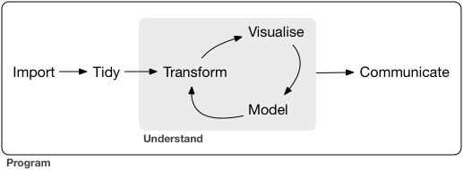 First you must import your data into R.
Once you’ve imported your data, it is a good idea to tidy it.
Once you have tidy data, a common first step is to transform it.
Transformation includes narrowing in on observations of interest (like all people in one city, or all data from the last year), creating new variables that are functions of existing variables (like computing speed from distance and time), and calculating a set of summary statistics (like counts or means).
Together, tidying and transforming are called wrangling, because getting your data in a form that’s natural to work with often feels like a fight!
Once you have tidy data with the variables you need, there are two main engines of knowledge generation: visualisation and modelling.
These have complementary strengths and weaknesses so any real analysis will iterate between them many times.
Visualisation is a fundamentally human activity.
A good visualisation will show you things that you did not expect, or raise new questions about the data.
A good visualisation might also hint that you’re asking the wrong question, or you need to collect different data.
Visualisations can surprise you, but don’t scale particularly well because they require a human to interpret them.
Models are complementary tools to visualisation.
Once you have made your questions sufficiently precise, you can use a model to answer them.
Models are a fundamentally mathematical or computational tool, so they generally scale well.
Even when they don’t, it’s usually cheaper to buy more computers than it is to buy more brains! But every model makes assumptions, and by its very nature a model cannot question its own assumptions.
That means a model cannot fundamentally surprise you.
The last step of data science is communication, an absolutely critical part of any data analysis project.
It doesn’t matter how well your models and visualisation have led you to understand the data unless you can also communicate your results to others.
Surrounding all these tools is programming.
Programming is a cross-cutting tool that you use in every part of the project.
You don’t need to be an expert programmer to be a data scientist, but learning more about programming pays off because becoming a better programmer allows you to automate common tasks, and solve new problems with greater ease.
You’ll use these tools in every data science project, but for most projects they’re not enough.
There’s a rough 80-20 rule at play; you can tackle about 80% of every project using the tools that you’ll learn in this book, but you’ll need other tools to tackle the remaining 20%.
Throughout this book we’ll point you to resources where you can learn more.
First you must import your data into R.
Once you’ve imported your data, it is a good idea to tidy it.
Once you have tidy data, a common first step is to transform it.
Transformation includes narrowing in on observations of interest (like all people in one city, or all data from the last year), creating new variables that are functions of existing variables (like computing speed from distance and time), and calculating a set of summary statistics (like counts or means).
Together, tidying and transforming are called wrangling, because getting your data in a form that’s natural to work with often feels like a fight!
Once you have tidy data with the variables you need, there are two main engines of knowledge generation: visualisation and modelling.
These have complementary strengths and weaknesses so any real analysis will iterate between them many times.
Visualisation is a fundamentally human activity.
A good visualisation will show you things that you did not expect, or raise new questions about the data.
A good visualisation might also hint that you’re asking the wrong question, or you need to collect different data.
Visualisations can surprise you, but don’t scale particularly well because they require a human to interpret them.
Models are complementary tools to visualisation.
Once you have made your questions sufficiently precise, you can use a model to answer them.
Models are a fundamentally mathematical or computational tool, so they generally scale well.
Even when they don’t, it’s usually cheaper to buy more computers than it is to buy more brains! But every model makes assumptions, and by its very nature a model cannot question its own assumptions.
That means a model cannot fundamentally surprise you.
The last step of data science is communication, an absolutely critical part of any data analysis project.
It doesn’t matter how well your models and visualisation have led you to understand the data unless you can also communicate your results to others.
Surrounding all these tools is programming.
Programming is a cross-cutting tool that you use in every part of the project.
You don’t need to be an expert programmer to be a data scientist, but learning more about programming pays off because becoming a better programmer allows you to automate common tasks, and solve new problems with greater ease.
You’ll use these tools in every data science project, but for most projects they’re not enough.
There’s a rough 80-20 rule at play; you can tackle about 80% of every project using the tools that you’ll learn in this book, but you’ll need other tools to tackle the remaining 20%.
Throughout this book we’ll point you to resources where you can learn more.
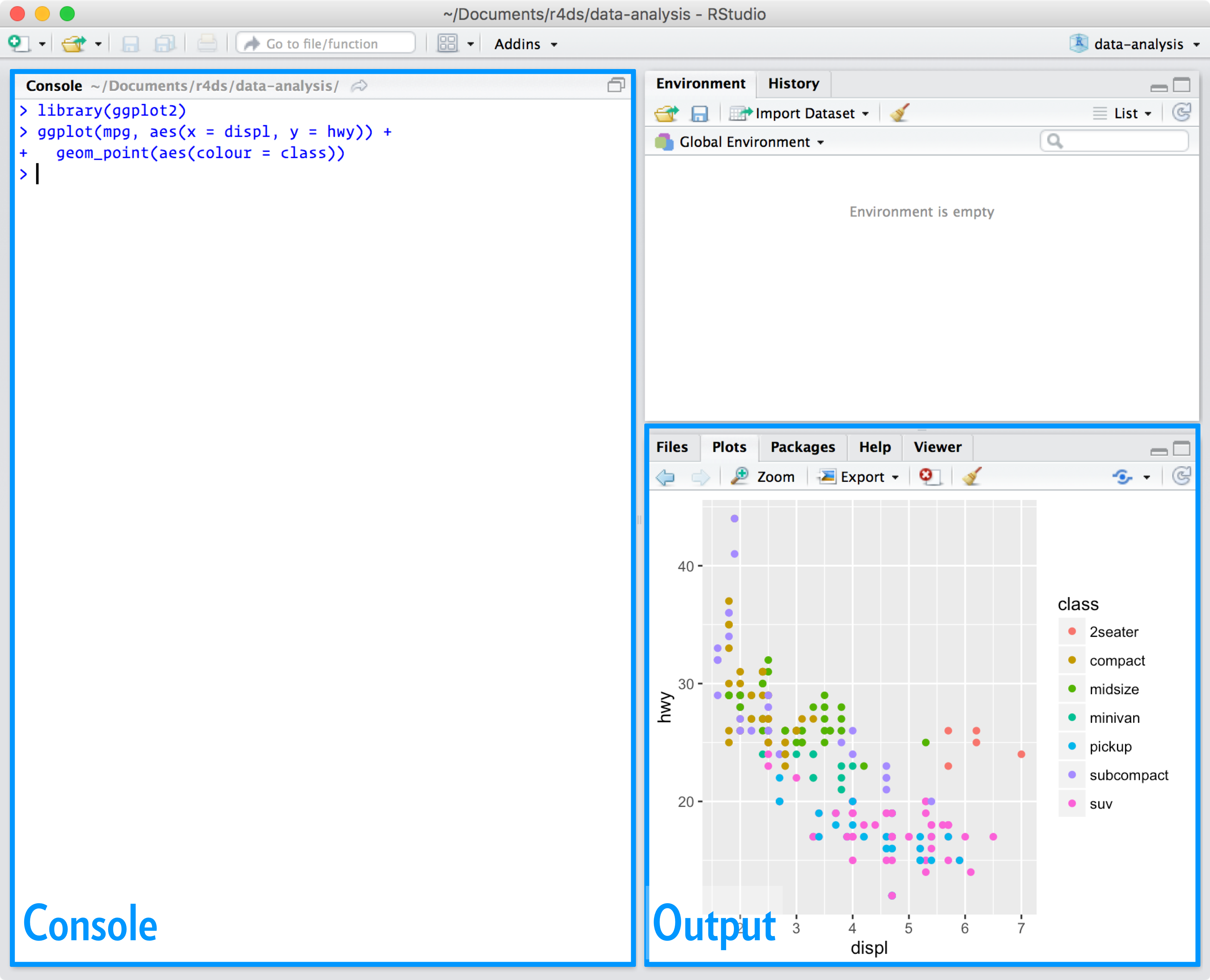 For now, all you need to know is that you type R code in the console pane, and press enter to run it.
You’ll learn more as we go along!
For now, all you need to know is that you type R code in the console pane, and press enter to run it.
You’ll learn more as we go along!
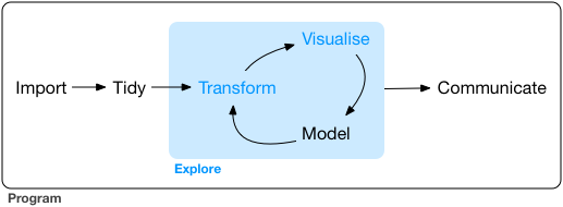 In this part of the book you will learn some useful tools that have an immediate payoff:
Visualisation is a great place to start with R programming, because the
payoff is so clear: you get to make elegant and informative plots that help
you understand data.
In data visualisation you’ll dive into visualisation,
learning the basic structure of a ggplot2 plot, and powerful techniques for
turning data into plots.
Visualisation alone is typically not enough, so in data transformation
you’ll learn the key verbs that allow you to select important variables,
filter out key observations, create new variables, and compute summaries.
Finally, in exploratory data analysis, you’ll combine visualisation and
transformation with your curiosity and scepticism to ask and answer
interesting questions about data.
Modelling is an important part of the exploratory process, but you don’t have the skills to effectively learn or apply it yet.
We’ll come back to it in modelling, once you’re better equipped with more data wrangling and programming tools.
Nestled among these three chapters that teach you the tools of exploration are three chapters that focus on your R workflow.
In workflow: basics, workflow: scripts, and workflow: projects you’ll learn good practices for writing and organising your R code.
These will set you up for success in the long run, as they’ll give you the tools to stay organised when you tackle real projects.
In this part of the book you will learn some useful tools that have an immediate payoff:
Visualisation is a great place to start with R programming, because the
payoff is so clear: you get to make elegant and informative plots that help
you understand data.
In data visualisation you’ll dive into visualisation,
learning the basic structure of a ggplot2 plot, and powerful techniques for
turning data into plots.
Visualisation alone is typically not enough, so in data transformation
you’ll learn the key verbs that allow you to select important variables,
filter out key observations, create new variables, and compute summaries.
Finally, in exploratory data analysis, you’ll combine visualisation and
transformation with your curiosity and scepticism to ask and answer
interesting questions about data.
Modelling is an important part of the exploratory process, but you don’t have the skills to effectively learn or apply it yet.
We’ll come back to it in modelling, once you’re better equipped with more data wrangling and programming tools.
Nestled among these three chapters that teach you the tools of exploration are three chapters that focus on your R workflow.
In workflow: basics, workflow: scripts, and workflow: projects you’ll learn good practices for writing and organising your R code.
These will set you up for success in the long run, as they’ll give you the tools to stay organised when you tackle real projects.
 The plot shows a negative relationship between engine size (
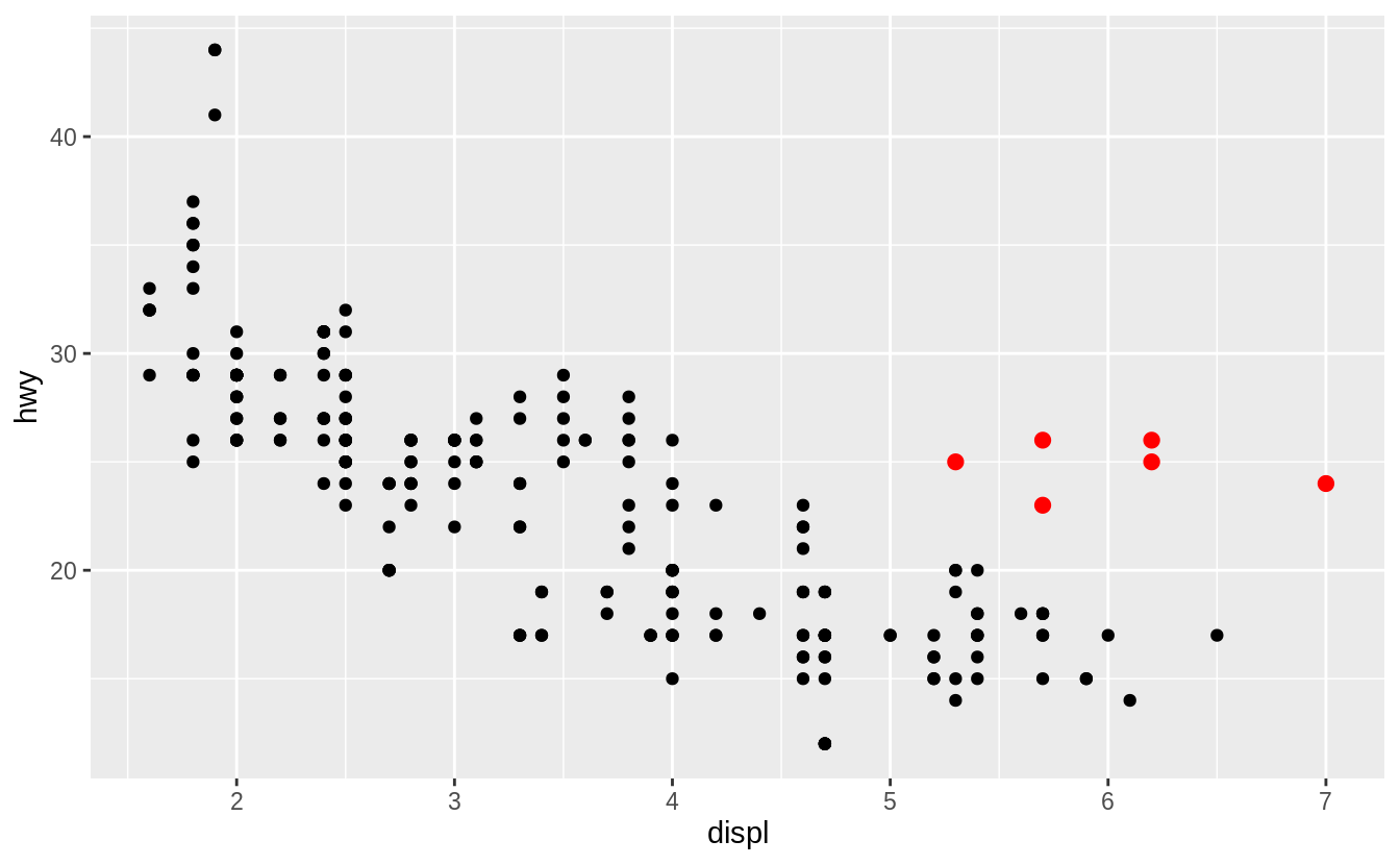 Let’s hypothesize that the cars are hybrids.
One way to test this hypothesis is to look at the
Let’s hypothesize that the cars are hybrids.
One way to test this hypothesis is to look at the 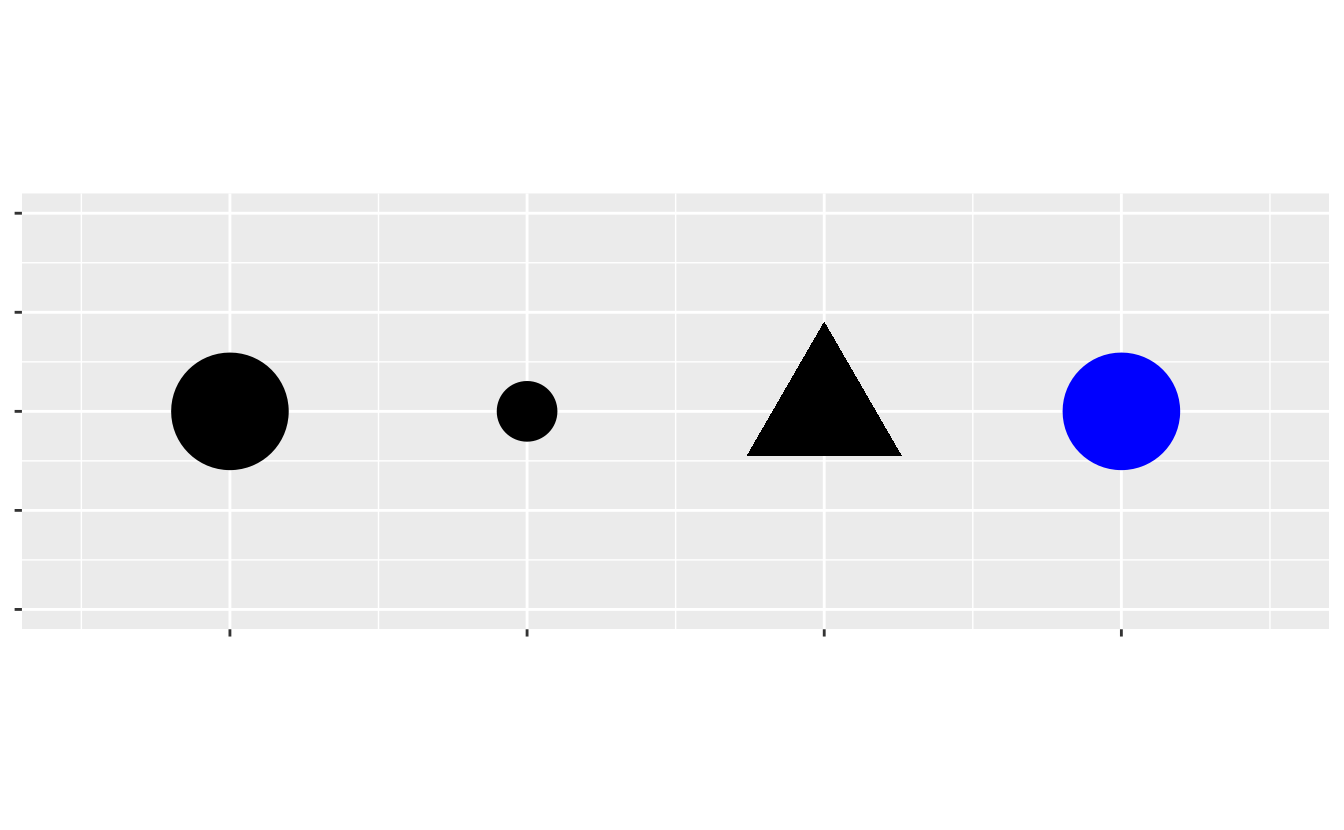 You can convey information about your data by mapping the aesthetics in your plot to the variables in your dataset.
For example, you can map the colors of your points to the
You can convey information about your data by mapping the aesthetics in your plot to the variables in your dataset.
For example, you can map the colors of your points to the 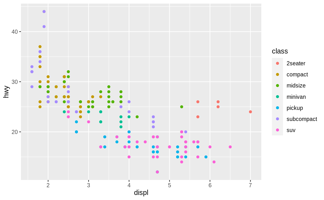 (If you prefer British English, like Hadley, you can use
  Or we could have mapped
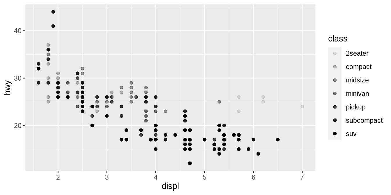
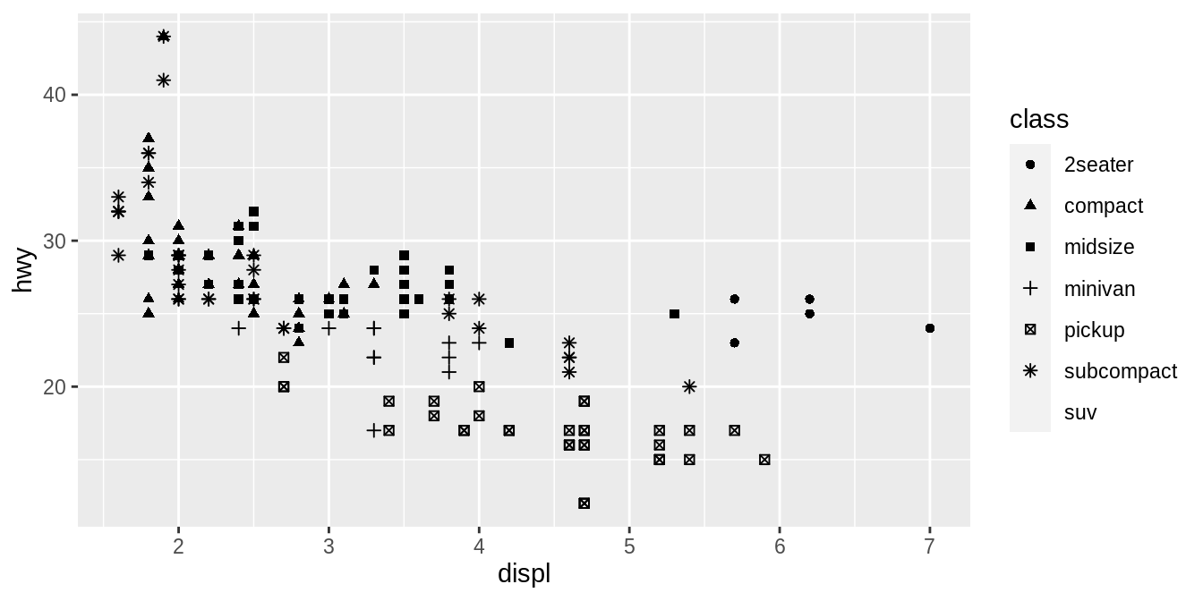 What happened to the SUVs? ggplot2 will only use six shapes at a time.
By default, additional groups will go unplotted when you use the shape aesthetic.
For each aesthetic, you use
What happened to the SUVs? ggplot2 will only use six shapes at a time.
By default, additional groups will go unplotted when you use the shape aesthetic.
For each aesthetic, you use 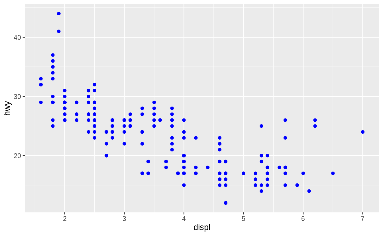 Here, the color doesn’t convey information about a variable, but only changes the appearance of the plot.
To set an aesthetic manually, set the aesthetic by name as an argument of your geom function; i.e. it goes outside of
Here, the color doesn’t convey information about a variable, but only changes the appearance of the plot.
To set an aesthetic manually, set the aesthetic by name as an argument of your geom function; i.e. it goes outside of  Figure 3.1: R has 25 built in shapes that are identified by numbers.
There are some seeming duplicates: for example, 0, 15, and 22 are all squares.
The difference comes from the interaction of the
Figure 3.1: R has 25 built in shapes that are identified by numbers.
There are some seeming duplicates: for example, 0, 15, and 22 are all squares.
The difference comes from the interaction of the 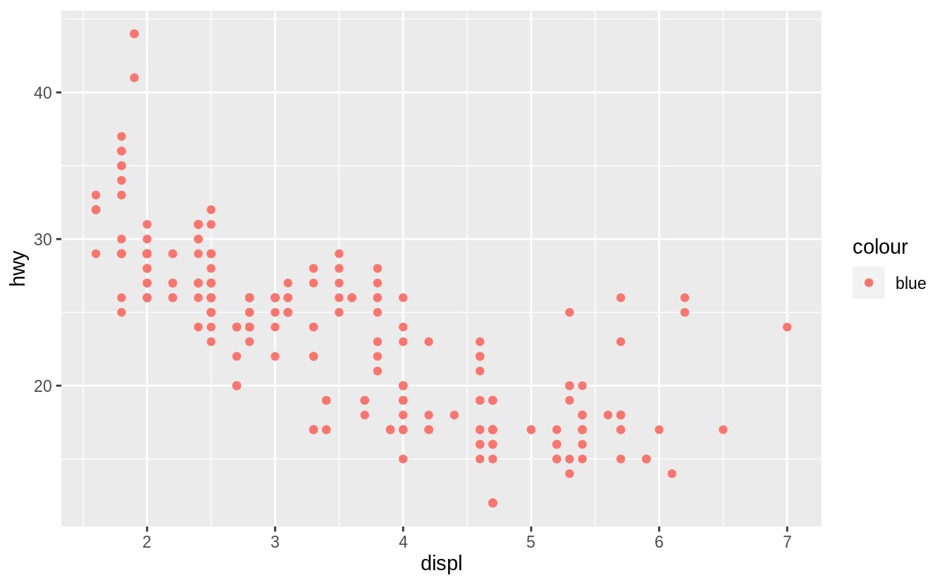 Which variables in
 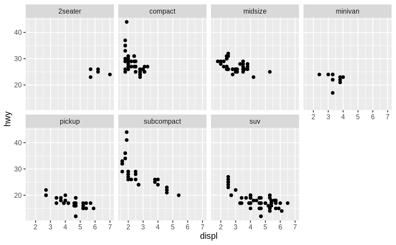 To facet your plot on the combination of two variables, add
 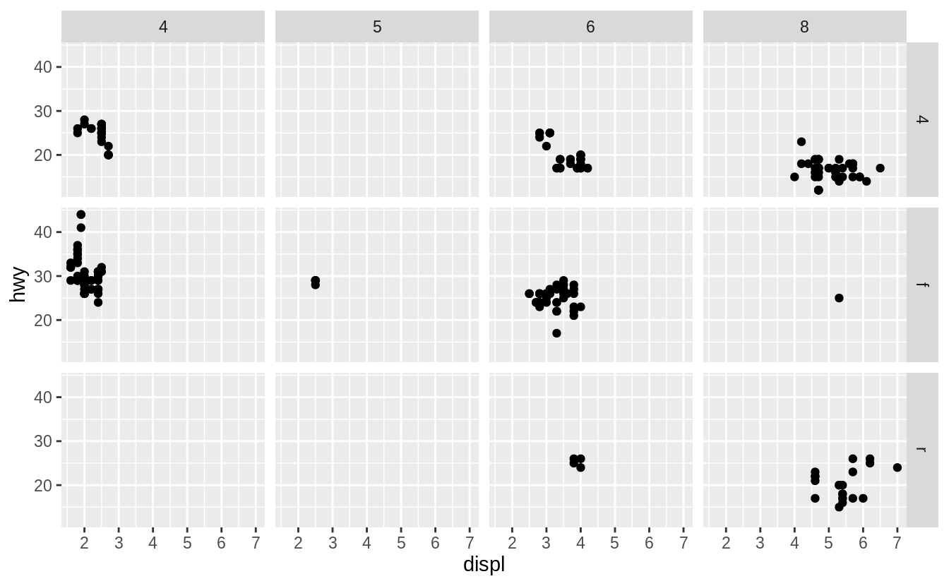 If you prefer to not facet in the rows or columns dimension, use a
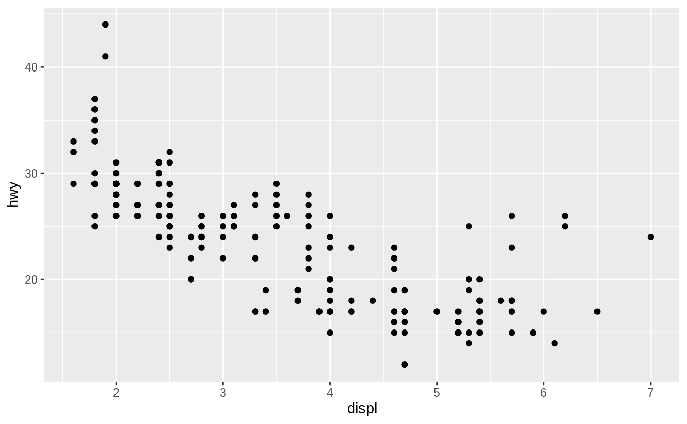
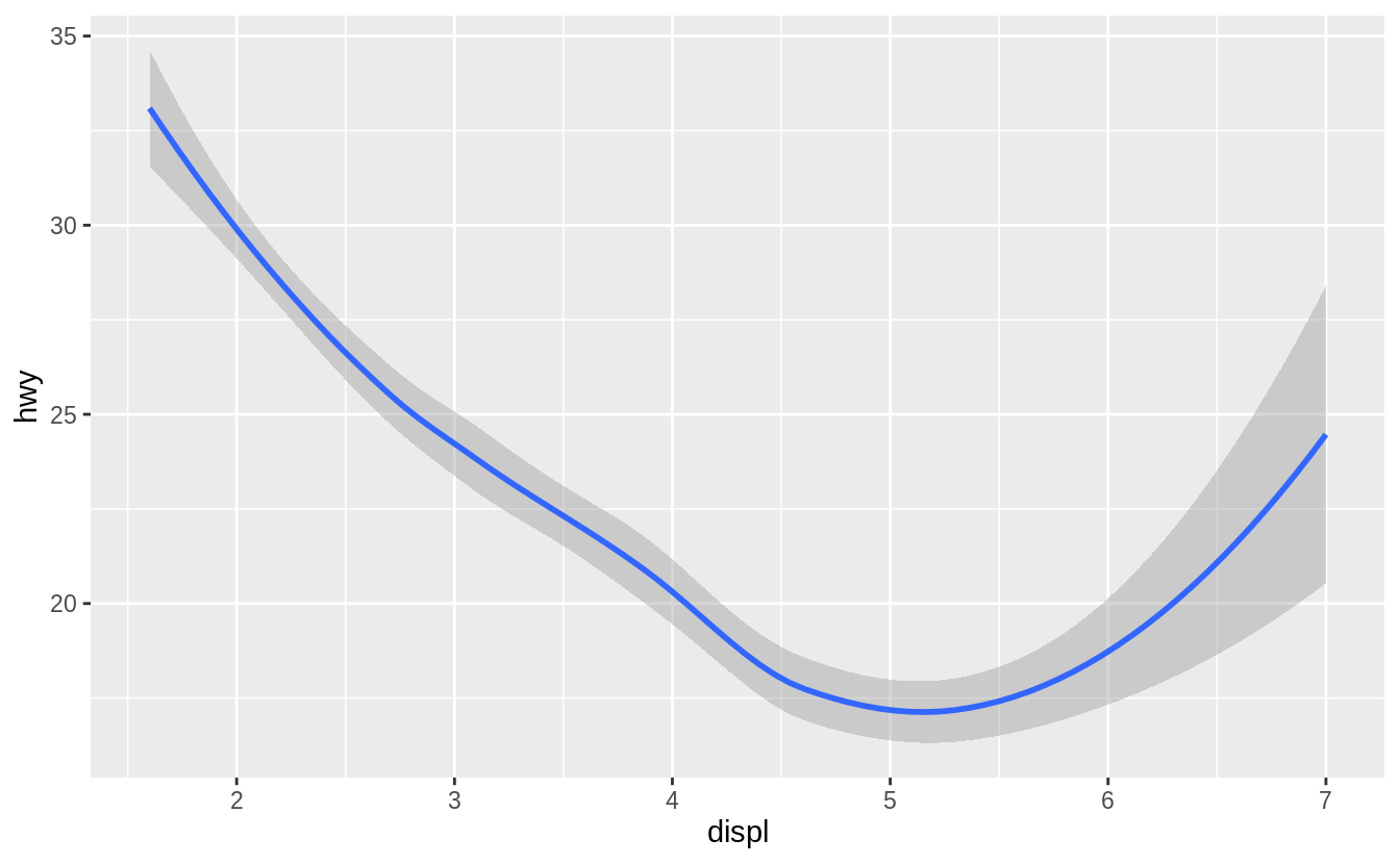 Both plots contain the same x variable, the same y variable, and both describe the same data.
But the plots are not identical.
Each plot uses a different visual object to represent the data.
In ggplot2 syntax, we say that they use different geoms.
A geom is the geometrical object that a plot uses to represent data.
People often describe plots by the type of geom that the plot uses.
For example, bar charts use bar geoms, line charts use line geoms, boxplots use boxplot geoms, and so on.
Scatterplots break the trend; they use the point geom.
As we see above, you can use different geoms to plot the same data.
The plot on the left uses the point geom, and the plot on the right uses the smooth geom, a smooth line fitted to the data.
To change the geom in your plot, change the geom function that you add to
Both plots contain the same x variable, the same y variable, and both describe the same data.
But the plots are not identical.
Each plot uses a different visual object to represent the data.
In ggplot2 syntax, we say that they use different geoms.
A geom is the geometrical object that a plot uses to represent data.
People often describe plots by the type of geom that the plot uses.
For example, bar charts use bar geoms, line charts use line geoms, boxplots use boxplot geoms, and so on.
Scatterplots break the trend; they use the point geom.
As we see above, you can use different geoms to plot the same data.
The plot on the left uses the point geom, and the plot on the right uses the smooth geom, a smooth line fitted to the data.
To change the geom in your plot, change the geom function that you add to  Here
Here 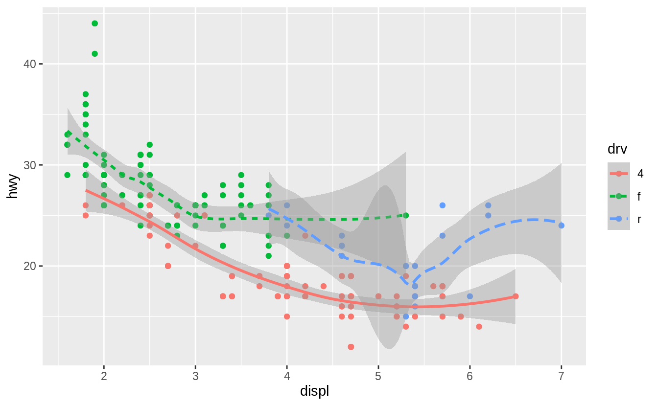 Notice that this plot contains two geoms in the same graph! If this makes you excited, buckle up.
We will learn how to place multiple geoms in the same plot very soon.
ggplot2 provides over 40 geoms, and extension packages provide even more (see https://exts.ggplot2.tidyverse.org/gallery/ for a sampling).
The best way to get a comprehensive overview is the ggplot2 cheatsheet, which you can find at http://rstudio.com/cheatsheets.
To learn more about any single geom, use help:
Notice that this plot contains two geoms in the same graph! If this makes you excited, buckle up.
We will learn how to place multiple geoms in the same plot very soon.
ggplot2 provides over 40 geoms, and extension packages provide even more (see https://exts.ggplot2.tidyverse.org/gallery/ for a sampling).
The best way to get a comprehensive overview is the ggplot2 cheatsheet, which you can find at http://rstudio.com/cheatsheets.
To learn more about any single geom, use help: 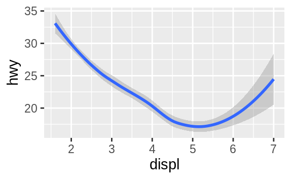
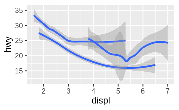
 To display multiple geoms in the same plot, add multiple geom functions to
 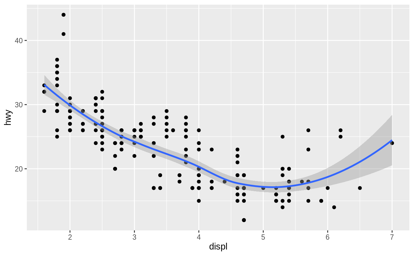 This, however, introduces some duplication in our code.
Imagine if you wanted to change the y-axis to display
This, however, introduces some duplication in our code.
Imagine if you wanted to change the y-axis to display  You can use the same idea to specify different
  (You’ll learn how
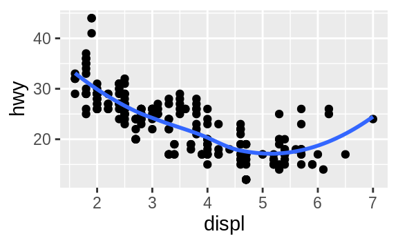

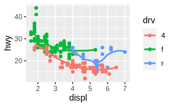
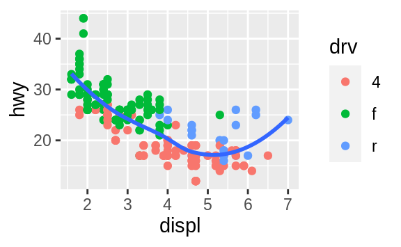

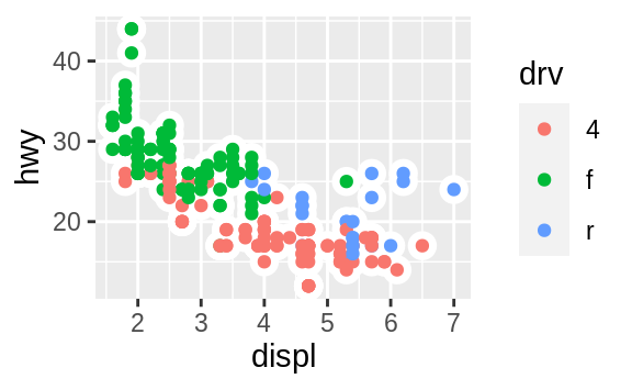
 On the x-axis, the chart displays
 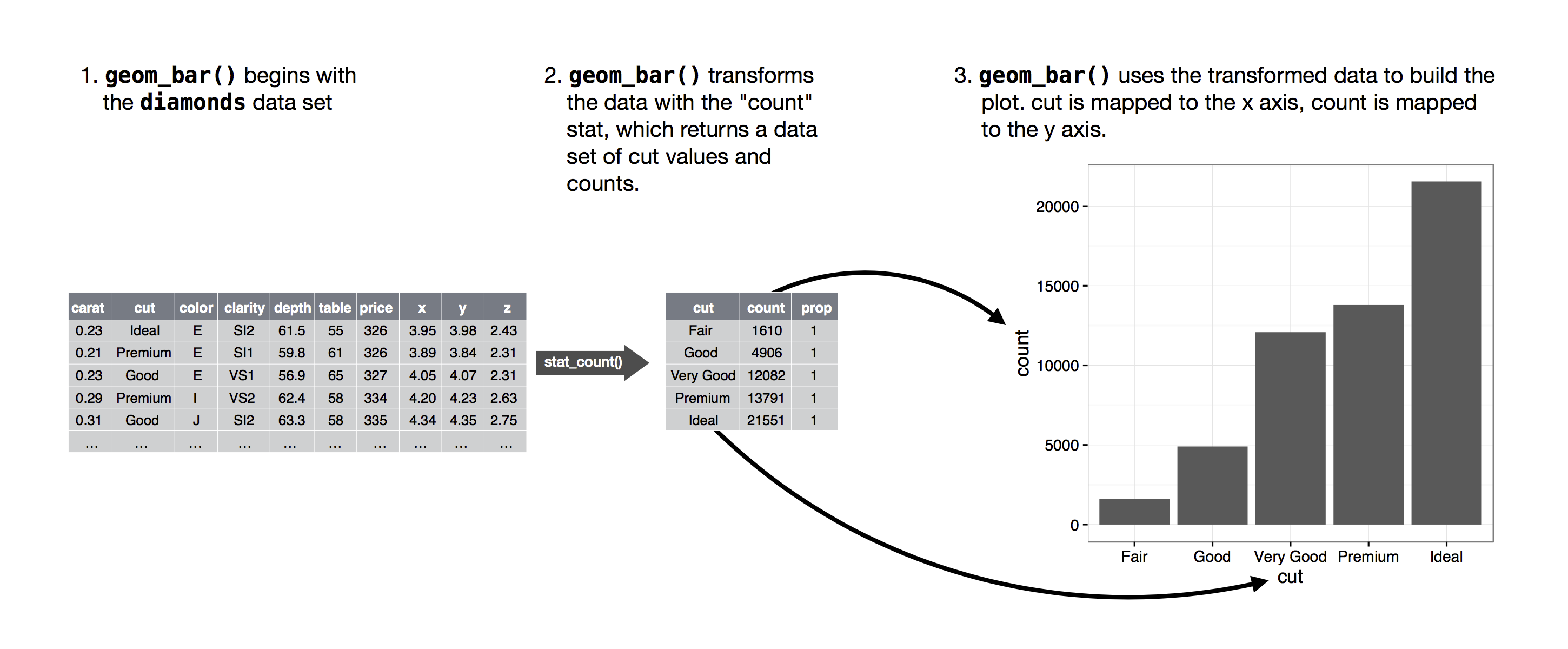 You can learn which stat a geom uses by inspecting the default value for the
 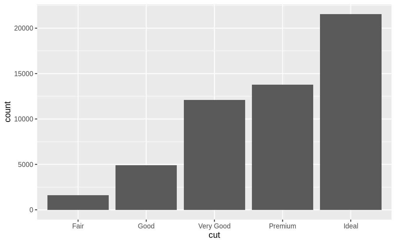 This works because every geom has a default stat; and every stat has a default geom.
This means that you can typically use geoms without worrying about the underlying statistical transformation.
There are three reasons you might need to use a stat explicitly:
You might want to override the default stat.
In the code below, I change
the stat of
This works because every geom has a default stat; and every stat has a default geom.
This means that you can typically use geoms without worrying about the underlying statistical transformation.
There are three reasons you might need to use a stat explicitly:
You might want to override the default stat.
In the code below, I change
the stat of 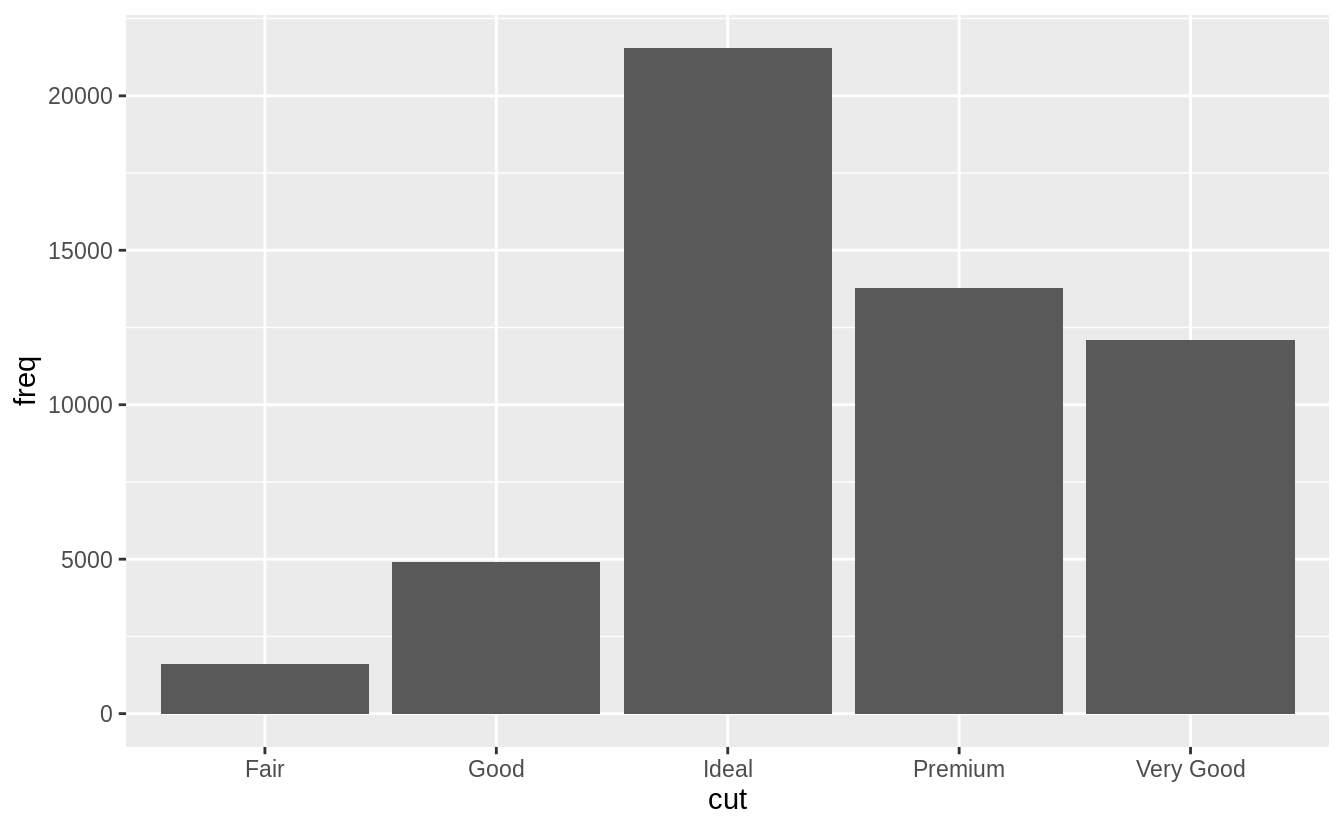 (Don’t worry that you haven’t seen
 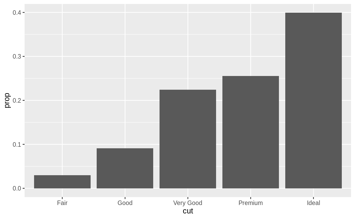 To find the variables computed by the stat, look for the help section
titled 'computed variables'.
You might want to draw greater attention to the statistical transformation
in your code.
For example, you might use
To find the variables computed by the stat, look for the help section
titled 'computed variables'.
You might want to draw greater attention to the statistical transformation
in your code.
For example, you might use  ggplot2 provides over 20 stats for you to use.
Each stat is a function, so you can get help in the usual way, e.g.
ggplot2 provides over 20 stats for you to use.
Each stat is a function, so you can get help in the usual way, e.g.
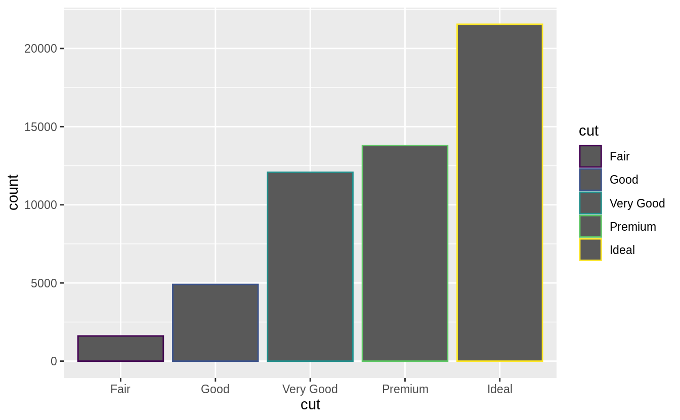
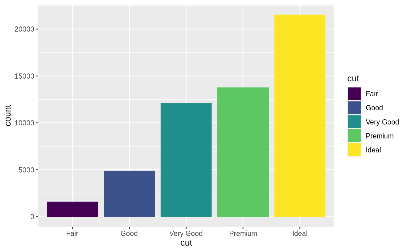 Note what happens if you map the fill aesthetic to another variable, like
 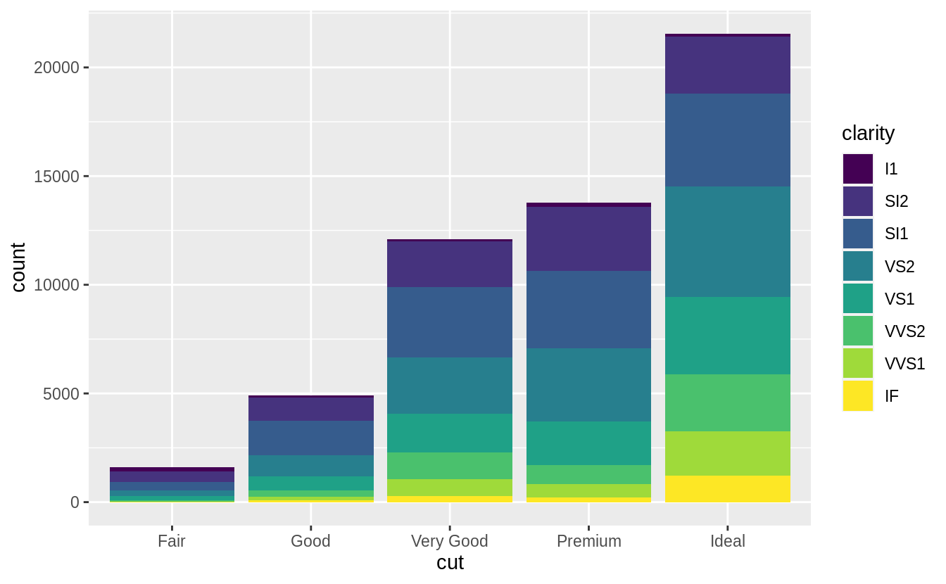 The stacking is performed automatically by the position adjustment specified by the
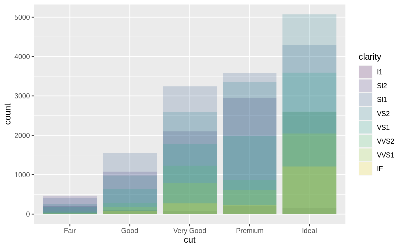
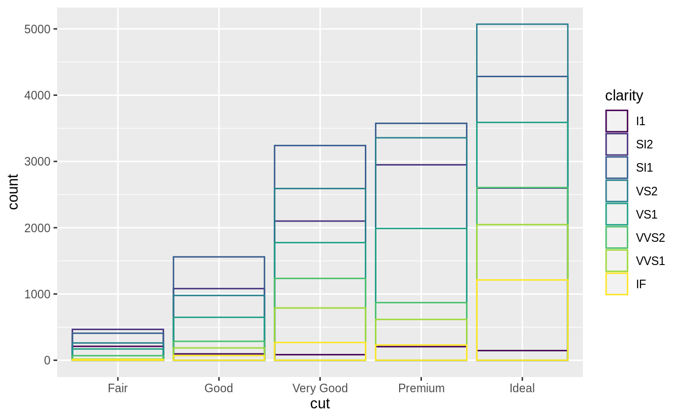 The identity position adjustment is more useful for 2d geoms, like points,
where it is the default.
The identity position adjustment is more useful for 2d geoms, like points,
where it is the default.
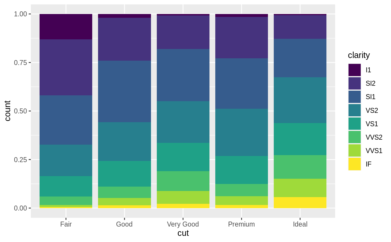
 There’s one other type of adjustment that’s not useful for bar charts, but it can be very useful for scatterplots.
Recall our first scatterplot.
Did you notice that the plot displays only 126 points, even though there are 234 observations in the dataset?
There’s one other type of adjustment that’s not useful for bar charts, but it can be very useful for scatterplots.
Recall our first scatterplot.
Did you notice that the plot displays only 126 points, even though there are 234 observations in the dataset?
 The values of
 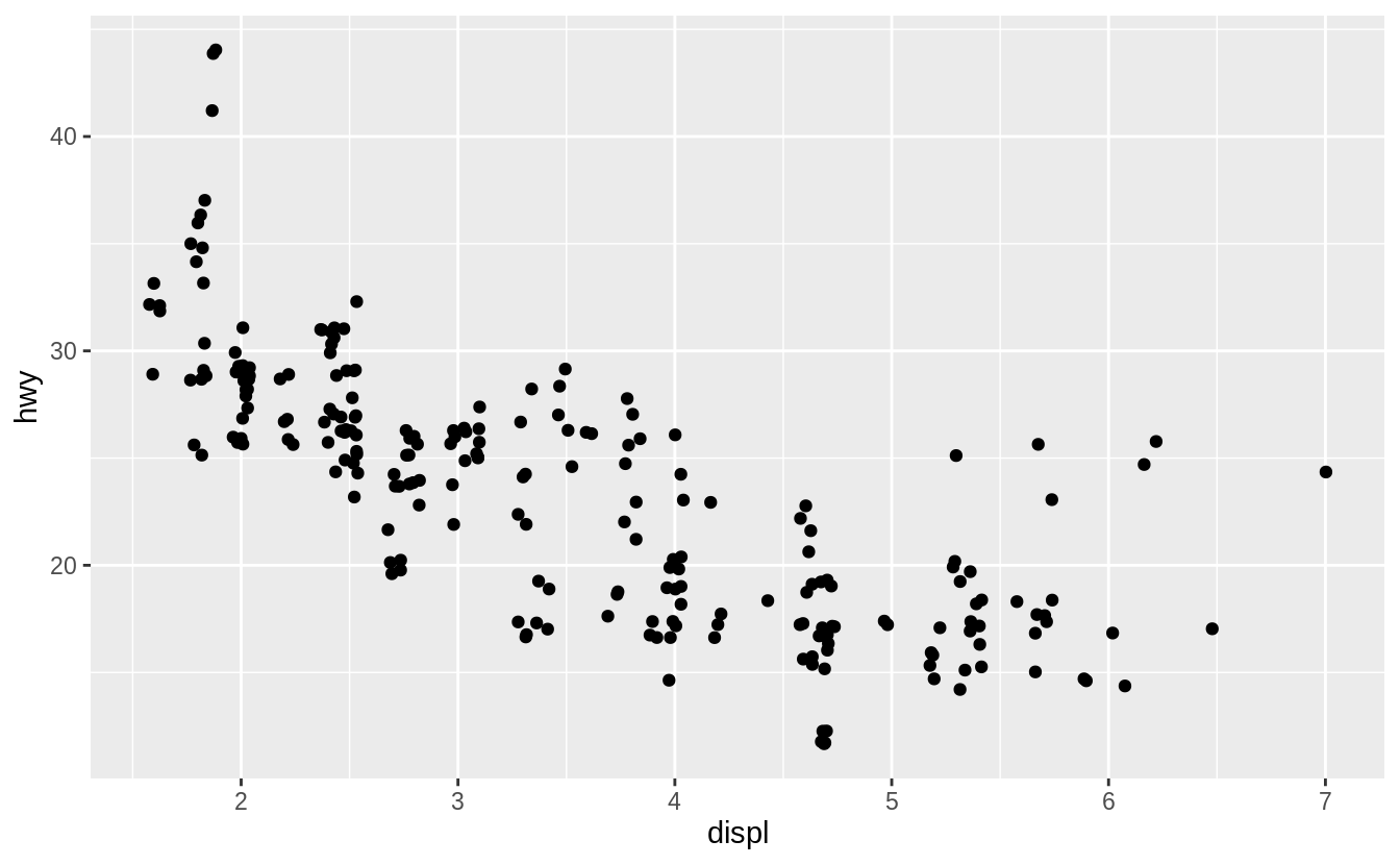 Adding randomness seems like a strange way to improve your plot, but while it makes your graph less accurate at small scales, it makes your graph more revealing at large scales.
Because this is such a useful operation, ggplot2 comes with a shorthand for
Adding randomness seems like a strange way to improve your plot, but while it makes your graph less accurate at small scales, it makes your graph more revealing at large scales.
Because this is such a useful operation, ggplot2 comes with a shorthand for  What parameters to
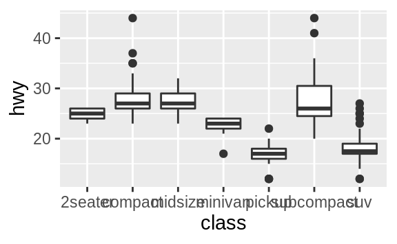
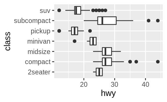
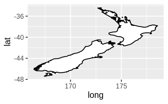
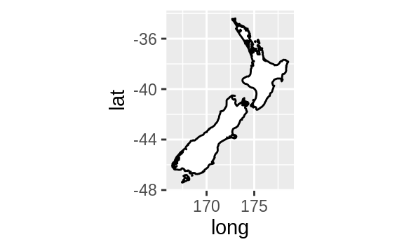

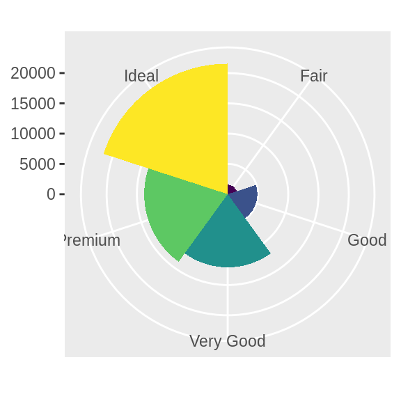
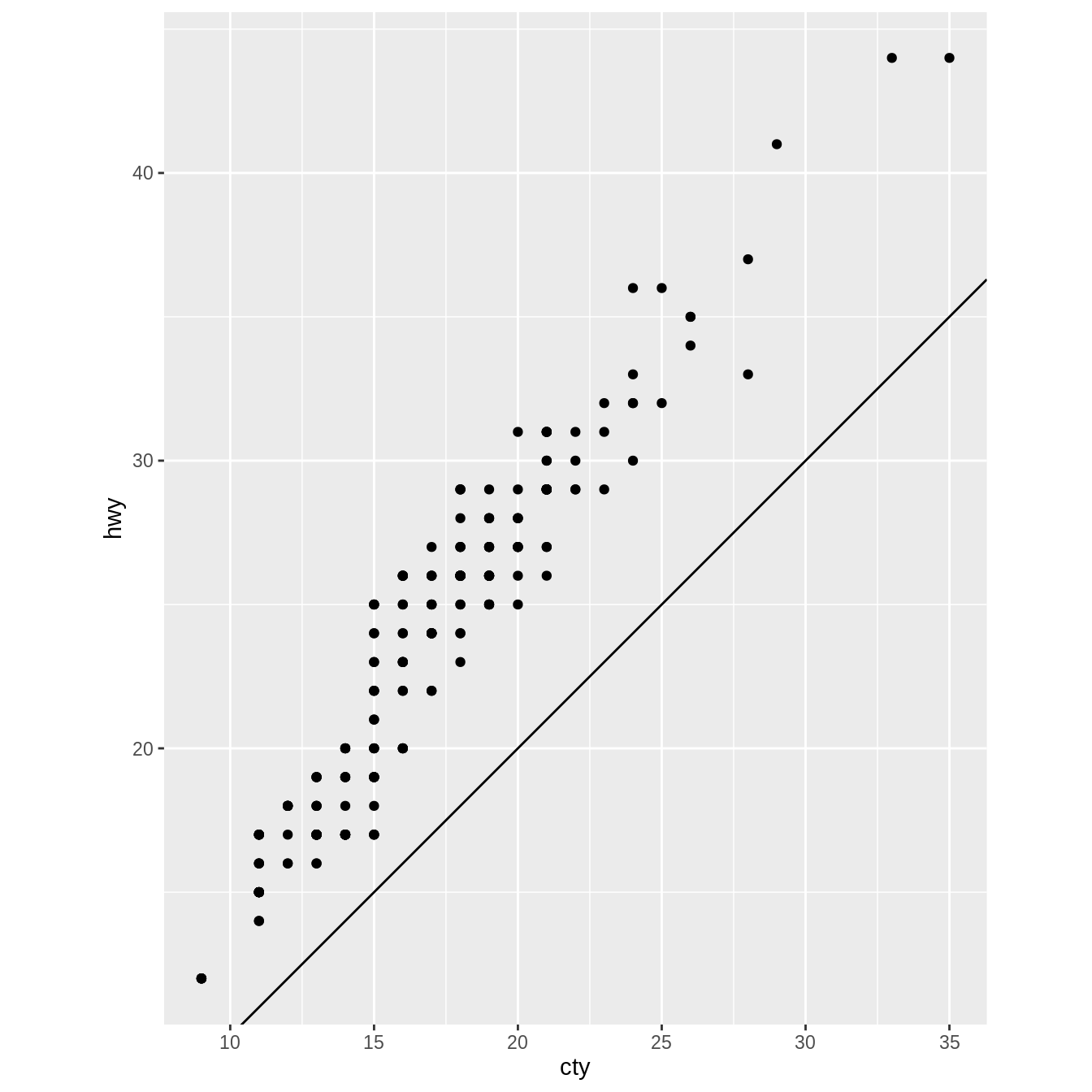
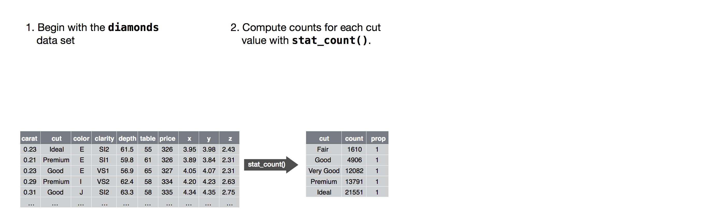 Next, you could choose a geometric object to represent each observation in the transformed data.
You could then use the aesthetic properties of the geoms to represent variables in the data.
You would map the values of each variable to the levels of an aesthetic.
Next, you could choose a geometric object to represent each observation in the transformed data.
You could then use the aesthetic properties of the geoms to represent variables in the data.
You would map the values of each variable to the levels of an aesthetic.
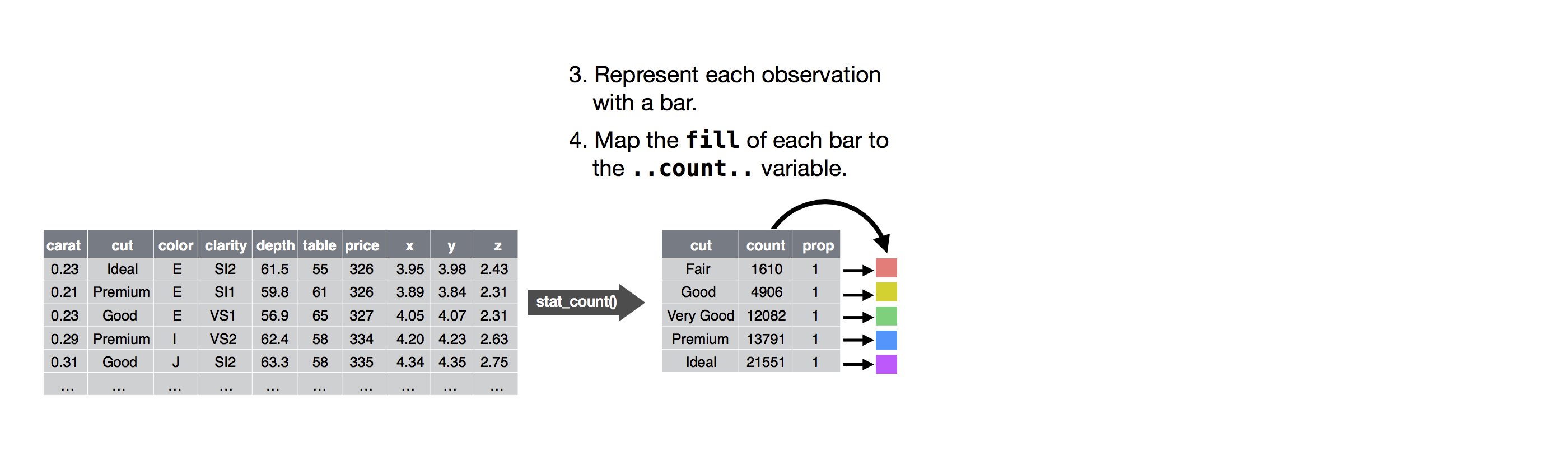 You’d then select a coordinate system to place the geoms into.
You’d use the location of the objects (which is itself an aesthetic property) to display the values of the x and y variables.
At that point, you would have a complete graph, but you could further adjust the positions of the geoms within the coordinate system (a position adjustment) or split the graph into subplots (faceting).
You could also extend the plot by adding one or more additional layers, where each additional layer uses a dataset, a geom, a set of mappings, a stat, and a position adjustment.
You’d then select a coordinate system to place the geoms into.
You’d use the location of the objects (which is itself an aesthetic property) to display the values of the x and y variables.
At that point, you would have a complete graph, but you could further adjust the positions of the geoms within the coordinate system (a position adjustment) or split the graph into subplots (faceting).
You could also extend the plot by adding one or more additional layers, where each additional layer uses a dataset, a geom, a set of mappings, a stat, and a position adjustment.
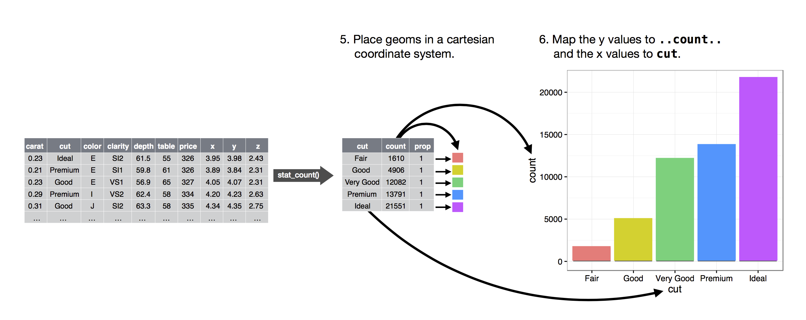 You could use this method to build any plot that you imagine.
In other words, you can use the code template that you’ve learned in this chapter to build hundreds of thousands of unique plots.
You could use this method to build any plot that you imagine.
In other words, you can use the code template that you’ve learned in this chapter to build hundreds of thousands of unique plots.
 Here you can see all of the objects that you’ve created.
 Figure 5.1: Complete set of boolean operations.
 There are three steps to prepare this data:
Group flights by destination.
Summarise to compute distance, average delay, and number of flights.
Filter to remove noisy points and Honolulu airport, which is almost
twice as far away as the next closest airport.
This code is a little frustrating to write because we have to give each intermediate data frame a name, even though we don’t care about it.
Naming things is hard, so this slows down our analysis.
There’s another way to tackle the same problem with the pipe,
There are three steps to prepare this data:
Group flights by destination.
Summarise to compute distance, average delay, and number of flights.
Filter to remove noisy points and Honolulu airport, which is almost
twice as far away as the next closest airport.
This code is a little frustrating to write because we have to give each intermediate data frame a name, even though we don’t care about it.
Naming things is hard, so this slows down our analysis.
There’s another way to tackle the same problem with the pipe,  Wow, there are some planes that have an average delay of 5 hours (300 minutes)!
The story is actually a little more nuanced.
We can get more insight if we draw a scatterplot of number of flights vs. average delay:
Wow, there are some planes that have an average delay of 5 hours (300 minutes)!
The story is actually a little more nuanced.
We can get more insight if we draw a scatterplot of number of flights vs. average delay:
 Not surprisingly, there is much greater variation in the average delay when there are few flights.
The shape of this plot is very characteristic: whenever you plot a mean (or other summary) vs. group size, you’ll see that the variation decreases as the sample size increases.
When looking at this sort of plot, it’s often useful to filter out the groups with the smallest numbers of observations, so you can see more of the pattern and less of the extreme variation in the smallest groups.
This is what the following code does, as well as showing you a handy pattern for integrating ggplot2 into dplyr flows.
It’s a bit painful that you have to switch from
Not surprisingly, there is much greater variation in the average delay when there are few flights.
The shape of this plot is very characteristic: whenever you plot a mean (or other summary) vs. group size, you’ll see that the variation decreases as the sample size increases.
When looking at this sort of plot, it’s often useful to filter out the groups with the smallest numbers of observations, so you can see more of the pattern and less of the extreme variation in the smallest groups.
This is what the following code does, as well as showing you a handy pattern for integrating ggplot2 into dplyr flows.
It’s a bit painful that you have to switch from 
 This also has important implications for ranking.
If you naively sort on
This also has important implications for ranking.
If you naively sort on 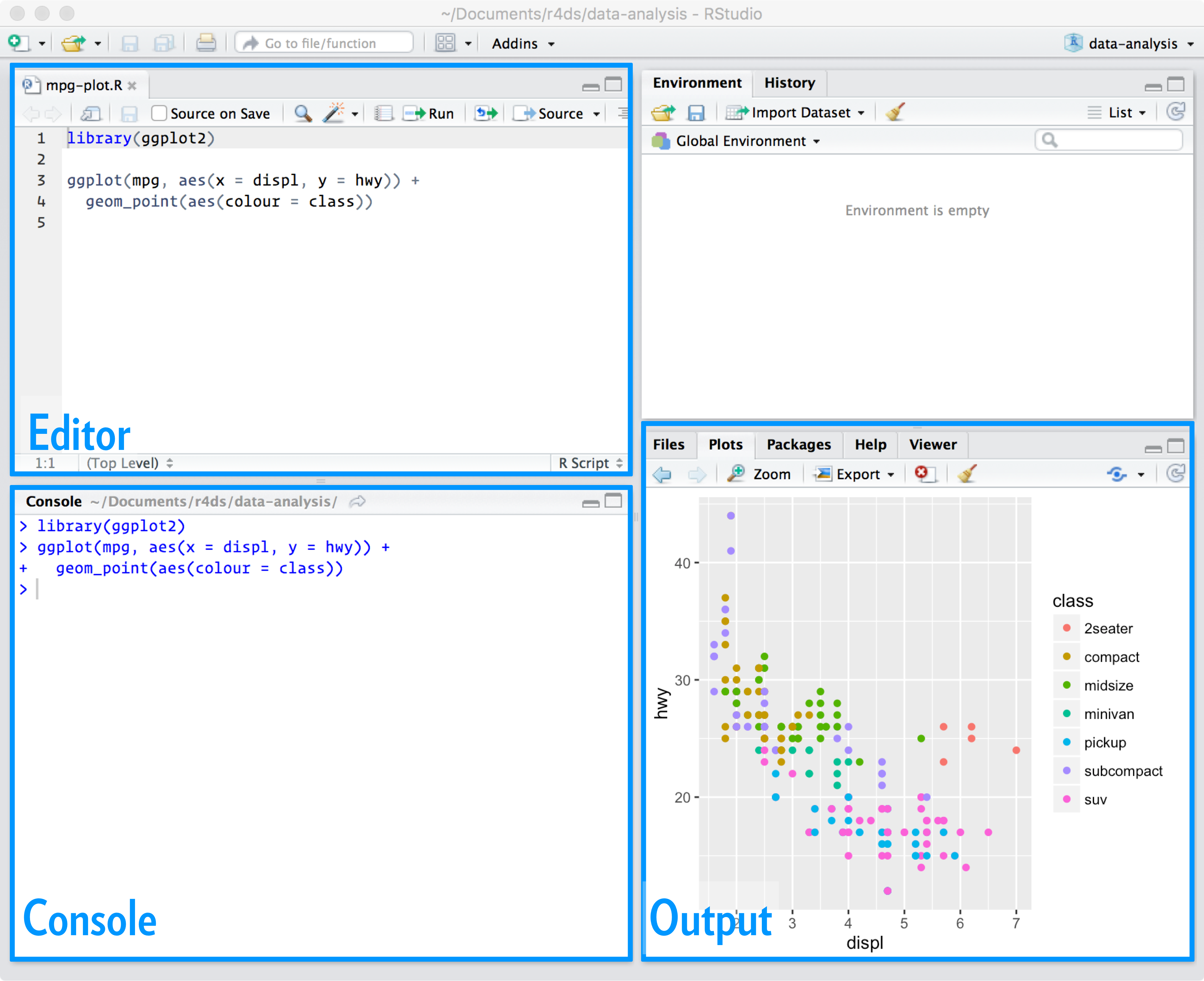 The script editor is a great place to put code you care about.
Keep experimenting in the console, but once you have written code that works and does what you want, put it in the script editor.
RStudio will automatically save the contents of the editor when you quit RStudio, and will automatically load it when you re-open.
Nevertheless, it’s a good idea to save your scripts regularly and to back them up.
The script editor is a great place to put code you care about.
Keep experimenting in the console, but once you have written code that works and does what you want, put it in the script editor.
RStudio will automatically save the contents of the editor when you quit RStudio, and will automatically load it when you re-open.
Nevertheless, it’s a good idea to save your scripts regularly and to back them up.
 Hover over the cross to see what the problem is:
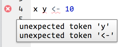 RStudio will also let you know about potential problems:
 The height of the bars displays how many observations occurred with each x value.
You can compute these values manually with
The height of the bars displays how many observations occurred with each x value.
You can compute these values manually with  You can compute this by hand by combining
  If you wish to overlay multiple histograms in the same plot, I recommend using
  There are a few challenges with this type of plot, which we will come back to in visualising a categorical and a continuous variable.
Now that you can visualise variation, what should you look for in your plots? And what type of follow-up questions should you ask? I’ve put together a list below of the most useful types of information that you will find in your graphs, along with some follow-up questions for each type of information.
The key to asking good follow-up questions will be to rely on your curiosity (What do you want to learn more about?) as well as your skepticism (How could this be misleading?).
There are a few challenges with this type of plot, which we will come back to in visualising a categorical and a continuous variable.
Now that you can visualise variation, what should you look for in your plots? And what type of follow-up questions should you ask? I’ve put together a list below of the most useful types of information that you will find in your graphs, along with some follow-up questions for each type of information.
The key to asking good follow-up questions will be to rely on your curiosity (What do you want to learn more about?) as well as your skepticism (How could this be misleading?).
 Clusters of similar values suggest that subgroups exist in your data.
To understand the subgroups, ask:
How are the observations within each cluster similar to each other?
How are the observations in separate clusters different from each other?
How can you explain or describe the clusters?
Why might the appearance of clusters be misleading?
The histogram below shows the length (in minutes) of 272 eruptions of the Old Faithful Geyser in Yellowstone National Park.
Eruption times appear to be clustered into two groups: there are short eruptions (of around 2 minutes) and long eruptions (4-5 minutes), but little in between.
Clusters of similar values suggest that subgroups exist in your data.
To understand the subgroups, ask:
How are the observations within each cluster similar to each other?
How are the observations in separate clusters different from each other?
How can you explain or describe the clusters?
Why might the appearance of clusters be misleading?
The histogram below shows the length (in minutes) of 272 eruptions of the Old Faithful Geyser in Yellowstone National Park.
Eruption times appear to be clustered into two groups: there are short eruptions (of around 2 minutes) and long eruptions (4-5 minutes), but little in between.
 Many of the questions above will prompt you to explore a relationship between variables, for example, to see if the values of one variable can explain the behavior of another variable.
We’ll get to that shortly.
Many of the questions above will prompt you to explore a relationship between variables, for example, to see if the values of one variable can explain the behavior of another variable.
We’ll get to that shortly.
 There are so many observations in the common bins that the rare bins are so short that you can’t see them (although maybe if you stare intently at 0 you’ll spot something).
To make it easy to see the unusual values, we need to zoom to small values of the y-axis with
There are so many observations in the common bins that the rare bins are so short that you can’t see them (although maybe if you stare intently at 0 you’ll spot something).
To make it easy to see the unusual values, we need to zoom to small values of the y-axis with  (
( To suppress that warning, set
  However this plot isn’t great because there are many more non-cancelled flights than cancelled flights.
In the next section we’ll explore some techniques for improving this comparison.
However this plot isn’t great because there are many more non-cancelled flights than cancelled flights.
In the next section we’ll explore some techniques for improving this comparison.
 It’s hard to see the difference in distribution because the overall counts differ so much:
 To make the comparison easier we need to swap what is displayed on the y-axis.
Instead of displaying count, we’ll display density, which is the count standardised so that the area under each frequency polygon is one.
To make the comparison easier we need to swap what is displayed on the y-axis.
Instead of displaying count, we’ll display density, which is the count standardised so that the area under each frequency polygon is one.
 There’s something rather surprising about this plot - it appears that fair diamonds (the lowest quality) have the highest average price! But maybe that’s because frequency polygons are a little hard to interpret - there’s a lot going on in this plot.
Another alternative to display the distribution of a continuous variable broken down by a categorical variable is the boxplot.
A boxplot is a type of visual shorthand for a distribution of values that is popular among statisticians.
Each boxplot consists of:
A box that stretches from the 25th percentile of the distribution to the
75th percentile, a distance known as the interquartile range (IQR).
In the
middle of the box is a line that displays the median, i.e. 50th percentile,
of the distribution.
These three lines give you a sense of the spread of the
distribution and whether or not the distribution is symmetric about the
median or skewed to one side.
Visual points that display observations that fall more than 1.5 times the
IQR from either edge of the box.
These outlying points are unusual
so are plotted individually.
A line (or whisker) that extends from each end of the box and goes to the
There’s something rather surprising about this plot - it appears that fair diamonds (the lowest quality) have the highest average price! But maybe that’s because frequency polygons are a little hard to interpret - there’s a lot going on in this plot.
Another alternative to display the distribution of a continuous variable broken down by a categorical variable is the boxplot.
A boxplot is a type of visual shorthand for a distribution of values that is popular among statisticians.
Each boxplot consists of:
A box that stretches from the 25th percentile of the distribution to the
75th percentile, a distance known as the interquartile range (IQR).
In the
middle of the box is a line that displays the median, i.e. 50th percentile,
of the distribution.
These three lines give you a sense of the spread of the
distribution and whether or not the distribution is symmetric about the
median or skewed to one side.
Visual points that display observations that fall more than 1.5 times the
IQR from either edge of the box.
These outlying points are unusual
so are plotted individually.
A line (or whisker) that extends from each end of the box and goes to the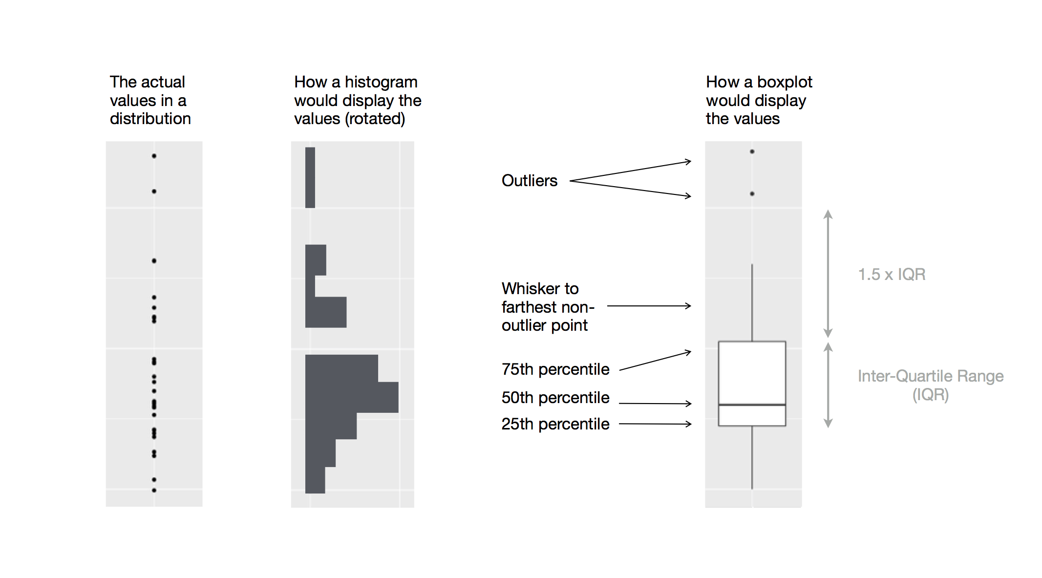 Let’s take a look at the distribution of price by cut using
  We see much less information about the distribution, but the boxplots are much more compact so we can more easily compare them (and fit more on one plot).
It supports the counterintuitive finding that better quality diamonds are cheaper on average! In the exercises, you’ll be challenged to figure out why.
We see much less information about the distribution, but the boxplots are much more compact so we can more easily compare them (and fit more on one plot).
It supports the counterintuitive finding that better quality diamonds are cheaper on average! In the exercises, you’ll be challenged to figure out why.
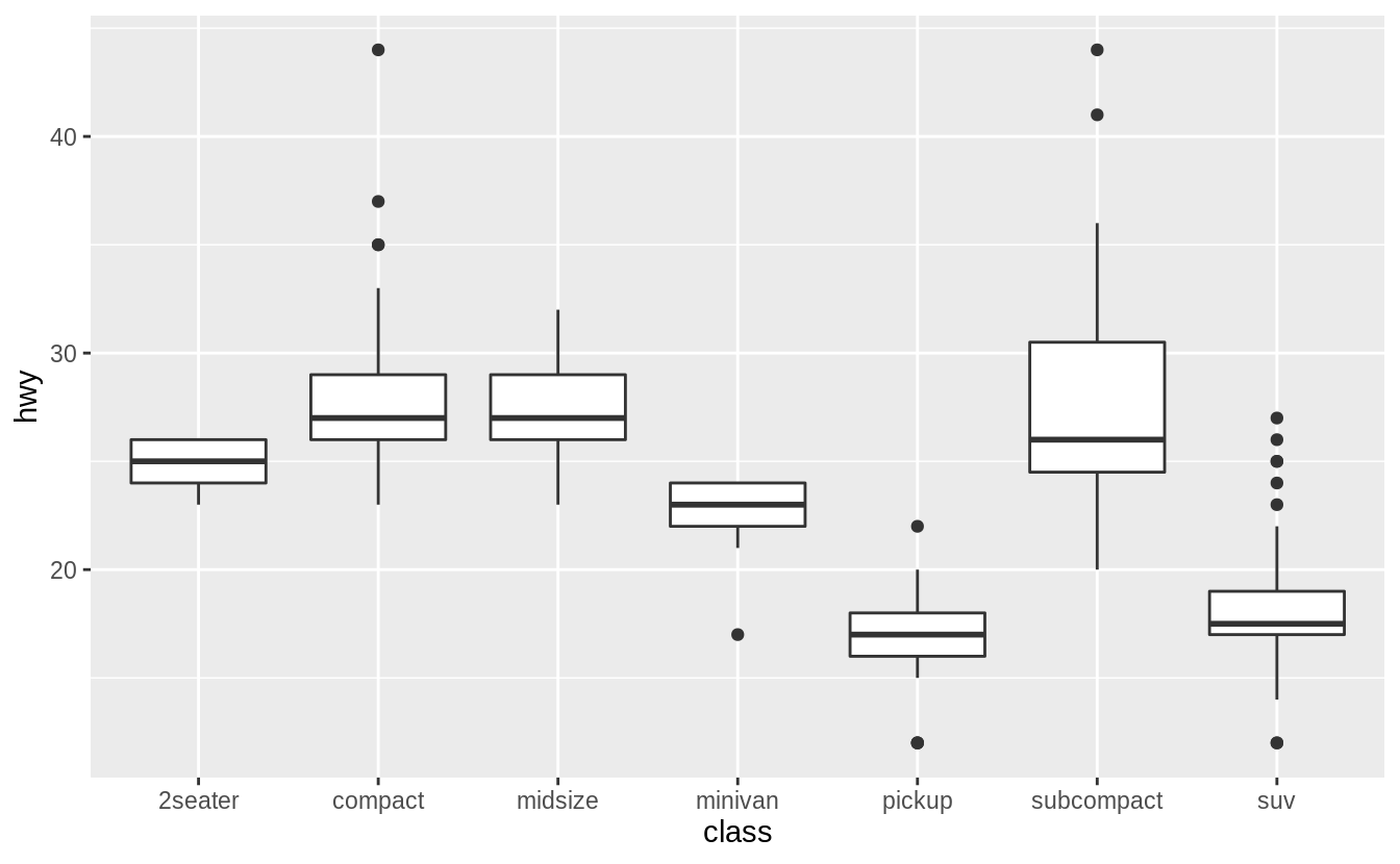 To make the trend easier to see, we can reorder
  If you have long variable names,
 The size of each circle in the plot displays how many observations occurred at each combination of values.
Covariation will appear as a strong correlation between specific x values and specific y values.
Another approach is to compute the count with dplyr:
The size of each circle in the plot displays how many observations occurred at each combination of values.
Covariation will appear as a strong correlation between specific x values and specific y values.
Another approach is to compute the count with dplyr:
 If the categorical variables are unordered, you might want to use the seriation package to simultaneously reorder the rows and columns in order to more clearly reveal interesting patterns.
For larger plots, you might want to try the d3heatmap or heatmaply packages, which create interactive plots.
If the categorical variables are unordered, you might want to use the seriation package to simultaneously reorder the rows and columns in order to more clearly reveal interesting patterns.
For larger plots, you might want to try the d3heatmap or heatmaply packages, which create interactive plots.
 Scatterplots become less useful as the size of your dataset grows, because points begin to overplot, and pile up into areas of uniform black (as above).
You’ve already seen one way to fix the problem: using the
Scatterplots become less useful as the size of your dataset grows, because points begin to overplot, and pile up into areas of uniform black (as above).
You’ve already seen one way to fix the problem: using the  But using transparency can be challenging for very large datasets.
Another solution is to use bin.
Previously you used
But using transparency can be challenging for very large datasets.
Another solution is to use bin.
Previously you used 
 Another option is to bin one continuous variable so it acts like a categorical variable.
Then you can use one of the techniques for visualising the combination of a categorical and a continuous variable that you learned about.
For example, you could bin
Another option is to bin one continuous variable so it acts like a categorical variable.
Then you can use one of the techniques for visualising the combination of a categorical and a continuous variable that you learned about.
For example, you could bin 

 Why is a scatterplot a better display than a binned plot for this case?
 Patterns provide one of the most useful tools for data scientists because they reveal covariation.
If you think of variation as a phenomenon that creates uncertainty, covariation is a phenomenon that reduces it.
If two variables covary, you can use the values of one variable to make better predictions about the values of the second.
If the covariation is due to a causal relationship (a special case), then you can use the value of one variable to control the value of the second.
Models are a tool for extracting patterns out of data.
For example, consider the diamonds data.
It’s hard to understand the relationship between cut and price, because cut and carat, and carat and price are tightly related.
It’s possible to use a model to remove the very strong relationship between price and carat so we can explore the subtleties that remain.
The following code fits a model that predicts
Patterns provide one of the most useful tools for data scientists because they reveal covariation.
If you think of variation as a phenomenon that creates uncertainty, covariation is a phenomenon that reduces it.
If two variables covary, you can use the values of one variable to make better predictions about the values of the second.
If the covariation is due to a causal relationship (a special case), then you can use the value of one variable to control the value of the second.
Models are a tool for extracting patterns out of data.
For example, consider the diamonds data.
It’s hard to understand the relationship between cut and price, because cut and carat, and carat and price are tightly related.
It’s possible to use a model to remove the very strong relationship between price and carat so we can explore the subtleties that remain.
The following code fits a model that predicts  Once you’ve removed the strong relationship between carat and price, you can see what you expect in the relationship between cut and price: relative to their size, better quality diamonds are more expensive.
 You’ll learn how models, and the modelr package, work in the final part of the book, model.
We’re saving modelling for later because understanding what models are and how they work is easiest once you have tools of data wrangling and programming in hand.
You’ll learn how models, and the modelr package, work in the final part of the book, model.
We’re saving modelling for later because understanding what models are and how they work is easiest once you have tools of data wrangling and programming in hand.
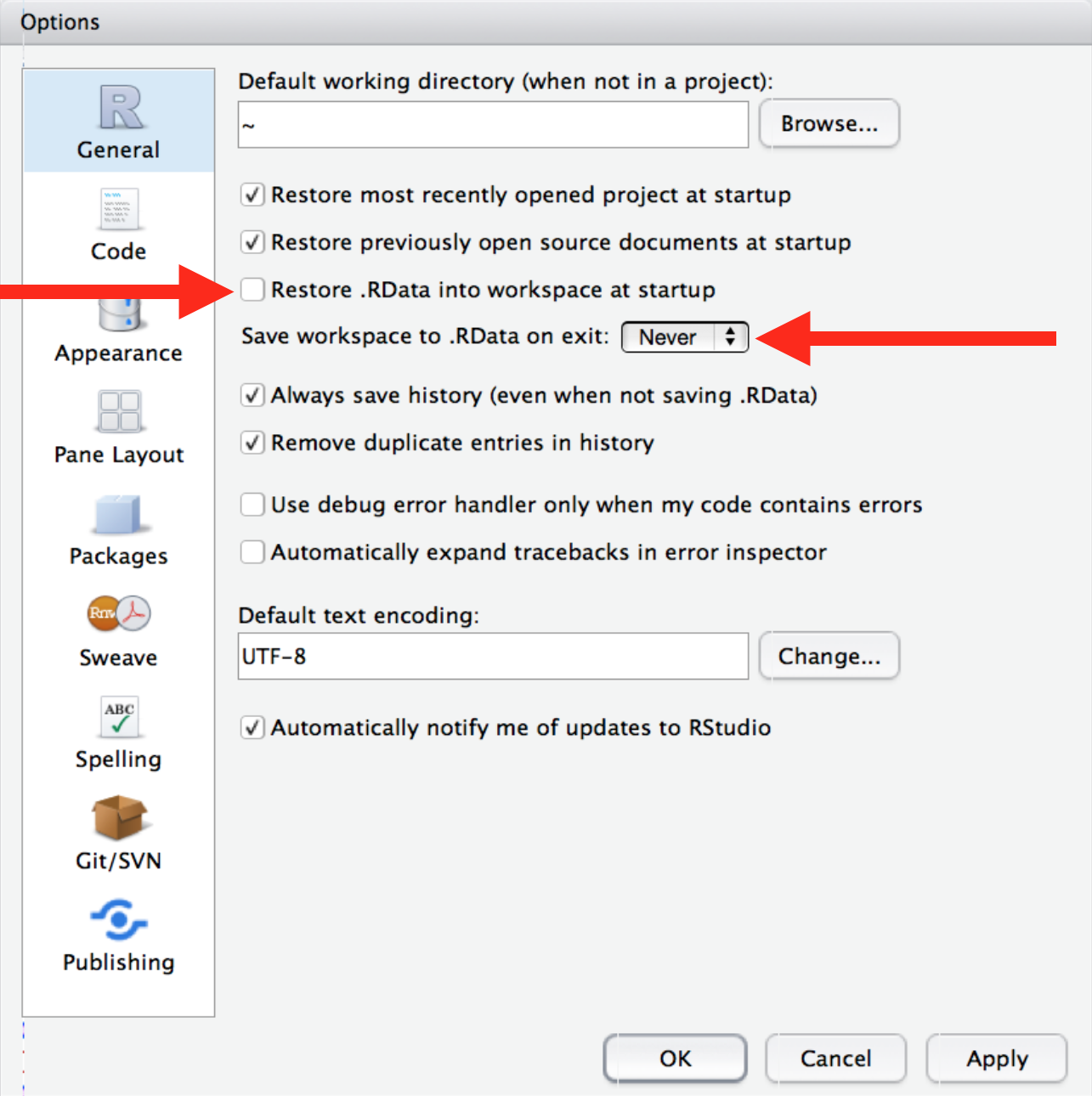 This will cause you some short-term pain, because now when you restart RStudio it will not remember the results of the code that you ran last time.
But this short-term pain will save you long-term agony because it forces you to capture all important interactions in your code.
There’s nothing worse than discovering three months after the fact that you’ve only stored the results of an important calculation in your workspace, not the calculation itself in your code.
There is a great pair of keyboard shortcuts that will work together to make sure you’ve captured the important parts of your code in the editor:
Press Cmd/Ctrl + Shift + F10 to restart RStudio.
Press Cmd/Ctrl + Shift + S to rerun the current script.
I use this pattern hundreds of times a week.
This will cause you some short-term pain, because now when you restart RStudio it will not remember the results of the code that you ran last time.
But this short-term pain will save you long-term agony because it forces you to capture all important interactions in your code.
There’s nothing worse than discovering three months after the fact that you’ve only stored the results of an important calculation in your workspace, not the calculation itself in your code.
There is a great pair of keyboard shortcuts that will work together to make sure you’ve captured the important parts of your code in the editor:
Press Cmd/Ctrl + Shift + F10 to restart RStudio.
Press Cmd/Ctrl + Shift + S to rerun the current script.
I use this pattern hundreds of times a week.
 And you can print this out in R code by running
 Call your project
 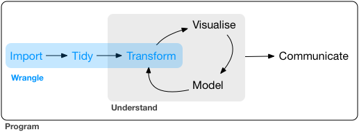 This part of the book proceeds as follows:
In tibbles, you’ll learn about the variant of the data frame that we use
in this book: the tibble.
You’ll learn what makes them different
from regular data frames, and how you can construct them 'by hand'.
In data import, you’ll learn how to get your data from disk and into R.
We’ll focus on plain-text rectangular formats, but will give you pointers
to packages that help with other types of data.
In tidy data, you’ll learn about tidy data, a consistent way of storing
your data that makes transformation, visualisation, and modelling easier.
You’ll learn the underlying principles, and how to get your data into a
tidy form.
Data wrangling also encompasses data transformation, which you’ve already learned a little about.
Now we’ll focus on new skills for three specific types of data you will frequently encounter in practice:
Relational data will give you tools for working with multiple
interrelated datasets.
Strings will introduce regular expressions, a powerful tool for
manipulating strings.
Factors are how R stores categorical data.
They are used when a variable
has a fixed set of possible values, or when you want to use a non-alphabetical
ordering of a string.
Dates and times will give you the key tools for working with
dates and date-times.
This part of the book proceeds as follows:
In tibbles, you’ll learn about the variant of the data frame that we use
in this book: the tibble.
You’ll learn what makes them different
from regular data frames, and how you can construct them 'by hand'.
In data import, you’ll learn how to get your data from disk and into R.
We’ll focus on plain-text rectangular formats, but will give you pointers
to packages that help with other types of data.
In tidy data, you’ll learn about tidy data, a consistent way of storing
your data that makes transformation, visualisation, and modelling easier.
You’ll learn the underlying principles, and how to get your data into a
tidy form.
Data wrangling also encompasses data transformation, which you’ve already learned a little about.
Now we’ll focus on new skills for three specific types of data you will frequently encounter in practice:
Relational data will give you tools for working with multiple
interrelated datasets.
Strings will introduce regular expressions, a powerful tool for
manipulating strings.
Factors are how R stores categorical data.
They are used when a variable
has a fixed set of possible values, or when you want to use a non-alphabetical
ordering of a string.
Dates and times will give you the key tools for working with
dates and date-times.
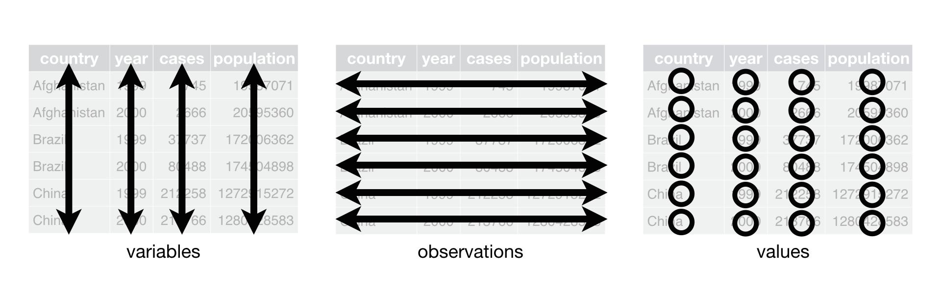 Figure 12.1: Following three rules makes a dataset tidy: variables are in columns, observations are in rows, and values are in cells.
These three rules are interrelated because it’s impossible to only satisfy two of the three.
That interrelationship leads to an even simpler set of practical instructions:
Put each dataset in a tibble.
Put each variable in a column.
In this example, only
Figure 12.1: Following three rules makes a dataset tidy: variables are in columns, observations are in rows, and values are in cells.
These three rules are interrelated because it’s impossible to only satisfy two of the three.
That interrelationship leads to an even simpler set of practical instructions:
Put each dataset in a tibble.
Put each variable in a column.
In this example, only 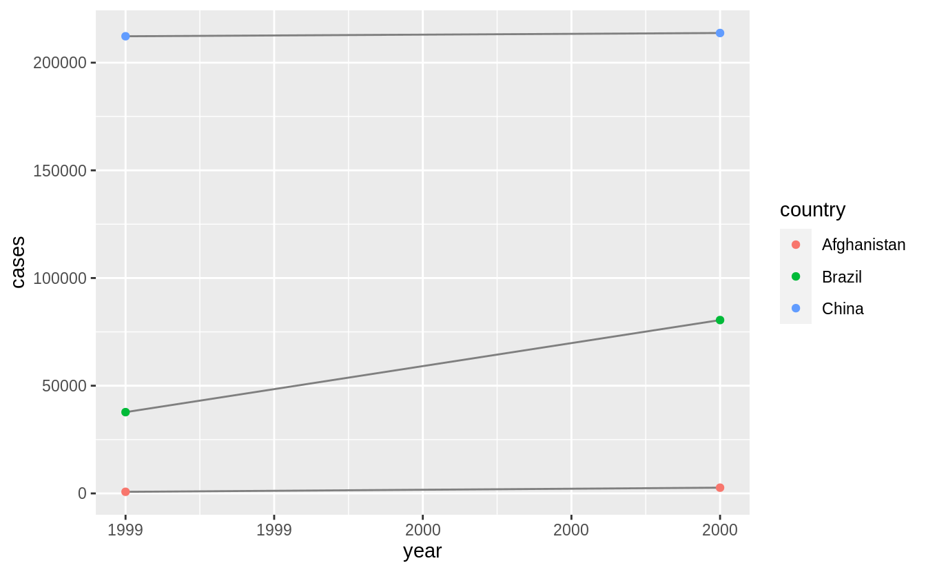
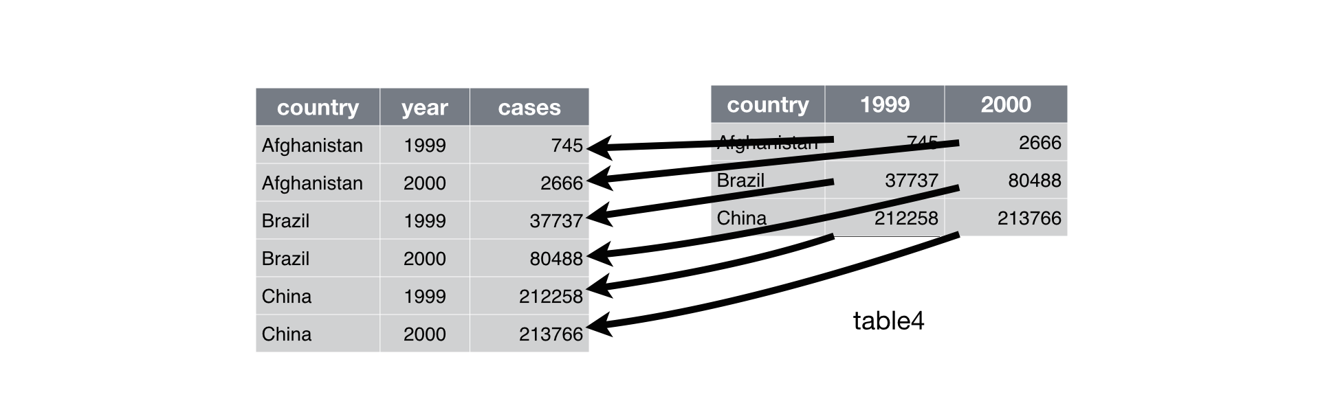 Figure 12.2: Pivoting
 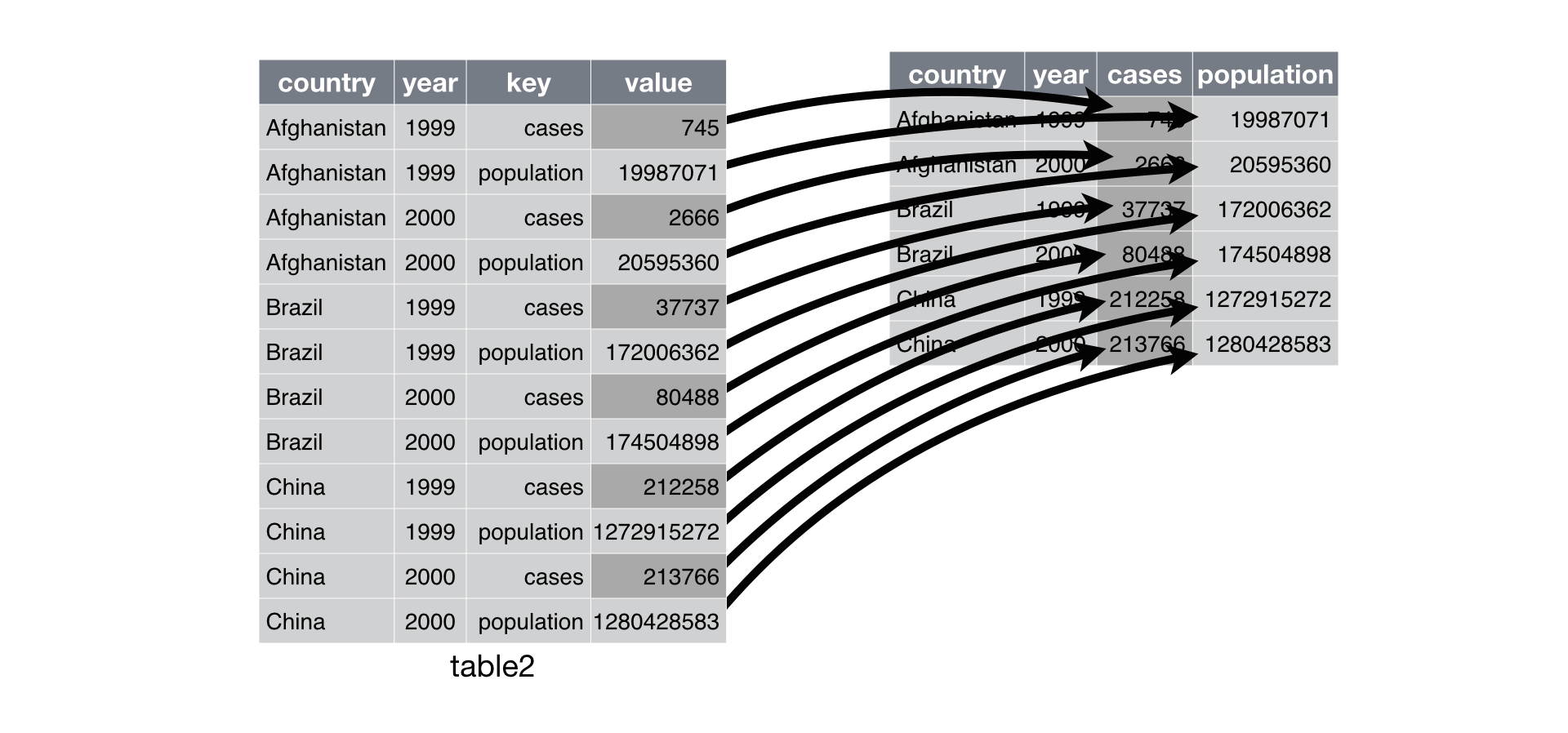 Figure 12.3: Pivoting
 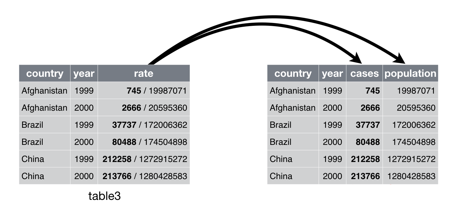 Figure 12.4: Separating
 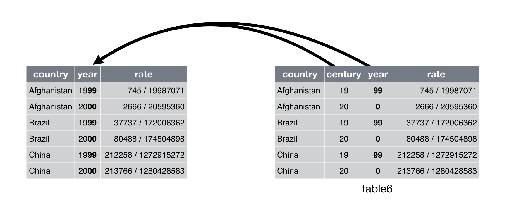 Figure 12.5: Uniting
 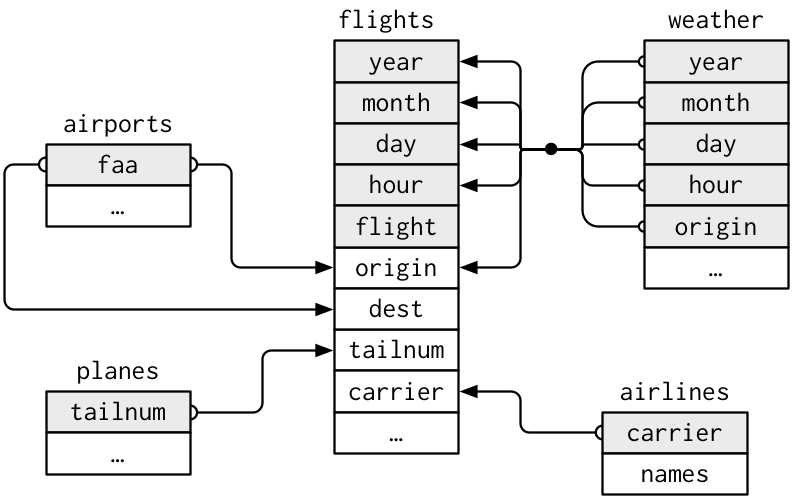 This diagram is a little overwhelming, but it’s simple compared to some you’ll see in the wild! The key to understanding diagrams like this is to remember each relation always concerns a pair of tables.
You don’t need to understand the whole thing; you just need to understand the chain of relations between the tables that you are interested in.
For nycflights13:
This diagram is a little overwhelming, but it’s simple compared to some you’ll see in the wild! The key to understanding diagrams like this is to remember each relation always concerns a pair of tables.
You don’t need to understand the whole thing; you just need to understand the chain of relations between the tables that you are interested in.
For nycflights13:
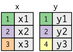
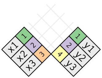 (If you look closely, you might notice that we’ve switched the order of the key and value columns in
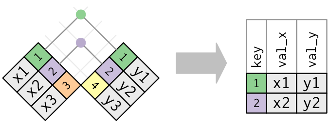
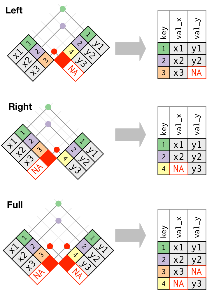 The most commonly used join is the left join: you use this whenever you look up additional data from another table, because it preserves the original observations even when there isn’t a match.
The left join should be your default join: use it unless you have a strong reason to prefer one of the others.
Another way to depict the different types of joins is with a Venn diagram:
The most commonly used join is the left join: you use this whenever you look up additional data from another table, because it preserves the original observations even when there isn’t a match.
The left join should be your default join: use it unless you have a strong reason to prefer one of the others.
Another way to depict the different types of joins is with a Venn diagram:
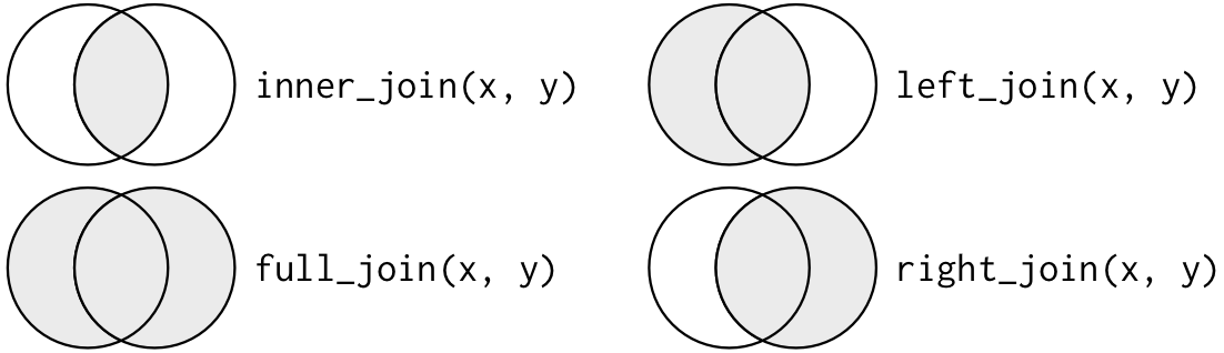 However, this is not a great representation.
It might jog your memory about which join preserves the observations in which table, but it suffers from a major limitation: a Venn diagram can’t show what happens when keys don’t uniquely identify an observation.
However, this is not a great representation.
It might jog your memory about which join preserves the observations in which table, but it suffers from a major limitation: a Venn diagram can’t show what happens when keys don’t uniquely identify an observation.
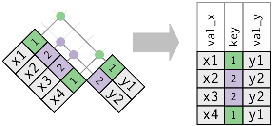 Note that I’ve put the key column in a slightly different position
in the output.
This reflects that the key is a primary key in
Note that I’ve put the key column in a slightly different position
in the output.
This reflects that the key is a primary key in 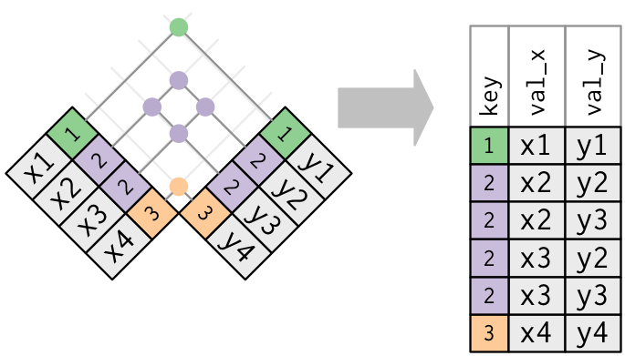
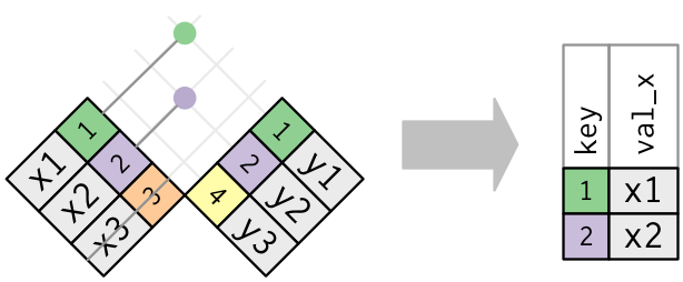 Only the existence of a match is important; it doesn’t matter which observation is matched.
This means that filtering joins never duplicate rows like mutating joins do:
Only the existence of a match is important; it doesn’t matter which observation is matched.
This means that filtering joins never duplicate rows like mutating joins do:
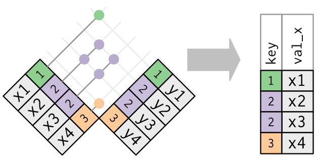 The inverse of a semi-join is an anti-join.
An anti-join keeps the rows that don’t have a match:
The inverse of a semi-join is an anti-join.
An anti-join keeps the rows that don’t have a match:
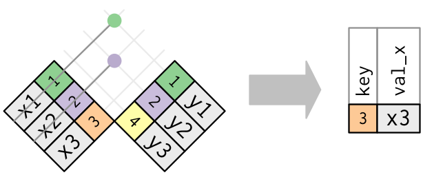 Anti-joins are useful for diagnosing join mismatches.
For example, when connecting
Anti-joins are useful for diagnosing join mismatches.
For example, when connecting 
 By default, ggplot2 will drop levels that don’t have any values.
You can force them to display with:
By default, ggplot2 will drop levels that don’t have any values.
You can force them to display with:
 These levels represent valid values that simply did not occur in this dataset.
Unfortunately, dplyr doesn’t yet have a
These levels represent valid values that simply did not occur in this dataset.
Unfortunately, dplyr doesn’t yet have a 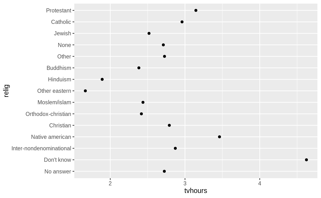 It is difficult to interpret this plot because there’s no overall pattern.
We can improve it by reordering the levels of
It is difficult to interpret this plot because there’s no overall pattern.
We can improve it by reordering the levels of  Reordering religion makes it much easier to see that people in the 'Don’t know' category watch much more TV, and Hinduism & Other Eastern religions watch much less.
As you start making more complicated transformations, I’d recommend moving them out of
Reordering religion makes it much easier to see that people in the 'Don’t know' category watch much more TV, and Hinduism & Other Eastern religions watch much less.
As you start making more complicated transformations, I’d recommend moving them out of  Here, arbitrarily reordering the levels isn’t a good idea! That’s because
  Why do you think the average age for 'Not applicable' is so high?
Another type of reordering is useful when you are colouring the lines on a plot.
Why do you think the average age for 'Not applicable' is so high?
Another type of reordering is useful when you are colouring the lines on a plot.

 Finally, for bar plots, you can use
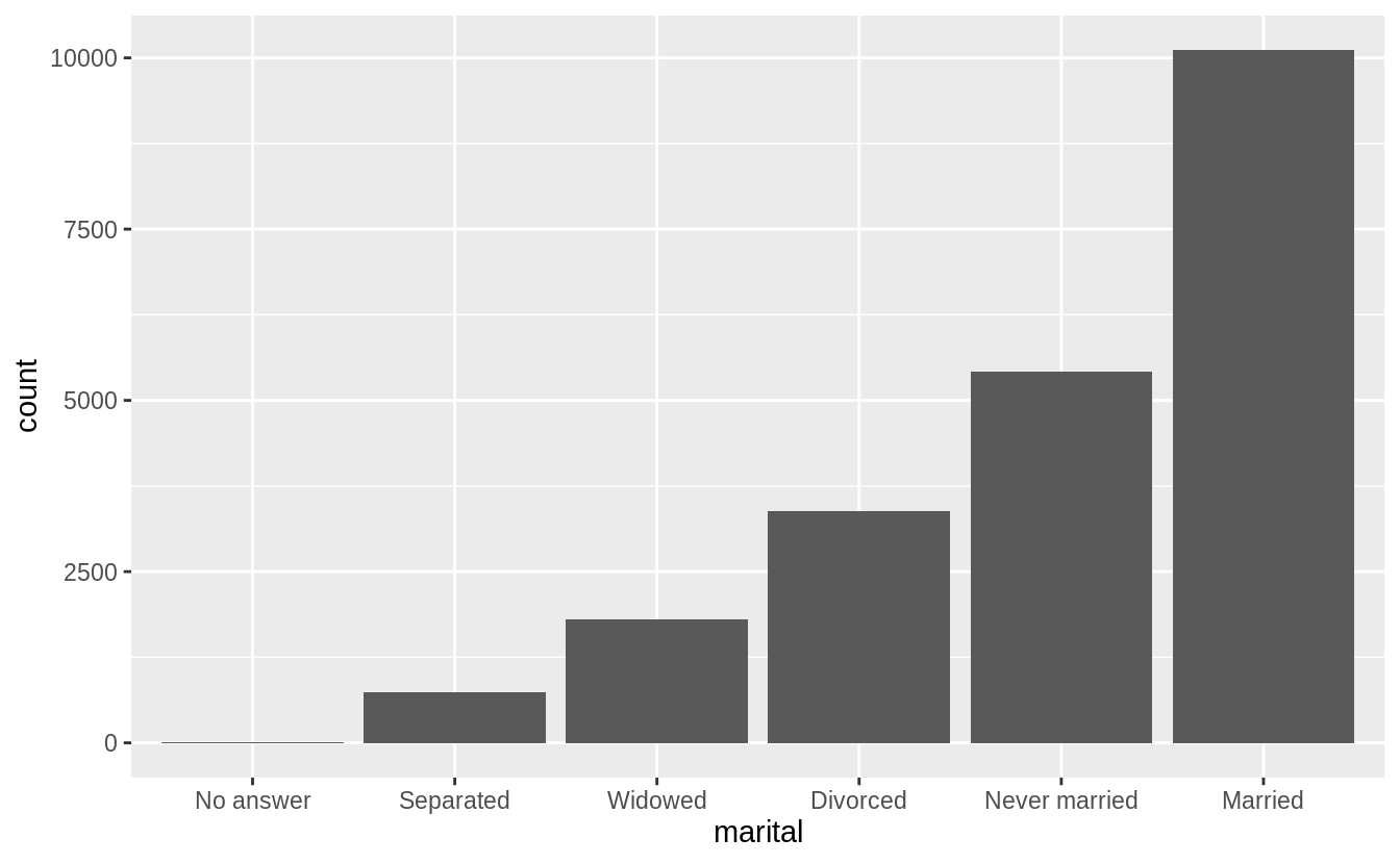
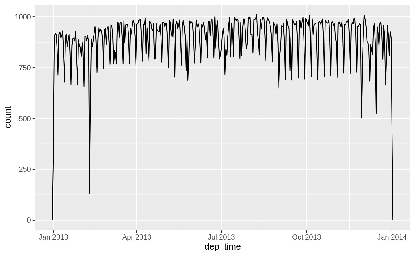 Or within a single day:
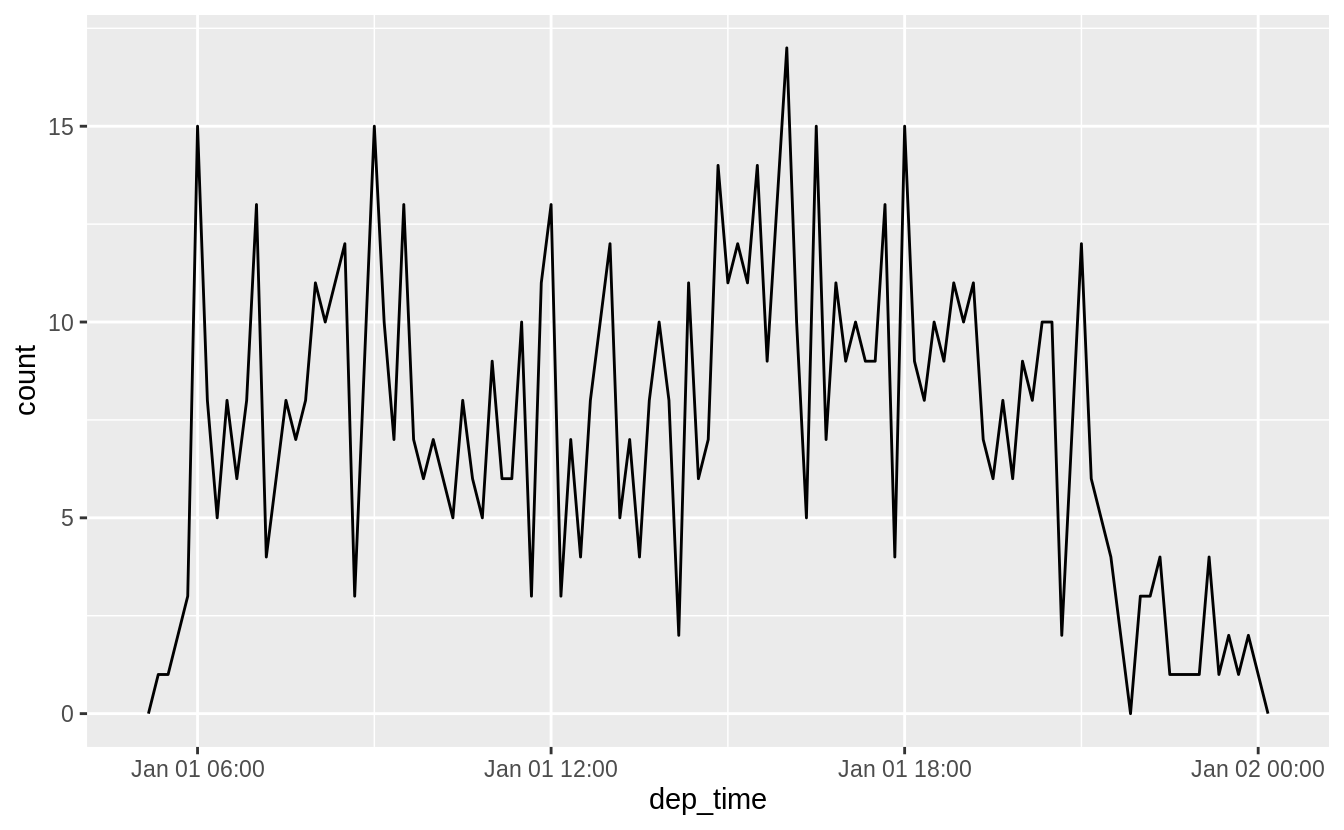 Note that when you use date-times in a numeric context (like in a histogram), 1 means 1 second, so a binwidth of 86400 means one day.
For dates, 1 means 1 day.
Note that when you use date-times in a numeric context (like in a histogram), 1 means 1 second, so a binwidth of 86400 means one day.
For dates, 1 means 1 day.
 There’s an interesting pattern if we look at the average departure delay by minute within the hour.
It looks like flights leaving in minutes 20-30 and 50-60 have much lower delays than the rest of the hour!
There’s an interesting pattern if we look at the average departure delay by minute within the hour.
It looks like flights leaving in minutes 20-30 and 50-60 have much lower delays than the rest of the hour!
 Interestingly, if we look at the scheduled departure time we don’t see such a strong pattern:
 So why do we see that pattern with the actual departure times? Well, like much data collected by humans, there’s a strong bias towards flights leaving at 'nice' departure times.
Always be alert for this sort of pattern whenever you work with data that involves human judgement!
So why do we see that pattern with the actual departure times? Well, like much data collected by humans, there’s a strong bias towards flights leaving at 'nice' departure times.
Always be alert for this sort of pattern whenever you work with data that involves human judgement!

 Computing the difference between a rounded and unrounded date can be particularly useful.
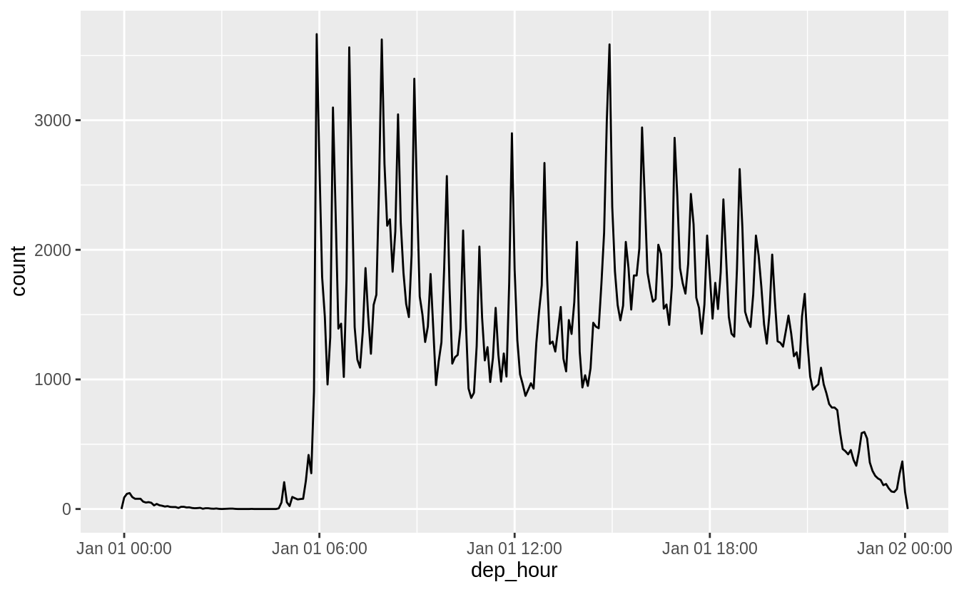 Setting larger components of a date to a constant is a powerful technique that allows you to explore patterns in the smaller components.
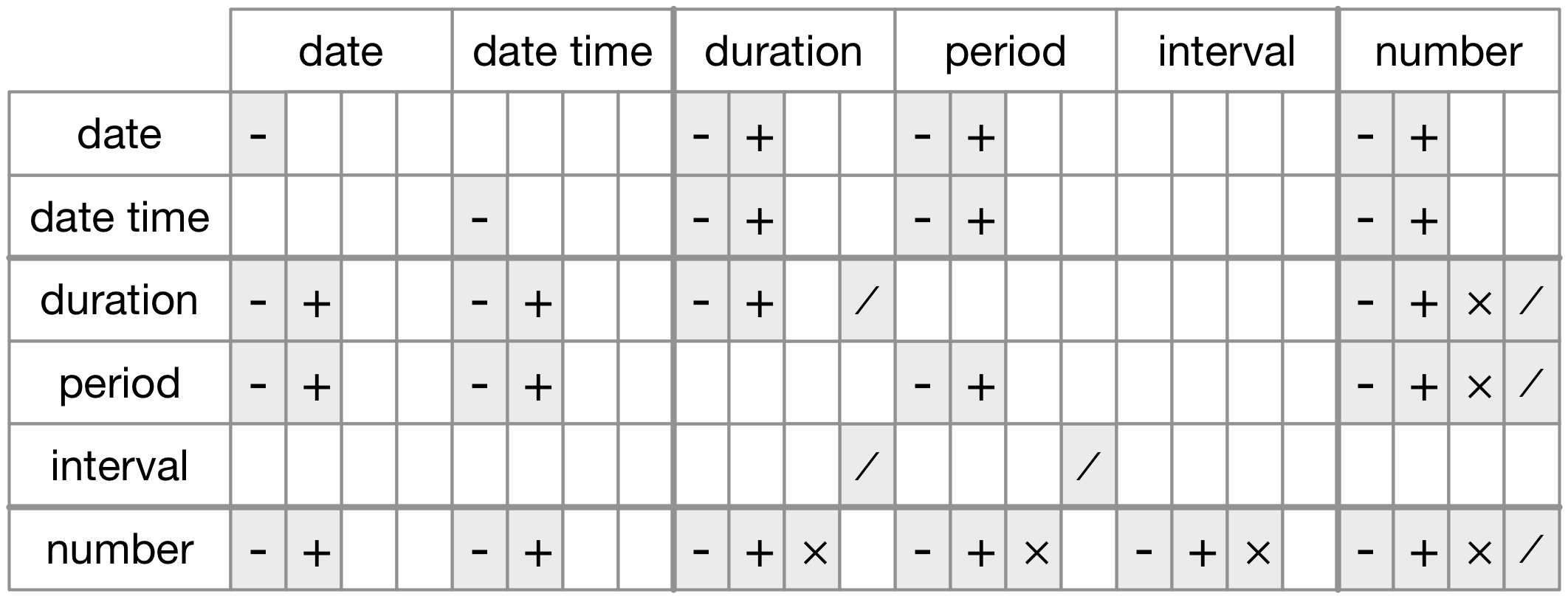 Figure 16.1: The allowed arithmetic operations between pairs of date/time classes.
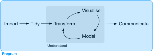 Programming produces code, and code is a tool of communication.
Obviously code tells the computer what you want it to do.
But it also communicates meaning to other humans.
Thinking about code as a vehicle for communication is important because every project you do is fundamentally collaborative.
Even if you’re not working with other people, you’ll definitely be working with future-you! Writing clear code is important so that others (like future-you) can understand why you tackled an analysis in the way you did.
That means getting better at programming also involves getting better at communicating.
Over time, you want your code to become not just easier to write, but easier for others to read.
Writing code is similar in many ways to writing prose.
One parallel which I find particularly useful is that in both cases rewriting is the key to clarity.
The first expression of your ideas is unlikely to be particularly clear, and you may need to rewrite multiple times.
After solving a data analysis challenge, it’s often worth looking at your code and thinking about whether or not it’s obvious what you’ve done.
If you spend a little time rewriting your code while the ideas are fresh, you can save a lot of time later trying to recreate what your code did.
But this doesn’t mean you should rewrite every function: you need to balance what you need to achieve now with saving time in the long run.
(But the more you rewrite your functions the more likely your first attempt will be clear.)
In the following four chapters, you’ll learn skills that will allow you to both tackle new programs and to solve existing problems with greater clarity and ease:
In pipes, you will dive deep into the pipe,
Programming produces code, and code is a tool of communication.
Obviously code tells the computer what you want it to do.
But it also communicates meaning to other humans.
Thinking about code as a vehicle for communication is important because every project you do is fundamentally collaborative.
Even if you’re not working with other people, you’ll definitely be working with future-you! Writing clear code is important so that others (like future-you) can understand why you tackled an analysis in the way you did.
That means getting better at programming also involves getting better at communicating.
Over time, you want your code to become not just easier to write, but easier for others to read.
Writing code is similar in many ways to writing prose.
One parallel which I find particularly useful is that in both cases rewriting is the key to clarity.
The first expression of your ideas is unlikely to be particularly clear, and you may need to rewrite multiple times.
After solving a data analysis challenge, it’s often worth looking at your code and thinking about whether or not it’s obvious what you’ve done.
If you spend a little time rewriting your code while the ideas are fresh, you can save a lot of time later trying to recreate what your code did.
But this doesn’t mean you should rewrite every function: you need to balance what you need to achieve now with saving time in the long run.
(But the more you rewrite your functions the more likely your first attempt will be clear.)
In the following four chapters, you’ll learn skills that will allow you to both tackle new programs and to solve existing problems with greater clarity and ease:
In pipes, you will dive deep into the pipe, 
 If you’re working with functions that don’t have a data frame based API
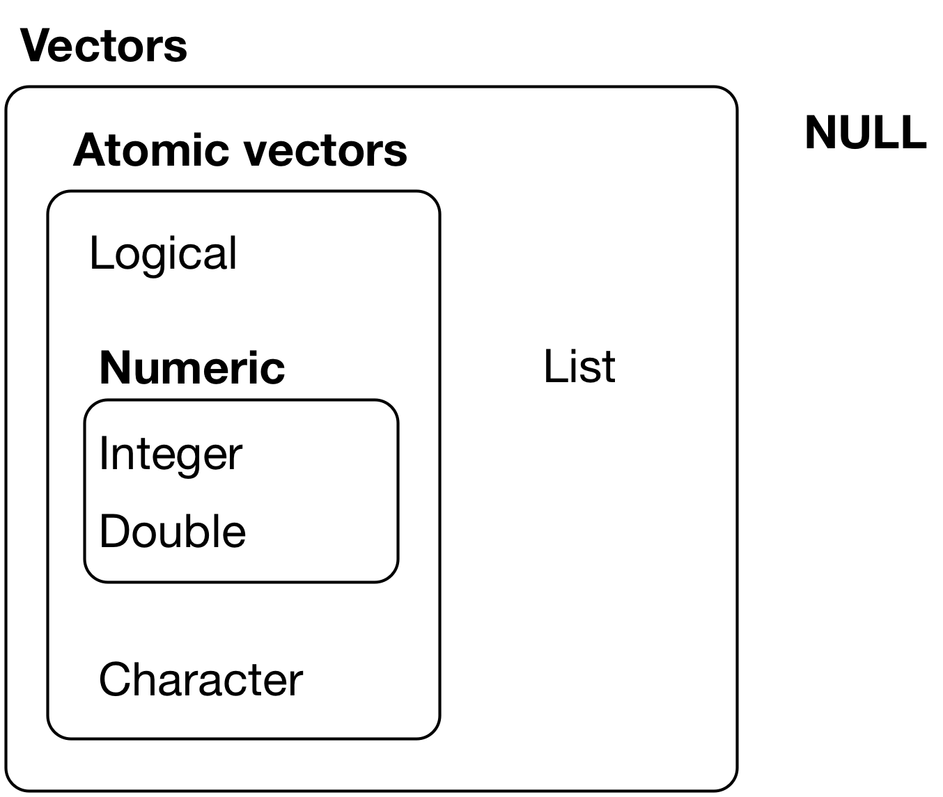 Figure 20.1: The hierarchy of R’s vector types
Every vector has two key properties:
Its type, which you can determine with
Figure 20.1: The hierarchy of R’s vector types
Every vector has two key properties:
Its type, which you can determine with  There are three principles:
Lists have rounded corners.
Atomic vectors have square corners.
Children are drawn inside their parent, and have a slightly darker
background to make it easier to see the hierarchy.
The orientation of the children (i.e. rows or columns) isn’t important,
so I’ll pick a row or column orientation to either save space or illustrate
an important property in the example.
There are three principles:
Lists have rounded corners.
Atomic vectors have square corners.
Children are drawn inside their parent, and have a slightly darker
background to make it easier to see the hierarchy.
The orientation of the children (i.e. rows or columns) isn’t important,
so I’ll pick a row or column orientation to either save space or illustrate
an important property in the example.
 Figure 20.2: Subsetting a list, visually.
 If this pepper shaker is your list
 If you wanted to get the content of the pepper package, you’d need
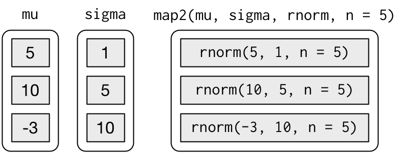 Note that the arguments that vary for each call come before the function; arguments that are the same for every call come after.
Like
Note that the arguments that vary for each call come before the function; arguments that are the same for every call come after.
Like 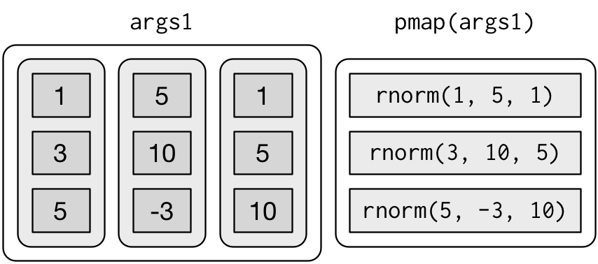 If you don’t name the list’s elements,
 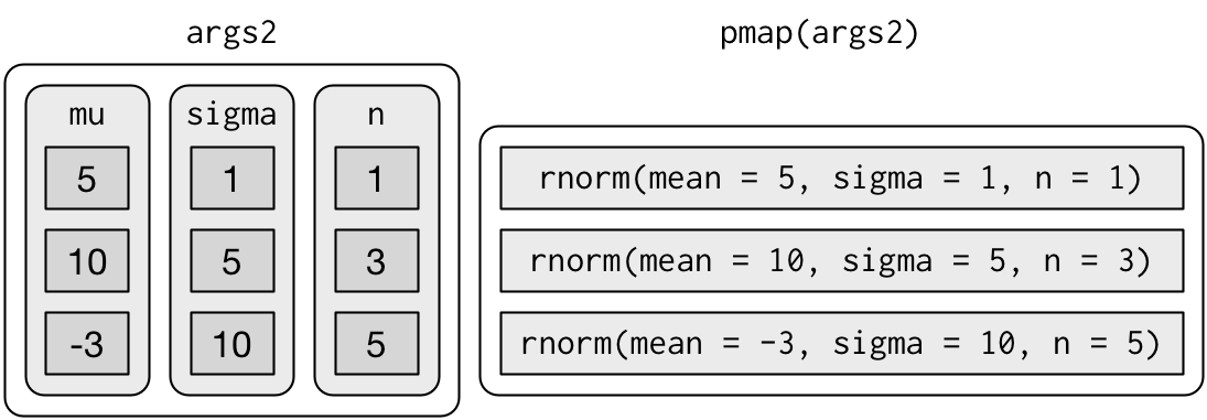 Since the arguments are all the same length, it makes sense to store them in a data frame:
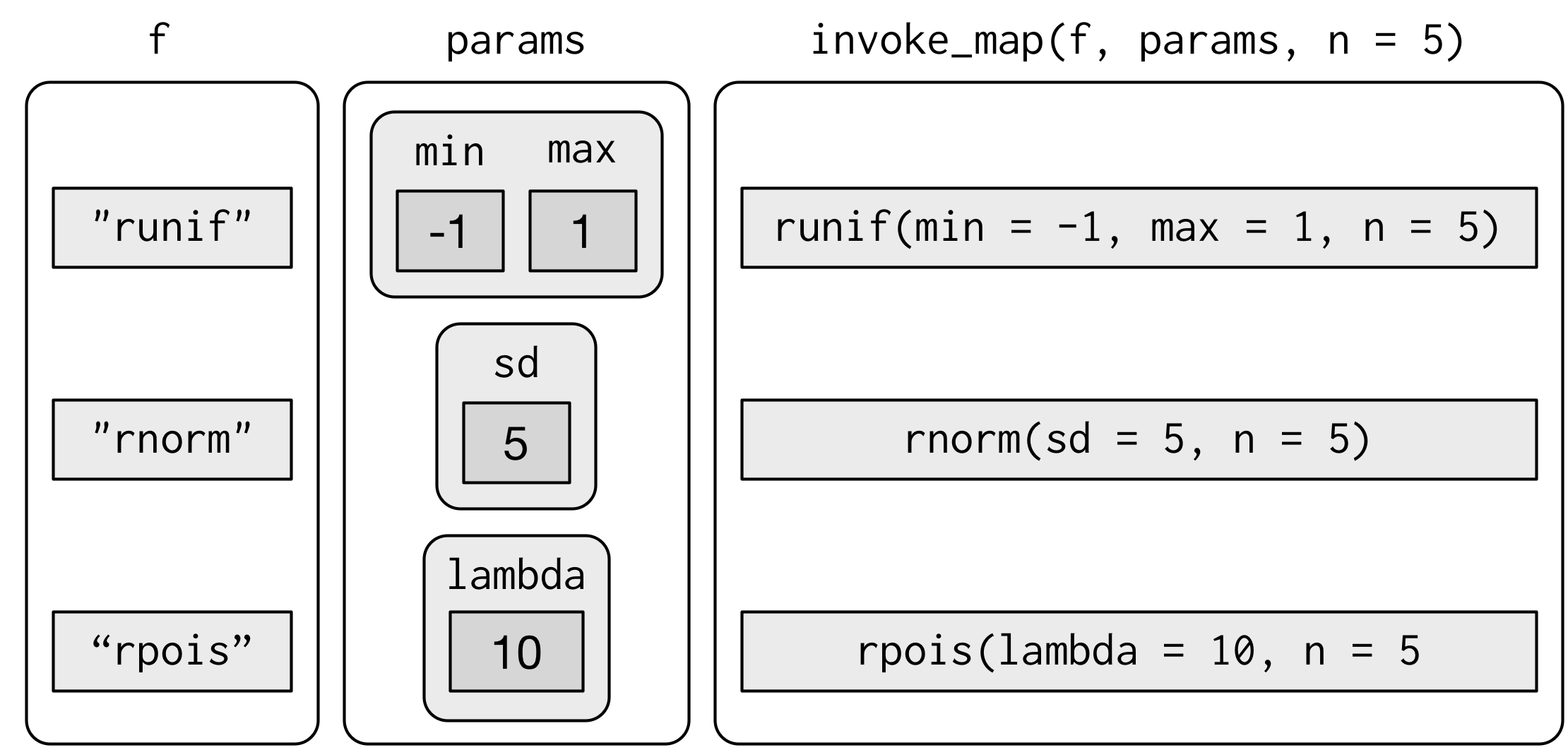 The first argument is a list of functions or character vector of function names.
The second argument is a list of lists giving the arguments that vary for each function.
The subsequent arguments are passed on to every function.
And again, you can use
The first argument is a list of functions or character vector of function names.
The second argument is a list of lists giving the arguments that vary for each function.
The subsequent arguments are passed on to every function.
And again, you can use 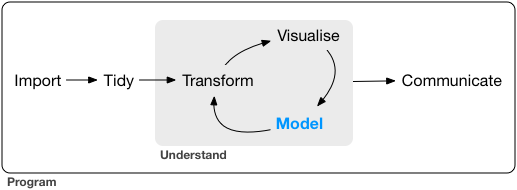 The goal of a model is to provide a simple low-dimensional summary of a dataset.
Ideally, the model will capture true 'signals' (i.e. patterns generated by the phenomenon of interest), and ignore 'noise' (i.e. random variation that you’re not interested in).
Here we only cover 'predictive' models, which, as the name suggests, generate predictions.
There is another type of model that we’re not going to discuss: 'data discovery' models.
These models don’t make predictions, but instead help you discover interesting relationships within your data.
(These two categories of models are sometimes called supervised and unsupervised, but I don’t think that terminology is particularly illuminating.)
This book is not going to give you a deep understanding of the mathematical theory that underlies models.
It will, however, build your intuition about how statistical models work, and give you a family of useful tools that allow you to use models to better understand your data:
In model basics, you’ll learn how models work mechanistically, focussing on
the important family of linear models.
You’ll learn general tools for gaining
insight into what a predictive model tells you about your data, focussing on
simple simulated datasets.
In model building, you’ll learn how to use models to pull out known
patterns in real data.
Once you have recognised an important pattern
it’s useful to make it explicit in a model, because then you can
more easily see the subtler signals that remain.
In many models, you’ll learn how to use many simple models to help
understand complex datasets.
This is a powerful technique, but to access
it you’ll need to combine modelling and programming tools.
These topics are notable because of what they don’t include: any tools for quantitatively assessing models.
That is deliberate: precisely quantifying a model requires a couple of big ideas that we just don’t have the space to cover here.
For now, you’ll rely on qualitative assessment and your natural scepticism.
In Learning more about models, we’ll point you to other resources where you can learn more.
The goal of a model is to provide a simple low-dimensional summary of a dataset.
Ideally, the model will capture true 'signals' (i.e. patterns generated by the phenomenon of interest), and ignore 'noise' (i.e. random variation that you’re not interested in).
Here we only cover 'predictive' models, which, as the name suggests, generate predictions.
There is another type of model that we’re not going to discuss: 'data discovery' models.
These models don’t make predictions, but instead help you discover interesting relationships within your data.
(These two categories of models are sometimes called supervised and unsupervised, but I don’t think that terminology is particularly illuminating.)
This book is not going to give you a deep understanding of the mathematical theory that underlies models.
It will, however, build your intuition about how statistical models work, and give you a family of useful tools that allow you to use models to better understand your data:
In model basics, you’ll learn how models work mechanistically, focussing on
the important family of linear models.
You’ll learn general tools for gaining
insight into what a predictive model tells you about your data, focussing on
simple simulated datasets.
In model building, you’ll learn how to use models to pull out known
patterns in real data.
Once you have recognised an important pattern
it’s useful to make it explicit in a model, because then you can
more easily see the subtler signals that remain.
In many models, you’ll learn how to use many simple models to help
understand complex datasets.
This is a powerful technique, but to access
it you’ll need to combine modelling and programming tools.
These topics are notable because of what they don’t include: any tools for quantitatively assessing models.
That is deliberate: precisely quantifying a model requires a couple of big ideas that we just don’t have the space to cover here.
For now, you’ll rely on qualitative assessment and your natural scepticism.
In Learning more about models, we’ll point you to other resources where you can learn more.
 You can see a strong pattern in the data.
Let’s use a model to capture that pattern and make it explicit.
It’s our job to supply the basic form of the model.
In this case, the relationship looks linear, i.e.
You can see a strong pattern in the data.
Let’s use a model to capture that pattern and make it explicit.
It’s our job to supply the basic form of the model.
In this case, the relationship looks linear, i.e.
 There are 250 models on this plot, but a lot are really bad! We need to find the good models by making precise our intuition that a good model is 'close' to the data.
We need a way to quantify the distance between the data and a model.
Then we can fit the model by finding the value of
There are 250 models on this plot, but a lot are really bad! We need to find the good models by making precise our intuition that a good model is 'close' to the data.
We need a way to quantify the distance between the data and a model.
Then we can fit the model by finding the value of  This distance is just the difference between the y value given by the model (the prediction), and the actual y value in the data (the response).
To compute this distance, we first turn our model family into an R function.
This takes the model parameters and the data as inputs, and gives values predicted by the model as output:
This distance is just the difference between the y value given by the model (the prediction), and the actual y value in the data (the response).
To compute this distance, we first turn our model family into an R function.
This takes the model parameters and the data as inputs, and gives values predicted by the model as output:
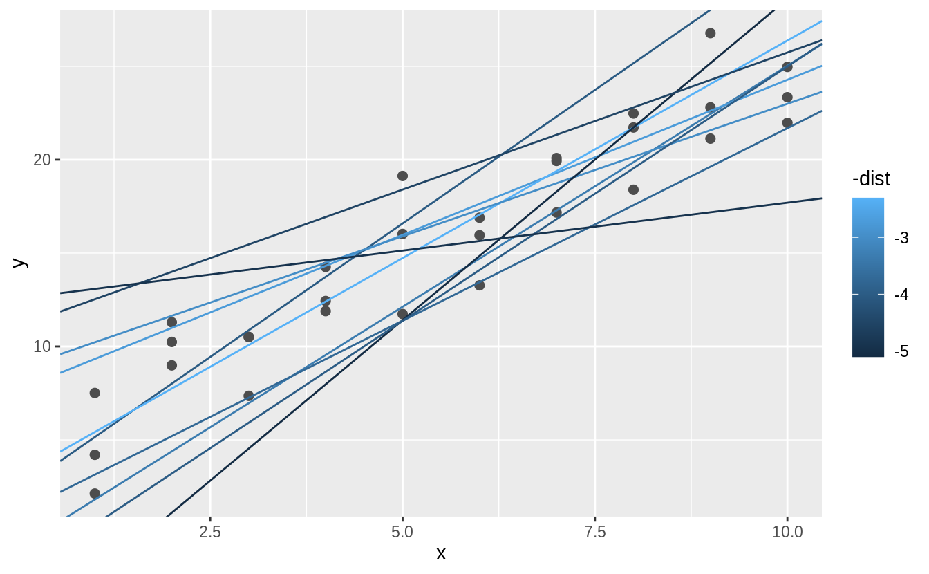 We can also think about these models as observations, and visualising with a scatterplot of
  Instead of trying lots of random models, we could be more systematic and generate an evenly spaced grid of points (this is called a grid search).
I picked the parameters of the grid roughly by looking at where the best models were in the plot above.
Instead of trying lots of random models, we could be more systematic and generate an evenly spaced grid of points (this is called a grid search).
I picked the parameters of the grid roughly by looking at where the best models were in the plot above.
 When you overlay the best 10 models back on the original data, they all look pretty good:
 You could imagine iteratively making the grid finer and finer until you narrowed in on the best model.
But there’s a better way to tackle that problem: a numerical minimisation tool called Newton-Raphson search.
The intuition of Newton-Raphson is pretty simple: you pick a starting point and look around for the steepest slope.
You then ski down that slope a little way, and then repeat again and again, until you can’t go any lower.
In R, we can do that with
You could imagine iteratively making the grid finer and finer until you narrowed in on the best model.
But there’s a better way to tackle that problem: a numerical minimisation tool called Newton-Raphson search.
The intuition of Newton-Raphson is pretty simple: you pick a starting point and look around for the steepest slope.
You then ski down that slope a little way, and then repeat again and again, until you can’t go any lower.
In R, we can do that with 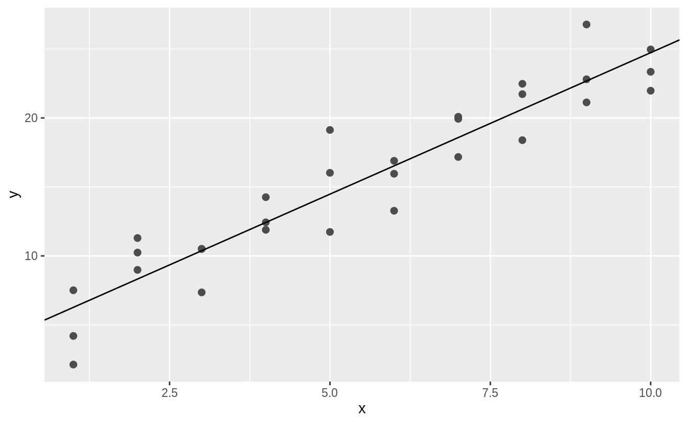 Don’t worry too much about the details of how
 This helps you calibrate the quality of the model: how far away are the predictions from the observed values? Note that the average of the residual will always be 0.
You’ll often want to recreate plots using the residuals instead of the original predictor.
You’ll see a lot of that in the next chapter.
This helps you calibrate the quality of the model: how far away are the predictions from the observed values? Note that the average of the residual will always be 0.
You’ll often want to recreate plots using the residuals instead of the original predictor.
You’ll see a lot of that in the next chapter.
 This looks like random noise, suggesting that our model has done a good job of capturing the patterns in the dataset.
 We can fit a model to it, and generate predictions:
 You can’t make predictions about levels that you didn’t observe.
Sometimes you’ll do this by accident so it’s good to recognise this error message:
You can’t make predictions about levels that you didn’t observe.
Sometimes you’ll do this by accident so it’s good to recognise this error message:
 There are two possible models you could fit to this data:
 Note that the model that uses
  There is little obvious pattern in the residuals for
  That doesn’t suggest that the models are very different! But that’s partly an illusion: our eyes and brains are not very good at accurately comparing shades of colour.
Instead of looking at the surface from the top, we could look at it from either side, showing multiple slices:
That doesn’t suggest that the models are very different! But that’s partly an illusion: our eyes and brains are not very good at accurately comparing shades of colour.
Instead of looking at the surface from the top, we could look at it from either side, showing multiple slices:

 This shows you that interaction between two continuous variables works basically the same way as for a categorical and continuous variable.
An interaction says that there’s not a fixed offset: you need to consider both values of
This shows you that interaction between two continuous variables works basically the same way as for a categorical and continuous variable.
An interaction says that there’s not a fixed offset: you need to consider both values of  I’m going to fit five models to this data.
 Notice that the extrapolation outside the range of the data is clearly bad.
This is the downside to approximating a function with a polynomial.
But this is a very real problem with every model: the model can never tell you if the behaviour is true when you start extrapolating outside the range of the data that you have seen.
You must rely on theory and science.
Notice that the extrapolation outside the range of the data is clearly bad.
This is the downside to approximating a function with a polynomial.
But this is a very real problem with every model: the model can never tell you if the behaviour is true when you start extrapolating outside the range of the data that you have seen.
You must rely on theory and science.


 Note that the worst diamond color is J (slightly yellow), and the worst clarity is I1 (inclusions visible to the naked eye).
 We can make it easier to see how the other attributes of a diamond affect its relative
  The log-transformation is particularly useful here because it makes the pattern linear, and linear patterns are the easiest to work with.
Let’s take the next step and remove that strong linear pattern.
We first make the pattern explicit by fitting a model:
The log-transformation is particularly useful here because it makes the pattern linear, and linear patterns are the easiest to work with.
Let’s take the next step and remove that strong linear pattern.
We first make the pattern explicit by fitting a model:
 That tells us something interesting about our data.
If we believe our model, then the large diamonds are much cheaper than expected.
This is probably because no diamond in this dataset costs more than $19,000.
Now we can look at the residuals, which verifies that we’ve successfully removed the strong linear pattern:
That tells us something interesting about our data.
If we believe our model, then the large diamonds are much cheaper than expected.
This is probably because no diamond in this dataset costs more than $19,000.
Now we can look at the residuals, which verifies that we’ve successfully removed the strong linear pattern:
 Importantly, we can now re-do our motivating plots using those residuals instead of

 Now we see the relationship we expect: as the quality of the diamond increases, so too does its relative price.
To interpret the
Now we see the relationship we expect: as the quality of the diamond increases, so too does its relative price.
To interpret the  If the model needs variables that you haven’t explicitly supplied,
  This plot indicates that there are some diamonds with quite large residuals - remember a residual of 2 indicates that the diamond is 4x the price that we expected.
It’s often useful to look at unusual values individually:
This plot indicates that there are some diamonds with quite large residuals - remember a residual of 2 indicates that the diamond is 4x the price that we expected.
It’s often useful to look at unusual values individually:

 There are fewer flights on weekends because most travel is for business.
The effect is particularly pronounced on Saturday: you might sometimes leave on Sunday for a Monday morning meeting, but it’s very rare that you’d leave on Saturday as you’d much rather be at home with your family.
One way to remove this strong pattern is to use a model.
First, we fit the model, and display its predictions overlaid on the original data:
There are fewer flights on weekends because most travel is for business.
The effect is particularly pronounced on Saturday: you might sometimes leave on Sunday for a Monday morning meeting, but it’s very rare that you’d leave on Saturday as you’d much rather be at home with your family.
One way to remove this strong pattern is to use a model.
First, we fit the model, and display its predictions overlaid on the original data:
 Next we compute and visualise the residuals:
 Note the change in the y-axis: now we are seeing the deviation from the expected number of flights, given the day of week.
This plot is useful because now that we’ve removed much of the large day-of-week effect, we can see some of the subtler patterns that remain:
Our model seems to fail starting in June: you can still see a strong
regular pattern that our model hasn’t captured.
Drawing a plot with one
line for each day of the week makes the cause easier to see:
Note the change in the y-axis: now we are seeing the deviation from the expected number of flights, given the day of week.
This plot is useful because now that we’ve removed much of the large day-of-week effect, we can see some of the subtler patterns that remain:
Our model seems to fail starting in June: you can still see a strong
regular pattern that our model hasn’t captured.
Drawing a plot with one
line for each day of the week makes the cause easier to see:
 Our model fails to accurately predict the number of flights on Saturday:
during summer there are more flights than we expect, and during Fall there
are fewer.
We’ll see how we can do better to capture this pattern in the
next section.
There are some days with far fewer flights than expected:
Our model fails to accurately predict the number of flights on Saturday:
during summer there are more flights than we expect, and during Fall there
are fewer.
We’ll see how we can do better to capture this pattern in the
next section.
There are some days with far fewer flights than expected:
 There are fewer flights in January (and December), and more in summer
(May-Sep).
We can’t do much with this pattern quantitatively, because we
only have a single year of data.
But we can use our domain knowledge to
brainstorm potential explanations.
There are fewer flights in January (and December), and more in summer
(May-Sep).
We can’t do much with this pattern quantitatively, because we
only have a single year of data.
But we can use our domain knowledge to
brainstorm potential explanations.
 (I’ve used both points and lines to make it more clear what is data and what is interpolation.)
I suspect this pattern is caused by summer holidays: many people go on holiday in the summer, and people don’t mind travelling on Saturdays for vacation.
Looking at this plot, we might guess that summer holidays are from early June to late August.
That seems to line up fairly well with the state’s school terms: summer break in 2013 was Jun 26–Sep 9.
Why are there more Saturday flights in the Spring than the Fall? I asked some American friends and they suggested that it’s less common to plan family vacations during the Fall because of the big Thanksgiving and Christmas holidays.
We don’t have the data to know for sure, but it seems like a plausible working hypothesis.
Lets create a 'term' variable that roughly captures the three school terms, and check our work with a plot:
(I’ve used both points and lines to make it more clear what is data and what is interpolation.)
I suspect this pattern is caused by summer holidays: many people go on holiday in the summer, and people don’t mind travelling on Saturdays for vacation.
Looking at this plot, we might guess that summer holidays are from early June to late August.
That seems to line up fairly well with the state’s school terms: summer break in 2013 was Jun 26–Sep 9.
Why are there more Saturday flights in the Spring than the Fall? I asked some American friends and they suggested that it’s less common to plan family vacations during the Fall because of the big Thanksgiving and Christmas holidays.
We don’t have the data to know for sure, but it seems like a plausible working hypothesis.
Lets create a 'term' variable that roughly captures the three school terms, and check our work with a plot:
 (I manually tweaked the dates to get nice breaks in the plot.
Using a visualisation to help you understand what your function is doing is a really powerful and general technique.)
It’s useful to see how this new variable affects the other days of the week:
(I manually tweaked the dates to get nice breaks in the plot.
Using a visualisation to help you understand what your function is doing is a really powerful and general technique.)
It’s useful to see how this new variable affects the other days of the week:
 It looks like there is significant variation across the terms, so fitting a separate day of week effect for each term is reasonable.
This improves our model, but not as much as we might hope:
It looks like there is significant variation across the terms, so fitting a separate day of week effect for each term is reasonable.
This improves our model, but not as much as we might hope:
 We can see the problem by overlaying the predictions from the model on to the raw data:
 Our model is finding the mean effect, but we have a lot of big outliers, so mean tends to be far away from the typical value.
We can alleviate this problem by using a model that is robust to the effect of outliers:
Our model is finding the mean effect, but we have a lot of big outliers, so mean tends to be far away from the typical value.
We can alleviate this problem by using a model that is robust to the effect of outliers:  It’s now much easier to see the long-term trend, and the positive and negative outliers.
 We see a strong pattern in the numbers of Saturday flights.
This is reassuring, because we also saw that pattern in the raw data.
It’s a good sign when you get the same signal from different approaches.
We see a strong pattern in the numbers of Saturday flights.
This is reassuring, because we also saw that pattern in the raw data.
It’s a good sign when you get the same signal from different approaches.
 This is a small dataset: it only has ~1,700 observations and 3 variables.
But it’s still hard to see what’s going on! Overall, it looks like life expectancy has been steadily improving.
However, if you look closely, you might notice some countries that don’t follow this pattern.
How can we make those countries easier to see?
One way is to use the same approach as in the last chapter: there’s a strong signal (overall linear growth) that makes it hard to see subtler trends.
We’ll tease these factors apart by fitting a model with a linear trend.
The model captures steady growth over time, and the residuals will show what’s left.
You already know how to do that if we had a single country:
This is a small dataset: it only has ~1,700 observations and 3 variables.
But it’s still hard to see what’s going on! Overall, it looks like life expectancy has been steadily improving.
However, if you look closely, you might notice some countries that don’t follow this pattern.
How can we make those countries easier to see?
One way is to use the same approach as in the last chapter: there’s a strong signal (overall linear growth) that makes it hard to see subtler trends.
We’ll tease these factors apart by fitting a model with a linear trend.
The model captures steady growth over time, and the residuals will show what’s left.
You already know how to do that if we had a single country:


 How can we easily fit that model to every country?
 Facetting by continent is particularly revealing:
 It looks like we’ve missed some mild patterns.
There’s also something interesting going on in Africa: we see some very large residuals which suggests our model isn’t fitting so well there.
We’ll explore that more in the next section, attacking it from a slightly different angle.
It looks like we’ve missed some mild patterns.
There’s also something interesting going on in Africa: we see some very large residuals which suggests our model isn’t fitting so well there.
We’ll explore that more in the next section, attacking it from a slightly different angle.
 We could pull out the countries with particularly bad \(R^2\) and plot the data:
 We see two main effects here: the tragedies of the HIV/AIDS epidemic and the Rwandan genocide.
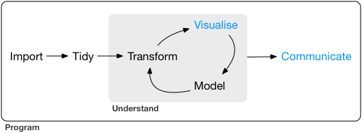 Communication is the theme of the following four chapters:
In R Markdown, you will learn about R Markdown, a tool for integrating
prose, code, and results.
You can use R Markdown in notebook mode for
analyst-to-analyst communication, and in report mode for
analyst-to-decision-maker communication.
Thanks to the power of R Markdown
formats, you can even use the same document for both purposes.
In Graphics for communication, you will learn how to take your exploratory
graphics and turn them into expository graphics, graphics that help the
newcomer to your analysis understand what’s going on as quickly and
easily as possible.
In R Markdown formats, you’ll learn a little about the many other varieties
of outputs you can produce using R Markdown, including dashboards, websites,
and books.
We’ll finish up with R Markdown workflow, where you’ll learn about the
'analysis notebook' and how to systematically record your successes and
failures so that you can learn from them.
Unfortunately, these chapters focus mostly on the technical mechanics of communication, not the really hard problems of communicating your thoughts to other humans.
However, there are lot of other great books about communication, which we’ll point you to at the end of each chapter.
Communication is the theme of the following four chapters:
In R Markdown, you will learn about R Markdown, a tool for integrating
prose, code, and results.
You can use R Markdown in notebook mode for
analyst-to-analyst communication, and in report mode for
analyst-to-decision-maker communication.
Thanks to the power of R Markdown
formats, you can even use the same document for both purposes.
In Graphics for communication, you will learn how to take your exploratory
graphics and turn them into expository graphics, graphics that help the
newcomer to your analysis understand what’s going on as quickly and
easily as possible.
In R Markdown formats, you’ll learn a little about the many other varieties
of outputs you can produce using R Markdown, including dashboards, websites,
and books.
We’ll finish up with R Markdown workflow, where you’ll learn about the
'analysis notebook' and how to systematically record your successes and
failures so that you can learn from them.
Unfortunately, these chapters focus mostly on the technical mechanics of communication, not the really hard problems of communicating your thoughts to other humans.
However, there are lot of other great books about communication, which we’ll point you to at the end of each chapter.
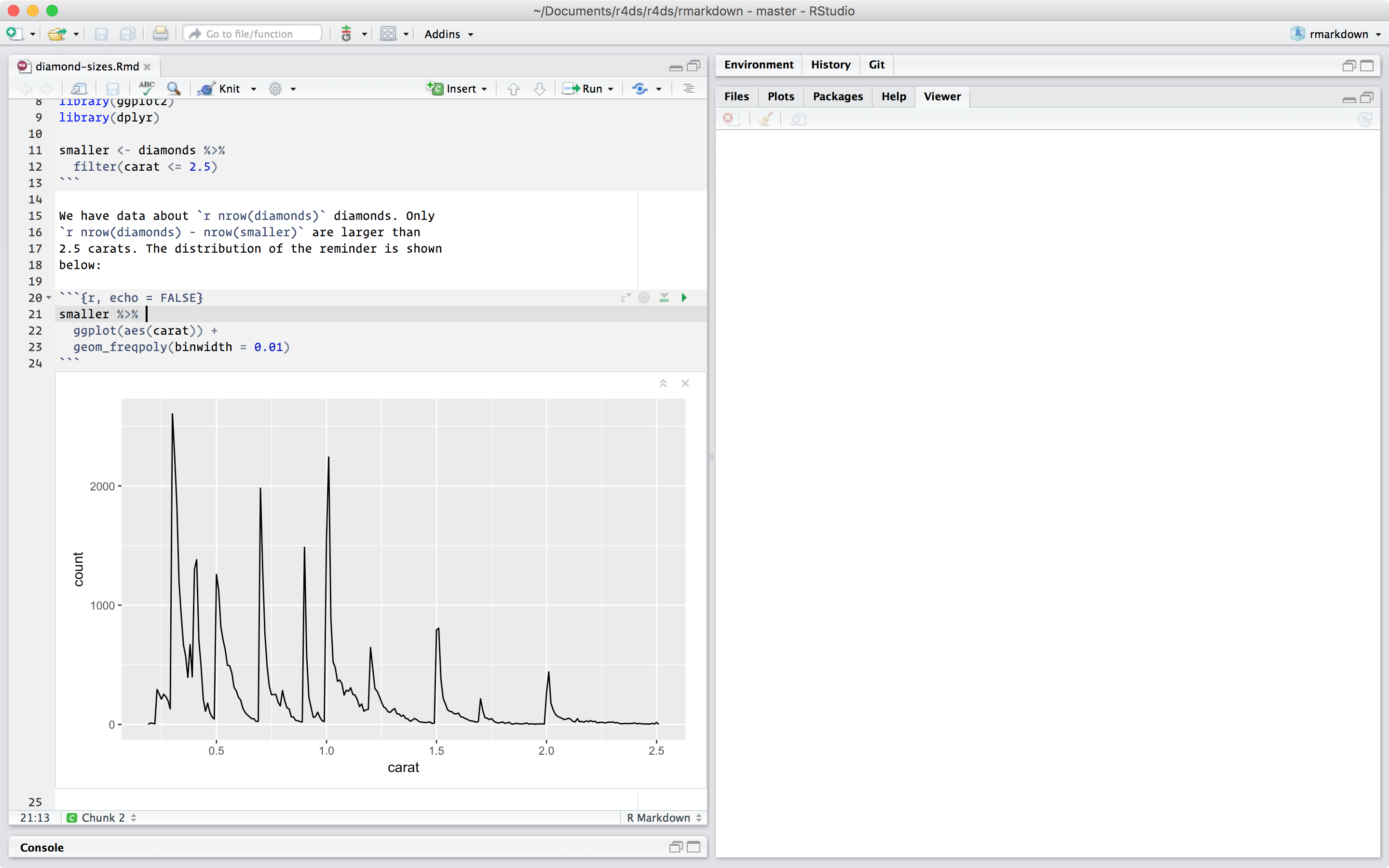 To produce a complete report containing all text, code, and results, click 'Knit' or press Cmd/Ctrl + Shift + K.
You can also do this programmatically with
To produce a complete report containing all text, code, and results, click 'Knit' or press Cmd/Ctrl + Shift + K.
You can also do this programmatically with  When you knit the document, R Markdown sends the .Rmd file to knitr, http://yihui.name/knitr/, which executes all of the code chunks and creates a new markdown (.md) document which includes the code and its output.
The markdown file generated by knitr is then processed by pandoc, http://pandoc.org/, which is responsible for creating the finished file.
The advantage of this two step workflow is that you can create a very wide range of output formats, as you’ll learn about in R markdown formats.
When you knit the document, R Markdown sends the .Rmd file to knitr, http://yihui.name/knitr/, which executes all of the code chunks and creates a new markdown (.md) document which includes the code and its output.
The markdown file generated by knitr is then processed by pandoc, http://pandoc.org/, which is responsible for creating the finished file.
The advantage of this two step workflow is that you can create a very wide range of output formats, as you’ll learn about in R markdown formats.
 To get started with your own
  Graphics produced by the chunks will have useful names that make
them easier to use elsewhere.
More on that in other important options.
You can set up networks of cached chunks to avoid re-performing expensive
computations on every run.
More on that below.
There is one chunk name that imbues special behaviour:
Graphics produced by the chunks will have useful names that make
them easier to use elsewhere.
More on that in other important options.
You can set up networks of cached chunks to avoid re-performing expensive
computations on every run.
More on that below.
There is one chunk name that imbues special behaviour: 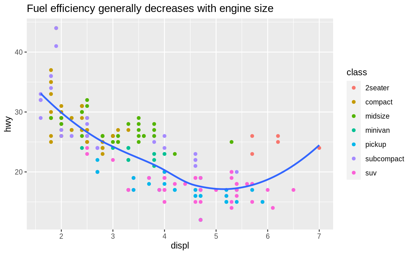 The purpose of a plot title is to summarise the main finding.
Avoid titles that just describe what the plot is, e.g.
'A scatterplot of engine displacement vs. fuel economy'.
If you need to add more text, there are two other useful labels that you can use in ggplot2 2.2.0 and above (which should be available by the time you’re reading this book):
The purpose of a plot title is to summarise the main finding.
Avoid titles that just describe what the plot is, e.g.
'A scatterplot of engine displacement vs. fuel economy'.
If you need to add more text, there are two other useful labels that you can use in ggplot2 2.2.0 and above (which should be available by the time you’re reading this book):
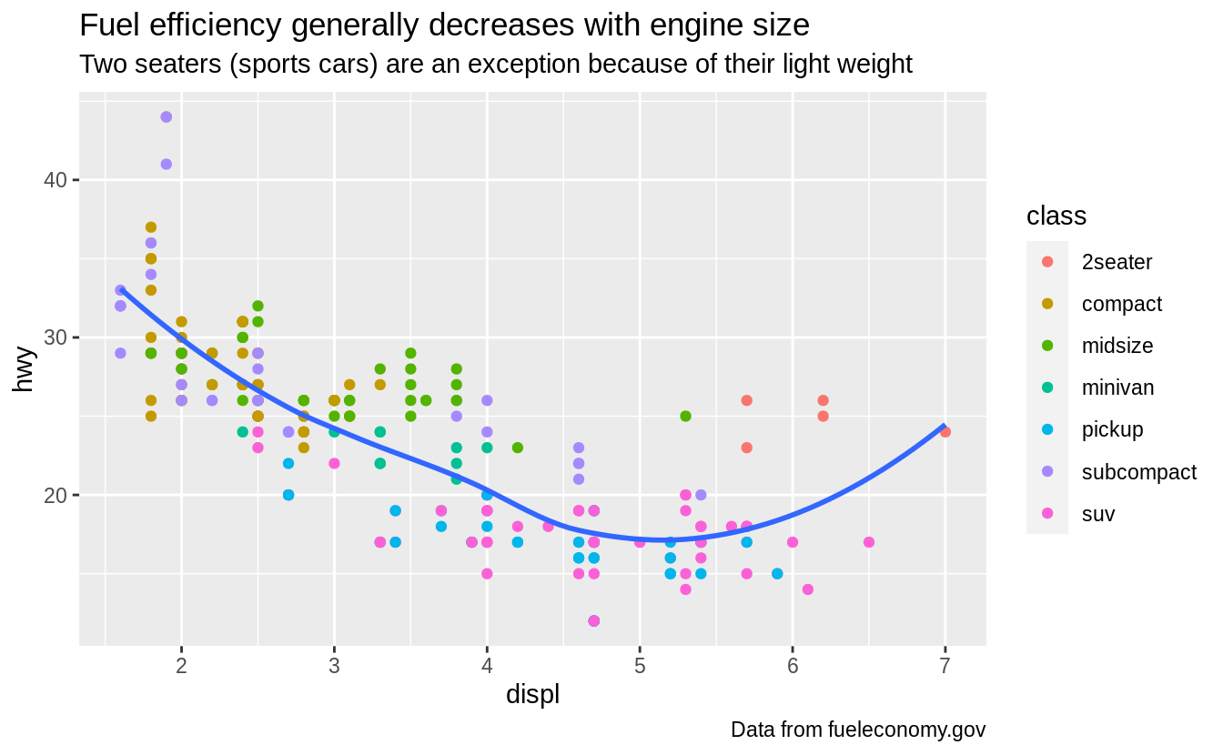 You can also use
  It’s possible to use mathematical equations instead of text strings.
Just switch
It’s possible to use mathematical equations instead of text strings.
Just switch 
 This is hard to read because the labels overlap with each other, and with the points.
We can make things a little better by switching to
This is hard to read because the labels overlap with each other, and with the points.
We can make things a little better by switching to  That helps a bit, but if you look closely in the top-left hand corner, you’ll notice that there are two labels practically on top of each other.
This happens because the highway mileage and displacement for the best cars in the compact and subcompact categories are exactly the same.
There’s no way that we can fix these by applying the same transformation for every label.
Instead, we can use the ggrepel package by Kamil Slowikowski.
This useful package will automatically adjust labels so that they don’t overlap:
That helps a bit, but if you look closely in the top-left hand corner, you’ll notice that there are two labels practically on top of each other.
This happens because the highway mileage and displacement for the best cars in the compact and subcompact categories are exactly the same.
There’s no way that we can fix these by applying the same transformation for every label.
Instead, we can use the ggrepel package by Kamil Slowikowski.
This useful package will automatically adjust labels so that they don’t overlap:
 Note another handy technique used here: I added a second layer of large, hollow points to highlight the points that I’ve labelled.
You can sometimes use the same idea to replace the legend with labels placed directly on the plot.
It’s not wonderful for this plot, but it isn’t too bad.
(
Note another handy technique used here: I added a second layer of large, hollow points to highlight the points that I’ve labelled.
You can sometimes use the same idea to replace the legend with labels placed directly on the plot.
It’s not wonderful for this plot, but it isn’t too bad.
( Alternatively, you might just want to add a single label to the plot, but you’ll still need to create a data frame.
Often, you want the label in the corner of the plot, so it’s convenient to create a new data frame using
Alternatively, you might just want to add a single label to the plot, but you’ll still need to create a data frame.
Often, you want the label in the corner of the plot, so it’s convenient to create a new data frame using 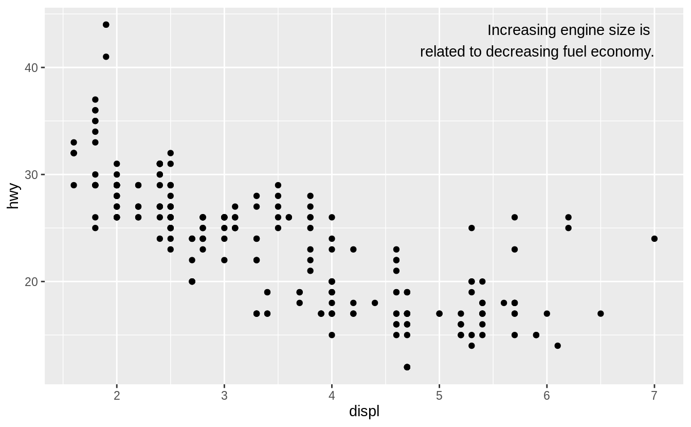 If you want to place the text exactly on the borders of the plot, you can use
 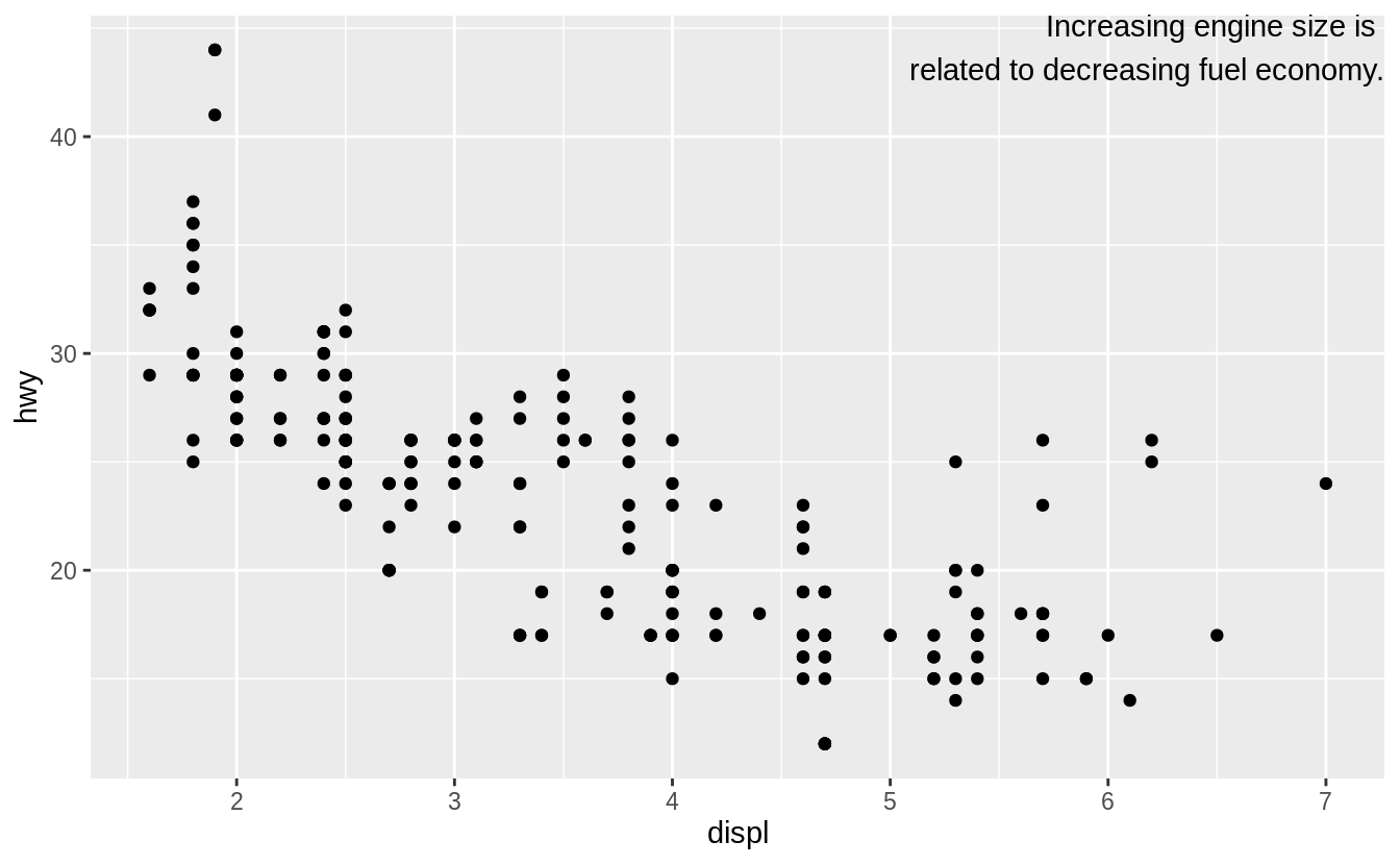 In these examples, I manually broke the label up into lines using
  Figure 28.1: All nine combinations of
  You can use
  You can also use
  Note that the specification of breaks and labels for date and datetime scales is a little different:


 You can also use

 However, the disadvantage of this transformation is that the axes are now labelled with the transformed values, making it hard to interpret the plot.
Instead of doing the transformation in the aesthetic mapping, we can instead do it with the scale.
This is visually identical, except the axes are labelled on the original data scale.
However, the disadvantage of this transformation is that the axes are now labelled with the transformed values, making it hard to interpret the plot.
Instead of doing the transformation in the aesthetic mapping, we can instead do it with the scale.
This is visually identical, except the axes are labelled on the original data scale.
 Another scale that is frequently customised is colour.
The default categorical scale picks colours that are evenly spaced around the colour wheel.
Useful alternatives are the ColorBrewer scales which have been hand tuned to work better for people with common types of colour blindness.
The two plots below look similar, but there is enough difference in the shades of red and green that the dots on the right can be distinguished even by people with red-green colour blindness.
Another scale that is frequently customised is colour.
The default categorical scale picks colours that are evenly spaced around the colour wheel.
Useful alternatives are the ColorBrewer scales which have been hand tuned to work better for people with common types of colour blindness.
The two plots below look similar, but there is enough difference in the shades of red and green that the dots on the right can be distinguished even by people with red-green colour blindness.

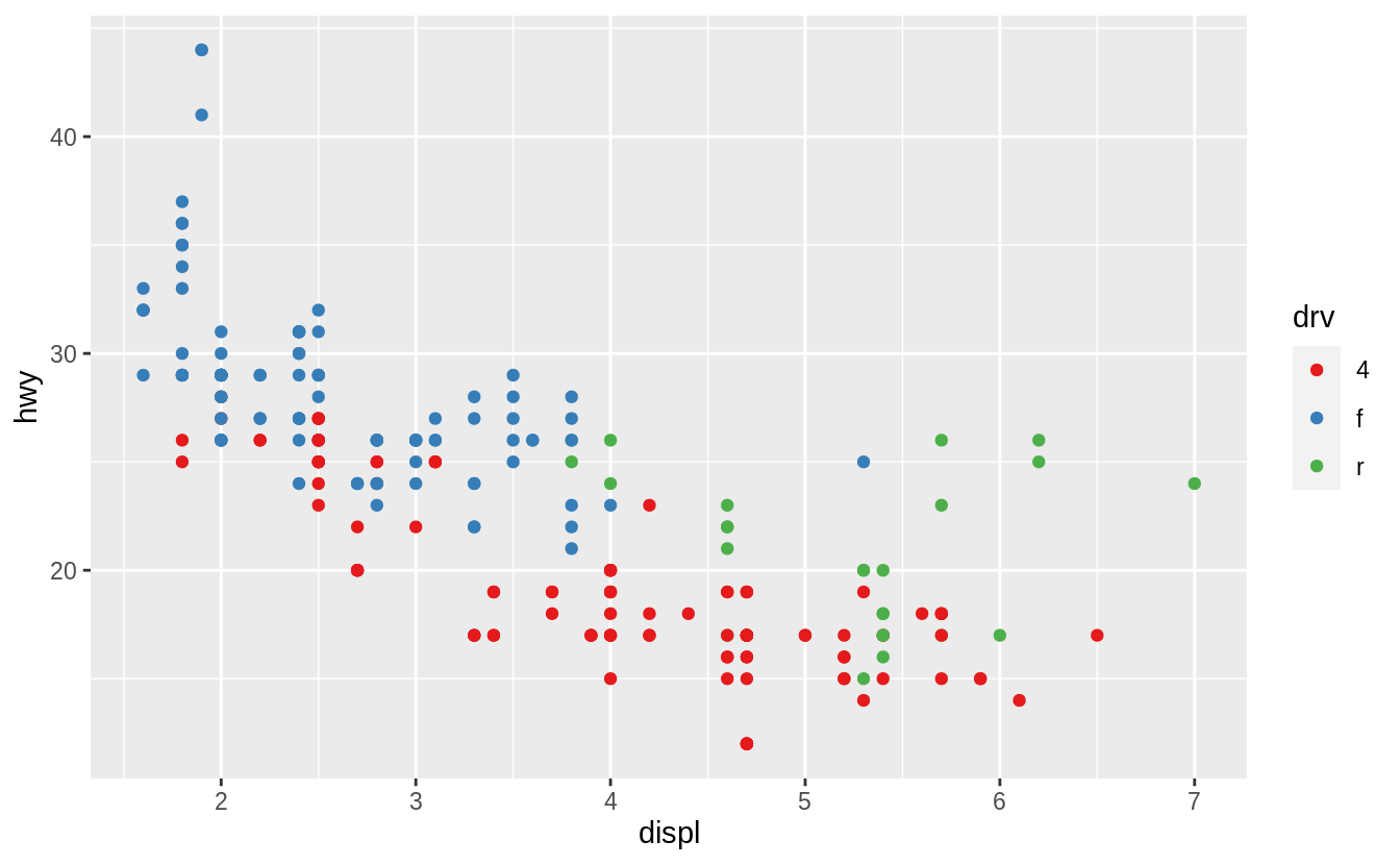 Don’t forget simpler techniques.
If there are just a few colours, you can add a redundant shape mapping.
This will also help ensure your plot is interpretable in black and white.
Don’t forget simpler techniques.
If there are just a few colours, you can add a redundant shape mapping.
This will also help ensure your plot is interpretable in black and white.
 The ColorBrewer scales are documented online at http://colorbrewer2.org/ and made available in R via the RColorBrewer package, by Erich Neuwirth.
Figure 28.2 shows the complete list of all palettes.
The sequential (top) and diverging (bottom) palettes are particularly useful if your categorical values are ordered, or have a 'middle'.
This often arises if you’ve used
The ColorBrewer scales are documented online at http://colorbrewer2.org/ and made available in R via the RColorBrewer package, by Erich Neuwirth.
Figure 28.2 shows the complete list of all palettes.
The sequential (top) and diverging (bottom) palettes are particularly useful if your categorical values are ordered, or have a 'middle'.
This often arises if you’ve used  Figure 28.2: All ColourBrewer scales.
When you have a predefined mapping between values and colours, use
Figure 28.2: All ColourBrewer scales.
When you have a predefined mapping between values and colours, use  For continuous colour, you can use the built-in
 Note that all colour scales come in two variety:
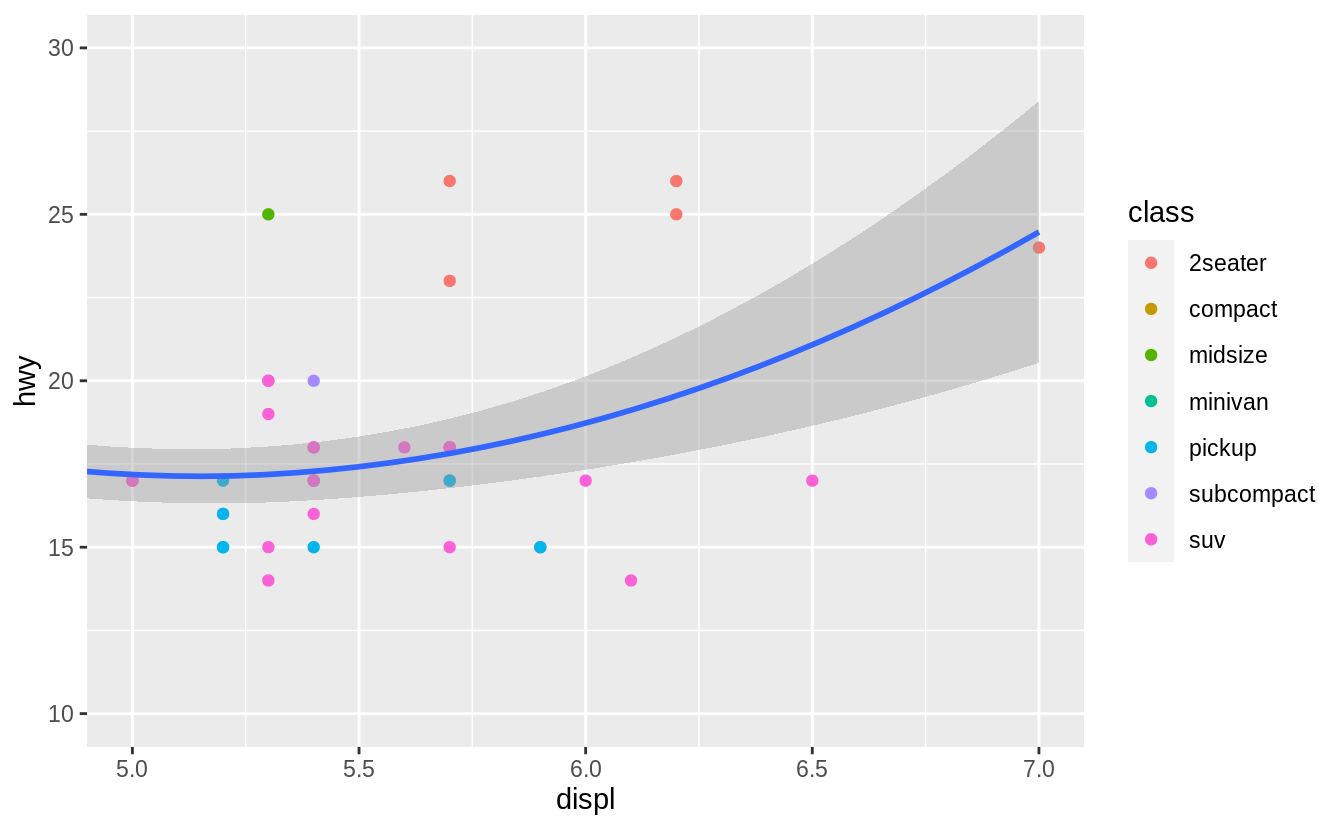
 You can also set the
 One way to overcome this problem is to share scales across multiple plots, training the scales with the
 In this particular case, you could have simply used faceting, but this technique is useful more generally, if for instance, you want spread plots over multiple pages of a report.
 ggplot2 includes eight themes by default, as shown in Figure 28.3.
Many more are included in add-on packages like ggthemes (https://github.com/jrnold/ggthemes), by Jeffrey Arnold.
ggplot2 includes eight themes by default, as shown in Figure 28.3.
Many more are included in add-on packages like ggthemes (https://github.com/jrnold/ggthemes), by Jeffrey Arnold.
 Figure 28.3: The eight themes built-in to ggplot2.
Many people wonder why the default theme has a grey background.
This was a deliberate choice because it puts the data forward while still making the grid lines visible.
The white grid lines are visible (which is important because they significantly aid position judgements), but they have little visual impact and we can easily tune them out.
The grey background gives the plot a similar typographic colour to the text, ensuring that the graphics fit in with the flow of a document without jumping out with a bright white background.
Finally, the grey background creates a continuous field of colour which ensures that the plot is perceived as a single visual entity.
It’s also possible to control individual components of each theme, like the size and colour of the font used for the y axis.
Unfortunately, this level of detail is outside the scope of this book, so you’ll need to read the ggplot2 book for the full details.
You can also create your own themes, if you are trying to match a particular corporate or journal style.
Figure 28.3: The eight themes built-in to ggplot2.
Many people wonder why the default theme has a grey background.
This was a deliberate choice because it puts the data forward while still making the grid lines visible.
The white grid lines are visible (which is important because they significantly aid position judgements), but they have little visual impact and we can easily tune them out.
The grey background gives the plot a similar typographic colour to the text, ensuring that the graphics fit in with the flow of a document without jumping out with a bright white background.
Finally, the grey background creates a continuous field of colour which ensures that the plot is perceived as a single visual entity.
It’s also possible to control individual components of each theme, like the size and colour of the font used for the y axis.
Unfortunately, this level of detail is outside the scope of this book, so you’ll need to read the ggplot2 book for the full details.
You can also create your own themes, if you are trying to match a particular corporate or journal style.


 If you want to make sure the font size is consistent across all your figures, whenever you set
 Using this code:
 You can then refer to the values with