R cookbook
cookbook-r
Must Watch!
MustWatch
Installing and using packages
Problem
You want to do install and use a package.
Solution
If you are using a GUI for R, there is likely a menu-driven way of installing packages. This is how to do it from the command line:
install.packages('reshape2')
In each new R session where you use the package, you will have to load it:
library(reshape2)
If you use the package in a script, put this line in the script.
To update all your installed packages to the latest versions available:
update.packages()
If you are using R on Linux, some of the R packages may be installed at the system level by the root user, and can’t be updated this way, since you won’t haver permission to overwrite them.
Indexing into a data structure
Problem
You want to get part of a data structure.
Solution
Elements from a vector, matrix, or data frame can be extracted using numeric indexing, or by using a boolean vector of the appropriate length.
In many of the examples, below, there are multiple ways of doing the same thing.
Indexing with numbers and names
With a vector:
# A sample vector
v <- c(1,4,4,3,2,2,3)
v[c(2,3,4)]
#> [1] 4 4 3
v[2:4]
#> [1] 4 4 3
v[c(2,4,3)]
#> [1] 4 3 4
With a data frame:
# Create a sample data frame
data <- read.table(header=T, text='
subject sex size
1 M 7
2 F 6
3 F 9
4 M 11
')
# Get the element at row 1, column 3
data[1,3]
#> [1] 7
data[1,"size"]
#> [1] 7
# Get rows 1 and 2, and all columns
data[1:2, ]
#> subject sex size
#> 1 1 M 7
#> 2 2 F 6
data[c(1,2), ]
#> subject sex size
#> 1 1 M 7
#> 2 2 F 6
# Get rows 1 and 2, and only column 2
data[1:2, 2]
#> [1] M F
#> Levels: F M
data[c(1,2), 2]
#> [1] M F
#> Levels: F M
# Get rows 1 and 2, and only the columns named "sex" and "size"
data[1:2, c("sex","size")]
#> sex size
#> 1 M 7
#> 2 F 6
data[c(1,2), c(2,3)]
#> sex size
#> 1 M 7
#> 2 F 6
Indexing with a boolean vector
With the vector v from above:
v > 2
#> [1] FALSE TRUE TRUE TRUE FALSE FALSE TRUE
v[v>2]
#> [1] 4 4 3 3
v[ c(F,T,T,T,F,F,T)]
#> [1] 4 4 3 3
With the data frame from above:
# A boolean vector
data$subject < 3
#> [1] TRUE TRUE FALSE FALSE
data[data$subject < 3, ]
#> subject sex size
#> 1 1 M 7
#> 2 2 F 6
data[c(TRUE,TRUE,FALSE,FALSE), ]
#> subject sex size
#> 1 1 M 7
#> 2 2 F 6
# It is also possible to get the numeric indices of the TRUEs
which(data$subject < 3)
#> [1] 1 2
Negative indexing
Unlike in some other programming languages, when you use negative numbers for indexing in R, it doesn’t mean to index backward from the end. Instead, it means to drop the element at that index, counting the usual way, from the beginning.
# Here's the vector again.
v
#> [1] 1 4 4 3 2 2 3
# Drop the first element
v[-1]
#> [1] 4 4 3 2 2 3
# Drop first three
v[-1:-3]
#> [1] 3 2 2 3
# Drop just the last element
v[-length(v)]
#> [1] 1 4 4 3 2 2
Getting a subset of a data structure
Problem
You want to do get a subset of the elements of a vector, matrix, or data frame.
Solution
To get a subset based on some conditional criterion, the subset() function or indexing using square brackets can be used. In the examples here, both ways are shown.
# A sample vector
v <- c(1,4,4,3,2,2,3)
subset(v, v<3)
#> [1] 1 2 2
v[v<3]
#> [1] 1 2 2
# Another vector
t <- c("small", "small", "large", "medium")
# Remove "small" entries
subset(t, t!="small")
#> [1] "large" "medium"
t[t!="small"]
#> [1] "large" "medium"
One important difference between the two methods is that you can assign values to elements with square bracket indexing, but you cannot with subset().
v[v<3] <- 9
subset(v, v<3) <- 9
#> Error in subset(v, v < 3) <- 9: could not find function "subset<-"
With data frames:
# A sample data frame
data <- read.table(header=T, text='
subject sex size
1 M 7
2 F 6
3 F 9
4 M 11
')
subset(data, subject < 3)
#> subject sex size
#> 1 1 M 7
#> 2 2 F 6
data[data$subject < 3, ]
#> subject sex size
#> 1 1 M 7
#> 2 2 F 6
# Subset of particular rows and columns
subset(data, subject < 3, select = -subject)
#> sex size
#> 1 M 7
#> 2 F 6
subset(data, subject < 3, select = c(sex,size))
#> sex size
#> 1 M 7
#> 2 F 6
subset(data, subject < 3, select = sex:size)
#> sex size
#> 1 M 7
#> 2 F 6
data[data$subject < 3, c("sex","size")]
#> sex size
#> 1 M 7
#> 2 F 6
# Logical AND of two conditions
subset(data, subject < 3 & sex=="M")
#> subject sex size
#> 1 1 M 7
data[data$subject < 3 & data$sex=="M", ]
#> subject sex size
#> 1 1 M 7
# Logical OR of two conditions
subset(data, subject < 3 | sex=="M")
#> subject sex size
#> 1 1 M 7
#> 2 2 F 6
#> 4 4 M 11
data[data$subject < 3 | data$sex=="M", ]
#> subject sex size
#> 1 1 M 7
#> 2 2 F 6
#> 4 4 M 11
# Condition based on transformed data
subset(data, log2(size) > 3 )
#> subject sex size
#> 3 3 F 9
#> 4 4 M 11
data[log2(data$size) > 3, ]
#> subject sex size
#> 3 3 F 9
#> 4 4 M 11
# Subset if elements are in another vector
subset(data, subject %in% c(1,3))
#> subject sex size
#> 1 1 M 7
#> 3 3 F 9
data[data$subject %in% c(1,3), ]
#> subject sex size
#> 1 1 M 7
#> 3 3 F 9
Making a vector filled with values
Problem
You want to create a vector with values already filled in.
Solution
rep(1, 50)
# [1] 1 1 1 1 1 1 1 1 1 1 1 1 1 1 1 1 1 1 1 1 1 1 1 1 1 1 1 1 1 1 1 1 1 1 1 1 1 1
# [39] 1 1 1 1 1 1 1 1 1 1 1 1
rep(F, 20)
# [1] FALSE FALSE FALSE FALSE FALSE FALSE FALSE FALSE FALSE FALSE FALSE FALSE
# [13] FALSE FALSE FALSE FALSE FALSE FALSE FALSE FALSE
rep(1:5, 4)
# 1 2 3 4 5 1 2 3 4 5 1 2 3 4 5 1 2 3 4 5
rep(1:5, each=4)
# 1 1 1 1 2 2 2 2 3 3 3 3 4 4 4 4 5 5 5 5
# Use it on a factor
rep(factor(LETTERS[1:3]), 5)
# A B C A B C A B C A B C A B C
# Levels: A B C
Information about variables
Problem
You want to find information about variables.
Solution
Here are some sample variables to work with in the examples below:
x <- 6
n <- 1:4
let <- LETTERS[1:4]
df <- data.frame(n, let)
Information about existence
# List currently defined variables
ls()
#> [1] "df" "filename" "let" "n" "old_dir" "x"
# Check if a variable named "x" exists
exists("x")
#> [1] TRUE
# Check if "y" exists
exists("y")
#> [1] FALSE
# Delete variable x
rm(x)
x
#> Error in eval(expr, envir, enclos): object 'x' not found
Information about size/structure
# Get information about structure
str(n)
#> int [1:4] 1 2 3 4
str(df)
#> 'data.frame': 4 obs. of 2 variables:
#> $ n : int 1 2 3 4
#> $ let: Factor w/ 4 levels "A","B","C","D": 1 2 3 4
# Get the length of a vector
length(n)
#> [1] 4
# Length probably doesn't give us what we want here:
length(df)
#> [1] 2
# Number of rows
nrow(df)
#> [1] 4
# Number of columns
ncol(df)
#> [1] 2
# Get rows and columns
dim(df)
#> [1] 4 2
Working with NULL, NA, and NaN
Problem
You want to properly handle NULL, NA, or NaN values.
Solution
Sometimes your data will include NULL, NA, or NaN. These work somewhat differently from “normal” values, and may require explicit testing.
Here are some examples of comparisons with these values:
x <- NULL
x > 5
# logical(0)
y <- NA
y > 5
# NA
z <- NaN
z > 5
# NA
Here’s how to test whether a variable has one of these values:
is.null(x)
# TRUE
is.na(y)
# TRUE
is.nan(z)
# TRUE
Note that NULL is different from the other two. NULL means that there is no value, while NA and NaN mean that there is some value, although one that is perhaps not usable. Here’s an illustration of the difference:
# Is y null?
is.null(y)
# FALSE
# Is x NA?
is.na(x)
# logical(0)
# Warning message:
# In is.na(x) : is.na() applied to non-(list or vector) of type 'NULL'
In the first case, it checks if y is NULL, and the answer is no. In the second case, it tries to check if x is `NA, but there is no value to be checked.
Ignoring “bad” values in vector summary functions
If you run functions like mean() or sum() on a vector containing NA or NaN, they will return NA and NaN, which is generally unhelpful, though this will alert you to the presence of the bad value. Many of these functions take the flag na.rm, which tells them to ignore these values.
vy <- c(1, 2, 3, NA, 5)
# 1 2 3 NA 5
mean(vy)
# NA
mean(vy, na.rm=TRUE)
# 2.75
vz <- c(1, 2, 3, NaN, 5)
# 1 2 3 NaN 5
sum(vz)
# NaN
sum(vz, na.rm=TRUE)
# 11
# NULL isn't a problem, because it doesn't exist
vx <- c(1, 2, 3, NULL, 5)
# 1 2 3 5
sum(vx)
# 11
Removing bad values from a vector
These values can be removed from a vector by filtering using is.na() or is.nan().
vy
# 1 2 3 NA 5
vy[ !is.na(vy) ]
# 1 2 3 5
vz
# 1 2 3 NaN 5
vz[ !is.nan(vz) ]
# 1 2 3 5
Notes
There are also the infinite numerical values Inf and -Inf, and the associated functions is.finite() and is.infinite().
Generating random numbers
Problem
You want to generate random numbers.
Solution
For uniformly distributed (flat) random numbers, use runif(). By default, its range is from 0 to 1.
runif(1)
#> [1] 0.09006613
# Get a vector of 4 numbers
runif(4)
#> [1] 0.6972299 0.9505426 0.8297167 0.9779939
# Get a vector of 3 numbers from 0 to 100
runif(3, min=0, max=100)
#> [1] 83.702278 3.062253 5.388360
# Get 3 integers from 0 to 100
# Use max=101 because it will never actually equal 101
floor(runif(3, min=0, max=101))
#> [1] 11 67 1
# This will do the same thing
sample(1:100, 3, replace=TRUE)
#> [1] 8 63 64
# To generate integers WITHOUT replacement:
sample(1:100, 3, replace=FALSE)
#> [1] 76 25 52
To generate numbers from a normal distribution, use rnorm(). By default the mean is 0 and the standard deviation is 1.
rnorm(4)
#> [1] -2.3308287 -0.9073857 -0.7638332 -0.2193786
# Use a different mean and standard deviation
rnorm(4, mean=50, sd=10)
#> [1] 59.20927 40.12440 44.58840 41.97056
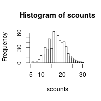
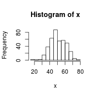
# To check that the distribution looks right, make a histogram of the numbers
x <- rnorm(400, mean=50, sd=10)
hist(x)
Generating repeatable sequences of random numbers
Problem
You want to generate a sequence of random numbers, and then generate that same sequence again later.
Solution
Use set.seed(), and pass in a number as the seed.
set.seed(423)
runif(3)
#> [1] 0.1089715 0.5973455 0.9726307
set.seed(423)
runif(3)
#> [1] 0.1089715 0.5973455 0.9726307
Saving the state of the random number generator
Problem
You want to save and restore the state of the random number generator
Solution
Save .Random.seed to another variable and then later restore that value to .Random.seed.
# For this example, set the random seed
set.seed(423)
runif(3)
#> [1] 0.1089715 0.5973455 0.9726307
# Save the seed
oldseed <- .Random.seed
runif(3)
#> [1] 0.7973768 0.2278427 0.5189830
# Do some other stuff with RNG here, such as:
# runif(30)
# ...
# Restore the seed
.Random.seed <- oldseed
# Get the same random numbers as before, after saving the seed
runif(3)
#> [1] 0.7973768 0.2278427 0.5189830
If no random number generator has been used in your R session, the variable .Random.seed will not exist. If you cannot be certain that an RNG has been used before attempting to save, the seed, you should check for it before saving and restoring:
oldseed <- NULL
if (exists(".Random.seed"))
oldseed <- .Random.seed
# Do some other stuff with RNG here, such as:
# runif(30)
# ...
if (!is.null(oldseed))
.Random.seed <- oldseed
Saving and restoring the state of the RNG in functions
If you attempt to restore the state of the random number generator within a function by using .Random.seed <- x, it will not work, because this operation changes a local variable named .Random.seed, instead of the variable in the global envrionment.
Here are two examples. What these functions are supposed to do is generate some random numbers, while leaving the state of the RNG unchanged.
# This is the bad version
bad_rand_restore <- function() {
if (exists(".Random.seed"))
oldseed <- .Random.seed
else
oldseed <- NULL
print(runif(3))
if (!is.null(oldseed))
.Random.seed <- oldseed
else
rm(".Random.seed")
}
# This is the good version
rand_restore <- function() {
if (exists(".Random.seed", .GlobalEnv))
oldseed <- .GlobalEnv$.Random.seed
else
oldseed <- NULL
print(runif(3))
if (!is.null(oldseed))
.GlobalEnv$.Random.seed <- oldseed
else
rm(".Random.seed", envir = .GlobalEnv)
}
# The bad version doesn't properly reset the RNG state, so random numbers keep
# changing.
set.seed(423)
bad_rand_restore()
#> [1] 0.1089715 0.5973455 0.9726307
bad_rand_restore()
#> [1] 0.7973768 0.2278427 0.5189830
bad_rand_restore()
#> [1] 0.6929255 0.8104453 0.1019465
# The good version correctly resets the RNG state each time, so random numbers
# stay the same.
set.seed(423)
rand_restore()
#> [1] 0.1089715 0.5973455 0.9726307
rand_restore()
#> [1] 0.1089715 0.5973455 0.9726307
rand_restore()
#> [1] 0.1089715 0.5973455 0.9726307
Notes
.Random.seed should not be modified by the user.
Rounding numbers
Problem
You want to round numbers.
Solution
There are many ways of rounding: to the nearest integer, up, down, or toward zero.
x <- seq(-2.5, 2.5, by=.5)
# Round to nearest, with .5 values rounded to even number.
round(x)
#> [1] -2 -2 -2 -1 0 0 0 1 2 2 2
# Round up
ceiling(x)
#> [1] -2 -2 -1 -1 0 0 1 1 2 2 3
# Round down
floor(x)
#> [1] -3 -2 -2 -1 -1 0 0 1 1 2 2
# Round toward zero
trunc(x)
#> [1] -2 -2 -1 -1 0 0 0 1 1 2 2
It is also possible to round to other decimal places:
x <- c(.001, .07, 1.2, 44.02, 738, 9927)
# Round to one decimal place
round(x, digits=1)
#> [1] 0.0 0.1 1.2 44.0 738.0 9927.0
# Round to tens place
round(x, digits=-1)
#> [1] 0 0 0 40 740 9930
# Round to nearest 5
round(x/5)*5
#> [1] 0 0 0 45 740 9925
# Round to nearest .02
round(x/.02)*.02
#> [1] 0.00 0.08 1.20 44.02 738.00 9927.00
Comparing floating point numbers
Problem
Comparing floating point numbers does not always work as you expect. For example:
0.3 == 3*.1
#> [1] FALSE
(0.1 + 0.1 + 0.1) - 0.3
#> [1] 5.551115e-17
x <- seq(0, 1, by=.1)
x
#> [1] 0.0 0.1 0.2 0.3 0.4 0.5 0.6 0.7 0.8 0.9 1.0
10*x - round(10*x)
#> [1] 0.000000e+00 0.000000e+00 0.000000e+00 4.440892e-16 0.000000e+00 0.000000e+00
#> [7] 8.881784e-16 8.881784e-16 0.000000e+00 0.000000e+00 0.000000e+00
Solution
There is no universal solution, because this issue is inherent to the storage format for non-integer (floating point) numbers, in R and computers in general.
See this page for more information and workarounds:
http://www.mathworks.com/support/tech-notes/1100/1108.html. This is written for Matlab, but much of it will be relevant for R as well.
Creating strings from variables
Problem
You want to do create a string from variables.
Solution
The two common ways of creating strings from variables are the paste function and the sprintf function. paste is more useful for vectors, and sprintf is more useful for precise control of the output.
Using paste()
a <- "apple"
b <- "banana"
# Put a and b together, with a space in between:
paste(a, b)
#> [1] "apple banana"
# With no space, use sep="", or use paste0():
paste(a, b, sep="")
#> [1] "applebanana"
paste0(a, b)
#> [1] "applebanana"
# With a comma and space:
paste(a, b, sep=", ")
#> [1] "apple, banana"
# With a vector
d <- c("fig", "grapefruit", "honeydew")
# If the input is a vector, use collapse to put the elements together:
paste(d, collapse=", ")
#> [1] "fig, grapefruit, honeydew"
# If the input is a scalar and a vector, it puts the scalar with each
# element of the vector, and returns a vector:
paste(a, d)
#> [1] "apple fig" "apple grapefruit" "apple honeydew"
# Use sep and collapse:
paste(a, d, sep="-", collapse=", ")
#> [1] "apple-fig, apple-grapefruit, apple-honeydew"
Using sprintf()
Another way is to use sprintf function. This is derived from the function of the same name in the C programming language.
To substitute in a string or string variable, use %s:
a <- "string"
sprintf("This is where a %s goes.", a)
#> [1] "This is where a string goes."
For integers, use %d or a variant:
x <- 8
sprintf("Regular:%d", x)
#> [1] "Regular:8"
# Can print to take some number of characters, leading with spaces.
sprintf("Leading spaces:%4d", x)
#> [1] "Leading spaces: 8"
# Can also lead with zeros instead.
sprintf("Leading zeros:%04d", x)
#> [1] "Leading zeros:0008"
For floating-point numbers, use %f for standard notation, and %e or %E for exponential notation. You can also use %g or %G for a “smart” formatter that automatically switches between the two formats, depending on where the significant digits are. The following examples are taken from the R help page for sprintf:
sprintf("%f", pi) # "3.141593"
sprintf("%.3f", pi) # "3.142"
sprintf("%1.0f", pi) # "3"
sprintf("%5.1f", pi) # " 3.1"
sprintf("%05.1f", pi) # "003.1"
sprintf("%+f", pi) # "+3.141593"
sprintf("% f", pi) # " 3.141593"
sprintf("%-10f", pi) # "3.141593 " (left justified)
sprintf("%e", pi) #"3.141593e+00"
sprintf("%E", pi) # "3.141593E+00"
sprintf("%g", pi) # "3.14159"
sprintf("%g", 1e6 * pi) # "3.14159e+06" (exponential)
sprintf("%.9g", 1e6 * pi) # "3141592.65" ("fixed")
sprintf("%G", 1e-6 * pi) # "3.14159E-06"
In the %m.nf format specification: The m represents the field width, which is the minimum number of characters in the output string, and can be padded with leading spaces, or zeros if there is a zero in front of m. The n represents precision, which the number of digits after the decimal.
Other miscellaneous things:
x <- "string"
sprintf("Substitute in multiple strings: %s %s", x, "string2")
#> [1] "Substitute in multiple strings: string string2"
# To print a percent sign, use "%%"
sprintf("A single percent sign here %%")
#> [1] "A single percent sign here %"
Creating a formula from a string
Problem
You want to create a formula from a string.
Solution
It can be useful to create a formula from a string. This often occurs in functions where the formula arguments are passed in as strings.
In the most basic case, use as.formula():
# This returns a string:
"y ~ x1 + x2"
#> [1] "y ~ x1 + x2"
# This returns a formula:
as.formula("y ~ x1 + x2")
#> y ~ x1 + x2
#> <environment: 0x3361710>
Here is an example of how it might be used:
# These are the variable names:
measurevar <- "y"
groupvars <- c("x1","x2","x3")
# This creates the appropriate string:
paste(measurevar, paste(groupvars, collapse=" + "), sep=" ~ ")
#> [1] "y ~ x1 + x2 + x3"
# This returns the formula:
as.formula(paste(measurevar, paste(groupvars, collapse=" + "), sep=" ~ "))
#> y ~ x1 + x2 + x3
#> <environment: 0x3361710>
Extracting components from a formula
Problem
You want to extract parts of a formula for further use.
Solution
You can index into the formula object as though it were a list, using the [[ operator.
f <- y ~ x1 + x2
# Take a look at f
str(f)
#> Class 'formula' language y ~ x1 + x2
#> ..- attr(*, ".Environment")=<environment: 0x1e46710>
# Get each part
f[[1]]
#> `~`
f[[2]]
#> y
f[[3]]
#> x1 + x2
# Or view the whole thing as a list
as.list(f)
#> [[1]]
#> `~`
#>
#> [[2]]
#> y
#>
#> [[3]]
#> x1 + x2
#>
#> <environment: 0x1e46710>
For formulas that have nothing on the left side, there are only two elements:
f2 <- ~ x1 + x2
as.list(f2)
#> [[1]]
#> `~`
#>
#> [[2]]
#> x1 + x2
#>
#> <environment: 0x1e46710>
Each of the elements of the formula is an symbol or language object (which consists of multiple symbols:
str(f[[1]])
#> symbol ~
str(f[[2]])
#> symbol y
str(f[[3]])
#> language x1 + x2
# Look at parts of the langage object
str(f[[3]][[1]])
#> symbol +
str(f[[3]][[2]])
#> symbol x1
str(f[[3]][[3]])
#> symbol x2
You can use as.character() or deparse() to convert any of these to strings. deparse() can give a more natural-looking result:
as.character(f[[1]])
#> [1] "~"
as.character(f[[2]])
#> [1] "y"
# The language object gets coerced into a string that represents the parse tree:
as.character(f[[3]])
#> [1] "+" "x1" "x2"
# You can use deparse() to get a more natural looking string
deparse(f[[3]])
#> [1] "x1 + x2"
deparse(f)
#> [1] "y ~ x1 + x2"
The formula object also captures the environment in which it was called, as we saw earlier when we ran str(f). To extract it, use environment():
environment(f)
#> <environment: 0x1e46710>
Loading data from a file
Problem
You want to load data from a file.
Solution
Delimited text files
The simplest way to import data is to save it as a text file with delimiters such as tabs or commas (CSV).
data <- read.csv("datafile.csv")
# Load a CSV file that doesn't have headers
data <- read.csv("datafile-noheader.csv", header=FALSE)
The function read.table() is a more general function which allows you to set the delimiter, whether or not there are headers, whether strings are set off with quotes, and more. See ?read.table for more information on the details.
data <- read.table("datafile-noheader.csv",
header=FALSE,
sep="," # use "\t" for tab-delimited files
)
Loading a file with a file chooser
On some platforms, using file.choose() will open a file chooser dialog window. On others, it will simply prompt the user to type in a filename.
data <- read.csv(file.choose())
Treating strings as factors or characters
By default, strings in the data are converted to factors. If you load the data below with read.csv, then all the text columns will be treated as factors, even though it might make more sense to treat some of them as strings. To do
this, use stringsAsFactors=FALSE:
data <- read.csv("datafile.csv", stringsAsFactors=FALSE)
# You might have to convert some columns to factors
data$Sex <- factor(data$Sex)
Another alternative is to load them as factors and convert some columns to
characters:
data <- read.csv("datafile.csv")
data$First <- as.character(data$First)
data$Last <- as.character(data$Last)
# Another method: convert columns named "First" and "Last"
stringcols <- c("First","Last")
data[stringcols] <- lapply(data[stringcols], as.character)
Loading a file from the Internet
Data can also be loaded from a URL. These (very long) URLs will load the files linked to below.
data <- read.csv("http://www.cookbook-r.com/Data_input_and_output/Loading_data_from_a_file/datafile.csv")
# Read in a CSV file without headers
data <- read.csv("http://www.cookbook-r.com/Data_input_and_output/Loading_data_from_a_file/datafile-noheader.csv", header=FALSE)
# Manually assign the header names
names(data) <- c("First","Last","Sex","Number")
The data files used above:
datafile.csv:
"First","Last","Sex","Number"
"Currer","Bell","F",2
"Dr.","Seuss","M",49
"","Student",NA,21
datafile-noheader.csv:
"Currer","Bell","F",2
"Dr.","Seuss","M",49
"","Student",NA,21
Fixed-width text files
Suppose your data has fixed-width columns, like this:
First Last Sex Number
Currer Bell F 2
Dr. Seuss M 49
"" Student NA 21
One way to read it in is to simply use read.table() with strip.white=TRUE, which will remove extra spaces.
read.table("clipboard", header=TRUE, strip.white=TRUE)
However, your data file may have columns containing spaces, or columns with no spaces separating them, like this, where the scores column represents six different measurements, each from 0 to 3.
subject sex scores
N 1 M 113311
NE 2 F 112231
S 3 F 111221
W 4 M 011002
In this case, you may need to use the read.fwf() function. If you read the column names from the file, it requires that they be separated with a delimiter like a single tab, space, or comma. If they are separated with multiple spaces, as in this example, you will have to assign the column names directly.
# Assign the column names manually
read.fwf("myfile.txt",
c(7,5,-2,1,1,1,1,1,1), # Width of the columns. -2 means drop those columns
skip=1, # Skip the first line (contains header here)
col.names=c("subject","sex","s1","s2","s3","s4","s5","s6"),
strip.white=TRUE) # Strip out leading and trailing whitespace when reading each
#> subject sex s1 s2 s3 s4 s5 s6
#> 1 N 1 M 1 1 3 3 1 1
#> 2 NE 2 F 1 1 2 2 3 1
#> 3 S 3 F 1 1 1 2 2 1
#> 4 W 4 M 0 1 1 0 0 2
# subject sex s1 s2 s3 s4 s5 s6
# N 1 M 1 1 3 3 1 1
# NE 2 F 1 1 2 2 3 1
# S 3 F 1 1 1 2 2 1
# W 4 M 0 1 1 0 0 2
# If the first row looked like this:
# subject,sex,scores
# Then we could use header=TRUE:
read.fwf("myfile.txt", c(7,5,-2,1,1,1,1,1,1), header=TRUE, strip.white=TRUE)
#> Error in read.table(file = FILE, header = header, sep = sep, row.names = row.names, : more columns than column names
Excel files
The read.xls function in the gdata package can read in Excel files.
library(gdata)
data <- read.xls("data.xls")
See http://cran.r-project.org/doc/manuals/R-data.html#Reading-Excel-spreadsheets.
SPSS data files
The read.spss function in the foreign package can read in SPSS files.
library(foreign)
data <- read.spss("data.sav", to.data.frame=TRUE)
Loading and storing data with the keyboard and clipboard
Problem
You want to enter data using input from the keyboard (not a file).
Solution
Data input
Suppose this is your data:
size weight cost
small 5 6
medium 8 10
large 11 9
Loading data from keyboard input or clipboard
One way enter from the keyboard is to read from standard input (stdin()).
# Cutting and pasting using read.table and stdin()
data <- read.table(stdin(), header=TRUE)
# You will be prompted for input; copy and paste text here
# Or:
# data <- read.csv(stdin())
You can also load directly from the clipboard:
# First copy the data to the clipboard
data <- read.table('clipboard', header=TRUE)
# Or:
# data <- read.csv('clipboard')
Loading data in a script
The previous method can’t be used to load data in a script file because the input must be typed (or pasted) after running the command.
# Using read.table()
data <- read.table(header=TRUE, text='
size weight cost
small 5 6
medium 8 10
large 11 9
')
For different data formats (e.g., comma-delimited, no headers, etc.), options to read.table() can be set. See ../Loading data from a file for more information.
Data output
By default, R prints row names. If you want to print the table in a format that can be copied and pasted, it may be useful to suppress them.
print(data, row.names=FALSE)
#> size weight cost
#> small 5 6
#> medium 8 10
#> large 11 9
Writing data for copying and pasting, or to the clipboard
It is possible to write delimited data to terminal (stdout()), so that it can be copied and pasted elsewhere. Or it can be written directly to the clipboard.
write.csv(data, stdout(), row.names=FALSE)
# "size","weight","cost"
# "small",5,6
# "medium",8,10
# "large",11,9
# Write to the clipboard (does not work on Mac or Unix)
write.csv(data, 'clipboard', row.names=FALSE)
Output for loading in R
If the data has already been loaded into R, the data structure can be saved using dput(). The output from dput() is a command which will recreate the data structure. The advantage of this method is that it will keep any modifications to data types; for example, if one column consists of numbers and you have converted it to a factor, this method will preserve that type, whereas simply loading the text table (as shown above) will treat it as numeric.
# Suppose you have already loaded data
dput(data)
#> structure(list(size = structure(c(3L, 2L, 1L), .Label = c("large",
#> "medium", "small"), class = "factor"), weight = c(5L, 8L, 11L
#> ), cost = c(6L, 10L, 9L)), .Names = c("size", "weight", "cost"
#> ), class = "data.frame", row.names = c(NA, -3L))
# Later, we can use the output from dput to recreate the data structure
newdata <- structure(list(size = structure(c(3L, 2L, 1L), .Label = c("large",
"medium", "small"), class = "factor"), weight = c(5L, 8L, 11L
), cost = c(6L, 10L, 9L)), .Names = c("size", "weight", "cost"
), class = "data.frame", row.names = c(NA, -3L))
Running a script
Problem
You want to run R code from a text file.
Solution
Use the source() function.
# First, go to the proper directory
setwd('/home/username/desktop/rcode')
source('analyze.r')
Note that if you want your script to produce text output, you must use the print() or cat() function.
x <- 1:10
# In a script, this will do nothing
x
# Use the print function:
print(x)
#> [1] 1 2 3 4 5 6 7 8 9 10
# Simpler output: no row/column numbers, no text wrapping
cat(x)
#> 1 2 3 4 5 6 7 8 9 10
Another alternative is to run source() with the print.eval=TRUE option.
Writing data to a file
Problem
You want to write data to a file.
Solution
Writing to a delimited text file
The easiest way to do this is to use write.csv(). By default, write.csv() includes row names, but these are usually unnecessary and may cause confusion.
# A sample data frame
data <- read.table(header=TRUE, text='
subject sex size
1 M 7
2 F NA
3 F 9
4 M 11
')
# Write to a file, suppress row names
write.csv(data, "data.csv", row.names=FALSE)
# Same, except that instead of "NA", output blank cells
write.csv(data, "data.csv", row.names=FALSE, na="")
# Use tabs, suppress row names and column names
write.table(data, "data.csv", sep="\t", row.names=FALSE, col.names=FALSE)
Saving in R data format
write.csv() and write.table() are best for interoperability with other data analysis programs. They will not, however, preserve special attributes of the data structures, such as whether a column is a character type or factor, or the order of levels in factors. In order to do that, it should be written out in a special format for R.
Below are are three primary ways of doing this:
The first method is to output R source code which, when run, will re-create the object. This should work for most data objects, but it may not be able to faithfully re-create some more complicated data objects.
# Save in a text format that can be easily loaded in R
dump("data", "data.Rdmpd")
# Can save multiple objects:
dump(c("data", "data1"), "data.Rdmpd")
# To load the data again:
source("data.Rdmpd")
# When loaded, the original data names will automatically be used.
The next method is to write out individual data objects in RDS format. This format can be binary or ASCII. Binary is more compact, while ASCII will be more efficient with version control systems like Git.
# Save a single object in binary RDS format
saveRDS(data, "data.rds")
# Or, using ASCII format
saveRDS(data, "data.rds", ascii=TRUE)
# To load the data again:
data <- readRDS("data.rds")
It’s also possible to save multiple objects into an single file, using the RData format.
# Saving multiple objects in binary RData format
save(data, file="data.RData")
# Or, using ASCII format
save(data, file="data.RData", ascii=TRUE)
# Can save multiple objects
save(data, data1, file="data.RData")
# To load the data again:
load("data.RData")
An important difference between saveRDS() and save() is that, with the former, when you readRDS() the data, you specify the name of the object, and with the latter, when you load() the data, the original object names are automatically used. Automatically using the original object names can sometimes simplify a workflow, but it can also be a drawback if the data object is meant to be distributed to others for use in a different environment.
Writing text and output from analyses to a file
Problem
You want to write output to a file.
Solution
The sink() function will redirect output to a file instead of to the R terminal. Note that if you use sink() in a script and it crashes before output is returned to the terminal, then you will not see any response to your commands. Call sink() without any arguments to return output to the terminal.
# Start writing to an output file
sink('analysis-output.txt')
set.seed(12345)
x <-rnorm(10,10,1)
y <-rnorm(10,11,1)
# Do some stuff here
cat(sprintf("x has %d elements:\n", length(x)))
print(x)
cat("y =", y, "\n")
cat("=============================\n")
cat("T-test between x and y\n")
cat("=============================\n")
t.test(x,y)
# Stop writing to the file
sink()
# Append to the file
sink('analysis-output.txt', append=TRUE)
cat("Some more stuff here...\n")
sink()
The contents of the output file:
x has 10 elements:
[1] 10.585529 10.709466 9.890697 9.546503 10.605887 8.182044 10.630099 9.723816
[9] 9.715840 9.080678
y = 10.88375 12.81731 11.37063 11.52022 10.24947 11.8169 10.11364 10.66842 12.12071 11.29872
=============================
T-test between x and y
=============================
Welch Two Sample t-test
data: x and y
t = -3.8326, df = 17.979, p-value = 0.001222
alternative hypothesis: true difference in means is not equal to 0
95 percent confidence interval:
-2.196802 -0.641042
sample estimates:
mean of x mean of y
9.867056 11.285978
Some more stuff here...
Sorting
Problem
You want to sort a vector, matrix, or data frame.
Solution
Vectors
# Make up a randomly ordered vector
v <- sample(101:110)
# Sort the vector
sort(v)
#> [1] 101 102 103 104 105 106 107 108 109 110
# Reverse sort
sort(v, decreasing=TRUE)
#> [1] 110 109 108 107 106 105 104 103 102 101
Data frames
To sort a data frame on one or more columns, you can use the arrange function from plyr package, or use R’s built-in functions. The arrange function is much easier to use, but does require the external package to be installed.
# Make a data frame
df <- data.frame (id=1:4,
weight=c(20,27,24,22),
size=c("small", "large", "medium", "large"))
df
library(plyr)
# Sort by weight column. These have the same result.
arrange(df, weight) # Use arrange from plyr package
df[ order(df$weight), ] # Use built-in R functions
#> id weight size
#> 1 1 20 small
#> 2 4 22 large
#> 3 3 24 medium
#> 4 2 27 large
# Sort by size, then by weight
arrange(df, size, weight) # Use arrange from plyr package
df[ order(df$size, df$weight), ] # Use built-in R functions
#> id weight size
#> 4 4 22 large
#> 2 2 27 large
#> 3 3 24 medium
#> 1 1 20 small
# Sort by all columns in the data frame, from left to right
df[ do.call(order, as.list(df)), ]
# In this particular example, the order will be unchanged
Note that the size column is a factor and is sorted by the order of the factor levels. In this case, the levels were automatically assigned alphabetically (when creating the data frame), so large is first and small is last.
Reverse sort
The overall order of the sort can be reversed with the argument decreasing=TRUE.
To reverse the direction of a particular column, the method depends on the data type:
- Numbers: put a
- in front of the variable name, e.g. df[ order(-df$weight), ].
- Factors: convert to integer and put a
- in front of the variable name, e.g. df[ order(-xtfrm(df$size)), ].
- Characters: there isn’t a simple way to do this. One method is to convert to a factor first and then sort as above.
# Reverse sort by weight column. These all have the same effect:
arrange(df, -weight)                      # Use arrange from plyr package
df[ order(df$weight, decreasing=TRUE), ]  # Use built-in R functions
df[ order(-df$weight), ]                  # Use built-in R functions
#>   id weight   size
#> 2  2     27  large
#> 3  3     24 medium
#> 4  4     22  large
#> 1  1     20  small

# Sort by size (increasing), then by weight (decreasing)
arrange(df, size, -weight)         # Use arrange from plyr package
df[ order(df$size, -df$weight), ]  # Use built-in R functions
#>   id weight   size
#> 2  2     27  large
#> 4  4     22  large
#> 3  3     24 medium
#> 1  1     20  small

# Sort by size (decreasing), then by weight (increasing)
# The call to xtfrm() is needed for factors
arrange(df, -xtfrm(size), weight)         # Use arrange from plyr package
df[ order(-xtfrm(df$size), df$weight), ]  # Use built-in R functions
#>   id weight   size
#> 1  1     20  small
#> 3  3     24 medium
#> 4  4     22  large
#> 2  2     27  large
Randomizing order
Problem
You want to randomize the order of a data structure.
Solution
# Create a vector
v <- 11:20
# Randomize the order of the vector
v <- sample(v)
# Create a data frame
data <- data.frame(label=letters[1:5], number=11:15)
data
#>   label number
#> 1     a     11
#> 2     b     12
#> 3     c     13
#> 4     d     14
#> 5     e     15
# Randomize the order of the data frame
data <- data[sample(1:nrow(data)), ]
data
#>   label number
#> 5     e     15
#> 2     b     12
#> 4     d     14
#> 3     c     13
#> 1     a     11
Notes
To make a randomization repeatable, you should set the seed for the random number generator.
Converting between vector types
Problem
You want to convert between numeric vectors, character vectors, and factors.
Solution
Suppose you start with this numeric vector n:
n <- 10:14
n
#> [1] 10 11 12 13 14
To convert the numeric vector to the other two types (we’ll also save these results in c and f):
# Numeric to Character
c <- as.character(n)
# Numeric to Factor
f <- factor(n)
# 10 11 12 13 14
To convert the character vector to the other two:
# Character to Numeric
as.numeric(c)
#> [1] 10 11 12 13 14
# Character to Factor
factor(c)
#> [1] 10 11 12 13 14
#> Levels: 10 11 12 13 14
Converting a factor to a character vector is straightforward:
# Factor to Character
as.character(f)
#> [1] "10" "11" "12" "13" "14"
However, converting a factor to a numeric vector is a little trickier. If you just convert it with as.numeric, it will give you the numeric coding of the factor, which probably isn’t what you want.
as.numeric(f)
#> [1] 1 2 3 4 5
# Another way to get the numeric coding, if that's what you want:
unclass(f)
#> [1] 1 2 3 4 5
#> attr(,"levels")
#> [1] "10" "11" "12" "13" "14"
The way to get the text values converted to numbers is to first convert it to a character, then a numeric vector.
# Factor to Numeric
as.numeric(as.character(f))
#> [1] 10 11 12 13 14
Finding and removing duplicate records
Problem
You want to find and/or remove duplicate entries from a vector or data frame.
Solution
With vectors:
# Generate a vector
set.seed(158)
x <- round(rnorm(20, 10, 5))
x
#>  [1] 14 11  8  4 12  5 10 10  3  3 11  6  0 16  8 10  8  5  6  6
# For each element: is this one a duplicate (first instance of a particular value
# not counted)
duplicated(x)
#>  [1] FALSE FALSE FALSE FALSE FALSE FALSE FALSE  TRUE FALSE  TRUE  TRUE FALSE FALSE FALSE
#> [15]  TRUE  TRUE  TRUE  TRUE  TRUE  TRUE
# The values of the duplicated entries
# Note that '6' appears in the original vector three times, and so it has two
# entries here.
x[duplicated(x)]
#> [1] 10  3 11  8 10  8  5  6  6
# Duplicated entries, without repeats
unique(x[duplicated(x)])
#> [1] 10  3 11  8  5  6
# The original vector with all duplicates removed. These do the same:
unique(x)
#>  [1] 14 11  8  4 12  5 10  3  6  0 16
x[!duplicated(x)]
#>  [1] 14 11  8  4 12  5 10  3  6  0 16
With data frames:
# A sample data frame:
df <- read.table(header=TRUE, text='
 label value
 A     4
 B     3
 C     6
 B     3
 B     1
 A     2
 A     4
 A     4
')

# Is each row a repeat?
duplicated(df)
#> [1] FALSE FALSE FALSE  TRUE FALSE FALSE  TRUE  TRUE
# Show the repeat entries
df[duplicated(df),]
#>   label value
#> 4     B     3
#> 7     A     4
#> 8     A     4
# Show unique repeat entries (row names may differ, but values are the same)
unique(df[duplicated(df),])
#>   label value
#> 4     B     3
#> 7     A     4
# Original data with repeats removed. These do the same:
unique(df)
#>   label value
#> 1     A     4
#> 2     B     3
#> 3     C     6
#> 5     B     1
#> 6     A     2
df[!duplicated(df),]
#>   label value
#> 1     A     4
#> 2     B     3
#> 3     C     6
#> 5     B     1
#> 6     A     2
Comparing vectors or factors with NA
Problem
You want to compare two vectors or factors but want comparisons with NA’s to be reported as TRUE or FALSE (instead of NA).
Solution
Suppose you have this data frame with two columns which consist of boolean vectors:
df <- data.frame( a=c(TRUE,TRUE,TRUE,FALSE,FALSE,FALSE,NA,NA,NA),
            b=c(TRUE,FALSE,NA,TRUE,FALSE,NA,TRUE,FALSE,NA))
df
#>       a     b
#> 1  TRUE  TRUE
#> 2  TRUE FALSE
#> 3  TRUE    NA
#> 4 FALSE  TRUE
#> 5 FALSE FALSE
#> 6 FALSE    NA
#> 7    NA  TRUE
#> 8    NA FALSE
#> 9    NA    NA
Normally, when you compare two vectors or factors containing NA values, the vector of results will have NAs where either of the original items was NA. Depending on your purposes, this may or not be desirable.
df$a == df$b
#> [1]  TRUE FALSE    NA FALSE  TRUE    NA    NA    NA    NA
# The same comparison, but presented as another column in the data frame:
data.frame(df, isSame = (df$a==df$b))
#>       a     b isSame
#> 1  TRUE  TRUE   TRUE
#> 2  TRUE FALSE  FALSE
#> 3  TRUE    NA     NA
#> 4 FALSE  TRUE  FALSE
#> 5 FALSE FALSE   TRUE
#> 6 FALSE    NA     NA
#> 7    NA  TRUE     NA
#> 8    NA FALSE     NA
#> 9    NA    NA     NA
A function for comparing with NA’s
This comparison function will essentially treat NA’s as just another value. If an item in both vectors is NA, then it reports TRUE for that item; if the item is NA in just one vector, it reports FALSE; all other comparisons (between non-NA items) behaves the same.
# This function returns TRUE wherever elements are the same, including NA's,
# and FALSE everywhere else.
compareNA <- function(v1,v2) {
same <- (v1 == v2) | (is.na(v1) & is.na(v2))
same[is.na(same)] <- FALSE
return(same)
}
Examples of the function in use
Comparing boolean vectors:
compareNA(df$a, df$b)
#> [1]  TRUE FALSE FALSE FALSE  TRUE FALSE FALSE FALSE  TRUE
# Same comparison, presented as another column
data.frame(df, isSame = compareNA(df$a,df$b))
#>       a     b isSame
#> 1  TRUE  TRUE   TRUE
#> 2  TRUE FALSE  FALSE
#> 3  TRUE    NA  FALSE
#> 4 FALSE  TRUE  FALSE
#> 5 FALSE FALSE   TRUE
#> 6 FALSE    NA  FALSE
#> 7    NA  TRUE  FALSE
#> 8    NA FALSE  FALSE
#> 9    NA    NA   TRUE
It also works with factors, even if the levels of the factors are in different orders:
# Create sample data frame with factors.
df1 <- data.frame(a = factor(c('x','x','x','y','y','y', NA, NA, NA)),
            b = factor(c('x','y', NA,'x','y', NA,'x','y', NA)))
# Do the comparison
data.frame(df1, isSame = compareNA(df1$a, df1$b))
#>      a    b isSame
#> 1    x    x   TRUE
#> 2    x    y  FALSE
#> 3    x <NA>  FALSE
#> 4    y    x  FALSE
#> 5    y    y   TRUE
#> 6    y <NA>  FALSE
#> 7 <NA>    x  FALSE
#> 8 <NA>    y  FALSE
#> 9 <NA> <NA>   TRUE

# It still works if the factor levels are arranged in a different order
df1$b <- factor(df1$b, levels=c('y','x'))
data.frame(df1, isSame = compareNA(df1$a, df1$b))
#>      a    b isSame
#> 1    x    x   TRUE
#> 2    x    y  FALSE
#> 3    x <NA>  FALSE
#> 4    y    x  FALSE
#> 5    y    y   TRUE
#> 6    y <NA>  FALSE
#> 7 <NA>    x  FALSE
#> 8 <NA>    y  FALSE
#> 9 <NA> <NA>   TRUE
Recoding data
Problem
You want to recode data or calculate new data columns from existing ones.
Solution
The examples below will use this data:
data <- read.table(header=T, text='
 subject sex control cond1 cond2
 1   M     7.9  12.3  10.7
 2   F     6.3  10.6  11.1
 3   F     9.5  13.1  13.8
 4   M    11.5  13.4  12.9
')
Recoding a categorical variable
The easiest way is to use revalue() or mapvalues() from the plyr package.
This will code M as 1 and F as 2, and put it in a new column.
Note that these functions preserves the type: if the input is a factor, the output will be a factor; and if the input is a character vector, the output will be a character vector.
library(plyr)
# The following two lines are equivalent:
data$scode <- revalue(data$sex, c("M"="1", "F"="2"))
data$scode <- mapvalues(data$sex, from = c("M", "F"), to = c("1", "2"))
data
#>   subject sex control cond1 cond2 scode
#> 1       1   M     7.9  12.3  10.7     1
#> 2       2   F     6.3  10.6  11.1     2
#> 3       3   F     9.5  13.1  13.8     2
#> 4       4   M    11.5  13.4  12.9     1
# data$sex is a factor, so data$scode is also a factor
See ../Mapping vector values and ../Renaming levels of a factor for more information about these functions.
If you don’t want to rely on plyr, you can do the following with R’s built-in functions:
data$scode[data$sex=="M"] <- "1"
data$scode[data$sex=="F"] <- "2"
# Convert the column to a factor
data$scode <- factor(data$scode)
data
#>   subject sex control cond1 cond2 scode
#> 1       1   M     7.9  12.3  10.7     1
#> 2       2   F     6.3  10.6  11.1     2
#> 3       3   F     9.5  13.1  13.8     2
#> 4       4   M    11.5  13.4  12.9     1
Another way to do it is to use the match function:
oldvalues <- c("M", "F")
newvalues <- factor(c("g1","g2"))  # Make this a factor
data$scode <- newvalues[ match(data$sex, oldvalues) ]
data
#>   subject sex control cond1 cond2 scode
#> 1       1   M     7.9  12.3  10.7    g1
#> 2       2   F     6.3  10.6  11.1    g2
#> 3       3   F     9.5  13.1  13.8    g2
#> 4       4   M    11.5  13.4  12.9    g1
Recoding a continuous variable into categorical variable
Mark those whose control measurement is <7 as “low”, and those with >=7 as “high”:
data$category[data$control< 7] <- "low"
data$category[data$control>=7] <- "high"
# Convert the column to a factor
data$category <- factor(data$category)
data
#>   subject sex control cond1 cond2 scode category
#> 1       1   M     7.9  12.3  10.7    g1     high
#> 2       2   F     6.3  10.6  11.1    g2      low
#> 3       3   F     9.5  13.1  13.8    g2     high
#> 4       4   M    11.5  13.4  12.9    g1     high
With the cut function, you specify boundaries and the resulting values:
data$category <- cut(data$control,
               breaks=c(-Inf, 7, 9, Inf),
               labels=c("low","medium","high"))
data
#>   subject sex control cond1 cond2 scode category
#> 1       1   M     7.9  12.3  10.7    g1   medium
#> 2       2   F     6.3  10.6  11.1    g2      low
#> 3       3   F     9.5  13.1  13.8    g2     high
#> 4       4   M    11.5  13.4  12.9    g1     high
By default, the ranges are open on the left, and closed on the right, as in (7,9]. To set it so that ranges are closed on the left and open on the right, like [7,9), use right=FALSE.
Calculating a new continuous variable
Suppose you want to add a new column with the sum of the three measurements.
data$total <- data$control + data$cond1 + data$cond2
data
#>   subject sex control cond1 cond2 scode category total
#> 1       1   M     7.9  12.3  10.7    g1   medium  30.9
#> 2       2   F     6.3  10.6  11.1    g2      low  28.0
#> 3       3   F     9.5  13.1  13.8    g2     high  36.4
#> 4       4   M    11.5  13.4  12.9    g1     high  37.8
Mapping vector values
Problem
You want to change all instances of value x to value y in a vector.
Solution
# Create some example data
str <- c("alpha", "beta", "gamma")
num <- c(1, 2, 3)
The easiest way is to use revalue() or mapvalues() from the plyr package:
library(plyr)
revalue(str, c("beta"="two", "gamma"="three"))
#> [1] "alpha" "two"   "three"
mapvalues(str, from = c("beta", "gamma"), to = c("two", "three"))
#> [1] "alpha" "two"   "three"

# For numeric vectors, revalue() won't work, since it uses a named vector, and
# the names are always strings, not numbers. mapvalues() will work, though:
mapvalues(num, from = c(2, 3), to = c(5, 6))
#> [1] 1 5 6
If you don’t want to rely on plyr, you can do the following with R’s built-in functions.
Note that these methods will modify the vectors directly; that is, you don’t have to save the result back into the variable.
# Rename by name: change "beta" to "two"
str[str=="beta"] <- "two"
str
#> [1] "alpha" "two"   "gamma"
num[num==2] <- 5
num
#> [1] 1 5 3
It’s also possible to use R’s string search-and-replace functions to remap values in character vectors.
Note that the ^ and $ surrounding alpha are there to ensure that the entire string matches.
Without them, if there were a value named alphabet, it would also match, and the replacement would be onebet.
str <- c("alpha", "beta", "gamma")
sub("^alpha$", "one", str)
#> [1] "one"   "beta"  "gamma"
# Across all columns, replace all instances of "a" with "X"
gsub("a", "X", str)
#> [1] "XlphX" "betX"  "gXmmX"

# gsub() replaces all instances of the pattern in each element
# sub() replaces only the first instance in each element
See also:
Changing the name of factor levels works much the same. See ../Renaming levels of a factor for more information.
Renaming levels of a factor
Problem
You want to rename the levels in a factor.
Solution
# A sample factor to work with.
x <- factor(c("alpha","beta","gamma","alpha","beta"))
x
#> [1] alpha beta  gamma alpha beta
#> Levels: alpha beta gamma
levels(x)
#> [1] "alpha" "beta"  "gamma"
The easiest way is to use revalue() or mapvalues() from the plyr package:
library(plyr)
revalue(x, c("beta"="two", "gamma"="three"))
#> [1] alpha two   three alpha two
#> Levels: alpha two three
mapvalues(x, from = c("beta", "gamma"), to = c("two", "three"))
#> [1] alpha two   three alpha two
#> Levels: alpha two three
If you don’t want to rely on plyr, you can do the following with R’s built-in functions.
Note that these methods will modify x directly; that is, you don’t have to save the result back into x.
# Rename by name: change "beta" to "two"
levels(x)[levels(x)=="beta"] <- "two"

# You can also rename by position, but this is a bit dangerous if your data
# can change in the future. If there is a change in the number or positions of
# factor levels, then this can result in wrong data.
# Rename by index in levels list: change third item, "gamma", to "three".
levels(x)[3] <- "three"
x
#> [1] alpha two   three alpha two
#> Levels: alpha two three
# Rename all levels
levels(x) <- c("one","two","three")
x
#> [1] one   two   three one   two
#> Levels: one two three
It’s possible to rename factor levels by name (without plyr), but keep in mind that this works only if ALL levels are present in the list; if any are not in the list, they will be replaced with NA.
# Rename all levels, by name
x <- factor(c("alpha","beta","gamma","alpha","beta"))
levels(x) <- list(A="alpha", B="beta", C="gamma")
x
#> [1] A B C A B
#> Levels: A B C
It’s also possible to use R’s string search-and-replace functions to rename factor levels. Note that the ^ and $ surrounding alpha are there to ensure that the entire string matches. Without them, if there were a level named alphabet, it would also match, and the replacement would be onebet.
# A sample factor to work with.
x <- factor(c("alpha","beta","gamma","alpha","beta"))
x
#> [1] alpha beta  gamma alpha beta
#> Levels: alpha beta gamma
levels(x) <- sub("^alpha$", "one", levels(x))
x
#> [1] one   beta  gamma one   beta
#> Levels: one beta gamma

# Across all columns, replace all instances of "a" with "X"
levels(x) <- gsub("a", "X", levels(x))
x
#> [1] one   betX  gXmmX one   betX
#> Levels: one betX gXmmX
# gsub() replaces all instances of the pattern in each factor level.
# sub() replaces only the first instance in each factor level.
See also:
Mapping values in a vector to new values works much the same. See ../Mapping vector values for more information.
Re-computing the levels of factor
Problem
You want to do re-compute the levels of a factor. This is useful when a factor contains levels that aren’t actually present in the data. This can happen during data import, or when you remove some rows.
Solution
For a single factor object:
# Create a factor with an extra level (gamma)
x <- factor(c("alpha","beta","alpha"), levels=c("alpha","beta","gamma"))
x
#> [1] alpha beta  alpha
#> Levels: alpha beta gamma
# Remove the extra level
x <- factor(x)
x
#> [1] alpha beta  alpha
#> Levels: alpha beta
After importing data, you may have a data frame with a mix of factors and other kinds vectors, and want to re-compute the levels of all the factors. You can use the droplevels() function to do this.
# Create a data frame with some factors (with extra levels)
df <- data.frame(
x = factor(c("alpha","beta","alpha"), levels=c("alpha","beta","gamma")),
y = c(5,8,2),
z = factor(c("red","green","green"), levels=c("red","green","blue"))
)
# Display the factors (with extra levels)
df$x
#> [1] alpha beta  alpha
#> Levels: alpha beta gamma
df$z
#> [1] red   green green
#> Levels: red green blue

# Drop the extra levels
df <- droplevels(df)
# Show the factors again, now without extra levels
df$x
#> [1] alpha beta  alpha
#> Levels: alpha beta
df$z
#> [1] red   green green
#> Levels: red green
See also:
To re-compute the levels of all the factor columns in a data frame, see ../Re-computing_the_levels_of_all_factor_columns_in_a_data_frame.
Changing the order of levels of a factor
Problem
You want to change the order in which the levels of a factor appear.
Solution
Factors in R come in two varieties: ordered and unordered, e.g., {small, medium, large} and {pen, brush, pencil}. For most analyses, it will not matter whether a factor is ordered or unordered. If the factor is ordered, then the specific order of the levels matters (small < medium < large). If the factor is unordered, then the levels will still appear in some order, but the specific order of the levels matters only for convenience (pen, pencil, brush) – it will determine, for example, how output will be printed, or the arrangement of items on a graph.
One way to change the level order is to use factor() on the factor and specify the order directly. In this example, the function ordered() could be used instead of factor().
Here’s the sample data:
# Create a factor with the wrong order of levels
sizes <- factor(c("small", "large", "large", "small", "medium"))
sizes
#> [1] small  large  large  small  medium
#> Levels: large medium small
The levels can be specified explicitly:
sizes <- factor(sizes, levels = c("small", "medium", "large"))
sizes
#> [1] small  large  large  small  medium
#> Levels: small medium large
We can do the same with an ordered factor:
sizes <- ordered(c("small", "large", "large", "small", "medium"))
sizes <- ordered(sizes, levels = c("small", "medium", "large"))
sizes
#> [1] small  large  large  small  medium
#> Levels: small < medium < large
Another way to change the order is to use relevel() to make a particular level first in the list. (This will not work for ordered factors.)
# Create a factor with the wrong order of levels
sizes <- factor(c("small", "large", "large", "small", "medium"))
sizes
#> [1] small  large  large  small  medium
#> Levels: large medium small
# Make medium first
sizes <- relevel(sizes, "medium")
sizes
#> [1] small  large  large  small  medium
#> Levels: medium large small
# Make small first
sizes <- relevel(sizes, "small")
sizes
#> [1] small  large  large  small  medium
#> Levels: small medium large
You can also specify the proper order when the factor is created.
sizes <- factor(c("small", "large", "large", "small", "medium"),
          levels = c("small", "medium", "large"))
sizes
#> [1] small  large  large  small  medium
#> Levels: small medium large
To reverse the order of levels in a factor:
# Create a factor with the wrong order of levels
sizes <- factor(c("small", "large", "large", "small", "medium"))
sizes
#> [1] small  large  large  small  medium
#> Levels: large medium small
sizes <- factor(sizes, levels=rev(levels(sizes)))
sizes
#> [1] small  large  large  small  medium
#> Levels: small medium large
Renaming columns in a data frame
Problem
You want to rename the columns in a data frame.
Solution
Start with a sample data frame with three columns:
d <- data.frame(alpha=1:3, beta=4:6, gamma=7:9)
d
#>   alpha beta gamma
#> 1     1    4     7
#> 2     2    5     8
#> 3     3    6     9
names(d)
#> [1] "alpha" "beta"  "gamma"
The simplest way is to use rename() from the plyr package:
library(plyr)
rename(d, c("beta"="two", "gamma"="three"))
#>   alpha two three
#> 1     1   4     7
#> 2     2   5     8
#> 3     3   6     9
If you don’t want to rely on plyr, you can do the following with R’s built-in functions. Note that these modify d directly; that is, you don’t have to save the result back into d.
# Rename column by name: change "beta" to "two"
names(d)[names(d)=="beta"] <- "two"
d
#>   alpha two gamma
#> 1     1   4     7
#> 2     2   5     8
#> 3     3   6     9
# You can also rename by position, but this is a bit dangerous if your data
# can change in the future. If there is a change in the number or positions of
# columns, then this can result in wrong data.
# Rename by index in names vector: change third item, "gamma", to "three"
names(d)[3] <- "three"
d
#>   alpha two three
#> 1     1   4     7
#> 2     2   5     8
#> 3     3   6     9
It’s also possible to use R’s string search-and-replace functions to rename columns. Note that the ^ and $ surrounding alpha are there to ensure that the entire string matches. Without them, if there were a column named alphabet, it would also match, and the replacement would be onebet.
names(d) <- sub("^alpha$", "one", names(d))
d
#>   one two three
#> 1   1   4     7
#> 2   2   5     8
#> 3   3   6     9
# Across all columns, replace all instances of "t" with "X"
names(d) <- gsub("t", "X", names(d))
d
#>   one Xwo Xhree
#> 1   1   4     7
#> 2   2   5     8
#> 3   3   6     9
# gsub() replaces all instances of the pattern in each column name.
# sub() replaces only the first instance in each column name.
Adding and removing columns from a data frame
Problem
You want to add or remove columns from a data frame.
Solution
There are many different ways of adding and removing columns from a data frame.
data <- read.table(header=TRUE, text='
 id weight
1     20
2     27
3     24
')
# Ways to add a column
data$size      <- c("small", "large", "medium")
data[["size"]] <- c("small", "large", "medium")
data[,"size"]  <- c("small", "large", "medium")
data$size      <- 0   # Use the same value (0) for all rows

# Ways to remove the column
data$size      <- NULL
data[["size"]] <- NULL
data[,"size"]  <- NULL
data[[3]]      <- NULL
data[,3]       <- NULL
data           <- subset(data, select=-size)
Reordering the columns in a data frame
Problem
You want to do reorder the columns in a data frame.
Solution
# A sample data frame
data <- read.table(header=TRUE, text='
id weight   size
 1     20  small
 2     27  large
 3     24 medium
')
# Reorder by column number
data[c(1,3,2)]
#>   id   size weight
#> 1  1  small     20
#> 2  2  large     27
#> 3  3 medium     24
# To actually change `data`, you need to save it back into `data`:
# data <- data[c(1,3,2)]

# Reorder by column name
data[c("size", "id", "weight")]
#>     size id weight
#> 1  small  1     20
#> 2  large  2     27
#> 3 medium  3     24
The above examples index into the data frame by treating it as a list (a data frame is essentially a list of vectors). You can also use matrix-style indexing, as in data[row, col], where row is left blank.
data[, c(1,3,2)]
#>   id   size weight
#> 1  1  small     20
#> 2  2  large     27
#> 3  3 medium     24
The drawback to matrix indexing is that it gives different results when you specify just one column. In these cases, the returned object is a vector, not a data frame. Because the returned data type isn’t always consistent with matrix indexing, it’s generally safer to use list-style indexing, or the drop=FALSE option:
# List-style indexing of one column
data[2]
#>   weight
#> 1     20
#> 2     27
#> 3     24
# Matrix-style indexing of one column - drops dimension to become a vector
data[,2]
#> [1] 20 27 24
# Matrix-style indexing with drop=FALSE - preserves dimension to remain data frame
data[, 2, drop=FALSE]
#>   weight
#> 1     20
#> 2     27
#> 3     24
Merging data frames
Problem
You want to merge two data frames on a given column from each (like a join in SQL).
Solution
# Make a data frame mapping story numbers to titles
stories <- read.table(header=TRUE, text='
 storyid  title
1       lions
2      tigers
3       bears
')
# Make another data frame with the data and story numbers (no titles)
data <- read.table(header=TRUE, text='
subject storyid rating
    1       1    6.7
    1       2    4.5
    1       3    3.7
    2       2    3.3
    2       3    4.1
    2       1    5.2
')
# Merge the two data frames
merge(stories, data, "storyid")
#>   storyid  title subject rating
#> 1       1  lions       1    6.7
#> 2       1  lions       2    5.2
#> 3       2 tigers       1    4.5
#> 4       2 tigers       2    3.3
#> 5       3  bears       1    3.7
#> 6       3  bears       2    4.1
If the two data frames have different names for the columns you want to match on, the names can be specified:
# In this case, the column is named 'id' instead of storyid
stories2 <- read.table(header=TRUE, text='
 id       title
1       lions
2      tigers
3       bears
')
# Merge on stories2$id and data$storyid.
merge(x=stories2, y=data, by.x="id", by.y="storyid")
#>   id  title subject rating
#> 1  1  lions       1    6.7
#> 2  1  lions       2    5.2
#> 3  2 tigers       1    4.5
#> 4  2 tigers       2    3.3
#> 5  3  bears       1    3.7
#> 6  3  bears       2    4.1
# Note that the column name is inherited from the first data frame (x=stories2).
It is possible to merge on multiple columns:
# Make up more data
animals <- read.table(header=T, text='
 size type         name
small  cat         lynx
big  cat        tiger
small  dog    chihuahua
big  dog "great dane"
')
observations <- read.table(header=T, text='
 number  size type
  1   big  cat
  2 small  dog
  3 small  dog
  4   big  dog
')
merge(observations, animals, c("size","type"))
#>    size type number       name
#> 1   big  cat      1      tiger
#> 2   big  dog      4 great dane
#> 3 small  dog      2  chihuahua
#> 4 small  dog      3  chihuahua
Notes
After merging, it may be useful to change the order of the columns.
Comparing data frames
Problem
You want to do compare two or more data frames and find rows that appear in more than one data frame, or rows that appear only in one data frame.
Solution
An example
Suppose you have the following three data frames, and you want to know whether each row from each data frame appears in at least one of the other data frames.
dfA <- data.frame(Subject=c(1,1,2,2), Response=c("X","X","X","X"))
dfA
#>   Subject Response
#> 1       1        X
#> 2       1        X
#> 3       2        X
#> 4       2        X
dfB <- data.frame(Subject=c(1,2,3), Response=c("X","Y","X"))
dfB
#>   Subject Response
#> 1       1        X
#> 2       2        Y
#> 3       3        X
dfC <- data.frame(Subject=c(1,2,3), Response=c("Z","Y","Z"))
dfC
#>   Subject Response
#> 1       1        Z
#> 2       2        Y
#> 3       3        Z
In dfA, the rows containing (1,X) also appear in dfB, but the rows containing (2,X) do not appear in any of the other data frames. Similarly, dfB contains (1,X) which appears in dfA, and (2,Y), which appears in dfC, but (3,X) does not appear in any other data frame.
You might wish to mark the rows which are duplicated in another data frame, or which are unique to each data frame.
Joining the data frames
To proceed, first join the three data frames with a column identifying which source each row came from. It’s called Coder here because this could be data coded by three different people. In this case, you might wish to find where the coders agreed, or where they disagreed.
dfA$Coder <- "A"
dfB$Coder <- "B"
dfC$Coder <- "C"
df <- rbind(dfA, dfB, dfC)                    # Stick them together
df <- df[,c("Coder", "Subject", "Response")]  # Reorder the columns to look nice
df
#>    Coder Subject Response
#> 1      A       1        X
#> 2      A       1        X
#> 3      A       2        X
#> 4      A       2        X
#> 5      B       1        X
#> 6      B       2        Y
#> 7      B       3        X
#> 8      C       1        Z
#> 9      C       2        Y
#> 10     C       3        Z
If your data starts out in this format, then there’s obviously no need to join it together.
Finding duplicated rows
Using the function dupsBetweenGroups (defined below), we can find which rows are duplicated between different groups:
# Find the rows which have duplicates in a different group.
dupRows <- dupsBetweenGroups(df, "Coder")
# Print it alongside the data frame
cbind(df, dup=dupRows)
#>    Coder Subject Response   dup
#> 1      A       1        X  TRUE
#> 2      A       1        X  TRUE
#> 3      A       2        X FALSE
#> 4      A       2        X FALSE
#> 5      B       1        X  TRUE
#> 6      B       2        Y  TRUE
#> 7      B       3        X FALSE
#> 8      C       1        Z FALSE
#> 9      C       2        Y  TRUE
#> 10     C       3        Z FALSE
Note that this does not mark duplicated rows within a group. With Coder=A, there are two rows with Subject=1 and Response=X, but these are not marked as duplicates.
Finding unique rows
It’s also possible to find the rows that are unique within each group:
cbind(df, unique=!dupRows)
#>    Coder Subject Response unique
#> 1      A       1        X  FALSE
#> 2      A       1        X  FALSE
#> 3      A       2        X   TRUE
#> 4      A       2        X   TRUE
#> 5      B       1        X  FALSE
#> 6      B       2        Y  FALSE
#> 7      B       3        X   TRUE
#> 8      C       1        Z   TRUE
#> 9      C       2        Y  FALSE
#> 10     C       3        Z   TRUE
Splitting apart the data frame
If you wish to split the joined data frame into the three original data frames
# Store the results in df
dfDup <- cbind(df, dup=dupRows)
dfA <- subset(dfDup, Coder=="A", select=-Coder)
dfA
#>   Subject Response   dup
#> 1       1        X  TRUE
#> 2       1        X  TRUE
#> 3       2        X FALSE
#> 4       2        X FALSE
dfB <- subset(dfDup, Coder=="B", select=-Coder)
dfB
#>   Subject Response   dup
#> 5       1        X  TRUE
#> 6       2        Y  TRUE
#> 7       3        X FALSE
dfC <- subset(dfDup, Coder=="C", select=-Coder)
dfC
#>    Subject Response   dup
#> 8        1        Z FALSE
#> 9        2        Y  TRUE
#> 10       3        Z FALSE
Ignoring columns
It is also possible to ignore one or more columns, by removing that column from the data frame that is passed to the function. The results can be joined to the original complete data frame if desired.
# Ignore the Subject column -- only use Response
dfNoSub <- subset(df, select=-Subject)
dfNoSub
#>    Coder Response
#> 1      A        X
#> 2      A        X
#> 3      A        X
#> 4      A        X
#> 5      B        X
#> 6      B        Y
#> 7      B        X
#> 8      C        Z
#> 9      C        Y
#> 10     C        Z
# Check for duplicates
dupRows <- dupsBetweenGroups(dfNoSub, "Coder")
# Join the result to the original data frame
cbind(df, dup=dupRows)
#>    Coder Subject Response   dup
#> 1      A       1        X  TRUE
#> 2      A       1        X  TRUE
#> 3      A       2        X  TRUE
#> 4      A       2        X  TRUE
#> 5      B       1        X  TRUE
#> 6      B       2        Y  TRUE
#> 7      B       3        X  TRUE
#> 8      C       1        Z FALSE
#> 9      C       2        Y  TRUE
#> 10     C       3        Z FALSE
dupsBetweenGroups function
This is the function that does all the work:
dupsBetweenGroups <- function (df, idcol) {
# df: the data frame
    # idcol: the column which identifies the group each row belongs to
# Get the data columns to use for finding matches
    datacols <- setdiff(names(df), idcol)
# Sort by idcol, then datacols. Save order so we can undo the sorting later.
    sortorder <- do.call(order, df)
df <- df[sortorder,]
# Find duplicates within each id group (first copy not marked)
    dupWithin <- duplicated(df)
# With duplicates within each group filtered out, find duplicates between groups.
    # Need to scan up and down with duplicated() because first copy is not marked.
    dupBetween = rep(NA, nrow(df))
dupBetween[!dupWithin] <- duplicated(df[!dupWithin,datacols])
dupBetween[!dupWithin] <- duplicated(df[!dupWithin,datacols], fromLast=TRUE) | dupBetween[!dupWithin]
# ============= Replace NA's with previous non-NA value ==============
    # This is why we sorted earlier - it was necessary to do this part efficiently
# Get indexes of non-NA's
    goodIdx <- !is.na(dupBetween)
# These are the non-NA values from x only
    # Add a leading NA for later use when we index into this vector
    goodVals <- c(NA, dupBetween[goodIdx])
# Fill the indices of the output vector with the indices pulled from
    # these offsets of goodVals. Add 1 to avoid indexing to zero.
    fillIdx <- cumsum(goodIdx)+1
# The original vector, now with gaps filled
    dupBetween <- goodVals[fillIdx]
# Undo the original sort
    dupBetween[sortorder] <- dupBetween
# Return the vector of which entries are duplicated across groups
    return(dupBetween)
}
Re-computing the levels of all factor columns in a data frame
Problem
You want to re-compute factor levels of all factor columns in a data frame.
Solution
Sometimes after reading in data and cleaning it, you will end up with factor columns that have levels that should no longer be there.
For example, d below has one blank row. When it’s read in, the factor columns have a level "", which shouldn’t be part of the data.
d <- read.csv(header = TRUE, text='
x,y,value
a,one,1
,,5
b,two,4
c,three,10
')
d
#>   x     y value
#> 1 a   one     1
#> 2             5
#> 3 b   two     4
#> 4 c three    10
str(d)
#> 'data.frame':	4 obs. of  3 variables:
#>  $ x    : Factor w/ 4 levels "","a","b","c": 2 1 3 4
#>  $ y    : Factor w/ 4 levels "","one","three",..: 2 1 4 3
#>  $ value: int  1 5 4 10
Even after removing the empty row, the factors still have the blank string "" as a level:
# Remove second row
d <- d[-2,]
d
#>   x     y value
#> 1 a   one     1
#> 3 b   two     4
#> 4 c three    10
str(d)
#> 'data.frame':	3 obs. of  3 variables:
#>  $ x    : Factor w/ 4 levels "","a","b","c": 2 3 4
#>  $ y    : Factor w/ 4 levels "","one","three",..: 2 4 3
#>  $ value: int  1 4 10
With droplevels
The simplest way is to use the droplevels() function:
d1 <- droplevels(d)
str(d1)
#> 'data.frame':	3 obs. of  3 variables:
#>  $ x    : Factor w/ 3 levels "a","b","c": 1 2 3
#>  $ y    : Factor w/ 3 levels "one","three",..: 1 3 2
#>  $ value: int  1 4 10
With vapply and lapply
To re-compute the levels for all factor columns, we can use vapply() with is.factor() to find out which of columns are factors, and then use that information with lapply to apply the factor() function to those columns.
# Find which columns are factors
factor_cols <- vapply(d, is.factor, logical(1))
# Apply the factor() function to those columns, and assign then back into d
d[factor_cols] <- lapply(d[factor_cols], factor)
str(d)
#> 'data.frame':	3 obs. of  3 variables:
#>  $ x    : Factor w/ 3 levels "a","b","c": 1 2 3
#>  $ y    : Factor w/ 3 levels "one","three",..: 1 3 2
#>  $ value: int  1 4 10
See also:
For information about re-computing the levels of a factor, see ../Re-computing_the_levels_of_factor.
Converting data between wide and long format
Problem
You want to do convert data from a wide format to a long format.
Many functions in R expect data to be in a long format rather than a wide format. Programs like SPSS, however, often use wide-formatted data.
Solution
There are two sets of methods that are explained below:
gather() and spread() from the tidyr package. This is a newer interface to the reshape2 package.melt() and dcast() from the reshape2 package.
There are a number of other methods which aren’t covered here, since they are not as easy to use:
- The
reshape() function, which is confusingly not part of the reshape2 package; it is part of the base install of R.
stack() and unstack()
Sample data
These data frames hold the same data, but in wide and long formats. They will each be converted to the other format below.
olddata_wide <- read.table(header=TRUE, text='
 subject sex control cond1 cond2
 1   M     7.9  12.3  10.7
 2   F     6.3  10.6  11.1
 3   F     9.5  13.1  13.8
 4   M    11.5  13.4  12.9
')
# Make sure the subject column is a factor
olddata_wide$subject <- factor(olddata_wide$subject)
olddata_long <- read.table(header=TRUE, text='
 subject sex condition measurement
 1   M   control         7.9
 1   M     cond1        12.3
 1   M     cond2        10.7
 2   F   control         6.3
 2   F     cond1        10.6
 2   F     cond2        11.1
 3   F   control         9.5
 3   F     cond1        13.1
 3   F     cond2        13.8
 4   M   control        11.5
 4   M     cond1        13.4
 4   M     cond2        12.9
')
# Make sure the subject column is a factor
olddata_long$subject <- factor(olddata_long$subject)
tidyr
From wide to long
Use gather:
olddata_wide
#>   subject sex control cond1 cond2
#> 1       1   M     7.9  12.3  10.7
#> 2       2   F     6.3  10.6  11.1
#> 3       3   F     9.5  13.1  13.8
#> 4       4   M    11.5  13.4  12.9
library(tidyr)
# The arguments to gather():
# - data: Data object
# - key: Name of new key column (made from names of data columns)
# - value: Name of new value column
# - ...: Names of source columns that contain values
# - factor_key: Treat the new key column as a factor (instead of character vector)
data_long <- gather(olddata_wide, condition, measurement, control:cond2, factor_key=TRUE)
data_long
#>    subject sex condition measurement
#> 1        1   M   control         7.9
#> 2        2   F   control         6.3
#> 3        3   F   control         9.5
#> 4        4   M   control        11.5
#> 5        1   M     cond1        12.3
#> 6        2   F     cond1        10.6
#> 7        3   F     cond1        13.1
#> 8        4   M     cond1        13.4
#> 9        1   M     cond2        10.7
#> 10       2   F     cond2        11.1
#> 11       3   F     cond2        13.8
#> 12       4   M     cond2        12.9
In this example, the source columns that are gathered are specified with control:cond2. This means to use all the columns, positionally, between control and cond2. Another way of doing it is to name the columns individually, as in:
gather(olddata_wide, condition, measurement, control, cond1, cond2)
If you need to use gather() programmatically, you may need to use variables containing column names. To do this, you should use the gather_() function instead, which takes strings instead of bare (unquoted) column names.
keycol <- "condition"
valuecol <- "measurement"
gathercols <- c("control", "cond1", "cond2")
gather_(olddata_wide, keycol, valuecol, gathercols)
Optional: Rename the factor levels of the variable column, and sort.
# Rename factor names from "cond1" and "cond2" to "first" and "second"
levels(data_long$condition)[levels(data_long$condition)=="cond1"] <- "first"
levels(data_long$condition)[levels(data_long$condition)=="cond2"] <- "second"
# Sort by subject first, then by condition
data_long <- data_long[order(data_long$subject, data_long$condition), ]
data_long
#>    subject sex condition measurement
#> 1        1   M   control         7.9
#> 5        1   M     first        12.3
#> 9        1   M    second        10.7
#> 2        2   F   control         6.3
#> 6        2   F     first        10.6
#> 10       2   F    second        11.1
#> 3        3   F   control         9.5
#> 7        3   F     first        13.1
#> 11       3   F    second        13.8
#> 4        4   M   control        11.5
#> 8        4   M     first        13.4
#> 12       4   M    second        12.9
From long to wide
Use spread:
olddata_long
#>    subject sex condition measurement
#> 1        1   M   control         7.9
#> 2        1   M     cond1        12.3
#> 3        1   M     cond2        10.7
#> 4        2   F   control         6.3
#> 5        2   F     cond1        10.6
#> 6        2   F     cond2        11.1
#> 7        3   F   control         9.5
#> 8        3   F     cond1        13.1
#> 9        3   F     cond2        13.8
#> 10       4   M   control        11.5
#> 11       4   M     cond1        13.4
#> 12       4   M     cond2        12.9
library(tidyr)
# The arguments to spread():
# - data: Data object
# - key: Name of column containing the new column names
# - value: Name of column containing values
data_wide <- spread(olddata_long, condition, measurement)
data_wide
#>   subject sex cond1 cond2 control
#> 1       1   M  12.3  10.7     7.9
#> 2       2   F  10.6  11.1     6.3
#> 3       3   F  13.1  13.8     9.5
#> 4       4   M  13.4  12.9    11.5
Optional: A few things to make the data look nicer.
# Rename cond1 to first, and cond2 to second
names(data_wide)[names(data_wide)=="cond1"] <- "first"
names(data_wide)[names(data_wide)=="cond2"] <- "second"
# Reorder the columns
data_wide <- data_wide[, c(1,2,5,3,4)]
data_wide
#>   subject sex control first second
#> 1       1   M     7.9  12.3   10.7
#> 2       2   F     6.3  10.6   11.1
#> 3       3   F     9.5  13.1   13.8
#> 4       4   M    11.5  13.4   12.9
The order of factor levels determines the order of the columns. The level order can be changed before reshaping, or the columns can be re-ordered afterward.
reshape2
From wide to long
Use melt:
olddata_wide
#>   subject sex control cond1 cond2
#> 1       1   M     7.9  12.3  10.7
#> 2       2   F     6.3  10.6  11.1
#> 3       3   F     9.5  13.1  13.8
#> 4       4   M    11.5  13.4  12.9
library(reshape2)
# Specify id.vars: the variables to keep but not split apart on
melt(olddata_wide, id.vars=c("subject", "sex"))
#>    subject sex variable value
#> 1        1   M  control   7.9
#> 2        2   F  control   6.3
#> 3        3   F  control   9.5
#> 4        4   M  control  11.5
#> 5        1   M    cond1  12.3
#> 6        2   F    cond1  10.6
#> 7        3   F    cond1  13.1
#> 8        4   M    cond1  13.4
#> 9        1   M    cond2  10.7
#> 10       2   F    cond2  11.1
#> 11       3   F    cond2  13.8
#> 12       4   M    cond2  12.9
There are options for melt that can make the output a little easier to work with:
data_long <- melt(olddata_wide,
  # ID variables - all the variables to keep but not split apart on
    id.vars=c("subject", "sex"),
  # The source columns
    measure.vars=c("control", "cond1", "cond2" ),
  # Name of the destination column that will identify the original
        # column that the measurement came from
    variable.name="condition",
value.name="measurement"
)
data_long
#>    subject sex condition measurement
#> 1        1   M   control         7.9
#> 2        2   F   control         6.3
#> 3        3   F   control         9.5
#> 4        4   M   control        11.5
#> 5        1   M     cond1        12.3
#> 6        2   F     cond1        10.6
#> 7        3   F     cond1        13.1
#> 8        4   M     cond1        13.4
#> 9        1   M     cond2        10.7
#> 10       2   F     cond2        11.1
#> 11       3   F     cond2        13.8
#> 12       4   M     cond2        12.9
If you leave out the measure.vars, melt will automatically use all the other variables as the id.vars. The reverse is true if you leave out id.vars.
If you don’t specify variable.name, it will name that column "variable", and if you leave out value.name, it will name that column "measurement".
Optional: Rename the factor levels of the variable column.
# Rename factor names from "cond1" and "cond2" to "first" and "second"
levels(data_long$condition)[levels(data_long$condition)=="cond1"] <- "first"
levels(data_long$condition)[levels(data_long$condition)=="cond2"] <- "second"
# Sort by subject first, then by condition
data_long <- data_long[ order(data_long$subject, data_long$condition), ]
data_long
#>    subject sex condition measurement
#> 1        1   M   control         7.9
#> 5        1   M     first        12.3
#> 9        1   M    second        10.7
#> 2        2   F   control         6.3
#> 6        2   F     first        10.6
#> 10       2   F    second        11.1
#> 3        3   F   control         9.5
#> 7        3   F     first        13.1
#> 11       3   F    second        13.8
#> 4        4   M   control        11.5
#> 8        4   M     first        13.4
#> 12       4   M    second        12.9
From long to wide
The following code uses dcast to reshape the data. This function is meant for data frames; if you are working with arrays or matrices, use acast instead.
olddata_long
#>    subject sex condition measurement
#> 1        1   M   control         7.9
#> 2        1   M     cond1        12.3
#> 3        1   M     cond2        10.7
#> 4        2   F   control         6.3
#> 5        2   F     cond1        10.6
#> 6        2   F     cond2        11.1
#> 7        3   F   control         9.5
#> 8        3   F     cond1        13.1
#> 9        3   F     cond2        13.8
#> 10       4   M   control        11.5
#> 11       4   M     cond1        13.4
#> 12       4   M     cond2        12.9
# From the source:
# "subject" and "sex" are columns we want to keep the same
# "condition" is the column that contains the names of the new column to put things in
# "measurement" holds the measurements
library(reshape2)
data_wide <- dcast(olddata_long, subject + sex ~ condition, value.var="measurement")
data_wide
#>   subject sex cond1 cond2 control
#> 1       1   M  12.3  10.7     7.9
#> 2       2   F  10.6  11.1     6.3
#> 3       3   F  13.1  13.8     9.5
#> 4       4   M  13.4  12.9    11.5
Optional: A few things to make the data look nicer.
# Rename cond1 to first, and cond2 to second
names(data_wide)[names(data_wide)=="cond1"] <- "first"
names(data_wide)[names(data_wide)=="cond2"] <- "second"
# Reorder the columns
data_wide <- data_wide[, c(1,2,5,3,4)]
data_wide
#>   subject sex control first second
#> 1       1   M     7.9  12.3   10.7
#> 2       2   F     6.3  10.6   11.1
#> 3       3   F     9.5  13.1   13.8
#> 4       4   M    11.5  13.4   12.9
The order of factor levels determines the order of the columns. The level order can be changed before reshaping, or the columns can be re-ordered afterward.
Summarizing data
Problem
You want to do summarize your data (with mean, standard deviation, etc.), broken down by group.
Solution
There are three ways described here to group data based on some specified variables, and apply a summary function (like mean, standard deviation, etc.) to each group.
- The
ddply() function. It is the easiest to use, though it requires the plyr package. This is probably what you want to use.
- The
summarizeBy() function. It is easier to use, though it requires the doBy package.
- The
aggregate() function. It is more difficult to use but is included in the base install of R.
Suppose you have this data and want to find the N, mean of change, standard deviation, and standard error of the mean for each group, where the groups are specified by each combination of sex and condition: F-placebo, F-aspirin, M-placebo, and M-aspirin.
data <- read.table(header=TRUE, text='
 subject sex condition before after change
 1   F   placebo   10.1   6.9   -3.2
 2   F   placebo    6.3   4.2   -2.1
 3   M   aspirin   12.4   6.3   -6.1
 4   F   placebo    8.1   6.1   -2.0
 5   M   aspirin   15.2   9.9   -5.3
 6   F   aspirin   10.9   7.0   -3.9
 7   F   aspirin   11.6   8.5   -3.1
 8   M   aspirin    9.5   3.0   -6.5
 9   F   placebo   11.5   9.0   -2.5
10   M   placebo   11.9  11.0   -0.9
11   F   aspirin   11.4   8.0   -3.4
12   M   aspirin   10.0   4.4   -5.6
13   M   aspirin   12.5   5.4   -7.1
14   M   placebo   10.6  10.6    0.0
15   M   aspirin    9.1   4.3   -4.8
16   F   placebo   12.1  10.2   -1.9
17   F   placebo   11.0   8.8   -2.2
18   F   placebo   11.9  10.2   -1.7
19   M   aspirin    9.1   3.6   -5.5
20   M   placebo   13.5  12.4   -1.1
21   M   aspirin   12.0   7.5   -4.5
22   F   placebo    9.1   7.6   -1.5
23   M   placebo    9.9   8.0   -1.9
24   F   placebo    7.6   5.2   -2.4
25   F   placebo   11.8   9.7   -2.1
26   F   placebo   11.8  10.7   -1.1
27   F   aspirin   10.1   7.9   -2.2
28   M   aspirin   11.6   8.3   -3.3
29   F   aspirin   11.3   6.8   -4.5
30   F   placebo   10.3   8.3   -2.0
 ')
Using ddply
library(plyr)
# Run the functions length, mean, and sd on the value of "change" for each group,
# broken down by sex + condition
cdata <- ddply(data, c("sex", "condition"), summarise,
         N    = length(change),
         mean = mean(change),
         sd   = sd(change),
         se   = sd / sqrt(N)
)
cdata
#>   sex condition  N      mean        sd        se
#> 1   F   aspirin  5 -3.420000 0.8642916 0.3865230
#> 2   F   placebo 12 -2.058333 0.5247655 0.1514867
#> 3   M   aspirin  9 -5.411111 1.1307569 0.3769190
#> 4   M   placebo  4 -0.975000 0.7804913 0.3902456
Handling missing data
If there are NA’s in the data, you need to pass the flag na.rm=TRUE to each of the functions. length() doesn’t take na.rm as an option, so one way to work around it is to use sum(!is.na(...)) to count how many non-NA’s there are.
# Put some NA's in the data
dataNA <- data
dataNA$change[11:14] <- NA
cdata <- ddply(dataNA, c("sex", "condition"), summarise,
         N    = sum(!is.na(change)),
         mean = mean(change, na.rm=TRUE),
         sd   = sd(change, na.rm=TRUE),
         se   = sd / sqrt(N)
)
cdata
#>   sex condition  N      mean        sd        se
#> 1   F   aspirin  4 -3.425000 0.9979145 0.4989572
#> 2   F   placebo 12 -2.058333 0.5247655 0.1514867
#> 3   M   aspirin  7 -5.142857 1.0674848 0.4034713
#> 4   M   placebo  3 -1.300000 0.5291503 0.3055050
A function for mean, count, standard deviation, standard error of the mean, and confidence interval
Instead of manually specifying all the values you want and then calculating the standard error, as shown above, this function will handle all of those details. It will do all the things described here:
- Find the mean, standard deviation, and count (N)
- Find the standard error of the mean (again, this may not be what you want if you are collapsing over a within-subject variable.
- Find a 95% confidence interval (or other value, if desired)
- Rename the columns so that the resulting data frame is easier to work with
To use, put this function in your code and call it as demonstrated below.
## Summarizes data.
## Gives count, mean, standard deviation, standard error of the mean, and confidence interval (default 95%).
##   data: a data frame.
##   measurevar: the name of a column that contains the variable to be summariezed
##   groupvars: a vector containing names of columns that contain grouping variables
##   na.rm: a boolean that indicates whether to ignore NA's
##   conf.interval: the percent range of the confidence interval (default is 95%)
summarySE <- function(data=NULL, measurevar, groupvars=NULL, na.rm=FALSE,
                conf.interval=.95, .drop=TRUE) {
library(plyr)
# New version of length which can handle NA's: if na.rm==T, don't count them
    length2 <- function (x, na.rm=FALSE) {
  if (na.rm) sum(!is.na(x))
  else       length(x)
}
# This does the summary. For each group's data frame, return a vector with
    # N, mean, and sd
    datac <- ddply(data, groupvars, .drop=.drop,
.fun = function(xx, col) {
  c(N    = length2(xx[[col]], na.rm=na.rm),
    mean = mean   (xx[[col]], na.rm=na.rm),
    sd   = sd     (xx[[col]], na.rm=na.rm)
  )
},
measurevar
)
# Rename the "mean" column
    datac <- rename(datac, c("mean" = measurevar))
datac$se <- datac$sd / sqrt(datac$N)  # Calculate standard error of the mean
# Confidence interval multiplier for standard error
    # Calculate t-statistic for confidence interval:
    # e.g., if conf.interval is .95, use .975 (above/below), and use df=N-1
    ciMult <- qt(conf.interval/2 + .5, datac$N-1)
datac$ci <- datac$se * ciMult
return(datac)
}
Example usage (with 95% confidence interval). Instead of doing all the steps manually, as done previously, the summarySE function does it all in one step:
summarySE(data, measurevar="change", groupvars=c("sex", "condition"))
#>   sex condition  N    change        sd        se        ci
#> 1   F   aspirin  5 -3.420000 0.8642916 0.3865230 1.0731598
#> 2   F   placebo 12 -2.058333 0.5247655 0.1514867 0.3334201
#> 3   M   aspirin  9 -5.411111 1.1307569 0.3769190 0.8691767
#> 4   M   placebo  4 -0.975000 0.7804913 0.3902456 1.2419358
# With a data set with NA's, use na.rm=TRUE
summarySE(dataNA, measurevar="change", groupvars=c("sex", "condition"), na.rm=TRUE)
#>   sex condition  N    change        sd        se        ci
#> 1   F   aspirin  4 -3.425000 0.9979145 0.4989572 1.5879046
#> 2   F   placebo 12 -2.058333 0.5247655 0.1514867 0.3334201
#> 3   M   aspirin  7 -5.142857 1.0674848 0.4034713 0.9872588
#> 4   M   placebo  3 -1.300000 0.5291503 0.3055050 1.3144821
Filling empty combinations with zeros
Sometimes there will be empty combinations of factors in the summary data frame – that is, combinations of factors that are possible, but don’t actually occur in the original data frame. It is often useful to automatically fill in those combinations in the summary data frame with NA’s. To do this, set .drop=FALSE in the call to ddply or summarySE.
Example usage:
# First remove some all Male+Placebo entries from the data
dataSub <- subset(data, !(sex=="M" & condition=="placebo"))
# If we summarize the data, there will be a missing row for Male+Placebo,
# since there were no cases with this combination.
summarySE(dataSub, measurevar="change", groupvars=c("sex", "condition"))
#>   sex condition  N    change        sd        se        ci
#> 1   F   aspirin  5 -3.420000 0.8642916 0.3865230 1.0731598
#> 2   F   placebo 12 -2.058333 0.5247655 0.1514867 0.3334201
#> 3   M   aspirin  9 -5.411111 1.1307569 0.3769190 0.8691767
# Set .drop=FALSE to NOT drop those combinations
summarySE(dataSub, measurevar="change", groupvars=c("sex", "condition"), .drop=FALSE)
#> Warning in qt(conf.interval/2 + 0.5, datac$N - 1): NaNs produced
#>   sex condition  N    change        sd        se        ci
#> 1   F   aspirin  5 -3.420000 0.8642916 0.3865230 1.0731598
#> 2   F   placebo 12 -2.058333 0.5247655 0.1514867 0.3334201
#> 3   M   aspirin  9 -5.411111 1.1307569 0.3769190 0.8691767
#> 4   M   placebo  0       NaN        NA        NA        NA
Using summaryBy
To collapse the data using the summarizeBy() function:
library(doBy)
# Run the functions length, mean, and sd on the value of "change" for each group,
# broken down by sex + condition
cdata <- summaryBy(change ~ sex + condition, data=data, FUN=c(length,mean,sd))
cdata
#>   sex condition change.length change.mean change.sd
#> 1   F   aspirin             5   -3.420000 0.8642916
#> 2   F   placebo            12   -2.058333 0.5247655
#> 3   M   aspirin             9   -5.411111 1.1307569
#> 4   M   placebo             4   -0.975000 0.7804913
# Rename column change.length to just N
names(cdata)[names(cdata)=="change.length"] <- "N"
# Calculate standard error of the mean
cdata$change.se <- cdata$change.sd / sqrt(cdata$N)
cdata
#>   sex condition  N change.mean change.sd change.se
#> 1   F   aspirin  5   -3.420000 0.8642916 0.3865230
#> 2   F   placebo 12   -2.058333 0.5247655 0.1514867
#> 3   M   aspirin  9   -5.411111 1.1307569 0.3769190
#> 4   M   placebo  4   -0.975000 0.7804913 0.3902456
Note that if you have any within-subjects variables, these standard error values may not be useful for comparing groups.
Handling missing data
If there are NA’s in the data, you need to pass the flag na.rm=TRUE to the functions. Normally you could pass it to summaryBy() and it would get passed to each of the functions called, but length() does not recognize it and so it won’t work. One way around it is to define a new length function that handles the NA’s.
# New version of length which can handle NA's: if na.rm==T, don't count them
length2 <- function (x, na.rm=FALSE) {
if (na.rm) sum(!is.na(x))
else       length(x)
}
# Put some NA's in the data
dataNA <- data
dataNA$change[11:14] <- NA
cdataNA <- summaryBy(change ~ sex + condition, data=dataNA,
               FUN=c(length2, mean, sd), na.rm=TRUE)
cdataNA
#>   sex condition change.length2 change.mean change.sd
#> 1   F   aspirin              4   -3.425000 0.9979145
#> 2   F   placebo             12   -2.058333 0.5247655
#> 3   M   aspirin              7   -5.142857 1.0674848
#> 4   M   placebo              3   -1.300000 0.5291503
# Now, do the same as before
A function for mean, count, standard deviation, standard error of the mean, and confidence interval
Instead of manually specifying all the values you want and then calculating the standard error, as shown above, this function will handle all of those details. It will do all the things described here:
- Find the mean, standard deviation, and count (N)
- Find the standard error of the mean (again, this may not be what you want if you are collapsing over a within-subject variable.
- Find a 95% confidence interval (or other value, if desired)
- Rename the columns so that the resulting data frame is easier to work with
To use, put this function in your code and call it as demonstrated below.
## Summarizes data.
## Gives count, mean, standard deviation, standard error of the mean, and confidence
## interval (default 95%).
##   data: a data frame.
##   measurevar: the name of a column that contains the variable to be summariezed
##   groupvars: a vector containing names of columns that contain grouping variables
##   na.rm: a boolean that indicates whether to ignore NA's
##   conf.interval: the percent range of the confidence interval (default is 95%)
summarySE <- function(data=NULL, measurevar, groupvars=NULL, na.rm=FALSE, conf.interval=.95) {
library(doBy)
# New version of length which can handle NA's: if na.rm==T, don't count them
    length2 <- function (x, na.rm=FALSE) {
  if (na.rm) sum(!is.na(x))
  else       length(x)
}
# Collapse the data
    formula <- as.formula(paste(measurevar, paste(groupvars, collapse=" + "), sep=" ~ "))
datac <- summaryBy(formula, data=data, FUN=c(length2,mean,sd), na.rm=na.rm)
# Rename columns
    names(datac)[ names(datac) == paste(measurevar, ".mean",    sep="") ] <- measurevar
names(datac)[ names(datac) == paste(measurevar, ".sd",      sep="") ] <- "sd"
names(datac)[ names(datac) == paste(measurevar, ".length2", sep="") ] <- "N"
datac$se <- datac$sd / sqrt(datac$N)  # Calculate standard error of the mean

# Confidence interval multiplier for standard error
    # Calculate t-statistic for confidence interval:
    # e.g., if conf.interval is .95, use .975 (above/below), and use df=N-1
    ciMult <- qt(conf.interval/2 + .5, datac$N-1)
datac$ci <- datac$se * ciMult
return(datac)
}
Example usage (with 95% confidence interval). Instead of doing all the steps manually, as done previously, the summarySE function does it all in one step:
summarySE(data, measurevar="change", groupvars=c("sex","condition"))
#>   sex condition  N    change        sd        se        ci
#> 1   F   aspirin  5 -3.420000 0.8642916 0.3865230 1.0731598
#> 2   F   placebo 12 -2.058333 0.5247655 0.1514867 0.3334201
#> 3   M   aspirin  9 -5.411111 1.1307569 0.3769190 0.8691767
#> 4   M   placebo  4 -0.975000 0.7804913 0.3902456 1.2419358
# With a data set with NA's, use na.rm=TRUE
summarySE(dataNA, measurevar="change", groupvars=c("sex","condition"), na.rm=TRUE)
#>   sex condition  N    change        sd        se        ci
#> 1   F   aspirin  4 -3.425000 0.9979145 0.4989572 1.5879046
#> 2   F   placebo 12 -2.058333 0.5247655 0.1514867 0.3334201
#> 3   M   aspirin  7 -5.142857 1.0674848 0.4034713 0.9872588
#> 4   M   placebo  3 -1.300000 0.5291503 0.3055050 1.3144821
Filling empty combinations with zeros
Sometimes there will be empty combinations of factors in the summary data frame – that is, combinations of factors that are possible, but don’t actually occur in the original data frame. It is often useful to automatically fill in those combinations in the summary data frame with zeros.
This function will fill in those missing combinations with zeros:
fillMissingCombs <- function(df, factors, measures) {
# Make a list of the combinations of factor levels
    levelList <- list()
for (f in factors) {  levelList[[f]] <- levels(df[,f])  }
fullFactors <- expand.grid(levelList)
dfFull <- merge(fullFactors, df, all.x=TRUE)
# Wherever there is an NA in the measure vars, replace with 0
    for (m in measures) {
dfFull[is.na(dfFull[,m]), m] <- 0
}
return(dfFull)
}
Example usage:
# First remove some all Male+Placebo entries from the data
dataSub <- subset(data, !(sex=="M" & condition=="placebo"))
# If we summarize the data, there will be a missing row for Male+Placebo,
# since there were no cases with this combination.
cdataSub <- summarySE(dataSub, measurevar="change", groupvars=c("sex", "condition"))
cdataSub
#>   sex condition  N    change        sd        se        ci
#> 1   F   aspirin  5 -3.420000 0.8642916 0.3865230 1.0731598
#> 2   F   placebo 12 -2.058333 0.5247655 0.1514867 0.3334201
#> 3   M   aspirin  9 -5.411111 1.1307569 0.3769190 0.8691767
# This will fill in the missing combinations with zeros
fillMissingCombs(cdataSub, factors=c("sex","condition"), measures=c("N","change","sd","se","ci"))
#>   sex condition  N    change        sd        se        ci
#> 1   F   aspirin  5 -3.420000 0.8642916 0.3865230 1.0731598
#> 2   F   placebo 12 -2.058333 0.5247655 0.1514867 0.3334201
#> 3   M   aspirin  9 -5.411111 1.1307569 0.3769190 0.8691767
#> 4   M   placebo  0  0.000000 0.0000000 0.0000000 0.0000000
Using aggregate
The aggregate function is more difficult to use, but it is included in the base R installation and does not require the installation of another package.
# Get a count of number of subjects in each category (sex*condition)
cdata <- aggregate(data["subject"], by=data[c("sex","condition")], FUN=length)
cdata
#>   sex condition subject
#> 1   F   aspirin       5
#> 2   M   aspirin       9
#> 3   F   placebo      12
#> 4   M   placebo       4
# Rename "subject" column to "N"
names(cdata)[names(cdata)=="subject"] <- "N"
cdata
#>   sex condition  N
#> 1   F   aspirin  5
#> 2   M   aspirin  9
#> 3   F   placebo 12
#> 4   M   placebo  4
# Sort by sex first
cdata <- cdata[order(cdata$sex),]
cdata
#>   sex condition  N
#> 1   F   aspirin  5
#> 3   F   placebo 12
#> 2   M   aspirin  9
#> 4   M   placebo  4
# We also keep the __before__ and __after__ columns:
# Get the average effect size by sex and condition
cdata.means <- aggregate(data[c("before","after","change")],
                   by = data[c("sex","condition")], FUN=mean)
cdata.means
#>   sex condition   before     after    change
#> 1   F   aspirin 11.06000  7.640000 -3.420000
#> 2   M   aspirin 11.26667  5.855556 -5.411111
#> 3   F   placebo 10.13333  8.075000 -2.058333
#> 4   M   placebo 11.47500 10.500000 -0.975000
# Merge the data frames
cdata <- merge(cdata, cdata.means)
cdata
#>   sex condition  N   before     after    change
#> 1   F   aspirin  5 11.06000  7.640000 -3.420000
#> 2   F   placebo 12 10.13333  8.075000 -2.058333
#> 3   M   aspirin  9 11.26667  5.855556 -5.411111
#> 4   M   placebo  4 11.47500 10.500000 -0.975000
# Get the sample (n-1) standard deviation for "change"
cdata.sd <- aggregate(data["change"],
                by = data[c("sex","condition")], FUN=sd)
# Rename the column to change.sd
names(cdata.sd)[names(cdata.sd)=="change"] <- "change.sd"
cdata.sd
#>   sex condition change.sd
#> 1   F   aspirin 0.8642916
#> 2   M   aspirin 1.1307569
#> 3   F   placebo 0.5247655
#> 4   M   placebo 0.7804913
# Merge
cdata <- merge(cdata, cdata.sd)
cdata
#>   sex condition  N   before     after    change change.sd
#> 1   F   aspirin  5 11.06000  7.640000 -3.420000 0.8642916
#> 2   F   placebo 12 10.13333  8.075000 -2.058333 0.5247655
#> 3   M   aspirin  9 11.26667  5.855556 -5.411111 1.1307569
#> 4   M   placebo  4 11.47500 10.500000 -0.975000 0.7804913
# Calculate standard error of the mean
cdata$change.se <- cdata$change.sd / sqrt(cdata$N)
cdata
#>   sex condition  N   before     after    change change.sd change.se
#> 1   F   aspirin  5 11.06000  7.640000 -3.420000 0.8642916 0.3865230
#> 2   F   placebo 12 10.13333  8.075000 -2.058333 0.5247655 0.1514867
#> 3   M   aspirin  9 11.26667  5.855556 -5.411111 1.1307569 0.3769190
#> 4   M   placebo  4 11.47500 10.500000 -0.975000 0.7804913 0.3902456
If you have NA’s in your data and wish to skip them, use na.rm=TRUE:
cdata.means <- aggregate(data[c("before","after","change")],
                   by = data[c("sex","condition")],
                   FUN=mean, na.rm=TRUE)
cdata.means
#>   sex condition   before     after    change
#> 1   F   aspirin 11.06000  7.640000 -3.420000
#> 2   M   aspirin 11.26667  5.855556 -5.411111
#> 3   F   placebo 10.13333  8.075000 -2.058333
#> 4   M   placebo 11.47500 10.500000 -0.975000
Converting between data frames and contingency tables
Problem
You want to do convert between a data frame of cases, a data frame of counts of each type of case, and a contingency table.
Solution
These three data structures represent the same information, but in different formats:
cases: A data frame where each row represents one case.ctable: A contingency table.counts A data frame of counts, where each row represents the count of each combination.
# Each row represents one case
cases <- data.frame(
Sex=c("M", "M", "F", "F", "F"),
Color=c("brown", "blue", "brown", "brown", "brown")
)
cases
#>   Sex Color
#> 1   M brown
#> 2   M  blue
#> 3   F brown
#> 4   F brown
#> 5   F brown
# A contingency table
ctable <- table(cases)
ctable
#>    Color
#> Sex blue brown
#>   F    0     3
#>   M    1     1
# A table with counts of each combination
counts <- data.frame(
Sex=c("F", "M", "F", "M"),
Color=c("blue", "blue", "brown", "brown"),
Freq=c(0, 1, 3, 1)
)
counts
#>   Sex Color Freq
#> 1   F  blue    0
#> 2   M  blue    1
#> 3   F brown    3
#> 4   M brown    1
Cases to contingency table
To convert from cases to contingency table (this is already shown above):
# Cases to Table
ctable  <- table(cases)
ctable
#>    Color
#> Sex blue brown
#>   F    0     3
#>   M    1     1
# If you call table using two vectors, it will not add names (Sex and Color) to
# the dimensions.
table(cases$Sex, cases$Color)
#>
#>     blue brown
#>   F    0     3
#>   M    1     1
# The dimension names can be specified manually with `dnn`, or by using a subset
# of the data frame that contains only the desired columns.
table(cases$Sex, cases$Color, dnn=c("Sex","Color"))
#>    Color
#> Sex blue brown
#>   F    0     3
#>   M    1     1
table(cases[,c("Sex","Color")])
#>    Color
#> Sex blue brown
#>   F    0     3
#>   M    1     1
Cases to counts
It can also be represented as a data frame of counts of each combination. Note that it’s converted here and stored in countdf:
# Cases to Counts
countdf <- as.data.frame(table(cases))
countdf
#>   Sex Color Freq
#> 1   F  blue    0
#> 2   M  blue    1
#> 3   F brown    3
#> 4   M brown    1
Contingency table to cases
countsToCases(as.data.frame(ctable))
#>     Sex Color
#> 2     M  blue
#> 3     F brown
#> 3.1   F brown
#> 3.2   F brown
#> 4     M brown
Note that the expand.dft function is defined below.
Contingency table to counts
as.data.frame(ctable)
#>   Sex Color Freq
#> 1   F  blue    0
#> 2   M  blue    1
#> 3   F brown    3
#> 4   M brown    1
Counts to cases
countsToCases(countdf)
#>     Sex Color
#> 2     M  blue
#> 3     F brown
#> 3.1   F brown
#> 3.2   F brown
#> 4     M brown
Note that the countsToCases function is defined below.
Counts to contingency table
xtabs(Freq ~ Sex+Color, data=countdf)
#>    Color
#> Sex blue brown
#>   F    0     3
#>   M    1     1
countsToCases() function
This function is used in the examples above:
# Convert from data frame of counts to data frame of cases.
# `countcol` is the name of the column containing the counts
countsToCases <- function(x, countcol = "Freq") {
# Get the row indices to pull from x
    idx <- rep.int(seq_len(nrow(x)), x[[countcol]])
# Drop count column
    x[[countcol]] <- NULL
# Get the rows from x
    x[idx, ]
}
Calculating a moving average
Problem
You want to calculate a moving average.
Solution
Suppose your data is a noisy sine wave with some missing values:
set.seed(993)
x <- 1:300
y <- sin(x/20) + rnorm(300,sd=.1)
y[251:255] <- NA
The filter() function can be used to calculate a moving average.
# Plot the unsmoothed data (gray)
plot(x, y, type="l", col=grey(.5))
# Draw gridlines
grid()
# Smoothed with lag:
# average of current sample and 19 previous samples (red)
f20 <- rep(1/20, 20)
f20
#>  [1] 0.05 0.05 0.05 0.05 0.05 0.05 0.05 0.05 0.05 0.05 0.05 0.05 0.05 0.05 0.05 0.05 0.05
#> [18] 0.05 0.05 0.05
y_lag <- filter(y, f20, sides=1)
lines(x, y_lag, col="red")
# Smoothed symmetrically:
# average of current sample, 10 future samples, and 10 past samples (blue)
f21 <- rep(1/21,21)
f21
#>  [1] 0.04761905 0.04761905 0.04761905 0.04761905 0.04761905 0.04761905 0.04761905
#>  [8] 0.04761905 0.04761905 0.04761905 0.04761905 0.04761905 0.04761905 0.04761905
#> [15] 0.04761905 0.04761905 0.04761905 0.04761905 0.04761905 0.04761905 0.04761905
y_sym <- filter(y, f21, sides=2)
lines(x, y_sym, col="blue")
filter() will leave holes wherever it encounters missing values, as shown in the graph above.
A different way to handle missing data is to simply ignore it, and not include it in the average. The function defined here will do that.
# x: the vector
# n: the number of samples
# centered: if FALSE, then average current sample and previous (n-1) samples
#           if TRUE, then average symmetrically in past and future. (If n is even, use one more sample from future.)
movingAverage <- function(x, n=1, centered=FALSE) {
if (centered) {
  before <- floor  ((n-1)/2)
  after  <- ceiling((n-1)/2)
} else {
  before <- n-1
  after  <- 0
}
# Track the sum and count of number of non-NA items
    s     <- rep(0, length(x))
count <- rep(0, length(x))
# Add the centered data
    new <- x
# Add to count list wherever there isn't a
    count <- count + !is.na(new)
# Now replace NA_s with 0_s and add to total
    new[is.na(new)] <- 0
s <- s + new
# Add the data from before
    i <- 1
while (i <= before) {
  # This is the vector with offset values to add
        new   <- c(rep(NA, i), x[1:(length(x)-i)])
  count <- count + !is.na(new)
  new[is.na(new)] <- 0
  s <- s + new

  i <- i+1
}
# Add the data from after
    i <- 1
while (i <= after) {
  # This is the vector with offset values to add
        new   <- c(x[(i+1):length(x)], rep(NA, i))

  count <- count + !is.na(new)
  new[is.na(new)] <- 0
  s <- s + new

  i <- i+1
}
# return sum divided by count
    s/count
}

# Make same plots from before, with thicker lines
plot(x, y, type="l", col=grey(.5))
grid()
y_lag <- filter(y, rep(1/20, 20), sides=1)
lines(x, y_lag, col="red", lwd=4)         # Lagged average in red
y_sym <- filter(y, rep(1/21,21), sides=2)
lines(x, y_sym, col="blue", lwd=4)        # Symmetrical average in blue
# Calculate lagged moving average with new method and overplot with green
y_lag_na.rm <- movingAverage(y, 20)
lines(x, y_lag_na.rm, col="green", lwd=2)
# Calculate symmetrical moving average  with new method and overplot with green
y_sym_na.rm <- movingAverage(y, 21, TRUE)
lines(x, y_sym_na.rm, col="green", lwd=2)
Averaging a sequence in blocks
Problem
You want to chop a sequence of data into blocks of a given length, and find the average of each block. This is one way of smoothing data.
Solution
Suppose you have a numeric vector and want to find the average of the first four numbers, the second four, and so on.
# Generate a vector with 22 random numbers from 0-99
set.seed(123)
x <- floor(runif(22)*100)
x
#>  [1] 28 78 40 88 94  4 52 89 55 45 95 45 67 57 10 89 24  4 32 95 88 69
# Round up the length of vector the to the nearest 4
newlength <- ceiling(length(x)/4)*4
newlength
#> [1] 24
# Pad x with NA's up to the new length
x[newlength] <- NA
x
#>  [1] 28 78 40 88 94  4 52 89 55 45 95 45 67 57 10 89 24  4 32 95 88 69 NA NA
# Convert to a matrix with 4 rows
x <- matrix(x, nrow=4)
x
#>      [,1] [,2] [,3] [,4] [,5] [,6]
#> [1,]   28   94   55   67   24   88
#> [2,]   78    4   45   57    4   69
#> [3,]   40   52   95   10   32   NA
#> [4,]   88   89   45   89   95   NA
# Take the means of the columns, and ignore any NA's
colMeans(x, na.rm=TRUE)
#> [1] 58.50 59.75 60.00 55.75 38.75 78.50
Finding sequences of identical values
Problem
You want to find sequences of identical values in a vector or factor.
Solution
It is possible to search for sequences of identical values by simply iterating over a vector, but this is very slow in R. A much faster way to find sequences is to use the rle() function.
# Example data
v <- c("A","A","A", "B","B","B","B", NA,NA, "C","C", "B", "C","C","C")
v
#>  [1] "A" "A" "A" "B" "B" "B" "B" NA  NA  "C" "C" "B" "C" "C" "C"
vr <- rle(v)
vr
#> Run Length Encoding
#>   lengths: int [1:7] 3 4 1 1 2 1 3
#>   values : chr [1:7] "A" "B" NA NA "C" "B" "C"
The RLE coded data can be converted back to a vector with inverse.rle().
inverse.rle(vr)
#>  [1] "A" "A" "A" "B" "B" "B" "B" NA  NA  "C" "C" "B" "C" "C" "C"
One issue that might be problematic is that each NA is treated as a run of length 1, even if the NA’s are next to each other. It is possible to work around this by replacing the NA’s with some special designated value. For numeric vectors, Inf or some other number can be used; for character vectors, any string may be used. Of course, the special value must not appear otherwise in the vector.
w <- v
w[is.na(w)] <- "ZZZ"
w
#>  [1] "A"   "A"   "A"   "B"   "B"   "B"   "B"   "ZZZ" "ZZZ" "C"   "C"   "B"   "C"   "C"
#> [15] "C"
wr <- rle(w)
wr
#> Run Length Encoding
#>   lengths: int [1:6] 3 4 2 2 1 3
#>   values : chr [1:6] "A" "B" "ZZZ" "C" "B" "C"
# Replace the ZZZ's with NA in the RLE-coded data
wr$values[ wr$values=="ZZZ" ] <- NA
wr
#> Run Length Encoding
#>   lengths: int [1:6] 3 4 2 2 1 3
#>   values : chr [1:6] "A" "B" NA "C" "B" "C"
w2 <- inverse.rle(wr)
w2
#>  [1] "A" "A" "A" "B" "B" "B" "B" NA  NA  "C" "C" "B" "C" "C" "C"
Working with factors
Even though factors are basically just integer vectors with some information about levels attached, the rle() function doesn’t work with factors. The solution is to manually convert the factor to an integer vector or a character vector. Using an integer vector is fast and memory-efficient, which may matter for large data sets, but it is difficult to interpret. Using a character vector is slower and requires more memory, but can be much easier to interpret.
# Suppose this is the factor we have to work with
f <- factor(v)
f
#>  [1] A    A    A    B    B    B    B    <NA> <NA> C    C    B    C    C    C
#> Levels: A B C
# Store the levels in the factor.
# This isn't strictly necessary, but it is useful for preserving order of levels
f_levels <- levels(f)
f_levels
#> [1] "A" "B" "C"
fc <- as.character(f)
fc[ is.na(fc) ] <- "ZZZ"
fc
#>  [1] "A"   "A"   "A"   "B"   "B"   "B"   "B"   "ZZZ" "ZZZ" "C"   "C"   "B"   "C"   "C"
#> [15] "C"
fr <- rle(fc)
fr
#> Run Length Encoding
#>   lengths: int [1:6] 3 4 2 2 1 3
#>   values : chr [1:6] "A" "B" "ZZZ" "C" "B" "C"
# Replace the ZZZ's with NA in the RLE-coded data
fr$values[ fr$values=="ZZZ" ] <- NA
fr
#> Run Length Encoding
#>   lengths: int [1:6] 3 4 2 2 1 3
#>   values : chr [1:6] "A" "B" NA "C" "B" "C"
# Invert RLE coding and convert back to a factor
f2 <- inverse.rle(fr)
f2 <- factor(f, levels=f_levels)
f2
#>  [1] A    A    A    B    B    B    B    <NA> <NA> C    C    B    C    C    C
#> Levels: A B C
Filling in NAs with last non-NA value
Problem
You want to replace NA’s in a vector or factor with the last non-NA value.
Solution
This code shows how to fill gaps in a vector. If you need to do this repeatedly, see the function below. The function also can fill in leading NA’s with the first good value and handle factors properly.
# Sample data
x <- c(NA,NA, "A","A", "B","B","B", NA,NA, "C", NA,NA,NA, "A","A","B", NA,NA)
goodIdx <- !is.na(x)
goodIdx
#>  [1] FALSE FALSE  TRUE  TRUE  TRUE  TRUE  TRUE FALSE FALSE  TRUE FALSE FALSE FALSE  TRUE
#> [15]  TRUE  TRUE FALSE FALSE
# These are the non-NA values from x only
# Add a leading NA for later use when we index into this vector
goodVals <- c(NA, x[goodIdx])
goodVals
#>  [1] NA  "A" "A" "B" "B" "B" "C" "A" "A" "B"
# Fill the indices of the output vector with the indices pulled from
# these offsets of goodVals. Add 1 to avoid indexing to zero.
fillIdx <- cumsum(goodIdx)+1
fillIdx
#>  [1]  1  1  2  3  4  5  6  6  6  7  7  7  7  8  9 10 10 10
# The original vector with gaps filled
goodVals[fillIdx]
#>  [1] NA  NA  "A" "A" "B" "B" "B" "B" "B" "C" "C" "C" "C" "A" "A" "B" "B" "B"
A function for filling gaps
This function does the same as the code above. It can also fill leading NA’s with the first good value, and handle factors properly.
fillNAgaps <- function(x, firstBack=FALSE) {
## NA's in a vector or factor are replaced with last non-NA values
    ## If firstBack is TRUE, it will fill in leading NA's with the first
    ## non-NA value. If FALSE, it will not change leading NA's.

# If it's a factor, store the level labels and convert to integer
    lvls <- NULL
if (is.factor(x)) {
  lvls <- levels(x)
  x    <- as.integer(x)
}

goodIdx <- !is.na(x)

# These are the non-NA values from x only
    # Add a leading NA or take the first good value, depending on firstBack
    if (firstBack)   goodVals <- c(x[goodIdx][1], x[goodIdx])
else             goodVals <- c(NA,            x[goodIdx])
# Fill the indices of the output vector with the indices pulled from
    # these offsets of goodVals. Add 1 to avoid indexing to zero.
    fillIdx <- cumsum(goodIdx)+1
x <- goodVals[fillIdx]
# If it was originally a factor, convert it back
    if (!is.null(lvls)) {
  x <- factor(x, levels=seq_along(lvls), labels=lvls)
}
x
}

# Sample data
x <- c(NA,NA, "A","A", "B","B","B", NA,NA, "C", NA,NA,NA, "A","A","B", NA,NA)
x
#>  [1] NA  NA  "A" "A" "B" "B" "B" NA  NA  "C" NA  NA  NA  "A" "A" "B" NA  NA
fillNAgaps(x)
#>  [1] NA  NA  "A" "A" "B" "B" "B" "B" "B" "C" "C" "C" "C" "A" "A" "B" "B" "B"
# Fill the leading NA's with the first good value
fillNAgaps(x, firstBack=TRUE)
#>  [1] "A" "A" "A" "A" "B" "B" "B" "B" "B" "C" "C" "C" "C" "A" "A" "B" "B" "B"
# It also works on factors
y <- factor(x)
y
#>  [1] <NA> <NA> A    A    B    B    B    <NA> <NA> C    <NA> <NA> <NA> A    A    B    <NA>
#> [18] <NA>
#> Levels: A B C
fillNAgaps(y)
#>  [1] <NA> <NA> A    A    B    B    B    B    B    C    C    C    C    A    A    B    B
#> [18] B
#> Levels: A B C
Notes
This is adapted from na.locf() in the zoo library.
Regression and correlation
Problem
You want to perform linear regressions and/or correlations.
Solution
Some sample data to work with:
# Make some data
# X increases (noisily)
# Z increases slowly
# Y is constructed so it is inversely related to xvar and positively related to xvar*zvar
set.seed(955)
xvar <- 1:20 + rnorm(20,sd=3)
zvar <- 1:20/4 + rnorm(20,sd=2)
yvar <- -2*xvar + xvar*zvar/5 + 3 + rnorm(20,sd=4)
# Make a data frame with the variables
dat <- data.frame(x=xvar, y=yvar, z=zvar)
# Show first few rows
head(dat)
#>           x           y           z
#> 1 -4.252354   4.5857688  1.89877152
#> 2  1.702318  -4.9027824 -0.82937359
#> 3  4.323054  -4.3076433 -1.31283495
#> 4  1.780628   0.2050367 -0.28479448
#> 5 11.537348 -29.7670502 -1.27303976
#> 6  6.672130 -10.1458220 -0.09459239
Correlation
# Correlation coefficient
cor(dat$x, dat$y)
#> [1] -0.7695378
Correlation matrices (for multiple variables)
It is also possible to run correlations between many pairs of variables, using a matrix or data frame.
# A correlation matrix of the variables
cor(dat)
#>            x            y           z
#> x  1.0000000 -0.769537849 0.491698938
#> y -0.7695378  1.000000000 0.004172295
#> z  0.4916989  0.004172295 1.000000000

# Print with only two decimal places
round(cor(dat), 2)
#>       x     y    z
#> x  1.00 -0.77 0.49
#> y -0.77  1.00 0.00
#> z  0.49  0.00 1.00
Linear regression
Linear regressions, where dat$x is the predictor, and dat$y is the outcome. This can be done using two columns from a data frame, or with numeric vectors directly.
# These two commands will have the same outcome:
fit <- lm(y ~ x, data=dat)  # Using the columns x and y from the data frame
fit <- lm(dat$y ~ dat$x)     # Using the vectors dat$x and dat$y
fit
#>
#> Call:
#> lm(formula = dat$y ~ dat$x)
#>
#> Coefficients:
#> (Intercept)        dat$x
#>     -0.2278      -1.1829
# This means that the predicted y = -0.2278 - 1.1829*x

# Get more detailed information:
summary(fit)
#>
#> Call:
#> lm(formula = dat$y ~ dat$x)
#>
#> Residuals:
#>      Min       1Q   Median       3Q      Max
#> -15.8922  -2.5114   0.2866   4.4646   9.3285
#>
#> Coefficients:
#>             Estimate Std. Error t value Pr(>|t|)
#> (Intercept)  -0.2278     2.6323  -0.087    0.932
#> dat$x        -1.1829     0.2314  -5.113 7.28e-05 ***
#> ---
#> Signif. codes:  0 '***' 0.001 '**' 0.01 '*' 0.05 '.' 0.1 ' ' 1
#>
#> Residual standard error: 6.506 on 18 degrees of freedom
#> Multiple R-squared:  0.5922,	Adjusted R-squared:  0.5695
#> F-statistic: 26.14 on 1 and 18 DF,  p-value: 7.282e-05
Linear regression with multiple predictors
Linear regression with y as the outcome, and x and z as predictors.
Note that the formula specified below does not test for interactions between x and z.
# These have the same result
fit2 <- lm(y ~ x + z, data=dat)    # Using the columns x, y, and z from the data frame
fit2 <- lm(dat$y ~ dat$x + dat$z)  # Using the vectors x, y, z
fit2
#>
#> Call:
#> lm(formula = dat$y ~ dat$x + dat$z)
#>
#> Coefficients:
#> (Intercept)        dat$x        dat$z
#>      -1.382       -1.564        1.858

summary(fit2)
#>
#> Call:
#> lm(formula = dat$y ~ dat$x + dat$z)
#>
#> Residuals:
#>    Min     1Q Median     3Q    Max
#> -7.974 -3.187 -1.205  3.847  7.524
#>
#> Coefficients:
#>             Estimate Std. Error t value Pr(>|t|)
#> (Intercept)  -1.3816     1.9878  -0.695  0.49644
#> dat$x        -1.5642     0.1984  -7.883 4.46e-07 ***
#> dat$z         1.8578     0.4753   3.908  0.00113 **
#> ---
#> Signif. codes:  0 '***' 0.001 '**' 0.01 '*' 0.05 '.' 0.1 ' ' 1
#>
#> Residual standard error: 4.859 on 17 degrees of freedom
#> Multiple R-squared:  0.7852,	Adjusted R-squared:  0.7599
#> F-statistic: 31.07 on 2 and 17 DF,  p-value: 2.1e-06
Interactions
The topic of how to properly do multiple regression and test for interactions can be quite complex and is not covered here. Here we just fit a model with x, z, and the interaction between the two.
To model interactions between x and z, a x:z term must be added. Alternatively, the formula x*z expands to x+z+x:z.
# These are equivalent; the x*z expands to x + z + x:z
fit3 <- lm(y ~ x * z, data=dat)
fit3 <- lm(y ~ x + z + x:z, data=dat)
fit3
#>
#> Call:
#> lm(formula = y ~ x + z + x:z, data = dat)
#>
#> Coefficients:
#> (Intercept)            x            z          x:z
#>      2.2820      -2.1311      -0.1068       0.2081
summary(fit3)
#>
#> Call:
#> lm(formula = y ~ x + z + x:z, data = dat)
#>
#> Residuals:
#>     Min      1Q  Median      3Q     Max
#> -5.3045 -3.5998  0.3926  2.1376  8.3957
#>
#> Coefficients:
#>             Estimate Std. Error t value Pr(>|t|)
#> (Intercept)  2.28204    2.20064   1.037   0.3152
#> x           -2.13110    0.27406  -7.776    8e-07 ***
#> z           -0.10682    0.84820  -0.126   0.9013
#> x:z          0.20814    0.07874   2.643   0.0177 *
#> ---
#> Signif. codes:  0 '***' 0.001 '**' 0.01 '*' 0.05 '.' 0.1 ' ' 1
#>
#> Residual standard error: 4.178 on 16 degrees of freedom
#> Multiple R-squared:  0.8505,	Adjusted R-squared:  0.8225
#> F-statistic: 30.34 on 3 and 16 DF,  p-value: 7.759e-07
t-test
Problem
You want to test whether two samples are drawn from populations with different means, or test whether one sample is drawn from a population with a mean different from some theoretical mean.
Solution
Sample data
We will use the built-in sleep data set.
sleep
#>    extra group ID
#> 1    0.7     1  1
#> 2   -1.6     1  2
#> 3   -0.2     1  3
#> 4   -1.2     1  4
#> 5   -0.1     1  5
#> 6    3.4     1  6
#> 7    3.7     1  7
#> 8    0.8     1  8
#> 9    0.0     1  9
#> 10   2.0     1 10
#> 11   1.9     2  1
#> 12   0.8     2  2
#> 13   1.1     2  3
#> 14   0.1     2  4
#> 15  -0.1     2  5
#> 16   4.4     2  6
#> 17   5.5     2  7
#> 18   1.6     2  8
#> 19   4.6     2  9
#> 20   3.4     2 10
We’ll also make a wide version of the sleep data; below we’ll see how to work with data in both long and wide formats.
sleep_wide <- data.frame(
ID=1:10,
group1=sleep$extra[1:10],
group2=sleep$extra[11:20]
)
sleep_wide
#>    ID group1 group2
#> 1   1    0.7    1.9
#> 2   2   -1.6    0.8
#> 3   3   -0.2    1.1
#> 4   4   -1.2    0.1
#> 5   5   -0.1   -0.1
#> 6   6    3.4    4.4
#> 7   7    3.7    5.5
#> 8   8    0.8    1.6
#> 9   9    0.0    4.6
#> 10 10    2.0    3.4
Comparing two groups: independent two-sample t-test
Suppose the two groups are independently sampled; we’ll ignore the ID variable for the purposes here.
The t.test function can operate on long-format data like sleep, where one column (extra) records the measurement, and the other column (group) specifies the grouping; or it can operate on two separate vectors.
# Welch t-test
t.test(extra ~ group, sleep)
#>
#> 	Welch Two Sample t-test
#>
#> data:  extra by group
#> t = -1.8608, df = 17.776, p-value = 0.07939
#> alternative hypothesis: true difference in means is not equal to 0
#> 95 percent confidence interval:
#>  -3.3654832  0.2054832
#> sample estimates:
#> mean in group 1 mean in group 2
#>            0.75            2.33
# Same for wide data (two separate vectors)
# t.test(sleep_wide$group1, sleep_wide$group2)
By default, t.test does not assume equal variances; instead of Student’s t-test, it uses the Welch t-test by default. Note that in the Welch t-test, df=17.776, because of the adjustment for unequal variances. To use Student’s t-test, set var.equal=TRUE.
# Student t-test
t.test(extra ~ group, sleep, var.equal=TRUE)
#>
#> 	Two Sample t-test
#>
#> data:  extra by group
#> t = -1.8608, df = 18, p-value = 0.07919
#> alternative hypothesis: true difference in means is not equal to 0
#> 95 percent confidence interval:
#>  -3.363874  0.203874
#> sample estimates:
#> mean in group 1 mean in group 2
#>            0.75            2.33
# Same for wide data (two separate vectors)
# t.test(sleep_wide$group1, sleep_wide$group2, var.equal=TRUE)
Paired-sample t-test
You can also compare paired data, using a paired-sample t-test. You might have observations before and after a treatment, or of two matched subjects with different treatments.
Again, the t-test function can be used on a data frame with a grouping variable, or on two vectors. It relies the relative position to determine the pairing. If you are using long-format data with a grouping variable, the first row with group=1 is paired with the first row with group=2. It is important to make sure that the data is sorted and there are not missing observations; otherwise the pairing can be thrown off. In this case, we can sort by the group and ID variables to ensure that the order is the same. For more on sorting see Sorting.
# Sort by group then ID
sleep <- sleep[order(sleep$group, sleep$ID), ]
# Paired t-test
t.test(extra ~ group, sleep, paired=TRUE)
#>
#> 	Paired t-test
#>
#> data:  extra by group
#> t = -4.0621, df = 9, p-value = 0.002833
#> alternative hypothesis: true difference in means is not equal to 0
#> 95 percent confidence interval:
#>  -2.4598858 -0.7001142
#> sample estimates:
#> mean of the differences
#>                   -1.58
# Same for wide data (two separate vectors)
# t.test(sleep.wide$group1, sleep.wide$group2, paired=TRUE)
The paired t-test is equivalent to testing whether difference between each pair of observations has a population mean of 0. (See below for comparing a single group to a population mean.)
t.test(sleep.wide$group1 - sleep.wide$group2, mu=0, var.equal=TRUE)
#> Error in t.test(sleep.wide$group1 - sleep.wide$group2, mu = 0, var.equal = TRUE): object 'sleep.wide' not found
Comparing a group against an expected population mean: one-sample t-test
Suppose that you want to test whether the data in column extra is drawn from a population whose true mean is 0. In this case, the group and ID columns are ignored.
t.test(sleep$extra, mu=0)
#>
#> 	One Sample t-test
#>
#> data:  sleep$extra
#> t = 3.413, df = 19, p-value = 0.002918
#> alternative hypothesis: true mean is not equal to 0
#> 95 percent confidence interval:
#>  0.5955845 2.4844155
#> sample estimates:
#> mean of x
#>      1.54
Frequency tests
Problem
You have categorical data and want test whether the frequency distribution of values differs from an expected frequency, or if the distribution differs between groups.
Solution
There are two general questions that frequency tests address:
- Does the frequency distribution differ from an expected, or theoretical, distribution (e.g., expect 50% yes, 50% no)? (Goodness-of-fit test)
- Does the frequency distribution differ between two or more groups? (Independence test)
Of the statistical tests commonly used to address these questions, there are exact tests and approximate tests.
| |
Expected distribution |
Comparing groups |
| Exact |
Exact binomial |
Fisher’s exact |
| Approximate |
Chi-square goodness of fit |
Chi-square test of independence |
Note: The exact binomial test can only be used on one variable that has two levels. Fisher’s exact test can only be used with two-dimensional contingency tables (for example, it can be used when there is one independent variable and one dependent variable, but not when there are 2 IVs and 1 DV).
To test for paired or within-subjects effects, McNemar’s test can be used. To use it, there must be one IV with two levels, and one DV with two levels.
To test for the independence of two variables with repeated measurements, the Cochran-Mantel-Haenszel test can be used.
Suppose this is your data, where each row represents one case:
data <- read.table(header=TRUE, text='
 condition result
 control      0
 control      0
 control      0
 control      0
 treatment      1
 control      0
 control      0
 treatment      0
 treatment      1
 control      1
 treatment      1
 treatment      1
 treatment      1
 treatment      1
 treatment      0
 control      0
 control      1
 control      0
 control      1
 treatment      0
 treatment      1
 treatment      0
 treatment      0
 control      0
 treatment      1
 control      0
 control      0
 treatment      1
 treatment      0
 treatment      1
')
Instead of a data frame of cases, your data might be stored as a data frame of counts, or as a contingency table. For the analyses here, your data must be in a contingency table. See this page for more information.
Tests of goodness-of-fit (expected frequency)
Chi-square test
To test the hypothesis that the two values in the result column (ignoring condition) are equally likely (50%-50%) in the population:
# Create contingency table for result, which contains values 0 and 1
# The column names are "0" and "1" (they're not actually values in the table)
ct <- table(data$result)
ct
#>
#>  0  1
#> 17 13
# An alternative is to manually create the table
#ct <- matrix(c(17,13), ncol=2)
#colnames(ct1) <- c("0", "1")
# Perform Chi-square test
chisq.test(ct)
#>
#> 	Chi-squared test for given probabilities
#>
#> data:  ct
#> X-squared = 0.53333, df = 1, p-value = 0.4652
To test the sample with different expected frequencies (in this case 0.75 and 0.25):
# Probability table - must sum to 1
pt <- c(.75, .25)
chisq.test(ct, p=pt)
#>
#> 	Chi-squared test for given probabilities
#>
#> data:  ct
#> X-squared = 5.3778, df = 1, p-value = 0.02039
If you want to extract information out of the test result, you can save the result into a variable, examine the variable with str(), and pull out the parts you want. For example:
chi_res <- chisq.test(ct, p=pt)
# View all the parts that can be extracted
str(chi_res)
#> List of 9
#>  $ statistic: Named num 5.38
#>   ..- attr(*, "names")= chr "X-squared"
#>  $ parameter: Named num 1
#>   ..- attr(*, "names")= chr "df"
#>  $ p.value  : num 0.0204
#>  $ method   : chr "Chi-squared test for given probabilities"
#>  $ data.name: chr "ct"
#>  $ observed : 'table' int [1:2(1d)] 17 13
#>   ..- attr(*, "dimnames")=List of 1
#>   .. ..$ : chr [1:2] "0" "1"
#>  $ expected : Named num [1:2] 22.5 7.5
#>   ..- attr(*, "names")= chr [1:2] "0" "1"
#>  $ residuals: table [1:2(1d)] -1.16 2.01
#>   ..- attr(*, "dimnames")=List of 1
#>   .. ..$ : chr [1:2] "0" "1"
#>  $ stdres   : table [1:2(1d)] -2.32 2.32
#>   ..- attr(*, "dimnames")=List of 1
#>   .. ..$ : chr [1:2] "0" "1"
#>  - attr(*, "class")= chr "htest"
# Get the Chi-squared value
chi_res$statistic
#> X-squared
#>  5.377778
# Get the p-value
chi_res$p.value
#> [1] 0.02039484
Exact binomial test
The exact binomial test is used only with data where there is one variable with two possible values.
ct <- table(data$result)
ct
#>
#>  0  1
#> 17 13
binom.test(ct, p=0.5)
#>
#> 	Exact binomial test
#>
#> data:  ct
#> number of successes = 17, number of trials = 30, p-value = 0.5847
#> alternative hypothesis: true probability of success is not equal to 0.5
#> 95 percent confidence interval:
#>  0.3742735 0.7453925
#> sample estimates:
#> probability of success
#>              0.5666667

# Using expected probability of 75% -- notice that 1 is in the second column of
# the table so need to use p=.25
binom.test(ct, p=0.25)
#>
#> 	Exact binomial test
#>
#> data:  ct
#> number of successes = 17, number of trials = 30, p-value = 0.0002157
#> alternative hypothesis: true probability of success is not equal to 0.25
#> 95 percent confidence interval:
#>  0.3742735 0.7453925
#> sample estimates:
#> probability of success
#>              0.5666667
If you want to extract information out of the test result, you can save the result into a variable, examine the variable with str(), and pull out the parts you want. For example:
bin_res <- binom.test(ct, p=0.25)
# View all the parts that can be extracted
str(bin_res)
#> List of 9
#>  $ statistic  : Named num 17
#>   ..- attr(*, "names")= chr "number of successes"
#>  $ parameter  : Named num 30
#>   ..- attr(*, "names")= chr "number of trials"
#>  $ p.value    : Named num 0.000216
#>   ..- attr(*, "names")= chr "0"
#>  $ conf.int   : atomic [1:2] 0.374 0.745
#>   ..- attr(*, "conf.level")= num 0.95
#>  $ estimate   : Named num 0.567
#>   ..- attr(*, "names")= chr "probability of success"
#>  $ null.value : Named num 0.25
#>   ..- attr(*, "names")= chr "probability of success"
#>  $ alternative: chr "two.sided"
#>  $ method     : chr "Exact binomial test"
#>  $ data.name  : chr "ct"
#>  - attr(*, "class")= chr "htest"
# Get the p-value
bin_res$p.value
#>            0
#> 0.0002156938
# Get the 95% confidence interval
bin_res$conf.int
#> [1] 0.3742735 0.7453925
#> attr(,"conf.level")
#> [1] 0.95
Tests of independence (comparing groups)
Chi-square test
To test whether the control and treatment conditions result in different frequencies, use a 2D contingency table.
ct <- table(data$condition, data$result)
ct
#>
#>              0  1
#>   control   11  3
#>   treatment  6 10
chisq.test(ct)
#>
#> 	Pearson's Chi-squared test with Yates' continuity correction
#>
#> data:  ct
#> X-squared = 3.593, df = 1, p-value = 0.05802
chisq.test(ct, correct=FALSE)
#>
#> 	Pearson's Chi-squared test
#>
#> data:  ct
#> X-squared = 5.1293, df = 1, p-value = 0.02353
For 2x2 tables, it uses Yates’s continuity correction by default. This test is more conservative for small sample sizes.
The flag correct=FALSE, tells it to use Pearson’s chi-square test without the correction.
Fisher’s exact test
For small sample sizes, Fisher’s exact test may be more appropriate. It is typically used for 2x2 tables with relatively small sample sizes because it is computationally intensive for more complicated (e.g., 2x3) tables, and those with larger sample sizes. However, the implementation in R seems to handle larger cases without trouble.
ct <- table(data$condition, data$result)
ct
#>
#>              0  1
#>   control   11  3
#>   treatment  6 10
fisher.test(ct)
#>
#> 	Fisher's Exact Test for Count Data
#>
#> data:  ct
#> p-value = 0.03293
#> alternative hypothesis: true odds ratio is not equal to 1
#> 95 percent confidence interval:
#>   0.966861 45.555016
#> sample estimates:
#> odds ratio
#>   5.714369
Cochran-Mantel-Haenszel test
The Cochran-Mantel-Haenszel test (or Mantel-Haenszel test) is used for testing the independence of two dichotomous variables with repeated measurements. It is most commonly used with 2x2xK tables, where K is the number of measurement conditions. For example, you may want to know whether a treatment (C vs. D) affects the likelihood of recovery (yes or no). Suppose, though, that the treatments were administered at three different times of day, morning, afternoon, and night – and that you want your test to control for this. The CMH test would then operate on a 2x2x3 contingency table, where the third variable is the one you wish to control for.
The implementation of the CMH test in R can handle dimensions greater than 2x2xK. For example, you could use it for a 3x3xK contingency table.
In the following example (borrowed from McDonald’s Handbook of Biological Statistics), there are three variables: Location, Allele, and Habitat. The question is whether Allele (94 or non-94) and Habitat (marine or estuarine) are independent, when location is controlled for.
fish <- read.table(header=TRUE, text='
Location Allele   Habitat Count
 tillamook     94    marine    56
 tillamook     94 estuarine    69
 tillamook non-94    marine    40
 tillamook non-94 estuarine    77
 yaquina     94    marine    61
 yaquina     94 estuarine   257
 yaquina non-94    marine    57
 yaquina non-94 estuarine   301
 alsea     94    marine    73
 alsea     94 estuarine    65
 alsea non-94    marine    71
 alsea non-94 estuarine    79
umpqua     94    marine    71
umpqua     94 estuarine    48
umpqua non-94    marine    55
umpqua non-94 estuarine    48
')
Note that the data above is entered as a data frame of counts, instead of a data frame of cases as in previous examples. Instead of using table() to convert it to a contingency table, use xtabs() instead. For more information, see this page.
# Make a 3D contingency table, where the last variable, Location, is the one to
# control for. If you use table() for case data, the last variable is also the
# one to control for.
ct <- xtabs(Count ~ Allele + Habitat + Location, data=fish)
ct
#> , , Location = alsea
#>
#>         Habitat
#> Allele   estuarine marine
#>   94            65     73
#>   non-94        79     71
#>
#> , , Location = tillamook
#>
#>         Habitat
#> Allele   estuarine marine
#>   94            69     56
#>   non-94        77     40
#>
#> , , Location = umpqua
#>
#>         Habitat
#> Allele   estuarine marine
#>   94            48     71
#>   non-94        48     55
#>
#> , , Location = yaquina
#>
#>         Habitat
#> Allele   estuarine marine
#>   94           257     61
#>   non-94       301     57
# This prints ct in a "flat" format
ftable(ct)
#>                  Location alsea tillamook umpqua yaquina
#> Allele Habitat
#> 94     estuarine             65        69     48     257
#>        marine                73        56     71      61
#> non-94 estuarine             79        77     48     301
#>        marine                71        40     55      57
# Print with different arrangement of variables
ftable(ct, row.vars=c("Location","Allele"), col.vars="Habitat")
#>                  Habitat estuarine marine
#> Location  Allele
#> alsea     94                    65     73
#>           non-94                79     71
#> tillamook 94                    69     56
#>           non-94                77     40
#> umpqua    94                    48     71
#>           non-94                48     55
#> yaquina   94                   257     61
#>           non-94               301     57

mantelhaen.test(ct)
#>
#> 	Mantel-Haenszel chi-squared test with continuity correction
#>
#> data:  ct
#> Mantel-Haenszel X-squared = 5.0497, df = 1, p-value = 0.02463
#> alternative hypothesis: true common odds ratio is not equal to 1
#> 95 percent confidence interval:
#>  0.6005522 0.9593077
#> sample estimates:
#> common odds ratio
#>          0.759022
According to this test, there is a relationship between Allele and Habitat, controlling for Location, p=.025.
Note that the first two dimensions of the contingency table are treated the same (so their order can be swapped without affecting the test result), the highest-order dimension in the contingency table is different. This is illustrated below.
# The following two create different contingency tables, but have the same result
# with the CMH test
ct.1 <- xtabs(Count ~ Habitat + Allele + Location, data=fish)
ct.2 <- xtabs(Count ~ Allele + Habitat + Location, data=fish)
mantelhaen.test(ct.1)
#>
#> 	Mantel-Haenszel chi-squared test with continuity correction
#>
#> data:  ct.1
#> Mantel-Haenszel X-squared = 5.0497, df = 1, p-value = 0.02463
#> alternative hypothesis: true common odds ratio is not equal to 1
#> 95 percent confidence interval:
#>  0.6005522 0.9593077
#> sample estimates:
#> common odds ratio
#>          0.759022
mantelhaen.test(ct.2)
#>
#> 	Mantel-Haenszel chi-squared test with continuity correction
#>
#> data:  ct.2
#> Mantel-Haenszel X-squared = 5.0497, df = 1, p-value = 0.02463
#> alternative hypothesis: true common odds ratio is not equal to 1
#> 95 percent confidence interval:
#>  0.6005522 0.9593077
#> sample estimates:
#> common odds ratio
#>          0.759022

# With Allele last, we get a different result
ct.3 <- xtabs(Count ~ Location + Habitat + Allele, data=fish)
ct.4 <- xtabs(Count ~ Habitat + Location + Allele, data=fish)
mantelhaen.test(ct.3)
#>
#> 	Cochran-Mantel-Haenszel test
#>
#> data:  ct.3
#> Cochran-Mantel-Haenszel M^2 = 168.47, df = 3, p-value < 2.2e-16
mantelhaen.test(ct.4)
#>
#> 	Cochran-Mantel-Haenszel test
#>
#> data:  ct.4
#> Cochran-Mantel-Haenszel M^2 = 168.47, df = 3, p-value < 2.2e-16

# With Habitat last, we get a different result
ct.5 <- xtabs(Count ~ Allele + Location + Habitat, data=fish)
ct.6 <- xtabs(Count ~ Location + Allele + Habitat, data=fish)
mantelhaen.test(ct.5)
#>
#> 	Cochran-Mantel-Haenszel test
#>
#> data:  ct.5
#> Cochran-Mantel-Haenszel M^2 = 2.0168, df = 3, p-value = 0.5689
mantelhaen.test(ct.6)
#>
#> 	Cochran-Mantel-Haenszel test
#>
#> data:  ct.6
#> Cochran-Mantel-Haenszel M^2 = 2.0168, df = 3, p-value = 0.5689
McNemar’s test
McNemar’s test is conceptually like a within-subjects test for frequency data. For example, suppose you want to test whether a treatment increases the probability that a person will respond “yes” to a question, and that you get just one pre-treatment and one post-treatment response per person. A standard chi-square test would be inappropriate, because it assumes that the groups are independent. Instead, McNemar’s test can be used. This test can only be used when there are two measurements of a dichotomous variable. The 2x2 contingency table used for McNemar’s test bears a superficial resemblance to those used for “normal” chi-square tests, but it is different in structure.
Suppose this is your data. Each subject has a pre-treatment and post-treatment response.
data <- read.table(header=TRUE, text='
 subject time result
 1  pre      0
 1 post      1
 2  pre      1
 2 post      1
 3  pre      0
 3 post      1
 4  pre      1
 4 post      0
 5  pre      1
 5 post      1
 6  pre      0
 6 post      1
 7  pre      0
 7 post      1
 8  pre      0
 8 post      1
 9  pre      0
 9 post      1
10  pre      1
10 post      1
11  pre      0
11 post      0
12  pre      1
12 post      1
13  pre      0
13 post      1
14  pre      0
14 post      0
15  pre      0
15 post      1
')
If your data is not already in wide format, it must be converted (see this page for more information):
library(tidyr)
data_wide <- spread(data, time, result)
data_wide
#>    subject post pre
#> 1        1    1   0
#> 2        2    1   1
#> 3        3    1   0
#> 4        4    0   1
#> 5        5    1   1
#> 6        6    1   0
#> 7        7    1   0
#> 8        8    1   0
#> 9        9    1   0
#> 10      10    1   1
#> 11      11    0   0
#> 12      12    1   1
#> 13      13    1   0
#> 14      14    0   0
#> 15      15    1   0
Next, generate the contingency table from just the pre and post columns from the data frame:
ct <- table( data_wide[,c("pre","post")] )
ct
#>    post
#> pre 0 1
#>   0 2 8
#>   1 1 4
# The contingency table above puts each subject into one of four cells, depending
# on their pre- and post-treatment response. Note that it it is different from
# the contingency table used for a "normal" chi-square test, shown below. The table
# below does not account for repeated measurements, and so it is not useful for
# the purposes here.
# table(data[,c("time","result")])
#       result
# time    0  1
#   post  3 12
#   pre  10  5
After creating the appropriate contingency table, run the test:
mcnemar.test(ct)
#>
#> 	McNemar's Chi-squared test with continuity correction
#>
#> data:  ct
#> McNemar's chi-squared = 4, df = 1, p-value = 0.0455
For small sample sizes, it uses a continuity correction. Instead of using this correction, you can use an exact version of McNemar’s test, which is more accurate. It is available in the package exact2x2.
library(exact2x2)
#> Loading required package: exactci
#> Loading required package: ssanv
mcnemar.exact(ct)
#>
#> 	Exact McNemar test (with central confidence intervals)
#>
#> data:  ct
#> b = 8, c = 1, p-value = 0.03906
#> alternative hypothesis: true odds ratio is not equal to 1
#> 95 percent confidence interval:
#>    1.072554 354.981246
#> sample estimates:
#> odds ratio
#>          8
ANOVA
Problem
You want to compare multiple groups using an ANOVA.
Solution
Suppose this is your data:
data <- read.table(header=TRUE, text='
 subject sex   age before after
 1   F   old    9.5   7.1
 2   M   old   10.3  11.0
 3   M   old    7.5   5.8
 4   F   old   12.4   8.8
 5   M   old   10.2   8.6
 6   M   old   11.0   8.0
 7   M young    9.1   3.0
 8   F young    7.9   5.2
 9   F   old    6.6   3.4
10   M young    7.7   4.0
11   M young    9.4   5.3
12   M   old   11.6  11.3
13   M young    9.9   4.6
14   F young    8.6   6.4
15   F young   14.3  13.5
16   F   old    9.2   4.7
17   M young    9.8   5.1
18   F   old    9.9   7.3
19   F young   13.0   9.5
20   M young   10.2   5.4
21   M young    9.0   3.7
22   F young    7.9   6.2
23   M   old   10.1  10.0
24   M young    9.0   1.7
25   M young    8.6   2.9
26   M young    9.4   3.2
27   M young    9.7   4.7
28   M young    9.3   4.9
29   F young   10.7   9.8
30   M   old    9.3   9.4
')
# Make sure subject column is a factor, so that it's not treated as a continuous
# variable.
data$subject <- factor(data$subject)
One way between ANOVA
# One way between:
# IV: sex
# DV: before
aov1 <- aov(before ~ sex, data=data)
summary(aov1)
#>             Df Sum Sq Mean Sq F value Pr(>F)
#> sex          1   1.53   1.529   0.573  0.455
#> Residuals   28  74.70   2.668
# Show the means
model.tables(aov1, "means")
#> Tables of means
#> Grand mean
#>
#> 9.703333
#>
#>  sex
#>      F      M
#>     10  9.532
#> rep 11 19.000
Two way between ANOVA
# 2x2 between:
# IV: sex
# IV: age
# DV: after
# These two calls are equivalent
aov2 <- aov(after ~ sex*age, data=data)
aov2 <- aov(after ~ sex + age + sex:age, data=data)
summary(aov2)
#>             Df Sum Sq Mean Sq F value  Pr(>F)
#> sex          1  16.08   16.08   4.038  0.0550 .
#> age          1  38.96   38.96   9.786  0.0043 **
#> sex:age      1  89.61   89.61  22.509 6.6e-05 ***
#> Residuals   26 103.51    3.98
#> ---
#> Signif. codes:  0 '***' 0.001 '**' 0.01 '*' 0.05 '.' 0.1 ' ' 1
# Show the means
model.tables(aov2, "means")
#> Tables of means
#> Grand mean
#>
#> 6.483333
#>
#>  sex
#>          F      M
#>      7.445  5.926
#> rep 11.000 19.000
#>
#>  age
#>        old  young
#>      7.874  5.556
#> rep 12.000 18.000
#>
#>  sex:age
#>      age
#> sex   old    young
#>   F    6.260  8.433
#>   rep  5.000  6.000
#>   M    9.157  4.042
#>   rep  7.000 12.000
Tukey HSD post-hoc test
TukeyHSD(aov2)
#>   Tukey multiple comparisons of means
#>     95% family-wise confidence level
#>
#> Fit: aov(formula = after ~ sex + age + sex:age, data = data)
#>
#> $sex
#>          diff       lwr        upr     p adj
#> M-F -1.519139 -3.073025 0.03474709 0.0549625
#>
#> $age
#>               diff       lwr        upr     p adj
#> young-old -2.31785 -3.846349 -0.7893498 0.0044215
#>
#> $`sex:age`
#>                       diff        lwr        upr     p adj
#> M:old-F:old      2.8971429 -0.3079526  6.1022384 0.0869856
#> F:young-F:old    2.1733333 -1.1411824  5.4878491 0.2966111
#> M:young-F:old   -2.2183333 -5.1319553  0.6952887 0.1832890
#> F:young-M:old   -0.7238095 -3.7691188  2.3214997 0.9138789
#> M:young-M:old   -5.1154762 -7.7187601 -2.5121923 0.0000676
#> M:young-F:young -4.3916667 -7.1285380 -1.6547953 0.0008841
ANOVAs with within-subjects variables
For ANOVAs with within-subjects variables, the data must be in long format. The data supplied above is in wide format, so we have to convert it first. (See ../../Manipulating data/Converting data between wide and long format for more information.)
Also, for ANOVAs with a within-subjects variable, there must be an identifier column. In this case, it is subject. This identifier variable must be a factor. If it is a numeric type, the function will interpret it incorrectly and it won’t work properly.
library(tidyr)
# This is what the original (wide) data looks like
# subject sex   age before after
#       1   F   old    9.5   7.1
#       2   M   old   10.3  11.0
#       3   M   old    7.5   5.8
# Convert it to long format
data_long <- gather(data, time, value, before:after)
# Look at first few rows
head(data_long)
#>   subject sex age   time value
#> 1       1   F old before   9.5
#> 2       2   M old before  10.3
#> 3       3   M old before   7.5
#> 4       4   F old before  12.4
#> 5       5   M old before  10.2
#> 6       6   M old before  11.0

# Make sure subject column is a factor
data_long$subject <- factor(data_long$subject)
One-way within ANOVA
First, convert the data to long format and make sure subject is a factor, as shown above. If subject is a numeric column, and not a factor, your results will be wrong!
# IV (within): time
# DV:          value
aov_time <- aov(value ~ time + Error(subject/time), data=data_long)
summary(aov_time)
#>
#> Error: subject
#>           Df Sum Sq Mean Sq F value Pr(>F)
#> Residuals 29  261.2   9.009
#>
#> Error: subject:time
#>           Df Sum Sq Mean Sq F value   Pr(>F)
#> time       1 155.53  155.53   71.43 2.59e-09 ***
#> Residuals 29  63.14    2.18
#> ---
#> Signif. codes:  0 '***' 0.001 '**' 0.01 '*' 0.05 '.' 0.1 ' ' 1

# This won't work here for some reason (?)
model.tables(aov_time, "means")
#> Tables of means
#> Grand mean
#>
#> 8.093333
#>
#>  time
#> time
#>  after before
#>  6.483  9.703
Mixed design ANOVA
First, convert the data to long format and make sure subject is a factor, as shown above.
# 2x2 mixed:
# IV between: age
# IV within:  time
# DV:         value
aov_age_time <- aov(value ~ age*time + Error(subject/time), data=data_long)
summary(aov_age_time)
#>
#> Error: subject
#>           Df Sum Sq Mean Sq F value Pr(>F)
#> age        1  24.44  24.440    2.89    0.1
#> Residuals 28 236.81   8.457
#>
#> Error: subject:time
#>           Df Sum Sq Mean Sq F value   Pr(>F)
#> time       1 155.53  155.53   98.14 1.18e-10 ***
#> age:time   1  18.77   18.77   11.84  0.00184 **
#> Residuals 28  44.37    1.58
#> ---
#> Signif. codes:  0 '***' 0.001 '**' 0.01 '*' 0.05 '.' 0.1 ' ' 1
# This won't work here because the data is unbalanced
model.tables(aov_age_time, "means")
#> Tables of means
#> Grand mean
#>
#> 8.093333
#>
#>  age
#>        old  young
#>      8.875  7.572
#> rep 24.000 36.000
#>
#>  time
#>      after before
#>      6.483  9.703
#> rep 30.000 30.000
#>
#>  age:time
#>        time
#> age     after  before
#>   old    7.950  9.800
#>   rep   12.000 12.000
#>   young  5.506  9.639
#>   rep   18.000 18.000
More ANOVAs with within-subjects variables
These examples don’t operate on the data above, but they should illustrate how to do things.
First, convert the data to long format and make sure subject is a factor, as shown above.
# Two within variables
aov.ww <- aov(y ~ w1*w2 + Error(subject/(w1*w2)), data=data_long)
# One between variable and two within variables
aov.bww <- aov(y ~ b1*w1*w2 + Error(subject/(w1*w2)) + b1, data=data_long)
# Two between variables and one within variables
aov.bww <- aov(y ~ b1*b2*w1 + Error(subject/(w1)) + b1*b2, data=data_long)
For more information on ANOVA in R, see:
Logistic regression
Problem
You want to perform a logistic regression.
Solution
A logistic regression is typically used when there is one dichotomous outcome variable (such as winning or losing), and a continuous predictor variable which is related to the probability or odds of the outcome variable. It can also be used with categorical predictors, and with multiple predictors.
Suppose we start with part of the built-in mtcars dataset. In the examples below, we’ll use vs as the outcome variable, mpg as a continuous predictor, and am as a categorical (dichotomous) predictor.
data(mtcars)
dat <- subset(mtcars, select=c(mpg, am, vs))
dat
#>                      mpg am vs
#> Mazda RX4           21.0  1  0
#> Mazda RX4 Wag       21.0  1  0
#> Datsun 710          22.8  1  1
#> Hornet 4 Drive      21.4  0  1
#> Hornet Sportabout   18.7  0  0
#> Valiant             18.1  0  1
#> Duster 360          14.3  0  0
#> Merc 240D           24.4  0  1
#> Merc 230            22.8  0  1
#> Merc 280            19.2  0  1
#> Merc 280C           17.8  0  1
#> Merc 450SE          16.4  0  0
#> Merc 450SL          17.3  0  0
#> Merc 450SLC         15.2  0  0
#> Cadillac Fleetwood  10.4  0  0
#> Lincoln Continental 10.4  0  0
#> Chrysler Imperial   14.7  0  0
#> Fiat 128            32.4  1  1
#> Honda Civic         30.4  1  1
#> Toyota Corolla      33.9  1  1
#> Toyota Corona       21.5  0  1
#> Dodge Challenger    15.5  0  0
#> AMC Javelin         15.2  0  0
#> Camaro Z28          13.3  0  0
#> Pontiac Firebird    19.2  0  0
#> Fiat X1-9           27.3  1  1
#> Porsche 914-2       26.0  1  0
#> Lotus Europa        30.4  1  1
#> Ford Pantera L      15.8  1  0
#> Ferrari Dino        19.7  1  0
#> Maserati Bora       15.0  1  0
#> Volvo 142E          21.4  1  1
Continuous predictor, dichotomous outcome
If the data set has one dichotomous and one continuous variable, and the continuous variable is a predictor of the probability the dichotomous variable, then a logistic regression might be appropriate.
In this example, mpg is the continuous predictor variable, and vs is the dichotomous outcome variable.
# Do the logistic regression - both of these have the same effect.
# ("logit" is the default model when family is binomial.)
logr_vm <- glm(vs ~ mpg, data=dat, family=binomial)
logr_vm <- glm(vs ~ mpg, data=dat, family=binomial(link="logit"))
To view the model and information about it:
# Print information about the model
logr_vm
#>
#> Call:  glm(formula = vs ~ mpg, family = binomial(link = "logit"), data = dat)
#>
#> Coefficients:
#> (Intercept)          mpg
#>     -8.8331       0.4304
#>
#> Degrees of Freedom: 31 Total (i.e. Null);  30 Residual
#> Null Deviance:	    43.86
#> Residual Deviance: 25.53 	AIC: 29.53
# More information about the model
summary(logr_vm)
#>
#> Call:
#> glm(formula = vs ~ mpg, family = binomial(link = "logit"), data = dat)
#>
#> Deviance Residuals:
#>     Min       1Q   Median       3Q      Max
#> -2.2127  -0.5121  -0.2276   0.6402   1.6980
#>
#> Coefficients:
#>             Estimate Std. Error z value Pr(>|z|)
#> (Intercept)  -8.8331     3.1623  -2.793  0.00522 **
#> mpg           0.4304     0.1584   2.717  0.00659 **
#> ---
#> Signif. codes:  0 '***' 0.001 '**' 0.01 '*' 0.05 '.' 0.1 ' ' 1
#>
#> (Dispersion parameter for binomial family taken to be 1)
#>
#>     Null deviance: 43.860  on 31  degrees of freedom
#> Residual deviance: 25.533  on 30  degrees of freedom
#> AIC: 29.533
#>
#> Number of Fisher Scoring iterations: 6
Plotting
The data and logistic regression model can be plotted with ggplot2 or base graphics:
library(ggplot2)
ggplot(dat, aes(x=mpg, y=vs)) + geom_point() +
stat_smooth(method="glm", method.args=list(family="binomial"), se=FALSE)
par(mar = c(4, 4, 1, 1)) # Reduce some of the margins so that the plot fits better
plot(dat$mpg, dat$vs)
curve(predict(logr_vm, data.frame(mpg=x), type="response"), add=TRUE)
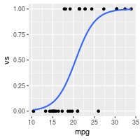
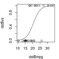
Dichotomous predictor, dichotomous outcome
This proceeds in much the same way as above. In this example, am is the dichotomous predictor variable, and vs is the dichotomous outcome variable.
# Do the logistic regression
logr_va <- glm(vs ~ am, data=dat, family=binomial)
# Print information about the model
logr_va
#>
#> Call:  glm(formula = vs ~ am, family = binomial, data = dat)
#>
#> Coefficients:
#> (Intercept)           am
#>     -0.5390       0.6931
#>
#> Degrees of Freedom: 31 Total (i.e. Null);  30 Residual
#> Null Deviance:	    43.86
#> Residual Deviance: 42.95 	AIC: 46.95
# More information about the model
summary(logr_va)
#>
#> Call:
#> glm(formula = vs ~ am, family = binomial, data = dat)
#>
#> Deviance Residuals:
#>     Min       1Q   Median       3Q      Max
#> -1.2435  -0.9587  -0.9587   1.1127   1.4132
#>
#> Coefficients:
#>             Estimate Std. Error z value Pr(>|z|)
#> (Intercept)  -0.5390     0.4756  -1.133    0.257
#> am            0.6931     0.7319   0.947    0.344
#>
#> (Dispersion parameter for binomial family taken to be 1)
#>
#>     Null deviance: 43.860  on 31  degrees of freedom
#> Residual deviance: 42.953  on 30  degrees of freedom
#> AIC: 46.953
#>
#> Number of Fisher Scoring iterations: 4
Plotting
The data and logistic regression model can be plotted with ggplot2 or base graphics, although the plots are probably less informative than those with a continuous variable. Because there are only 4 locations for the points to go, it will help to jitter the points so they do not all get overplotted.
library(ggplot2)
ggplot(dat, aes(x=am, y=vs)) +
geom_point(shape=1, position=position_jitter(width=.05,height=.05)) +
stat_smooth(method="glm", method.args=list(family="binomial"), se=FALSE)

par(mar = c(4, 4, 1, 1)) # Reduce some of the margins so that the plot fits better
plot(jitter(dat$am, .2), jitter(dat$vs, .2))
curve(predict(logr_va, data.frame(am=x), type="response"), add=TRUE)
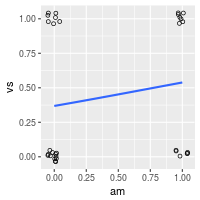
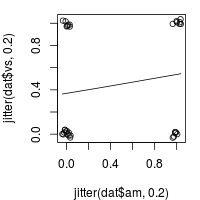
Continuous and dichotomous predictors, dichotomous outcome
This is similar to the previous examples. In this example, mpg is the continuous predictor, am is the dichotomous predictor variable, and vs is the dichotomous outcome variable.
logr_vma <- glm(vs ~ mpg + am, data=dat, family=binomial)
logr_vma
#>
#> Call:  glm(formula = vs ~ mpg + am, family = binomial, data = dat)
#>
#> Coefficients:
#> (Intercept)          mpg           am
#>    -12.7051       0.6809      -3.0073
#>
#> Degrees of Freedom: 31 Total (i.e. Null);  29 Residual
#> Null Deviance:	    43.86
#> Residual Deviance: 20.65 	AIC: 26.65
summary(logr_vma)
#>
#> Call:
#> glm(formula = vs ~ mpg + am, family = binomial, data = dat)
#>
#> Deviance Residuals:
#>      Min        1Q    Median        3Q       Max
#> -2.05888  -0.44544  -0.08765   0.33335   1.68405
#>
#> Coefficients:
#>             Estimate Std. Error z value Pr(>|z|)
#> (Intercept) -12.7051     4.6252  -2.747  0.00602 **
#> mpg           0.6809     0.2524   2.698  0.00697 **
#> am           -3.0073     1.5995  -1.880  0.06009 .
#> ---
#> Signif. codes:  0 '***' 0.001 '**' 0.01 '*' 0.05 '.' 0.1 ' ' 1
#>
#> (Dispersion parameter for binomial family taken to be 1)
#>
#>     Null deviance: 43.860  on 31  degrees of freedom
#> Residual deviance: 20.646  on 29  degrees of freedom
#> AIC: 26.646
#>
#> Number of Fisher Scoring iterations: 6
Multiple predictors with interactions
It is possible to test for interactions when there are multiple predictors. The interactions can be specified individually, as with a + b + c + a:b + b:c + a:b:c, or they can be expanded automatically, with a * b * c. It is possible to specify only a subset of the possible interactions, such as a + b + c + a:c.
This case proceeds as above, but with a slight change: instead of the formula being vs ~ mpg + am, it is vs ~ mpg * am, which is equivalent to vs ~ mpg + am + mpg:am.
# Do the logistic regression - both of these have the same effect.
logr_vmai <- glm(vs ~ mpg * am, data=dat, family=binomial)
logr_vmai <- glm(vs ~ mpg + am + mpg:am, data=dat, family=binomial)
logr_vmai
#>
#> Call:  glm(formula = vs ~ mpg + am + mpg:am, family = binomial, data = dat)
#>
#> Coefficients:
#> (Intercept)          mpg           am       mpg:am
#>    -20.4784       1.1084      10.1055      -0.6637
#>
#> Degrees of Freedom: 31 Total (i.e. Null);  28 Residual
#> Null Deviance:	    43.86
#> Residual Deviance: 19.12 	AIC: 27.12
summary(logr_vmai)
#>
#> Call:
#> glm(formula = vs ~ mpg + am + mpg:am, family = binomial, data = dat)
#>
#> Deviance Residuals:
#>      Min        1Q    Median        3Q       Max
#> -1.70566  -0.31124  -0.04817   0.28038   1.55603
#>
#> Coefficients:
#>             Estimate Std. Error z value Pr(>|z|)
#> (Intercept) -20.4784    10.5525  -1.941   0.0523 .
#> mpg           1.1084     0.5770   1.921   0.0547 .
#> am           10.1055    11.9104   0.848   0.3962
#> mpg:am       -0.6637     0.6242  -1.063   0.2877
#> ---
#> Signif. codes:  0 '***' 0.001 '**' 0.01 '*' 0.05 '.' 0.1 ' ' 1
#>
#> (Dispersion parameter for binomial family taken to be 1)
#>
#>     Null deviance: 43.860  on 31  degrees of freedom
#> Residual deviance: 19.125  on 28  degrees of freedom
#> AIC: 27.125
#>
#> Number of Fisher Scoring iterations: 7
TODO: Add comparison between interaction and non-interaction models.
Homogeneity of variance
Problem
You want test samples to see for homogeneity of variance (homoscedasticity) – or more accurately. Many statistical tests assume that the populations are homoscedastic.
Solution
There are many ways of testing data for homogeneity of variance. Three methods are shown here.
- Bartlett’s test - If the data is normally distributed, this is the best test to use. It is sensitive to data which is not non-normally distribution; it is more likely to return a “false positive” when the data is non-normal.
- Levene’s test - this is more robust to departures from normality than Bartlett’s test. It is in the
car package.
- Fligner-Killeen test - this is a non-parametric test which is very robust against departures from normality.
For all these tests, the null hypothesis is that all populations variances are equal; the alternative hypothesis is that at least two of them differ.
Sample data
The examples here will use the InsectSprays and ToothGrowth data sets. The InsectSprays data set has one independent variable, while the ToothGrowth data set has two independent variables.
head(InsectSprays)
#>   count spray
#> 1    10     A
#> 2     7     A
#> 3    20     A
#> 4    14     A
#> 5    14     A
#> 6    12     A
tg      <- ToothGrowth
tg$dose <- factor(tg$dose) # Treat this column as a factor, not numeric
head(tg)
#>    len supp dose
#> 1  4.2   VC  0.5
#> 2 11.5   VC  0.5
#> 3  7.3   VC  0.5
#> 4  5.8   VC  0.5
#> 5  6.4   VC  0.5
#> 6 10.0   VC  0.5
Quick boxplots of these data sets:
plot(count ~ spray, data = InsectSprays)
plot(len ~ interaction(dose,supp), data=ToothGrowth)
 On a first glance, it appears that both data sets are heteroscedastic, but this needs to be properly tested, which we’ll do below.
Bartlett’s test
With one independent variable:
bartlett.test(count ~ spray, data=InsectSprays)
#>
#> 	Bartlett test of homogeneity of variances
#>
#> data:  count by spray
#> Bartlett's K-squared = 25.96, df = 5, p-value = 9.085e-05
# Same effect, but with two vectors, instead of two columns from a data frame
# bartlett.test(InsectSprays$count ~ InsectSprays$spray)
With multiple independent variables, the interaction() function must be used to collapse the IV’s into a single variable with all combinations of the factors. If it is not used, then the will be the wrong degrees of freedom, and the p-value will be wrong.
bartlett.test(len ~ interaction(supp,dose), data=ToothGrowth)
#>
#> 	Bartlett test of homogeneity of variances
#>
#> data:  len by interaction(supp, dose)
#> Bartlett's K-squared = 6.9273, df = 5, p-value = 0.2261
# The above gives the same result as testing len vs. dose alone, without supp
bartlett.test(len ~ dose, data=ToothGrowth)
#>
#> 	Bartlett test of homogeneity of variances
#>
#> data:  len by dose
#> Bartlett's K-squared = 0.66547, df = 2, p-value = 0.717
Levene’s test
The leveneTest function is part of the car package.
With one independent variable:
library(car)
leveneTest(count ~ spray, data=InsectSprays)
#> Levene's Test for Homogeneity of Variance (center = median)
#>       Df F value   Pr(>F)
#> group  5  3.8214 0.004223 **
#>       66
#> ---
#> Signif. codes:  0 '***' 0.001 '**' 0.01 '*' 0.05 '.' 0.1 ' ' 1
With two independent variables. Note that the interaction function is not needed, as it is for the other two tests.
leveneTest(len ~ supp*dose, data=tg)
#> Levene's Test for Homogeneity of Variance (center = median)
#>       Df F value Pr(>F)
#> group  5  1.7086 0.1484
#>       54
Fligner-Killeen test
With one independent variable:
fligner.test(count ~ spray, data=InsectSprays)
#>
#> 	Fligner-Killeen test of homogeneity of variances
#>
#> data:  count by spray
#> Fligner-Killeen:med chi-squared = 14.483, df = 5, p-value = 0.01282
# Same effect, but with two vectors, instead of two columns from a data frame
# fligner.test(InsectSprays$count ~ InsectSprays$spray)
The fligner.test function has the same quirks as bartlett.test when working with multiple IV’s. With multiple independent variables, the interaction() function must be used.
fligner.test(len ~ interaction(supp,dose), data=ToothGrowth)
#>
#> 	Fligner-Killeen test of homogeneity of variances
#>
#> data:  len by interaction(supp, dose)
#> Fligner-Killeen:med chi-squared = 7.7488, df = 5, p-value = 0.1706

# The above gives the same result as testing len vs. dose alone, without supp
fligner.test(len ~ dose, data=ToothGrowth)
#>
#> 	Fligner-Killeen test of homogeneity of variances
#>
#> data:  len by dose
#> Fligner-Killeen:med chi-squared = 1.3879, df = 2, p-value = 0.4996
Inter-rater reliability
Problem
You want to calculate inter-rater reliability.
Solution
The method for calculating inter-rater reliability will depend on the type of data (categorical, ordinal, or continuous) and the number of coders.
Categorical data
Suppose this is your data set. It consists of 30 cases, rated by three coders. It is a subset of the diagnoses data set in the irr package.
library(irr)
#> Loading required package: lpSolve
data(diagnoses)
dat <- diagnoses[,1:3]
#                  rater1                  rater2                  rater3
#             4. Neurosis             4. Neurosis             4. Neurosis
# 2. Personality Disorder 2. Personality Disorder 2. Personality Disorder
# 2. Personality Disorder        3. Schizophrenia        3. Schizophrenia
#                5. Other                5. Other                5. Other
# 2. Personality Disorder 2. Personality Disorder 2. Personality Disorder
#           1. Depression           1. Depression        3. Schizophrenia
#        3. Schizophrenia        3. Schizophrenia        3. Schizophrenia
#           1. Depression           1. Depression        3. Schizophrenia
#           1. Depression           1. Depression             4. Neurosis
#                5. Other                5. Other                5. Other
#           1. Depression             4. Neurosis             4. Neurosis
#           1. Depression 2. Personality Disorder             4. Neurosis
# 2. Personality Disorder 2. Personality Disorder 2. Personality Disorder
#           1. Depression             4. Neurosis             4. Neurosis
# 2. Personality Disorder 2. Personality Disorder             4. Neurosis
#        3. Schizophrenia        3. Schizophrenia        3. Schizophrenia
#           1. Depression           1. Depression           1. Depression
#           1. Depression           1. Depression           1. Depression
# 2. Personality Disorder 2. Personality Disorder             4. Neurosis
#           1. Depression        3. Schizophrenia        3. Schizophrenia
#                5. Other                5. Other                5. Other
# 2. Personality Disorder             4. Neurosis             4. Neurosis
# 2. Personality Disorder 2. Personality Disorder             4. Neurosis
#           1. Depression           1. Depression             4. Neurosis
#           1. Depression             4. Neurosis             4. Neurosis
# 2. Personality Disorder 2. Personality Disorder 2. Personality Disorder
#           1. Depression           1. Depression           1. Depression
# 2. Personality Disorder 2. Personality Disorder             4. Neurosis
#           1. Depression        3. Schizophrenia        3. Schizophrenia
#                5. Other                5. Other                5. Other
Two raters: Cohen’s Kappa
This will calculate Cohen’s Kappa for two coders – In this case, raters 1 and 2.
kappa2(dat[,c(1,2)], "unweighted")
#>  Cohen's Kappa for 2 Raters (Weights: unweighted)
#>
#>  Subjects = 30
#>    Raters = 2
#>     Kappa = 0.651
#>
#>         z = 7
#>   p-value = 2.63e-12
N raters: Fleiss’s Kappa, Conger’s Kappa
If there are more than two raters, use Fleiss’s Kappa.
kappam.fleiss(dat)
#>  Fleiss' Kappa for m Raters
#>
#>  Subjects = 30
#>    Raters = 3
#>     Kappa = 0.534
#>
#>         z = 9.89
#>   p-value = 0
It is also possible to use Conger’s (1980) exact Kappa. (Note that it is not clear to me when it is better or worse to use the exact method.)
kappam.fleiss(dat, exact=TRUE)
#>  Fleiss' Kappa for m Raters (exact value)
#>
#>  Subjects = 30
#>    Raters = 3
#>     Kappa = 0.55
Ordinal data: weighted Kappa
If the data is ordinal, then it may be appropriate to use a weighted Kappa. For example, if the possible values are low, medium, and high, then if a case were rated medium and high by the two coders, they would be in better agreement than if the ratings were low and high.
We will use a subset of the anxiety data set from the irr package.
library(irr)
data(anxiety)
dfa <- anxiety[,c(1,2)]
dfa
#>    rater1 rater2
#> 1       3      3
#> 2       3      6
#> 3       3      4
#> 4       4      6
#> 5       5      2
#> 6       5      4
#> 7       2      2
#> 8       3      4
#> 9       5      3
#> 10      2      3
#> 11      2      2
#> 12      6      3
#> 13      1      3
#> 14      5      3
#> 15      2      2
#> 16      2      2
#> 17      1      1
#> 18      2      3
#> 19      4      3
#> 20      3      4
The weighted Kappa calculation must be made with 2 raters, and can use either linear or squared weights of the differences.
# Compare raters 1 and 2 with squared weights
kappa2(dfa, "squared")
#>  Cohen's Kappa for 2 Raters (Weights: squared)
#>
#>  Subjects = 20
#>    Raters = 2
#>     Kappa = 0.297
#>
#>         z = 1.34
#>   p-value = 0.18

# Use linear weights
kappa2(dfa, "equal")
#>  Cohen's Kappa for 2 Raters (Weights: equal)
#>
#>  Subjects = 20
#>    Raters = 2
#>     Kappa = 0.189
#>
#>         z = 1.42
#>   p-value = 0.157
Compare the results above to the unweighted calculation (used in the tests for non-ordinal data above), which treats all differences as the same:
kappa2(dfa, "unweighted")
#>  Cohen's Kappa for 2 Raters (Weights: unweighted)
#>
#>  Subjects = 20
#>    Raters = 2
#>     Kappa = 0.119
#>
#>         z = 1.16
#>   p-value = 0.245
Weighted Kappa with factors
The data above is numeric, but a weighted Kappa can also be calculated for factors. Note that the factor levels must be in the correct order, or results will be wrong.
# Make a factor-ized version of the data
dfa2 <- dfa
dfa2$rater1 <- factor(dfa2$rater1, levels=1:6, labels=LETTERS[1:6])
dfa2$rater2 <- factor(dfa2$rater2, levels=1:6, labels=LETTERS[1:6])
dfa2
#>    rater1 rater2
#> 1       C      C
#> 2       C      F
#> 3       C      D
#> 4       D      F
#> 5       E      B
#> 6       E      D
#> 7       B      B
#> 8       C      D
#> 9       E      C
#> 10      B      C
#> 11      B      B
#> 12      F      C
#> 13      A      C
#> 14      E      C
#> 15      B      B
#> 16      B      B
#> 17      A      A
#> 18      B      C
#> 19      D      C
#> 20      C      D
# The factor levels must be in the correct order:
levels(dfa2$rater1)
#> [1] "A" "B" "C" "D" "E" "F"
levels(dfa2$rater2)
#> [1] "A" "B" "C" "D" "E" "F"

# The results are the same as with the numeric data, above
kappa2(dfa2, "squared")
#>  Cohen's Kappa for 2 Raters (Weights: squared)
#>
#>  Subjects = 20
#>    Raters = 2
#>     Kappa = 0.297
#>
#>         z = 1.34
#>   p-value = 0.18

# Use linear weights
kappa2(dfa2, "equal")
#>  Cohen's Kappa for 2 Raters (Weights: equal)
#>
#>  Subjects = 20
#>    Raters = 2
#>     Kappa = 0.189
#>
#>         z = 1.42
#>   p-value = 0.157
Continuous data: Intraclass correlation coefficient
When the variable is continuous, the intraclass correlation coefficient should be computed. From the documentation for icc:
When considering which form of ICC is appropriate for an actual set of data, one has take several decisions (Shrout & Fleiss, 1979):
- Should only the subjects be considered as random effects (
"oneway" model, default) or are subjects and raters randomly chosen from a bigger pool of persons ("twoway" model).
- If differences in judges’ mean ratings are of interest, interrater
"agreement" instead of "consistency" (default) should be computed.
- If the unit of analysis is a mean of several ratings,
unit should be changed to "average". In most cases, however, single values (unit="single", default) are regarded.
We will use the anxiety data set from the irr package.
library(irr)
data(anxiety)
anxiety
#>    rater1 rater2 rater3
#> 1       3      3      2
#> 2       3      6      1
#> 3       3      4      4
#> 4       4      6      4
#> 5       5      2      3
#> 6       5      4      2
#> 7       2      2      1
#> 8       3      4      6
#> 9       5      3      1
#> 10      2      3      1
#> 11      2      2      1
#> 12      6      3      2
#> 13      1      3      3
#> 14      5      3      3
#> 15      2      2      1
#> 16      2      2      1
#> 17      1      1      3
#> 18      2      3      3
#> 19      4      3      2
#> 20      3      4      2
# Just one of the many possible ICC coefficients
icc(anxiety, model="twoway", type="agreement")
#>  Single Score Intraclass Correlation
#>
#>    Model: twoway
#>    Type : agreement
#>
#>    Subjects = 20
#>      Raters = 3
#>    ICC(A,1) = 0.198
#>
#>  F-Test, H0: r0 = 0 ; H1: r0 > 0
#>  F(19,39.7) = 1.83 , p = 0.0543
#>
#>  95%-Confidence Interval for ICC Population Values:
#>   -0.039 < ICC < 0.494
Bar and line graphs (ggplot2)
Problem
You want to do make basic bar or line graphs.
Solution
To make graphs with ggplot2, the data must be in a data frame, and in “long” (as opposed to wide) format. If your data needs to be restructured, see this page for more information.
Basic graphs with discrete x-axis
With bar graphs, there are two different things that the heights of bars commonly represent:
- The count of cases for each group – typically, each x value represents one group. This is done with
stat_bin, which calculates the number of cases in each group (if x is discrete, then each x value is a group; if x is continuous, then all the data is automatically in one group, unless you specifiy grouping with group=xx).
- The value of a column in the data set. This is done with
stat_identity, which leaves the y values unchanged.
| x axis is |
Height of bar represents |
Common name |
| Continuous |
Count |
Histogram |
| Discrete |
Count |
Bar graph |
| Continuous |
Value |
Bar graph |
| Discrete |
Value |
Bar graph |
In ggplot2, the default is to use stat_bin, so that the bar height represents the count of cases.
Bar graphs of values
Here is some sample data (derived from the tips dataset in the reshape2 package):
dat <- data.frame(
time = factor(c("Lunch","Dinner"), levels=c("Lunch","Dinner")),
total_bill = c(14.89, 17.23)
)
dat
#>     time total_bill
#> 1  Lunch      14.89
#> 2 Dinner      17.23
# Load the ggplot2 package
library(ggplot2)
In these examples, the height of the bar will represent the value in a column of the data frame. This is done by using stat="identity" instead of the default, stat="bin".
These are the variable mappings used here:
time: x-axis and sometimes color filltotal_bill: y-axis
# Very basic bar graph
ggplot(data=dat, aes(x=time, y=total_bill)) +
geom_bar(stat="identity")

# Map the time of day to different fill colors
ggplot(data=dat, aes(x=time, y=total_bill, fill=time)) +
geom_bar(stat="identity")
## This would have the same result as above
# ggplot(data=dat, aes(x=time, y=total_bill)) +
#    geom_bar(aes(fill=time), stat="identity")

# Add a black outline
ggplot(data=dat, aes(x=time, y=total_bill, fill=time)) +
geom_bar(colour="black", stat="identity")

# No legend, since the information is redundant
ggplot(data=dat, aes(x=time, y=total_bill, fill=time)) +
geom_bar(colour="black", stat="identity") +
guides(fill=FALSE)
/figure/unnamed-chunk-3-1.png)
/figure/unnamed-chunk-3-2.png)
/figure/unnamed-chunk-3-3.png)
/figure/unnamed-chunk-3-4.png) The desired bar graph might look something like this:
The desired bar graph might look something like this:
# Add title, narrower bars, fill color, and change axis labels
ggplot(data=dat, aes(x=time, y=total_bill, fill=time)) +
geom_bar(colour="black", fill="#DD8888", width=.8, stat="identity") +
guides(fill=FALSE) +
xlab("Time of day") + ylab("Total bill") +
ggtitle("Average bill for 2 people")
/figure/unnamed-chunk-4-1.png) See ../Colors (ggplot2) for more information on colors.
See ../Colors (ggplot2) for more information on colors.
Bar graphs of counts
In these examples, the height of the bar will represent the count of cases.
This is done by using stat="bin" (which is the default).
We’ll start with the tips data from the reshape2 package:
library(reshape2)
# Look at fist several rows
head(tips)
#>   total_bill  tip    sex smoker day   time size
#> 1      16.99 1.01 Female     No Sun Dinner    2
#> 2      10.34 1.66   Male     No Sun Dinner    3
#> 3      21.01 3.50   Male     No Sun Dinner    3
#> 4      23.68 3.31   Male     No Sun Dinner    2
#> 5      24.59 3.61 Female     No Sun Dinner    4
#> 6      25.29 4.71   Male     No Sun Dinner    4
To get a bar graph of counts, don’t map a variable to y, and use stat="bin" (which is the default) instead of stat="identity":
# Bar graph of counts
ggplot(data=tips, aes(x=day)) +
geom_bar(stat="count")
## Equivalent to this, since stat="bin" is the default:
# ggplot(data=tips, aes(x=day)) +
#    geom_bar()
/figure/unnamed-chunk-6-1.png)
Line graphs
For line graphs, the data points must be grouped so that it knows which points to connect. In this case, it is simple – all points should be connected, so group=1. When more variables are used and multiple lines are drawn, the grouping for lines is usually done by variable (this is seen in later examples).
These are the variable mappings used here:
time: x-axistotal_bill: y-axis
# Basic line graph
ggplot(data=dat, aes(x=time, y=total_bill, group=1)) +
geom_line()
## This would have the same result as above
# ggplot(data=dat, aes(x=time, y=total_bill)) +
#     geom_line(aes(group=1))
# Add points
ggplot(data=dat, aes(x=time, y=total_bill, group=1)) +
geom_line() +
geom_point()
# Change color of both line and points
# Change line type and point type, and use thicker line and larger points
# Change points to circles with white fill
ggplot(data=dat, aes(x=time, y=total_bill, group=1)) +
geom_line(colour="red", linetype="dashed", size=1.5) +
geom_point(colour="red", size=4, shape=21, fill="white")
/figure/unnamed-chunk-7-1.png)
/figure/unnamed-chunk-7-2.png)
/figure/unnamed-chunk-7-3.png) The desired line graph might look something like this:
The desired line graph might look something like this:
# Change the y-range to go from 0 to the maximum value in the total_bill column,
# and change axis labels
ggplot(data=dat, aes(x=time, y=total_bill, group=1)) +
geom_line() +
geom_point() +
expand_limits(y=0) +
xlab("Time of day") + ylab("Total bill") +
ggtitle("Average bill for 2 people")
/figure/unnamed-chunk-8-1.png) See ../Colors (ggplot2) for more information on colors, and ../Shapes and line types for information on shapes and line types.
See ../Colors (ggplot2) for more information on colors, and ../Shapes and line types for information on shapes and line types.
Graphs with more variables
This data will be used for the examples below:
dat1 <- data.frame(
sex = factor(c("Female","Female","Male","Male")),
time = factor(c("Lunch","Dinner","Lunch","Dinner"), levels=c("Lunch","Dinner")),
total_bill = c(13.53, 16.81, 16.24, 17.42)
)
dat1
#>      sex   time total_bill
#> 1 Female  Lunch      13.53
#> 2 Female Dinner      16.81
#> 3   Male  Lunch      16.24
#> 4   Male Dinner      17.42
This is derived from the tips dataset in the reshape2 package.
Bar graphs
These are the variable mappings used here:
time: x-axissex: color filltotal_bill: y-axis.
# Stacked bar graph -- this is probably not what you want
ggplot(data=dat1, aes(x=time, y=total_bill, fill=sex)) +
geom_bar(stat="identity")
# Bar graph, time on x-axis, color fill grouped by sex -- use position_dodge()
ggplot(data=dat1, aes(x=time, y=total_bill, fill=sex)) +
geom_bar(stat="identity", position=position_dodge())
ggplot(data=dat1, aes(x=time, y=total_bill, fill=sex)) +
geom_bar(stat="identity", position=position_dodge(), colour="black")
# Change colors
ggplot(data=dat1, aes(x=time, y=total_bill, fill=sex)) +
geom_bar(stat="identity", position=position_dodge(), colour="black") +
scale_fill_manual(values=c("#999999", "#E69F00"))
/figure/unnamed-chunk-10-1.png)
/figure/unnamed-chunk-10-2.png)
/figure/unnamed-chunk-10-3.png)
/figure/unnamed-chunk-10-4.png) It’s easy to change which variable is mapped the x-axis and which is mapped to the fill.
It’s easy to change which variable is mapped the x-axis and which is mapped to the fill.
# Bar graph, time on x-axis, color fill grouped by sex -- use position_dodge()
ggplot(data=dat1, aes(x=sex, y=total_bill, fill=time)) +
geom_bar(stat="identity", position=position_dodge(), colour="black")
/figure/unnamed-chunk-11-1.png) See ../Colors (ggplot2) for more information on colors.
See ../Colors (ggplot2) for more information on colors.
Line graphs
These are the variable mappings used here:
time: x-axissex: line colortotal_bill: y-axis.
To draw multiple lines, the points must be grouped by a variable; otherwise all points will be connected by a single line. In this case, we want them to be grouped by sex.
# Basic line graph with points
ggplot(data=dat1, aes(x=time, y=total_bill, group=sex)) +
geom_line() +
geom_point()
# Map sex to color
ggplot(data=dat1, aes(x=time, y=total_bill, group=sex, colour=sex)) +
geom_line() +
geom_point()
# Map sex to different point shape, and use larger points
ggplot(data=dat1, aes(x=time, y=total_bill, group=sex, shape=sex)) +
geom_line() +
geom_point()

# Use thicker lines and larger points, and hollow white-filled points
ggplot(data=dat1, aes(x=time, y=total_bill, group=sex, shape=sex)) +
geom_line(size=1.5) +
geom_point(size=3, fill="white") +
scale_shape_manual(values=c(22,21))
/figure/unnamed-chunk-12-1.png)
/figure/unnamed-chunk-12-2.png)
/figure/unnamed-chunk-12-3.png)
/figure/unnamed-chunk-12-4.png) It’s easy to change which variable is mapped the x-axis and which is mapped to the color or shape.
It’s easy to change which variable is mapped the x-axis and which is mapped to the color or shape.
ggplot(data=dat1, aes(x=sex, y=total_bill, group=time, shape=time, color=time)) +
geom_line() +
geom_point()
/figure/unnamed-chunk-13-1.png) See ../Colors (ggplot2) for more information on colors, and ../Shapes and line types for information on shapes and line types.
See ../Colors (ggplot2) for more information on colors, and ../Shapes and line types for information on shapes and line types.
Finished examples
The finished graphs might look like these:
# A bar graph
ggplot(data=dat1, aes(x=time, y=total_bill, fill=sex)) +
geom_bar(colour="black", stat="identity",
       position=position_dodge(),
       size=.3) +                        # Thinner lines
    scale_fill_hue(name="Sex of payer") +      # Set legend title
    xlab("Time of day") + ylab("Total bill") + # Set axis labels
    ggtitle("Average bill for 2 people") +     # Set title
    theme_bw()

# A line graph
ggplot(data=dat1, aes(x=time, y=total_bill, group=sex, shape=sex, colour=sex)) +
geom_line(aes(linetype=sex), size=1) +     # Set linetype by sex
    geom_point(size=3, fill="white") +         # Use larger points, fill with white
    expand_limits(y=0) +                       # Set y range to include 0
    scale_colour_hue(name="Sex of payer",      # Set legend title
                     l=30)  +                  # Use darker colors (lightness=30)
    scale_shape_manual(name="Sex of payer",
                 values=c(22,21)) +      # Use points with a fill color
    scale_linetype_discrete(name="Sex of payer") +
xlab("Time of day") + ylab("Total bill") + # Set axis labels
    ggtitle("Average bill for 2 people") +     # Set title
    theme_bw() +
theme(legend.position=c(.7, .4))           # Position legend inside
                                               # This must go after theme_bw
/figure/unnamed-chunk-14-1.png)
/figure/unnamed-chunk-14-2.png) In the line graph, the reason that the legend title, “Sex of payer”, must be specified three times is so that there is only one legend. The issue is explained here.
In the line graph, the reason that the legend title, “Sex of payer”, must be specified three times is so that there is only one legend. The issue is explained here.
With a numeric x-axis
When the variable on the x-axis is numeric, it is sometimes useful to treat it as continuous, and sometimes useful to treat it as categorical. In this data set, the dose is a numeric variable with values 0.5, 1.0, and 2.0. It might be useful to treat these values as equal categories when making a graph.
datn <- read.table(header=TRUE, text='
supp dose length
OJ  0.5  13.23
OJ  1.0  22.70
OJ  2.0  26.06
VC  0.5   7.98
VC  1.0  16.77
VC  2.0  26.14
')
This is derived from the ToothGrowth dataset included with R.
With x-axis treated as continuous
A simple graph might put dose on the x-axis as a numeric value. It is possible to make a line graph this way, but not a bar graph.
ggplot(data=datn, aes(x=dose, y=length, group=supp, colour=supp)) +
geom_line() +
geom_point()
/figure/unnamed-chunk-16-1.png)
With x-axis treated as categorical
If you wish to treat it as a categorical variable instead of a numeric one, it must be converted to a factor. This can be done by modifying the data frame, or by changing the specification of the graph.
# Copy the data frame and convert dose to a factor
datn2 <- datn
datn2$dose <- factor(datn2$dose)
ggplot(data=datn2, aes(x=dose, y=length, group=supp, colour=supp)) +
geom_line() +
geom_point()
# Use the original data frame, but put factor() directly in the plot specification
ggplot(data=datn, aes(x=factor(dose), y=length, group=supp, colour=supp)) +
geom_line() +
geom_point()
/figure/unnamed-chunk-17-1.png)
/figure/unnamed-chunk-17-2.png) It is also possible to make a bar graph when the variable is treated as categorical rather than numeric.
It is also possible to make a bar graph when the variable is treated as categorical rather than numeric.
# Use datn2 from above
ggplot(data=datn2, aes(x=dose, y=length, fill=supp)) +
geom_bar(stat="identity", position=position_dodge())
# Use the original data frame, but put factor() directly in the plot specification
ggplot(data=datn, aes(x=factor(dose), y=length, fill=supp)) +
geom_bar(stat="identity", position=position_dodge())
/figure/unnamed-chunk-18-1.png)
/figure/unnamed-chunk-18-2.png)
Plotting means and error bars (ggplot2)
Problem
You want to plot means and error bars for a dataset.
Solution
To make graphs with ggplot2, the data must be in a data frame, and in “long” (as opposed to wide) format. If your data needs to be restructured, see this page for more information.
Sample data
The examples below will the ToothGrowth dataset. Note that dose is a numeric column here; in some situations it may be useful to convert it to a factor.
tg <- ToothGrowth
head(tg)
#>    len supp dose
#> 1  4.2   VC  0.5
#> 2 11.5   VC  0.5
#> 3  7.3   VC  0.5
#> 4  5.8   VC  0.5
#> 5  6.4   VC  0.5
#> 6 10.0   VC  0.5
library(ggplot2)
First, it is necessary to summarize the data. This can be done in a number of ways, as described on this page. In this case, we’ll use the summarySE() function defined on that page, and also at the bottom of this page. (The code for the summarySE function must be entered before it is called here).
# summarySE provides the standard deviation, standard error of the mean, and a (default 95%) confidence interval
tgc <- summarySE(tg, measurevar="len", groupvars=c("supp","dose"))
tgc
#>   supp dose  N   len       sd        se       ci
#> 1   OJ  0.5 10 13.23 4.459709 1.4102837 3.190283
#> 2   OJ  1.0 10 22.70 3.910953 1.2367520 2.797727
#> 3   OJ  2.0 10 26.06 2.655058 0.8396031 1.899314
#> 4   VC  0.5 10  7.98 2.746634 0.8685620 1.964824
#> 5   VC  1.0 10 16.77 2.515309 0.7954104 1.799343
#> 6   VC  2.0 10 26.14 4.797731 1.5171757 3.432090
Line graphs
After the data is summarized, we can make the graph. These are basic line and point graph with error bars representing either the standard error of the mean, or 95% confidence interval.
# Standard error of the mean
ggplot(tgc, aes(x=dose, y=len, colour=supp)) +
geom_errorbar(aes(ymin=len-se, ymax=len+se), width=.1) +
geom_line() +
geom_point()

# The errorbars overlapped, so use position_dodge to move them horizontally
pd <- position_dodge(0.1) # move them .05 to the left and right
ggplot(tgc, aes(x=dose, y=len, colour=supp)) +
geom_errorbar(aes(ymin=len-se, ymax=len+se), width=.1, position=pd) +
geom_line(position=pd) +
geom_point(position=pd)

# Use 95% confidence interval instead of SEM
ggplot(tgc, aes(x=dose, y=len, colour=supp)) +
geom_errorbar(aes(ymin=len-ci, ymax=len+ci), width=.1, position=pd) +
geom_line(position=pd) +
geom_point(position=pd)
# Black error bars - notice the mapping of 'group=supp' -- without it, the error
# bars won't be dodged!
ggplot(tgc, aes(x=dose, y=len, colour=supp, group=supp)) +
geom_errorbar(aes(ymin=len-ci, ymax=len+ci), colour="black", width=.1, position=pd) +
geom_line(position=pd) +
geom_point(position=pd, size=3)
/figure/unnamed-chunk-4-1.png)
/figure/unnamed-chunk-4-2.png)
/figure/unnamed-chunk-4-3.png)
/figure/unnamed-chunk-4-4.png) A finished graph with error bars representing the standard error of the mean might look like this. The points are drawn last so that the white fill goes on top of the lines and error bars.
A finished graph with error bars representing the standard error of the mean might look like this. The points are drawn last so that the white fill goes on top of the lines and error bars.
ggplot(tgc, aes(x=dose, y=len, colour=supp, group=supp)) +
geom_errorbar(aes(ymin=len-se, ymax=len+se), colour="black", width=.1, position=pd) +
geom_line(position=pd) +
geom_point(position=pd, size=3, shape=21, fill="white") + # 21 is filled circle
    xlab("Dose (mg)") +
ylab("Tooth length") +
scale_colour_hue(name="Supplement type",    # Legend label, use darker colors
                     breaks=c("OJ", "VC"),
               labels=c("Orange juice", "Ascorbic acid"),
               l=40) +                    # Use darker colors, lightness=40
    ggtitle("The Effect of Vitamin C on\nTooth Growth in Guinea Pigs") +
expand_limits(y=0) +                        # Expand y range
    scale_y_continuous(breaks=0:20*4) +         # Set tick every 4
    theme_bw() +
theme(legend.justification=c(1,0),
    legend.position=c(1,0))               # Position legend in bottom right
/figure/unnamed-chunk-5-1.png)
Bar graphs
The procedure is similar for bar graphs. Note that tgc$size must be a factor. If it is a numeric vector, then it will not work.
# Use dose as a factor rather than numeric
tgc2 <- tgc
tgc2$dose <- factor(tgc2$dose)
# Error bars represent standard error of the mean
ggplot(tgc2, aes(x=dose, y=len, fill=supp)) +
geom_bar(position=position_dodge(), stat="identity") +
geom_errorbar(aes(ymin=len-se, ymax=len+se),
            width=.2,                    # Width of the error bars
                  position=position_dodge(.9))

# Use 95% confidence intervals instead of SEM
ggplot(tgc2, aes(x=dose, y=len, fill=supp)) +
geom_bar(position=position_dodge(), stat="identity") +
geom_errorbar(aes(ymin=len-ci, ymax=len+ci),
            width=.2,                    # Width of the error bars
                  position=position_dodge(.9))
/figure/unnamed-chunk-6-1.png)
/figure/unnamed-chunk-6-2.png) A finished graph might look like this.
A finished graph might look like this.
ggplot(tgc2, aes(x=dose, y=len, fill=supp)) +
geom_bar(position=position_dodge(), stat="identity",
       colour="black", # Use black outlines,
             size=.3) +      # Thinner lines
    geom_errorbar(aes(ymin=len-se, ymax=len+se),
            size=.3,    # Thinner lines
                  width=.2,
            position=position_dodge(.9)) +
xlab("Dose (mg)") +
ylab("Tooth length") +
scale_fill_hue(name="Supplement type", # Legend label, use darker colors
                   breaks=c("OJ", "VC"),
             labels=c("Orange juice", "Ascorbic acid")) +
ggtitle("The Effect of Vitamin C on\nTooth Growth in Guinea Pigs") +
scale_y_continuous(breaks=0:20*4) +
theme_bw()
/figure/unnamed-chunk-7-1.png)
Error bars for within-subjects variables
When all variables are between-subjects, it is straightforward to plot standard error or confidence intervals. However, when there are within-subjects variables (repeated measures), plotting the standard error or regular confidence intervals may be misleading for making inferences about differences between conditions.
The method below is from Morey (2008), which is a correction to Cousineau (2005), which in turn is meant to be a simpler method of that in Loftus and Masson (1994). See these papers for a more detailed treatment of the issues involved in error bars with within-subjects variables.
One within-subjects variable
Here is a data set (from Morey 2008) with one within-subjects variable: pre/post-test.
dfw <- read.table(header=TRUE, text='
 subject pretest posttest
 1    59.4     64.5
 2    46.4     52.4
 3    46.0     49.7
 4    49.0     48.7
 5    32.5     37.4
 6    45.2     49.5
 7    60.3     59.9
 8    54.3     54.1
 9    45.4     49.6
10    38.9     48.5
 ')
# Treat subject ID as a factor
dfw$subject <- factor(dfw$subject)
The first step is to convert it to long format. See this page for more information about the conversion.
# Convert to long format
library(reshape2)
dfw_long <- melt(dfw,
           id.vars = "subject",
           measure.vars = c("pretest","posttest"),
           variable.name = "condition")
dfw_long
#>    subject condition value
#> 1        1   pretest  59.4
#> 2        2   pretest  46.4
#> 3        3   pretest  46.0
#> 4        4   pretest  49.0
#> 5        5   pretest  32.5
#> 6        6   pretest  45.2
#> 7        7   pretest  60.3
#> 8        8   pretest  54.3
#> 9        9   pretest  45.4
#> 10      10   pretest  38.9
#> 11       1  posttest  64.5
#> 12       2  posttest  52.4
#> 13       3  posttest  49.7
#> 14       4  posttest  48.7
#> 15       5  posttest  37.4
#> 16       6  posttest  49.5
#> 17       7  posttest  59.9
#> 18       8  posttest  54.1
#> 19       9  posttest  49.6
#> 20      10  posttest  48.5
Collapse the data using summarySEwithin (defined at the bottom of this page; both of the helper functions below must be entered before the function is called here).
dfwc <- summarySEwithin(dfw_long, measurevar="value", withinvars="condition",
                  idvar="subject", na.rm=FALSE, conf.interval=.95)
dfwc
#>   condition  N value value_norm       sd        se       ci
#> 1  posttest 10 51.43      51.43 2.262361 0.7154214 1.618396
#> 2   pretest 10 47.74      47.74 2.262361 0.7154214 1.618396
library(ggplot2)
# Make the graph with the 95% confidence interval
ggplot(dfwc, aes(x=condition, y=value, group=1)) +
geom_line() +
geom_errorbar(width=.1, aes(ymin=value-ci, ymax=value+ci)) +
geom_point(shape=21, size=3, fill="white") +
ylim(40,60)
/figure/unnamed-chunk-10-1.png) The
The value and value_norm columns represent the un-normed and normed means. See the section below on normed means for more information.
Understanding within-subjects error bars
This section explains how the within-subjects error bar values are calculated. The steps here are for explanation purposes only; they are not necessary for making the error bars.
The graph of individual data shows that there is a consistent trend for the within-subjects variable condition, but this would not necessarily be revealed by taking the regular standard errors (or confidence intervals) for each group. The method in Morey (2008) and Cousineau (2005) essentially normalizes the data to remove the between-subject variability and calculates the variance from this normalized data.
# Use a consistent y range
ymax <- max(dfw_long$value)
ymin <- min(dfw_long$value)
# Plot the individuals
ggplot(dfw_long, aes(x=condition, y=value, colour=subject, group=subject)) +
geom_line() + geom_point(shape=21, fill="white") +
ylim(ymin,ymax)

# Create the normed version of the data
dfwNorm.long <- normDataWithin(data=dfw_long, idvar="subject", measurevar="value")
# Plot the normed individuals
ggplot(dfwNorm.long, aes(x=condition, y=value_norm, colour=subject, group=subject)) +
geom_line() + geom_point(shape=21, fill="white") +
ylim(ymin,ymax)
/figure/unnamed-chunk-11-1.png)
/figure/unnamed-chunk-11-2.png) The differences in the error bars for the regular (between-subject) method and the within-subject method are shown here. The regular error bars are in red, and the within-subject error bars are in black.
The differences in the error bars for the regular (between-subject) method and the within-subject method are shown here. The regular error bars are in red, and the within-subject error bars are in black.
# Instead of summarySEwithin, use summarySE, which treats condition as though it were a between-subjects variable
dfwc_between <- summarySE(data=dfw_long, measurevar="value", groupvars="condition", na.rm=FALSE, conf.interval=.95)
dfwc_between
#>   condition  N value       sd       se       ci
#> 1   pretest 10 47.74 8.598992 2.719240 6.151348
#> 2  posttest 10 51.43 7.253972 2.293907 5.189179
# Show the between-S CI's in red, and the within-S CI's in black
ggplot(dfwc_between, aes(x=condition, y=value, group=1)) +
geom_line() +
geom_errorbar(width=.1, aes(ymin=value-ci, ymax=value+ci), colour="red") +
geom_errorbar(width=.1, aes(ymin=value-ci, ymax=value+ci), data=dfwc) +
geom_point(shape=21, size=3, fill="white") +
ylim(ymin,ymax)
/figure/unnamed-chunk-12-1.png)
Two within-subjects variables
If there is more than one within-subjects variable, the same function, summarySEwithin, can be used. This data set is taken from Hays (1994), and used for making this type of within-subject error bar in Rouder and Morey (2005).
data <- read.table(header=TRUE, text='
 Subject RoundMono SquareMono RoundColor SquareColor
 1        41         40         41          37
 2        57         56         56          53
 3        52         53         53          50
 4        49         47         47          47
 5        47         48         48          47
 6        37         34         35          36
 7        47         50         47          46
 8        41         40         38          40
 9        48         47         49          45
10        37         35         36          35
11        32         31         31          33
12        47         42         42          42
')
The data must first be converted to long format. In this case, the column names indicate two variables, shape (round/square) and color scheme (monochromatic/colored).
# Convert it to long format
library(reshape2)
data_long <- melt(data=data, id.var="Subject",
            measure.vars=c("RoundMono", "SquareMono", "RoundColor", "SquareColor"),
            variable.name="Condition")
names(data_long)[names(data_long)=="value"] <- "Time"
# Split Condition column into Shape and ColorScheme
data_long$Shape <- NA
data_long$Shape[grepl("^Round",  data_long$Condition)] <- "Round"
data_long$Shape[grepl("^Square", data_long$Condition)] <- "Square"
data_long$Shape <- factor(data_long$Shape)
data_long$ColorScheme <- NA
data_long$ColorScheme[grepl("Mono$",  data_long$Condition)] <- "Monochromatic"
data_long$ColorScheme[grepl("Color$", data_long$Condition)] <- "Colored"
data_long$ColorScheme <- factor(data_long$ColorScheme, levels=c("Monochromatic","Colored"))
# Remove the Condition column now
data_long$Condition <- NULL
# Look at first few rows
head(data_long)
#>   Subject Time Shape   ColorScheme
#> 1       1   41 Round Monochromatic
#> 2       2   57 Round Monochromatic
#> 3       3   52 Round Monochromatic
#> 4       4   49 Round Monochromatic
#> 5       5   47 Round Monochromatic
#> 6       6   37 Round Monochromatic
Now it can be summarized and graphed.
datac <- summarySEwithin(data_long, measurevar="Time", withinvars=c("Shape","ColorScheme"), idvar="Subject")
datac
#>    Shape   ColorScheme  N     Time Time_norm       sd        se        ci
#> 1  Round       Colored 12 43.58333  43.58333 1.212311 0.3499639 0.7702654
#> 2  Round Monochromatic 12 44.58333  44.58333 1.331438 0.3843531 0.8459554
#> 3 Square       Colored 12 42.58333  42.58333 1.461630 0.4219364 0.9286757
#> 4 Square Monochromatic 12 43.58333  43.58333 1.261312 0.3641095 0.8013997
library(ggplot2)
ggplot(datac, aes(x=Shape, y=Time, fill=ColorScheme)) +
geom_bar(position=position_dodge(.9), colour="black", stat="identity") +
geom_errorbar(position=position_dodge(.9), width=.25, aes(ymin=Time-ci, ymax=Time+ci)) +
coord_cartesian(ylim=c(40,46)) +
scale_fill_manual(values=c("#CCCCCC","#FFFFFF")) +
scale_y_continuous(breaks=seq(1:100)) +
theme_bw() +
geom_hline(yintercept=38)
/figure/unnamed-chunk-15-1.png)
Note about normed means
The summarySEWithin function returns both normed and un-normed means. The un-normed means are simply the mean of each group. The normed means are calculated so that means of each between-subject group are the same. These values can diverge when there are between-subject variables.
For example:
dat <- read.table(header=TRUE, text='
id trial gender dv
 A     0   male  2
 A     1   male  4
 B     0   male  6
 B     1   male  8
 C     0 female 22
 C     1 female 24
 D     0 female 26
 D     1 female 28
')
# normed and un-normed means are different
summarySEwithin(dat, measurevar="dv", withinvars="trial", betweenvars="gender",
          idvar="id")
#> Automatically converting the following non-factors to factors: trial
#>   gender trial N dv dv_norm sd se ci
#> 1 female     0 2 24      14  0  0  0
#> 2 female     1 2 26      16  0  0  0
#> 3   male     0 2  4      14  0  0  0
#> 4   male     1 2  6      16  0  0  0
Helper functions
The summarySE function is also defined on this page. If you only are working with between-subjects variables, that is the only function you will need in your code. If you have within-subjects variables and want to adjust the error bars so that inter-subject variability is removed as in Loftus and Masson (1994), then the other two functions, normDataWithin and summarySEwithin must also be added to your code; summarySEwithin will then be the function that you call.
## Gives count, mean, standard deviation, standard error of the mean, and confidence interval (default 95%).
##   data: a data frame.
##   measurevar: the name of a column that contains the variable to be summariezed
##   groupvars: a vector containing names of columns that contain grouping variables
##   na.rm: a boolean that indicates whether to ignore NA's
##   conf.interval: the percent range of the confidence interval (default is 95%)
summarySE <- function(data=NULL, measurevar, groupvars=NULL, na.rm=FALSE,
                conf.interval=.95, .drop=TRUE) {
library(plyr)
# New version of length which can handle NA's: if na.rm==T, don't count them
    length2 <- function (x, na.rm=FALSE) {
  if (na.rm) sum(!is.na(x))
  else       length(x)
}
# This does the summary. For each group's data frame, return a vector with
    # N, mean, and sd
    datac <- ddply(data, groupvars, .drop=.drop,
.fun = function(xx, col) {
  c(N    = length2(xx[[col]], na.rm=na.rm),
    mean = mean   (xx[[col]], na.rm=na.rm),
    sd   = sd     (xx[[col]], na.rm=na.rm)
  )
},
measurevar
)
# Rename the "mean" column
    datac <- rename(datac, c("mean" = measurevar))
datac$se <- datac$sd / sqrt(datac$N)  # Calculate standard error of the mean
# Confidence interval multiplier for standard error
    # Calculate t-statistic for confidence interval:
    # e.g., if conf.interval is .95, use .975 (above/below), and use df=N-1
    ciMult <- qt(conf.interval/2 + .5, datac$N-1)
datac$ci <- datac$se * ciMult
return(datac)
}
## Norms the data within specified groups in a data frame; it normalizes each
## subject (identified by idvar) so that they have the same mean, within each group
## specified by betweenvars.
## data: a data frame.
## idvar: the name of a column that identifies each subject (or matched subjects)
## measurevar: the name of a column that contains the variable to be summariezed
## betweenvars: a vector containing names of columns that are between-subjects variables
## na.rm: a boolean that indicates whether to ignore NA's
normDataWithin <- function(data=NULL, idvar, measurevar, betweenvars=NULL,
na.rm=FALSE, .drop=TRUE) {
library(plyr)
# Measure var on left, idvar + between vars on right of formula.
data.subjMean <- ddply(data, c(idvar, betweenvars), .drop=.drop,
.fun = function(xx, col, na.rm) {
c(subjMean = mean(xx[,col], na.rm=na.rm))
},
measurevar,
na.rm
)
# Put the subject means with original data
data <- merge(data, data.subjMean)
# Get the normalized data in a new column
measureNormedVar <- paste(measurevar, "_norm", sep="")
data[,measureNormedVar] <- data[,measurevar] - data[,"subjMean"] +
mean(data[,measurevar], na.rm=na.rm)
# Remove this subject mean column
data$subjMean <- NULL
return(data)
}
## Summarizes data, handling within-subjects variables by removing inter-subject variability.
## It will still work if there are no within-S variables.
## Gives count, un-normed mean, normed mean (with same between-group mean),
## standard deviation, standard error of the mean, and confidence interval.
## If there are within-subject variables, calculate adjusted values using method from Morey (2008).
## data: a data frame.
## measurevar: the name of a column that contains the variable to be summariezed
## betweenvars: a vector containing names of columns that are between-subjects variables
## withinvars: a vector containing names of columns that are within-subjects variables
## idvar: the name of a column that identifies each subject (or matched subjects)
## na.rm: a boolean that indicates whether to ignore NA's
## conf.interval: the percent range of the confidence interval (default is 95%)
summarySEwithin <- function(data=NULL, measurevar, betweenvars=NULL, withinvars=NULL,
idvar=NULL, na.rm=FALSE, conf.interval=.95, .drop=TRUE) {
# Ensure that the betweenvars and withinvars are factors
factorvars <- vapply(data[, c(betweenvars, withinvars), drop=FALSE],
FUN=is.factor, FUN.VALUE=logical(1))
if (!all(factorvars)) {
nonfactorvars <- names(factorvars)[!factorvars]
message("Automatically converting the following non-factors to factors: ",
paste(nonfactorvars, collapse = ", "))
data[nonfactorvars] <- lapply(data[nonfactorvars], factor)
}
# Get the means from the un-normed data
datac <- summarySE(data, measurevar, groupvars=c(betweenvars, withinvars),
na.rm=na.rm, conf.interval=conf.interval, .drop=.drop)
# Drop all the unused columns (these will be calculated with normed data)
datac$sd <- NULL
datac$se <- NULL
datac$ci <- NULL
# Norm each subject's data
ndata <- normDataWithin(data, idvar, measurevar, betweenvars, na.rm, .drop=.drop)
# This is the name of the new column
measurevar_n <- paste(measurevar, "_norm", sep="")
# Collapse the normed data - now we can treat between and within vars the same
ndatac <- summarySE(ndata, measurevar_n, groupvars=c(betweenvars, withinvars),
na.rm=na.rm, conf.interval=conf.interval, .drop=.drop)
# Apply correction from Morey (2008) to the standard error and confidence interval
# Get the product of the number of conditions of within-S variables
nWithinGroups <- prod(vapply(ndatac[,withinvars, drop=FALSE], FUN=nlevels,
FUN.VALUE=numeric(1)))
correctionFactor <- sqrt( nWithinGroups / (nWithinGroups-1) )
# Apply the correction factor
ndatac$sd <- ndatac$sd * correctionFactor
ndatac$se <- ndatac$se * correctionFactor
ndatac$ci <- ndatac$ci * correctionFactor
# Combine the un-normed means with the normed results
merge(datac, ndatac)
}
Plotting distributions (ggplot2)
Problem
You want to plot a distribution of data.
Solution
This sample data will be used for the examples below:
set.seed(1234)
dat <- data.frame(cond = factor(rep(c("A","B"), each=200)),
rating = c(rnorm(200),rnorm(200, mean=.8)))
# View first few rows
head(dat)
#> cond rating
#> 1 A -1.2070657
#> 2 A 0.2774292
#> 3 A 1.0844412
#> 4 A -2.3456977
#> 5 A 0.4291247
#> 6 A 0.5060559
library(ggplot2)
Histogram and density plots
The qplot function is supposed make the same graphs as ggplot, but with a simpler syntax. However, in practice, it’s often easier to just use ggplot because the options for qplot can be more confusing to use.
## Basic histogram from the vector "rating". Each bin is .5 wide.
## These both result in the same output:
ggplot(dat, aes(x=rating)) + geom_histogram(binwidth=.5)
# qplot(dat$rating, binwidth=.5)
# Draw with black outline, white fill
ggplot(dat, aes(x=rating)) +
geom_histogram(binwidth=.5, colour="black", fill="white")
# Density curve
ggplot(dat, aes(x=rating)) + geom_density()
# Histogram overlaid with kernel density curve
ggplot(dat, aes(x=rating)) +
geom_histogram(aes(y=..density..), # Histogram with density instead of count on y-axis
binwidth=.5,
colour="black", fill="white") +
geom_density(alpha=.2, fill="#FF6666") # Overlay with transparent density plot
/figure/unnamed-chunk-3-1.png)
/figure/unnamed-chunk-3-2.png)
/figure/unnamed-chunk-3-3.png)
/figure/unnamed-chunk-3-4.png) Add a line for the mean:
Add a line for the mean:
ggplot(dat, aes(x=rating)) +
geom_histogram(binwidth=.5, colour="black", fill="white") +
geom_vline(aes(xintercept=mean(rating, na.rm=T)), # Ignore NA values for mean
color="red", linetype="dashed", size=1)
/figure/unnamed-chunk-4-1.png)
Histogram and density plots with multiple groups
# Overlaid histograms
ggplot(dat, aes(x=rating, fill=cond)) +
geom_histogram(binwidth=.5, alpha=.5, position="identity")
# Interleaved histograms
ggplot(dat, aes(x=rating, fill=cond)) +
geom_histogram(binwidth=.5, position="dodge")
# Density plots
ggplot(dat, aes(x=rating, colour=cond)) + geom_density()
# Density plots with semi-transparent fill
ggplot(dat, aes(x=rating, fill=cond)) + geom_density(alpha=.3)
/figure/unnamed-chunk-5-1.png)
/figure/unnamed-chunk-5-2.png)
/figure/unnamed-chunk-5-3.png)
/figure/unnamed-chunk-5-4.png) Add lines for each mean requires first creating a separate data frame with the means:
Add lines for each mean requires first creating a separate data frame with the means:
# Find the mean of each group
library(plyr)
cdat <- ddply(dat, "cond", summarise, rating.mean=mean(rating))
cdat
#> cond rating.mean
#> 1 A -0.05775928
#> 2 B 0.87324927
# Overlaid histograms with means
ggplot(dat, aes(x=rating, fill=cond)) +
geom_histogram(binwidth=.5, alpha=.5, position="identity") +
geom_vline(data=cdat, aes(xintercept=rating.mean, colour=cond),
linetype="dashed", size=1)
# Density plots with means
ggplot(dat, aes(x=rating, colour=cond)) +
geom_density() +
geom_vline(data=cdat, aes(xintercept=rating.mean, colour=cond),
linetype="dashed", size=1)
/figure/unnamed-chunk-6-1.png)
/figure/unnamed-chunk-6-2.png) Using facets:
Using facets:
ggplot(dat, aes(x=rating)) + geom_histogram(binwidth=.5, colour="black", fill="white") +
facet_grid(cond ~ .)
# With mean lines, using cdat from above
ggplot(dat, aes(x=rating)) + geom_histogram(binwidth=.5, colour="black", fill="white") +
facet_grid(cond ~ .) +
geom_vline(data=cdat, aes(xintercept=rating.mean),
linetype="dashed", size=1, colour="red")
/figure/unnamed-chunk-7-1.png)
/figure/unnamed-chunk-7-2.png) See Facets (ggplot2) for more details.
See Facets (ggplot2) for more details.
Box plots
# A basic box plot
ggplot(dat, aes(x=cond, y=rating)) + geom_boxplot()
# A basic box with the conditions colored
ggplot(dat, aes(x=cond, y=rating, fill=cond)) + geom_boxplot()
# The above adds a redundant legend. With the legend removed:
ggplot(dat, aes(x=cond, y=rating, fill=cond)) + geom_boxplot() +
guides(fill=FALSE)
# With flipped axes
ggplot(dat, aes(x=cond, y=rating, fill=cond)) + geom_boxplot() +
guides(fill=FALSE) + coord_flip()
/figure/unnamed-chunk-8-1.png)
/figure/unnamed-chunk-8-2.png)
/figure/unnamed-chunk-8-3.png)
/figure/unnamed-chunk-8-4.png) It’s also possible to add the mean by using
It’s also possible to add the mean by using stat_summary.
# Add a diamond at the mean, and make it larger
ggplot(dat, aes(x=cond, y=rating)) + geom_boxplot() +
stat_summary(fun.y=mean, geom="point", shape=5, size=4)
/figure/unnamed-chunk-9-1.png)
Scatterplots (ggplot2)
Problem
You want to make a scatterplot.
Solution
Suppose this is your data:
set.seed(955)
# Make some noisily increasing data
dat <- data.frame(cond = rep(c("A", "B"), each=10),
xvar = 1:20 + rnorm(20,sd=3),
yvar = 1:20 + rnorm(20,sd=3))
head(dat)
#> cond xvar yvar
#> 1 A -4.252354 3.473157275
#> 2 A 1.702318 0.005939612
#> 3 A 4.323054 -0.094252427
#> 4 A 1.780628 2.072808278
#> 5 A 11.537348 1.215440358
#> 6 A 6.672130 3.608111411
library(ggplot2)
Basic scatterplots with regression lines
ggplot(dat, aes(x=xvar, y=yvar)) +
geom_point(shape=1) # Use hollow circles
ggplot(dat, aes(x=xvar, y=yvar)) +
geom_point(shape=1) + # Use hollow circles
geom_smooth(method=lm) # Add linear regression line
# (by default includes 95% confidence region)
ggplot(dat, aes(x=xvar, y=yvar)) +
geom_point(shape=1) + # Use hollow circles
geom_smooth(method=lm, # Add linear regression line
se=FALSE) # Don't add shaded confidence region
ggplot(dat, aes(x=xvar, y=yvar)) +
geom_point(shape=1) + # Use hollow circles
geom_smooth() # Add a loess smoothed fit curve with confidence region
#> `geom_smooth()` using method = 'loess'
/figure/unnamed-chunk-3-1.png)
/figure/unnamed-chunk-3-2.png)
/figure/unnamed-chunk-3-3.png)
/figure/unnamed-chunk-3-4.png)
Set color/shape by another variable
# Set color by cond
ggplot(dat, aes(x=xvar, y=yvar, color=cond)) + geom_point(shape=1)
# Same, but with different colors and add regression lines
ggplot(dat, aes(x=xvar, y=yvar, color=cond)) +
geom_point(shape=1) +
scale_colour_hue(l=50) + # Use a slightly darker palette than normal
geom_smooth(method=lm, # Add linear regression lines
se=FALSE) # Don't add shaded confidence region
# Extend the regression lines beyond the domain of the data
ggplot(dat, aes(x=xvar, y=yvar, color=cond)) + geom_point(shape=1) +
scale_colour_hue(l=50) + # Use a slightly darker palette than normal
geom_smooth(method=lm, # Add linear regression lines
se=FALSE, # Don't add shaded confidence region
fullrange=TRUE) # Extend regression lines
# Set shape by cond
ggplot(dat, aes(x=xvar, y=yvar, shape=cond)) + geom_point()
# Same, but with different shapes
ggplot(dat, aes(x=xvar, y=yvar, shape=cond)) + geom_point() +
scale_shape_manual(values=c(1,2)) # Use a hollow circle and triangle
/figure/unnamed-chunk-4-1.png)
/figure/unnamed-chunk-4-2.png)
/figure/unnamed-chunk-4-3.png)
/figure/unnamed-chunk-4-4.png)
/figure/unnamed-chunk-4-5.png) See Colors (ggplot2) and Shapes and line types for more information about colors and shapes.
See Colors (ggplot2) and Shapes and line types for more information about colors and shapes.
Handling overplotting
If you have many data points, or if your data scales are discrete, then the data points might overlap and it will be impossible to see if there are many points at the same location.
# Round xvar and yvar to the nearest 5
dat$xrnd <- round(dat$xvar/5)*5
dat$yrnd <- round(dat$yvar/5)*5
# Make each dot partially transparent, with 1/4 opacity
# For heavy overplotting, try using smaller values
ggplot(dat, aes(x=xrnd, y=yrnd)) +
geom_point(shape=19, # Use solid circles
alpha=1/4) # 1/4 opacity
# Jitter the points
# Jitter range is 1 on the x-axis, .5 on the y-axis
ggplot(dat, aes(x=xrnd, y=yrnd)) +
geom_point(shape=1, # Use hollow circles
position=position_jitter(width=1,height=.5))
/figure/unnamed-chunk-5-1.png)
/figure/unnamed-chunk-5-2.png)
Titles (ggplot2)
Problem
You want to set the title of your graph.
Solution
An example graph without a title:
library(ggplot2)
bp <- ggplot(PlantGrowth, aes(x=group, y=weight)) + geom_boxplot()
bp
/figure/unnamed-chunk-2-1.png) With a title:
With a title:
bp + ggtitle("Plant growth")
## Equivalent to
# bp + labs(title="Plant growth")
# If the title is long, it can be split into multiple lines with \n
bp + ggtitle("Plant growth with\ndifferent treatments")
# Reduce line spacing and use bold text
bp + ggtitle("Plant growth with\ndifferent treatments") +
theme(plot.title = element_text(lineheight=.8, face="bold"))
/figure/unnamed-chunk-3-1.png)
/figure/unnamed-chunk-3-2.png)
/figure/unnamed-chunk-3-3.png)
Axes (ggplot2)
Problem
You want to change the order or direction of the axes.
Solution
Note: In the examples below, where it says something like scale_y_continuous, scale_x_continuous, or ylim, the y can be replaced with x if you want to operate on the other axis.
This is the basic boxplot that we will work with, using the built-in PlantGrowth data set.
library(ggplot2)
bp <- ggplot(PlantGrowth, aes(x=group, y=weight)) +
geom_boxplot()
bp
/figure/unnamed-chunk-2-1.png)
Swapping X and Y axes
Swap x and y axes (make x vertical, y horizontal):
bp + coord_flip()
/figure/unnamed-chunk-3-1.png)
Discrete axis
Changing the order of items
# Manually set the order of a discrete-valued axis
bp + scale_x_discrete(limits=c("trt1","trt2","ctrl"))
# Reverse the order of a discrete-valued axis
# Get the levels of the factor
flevels <- levels(PlantGrowth$group)
flevels
#> [1] "ctrl" "trt1" "trt2"
# Reverse the order
flevels <- rev(flevels)
flevels
#> [1] "trt2" "trt1" "ctrl"
bp + scale_x_discrete(limits=flevels)
# Or it can be done in one line:
bp + scale_x_discrete(limits = rev(levels(PlantGrowth$group)))
/figure/unnamed-chunk-4-1.png)
/figure/unnamed-chunk-4-2.png)
/figure/unnamed-chunk-4-3.png)
Setting tick mark labels
For discrete variables, the tick mark labels are taken directly from levels of the factor. However, sometimes the factor levels have short names that aren’t suitable for presentation.
bp + scale_x_discrete(breaks=c("ctrl", "trt1", "trt2"),
labels=c("Control", "Treat 1", "Treat 2"))
/figure/unnamed-chunk-5-1.png)
# Hide x tick marks, labels, and grid lines
bp + scale_x_discrete(breaks=NULL)
# Hide all tick marks and labels (on X axis), but keep the gridlines
bp + theme(axis.ticks = element_blank(), axis.text.x = element_blank())
/figure/unnamed-chunk-6-1.png)
/figure/unnamed-chunk-6-2.png)
Continuous axis
Setting range and reversing direction of an axis
If you simply want to make sure that an axis includes a particular value in the range, use expand_limits(). This can only expand the range of an axis; it can’t shrink the range.
# Make sure to include 0 in the y axis
bp + expand_limits(y=0)
# Make sure to include 0 and 8 in the y axis
bp + expand_limits(y=c(0,8))
/figure/unnamed-chunk-7-1.png)
/figure/unnamed-chunk-7-2.png) You can also explicitly set the y limits. Note that if any
You can also explicitly set the y limits. Note that if any scale_y_continuous command is used, it overrides any ylim command, and the ylim will be ignored.
# Set the range of a continuous-valued axis
# These are equivalent
bp + ylim(0, 8)
# bp + scale_y_continuous(limits=c(0, 8))
/figure/unnamed-chunk-8-1.png) If the y range is reduced using the method above, the data outside the range is ignored. This might be OK for a scatterplot, but it can be problematic for the box plots used here. For bar graphs, if the range does not include 0, the bars will not show at all!
To avoid this problem, you can use
If the y range is reduced using the method above, the data outside the range is ignored. This might be OK for a scatterplot, but it can be problematic for the box plots used here. For bar graphs, if the range does not include 0, the bars will not show at all!
To avoid this problem, you can use coord_cartesian instead. Instead of setting the limits of the data, it sets the viewing area of the data.
# These two do the same thing; all data points outside the graphing range are
# dropped, resulting in a misleading box plot
bp + ylim(5, 7.5)
#> Warning: Removed 13 rows containing non-finite values (stat_boxplot).
# bp + scale_y_continuous(limits=c(5, 7.5))
# Using coord_cartesian "zooms" into the area
bp + coord_cartesian(ylim=c(5, 7.5))
# Specify tick marks directly
bp + coord_cartesian(ylim=c(5, 7.5)) +
scale_y_continuous(breaks=seq(0, 10, 0.25)) # Ticks from 0-10, every .25
/figure/unnamed-chunk-9-1.png)
/figure/unnamed-chunk-9-2.png)
/figure/unnamed-chunk-9-3.png)
Reversing the direction of an axis
# Reverse order of a continuous-valued axis
bp + scale_y_reverse()
/figure/unnamed-chunk-10-1.png)
Setting and hiding tick markers
# Setting the tick marks on an axis
# This will show tick marks on every 0.25 from 1 to 10
# The scale will show only the ones that are within range (3.50-6.25 in this case)
bp + scale_y_continuous(breaks=seq(1,10,1/4))
# The breaks can be spaced unevenly
bp + scale_y_continuous(breaks=c(4, 4.25, 4.5, 5, 6,8))
# Suppress ticks and gridlines
bp + scale_y_continuous(breaks=NULL)
# Hide tick marks and labels (on Y axis), but keep the gridlines
bp + theme(axis.ticks = element_blank(), axis.text.y = element_blank())
/figure/unnamed-chunk-11-1.png)
/figure/unnamed-chunk-11-2.png)
/figure/unnamed-chunk-11-3.png)
/figure/unnamed-chunk-11-4.png)
Axis transformations: log, sqrt, etc.
By default, the axes are linearly scaled. It is possible to transform the axes with log, power, roots, and so on.
There are two ways of transforming an axis. One is to use a scale transform, and the other is to use a coordinate transform. With a scale transform, the data is transformed before properties such as breaks (the tick locations) and range of the axis are decided. With a coordinate transform, the transformation happens after the breaks and scale range are decided. This results in different appearances, as shown below.
# Create some noisy exponentially-distributed data
set.seed(201)
n <- 100
dat <- data.frame(
xval = (1:n+rnorm(n,sd=5))/20,
yval = 2*2^((1:n+rnorm(n,sd=5))/20)
)
# A scatterplot with regular (linear) axis scaling
sp <- ggplot(dat, aes(xval, yval)) + geom_point()
sp
# log2 scaling of the y axis (with visually-equal spacing)
library(scales) # Need the scales package
sp + scale_y_continuous(trans=log2_trans())
# log2 coordinate transformation (with visually-diminishing spacing)
sp + coord_trans(y="log2")
/figure/unnamed-chunk-12-1.png)
/figure/unnamed-chunk-12-2.png)
/figure/unnamed-chunk-12-3.png) With a scale transformation, you can also set the axis tick marks to show exponents.
With a scale transformation, you can also set the axis tick marks to show exponents.
sp + scale_y_continuous(trans = log2_trans(),
breaks = trans_breaks("log2", function(x) 2^x),
labels = trans_format("log2", math_format(2^.x)))
/figure/unnamed-chunk-13-1.png) Many transformations are available. See
Many transformations are available. See ?trans_new for a full list. If the transformation you need isn’t on the list, it is possible to write your own transformation function.
A couple scale transformations have convenience functions: scale_y_log10 and scale_y_sqrt (with corresponding versions for x).
set.seed(205)
n <- 100
dat10 <- data.frame(
xval = (1:n+rnorm(n,sd=5))/20,
yval = 10*10^((1:n+rnorm(n,sd=5))/20)
)
sp10 <- ggplot(dat10, aes(xval, yval)) + geom_point()
# log10
sp10 + scale_y_log10()
# log10 with exponents on tick labels
sp10 + scale_y_log10(breaks = trans_breaks("log10", function(x) 10^x),
labels = trans_format("log10", math_format(10^.x)))
/figure/unnamed-chunk-14-1.png)
/figure/unnamed-chunk-14-2.png)
Fixed ratio between x and y axes
It is possible to set the scaling of the axes to an equal ratio, with one visual unit being representing the same numeric unit on both axes. It is also possible to set them to ratios other than 1:1.
# Data where x ranges from 0-10, y ranges from 0-30
set.seed(202)
dat <- data.frame(
xval = runif(40,0,10),
yval = runif(40,0,30)
)
sp <- ggplot(dat, aes(xval, yval)) + geom_point()
# Force equal scaling
sp + coord_fixed()
# Equal scaling, with each 1 on the x axis the same length as y on x axis
sp + coord_fixed(ratio=1/3)
/figure/unnamed-chunk-15-1.png)
/figure/unnamed-chunk-15-2.png)
Axis labels and text formatting
To set and hide the axis labels:
bp + theme(axis.title.x = element_blank()) + # Remove x-axis label
ylab("Weight (Kg)") # Set y-axis label
# Also possible to set the axis label with the scale
# Note that vertical space is still reserved for x's label
bp + scale_x_discrete(name="") +
scale_y_continuous(name="Weight (Kg)")
/figure/unnamed-chunk-16-1.png)
/figure/unnamed-chunk-16-2.png) To change the fonts, and rotate tick mark labels:
To change the fonts, and rotate tick mark labels:
# Change font options:
# X-axis label: bold, red, and 20 points
# X-axis tick marks: rotate 90 degrees CCW, move to the left a bit (using vjust,
# since the labels are rotated), and 16 points
bp + theme(axis.title.x = element_text(face="bold", colour="#990000", size=20),
axis.text.x = element_text(angle=90, vjust=0.5, size=16))
/figure/unnamed-chunk-17-1.png)
Tick mark label text formatters
You may want to display your values as percents, or dollars, or in scientific notation. To do this you can use a formatter, which is a function that changes the text:
# Label formatters
library(scales) # Need the scales package
bp + scale_y_continuous(labels=percent) +
scale_x_discrete(labels=abbreviate) # In this particular case, it has no effect
/figure/unnamed-chunk-18-1.png) Other useful formatters for continuous scales include
Other useful formatters for continuous scales include comma, percent, dollar, and scientific. For discrete scales, abbreviate will remove vowels and spaces and shorten to four characters. For dates, use date_format.
Sometimes you may need to create your own formatting function. This one will display numeric minutes in HH:MM:SS format.
# Self-defined formatting function for times.
timeHMS_formatter <- function(x) {
h <- floor(x/60)
m <- floor(x %% 60)
s <- round(60*(x %% 1)) # Round to nearest second
lab <- sprintf('%02d:%02d:%02d', h, m, s) # Format the strings as HH:MM:SS
lab <- gsub('^00:', '', lab) # Remove leading 00: if present
lab <- gsub('^0', '', lab) # Remove leading 0 if present
}
bp + scale_y_continuous(label=timeHMS_formatter)
/figure/unnamed-chunk-19-1.png)
Hiding gridlines
To hide all gridlines, both vertical and horizontal:
# Hide all the gridlines
bp + theme(panel.grid.minor=element_blank(),
panel.grid.major=element_blank())
# Hide just the minor gridlines
bp + theme(panel.grid.minor=element_blank())
/figure/unnamed-chunk-20-1.png)
/figure/unnamed-chunk-20-2.png) It’s also possible to hide just the vertical or horizontal gridlines:
It’s also possible to hide just the vertical or horizontal gridlines:
# Hide all the vertical gridlines
bp + theme(panel.grid.minor.x=element_blank(),
panel.grid.major.x=element_blank())
# Hide all the horizontal gridlines
bp + theme(panel.grid.minor.y=element_blank(),
panel.grid.major.y=element_blank())
/figure/unnamed-chunk-21-1.png)
/figure/unnamed-chunk-21-2.png)
Legends (ggplot2)
Problem
You want to modify the legend of a graph made with ggplot2.
Solution
Start with an example graph with the default options:
library(ggplot2)
bp <- ggplot(data=PlantGrowth, aes(x=group, y=weight, fill=group)) + geom_boxplot()
bp
/figure/unnamed-chunk-2-1.png)
Removing the legend
Use guides(fill=FALSE), replacing fill with the desired aesthetic.
You can also remove all the legends in a graph, using theme.
# Remove legend for a particular aesthetic (fill)
bp + guides(fill=FALSE)
# It can also be done when specifying the scale
bp + scale_fill_discrete(guide=FALSE)
# This removes all legends
bp + theme(legend.position="none")
/figure/unnamed-chunk-4-1.png)
Changing the order of items in the legend
This changes the order of items to trt1, ctrl, trt2:
bp + scale_fill_discrete(breaks=c("trt1","ctrl","trt2"))
/figure/unnamed-chunk-5-1.png) Depending on how the colors are specified, you may have to use a different scale, such as
Depending on how the colors are specified, you may have to use a different scale, such as scale_fill_manual, scale_colour_hue, scale_colour_manual, scale_shape_discrete, scale_linetype_discrete, and so on.
Reversing the order of items in the legend
To reverse the legend order:
# These two methods are equivalent:
bp + guides(fill = guide_legend(reverse=TRUE))
bp + scale_fill_discrete(guide = guide_legend(reverse=TRUE))
# You can also modify the scale directly:
bp + scale_fill_discrete(breaks = rev(levels(PlantGrowth$group)))
/figure/unnamed-chunk-7-1.png) Instead of
Instead of scale_fill_discrete, you may need to use a different scale, such as scale_fill_manual, scale_colour_hue, scale_colour_manual, scale_shape_discrete, scale_linetype_discrete, and so on.
Hiding the legend title
This will hide the legend title:
# Remove title for fill legend
bp + guides(fill=guide_legend(title=NULL))
# Remove title for all legends
bp + theme(legend.title=element_blank())
/figure/unnamed-chunk-9-1.png)
Modifying the text of legend titles and labels
There are two ways of changing the legend title and labels. The first way is to tell the scale to use have a different title and labels. The second way is to change data frame so that the factor has the desired form.
Using scales
The legend can be a guide for fill, colour, linetype, shape, or other aesthetics.
With fill and color
Because group, the variable in the legend, is mapped to the color fill, it is necessary to use scale_fill_xxx, where xxx is a method of mapping each factor level of group to different colors. The default is to use a different hue on the color wheel for each factor level, but it is also possible to manually specify the colors for each level.
bp + scale_fill_discrete(name="Experimental\nCondition")
bp + scale_fill_discrete(name="Experimental\nCondition",
breaks=c("ctrl", "trt1", "trt2"),
labels=c("Control", "Treatment 1", "Treatment 2"))
# Using a manual scale instead of hue
bp + scale_fill_manual(values=c("#999999", "#E69F00", "#56B4E9"),
name="Experimental\nCondition",
breaks=c("ctrl", "trt1", "trt2"),
labels=c("Control", "Treatment 1", "Treatment 2"))
/figure/unnamed-chunk-10-1.png)
/figure/unnamed-chunk-10-2.png)
/figure/unnamed-chunk-10-3.png) Note that this didn’t change the x axis labels. See Axes (ggplot2) for information on how to modify the axis labels.
If you use a line graph, you will probably need to use
Note that this didn’t change the x axis labels. See Axes (ggplot2) for information on how to modify the axis labels.
If you use a line graph, you will probably need to use scale_colour_xxx and/or scale_shape_xxx instead of scale_fill_xxx. colour maps to the colors of lines and points, while fill maps to the color of area fills. shape maps to the shapes of points.
We’ll use a different data set for the line graphs here because the PlantGrowth data set does not work well with a line graph.
# A different data set
df1 <- data.frame(
sex = factor(c("Female","Female","Male","Male")),
time = factor(c("Lunch","Dinner","Lunch","Dinner"), levels=c("Lunch","Dinner")),
total_bill = c(13.53, 16.81, 16.24, 17.42)
)
# A basic graph
lp <- ggplot(data=df1, aes(x=time, y=total_bill, group=sex, shape=sex)) + geom_line() + geom_point()
lp
# Change the legend
lp + scale_shape_discrete(name ="Payer",
breaks=c("Female", "Male"),
labels=c("Woman", "Man"))
/figure/unnamed-chunk-11-1.png)
/figure/unnamed-chunk-11-2.png) If you use both
If you use both colour and shape, they both need to be given scale specifications. Otherwise there will be two two separate legends.
# Specify colour and shape
lp1 <- ggplot(data=df1, aes(x=time, y=total_bill, group=sex, shape=sex, colour=sex)) + geom_line() + geom_point()
lp1
# Here's what happens if you just specify colour
lp1 + scale_colour_discrete(name ="Payer",
breaks=c("Female", "Male"),
labels=c("Woman", "Man"))
# Specify both colour and shape
lp1 + scale_colour_discrete(name ="Payer",
breaks=c("Female", "Male"),
labels=c("Woman", "Man")) +
scale_shape_discrete(name ="Payer",
breaks=c("Female", "Male"),
labels=c("Woman", "Man"))
/figure/unnamed-chunk-12-1.png)
/figure/unnamed-chunk-12-2.png)
/figure/unnamed-chunk-12-3.png)
Kinds of scales
There are many kinds of scales. They take the form scale_xxx_yyy. Here are some commonly-used values of xxx and yyy:
| xxx |
Description |
| colour |
Color of lines and points |
| fill |
Color of area fills (e.g. bar graph) |
| linetype |
Solid/dashed/dotted lines |
| shape |
Shape of points |
| size |
Size of points |
| alpha |
Opacity/transparency |
| yyy |
Description |
| hue |
Equally-spaced colors from the color wheel |
| manual |
Manually-specified values (e.g., colors, point shapes, line types) |
| gradient |
Color gradient |
| grey |
Shades of grey |
| discrete |
Discrete values (e.g., colors, point shapes, line types, point sizes) |
| continuous |
Continuous values (e.g., alpha, colors, point sizes) |
Changing the factor in the data frame
Another way to change the legend title and labels is to directly modify the data frame.
pg <- PlantGrowth # Copy data into new data frame
# Rename the column and the values in the factor
levels(pg$group)[levels(pg$group)=="ctrl"] <- "Control"
levels(pg$group)[levels(pg$group)=="trt1"] <- "Treatment 1"
levels(pg$group)[levels(pg$group)=="trt2"] <- "Treatment 2"
names(pg)[names(pg)=="group"] <- "Experimental Condition"
# View a few rows from the end product
head(pg)
#> weight Experimental Condition
#> 1 4.17 Control
#> 2 5.58 Control
#> 3 5.18 Control
#> 4 6.11 Control
#> 5 4.50 Control
#> 6 4.61 Control
# Make the plot
ggplot(data=pg, aes(x=`Experimental Condition`, y=weight, fill=`Experimental Condition`)) +
geom_boxplot()
/figure/unnamed-chunk-13-1.png) The legend title “Experimental Condtion” is long and it might look better if it were broken into two lines, but this doesn’t work very well with this method, since you would have to put a newline character in the name of the column. The other method, with scales, is generally a better way to do this.
Also note the use of backticks instead of quotes. They are necessary because of the spaces in the variable name.
The legend title “Experimental Condtion” is long and it might look better if it were broken into two lines, but this doesn’t work very well with this method, since you would have to put a newline character in the name of the column. The other method, with scales, is generally a better way to do this.
Also note the use of backticks instead of quotes. They are necessary because of the spaces in the variable name.
Modifying the appearance of the legend title and labels
# Title appearance
bp + theme(legend.title = element_text(colour="blue", size=16, face="bold"))
# Label appearance
bp + theme(legend.text = element_text(colour="blue", size = 16, face = "bold"))
/figure/unnamed-chunk-14-1.png)
/figure/unnamed-chunk-14-2.png)
Modifying the legend box
By default, the legend will not have a box around it. To add a box and modify its properties:
bp + theme(legend.background = element_rect())
bp + theme(legend.background = element_rect(fill="gray90", size=.5, linetype="dotted"))
/figure/unnamed-chunk-15-1.png)
/figure/unnamed-chunk-15-2.png)
Changing the position of the legend
Position legend outside the plotting area (left/right/top/bottom):
bp + theme(legend.position="top")
/figure/unnamed-chunk-16-1.png) It is also possible to position the legend inside the plotting area. Note that the numeric position below is relative to the entire area, including titles and labels, not just the plotting area.
It is also possible to position the legend inside the plotting area. Note that the numeric position below is relative to the entire area, including titles and labels, not just the plotting area.
# Position legend in graph, where x,y is 0,0 (bottom left) to 1,1 (top right)
bp + theme(legend.position=c(.5, .5))
# Set the "anchoring point" of the legend (bottom-left is 0,0; top-right is 1,1)
# Put bottom-left corner of legend box in bottom-left corner of graph
bp + theme(legend.justification=c(0,0), legend.position=c(0,0))
# Put bottom-right corner of legend box in bottom-right corner of graph
bp + theme(legend.justification=c(1,0), legend.position=c(1,0))
/figure/unnamed-chunk-17-1.png)
/figure/unnamed-chunk-17-2.png)
/figure/unnamed-chunk-17-3.png)
Hiding slashes in the legend
If you make bar graphs with an outline (by setting colour=”black”), it will draw a slash through the colors in the legend. There is not a built-in way to remove the slashes, but it is possible to cover them up.
# No outline
ggplot(data=PlantGrowth, aes(x=group, fill=group)) +
geom_bar()
# Add outline, but slashes appear in legend
ggplot(data=PlantGrowth, aes(x=group, fill=group)) +
geom_bar(colour="black")
# A hack to hide the slashes: first graph the bars with no outline and add the legend,
# then graph the bars again with outline, but with a blank legend.
ggplot(data=PlantGrowth, aes(x=group, fill=group)) +
geom_bar() +
geom_bar(colour="black", show.legend=FALSE)
/figure/unnamed-chunk-18-1.png)
/figure/unnamed-chunk-18-2.png)
/figure/unnamed-chunk-18-3.png)
Lines (ggplot2)
Problem
You want to do add lines to a plot.
Solution
With one continuous and one categorical axis
# Some sample data
dat <- read.table(header=TRUE, text='
cond result
control 10
treatment 11.5
')
library(ggplot2)
Lines that go all the way across
These use geom_hline because the y-axis is the continuous one, but it is also possible to use geom_vline (with xintercept) if the x-axis is continuous.
# Basic bar plot
bp <- ggplot(dat, aes(x=cond, y=result)) +
geom_bar(position=position_dodge(), stat="identity")
bp
# Add a horizontal line
bp + geom_hline(aes(yintercept=12))
# Make the line red and dashed
bp + geom_hline(aes(yintercept=12), colour="#990000", linetype="dashed")
/figure/unnamed-chunk-3-1.png)
/figure/unnamed-chunk-3-2.png)
/figure/unnamed-chunk-3-3.png)
Separate lines for each categorical value
To make separate lines for each bar, use geom_errorbar. The error bars have no height – ymin=ymax. It also seems necessary to specify y for some reason, even though it doesn’t do anything.
# Draw separate hlines for each bar. First add another column to dat
dat$hline <- c(9,12)
dat
#> cond result hline
#> 1 control 10.0 9
#> 2 treatment 11.5 12
# Need to re-specify bp, because the data has changed
bp <- ggplot(dat, aes(x=cond, y=result)) +
geom_bar(position=position_dodge(), stat="identity")
# Draw with separate lines for each bar
bp + geom_errorbar(aes(ymax=hline, ymin=hline), colour="#AA0000")
# Make the lines narrower
bp + geom_errorbar(width=0.5, aes(ymax=hline, ymin=hline), colour="#AA0000")
# Can get the same result, even if we get the hline values from a second data frame
# Define data frame with hline
dat_hlines <- data.frame(cond=c("control","treatment"), hline=c(9,12))
dat_hlines
#> cond hline
#> 1 control 9
#> 2 treatment 12
# The bars are from dat, but the lines are from dat_hlines
bp + geom_errorbar(data=dat_hlines, aes(y=NULL, ymax=hline, ymin=hline), colour="#AA0000")
#> Warning: Ignoring unknown aesthetics: y
/figure/unnamed-chunk-4-1.png)
/figure/unnamed-chunk-4-2.png)
/figure/unnamed-chunk-4-3.png)
Lines over grouped bars
It is possible to add lines over grouped bars. In this example, there are actually four lines (one for each entry for hline), but it looks like two, because they are drawn on top of each other. I don’t think it’s possible to avoid this, but it doesn’t cause any problems.
dat <- read.table(header=TRUE, text='
cond group result hline
control A 10 9
treatment A 11.5 12
control B 12 9
treatment B 14 12
')
dat
#> cond group result hline
#> 1 control A 10.0 9
#> 2 treatment A 11.5 12
#> 3 control B 12.0 9
#> 4 treatment B 14.0 12
# Define basic bar plot
bp <- ggplot(dat, aes(x=cond, y=result, fill=group)) +
geom_bar(position=position_dodge(), stat="identity")
bp
# The error bars get plotted over one another -- there are four but it looks
# like two
bp + geom_errorbar(aes(ymax=hline, ymin=hline), linetype="dashed")
/figure/unnamed-chunk-5-1.png)
/figure/unnamed-chunk-5-2.png)
Lines over individual grouped bars
It is also possible to have lines over each individual bar, even when grouped.
dat <- read.table(header=TRUE, text='
cond group result hline
control A 10 11
treatment A 11.5 12
control B 12 12.5
treatment B 14 15
')
# Define basic bar plot
bp <- ggplot(dat, aes(x=cond, y=result, fill=group)) +
geom_bar(position=position_dodge(), stat="identity")
bp
bp + geom_errorbar(aes(ymax=hline, ymin=hline), linetype="dashed",
position=position_dodge())
/figure/unnamed-chunk-6-1.png)
/figure/unnamed-chunk-6-2.png)
With two continuous axes
Sample data used here:
dat <- read.table(header=TRUE, text='
cond xval yval
control 11.5 10.8
control 9.3 12.9
control 8.0 9.9
control 11.5 10.1
control 8.6 8.3
control 9.9 9.5
control 8.8 8.7
control 11.7 10.1
control 9.7 9.3
control 9.8 12.0
treatment 10.4 10.6
treatment 12.1 8.6
treatment 11.2 11.0
treatment 10.0 8.8
treatment 12.9 9.5
treatment 9.1 10.0
treatment 13.4 9.6
treatment 11.6 9.8
treatment 11.5 9.8
treatment 12.0 10.6
')
library(ggplot2)
Basic lines
# The basic scatterplot
sp <- ggplot(dat, aes(x=xval, y=yval, colour=cond)) + geom_point()
# Add a horizontal line
sp + geom_hline(aes(yintercept=10))
# Add a red dashed vertical line
sp + geom_hline(aes(yintercept=10)) +
geom_vline(aes(xintercept=11.5), colour="#BB0000", linetype="dashed")
/figure/unnamed-chunk-9-1.png)
/figure/unnamed-chunk-9-2.png)
Drawing lines for the mean
It is also possible to compute a mean value for each subset of data, grouped by some variable. The group means would have to be computed and stored in a separate data frame, and the easiest way to do this is to use the dplyr package. Note that the y range of the line is determined by the data.
library(dplyr)
lines <- dat %>%
group_by(cond) %>%
summarise(
x = mean(xval),
ymin = min(yval),
ymax = max(yval)
)
# Add colored lines for the mean xval of each group
sp + geom_hline(aes(yintercept=10)) +
geom_linerange(aes(x=x, y=NULL, ymin=ymin, ymax=ymax), data=lines)
#> Warning: Ignoring unknown aesthetics: y
/figure/unnamed-chunk-10-1.png)
Using lines with facets
Normally, if you add a line, it will appear in all facets.
# Facet, based on cond
spf <- sp + facet_grid(. ~ cond)
spf
# Draw a horizontal line in all of the facets at the same value
spf + geom_hline(aes(yintercept=10))
/figure/unnamed-chunk-11-1.png)
/figure/unnamed-chunk-11-2.png) If you want the different lines to appear in the different facets, there are two options. One is to create a new data frame with the desired values for the lines. Another option (with more limited control) is to use
If you want the different lines to appear in the different facets, there are two options. One is to create a new data frame with the desired values for the lines. Another option (with more limited control) is to use stat and xintercept in geom_line().
dat_vlines <- data.frame(cond=levels(dat$cond), xval=c(10,11.5))
dat_vlines
#> cond xval
#> 1 control 10.0
#> 2 treatment 11.5
spf + geom_hline(aes(yintercept=10)) +
geom_vline(aes(xintercept=xval), data=dat_vlines,
colour="#990000", linetype="dashed")
spf + geom_hline(aes(yintercept=10)) +
geom_linerange(aes(x=x, y=NULL, ymin=ymin, ymax=ymax), data=lines)
#> Warning: Ignoring unknown aesthetics: y
/figure/unnamed-chunk-12-1.png)
/figure/unnamed-chunk-12-2.png)
Facets (ggplot2)
Problem
You want to do split up your data by one or more variables and plot the subsets of data together.
Solution
Sample data
We will use the tips dataset from the reshape2 package.
library(reshape2)
# Look at first few rows
head(tips)
#> total_bill tip sex smoker day time size
#> 1 16.99 1.01 Female No Sun Dinner 2
#> 2 10.34 1.66 Male No Sun Dinner 3
#> 3 21.01 3.50 Male No Sun Dinner 3
#> 4 23.68 3.31 Male No Sun Dinner 2
#> 5 24.59 3.61 Female No Sun Dinner 4
#> 6 25.29 4.71 Male No Sun Dinner 4
This is a scatterplot of the tip percentage by total bill size.
library(ggplot2)
sp <- ggplot(tips, aes(x=total_bill, y=tip/total_bill)) + geom_point(shape=1)
sp
/figure/unnamed-chunk-3-1.png)
facet_grid
The data can be split up by one or two variables that vary on the horizontal and/or vertical direction.
This is done by giving a formula to facet_grid(), of the form vertical ~ horizontal.
# Divide by levels of "sex", in the vertical direction
sp + facet_grid(sex ~ .)
/figure/unnamed-chunk-4-1.png)
# Divide by levels of "sex", in the horizontal direction
sp + facet_grid(. ~ sex)
/figure/unnamed-chunk-5-1.png)
# Divide with "sex" vertical, "day" horizontal
sp + facet_grid(sex ~ day)
/figure/unnamed-chunk-6-1.png)
facet_wrap
Instead of faceting with a variable in the horizontal or vertical direction, facets can be placed next to each other, wrapping with a certain number of columns or rows. The label for each plot will be at the top of the plot.
# Divide by day, going horizontally and wrapping with 2 columns
sp + facet_wrap( ~ day, ncol=2)
/figure/unnamed-chunk-7-1.png)
Modifying facet label appearance
sp + facet_grid(sex ~ day) +
theme(strip.text.x = element_text(size=8, angle=75),
strip.text.y = element_text(size=12, face="bold"),
strip.background = element_rect(colour="red", fill="#CCCCFF"))
/figure/unnamed-chunk-8-1.png)
Modifying facet label text
There are a few different ways of modifying facet labels. The simplest way is to provide a named vector that maps original names to new names. To map the levels of sex from Female==>Women, and Male==>Men:
labels <- c(Female = "Women", Male = "Men")
sp + facet_grid(. ~ sex, labeller=labeller(sex = labels))
Another way is to modify the data frame so that the data contains the desired labels:
tips2 <- tips
levels(tips2$sex)[levels(tips2$sex)=="Female"] <- "Women"
levels(tips2$sex)[levels(tips2$sex)=="Male"] <- "Men"
head(tips2, 3)
#> total_bill tip sex smoker day time size
#> 1 16.99 1.01 Women No Sun Dinner 2
#> 2 10.34 1.66 Men No Sun Dinner 3
#> 3 21.01 3.50 Men No Sun Dinner 3
# Both of these will give the same output:
sp2 <- ggplot(tips2, aes(x=total_bill, y=tip/total_bill)) + geom_point(shape=1)
sp2 + facet_grid(. ~ sex)
Both of these will give the same result:
/figure/unnamed-chunk-11-1.png)
labeller() can use any function that takes a character vector as input and returns a character vector as output. For example, the capitalize function from the Hmisc package will capitalize the first letters of strings. We can also define our own custom functions, like this one, which reverses strings:
# Reverse each strings in a character vector
reverse <- function(strings) {
strings <- strsplit(strings, "")
vapply(strings, function(x) {
paste(rev(x), collapse = "")
}, FUN.VALUE = character(1))
}
sp + facet_grid(. ~ sex, labeller=labeller(sex = reverse))
/figure/unnamed-chunk-12-1.png)
Free scales
Normally, the axis scales on each graph are fixed, which means that they have the same size and range. They can be made independent, by setting scales to free, free_x, or free_y.
# A histogram of bill sizes
hp <- ggplot(tips, aes(x=total_bill)) + geom_histogram(binwidth=2,colour="white")
# Histogram of total_bill, divided by sex and smoker
hp + facet_grid(sex ~ smoker)
# Same as above, with scales="free_y"
hp + facet_grid(sex ~ smoker, scales="free_y")
# With panels that have the same scaling, but different range (and therefore different physical sizes)
hp + facet_grid(sex ~ smoker, scales="free", space="free")
/figure/unnamed-chunk-13-1.png)
/figure/unnamed-chunk-13-2.png)
/figure/unnamed-chunk-13-3.png)
Multiple graphs on one page (ggplot2)
Problem
You want to put multiple graphs on one page.
Solution
The easy way is to use the multiplot function, defined at the bottom of this page. If it isn’t suitable for your needs, you can copy and modify it.
First, set up the plots and store them, but don’t render them yet. The details of these plots aren’t important; all you need to do is store the plot objects in variables.
library(ggplot2)
# This example uses the ChickWeight dataset, which comes with ggplot2
# First plot
p1 <- ggplot(ChickWeight, aes(x=Time, y=weight, colour=Diet, group=Chick)) +
geom_line() +
ggtitle("Growth curve for individual chicks")
# Second plot
p2 <- ggplot(ChickWeight, aes(x=Time, y=weight, colour=Diet)) +
geom_point(alpha=.3) +
geom_smooth(alpha=.2, size=1) +
ggtitle("Fitted growth curve per diet")
# Third plot
p3 <- ggplot(subset(ChickWeight, Time==21), aes(x=weight, colour=Diet)) +
geom_density() +
ggtitle("Final weight, by diet")
# Fourth plot
p4 <- ggplot(subset(ChickWeight, Time==21), aes(x=weight, fill=Diet)) +
geom_histogram(colour="black", binwidth=50) +
facet_grid(Diet ~ .) +
ggtitle("Final weight, by diet") +
theme(legend.position="none") # No legend (redundant in this graph)
Once the plot objects are set up, we can render them with multiplot. This will make two columns of graphs:
multiplot(p1, p2, p3, p4, cols=2)
#> `geom_smooth()` using method = 'loess'
/figure/unnamed-chunk-3-1.png)
multiplot function
This is the definition of multiplot. It can take any number of plot objects as arguments, or if it can take a list of plot objects passed to plotlist.
# Multiple plot function
#
# ggplot objects can be passed in ..., or to plotlist (as a list of ggplot objects)
# - cols: Number of columns in layout
# - layout: A matrix specifying the layout. If present, 'cols' is ignored.
#
# If the layout is something like matrix(c(1,2,3,3), nrow=2, byrow=TRUE),
# then plot 1 will go in the upper left, 2 will go in the upper right, and
# 3 will go all the way across the bottom.
#
multiplot <- function(..., plotlist=NULL, file, cols=1, layout=NULL) {
library(grid)
# Make a list from the ... arguments and plotlist
plots <- c(list(...), plotlist)
numPlots = length(plots)
# If layout is NULL, then use 'cols' to determine layout
if (is.null(layout)) {
# Make the panel
# ncol: Number of columns of plots
# nrow: Number of rows needed, calculated from # of cols
layout <- matrix(seq(1, cols * ceiling(numPlots/cols)),
ncol = cols, nrow = ceiling(numPlots/cols))
}
if (numPlots==1) {
print(plots[[1]])
} else {
# Set up the page
grid.newpage()
pushViewport(viewport(layout = grid.layout(nrow(layout), ncol(layout))))
# Make each plot, in the correct location
for (i in 1:numPlots) {
# Get the i,j matrix positions of the regions that contain this subplot
matchidx <- as.data.frame(which(layout == i, arr.ind = TRUE))
print(plots[[i]], vp = viewport(layout.pos.row = matchidx$row,
layout.pos.col = matchidx$col))
}
}
}
Colors (ggplot2)
Problem
You want to use colors in a graph with ggplot2.
Solution
The default colors in ggplot2 can be difficult to distinguish from one another because they have equal luminance. They are also not friendly for colorblind viewers.
A good general-purpose solution is to just use the colorblind-friendly palette below.
Sample data
These two data sets will be used to generate the graphs below.
# Two variables
df <- read.table(header=TRUE, text='
cond yval
A 2
B 2.5
C 1.6
')
# Three variables
df2 <- read.table(header=TRUE, text='
cond1 cond2 yval
A I 2
A J 2.5
A K 1.6
B I 2.2
B J 2.4
B K 1.2
C I 1.7
C J 2.3
C K 1.9
')
Simple color assignment
The colors of lines and points can be set directly using colour="red", replacing “red” with a color name. The colors of filled objects, like bars, can be set using fill="red".
If you want to use anything other than very basic colors, it may be easier to use hexadecimal codes for colors, like "#FF6699". (See the hexadecimal color chart below.)
library(ggplot2)
# Default: dark bars
ggplot(df, aes(x=cond, y=yval)) + geom_bar(stat="identity")
# Bars with red outlines
ggplot(df, aes(x=cond, y=yval)) + geom_bar(stat="identity", colour="#FF9999")
# Red fill, black outlines
ggplot(df, aes(x=cond, y=yval)) + geom_bar(stat="identity", fill="#FF9999", colour="black")
# Standard black lines and points
ggplot(df, aes(x=cond, y=yval)) +
geom_line(aes(group=1)) + # Group all points; otherwise no line will show
geom_point(size=3)
# Dark blue lines, red dots
ggplot(df, aes(x=cond, y=yval)) +
geom_line(aes(group=1), colour="#000099") + # Blue lines
geom_point(size=3, colour="#CC0000") # Red dots
/figure/unnamed-chunk-3-1.png)
/figure/unnamed-chunk-3-2.png)
/figure/unnamed-chunk-3-3.png)
/figure/unnamed-chunk-3-4.png)
/figure/unnamed-chunk-3-5.png)
Mapping variable values to colors
Instead of changing colors globally, you can map variables to colors – in other words, make the color conditional on a variable, by putting it inside an aes() statement.
# Bars: x and fill both depend on cond2
ggplot(df, aes(x=cond, y=yval, fill=cond)) + geom_bar(stat="identity")
# Bars with other dataset; fill depends on cond2
ggplot(df2, aes(x=cond1, y=yval)) +
geom_bar(aes(fill=cond2), # fill depends on cond2
stat="identity",
colour="black", # Black outline for all
position=position_dodge()) # Put bars side-by-side instead of stacked
# Lines and points; colour depends on cond2
ggplot(df2, aes(x=cond1, y=yval)) +
geom_line(aes(colour=cond2, group=cond2)) + # colour, group both depend on cond2
geom_point(aes(colour=cond2), # colour depends on cond2
size=3) # larger points, different shape
## Equivalent to above; but move "colour=cond2" into the global aes() mapping
# ggplot(df2, aes(x=cond1, y=yval, colour=cond2)) +
# geom_line(aes(group=cond2)) +
# geom_point(size=3)
/figure/unnamed-chunk-4-1.png)
/figure/unnamed-chunk-4-2.png)
/figure/unnamed-chunk-4-3.png)
A colorblind-friendly palette
These are color-blind-friendly palettes, one with gray, and one with black.
/figure/unnamed-chunk-5-1.png)
/figure/unnamed-chunk-5-2.png) To use with ggplot2, it is possible to store the palette in a variable, then use it later.
To use with ggplot2, it is possible to store the palette in a variable, then use it later.
# The palette with grey:
cbPalette <- c("#999999", "#E69F00", "#56B4E9", "#009E73", "#F0E442", "#0072B2", "#D55E00", "#CC79A7")
# The palette with black:
cbbPalette <- c("#000000", "#E69F00", "#56B4E9", "#009E73", "#F0E442", "#0072B2", "#D55E00", "#CC79A7")
# To use for fills, add
scale_fill_manual(values=cbPalette)
# To use for line and point colors, add
scale_colour_manual(values=cbPalette)
This palette is from http://jfly.iam.u-tokyo.ac.jp/color/:
/colorblind_palette.jpg)
Color selection
By default, the colors for discrete scales are evenly spaced around a HSL color circle. For example, if there are two colors, then they will be selected from opposite points on the circle; if there are three colors, they will be 120° apart on the color circle; and so on.
The colors used for different numbers of levels are shown here:
/figure/unnamed-chunk-7-1.png) The default color selection uses
The default color selection uses scale_fill_hue() and scale_colour_hue(). For example, adding those commands is redundant in these cases:
# These two are equivalent; by default scale_fill_hue() is used
ggplot(df, aes(x=cond, y=yval, fill=cond)) + geom_bar(stat="identity")
# ggplot(df, aes(x=cond, y=yval, fill=cond)) + geom_bar(stat="identity") + scale_fill_hue()
# These two are equivalent; by default scale_colour_hue() is used
ggplot(df, aes(x=cond, y=yval, colour=cond)) + geom_point(size=2)
# ggplot(df, aes(x=cond, y=yval, colour=cond)) + geom_point(size=2) + scale_colour_hue()
/figure/unnamed-chunk-8-1.png)
/figure/unnamed-chunk-8-2.png)
Setting luminance and saturation (chromaticity)
Although scale_fill_hue() and scale_colour_hue() were redundant above, they can be used when you want to make changes from the default, like changing the luminance or chromaticity.
# Use luminance=45, instead of default 65
ggplot(df, aes(x=cond, y=yval, fill=cond)) + geom_bar(stat="identity") +
scale_fill_hue(l=40)
# Reduce saturation (chromaticity) from 100 to 50, and increase luminance
ggplot(df, aes(x=cond, y=yval, fill=cond)) + geom_bar(stat="identity") +
scale_fill_hue(c=45, l=80)
# Note: use scale_colour_hue() for lines and points
/figure/unnamed-chunk-9-1.png)
/figure/unnamed-chunk-9-2.png) This is a chart of colors with luminance=45:
This is a chart of colors with luminance=45:
/figure/unnamed-chunk-10-1.png)
Palettes: Color Brewer
You can also use other color scales, such as ones taken from the RColorBrewer package. See the chart of RColorBrewer palettes below. See the scale section here for more information.
ggplot(df, aes(x=cond, y=yval, fill=cond)) + geom_bar(stat="identity") +
scale_fill_brewer()
ggplot(df, aes(x=cond, y=yval, fill=cond)) + geom_bar(stat="identity") +
scale_fill_brewer(palette="Set1")
ggplot(df, aes(x=cond, y=yval, fill=cond)) + geom_bar(stat="identity") +
scale_fill_brewer(palette="Spectral")
# Note: use scale_colour_brewer() for lines and points
/figure/unnamed-chunk-11-1.png)
/figure/unnamed-chunk-11-2.png)
/figure/unnamed-chunk-11-3.png)
Palettes: manually-defined
Finally, you can define your own set of colors with scale_fill_manual(). See the hexadecimal code chart below for help choosing specific colors.
ggplot(df, aes(x=cond, y=yval, fill=cond)) + geom_bar(stat="identity") +
scale_fill_manual(values=c("red", "blue", "green"))
ggplot(df, aes(x=cond, y=yval, fill=cond)) + geom_bar(stat="identity") +
scale_fill_manual(values=c("#CC6666", "#9999CC", "#66CC99"))
# Note: use scale_colour_manual() for lines and points
/figure/unnamed-chunk-12-1.png)
/figure/unnamed-chunk-12-2.png)
Continuous colors
[Not complete]
See the scale section here for more information.
# Generate some data
set.seed(133)
df <- data.frame(xval=rnorm(50), yval=rnorm(50))
# Make color depend on yval
ggplot(df, aes(x=xval, y=yval, colour=yval)) + geom_point()
# Use a different gradient
ggplot(df, aes(x=xval, y=yval, colour=yval)) + geom_point() +
scale_colour_gradientn(colours=rainbow(4))
/figure/unnamed-chunk-13-1.png)
/figure/unnamed-chunk-13-2.png)
Color charts
Hexadecimal color code chart
Colors can specified as a hexadecimal RGB triplet, such as "#0066CC". The first two digits are the level of red, the next two green, and the last two blue. The value for each ranges from 00 to FF in hexadecimal (base-16) notation, which is equivalent to 0 and 255 in base-10. For example, in the table below, “#FFFFFF” is white and “#990000” is a deep red.
/hextable.png) (Color chart is from http://www.visibone.com)
(Color chart is from http://www.visibone.com)
RColorBrewer palette chart
/figure/unnamed-chunk-14-1.png)
Output to a file
Problem
You want to save your graph(s) to a file.
Solution
There are several commands which will direct output to a file instead of the screen. You must use the dev.off() command to tell R that you are finished plotting; otherwise your graph will not show up.
PDF
PDF is a vector file format. Vector files are generally preferred for print output because the resulting output can be scaled to any size without pixelation. The size of a vector file is usually smaller than the corresponding bitmap file, except in cases where there are many objects. (For example, a scatter plot with thousands of points may result in a very large vector file, but a smaller bitmap file.)
pdf("plots.pdf")
plot(...)
plot(...)
dev.off()
PDF’s are 7x7 inches by default, and each new plot is on a new page. The size can be changed:
# 6x3 inches
pdf("plots.pdf", width=6, height=3)
# 10x6 cm
pdf("plots.pdf", width=10/2.54, height=6/2.54)
If you want to edit your file in a vector editor like Inkscape or Illustrator, some of the plotting point objects might look like letters instead of circles, squares, etc. To avoid this problem:
pdf("plots.pdf", useDingbats=FALSE)
SVG
SVG is another vector format. The default settings for svg() doesn’t allow for multiple pages in a single file, since most SVG viewers can’t handle multi-page SVG files. See the PNG section below for outputting to multiple files.
svg("plots.svg")
plot(...)
dev.off()
SVG files may work better with vector-editing programs than PDF files.
PNG/TIFF
PNG and TIFF are bitmap (or raster) formats. If they are magnified, the pixels may be visible.
png("plot.png")
# or tiff("plot.tiff")
plot(...)
dev.off()
By default, the graphs are 480x480 pixels in size, at a resolution of 72 dpi (6.66x6.66 inches).
Increasing the resolution will increase the size (in pixels) of the text and graph elements. This occurs because the size of these elements is relative to the physical dimension of the graph (e.g., 4x4 inches), not the pixel dimension of the graph. For example, a 12 point font is 12/72 = 1/6 inch tall; at 72 dpi, this is 12 pixels, but at 120dpi, it is 20 pixels.
This would create a graph that is 480x240 pixels at 120dpi, equivalent to 4x2 inches.
png("plot.png", width=480, height=240, res=120)
plot(...)
dev.off()
If you want to make more than one graph, you must either execute a new png() command for each one, or put %d in the filename:
png("plot-%d.png")
plot(...)
dev.off()
This will generate plot-1.png, plot2.png, and so on.
For import into PDF-incapable programs (MS Office)
Some programs which cannot import PDF files may work with high-resolution PNG or TIFF files. For example, Microsoft Office cannot import PDF files. For print publications, you may be required to use 300dpi images.
# Make a 6x6 inch image at 300dpi
ppi <- 300
png("plot.png", width=6*ppi, height=6*ppi, res=ppi)
plot(...)
dev.off()
ggplot2
If you make plots with ggplot2 in a script or function, you must use the print() command to make the graphs actually get rendered.
# This will do nothing
pdf("plots.pdf")
qplot(...)
dev.off()
# This will do the right thing
pdf("plots.pdf")
print(qplot(...))
dev.off()
To save a ggplot2 graph from the screen to a file, you can use ggsave().
ggsave("plot.pdf")
ggsave("plot.pdf", width=4, height=4)
# This will save a 400x400 file at 100 ppi
ggsave("plot.png", width=4, height=4, dpi=100)
Saving a graph from the screen
If you have a graph on the screen, you can save it to a bitmap file.
This will save an exact pixel-for-pixel copy of what’s on screen, but it will probably only work in Linux and on Macs that use X11 for R graphing:
# Make a plot on screen
plot(...)
savePlot("myplot.png")
This will save the current graph from the screen, but it re-renders it for the device, which may have different dimensions, so it won’t look exactly the same unless you specify the exact same size in pixels.
# Make a plot on screen
plot(...)
dev.copy(pdf,"myplot.pdf", width=4, height=4)
dev.off()
# Same as doing:
# pdf("myplot.pdf", width=4, height=4)
# plot(...)
# dev.off()
dev.copy(png,"myplot.png", width=400, height=400)
dev.off()
Shapes and line types
Problem
You want to use different shapes and line types in your graph.
Solution
 Note that with bitmap output, the filled symbols 15-18 may render without proper anti-aliasing; they can appear jagged, pixelated, and not properly centered, though this varies among platforms. Symbols 19 and 21-25 have an outline around the filled area, and will render with smoothed edges on most platforms. For symbols 21-25 to appear solid, you will also need to specify a fill (bg) color that is the same as the outline color (col); otherwise they will be hollow.
Standard graphics
Use the pch option to set the shape, and use lty and lwd to set the line type and width. The line type can be specified by name or by number.
set.seed(331)
# Plot some points with lines
# Set up the plotting area
par(mar=c(3,3,2,2))
plot(NA, xlim=c(1,4), ylim=c(0,1))
# Plot solid circles with solid lines
points(1:4, runif(4), type="b", pch=19)
# Add open squares with dashed line, with heavier line width
points(1:4, runif(4), type="b", pch=0, lty=2, lwd=3)
points(1:4, runif(4), type="b", pch=23, # Diamond shape
lty="dotted", cex=2, # Dotted line, double-size shapes
col="#000099", bg="#FF6666") # blue line, red fill
ggplot2
With ggplot2, shapes and line types can be assigned overall (e.g., if you want all points to be squares, or all lines to be dashed), or they can be conditioned on a variable.
# Sample data
df <- read.table(header=T, text='
cond xval yval
A 1 2.0
A 2 2.5
B 1 3.0
B 2 2.0
')
library(ggplot2)
# Plot with standard lines and points
# group = cond tells it which points to connect with lines
ggplot(df, aes(x=xval, y=yval, group = cond)) +
geom_line() +
geom_point()
# Set overall shapes and line type
ggplot(df, aes(x=xval, y=yval, group = cond)) +
geom_line(linetype="dashed", # Dashed line
size = 1.5) + # Thicker line
geom_point(shape = 0, # Hollow squares
size = 4) # Large points
# Condition shapes and line type on variable cond
ggplot(df, aes(x=xval, y=yval, group = cond)) +
geom_line(aes(linetype=cond), # Line type depends on cond
size = 1.5) + # Thicker line
geom_point(aes(shape=cond), # Shape depends on cond
size = 4) # Large points
# Same as previous, but also change the specific linetypes and
# shapes that are used
ggplot(df, aes(x=xval, y=yval, group = cond)) +
geom_line(aes(linetype=cond), # Line type depends on cond
size = 1.5) + # Thicker line
geom_point(aes(shape=cond), # Shape depends on cond
size = 4) + # Large points
scale_shape_manual(values=c(6,5)) + # Change shapes
scale_linetype_manual(values=c("dotdash", "dotted")) # Change linetypes
 By default, ggplot2 uses solid shapes. If you want to use hollow shapes, without manually declaring each shape, you can use
 scale_shape(solid=FALSE). Note, however, that the lines will visible inside the shape. To avoid this, you can use shapes 21-25 and specify a white fill.
# Hollow shapes
ggplot(df, aes(x=xval, y=yval, group = cond)) +
geom_line(aes(linetype=cond), # Line type depends on cond
size = 1.5) + # Thicker line
geom_point(aes(shape=cond), # Shape depends on cond
size = 4) + # Large points
scale_shape(solid=FALSE)
# Shapes with white fill
ggplot(df, aes(x=xval, y=yval, group = cond)) +
geom_line(aes(linetype=cond), # Line type depends on cond
size = 1.5) + # Thicker line
geom_point(aes(shape=cond), # Shape depends on cond
fill = "white", # White fill
size = 4) + # Large points
scale_shape_manual(values=c(21,24)) # Shapes: Filled circle, triangle
Note
This code will generate the chart of line types seen at the top.
par(mar=c(0,0,0,0))
# Set up the plotting area
plot(NA, xlim=c(0,1), ylim=c(6.5, -0.5),
xaxt="n", yaxt="n",
xlab=NA, ylab=NA )
# Draw the lines
for (i in 0:6) {
points(c(0.25,1), c(i,i), lty=i, lwd=2, type="l")
}
# Add labels
text(0, 0, "0. 'blank'" , adj=c(0,.5))
text(0, 1, "1. 'solid'" , adj=c(0,.5))
text(0, 2, "2. 'dashed'" , adj=c(0,.5))
text(0, 3, "3. 'dotted'" , adj=c(0,.5))
text(0, 4, "4. 'dotdash'" , adj=c(0,.5))
text(0, 5, "5. 'longdash'", adj=c(0,.5))
text(0, 6, "6. 'twodash'" , adj=c(0,.5))
Fonts
Problem
You want to use different fonts in your graphs.
Solution
Update: Also see the extrafont package for much better support of fonts for PDF and Windows bitmap output.
Font support in R is generally not very good. It varies between systems, and between output formats.
geom_text
With geom_text or annotate in ggplot2, you can set a number of properties of the text. geom_text is used to add text from the data frame, and annotate is used to add a single text element.
| Name |
Default value |
size |
5 |
family |
"" (sans) |
fontface |
plain |
lineheight |
1.2 |
angle |
0 |
hjust |
0.5 |
vjust |
0.5 |
Note that size is in mm, not points.
dat <- data.frame(
y = 1:3,
text = c("This is text", "Text with\nmultiple lines", "Some more text")
)
library(ggplot2)
p <- ggplot(dat, aes(x=1, y=y)) +
scale_y_continuous(limits=c(0.5, 3.5), breaks=NULL) +
scale_x_continuous(breaks=NULL)
p + geom_text(aes(label=text))
p + geom_text(aes(label=text), family="Times", fontface="italic", lineheight=.8) +
annotate(geom="text", x=1, y=1.5, label="Annotation text", colour="red",
size=7, family="Courier", fontface="bold", angle=30)
themes and element_text
When controlling elements such as the title, legend, axis labels, and so on, you use element_text, which has the same parameters, except that size is points (not mm), and instead of fontface, it uses face. The default value of size depends on the element; for example, titles are larger than tick labels.
p + geom_point() +
ggtitle("This is a Title") +
theme(plot.title=element_text(family="Times", face="bold", size=20))
Table of fonts
You can use this code to generate a graphical table of fonts. Fonts have short names and canonical family names. You can use either one when specifying the family.
fonttable <- read.table(header=TRUE, sep=",", stringsAsFactors=FALSE,
text='
Short,Canonical
mono,Courier
sans,Helvetica
serif,Times
,AvantGarde
,Bookman
,Helvetica-Narrow
,NewCenturySchoolbook
,Palatino
,URWGothic
,URWBookman
,NimbusMon
URWHelvetica,NimbusSan
,NimbusSanCond
,CenturySch
,URWPalladio
URWTimes,NimbusRom
')
fonttable$pos <- 1:nrow(fonttable)
library(reshape2)
fonttable <- melt(fonttable, id.vars="pos", measure.vars=c("Short","Canonical"),
variable.name="NameType", value.name="Font")
# Make a table of faces. Make sure factors are ordered correctly
facetable <- data.frame(Face = factor(c("plain","bold","italic","bold.italic"),
levels = c("plain","bold","italic","bold.italic")))
fullfonts <- merge(fonttable, facetable)
library(ggplot2)
pf <- ggplot(fullfonts, aes(x=NameType, y=pos)) +
geom_text(aes(label=Font, family=Font, fontface=Face)) +
facet_wrap(~ Face, ncol=2)
To view it on screen:
pf
What you see on the screen isn’t necessarily the same as what you get when you output to PNG or PDF. To see PNG output:
png('fonttable.png', width=720, height=720, res=72)
print(pf)
dev.off()
Notice that on the system that generated this picture, most of the fonts (at the top) don’t really work. Only the basic fonts (at the bottom) work.
And PDF output (the image below has been converted from PDF to PNG):
pdf('fonttable.pdf', width=10, height=10)
print(pf)
dev.off()
# Convert to PNG using GraphicsMagick:
# system("gm convert -resize 720x720 -background white fonttable.pdf fonttable-pdf.png")
The PDF device has better font support than the PNG device. All the fonts work (though they’re not necessarily pretty):
Histogram and density plot
Problem
You want to make a histogram or density plot.
Solution
Some sample data: these two vectors contain 200 data points each:
set.seed(1234)
rating <- rnorm(200)
head(rating)
#> [1] -1.2070657 0.2774292 1.0844412 -2.3456977 0.4291247 0.5060559
rating2 <- rnorm(200, mean=.8)
head(rating2)
#> [1] 1.2852268 1.4967688 0.9855139 1.5007335 1.1116810 1.5604624
When plotting multiple groups of data, some graphing routines require a data frame with one column for the grouping variable and one for the measure variable.
# Make a column to indicate which group each value is in
cond <- factor( rep(c("A","B"), each=200) )
data <- data.frame(cond, rating = c(rating,rating2))
head(data)
#> cond rating
#> 1 A -1.2070657
#> 2 A 0.2774292
#> 3 A 1.0844412
#> 4 A -2.3456977
#> 5 A 0.4291247
#> 6 A 0.5060559
# Histogram
hist(rating)
# Use 8 bins (this is only approximate - it places boundaries on nice round numbers)
# Make it light blue #CCCCFF
# Instead of showing count, make area sum to 1, (freq=FALSE)
hist(rating, breaks=8, col="#CCCCFF", freq=FALSE)
# Put breaks at every 0.6
boundaries <- seq(-3, 3.6, by=.6)
boundaries
#> [1] -3.0 -2.4 -1.8 -1.2 -0.6 0.0 0.6 1.2 1.8 2.4 3.0 3.6
hist(rating, breaks=boundaries)
# Kernel density plot
plot(density(rating))
 Multiple groups with kernel density plots.
This code is from: http://onertipaday.blogspot.com/2007/09/plotting-two-or-more-overlapping.html
Multiple groups with kernel density plots.
This code is from: http://onertipaday.blogspot.com/2007/09/plotting-two-or-more-overlapping.html
plot.multi.dens <- function(s)
{
junk.x = NULL
junk.y = NULL
for(i in 1:length(s)) {
junk.x = c(junk.x, density(s[[i]])$x)
junk.y = c(junk.y, density(s[[i]])$y)
}
xr <- range(junk.x)
yr <- range(junk.y)
plot(density(s[[1]]), xlim = xr, ylim = yr, main = "")
for(i in 1:length(s)) {
lines(density(s[[i]]), xlim = xr, ylim = yr, col = i)
}
}
# the input of the following function MUST be a numeric list
plot.multi.dens( list(rating, rating2))
 The
The sm package also includes a way of doing multiple density plots. The data must be in a data frame.
library(sm)
sm.density.compare(data$rating, data$cond)
# Add a legend (the color numbers start from 2 and go up)
legend("topright", levels(data$cond), fill=2+(0:nlevels(data$cond)))
Scatterplot
Problem
You want to make a scatterplot.
Solution
Suppose this is your data:
set.seed(955)
# Make some noisily increasing data
dat <- data.frame(xvar = 1:20 + rnorm(20,sd=3),
yvar = 1:20 + rnorm(20,sd=3),
zvar = 1:20 + rnorm(20,sd=3))
head(dat)
#> xvar yvar zvar
#> 1 -4.252354 3.473157275 -2.97806724
#> 2 1.702318 0.005939612 -1.16183118
#> 3 4.323054 -0.094252427 4.85516658
#> 4 1.780628 2.072808278 4.65078709
#> 5 11.537348 1.215440358 -0.06613962
#> 6 6.672130 3.608111411 6.24349897
Basic scatterplots
# Plot the points using the vectors xvar and yvar
plot(dat$xvar, dat$yvar)
# Same as previous, but with formula interface
plot(yvar ~ xvar, dat)
# Add a regression line
fitline <- lm(dat$yvar ~ dat$xvar)
abline(fitline)
Scatterplot matrices
It is also possible to make a matrix of scatterplots if you would like to compare several variables.
See this for a way to make a scatterplot matrix with r values.
# A scatterplot matrix
plot(dat[,1:3])
# Another way of making a scatterplot matrix, with regression lines
# and histogram/boxplot/density/qqplot/none along the diagonal
library(car)
scatterplotMatrix(dat[,1:3],
diagonal="histogram",
smooth=FALSE)
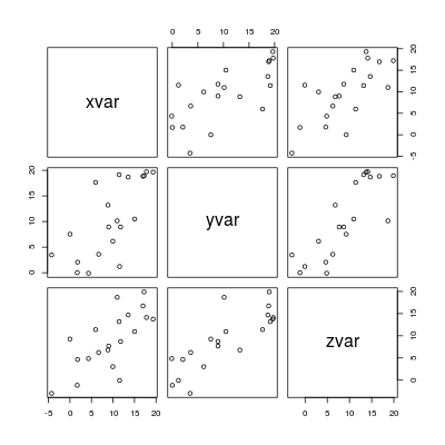
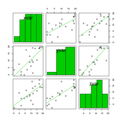 To calculate the corresponding correlation matrix, see ../../Statistical analysis/Regression and correlation.
To visualize the correlation matrix, see ../Correlation matrix.
To calculate the corresponding correlation matrix, see ../../Statistical analysis/Regression and correlation.
To visualize the correlation matrix, see ../Correlation matrix.
Box plot
Problem
You want to make a box plot.
Solution
This page shows how to make quick, simple box plots with base graphics. For more sophisticated ones, see Plotting distributions (ggplot2).
Sample data
The examples here will use the ToothGrowth data set, which has two independent variables, and one dependent variable.
head(ToothGrowth)
#> len supp dose
#> 1 4.2 VC 0.5
#> 2 11.5 VC 0.5
#> 3 7.3 VC 0.5
#> 4 5.8 VC 0.5
#> 5 6.4 VC 0.5
#> 6 10.0 VC 0.5
Simple box plots of len against supp and dose:
boxplot(len ~ supp, data=ToothGrowth)
# Even though `dose` is a numeric variable, `boxplot` will convert it to a factor
boxplot(len ~ dose, data=ToothGrowth)
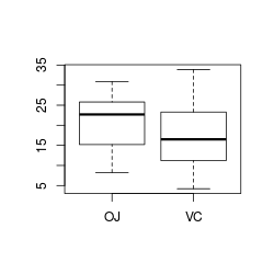
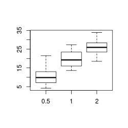 A boxplot of
 len against supp and dose together.
boxplot(len ~ interaction(dose,supp), data=ToothGrowth)
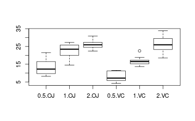 Note that
 boxplot and plot have much the same output, except that plot puts in axis labels, and doesn’t automatically convert numeric variables to factors, as was done with dose above.
plot(len ~ interaction(dose,supp), data=ToothGrowth)

Q-Q plot
Problem
You want to compare the distribution of your data to another distribution. This is often used to check whether a sample follows a normal distribution, to check whether two samples are drawn from the same distribution.
Solution
Suppose this is your data:
set.seed(183)
# Normally distributed numbers
x <- rnorm(80, mean=50, sd=5)
# Uniformly distributed numbers
z <- runif(80)
# Compare the numbers sampled with rnorm() against normal distribution
qqnorm(x)
qqline(x)
# The same numbers to the 4th power, compared to the normal distribution
qqnorm(x^4)
qqline(x^4)
# Numbers sampled from the flat distribution, compared to normal
qqnorm(z)
qqline(z)
Correlation matrix
Problem
You want to visualize the strength of correlations among many variables.
Solution
Suppose this is your data:
set.seed(955)
vvar <- 1:20 + rnorm(20,sd=3)
wvar <- 1:20 + rnorm(20,sd=5)
xvar <- 20:1 + rnorm(20,sd=3)
yvar <- (1:20)/2 + rnorm(20, sd=10)
zvar <- rnorm(20, sd=6)
# A data frame with multiple variables
data <- data.frame(vvar, wvar, xvar, yvar, zvar)
head(data)
#> vvar wvar xvar yvar zvar
#> 1 -4.252354 5.1219288 16.02193 -15.156368 -4.086904
#> 2 1.702318 -1.3234340 15.83817 -24.063902 3.468423
#> 3 4.323054 -2.1570874 19.85517 2.306770 -3.044931
#> 4 1.780628 0.7880138 17.65079 2.564663 1.449081
#> 5 11.537348 -1.3075994 10.93386 9.600835 2.761963
#> 6 6.672130 2.0135190 15.24350 -3.465695 5.749642
To make the graph:
library(ellipse)
# Make the correlation table
ctab <- cor(data)
round(ctab, 2)
#> vvar wvar xvar yvar zvar
#> vvar 1.00 0.61 -0.85 0.75 -0.21
#> wvar 0.61 1.00 -0.81 0.54 -0.31
#> xvar -0.85 -0.81 1.00 -0.63 0.24
#> yvar 0.75 0.54 -0.63 1.00 -0.30
#> zvar -0.21 -0.31 0.24 -0.30 1.00
# Make the graph, with reduced margins
plotcorr(ctab, mar = c(0.1, 0.1, 0.1, 0.1))
# Do the same, but with colors corresponding to value
colorfun <- colorRamp(c("#CC0000","white","#3366CC"), space="Lab")
plotcorr(ctab, col=rgb(colorfun((ctab+1)/2), maxColorValue=255),
mar = c(0.1, 0.1, 0.1, 0.1))
Debugging a script or function
Problem
You want to debug a script or function.
Solution
Insert this into your code at the place where you want to start debugging:
browser()
When the R interpreter reaches that line, it will pause your code and you will be able to look at and change variables.
In the browser, typing these letters will do things:
| |
|
| c |
Continue |
| n (or Return) |
Next step |
| Q |
quit |
| Ctrl-C |
go to top level |
When in the browser, you can see what variables are in the current scope.
ls()
To pause and start a browser for every line in your function:
debug(myfunction)
myfunction(x)
Useful options
By default, every time you press Enter at the browser prompt, it runs the next step. This is equivalent to pressing n and then Enter. This can be annoying. To disable it use:
options(browserNLdisabled=TRUE)
To start debugging whenever an error is thrown, run this before your function which throws an error:
options(error=recover)
If you want these options to be set every time you start R, you can put them in your ~/.Rprofile file.
Measuring elapsed time
Problem
You want to measure how much time it takes to run a particular block of code.
Solution
The system.time() function will measure how long it takes to run something in R.
system.time({
# Do something that takes time
x <- 1:100000
for (i in seq_along(x)) x[i] <- x[i]+1
})
#> user system elapsed
#> 0.144 0.002 0.153
The output means it took 0.153 seconds to run the block of code.
Getting a list of functions and objects in a package
Problem
You want to find out what’s in a package.
Solution
This code snippet will list the functions and objects in a package.
# Using search() in a new R session says that these packages are
# loaded by default:
# "package:stats" "package:graphics"
# "package:grDevices" "package:utils" "package:datasets"
# "package:methods" "package:base"
# Others that are useful:
# gplots
# ggplot2, reshape, plyr
showPackageContents <- function (packageName) {
# Get a list of things contained in a particular package
funlist <- objects(packageName)
# Remove things that don't start with a letter
idx <- grep('^[a-zA-Z][a-zA-Z0-9._]*', funlist)
funlist <- funlist[idx]
# Remove things that contain arrow <-
idx <- grep('<-', funlist)
if (length(idx)!=0)
funlist <- funlist[-idx]
# Make a data frame to keep track of status
objectlist <- data.frame(name=funlist,
primitive=FALSE,
func=FALSE,
object=FALSE,
constant=FALSE,
stringsAsFactors=F)
for (i in 1:nrow(objectlist)) {
fname <- objectlist$name[i]
if (exists(fname)) {
obj <- get(fname)
if (is.primitive(obj)) {
objectlist$primitive[i] <- TRUE
}
if (is.function(obj)) {
objectlist$func[i] <- TRUE
}
if (is.object(obj)) {
objectlist$object[i] <- TRUE
}
# I think these are generally constants
if (is.vector(obj)) {
objectlist$constant[i] <- TRUE
}
}
}
cat(packageName)
cat("\n================================================\n")
cat("Primitive functions: \n")
cat(objectlist$name[objectlist$primitive])
cat("\n")
cat("\n================================================\n")
cat("Non-primitive functions: \n")
cat(objectlist$name[objectlist$func & !objectlist$primitive])
cat("\n")
cat("\n================================================\n")
cat("Constants: \n")
cat(objectlist$name[objectlist$constant])
cat("\n")
cat("\n================================================\n")
cat("Objects: \n")
cat(objectlist$name[objectlist$object])
cat("\n")
}
# Run the function using base package
showPackageContents("package:base")
Generating counterbalanced orders
Problem
You want to generate counterbalanced sequences for an experiment.
Solution
The function latinsquare() (defined below) can be used to generate Latin squares.
latinsquare(4)
#> [,1] [,2] [,3] [,4]
#> [1,] 1 2 4 3
#> [2,] 2 1 3 4
#> [3,] 3 4 1 2
#> [4,] 4 3 2 1
# To generate 2 Latin squares of size 4 (in sequence)
latinsquare(4, reps=2)
#> [,1] [,2] [,3] [,4]
#> [1,] 3 4 1 2
#> [2,] 4 3 2 1
#> [3,] 1 2 4 3
#> [4,] 2 1 3 4
#> [5,] 4 2 1 3
#> [6,] 2 3 4 1
#> [7,] 1 4 3 2
#> [8,] 3 1 2 4
# It is better to put the random seed in the function call, to make it repeatable
# This will return the same sequence of two Latin squares every time
latinsquare(4, reps=2, seed=5873)
#> [,1] [,2] [,3] [,4]
#> [1,] 1 4 2 3
#> [2,] 4 1 3 2
#> [3,] 2 3 4 1
#> [4,] 3 2 1 4
#> [5,] 3 2 4 1
#> [6,] 1 4 2 3
#> [7,] 4 3 1 2
#> [8,] 2 1 3 4
There are 576 Latin squares of size 4. The latinsquare function will, in effect, randomly select n of these squares and return them in sequence. This is known as a replicated Latin square design.
Once you generate your Latin squares, it is a good idea to inspect them to make sure that there are not many duplicated sequences. This is not uncommon with smaller squares (3x3 or 4x4).
A function for generating Latin squares
This function generates Latin squares. It uses a somewhat brute-force algorithm to generate each square, which can sometimes fail because it runs out of available numbers to put in a given location. In such cases, it just tries again. There may be an elegant way out there to do it, but I am not aware of it.
## - len is the size of the latin square
## - reps is the number of repetitions - how many Latin squares to generate
## - seed is a random seed that can be used to generate repeatable sequences
## - returnstrings tells it to return a vector of char strings for each square,
## instead of a big matrix. This option is only really used for checking the
## randomness of the squares.
latinsquare <- function(len, reps=1, seed=NA, returnstrings=FALSE) {
# Save the old random seed and use the new one, if present
if (!is.na(seed)) {
if (exists(".Random.seed")) { saved.seed <- .Random.seed }
else { saved.seed <- NA }
set.seed(seed)
}
# This matrix will contain all the individual squares
allsq <- matrix(nrow=reps*len, ncol=len)
# Store a string id of each square if requested
if (returnstrings) { squareid <- vector(mode = "character", length = reps) }
# Get a random element from a vector (the built-in sample function annoyingly
# has different behavior if there's only one element in x)
sample1 <- function(x) {
if (length(x)==1) { return(x) }
else { return(sample(x,1)) }
}
# Generate each of n individual squares
for (n in 1:reps) {
# Generate an empty square
sq <- matrix(nrow=len, ncol=len)
# If we fill the square sequentially from top left, some latin squares
# are more probable than others. So we have to do it random order,
# all over the square.
# The rough procedure is:
# - randomly select a cell that is currently NA (call it the target cell)
# - find all the NA cells sharing the same row or column as the target
# - fill the target cell
# - fill the other cells sharing the row/col
# - If it ever is impossible to fill a cell because all the numbers
# are already used, then quit and start over with a new square.
# In short, it picks a random empty cell, fills it, then fills in the
# other empty cells in the "cross" in random order. If we went totally randomly
# (without the cross), the failure rate is much higher.
while (any(is.na(sq))) {
# Pick a random cell which is currently NA
k <- sample1(which(is.na(sq)))
i <- (k-1) %% len +1 # Get the row num
j <- floor((k-1) / len) +1 # Get the col num
# Find the other NA cells in the "cross" centered at i,j
sqrow <- sq[i,]
sqcol <- sq[,j]
# A matrix of coordinates of all the NA cells in the cross
openCell <-rbind( cbind(which(is.na(sqcol)), j),
cbind(i, which(is.na(sqrow))))
# Randomize fill order
openCell <- openCell[sample(nrow(openCell)),]
# Put center cell at top of list, so that it gets filled first
openCell <- rbind(c(i,j), openCell)
# There will now be three entries for the center cell, so remove duplicated entries
# Need to make sure it's a matrix -- otherwise, if there's just
# one row, it turns into a vector, which causes problems
openCell <- matrix(openCell[!duplicated(openCell),], ncol=2)
# Fill in the center of the cross, then the other open spaces in the cross
for (c in 1:nrow(openCell)) {
# The current cell to fill
ci <- openCell[c,1]
cj <- openCell[c,2]
# Get the numbers that are unused in the "cross" centered on i,j
freeNum <- which(!(1:len %in% c(sq[ci,], sq[,cj])))
# Fill in this location on the square
if (length(freeNum)>0) { sq[ci,cj] <- sample1(freeNum) }
else {
# Failed attempt - no available numbers
# Re-generate empty square
sq <- matrix(nrow=len, ncol=len)
# Break out of loop
break;
}
}
}
# Store the individual square into the matrix containing all squares
allsqrows <- ((n-1)*len) + 1:len
allsq[allsqrows,] <- sq
# Store a string representation of the square if requested. Each unique
# square has a unique string.
if (returnstrings) { squareid[n] <- paste(sq, collapse="") }
}
# Restore the old random seed, if present
if (!is.na(seed) && !is.na(saved.seed)) { .Random.seed <- saved.seed }
if (returnstrings) { return(squareid) }
else { return(allsq) }
}
Testing the function for randomness
Some algorithms for generating Latin squares may not create them very randomly. There are 576 unique 4x4 squares, and each one should have an equal probability of being created, but some algorithms do not properly do this. There is probably no need to test the randomness of the function above, but here is some code that will do it. Previous algorithms that I used did not have a good random distribution, which was discovered by running the code below.
This code creates 10,000 4x4 Latin squares, then counts how often each of the 576 unique squares appears. The counts should form a not-too-wide normal distribution; otherwise the distribution not very random. I believe the expected standard deviation of the distribution (assuming randomly generated squares) is sqrt(10000/576).
# Set up the size and number of squares to generate
squaresize <- 4
numsquares <- 10000
# Get number of unique squares of a given size.
# There is not a general solution to finding the number of unique nxn squares
# so we just hard-code the values here. (From http://oeis.org/A002860)
uniquesquares <- c(1, 2, 12, 576, 161280, 812851200)[squaresize]
# Generate the squares
s <- latinsquare(squaresize, numsquares, seed=122, returnstrings=TRUE)
# Get the list of all squares and counts for each
slist <- rle(sort(s))
scounts <- slist[[1]]
hist(scounts, breaks=(min(scounts):(max(scounts)+1)-.5))
cat(sprintf("Expected and actual standard deviation: %.4f, %.4f\n",
sqrt(numsquares/uniquesquares), sd(scounts) ))
#> Expected and actual standard deviation: 4.1667, 4.0883