ggplot2 cheatsheetEven the most experienced R users need help creating elegant graphics. The ggplot2 library is a phenomenal tool for creating graphics in R but even after many years of near-daily use we still need to refer to our Cheat Sheet. Up until now, we’ve kept these key tidbits on a local PDF. But for our own benefit (and hopefully yours) we decided to post the most useful bits of code.
* Last updated January 20, 2016 (with ggplot2 2.0 replace vjust with margin for title text)
You may also be interested in these other ggplot2-related posts:
Under the hood of ggplot2 graphics in R
Mapping in R using the ggplot2 package
A new data processing workflow for R: dplyr, magrittr, tidyr and ggplot2
We start with the the quick setup and a default plot followed by a range of adjustments below.
ggplot2labs(), xlab())theme(), axis.ticks.y)axis.text.x)theme(), axis.title.x)ylim, scale_x_continuous(), coord_cartesian())coord_equal())label=function(x){})legend.title)legend.title)name)legend.key)guides(), guide_legend)show_guide)guides(), override.aes)facet_wrap())facet_wrap())scales)facet_grid())pushViewport(), grid.arrange())We’re using data from the National Morbidity and Mortality Air Pollution Study (NMMAPS). To make the plots manageable we’re limiting the data to Chicago and 1997-2000. For more detail on this dataset, consult Roger Peng’s book Statistical Methods in Environmental Epidemiology with R.
You can also download the data we’re using in this post here.
library(ggplot2)
nmmaps<-read.csv("chicago-nmmaps.csv", as.is=T)
nmmaps$date<-as.Date(nmmaps$date)
nmmaps<-nmmaps[nmmaps$date>as.Date("1996-12-31"),]
nmmaps$year<-substring(nmmaps$date,1,4)
head(nmmaps)
##      city       date death temp dewpoint   pm10     o3 time season year
## 3654 chic 1997-01-01   137 36.0    37.50 13.052  5.659 3654 winter 1997
## 3655 chic 1997-01-02   123 45.0    47.25 41.949  5.525 3655 winter 1997
## 3656 chic 1997-01-03   127 40.0    38.00 27.042  6.289 3656 winter 1997
## 3657 chic 1997-01-04   146 51.5    45.50 25.073  7.538 3657 winter 1997
## 3658 chic 1997-01-05   102 27.0    11.25 15.343 20.761 3658 winter 1997
## 3659 chic 1997-01-06   127 17.0     5.75  9.365 14.941 3659 winter 1997
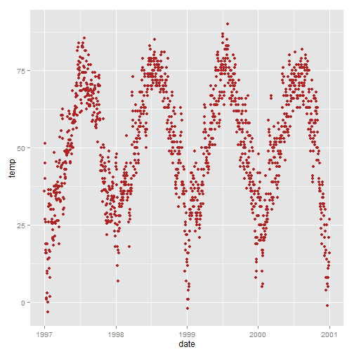
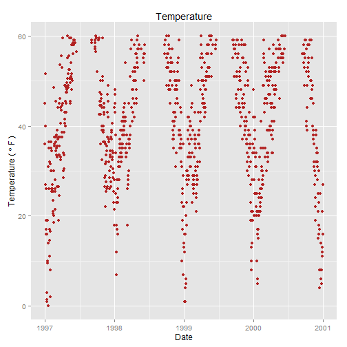
ggplot2g<-ggplot(nmmaps, aes(date, temp))+geom_point(color="firebrick")
g
ggtitle() or labs())g<-g+ggtitle('Temperature')
g
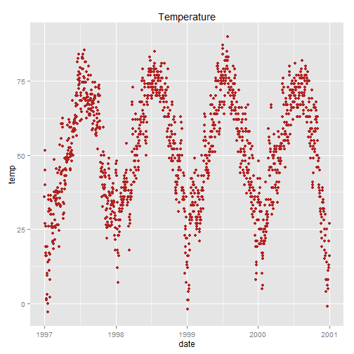
Alternatively, you can use g+labs(title='Temperature')
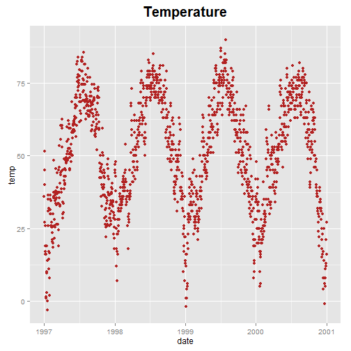
face, margin)In ggplot2 versions before 2.0 I used the vjust argument to move the title away from the plot. With 2.0 this no longer works and a blog comment (below) helped me identify an alternative using this link. The margin argument uses the margin function and you provide the top, right, bottom and left margins (the default unit is points).
g+theme(plot.title = element_text(size=20, face="bold",
    margin = margin(10, 0, 10, 0)))
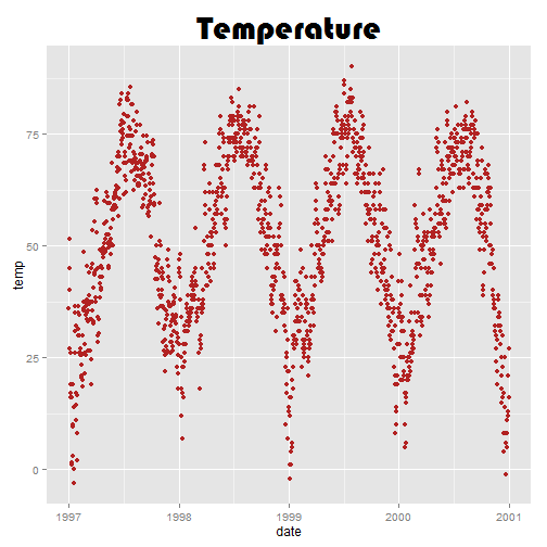
family)Note that you can also use different fonts. It’s not as easy as it seems here, check out this post if you need to use different fonts. This may not work on a Mac (send me a note and let me know).
If you are having trouble with this you might take a look at this StackOverflow discussion.
library(extrafont)
g+theme(plot.title = element_text(size=30,lineheight=.8,
  vjust=1,family="Bauhaus 93"))
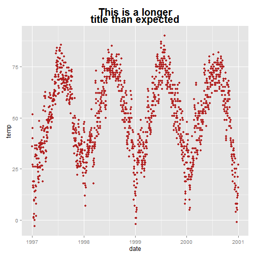
lineheight)You can use the lineheight argument to change the spacing between lines. In this example, I’ve squished the lines together a bit (lineheight < 1).
g<-g+ggtitle("This is a longer\ntitle than expected")
g+theme(plot.title = element_text(size=20, face="bold", vjust=1, lineheight=0.6))
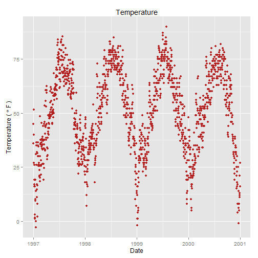
labs(), xlab())The easiest is:
g<-g+labs(x="Date", y=expression(paste("Temperature ( ", degree ~ F, " )")), title="Temperature")
g
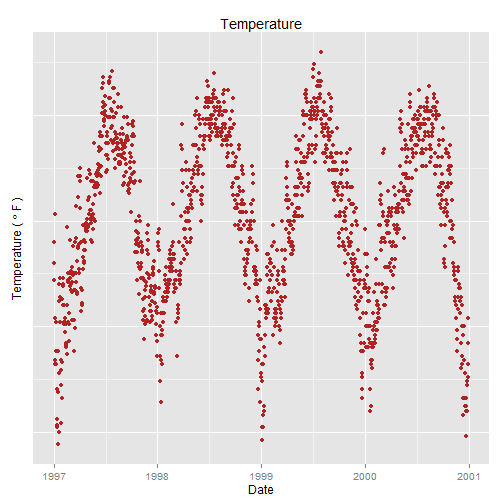
theme(), axis.ticks.y)I wouldn’t normally do this but demonstration purposes:
g + theme(axis.ticks.y = element_blank(),axis.text.y = element_blank())
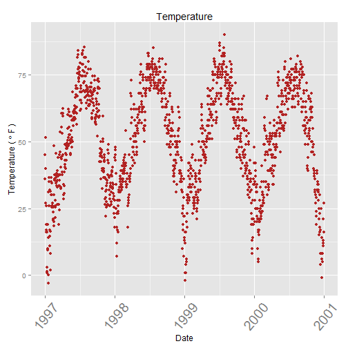
axis.text.x)Go ahead, try to say ‘tick text’ three times fast.
g + theme(axis.text.x=element_text(angle=50, size=20, vjust=0.5))
theme(), axis.title.x)I find that the labels are too close to the plot in the default settings so, similar to with the title, I’m using the vjust argument.
g + theme(
      axis.title.x = element_text(color="forestgreen", vjust=-0.35),
      axis.title.y = element_text(color="cadetblue" , vjust=0.35)
          )

ylim(), scale_x_continuous(), coord_cartesian())Again, this plot is for demonstration purposes:
g + ylim(c(0,60))
Alternatively: g+scale_x_continuous(limits=c(0,35)) or g+coord_cartesian(xlim=c(0,35)). The former removes all data points outside the range and second adjusts the visible area.
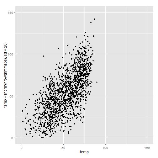
coord_equal())There must be a better way than this. In the example, I’m plotting temperature against temperature with some random noise (for demonstration purposes) and I want both axes to be the same scale/same range.
ggplot(nmmaps, aes(temp, temp+rnorm(nrow(nmmaps), sd=20)))+geom_point()+
  xlim(c(0,150))+ylim(c(0,150))+
  coord_equal()
label=function(x){})Sometimes it’s handy to alter your labels a little, perhaps adding units or percent signs without adding them to your data. You can use a function in this case. Here is an example:
ggplot(nmmaps, aes(date, temp))+
  geom_point(color="grey")+
  labs(x="Month", y="Temp")+
  scale_y_continuous(label=function(x){return(paste("My value is", x, "degrees"))})
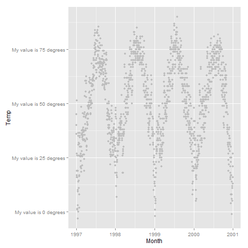
Not pretty here, but this can come in handy.
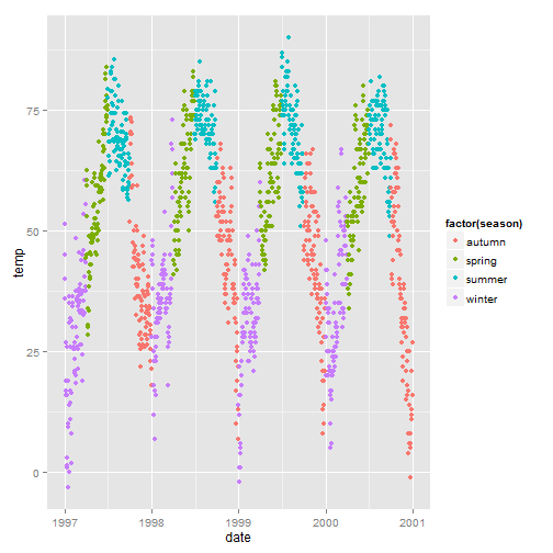
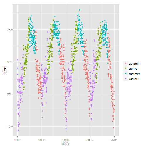
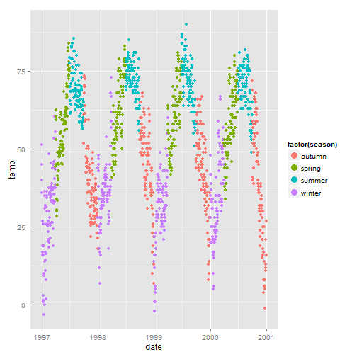
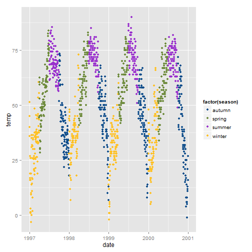
We will color code the plot based on season. You can see that by default the legend title is what we specified in the color argument.
g<-ggplot(nmmaps, aes(date, temp, color=factor(season)))+geom_point()
g
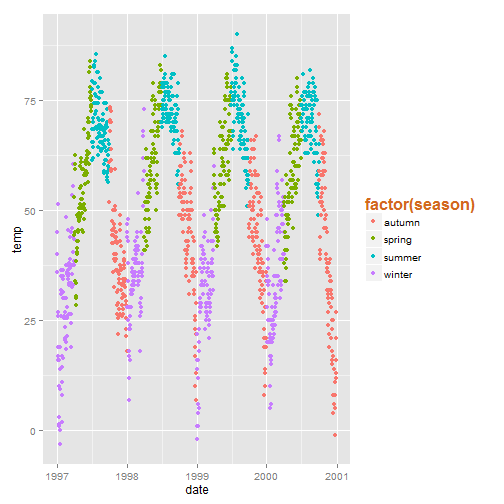
legend.title)g+theme(legend.title=element_blank())
legend.title)g+theme(legend.title = element_text(colour="chocolate", size=16, face="bold"))
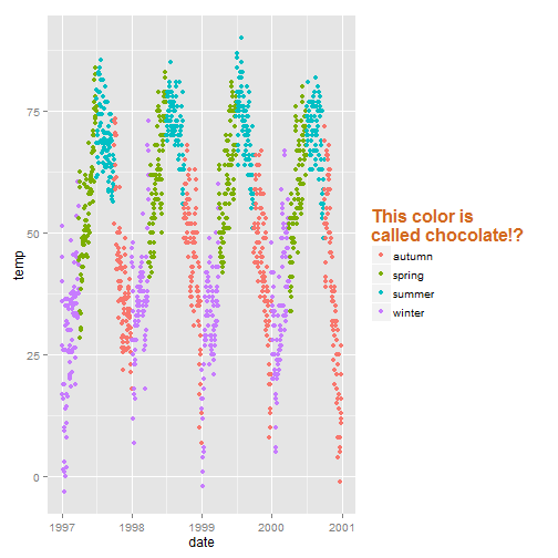
name)To change the title of the legend you would use the name argument in your scale function. If you don’t use a `scale` function you will need to change the data itself so that it has the right format.
g+theme(legend.title = element_text(colour="chocolate", size=16, face="bold"))+
  scale_color_discrete(name="This color is\ncalled chocolate!?")
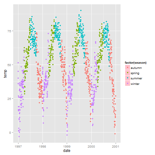
legend.key)I have mixed feelings about those boxes. If you want to get rid of them entirely use fill=NA.
g+theme(legend.key=element_rect(fill='pink'))
guides(), guide_legend)Points in the legend get a little lost, especially without the boxes. To override the default try:
g+guides(colour = guide_legend(override.aes = list(size=4)))
show_guide)Let’s say you have a point layer and you add label text to it. By default, both the points and the label text end up in the legend like this (again, who would make a plot like this? It’s for demonstration purposes):
g+geom_text(data=nmmaps, aes(date, temp, label=round(temp)), size=4)
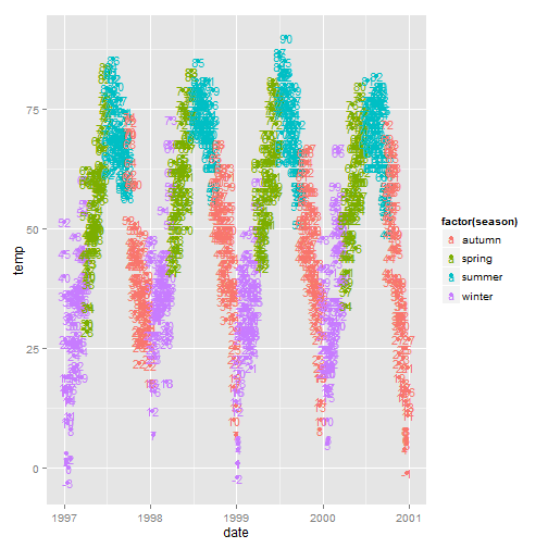
You can use show_guide=FALSE to turn a layer off in the legend. Useful!
g+geom_text(data=nmmaps, aes(date, temp, label=round(temp), size=4), show_guide=FALSE)

guides(), override.aes)ggplot2 will not add a legend automatically unless you map aethetics (color, size etc) to a variable. There are times, though, that I want to have a legend so that it’s clear what you’re plotting. Here is the default:
# here there is no legend automatically
ggplot(nmmaps, aes(x=date, y=o3))+geom_line(color="grey")+geom_point(color="red")
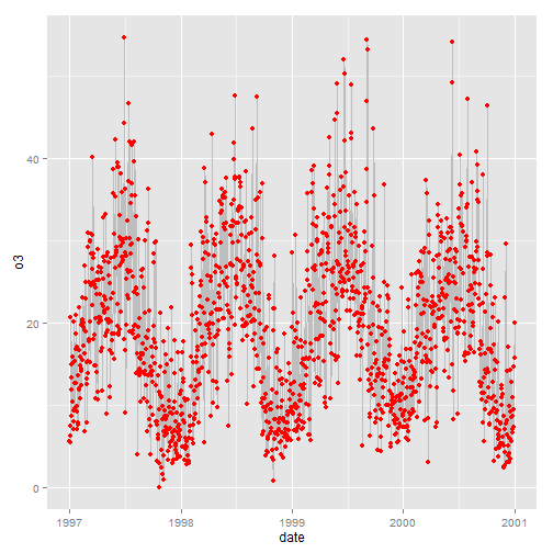
We can force a legend by mapping to a “variable”. We are mapping the lines and the points using aes and we are mapping not to a variable in our dataset but to a single string (so that we get just one color for each).
ggplot(nmmaps, aes(x=date, y=o3))+geom_line(aes(color="Important line"))+
  geom_point(aes(color="My points"))
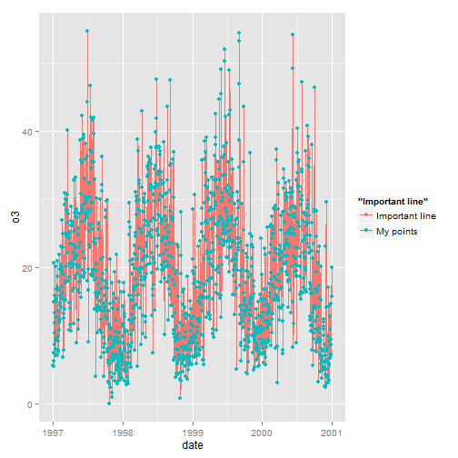
We’re getting close but this is not what I want. I wanted grey and red. To change the color, we use scale_colour_manual().
ggplot(nmmaps, aes(x=date, y=o3))+geom_line(aes(color="Important line"))+
   geom_point(aes(color="Point values"))+
  scale_colour_manual(name='', values=c('Important line'='grey', 'Point values'='red'))
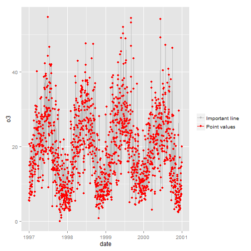
Tantalizingly close! But we don’t want a line with a point for both. Line=grey and point=red. The final step is to override the aesthetics in the legend. The guide() function allows us to control guides like the legend:
ggplot(nmmaps, aes(x=date, y=o3))+geom_line(aes(color="Important line"))+
   geom_point(aes(color="Point values"))+
  scale_colour_manual(name='', values=c('Important line'='grey', 'Point values'='red'), guide='legend') +
  guides(colour = guide_legend(override.aes = list(linetype=c(1,0)
                                                      , shape=c(NA, 16))))

Voila!
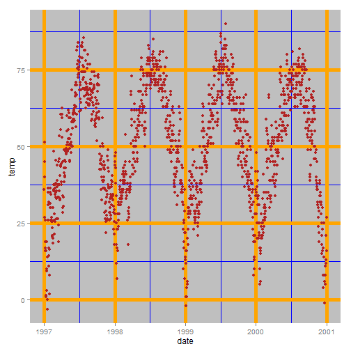
There are ways to change the entire look of your plot with one function (see below) but if you want to simply change the background color of the panel you can use the following:
panel.background)ggplot(nmmaps, aes(date, temp))+geom_point(color="firebrick")+
theme(panel.background = element_rect(fill = 'grey75'))
panel.grid.major)ggplot(nmmaps, aes(date, temp))+geom_point(color="firebrick")+
theme(panel.background = element_rect(fill = 'grey75'),
panel.grid.major = element_line(colour = "orange", size=2),
panel.grid.minor = element_line(colour = "blue"))
plot.background)ggplot(nmmaps, aes(date, temp))+geom_point(color="firebrick")+
theme(plot.background = element_rect(fill = 'grey'))
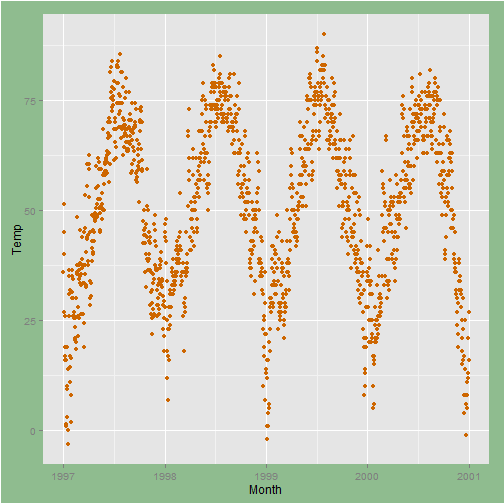
plot.margin)I sometimes find that I need to add a little space to one margin of my plot. Similar to the previous examples we can use an argument to the theme() function. In this case the argument is plot.margin. In order to illustrate I’m going to add a background color using plot.background so you can see the default:
# the default
ggplot(nmmaps, aes(date, temp))+
  geom_point(color="darkorange3")+
  labs(x="Month", y="Temp")+
  theme(plot.background=element_rect(fill="darkseagreen"))
Now let’s add extra space to both the left and right. The argument, plot.margin, can handle a variety of different units (cm, inches etc) but it requires the use of the function unit from the package grid to specify the units. Here I’m using a 6 cm margin on the right and left.
library(grid)
ggplot(nmmaps, aes(date, temp))+
  geom_point(color="darkorange3")+
  labs(x="Month", y="Temp")+
  theme(plot.background=element_rect(fill="darkseagreen"),
        plot.margin = unit(c(1, 6, 1, 6), "cm")) #top, right, bottom, left
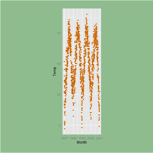
Again, not a pretty plot!
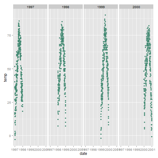
The ggplot2 package has two nice functions for creating multi-panel plots. They are related but a little different facet_wrap creates essentially a ribbon of plots based on a single variable while facet_grid can take two variables.
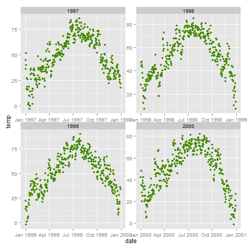
facet_wrap())ggplot(nmmaps, aes(date,temp))+geom_point(color="aquamarine4")+facet_wrap(~year, nrow=1)
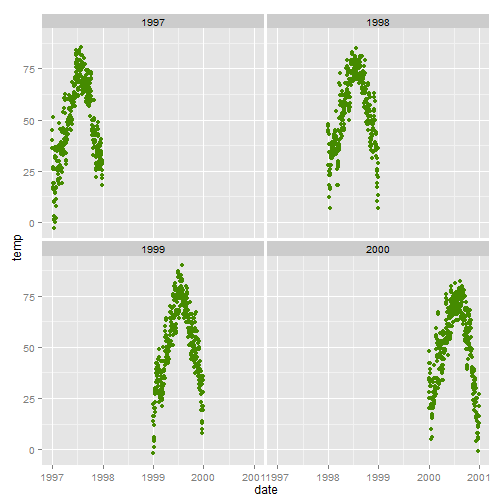
facet_wrap())ggplot(nmmaps, aes(date,temp))+geom_point(color="chartreuse4")+
facet_wrap(~year, ncol=2)
scales)The default for multi-panel plots in ggplot2 is to use equivalent scales in each panel. But sometimes you want to allow a panel’s own data to determine the scale. This is not often a good idea since it may give your user the wrong impression about the data but to do this you can set scales="free" like this:
ggplot(nmmaps, aes(date,temp))+geom_point(color="chartreuse4")+
  facet_wrap(~year, ncol=2, scales="free")
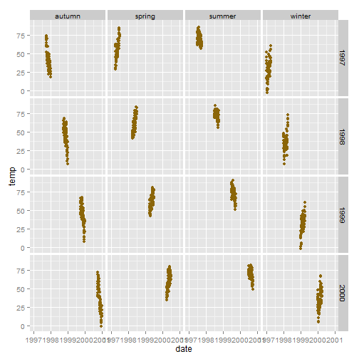
facet_grid())ggplot(nmmaps, aes(date,temp))+geom_point(color="darkgoldenrod4")+
facet_grid(year~season)
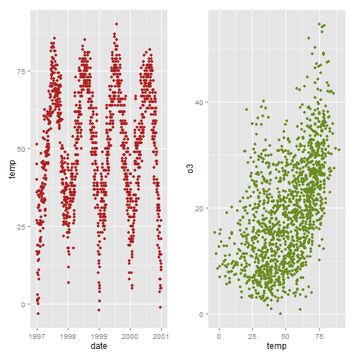
pushViewport(), grid.arrange())I find that doing this is not nearly as straightforward as traditional (base) graphics. Here are two approaches:
myplot1<-ggplot(nmmaps, aes(date, temp))+geom_point(color="firebrick")
myplot2<-ggplot(nmmaps, aes(temp, o3))+geom_point(color="olivedrab")

library(grid)
pushViewport(viewport(layout = grid.layout(1, 2)))
print(myplot1, vp = viewport(layout.pos.row = 1, layout.pos.col = 1))
print(myplot2, vp = viewport(layout.pos.row = 1, layout.pos.col = 2))

# alternative, a little easier
library(gridExtra)
grid.arrange(myplot1, myplot2, ncol=2)
To change from row to column arrangement you can change facet_grid(season~year) to facet_grid(year~season).
You can change the entire look of the plots by using custom theme. As an example, Jeffrey Arnold has put together the library ggthemes with several custom themes. For a list you can visit the ggthemes site. Here is an example:
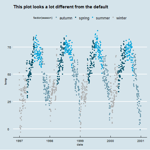
theme_XX())library(ggthemes)
ggplot(nmmaps, aes(date, temp, color=factor(season)))+
geom_point()+ggtitle("This plot looks a lot different from the default")+
theme_economist()+scale_colour_economist()
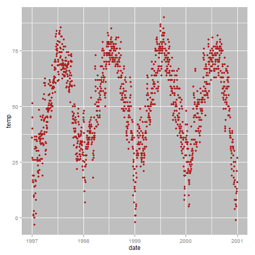
Personally, I find default size of the tick text, legends and other elements to be a little too small. Luckily it’s incredibly easy to change the size of all the text elements at once. If you look below at the section on creating a custom theme you’ll notice that the sizes of all the elements are relative (rel()) to the base_size. As a result, you can simply change the base_size and you’re done. Here is the code:
theme_set(theme_gray(base_size = 30))
ggplot(nmmaps, aes(x=date, y=o3))+geom_point(color="red")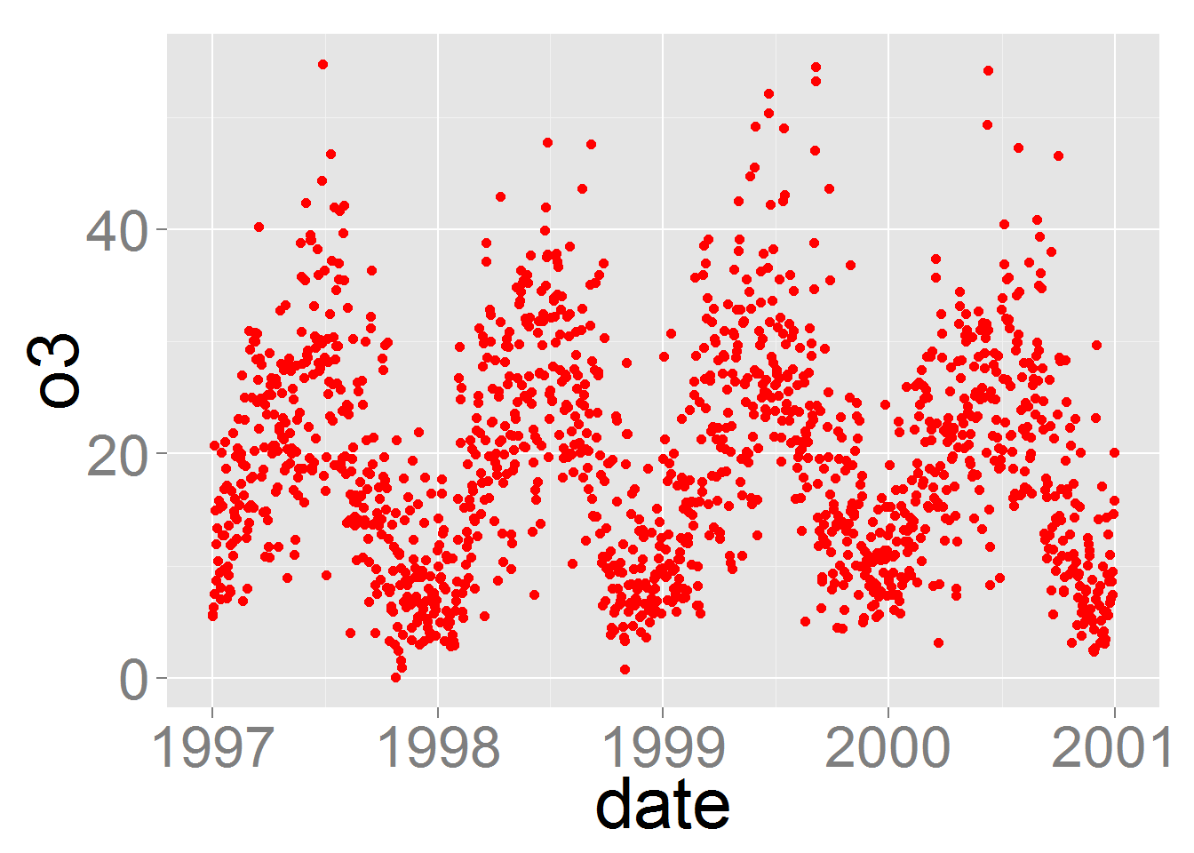
If you want to change the theme for an entire session you can use theme_set as in theme_set(theme_bw()). The default is called theme_gray. If you wanted to create your own custom theme, you could extract the code directly from the gray theme and modify. Note that the rel() function change the sizes relative to the base_size.
theme_gray

function (base_size = 12, base_family = "")
{
  theme(
    line = element_line(colour = "black", size = 0.5, linetype = 1, lineend = "butt"),
    rect = element_rect(fill = "white", colour = "black", size = 0.5, linetype = 1),
    text = element_text(family = base_family, face = "plain", colour = "black", size = base_size, hjust = 0.5, vjust = 0.5, angle = 0, lineheight = 0.9),

    axis.text = element_text(size = rel(0.8), colour = "grey50"),
    strip.text = element_text(size = rel(0.8)),
    axis.line = element_blank(),
    axis.text.x = element_text(vjust = 1),
    axis.text.y = element_text(hjust = 1),
    axis.ticks = element_line(colour = "grey50"),
    axis.title.x = element_text(),
    axis.title.y = element_text(angle = 90),
    axis.ticks.length = unit(0.15, "cm"),
    axis.ticks.margin = unit(0.1, "cm"),

    legend.background = element_rect(colour = NA),
    legend.margin = unit(0.2, "cm"),
    legend.key = element_rect(fill = "grey95", colour = "white"),
    legend.key.size = unit(1.2, "lines"),
    legend.key.height = NULL,
    legend.key.width = NULL,
    legend.text = element_text(size = rel(0.8)),
    legend.text.align = NULL,
    legend.title = element_text(size = rel(0.8), face = "bold", hjust = 0),
    legend.title.align = NULL,
    legend.position = "right",
    legend.direction = NULL,
    legend.justification = "center",
    legend.box = NULL,

    panel.background = element_rect(fill = "grey90", colour = NA),
    panel.border = element_blank(),
    panel.grid.major = element_line(colour = "white"),
    panel.grid.minor = element_line(colour = "grey95", size = 0.25),
    panel.margin = unit(0.25, "lines"),
    panel.margin.x = NULL,
    panel.margin.y = NULL,

    strip.background = element_rect(fill = "grey80", colour = NA),
    strip.text.x = element_text(),
    strip.text.y = element_text(angle = -90),

    plot.background = element_rect(colour = "white"),
    plot.title = element_text(size = rel(1.2)),
    plot.margin = unit(c(1, 1, 0.5, 0.5), "lines"), complete = TRUE)
}
For simple applications working with colors is straightforward in ggplot2 but when you have more advanced needs it can be a challenge. For a more advaned treatment of the topic you should probably get your hands on Hadley’s book which has nice coverage. There are a few other good sources including the R Cookbook and the ggplot2 online docs. Tian Zheng at Columbia has created a useful PDF of R colors.
In order to use color with your data, most importantly, you need to know if you’re dealing with a categorical or continuous variable.
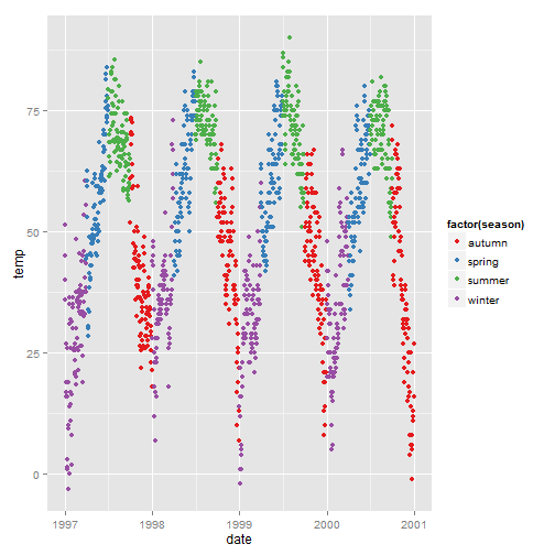
scale_color_manual())ggplot(nmmaps, aes(date, temp, color=factor(season)))+
geom_point() +
scale_color_manual(values=c("dodgerblue4", "darkolivegreen4",
"darkorchid3", "goldenrod1"))
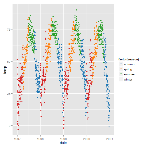
scale_color_brewer()):ggplot(nmmaps, aes(date, temp, color=factor(season)))+
geom_point() +
scale_color_brewer(palette="Set1")
How about using the Tableau colors (but you need the library ggthemes):
library(ggthemes)
ggplot(nmmaps, aes(date, temp, color=factor(season)))+
  geom_point() +
  scale_colour_tableau()
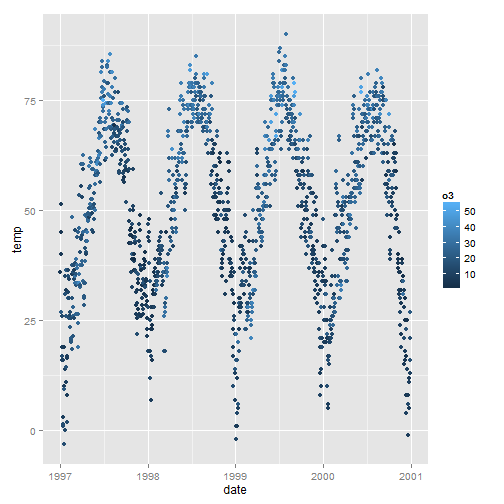
scale_color_gradient(), scale_color_gradient2())In our example we will change the color variable to ozone, a continuous variable that is strongly related to temperature (higher temperature = higher ozone). The function scale_color_gradient() is a sequential gradient while scale_color_gradient2() is diverging.
Here is a default continuous color scheme (sequential color scheme):
ggplot(nmmaps, aes(date, temp, color=o3))+geom_point()
# this code produces an identical plot
#ggplot(nmmaps, aes(date, temp, color=o3))+geom_point()+scale_color_gradient()
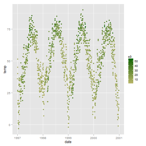
Manually change the low and high colors (sequential color scheme):
ggplot(nmmaps, aes(date, temp, color=o3))+geom_point()+
  scale_color_gradient(low="darkkhaki", high="darkgreen")
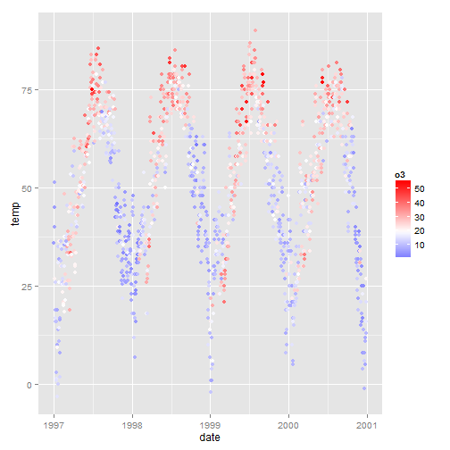
The temperature data is normally distributed so how about a diverging color scheme (rather than sequential). For diverging color you can use the scale_color_gradient2 function.
mid<-mean(nmmaps$o3)
ggplot(nmmaps, aes(date, temp, color=o3))+geom_point()+
scale_color_gradient2(midpoint=mid,
                      low="blue", mid="white", high="red" )
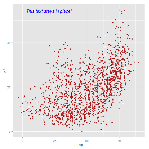
annotation_custom() and textGrob())I often have trouble figuring out the best way to add text to a plot in say, the top left corner, without using hard-coded coordinates. With ggplot2 you can set annotation coordinates to Inf but I find this only moderately useful. Here is an example (based on code from here) using the library grid that allows you to specify the location based on scaled coordinates where 0 is low and 1 is high.
The grobTree function (from grid) creates a grid graphical object and textGrob creates the text graphical object. The annotation_custom() function comes from ggplot2 and is designed to use a grob as input.
library(grid)

my_grob = grobTree(textGrob("This text stays in place!", x=0.1,  y=0.95, hjust=0,
  gp=gpar(col="blue", fontsize=15, fontface="italic")))

ggplot(nmmaps, aes(temp, o3))+geom_point(color="firebrick")+
  annotation_custom(my_grob)
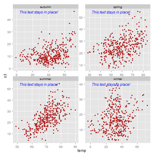
‘Big deal’ you say!? It is a big deal. The value here is particularly evident when you have multiple plots with different scales. In the plot below you see that the axis scales vary yet the same code as above can be used to put the annotation is the same place on each facet. Nice!
library(grid)

my_grob = grobTree(textGrob("This text stays in place!", x=0.1,  y=0.95, hjust=0,
  gp=gpar(col="blue", fontsize=12, fontface="italic")))

ggplot(nmmaps, aes(temp, o3))+geom_point(color="firebrick")+facet_wrap(~season, scales="free")+
  annotation_custom(my_grob)
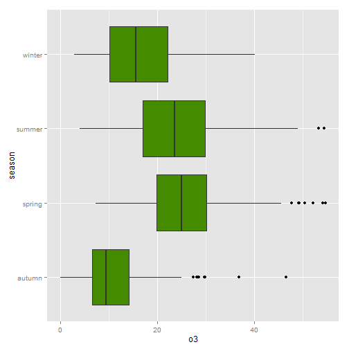
coord_flip())It is incredibly easy to flip your plot on it’s side. Here I’ve added the coord_flip() which is all you need to flip the plot.
ggplot(nmmaps, aes(x=season, y=o3))+geom_boxplot(fill="chartreuse4")+coord_flip()
geom_jitter() and geom_violin())Box plots are great, but they can be so incredibly boring. There are alternatives, first – a box plot:
g<-ggplot(nmmaps, aes(x=season, y=o3))
g+geom_boxplot(fill="darkseagreen4")
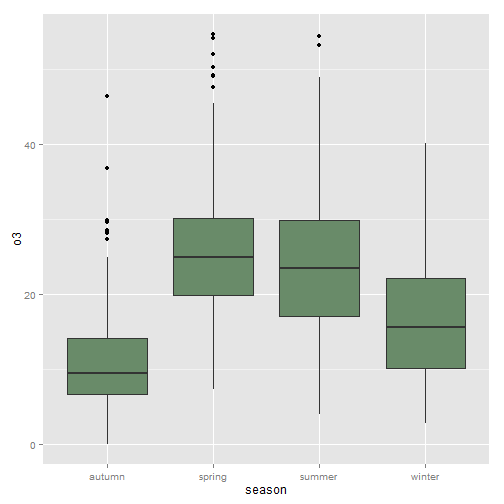
Effective, yes. Interesting, no.
What if we plot the points themselves?
g+geom_point()
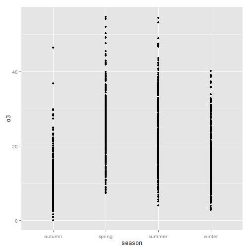
Not only boring but uninformative, you could add transparency to deal with overplotting, but this is not good either. Let’s try something else.
geom_jitter())Try adding a little jitter to the data. I like this for in-house visualization but be careful using jittering because you’re purposely adding noise to your data and this can result in misinterpretation of your data.
g+geom_jitter(alpha=0.5, aes(color=season),position = position_jitter(width = .2))
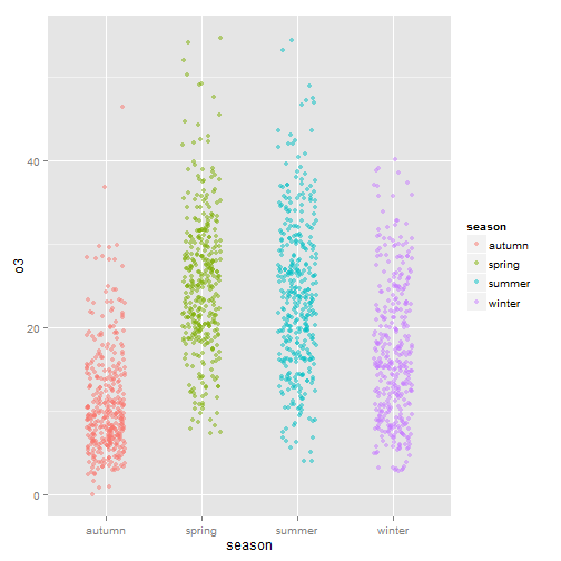
This is better and I think since we’re working with season, a variable everyone will be familiar with, the extra noise will not likely lead to confusion.
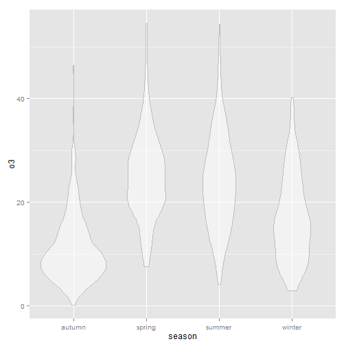
geom_violin())Violin plots, similar to box plots except you’re using a kernel density to show where you have the most data, are a useful visualization.
g+geom_violin(alpha=0.5, color="gray")
What if we rotated and added the jittered points.
g+geom_violin(alpha=0.5, color="gray")+geom_jitter(alpha=0.5, aes(color=season),
      position = position_jitter(width = 0.1))+coord_flip()
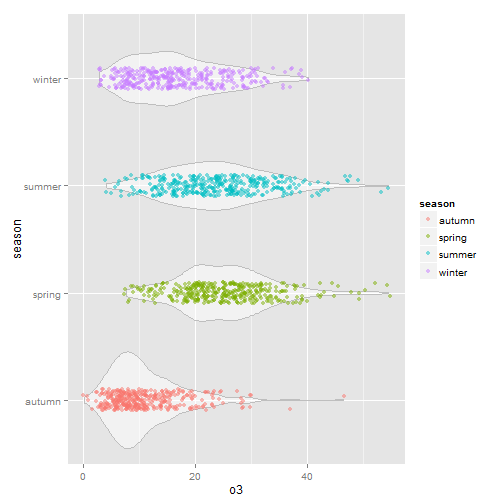
This is nice and I like it. But be wary of using unusual plot types, they take more time for your users to understand. Sometimes the simplest and most conventional plot type is your best bet when sharing with others. Box plots may be boring but people know how to interpret them immediately.
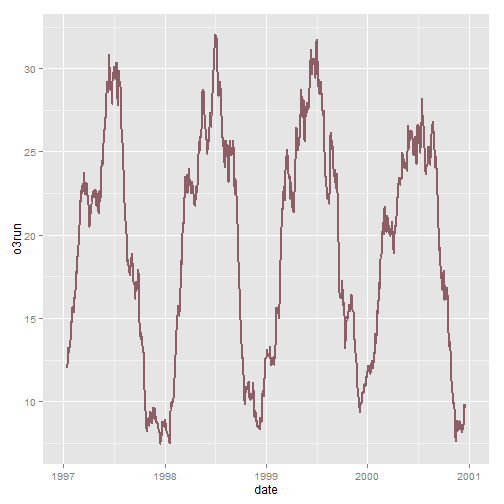
geom_ribbon())This is not the perfect dataset for this, but using ribbon can be useful. In this example we will create a 30-day running average using the filter() function so that our ribbon is not too noisy.
# add a filter
nmmaps$o3run<-as.numeric(filter(nmmaps$o3, rep(1/30,30), sides=2))
ggplot(nmmaps, aes(date, o3run))+geom_line(color="lightpink4", lwd=1)
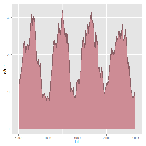
How does it look if we fill in the area below the curve using the geom_ribbon() function?
# add a filter

ggplot(nmmaps, aes(date, o3run))+geom_ribbon(aes(ymin=0, ymax=o3run), fill="lightpink3", color="lightpink3")+
  geom_line(color="lightpink4", lwd=1)
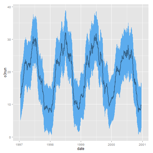
Above is not really the conventional way to use geom_ribbon(). Instead, why don’t we draw a ribbon that gives us one standard deviation above and below our data:
nmmaps$mino3<-nmmaps$o3run-sd(nmmaps$o3run, na.rm=T)
nmmaps$maxo3<-nmmaps$o3run+sd(nmmaps$o3run, na.rm=T)

ggplot(nmmaps, aes(date, o3run))+geom_ribbon(aes(ymin=mino3, ymax=maxo3), fill="steelblue2", color="steelblue2")+
  geom_line(color="steelblue4", lwd=1)
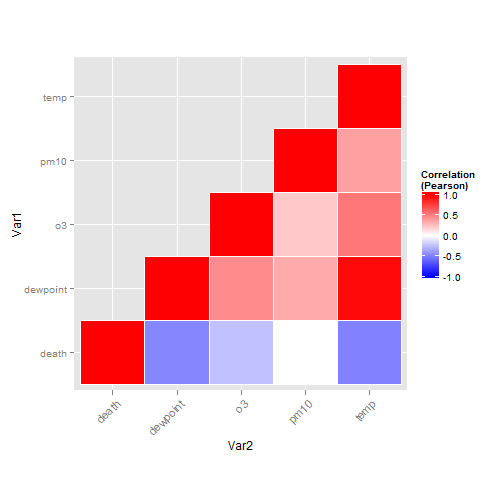
geom_tile())I’ll admit that I find creating tiled correlation plots a bit cumbersome, I always have to copy and paste code from a previous project. Nevertheless, it’s a useful plot type so I’m posting the code here.
First step is to create the correlation matrix. I’m using Pearson because all the variables are fairly normally distributed – you may want to consider Spearman if your variables follow a different pattern. Note that since a correlation matrix has redundant information I’m setting half of it to NA.
#careful, I'm sorting the field names so that the ordering in the final plot is correct
thecor<-round(cor(nmmaps[,sort(c("death", "temp", "dewpoint", "pm10", "o3"))], method="pearson", use="pairwise.complete.obs"),2)
thecor[lower.tri(thecor)]<-NA
thecor
##          death dewpoint    o3 pm10  temp
## death        1    -0.47 -0.24 0.00 -0.49
## dewpoint    NA     1.00  0.45 0.33  0.96
## o3          NA       NA  1.00 0.21  0.53
## pm10        NA       NA    NA 1.00  0.37
## temp        NA       NA    NA   NA  1.00
Now I’m going to put it in “long” format using the melt function from the reshape2 package and I’ll drop the records with NA values.
library(reshape2)

thecor<-melt(thecor)
thecor$Var1<-as.character(thecor$Var1)
thecor$Var2<-as.character(thecor$Var2)
thecor<-na.omit(thecor)
head(thecor)
##        Var1     Var2 value
## 1     death    death  1.00
## 6     death dewpoint -0.47
## 7  dewpoint dewpoint  1.00
## 11    death       o3 -0.24
## 12 dewpoint       o3  0.45
## 13       o3       o3  1.00
Now for the plot. I’m using geom_tile but if you have a lot of data you might consider geom_raster which can be much faster.
ggplot(thecor, aes(Var2, Var1))+
 geom_tile(data=thecor, aes(fill=value), color="white")+
 scale_fill_gradient2(low="blue", high="red", mid="white",
  midpoint=0, limit=c(-1,1),name="Correlation\n(Pearson)")+
 theme(axis.text.x = element_text(angle=45, vjust=1, size=11, hjust=1))+
 coord_equal()
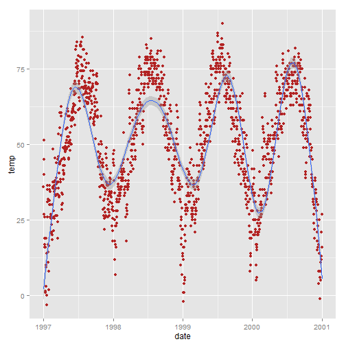
You’ve likely already learned how amazingly easy it is to add a smooth to your data using ggplot2. You can simply use stat_smooth() which will add a LOESS smooth if you have fewer than 1000 points or a GAM otherwise. Since we have more than 1000 points the smooth is a GAM.
stat_smooth())Here it is at its simplest – no formula required:
ggplot(nmmaps, aes(date, temp))+geom_point(color="firebrick")+
  stat_smooth()
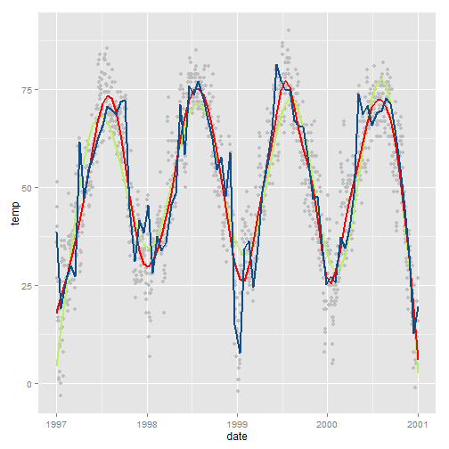
stat_smooth(formula=))But ggplot2 allows you to specify the model you want it to use. For example, let’s say you want to increase the GAM dimension (add some additional wiggles to the smooth):
ggplot(nmmaps, aes(date, temp))+
  geom_point(color="grey")+
  stat_smooth(method="gam", formula=y~s(x,k=10), col="darkolivegreen2", se=FALSE, size=1)+
  stat_smooth(method="gam", formula=y~s(x,k=30), col="red", se=FALSE, size=1)+
  stat_smooth(method="gam", formula=y~s(x,k=500), col="dodgerblue4", se=FALSE, size=1)
stat_smooth(method="lm"))Though the default is a smooth, it is also easy to add a standard linear fit:
ggplot(nmmaps, aes(temp, death))+geom_point(color="firebrick")+
  stat_smooth(method="lm", se=FALSE)
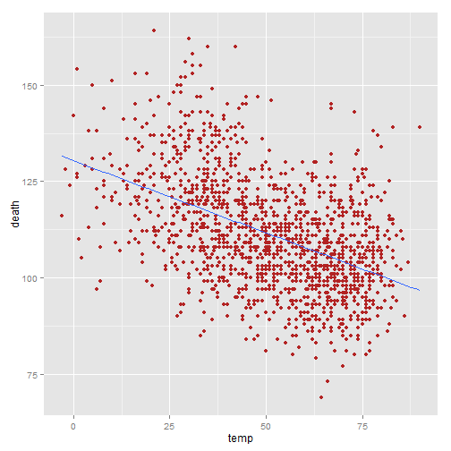
Note that the same could be achieved using the more cumbersome:
lmTemp<-lm(death~temp, data=nmmaps)
ggplot(nmmaps, aes(temp, death))+geom_point(col="firebrick")+
  geom_abline(intercept=lmTemp$coef[1], slope=lmTemp$coef[2])
Plot.ly is a great tool for easily creating online, interactive graphics directly from your ggplot2 plots. The process is surprisingly easy, and can be done from within R, but there are enough steps that I describe how to create graphics like the one below in a separate post.
If this plot is not visible it is being throttled by plot.ly which limits free plot hosting to 500 views per day.