Inkscape is available for Microsoft Windows operating systems from XP up toWindows 10. There are two basic methods for installing Inkscape ontocomputers with a Windows operating system. One method is downloadingand installing directly from Inkscape and the other is installing itfrom the Microsoft App store. A description of both methods ispresented here.
Attention
If you had previously installed Inkscape onto your computer, you will needto uninstall that version before installing the new version.
Method 1: Downloading and installing directly from Inkscape
Using a Web browser, go to the Inkscape website’s download page forWindows and select the best download for your system.
If you are unsure if you need the 32-bit or 64-bit version, read the section about: Identifying Your System Architecture first.
Select an installation method from the available choices (: portable) and wait for it todownload.
You should either see a window giving you the option to savethe file, or a pop-up appear in your web browser withthe file’s name and a timer stating how long until the download iscomplete.
Once the download is complete, either click on the file in the lowerleft corner of your screen to start the installation process or, if needbe, go to your file explorer, open your downloads folder and selectthe file from there.
It should be the first file at the top of thefolder.
OR
If you get a User Account Control pop-up from Windows similarto the following one click “OK” and wait for the Inkscape installation program to start.
Select what language you want to use during the installation andclick OK.
Then click Next on both the followingwelcome screen and license agreement screen.
On the Choose Components screen you can select which featuresyou want to install or not install.
In most cases the default options should provide all that the user needs, so click Next.
On the Choose Install Location window leave the destinationfolder as C:\ProgramFiles\Inkscape and clickInstall unless you want Inkscape to be installed in aspecific location on your computer.
(Optional step)
If you do want to install Inkscape in a specific location on yourcomputer, click the Browse button and in the resulting windoweither make a new folder for Inkscape and select it or select thedestination folder you want Inkscape to be installed to.
Once you click Install, a progress bar will appear showinghow long it will take for your program to install.
After the installation is complete, click Finish andthe installer will automatically open Inkscape for you.
You areready to begin working with Inkscape.
Method 2: Installing from the Microsoft App store
You can also install Inkscape onto your Windows computer from theMicrosoft App store.
If you have the Windows 10 Education version thiswill be the only way you can install Inkscape.
Note
You will need a Microsoft account to install apps from the Microsoft store.
If you already have an account, skip the following steps on how to make one.
To create a Microsoft account using a Web browser go tohttps://login.live.com/and select Create one!.
On the following page enter in the email address or phone number thatyou would like to link your Microsoft Account to and then click Next.There is also the option to get a new email address from Microsoft.
Note
We will be using a preexisting email for this example but if youwant to create a new email the process for making a Microsoft email ispretty straight forward.
Enter a password that you wish to use with your new Microsoft accountand click Next.
Enter in your first and last name then click Next.
Enter the country/region in which you live and your birthdate.
Check the email you used to create the account and find the emailfrom Microsoft.
Enter the codefrom the email into the web form and clickNext.
Enter your phone number and then click send code to receivethe security code, then click Next.
On the following page verify that the information is correct andclick Looks good! and your Microsoft Account is ready for use.
From the task bar at the bottom of your screen click the MicrosoftStore icon or enter ‘store’ into the search bar and select ‘MicrosoftStore’ from the results.
OR
Enter ‘Inkscape’ into the Microsoft Store search bar and select‘Inkscape’ from the results.
In the following windows to install Inkscape click Get andthen enter your Microsoft account username and then password in thewindow that pops up.
After signing into your Microsoft Account click Install andthe installation will begin.
Once the download and installation is complete click Launchand you are ready to begin working with Inkscape.
Congratulations! You have now installed Inkscape onto your Windowscomputer.
If you need further help, please visit the FAQ section for Windowsspecific problems on the Inkscape website.
Identifying Your System Architecture
Before you can begin to download Inkscape, you must first know what typeof operating system (OS) you have, 32-bit or 64-bit.
If you already knowwhat type of operating system you have please skip this section and gothe section on downloading Inkscape.
Method 1: Using Keyboard Shortcuts
Press Win + r to open the Windows Run dialog.
Type “msinfo32” and press Enter.
Now in the new dialog, toward the middle of the screen, you should see anoption that says System Type.
Write down the associated information.
You will need this to select the correct Inkscape download file for yoursystem.
Method 2: Using the mouse
Click on the magnifying glass to open a search dialog and type‘system’.
Click to open the System control panel.
Depending on the version of MS Windows on your computer, you may see one of the dialogs shown below.
Now on that dialog, towards the middle of the screen, you should see anoption that says System Type.
Write down the associated information.
You will need this to select the correct Inkscape download file for yoursystem.
The User Interface
Inkscape shows a window for each opened document. Each window contains
the toolbars and a white, empty area.
In this manual, we use the Wide view which puts the first toolbar
on the right. You can get this view with the menu by selecting View ‣ Wide.
The main areas of the Inkscape user interface
The application menu bar along the top provides general menu
options. Some are similar to other software programs (File
‣ Save, Edit ‣ Copy, etc.). There are also
Inkscape-specific items.
The tool controls bar just below adjusts to the currently selected
tool. It displays the tool’s options.
Vertically on the left, the toolbox contains the main drawing
tools. Only one tool can be selected at once.
The large blank area is the canvas, where the image is edited.
A black outline represents the visible page area.
On the right side of the window, there are two toolbars. To the left
is the commands bar which gives quick access to common commands,
which are also available via the dropdown menus. If not all the
commands are shown, there is a right-facing arrow that gives access
to the hidden choices.
To the right is the snap controls bar. We suggest you deactivate
snapping for now, by pressing the topmost button in the bar, or by
pressing %.
There are rulers at the top and on the left of the canvas to help
with grid and guideline placement.
Scrollbars are available to the right and bottom to move around on
the canvas.
The color palette is near the bottom of the window. Its
most basic usage is to change the fill color of an object.
At the very bottom, the status bar provides information such as the
colors of the selected object, layers, cursor coordinates, and zoom
level. It also contains a field where Inkscape can display helpful
texts, such as the number and type of selected objects, or tips about
keyboard shortcuts and usage hints. Whenever Inkscape doesn’t do what
you think it should be doing, look here first.
Dialogs for specific functionality are available will by default appear
attached to the right of the canvas, in the docking area.
Managing the workspace
Document Properties Dialog
By default, Inkscape creates documents in a size that fits your operatingsystem language (that is, in the US, you get a different default documentthan in Germany, for example).
To change the page size, clickFile : Document properties… (or click on the next to lasticon on the commands bar, which looks like
, or use the Shift + Ctrl + D keyboard shortcut).
In the section Page Size on the Page tab, select or define the size you wish.
The default measurement unit for page size can be changed in the Page Size section of the same Page tab.
The large rectangular line that you see on the canvas, in a new blankdocument, is the page border.
If you compare the page border to therulers, you can see that it represents the page size.
Note that the pageborder is never seen in exported or saved files.
Most of the time, everything that you want to show up in your finisheddrawing, must be inside this border.
Elements placed outside of the pageborder usually can’t be seen when you share your drawing, and can bethought of as drafts, experiments or available resources.
If you do not want to see the page border while you’re working, you canuncheck the option Show page border in the Page tabto hide it.
You can also configure the page shadow and color of that shadow,in that section, if you like.
In Inkscape, the canvas appears white.
Even though it does not use thetraditional checkerboard pattern to indicate transparency (by default),it really is transparent.
If you’d like to see a checkerboard patternfor transparency, please check the Checkerboard background optionin the section Background on the Page tab.
When a drawing is exported to a : PNG format, areas on the page wherethere is no object will be transparent.
You can change this by puttingan opaque object behind your drawing (usually a rectangle, the same sizeas the page).
Another way to change this is by clicking on the color bar in theBackground section of the Page tab, and setting theA slider (“A” for : Alpha) to 255, or all the way to theright.
You can also change the color, if you like.
Note that this settingonly affects how the image looks in Inkscape or when you export to PNG.
Options in ‘View’ Menu
Many people use Inkscape with no scrollbars and no snapping.
Anyunneeded bars can be hidden in the menu View : Show/hide.
The canvas can be moved using the middle mouse button.
Ways of Drawing in Inkscape
Inkscape offers several ways for creating vector images, which can, of course, be combined:
using the geometric shape tools
using the path tools, much like a pencil on paper
starting from a photo, a scanned image, or any raster graphic by using a tracing engine
using one of the many available features that let you create elements of a drawing automatically
Often there are more than one ways to achieve the same result.
Soon you will develop your own habits and preferences for drawing with Inkscape.
Only very rarely, there is one way, and only one way, to accomplish something.
In this section, we’ll start out by exploring the easiest way to create a drawing in Inkscape: the shape tools.
We will also get to know some of the most commonly used tools or features.
If you have any prior experience with raster graphics (such as editing photos), you will also begin to discover how creating and editing vector graphics is so very different.
The Shape Tools
Geometric shapes, despite their simple look, are useful for many drawingtechniques (and not only vector drawing).
With path operations (Union,Difference, etc…), you can quickly get awesome results from someelementary shapes.
You can even further improve that with path tools.Both path operations and path tools are detailed in later sections.
Let’s draw some geometric shapes.
All the shape tools follow similarrules to let you create and edit your shapes.
But each tool has specificoptions: for example, a circle can become a pie wedge, or a rectanglecan have its corners rounded.
To create a geometric shape:
enable the relevant tool in the toolbar by clicking on it;
on the canvas, press the mouse button and hold while you drag the mouse;
release the mouse button to display the shape.
Click and drag to create a shape.
Once the mouse is released and the shape is displayed, various handleswill become visible.
Many of Inkscape’s tools use handlesfor one purpose or another.
But it’s the handles of the geometric shapeswhich are used for creating many fancy and exciting effects.
The handlesmay be tiny circles, squares and/or diamonds.
Sometimes, the samehandles can be available for different tools.
We will learn more abouteach handle’s function in the following chapters.
Primitive shapes provide handles as squares, circles or diamonds.
Many features of Inkscape are accessible through keyboard shortcuts, andsometimes even only through key shortcuts.
While drawing your shape:
press Ctrl while you drag the mouse, with the Rectangle andEllipse tools, to create squares and circles;
press Shift while you drag to draw from the center, ratherthan from one corner.
Try drawing some shapes, with and without those keys to get an idea ofhow they can be used.
Sketching a cloud from ellipses.
The Selector Tool
F1 or S
The Selector tool is a fundamental tool in the program, since almost everythingmust be selected before it can be edited.
Working much like a hand, the Selector tool also moves, scales, skews androtates objects.
To move an object:
position the mouse over an object;
press the mouse button and hold, while dragging it to the desiredposition (hold Ctrl to move the shape in horizontal orvertical direction only);
release the mouse button.
Drag to move the selection.
Transformations (such as moving, scaling,rotating) are easy thanks to the two-way arrows.
Click the selection asecond time to access skew and rotating functions.
To scale (change the size of) an object:
click on it to select it;
position the mouse over a two-way arrow on a side or a corner;
press the mouse button and hold while dragging it to the desired size(hold Ctrl if you want to preserve the proportions);
release the mouse button.
To skew an object:
select it, then click it again;
position the mouse over a horizontal or vertical two-way arrow;
press the mouse button and hold, while dragging it to the desiredamount of skew (also hold Ctrl for 15° steps)
release the mouse button.
To rotate an object:
select it, then click it again;
grab a curved two-way arrow in any corner;
drag it until the object reaches the desired angle (holdCtrl for rotating in steps of 15°).
In some cases, you want to edit more than one object at once.
So theSelect tool can select more than one object at once.
To select more than one object, there are mainly two ways:
click the first object, then hold Shift while clicking eachadditional object once;
or press the mouse button and drag out a rectangular selection boxwhich encloses all the objects.
Each selected object is framed with a dashed line (known as thebounding box), while the two-way arrows for transformation are placedaround the entire selection (one or more than one object).
You can combine the two methods: hold Shift to keep previouslyselected objects selected, and drag out a selection box to add moreobjects to the selection.
Doing this the other way around works, too: afterselecting more than one object by dragging a selection box, hold Shiftwhile you individually click on more objects.
Also notice how the Shift key allows you to sort of toggle a selection:click to add to the selection, click again to remove.
Squares and Rectangles
F4 or R
To draw a rectangle:
Select the Rectangle tool from the toolbox on the left.
Click and drag the mouse diagonally, using the same motion as when dragging aselection box.
The rectangle will appear immediately after you releasethe mouse button.
To draw a perfect square, hold down Ctrl whileclick-dragging with the mouse.
The square-shaped handles can be used to change the rectangle’s size.However, when you only want to change either the height or the width ofthe rectangle, it’s hard to control with the mouse alone.
Here you canuse Ctrl to restrict the size change to either width or heightof the rectangle.
When you hold down Ctrl while dragging the square-shaped handles, it iseasy to limit the change in the rectangle’s size to a single direction.
The circle-shaped handles are for rounding the corners.
Grab a circlehandle and move it just a tiny bit.
You’ll see that all four cornerswill be rounded.
Additionally, a second circular handle has appeared now.
Eachhandle changes the amount of rounding in one direction.
It is notpossible to only round a single corner of the rectangle independant fromthe others.
They will all change together.
Moving the circle handles rounds the corners.
Each circle handlechanges the radii in a different direction.The “Rx” and “Ry” values on the control bar, determine the radius ofthe imaginary circle which the rounding is based upon.
To restore the initial, sharp-cornered shape of a rectangle or square,click on the far right icon in the tool control bar .
This is very useful, when you’re still learning how to master theusage of the circular handles!
When you need to draw a rectangle with accurate dimensions, you can usethe tool controls bar:
the field labelled W is for the width;
the field labelled H is for the height;
the Rx and Ry fields define the rounding radius forthe corners.
The dropdown behind each number entry field allows you to select the unit youneed for your rectangle.
Circles, Ellipses and Arcs
F5 or E
To draw a circle or ellipse, click and drag the mouse diagonally, using the samemotion as when dragging a selection box.
The circle will appear immediately afteryou release the mouse button.
To draw a perfect circle, hold down the Ctrlkey while you drag the mouse.
Holding Shift will start drawing from thecenter of the shape.
The Ellipse tool also allows you to draw arcs and circle segments (or “piewedges”).
To draw an arc, grab the round handle and drag it, always keeping themouse pointer on the inside of the (imaginary) circle.
To draw a segment (“pie wedge”), drag the round handle, always keeping the mousepointer on the outside of the (imaginary) circle.
After the first drag, you’ll see a second round handle appear.
You can set aspecific angle for these shapes on the control bar, using the Startand End fields.
Note that the three buttons to the right of thosefields do not become activated until after you have dragged the circle handles.
Dragging the square handles converts a circle into an ellipse.The round handles convert the shape into an arc or segment (“pie wedge”),depending on the position of the mouse (inside or outside the imaginarycircle) as you drag the handle.The Start and End fields, on the tool controls barindicate the angles between which the pie or arc extends.
To quickly restore the circle/ellipse shape, click the far right icon in thetool controls bar:
.
To convert an ellipse into a perfect circle, click on one of the square handleswhile pressing Ctrl.
The top and left square handles change the size ofthe ellipse in vertical and horizontal direction, respectively.
To create a circle with a specific size, you can use the fields for the horizontal and vertical radius Rx and Ry in the tool controls bar.
Stars and Polygons
Shift + F9 or *
The Star/Polygon tool is perhaps the most exciting tool for beginners,and sets Inkscape apart from other vector editing software! It offersnumerous creative options which can be edited on the canvas with ease.
As with the other geometric shape tools, drag the mouse on the canvas using asimilar process as dragging a selection box.
The default star, which has5 points, will be displayed with its 2 diamond-shaped handles, as soonas the mouse button is released.
If you need your star rotated in a specific angle, you can hold downCtrl while drawing it.
This will make it ‘snap’ in 15° steps.
If youdrag the mouse downwards, the tip where the mouse cursor is will bepositioned exactly at 6 o’clock (or south).
The handle that is situated in the crease between two of the star’s tipschanges the inner diameter.
The other handle changes the length of the star’stips.
When you press Ctrl while dragging the star’s handles, you can changethe tips’ length and the inner radius without also rotating or twistingthe star.
The field labelled Spoke Ratio on the tool controls bar will alsowork without any turning or twisting the star.
You can use the up and down arrowsbeside the field to change the number there, too.
Even holding the mouse cursorabove the field and using the scroll wheel will work.
The handle in the crease between two tips lets you make changes to theinner diameter of the star.
Without holding down Ctrl, it can bedifficult to avoid twisting the star.
The other handle is used to changethe length of the tips.
If you prefer to draw a polygon, click the icon on the control bar,which is shown below.
In Polygon mode, the shape only has a single handle: This handleenlarges or shrinks the shape.
The star can be twisted, if you do nothold the Ctrl key.
With these few options, it’s already possible to create many differentshapes, starting from a single star.
But there are even more options! Toadd more tips to a star or more sides to a polygon, either enter thenumber of tips you want, in the field Corners in the tool controlsbar or click on the up/down arrows right beside it.
To round the tips of a star or the corners of a polygon, you can holddown Shift while dragging any of the handles.
The farther youdrag them, the more rounding you will get (drag the mouse horizontallyfor best results).
Or as before, either use the arrows next to the fieldRounded in the tool controls bar, or change its value by entering anew one.
When you press Alt while dragging a handle, this will add somerandomness to the star or polygon.
Or as before, use the number field with thearrows to change the value for Randomized.
A star’s tipswill then all be of different length, and a polygon will look distorted.
Adding a slight rounding.
Adding a little bit of randomness.The Star tool’s tool controls bar.
The right-most icon resets todefault values.
Very useful when you don’t know how to get back!Can you draw these stars?
Spirals
F9 or I
This geometrical shape isn’t needed frequently, but sometimes, it provesto be very useful.
To draw a spiral, click and drag with the mouse on the canvas.
When the left mouse button is released, the spiral will be finished.
You will notice two diamond-shaped handles on the spiral.
These handles change the length of the spiral.
You can try this outright on the canvas: Just grab one of the handles and drag it along thespiral’s turns to get the desired number of turns and to make the spirallarger or smaller.
If you hold down Ctrl while dragging the handles, the spiral will getlonger (or shorter) in 15° steps.
When you combine pressing Alt with pulling the inner handleupwards or downwards, it will change the divergence (tightness) /convergence (looseness) of the spiral, without changing its overall size.Dragging upwards makes the turns move toward the outside of the spiral.Dragging downwards will make them move closer to its center.
The easiest way to change the number of turns of a spiral quickly by alarge amount is to enter the desired number into the field labelledTurns in the tool controls bar.
This will not change the spiral’sdiameter.
If you ever feel lost when working with the spiral tool, you can use therightmost icon in the tool controls bar to remove all changes and toreset the spiral to its initial shape.
A basic spiralChanging a spiral using its handles.Alt + dragging the inner handle downwards makes the spiral converge more.Alt + dragging the inner handle upwards lets the spiral more divergent.A spiral with a large number of turns.A spiral with a smaller number of turns.
3D-Boxes
Shift + F4 or x
The 3D-Box tool draws a (simulated) three-dimensional box.
Tounderstand how it works, it helps to know a little bit about drawing inperspective.
This tool is of interest to people who want to drawarchitecture or interiors.
It makes it really easy to create furnitureor rooms, because it automatically creates perspective, by making use ofvanishing points.
After click-and-dragging with the tool active, a box appears on thecanvas.
This is best done somewhere near the center of the page area.Otherwise, the box can sometimes end up quite deformed.
By default, twovanishing points are placed in the vertical middle of the page borders,one on the right, the other on the left.
When you look closely at the 3D-box that you have drawn, you will seethe following:
A small black crosshair, which designates the center of the box.When you click and drag it with your mouse, the box will move alongwith it, apparently in 3D space.
Depending on its position inrelation to the vanishing points, you will be able to see the box’sbottom, or its top.
If you move the box to the left or right, itsshape will change in accordance with the vanishing lines.
Numerous (to be exact, 8) white, diamond-shaped handles allow youto extend or shrink the box along the x, y or z axis by dragging themwith the mouse.
The white, square-shaped handles symbolize the vanishing pointsand can be moved in the same fashion as the other handles.
Note that these specific changes can only be achieved when you use the3D-box tool.
If you move the box with the Selection tool, both the boxand the vanishing points will move.
The tool controls for this tool allow you to set parameters for the 3vanishing points for the x, y and z axis.
The buttons with the icon depicting twoparallel lines
will make the vanishinglines parallel and have an immediate effect on the box on the canvas.
Dark blue: the top of the box.
Medium blue: its left side.
Light blue:its right side.Moving the 3D-BoxMoving the vanishing points.Adding a third vanishing point.
Stacking Order
If you have drawn objects that overlap each other, you can select an object and then click “Raise” or “Lower” under the “Object” menu to change the stacking order.
Free Drawing
The freehand drawing tools make it possible to draw directly onto the Inkscape canvas using the mouse or a graphics tablet stylus.
Depending on what and how you would like to draw, you can select the best tool for the task.
These tools are not based on geometrical shapes.
You can draw exactly the shape you need.
With some practice, you will get better and better in achieving exactly the result that you desire.
And of course, you can always modify the elements in your drawing with the path tools.
In this section, we’re going to first learn about how to use the Pencil, Pen and Calligraphy tools.
This way, we will gently learn about the new concept of : paths, which are at the core of vector drawings.
Later on, we will explore how to edit these paths.
The Pencil Tool
F6 or P
The behavior of the Pencil tool depends on the settings in its controlsbar.
To draw with this tool, press the left mouse button and drag themouse around the canvas.
The Pencil will leave a green trace thatfollows the location of the mouse cursor.
When you let go of the mousebutton, the shape you created will get its stroke (and/or its fill, ifyou have one set).
Two tiny, square handles appear at the start and end of the drawn path.When you start drawing on one of these handles, this will continue thepath, instead of creating a new object. And if you stop drawing thesame path in one of those squares, it will close the path (meaning thereare no openings).
Let’s have a look at the options of the Pencil tool.
The Shapedropdown menu offers different brushes that influence the shape of the path:
Triangle in and out
This makes the path look a little more elegant, thinning or thickening alongits length.
Switch to the Node tool and drag on the pink diamond-shaped handleto adjust the width interactively.
Ellipse
The beginning and end of the path will be thinner than its middle part.Switch to the Node tool and drag on the round white handle to adjustthe width interactively.
From clipboard
You can make custom brushes by first drawing yourbrush shape, and then copying it.
This will add it to the clipboardautomatically and can be used as a brush for the pencil and pentools.
Bend from clipboard
First you must copy a curve that already exists.
The line that you draw willbe deformed like the path that you copied. And it will be adjustable, usingthe Node tool.
Last applied
Use the same shape you used last time.
Use this if you want to continue usinga custom shape, for drawing multiple lines with the same style.
This way, youcan go back to using the clipboard normally.
It does no longer have to holdthe shape you want to draw.
None
The drawn path’s outline will be of the same width along the whole length ofthe path.
You can set the amount of Smoothing for the path you want to draw.When you use a mouse for drawing, making this value larger will make the linelook less scrawly.
When you use a graphics tablet with pen, you can use a lowersmoothing value, and it will still look nice.
The button LPE based interactive simplify allows you to draw a pathwhere you can adjust the smoothing after you have finished drawing thepath.
Use the button LPE simplify flatten to lock the result of theinteractive smoothing.
After it has been used, the path’s smoothing canno longer be adjusted.
Hint
‘LPE’ is the acronym for “Live Path Effect”, a set offunctionalities specific to Inkscape that can change pathsnon-destructively, to achieve spectacular results.
To reset your changes to smoothing to the default value, you can use thebutton where the hover text says reset pencil parameters to default.
The pencil tool has three different modes.
The results you get alsodepend a lot on the level of smoothing:
Create regular Bézier path
The path that you get as a result is very close to the path that you drag with the mouse cursor on the canvas.
Remember to adjust the smoothing, to make your line look more elegant.
Create Spiro path
Create stylish swirls and curls with only the mouse!
Create BSpline path
This mode reveals its use when you switch tothe Node tool.
It makes it really easy to draw evenly smooth curves.
The Pencil tool (as well as the Pen tool) creates dots when you holddown Ctrl while clicking on the canvas.
When you hold down bothCtrl + Shift, the dots’ size will be doubled.
With Ctrl +Alt, random sized small dots will be created with every click, and withCtrl + Alt + Shift, each click will generate a random sizedbig dot.
Hint
Note that the dots are really circles.
Dots created with the pencil tool.
Top left: with Ctrl, top right: withCtrl + Alt, bottom left: with Ctrl + Shift, bottom right: with Ctrl +Alt + Shift.
A path drawn with Shape: Ellipse and no smoothing.
The path has been extended from the square handle at its end.|
The path has been extended from the square handle at its end.
Shape: Ellipse with more smoothing.
Shape: Triangle out was used here.
This path uses Shape: From Clipboard
The path that was copied to the clipboard for drawing the above path.
Path drawn with Shape: Triangle In in Bézier mode, with a smoothing of40
Path drawn in B-Spline mode
Path with Shape: From Clipboard drawn in Spiro mode with a smoothinglevel of 40
The same path as above, only wider.
The width of a path that usesobjects on the clipboard (and those that use ‘Shape: Ellipse’, both usethe ‘Pattern along Path’ Live Path Effect) can be changed with the Nodetool, using the white circular handle at the beginning of the path.
The width of a path with a PowerStroke Live Path Effect (used by ‘Shape:Triangle In / Out’) can be adjusted with the node tool by moving a pink,diamond-shaped node, to achieve a non-constant path width.
The Pen Tool
Shift + F6 or B
When you’re first using this tool, it may appear complex, but very soonit will become a good friend that you will enjoy to use for creatingyour illustrations.
This tool’s purpose is to draw paths.
Multiple paths, drawn next to andon top of each other, form a design.
For a start:
Click with the left mouse button to create the first point(node) of the path.
Move the mouse and click again.
Repeat this for as many nodes thatyou want to draw.
All your nodes will be connected by straight lines(segments).
To finish the path, right-click with the mouse.
It’s also possible to draw curves with this tool.
Every node you createhas two handles.
These handles define the shape of the curve.
To draw acurve directly, you can:
Click with the left mouse button to position the first node.
Keep the mouse button pressed and move the mouse slightly.
You are currently moving one handle of the node.
Left-click and drag to continue the path, or right-click to finishit.
The first method is predestined for creating precise drawings.
First,you position the nodes, later, you can use the node tool to modify thepath.
You’ll be able to choose from several modes: Bézier, Spiro, BSpline,straight lines, paraxial (= only strictly parallel and perpendicular).Then, there is the Shape option that you have alreadylearnt about in the chapter about the Pencil tool.
With some experience, you will learn how to place your nodesstrategically.
When a path contains too many nodes, this will makeworking with it more difficult.
On the other hand, when there aren’t enough ofthem, you will find that you have a lack of control when you are tweaking thepath.
Every left-click adds a node.
A long left-click drags out a node’shandle and makes the segment curvy.Creating the rough shape with the Pen tool, without thinking toomuch about any curves.
The nodes are represented as grey diamonds.The nodes have been aligned vertically and horizontally using theAlign-and-Distribute dialog.
The path has been modified by making the straight segments curved withthe help of the node tool.
Some final adjustments have been made, to achieve a nice result.
Theimage now resembles an open book.
The Calligraphy Tool
Ctrl + F6 or C
What a goose quill was in antiquity, is Inkscape’s calligraphy tool inthe digital world.
Ideally, it should be used with a graphics tablet andstylus, with one hand on the graphics tablet and the other one on thekeyboard, which moves the canvas, so one can write without interruption.
A varied set of options exists for simulating different brushes, in casethe default brushes that come with Inkscape do not suffice.
Dip Pen
Emulates a bevelled pen tip.
Marker
Emulates a round and regular tip.
Brush
Emulates a soft, thinning ellipse.
Wiggly
Emulates a very jumpy round brush.
Splotchy
Emulates a quill.
Tracing
This allows you to emulate an engraving, by drawing moreor less regular lines over a drawing that serves as a model.
The button to the right, Add or edit calligraphic profile, allowsyou to save and load the settings made in the following options, under abrush name of your choice.
Every brush is a result of the following parameters:
Width
Here you can set the width of your brush.
Pressure sensitivity
This option is only useful when a graphicstablet is used for drawing.
Trace lightness
Needs to be active when you want to usethe Engraving feature.
Thinning
Determines the width of the brush stroke at the startand end of the line.
Angle
Determines the quill’s angle.
Fixation
Determines how much the angle will change when the drawdirection changes.
Caps
Determines the shape of the brush stroke’s ends.
Tremor
Adds a little randomness to the brush stroke.
Wiggle
Adds the unexpected.
Mass
Simulates the weight of the tool used, which has an impacton the stroke’s shape.
The ends of a line drawn with the Dip Pen setting are cusped.With the Marker setting, the paths look smooth and their ends arerounded.The setting Brush creates slightly rounded and uneven strokes.The Wiggly setting allows you to draw very organic shapes.When set to Splotchy, the result looks a bit like calligraphy.With the calligraphy tool setting Tracing, drawings that looklike an old engraving can be created.
The image below serves as a model.
Boolean Operations
The Boolean Operations work on paths, or they try to convert the selectedobjects to paths before they compute the result.
All these operations need atleast 2 convertible objects or paths, which will be combined following specificrules.
Union
Keeps the common outline of all selectedpaths.
Difference
Subtracts one path from another one.
Intersection
Only keeps those parts that arecovered by all selected paths.
Exclusion
Keeps those parts which are covered by an odd number of paths (if you havetwo objects, this is where the objects do not overlap).
Division
The path below is cut into pieces by the path above.
Cut Path
Creates as many paths as there are path intersections between the two paths.
Combine
Keeps all parts, and combines them into a single object.
Break Apart
If a path consists of a number of independent parts (subpaths), this willcreate that number of separate objects.
To use these operations, select the two (or more) objects, and then select theoption of your choice in the Path menu.
The result will immediatelyappear on the canvas - if it doesn’t, read the error message that will appear inthe status bar, at the bottom of the Inkscape window, to find out about thereason for the failure.
Hint
The stacking order of the objectmatters, so check that the bottom object is the one you wantto apply the operation to.
To know how each operation willapply, look at the icons: the circle is always on top of thesquare.
Two objects about to be unionedUnioning a triangle and a square gives a house.The rectangle will become the door opening.Difference between a rectangle and a house creates an opening for thedoor.Two overlapping ellipsesIntersection between the two ellipsesExclusion between the two ellipses.Someone has drawn a path with the pencil tool (with the setting ofShape: Ellipse) on the orange ellipse.DivisionMove apart and combine (to form a single path composed of two subpaths).Break Apart separates all subpaths into independent objects.
Editing Paths with the Node Tool
F2 or N
The second-most used tool in Inkscape is the Node tool.
It will be your friend when you need to edit a path.
What you need to know about paths
Every path consists of nodes that are connected to each other, like pearls on a string.
The ends of this string can be connected like in a chain (closed path), or there can be two end nodes, that are only connected to one other node (open path).
On the left side, there is an open path.
On the right side, it has been closed by connecting the two end nodes.
Each node can only be connected to one or two other nodes.
It’s impossible to attach a third line to a node.
When you need to draw a branching, you must create a separate path for one of the branches.
In Inkscape, a node’s position is marked by a square, circle or diamondhandle on the line that represents the path.
A path’s shape can be changed radically by moving the nodes it consistsof:
Activate the Node tool.
Click on the path to select it.
Click and drag the node you wish to reposition.
This node has an incoming and an outgoing path segment connected to it.You can move a node by grabbing it with the mouse.
For more gradual changes, paths can be edited by their nodes’handles.
Each node can have up to two circular handles that are connected toit by thin lines.
These handles can be moved around with the mouse, too.
The handles control the shape of the adjacent path segment.
Activate the Node tool.
Click on the path to select it.
Click on the node you wish to edit.
Click and drag on the node’s handle(s).
You can modify path segments by moving the node’s handles.
You can also manipulate the lines between the nodes (the path segments) directly,using the Node tool.
Click and drag on the path segment that connects two nodes,to change its curvature, without having to use the handles for this.
Dragging directly on the path gives quick results.
Node Tool Options
F2 or N
The Node tool offers a number of options we haven’t seen yet.
In thischapter we will go through them, by looking at the different icons inits tool controls bar:
Insert new node
A double-click on a path segment lets you add new nodes easily directly on thecanvas.
If you need to add more nodes, or want to insert a node right in themiddle between two other nodes, you can click on the path segment or selectmultiple nodes, then use this button.
More nodes allow you to moreprecisely determine the shape of a path.
Delete selected nodes
Select the node(s) and then either use the Del key, or use this button.You should aim for having as few nodes as possible, so you canmake changes to the objects in your drawing more quickly.
Join (merge) nodes
Select at least two nodes.
When you click on the button, the nodes will bemerged into a single node.
Inkscape will try to preserve the path’s shape aswell as possible.
Break path
This will split one node into two nodes.
These two new nodes are not connectedby a path segment.
The new nodes only have a single handle, as they are endnodes, and they are placed directly on top of each other.
This can sometimesbe difficult to handle.
Only use this feature when you really need it!
Join end nodes with a new segment
This is ideal for manually joining separate path pieces.
If you select all nodes in a path that has many interruptions, this will always join the two nodes that are closest to each other.
Delete segment between two non-end nodes
Breaks a path in two, leaving a gap.
The next couple of icons can be used to convert one thing into adifferent one:
Then, there are number fields for changing the x and y coordinate of theselected node, and a drop-down menu that allows you to change the unitfor the coordinates.
These buttons determine if certain path properties will be editable andvisible on the canvas:
An object where a node has been added by double-clicking on the path.A stroke was added, and another node.
This node was broken into two.This one looks a lot smaller.
Make sure you really want this beforeclicking the button!The segment between two nodes has been deleted.Example of editing a path by …… moving a node, then …… changing a node’s type and modifying the handles.
About Node Types
F2 or N
You have probably noticed that the node handles don’t all look the same.
Inkscape has a number of different node types, that each behave in a specific way:
Cusp nodes
Used for creating corners, or for being able to freely modify the curvature ofthe path.
The handles can be moved independantly.
A cusp node isdiamond-shaped.
Smooth nodes
Used for drawing beautiful, flowing curves.
Both handles and the node arealigned on a straight line.
Smooth nodes look like ordinary squares.
Symmetric nodes
Used for drawing soft curves.
The handles are not only on the same line, butalso both at the same distance from the node.
Symmetric nodes look like squares, too, but their handles always move together.
Auto-smooth nodes
Used for drawing nicecurves, without worrying about handles or segment shapes.
The handlessit on a straight line, and their distance from the node adaptsautomatically when you move the node, so a smooth curve is drawn.
A smooth node has a circular shape.
To change a node’s type:
Switch to the Node tool by clicking on its icon.
Click on the path you want to modify.
Click on the node that you would like to convert to a differentnode type, or select multiple nodes.
Then click on the corresponding icon in the tool controls bar toset the node type.
Beginners often prefer to use cusp nodes, because they are easy to use,although very often, smooth nodes would be the better choice.
Cusp nodes make sharp corners.A smooth node creates a rounded curve.A symmetric node creates a symmetrical curve.Auto-smooth nodes adapt automatically when you move them.
Editing Nodes on a Geometrical Shape
There are multiple ways to modify an object in your drawing.
If the object is arectangle, an ellipse, a star or a spiral, i.e.
a geometrical shape drawn withone of the shape tools, then this object is a shape, and not a path.
Shapes can only be modified by dragging their specific handles.
In contrast toshapes, you will edit a path with tools that are meant for modifying paths.
However, shapes can be converted into paths, so the path tools can then beused with them.
To convert a shape into a path:
Select the shape with the Selector tool.
In the menu, select Path : Object to path.
Warning
A shape can always be converted to a path, but a path can neverbe converted back into an object!
The Tweak Tool
Shift + F2 or w
The Tweak tool is the ideal tool for illustrators who first draw their designs onpaper, then scan and vectorize their work.
With it, you can modify pathson the canvas, using numerous options, without everswitching tools.
As the tool only works on selected objects, first select the path that you would like to modify.
Then switch to the Tweak tool and click on the area that you wish to edit, or click and drag the tool over the canvas.
First, let’s have a look at its general options:
Width
Determines the size of the tool.
If you only want to edita small region on the canvas, make the circle smaller, else, make itbigger.
Force
Determines how strong the effect of the tool will be.
Pressure sensivity
Activate this button to use the pressure sensitivity of your graphics tablet todynamically change the force of the applied effect.
However, the tool can beused well without a graphics tablet.
Now let’s look at the heart of the tool, its different modes:
Move objects
The first three icons move the selected objects in various directions.
Readthe hint in the status bar to learn about additional key presses that changehow the tool works.
Shrink/Grow objects
Reduces the size of the paths, or, when you hold down Shift,enlarges the paths.
Rotate
Rotates the paths.
Duplicate
Creates duplicates of the selected paths.
These will be placed directly abovethe originals, so remember to move them, if you want to see the effect.
Push path parts
Deforms the paths by pushing the nodes like a snow shovel.
Shrink /
grow path parts
The borders of a part of a path will be moved closer to eachother, with Shift, they will be moved farther away from each other.
Roughen path parts
Roughens the contours of a path.
Paint color and
Jitter colors
These modes modify the color of the paths.
Blur objects
Adds blur to the paths.
This drawing will serve as an example.
The chameleon was drawn with apencil, and afterwards it has been vectorized with Inkscape.
The tail needs to be edited, so it will gradually become thinner.
Here,the effect has been exaggerated for demonstration purposes.
Someroughening has been added to the tongue, to emphasize the beast’sdangerous side.
Colors
Colors of objects can be added and changed at any time when you’re working with Inkscape.
For a vector object, a separate style can be defined for its outline (orstroke) and its main color (or fill).
This can be a plain color(e.g.
dark red), a pattern (e.g.
stripes or flowers), or a gradient(e.g.
a smooth transition from green to blue).
Inkscape comes with a couple of patterns, but also makes it easy to create yourown custom patterns.
Adding a plain color—that is, a uniform color—caneasily be achieved by using one of the ready-made palettes.
Gradients arecreated directly on the canvas with a dedicated tool.
In this section, we are going to learn how to apply a plain color in variousways, how to create custom gradients and how to use stock patterns and createour own custom patterns.
We will also learn how to modify the stroke style (e.g.make it dashed) and how to use markers.
The Color Palette
At the bottom of the Inkscape window, you can find the color palette.
The quickest way to apply a color to an object is to:
Select the object with the Selector tool.
Left-click on the color of your choice in the palette.
The color will be immediately applied to your object.
You can also click-and-drag the color on your object to use that colorfor your object.
Each vector object can have a stroke color and a fill color.
To apply acolor to the stroke:
Select the object with the Selector tool.
Hold down Shift and left-click on the color field ofyour choice.
The color will immediately be applied to the object’s stroke.
If you do not like the colors offered by the current palette, you canuse one of the other palettes Inkscape supplies.
To switch the palette:
Click on the tiny triangle to the right of the palette, nearthe margin of the Inkscape window.
Click on the name of another palette.
You will also notice that there are options for changing the palette’sappearance at the top of the palette menu, which allow you to makethe palette more or less tightly arranged.
Tip
Custom palettes
It’s also possible to create your own color palette.
To do so, createan empty text file with the file extension .gpl, which contains thename of the palette in the first line, and your colors in RGB hexadecimalformat, each in a separate line.
Save this file in the folder/palettes, which you create in the folder indicated atEdit : Preferences : System: User config.
Restart Inkscape to see the new palette in the list.
An object with a light blue fill and a dark blue stroke
The colorful palette is located at the bottom of the window.
The paletteoptions menu is unfolded.
The fill color can be dragged from the palette onto the object.
The Fill And Stroke Dialog
This dialog can be opened in various ways:
menu Object : Fill and Stroke
keyboard shortcut Shift + Ctrl + F
via its icon
or by double-clicking on the fields for fill and stroke at the bottomleft of the Inkscape window.
The dialog has 3 tabs: one for the fill, one for the stroke paint andone for the stroke style.
The first row of buttons in the tabs for fill and stroke paint are for setting the type of fill or stroke paint thatyou want to use:
The cross needsto be active when you do not want to have any fill or stroke paintrespectively.
The firstsquare must be activated if you want to apply a flat, uniformcolor.
The secondsquare with the gradually changing color must be set when you wantto use a linear gradient.
The thirdsquare with the brighter color in the middle is for setting aradial gradient.
The nextsquare with its four quarters is needed for using a mesh gradient.
The patterned square when active will allow you to applya pattern.
The white square isuseful when you want to reuse the fill for other objects in the samedocument.
It acts like a library.
The question mark does not set any specific color.
Theobject inherits the color of its parent.
Below, you can customize your color - we will return to that in the nextchapter.
At the bottom of all 3 tabs, there are two fields that setvalues for the whole object:
Blur: when you click, or click-and-drag in this field, you canapply a blur to the whole selected object.
Be warned: in most cases,values greater than 2% are pretty useless.
Opacity: when you click, or click-and-drag in this field, thiswill change the global opacity of the selected object - changing theopacity of fill and stroke equally.
The first tab of the Fill and Stroke dialog, when anobject with a plain light blue fill is selected.In the second tab of the Fill and Stroke dialog, the stroke is dark blue…… and 10 mm wide in the third tab.
Custom Colors
Ctrl + Shift + FObject : Fill and Stroke
When the palette does not contain the color you would like to use, you canselect a color in the Fill and Stroke dialog.
We will now take acloser look at that dialog.
At the top of the dialog, there are 3 different tabs: for the Fill,the Stroke paint, and the Stroke style.
In both the Fill and the Stroke paint tabs, you will find5 different color selection modes: RGB (Red, Green, Blue),HSL (Hue, Saturation, Lightness), CMYK (Cyan, Magenta,Yellow, Key/Black), Wheel (Colorwheel) and CMS (ColorManagement System).
This book will not go into the details of the differences between these modes.
Many people find the HSL color selector the easiest to use.
The CMS color selector is reserved for advanced uses, and only makes sense in combination with the open source desktop publishing software Scribus .
For choosing a color for your first drawings, you can select any of the firstfour options.
The same light blue color in four different color selectors.Our mountains are light blue at the beginning.
To select your color, click or click-and-drag with the mouse in the differentsliders (or the wheel).
Always remember to first select your object! The resultwill immediately be displayed on the canvas.
When you’re happy with it, don’ttouch anything in the dialog!
But we prefer them green.And we choose a green stroke.
Every color chooser also has a field labelled A at the bottom.
‘A’ stands for ‘Alpha’, which is the opacity value of the selected color.
The higher the value for alpha, the more opaque your color will be.
If we lower the alpha value for the fill, we can see that the sun is about to rise behind our green mountains.
Note that the stroke is still completely opaque.
In case you were wondering about that little field labelled RGBA in the bottom right corner of the dialog: it is the name of the color in : opacity or ‘alpha value’ (just like the slider labeled A).
Copying a color
There are several ways to apply the same style to multiple objects:
Selecting multiple objects: select all the objects whose coloryou want to change (hold Shift and click, or drag a selectionbox around them), then open the Fill and Stroke dialog, select a color.
It will be applied to all selected objects automatically.
Use the Dropper tool: select an object, then activate the Droppertool by clicking on its icon
, then click on the canvas, on an area where it has the color that you want to apply.
The selected object’s color will change accordingly.
Copy the complete style of an object to apply it toanother object: select the object, copy it to the clipboard with Ctrl+ C, then select the second object and paste only the style withCtrl + Shift + V.
This not only copies the fill andstroke color, but also the stroke width and style, a text’s font style and anypatterns or gradients.
Creating Gradients
Ctrl + F1 or G
Inkscape allows you to comfortably create and modify gradients on-canvas.However, it is useful to always have the Fill and Stroke dialogwithin reach, so you can modify the colors easily.
The Gradient Tool can be activated in the tool bar.
To apply a gradient to anobject, you need to first select an object.
Then, click-and-drag over the objectwith the Gradient tool.
There will now appear two new handles on the object, one square, one circular,which are connected by a blue line.
The square symbolizes the beginning of thegradient, and the circle its end.
By default, the tool creates linear gradients with two stops (i.e.
2 handles withone color each).
The color of the start stop is opaque, the color of the end stopis entirely transparent.
This way, your object will look as if it is fading out.
To change a gradient’s direction and position, just move the square or thecircular handle with the mouse.
To edit a gradient’s colors:
select one handle of the gradient (circular or square) with the Gradient tool
in the Fill and Stroke dialog, select the color you want, or clickon a color in the palette to assign it to the selected gradient stop.
To create a gradient that has more than 2 colors, you can double-click with theGradient tool on the blue line that spans between the handles.
This will createa new, diamond-shaped handle.
You can now change its color.
The result willimmediately show on the canvas.
When you move the diamond-shaped handle along theline with the mouse, the colors of the gradient will move, too.
You can transform a linear gradient into a radial one by using the top rowbutton
in the Fill and Stroke dialog.
You canalso replace the old gradient by creating a new one with the Gradienttool.
For this, the button for radial gradients in the tool controls bar must beselected.
When an object has a radial gradient applied to it, the gradient issymbolized not by a straight line, but by an angle, that has a square handle inthe middle, and two circular handles at the end of its arms.
The length of thearms represents the diameter of the radial gradient.
There can be separate gradients applied to an object’s fill and to its stroke.
A rectangle that has a gradient going from yellow to transparent.
At thetop, the tool controls bar indicates that the object has a linear gradient withtwo stops, one yellow, the other transparent.
Each stop can be modified with the Fill and Stroke dialog, after the corresponding stop has beenselected on the canvas.A linear gradient with 5 stops.The position of each stop (color) can be changed directly on the canvas.A linear gradient can be transformed into a radial gradient and the other way around.A radial gradient can be moved as a whole by dragging on the square handle.
Creating a Mesh Gradient
This tool is especially useful for those who want to create photorealisticdesigns, but it also has its uses for everyone who wants to create complexgradients in a single object.
To apply a mesh gradient to an object, select the object.
Now you have two options:
Option 1:
Activate the Mesh Gradient tool in the tool bar.
Use it to click and drag onthe object.
Option 2:
Open the Fill and Stroke dialog.
There, select the MeshGradient mode
.
Now, the mesh gradient will be displayed directly on the object.
It has somedifferent kinds of nodes:
grey diamond-shaped nodes for assigning colors
white circular (or arrow-shaped) handles for shaping the mesh
Note
You will only be able to see and modify these nodes when you use the MeshGradient tool.
In the tool’s tool controls bar, note the fields labelled Rows andColumns.
More rows or columns add more nodes that can each have aseparate color.
This way, an object can be painted in a multitude ofcolors.
New meshes will have the set number of rows or columns.
To add more rows or columns to an existing gradient, double-click on thevertical or horizontal mesh lines.
To apply a color:
select a grey node
select the color of your choice.
Tip
You can use the dropper icon
at the bottom of the Fill and Stroke dialog to more quickly apply colors that you already use in your drawing.
Just like the normal gradients, mesh gradients can be shared betweenobjects, when both objects use a gradient with the same name (e.g.mygradient1234).
Select the gradient in the Mesh Fill list inthe Fill and Stroke dialog to reuse it on a different object.
This cloud consists of 10 different colors.
Each color has been appliedto one of the grey diamond-shaped nodes.
The shape of the mesh has beenmodified to better fit the shape of the cloud.A landscape with mesh gradientsThe same landscape without mesh gradients
Using Patterns
Inkscape comes with a couple of preset patterns.
To apply them to anobject, you need to:
select the object on the canvas
open the Fill and Stroke dialog, and in the Fill (orStroke paint) tab, click on the icon for patterns
You will then see a dropdown menu with many pattern names.
Select any patternfrom the list to apply it immediately to the object.
Object with stock pattern ‘Polka dots, medium’ and a view of thelist of available patterns
Modifying Patterns
A pattern can easily be rotated, enlarged or shrunk.
When the node toolis active, an interesting trio will appear in the top left corner:
a cross, which you can use to move the pattern
a white, circular handle that allows you to rotate the pattern.
a white, square-shaped handle, which enlarges and shrinks thepattern.
When you grab these handles with the mouse and drag them, they willaffect the pattern, and the result will immediately be visible.
Standard pattern with vertical stripes.The pattern has been rotated, using the circular handle.The pattern has been enlarged, by dragging the square handle.
Creating Custom Patterns
You can make your own patterns in Inkscape.
A pattern can consist of a texture(i.e.
a raster image like *.jpg or *.png that you imported), a group, a path,shape objects, …
Select the object that you would like use as a pattern, and then tell thesoftware to turn it into a pattern via Object : Pattern :Objects to Pattern.
Your pattern will appear on the canvas, applied to arectangle.
It will now also be available in the Fill and Strokedialog, next to the stock patterns that come with Inkscape.
The Pattern to Objects option in the same menu allows you to do theopposite operation.
This is useful when you want to modify a pattern, or want toextract an object from it.
Your first patterns may look a little surprising to you.
When you startdesigning beautiful seamless patterns, you are engaging in the art ofillustration.
This octopus image is using a custom fish pattern.
Strokes
An object’s stroke is handled independently from its fill.
Two of thetabs of the Fill and Stroke dialog are dedicated to styling strokes.
You can assign a paint to a stroke.
This works in the same way as assigning apaint to the fill does (but in the Stroke tab).
The stroke paint can not only bea flat color, but also a radial or linear gradient, a pattern or even a gradientmesh.
In the Stroke Style tab, you can set the width of the stroke, theshape of its : end caps or select a dashpattern (simple stroke, various dash lengths,…).
Check the zoom level (in %) in the bottom right corner of the window to be surethat you’re applying a suitable width.
The more you zoom in, the wider thestroke will appear.
The options for Join and Cap slightly modify the shapeof the stroke.
The default values are fully sufficient in most cases.
The Dashes dropdown list gives access to a large selection ofdifferent dash styles, that give you regular dash patterns along the stroke.
Thenumber field to the right allows you to shift the dash pattern to the desiredlocation.
It is impossible to apply blur only to an object’s stroke.
The options forBlur and Opacity always apply to the object as a whole.
Black flat color on strokeLinear gradient with 3 stops.
The dotted lines indicate the spreadof the color for each stop.Radial gradient with 5 stops on the stroke.
The dotted ellipsesindicate the spread of the color for each stop.The 3 different types of line joins.
Markers
Markers are little symbols that can be added to the start of a path, to itsend, and to the line in between those.
They will be placed on the path’sstroke.
This is very useful when you want to create arrows and diagramsquickly!
Markers will be located exactly on the nodes of the path.
The startmarker will appear on the first node of the path, the middle markers oneach node along the path, and the end marker on the last node of thepath.
Inkscape offers lots of different markers for you to choose from.
Youcan look at them in the Stroke Style tab of the Filland Stroke dialog, in the row labelled Markers.
The left-mostdrop-down menu is for the start marker, the one in the middle for the middlemarkers, and the right-most one for the end markers.
Markers automatically take on the fill and stroke of the path they areattached to.
In older Inkscape versions, the extensionExtensions : Modify Path : Color Markers will do thisfor you.
If your arrows point into the wrong direction, you can change thedirection of the path (Path : Reverse).
List of available markers..
(TODO: insert image)
Ordering Markers, Stroke and Fill
An object’s path determines its shape.
The : stroke is centered onthe path, one half of it on the inside of the path, overlapping with thefill, the other half is on the outside.
Markers, too, are centered on thepath.
In the Order section of the Fill and Stroke dialog, youcan select the order in which these different parts of an object will be drawn.This way, you can place markers (and / or strokes) above or below the fill.
The available marker orders’ icons[top] markers > stroke > fill [bottom][top] markers > fill > stroke [bottom][top] stroke > marker > fill [bottom][top] stroke > fill > markers [bottom][top] fill > markers > stroke [bottom][top] stroke > fill > marker [bottom]
Creating Custom Markers
Just as you can create custom patterns, you can also create your own custommarkers.
In order to do so, draw the marker you’re envisioning, then make itavailable for use by doing Object : Object to markers.
Your marker is now available at the top of the list of markers in the drop-downmenu (Fill and Stroke dialog, third tab).
We have drawn our markers and our path.
For the ends, in this case we want to have two mirrored markers.Now we convert the object to a marker.
It will be gone from the drawing after this operation.In the Fill and Stroke dialog, we have selected the new markers for the start, end and middle of our path.
They are placed on the nodes of the path.
The size of the markers depends on the size of the objects that were converted to a marker.
It also changes with the stroke width of the path.
Text in Inkscape
There is one menu which is dedicated to everything related to Text, which makes it easier to add text to adverts or logos.
The text can be added as a normal text, or in a frame for a : auto-wrapped text.
At any time, the font, font size and color of the text can be changed.
You can also make interesting modifications such as making a text follow the course of a path or flowing it into an irregularly-shaped frame.
Once a text has been converted to a path, the text can be deformed just like any other path, to achieve a specific visual design or typography.
Typographers will appreciate the option to create : SVG fonts with Inkscape.
The dedicated dialog allows you to directly see the result, in a preview that updates as you type!
Writing Text
F8 or T
Once the Text tool is active, you will have two options at your handsabout how to create a text.
When you want to add a text that consists only of a single word or a short expression, the easiest way to add it is to:
Left-click on the canvas to place the cursor at the desired position.
Type the text directly afterwards.
The text will all be put into asingle line, unless you hit Enter to continue in the next line.
When you want to put your (longer) text into a specific areathat you have reserved for it:
Click-and-drag on the canvas.
This will create a frame for a flowedtext with a blue border, in which the text can be inserted.
Type on the keyboard.
The text will appear in its frame and will notleave the frame area.
When it reaches the border of the frame, itwill automatically flow into the next line.
The border of the textframe will turn red when the text doesn’t completely fit into it.
You can change the dimensions of the text box by dragging on thewhite handle in the bottom right corner.
Note
The text will not stretch or grow to fill the allotted space at allcosts.
It is up to you to adapt the size of the area or the font to yourneeds.
A left-click on the canvas with the text tool positions the cursor.This mode does not automatically break lines in the text.You need to create a text frame with the text tool first, if you want to use a flowed text with automatic line breaks.At any time, you can modify the text frame using its handle.
Styling Text
Ctrl + Shift + T, Text : Text and Font
The Text and Font dialog is ideal for modifying a text’s style.
Most of the options that are available in that dialog can also be found in the horizontal tool controls bar at the top of the canvas:
TODO: list options for dialog and toolbar separately, this mixup is confusing.
Adjust to 0.92.3 changes (how to explain those messed up line height settings???)
a field with a list of the fonts that are installed on yourcomputer
the font style (bold, italic, condensed, regular etc.)
the font size
the line-height or spacing between lines
the icons for the text alignment (left, right, centered)
two icons for quickly adding superscript or subscript
a field for setting the spacing between letters and one for thespacing between words
two fields for horizontally and vertically shifting single orselected letters (kerning) and one for rotating them
icons for changing the text’s direction and orientation.
In the dialog, you will see a small preview of the result of yoursettings, and a tab labelled Text that can hold the whole text withoutdisplaying any styling.
Once you have all parameters tweaked to yourliking, you can click on Apply to make the result show up on thecanvas.
Inkscape does not come with any fonts.
It will allow you to select fromthose that you have installed on your system.
When you install a newfont while you are working on a drawing, you need to close all Inkscapewindows and restart the program to be able to select the new font.
The tab Variants allows you to activate specific features of certainfonts, like : ligatures.
There are several options that influence the text’s orientation.
Inkscapeoffers support for vertical scripts, and also for text that is written from right to left, like Arabic or Hebrew.
If your screen isn’t wide enough to display the whole list of option buttons for the Text tool, you will see a little arrow on the far right of the tool controls bar.
Click on it to reveal the missing options.
If I create a frame where the text will
The text tool’s options
I write my text directly on the canvasI hit Enter when I need to break a line
The Text and Font dialog
Changing Text Color
You can change a text’s color the same way as you change the color of any vectorobject in Inkscape.
First, you need to select the text, or, using the Text tool,you can even select words or characters in a text, then you click on the colorof your choice.
The text can have a separate paint for fill and stroke, like allthe objects in Inkscape.
You can also apply a gradient to a text.
Text variations
Moving and Rotating Letters
Aside from deforming a text with the Selector tool, Inkscape offers numerous options to have fun with texts, adapting them to the design,while keeping them editable.
To use the following options you need to select the text, words, orletters you want to move with the text tool, and then increase ordecrease the value of the option in the tool controls bar (the defaultvalue for all of them is 0).
The change will immediately be visible onthe canvas.
Options for moving and rotating letters
Changing spacing between letters
The option allows you to change the distances between all letters in theselected text, or the selected letters.
This is useful if your font size is very small, because it improves readability.
Changing spacing between words
Here you can change the distances between all words in your text, or theselected part of the text.
Changing horizontal kerning
The option changes the distance between the two letters in the position ofthe cursor.
All letters that come after will move by the value you indicatein the input field.
Changing vertical kerning
One of the options is for changing the position of a word or single lettersin relation to the base line.
This means that the selected word or letterwill be moved up or down, and will no longer rest on the same line as itsfellows.
Changing letter rotation
One last option allows you to also rotate single letters (or all selectedletters).
If your design requires a more radical change of the shape of the text,it is possible to make a text follow a path or to put it into anarbitrarily shaped frame.
Options of the text tool that change the letters’ positions.
Changing the kerning allows you to create more elegant text blocks.
Standard text.
Changing the kerning allows you to create more elegant text blocks.
Text with a little kerning added.
Adjusting the height to achieve typographical effects.
Text with exaggerated kerning and rotation.
Putting Text on a Path
The adjustment of letters’ and words’ positions are merely the finishingtouch.
More often, it is useful to start out by layouting the text as awhole in a drawing.
Inkscape offers two options for this, which areaccessible via Text : Put on Path and Text : Flow into Frame.
To make a text that follows a path’s curvature, you need to do this:
Create a path that will serve as the base line for the words andletters of the text.
The path can be created by using the shapetools and combining shapes with the Boolean operations, or bydrawing it directly with one of the tools that draw paths.
Write the text directly on the canvas, after clicking on it withthe mouse.
It’s not useful to use flowed text in a frame for this.
With the Selector tool, select the path and the text.
Then makeInkscape do the work by selecting Text : Put onPath from the menu.
The result will show up on the canvas immediately.
The text can still beedited at any time: you can change its contents or style whenever youlike.
The path will remain editable, too: you can shape its curves, addor delete nodes, move it, etc.
and the text will automatically adjustto its changed shape.
Very often, this path only serves to position the text.
If you deleteit, the text doesn’t have anything to follow anymore, and reverts to itsprevious shape.
If you don’t want to see the path in your drawing,remove its fill and its stroke!
Create a text and a path by whichever method you prefer…… and put the text on the path using Text : Put on Path.
Flowing Text into a Frame
Whether you’re creating a graphical poem (calligram), or whether yourtext needs a specific shape to fit into your layout, Inkscape offers youa tool to assist with this type of design.
To use it:
Write the text on the canvas (or copy-paste it).
Create the path or shape that the text is supposed to fill.
With the Selector tool, select the shape and the text, then useText : Flow into Frame.
The path stays editable, the text will try to fill it as good aspossible.
The text, too, can still be edited any time.
Very often, this is just the first step in arranging a text in adecorative fashion.
Some finishing touches may be needed to improve thepositioning of certain words or letters, by using the options offered bythe Text tool.
To further tweak the text, there is one last, irreversible option: thetransformation of a text into a path.
When you convert a text into apath, you will lose any possibility of editing the text’s contents.
Thetext will no longer be available as a text object, but it now allows youto use all the available options for editing paths.
For example, it willbecome impossible to change the font, the font weight (light, bold,heavy,…) or the style (italic, regular, condensed,…).
Because ofthis, it is recommended to work on the rough and general shape of a textfirst, and to later move on to the finer details:
Finish everything that needs to be done with the Text tool, tobenefit from the tool’s property of keeping the text itself editable.
Only convert the text to a path at the very end, to be able to tweakthe small details of the text.
If you would like to share the SVG file on the web, or to export it intoa PDF file, that you want to share with other people, convert all textobjects to paths.
Not all computers have the same fonts installed, andthe file may look very different to someone, if their computer uses afallback font to display the text.
Text flowed into a frame that resembles an octopus.
Creating Custom Fonts
Fonts can be saved in different file formats: OTF, TTF and SVG (and some more).
With Inkscape, you can create SVG fonts.
These fonts can later be converted toanother font file format, and be used in a text editor or graphics program.
Thereare also a few programs that support SVG fonts directly (Inkscape 0.92.x is notone of them.
This is planned for version 1.0, though).
The letters, numbers and special characters a font consists of are called: glyphs.
To create a custom SVG font:
Open the typography template with File : New from Template : Typography Canvas.
Open the Font Editor dialog from Text : SVG Font Editor.
In the column labelled Font, click on New to create a font.
You can double-click on the generic name of the font to change it.
Open the Layers dialog from Layer : Layers.
Repeat the following for each glyph that you want to add to your font:
In the Layers dialog, add a new layer by clicking on the ‘+’ icon.Name it after your letter.
Select the layer in the dialog.
Now, in the Font Editor, in the tab Glyphs, click onAdd Glyph.
Double-click on the Glyph name field toname your glyph, e.g.
call it ‘Capital A’ or ‘Space’.
In theMatching String field, enter the letter that it corresponds to.
Draw the path for your glyph on the canvas.
When you’re happy with your glyph, select it, and also select thecorresponding row in the dialog, then click on Get curves fromselection.
Tip
You can always test your font by typing a text into the field at the bottom ofthe SVG Font Editor dialog and looking at the preview above it.
Hint
You can use the little ‘eye’ icons in the Layers dialog to hide the layers with the glyphs that you have already finished.
To protect the completed glyph layers from accidental changes, use the ‘lock’ icons.
When you are done, save the file as an Inkscape SVG (this is Inkscape’s standard file format).
Although this functionality is meant for typographers, amateurs, too, can quicklyget a working result and test their work as they go.
When your font is finished, you can use a software like FontForge where you import your SVG font and can exportit into different formats to be able to use it with other software.
The typography template has just the right size for a single letter.
It comes with a set of useful guides.
On the right side, the letter ‘a’ has already been added to the SVG font.
Saving Your Work
Inkscape is stable software.
However, some unfortunate actions can entail a crash.
The best way to prevent this from causing problems is to regularly save your drawing.
For this reason, the keyboard shortcut Ctrl + S should be used frequently.
When you first save your drawing, give your file a name of your choice, and select one of these extensions:
.svg (Inkscape SVG)
to keep all the data in your file, even the data that is only useful forediting with Inkscape, and no other editor
.svg (Plain SVG)
for sharing your drawing with other people, who might not use Inkscape, but use SVG, e.g.
when they view a web page that uses a picture that you created
.svgz (compressed Inkscape / Plain SVG)
compressed to save space on your harddisk
Activating Autosave prevents loss of work
If Inkscape closes unexpectedly, in most cases, it creates a backup file, which is available in a location that will be indicated in a dialog window.
The file name consists of the original file name with the time and date of the crash.
It is recommended that (additionally to saving frequently) you activate Inkscape’s Autosave feature, which you can find in Edit : Preferences : Input/Output : Autosave.
Exporting a PNG file
Often, it’s useful to export your work into a raster graphics file format, toshow off or use it with other programs.
Open the dialog Export PNG Image with Shift + Ctrl + E, orby going to File : Export PNG Image.
Now you will have acouple of different options for the export area:
Page: Export only the contents of the page area
Drawing: Export all objects that you have drawn on the canvas
Selection: Export only the area of the selected objects
Custom: Export according to the coordinates that you enter intothe fields at the top
Under the heading Image Size, indicate the size of your image inpixels, or the desired resolution.
The other values will adapt automatically.Now select a name for the exported file and click on Export.
Beginners are sometimes surprised that their exported image has a transparentbackground.
To change this, open File : Document Properties(Shift + Ctrl + D), then for a white background, set thealpha channel of the background color to 255 after a click on theBackground Color field.
Other colors can be selected for the exportbackground accordingly.
Inkscape exports your drawing without a margin.
This can lead to the impressionthat the image is cut off, while it is not.
If this bothers you, you can addmargins by using the collapsible field Resize Page to Content in thefirst tab of the Document Properties dialog.
Note that this changesthe page size.
PNG image export dialog
Changing the settings in Resize Page to Content
Exporting a PDF File
The PDF file format is a vector format that can also hold raster images.Inkscape can save directly to PDF.
To do so, do File : Save a Copy,and select Portable Document Format (*.pdf) from the list of availablefile formats at the bottom.
Caution
Never save as PDF only, but always keep an SVG file, because thePDF file format supports a different set of features from the SVG file formatand you may lose data in the process.
A dialog will then allow you to set the following options:
Restrict to PDF version: Current choices are 1.4 or 1.5.
If no specific version is required by the persons who will get the PDF file from you, you can leave it at the default 1.5.
Text output options: If your text needs to be searchable in the PDF and the font license allows you to embed the font, choose to Embed fonts.
When the text is mostly decorative (as in a logo), it’s better to convert the text to paths.
If you’re writing on a thesis or another scientific document, and know how to work with LaTeX, you can make use of the third option Omit text in PDF and create LaTeX file.
Rasterize filter effects: Blurs, shadows and any other filters cannot be used in PDF.
This option tells Inkscape to make a ‘photo’ of any objects/areas in the drawing that have a filter.
That way, the drawing will still look the same in a PDF.
If you do not select this option, objects that are filtered will look different in the PDF.
Resolution for rasterization (dpi): The higher the value, the more fine-grained the ‘photos’ of filtered objects will be.
Common values are 96 dpi for screen display, and 300 or 600 dpi for printing.
Output page size: Lets you choose which part of the drawing to export to PDF.
Bleed/margin: Increases the size of the exported area by adding a margin of the selected width.
Limit export to object with ID: Only export the specified object.
The PDF export dialog offers many options.
Usually, the default settings willwork fine.
However, when the PDF is for printing (as opposed to screen display),it is recommended that you set the dpi value (resolution) for filtered objectsto at least 300.
Tips
Inkscape can also open PDF files for editing.
Try to avoid multiple round-tripsthrough different file formats, though, because each conversion loses data or addsunnecessary data.
Note that for creating perfect PDF files for printing, it’s better toturn to a dedicated desktop publishing software such as Scribus, which can also import SVG files.
Exporting to other File Formats
In addition to : PNG, Inkscape can export to a varietyof other file formats.
A list of available formats in your own Inkscapeinstallation can be found at the bottom of the File :Save, File : Save as and File : Save aCopy dialogs.
Some formats only become available when a certain other program is installedon the computer.
Third-party Inkscape extensions that you install yourselfcan also add new file formats to the list.
No matter which format you want to export to, it is recommended to only usethe Save a Copy functionality for this, and to save your originalfile as Inkscape SVG.
This way, you can always come back and makeedits to your original drawing, and you will not lose helpful editor data,such as guides, grids, path effects, layers and more.
For some of these file formats, you will get a dialog promptingyou to select further options for export.
Note that most export file formats do not support all Inkscape features.
Commonly available export file formats
(ordered by file extension)
Desktop Cutting Plotter (AutoCAD DXF R 12) (*.dxf)
plotter file format
Desktop Cutting Plotter (AutoCAD DXF R 14) (*.dxf)
plotter file format
Enhanced Metafile (*.emf)
improved version of .wmf with support for Bézier curves**
Encapsulated PostScript (*.eps)
embeddable printer graphics file
JavaFX (*.fx)
vector image files for use in JavaFX user interface
Flash XML Graphics (*.fxg)
XML-based file format (similar to SVG) for use with Adobe Flash and Adobe Flash Player
GIMP Palette (*.gpl)
color palette containing the colors used in the current document that canbe used by several open graphics programs, such as Gimp, Inkscape or Krita
HTML 5 canvas (*.html)
HTML5 canvas object
OpenDocument drawing (*.odg)
open diagram file format, for use e.g.
with LibreOffice
Optimised SVG (*.svg)
SVG file optimized for size
Portable Document Format (*.pdf)
standardized document exchange file format
HP Graphics Language plot file [AutoCAD] (*.plt)
plotter file format
Cairo PNG (*.png)
PNG file format that only supports a restricted set of PNG features.
Ifyou don’t know what it is, you probably want File :Export PNG image instead.
PovRay (*.pov) (paths and shapes only)
file format for a 3D ray tracing software
PostScript (*.ps)
printer graphics language file format
Synfig Animation (*.sif)
Synfig animation canvas file format
Plain SVG (*.svg)
SVG file that does not contain any editor data
Compressed Inkscape SVG (*.svgz)
gzip-compressed SVG file with all editor data
Compressed plain SVG (*.svgz)
gzip-compressed SVG file without editor data
Layers as Separate SVG (*.tar)
each layer of the current SVG file saved as a separate SVG, bound togetherin a tar archive
LaTeX With PSTricks macros (*.tex)
file format with support for complex math formulas commonly used forgenerating and type-setting large scientific documents, like doctoraltheses
Windows Metafile (*.wmf)
proprietary Windows vector file format that only supports straight lines
Microsoft XAML (*.xaml)
Microsoft’s graphical user interface description language file format
GIMP XCF maintaining layers (*.xcf)
Gimp’s native file format, with Inkscape layers being converted to Gimplayers
Jessylnk zipped pdf or png output (*.zip)
JessyInk slide show with one pdf or png file per slide, compressed into azip file
Compressed Inkscape SVG With media (*.ZIP)
Inkscape SVG file and linked image files, compressed into a zip file
Importing Pictures into a Document
Sometimes, it can be necessary to use raster images in your drawing, beit for copying from a sketch you made, vectorizing a raster image, orfor adding a photo into your design.
Depending on the purpose, a rasterimage can be linked to, or embedded.
Linking to an image means thatInkscape loads the raster image from the place where it is stored intoInkscape everytime the file is opened.
In consequence, if you move ordelete the raster image file or the SVG file, or share the file withsomeone else, the link between those two will break.
Instead of theimage, you will see a red frame.
So it is often safer to embed rasterimages into the SVG file instead.
This will make the file larger, butyour drawing will not change due to moving your files around.
To import an image, use File : Import.
In the dialog thatopens, you can select the file.
Then a dialog will ask you if you would like to link or embed the imagein question.
Don’t panic if you have selected the wrong option for embedding orlinking, you can change this any time.
Select the image, right-click onit, and then either select Extract Image or Embed Image,to change to the other mode.
The imported image will be inserted at your mouse cursor’s position, or,if the mouse is not currently on the canvas, into the middle of thevisible area of your drawing.
Inkscape imports a huge variety of raster image file formats, but onlyexports to PNG.
There exist extensions for Inkscape that allow to exportto JPG and other file formats.
Bitmap Image Import DialogWhen the imported image is only linked in the document, and latermoved away, Inkscape will not be able to find the image.
Abeautiful red frame with a cross will be displayed on the canvasinstead!
Importing other File Formats
Inkscape can import and open a large variety of file formats.
The availability of some import file formats depends on other programs installed on your computer.
Third-party Inkscape extensions can be used to import additional file formats.
When you import certain file formats, Inkscape may open a dialog asking you to specify import options for the file.
For some file formats, Inkscape is only able to import a subset of all available features of that file format.
Commonly available import file formats
(ordered by file extension)
Adobe Illustrator (via pdftocairo) (*.ai)
Adobe Illustrator file import via pdftocairo
Adobe Illustrator 8.0 and below (*.ai)
Adobe Illustrator files created with Illustrator 8.0 or older
Adobe Illustrator 9.0 and above (*.ai)
Adobe Illustrator files created with Illustrator 9.0 and newer
Adobe Illustrator SVG (*.ai.svg)
SVG file exported from Adobe Illustrator
ani (*.ani)
file format for animated mouse cursors on MS Windows
wmf (*.apm)
same as Windows Metafiles (*.wmf)
bmp (*.bmp)
Windows Bitmap image file format
Corel DRAW Compressed Exchange files (*.ccx)
Corel DRAW exchange file format
Corel DRAW Compressed Exchange files (UC) (*.ccx)
Corel DRAW exchange file format
Corel DRAW 7-X4 files (*.cdr)
Corel DRAW file format version 7-X4
Corel DRAW 7-X4 files (UQ) (*.cdr)
Corel DRAW file format version 7-X4
Corel DRAW 7-13 template files (*.cdt)
Corel DRAW template file format version 7-13
Corel DRAW 7-13 template files (UC) (*.cdt)
Corel DRAW template file format version 7-13
Computer Graphics Metafile files (*.cgm)
standardized graphics format for vector and raster data
Wireless Application Protocol Bitmap Format (black-transparent raster graphics)
Windows Metafiles (*.wmf)
improved version of .wmf with support for Bézier curves
WordPerfect Graphics (*.wpg)
graphics exported from Word Perfect
Microsoft XAML (*.xaml)
Microsoft’s graphical user interface description language file format
xbm (*.xbm)
X BitMap file format for cursors (black and white)
xpm (*.xpm)
X PixMap file format for cursors (color, successor of *.xbm)
Overview
Now you have familiarized yourself with the basics of the Inkscape program.
While Inkscape may appear complex when you first use it, with some practice, you will soon feel more confident.
In this chapter, you will discover functionality that can be used to automate or simplify many steps.
However, don’t forget that originality comes from your imagination, and not from a software that autogenerates the results for you.
First, we will learn about some useful techniques, then we will get to see some interesting filters, extensions and path effects.
Lastly, you will learn a little about customizing Inkscape.
Copying and Duplicating Objects
The famous Copy keyboard shortcut Ctrl + C also worksin Inkscape, but its brother Duplicate, with Ctrl + Dis very useful, too.
Copying with Ctrl + C copies the selected element into theclipboard.
It can then be pasted into the document (or into another opendocument) by using the corresponding shortcut Ctrl + V.
Thisinserts the object at the place of the cursor.
Duplicating, however, makes a copy of an object and positions this copy exactlyon top of the original.
This can be very useful when your copy needs to be inthe same place as the original—you will not need to use the mouse or thealignment functions to move it back.
Cloning Objects
Alt + DEdit : Clone : Create Clone
You can save yourself some time when you know how to use : clones.With Alt + D, a clone can be created just as quickly as a copy or aduplicate.
One only needs to remember that the option exists.
The new clone will appear right on top of the original, and will follow allmodifications made on the original, no matter if they affect its style (stroke,fill,…) or its shape.
The clone’s shape cannot be edited directly.
Its colors can only be changed if the original has no color itself.
Its size and rotation can be changed freely.
Tip
To remove a color from an object, you must ‘unset’ its paint, using thequestion mark button
in the Fill and Strokedialog.
All these stars are clones of the star in the top left corner.
They have the same color and shape, but different sizes and rotations.
Note that the selected clone does not have any star tool handles.
To turn a clone into an independent, fully editable object, you need tounlink it from its original with Shift + Alt + D, Edit : Clone : Unlink Clone or by clicking on the corresponding icon
in the command bar.
To select the original of a clone, you can press Shift + D or use Edit : Clone : Select Original in the menu.
Grouping Objects
GroupingCtrl + G, Object : GroupUngroupingCtrl + Shift + G, Object : UngroupGrouping allows you to work with multiple objects as a single object: any changes you make will equally affect all members of the group, and the entire group can be copied, duplicated or cloned as a unit.
Grouping your objects can help keep your canvas organized; for instance, if you’ve positioned several shapes in a nice even row, grouping them together will make sure that none of them become offset.
Groups can also be nested within other groups.
Adding objects to a group
To demonstrate, consider a simple smiley face made of four objects: a big yellow circle, two black ellipses, and a curved line:
Since we don’t want the eyes to get out of alignment, we should group them.
Select both objects and then select Group from the commands bar, Object menu or keyboard shortcut:
Note that we could also, if we wanted, group all four objects together at the same time.
In this example, we’ll make three nested groups: one of the eyes, another of the face (mouth + eye-group), and a third of the whole head (head + face-group):
Now the smiley face can be moved, rotated, and scaled as a single object.
Manipulating objects within a group
When you Enter a group, you gain the ability to select and manipulate its elements freely.
To Enter a group you can either:
Double-click on the group
Right-click on it and select Enter group from the dropdown menu.
Left-click once on the group and press Ctrl + Enter
Remember that groups can be nested! You may need to Enter multiple levels of groups before you reach the object you’re looking for.
When you’re done editing objects within a group, you need to Exit back out.
To Exit a group you can either:
Double-left-click anywhere outside the group
Right-click on the group and select Go to parent from the dropdown menu.
Left-click once on the group and press Ctrl + Backspace
Note that there is no indicator on the canvas of which group you are “in” at any given time (other than the feedback of which objects you can and cannot select individually).
To find that information, look at the status bar or the Objects dialogue (Object : Objects…)
Manipulating objects without entering a group
You can select and edit any individual item within a group, without either first entering or ungrouping said group, by holding Ctrl while left-clicking it.
Note that this will select an item no matter how many nested groups “deep” it is – for example, in the smiley face up above, Ctrl + clicking on one of the eyes would allow you to move it, even though it’s within a group within a group within a group.
Note that moving or manipulating an item in this way does not remove it from its group – once you release your selection, any further transformations of the group will continue to affect the object as before.
If the object you want to select is “underneath” another object, repeatedly pressing Ctrl + Alt + left click will cycle through ALL objects in that location (high to low in z-order).
Having the Object Properties tab open ( Shift + Ctrl + O ) can help to keep track of which object you’ve currently selected.
Removing objects from a group
To remove objects from a group you can either disband the entire group or pull one object out to the next level up.
To disband (“ungroup”) a group, you can either:
Select the group and choose Object : Ungroup from the menu bar or the Ungroup icon from the commands bar
Right-click on the group and choose Ungroup from the dropdown menu
Ungrouping returns all objects in the group to the next level up.
If you want to extract only a single item while leaving the rest of the group in place, you need to first Enter the group.
Then, either:
Select the object you wish to extract and choose Object : Pop Selected Objects out of Group from the menu bar
Right-click on the object and choose Pop selection out of group from the dropdown menu
Note that this will only move the object up one level higher – if you have multiple nested groups, you may need to repeat this process multiple times until the object is extracted to the desired level.
Align and Distribute
Ctrl + Shift + A
This dialog offers invaluable help.
You can use it to align nodes andobjects vertically or horizontally, or to distribute them at equaldistances.
To use it for aligning nodes:
Open the dialog by clicking on its icon in the command bar to the right of the canvas.
Switch to the Node tool.
Select a couple of nodes.
Click on the node alignment button of your choice.
The alignment will be applied immediately.
To align objects:
Open the dialog.
Switch to the Select tool.
Select the objects that you want to align.
Decide which one of the objects should not move at all.
The object youselected first? The one you selected last? The biggest or the smallestone? Or perhaps you want to move all the objects in relation to the page? Inthe dropdown labelled Relative to:, select the option thatapplies.
Click on the alignment button of your choice.
Use the tooltips that displaywhen you hover over them with the mouse to learn what each symbol means.
Theselected alignment will be applied immediately.
Before arranging the objects, they are distributed somewhat randomly on thecanvas.After aligning each row and column vertically and horizontally, theresult looks very neat.With the Align and Distribute dialog, it only takes a couple of clicks to arrange your objects neatly.
Tracing an Image
Shift + Alt + B, Path : Trace Bitmap
You can use this feature to turn a raster image to paths that you can useand edit in your design.
This process is called ‘Tracing’ or ‘Vectorization’.If you expect a 100% faithful representation of your picture, though, only invector format, you will be disappointed.
The functionality is ideal to vectorize dark silhouettes in front of abright background.
There is an option for keeping colors, but Inkscapewill then create one object for each color.
You’ll find yourself facinga pile of objects, each of a different color.
This can be difficult toedit, especially for a beginner.
To vectorize a picture:
Import a suitable bitmap image by using the menuFile : Import.
Select the image with the Selector tool.
In the menu, go to Path : Trace Bitmap.
A dialog will open where you can set different options.
Use the Update button to get a new preview image whenever youchange the settings.
When the result of the preview looks right, clickOk.
The vectorized image will be available right on the canvas.
Itwill be positioned exactly above your picture.
Tip
Sometimes, the vectorized version will be sosimilar to the original bitmap image, that you do not notice a difference.Use the Selector tool to move it to a different place on the canvas, so youcan examine it properly.
Let’s take a closer look at the options for this wonderful tool.
The first taboffers several different choices in the Mode tab:
Brightness Cutoff Mode
This is the most frequently used mode.
It will create a silhouette-like path that follows the shape of your image.
Edge Detection Mode
Useful if you only want to vectorize the contours of a shape.
Color Quantization Mode
This traces along borders between different colors.
The mode Multiple Scans will give you a more detailed result, but itwill create a separate object for each scan.
Don’t forget to refresh the preview on the right of the dialog, and toclick on Ok to create the vector object.
rocket.png, the image that we want to trace in this example.The image rocket.png has been imported and the Trace Bitmap dialogwas opened.
The Live Preview can be activated to show a roughpreview of the result.The rocket traced with the Brightness Cutoff option.The rocket vectorized with the Edge Detection option.A bitmap image in color.Multiple Scans: Colors option with 10 scans.
There are 10 stackedobjects in the result.After ungrouping, the 10 objects can be moved.
Clipping and Masking
These two features are both employed in the same way: put the object that willserve as clip (or mask) above the object that you want to clip (or mask).
Thenselect both objects, and use Object : Clip : Set orObject : Mask : Set.
The top object will then becomeinvisible and work to hide parts of the bottom object.
Clips and masks give different results.
A clip allows you to hide allparts of the bottom object that are outside the clip object.
Thecolors of a mask object affect the opacity of the bottom object.
Thedarker and the more transparent the mask, the more transparent themasked object will become.
A white mask works just like a clip.
The object we want to clip and maskThe path for clipping (and masking) has been positioned above the head of the griffin.On the left, the griffin’s head was clipped with the circle.
On the right, the circle was used as a mask.
Filters
One of the menu entries is dedicated to filters.
More precisely, allof these are combinations of SVG filters.
The possibilities ofcombination are infinite, and the Inkscape developers put somecombination suggestions into the menu and tried to find a descriptivename for each.
To apply a filter, you need to first select one or more objects, thenselect the filter you want to use.
The result will immediately beavailable on the canvas.
The Drop Shadow Filter
This filter promises to automatically add a shadow to the selected object thatwill be placed below the object.
First, select one or more objects, then openthe filter’s dialog with Filters : Shadows and Glows : DropShadow.
The dialog allows you to define the amount of blur, the shadow’soffset, it’s type, and its color.
The larger the blur radius, the more distantwill the object seem from its shadow.
The farther away the values for the x andy offset are from 0, the more will it look as if the light comes from the side.
The dropdown for the shadow type allows you to choose between:
Outer: normal shadow
Inner: the object looks like it were a hole
Outer Cutout: just the outer shadow, the object will be invisible
Inner Cutout: just the inner shadow, without the object
Shadow Only: the full shadow, without the object
In the Color tab, you can change the shadow’s color and opacity (theintensity of the shadow).
If you want to play with different values, check the little box labelledLive Preview, then the result will be shown on the canvas.
It willonly be applied to the object when you click Apply.
Editing Filters
Inkscape offers a dialog for editing filters, which can be opened from the entryFilter Editor at the bottom of the Filters menu.
When the dialog opens, and there is no filter applied to the currently selectedobjects, it will be empty.
When there is an object with a filter selected, youwill see the components of the object’s current filter.
The basic principle of the dialog is simple, but understanding all itsramifications is highly complex.
One needs to have a deep knowledge in SVGfilters and matrix mathematics to be able to understand how to use theparameters of every available filter to achieve a specific result.
Because of this, the easier option may be to just play with the filter settingsrandomly, starting from one of the stock filters that is similar to the desiredresult.
Here is a list of some interesting filters:
Distort : Chalk and Sponge: turns objects into an interestingexplosion.
Image Paint and Draw : Pencil: converts the selected objects to asketch.
Scatter: Several filters that give different scatter effects.
Blurs: Offers several blur variations.
Morphology: Offers filters that have to do with the objects’contours.
It’s up to you to explore this further.
The result of most filters dependsheavily on the selected objects.
Extensions
In this submenu, you will find functionality that does not target Inkscape’smain objective, but that has still been accepted into the Inkscape program byits developers.
They are grouped into some very distinct categories:
Arrange: Affects the stacking order and grouping of objects.
Color: Affects only the color of the selected objects.
Document: Changes and informs about specific document properties.
Export: Offers exporting functionalities and export preparation.
Gcodetools: For generating GCodeand communicating with cutting
machines.
Generate from Path and Modify Path: These extension scripts need a path to start with, so they can create something from it.
Images and Raster: Both of these categories affect raster
images that are linked or embedded in the SVG file.
JessyInk: For creating animated presentation slides.
Render: Generates new objects on the canvas.
Stylesheet: Associates your SVG with the web design.
Text: Offers additional functionalities for working with text.
Typography: For quickly creating SVG fonts (independently from SVGFont Editor).
Visualize Path: Offers multiple options to visualize differentproperties of a path.
Web: Allows you to add some simple Javascript or do some layoutingfor the web.
We will now take a closer look at some of the extensions.
Some Very Useful Extensions in Detail
Interpolate
This extension draws the steps that convert one path into another one.
Start bycreating a first path, and then another one that is the goal of thetransformation.
Select both paths and open this extension’s dialog withExtensions : Generate from Path : Interpolate.
It will askyou for the number of steps you want to generate. When you hitApply, the result will appear on the canvas.
It consists of a groupof as many paths as you have indicated for the Steps value.
Thepaths will all have the same style.
You can ungroup them, when you want to editeach path separately and customize their styles.
Pattern along Path
This extension chains copies of an object, so they follow the curvature of apath that you have drawn.
First draw your path.
You can use the Pen/Bézier toolfor this.
Then create your pattern.
The pattern can be a path, even one thatconsists of multiple subpaths, and even a group.
Make sure that your pattern is on top of the path in the stacking order.
Selectthe two objects, then open the extension dialog with Extensions: Generate from Path : Pattern along Path.
The dialog will ask you to decide whether the pattern should be repeated as manytimes as possible on the path, or if it should be stretched, to start at thepath’s start, and end exactly at its end point (and not after that).
Thedeformation type option allows you to select whether to simply chainthe objects, or to make them look like they are printed on a ribbon.
The otheroptions are about adjusting the objects’ position in relation to each other andto the path.
Color Markers
This extension allows you to edit the color of object’s markers.
They can eitherbe adapted to fit the object’s colors (which is the default), or you can selecta specific color yourself.
You need to select the path with the markers that youwant to change, then open the dialog with Extensions : ModifyPath : Color Markers.
When you have selected the options you need, click onApply.
Edge 3D
After having selected a path, you can open the extension’s dialog withExtensions : Modify Path : Edge 3D.
As Inkscape is a 2Dsoftware, the 3D effect can only be simulated.
You can refine the 3D illusion byadjusting the values for the blur, the lighting angle and the width.
The previewis very useful for tweaking the result.
Hit Apply when you aresatisfied with what you see.
Envelope/Perspective
These extensions allow you to automatically deform a path to meet a perspectiveor to fit into a 4-sided shape, which you indicate by drawing a rectangularshape.
For example, you may have drawn a piece of furniture in a room in perspective,and now you would like to put a design onto its faces.
Draw a rectangle in theshape of the furniture’s face.
Then use the extension with Extensions : Modify Path :Envelope or Perspective.
Now, the path will be deformed to fitthe selected frame.
Note that this extension will only work with paths
Barcode
This set of extensions that you can find under Extensions :Render : Barcode allows you to create lots and lots of different barcodes, QRcodes and even data matrices.
You only need to enter your numbers or texts, andInkscape will do the rest for you.
Printing Marks
If you would like to get your design printed and you need the typical printingmarks, then this extenstion, which you can find at Extensions: Render : Layout : Printing Marks will be tremendously useful.
You can select the kind of printing marks that you need (crop marks,registration marks etc.), and the extension will do the rest for you.
Text
In this category, we can see the extension labelled Lorem Ipsum,which is a generator for placeholder texts.
When you open the extension’sdialog, it asks you to indicate the number of paragraphs and sentences, and theamount of length difference between single paragraphs.
‘Lorem Ipsum’ is apseudo-Latin text, which can be used to fill the text boxes in your layout witha placeholder text.
The generated text will be placed at the top of the page.
Installing Extensions
It is easy to install extensions created by the community, or, for those whoknow how to write in the Python programming language, to write their own.
Tolearn more about the inner workings of Inkscape extensions, visit the Inkscapewebsite.
Many extensions can be found in the website’s gallery.
Note that these extensions are not curated, and that many extension developerschoose to publish their extension on other websites.
Generally, to install a new extension, you need to download and unpackits files.
Copy the files into the directory listed at Edit :Preferences : System: User extensions.
After a restart of Inkscape, thenew extension will be available.
Some extensions may come with differentinstallation instructions.
A couple of extensions may depend on other programs, that will need tobe installed on your computer for them to work correctly.
Usually, theauthor of the extension will provide instructions for this.
Live Path Effects
Even more effects are available in the Path Effects dialog, which you can access as Path Effects from the bottom of the Path menu entry.
When you don’t have a path selected, the dialog will prompt you to choose one before you can proceed.
Click on the plus sign to see a list of available path effects.
Select one of them, then click on Add.
Now you will be presented with a list of options for the selected effect.
In most cases, the path will already look different from before now.
You can adjust a path with a Live Path Effect by the options in its dialog, and also by manipulating the path’s handles on the canvas.
Here’s a description of some of the Path Effects (LPEs).
Don’t hesitate to discover the functionality of the others on your own:
Power Stroke
Adds handles that allow you to change the width of the path, so it can be different at different points of the path.
Sketch
Transforms your path into multiple lines that look like a sketch drawn with a pencil.
Perspective / Envelope
Seriously helpful for drawing in perspective, thanks to the addition of 4 handles for the corners.
Knot
Creates gaps in the bottom parts of a path, when they cross with another part of the path.
Hatches
Transforms your shape into hatches that can be heavily customized.
Interpolate subpaths
The principle is the same as for the Interpolate extension, but the LPE approaches the topic differently.
Pattern along Path
The principle is similar to the extension with the same name, but the pattern parts will all be parts of the same path.
Now we have taken a small tour around all the effects that add functionality to Inkscape and allow you to automate specific tasks.
This book is only an introduction to Inkscape.
Do not hesitate to further explore the software once you feel at ease with its basic functionality.
Customizing keyboard shortcuts
Inkscape allows you to use your own custom keyboard shortcuts.
There are various reasons why you would want to change those:
you have used a different graphics software before, and would like to keep theshortcuts the same, so you don’t need to learn so many new ones
your keyboard layout makes it very hard to press some key combinations
certain key combinations are already in use on your computer, and you do not want to change them just for Inkscape
you want to assign a shortcut to a functionality in Inkscape that doesn’t have a shortcut by default
You can change the shortcuts at Edit : Preferences : Interface : Keyboard Shortcuts.
The dialog lets you choose between some prefilled keyboard shortcut maps that resemble those of other graphics programs.
You can choose between a couple of presets for the keyboard shortcuts.
In addition to this, you can overwrite any shortcut by:
selecting it from the list;
clicking on the field in the Shortcut column;
pressing the new shortcut, when it says New accelerator in thatfield.
Pressing Backspace will reset the shortcut to its default value.
When it says ‘New accelerator’, press the new shortcut.
Finding Help for Inkscape
TODO: add links to websites where one can get helpTODO: link to advanced manual and tutorials and other helpful sites
Draw Freely!
Glossary
Alpha
Value for the opacity of a color, usually between 0 (fully transparent) and 1 (fully opaque) or between 0% and 100%.
Alpha is tied to the color.
Independently of this, each object can have an additional value for its opacity.
The opacity value affects the object as a whole (as opposed to alpha, which affects only the transparency of the stroke or the fill of the object).
AppImage
A standalone packaging format for programs that run on Linux.
AppImages are (mostly) self-contained executable files, that can be saved anywhere on your computer.
To be able to run it as a program, you need to allow your computer to execute it by (usually) right-clicking on the file and editing its properties.
This may mean to check a checkbox with the label ‘file is executable’.
More information on the format is availble at appimage.org .
Binary Archive
A folder that contains multiple binary files and requires a special type of program to interact with them.
Binary File
A type of file which is not meant to be read by humans.
It contains no text but instead is composed of patterns of 0s and 1s that can be directly read by the computer.
Bit
(Short for binary digit) The smallest unit of data in a computer.
A bit has a single binary value, either 0 or 1.
Cap
The shape that is put on the end nodes of a path.
This can be a half circle or a half square, that is as wide as the path’s stroke.
Or the path can just be cut off at a 90° angle.
Cascading Style Sheets
A way to write out styling information for documents such as HTML and SVG.
The CSS specification is developed by the W3C, just like the SVG file format.
CSS determines how websites look in a browser.
For SVG, it is one of two options to describe how an object is supposed to look.
Clone
A copy of another object that follows every change made to the original object.
An object can have multiple clones that can all be positioned in different places in the drawing.
Clones can be rotated and scaled independently of the original object.
If the original’s fill or stroke is not set (unset), the clone’s fill (or stroke) can be edited.
In all other cases, the clone’s fill and stroke will look just like the original’s.
Disk Image (.dmg)
A Disk Image is a special type of file that is commonly used for distributing software on macOS.
Inkscape and other software applications on the Mac platform are often downloaded as DMG files.
When you open a DMG file, your computer treats it as though it were a removable drive (hence “disk image”) that you had plugged into your computer.
Executable File (.exe)
Contains an executable program for Windows and is the standard file extension used by Windows programs.
These are the files that make a program on your computer run.
Flatpak
A packaging format for Linux programs.
Flatpak requires the Flatpak program for installation and running.
It provides a sandbox to isolate the programs run as Flatpak from other programs on a user’s system, to make running the program packaged as Flatpak safer for the user.
Flow Text
Text that automatically breaks lines after a given width.
Glyph
A graphical element that represents a specific character (letter, number, punctuation, …) in a specific font.
Hex Color
A way to define a color by 3 numbers in the hexadecimal numeral system, commonly preceded by a hash (#) sign.
Each number can take on values between 0 (no intensity) and 255 (maximum intensity), or 00 and ff, in hexadecimal.
The first number stands for red, the second for green, and the last for blue.
Combined, the colors represent one of the resulting 16,777,216 colors in the sRGB color space (commonly used for computer screens).
HTML5
The main language that websites are written in, in the (current) 5th edition.
Like SVG, HTML is based on the XML markup structure, consisting of nested elements that are delimited by angle brackets.
HTML is also standardized by the W3C.
Join type
The way that vector path corners look.
They can be rounded (round), cut off (bevel) or pointed (miter).
Ligature
A combination of letters that has its own symbol in a font, mostly for cosmetic reasons.
E.g.
the letters s and t can be contracted to look like they are connected at the top, or the letters f and i are merged, so that the dot of the i becomes a part of the f’s upper arc.
Node
A node is a point, placed at a specified position on a path.
Object
An object is any individual drawing component that can have its own set of properties assigned to it and that can be moved in the drawing as a single entity.
An object could be (to name several examples) a rectangle, a circle, a path, a text, a group of circles, a clone, or even a group of groups.
Operating System Architecture
A 32-bit architecture means that the operating system is able to process data chunks up to 32 bits in size.
Likewise, a 64-bit architecture means an operating system can process data up to 64 bits.
You need to use the correct program file for each architecture, otherwise the program won’t work properly.
Note: Most modern computers come as 64-bit systems.
Path
The basic building element in SVG, consists of nodes that are connected by the segments of the path.
Portable Document Format
A file format abbreviated as PDF which is used for exchanging and printing documents.
Originally developed by Adobe in the 1990s, it has been standardized in 2008 and is now maintained by the International Organization for Standardization (ISO).
Pixel
The basic building element of a raster graphic, a dot of a specific color.
Also, the smallest unit that creates a color on a computer screen, commonly consisting of three little lights, a red one, a green one and a blue one, which, when seen from a distance by the human eye, mix to look like a single color.
PNG
Abbreviation for ‘Portable Network Graphics’, a standardized raster graphics file format that supports transparency (unlike JPEG) and that uses lossless compression (unlike most JPEG images, no compression artifacts) and colors in the RGB color space.
Portable App
A portable app is a program that does not need to be installed onto a computer.
Instead all necessary files needed to run the program reside in a single folder located on a disc or USB drive.
The advantage to this is that the program can be taken anywhere the user goes and can be run from the cd or USB drive on any computer that supports the program.
The disadvantages are that the program can easily be lost and if the USB isn’t properly removed from the computer after use, the program can get corrupted and stop working.
Personal Package Archive
A personal repository for Ubuntu packages hosted on Launchpad (abbreviated as ‘ppa’).
Ubuntu’s package management tool ‘apt’ is able to load and install .deb packages published in a ppa.
The Inkscape developers maintain a ppa for Inkscape.
Scalable Vector Graphics (SVG)
A file format for vector graphics that uses an open standard for saving the image data in a human-readable plain text format.
The structure of the file follows the tree-like XML structure, similar to HTML (which is used for web pages).
There are various computer programs that can display SVG files (almost all web browsers, for example), and many programs can save as SVG.
Snap
A packaging format for GNU/Linux programs, developed and promoted by Canonical, the makers of Ubuntu.
It uses the package manager Snappy, and is available for multiple Linux distributions.
Due to its strict default safety settings, the format comes with a couple restrictions for interacting with other resources and devices on a user’s computer.
Source Code
A set of text files that are written by software developers in one or more programming languages.
These files contain the instructions for the computer program.
In order for a computer to be able to execute the instructions, often the source codemust be translated into binary codeby a compiler program (‘building’ a program).
Stroke
A contour that is drawn along a vector path or shape.
Strokes can have different widths, colors, patterns (dashes) and even gradients or patterns.
Strokes are optional, not every path / shape has one.
SVG Font
A font whose file format is based on the SVG file format.
Inkscape can create SVG fonts, but cannot use them for writing texts.
Another program, like FontForge, is required to convert the SVG font to a different font file format (e.g.
otf, ttf).
XQuartz
An “X11” helper application used to run Inkscape on macOS, in Inkscape 0.92 and earlier versions.
Starting with version 1.0, Inkscape is a native Mac application that no longer uses XQuartz.
XQuartz is an open source X.Org project X Window System .
Windows Installer Package Files (.msi)
An MSI file is a package that contains installation information for a particular installer, such as files to be installed and the locations for installation.
They can be used for Windows updates as well as third-party software installers.
The installation results are no different from using an executable file, but msi packages sometimes do have additional options such as doing silent installations (no human action needed) or pre-configured installs.
Zip File (.zip)
Zip files are a way to compress large amounts of data into a smaller, more manageable size.
This allows for easy transportation and faster downloads of files.
The disadvantage to zip files is that the files inside need to be extracted and decompressed before they can be used.
About This Guide
This book was originally created by Elisa de Castro Guerra, designer andeducational instructor.
It was created as a reference guide for learning Inkscape.
It is available under a Creative Commons license (CC BY-SA) and was first published on TO BE DETERMINED.
The book was translated from French to English in 2016-2017.
The version of the book that you are reading now has been updated and adapted byInkscape community volunteers, to match Inkscape 1.0.
We sincerely hope you found this little guide helpful when makingyour first steps with Inkscape, and that you will enjoy drawing in Inkscape justas we do.
If you find something that could be improved, or needs to be updated,or have any other suggestions concerning this book, we’d be happy to have youjoin us at our collaboration space at gitlab.com or on Inkscape’sdocumentation mailing list
These are the people who contributed to this book:
Jabiertxo Arraiza Cenoz
brynn
Elisa de Castro Guerra
Hinerangi Courtenay
Sylvain Chiron
Sergio González Collado
Maren Hachmann
Rosalind Lord
JP Otto
Jon Peyer
Christopher Michael Rogers
Carl Symons
Reidar Vik
Marietta Walker
Damien Picard
Help us improve this guide! Then you will find your own name in this list :-)
Sample Chapter Title (h1)
This documentation uses ‘reStructured Text’ (reST) as its markup language.
The below document outlines most of the elements used in this guide.
If you have never used reST before, please familiarize yourself with its syntax(links to cheatsheets below), or diligently copy-paste what you see here or inother parts of the documentation.
Note that spaces (and how many there are) arealways relevant.
Without them, the automatical document creator does notunderstand what you mean, and may give unexpected results.
Backticks (this one:`, not apostrophes: ‘) are used frequently in delimiting different elements.
Second level heading (h2)
It’s best to have this document opened as the finished web page, and as thesource text in parallel.
That way you can see the syntax, and how it will lookwhen the documentation has been auto-created.
This is text in a paragraph.
Separate paragraphs by an empty line.
This isprinted bold, and this is in italics.
This is for codeand other smallcommandline commands that are used inline.
A numbered list with useful links:
Inkscape Website
This is a paragraph in a list
An internal link to another book chapter uses its file name (without the ‘.rst’): Link to 3D Boxes
If you want to link to another section in this manual (this can be in any file, or in this one), you must put a so called label there (with underscore).
Then you write the link to that label (no underscore) here.
If you want to refer to a section that starts with a heading, you do not need to use a label.
You can just directly refer to it like this: Third level heading (h3).
A download link, e.g.
for an example file that users can play with, will look like this: LinktoGlyphAfile
Images can be used within a sentence or line, or as a larger image with a description.
An image within a sentence can be something like this icon
.
You decide on a name for the image that you put into the text.
Then, you specify its properties in a separate block.
It’s best to put these blocks at the bottom of the document (scroll down to the end to see it).
This type of image can be described as an ‘inline image’.
All images that show a part of the Inkscape interface should be formatted like this and have the class ‘screenshot’, a caption and an alt attribute.
Screenshots should be in the png file format and the relevant area should be as large as possible:
This is a caption for the image.
Text should wrap around the caption.
You can add a ‘target’ line above, if you want to link to something.You can also use a two-column container, and the figures …… will fit on one or two columns, depending on the displaywidth.
Images that are used for mere decoration look like this.
You can use png images.
If you want to use an SVG image, you must also provide a pdf with the same content and give it the same name.
Then, you would need to replace the file extension by an asterisk in the page source.
Available classes:
for alignment: left, center, right
for size: small, medium, large
If you want to tell the user how to get somewhere using the menu, use the menu selection markup, e.g.
Edit : Preferences : Input/Output : Autosave
For a label in the interface, use the gui label markup, e.g.
Enable gradient editing.
If you want to tell the user which key to press, use the keyboard shortcut markup, e.g.
Ctrl + C.
For referencing a specific file on the user’s computer, use the markup for files, e.g.
~/.config/inkscape/preferences.xml
If you need to quote someone, or another document, do this by indenting by 4 spaces:
Inkscape is professional quality vector graphics software which runs onWindows, Mac OS X and GNU/Linux.
It is used by design professionals andhobbyists worldwide, for creating a wide variety of graphics such asillustrations, icons, logos, diagrams, maps and web graphics.
Inkscape usesthe W3C open standard SVG (Scalable Vector Graphics) as its native format,and is free and open-source software.
—Inkscape Website
We can have different styles of admonition boxes:
Attention
Watch out for this!
Caution
Be careful!
Warning
Drawing can be addictive.
Danger
Don’t break Inkscape!
Error
Now you have it.
Hint
The status line in Inkscape is very useful.
Important
Start your computer.
Login.
Start Inkscape.
Select the rectangle tool.
Tip
Give the user a tip to have an easier time
with
things
in
Inkscape
Note
This is a note.You can add more contents below.Really.
And, by the way…
You can make up your own admonitions titles, too.
However, you cannot choose their color.
Referring to terms in the : path (if you want to change the spelling, e.g.
for plural, or to not use capitalization).
In case you ever want to put in a longer codeblock:
Dashes and other typography:
Please follow English typography guidelines for dashes.See https://en.wikipedia.org/wiki/Dash
En dash: –
Em dash: —
Ellipsis: …
The following won’t be visible in this location, but it will appear in any place where you write its ‘anchor’.
Use the asterisk instead of the file ending, if there is both an svg and a pdf of the image file available.
This should be the case for all icons of the Inkscape interface, as there is a complete set of them in the icons directory:
From the Top
Inkscape is a professional-quality vector-graphics software program which runs on Windows, Mac OS X, and Linux.
Design professionals and hobbyists worldwide use it to create a mind-boggling variety of graphics, including illustrations, icons, logos, diagrams, maps, and web graphics.
It uses W3C open standard SVG (Scalable Vector Graphics) as its native format, and, very importantly, it is free and open-source software.
About This Tutorial
The wheel has been invented a long time ago.
However, whenever a new model of bicycle or car is designed, a new model of tire might have to be created along with it to ensure driving ease and comfort.
This series of tutorials can be considered as a new tire for a new design of computer illustration program.
Its underlying principle is that you learn by doing, so the approach is hands-on.
Lessons are step-by-step.
You learn at your own pace.
Inkscape 1.0.1 has been around since 6 September 2020.
Features have been improved, bugs have been fixed, and the future holds great promise for a wealth of innovations.
I salute and praise the Inkscape community, all volunteers, who give of their time, thought, imagination, and care to provide the world with a tool that helps to fuel an artist’s passion to create.
Each chapter contains a project for you to explore.
As you work on each aspect of the project, you learn new concepts and techniques.
You are also invited to explore further, experiment, and just play with what you’re learning.
Images created for this tutorial were created using Inkscape 1.0.1 and Irfanview 4.56 on a Windows 10-based PC.
The Web pages are made responsive using Bootstrap 4.5.2.
As of this writing, Scribus, which is used in Tutorial 20, has just been upgraded to version 1.5.8 (almost hot off the press or hot off the CPU).
What You Need to Know Before You Start
You need to be comfortable with your computer and its operating system.
Know how to work with the keyboard, mouse, menus, and commands.
Also, be familiar with opening, saving, and closing files.
Review any printed or online Windows documentation if necessary.
Additional Resources
There is a treasure trove of support on and off the Web.
The best starting place for supplementary learning materials is the Inkscape web site.
Tutorials are at the tutorials page and book recommendations are at the books page.
There is also an active Inkscape community that welcomes newcomers at the Inkscape community page with forums, blogs, galleries that you can contribute to, and more.
Feel free to join the community and contribute to Inkscape’s development and use as a “people’s computer graphics design program.”
Installing Inkscape on the PC
Go to Inkscape’s web site, https://inkscape.org/, and click on the Download link.
Inkscape home page.
Alternatively, you can go directly to the download page, https://inkscape.org/release/inkscape-1.0.1/ and see what your options are.
Inkscape Download page.
Download the installer of your choice.
Note: this tutorial covers the Inkscape .exe installer.
The Inkscape .msi installer has a couple of dialog boxes different from the .exe version.
If you use the .msi installer, accept all default settings.
A download dialog box might appear asking you whether you want to save the installation file or cancel out of downloading.
Click on Save File.
Choose Inkscape Installer.
You are brought to the Download Inkscape page.
A dialog box appears prompting you to download the Inkscape installation program.
Download Inkscape dialog box.
If you download it onto your desktop, you will see an icon similar to the one below:
Inkscape Installer Icon Double-click on the installer icon.
If you are using Windows 10, a dialog box will appear inquiring whether you want to install Inkscape.
Click on Yes.
Another dialog box appears inquiring which language you want to use for installing Inkscape.
Select your language of choice:
Installer Language dialog box.
The installation wizard appears:
Installation wizard The installer quickly checks whether there is enough room on the hard disk to install Inkscape.
If there isn't, the installer will give you a diagnostic statement.
If there is enough room to fit the Inkscape program on, then the installation begins in earnest.
Click on the Next button.
The End User Legal Agreement (EULA) window comes up.
Read the agreement.
Click on I Agree.
End User Legal Agreement (EULA) window The Choose Components window comes up.
If you are just starting out, keep the default settings by clicking on Next.
Choose Components (default settings are chosen) The Choose Install Location dialog box appears.
Accept the default location by clicking on Install.
Choose Install Location dialog box.
Once you’ve clicked on the Install button.
The installation process begins:
Installing files
Finished installing dialog window Click on Finish.
Congratulations! You have just installed Inkscape onto your computer.
If the Run Inkscape checkbox is checked, Inkscape will launch.
Otherwise, you will see the Inkscape icon on your desktop.
Desktop Inkscape icon You can double-click on it to start Inkscape.
Enjoy the creative power of graphic design at your fingertips!
Setting Up Autosave
Now that Inkscape is installed, you should activate the Autosave so that your artwork is saved automatically behind the scenes on a regular basis.
Power outages, hardware and software problems, and other miscellaneous, yet serious accidents can and do happen, so it’s a wise thing to do to minimize the damage.
Choose Edit > Preferences… The Preferences dialog box appears.
Preferences dialog box.
Scroll down the navigation list on the left side of the dialog box until you reach Input/Output.
Scrolling down to Input/Output.
Click on the Expand icon ( ) to see the Input/Output sublisting.
Expand the Input/Output sublisting.
Click on Autosave.
Click on Autosave.
In the Autosave dialog box, you can choose where temporary saved Inkscape files can be stored.
When in doubt keep the default subdirectory.
A ten-minute save interval and a maximum of ten autosaved files are good default values to keep.
You can change them to fit your needs and level of comfort.
Check the Enable autosave (requires restart) checkbox to “turn the Autosave switch on.” It has not been activated yet.
Click on the Autosave checkbox to enable the function.
If you already created some artwork that you want to save, then choose File > Save, follow the instructions in the dialog box, then File > Quit to exit Inkscape.
Restart Inkscape.
The Autosave function is now active and will stay active in future sessions.
It will create backup copies of your work every ten minutes.
You can now work on your artwork with peace of mind.
Tutorial 1 – Getting Acquainted with the Work Area
Learning the parts of the work area and how to navigate among them will help you make effective use of Inkscape.
The work area includes the canvas, page, scratch area, and toolbars.
In this tutorial on the work area, you will learn: how to open an Inkscape file.
how to select tools from the toolbar.
how to magnify and reduce the size of an image.
how to work with dialogs.
how to use the Inkscape Manual.
You will be working on an art file in this tutorial.
Double-click the Inkscape icon to launch Inkscape.
The work area appears after several seconds of uploading Inkscape into your computer’s CPU.
It might take up to a minute or more on a slow computer.
Be patient! Inkscape will come up.
Click on the Tutorial01Image01.svg link in this tutorial and download the Tutorial01Image01.svg file to your computer.
The image is larger than will fit on the screen — its bottom is hidden behind the horizontal scroll bar.
To resize the image so that it fits just right in the screen, click on the Zoom in or out (F3) icon
in the toolbox on the left of the screen, and then click on the Zoom to fit page in window (5) icon in the toolbar above the work area
.
The image now fits perfectly in the window.
We’ll work more with the Zoom function later in this tutorial.
Choose File > Save As..., name the file Music, and navigate to a folder where you would like to store the file using the Save in menu.
In the Save as Type bar, leave the type of file format set to the Inkscape SVG (*.svg) default format, and click Save.
Inkscape will automatically append the .svg (scalable vector graphics) extension to the filename.
What’s in the Work Area
The Canvas: The canvas is all the space inside the Inkscape window available for you to draw on.
It includes the area that houses the artwork you're working on and the area outside the page boundary.
The Page: The page, also called the artboard, is part of the canvas.
It is bounded by solid lines and represents the region containing printable artwork.
By default, the artboard is the same size as a 210 mm × 297 mm sheet of A4 paper, but you can enlarge it (for example, up to 11 in.
× 17 in.
and larger) or reduced to card-size.
The Scratch Area: The scratch area is all the area outside of the page boundaries.
You can use this space for storing pieces of imagery that you can use later in your artwork, trying out experiments, doodling, and more.
Viewing Your Artwork
When you first open a file, Inkscape displays it in Normal view mode.
In this mode, you can see how the artwork will print.
If you are working on an image that is really large or complex, you might prefer to view the work in Outline mode.
You will see only the outlines of individual objects.
Objects that are partially or totally hidden behind others will be visible as outlines, thus allowing you to manipulate them more easily.
You also give Inkscape a break because it doesn't have to redraw the screen every time you make a change.
Choose View > Display mode > Outline.
You now see only the outlines of objects.
Use this view mode to find objects that are not visible in Normal mode.
Now choose View > Display mode > Normal.
The image returns to its previous color version.
Choose View > Color display mode > Grayscale.
Colors are transformed to their grayscale equivalents.
Use Grayscale as a way of previewing your work before printing it using a laserjet printer or displaying it using a non-color medium.
Outline view
Grayscale view
Normal view
Choose View > Color display mode > Normal to return to full color.
Getting Acquainted with the Toolbox
The Inkscape toolbox contains selection tools, drawing, painting, and erasing tools, and more tools whose uses you’ll find more about as you go through these tutorials.
You make a tool active by either clicking on it or using a shortcut key (also called a or Hot Key) combination as shown below.
Toolbar, Tool Hot Keys, and Hidden Tool Submenu.
The Mesh, Dropper, and Connector tools are available when you click on the double-arrow button
at the bottom of the toolbox.
You select a tool by either clicking on its icon in the toolbox or by pressing the tool’s keyboard shortcut key combination (Hot Key combination).
For example, you press F3 to select the Zoom in or out tool.
Selected tools stay active until you choose a different tool.
If you can't remember the shortcut key for a tool, you can position the cursor over that tool’s icon and a tooltip will appear showing you the tool’s name and shortcut key.
The Inkscape manual also contains a list of all the shortcut keys.
You’ll learn about the Inkscape manual later in this tutorial.
For the sake of easy reading, I will call tools by a shortened name.
For example: Select and transform objects tool — Select tool Edit paths by nodes tool — Node tool Zoom in or out tool — Zoom tool and so on …
Changing the View of Your Artwork
You can magnify or demagnify your artwork using a few different tools.
Inkscape shows you the percentage of the image's actual size in the Zoom bar located in the lower right corner of the Inkscape screen:
When you use any of the viewing tools, only the screen display of your work is affected, not its actual size.
View Commands
Magnify or demagnify the view of the artwork by doing the following: Choose View > Zoom > Zoom In to enlarge the display of the Music.svg artwork.
Choose View > Zoom > Zoom Out to reduce the display of the Music.svg artwork.
Each time you use a Zoom In or Zoom Out command, the view of the artwork is resized to the next predefined zoom amount.
You can see the percentage amount in the Zoom bar in the lower right corner of the screen.
You can also use the View menu to fit the artwork to your screen, or to view it at actual size.
Choose View > Zoom > Page.
A reduced view of the entire document is displayed in the window.
The magnification is at 48%.
Pressing the number 5 (shortcut key) produces the same result.
Page view.
Now choose View > Zoom > Page Width.
The artwork is magnified so that the artwork page width spans the width of the Inkscape screen.
Pressing the number 6 (shortcut key) does the same thing.
Note the percentage amount of zoom in the Zoom bar (153%).
Page width view.
Choose View > Zoom > Drawing.
The screen now shows the Music.svg artwork in exactly the same way as you saw it using the View > Zoom > Page command.
These two views are similar because the Music.svg artwork fits almost exactly on the drawing page.
If the image was smaller, then it would be magnified to fit the screen.
In the case above, the magnification is at 47% instead of 48%.
Another useful viewing function allows you to select a specific item in your artwork with the Select tool and expand the view to focus on the object of interest.
Try it out by: clicking on the Select tool ( )(Note the Select and transform objects tooltip that appears when you hover over the tool icon):
then clicking on a spot in the artwork that you would like to get a closer look at:
and then choosing View > Zoom > Selection.
The object you selected now fills the screen awaiting your close examination.
Note the bounding box surrounding the selected object that helps you distinguish the selected object from the others.
The Zoom Tool
In addition to the View commands, you can use the Zoom tool
in the toolbox to magnify and reduce the view of artwork.
Use the View menu to select predefined magnification levels or to fit your artwork inside the document window.
Click the Zoom tool
in the toolbar to select the tool, and move the cursor into the document window.
Notice that a plus sign appears at the center of the Zoom tool
.
Position the Zoom tool over the topmost treble clef and click once.
The artwork is now displayed at a higher magnification.
Click two more times in the same spot.
The view is increased again, and you'll notice that the area you click is magnified.
The spot that you clicked on stays centered underneath the cursor.
Next, you'll reduce the view of the artwork.
With the Zoom tool
still selected, position the pointer over the uppermost bass clef and hold down the <Shift> key.
A minus sign appears at the center of the Zoom tool
.
With the <Shift> key still depressed, click in the artwork twice.
The view of the artwork is reduced.
You can achieve a much more controlled and effective zoom by dragging a marquee to magnify a specific area of your artwork.
With the Zoom tool
still selected, hold the left mouse button down and drag over the area of the illustration you want to magnify; watch as a marquee appears around the area you are dragging, then release the mouse button.
The area that was included in the marqueed area is now enlarged to fit the size of the document window.
Area selected
Resulting view Repeat this technique to get to the end of the sequence of treble clefs or bass clefs in the artwork! You can do some serious magnifying! (Inkscape allows you to get up to a magnification of 25,600%! That's really high magnification!)
The end of the line.
Note: You can draw a marquee with the Zoom tool to enlarge the view of artwork, but you cannot draw a marquee to reduce it.
The Zoom Tool bar
When you click on the Zoom tool, the Zoom Toolbar appears just above the view screen.
It contains icon versions of all the Zoom commands available to you in the View > Zoom menu.
A tooltip appears when you hover over a tool icon.
Zoom toolbar.
Click on the Zoom to fit page in window icon
to resize the Music.svg artwork.
Click on the Zoom to 1:1 icon
.
The artwork is redrawn to 100% of the drawing size.
At this scale, one Inkscape drawing pixel equals one screen pixel.
Click on the Zoom to 1:2 icon
.
The artwork is redrawn to 50% of its drawing size.
Click on the Zoom to 2:1 icon
.
The artwork is redrawn to twice (200%) its drawing size.
Click slowly several times on the View Previous button
to see the magnification history of your artwork.
Now, go forward in history by clicking slowly the View Next button
to retrace your viewing history.
The Quick View Tool
This tool is great for letting you quickly view single, and perhaps tiny, items in a complicated piece of artwork without having to select a specific magnification.
With the Select tool
, select any of the individual clefs in the artwork.
A really small clef is a good choice.
With the clef selected (you'll see the selection bounding box), press the q key (capital Q works, also).
The clef is magnified to fit the screen so you can easily see its details.
Note that it is inside a bounding box to help you distinguish the clef as being selected.
Release the q key.
The original artwork appears.
If Your Mouse Has a Wheel
If your mouse has a wheel, press <Ctrl> and roll forward to magnify your artwork incrementally.
Press <Ctrl> and roll the wheel backward to demagnify incrementally.
Try it out on the Music.svg picture.
Place the cursor at one or another particular spot in the artwork and <Ctrl>-roll forward the wheel.
See how the spot where the cursor is located stays put.
Now, place the cursor somewhere else and <Ctrl>-roll backward.
The artwork is reduced in size with the cursor location staying in place.
Recenter and resize the artwork by clicking on the Zoom to fit page in window icon
in the Zoom bar.
Moving Around the Canvas
Using the Scroll Bars
You can move left, right, up, and down using the horizontal and vertical scroll bars.
With the Music.svg artwork zoomed to fit the drawing page, move it around left and right, and up and down using the scroll bars to get an initial feel for doing this.
Now, click on the Zoom tool
and then click on the Zoom to 2:1 icon
in the Zoom bar.
Note that the scroll bars have shrunk in size.
Move around the artwork and get a feel for how their sensitivity to movement has changed.
Click on the Zoom to 1:2 icon
.
See how the scroll bars have increased in size, especially the horizontal scroll.
Now move the artwork hither and thither, over and yonder.
Feel the difference in movement sensitivity.
You can move the drawing page only a limited amount horizontally, but you can move it out of sight vertically.
Play with different magnifications to get a good feel for how the scroll bars work.
Note that Inkscape can have difficulties keeping up with you if you scroll quickly.
If you are working with a large piece of work and need to look quickly in various places, you can scroll slowly enough that Inkscape can redraw your new location in time, or switch to Outline view, whereby Inkscape has less redrawing to do as you move.
As you gain experience with Inkscape, you will figure out ways to navigate your artwork with greater speed and efficiency.
There is no single cut-and-dry method for doing your work quickly.
You might choose to use one techique in one situation and another technique in yet another type of situation.
What you do depends upon how comfortable you feel with the techniques and what works best for you at this or that moment, and comfort comes with experience.
Using the Mouse Wheel
You can move left and right, up and down easily with the mouse wheel.
Mouse wheel forward moves you upscreen, mouse wheel backward moves you downscreen.
Pressing <Shift>-wheel forward moves you to the left of the screen, causing the view to move right.
Pressing <Shift>-wheel backward moves you to the right of the screen, causing the view to move left.
But don't just read these words! Do it! Center and resize the Music.svg artwork using the Zoom to fit page in window icon
in the Zoom bar.
Roll the mouse wheel forward and see how fast the artwork drops down and disappears off the screen.
Now roll the mouse wheel backward a bit more slowly and watch the artwork reappear.
Center it on the screen.
Now press the <Shift> key and roll the mouse wheel forward.
The artwork moves to the right and off the screen as your view shifts to the left.
Bring the picture back by <Shift>-backward rolling the wheel.
Center the artwork.
Increase the size of the picture using the Zoom to 1:2 icon
.
Using combinations of rolling the mouse wheel and <Shift>-rolling the mouse wheel, traverse the train of treble clefs from largest to smallest.
Then, cross down to the smallest bass clefs and move through the train of bass clefs to the largest one.
Note: Remember that just moving the mouse wheel moves your view up and down, using <Shift>-mouse wheel moves your view left and right, and using <Ctrl>-mouse wheel enlarges and reduces your view.
I recommend committing these techniques to memory because they will come in very handy.
Removing the Scroll Bars
Both the horizontal and vertical scroll bars occupy space that you might need as you do your work.
You can toggle them off and on by pressing <Ctrl>-b (<Ctrl>-B works, too).
Press <Ctrl>-b.
The scroll bars disappear.
Move around using any technique you'd like.
The view still moves as if the scroll bars were still there.
Press <Ctrl>-b to turn the scroll bars back on.
Now you are aware that a little bit of screen space is covered up by the bars.
Whether you need to see the scroll bars or not depends upon your artwork and your preference.
If the bars hide important details around the edges, then turn them off.
If they help guide you as you locate items in the work, turn or keep them on.
Working with Dockable Dialogs
Dockable dialogs are dialog windows that can help to make modifying artwork easier by readily giving you access to many of Inkscape’s functions.
By default, they appear on the right side of the screen.
You can rearrange them, resize them (space permitting), stack them one ontop another, and turn them into icons for later use.
Below we see one dockable dialog for the Fill and Stroke function:
Clicking on the exit symbol
in the upper right corner of the dialog window will remove the dialog from the screen.
However, clicking on the small arrow symbol
will reduce the dialog window to an icon which is placed as a strip along the right side of the screen.
If you have two or more dialogs up, you switch between them by clicking in one or the other.
You can also iconify both to open up space and yet keep the dialogs available for immediate use.
Two dialogs up and available.
The previous two dialogs iconified.
You can literally tear off a dialog from its position on the right side of the screen and make it a free-floating window.
Left-click on the dialog’s title bar and drag it to the middle of the screen.
This capability of moving dialogs to other places on the screen might be a boon to artists and designers who work well with a fluidly manageable work area.
To complete the section on working with dockable dialogs, look up dockable dialogs using the Comprehensive Index.
When you’re at the index, choose D > Dialogs > Floating.
Speaking of the Inkscape manual, that subject is coming up next.
Using the Inkscape Manual
For complete information about using palettes and tools, you can use the Inkscape manual.
The manual includes keyboard shortcuts and additional information, including full-color galleries of examples.
All the illustrations in the Inkscape Manual are in color.
The Inkscape Manual is easy to use because you can look for topics in these ways: Scan the table of contents.
Use the Comprehensive Index.
Use the Index by Menu.
Use the Index by Tool.
Use the Glossary.
Inkscape Manual Contents
The Inkscape Manual is a living document.
As Inkscape continues to evolve, the manual is updated to incorporate any latest changes, such as new image manipulating techniques, additions to styles, and other add-ons.
The manual is maintained by Tavmjong Bah (http://tavmjong.free.fr/index.html), who also contributes to Inkscape’s continued development (Thank you, Tavmjong!).
He has written tutorials and has created a blog.
Looking Up A Tutorial
The manual contains a comprehensive list of tutorials on specific topics, such as how to create shapes, move and transform them, modify them, work with different effects, work with image files, and much, much more.
You are going to look up a particular topic of interest in the manual.
You need your browser with Javascript active.
In this example, you want to learn about how you can create shapes using Inkscape’s shape tools.
To access the Inkscape Manual, choose Help > Tutorials > Inkscape: Shapes.
The Inkscape tutorial on shapes comes up:
Scroll down and immerse yourself in all the capabilities that Inkscape offers you in creating shapes from basic simplicity to things that defy description.
This is just a start.
As you read and learn, play with the examples the tutorial provides to get a hands-on feel.
When you are finished, you can save the tutorial with all the changes you made to the examples or exit it without saving your changes.
Below is an example of me goofing around:
Inkscape Keys and Mouse Reference
If you need a reference source for how Inkscape uses the keyboard and mouse, then choose Help > Keys and Mouse Reference.
The top of the document is shown below.
It is long and exhaustive.
Scroll down to view how keys and the mouse work in the canvas environment:
Using the Comprehensive Index
The comprehensive index gives you access to a well-detailed rich encyclopedia about Inkscape.
Suppose you want to know about Inkscape’s Outline function.
Choose Help > Inkscape Manual.
Scroll down the page until you reach the bottom of the Table of Contents:
Click on the Comprehensive Index link.
The Comprehensive Index page comes up:
Click on O.
You are taken to the O section of the manual.
Scroll down until you reach Outline Mode:
Click on the Outline Mode link.
You are taken to the Outline Mode page:
Index by Menu and Index by Tool
These two indexes are arranged according to Inkscape menus and tools, both in alphabetical order.
The top part of both indexes are shown below:
Page top of the Index by Menu.
Page top of the Index by Tool.
Take or make some time to explore the Inkscape Manual.
It is vast, comprehensive, and is always being updated to reflect latest developments.
This tutorial serves to supplement the Inkscape Manual.
If you need in-depth information about any feature that Inkscape offers, consult the manual first.
Use it as your main resource.
There is also a vibrant Inkscape community on the web.
You are invited to join and participate.
Contributions of tutorials and graphic design examples are plentiful and exist for everybody’s benefit.
It’s as if diamonds are spread around on the ground.
You just need to bend down and pick them up.
Enjoy in good health!
Review Quiz
What are two ways to change the view of your artwork? How can you select tools in Inkscape? What are two ways to change how a dialog is displayed? Describe two ways to obtain more information about Inkscape.
Review Quiz Answers
You can select commands from the View menu to zoom in or out of a document, or fit it to your screen; you can also use the Zoom tool in the toolbox, and click or drag over a document to enlarge or reduce the view.
In addition, you can use keyboard shortcuts to magnify or reduce the display of artwork.
To select a tool, you can either click the tool in the toolbox or press the tool’s keyboard shortcut.
For example, you can press the F9 key to choose the Spiral tool from the keyboard.
Selected tools remain active until you click a different tool.
You can 1) iconify the dialog by clicking on the small arrow symbol
, 2) tear the dialog off from its moorings on the right side of the screen to make it a free-floating window, or 3) you can click on the exit symbol
to "exit" the dialog away.
The Inkscape Manual contains a vast amount of information on Inkscape features and functions.
The Comprehensive Index (and Index of Menus and Index of Tools) also contains information arranged alphabetically and categorically.
The Inkscape community is also a resource of knowledge and wisdom.
Tutorial 2 – Selection Basics
Choosing the correct selection method to make changes to objects is an essential skill to develop.
In this tutorial, you will learn how to correctly locate and select objects using the Selection tools, as well as protect objects by hiding and locking.
Later, you will build on these methods by integrating layers.
In this tutorial on the work area, you will learn how to: differentiate when to use the Selection, Edit path by nodes, or Select by grouping tools.
group and ungroup items.
clone items with the Select tool.
lock and hide items for organizational purposes.
Prepping for this tutorial
You might have heard the saying, "You have to select it, to affect it." When changing colors, sizes, adding effects or any number of attributes, you must first select the object to which you are applying the changes.
Consider this tutorial a primer in the fundamentals of the Selection tools.
More advanced selection techniques using layers are discussed in Tutorial 7, “Working with Layers.” Start Inkscape.
Click on the Tutorial02Image01.svg link in this tutorial and download the Tutorial02Image01.svg file to your computer.
Using the Select Tool
Choose the Select tool ( ).
Position the mouse over the different star shapes without clicking.
Note the crossed arrow icon that appears as you pass over objects, indicating that there is an object that can be selected under the pointer.
Select tool with crossed arrow icon.
Click on the yellow star in the upper left corner.
A bounding box with eight handles appears.
The bounding box The bounding box is used for transformations such as resizing and rotating; it also indicates that this item is selected and ready to be edited.
This could mean changing the size, color, position, or any number of other things.
Using the Select tool ( ), click on the star to the right and notice that the first star is now deselected and only the second star is selected.
Second star selected.
Add another star to the selection by holding down the <Shift> key and clicking on the first star.
Both stars are now selected.
Add other items to a selection by holding down the <Shift> key.
Reposition the stars by clicking in the center of either selected star and dragging.
Since both are selected, they travel together.
Note: When you select an item without a fill, you must click on the stroke (border).
Deselect the stars by clicking on the canvas where there are no objects.
Alternatively, press <Esc> (the Escape key).
Revert by choosing File > Revert.
An alert box will appear warning you that you will lose any changes made to your document — are you sure you want to reload the document…? Click on OK.
File YellowStars.svg is reloaded and the stars appear in their original positions.
Marquee Select
Some selections may be easier to make by creating a marquee around the objects that you want to select.
With the same file, YellowStars.svg, open, switch to the Select tool ( ).
Instead of <Shift>+clicking to select the first two stars, position the mouse above the upper left star and then click and drag downward and to the right to create a marquee that completely encloses the two stars.
Marquee drawn around two stars.
The two stars are now selected.
Grouping Objects
You can combine several objects into a group so that they are treated as a single unit.
This way, you can move or transform a number of objects without affecting their attributes or positions relative to each other.
With the same file, YellowStars.svg, open, switch to the Select tool ( ).
Click outside the top left of the first star and drag a marquee that encompasses each star on the first row to select all three.
Choose Object > Group, then press <Esc>.
With the Select tool ( ), click on the first star.
Notice that since it is grouped with the other two stars, all three become selected.
Click one, all in the group become selected.
Adding to a Group
Groups can also be nested; that is, they can be grouped within other objects or groups to form larger groups.
With the top group of three stars still selected, <Shift>+click on the first star in the second row.
With this added to the selection, choose Object > Group.
<Shift>+click on the middle star in the second row and also choose Object > Group.
Press <Esc> when finished.
Now, click on any of the five grouped stars.
See how the top and middle rows of stars are enclosed in the bounding box.
Click anywhere outside the box to deselect the group, and then click on the third star in the second row.
Only that star is enclosed in the marquee.
It has not been included in the group yet.
<Shift>+click on one of the grouped stars to include the group to the "group of one." The bounding box encloses the two top rows of stars and includes a smaller box highlighting the one "special star."
Choose Object > Group.
Click outside the box and then click on the third star in the second row.
The box now encloses the top two rows of stars, indicating that the last star you included is now part of the group.
You have created groups within groups.
This is a common technique used when designing artwork, but can be confusing when editing existing files where grouping has been used.
Choose the Select tool ( ) and click on any one of the grouped stars.
They all become selected.
Click off the stars to a blank area on the artboard to deselect them.
Ungroup items by choosing Object > Ungroup.
Note that you will have to repeat this action for each of the groups created.
In other words, to get these back to individual stars, we have to choose Ungroup four times.
Note: Read Tutorial 7, “Working with Layers.” If you have a complex setup of nested groups and want to ungroup just one item, you can locate and select that item much more easily using layers, and you don’t have to ungroup.
File > Close without saving.
The Edit Path by Nodes Tool
There are instances when you want to select and manipulate specific line segments and nodes without affecting other paths and nodes in an object.
You can with the Edit Path by Nodes Tool (Node tool, for short).
In this part of the tutorial, you will select certain points on the stars in the top row of stars used in the last example, and manipulate them.
Before you start, you need to know that regular geometric shapes, such as the stars, are described internally by scalable vector equations that need only the positions of one inner and one outer point (node) to fully determine the shape of the star.
To manipulate individual paths and nodes on a star, or other type of regular polygon for that matter, you need to strip the star or polygon of its original equations so that it is represented internally as a series of individual paths and nodes.
The original describing equations are eliminated, so there is no previous computer knowledge of what the shape was.
With this new internal representation, you can now change the position of individual nodes.
Click on File > Open and open the Tutorial02Image01.svg file you downloaded earlier.
Marquee select the three stars in the top row.
Selecting the top 3 stars
Top 3 stars selected With the three stars still selected, choose Path > Object to path.
Click on the Node tool ( ).
The selected stars are now shown as paths and nodes.
The top 3 stars appearing as paths and nodes Click on the top point of the third selected star and drag it to the right.
Note how the selected node turns red, indicating that it is active.
When you release the left mouse button and move the cursor off the node, it turns blue to indicate that it is still active and ready to be moved.
Choose Edit > Undo: Move nodes to undo your latest action of repositioning the star point.
Click on the white background to deselect the stars.
Now click on the Select tool ( ) and reselect the top three stars.
Click on the Node tool ( ).
Note how the stars now show nodes at all inner and outer points.
Using the Node tool, drag a marquee around the top points of the three selected stars.
Release the left mouse button.
The selected points are now colored blue, indicating that they are now active.
Drag the top point of the right-most star to a new location.
See how all the selected top points move in parallel with the one node you are moving.
Experiment by clicking (and <Shift>-clicking ) on different nodes and moving them around.
This grouping technique is handy when you need to move one or more parts of one or more items the same distance in the same direction.
You can also select more than one node by <Shift>-clicking on the nodes with the Node tool.
When you use this technique, select your items with the Select tool ( ), choose Path > Object to Path, click on the Node tool ( ), use the Node tool ( ) to select the nodes you want to manipulate, and move the nodes as you need.
If you don’t like the positioning, you can always choose Edit > Undo: your latest action.
A quick alternative to using the Edit menu is to press <Ctrl>-z, the shortcut key, to undo your last action.
(Press <Ctrl>-z multiple times to undo multiple actions.)
Applying Selection Techniques
In this next part of the tutorial, you will use some of the techniques discussed as well as several others.
Download the art file Doggie_pieces.svg to your computer.
Make sure that the entire canvas is visible by pressing the 4 key (the shortcut key for the View > Zoom > Drawing command).
On the right you see the completed project, on the left are the objects needed to create the finished dog.
Start this lesson by hiding the Command bar, Tools Control bar, Toolbox, and color palette; you won’t need them for this part of the tutorial.
Hold down <Shift>+<Alt>+p to hide the palette, or hide the Commands bar, Tools Control bar, Toolbox, and color palette individually using the View > Show/Hide submenu.
With the Select tool ( ), select the brownish-red circle.
To avoid grabbing a bounding box handle and resizing the circle, click and drag the center of the circle to slide it to its new location as the nose of the dog.
Using the Select tool ( ), drag both ears, the tuft of hair, and the mouth into position.
Use the Select tool to move parts into place.
Note: Be careful with the mouth.
It contains two objects, so with the Select tool ( ), <Shift>+click to select the top and bottom objects, and move them together.
Select the dog’s head (light brown shape), choose Object > Object Properties, and click the Lock checkbox to keep the head in position.
Click outside the bounding box to turn it off.
You will not be able to select the dog’s head until you choose Object > Unlock All.
Leave it locked for now.
You are using the solid arrow, or Select tool ( ), to activate an entire object and move it.
Each object that you select is made up of several anchor points.
To activate these anchor points individually, switch to the Node tool ( ).
Click on the anchor point in the first peak, or tuft, of hair.
When the individual point is selected, it appears as a solid red diamond (active), whereas the other anchor points are gray diamonds (inactive).
When you move the Node tool off the active node, the node’s color changes to blue, indicating that it’s still selected but not currently active.
Click and drag the individual anchor point to change its position.
Using the Node tool,
click and drag individual anchor points.
Individually select other anchor points in the hair shape and position them in different directions.
You are giving a ruffled look to the dog’s hair.
Moving individual anchor points.
Choose the Select tool ( ).
The eye is made of several parts.
Use either the marquee selection technique or the <Shift> key to select all three parts of the eye.
Choose Object > Group.
Drag the eye into a position on the face to create a left eye.
While still pressing the left mouse button (don’t release it yet), press the space bar once.
The eye is copied and can now be dragged to a new location.
Drag the selected eye to the right to clone the left eye and position it as the right eye.
Release the mouse button.
The dog now has two eyes.
Note: If you also hold down the <Ctrl> key when cloning, the newly cloned object is constrained and snaps to a straight, 90°, or 180° angle.
Also, if you need to create a multitude of similar objects, you can first click on the original object to select it but do not release the mouse button.
Drag the mouse along and tap on the space bar to create copies of the original object.
You can adjust their position later.
File > Save and close the file.
Hiding Selections
As you create more complicated artwork, existing objects may get in the way and make it difficult to make selections.
A good technique when designing in Inkscape is to Hide selected artwork, which can be done by selecting an object with the Select tool ( ), choosing Object > Object Properties, and clicking on the Hide checkbox in the Object Properties dialog.
A hidden object can not be moved or selected; it is essentially as though that object no longer exists on the canvas.
Bring all hidden objects back at the same time by choosing Object > Unhide All.
Advanced Selection Techniques
When working on complex artwork, selections may become more difficult to control.
In this tutorial, we combine some of the tutorials already covered with some additional features that will make selecting the correct items easier.
Download file AlleenMaarDeBesteFriten.svg to your computer.
Have the Fill and Stroke dialog panel open.
If it isn’t visible, choose Window > Fill and Stroke.
Note that the large words, DE BESTE FRITEN, cover and make it difficult to select items underneath.
Using the Select tool ( ), select the words, DE BESTE FRITEN, choose Object > Object Properties, and click on the Hide checkbox in the Object Properties dialog.
The words will come back in the exact same location when we choose Object > Unhide All at the end of the tutorial.
If the text DE BEST FRITEN in the figure above looks different from what you see on your computer, the particular font used might not be installed.
If you want to use this particular font, download it from this link, Poetica Chancery or from this Web site at Best-Font.com.
This Web site is one of many that have Poetica Chancery available for download.
Install the font on your computer, exit from Inkscape and then restart it, so Inkscape can see and use it.
Poetica Chancery is an elegant decorative font used to enhance the attractiveness of many a graphical piece of artwork.
You might find ample opportunity to use it as you develop your typographical skills and sense and sensibility of using typographical design.
Changing the fill of all the yellow stars to white could be time-consuming, but using the Edit Same feature reduces the trouble.
Select any one yellow star and then choose Edit > Select Same > Fill and Stroke.
All the other stars become selected.
Make sure that the fill box is forward in the toolbar and select white from the Color palette at the bottom of the screen.
The stars all change to white.
Select one of the shapes creating the French fries and then choose Edit > Select Same > Stroke Color.
The french fry shape has a black-colored stroke so all strokes that are black are now activated.
Using the Object > Fill and Stroke… > Stroke style palette, type 5 into the Width textbox to increase the line weight to 5 pt (make sure the units of measurement are points) and press <Enter> to set the value.
Click in an empty area to deselect the artwork.
Choose Object > Unhide All to bring back the words DE BESTE FRITEN.
Save and close the file.
Exploring on Your Own
Experiment with shapes by creating a shape object, circle, star, rectangle, or whatever you like.
Clone it several times.
Apply different colors and strokes to the shapes and reselect them using the Select Same menu item.
Try cloning multiple items at the same time.
Review Quiz
Why might an object that has no fill not become selected when you click on it? How do you edit the shape of an object? If something is blocking your view of a selection what can you do?
Review Answers
Items that have no fill must be selected by clicking on their stroke (border).
Using the Edit paths by nodes tool ( ), you can select one or more individual anchor points and make changes to the shape of an object.
If something is blocking your access to a selection, you can choose Object > Object Properties, and click on the Hide checkbox in the Object Properties dialog.
The object is not deleted, just hidden in the same position until you choose Object > Unhide All.
Tutorial 3 – Creating Basic Shapes
Many objects in the Inkscape program can be created by starting with basic shapes and then editing them to create new shapes.
In this tutorial, you will use some basic shapes to create a logo.
In this tutorial on the work area, you will learn how to:
use rulers, grids, and guides as drawing aids.
use tools and commands to create basic shapes.
copy and combine objects to create new shapes.
paint objects.
scale objects using the bounding box.
Prepping for this tutorial
Start Inkscape.
Download file Tutorial03Image01.svg to your computer.
If you like, choose View > Zoom > Zoom Out (-) to make the finished artwork smaller, adjust the window size, and leave it on your screen as you work.
Move the artwork where you want it in the window using the <Shift>+arrow keys.
If you don't want to leave the image open, choose File > Close.
Now create the start file to begin the lesson.
Choose File > New to open a new, untitled document.
Choose File > Save As…, name the file Logo, and navigate to the folder where you want to store the file using the Save In menu.
Leave the default file format as Inkscape SVG (*.svg).
Inkscape will automatically append the filename with .svg as it saves.
Setting up the Document
You’ll begin this tutorial by displaying a grid to use as a guideline for drawing, setting the ruler units to inches, closing the color palette and Command toolbar that you won’t use, opening the Snap Controls bar to adjust the positioning of objects.
Close the color palette by pressing <Shift>+<Alt>+p or choosing View > Show/Hide > Palette.
To close the Commands toolbar, choose View > Show/Hide < Commands Bar.
For now, you won’t need to use it.
Choose View > Page Grid to display a grid that’s useful for measuring, drawing, and aligning shapes.
The grid won’t print with the artwork.
If the rulers are not visible along the top and left side of the window, choose View > Show/Hide > Rulers to display them.
The ruler units are set by default to pixels.
You can change ruler units for the current document.
The ruler unit of measure applies to measuring objects, moving and transforming objects, setting grid and guide spacing, and creating ellipses and rectangles.
(It does not affect the units in the Character, Paragraph, and Stroke palettes.) Choose File > Document Properties.
Document Properties dialog box.
Click on the Grids tab.
Grids dialog box.
Click on the New button in the Creation section.
New Grid dialog box.
Click on in in the Grid units dropdown menu.
Grid Spacing inches dialog box.
We will now change the grid spacing so that squares measure 1/8 inch on each side.
With the Grids dialog box still active, change the Spacing X and Spacing Y measurements to 0.125 (Press <Enter> after each entry).
The grid spacing now shows squares that measure 1/8 inch on each side.
Changing the grid spacing to 1/8 inch.
We will make the major grid lines a darker blue than they are currently.
Click on the Major grid line color bar.
The Major grid line color dialog box appears.
Enter the numbers from the figure below to create major grid lines that are colored navy blue:
Major Grid Line Color dialog box.
The numbers produce a navy blue color.
Close the Major Grid Line Color and Grids dialog boxes when done.
Close the Color palette by choosing View > Show/Hide > Palette.
If the Snap Controls Bar isn’t visible, choose View > Show/Hide > Snap Controls Bar to display it.
Snap Controls bar.
Note: if you find that the Snap Controls Bar is too far to the right for comfort, you can move it to the top of the workspace by choosing View > Custom.
You can move the bar back to its default location on the right side of the window by choosing View> Default.
When Inkscape is launched, the Snap Controls Bar is activated automatically.
Snapping in the figure above is enabled.
If you need to deactivate it to prevent automatic snapping of objects to anything, click on the topmost (or leftmost) icon in the bar (Enable snapping (%)).
All subordinate icons will also deactivate.
We’ll discuss more about the Snap Controls Bar later.
Using Basic Shape Tools
In this tutorial, you’ll create a simple logo using the basic shape tools in the toolbox.
The shape tools include the: Create rectangles and squares tool ( ), Create circles, ellipses, and arcs tool ( ), and Create stars and polygons tool ( ).
To reduce bulky prose, we’ll call these tools the Rectangle tool, Ellipse tool, and Polygon or Star tool, respectively.
Drawing the Pencil Shape
In Inkscape, you control the thickness and color of lines that you draw by setting stroke attributes.
A stroke is the paint characteristics of a line or the outline of an object.
A fill is the paint characteristics of the inside of an object.
The default settings will let you see the objects you draw with a white fill and a black outline.
Select the Zoom tool ( ) in the toolbox, and click in the middle of the window once or twice until you are zoomed in to about 150%.
(Notice that 150%, more or less, is displayed in the bottom left corner of the window.) Choose View > Guides to turn them on.
Guides automatically snap the edges of objects to nearby objects or their intersect points as you move them.
How Guides Work
When the Guides feature is turned on and you move the cursor over your artwork, the cursor looks for objects, page boundaries, and intersections of construction guides to snap to that are within the tolerance range set in File > Document Properties > Snap tab.
You can use Guides in the following ways when you create, move, and transform objects.
When you create an object with the pen or shape tools, use the Guides to position the new object’s anchor points relative to the other object.
When you move an object, use the Guides to align to the point on the object that you have selected.
You can align to the anchor point at the corner of a selected object near the bounding box.
To do so, select the object just inside the bounding box handle.
If the tolerance is 5 pixels or greater, you can snap to the corner point from 5 pixels away.
When you transform an object, Guides appear to assist the transformation.
Note: When Snap to Grid is turned on, you cannot use Guides (even if the menu command is selected).
Select the Rectangle tool ( ), and drag it to draw a rectangle that's 0.75 inches wide and 1 inch tall.
(Use the rulers and the grid as guides.) This will be the body of the pencil.
Drag to draw first rectangle When you release the left mouse button, the rectangle is automatically selected and eight sizing handles appear on its bounding box.
To move the rectangle, you will need to put the cursor on the border of the rectangle and then drag it to its new location.
Trying to move it by dragging on its interior will have no effect unless it has a color fill.
Note the rectangle’s width (W) and height (H) in the Tool Controls bar:
If the rectangle’s dimensions are not correct, it’s easy to change them.
Click on the rectangle’s border if it isn't still selected.
Then, click in the W (width) box and change the measurement to .75.
Do the same with the H (height) box, changing the measurement to 1.
The rectangle’s dimensions will update accordingly.
You’ll draw another rectangle centered inside the first one to represent the two vertical lines on the pencil.
With the Rectangle tool still selected, position the pointer over the center point of the rectangle, hold down the <Shift> key, and drag out from the center point to draw a rectangle that's centered inside it.
Release the mouse button when the rectangle is the same height as the first rectangle (1 inch).
If the unit of measurement is not in inches (in), click in that box and choose in from the drop-down menu.
In the width (W) box, change the measurement to 0.42 so the inner rectangle won’t appear unnecessarily broad.
Holding down <Shift> as you drag the Rectangle tool draws the rectangle from its center point rather than from its top left corner.
<Shift>-drag to draw second rectangle The inner rectangle is ½ an inch in width.
It makes the pencil look overly broad.
Click in the width (W) box and change the width to 0.42 (make sure the unit of measurement is in).
Inner rectangle width changed to 0.42 in.
The inner rectangle needs to be centered inside the outer rectangle.
The Snap centers of objects tool ( ) will allow us to do centering easily.
Click on the Snap to object center tool to activate it ( ) Click on the border of the inner rectangle with the Select tool ( ) to select it.
Drag the inner rectangle until you see the tool tip indicating that the rectangle will now snap into place.
Inner rectangle snapping into place.
Release the mouse and click off the rectangle to deselect it.
Now you'll create a rounded rectangle for the eraser using the Node tool ( ).
Choose the Rectangle tool and create a 0.75 in × 0.75 in square using the grid lines to snap the figure into a good position.
Leave the square selected.
Choose the Node tool ( ).
Left click on the circular handle on the upper right corner of the square and drag it down by one grid square.
Release the mouse button.
Left click on the second circular handle that is still on the upper right corner of the square and drag it over to the left by one grid square.
All four corners of the square are now rounded.
Drag one circular handle down one grid square length and then the second to the left to round all four square corners.
You will now snap the eraser shape to the top of the pencil body.
If the Snap Controls Bar is not displayed, choose View > Show/Hide > Snap Controls Bar to display it.
Click the Select tool ( ) if it is not already selected.
Click on the edge of the rounded square to select it.
Click on the Enable snapping button at the far left of the Snap Controls bar ( ) to activate the snapping function.
Click on the Snap bounding boxes button which is the next button to the right of the Enable snapping button.
It looks identical to the Enable snapping button but has a different tool tip description.
Click on the Snap midpoints of bounding box edges button ( ).
Drag the rounded square shape until it is close to the top of the pencil body and release the left mouse button.
The eraser shape immediately shifts into place squarely on the top of the pencil body.
If you under- or overshoot, just drag the eraser into place and see the pulling action of the snapping function.
Result Next you’ll create two shapes to represent the metal bands connecting the eraser to the pencil.
To prevent automatic snapping to a grid line that will misalign your objects, click on the Snap to grids button ( ) to turn the feature off.
Keep the other snapping features on because they will help in aligning objects properly.
To make the first band, create a rounded box 1 square high and 8 squares long.
Note that the corners are already rounded because the rounding function carries over into your next created rectangle or square.
Create the first band.
Now move the band to the top of the pencil body using the Select tool ( ).
Because the snapping function is still active, the band will snap into position.
Reposition the first band.
Resize the length of the band to 0.85 inches by clicking in the width (W) bar and typing in .85 <Enter>.
The band automatically resizes.
Resizing the band.
Now move the band with the Select tool ( )so that it snaps into its properly centered position on top of the pencil body.
Moving the resized band.
Copy the band by selecting it (if it’s been deselected) and then pressing <Ctrl>-D (D or d for duplicate).
A copy of the band now sits directly on top of the original.
Drag the copy of the band up until it snaps into place above the first band.
Copying the band.
Now you’ll draw two triangles to represent the pencil tip and its lead using Outline view.
Choose View > Display mode > Outline to switch from Normal view to Outline view.
Pencil body in Outline view.
Select the Polygon tool ( ).
In the Corners box, change the number of corners to 3:
Position the pointer over the center point of the two rectangles.
<Shift>-drag to begin drawing a triangle, but don’t release the mouse button.
Move the mouse in an arc to rotate one side of the triangle to the top.
Drawing a triangle.
While still pressing the left mouse button, drag the triangle down to position it just below the pencil body.
Release the mouse button when the triangle is positioned.
The triangle will snap into place.
Moving the triangle.
Now you’ll create the second triangle for the pencil’s lead tip.
With the triangle still selected (select it if it isn’t), left-click on the edge and, with the left mouse button still pressed, tap the spacebar once and then drag the copy of the triangle off to the left or right for resizing.
Moving the triangle.
<Ctrl>-click on the triangle and shrink it down so that its edges are about one square edge in length.
Reducing the size of the second triangle.
The pencil lead tip looks a little too small.
We’ll make it a little larger.
If the pencil lead triangle isn't selected, then select it so we can edit its size.
Now click on the open lock icon in the Tool Controls bar ( ), located between the width (W) bar and height (H) bar, to toggle it closed ( ).
When the lock is closed, you can change the size of a selected object without changing one or another dimension individually (in other words, you maintain the aspect ratio).
With the small triangle still selected, change the height (H) to 0.2 in the the Height box and press <Enter>.
Note: an object needs to be selected in order for you to change width and/or height of an object.
Inkscape won’t change any dimension if nothing is selected — there is simply nothing to change.
Move the reduced triangle so that it fits exactly into the tip of the larger triangle at the bottom of the pencil body.
The Snap function will snap the smaller triangle into place.
Positioning the second triangle.
Next you will use the Draw freehand lines (or Line) tool ( ) in the toolbox to quickly draw a horizontal line segment near the top of the pencil.
Select the Line tool ( ), and position the pointer over the left side of the pencil near the top.
Click where you want the line to begin and release the mouse button.
Press the <Ctrl> button and move the mouse without pressing the left mouse button to drag to where you want the line to end.
As you move the mouse, keeping holding down <Ctrl> to constrain the line horizontally.
When you reach the other side, click with the left mouse button to set the end of the line segment.
Drawing with the Line tool.
Choose File > Save to save your work.
Drawing the Piece of Stationery
You can draw the diamond-shaped piece of stationery for the logo in a couple of ways.
One way is to draw four-sided polygons (using the same methods you used to draw the triangle for the pencil tip).
Another way is to draw using the Rectangle tool, and the Selection tool.
Select the Rectangle tool ( ) in the toolbox, and position the pointer over the center point of the pencil body.
Hold down <Ctrl> and drag the tool to draw a square of any size from the center of the pencil.
Holding down the <Ctrl> key while dragging the Rectangle tool constrains the rectangle to a square.
Holding down <Shift> draws the rectangle from its center point rather than from the top left corner.
Holding down both the <Ctrl> and <Shift> keys allows you to draw a square from its center point out.
<Ctrl>-drag to make a square of any size from pencil’s center.
Now you'll use the width (W) and height (H) text boxes to enter precise dimensions for the square.
Check that the units of measurement are in.
Type 2.25 in the W text box and 2.25 in the H text box.
Press <Enter> to apply the changes.
Set new width and height.
Result.
Choose File > Save to save your work.
Drawing with the Rectangular Grid Tool
With the grid tool, you can create different types grids.
You can generate rectangular (Cartesian) grids and concentric circles for polar grids of a specified size with a specified number of dividers.
Now you'll add a grid to the stationery.
Unlike the View grid, this grid can print.
To make this next part of the lesson easier to visualize, choose View > Page Grid to turn off the grid display.
Choose Entensions > Render > Grids > Cartesian Grid… The Cartesian Grid dialog appears.
Click on the X Axis tab.
Enter the numbers in the figure below to design the X axis of the grid.
Do not click on Apply yet.
Click on the Y Axis tab and enter the same numbers that you entered for the X-axis dialog box.
Now click on the Apply button.
Click on Close to close the dialog box.
Note: Every time you click on the Apply tab, you create a new grid figure.
So enter your grid dimensions first, and click Apply only at the very end.
Inkscape produces the 5 × 5 grid below.
Click on the Snapping centers of bounding boxes button ( ) to activate this snapping feature.
Click on the Select tool ( ).
Select the grid and resize it by entering 1.5 into the width (W) and height (H) fields in the Tools Control Bar.
Move the grid into the larger stationery square so that their centers coincide.
You will see a notification appear for a fraction of a second indicating that you are close.
Release the left mouse button so that the grid can snap into place at the center of the larger outer square.
If the grid is not selected, then select it with the Select tool ( ).
Then <Shift>-click the edge of the larger square to include it as a selected object.
Click again on the edge of the larger square so its rotating handles will appear.
Click on the square's edge a second time to change the position handles to rotation handles.
Press the <Ctrl> key and drag-rotate the square 45° so that one of the corners now points up.
With the grid and square still selected, drag them over so that the top corner of the larger square just touches the metal bands securing the eraser to the pencil.
The squares will snap into place.
With the square stationery and grid still chosen, choose Object > Lower to Bottom to move the grid and square stationery to behind the pencil.
You see nothing different right now because the work is in Outline view.
Toward the end of the lesson, we will go back to Normal view, turn on the Color palette, and color fill all the parts of the logo image.
Press <Esc> to deselect the stationery.
Choose File > Save to save your work.
Decorating the Stationery Border
You'll decorate the border of the piece of stationery with a circle, a spiral, and some star shapes, using different methods to create the shapes.
Press <Alt>-z to highlight the magnification text box in the lower right-hand corner of the window: ( ) Type 200 to increase the magnification and press <Enter>.
Select the Ellipse tool ( ) in the toolbox, and position the pointer in the left corner of the stationery border.
Hold down <Shift>+<Ctrl> and drag the cursor to draw a small circle.
Holding down <Ctrl> as you drag the Ellipse tool constrains the shape to a circle; holding <Shift> draws it from its center point.
Holding down <Shift>+<Ctrl> allows you to draw a circle from its center out.
Press <Shift>+<Ctrl> and drag to create a circle.
Now select the Spiral tool ( ) in the toolbox and position the cursor in the bottom left side of the stationery about midway between the two corners.
Drag the cursor to draw a small spiral, release the mouse, and then use the arrow keys to adjust the spiral’s position.
Let’s improve on the spiral a bit.
We’ll add more turns and alter its radius of curvature.
Enter the numbers below into the Spiral tool bar text boxes.
The spiral changes accordingly.
Rotate the spiral using bounding box rotational handles, change the size as you desire, and/or flip it horizontally or vertically as you desire.
Drawing Spirals
The Spiral tool creates a spiral-shaped object of a given radius and number of winds; that is, the number of turns that the spiral completes from start to finish.
To draw a spiral by specifying dimensions: Select the Spiral tool, and click where you want to place the center of the spiral.
In the Turns text box, enter the number of turns from the center to the outermost point in the spiral.
In the Divergence text box, enter how much you want the spacing between turns to increase or decrease:
Turns = 3.000
Divergence = 1.000
Inner Radius = 0.000
Turns = 3.000
Divergence = 2.000
Inner Radius = 0.000
Turns = 3.000
Divergence of 0.500
Inner Radius = 0.000
Turns = 3.000
Divergence of 0.500
Inner Radius = 0.200 To change the direction of turn, choose Object > Flip Horizontal or Object > Flip Vertical.
You can change where the spiral starts or ends by clicking twice on the spiral to display the rotation handles and rotating the spiral the desired amount.
Now you'll draw some stars using different methods.
Select the Polygon tool ( ).
The Polygon-Star tool bar appears.
Change the default number of 3 in the Corners text box to 5 so you can draw a five-pointed star.
Position the pointer in the bottom corner of the stationery.
Put the Polygon tool cursor where you want the center of the star to be and drag the tool to draw the first star shape.
Keeping the left mouse button pressed, rotate the star until you like what you see.
Drawing a 5-pointed star.
In the Corners text box, type in 4 and press <Enter> to set the new number of corners.
Now position the Polygon tool in the bottom right side of the stationery (midway between the two corners) where the center of a new star should go.
Press the left mouse button and drag to create a new 4-pointed star.
Rotate it by rotate-dragging the mouse with the left button still pressed.
Release the mouse button when the star is oriented in a pleasing way.
Drawing a 4-pointed star.
To draw the last star, position the Polygon tool in the right-hand corner and drag to create a second four-pointed star.
With that last star still selected, increase the number of corners in the Corner text box to 8.
See how the newly created star changes as you increase the number of corners.
You can fine-rotate the star, resize it, and reposition it as you see fit.
Drawing an 8-pointed star.
Click in an unoccupied area of the window to deselect the 8-pointed star.
Choose File > Save to save your work.
Painting the Logo
In Inkscape, you can paint both the fill and the stroke of shapes with colors, patterns, or gradients.
You can even apply various brushes to the path of the shapes.
For this logo, you will apply basic black and white fills and strokes.
You will also troubleshoot an Inkscape limitation.
Choose View > Display mode > Normal.
You can now do color editing.
Outline view permits the graphics version of X-ray vision but without colors.
The Display Mode Normal setting permits coloring borders of objects and color filling them.
Open the Color Palette by choosing View > Show/Hide > Palette.
With the Select tool ( ), click the eraser shape to select it.
Select the eraser shape.
Now click on the black swatch in the Color palette to create a black fill in the eraser.
Result.
Next you’ll paint the two rings at the bottom of the eraser shape with a white fill.
First, while pressing the <Ctrl> key, use the scroll wheel on the mouse to magnify the two bands to make selecting them easier.
Click on the border of one of the rings to select it.
Then <Shift> -click on the border of the second ring to include it in the selection.
Selected rings.
Click on the white swatch in the Color palette to choose a white fill.
Choosing the white swatch.
The two rings are automatically given a white fill.
White fill.
Next you’ll paint the grid with a white fill and the stroke with a 50% screen of black.
Select the grid with the Select tool ( ).
Select the grid.
Change the opacity (transparency) of the grid to 39% by clicking in the O (opacity) text box, found underneath the Color palette, typing in 39 and pressing <Enter>.
The grid automatically turns a shade of dark gray.
Changing the grid from 100% black to 39% black.
Result.
Next you'll paint the area between the outer square of the stationery and the grid black.
Select the outer square and click on the black swatch.
Black outer square.
If you don't get the same result as you see above, good.
Time to do some troubleshooting.
Choose View > Display mode > Outline.
Click on one of the stationery decorations (circle, spiral, or star) and <Shift>-click to include the other decorations in a group.
<Shift>-clicking stationery decorations into a group.
Click on the black swatch in the Color palette to make sure all the decorations have black strokes.
Then, <Shift>-click the white swatch in the Color palette to give them white fills.
Choose View > Display mode > Normal to switch back to normal view.
Stationery decorations are now visible.
You will change how the spiral looks.
Select the spiral with Select tool ( ).
Click on the black swatch.
The spiral disappears.
It's still there, however, because you see the spiral’s bounding box.
Now, <Shift>-click on the white swatch.
The spiral reappears.
The spiral modified.
Click outside the figure to deselect it.
The grid is invisible in all the black.
You will now make it visible.
Choose View > Display mode > Outline.
You can now see the outline of the grid.
The grid is visible in Outline view.
Click on the edge of the grid with the Select tool ( ) to select it.
Then, click the left mouse button and keep it pressed.
Tap once on the spacebar to create a copy of the grid.
You will see the grid become a little darker gray.
Do not move the copy of the grid.
Release the left mouse button, leaving the copy of the grid selected.
Now click on the white swatch in the Color palette to give the grid copy a white fill.
Choose View > Display mode > Normal to return to normal view mode and change the opacity (O) of the grid copy to 100 (totally opaque).
The grid is made completely white.
Now choose Object > Lower.
The grid lines appear.
Click outside the figure to deselect it.
The grid lines are now visible.
You will now fill in the pencil lead.
Click on the pencil lead with the Select tool ( ).
Select the pencil lead.
Click on the black swatch in the Color palette.
Pencil lead with black fill.
You will now give the body of the pencil a black fill with white edges.
Click on the inner rectangle of the pencil body with the Select tool ( ) to select it.
Select the inner rectangle of the pencil body.
With the inner rectangle still selected, click on the black swatch in the Color palette and <Shift>-click on the white swatch in the Color palette.
The inner rectangle modified.
Do the same thing with the outer rectangle that makes up the pencil body, that is, select the outer rectangle, click on the black swatch in the Color palette, and then <Shift>-click on the white swatch in the Color palette.
The outer rectangle modified.
We forgot to redo the line that crosses the pencil body just under the bands that hold the eraser.
You’ll use Outline view to locate it and change its color from black to white.
Choose View > Display mode > Outline.
You can now see the cross line.
Cross line in Outine view.
While still in Outline view, select the cross line, then <Shift>-click on the white swatch in the Color palette.
Choose View > Display mode > Normal to switch back to Normal view.
White cross line, still selected, in normal view.
Press the <Esc> to deselect the cross line.
The outer triangle that contains the pencil lead triangle needs to have a white fill.
Click on the border of the outer triangle to select it, then click on the white swatch in the Color palette.
The outer triangle how has a white fill.
The white line above the outer triangle is not esthetically pleasing.
We’ll move the outer and inner triangles up a little to cover the white line.
First, deactivate snapping by clicking on the Enable snapping (%) button ( ) in the Snap Controls Bar.
Now click on the inner triangle that represents the pencil lead.
Then, <Shift>-click the outer triangle to add it to the selection.
<Ctrl>-drag the two selected triangles straight up until the top border of the outer triangle touches the pencil body.
Press <Esc> to deselect the triangles.
You will now add a curvy line below the pencil's tip.
Click on the Line tool in the toolbox ( ).
Click underneath the tip of the pencil lead to set the beginning of the curve.
Without pressing the left mouse button, bring the cursor about 2 squares’ length straight down.
Then click to set the end of the line.
Setting the starting point and ending point of the line.
With the line still selected, choose Object > Fill and Stroke.
In the Fill and Stroke dialog, click on the drop arrow to the Units of measurement drop-down box, and click on pt (points).
Select points for the unit of measurement of the line.
Change the width to 3 in the Width (W) text box (3 points).
The line becomes thicker.
Result.
With the line still selected, click on the Node tool in the toolbox ( ).
Press both the <Ctrl> and <Alt> keys and while still pressing, click on the midpoint of the line to set a new node.
New node.
Note: the new node is colored red when the Node tool cursor hovers over it.
When the cursor is taken off, it changes to yellow to indicate that it is still a selected node.
Position the cursor in the middle of the upper half of the line, press the left mouse button and keep it pressed.
Drag the upper half of the line to one side to make it a curve.
Making a curve.
Position the cursor in the middle of the lower half of the line, press the left mouse button and keep it pressed.
Drag the upper half of the line to the opposite of the first curve.
Making a curve.
Adjust the shape of the curve using the control handles.
To use a control handle, position the Nodes cursor on one of the handles, click on it and move it without releasing the left mouse button.
You can fine-tune the shape of the curve this way.
When you’re done, press <Esc> to deselect the curve.
Adjusting a curve’s shape.
Copying and Scaling Shapes
A final step in creating logos is to scale the artwork to a 1-inch square and make sure that the resized logo still presents a clear image.
You’ll use the bounding box feature in Inkscape to make a scaled copy of the logo.
Double-click in the Zoom text box in the lower right-hand corner of the window to highlight its contents and type in 100 to zoom out to 100% magnification.
Choose View > Page Grid to redisplay the grid.
Click on the Scale stroke width and Scale rounded corner radii icons in the Selection and Transform Toolbar to activate these functions (See the figure below) Leave the other settings as they are.
The Scale stroke width and Scale rounded corner radii functions effect the scaling of stroke weights and effects automatically.
Selection and Transform toolbar.
Choose Edit > Select All to select all the objects in the logo, and then click the Select tool ( ) in the toolbox.
Move the Select tool cursor into the artwork until the cursor changes into an arrow with an accompanying cross arrow ( ).
Press the left mouse button and tap the spacebar once to make a copy of the artwork.
Then drag the artwork copy to below the original and line up the left corner point on the logo with a grid line to make it easier to measure as you scale the copy.
Using the Select tool ( ), select the bottom right corner point of the bounding box, hold down <Ctrl>, and drag the corner up and to the left to scale down the logo.
Release the mouse button when the logo is about an inch wide.
Holding down <Ctrl> as you drag the corner of the bounding box scales the objects proportionately.
<Ctrl>-drag to scale the artwork proportionately.
Result.
You can use various zoom options to zoom in on the smaller logo and check its clarity.
Using the Select tool ( ), select the 1-inch-sized logo, then press the number 3 (Zoom to fit selection in window shortcut key).
One-inch logo magnified.
The spiral decoration needs to have a thicker stroke.
Select the spiral with the Select tool ( ).
Choose Object > Fill and Stroke.
If the Stroke style tab isn’t selected, then click on it.
Choose px (pixels) from the Units of measurement drop-down menu.
Change the width in the W text box to .9.
Press <Enter> to set the new stroke measurement.
The logo is almost finished.
The spiral needs to be centered better in the middle of the background border.
Select it and fine-adjust its position to satisfaction.
Fine-positioning the spiral.
Here is your finished product.
Choose File > Save.
Choose File > Close to close the file.
You’ve now completed the basic shapes lesson and created the logo artwork.
Review Quiz
What are the basic shape tools? How do you draw a square? How do you select the color fill of an object? How do you select the stroke color of an object? What is the difference between a View grid and a grid drawn with the Grid extension tool? How do you rescale an object so that it scales up or down proportionately?
Review Answers
The basic shape tools are the Rectangle tool, Circle tool, Polygon tool, and the Spiral tool.
Select the Rectangle tool, press <Ctrl>, and drag to create the square.
Select your object and, while the object is still selected, click on the desired color in the Color palette.
The interior of the object is colored with that particular color.
The stroke color is not affected.
Select your object and, while the object is still selected, <Shift>-click on the desired color in the Color palette.
The exterior boundary of the object is colored with that particular color.
The fill color is not affected.
The View grid acts as a guiding tool that you can use for precision placement of an object, including snapping.
The View grid does not print with the artwork.
A grid made with the Grid extension tool does print.
To rescale an object proportionately, hold down <Ctrl> and click-drag with the mouse to resize.
Tutorial 4 – Drawing with the Pen Tool
Many objects in the Inkscape program can be created by starting with basic shapes and then editing them to create new shapes.
In this tutorial, you will use some basic shapes to create a logo.
In this tutorial on the work area, you will learn how to:
Draw straight lines.
End path segments and split lines.
Draw curved lines.
Select and adjust curve segments.
Draw two types of curves, smooth and pointed.
Edit curves, changing from smooth to pointed, and vice versa.
Getting Started
The first part of this lesson involves manipulating the Pen tool on a blank artboard.
Start Inkscape if it isn’t started already.
Download and open file Tutorial04Image01.svg.
The top portion of the artboard shows the path that you will create.
Use the bottom half of the artboard for this exercise.
Choose View > Zoom > Drawing to fit the page into the window and then close the palette by choosing View > Show/Hide, and clicking on Palette.
You won’t need to use it for this lesson.
Select the Pen tool icon in the toolbox ( ).
The Pen Tool Controls Bar appears at the top of the window, dedicated to enhancing your ability to work with the Pen tool.
Pen Tool Controls Bar.
Click on the Create a Sequence of Straight Line Segments icon (Straight Line icon for short) ( ) in the Pen tool control bar.
Click and release once near the top of the page.
The Pen tool creates a square anchor point.
Then, move the mouse away from the original anchor point.
See how the line is drawn from the cross at the tip of the pen.
Move the mouse to the right and click once to create the next anchor point in the path.
Note: The first segment you draw will not be set until you click on a second anchor point.
Also, if direction handles appear, you’ve accidentally dragged with the Pen tool; release the mouse left button, press <Delete>, click on the Pen tool straight lines icon to make sure it is active (
and click again in the work area.
(Direction handles are used to reshape curved paths, but do not print.) The first point connects to the new anchor point.
Click back under the initial anchor point to create a zigzag pattern.
Click and release from point to point to create the zigzag.
Your zigzag is complete when it has a total of six anchor points.
Zigzag path, last path not set
Left-click to set last path
Right-click or press <Enter>
to finalize the path Choose the Select tool ( ).
One of the many benefits of using the Pen tool is that you can create custom paths and edit the anchor points that make up the path.
You can learn more about the selection tools by reviewing Tutorial 2, “Selection Basics” here you will see how the selection tools relate to the Pen tool.
Using the Select tool ( ), click on the zigzag path and see how the zigzag is enclosed in a bounding box, signifying that all line segments and anchor points are selected.
Zigzag path selected Left-click and drag the path to a new location anywhere on the artboard.
Notice that all the line segments and anchor points travel together, maintaining the zigzag path.
Deselect the zigzag path any one of these three ways: Use the Select tool ( ) and click on an empty section of the artboard.
Use Edit > Deselect from the menu.
Click once on the Pen tool (
icon in the Toolbar.
Even though it looks like the path is still active, it will not connect to the next anchor point created.
Note: Here is an optional way of creating a new path separate from the one you have just created: you can click on the Pen tool again after you have finalized (that is, right-clicked or pressed <Enter>) you last composite path.
Even though it looks like the path is still active, it will not connect to the next anchor point created.
Choose the Node tool ( ).
Note that a new Tools Control bar appears dedicated to the Node tool.
Edit paths by nodes Tools Control Bar (full bar) Each icon represents a specific function.
Left half of the Edit paths by nodes control bar
Right half of the Edit paths by nodes control bar We’ll use several Edit Paths by Nodes tools in this tutorial.
Click on any one point in the zigzag.
Using the marquee selection technique with the Edit Paths by Nodes tool, or Node tool ( ) for short, can make selecting individual anchor points easier.
The selected anchor point turns red, while the rest remain grey.
Selecting a single anchor point with the Node tool.
Note: the red selected anchor point turns blue when you take the Node cursor off, indicating that the point is still selected.
A blue anchor point means that it is still selected.
With the anchor point selected, click and drag.
The anchor point is moving but the others are stationary.
This is how you edit a path
Dragging a single anchor point to the right with the Node tool.
At times, you will need to recreate just one line segment in a path.
Click on the Node tool ( ), and click on any line segment with the Node tool cursor.
Note that a hand appears near the cursor indicating that you are hovering over an object that can be manipulated.
Select a path on click on with the Node tool.
Click on the path with the Node tool.
Note how the two anchor points for that segment turn blue, indicating that you have selected that part of the path.
Click on the Delete Segment Between Two Non-Endpoint Nodes icon ( ) in the Tools Control Bar.
The selected line segment disappears.
Line segment is deleted.
Now choose Edit > Deselect to deselect the two separate paths.
Two separate paths.
We will now reconnect the two paths.
Click on the Node tool and then click on one of the anchor points of the deleted line segment to select it.
The anchor point turns red.
Clicking on a first anchor point.
Now <Shift>-click on the second anchor point.
Note how the anchor points change color.
The first (blue) anchor point stays selected because you <Shift>-clicked on the second (red) point.
If you just clicked on the second anchor point without pressing the <Shift> key at the same time, you would have deselected the first point.
It would have reverted to its original grey color.
<Shift>-clicking on the second anchor point.
With both anchor points selected, click on the Join Selected Endnodes with a New Segment icon ( ) in the Tools Control Bar.
There is now a new line segment connected the selected anchor points.
Anchor points are now connected.
Press <Esc> to deselect the zigzag, then File > Save to save and close this file.
Creating Straight Lines
In Tutorial 3, you discovered that using the <Ctrl> key in combination with shape tools constrains the shape of objects you create using Inkscape.
This is also true with the Pen tool.
Using the Pen tool with the <Ctrl> key constrains the paths you create to angles that are multiples of 15°.
In this part of the lesson, you will learn how to draw straight lines.
Download and open file Tutorial04Image02.svg.
The top portion of the artboard shows the path that you will create.
Use the bottom half of the page for this exercise.
Select the Pen tool ( ), then choose the Create a sequence of straight line segments icon ( ) in the Tool Controls bar.
Click once in the work area of the page.
Hold the <Ctrl> key down and click about an inch to the right of the original anchor point.
While holding down the <Ctrl> key, click and drag with the mouse and try to replicate the path in the exercise file.
Hold down the <Ctrl> key while clicking and dragging to constrain the path.
File > Save and close the file.
Creating Curved Paths
In this part of the lesson, you’ll learn how to draw smooth, curved lines with the Pen tool.
In vector-drawing programs such as Inkscape, you can draw a curve, called a Bézier curve, using control points.
By setting anchor points and dragging direction handles (controls), you can define the shape of the curve.
Although drawing curves this way takes some getting used to, it gives you the greatest control and flexibility in creating paths.
Before we get started with a lesson file, choose File > New to create a new document in Inkscape.
Click on the Zoom icon in the toolbox ( ) and then click on the Zoom to Fit Page (5) icon ( ) in the toolbar that appears when you click on the Zoom icon.
Consider this page a "scratch" page to practice the Bézier curve.
Click on the Pen tool ( ) in the toolbar, and then on the Create Regular Bézier path icon ( ) in the Pen Tool Control Bar that appears when you click on the Pen tool.
Click and drag to create a curved path.
Continue clicking and dragging at various locations on the page.
The goal for this exercise is not to create anything specific, but to get you accustomed to the feel of the Bézier curve.
Notice that as you click and drag, direction handles appear that end in round direction points.
The angle and length of the direction handles determine the shape and size of the curved segments.
Direction lines do not print and are not visible when the anchor is inactive.
Choose Edit > Deselect.
Choose the Node tool ( ) and select a curved segment to display the direction handles again.
Moving the direction points reshapes the curves.
Note: Endpoints are diamond-shaped, and, when selected, appear red when the cursor is on them, blue when the cursor is off them; unselected, they appear grey.
Anchor points in the middle of a line or curve segment are squares.
Like segment endpoints, they are red when selected and the cursor is on them, blue when selected and the cursor is off them.
Direction points are circles.
These lines and points do not print with the artwork.
Select anchor points to
access the direction handles.
Select an endpoint to
access direction handles for a path segment.
Select non-endpoint anchor points to access
direction handles of contiguous path segments.
Choose File > Close and do not save this file.
Components of a Path
A smooth anchor point always has two direction handles that move together as a single, straight unit.
When you drag the direction anchor point of either direction line on a smooth anchor point, both direction handles move simultaneously, maintaining a continuous curve at that anchor point.
A. Anchor point.
B. Direction line.
C. Direction point (or handle).
In comparison, a corner point can have two, one, or no direction handles, depending on whether it joins two, one, or no curved segments, respectively.
Corner point direction handles maintain the corner by using different angles.
When you drag a direction point on a corner point's direction line, the other direction line, if present, does not move.
Building a Curve
In this part of the tutorial, you will learn how to control the direction handles in order to control curves.
Download and open fileTutorial04Image03.svg.
On this page you can see the paths that you will create.
A template layer has been created in this file so that you can practice using the Pen tool by tracing.
The work area below the path is for additional practice on your own.
Click on the Zoom icon ( ) in the toolbox and drag a marquee around the first curve.
Zoom in to a specified area by dragging
a marquee with the Zoom tool.
Select the Pen tool ( ) and click and hold at the base of the left side of the arch, and drag up to create a direction line going the same direction as the arch.
It helps to remember to always follow the direction of the curve.
Release the mouse when the direction line is slightly above the arch.
When a curve goes up, the
direction line should also go up.
When you release the mouse and move the cursor
away from the direction line, the direction line stays put.
Note: The artboard might scroll as you drag the anchor point.
If you lose visibility of the curve, you can roll the mouse wheel to move your artwork up or down, or <Shift>-roll the mouse wheel to move your work left or right, or <Ctrl>-roll the mouse wheel to magnify or demagnify your work to bring the path back into view. Click on the lower right base of the arch path and drag down.
Release the mouse when the top direction line is slightly above the arch.
To control the path, pay attention to where
the direction handles fall.
A good adjustment.
Right-click or press <Enter> to finalize the curve.
Result.
Edit > Deselect or press <Esc> to hide
the bounding box.
If the path you created is not aligned exactly with the template, return to the Node tool ( ) and select the anchor points one at a time.
Then adjust the direction handles until your path follows the template more accurately.
Note: Pulling the direction handle longer makes a higher slope, while pulling it shorter makes the slope flatter. Save the file by choosing File > Save.
What you created is an open path; now you are going to create the second path on this page.
If you click with the Pen tool ( ) while the original path is still active, the path will connect.
To avoid doing this, right-click or press <Enter>.
Click and drag at the left base of path "B," again in the direction of the arch.
Click and drag down on the next square point, adjusting the arch with the direction handle before you release the mouse.
Don’t worry if it is not exact; you can correct this with the Node tool ( ) when the path is complete.
Click and drag up to create the upward arch.
Continue along the path, alternating between clicking and dragging up and down.
Put anchor points only where you see the square boxes.
If you make a mistake as you draw, you can undo your work by choosing Edit > Undo or by pressing <Ctrl>-Z.
Inkscape, by default, lets you undo a series of actions — limited only by your computer’s memory — by repeatedly choosing Edit > Undo or pressing <Ctrl>-Z.
Tip: You have the ability to undo and redo multiple times in Inkscape.
When you use the Edit menu, you will see a description of the change that would happen.
Multiple steps can be undone using the Edit > Undo History command.
For more details, go to Help > Inkscape Manual > 4.
Editing Basics > Undo and Redo.
Alternate between dragging up and down with the Pen tool.
When the path is complete (and you right-clicked or pressed <Enter> to finalize the path), choose the Node tool ( ) and select an anchor point.
When the anchor point is selected, the direction handles appear and you can readjust the slope of the path.
Practice repeating these paths in the work area.
File > Save and close the file.
Curves and Corner Anchor Points
When creating curves, the directional handles help to determine the slope of the path.
Returning to a corner point requires a little extra effort.
In this next portion of the lesson, we will practice converting curve points to corners.
Download and open file Tutorial04Image04.
On this page you can see the path that you will create.
Use the top section as a template for the exercise.
Create your paths directly on top of those that you see on the page.
The work area below is for additional practice on your own.
Use the Zoom tool in the toolbox ( ) and drag a marquee around the top path.
You will get a much more accurate path when you are zoomed in.
Choose the Pen tool ( ), click on the first anchor point and drag up to create the first direction line.
Then click on the second anchor point and drag down, just as you have been doing in the previous exercises.
Click on the second anchor point.
Drag down to create the first curve.
Create the second path segment.
Click on the third anchor point.
Drag up to create the second curve.
Make the third curve.
Click on the fourth anchor point.
Drag down to create the third curve.
Continue as you did in the previous exercise to arrive at the end of the sequence of connected curves.
Right-click or press <Enter> to finalize the path.
Press <Esc> to hide the bounding box.
You have now created the first draft of the path for this exercise.
Now you will edit the path with the Node tool ( ) to create corner nodes and convert two downward curves into upward curves.
Click on the Node tool ( ) in the toolbox and then click anywhere on the path you just created.
Click on the second (downward) curve to select it.
Notice that it is the only segment selected of the whole path and that its anchor points are the only ones highlighted.
With the second path segment still highlighted, click on the Make Selected Nodes Corner icon ( ) in the toolbar.
Notice how the two highlighted square anchor points to the path segment turn into highlighted diamonds.
Now click-drag the left lower direction control up to more-or-less match the position of the upper direction control that is attached to the left-hand path segment.
Notice that the active direction control is colored red to let you know that it is the active control.
Click-drag the right lower direction control up to more-or-less match the position of the upper direction control that is attached to the path segment on the right.
See if you can get your curve to match the shape of the one underneath it.
Now click on the second downward curve with the Nodes tool.
Click again on the path segment to select it.
The path segment’s anchor points turn into highlighted squares.
With the path segment still selected, click on the Make Selected Nodes Corner icon ( ) in the toolbar.
The path segment's anchor points turn into highlighed diamonds.
Click drag the segment’s direction controls upward as you did on the first downward curve.
See if you can match shapes.
Note: You can also move anchor points by click-dragging them with the Nodes tool ( ).
If an anchor point is off, just click-drag it into position.
You might need to readjust segment direction controls because you moved the anchor point.
Once you're done with this exercise, experiment in creating different shapes and changing them with the Nodes tool. When you have finished fine-tuning the path, press <Esc> once or twice to hide the bounding box.
File > Close.
Choose View and click on the Zoom to Fit Page in Window icon ( ) in the toolbar.
You can also press the F3 key and then 5 to get the same result.
Use the Zoom tool ( ) to drag a marquee around the second path and enlarge its view.
With the Pen tool ( ), click on the first anchor point and drag up, then click and drag down on the second anchor point.
This motion of creating an arch should be familiar to you by now.
Clicking on the first anchor point and dragging up.
Clicking on the second anchor point and dragging down.
Click on the third anchor point and drag up.
Click on the fourth anchor point and drag down.
Continue until you get to the end of the path.
Right-click or press <Enter> to finalize the path.
Press <Esc> to hide the bounding box.
Now click on the Node tool ( ) in the toolbox and click on the path you just created.
Click on the second path segment, that is, on the curve that dips below the straight line segment.
The two anchor points that contain the curve become highlighted highlighted squares.
Click on the Make Selected Nodes Corner icon (Corner icon, for short)( ) in the toolbar.
The two highlighted square anchor points turn into highlighted diamonds.
Press <Shift>-L to make the curve a straight line that now connects the two anchor points.
(<Shift>-L — Think Line!)
<Shift>-L Now click twice on the second downward curve to select it.
Before selecting the curve.
First click with the Node tool.
Second click with the Node tool.
Press <Shift>-L to transform the curve into a straight line.
<Shift>-L We’ll use an alternate method for bringing the middle upward curve down.
Put the Node tool cursor on the curve.
See how a hand appears near the cursor, signifying that the tool is on top of an object that can be manipulated.
Node tool with hand on top of curve.
Now click-drag the curve downward.
Adjust anchor points and direction controls as you want with the Node tool to fine-adjust the path.
Then press <Esc> once…
Press <Esc> twice to hide the bounding box.
Practice repeating these paths in the lower portion of the exercise page.
Try out different shapes and see what happens.
File > Close the file.
Creating the Pear Illustration
In this next part of the tutorial, you’ll create an illustration of a pear pierced by an arrow.
This procedure will incorporate what you have learned in the previous exercises as well as teach you some additional pen techniques.
Download and open file PearParts.svg.
Template of pear parts.
Note: For an illustration of the finished artwork in this section, see the beginning of this tutorial. Choose File > Save As, name the file Pear.svg, and save it in a convenient location.
Creating the Arrow
You'll begin by drawing the straight line for the arrow.
The template layer allows you to follow along directly over the artwork.
Click on the Zoom icon ( ) in the toolbox and draw a marquee around the arrow to magnify it.
Marquee drawn around arrow using the Zoom tool.
Result.
Select the Pen tool ( ) in the toolbox.
Then select the Create a Sequence of Straight Line Segments icon ( ) in the Pen Tool Control Bar that appears when you select the Pen tool.
Click point A at the upper right end of the line to create the starting anchor point — a small open square.
Setting the initial anchor point at A.
Click point B at the right end of the line to create the ending anchor point.
Setting the end anchor point at B.
Press <Enter> or right-click to finalize the line segment.
Finalizing the arrow shaft.
Press <Esc> to make the bounding box go away.
Hiding the bounding box.
Now you’ll make the straight line thicker by changing its stroke weight.
With the Select tool ( ) from the toolbox, click the straight line to select it.
Selecting the straight line.
Choose Object > Fill and Stroke to display the Fill and Stroke palette.
Fill and Stroke palette.
Note: the Fill and Stroke palette might appear docked to the right side of the work window.
This is the default appearance when it is first activated.
For further information about dockable dialog windows, click on Help > Inkscape Manual > Comprehensive Index > D > Dialogs > Docking > Dockable Dialogs. Click on the Stroke style tab.
Stroke style tab highlighted.
In the Fill and Stroke palette, type 2 in the Width text box, leave the unit of measurement as px (pixels), and press <Enter> to apply the change.
Two-pixel stroke weight.
Result.
Splitting a Path
To continue creating the arrow for this illustration, you’ll split the path of the straight line using the Insert New Nodes into Selected Segments tool ( ) and the Break Path at Selected Nodes tool ( ).
With the straight line still selected, click on the Node tool ( ) in the toolbox.
The Node toolbar appears.
Note how the endpoints of the line are two grey diamonds – the line has not been selected for editing yet.
Grey endpoints – line not selected for editing.
Now click on the straight line with the Node tool ( ) a second time.
The two endpoints change into two blue and yellow diamonds, indicating that the line and its endpoints are now selected for editing.
Blue and yellow diamond-shaped endpoints – line now selected for editing.
Click on the Insert New Nodes into Selected Segments tool ( ) in the toolbar.
A new node is inserted in the middle of the line.
New blue and yellow node inserted in the middle of the line.
Click on the midpoint node with the Node tool ( ) to select it.
Midpoint before selection – note the selected endpoints.
Midpoint after selection – the endpoints have changed to deselected grey.
Now click on the Break Path at Selected Nodes tool ( )in the toolbar.
The midpoint node on the straight line turns blue (red when you hover the cursor over it).
Midpoint selected for splitting line.
With the Node tool still selected, click-drag the midpoint node either up or down to separate the two halves of the straight line.
Click-dragging the midpoint with the Node tool.
Adding Arrowheads
Inkscape has pre-made arrowheads you can add by applying a stroke style from the Fill and Stroke palette.
Click on Stroke style, then on the down-arrow on the first Markers selection box.
Some examples are shown below:
A partial list of arrowheads in the Start Markers selection box.
When you scroll down to peruse all the arrowhead possibilities, you will find that our particular arrowhead is not included in the roster.
So, we will create our own.
Click anywhere off the arrow shaft to deselect it.
Click on the Pen tool ( ).
Click on the Straight Line Segments tool icon ( ) in the toolbar if it isn’t selected already.
Click on any corner of the arrowhead, then click on a next corner, and keep on going until you click on the corner you started on to complete the arrowhead.
Clicking on a first corner with the Pen tool.
Clicking on a second corner with the Pen tool.
Clicking on a third corner with the Pen tool.
Clicking on a fourth corner with the Pen tool.
Closing the arrowhead shape.
The path turns solid black when you click on the first corner point, signifying that you have closed the path.
With the arrowhead path still selected, click on Object > Fill and Stroke > Stroke style tab.
Change the stroke width to 1.5 pixels.
Arrowhead stroke width changed from 1 to 1.5 pixels.
Choose the Node tool ( ) in the toolbox and adjust the placement of any corners.
We will now add the tail feathers to the arrow.
Select the arrow shaft with either the Select tool or Node tool.
Arrow shaft selected with the Select tool.
Select Object > Fill and Stroke > Stroke style tab.
Click on the down arrow for the End Markers Selection box.
Inkscape has pre-made line end markers you can add by applying a stroke style from the Fill and Stroke palette.
Click on the Stroke style tab, then on the down-arrow on the third Markers selection box.
Some examples are shown below:
A partial list of line end markers in the End Markers selection box.
Tooltip box message: End Markers are drawn on the last node of a path or shape.
The cursor points at the third line end marker: a set of feathers.
Click on the feather line end marker to select and apply it.
Feathers added to the end of the arrow shape.
Edit > Deselect to deselect the shape.
File > Save to save your artwork.
Drawing Curves
In this part of the tutorial, you will review drawing curves by drawing the pear, its stem, and a leaf.
You'll examine a single curve and then draw a series of curves together, using the template guidelines to help you.
Selecting a Curve
Choose the Zoom tool ( ) in the toolbox.
With the Zoom tool still selected, click-drag a marquee around the Curved Line in the upper right corner of the template image.
Selecting the Curved Line to enlarge it.
Result.
Using the Node tool ( ), click on the curve once to selected the entire curve.
Note the grey deselcted endpoint anchors.
First click – curve shows deselected endpoints.
Click on the curve a second time with the Node tool ( ).
The endpoints are colored blue (red when you put the cursor over them), direction handles appear that extend from the endpoints, and a hand appears near the cursor signaling that you can now edit the curve.
The Node tool lets you select and edit individual segments in the curved line.
Second click – curve shows selected endpoints and direction handles.
By selecting a curve, you also select the paint attributes of the curve, so that the next line you draw will have those same attributes.
There will be more on paint attributes in an upcoming tutorial.
Drawing the Leaf
Now you'll draw the first curve of the leaf.
Choose the Zoom tool ( ) in the toolbox.
With the Zoom tool still selected, click-drag a marquee around the Leaf Step 1 image in the middle right side of the template image.
Selecting the Leaf Step 1 image to enlarge it.
Result.
Instead of dragging the Pen tool to draw a curve, you will drag it to set the starting point and the direction of the line‘s curve.
When you release the mouse button, the starting point is created and a direction handle is formed.
Then you drag the Pen tool to the end of the first curve and to set the start point and direction of the next curve on the line.
Select the Pen tool ( ) and then select the Create Regular Bézier path icon ( ) in the Pen tool control bar.
Position the Pen tool over point A on the template.
Press the left mouse button and drag from point A to the red dot.
Then release the mouse button.
Result.
Next you’ll set the second anchor point and its direction handles.
Without click-dragging, move the left mouse button to point B and then click-drag to the next red dot.
Release the mouse button.
Inkscape connects the two anchor points with a curve that follows the direction handles you have created.
Notice that if you vary the angle of dragging, you change the amount of curve.
Moving the cursor without click-dragging.
Moving the mouse to Point B.
Moving the cursor down the direction handle from Point B.
Now move the Pen tool without click-dragging from point B to Point C, and then click-drag to the last red dot and release the mouse button.
Moving the mouse to Point C without click-dragging.
Clicking on Point C to set the path at C.
Click-dragging to set the final slope of the path.
Right-click or press <Enter> to indicate the end of the path.
(You must do this to indicate when you have finished drawing a path.)
Finalizing the leaf path.
Choose the Select tool ( )or the Node tool ( ) in the toolbox.
Click twice anywhere off the path to deselect it.
Deselecting the leaf path.
File > Save your artwork.
Drawing Different Kinds of Curves
Now you’ll finish drawing the leaf by adding to an existing curved segment.
Even after ending a path, you can return to the curve and add to it.
You start by selecting the path and then using the Pencil or Pen tool to add new segments.
If you are not on the Leaf Step 1 image, then move to it and click on it with the Select tool ( ).
Selecting the leaf path.
Now you will make a duplicate of the Leaf Step 1 curve.
With the curve still selected, press <Ctrl>-D.
You will see the curve flicker for a fraction of a second as the duplicate is created directly on top of the original curve.
Click on the curve and click-drag it down to the Leaf Step 2 curve.
Moving the leaf path.
Position the duplicated path on top of the lower curve of Lead Step 2
Positioning the leaf path.
You’ll add a corner point to the path.
A corner point lets you change the direction of the curve.
A smooth point lets you draw a continuous curve.
With the duplicated path still selected (if you deselected it, then reselect it), choose the Pen tool ( ).
Click on the square at anchor point A, click-drag the cursor up to the red dot on the direction handle, and then release the mouse button to set the end of the direction handle.
Click-dragging from anchor point A to create a direction handle.
Now move the cursor to anchor point B without holding down the left mouse button.
Moving the cursor to anchor point B without click-dragging.
Moving the cursor to anchor point B without click-dragging.
Except for the arrowhead on the arrow image, all the curves you have drawn have been open paths.
Now you’ll draw a closed path, in which the final anchor point is drawn on the first anchor point of the path.
(Examples of closed paths include ovals and rectangles.) Position the pointer over anchor point B on the template, click on point B, and click-drag from this point to the red dot on the second direction handle.
Click-dragging from anchor point B down to the red dot at the end of the direction handle.
Notice the direction handles where you close the path.
The direction handles on both sides of a smooth point are aligned along the same angle.
Right-click or press <Enter> to finalize the curve.
Finalizing the full leaf path.
Press <Esc> to hide the bounding box
Hide the bounding box.
File > Save your artwork.
Changing a Smooth Curve to a Corner and Vice Versa
Now you'll create the leaf stem by adjusting a curved path.
You'll be converting a smooth point on the curve to a corner point and a corner point to a smooth point.
Make a simple teardrop path first.
Magnify the image of the stem as you did for the arrow and leaf images using the Zoom tool ( ) in the toolbox.
Drawing a bounding box around the stem image.
Magnified result.
Select the Pen tool ( ) in the toolbox, click on Point A at the top of the stem image, and click-drag to the left to the red dot.
Release the left mouse button to fix the direction handle.
Setting the top left direction handle.
Move the cursor to Point B at the bottom of the image.
Do not click-drag.
Moving the cursor to Point B.
Click on Point B and release the mouse button.
You will next close the path by moving the cursor with no button pressed back up to Point A.
Move the cursor to Point A at the top of the image.
Click on Point A but no not release the left mouse button.
Clicking on Point A but not releasing the left mouse button.
Now click-drag the cursor to the left until you get to the red dot.
See how the straight line you created bends to conform to the curvature of the right side of the underlying stem image.
Click-dragging from Point A to create curvature in the straight line segment.
When you reach the red dot, release the mouse button to finalize the path.
Finalizing the starting path.
You will now edit the path so it matches the path image underneath.
Select the Node tool ( ) in the toolbox and click on any part of the path you just created.
Note how nodes and directional handles appear.
Clicking on the path with the Edit Nodes tool.
Click on the Node Corner tool ( ) in the toolbar.
Click-drag the circle at the end of the top-left direction handle to its new position on the right side of the stem image and release the mouse button.
Note how the left side curve changes as you move the direction handle.
Click-dragging the top-left direction handle to its new location.
You will now round out the bottom part of the part.
You will create a new direction handle at Point B by pressing <Shift> and <Shift>-dragging the cursor.
Click on Point B, press <Shift>, and click-drag the cursor to the left while still pressing the <Shift> key.
See how the original curve segment changes its shape as the cursor moves.
It should match the curve underneath.
If not, you can edit it with the Node tool ( ).
<Shift>-click-dragging to the left from Point B.
Click on Point B again with the Node tool ( ).
Now create a direction handle to the right by <Shift>-clicking on Point B just as you did before, not releasing the mouse button, but this time click-dragging the cursor to the right until it is over the circle underneath.
Release the left mouse button.
<Shift>-click-dragging to the right from Point B.
Press <Esc> twice to deselect the path and eliminate the bounding box.
You have finished editing the stem image.
Use the Node tool ( ) to do any fine-tuning.
Finished stem path.
File > Save.
Drawing the Pear Shape
Now you'll draw a single, continuous object that consists of smooth points and corner points.
Each time you want to change the direction of a curve at a specific point, you'll hold down <Shift> to create a corner point.
Click on the Zoom tool ( ) in the toolbox, then click on the Zoom to Fit Page in Window (5) icon ( ) in the Zoom toolbar to fit the artboard in the work window (alternatively, you can press the number 5 using the keyboard shortcut command to do the same thing).
With the Zoom tool still selected, draw a marquee around the pear outline to magnify it.
Drawing a marquee around the pear outline.
Magnified result.
First you'll draw the bite marks on the pear by creating corner points and changing the direction of the curve segments.
Select the Pen tool ( ) in the toolbox.
Click on point A and click-drag the Pen tool from point A on the template to the red dot to set the starting anchor point and direction handle of the first curve.
Release the mouse button.
Creating the first direction handle.
Magnify the image if you find it too small for comfort.
Now move the cursor without pressing the left mouse button to point B, then click on point B, and click-drag the cursor to the red dot at the end of the direction handle.
Moving the cursor to point B and then click-dragging to the red dot.
Release the mouse button and either press <Enter> or right-click to finalize the first curve segment of the path.
Finalizing the first curve.
Click now on point B and click-drag to the gold dot on the direction handle from point B to create the second direction handle.
Then release the mouse button
Finalizing the first curve.
Now move the cursor without pressing the left mouse button to point C.
Moving to point C.
Click on point C and then click-drag the mouse to the red dot at the end of the direction handle from point C.
Release the mouse button.
From point C to the end of the direction handle.
Finalize the second curve by either right-clicking or pressing <Enter>.
Finalizing the second curve.
Continue drawing to point D by first moving from point C to point D, clicking on point D, click-dragging to the red dot on the direction handle, then releasing the mouse button.
Right-click or press <Enter> to finalize the curve.
You have now created the three bites that are taken out of the pear drawing.
Third curve.
Next, you'll complete your drawing of the pear by creating smooth points.
Drag each of the points from E through I to the red dots on their direction handles, and then click on anchor point K to close the pear shape.
Notice that when you click the pointer over anchor point K, the path turns solid black indicating that you have created a closed path, that is, the starting point and the ending point are the same point.
Completed outline of the pear shape.
Press <Esc> to deselect the pear path, then choose File > Save to save your artwork.
Finalized pear shape.
Editing Curves
To adjust the curves you've drawn, you can drag either the curve’s anchor points or its direction handles.
You can also edit a curve by moving the line.
Select the Node tool ( ) and choose the Make Selected Nodes Smooth icon ( ) in the toolbar.
Click the outline of the pear.
If nodes and direction handles don’t appear on the second click, then click on a different place on the path.
Clicking with the Node tool ( ) displays the curve’s direction handles and lets you adjust the shape of individual curved segments.
Clicking with the Select tool ( ) selects the entire path.
Clicking on the pear outline with the Node tool.
Click the anchor point G at the top right of the pear to select it, and adjust the segment by dragging the top direction handle as shown in the illustration below.
Adjusting the segment at point G.
In the color palette at the bottom of the work window, click the Color: None box to set the color fill of the pear shape to None.
Note the color status of the pear object fill and stroke in the status bar below the color palette.
Setting the color fill of the pear shape to None.
Now select the Pen tool ( ) and drag to draw the small curve on the pear where the arrow pierces it.
(Use the dashed line on the template as a guide.) Note: If you can’t see the dashed, curved line on the template, make sure that the Color: None box is set to None in the color palette and that the Stroke is set to black (<Shift>-click the black box in the Color palette to set the stroke to black).
The status bar below the palette will inform you. Choose File < Save.
Tips for Drawing Curves
Keep the following guidelines in mind to help you draw any kind of curve quickly and easily:Always drag the first direction point in the direction of the bump of the curve, and drag the second direction point in the opposite direction to create a single curve.
Dragging both direction points in the same direction creates an S curve.When drawing a series of continuous curves, draw one curve at a time, placing anchor points at the beginning and end of each curve, not at the tip of the curve.Use as few anchor points as possible, placing them as far apart as possible.
Drag in opposite direction to create a smooth curve.
Drag in same direction to create an S curve.
Less to more efficient curves.
Tip: For information on adding, deleting, and moving anchor points on a path, see Help > Inkscape Manual.
Go to 7.
Paths in the Table of Contents.
Finishing the Pear Illustration
To complete the illustration, you'll make some minor modifications and assemble and paint all the objects.
Then position parts of the arrow to create the illusion of the pear being pierced.
Assembling the Parts
We will do our assembly work outside of the artboard.
Select the leaf path in the lower right hand corner of the template with the Select tool ( ).
Press <Ctrl>-d to duplicate the path (You might see the screen flicker for a fraction of a second as Inkscape duplicates the path).
Select the leaf shape.
Leaf shape selected.
Drag the duplicate of the leaf to a convenient place outside the artboard so you can work on it without distraction from the underlying template.
Moving the duplicated leaf shape.
With the leaf path still selected (or if you deselected it, then reselect it), choose Object > Transform… The Transform Object dialog box appears.
Click on the Scale tab, type in 50 in the Width or Height text box, set the unit of measurement to % (percent), and check the Scale proportionately checkbox.
Click the Apply button.
The Transform Object dialog box, preparing to rescale the size of the leaf shape.
The duplicate leaf rescaled.
With the leaf still selected (reselect it if you deselected it), click on the Rotate tab in the Transform Object dialog box, set the angle to 15°, and then click Apply.
Rotate dialog box.
The duplicate leaf rotated 15° anti-clockwise.
Now select and duplicate the stem path, and move the duplicate stem to your work area by the leaf.
Moving the stem.
With the stem path still selected (or if you deselected it, then reselect it), choose Object > Transform… (ignore this step if the dialog box is still visible).
Click on the Scale tab, check to see whether 50% is still the chosen size transform amount in the Width or Height text box and that the Scale proportionately checkbox is still checked (These settings do persist into a next project).
Click the Apply button.
Rescaling the stem.
You will now rotate the stem by 45°.
With the leaf still selected (reselect it if you deselected it), click on the Rotate tab in the Transform Object dialog box, set the angle to 45°, and then click Apply.
Rotating the stem.
Select the pear path and move it to the neighborhood of the stem and leaf.
Move the stem and the leaf to the top of the pear.
Assembling the pear.
Move the parts of the arrow to ontop of the pear shape.
Be aware that the arrow shaft and arrowhead are two separate objects.
You can move them separately, group them before you move them (see Tutorial 02, Grouping Objects to review), or use a marquee with the Select tool to enclose both shaft and arrowhead to move them as one item.
If sections of the arrow disappear, then they are underneath the pear.
Press the <Page Up> key to position them on top of the pear (you might have to press <Page Up> more than once).
Moving the arrow.
With the arrow still selected (reselect both shaft and head if you deselected the arrow shape), move it so it lies on top of the pear.
You will work with the arrow shaft and arrowhead separately.
If you grouped the arrow shaft and arrowhead together, ungroup them now by selecting them with the Select tool ( ) and pressing <Shift>–<Ctrl>–g.
Select the arrow shaft with the Select tool ( ) and position the arrow shaft (both shaft pieces will move as if they are still one piece), so the top of the lower half touches the dent inside the pear shape.
Moving the arrow shaft.
Select the Node tool ( ), click on the end anchor of the lower half of the shaft and pull it out in the direction of the shaft.
Extending the arrow shaft.
With the Select tool ( ), select and move the arrowhead out of the line of direction of the arrow shaft.
You will extend the shaft out further from the path of the pear shape.
Extending the arrow shaft away from the pear path.
With the Node tool ( ), click on the end anchor of the upper half of the shaft and move it up in the direction of the shaft so that it touches the path of the pear shape, creating the impression that the line segment is coming out from in back of the pear.
Extending the arrow shaft.
Select the arrowhead with the Select tool ( ) and move it so it fits just right at the head of the arrow shaft.
Moving the arrow head.
Deselect the figure.
Finished pear shape.
Painting the Artwork
Now paint the objects as you like.
You will use the Style Indicator, which is an area in the lower left corner of the window containing the Fill Box, Stroke Box, Stroke thickness, and Opacity.
In the color illustration at the beginning of this tutorial, the stroke on the leaf, the stem, and the pear have been removed, and the fills were created with custom-made gradients.
The arrow is given a dark blue color.
Details were drawn on the leaf, the stem, and the round part of the pear using the paintbrush tool and the Pen tool.
We also stroked the curve where the arrow pierces the pear.
Move the cursor to the Color palette.
With the mouse wheel, roll the palette right or left until you see your color of choice.
Click on the Color box, click-drag it down and drop it in the Fill box of the Style Indicator.
Your object is filled with that color.
Alternatively, you can select the object you want to color-fill and just click on the box containing the color you want.
For example:
Dragging your color of choice into the Fill box of the Style Indicator.
Arrowhead filled with dark blue.
Now drag your color of choice down and drop it on the Stroke box of the Style Indicator to change the stroke color of a selected object.
Because you applied dark blue to your object in the previous step, the Fill box is dark blue.
The Fill and Stroke boxes can be very handy in showing you the color status of a selected object and manipulating its color.
Dragging your color of choice into the Stroke box of the Style Indicator.
Arrowhead given a dark blue stroke.
Stroke color box is now dark blue.
The 1.5 next to the Stroke color box indicates the thickness of the stroke in pixels.
The O next to the 100 stands for the opacity (the opposite of transparency) of the selected object.
The selected object is currently 100% opaque.
Using the Opacity box allows you to set the degree of transparency from totally transparent (0%) to totally opaque (100%).
Note: The None color box ( ) is a buggy feature.
It works well if you want to delete a fill color.
However, if you want to delete a stroke, you need to <Shift>-click on the None box.
I recommend that you memorize this technique.
It can come in very handy when you are manipulating both shape and color of an object.
Choose File > Save to save your work, then File > Close to close the file.
You’ve completed this tutorial on drawing straight lines and curves.
For additional practice with the Pen tool, try tracing over images with it.
As you practice more with the Pen tool, you'll become more adept at drawing the kinds of curves and shapes you want.
If you want to duplicate the colors in the pear logo at the beginning of this lesson, try your hand at using the Color palette to find and use a fill color.
To explore the brush strokes in the logo, look at Help > Inkscape Manual > Comprehensive Index > C > Calligraphy Tool > Predefined and custom presets.
Tip: Because this tutorial does not cover all the Inkscape tools and techniques possible, please spend time with the Inkscape Manual to find out what else is available to you as your expertise grows.
With respect to this particular tutorial, go to Help > Inkscape Manual and select 10.
Attributes in the Table of Contents.
Experiment with the tools and techniques the Fill and Stroke Paint and Stroke Style sections present.
Exploring on Your Own
Now that you've used the Pen tool ( ) to draw a pear with precise Bézier curves, try drawing the pear using the Pencil tool ( ) to create a hand-drawn look.
You can edit lines that you draw using the Pencil tool and Node tool ( ) to change their shape, and you can use the Pencil tool Tool Controls bar, Path Simplify command, and Erase Existing Paths tool to edit the drawing further.
Open the PearParts.svg file again and save it as Pear2.svg.
Select the Pencil tool ( ) in the toolbox, and draw the pear on one continuous path without releasing the mouse button.
To close the path, click-drag the Pencil tool cursor to the starting point, which is a small open square.
The starting square will get a red fill when the cursor hovers above it, signaling that you can now close the path.
Release the left mouse button.
The path turns into a solid black path inside a bounding box.
Anchor points are set down as you draw with the Pencil tool, and you can adjust them once the path is complete.
The number of anchor points is determined by the length and complexity of the path and by the tolerance value set in the Inkscape Pencil tool Tool Controls bar.
In the figure below, the smoothness tolerance is set to 10.
The Inkscape default value for the smoothness tolerance is 4.
The higher the number, the smoother the curve; the lower the number, the more irregular the curve.
Note that the Smooth text box displays a percentage bar to show you graphically the degree of smoothness that will be applied to your curve.
Pencil tool control bar.
Smoothness tolerance is set to 10.
Use the Pencil tool ( ) redraw the shape of the pear with different tolerance settings.
Note how finely the pear path is defined with many anchor points at smoothness setting 10, compared to a redrawing done with a smoothness setting 20.
An alternative to smoothing a rough-drawn path is the Simplify Path command.
Use Path > Simplify or press <Ctrl>-L.
One application of the Simplify Path command to the left-most drawing reduces the number of anchor points significantly, as you can see below.
Pencil tool results from different tolerance settings and one application of the Simplify command (<Ctrl>-L).
Plain paths are shown in the top row, corresponding paths with nodes are shown in the bottom row.
Simplify Path command applied twice on an open path.
Depending on where you begin to redraw a path and in which direction you drag, you might get unexpected results.
For example, you might unintentionally change a closed path to an open path, change on open path to a closed path, or lose a portion of a shape.
You can always undo a mistake by choosing Edit > Undo or using the <Ctrl>-z short-cut key combination.
Use the Simplify Path command (Path > Simplify or <Ctrl>-L) to round out the shape of a curved segment (deleting anchor points if necessary).
The number of anchor points is determined by the length and complexity of the new path, as well as by the smoothness tolerance values set in the Pencil tool Control bar (see 2.
above).
Smoothing the Path with the Simplify Path command (Path > Simplify or <Ctrl>-L)
The Simplify Path command lets you smooth out an existing stroke or path.
The Simplify Path command retains the original shape of the path as much as possible.
To use the Simplify Path command:
If the path you wish to smooth is not selected, select it with the Select tool ( ).
Do one of the following: Choose Path > Simplify.
Press <Ctrl>-L (or <Ctrl>-l), the command is case-insensitive).
Continue choosing Path > Simplify or pressing <Ctrl>-L (or <Ctrl>-l) until the stroke or path has the desired smoothness.
Simplify Path command applied three times on an open path.
Note how the number of anchor points steadily decreases with each application.
Use the Delete Segment between Two Non-Endpoint Nodes tool ( ) in the Edit Nodes toolbar to delete segments on the path of the pear, then redraw them using the Pencil tool ( ).
Erasing a Path with the Delete Segment between Two Non-Endpoint Nodes tool
The Delete Segment between Two Non-Endpoint Nodes tool (Delete Segment tool, for short) ( ) lets you remove a portion of an existing path or stroke.
You can use the Delete Segment tool on paths (including brushed paths), but not on text or meshes.
Using the Node tool to delete part of a path.
To Use the Delete Segment between Two Non-Endpoint Nodes Tool:
Using the Node tool ( ), select the entire path that you want to modify.
Then, still using the Node tool, select the segment of path that you want to delete.
Make sure that one of the two endpoints of the path segment are highlighted.
Reselect, otherwise.
Click on the Delete Segment tool ( ) in the Edit Nodes toolbar to delete the path segment.
Press <Esc> to deselect the path.
Tip 1: You can find more information on the Pencil tool in the Inkscape Manual.
Visit section 7.
Paths > Creating Paths, The Pencil Tool.
Tip 2: To learn more about the Edit Nodes tool, see the Inkscape Manual, visit section 7.
Paths > Editing Paths > Using the Node Tool-Tool Controls.
Review Questions
Describe how to draw straight vertical, horizontal, or diagonal lines using the Pen tool.
How do you draw a curved line using the Pen tool? How do you draw a corner point on a curved line? How do you change a smooth point on a curve to a corner point? Which tool would you use edit a segment on a curved line?
Review answers
To draw a straight line, you click twice with the Pen tool ( ) — the first click sets the starting anchor point, and the second click sets the ending anchor point of the line.
To constrain the line vertically, horizontally, or along a 45° diagonal, hold down <Ctrl> as you click with the Pen tool.
To draw a curved line using the Pen tool ( ), you hold down the left mouse button and click-drag to create the starting anchor point and set the direction of the curve, and then you click to end the curve.
To draw a corner point on a curved line, click on the ending point of your first curve.
Click-drag the direction handle on the endpoint of the curve to fine-tune the direction of the path.
Either right-click or press <Enter> to finalize the curve segment.
Then click on the endpoint and click-drag the cursor in the direction the next curve segment will take.
Move the cursor to the next endpoint without click-dragging to draw the next curve.
Use the Edit paths by nodes tool ( ) to select the anchor point, and then click on the Make Selected Nodes Corner icon
) in the toolbar.
<Shift>-drag a direction handle from the node to change the direction of one of the curves.
If both curves have different starting angles, <Shift>-drag the mouse to create a direction handle for each side of the cusp.
To edit a segment on a curved line, select the Edit paths by nodes tool ( ) and drag the segment to move it, or drag a direction handle on an anchor point to adjust the length and shape of the segment.
Tutorial 5 – Painting
The Fill, Stroke paint, and Swatches palettes let you apply, modify, and save colors in your artwork.
You can paint with HSL, RGB, CMS, RGB, or CMYK colors; patterns; and gradients of blended colors.
With the Brushes palette, you can apply art or patterns to the path of an object.
In this tutorial on the work area, you will learn how to:
Paint with, create, and edit colors.
Name and save colors and build a color palette.
Copy paint and appearance attributes from one object to another.
Adjust the saturation of a color.
Paint with gradients, patterns, and brushes.
Getting Started
In this lesson, you’ll learn about the variety of paint options in Inkscape as you paint an illustration of four hats.
First, open the finished art file for this lesson to see what you’ll create.
If you haven’t opened Inkscape, start it now.
Download and File > Open file Tutorial05FinishedImages.svg.
If you like, choose View > Zoom > Zoom Out to make the finished artwork smaller and leave it on your screen as you work.
(Use <Shift>-roll the mouse wheel and roll without using the <Shift> key to move the artwork where you want it in the window.) If you don’t want to leave the image open, choose File > Close.
Tip: For an illustration of the finished artwork in this tutorial, go to the beginning of this tutorial. Now download and File > Open start file Tutorial05StartingImages.svg to begin this lesson.
Choose File > Save As, name the file Hats.svg, and save it in a convenient location.
Filling with Color
Painting objects with colors, gradients, or patterns is done using a combination of palettes and tools — including the Color palette, the Swatches palette, the Gradient palette, the Stroke palette, and the paint buttons in the toolbox — that let you select and change an object’s paint and line attributes.
You’ll begin by filling an object with color.
Filling an object paints the area enclosed by the path.
The Color palette appears automatically on-screen when starting Inkscape.
(If the Color palette isn’t visible, display it by choosing View > Show/Hide > Palette; a check mark indicates that the palette is open on-screen.)
Left-most portion of the Color palette.
Note the None color box on the far left.
Scrolling right on the Color palette to the middle.
See how you get a pop-up box showing you the hexadecimal code for the color pointed at.
Scrolling right on the Color palette.
Note: you can scroll across the Color palette by placing the mouse cursor on the palette and rolling the mouse wheel one way or the other.
There are more colors on the palette than are shown here.
Scroll across the whole palette to get a sense of how colors are organized. Choose Edit > Preferences > Tools > Selector > Per-object selection cue > None.
Exit out of the dialog window by clicking on the X box in the upper right-hand corner of the dialog box.
The bounding box is useful for moving and resizing objects.
You won’t need this option for this tutorial.
Choose the Select tool ( ) in the toolbox, and then click on the rectangular border around the top left block in the artwork to select the object.
Choose Object < Fill and Stroke.
The selected object’s paint attributes appear in the toolbox.
In the Object < Fill and Stroke dialog box, notice that the Fill tab is active, indicating that it is selected.
(This is the default.) The RGB tab is active, indicating that we are using the Red-Green-Blue mode of identifying color (this mode is Inkscape’s default way of describing color).
The Opacity box indicates that the border color is 100% opaque.
Note the R, G, and B color settings.
The A (Alpha channel or Opacity setting) is set to 100%.
The Blur (%) setting is set to 0.
The Fill Dialog box.
The Opacity and Blur settings both can affect the color of your artwork.
You’ll change transparency and blurring later in this lesson.
For more information on using Opacity, see Help > Inkscape Manual > Comprehensive Index > O > Opacity > Display.
There is a lot of information in the manual, so be prepared for a deluge of good information and technique.
Click on the Stroke paint tab.
The Stroke paint color icon is selected and the Opacity is set to 100%.
See how the RGB color settings are different from the Fill tab color settings, reflecting the color of the box border.
The Stroke Paint Dialog box.
Click on the Stroke style tab.
See how the box border has a width of 5.000 pixels.
Immediately underneath the Stroke width fields, you can see that corner joints are set to a square Miter join.
We shall discuss the Caps, Dashes, and Markers fields later in the tutorial.
The Stroke Style Dialog box.
Tip: If you are not familiar with the different options in the dialog boxes, hover the mouse cursor over them and a tip tool box will appear, giving you a quick explanation of what they are.
Follow up with the Inkscape Manual if you need further information about them. We will use the CMYK color scheme in this tutorial.
CMYK stands Cyan, Magenta, Yellow, and blacK.
CMYK colors are known as process colors in that cyan, magenta, yellow, and black inks are typically used for color separations in the printing industry.
Click on the Fill tab, and then on the Flat color icon.
Click on the CMYK button to activate the CMYK color feature.
The CMYK sliders in the Fill palette show the colors’ percentages of cyan, magenta, yellow, and black.
The Style Indicator, in the lower left of the screen, displays the current color for the fill and stroke.
The CMYK Option Dialog box.
For more information on color schemes, see Help > Inkscape Manual > 10.
Attributes > Fill and Stroke Paint.
Now click a yellow color in the color bar to select the color.
You can adjust the color by dragging the CMYK sliders in the Color palette.
(We selected a yellow color with these values: C = 0%, M = 2%, Y = 49%, K = 0%, and A = 100%.) The color is updated in the Fill box in the Attribute box and in the Color Palette, as well as in the artwork.
The updated Style Indicator, artwork, and Fill palette.
The paint attributes you choose are applied to all new objects you create until you change the attributes again.
You will see the new paint attributes in the Attribute box in the lower left-hand corner of the screen.
Stroking with Color
Next, you’ll outline the squiggly area around the bottom left hat.
Painting just the outline of an object is called stroking.
Using the Select tool ( ), click the squiggly shape around the hat in the bottom left rectangle to select it.
Select the squiggly shape in the bottom left rectangle.
The Fill box in the Style Indicator displays a pale green color.
The Stroke box is transparent against the background and has the word None, which is the current color value of the object’s stroke.
You’ll start by exchanging the fill color and the stroke color.
Click on the Stroke paint tab in the Color palette.
Click on the Flat color icon in the palette.
If you haven’t been working with stroke colors earlier, the Color palette for stroke color will show you that the squiggly shape now has a black stroke, as you can see below.
The squiggly shape has a black stroke.
Click on the Dropper tool icon ( ).
The icon now has a dotted outline showing that it is active ( ).
Move the cursor onto the squiggly shape.
Note how the cursor has changed into an eyedropper with a crosshair at its tip (the color selection point).
The dotted square to the right indicates that the stroke color is to be changed.
Note: If you see a square with a solid border, that means that you are going to change the fill color of a shape.
Selecting a color.
Click on the squiggly shape and see how it expands a little bit as the non-colored stroke now has the same color as the inside of the shape.
The Style Indicator and Stroke paint palette have updated accordingly.
The squiggly shape now has a green fill and a green stroke.
We now eliminate the fill color.
Click on the Fill tab and then click on the No paint button.
There is a green stroke, but no fill color.
The squiggly shape now has no fill.
The Fill box now has no fill (a fill of “None”), and the Stroke box has a pale green color.
(The color will become apparent in the next step.) With a fill of None, you can see through to the fill underneath – in this case, the gray color of the rectangle’s fill.
Now you’ll change the weight of the curve that you just stroked using the Stroke style palette.
Stroke weight is the thickness of a line.
The Stroke style palette is grouped with the Fill and Stroke paint palettes.
The green curve has a weight of 1 pixel.
With the squiggly shape still selected, click on the Stroke style tab.
If the shape has been deselected, then the features in the Stroke style palette will be appear grey and unhighlighted.
Click on the curve to reselect it, if this is the case.
Features in the Stroke palette become highlighted, and thus active.
Stroke style palette.
Type 7 in the Width text box and press <Enter> or <Return> to change the stroke weight to 7 pixels.
The squiggly line now stands out.
Stroke width changed to 7 pixels and result.
Next, you’ll use the Stroke style palette’s options to change the line from solid to dashed.
Click on the Dashes drop-down arrow to bring up (or down) a selection of dashed line styles.
Scroll down to see the different styles available to you to choose from.
Available dashed line styles.
Top of list.
Bottom of list.
Select a dashed line style.
The curve immediately changes to the style you selected.
Selecting a dash style for the curve.
Click on the Round cap option.
The dashed curve now has rounded ends on its segments.
The result doesn’t fall so jarringly on the eyes.
Selecting a segment cap style for the curve and resulting appearance.
Tip: For examples of other effects you can create, and information on stroking lines, see "10.
Attributes, Stroke Style" in the Inkscape Manual.
You can select objects by a common paint attribute (such as their stroke color or weight) and change them all at once.
Select the border of one of the rectangles, and click the Stroke style tab.
In the Main Menu, choose Edit > Select Same > Stroke Color to select the strokes of all the objects that have the same stroke color in the artwork (in this case, all of the rectangles).
In the Stroke style palette, type 2 in the Width text box and press <Enter> or <Return>, and change the unit of measurement from px (pixel) to pt (point) to globally change the stroke weight to 2 points.
Click away from the artwork to deselect it, and choose File > Save.
Globally changing rectangle stroke width to 2 points.
Changing rectangle stroke width to 2 points.
Building Custom Swatches
You’ll start to create a custom color using the CMYK sliders in the Color palette.
First you’ll mix a fill color.
In the Fill and Stroke palette, click the Fill tab to make it active, if it isn’t already.
Using the Select tool ( ), click the middle of the hat in the bottom left rectangle to select it.
Color attributes for the middle
part of the lower left hat.
Selecting the middle part of the lower left hat.
Fill palette for the middle part
of the lower left hat.
In the Fill palette, notice that the hat color is grayscale – that is, a percentage of black – and only the K (black) slider shows a value.
The color bar changes to display a scale ramp from white to black.
The other colors have a 0 value.
Now you’ll mix colors using the CMYK color model.
The Fill and Stroke paint palettes let you edit and mix colors – either colors that you create or colors that you have selected from a Swatches palette, from an object, or from a color library.
In this case, you’re selecting colors using the CMYK color model.
In the Fill palette, drag the CMYK sliders to select a light orange color, or type values in the text boxes and press <Enter> or <Return> to apply the changes.
(We specified C = 0%, M = 25%, Y = 54%, and B = 0%.)
Color attributes for the middle
part of the lower left hat.
The middle of the lower left hat changed to
orange.
Fill palette now registers orange.
You can use the different color models (RGB, HSL, CMYK, Wheel, CMS) in conjunction with the Fill palette sliders to precisely select a color by its different color values.
Click away from the artwork to deselect it, and choose File > Save.
Tip: For information on the color models that Inkscape uses, see Help > Inkscape Manual > 10.
Attributes > Fill and Stroke Paint.
You can use the different color models in conjunction with the Color palette sliders to precisely select a color by its different color values.
However, if you mix color models (such as CMYK and RGB) in the same file, Inkscape will convert the colors to the RGB mode in which the file is saved, RGB being Inkscape’s native color storage mode.
Saving and Naming a Color Swatch
The Swatch palette stores the colors, gradients, and patterns that have been preloaded into Inkscape, as well as those you create and save for reuse.
New colors added to the Swatch palette are saved with the current file.
Opening a new artwork file displays the default set of swatches that comes with the Inkscape program.
You will now add the light orange color you just mixed to the Swatch palette so it will be stored with this artwork file.
You can select a color to add from either the Fill or Stroke paint palettes.
Even though you deselected the artwork, the light orange color is still the current color in the Fill box in both the Style Indicator and the Fill palette.
If the artwork is deselected, select the orange area you just created in the middle of the lower left hat.
Note how the Style Indicator and Fill palette change to reflect the color status of the orange area.
Color attributes for the middle
part of the lower left hat.
Orange area of the lower left hat selected.
Fill palette registers orange.
Click on the Swatch icon in the Fill palette ( ).
The Swatch palette comes up with the new light orange color added to the Swatch fill list.
New swatch added to swatch list.
Click in the Name field in the Swatch fill palette to highlight the number, type in something like “background-orange”, and click away from the field to set the name.
Naming the background-orange swatch.
If you create a series of new colors that are subtley different from each other, naming them in an organized way can help you keep track of them in your custom swatches palette.
Copying Paint Attributes
Inkscape lets you copy paint attributes of objects (such as their fill and stroke colors) in various ways and apply the attributes to other objects.
You’ll use the Dropper tool to copy colors from your artwork into the Fill palette.
Also called sampling, copying colors lets you replicate paint attributes even when you don’t know their exact values.
In the bottom left rectangle, click the gray top of the hat with the Select tool ( ) to highlight it.
Select top of hat.
Select the Dropper tool ( ) in the Fill palette.
The highlighting arrows around the top of the hat disappear temporarily.
By default, the Dropper tool samples the color fill and stroke attributes of an object.
Note: the Dropper tool is not active when an object is not selected.
Once an object to be painted or repainted is selected, the Dropper tool is active and ready for color sampling.
Select Dropper tool.
Put the Dropper tool on the red brim of the hat and click to replace the color of the top of the hat.
Highlighting arrows appear again around the hat top.
Dropper tool on red brim of hat.
Result.
Copying Appearance Attributes
Inkscape lets you copy appearance attributes that include both the fill and the stroke of an object as well as its transparency and effects.
You’ll create a drop shadow shape and change its transparency.
Then you’ll apply the shadow's appearance to another shape.
Select the Select tool ( ) in the toolbox, and click the hat brim in the upper right rectangle.
With the hat brim selected, press <Ctrl>-d to make a copy of the brim (think d for duplicate), and drag the copy slightly down and to the right.
Release the mouse button to leave a copy of the hat brim.
This copy will become a drop shadow.
Choose Object > Lower 5 times to move the shadow shape underneath the hat brim.
You should still be able to see both the shadow shape and the hat brim.
Note: Pressing the <page down> key will also lower the hat brim in the figure stacking order.
It’s a good feature to memorize.
With the object (in this case, the hat’s shadow) still selected, use the Stroke paint palette to change its stroke to None by clicking on the No paint icon.
Click on the No paint icon.
Hat brim edge is not painted.
Change the fill to a medium brown.
(I used C = 0%, M = 58%, Y = 90%, B = 35%, A = 100%.)
Fill color set to medium brown.
Hat brim shadow set to medium brown.
Using the Opacity (%) control at the bottom of the Fill palette, change the shadow shape’s transparency from 100% to 50%.
You can type 50 at the right end of the slider bar and press <Enter> to set the transparency, or drag the slider bar indicator to 50.0 using the mouse.
If you choose to use the slider bar indicator, note how the cursor pointer changes from an arrowhead to an upward-pointing stylized arrow ( ).
Hat brim at 50 percent transparency.
Hat brim shadow at 50 percent transparency.
Choose the Select tool ( ) in the toolbox and click on the side of the hat in the lower right-hand rectangle.
Select the side of the hat.
Click on the Dropper tool icon ( ) in the Fill palette and click on the shadowed area under the hat brim in the upper right-hand rectangle.
The side of the hat in the lower right-hand rectangle turns brown.
Side of the hat changed to brown.
Now make the side of the hat partially transparent by moving the opacity slider to 50.0 or typing 50 in the right end of the slider bar and pressing <Enter> to set the transparency.
Side of the hat made 50 percent transparent.
We will now render the hat side edge invisible.
Click on the Stroke paint tab and click on the No paint button.
The edge of the hat’s side disappears.
Edge of the hat side disappears.
The side of the hat looks too faint.
We will enhance the contrast of the brown color while keeping the transparency about the same.
Move the black K slider to 60 to make the brown color darker and move the Opacity slider to 40.
The darker, and still transparent brown is more visible, letting you know that there is a shape there.
Hat side made a darker transparent brown.
Click away from the artwork to deselect it, and choose File < Save.
Current result.
Tip: For (much) more information on using the Fill and Stroke palette, see Help > Inkscape Manual > Attributes > Fill and Stroke Paint, and Stroke Style.
Saturating a Color
Next, you’ll adjust the saturation of the new color you added to the hat’s top by changing the percentage of black in the color.
Using the Select tool ( ), click the top of the hat in the bottom left rectangle to select it.
Make sure that the Fill palette is selected.
Hat top selected.
In the Fill palette, hold down <Shift> and drag the M slider to the left to desaturate the color.
As you <Shift>-drag, the sliders all move in tandem, changing the color intensity.
Magenta in hat top desaturated.
<Shift>-drag left to desaturate the magenta
in the color mix.
Adjusting the saturation lets you change the strength of a color without affecting the hue.
(However, if you drag a slider that is set to 0%, you will change the hue or color of the object, rather than the color’s saturation.) Click away from the artwork, and choose File > Save.
Magenta desaturated.
Painting with Patterns
In addition to process and spot colors, you can also create your own pattern swatches.
Inkscape provides features with which you can create your own patterns.
Now you’ll fill some objects with a pattern, working with the hat in the top right rectangle.
Using the Select tool ( ), click in the center of the hat ribbon shape in the top right rectangle.
The Fill box in the Attribute box shows that the shape’s current fill is a very light yellow (Y = 4).
Attribute box shows a
very light yellow fill.
Hat ribbon selected.
Fill palette shows a very light yellow fill.
We will now create a new Inkscape-style repeating pattern from an a previously made .svg file.
Download and open file Colorfetti.svg.
You now have two Inkscape workspaces open, one containing the Colorfetti pattern and the other, the collection of four hats.
Colorfetti.svg image Click on the image and choose Edit > Copy or press <Ctrl>-C to copy the image to the clipboard.
Return to the Hats.svg window and paste the copy of the Colorfetti image to your workspace.
Position the cursor at the place where you want to paste the image, and then paste (Edit > Paste or press <Ctrl>-v — I pasted the image to the right of the four hats.)
Colorfetti images pasted into the Hats.svg workspace.
With the Colorfetti image still selected, choose Object > Pattern > Objects to Pattern.
You’ll see the bounding box handles flicker as the image is converted into a pattern and stored in the Pattern Swatch library.
You can now use the Colorfetti image as a fill pattern.
The Pattern fill palette appears in the Fill palette after you choose Objects to Pattern.
The pattern is given a label.
Here, it is pattern14155.
Note that the cursor is underneath and pointing to the Pattern Swatch icon ( ).
The new pattern is stored as pattern14155.
Delete the copied Colorfetti image.
Colorfetti still resides in the Pattern Swatch library.
If the ribbon area of the hat is deselected, reselect it.
Click on the Pattern button.
The Colorfetti pattern fills the ribbon band.
The Colorfetti pattern now fills the ribbon band.
Now select the background of the top right rectangle.
Make sure that the Fill palette is selected, and click the same pattern swatch so the rectangle’s fill is with the same pattern.
The Colorfetti pattern now fills the background.
(Background hasn’t been deselected yet.) The new pattern swatch that you created exists only for this workspace.
If you want to use this pattern in another image file, you will have to copy the original .svg image into your workspace just as you did earlier here, and transform it from an object into a pattern by using Object > Pattern > Objects to Pattern.
Then you can use it as a fill pattern.
Applying a Gradient
Now you’ll apply an orange-to-yellow gradient to the first block in the illustration.
In the top left rectangle, select the squiggly curve around the hat with the Node tool ( ), and make sure that the Fill palette is active.
Select the squiggly curve with the Node tool.
Click on the Radial gradient button ( ).
Note that two control circles and a control square appear over the hat image.
These control points will help you create a gradient background.
Gradient controls appear to help you create a gradient background.
Click on one of the two control circles (it doesn’t matter which one).
The circle turns red when the cursor hovers over it, and turns blue when you click on it.
The Fill palette appears, awaiting you to define the outer color of the gradient’s span.
Gradient controls
Gradient control red circle
Gradient control blue circle The control circle represents the outer color limit of the gradient that you are creating.
We will make it orange.
Click on the CMYK tab.
The CMYK color percentages are C = 0%, M = 54%, Y = 92%, K = 1%, and we want the opacity A = 100% (fully opague orange).
Orange background.
To complete the gradient, click on the square control in the middle of the hat image.
The control turns red when the cursor hovers over it, then blue when you click on it, showing that it’s active.
Blue square active.
With the square active, we can set the color of the center of the radial gradient.
Set it to yellow, C = 0%, M = 0%, Y = 100%, B = 0%, and A = 100%.
Set the gradient center to yellow.
Click off the upper left hat image to deselect it.
Here is our result.
Yellow-to-orange gradient result.
Painting with the Pattern Along Path Extension
Patterns can be applied to existing paths or objects using an extension.
Extensions are scripts or programs that have been added to Inkscape to enhance its capabilities and functionality.
Here, we will use the Pattern Along Path extension.
Download and open file OliveBranch.svg in a new Inkscape window (File > New).
Close-up of olive branch segment.
Select the figure of the olive branch with the Select tool ( ).
It is a small figure.
Don’t be surprised at its size.
There is a reason for it as you will see shortly.
Select the olive branch.
Choose Edit > Copy or press <Ctrl>-c to copy the figure to your computer’s clipboard.
Return to the screen that contains the four hats, position the cursor where you can easily work with the copied and pasted figure, and press <Ctrl>-v to paste the laurel branch figure into your workspace.
Pasted olive branch.
Select both the olive branch figure and the edge of the squiggly area around the lower right-hand hat.
Remember: when selecting more than one object, use <Shift>-click to include other objects to your first one.
See Tutorial 2, Selecting Objects, for review.
Select the olive branch and the squiggly area under the lower right-hand hat.
Choose Extensions > Generate from Path > Pattern along Path… The Pattern along Path dialog box appears.
Select Copies of the pattern: Repeated, Deformation type: snake, and check the boxes for Duplicate the pattern before deformation and Live preview to view different settings applied to the artwork without closing the dialog box.
Pattern along Path dialog box.
Click the Apply button.
The " 'Pattern along Path' working" box appears for a few seconds while the extension program creates duplicates of the olive branch figure and places them over the edge of the squiggly area.
Pattern along Path diagnostic box.
The diagnostic box disappears and the edge of the squiggly area is now dressed with an olive-branch design.
Result.
Try out different settings to see how they affect the pattern on the squiggly shape, such as Single, stretched, or changing the Space between copies, Normal offset, and/or Tangential offset.
When you’re satisfied with the settings, click OK to apply them to the artwork.
Choose File > Save.
Close the file.
You’ve completed painting the hat artwork using a variety of painting tools.
Compare your results with the illustration at the very beginning of this lesson.
Final version of artwork.
See these topics to learn more about the following painting techniques: For (much) more information on using extensions and creating your own custom designs, see Help > Inkscape Manual > 22.
Extensions.
For more information on transparency, styles, appearance attributes, effects, and how to create other blending effects, see Help > Inkscape Manual > 10.
Attributes.
Review Questions
Describe at least three ways to fill an object with color.
How do you name a new color? How do you paint a shape with a transparent color? How can you desaturate a CMYK color?
Review Answers
To fill an object with color, select the object and the Fill or Stroke paint tab in the Fill and Stroke paint palette.
Then do one of the following: Click a color in the color bar in the Color palette.
Drag the color sliders or type in values in the text boxes in the Fill palette.
Click a color swatch in the Swatches palette.
Select the Dropper pointer ( ), and click a color in the artwork.
To name a color, click on the Swatch icon in the Fill palette ( ).
Click in the Name field in the Swatch fill palette to highlight the number, type the name of the new color in the name field, and click away from the field to set the name.
To paint a shape with a transparent color, select the shape and fill it with any color.
Then adjust the Opacity (%) control at the bottom of the Fill or Stroke paint palette to less than 100%.
To desaturate a CMYK color, select the color and drag its slider to the left in the Fill or Stroke paint palette.
Dragging the slider causes the other sliders to move in tandem so the hue won’t change.
Tutorial 6 – Working with Layers
Layers let you organize your work into distinct levels that can be edited and viewed as individual units.
Every Inkscape document contains at least one layer.
Creating multiple layers in your artwork lets you easily control how artwork is printed, displayed, and edited.
In this tutorial, you’ll learn how to do the following:
Work with the Layers palette.
Create and name new layers and sublayers.
Move layers and sublayers to change their position in the layer stack.
Move objects between layers.
Lock layers to prevent editing.
Hide layers to make viewing and editing easier, and redisplay them.
Paste objects from another file into your artwork.
Create clipping masks to control how artwork is hidden or revealed.
Add an appearance attribute to a layer.
Getting Started
In this lesson, you’ll finish the artwork of a wall clock as you explore the various ways to use the Layers palette.
Before you begin, you will open the finished art file for this lesson to see what you’ll create.
Start Inkscape.
Download and File > Open file Tutorial06End.svg.
Finished artwork.
Separate layers are used for the objects that make up the clock’s frame, striped clock face, hands, and numbers – as indicated by their layer names in the Layers palette.
Layers palette menu bar.
Eye icon (Hide/Show).
Current layer indicator.
Edit column (Lock/Unlock).
Create a new layer.
Delete the current layer in the stacking order.
Raise the current layer to the top.
Raise the current layer.
Lower the current layer in the stacking order.
Lower the current layer to the bottom.
Layers palette.
If you like, you may leave the file open as a visual reference.
Do this by reducing the size of your Inkscape window, then press the number 5 to fit the artboard in the screen.
If you don’t want to leave the image open, choose File > Close.
Tip: For an illustration of the finished artwork in this lesson, see the illustration at the very beginning of this lesson.
To begin working, you’ll open an existing file.
Choose File > Open, and open file Tutorial06Start.svg.
If you left the earlier reduced-sized window open, Inkscape will show the new artwork in a new Inkscape workspace window.
Otherwise, the new image will appear the reduced-size screen.
Expand the screen to full size for your computer monitor.
The artwork contains some of the basic objects for the clock illustration.
Choose File > Save As, name the file Clock.svg, and save it in a convenient location.
Using the Layers palette, you can create multiple levels of artwork that reside on separate, overlapping layers, sublayers, and groups in the same file.
Layers act like individual, clear sheets containing one or more objects.
Where no filled (or nontransparent) objects overlap, you can see through any layer to the layer below.
You can create and edit objects on any layer without affecting the artwork on any other layer.
You can also display, print, lock, and reorder layers as distinct units.
Example of composite art and how layers break out
Creating Layers
Every document in Inkscape contains one layer by default.
You can rename the layer and add more layers at any time as you create the artwork.
Placing objects on separate layers lets you easily select and edit them by their organization.
For example, by placing type on a separate layer, you can change the type all at once without affecting the rest of the artwork.
You’ll change the layer name to “Clock,” and then you’ll create another layer.
If the Layers palette isn’t visible on-screen, choose Layer > Layers to display it.
Alternatively, you can click on the View Layers icon ( ) in the Commands Bar.
Layer 1 (the default name for the first layer) is highlighted, indicating that it is active.
Starting image on the artboard.
The Layers palette.
Layer 1 is highlighted.
In the Layers palette, double-click the layer name to highlight it.
Type Clock in the text box, and then press <Enter> to set the new name.
Double-click on the Layer 1 name to highlight it.
Layer 1 renamed to Clock.
Now you’ll create a sublayer for the clock numbers.
Choose Layer > Add Layer… You can also right-click on the Clock layer bar in the Layers palette.
The Layers short-cut menu appears.
Click on Add Layer… The Add Layer Dialog box appears.
The Layer name is Clock 1.
It is highlighted, which means that you can edit it.
Change the Layer name to Numbers.
Click on the down selector arrow ( ) in the Position selection box and select As sublayer of current (as a sublayer of the current active layer).
Click the Add button to create the Numbers layer as a sublayer to Clock.
Layers short-cut menu
Choose Position: As a sublayer of current
Numbers sublayer – note the indentation
to show that Numbers is a sublayer of the
layer above it.
Moving Objects and Layers
By rearranging the layers in the Layers palette, you can reorder layered objects in your artwork.
You can also move selected objects from one layer or sublayer to another.
First, you’ll move the clock numbers onto their own sublayer.
With the Select tool ( ), click on the numeral 1 on the clock face to select it.
Select the numeral 1.
Choose Layer > Move Selection to Layer Below.
The Numbers layer bar in the Layers palette is highlighted, indicating that it is now the active layer and that the numeral 1 is now located on the Numbers layer.
Move the numeral 2 to the Numbers sublayer.
Click on the numeral 2 on the clock face.
The numeral 2 is now selected and the Clock layer is highlighted, indicating that you have moved off the Numbers layer and onto the Clock layer, where numeral 2 is actually located.
Select the numeral 2.
Again, choose Layer > Move Selection to Layer Below.
The Numbers layer bar in the Layers palette is highlighted again.
The numeral 2 is now on the Numbers layer.
Select numeral 3, but this time, press the hot-key combination <Shift>-<Page Down> to make the Numbers layer active and add the 3 onto this layer.
Repeat this step for numbers 4, 5, and 6.
For numerals 7 through 12, move them to the Numbers layer as a group by <Shift>-clicking on them (see Tutorial 2, Using the Select Tool), and then pressing <Shift>-<Page Down>.
Select numerals 7 to 12.
Choose Edit > Deselect.
Then choose File > Save.
Now you’ll move the face of the clock to a new layer to use later when you add the stripes, hands, and brand name of the clock, and you’ll rename the Clock layer to reflect the new organization of the artwork.
Click on the Clock layer bar to highlight it.
Then click on the boxed minus sign ( )to collapse the Numbers layer bar underneath.
This will help simplify your work.
We will add the new layer above Clock.
Click on the Clock layer bar to highlight it.
Collapse the Numbers layer bar.
" Note how the boxed plus sign becomes a boxed plus sign ( ), indicating that the Clock layer contains a sublayer which becomes visible when you click on the plus sign.
Add a new layer by clicking on the plus sign icon ( ) on the bottom left of the Layers palette.
Label the new layer Face.
Create a new layer by clicking on the plus sign icon.
Label the new layer Face.
Click on the Add button.
The Face layer is added above the Clock layer and becomes active.
The new layer Face is added above the Clock layer.
In the artwork, click behind the numbers to select the clock face.
Notice that the Clock layer bar is highlighted, signaling that it is now the active layer.
Select the clock face.
Selection shows in Layers palette.
Press <Shift>-<Page Up> to make the Face layer active and have it contain the clock’s face.
The Face layer now contains the clock face object.
Deselect the clock face by clicking anywhere off the face.
What we have done now is put the clock face over the numbers so we can’t see them.
It is as if we pulled a sheet of tracing paper with the face circle drawn on it out of a stack of tracing paper sheets, each sheet having a drawing of the clock frame, clock face, and numbers, and put the face drawing on the very top of the stack, covering up the numbers.
We will now relocate the numbers so that they are on top of the clock face.
Moving a Sublayer
The numbers for the hours are covered over now by the image of the clock face.
The clock face is topmost in the stack of layers that make up the artwork.
The numbers that represent the hours are on the Numbers sublayer.
This sublayer is subordinate to the Clock layer.
Layer decomposition
Click on the Numbers sublayer bar and drag it up until you see the Placement line appear above the Face layer.
Release the mouse button.
Drag the Numbers sublayer up until the Placement line appears above
the Face layer bar.
You will see the Move Indicator ( ) as you drag the bar.
Release the mouse button.
The Numbers bar settles into place above the Face layer bar and the numbers appear on the artwork on the clock face.
The Numbers layer bar is topmost in the layers list and
numbers appear on the artwork.
Double-click the Clock layer to highlight the layer name.
Change the layer name to Frame and press <Enter> to set the name.
Choose Edit > Deselect to deselect all active objects, and then choose File > Save.
Locking Layers
As you edit objects on a layer, use the Layers palette to lock other layers and prevent selecting or changing the rest of the artwork.
Now you’ll lock all the layers except the Numbers layer so that you can easily edit the clock numbers without affecting objects on other layers.
Locked layers cannot be selected or edited in any way.
Click on the open padlock icon ( ) in the Face and Frame layer bars to lock them.
The closed padlock icon ( ) indicates that a layer is locked.
You cannot select it or make any changes to it.
Locking the Face and Frame layers.
Now you’ll change the type size and font of the numbers.
Click on the Numbers bar to make the Numbers layer active.
Press the <Ctrl>-A (case-insensitive) hot key pair to select all the numbers on the clock face.
Notice that only the numbers are selected.
The clock face and frame are unaffected because they are in layers that have been locked.
Selecting all numbers on the clock face.
Click on the Text and Font icon ( ) in the Commands menu bar.
The Text and Font palette appears.
Select the Font tab if it isn’t selected already.
Select another font or size for the group of numbers.
(We used Myriad Pro Bold, size 28 points.) Note: Myriad Pro is an OpenType font that I included in the Tutorial 6 folder.
If it is not installed on your computer and you want to use it, download and install it (Myriad Pro Bold).
Choose File > Save, exit Inkscape, and then restart Inkscape.
When Inkscape is restarted, it will "see" the Myriad Pro font and include in its font list, ready for you to use.
Text and Font palette with the Myriad Pro Bold font 28 pt selected.
If you wish, use the Color palette or Swatches palette to change the color of the selected numbers.
Click on the Apply button.
The numbers change font and size.
Numbers in Myriad Pro Bold 28 pt font.
Click on the Select tool ( ) and then click anywhere away from the numbers to deselect them.
Deselect numbers.
In the Layers palette, click the padlock icons in the Face and Frame layers to unlock them.
Viewing Layers
The Layers palette lets you hide layers, sublayers, or individual objects from view.
When a layer is hidden, objects on that layer are also locked and cannot be selected or printed.
You can also use the Layers palette to display layers or objects in Outline mode, Grayscale mode, or No Filters mode to view independently from other layers in the artwork.
Now you’ll edit the frame on the clock, using gradient-painting techniques to create a three-dimensional effect on the frame.
You will start by creating sublayers to the Frame layer that will contain individual parts of the frame that you can modify without affecting other neighboring parts.
In the Layers palette, right-click the Frame layer to select it and bring up the Layers short-cut menu.
Layers short-cut menu Click on Show/hide other layers to hide the other layers.
The Show/hide Layer icons ( ) on the Face and Numbers layer bars are now closed ( ), indicating that those layers are hidden.
Tip: Clicking the layer Show/hide Layer icon alternately hides ( ) and shows ( ) a layer.
Hiding layers also locks them and prevents them from being changed.
Hide the Face and Numbers layers.
Only objects in the Frame layer appear.
Using the Select tool ( ), click on the locked padlock icon to the Frame layer to unlock it.
Click on the plus sign icon ( ) on the bottom left of the Layers palette.
Label the new layer Outer Lower Frame.
Select As sublayer of current from the drop-down selection box.
Click on Add.
Create a sublayer to the Frame layer.
Sublayer to Frame layer created.
Select the outermost circle of the outer frame.
Note that the Frame layer bar is highlighted.
Select the outermost circle.
Press <Shift>-<Page Down> to highlight the Outer Lower Frame layer bar.
The outermost circle has now been added to the Outer Lower Frame layer bar.
Note that it has changed to a dark brown circle.
The outermost circle is now in its own layer.
Click on the Open Eye icon ( ) in the Outer Lower Frame layer bar to hide ( ) the brown circle.
Hide the outermost circle.
The bronze ring is the upper part of the outer frame that will help create a quasi-three-dimensional effect using a gradient.
You will isolate the bronze ring, which is actually a circle, by putting it into its own layer.
Click on the plus sign icon ( ) on the bottom left of the Layers palette.
In the Position field, select Below current to make a second sublayer.
Change its name to Inner Lower Frame
Create an Inner Lower Frame sublayer.
Click on the bronze ring.
Note that the Frame layer bar is highlighted.
Select the bronze ring.
Press <Shift>-<Page Down> twice to highlight the Inner Lower Frame sublayer.
The bronze ring, actually a bronze circle, now resides in the Inner Lower Frame sublayer.
The bronze ring (actually, bronze circle) is in its own sublayer.
Click on the Open Eye icon ( ) in the Inner Lower Frame layer bar to hide ( ) the bronze circle.
Hide the bronze circle.
Finally, create a new sublayer to the Frame layer and name it Inner Frame.
Select the remaining medium-sized brown circle, press <Shift>-<Page Down> once to highlight the Inner Frame layer bar, and click off the circle to deselect it.
Put the last brown circle into its own sublayer.
Hide all the layers and then turn them on individually.
See how each circle has its own layer that you can control.
Turn them off and on in different combinations.
Finally, make them all visible.
Make all layers visible.
Your result should be similar to the figure above.
The bronze ring that makes up the second outer circle isn’t there.
It turns out that it is, but it’s covered over by the Outer Lower Frame circle.
The bottommost two sublayers are in opposite order.
You will now move the Outer Upper Frame layer above the Outer Lower Frame layer to make the bronze circle visible.
It will be as if you interchanged two sheets of tracing paper with drawings on them.
Click on the lowest layer bar (Outer Upper Frame) to highlight it.
Then click on the Raise current layer arrow ( ) to reposition the layer above the Outer Lower Frame layer.
Reposition the two bottommost sublayers.
With each circle in its own layer, you can now create gradients to achieve a quasi-three-dimensional effect with your artwork.
Hide the Numbers and Face layers, and the Inner Frame sublayer.
Lock the Outer Lower Frame but keep it visible.
Preparing to make a gradient.
If the Fill and Stroke palette isn’t visible, then click on the Fill and Stroke icon in the Commands menu bar ( ) to bring it up.
Select the bronze circle.
If the Fill isn’t selected in the Fill and Stroke palette, select it.
Click on the Linear gradient button.
The bronze circle will now show a color gradient changing from bronze to brown.
Creating the first gradient.
To see how Inkscape’s gradient feature works, turn the visibility off on the Outer Lower Frame layer.
You will see that the bronze circle fades from left to right, actually becoming more transparent from left to right.
When the underlying dark brown circle is made visible again, it shows through from underneath, making the resultant circle appear lit from the left.
Bronze gradient layer without background.
Bronze gradient layer with dark brown
background.
Choose Edit > Deselect to deselect your artwork and choose File > Save.
Note: The Gradient control line which guides the direction the gradient takes has a circle at one end and a square at the other.
When you hover the cursor over one end, its color changes to red.
When you select an end, its color changes to blue, indicating that it is the active end of the control line.
They are white when deselected.
The Gradient Control tool works only on selected objects that are filled with gradients.
You will now create a second inner circle with its gradient changing in a vertical direction.
Click on the Closed Eye icon ( ) in the Inner Frame layer bar to make it visible, and click on the Open Eye icon ( ) in the Outer Upper Frame and Outer Lower Frame sublayer bars to hide them.
Make the Inner Frame circle visible and hide the two lower sublayers.
To create a gradient in the Inner Frame circle, you need to make a second circle that will contain the semi-transparent gradient underlain by the dark brown circle.
You will make a duplicate layer containing a duplicate of the first circle.
Right-click on the Inner Frame layer and click on Duplicate Current Layer.
Duplicate the current layer.
Current layer duplicated.
The new layer is automatically named Inner Frame copy.
It contains a similar dark brown circle, which is positioned directly over the original circle in the original Inner Frame layer.
You can test for duplication by hiding the original Inner Frame sublayer and then hiding the Inner Frame copy sublayer.
The circle disappears only after you hide the duplicated layer.
Have both Inner Frame copy and Inner Frame sublayers visible.
You need them to make the gradient.
Lock the Inner Frame sublayer but keep it visible.
Click on the circle.
The Inner Frame copy sublayer is highlighted.
Select the dark brown circle.
Bring up the Fill and Stroke palette, type the following hexadecimal code for a light bronze into the RGBA field: b39a47ff.
Press <Enter> to set the code.
RGBA means Red, Green, Blue, and Alpha channel.
The alpha channel controls an object’s degree of transparency from 0% (totally transparent) to 100% (totally opaque).
Check the Stroke palette.
There should be no stroke as shown by a message: Paint is undefined.
Change the circle’s color from dark brown to bronze.
You will now change the direction of the gradient from a horizontal change to a vertical change.
Click on the Linear gradient button in the Fill palette.
The bronze circle now shows a color gradient.
Click on the linear gradient button in the Fill palette.
The gradient changes from left to right.
You will now make the gradient change from bottom to top.
Click on the double arrow button ( ) at the bottom of the toolbox to bring up the hidden tools box.
Clicking on the double arrow
brings up more options.
Click on the Gradient option.
A gradient guide line appears across the circle.
The cursor also changes into a Gradient Control cursor ( ).
Gradient guide line.
Change the direction of the gradient by dragging the square marker to the top of the circle and the circular marker to the bottom of the circle.
Choose Edit > Deselect to deselect the circle.
Gradient is now vertical.
Result.
Choose Edit > Deselect to deselect the artwork, and then choose File > Save.
In the Layers palette, right-click on any layer bar and select Show all layers from the short-cut menu.
Show all layers.
Note that all eye icons are open.
As you edit objects in layered artwork, you can hide individual layers, keeping the others in Normal view.
Click on the Show/hide Layer icon (Open Eye icon –
) on the Face layer to hide that layer.
Hide the Face layer.
Click on the Show/hide Layer icon (Closed Eye icon –
) in the Face layer to return to Normal view for that layer.
Face layer visible (Normal view).
Pasting Layers
To complete the clock, you’ll copy and paste the finishing parts of artwork from another file.
You can paste layered files into another file while keeping all the layers intact.
Download and File > Open file Details.svg.
The font for the brand might look different on your computer than what you see in the example below.
The font is called Ametist.
If this font is not installed on your computer and you want to use it, you can download it here (Ametist).
After installing the Ametist font, exit Inkscape if it is active, and then restart it so it will “see” and include Ametist in its font library.
Current Clock.svg artwork
Details.svgLayers palette for Details.svg If you want to see how the objects in Details.svg are organized in the layers, right-click on any of the layers in the Layers and select Show/hide other layers to alternately display each layer and hide the others.
When you’ve finished, make sure that all the layers are showing and that they are unlocked.
If a layer is hidden, its objects are locked and cannot be selected or copied.
Choose Edit > Select All in All Layers and then Edit > Copy to select and copy the clock details to the Clipboard.
Choose File > Close to close the Details.svg file.
Do not save any changes if asked.
In the Clock.svg file, create a new layer between the Face and Numbers layers and name it Details.
Details is now the currently active layer.
Create a Details layer.
Choose Edit > Paste In Place to paste the Details artwork into the Details layer.
Paste the Details.svg artwork in place into the Clock artwork.
Now you’ll move the highlight, brand, hands, and stripes into their own layers.
Choose the Select tool ( ) and click away from the artwork to deselect it.
In the Layers palette, create a new layer Highlight above the Numbers layer.
Create a new layer Highlight.
Click on the highlight in the artwork.
The Details layer becomes the active layer.
Press <Shift>-<Page Up> twice to put the highlight into its own layer.
Press <Shift>-<Page Up> twice.
The highlight is now in its own layer.
Click anywhere off the highlight object to deselect it.
Click on the Show/hide icon in the Highlight layer to verify that the highlight object is indeed where it is supposed to be.
Click the Show/hide icon again to bring the highlight back into view.
Hide the highlight to verify that it is in its own layer.
Create new layers Brand, Hands, and Stripes between the Details and Face layers.
As you create new layers, you might need to lengthen the Layers palette to see all the layers.
Create the Brand, Hands, and Stripes layers.
Click on the Munroe text and <Shift>-click on the PORTLAND text to group highlight them (see Tutorial 2, Using the Select Tool, for review).
The Details layer bar is highlighted in the Layers palette.
Press <Shift>-<Page up> three times to highlight the Brand layer bar.
Click on the Show/hide icon to verify that the brand text is in the Brand layer.
Deselect the text in the artwork.
Group select the Brand text.
Repeat for the clock hands and background stripes, testing each time to make sure that they are in their appropriate layers.
Choose File > Save to save the changes.
Creating Clipping Masks
The Layers palette lets you create clipping masks to control how artwork on a layer (or in a group) is hidden or revealed.
A clipping mask is an object or group of objects whose shape masks artwork below it so that only artwork within the shape is visible.
Now you’ll create a clipping mask with the circle shape in the Face layer.
You’ll group it with the Stripes layer so that only the stripes show through the circle shape.
In the Layers palette, drag the Stripes layer so that it is located immediately underneath the Face layer.
If the Stripes layer ends up as a sublayer to the Face layer, that is absolutely fine.
The important thing is that the Face be immediately above the Stripes layer.
The Stripes layer has been put underneath the Face layer (here, as a sublayer to Face).
A masking object must reside above the objects it will mask in the Layers palette.
Since you want to mask only the stripes, you’ll move the circular Face object to above the Stripes layer before you create the clipping mask.
In the Layers palette, right-click on the Face layer and choose Lock/Unlock Other layers in the short-cut menu.
All layers other than Face are now locked.
Unlock the Stripes layer by clicking on its Show/hide icon.
The Face and Stripes layers are unlocked.
All other layers are locked.
Both the masking object above and object to be masked below must be selected in order for clipping to happen.
Using the Select tool ( ), marquee select the Stripes object and the Face object in the artwork.
(See Tutorial 2, Marquee Select, for review.)
Select the Face and Stripes objects.
Choose Object > Clip > Set.
The Stripes object is now clipped.
Result.
Choose File > Save.
Applying Appearance Attributes to Layers
You can apply appearance attributes such as styles, effects, and transparency to layers, groups, and objects with the Layers palette.
When an appearance attribute is applied to a layer, any object on that layer will take on that attribute.
If an appearance attribute is applied only to a specific object on a layer, it affects only that object, not the entire layer.
You will apply an effect to an object on a layer.
Then you’ll copy that effect to a layer to change all objects on that layer.
In the Layers palette, collapse the Face layer and expand the Frame layer to reveal all its objects.
Right-click on any layer bar and choose Lock all layers.
Then, unlock the Frame layer and Outer Lower Frame sublayer.
You will apply an effect to the Outer Lower Frame sublayer.
Lock all layers, then unlock the Frame layer and
Outer Lower Frame sublayer.
Select the bottom path in the Frame layer (Outer Lower Frame) and then click on the artwork to select the bottommost circle in the artwork.
Click on the artwork to select the bottommost circle.
Choose Filters > Shadows and Glows > Drop Shadow… The Drop Shadow dialog box appears.
Choose: Blur radius (px): 5.0Horizontal offset (px): 5.0Vertical offset (px): 5.0Shadow type: Outer check the Live preview checkbox so you can see the immediate effect of the drop shadow.
Drop shadow.
You will now add drop shadows to the clock hands and numbers.
You will group the hands and numbers and copy them into their own layer and use the blur feature to make shadows out of them, and reposition them all as a group.
Rename the Details layer by double-clicking on the name and typing Drop Shadows.
Press <Enter> to set the name.
This layer should already be located below the Numbers and Hands layers.
This position indicates that the drop shadow objects are indeed located underneath the artwork’s original numbers and hands, giving an illusion of depth.
Lock all the layers except for the Numbers, Hands, and Drop Shadow layers.
Preparing for merging objects into one layer.
Marquee select the artwork and then press <Ctrl>-D to make a copy of the numbers and hands as a group.
Even though you made a group copy of these details, they are still individual objects.
Choose Object > Group to group the numbers and hands into one object.
Marquee select the numbers and hands.
Group the numbers and hands.
Press <Shift>-<Page Down> until the Drop Shadows layer is highlighted.
At this point, the grouped copies of the numbers and hands are located in the Drop Shadows layer.
Move the grouped objects to the Drop Shadows layer.
Now lock the Numbers and Hands layers, but keep the Drop Shadows layer unlocked.
Open the Fill and Stroke palette.
With the duplicated numbers and clock hands still selected, set the Blur (%) feature to 2.0.
Click off the artwork to set the blur and then reselect the artwork for repositioning.
Press the down arrow twice and the right arrow twice to offset the shadows’ positions to the lower right of their supposed shadow source.
Set Blur (%) to 2.0.
Offset the drop shadows to the lower right.
Choose Edit > Deselect.
Finished artwork.
Choose File > Save.
Choose File > Close to close the file.
You have completed building a layered file.
In some cases after the artwork is complete, you may want to place all the layers of art onto a single layer and delete the empty layers.
This is called flattening artwork.
Delivering finished artwork in a single layer file can prevent accidents, such as hiding layers, and not printing parts of the artwork, from happening.
Merging and Flattening Artwork
Merging and flattening are similar in that they let you consolidate paths, groups, and sublayers.
With merging, you can select which items you want to consolidate; with flattening, all visible items in the artwork are consolidated in a single, parent layer.
With either option, the stacking order of the artwork remains the same.
To Merge Artwork into a Single Layer or Group:
Unlock just those layers that contain items you want to merge into one layer.
It is wise to have a new receptacle layer already created to put the selected items into.
Select the items that you want to merge in the Layers palette.
Marquee select your artwork and group (choose Object > Group) the items that are selected from the marquee select.
<Shift>-<Page Up> or <Shift>-<Page Down> to make the destination layer active.
At this point, the selected items are located in the destination layer.
Choose Edit > Deselect or click off the selected artwork to deselect it.
To Flatten Artwork:
Make sure that all the layers you want to flatten are visible.
Select the layer into which you will flatten the artwork or create a new destination layer.
You cannot flatten artwork into hidden, locked, or template layers.
They won’t accept incoming items.
Regardless of the layer you select, the options for the layer and the stacking order of the artwork don’t change.
Marquee select your artwork and group the items (choose Object > Group) that are selected from the marquee select into one object.
<Shift>-<Page Up> or <Shift>-<Page Down> to make the destination layer active.
At this point, all the items in the selected layers are located in the destination layer.
It might be wise to delete the original source layers.
Test each source layer against the flattened layer to verify that you do indeed have a copy of the original in the destination layer.
If you find a discrepancy between source and destination layers, either choose Edit > Undo or use the hot-key combination <Ctrl>-Z (case insensitive) to undo your most recent action or actions to help you troubleshoot.
If you find an error, you will be in a good position to resolve the graphics design error and maintain the integrity of your artwork.
Resource: For a complete list of shortcuts that you can use with the Layers palette, see Help > Keys and Mouse Reference > Layers in the navigation list on the left side of the screen.
Review Questions
Name two benefits of using layrs when creating artwork.
How do you hide layers? Display individual layers? Describe how to reorder layers in a file.
How can you lock layers? How do you move objects from one layer to another? How do you create a layer clipping mask? How do you apply an effect to a layer?
Review answers
Benefits of using layers when creating artwork include: You can protect artwork that you don’t want to change, you can hide artwork that you aren’t working with so that it’s not distracting, and you can control what prints.
To hide a layer, you click the eye icon The Open Eye icons ( ) to the left of the layer name.
To redisplay a layer, click the Closed Eye icon ( ) to the left of the layer name.
You reorder layers by selecting a layer name in the Layers palette and dragging the layer to its new location.
You can also click on a layer to be moved to select it, and then click on the Up Arrow ( ) or Down Arrow ( ) at the bottom of the Layers palette to move that layer up or down in the layer order.
The order of layers in the Layers palette controls the document’s layer order – topmost in the palette is frontmost in the artwork.
You can lock layers in a few different ways: You can choose Lock All Layers from the Layers palette menu to lock all layers.
You can choose Lock Others from the Layers palette menu to lock all layers but the active layer.
You can hide a layer to protect it.
Select the object you want to move.
Press <Shift>-<Page Up> or <Shift>-<Page Down> to highlight the layer bar of the destination layer.
Create a clipping mask on a layer by selecting the layer and then choosing Object > Clip > Set.
The topmost object in the layer will become the clipping mask.
Select the layer bar of the layer to which you want to apply an effect.
Make sure that the layer is visible ( ) and unlocked ( ) so you can edit it.
Select all objects in the layer (you might need to do a marquee select) and then apply the desired effect.
Tutorial 7 – Transforming Objects
You can modify objects in many ways as you create your artwork – including quickly and precisely controlling their size, shape, and orientation.
In this lesson, you’ll explore the various transform tools, commands, and palettes as you create three pieces of artwork.
In this tutorial, you’ll learn how to do the following:
Select, scale, move, rotate, and shear individual objects and objects in a group.
Rotate objects using default rotation centers and centers that you have moved.
Use the Transform palette to modify the shape of an object with precision.
Work with snap guides and snap objects to guide lines.
Getting Started
In this lesson, you’ll transform parts of a logo to use in three pieces of artwork to create a letterhead design, an envelope, and a business card template.
Start Inkscape.
Download and File > Open file Composite.svg.
This file contains a composite of the three pieces of finished artwork.
The Citrus Bath & Soap logo in the top left corner of the letterhead is the basis for all the modified objects.
The logo has been resized for the letterhead, envelope, and business card.
Note: You can also view the individual pieces of finished artwork by downloading and opening files Tutorial07EndLetterhd.svg, Tutorial07Envelope.svg, and Tutorial07EndBusCard.svg.
If you like, use the Zoom tool ( ) to reduce the view of the finished artwork, adjust the window size, and leave it on your screen as you work.
(Use the mouse wheel with and without pressing the <Shift> key to move the artwork where you want it in the window.) If you don’t want to leave the image open, choose File > Close.
To begin working, you’ll open an existing file set up for the letterhead artwork.
Download and File > Open file Tutorial08StartLetterhd.svg.
This start file has been saved with the rulers showing in inches, custom swatches added to the Swatches palette, and blue guidelines for scaling the logo and objects on the letterhead.
Choose File > Save As, name the file Letterhead.svg, store it in a convenient location, and click on the Save button.
Scaling Objects
You scale objects by enlarging or reducing them horizontally (along the x axis) and vertically (along the y axis) relative to a fixed point of origin that you designate.
If you don’t designate an origin, the objects are scaled from their center points.
You’ll use three methods to scale the logo and two objects copied from the logo.
First, you’ll use the Transform palette to scale down the logo by entering new dimensions and designating the point of origin from which the logo will scale.
Make sure that the Scale stroke width icon and Move gradient with object icon are active at the right end of the Commands Bar:
Scale stroke width
and Move gradient with object
icons active.
Using the Select tool ( ) in the toolbox, click the logo to select the group of objects (type, background, lemon, orange slice, lime slice) that make up the logo.
Choose Object > Transform to display the Transform palette.
The Transform palette appears docked on the right side of the screen.
The Transform palette contains options for moving, scaling, rotating, skewing, and distorting an object by manipulating the handles of its bounding box.
You can move an object relative to a point of origin of your choosing or absolute position on the artboard, scale an object keeping or not keeping aspect ratio, and distort an object by editing its matrix or creating a new matrix.
For more information than what is presented in this tutorial, choose Help > Inkscape Manual > Positioning and Transforming > Transformations.
Transform palette.
Click on the Scale tab.
Set the unit of measurement to points (pt) if it is not set to points already.
Set the width to 83.75 points and the height to 88.5 points.
Click on the Apply button.
The logo is now resized to your measurements.
Logo scaled down.
You will now move the logo to the upper left-hand corner of the page.
If the Snap Controls Bar is not visible, choose View > Show/Hide > Snap Controls Bar.
A check mark will appear to the left of the Snap Controls Bar option when you click on the option and the bar will appear.
If the Enable snapping (%) icon ( ) isn’t highlighted, click on it to activate it.
Then, click on the Snap guides icon ( ) to activate its functioning.
Note: The Enable snapping feature acts as a master switch that allows activating all other snapping features under it, including the Snap guides function.
If the particular snapping feature you want to use is not highlighted, check to see whether the Enable snapping (%) icon is highlighted.
If it’s off, turn it on, then turn your option on.
Click on the logo with the Select tool ( ) and drag the logo to the upper left-hand corner of the artboard where it fits into the small square defined by four guide lines.
Logo moved to upper left-hand corner.
The upper part of the page should appear similar to the figure below.
Upper part of page showing ruler.
Next you’ll copy the background object in the logo and scale the new object by dragging its bounding box to fit the background of the letterhead.
With the logo still selected, choose Object > Ungroup to ungroup the larger group in the logo.
See how the smaller subgroups remain grouped.
If desired, use the Zoom tool ( ) to zoom in on the logo.
Using the Select tool ( ), click away from the logo to deselect it, and then click below the word “Bath” to select the light-blue background object in the logo.
Press <Ctrl>-D to duplicate the background image.
All the objects in the logo become darkened a little bit because there is now a copy of the background color, which is actually a gradient, on top of all the objects.
Now drag the copy the background to the bottom left corner of the page, aligning it with the snap guides.
You can press the arrow keys to nudge it into place.
Move the background object.
Next, you’ll make this background object the background for the page.
With the Select tool ( ), drag the top right corner of the new object’s bounding box up to the top right side of the blue letterhead guide, to just below the return address.
Scaling the background object to the page.
Background object scaled to the page.
With the background object still selected, choose Object > Object Properties, and click on the Lock checkbox in the Object Properties palette to lock the object.
Click away from the background object to deselect it.
Locking the background object makes it easier to select other objects you’ll add to the artwork without accidentally the background.
You can also lock all artwork above the selected object – for example, if you want to edit an object in the background that has objects on top of it – or all objects on other layers.
In addition, you can use the Layers palette to lock objects.
Once objects are locked, they cannot be selected or edited.
You can quickly lock multiple objects, groups of objects, and sublayers by locking the parent layer.
The lemon in the logo is comprised of two objects grouped together.
Now you’ll copy and move the lemon and place it at the bottom of the letterhead.
Click on the collection of citrus fruits in the lower part of the logo and choose Object < Ungroup to separate them into three distinct objects.
If the logo text is also included in the selection, Choose Object < Ungroup again to separate the text from the fruit objects.
If the fruits are grouped, ungroup them.
Now, select the lemon in the logo, press <Ctrl>-D to copy it, and move the new lemon to the bottom right corner of the letterhead guide.
Move the copy of the lemon to the lower right corner of the page.
You’ll use the Scale tool to resize the new lemon.
Select the copy of the lemon if it isn’t selected already.
Click on the Scale tab in the Transform palette, set the unit of measurement to percent (%), set the width to 300 (300 percent), and click on the Scale proportionally checkbox to maintain the aspect ratio of width to height.
Click the Apply button.
Magnify the image of the lemon 300 percent.
Move the lemon so it clears the side and bottom of the page by about half an inch.
Relocating the lemon image.
Rotating Objects
Objects are rotated by turning them around a designed point of rotation.
You can rotate objects by clicking on them twice, first to display their bounding boxes and handles to allow resizing, and second to display handles to allow rotation and shearing.
When the center of rotation appears after the second click, you can rotate the object about that point.
You can also drag that center of rotation to any other location you want where it will still act as a center about which your object will rotate.
You can rotate objects using the Transform palette to set a point of origin and a rotation angle.
You can also rotate objects using the Rotate palette to set its rotation angle.
In the examples below, the middle figure shows a lemon object rotated about its default center of rotation.
In the third example, the center of rotation has been dragged outside the lemon and a rotation of 30 degrees applied using the Rotate palette in the Transform palette.
Original lemon object
showing rotation
and shear handles.
Original lemon object
rotated about default
center of rotation.
Original lemon object
rotated about external
center of rotation.
Rotate palette, 30°, clockwise
direction icon selected.
You’ll rotate the lemon 30° anticlockwise around its center point using the Rotate palette.
With the lemon selected, click on the Rotate tab to bring up the Rotate palette.
Type 30 in the Angle: text field, select the Rotate anticlockwise icon, and click on the Apply button.
Rotate lemon 30° anticlockwiseclockwise.
Click away from the lemon object to deselect it.
Your page will appear similar to the figure below.
Full page image so far.
Choose File > Save.
Now you’ll create a flower.
You will first create the sepals by distorting the edges of a star.
You will then create the petals by rotating copies of an ellipse, converting them into paths, and then merging them into one object using the Union option for paths.
Select the Star tool ( ) in the toolbox, type 5 into the Corners text box to make a five-pointed star, leave the other settings at their default values, and position the pointer in the artwork next to the lemon.
Drag the tool to draw a five-pointed star that’s about the same size as the lemon.
Make a five-pointed star.
The star is painted with the paint attributes of the last selected object (in this case, the lemon).
With the star still selected, click on the Lime Green swatch in the Color palette.
Leave the stroke set to None.
Change the star’s fill color to lime green.
Now you’ll distort the star by converting it from an object into a series of paths that you can manipulate individually.
Choose Path > Object to path.
Select the Node tool ( ).
Choose Path > Object to path.
Note how the star shape changes to show individual paths and nodes.
Star converted into a series of nodes and paths.
Select each side of the star and drag the middle to the right a little bit to produce a twirl effect.
When you’re done, choose Edit > Deselect to deselect the distorted star.
You have created the flower sepals, which are the backmost part of the flower.
Curving the sides of the star with the Node tool.
Result of distorting star object.
Now you’ll make the flower petals.
You’ll create a white ellipse, move its center of rotation to one end, and use a combination of <Ctrl>-D to duplicate the ellipse and the Rotate palette to create the remaining four petals to create a five-petaled flower.
You’ll then convert the five ellipses into paths and then use the path Union option to merge them into one object.
Make an ellipse and color it white.
With the ellipse still selected, choose Path > Object to Path.
Click on the ellipse again to bring up the rotate and shear handles.
The center of rotation should (of course) appear in the center of ellipse.
Drag the center of rotation to one end of the ellipse.
Change color of ellipse from lime green to white.
Then convert it into a path.
Drag the center of rotation of the ellipse to one end.
With the ellipse still selected, bring up the Rotate palette in the Transform palette.
Type 72 in the Angle: text field (An angle of 72° represents one-fifth of a full 360° rotation).
It doesn’t matter which direction of rotation you choose.
Press <Ctrl>-D to make a copy of the ellipse and click the Apply button in the Rotate palette.
The copy of the petal is now rotated 72 degrees about its end.
Second flower petal created.
With the second petal still selected, press <Ctrl>-D to make a copy of that petal and click on the Apply button in the Rotate palette to rotate the newly copied petal.
Repeat these steps two more times to create the remaining two petals.
Five petals created.
Now shift-click all the unselected petals, or marquee-select them to group them.
Choose Path > Union to merge all the individual ellipse paths into one path.
Five petals merged into one object.
Move, magnify, and rotate the flower petal object on top of the lime-green sepal object.
Enlarge the petal object so it is approximately the same size as the sepal object and rotate it so the petals are situated between the sepals.
The petal object on top of the sepal object.
Now you’ll complete the body of the flower by adding an orange center.
Using the Circle tool in the toolbox, create an ellipse about the same size and shape as a single petal.
Move to the center of the flower.
Completing the flower
Shearing Objects
You will now shear the flower.
Shearing an object slants, or skews, the sides of the object along the axis you specify, keeping opposite sides parallel and making the object nonsymmetrical.
Marquee select the whole flower and choose Object > Group to group them into one object.
Click on the Skew tab in the Transform palette.
Enter -10 in the Horizontal: text field, leave the Vertical: text field at 0, and select ° (degrees) in the unit of measurement field.
Click on the Apply button.
The flower now appears to have been turned a little to the left and up.
Shearing the flower object.
The flower is about the same size as the lemon.
You’ll rescale it so it’s smaller.
Click on the Scale tab, enter 0.75 in both the Width and Height text fields.
Choose in (inches) for the unit of measurement.
Click on the Apply button.
The flower now has a more reasonable size compared to the lemon.
Rescaling the flower object.
Using the Select tool ( ), drag the flower next to the lemon in the bottom right corner of the page.
Then group the flower and lemon, and move them as a unit closer to the lower right corner of the letterhead.
Group the flower and lemon objects.
Then convert it into a path.
Move the flower and lemon objects.
Choose Edit > Deselect to deselect the artwork, and then choose File > Save.
You’ve completed the letterhead artwork.
Keep the file open so that you can use its artwork later in the lesson.
Positioning Objects Precisely
You can use guide lines with snapping capabilities and the Transform palette to move objects to exact coordinates on the x and y axes of the page and to control the position of objects in relation to a trim edge.
For this portion of the tutorial, you will create a new svg file that will contain artwork for an envelope.
This artwork will be a modified version of the letterhead logo you just finished.
Choose File > New.A new Inkscape window appears with a blank artboard.
Choose File > Save As… Using the File > Save As… dialog window, navigate to a convenient location to store the file and save it as envelope.svg.
Choose File > Document Properties.
Select Page Size: US #10 Envelope 4.1 × 9.5 in.
and uncheck the checkbox for Border: Show border shadow.
The artboard drop shadow might be a distraction whereas a simple border might define your working area more clearly in this case.
Document Properties dialog box.
X out of the Document Properties palette.
Click on the Zoom to fit page in window (5) icon in the Commands Bar.
Choose Extensions > Render > Layout > Printing marks… Click on the Marks tab if that tab isn’t already active.
Check the Crop Marks checkbox if it isn’t already checked and deselect any other checkboxes.
Crop marks appear automatically at the corners of the envelope-shaped artboard.
Envelope with crop marks.
Now you will make three guide lines to help in positioning the logo and address label on the envelope.
To create the top guide line, click on the ruler at the top of the work window, left-click to create the guide line and drag it down until it is one quarter of an inch down from the top edge of the envelope.
The line should be aligned at the 4⅛-inch mark on the left vertical ruler.
The line turns blue when you release the left mouse button.
Make the top guide line.
Do the same thing to create a guide line for the bottom part of the envelope.
Click on the ruler at the top of the work window again and drag the new guide line down until it is ¼ of an inch from the bottom edge of the envelope.
It will be aligned with the ¼-inch mark on the vertical ruler at the left side of the work window.
Create a vertical guide line for the left side of the envelope.
Click on the ruler on the left side of the work window and drag that new guide line to the right until it is ¼ of an inch from the left edge of the envelope.
Make the remaining guide lines.
We don’t need to make a guide line for the right end of the envelope.
We will not be putting any artwork there.
The envelope artboard is ready to receive artwork from the letterhead file.
For more information on rulers, see Help > Inkscape Manual.
In the table of contents, choose 1.
Quick Start > The Anatomy of the Inkscape Window.
For more on guide lines, see 5.
Positioning and Transforming > Snapping > Guides.
Bring the letterhead artwork file that you were working on earlier.
You can use the <Alt>-<tab> key combination to switch to the other active Inkscape window.
Using the Select tool ( ), draw a marquee around the logo so that all the objects in it are selected.
Choose Edit > Copy to copy the logo to the Clipboard.
Press <Alt>-<tab> again so you can switch back to the envelope Inkscape window.
Choose Edit > Paste.
You’ll move the pasted logo to within ¼-inch of the top left corner of the envelope by specifying the x and y coordinates in relation to the ruler origin.
The ruler origin is the point where 0 appears on each ruler.
The ruler origin in this file begins at the lower left corner of the envelope, and the ruler units are in inches.
If the Snapping Toolbar isn’t visible, then choose View > Show/Hide > Snap Controls Bar.
Click on the Enable snapping (%) icon ( ) and the Snap guides icon ( ) to make them active.
Drag the logo artwork to the upper left corner of the envelope where the guide lines intersect.
A tooltip window appears when the upper left corner of the logo image is very close to the guide line intersection, signaling you of the image’s proximity and that snapping to the corner will take place.
Moving the logo image to the upper left corner of the envelope.
Release the mouse key and the logo image snaps into place.
Now go back to the letterhead artwork using <Alt>-<Tab>, marquee select the top two lines of the address and copy the block to the Clipboard using Edit > Copy.
Select the address (top two lines only).
Return to the envelope artwork (<Alt>-<Tab>) again and use Edit > Paste to paste the address onto the artboard.
Choose Object > Transform > Move.
Select in for unit of measurement if it isn’t selected already, set both the Horizontal and Vertical placement to 0.25 so the lower left corner of the address block will be placed where the left-hand and bottom guide lines intersection.
Uncheck the Relative move checkbox.
You will move the lower left corner of the logo block to the absolute coordinates x = 0.25 inches, y = 0.25 inches, as you will see when you check where the guide lines intersect the left and top rulers.
Positioning the address block using the Transform function.
The two lines of address text need to be aligned.
You will use the Align and Distribute function to left-justify them.
With the address block still selected (reselect it, otherwise), choose Object > Align and Distribute….
Click on the Align baseline anchors of texts horizontally icon.
The two lines of address text line up against the left guide line.
Left-justifying the address block using the Align and Distribute function.
The Align and Distribute function is a very powerful feature of Inkscape that allows you to arrange text and art objects with great precision.
To find out more about it, see Help > Inkscape manual > 5.
Positioning and Transforming > Alignment and Distribution of Objects.
Click away from the artwork to deselect it, and then choose File > Save.
Reflecting Objects
You can make mirror reflections of objects by flipping them across an invisible vertical or horizontal mirror.
There are two reflect functions available when the Select tool ( ) is active.
They are located in the Commands Bar.
Reflection Icons.
Now you’ll use the Vertical Reflect tool ( ) to make a mirror image of the orange slice in the logo.
Use the Select tool ( ) to select the orange slice in the logo.
Zoom in if necessary.
Press <Ctrl>-D to make a copy of the orange slice.
You’ll see the image flicker a little bit as the copy is made and placed directly on top of the original orange slice.
With the duplicated orange slice still selected, click on the Vertical Reflect tool ( ) to make a mirror image of the object.
Drag it off to the side where you will continue to manipulate it.
Copying, Reflecting, and Moving the Orange Slice.
With the reflected orange slice still selected, move it down below the logo, <Ctrl>-dragging it to constrain the move vertically downward.
Then <Ctrl>-drag a handle on the bounding box to enlarge the orange slice (as shown in the illustration below).
Enlarge the Orange Slice.
Changing the Perspective
Now you’ll use the Perspective tool to change the perspective of the orange slice.
The Perspective Tool
The Perspective tool distorts a path or paths that have been grouped so that an object’s original bounding box is mapped to the edges of a quadrilateral (square, rectangle, parallelogram, trapezoid, etc.) and a perspective operation is applied to the path.
To use this function, create the envelope box (transformation quadrilateral) that will govern how the object will be distorted.
Use the Line tool ( ), the Bézier pen tool ( ), or the Rectangle tool ( ).
Make sure that the first corner created is the lower left corner of the quadrilateral.
Then, convert the envelope box and the object or objects to paths.
Use the Path > Object to Path and Path > Stroke to Path functions.
If you used the Rectangle tool and converted it to a path with Path > Object to Path, you will most likely have to rotate the quadrilateral 90° anticlockwise to position the first corner node from the upper left to the lower left corner.
This is an idiosyncratic feature of the Perspective tool we have to work with.
To check for proper orientation, make the Node tool ( ) active, select the quadrilateral if it has been deselected, and press the <Tab> key.
The lower left node of the rectangle should become highlighted, indicating that the rectangle is oriented corrected.
If another node is highlighted instead, then rotate the rectangle until the highlighted node is the lower left corner.
The Perspective tool is idiosyncratic in how it works.
Before transforming your object, both it and the transformation quadrilateral must be converted into paths.
Click on your object and choose Path > Object to Path.
Do the same with the quadrilateral.
If your object is a group of objects, convert the individual objects into individual paths by: ungrouping them by choosing Object > Ungroup or by clicking the Ungroup selected groups icon ( ) in the Commands Bar.
Then, with the separate objects still group-selected, convert them into separate paths by choosing Path > Object to Path.
Now regroup these paths with Object > Group or by clicking on the Group selected groups icon ( ) in the Commands Bar.
Select the grouped paths to be transformed (as a single object now), then select the transformation quadrilateral, in this order (important!), by <Shift>-clicking with the Select tool ( ).
Now and finally, choose Extensions > Modify Path > Perspective.
If you forget to convert the distortion envelope into a path or any of the objects, the Perspective tool will stop and give you a warning message that one or both objects weren’t converted.
One way to check whether an object was or wasn’t converted is to choose the Node tool ( ).
All path nodes show up when this tool is selected.
You can determine whether any object hasn’t been converted by the shape and color of its path nodes.
Sometimes, the Perspective tool doesn’t perform the way you want it to.
To troubleshoot, experiment with different techniques, such as grouping all the path objects you want to transform, and then using the Perspective tool.
If items are already grouped and you still receive a warning message, ungroup them and then regroup them again – this technique works in various cases.
Outline view (choose View > Display mode > Outline) can be used to identify ghost outlines from objects with fills and strokes set to None.
Delete them.
They can produce unexpected results that show up in the transformed object.
Remember: the Perspective tool works only with paths.
Important: Start drawing the trapezoid from the lower left corner.
Then continue to make edges in a clockwise direction.
You are creating an ordered sequence of corner points that the Inkscape Perspective function understands and can work with.
Draw the distortion box.
To check if the lower left corner is the first made corner, click on the trapezoid with the Node tool ( ).
Then, press <Tab>.
If the first corner is highlighted, then the envelope box is correctly oriented.
Draw the template trapezoid.
Testing for Corner No.
1 at lower left corner of trapezoid.
The first corner is highlighted.
Select the orange slice image, then <Shift>-select the trapezoid to group-select it.
Select the object to transform and the trapezoid transform shape.
With the trapezoid and orange slice selected, choose Extensions > Modify Path > Perspective.
The Perspective function takes a number of seconds to do its number-crunching.
The original shape disappears and then reappears as a distortion of itself in the trapezoid.
Distorted Orange Slice.
Click on the trapezoid with the Select tool ( ) and press the <Delete> key to delete it.
Click on the distorted orange slice with the Select tool ( ) and fine-adjust its shape and position as you desire.
You can resize it, shear it, and rotate it to suite your taste in the design.
Fine-tuning the shape of the Orange Slice.
Choose Edit > Deselect.
Finished Envelope.
Choose File > Save.
You can either minimize the file and leave it open on your desktop, or close the file.
You'll use it later in this tutorial.
You can find out more about how the Perspective tool works by choosing Help > Inkscape Manual > 22.
Extensions > Modify Path > Perspective.
Further Using the Perspective Tool
The Perspective tool is a multipurpose tool that, besides letting you change the perspective of an object, combines the functions of scaling, shearing, reflecting, and rotating.
Now you’ll use the Perspective tool to transform objects that you copy from the logo into a business card.
Download and File > Open Tutorial07BusinessCard.svg.
Tutorial07BusinessCard file contents.
You will finish the business card design and then make duplicates of the card to fill up the remaining spaces on the artboard.
Choose File > Save As, name the file Buscards.svg, navigate to your storage location of choice, and click Save.
Click on the Zoom tool ( ) in the toolbox and draw a marquee around the image in the upper left corner of the artboard to magnify it.
Magnify the card image.
Choose the Select tool ( ), and click to select the logo.
The logo is a grouped image.
You will ungroup it to isolate the image of the full lime slice in the background, copy it, and distort the copy.
Select the logo.
Use the hot key combination <Shift>-<Ctrl>-G to ungroup the first of several groups of logo images.
Ungroup the first level of groups.
Note how the upper text and lower fruit images are in their own separate groups.
Dashed bounding boxes define their borders.
Click off the logo to deselect the groups and then click on the fruit image to select it.
Select the grouped fruit image.
The fruit image is a group of three individual fruit images.
Press <Shift>-<Ctrl>-G to ungroup them.
Ungroup the three individual fruit images.
Click off the image to deselect it and then click on the background lime slice in the logo to select it.
Select the background lime slice.
Press <Ctrl>-D to make a copy of the object.
Note how the copy appears topmost over the over fruit objects.
Make a copy of the lime slice.
Position the new lime slice below and slightly to the right of the logo.
Move the copy of the lime slice down and to the right.
Now you’ll use the <Ctrl> and <Shift> keys in combination with the Select tool to scale the new lime slice.
Note that using the <Ctrl> and <Shift> keys together with the Select tool allows you to resize an object from the center of its bounding box and maintain its aspect.
With the lime slice still selected, hold down both the <Ctrl> and <Shift> keys and drag the bottom right corner handle down to scale the object from its center and make the lime slice bigger.
Resize the lime slice.
You will now distort the lime slice using the Perspective tool.
You need to prepare the lime slice object for the Perspective function before you apply it.
You will ungroup the component parts of the image, eliminate the color gradient (the Perspective tool does not work with gradients at this point in time, only solid colors), convert the individual objects into paths, and then distort.
With the lime slice image still selected (reselect it if it is deselected), use the <Ctrl>-<Shift>-G hot-key combination to ungroup the component parts that make up the slice.
Ungroup the lime slice.
Select one of the lime sections in the image.
Bring up the Color palette, click on the Fill tab if it isn’t active already, and click on the Flat color icon.
The gradient is now a solid color.
The Perspective function can work with the image more effectively now.
Eliminate the gradient.
You will now make a shape consisting of the rib "spokes" and the white inner circle.
Start by selecting only the individual ribs using the <Shift>-Select tool and color them red by <Shift>-clicking on the Red swatch.
You <Shift>-click on the Red swatch on the Color palette in this case because the spokes are lines having a significant thickness, not two-dimensional objects that can have a color fill, such as long rectangles.
So, instead of clicking on the Red swatch (nothing will happen), <Shift>-click on the Red swatch.
Red is a good color to work with here because the spokes can get lost against any white background.
Red prevents that from happening.
<Shift>-select the ribs and color them red.
Draw a red circle that completely covers the inner white circle and ribs.
Draw a red circle.
Set the circle’s stroke to 4 pixels and the fill to None.
Turn the circle into a red wheel rim.
<Shift>-select the red circumference and the red ribs.
You will now convert them into paths.
Select image ribs and circumference.
With the red components selected, click on the Node tool ( ) so you can see how the conversion process works.
Choose Path > Object to Path and then choose Path > Stroke to Path.
You can see individual nodes when the Node tool is active.
Convert objects and strokes to paths.
You will now convert the individual rib and circumference paths into one path using the Union function.
With the paths still selected, choose Path > Union.
The individual paths combine into one path, something that the Perspective function can work with more effectively.
Apply the path union function.
The outer lime-colored circle has a lime-colored stroke and a white fill.
Change the white fill to lime so the background circle has just one color.
Change the white circle fill to lime green.
Select the combined red spoke-and-red figure and change its fill color to white.
Change the red ribs and circumference to white.
Because the image originally had a gradient in its make-up, there might be a remnant figure left behind when you replaced the gradient with a solid color.
An artefact like this can produce unexpected and undesired side-effects in the distortion process.
To find out, choose View > Display mode > Outline.
If you see a figure like the one below, select the inner spurious circle while you’re still in Outline mode and press the <Delete> button on the keyboard.
Spurious circle left from original gradient function.
Spurious circle removed.
Choose View > Display mode > Normal to return to normal view.
Draw a bounding box around the lime slice object and choose Path > Object to Path convert the box into a path.
Here, the bounding box is colored lime green, which was the last color used from the Color palette.
Group the converted box (now a path) and the lime slice object using the <Ctrl>-G hot key combination.
Group the lime image and the bounding box.
If you haven’t done so already, draw a distortion bounding box starting from the lower left corner of the box shape.
You can use the Line tool ( ) or the Bézier Pen tool ( ).
If you use the the Rectangle tool, you’ll need to rotate the rectangle or square anticlockwise by 90° so the initial corner (consider it as Corner #1) is the bottom left corner.
Test to see if this is the case by choosing the Node tool ( ) while the box is still highlighted and pressing the <Tab> key.
If the lower left corner is highlighted, then the distortion box is oriented correctly.
Draw the trapezoid distortion box and test for correct orientation.
At long last, you will distort the slice of lime.
Select the lime slice plus box (it is grouped now, so it is all one object) and <Shift>-select the trapezoid.
Choose Extensions > Modify Path > Perspective.
The Perspective function will chug away for several seconds and the ‘Perspective working’ diagnostic box will flicker as the program performs geometrical calculations behind the scenes.
Diagnostic box for Perspective function.
Then, the lime figure will disappear and reappear inside the trapezoid distortion box.
Result of distorting original shape.
You will now fine-tune the shape.
Start by moving the lime shape out of the bounding trapezoid.
Select the lime shape with the Select tool ( ) and then choose Object > Ungroup.
Select the resulting shape, move it out of the trapezoid, and ungroup it.
Click on the Node tool ( ).
Nodes that define all the various paths appear.
Click on the Node tool.
Nodes are now visible for editing.
Click on the leftmost node on the lime skin and move it further to the left until it touches the left edge of the bounding trapezoid.
Extend the left end of the lime shape
using the Edit nodes tool.
Click on the Select tool ( ), then click on the bounding trapezoid box.
Press the <Delete> key to delete the box.
Delete the bounding trapezoid.
With the lime image still selected, choose Object > Transform > Rotate.
Type 70 into the text field and click on the Rotate Anticlockwise icon ( ).
Rotate the figure anticlockwise.
With the lime figure still selected, bring up the Color palette, click on the Fill tab, and change the transparency to 25 percent.
Then move the figure onto the logo.
You can still fine-tune the shape of the lime slice as you see fit.
Move the transformed lime slice into the logo.
Move the lime slice to the bottom of the logo image stack by clicking on the Lower Selection to Bottom icon ( ) in the Command bar.
Move the transformed lime slice to the bottom level.
Click away from the logo to deselect it and choose File > Save.
Finished card.
Making Multiple Transformations
Now you’ll create multiple copies of the business card in a few easy steps.
Click on the Zoom tool ( ) and press the 5 key to fit the artboard in the work window.
Current artboard.
Choose Edit > Select All to select all the objects on the business card.
Select all objects on the artboard.
Press <Ctrl>-D to make a duplicate of the card figure.
Choose Object > Transform.
Click on the Move tab in the Transform palette.
The Move option in the Transform palette lets you move objects in a specified direction either relative to a selected object or in an absolute direction relative to the origin specified by the horizontal and vertical rulers.
Now you’ll move the duplicate of the selected objects down 2 inches from the original objects.
Type -2 in the Vertical: text field.
A negative number means that you are moving an object either down or to the left, as if they were on a number line.
Make sure that the Relative move checkbox is checked and that the unit of measurement is in.
Click on the Apply button.
Move the duplicated card down 2 inches.
Press <Ctrl>-D to duplicate the card you just moved.
It is still selected so the copy function will work on it.
Click on the Apply button.
Make and move a second duplicate card.
Deselect the card figure by clicking away from it.
Now group select the lower two card figures, press <Ctrl>-D to duplicate them, and type -4 in the Vertical: text field.
Select the lower two cards.
Click on the Apply button to move the duplicate card pair down 4 inches.
Duplicate and move the selected two cards.
The first column of card images is completed.
You can duplicate the entire column and fill in the second column with the copy.
Click off the images to deselect them.
Then marquee-select all the card objects in the column you just created.
Marquee-select the column of cards.
In the Move palette, change the Horizontal: entry to 3.5 (3½ inches) and the Vertical: entry to 0.
Click on Apply.
The second column is instantly populated.
Make the second column of cards.
Click off the artwork to deselect the second column.
Deselect the second column.
Choose View > Guides.
The Guides option is checked.
You uncheck it when you click on it.
Hide the guide lines.
Choose File > Save to save your artwork.
Review Questions
How do you resize an object? What transformations can you make using the Transform palette? How do you copy an object from one Inkscape file to another? How can you change perspective or distort an object?
Review Answers
There are two ways you can resize an object: You can select an object with the Select tool ( ) and drag a directional handle.
To rescale an object proportionately as you change its size, hold down the <Ctrl> key as you drag the directional handle.
You can resize an object using the Scale option in the Transform palette.
You can enter its exact height, width, unit of measurement (inch, percent, millimeter, centimeter, pixel, pica), and resize individual objects separately.
The object is resized relative to the center of its bounding box.
The Transform palette allows you to make the following transformations: Move: by moving or strategically placing objects in your artwork (by specifying the x and y coordinates and the point of origin).
Scale: by specifying the width and height of selected objects, and whether proportionally or not.
Matrix: by editing the entries in a transformation matrix that controls the amount of translation, scaling, rotation, and skewing, all in one operation.
You can copy an Inkscape object by: selecting it in the source file with the Select tool
), and then choosing Edit > Copy or pressing the hot key combination <Ctrl>-C (C for Copy) to make a duplicate, making the destination file active by bring up its Inkscape window, and choosing Edit > Paste or pressing the hot key combination <Ctrl>-V to paste the object into its new home.
You can change the perspective of or distort an object by: Converting all objects into paths using the Path > Object to Path function and converting all strokes to paths using the Path > Stroke to Path function.
Drawing a 4-sided distortion envelope (a quadrilateral) using the Line tool ( ), the Bézier pen tool ( ), or the Rectangle tool ( ).
The first node must be the lower left corner of the quadrilateral.
Selecting both the object or objects to be transformed, and then selecting the distortion envelope, and finally Choosing Extensions > Modify Path > Perspective.
Tutorial 8 – Transparencies and Color Blending
Inkscape’s Transparency feature gives you the opportunity of adding a new dimension to your artwork that can exceed your expectations and expand your imagination.
You can create special effects using the transparency and color blending features, such as combining different blending modes and transparencies with clipping and masking tools.
In this tutorial, you’ll learn how to do the following:
Use the Transparency feature.
Change the opacity of objects.
Use color blending modes.
Use group options for transparency.
Use color and opacity masking.
Getting Started
In this lesson, you’ll add transparency to artwork in several ways.
You can vary the degree of transparency of an object’s fill or stroke (or both), a group of objects, or a layer from 100% opacity (completely solid) to 0% opacity (completely transparent).
When you decrease an object’s opacity, the underlying artwork becomes visible through that object as if you were working with stained glass.
Using transparency features, you can also create special effects, such as knocking out underlying colors or creating graduated transparencies or blends.
Transparency can be applied to multiple objects, groups, and even to entire layers.
In this lesson you will focus on the transparency and color blending features and their capabilities.
Learn how to apply transparency to layers in Lesson 7, "Working with Layers." Start Inkscape.
Download and File > Open file RadioWave.gif.
If you like, use the Zoom tool ( ) to reduce the view of the finished artwork, adjust the window size, and leave it on your screen as you work.
(Use the mouse wheel with and without pressing the <Shift> key to move the artwork where you want it in the window.) If you don’t want to leave the image open, choose File > Close.
To begin working, you’ll open an existing file set up for experimenting with Inkscape’s transparency and color blending features.
Download and File > Open file Tutorial08Start.svg.
Starting artwork.
The artwork in this file contains four ungrouped pieces of artwork: a text object and three individual wave images.
You will apply different degrees of transparency and color blending to each wave.
Choose File > Save As, name the file RadioBlend.svg, store it in a convenient location, and click on the Save button.
Applying Transparencies to Objects
Using the Select tool ( ), select the first wave on the left.
First wave selected.
Choose Object > Fill and Stroke > Fill tab, and type 90 in the right end of the Opacity (%) sliding bar.
First wave set to 90 percent opacity.
You can just see text through the first wave.
Select the middle wave with the Select tool ( ) and, with the Fill and Stroke palette still open, move the Opacity (%) sliding bar with the adjustment arrow ( ) to 80.0.
If you experience difficulty because of the arrow’s sensitivity to movement, you can type in 80 <Enter>.
The up and down arrows at the end of the bar also allow for fine numerical adjustment.
Second wave set to 80 percent opacity.
Text is relatively more visible through the second wave.
Select the third wave with the Select tool ( ) and, with the Fill and Stroke palette still open, move the Opacity (%) sliding bar with the adjustment arrow ( ) to 70.0 or by typing in 70 <Enter>.
Waves at 90, 80, and 70 percent opacity, respectively.
With each wave, the underlying text becomes more visible.
Choose File > Save.
Keep the file open if you plan to continue on to the next exercise.
Basic color blending and blending modes
Color blending works with layers to produce its visual effects.
When an object needs to have its own special see-through effect, it is best to have that object in its own layer.
Several objects that use the same blending mode can be in the same layer for the sake of efficiency.
You will create a layer and move the leftmost wave to that layer to see how blending modes work.
Note: If you did not practice Tutorial 6, Working with Layers, I strongly recommend that you take time to become acquainted with layer techniques now.
The material is this tutorial will be easier to work with.
Creating a Layer for Each Wave
Click on the Layers icon ( ) in the Command menu bar.
Click on the Add layer plus sign icon ( ) to create a new layer.
When the Add Layer dialog box appears, type Right wave in the Layer name text box, keep the Position as Above current.
Layer created for the rightmost wave.
Click on the Add button.
Type Middle wave in the Layer name text box and keep the Position as Above current.
Repeat the last couple of steps to create a layer for the leftmost wave and label it appropriately.
Layers created for all three waves.
Type Middle wave in the Layer name text box and keep You will now move each wave into its own layer.
With the Select tool ( ), click on the rightmost wave.
Note that it is currently located in Layer 1.
Press <Shift>-<PgUp> to move the wave into the Right wave layer.
The rightmost wave is now in its own layer.
See that the Right wave layer bar is now highlighted and the selected wave has moved to the front.
That won’t last for long.
Click on the middle wave and then press <Shift>-<PgUp> twice to highlight the Middle wave layer bar.
The middle wave now resides in its proper layer.
Repeat the last couple of steps for the leftmost wave, except press <Shift>-<PgUp> three times to move it into the Left wave layer.
Each wave is now in its own layer.
Note how the waves are now in their original stacking order.
With each wave in its own layer, we can explore color blending.
Exploring color blend modes
Multiply
Select the left wave if it isn’t already selected.
The Left wave layer bar Layers panel should be highlighted.
Click on the arrow at the right end of the Blend mode options bar and select Multiply from the dropdown option list.
Select Multiply from the Blend Mode dropdown list.
Result of applying the Multiply color blend mode to the leftmost wave.
Multiply multiplies the underlying color with the overlapping object’s color.
The result is always a darker color.
Multiplying any color with black produces black.
Multiplying any color with white leaves the color unchanged.
The effect is similar to drawing with multiple magic markers.
This blending mode is used often for drop shadows.
Difference
Select the middle (the Middle wave layer bar highlights), select Difference from the dropdown option list.
Select the Difference blending mode.
Result of applying the Difference color blend mode to the middle wave.
Difference creates the effect of seeing underlying objects as a color film negative.
Using it subtracts either the overlaying color from the underlying color or the underlying color from the overlaying color, depending on which one has the greater brightness value.
Blending with white inverts the underlying color values; blending with black produces no change.
Screen
Select the left wave, then select Screen from the Blend mode dropdown option list.
Select the Screen blending mode.
Result of applying the Screen color blend mode to the right wave.
Screen multiplies the inverse of the overlying and underlying colors.
The resulting color is always a lighter color.
Screening with black leaves the color unchanged, and screening with white produces white.
The effect is similar to projecting multiple slide images on top of each other.
As you can see, the portion of the right wave that overlies the white background is invisible.
Only the top portion that overlies the background text shows.
File > Save and File > Close.
Experiment with the other blending modes available in the dropdown list.
If you want to undo a color blend, click on the object and then choose Normal from the Blend mode dropdown list in the Layers palette.
Making an Opacity Mask
In this section, you will make a copy of the logo at the beginning of this tutorial.
When you look at the logo closely, you will see that it is composed of four layers: one containing small type, one containing the wave shapes, one containing stripes, and one containing large type.
You will start by creating the layer that houses the small type.
File > Open file Tutorial08Start.svg again.
Choose File > Save As…, name the file RadioWave.svg, find a convenient storage location, and click on the Save button.
Now, download image file numbers.pdf (right-click on the link and choose Save Link As…) and store it in a convenient location.
Choose File > Import… Locate, select the PDF file numbers.pdf you just downloaded and click on the Open button.
The PDF Import Setting dialog box appears.
Move the Precision of approximating gradient meshes slider to the extreme left (1.0).
We don’t need extreme precision in this graphic.
PDF Import Settings dialog box.
Mesh precision set to 1.0 Click on the OK button.
The imported graphic is placed where the cursor is located.
PDF imported and placed where the cursor is located.
Move the PDF import and resize it smaller so it’s about the same size as the logo artwork.
PDF moved and resized.
Group-select (marquee-select or use <Shift>-click) the three waves, duplicate them (<Ctrl>-D or choose Edit > Duplicate), and move the copies down from their original position.
Move the duplicated waves.
Move the imported small text to behind the copied waves.
If the text lies ontop of the waves, there is no problem, as you will see in the next step.
Move the imported small text image to behind the duplicated waves.
With the small text image still selected, click on the Raise selection to top icon ( ) in the Tool Controls Bar.
The text moves to the top of the wave-text stack, ready to be used as a mask.
The waves are positioned underneath.
They are visible if you choose View > Display mode > Outline.
Small text and waves visible in Outline view.
If you went to Outline view, go back to Normal view.
Group-select the text image and waves (you can’t help but select both) and choose Object > Mask > Set.
After a couple of seconds of image processing, the combined area of waves appear with lettering taking on the color of the waves.
Result.
In the Layers panel, add a new layer and label it Small text.
Then, select the masked text image and move it into the Small text layer.
Lock the Small text layer.
Masked text moved into its own layer and the layer is locked.
Make another grouped duplicate of the three waves in the logo and bring that grouped object down so it sits directly ontop of the small text object.
Placement does not have to be exact at this point.
New wave duplicate moved to ontop of masked text object.
Create a new layer and label it Transparent waves.
Group-select the waves and move them into the Transparent waves layer.
Then, select Multiply for the Blend mode.
New wave duplicates moved into own layer and Multiply blend mode applied to whole layer.
Next, you’ll apply different degrees of opacity to each wave.
Select the right-hand wave and set Opacity (%) to 20.0 in the Fill and Stroke palette.
Right wave set to 20 percent opacity.
Set the middle wave’s opacity to 50 percent and the left wave’s opacity to 80 percent.
The middle wave is set to 50 percent opacity and the left wave is set to 80 percent opacity.
Deselect the wave or waves and lock the Transparent waves layer.
Lock the Transparent wave layer.
Before the large logo text is put into place, you’ll create and add a decorative stripe pattern.
First, choose View > Page Grid.
The grid will help you measure out the design.
Then, increase the magnification of the area to the upper left of the left wave.
If the Snap Controls Bar isn’t active, choose View > Show/Hide > Snap Controls Bar.
Select the Enable Snapping (%) icon ( ), the Snap nodes, paths, and handles icon ( ), and the Snap to grids icon ( ).
Then, choose the Rectangle tool ( ).
Draw a rectangle 12 squares long by 4 squares wide.
Draw another rectangle 12 squares long by 3 squares wide with a space of 2 squares between the two.
Then, draw a line segment with the Pen tool starting at the top right corner of the top rectangle going down to 1 square below the lower right corner of the lower rectangle.
Using the Style style tab in the Fill and Stroke palette, give the line a white stroke and a thickness of 1.5 pixels.
We choose a dark purple color with hexadecimal code 0b0b28 to fill the rectangles.
Creating a pattern template for decorative Capri stripes.
Marquee-select the two rectangles and line segment.
Group-selecting the pattern template for conversion into an actual pattern.
Note that the line segment creates a bottommost space of 1 square in width, which is what we want.
Choose Object > Pattern > Objects to Pattern to convert the grouped items into a pattern.
The pattern you just created has been added to Inkscape’s pattern library for this particular file.
Choose View > Page Grid to turn off the grid lines.
Keep the pattern up, however.
You will adjust the thickness and angle of the stripes shortly and the pattern handles needed to adjust pattern attributes will appear on the template.
Create a new top layer and label it Capri stripes.
With the Rectangle tool ( ), draw a rectangle around the three wave image.
Draw a rectangle around the waves.
In the Fill and Stroke palette, Fill tab, click on the Pattern icon.
The pattern whose template you just created fills the rectangle.
Filling the rectangle with the stripe pattern.
Press 5 to scale the artboard to the work window.
Then, click on the Node tool ( ).
The artboard is reduced to size and pattern handles are visible on the template.
The stripes need to be rescaled so they are thinner and angled at 45°.
You use the pattern handles to accomplish these two adjustments.
Pattern handles and their descriptions.
Rescale the stripe so they are thinner.
With the Node tool ( ), drag the Translation handle toward the center of the pattern template until the stripes are of a satisfactory thinness.
Release the mouse button to set the scale.
We set the stripe thickness at about the same thicknes of an underlying line of text.
Rescaling the stripes.
Rotate the stripes by 45°.
While pressing the <Ctrl> key, drag the Rotation handle anticlockwise until the stripes are angled at 45°.
By pressing the <Ctrl> key, you can rotate objects by 15° increments, just like the rotation handles that appear when you click twice on an object with the Select tool.
The Rotation handle turns blue to show that it is in use.
It turns red when you release the mouse to indicate that you can still manipulate it.
Rotating the stripes.
In the Layers panel, set the Opacity (%) to 50 percent and choose Color Burn for the Blend mode.
Set the Opacity to 50 percent and Blend mode to Color Burn.
Color Burn is a blending mode that gives you a darker result than the Multiply mode.
It increases contrast by darkening the original colors of the image.
This effect increases contrast with the blend colors.
The result is brighter, more highly saturated colors while reducing highlights.
Color Burn blending with white produces no change.
Practical uses in Color Burn blending include heightening brilliant colors of photogenic food dishes on a dark cloth or table background, sunset colors that contrast against a darkening landscape, or for putting greater focus on flowers in a display or on a bush or tree.
You will now clip the image.
Create a new top layer and label it Mask.
Click on the Layer 1 layer bar.
Group-select the three waves and duplicate them (<Ctrl>-D).
You can optionally group them (<Ctrl>-G) and move them off to the side.
Press <Shift>-<PgUp> 4 times to move the waves into the Mask layer.
Move the duplicated waves into the Mask layer.
(They have also been grouped.) If the Snap Controls Bar isn’t visible, choose View > Show/Hide > Snap Controls Bar.
Select the Enable Snapping (%) icon ( ), the Snap nodes, paths, and handles icon ( ), and the Snap cusp nodes, incl.
rectangle corners icon ( ).
The Snap cusp nodes tool ( ) allows you to snap corners and sharp angles of an object to points you choose as anchor points for fine positioning.
Select and move the duplicated three waves (grouping them might be a wise thing to do here) so they lie directly ontop and topmost of the wave-text artwork.
Putting the clipping mask into place.
With the mask in place, choose Object > Clip > Set.
The clipping "cookie cutter" cuts through all the underlying layers and gives us a cleanly cut “cookie”.
Note and remember: the clipping mask lies above the artwork that is to be clipped.
Clipping done.
Deselect the artwork and File > Save.
Clipped artwork.
You will now use the original three waves in the text-wave artwork to position the clipped artwork you just created under the large logo text with precision.
With the Snap Controls Bar and tools still active that you used earlier (Enable Snapping (%) icon ( ), the Snap nodes, paths, and handles icon ( ), and the Snap cusp nodes, incl.
rectangle corners icon ( )), group-select the clipped artwork and drag it up to cover the original three waves.
Let the snapping tools guide you as you make fine adjustments to positioning.
Move the clipped artwork up to cover the original three waves.
It is now time to delete the original three waves.
Lock all the layers except for Layer 1 at the bottom of the stack where the original waves are located.
Marquee-select the three waves.
Press the <Delete> or <Del> key.
Delete the original three waves.
The only object left in Layer 1 is the logo text.
You will move Layer 1 to the top of the stack.
Click on the Raise current layer to the top icon ( ) to put Layer 1 at the top of the stack.
The text has 100% opacity so it partially hides the clipped artwork situated underneath it in the stacking order.
The logo text layer Layer 1 is topmost in the stacking order.
The last touch-up task involves resizing the logo text and centering it.
As you can see, the two lines of text overlap.
They need to be separate for legibility’s sake.
The fix is easy to accomplish.
With Layer 1 still selected (reselect it if it has been deselected), click on the Text tool ( ).
Select the logo text.
The font is Bookman Old Style Semi-Bold, as you can see in the Text Tool Control Bar ( ).
If the size is different from 89 pt, change it to 89.
Change the leading to 69% if it is different.
89 pt is a good size for the artwork and a 69% leading separates the two lines of text from each other.
Click on the Center align icon ( ) in the Text Tool Control Bar.
File > Save and File > Close.
Finished artwork.
You have just concluded a tutorial where you became more closely acquainted with transparency and color blending tools, and with their use in combination.
You also learned that the clipping tool “cookie-cuts” through multiple layers to modify the borders of your artwork.
Try out different fonts for the logo text and different blending modes.
Rearrange the layers to get different results.
A layer is the computer graphic equivalent of tracing paper.
Just as you can change the order in which you can stack tracing paper as you create a piece of artwork, so can you change the stacking order of layers as you try out different ideas.
They exist to help you develop and fine-hone your skills.
Review Questions
What is the difference between transparency and opacity? What is a blending mode and how is it applied? Can transparency and color blending be combined?
Review Answers
Transparency and opacity are opposites of each other.
Transparency has to do with how much you can see through an object (how transparent it is); opacity has to do with how much you can’t see through an object, or how opaque it is.
Blending modes allow you to vary the way that colors in objects interact or blend with the underlying objects.
Modes can be selected from the Blend mode dropdown menu in the Layers palette.
Yes, transparency and color blending can be combined to produce a broad range of design effects, such as images produced with stained glass, tracing paper, lighting effects, and more.
Tutorial 9 – Working with Typography
One of the most powerful features of Inkscape is the ability to use type as a graphic element.
Like other objects, type can be painted, scaled, rotated, and so on.
You can also wrap type around objects, make it follow along the shape of a path, create type masks, import text files into containers, and modify the shapes of individual letters in a block of type.
In this tutorial, you’ll learn how to do the following:
Create type in containers and along paths.
Import text files into type containers.
Apply an envelope effect to type, and edit the envelope contents.
Adjust type attributes and formatting, including the font, leading, and paragraph alignment.
Format text and adjust the text flow.
Use Open Type.
Wrap type around a graphic.
Create stylized letterforms with outlined type.
Create type masks.
Place text on a path.
Save a file in PDF format for online distribution and viewing.
Getting Started
In this lesson, you’ll create a T’ai Chi lecture series poster.
You will need to have the Chaparral Pro font installed in your system.
Chaparral Pro is an OpenType® font that can be used on both Windows and Macintosh operating systems.
You can download it from here as a zipped package of Chaparral Pro font faces Chaparral Pro font, or from a font site on the Web, such as Wfonts or Cufon Fonts.
To see the finished version of this tutorial, go to the top of the page.
Download file Tutorial09Start.svg.
Starting artwork.
Choose File > Open.
Once Inkscape has opened the starting file, choose File > Save As…, and save it as TaiChi.svg in a convenient storage location.
Adding Type to a Document
You can add type into an Inkscape document in different ways.
You can type directly into the artwork, copy and paste type from other documents, and import entire text files.
To begin adding type to your artwork, you’ll type the Tai Chi title on the poster.
Select the Text tool ( ) in the toolbox.
The Select tool cursor changes to the Text tool cursor ( ).
Position the Text tool cursor so that the center of the cross hair is in the top left corner of the artwork.
Text tool cursor positioned at intersection of guide lines.
Create a text box by clicking and dragging down and to the right using the guides that already exist in the document, then release.
Creating a text box.
The center of the Text tool cursor cross line marks the drawing center of the tool.
Click to set the type baseline and type T’ai Chi.
Note that a small guide square appears at the bottom left of the T, marking the start of the baseline of the text.
Typing in the poster title text.
By default, the type you create is 12-point sans-serif, filled with black, and stroked with None.
The Fill and Stroke boxes in the toolbox (in the lower left corner of the working window) display the type’s current paint attributes.
Fill and Stroke attributes of the poster title text.
Applying Attributes of One Body of Text to Another
Now, you’ll apply attributes of other text in the poster to the title text.
With the Text tool active, click on the line “Lecture Series 300”.
Note that the text font is 18 point Chaparral Pro bold italic.
Clicking on the Lecture Series
600 text with the Text tool.
Text attributes of the class subheader.
With the text still selected, click on the Fill and Stroke icon in the Commands Bar ( ).
Click on the Fill tab if it is not highlighted.
Note that the text fill is 60% gray (K for black is 60 on the K color bar.).
Color and Stroke attributes of the class subheader.
With the Fill and Stroke palette still active (bring it back up if it isn’), double-click on the RGBA hexadecimal code to highlight it, and press <Ctrl>-C to copy the code to the Clipboard.
Double-click on the hexadecimal color code to highlight it, and <Ctrl>-C to copy it to the Clipboard.
Note the 666666ff code.
This code represents 60% gray.
80% gray is 888888.
The two ffs represent 100% opacity.
Now click on the title text T’ai Chi to select it, double-click on the hexadecimal color code to highlight it, press <Ctrl>-V to paste the new color code in from the Clipboard, and press <Enter> to set the value.
The title text has the same gray color as the course subheader.
Gray color copied to title text.
The RGBA label to the color code bar stands for Red, Green, Blue, and Alpha Channel.
An Alpha Channel value determines how transparent (or conversely, how opaque) an object is.
A value of 00 means that an object is fully transparent, while a value of ff means fully opaque.
Click on the Text and Font icon ( ) in the Commands Bar.
Locate and choose the Chaparral Pro font in the Font family dropdown listing, Bold Italic in the Style listing, and 18 in the Font size dropdown listing.
New text attributes chosen in the Text and Font palette.
Click on the Apply button.
The poster title appearance now reflects the new text attributes.
The Chaparral Pro, bold italic, 18 point font face is applied to the poster title text.
Changing Character Size
Now you’ll use the Text and Font palette to make the title text bigger.
Click on the Text Tool icon ( ) in the toolbox.
The Text and Font Command Bar appears above the work window.
Text and Font Command Bar.
Left Half of the Text and Font Command Bar
Right Half of the Text and Font Command Bar
Hidden Features
Two hidden features.
Text orientation submenu.
Text direction submenu.
By default, the Text and Font Command Bar displays the selected font and its style, size, kerning, leading, and tracking values.
If the type selection contains two or more attributes, the corresponding text boxes are blank.
(Leading is the amount of space between lines or paragraphs.
Kerning is the space between two characters.
Tracking is the spacing between a string of characters.) Type 120 in the Font Size text box and press <Enter> or <Return> to increase the font size to 120 points.
The text box you drew earlier appears and a blinking angled line segment also appears.
Title text now at 120 points but doesn’t fit into the text box.
The title text has been magnified so much that it no longer fits into the text box.
To remedy this situation, click on the diamond on the lower right corner of the text box and drag it down and to the right until the title text appears in its entirety.
Expand the text box until the title text appears.
You can also select a font and font size using the Text and Font palette dropdown listings.
Reshaping Text with a Deformation Lattice
A deformation lattice is just a grid that allows you to manipulate a shape inside it.
The grid you’ll be using has points where grid lines intersect that you can move to reshape your object.
You will distort the text to make it follow the shape of the image of the person.
Select the title text and press <Ctrl>-D to make a copy of it.
<Ctrl>-drag the copy of the text off to the side of the artboard and leave the original text in place.
The copy of the text object serves as a backup copy.
Make a copy of the title text.
Select the original title text with the Select tool ( ).
Choose Path > Object to path to convert the original title text from a text object to a grouped path.
Choose Path > Path Effects… The Path Effects dialog box appears.
Path Effects dialog box.
Click on the Plus Sign icon ( ) to add a path effect to the Effect list window.
The Add Path Effect listing appears.
Select Bend.
Select Bend.
Click on the Add button.
The Bend effect is added to the effects window.
Bend added to the Path Effects window.
You can add more than one path effect to your shape object.
When you want to use one particular effect, click on it to select it, it will highlight to show you that it is the currently active effect and immediately available for use.
Click on the Bend path node tool option.
The title text is immediately surrounded by a deformation bounding box with a bend tool line running through its length.
Node Tool is selected and deformation bounding box appears.
With the Node Tool cursor, click on the Bend tool line and drag it down to create a curve in the title text that mimics the curvature of the person’s upper body (the result does not have to be exact).
Pull down on the Bend Tool line with the Node tool cursor to curve it.
You will now fine tune the placement and curvature of the poster title text.
Alternate between using the Select tool ( ) to move, rotate, and resize the entire text object and using the Edit On-canvas tool ( ) to fine-adjust the downward bend in the curvature.
When the Select tool ( ) is active and you need to use the Bend tool, click on the Edit On-canvas tool ( ) in the Path Effects palette so the Bend Tool line will reappear as the active tool.
If the Bend tool disappears for no reason, just click on the Edit On-canvas tool ( ) to reactivate it.
Select Tool and Bend Tool used to fine-adjust the poster title text.
The text was just rotated – note
the rotation handle in the lower right corner of the text’s bounding box.
With the title text still selected, place it below the person by clicking on the Lower selection one step icon ( ) in the Tool Control Bar.
Figure placed behind poster title text.
The person’s face hides the i in the word T’ai.
Adjust the size and placement of both title text and figure so that all the text is visible.
Place the text so that the T at the beginning of the text touches against the two guide lines in the upper left corner of the artboard.
You might also need to move the course heading and subheading that are near the person’s back foot.
Poster title text and figure fine-adjusted for better visual composition.
Creating Type Paths
You can modify the shapes of individual letters in a block of type by converting the block to type paths or letterforms.
When you create type paths, each character becomes a separate object with compound paths outlining the character.
This is helpful when creating logos or other artwork that is distributed to many people and might not have the same fonts that you used.
Now you will create the number 300 and convert it into paths.
Click on the Text tool ( ) in the toolbox.
Position the cursor and click on a spot to the right of the filled rectangle in the upper right section of the page.
You will start typing here.
Start typing here.
Type 6 <Enter> 0 <Enter>0 <Enter>.
The text looks like it flows down from the top.
We used Chaparral Pro, bold, 45 points for the font.
We also changed the Spacing between baselines ( ) from 1.25 % to 0.90 %.
Note the baseline marker square at the lower left of the number 6.
Typing in the number text object.
Group select the three numbers (click on one number or marquee select).
The three numbers are currently one group of text, so clicking on one number selects the entire group.
Select the number text object.
Choose Path > Object to path.
Inkscape now no longer considers these numbers as a single text object but as a group of individual paths whose shapes can be modified in many different ways.
Note that baseline marker square at the bottom left of the character 6 has disappeared.
We will create our own custom stylization.
Deselect the character 6.
Choose the Node tool ( ) and click on the character 6.
Nodes appear on the inner and outer curved paths that make up the shape of the character 6.
The character 6 as a path.
Magnify the 6.
With the Node tool ( ) still selected, marquee select the inner path.
If you accidentally include a node from the outer path, click off the object to deselect and start again.
Select the inner path of the character 6.
Inner path of the character 6 is selected.
With the inner path of the 6 still selected, press the Down Arrow key a couple of times to move the inner path downward.
Inner path of the character 6 is moved down.
Choose Edit > Deselect twice — first time to deselect the nodes on the inner path, and the second time to deselect the entire character 6.
Stylized character 6.
Repeat Steps 6 through 9 for the two zeroes.
You should see a stylized string of numbers like the one below.
Stylized character string 600.
Move the 600 so it is inside the gray rectangle on the right.
600 moved to inside the gray rectangle.
The 600 needs to be properly positioned in the rectangle.
With the character string still selected, <Shift>-click on the gray rectangle to select it, also.
Group select the 600 and the background gray rectangle.
Click on the Align and distribute objects… icon ( ) in the Tool Controls Bar.
The Align and Distribute panel appears.
Align and Distribute panel.
Click on the down-arrow at the right of the Relative to: text field box in the Align section and choose Last selected — the gray background rectangle is the last item we selected and we will center the 600 character object on the rectangle’s center line.
The 600 automatically moves to center line.
Centering the 600 character string.
With the 600 still selected, press the Up Arrow key until the top of the 6 hits the blue guide line.
Now, <Ctrl>-drag the bottom center handle arrow up until the character string is about ⅔ the height of the clouds image.
Moving the 600 character string up and then
resizing it to ⅔ the height of the cloud picture.
We just did a “quick ’n dirty” size adjustment of the 600 character string so it is not out of balance with the whole clouds and rectangle composition.
Now, with the character string still selected, press the Down Arrow key until the top of the 6 is about half a character height down from the top of the rectangle.
600 moved down half a character from the top of the background rectangle.
With the 600 still selected, click on the White square in the color palette.
The lettering is now white.
The 600 now has a white fill.
Click away from the artwork to deselect it.
Result.
File > Save.
Creating Type Masks
Masks crop part of an image so that only a portion of it is revealed through the shape or shapes that you create.
You can use type as a mask without having to convert the type to outlines first.
In this tutorial, you’ll create a mask using type and an embedded bitmap image.
An image of a cloudy sky was pasted into the document to use as the background of the mask.
You will add the heading "ASIAN STUDIES PROGRAM" in the top right corner of the poster and convert it to a type mask over the cloudy sky image.
Click on the Text tool ( ) in the toolbox, and then click in a clear area underneath the sky image where you will type the course title.
Type, in capital letters, ASIAN STUDIES PROGRAM.
Use Chaparral Pro, bold, 28 pt.
Press <Enter> or <Return> after each word to left justify-them.
Type ASIAN STUDIES PROGRAM in capitals.
With the text still selected, click on the Align right icon ( ) in the Tool Controls Bar.
The text immediately justifies right.
Text right-justified.
With the Select tool ( ), click-drag the image of the cloudy sky down so that it lies behind the course title text.
If it covers the text, then click on the Lower selection one step icon ( ) in the Tool Controls Bar to place the image behind the text.
We placed the image so the lettering is superimposed over the upper left corner where there is relatively strong contrast in colors.
Note: the image that is to be used as a mask is like a cookie cutter that cuts out the cookies from the image underneath.
Always put the masking image or text above the image that you want to have shaped like your “cookie-cutter” image.
Sky image placed behind course title text.
Choose Object > Clip > Set to perform the clipping action.
Choose Object > Clip > Set to clip the underlying image.
Instead of a black fill, the text string now shows what lies behind it.
That rest of the sky image has been made transparent and so is not visible.
The result is a “cookie-cutter” effect that falls pleasingly on the eye.
Clipping result.
We will now align the clip text and the 600 course number so their top edges are aligned to improve visual composition.
Click on the 600 text in the adjacent gray rectangle and then <Shift>-click on the clip text.
Choose Object > Align and Distribute…, choose First selected in the Align section, and finally select the Align top edges icon in the option listing.
The two items automatically line up along their tops.
Top-aligning the two text objects.
The ASIAN STUDIES PROGRAM text is partially behind the i in the T’ai Chi title text.
We need to bring it forward.
With the Select tool ( ) active, select the clip text and then click on the Raise selection one step icon ( ) to bring the text up one level.
If the 600 text is still selected, no change will happen with it — the characters are already so “up” as they will go.
Raising the clip text one level.
Below is the poster-in-progress.
Result.
Typing Along a Path
You can enter type along a path in Inkscape.
In this exercise, you’ll add a freeform line of text to the poster.
We will use the Adobe Garamond Pro Regular font in this section.
If this font is not on your computer, you can download it from here, Adobe Garamond Pro Regular, or from the Internet at Fonts geek or Cufon Fonts.
Unzip the files and install them.
If Inkscape is currently running, exit and restart it so it will “see” the newly installed font(s).
Select the Pen tool ( ).
Magnify the left arm of the figure so it’ll be easier to draw the type path underneath it.
Start the type path by clicking with the Pen tool ( ) under the drop shadow where the arm joins the body.
Click again underneath the elbow and under the drop shadow.
Click a third time at the sleeve of the tunic, and then press <Enter> or <Return> to terminate the line segment.
Drawing the type path.
Select the Node tool ( ) and click on the line node that appears under the elbow to make that node active.
The node turns red when the Node tool cursor hovers over it to indicate that it is active.
Selecting the elbow node.
With the Node tool ( ) still active, select the Make selected nodes smooth icon ( ) in the Tool Controls Bar.
The selected node becomes a smooth curve.
Angular bend made smooth.
Select the Text tool ( ) in the toolbox, select the Adobe Garamond Pro Regular font, 6 points, and type underneath the curve Combine mind intent and inner body skill.
Text to be set to the above-lying path.
Deselect the text by choosing Edit > Deselect.
Then, with the Select tool ( ), group-select the text and curve by <Shift>-clicking the two objects (order is not important).
Choose Text > Put on Path to combine them.
Placing the text on the curve.
Note that the words body skill are cut off.
The hidden parts still exist.
To retrieve them, click on the Node tool icon ( ) and click-drag the right end node that appears to the right to lengthen the curve until the remainder of the text appears.
Lengthening the curve to make the remaining text visible.
Press <Esc> twice to deselect the text and curve.
We will now eliminate the curve.
Actually, we will render it transparent.
With the Select tool ( ), select the curve.
You might need to magnify where you want to click to separate the curve from the text.
Tip:You can click on one or the other end of the curve with the Node tool ( ) and elongate the curve for greater separation from the text.
Choose Object > Fill and Stroke > Stroke paint tab > No paint icon ( ).
The curve disappears.
Only the text remains with its curvature intact.
The curve is rendered transparent and disappears.
Note: You can still edit the curvature of the text.
To see it, choose View > Display mode > Outline.
The curve becomes visible.
You can edit it in Outline mode and switch between Outline and Normal mode as desired.
You can also change the font size, weight, placement, and color as you can with straight text.
File > Save.
Result.
Having Text Flow into an Arbitrary Shape
With Inkscape, you can fit text into a shape envelope you create.
You can edit the text as you would regular text: changing font family, font size, color, and more.
In this exercise, you will create a custom text box that will contain type that conforms to the envelope’s shape.
Marquee-select all the contents of the artboard and <Ctrl>-drag the lower right corner sizing handle until it meets the right-hand guideline.
The width of the poster image should now fill all the width between the left-hand and right-hand guidelines.
Expand the full poster image.
Choose View > Page Grid to bring up the background grid.
We’ll use it to create a text containment box.
Then, if the Snap Controls Bar isn’t active, choose View > Show/Hide > Snap Controls Bar to bring it up.
Click on the Enable Snapping (%) icon ( ), the Snap Bounding Boxes icon ( ), Snap node, paths, and handles icon ( ), Snap cusp nodes, incl.
rectangle corners icon ( ), and finally, the Snap to grids icon ( ).
With the Pen tool ( ), draw a containment box that follows the person’s shape on the right, preferably avoiding the drop shadow, goes straight to the right from the figure to the right guideline, then going straight down to the bottom guideline, over to the left on the bottom guide line, and then up, avoiding the drop shadow and reconnecting with the starting point.
Use the figure below as a template.
Note: You can draw the containment box any way you wish.
The direction in this exercise is completely arbitrary.
The Snap to grids function is meant to help you draw straight horizontal and vertical lines with minimal fuss.
Draw the text containment box.
Open the Text.rtf file and copy the text to the Clipboard.
Return to the TaiChi.svg file, and paste the text (<Ctrl>-V) onto the artboard.
Copy and paste the text from an outside file.
You will now flow the text into the containment box.
<Shift>-click on the containment box and the text to group-select them (order doesn’t matter).
Group-select the text and the containment envelope.
Choose Text > Flow into Frame.
The text is automatically placed inside the containment box so that it wordwraps around to the next line down when it reaches the right side of the box.
Flow the imported text into the envelope frame.
With the Text tool ( ) active, insert hard returns (press <Enter> or <Return>) in appropriate places to put a space between paragraphs.
Separating the paragraphs.
With the Text tool ( ), select the first two lines of the text.
Choose the Chaparral Pro font, italic font style.
The first two lines are selected and Chapparal Pro italic font used.
Now select the first sentence “The master of one move…” and increase its font size to 22 points and its leading to 150 % (33 points).
Chapparal Pro italic 22 points with 33 point leading (note the 150 % in the Tool Controls Bar).
Select the attribution line with the Text tool ( ) and increase its font size to 14 points.
Note: Inkscape occasionally doesn’t give you the exact number of points, but gives you a closest approximation, as you can see in the figure below, of 13.99 pt, instead of 14 pt.
Don’t be concerned about it — it’s a mathematical artifact of the resizing process inside Inkscape’s program machinery.
The attribution line is set to 14 points.
Click on the Align right icon ( ) in the Tool Controls Bar to right-justify the attribution line.
Right-justify the attribution line.
With the Text tool ( ), select the remaining paragraphs and change their font to Chapparal Pro, 13 points.
The text fills the remaining space in the containment box.
With the Select tool ( ), click on the containment box border, choose Object > Fill and Stroke, Stroke paint tab, and click on the No paint icon ( ).
The containment box disappears (actually, it is still there, just transparent).
The result is a finished poster.
Finished poster.
Saving Your File for Electronic Distribution
Now you’ll save a copy of the poster in Portable Document Format (PDF) so you can distribute it electronically, or link it to your Web site.
When you save your artwork in PDF format, Inkscape creates an exact snapshot of the page that lets you view it online without the fonts or software used to create it.
Choose File > Save As… In the Select file to save to dialog box that appears, click on the down arrow at the right end of the Save as type: text bar to bring up the file format dropdown listing.
Choose Portable Document Format (*.pdf).
Choose the Portable Document Format option.
A PDF copy of the Inkscape artwork file is created with the .pdf filename extension automatically appended, ready to be saved in a convenient storage location.
PDF file is ready to be saved in a storage location.
Use the Save in: navigation bar to go to the storage location.
Click on the Save button.
A Portable Document Format appears so you can fine-tune the portable document format parameters.
In the Text output options: section, choose Convert text to paths to make the file font-independent, and adjust the Resolution for rasterization (dpi): to 192 to reduce graininess of the imagery.
Click on the OK button.
Adjusting parameters for the PDF file.
Note: Inkscape’s default value for Text output is Embed fonts.
This value means that any PDF viewer will have to have all the fonts that the artwork uses available to view the file correctly.
If the fonts do not exist for that viewer, they will appear as a default font that might not reflect the artwork accurately.
It is wise to choose the Convert text to paths options so the text is font-independent and will render correctly every time.
Computers and Web browser technology has advanced over the years to where high resolution imagery is the standard.
Inkscape’s default raster resolution is 96 dots per inch.
Doubling that value significantly reduces the graininess seen in low-resolution images and improves their appearance.
High-quality printing might require even higher values, depending upon the technology used.
You have the option of increasing resolution to any custom value just by changing the value of the raster resolution.
The value is automatically saved in the file.
Below is the final artwork as a Portable Document Format image, viewed through Adobe Acrobat Reader®.
The final artwork, saved as a PDF file and viewed through Adobe Acrobat Reader.
You have now finished this tutorial on typography.
We have only touched the surface of what you can do with text in graphic design — it is such a broad topic.
Explore whatever ideas arise, and play with the features Inkscape offers you in putting those ideas on-screen.
Explore the World-Wide Web as a vast showcase of artwork that you can learn from, mimic, expand upon, and redo with your own touch, to expand your own capabilities, skills, and imagination.
Review Questions
Describe three ways to enter text into the artwork.
Describe two ways to change the font and size of type.
How do you create type that follows the shape of a path or an object? What is a reason for converting type to paths? How do you create a type mask? How do you create a PDF version of an Inkscape document?
Review Answers
To enter text in the artwork, do any of the following: Select the Type tool ( ) and start typing.
Copy text from an external file to the Clipboard, and then paste into the artwork using Edit > Paste or <Ctrl>-V (hot key combination for pasting).
Click inside a shape that has text already placed inside through the text flow feature with the Type tool ( ) and start typing.
To change the font and size of type, you can use the controls in the Text and Font palette, or choose commands from the Font and Size submenus in the Type Tool Commands Bar.
Convert type to paths when you want to transform (scale, reshape, and so on) letters individually in the word or block of type.
Paths are also useful for filling type with a gradient fill.
Paths also eliminate the need to send the font along with the file when sharing with others.
Create the path you want the text to follow using a shape, or by using the Pencil tool ( ) or Pen tool ( ).
Have the text available (already typed or pasted in).
Select both the text and the path, and choose Text > Put on Path.
One way to create a type mask is to select the type that you want to be the mask, and select the object, bitmap image, or type that you want to show through the mask.
(The masking type must be in front of any other objects.) Then choose Object > Clip > Set to create the type mask.
To create a PDF version of an Inkscape file, you choose File > Save As…; then for type, you select Portable Document Format.
Tutorial 10 — Working with Placement and Order of Objects
Using custom and ruler guides can help you produce quality artwork, such as logos, from scanned art.
Combine object arrangement or painting order with transparency and masking options to create dramatic results that vary based on which shapes are in front or behind.
In this lesson, you’ll learn how to do the following: Turn scanned artwork into a template.
Use and create guides.
Re-create a scanned logo and convert it into vector art.
Constrain objects.
Clone objects.
Rearrange object order.
Integrate transparency with placement of objects.
Create a clipping mask.
Getting Started
In this lesson, you’ll digitally re-create a logo that is supplied to you as a low-resolution scan.
This is a simple technique that can be applied to a multitude of projects including creating artwork from photographs, or update your company’s logo into a scalable vector form that can be used over and over again without degradation.
Before you begin, download and install the font Wicked Mouse.
You can also find the Wicked Mouse font on the Internet at https://www.dafontfree.io/wicked-mouse-font/.
You’ll open a file containing the final version of the finished logo to see what you are going to create.
Start Inkscape.
Download and File > Import… file 10_logo_end.gif
Finished logo.
You will recreate this logo digitally with the Pen tool.
If you like, choose View > Zoom > Zoom Out to reduce the view of the finished artwork, adjust the window size, and leave it on your screen as you work.
(Use the Select tool ( ) to select and move the artwork where you want it in the window.) If you don’t want to leave the image open, choose File > Close.
Download and File > Open, and open file 10_logo_start.svg.
Starting logo text with no artwork.
Bitmapped files and files from other programs, such as Gimp and Photoshop, can be imported into Inkscape and made into a template that you can trace over, as if you were working with tracing paper over a drawing.
In this tutorial, you will import a Portable Document Format (PDF) file containing logo and text imagery that you will redraw to create images that you can manipulate using Inkscape’s tools.
Turning an Imported Scan into a Template
To begin working, you’ll import an existing art file of logo artwork that was scanned in.
Note that scanners are commonly able to save scanned images in Portable Document Format (PDF).
Download file 10_Logo_Start.pdf and choose File > Import….
Locate and select file 10_Logo_Start.pdf and click on the Open button.
A PDF Import Settings dialog box appears.
Move the slider in the Precision of approximating gradient meshes to the extreme left of the bar to 1.0.
You do not need absolute precision in resolution of this imagery.
PDF Import Settings dialog box.
Precision is set to 1.0 Click the OK button.
The PDF file is imported into the work area.
Note that it has a bounding box, so it is selected.
Imported PDF file of logo and text.
Drag the image into the artboard with the Select tool ( ).
You don’t have to be exact in placing the image because you’ll be drawing over it and, once you’re done, you will delete it.
Moving the PDF image into the artboard.
This start file contains locked bitmap text for a fish supply chain, but not the artwork needed to complete the logo.
Many times a client provides the only working logo that he or she has, and it’s already printed — perhaps even on a napkin! With no digital information, you can still recreate the client’s logo with the Pen tool ( ).
Choose File > Save As…, name the file WVLogo, navigate to a convenient storage location, click on the Save button.
In the Save as Type option bar, leave at the default Inkscape SVG (*.svg) and click Save (Inkscape automatically appends the extension .svg to the filename).
The logo and text objects are not aligned.
That is how they were scanned in.
You will make a template out of this imported image and draw new workable images on top of it.
First, you will make the black images partially transparent so you can easily distinguish between them and your drawings.
With the imagery still selected, choose Object > Fill and Stroke, and adjust the transparency (with the Opacity (%) bar) to 50.
The imagery turns a medium gray color.
Imagery set to 50 percent transparency.
Deselect the image and click on the Layers icon in the Tool Controls Bar ( ).
The Layers palette appears.
Layers palette.
Double-click on the Layer 1 bar.
It highlights to a deep blue.
Change the layer name from Layer 1 to Template and click on the unlock icon ( ) to change to locked ( ), thus locking the layer.
The imagery can’t be modified now.
Rename Layer 1 to Template.
Now you’ll create a new layer that you will use to draw on.
Click on the Plus sign icon ( ) in the Layers palette to add a new layer to the workspace.
Name the new layer Tracing Paper.
Keep its position to Above current.
Add a new layer to draw on.
The new layer is added, is unlocked, and is positioned above the Template layer.
Creating Custom Guides
You should be getting an idea of the direction that you are headed.
Using template layers is very much like the workflow you would use with artwork placed underneath a piece of tracing paper.
Before you start any project that requires some level of accuracy, you should set up guides.
In this tutorial, you will use standard ruler guides, as well as custom guides that you create yourself from pen paths.
Creating and Using Guidelines
Inkscape has two kinds of guides that you can use: Standard ruler guides are non-printing straight lines that run vertically or horizontally on the page.
Guide objects are created by converting an object into a guide.
This can be helpful when aligning objects on a diagonal line, or if you need a shape to be guide.
Click and hold on the horizontal ruler.
Drag a ruler guide from the ruler to the bottom (or baseline) of the placed artwork.
Drag another guideline to the top of the artwork.
Drag a horizontal guideline to the baseline of the logo figure.
Drag a horizontal guideline to the top line of the logo figure.
Click on the vertical ruler and drag out, creating ruler guides to surround both sides of the logo.
Drag a vertical guideline from the left.
Drag another vertical guideline from the left.
You’ll now create pen paths that will be converted into custom guides.
This makes it easier to keep angles consistent throughout the artwork.
The paths that you are creating should overshoot the top and bottom so that you can make adjustments to them with less difficulty.
Select the Pen tool ( ) and click below the baseline of the first "V." Then click over the top of the "v" following the angle.
If you did not get it exactly along the angle, switch to the Node tool ( ) and activate the end points individually to adjust them.
Follow the angle of the left side of the first V.
Fine-adjust the line segment with the Node tool.
Choose Edit > Deselect to deactivate the path and create another path that follows the inside of the first “V.” Use the Node tool ( ) to adjust the endpoints individually.
Follow the angle of the inside of the left side of the first V.
Choose the Select tool ( ), click on the first path created.
<Shift>-click on the second path that you created to add it to the selection.
Instead of creating the other side of the “V” with the Pen tool and to avoid risking inaccuracies, you will use the Flip selected objects horizontally tool ( ) in the Tool Controls Bar.
Press <Ctrl>-D to duplicate the grouped line segments, then click on the Flip selected objects horizontally tool ( ) to create a mirror-image of the original two line segments.
Select line segments.
Duplicate and horizontally reflect the selected line segments.
Using the Select tool ( ), begin moving the reflected paths into position over to the other side of the first "V." Hold down the <Ctrl> key to constrain the paths to a horizontal movement as you drag them.
Moving the selected line segments.
Deselect the line segments and then fine-adjust with the Node tool ( ).
Do fine-adjustment with the Node tool.
Instead of recreating paths for each “V” shape, you will clone them two times.
Using the Select tool ( ), select all four paths, and choose Edit > Clone > Create Clone.
Hold down <Ctrl> and drag the cloned copy over to position it ontop of the next “V” shape in the artwork.
If you hold down the <Ctrl> key after you start dragging, the paths will be constrained to moving in a straight horizontal or vertical path.
You must release the mouse before releasing the <Ctrl> key to have the cloning to occur.
Move the cloned paths to the right.
Make a clone of the cloned “V” shape and move position it over the third “V”.
Create and move a second clone.
If necessary, fine-tune any paths with the Node tool ( ).
Then choose Edit > Select All or <Ctrl>-A to select all the paths.
With the paths selected, choose Objects > Objects to Guides.
You have created custom guides.
Leave them as guides for the rest of this lesson.
A forest of finished custom guidelines.
Tips for Editing Guidelines Select the guideline you want to move, delete, or release, and do one of the following: Move the guideline by dragging or copying.
Delete the guideline by clicking on it and then pressing Backspace or the Delete key.
Delete all guidelines at once by choosing Edit > Delete All Guides.
Lock all guides by choosing Edit > Lock All Guides.
Hide or show guides by choosing View > Guides.
Creating the Vector Logo
Click on the Pen tool ( ).
Select a starting point and draw a line segment following a guideline.
Stop when you come to a corner (a tooltip will appear).
Click on that corner to set the line segment end there.
Start drawing the logo outline.
Right-click to deactivate the Pen tool.
Click on the Select tool ( ) and select the line segment you just drew.
With the line segment selected, <Shift>-click on the black swatch in the Color palette at the bottom of the work window so the line segment will have a black stroke, and left-click (no <Shift>) on the none or No fill swatch so the line segment will not have a fill.
Choose Object > Fill and Stroke > Stroke style tab, and set the Width: value to 1.000 pt.
Line segments that you draw will now be more visible and easier to work with.
Click on the Pen tool ( ) again, and click on the endpoint of the line segment you drew earlier to continue drawing the logo outline.
When you click on the endpoint, it turns red to indicate that it is now active as a node from where you can now extend the outline.
Restart drawing the logo outline from where you left off.
Continue from corner to corner, click at every corner to create a corner node there.
Continue drawing the logo outline, stopping and continuing at every corner.
When you come back to the starting point of your path, look for the close path symbol (a red square) to appear, then click.
Finishing the outline.
Leave the path selected.
The outline is finished.
The path is still selected.
Click on the black swatch in the Color palette.
Then <Shift>-click on the none or No fill swatch just to the left of the black swatch.
The logo outline is filled with black and it has no stroke color.
The outline has a black fill with no stroke color.
The guidelines are no longer needed.
Choose View > Guides.
The guidelines disappear.
Hiding the guidelines.
Choose Edit > Deselect to eliminate the bounding box.
You will now include and style the Wendy Volker Fish Supplies text.
Using the Text tool ( ) in the toolbox, click underneath the logo you just finished and type Wendy Volker Fish Supplies using the default font and font size (our default font is sans-serif, 6 pt).
Click inside the text and press <Ctrl>-A to select all the text in the text box.
Locate and select the Wicked Mouse font in the Select Font Family dropdown listing.
Select the Wicked Mouse font.
Select the Wicked Mouse font.
The logo text appearance immediately updates to the Wicked Mouse font.
Wicked Mouse font applied.
Using the Font size option in the Tool Controls Bar, increase the size of the font to 20 pt.
Wicked Mouse font 20 points.
The spacing between lines is greater than what the scanned logo text shows.
We need to decrease the line spacing.
With the Select tool ( ), move the font text so that it directly overlays the font text in the template.
Reduce the font leading to 0.90 (leave the units of measurement box blank).
Wicked Mouse font 0.90 leading.
Result.
Select all the text in the text bar using <Ctrl>-A.
Click on the Align center icon ( ) in the Text Tool Controls Bar.
The logo text automatically centers.
Wicked Mouse font centered justification.
With the Select tool ( ), move the text to underneath the logo
Wicked Mouse font moved to underneath logo.
Choose Object > Align and Distribute… and click on the Center on vertical axis icon in the Align and Distribute panel that appears.
Wicked Mouse center-aligned with logo.
Click away from the selected image to deselect it.
We are now done with the Template layer, so click on the Minus sign icon ( ) in the Layers panel to deactivate the Template layer.
The template text is finished.
Applying the Bend Path Effect
Now that you have recreated the main part of the logo, you can take advantage of a path effect that Inkscape offers.
First, select the Rectangle tool ( ) and create a long thin rectangle that will serve as the first wave stripe across the logo.
Make one end narrower than the other using the Node tool ( ).
We chose to make the left end narrower than the right.
First bar to make a wave shape.
With the bar still selected, choose Path > Path Effects.
When the Edit Paths dialog box appears, click on the Edit on-canvas icon.
When the editing tool appears in the wave bar, click-drag the bend line with the Node tool cursor into a curve that you like.
We chose for the line to curve upwards at the left and then down toward the right.
When done, press <Esc> to deselect the curve.
Bending the first bar to make a wave shape.
Reselect the curve with the Select tool ( ) and press <Ctrl>-D to duplicate the curve.
While pressing the <Ctrl> key, drag the duplicate of the wave straight down to just underneath the original curve, then release the <Ctrl> key and mouse key.
Continue until you have about eight individual wavy curves.
First bar to make a wave shape.
Select all eight wavy lines, move them as a group up to the logo artwork, and resize them using the sizing handles on the bounding box.
Fine-adjust their position and resize as you see fit.
Finally, click on the Raise selection to top icon ( ) in the Tool Controls Bar to ensure that the wavy lines are placed ontop of the logo.
This stacking order is important for the upcoming path effect feature to work.
Positioning the waves over the WV logo and resizing them.
With the group of wavy curves still selected, choose Path > Exclusion.
The areas where the wavy curves overlap the logo underneath are blocked out.
This is the path effect we want.
Using path exclusion to block out overlapping areas.
Click anywhere off the image to deselect it and File > Save.
Finished waves.
Arrangement and Stacking Order
Inkscape stacks sucessively drawn objects, with the first object drawn on the bottom, much like a stack of papers on your desk.
As you add items to the stack, they will cover the previously created objects underneath.
This arrangement, or stacking order is important not only because it affects the way items look when they overlap, but also because the stacking order plays a large part in the creation of masks and the way objects appea when transparency is applied.
In this part of the tutorial, you will change object order to create an illustration for a fish store.
Download file 10_fish_end.svg and File > Open.
If you like, choose View > Zoom > Zoom Out to reduce the view of the finished artwork, adjust the window size, and leave it on your screen as you work.
(Use the Select tool ( ) to move the artwork where you want it in the window.) If you don’t want to leave the image open, choose File > Close.
To begin working, download and choose File > Open to open file 10_fish_start.svg.
Starting file for illustration.
This start file contains the artwork needed to complete the illustration; however, you will need to rearrange it and add some objects.
Choose File > Save As…, name the file fishart.svg, and save it in a convenient storage location.
Using the Select tool ( ), select the plant in the lower left corner.
Clone (duplicate) the plant by <Alt>-D and dragging the plant next to itself so that it is overlapping slightly.
Continue cloning the plant until you have six copies along the bottom of the yellow circle.
Duplicating the plant.
You will apply color blending to the plants.
To start, click on the Layers icon ( ).
When the Layers palette appears, double-click on the Layer 1 bar, and change its label to 1st plant.
Add five more layers using the Plus sign icon ( ) and label them 2nd plant, 3rd plant, and so on.
Each plant needs to be in its own layer in order for color blending to work.
Six layers.
Now you will move each plant in its own layer.
They all reside in the first layer right now.
Select the second plant and press <Shift>-<PgUp> to move it into the 2nd plant layer.
Note the 2nd plant layer label becomes highlighted, indicating that it is now the active layer.
Moving the second plant into the second layer.
Move the remaining four plants into their respective layers by selecting them and pressing <Shift>-<PgUp> to move them up using the highlighting of the layers to guide you.
Note that you did not have to move the first plant — it is already in its own layer.
All the plants are in their own layers.
Now, after all of this preparation, apply color blending.
Click on the second plant to select it.
In the Layers panel, select Multiply as the Mode for the second layer (which contains only the second plant).
Click on the Apply button.
Apply the Multiply blend mode to the second plant.
Individually select the fourth and sixth plants and apply Multiply color blending.
See how color-blended leaves are transparent and yet produce a colorful see-through effect.
Apply the Multiply blend mode to the fourth and sixth plants.
You will now apply color blending and transparency to the bubbles.
Group-select all the bubbles using <Shift>-click Choose Filters > Fill and Transparency > Blend….
Select Image for Source, Screen for Mode, and check the the Live preview checkbox to preview the color blending before actually applying it.
Click on the Apply button.
Choose Object > Fill and Stroke, and set Opacity (%) to 50 %.
Preview the color blending and transparency before setting the application.
Result.
Create a new top layer and label it Water./> This layer will contain a shape that will represent the water surrounding the fish, plants, and bubbles.
New layer created to contain the water image.
Create a rectangle that encompasses the fish and plant artwork.
The exact size is not important.
This will serve as the water in the illustration.
Choose to fill the rectangle with color 8c94c6, a somewhat dark blue color.
Drawing a sky-blue rectangle.
Click on the Linear gradient icon ( ) in the Fill and Stroke panel, click on the Edit gradient icon ( ) and adjust the two gradient handles so that the blue color becomes more transparent to the left.
Adjusting the gradient handles.
With the rectangle still selected, change the blending mode to Multiply in the Layers panel.
Set the Opacity (%) slider to 50.0.
Press <Enter> or <Return> to set the opacity value.
Multiply color blending and 50% transparency applied to the water object.
File > Save.
Making Waves Using the Function Plotter
Inkscape’s Function Plotter comes in handy for creating curves that are unavailable or difficult to draw using other tools.
You will use the Function Plotter to replace the top side of the blue water rectangle with stylized waves, thus enhancing the effect of looking at water.
Make a duplicate of the rectangle by activating it with the Select tool ( ) and then pressing <Ctrl>-D.
Move the duplicated rectangle off to a side of the artboard.
Duplicating and moving the blue rectangle.
Choose Extensions > Render > Function Plotter… The Function Plotter dialog box appears.
Fill in the text boxes with the values shown below.
Check the Live preview checkbox at the bottom of the dialog box.
The wave curve is automatically drawn but not yet set.
Function Plotter dialog box with filled in values.
Waves drawn but not yet set.
Click on the Apply button, and then, the Close button.
Delete the rectangle.
If you accidentally delete the waves, click on the Undo last action icon in the Command Toolbar ( ), select the rectangle (and not the waves) and delete it.
Source rectangle deleted.
Move the wave object to place it directly on top of the blue rectangle and touching the rectangle’s top side.
Moving the wave object so it sits directly on top of the blue rectangle.
With the wave object still selected, <Shift>-click on the blue rectangle underneath.
Choose Path > Union to merge the paths of the waves and rectangle into one object.
You can see the result as an outline by choosing View > Display mode > Outline.
Merging the paths that make up the waves and rectangle.
View in Outline mode.
Resize the rectangle so it fits more closely in with the yellow background circle.
Resizing the merged waves and rectangle.
File > Save.
Creating a Clipping Mask
In this section, you will turn the yellow circle into a clipping mask.
When complete, the modified circle will act as a window showing through only the artwork located within the boundaries of that shape.
The yellow circle is located on the bottommost layer, labeled 1st plant.
If the Layers panel isn’t visible, click on the Layers icon ( ).
If the Layers panel still doesn’ appear, check whether the panel has been iconified to the side of the window.
Click on the icon to make the panel appear.
Click on the bottommost layer (1st plant) to make it active, then choose Object > Unlock All.
Click on the bottommost layer bar to make it active.
Make the circle active by selecting it with the Select tool ( ).
Unlock and select the yellow circle.
You will now make the yellow circle the topmost object in the layer stack.
Click on the topmost layer (Water) in the Layers panel and then click on the Plus sign icon ( ).
Label the new layer Mask.
Create a new layer and label it Mask.
The yellow circle needs to be the topmost object on top of all the stacked images in order for it to act as the “cookie cutter” clipping tool it is supposed to be.
Select the yellow circle with the Select tool ( ) and press <Shift>-<PgUp> until the Mask layer is highlighted.
The yellow circle is now topmost in the stacking order.
The yellow circle is now topmost in the layer stacking order.
Marquee-select the entire grouped stack of layers.
Group-select the entire stack of layers.
Choose Object > Clip > Set.
Everything outside of the yellow circle is clipped off.
Clipping the entire stack of layers.
The yellow masking circle has served its purpose and is now longer needed.
With the Mask layer still selected, click on the Minus sign icon ( )to delete the layer and the yellow circle it contains.
Delete the Mask layer.
File > Save.
Putting the Logo Together
In the Layers panel, make sure that the topmost layer Water is active.
Click on the Plus sign icon ( ) to add a new layer to the stack.
Label it Logo and select Above current to place it topmost in the stack.
The Logo layer is now the active layer in the stack.
Lock the Water layer.
Choose File > Open, locate and open file WVLogo.svg that you created earlier.
Choose Edit > Select All, then Edit > Copy to copy the logo to the Clipboard.
Return to the fishart.svg file.
All components of the logo are selected.
Place the Select cursor where you want to position the logo artwork.
I recommend somewhere close to the fish art for easy access.
The logo is moved closer to the artboard and the lower seven layers have been locked.
Select the logo.
If the Logo layer bar is not highlighted, then move the logo into that layer using <Shift>-<PgUp>.
The logo is moved into its own layer.
Lock the Water layer.
Only the Logo layer should be unlocked now.
Select the logo text.
You might need to group logo items.
Move the logo onto the fish art and resize it so it fits closely to the underlying artwork.
The logo is moved ontop of fish art.
Select the entire logo.
Click on the white swatch in the Color palette and <Shift>-click the none swatch ( ) to select no fill.
The logo now has a white fill and no stroke.
Click off the artwork to deselect it.
The logo now has a white fill and no stroke deselected.
If the logo has been grouped, ungroup the two portions.
Select only the top portion of the logo.
We’ll work with the bottom portion of the logo separately.
Selecting only the top portion of the logo.
Choose Filters > Fill and Transparency > Blend….
Select Image for the Source and Lighten for the Mode.
Click on the Apply button.
To finish the blending, set the Opacity (%) bar in the Layers panel to 50.
Here, the entire Logo layer is set to 50% opacity.
Entire Logo layer is set to 50% opacity.
Note that the lower portion of the logo is also affected by the color blending.
We want to keep it solid white.
To accomplish that, we make a new topmost layer for the lower portion of the logo.
Select the Logo layer in the Layers panel and add a new layer ontop of it.
Label it Wendy Volkers.
Click on the Wendy Volkers logo text and move it to the Wendy Volkers layer using <Shift>-<PgUp>.
The lower portion of the logo has been moved into its own layer.
Note that the Wendy Volkers text is now solid white in color with no stroke color.
This is exactly what we want.
Click anywhere off the artwork to deselect it.
Finished artwork.
You are now finished with the logo.
Choose File > Save and File > Close.
Exploring on Your Own
Experiment with different shapes and various transparency settings.
Overlap the shapes, try out different blending modes, and rearrange the layer stacking order using the Layers palette to create new colors and effects.
Review Questions
What makes a custom guide different from a ruler guide? What steps do you take to make a scan into a template? What is the difference between Raise the current layer and Raise the current layer to the top? Where must an object be in the painting in order to be used as a clipping mask?
Review Answers
A custom guide is different from a ruler guide in that it can be created from any path or shape.
A ruler guide is only horizontal or vertical and is created by dragging the guide from the rulers.
To make a scan into a template, it is best to scan it and save the image as a bitmap image file.
Then choose File > Import…, place it on the artboard or where you want to position it.
Select the image, choose Object > Object Properties…, check the Lock checkbox to prevent it from being modified accidentally.
Using guides and the Pen tool ( ), re-create the placed scan.
When you have finished redrawing the image, choose Object > Unlock All.
Delete the original scan image.
Raise the current layer will only bring the selected layer ahead of the layer created right beneath it in the layer stacking order.
This is not the same as Raise the current layer to the top, which will immediately place the selected layer at the very top of the stacking order.
When you are creating a clipping mask, the object acting as the mask must be at the top of the object or layer stacking order.
Always make sure by selecting the object and choosing Object > Raise to Top, or by clicking on the Raise selection to top icon in the Tool Controls Bar, or by having the clipping mask object in its own layer and having that layer be topmost in the layer stack.
Tutorial 11 – Blending Shapes and Colors
Gradient fills are graduated blends of two or more colors.
You use the Gradient panel to create or modify a gradient fill.
The Interpolate tool blends the shapes and colors of objects together into a new blended object or series of intermediate shapes.
In this lesson, you’ll learn how to do the following: Create and save gradients.
Add colors to a gradient.
Adjust the direction of a gradient blend.
Create smooth-color blends between objects.
Blend the shapes of objects in intermediate steps.
Modify a blend, including adjusting its path and changing the shape or color of the original objects.
Getting Started
You’ll explore various ways to create your own color gradients and blend colors and shapes together using the Gradient panel and the Blend tool.
Download file L11start.svg.
Start Inkscape.
File > Open file L11start.svg.
The front chili and zigzag lines are filled with gradients.
The chilies are grouped objects.
The background rectangles are locked to prevent accidental modification as you practice on the artwork.
Starting artwork for Tutorial 11.
Choose File > Save As… and save the file as Chilies.svg in a convenient location.
Creating a Gradient Fill
Gradients can be used very much like colors to fill objects that you create.
A gradient fill is a graduated blend between two or more colors.
You can easily create your own gradients, or you can use the gradients provided with Inkscape and edit them for the desired effect.
To begin the tutorial, you’ll create a gradient fill for one of the chili peppers.
Using the Select tool ( ), click to select the chili pepper in the back.
The pepper is painted with a solid color fill and no stroke, as indicated in the Fill and Stroke boxes at the bottom of the toolbox.
The back chili is selected.
The Fill and Stroke boxes show that
the back chili has a solid fill and no stroke.
Choose Object > Fill and Stroke…, and click on the Linear gradient tab in the Fill and Stroke panel that appears.
Your example might show a gradient background of black grading into transparency or another combination of colors if you have already been working with gradients.
The example here shows the original of the chili grading into transparency as an artifact of previous experiments.
Note that the Fill and Stroke boxes now show that a gradient has been applied and no stroke.
The back chili now has a linear gradient applied (no stroke).
The Fill and Stroke boxes show a gradient fill
(no stroke).
In the Fill and Stroke panel, click on the Edit Gradient icon ( ) just below the Gradient library listing.
An Edit Gradient tool appears as a rectangle enclosing the chili with a gradient adjustment tool (line segment with end handles) inside.
The square and circle that end the line segment represent what are called gradient stops, or just stops, where one color starts (the square handle) and the other ends (at the circular handle).
The Select tool cursor changes into the Edit Gradient cursor ( ).
Important! How the Gradient Tool works.
Note that the Linear Gradient tool uses the fill color you last used.
Otherwise, the color defaults to black.
The fill color starts out at full opacity under the square stop, and then grades to full transparency under the circular stop.
You need to remember this behavior of the Gradient tool.
To end the gradient in a different color, make a duplicate of the object you want to attach a gradient to and give it a solid fill color that is the color at the end stop.
Using the Lower selection one step tool ( ) in the Tool Controls Bar or pressing the <PgDn> key, lower the solid fill color copy of the object to underneath the original object with the gradient.
The result is an object filled with a color-to-color gradient.
Select the square stop with the Edit Gradient cursor ( ).
The square stop turns blue to show that it is active.
In the Fill palette in the Fill and Stroke panel, click on the RGB tab (Red Green Blue) if that palette isn’t selected already.
Enter these RGB values in the Color palette: R = 204, G = 0, B = 51, and A = 255.
(Press <Tab> to select each text box.) Press <Enter> or <Return> to apply the last value typed.
You will now make a duplicate of the chili.
This copy will contain the fill color that represents the end of the gradient.
With the Select tool ( ) active, select the chili and make a duplicate of it with <Ctrl>-D or by choosing Edit > Duplicate.
Note that the duplicated chili adds to the overall darkness of the gradient because there are two gradient chilis, one ontop of the other.
Duplicated chili ontop of the original gradient chili.
Note that the gradient has darkened because there are now two chilies.
With the duplicate chili still selected, click on the Flat color icon ( ) in the Fill and Stroke panel.
The selected chili takes on the solid color that starts the gradient of the original chili.
The duplicated chili now has a solid color.
The selected chili is ready to become the end portion of the gradient.
With the Flat color tool active, click on the RGB button if it is not already selected.
Change the ending color by entering these values in the Color palette: R = 0, G = 179, B = 0, and A = 255.
(Press Tab to select each text box.) Press <Enter> or <Return> to apply the last value typed.
The resulting green color will define the end stop of the gradient.
The duplicated chili is colored a solid green.
Press the <PgDn> key 7 times to (eventually) place the green chili directly underneath the original chili with the gradient.
The chili’s gradient is now complete.
Deselect the chili and File > Save.
Back chili gradient finished.
Adjusting the Direction of the Gradient Blend
Once you have painted an object with a gradient fill, you can adjust the direction that the gradient colors blend in the object.
Now you’ll adjust the gradient fill in the other chili pepper.
Use the Select tool ( ) to select the chili pepper in front.
Notice that it’s painted with a radial-type gradient (as indicated in the Fill and Stroke panel).
Front chili selected.
You can create linear or radial gradients.
Both types of gradient have a starting and an ending color of the fill.
With a radial gradient, the starting color of the gradient defines the center point of the fill, which radiates outward to the ending color.
Select the Gradient tool, which is one of the hidden tools at the bottom of the toolbox.
The Radial gradient tool automatically appears over the selected chili.
Gradient tool
Front chili with Gradient tool The Gradient tool works only on selected objects that are filled with a gradient.
Click or drag the Gradient tool across the selected chili pepper to change the position and direction of the gradient’s starting and ending colors.
You move the entire Gradient tool when you drag the square handle.
You rotate the orientation of the radial gradient, and extend or shorten the gradient effect when you drag one or the other cirular handle.
Moving the Gradient tool.
For example, drag within the pepper to create a short gradient with distinct color blends; drag a longer distance outside the pepper to create a longer gradient with more subtle color blends.
You can also drag from the ending color to the starting color and vice versa to transpose the colors and reverse the direction of the blend as you can see below.
Moving the Gradient tool some more.
Deselect the artwork by choosing Edit > Deselect, and then choose File > Save.
If you experimented with changing the direction of the gradient and want to revert to the prior direction, press <Ctrl>-Z or click on the Undo icon ( ) in the Commands Bar until you arrive back at the original placement of the gradient.
Adding Colors to a Gradient
Every gradient in Inkscape has at least two gradient stops.
By editing the color mix of each stop and by adding gradient stops in the Gradient palette, you can create your own custom gradients.
Now you’ll paint some type that has been converted to paths with a linear gradient fill, and edit the colors in it.
With the Select tool ( ), <Shift>-click each of the letters to group-select them in the type CHILES.
The CHILES type has already been converted to paths so you can fill it with a gradient.
(To convert type to paths, select it and choose Path > Object to Path.
See Lesson 8, "Working with Type," for more information.)
Text group-selected With the text still selected, click on the Group selected objects icon ( ) to group the letters.
By grouping the letters, you’ll fill each individual letter with the same gradient at once.
Grouping them also makes it easier to edit the gradient fill globally.
Text has been grouped In the Fill and Stroke panel, click the Linear gradient button to paint the type outlines with the current gradient fill – in this case, with the radial gradient that was last used in the chili pepper.
Paint the selected type with the last-selected gradient fill.
To edit the colors in a gradient, you click on the Edit Gradient icon ( ) just below the Gradient library listing to activate the Edit Gradient tool.
Gradient tool active.
Click the left (square) gradient stop to select it so that you can adjust the starting color of the gradient.
The left stop turns blue to show that it is selected.
The Color palette displays the color of the currently selected gradient stop and the Flat color button is highlighted, signaling that you are ready to select a solid color for the gradient start.
Left (square) gradient stop clicked.
We have chosen lime green for the starting color in the gradient.
Click on the Lime green swatch in the Color palette.
Lime green swatch selected in the Color palette.
The text turns lime green.
The Flat color button remains highlighted.
Note that the Linear gradient button has an outline indicating that it is still active.
Text has a solid lime green fill.
Click on the Linear gradient button ( ).
The lime green color in the text now shows up as the start of the gradient.
Text has a solid lime green start of gradient.
Now you’ll add intermediate colors to the gradient to create a fill with multiple blends between colors.
You add a color to a gradient by adding a gradient stop.
When you add a new gradient stop, a diamond appears above the gradient bar to mark the colors’ new midpoint.
Click the Edit Gradient icon ( ), then with the Edit Gradient cursor ( ), double-click the middle of the Edit gradient tool bar.
A diamond appears at the midpoint indicating the placement of the new gradient stop.
It is colored blue, indicating that it is active.
Creating an intermediate gradient stop.
With the intermediate gradient stop still active (blue color), select the yellow color swatch in the Color palette.
Choose yellow for the intermediate gradient stop.
You will now add the ending color to the gradient by using the Dropper tool.
First, click the right-hand (circular) gradient stop on the Edit gradient tool bar to activate it.
It turns blue.
Click on the double arrow at the bottom of the toolbox and choose the Dropper tool.
Selecting the Dropper tool.
Click in the light red area of the front chili with the Dropper cursor ( ) to sample its color.
Light red color sampled for gradient end using Dropper tool.
The text colors now grade from lime green at the left to yellow in the middle to light red at the right.
The Dropper cursor ( ) changes back to the Edit Gradient cursor ( ).
Press <Esc> three times to deselect the right-hand gradient stop, exit the Edit Gradient tool, and reactivate the Select tool ( ).
The text now has a three-color gradient.
File > Save.
Simulating Blending with a Blur
Blurring the edge or edges of an object of one color over another object with a different color can produce pleasing smooth gradient effects.
In this section, you will blur the edge of the smaller object inside the bowl to blend its color smoothly into the outer shape’s color.
Click the inner cream-colored object with the Select tool ( ).
Select the smaller object in the bowl.
In the Fill and Stroke panel, set the Blur to 5.4.
At this setting, the bounding box of the blurred object just touches the edge of the bowl.
The blur setting is set to 5.4 percent.
The blurred object can stand to be stretched out a little bit.
With the Select tool ( ), drag each side handle out so they are located about halfway between the side edges of the smaller selected object and the inner edge of the bowl.
Pulling out the side edges of the bounding box.
Note: To release a blend, blur, or filter and revert to the original objects, select the objects and choose Object > Filters > Remove Filters.
Deselect the artwork and File > Save.
Blending Intermediate Steps
In this section, you’ll create a series of blended shapes between three different-colored shapes on the outside of the bowl by specifying the number of steps in the blend and using the Generate from Path - Interpolate extension tool to create the blend.
First, group-select the red and yellow diamonds below the rim of the bowl with <Shift>-click.
Then, choose Path > Object to Path.
The Interpolate tool works only on paths, so any shape like a circle, square, or other shape created with a shape tool needs to be converted to a path in order for it to work smoothly.
Convert the diamond shapes to paths.
Choose Extensions > Generate from Path > Interpolate… When the Interpolate dialog box appears, set Interpolation steps to 6 to create six intermediate shapes, set Interpolation method to 1 (method 2 is an alternative algorithm for blending if method 1 doesn’t work), check the Interpolate style checkbox, and leave the Duplicate endpoints and Use Z-order checkboxes unchecked.
However, check the Live preview checkbox so you can see the blend result before you actually apply blending.
Previewing the Interpolate 1 blend.
The result is a sequence of eight diamonds, including the original beginning and ending diamonds, that changes step-wise in color and size.
The transition in attributes (color and size) is smooth from start to finish.
Click the Apply button, and then the Close button.
The sequence of diamonds is a grouping of the two end diamonds as one group and the six intermediate diamonds as the other group.
With the diamonds still selected, click on the Ungroup selected groups icon ( ) in the Tools Control Bar.
Click off the artwork to deselect the diamonds.
We’ll complete the line of decorations along the underside of the bowl using the same technique that we used to create the left hand line of diamonds.
Group-select the central diamond and the blue circle.
Choose Path > Object to Path.
Choose Extensions > Generate from Path > Interpolate… As you did before, set Interpolation steps to 6, set Interpolation method to 1, check the Interpolate style checkbox, leave the Duplicate endpoints and Use Z-order checkboxes unchecked, but check the Live preview checkbox.
The result below looks ...
strange.
This shape-blending result just doesn’t look right.
Let’s change the Interpolate style value to 2 to see what the other blend method does.
These shape-blending results change more smoothly and predictably.
The blended decorations need to be properly spaced and aligned along a curve that parallels the edge of the bowl.
You will ungroup them (the objects are already partially grouped from the blending process), convert them to paths, put them on a straight-line path (called the skeleton), and then use the Bend tool to give the skeleton a curve.
(See Help > Inkscape Manual > 8.
Live Path Effects (LPEs) in the Table of Contents > Bend) Group-select the blended objects by marquee-selecting with the Select tool ( ) or using <Shift>-click.
Press <Shift>-<Ctrl>-G twice to ungroup the decorations into individual objects.
First ungrouping
Second ungrouping Now that the decorations are all individual objects, you will align them onto a central horizontal line of symmetry (the skeleton).
With the decorations all individually selected, choose Object > Align and Distribute… to bring up the Align and Distribute panel.
In the Align section, select Selection Area in the Relative to: options box, click on the Center on horizontal axis icon ( ).
The decorations automatically center on the skeleton.
Center the decorations on the horizontal axis of symmetry skeleton).
The decorations should be distributed along the skeleton so they have equal spacing between adjacent objects.
Click on the Make horizontal gaps between objects equal icon ( ).
The decorations automatically shift on the skeleton so they are equally spaced.
Redistribute the decorations so they have equal spacing.
Now that the decorations are aligned and distributed on the skeleton, it’s high time to convert these them into one collective path.
Regroup them by clicking on the Group selected objects icon ( ) in the Tools Control Bar.
Choose Path > Object to Path.
There is no visible change, but behind the scenes, there is no object information that any of these objects are diamonds, circles, or anything in between.
They are now only line segments and curves — things that the Bend function can work with.
Choose Path > Path Effects.
The Path Effects dialog box appears.
Click on the Add path effect plus sign ( ).
The Add Path Effect library listing box appears.
Select Bend.
Select the Bend function.
The Bend bounding box and bar appear over and across the decorations.
The Node tool ( ) is active.
The Bend tool.
Bend the skeleton down with the Node tool ( ).
Bending the skeleton down.
You can fine-adjust the curvature, placement, and size of the skeleton by alternating between the Node tool ( ) and the Select tool ( ).
The Edit on-canvas tool, whose cursor looks exactly like the Node tool cursor, allows you to adjust the degree of curvature of the skeleton, the placement of the endpoints of the skeleton, and to flip the objects upside-down.
The Select tool allows you to move the whole collection of objects as a unit (they have all been grouped by the Bend process), rotate it, and rescale it like any other object or group of objects.
When you use the Select tool and need to fine-adjust using the Node tool ( ), click on the Edit on-canvas icon in the Path Effects dialog box (it looks exactly like the Node tool icon and has a dotted outline surrounding it when it’s active) and then continue with fine-adjustment.
Fine-adjusting the curve.
When you are satisfied with your design, click off the artwork to deselect it.
Result.
Combining Blends with Gradients
You can blend objects that are filled with gradients to create different effects of color blending.
The two zigzag lines in the artwork are filled with gradients.
Now, you’ll blend the gradient-filled lines to create a multicolored blend in the artwork.
The theme of this particular design is a yellow stripe diagonally crossing an area of dark blue zigzag lines.
First, set guidelines on all four sides of the block of space that includes the two zigzag lines.
These guidelines will serve to reposition the filled block of zigzag lines you will create.
You will move the two zigzag lines outside of the artwork so you can work without any distracting background.
When you have finished with this section’s task, you will move the zigzag line block back into the artwork exactly back into its original location.
The guidelines will help you do this.
Set guidelines for precise placement.
<Shift>-click both zigzag lines to group-select them.
<Ctrl>-drag the grouped lines to one side of the artwork so you can work on them without distraction from background and nearby coloration.
Moving the zigzag lines outside of the artwork.
Using <Ctrl>-D, make six duplicates of one or the other line.
We duplicated the top line, as you can see by its gradient.
Making six duplicate zigzag lines.
You will now even out the spacing between the lines.
Group-select all eight lines.
Choose Object > Align and Distribute… In the Align and Distribute panel, click on the Make vertical gaps between objects equal icon ( ) in the Distribute section of the panel.
The lines are automatically distributed evenly up and down.
The zigzag lines are now distributed evenly vertically.
You will now apply a gradient to the newly added six lines as a group.
Group-select the inner six zigzag lines and press <Ctrl>-G to group them into one object.
Choose Object > Fill and Stroke…, click on the Stroke paint tab (These zigzag lines have strokes but no fill), and click on the Linear gradient button ( ).
The selected lines fill with the default black and white gradient.
If you have created gradients earlier, then the gradient will be the last one that you used.
Black and white default gradient.
Click on the Gradient tool icon ( ).
If the Flat Color icon ( ) highlights, click the Linear gradient icon again to reactivate it.
Click on the Linear gradient button to reactivate it.
With the Edit gradient cursor ( ) active, click on the left end gradient stop marker to make it active.
The square marker turns blue to show that it is active.
The Edit gradient button in the Fill and Stroke panel becomes the Pick colors from image button ( ) (I’ll call it the Dropper cursor or icon from here on) You can now sample colors and apply them to gradient stops.
Place the cursor over the yellow left beginning of the top zigzag line.
Place the dropper icon on the yellow beginning of the top zigzag line to sample it.
Click on the yellow color.
The left side of the gradient is set to yellow.
The dropper cursor reverts to the Edit gradient cursor ( ).
With the Edit gradient cursor ( ) active, click on the rightmost gradient marker to make it active.
Result of sampling yellow color.
The Dropper cursor changes to
the Gradient tool cursor.
The rightmost gradient marker is now made active.
Click on the Edit gradient icon ( ) so the cursor will change into the Dropper cursor ( ).
Place the cursor over the right end of the topmost zigzag line to sample its dark blue color.
Sampling the right end of the top zigzag line for its dark blue color.
Click on the dark blue color to apply it to the right side of the gradient.
The Dropper cursor reverts to the Edit gradient cursor.
Deep blue color applied to right end of gradient.
With the Edit gradient cursor ( ) active, double-click on the the Edit gradient tool bar between the intermediate stop marker and the right-end stop marker in order to create yet a second intermediate gradient marker.
Both intermediate stop markers will define the left side and right side of the yellow stripe that traverses the dark blue background.
Adding a second intermediate stop to the Gradient tool bar.
Click-drag the left intermediate stop marker further to the left.
The yellow strip will be wide initially.
You will make it narrower as you adjust both its width and orientation.
Move the left intermediate stop to the left.
Note that the diamond is
blue as the active stop marker.
Click on the Edit gradient button to activate the Dropper tool ( ).
Sample/set the yellow color of either the beginning of the top zigzag line or the end of the bottom line.
Setting the first intermediate gradient stop to yellow.
Now select the leftmost gradient marker on the gradient bar with the Edit gradient cursor ( ) and sample the dark blue color at the beginning of the bottom zigzag line to set that color as the very first color of the gradient.
Setting the leftmost gradient stop to dark blue.
Select the right intermediate stop and set its color to yellow using the techniques you should be familiar with now.
Note that the yellow stripe is wide as defined by the two intermediate gradient stops.
Setting the second intermediate gradient stop to yellow.
You are now in a position to adjust the width and orientation of the yellow stripe with precision.
Click-drag each intermediate gradient stop closer toward the center of the gradient bar until they divide the bar into thirds.
Then, individually move each end gradient marker until the yellow stripe connects smoothly with the yellow area on the left of the top zigzag line and the yellow area on the right of the bottom zigzag line.
Make fine adjustments to end and intermediate stop markers as you see fit.
When you bring the two intermediate markers closer together, you make the width of the yellow strip narrower.
You change the character of color blending when you drag the end markers further away from the gradient block you’re working on.
Moving the gradient tool bar.
When you have finished adjusting the gradient, you will move the gradient block into the artwork.
Deselect the block by pressing <Esc> until the Select tool ( ) is highlighted (pressing three times).
Marquee-select the gradient block with the Select tool ( ) to group it and click-drag it into the the rectangle defined by the guidelines you set earlier in the artwork.
Moving the gradient block back into the artwork.
Click on the Lower selection one step icon in the Tool Controls Bar until all the zigzags lie behind the chili stems and the back chili, forming a backdrop tapestry.
Lowering the zigzags in the image stack.
Deselect the gradient block by clicking off the artwork, drag the two horizontal guides up or down off the work window to eliminate them, and drag the two vertical guides to the left or right to eliminate them.
Finished artwork.
File > Save.
You have finished this tutorial on blending colors to make gradients and blending objects to make object blends.
You now have experience on combining the blending gradients and objects to enhance and broaden your graphic design skills.
Experiment with different widths of the yellow stripe, the length of the gradient tool bar, and adding different colors to the gradient.
Let this project serve as an initial idea of what you can do with color gradients and object blending.
Review Questions
What is a gradient fill? Name two ways to fill a selected object with a gradient.
What is the difference between a gradient fill and a blend? How do you adjust the blend between colors in a gradient? How do you add colors to a gradient? How do you adjust the direction of a gradient? How do you blend the shapes and colors of objects together.
Review Answers
A gradient fill is a graduated blend between two or more colors or tints of the same color.
Select an object and do one of the following: Click the Linear gradient button or Radial gradient button in the Fill and Stroke panel to fill an object with the default white-to-black gradient or with the last selected gradient.
Click a gradient swatch in the gradient library palette, also in the Fill and Stroke panel.
Use the Pick colors from image tool ( ) to sample a gradient from an object in your artwork, and then apply it to the selected object.
The difference between a gradient fill and a blend is the way that colors combine together – colors blend together within a gradient fill and between objects in a blend.
You drag one of the gradient’s stops on the Gradient tool bar.
Double-click where you want to add the new color on the Gradient tool bar with the Edit gradient cursor active ( ) active.
Then, with the Gradient tool icon ( ) active, click on the color you want to add.
You click or drag the beginning or ending stop marker of the Gradient tool bar with the Edit gradient cursor ( ) to adjust the direction of a gradient.
Make sure that the gradient stop marker you want is blue, showing that it is active.
Dragging a long distance changes colors gradually; dragging a short distance makes the color change more abrupt.
You first group-select the objects that will share a common gradient among them and press <Ctrl>-G to group them into one object.
While the grouped objects are still selected, bring up the Fill and Stroke panel, click on the Linear gradient button ( ) or Radial gradient button ( ), click on the Edit gradient icon ( ), and then adjust colors and direction as you see fit.
Tutorial 12 – Working with the Spray, Extrude, and Envelope Tools
The Spray tool lets you apply multiple objects by painting them onto the page.
The Spray tool offers options that make creating repetitive shapes, such as grass, or stars in the sky, easy and fun.
You can create 3-D objects using the Extrude tool and then map images that contain sprayed objects with the Envelope tool.
In this lesson, you’ll learn how to do the following: Create an object to copy, clone, or transform into a path using the Spray tool.
Apply object instances using the Spray tool.
Modify and redefine an object instance.
Use sprayed object instances for 3D mapping.
Create a box shape using the Extrude tool.
Attach grouped objects to a box shape using the Envelope tool.
Getting Started
In this lesson, you’ll finish artwork for a poster.
Start Inkscape.
Download file Tutorial12end.svg and store it in a convenient location.
Choose File > Open and open file Tutorial12end.svg.
If you like, choose View > Zoom > Zoom Out to make the finished artwork smaller, adjust the window size, and leave it on your screen as you work.
(Press <Ctrl>-A to group-select the artwork and then move it with the Select tool ( ) to where you want it in the window.) If you don’t want to leave the image open, choose File > Close.
To begin working, you’ll open an existing art file set up for the artwork.
Download file Tutorial12start.svg and choose File > Open to open it.
Starting image for Tutorial 12.
Choose File > Save As… and name the file ballgame.svg.
Creating an Object to Use with the Spray Tool
You create an object to be sprayed onto your artwork like any other object.
It acts, however, as the source for duplicates that you spray on as if you were using an air brush that sprays on droplets of paint, but not just colors.
For example, if you create an object in the shape of a blade of grass, you can then add instances of that grass multiple times to your artwork by spraying it on using the Spray tool.
When you click on the Spray tool icon ( ) in the toolbox, the Spray Tool Controls Bar appears above or to the right of the work window (depending on how you configured toolbar placement), presenting options to modify how the tool operates.
Spray Tool Controls Bar.
Left portion of Spray Tool Controls Bar.
Right portion of Spray Tool Controls Bar.
If you choose the Spray copies option, you can spray on just copies of the original object.
Each copy is a stand-alone object that you can edit or replace independently of all the other copies.
If you later want to modify selected instances, you can, using the Select tool ( ) and one or another technique of group-selection.
Example of spraying objects in Copy mode.
Source object on the left, sprayed duplicates on the right.
In Copy mode, individual duplicated objects can be modified.
If you chose the Spray clones option, then all clone instances are linked to the original source object.
This means that you can alter all instances by selecting the original instance, and then editing or replacing it – all instances of that object will be updated.
You can turn that grass from brown to green instantly! This tool can be a great time-saver as you create your artwork.
When Clone mode is used, duplicated objects are linked to their source object.
When a source object is modified, all corresponding sprayed objects are also modified.
Source object on the left, sprayed duplicates on the right.
If you choose to work with the single path option, then all duplicated objects become part of a single path.
If any of the sprayed objects overlap, the overlapping strokes are removed, creating the appearance that the objects have been merged (into a path union).
When Single path mode is used, duplicated objects are converted into paths and
merged together into a path union (single path).
Source object on the left, sprayed duplicates on the right.
Inkscape objects that can be used are: paths, compound paths, text, raster images, mesh objects, and groups of objects.
You can use active objects, such as blends, effects, or other object instances that make up a larger object.
You can find more information about the Spray Tool at Help > Inkscape Manual > 12.
Spray Tool.
Creating a Simple Source Object for Spraying
You will first start by adding a crowd to the start file image.
To prevent accidentally moving the background as you add and modify objects, click on the colored portion of the background to select the entire rectangle.
Note that the upper portion of the background has a white fill.
Choose Object > Object Properties…, and click on the Lock checkbox to lock the background.
You cannot edit it until you unlock it.
Select the Ellipse tool ( ) in the toolbox, and click and drag to create the shape of a head.
Creating the shape of a head.
Applying a Spray Object Instance
Now you’ll use the Spray tool to apply the face to your illustration.
With the face object still selected, click on the Spray tool ( ) in the toolbox.
Use the Copy mode for spraying.
Some good settings are: Width: 3, Amount: 3, and Scale: 0.
Click on the Apply over no transparent areas icon ( ) — any seemingly blank areas have a white fill, thus are not transparent.
Click and drag using the Spray tool, much like an airbrush, or can of paint, to create a crowd with your face object.
Experiment dragging at different speeds.
You’ll find that the number of copies that appear changes with how fast you drag the mouse.
Spraying on copied faces.
Now you will apply colorization to the copied faces.
Group-select all the faces, source and copies.
<Shift>-click and <Shift>-drag work in this situation where you have disjoint batches of objects.
Group-select faces in preparation for mass colorization.
Click on the Flat color icon.
The face objects fill with black.
Enter dccabcff in the RGBA text box and press <Enter> or <Return> to set a pinkish color.
Changing the color of the faces to pink.
Click on the Stroke paint tab.
Click on the No paint icon to set the black stroke color to transparent.
Eliminating the black stroke.
Click of the artwork to deselect the original face object.
Create a new batch of faces still using Copy mode.
Draw a source face, set its fill color to fcde60ff in the RGBA text box, and its stroke to No paint.
Then, select the Spray tool ( ), set Scale to 30 for a wide range in size variation, and start spraying.
Spraying on new face objects using Copy mode.
Create one last face and set its color to the pink of the “front-most” faces using the Dropper tool ( ) in the Fill panel.
Set its stroke to No paint.
Adjust the placement and size of faces as you desire.
Note that a couple of faces have been added.
The faces placed behind the head brush strokes were lowered in the stacking order using the Lower selection one step tool ( ) in the Tool Controls Bar twice so they stand behind the strokes.
Making final adjustments to the faces.
Editing Spray Source Objects
In the next steps, you will add an additional source object, then edit and update it.
While on the Select tool ( ), click anywhere off the artwork to make sure that no objects are selected.
Using the Pen tool ( ) in the toolbox, create several blades of grass.
Draw at least 8 line segments to make a tuft of grass.
Don’t be worried if they’re a different color than the color as shown below.
You’ll change the color shortly.
Making a tuft of grass.
These line segments are individual objects.
In preparation for spraying whole tufts of grass, you’ll need to group the line segments.
Group-select the collection of line segments and then press <Ctrl>-G to group them into one grass-tuft object.
Grouping the individual blades of grass into a grouped tuft of grass.
You will now change the tuft of grass to a green color.
Choose Object > Fill and Stroke… to bring up the Fill and Stroke panel.
Click on the Fill tab if it isn’t selected already.
Make sure the No paint icon ( )is selected.
<Shift>-click on the Green swatch in the Color palette at the bottom of the work window to set the grass tuft stroke color to green.
Keep the source tuft of grass selected.
Grouping the individual blades of grass into a grouped tuft of grass.
Click on the Spray tool ( ), make sure the Mode to Spray copies of the initial selection, Width to 6, Amount to 8, and set Apply over no transparent areas ( ).
Then spray over the bottom panel of the background to simulate tufts of grass growing on a baseball field.
If you don’t like the result, then delete all the duplicate tufts of grass and respray.
Copying the tuft of grass.
Important Note You are using the Spray copies mode because you will be transfering the front face image to a box figure created by the Extrude tool.
Copied duplicates (forgive the redundancy in the English language) will transfer with no problem.
If you create duplicates of the grass tuft using the Spray clones mode, only the original image will transfer, the copies won’t.
The copies will remain in place.
When you plan to use the Extrude, Envelope, and Spray tools in combination, remember this constraint: use the Spray copies mode to duplicate objects.
File > Save.
Current artwork.
Updating a Spray Source Object
Perhaps 0.75 pt blades of grass are too thin.
In this next section, you will edit the blades of grass.
Group-select all the tufts of grass.
Here is where having the background panels locked offers you the convenience of working without inadvertently moving, copying, or deleting the background.
You’ll need to unlock it later when you apply it to a 3-D box model.
If the Fill and Stroke panel has been closed, reopen it and click on the Stroke tab.
Change the stroke width to 1 pt.
The blades of grass all become thicker.
Grass blade stroke thickness changed to 1 point.
File > Save.
File > Close this file.
Mapping an Object to 3D Artwork
Objects can be mapped to 3D artwork to create labels and textures.
In this next section, you will create a cereal box with your baseball player on the front panel and a text object on the top and side.
Choose File > Open, and open the ballgame.svg file you were working on earlier.
You are going to add a text label at the top of the image.
Select the Text tool ( ) in the toolbox, click anywhere on the work window to set the location of the text, and type SUPERSTAR.
The text will be the in the last font and in the last font size you used.
In the figure below, the font is sans-serif, normal, 12 pt.
Typing the box title text.
With the Text tool ( ) and text still selected, look for an attractive font to use (we used Chapparal Pro, bold).
Set the font size to 45 pt.
Changing the font and font size to Chapparal Pro bold, 45 points.
You need to center the box title text horizontally in the image.
The problem is that you cannot see the side borders.
You can by choosing View > Display mode > Outline.
The border is now visible.
Changing the View to Outline.
If the box title text is still selected, then group-select the box border using <Shift>-click.
Choose Object > Align and Distribute… In the Align and Distribute panel, click on the Center on vertical axis icon to horizontally center the text.
The text is immediately centered.
Centering the box title text.
Make a duplicate of the SUPERSTAR text using <Ctrl>-D or by choosing Edit > Duplicate.
Move the duplicate text above the artwork.
You’ll work with it shortly to place it on the top of a 3-D box that you will create.
Type CEREAL to the side of the artwork.
Using the Text tool ( ), set the text’s font to the font you used for the box title text (We used Chaparral Pro, bold) and the font size to 45 pt.
With the text still selected, click on the Select tool ( ) in the toolbox and then click on the Rotate selection 90° counter-clockwise icon ( ) in the Tool Controls Bar to make the text vertically oriented.
This text CEREAL will be placed on the side of the eventual 3-D box.
Typing and rotating the text that goes on the side of the 3-D box.
Making a Three-dimensional Box Using the Extrude Tool
You can make boxes, cylinders, and other objects that allow you to make a prism out of a top and bottom geometric shape.
I recommend that you use it to create objects that have a sense of nearness to you, the observer.
If you want to create an object that gives the illusion of great size and distance from near point to far point, then you might achieve more desirable results using the Perspective Tool.
You will create a box where the observer’s point of view is from the top and to the front left side.
Draw a rectangle with the Rectangle tool ( ).
Make it a little narrower in width than the box front image.
Drawing the starting rectangle for the box.
You will now skew the rectangle to simulate a view point from the top left corner.
If the rectangle is deselected, reselect it, and choose Object > Transform… Click on the Skew tab, choose the degree sign ( ), and type 15 in the Vertical text box.
Click on the Apply button.
The rectangle looks like it is rotated through a small angle.
Skew transforming the rectangle to simulate a change in view point.
Press <Ctrl>-D to duplicate the skewed rectangle and drag the duplicate to the left and up a little from the original.
You are creating a 3-D box viewed from its upper left corner.
Duplicating the skewed rectangle.
The duplicate quadrilateral (it does have four sides) lies topmost in the image stack, above the original quadrilateral.
Inkscape right now “thinks” that it is the front side of the box.
You need to send it to underneath the original so Inkscape will interpret it as the backside of the box.
Click on the Lower selection to bottom icon ( ) in the Tools Control Bar.
The duplicate figure is now the back side of the box shape.
Moving the duplicate to underneath the original figure in the image stack.
Both quadrilaterals are objects and Inkscape “sees” them as such.
You need to transform them into paths and merge the paths into one item (one merged path) in order for the Extrude tool to work.
<Shift>-click the duplicate quadrilateral to group-select it with the original.
Choose Path > Object to Path to convert both quadrilaterals from objects into paths.
Then, with both paths selected, click on the Group selected objects icon ( ) in the Tool Controls Bar to merge them into a single path item.
You will see no change in the paths or their bounding boxes, but Inkscape now recognizes them as a collection of connected nodes and paths, something that the Extrude tool can work with.
The two quadrilaterals are now one merged path.
You will now create the 3-D box.
With the two quadrilaterals that make up the front and back sides of the box selected, choose Extensions > Generate from Path > Extrude… In the Extrude dialog box, select Polygons for the Mode and check the Live preview checkbox.
Click on the Apply button.
After a few seconds of image processing behind the scenes, the remaining four sides appear.
The Extrude tool has created four new sides to make a 3-D box.
Click on the Close button to dismiss the Extrude dialog box.
Now that the box has been created, we need to prepare its sides to receive images for the front, left, and top sides using the Envelope tool.
Note that the front and back sides are still selected (they have their bounding boxes).
The new sides are four paths that are merged into one group and are not selected.
Front and back sides are selected, new sides are not.
Ungroup the new sides by first marquee-selecting the whole box shape with the Select tool ( ) and then by clicking on the Ungroup selected groups icon ( ) in the Tool Controls Bar.
Ungrouping all sides of the box and the four short diagonal lines.
Note that all six sides of the box have bounding boxes.
There are also four short diagonal edge lines that have their own boxes.
You will delete them later.
Emplacing an Image on the Box Front Side Using the Envelope Tool
The 3-D box has been created.
It is now time to dress up its sides.
You will prepare the front side image of the box for use with the Envelope tool.
Like the Extrude tool, the Envelope tool also works with paths.
So, you’ll convert all the objects that make up the baseball player artwork from objects into paths.
Marquee-select the baseball player artwork to group-select all the objects that make it up.
Don’t forget that the upper part of the image is white and is part of the background.
Changing to Outline view might help.
If you don’t select everything at first, just click off the artwork to deselect it and then marquee-select again.
Group-selecting the baseball player artwork.
With the baseball player artwork selected, choose Path > Object to Path.
You might see a momentary flicker as Inkscape performs the conversion.
Then, with the artwork still group-selected, click on the Group selected objects icon ( ) in the Tool Controls Bar to group all the paths into one grouped path.
Artwork converted to paths and regrouped.
Front side of box cannot be properly selected.
Right side of box sent to bottom of image stack.
Front side of box can now be properly selected.
Front side of box properly selected as recipient for front side image.
Envelope function working.
Front side image properly emplaced.
Note that you can see the bottom side of the box through the front side image.
You’ll resolve that detail shortly.
Working with the Extrude Function and Envelope Function in Combination
In this section, you will prepare and emplace the text CEREAL onto the left-hand side of the box.
You will encounter an idiosyncracy of the Envelope function during emplacement and learn how to work around it.
Move the text CEREAL to the left side of the box figure.
Having objects in near proximity makes it easier to visualize what you are doing and access objects immediately.
Moving the text CEREAL next to the box figure.
With the Rectangle tool ( ), draw a rectangle around the CEREAL text that’s about the same size as the left side of the box.
The size does not have to be exact because the Envelope function will resize the rectangle to fit the geometry of the box left side.
Choose Object > Align and Distribute… and center the text CEREAL using the Center on horizontal axis and Center on vertical axis options.
Drawing the rectangle image for the left side of the box.
Note that the text CEREAL is still selected and shows the baseline marker at the bottom right of the C, indicating that CEREAL is a text object.
You will see it disappear shortly.
Give the rectangle a fill color.
(We used a very light blue as you can see in the Fill and Stroke panel).
The rectangle is placed above the text CEREAL, so the text is covered by the opaque light blue fill.
Also, set the stroke color to none by <Shift>-clicking on the none swatch ( ) in the Color palette at the bottom of the work window.
Color the rectangle with a light blue fill and set the stroke to none.
Click on the Lower selection to bottom icon ( ) in the Tools Control Bar to place the rectangle underneath the CEREAL text in the image stacking order.
Moving the rectangle to the bottom of the image stacking order.
With the rectangle still selected, <Shift>-click on the CEREAL text to group-select it.
With both objects selected, choose Path > Object to Path to convert both rectangle and text into paths.
Note the text no longer has the baseline marker at the bottom right of the C, indicating that the text is no longer a text object but a series of line and curve paths.
Converting the rectangle and text into paths.
The left side of the box has a color fill that will remain after the side image is emplaced.
You will set the fill to none.
Select the box side and then click on the none swatch ( ) in the Color palette to eliminate the coloration.
Setting the left of the box to none color fill.
You will now emplace the rectangle + text image onto the left side of the box.
Click on the image, then <Shift>-click on the edge of the box’s left side to group-select it.
Note: You cannot select the left side of the box by clicking inside it.
It has no fill color to click on.
The Select tool requires a color to click on in order for the Selection function to work.
No color, no selection.
Group-selecting rectangle and box side in preparation to use the Envelope function.
Choose Extensions > Modify path > Envelope.
The image is now emplaced and it is emplaced upside-down.
You don’t want that.
To remedy this idiosyncracy, click on the Undo last action icon ( ) in the Tool Controls Bar to undo emplacing the image.
Image emplaced upside-down.
With the rectangle + text image off the box, rotate it 180° by clicking twice on either the Rotate selection 90° counter-clockwise icon ( ) or the Rotate selection 90° clockwise icon ( ) (in the Tool Controls Bar).
Rotate rectangle + text image 180°.
Group-select the rectangle + text image and left side of the box, in that order.
Group-selecting the rectangle + text image and left side of the box, in that order.
Now, choose Extensions > Modify path > Envelope.
The text, originally upside-down, is now right-side up.
Problem resolved!
Image is now positioned right-side up.
Current result.
Working with Idiosyncratic Extrude Tool – Envelope Tool Interactions
In this section, you will mold the image that goes onto the top side of the box using the Envelope tool.
By thinking a problem through and experimenting with different options for orienting an image, you will find ways to overcome what looks like an insurmountable problem and break it down into a sequence of single and simple operations that allow you to obtain what you want in your design.
You will start this section by drawing a rectangle that has about the same size as the top face of the box.
Using the Fill and Stroke panel, give the rectangle a slightly darker blue than the side face (we used the blue color defined in the Fill and Stroke panel ).
Give it a stroke of none as was done earlier with the side face.
Drawing a blue rectangle for the top side of the box.
Click on the Lower selection to bottom icon ( ) to place the rectangle underneath the text SUPERSTAR in the image stack.
Rectangle placed underneath the text object.
Choose Object > Align and Distribute… and center the text SUPERSTAR both horizontally and vertically as you did earlier with the side text CEREAL.
Note that the text SUPERSTAR is a text object by its baseline marker at the bottom left of the first S.
Centering the text both horizontally and vertically.
With both the rectangle and text still selected, choose Path > Object to Path.
Both rectangle and text are now just a collection of line segments and curves.
Note that the baseline marker for the text has disappeared.
You see the text, but Inkscape “sees” just line segments and curves and not as objects anymore — the Envelope function can work with this arrangement.
Converting the rectangle and text into paths.
Press <Ctrl>-G to group the rectangle and text into one group of paths.
Grouping the rectangle and text paths.
Change the fill color of the top side of the box to none by clicking on the face to select it and then by clicking on the none swatch ( ) in the Color palette.
Setting the fill color of the top box face to none.
You will now emplace the rectangle + text image onto the top face of the box.
Choose Extensions > Modify path > Envelope.
The result below is not the result you want at all.
It is oriented 90° to how it should be.
Image incorrectly emplaced by 90°.
You haven’t met this situation before, and yet, there is a way to fix it.
Press <Ctrl>-Z to undo the emplacement operation.
Click on the edge of the top face of the box and then choose Path > Reverse.
Reselect the rectangle + text image and <Shift>-click to group-select the top face of the box as you had done earlier.
Choose Extensions > Modify path > Envelope.
The image is now a mirror image, reflected horizontally from the original.
Because the result is a horizontal reflection of the original image, you might have a good idea on how to make a correction.
Image emplaced as a horizontal reflection of the original image.
For more information on how to use the Envelope function, see Help > Inkscape Manual > 22.
Extensions > Modify Path > Envelope.
Press <Ctrl>-Z to undo the emplacement operation.
Select the rectangle + text image and then click on the Flip selected objects horizontally icon ( ) in the Tool Controls Bar.
You should obtain the result below.
Rectangle + text image flipped horizontally.
Once again, select the Rectangle + text image and <Shift>-click on the edge of the top face of the box (all of this should sound very familiar now) to group-select it.
And once again, choose Extensions > Modify path > Envelope to achieve the result below.
Correct emplacement of the rectangle + text image onto the top face of the box.
Final Editing of the Artwork
The Extrude function creates artefacts that need to be cleaned up before declaring any artwork finished.
Group-select the front, side, and top faces of the box.
Drag the collection off to the side of the artboard to reveal the box framework that the Envelope process creates.
Moving the artwork to the side of the artboard.
Marquee-select the box framework and press the <Delete> or <Del> key to delete it.
Then, move the artwork onto the artboard.
Moving the artwork onto the artboard.
Your artwork has a clean look to it.
One last touch is to add a border to the front face to give the upper portion better edge definition.
Final Edits
The box artwork is almost complete.
You will now add a finishing touch by applying a border to the front face image of the box.
Most of the work involves ungrouping levels of groups until you can finally access the bottommost image, which is the white rectangle that underlies the entire image.
Only then will you be able to apply a border that encompasses only the very edge of the front face.
Click on the front face with the Select tool ( ).
Then press <Shift>-<Ctrl>-G to ungroup the top level of objects that make up the face image.
Background faces, the baseball player, the text SUPERSTAR, and tufts of grasses have bounding boxes to indicate that they are now separate objects.
Ungrouping the top level of grouped objects.
Click off the artwork to deselect it.
Then, click on the white upper portion of the background to select it.
Note that the background is comprised of four objects: three colored panels that make up the lower half of the background and the white upper portion.
Right now, they are grouped.
Press <Shift>-<Ctrl>-G to ungroup these four objects.
They now have their own bounding boxes.
Ungrouping the four background rectangles.
Click off the artwork to deselect it.
Then, click again on the white upper portion of the background to select it.
Only the white portion of the background has a bounding box.
You are now in a position to give it a colored border.
Only the white portion of the background is selected.
Using the Fill and Stroke panel, click on the Stroke paint tab, the Flat color icon, and enter the numbers below into the color value text boxes to produce a light blue color for the white background panel.
Press <Tab> after the first three values to move the cursor to the next text box.
Press <Enter> or <Return> after you have entered the last value.
Giving the front face of the box a blue edge.
Click anywhere off the artwork to deselect it.
Finished artwork.
File > Save.
File > Close this file.
You have finished Tutorial 12.
It is your introduction to Inkscape’s methodology for creating artwork that has a 3-D look to it.
Ways to enhance depth, the perspective of distance, and the change in illumination with depth include using the Perspective function, gradient tools, selective blurring of background objects, and color blending to give texture to your third dimension.
Continue to explore what Inkscape has to offer you.
Let your imagination open up new scenes for you and your desire to explore propel you forward and expand your personal frontier of what’s possible.
Review Questions
What is the difference between the Spray copies of the initial selection mode and the Spray clones of the initial selection mode when using the Spray tool? Can you spray grouped objects? How? Does the Extrude tool work with objects, paths, or both? What can you do when an image is not emplaced properly on an extruded object?
Review Answers
Spray copies of the initial selection mode allows you to make duplicates of the original source object or objects that are individual, stand-alone copies.
They can be treated as individual objects.
Spray clones of the initial selection mode allows you to make duplicates of the source objects that are connected or linked to the source objects.
So, if you modify one source object, all the linked clones are modified as well.
Yes, you can spray objects that have been grouped.
First, select the objects that you want to group, then press <Ctrl>-G to group them or click on the Group selected objects icon ( ) in the Tool Controls Bar.
The Extrude tool works only with paths.
Convert an object to which you plan to add a third dimension into a path by selecting it, then choosing then Path > Object to Path option.
Then use the Extrude tool.
There are four options available to you to resolve the emplacement problem.
Keep in mind that emplacement problems are problems of orientation which can be resolved one step at a time.
You might need to use each option one after another if the situation requires it.
Each time that you use a step, you can see how the orientation improves and comes closer to resolution.
If the transferred image is rotated by 90°, undo the transfer by pressing <Ctrl>-Z or clicking on the Undo last action icon ( ) in the Tool Controls Bar.
Choose Path > Reverse.
Then, reuse the Envelope tool.
If the transferred imaged is rotated by 180° either horizontally or vertically, undo the transfer (<Ctrl>-Z or Undo last action ( )), rotate the original image 180° horizontally or vertically as the situation requires, and then reemplace the image with the Envelope tool.
If the transferred image is a mirror image of the original where it has been flipped horizontally or vertically, undo the transfer (<Ctrl>-Z or Undo last action ( )).
Select the original image and then click on the Flip selected objects horizontally icon ( ) or Flip selected objects vertically icon ( ) as the situation requires.
Then, reemplace the image with the Envelope tool.
The emplaced image might have undergone both rotation and mirror-imaging.
Undo the emplacement and then test one or another of the options above until you see improvement in the image’s orientation.
Once you see what you want, then you will have conquered the beast.
Congratulations!
Tutorial 13, Part A – Creating Airbrush Effects
Converting shapes into mesh objects lets you blend colors in multiple directions within the shapes for an aquarelle or airbrush effect.
It’s easy to modify mesh objects.
You can add or remove colors from points on the mesh to adjust the direction and amount of color blending.
This particular tutorial comes in three-parts – there is so much material on mesh gradients to cover.
Much of what is presented here is in pictures that take up a lot of space.
Their purpose is take make the learning process easier than if everything was just plain text.
As you go through this tutorial and the artwork develops as you scroll down, the imagery that you create might look similar enough to what you see here.
Absolute precision is not important — learning the methods and getting the feel of working and playing with them is.
Make the Undo function your friend.
If at first you don’t succeed, undo and try, try again! If you feel that your brain is full, take a break! I do.
And, have fun! In this tutorial, you’ll learn how to do the following: Create a mesh grid.
Apply colors to a mesh.
Edit a mesh for a variety of effects.
Getting Started
In this tutorial, you’ll convert the shapes of two butterflies into meshes, paint them, and manipulate the color blending.
Before you begin, you will open the finished art file for the tutorial to see what you’ll create.
Start Inkscape.
Download file Tutorial13Aend.svg and store it in a convenient location on your computer.
Note that the file image might look like one wing is missing when viewing it in its Internet source location.
There is a wing section — you might just be experiencing an incompatibility between the viewing software in your browser and the flavor of svg (scalable vector graphics) that Inkscape uses.
Choose File > Open, and open the Tutorial13A_end.svg file.
The missing wing should appear (along with everything else in the file).
If you like, choose View > Zoom > Zoom Out to make the finished artwork smaller, adjust the window size, and leave it on your screen as you work.
If you don’t want to leave the image open, choose File > Close.
To begin working, you’ll open an existing art file.
Download file Tutorial13Astart.svg and store it in a convenient location on your computer.
Choose File > Open to open it.
Start file for Tutorial 13A.
Choose File > Save As…, name the file Butterfly.svg, and store it in a convenient location.
Introduction to the Mesh Tool
Creating gradients using the Mesh tool is both a science and an art.
The science aspect involves creating a mesh grid with which you will define the geometry of the gradient borders and where different colors are to be positioned.
The art aspect involves your sense and sensibility of manipulating the mesh grid so the colors look the way you want them in terms of how they blend amongst each other to match what your imagination has produced.
The art of mesh gradients comes with experimenting, undoing and redoing mistakes, and just playing with the possibilities that appear on your mental computer screen.
First, you’ll paint a color on one of the tail wings on a butterfly.
You’ll start out with a simple mesh to get a basic feel for the Mesh tool, and then you’ll paint the other tail wing with the same colors.
Make a duplicate of the top butterfly’s lower left wing and move it to a side of the artboard to work on.
Making a copy of the butterfly’s lower left wing.
Rotate the wind so that the tip of its tail is at the midpoint of the top line segment of the bounding box.
This orientation will make it a little easier to work with the Mesh grid.
Doing a preliminary step like rotating an object so its main axes of symmetry line up with the x-axis and y-axis of the work window is a wise thing to do.
It makes grid manipulation easier and can give you clearer insight into how you want to work with your coloration.
Rotating the butterfly’s lower left wing.
With the butterfly wing still selected (reselect if it isn’t), click on the Create and edit meshes tool ( ) in the toolbox.
The Select tool cursor ( ) turns into the Mesh tool cursor ( ).
Double-click on the edge of the wing (not inside the wing) with the Mesh tool cursor to create the mesh grid.
Placing Mesh tool cursor on edge of wing.
Double-clicking on the edge of the wing.
Notice that grid points in the selected object are either solid diamonds or open circles.
Also, the object has a mesh point at the intersection of the two inside mesh lines, and two open circles between each pair of mesh points.
Mesh points define where the center of an area of color is located.
The open circles are mesh handles that allow you to change the shape of an area of color.
By moving the circles, you move the boundaries of an area of color to suit your preferences.
Each mesh point has at least two mesh handles associated with it.
Mesh points at the corners of the grid have two handles associated with them, mesh points on the grid sides but not on the corners have three handles associated with them, and mesh points inside the grid body have four mesh handles.
Anatomy of a basic grid.
Moving Mesh Points and Mesh Handles
Moving a Single Mesh Point
When you move a mesh point, you move the center of an area of color associated with that center.
The mesh handles associated with that mesh point also move with that mesh point, keeping the same distance and orientation.
As a result, you move an entire area of color while maintaining its original shape, size and orientation.
With the Mesh tool cursor ( ) active, click on the middle mesh point.
Clicking on the center mesh point.
The four mesh handles closest to the selected mesh point turn into arrows, all pointing toward the mesh point.
This feature is excellent for indicating which mesh point they’re associated with.
The arrows have a black stroke and white fill so they will always be visible, no matter what the underlying color is.
The center mesh point is colored blue, indicating that it is selected.
Click-drag the center mesh point to the center of the wing.
It does not have to be moved to the exact center.
See how the white area underneath the mesh point moves with the mesh point.
Also note how the four mesh handles, now arrows, move with the mesh point, maintaining their original distance and orientation.
Lastly, the central grid lines are now curved, especially the horizontal grid line, to maintain connection with the center mesh point.
Moving the center mesh point.
Moving Multiple Mesh Points
By <Shift>-clicking on two or more mesh points with Mesh tool cursor ( ), you can group-select them as if you were using the Select tool ( ) and moving them as a group.
Press <Ctrl>-Z to undo the move until you get to where you were at Step 1 in the previous section with the middle mesh line straight across (you might have to press <Ctrl>-Z more than once).
Now, <Shift>-click the three mesh points on the middle mesh line to group-select them.
All three mesh points turn blue to indicate that they are selected.
Shift-clicking the middle grid line mesh points.
Click on any of the three blue mesh points with Mesh tool cursor ( ) and drag the middle mesh line straight down until it is a quarter of the way up from the bottommost mesh point.
Moving the middle grid line down.
Note that the three mesh handles associated with the rightmost mesh point on the middle mesh line are arrows, indicating that the rightmost mesh point was the last one selected and that it is still selected and active.
Click on the center mesh point.
It will stay selected (it remains blue).
However, the two side mesh points will deselect.
Now, click-drag the center mesh point right to the middle of the wing shape (you don’t have to be precise).
Selecting the center mesh point,
deselecting the side mesh points,
and moving the center mesh point
to the middle of the wing shape.
Note how the white patch and mesh handles follow the mesh point.
Tip: If you have a lot of mesh points that need to be moved, you might find that repositioned mesh handles can produce a confusing mess.
One way to reduce the confusion and frustration that can ensue involves moving the mesh handles for each mesh point closer in to the point.
So, when you move this and that point, the mesh handles stay in close proximity to the mesh point, allowing you to keep track of them more easily.
Once the mesh points are in place, you can then pull the handles away from their associated mesh point to restretch the color area into its proper geometry.
It’s almost like working with Silly Putty (if anybody remembers Silly Putty).
Below are three examples of how you can determine which mesh handles go to which mesh points, using the bottommost mesh points and handles, and the fact that the middle mesh line had been lowered.
Bottom left mesh point selected and
associated mesh handles activated.
Bottom center mesh point selected and
associated mesh handles activated.
Bottom right mesh point selected and
associated mesh handles activated.
The wind needs to have a black border and a deep purple center.
Making the black border is more challenging than making the purple center.
Also, by keeping the wing’ center white, it will be easy to shape the black border by virtue of stronger color contrast, compared to working with a deep or dark purple center and, thus, less contrast between colors.
Start on the black border by moving the mesh handles associated with the three bottom mesh points closer to their respective points.
Click on the bottom center mesh point.
Its associated mesh handles turn into arrows.
Note that the bottom mesh points have their upper mesh handles located above the mesh handles associated with the mesh points on the middle mesh line.
You can verify this upside-down orientation by clicking on a mesh point on the middle mesh line and then clicking on a bottom mesh point.
This orientation happened when you moved the middle mesh line down from its original central position in Step 3 above.
The mesh handles maintained their original relationship to their mesh points.
Move the mesh handles closer in for each mesh point on the bottom line.
Note that an arrow fill turns red when the mesh tool cursor hovers over it.
Mesh handles moved closer in to mesh point.
Bottom line mesh points now have handles moved in closer.
The right-hand mesh handle is the last one moved in the first figure.
Its color fill is red because the mesh tool cursor is still hovering over it.
The grey color in the lower right corner of the figure has become subtley darker.
The two mesh handles that belong to the bottom right mesh point have been moved away from their original area of influence where they help define a patch of white color.
That white color patch still exists but it is now more restricted to the very near neighborhood of its mesh point, which is off the wing shape.
Move the bottom mesh points individually up to the wing figure so that they bring the whole bottom mesh line up to closely approximate the geometry of the that part of the wing.
Note how the coloration changes in response to the new placement of the mesh points with their close-in mesh handles.
Also, when a segment of the mesh line moves to inside the figure, it creates a white-filled patch defined by the outer border of the figure itself and the inner mesh line.
You will correct this discrepancy in painting shortly.
Moving the bottom line mesh points.
You will now paint the bottom edge of the wing black.
With the Mesh tool cursor ( ) still active, click on the bottom left mesh point to select it.
Then, click on the black swatch in the Color palette at the bottom of the work window.
Select and paint the center and right bottom mesh points black, also.
Left bottom mesh point painted black.
Center bottom mesh point painted black.
Right bottom mesh point painted black.
The bottom center mesh point was already painted black, but it doesn’t hurt to make sure.
Pulling down right bottom mesh handle.
Fine-adjusting right bottom mesh handle.
Select the center bottom mesh point with the Mesh tool cursor ( ).
Click drag the right-hand mesh handle to verify that the curvature of the curve segment between the center and right-hand points aligns with the curve of the wing shape.
It is alright if the grid curve is outside of the wing a little bit.
See how the handle arrow points along the curve, causing the curve of the mesh grid to follow the curve of the wing at the point.
You will notice if the grid curve is inside the wing – because of the odd area of white.
With the bottom center mesh point still selected, pull down the left-hand handle to see the grid curve to the left.
There is no difference in the grid curvature when you pull the handle down, so release the mouse key and press <Shift>-Z to undo the move and bring the mesh handle to its original position.
Fine-adjusting center bottom mesh handle.
Pulling down center bottom mesh handle.
Now click on the left bottom mesh point to select it and activate its handles.
Click-drag the right-hand handle down.
See how you eliminate a little bit of grid overlap over the wing boundary.
Move the handle so that it is in line with the curvature of the wing.
Pulling down left bottom mesh handle.
Fine-adjusting left bottom mesh handle.
You will now paint black edging on the middle portion of the wing.
Select the center mesh point on the right-hand mesh line with the Mesh tool cursor ( ) and then click on the black swatch in the Color palette.
Note how the black edging extends upwards to the mesh point.
Click-drag the lower mesh handle of the mesh point you just colored down and to the right a little bit to extend the mesh line’s curvature out from the boundary of the wing shape.
Note how the handle’s direction remains focused on its associated mesh point.
Coarse-adjusting the lower right-side grid line.
Fine-adjust the mesh line at its lower end so it hugs the curve of the wing shape.
Fine-adjusting the lower right-side grid line.
You might need to magnify the area where you are doing fine adjustment.
Do so and continue to fine-adjust until you are satisfied with the result.
You might need to zoom in and zoom out multiple times as you work.
You want to achieve the degree of precision that satisfies your sense of precise placement.
Magnify and adjust the area of work as you see fit.
Fine-adjusting the lower right-side grid line.
You’ll now fine-tune the center mesh point on the left-hand mesh line.
Pull out the mesh line from the center mesh point using the left-hand mesh handle to gauge what you’re going to do next.
Pulling out the lower left-side grid line.
Move the mesh handle in and down until the mesh line lies directly on top of the wing shape curve.
Fine-adjusting the lower left-side grid line.
Use the upper mesh handle of the bottom left mesh point to make very fine adjustments to the left at its lower end.
Fine-adjusting the lower left-side grid line.
Repeat Steps 15 to 17 for the center mesh point on the right-hand mesh line.
Coarse-adjusting the lower right-side grid line.
Fine-adjusting the lower right-side grid line.
You will now paint the wing tail.
Magnify the area at the top of the mesh grid to see the mesh layout better.
Magnified view of the wing tail.
Click on the left-hand mesh point and then click on the black swatch in the Color palette to set the point’s color to black.
The mesh point is far enough away from the wing tail that its contribution to the black edging is not noticeable.
You’ll change that situation shortly.
Painting the left side of the wing tail black.
Click on the center mesh point and then on the black swatch to set this point’s color to black.
Again, no discernible change.
Painting the center (tip) of the wing tail black.
Repeat the previous step on the right-hand mesh point.
Now you see discernible progress!
Painting the right side of the wing tail black.
The image below is what you have created so far.
The whole lower right wing
as it is painted now.
Now you’ll change the curvature of the left, center, and right mesh lines so that they’ll conform to the geometry of the wing tail.
By creating a color fill to the tail this way, you will have better control over how colors blend from one to another inside the mesh grid, and thus, inside the wing.
First, magnify the top area of the mesh grid so you’ see better what you’ll be doing.
Then, move all the mesh handles inward toward their respective mesh points.
You’ll be moving mesh points, so you’ll need to keep mesh handles together in distinct and recognizable groups to keep them manageable.
Magnifying the wing tail to move mesh handles close to their mesh points.
Move the left and right mesh points in toward the center mesh point to start moving the left and right mesh lines in toward the wing tail.
Note that the right mesh line cuts into the wing tail, slicing off part of its length.
You’ll take care of that shortly.
Moving wing tail mesh lines in so they converge near the tail tip.
You will now do some coarse-adjusting of the right-hand mesh line.
Click-drag the lower mesh handle of the right mesh point down and to the right a little to get a feel for how that handle affects the placement of the mesh line.
Also, see how the mesh line differentially slices off the right side of the wing tail as you move the handle.
Current right-hand mesh line cutting off part of wing tail.
Move the mesh handle up, noting how the curvature of the mesh line changes as you approach the upper mesh point.
Once you see that the mesh line has moved away from the wing tail so the tip appears in its entirety, you can stop moving the mesh handle.
The mesh line now conforms much better to the geometry of the tail tip, and the tip is all black.
Moving the right-hand mesh line out of the wing shape and
manipulating its curvature to match that of the wing.
Fine-adjust the right mesh line by adjusting the upper mesh handle that belongs to the center right-side mesh point.
Fine-adjusting the curvature of the lower part of
the right-hand mesh line.
A good next step is to change the orientation of the central ray of white color fill that comes out and up from the central mesh point.
You want the direction of the ray to follow the general inclined upward trend of the wing shape.
To start, move the mesh handles of the central mesh point in close.
Bringing mesh handles in to near proximity of the
central mesh point prior to moving.
Magnify the top of the mesh grid so you can see the top center mesh point and its handles clearly.
Click-drag the lower mesh handle of the top center mesh point down, following the curve of the wing tail.
Again, note how the mesh handle, now a red active arrow, stays pointed toward its associated mesh point.
Magnifying the wing tail tip to help move the center vertical mesh line.
Move the mesh handle down to the base of the wing tail.
Bringing the mesh handle down to extend the black fill
of the wing tail.
Now, click-drag the upper mesh handle of the central mesh point up towards the mesh handle at the base of the wing tail.
Note how the white fill ray follows the mesh handle as you bring the handle up to the base of the tail.
Bringing the “north” central mesh handle up to reorient the upward-pointing ray of white fill.
The upper part of the central mesh line lies outside the wing tail.
To bring it inside and more in line with the tail geometry, click-drag the mesh handle belonging to the upper center mesh point to the right.
Fine-tune using the mesh handle belonging to the central mesh point.
You might find yourself alternately moving both mesh handles until you get a good-trending center vertical mesh line.
The figure below provides a good idea of what you’re striving for.
Pulling the central mesh line to the right to conform
with the wing tail curvature.
Now do the left mesh line.
Click drag the upper mesh handle of the left center mesh point up and to the right to bring the mesh line (now a curve) closer to the wing tail.
Pulling the left-hand vertical mesh line to the right to
define the left extent of the mesh grid.
You just did coarse adjustment of the left mesh line.
Do fine adjustment now using the lower mesh handle belonging to the left upper mesh point.
You’ll get very close to following the wing tail’s left boundary but not exactly – and that is just fine.
Fine-adjusting the curvature of the left-hand mesh line.
The upper part of the ray of light looks good.
Let’s turn our attention to the ray below the central mesh point.
Move the bottom center mesh point to the left a little bit along the curvature of the wing bottom until you see continuity of curvature of the ray through the central mesh point.
Adjust the mesh handles as you see fit.
Moving and fine-adjusting the bottom center mesh
point and handles to smoothen the path of the
central ray of white fill.
Click off the artwork to deselect it so you can see and appreciate your artwork up to this point.
Wing tail with and without mesh details visible.
It’s time now to color the center of the wind a dark purple.
Click on the central mesh point with the Mesh tool cursor ( ).
If the Fill and Stroke panel isn’t up, choose Object > Fill and Stroke…, click on the Fill tab, and type 0482bcff into the RGBA text box in the Fill panel.
Press <Enter> when you’ve typed it all in.
Selecting the central mesh point
and giving it a deep purple fill color.
Click off the artwork to deselect it so you can view the change in coloration without the distraction of the mesh details.
Wing tail without mesh details visible.
The area of purple needs to be expanded.
Click on the wing with the Mesh tool cursor ( ), and click-drag each mesh handle away from their central mesh point until the purple fills the available space up to but not including the black edging, so that, of course, there is still black edging.
Extending down the purple color patch by moving the left, bottom, and right mesh handles down and out from the central mesh point.
Move the side mesh points and their handles to fine-adjust the geometry of the purple patch as your taste suggests.
Fine-adjusting the purple color fill
using mesh handles of both the left
and right side mesh points.
Press <Esc> to deselect your artwork and view it without the clutter of the mesh details.
Result.
File > Save.
Adding a Mesh Line to the Mesh Grid
On many an occasion, you will want or need to add a new color to the mesh grid because the artwork requires it.
You will learn how to add a horizontal mesh line in this section.
Click on the Create and edit meshes tool ( ) in the toolbox.
Do not click on the Create and edit gradients icon ( ).
If you do, undo what you did using <Ctrl>-Z or by clicking on the Undo tool ( ).
Double-click halfway up the central vertical mesh line to create a new horizontal mesh line.
With the new mesh point still selected, choose Object > Fill and Stroke…, click on the Fill tab, type 0c429cff into the RGBA text box, and press <Enter> to set the new color, an even darker purple near the base of wing tail.
Adding a mesh point and coloring it.
Adjust mesh points and mesh handles as you see fit to create the areas of color that you want to see in your artwork.
Adjusting mesh points and mesh handles.
Press <Esc> to deselect the artwork.
Result.
You will now make a duplicate lower right wing and make a mirror-image of it.
Select the wing with the Select tool ( ).
Click on the Flip selected objects horizontally icon ( ) in the Tool Controls Bar to create the mirror image of the wing.
Mirror-image wings.
Move the mirror-image duplicate wing to near the original black wing.
Moving the duplicate lower right wing.
Move and rotate the wing until you completely superimpose it on the black original.
Use all means that you have learned up to this point to place and orient it to satisfaction.
Moving the duplicate lower right wing.
Rotating the duplicate lower right wing.
Press the <PgDn> key once or twice to lower the wing so it will lie underneath the black original.
Then, press <Delete> to delete the black wing and make the colored wing visible.
If the colored wing lies on top of the right forward wing, then select it, if it isn’t already selected, and press the <PgDn> key once or twice so it will lie underneath the forward wing.
Moving the duplicate lower right wing.
Repeat Steps 5, 6, and 7 for the left bottom wing.
Moving the duplicate lower right wing.
Your artwork might not look exactly like the figure below.
That is just fine.
It is important that you have a feeling for how to create and edit grid meshes using mesh points and mesh handles.
Finished tutorial artwork.
File > Save.
File > Close.
Exit Inkscape if you desire.
You will use your artwork in the next tutorial, where you will learn other gradient mesh techniques that further enhance your ability to create imagery that falls pleasantly on the eyes.
Explore using different gradient colors, moving mesh points and handles around to alter the shapes of color patches.
If you don’t like what you just did, use <Ctrl>-Z or the Undo tool ( ) to undo your mistake so you can start over.
Review Questions
Which icon do you click on to create a new gradient mesh? What is the function of a gradient mesh point? What is the function of a mesh handle?
Review Answers
You click on the Create and edit meshes tool ( ) in the toolbox.
A gradient mesh point acts a center point for the creation of a patch of color.
A gradient mesh handle allows you to stretch, contract, and change the direction into which a color patch extends.
Tutorial 13, Part B – Creating Airbrush Effects
Blending colors using gradient meshes allows you to add subtle details to your artwork.
with meshes, you can create interesting details that suggest changes in illumination, shadowing, or texturing on an otherwise smooth surface.
This particular tutorial is the second of a three-part chapter.
As with the previous tutorial, Tutorial 13A, there are a lot of pictures.
Let them guide you as you learn the finer aspects of mesh gradient manipulation.
Be comfortable using the Undo function.
It makes it very easy to retrace your steps if something doesn’t look the way it should.
Do take breaks! Working with this kind of cyber-magic can make time pass unbelievably quickly.
In this tutorial, you’ll learn how to do the following: Edit a mesh grid.
Apply colors to a mesh.
Move a group of mesh points to relocate a patch of color.
Getting Started
In this tutorial, you’ll continue working the art file that you began in the previous tutorial.
Start Inkscape if you exited it.
Download file Tutorial13B_end.svg and store it in a convenient location on your computer.
Note that the file image might look like there are wing parts missing when viewing it in its Internet source location.
There are wing parts — you might just be experiencing an incompatibility between the viewing software in your browser and the flavor of svg (scalable vector graphics) that Inkscape uses.
Choose File > Open, and open the Tutorial13B_end.svg file.
The missing wing parts should appear (along with everything else in the file).
If you like, choose View > Zoom > Zoom Out to make the finished artwork smaller, adjust the window size, and leave it on your screen as you work.
If you don’t want to leave the image open, choose File > Close.
To begin working, File > Open file Butterfly.svg, which you worked on in Tutorial 13A.
If, however, you did not create Butterfly.svg, then download file Tutorial13B_start.svg and store it in a convenient location on your computer.
Choose File > Open to open it.
Start file for Tutorial 13B.
Choose File > Save As…, name the file Butterfly.svg, and store it in a convenient location.
Specifying the Number of Mesh Lines in a Mesh Grid
When you use the Mesh tool to create a new gradient mesh, two intersecting mesh lines are created for every mesh point you create.
Before creating a mesh grid, you’ll specify its number of mesh lines using the Create and edit meshes tool ( ).
Select the Select tool ( ) in the toolbox, and click the black right forewing on the top butterfly to select it.
Selecting the black right forewing.
Click on the Create and edit meshes tool ( ).
The Mesh Tool Controls Bar appears.
Set the number of rows to 3 and the number of columns to 4.
Choose Objects > Fill and Stroke… and click the Fill tab, and click on the Mesh gradient icon ( ).
The default gradient mesh appears in the selected forewing.
Default meshes typically appear as a black-and-white checkerboard pattern that you color and modify through the mesh points and mesh handles.
Creating a three row by four column gradient grid.
You will now apply a purple color to four left-hand mesh points.
You can colorize groups of mesh points easily by group-selecting them with the Create meshes tool ( ).
With the Create meshes tool still active, <Shift>-drag the Mesh tool cursor ( ) over the four mesh points as if you were using the Node tool.
Group-selecting four mesh points.
Release the mouse button.
Note that the selected mesh points are now blue in color, indicating that they have been selected, and that their associated mesh handles are now arrows pointing in toward their respective mesh points.
Choose Objects > Fill and Stroke…, click on the Fill tab, and type 0482bcff into the RGBA text box.
Press <Enter> to apply a purple color to the selected mesh points.
Coloring the group-selected mesh points.
Now group-select the two mesh points immediately below the purple patch using <Shift>-drag with the Mesh tool cursor ( ).
Group-selecting two lower mesh points.
Type 0c429cff into the RGBA text box.
Press <Enter> to apply a deeper shade of purple to the selected mesh points.
Coloring the two lower mesh points.
Group-select the two mesh points to the right of the earlier patch of purple using <Shift>-drag with the Mesh tool cursor ( ).
Color them with another shade of purple using RGBA = 14027cff.
Coloring two right-hand mesh points.
You will now start creating black edging to the forewing.
With the Mesh tool cursor ( ) still active, <Shift>-drag around the edge of the mesh grid to select only the outer mesh points.
Note that now only the outer mesh points are colored blue and that their mesh handles are now arrows.
The internal mesh points are not highlighted and their mesh handles are circles.
Group-selecting the outer mesh points.
Click on the black swatch in the Color palette at the bottom of the work window to set all outer mesh points to black.
Putting black edging on the forewing.
You will be moving mesh points around to have the grid conform to the shape of the wing.
To prepare, move all mesh handles in close to their associated mesh points for easier visual management.
Moving mesh handles in prior to moving.
Move the outer mesh points in until they just touch the edge of the wing or lie just outside the shape.
Move the inner mesh points to create mesh lines that roughly align with the shape of the wing.
Move mesh handles out as you see fit to bring color to the edges of the wing but not totally removing the black edging.
How you do this is up to you and how you feel or think the different patches of color should look.
Editing the forewing gradient grid.
File > Save.
Highlighting Using a Mesh
To give an object a three-dimensional appearance, you can create a gradient mesh that highlights the center or the edge of an object.
Now you’ll create a 3 &mult; 3 mesh with highlighting.
Scroll down the artboard to bring the second butterfly to the center of the work window.
With the Select tool ( ), click the top forewing on the pink butterfly to select it.
Selecting the forewing.
Click on the Create meshes tool ( ).
In the Mesh Tool Controls Bar that appears, leave 3 entered in the Rows text box.
Type 3 in the Columns text box.
Choose Objects > Fill and Stroke…, click on the Fill tab, click on the Mesh gradient icon ( ).
A mesh grid encloses the wing.
Creating the forewing mesh grid.
You will shortly move the edge mesh points so they conform with the shape of the forewing.
Before you move them, group the mesh handles in so they are in close proximity to their respective mesh points.
Grouping mesh points and mesh handles
together prior to moving.
Move the edge mesh points to the edges of the wing.
Make sure they don’t enter into the wing itself, otherwise portions of the edge might be cut off.
Adjust points and handles so you achieve curves that mimic the external geometry of the wing.
There will be times when it helps to magnify the area you are working on to separate points and handles more easily, or place points and handles with the precision you want.
Moving mesh points and mesh handle
groups to conform to the wing geometry.
If you want to work on an area that lies underneath another object, switching to Outline View is a great feature to can help you visualize mesh lines and figure outlines more easily.
Go back to Normal View when you are done.
Moving the lower hidden mesh points and mesh handle
groups using Outline View to conform to the wing geometry.
Result in Normal View.
You will now put an edging color on the wing.
<Shift>-drag to select only those mesh points situated along the wing edge.
If you encounter instances when points don’t select, then <Shift>-click points individually to add them to the group you’re creating.
Blue point highlighting and mesh handles turning from circles into arrows are the indicators that inform you on how you’re doing.
Group-selecting edge mesh points prior to
group-coloring.
With the edge mesh points selected, choose Objects > Fill and Stroke…, the Fill tab, and click on the Mesh gradient icon ( ), and type 14027cff into the RGBA text box.
Press <Enter> to apply a deep purple color to the selected mesh points.
Now move the four inner mesh points out individually to expand the central color patch, group-select them using <Shift>-drag, and, if the Fill and Stroke panel is still open, click on the HSL icon (Hue, Saturation, Lightness) in the Fill panel.
To make the central wing area highlighted, you will lighten its overall color.
Set H = 315, S = 46, L = 90, and A = 100.
The central color patch lightens up.
Setting the color on the edge mesh points
and moving inner mesh points toward the edges
to make the border color narrow.
You’ll now give the wing tip a deeper purple color.
Group-select the four consecutive edge mesh points from the left side up to the tip.
Type 14027cff into the RGBA text box in the Fill panel.
Setting the color on the four top edge mesh points to a deeper shade of purple.
The wing tip should have more deep purple.
Move the inside handles of the three uppermost edge points to give the deep purple color path more width.
Let your own taste determine how far you want to move mesh handles.
Adjusting the spread of the deeper purple mesh patch.
Adjust mesh points and handles further to blend colors to your satisfaction.
Adjusting the spread of the inner
highlight mesh patch.
There are two smoothing algorithms available for you to experiment with.
There is the Coons algorithm and the Bicubic algorithm.
The Coons algorithm can produce abrupt changes in color between color patch borders.
The bicubic algorithm spreads color changes out over greater distances, significantly reducing the rate of color change and color banding.
The decision of which algorithm to use depends upon your taste in coloration.
They are available in the Mesh Tool Controls Bar.
The two figures below use the same gradient grid but different algorithms.
Coons smoothing algorithm.
Bicubic smoothing algorithm.
You have now given the center of the wing highlighting.
Editing Mesh Points
You can use the Mesh tool to select and add mesh points to change the way colors blend in a gradient mesh.
Every mesh point has a set of direction handles that let you adjust the distance and direction that a color blends with neighboring colors in the mesh grid.
In this section, you’ll use the Mesh tool to create a mesh point in the tail wing on the butterfly and then change the direction in which the color of the mesh point blends from the corner.
Click on the Create meshes tool ( ) in the toolbox.
Give the mesh 2 rows and 2 columns.
Then, double-click in the left tail wing of the butterfly.
A 2 × 2 grid appears encompassing the wing.
Creating a 2 × 2 gradient mesh.
Move all the mesh handles in toward their respective mesh points.
Moving all the mesh handles in toward their respective
mesh points.
Group-select all the mesh points on the wing using <Shift>-drag with the Mesh tool cursor ( ) (as if you were using the Select tool to group-select).
All mesh points turn blue and all mesh handles change from circles into arrows.
Color all mesh points pink by typing c462acff into the RGBA text box in the Fill subpanel of the Fill and Stroke panel.
The entire wing turns pink.
Group-selecting all mesh points and handles.
Click on the central mesh point to keep it selected while deselecting all other mesh points.
Type a4a6d4ff into the RGBA text box to give the wing a central highlight.
Press <Enter> to set the color.
Selecting the central mesh point and giving it a color highlight.
You will paint the wing tip deep purple.
Group-select the two farthest left mesh points on the wing tip with the Mesh tool cursor ( ).
The mesh points and handles change appropriately to show they’re selected.
Group-selecting the two farthest left mesh points.
Selected mesh points and handles.
Type 14027cff into the RGBA text box.
Press <Enter> to set the color.
Tailwing 7.
Drag the left mesh handle of the central halfway out to the left wing edge.
Drag the right mesh handle halfway out to the right wing edge.
Moving the left mesh handle.
Moving the right mesh handle.
You will now give the central mesh point a swirl effect.
Drag the right mesh handle up so it makes an upward curve out of the right line segment.
Drag the left mesh handle down so it makes a downward curve out of the left line segment.
Dragging the right mesh handle up.
Dragging the left mesh handle down.
Click off the artwork to deselect the wing.
Then, <Shift>-click the forewing and tailwing to group-select them.
Pres <Ctrl>-D to duplicate them.
Group-selecting and duplicating the forewing and tailwing.
Move the duplicate pair of wings to near the right side of the butterfly and click on the Flip selected objects horizontally icon ( ) in the Tool Controls Bar to make a mirror image of the pair of wings.
Making a mirror image of the pair of wings.
Move and rotate the grouped pair of wings into place.
If the original outline is still visible, select it with the Select tool ( ) and press <Delete> to delete it.
Finished tailwing.
Modifying Mesh Lines
You’ll use the Mesh tool to reshape mesh lines by moving mesh points on the mesh in the forewing of the first butterfly.
Move the butterfly at the top of the artwork down to the center of your work window.
Select the Create meshes tool ( ), and click the left forewing to bring up the gradient mesh.
Select the left mesh point on the top horizontal line (don’t release the mouse button) and then drag the mesh point to the left.
Dragging the mesh point to the left.
Notice how the mesh line left of the point arches out beyond the edge of the wing.
This happened because the left anchor point moved in relation to the mesh point as you moved it.
To remedy this situation, drag the left mesh handle straight in so it is situated immediately next to its mesh point.
Note how the curvature of the mesh line is reduced and disappears when the handle is right up against its associated mesh point.
Also note how the edging color returns to the wing tip.
Dragging the left mesh handle to its mesh point.
Now move the lower internal mesh point on the second line from the right down, following the direction of the original mesh line.
Note how the purple color patch moves down with the point and overpowers the edging color.
The mesh line segment also curves outside the boundary of the forewing.
Moving the right lower mesh point down.
Bring back the dark edging color by moving the bottom mesh handle straight up to touch its mesh point.
The mesh line segment straightens out.
Moving the bottom mesh handle up.
You will now add a vertical mesh line to the grid.
Position the Mesh tool cursor ( ) on the bottom edge of the forewing midway between the right-hand and middle vertical mesh lines.
Positioning the Mesh tool cursor on the bottom edge mesh line of
the forewing between the right and middle vertical mesh lines.
Double-click on the bottom edge mesh line.
A new vertical mesh line is created.
Note that it loosely conforms to the overall geometry of the forewing.
Adding a new vertical mesh line.
You will now change the color of the upper mesh point on the mesh line you just added.
Start by moving the left mesh handle of the mesh point located on the same horizontal line right of the one on the new line halfway to the left.
Do the same with the lower mesh handle.
Doing this will help in extending the deep purple path of color on the right side of the forewing.
Color the upper mesh point 14027cff.
Moving mesh handles to halfway locations on mesh lines.
Coloring the mesh point.
Select the forewing with the Select tool ( ) and press <Ctrl>-D to duplicate it.
Move the duplicated forewing to the right side of the butterfly.
Marquee-selecting two inner mesh points.
Two inner mesh points selected.
With the forewing still selected, click on the Flip selected objects vertically icon ( ) to make a mirror image of the forewing.
Flipping the forewing vertically to create a mirror image.
Move and rotate the forewing until it fits exactly over the wing outline.
Using Snap tools can make positioning easier.
Activate Enable snapping (%), Snap nodes, paths, and handles, and Snap to cusp nodes, incl.
rectangle corners.
Moving and rotating the pair of wings into position.
If the original wing outlines are still visible, select them with the Select tool ( ) and press <Delete> to delete them.
Finished Artwork.
File > Save.
Review Questions
Describe two methods for creating a mesh.
How do you change the color on a mesh? How do you add a mesh point to a mesh? Describe how to move a mesh point without affecting the intersecting line.
How do you create a warp effect?
Review Answers
To create a mesh grid, select the object that you want to attach the grid to with the Select tool ( ).
Then, select the Create and edit meshes tool ( ) in the toolbox.
Set the number of rows and columns that you want in the grid in the Mesh Tool Controls Bar and select whether you want Coons smoothing or bicubic smoothing.
Choose Objects > Fill and Stroke…, Fill tab, Mesh gradient ( ).
select the Create and edit meshes tool ( ) in the toolbox.
Set the number of rows and columns that you want in the grid in the Mesh Tool Controls Bar and select whether you want Coons smoothing or bicubic smoothing.
Double-click on the object you want to attach a gradient mesh to.
To change a color on the mesh, use the Mesh tool to select the mesh point for the color, and then select a different color.
To add a mesh point to a grid, double-click on a mesh line segment with the Mesh tool cursor ( ).
To move a mesh point without affecting the intersecting line, use the Mesh tool to select the point, and without releasing the mouse button, drag the mesh point along the line that runs in the direction you want.
To add a warp effect, drag at least one mesh handle in the direction in which you want the warp.
If necessary, drag the opposite mesh handle in the opposite direction.
Tutorial 13, Part C – Creating Airbrush Effects
Adding transparency to a gradient mesh creates attractive see-through effects, such as having a background object viewed through stained glass, a membrane, or a dragonfly wing.
The possibilities are endless when you combine transparency and mesh color blending in ways that excite a viewer’s imagination and stimulate yours.
This particular tutorial is the third of a three-part chapter.
Yes, the end is in sight! Be comfortable using the Undo function and the Zoom function.
The Undo function makes it very easy to retrace your steps if something doesn’t look the way it should.
The Zoom function allows for deep, up-close viewing of fine-detail work – it’s a great magnifying glass when needed, and a great telescope when also needed.
Do take breaks! Time passes with amazing speed when you get into the flow.
In this tutorial, you’ll learn how to do the following: Apply transparency to a gradient mesh.
Copy artwork from one Inkscape file to another.
Getting Started
In this tutorial, you’ll continue working the art file that you began in the previous tutorial.
Start Inkscape if you exited it.
Download file Tutorial13C_end.svg and store it in a convenient location on your computer.
Note that the file image might look like there are wing parts missing when viewing it in its Internet source location.
There are wing parts — you might just be experiencing an incompatibility between the viewing software in your browser and the flavor of svg (scalable vector graphics) that Inkscape uses.
Choose File > Open, and open the Tutorial13C_end.svg file.
The missing wing parts should appear (along with everything else in the file).
Finished tutorial art file.
If you like, choose View > Zoom > Zoom Out to make the finished artwork smaller, adjust the window size, and leave it on your screen as you work.
If you don’t want to leave the image open, choose File > Close.
To begin working, File > Open file Butterfly.svg, which you worked on in Tutorial 13A and 13B.
If, however, you did not create Butterfly.svg, then download file Tutorial13C_start.svg and store it in a convenient location on your computer.
Choose File > Open to open it.
Start file for Tutorial 13C.
Choose File > Save As…, name the file Butterfly.svg, and store it in a convenient location.
Download and File > Open art file Dragonfly.svg.
Dragonfly and leaves art file.
Adding Transparency to a Gradient Mesh
Adding transparency to a gradient mesh is very easy to do.
In this section, you will simulate the tinted see-through quality of a dragonfly’s membrane wing.
To start, magnify the dragonfly.
Select a wing with the Select tool ( ) (we selected the lower left wing) and duplicate it using <Ctrl>-D.
Magnifying the dragonfly and selecting a wing and duplicating it.
Move the duplicated wing to the left and rotate it so it is oriented horizontally in preparation for makiing a gradient mesh.
Moving and rotating the duplicated wing.
With the wing still selected, click on the Create and edit meshes icon in the toolbox ( ).
In the Mesh Tool Controls Bar that appears, set Rows = 3, Columns = 2, and Smoothing = Bicubic.
Choose Objects > Fill and Stroke…, click on the Fill tab, and click on the Mesh gradient icon ( ).
The dragonfly wing is now enclosed by a 3 row × 2 column gradient mesh.
3 × 2 gradient mesh.
You will shortly move mesh points so they conform more to the overall shape of the wing.
Move all the mesh handles in toward their respective mesh points.
Moving mesh handles in toward their respective mesh points.
Now move all the edge mesh points in so they just touch or lie just outside the shape of the wing.
Adjust mesh handles so external mesh lines follow the curvature of the dragonfly wing outline without entering the shape – you’ll cut off part of the wing, otherwise.
Moving mesh points and adjusting mesh handles so the mesh conforms to the shape of the wing.
Group-select or singly select all mesh points in preparation for coloring the wing.
Selecting mesh points.
Color all the mesh points with the original deep purple of the wing.
Use the Dropper tool ( ) to sample the color of the original wing.
Coloring all mesh points deep purple.
You will now add a highlight to the middle of the dragonfly wing.
Group-select the two inner mesh points with the Mesh tool cursor ( ).
Selecting the inner two mesh points.
Click on the HSL button in the Fill panel and set the lightness value L = 100.
Creating a highlight.
You will now make the wing transparent.
Set the opacity of the wing to 29 percent.
Remember that opacity is just the opposite of tranparency.
If an object is less opaque, then it is more transparent.
Setting the wing opacity to 29%.
Here is a neat technique for replacing the original dragonfly wing with the new transparent version.
Select the original wing.
Set its border to black to by <Shift>-clicking on the black swatch in the Color palette at the bottom of the work window.
Make the fill absolutely transparent by clicking on the none swatch next to the black swatch.
Move the tranparent wing closer to the original wing and rotate it so it has roughly the same orientation as the original.
Original wing with no color fill and black outline.
The tranparent wing is moved close for easy orientation.
Move and fine-rotate the new wing so it fits precisely into the black outline.
Precision emplacement of the new wing.
With the new wing object still selected, click on the Lower selection one step icon ( ) once or twice to place it underneath the black outline.
Press the <Esc> key to deselect the wing.
Then, select the black edge of the wing and press the <Del> or <Delete> key to delete it.
If you accidentally delete the transparent wing instead, then press <Ctrl>-Z to undo the mistake and press the Lower selection one step icon again.
Click off the artwork to deselect the wing.
Select the black edge of the wing again.
Press the <Del> or <Delete> key again.
If the black outline disappears, then good.
Otherwise, repeat the previous few steps until you successfully delete the black outline.
Select the lower right wing with the Select tool ( ).
Selecting the lower right wing.
With the wing selected, set its border stroke to black and its color to none.
Duplicate the lower left wing with <Ctrl>-D and make a mirror-image of it using the FlipSelectedObjectsHorizontally tool ( ).
Move and rotate the duplicate transparent wing into place.
Moving and rotating the duplicate transparent wing into place.
The original wing with the black border and transparent fill lies underneath the colored wing in the image stack.
With the colored wing selected (reselect it if you deselected it), click on the Lower selection one step icon ( ) once or twice to put the colored wing underneath the black border.
Click off the artwork to deselect the wing, then click on the black border and press the <Del> or <Delete> key.
If you accidentally delete the colored wing, then undo the mistake with <Ctrl>-Z and repeat the previous couple of steps until you successfully delete the black border.
Lower right wing emplaced, no border.
You will now repeat all the previous steps to create transparent upper wings.
Duplicate and move both upper wings to the left of the dragonfly.
Make 3 × 2 gradient meshes for both wings, color them with the original deep purple color, and give them the central highlight, just as you had done with the lower pair of wings.
Creating a gradient grid for the upper left wing, coloring it deep purple, and giving it a highlight.
Marquee-select the two wings with the Select tool ( ) and set their opacity to Opacity (%) = 29, just as you had done earlier.
Group-selecting the two upper wings and giving them 29% opacity.
Group-select both original upper wings using <Shift>-click, set their borders to black by clicking on the black swatch in the Color palette, and set their color fill to none.
Preparing the original wings for replacement.
Position the wings and delete the black borders as you had done earlier.
Emplacing the two upper wings and deleting the black borders.
You will emplace the two butterflies you had created earlier onto the dragonfly-and-leaves image.
Go to the Butterfly.svg file that you opened at the beginning of this tutorial.
Choose Edit > Select All to select both butterflies.
Choose Edit > Copy to copy the two butterfly images to your computer’s clipboard.
Selecting both butterflies.
Switch to the Dragonfly.svg Inkscape window.
Position the cursor to the right of the artboard and press <Ctrl>-V to paste the butterflies on that side.
Pasting the butterflies next to the dragonfly artboard.
The image is pasted where the cursor is located (now in the middle of the butterfly image).
Group-select the butterflies and move them onto the dragonfly-and-leaves artwork.
It would be wise to make each butterfly its own group before moving.
They are now ungrouped body parts, wings, and legs that can easily and accidentally separate upon being moved and rescaled.
Group-moving the butterfies over the dragonfly-and-leaves artwork.
The lower butterfly is partially covering the dragonfly.
<Ctrl>-drag a sizing handle to resize the two butterflies while maintaining the aspect ratio.
Move them until they are positioned where you would like them.
Moving and rescaling the butterfies.
Choose Edit > Deselect to deselect the artwork.
Finished artwork.
File > Save.
File > Quit to exit Inkscape.
You have now learned how to create and modify mesh gradients, and finally, how to add transparency to objects that have mesh gradients attached to them.
Review Questions
How do you add transparency to a mesh gradient? Can you add transparency to multiple objects?
Review Answers
You add transparency to an mesh gradient object just like adding transparency to any other object.
Choose Objects > Fill and Stroke…, click on the Fill tab, click on the Mesh gradient icon ( ), and adjust the Opacity (%) bar to the percent opacity that you want.
Yes, you can group-select multiple objects using the marquee-select technique or by <Shift>-click on disparate objects.
You then set the transparency for all the selected objects.
They will all have the same degree of transparency.
Tutorial 14, Part A – Working with Brush Styling
Inkscape has painting features that simulate strokes done with a charcoal pencil, paint brush, marker, and more.
Line tapering options of the Pen and Pencil tools allow for controlled thickening and thinning of middles and ends of line segments, adding flourish and a touch of elegance to the overall design of the artwork.
In this tutorial, you’ll learn how to do the following: How to work with the Pencil tool’s Triangle in and Triangle out features to create a tapering path.
How to create a custom charcoal pencil filter.
How to add a charcoal pencil effect to a path.
How to scatter objects along a path.
How to simulate drawing with an edged marker pen.
How to fill a blank area enclosed fully or partially by a curved line segment.
Getting Started
In this tutorial, you will apply different styles of paint brush and drawing pencil to a template file that contains the paths that you will trace over and apply brush effects to.
This tutorial is the first to two parts that explore the use of painting and drawing with the aim of stylizing what you draw.
Take your time exploring the different techniques and tools, become familiar with their capabilites and limitations, and include them in your toolbox of means to enhancing your skills as a graphic artist.
Download file Tutorial14A_end.svg and store it in a convenient location on your computer.
Choose File > Open, and open the Tutorial14A_end.svg file.
Partially finished poster.
If you like, choose View > Zoom > Zoom Out to make the finished artwork smaller, adjust the window size, and leave it on your screen as you work.
If you don’t want to leave the image open, choose File > Close.
To begin working, download file Tutorial14A_start.svg and store it in a convenient location on your computer.
Choose File > Open to open it.
Start file for Tutorial 14, Part A.
Choose File > Save As, name the file Brushes.svg, and store it where you deem best.
You will be using layers to create your artwork.
Click on the View Layers icon ( ) in the Tool Controls Bar and rename the current (and only) layer Guides.
Add a new layer on top of the Guides layer and label it Tree and Leaves.
It is highlighted, indicating that it is the active layer.
This is the layer you will start drawing on.
Minimize the Layers dialog box by clicking the Iconify this dock ( ) icon.
You’ll be using the Layers dialog box later.
Using Art Brush Tools
Art brushes stretch artwork evenly along a path.
They include strokes resembling various graphic media, such as the Chalk and Sponge, and Marker brushes.
Brush tools don&rsqou;t exist as a distinct central palette of tools in Inkscape.
Instead, they are distributed throughout Inkscape&rsqou;s organization of features.
In this section, you’ll create and apply a custom charcoal brush to draw the trunk and limbs of a tree in a way that imitates using a charcoal pencil.
The start file has been created with guides that you can use to create and align your artwork for this tutorial.
They are locked and cannot be selected, moved, modified, or printed (unless they are unlocked).
The guides in the illustration above are very light (that is how they are in the original file).
They will be darkened a bit in the rest of this tutorial so you can see them more easily.
Applying a Tapered Stroke Effect to a Path
You’ll start by drawing the trunk of the tree in a two-step process.
The first step involves tracing over the two trunk guides using the Pencil tool ( ).
Select the Pencil tool ( ).
In the Pencil Tool Control Bar, set Smoothing to 20 and Shape to Triangle in.
Setting Smoothing to 20 and Shape to Triangle in.
The Smoothing function acts to reduce the small-scale bumps and irregularities that commonly appear in a line or curve that you draw using the Pencil tool.
The Smoothing function allows you to make a line or curve smooth by adjusting the smoothing factor from 1 to 100.
A smoothing factor of 1 keeps all the small bumps and jitters that the hand produces.
As you increase the smoothing factor, small-scale deviations are reduced in size until you achieve an essentially straight line, no matter how jiggly the line is.
A few examples below demonstrate how the smoothing function works:
Examples of smoothing.
Drag the Pencil tool cursor up for the left side of the trunk and down for the right side.
Your line might look different in color and width than the line in the figure below.
You’ll take care of that shortly.
Drawing the left trunk line.
Note how the line tapers from a somewhat wide start to a thin end.
Draw the right line for the tree trunk.
Choose Triangle out for Shape and draw up from the rope knot at the bottom right of the trunk to the upstairs intersection with a branch.
Drawing the right trunk line.
You will widen the starting point of the left line.
Magnify the starting point of the line and click the Node tool ( ) in the toolbox.
Three nodes appear on the line, two of which are at the starting point.
One of the latter two nodes terminates the main trace or spine of the line.
The other is a width handle that allows you to change how wide the line is at the starting point.
Starting point of the left line magnified.
The Node tool icon points to the width handle.
Click-drag the width handle to the right to widen the line’s starting point.
Widening the start of the left line.
Repeat the last two steps for the right line.
The width handle is located at the wide top of the line.
Widening the top of the right line.
You now have the basic geometry of tree trunks that you will add an appearance filter to in order to create a stylized charcoal pencil effect.
Result.
Creating a Custom Filter with the Filter Editor
What Is a Filter? A filter or filter effect is one or more mathematical operations that a graphics program, such as Inkscape, applies to something that you have drawn — a star, a tree, a dragonfly wing, etc.
— and produces a modified result — a star with a halo, a tree drawn with a charcoal pencil, a transparent wing that shows what lies underneath, etc.
All the math is done behind the scenes.
What’s important is the visual result on your screen, the print-out on good stationery, or added to a video scene.
The filtering process starts out with a source graphic, your original drawing.
The filter program first analyzes the color fills, strokes, paths, and other attributes that contribute to the drawing and then transforms at least one of the attributes according to how the filter is put together.
Below are a few examples of source graphics that have a filter applied to them.
Source graphics and filtered results.
Inkscape does not have a filter that mimics drawing with a charcoal pencil.
So, you will create a charcoal filter using Inkscape’s Filter Editor.
Select the left tree trunk line.
Choose Filters > Filter Editor….
The Filter Editor dialog panel appears.
Resize the inner panels to make work easier.
Filter editor dialog box.
Resizing the Filter editor dialog panel.
You will create a new filter.
Click on the New button.
Position the cursor on the New button.
Adding a new filter.
The new filter is given a default name, here filter0.
Click on the filter name to select it and type in Charcoal.
Press <Enter> to set the name.
Renaming the new filter.
Activate the new filter by checking the checkbox next to the filter’s name.
The left tree trunk line disappears.
If you uncheck the checkbox, the line reappears.
Keep the checkbox checked so you can see your progress as you go through the filter creation process.
Activating the new filter.
Click on the down arrow in the type box to the right of the Add Effect: button.
A list of filter primitives comes up.
Select Turbulence at the bottom of the list.
Turbulence is inserted into the selection box.
Adding a new effect to the new filter.
Selecting the Turbulence primitive.
What Is a Filter Primitive? When a filter is created that does several things to its associated source graphic, it is commonly convenient to take very simple filter components and link them together so that the graphic output from one serves as the input for the next.
These components are called filter primitives.
They commonly do just one simple thing, such as creating a blur, moving (displacing) pixels to a new location, tile multiple copies of the original source image (source graphic), and introducing different types of visual noise.
Inkscape allows you to construct new filters using its Filter editor.
You can modify original images you make that are otherwise difficult or inconvenient to construct using tools in the toolbox.
Once the new filter has been constructed, all you need to do is select the source graphic, make a couple of selections, and the result appears immediately.
Click on the Add Effect: button.
The bounding box is now filled with a random pattern.
Adding the Turbulence primitive to the Effect panel.
Although the explanatory text is partially cut off, it reads, in its entirety: The feTurbulence filter primitive renders Perlin noise.
This kind of noise is useful in simulating several nature phenomena like clouds, fire and smoke and in generating complex textures like marble or granite. Below are examples of Perlin noise:
This is the sort of filter component that we need in the Charcoal filter — the random and rough edge texture that a charcoal pencil commonly produces when drawing.
(The fe prefix stands for filter effect) Click on the down arrow in the type box to the right of the Add Effect: button again and scroll down to Displacement Map.
Scrolling down to Displacement Map.
Click on Displacement Map.
Displacement Map is inserted into the Add Effect: text box.
Selecting the Displacement Map filter primitive.
Click on the Add Effect: button.
The Displacement Map filter primitive is added to the list of filter components that build toward the Charcoal filter.
Note that the Displacement Map has two arrowheads, instead of one.
Displacement Map filter primitive added to list of filter components.
Click on the top arrowhead in the Displacement Map bar.
The arrowhead turns red, indicating that it is selected.
Clicking on the top arrow in the Displacement Map bar.
Drag the top arrowhead to the leftmost vertical bar labeled Source graphic and release the mouse button.
Dragging the top arrowhead to the Source graphic bar.
In the Effect parameters panel at the bottom of the dialog box, set Scale = 2.0.
A Scale setting of 2.0 produces a good charcoal-like effect on an edge.
Our X displacement and Y displacement settings were originally set to Alpha.
We kept them that way.
Setting the Scale Effect parameter to 2.0.
Select the right side line of the tree trunk with the Select tool ( ).
Selecting the right side line of the tree trunk.
Click on the Charcoal filter checkbox to apply the filter.
Applying the Charcoal filter to the right side of the tree trunk.
You might need to make fine adjustments to the placement, degree of taper (thickness), and orientation of a line.
You can click on a line that has a filter already applied with the Node tool ( ) and still make your adjustments.
The filter does not affect how the Node tool works.
Making fine adjustments with the Node tool.
Select the Pencil tool ( ).
Choose either the Triangle in or Triangle out option and draw in the tree branches.
Drawing the tree branches.
Marquee-select the branches with the Select tool ( ) to group-select them.
Marquee-selecting branches.
Branches are group-selected.
Check the Charcoal filter checkbox to apply the filter.
All selected branches now look like charcoal pencil strokes.
Applying the Charcoal filter.
Some of the branches might not be aligned closely over their respective guides.
Using the Node tool ( ), make fine adjustments to the curvature, beginning width, and length of line segments until you achieve what you’re looking for.
Note that you can do fine adjustments with a filter already applied — it will have no effect on the Node tool.
Fine-adjusting branch placement, width, and length.
Choose Edit > Deselect to deselect the branches.
The Charcoal filter checkbox unchecks, signifying that nothing is currently selected for stylizing.
Deselecting the artwork.
Click on the Exit button ( ) in the upper right corner of the Filter Editor to dismiss it.
Below is the tree with its trunk and branches stylized as charcoal pencil strokes.
Finished tree trunk and branches.
Using the Spray Tool As a Brush
When you spray art objects along a guide or path, you are using the Spray tool as if it were a paint brush.
Objects can be sprayed directly onto a path or splashed on so that the result is a scattering of objects, yet still centered along the path, like leaves swept into rows or sand grains aligned in ripples.
In this section, you will paint leaves along the tree branches in a very loose manner using the Spray tool.
Select the leaf image to the right of the artboard with the Select tool ( ).
Tree leaf.
Click on the right arrow at the bottom of the toolbox to expand the Hidden Tools menu.
Click on Spray.
Selecting the Spray tool In the Spray Tool Controls Bar, set Width = 20, Amount = 5, Rotation = 100, Scale = 0, Scatter = 100, and Focus = 1.
Also, activate Apply over no transparent areas ( ) and Apply over transparent areas ( ).
Spray Tool Controls Bar With the Spray tool active, click and trace over the guides located at the top of the tree and spray paint on leaves until the tree is “well-leafed” to your taste.
Spraying leaves onto the tree branches.
Your result will look different from the example below.
The important thing is that the tree should look well-endowed with leaves.
Tree with leaves.
Tree with leaves, no background guides.
Collecting Tapered Pencil Strokes to Simulate a Single Paintbrush Stroke
One way to imitate brush strokes involves drawing individual lines made by the camel hairs of the brush tip and collecting them together into one tip of any width.
You can also use this technique to create tufts of grass, which is the task of this section.
You will start this section by adding a new layer ontop of the Tree and Leaves layer.
Expand the iconified Layers dialog box, add a new layer, and label it Grass.
Also, lock the Tree and Leaves layer so you won’t accidentally modify your earlier work.
The guidelines in the Guides layer are already locked, so it is not necessary to lock that layer.
Current Layers dialog box.
Select the Pencil tool ( ), choose Shape = Triangle out in the Pencil Tool Controls Bar, and draw 5 or 6 line segments.
Your line segments might have different widths than those shown below.
Give a few of them a little bend or angle.
Drawing individual grass leaf starter shapes.
Select the Node tool ( ) and narrow the width of each line so that they have the appearance of stylized brush hairs.
Reducing grass leaf widths.
Bring down a guideline for aligning the bottoms of the line segments.
Lowering a guideline to align grass blade bottoms.
Using the Select tool ( ), move the line segments together so that they form a clump.
Have them overlap each other so they appear more organic in appearance.
Moving individual grass blades into a coherent tuft of grass.
You will now make the clump of grass blades one path object for easy path transformation.
Marquee-select the line segments and choose Path > Object to Path.
Then choose Path > Union to make the clump one path.
Group-converting the grass blades into paths and making a union of them into one path.
Give the tuft of grass a green color fill by selecting the green swatch in the Color palette at the bottom of the working window.
Giving the grass tuft a green color fill.
The green color is too dark for the tuft of grass.
This tuft is to be duplicated and transformed against a background of grass.
Give the tuft a bright green color so it will stand out when the rest of the background is drawn.
Choose Object > Stroke and Fill…, click the Fill tab, and enter 66ff00ff into the RGBA text box.
Press <Enter> to set the color value.
Changing the green color fill to bright green.
Make duplicates of the tuft of grass using <Ctrl>-D and move each duplicate to a grass tuft guide.
Making and positioning duplicates of the original tuft of grass.
Transform each tuft of grass by rotating it and/or using the Envelope Deformation path effect (choose Path > Path Effects… > Envelope Deformation).
The Envelope Deformation path effect works only on paths, so it was necessary to convert the original tuft of grass from a collection of objects to a collection of paths, and then make one path out of them by performing the Union operation.
When you select the Envelope Deformation path effect, a bounding box encloses the object you want to transform.
You can adjust each side of the box, which is a bend path by selecting the appropriate icon in the Path Effects dialog box, and then changing the bend of the side and/or moving the nodes that define the ends of the line segment.
Note that the cursor turns into the Node tool cursor when you select one of the four bend path icons.
When you are done performing the transformation, select the Select tool ( ) to dismiss the Envelope Deformation function.
Applying the Envelope Deformation Path Effect to bend a tuft of grass.
This method of creating tufts of grass and paintbrush tips is just one of many that you can explore and invent for yourself as you develop your own style of painting.
Tree with leaves surrounded by tufts of grass.
Tree with leaves surrounded by tufts of grass,
no guidelines.
Click on the Lock icon ( ) to the Grass layer to lock it down ( ).
Drawing with the Pencil Tool’s Ellipse Shape and the Bucket Fill Tool
You will learn how to work with the Pen tool’s ellipse shape option to draw the outline of the boat.
Then, you will learn how to use the Bucket Fill tool in color fill in the space within an unclosed curve.
First, create a new layer ontop of the Grass layer you just created earlier.
Label it Boat and Rope.
Select the Pencil tool ( ).
In the Pencil Tool Control Bar, set Smoothing to 20 and Shape to Ellipse.
Using the guides, click-drag the Pencil tool along the nearer edge of the top of the boat, and keeping the left mouse key depressed, continue drawing along the bottom of the boat back to the starting point.
Note that there is a very thin line showing where you had drawn.
While you draw, you will note irregularities in the curvature of the line trace because of your hand jiggling a little bit or the cat running interference against your arm and hand.
The Smoothing function will eliminate many of the irregularities because you set its level to 20.
You’ll smooth the remaining irregularities out shortly.
If you’re not satisfied with the result, you can always undo the last with <Ctrl>-Z or by choosing Edit > Undo and start over.
Tracing along the edge of the boat.
You will see only the bounding box of the drawing area at first.
Click on the Node tool ( ).
The curve and its nodes appear.
There is an open circle at the starting point of the curve.
This circle is the Thickness handle for the ellipse shape option.
Viewing the drawn curve and nodes while the Node tool is active.
With the Node tool active, click-drag the circle away from the central line of the curve (its spine) a little bit to widen it.
The circle turns red when you activate it.
Widening the curve preliminarily using the Thickness handle.
Release the left mouse key and select the Select tool ( ).
The curve is filled with the last color you used with the Pencil tool (bright green).
The curve has been widened too much.
Select the Node tool ( ) again to make the curve line, nodes, and the Thickness handle visible.
Click-drag the Thickness handle in toward the starting node to which it is attached to make the curve thinner.
The Thickness handle can be very sensitive to movement, so it might be helpful to magnify the artwork so you can control the handle’s movement more easily.
Adjusting the width of the curve so it is thinner.
With the curve thinner, it is easier to see the remaining irregularities in the curve.
You will now make it partially transparent so that you can see the underlying guide and adjust the spine of the curve to match its path.
With the curve still selected, change its opacity from 100 to 50 percent using the Opacity box next to the Fill and Stroke indicators in the lower left corner of the work window.
Changing the opacity of the curve from 100 to 50 percent.
Now make the adjustments you feel are needed to bring the drawn curve into conformity with the guide curve underneath.
You might need to move nodes, adjust node handles, delete nodes, and add others at locations along the curve to help you achieve the look you want.
Go for simplicity in the number of nodes needed to modify the curve.
Consider the figure below — it needs only six nodes placed at the ends and at places where the curvature changes in sharpness.
They are all that are needed in this case.
Adjusting node and node handle placement.
When you are finished making fine adjustments, bring the curve’s opacity up to 100.
Curve opacity now at 100 percent.
Change the color fill of the curve to a dark orange.
In the Stroke and Fill dialog box, Fill panel, type the hexadecimal code 339933ff into the RGBA text box and press <Enter> to set it.
Changing the curve fill color to a dark orange.
Now draw the upper rim of the boat with the Pencil tool ( ).
Drawing the upper edge of the boat with the Pencil tool.
Select the Node tool ( ) to view the curve you just drew with its nodes and Thickness handle.
Boat 11.
Click on the Dropper tool ( ) in the toolbox to select the color of the curve you drew earlier.
Click in the dark orange curve with the Dropper tool to sample its color.
The newly drawn curve fills with dark orange.
Giving the upper curve a dark orange color fill.
Set the curve’s opacity to 50 percent as you did in Step 7.
Setting the upper curve’s opacity to 50 percent.
Make fine adjustments to the curve’s shape.
Note that only two nodes are needed at the ends.
The node handles take care of the rest.
Fine-adjusting the shape of the upper curve.
When you’re done making adjustments to the curve’s shape, bring its opacity up to 100 percent.
Bringing the curve’s opacity up to 100 percent.
Now draw in the sitting benches in the boat.
Select Shape = None in the Pencil Tool Controls Bar and trace over the guides that represent the two benches.
Drawing the benches.
Using the Stroke style panel in the Fill and Stroke dialog box, set the Width to 8 px.
Setting the bench widths to 8 pixels.
You will now paint the area inside the lower curve.
Select the Paint Bucket tool ( ) in the toolbox.
Position the Paint Bucket cursor ( ) over the blank area inside the (almost completely closed) curve.
Positioning the Paint Bucket cursor inside the lower curve.
Click inside the curve.
The blank area is now filled with the same dark orange as the boat’ edge curves.
Filling the empty area inside the lower edge curve.
Note that the fill stops at the right end where the guide is located.
The Paint Bucket tool interprets the line as a stopping point when it fills the blank area.
The color fill also stops at the left end where there is a small opening between the starting and ending points of the curve.
Creating a color fill.
With the color fill area still selected, change the color of the fill to a brighter orange.
In the Stroke and Fill dialog box, Fill panel, type the hexadecimal code 99cc33ff into the RGBA text box and press <Enter> to set it.
You can see the two areas that are not filled more easily.
Changing the fill color to a bright orange.
The Paint Bucket tool is sensitive to the magnification of the area you want to fill.
By increasing the magnification of the fill area, you can undo what you just did in filling the area, and refill it using a higher magnification.
Increase the magnification of the fill area, making sure that none of it goes outside the window area — any part outside the window is considered a boundary by the Paint Bucket tool and filling will stop at that limit.
Go to the Layer dialog box and click on the Eye icon for the bottommost Guides layer to turn off visibility.
The guides are still there, just not rendered.
Undo, then redo color-filling the blank area with the Paint Bucket tool ( ).
With the right end guide hidden, the color fill extends further to the right inside the curve.
Redoing filling the blank area with the right-end guide not visible.
Magnify the left end of the curve.
Select the Node tool ( ) to see the nodes, node handles, and line of the color fill area.
The color fill area is placed above its bounding curve in the image stack.
You can now reshape the fill area by adjusting its nodes and node handles so that it overlaps the curve slightly, eliminating any spurious opening spaces between fill area and bounding curve.
Adjust any nodes and node handles to create a slight overlap.
At the left end of the fill area, pull the area to the left a little to fill the gap between the starting point and the ending point better.
Extending the left end of the fill area.
Click on the Select tool ( ) and then click on the Lower selection one step icon ( ), perhaps up to six times, to lower the fill area underneath the curve.
Lowering the fill area so its boundaries lie underneath the bounding curve.
Choose Edit > Deselect to deselect the artwork.
Finished boat (with the guide layer hidden).
Your current artwork should appear similar to the image below, with the Guides layer visible.
It might not be exact, but that is not the point.
The important thing is that you are now familiar with the techniques that brought you to this point of excellence.
Partially finished artwork, ready for the next tutorial.
File > Save.
Final Word Before Chapter 14, Part B
Using brush techniques to texture how strokes, line segments, and curves look is a broad subject that is way beyond the scope of this tutorial.
The techniques that you have learned up to this point can already serve you very well in creating artwork that invites the visitor to look more closely, and enjoy both the small details and how they weave themselves into the larger picture.
The next tutorial, Tutorial 14B, explores how to fill a space with Inkscape pen and pencil scribble techniques, and how to apply them to texture the appearance of text, to where it is no longer a string of letters, but text stylized to capture and hold your viewer’s attention through your inventiveness.
Review Questions
What are tools that can be used as pencils or brushes? What is the difference between a filter and a filter primitive? What is the function of the Spray tool? How do you make ellipse shapes visible when using the Pencil tool?
Review Answers
Inkscape has available the Pencil tool ( ), the Pen tool ( ), the Spray tool, the Calligraphy tool ( ), and the Paint Bucket tool ( ).
The Pencil tool ( ) allows you to draw or trace along a guide as if you were using an actual pencil.
You can stylize what you draw using the Triangle in, Triangle out, and Ellipse options, among others.
The Pen tool ( ) allows you to draw simple or stylized curves in addition to lines and edit them as you draw using nodes and node handles.
The Paint Bucket tool ( ) lets you fill in spaces according to criteria that you specify in the Paint Bucket Tool Control Bar.
A filter is an operation or process that alters an image that already has been drawn or painted, that is, an original or source graphic image.
The filter adds something extra to the image, such as giving it a blur, a shadow, a glow, or a change in shape.
A filter primitive is a filter that performs commonly just one operation.
It can be considered a simple piece that can be added or linked together with other simple "filter pieces" or components using a filter editor to create a graphic operation that can perform complex actions on a source graphic.
The Spray tool can be thought of as a type of brush that brushes objects (or copies of an object) onto the workspace, much like dipping a paint brush into some glue, and then into a collection of objects, such as leaves, confetti, or raindrop shapes, and then brushing them onto a canvas.
The number of objects sprayed on, the spray area around the Spray tool cursor, and other attributes are adjustable in the Spray Tool Controls Bar.
After you have drawn your shape with the Pencil or Pen tool, select the Node tool ( ).
The curve (or curve spine), nodes, node handles, and the Thickness handle appear, allowing adjustment of curve position and thickness.
When color filling the curve, use the Select tool ( ) to view the color fill.
When making fine adjustments to the curve, you might find yourself switching between the views furnished by the Select tool and Node tool — the Select tool ( ) allowing you to see coloration, and the Node tool ( ) allowing you to see structural controls for the curve.
Tutorial 14, Part B – Working with Brush Styling
Inkscape’s brush, filter, and paint transform ordinary strokes of a pencil or pen into large swathes and splashes of color with edging that suggests strokes made by colored pencils, pens, and even cord glued onto the artwork that, indeed, looks like coiled cord or rope.
The number and style of colors and shapes possible is limited only by the imagination.
In this tutorial, you’ll learn how to do the following: How to create water ripples using the Calligraphy tool.
How to create a rope cord element and use it to draw a length of rope.
How to place objects along a path at regular intervals with regular spacing.
Getting Started
In this tutorial, you will continue applying different styles of paint brush and drawing pencil to a template file you were working on in the last tutorial, Tutorial 14, Part A.
You will work with the Calligraphy Pen tool and learn how to create a ripple texture.
You will also learn some of the critical thinking techniques to analyze and then create complex shapes.
Download file Tutorial14B_end.svg and store it in a convenient location on your computer.
Choose File > Open, and open the Tutorial14B_end.svg file.
Finished poster.
If you like, choose View > Zoom > Zoom Out to make the finished artwork smaller, adjust the window size, and leave it on your screen as you work.
If you don’t want to leave the image open, choose File > Close.
To begin working, File > Open file Brushes.svg, which you were working on in the last tutorial.
If file Brushes.svg is not available, then download file Tutorial14B_start.svg and store it in a convenient location on your computer.
Choose File > Open to open it.
Start file for Tutorial 14, Part B.
Choose File > Save As, name the file Brushes.svg, and store it where you deem best.
You will be using layers to create your artwork.
Click on the View Layers icon ( ).
Note that there are already four layers, each containing a specific component of the artwork.
Layers dialog box showing four layers.
Using Calligraphic Brushes
Calligraphic brushes resemble strokes drawn using different types of calligraphic pen.
Pen types and styles include the Dip pen, Marker, Brush, Wiggly, Splotchy, and Tracing.
The No preset option allows you to create your own pen style.
You’ll use a Calligraphic pen to draw water ripples in front of the canoe.
You’ll begin by creating a custom brush.
You will then choose a color for the brush strokes you will have drawn.
Click on the Calligraphy Pen tool icon ( ) in the toolbox.
The Calligraphy Pen Tool Controls Bar appears.
Calligraphy Pen Tool Controls Bar.
Left half of the Calligraphy Pen Tool Controls Bar.
Right half of the Calligraphy Pen Tool Controls Bar.
Pen mass controls.
You will make create a new Calligraphic Pen preset option for making lines and curves that represent ripples.
As you draw a curve, the thickness will vary subtley, which is desirable in this case.
The various settings you make will be saved as a pen preset option.
Set the Width = 8, keep the Thinning at 0, set the Angle = 45, Fixation = 75, and Caps and Tremor to 0.
Click on the Down arrow ( ) at the right of the Calligraphic Pen Tool bar to bring up the Pen mass dialog box.
We chose Mass = 4 to make the pen stroke lag behind a little bit in speed compared to the speed at which you will be drawing to help smoothen the curve.
Click on the Add or edit calligraphic profile icon ( ) at the left end of the Calligraphic Pen Tool Bar.
Enter Ripple in the Edit profile dialog box that appears.
Click on the Save button.
You can now use this calligraphic pen option whenever you want for this particular artwork.
Just click on the Choose a preset button and select Ripple.
The Calligraphic Pen tool will be configured to draw ripples.
Adding the Ripple profile to Calligraphic Pen presets.
With the Calligraphic Pen tool, Ripple option active, trace over the three guides for the ripples.
If you don't like what you see, delete and redraw.
Try increasing the mass of the pen.
The Calligraphic Pen tool will react more slowly as you draw, which is the point with this option.
A slower interaction time might help you draw a smoother line or curve.
Tracing over the ripple guides.
The fill color of the ripples is black in this example.
Change the color to a light blue by entering bbbbffff into the RGBA text box in the Fill panel of the Fill and Stroke dialog box.
Changing the color of the ripples to a light blue.
File > Save.
Drawing Rope Using the Pattern Along Path Function
Drawing rope seems to be a simple task of taking a single roll of cord and duplicating it along the length of a path that represents the rope itself.
To make a length of rope in which all the rolls fit into each other in a continuous sequence can be tedious, however, requiring an understanding of symmetry and how to make it work for you.
The tedium is reduced when you break the task down into smaller steps that are easier to manage.
The ability to take a large problem and reduce it into a collection of smaller, simpler steps is a very important skill to cultivate in graphic design.
You can create very sophisticated and awe-inspiring artwork when you use critical thinking like this.
You will make a length of doubled rope that is tied to the boat and leads up to the trunk of the tree.
Then, you will make a visually separate length of rope that circles the trunk of the tree.
First, select the Pen tool ( ) and create a smooth curve that follows the guideline from the boat to the knot at the tree trunk.
Click on a starting point of the rope guideline and drag the Pen tool cursor ( ) out in the direction that the curve is to go.
Clicking on a starting point and dragging the direction
handle out in the direction of the curve.
Release the left mouse button and then click on the ending point of the curve.
Note how the curve follows the cursor and is then set when you click on the ending point.
Defining the ending point of the rope curve.
Click on the Node tool ( ).
Position the Node tool cursor over the rope curve until the hand icon appears.
Click-drag the curve out until it matches the curvature of the guideline underneath.
Adjust with the two direction handles at either end of the curve for fine adjustment, if necessary.
Pulling the rope curve with the Node tool until its
shape matches the guideline underneath.
Fine-adjusting the curve using a direction handle.
You will now transform the rope curve into a path that represents a doubled rope, that is, a rope path that doubles back on itself smoothly at each end.
Select the Select tool ( ) and choose Objects > Fill and Stroke….
Click on the Stroke style tab, enter a Width of 3.2 px, and click on the Round cap button ( ).
Rope curve with a width of 3.2 pixels and ends having round caps.
With the curve still selected, choose Path > Stroke to Path.
You will see nothing different in the curve, but Inkscape now “sees” the curve only as a simple curve without any previous shape information that it was a line segment.
Select the Node tool ( ) to view the nodes that demarcate the newly created path from the curve stroke.
Nodes visible on the newly created path.
To see the path better, change the stroke width to 0.200 px, set the stroke color to black (<Shift>-click on the black swatch in the Color palette at the bottom of the working window), and click on the none swatch ( ) at the left end of the Color palette to set the curve’s fill color to none (or transparent).
Path seen in Node tool view.
Select the Select tool ( ) if it isn’t active already, and press <Esc> to deselect the path.
The path doubles back on itself at the ends.
The Round cap option that you selected earlier creates smooth turn-arounds that the coils that you will shortly make can follow, enhancing the flexible look of rope.
Doubled path with round ends.
Reselect the path with the Select tool ( ) and choose Path > Stroke to Path.
Do not choose Path > Object to Path.
You will get spurious rope coils that do not appear right when you apply the Pattern along Path function later in this tutorial.
The path is now ready to receive the pattern of a rope coil that will be duplicated along the path’s length.
Drawing Rope — How to Analyze a Complex Shape
The Geometry of Rope
When one thinks of rope, one envisions a cord of any length consisting of coiled cotton, nylon, wire, or any other material that can make lengths of strong, usually resilient material.
See below.
The examples above have one feature in common: they all are made of coiled material.
That basic coil feature, we’ll call it a motif, is repeated along the length of the rope and informs us, when we see it, that we are looking at cord or rope.
It is our challenge to replicate that coiled look to inform the person viewing our artwork that he or she is looking at rope or cord.
Here is where geometry, the study of shapes, comes in handy to inform our sense of how to do precise design.
By the way, this section does not discuss geometry as is done in a mathematics course.
We do need, however, to look closely at shapes with an analytical frame of mind so that we can create the kind of imagery that has meaning and makes sense to the viewer.
We’ll start by looking at the drawing of a piece of rope.
Let’s look at a section of rope or cord up close.
The small-scale feature that leaps out of the picture is the coils.
These coils all look exactly alike.
As a graphic designer, this repetition of shape is a geometric constraint, a limit if you will, that will help us immensely.
If you consider one coil, you consider them all.
A section of rope.
These coils are not just exact replicas of each other, their sides are curved just right so that they fit exactly against each other.
This is another constraint that can help us understand how this kind of repetitive design works.
Each coil has matching side curvature.
Another characteristic of the coils is that they still look exactly alike when they are rotated 180 degrees.
This feature is called two-fold rotational symmetry.
Two-fold, three-fold, four-fold, and six-fold symmetry are terms used in geometry, engineering, crystallography, and other analytical disciplines that use symmetry as a tool for understanding and communicating about shapes.
Two-fold rotational symmetry.
Because coils have two-fold rotational symmetry and their sides have the same curvature, each side has two-fold symmetry across its midpoint.
Opposite sides having the same curvature.
As a result, we need to consider only one half of a coil’s shape.
The lower half of the sequence of coils can be removed with no loss of design information.
With the lower half of the coils removed, we still see the repetitive symmetry of the upper half, and that opposite sides still match.
Top half of coils, all important shape information still present.
The exact sameness of the sides, and the top, of each coil allows us to divide a coil-half into two complementary halves, as drawn in the figure below.
Each coil half divided into two complementary halves.
When the coil halves are placed next to each other, a simpler symmetry appears.
Regrouping coil halves to highlight a simpler symmetry.
For simplicity’s sake (pun intentional), consider just one coil half.
One upper half of a coil.
Move the lower left section of the coil half to the lower right.
Because the two sides have the exact same curvature, they fit together exactly.
Exact fit of opposing sides.
The two combined sides make the curved diagonal of a rectangle.
The curved top of the rectangle and the curved diagonal can be straightened out.
Now we can see how, by simplifying a complex shape into basic components of simpler symmetry, we can understand how the original shape is put together and, importantly, how we can use Inkscape tools and functions to construct that shape out of motifs of simple symmetry.
Curved diagonal to straight diagonal.
The simplest two-dimensional shape that ends this train of thought is the triangle.
The simplest 2-D shape.
This section can serve as an introduction to the theory of graphic design.
The main point is the importance of critical thinking, which in this case, helps you to take a complicated problem, like a rope coil, divide it into smaller, more manageable parts, and use those pieces to understand what is happening behind the scenes in terms of geometry, symmetry, and what Inkscape can do for you in drawing them.
If you don’t like mathematics, there is no problem here.
You are working strictly with shapes.
Numbers will help when you need them, but for now, the ability to envision using your mental screen and Inkscape on an actual screen is what’s important.
Then, let the power of your imagination take over.
Drawing Rope — Using Shape Analysis to Guide Your Drawing
Now that you know what’s involved with doing shape analysis, you will use your newly acquired insight to draw a length of rope showing visible coils.
This section is a variation on the theme of the last section, the variation being that you will go through the last section from end to beginning, using Inkscape to draw each step of the way until you have created a full length of rope.
The rope starts with a triangle.
Draw a triangle using the Pen tool ( ).
The triangle drawn below has a long leg of 11 pixels’ length and the short leg is 9 pixels long.
These measurements are not hard and fast — we chose them arbitrarily to make a nice-looking coil, and thus a nice-looking length of rope.
The starting triangle.
The coil will eventually be colored before creating the final length of rope.
At this time, we need a color (we chose Fuchsia here) to see the triangle and differentiate from the other pieces of the coil shape that we’ll create shortly.
Choose none for the stroke color.
We’ll give the final coil shape a stroke color later.
Fuchsia color fill, no color for the stroke.
Select the Node tool ( ), and then click on the triangle with the Node tool cursor ( ).
Corner nodes and thin lines appear, ready for manipulation.
Triangle in Node tool view.
Move the Node tool cursor ( ) to the hypotenuse (the longest leg) until a hand icon appears next to the cursor.
The hand means that the cursor is now above an object that can be manipulated by the tool.
Click on the hypotenuse to select it and then click-drag it a little to the upper left to give it a gentle curve.
(By how much is up to you.) This curve will generate both the left and right side curves of the coil.
Creating the first curve on the coil motif.
Repeat the previous step with the top (long) leg of the triangle also, to give it a gentle curve.
This curve will serve as the top and bottom parts of the coil shape, demarcating where the rope stops and the rest of the artwork begins.
Right now, it just looks like a stylized eagle claw — but not for long!
Creating the second curve on the coil motif.
This shape represents one quarter of the full shape of the coil.
Choose the Select tool ( ).
Press <Ctrl>-D to duplicate the claw shape.
Then, click away from the artwork to deselect it.
If the Snap Tool Bar is not active, then choose View > Show/Hide.
Check the Snap Controls Bar checkbox to activate the Snap Tool Bar.
Click on the Enable snapping (%), Snap nodes, paths, and handles, and Snap to cusp nodes, incl.
rectangle corners buttons to activate them.
Snap controls bar with selected snapping functions highlighted.
You will now make the complementary half of the coil shape that will connect at the left of the “eagle’s talon” shape.
Start by selecting the Rectangle tool ( ).
Click-drag the Rectangle tool ( ) diagonally across the claw shape to cover it with a rectangle.
Let the top curve remain uncovered.
We turned the View > Page Grid feature off — it is no longer necessary.
We chose blue for the fill color of the rectangle from the Color palette so that it is distinguishable from the talon shape.
Drawing a rectangle.
Rectangle drawn.
(View > Page Grid turned off) You have created an image stack, consisting of two talon shapes at the bottom and in the middle, and the rectangle at the top.
Consider them as three pieces of tracing paper, each with an image on it, and in a bottom-to-top stacking order.
You can change that order.
Current image stack.
With the rectangle still selected, click on the Lower selection one step icon ( ) to move the rectangle to the middle of the image stack.
Note that a talon shape has appeared on top of the rectangle.
Selecting the rectangle.
The rectangle lowered by one level
in the image stack.
You will now divide the image stack into two parts: the original talon shape and the complementary part of the rectangle not underneath the talon.
You will use the Path difference function to do this.
With the rectangle still selected (reselect it if it has been deselected), choose Path > Object to Path.
This step is necessary for what’s coming up.
<Shift>-click in the talon shape to group-select it with the rectangle.
You will see two horizontal bounding box line segments: one demarcating the top of the rectangle, and the other touching the curved top of the overlying talon shape.
Group-selecting the rectangle and talon shapes.
The Path difference function operates by taking the top of two path objects and using it like a cookie-cutter on the shape underneath.
The operation eliminates the cookie-cutter shape but keeps the shape that was cut.
The Path difference function does not work on regular objects; it works only on paths.
So, before using this function, make sure that both the cookie-cutter top shape has been converted into a path and the object underneath has also been converted using Path > Object to Path or Path > Stroke to Path, depending on the kind of object that needs to be converted.
Then, do your cookie-cutting.
Choose Path > Difference.
Click-drag the lower shape away from the talon.
The duplicate talon that cookie-cut the rectangle has been eliminated, but the original talon at the bottom of the image stack remains.
This technique of duplicating an image and using one as a cookie-cutter is great for creating shapes that need to complement each other’s geometry and where you need both shapes available.
Talon shape and complement, both showing
their common side curve.
Move the lower shape to the left of the talon shape so that it attaches.
Inkscape’s snapping function will pull the talon shape into position so that it attaches cusp-to-cusp with exact precision.
Joining the complementary shape to the left side of the talon shape.
This shape now represents one half of the full shape of the coil.
With the left-hand shape still selected, <Shift>-click the talon shape to group-select with the first shape.
Press <Ctrl>-G to group the two shapes.
They are now enclosed within one bounding box, not two.
Grouping the two shapes.
With the group still selected, press <Ctrl>-D to duplicate it.
Move the duplicate grouped shape to the side and then click on the Rotate selection 90° clockwise icon ( ) twice or the Rotate selection 90° counter-clockwise icon ( ) twice to rotate the shape by 180 degrees.
Rotating the duplicate group 180 degrees.
Move the lower rotated duplicated shape so that it fits just right onto the lower left bottom of the first shape.
Inkscape fine-positions the object for you with the snapping function.
Attaching the lower object to the upper object.
You how have the full shape of the coil.
It is now time to turn it into a single path in preparation for use in Inkscape’s Pattern Along Path function.
Inkscape “sees” the coil shape as two groupings of objects, each grouping containing two objects.
<Shift>-click on each group to group-select them and then click on the Ungroup selected objects button ( ) in the Command Tools Bar to ungroup them.
Each object is now enclosed in its own bounding box.
Ungrouping the four objects that make up the coil shape.
Now is a good time to change the fill color of the four objects.
With the Select tool ( ), select the upper right object, choose Object > Fill and Stroke… > Fill tab, and set the object’s fill color to light blue (bbbbffff in the RGBA text box).
Giving the top right object a light blue fill color.
Change the remaining objects’ fill color to light blue.
Start by selecting the next object to the left.
Then, select the Dropper tool ( ) in the toolbox.
Position the Dropper tool cursor ( ) over the light blue object.
Selecting the object to recolor and positioning the Dropper tool cursor
over the light blue object to sample its fill color.
Click on the light blue object to sample its color.
The other object already selected receives the same light blue fill color.
Clicking on the light blue object to sample its color.
Repeat the previous two steps for the remaining two objects.
Remaining two objects receiving a light blue fill color.
You will now convert the four objects that make up the rope coil motif into paths.
Marquee-select the whole coil shape to group-select the four individual objects that make it up and choose Path > Object to Path.
There is no visible difference, but Inkscape now “sees” each object only as a collection of lines and curves.
Converting the four objects into four individual paths.
Now, you will unite the four individual paths into one.
Choose Path > Union.
The four bounding boxes disappear and are replaced by one large bounding box that encompasses the entire coil motif.
Inkscape now “sees” the coil as one single path.
Inkscape’s Pattern Along Path function can work with this.
Creating a union out of the four individual paths.
Now is a good time to give the coil motif a border.
We chose a dark blue stroke color.
It will demarcate the top and bottom parts of the coil and serve as a stylized shadowing effect between adjacent coils once the rope has been made.
Choose Object > Fill and Stroke…, Stroke paint tab, and type 000066ff into the RGBA text box.
Press <Enter> to set the stroke color.
Select the Stroke style tab and give the border a Width of 0.150 px.
Dark blue stroke color and stroke width of 0.150 pixels.
Next, resize the coil motif so that it does not interfere with duplicates located on the path representing the opposite length of rope.
If the motif is too large, tops of one side will overlap the bottoms of the other side, producing an unrealistic and unsightly effect.
A good technique is to resize the motif using the spacing between adjacent path curves so that it just fits inside.
With the Select tool ( ), select the motif, click-drag it so that it sits over the rope path, and resize it using <Ctrl>-drag on a sizing handle (<Ctrl>-drag allows you to resize an object and maintain its aspect ratio so it is not distorted).
Resize it so that it just fits inside the space or is a little smaller.
Resizing the motif this way allows it to be duplicated along the rope path without interfering with the other motifs on the other side of the path.
Resizing the coil motif.
The coil motif and the rope path will be placed into a image stack to help the Pattern Along Path function work properly.
The coil path should be topmost as the pattern to be placed ontop of the rope path underneath, which directs the coil duplicates in their merry march along the path.
With Select tool ( ), select the rope path and then click on the Lower selection to bottom icon ( ) to put the path on the bottom of the image stack.
Select the coil motif with Select tool ( ) and then click on the Raise selection to top icon ( ) to put the motif at the top of the image stack.
Putting the rope path and coil motif into an image stack.
The Pattern along Path function needs to know a few things about the motif: how wide the bounding box is, by how much do you need to shift a duplicate so it fits just right against an adjacent motif, and whether the motif is oriented horizontally or vertically.
The geometry of the motif is such that its central width is one third of the width of the bounding box.
That is how the motif was constructed.
You can find the width of the motif by using the Measure tool.
Click on the Hidden tools arrow ( ) at the bottom of the toolbox, and then select Measure.
With the Measure tool cursor ( ), click on one side of the motif along its center line (use a guideline if needed) and then click on the other side.
A very nice feature of the Measure tool is that it can measure the width or height of an object, as seen in the figure below.
The coil motif has a central width of 1.60 pixels.
This is fortuitous for this tutorial because the Pattern along Path function does not work with feature resolutions finer than a tenth of a pixel.
A width of 1.60 pixels can be reexpressed as 1.6 pixels — the 0 can be discarded — so this measurement is at the level of resolution that the Pattern along Path function can work with.
Remember this number of 1.6 pixels.
Note: If your measurement has a number not zero in the last place, for example, 1.64 px, then resize the motif and remeasure its width with the Measure tool until you see a width with a 0 in the last place.
Coil motif width of 1.60 pixels.
It is now time to put the coil motif on the rope path and make the double-length of rope.
Move the coil motif to a side of the rope path.
With the Select tool ( ), select the coil motif and <Shift>-click on the rope path to group-select it (the order of selection is not important).
Now, choose Extensions > Generate from Path > Pattern along Path….
In the Pattern along Path dialog box, set Copies of the Pattern = Repeated, stretched, Deformation type = Snake, Space between copies = 0.0, Normal offset = 0.0, Tangential offset = 0.0, and check the checkbox for Duplicate the pattern before deformation.
Check the Live preview checkbox to view the first set of duplicated coil motifs on the rope path.
There is space for two more sets of motifs.
Note: the spacing between individual motifs is determined by the width of the motif’s bounding box, which is three times the length of the motifs central width.
Creating the first set of coil motifs along the rope path.
Click on the Apply button to set the first set of motifs.
There is no visible change in the image, but the Live preview checkbox unchecks — the Pattern along Path function is ready for you to create the second set of motifs.
Type 1.6 into the Tangential offset text box.
Press <Enter> to set the value.
After a few seconds of calculating behind the scene, the second set of motifs appear.
Creating the second set of motifs.
The second set of motifs overlap the first set a little bit.
Let’s adjust the spacing by incrementing it by one tenth of a pixel, to 1.7 pixels.
The spacing automatically readjusts after a few seconds and yields a more pleasing and exacting result.
Adjacent coil motifs are in contact by just the right amount.
Click on the Apply button to set the second set of motifs.
The Live preview checkbox unchecks, and the Pattern Along Path function awaits the third and final set of motifs.
Fine-adjusting the spacing between the first and second sets of coil motifs.
There is one last space to fill in order to complete the rope.
If 1.7 px produces exact spacing for the first two sets of motifs, then duplicating and placing the first set by 3.4 pixels (1.7 × 2 = 3.4) should place the third set of motifs just right.
Replace the 1.7 value in the Tangential offset with 3.4 and check the Live preview checkbox.
The fit is exact! Click on the Apply button to set the third set of coils.
Setting the third set of coil motifs.
Note the good fit between adjacent coil motifs.
Also, note how the motifs deform at the strongly curved ends of the rope path.
Another note involves the Duplicate the pattern before deformation option.
When this checkbox is checked, the original pattern (the first set of coil motifs) remains in place.
If the checkbox is unchecked, that original pattern disappears.
When the artwork is demagnified, many small-scale details in the rope fade from view — they might be too small to be rendered well, and so, might simply disappear from view.
Do not delete the coil motif! You will use it again shortly.
Result.
Drawing the Second Rope with the Pattern Along Path Function
Half of the work has already been done for this section: the rope coil motif has already been made and is just the right size for the rope path you will create.
Inkscape remembers that the motif has the top-of-the-image-stack marker you gave it in the last section.
You just have to make the rope path and put the coil motif on it via the Pattern Along Path function.
Start drawing the rope path with the Pen tool ( ).
Starting to draw the rope path.
Using the Node tool ( ), put in the curves and do the fine-adjustments you want so that the path looks smooth and “ropey.” Increase the path’s width to 3.2 pixels as you had done in the last section.
Making the rope path smooth and increasing its width to 3.2 pixels.
Select the Choose Path > Stroke to Path.
Do not choose Path > Object to Path.
You will see spurious copies of the coil motif when you use the Pattern Along Path function.
Select the Select tool ( ).
Select the rope path if it has been deselected, click on the none swatch ( ) in the Color palette so the path will have no color fill, <Shift>-click on the black swatch so the stroke path will appear, and set the stroke width to 0.2 px.
Rope path is now a path, not an object; no color fill, black stroke, 0.2 pixel width.
With the rope path selected, click on the Lower selection to bottom icon ( ) to put the rope path at the bottom of the coil motif-rope path image stack.
Making an image stack out of the coil motif and rope path.
Choose Extensions > Generate from Path > Pattern along Path… As you had done in the previous section, set Copies of the Pattern = Repeated, stretched, Deformation type = Snake, Space between copies = 0.0, Normal offset = 0.0, Tangential offset = 0.0, and check the checkbox for Duplicate the pattern before deformation.
Check the Live preview checkbox to view the first set of duplicated coil motifs on the rope path.
Click on the Apply button to set the first set of duplicate coil motifs.
Applying the first set of coil motifs.
Type 1.7 into the Tangential offset text box.
Press <Enter> to set the value.
The second set of coil motifs appear.
Click on the Apply button.
Applying the second set of coil motifs.
Replace the 1.7 value in the Tangential offset with 3.4 and check the Live preview checkbox.
Click on the Apply button to set the third set of coils.
Applying the third set of coil motifs.
Magnify the ends of the newly created rope to see how the coil motifs are deformed to accommodate themselves to the sharpness of the curves there.
Examining the left end of the rope path.
Examining the right end of the rope path.
When the rope is demagnified, any small discrepancies diminish even more to the point of disappearing entirely.
The rope demagnified.
Demagnify the artwork so you can see your rope artwork in the context of the overall poster image.
Partially finished artwork.
You have now finished the second part of this three-part tutorial.
You learned what’s involved with critically thinking through a complex shape, here, a rope with coils.
You deconstructed the rope into individual coils, and a coil into related shapes that share side curvatures and side lengths.
Then, you reconstructed a couple of rope shapes by retracing the theoretical steps you took earlier, from end to beginning, to draw a believable rope image, coils and all.
This kind of critical thinking opens up a whole new arena of understanding and drawing shapes, with pencil, pen, Inkscape, or another computer drawing program.
You don’t have to be a mathematician — you just need a basic understanding of how the symmetry of shapes can help you develop a graphic design version of X-ray vision and help you choose the tools that work best for you.
In Tutorial 14, Part C, you will learn how to simulate pencil and pen scribble strokes as if you actually had colored pencils and pens and were just quickly filling in colors, among a couple of other techniques.
Review Questions
What is the purpose of the Calligraphy tool mass control? Does the Pattern Along Paths function accept objects, paths, or both to lay out a pattern along a path? What does two-fold symmetry mean? What are some examples of two-fold symmetry? What might happen if the Tangential offset is lower than the ideal value for a sequence of Pattern Along Path duplicates? What is the value of critical thinking in graphic design?
Review Answers
The Pen tool mass control slows down the reaction of the Calligraphy tool to the rate of speed at which you draw.
The higher the mass value, the more slowly the pen stroke moves behind the Calligraphy tool cursor.
This simulates drawing with a heavy pen, although there is no real weight.
However, wiggles and jiggles caused from small hand movements are reduced, resulting in a smoother stroke.
The Pattern Along Paths function accepts only paths.
The pattern to be applied to a path has to be converted to a path, by choosing either Path > Object to Path or Path > Stroke to Path, depending upon the nature of the pattern.
The same thing goes for the path that the pattern follows.
Two-fold symmetry means that you can take an object, rotate it by 180 degrees about an axis of rotation, and you’ll see the exact same thing again.
Examples of two-fold symmetry include a rectangle, a diamond shape , the letters H, I, O, S (non-stylized), X, Z.
There is an infinity of other examples.
If the Tangential offset value is too small, duplicated objects might overlap, possibly producing an unsightly effect.
Critical thinking is a structured way of looking at a complicated problem, say, an image, by breaking it down into smaller image chunks that are easier to understand and work with.
In graphic design, these small pieces of the problem can show you symmetry where it looked like none existed before.
These smaller parts of the problem can help you gain insight into how you can solve it as you find techniques, here, Inkscape techniques and tools that can work for you each step along the way toward a solution.
Tutorial 14, Part C – Working with Brush Styling
Inkscape’s brush, filter, and paint capabilities allow you to transform ordinary strokes of a pencil or pen tool into large swathes and splashes of color with textures suggesting mechanical scribbles with a color pencil or a looser, more relaxed back and forth movement with a pen.
In this tutorial, you’ll learn how to do the following: Review how to move objects between layers.
Edit the shape of an object using the Eraser tool.
Stretch a shape along a path and edit the result using the Pattern Along Path live path effect feature.
Create a variety of scribble effects.
Combine a scribble effect with a mask.
Getting Started
In this tutorial, you will continue applying different styles of paint brush and drawing pencil to a template file you were working on in the last tutorial, Tutorial 14, Part B.
You will work with the Calligraphy Pen tool and learn how to create a scribble texture.
You will add details using the Pattern Along Path function to improve the composition of the poster artwork.
Download file Tutorial14C_end.svg and store it in a convenient location on your computer.
Choose File > Open, and open the Tutorial14C_end.svg file.
Note: you might see a few letters and other details missing in the art file when you view it in your browser.
What you see arises from a disparity in Web viewing technology, specifically the dialect of svg coding (Scalable Vector Graphics) currently used in your browser and on the Web.
You will see the hidden details once you’ve downloaded the art file onto your computer.
Finished poster.
If you like, choose View > Zoom > Zoom Out to make the finished artwork smaller, adjust the window size, and leave it on your screen as you work.
If you don’t want to leave the image open, choose File > Close.
To begin working, File > Open file Brushes.svg, which you were working on in the last tutorial.
If file Brushes.svg is not available, then download file Tutorial14C_start.svg and store it in a convenient location on your computer.
Choose File > Open to open it.
Start file for Tutorial 14, Part C.
Choose File > Save As, name the file Brushes.svg, and store it where you deem best.
You will be using layers to create your artwork.
Click on the View Layers icon ( ).
Note that there are already five layers, each containing a specific component of the artwork.
Layers dialog box showing five layers.
Moving Objects Between Layers
You can give the poster imagery a touch of stylized depth by moving a couple of tufts of grass from in back of the rope tied around the tree to in front of the rope, suggesting that the rope is tied right against the tree trunk, behind the grass tufts.
These two tufts of grass are to be moved forward.
You can’t access the tufts of grass right now because they are located in the Grass layer, which is locked, and the Boat and Rope layer is the current active layer.
Click on the Locked layer icon ( ) of the Grass layer to unlock that layer ( ) and make the tufts accessible for manipulation.
Unlocking the Grass layer.
Click on the Grass layer bar to highlight it and make the Grass layer the active layer.
Group-select the two tufts of grass using <Shift>-click.
(Marquee-select also works here.)
Making the Grass layer active and group-selecting the two tufts of grass.
With the two tufts selected, you will now move them from the Grass to the Boat and Rope layer.
Press <Shift>-<PgUp> to move the tufts of grass up one layer in the layer stack.
The Boat and Rope layer highlights, signaling that it is now the currently active layer.
Moving the two tufts of grass up one layer.
Click on the two Unlocked layer icons to the Grass and Boat and Rope layers to lock them.
You are done with these layers for now.
Locking the Grass and Boat and Rope layers.
File > Save.
Simulating a Paintbrush Stroke
In this section, you will use the cloud image below as the template to draw a new version in which the stroke looks as if you had dipped a paintbrush into paint and drew the cloud outline with one stroke.
The cloud motif template is situated just to the right of the artboard.
The stroke has been given a gradient at the lower left to texture the color.
When the cloud has been modified, it will look as if a paintbrush had been applied and lifted off where the blue color lightens.
Cloud motif template.
Select the Node tool ( ) so you can see the structure of the cloud template image.
You can see the gradient handles in the lower left of the image.
Cloud template in Node tool view.
Choose Object > Fill and Stroke…, Stroke paint tab.
Note that the Linear gradient icon ( ) is highlighted, indicating that the cloud image has a gradient attached to it.
The Linear gradient icon is highlighted.
You will remove the gradient from the cloud image by clicking on the Flat color icon ( ) just left of the Linear gradient icon.
The cloud motif turns a solid blue color.
Removing the gradient.
Now comes the interesting part of this section.
Download art file 2174691.svg.
This file contains an image of an ink spot, say, like the ink spot in Robert Louis Stevenson’s book Treasure Island.
This image will provide the texture needed to simulate a paintbrush stroke.
This art file of an ink splotch can also be downloaded from https://svgsilh.com/image/2174691.html at SVG SILF, where there are many other examples available for free download (you can enter splat ink grunge in the search bar for more ink spots).
The ink spot is a large image.
You will rescale it to a manageable size, rotate it, squash it almost totally flat, and then apply it to the cloud motif as a pattern using the Pattern Along Path LPE function (Live Pattern Effect).
Note: this Pattern Along Path LPE function is different from the Pattern Along Path LPE function used to create the rope in the previous tutorial (Tutorial 14, Part B).
You access it by choosing Path > Path Effects… and then selecting an effect from an effects GUI (Graphic User Interface).
Once the path has been modified, you can still edit it using the Select tool ( ) and the Node tool ( ).
Our starting inkspot.
The inkspot has a couple of trailing extensions on its right side that can contribute to making fine hair-line traces for the end of the cloud motif’s outline, as if a camel-hair paintbrush was being used.
We chose to rotate the inkspot by 180 degrees to make it a little easier to smoothen the opposite side to make a smooth bullet-shaped head.
Rotating the inkspot.
To start the smoothening process, select the Eraser tool in the hidden tools area found at the bottom of the toolbox (click on the right-pointing arrow ( )).
Set the Width to 20.
20 is a good width with which to start.
Use the Eraser as you would a regular rubber eraser.
Press the left mouse button and move the mouse back and forth as if you were using a rubber eraser.
It traces a red active path that disappears in a second or two once the underlying colored pixels have been erased.
If you are dissatisfied with what you see or made a mistake, undo your work by clicking on the Undo icon ( ) in the Tool Controls bar or by pressing <Ctrl>-Z until you get back to where you want to be.
With the Eraser, erase all the small spots of ink that you find splattered around the main splotch.
Erasing extraneous spots with the Eraser tool.
Examine the right side of the ink splotch to assess how much you want to erase to create a smooth side.
This side will serve as the head of the paintbrush stroke that you will create shortly.
With smooth, even strokes of the Eraser tool, shave off the protuberances on the right side of the ink splotch.
Erasing rough edges and smoothing the right side of the inkspot.
It is okay to leave one or two protuberances on the top and bottom sides.
They will be stretched out to simulate an occasional, random brush hair streak that can help to texture a camel-hair brush stroke.
Resulting smoothened head of the inkspot.
Now, squash the ink splotch.
No, you aren’t going to step on it.
With the Select tool ( ), use a top or bottom sizing handle to make the ink shape thinner so you can see how it can be stretched as a pattern along a path and made to look like a brush stroke.
Squashing the inkspot.
With the flattened ink splotch still selected, press <Ctrl>-C or choose Edit > Copy to copy the image to the clipboard.
Then, select the cloud motif.
(Don’t group-select it.)
Selecting the cloud template image (the inkspot has been saved to the clipboard).
Choose Path > Path Effects… The Path Effects dialog box appears.
Click on the Add path effect plus sign ( ) at the bottom of the dialog box.
Path effect dialog box.
The Live Path Effects Selector GUI appears.
Scroll down and select the Pattern Along Path button.
Selecting the Pattern Along Path function.
The Path Effects dialog box reappears showing that the Pattern Along Path LPE has been selected.
Note that the default Pattern copies is Single, stretched.
That setting is what we want in order to have the ink splotch stretched along the cloud motif path.
Path effect dialog box showing Pattern Along Path selection.
The ink splotch, which is the pattern you will put on the cloud motif path, is being stored in the clipboard.
To access it, click on the Link to path in clipboard icon ( )as the Pattern source.
What you see might absolutely bewilder you.
Good.
You will fix that.
Applying the Pattern Along Path path effect.
Select the Node tool ( ).
The structure of the cloud motif path appears with its nodes.
Note that the Width handle is a significant distance away from the node it’s associated with.
The cloud template image in Node tool view.
Note how far out the Width handle is located.
Because the Width handle is so far from the artwork, it makes sense to find out if moving it in toward its associated node might help fix the problem.
Click-drag it in slowly and see how the “modern art” changes.
Direction in which to move the Width handle.
The Width handle turns red when you click-drag it in.
See how the blue shape changes to conform more to the cloud motif path.
Shrinking the modern art figure by moving the Width handle in
toward the starting point of the line.
When the Width handle has been moved inward enough (you determine what is enough), click on the Dropper tool ( ).
The curve does not have a fill color.
You will fill it with the blue color already in the stroke.
Click anywhere on the blue color.
The cloud motif looks bloated right now because both its fill color and stroke color are the same blue.
Giving the cloud motif a blue fill color.
With the cloud motif still selected, <Shift>-click on the none color swatch ( ) in the Color palette.
The cloud motif loses a significant amount of weight and finer stroke details become visible.
Setting the stroke color to none.
Select the Node tool ( ) so you can see the cloud motif path and Width handle.
Node tool view.
Adjust the width of the motif path by moving the Width handle in a direction that gives you the best results.
Fine-adjusting the stroke using the Width handle.
Do fine-adjustment of the cloud motif shape by manipulating nodes, for example, by changing nodes from smooth or symmetric to making them corner nodes and vice versa, or by changing the curvature of line segments, and just by experimenting with combinations of node and line segment changes until you attain what you want.
Fine adjustments.
When you’re done, compare your work with the original cloud motif template.
Finished paint-brushed cloud.
Original cloud motif.
File > Save.
Drawing Clouds Using the Pattern Along Path Live Path Effect
Now that you have created the cloud motif, it is time to put it to use by applying it to the border of the poster and to a path you will create above the tree.
Create a new layer for the clouds.
Click on the View Layers icon ( ), click on the Add new layer plus sign ( ) underneath the layer list to add the new layer, call it Clouds, and move it to the top of the layer stack if it isn’t put there automatically.
Adding a layer for the clouds.
You will now draw a rectangle using the border rectangle as a guide.
This rectangle will become the path for cloud motifs that will line the border.
Select the Rectangle tool ( ) and draw a rectangle that follows the rectangle guide.
It might have a color fill and, perhaps, a border with the same or a different color — that is not important.
Note: the rectangle in the figure below has been made transparent to help in visualization.
Drawing a rectangle across the poster space.
Click on the Dropper tool ( ) and then click on an area of blue color in the cloud motif to the right of the artboard to sample its color.
Then, press the <Shift> key and, while continuing to press <Shift>, click in the blue rectangle to copy the color onto the stroke of the rectangle.
Giving the rectangle stroke color the same as the fill color.
You will make the the underlying artwork visible by clicking on the none swatch ( ) in the Color palette.
The rectangle’s color fill disappears, but the stroke remains.
Now, choose Path > Object to Path to convert the rectangle to a path that the Pattern Along Path LPE (Live Path Effect) can use.
Setting the rectangle fill color to none.
Only the stroke is visible.
You will now put the cloud motif on the rectangular path.
Select the cloud motif with the Select tool ( ) and choose Edit > Copy to place a copy on the clipboard.
Select the rectangle.
Choose Path > Path Effects… > Pattern Along Path.
In the Path Effects dialog box (see Step 14 in the previous section), set Pattern copies = Repeated, check the Width in units of length checkbox, and check the Offsets in units of pattern size checkbox.
Then, click on the Link to path in clipboard icon ( ) for the Pattern source to apply the Pattern Along Path LPE.
Note that the emplaced cloud motifs have a colored stroke but no color fill.
You will change that.
Applying the Pattern to Path Live Path Effect.
If the cloud motifs are not group-selected, then click on one to select the entire sequence, click on the Dropper tool ( ), and click on an area of blue color in the cloud motif on the right side of the artboard to sample its color.
All cloud motifs are given a blue color fill.
Setting the cloud fill color to blue.
With the border clouds still group-selected, eliminate their stroke color (blue) by <Shift>-clicking on the none swatch ( ) with the Dropper tool ( ).
The cloud motifs now look the way they’re supposed to look.
Setting the cloud stroke to none.
The current Spacing is 0.00 of the width of a cloud motif.
In other words, clouds touch each other on the path.
They need to be separated by a reasonable amount of space.
Spacing 0.00 between cloud motifs.
Let’s see how the border looks when the clouds are given a spacing of 0.20 of a cloud width.
Spacing 0.20 between cloud motifs.
Let’s try out a cloud width of 0.40.
Spacing 0.40 between cloud motifs.
There is more breathing space between clouds.
The triangle pattern at the upper right corner is not a problem because it will shortly be covered by the sun motif.
Cloud border created.
Now that the cloud border for the poster has been created, it’s time to focus our attention on putting clouds on a path above the tree.
Start by drawing a path above the tree following the guide curve.
Here, we use the Pen tool ( ).
Drawing the path for the clouds above the tree.
Drawing the path for the clouds above the tree.
Resize the cloud motif on the right side of the artboard by two-and-a-half times (or 250% its original size).
Choose Object > Transform… > Scale.
Set the Width to 250.
If the percent sign (%) isn’t visible in the unit of measurement text box to the right of the value text box, then select it from the dropdown list.
Check the Scale proportionally checkbox so the Height will automatically change with the Width.
Transform object dialog box, Scale panel.
Click on the Apply button at the bottom of the dialog box.
Resizing the basic cloud motif to 250 percent its original size.
Select the enlarged cloud motif and choose Edit > Copy to copy the motif to the clipboard.
Then, select the path you just created above the tree figure.
Copying the cloud motif to the clipboard and then selecting the cloud path.
As you had done in Step 14 in the previous section, choose Path > Path Effects… > Pattern Along Path.
In the Path Effects dialog box, set Pattern copies = Repeated, check the Width in units of length checkbox, and check the Offsets in units of pattern size checkbox.
Then, click on the Link to path in clipboard icon ( )for the Pattern source to apply the Pattern Along Path LPE.
Note that the emplaced cloud motifs have a colored stroke but no color fill.
You will change that in a little bit.
Applying the cloud motif to the selected path.
We need to have only three cloud motifs evenly spaced and centered on the path.
There are currently five clouds touching each other.
Change the Spacing to 1.00.
Setting the cloud spacing to 1.00.
There is still space at the right end of the path.
You will improve upon that feature by change the Spacing to 1.20.
Setting the cloud spacing to 1.20.
Let’s do some fine-adjusting that’s not really necessary, there is harm in doing it, and it might even satisfy an impulse of somebody with obsessive compulsion.
Set the Spacing to 1.26.
The entire path is used and obsessive compulsion has been satisfied.
Setting the cloud spacing to 1.26.
With the clouds selected, click on the Dropper tool ( ) and then click on an area of blue color in a border cloud motif to sample its color.
Setting the cloud fill color to blue.
Now, with the Dropper tool ( ), <Shift>-click on the none swatch ( ) in the Color palette to eliminate the stroke on the clouds (the stroke has thickness and interferes with the cloud geometry).
Setting the cloud stroke to none.
With the Select tool ( ), click on the Zoom to fit page in window icon ( ) in the Tool Controls Bar to resize the artboard to fit the work window.
Cloud work finished.
Imitating Pencil and Pen Scribbles Using the Hatches Path Effect
Drawing the Lawn with Fine Scribbles
In this section, you will create a “lawn” look by giving the middle panel a green fill and then using the Hatches path effect to make the green area look like it was drawn with a colored pencil.
The strokes are to be thin and mechanical in appearance.
Select the Rectangle tool ( ).
Draw a rectangle over the middle panel and click on the green color swatch in the Color palette at the bottom of the working window.
Giving the lawn rectangle a green color fill.
Choose Path > Path Effects… Click on the Hatches (rough) path effect icon in the Path Effects menu.
Hatches (rough) icon.
The Path Effects dialog box appears and the green rectangle changes into a sloppily drawn sine wave, ready to be adjusted to look like a grass lawn.
Selecting the Hatches (rough) path effect.
Click on the Node tool ( ) to see the structure behind the green waves.
Nodes appear on the rectangle corners allowing you to adjust the roundness of the corners (the circle at the top right corner), and two squares for adjusting rectangle length and width.
The four nodes inside the rectangle allow you to change the number/density of the sine waves and how they are angled.
Viewing the lawn rectangle in Node tool view.
The two left-hand circles are reference points (or zero points, if you will) for their corresponding Scale/Direction node and Bend node.
You can move all four around to achieve different effects.
You will work with Scale/Direction node (upper left diamond).
The sine waves will remain straight, so you will not need the Bend node (lower right diamond).
Hatch nodes.
To achieve the look of grass, you need to move the Scale/Direction node in toward its corresponding reference circle.
Move it in slowly to see how its action affects the look of the sine waves.
Moving this node in toward its reference point causes more sine waves to be created, increasing the density of the waves in the lawn rectangle until they become indistinguishable from each other, creating the impression of lawn grass.
The Scale/Direction node is very sensitive to placement and you might find that Inkscape reacts relatively slowly to node movement.
The slowness arises from Inkscape performing some intense calculations behind the scenes to maintain the “sloppy” or quasi-random look of the sine waves as more waves are created and sized to fit properly within their rectangular confine.
If response time lengthens, then slow down in moving the Scale/Direction node further so Inkscape can catch up with you.
Do give yourself time to get used to how this feature works.
Because the Scale/Direction node also acts to give the sine waves an angle of inclination, keep the node even with its reference point.
Again, note how sensitive the results are to node placement.
The Scale/Direction node is to be moved next to its reference node.
To make fine adjustment easier, zoom in on the nodes.
The figure below has a magnification of 1200 percent.
At this magnification, or higher or lower, you can position the Scale/Direction node very close to its reference point and finely adjust it to be exactly level with the point, resulting in vertical sine wave spikes.
Magnifying the view to enhance precision in positioning
the Scale/Direction node.
You can create your version of a panel of lawn grass using the Hatches parameters in the dialog box below.
Fine-adjusting hatching parameters.
When the lawn appears how you want to appear, click off the artwork to deselect it.
The lawn is done.
File > Save
Drawing the Lake Water with Broad Scribbles
You will now create the lake water using a gradient fill and the Hatches path effect.
Draw a rectangle over the lowest guideline panel and give it a color fill of navy blue, found in the Color palette at the bottom of the work window.
Drawing the water rectangle with a Navy blue color fill.
If the Fill and Stroke dialog box has been closed, then bring it back up by choosing Object > Fill and Stroke… > Fill tab.
Click on the Linear gradient icon ( ).
The solid Navy blue color fill changes into a gradient.
Converting the solid Navy blue color fill into a gradient.
Click on the Create and edit gradients tool icon ( ) in the toolbox.
The Gradient tool appears across the width of the rectangle.
Gradient tool activated.
With the Gradient tool cursor ( ), click-drag the square node of the Gradient tool to the top of the rectangle to move the dark Navy blue shading to the top, and the circular node to the bottom to move the white shading to the bottom.
Note that the nodes turn from blue to red, indicating that they are active.
Reorienting the lake water gradient from horizontal to vertical.
If the Path > Path Effects dialog box has been dismissed, then choose Path > Path Effects… to bring it back up.
Click on the Hatches (rough) path effect icon in the Path Effects menu.
Select the Node tool ( ) to view the underlying structure of the path effect.
The Scale/Direction node and Bend node appear along their reference points.
Viewing the water rectangle using Node tool view.
As you did with the lawn grass path effect, move the Scale/Direction node in toward its reference point to increase the density of sine waves in the water rectangle.
Note how the gradient is maintained as sine waves are added.
Also, note how slow Inkscape is in keeping up with the movement of the cursor — there is much computation taking place behind the scenes to maintain the scribble look.
Zoom in to the nodes — the magnification is 1200% in the figure below — to fine-adjust the density of sine waves and their angle of inclination.
The angle of the waves below is about 40 degrees from the horizontal.
You achieve this inclination by moving the Scale/Direction node in toward its reference point and positioning it below the reference point by about 50 degrees.
Note how sensitive the Scale/Direction node is to positioning.
The more you use this feature, the more your sense develops in using it with comparable sensitivity and intuition.
Moving the Scale/Direction node in toward its reference point and positioning it at an angle below the horizontal.
Demagnify the artwork (akin to taking a step back) to see whether the character of the water scribbles looks the way it’s supposed to, and then remagnify to make fine adjustments.
Fine-adjusting the water scribbles.
When you’re satisfied with what you see, choose Edit > Deselect to deselect the artwork.
The stylized lake water is done.
File > Save.
Rearranging Layers
Now is a good point in time to rearrange layers into an order that makes sense.
In the last section, you have been in the Lake and Lawn layer.
It is located topmost in the layer stack that makes up your artwork.
In reality, a lawn should lie underneath a tree and lake water should lie underneath a boat.
It only makes sense that the Lake and Lawn layer should be put underneath those other layers.
It can lie above the Guides layer.
The Lake and Lawn layer was created in the last section, is currently active — it is highlighted in the Layers list — and is topmost in the layer stack.
The Lake and Lawn layer is currently topmost in the layer stack and active.
You will move the Lake and Lawn layer down in the stack until it sits ontop of the bottommost Guides layer.
Click on the Lower the current layer button and wait for a few second while Inkscape carries out behind-the-scenes calculations, after which the Lake and Lawn layer reappears one level down in the stack.
Repeat the above step until the Lake and Lawn layer is located immediately above the Guides layer.
Be patient with Inkscape while it calculates — that is one of its jobs.
Lowering the Lake and Lawn layer to second from the bottom in the layer stack.
Hide the Guides layer by clicking on its open Show/Hide eye icon ( ).
The Guides layer disappears and the Show/Hide eye icon closes ( ).
Hiding the Guides layer by clicking on its Show/Hide icon.
The prow of the boat has the same color as the grass lawn, and so it disappears — green against green.
You will lighten the green color of the lawn so the boat prow will become visible by virture of contrast.
Select the grass lawn rectangle with the Select tool ( ), and give it a fill color of 4ab62aff from the Fill panel in the Fill and Stroke dialog box.
Click off the artwork to deselect it.
Giving the lawn a lighter green color fill.
File > Save.
Text with Scribbles
A challenging technique to explore involves making regular text look as if it was scribbled.
It adds to the composition of a piece of artwork when the scribbled look is central to its theme.
There are two techniques involved in working with scribbled text.
They both use the Hatches path effect.
Letters that are open to the outside are treated one way.
Letters that contain enclosed spaces need to be treated differently to retain those open areas.
Type LAKESIDE DESIGNS using a sans-serif font.
We used Myriad Pro, bold, 72 points, 72 point leading (space between lines), and centered alignment.
Starting text.
The text contains letters that are entirely open to the outside and letters that contain enclosed spaces.
Because we need to treat the two types of letters differently, we need to separate them as groups.
There are only three closed letters to separate from the pack: one A and two Ds.
Convert the text, which is a single object, into a single path by choosing Path > Object to Path.
Break the text into individual letter paths by clicking on the Ungroup selected groups icon in the Tool Controls Bar.
Converting the text into individual letter paths.
Deselect the text and then select the A with the Select tool ( ) so you can move the letter.
Click-drag the A away from the main body of the text.
Moving the letter A away from the main body of the text.
Click on a D with the Select tool ( ) and move it away from the main text.
Do the same for the second D.
Both Ds moved away from the main body of the text.
You will apply one scribble technique to the main body of the text.
Marquee-select the main text body and then click on the Group selected objects icon ( ) in the Tool Controls Bar.
Grouping the main body of text.
Choose Path > Path Effects… and select the Hatches (rough) path effect.
The Hatches (rough) dialog box appears and default hatch settings are applied to the text.
Default application of the Hatches path effect.
No letters of the main text are visible because of the default values of the Hatches parameters.
Make the scribbles less random in appearance by eliminating the default randomness created by the default settings.
Change all Hatches parameters to 0.
Setting all parameters to 0.
Click on Node tool ( ).
The Hatches nodes and reference points appear.
You will work with the Scale/Direction node (top right node) to transform the chicken scratches that are the letters into actual legible text.
The main text in Node tool view.
Move the Scale/Direction node until it is close to and underneath its reference point (open circle).
When you move the node slowly, you can see how it has an immediate effect on the chicken scratch markings as they transform into individual letters.
Moving the Scale/Direction node to create thick, horizontal scribble strokes.
The main body of the text has been transformed into letters made up of coherent, horizontal scribbles.
All of these letters are open to the outside and do not contain any enclosed spaces.
The remaining three letters do contain spaces that have no access to the outside, and so will be treated differently.
Start with the letter A.
It has already been converted into a path from Step 2 earlier.
The basic letter A, already converted into a path.
Click on the A with the Node tool ( ) so you can see it as a collection of nodes and paths.
You can manipulate these paths more easily when you can see them.
The letter A in Node tool view with nodes
and paths visible.
With the Node tool ( ) still active, choose Path > Break Apart.
Inkscape now “sees” the A as two separate paths instead of as a path group.
The inner white space disappears.
It’s still there but is now underneath the larger figure in the image/path stack.
Breaking the single A path apart into two separate paths.
With the Node tool ( ) still active, <Shift>-click on the inner triangle.
The inner triangle is enclosed in its own dashed bounding box.
<Shift>-clicking on the inner triangle.
With the inner triangle still selected, click on the Select tool ( ).
A Select tool bounding box now appears encompassing the inner triangle, which is not visible right now.
Bring the inner triangle to the top of the image stack.
Click on the Raise selection to top icon ( ) in the Tool Controls Bar.
Inner triangle in Select tool view.
With the inner triangle still selected, click on the white swatch in the Color palette.
The inner triangle is now visible.
Inner triangle with white fill color.
Choose Path > Path Effects… and click on the Hatches (rough) icon if the Path Effects dialog box isn’t active.
A “stylized” drawing of the A appears.
Note that there is a “scribbled” drawing of the inner triangle inside the black scribbles.
Applying the Hatches path effect.
Both paths will be transformed as you zero the Hatches path effect parameters in the dialog box.
Change all parameters to 0, as shown in the figure below.
Zeroing the Hatches path effect parameters.
Click on Node tool ( ).
The Hatches nodes and reference points appear.
You will work with the Scale/Direction node (top right node) as you had done in Step 9 to transform the scribbled lines into actual legible text.
Hatches applied, Node tool view.
Click-drag the Scale/Direction node toward and underneath its reference point.
By positioning the Scale/Direction node underneath the reference point, your can make the scribble lines horizontal.
You can make them thicker by moving the node further down from the reference point, or thinner by moving it closer to the reference point.
You determine how thick or thin you want the scribble lines to be.
Scale/direction node moved to create horizontal scribbles.
Click away from the A to deselect it.
Select the Select tool ( ) and use it to move the stylized A into position with the main body of text.
Use a guideline, activate the Snap tool bar, and choose Enable snapping (%), Snap bounding boxes, and Snap bounding box corners.
Moving the stylized A into position.
Repeat Steps 10 through 20 for one of the letters D.
First three steps to making a scribbled D.
Fourth to sixth steps to making a scribbled D.
Last three steps to making a scribbled D.
Move the stylized D into place in the main text.
With the D still selected, press <Ctrl>-D to duplicate it, and move the duplicate into the location for the other stylized D.
Use a guideline if it helps to align the letters properly.
Stylized Ds inserted into main body of text.
It is now time to put the text into the poster artwork.
Create a new layer, place it topmost in the layer stack, and label it Title.
Create new top layer for title text.
Marquee-select the text and group it by pressing <Ctrl>-G.
Then, move it onto the water panel of the artwork.
You don’t have to place it exactly in the middle of the water panel.
Inkscape will do that for you.
Moving title text onto artwork.
With the title text still selected, choose Object > and Distribute…, select Page in the Relative to options box, and click on the Center on vertical axis icon.
The text is centered horizontally between the left and right sides of the artwork.
Centering title text horizontally on artwork page.
Magnify the title text.
The white areas in the letters A and D are an artifact of the path effect work you did earlier.
You will now eliminate them using Inkscape’s Mask function.
Magnifying title text to view white spaces.
To create the mask, select the letter A and press <Ctrl>-D to duplicate it.
The mask letter needs to sit at the top of the image stack in order for it to selectively block underlying colors, allowing other colors to pass through.
The black color in the mask will make the underlying white triangle transparent.
The white color in the mask will allow the underlying color to remain.
With the duplicate A still selected, choose Filters > Color > Invert…, check the Invert lightness checkbox, and check the Live preview checkbox to view the color change before you set it.
The black and white areas have been interchanged.
Click on the Apply button and then the Close button.
Inverting colors of the duplicate A.
Deselect the A.
Then marquee-select it so that both the color-inverted mask and the underlying original A are selected, as indicated by a double bounding box.
Do not move the mask! It needs to sit exactly ontop of the underlying A in order for it to be applied properly.
Choose Object > Mask > Set.
Any color underneath the inner black triangle will be made transparent by the mask.
Any color underneath the white portion will remain untouched.
Group-selecting the original A and color-inverted duplicate in preparation for masking.
When the mask is applied, the mask disappears, any color underneath the black portion of the mask also disappears, and any color underneath the white portion is still there.
Here, the background scribbled water appears in the open space of the letter A.
Mask applied to the letter A.
Repeat Steps 28 to 30 for each letter D.
The masking function does not work for grouped objects, so each D needs to be done individually.
Marquee-selecting the original D and color-inverted duplicate in preparation for masking.
Click away from the stylized text to deselect it.
Finished stylized text.
Adding a Sun Motif to the Artwork Border
The border of the artwork is made up of a cloud pattern.
Placing a sun motif at the corners will give a montonous border a little texture.
The sun motif is currently small compared to the clouds that line the artwork border.
You will increase its size from 100% to 120%.
Choose Object > Transform… > Scale >.
In the Scale dialog box, check the Scale proportionally checkbox and set the Width to 120%.
Click on the Apply button.
Scale dialog box.
Increasing the size of the sun motif to 120 percent.
Move the sun motif to the upper right-hand corner of the artwork border.
Moving the sun motif to the upper right
corner of the artwork border.
With the sun motif still selected, press <Ctrl>-D to duplicate it.
Then, <Ctrl>-drag the duplicate to the left-hand corner of the border (<Ctrl>-dragging an object allows you to keep the direction of dragging strictly horizontal or strictly vertical).
Moving the duplicate sun motif to the upper left-hand corner of the artwork border Deselect the duplicate sun.
Then, group-select both sun motifs using <Shift>-click.
Press <Ctrl>-D to duplicate them.
Now, <Ctrl>-drag both motifs straignt down until they sit ontop of the two lower corners of the border.
Moving the duplicate pair of sun motifs down to the bottom
of the artwork border.
Hide the Guides layer by clicking on its open Show/Hide eye icon ( ).
The Guides layer disappears and the Show/Hide eye icon closes ( ).
Hiding the Guides layer.
Click on the exit icon ( ) in the upper right-hand corner of the Layers dialog box to dismiss it.
You have finished the poster.
Finished poster.
File > Save, File > Quit to exit Inkscape.
Review Questions
How do you move an object from one layer to another? What Inkscape feature do you use in order to obtain a scribble effect with pen and pencil strokes? If you get a figure that makes no sense to you when you apply the Pattern Along Path path effect, what can you do to troubleshoot the problem? What tool allows you to change the density of scribble lines and their angle of orientation when you have drawn them? What are examples of letters that have enclosed spaces, requiring a mask to make those spaces transparent?
Review Answers
You can move an object from one layer to another by first selecting it.
Then, if it is on a layer lower in the layer stack than the destination layer, then press <Shift>-<PgUp> until the destination layer is highlighted in the Layers dialog box.
If the object to be moved is in a layer higher than the destination layer, press <Shift>-<PgDn> until the destination layer is highlighted in the Layers dialog box.
You use the Hatches (rough) path effect, found as an option in the Path > Path Effects… Live Path Effects Selector.
If you apply the Pattern Along Path path effect on an object that is to be used as a pattern and a path, and obtain a strange result, you can select the Node tool ( ) to view the underlying structure of the path effect, click-drag the Width node toward its associated path node, and observe the changing figure until it conforms to what you envision it to be.
After you have drawn your scribbles, you can increase the number of up-and-down strokes by moving the Scale/Direction node toward its corresponding reference point (open circle), or decrease the number of strokes by moving the Scale/Direction node away from its reference point.
You change the angle of orientation by moving the Scale/Direction node around its reference point until the inclination of the strokes is just how you want it.
Examples of Latin-based letters include: Capital letters: A, B, D, O, P, Q, R Lower-case letters: a, b, d, e, g, o, p, q These letters require masks to eliminate the internal white space that is left as an artifact of the Hatches path effect process.
Tutorial 15, Part A – Cylinders, Spheres, and Other 3D Effects
Inkscape’s drawing and painting tools allow you to create the effect of depth with drop shadow and color gradient capabilities.
Cylindrical containers, spheres, and vases become solid when they cast a shadow on a background or reflect a source of illumination, enhancing the effect of a three-dimensional environment.
In this tutorial, you’ll learn how to do the following: Bend text.
Style text outlines.
Create a 3-D cylinder out a rectangle and ellipses.
Add gradient coloring to create illumination on a curved surface.
Use a Pattern Along Path technique to create and place a decorative band around the middle of a cylinder.
This tutorial is the first of two parts in which you will create a series of 3-D objects for a poster.
Each object is made using separate sets of drawing techniques to create the illusion of depth.
Getting Started
In this tutorial, you’ll create a cylindrical object using the ellipse, path union, and gradient tools.
Start Inkscape.
Download art file Tutorial15A_end.svg and store it in a convenient location.
File > Open file Tutorial15A_end.svg.
This file displays a completed illustration of a soap can, soap balls, and a vase.
If you like, choose View > Zoom > Zoom Out to reduce the view of the finished artwork, adjust the window size, and leave it on your screen as you work.
(Use the Select tool ( ) to select and move the artwork where you want it in the window.) If you don’t want to leave the image open, choose File > Close.
Resource: For an illustration of the finished artwork in this tutorial, see the top of this page.
Drawing the Canister Lid
To begin working, you’ll open an existing art file to which you will add objects that require a 3-D look.
Download art file Tutorial15A_start.svg and store it in a convenient location.
File > Open file Tutorial15A_start.svg.
Starting art file for Tutorial 15A.
File > Save As… and name the copy of the file Lemon.svg.
You will stylize the logo.
With the Select tool ( ), select the logo text.
From here on, we will call logo text logotype.
In graphic design, a logotype is a single piece of text that prints a logo or emblem, or is a logo if the figure is centered around a company name or initials.
Selecting the logotype.
Move the logotype off to the side of the artwork.
This way, you can modify it without being distracted by artwork details underneath.
Moving the logotype off the artwork.
Choose Object > Fill and Stroke…, click on the Stroke style tab.
Give the lettering a yellow stroke by <Shift>-clicking on the yellow swatch in the Color palette at the bottom of the work window.
Give the stroke a Width of 1.500 px.
Giving the logotype a 1.5-pixel thick yellow stroke.
You will now make a second stroke that borders the first yellow stroke.
The second stroke will actually be path copies of the original text characters that you will resize and color using the Linked Offset tool.
Choose Path > Linked Offset.
The logotype is enclosed in a bounding box, an offset handle appears, and the Node tool is activated ( ).
Linked Offset tool activated, offset handle visible, and the Select tool cursor becomes the Node tool cursor.
Slowly drag the offset handle to the left or up.
You will see a second yellow-stroke and black-filled text-figure start to appear from behind the original text.
Stop when you see the black fill appear.
Dragging the offset handle off to a side to expand the copied path.
Delete the outer yellow stroke by <Shift>-clicking on the none color swatch ( ) at the left end of the Color palette.
The underlying black color fill appears.
Deleting the outer yellow stroke.
With the Node tool ( ) still active, drag the offset handle inwards into the figure to shrink the width of the black outer stroke.
Stop at what you feel is a reasonable thinness.
Making the black second stroke thinner.
Make a drop shadow.
Choose Filters > Shadows and Glows > Drop Shadow….
In the Drop Shadow dialog box, click on the Blur color tab to bring up the Blur color palette.
Type 8bbe1bff into the RGBA text box to give the shadow a dark lemon-lime color and press <Enter> to set the hexadecimal color value.
Click on the Options tab to bring up the Options settings dialog box.
Set the Blur radius (px) to 0.5, the Horizontal offset (px) to 0.7, and the Vertical offset to 0.7.
The Shadow type should show a default setting of Outer.
Change the value to Outer if the setting is something else.
Click on the Live preview checkbox to see the resulting drop shadow before you actually apply the shadow effect.
If you like what you see, click on the Apply button, then Close.
Applying the drop shadow filter effect.
You will now bend the logotype.
With the Select tool ( ) active, choose Path > Path Effects… > Bend.
The Bend path tool appears.
Click on the Edit on-canvas button in the Path Effects dialog box to activate the Bend path editing tool.
Bend path tool.
Click-drag the left end node on the Bend tool bar down about the height of a letter.
The whole line of text tilts.
Tilting the logotype down on the left end.
With the Bend path editing tool still active, click on the middle of the Bend tool bar and drag it down so the left-hand direction handle is parallel with the bottom (and top) side of the bounding box.
Bending the left half of the logotype path.
With the Bend path editing tool still active, click on the node at the end of the right-hand direction handle and bring it up until the handle is parallel to the top (and bottom) side of the bounding box.
Move both direction handle nodes until they are at the center line of the bounding box, producing a symmetrical bend in the logotype.
Bending the right half of the logotype path.
Click on the Select tool ( ), marquee-select the logotype (you will also be selecting any paths located lower in the image stack), group it with <Ctrl>-G, and move the it onto the artwork.
Position it until you like what you see.
Moving the logotype.
Reposition and resize the logotype as you see fit.
Once done, click away from the artwork to deselect it.
Finished lid artwork.
File >Save the artwork.
Note: Inkscape has an idiosyncracy that involves the order in which a drop shadow and path bend are applied.
In the artwork above, the drop shadow filter was applied before applying the path bend effect.
The result below shows an even casting of the drop shadow.
If, however, the path bend effect is applied before the drop shadow, a portion of the drop shadow is clipped off, producing a visually unpleasant result.
Applying the drop shadow filter before the bend path effect and after the bend path effect.
Note the clipped shadows in the second example.
If you want or need to combine drop shadow and bend path effects, consider using the Bend path effect last.
The Bend path effect works on whatever paths you select, including their attributes, such a drop shadow.
A drop shadow filter extends out from what is easily visible, and yet is still part of the shadow region.
The Bend tool “sees” that invisible region, considers it as part of the shadow, and thus includes it as part of the whole construct that is to be warped.
If, however, the object is bent before applying the drop shadow filter, the Bend tool “sees” only the object to be warped, but there is no shadow to include as part of the object.
The object is warped, and then, when the drop shadow filter is applied, the boundary created by the Bend tool inadvertently clips the shadow up to the limit set by the bounding box of the original object.
Should something look not right, consider changing the order with which filters and effects are applied as you create your artwork.
Drawing a Cylinder
In this section, you will draw the cylindrical body of the soap canister.
You will start by grouping all the components that make up the lid design to make it easy to manipulate the entire object.
You will then rotate the canister lid design by 15 degrees anticlockwise to suggest that you are viewing it from a casual, off-angle perspective.
Marquee-select the canister lid artwork with the Select tool ( ) and <Ctrl>-G to group all the image components of the lid.
Grouping the lid components.
With the lid figure still selected, choose Object > Transform… and click on the Rotate tab.
Set the Angle to 15, make sure the unit of measurement is degrees (°), select the Anticlockwise direction icon ( ), and then click on the Apply button.
Rotate the lid 15 degrees anticlockwise.
You will use guidelines to make sure that the canister body has the same width as the lid.
Drag a guideline from the left ruler to the right side of the lid and drag another guideline to the left side of the lid.
Dragging guidelines to the left and right sides of the lid figure.
You will now bring your point of view down so it does not seem as if you are looking straight down from the top center of the lid but somewhere closer to the plane of the table that the canister is sitting on.
(You will draw the table top later.) Select the lid artwork (reselect it if it has been deselected), and choose Object > Transform… and click on the Scale tab.
Set the Height to 30 and make sure that the unit of measurement box to the right of the Width textbox is set to percent (%).
Click on the Apply button.
Scaling the lid height down to 30 percent.
The lid figure has expanded in size a little bit as an artifact from the rescaling process.
<Ctrl>-drag or <Ctrl>-<Shift>-drag a sizing handle to resize the lid so it fits exactly inside the left and right guidelines.
(<Ctrl>-<Shift>-drag resizes an object from its center.)
Resizing the lid so it fits exactly within the two guidelines.
The canister lid is now ready to have a cylindrical body fitted to it.
Drawing a Cylinder
In this section, you draw a rectangle that will become the body of the cylinder, reshape a circle into an ellipse to make the bottom of the cylinder, and join them together.
You will then add the lid figure you just drew ontop to make the complete canister.
Select the Rectangle tool ( ).
If the Snap Controls Bar isn’t visible, choose View > Show/Hide, and check the Snap Controls Bar checkbox.
Select Enable snapping (%) ( ), Snap bounding boxes ( ), Snap bounding box corners ( ), and Snap guides ( ).
Draw a rectangle of moderate height (your choice) and width enough to fit between the guidelines.
Guideline indicator messages will let you know when rectangle bounding box corners have snapped to the guidelines.
With the rectangle still selected, click on the 50% Gray color swatch in the Color palette at the bottom of the work window, then <Shift>-click on the none color swatch ( ) at the left end of the Color palette so the rectangle will not have a border.
Making the rectangle for the cylinder body.
Select the Ellipse tool ( ).
In the Snap Controls Bar, keeping Enable snapping (%) ( ) active, turn off Snap bounding boxes ( ), turn on Snap nodes, paths, and handles ( ), and turn on Snap smooth nodes, incl.
quadrant points of ellipses ( ).
Keep Snap guides ( ) turned on.
You will now draw the bottom rim of the canister.
Below the rectangle you just drew, draw a circle, using <Ctrl>-drag, that fits inside the two guidelines.
If you don’t get the diameter right, switch to the Select tool ( ) and <Ctrl>-drag a sizing handle until you get a circle that fits exactly between the two guidelines.
Guideline indicator messages will let you know when the circle touches a guideline.
With the circle still selected, give it a 50% Gray color fill and a stroke of none as you had done for the rectangle in Step 4.
You will now transform the circle into an ellipse having the same curvature as the canister lid.
Remember that the original lid design was a circle that you transformed into an ellipse with a height of 30 percent of its original diameter.
You will do the same for the gray circle you just drew.
With the circle still selected, choose Object > Transform…, click on the Scale tab, and change the Height from 100 to 30 percent.
(Make sure that the unit of measurement is percent (%)) Click on the Apply button.
Making the bottom of the cylinder.
Make a duplicate of the ellipse with <Ctrl>-D and move it further down from the first ellipse.
You will use the duplicate shortly to make a decorative band around the middle of the cylinder.
Select the first ellipse and move it up until its major diameter coincides with the bottom side of the rectangle.
(In geometrical terms, this diameter of an ellipse is called its major axis; the shorter diameter is called the minor axis.) The rectangle and ellipse below are partially transparent to show their placement.
Positioning the ellipse to make the bottom of the cylinder.
You will turn both objects into one by creating a path union.
Group-select the rectangle and ellipse by <Shift>-clicking them.
Group-selecting the rectangle and ellipse to make paths and then a path union out of them.
Choose Path > Union.
Both rectangle and ellipse objects are converted into paths.
Both paths are then joined into one path.
Note that there is only one bounding box where there were two.
Rectangle and ellipse made into a path union.
Move the canister lid artwork down until its major axis (it is an ellipse) coincides with the top side of the canister body object.
Placing the lid on top of the cylinder body.
Note how the left and right guidelines help you to maintain a constant width of the canister lid top, body, and bottom.
The artwork now looks like a well put-together canister.
To enhance the 3-D effect, you will give the canister body a gradient, suggesting lighting from the side reflecting off a cylindrical shape.
If the Fill and Stroke… dialog box isn’t active, then choose Object > Fill and Stroke…, click on the Linear gradient icon.
The cylinder component is given a default color gradient.
Selecting the Linear gradient color fill.
Select the Create and edit gradients tool ( ) in the toolbox.
The Edit gradient tool line appears across the cylinder body.
Selecting the Linear gradient tool.
You will now add a gradient stop to the middle of the Edit gradient tool line.
Double-click on the middle of the line with the Gradient tool cursor.
A diamond appears where you double-clicked.
You can change the color at this stop to add extra coloration to the gradient.
Adding a gradient stop to the middle of the gradient tool bar.
The gradient will be created deliberately off-center to simulate a source of lighting that is somewhere to the right side of the artwork.
To start, click on the right-hand gradient stop to make it active.
Clicking on the right-hand gradient stop to select it.
Click on the Dropper tool icon ( ) in the toolbox and then click on the 50% Gray color swatch in the Color palette.
The cylinder is now a medium gray color all the way across its width.
Click on the middle gradient stop, then click on the Dropper tool icon ( ).
Click on the 20% Gray color swatch in the Color palette.
The body now has a central area of light gray, suggesting illumination from a light source in front of the artwork (perhaps, even you!).
Choosing 20 percent grey for the middle gradient stop.
Now spread out the light gray area to suggest a more distant, diffuse source of light.
Create a second gradient stop to the right of the middle stop.
Adding a second gradient stop to the gradient tool bar.
With the new stop still selected, click on the Dropper tool icon ( ), and then on the 20% Gray color swatch in the Color palette.
Giving the second internal stop a 20 percent light gray color.
Click-drag both middle gradient stops to the right to move the whole light gray area to the right.
Let your sense of how the illuminated area should look in guiding how you move the stops.
Note: if you prefer to work with just one stop in the middle of the gradient, click on the stop you want to delete, and then click on the Delete stop icon ( ) in the Gradient Tool Controls Bar.
Moving both internal gradient stops to the right.
The logotype is a little large for the size of the canister lid.
It should be reduced in size for a better fit.
Select the canister lid artwork, ungroup the logotype and the rest of the artwork by clicking on the Ungroup selected groups icon ( ).
Select the logotype and adjust its size, maintaining its height-width aspect ratio by <Ctrl>-dragging sizing handles until you are satisfied with the adjustment.
Resizing the logotype.
When you are satisfied with your results, choose Edit > Deselect to deselect the artwork.
Keep the guidelines because you’ll need them in the next section.
Finished cylinder.
File > Save.
Drawing a 3-D Decorative Band for the Cylinder
The body of the canister looks three-dimensional courtesy of the gradient coloration attached to it.
It also looks monolithic and uninspiring.
A well-drawn decorative band placed around its middle gives it appeal and adds to the 3-D effect the artwork should have.
Download the art file Leaf.svg and store it in a convenient location.
File > Open file Leaf.svg, choose Edit > Select All, and then choose Edit > Copy to copy the artwork to the clipboard.
The artwork in this file consists of a stylized leaf made of a leaf body and a central vein, both of which are ungrouped objects.
The artwork appears large because the artboard was resized to fit the leaf and Inkscape automatically resizes the artboard to fit the work window.
Choose Edit > Select All to group-select the leaf body and vein objects, then choose Edit > Copy to copy them to the clipboard.
Leaf motif.
If the Inkscape window from the previous section is still active, make it visible by pressing <Alt>-<Tab> however many times you need to bring it up using the Windows screen-switching function.
Position the Select tool cursor ( ) to a side of the canister artwork and press <Ctrl>-V to paste the leaf image at that location.
Note that it appears much smaller than it did in its source file.
Inkscape automatically rescaled it to the dimensions of the current work window.
Leaf image pasted next to canister artwork.
Select the duplicate ellipse that was made in the last section.
Selecting the duplicate ellipse.
With the duplicate ellipse selected, choose Path > Object to Path to convert it from an (ellipse) object to a path in preparation for deleting portions of the circumference to make it a “half-path”, if you will.
Converting the ellipse into a path.
Select the Node tool ( ) and position it over the upper left quadrant of the ellipse.
It’s in a good position when the hand icon appears next to the arrowhead.
Click on the curve to select it.
The two nodes that begin and end the curve turn blue, signaling that the curve has been selected.
Positioning the Node tool cursor on and selecting the curve.
Click on the Delete segment between two non-endpoint nodes icon ( ) in the Node Tool Controls Bar to delete that particular portion of the ellipse’s circumference.
Deleting the upper left quadrant of the ellipse path.
Repeat Steps 8 and 9 for the upper right quadrant of the ellipse path.
Selecting the upper right quadrant of the ellipse.
You now have half an ellipse path left.
This half-path will define route that the stylized leaves will take as they take their promenade along the mid-section of the canister body.
Half an ellipse.
Click on the Select tool ( ), and then click on the none color swatch ( ) at the left end of the Color palette.
The ellipse disappears, and yet, there is still a bounding box and nodes — the half-path still exists.
Hidden half-path.
<Shift>-click on the black color swatch next to the none color swatch to make the half-path (not the fill color) visible.
In the figure below, it has a stroke thickness of 1.500 pixels.
Make a duplicate of the half-path with <Ctrl>-D.
You will use one half-path to apply the leaf body to and the other one to apply the leaf vein to, and then merge the two half-paths to create the band.
Giving the half-path a black stroke.
With the Select tool ( ), click on the leaf body (not the vein) to select it.
Press <Ctrl>-C to copy it to the clipboard in preparation for applying the Pattern Along Path effect.
Selecting and copying the leaf body to the clipboard.
Choose Path > Path Effects… to bring up the Live Path Effects Selector menu.
Click on the Pattern Along Path icon.
In the Pattern Along Path dialog box, select Repeated for Pattern copies, and then click on the Link to path in clipboard icon ( ).
The leaf stroke appears in black as a repeated pattern along the ellipse half-path.
The leaves have no fill.
You will take care of that shortly.
Apply the Pattern Along Path function with just the leaf body.
You will now fill the procession of leaves with a gradient.
Choose Object > Stroke and Fill…, click on the Gradient tab in the Stroke and Fill dialog box, and then click on the Create and edit gradients tool ( ) in the toolbox.
The default gradient (black to white) might appear across the leaves.
If your result is different, don’t worry, it is not a concern at all.
You will take care of it in the next few steps.
Default gradient across all leaf motifs.
Click on the right end gradient stop with the Edit gradient tool to select it.
The gradient stop node turns blue to show that it has been selected.
Click on the yellow color swatch in the Color palette to give the leaves a yellow fill color.
Right end of gradient starts with yellow.
Click on the left end gradient stop with the Edit gradient tool to select it.
Type 8bbe1bff into the RGBA text box in the Fill dialog box to give the left end of the gradient a dark lemon yellow color.
Left end of gradient starts with dark lemon yellow.
<Shift>-click on the none color swatch ( ) at the left end of the Color palette to hide the leaves’ black stroke.
Hiding the leaves’ black stroke.
You will now add the green leaf vein to the caravan of marching leaves.
The Pattern Along Path path effect works only with one ungrouped object that is the pattern and only one path that guides the pattern succession.
In order to construct a pattern that is made of more than one object, such as the leaf motif in this exercise, each object needs to be applied to a duplicate of the original path and then moved ontop or below the base pattern.
Note: It is important that all components that make up a composite pattern along a path like the leaf body and vein pattern have exactly the same length.
If lengths are different, one component will not line up with another as individually different lengths add up to create an increasing mismatch and misalignment as the pattern is traversed from one end to the other.
It is wise to make sure that 1) individual motifs have the same length and 2) that they are applied to paths having the exact same size (length) and curvature so the resulting patterns will fit together seamlessly.
Blown up diagram of a composite pattern.
Select the green leaf vein and press <Ctrl>-C to copy it to the clipboard.
You will apply that object to the duplicate curved path you created earlier.
Make sure that Pattern copies is set to Repeated in the Pattern Along Path dialog box.
Selecting the green leaf vein to place on the duplicate path.
The Pattern Along Path function copies and positions the leaf motif on the curved path.
It does not copy the green fill color.
It does, however, use the black stroke color of the curve for the leaves’ stroke color.
Applying the Pattern Along Path path effect to the curve.
With the leaf vein parade still selected, click on the green color swatch in the Color palette to give the veins a green color fill, then click on the none color swatch ( ) to hide the black stroke.
Leaf veins now have a green color fill and no stroke.
With the leaf vein pattern still selected (reselect it if it has been deselected), move it up between the two guidelines until it rests ontop of the leaf body pattern.
Magnify any part of the artwork to help you in increasing the precision of placement.
Positioning the leaf vein pattern ontop of the leaf body pattern.
The leaf pattern looks good enough as a tip-to-toe sequence.
It might look a little better with some spacing between leaves.
Spacing will be applied to both the leaf body pattern and the leaf vein pattern separately — they are separate objects.
Click on an individual leaf body to select it.
The whole sequence of leaves becomes selected.
In the Pattern Along Path dialog box, change the Spacing from its default of 0.00 to 1.00.
The leaf bodies separate by a small amount of space in between.
The leaf veins remain in their original positions — the leaf vein sequence is an object separate from the leaf body object and so is not affected by the change in spacing.
Leaf bodies given spacing, leaf veins no spacing.
Now select a leaf vein.
The whole sequence of leaf veins becomes selected.
As you did in the previous step, change the Spacing from its default of 0.00 to 1.00.
Now the leaf veins move to coincide exactly with their corresponding leaf bodies.
Leaf veins given same amount of spacing as the leaf bodies so they will coincide.
Marquee-select the leaf body and leaf vein patterns and group them by clicking on the Group selected objects icon ( ) in the Tool Controls Bar.
Move the artwork to the canister and position it so that it is situated at the middle of the canister body.
Moving the decorative band artwork to the middle of the canister body.
You will now change the color of the leaf veins to white so the coloration of the decorative band is more in line with the artwork of the canister lid.
Select the decorative band.
(If the band has been deselected, reselect it.) Click on the Ungroup selected groups icon ( ) in the Tool Controls Bar Select a leaf vein.
Then, click on the white color swatch in the Color palette.
All the leaf veins turn white.
Giving the leaf veins a white color fill.
The right-most leaf extends beyond the edge of the canister body.
It needs to be clipped off.
You will use the Clip function to accomplish that task.
Select the Rectangle tool ( ) and draw a rectangle.
Give it a color fill of none and a thin black stroke.
The rectangle below has a thickness of 1.500 pixels.
Bring up the Snap Controls Bar and select the Enable snapping (%) ( ), Snap bounding boxes ( ), Snap bounding box corners ( ), and Snap guide ( )icons.
The last option allows the rectangle to be snapped precisely to the side of the canister where the one leaf is sticking out, waiting to be clipped.
Move the rectangle to the right guideline where the right-most leaf extends beyond the edge of the canister.
The rectangle will snap into place precisely at the guideline.
Drawing the clipping rectangle.
In order for the clipping rectangle to act like a cookie cutter, it needs to be placed above the cookie to be cut.
Click on the Raise selection to top icon ( ) in the Tool Controls Bar to put the rectangle at the top of the rectangle-leaf image stack.
Click on a leaf body to select it (and all other leaf bodies as the bounding box indicates), and then click on the Lower selection to bottom icon ( ) to put it underneath the rectangle in the image stack.
Rectangle at top of image stack, leaf at bottom of image stack.
Choose Object > Clip > Set Inverse (LPE).
The extended portion of the leaf is clipped off and rendered invisible right at the guideline.
Clipping the right-most leaf.
Press <Esc> to deselect the decorative band.
Deselecting the decorative band.
Click-drag the two guidelines off to the right or left of the work window — they are no longer needed.
Finished canister artwork.
File > Save, File > Quit to exit Inkscape.
Review Questions
When creating a cylinder, what needs to be done about the angle of the top surface and the bottom surface? What are good tools to use to ensure that the top, bottom, and sides of of cylinder all have matching diameters and widths? How are gradients helpful in creating a 3-D effect? What is necessary to have a composite pattern along a path merge properly? What can you do if a portion of a pattern along a path extends beyond where you want it to stop?
Review Answers
Both the top and bottom surfaces of a cylinder need to be shortened (transformed) by the same angle to produce a consistent shape.
Guidelines are good tools for constraining top and bottom circles or ellipses to have matching diameters or axes that also match the width of a cylinder body rectangle.
Gradients give the impression of light reflecting off a surface in ways that suggest that the surface has depth, is curved, or is at angle to the eye of the viewer.
Component parts of all motifs must have exactly the same length and each path for each motif must have exactly the same length and the same curvature.
You can clip the projecting part of the pattern by 1) drawing a rectangle or other shape that you can use as a graphical cookie cutter, 2) placing it over the part of the pattern to clip off, 3) making sure that the cookie cutter object lies above the object to clip in the image stack, 4) selecting both the cookie cutter object and the object to be clipped, and 5) choosing Object > Clip > Set Inverse (LPE).
Tutorial 15, Part B – Cylinders, Spheres, and Other 3-D Effects
Inkscape’s radial gradient tool helps you in highlighting the curvature of rounded objects, such as globes and vases, in ways that create the sense of a single directed light source.
The Swirl tool helps in creating a texture on a curved surface, further enhancing a 3-D effect.
In this tutorial, you’ll learn how to do the following: Unevenly swirl a two-dimensional texture.
Clip a background texture to create an illusion of a textured spherical surface.
Add a radial gradient to a background image to produce a curved reflection of a distant light source.
This tutorial is the second of two parts in which you create 3-D objects for a poster.
You have already created a short cylindrical canister with a lid, linear gradient on the side, and a decorative band that follows the middle line of the cylindrical body.
In this part, you will draw lemon soap globes that will have surface texturing and radial gradients that suggest a diffuse reflection of light from a nearby source of illumination.
You will also draw a vase that is made up of separate objects, merge them into one object, and then add gradients to the result to produce lighting, shadowing, and three-dimensional solidity.
Getting Started
Start Inkscape.
Download art file Tutorial15B_end.svg and store it in a convenient location.
File > Open file Tutorial15B_end.svg.
This file displays a completed illustration of a soap can, soap globes, and a vase.
If you like, choose View > Zoom > Zoom Out to reduce the view of the finished artwork, adjust the window size, and leave it on your screen as you work.
(Use the Select tool ( ) to select and move the artwork where you want it in the window.) If you don’t want to leave the image open, choose File > Close.
If you worked through the previous tutorial, then File > Open file Lemon.svg.
You will continue working on this artwork.
If you haven’t done the previous tutorial, then download art file Tutorial15B_start.svg and store it in a convenient location.
File > Open file Tutorial15B_start.svg, and then File > Save As… it as Lemon.svg.
Resource: For an illustration of the finished artwork in this tutorial, see the top of this page.
Drawing the Lemon Soap Globes
Download the art file StylizedLemonSkin.gif and store it in a convenient location.
Stylized lemon skin.
Import the lemon skin image into your Lemon.svg work file by choosing File > Open, selecting file StylizedLemonSkin.svg, and opening it.
Select the image of the lemon skin and choose Edit > Copy to copy it to the clipboard.
Switch to the Lemon.svg Inkscape window, place the cursor to a side of the canister artwork and press <Ctrl>-V to paste the lemon skin image at that location.
You will create a swirl effect with the lemon skin image.
The swirling motion will contribute to the three-dimensionality of the soap globes, enhanced further by applying a radial gradient.
With the lemon skin image, choose Extensions > Raster > Swirl….
When the Swirl dialog box appears, set the Degrees value to 100.
Check the Live preview checkbox so you will see the result before you actually apply the value.
Click on the Apply button to apply the swirl value, then click on the Close button to dismiss the dialog box.
If you would like more swirl, then press <Ctrl>-Z to undo the swirl action, choose Extensions > Raster > Swirl… again, and enter another value into the Degrees text box.
Swirling the lemon skin.
You will now “squash” the lemon skin image.
Choose Object > Transform…, and click on the Scale tab.
Set the Height to 50.000 %.
Keep the Width at 100.000 %.
The swirl effect appears to be angled, which is what you want.
It’s as if you are looking at it from an angle, instead of from straight up from the swirl center.
Rescaling the lemon skin image to 50 percent height.
Now create a clipping mask for a soap globe.
Select the Ellipse tool ( ) in the toolbox and draw an ellipse over the swirl.
Set the ellipse’s stroke to black, stroke thickness to 1 pixel, and fill color to none.
With a thin black stroke and no color fill, you can easily position the ellipse clipping mask where you need it with precision.
Place the ellipse on the swirl so that the center of the swirl occupies the top right portion of the ellipse.
The effect of a slightly off-center swirl heightens the sense of the globe being a three-dimensional object.
Drawing the ellipse clipping mask.
Select the ellipse by clicking on its border.
(You can’t select it by clicking inside — there is no color fill and thus nothing to select.).
<Shift>-click on the background swirl to group-select it.
Choose Object > Clip > Set.
The swirl outside the ellipse is hidden; the portion inside the ellipse remains.
Note how the squashed swirl imparts a 3-D feel to the artwork, even a sense of motion, which is nice and catches the eye.
Clipping the lemon skin image.
With the globe given a good surface texture and properly clipped, it is now time to apply a gradient to simulate lighting and shadowing to simulate depth.
The lighting and shadow effect will be in the form of an overlay.
With the Ellipse tool ( ), draw another ellipse with a thin black stroke and no fill, just like the last one you drew the coincides exactly with the elliptical soap globe.
This second ellipse will be the overlay.
Drawing a duplicate ellipse with no fill and a thin black stroke.
Start making the radial gradient by choosing Object > Fill and Stroke…, and selecting the Radial Gradient tab in the Fill and Stroke dialog box.
A black-to-white default radial gradient now fills the ellipse.
(The gradient swatches below the default swatch are from previous experiments of my own.)
Applying a default radial gradient.
Select the Create and edit gradients tool ( ) in the toolbox.
The Edit gradient tool appears across the ellipse body as two perpendicular lines with stop nodes at the common center and at the ends.
Radial gradient tool activated.
Click on the central stop node with the Edit gradient cursor ( ) to select it.
The node turns blue.
Selecting the central radial gradient node.
With the central radial gradient node selected, click on the yellow color swatch in the Color palette.
The area around the central node turns yellow.
Select yellow for the color at the central gradient node.
With the central radial gradient node still selected, click-drag the node to the upper right portion of the ellipse so it is more-or-less coincident with the center of the background swirl.
Note how the two perpendicular lines and their end nodes maintain their position relative to the center node as you move them.
Moving the radial gradient tool to the upper right portion of the ellipse.
The two end nodes on the each gradient direction line control the outer color that the central color grades to.
They will control the shadow in the lower section of the ellipse.
Click-drag one of the end nodes around until they are both situated in the lower part of the ellipse.
Their placement doesn’t have to be exact.
One, the other, or both nodes can even be extended out beyond the edge of the ellipse.
You will see the dark part of the radial gradient change as you adjust the direction and length of the gradient lines.
Adjust as you see fit.
Rotating and adjusting the radial gradient direction lines and nodes.
The shadow effect isn’t strong.
Adding a gradient stop in the middle of the gradient lines can help you in controlling the darkness and placement of the shadow with finer control.
Double-click in the middle of one of the gradient lines with the Edit gradient cursor ( ).
An extra gradient stop appears on both lines as a blue diamond, meaning that they are active and waiting to receive a new color and/or to be moved.
Adding an extra gradient stop to the radial gradient direction lines.
Resize the gradient direction lines, rotate them, and click on one or the other end node to change its color to a lighter or darker shadow color.
Also adjust the transparency of the shadow.
Try a 50 percent opacity, less, or more, until you are satisfied with what you see.
Fine adjusting the shadow effect.
Reduce the opacity of the central gradient tool node to about 50 percent so the underlying swirl becomes more visible.
Reducing the opacity of the central radial gradient node to 50 percent.
When you have finished making fine adjustments to the radial gradient, select the Select tool ( ) to finalize the gradient overlay.
Finalizing the radial gradient overlay.
If you separate the soap globe and the lighting-shadow overlay, you can see how the upper right region of the overlay can give the impression that a light is shining upon it from an angle, while underneath, the shadow suggests that the object is solid and opaque, not permitting light to reach the bottom.
For round objects, this technique is effective at producing the illusion of a three-dimensional round object.
A simple real-world example is to take an egg, put it on a table, and see how light interacts with it.
Look at it from different angles, place the egg at different distances from any source of illumination, and see how the interplay of light and shadow change in complementary ways to maintain the sense of three-dimensionality.
It is your job to learn how to replicate what you observe and use it in your own sense of design.
Original lemon soap globe and gradient overlay.
Make two duplicates of the lemon globe using <Ctrl>-D and place all three globes so they are situated in the front right of the soap canister.
You will make a surface for them to sit on later in this tutorial.
Duplicating and positioning lemon soap globes.
File > Save.
Using the Path Union Function and Radial Gradients to Create a Vase
Vases are objects of revolution.
The concept comes from geometry where you take a line or curve and rotate it around an axis of rotation.
Cylinders, spheres, bowls, cones, and vases are example of lines or curves and rotated around an axis.
You have already learned how to make a cylinder and globes, and give them a three-dimensional appearance.
The vase in this tutorial is a composite shape, made of a circle that is flattened at one end, a neck made of two joined curves, and an open top created from an ellipse.
Although the vase is simple in geometry, you will give it the close attention that a skilled ceramicist would give in creating in piece of fine porcelain by hand.
Select the Ellipse tool ( ) in the toolbox.
Draw a circle using <Ctrl>-drag.
Give it a thin black stroke and no (none) color fill.
Drawing a circle with a thin black stoke and no color fill.
You will flatten the bottom of the circle to impart the look that it is the bottom of the vase that sits on a flat surface.
Start by choosing Path > Object to Path.
You will have great freedom to deforming one small part of the circle while leaving the rest of the circumference unaffected.
Four nodes appear on the four quadrants of the circle.
Converting the circle into a path.
With the Node tool ( ) still active, click on the lower left-hand curve of the circle.
The left and bottom nodes become highlighted, signaling that the curve segment between them can be manipulated.
Selecting the lower left-hand curve segment of the circle.
Click on the Insert new nodes into selected segments icon ( ) in the Node Tool Control Bar to add a new node exactly between the two highlighted nodes.
Insert a new node into the lower left curve of the circle’s
circumference.
Repeat Steps 4 and 5 for the lower left-hand curve segment of the circle.
Selecting the lower right curve of the circle’s
circumference.
Insert a new node into the lower right curve
of the circle’s circumference.
Select the bottom node with the Node tool ( ).
Selecting the bottom node with the Node tool.
Click-drag the bottom node upwards a little distance to create a minor indentation in the curvature of the circle at that point.
This indentation creates the subtle impression that it is the bottom of the circle (much like a glass paper weight) that is to rest on a flat surface.
Raising the bottom node of the circle.
You will now draw the circle that will become the open top of the vase.
Select the Ellipse tool ( ) and <Ctrl>-drag to create a circle whose diameter is between ⅓ and ½ the diameter of the vase body.
Drawing the circle that will become the open top of the vase.
The soap canister that you created in Tutorial 15A has its lid rescaled using the Transform tool so that its height is now 30 percent of its original height of 100 percent.
The 30 percent value sets the amount of deformation throughout the artwork is a way that also sets the virtual angle at which a viewer looks at your artwork.
By maintaining a consistent value of 30 percent in any graphic design function that manipulates height reduction, you are able to maintain the consistent illusion of a real-world point of view from an angle, upwards or downwards, of your artwork, not from straight down or straight from a side.
You train the viewer’s eye and mind that they are looking at something simulating a real-world three-dimensional universe.
Transform the newly-drawn, and selected, circle by choosing Object > Transform… Scale, and set its Height to 30 percent.
Make sure that % is selected as the unit of measurement.
Click on the Apply button and then on the Close button to dismiss the Transform dialog box.
Reducing the new circle’s diameter to 30 percent its original value.
With the newly created ellipse still selected, <Shift>-click the stroke of the vase body to group-select it, choose Object > Align and Distribute…, select First selected in the Relative to drop-down list of selections, and then click on the Center on vertical axis icon ( ).
The ellipse and vase body are now centered one over the other.
You are building precision into your design.
Vertically centering the ellipse and the vase body.
You will now draw the vase’s neck.
“Grab” a vertical guideline from the left-hand ruler and drag it so that it just touches the left edge of the ellipse.
The small circle is that line’s anchor about which you can rotate the guideline.
Click-drag the anchor so it is situated where the guideline touches the ellipse.
It will be the point about which you will rotate the guideline so it just touches both the ellipse and the body of the vase.
This guideline will be used to constrain the curve that will become the left side of the neck.
You will not need to drag a second line to the right side of the ellipse, as you will see shortly.
Dragging a guideline to the left side of the ellipse and moving the anchor to the point of contact.
Put the Select cursor ( ) on the guideline and press <Shift>.
The cursor turns into a hand cursor and a double-circular arrow appears on the guideline, indicating that you can now rotate the line about its anchor.
Rotate the line so that it just touches the body of the vase.
Rotating the guideline so that it just contacts the body of the vase.
Bring up the Snap Controls Bar if it isn’t up already (choose View > Show/Hide > Snap Controls Bar) and click on Enable snapping (%) ( ), Snap nodes, paths, and handles ( ), and Snap guides ( ).
With the Pen tool ( ), draw a line segment from where the guideline contacts the body of the vase up to where the segment touches the ellipse.
Drawing the line segment between the body of the vase and the ellipse.
Click on the Node tool ( ), then click on the line segment to select it.
Then, click-drag the segment inwards to create a gentle asymmetrical curve that looks appropriate for the left side of a vase neck.
Make fine adjustments with the direction handles and nodes until you like what you see.
You will make micro-adjustments shortly.
Converting the neck line segment into a curve.
Select the Select tool ( ), keep the curve selected, and choose Edit > Duplicate to duplicate it.
Click on the Flip selected objects horizontally icon ( ) to make the duplicate a mirror image of the original.
Turning the duplicated curve into an exact mirror image.
<Ctrl>-drag the duplicate curve to the right side of the vase-ellipse image and position it so that it connects the two shapes.
Remember that moving an object with the <Ctrl> key pressed constrains movement to either the horizontal direction or the vertical direction.
Moving the mirror-image duplicate curve to the right side of the vase and ellipse.
Select the ellipse and, with the <Ctrl> key pressed, move it directly upwards a little bit so it will be out of the way when you fine-adjust both curves.
Moving the ellipse straight up a short distance.
Select the Node tool ( ) and <Shift>-click on both curves to group-select them.
Instead of appearing inside a single bounding box with directional handles as you would see with the Select tool ( ), each curve appears in its own bounding box and ends with its own nodes.
Group-selecting the two curves with the Node tool.
You will now join the two top curve nodes with a line segment.
With the Node tool ( ) active, draw a marquee around both nodes to group-select them (and not the lower two nodes).
Marquee-selecting the two top nodes of both curves.
Both top nodes are highlighted and ready for manipulation.
The bottom two nodes are unaffected.
The two top nodes are highlighted, the bottom two nodes are unaffected.
With the two top nodes highlighted, click on the Join selected endnodes with a new segment icon ( ) in the Node Tool Controls Bar.
A straight line segment now connects the two nodes.
Connecting the two top curve nodes.
It’s likely that the two neck curves aren’t in contact with the body of the vase.
There might be a pixel or fraction of a pixel space between the vase and the curves.
Here is when you do micro-adjustment.
Choose View > Display Mode > Outline.
With only paths visible, you can see discrepancies more easily.
In the figure below, both curves are not in contact with the vase body.
You will move each curve inward until they touch seamlessly, without any break.
Top portion of the vase in Outline view.
An easy way to bring the left curve in so that it touches the body of the vase properly is to click-drag the left-hand direction handle on the bounding box inwards until the curve touches the vase body.
Outline view makes this technique very easy.
Remember that you can also magnify your area of focus with the Zoom tool to get the “micro”-feeling in micro-adjustment.
Do the same thing with the right side curve.
Bringing the left curve in for proper contact
with the vase body.
Bringing the right curve in for proper contact
with the vase body.
Now combine both the upper neck portion of the vase with the vase body into one path in preparation for color work over the whole body.
Marquee-select both neck and body objects to group-select them.
Group-selecting the vase neck and body.
Choose Path > Union.
There is now only one bounding box enclosing the entire vase construct as a single object.
Combining vase neck and body with the Path union function.
The next step is to color the vase.
Click on the yellow color swatch in the Color palette to give the vase a yellow fill.
Then <Shift>-click on the none swatch ( ) to eliminate the stroke.
Giving the vase a yellow fill and no stroke.
Click on the Radial gradient icon ( ) in the Fill dialog box.
The vase now has a gradient that changes from an opaque yellow at the center to 100 percent transparency at the edges.
Click on the Gradient Tool ( ) in the toolbox.
The Gradient Tool directional handles and nodes appear.
Applying a gradient to the vase.
Drag the square node to the upper right portion of the vase.
The yellow Will-o’-the-wisp follows it.
The yellow area will represent the area of greatest illumination from a nearby light source.
Click-drag one of the circular end nodes around about half a turn.
With that one end node still active (blue-colored), click on the HSL tab (Hue, Saturation, Lightness) in the Fill dialog box, and move the slider in the L color bar to the left until the lightness value equals 30.
By reducing the lightness value, you are giving the outside region of the gradient a dark yellow color.
This darker color will represent shadowing on the back and bottom side of the vase.
Adjust the position of the square node and the two circular end nodes to achieve the kind of shadowing that you would like to see.
Note that, because the neck and body of the vase are now one object, courtesy of having performed the path union, the gradient affects the entire vase, instead of affecting just the neck or just the body.
You are producing the effect of depth of one solid three-dimensional body.
Creating shadowing on the vase.
When you are satisfied with what you see, click away from the vase to deselect it.
Deselecting the vase.
Now select the ellipse that will become the vase top and lower it straight down (<Ctrl>-drag) so that the two neck curves touch it at both ends of its major axis (its long diameter, if you will).
Keep the black stroke on the ellipse so you can see where one object ends and the other starts.
Lowering the ellipse.
Zoom in on the ellipse with the Zoom tool.
Zooming in on the ellipse.
When the top of a vase or cup is illuminated from the side and up a little bit, the light falls on one of the inside walls as a crescent arc.
The rest of the inside wall down from the illuminated arc is dark, so you know that you are looking deeper into the vase than the light can reach.
You will now imitate that light-and-shadow effect using a radial gradient.
As you can see in the figure below, the curve that marks the boundary between bright yellow and dark yellow looks like it is part of an ellipse.
You will use that insight to advantage by creating a radial gradient, part of which will color the inside of the ellipse and look solid.
The rest of the gradient outside the ellipse will be hidden.
Anatomy of an arc of illumination.
Click on the edge of the ellipse to select it.
In the Fill dialog box (bring it back up if you dismissed it), click on the Radial gradient icon ( ) in the Fill dialog box.
The ellipse is now filled with a gradient starting with dark yellow at the center and grading to bright yellow at the edges.
This gradient setting is what you used on the vase body.
Inkscape keeps the settings from the last time you used a tool in the same work session.
Creating the gradient inside the ellipse.
Drag the square node down to the lower left-hand portion of the ellipse.
The dark yellow coloration follows the node.
This area will represent the darker interior of the vase neck.
Click on a circular end node and rotate the radial gradient tool around until one line segment points to the left and down a little bit, and the other line points down and a little to the left.
The left-hand line will represent the dark yellow portion just down from the yellow illuminated portion of the inside of the neck and help you define its extent to the left as you refine the structure of the inside shadow.
The downward line represents that part of the inside shadow that grows darker as you go further down into the vase interior.
Rotating the radial gradient tool to start defining the shape of the interior shadow.
Double-click in the middle of one or the other gradient directional handle to add a new gradient stop to both lines.
You will use this new stop to do fine adjustment of the structure of the shadow.
Adding a new gradient stop to the radial gradient structure.
Drag the new stop on the lower directional handle line down to extend the extent of the shadow in that direction.
It doesn’t have to be moved much because the gradient tool is very sensitive to movement.
The important point is that the shadow area needs to become darker is it gets closer to the rim of the lip you are creating, creating the illusion of consistently deepening darkness into the interior of the vase.
Extending the dark yellow area down toward the lower part of the rim of the vase opening.
Select the Select tool ( ), click on or in the ellipse, and <Shift>-click on the none swatch ( ) to eliminate the black lining on the rim.
Eliminating the black rim on the ellipse.
The edge rim now looks razor sharp.
This is supposed to be a vase, not a safety hazard! You will now give the lip thickness, including a gradient.
A thick rim also lends the look of solidness, which is what you want in a ceramic 3-D object.
With the ellipse still selected (reselect if it has been deselected), bring up the Fill and Stroke dialog box if it has been deselected or iconified, choose the Stroke style tab, and set the stroke Width to 8.000 pixels.
The edge broadens into a thick rim with a (radial) gradient already applied and its own Radial gradient tool active for immediate use.
The radial gradient was applied automatically because the color fill had just been given a radial gradient.
Eight-pixel thick rim with gradient applied.
The rim coloration looks good.
The rim thickness lends the impression that the vase has material strength, further enhancing its 3-D feel.
Choose Edit > Deselect to deselect the open-top artwork for the vase.
Marquee-select the vase top and the vase body to group-select them.
Press <Ctrl>-G to group them into one grouped unit.
Click anywhere off the artwork to deselect it.
Finished vase.
With the Select tool ( ), move the vase to a position of your choice over the canister-and-soap globe artwork.
Moving the vase over the canister-and-soap globe artwork.
With the vase still selected, click on the Lower selection to bottom icon ( ) to put the vase behind the canister and soap globes.
Reposition and resize it as you see fit.
Lowering the vase to the bottom of the artwork image stack.
Click anywhere off the artwork to deselect it.
Partially finished artwork.
Making a Placemat Using a Pattern Fill
The last item to draw is a placemat.
You will draw a trapezoid to represent a square mat that recedes into the distance and fill it with lines that also recede within the sides.
With the Pen tool ( ), draw a trapezoid.
Note: drawing the horizontal sides is easy when you draw pressing the <Ctrl> key — the <Ctrl> key maintains the intended horizontal direction even if the cursor wanders off the line.
Drawing the trapezoid.
With the Node tool ( ), adjust the placement of any nodes so that your placemat enjoys a symmetrical geometry.
Fine-adjusting corner nodes of the placemat.
Select the Select tool ( ) in preparation for filling the trapezoid with a pattern.
The nodes disappear and the bounding box now has direction handles.
Selecting the Selection tool.
With the trapezoid still selected, choose Object > Fill and Stroke…, Fill tab, the Pattern button ( ).
If the Pattern fill does not default to Stripes 1:1, then select Stripes 1:1 from the dropdown list of patterns.
The trapezoid is now filled with alternating black and transparent vertical bars.
Alternating vertical black and transparent bar fill pattern.
With the trapezoid still selected, click on the Node tool ( ).
Nodes appear on the corners of the trapezoid and the Pattern tool appears at the upper left corner of the artboard (in the orange ellipse).
Node tool activated, nodes appearing at corners of the trapezoid, and the Pattern tool appears at the upper left corner of the artboard.
Click-drag the × symbol in the Pattern tool to move all three Pattern tool components to below the placemat object.
Click on the circle tool component ○ and, while pressing the <Ctrl> key, rotate the circle (now red because it is active) around the × symbol until it is directly below the ×.
Note that pressing the <Ctrl> key causes the circle symbol ○ to rotate in 15 degree increments.
As you rotate the circle symbol ○, the vertical bars change their orientation until they are horizontal.
Rotating the circle symbol so the pattern bars are horizontally oriented.
Reduce the thickness of the now horizontal bars by dragging the square symbol □ upwards until you achieve a bar thickness that you like.
The square turns red as you drag it, indicating that it is active.
The circle symbol ○ moves with the square, yet keeping its orientation to the × symbol.
The closer the circle is to the × symbol, the thinner the bars become.
Pattern tool in
standard position.
Pattern tool with circle
rotated down.
Pattern tool with square moved upwards.
The circle moves with the square.
Also, note that the square symbol □ is sensitive to placement.
Magnifying your work area might help in giving you finer control over its “electronic hyper-activity.”
Reducing the thickness of the horizontal bars.
Select the Select tool ( ) in preparation for lowering the placemat to the bottom of the image stack.
Activating the Selection tool.
With the placemat still selected, click on the Lower selection to bottom icon ( ) to put the placemat bottommost in the image stack.
Lowering the placemat to the bottom of the image stack.
Press <Esc> to deselect the artwork.
Finished artwork.
File > Save.
File > Quit to exit Inkscape.
You have now completed the Inkscape tutorial that focuses on creating the appearance of three-dimensionality in your artwork.
Gradients can be an essential feature in simulating depth, distance, and the sense that some objects sit before, after, or next to others.
Experiment with different lighting and shadowing colors, different degrees of contrast, and consider adding other sources of illumination placed in different directions.
Base your experiments on what you see in reality, and then let your imagination take over.
Let Inkscape be your playground of the imagination!
Review Questions
How can you determine whether a linear gradient or radial gradient is better for creating creating lighting and shadowing on an object? How can you make a rim of a bowl, cup, or vase look solid and three-dimensional? When an object is made up of several parts that touch, what can you do to create smooth lighting and shadowing across the entire object? What can you do if parts do not touch?
Review Answers
A basic rule-of-thumb is to take a real-world object similar to what you want to paint and place it under the type of illumination you intend to duplicate.
Critically observe how light is distributed across the surface or surfaces, and where and how shadowing appears.
Then, make your determination.
To give the appearance of solidity to a rim of anything having a top or opening, select the object that defines the rim and increase the width of the stroke using the Width feature in the Stroke style dialog box.
Adding a linear or radial gradient to the stroke via the Stroke paint dialog box allows you to be creative with the lighting of the rim to enhance the 3-D effect.
If the object you want to paint consists of parts that can be joined smoothly, like a vase, cup, or bowl, join them by first group-selecting them and then by choosing Path > Union to unite them into one path.
Inkscape’s gradient functions will see that path as one entity that they can fill as you see fit.
If parts do not touch, then treat each separate part individually by giving them their own gradients.
If they are illuminated by the same light source, make sure that the direction of illumination and shadowing are similar on all the objects to maintain consistency in the play of light.
Tutorial 16, Part A – Drawing Hair Using Live Path Effects
Inkscape’s Live Path Effects offer the graphic designer a way to draw hair, fur, and other objects that need to appear as a series of wavy curves.
By combining sub-path stitching, envelope deformation, lattice deformation, and sub-path interpolation, the artist can draw areas where the filament look of hair, fur, and textiles adds texture, depth, and attractive detail to the composition of a piece of artwork.
This tutorial comes in two parts.
In this part, Tutorial 16, Part A, we will focus on the Stitch Sub-Paths Live Path Effect to draw hair.
We will use the Envelope Deformation and Lattice Deformation Live Path Effects to refine the overall shapes of areas of hair and create the smooth flow of hair that is trained into a ponytail.
Tutorial 16, Part B, will introduce Sub-Path Interpolation for more flow effects.
You’ll learn how to do the following techniques: draw curves that connect two boundary curves.
refine the shape of a multi-curve object using envelope deformation and lattice deformation tools.
Use transparency and color blending to create a sense of hair depth.
In this tutorial, you will learn how to draw hair.
You will be working with three Live Path Effects.
Stitching Sub-paths is a live-path function with which you draw a starting line or curve, and an ending line or curve.
These two boundaries are called sub-paths and help you define where a group of cross-lines start and where they end — you are graphically “stitching” the two sub-paths together.
A second and related live-path function is the sub-path interpolation live path effect.
Instead of stitching two sub-paths together, you draw two lines or curves that make the sides of an area that you will fill with parallel or sub-parallel curves that change in shape from one sub-path on one side to the other path on the other side of the space to be filled.
We will cover sub-path interpolation in the second part of this tutorial.
For more information about Live Path Effects, go to Help > Inkscape Manual > 8.
Live Path Effects (LPEs), and click on Stitch Sub-Paths or Interpolate Sub-Paths.
Getting Started
Start Inkscape.
Download art file Tutorial16A_end.svg and store it in a convenient location.
File > Open file Tutorial16A_end.svg.
This file displays a completed illustration of a young woman with a ponytail, facing away from the viewer.
If you like, choose View > Zoom > Zoom Out to reduce the view of the finished artwork, adjust the window size, and leave it on your screen as you work.
(Use the Select tool ( ) to select and move the artwork where you want it in the window.) If you don’t want to leave the image open, choose File > Close.
Resource: For an illustration of the finished artwork in this tutorial, see the top of this page.
Download the art file Tutorial16A_start.svg and store it in a convenient location.
Young woman – Tutorial 16, Part A starting artwork.
Choose File > Save As… and save the file as Ponytail.svg in a convenient location.
This file will be your work file.
The art file contains the image of a young woman facing away from the camera.
The image is on two layers: the bottom layer, which is locked, contains the woman as a mannequin figure; the second layer contains hair and right ear.
Image of the head of a mannequin – bottom layer.
Image of the plan of the mannequin’s hair and ear – upper layer.
The hair is divided into separate areas.
Each area contains hair whose flow has its own starting and ending points, degree of curvature, color and gradient shading.
Each area has its own place in the overall image stack to create a sense of hair design as might be done in a salon.
Exploded view of the different areas of hair.
The woman’s ear is its own grouped object so that it can be placed between two bodies of hair to enhance the sense of a 3-D presentation.
Image of the mannequin’s right ear.
The task of this tutorial is to create overlays that you will place ontop of the areas of hair to create the look of strands of trained hair that follow the curvature of each area.
The coloration of underlying areas and overlying hair filaments will be different to give the appearance of darker hair underneath that is not reached by the light, and lighter-colored, variegated hair that is reflecting light.
The combination colors and styles of coloration produce subtle depth.
Drawing Hair Using the Stitch Sub-Paths Live Path Effect
The Stitch Sub-Paths Live Path Effect is a great tool for “stringing together ” a starting and an ending boundary path, here called sub-paths.
This section shows you how to analyze the underlying geometry that can guide you in determining how hair should flow and then in drawing it.
Select the top area of hair with the Select tool ( ).
Selecting the top area of hair.
Choose Edit > Duplicate to duplicate the area and then drag the duplicated area to a side where you can work on it without the distraction of adjacent hair areas.
Duplicating and moving the top area of hair.
The hair in this top area ideally appear as if it is coming from over the top edge and down into the lower, narrower part of the area that is constricted before it enters the ponytail.
The figure below provides an idea template of how hair filaments might flow from top to bottom.
You will create a “current” of hair that flows from over the top of the area into the narrow lower portion at the bottom using the Stitch Sub-Paths Live Path Effect.
Envisioning stitched paths.
Using the Pen tool ( ), draw two paths (sub-paths), one that follows the top curvature of the hair area and ends at a point just above the length of “straight” curve above the bottom, and the other following the curve that defines the bottom of the area.
Note: In order for Stitch Sub-Paths to work properly in this particular task, both sub-paths need to be draw in the same direction: either right-to-left as shown below, or left-to-right.
If the sub-paths are drawn but in opposing directions, Stitch Sub-Paths will make the hair paths criss-cross, which is what we don’t want.
Drawing the sub-paths.
Inkscape now “sees” the two sub-paths as two separate objects.
Stitch Sub-Paths needs to see them as one path in order for it to work.
The Path Combine function merges them into one item.
First, group-select the two sub-paths using <Shift>-click.
Each sub-path is enclosed in its own bounding box.
Group-selecting sub-paths.
Choose Path > Combine.
The sub-paths are now enclosed in one large common bounding box and Inkscape now “sees” the two sub-paths as one compound sub-path.
Combining sub-paths.
With the sub-paths still selected, choose Path > Path Effects….
The Path Effects dialog box appears.
Choosing Path Effects.
Click on the Add path effect plus sign icon ( ).
The Live Path Effects Selector appears.
Scroll to the bottom of the Live Path Effects Selector until the Stitch Sub-Paths Live Path Effect appears.
Live Path Effects Selector with the Stitch Sub-Paths icon highlighted.
Click on the Stitch Sub-Paths icon.
The Stitch Sub-Paths dialog box appears.
The Number of paths might be different from that in the figure below, but that is not a problem.
The lines, however, might have a different stroke color.
In the figure, we chose a stroke color of yellow and a stroke width of 3 px, using the Fill and Stroke…, Stroke paint and Stroke style dialog boxes.
The lines are easily visible and allow for easy modification.
You will change the color of the lines to a more “hair-like” color shortly.
Note that you can have both the Fill and Stroke and Path Effects dialogs active at the same time.
Stitching sub-paths.
Note that the original stitch sub-paths have disappeared.
Change the Number of paths from 5 to 120.
Changing the number of paths from 5 to 120.
Using the Fill and Stroke…Stroke style dialog box, change the hair stroke Width to 1.000 px.
You now have a better idea of how to morph the hair pattern into what actually looks like hair.
Changing the hair stroke width to 1.000 pixel.
The shadowy wavy patterns in the hair are calle Moiré patterns.
They are frequently visible in folds of cloth, or strands of hair that overlay each other, creating eye-catching, and yet attractive, interference patterns, such as waves and rays that radiate in or out in unpredictable directions.
The right side of the hair needs to be reshaped to match with the right side of the underlying area.
Hair does not usually flow in a purely linear way – it usually has a degree of curvature in its flow.
You will create a curved flow pattern using the Envelope Deformation Live Path Effect.
Make the Path Effects dialog active and click on the Add path effect plus sign icon ( ).
The Live Path Effects Selector appears.
Live Path Effects Selector with the Envelope Deformation Live Path Effect highlighted.
Click on the Envelope Deformation icon.
The Envelope Deformation dialog box appears.
Envelope Deformation dialog box.
The right side of the stitching line object needs the most adjustment of the four sides.
You can accomplish this using the Edit on-canvas tool for the Right bend path ( ).
Note that the icons for the four bend path tools look exactly like the Node tool in the toolbox.
Click on the Right bend path tool icon.
Right bend path tool icon.
The Right bend path tool is activated.
A solid blue bounding box envelope surrounds the hair area in addition to the Select tool dashed bounding box.
The right side of the deformation envelope is highlighted in red, informing you that it is the active side, awaiting your attention.
Right bend path tool activated.
Place the cursor over the right side of the deformation rectangle.
The cursor changes from the Node cursor to a hand cursor, indicating that it is hovering over an object that it can manipulate.
The Bend path cursor changes to a hand cursor when placed over a bend tool line.
Click on the line and drag it to the lower right.
Watch the rightmost stitch lines as you drag so that you can match the curvature of the lines with the curvature of the underlying shape.
Use <Ctrl>-Z to undo any action that you consider a mistake and redo.
You also have the option of fine tuning your work later.
Any adjustments that you make now are not set in stone.
Envelope Deformation 2.
Now the bottom curve needs adjustment.
Click on the Edit on-canvas tool for the Bottom bend path ( ).
The bottom bend path is highlighted in red, indicating that it is ready for manipulation.
The bottom bend path is active and highlighted in red.
Click on the left-hand node of the bottom path bend line to activate it and drag it a little down to the left.
Notice how quickly the bottom part of the stitched paths object responds to small adjustment moves.
Stop when you get a good shape match.
Adjusting the bottom part of the stitched sub-path overlay.
The left side of the stitched path object can use some micro-adjustment in the overlap.
Click on the Left bend path tool icon and drag the left-hand node to the left a very little bit.
Fine adjusting the left side of the stitch sub-paths object.
The right side of the stitched sub-path object can use a little more micro-adjustment in the overlap.
Click on the Right bend path tool icon and pull the right bend path to the right and down a very little bit to make the rightmost lines cover the very little bit of exposed dark brown area.
Micro-adjusting the right side of the stitched sub-path object.
You will now change the color of the hair from yellow to a dark reddish brown.
In the Fill and Stroke dialog box, click on the Stroke paint tab, and enter the hexadecimal code for a dark reddish brown stroke color 3c2316ff in the RGBA text box.
Changing the hair stroke color from yellow to reddish brown.
The strands of hair are almost invisible against the darker reddish brown of the background.
You will make the hair glisten by giving it a gradient highlight.
Click on the Linear gradient icon ( ) in the Stroke paint dialog box and then click on the Create and edit gradients tool icon ( ) in the toolbox.
Activating the Linear Gradient tool.
Click on the circular node on the gradient tool line and drag it to the upper area of the hair area shape.
Click on the square node on the opposite end of the gradient tool line and drag it to the lower area of the hair area shape.
Double-click in the middle of the gradient line to add a gradient stop at that point.
Its shape is a small diamond, colored blue because it is active.
That midpoint gradient stop will control a band of lighter reddish brown which will be the highlight.
With the midpoint stop still selected (colored blue), click on the HSL tab (Hue, Saturation, Lightness), and enter the numbers shown in the figure below.
Move the two nodes on the gradient tool line to obtain a highlight that looks reasonable to you.
Creating a gradient highlight.
Some stitch lines poke out at the top and extend out on the right.
Micro-adjust them so that they won’t stick out by clicking on the Select tool ( ) and moving the sizing handles on the object’s bounding box to align the upper and lower images just right.
Making fine adjustments to the sub-path stitch overlay.
Marquee-select the hair shape to group-select both the underlying dark reddish brown hair area and the stitch-path object.
Click the Group selected objects icon ( ) to group the two objects.
You will now replace the original flat colored hair area with the new area with the stitched-sub-path overlay.
Move the grouped hair area to near the model’s head.
Moving the hair area with overlay to near the model’s head.
If the Snap Controls Bar isn’t active, choose View > Show/Hide, and check the Snap Controls Bar checkbox.
Click on Enable snapping (%) ( ), Snap other points (centers, guide origins, gradient handles, etc.) ( ), and Snap centers of objects ( ).
(The Snap centers of objects icon has been darkened to make details more visible.) With the Select tool ( ), drag the finished area of hair so that it lies directly ontop of the original flat red-brown area.
Because the Snap centers of objects tool is activated, you will see a pop-up tooltip letting you know when the center of the hair is directly ontop of the flat color area as shown below.
Hair object moved to lie directly ontop of lower flat color area with tooltip.
With the hair object still selected, click on the Lower selection one step icon ( ) until it disappears underneath the flat color area and the knot above the ponytail.
It is now two levels down in the image stack.
The hair object is now situated underneath the flat color area and the knot above the ponytail.
Click away from the artwork to deselect it and then click on the flat reddish brown area.
Because the flat colored area lies ontop of the hair object, it is the object that is preferentially selected.
Move the flat color area off the artwork to reveal the hair object underneath.
Click-dragging the flat color object off the hair object.
With the flat color object still selected, press the <Del> or <Delete> key to delete it.
Hair object finished and positioned.
You have just drawn hair with its own color, highlighting, flow, and placement in the image stack that makes up the young woman’s head.
Choose File > Save to save your artwork.
Drawing Hair Using the Stitch Sub-Paths Live Path Effect, Color Blending, and the Lattice Deformation 2 Live Path Effect Function
We explore working with stitching sub-paths in combination with color blending and using the Lattice Deformation 2 Live Path Effect to create a second area of trained hair so that it exhibits a natural look to a viewer.
Select the right-side area of hair with the Select tool ( ).
Selecting the right-side area of hair on the figure.
Duplicate the area by pressing <Ctrl>-D and move the duplicate to the side of the figure.
Duplicating the right-side area of hair and moving it to one side of the figure.
Using the Pen tool ( ), draw two paths (sub-paths): one following the top curvature of the hair area and the other following the curve at the lower left corner of the shape.
Draw both paths in the same direction, that is, from left to right, or from right to left.
Drawing the two sub-paths in preparation for applying the Stitch Sub-Paths Live Path Effect.
Group-select the two sub-paths using <Shift>-click.
Each sub-path is enclosed in its own bounding box.
Group-selecting the two sub-paths.
Choose Path > Combine.
The sub-paths are now enclosed in one large common bounding box and are now merged into one compound path.
Combined sub-paths.
With the sub-paths still selected, choose Path > Path Effects….
The Path Effects dialog box appears.
Path Effects dialog box.
Click on the Add path effect plus sign icon ( ).
The Live Path Effects Selector appears.
Scroll to the bottom of the Live Path Effects Selector until the Stitch Sub-Paths Live Path Effect appears.
Live Path Effects Selector with the Stitch Sub-Paths icon highlighted.
Click on the Stitch Sub-Paths icon.
The Stitch Sub-Paths dialog box appears.
The Number of paths is 5, which is the default number for newly created path objects like this, but that is not a problem.
The lines, however, might have a different stroke color.
In the figure, we chose a stroke color of yellow and a stroke width of 4 px, using the Fill and Stroke…, Stroke paint and Stroke style dialog boxes.
The lines are easily visible and allow for easy modification.
You will change the color of the lines to a more “hair-like” color shortly.
Stitch Sub-Paths applied to sub-paths with five stitch lines appearing.
Note that the two sub-paths have disappeared.
Change the Number of paths from 5 to 80.
The stitch lines are thick enough (4 pixels width) that they form a swath of yellow.
Changing the number of paths from five to 80.
Make the Fill and Stroke dialog box active, click on the Stroke style tab, and change the stroke Width to 1.500 px.
You can start to see individual lines.
Changing the stroke width from 4 pixels to 1.5 pixels.
Inkscape allows you to randomly change the spacing between adjacent stitch lines.
You will apply this function to create uneven spacing between lines.
Make the Stitch Sub-Paths dialog box active.
Enter 7 into the Start spacing variance and End spacing variance text boxes.
Then click on the Random number generator icon ( ) for each option and continue clicking until you get a spacing style that you like.
Note: each time you click a Random number generator icon, Inkscape creates a new sequence of random numbers that you can use in turn in creating unevenness in how far stitch paths are positioned from each other.
This feature is particularly useful in producing the trained, and yet subtley uneven spacing between hair strands in this project.
Larger values for a random number generator produce larger variations in random values.
They can result in larger spacings between adjacent lines.
A value of 0 creates regular spacing, that is, the Random number generator is turned off.
Experiment with different values for a random number generator and see what you get.
The more you use it, the more you develop your intuition for how to use it.
Creating uneven spacing between stitch lines.
Click on the Add path effect plus sign icon ( ).
The Live Path Effects Selector appears.
Live Path Effects Selector with the Lattice Deformation 2 Live Path Effect highlighted.
Click on the Lattice Deformation 2 icon.
The deformation lattice (or deformation grid) appears encompassing the stitch line object.
Note that it does not totally include the underlying swath of color, indicating that only the yellow lines will be affected.
In the Path Effects dialog box, Lattice Deformation 2 has been added to the path effects listing and is highlighted, indicating that it is the currently active path effect, awaiting your commands.
Lattice Deformation 2 Live Path Effect showing grid.
There are movable nodes where lattice lines cross.
Click on a node to select it and then drag it around to get the feel for how they affect the yellow lines.
When you feel comfortable moving them around (even somewhat comfortable is very okay), experiment with moving them so that allow the yellow lines bend conformably with the bounding left and right edges of the underlying shape.
If you don’t like a result, then copy the node geometry in the figure below.
Fine-tune their positions as you see fit.
The more you play with the lattice, the more confident you will feel using this tool and the more easily you will be able to manipulation shapes into how you envision them.
Warping the Lattice Deformation 2 grid to bend the yellow stitch lines into curve agreement with the edges of the underlying shape.
The hair color needs to be changed from yellow to a reddish brown color that matches the underlying color.
It should be lighter in color because it is being illuminated by a light source off-camera.
Using the Screen color blend will heighten the effect of a diffuse light source and also give the impression that there is underlying hair receiving less illumination.
Make the Fill and Stroke dialog box active, click on the Stroke paint tab, and type 7e1b1bff into the RGBA text field.
Click on the down arrow at the right of the Blend mode selection box and choose Screen in the color blend mode list.
Set the value of Opacity (%) to 70.0.
Setting the stitch hair stroke to reddish brown and transparency to 70.0 percent.
Marquee-select the artwork (you need to select both the overlying hair object and the underlying hair shape) and press <Ctrl>-G to group them.
Move the grouped hair object onto the figure’s head so that it completely covers the original area of hair.
You can optionally delete the original area by lowering the grouped object by one level, deselecting the original area, and then selecting the original one simply by clicking on it (it is now at the top of the image stack).
You can then delete it by pressing the <Del> or <Delete> key.
Moving the grouped hair object onto the figure.
If the grouped hair object lies above the knot at the top of the ponytail, then select the object and click on the Lower selection one step icon ( ) until it disappears underneath the knot.
Lowering the grouped hair object so that it lies underneath the knot at the top of the ponytail.
Deselect the grouped hair object by clicking anywhere off the artwork.
It’s possible that the grouped hair object is not exactly in place on the figure’s head, as illustrated below.
If this is the case, then it is very easy to fix.
Small misplacement of the grouped hair object.
Zoom in with the Zoom tool or increase the magnification using the magnification indicator at the lower right corner of the work window until you can clearly see how large the discrepancy in placement is.
Select the grouped hair object with the Select tool ( ) and move it (up, down, right, and/or left) until it’s top curve matches that of the top area of hair.
Fine-adjusting the placement of the grouped hair object.
When you are satisfied with now things look, deselect the grouped hair object.
The top area of hair does not have a random look to the placement of hair filaments.
It is unrealistic to see such mathematical precision in combed hair.
There is always a little bit of unevenness.
Select the top area of hair.
Make the Path Effects dialog box active.
Click on the Stitch Sub-Paths Live Path Effect.
Preparing to add uneven spacing to the top area of hair.
Set both Start spacing variance and End spacing variance to 4.00.
Click either or both associated Random number generator icons ( ) and continue clicking until you get a spacing style that you like.
Selecting the top area of hair.
When you are satisfied with what you see, deselect the artwork by pressing <Esc>.
Deselecting the current artwork.
Save your work with File > Save.
Drawing Hair Using the Stitch Sub-Paths Live Path Effect, Transparency, and the Lattice Deformation 2 Live Path Effect Function
This section can act as a review of the previous two sections: you will be using the same tools and techniques as you draw hair that makes up the knot above the ponytail.
Instead of using color blending, you will use the Opacity tool to use transparency as a way to shade the upper layer of hair differently from the color texture underneath.
Select the knot of hair above the ponytail with the Select tool ( ).
Selecting the knot of hair above the ponytail.
Duplicate the area by pressing <Ctrl>-D and move the duplicate to the side of the figure.
Duplicating the knot and moving it to the side of the figure.
Using the Pen tool ( ), draw two paths (sub-paths): one following the left side of the hair area and the other following the right side of the shape.
Draw both paths in the same direction, that is, from up to down, or from down to up.
Drawing the two sub-paths in preparation for applying the Stitch Sub-Paths Live Path Effect.
Group-select the two sub-paths using <Shift>-click.
Each sub-path is enclosed in its own bounding box.
Group-selecting the two sub-paths.
Choose Path > Combine.
The sub-paths are now enclosed in one large common bounding box and are now merged into one compound path.
Combined sub-paths.
With the sub-paths still selected, choose Path > Path Effects….
The Path Effects dialog box appears.
Path Effects dialog box.
Click on the Add path effect plus sign icon ( ).
The Live Path Effects Selector appears.
Scroll to the bottom of the Live Path Effects Selector until the Stitch Sub-Paths Live Path Effect appears.
Live Path Effects Selector with the Stitch Sub-Paths icon highlighted.
Click on the Stitch Sub-Paths icon.
The Stitch Sub-Paths dialog box appears.
The Number of paths is 5, the default number for new path objects as you saw in the previous section.
The lines, however, might have a different stroke color.
In the figure, we chose a stroke color of yellow and a stroke width of 4 px, using the Fill and Stroke…, Stroke paint and Stroke style dialog boxes.
The lines are easily visible and allow for easy modification.
You will change the color of the lines to a more “hair-like” color shortly.
Live Path Effect Selector with the Stitch Sub-Paths icon highlighted.
Change the Number of paths from 5 to 35.
The stitch lines are so thick (3 pixels width) that they form a swath of yellow with little spacing between adjacent lines.
Changing the number of paths from five to 80.
Make the Fill and Stroke dialog box active, click on the Stroke style tab, and change the stroke Width to 1.500 px.
You can now see individual lines.
Changing the stroke width from 3 pixels to 1.5 pixels.
Click on the Add path effect plus sign icon ( ).
The Live Path Effects Selector appears.
Live Path Effects Selector with the Lattice Deformation 2 Live Path Effect highlighted.
Click on the Lattice Deformation 2 icon.
The deformation lattice (or deformation grid) appears encompassing the stitch line object.
Note that it does not totally include the underlying swath of color, indicating that only the yellow lines will be affected.
In the Path Effects dialog box, Lattice Deformation 2 has been added to the path effects listing and is highlighted, indicating that it is the currently active path effect, awaiting your commands.
Lattice Deformation 2 Live Path Effect showing grid.
Move the nodes around in the lattice grid until the stitch lines lie conformably with the upper right and lower left edges of the underlying shape.
If you find that you’re having difficulty getting the effect you want, then copy the node placement in the figure below.
The grid won’t look like an organized lattice anymore, but the stitch lines flow in agreement with the underlying shape edges, which is what you want.
Warping the Lattice Deformation 2 grid to bend the yellow stitch lines into curve agreement with the edges of the underlying shape.
You will now make the spacing between stitch lines uneven to simulate real hair.
Make the Stitch Sub-Paths dialog box active.
Enter 3 into the Start spacing variance and End spacing variance text boxes.
Then click on the Random number generator icon ( ) for each option and continue clicking until you get a spacing style that you like.
Creating uneven spacing between stitch lines.
The hair color needs to be changed from yellow to a reddish brown color that matches the underlying color, but darker.
It should be darker in color because it is receiving less illumination than the right side of the figure’s hair and head.
Make the Fill and Stroke dialog box active, click on the Stroke paint tab, and type 271207ff as the hexadecimal color value into the RGBA text field if it doesn’t have that value already.
If Normal is not the current color blend mode, then click on the down arrow at the right of the Blend mode selection box and choose Normal in the list.
Set the value of Opacity (%) to 70.0.
Setting the stitch hair stroke to reddish brown and transparency to 70.0 percent.
Marquee-select the artwork (you need to select both the overlying hair object and the underlying hair shape), and press <Ctrl>-G to group them.
Move the grouped hair object onto the figure’s head so that it completely covers the original knot shape.
You can optionally delete the original knot by lowering the grouped object by one level, deselecting the original knot, and then selecting the original one simply by clicking on it (it is now at the top of the image stack).
You can then delete it by pressing the <Del> or <Delete> key.
Moving the knot object onto the figure.
Zoom in with the Zoom tool or increase the magnification using the magnification indicator at the lower right corner of the work window so that you can clearly see whether there is any discrepancy in placement.
Select the knot object with the Select tool ( ) and move it (up, down, right, and/or left) until you are satisfied with its placement.
Good placement of the knot.
When you are satisfied with how things look, deselect the grouped hair object.
View of the current artwork.
File > Save to save your artwork.
File > Quit to exit Inkscape.
You have learned how to draw and texture hair using the Stitch Sub-Paths, Envelope Deformation, and Lattice Deformation Live Path Effects.
Color blending and transparency refine your sense of how to create three-dimensionality using color to give subtle, and yet believable depth to your artwork.
You will finish the artwork of this tutorial in Tutorial 16, Part B, where you will be introduced to the Sub-Path Interpolation Live Path Effect which can make filling certain shapes with lines easier than with Stitch Sub-Paths.
Review Questions
How are Stitch Sub-Paths, Envelope Deformation, and Lattice Deformation related as workflow tools as you create hair? How are Envelope Deformation and Lattice Deformation different from each other?
Review Answers
The Stitch Sub-Paths, Envelope Deformation, and Lattice Deformation tools are related in your workflow in that you first draw the hair using Stitch Sub-Paths.
To make the hair strands curved, you need to modify their original straight lengths using either Envelope Deformation or Lattice Deformation.
Envelope Deformation can be used for simple shapes and Lattice Deformation should be used for shapes having complex geometries.
Envelope Deformation affects the overall shape of an object using sides of a bounding box envelope.
The top, left, right, and bottom sides are separable tools whereby you can change the shape of each side’s line segment and end nodes without affecting the other sides.
Lattice Deformation works via a lattice grid whereby you can change the curvature and location of points both on the edges and inside a shape, producing complex modifications that Envelope Deformation can’t do.
Tutorial 16, Part B – Drawing Hair Using Live Path Effects
Inkscape’s Live Path Effects offer the graphic designer a way to draw hair, fur, and other objects that need to appear as a series of wavy curves.
By combining sub-path stitching, envelope deformation, lattice deformation, and sub-path interpolation, the artist can draw areas where the filaments of hair and fur, and the threads of textiles add texture, depth, and attractive detail to the composition of a piece of artwork.
This tutorial is the second part of a two-part tutorial series.
In this part, Tutorial 16, Part B, we will focus on the Interpolate Sub-Paths Live Path Effect to draw hair.
We will also use the Envelope Deformation and Lattice Deformation Live Path Effects to refine the overall shapes of areas of hair and create the smooth flow of hair that is trained into a ponytail.
You’ll learn how to do the following techniques: draw curves that fill the space between two parallel or sub-parallel boundary curves.
refine the shape of a multi-curve object using envelope deformation and lattice deformation tools.
Use transparency and color blending to create a sense of hair depth.
In this tutorial, you will continue learning how to draw hair.
You will be working with three Live Path Effects.
Interpolate Sub-paths is a live-path function with which you draw two starting lines or curves, called sub-paths that define the sides of a space that you intend to fill with lines the run parallel to one side sub-path and, as they cross the intervening space, they morph in curvature until they mimic the sub-path on the other side of the fill space.
For more information about Live Path Effects, go to Help > Inkscape Manual > 8.
Live Path Effects (LPEs), and click on Stitch Sub-Paths or Interpolate Sub-Paths.
Getting Started
Start Inkscape.
Download art file Tutorial16B_end.svg and store it in a convenient location.
File > Open file Tutorial16B_end.svg.
This file displays a completed illustration of a young woman with a ponytail, facing away from the viewer.
If you like, choose View > Zoom > Zoom Out to reduce the view of the finished artwork, adjust the window size, and leave it on your screen as you work.
(Use the Select tool ( ) to select and move the artwork where you want it in the window.) If you don’t want to leave the image open, choose File > Close.
Resource: For an illustration of the finished artwork in this tutorial, see the top of this page.
If you have worked on Tutorial 16, Part A, then File > Open file Ponytail.svg.
If, however, you have not worked on Tutorial 16, Part A, then download the art file Tutorial16B_start.svg and store it in a convenient location.
Young woman – Tutorial 16, Part B starting artwork.
Choose File > Save As… and save the file as Ponytail.svg in a convenient location.
This file will be your work file.
The art file contains the image of a young woman facing away from the camera.
The image is on two layers: the bottom layer, which is locked, contains the woman as a mannequin figure; the second layer contains hair and right ear.
Image of the head of a mannequin – bottom layer.
Image of the plan of the mannequin’s hair and ear – upper layer.
The hair is divided into separate areas.
Each area contains hair whose flow has its own starting and ending points, degree of curvature, color and gradient shading.
Each area has its own place in the overall image stack to create a sense of hair design as might be done in a salon.
Exploded view of the different areas of hair.
The woman’s ear is its own grouped object so that it can be placed between two bodies of hair to enhance the sense of a 3-D presentation.
Image of the mannequin’s right ear.
The task of this tutorial is to create overlays that you will place ontop of the areas of hair to create the look of strands of trained hair that follow the curvature of each area.
The coloration of underlying areas and overlying hair filaments will be different to give the appearance of darker hair underneath that is not reached by the light, and lighter-colored, variegated hair that is reflecting light.
The combination colors and styles of coloration produce subtle depth.
Review of Stitch Sub-Paths and Envelope Deformation Live Path Effects in Drawing Hair on the Nape of the Neck
If you have been taking a break away from Inkscape for a while, it might be worthwhile to refresh your memory on the Live Path Effects that you have learned in the previous half of this tutorial (Tutorial 16, Part A).
In this section, you will draw the hair that runs down the back of the model’s neck in a triangular shape using the Stitch Sub-Paths Live Path Effect.
In subsequent sections, we will focus on learning and using the Sub-Path Interpolation Live Path Effect.
With the Select tool ( ), select the reddisn-brown triangular shape that represents hair on the nape of the model’s neck.
Selecting the neck hair line.
With the area of hair selected, choose Edit > Duplicate to duplicate the object and move it to one side of the artwork.
Duplicating and moving the neck hair line.
With the Pen tool ( ), draw two sub-paths that will define the left and right sides of a stitch-path live path effect object.
Draw them in the same direction, that is, from down to up or vice versa.
If you draw them in opposite directions, the stitch paths will criss-cross, producing an effect that you do not want.
Drawing the left and right sub-paths that will define the stitch paths.
Group-select the sub-paths using <Shift>-click.
Group-selecting the sub-paths.
Choose Path > Combine to merge the two sub-paths into one compound sub-path that the Stitch Sub-Paths Live Path Effect can use.
Combining the two sub-paths into one compound sub-path.
Choose Path > Path Effects….
When the Path Effects dialog box appears, click on the Add path effects plus sign icon ( ).
The Live Path Effects Selector appears.
Live Path Effects Selector with the Stitch Sub-Paths icon highlighted.
Scroll to the bottom of the Live Path Effects Selector until the Stitch Sub-Paths Live Path Effect appears.
Click on the Stitch Sub-Paths icon.
The figure below shows five stitch paths that are four pixels wide.
Five is the default number of paths when you apply Stitch Sub-Paths for the first time to a combined path object.
Your lines might have a different width and color.
We gave the lines a yellow stroke so that they can be seen easily because of the strong color contrast.
Activating the Stitch Sub-Paths Live Path Effect with five stitch paths showing.
Change the Number of paths to 80.
There are so many lines that, at 4 pixels width, they merge and create a yellow swath.
The number of stitch lines changed to 80.
Make the Fill and Stroke dialog box active and click on the Stroke style tab.
Change the stroke Width to 1.500 px.
Individual stitch lines are now visible.
Changing the stroke width of the stitch lines to 1.5 pixels.
The bottom of the triangular shape is somewhat wide.
You will make it narrower.
Click on the Stitch path tool ( ).
The Select tool cursor turns into a Node tool cursor ( ).
Click inside the triangle.
Nodes appear representing the endpoint of the original sub-paths.
Move the two bottom nodes closer together to tighten the bottom of the triangle and adjust the directional handles as you see fit.
Adjusting the bottom of the triangular shape and directional handles.
The stitch lines are all spaced at regular intervals.
Introduce some unevenness in distribution by entering the values into the Start spacing variance and End spacing variance text boxes below.
Click either or both associated Random number generator icons ( ) and continue clicking until you get a spacing style that you like.
Introducing unevenness into the placement of the stitch lines.
Make the Fill and Stroke dialog box active.
Click on the Stroke paint tab and then click on the Dropper tool icon ( ) ⅔ of the way down the dialog box.
Click on the reddish-brown triangle to sample its color and give the hair lines the same reddish-brown color.
Make the Path Effects dialog box active, change the Number of paths to 100 and type in the Start edge variance and End edge variance values shown in the figure below.
The start edge and end edge variance allow you to give the edges of the triangle shape a little bit of unevenness, giving it a more organic look compared to a triangle seen in a geometry textbook, as you can see in the figure below.
Making the edges of the triangular shape a little uneven.
Marquee-select the triangular shape.
Make sure you see two bounding boxes, one encompassing the background shape and the other encompassing the stitch-line object.
Press <Ctrl>-G to group the two objects.
Move the grouped hair object onto the artwork over the original triangle.
Grouping and moving the triangular hair object.
Click on the Lower selection one step icon ( ) in the Tool Controls Bar three times to lower it below 1) the knot above the ponytail, 2) the right side hair object you worked on in Tutorial 16, Part A, and 3) the original triangular body of hair (without the stitch lines).
Deselect the object you just moved and then click in the middle of it to select the original triangle.
Move the triangle off the artwork to make sure that you actually selected it (sometimes I miss) and delete it.
Triangle with the underlying original shape removed.
Demagnify the artwork and make any fine adjustments you deem necessary.
Current artwork.
File > Save your artwork.
Drawing the Right Side-Bang and Back Bang Using the Sub-Path Interpolation Live Path Effect
Drawing using the Sub-Path Interpolation Live Path Effect is similar to drawing with the Stitching Sub-Path function.
The steps you take to draw are exactly the same as those for stitching sub-paths.
The two differences are that lines are drawn parallel or sub-parallel to the two edge sub-paths and that there is no randomizing option to introduce unevenness in line spacing and length.
In this section, you will draw the right side-bang and back bang (my terminology) for the model using Sub-Path Interpolation.
Preparing the two sub-paths for the Sub-Path Interpolation Live Path Effect is done in exactly the same way as for Stitch Sub-Paths.
With the Pen tool ( ), draw two sub-paths (here, yellow is a great color to use because of its contrast to the background coloration) that will be the top and bottom limits of the space that the hairs will occupy.
They don’t need to be exact; they just need to provide a starting point for the eventual geometry of the sidebang.
Note that the upper sub-path is drawn so that it lies ontop of the hair object you drew in Tutorial 16, Part A.
The reason for this placement is that the sidebang will look like it comes out from underneath the larger hair object when you are finished.
Right now, you just need to see the starting layout.
The lines here are 4 pixels wide so you can see them easily.
They will remain as boundary lines when you apply Interpolate Sub-Paths.
Rough drawing of the top and bottom limits of the sidebang shape.
You will create a bend in the left side of the lower sub-path to simulate hair that is pulled back behind the top of the ear.
Make the Node tool ( ) active and double-click on the bottom of the lower sub-path to add a new node there.
Adding a node to the lower sub-path.
Click on the left end-node of the lower sub-path to activate it.
When its directional handle appears, move it directly to the right to create a bend in the sub-path that conforms to the curvature of the upper part of the ear.
Adjust the directional handles of the node that you just added to micro-adjust the curvature if you desire.
Adjusting the curvature of the lower path.
Now that the sub-paths have been drawn to satisfaction, you need to prepare them for sub-path interpolation.
<Shift>-click both sub-paths to group-select them.
You’ll see that each one has its own bounding box.
Group-selecting the sub-paths.
Choose Path > Combine to merge the two sub-paths into one compound sub-path that Interpolate Sub-Paths can work with.
Combining sub-paths.
Choose Path > Path Effects….
When the Path Effects dialog box appears, click on the Add path effects plus sign icon ( ) to make the Live Path Effects Selector appear.
The Live Path Effects dialog box.
Click on the Interpolate Sub-Paths icon.
Live Path Effect Selector with the Interpolate Sub-Paths icon highlighted.
The space between the two sub-paths is filled with three sub-parallel lines.
The default number of paths when you first apply Interpolate Sub-Paths is 5.
You will change that number shortly.
Applying the Interpolate Sub-Paths Live Path Effect.
Make the Fill and Stroke dialog box active and click on the Stroke style tab.
Change the stroke Width to 1.000 px.
This is a preparatory step to increasing the number of lines in a way that you can see what you’re doing more easily.
Setting the line stroke width to 1 pixel.
Make the Path Effects dialog box active.
Set the Number of paths to 30.
The increased number of lines encased inside the two original sub-paths give you a clearer idea of the layout of the sidebang.
Increasing the number of paths to 30.
Change the color of the sidebang to reddish brown.
Make the Fill and Stroke dialog box active and click on the Stroke paint tab.
Type 45200fff in the RGBA text box and press <Enter> to set the color value.
Changing the color of the lines from yellow to reddish brown.
The sidebang needs to be positioned underneath the larger body of hair it is partially situated upon and behind the ear.
Click on the Lower selection one step icon in the Tool Controls Bar to lower the sidebang so that it lies underneath the upper larger body of hair and underneath the ear.
By arranging the sidebang in this stacking order of the image stack, you have given this area of the hair and face a three-dimensional feel.
Lowering the sidebang so that it lies underneath the upper body of hair and the ear.
The sidebang looks thin.
It is composed of evenly spaced lines.
The Interpolate Sub-Paths Live Path Effect does not have the randomizing capabilites that Stitch Sub-Paths has.
However, we can create an impression that the sidebang is more substantial than it currently looks.
We will create an underlying object that mimics the geometry of the sidebang and give it a gradient that suggests that there is more hair underneath and covered by the lines you drew that partially obscure details.
Select the Ellipse tool ( ) in the toolbox and draw an ellipse that roughly mimics the size and shape of the sidebang.
The ellipse might have a reddish brown fill color because that was the last color you used in coloring the sidebang.
That color is the color you want for the sidebang so that it harmonizes with the rest of the hair.
Drawing an ellipse.
With the ellipse still selected, click on the Radial gradient icon ( ) in the Fill and Stroke – Fill dialog box.
The ellipse now has a radial gradient attached to it that changes from reddish brown to transparent at the edge.
You will see different gradient swatches in your Radial gradient library listing — what you see in the figure below is the result of my experiments.
Setting a gradient to the ellipse.
If the Move gradients icon isn’t highlighted in the Tool Controls Bar, click on it to activate it.
If it is not made active, you will still be able to move the ellipse, but its gradient will remain behind, which can become irksome.
Move gradients icon unhighlighted.
Move the ellipse (with gradient) to the sidebang and position it so that you can envision how it will appear when its orientation, size, and gradient are adjusted to agree with the sidebang geometry.
Moving the ellipse with gradient to the sidebang.
Click on the Create and edit gradients icon ( ) in the toolbox.
The Radial gradient tool appears in the ellipse.
The square node controls the reddish brown center of the radial gradient and the two circular nodes control the transparency at the edge.
The default edge transparency for new objects is 100% transparency.
This is what we want.
Rotate one of the circular gradient nodes so that a longer directional handle (line) is aligned with the major axis (the long direction) of the ellipse.
Rotating the Radial gradient tool.
Make the Select tool ( ) active.
Select the ellipse if it became deselected, and move it, resize it, and rotate it until it closely mimics the underlying sidebang object.
Moving, resizing, and rotating the ellipse to mimic the shape of the sidebang.
Adjust the gradient by moving the gradient tool handles in and/or out until you are satisfied with the result.
Adjusting the radial gradient.
You can see the upper half of the gradient ellipse.
You will lower it so that it lies underneath the body of hair above and the sidebang lines.
The gradient ellipse still selected, click on the Lower selection one step icon ( ) in the Tool Controls Bar twice: first to lower the gradient ellipse to underneath the upper body of hair, and second to lower it below the sidebang lines.
If, however, it is visible over the top of the ear, then click on the Lower selection one step icon ( )again to lower the ellipse so that it appears behind the ear, thus maintaining the illusion of depth.
Lowering the gradient ellipse in the image stack.
Reduce the magnification of the artwork so that you can assess whether your current work appears as you want it to.
Make whatever corrections, modifications, and other edits as you see fit.
Reduced magnification of artwork.
Save your artwork with File > Save.
Now you’ll do the backbang (I don’t think that this word exists but it’ll work for now).
The steps you take will be almost exactly like the ones that you took in drawing the sidebang.
You won’t include a gradient, however.
Draw the two sub-paths.
Make sure you draw them going in the same direction.
Drawing two sub-paths.
Group-select the two sub-paths using <Shift>-click.
Group-selecting the two sub-paths.
Choose Path > Combine to convert the two sub-paths into one compound sub-path.
Combining the two sub-paths into one sub-path.
Choose Path > Path Effects and select Interpolate Sub-Paths in the Live Path Effects Selector.
You obtain five linearly interpolated paths.
Applying the Interpolate Sub-Paths Live Path Effect.
Using the Fill and Stroke – Stroke style dialog box, change the stroke Width to 1.500 px.
Changing the line stroke width to 1.5 pixels.
Make the Path Effects dialog box active and change the number of Steps to 40.
Changing the number of steps to 40.
Make the Fill and Stroke – Stroke paint dialog box and type 32170bff in the RGBA text box to give the lines a dark reddish brown color.
Giving the backbang lines a dark reddish brown color.
With the backbang object still selected, lower it in the image stack by clicking on the Lower selection one step icon ( ) in the Tool Controls Bar once so that it is situated between the overlying large body of hair and the triangle of hair on the nape of the neck.
Lowering the backbang in the image stack.
Though we can’t make the spacing between backbang lines uneven, we can simulate the effect a little bit by making the lines a little thicker.
Make the Fill and Stroke – Stroke style dialog box active and change the stroke Width to 1.750 px.
The slight increase in width and the upper part of the hair on the nape of the hair produces a slight confusion in line geometry that can pass for uneven spacing.
Increasing line width to 1.75 pixels.
Reduce the magnification of your artwork so that you can assess how it appears from a vantage point a little farther away.
Make any edits that you feel are desirable or necessary.
View of the current artwork.
Save your artwork with File > Save.
Drawing the Ponytail Using the Stitch Sub-Paths Live Path Effect
You will draw the ponytail using Stitch Sub-Paths.
The Start spacing variance and End spacing variance options are great for creating the subtle unevenness strands of hair naturally have in a long ponytail.
With the Select tool ( ), select the ponytail.
Selecting the ponytail.
With the ponytail selected, choose Edit > Duplicate to duplicate it and move it to one side of the artwork.
Duplicating the ponytail and moving it to one side of the artwork.
With the Pen tool ( ), draw two sub-paths that will define the top and bottom sides of a stitch-path live path effect object.
Draw them in the same direction, that is, from left to right or vice versa.
If you draw them in opposite directions, the stitch paths will criss-cross, producing an effect that you do not want.
Drawing the top and bottom sub-paths in preparation for applying the Stitch Sub-Paths Live Path Effect.
Group-select the sub-paths using <Shift>-click.
Group-selecting the sub-paths.
Choose Path > Combine to merge the two sub-paths into one compound sub-path that the Stitch Sub-Paths Live Path Effect can use.
Combining the two sub-paths into one compound sub-path.
Choose Path > Path Effects….
When the Path Effects dialog box appears, click on the Add path effects plus sign icon ( ).
The Live Path Effects Selector appears.
Live Path Effects Selector with the Stitch Sub-Paths icon highlighted.
Scroll to the bottom of the Live Path Effects Selector until the Stitch Sub-Paths Live Path Effect appears.
Click on the Stitch Sub-Paths icon.
The figure below shows five stitch paths that are four pixels wide.
Five is the default number of paths when you apply Stitch Sub-Paths for the first time to a combined path object.
Your lines might have a different width and color.
We gave the lines a yellow stroke so that they can be seen easily because of the strong color contrast.
We also gave them a stroke width of 30 using the Fill and Stroke – Stroke style dialog box.
Activating the Stitch Sub-Paths Live Path Effect with five stitch paths showing.
Change the Number of paths to 20.
There are so many lines that, at 3 pixels width, they would merge and create a yellow swath if you used 30 or 40 paths.
The number of stitch lines changed to 20.
Click on the Add path effects plus sign icon ( ).
The Live Path Effects Selector appears.
Click on the Envelope Deformation icon.
Live Path Effect Selector with the Envelope Deformation icon highlighted.
The Envelope Deformation Live Path Effect is added to the Live Path Listing and is highlighted, informing you that it is active.
Note that you will occasionally see spurious lines extending beyond the bounding box.
This lines result from minor discrepancies in how some lines are calculated and rendered by Inkscape.
They are easy to eliminate by redrawing bend paths and original sub-paths, by changing the number of stitching paths, and by changing the character of randomness of hair spacing and length (start and end edges).
The changes you make can be very small in order to eliminate those rendering errors.
You might also see spurious holes in the paths, which also result from calculation errors.
Again, just make minor changes as suggested above to make them disappear.
Adding the Envelope Deformation Live Path Effect to the list of available live path effect functions.
Click on the Left bend path icon ( ) and adjust the left side of the stitch-path object using the line segment and end nodes so that the stitch lines bend in agreement with the left edge of the underlying reddish brown background object.
Note that a hand icon appears by the cursor whenever it is positioned above an object that can be manipulated.
Adjusting the left side of the stitch-path object.
Click on the Right bend path icon ( ) and adjust the right side of the stitch-path object by moving the line segment and end nodes.
Note that the left side of the stitch lines move a little to the right, also.
You will correct this shortly.
Adjusting the right side of the stitch-path object.
Click on the Top bend path icon ( ) and adjust the top side of the stitch-path object if it needs fine-tuning.
Adjusting the top side of the stitch-path object.
Click on the Bottom bend path icon ( ) and adjust the bottom side of the stitch-path object if it needs fine-tuning.
Adjusting the bottom side of the stitch-path object.
Click on the Left bend path icon ( ) again.
This time, double-click on the middle of the bend path to add a node at that location.
This new node will help you do fine control of the curvature of the left side of the stitch paths.
Adding a new node to the left bend path.
Click on the upper node of the direction handle and drag it upward until the curvature of the stitch paths in the upper left part of the path object come into close agreement with the left edge path.
Then click on the lower end node of the left bend path and move it to do the same type of adjustment with the lower left corner of the stitch line path object.
Adjusting the left bend path.
If you see any micro-adjustments that need to be made on the right side of the stitch paths, then click on the Right bend path icon ( ) again and move the bend line and its nodes as you see fit.
Micro-adjusting the right side of the stitch path object.
Make the Stitch Sub-Paths bar in the Path Effects dialog box and increase the Number of paths to 30.
Increasing the number of stitch paths to 30.
Enter the values shown below into the Start spacing variance and End spacing variance text boxes and click on their associated Random number generator icons ( ) until you obtain the kind of natural look to the strands of hair in the ponytail that fall pleasingly on the eye.
Remember that the smaller the value, the less variation you see in spacing.
You turn the Random number generator off when you enter 0 into the text box.
Note: you will occasionally see spurious line extensions and open spaces that occur here and there.
Eliminate them by click on a Random number generator icon again, or by making small changes in the number of stitch paths.
They can be an annoyance, but they are easy to eliminate.
Adding a natural-looking unevenness to the ponytail hair strands using the Start and End spacing variance options.
Change the color of the hair strands to a reddish brown color (I used 4a2912ff in the RGBA text box), the Blend mode to Screen, and the Opacity (%) to 70.0.
Changing the ponytail hair color to reddish brown with Screen color blending.
Click off the ponytail to deselect it, and then marquee-select the ponytail so that both the stitch-hair object and the background object are selected.
Press <Ctrl>-G to group them.
If the Snap Controls Bar isn’t active, choose View > Show/Hide, and check the Snap Controls Bar checkbox.
Click on Enable snapping (%) ( ), Snap other points (centers, guide origins, gradient handles, etc.) ( ), and Snap centers of objects ( ).
(The Snap centers of objects icon has been darkened to make details more visible.) With the Select tool ( ), move the ponytail so that it lies directly ontop of the original red-brown background.
Because the Snap centers of objects tool is activated, you will see a pop-up tooltip letting you know when the center of the ponytail is directly ontop of the background area as shown below.
Moving the ponytail so that it lies directly above the original flat color background object.
With the ponytail still selected, click on the Lower selection one step icon ( ) in the Tool Controls Bar two or three times to lower it below the knot at the top of the ponytail and below the flat color ponytail background object.
When the underlying ponytail background appears, click off the artwork, click again on the original background ponytail object, which now should be at the top of the image stack, and press the <Del> or <Delete> key to delete it.
Finished ponytail.
Make any corrections and adjustments that you deem necessary, then File > Save your artwork, and File > Quit to exit Inkscape.
You have learned how to draw hair using Live Path Effects.
You now have a feel for how to use Stitch Sub-Paths, Interpolate Sub-Paths, Envelope Deformation, and Lattice Deformation to draw, to make major and minor adjustments to, and to add a natural look to human hair.
Hair, fur, cloth, and other materials that are made up of fibers, short and long, can be imitated with these drawing tools.
Live Path Effect tools are indeed sophisticated in their complexity, and yet this complexity allows you to draw things that are naturally complex in nature.
Gradient, tranparency, and color blending tools are great supplementary and complementary aids in creating a feeling of depth where, the deeper you go, the less light gets through to places underneath an illuminated and yet open surface.
Continue to explore these tools with different starting models, lighting, and shapes to create something that looks remarkably close to reality, either as we know it or as you would like to see it!
Review Questions
What is the primary distinction between Stitch Sub-Paths, Interpolate Sub-Paths, Envelope Deformation, and Lattice Deformation? What tools are available for you to add depth to hair, fur, or cloth?
Review Answers
Stitch Sub-Paths and Interpolate Sub-Paths allow you to determine how to draw and then actually draw the strands of hair, fur, or threads of cloth that make up the foundation of that facet of your artwork.
Envelope Deformation, and Lattice Deformation allow you to shape and reshape the envelope that encompasses the body of hair, fur, or cloth so that the entire geometry of the shape conforms with your concept.
The strands or filaments have to be drawn already in order for Envelope Deformation, and Lattice Deformation to mold them into what you envision.
The Linear gradient, Radial gradient, Transparency/Opacity, and color Blend mode tools are available to help you give depth, shading, illumination, iridescence, and fine texturing produced by an external light source (internal light sources is not explored in this particular tutorial).
Tutorial 17 — Combining Inkscape Graphics and Gimp or Photoshop Images
You can easily add an image created in an image-editing program to an Inkscape file.
This is an effective method for seeing how a photograph looks incorporated with a line drawing or for trying out an Inkscape special effect on bitmap images.
In this lesson, you’ll learn how to do the following: Differentiate between vector and bitmap graphics.
Import embedded Gimp and Photoshop® graphics in an Inkscape file.
Combining Artwork
You can combine Inkscape artwork with images from other graphics applications in a variety of ways for a wide range of creative results.
Sharing artwork between applications lets you combine continuous-tone paintings and photographs with line art.
Even though Inkscape lets you create certain types of raster images, Gimp and Photoshop excel at many image-editing tasks; once done, the images can then be placed in Inkscape.
To illustrate how you can combine bitmap images with vector art and work between applications, this tutorial steps you through the process of creating a composite image.
In this tutorial, you will add bitmap images created to a postcard created in Inkscape.
Then you’ll adjust the color in the photo, mask the photo, and sample color from the photo to use in the Inkscape artwork.
You’ll update a positioned image and then export your postcard to Gimp to complete the type treatment.
Vector Versus Bitmap Graphics
Inkscape creates vector graphics, also called draw graphics, which are made up of shapes based on mathematical expressions.
These graphics consist of clear, smooth lines that retain their crispness when scaled.
They are appropriate for illustrations, type, and graphics, such as logos that may be scaled to different sizes.
Bitmap images, also called raster images, are based on a grid of pixels and are created by image-editing applications such as Gimp and Adobe Photoshop.
In working with bitmap images, you edit groups of pixels rather than objects of shapes.
Because bitmap graphics can represent subtle gradations of shade and color, they are appropriate for continuous-tone images such as photographs or artwork created in painting programs.
A disadvantage of bitmap graphics is that they lose definition and appear jagged when scaled up.
You can see the ragged the edges are in the rasterized image below.
Logo drawn as vector art.
Logo rasterized as bitmap art.
In deciding whether to use Inkscape or a bitmap image program such as Gimp for creating and combining graphics, consider both the elements of the image and how the image will be used.
In general, use Inkscape if you need to create art or type with clean lines that will look good at any magnification.
In most cases, you will also want to use Inkscape for laying out a design, because Inkscape offers more flexibility in working with type and with reselecting, moving, and altering images.
You can create raster images in Inkscape but its pixel-editing tools are limited.
Use Gimp or Photoshop for images that need pixel-editing, color correcting, painting, and other special effects.
Getting Started
Download art file Tutorial17_end.svg and store it in a convenient location.
Tutorial 17 finished artwork.
Start Inkscape.
Choose View > Zoom > Zoom Out to make the finished artwork smaller, adjust the window size, and leave it on-screen as you work.
(Move the artwork where you want it in the window.) If you don’t want to leave the image open, choose File > Close.
Resource: For an illustration of the finished artwork in this lesson, see the beginning of this page.
Now download the starting art file Tutorial17_start.svg and store it in a convenient location.
Now you’ll open the start file to begin the lesson.
Choose File > Open, and open the Tutorial17_start.svg file.
The file has been prepared with three layers: the Text layer, and two additional layers: Layer 1 and Checkerboard, on which you’ll place images.
Checkerboard also contains objects that you’ll make into a mask.
Tutorial 17 starting artwork.
Choose File > Save As… and name the file Postcard.svg.
Importing an SVG (Scaled Vector Graphics) Image File
You’ll begin by placing an SVG image file in the Inkscape document as an embedded file.
Imported files can be embedded or linked.
Embedded files are added to the Inkscape file, and the Inkscape file size increases to reflect the addition of the imported file.
Linked files remain as separate, external files, with a link to the imported file in the Inkscape file.
(The linked file must always accompany the Inkscape file, or the link will break and the imported file will not appear in the Inkscape artwork.) Remember that SVG stands for Scaled Vector Graphics which means that drawings are mathematical expressions that a graphics program, such as Inkscape and Adobe Illustrator® can understand and render (that is, draw) precisely, no matter how large or small the artwork is.
Click on the Layers icon ( ) in the Tool Controls Bar to make the Layers dialog box active.
Resize the dialog box to make all the layers visible if needed.
In the Layers dialog box, select the Checkerboard layer.
Selecting the Checkboard layer.
When you import an image, it is added to the selected layer.
You’ll use the Checkerboard layer for the imported image, because the layer includes artwork for a mask for the image that you’ll create later in the tutorial.
Download art file Chess.svg and store it in a convenient location.
Now choose File > Import… When the Select file to import dialog box appears, navigate to the Chess.svg file, select it, and click on the Open button.
Select file to import dialog box.
The SVG input dialog box appears.
Leave DPI for rendered SVG and Image Rendering Mode at their default settings.
SVG input dialog box.
Click the OK button.
The image is imported onto the Checkerboard layer.
In the figure below, it is placed at the upper left corner of the checkerboard.
You can see that, like the checkerboard, the imported image of the chess pieces lies underneath the text, which lies in the Text layer above.
It is as if you are working with tracing paper.
Bitmap image file imported and placed in the Checkerboard layer.
The image you just imported contains two grouped components: the background chessboard and chess pieces, and a masked image of the chess Queen piece, cut out and positioned exactly ontop of the image of the Queen in the background image.
SVG input file.
Now you’ll move the imported images, using Snap tools to place the image precisely.
Make the Snap Controls Bar active.
Choose View > Show/Hide > Snap Controls Bar is it is not visible or has been iconified.
Click on the Enable snapping (%) ( ), Snap bounding boxes ( ), and Snap bounding box corners ( ) icons.
Click-drag the imported image until one of its corners coincides with its corresponding corner on the checkerboard image.
The snap function will alert you when the image corner is close enough to an underlying corner to be snapped precisely into place.
The square with dashed-line sides is an artifact of the positioning process.
Positioning the imported image.
Now you will move the image below the checkerboard, and duplicate it.
Importing Files The Import command places files from other applications into Inkscape.
Files can be embedded, or included in, the Inkscape file, or they can be linked to the Inkscape file.
Linked files remain independent of the Inkscape file, resulting in a smaller Inkscape file.
Depending on a preference you set for updating links, the linked image in the Inkscape file may change when the artwork in the linked file changes.
By default, the Embed option is selected in the bitmap image import dialog box which opens after you have selected your image file to import.
If you deselect the Link option, the Embed option automatically activates and the artwork is embedded in the Inkscape file, resulting in a larger Inkscape file.
Duplicating an Imported Image
You can duplicate placed images just as you do other objects in an Inkscape file.
The copy of the image can then be modified independently of the original.
Now you’ll duplicate the Chess.svg image in the Layers palette and move it into its own layer.
Click on the Unlocked Layer icon ( ) for the Text layer to toggle it locked ( ) so the text won’ be accidentally manipulated as you work.
Make the Checkerboard layer the active layer, if it isn’ already, and click on the background image.
Making the Checkerboard layer active.
With the background image selected, press <Shift>-<Ctrl>-G to ungroup the background image and the Queen chess piece image.
Do not click on the Queen chess piece.
The Queen chess piece is a separate image apart from the background and is to remain on the Checkerboard layer.
Ungrouping the background and Queen chess piece images.
Click off the artwork to deselect it and then reselect the background image.
Don’t select the Queen image.
You will move only the background.
Choose Edit > Duplicate to duplicate just the background.
Press <Shift>-<PgDn> to move the background image down to Layer 1.
The Layer 1 bar becomes highlighted, indicating that it is now the active layer.
Moving the duplicate background to Layer 1.
Layer 1 becomes highlighted.
Hide the top Text layer and Checkerboard layer, leaving only Layer 1 showing to verify that the duplicate Background image did indeed move to the bottom layer.
Checking that the background image did move to Layer 1.
Click on the Layer 1 label in the Layer 1 bar and rename the layer Blue Chess.
You will shortly colorize the duplicated background with a blue hue.
Layer 1 renamed to Blue Chess.
You will now take the imported original background and chess piece images and put them into new layers below the Checkerboard layer.
Make the Checkerboard layer active again by clicking on its Layer bar in the Layers palette.
Click on the Create a new layer plus sign icon ( ).
When the Add layer dialog box appears, select Below current and label the new layer Background.
New layer created to house the background image.
Click on the Add button.
The Layers palette now shows Background as the next layer down from the Checkerboard layer.
New layer down in the layer stack.
You will now move the background image down to the Background layer.
Click on the background image (and not the Queen chess piece image).
The Checkerboard layer bar is now highlighted, indicating that it is now the active layer.
Selecting the background image.
With the background image selected, choose Layer > Move Selection to Layer Below.
The Background layer bar is now highlighted.
The checkerboard and Queen chess piece are now visible.
Moving the background image to its own layer.
Move the Queen chess piece onto its own layer.
Select the Checkerboard layer bar in the Layers palette.
Click on the Create a new layer plus sign icon ( ).
Choose Below current in the Position text box and label the new layer Masked Queen.
Click on the Add button.
Adding the Masked Queen layer.
Click on the Queen chess piece to select it.
Selecting the Queen chess piece.
Press <Shift>-<PgDn> to move the Queen chess piece down in the layer stack to the Masked Queen layer.
The Masked Queen layer bar highlights, indicating that it is the active layer.
Moving the Queen chess piece image to its own layer.
You can now see the stacking order of the layers: 1) Text topmost, 2) Checkerboard image, 3) Masked Queen chess piece, 4) Background, and finally, 5) the bottommost background image (Blue Chess) which is not visible under the overlying Background image.
Layer break-down.
Choose File > Save.
Adjusting Color in a Bitmap Image
You can use filters to modify colors in bitmap images in a variety of ways.
You can use filters to convert to a different color mode (such as RGB, CMYK, or grayscale) or to adjust individual color values.
You can also use filters to saturate or desaturate (darken or lighten) colors, or invert colors (create a color negative).
Colorizing an imported image file using color filters.
In this section, you’ll adjust colors in the background chessboard image in the Checkerboard layer.
Later in this tutorial, you’ll apply a mask to this image and then adjust colors in the Blue Chess layer so that the two layers appear in contrasting colors through the mask.
In the Layers palette, select the Background layer.
Click the eye icon to all the layers except the Background layer to hide them.
When you hide a layer, all objects on that layer are deselected, hidden, and locked.
Hiding all but the Background layer.
Make the Background layer active if it isn’t already and select the background image.
You will now colorize the image with a strong yellow hue.
Choose Extensions > Raster > Colorize… and click on the CMYK tab.
Move the Y slider to 100 for 100 percent yellow and the A slider to 28 for 28% opacity.
Check the Live preview checkbox to see the filter effect before you set the filter values.
Colorizing the background image yellow.
The Raster option was chosen in the Extensions menu because the image is a rasterized (pixel-based) jpeg image.
Click on the Apply button, then the Close button.
Click outside the image, and then choose File > Save.
Click the eye icon to all the layers to unhide them.
You can now review your current piece of artwork.
Current artwork.
Masking an Image
Masks crop part of an image so that only a portion of the image appears through the shape of the mask.
You can make a mask from a single path or a compound path.
Creating Compound Path and Opacity Masks
In this section, you’ll create a compound path from the checkerboard pattern on the Checkerboard layer and create an opacity mask from the compound path, so that the Background layer appears through the mask.
Then you’ll adjust the colors in the Blue Chess layer to contrast with the Background layer.
Click on the eye icon of all the layers in the Layer palette except for the Checkerboard layer.
Keeping only the Checkerboard layer visible.
Select one of the black squares.
Selecting a black square.
Choose Edit > Select Same > Fill and Stroke.
All the black squares become selected.
All black squares selected.
Choose Path > Object to Path.
Right now you’ see no changes, but Inkscape no longer “sees” the squares as square objects but as a collection of paths and nodes.
Choose Path > Combine.
The square paths have been merged into one compound path, which can be used as a mask.
Combining paths.
Note that individual squares no longer have their own bounding boxes.
Note: the Mask function will work only when the mask is a single item, that is, a single object.
You make separate individual objects into one either by grouping them using the Group selected objects function or by converting the objects into paths and then using the Combine paths function.
Combined paths act just like grouped objects.
The only difference lies behind the scenes.
Inkscape still “sees” grouped objects as, indeed single objects that have been collected together to form a compound entity in which all of its components are still recognized as squares, circles, and other shapes that will still have their shape identity if that group is ungrouped — you will get all of your original shapes back again.
On the other hand, objects that have been converted into paths have lost all of their shape attributes and are “seen” only as collections of lines, curves, and nodes.
When combined into a single compound path, that entity is still a collection of lines, curves, and nodes.
Combined paths can be broken apart using the Break apart path function, but the result is still a collection of lines, curves, and nodes, but with no shape information.
Path effect functions work on paths.
Some of these functions first convert an object with shape information into a path because that is how they work.
They won’t work on objects containing shape information.
That is simply how those functions have been put together.
Yet, you can manipulate those converted objects in ways that you can’t with regular shape tools.
Click off the artwork to deselect it.
In the Layers palette, lock the Text, Masked Queen, and Blue Chess layers.
Make the Checkerboard and Background, and Blue Chess layers visible.
Preparing layers for masking.
The Checkerboard mask is one compound path and is situated above the Background layer, which how you want them to be — the mask is always above the object so it can “cookie-cut” the image immediately underneath it.
Select both the Checkerboard mask and the Background images by choosing Edit > Select All.
Choose Object > Clip > Set.
The parts of the yellow-colorized background image underneath the black squares remain.
The original colors of the Blue Chess background fill the spaces where the white squares were.
Applying the mask.
Now give the Blue Chess image a strong blue hue to contrast with the yellow.
Unlock the Blue Chess layer and lock the Background layer.
Choose Extension > Raster > Colorize….
We used the color Wheel to choose blue with an Alpha (opacity) value of 40 percent.
When you are satisfied with the color and opacity you chose, click on the Apply button and then Close.
Blue Chess image colorized blue.
Choose File > Save.
Editing a Masked Image
The contrast between the blue and yellow squares of the background is low.
The focus of the card is supposed to be on the Queen chess piece — the title of the card is, after all, “The Queen’s Gambit.” It makes sense to have the background more subdued in comparison with the coloration of the Queen and highlight the Queen so that she “pops” visually out of the picture.
In the Layers palette, unlock both the Background and Blue Chess layers if they aren’t already unlocked.
Lock the Text, Checkerboard, and Masked Queen layers so they won’t be affected by the colorizing you will do next.
Choose Edit > Select All in All Layers to select all objects in those layers that are unlocked.
Objects in locked or hidden layers will not be selected.
Choose Extensions > Raster > Colorize… Set cyan C = 60, magenta M = 60, yellow Y = 0, black K = 61, and opacity A = 40.
The composite background image is given a subdued dark purple overlay.
Click on the Apply button, then click on Close.
Colorizing the background layers a transparent dark purple.
The Queen and King chess pieces need a little more definition to light and dark areas — they are a little too subdued.
With the two background layers still selected (reselect them if they have been deselected using Edit > Select All in All Layers), choose Filters > Color > Lightness-Contrast….
In the Lightness-Contrast dialog box that appears, set Lightness = 1.00 and Contrast = 1.20.
Click Apply, then Close.
Adjusting brightness and contrast of the two background images (colors already adjusted).
You will now adjust the bright and contrast settings for the Queen chess piece.
Unlock the Masked Queen layer and lock the Background and Blue Chess layers.
Select the Masked Queen layer to make it the active layer.
Select the Queen chess piece image Choose Filters > Color > Lightness-Contrast….
Set Lightness = 1.00 and Contrast = 1.20.
Click Apply, then Close.
See how the Queen stands out from the background and other chess pieces.
Adjusting brightness and contrast of the Queen chess piece image" The text at the bottom of the card should be simplified.
Unlock the Text layer and select the bottom text.
Selecting the bottom text.
Select the Text tool ( ) in the toolbox and drag the tool cursor across the bottom two lines of text to highlight them.
Selecting the bottom two lines.
Press the <Del> or <Delete> key to delete the two lines.
Deleting the bottom two lines.
Make the Select tool ( ) active and use it to center the now one line of text.
Centering the bottom line of text.
Dismiss the Layers palette unless you want to continue working on the artwork.
Finished artwork.
File > Save and then File > Quit to exit Inkscape.
Exploring on Your Own
Now that you know how to import, mask, and apply color filters to an image in an Inkscape file, you can import other images and apply a variety of modifications to them.
You can also create masks for images from objects you create in Inkscape.
For more practice, try the following: Repeat the tutorial by making a copy of the Chess.svg file, call it Chess2.svg.
In addition to adjusting color in the component images, apply transformation effects, such as shearing or rotating, or filters or effects, such as one of the extension Distort filters/effects, to create stylistic contrast between the two images in the checkerboard pattern.
Use the basic shapes tools or the drawing tools to draw objects to create a compound path to use as a mask.
Then place the Chess.svg image into the file with the compound path, and apply the compound path as a mask.
Create large type and use the type as a mask to mask a placed object.
Review Questions
Describe the difference between linking and embeding a placed file in Inkscape.
How do you create an opacity mask for an imported image? What kinds of objects can be used as masks? What color modifications can you apply to a selected object using filters?
Review Answers
A linked file is a separate, external file connected to the Inkscape file by an electronic link.
A linked file does not add significantly to the size of the Inkscape file.
The linked file must accompany the Inkscape file to preserve the link and ensure that the imported file appears in the Inkscape file.
An embedded file is included in the Inkscape file.
The Inkscape file size reflects the addition of the embedded file.
Because the embedded file is part of the Inkscape file, there is no link to break.
You create an opacity mask by placing the object to be used as a mask on top of the object to be masked.
Then you select the mask and the objects to be masked, and choose Object > Mask > Set.
A mask can be a simple or compound path.
You can use type as a mask.
You can import opacity masks with from Gimp and Photoshop.
You can also create layer clipping masks with any shape that is the topmost object of a group or layer.
You can use filters to change the color mode (RGB, CMYK, HSL, HSV, or Grayscale) or adjust individual colors in a selected object.
You can also saturate or desaturate colors or invert colors in a selected object.
You can apply color modifications to placed images, as well as to artwork created in Inkscape.
Tutorial 18 — Using Patterns to Create an Engraving Effect
Inkscape’s Patterns feature allows you to fill an empty space with different geometric shapes, such as straight, curved, and zig-zag lines.
With line patterns, you can make your artwork look like a piece of intaglio printing or engraving.
You can combine line patterns with background images, incorporate gradients and blurs, and mask imported bitmap images that produces a composite picture of multi-dimensional breadth and depth to capture the viewer’s attention.
In this lesson, you’ll learn how to do the following: Create line grids using the Patterns feature to simulate engraving.
Blur edges of bitmap images using masking to produce vignettes.
Embed bitmap images into a host Inkscape file.
Create a background cloud image using a gradient and blurred brush strokes.
Combining Artwork
In the previous tutorial (Tutorial 17), you combined Inkscape artwork with images from other graphics, producing a mult-faceted composite image for a poster.
In this tutorial, you’ll continue combining continuous-tone photographs with vector-based line art.
You will open an Inkscape file that contains a bitmap image of a mountain (Mt. Hood in the state of Oregon, USA) with a map overlay that defines areas of lightness and darkness.
You will separate and fill each individual area with a different line pattern to simulate horizontal line engraving of light and dark areas.
In another Inkscape file, you will import bitmap images of rare Oregon orchid flowers brought in from the Internet and create vignettes out of them.
Finally, you will create a background image of a lightly clouded sky with a linear gradient and a few blurred brush strokes to imitate separate, distant individual clouds.
You will combine all of these images into one to create a composite poster image.
Getting Started
Download art file Tutorial18_end.svg and store it in a convenient location.
Tutorial 18 finished artwork.
Start Inkscape.
Choose View > Zoom > Zoom Out to make the finished artwork smaller, adjust the window size, and leave it on-screen as you work.
(Move the artwork where you want it in the window.) If you don’t want to leave the image open, choose File > Close.
Resource: For an illustration of the finished artwork in this lesson, see the beginning of this page.
Now download the starting art file Tutorial18_start.svg and store it in a convenient location.
Open the start file to begin the lesson.
Choose File > Open, and open the Tutorial18_start.svg file.
Tutorial 18 starting art file: Mt. Hood at Sunrise.
This file contains a bitmap image of Mt. Hood in the state of Oregon, USA, taken at sunrise.
The original image can be downloaded from https://www.goodfreephotos.com/united-states/oregon/other-oregon/landscape-of-mount-hood-at-sunrise-oregon.jpg.php.
Areas of different shading have been delineated on the mountain that will contain different pattern fills.
The final effect is to produce an image simulating intaglio printing or engraving with horizontal lines.
Intaglio Printing
Intaglio is the family of printing and printmaking techniques where an image is acid-etched or mechanically cut into a surface, usually of metal, such as copper or zinc.
The lines, curves, and other cuts hold ink which is then transferred onto a page.
When a sharp cutting instrument, like a burin (a strong steel needle meant for digging grooves and pits into a metal plate) is used to create the image prototype, this particular method of creating an image is called engraving.
An example of line engraving technique in action and a finished piece of artwork are shown on the right.
Engraving with a burin.
Engraving of a 19th Century Russian balalaika.
Separating Areas of Different Shading
At first glance, Mt. Hood is a mesh (and a mess) of overlapping pieces of slope.
Each piece will contain its own color of engraving.
You will group-select the central portion of the mountain that contains the map, make a duplicate of the map and move it down from the image.
You will then make a duplicate of that map and disassemble it into its various parts for individual treatment.
With the Select Tool ( ), draw a rectangle around the mapped area to group-select all the map pieces.
Make sure all pieces are within the rectangle.
(For review on group-selecting, see Tutorial 2, Using the Select Tool.)
Group-selecting the mapped areas of the mountain image.
Release the left mouse button.
Each area is enclosed inside its own bounding box.
Group-selected areas showing individual bounding boxes.
With the map still selected, press <Ctrl>-D to duplicate the map.
The borders become darker indicating that each area border has another lying directly ontop of it.
Duplicating the mapped area borders.
With the duplicate map still selected, move it down from the mountain image.
Moving the map duplicate.
Now, with the duplicate map still selected, make yet another duplicate using <Ctrl>-D, drag it down, and then dissect it into its various pieces by selecting each piece and moving it out so you can see its individual geometry.
Each piece of the jigsaw puzzle is to have its own color of engraving.
Separating individual map areas.
Creating a Pattern Palette for the Engraving Effect
Engraving colors into a piece of artwork can be a delicate and tricky endeavor.
Engraving color fills are alternate colored and white lines and curves, resulting from the transfer of the ink in the line and curve grooves dug into the metal engraving plate interlayered with white lines from the raised areas between the grooves.
You see an average color when you stand back from the work, and alternating colored and white lines when you look more closely, as shown below.
An engraving by Alphonse de Neuville from Jules Verne's 2000 Leagues Under the Sea.
A technique that helps in keeping engraved fills equivalent in lightness (or darkness) to an original color involves making the starting color for the colored lines darker than the original.
Neighboring white lines can create an average brightness that mimics the original color to satisfaction.
It can take a certain amount of experimentation to get the color balance just right.
In this tutorial, you will be provided reasonable starting colors to create your engraving palette.
The figure below shows a palette of six colors to the right of the artwork.
The bottommost color will be used as a solid fill for the bottommost area of hill topography at the base of Mt. Hood.
All other colors will serve as the base color for an engraving grid.
Each rectangle of color has its corresponding hexadecimal code, or hex code, for short, above it.
The final ff on each code stands for its opacity, which is 100% in each instance.
Selecting palette colors.
Note how the colors become light as you go from bottom to top.
They are to represent areas of distance and shadow, in keeping with how mountains can appear lighter and bluer as they recede into the distance.
You will now create the engraving grid from the dark blue rectangle second from the bottom.
Select and duplicate the dark blue rectangle with <Ctrl>-D, and move the duplicate off to the side.
Moving the duplicate dark blue rectangle.
Make a second duplicate rectangle and move it down to below the first duplicate.
Activate the Snap Tools toolbar if it isn’t active already, and click on the Enable snapping (%) ( ), Snap bounding boxes ( ), and Snap bounding box corners ( ) icons.
With the snap tools activated, position the lower dark blue duplicate rectangle so that it is exactly in line with the upper duplicate.
It will snap into place.
Moving the second duplicate dark rectangle down.
With the lower rectangle still selected, click on the white color swatch in the Color palette to give the rectangle a white color fill.
Changing the fill color of the lower rectangle from dark blue to white.
<Shift>-click the upper rectangle to group-select it.
<Shift>-clicking the upper rectangle to group-select it.
Press <Ctrl>-G to group the two selected rectangles.
Grouping the two selected rectangles.
Choose Object > Pattern > Objects to Pattern to convert the grouped rectangular object into a pattern template.
Click on the Node tool ( ) in the toolbox Note there there is an × in the upper left square handle of the rectangle.
This × is the reference point or origin for the Pattern tool, much like the 0 on a number line.
Activating the Node tool.
With the Node tool ( ) still active, click-drag the × up a little bit from its original location.
A circle and square handle move up along with the ×.
The circular handle, which you won't use, governs the angle at which the lines (or any other pattern figure) are oriented.
You'll keep the lines horizontal.
The square handle, however, governs how thick or thin the grid lines are.
You can move the square up or down, and the two rectangles that make up the pattern template grow either thicker or thinner, depending upon which direction you move the square.
If there were vertical lines, moving the square left or right would change their thickness.
In this case, there are no vertical lines, so we don’t need to be concerned about them.
Moving the Pattern tool up.
Hover the Node tool ( ) over the square handle.
It turns red to show that it is active and ready for manipulation.
Hovering over the Pattern tool square.
Keeping the Node tool on the square handle (it should stay red so long as you hover over it), drag it up toward the Patter tool reference handle.
Two things happen as the square approaches the ×.
First of all, the two rectangles become thinner and more appear in the space that originally contained two.
Also, the circular handle approaches the reference handle, moving along a horizontal line.
This is what you want in making your engraving grids.
Stop a short distance away from the reference point, and move the red square up toward the circle.
The grid lines continue to become thinner.
Stop when you feel a reasonable thinness has been reached.
By keeping the Pattern tool reference handle, square grid thickness handle, and the circular grid orientation handle is close proximity, you can keep close tabs (pun intentional) on what you doing with the tool.
Moving the Pattern tool.
Select the Select Tool ( ) and move the newly created engraving grid to the side.
Repeat Steps 2 to 14 to create engraving grids for the remaining color rectangles.
Organize your engraving grids so that you have a palette of colored grids that you can use in selecting colors for each area of the mountain map &dlquo;jig-saw puzzle.”
Completed engraving grid palette.
There is more about Patterns in the Inkscape Manual at Help > Inkscape Manual > 10.
Attributes > Fill and Stroke Paint > Patterns.
Creating the Engraving Effect
You have now created an engraving palette.
Your next step is to put it to good use.
In this section, you will use Inkscape’s Clip tool to turn each area into an engraving.
Determine which shapes should have lighter or darker grids and organize them by shade category.
Below, shapes are categorized from lightest shading at the top row to the solid blue at the bottom.
Their associated engraving grid is on the right of each row.
The first shape in the second row from the top is a composite shape and will receive its own individual treatment.
Matching map shapes to grid colors.
Make a duplicate of the top jigsaw puzzle shape (<Ctrl>-D) and move it to a place where you can work with it without having other items interfere.
Make a duplicate of its associated engraving grid and enlarge it so that the jigsaw puzzle piece totally fits inside.
Note that the grid retains its spacing when you resize its enclosing rectangle.
Duplicate engraving grid and associated shape.
Move the puzzle shape so it lies completely ontop of the engraving grid.
Moving the top shape over its enlarged grid.
With the Select Tool ( ), marquee-select both the shape and the rectangle.
Marquee-selecting the top shape and its associated grid.
Both the shape and rectangle should now have their own bounding boxes to show that they have been group-selected.
Shape and grid group-selected.
Choose Object > Clip > Set.
The outline of the shape disappears along with the outer portion of the engraving rectangle.
Only that part of the rectangle inside the shape remains, which is what you want.
Top shape engraved.
This figure is the lightest one in the artwork.
All others are to be darker to represent shadowing and less snow cover.
Repeat Steps 2 to 6 for the remaining shapes and their associated engraving grids.
All areas engraved.
The composite shape mentioned in Step 1 is not a grouped shape.
You will use the original composite shape to make one colored engraving and use a duplicate to delete a portion, leaving the other portion to be paired with a grid of a different color.
The left-hand portion of the composite shape will receive a light color grid fill, and the right-hand portion will receive a darker grid fill, as hinted at by the figure below.
Composite area and grids to use.
Select the composite shape with the Select tool ( ), make a duplicate shape with <Ctrl>-D, and move the duplicate to below the original shape.
Composite shape and duplicate.
Click on the Node tool ( ) in the toolbox.
All nodes in the composite shape border appear.
The composite selected and with the Node tool activated.
Marquee-select those nodes on the left-hand shape that are not on the right-hand shape.
First selection of nodes with the Node tool.
Release the mouse key.
Those nodes that are within the marquee are highlighted.
The remaining nodes on the border of the right-hand shape are still grey, meaning that they have not been selected.
First swipe with the Node tool.
Click on the Delete segment between two non-endpoint nodes icon ( ) in the Node Tool toolbar.
Most of the left-hand shape is deleted.
There are only a couple of branches left of the border which you will delete one-by-one.
Deleting line segments.
Click on the bottommost line segment of the figure with the Node tool ( ) to select it.
Note how its two endpoints become highlighted.
Deleting an individual line segment.
Click on the Delete segment between two non-endpoint nodes icon ( ) in the Node Tool toolbar to delete the segment.
Do the same for the remaining segments until only the right-hand shape remains.
Remaining line segments after deleting.
Click off the artwork to deselect it.
Shape with nodes hidden.
Now move the complete composite shape over its engraving grid and the small right-hand shape over its darker-colored grid in preparation for clipping.
Preparing the shapes and engraving grids for clipping.
Select each shape-grid pair separately and choose Object > Clip > Set to apply the clipping function.
The Clip function doesn’t work when you apply it on both pairs at the same time.
Clipping the two composite shape parts.
You will now position the smaller, darker shape ontop of the larger lighter-colored shape using the Snap tool.
If the Snap Tool toolbar isn’t active, make it visible and select the Enable snapping (%) ( ), Snap bounding boxes ( ), and Snap bounding box corners ( ) icons.
The Snap tool will enable you to position the darker shape ontop of the other lighter one with precision.
The upper shape will snap into place and you will see a textbox informing you that bounding box corners have snapped together.
Group the composite shape by group-selecting it and press <Ctrl>-G.
It will be easy to move as a single unit as a result.
Assembling composite parts.
You have made all the pieces that will fit together to make Mt. Hood as a piece of engraving artwork.
Now it is time to assemble them.
All areas collected for reassembling the mountain.
Assembling the Pieces of Engraving Work
If you enjoy putting together jigsaw puzzles, then you will love this section.
Here, you will take all the pieces of Mt. Hood that you drew and fit them together much as you would a jigsaw puzzle.
The difference is that you will also determine where each piece is situated in the image stack.
Some pieces need to be partially situated underneath other pieces in the image stack to give the impression of depth or of one part of the mountain casting a shadow on another.
It will be as if you were working with a three-dimensional puzzle! A good first step is to take the largest piece of the mountain and make it the background upon which all the other pieces will lie.
Make the Snap Tool toolbar active and click on the Enable snapping (%) ( ), Snap bounding boxes ( ), and Snap bounding box corners ( ) icons.
Move or copy the piece that contains the summit (the biggest piece) and move it so that it fits exactly inside the black outline that has the same shape.
A tooltip box will inform you when positioning is exact.
Positioning the first and largest piece of the mountain puzzle on the figure.
You will now position the piece in a good place in the image stack.
With the puzzle piece still selected, click on the Raise selection to top icon ( ) to put the piece at the top of the image stack.
Press the Lower selection one step icon ( ) several times.
As you press the Lower selection one step icon, the black border of a different puzzle piece will appear as the selected piece is put underneath it in the image stack.
When the puzzle piece disappears, you have put it underneath the original background picture.
You know where the piece is and now it’s time to raise it one step in the image stack.
Press the Raise selection one step icon ( ) to raise the puzzle piece to lie directly upon the background picture and underneath all the black borders for the other pieces.
This is how you can work with the third dimension of this three-dimensional jigsaw puzzle.
Positioning the first and largest piece of the mountain puzzle in the image stack.
Move the second largest puzzle piece into its place on the figure where you see its black outline.
The Snap function will inform you when positioning is exact.
Positioning the second largest piece of the mountain puzzle on the figure.
With the second piece still selected, bring it to the top of the image stack by pressing the Raise selection to top icon ( ), and then pressing the Lower selection one step icon ( ) until it disappears underneath the first piece you have put in.
Press the Raise selection one step icon ( ) to bring the puzzle piece up one level so that it sits ontop of the first puzzle piece.
You should see the black borders for other pieces that will lie ontop of what you just inserted.
These other pieces, once included, will represent a hill, a cliff on the mountain, and their shadows, giving your artwork a sense of depth.
The piece you just moved is lighter compared to the underlying piece because it represents a portion of slope whose snow is reflecting more sunlight than the background.
Positioning the second largest piece of the mountain puzzle in the image stack.
The next piece is a hill that stands in front and to our right of Mt. Hood.
Move this next, slightly darker puzzle piece into its place on the figure where you see its black outline.
The Snap function will let you know when it’s in position.
Moving the hill piece into place on the mountainside.
With the hill piece still selected, bring it to the top of the image stack by pressing the Raise selection to top icon ( ), and then pressing the Lower selection one step icon ( ) until it disappears underneath the second, very light piece you have put already in.
Then, press the Raise selection one step icon ( ) so that it sits ontop of the second puzzle piece.
Note that the bottom of the hill piece is just a straight line.
That part will be hidden by another, overlying piece that will represent closer hill country.
Hill piece now properly positioned in the image stack.
You will now give the hill you just inserted a shadow.
Move the next, even darker puzzle piece that looks like a triangle into place where you see its corresponding black outline.
The Snap function, of course, will let you know when it’s in position.
Moving the hill shadow into place in the figure.
With the hill piece still selected, bring it to the top of the image stack by pressing the Raise selection to top icon ( ), and then pressing the Lower selection one step icon ( ) until it is partially covered by the hill piece.
You don’t have to lower it any further in the image stack because it just needs to be behind the hill, representing its shadow on the main mountain slope in back of it, and heightening the suggestion of three-dimensionality.
You will attend to the black border curves and lines later.
Putting the hill shadow piece into place in the image stack so that it hints at really being a shadow.
Just as you did in Step 7, move the even darker puzzle piece of front hill country, seen in the figure below, into position in the black border having the same shape.
This piece of the puzzle represents even closer hill country with less snow and more forest, seen at a distance.
Make sure that this piece is at the top of the image stack by clicking on the Raise selection to top icon ( ).
It represents the closest piece of landscape at this moment (but it won’t last for long).
Moving the next puzzle piece into position on the mountain slope.
Now move the solid dark blue shape into place.
It represents the closest piece of landscape in the figure.
Make sure that it is topmost in the image stack by clicking on the Raise selection to top icon ( ).
Putting the solid dark blue puzzle piece into place.
The next piece you will insert represents the shadow cast into a valley cut by a glacier (Reid Glacer) from the ridge leading up to a rock point (Illumination Rock).
Move or copy the shape shown in the figure below and move it into its place designated by its outline, just as you have been doing previously.
Inserting a shadow piece.
Because this shape is the shadow for the very light puzzle piece to its right, you light place it underneath that right-hand piece so that it is partially hidden by it.
Click on the Raise selection to top icon ( ) and then click on the Lower selection one step icon ( ) until you see the shadow partially underneath the ridge defined by the right-hand puzzle piece.
If you don’t see the shadow, then you might have lowered it too far and it is now underneath the main slope of the mountain.
Press the Raise selection to top icon ( ) until the shadow piece appears.
Don’t mind the straight line border.
You will take care of that shortly.
The shadow puzzle piece placed properly in the image stack.
The next piece (seen below) represents an area of rock that is not fully covered by snow, so it has a dark blue color (for distant rock).
Move it into place as you have been doing up to now.
Moving a dark puzzle piece into place.
This area of rock with some snow is the most forward part of Mt. Hood and yet behind the closest strip of landscape (the solid dark blue puzzle piece).
Put it at the top of the image stack by clicking on the Raise selection to top icon ( ) and then click on the Lower selection one step icon ( ) until the bottom of the shape disappears behind the solid dark blue of the forefront.
The dark puzzle piece placed just underneath the solid dark blue piece.
You will now insert another shadow cast by a ridge on the mountain.
Move and position the puzzle piece (shown below) as you’ve been doing over these past many steps so that it’s comfortably nestled inside the black border meant only for it.
Inserting the next shadow piece.
Bring the shadow to the top of the image stack and then lower it step by step until it disappears behind the light blue of the main mountain slope.
Then, click on the Raise selection one step icon ( ) perhaps once to bring it back into sight.
There should the outlines of two small shapes above it.
Second shadow placed properly in the image stack.
Move a sub-shadow into position.
This piece of the puzzle represents a area of deep shadow, which should have a darker color than that of the underlying piece.
As you are about to position the shadow, note that there is a problem.
The piece of shadow that you are moving has exactly the same color as the underlying shadow.
This is a mistake.
A problem with shadows.
Yes, we have a problem with shadow coloration.
However, it is very easy to fix.
The piece of shadow we just moved needs to be a little darker so that it will stand out from the background shadow.
Move the piece of shadow off the artwork, and copy and move another piece of shadow that is darker, to near the first piece.
The first piece is going to take on the darker engraving grid.
Note that both objects are clipped objects.
This is important to know for this kind of troubleshooting.
Prepping clipped object for release for clipping function.
With the Select Tool ( ), click on one of the shapes to select it.
Choose Object > Clip > Release.
Do the same for the other shape.
Both clipped objects separate into their respective outlines and background engraving grid.
Releasing (unsetting) the clip function on the two engraved objects.
Click on the lighter-colored grid and delete it.
Click on the shape on the darker grid and delete that shape.
The problem shape paired with its correct color.
Move the remaining shape so that it lies ontop of the darker engraving grid.
The problem shape moved over the correct rectangle in preparation for clipping.
Marqee-select the grid and shape to group-select them.
Choose Edit > Clip > Set.
Problem fixed.
Clipping has been applied and the shape now has its correct grid color fill.
Now you can move the corrected shape into position.
The fixed shape moved into position on the mountain figure.
Move the shadow shape to the top of the image stack, then lower it step-by-step down the stack until it disappears behind the underlying shadow.
Then, raise it back up one step so that it lies ontop of the lighter larger shadow.
The problem shape placed into position in the image stack.
Move the next piece of deep shadow into place.
Moving the smaller piece of deep shadow into place.
As you did in Step 24, move the piece of dark shadow to the top of the image stack, and lower it step-by-step until it disappears behind the lighter, larger shadow background underneath, then raise it one step so it reappears.
Placing the smaller piece of deep shadow into place in the image stack.
Move the next piece of shadow into place (see the figure below).
Moving the next piece of shadow into place.
If the piece of shadow lies ontop of the main slope of the mountain, then you are done with this piece.
If you don’t see it but see its bounding box, then it is underneath the mountain slope.
In this case, raise it step-by-step by clicking the Raise selection one step icon ( ) until it appears.
Now you’re done with this piece.
Making sure that the newly emplaced piece of shadow lies ontop of the main mountain slope piece.
Now, move the left outrunner of Mt. Hood (see below) into position.
Moving the left outrunner of Mt. Hood into position, for now, in front of the mountain.
From what you know now about moving an image up and down in an image stack, move the outrunner piece down the stack until it disappears behind the picture.
Move it back up one level so that it reappears as a piece of the mountain but behind the main part, as shown in the figure below.
The left-hand outrunner piece moved into position in the image stack.
The outrunner puzzle piece has a couple of internal color details that are addressed by the composite puzzle piece you worked on earlier in Steps 8 to 19 in the section on “Creating the Engraving Effect.” Move this puzzle piece into its spot on the map.
Moving the composite puzzle piece into place.
As you have done with most of the other pieces of this graphic design jigsaw puzzle, click on the Raise selection to top icon ( ) to put this puzzle piece at the top of the image stack, then lower it step-by-step in the stack until it disappears behind the piece that you emplaced just earlier.
Then, press Raise selection one step icon ( ) so that it reappears above the background outrunner piece but behind the solid dark blue foreground piece of landscape.
This juxtaposition of puzzle pieces in the image stack allows you to project an illusion of depth at this side of the mountain.
Composite shape properly placed in the image stack.
You have now put in, arranged, and ordered all the pieces of the jigsaw puzzle of Mt. Hood, sentinel mountain in the state of Oregon.
As an aside, it is actually a dormant volcano, the highest peak in Oregon, and a great place to visit (speaking from experience).
It had its last major eruption in 1781 to 1782.
It had a few hiccups afterward, but otherwise, it has been quiet (thankfully so).
The current view of the Mt. Hood artwork.
It is now time to delete the black borders of the puzzle pieces.
With the Select Tool ( ), select a black border.
Selecting an object’s black stroke.
Choose Edit > Select Same > Stroke Color.
All shape borders are selected.
Selecting objects with the same black stroke color.
Choose Edit > Delete.
The black borders of all the puzzle pieces disappear, leaving engraving color fills behind.
Deleting the puzzle piece borders.
Marquee-select the mountain (and not the background behind it) and group the puzzle pieces by clicking on the Group selected objects icon ( ) in the toolbar.
Move Mt. Hood off the background picture in preparation for receiving one that you will draw.
Mt. Hood with no background.
Creating a Sky Background Using a Gradient and Blurring for Clouds
A band of cirrostratus clouds is visible in the sky behind Mt. Hood in the original picture, along with a few almost invisible stratus clouds in the foreground.
The sky background will add badly needed contrast to the mountain so your viewers can see it.
Below is a draft of what how Mt. Hood can look with a sky behind it.
Engraving of Mt. Hood with original sky behind it.
Start by drawing a rectangle having the same width as the Mt. Hood artwork, and giving it a fill color of 7d86d0ff and a stroke color of none.
Drawing a rectangle to contain sky details.
With the rectangle still selected, make the Fill and Stroke palette active by choosing Object > Fill and Stroke…, click on the Fill tab, and then click on the Linear gradient icon ( ) in the toolbar.
Click on the Create and edit gradients icon ( ) in the toolbox to activate the Gradient tool.
Activating the Gradients tool.
You will now create the band of very light blue cirrostratus clouds as a gradient band.
Click on the Insert new stop ( ) icon in the Gradient toolbar to add a new gradient stop to the middle of the gradient tool line.
The new stop appears as a small blue diamond in the middle of the gradient tool line.
This stop will govern how the band of clouds is placed and oriented.
Inserting a new gradient stop.
With the new gradient stop still showing blue (selected), click on the white color swatch in the Color palette.
A white vertical gradient band appears in the middle of the rectangle.
Creating a white vertical gradient band.
With the Create and edit gradients cursor ( ) active, click-drag one of the end gradient stops to the top side of the rectangle and the other stop to the bottom side.
Note how the orientation of the white gradient strip changes from vertical to horizontal as you move the stops.
Moving the end gradient stops to rectangle top and bottom sides making the white gradient strip horizontal.
Move the top gradient stop to the right side a little bit so that the gradient tool line is angled at about five degrees from the vertical.
The white gradient band is now angled at about five degrees down from the horizontal.
Drag the middle gradient stop up to raise the white band to near the top of the rectangle.
You are building, step-by-step, the band of clouds that serve as part of the background for Mt. Hood.
Raising and angling the white gradient band.
Select the rectangle with the Select tool ( ) and move it to the Mt. Hood artwork.
If it covers the mountain, then lower the sky image to the bottom of the image stack by clicking on the Lower selection to bottom icon ( ) in the toolbar.
Sky background placed behind Mt. Hood.
The summit of Mt. Hood can be made more visible by making the sky behind it less white.
Make the sky bluer by raising the bottom gradient stop until it is above Mt. Hood’s slope.
Note how the cloud strip becomes narrower and Mt. Hood’s becomes easier to see because of the enhanced contrast of the deeper blue behind it.
Raising bottom gradient stop to enhance deep blue of sky behind Mt. Hood’s summit.
The band of cirrostratus clouds is too white.
Tone the whiteness down by making the cloud strip a very light blue.
Click on the middle gradient stop with the Edit gradients cursor ( )to make it active.
The diamond turns blue, indicating that it has been selected and is awaiting your command.
Making the middle gradient stop active.
In the RGBA text field in the Fill and Stroke — Fill palette, type in d7dbefff <Enter> to give the cloud band a light blue tint.
The sky behind Mt. Hood becomes a little darker and the summit stands out a little more.
Giving the cloud band a light blue tint.
Add a few small clouds to give texture to the sky.
Choose the Draw calligraphic or brush strokes tool ( ) in the toolbox.
In the Calligraphy/Brush Stroke toolbar, select Dip pen in the Choose a preset option box, a Width of 15, and Thinning of 10.
All other settings can be left alone.
Draw a thin, wavy cloud by click-dragging the Calligraphy pen cursor ( ) in a long, lazy line with a slight gentle curve to it.
Drawing a cloud with the Calligraphy pen.
Set the cloud’s color to 96a3ecff in the Fill palette’s RGBA text box — this color is a slightly darker blue than that of the underlying strip of clouds.
It is there strictly for texture, not to detract your attention from the rest of the poster.
Keep the Fill palette active for the next task.
Setting the cloud’s color to a slightly darker blue than that of the underlying strip of clouds.
Now blur the cloud so that it looks even more distant than it does now.
With the cloud selected, set its Blur (%) amount to 14.4 in the Blur (%) slider bar (you can also type in 14.4 in the text box to the right of the slider bar).
Then click off the artwork to deselect the cloud.
Blurring the cloud.
Draw a couple more clouds to the right of Mt. Hood’s summit with the Draw calligraphic or brush strokes tool ( ).
Use the same pen settings and color.
Draw them in the same orientation as the first cloud to suggest a constant upper-elevation wind direction.
Drawing two more clouds.
Give the upper right cloud a blur of 14.4 percent and the lower one a blur of 27 percent.
The difference in fuzziness gives them a more natural look because all clouds don’t condense equally.
(I’m not sorry about the pun.)
Drawing two more clouds.
Click anywhere off the artwork to deselect the cloud.
Deselecting the cloud.
Adding the Vignettes to the Artwork and Adjusting the Composition
With the file Orchids.svg still open, <Shift>-click on the two vignettes to group-select them.
Choose Edit > Copy to copy them to your computer’s Clipboard.
If the Tutorial18_start.svg file isn’t open, then File > Open, navigate to the file and open it.
Choose Edit > Paste to paste the two vignettes onto the artwork of Mt. Hood.
Move the vignettes so that they are placed in the upper corners of the poster rectangle.
Now you can start doing precision positioning.
First step in assembling the whole poster.
Bring down a guideline to line up the top of the two vignettes.
First step in assembling the whole poster.
Both vignettes should have the same height for the sake of good composition.
Bring down another guideline to use as a size adjustment line for scaling both the vignettes.
Then, <Ctrl>-click and drag a corner sizeing handle on both vignettes to resize until the bottom sides snap to the bottom guideline.
First step in assembling the whole poster.
The vignettes are too high up in the poster.
There is too much “white space” (unused space) between the vignettes and the slope of Mt. Hood, producing an unbalanced look.
Lower the vignettes by removing the guidelines and clicking on the Enable snapping (%) icon ( ) to turn it and subordinate snapping tools off.
<Shift>-click both vignettes to group-select them and <Ctrl>-drag them straight down until the summit of Mt. Hood is about halfway between them in height.
Lowering the two vignettes to improve composition.
So far, there are only images in this poster.
It is time to put in text.
A font that has some of the same line characteristics as the Mt. Hood artwork would be good at maintaining the theme of line art.
We choose Relief Serif.
If this font is not on your computer, you can download it for free at FreeFontsDownload.net, fontpalace, and FontZone.
There are other font sites on the Internet, too.
Click on the Text tool icon ( ) in the toolbox.
Then click somewhere between the two vignettes and type on three lines Oregon, Sentinel Mountains, Orchids of Mystery.
Your text might look different from that in the figure below, especially in font size.
That is not a problem.
Typing in the poster text.
Center-justify the text by clicking on the Text alignment icon in the Text Tool toolbar and selecting the Center text option.
Selecting the text center-justification option.
Center-justifying the poster text has a more pleasing effect on the eye.
Center-justifying the poster text.
Reduce the font size to 28 pixels, and spacing between baselines (line spacing) of 1.25 pixels.
Reducing the font size to 28 pixels and setting the line spacing to 1.25 pixels.
There is extra and unnecessary sky background above the vignettes and poster text.
To reduce the extra space, click in the sky toward the top of the artwork and click-drag the top-middle sizing handle of the sky image down about half the distance between the top of the sky image and the top side of the two vignettes.
Reducing the amount of unnecessary sky in the background.
When you’re satisfied with your result, press <Esc> to deselect the artwork.
Final artwork.
File > Save and File > Quit to exit Inkscape.
You have just finished Tutorial 18 and learned how to create the appearance of engraving, old-style pictures or vignettes, and how to complement the appearance of engraved images and engraving-style fonts.
Exploring Further
This tutorial shows you only one way of many of using patterns, creating an engraving effect, and creating the vignette look.
Experiment with creating engraving images where colored lines alternate with lines of other colors.
Engraving lines don’t have to be all horizontal.
They can be at any angle, curved, bent (using the Live Path Effect Bend function), and made into hatched images where lines and curves cross.
Find pictures on the Internet whose borders can be blurred a lot, as seen in many portraits from the 1800s and early 1900s, and give your imagination full reign.
Tutorial 19 — Using Inkscape in Animation
Science with a Sense of Humor Inkscape can create backgrounds over which figures can be animated.
Moreover, Inkscape can create those figures to be animated.
An external animation program can then help you determine how those figures are to be moved and placed over the background you have either created or are about to create.
When the components work to satisfaction, the animation file can then be rendered, that is, drawn into an animation video clip that can be embedded in an HTML file and displayed in a browser.
In this lesson, you’ll learn how to do the following: Import a bitmap image.
Convert a bitmap image into an svg graphic image.
Import a svg image file into a separate animation program.
Animate a portion of an imported background.
Render the animation into a video clip.
Embed the animation video clip into an HTML file that can be uploaded to the World Wide Web.
Inkscape and Animation
At the time of writing this tutorial (18 August 2021), Inkscape does not have the capabilities of producing animation.
However, it can help you create the building blocks that go into animation.
These building blocks include backgrounds and figures for later animation.
Backgrounds and figures, though they are static images, can be imported into an animation program which can then create the type of motion you would see if you drew figures on consecutive pages in a writing pad, and then flipped the pages rapidly enough to simulate motion.
In this case, you don’t have to draw every single page.
The computer does much of the tedious work of drawing and flipping the pages for you.
Getting Started
You will work with the background first.
Download image file Background_original.jpg and store it in a convenient location.
Original image for animation background.
Dr.
Alex McBirney looks out at us from specimen C.
This image is reproduced from a book on Igneous Petrology, written by Alexander McBirney.
Igneous Petrology is an out-of-print university textbook about the chemistry and mineralogy of lavas that McBirney and colleagues obtained out in the field.
Circles A, B, C, and D are drawings of thin slices of different lava rocks, called thin sections, used here in studying what different lava rocks look like under a microscope.
McBirney hand-drew all of these images.
As an experiment, Dr.
McBirney also drew little cartoon caricatures of himself in several of the specimens.
He wanted to test whether serious scientific publishing companies were indeed stringently careful in reviewing the books they were about to publish.
Every little representation of the good professor made it through the review process unscathed, which makes one wonder about the power of close scrutiny of some book publishing companies.
One such leprechaun peers out at us from specimen C.
You will animate Dr.
McBirney.
He will puff a smoke ring out of his pipe and then wink at you.
The background image is a jpg, that is, it is a bitmap image.
You will convert it into a scaled vector graphic (.svg) file so that the animation program you’ll be working with shortly can accept it.
Resource: For an illustration of the finished animation in this lesson, see the beginning of this page.
Start Inkscape.
Choose File > Import …, navigate to where you are storing file Background_original.jpg, and open it.
You will now convert the bitmap image into an .svg image by using Inkscape’s Trace Bitmap function.
Click on the image with the Select Tool ( ).
Selecting the background bitmap image in preparation for conversion from jpg to svg.
With the image selected, choose Path > Trace Bitmap ….
Change the default Brightness threshold from 0.450 to 0.500.
This setting produces good definition of curves and lines in the conversion process.
Trace Bitmap dialog box.
Brightness threshold is changed to 0.500.
Click on the Update button.
A small preview representation of the converted appears in the right-hand window in the dialog box.
Clicking on the Update button and previewing the soon-to-be-converted image.
Click on the OK button.
After a few seconds, an svg image is created from the jpg and is overlain over the jpg.
SVG conversion completed.
The svg image is already selected, as can be seen by its bounding box and sizing handles.
Move the converted image off the underlying bitmap version of the image so that the two can be compared.
Comparing bitmap and svg images.
The svg image compares very well to the original bitmap jpg image.
Dismiss the Trace Bitmap dialog box and delete the bitmap image, keeping only the converted svg version.
File > Save As… and save the svg image as Background.svg in a convenient storage location.
File > Quit to exit Inkscape.
Downloading and Installing the enve Animation Program
Maurycy Liebner is developing an animation program, called enve that allows you to create two-dimensional vector and bitmap animation.
Animations can also include sound and video.
It is easy to download and install.
The installer file is 82.5 megabytes in size, of moderate size for modern-day computers.
enve is not a video editor, such as VSDC Video Editor and Openshot (both are freeware video editing programs), but an animator, which is a different animal.
It takes vector (svg) images that you create and and makes time-based changes to them as you desire.
enve, for an aside, stands for:
Download enve from its download site at https://maurycyliebner.github.io/dow/index.
Double-click on the installer program to start the installation process.
If a warning dialog box appears Do you want to allow this app from an unknown publisher to make changes to your device?, click on Yes.
The Ready to Install dialog box appears.
Click on the Install button.
Ready to Install dialog box.
The next dialog box that appears asks you whether you want a desktop shortcut icon installed.
Check the checkbox if you so desire and then click on the Next button.
Select Additional Tasks dialog box.
enve is installed on your computer.
Because the enve file isn’t large, it installs quickly.
Installing progress box.
Once installation has completed, you are given the option of launching enve immediately.
Keep the checkbox checked and click on the Finish button to launch enve.
Completing the Setup box.
Getting Acquainted with enve
When enve first launches, its welcome page shows you a request window for support.
If you can help Maurycy out, it would be wonderful on your part.
Otherwise, click on the Done button to reveal the main welcome window.
enve welcome page with request for support dialog box.
Every time that you launch enve, a new animated technique tip is shown in the initial file open dialog box.
enve welcome page with request for support dialog box dismissed.
Click on the New button in the Open File/Create New File dialog box.
The Scene Settings dialog box appears.
Scene Settings dialog box.
Change the width to 1080 and the height to 768.
This animation will be five seconds long, so set the Duration to 0 to 50 Frames at 10 frames per second (Fps).
Scene Settings dialog box with settings updated.
Click on the Ok button.
The enve window appears.
The enve window with main components labeled.
The enve screen has many of the tools that Inkscape has.
They are organized differently, and yet their functions are basically the same.
Look at the Object Mode Toolbar.
The first eight icons on the left are similar to those found on Inkscape’s toolbox, as shown below.
Object Mode Tools Control bar and comparison of first eight enve graphics tools with Inkscape’s.
Note:
enve’s capabilities will not be explored in detail – that topic is outside the scope of this tutorial and well deserves its own stand-alone tutorial.
Only those tools and techniques needed to draw the animation shown here will be touched upon.
The point of this tutorial and project is to show you how Inkscape can contribute to the creation of animated 2-D graphic art in an easy-to-learn and easy-to-understand way.
There are tutorials on how to use enve already on the Internet — most of them are video clips — and they can expand your imagination on what is freely available to you if you are interested in exploring this area of graphic arts further.
enve has only recently been developed and is still undergoing refinement and expansion of its capabilities.
As enve continues to grow, so will the number of tutorials available on how to use it; all of it free for you to download, learn, enjoy, and create.
Putting the Animation Together
You’ll start by importing the background upon which the animation will take place.
Choose File > Import File…, navigate to where you have file Background.svg stored, select it, and click on the Open button to open it.
The background image appears after a few seconds.
Importing the original svg art file.
The Object Mode tool should be active by default when you first start enve.
Hover the Object Mode tool cursor over a black area to activate the moving function.
A black border appears indicating that the image can be manipulated.
Click-drag the image to the center of the canvas.
So far, tools work just as they do in Inkscape.
Moving the image to the center of the canvas.
You will now scale the image so that it fills the canvas.
Here is where the scaling function differs from what Inkscape has.
With the Object Mode cursor active, click on a black area in the image so that a black border appears around the whole image.
The image is now manipulable.
Press S to turn on scaling.
A dashed line appears between the cursor and a circle with a cross inside it.
This circle is called the image’s pivot point ( ).
It acts as an origin from which an object can be resized, or about which an object can be rotated, hence pivot point.
Without pressing any key, just pull the cursor away from the pivot point.
The image expands.
If the image is off-center, then turn off the scaling function by clicking the mouse, repositioning the mouse, and then pressing S again to turn scaling back on.
Pressing S to scale the image.
Move the image and rescale it until it fills the canvas.
Play around with moving and rescaling the image so that you get a feel for how the two functions work.
Pressing S to scale the image.
Save your work by choosing File > Save As….
When the Save File dialog box appears, name your animation file GeniusAtWork) so that the HTML page that you will embed it in later will recognize it, navigate to where you want to store it, and click on the Save button.
enve automatically appends the extension .ev to the filename so that enve can recognize it as an enve file.
Now that you have a good idea of how to use both the moving and scaling functions, you will now use enve’s zoom function.
The zoom function is different from the scale function because it magnifies the whole canvas, not just a selected object.
Do note that, when you scale an object, you are resizing it for the animation you intend to create.
Zooming in on an object does not rescale it for the animation — it increases or decreases the magnification of whatever you are looking at, like a telescope or microscope, so that you can see details better that you need to see without resizing the image.
So, scaling actually resizes images and image components, and you will see that resizing in the animation.
Zooming should be used strictly for better viewing without changing the size of images for purposes of the animation.
You zoom in by pressing <Ctrl>-+ (Control key and plus sign) and zoom out pressing <Ctrl>-- (Control key and minus sign).
For quick zooming, press the Control key and roll the mouse wheel.
To return to the default magnification, press <Ctrl>-0 (Control key and zero).
Zoom in on Dr.
McBirney using a combination of the move function and the zoom function.
Don’t use the scaling function with S because you will resize the background image.
Zoom works as if you are looking more closely at what you’re working on.
Pressing the Control key and rolling the mouse wheel to zoom in on Dr.
McBirney.
You will now start drawing a smoke ring that will come out of Dr.
McBirney’s pipebowl.
Click on the Circle Mode icon ( ) in the toolbar and draw a circle near the pipebowl.
By default, it will have a black stroke and transparent color fill.
Drawing the beginning of the smoke ring circle.
The circle you just drew is selected.
The word Circle appears in the Selected Objects panel on the left side of the enve canvas and is highlighted.
Click on the Expand Item arrow ( ) to show the components and attributes that can contribute to animating the circle.
Expanding the circle object in the Selected Objects panel.
You will now activate the Animation Recorder by clicking on the white discs in front of items that are to be animated.
By clicking on these discs, the Animation Recorder “remembers” which objects and object attributes are to be changed with time.
The Animation Recorder also allows you to change how animated items are to change according to your vision.
Click on the white disc on the transform item line.
It turns red, indicating that transform functions can be changed.
Click on the Expand Item arrow ( ) for the outline attribute.
Make the black circle thicker and color it medium gray.
Click on the thickness Animation Recorder disc (it turns red) and change the thickness to 3 in the number box.
In the Fill and Stroke panel, click on the Stroke tab and Flat tab (for flat color).
Both tabs highlight and the color palette appears.
Note that the Fill and Stroke panel resembles Inkscape’s Fill and Stroke panel, so working with it should be easy.
Click on the HSV tab (Hue Saturation Value).
Set H = 0, S = 0, V = .5, and A = 1.
V acts like the lightness value L in the HSL color model.
The value of 0.500 gives you a medium gray color.
Remember that A stands for alpha channel, the opacity/transparency value you’ been working with in earlier Inkscape tutorials.
The gray color will not change during the animation, so leave the red, green, and blue color recorder discs white.
The smoke ring will dissipate with time, so it will become transparent toward the end of the animation.
This feature is activated by clicking on the disc for alpha.
The smoke ring will move around, so its position needs to be recorded .
Click on the white discs for center, horizontal radius, and vertical radius.
Changing the attributes of the beginning circle.
Red arrows point to those items that are to be recorded by the Animation Recorder.
If you change the Color model option at the bottom of the Fill and Stroke panel to HSV, the color labels in the Selected Objects panel will change to hue, saturation, and value to reflect the change.
The color model changes, but the color does not.
With the circle still selected, click-drag it so that it sits over the top of the pipebowl.
Moving the circle over the pipe bowl.
Select the Point Mode tool ( ).
Two nodes appear on the circle selection ring.
Circle nodes visible in Point mode.
Click-drag a node inward with the Point Mode cursor so that you obtain an ellipse.
Squeezing the ellipse into the mouth of the pipe.
Click off the ellipse to deselect it.
You will now rotate the ellipse so that its orientation is in agreement with where the opening of the pipebowl should be.
Place the Object Mode cursor to a side of the ellipse and press R.
A dashed line appears connecting the ellipse’s pivot point with the Object Mode cursor.
Move the cursor to rotate the ellipse into a good orientation.
Once you’re satisfied with the orientation, click the left mouse button to turn off the Rotation function.
Rotating the ellipse.
Fine-adjust the placement and orientation of the smoke ring by click-dragging the selected circle to move it, pressing S to fine-resize it, pressing R to fine-rotate it, and using the Point Mode tool ( ) to fine-adjust its ellipticity.
Fine-adjusting the smoke ring.
The starting image for the smoke ring is now complete.
It’s time to return the canvas and image size back to normal.
Before you do that, click on the Object Mode tool icon ( ), then click on a black piece of the background image to select it.
Press <Ctrl>-A to select both the background image and smoke ring image to group-select them.
By group-selecting both images, you can move and rescale them as a single object.
Otherwise, you will move and rescale the background, but the smoke ring will remain in its original location and not change in size.
Move the grouped image with the Object Mode tool icon ( ) into place on the canvas, rescale it with S if you need to, and then press <Ctrl>-0 to zoom the canvas to its default size.
Bringing the canvas back to its default size.
Note that the pivot point for the smoke ring is visible for your convenience.
Press <Shift>-<Ctrl>-G to ungroup the background and smoke ring images.
Save your work by choosing File > Save.
Using the Timeline
The Timeline is where all the kinetic action takes place.
You can start an animation at one point in time, stop or pause it at another, change when things happen, and finally render everthing into a video clip.
In this section, you will make the smoke ring that you drew appear out of Dr.
McBirney's and float upwards, expanding out and fading as it goes.
The Circle object should be highlighted and a yellow disc should be visible under Time Frame 0.
If, however, you see Group, then the two images (background and smoke ring) are still grouped.
Press <Shift>-<Ctrl>-G again.
If you still see Group, then troubleshoot.
Click on the Group label and then press <Shift>-<Ctrl>-G.
The label should change into two labels: Circle and layer1.
Because the smoke ring object is located in the Frame 0 column, the animation will start immediately.
In this animation, you will have the animation start after one second of silence (a theatrical pause).
Click on the Circle label to make it the selected object.
Clicking on the object button.
Click-drag the Timeline Frame cursor to Frame 10.
Click-drag the yellow disc until it lies in the Frame 10 column.
Moving the object button to the 10 frames mark and making Frame 10 active.
Because the animation was set to ten frames per second in the beginning, the animation will start after one second.
You will now create the first half of the smoke ring’s journey to the top of the specimen background.
Give the smoke ring 12 frames to reach its half-way point.
Move the Timeline Frame cursor to Frame 22.
With the Object Mode tool icon ( ), click on the smoke ring image to select it and move it about half-way up the microscope specimen image and to the left by about the same amount of distance.
With the ring image still selected, press S to scale it and increase its size to about half of what its final size is to be.
The thickness of the ring has increased with resizing.
To keep the ring thickness under control, change the thickness to 2 <Enter> in the Selected Objects panel.
Now, press R and rotate the ellipse so that it is in line with the east-west direction.
Click with the left mouse button when the ellipse is oriented satisfactorily.
Scale the smoke ring up to about half of its intended full size and set its thickness to 2.
Select the Point Mode tool ( ), select the node on the ellipse’s long side, and move it inward to make the ellipse narrower.
Using the Point Mode tool to make the smoke ellipse narrower.
You will now preview the animation that you have created so far.
Click-drag the Timeline frame cursor back to 0.
Click on the Render Preview arrow.
Render Preview arrow.
Your animation should be similar to the one below.
File > Save.
You will now create the second (and last) leg of the smoke ring’s journey to the top.
Drag the Timeline Frame cursor to Frame 34.
Type 2 in the thickness number field in the Selected Objects panel so the ring doesn’t turn into a helium-filled doughnut.
Select the Point Mode tool ( ) and stretch out the ellipse to what you feel its final size should be, and, if need be, make it narrower.
Stretching out the ellipse.
Your animation should be similar to the one below.
The smoke ring has made it to the top.
It will now dissipate away into nothingness.
Drag the Frame cursor to Frame 45.
Select the smoke ring with the Object Mode tool ( ) and change its opacity (alpha channel) to alpha = 0.
The smoke ring disappears.
Only its trace is visible to let you know where it is (this trace does not appear in the animation).
If the ring’s thickness has changed, then change it back to 2.
Making the smoke ring disappear at Frame 45.
The object disc was moved to Frame 37 to draw out the time length of the second leg by a fraction of a second.
Back-track through the animation one frame at time by pressing the left arrow.
The smoke ring starts to reappear as you go back in time.
It should start fading out at Frame 45, not at some time earlier than Frame 37.
To fix this discrepancy in the fade-out, click at the top of the Frame 44 column to highlight it.
Make sure the ellipse is selected.
Its alpha value will be some low value, such as 0.333 in the figure below.
Change the value to 1, that is full opacity.
The ellipse is now opaque and it will start its fade-out in the next frame.
Premature fade-out at end.
There is one last loose end to tie up.
The smoke ring is visible in Dr.
McBirney’s pipe at the very beginning of the animation.
It should become visible starting at Frame 10.
Click at the top of Frame 9, then click on the Circle object disc to select it, then press <Ctrl>-D to duplicate it.
An object disc appears in the Circle object row which is a duplicate of the original object next-door at Frame 10.
Change the alpha value to 0.
The microscopic smoke ring disappears and remains gone from the very beginning of the animation up to Frame 9.
It then appears and goes on its wayward journey from Frame 10 on.
Setting the smoke ring to full transparency at Frame 9.
File > Save to save your work.
Below is the animation with the smoke ring visible starting at Frame 0.
Below is the animation with the smoke ring visible starting at Frame 10.
Adding a Second Animation
You will now make Dr.
McBirney wink after the smoke ring has dissipated.
With the Object Mode tool ( ) active, press <Ctrl>-G to group the smoke ring and background images.
Doing this allows you to move everything as a unit.
Zoom in on Dr.
McBirney using <Ctrl> with the mouse roll wheel and move the whole image as needed so that the good doctor fills the canvas.
Magnifying the image will help tremendously in drawing the eye wink.
Move the Timeline Frame cursor to Frame 40, where this second animation will start.
Click on the Circle label to activate the smoke ring circle.
The Circle bar highlights, indicating that it is active and the Selected Objects panel populates with Circle data.
Expand the outline attribute and set alpha = 0 to ensure full tranparency of the smoke ring at that frame.
A blue object point appears in the Frame 40 column on the Circle timeline.
Magnifying Dr.
McBirney.
Time frame 40 is active, Circle is active, and Circle’s alpha channel is set to 0.
Click on the Circle Mode icon ( ) in the toolbar and draw a circle that is large enough to cover Dr.
McBirney’s right eye.
This circle will represent the eyelid in the wink which, of course, covers the eye.
Note that the circle has no color fill and but a black stroke.
Click with the left mouse button to turn off the circle function when the circle is of a good size.
Drawing a circle around Dr.
McBirney’s right eye.
The circle will be listed in the Selected Objects panel as Circle 0 to differentiate it from the earlier Circle that represents the smoke ring.
The circle listed as Circle 0 in the Selected Objects panel.
Click on the Expand Item arrow ( ) to show the components and attributes that can contribute to animating the eye-wink circle.
Expanding the circle object in the Selected Objects panel.
The fill attribute is grayed out, a sign that the circle does not have a color fill.
You will give it an opaque white color fill that will make Dr.
McBirney’s eye disappear during the wink.
Go to the Fill and Stroke panel, and click on the Fill and Flat tabs.
They will highlight.
Clicking on the Fill and Flat tabs in the Fill and Stroke panel.
Create an opaque white color fill by sliding all four sliders to the right end of the sliders.
If you are using a different color model than RGB, then move the sliders appropriately so that you obtain a solid opaque white color fill.
Moving all color sliders to the right end of the slider bars to obtain an opaque while color fill (RGB color model).
Once you have set the circle’s color fill to opaque white, the fill attribute in the Selected Objects panel shows that it is now active and can be manipulated.
Fill attribute now active.
The circle outline needs to be eliminated.
The white color fill is to be animated — the fill is transparent before and after the wink, but fully opaque during the wink to cover the eye.
Expand the fill and outline attributes.
Expanding both the fill and outline attributes.
Now that the closed eyelid has been drawn, it’s time to draw the lower part of the eyelid edge.
Click on the Draw Path Mode icon ( ).
Click-drag the Draw Path Tool icon to draw the lower eyelid edge.
Note that it works just like Inkscape’s Pencil Tool.
Drawing the lower edge of the eyelid.
Color the lower eyelid edge black.
Coloring is to be applied to the stroke of the eyelid edge — there will be no fill.
The white circle you already drew takes care of that.
Click on the Stroke and Flat tabs, and drag the RGB sliders to the left of their slider bars.
Set the A value (alpha or opacity) to 1.
Don’t worry about drawing a precise half-circle.
Doing that is the next task.
Drawing the lower edge of the eyelid.
Now click on the Point Mode tool ( ) and then click on one of the end-nodes of the eyelid curve you just drew.
Both nodes now have directional handles that you can work with to smoothen the eyelid curve, just like working with Inkscape’s Node tool.
Nodes with directional handles.
Adjust the directional handles until you get an eyelid that looks ...
like an eyelid.
Adjusting the eyelid curvature using the directional handles.
The curve of the eyelid is thin compared to the surrounding strokes.
Increase its thickness to 2.
You will find the eyelid’s thickness attribute under Path > Outline in the Selected Objects panel.
Click on the Animation Recorder button for alpha.
You will make the lower eyelid become visible only during the wink — it will be hidden everywhere else.
Changing the eyelid thickness to
two and adding the eyelid
alpha channel to the
Animation Recorder.
Result.
Dr.
McBirney’s right eye is in full wink at Frame 40.
Press the right arrow to test the animation frame by frame.
His right eye should be open at Frame 39 and earlier.
It isn’t.
Dr.
McBirney’s right eye is still closed at Frame 38 and earlier.
To remedy this problem, move the Timeline Frame cursor to Frame 39.
Dr.
McBirney’s eye is not open at Frame 39.
Click on Circle 0 to make that animation item active.
Its data shows up in the Selected Objects panel.
Circle 0 animation item selected.
Set Circle 0’s alpha (opacity) to 0.
Dr.
McBirney’s right eye appears.
However, the closed lower eyelid is still visible.
Circle 0’s alpha value set to zero Click on the Path label in the timeline to make it active.
The Path’s data appears in the Selected Objects panel.
Set the Path’s alpha value to 0 to make it transparent.
Only the path trace appears and the lower eyelid is transparent for Frame 39 and all earlier frames.
Lower eyelid’s alpha value set to zero.
Test this part of the animation.
Use the left arrow to move the Timeline Frame cursor to Frame 40.
The lower eyelid is still transparent and remains that way for the remaining frames.
Lower eyelid still tranparent at Frame 40.
With the lower eyelid still selected and the Timeline cursor still on Frame 40, set the alpha value of the lower eyelid to 1 in the Selected Objects panel.
The lower eyelid appears.
Now retest the animation to make sure that Dr.
McBirney’s wink actually starts at Frame 40 without any muss or fuss.
Lower eyelid’s alpha value set to one.
File > Save.
Have Dr.
McBirney “unwink” at Frame 47.
Move the Timeline cursor to Frame 47.
Timeline cursor at Frame 47.
Lower eyelid curve at ending transparency frame.
White eyelid disc at ending transparency frame.
Wink gradient change at Frame 44.
Correcting the transparency for the lower eyelid curve.
Correcting the transparency for the white eyelid disc.
Now test the animation by using the left and right arrows to go back and forth sequentially through the wink animation.
If it doesn’t work to satisfaction, troubleshoot where you think the problem might lie.
It can always be fixed.
Press <Ctrl>-A to select all components of the animation and then press <Ctrl>-G to group them.
Press <Ctrl>-0 to return the canvas to its default zoom magnification.
Move the grouped image so that it is centered on the canvas.
Test preview your work by first moving the Timeline Frame cursor to Frame 0 and then by clicking on the Render Preview arrow.
Render Preview arrow.
You should a see work of animation similar to the one below.
File > Save.
Embedding an Animation into HTML for Web Presentation
In this tutorial, embedding is almost a brainless task, it is that easy.
Download HTML file MyHTMLPage.html and store it in a convenient location.
Copy or move your MyAnimation.mp4 video clip to the same folder where the HTML file is being stored.
Test your Web page by double-clicking on MyHTMLPage.html.
If the page and animation work well, then you are done.
Enjoy your animation, make friends and influence people!
Final Thoughts on enve, Inkscape, and Animation
You have now learned how to create a basic animation using Inkscape in conjunction with the enve 2-D animation program.
There are other 2-D programs available on the Web.
Not only that, there are 3-D programs, such as Anim8or, Art of Illusion, and last but not least, Blender, to broaden extend your frontier of what’s possible in the graphic arts.
There is more than enough to spend a lifetime on, enhancing your technical and creative skills and feeding your imagination.
Inkscape’s strength lies in its capabilities for drawing 2-D artwork with high quality that compares favorably with other drawing software available on the market.
Although it does not offer animation, programmers and programming enthusiasts have made great strides in creating software that suggests that great things are already on the way to your desktop or laptop.
enve is one of these shining new stars attracting the attention of many graphic artists who want to expand their horizons into the realm of art that moves.
Because enve has many of the same drawing tools and features as Inkscape, it makes basic sense to consider it as a next reasonable step to take in your journey as a developing graphic artist.
This tutorial is only meant to get you started on that road.
There are other animation programs out there to choose from as your skill set and imagination grow and evolve.
Use this tutorial as a way to start playing with animation possibilities and produce exciting new, fun and funny, meaningful, awe-inspiring, great art that is of your creation.
There is still magic in this universe of ours!
Tutorial 20 — Printing Artwork and Producing Color Separations
The quality and color of your final printed output are determined by the process you follow to prepare an image for print.
Whether you’re printing a draft of your work on a desktop printer or outputting color separations to be printed on a commercial press, learning fundamental printing concepts helps ensure that your printed results meet your expectations.
In this lesson, you’ll learn about the following: Different types of printing requirements and printing devices.
Printing concepts and printing terminology.
Basic color principles.
How to separate your color artwork into its component colors for output to print.
How to use spot colors for two-color printing.
Special considerations when outputting to print.
Printing: An Overview
When you print a document from a computer, data is sent from the document to the printing device, either to be printed on paper or to be converted to a positive or negative image on film.
For black-and-white, grayscale, or low quantities of color artwork, many people use desktop printers.
However, if you require large quantities of printed images, such as a brochure or magazine ad, you’ll need to prepare your artwork for output on a commercial printing press.
Printing on a commercial press is an art that requires time and experience to perfect.
In addition to close communication with a printing professional, learning basic printing concepts and terminology will help you produce printed results that meet your expectations.
Note: This lesson assumes that you have a desktop printer for use with the exercises.
If you don’t have a desktop printer available, read the sections and skip the step-by-step instructions.
Different printing requirements require different printing processes.
To determine your printing requirements, consider the following: What effect do you want the printed piece to have on your audience? Will your artwork be printed in black and white? Color? Does it require special paper? How many printed copies do you need? If you’re printing in color, is precise color matching necessary, or will approximate color matching suffice? Take a minute to consider several types of print jobs: A black-and-white interoffice newsletter, requiring a low quantity of printed copies.
For this type of printing job, you can generally use a 300-600 dpi (dots per inch) desktop laser printer to output the original, and then use a copy machine to reproduce the larger quantity.
A business card using black and one other color. The term two-color printing typically refers to printing with black and one other color, although it may also refer to printing with two colors that are not black.
Two-color printing is less expensive than four-color printing and lets you select exact color matches, called spot colors, which can be important for logos.
For precise color matching, two-color printing is done on a printing press; if only an approximate color match is required, you might use a desktop color printer.
A party invitation using two colors and tints of those colors. In addition to printing two solid colors, you can print tints of the colors to add depth to your printed artwork.
Two-color printing is often done on colored paper that compliments the ink colors and might be done on a desktop color printer or on a printing press, depending on the desired quantity and the degree of color matching required.
A newspaper. Newspapers are typically printed on a printing press because they are time-sensitive publications printed in large quantities.
In addition, newspapers are generally printed on large rolls of newsprint, which are then trimmed and folded to the correct size.
A fashion magazine or catalog requiring accurate color reproduction. Four-color printing refers to mixing the four process ink colors (cyan, magenta, yellow, and black, or CMYK) for printed output.
When accurate color reproduction is required, printing is done on a printing press using CMYK inks.
CMYK inks can reproduce a good amount of the visible color spectrum, with the exception of neon or metallic colors.
You’ll learn more about color models in the next section.
About Printing Devices
Now that you’ve looked at several types of publications and different ways to reproduce them, you’ll begin learning basic printing concepts and printing terminology.
Halftone Screens
To reproduce any type of artwork, a printing device typically breaks down the artwork into a series of dots of various sizes called a halftone screen.
Black dots are used to print black-and-white or grayscale artwork.
For color artwork, a halftone screen is created for each ink color (cyan, magenta, yellow, and black); these then overlay one another at different angles to produce the full range of printed color.
To see a good example of how individual halftone screens overlay each other at different angles on a printed page, look at a color comics page through a magnifying glass.
The size of the dots in a halftone screen determines how light or dark colors appear in print.
The smaller the dot, the lighter the color appears; the larger the dot, the darker the color appears.
Pictures of the Mona Lisa shown at different screen frequencies.
Output Device Resolution
The resolution of a printing device describes the number of dots the printing device has available to render, or create, a halftone dot.
The higher the output device resolution, the higher the quality of the printed output.
For example, the printed quality of an image output at 2400 dots per inch (dpi) is higher than the printed quality of an image output at 300 dpi.
Inkscape is resolution-independent and will always print at the printing device’s highest resolution capability.
The quality of printed output depends on the relationship between the resolution of the output device (dpi) and the screen frequency (lpi).
As a general rule, high-resolution output devices use higher screen frequency values to produce the highest quality images.
For example, an imagesetter with a resolution of 2400 dpi and a screen frequency of 177 lpi produces a higher quality image than a desktop printer with a resolution of 300 to 600 dpi and a screen frequency of 85 lpi.
Color is produced by a computer monitor and printing device using two different color models (methods for displaying and measuring color).
The human eye perceives color according to the wavelength of the light it receives.
Light containing the full color spectrum is perceived as white; in the absence of light, the eye perceives black.
The gamut of a color model is the range of colors that can be displayed or printed.
The largest color gamut is that viewed in nature; all other color gamuts produce a subset of nature’s color gamut.
The two most common color models are red, green, and blue (RGB), the method by which monitors display color; and cyan, magenta, yellow, and black (CMYK), the method by which images are printed using four process ink colors.
The RGB Color Model
A large percentage of the visible spectrum of color can be represented by mixing three basic components of colored light in various proportions.
These components are known as the additive colors: red, green and blue (RGB).
The RGB color model is called the additive color model because various percentages of each colored light are added to create color.
All monitors display color using the RGB color model.
The CMYK Color Model
If 100% of red, green, or blue is subtracted from white light, the resulting color is cyan, magenta, or yellow, respectively.
For example, if an object absorbs (subtracts) 100% red light and reflects green and blue, cyan is the perceived color.
Cyan, magenta, and yellow are called the subtractive primaries, and they form the basis for printed colors.
In addition to cyan, magenta, and yellow, black ink is used to generate true black and to deepen the shadows in images.
These four inks (CMYK) are often called process colors because they are the four standard inks used in the printing process.
RGB and CMYK Color Models
Additive and subtractive color mixing models.
The numbers are rgb color codes.
Spot Colors
Whereas process colors are reproduced using cyan, magenta, yellow, and black inks, spot colors are premixed inks used in place of, or in addition to, CMYK colors.
Spot colors can be selected from color-matching systems, such as the PANTONE® or TOYO™ color libraries.
Many spot colors can be converted to their process color equivalents when printed; however, some spot colors, such as metallic or iridescent colors, require their own plate on press.
Use spot colors in the following situations: To save money on one-color and two-color print jobs.
(When your printing budget won’t allow for four-color printing, you can still print relatively inexpensively using one or two colors.) To print logos or other graphic elements that require precise color matching.
You want the printer in San Francisco to use the same color of red as the printer in Seattle.
To print special inks, such as metallic, fluorescent, or pearlescent colors.
Getting Started
Start Inkscape.
Download art file Tutorial20_start.svg and store it in a convenient location.
Starting art file Tutorial20_start.svg.
Choose File > Save As… and name the file CommunityOutreach.svg.
Color Management
Although all color gamuts overlap, they don’t match exactly, which is why some colors on your monitor can’t be reproduced in print.
The colors that can’t be reproduced in print are called out-of-gamut colors because they are outside the spectrum of printable colors.
You might want or need to print your artwork on a special type of paper.
Paper types include: repro paper (offset or printing paper) coated paper (couché paper) tissue papernewsprint papercardboardKraft paperpaperboard, and fine arts paper types, such as cold-press water-color paper, Hahnemühle German etching paper, luster photo paper, fiber papers, and many more among the plethora of species and subspecies of printing sheet media.
You might see a completely different set and range of colors on the printed sheet in comparison to what you see on your computer screen.
To compensate for these differences and to ensure the closest match between on-screen colors and printed colors, Inkscape includes a color management system (CMS) that lets you select profiles for your monitor and for the output device to which you’ll print.
Selecting a color profile controls the conversion of RGB values to CMYK values at print time.
To select a color profile, you use Inkscape’s color management system.
The point of color management is not to help you achieve better colors in print, but to help keep in check expectations as to how the artwork will print.
Color management, essentially, makes your RGB monitor represent colors as they appear when printed in CMYK.
Choose Edit > Preferences… > Input/Output > Color management to bring up the Color management dialog box.
Color management dialog box.
In the Display adjustment section, click on the down-arrow in the current Display profile selection field.
Inkscape comes with two settings already installed: <none> and sRGB61966-2.1.
The default value is <none>.
Color management display options none and sRGB61966-2.1.
The sRGB61966-2.1 setting option comes from the North America General Purpose 2 display color setting.
It provides all-purpose general color settings for images on-screen, in print, and on the Web.
It is widely used in North America.
(The sRGB stands for standard Red Green Blue.) sRGB is often the “default” color space for images that contain no color space information.
In this tutorial, you can use either <none> or select the sRGB61966-2.1 predefined set of color management settings provided in Inkscape.
Each set has a corresponding color profile and conversion options designed to preserve consistent color for a particular publishing workflow under typical conditions.
For more information on color management settings, visit https://en.wikipedia.org/wiki/Color_management.
Choose the Display profile you desire and leave the remaining options at their default values.
Dismiss the dialog box.
Printing Black-and-White Proofs
As a general rule, you should print black-and-white proofs of all your documents at different stages of your work to check the layout and to verify the accuracy of text and graphics before preparing the document for final output.
Now you’ll print a draft of the CommunityOutreach.svg file.
Choose File > Print, leave all choices set at the default and click Okay.
Soft-proofing Colors
In a color-managed work flow, you can use the precision of color profiles to soft-proof your document directly on the monitor.
Soft-proofing lets you preview on-screen how your document’s colors will look when reproduced on a particular output device.
The reliability of soft-proofing completely depends, however, on the quality of your monitor, your monitor profile, and the ambient lighting conditions of your workstation area.
In other words, if you are working in an inconsistent environment, with varying light throughout the day, you might not get reliable results.
Inkscape currently has only one device profile as a proof setting: Agfa: Swop standard.
Swop stands for Specifications for Web Offset Publications, which is both a company and name of a set of specifications whose goal is to make data for printing consistent, reliable, and of high quality across different printing and viewing devices.
For this tutorial, you will download and install a device profile developed by the European Color Initiative (ECI), an organization whose goal is to develop and enhance device-independent processing of color data in digital publication systems.
Click on https://www.athesiadruck.com/fileadmin/user_upload/Files/Downloads/PSO_Uncoated_ISO12647_eci.icc to download this device profile.
Right-click on the downloaded file and select Install in the short-cut menu.
(It’s just like installing a font, but this time it’s a color profile.) Exit Inkscape and then restart it so that Inkscape will “see” the new profile and add it to its list of device profiles.
In the Color management dialog box, click on the down arrow in the Device profile selection box.
Use the Device profile menu to select PSO Uncoated ISO 12647 (ECI), which you just downloaded and installed.
Choose View and check the Color-Managed View checkbox to create a color preview.
The image automatically shifts colors to display what it would look like were it printed according to the PSO Uncoated ISO 12647 profile.
Community outreach image with the PSO Uncoated ISO 12647 (ECI) device setting selected and Color-Managed View turned off.
Community outreach image with the PSO Uncoated ISO 12647 (ECI) device setting selected and Color-Managed View turned on.
You’ll now return the settings to the SWOP settings.
Choose Edit > Preferences… > Input/Output > Color management to bring up the Color management dialog box again.
Set the Device profile to Agfa: Swop standard and dismiss the dialog box.
Choose View and uncheck the Color-Managed View checkbox.
The image automatically shifts colors to display its original on-screen RGB coloration.
File > Close to close the file.
Next, you’ll work with printing color artwork.
Creating Color Separations
To print color artwork on a printing press, you must first separate the composite art into its component colors: cyan, magenta, yellow, and black, and any spot colors, if applicable.
The process of breaking down composite artwork into its component colors is called color separation.
Inkscape currently does not have the capability of producing color separations of artwork.
However, we have the opportunity here to create CMYK separations using a separate external program called Scribus.
Scribus has many of the graphic manipulation features that Inkscape has.
However, its focus is on preparing artwork for printing, either on a desktop printer or on a printing press.
Excepting the section on Working with Two-Color Illustrations, the remainder of this tutorial focuses on using Scribus as a means of producing CMYK color separations and registration marks that help guide a professional printer in printing and cutting sheets to your specifications.
I will remind you from time to time that you should consult your professional printer if you have any questions, uncertainties, or problems with document preparation.
They are professionals at what they do — they know their job.
Installing Scribus
Complete installation of Scribus is a two-step process.
You will download and install both Scribus and a helper program, Ghostscript.
The current version of Scribus is Scribus 1.5.8.
You can download it from https://www.scribus.net/downloads/.
Read through which version of Scribus is best for you, download it, and install it keeping all default values.
Download and install the latest version of Ghostscript (Ghostscript 9.55.0) that’s appropriate for your computer from https://www.ghostscript.com/releases/gsdnld.html.
Keep all default values during installation.
The Ghostscript executable files are located at C:\Program Files\gs\gs9.55.0\bin on my computer.
The bin subdirectory contains two versions of Ghostwriter: gswin64.exe, which is written in Postscript, and gswin64c.exe, which is brand new and is "written from the ground up" in the C programming language (hence the “c” in the gswin64c.exe).
The latest version of Scribus works only with Ghostwriter written in C.
Once both Ghostwriter and Scribus have been installed, you will enjoy a powerful tool that can help you prepare your artwork for printing both at home and at a professional printer.
Remember where gswin64c.exe is located so you can show Scribus where it is when you configure it.
Ghostscript is undergoing serious upgrading to conform better with advances in modern graphics capabilities.
The C version allows manipulation of transparency, along with other graphics tools, which the Postscript version cannot.
Ghostscript is important in allowing Scribus to import plain-vanilla and enhanced postscript files (.ps and .eps files).
You will import Inkscape files that have been converted into .ps or .eps files into Scribus.
Configuring Scribus
For this tutorial, the only things you need to do are: Start Scribus.
Choose File > Preferences.
Click on External Tools.
Enter the location of the Ghostscript executable file gswin64c.exe on your hard drive in the text field for Postscript InterpreterName of Executable:.
Fill out any other text fields in the form as you see fit (you can always come back to them later).
Configuring Scribus.
Click on Okay.
The dialog box vanishes and Scribus is configured.
Creating and Saving an Inkscape File as an Enhanced Postscript File
Choose File > Open… and select art file Tutorial20_circus.svg.
Circus poster art file.
Choose File > Save As…, call the new file circus, and save it as an Encapsulated Postscript (*.eps) file.
(Inkscape will automatically append an .eps extension to the file name.)
Saving the art file as an enhanced Postscript image file.
Opening an Art File in Scribus
Start Scribus if it isn’t active already.
Click on File > Open… Navigate to the art file you just created, circus.eps, and open it.
Select either All Pages or Single Page for the Page Range, and select Import Text As Vectors if it isn’t selected already.
Scribus’ open file dialog box.
Click on the OK button.
A diagnostic window with a progress bar appears for a couple of seconds.
Then, the circus.eps image appears.
It might be overly magnified.
If it is, then click on View > Zoom > Fit to Height so that the image fits completely within the work space.
The imported circus.eps is now resized to fit entirely inside the Scribus work space.
Note how many of the Scribus tool icons are similar to those in Inkscape.
They are drawn a little differently but the tool functions are the same.
Preparing the Image File for Saving as a Portable Document File (PDF)
Choose File > Export > Save File as PDF… The Save as PDF dialog box appears.
The General dialog box is active by default.
Scribus automatically appends .pdf as the new file extension.
Leave the Page Range at the All pages default value.
We’ll suppose that the professional printer uses PDF 1.6 (Acrobat 7) compatible software their printer, so choose that option under Compatibility.
Leave all other options at their default values.
Save As PDF General tab.
At the beginning of this tutorial, you learned that the relationship between the output device resolution and the screen frequency determines the quality of the printed output.
Depending on the output device you select, more than one screen frequency value may be available.
Your printing professional will direct you to select the screen frequency appropriate to your artwork.
Scribus makes the intelligent decision of 300 dots per inch since this resolution value is used very commonly on standard printing machines.
Your printing professional will direct you to select the screen frequency appropriate to your artwork if fine-adjusting screen and printer frequency is needed.
Click on the Color tab.
Select the Printer option in the Output Intended For: drop-down selection list.
Save As PDF Color tab.
Dismiss the Save As dialog box and choose File > Document Setup… Select the Document Information option.
The text that you enter in Title text field will in the image proofs that you will create shortly.
If you will be creating a lot of proofs for different projects all at the same time, a text label can help you keep track of pages in case a breeze blows everything off the tabletop.
Scribus Document Information dialog box.
There will be differences in coloration between what you see on the screen and what comes out of the printer.
Colors seen on-screen are RGB additive colors, while those same colors that are made in the printer with the CMYK subtractive color inks they use might produce small but important changes in hue, tinting, toning, or shading.
You can see these changes by choosing File > Output Preview and switching between the Screen / Web and Printer Preview Settings panel in the PDF Output Preview dialog box.
Note the small difference in hue of the red striping on the tent object.
Output Preview with setting set to Screen / Web.
Output Preview with setting set to Printer.
To create the actual color separations that will go to the printing press, make sure that the Printer option is selected in the Preview Settings section, then click on the Display CMYK checkbox (which is no longer grayed out and inactive).
Uncheck the CMYK color checkboxes except for Cyan.
The cyan preview automatically appears.
Preview of cyan color separation.
Uncheck the Cyan checkbox and check the Magenta color checkbox.
The coloration immediately changes to magenta.
Preview of magenta color separation.
Do the same for yellow and black.
Preview of yellow color separation.
Preview of black color separation.
If you are considering using a black ink instead of a judicious combination of cyan, magenta, and yellow inks, keep the black color checkbox checked and check Under Color Removal.
Preview of black color under color removal separation.
You will now create a PDF file of your artwork.
Click on the Close button to close the Output Preview dialog box.
Choose File > Export… > Save as PDF.
The Save as PDF dialog box appears.
In the General dialog box, change Compatibility to PDF 1.6 (Acrobat 7) if it is not that value already.
Leave all other settings at their default values.
Click on the Color tab and change the Output Intended For: value to Printer.
Click on the Pre-Press tab.
Click on all Printer Marks checkboxes (Crop Marks, Bleed Marks, Registration Marks, Color Bars, Page Information) so that they will be added onto the PDF image.
Uncheck the Use Document Bleeds checkbox and change all four side bleed values (Top, Bottom, Left, Right) to 0.1000 in.
Click on the Save button to save your new settings.
The PDF file you just created should be similar to the one shown below minus the printing mark labels.
Portable document file image of circus poster with full CMYK color and printing marks.
As an exercise: Using Inkscape, make an .eps file out of art file CommunityOutreach.svg that you worked with earlier.
Import it into Scribus.
Choose File > Document Setup… If the Document Setup dialog box isn’t active, click on the Document Setup tab to bring it up.
Click on the Margins & Bleeds tab.
Keep all margins to 0.0000 in but set all bleeds to 0.0500 in.
Click on the Preview Mode icon ( ) in the Command Bar to see what the PDF version of the artwork will look like.
Note that any part of the artwork that is outside of the artboard is hidden.
Click on the Preview Mode icon again to return to normal viewing mode.
Artwork viewed in Preview Mode.
Select PDF Export in the menu panel.
Click on the Color tab.
Select Printer in the Output Intended For: field.
Click on the Prepress tab.
Check the checkboxes for Crop Marks, Bleed Marks, Color Bars, and Registration Marks.
Leave the Bleed Settings at 0.0000 in (they’ve already been taken care of in the Document Setup Bleeds and Margins).
Choose File > Print… > and click on the Print button.
The Save As dialog box will appear when Scribus has finished rendering the artwork for PDF output into a file (processing will take a few seconds).
Scribus will automatically append a .pdf extension to the existing filename.
View the PDF artwork file in a PDF viewer, such as Adobe Acrobat Reader.
PDF output of Community Outreach art file.
Note: There are two color bars: one greyscale and the other color.
Because the artwork is the size of a business card, the greyscale bar partially underlies the color bar.
The bar size is fixed for any size of artwork.
The document title also was not included because the default large size of the font prevents the text from fitting.
They appear in larger works, however, as you can see in the PDF proof of the circus poster.
Creating a Trap
Trapping is used to compensate for any gaps or color shifts that may occur between adjoining or overlapping objects when printing.
These gaps or color shifts occur from misregistration, the result of the paper or the printing plates becoming misaligned during printing.
Trapping is a technique developed by commercial print shops to slightly overprint the colors along common edges.
Gap created by misregistration.
Gap removed by trapping.
About Traps When overlapping painted objects share a common color, trapping may be unnecessary if the color that is common to both objects creates an automatic trap.
For example, if two overlapping objects contain cyan as part of their CMYK values, any gap between them is covered by the cyan content of the object underneath.
Note: When artwork contains common ink colors, overprinting does not occur on the shared plate — that is, the topmost overlapping printing ink appears opaque.
There are two types of traps: a spread, in which a lighter object overlaps a darker background and seems to expand into the background; and a choke, in which a lighter background overlaps a darker object that falls within the background and seems to squeeze or reduce the object.
Spread: Object overlaps background.
Choke: Background overlaps object.
Although Inkscape and Scribus don’t have trapping functionality at this time of writing, you can still discuss both spreads and chokes with your professional printer.
Your printer might recommend that you scale your graphic to its final size before a trap is added.
The thickness of a trapping increases or decreases if you scale the object.
For example, if a graphic has a 0.5-point trap and it is scaled up to five times its original size, the result is a 2.5-point trap for the enlarged graphic.
Although trapping sounds simple enough, it requires a thorough knowledge of color and design and an eye for determining where trapping is necessary.
Your professional printer can create a trap using two methods: by applying a trap filter or trap effect, for simple artwork whose parts can be selected and trapped individually; and by setting a stroke value for individual objects you want to trap.
Like printing, creating a trap is an art that requires time and experience.
We will now consider a simple kind of trap called overprinting.
Overprinting Objects
When preparing an image for color separation, you can define how you want overlapping objects of different colors to print.
By default, the top object in the Scribus artwork overprints, or lies ontop of, underlying artwork and prints with the color of the top object only.
If, however, you use a technique that knocks out, or eliminates any underlying color, misregistration (gaps between colors) might occur, as you can see below.
Composite image with misregistration of the lion figure.
First plate for the lion figure.
Second plate for the lion figure.
You can also specify to your professional printer an object to overprint, or print on top of, any of the artwork under them.
Overprinting is the simplest method you can use to prevent misregistration on press.
The overprinted color automatically traps into the background color.
Composite image with misregistration of the lion figure eliminated.
First plate for the lion figure.
Second plate.
Depending on what you have discussed with your printing professional, you might want to change the amount of trap specified.
It is much like changing the stroke thickness of a shape’s border using the Stroke palette in Inkscape.
Inkscape doesn’t have trapping functionality, but Scribus does.
If you want to explore what Scribus can do with trapping, choose Windows > Properties.
Then, select an image or image frame.
You’ll see a boundary appear around the image and the text in the Properties panel will change from grey (inactive) to black (activated).
Click on the Colors option and note the Overprinting field at the bottom of the dialog box.
Knockout and Overprint are the two options available to you.
This tutorial will not go any further with trapping because this subject is meant for printing, and working with printing machines and professional printers.
Inkscape’s focus is on graphic design.
Working with Two-Color Illustrations
Two-color printing generally refers to black and one spot color, but may also refer to two spot colors.
In addition to printing the two solid colors, you can print tints, or screens of the colors.
Two-color printing is much less expensive than four-color printing and lets you create a rich range of depth and color when used effectively.
Editing a Spot Color
In this section, you’ll open a two-color version of a circus illustration containing black, a spot color, and tints and a shade of that spot color (the lion figure has been shaded).
Before you separate the illustration, you’ll replace the current PANTONE spot color with another PANTONE color.
Exit Scribus and start Inkscape.
Choose File > Open, and open the Tutorial20_start2.svg file.
Tutorial20_start2 image file.
Choose File > Save As, name the file Twocolor.svg, and save it in a convenient location.
Choose Objects > Fill and Stroke… and click on Fill.
Using the Selection tool ( ), click any colored part of the circus tent.
Notice the PANTONE_116_C swatch in the Color palette.
Spot color.
Next, you’ll replace every instance of the spot color (including any tints and shades of the color) with another spot color.
The Swatches palette has three different views which you can use.
In order to see the swatch color name and the swatch, choose View > Swatches….
Click on the right-pointing arrow ( ) at the top right of the color grid and then click on List at the top of the drop-down menu.
This view option provides you with a visual of the swatch, and its name or number.
In the figure below, I have set the Size to Medium, the Width to Medium, and the Border to Wide.
Change the Swatch palette to List View in order to read
the swatch names.
Choose Select > Deselect or <Ctrl>-click, or click away from the artwork to deselect the tent.
Next, you’ll replace the current PANTONE color with the new PANTONE color.
With the Selection tool ( ), click any colored part of the circus tent, just as you had done in Step 4.
Choose Edit > Select Same > Fill Color.
Selecting objects having the same fill color.
Note that colors that have been tinted or shaded are also selected.
In the Swatches palette, click on swatch PANTONE_193_C.
Almost all objects that were painted using spot color PANTONE_116_C are now painted with PANTONE_193_C, including all those objects that are tinted and shaded.
Objects that have been tinted or shaded retain their tints and shades with the new spot color or hue.
The only exception is the face and front of the acrobat.
Updated image.
It is currently unknown whether this is a bug in Inkscape.
There is a way around this idiosyncracy, however.
Select the front of the acrobat with the Selection tool ( ).
Selecting the front of the acrobat.
Now click on swatch PANTONE_193_C in the Swatches palette.
The color of the acrobat’s front changes from PANTONE_116_C to PANTONE_193_C.
Notice that the white tinting is maintained.
Changing the color of the front of the acrobat.
You’ve finished the lesson.
In an ordinary workflow situation, you would now be ready to send your artwork to a commercial press to be printed.
Include proofs of color separation setups when you send your electronic file to a printer.
Also tell your printer about any traps you created in the artwork.
Keep in mind that you must remain in close communication with your printing professional for each print job.
Each print job has unique requirements that you must consider before you begin the process of color separation.
Review Questions
How do the RGB and CMYK color gamuts affect the relationship between on-screen colors and printed colors? How can you create a closer match between your on-screen colors and printed colors? What is the benefit of printing interim drafts of your artwork to a black-and-white desktop printer? What does the term color separation mean? What are two ways to output spot colors? What are the advantages of one- or two-color printing? What is trapping? What is a simple method you can use to create trap?
Review Answers
Each color model has a gamut of color that overlaps, but does not precisely match the others.
Because monitors display color using the RGB color gamut and printed artwork used the smaller CMYK color gamut, there might be times when a printed color cannot precisely match an on-screen color.
You can select one of Inkscape’s built-in color management profiles to better simulate the relationship betwen on-screen colors and printed colors.
You can choose View > Proof Setup and select an output device profile.
Then choose View > Proof Colors to get an on-screen version of how the artwork will look when printed to the selected device.
It’s a good idea to print black-and-white drafts of your artwork on a desktop printer to check the layout and the accuracy of text and graphics in your publication before incurring the expense of printing to a color printer or imagesetter (for separations).
Color separation refers to breaking down composite artwork into its component colors — for example, using the four process colors (cyan, magenta, yellow, and black) to reproduce a large portion of the visible color spectrum.
You can convert a spot color to its process color equivalents if a precise color match is not required, or you can output a spot color to its own separation.
One- or two-color printing is less expensive than four-color printing, and you can use spot colors for precise color matching.
Trapping is a technique developed by commercial print shops to slightly overprint the colors along common edges, and it is used to compensate for any gaps or color shifts that may occur between adjoining or overlapping objects when printed.
You can specify objects to overprint, or print on top of, any of the artwork under them.
Overprinting is the simplest method you can use to create a trap, which compensates for misregistration on press.
Thoughts and Theory on Tints, Tones, and Shading
Preparing a piece of graphic artwork for print using a printing press requires that attention be paid to details, such as brightness, contrast, gamma correction, the type of printer, and more, so that the printed result matches to satisfaction what you see on-screen.
Applying tinting, tones, and shading to enhance or subdue colors is part of the process.
The musings and theory presented below are directed to understanding what tint, tone, and shading are all about in a framework built on basic color theory, algebra, and geometry.
Defining Our RGB Color Space
Consider a 3-D cube whose x, y, and z axes represent the Red, Green, and Blue color space, or RGB space.
The origin, at point (0, 0, 0) represents black.
Diagonally opposite the origin, across the cube, is point (255, 255, 255), which represents white.
Each edge goes from 0 to 255 in color values.
There are 16,777,216 individual 24-bit color points contained in and on the cube that can be used to color an individual pixel.
Because each pixel can be colored individually, we have available to us, as graphic artists, what feels like an infinity of image possibilities.
The number of possibilities is huge to where your mind will melt, and yet it can be calculated and each color number can be manipulated with computer programming techniques.
We see this capability in action with Inkscape.
RGB color-space cube.
We can portray grayscale colors on the line segment that connects black at the cube’s origin (0, 0, 0), to white at point (255, 255, 255), along the cube’ body diagonal.
Introduction to Color Shading
Consider a color, any color, inside the RGB color cube.
I picked (235, 199, 56), which is close to Bright Sun Yellow and RAL Zinc Yellow.
If you have either of these colors as a paint, you add shading to the color by adding a drop of pure black paint to a small amount of the yellow and mixing thoroughly.
To add more shading, you add another, and more drops of black paint, thoroughly mixing, until you achieve the degree of darkness that you are looking for (see Beach Painting Contractors).
You can create a shaded version of your original color by adding black in a drawing program, such as Inkscape.
It is just like moving the point that represents your original color, here Bright Sun Yellow, straight towards the origin of the color cube, which represents black.
Unlike your mixing bowl of paint, you can move your color point back and forth along the color path to adjust the degree of shading.
With the paint, you can only add black paint.
With Inkscape, you can both add and remove the black paint with a clear conscience.
Shading path connecting your original Bright Sun Yellow color with black.
As you move from Bright Sun Yellow to black, the mixed color will darken from 100% yellow to 100% black, going through all shades in between.
Different shades of Bright Sun Yellow, including the end colors black and Bright Sun Yellow.
This color path that connects your original color to black can be reexpressed as a shading slider bar that you can adjust to integer precision (no real numbers — all color values are integer values).
The degree of shading, the RGB code for the new shaded color, the code for black, and, finally, the code for your starting color are all related by an equation shown below as a color example.
This equation is easy to translate into computer code that can then be made incarnate as an application dedicated to shading colors.
Shading Slider Bar.
Inkscape’s tint function is accessed by choosing Filters > Colors > Fade to Black or White… For Fade to:, choose Black.
You can see the tint function in action below.
Shade color slider bar at 100% spot color or hue.
Shade color slider bar at 80% spot color or hue.
Shade color slider bar at 50% spot color or hue.
Introduction to Color Tinting
Color tinting works in the same way as with shading, except that now, we add pure white to our original color, instead of black (see Beach Painting Contractors).
The result is that we obtain a lighter, desaturated version of the original color.
The color tint path, which is also a straight line, now takes us from the original color inside the RGB color cube to the far corner of the cube where white (255, 255, 255) is located.
Tinting path from our original color at P(235, 199, 56) to the far corner of the color cube where pure white (255, 255, 255) is located.
The tinting path is not a continuation of the shading path.
When the color you want to shade or tint is off the grayscale path, the shading and tinting processes always take different paths from one another when it comes to color adjustment.
They appear as two line segments having different points of origin and orientations in the figure below.
The tinting path is different from the shading path.
Just as with the shading path, points along the tinting path give you different tints of the original Bright Sun Yellow (or any color), simulating different proportions of white with the yellow.
Different points along the tinting path yield different mixtures of white and Bright Sun Yellow.
The tint path can be reexpressed as a color slider bar that demonstrates how you can mix different percentages of white and, here, Bright Sun Yellow to to achieve a lighter, desaturated version of the original color.
The equation that gives you the RGB code for the new desaturated color is shown under the bar in the figure below as an example of how values are used.
Like the equation shown earlier for shading, it is a basic algebraic equation used in a 3-D space where x, y, and z are replaced by RGB.
Tint color slider bar.
Inkscape’s tint function uses the same dialog box as the shade function.
The tint function is accessed by choosing Filters > Colors > Fade to Black or White… For Fade to:, choose White.
You can see the tint function in action below.
Tint color slider bar at 100% spot color or hue.
Tint color slider bar at 50% spot color or hue.
Tint color slider bar at 20% spot color or hue.
Introduction to Color Toning
Color toning takes shading and tinting up a notch when it comes to color manipulation.
Color toning is done by adding gray to your original color to subdue its hue, like shading with black and tinting with white.
However, gray does not come as a single hue or pure color.
You have light grays, medium grays, dark grays, off-white, off-black, and if you include black and white, there are 256 shades of gray on our RGB color cube’s grayscale line.
We won’t work with black and white in this section because they are used separately in shading and tinting.
Here, color toning involves strict grays whose gamut (color range) starts at (01, 01, 01) and ends at (254, 254, 254), not (0, 0, 0) to (255, 255, 255).
You will get a different range of colors to choose from when your color range ends (or starts) with a different shade of gray.
Below is one tone line that start with a particular spot color and ends on a light gray.
For example, the addition of light gray to your original color acts to subdue its intensity.
Toning a magenta color with light gray.
Now, keep the original color the same but change the gray tone to a darker gray.
See how the range of color changes to subdued, and yet darker possibilities for your color palette.
Toning a magenta color with dark gray.
Both ends of the color tone line can be changed.
This flexibility of 1) changing the lightness or darkness of your starting gray color and 2) of changing your starting spot color or hue requires working with two color gamuts: one gamut for the grayscale line and the other for your spot color or hue.
The gray that you choose from the grayscale line becomes the new beginning for the tone scale line.
You can now find a tone balance between a good gray and your original color to de-highlight the latter according to your vision.
Working with a grayscale gamut and spot color or hue gamut to give a color a tone.
The figure below shows how a light spot color can be made more subdued with the judicious application of light gray to its toning gamut.
Giving a lighter spot color a lighter gray tone.
Two color gamut slider bars can be coded and linked so that a result from the grayscale gamut slider is immediately applied to the beginning of the second tonal scale gamut for the spot color.
Color tones, being defined by two slider bars, allow you to create subtleties in color intensity that suggest differences in depth, how the viewer should direct their attention, and elicit different moods and feelings.
Percentages are for recording those selections of color that are important to your work.
How an Inkscape color toning application might look.
Working with color tones requires a feel for what works best for your artwork.
As you experiment with different combinations of gray and spot color or hue, you will gain the experience and the intuition required to adjust colors freely, easily, and with confidence.
Those who work with graphics for internet use know the problems inherent to publishing images on the web. Traditionally, the only options for use in internet documents were bitmap images (such as JPG or GIF), with the disadvantage that these images are either too large for quick transfer or of poor quality due to high compression.
As a solution to this problem, Macromedia created the Flash image format. While Flash satisfactorily solved the main problems inherent to bitmap images, some users found it unacceptable that they depended solely on Macromedia to develop the file format and software for the internet-standard vector format. In order to address this discontent and provide an open option for vector graphics, the W3C created the SVG file format, making a freely usable vector format available to everyone.
For most image files, only the specific software that renders the actual image can read them. SVG, however, is described in XML and CSS, and its files can be opened and edited in any ASCII text editor. Though one could create SVG images in this manner, it is highly unproductive and unintuitive. SVG editors and renderers have the ability to easily open and manipulate SVG files without a special interpreter.
Objectives of the SVG Format
The advantages of SVG are the same as for any vector image. They offer smooth, crisp, high-quality images with the ability to resize to any dimensions without diminishing quality, all impossible with bitmap images. The SVG standard also defines animation, and with a little use of Javascript, one can make SVG interactive. Finally, since SVG is written in XML, a designer can create graphics based on data stored in other XML-based formats, such as graphs, charts and maps. Despite its benefits, SVG lacks a large choice in usable software that takes full advantage of its capabilities. For this reason, SVG is not as usable, at the moment, as Flash.
The Current State of SVG Software
Today, a number of software applications, both free and proprietary, can create SVG files: Inkscape, Sketch/Skencil, sK1, Karbon14, xfig, Adobe Illustrator, Corel Draw, Xara, and any ASCII text editor.
Although not well supported by most web browsers, Mozilla (Firefox, Netscape) and other browsers such as Safari and Konqueror currently support a basic subset of SVG, and Internet Explorer uses plugins (i.e. Renesis) which support most of the SVG standard. Amaya has good support for SVG display, including animations, and can also perform basic editing tasks.
The Batik toolkit is a very useful tool for SVG display, and is often used as a reference for checking SVG implementations.
Inkscape Interface
The Inkscape interface is constituted of elements designed to make work simple, harmonious and contextual. It is composed principally of a single window in which one creates and manipulates drawings. Within the window, lie particular components which this chapter will identify, enabling readers to easily navigate the software.
We may divide the window into nine major areas:
the Menu (at the top of the window)
the Commands Bar
the Snap Controls Bar
the Rulers, Guides and Grids
the Tool Controls Bar (also called just Controls Bar)
the Toolbox
the Canvas
the Color Palette
the Status Bar
The many toolbars that are available in Inkscape can take up a lot of visual space on your screen. To reduce the toolbar size. Use File > Inkscape Preferences... then select the Interface option. Here you can individually set the Commands Bar Icon Size, the Tool Controls Bar Icon Size and the Main toolbar Icon Size.
The Menu
As in most GTK applications, the Inkscape Menu contains the essential functions of any program, those which concern the application itself: New, Open, Save, Export, Quit, etc. The Menu also consists of functions related to drawing.
The Commands Bar
The Commands Bar is located at the top of the workspace directly underneath the Menu. It contains icons which are shortcuts to commands otherwise accessible from the menus or shortcut keys. It also houses other controls for manipulating the document and drawing objects. For example, from the Commands Bar one can open a new or existing document, print, import an image, undo previous commands, zoom, open the ochre to adjust document properties, etc. Hovering the mouse cursor over each icon will display its functions through tooltips.
There may be an arrow on the right side of the Commands Bar pointing down. Clicking this will reveal any command shortcuts that unable to fit on the bar due to monitor size or resolution settings.
The Toolbox and Tool Controls Bar
The Toolbox, consisting of vertically aligned buttons located on the left of the window, is Inkscape's main editing control. It contains the basic set of drawing utilities, particularly those for creating and editing shapes. There are controls for geometric shapes as well as free-form shapes and lines, text, and fills (colors and gradients).
Located directly under the Commands Bar is the Tool Controls Bar.
Selecting a tool in the Toolbox changes the Tool Controls Bar to show particular options associated with that tool. Depending on context, some of these options affect a selected object while some take effect only when drawing a new object; others can affect either existing or new objects.
The Canvas
The Canvas is the main workspace. It is the most central and important part of the interface since a user creates and views drawings there. It occupies the middle of the window and is represented as a blank "page" surrounded by open space. By default, rulers measuring pixels (the standard SVG unit) run above and to the left of the Canvas, but one can adjust these defaults (ruler visibility and unit) in Document Properties.
While the "page" defines the boundaries of a document intended for certain media (print, export, etc.), the page boundaries do not limit the actual SVG image. In fact, users may make the page border and shadow invisible in the Document Properties. Some artists prefer to use a particular page boundary and use the white space as "scratch paper"; others prefer not to be limited by page boundaries.
Rulers
The Rulers are graduated lines placed on top and left of the canvas. The first is called "horizontal" and the second "vertical". Graduations represent distances and are expressed in units that can be set in the Units option of the Page tab of the File > Document Propertiesmenu command.
When the mouse is over the canvas, two triangles appear in the rulers to show its X and Y coordinates, relative to the page's bottom left corner. Those coordinates are also displayed in the Status Bar (at the bottom of the document window) on the right, near the Zoom Control.
Note : In SVG, coordinates begin at the bottom left of the document like in Cartesian geometry.
Ctrl + R is a quick way to hide or display the Rulers. One can also do that with the View>Show/Hide>Rulersmenu command.
Guides
Guides are user-defined 'magnetic' lines. Using Guides makes object alignment easy even with the mouse. To use Guides, click and drag from the Rulers to the point where the Guide is to be inserted and release. Clicking and dragging from the horizontal Ruler produces a horizontal Guide. Clicking and dragging from the vertical Ruler produces a vertical Guide.
◊How to use
♦Moving Guides
When the Selector Tool F1 is active, passing the mouse over a Guide will change its color to red. Then, click and drag the Guide where you want.
♦Deleting guides
To delete a guide, just drag it to the appropriate Ruler with the Selector Tool F1
♦Guide Visibility
To make Guides invisible, without deleting them, select View > Guides from the Menu Bar. The keyboard shortcut for toggling Guide visibility is Shift| (hold shift and press the pipe - | - key, which is usually paired with the backslash key.)
File > Document properties lets you define if Guides should be displayed by default, and the color of both the Guide itself and the highlight when the mouse is passing over.
Guides are also often used with snapping making it much easier to place objects on the canvas, especially for precise or technical drawings. In this case just check the Snap guides while dragging checkbox.
Grids
Instead of using lots of Guides, it can be useful to activate Grids. Do this with the View > Grid menu or press # (Shift + 3 ).
Grids are of 2 types : rectangular and axonometric. They can be defined in the window from the File > Document properties menu. Most commonly used is the rectangular Grid which is made of vertical and horizontal lines.
Axonometric Grids allow the user to define any kind of angled Grid which can be interesting for technical or architectural drawings.
Here is an example of a standard axonometric grid and a rectangular grid.
◊How to Use
Use the drop down list in the "Document Properties" ochre to select which type of grid to use then click the "New" button. A new tab is created under "Defined grids" (several grids can be defined for a single document). Then define the units you would like to use and both the Origin point and the distance (Spacing) between two lines of the Grid. When using Axonometric Grids there is also the option to define the angle of two grid lines.
♦Enabled
Tick the box to use this grid in the current document. Can be left 'on' in invisible grids to maintain snap to grid controls.
♦Visible
Tick to display the grid on the canvas. Switch off to make the grid invisible. This option sets the default value for each grid so that even if Visible is ticked here, it is still possible to toggle View Grid on and off via the menu or by hitting the # key. If the View > Grid menu is unchecked, the grid won't be visible on the canvas even if "Visible" is checked here.
♦Grid Units
Many commonly used units are available from mm, to feet and px. Choose the one that best suits your needs. If no special needs, keep the default px.
♦Origin X and Y
Defines the beginning point of the Grid. Usually set to '0' (zero) it can be useful to change these if an offset is needed, especially to define margins from the edge of the Canvas.
♦Spacing X and Y
Defines the space between two lines of the Grid. These spaces can be different for horizontal and vertical lines so that the Grid pattern can be set to any kind of rectangle.
♦Angle X and Z
Only available for Axonometric Grids. Defines the the angles for the Grid Lines on the X and Z axes.
♦Grid line color
The default color for the Grid is blue, but this can be changed here. There are two kinds of line. The most often used is the Grid line, but when the grid spacing is short and many lines are displayed the Major Grid line helps to evaluate distances. In this case a different color can be defined for each type of line and the frequency of the Major Grid line can be set (usually 5 or 10).
♦Show dots instead of lines
Available on Rectangular Grid Only. Since lines can overload the screen, it can be uneasy working with Drawing Tools when the grid is visible. This option toggles between lines and dots for displaying the grid, creating a less overloaded screen.
Snap Controls Bar
The Snap Controls Bar gives easy access to object snapping enabling you to quickly turn snapping on when required and the off when finished. It also allows customisation of the snapping feature letting you select what can be snapped and what objects can snap to.
Color Palette
The Color Palette is a quick way to apply color to shapes. It is displayed at the bottom of the Canvas, or can be opened in a window by selecting View > Swatches ( Shift + Ctrl + W )
◊How to Use
To find the color you like, just scroll along the swatch line and choose. You can change the color palette with another preset by clicking the triangle at the right of the bar and choosing one.
To apply a color to a shapes "Fill color", just click on a color after selecting one or more shapes.
To apply color to the "Stroke", press Shift while clicking and it's done.
Status Bar
Status Bar is the bottom-most area of the Inkscape interface. It includes (from left to right) :
Color indicator for the object
Quick layer selector
Help message area
Mouse Coordinate indicator
and finally a Zoom Factor in which one can write the exact zoom factor they want to use.
Working with files
Creating a New Document
Creating a new document is usually the first step to creating art in Inkscape. While you can always begin with an existing document, it is likely that a blank document is more useful for a new drawing.
New documents, themselves, are created from an existing document (also known as a template) which exists in the user's profile. A standard template file comes with a new installation, but a user can modify it, just like any Inkscape file, to suit his or her preferences. In addition to the standard template, there is a selection of other templates representing various media types; this list can be extended with additional templates created by the user.
When Inkscape starts, a new document is automatically created from the standard template. If a new document is created from an existing instance of Inkscape, a new Inkscape window is opened.
◊How to Use
One can create a new file in several ways:
Select File>New from the menu bar (opens a list of all available templates with Default at the top)
PressCtrl+ N (creates a new document from the default template)
Click the New Document icon on the Commands Bar (also creates a new document from the default template)
To modify document properties (such as page size, default units, etc.), select File>Document Properties from the menu or press Ctrl + Shift + D.
Opening a Document
Instead of creating a new file one may wish to open an existing SVG document. This process can be useful for:
modifying an existing document;
getting some part of a document to reuse it for another one;
analyzing the method used to create a picture, especially by viewing the code in the Inkscape XML source code editor;
exporting the document in a new format.
◊How to Use
There are a couple of methods for opening files:
Open... - Opens a file in a new window for editing, making any work carried out totally independent from concurrently open documents.
SelectFile> Open from the menu
PressCtrl + OClick the Open icon on the Commands Bar
Import... - Imports a file into the currently active document you are working on. The imported file becomes an object in the already open document.
Select File > Import...
Press Ctrl + I
Click the Import icon on the Commands Bar
It is possible to exchange objects from one document to another by copy/paste, but only if the newly opened document was opened from within the original application instance. For example, if a file was opened by double clicking its icon from the computer's file browser, a second instance of Inkscape would be opened and objects could not be exchanged between documents.
While Inkscape can import several different file types, it only works with SVG files; therefore, every file is translated to SVG upon import. This means that some data loss and change may occur upon import.
Saving a Document
There are several methods of saving files:
Save - saves the existing document using the current file name. If the document is new and has not yet been saved, a ochre will open asking the user to specify a file name and location.
Select File > Save from the menu
Press Ctrl + S
Click the Save Document icon on the Commands Bar
Save as... - saves a new copy of the file under a different file name. The newly saved file automatically becomes the working copy, so any further changes will be saved to the new file. This can be useful for saving incremental versions of a file.
Select File > Save as... from the menu
Press Ctrl + Shift + S
Save a Copy... - saves an exact copy of the current SVG file under a different file name in whatever location the user specifies. This copy is kept separate from the current working file, even after the save. It can be saved over by selecting Save a Copy... again from the menu. This can also be useful for saving incremental versions of a file.
Select File > Save a Copy... from the menu
Press Ctrl + Shift + Alt + S
Export Bitmap... - saves a bitmap rendering of the SVG file or some selection of objects on the page. Currently only renders as PNG.
Select File > Export Bitmap... from the menu
Press Ctrl + Shift + E
Click the Export Bitmap icon on the Commands Bar
◊The File Save ochre
◊Name
Specifies the new file name. Selecting "Append filename extension automatically" at the bottom of the window, makes it unnecessary to type extensions manually.
◊Directory and File Panels
In the center part of the ochre, the left panel gives a quick access to standard directories and bookmarked directories; the right panel lists the actual directory contents.
◊Type
Defines the file format for saving the file.
Inkscape SVG (the default file type) is a superset of the SVG specification which is used by Inkscape as its native file format. Inkscape SVGs contain markup that define such features as Path Effects which are not defined in the SVG spec but are still important to save in the file. While many SVG applications will open Inkscape SVGs, the file may not render as expected in those programs if non-SVG features were used in the file.
Plain SVG is the standard SVG without Inkscape-specific markup. Use Plain SVG for best interoperability with other applications that may be used to open the file.
For more information about other file formats supported by Inkscape, see below.
◊Commonly Used File Formats
◊.svg
There are several versions of the SVG file format available to Inkscape:
Inkscape svg is Inkscapes default format which keeps every shape as easily editable as possible.
Plain svg is the recommended SVG format for use outside Inkscape. It is fully compliant with W3C's spec. In this format, many of the shapes (especially primitives) will be transformed to paths.
Adobe Illustrator svg (Adobe Illustrator 9+) is the svg format exported from Adobe Illustrator, with its specification. For those who have to work with proprietary software users. Note: these files are labeled .ai.svg and Inkscape is only able to open/import them.
◊.svgz (compressed)
Compressed SVG file using gzip compression. Low file size for quicker downloading or uploading on the web. Inkscape can save .svgz files in both Compressed Inkscape svg and Compressed Plain svg formats.
◊.pdf
An exchange format developed by Adobe, PDF documents can contain any mixture of text, fonts, images and vector graphics. PDF files are able be viewed across many software, operating system and hardware platforms while still retaining the same formats, layout and properties that were intended by the document's creator. Note: Inkscape's PDF is 1.4 only, and needs to be improved.
◊.xaml
EXtensible Application Markup Language. Developed by Microsoft to define the Windows Vista Graphical Interface.
◊.png
PNG (Portable Network Graphics) is a Raster Image format recommended by W3C and is expected to eventually replace the GIF image format. It utilizes a lossless data compresstion and includes alpha support for image transparency.
◊.bmp
Simple Raster Image format. BMP files are uncompressed so they produce large files compared to other Raster formats such as PNG and JPG. Note: Inkscape is only able to open/import BMP files.
◊ .jpg, .jpeg
Raster Image format commonly used for photos on the internet as JPEG images are able to be highly compressed giving very small file sizes. The compression method causes some detail to be lossed, so the compression ratio can be set at a trade-off of file size for image quality. Many digital cameras also save pictures in JPEG format. Note: Inkscape is only able to open/import JPEG files.
◊ .tiff
Tiff (Tagged Image File Format) is a flexible Raster image format developed for the professional printing process. Tiff files are very flexible supporting many colour classes including alpha channels. Several forms of compression are able to be used in tiff files, however their larger size makes them unsuitable for online use. Note: Inkscape is only able to open/import TIFF files.
◊.ps,.eps,.epsi
PS (PostScript) is a page description language developed by Adobe in the early '80s. As the first software/hardware independent format to incorporate text, raster images and vector drawings it quickly became the comercial printers main language. Now starting to show it's age ps is being replaced by pdf.EPS (Encapsulated PostScript) is a subset of the ps file format used for transferring graphic images between different software. EPS files contain PostScript code as well as an optional preview image in TIFF, WMF, PICT or EPSI format.EPSI (Encapsulated PostScript Interchange) is a raster image format used as a preview image for EPS files. Containing only 7-bit ASCII data it has been used in areas not supporting TIFF, WMF or PICT formats.
◊.dxf
A 2D and 3D graphics file format developed by Autodesk for the AutoCAD system. Now supported by virtually all PC based CAD systems DXF is the standard format used for technical drawings in the engineering and construction industries. Note: Inkscape is only able to save DXF files.
◊.emf
Extended (Enhanced) Windows Metafile Format. A vector graphics format recognized by many office applications including Openoffice and MS office; basically a 32-bit version of the original Windows Metafile Format (.WMF)
◊.xcf
Native format for the GIMP image editor. A very flexible XCF files can contain a lot of info including Alpha Chanels, Transparency, Paths, the current selection and layers (which are kept when saved from Inkscape). Note: Inkscape is only able to save XCF files.
◊.gif
A raster image format limited to 256 colors. GIF files overcome this limitation by customizing their own pallets to suit the colors required for the image. Owing to it's small size and the ability to add transparency the GIF format is commonly used on the web for logos and animated logos (GIF files can store multiple images enabling basic animation when viewed through a web browser). Note Inkscape is only able to open/import GIF files.
◊.zip
(Compressed InkscapeSVG with Media). This option will save the drawing as an Inkscape SVG file and then package it with all included linked graphics files as a ZIP file. The resulting file will not be read by Inkscape, but once uncompressed Inkscape can find the graphics when the SVG file is opened. Note Inkscape is only able to save ZIP files.
Select Tool
The Select Tool is used to select, position and transform objects on the Canvas with the mouse or other input device.
How to Use
Start the Select Tool one of three ways:
Click on the Select Tool button in the Toolbox;
Press s;
Press F1.
◊Select a Single Object
Click an object with the Select Tool to select it. The object will be framed with a bounding box (a black, dashed line) and scale handles will appear. Click again on the same object and the scale handles will change to rotation and skew handles.
If the object clicked is part of a group, the group will be selected, and any actions performed will affect the entire group as if it were one object. Double-clicking a group will allow you to subsequently select individual objects within the group.
◊Add Objects to and Remove Objects from Selection
Shift+Click objects to add them to the current selection or to remove them from the selection.
◊Select Objects Under other Objects
Alt+click selects the object under the cursor which is below (in z-order) the currently selected object under the cursor; if the bottom object is reached, Alt+click again selects the top object. Thus, several Alt+clicks will cycle selection through the z-order stack at the click point.
Combining Alt with Ctrl ("select in groups") and Shift ("add to selection") works, too. (Note that on Linux, many window managers steal Alt+click by default; reconfigure your WM so you can use Alt+click in Inkscape.)
◊Rubberband Selection
Select multiple objects by clicking on empty canvas space (or over objects which are unselectable) and dragging the rectangular "rubber band" over several objects (i.e. click at one place and keep the button pressed while moving the mouse).
Shift+Click+Drag will start the Rubberband Selection over any object.
◊Touch Selection
Alt+Click+Drag will allow you to select objects by drawing a freehand path (indicated by a red line); anything which the path touches will become part of the selection when you release the mouse button. This mode is convenient in situations where you need to select objects so intermingled that selecting them by the other methods is too difficult or tedious.
(Note that your selection must be empty, otherwise Alt dragging will move the selected objects instead.)
To start a touch selection from a point over an object, or to add to existing selection by touching, press Shift+Alt and then start to drag.
◊Invert Selection
Use ! to invert the selection to all unselected objects within the current layer; use Alt+! to invert the selection to all unselected objects within all unlocked layers.
◊Move
To move a selection with the mouse, click an object and hold the mouse button while dragging to the new location.
(Dragging an object or several objects while holding Ctrl enables you to keep them aligned on an axis using the snap options.)
Move a selection precisely with the Select Tool either of two ways:
Press the keyboard's cursor arrows to move selection 2 pixels in the direction of the arrow; Shift+Cursor will move by steps of 20 pixels; Alt+Cursor will move it by steps of one screen pixel, which will vary the actual movement based on zoom factor. (The default step can be changed in Inkscape Preferences.)
Change the coordinates in the Tool Controls Bar X and Y coordinate boxes.
◊Transform
There are two modes within the Select Tool which are used to transform objects: scale and shear/rotate modes.
You can switch between modes by clicking the current selection or pressing Shift+S.
♦Scale
Scaling an object resizes it vertically, horizontally or both.
To resize a selection in scale mode, drag the handles at the corners or press < or > (the factor for key scaling can be set in Inkscape Preferences).
You may also scale a selection by adjusting the parameters of the widthand height boxes on the Tool Controls bar
To constrain the proportion of the selection while resizing, select the lock toggle on the Tool Controls Bar or hold Ctrl while dragging.
To use the center point of the object as the center of the transformation, hold Shift.
Dragging the scale handles with Alt scales the selection by an integer factor, i.e. up to 2, 3, 4, etc. times the original size or down to 1/2. 1/3, 1/4, etc. of the original size either horizontally or vertically (or both). (In some Linux distributions, you may need to adjust your meta-key settings to make this work.)
♦Rotate
To rotate a selection, switch to shear/rotate mode and drag the arrow handles which are found at the corners or press [ or ].
Constrain rotations to 15 degree increments by holding Ctrl while rotating.
To rotate the selection around the opposite bounding box corner location, hold Shift while rotating.
◊Rotation Center
The Rotation Center of the selection specifies the point around which it rotates. The Rotation Center is marked with a crosshairs and may be placed anywhere on the canvas (not just within the bounding box of the object).
When several objects are selected, they use the Rotation Center of the first selected object. If the first object does not have center set (i.e. if it is in a default central position), then several objects will rotate around the geometric center of their common bounding box
To move the rotation center of an object, click and drag it to the desired spot. It will snap to the bounding box of the object as well as other snap points as set in the Preferences.
Compare rotation around center which is in it default position
with rotation around center which is moved to upper right corner of a shape:
Shift+click on the rotation center resets it back to the center of the object's box.
◊Skew or Shear
To shift the parallel bounding edges of the selection in opposite directions so that the selection is warped diagonally, drag on the shearing handles at the top, bottom or sides of the selection while in shear/rotate mode.
◊Flip
Flip a selection either vertically or horizontally by
clicking the Flip buttons on the Tool Controls Bar
selecting Object->Flip Vertical or Object->Flip Horizontal
pressing v or h
Flipping a selection while in scale mode makes it flip within its bounding box, so that the bounding box remains fixed:
However, in rotate/shear mode flipping happens over an axis through the rotation center:
◊Scale Stroke Width, Rectangle Corners and Fills
There are four preferences that control whether to transform stroke widths, rectangle corners, gradient fills, and pattern fills when a selection is transformed.
They are represented by four toggle buttons in the Tool Controls Bar. Be sure to select the appropriate toggles before transforming any selection.
Tips
Double-clicking an object with the Select Tool and the tool will activate the appropriate tool to edit the object (i.e., if you double-click an ellipse, the Ellipse Tool will be activated, etc.).
The Transform Window (Object->Transform or Shift+Ctrl+M) can be used for precise transformations.
Press Esc to cancel selection or cancel an incomplete move or transformation.
Ctrl+Click or Shift+Ctrl+Click will select objects within groups from outside that group.
Drag Selected: in Select, Alt+Drag moves the currently selected object(s) no matter where you start the drag, unlike regular drag that first selects the object under cursor. This is convenient for dragging objects that are behind other objects in z-order. (On Linux, you may need to disable dragging the window with Alt in your window manager's settings if you want to use this "drag selected" method.)
Node Tool
The Node tool is used to select and manipulate nodes so as to be able to precisely modify the shape of paths or curves. These paths can be stand alone objects or they can be attached to another object as a mask or clipping path. In addition to allowing manipulating of node position, node handles extend from the node when it is selected which define the direction of the path segments originating from that node.
How to Use
To activate the Node Tool click on the Node Button in the Toolbox or press the F2 Key. The Tool Controls Bar will change to display the following buttons.
Selecting Nodes
To select an object with the node tool you can click on it. Once an object is selected you can then select and edit the individual nodes in the object. clicking on a node selects it, clicking on a path segment between two nodes selects both nodes. If you want to add or remove nodes from the selection use Shift+Click to toggle nodes into and out of the selection. You can do a rubberband selection around a group of nodes using Click+Drag with the mouse. Nodes can also be added and removed from a selection using Shift+Drag.If you need to select all the nodes in a path or sub-path first select any node in the path. If you want to select all the nodes in a path containing 2 or more sub-paths then press Ctrl+Alt+A. If you just want to select the sub-path press Ctrl+A to select all nodes in a sub-path (if there are no sub-paths Ctrl+A will select the whole path). Moving Nodes and Node Handles
Once a node has been selected, it can be moved by Dragging the mouse. Use Ctrl+Drag to restrict the movement to horizontal or vertical, and Ctrl+Alt+Drag to drag along the direction of the node's handles. Nodes can also be moved using the Arrow keys. Pressing an Arrow by itself will move the selected node(s) by the Nudge Distance (The default nudge distance is 2 SVG pixel units). Presshing Shift+Arrow moves the node(s) by 10x the Nudge Distance. Pressing Alt+Arrow moves the node(s) 1 screen pixel and Alt+Shift+Arrow moves the node(s) 10 screen pixels.Once a node has been selected, it displays it's handles. The node handles are used to define the shape of a curve between two nodes. Rotating the node handle changes the direction of the curve as it leaves the node and changing the length of the handle changes the distance the curve will travel before it bends/interacts with the properties of the handle of the next node along the curve.A node handle can be moved by Dragging the mouse. Using Ctrl+Drag locks the rotation of the handle to 15 degree steps from 0, as well as snapping to it's original angle and the angle of the opposite node handle. Shift+Drag rotates both handles at once and Alt+Drag locks the length of the handle as it is rotated.
◊Add Node
Creates a new node between two selected nodes. You can also double-click on the path at the place you want the node to be created.
◊Subtract Node
Removes selected nodes and joins adjacent nodes. It is also possible to press Ctrl+Del or Ctrl+Backspace.
To preserve the shape of the path better, either select the node and press Del or Bksp, or elseCtrl+Alt+Click on the node.
◊Join Nodes
Combines two end nodes into one node on a continuous path, moving both nodes to an average middle point; Shift+J can also be used (hovering the cursor over one node will preserve its position so that only the other node is moved).
◊Join Nodes with a New Segment
Adds a path segment between two open nodes.
◊Split Path Between Two non-Endpoint Nodes
Deletes the path segment between two selected nodes, leaving the nodes open (or unconnected).
◊
Break Path at Selected Nodes
Splits a single node into two nodes in the same position. The nodes can then be moved apart.
◊
Make Selected Nodes Corner (Convert to Cusp)
Changes one or more selected nodes into cusp nodes or angled/corner nodes. Paths on cusp nodes have an angle rather than an arch, and node handles can be moved independently of each other.
◊Make Selected Nodes Smooth
Changes one or more selected nodes into smooth nodes. Also available by Shift+S. Paths passing through smooth nodes have a continuous arch through the node point, but each handle of the node can have different lengths. The position of one of the handles can be locked by hovering the mouse over the node when pressing Shift+S.
◊Make Selected Nodes Symmetric
Changes one or more selected nodes into symmetric nodes. Also available by Shift+Y. Paths passing through symmetric nodes have a continuous arc throught the node point, and handles have the same length. The position of one of the handles can be locked by hovering the mouse over the node when pressing Shift+Y.
◊ Make Selected Nodes Auto-Smooth
Changes One or more selected notes into Auto-Smooth nodes. Also available using Shift+A. When an auto-smooth node is moved or the nodes ajacent to it are moved, the auto-smooth node will automatically adjust it's handles to keep the curve passing through it as smooth as possible.
Note: Pressing Ctrl+Click on a particular node will toggle it through the above 4 node types.
◊Make Selected Segments Lines
Changes one or more selected segments (two adjacent nodes) into a straight path. Also available using Shift+L
◊Make Selected Segments Curves
Changes one or more selected segments (two adjacent nodes) into a curved path. Also available using Shift+U.
◊Convert Selected Object to Path
Converts an object that is not already a path, like a Live Shape or a text object, to path. (This command effectively creates "outline" text, removing dependency on installed fonts.)
◊Convert Selected Object's Stroke to Paths
Creates an outline of a path, creating parallel combined paths separated by the width of the stroke.
◊X and Y Co-ordinates
These two tools show the exact X and Y Co-ordinates for the selected node. If more than one node is selected the co-ordinates shown are the midpoints between the selected nodes. Using these tools you can also type in specific co-ordinates for the selected node(s) enabling you to precisely position nodes. To the right of the co-ordinate buttons is the units button, clicking on this button will give you a selection of units to use for displaying node co-ordinates.
Note: If more than one node is selected when changing units, they will all be moved to the midpoint between the selected nodes.
◊Edit the Clipping Path of the Object
Edits the Clipping Path of an object without having to release the relationship between the path and the object.
◊Edit the Mask of the Object
Edits the Mask of an object without having to release the relationship between the masking path and the object.
◊Show Next Path Effect Parameter for Editing
Cycles the display of LPE controls, often indicated by a red or green path or specific handle types.
◊Show the Bezier Handles of Selected Nodes
Toggle whether the node's handles are displayed while editing.
◊Show the Outline of the Path
This button highlights the outline of the selected path. Can be useful in a complex image or if your path's outline is completely transparent (e.g. when the path has a relationship with another object such as a clipping/masking path or text put on a path).
◊Invert Node selection
The ! key inverts node selection in the current subpath(s) (i.e. subpaths with at least one selected node); Alt! inverts in the entire path. (This is similar to how these keys work in Selector, with current subpath(s) instead of the current layer.)
Hotkeys
◊Multiple select
Shift+Click to select several nodes in succession.
◊Near selection
Clicking on a selected path selects the two nodes closest to the click point (on either side). Shift+Click adds or removes these two nodes to the node selection (when only one path is selected; otherwise Shift+Click works as in Selector).
◊Adding and Deleting nodes
Double-click or Shift+Alt+Click anywhere on the selected path (even if it is under other objects) creates a new node at the click point, without changing the shape of the path.
Tab selects the next node
Shift+Tab selects the previous node
Ctrl+Alt+click deletes a node
◊Manipulating Nodes
Pressing Ctrl+Click on a node handle and it will retract back to a length of 0. To pull the handle back out of the node use Shift+Drag.
Pressing [ or ] keys will rotate the handles around the node by 1 angle step (the default angle is 15 degrees), pressing Alt+[ or ] will restrict the rotation to 1 pixel. If the node is a corner or cusp holding the left or right Ctrl key while pressing [ or ] will restrict the rotation to the left or right node handle, using the left or right Alt+[ or ] keys wil rotate the left or right handle by 1 pixel.
Pressing the < or > keys will increase or decrease the length of the node handles by 1scale step. (the default step is 2 SVG pixel units). For any node type except symmetric holding the left or right Ctrl key when pressing < or > will restrict the scaling to the right or left node. Alt+< or > will change the scale by 1 screen pixel (as with the Ctrl key the handle being scaled depends on which Alt key is pressed).
Rotating objects or control handles of a node with Ctrl restricts rotation to 15 degree increments. Dragging nodes may be restricted to horizontal/vertical with Ctrl and to the directions of the node's handles (or there perpendiculars) with Ctrl+Alt. Dragging a node's control points with Alt locks the length of the handle, and with Shift, rotates the other handle by the same angle. When several nodes are selected, pressing < or > scales, [ or ] rotates the selected nodes as if they were an “object”, around the center of that object. So, for example, in a single-path silhouette portrait, you can select the nodes of the nose and rotate/scale the nose as a whole without breaking the path into pieces. Pressing Alt with these keys gives pixel-sized movement depending on zoom, the same as in Selector. Also, you can press h or v to flip the selected nodes horizontally or vertically.
Ctrl+click toggles cusp/smooth/symmetric/auto-smooth.
Tips
When an object is selected handles appear making it possible to handle the shape of the object in an intuitive and precise way.
You can switch the not-yet-finalized (red) segment of the path being drawn from curve to line (ShiftL) or back to curve (ShiftU).
Esc deselects, cancels selection, and cancels drag or transformation of any kind (so far only in selector and node edit). Arrows, Ctrl+a, and Tab / Shift+Tab act on nodes in node editor exactly as they do on objects in Selector. The first Escape or empty-space click deselects any selected nodes, the second one deselects the selected object removing the node display.
The Node Tool selects objects regardless of grouping. This means you don't need to switch to selector for a Ctrl+click if you want to edit a grouped path.
You can reverse the direction of selected path(s) either via Path > Reverse or by pressing 'r' in node tool (useful for markers and combining paths).
Ctrl+click on a node handle retracts that handle back to its node.
If a node does not show one or both handles (i.e. they are retracted), you can drag a handle out by dragging away from the node with Shift.
Pressing Ctrl+A with some nodes selected will select not all nodes in the path but all nodes in the subpath(s) containing the selected node(s). To select all nodes in the path unconditionally, either deselect any nodes before pressing Ctrl+A, or use Select all in all subpaths (Ctrl+Alt+A) in Node tool.
Edit the selected path by dragging directly on the path.
if you press Shift before starting to drag, you always get a node selection rubberband rectangle
When you switch the type of the selected node to Smooth or Symmetric by pressing Shift+S / Shift+Y, you can now preserve the position of one of the two handles by hovering your mouse over it, so that only the other handle is rotated/scaled to match.
You can grow or shrink node selection by hovering the mouse pointer over a node and using mousewheel (up = grow, down = shrink) or the keys PageUp (grow) and PageDown (shrink). Growing adds the closest unselected node to the selection; shrinking deselects the farthest selected node. There are two modes that differ by how the closest/farthest nodes are chosen:
Spatial selection (mousewheel, PageUp / PageDown): distances to nodes are measured directly, regardless of which subpath a node belongs to.
Linear selection (Ctrl+mousewheel, Ctrl+PageUp/Ctrl+PageDown): node distances are measured along the path, and only the nodes belonging to the same subpath as the hovered node are considered (i.e. other subpaths are never selected).
This technique is convenient for quickly selecting an area in a complex path starting from a center - for example, for node sculpting.
If any of the nodes in the currently selected path is mouseovered, then horizontal/vertical flipping ('H' and 'V' keys), stepwise rotation ('[' and ']' keys) and scaling ('<' and '>' keys) now all use this specific node as center/axis. If there is no mouseovered node, the center of the bounding box is used instead (as is currently the case unconditionally). Nodes that are covered by one of their handles are also detected as mouseovered.
Two entry fields are available on the Tool Controls bar which allow precise editing of the coordinates of selected nodes.
The message, "To join, you must have two endnodes selected" warns that the command only works on endnodes. To see if a line segment ends in an endnode, drag the middle of the line. If a closed loop forms, with two paths between two nodes, then the nodes are not endnodes. To convert a node into an endnode, select the line connected to the node by clicking once on the line, click a second time to select one of the overlapping line segments, and click on the split path tool to remove one of the line segments.
Tweak Tool
The Tweak Tool is an exciting way to edit drawings which largely blurs the distinction between vector and raster editing. Instead of meticulously selecting some objects and then performing an action on the selection, you can select all objects (or all objects you are interested in) and apply the Tweak Tool's brush to smoothly and naturally change the shape or style of only those objects (or parts thereof) that the brush touches.
The editing modes of the Tweak tool fall into 3 different categories: Path Editing Modes where the shape of individual paths is modified; Colour Modes where the colour of individual objects is modified and Object Editing Modes where whole objects are moved, scaled or rotated but their shapes are kept intact.
The area of the tool's action - its brush - is marked by an orange-colored circular outline that moves with your mouse cursor. However, that area actually has no sharp boundaries; the power of the tool's action falls off gradually, following a smooth bell-shaped profile. This makes the tool act softly and smoothly.
The tool will work on any number of selected objects; for example, you can select all Ctrl + A and "smear" your entire drawing by Push mode or paint it by Color Paint mode. You can also apply it to groups of objects; it will go into groups and act on individual objects inside groups. If you're trying to use it without anything selected, it will remind you by a statusbar message to select some objects.
How to Use
◊Width
The width of the tool's brush, in the range from 1 to 100, can be changed by the Width control in the tool's controls bar above the canvas. You can also change width by Left and Right arrow keys (same as in the Calligraphy Tool) at any time (including during action) as well as Home and End. Also, as in Calligraphy Tool, the visible width of the brush is independent of zoom; simply zooming in or out is often easier than adjusting the width if you want to cover a smaller or larger area of the drawing.
◊Force
The next control is Force which adjusts the power of the action, also in the range from 1 to 100. You can also change width by Up and Down arrow keys at any time (including during action).
If you have a pressure-sensitive tablet and your "Use pressure" button on the right-hand end of the controls bar is on, then the force will also depend on how hard you actually press your pen into your tablet, changing in the range from zero to whatever you set in the Force control. If all you have is a mouse, then the force will be constant but still settable by the Force control.
◊Path editing modes
The Tweak tool has a number of modes, selectable by toggle buttons in the tool's Controls bar and by keyboard shortcuts. Some of these modes change the shapes of paths, others affect the whole object leaving the path shape intact, while still others affect the colors of objects. All these modes share the Width and Force controls but otherwise are quite different. Let's look at the path editing modes first.
Unlike the Node tool, to edit paths with the Tweak tool you don't need to worry about where the nodes of a path are and how to manipulate them. You just apply the tool's brush to any point, and the selected paths at that point will reshape smoothly and naturally - as if made of soft jelly - regardless of where its nodes lie. If applied to a shape or text object, the tool converts them to paths automatically.
While not very useful for technical drawings, tweaking paths will be indispensable for artistic uses of Inkscape - cartoons, drawings, sketches, anime, etc. This new functionality is somewhat similar to the tools such as "Pucker" and "Bloat" in the latest versions of Adobe Illustrator.
There are currently six path editing modes in the Tweak Tool: Push, Shrink/ Grow, Attract/ Repel, and Roughen.
♦Push
This default mode of the tool, Push, Shift + P simply displaces the part of the path under the cursor in the direction of the drag. The path behaves like soft jelly, bending and bulging smoothly and naturally. It's an easy way to produce various irregular, lifelike, handmade-looking shapes starting from something as simple as an ellipse or a calligraphic stroke. For parallel-stroke hatching (engraving) done in the Calligraphy tool, pushing is an easy way to bend, pinch, or curve the entire hatching uniformly.
♦Shrink and Grow
Shrink ( Shift + S ) and Grow ( Hold Shift when using the Tweak Tool) are two opposite modes that move each point of a path in a direction perpendicular to the path's surface at the point, either inwards (Shrink) or outwards (Grow). This is similar to the Inset and Outset commands, except that the Tweak Tool can act on a part of a path instead of the whole path.
For example, the visible lightness/darkness of an engraving hatching may not exactly correspond to your artistic intention. Also, the ends of Calligraphy pen strokes are often far from ideal - they may be too blunt or have unsightly bends or blobs. This is where the Tweak Tool may help. Select all the strokes in a hatching pattern and apply a light Shrink action where you want the lines to become thinner (and the hatching to become lighter), up until total disappearance. If you press hard, shrinking works as an eraser, so you can easily clean the strokes' ends to make them thin, sharp, and uniform. Conversely, applying Grow makes strokes wider (i.e. the hatching becomes darker).
Of course, shrinking and growing are useful not only for calligraphic strokes. Same as with Push, with Shrink and Grow you can sculpt any path, spawning smooth treacle-like appendages with Grow and carving holes with Shrink. Unlike the "node sculpting" mode in the Node tool, however, this does not require adding new nodes to the shape.
♦
Attract and Repel
Attract ( Shift+ A )and Repel ( Hold Shiftwhen applying tool) mode works by moving each affected point on a path towards (Attract) or from (Repel) the cursor point. In some cases this may look similar to Shrink and Grow, but the difference is that shrinking/growing moves paths perpendicularly to the path in each point, whereas attracting/repelling moves them to or from the cursor regardless of the path shape. These modes are similar to the Pinch effect in AI; you can use them for various central-symmetric distortions in parts of your paths.
♦Roughen
The Roughen (Shift +R ) mode does exactly this: roughens the edge of the path without changing its overall shape. Slight roughening simply makes the edge crooked and uneven; strong roughening tears and explodes the edge into random blobs and splotches.
NOTE: This operation, especially when applied with high Fidelity, adds a lot of nodes, increasing the size of your SVG document and may slow down Inkscape considerably. In particular, pushing, shrinking, or growing of a roughened path becomes much slower and more difficult. It's recommended to finalise the overall shape of a path first and roughen it, if necessary, only as the final step.
♦Fidelity
Any tweaking of a path slightly distorts the entire path, including even those parts that you didn't touch. These distortions are similar to those that a Simplify command produces. The Fidelity value (also in the range from 1 to 100, default is 50) allows you to control the amount of these distortions. With a higher fidelity, the distortions are less noticeable, but the path may end up having a lot of nodes which inflates up the SVG size and slows down Inkscape.
The best value of Fidelity depends on the nature of your artwork. If you're sculpting an amorphous blob, you can do with low fidelity of about 20. If, however, you are pushing or inflating a text string (as a single path) and want the letters outside the distorted area to remain crisp and clean, you will need to raise fidelity to 80 or more.
◊Object editing modes
The Object editing modes, unlike the path editing modes, change the position, size, rotation, etc of objects instead of their shapes. Yet they share enough common features with the path editing modes to be part of the same tool: These modes also use a circular soft-edged brush controlled by the Width and Force parameters on the Controls bar and affected by the pen pressure (if you have a pressure-sensitive tablet).
♦Push Mode
♦Attract/Repel Objects Mode
♦Jitter Mode
♦Scale Mode
♦Rotate Mode
♦Duplicate/Delete Mode
♦Blur Mode
♦
◊Color editing modes
The Color Paint ( Shift + C ) and Color Jitter ( Shift + J ) modes, unlike the path editing modes, change the colors of objects instead of their shapes. Yet they share enough common features with the path editing modes to be part of the same tool: These modes also use a circular soft-edged brush controlled by the Width and Force parameters on the Controls bar and affected by the pen pressure (if you have a pressure-sensitive tablet).
Color Paint applies the style of the tool to the selected objects under the brush. The style of the tool is visible in the style swatch at the rightmost end of the tool's control bar; it can be changed by clicking on the color palette or by any other style assignment command, such as Fill and Stroke ochre. (Note: unlike all other tools, in Tweak tool in Color Paint mode you cannot assign style directly to selected objects; any style-setting command changes the tool's style instead.)
The fill from the tool's style applies to the fills of the painted objects, and the stroke applies to the strokes. If the tool's style has no fill or no stroke, it won't affect fills or strokes, correspondingly. For example, if you want to color the fills of objects blue but leave their strokes untouched, assign blue fill to the tool's style (just click blue on the palette) but set its stroke to None (middle-click the Stroke swatch in the statusbar). Similarly, master opacity in the tool's style affects master opacities of the touched objects (if the O channel is on, see below).
This mode allows you to literally paint over objects, shifting their colors towards the target style of the tool. For example, if you paint with yellow fill over a blue-filled object, the object will become greenish blue, then green, then yellowish green, and end up being exactly the yellow color you're painting with. This speed of this gradual transition depends on both Force parameter and pen pressure; also, objects touched by the periphery of the brush are less affected than those hit by the brush centre. Overall, using this tool is very similar to a soft brush in a raster editor such as Gimp or Photoshop.
Color Jitter mode does not apply any color, but instead jitters (randomises) the colors of the objects it touches. The force of the action determines how strong is the randomisation, i.e. how far the colors deviate from the original values. This mode does not use the tool's style.
Both modes work on flat fills and gradients; for gradients, the tool takes into account not only the position of the entire object with gradient, but also the position of each gradient stop relative to the brush. This means that, for example, you can change the blue color only in an object filled with blue-red gradient simply by painting over its blue end with a brush small enough to not touch the red. (Note that color tweaking does not create gradients on objects that used flat color before, but only adjusts existing gradients in the drawing.)
◊Channels
Color Paint and Color Jitter honor the Channels control. This control comprises the four buttons: H, S, L, and O, which allow you to turn on and off the tool's action on the object's hue, saturation, lightness, and opacity, correspondingly. For example, if you want to raise the saturation of some part of your drawing without changing the hue, select some maximum-saturation color (e.g. pure red) and turn off all Channels buttons except S. Similarly, you can replace the hues without affecting saturation or lightness (only H pressed), or lighten/darken all colors without changing their hues and saturation (only L pressed). Pressing O allows you to apply the master opacity from the tool's style to the master opacity of objects (but not fill or stroke opacity).
♦Usage notes
Color painting with Tweak tool is similar, but not exactly analogous to bitmap painting. Even though the tool itself works as a soft brush, it still applies its color to vector objects, which behave as vector objects usually do. For example, if you want to change the tint of the face in your drawing, and if a hand in the drawing is part of the same object as the face, that hand will change its tint too even if it's located far from the point you are painting. (We foresee a "fracture" command in one of the next versions of Inkscape which will help you turn a monolithic object into a mosaic of small fragments that will be then easy to paint with Tweak tool.) Still, even with this limitation, color painting is a novel way of dealing with vector drawings which allows you to quickly and intuitively make adjustments which would be awkward and slow with traditional approach.
Drawings containing patterns or scatterings of small independent objects are best suited for color painting with Tweak tool. Examples include:
freehand drawings with Calligraphy pen, consisting of many separate strokes;
gradient meshes imported from Adobe Illustrator files (Inkscape renders these meshes as lattices of small polygons; while there's no direct support for gradient meshes in Inkscape yet, color painting on such lattices is almost as good);
text converted to paths and with Break Apart command applied so that each letter is a separate path;
patterns made with the Tile Clones command; note that you need to unset the fill and/or stroke on the original object and use the Color tab to assign some initial color to the clones - this will make them paintable with the Tweak tool without unlinking.
Moreover, color tweaking can be useful for compositions with a few objects or even for single objects. Unlike all other color selection methods, painting with the Tweak tool implements the color mixing metaphor which is much more familiar to traditional artists than RGB sliders or even the color wheel. For example, start with a rectangle of pure blue color; then, pick different colors by Color Paint and apply light touches with minimum Force and minimum pen pressure: add a little green, a little brown, a little yellow, etc. until you have the exact hue you need. Similarly, you can whiten or blacken any hue by admixing white or black.
You can also use color tweaking to add a tint, darken/lighten, saturate/desaturate, or color jitter your entire drawing. Just select all in all layers, zoom out, choose a large brush width so it covers all of the drawing, and apply a little color tweaking (with minimum Force) that will therefore affect all visible objects.
Hotkeys
W, Shift + F2: switch to the Tweak Tool
Shift +P: switch to the Push mode
Shift+S: switch to the Shrink mode
Shift+G: switch to the Grow mode
Shift+A: switch to the Attract mode
Shift+E: switch to the Repel mode
Shift+R: switch to the Roughen mode
Shift+C: switch to the Color Paint mode
Shift+J: switch to the Color Jitter mode
Left, Right, Home, End: change width
Up, Down: change force
mouse drag: act on selected path in the current mode
Ctrl+mouse drag: temporarily switch to Shrink (while Ctrl is down)
Shift+Ctrl+mouse drag: temporarily switch to Grow (while Shift+Ctrl is down)
Zoom Tool
The Zoom Tool magnifies or "zooms in" on part of the canvas and, conversely, "zooms out".
Because of its utility, zooming can be accomplished from the Tool Commands Bar, the keyboard or the mouse (or a combination thereof), and often does not require the Zoom Tool to be activated.
How to use
The Zoom Tool can be activated in the following ways:
by clicking on the Zoom Tool in the Tool Box:
by pressingF3
◊Zooming
Zooming in sets the zoom factor to a higher lever so that one can see more detail and work more precisely.
You can zoom in by:
Left Clicking on the canvas with the Zoom Tool active
Left Click + Drag to select the area of the image you want to zoom into
Press + (Shift + =)
Hold Ctrl + Roll Mouse Wheel up
Press Middle Mouse Button
◊Unzoom
Unzooming (or Zooming out) can be used to have a larger view of the drawing or area.
You can unzoom by:
Right Clicking on the canvas with the Zoom Tool active
Press - (minus)
Hold Ctrl + Roll Mouse Wheel down
Press Shift + Middle Click
◊Zoom to 1:1
Displays the drawing at real pixel size. This way a banner drawing (for example) which is 468 pixels wide, will be 468 pixels on screen. This zoom level can also be activated by pressing 1.
NOTE: If the Inkscape window is smaller than the image, some part of the drawing may be invisible, drag with the Middle Mouse Button to pan around the image.
◊Zoom to 1:2
Displays the drawing at half the real pixel size. This way a Banner drawing which is 468 pixels wide, will be 234 pixels on screen. The keyboard shortcut for this zoom level is 2.
◊Zoom to 2:1
Just displays the drawing at twice the real pixel size. This way a Banner drawing which is 468 pixels wide, will be 936 pixels on screen.
◊Zoom to fit selection in window
The selected area will fill the entire Inkscape window. This can also be achieved by pressing 3.
◊Zoom to fit drawing in window
The zoom level will be adjusted to fit all existing drawing elements in the window. Click on the icon or press 4.
◊Zoom to fit page in window
Best to have a complete overview of the page and work on a layout, makes the whole page fit the window size depending on the orientation. Pressing 5 does the same action.
◊Zoom to fit page width in window
This is similar to zooming to fit page in window, however if the orientation is portrait Inkscape will go in closer to fill the window with the page width. Gives a better result than previous with landscape drawing. Press 6 to activate it with keyb
◊Previous zoom
Move back to the previous zoom factor, as saved in the zoom history. Inkscape now preserves the history of zoom settings for each document. The ` key restores previous zoom; pressing ` repeatedly will guide you through all the zoom settings you've used in this session.
◊Next zoom
Goes back to the next zoom factor, as saved in the zoom history, especially when previous zoom has just be used. Shift + ` also moves forward in the zoom history.
Hotkeys
Shift is diminishing zoom factor.
Middle click zooms in, Shift + middle click zooms out (in addition to middle button + drag which pans canvas).
Tips
Zooming with the Mouse Wheel performs a precision zoom directly under the cursor. The other incremental zoom methods zoom at the middle of the canvas.
By default, rotating the mouse wheel scrolls the canvas vertically and Ctrl+wheel zooms in and out. Selecting the Mouse wheel zooms by default checkbox in the Scrolling tab of the Inkscape Preferences ochre, this behavior is reversed: the mouse wheel zooms without Ctrl and scrolls with Ctrl. This new mode should be familiar for users of AutoCAD and CorelDraw.
You can use Shift+middle button drag, in any tool, to zoom into a specific area. This works the same as simple drag in Zoom tool, but is faster because it does not require switching away from your current tool. Together with middle button drag (panning), middle button click (zoom in) and Shift+middle button click (zoom out), this completes the set of canvas navigation shortcuts available in any tool or context.
In the Zoom Tool, the Right Mouse Button usually zooms out instead of calling the context menu if it is clicked on empty canvas.
Rectangle Tool
The Rectangle Tool draws boxes (squares and rectangles) which are live shapes. Rectangle live shapes can be given rounded corners as well.
How to Use
A new rectangle is drawn by pressing the left mouse button and dragging the mouse.
Rectangles have two square resize handles in opposite corners (top left and bottom right when the rectangle is at its original orientation). Dragging the resize handles resizes the rectangle's width and height simultaneously.
Rectangles also have round corner radius handles at the top right to set the radius of the corners. There are two radius dimensions which can be set either together or independently; these separate dimensions affect the horizontal or vertical "sides" of each corner. "Rx" affects the top and bottom side radii, while "Ry" affects the left and right side radii. (The best way to understand this is to play with the controls and settings and watch their effects.)
A box with rounded corners can be set back to sharp corners with the last button on the Tool Commands Bar, "Make corners sharp".
Hotkeys
Ctrl+Drag on handles constrains the width and height of the rectangle while resizing so that they retain their current ratios when resizing, or will constrain the rectangle to be resized only in the direction of cursor travel if the cursor strays considerably from the degree of the diagonal through the two opposing corners; when drawing a new rectangle, this method can create a perfect square.
Shift+Drag on handles resizes the rectangle from its center and not from the opposite corner of the grabbed handle; when drawing a new rectangle, the rectangle will be drawn with its center at the starting point rather than one of its corners.
SHIFT+Click on a rounding handle removes rounding.
CTRL+Click on a rounding handle makes rounding radii equal.
3D Box Tool
Inkscape is a two-dimensional drawing tool. However, very often it is used to create drawings or objects that appear three-dimensional. The 3D box tool helps you create such drawings by automating the most common operation: creating a box in a given 3D perspective. The tool automatically ensures that all sides of the box lie on the corresponding perspective lines.
Basic Usage
In order to represent an object in 3D (it's emulated 3D, so it's rather 2.5D), the 3D box tool deals with axes (XYZ), planes (XY, XZ, YZ), parallel lines (PL), converging lines and vanishing points (VP).
Each dimension can lie on either parallel or converging lines. These lines are drawn in different colors, so that users could distinguish one line from another:
red lines stand for X direction (width);
blue lines stand for Y direction (height);
yellow lines stand for Z direction (depth).
If lines are converging, they have a vanishing point — a point where they cross. Here is a sample to illustrate how it works:
X is the vanishing point for X plane
Z is the vanishing point for Z plane
Y are parallel lines for Y plane
Here is what happens when you keep moving borders of X and Z planes closer to vanishing points:
X and Z planes nearly converged, but Y is more or less the same.
By default Inkscape makes X and Z lines converging, because it represents usual perspective.
Note : Parallel lines do not necessarily have to be 90 degrees to X axis — changing the angle will somewhat skew the object.
◊Drawing a 3D box
Press X or Shift+F4 to switch to the 3D Box Tool. Start dragging cursor on canvas. You can use Shift+drag without releasing the mouse button to extrude in Z direction.
If you need to draw another 3D box with same vanishing point, just keep the previous box selected and start drawing a new one:
◊Editing a 3D box
Adjust any of its 3 dimensions by handles. The 4 handles on the front X/Y side resize it, the four ones on the back X/Y side expand/contract the box in Z direction. With Shift, the functions of handles on front and back sides are reversed. With Ctrl, the side-resizing handles snap to the coordinate axes or diagonals.
◊Moving a 3D box
You can move a 3D box in perspective by dragging its center marked as an "X" character; without modifiers, movement occurs within the XY-plane (press Ctrl to constrain the movement to the directions of the coordinate axes or diagonals), with Shift the box moves parallel to the Z-axis.
◊Handling vanishing points
Adjust the vanishing points of a perspective by dragging them on the canvas (see below) or toggling their states; all boxes sharing this perspective are affected by a vanishing point move.
When several boxes are selected, all vanishing points of their associated perspectives are shown on the canvas. If vanishing points of different perspectives coincide, they are combined in a single "dragger". Moving this dragger moves all the vanishing points simultaneously and transforms the associated boxes accordingly. Note that some non-selected boxes may also be reshaped if their perspectives share the same vanishing point. Pressing Shift while moving the dragger can be used to only transform the selected boxes, separating their perspectives from the non-selected ones'. On the other hand, when a vanishing point being dragged comes close enough to another one, both snap together and are combined in a single dragger.
◊Rotating perspective lines
The various kinds of parentheses, namely [ ], ( ), { }, can be used to rotate infinite (i.e., parallel) perspective lines in X-, Y-, and Z-direction, respectively. Closing parentheses rotate clockwise and opening parentheses rotate counterclockwise. The angle of rotation is taken from the preferences. Pressing Alt reduces the amount of rotation to 1 screen pixel.
◊Changing mode of perspective lines
When the 3D box tool is active, Shift+X, Shift+Y, and Shift+Z toggle perspective lines in the corresponding direction between "converging" and "parallel".
Tips
◊Inside 3D Box tool
In SVG, a 3D box is represented as a group (svg:g) with a special extension attribute (in Inkscape's namespace); this group contains the 6 quadrilateral paths representing the sides of the box. Only the 3D box tool treats this object as a box; for all other tools it is just a group, so you can select any of the paths by Ctrl+click, apply any style to it, delete it, etc. You can of course transform the entire box or any face in it using Selector or Node tools.
Ellipse
With the Ellipse tool, the Inkscape artist can draw an ellipse, circle, or arc. As a Live Shape, an ellipse can be converted to any elliptical shape (circle or oval); it can also be converted from an ellipse to a pie segment or arc.
How to Use
When an ellipse is drawn there are three edit handles: top (square), left (square) and right (circle).
The top and left handles control the horizontal and vertical dimensions, respectively.
Dragging the right handle of a whole ellipse will create an arc or segment; this handle then sets the degree of the arc or segment (measured from the rightmost point of the ellipse at its original orientation).
To easily switch between an arc or pie segment, drag the handle inside or outside of the ellipse. For example, when dragging inside the bounds of the ellipse, the ellipse will be an arc; when dragging outside of them the arc will be closed and create a pie shape.
These attributes can also be set by the the Tool Controls Bar. The start and end degrees may be adjusted precisely with respective the spin boxes; the shape type (segment, arc or whole) can be selected from the corresponding buttons.
Tips
Hold Ctrl while dragging the arc control to enable snapping at angles as specified in the Inkscape Preferences window.
Hold Shift while drawing to draw the shape with its centre at the cursor's point of origin in order to keep position static during the drawing.
Star Tool
Stars and polygons are special shapes, difficult to draw by hand while maintaining a regular shape. The Star Tool enables stars and regular polygons to be drawn easily in the document. This tool is very convenient even though it may be less often used than the Rectangle Tool and Ellipse Tool.
Inkscape stars are Live Shapes, and can thus be infinitely modified after creation, with handles or tool control parameters. By modifying some of the following parameters, this tool can be used to draw triangles and other regular polygons with any number of sides. The included deformation methods allow for some amazing shapes, all while keeping the powerful aspects of easy editability of an SVG Primitive.
How to Use
To switch to the Star Tool, you can either
click the Toolbox icon or press*( Shift+8 )
◊Options
The tool options can be accessed in the Tool Controls bar
◊Drawing a Regular Polygon or Star
The left icons allow respectively to use the Regular Polygon Mode or the Star Mode .
The next polygon/star will be created in the Selected Mode. An object's mode and shape will be changed if it is selected while one of these icon is clicked.
In Regular Polygon Mode, the shape has no spokes. Only one handle is available, allowing modification of the size and orientation of the polygon.
In Star Mode, spokes start from regular polygon corners. There are two handles - the red handle is the same as for polygons, allowing modification of size and orientation of the object; the white handle at an interior spoke angle allows simultaneous modification of all the spokes' shapes and sizes.
◊Corners
You can define the number of corners and spokes of the shape by adjusting the corners parameter - it can either be specified before drawing a polygon or dynamically modified after selecting an existing polygon. Corner counts are limited from 3 to 1024.
◊Spoke Ratio
Only accessible in Star Mode, it allows you to define the ratio of spoke length between the star core and its spoke tips. This parameter range is from 0.0 to 1.0.
◊Rounded
This setting allows you to round the corners of the shape in both Polygon Mode and Star Modes of this tool. The range value is from -10.0 to 10.0. Press Shift and drag either handle to modify the rounding of the shape on-canvas.
Note that dragging each handle gives different results because the degree of rounding is proportional to the angle of displacement from the center of the shape - thus a drag of the middle handle will create a greater degree of rounding than a same-length drag of the outer handle.
The following image shows some rounding examples, with regular polygons on the first line and stars at the second. There are infinitely more possibilities than shown here.
There is a Spirograph Tool ( Effects > Render > Spirograph ) which can produce similar effects and much more.
◊Randomised
The Randomised option of Star Tool displaces the inner and outer points of the spokes to random coordinates around the center of the star. The range value runs from -10.0 to 10.0. Near 0.0, the randomness of the displacement ratio low, and it increases as the parameter approaches -10.0 or 10.0.
You can also change the power of the randomised effect on-screen by pressing Alt and dragging the handle.
◊Default
Reset shape parameters to defaults.
◊Additional information
Polygons are always drawn with their geometric centers at the cursor origin - this cannot be changed
Ctrl - Constrain the star shape to follow some angles. The cursor move allow to modify angle by regular increment. The increment value can be defined in the general preferences window: File>Inkscape Preferences... > Steps tab.
Spiral
The Spiral Tool is one of the special class of tools that create Live Shapes. With the Spiral tool, shapes of spiral arcs can be drawn.
How to use
Call the Spiral Tool with its icon on the Toolbox or by pressing F9 or I.
The spiral drawn with the tool has two handles, one on either end of the shape's path. Clicking and dragging the inner-most handle with the spiral tool will change the interior radius of the arc, and the handle on the outter-most end of the path edits the number of turns of the spiral.
There are four options in the Tool Controls bar which can be used to further manipulate the spiral:
Turns adjusts the number of rotations the spiral takes around its center. Increasing the turns will decrease the width between successive spiral paths, since this option does not increase the dimensions of the spiral.
Divergence tightens the spiral either toward its center (as if it were being wound tighter) or toward the exterior. When the divergence is increased above 1, it makes the outer part of the spiral looser, or widens the gap between its outermost paths. The reverse is true for values below 1.
Inner Radius does the same as dragging the inner handle. The inner radius parameter is a relation or fraction representing the distance from the exact center of the spiral to the beginning of the inner spiral path relative to the whole spiral radius. When the inner handle has been moved from its position at the center of the spiral, the radius becomes more than 0. When this is true, growing the spiral path by dragging the outer handle will decrease the inner radius, showing its relative nature.
The Broom icon will clear all parameters to the defaults set at the spiral's creation.
Key Commands
Ctrldrag constrains the rotation angle to 15 degree increments
◊Outer handle:
Shiftdrag scales the spiral and ;rotates it
Altdrag keeps the radius static while increasing or decreasing the turns around the center
◊Inner handle:
Altdrag vertically adjusts divergence
Alt click resets divergence
Shiftclick moves the inner handle to the center
Pencil Tool
With the Pencil Tool ( P or F6 ), the Inkscape artist creates freehand paths by drawing directly on the canvas in the desired curves. Inkscape evaluates the line or shape drawn by the user and produces nodes to form the path. After the path is drawn, the nodes of the path can be edited with the Node Tool, like other paths.
How to use
Choose the Pencil Tool, then click and drag the mouse to draw the line. By default it has no fill, but this can be set by any means (swatch or Fill and Stroke ochre). The line can also be set with stroke properties and colors in the Fill and Stroke ochre.
It is possible to close the line drawn while returning towards the initial point. When the mouse is close to this point, the point changes color to red to specify that a release of the mouse at this moment closes the shape.
Tips
These tools can create single dots by Ctrl + click on the canvas. This creates a small circle filled with the current stroke color. The radius can be set in the Preferences of the respective tools (it is specified as a multiple of the current stroke width). Shift + Ctrl + click creates a dot twice the specified size, and Alt + Ctrl + click varies the size of the created dots randomly.
Pen Tool
The Pen Tool is used to draw paths made of bezier curves; beziers can form unclosed paths or closed shapes. The pen tool is useful for drawing figures with smooth curves, and can be particularly efficient for tracing images (e.g. for rotoscoping).
How to use the Pen Tool
Start the Pen Tool one of three ways:
Click on the Pen Tool button in the Toolbox;
Press b;
Press Shift + F6.
Left-click on the canvas to create the first node.
◊Draw a Straight Segment
To draw a straight segment, click again where you want the segment to end; a straight segment will be drawn between these two points.
◊Draw a Curved Segment
To draw a curved segment, click to add a new node and hold down the mouse button, then drag to adjust the curve of the segment (this also makes curve control handles appear).
◊End a Path
To end a path, either click the first node of the path (if you want it to be a closed shape), or press Enter or double-click (if you want the path to remain open); right-clicking will add a new node and end pat editing at the same time.
◊Continue a Path
To continue a path that has been previously drawn, select the path and start the Pen Tool; then click either the beginning or end node and add segments as normal.
◊Delete a Segment
To remove the most recently added segment/node, press Delete.
Tips
A Pen Tool-made path can be continued with the Pencil Tool.
Any path can be edited with the Pen Tool to add more segments.
Calligraphy Tool
The Calligraphy Tool uses dynamic drawing techniques that apply simple filters to the cursor place and motion. The SVG "stylus" transforms as if it were a physical stylus or brush, depending on its mass, speed, orientation and friction. (Some of these parameters are affected only by use of an input device such as a drawing tablet.) By changing these parameters, various types of "strokes" can be made. This makes the Calligraphy tool excellent for drawing more natural, smooth and consistent strokes, particularly when using a pen tablet or similar input device.
The Calligraphy Tool does not draw a single path line like the freehand tool, but a whole filled shape. This is not a live shape, like rectangles and stars, but an arbitrary shape consisting of node paths. Being comprised of multiple nodes, calligraphy strokes can be modified by other path tools, for example the Node and Tweak tools. Also, like all arbitrary SVG shapes, calligraphy paths have strokes at their edges, so they are affected by the usual Fill and Stroke settings.
How to Use
The Calligraphy Tool can be called by clicking its icon in the Toolbox or by pressing C or Ctrl+F6.
Calligraphy shapes are drawn in the same manner as any other shape - just click on the canvas and drag.
◊Options
The Calligraphy Tool has many options available in the Tool Controls bar which allow the artist to create very specific types of strokes.
♦Width
Used to set the basic width of the line. This basic width is then automatically modified depending on the other values (such as pressure of the tablet pen) and settings (such as the toggle setting of Input Device Pressure).
Warning: Calligraphy stroke width is relative to the current view and zoom factor.
Input Device Pressure
When on, Calligraphy uses pen tablet pressure to affect such values as stroke width.
Trace Lightness to Width
Trace Lightness to Width adjusts the width of the stroke to the lightness of objects behind it. In the background objects, white translates into the minimum stoke width (1) and black translates to the maximum (which is set by the Width parameter). This works with both bitmap and vector images and allows the artist to not only hatch over an imported bitmap image or any drawing, but to do so automatically reproducing the highlights and shades of the background with your strokes becoming lighter and heavier as needed. This can work alone or in combination with pressure sensitivity, depending on whether the "Use pressure" button is also toggled.
Thinning
Thinning is a way to modify the width of the calligraphy stroke dynamically according to the speed at which the stroke is made. This value enables the calligraphy tool to emulate true ink flow from a pen or brush. For instance, dragging a stroke at a uniform speed will create a mostly uniform stroke width, while increasing speed will decrease width, and decreasing speed will increase width (to a degree). The higher the thinning value is, the more the stroke will be thinned.
Some examples are shown below. Notice that a negative thinning results in a thicking. When set to 0.0, the line keeps its width with uniformity.
Angle
The Angle setting is used to emulate a stylus type of writing instrument. Angle will affect the direction at which the stroke creates its thinnest part, just like a calligraphy pen. Values can be set from -90° to 90°. When set to 0, the hair line is horizontal; to 90, vertical.
Tilt to angle
When activated, Angle is modified relatively to tilt of the tablet pen.
Fixation
Fixation changes the way the Angle width follows the calligraphic path. When set to 0.0, Angle is set always perpendicularly to the path so that the width looks nearly the same all along the path (as if the stylus were rotated constantly in the direction of the stroke). When set to 1.0, Angle is set to adjust to stroke direction most strictly (as if the stylus were kept exactly in the same direction at all times as a machine might be able to do). A setting of a little less than 1.0 (such as 0.9) will most closely follow natural hand movement, like using a real stylus.
Caps
Caps determines how the line ends. At 0, the end caps will be drawn flat. Increasing the value will create elliptical end caps, and the higher the value the longer the ellipses will be. The max value is 5.00.
Tremor
Tremor affects jitteriness of the stroke. It can be set from 0.0 to 1.0. When set to 0, the line is the most regular.
Wiggle
Wiggle is a kind of randomization on drawn curves, making a sort of "bumpy" stroke. It generates these curves or "bumps" regularly, and can help to draw some nice typographic shapes, though the result is hardly predictable.
Mass
Mass affects how quickly the stroke follows the cursor. A heavier mass makes the stroke slower and increases smoothness or regularity of the stroke. Values can be set from 0.0 to 1.0. When set to 0.0 the path just follows the mouse as normal. When set to 1.0, the drawing of the stroke is very slow.
Default
Default resets all Calligraphy Tool Controls settings to defaults as defined in Preferences.
◊Drawing
♦Adding a New Stroke to a Calligraphy Object
Press Shift to add a new calligraphic line to those that are selected, keeping all strokes together as a single object.
◊Engraving
♦Tracking a Shape
One of the most common operations in line engraving is hatching (or sometimes cross-hatching when several hatching grids cross): filling a space with many parallel straight or variously curved lines (usually of varying width to represent a gradual shading). You could try to achieve a similar effect with e.g. path interpolation (blending), but it is rather cumbersome and limited; manual drawing of hatch lines, on the other hand, is tedious and nearly impossible to do uniformly. Now Inkscape provides "assisted hatching" by tracking a guide path, allowing you to hatch quickly and uniformly and at the same time giving you sufficient manual control over the process.
First, select the guide path that you will track. It may be another calligraphic stroke, any path or shape, or even a letter of a text object. Then switch to Calligraphic pen, select the desired parameters (line width, angle, fixation etc.) and, before starting to draw, press Ctrl. You will see a gray track circle centered at your mouse pointer and touching the closest point on the selected guide path. (If you have no guide path selected, a statusbar message will tell you to select it.)
The Now move your mouse close to the guide path, so that the track circle radius is equal to the desired spacing of your hatch pattern, and start drawing along the guide path. At that moment, the radius of the circle gets locked; now the circle slides along the guide path - and the actual stroke is drawn by the center of the tracking circle, not by your mouse point. As a result, you are getting a smooth stroke going parallel to the guide path and always at the same distance from it.
When the stroke is ready, release your mouse button (or lift your tablet pen) but do not let go of Ctrl because, as long as you have it pressed, the tool remembers the hatch spacing you set when you started drawing. Now, you have just created a new stroke and, as usual with Inkscape tools, it gets selected instead of what was selected before. In our case, this means that the newly drawn stroke itself becomes the new guide path. Next, you can draw a second stroke along the first one, then a third one along the second, etc. Eventually you can fill any desired space with uniform hatching.
Alternatively, if you uncheck "Select new path" in the Calligraphy tool preferences, newly created strokes will not be selected, so your original guide path will be kept selected. In this mode, Inkscape will increase the tracking distance after each created stroke so that you can create uniformly spaced hatching by tracking a single guide path.
The attachment to the guide path is not absolute. If you stray your mouse pointer far enough from the guide path, you will be able to tear it off (the track circle turns from green to red) and move freely. This is intentional; this feature allows you, for example, to continue drawing a stroke past the end of a guide stroke, thus making your hatching cover a wider area than the initial guide path. Special care is taken to make such tearing off as smooth as possible and to suppress violent jerks, but this is not always possible; the general advice is to not try to hatch too fast. If jerking and unintended tearoffs still bother you, try increasing the Mass parameter.
Also, special code is in place to prevent flipovers - accidental jumps to the other side of the guide path. Brief flipovers are suppressed, but if you intentionally go over to the other side and stay there, eventually Inkscape will obey and your tracking stroke will also flip over to follow you.
Tracking a guide also allows some slight feedback by gradually changing the tracking distance in response to your drawing behavior. Thus, if you're consistently trying to draw closer or farther from the guide than the current tracking distance, the distance will correspondingly decrease or increase, so you will get a hatching that is slightly spacing in or out. (The effect is very slight, however, so as not to become a nuisance.) Also, note that since tracking follows the edge of the stroke, strokes of varying width (such as those tracing background, see below) will result in gradual bending of the hatching pattern as you proceed
♦Engraving
Combined with the Ctrl key, the Calligraphy Tool is able to simulate the ancient art of line engraving. Traditional engraving is a very labour-intensive process, and while for a long time it was the only practical way of reproducing lifelike images in black-and-white print, about a century ago it was almost completely displaced by automatic halftone screens in industrial process. However, line engravings have their characteristic charm, and are often still used for certain art applications.
Bucket Fill Tool
The Bucket Fill Tool is simple - it fills in unfilled areas with color. Being a vector tool, however, Inkscape's Paint Bucket actually creates a new path that "fills in" the area in which you clicked.
It is important to note that the tool's operation perceptual, not geometric. That is, when looking for the boundaries around the point you clicked, it takes for such boundaries any visible color changes. This means that filling will stop at gradients, blurs, and even the color boundaries in imported bitmaps, but will ignore any paths or other objects that are fully (or almost fully) transparent or for any other reason do not stand out from the background. In short, it will work exactly as if you were filling a rasterized version of your image in a bitmap editor like Photoshop or GIMP - but will give you a vector object to work with.
Internally, the tool works by performing a bitmap-based flood fill on a rendered version of the visible canvas, then tracing the resulting fill using potrace and placing the traced path into the document.
It places the rendered path onto the current layer, so you can have a layer on top (for example, "Inks") and select the layer below ("Colors") and do the fills so that they always appear below the Inks.
Because the tool operates in this way, you can, for example, scan a pencil sketch, import the bitmap into Inkscape, and quickly fill all its cells with colors without tracing the bitmap first. This is a very convenient and interactive way of digitizing your paper drawings, making the traditional bitmap tracing unnecessary in many cases.
The resolution of the bitmap image used to perform the trace is dependent upon your current zoom level -- the more 'zoomed in' to an area that you are, the higher the resolution of the bitmap-based flood fill. So, if you have a fill that is too imprecise, has rough corners, or doesn't go where it is supposed to go, just undo it (CTRL + z ), 'zoom in' closer and repeat filling from the same point. Conversely, if the fill leaks out through a small gap, zoom out to make the gap less visible and fill again (or use the auto gap closing parameter - see below).
How to use
The Paint Bucket Tool works fairly intuitively: click in any area bounded on all sides and it will fill it with color - or, in reality, a path which can be filled and adjusted like any arbitrary path.
◊Style
Like all object-creating tools, the Paint Bucket may use the last-set style for the objects it creates (this is the default), or it can use its own fixed style. You can switch between these modes on this tool's page in Inkscape Preferences (Ctrl+Shift+P). As in all other tools, the style swatch on the far right of the Controls Bar shows the style that will be used for the next fill object you create.
◊Controls
In the Tool Controls bar: Paint Bucket's perceptual fill can use either all visible colors or specific color channels. Using the Fill by drop-down list, you can restrict the fill algorithm to one the following channels:
Red
Green
Blue
Hue
Saturation
Lightness
Alpha
The Threshold (in per cent units) controls how large the color difference must be at a point (compared to the initial click point) to stop the fill. 'Zero tolerance' means only an area which is strictly the same color will be filled; the larger the tolerance, the easier it will be for the fill to leak into adjacent different-color areas. The default value is 10%.
Using the Grow/shrink by parameter, you can control the amount of inset/outset to be applied to the created fill path. Setting a positive outset causes fill paths to be larger than the filled bitmap area (good for eliminating anti-aliasing errors), while setting a negative outset causes the path to be smaller. This works much the same as the Outset and Inset path commands, except it's done automatically after every fill.
With the Close gaps parameter, you can make the Paint Bucket tool ignore any gaps in the area boundaries that would normally cause the fill to spill out of the desired area. There are four settings to auto gap:
None
Small (close gaps up to 2 pixels in size)
Medium (4 pixels)
Large (6 pixels)
Note : setting this parameter to anything other than None may slow down Inkscape noticeably while filling large areas.
Hotkeys
The tool's shortcuts are:
Single click performs filling from the click point.
Shift+click performs filling from the click point and then unions the resulting path with the selected path. This way, if your first attempt did not fill in all of the desired area, you can Shift+click the remaining corner to fill it in separately and combine the result with the result of the previous fill.
Ctrl+click on an object simply changes that object's fill to the current fill color of the tool, and Shift+Ctrl+click changes the stroke to the current stroke color.
Click+drag performs filling from all of the points that you pass while dragging (you will see your path visualized by a red line). From each point, the fill spreads to its neighbours with the colors similar to that point - in other words, it's like clicking with this tool at each point of the drag path and joining the results. This lets you easily fill an area occupied by a gradient or blur - just drag from the darkest to the lightest points in the area you want to fill.
Alt+click and drag works similarly to simple drag, except from each point of the drag path, the fill spreads to the neighbours (if any) with the colors similar to the initial point (the point where you started the drag). This lets you fill a series of similarly-colored yet separated areas (for example, multiple cells in a cartoon) by starting the drag in one of those areas, and Alt+dragging the tool through all the other areas.
Text tool
The Text Tool makes it possible to write text in an SVG drawing.
How to use
To invoke the tool, press Shift + Ctrl + T. Alternatively there is a Text menu which allows you to change the aspect of the characters or their behavior with respect to other elements of the drawing. Text Tool uses several short cut keys to modify typographic elements.
There are two ways to use the Text Tool :
Select the Text Tool and click on the canvas to create a simple line field. It will grow with the written text.
Click and drag to draw a rectangle this becomes a text box : this frame will contain the text and will be the limit for the word wrapping. The text box will not grow with the text, so if there is too much text for the frame, some letters will simply not be displayed. This frame can be manually resized by dragging the handle at the bottom right corner. The Flow into Frame command of the Text menu makes it easy to use any shape as a text container.
Special Characters
Ctrl + Space inserts on non-breaking space
CtrlU allows to use Unicode encodings within the document. To find a Unicode value refer to a Unicode character map program or reference.
To insert an arbitrary Unicode character, type Ctrl + U, then the hexadecimal code, then Enter. For example, type CtrlU2014Enter for an em-dash; Ctrl + U a 9 + Enter for a copyright sign.To stay in Unicode mode after inserting the character, press Space instead of EnterPress Esc or another CtrlU to cancel Unicode mode without inserting the character.
Tips
If you're not sure if all your text is visible in the frame, use the Text and Font window to read it all.
Connector Tool
The Connector tool (Ctrl+F2 or the o key) draws lines between objects that stay connected to other objects as they are manipulated. Any object may be marked as an object to avoid, which causes connectors to automatically route around the object. This is helpful for creating technical illustrations like flowcharts.
How to Use
◊Connecting
A new connector can be drawn by clicking and dragging from any point on the canvas. Connectors can also be created with two clicks, rather than click-and-drag, if this is preferred. In this case, click once on an empty point on the canvas to begin drawing the connector, then move the mouse to the new connector's target point and then click again to finalize the connector. Single clicking on a canvas object selects/deselects that object, just as with other tools. Usually connectors are drawn from an existing object:
Connection point handles are shown while the mouse cursor is hovering over a non-connector object in the connector tool. Currently they are shown only at the center of objects. When creating a connector, if the connector is started or ended over a connection point then the connector will be attached to that object. From then on the connector will be automatically rerouted whenever the attached object is moved.
Connectors attached to objects are currently drawn to the bounding box of those objects. It is planned that they will be drawn instead to the edges of objects.
The connector is finalized, when the mouse is released:
The Make connectors avoid selected objects button marks all objects in the selection as "avoided", causing all current and future connectors to automatically avoid these objects.
The Make connectors ignore selected objects button marks all objects in the selection as "ignored", causing all current and future connectors to completely ignore these objects. This is the default for all canvas items, i.e., no objects are automatically routed around by default.
Here the middle object is avoided:
By default, the Connector tool will not attach connectors to text objects. A checkbox in the Connector preferences controls this setting.
◊Rerouting
A selected connector shows two endpoint handles. By clicking and dragging these, the connector can be rerouted and attached/detached from objects.
Connectors moved as part of a selection will stay attached to other objects in the selection, rather than becoming detached from them.
◊Arranging
The margins around avoided shapes used for autorouting connectors can be adjusted via the "Spacing" control on the controls bar.
The Remove Overlaps button to move the selected objects enough that they don't overlap each other. A minimum spacing between the boundaries of objects can be specified. Together with the automatic layout tool, described above, this should be a significant addition to Inkscape's usability for diagramming. Removing overlaps is different from the "Unclump" button in that the former is completely deterministic and guarantees removing overlaps on the first application, but is not concerned with visual perceptive distances between objects. Unclumping, on the other hand, attempts to equalize perceptive distances between objects and can be applied repeatedly for gradual effect.
Automatic Diagram Layout: this function is available in the Align and Distribute ochre and performs automatic layout of diagrams involving a network of shapes and connectors. Edges are treated as if they are springs such that the distance between nodes will be proportional to the path length — number of connectors — between them. Disconnected components (where not every shape is connected) will be arranged around the circumference of a circle.
Gradients
The Gradient Tool allows the progressive passage of one color to another (or multiple others) in an object. It can be used on any shape, closed or opened, as a fill or a stroke (applied separately). Any number of selected objects can simultaneously display handles and direction lines for the linear and radial gradients in their fills or strokes. You can drag these handles directly in the drawing, to interactively adjust gradient positions.
The gradient can be set in the Fill and in the Stroke Paint ochre to replace of any other type of coloration.
How to use
To invoke, either click the Gradient Tool icon or press Ctrl +F1.
◊Types of gradients
There are two types of gradients:
Linear gradients transition the color change from one point to another in a straight line. Just click where the gradient should begin, hold and drag, and release where it should end. Two handles now appear: the handle of the beginning is square and the end is a circle. The two handles can now be used to change the color (select each one and choose the color for it from the fill and stroke ochre) or move and change the gradient direction.
Radial gradients work as colored circles with the color transition beginning at the center. Three handles are available : the square one is the center of the gradient, and the circle ones change the radius of the gradient. When the radius is the same for both circle handle, the gradient is perfectly circular. To move the placement of a radial gradient in the object, drag the square handle.
Once a gradient is created it is automatically saved in the drop-down list of the Gradient Tool Options bar so that it can be easily reused on other shapes.
◊More colors
To have more than two colors on a gradient, just double-click on the gradient base path to make a new handle (stop) appear.
By default first and last color stops have fill color that matches original flat color fill of the object, but opacity drops from 100% to 0% accordingly. All new color stops in between will inherit original fill color, but have various opacity depending on position of each color stops on the gradient line (i.e. percentage of the radius).
Click in the swatch to set the color. You can move this handle to adjust the position of this stop. To delete a stop, just press the Backspace key.
◊Selecting multiple stops
More than one gradient stop can be selected at a time. Shortcuts for working with multiple stop selections are generally modeled on the Node tool.
Add a stop to the selected stops by Shift+click.
Press Ctrl+A to select all stops in the selected objects.
Shift+drag around stops to add them to selection.
Multiple selected stops:
Can be moved together by mouse drag or by arrow keys. For example, creating a linear gradient, then press Ctrl+A to select all stops and use arrow keys to move the entire gradient as a whole.
Can be deleted at the same time by pressing Del.
An always up-to-date description of the current handle selection is provided in the statusbar in the Gradient tool, including the number of selected handles (and the type of the single selected handle), as well as the total number of handles and selected objects.
◊Editing intermediate stops
Intermediate stops in gradients can be added, deleted, and edited right on canvas.
Stops can be added by double clicking or by Ctrl+Alt+Click on the gradient line. Also, you can drag-and-drop a color from the palette onto the gradient line to create a new stop with this color. Dropping a color on an existing stop changes the color of that stop.
When two or more adjacent stops are selected, pressing Ins adds stops in the middles of all selected stop intervals.
Intermediate stops can be mouse-dragged or moved by arrow keys along their gradient line, within the limits of the adjacent unselected stops (or end handles).
Dragging with Ctrl moves the selected stops snapping them to 1/10 fractions of the available range.
Dragging with Alt moves the selected stops depending on how close each one is to the stop being dragged, using a smooth bell-like curve similar to the node sculpting feature in Node tool. This makes it easy to approximate different gradient profiles; for example, if you have a two-stop gradient that you want to shape according to a curve profile, select both ends of the gradient, press Ins a few times to add a number of intermediate nodes, then Alt+drag a node in the middle to smoothly profile the gradient.
Stops can also be moved by arrow keys with all the regular modifiers (Shift for 10× movement, Alt for pixel-size movement at the current zoom, Shift+Alt for 10 pixels movement at the current zoom).
Stops can be deleted by Ctrl+Alt+Click on a stop or by the Del key for all the selected stop(s).
When you delete an end stop, the nearest intermediate stop becomes the new end stop of the gradient (without moving — i.e., the gradient span becomes shorter).
When you delete an end stop and there are no intermediate stops, the object will be painted with a solid fill taken from the color & opacity of the remaining stop.
Pressing Ctrl+L with some intermediate stops selected attempts to simplify the selected portion of the gradient, removing those stops that can be removed without too much change in the way the gradient looks. In particular, new stops created by double-clicking or pressing Ins initially do not change the appearance of the gradient, so if you press Ctrl+L, all redundant stops that weren't moved or repainted since creation will be deleted.
◊Automatic duplication of gradients
When copy/pasting or duplicating an object with gradient, it automatically gets a copy of the original gradient, so modifying it does not affect the source object's gradient anymore .
However, to accommodate the needs of users who rely on sharing the same gradient definition across objects, this behavior can be optionally suppressed. The Prevent sharing of gradient definitions checkbox on the Misc tab of Inkscape Preferences is by default checked; if you uncheck it, Inkscape does not automatically copy gradient definitions for new objects, which means that copy/pasting, duplicating, pasting style, and explicit assignment of a gradient to an object via the Gradient tool controls results in a shared gradient definition, so that changing the colors or mid-stop positions of the gradient on one object (but not changing the coordinates of the end handles) affects all other objects that share the same definition.
Dropper Tool
The Dropper Tool is used to select an object's fill or stroke color by sampling the color of an area of the canvas. The color selected is the single point at the center of the cross at the end of the Dropper Tool icon.
How to Use
Select an object to which you want to apply a new color and press F7 or D to switch to Dropper. Click a point on the canvas which is the desired color - the fill of the selected object will be changed to the target color. Shift + Click to apply this color to the stroke.
The shortcut D can be used to toggle (not just switch to) the Dropper tool — much like space is used to toggle the Selector Tool. That is, pressing D a second time switches back to the tool used before.
◊Alpha Settings
The toolbar has only two options:
The left icon toggles picking the alpha channel. The right icon toggles setting the alpha channel.
Suppose you have an object selected and, using Dropper, click on an object which has blue transparent fill (#389bff7f).
If the "Pick alpha" checkbox is off, the selected object will get the fill color #9ccdffff (i.e. faded-out blue) and opaque:
If the "Pick alpha" checkbox is on, but "Set alpha" is off, the selected object will get the fill color #389bffff (bright blue) and opaque:
If both "Pick alpha" and "Set alpha" are on, the selected object will get the fill color #389bff7f (pale blue) and half-transparent, i.e. fully match the fill style of the object from which the color was inherited:
Note that in no situation can Dropper change the master opacity of the selected object(s) (only the fill/stroke opacity), although it can pick it just as it does any other kind of opacity.
◊Select Average Color
There are cases also, when you might want to apply an average color of an area - for example, an object with gradient fill.
With an object selected, click and drag the Dropper Tool from the central point of an area with the average color you want to pick:
The selected object will be filled with the averaged color value of the dropper selection.
The same can be done for stroke by Shift + Click + Drag:
And you get:
Hotkeys
Alt+Click picks the inverse of the color selected by the Dropper Tool (also works with averaged color selections and applying to target object borders).
Tips
You can pick a color from the target object itself. You can do this, for example, to set the stroke fill the same as the object fill.
Path modification Effects
Modify Path Effects work on a selection of any number of paths and modify them in various ways without creating new paths or deleting existing ones.
Available effects
◊Envelope and Perspective
Maps bounding box of a path to quadrilateral to achieve effect of a perspective. These two effects are quite similar, but differ in level of natural look of the desired effect.
Here is how to use it:
Draw your to-be-distorted path
Draw and position a four node path (envelope frame).
Place the to-be-distorted path inside/above the envelope frame.
Select the path you wish to distort first and then add to selection the envelope frame. The original position of the four nodes is considered to be clockwise around the bounding box of the path to distort beginning in the upper left corner.
Apply the effect.
Here is the difference:
◊Add Nodes
Adds nodes to the selected paths. Each segment of the selected path is subdivided into ceil (Length/Max) equal length segments. Lengths are measured in SVG User Units calculated from the path data and do not take into account any transforms.
Parameters for example below:
Division method: by number of segments
Maximum segment length (px): 5
Number of segments: 2
◊Color Markers to Match Stroke
Currently available SVG 1.1 Full specification doesn't allow using the same color for the path and its markers. This extension is a temporary workaround to fix that (until the new improved SVG specification is out). Just change the stroke color of your path and call this effect to recolor its markers to match.
◊Flatten Beziers
Flattens paths in the current selection, approximating each path with a polyline whose segments meet the specified criteria for flatness. Lower flatness values make a smoother line.
Parameters for example below:
Flatness:10
◊Fractalize
Replaces each segment of the selected path by a crooked line, subdivided to the given depth, with randomly displaced nodes.
Available options are:
Parameters for example below:
Subdivisions: 6
Smoothness: 4.0
◊Jitter nodes
Randomly shifts nodes (and, optionally, node handles)
Parameters for example below:
Maximum Displacement in X: 50.0
Maximum Displacement in Y: 50.0
Shift nodes: checked
Shift node handles: checked
Use normal distribution: checked
◊Straighten Segments
Straightens curved segment to a user defined level (in percents), using of two behaviours (1 stands for rounded corners, 2 stands for less rounded corners).
Parameters for example below:
Percent:50
Behavior: 1
Many modifications can be done to Text. Some are available in Text Option Bar, but some aren't. Here is a little overview of the most useful options.
Text Selection
Ctrl with arrows left and right : moves the beam word by word
Shift with arrows left and right : selecting glyph by glyph
CtrlShift with arrows left and right : selection by words
Double click : select the word
Triple click : select the line
Shift + Home : select from the beginning of the line
Shift + End : select until the end of the line
Ctrl + Shift +Home : select from the beginning of the text
Ctrl + Shift + End : select until the end of the text
Text Aspect
The Tool Controls Bar provides several options such as :
Font families
Font size
Bold style
Oblique/Italic style
Alignment
Writing text often requires the repetition of the same operations. The Effect > Text menu can do some of them automatically.
Lorem Ipsum Example
In the example below a standard latin text taken from Cicero is insterted into a text frame. This is useful in cases when a text placeholder is required (e.g. webdesign).
Replace Text
Replace Text simply replaces the text written in the first field of the ochre by the text written in the second one.
Sentence Case
Sentence Case replaces lower case characters by capitals ine the beginning of every sentence.
Title Case
Capitalizes first letter of each word.
UPPER CASE
Capitalizes all letters.
fLIP cASE
Reverses letter case, so that all capitals become lower case, and all lower case letters become upper case letters.
Text and path can be complementary elements that work together. Some options of the Text menu are very interesting.
Put on Path / Remove from Path
Inkscape has support for the SVG element <textPath>. That allows putting a text on a path so that it follows its shape. Both text and path remain fully editable (including kerns and letterspacing in text).
Select the path and the text and use Text->Put on Path. When you move the path, its attached text moves with it; however, you can move the text away from its path or transform it without losing the link. The Text->Remove from Path command converts a text-on-path into a regular text object.
The artist may have need, at some point in his work, to replicate an object he has created for any number of purposes. Possibly he is populating a scene with bubbles or blades of grass which will all look exactly alike, or else he may want to create a very similar object which has some minor modifications.
Fortunately, Inkscape offers several tools to replicate objects. Each one has advantages in disadvantages, of course, which will be defined also by the purpose of the replicant object.
A strict copy of an object repeats the object on screen and within the xml code, and the new object is entirely separate from the original. This means that changes can be made to the replicant indifferently to the original, and changes made to the original do not affect the replicant either. This is done with either the Copy or Duplicate commands.
A clone is merely a repetition of the original on screen and in the code. Most modifications made to the original, like fill and transparency, are transferred to the replicant as well, and only a few modifications, such as transform and position, may be made to the replicant directly (some of these only under certain circumstances). Clones are created with the Clone command.
How to Use
◊Copy
The Copy command ( Ctrl + C or Edit > Copy or the command bar button) makes an exact copy of the selection in Inkscape's memory; the Paste command ( Ctrl + V or Edit > Paste or the command bar button) puts an exact copy under the cursor. The last selection to be copied can be pasted an indefinite number of times. It is also possible to paste the object wherever it is needed, for instance on an other layer, without the trouble of having to reposition the copy after its creation.
◊Duplicate
The Duplicate command ( Ctrl + D or Edit > Duplicate ) allows you to copy and paste a selection automatically with one command. The new object or selection is in exactly the same position as the original and is selected (instead of the original), ready for further manipulation.
◊Clone
The Clone command ( Alt + D or Edit>Clone ) allows you to create a copy of the selection that is linked to the original, also known as its parent. The clone's shape, style (fill and stroke, transparency) and dimensions are linked to its parent. Thus, editing the parent's transparency (etc.) will also affect the clone's transparency.
You can clone multiple object by grouping them first.
A clone can be a parent to another clone. Any modifications to the original will affect all clones down the hierarchy of clones.
The fill and stroke paint of a clone is the same as its parent's unless the parent has "Unset paint" activated for either in the Fill and Stroke ochre. Unsetting fill will make the parent's fill black as well as the clone's, but the clone's fill can then be reset while the parent's cannot; unsetting stroke paint will make the stroke disappear so that the clone's stroke and stroke paint can be adjusted while the parent's cannot (it will remain invisible unless paint is reset for the parent).
◊Unlink clone
Unlink clone ( Alt+Shift+D or Edit > Clone > Unlink clone ) separates a clone definitively from its parent, effectively making it only a copy. After that you can apply changes to the parent without changing the copy.
Clip paths, masks, and patterns are greatly useful additions to an artist or designers' tool set. A common property that all three share is the concept of boundaries. Clip paths and masks bound the contents of the items they contain, whereas patterns are only visible inside the bounds of the object they are applied to (in all three cases cropping visibility).
These methods do not delete parts of your objects, they merely tell the SVG renderer not to display them. This non-destructive editing makes it so that we can also release objects from from their bounded areas as well.
There are benefits to working with clip paths or masks combined with either individual or grouped objects.
Use of patterns fills is addressed in a dedicated chapter.
Clipping
The clip function in Inkscape allows an object or a group of objects to be clipped (cropped) so that only parts of the elements are visible. Clipping can be applied to any object (including groups, layers, bitmaps, etc.)
The easiest way to understand clipping is to see it in action. Take the following assortment of objects:
Now, place another object on top of all the others. This is what we are using for our clipping object. Note that the Z-order of the clipping object is important, as the default behavior in Inkscape takes the top-most object as the clipping object. Also note that the style (fill, stroke, opacity etc.) of the object is irrelevant, all that is used when clipping is the shape of the object.
The next step is to select all the objects that you want clipped and the clipping object. Then in the menus, go to Object > Clip > Set. The result is:
Since this is all non-destructive editing, it means that we can also release objects from a clip. Do this by selecting the object that you wish to release, and in the menus go to Object > Clip > Release. In the following example the blue star object was selected, and the clip was released:
So the purple clipping object has now returned, and the blue star object is no longer clipped. Note that the other two objects are still clipped, as the clip was applied to 3 seperate objects. These clips still apply and can be released if needed. Because clipping paths can be applied to any object, if you wanted to treat the 3 objects as a whole, you would group them, then apply the clip to the group.
Clipping can be done on any object, even objects that have had filters applied to them. Below is an example of using clipping to create a bubble effect on a circle:
A clip can also be done on bitmaps that are embedded into or linked from an SVG:
Align and Distribute moves multiple selected objects to the same axis and distributes them equally relative to a selected anchor object.
The Align and Distribute dialog offers many ways of applying these functions to object selections.
How to Use
The Align and Distribute dialog can be called by pressing Shift+Ctrl+A, selecting Object > Align and Distribute, or clicking the icon on the Toolbar:
Make sure your objects are selected.
Depending on which object you wish to have as the anchor and which relative to setting you have selected, order of selection will be important.
◊"Relative to"
Objects can be aligned and distributed relative to:
the last or first selected
the biggest or smallest item
the page
the drawing (all objects within the document)
the selection of objects
◊Align
To align selected objects, click one of the align icons:
Align right sides of objects to left side of anchor
Align left sides
Center on vertical axis
Align right sides
Align left sides of objects to right side of anchor
Align baseline anchors of text vertically
Align bottoms ob objects to top of anchor
Align tops
Center on horizontal axis
Align bottoms
Align tops of objects to bottom of anchor
Align baseline anchors of texts horizontally
◊Distribute
To distribute selected objects, click one of the distribute icons:
Distribute left sides equidistanly
Distribute centers equidistanly horizontally
Distribute right sides equidistanly
Make horizontal gaps between objects equal
Distribute baseline anchors of text horizontally
Distribute tops euidistanly
Distribute centers equidistanly vertically
Distribute bottoms equidistanly
Make vertical gaps between objects equal
Distribute baseline anchors of text vertically
Randomize centers in both dimensions
Unclump objects ; try to equalize edge-to-edge distances
◊Remove overlaps
You can also define:
Minimum horizontal gaps between objects,
Mimimum vertical gaps,
Move objects as little as possible so that their bounding boxes do not overlap
◊Connector network layout
If you are using the connector tool and need to distribute the connected objects, use this button to rearrange the selected connectors.
◊Nodes
There are 4 buttons to organize nodes in path. Select the nodes with Node Tool and click one of the node align buttons:
Align selected nodes horizontally
Align selected nodes vertically
Distribute selected nodes horizontally
Distribute selected nodes vertically
Fill and Stroke
The Filland Stroke Paint panels are found in the Style ochre. The settings contained in these panels are used to apply color or pattern styles to their respective object elements, and function almost the same for each. Fill affects the interior part of an object (anything inside the object's path), Stroke Paint affects the path's stroke following its border.
An interesting point: when stroke paint has partial transparency, the object's fill will show through the inner half of the stroke paint but not the outer half, since the path stops at the center of the stroke and bounds the object's fill. This can either make for interesting drawing possibilities or frustrated artists. This is by SVG specification design.
The fill or stroke paint of an object can be set to:
No Paint
Plain Color
Linear Gradient
Radial Gradient
Pattern
Unset (used mostly for creating clones that are styled independently from their master)
In addition, there are a few settings that can really complicate the ease with which this ochreue might otherwise be understood:
Even-odd
Non-zero
Blur
Opacity
How to Use
Select one or more objects or groups you want to edit, then call the Fill and Stroke ochre by selecting Object > Fill and Stroke or by pressing Shift+Ctrl+F.
The following list describes each property setting. (Examples are given using the Fill properties since they are seen more easily.)
◊No Paint
No paint or fill is visible in the object or stroke. This means that any visible object behind the invisible fill will show through it. Though it may seem counterintuitive, this is not the same as "Unset" since this is actually a fill type rather than no fill type.
Objects set to "No Paint" still act as normal shapes and paths when they are manipulated in path operations. For instance, a boolean operation will react to the path exactly the same whether it has no paint fill or any other kind of fill.
Note: any object with 0% opacity (completely transparent) on both fill and stroke is not selectable by normal click selection. Any other selection method should work for transparent objects.
◊Plain Color
A solid color paints the object or stroke. In both Fill and Stroke Paint tabs, there are sub-tabs whereby color selections can be made either precisely (with the numeric and alpha-numeric controls) or more generally (with wheels and sliders). Each selector type also shows an RGBA definition box at the bottom-right in which one may define a specific hexadecimal color.
RGB offers four sliders representing percentages of red, green, blue, and alpha
HSL offers four sliders representing percentages of hue, saturation, lightness, and alpha
CMYK offers five sliders representing percentages of cyan, magenta, yellow, black and alpha
Wheel offers a convenient (though less precise) selection apparatus consisting of a hue wheel and a combination saturation/lightness triangle, underneath which is an alpha slider
CMS (only available in some distributions) allows selection of a color profile and offers an alpha slider underneath
◊Linear Gradient
A linear gradient paints the object or stroke according to two settings. The gradient selector box chooses the gradient definition to use. The repeat type selector box chooses none (the gradient only fills once from it's beginning point to its end point), direct (repeats the gradient infinitely, likely causing an abrupt color change at the end of each repetition if the ends are different colors), or reflected (repeats the gradient infinitely also, except that each repetition flips the gradient so the color changes are always smooth at the end of each repetition).
The direction and extent of the gradient is adjusted by dragging the handles.
Gradients may also be duplicated or edited from this ochre panel using the provided buttons.
◊Radial Gradient
This panel works the same as linear gradient except that the gradient is applied radially.
The elliptical "shape", placement and extent of the radius is controlled by the three handles.
◊Pattern
An SVG or bitmap pattern, selected from the selection box, paints the object.
To create your own pattern, select the object from which the pattern will be created. Then select Object > Pattern > Object to Pattern or pressAlt+I. Your object will dissapear from the canvas and appear on the list of patterns.
To do the reverse, select Object > Pattern > Pattern to Object or press Shift+Alt+I.
If the object filled with pattern is transformed, the pattern will be also. If you don't want the pattern to be transformed, uncheck "Transform patterns" from the Transforms tab in the Preferences ochre.
◊Unset
Unset fill is applied to a master object of clones in order to make the clones paintable. This must be applied individually to the object's fill and stroke to affect each. This will make the object's fill appear black and its stroke appear invisible.
◊Even-Odd
This setting is available only for an object's Fill. It causes the fill to be completely transparent wherever a path crosses over itself.
◊Non-Zero
This setting is available only for an object's Fill. It causes the fill to be shown wherever a path crosses over itself. This is the default setting.
◊Blur
Blur is not actually a paint function at all - it is actually an SVG filter effect. However, it makes sense in Fill and Stroke, since it is a very commonly useful visual effect. It is also important to note that blur affects the entire object, not just the fill or the stroke, and cannot be applied separately to either.
Apply blur by dragging the slider or setting the number box to the desired blur factor. Usually only a small factor (0-10) is needed.
Object strokes or outlines can have various styles applied to them from the Stroke Style panel on the Fill and Stroke ochre. (Stroke paint is applied from the Stroke Paint ochre and is not covered in this chapter.)
The center of an object's stroke follows the path of the object. For example, if the stroke is 10 pixels wide, the stroke will be drawn 5 pixels in opposite directions on either side of the path.
How to Use
While an object is selected, activate the Fill and Stroke ochre by pressing Shift+Ctrl+F or selecting Object > Fill and Stroke. Changes in the ochreue will immediately affect the selected object(s).
A brief list of stroke style options follows:
Width controls how thick the stroke is and your desired measurement unit.
Join controls the type of angle on a non-curve joint - miter (angled corners), round (rounded corners) or bevel (flat corners). This affects the outside of the join only.
Miter limit keeps corners mitered at set limits of corner angle; the higher the miter limit setting, the sharper the corner can be while retaining its miter.
Cap controls the type of cap that is on the end of an open path - butt cap (flat), round cap (half-circle) or end cap (flat but extended).
Dashes controls the dash pattern and its offset from the primary node.
Start Markers, Mid Markers and End Markers set a marker selection from the dropdown (there is a pre-set selection of arrow-heads, etc). Mid Markers places only one marker at the middle of the path.
The Pattern along Path effect can curve a path along another path. When this effect is applied to path A (called skeleton), another path B (called pattern) can then be passed as a parameter. The result is that path B is bent along path A. With the node edit tool, path A can be changed on-canvas and the result is updated live. This provides a direct equivalent of "vector brushes" or "skeletal strokes" features in other vector editors.
In the effect's control panel in the Path Effects ochre, you can select how many copies of the pattern are attached (either single or repeated) and whether the pattern is stretched to fill the skeleton path. You can also choose the pattern for the selected skeleton [either directly or] by pasting it from clipboard (that is, you select and copy to the clipboard the pattern, then select the skeleton, apply the Path along path effect, and paste the pattern). The Scale width parameter allows you to change the width of the pattern applied to the path.
SELECT TOOLNODE TOOLTWEAK TOOLZOOM TOOLRECTANGLE TOOL3D BOX TOOLELLIPSE TOOLSTAR TOOLSPIRAL TOOLPENCIL TOOLPEN TOOLCALLIGRAPHY TOOLBUCKET FILL TOOLTEXT TOOLCONNECTOR TOOLGRADIENT TOOLDROPPER TOOL
PATHS
INTRODUCTIONFILL AND STROKESTROKE STYLECOLOR PALETTE
LIVE PATH EFFECTS
INTRODUCTIONGEARSPATTERN ALONG PATHKNOT
C:\Documents and Settings\<user>\My Documents\color\icc
C:\Documents and Settings\<user>\Application Data\.color\iccC:\Documents and Settings\All Users\Documents\color\iccC:\Documents and Settings\All Users\Application Data\.color\icc<application directory>\share\color\icc
Calibrated SVG Color including CMYK
Inkscape supports color-managed color definitions that use a colorspace other than sRGB (for example Adobe RGB, or calibrated CMYK colors). In the SVG file, this is done using the optional "icc-color(...)" paint components as described in section 11.2 "Specifying paint" of the SVG 1.1 specification. A fallback sRGB value will be used for non color managed workflows. This allows using of calibrated color spaces, including using CMYK values that are preserved across applications.
The CMS color selector tab allows these colors to be edited.
Display Adjustment
Color Management tab in Inkscape Preferences ochre provides options for enabling display adjustment:
Display Profile. Here you set an ICC file for you calibrated and profile display.
Retrieve profile from display. On X11-based systems (i.e. Unix and Mac OSX) use of ICC Profiles In X Specification (or XICC) can be enabled. Support for version 0.2 of this specification has been implemented. Enabling this option by choosing to retrieve profiles from the display will switch Inkscape to using profiles attached to screens at runtime. These allow display adjustment to be changed on the fly, and to be set/cleared per-display. This is especially helpful for a multi-display configuration.
When XICC support is enabled, windows will adjust to the proper profile as they are moved across monitors. Also, as the windows are moved onto monitors with no profile attached, the adjustment toggle will become disabled. When the windows are moved onto screens that do have profiles, the toggle will become enabled.
Display Rendering Intent. You can choose between Perceptual, Relative Colorimetric, Saturation and Absolute Colorimetric.
Perceptual intent prevents from gamut clipping by preserving relationships between color.
Saturation intent preserves saturation and best suits for illustrations with indexed color palette like logos.
Relative colorimetric intent maps original white color to color of the paper and translates other colors accordingly.
Absolute colorimetric intent tries to produce closest match, but suits mostly spot color workflows.
It has to be noted that display adjustment is enabled and disabled for each Inkscape's window. This allows for simultaneous viewing of adjusted and unadjusted views of a single document by using multiple windows. There is a toggle at the bottom-right corner of the scrollbars that allows for turning on and off display adjustment. The toggle will have a disabled state to provide visible feedback when no profile is set.
Proofing
This section in Color Management tab allows defining settings for an output device such as printer:
Simulate output on screen option enables softproofing, that is — the document will look exactly as it will be outputted to printer.
Mark out of gamut colors. All devices have a unique set of colors (gamut) they can reproduce, be it a display or a printer. This option enables marking the colors that cannot be reproduced in destination color space with a user defined color. By default neutral grey color is used.
Device profile. This is an ICC profile for the output device (usually, a printer). For Europe the Euroscale Uncoated v2 profile is recommended to be used by default, and for USA — U.S. Web Coated (SWOP) v2 or U.S. Sheet-fed Coated v2.
Device Rendering Intent. You can choose between Perceptual, Relative Colorimetric, Saturation and Absolute Colorimetric.
Black Point Compensation. BPC's primary function is to map dynamic range of an image to dynamic range of an output device, so that contrast us not lost. It is usually used for publications with a lot of full color graphics like photos. Note that BPC is used only with relativecolorimetric rendering intent and should be disabled for other rendering intent types.
Preserve Black. Makes Inkscape do its best to provide same level of blackness in the output.
The only available extension to create a template right now is Perfect-Bound Cover which modifies the document to create a cover for perfect-bound books using US size and paper weight measurements. This extension will resize the document to include the width, height, spine width, and bleed measurements that are provided to the extensions, so it should be the first operation done before designing.
Ideally, you want to know the PPI of the paper stock you’ll be using. Average caliper size or point size (which is the caliper size times 1000) are just as good. Your printer should be able to tell you any of these measurements. If not, you’ll have to guess. Or find another printer. If you don’t know the PPI, caliper, or point size of the paper your printer is using, but do know the type of paper and its weight, you can estimate PPI or caliper using the charts on the Case Paper ( http://www.casepaper.com/calc_chart_caliper.htm ) or the Micro Format ( http://www.paper-paper.com/weight.html ) site.
For instance, let’s say your printer uses 20# bond paper, a pretty standard paper weight, to print the interior pages of your 200 page book. Most likely, the caliper size of this paper is .004, but again, verify this with your printer before proceeding. Calculate the PPI by diving the number 2 by the caliper size:
2/.004 = 500
The PPI of this paper is 500, which means that, for every 500 pages in your book, the spine will be 1 inch thick.
Now, with the PPI, you can calculate the thickness of the spine, without the allowance for the cover. The size of the spine for the interior pages will be:
200/500 = .4 inches
Next, do the same for the cover. Let’s say your cover is going to be printed on 9pt paper stock. Points to caliper is a really easy conversion — divide the points by 1000 to get .009, then calculate:
2/.009 = 222
Since the cover is four “pages” (outside and inside covers), the additional inches you need to add to the spine will be:
4/222 = .018
So your final spine width in inches for a 200 page book printed on 20# bond with a cover that is printed on 9pt stock is:
(200 / (2/.004)) + (4 / (2/.009)) = .418
.4 + .018 = .418 inches
All this is different in metric.
Let's take an example. You have a 6″x9″ book with 176 pages to be printed on paper with a PPI of 426 and the cover — on 9pt stock. You also need 1/8″ bleeds. Here’s how you would set up the document:
And here is how the final document looks:
You can also use the Live Preview option to see what you get.
SELECT TOOLNODE TOOLTWEAK TOOLZOOM TOOLRECTANGLE TOOL3D BOX TOOLELLIPSE TOOLSTAR TOOLSPIRAL TOOLPENCIL TOOLPEN TOOLCALLIGRAPHY TOOLBUCKET FILL TOOLTEXT TOOLCONNECTOR TOOLGRADIENT TOOLDROPPER TOOL
PATHS
SVG FILTERS
INTRODUCTION
ADVANCED
COLOR MANAGEMENTGENERATE TEMPLATE
TUTORIALS
INSTALLING ON WINDOWS
Installing Inkscape on Windows
Software name : Inkscape
Homepage : http://www.inkscape.org/
Software version used for this installation : 0.46
Operating System use for this installation : Microsoft Windows (2000)
Recommended Hardware : 200 Mhz processor (CPU) minimum
Installing Inkscape is relatively easy. You need only an internet connection and browser. First visit the download page of Inkscape : http://www.inkscape.org/download/
Now scroll down to the Official Releases' section to the link that says 'Windows' :
We will choose the '.exe installer' so click on this. You will be redirected to a 'SourceForge' page. This is where the installation files are hosted :
The download will begin automatically. You chould see a ochre like this (it may look different according to the browser you are using):
Press 'Save File'. Your installation file will start downloading. You need to know where the file is downloading to. If you know where this is then you need to find the file on your computer. You should see an icon like this :
Now you need to double-click on tis icon and the installation process will begin.
You can click through the above introduction screen.
The above is just the license agreement. If you don't agree to it then press cancel but this means you will not be able to install the software. If you wish to install the software click 'Next >' :
The entire installation size is listed here as 215.9MB. If this is too big then you may wish to turn off some of the boxes with green arrows. The items with green arrows are optional, the best saving would be to turn of all the Translations (saves 45MB) - however this means you will not be able to use Inkscape in any language other than english. When you finished with the options click 'Next >' :
The above window just tells you where Inkscape will be installed. Unless you have good reason to change the above settings then it is better to leave it as it is and press 'Install'. Then the installation window appears and reports the progress:
When the install has finished you will see the following:
To run Inkscape just leave the 'Run Inkscape 0.46' and press 'Finish'. Inkscape then appears:
Create a Basic Icon
Inkscape is an excellent tool for creating icons. Generally speaking icons are required in different formats so that makes SVG an excellent format as it is a scalable graphics format. This means you can shrink or enlarge the graphic to the required size without losing any quality.
This tutorial was made with Ubuntu, but works with any operating system supported by Inkscape. In this case, only the way you open Inkscape and the general look and feel may be different.
Create New Icon File
First open Inkscape and to create a new file. Click on the File menu and choose 'New' and then 'icon_32x32'.
A new blank file will then open with, in this example, a grid:
The grid is a 32x32 block grid, the same size as many of the icons you will find on your computer. The lines in this grid will not appear when the final image is exported to another type of file such as JPEG or GIF. The grid is just there to help you create the square icon within the standard 32x32 pixel dimensions. It's possible to add or remove the grid using the 'View>Grid' menu.
Save the File
Before you start work it is a good idea to first save the file. Even though the content of the file is empty it is good practice to always save the file before you start so that you can easily save the changes as you go. By doing this you ensure yourself against losing your work if your computer crashes or turns off unintentionally. Save the file by clicking on 'File' and 'Save As...' :
This will pop open a ochre box. The style of your ochre may differ from the following :
You can change the name of the file to anything to help you identify it (in the above example it is 'drawing.svg'). Make sure when you save it the file name has '.svg' at the end. You can also click through the folders on your computer using this ochre box until you find the folder where you wish to save the file. When you have the right location click 'Save'.
Using the Icon Preview Window
If you are going to be exporting the image into a bitmap version and using it for multiple reasons, it may be important to know how it will turn out as a icon during the creation process. Therefore Inkscape has the added feature of a bitmap previewer. This window will let you see what your icon will look like in the 16x16, 24x24, 32x32, 48x48 and 128x128 common size views. Located in the Menu through: View > Icon Preview...
Start Work
Now we will proceed to draw the icon. You can choose any of the tools for creating shapes and colors. Currently icons that look three dimensional are very popular but we will look at creating a very two dimensional icon. So lets make a simple radio icon. It will end up looking something like this:
Lets start with making the background circle. Choose the circle tool from the tool bar on the left of Inkscape:
With this tool selected you need to click in one of the corners of the grid and drag to the diagonally opposite corner. It might take a bit of practice until you have this right. The end result should look something like this:
You may have a dark line around the outside of the circle. If you do we will look at how to remove this shortly. For now we will change the color of the circle to the desired color. I will choose the HTML color code '#ff7f00'. You may wish to choose another color. To change the color of the circle you must right-click on the circle and choose 'Fill and Stroke':
The following ochre should appear:
I know the HTML color code is the equivalent to the RGB code + 'ff'. So I will add 'ff7f00ff' to the RGBA box near the bottom :
If you know your HTML color code then add it here. Otherwise you can use the RGB sliders to choose a color. As you change the values you will see the color of the circle change simultaneously. If you had a line around the outside of the circle when you created it you can now delete it by clicking on the 'Stroke style' tab and set the 'Width' box (at the top of the tab) to 0 (zero) px. When you are happy with the color of the circle just move the 'Fill and Stroke' ochre to the side (if you have enough room on your screen) or close it. We will use it again a little later.
My colored circle now looks like this :
Now we wish to add the radio to the middle of our circle. We will first add a black box with rounded corners to the middle of the circle. Click on the 'Square and Rectangle' tool on the left :
Now click somewhere in the circle and drag the mouse in a diagonal towards the bottom of the page. You are now creating the square but you will not see anything happening on the screen so you have to guess the approximate distance you drag before you release the mouse. You should see something like this :
Now, return to the 'Fill and Stroke' ochre box and change the value of the RGBA box (In the 'Fill' tabe') to "000000ff" :
Now the square should appear black :
You could also have used the color sliders to choose a color.
Now we wish to make nice rounded corners on the black box. To do this mouse over the small round circle at the top right of the black box. It should go 'red' :
Click on the circle when it is red and drag it vertically down and you will all the corners of the black box change to rounded corners as you drag. When you are satisfied with the amount of 'rounding' release the mouse button :
Now we need to create three white circles for the 'dial' and 'tuning buttons' of the radio. Do this using the same method as you used for creating the first large circle, except you want to try and create them in the right place in the black box.
Now we want an antenna on the top right. We will use the pencil tool that you will also find on the left tool bar:
To draw a straight line click where you wish the line to start and then click again where you wish it to finish:
Now we wish to give the antenna a nice circular tip so we return to the 'Fill and Stroke' ochre and look at the 'Stroke style' tab. You will notice here a 'cap' section :
Click on the middle box in this section and your antenna will be instantly rounded :
Exporting to PNG
We will now export this to a PNG. You may wish to use another graphic file format however Inkscape will only support export to PNG. To convert the image to another format you will need to use an image software such as GIMP.
Choose 'File' and 'Export Bitmap...':
You will see a ochre appear like this:
If you just pressed 'Export' right now you would export a 32x32 PNG to the folder '/home/folder'. You can change any of these settings. To change the dimensions of the image click on the arrows next to the Width and Height boxes. To change the file name and the location you wish to export the file to you must click on the 'Browse' button.
 Select an installation method from the available choices (: portable) and wait for it todownload.
You should either see a window giving you the option to savethe file, or a pop-up appear in your web browser withthe file’s name and a timer stating how long until the download iscomplete.
Select an installation method from the available choices (: portable) and wait for it todownload.
You should either see a window giving you the option to savethe file, or a pop-up appear in your web browser withthe file’s name and a timer stating how long until the download iscomplete.
 Once the download is complete, either click on the file in the lowerleft corner of your screen to start the installation process or, if needbe, go to your file explorer, open your downloads folder and selectthe file from there.
It should be the first file at the top of thefolder.
Once the download is complete, either click on the file in the lowerleft corner of your screen to start the installation process or, if needbe, go to your file explorer, open your downloads folder and selectthe file from there.
It should be the first file at the top of thefolder.
 OR
OR


 If you get a User Account Control pop-up from Windows similarto the following one click “OK” and wait for the Inkscape installation program to start.
 Select what language you want to use during the installation andclick OK.
Then click Next on both the followingwelcome screen and license agreement screen.
Select what language you want to use during the installation andclick OK.
Then click Next on both the followingwelcome screen and license agreement screen.
 On the Choose Components screen you can select which featuresyou want to install or not install.
In most cases the default options should provide all that the user needs, so click Next.
On the Choose Components screen you can select which featuresyou want to install or not install.
In most cases the default options should provide all that the user needs, so click Next.
 On the Choose Install Location window leave the destinationfolder as
  (Optional step)
If you do want to install Inkscape in a specific location on yourcomputer, click the Browse button and in the resulting windoweither make a new folder for Inkscape and select it or select thedestination folder you want Inkscape to be installed to.
(Optional step)
If you do want to install Inkscape in a specific location on yourcomputer, click the Browse button and in the resulting windoweither make a new folder for Inkscape and select it or select thedestination folder you want Inkscape to be installed to.
 Once you click Install, a progress bar will appear showinghow long it will take for your program to install.
After the installation is complete, click Finish andthe installer will automatically open Inkscape for you.
You areready to begin working with Inkscape.
Once you click Install, a progress bar will appear showinghow long it will take for your program to install.
After the installation is complete, click Finish andthe installer will automatically open Inkscape for you.
You areready to begin working with Inkscape.

 On the following page enter in the email address or phone number thatyou would like to link your Microsoft Account to and then click Next.There is also the option to get a new email address from Microsoft.
Note
We will be using a preexisting email for this example but if youwant to create a new email the process for making a Microsoft email ispretty straight forward.
On the following page enter in the email address or phone number thatyou would like to link your Microsoft Account to and then click Next.There is also the option to get a new email address from Microsoft.
Note
We will be using a preexisting email for this example but if youwant to create a new email the process for making a Microsoft email ispretty straight forward.
 Enter a password that you wish to use with your new Microsoft accountand click Next.
 Enter in your first and last name then click Next.
 Enter the country/region in which you live and your birthdate.
 Check the email you used to create the account and find the emailfrom Microsoft.
Enter the codefrom the email into the web form and clickNext.
Check the email you used to create the account and find the emailfrom Microsoft.
Enter the codefrom the email into the web form and clickNext.
 Enter your phone number and then click send code to receivethe security code, then click Next.
 On the following page verify that the information is correct andclick Looks good! and your Microsoft Account is ready for use.
 From the task bar at the bottom of your screen click the MicrosoftStore icon or enter ‘store’ into the search bar and select ‘MicrosoftStore’ from the results.
 OR
OR
 Enter ‘Inkscape’ into the Microsoft Store search bar and select‘Inkscape’ from the results.
 In the following windows to install Inkscape click Get andthen enter your Microsoft account username and then password in thewindow that pops up.


 Once the download and installation is complete click Launchand you are ready to begin working with Inkscape.
 Congratulations! You have now installed Inkscape onto your Windowscomputer.
If you need further help, please visit the FAQ section for Windowsspecific problems on the Inkscape website.
Congratulations! You have now installed Inkscape onto your Windowscomputer.
If you need further help, please visit the FAQ section for Windowsspecific problems on the Inkscape website.

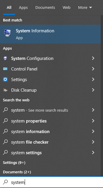 Click to open the System control panel.
Depending on the version of MS Windows on your computer, you may see one of the dialogs shown below.
Now on that dialog, towards the middle of the screen, you should see anoption that says System Type.
Write down the associated information.
You will need this to select the correct Inkscape download file for yoursystem.
Click to open the System control panel.
Depending on the version of MS Windows on your computer, you may see one of the dialogs shown below.
Now on that dialog, towards the middle of the screen, you should see anoption that says System Type.
Write down the associated information.
You will need this to select the correct Inkscape download file for yoursystem.
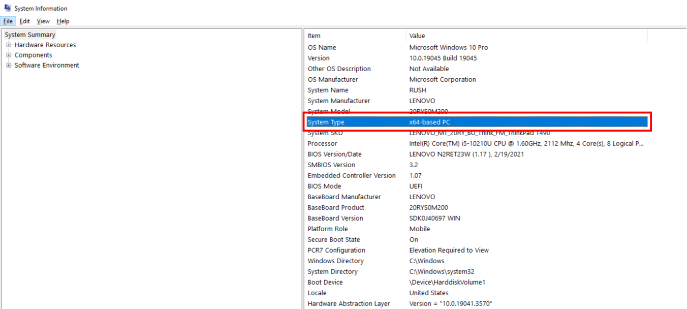
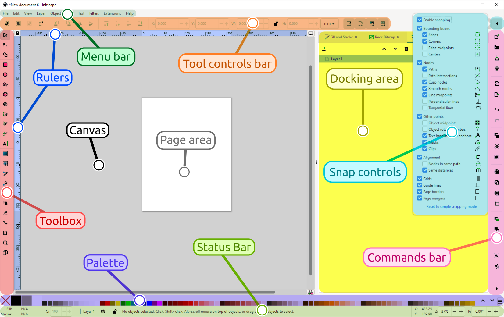 The main areas of the Inkscape user interface
The application menu bar along the top provides general menu
options. Some are similar to other software programs (File
‣ Save, Edit ‣ Copy, etc.). There are also
Inkscape-specific items.
The tool controls bar just below adjusts to the currently selected
tool. It displays the tool’s options.
Vertically on the left, the toolbox contains the main drawing
tools. Only one tool can be selected at once.
The large blank area is the canvas, where the image is edited.
A black outline represents the visible page area.
On the right side of the window, there are two toolbars. To the left
is the commands bar which gives quick access to common commands,
which are also available via the dropdown menus. If not all the
commands are shown, there is a right-facing arrow that gives access
to the hidden choices.
To the right is the snap controls bar. We suggest you deactivate
snapping for now, by pressing the topmost button in the bar, or by
pressing %.
There are rulers at the top and on the left of the canvas to help
with grid and guideline placement.
Scrollbars are available to the right and bottom to move around on
the canvas.
The color palette is near the bottom of the window. Its
most basic usage is to change the fill color of an object.
At the very bottom, the status bar provides information such as the
colors of the selected object, layers, cursor coordinates, and zoom
level. It also contains a field where Inkscape can display helpful
texts, such as the number and type of selected objects, or tips about
keyboard shortcuts and usage hints. Whenever Inkscape doesn’t do what
you think it should be doing, look here first.
Dialogs for specific functionality are available will by default appear
attached to the right of the canvas, in the docking area.
The main areas of the Inkscape user interface
The application menu bar along the top provides general menu
options. Some are similar to other software programs (File
‣ Save, Edit ‣ Copy, etc.). There are also
Inkscape-specific items.
The tool controls bar just below adjusts to the currently selected
tool. It displays the tool’s options.
Vertically on the left, the toolbox contains the main drawing
tools. Only one tool can be selected at once.
The large blank area is the canvas, where the image is edited.
A black outline represents the visible page area.
On the right side of the window, there are two toolbars. To the left
is the commands bar which gives quick access to common commands,
which are also available via the dropdown menus. If not all the
commands are shown, there is a right-facing arrow that gives access
to the hidden choices.
To the right is the snap controls bar. We suggest you deactivate
snapping for now, by pressing the topmost button in the bar, or by
pressing %.
There are rulers at the top and on the left of the canvas to help
with grid and guideline placement.
Scrollbars are available to the right and bottom to move around on
the canvas.
The color palette is near the bottom of the window. Its
most basic usage is to change the fill color of an object.
At the very bottom, the status bar provides information such as the
colors of the selected object, layers, cursor coordinates, and zoom
level. It also contains a field where Inkscape can display helpful
texts, such as the number and type of selected objects, or tips about
keyboard shortcuts and usage hints. Whenever Inkscape doesn’t do what
you think it should be doing, look here first.
Dialogs for specific functionality are available will by default appear
attached to the right of the canvas, in the docking area.
 , or use the Shift + Ctrl + D keyboard shortcut).
In the section Page Size on the Page tab, select or define the size you wish.
, or use the Shift + Ctrl + D keyboard shortcut).
In the section Page Size on the Page tab, select or define the size you wish.
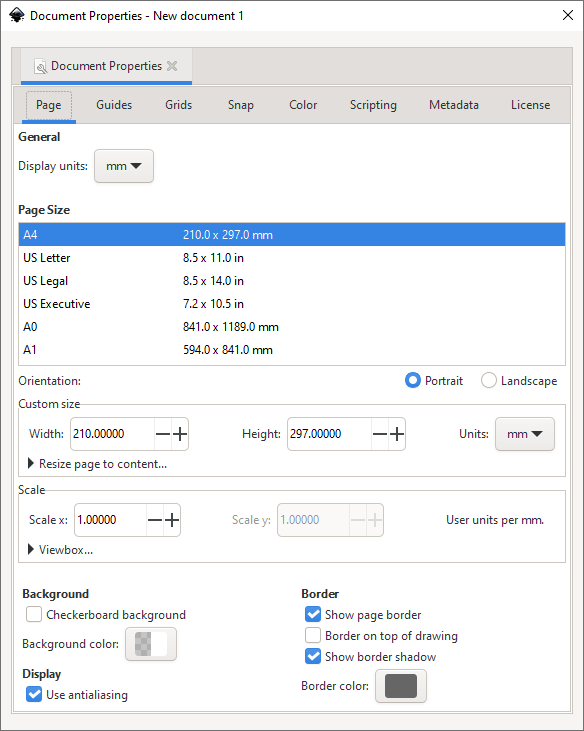 The default measurement unit for page size can be changed in the Page Size section of the same Page tab.
The large rectangular line that you see on the canvas, in a new blankdocument, is the page border.
If you compare the page border to therulers, you can see that it represents the page size.
Note that the pageborder is never seen in exported or saved files.
Most of the time, everything that you want to show up in your finisheddrawing, must be inside this border.
Elements placed outside of the pageborder usually can’t be seen when you share your drawing, and can bethought of as drafts, experiments or available resources.
If you do not want to see the page border while you’re working, you canuncheck the option Show page border in the Page tabto hide it.
You can also configure the page shadow and color of that shadow,in that section, if you like.
In Inkscape, the canvas appears white.
Even though it does not use thetraditional checkerboard pattern to indicate transparency (by default),it really is transparent.
If you’d like to see a checkerboard patternfor transparency, please check the Checkerboard background optionin the section Background on the Page tab.
When a drawing is exported to a : PNG format, areas on the page wherethere is no object will be transparent.
You can change this by puttingan opaque object behind your drawing (usually a rectangle, the same sizeas the page).
Another way to change this is by clicking on the color bar in theBackground section of the Page tab, and setting theA slider (“A” for : Alpha) to 255, or all the way to theright.
You can also change the color, if you like.
Note that this settingonly affects how the image looks in Inkscape or when you export to PNG.
The default measurement unit for page size can be changed in the Page Size section of the same Page tab.
The large rectangular line that you see on the canvas, in a new blankdocument, is the page border.
If you compare the page border to therulers, you can see that it represents the page size.
Note that the pageborder is never seen in exported or saved files.
Most of the time, everything that you want to show up in your finisheddrawing, must be inside this border.
Elements placed outside of the pageborder usually can’t be seen when you share your drawing, and can bethought of as drafts, experiments or available resources.
If you do not want to see the page border while you’re working, you canuncheck the option Show page border in the Page tabto hide it.
You can also configure the page shadow and color of that shadow,in that section, if you like.
In Inkscape, the canvas appears white.
Even though it does not use thetraditional checkerboard pattern to indicate transparency (by default),it really is transparent.
If you’d like to see a checkerboard patternfor transparency, please check the Checkerboard background optionin the section Background on the Page tab.
When a drawing is exported to a : PNG format, areas on the page wherethere is no object will be transparent.
You can change this by puttingan opaque object behind your drawing (usually a rectangle, the same sizeas the page).
Another way to change this is by clicking on the color bar in theBackground section of the Page tab, and setting theA slider (“A” for : Alpha) to 255, or all the way to theright.
You can also change the color, if you like.
Note that this settingonly affects how the image looks in Inkscape or when you export to PNG.
 Click and drag to create a shape.
Once the mouse is released and the shape is displayed, various handleswill become visible.
Many of Inkscape’s tools use handlesfor one purpose or another.
But it’s the handles of the geometric shapeswhich are used for creating many fancy and exciting effects.
The handlesmay be tiny circles, squares and/or diamonds.
Sometimes, the samehandles can be available for different tools.
We will learn more abouteach handle’s function in the following chapters.
Click and drag to create a shape.
Once the mouse is released and the shape is displayed, various handleswill become visible.
Many of Inkscape’s tools use handlesfor one purpose or another.
But it’s the handles of the geometric shapeswhich are used for creating many fancy and exciting effects.
The handlesmay be tiny circles, squares and/or diamonds.
Sometimes, the samehandles can be available for different tools.
We will learn more abouteach handle’s function in the following chapters.
 Primitive shapes provide handles as squares, circles or diamonds.
Many features of Inkscape are accessible through keyboard shortcuts, andsometimes even only through key shortcuts.
While drawing your shape:
press Ctrl while you drag the mouse, with the Rectangle andEllipse tools, to create squares and circles;
press Shift while you drag to draw from the center, ratherthan from one corner.
Try drawing some shapes, with and without those keys to get an idea ofhow they can be used.
Primitive shapes provide handles as squares, circles or diamonds.
Many features of Inkscape are accessible through keyboard shortcuts, andsometimes even only through key shortcuts.
While drawing your shape:
press Ctrl while you drag the mouse, with the Rectangle andEllipse tools, to create squares and circles;
press Shift while you drag to draw from the center, ratherthan from one corner.
Try drawing some shapes, with and without those keys to get an idea ofhow they can be used.
 Sketching a cloud from ellipses.
 F1 or S
The Selector tool is a fundamental tool in the program, since almost everythingmust be selected before it can be edited.
Working much like a hand, the Selector tool also moves, scales, skews androtates objects.
To move an object:
position the mouse over an object;
press the mouse button and hold, while dragging it to the desiredposition (hold Ctrl to move the shape in horizontal orvertical direction only);
release the mouse button.
F1 or S
The Selector tool is a fundamental tool in the program, since almost everythingmust be selected before it can be edited.
Working much like a hand, the Selector tool also moves, scales, skews androtates objects.
To move an object:
position the mouse over an object;
press the mouse button and hold, while dragging it to the desiredposition (hold Ctrl to move the shape in horizontal orvertical direction only);
release the mouse button.
 Drag to move the selection.
Transformations (such as moving, scaling,rotating) are easy thanks to the two-way arrows.
Click the selection asecond time to access skew and rotating functions.
To scale (change the size of) an object:
click on it to select it;
position the mouse over a two-way arrow on a side or a corner;
press the mouse button and hold while dragging it to the desired size(hold Ctrl if you want to preserve the proportions);
release the mouse button.
To skew an object:
select it, then click it again;
position the mouse over a horizontal or vertical two-way arrow;
press the mouse button and hold, while dragging it to the desiredamount of skew (also hold Ctrl for 15° steps)
release the mouse button.
To rotate an object:
select it, then click it again;
grab a curved two-way arrow in any corner;
drag it until the object reaches the desired angle (holdCtrl for rotating in steps of 15°).
Drag to move the selection.
Transformations (such as moving, scaling,rotating) are easy thanks to the two-way arrows.
Click the selection asecond time to access skew and rotating functions.
To scale (change the size of) an object:
click on it to select it;
position the mouse over a two-way arrow on a side or a corner;
press the mouse button and hold while dragging it to the desired size(hold Ctrl if you want to preserve the proportions);
release the mouse button.
To skew an object:
select it, then click it again;
position the mouse over a horizontal or vertical two-way arrow;
press the mouse button and hold, while dragging it to the desiredamount of skew (also hold Ctrl for 15° steps)
release the mouse button.
To rotate an object:
select it, then click it again;
grab a curved two-way arrow in any corner;
drag it until the object reaches the desired angle (holdCtrl for rotating in steps of 15°).
 In some cases, you want to edit more than one object at once.
So theSelect tool can select more than one object at once.
To select more than one object, there are mainly two ways:
click the first object, then hold Shift while clicking eachadditional object once;
or press the mouse button and drag out a rectangular selection boxwhich encloses all the objects.
In some cases, you want to edit more than one object at once.
So theSelect tool can select more than one object at once.
To select more than one object, there are mainly two ways:
click the first object, then hold Shift while clicking eachadditional object once;
or press the mouse button and drag out a rectangular selection boxwhich encloses all the objects.
 Each selected object is framed with a dashed line (known as thebounding box), while the two-way arrows for transformation are placedaround the entire selection (one or more than one object).
You can combine the two methods: hold Shift to keep previouslyselected objects selected, and drag out a selection box to add moreobjects to the selection.
Doing this the other way around works, too: afterselecting more than one object by dragging a selection box, hold Shiftwhile you individually click on more objects.
Also notice how the Shift key allows you to sort of toggle a selection:click to add to the selection, click again to remove.
Each selected object is framed with a dashed line (known as thebounding box), while the two-way arrows for transformation are placedaround the entire selection (one or more than one object).
You can combine the two methods: hold Shift to keep previouslyselected objects selected, and drag out a selection box to add moreobjects to the selection.
Doing this the other way around works, too: afterselecting more than one object by dragging a selection box, hold Shiftwhile you individually click on more objects.
Also notice how the Shift key allows you to sort of toggle a selection:click to add to the selection, click again to remove.
 F4 or R
To draw a rectangle:
Select the Rectangle tool from the toolbox on the left.
Click and drag the mouse diagonally, using the same motion as when dragging aselection box.
The rectangle will appear immediately after you releasethe mouse button.
To draw a perfect square, hold down Ctrl whileclick-dragging with the mouse.
The square-shaped handles can be used to change the rectangle’s size.However, when you only want to change either the height or the width ofthe rectangle, it’s hard to control with the mouse alone.
Here you canuse Ctrl to restrict the size change to either width or heightof the rectangle.
F4 or R
To draw a rectangle:
Select the Rectangle tool from the toolbox on the left.
Click and drag the mouse diagonally, using the same motion as when dragging aselection box.
The rectangle will appear immediately after you releasethe mouse button.
To draw a perfect square, hold down Ctrl whileclick-dragging with the mouse.
The square-shaped handles can be used to change the rectangle’s size.However, when you only want to change either the height or the width ofthe rectangle, it’s hard to control with the mouse alone.
Here you canuse Ctrl to restrict the size change to either width or heightof the rectangle.
 When you hold down Ctrl while dragging the square-shaped handles, it iseasy to limit the change in the rectangle’s size to a single direction.
The circle-shaped handles are for rounding the corners.
Grab a circlehandle and move it just a tiny bit.
You’ll see that all four cornerswill be rounded.
Additionally, a second circular handle has appeared now.
Eachhandle changes the amount of rounding in one direction.
It is notpossible to only round a single corner of the rectangle independant fromthe others.
They will all change together.
When you hold down Ctrl while dragging the square-shaped handles, it iseasy to limit the change in the rectangle’s size to a single direction.
The circle-shaped handles are for rounding the corners.
Grab a circlehandle and move it just a tiny bit.
You’ll see that all four cornerswill be rounded.
Additionally, a second circular handle has appeared now.
Eachhandle changes the amount of rounding in one direction.
It is notpossible to only round a single corner of the rectangle independant fromthe others.
They will all change together.
 Moving the circle handles rounds the corners.
Each circle handlechanges the radii in a different direction.
Moving the circle handles rounds the corners.
Each circle handlechanges the radii in a different direction.
 The “Rx” and “Ry” values on the control bar, determine the radius ofthe imaginary circle which the rounding is based upon.
To restore the initial, sharp-cornered shape of a rectangle or square,click on the far right icon in the tool control bar
The “Rx” and “Ry” values on the control bar, determine the radius ofthe imaginary circle which the rounding is based upon.
To restore the initial, sharp-cornered shape of a rectangle or square,click on the far right icon in the tool control bar
 F5 or E
To draw a circle or ellipse, click and drag the mouse diagonally, using the samemotion as when dragging a selection box.
The circle will appear immediately afteryou release the mouse button.
To draw a perfect circle, hold down the Ctrlkey while you drag the mouse.
Holding Shift will start drawing from thecenter of the shape.
The Ellipse tool also allows you to draw arcs and circle segments (or “piewedges”).
To draw an arc, grab the round handle and drag it, always keeping themouse pointer on the inside of the (imaginary) circle.
To draw a segment (“pie wedge”), drag the round handle, always keeping the mousepointer on the outside of the (imaginary) circle.
After the first drag, you’ll see a second round handle appear.
You can set aspecific angle for these shapes on the control bar, using the Startand End fields.
Note that the three buttons to the right of thosefields do not become activated until after you have dragged the circle handles.
F5 or E
To draw a circle or ellipse, click and drag the mouse diagonally, using the samemotion as when dragging a selection box.
The circle will appear immediately afteryou release the mouse button.
To draw a perfect circle, hold down the Ctrlkey while you drag the mouse.
Holding Shift will start drawing from thecenter of the shape.
The Ellipse tool also allows you to draw arcs and circle segments (or “piewedges”).
To draw an arc, grab the round handle and drag it, always keeping themouse pointer on the inside of the (imaginary) circle.
To draw a segment (“pie wedge”), drag the round handle, always keeping the mousepointer on the outside of the (imaginary) circle.
After the first drag, you’ll see a second round handle appear.
You can set aspecific angle for these shapes on the control bar, using the Startand End fields.
Note that the three buttons to the right of thosefields do not become activated until after you have dragged the circle handles.
 Dragging the square handles converts a circle into an ellipse.
 The round handles convert the shape into an arc or segment (“pie wedge”),depending on the position of the mouse (inside or outside the imaginarycircle) as you drag the handle.
 The Start and End fields, on the tool controls barindicate the angles between which the pie or arc extends.
To quickly restore the circle/ellipse shape, click the far right icon in thetool controls bar:
The Start and End fields, on the tool controls barindicate the angles between which the pie or arc extends.
To quickly restore the circle/ellipse shape, click the far right icon in thetool controls bar:
 .
To convert an ellipse into a perfect circle, click on one of the square handleswhile pressing Ctrl.
The top and left square handles change the size ofthe ellipse in vertical and horizontal direction, respectively.
To create a circle with a specific size, you can use the fields for the horizontal and vertical radius Rx and Ry in the tool controls bar.
.
To convert an ellipse into a perfect circle, click on one of the square handleswhile pressing Ctrl.
The top and left square handles change the size ofthe ellipse in vertical and horizontal direction, respectively.
To create a circle with a specific size, you can use the fields for the horizontal and vertical radius Rx and Ry in the tool controls bar.
 The handle in the crease between two tips lets you make changes to theinner diameter of the star.
Without holding down Ctrl, it can bedifficult to avoid twisting the star.
The other handle is used to changethe length of the tips.
If you prefer to draw a polygon, click the icon on the control bar,which is shown below.
The handle in the crease between two tips lets you make changes to theinner diameter of the star.
Without holding down Ctrl, it can bedifficult to avoid twisting the star.
The other handle is used to changethe length of the tips.
If you prefer to draw a polygon, click the icon on the control bar,which is shown below.
 In Polygon mode, the shape only has a single handle: This handleenlarges or shrinks the shape.
The star can be twisted, if you do nothold the Ctrl key.
With these few options, it’s already possible to create many differentshapes, starting from a single star.
But there are even more options! Toadd more tips to a star or more sides to a polygon, either enter thenumber of tips you want, in the field Corners in the tool controlsbar or click on the up/down arrows right beside it.
To round the tips of a star or the corners of a polygon, you can holddown Shift while dragging any of the handles.
The farther youdrag them, the more rounding you will get (drag the mouse horizontallyfor best results).
Or as before, either use the arrows next to the fieldRounded in the tool controls bar, or change its value by entering anew one.
When you press Alt while dragging a handle, this will add somerandomness to the star or polygon.
Or as before, use the number field with thearrows to change the value for Randomized.
A star’s tipswill then all be of different length, and a polygon will look distorted.
In Polygon mode, the shape only has a single handle: This handleenlarges or shrinks the shape.
The star can be twisted, if you do nothold the Ctrl key.
With these few options, it’s already possible to create many differentshapes, starting from a single star.
But there are even more options! Toadd more tips to a star or more sides to a polygon, either enter thenumber of tips you want, in the field Corners in the tool controlsbar or click on the up/down arrows right beside it.
To round the tips of a star or the corners of a polygon, you can holddown Shift while dragging any of the handles.
The farther youdrag them, the more rounding you will get (drag the mouse horizontallyfor best results).
Or as before, either use the arrows next to the fieldRounded in the tool controls bar, or change its value by entering anew one.
When you press Alt while dragging a handle, this will add somerandomness to the star or polygon.
Or as before, use the number field with thearrows to change the value for Randomized.
A star’s tipswill then all be of different length, and a polygon will look distorted.
 Adding a slight rounding.
Adding a little bit of randomness.
Adding a slight rounding.
Adding a little bit of randomness.
 The Star tool’s tool controls bar.
The right-most icon resets todefault values.
Very useful when you don’t know how to get back!
The Star tool’s tool controls bar.
The right-most icon resets todefault values.
Very useful when you don’t know how to get back!
 Can you draw these stars?
 F9 or I
This geometrical shape isn’t needed frequently, but sometimes, it provesto be very useful.
To draw a spiral, click and drag with the mouse on the canvas.
When the left mouse button is released, the spiral will be finished.
You will notice two diamond-shaped handles on the spiral.
These handles change the length of the spiral.
You can try this outright on the canvas: Just grab one of the handles and drag it along thespiral’s turns to get the desired number of turns and to make the spirallarger or smaller.
If you hold down Ctrl while dragging the handles, the spiral will getlonger (or shorter) in 15° steps.
When you combine pressing Alt with pulling the inner handleupwards or downwards, it will change the divergence (tightness) /convergence (looseness) of the spiral, without changing its overall size.Dragging upwards makes the turns move toward the outside of the spiral.Dragging downwards will make them move closer to its center.
The easiest way to change the number of turns of a spiral quickly by alarge amount is to enter the desired number into the field labelledTurns in the tool controls bar.
This will not change the spiral’sdiameter.
If you ever feel lost when working with the spiral tool, you can use therightmost icon in the tool controls bar to remove all changes and toreset the spiral to its initial shape.
F9 or I
This geometrical shape isn’t needed frequently, but sometimes, it provesto be very useful.
To draw a spiral, click and drag with the mouse on the canvas.
When the left mouse button is released, the spiral will be finished.
You will notice two diamond-shaped handles on the spiral.
These handles change the length of the spiral.
You can try this outright on the canvas: Just grab one of the handles and drag it along thespiral’s turns to get the desired number of turns and to make the spirallarger or smaller.
If you hold down Ctrl while dragging the handles, the spiral will getlonger (or shorter) in 15° steps.
When you combine pressing Alt with pulling the inner handleupwards or downwards, it will change the divergence (tightness) /convergence (looseness) of the spiral, without changing its overall size.Dragging upwards makes the turns move toward the outside of the spiral.Dragging downwards will make them move closer to its center.
The easiest way to change the number of turns of a spiral quickly by alarge amount is to enter the desired number into the field labelledTurns in the tool controls bar.
This will not change the spiral’sdiameter.
If you ever feel lost when working with the spiral tool, you can use therightmost icon in the tool controls bar to remove all changes and toreset the spiral to its initial shape.

 A basic spiral
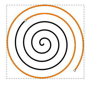 Changing a spiral using its handles.
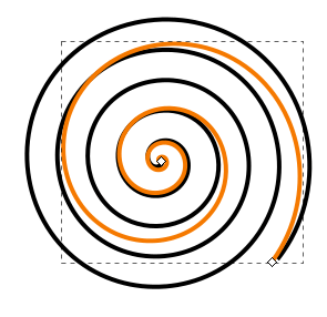 Alt + dragging the inner handle downwards makes the spiral converge more.
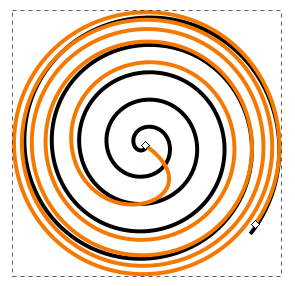 Alt + dragging the inner handle upwards lets the spiral more divergent.
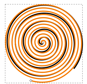 A spiral with a large number of turns.
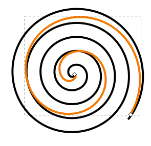 A spiral with a smaller number of turns.
 Shift + F4 or x
The 3D-Box tool draws a (simulated) three-dimensional box.
Tounderstand how it works, it helps to know a little bit about drawing inperspective.
This tool is of interest to people who want to drawarchitecture or interiors.
It makes it really easy to create furnitureor rooms, because it automatically creates perspective, by making use ofvanishing points.
After click-and-dragging with the tool active, a box appears on thecanvas.
This is best done somewhere near the center of the page area.Otherwise, the box can sometimes end up quite deformed.
By default, twovanishing points are placed in the vertical middle of the page borders,one on the right, the other on the left.
When you look closely at the 3D-box that you have drawn, you will seethe following:
A small black crosshair, which designates the center of the box.When you click and drag it with your mouse, the box will move alongwith it, apparently in 3D space.
Depending on its position inrelation to the vanishing points, you will be able to see the box’sbottom, or its top.
If you move the box to the left or right, itsshape will change in accordance with the vanishing lines.
Numerous (to be exact, 8) white, diamond-shaped handles allow youto extend or shrink the box along the x, y or z axis by dragging themwith the mouse.
The white, square-shaped handles symbolize the vanishing pointsand can be moved in the same fashion as the other handles.
Note that these specific changes can only be achieved when you use the3D-box tool.
If you move the box with the Selection tool, both the boxand the vanishing points will move.
The tool controls for this tool allow you to set parameters for the 3vanishing points for the x, y and z axis.
The buttons with the icon depicting twoparallel lines
Shift + F4 or x
The 3D-Box tool draws a (simulated) three-dimensional box.
Tounderstand how it works, it helps to know a little bit about drawing inperspective.
This tool is of interest to people who want to drawarchitecture or interiors.
It makes it really easy to create furnitureor rooms, because it automatically creates perspective, by making use ofvanishing points.
After click-and-dragging with the tool active, a box appears on thecanvas.
This is best done somewhere near the center of the page area.Otherwise, the box can sometimes end up quite deformed.
By default, twovanishing points are placed in the vertical middle of the page borders,one on the right, the other on the left.
When you look closely at the 3D-box that you have drawn, you will seethe following:
A small black crosshair, which designates the center of the box.When you click and drag it with your mouse, the box will move alongwith it, apparently in 3D space.
Depending on its position inrelation to the vanishing points, you will be able to see the box’sbottom, or its top.
If you move the box to the left or right, itsshape will change in accordance with the vanishing lines.
Numerous (to be exact, 8) white, diamond-shaped handles allow youto extend or shrink the box along the x, y or z axis by dragging themwith the mouse.
The white, square-shaped handles symbolize the vanishing pointsand can be moved in the same fashion as the other handles.
Note that these specific changes can only be achieved when you use the3D-box tool.
If you move the box with the Selection tool, both the boxand the vanishing points will move.
The tool controls for this tool allow you to set parameters for the 3vanishing points for the x, y and z axis.
The buttons with the icon depicting twoparallel lines
 will make the vanishinglines parallel and have an immediate effect on the box on the canvas.
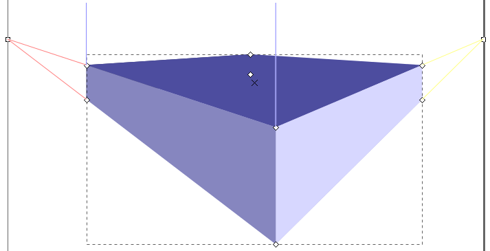 Dark blue: the top of the box.
Medium blue: its left side.
Light blue:its right side.
Dark blue: the top of the box.
Medium blue: its left side.
Light blue:its right side.
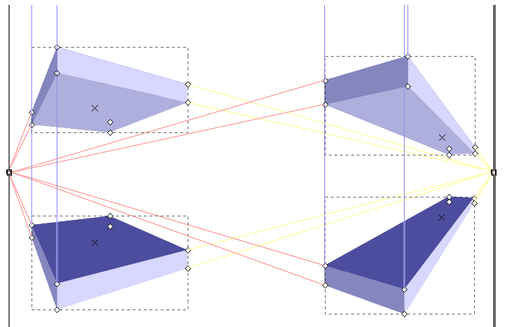 Moving the 3D-Box
 Moving the vanishing points.
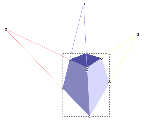 Adding a third vanishing point.

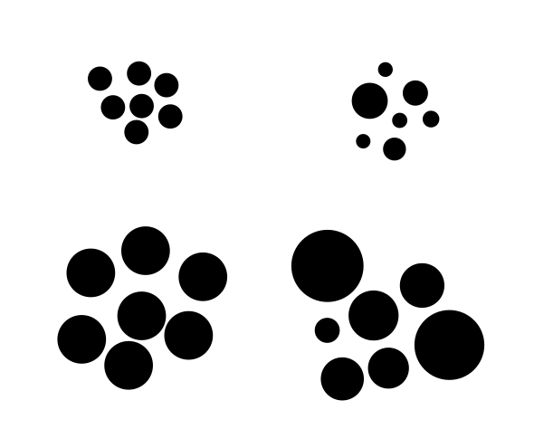 Dots created with the pencil tool.
Top left: with Ctrl, top right: withCtrl + Alt, bottom left: with Ctrl + Shift, bottom right: with Ctrl +Alt + Shift.
Dots created with the pencil tool.
Top left: with Ctrl, top right: withCtrl + Alt, bottom left: with Ctrl + Shift, bottom right: with Ctrl +Alt + Shift.
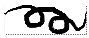 A path drawn with Shape: Ellipse and no smoothing.
The path has been extended from the square handle at its end.|
The path has been extended from the square handle at its end.
A path drawn with Shape: Ellipse and no smoothing.
The path has been extended from the square handle at its end.|
The path has been extended from the square handle at its end.
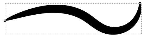 Shape: Ellipse with more smoothing.
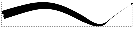 Shape: Triangle out was used here.
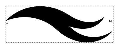 This path uses Shape: From Clipboard
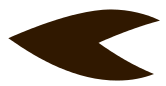 The path that was copied to the clipboard for drawing the above path.
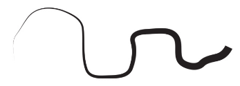 Path drawn with Shape: Triangle In in Bézier mode, with a smoothing of40
 Path drawn in B-Spline mode
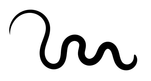 Path with Shape: From Clipboard drawn in Spiro mode with a smoothinglevel of 40
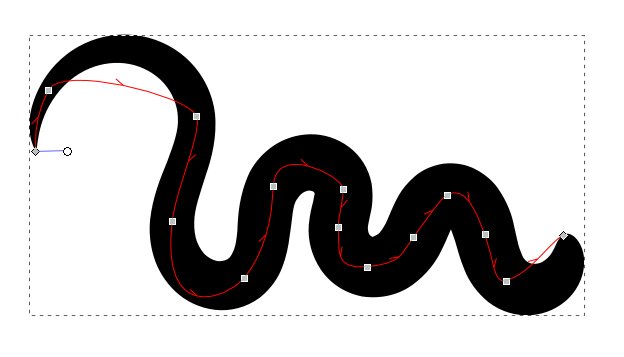 The same path as above, only wider.
The width of a path that usesobjects on the clipboard (and those that use ‘Shape: Ellipse’, both usethe ‘Pattern along Path’ Live Path Effect) can be changed with the Nodetool, using the white circular handle at the beginning of the path.
The same path as above, only wider.
The width of a path that usesobjects on the clipboard (and those that use ‘Shape: Ellipse’, both usethe ‘Pattern along Path’ Live Path Effect) can be changed with the Nodetool, using the white circular handle at the beginning of the path.
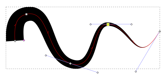 The width of a path with a PowerStroke Live Path Effect (used by ‘Shape:Triangle In / Out’) can be adjusted with the node tool by moving a pink,diamond-shaped node, to achieve a non-constant path width.
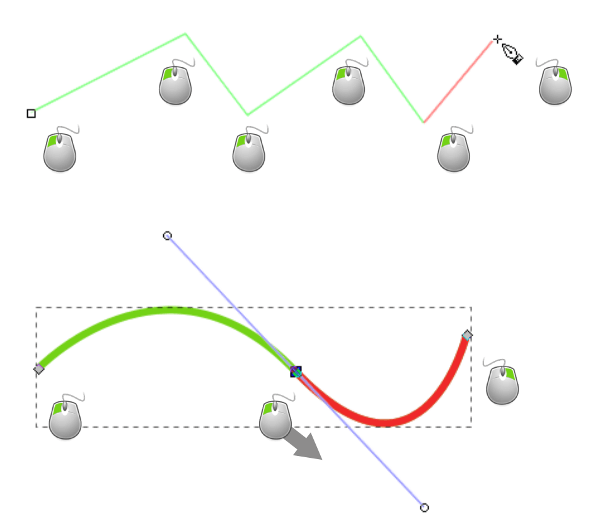 Every left-click adds a node.
A long left-click drags out a node’shandle and makes the segment curvy.
Every left-click adds a node.
A long left-click drags out a node’shandle and makes the segment curvy.
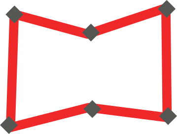 Creating the rough shape with the Pen tool, without thinking toomuch about any curves.
The nodes are represented as grey diamonds.
Creating the rough shape with the Pen tool, without thinking toomuch about any curves.
The nodes are represented as grey diamonds.
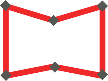 The nodes have been aligned vertically and horizontally using theAlign-and-Distribute dialog.
 The path has been modified by making the straight segments curved withthe help of the node tool.
 Some final adjustments have been made, to achieve a nice result.
Theimage now resembles an open book.
Some final adjustments have been made, to achieve a nice result.
Theimage now resembles an open book.
 Ctrl + F6 or C
What a goose quill was in antiquity, is Inkscape’s calligraphy tool inthe digital world.
Ideally, it should be used with a graphics tablet andstylus, with one hand on the graphics tablet and the other one on thekeyboard, which moves the canvas, so one can write without interruption.
Ctrl + F6 or C
What a goose quill was in antiquity, is Inkscape’s calligraphy tool inthe digital world.
Ideally, it should be used with a graphics tablet andstylus, with one hand on the graphics tablet and the other one on thekeyboard, which moves the canvas, so one can write without interruption.
 A varied set of options exists for simulating different brushes, in casethe default brushes that come with Inkscape do not suffice.
 Pressure sensitivity
 Trace lightness
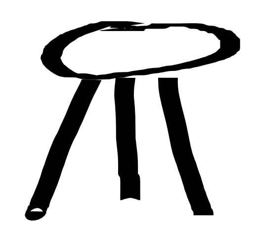 The ends of a line drawn with the Dip Pen setting are cusped.
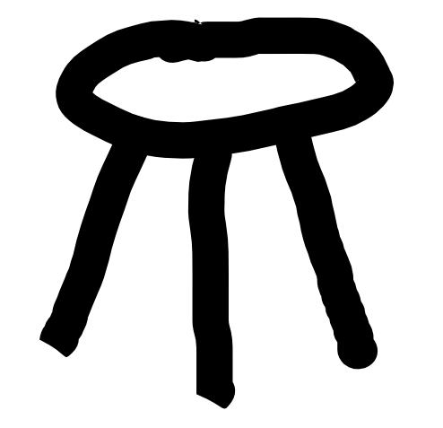 With the Marker setting, the paths look smooth and their ends arerounded.
 The setting Brush creates slightly rounded and uneven strokes.
 The Wiggly setting allows you to draw very organic shapes.
 When set to Splotchy, the result looks a bit like calligraphy.
 With the calligraphy tool setting Tracing, drawings that looklike an old engraving can be created.
The image below serves as a model.
With the calligraphy tool setting Tracing, drawings that looklike an old engraving can be created.
The image below serves as a model.
 Union
Union Difference
 Intersection
 Exclusion
 Division
 Cut Path
 Combine
 Break Apart
 Two objects about to be unioned
 Unioning a triangle and a square gives a house.
 The rectangle will become the door opening.
 Difference between a rectangle and a house creates an opening for thedoor.
 Two overlapping ellipses
 Intersection between the two ellipses
 Exclusion between the two ellipses.
 Someone has drawn a path with the pencil tool (with the setting ofShape: Ellipse) on the orange ellipse.
 Division
 Move apart and combine (to form a single path composed of two subpaths).
 Break Apart separates all subpaths into independent objects.
 F2 or N
The second-most used tool in Inkscape is the Node tool.
It will be your friend when you need to edit a path.
What you need to know about paths
Every path consists of nodes that are connected to each other, like pearls on a string.
The ends of this string can be connected like in a chain (closed path), or there can be two end nodes, that are only connected to one other node (open path).
F2 or N
The second-most used tool in Inkscape is the Node tool.
It will be your friend when you need to edit a path.
What you need to know about paths
Every path consists of nodes that are connected to each other, like pearls on a string.
The ends of this string can be connected like in a chain (closed path), or there can be two end nodes, that are only connected to one other node (open path).
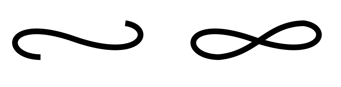 On the left side, there is an open path.
On the right side, it has been closed by connecting the two end nodes.
Each node can only be connected to one or two other nodes.
It’s impossible to attach a third line to a node.
When you need to draw a branching, you must create a separate path for one of the branches.
In Inkscape, a node’s position is marked by a square, circle or diamondhandle on the line that represents the path.
A path’s shape can be changed radically by moving the nodes it consistsof:
Activate the Node tool.
Click on the path to select it.
Click and drag the node you wish to reposition.
On the left side, there is an open path.
On the right side, it has been closed by connecting the two end nodes.
Each node can only be connected to one or two other nodes.
It’s impossible to attach a third line to a node.
When you need to draw a branching, you must create a separate path for one of the branches.
In Inkscape, a node’s position is marked by a square, circle or diamondhandle on the line that represents the path.
A path’s shape can be changed radically by moving the nodes it consistsof:
Activate the Node tool.
Click on the path to select it.
Click and drag the node you wish to reposition.
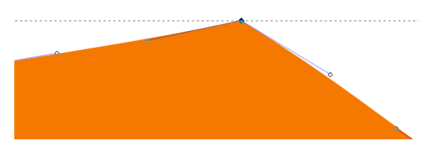 This node has an incoming and an outgoing path segment connected to it.
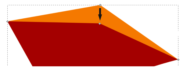 You can move a node by grabbing it with the mouse.
For more gradual changes, paths can be edited by their nodes’handles.
Each node can have up to two circular handles that are connected toit by thin lines.
These handles can be moved around with the mouse, too.
The handles control the shape of the adjacent path segment.
Activate the Node tool.
Click on the path to select it.
Click on the node you wish to edit.
Click and drag on the node’s handle(s).
You can move a node by grabbing it with the mouse.
For more gradual changes, paths can be edited by their nodes’handles.
Each node can have up to two circular handles that are connected toit by thin lines.
These handles can be moved around with the mouse, too.
The handles control the shape of the adjacent path segment.
Activate the Node tool.
Click on the path to select it.
Click on the node you wish to edit.
Click and drag on the node’s handle(s).
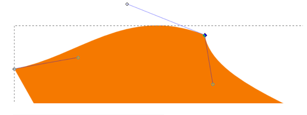 You can modify path segments by moving the node’s handles.
You can also manipulate the lines between the nodes (the path segments) directly,using the Node tool.
Click and drag on the path segment that connects two nodes,to change its curvature, without having to use the handles for this.
You can modify path segments by moving the node’s handles.
You can also manipulate the lines between the nodes (the path segments) directly,using the Node tool.
Click and drag on the path segment that connects two nodes,to change its curvature, without having to use the handles for this.
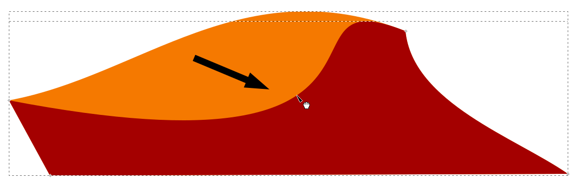 Dragging directly on the path gives quick results.
 Insert new node
 Delete selected nodes
 Join (merge) nodes
 Break path
 Join end nodes with a new segment
 Delete segment between two non-end nodes


 Convert different node types into each other
 Convert objects to paths
 Convert stroke to path


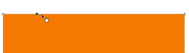 An object where a node has been added by double-clicking on the path.
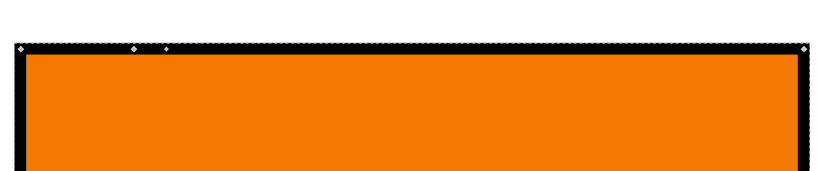 A stroke was added, and another node.
This node was broken into two.This one looks a lot smaller.
Make sure you really want this beforeclicking the button!
A stroke was added, and another node.
This node was broken into two.This one looks a lot smaller.
Make sure you really want this beforeclicking the button!
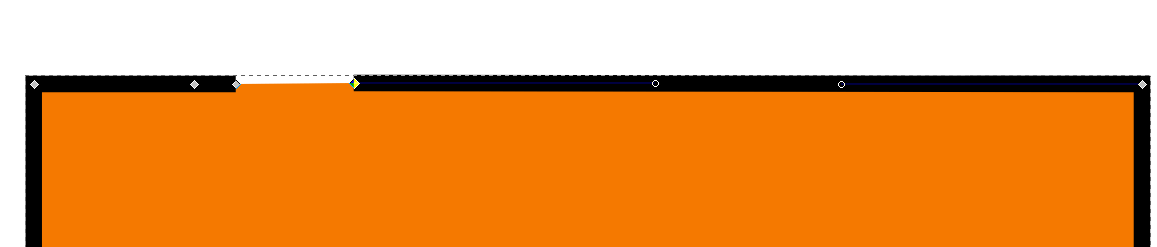 The segment between two nodes has been deleted.
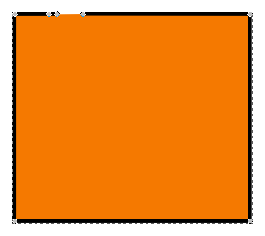 Example of editing a path by …
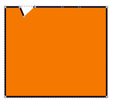 … moving a node, then …
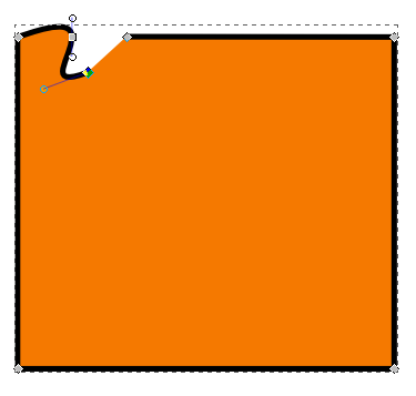 … changing a node’s type and modifying the handles.
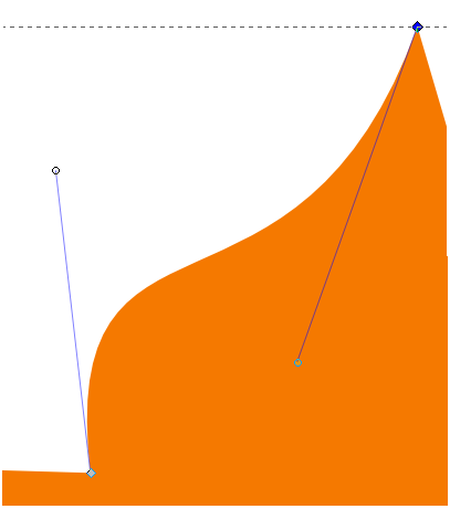 Cusp nodes make sharp corners.
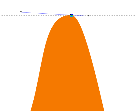 A smooth node creates a rounded curve.
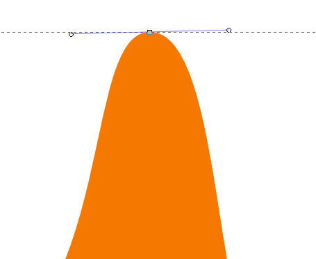 A symmetric node creates a symmetrical curve.
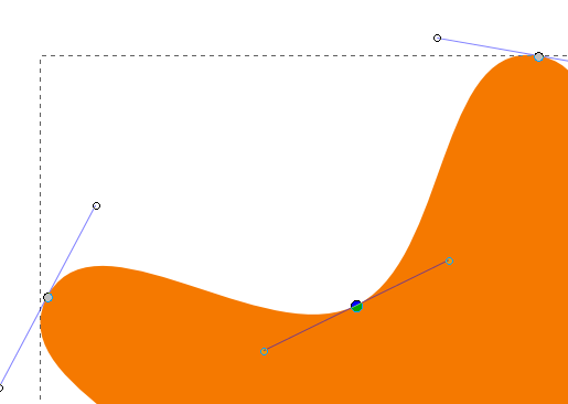 Auto-smooth nodes adapt automatically when you move them.
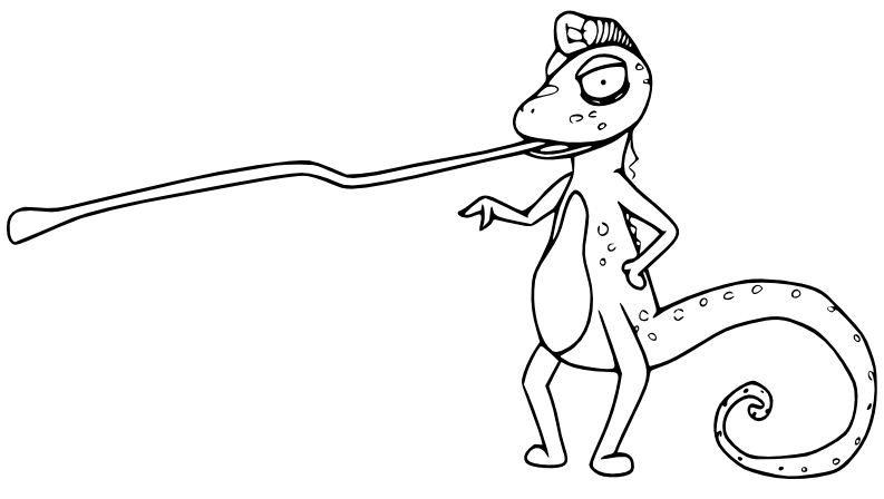 This drawing will serve as an example.
The chameleon was drawn with apencil, and afterwards it has been vectorized with Inkscape.
This drawing will serve as an example.
The chameleon was drawn with apencil, and afterwards it has been vectorized with Inkscape.
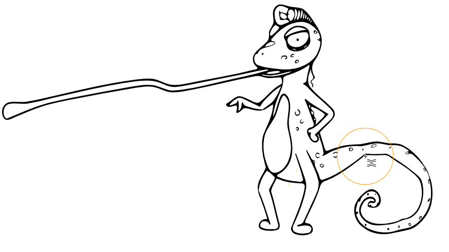 The tail needs to be edited, so it will gradually become thinner.
Here,the effect has been exaggerated for demonstration purposes.
The tail needs to be edited, so it will gradually become thinner.
Here,the effect has been exaggerated for demonstration purposes.
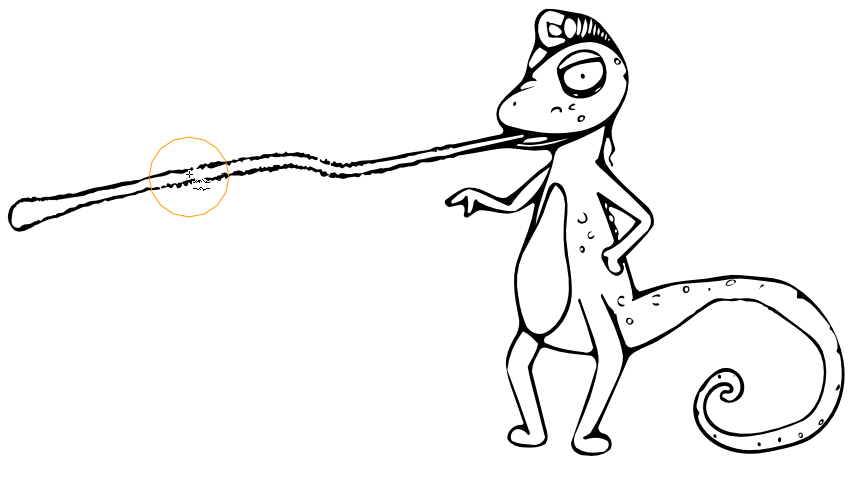 Someroughening has been added to the tongue, to emphasize the beast’sdangerous side.
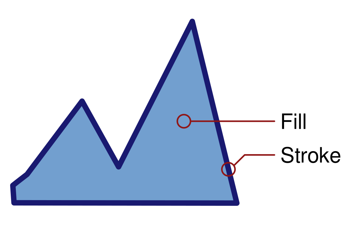 An object with a light blue fill and a dark blue stroke
 The colorful palette is located at the bottom of the window.
The paletteoptions menu is unfolded.
The colorful palette is located at the bottom of the window.
The paletteoptions menu is unfolded.
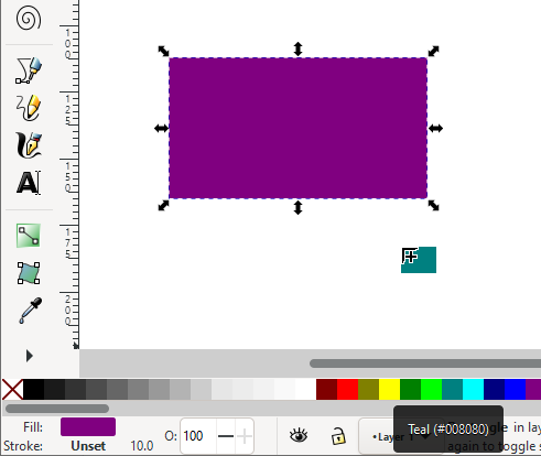 The fill color can be dragged from the palette onto the object.
 The nextsquare with its four quarters is needed for using a mesh gradient.
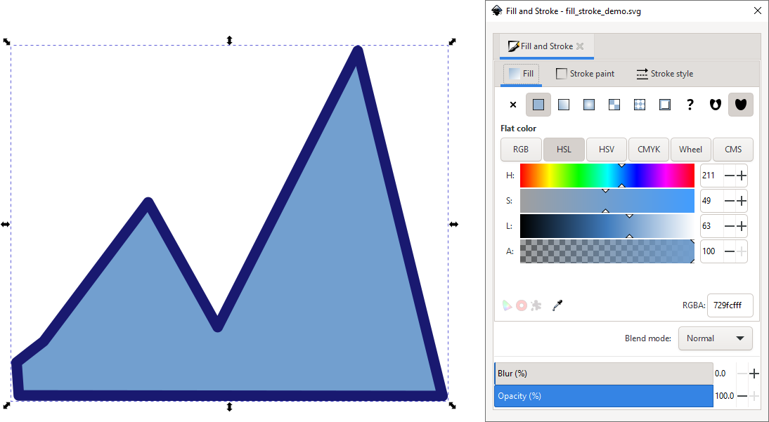 The first tab of the Fill and Stroke dialog, when anobject with a plain light blue fill is selected.
 In the second tab of the Fill and Stroke dialog, the stroke is dark blue…
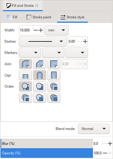 … and 10 mm wide in the third tab.
 Ctrl + Shift + F Object : Fill and Stroke
When the palette does not contain the color you would like to use, you canselect a color in the Fill and Stroke dialog.
We will now take acloser look at that dialog.
At the top of the dialog, there are 3 different tabs: for the Fill,the Stroke paint, and the Stroke style.
In both the Fill and the Stroke paint tabs, you will find5 different color selection modes: RGB (Red, Green, Blue),HSL (Hue, Saturation, Lightness), CMYK (Cyan, Magenta,Yellow, Key/Black), Wheel (Colorwheel) and CMS (ColorManagement System).
This book will not go into the details of the differences between these modes.
Many people find the HSL color selector the easiest to use.
The CMS color selector is reserved for advanced uses, and only makes sense in combination with the open source desktop publishing software Scribus .
For choosing a color for your first drawings, you can select any of the firstfour options.
Ctrl + Shift + F Object : Fill and Stroke
When the palette does not contain the color you would like to use, you canselect a color in the Fill and Stroke dialog.
We will now take acloser look at that dialog.
At the top of the dialog, there are 3 different tabs: for the Fill,the Stroke paint, and the Stroke style.
In both the Fill and the Stroke paint tabs, you will find5 different color selection modes: RGB (Red, Green, Blue),HSL (Hue, Saturation, Lightness), CMYK (Cyan, Magenta,Yellow, Key/Black), Wheel (Colorwheel) and CMS (ColorManagement System).
This book will not go into the details of the differences between these modes.
Many people find the HSL color selector the easiest to use.
The CMS color selector is reserved for advanced uses, and only makes sense in combination with the open source desktop publishing software Scribus .
For choosing a color for your first drawings, you can select any of the firstfour options.
 The same light blue color in four different color selectors.
 Our mountains are light blue at the beginning.
To select your color, click or click-and-drag with the mouse in the differentsliders (or the wheel).
Always remember to first select your object! The resultwill immediately be displayed on the canvas.
When you’re happy with it, don’ttouch anything in the dialog!
Our mountains are light blue at the beginning.
To select your color, click or click-and-drag with the mouse in the differentsliders (or the wheel).
Always remember to first select your object! The resultwill immediately be displayed on the canvas.
When you’re happy with it, don’ttouch anything in the dialog!
 But we prefer them green.
 And we choose a green stroke.
Every color chooser also has a field labelled A at the bottom.
‘A’ stands for ‘Alpha’, which is the opacity value of the selected color.
The higher the value for alpha, the more opaque your color will be.
And we choose a green stroke.
Every color chooser also has a field labelled A at the bottom.
‘A’ stands for ‘Alpha’, which is the opacity value of the selected color.
The higher the value for alpha, the more opaque your color will be.
 If we lower the alpha value for the fill, we can see that the sun is about to rise behind our green mountains.
Note that the stroke is still completely opaque.
In case you were wondering about that little field labelled RGBA in the bottom right corner of the dialog: it is the name of the color in : opacity or ‘alpha value’ (just like the slider labeled A).
If we lower the alpha value for the fill, we can see that the sun is about to rise behind our green mountains.
Note that the stroke is still completely opaque.
In case you were wondering about that little field labelled RGBA in the bottom right corner of the dialog: it is the name of the color in : opacity or ‘alpha value’ (just like the slider labeled A).
 , then click on the canvas, on an area where it has the color that you want to apply.
The selected object’s color will change accordingly.
Copy the complete style of an object to apply it toanother object: select the object, copy it to the clipboard with Ctrl+ C, then select the second object and paste only the style withCtrl + Shift + V.
This not only copies the fill andstroke color, but also the stroke width and style, a text’s font style and anypatterns or gradients.
, then click on the canvas, on an area where it has the color that you want to apply.
The selected object’s color will change accordingly.
Copy the complete style of an object to apply it toanother object: select the object, copy it to the clipboard with Ctrl+ C, then select the second object and paste only the style withCtrl + Shift + V.
This not only copies the fill andstroke color, but also the stroke width and style, a text’s font style and anypatterns or gradients.
 Ctrl + F1 or G
Inkscape allows you to comfortably create and modify gradients on-canvas.However, it is useful to always have the Fill and Stroke dialogwithin reach, so you can modify the colors easily.
The Gradient Tool can be activated in the tool bar.
To apply a gradient to anobject, you need to first select an object.
Then, click-and-drag over the objectwith the Gradient tool.
There will now appear two new handles on the object, one square, one circular,which are connected by a blue line.
The square symbolizes the beginning of thegradient, and the circle its end.
By default, the tool creates linear gradients with two stops (i.e.
2 handles withone color each).
The color of the start stop is opaque, the color of the end stopis entirely transparent.
This way, your object will look as if it is fading out.
To change a gradient’s direction and position, just move the square or thecircular handle with the mouse.
To edit a gradient’s colors:
select one handle of the gradient (circular or square) with the Gradient tool
in the Fill and Stroke dialog, select the color you want, or clickon a color in the palette to assign it to the selected gradient stop.
To create a gradient that has more than 2 colors, you can double-click with theGradient tool on the blue line that spans between the handles.
This will createa new, diamond-shaped handle.
You can now change its color.
The result willimmediately show on the canvas.
When you move the diamond-shaped handle along theline with the mouse, the colors of the gradient will move, too.
You can transform a linear gradient into a radial one by using the top rowbutton
Ctrl + F1 or G
Inkscape allows you to comfortably create and modify gradients on-canvas.However, it is useful to always have the Fill and Stroke dialogwithin reach, so you can modify the colors easily.
The Gradient Tool can be activated in the tool bar.
To apply a gradient to anobject, you need to first select an object.
Then, click-and-drag over the objectwith the Gradient tool.
There will now appear two new handles on the object, one square, one circular,which are connected by a blue line.
The square symbolizes the beginning of thegradient, and the circle its end.
By default, the tool creates linear gradients with two stops (i.e.
2 handles withone color each).
The color of the start stop is opaque, the color of the end stopis entirely transparent.
This way, your object will look as if it is fading out.
To change a gradient’s direction and position, just move the square or thecircular handle with the mouse.
To edit a gradient’s colors:
select one handle of the gradient (circular or square) with the Gradient tool
in the Fill and Stroke dialog, select the color you want, or clickon a color in the palette to assign it to the selected gradient stop.
To create a gradient that has more than 2 colors, you can double-click with theGradient tool on the blue line that spans between the handles.
This will createa new, diamond-shaped handle.
You can now change its color.
The result willimmediately show on the canvas.
When you move the diamond-shaped handle along theline with the mouse, the colors of the gradient will move, too.
You can transform a linear gradient into a radial one by using the top rowbutton
 in the Fill and Stroke dialog.
You canalso replace the old gradient by creating a new one with the Gradienttool.
For this, the button for radial gradients in the tool controls bar must beselected.
When an object has a radial gradient applied to it, the gradient issymbolized not by a straight line, but by an angle, that has a square handle inthe middle, and two circular handles at the end of its arms.
The length of thearms represents the diameter of the radial gradient.
There can be separate gradients applied to an object’s fill and to its stroke.
in the Fill and Stroke dialog.
You canalso replace the old gradient by creating a new one with the Gradienttool.
For this, the button for radial gradients in the tool controls bar must beselected.
When an object has a radial gradient applied to it, the gradient issymbolized not by a straight line, but by an angle, that has a square handle inthe middle, and two circular handles at the end of its arms.
The length of thearms represents the diameter of the radial gradient.
There can be separate gradients applied to an object’s fill and to its stroke.
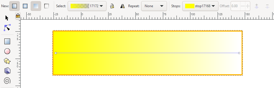 A rectangle that has a gradient going from yellow to transparent.
At thetop, the tool controls bar indicates that the object has a linear gradient withtwo stops, one yellow, the other transparent.
Each stop can be modified with the Fill and Stroke dialog, after the corresponding stop has beenselected on the canvas.
A rectangle that has a gradient going from yellow to transparent.
At thetop, the tool controls bar indicates that the object has a linear gradient withtwo stops, one yellow, the other transparent.
Each stop can be modified with the Fill and Stroke dialog, after the corresponding stop has beenselected on the canvas.
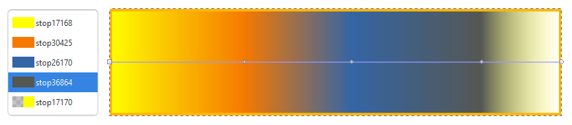 A linear gradient with 5 stops.
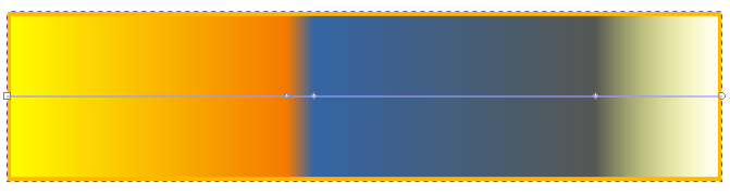 The position of each stop (color) can be changed directly on the canvas.
 A linear gradient can be transformed into a radial gradient and the other way around.
 A radial gradient can be moved as a whole by dragging on the square handle.
 This tool is especially useful for those who want to create photorealisticdesigns, but it also has its uses for everyone who wants to create complexgradients in a single object.
To apply a mesh gradient to an object, select the object.
Now you have two options:
This tool is especially useful for those who want to create photorealisticdesigns, but it also has its uses for everyone who wants to create complexgradients in a single object.
To apply a mesh gradient to an object, select the object.
Now you have two options:
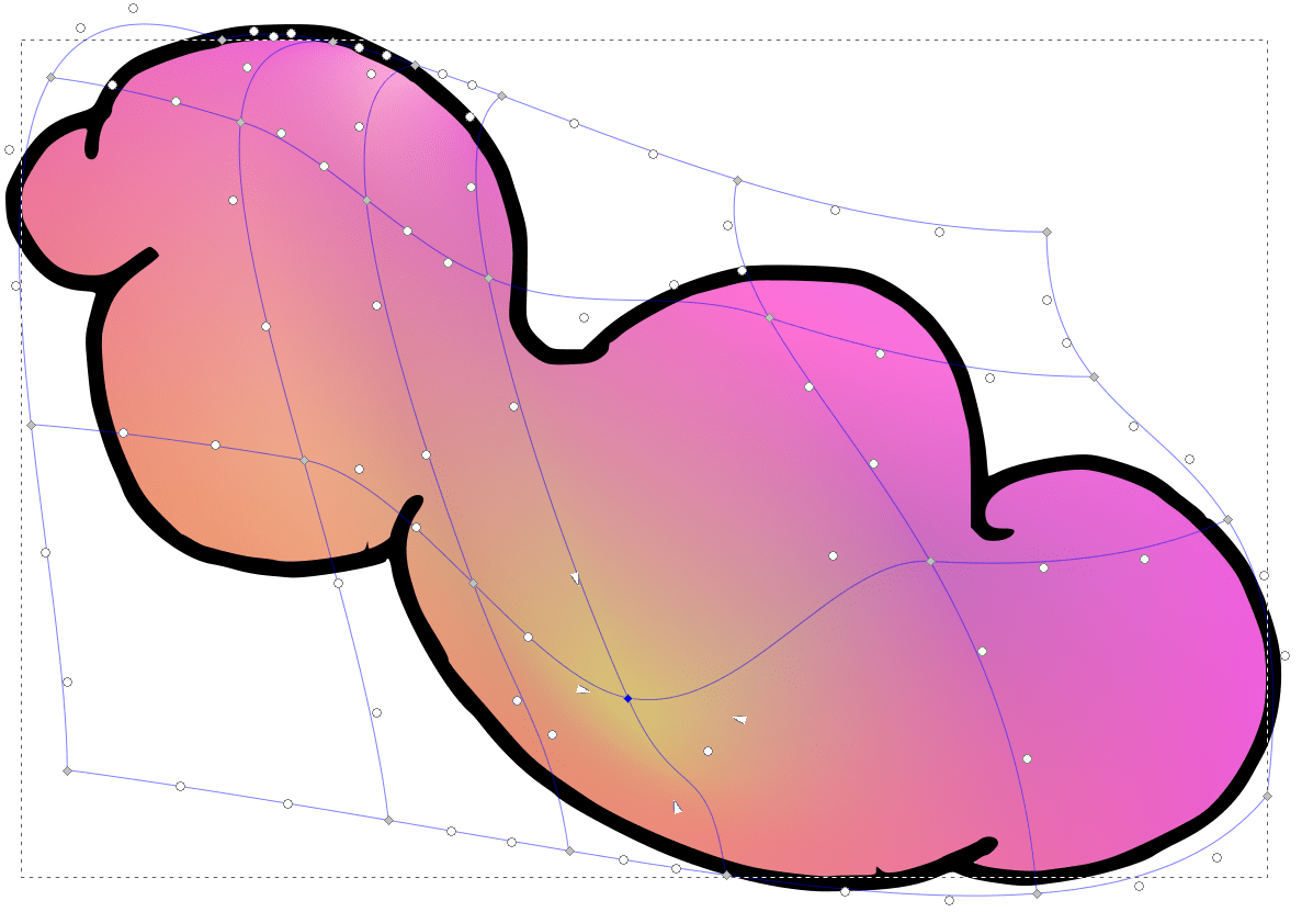 This cloud consists of 10 different colors.
Each color has been appliedto one of the grey diamond-shaped nodes.
The shape of the mesh has beenmodified to better fit the shape of the cloud.
This cloud consists of 10 different colors.
Each color has been appliedto one of the grey diamond-shaped nodes.
The shape of the mesh has beenmodified to better fit the shape of the cloud.
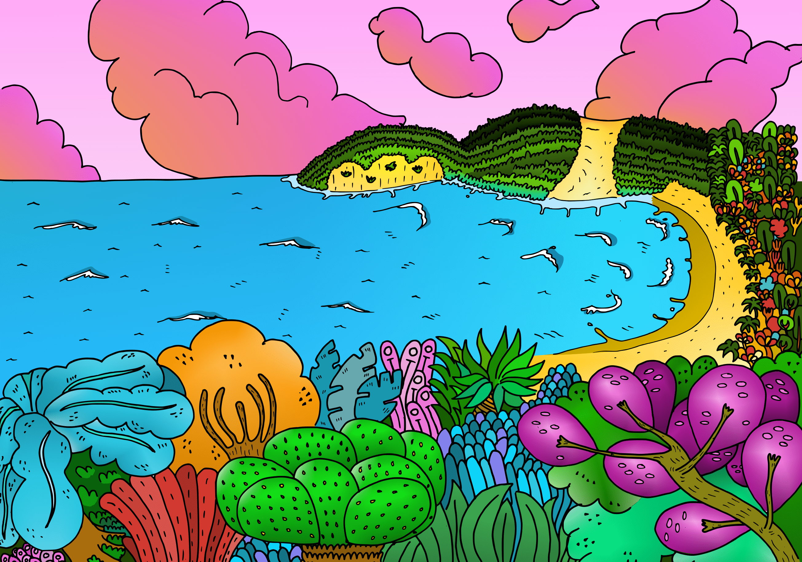 A landscape with mesh gradients
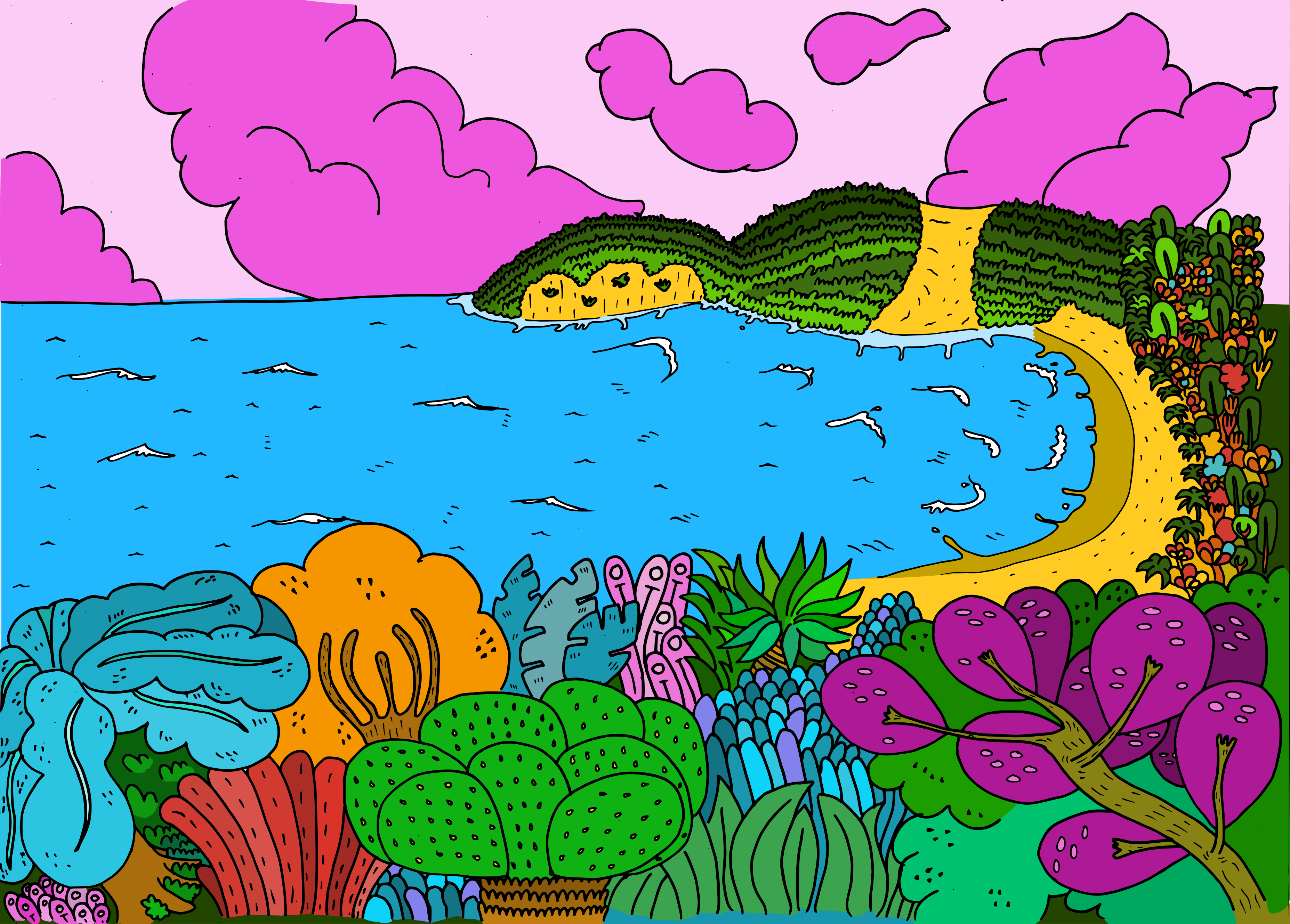 The same landscape without mesh gradients
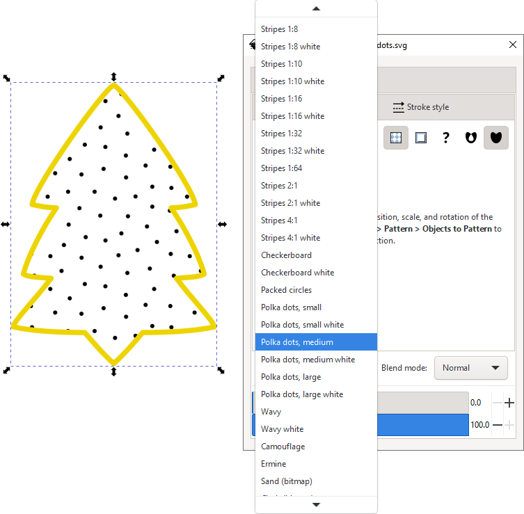 Object with stock pattern ‘Polka dots, medium’ and a view of thelist of available patterns
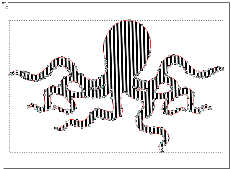 Standard pattern with vertical stripes.
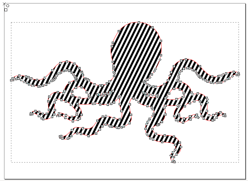 The pattern has been rotated, using the circular handle.
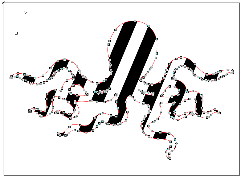 The pattern has been enlarged, by dragging the square handle.
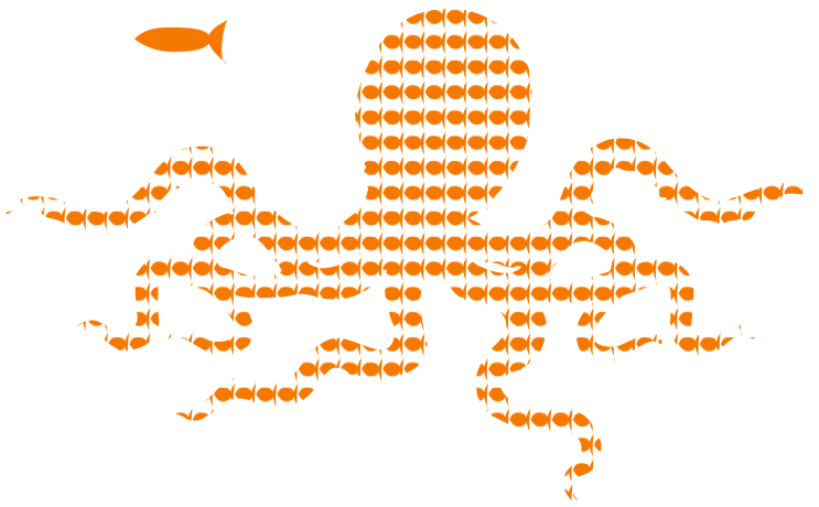 This octopus image is using a custom fish pattern.
 Black flat color on stroke
 Linear gradient with 3 stops.
The dotted lines indicate the spreadof the color for each stop.
Linear gradient with 3 stops.
The dotted lines indicate the spreadof the color for each stop.
 Radial gradient with 5 stops on the stroke.
The dotted ellipsesindicate the spread of the color for each stop.
Radial gradient with 5 stops on the stroke.
The dotted ellipsesindicate the spread of the color for each stop.
 The 3 different types of line joins.
 List of available markers..
(TODO: insert image)
List of available markers..
(TODO: insert image)
 The available marker orders’ icons
 [top] markers > stroke > fill [bottom]
 [top] markers > fill > stroke [bottom]
 [top] stroke > marker > fill [bottom]
 [top] stroke > fill > markers [bottom]
 [top] fill > markers > stroke [bottom]
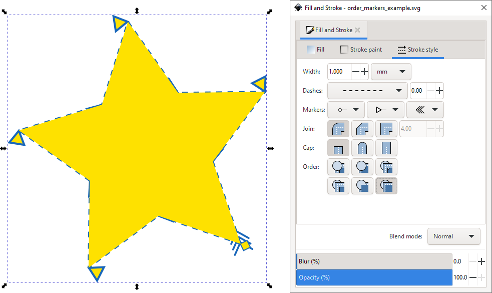 [top] stroke > fill > marker [bottom]
 We have drawn our markers and our path.
For the ends, in this case we want to have two mirrored markers.
We have drawn our markers and our path.
For the ends, in this case we want to have two mirrored markers.
 Now we convert the object to a marker.
It will be gone from the drawing after this operation.
Now we convert the object to a marker.
It will be gone from the drawing after this operation.
 In the Fill and Stroke dialog, we have selected the new markers for the start, end and middle of our path.
They are placed on the nodes of the path.
The size of the markers depends on the size of the objects that were converted to a marker.
It also changes with the stroke width of the path.
In the Fill and Stroke dialog, we have selected the new markers for the start, end and middle of our path.
They are placed on the nodes of the path.
The size of the markers depends on the size of the objects that were converted to a marker.
It also changes with the stroke width of the path.
 F8 or T
Once the Text tool is active, you will have two options at your handsabout how to create a text.
When you want to add a text that consists only of a single word or a short expression, the easiest way to add it is to:
Left-click on the canvas to place the cursor at the desired position.
Type the text directly afterwards.
The text will all be put into asingle line, unless you hit Enter to continue in the next line.
When you want to put your (longer) text into a specific areathat you have reserved for it:
Click-and-drag on the canvas.
This will create a frame for a flowedtext with a blue border, in which the text can be inserted.
Type on the keyboard.
The text will appear in its frame and will notleave the frame area.
When it reaches the border of the frame, itwill automatically flow into the next line.
The border of the textframe will turn red when the text doesn’t completely fit into it.
You can change the dimensions of the text box by dragging on thewhite handle in the bottom right corner.
Note
The text will not stretch or grow to fill the allotted space at allcosts.
It is up to you to adapt the size of the area or the font to yourneeds.
F8 or T
Once the Text tool is active, you will have two options at your handsabout how to create a text.
When you want to add a text that consists only of a single word or a short expression, the easiest way to add it is to:
Left-click on the canvas to place the cursor at the desired position.
Type the text directly afterwards.
The text will all be put into asingle line, unless you hit Enter to continue in the next line.
When you want to put your (longer) text into a specific areathat you have reserved for it:
Click-and-drag on the canvas.
This will create a frame for a flowedtext with a blue border, in which the text can be inserted.
Type on the keyboard.
The text will appear in its frame and will notleave the frame area.
When it reaches the border of the frame, itwill automatically flow into the next line.
The border of the textframe will turn red when the text doesn’t completely fit into it.
You can change the dimensions of the text box by dragging on thewhite handle in the bottom right corner.
Note
The text will not stretch or grow to fill the allotted space at allcosts.
It is up to you to adapt the size of the area or the font to yourneeds.
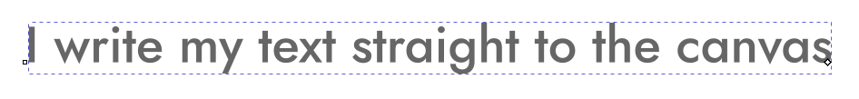 A left-click on the canvas with the text tool positions the cursor.
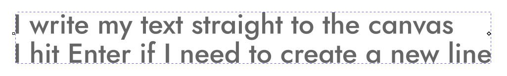 This mode does not automatically break lines in the text.
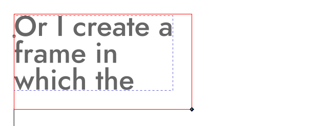 You need to create a text frame with the text tool first, if you want to use a flowed text with automatic line breaks.
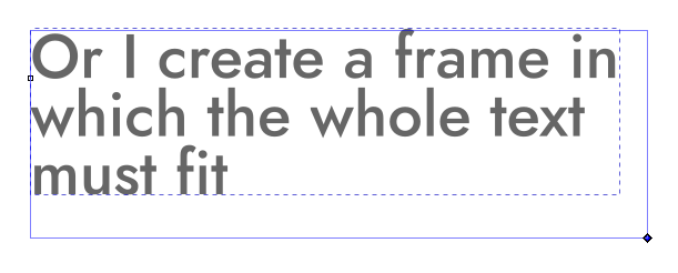 At any time, you can modify the text frame using its handle.
 Ctrl + Shift + T, Text : Text and Font
The Text and Font dialog is ideal for modifying a text’s style.
Most of the options that are available in that dialog can also be found in the horizontal tool controls bar at the top of the canvas:
TODO: list options for dialog and toolbar separately, this mixup is confusing.
Adjust to 0.92.3 changes (how to explain those messed up line height settings???)
a field with a list of the fonts that are installed on yourcomputer
the font style (bold, italic, condensed, regular etc.)
the font size
the line-height or spacing between lines
the icons for the text alignment (left, right, centered)
two icons for quickly adding superscript or subscript
a field for setting the spacing between letters and one for thespacing between words
two fields for horizontally and vertically shifting single orselected letters (kerning) and one for rotating them
icons for changing the text’s direction and orientation.
In the dialog, you will see a small preview of the result of yoursettings, and a tab labelled Text that can hold the whole text withoutdisplaying any styling.
Once you have all parameters tweaked to yourliking, you can click on Apply to make the result show up on thecanvas.
Inkscape does not come with any fonts.
It will allow you to select fromthose that you have installed on your system.
When you install a newfont while you are working on a drawing, you need to close all Inkscapewindows and restart the program to be able to select the new font.
The tab Variants allows you to activate specific features of certainfonts, like : ligatures.
There are several options that influence the text’s orientation.
Inkscapeoffers support for vertical scripts, and also for text that is written from right to left, like Arabic or Hebrew.
If your screen isn’t wide enough to display the whole list of option buttons for the Text tool, you will see a little arrow on the far right of the tool controls bar.
Click on it to reveal the missing options.
Ctrl + Shift + T, Text : Text and Font
The Text and Font dialog is ideal for modifying a text’s style.
Most of the options that are available in that dialog can also be found in the horizontal tool controls bar at the top of the canvas:
TODO: list options for dialog and toolbar separately, this mixup is confusing.
Adjust to 0.92.3 changes (how to explain those messed up line height settings???)
a field with a list of the fonts that are installed on yourcomputer
the font style (bold, italic, condensed, regular etc.)
the font size
the line-height or spacing between lines
the icons for the text alignment (left, right, centered)
two icons for quickly adding superscript or subscript
a field for setting the spacing between letters and one for thespacing between words
two fields for horizontally and vertically shifting single orselected letters (kerning) and one for rotating them
icons for changing the text’s direction and orientation.
In the dialog, you will see a small preview of the result of yoursettings, and a tab labelled Text that can hold the whole text withoutdisplaying any styling.
Once you have all parameters tweaked to yourliking, you can click on Apply to make the result show up on thecanvas.
Inkscape does not come with any fonts.
It will allow you to select fromthose that you have installed on your system.
When you install a newfont while you are working on a drawing, you need to close all Inkscapewindows and restart the program to be able to select the new font.
The tab Variants allows you to activate specific features of certainfonts, like : ligatures.
There are several options that influence the text’s orientation.
Inkscapeoffers support for vertical scripts, and also for text that is written from right to left, like Arabic or Hebrew.
If your screen isn’t wide enough to display the whole list of option buttons for the Text tool, you will see a little arrow on the far right of the tool controls bar.
Click on it to reveal the missing options.
 If I create a frame where the text will
The text tool’s options
I write my text directly on the canvas
I hit Enter when I need to break a line
The Text and Font dialog
If I create a frame where the text will
The text tool’s options
I write my text directly on the canvas
I hit Enter when I need to break a line
The Text and Font dialog
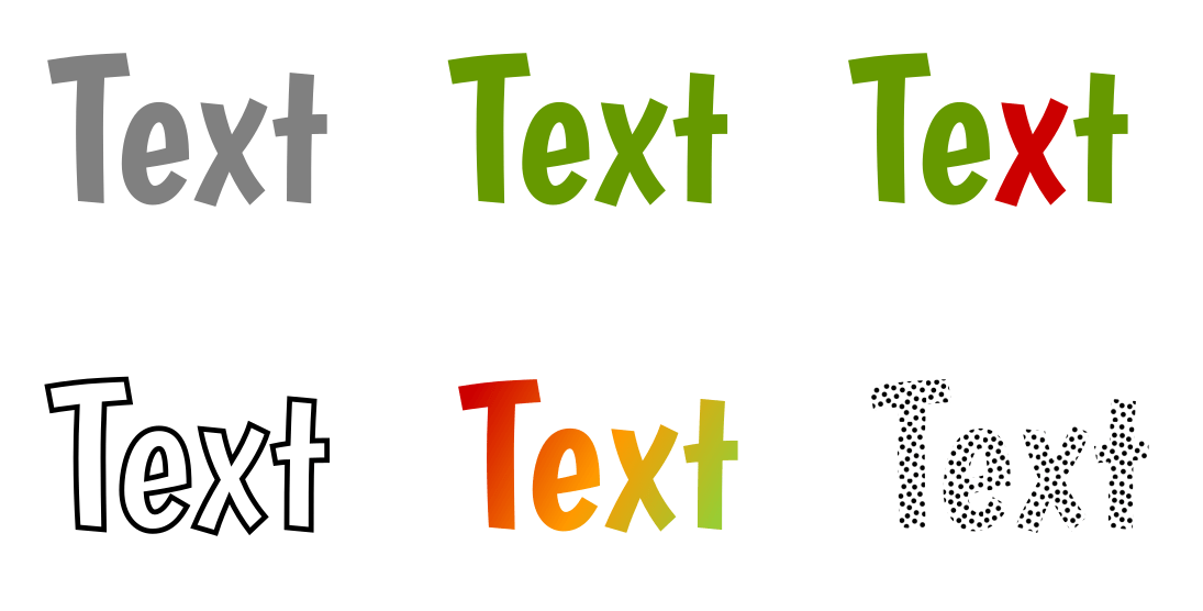 Text variations
 Options of the text tool that change the letters’ positions.
Changing the kerning allows you to create more elegant text blocks.
Standard text.
Changing the kerning allows you to create more elegant text blocks.
Text with a little kerning added.
Adjusting the height to achieve typographical effects.
Text with exaggerated kerning and rotation.
Options of the text tool that change the letters’ positions.
Changing the kerning allows you to create more elegant text blocks.
Standard text.
Changing the kerning allows you to create more elegant text blocks.
Text with a little kerning added.
Adjusting the height to achieve typographical effects.
Text with exaggerated kerning and rotation.
 Create a text and a path by whichever method you prefer…
 … and put the text on the path using Text : Put on Path.
 Text flowed into a frame that resembles an octopus.
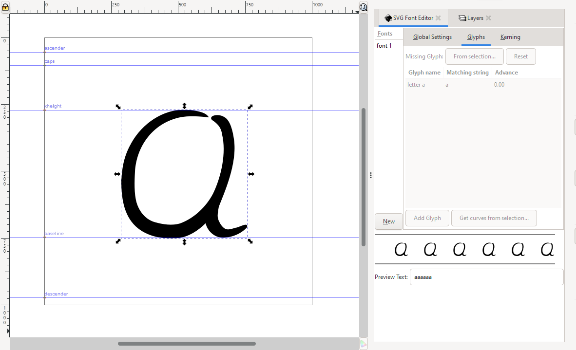 The typography template has just the right size for a single letter.
It comes with a set of useful guides.
On the right side, the letter ‘a’ has already been added to the SVG font.
The typography template has just the right size for a single letter.
It comes with a set of useful guides.
On the right side, the letter ‘a’ has already been added to the SVG font.

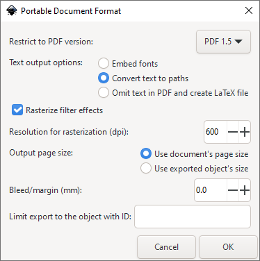 The PDF export dialog offers many options.
Usually, the default settings willwork fine.
However, when the PDF is for printing (as opposed to screen display),it is recommended that you set the dpi value (resolution) for filtered objectsto at least 300.
Tips
Inkscape can also open PDF files for editing.
Try to avoid multiple round-tripsthrough different file formats, though, because each conversion loses data or addsunnecessary data.
Note that for creating perfect PDF files for printing, it’s better toturn to a dedicated desktop publishing software such as Scribus, which can also import SVG files.
The PDF export dialog offers many options.
Usually, the default settings willwork fine.
However, when the PDF is for printing (as opposed to screen display),it is recommended that you set the dpi value (resolution) for filtered objectsto at least 300.
Tips
Inkscape can also open PDF files for editing.
Try to avoid multiple round-tripsthrough different file formats, though, because each conversion loses data or addsunnecessary data.
Note that for creating perfect PDF files for printing, it’s better toturn to a dedicated desktop publishing software such as Scribus, which can also import SVG files.
 Bitmap Image Import Dialog
 When the imported image is only linked in the document, and latermoved away, Inkscape will not be able to find the image.
Abeautiful red frame with a cross will be displayed on the canvasinstead!
When the imported image is only linked in the document, and latermoved away, Inkscape will not be able to find the image.
Abeautiful red frame with a cross will be displayed on the canvasinstead!
 Alt + D Edit : Clone : Create Clone
You can save yourself some time when you know how to use : clones.With Alt + D, a clone can be created just as quickly as a copy or aduplicate.
One only needs to remember that the option exists.
The new clone will appear right on top of the original, and will follow allmodifications made on the original, no matter if they affect its style (stroke,fill,…) or its shape.
The clone’s shape cannot be edited directly.
Its colors can only be changed if the original has no color itself.
Its size and rotation can be changed freely.
Tip
To remove a color from an object, you must ‘unset’ its paint, using thequestion mark button
Alt + D Edit : Clone : Create Clone
You can save yourself some time when you know how to use : clones.With Alt + D, a clone can be created just as quickly as a copy or aduplicate.
One only needs to remember that the option exists.
The new clone will appear right on top of the original, and will follow allmodifications made on the original, no matter if they affect its style (stroke,fill,…) or its shape.
The clone’s shape cannot be edited directly.
Its colors can only be changed if the original has no color itself.
Its size and rotation can be changed freely.
Tip
To remove a color from an object, you must ‘unset’ its paint, using thequestion mark button
 in the Fill and Strokedialog.
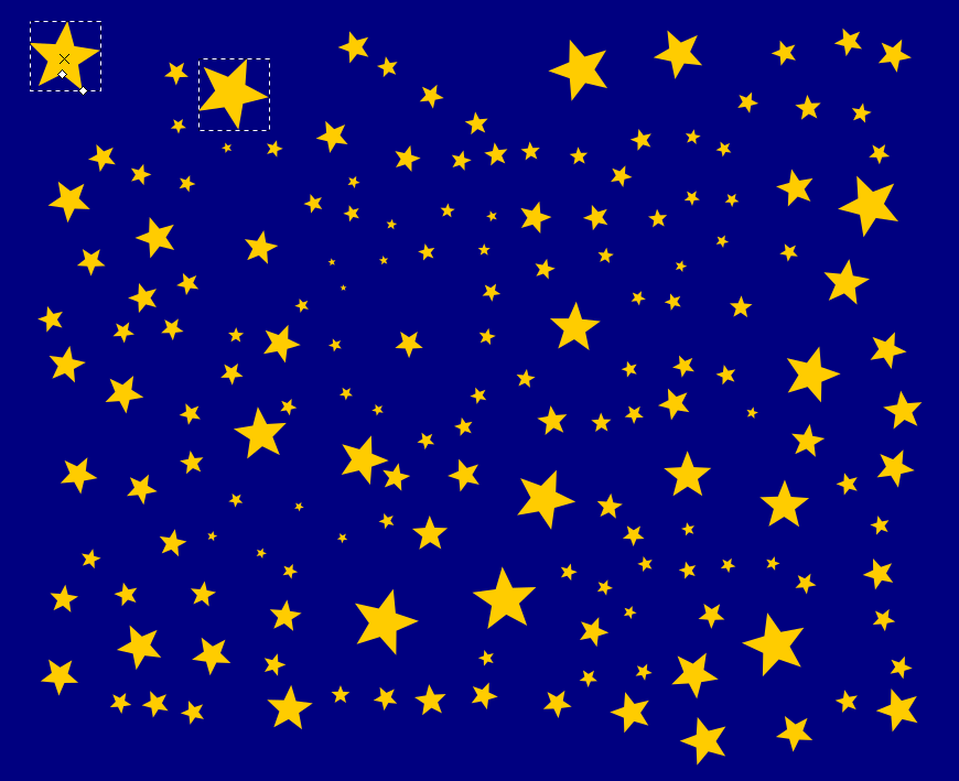 All these stars are clones of the star in the top left corner.
They have the same color and shape, but different sizes and rotations.
Note that the selected clone does not have any star tool handles.
To turn a clone into an independent, fully editable object, you need tounlink it from its original with Shift + Alt + D, Edit : Clone : Unlink Clone or by clicking on the corresponding icon
All these stars are clones of the star in the top left corner.
They have the same color and shape, but different sizes and rotations.
Note that the selected clone does not have any star tool handles.
To turn a clone into an independent, fully editable object, you need tounlink it from its original with Shift + Alt + D, Edit : Clone : Unlink Clone or by clicking on the corresponding icon
 in the command bar.
To select the original of a clone, you can press Shift + D or use Edit : Clone : Select Original in the menu.
in the command bar.
To select the original of a clone, you can press Shift + D or use Edit : Clone : Select Original in the menu.
 Since we don’t want the eyes to get out of alignment, we should group them.
Select both objects and then select Group from the commands bar, Object menu or keyboard shortcut:
Since we don’t want the eyes to get out of alignment, we should group them.
Select both objects and then select Group from the commands bar, Object menu or keyboard shortcut:
 Note that we could also, if we wanted, group all four objects together at the same time.
In this example, we’ll make three nested groups: one of the eyes, another of the face (mouth + eye-group), and a third of the whole head (head + face-group):
Note that we could also, if we wanted, group all four objects together at the same time.
In this example, we’ll make three nested groups: one of the eyes, another of the face (mouth + eye-group), and a third of the whole head (head + face-group):
 Now the smiley face can be moved, rotated, and scaled as a single object.
 Ctrl + Shift + A
This dialog offers invaluable help.
You can use it to align nodes andobjects vertically or horizontally, or to distribute them at equaldistances.
To use it for aligning nodes:
Open the dialog by clicking on its icon in the command bar to the right of the canvas.
Switch to the Node tool.
Select a couple of nodes.
Click on the node alignment button of your choice.
The alignment will be applied immediately.
To align objects:
Open the dialog.
Switch to the Select tool.
Select the objects that you want to align.
Decide which one of the objects should not move at all.
The object youselected first? The one you selected last? The biggest or the smallestone? Or perhaps you want to move all the objects in relation to the page? Inthe dropdown labelled Relative to:, select the option thatapplies.
Click on the alignment button of your choice.
Use the tooltips that displaywhen you hover over them with the mouse to learn what each symbol means.
Theselected alignment will be applied immediately.
Ctrl + Shift + A
This dialog offers invaluable help.
You can use it to align nodes andobjects vertically or horizontally, or to distribute them at equaldistances.
To use it for aligning nodes:
Open the dialog by clicking on its icon in the command bar to the right of the canvas.
Switch to the Node tool.
Select a couple of nodes.
Click on the node alignment button of your choice.
The alignment will be applied immediately.
To align objects:
Open the dialog.
Switch to the Select tool.
Select the objects that you want to align.
Decide which one of the objects should not move at all.
The object youselected first? The one you selected last? The biggest or the smallestone? Or perhaps you want to move all the objects in relation to the page? Inthe dropdown labelled Relative to:, select the option thatapplies.
Click on the alignment button of your choice.
Use the tooltips that displaywhen you hover over them with the mouse to learn what each symbol means.
Theselected alignment will be applied immediately.
 Before arranging the objects, they are distributed somewhat randomly on thecanvas.
 After aligning each row and column vertically and horizontally, theresult looks very neat.
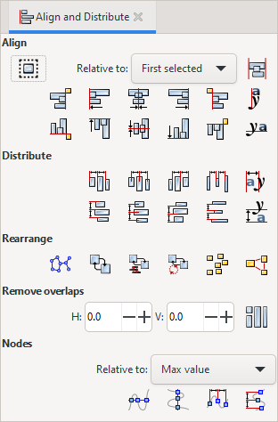 With the Align and Distribute dialog, it only takes a couple of clicks to arrange your objects neatly.
 rocket.png, the image that we want to trace in this example.
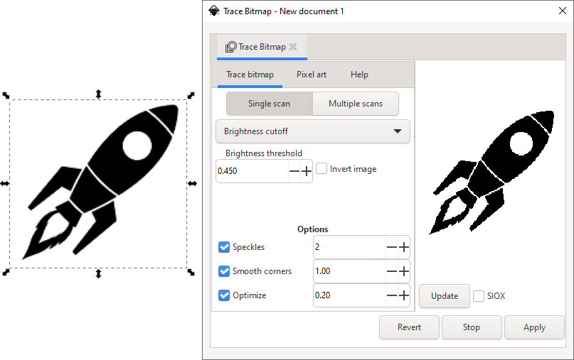 The image rocket.png has been imported and the Trace Bitmap dialogwas opened.
The Live Preview can be activated to show a roughpreview of the result.
The image rocket.png has been imported and the Trace Bitmap dialogwas opened.
The Live Preview can be activated to show a roughpreview of the result.
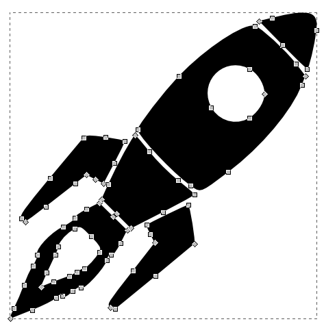 The rocket traced with the Brightness Cutoff option.
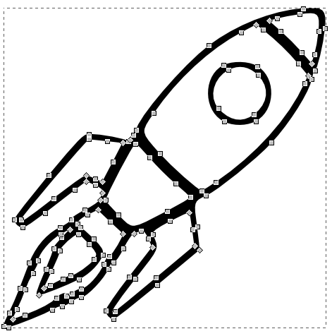 The rocket vectorized with the Edge Detection option.
 A bitmap image in color.
 Multiple Scans: Colors option with 10 scans.
There are 10 stackedobjects in the result.
Multiple Scans: Colors option with 10 scans.
There are 10 stackedobjects in the result.
 After ungrouping, the 10 objects can be moved.
 The object we want to clip and mask
 The path for clipping (and masking) has been positioned above the head of the griffin.
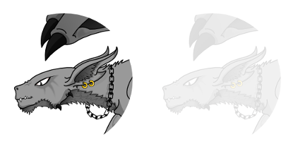 On the left, the griffin’s head was clipped with the circle.
On the right, the circle was used as a mask.
On the left, the griffin’s head was clipped with the circle.
On the right, the circle was used as a mask.


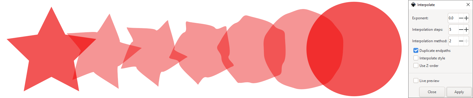


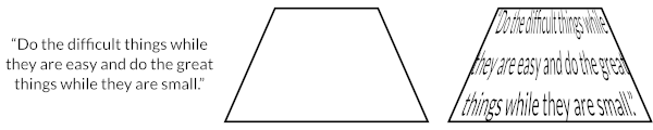

 You can choose between a couple of presets for the keyboard shortcuts.
In addition to this, you can overwrite any shortcut by:
selecting it from the list;
clicking on the field in the Shortcut column;
pressing the new shortcut, when it says New accelerator in thatfield.
Pressing Backspace will reset the shortcut to its default value.
You can choose between a couple of presets for the keyboard shortcuts.
In addition to this, you can overwrite any shortcut by:
selecting it from the list;
clicking on the field in the Shortcut column;
pressing the new shortcut, when it says New accelerator in thatfield.
Pressing Backspace will reset the shortcut to its default value.
 When it says ‘New accelerator’, press the new shortcut.
 .
You decide on a name for the image that you put into the text.
Then, you specify its properties in a separate block.
It’s best to put these blocks at the bottom of the document (scroll down to the end to see it).
This type of image can be described as an ‘inline image’.
All images that show a part of the Inkscape interface should be formatted like this and have the class ‘screenshot’, a caption and an alt attribute.
Screenshots should be in the png file format and the relevant area should be as large as possible:
.
You decide on a name for the image that you put into the text.
Then, you specify its properties in a separate block.
It’s best to put these blocks at the bottom of the document (scroll down to the end to see it).
This type of image can be described as an ‘inline image’.
All images that show a part of the Inkscape interface should be formatted like this and have the class ‘screenshot’, a caption and an alt attribute.
Screenshots should be in the png file format and the relevant area should be as large as possible:
 Available classes:
for alignment: left, center, right
for size: small, medium, large
If you want to tell the user how to get somewhere using the menu, use the menu selection markup, e.g.
Edit : Preferences : Input/Output : Autosave
For a label in the interface, use the gui label markup, e.g.
Enable gradient editing.
If you want to tell the user which key to press, use the keyboard shortcut markup, e.g.
Ctrl + C.
For referencing a specific file on the user’s computer, use the markup for files, e.g.
Available classes:
for alignment: left, center, right
for size: small, medium, large
If you want to tell the user how to get somewhere using the menu, use the menu selection markup, e.g.
Edit : Preferences : Input/Output : Autosave
For a label in the interface, use the gui label markup, e.g.
Enable gradient editing.
If you want to tell the user which key to press, use the keyboard shortcut markup, e.g.
Ctrl + C.
For referencing a specific file on the user’s computer, use the markup for files, e.g.

 Inkscape home page.
Alternatively, you can go directly to the download page, https://inkscape.org/release/inkscape-1.0.1/ and see what your options are.
Inkscape home page.
Alternatively, you can go directly to the download page, https://inkscape.org/release/inkscape-1.0.1/ and see what your options are.
 Inkscape Download page.
Download the installer of your choice.
Note: this tutorial covers the Inkscape .exe installer.
The Inkscape .msi installer has a couple of dialog boxes different from the .exe version.
If you use the .msi installer, accept all default settings.
A download dialog box might appear asking you whether you want to save the installation file or cancel out of downloading.
Click on Save File.
Inkscape Download page.
Download the installer of your choice.
Note: this tutorial covers the Inkscape .exe installer.
The Inkscape .msi installer has a couple of dialog boxes different from the .exe version.
If you use the .msi installer, accept all default settings.
A download dialog box might appear asking you whether you want to save the installation file or cancel out of downloading.
Click on Save File.
 Choose Inkscape Installer.
You are brought to the Download Inkscape page.
A dialog box appears prompting you to download the Inkscape installation program.
Choose Inkscape Installer.
You are brought to the Download Inkscape page.
A dialog box appears prompting you to download the Inkscape installation program.
 Download Inkscape dialog box.
If you download it onto your desktop, you will see an icon similar to the one below:
Download Inkscape dialog box.
If you download it onto your desktop, you will see an icon similar to the one below:
 Inkscape Installer Icon Double-click on the installer icon.
If you are using Windows 10, a dialog box will appear inquiring whether you want to install Inkscape.
Click on Yes.
Another dialog box appears inquiring which language you want to use for installing Inkscape.
Select your language of choice:
Inkscape Installer Icon Double-click on the installer icon.
If you are using Windows 10, a dialog box will appear inquiring whether you want to install Inkscape.
Click on Yes.
Another dialog box appears inquiring which language you want to use for installing Inkscape.
Select your language of choice:
 Installer Language dialog box.
The installation wizard appears:
Installer Language dialog box.
The installation wizard appears:
 Installation wizard The installer quickly checks whether there is enough room on the hard disk to install Inkscape.
If there isn't, the installer will give you a diagnostic statement.
If there is enough room to fit the Inkscape program on, then the installation begins in earnest.
Click on the Next button.
The End User Legal Agreement (EULA) window comes up.
Read the agreement.
Click on I Agree.
Installation wizard The installer quickly checks whether there is enough room on the hard disk to install Inkscape.
If there isn't, the installer will give you a diagnostic statement.
If there is enough room to fit the Inkscape program on, then the installation begins in earnest.
Click on the Next button.
The End User Legal Agreement (EULA) window comes up.
Read the agreement.
Click on I Agree.
 End User Legal Agreement (EULA) window The Choose Components window comes up.
If you are just starting out, keep the default settings by clicking on Next.
End User Legal Agreement (EULA) window The Choose Components window comes up.
If you are just starting out, keep the default settings by clicking on Next.
 Choose Components (default settings are chosen) The Choose Install Location dialog box appears.
Accept the default location by clicking on Install.
Choose Components (default settings are chosen) The Choose Install Location dialog box appears.
Accept the default location by clicking on Install.
 Choose Install Location dialog box.
Once you’ve clicked on the Install button.
The installation process begins:
Choose Install Location dialog box.
Once you’ve clicked on the Install button.
The installation process begins:
 Installing files
 Finished installing dialog window Click on Finish.
Congratulations! You have just installed Inkscape onto your computer.
If the Run Inkscape checkbox is checked, Inkscape will launch.
Otherwise, you will see the Inkscape icon on your desktop.
Finished installing dialog window Click on Finish.
Congratulations! You have just installed Inkscape onto your computer.
If the Run Inkscape checkbox is checked, Inkscape will launch.
Otherwise, you will see the Inkscape icon on your desktop.
 Desktop Inkscape icon You can double-click on it to start Inkscape.
Enjoy the creative power of graphic design at your fingertips!
Desktop Inkscape icon You can double-click on it to start Inkscape.
Enjoy the creative power of graphic design at your fingertips!
 Preferences dialog box.
Scroll down the navigation list on the left side of the dialog box until you reach Input/Output.
Preferences dialog box.
Scroll down the navigation list on the left side of the dialog box until you reach Input/Output.
 Scrolling down to Input/Output.
Click on the Expand icon (
Scrolling down to Input/Output.
Click on the Expand icon (  Expand the Input/Output sublisting.
Click on Autosave.
Expand the Input/Output sublisting.
Click on Autosave.
 Click on Autosave.
In the Autosave dialog box, you can choose where temporary saved Inkscape files can be stored.
When in doubt keep the default subdirectory.
A ten-minute save interval and a maximum of ten autosaved files are good default values to keep.
You can change them to fit your needs and level of comfort.
Check the Enable autosave (requires restart) checkbox to “turn the Autosave switch on.” It has not been activated yet.
Click on Autosave.
In the Autosave dialog box, you can choose where temporary saved Inkscape files can be stored.
When in doubt keep the default subdirectory.
A ten-minute save interval and a maximum of ten autosaved files are good default values to keep.
You can change them to fit your needs and level of comfort.
Check the Enable autosave (requires restart) checkbox to “turn the Autosave switch on.” It has not been activated yet.
 Click on the Autosave checkbox to enable the function.
If you already created some artwork that you want to save, then choose File > Save, follow the instructions in the dialog box, then File > Quit to exit Inkscape.
Restart Inkscape.
The Autosave function is now active and will stay active in future sessions.
It will create backup copies of your work every ten minutes.
You can now work on your artwork with peace of mind.
Click on the Autosave checkbox to enable the function.
If you already created some artwork that you want to save, then choose File > Save, follow the instructions in the dialog box, then File > Quit to exit Inkscape.
Restart Inkscape.
The Autosave function is now active and will stay active in future sessions.
It will create backup copies of your work every ten minutes.
You can now work on your artwork with peace of mind.
 Learning the parts of the work area and how to navigate among them will help you make effective use of Inkscape.
The work area includes the canvas, page, scratch area, and toolbars.
In this tutorial on the work area, you will learn: how to open an Inkscape file.
how to select tools from the toolbar.
how to magnify and reduce the size of an image.
how to work with dialogs.
how to use the Inkscape Manual.
You will be working on an art file in this tutorial.
Double-click the Inkscape icon to launch Inkscape.
The work area appears after several seconds of uploading Inkscape into your computer’s CPU.
It might take up to a minute or more on a slow computer.
Be patient! Inkscape will come up.
Learning the parts of the work area and how to navigate among them will help you make effective use of Inkscape.
The work area includes the canvas, page, scratch area, and toolbars.
In this tutorial on the work area, you will learn: how to open an Inkscape file.
how to select tools from the toolbar.
how to magnify and reduce the size of an image.
how to work with dialogs.
how to use the Inkscape Manual.
You will be working on an art file in this tutorial.
Double-click the Inkscape icon to launch Inkscape.
The work area appears after several seconds of uploading Inkscape into your computer’s CPU.
It might take up to a minute or more on a slow computer.
Be patient! Inkscape will come up.
 Click on the Tutorial01Image01.svg link in this tutorial and download the Tutorial01Image01.svg file to your computer.
 The image is larger than will fit on the screen — its bottom is hidden behind the horizontal scroll bar.
To resize the image so that it fits just right in the screen, click on the Zoom in or out (F3) icon
The image is larger than will fit on the screen — its bottom is hidden behind the horizontal scroll bar.
To resize the image so that it fits just right in the screen, click on the Zoom in or out (F3) icon
 Outline view
 Grayscale view
 Normal view
Choose View > Color display mode > Normal to return to full color.
Normal view
Choose View > Color display mode > Normal to return to full color.
 Toolbar, Tool Hot Keys, and Hidden Tool Submenu.
The Mesh, Dropper, and Connector tools are available when you click on the double-arrow button
Toolbar, Tool Hot Keys, and Hidden Tool Submenu.
The Mesh, Dropper, and Connector tools are available when you click on the double-arrow button
 When you use any of the viewing tools, only the screen display of your work is affected, not its actual size.
 Page view.
Now choose View > Zoom > Page Width.
The artwork is magnified so that the artwork page width spans the width of the Inkscape screen.
Pressing the number 6 (shortcut key) does the same thing.
Note the percentage amount of zoom in the Zoom bar (153%).
Page view.
Now choose View > Zoom > Page Width.
The artwork is magnified so that the artwork page width spans the width of the Inkscape screen.
Pressing the number 6 (shortcut key) does the same thing.
Note the percentage amount of zoom in the Zoom bar (153%).
 Page width view.
Choose View > Zoom > Drawing.
The screen now shows the Music.svg artwork in exactly the same way as you saw it using the View > Zoom > Page command.
These two views are similar because the Music.svg artwork fits almost exactly on the drawing page.
If the image was smaller, then it would be magnified to fit the screen.
In the case above, the magnification is at 47% instead of 48%.
Another useful viewing function allows you to select a specific item in your artwork with the Select tool and expand the view to focus on the object of interest.
Try it out by: clicking on the Select tool (
Page width view.
Choose View > Zoom > Drawing.
The screen now shows the Music.svg artwork in exactly the same way as you saw it using the View > Zoom > Page command.
These two views are similar because the Music.svg artwork fits almost exactly on the drawing page.
If the image was smaller, then it would be magnified to fit the screen.
In the case above, the magnification is at 47% instead of 48%.
Another useful viewing function allows you to select a specific item in your artwork with the Select tool and expand the view to focus on the object of interest.
Try it out by: clicking on the Select tool (  then clicking on a spot in the artwork that you would like to get a closer look at:
 and then choosing View > Zoom > Selection.
The object you selected now fills the screen awaiting your close examination.
Note the bounding box surrounding the selected object that helps you distinguish the selected object from the others.
and then choosing View > Zoom > Selection.
The object you selected now fills the screen awaiting your close examination.
Note the bounding box surrounding the selected object that helps you distinguish the selected object from the others.

 .
Position the Zoom tool over the topmost treble clef and click once.
The artwork is now displayed at a higher magnification.
Click two more times in the same spot.
The view is increased again, and you'll notice that the area you click is magnified.
The spot that you clicked on stays centered underneath the cursor.
Next, you'll reduce the view of the artwork.
With the Zoom tool
.
Position the Zoom tool over the topmost treble clef and click once.
The artwork is now displayed at a higher magnification.
Click two more times in the same spot.
The view is increased again, and you'll notice that the area you click is magnified.
The spot that you clicked on stays centered underneath the cursor.
Next, you'll reduce the view of the artwork.
With the Zoom tool
 .
With the <Shift> key still depressed, click in the artwork twice.
The view of the artwork is reduced.
You can achieve a much more controlled and effective zoom by dragging a marquee to magnify a specific area of your artwork.
With the Zoom tool
.
With the <Shift> key still depressed, click in the artwork twice.
The view of the artwork is reduced.
You can achieve a much more controlled and effective zoom by dragging a marquee to magnify a specific area of your artwork.
With the Zoom tool
 Area selected
 Resulting view Repeat this technique to get to the end of the sequence of treble clefs or bass clefs in the artwork! You can do some serious magnifying! (Inkscape allows you to get up to a magnification of 25,600%! That's really high magnification!)
 The end of the line.
Note: You can draw a marquee with the Zoom tool to enlarge the view of artwork, but you cannot draw a marquee to reduce it.
The end of the line.
Note: You can draw a marquee with the Zoom tool to enlarge the view of artwork, but you cannot draw a marquee to reduce it.
 Zoom toolbar.
Click on the Zoom to fit page in window icon
Zoom toolbar.
Click on the Zoom to fit page in window icon
 to resize the Music.svg artwork.
Click on the Zoom to 1:1 icon
to resize the Music.svg artwork.
Click on the Zoom to 1:1 icon
 .
The artwork is redrawn to 100% of the drawing size.
At this scale, one Inkscape drawing pixel equals one screen pixel.
Click on the Zoom to 1:2 icon
.
The artwork is redrawn to 100% of the drawing size.
At this scale, one Inkscape drawing pixel equals one screen pixel.
Click on the Zoom to 1:2 icon
 .
The artwork is redrawn to 50% of its drawing size.
Click on the Zoom to 2:1 icon
.
The artwork is redrawn to 50% of its drawing size.
Click on the Zoom to 2:1 icon
 .
The artwork is redrawn to twice (200%) its drawing size.
Click slowly several times on the View Previous button
.
The artwork is redrawn to twice (200%) its drawing size.
Click slowly several times on the View Previous button
 to see the magnification history of your artwork.
Now, go forward in history by clicking slowly the View Next button
to see the magnification history of your artwork.
Now, go forward in history by clicking slowly the View Next button
 to retrace your viewing history.
 Clicking on the exit symbol
 If you have two or more dialogs up, you switch between them by clicking in one or the other.
You can also iconify both to open up space and yet keep the dialogs available for immediate use.
If you have two or more dialogs up, you switch between them by clicking in one or the other.
You can also iconify both to open up space and yet keep the dialogs available for immediate use.
 Two dialogs up and available.
 The previous two dialogs iconified.
You can literally tear off a dialog from its position on the right side of the screen and make it a free-floating window.
Left-click on the dialog’s title bar and drag it to the middle of the screen.
This capability of moving dialogs to other places on the screen might be a boon to artists and designers who work well with a fluidly manageable work area.
The previous two dialogs iconified.
You can literally tear off a dialog from its position on the right side of the screen and make it a free-floating window.
Left-click on the dialog’s title bar and drag it to the middle of the screen.
This capability of moving dialogs to other places on the screen might be a boon to artists and designers who work well with a fluidly manageable work area.
 To complete the section on working with dockable dialogs, look up dockable dialogs using the Comprehensive Index.
When you’re at the index, choose D > Dialogs > Floating.
Speaking of the Inkscape manual, that subject is coming up next.
To complete the section on working with dockable dialogs, look up dockable dialogs using the Comprehensive Index.
When you’re at the index, choose D > Dialogs > Floating.
Speaking of the Inkscape manual, that subject is coming up next.
 Scroll down and immerse yourself in all the capabilities that Inkscape offers you in creating shapes from basic simplicity to things that defy description.
This is just a start.
As you read and learn, play with the examples the tutorial provides to get a hands-on feel.
When you are finished, you can save the tutorial with all the changes you made to the examples or exit it without saving your changes.
Below is an example of me goofing around:
Scroll down and immerse yourself in all the capabilities that Inkscape offers you in creating shapes from basic simplicity to things that defy description.
This is just a start.
As you read and learn, play with the examples the tutorial provides to get a hands-on feel.
When you are finished, you can save the tutorial with all the changes you made to the examples or exit it without saving your changes.
Below is an example of me goofing around:
 Scroll down to view how keys and the mouse work in the canvas environment:

 Click on the Comprehensive Index link.
The Comprehensive Index page comes up:
Click on the Comprehensive Index link.
The Comprehensive Index page comes up:
 Click on O.
You are taken to the O section of the manual.
Scroll down until you reach Outline Mode:
Click on O.
You are taken to the O section of the manual.
Scroll down until you reach Outline Mode:
 Click on the Outline Mode link.
You are taken to the Outline Mode page:
Click on the Outline Mode link.
You are taken to the Outline Mode page:

 Page top of the Index by Menu.
 Page top of the Index by Tool.
Take or make some time to explore the Inkscape Manual.
It is vast, comprehensive, and is always being updated to reflect latest developments.
This tutorial serves to supplement the Inkscape Manual.
If you need in-depth information about any feature that Inkscape offers, consult the manual first.
Use it as your main resource.
There is also a vibrant Inkscape community on the web.
You are invited to join and participate.
Contributions of tutorials and graphic design examples are plentiful and exist for everybody’s benefit.
It’s as if diamonds are spread around on the ground.
You just need to bend down and pick them up.
Enjoy in good health!
Page top of the Index by Tool.
Take or make some time to explore the Inkscape Manual.
It is vast, comprehensive, and is always being updated to reflect latest developments.
This tutorial serves to supplement the Inkscape Manual.
If you need in-depth information about any feature that Inkscape offers, consult the manual first.
Use it as your main resource.
There is also a vibrant Inkscape community on the web.
You are invited to join and participate.
Contributions of tutorials and graphic design examples are plentiful and exist for everybody’s benefit.
It’s as if diamonds are spread around on the ground.
You just need to bend down and pick them up.
Enjoy in good health!
 Choosing the correct selection method to make changes to objects is an essential skill to develop.
In this tutorial, you will learn how to correctly locate and select objects using the Selection tools, as well as protect objects by hiding and locking.
Later, you will build on these methods by integrating layers.
In this tutorial on the work area, you will learn how to: differentiate when to use the Selection, Edit path by nodes, or Select by grouping tools.
group and ungroup items.
clone items with the Select tool.
lock and hide items for organizational purposes.
Choosing the correct selection method to make changes to objects is an essential skill to develop.
In this tutorial, you will learn how to correctly locate and select objects using the Selection tools, as well as protect objects by hiding and locking.
Later, you will build on these methods by integrating layers.
In this tutorial on the work area, you will learn how to: differentiate when to use the Selection, Edit path by nodes, or Select by grouping tools.
group and ungroup items.
clone items with the Select tool.
lock and hide items for organizational purposes.

 Select tool with crossed arrow icon.
Click on the yellow star in the upper left corner.
A bounding box with eight handles appears.
Select tool with crossed arrow icon.
Click on the yellow star in the upper left corner.
A bounding box with eight handles appears.
 The bounding box The bounding box is used for transformations such as resizing and rotating; it also indicates that this item is selected and ready to be edited.
This could mean changing the size, color, position, or any number of other things.
Using the Select tool (
The bounding box The bounding box is used for transformations such as resizing and rotating; it also indicates that this item is selected and ready to be edited.
This could mean changing the size, color, position, or any number of other things.
Using the Select tool (  Second star selected.
Add another star to the selection by holding down the <Shift> key and clicking on the first star.
Both stars are now selected.
Second star selected.
Add another star to the selection by holding down the <Shift> key and clicking on the first star.
Both stars are now selected.
 Add other items to a selection by holding down the <Shift> key.
Reposition the stars by clicking in the center of either selected star and dragging.
Since both are selected, they travel together.
Note: When you select an item without a fill, you must click on the stroke (border).
Deselect the stars by clicking on the canvas where there are no objects.
Alternatively, press <Esc> (the Escape key).
Revert by choosing File > Revert.
An alert box will appear warning you that you will lose any changes made to your document — are you sure you want to reload the document…? Click on OK.
File YellowStars.svg is reloaded and the stars appear in their original positions.
Add other items to a selection by holding down the <Shift> key.
Reposition the stars by clicking in the center of either selected star and dragging.
Since both are selected, they travel together.
Note: When you select an item without a fill, you must click on the stroke (border).
Deselect the stars by clicking on the canvas where there are no objects.
Alternatively, press <Esc> (the Escape key).
Revert by choosing File > Revert.
An alert box will appear warning you that you will lose any changes made to your document — are you sure you want to reload the document…? Click on OK.
File YellowStars.svg is reloaded and the stars appear in their original positions.
 Marquee drawn around two stars.
 The two stars are now selected.
 Click one, all in the group become selected.
 With this added to the selection, choose Object > Group.
 <Shift>+click on the middle star in the second row and also choose Object > Group.
Press <Esc> when finished.
Now, click on any of the five grouped stars.
See how the top and middle rows of stars are enclosed in the bounding box.
Click anywhere outside the box to deselect the group, and then click on the third star in the second row.
Only that star is enclosed in the marquee.
It has not been included in the group yet.
<Shift>+click on one of the grouped stars to include the group to the "group of one." The bounding box encloses the two top rows of stars and includes a smaller box highlighting the one "special star."
<Shift>+click on the middle star in the second row and also choose Object > Group.
Press <Esc> when finished.
Now, click on any of the five grouped stars.
See how the top and middle rows of stars are enclosed in the bounding box.
Click anywhere outside the box to deselect the group, and then click on the third star in the second row.
Only that star is enclosed in the marquee.
It has not been included in the group yet.
<Shift>+click on one of the grouped stars to include the group to the "group of one." The bounding box encloses the two top rows of stars and includes a smaller box highlighting the one "special star."
 Choose Object > Group.
Click outside the box and then click on the third star in the second row.
The box now encloses the top two rows of stars, indicating that the last star you included is now part of the group.
You have created groups within groups.
This is a common technique used when designing artwork, but can be confusing when editing existing files where grouping has been used.
Choose the Select tool (
Choose Object > Group.
Click outside the box and then click on the third star in the second row.
The box now encloses the top two rows of stars, indicating that the last star you included is now part of the group.
You have created groups within groups.
This is a common technique used when designing artwork, but can be confusing when editing existing files where grouping has been used.
Choose the Select tool (  To manipulate individual paths and nodes on a star, or other type of regular polygon for that matter, you need to strip the star or polygon of its original equations so that it is represented internally as a series of individual paths and nodes.
The original describing equations are eliminated, so there is no previous computer knowledge of what the shape was.
With this new internal representation, you can now change the position of individual nodes.
Click on File > Open and open the Tutorial02Image01.svg file you downloaded earlier.
Marquee select the three stars in the top row.
To manipulate individual paths and nodes on a star, or other type of regular polygon for that matter, you need to strip the star or polygon of its original equations so that it is represented internally as a series of individual paths and nodes.
The original describing equations are eliminated, so there is no previous computer knowledge of what the shape was.
With this new internal representation, you can now change the position of individual nodes.
Click on File > Open and open the Tutorial02Image01.svg file you downloaded earlier.
Marquee select the three stars in the top row.
 Selecting the top 3 stars
 Top 3 stars selected With the three stars still selected, choose Path > Object to path.
Click on the Node tool (
Top 3 stars selected With the three stars still selected, choose Path > Object to path.
Click on the Node tool (  The top 3 stars appearing as paths and nodes Click on the top point of the third selected star and drag it to the right.
 Note how the selected node turns red, indicating that it is active.
When you release the left mouse button and move the cursor off the node, it turns blue to indicate that it is still active and ready to be moved.
Choose Edit > Undo: Move nodes to undo your latest action of repositioning the star point.
Click on the white background to deselect the stars.
Now click on the Select tool (
Note how the selected node turns red, indicating that it is active.
When you release the left mouse button and move the cursor off the node, it turns blue to indicate that it is still active and ready to be moved.
Choose Edit > Undo: Move nodes to undo your latest action of repositioning the star point.
Click on the white background to deselect the stars.
Now click on the Select tool (  Release the left mouse button.
The selected points are now colored blue, indicating that they are now active.
Release the left mouse button.
The selected points are now colored blue, indicating that they are now active.
 Drag the top point of the right-most star to a new location.
See how all the selected top points move in parallel with the one node you are moving.
Drag the top point of the right-most star to a new location.
See how all the selected top points move in parallel with the one node you are moving.
 Experiment by clicking (and <Shift>-clicking ) on different nodes and moving them around.
This grouping technique is handy when you need to move one or more parts of one or more items the same distance in the same direction.
You can also select more than one node by <Shift>-clicking on the nodes with the Node tool.
When you use this technique, select your items with the Select tool (
Experiment by clicking (and <Shift>-clicking ) on different nodes and moving them around.
This grouping technique is handy when you need to move one or more parts of one or more items the same distance in the same direction.
You can also select more than one node by <Shift>-clicking on the nodes with the Node tool.
When you use this technique, select your items with the Select tool (  Start this lesson by hiding the Command bar, Tools Control bar, Toolbox, and color palette; you won’t need them for this part of the tutorial.
Hold down <Shift>+<Alt>+p to hide the palette, or hide the Commands bar, Tools Control bar, Toolbox, and color palette individually using the View > Show/Hide submenu.
With the Select tool (
Start this lesson by hiding the Command bar, Tools Control bar, Toolbox, and color palette; you won’t need them for this part of the tutorial.
Hold down <Shift>+<Alt>+p to hide the palette, or hide the Commands bar, Tools Control bar, Toolbox, and color palette individually using the View > Show/Hide submenu.
With the Select tool (  Use the Select tool to move parts into place.
Note: Be careful with the mouth.
It contains two objects, so with the Select tool (
Use the Select tool to move parts into place.
Note: Be careful with the mouth.
It contains two objects, so with the Select tool (  Using the Node tool,
click and drag individual anchor points.
Individually select other anchor points in the hair shape and position them in different directions.
You are giving a ruffled look to the dog’s hair.
Using the Node tool,
click and drag individual anchor points.
Individually select other anchor points in the hair shape and position them in different directions.
You are giving a ruffled look to the dog’s hair.
 Moving individual anchor points.
Choose the Select tool (
Moving individual anchor points.
Choose the Select tool (  Note that the large words, DE BESTE FRITEN, cover and make it difficult to select items underneath.
Using the Select tool (
Note that the large words, DE BESTE FRITEN, cover and make it difficult to select items underneath.
Using the Select tool (  Select one of the shapes creating the French fries and then choose Edit > Select Same > Stroke Color.
The french fry shape has a black-colored stroke so all strokes that are black are now activated.
Using the Object > Fill and Stroke… > Stroke style palette, type 5 into the Width textbox to increase the line weight to 5 pt (make sure the units of measurement are points) and press <Enter> to set the value.
Click in an empty area to deselect the artwork.
Choose Object > Unhide All to bring back the words DE BESTE FRITEN.
Select one of the shapes creating the French fries and then choose Edit > Select Same > Stroke Color.
The french fry shape has a black-colored stroke so all strokes that are black are now activated.
Using the Object > Fill and Stroke… > Stroke style palette, type 5 into the Width textbox to increase the line weight to 5 pt (make sure the units of measurement are points) and press <Enter> to set the value.
Click in an empty area to deselect the artwork.
Choose Object > Unhide All to bring back the words DE BESTE FRITEN.
 Save and close the file.
 Many objects in the Inkscape program can be created by starting with basic shapes and then editing them to create new shapes.
In this tutorial, you will use some basic shapes to create a logo.
Many objects in the Inkscape program can be created by starting with basic shapes and then editing them to create new shapes.
In this tutorial, you will use some basic shapes to create a logo.
 Document Properties dialog box.
Click on the Grids tab.
Document Properties dialog box.
Click on the Grids tab.
 Grids dialog box.
Click on the New button in the Creation section.
Grids dialog box.
Click on the New button in the Creation section.
 New Grid dialog box.
Click on in in the Grid units dropdown menu.
New Grid dialog box.
Click on in in the Grid units dropdown menu.
 Grid Spacing inches dialog box.
We will now change the grid spacing so that squares measure 1/8 inch on each side.
With the Grids dialog box still active, change the Spacing X and Spacing Y measurements to 0.125 (Press <Enter> after each entry).
The grid spacing now shows squares that measure 1/8 inch on each side.
Grid Spacing inches dialog box.
We will now change the grid spacing so that squares measure 1/8 inch on each side.
With the Grids dialog box still active, change the Spacing X and Spacing Y measurements to 0.125 (Press <Enter> after each entry).
The grid spacing now shows squares that measure 1/8 inch on each side.
 Changing the grid spacing to 1/8 inch.
We will make the major grid lines a darker blue than they are currently.
Click on the Major grid line color bar.
The Major grid line color dialog box appears.
Enter the numbers from the figure below to create major grid lines that are colored navy blue:
Changing the grid spacing to 1/8 inch.
We will make the major grid lines a darker blue than they are currently.
Click on the Major grid line color bar.
The Major grid line color dialog box appears.
Enter the numbers from the figure below to create major grid lines that are colored navy blue:
 Major Grid Line Color dialog box.
The numbers produce a navy blue color.
Close the Major Grid Line Color and Grids dialog boxes when done.
Close the Color palette by choosing View > Show/Hide > Palette.
If the Snap Controls Bar isn’t visible, choose View > Show/Hide > Snap Controls Bar to display it.
Major Grid Line Color dialog box.
The numbers produce a navy blue color.
Close the Major Grid Line Color and Grids dialog boxes when done.
Close the Color palette by choosing View > Show/Hide > Palette.
If the Snap Controls Bar isn’t visible, choose View > Show/Hide > Snap Controls Bar to display it.
 Snap Controls bar.
Note: if you find that the Snap Controls Bar is too far to the right for comfort, you can move it to the top of the workspace by choosing View > Custom.
You can move the bar back to its default location on the right side of the window by choosing View> Default.
When Inkscape is launched, the Snap Controls Bar is activated automatically.
Snapping in the figure above is enabled.
If you need to deactivate it to prevent automatic snapping of objects to anything, click on the topmost (or leftmost) icon in the bar (Enable snapping (%)).
All subordinate icons will also deactivate.
We’ll discuss more about the Snap Controls Bar later.
Snap Controls bar.
Note: if you find that the Snap Controls Bar is too far to the right for comfort, you can move it to the top of the workspace by choosing View > Custom.
You can move the bar back to its default location on the right side of the window by choosing View> Default.
When Inkscape is launched, the Snap Controls Bar is activated automatically.
Snapping in the figure above is enabled.
If you need to deactivate it to prevent automatic snapping of objects to anything, click on the topmost (or leftmost) icon in the bar (Enable snapping (%)).
All subordinate icons will also deactivate.
We’ll discuss more about the Snap Controls Bar later.
 Drag to draw first rectangle When you release the left mouse button, the rectangle is automatically selected and eight sizing handles appear on its bounding box.
To move the rectangle, you will need to put the cursor on the border of the rectangle and then drag it to its new location.
Trying to move it by dragging on its interior will have no effect unless it has a color fill.
Note the rectangle’s width (W) and height (H) in the Tool Controls bar:
Drag to draw first rectangle When you release the left mouse button, the rectangle is automatically selected and eight sizing handles appear on its bounding box.
To move the rectangle, you will need to put the cursor on the border of the rectangle and then drag it to its new location.
Trying to move it by dragging on its interior will have no effect unless it has a color fill.
Note the rectangle’s width (W) and height (H) in the Tool Controls bar:
 If the rectangle’s dimensions are not correct, it’s easy to change them.
Click on the rectangle’s border if it isn't still selected.
Then, click in the W (width) box and change the measurement to .75.
Do the same with the H (height) box, changing the measurement to 1.
The rectangle’s dimensions will update accordingly.
You’ll draw another rectangle centered inside the first one to represent the two vertical lines on the pencil.
With the Rectangle tool still selected, position the pointer over the center point of the rectangle, hold down the <Shift> key, and drag out from the center point to draw a rectangle that's centered inside it.
Release the mouse button when the rectangle is the same height as the first rectangle (1 inch).
If the unit of measurement is not in inches (in), click in that box and choose in from the drop-down menu.
In the width (W) box, change the measurement to 0.42 so the inner rectangle won’t appear unnecessarily broad.
Holding down <Shift> as you drag the Rectangle tool draws the rectangle from its center point rather than from its top left corner.
If the rectangle’s dimensions are not correct, it’s easy to change them.
Click on the rectangle’s border if it isn't still selected.
Then, click in the W (width) box and change the measurement to .75.
Do the same with the H (height) box, changing the measurement to 1.
The rectangle’s dimensions will update accordingly.
You’ll draw another rectangle centered inside the first one to represent the two vertical lines on the pencil.
With the Rectangle tool still selected, position the pointer over the center point of the rectangle, hold down the <Shift> key, and drag out from the center point to draw a rectangle that's centered inside it.
Release the mouse button when the rectangle is the same height as the first rectangle (1 inch).
If the unit of measurement is not in inches (in), click in that box and choose in from the drop-down menu.
In the width (W) box, change the measurement to 0.42 so the inner rectangle won’t appear unnecessarily broad.
Holding down <Shift> as you drag the Rectangle tool draws the rectangle from its center point rather than from its top left corner.
 <Shift>-drag to draw second rectangle The inner rectangle is ½ an inch in width.
It makes the pencil look overly broad.
Click in the width (W) box and change the width to 0.42 (make sure the unit of measurement is in).
<Shift>-drag to draw second rectangle The inner rectangle is ½ an inch in width.
It makes the pencil look overly broad.
Click in the width (W) box and change the width to 0.42 (make sure the unit of measurement is in).
 Inner rectangle width changed to 0.42 in.
The inner rectangle needs to be centered inside the outer rectangle.
The Snap centers of objects tool (
Inner rectangle width changed to 0.42 in.
The inner rectangle needs to be centered inside the outer rectangle.
The Snap centers of objects tool (  Inner rectangle snapping into place.
Release the mouse and click off the rectangle to deselect it.
Now you'll create a rounded rectangle for the eraser using the Node tool (
Inner rectangle snapping into place.
Release the mouse and click off the rectangle to deselect it.
Now you'll create a rounded rectangle for the eraser using the Node tool (  Drag one circular handle down one grid square length and then the second to the left to round all four square corners.
You will now snap the eraser shape to the top of the pencil body.
If the Snap Controls Bar is not displayed, choose View > Show/Hide > Snap Controls Bar to display it.
Click the Select tool (
Drag one circular handle down one grid square length and then the second to the left to round all four square corners.
You will now snap the eraser shape to the top of the pencil body.
If the Snap Controls Bar is not displayed, choose View > Show/Hide > Snap Controls Bar to display it.
Click the Select tool (  Result Next you’ll create two shapes to represent the metal bands connecting the eraser to the pencil.
To prevent automatic snapping to a grid line that will misalign your objects, click on the Snap to grids button (
Result Next you’ll create two shapes to represent the metal bands connecting the eraser to the pencil.
To prevent automatic snapping to a grid line that will misalign your objects, click on the Snap to grids button (  Create the first band.
Now move the band to the top of the pencil body using the Select tool (
Create the first band.
Now move the band to the top of the pencil body using the Select tool (  Reposition the first band.
Resize the length of the band to 0.85 inches by clicking in the width (W) bar and typing in .85 <Enter>.
The band automatically resizes.
Reposition the first band.
Resize the length of the band to 0.85 inches by clicking in the width (W) bar and typing in .85 <Enter>.
The band automatically resizes.
 Resizing the band.
Now move the band with the Select tool (
Resizing the band.
Now move the band with the Select tool (  Moving the resized band.
Copy the band by selecting it (if it’s been deselected) and then pressing <Ctrl>-D (D or d for duplicate).
A copy of the band now sits directly on top of the original.
Drag the copy of the band up until it snaps into place above the first band.
Moving the resized band.
Copy the band by selecting it (if it’s been deselected) and then pressing <Ctrl>-D (D or d for duplicate).
A copy of the band now sits directly on top of the original.
Drag the copy of the band up until it snaps into place above the first band.
 Copying the band.
Now you’ll draw two triangles to represent the pencil tip and its lead using Outline view.
Choose View > Display mode > Outline to switch from Normal view to Outline view.
Copying the band.
Now you’ll draw two triangles to represent the pencil tip and its lead using Outline view.
Choose View > Display mode > Outline to switch from Normal view to Outline view.
 Pencil body in Outline view.
Select the Polygon tool (
Pencil body in Outline view.
Select the Polygon tool (  Position the pointer over the center point of the two rectangles.
<Shift>-drag to begin drawing a triangle, but don’t release the mouse button.
Move the mouse in an arc to rotate one side of the triangle to the top.
Position the pointer over the center point of the two rectangles.
<Shift>-drag to begin drawing a triangle, but don’t release the mouse button.
Move the mouse in an arc to rotate one side of the triangle to the top.
 Drawing a triangle.
While still pressing the left mouse button, drag the triangle down to position it just below the pencil body.
Release the mouse button when the triangle is positioned.
The triangle will snap into place.
Drawing a triangle.
While still pressing the left mouse button, drag the triangle down to position it just below the pencil body.
Release the mouse button when the triangle is positioned.
The triangle will snap into place.
 Moving the triangle.
Now you’ll create the second triangle for the pencil’s lead tip.
With the triangle still selected (select it if it isn’t), left-click on the edge and, with the left mouse button still pressed, tap the spacebar once and then drag the copy of the triangle off to the left or right for resizing.
Moving the triangle.
Now you’ll create the second triangle for the pencil’s lead tip.
With the triangle still selected (select it if it isn’t), left-click on the edge and, with the left mouse button still pressed, tap the spacebar once and then drag the copy of the triangle off to the left or right for resizing.
 Moving the triangle.
<Ctrl>-click on the triangle and shrink it down so that its edges are about one square edge in length.
Moving the triangle.
<Ctrl>-click on the triangle and shrink it down so that its edges are about one square edge in length.
 Reducing the size of the second triangle.
The pencil lead tip looks a little too small.
We’ll make it a little larger.
If the pencil lead triangle isn't selected, then select it so we can edit its size.
Now click on the open lock icon in the Tool Controls bar (
Reducing the size of the second triangle.
The pencil lead tip looks a little too small.
We’ll make it a little larger.
If the pencil lead triangle isn't selected, then select it so we can edit its size.
Now click on the open lock icon in the Tool Controls bar (  Positioning the second triangle.
Next you will use the Draw freehand lines (or Line) tool (
Positioning the second triangle.
Next you will use the Draw freehand lines (or Line) tool (  Drawing with the Line tool.
Choose File > Save to save your work.
Drawing with the Line tool.
Choose File > Save to save your work.
 <Ctrl>-drag to make a square of any size from pencil’s center.
Now you'll use the width (W) and height (H) text boxes to enter precise dimensions for the square.
Check that the units of measurement are in.
Type 2.25 in the W text box and 2.25 in the H text box.
Press <Enter> to apply the changes.
<Ctrl>-drag to make a square of any size from pencil’s center.
Now you'll use the width (W) and height (H) text boxes to enter precise dimensions for the square.
Check that the units of measurement are in.
Type 2.25 in the W text box and 2.25 in the H text box.
Press <Enter> to apply the changes.
 Set new width and height.
 Result.
Choose File > Save to save your work.
Result.
Choose File > Save to save your work.

 Now click on the Apply button.
Click on Close to close the dialog box.
Note: Every time you click on the Apply tab, you create a new grid figure.
So enter your grid dimensions first, and click Apply only at the very end.
Inkscape produces the 5 × 5 grid below.
Now click on the Apply button.
Click on Close to close the dialog box.
Note: Every time you click on the Apply tab, you create a new grid figure.
So enter your grid dimensions first, and click Apply only at the very end.
Inkscape produces the 5 × 5 grid below.
 Click on the Snapping centers of bounding boxes button (
  If the grid is not selected, then select it with the Select tool (
  Click on the square's edge a second time to change the position handles to rotation handles.
Press the <Ctrl> key and drag-rotate the square 45° so that one of the corners now points up.
Click on the square's edge a second time to change the position handles to rotation handles.
Press the <Ctrl> key and drag-rotate the square 45° so that one of the corners now points up.
 With the grid and square still selected, drag them over so that the top corner of the larger square just touches the metal bands securing the eraser to the pencil.
The squares will snap into place.
With the grid and square still selected, drag them over so that the top corner of the larger square just touches the metal bands securing the eraser to the pencil.
The squares will snap into place.
 With the square stationery and grid still chosen, choose Object > Lower to Bottom to move the grid and square stationery to behind the pencil.
 You see nothing different right now because the work is in Outline view.
Toward the end of the lesson, we will go back to Normal view, turn on the Color palette, and color fill all the parts of the logo image.
Press <Esc> to deselect the stationery.
Choose File > Save to save your work.
You see nothing different right now because the work is in Outline view.
Toward the end of the lesson, we will go back to Normal view, turn on the Color palette, and color fill all the parts of the logo image.
Press <Esc> to deselect the stationery.
Choose File > Save to save your work.
 ) Type 200 to increase the magnification and press <Enter>.
Select the Ellipse tool (
) Type 200 to increase the magnification and press <Enter>.
Select the Ellipse tool (  Press <Shift>+<Ctrl> and drag to create a circle.
Now select the Spiral tool (
Press <Shift>+<Ctrl> and drag to create a circle.
Now select the Spiral tool (  Let’s improve on the spiral a bit.
We’ll add more turns and alter its radius of curvature.
Enter the numbers below into the Spiral tool bar text boxes.
Let’s improve on the spiral a bit.
We’ll add more turns and alter its radius of curvature.
Enter the numbers below into the Spiral tool bar text boxes.
 The spiral changes accordingly.
Rotate the spiral using bounding box rotational handles, change the size as you desire, and/or flip it horizontally or vertically as you desire.
The spiral changes accordingly.
Rotate the spiral using bounding box rotational handles, change the size as you desire, and/or flip it horizontally or vertically as you desire.

 To draw a spiral by specifying dimensions: Select the Spiral tool, and click where you want to place the center of the spiral.
In the Turns text box, enter the number of turns from the center to the outermost point in the spiral.
In the Divergence text box, enter how much you want the spacing between turns to increase or decrease:
To draw a spiral by specifying dimensions: Select the Spiral tool, and click where you want to place the center of the spiral.
In the Turns text box, enter the number of turns from the center to the outermost point in the spiral.
In the Divergence text box, enter how much you want the spacing between turns to increase or decrease:
 Turns = 3.000
Divergence = 1.000
Inner Radius = 0.000
Turns = 3.000
Divergence = 1.000
Inner Radius = 0.000
 Turns = 3.000
Divergence = 2.000
Inner Radius = 0.000
Turns = 3.000
Divergence = 2.000
Inner Radius = 0.000
 Turns = 3.000
Divergence of 0.500
Inner Radius = 0.000
Turns = 3.000
Divergence of 0.500
Inner Radius = 0.000
 Turns = 3.000
Divergence of 0.500
Inner Radius = 0.200 To change the direction of turn, choose Object > Flip Horizontal or Object > Flip Vertical.
You can change where the spiral starts or ends by clicking twice on the spiral to display the rotation handles and rotating the spiral the desired amount.
Now you'll draw some stars using different methods.
Select the Polygon tool (
Turns = 3.000
Divergence of 0.500
Inner Radius = 0.200 To change the direction of turn, choose Object > Flip Horizontal or Object > Flip Vertical.
You can change where the spiral starts or ends by clicking twice on the spiral to display the rotation handles and rotating the spiral the desired amount.
Now you'll draw some stars using different methods.
Select the Polygon tool (  Drawing a 5-pointed star.
In the Corners text box, type in 4 and press <Enter> to set the new number of corners.
Now position the Polygon tool in the bottom right side of the stationery (midway between the two corners) where the center of a new star should go.
Press the left mouse button and drag to create a new 4-pointed star.
Rotate it by rotate-dragging the mouse with the left button still pressed.
Release the mouse button when the star is oriented in a pleasing way.
Drawing a 5-pointed star.
In the Corners text box, type in 4 and press <Enter> to set the new number of corners.
Now position the Polygon tool in the bottom right side of the stationery (midway between the two corners) where the center of a new star should go.
Press the left mouse button and drag to create a new 4-pointed star.
Rotate it by rotate-dragging the mouse with the left button still pressed.
Release the mouse button when the star is oriented in a pleasing way.
 Drawing a 4-pointed star.
To draw the last star, position the Polygon tool in the right-hand corner and drag to create a second four-pointed star.
With that last star still selected, increase the number of corners in the Corner text box to 8.
See how the newly created star changes as you increase the number of corners.
You can fine-rotate the star, resize it, and reposition it as you see fit.
Drawing a 4-pointed star.
To draw the last star, position the Polygon tool in the right-hand corner and drag to create a second four-pointed star.
With that last star still selected, increase the number of corners in the Corner text box to 8.
See how the newly created star changes as you increase the number of corners.
You can fine-rotate the star, resize it, and reposition it as you see fit.
 Drawing an 8-pointed star.
Click in an unoccupied area of the window to deselect the 8-pointed star.
Choose File > Save to save your work.
Drawing an 8-pointed star.
Click in an unoccupied area of the window to deselect the 8-pointed star.
Choose File > Save to save your work.
 Select the eraser shape.
Now click on the black swatch in the Color palette to create a black fill in the eraser.
Select the eraser shape.
Now click on the black swatch in the Color palette to create a black fill in the eraser.

 Result.
Next you’ll paint the two rings at the bottom of the eraser shape with a white fill.
First, while pressing the <Ctrl> key, use the scroll wheel on the mouse to magnify the two bands to make selecting them easier.
Click on the border of one of the rings to select it.
Then <Shift> -click on the border of the second ring to include it in the selection.
Result.
Next you’ll paint the two rings at the bottom of the eraser shape with a white fill.
First, while pressing the <Ctrl> key, use the scroll wheel on the mouse to magnify the two bands to make selecting them easier.
Click on the border of one of the rings to select it.
Then <Shift> -click on the border of the second ring to include it in the selection.
 Selected rings.
Click on the white swatch in the Color palette to choose a white fill.
Selected rings.
Click on the white swatch in the Color palette to choose a white fill.
 Choosing the white swatch.
The two rings are automatically given a white fill.
Choosing the white swatch.
The two rings are automatically given a white fill.
 White fill.
Next you’ll paint the grid with a white fill and the stroke with a 50% screen of black.
Select the grid with the Select tool (
White fill.
Next you’ll paint the grid with a white fill and the stroke with a 50% screen of black.
Select the grid with the Select tool (  Select the grid.
Change the opacity (transparency) of the grid to 39% by clicking in the O (opacity) text box, found underneath the Color palette, typing in 39 and pressing <Enter>.
The grid automatically turns a shade of dark gray.
Select the grid.
Change the opacity (transparency) of the grid to 39% by clicking in the O (opacity) text box, found underneath the Color palette, typing in 39 and pressing <Enter>.
The grid automatically turns a shade of dark gray.
 Changing the grid from 100% black to 39% black.
 Result.
Next you'll paint the area between the outer square of the stationery and the grid black.
Select the outer square and click on the black swatch.
Result.
Next you'll paint the area between the outer square of the stationery and the grid black.
Select the outer square and click on the black swatch.
 Black outer square.
If you don't get the same result as you see above, good.
Time to do some troubleshooting.
Choose View > Display mode > Outline.
Click on one of the stationery decorations (circle, spiral, or star) and <Shift>-click to include the other decorations in a group.
Black outer square.
If you don't get the same result as you see above, good.
Time to do some troubleshooting.
Choose View > Display mode > Outline.
Click on one of the stationery decorations (circle, spiral, or star) and <Shift>-click to include the other decorations in a group.
 <Shift>-clicking stationery decorations into a group.
Click on the black swatch in the Color palette to make sure all the decorations have black strokes.
Then, <Shift>-click the white swatch in the Color palette to give them white fills.
Choose View > Display mode > Normal to switch back to normal view.
<Shift>-clicking stationery decorations into a group.
Click on the black swatch in the Color palette to make sure all the decorations have black strokes.
Then, <Shift>-click the white swatch in the Color palette to give them white fills.
Choose View > Display mode > Normal to switch back to normal view.
 Stationery decorations are now visible.
You will change how the spiral looks.
Select the spiral with Select tool (
Stationery decorations are now visible.
You will change how the spiral looks.
Select the spiral with Select tool (  The spiral modified.
Click outside the figure to deselect it.
The grid is invisible in all the black.
You will now make it visible.
Choose View > Display mode > Outline.
You can now see the outline of the grid.
The spiral modified.
Click outside the figure to deselect it.
The grid is invisible in all the black.
You will now make it visible.
Choose View > Display mode > Outline.
You can now see the outline of the grid.
 The grid is visible in Outline view.
Click on the edge of the grid with the Select tool (
The grid is visible in Outline view.
Click on the edge of the grid with the Select tool (  The grid is made completely white.
Now choose Object > Lower.
The grid lines appear.
Click outside the figure to deselect it.
The grid is made completely white.
Now choose Object > Lower.
The grid lines appear.
Click outside the figure to deselect it.
 The grid lines are now visible.
You will now fill in the pencil lead.
Click on the pencil lead with the Select tool (
The grid lines are now visible.
You will now fill in the pencil lead.
Click on the pencil lead with the Select tool (  Select the pencil lead.
Click on the black swatch in the Color palette.
Select the pencil lead.
Click on the black swatch in the Color palette.
 Pencil lead with black fill.
You will now give the body of the pencil a black fill with white edges.
Click on the inner rectangle of the pencil body with the Select tool (
Pencil lead with black fill.
You will now give the body of the pencil a black fill with white edges.
Click on the inner rectangle of the pencil body with the Select tool (  Select the inner rectangle of the pencil body.
With the inner rectangle still selected, click on the black swatch in the Color palette and <Shift>-click on the white swatch in the Color palette.
Select the inner rectangle of the pencil body.
With the inner rectangle still selected, click on the black swatch in the Color palette and <Shift>-click on the white swatch in the Color palette.
 The inner rectangle modified.
Do the same thing with the outer rectangle that makes up the pencil body, that is, select the outer rectangle, click on the black swatch in the Color palette, and then <Shift>-click on the white swatch in the Color palette.
The inner rectangle modified.
Do the same thing with the outer rectangle that makes up the pencil body, that is, select the outer rectangle, click on the black swatch in the Color palette, and then <Shift>-click on the white swatch in the Color palette.
 The outer rectangle modified.
We forgot to redo the line that crosses the pencil body just under the bands that hold the eraser.
You’ll use Outline view to locate it and change its color from black to white.
Choose View > Display mode > Outline.
You can now see the cross line.
The outer rectangle modified.
We forgot to redo the line that crosses the pencil body just under the bands that hold the eraser.
You’ll use Outline view to locate it and change its color from black to white.
Choose View > Display mode > Outline.
You can now see the cross line.
 Cross line in Outine view.
While still in Outline view, select the cross line, then <Shift>-click on the white swatch in the Color palette.
Choose View > Display mode > Normal to switch back to Normal view.
Cross line in Outine view.
While still in Outline view, select the cross line, then <Shift>-click on the white swatch in the Color palette.
Choose View > Display mode > Normal to switch back to Normal view.
 White cross line, still selected, in normal view.
Press the <Esc> to deselect the cross line.
The outer triangle that contains the pencil lead triangle needs to have a white fill.
Click on the border of the outer triangle to select it, then click on the white swatch in the Color palette.
The outer triangle how has a white fill.
White cross line, still selected, in normal view.
Press the <Esc> to deselect the cross line.
The outer triangle that contains the pencil lead triangle needs to have a white fill.
Click on the border of the outer triangle to select it, then click on the white swatch in the Color palette.
The outer triangle how has a white fill.
 The white line above the outer triangle is not esthetically pleasing.
We’ll move the outer and inner triangles up a little to cover the white line.
First, deactivate snapping by clicking on the Enable snapping (%) button (
The white line above the outer triangle is not esthetically pleasing.
We’ll move the outer and inner triangles up a little to cover the white line.
First, deactivate snapping by clicking on the Enable snapping (%) button (  ) in the Snap Controls Bar.
Now click on the inner triangle that represents the pencil lead.
Then, <Shift>-click the outer triangle to add it to the selection.
<Ctrl>-drag the two selected triangles straight up until the top border of the outer triangle touches the pencil body.
Press <Esc> to deselect the triangles.
) in the Snap Controls Bar.
Now click on the inner triangle that represents the pencil lead.
Then, <Shift>-click the outer triangle to add it to the selection.
<Ctrl>-drag the two selected triangles straight up until the top border of the outer triangle touches the pencil body.
Press <Esc> to deselect the triangles.
 You will now add a curvy line below the pencil's tip.
Click on the Line tool in the toolbox (
You will now add a curvy line below the pencil's tip.
Click on the Line tool in the toolbox (  Setting the starting point and ending point of the line.
With the line still selected, choose Object > Fill and Stroke.
In the Fill and Stroke dialog, click on the drop arrow to the Units of measurement drop-down box, and click on pt (points).
Setting the starting point and ending point of the line.
With the line still selected, choose Object > Fill and Stroke.
In the Fill and Stroke dialog, click on the drop arrow to the Units of measurement drop-down box, and click on pt (points).
 Select points for the unit of measurement of the line.
Change the width to 3 in the Width (W) text box (3 points).
The line becomes thicker.
Select points for the unit of measurement of the line.
Change the width to 3 in the Width (W) text box (3 points).
The line becomes thicker.
 Result.
With the line still selected, click on the Node tool in the toolbox (
Result.
With the line still selected, click on the Node tool in the toolbox (  New node.
Note: the new node is colored red when the Node tool cursor hovers over it.
When the cursor is taken off, it changes to yellow to indicate that it is still a selected node.
Position the cursor in the middle of the upper half of the line, press the left mouse button and keep it pressed.
Drag the upper half of the line to one side to make it a curve.
New node.
Note: the new node is colored red when the Node tool cursor hovers over it.
When the cursor is taken off, it changes to yellow to indicate that it is still a selected node.
Position the cursor in the middle of the upper half of the line, press the left mouse button and keep it pressed.
Drag the upper half of the line to one side to make it a curve.
 Making a curve.
Position the cursor in the middle of the lower half of the line, press the left mouse button and keep it pressed.
Drag the upper half of the line to the opposite of the first curve.
Making a curve.
Position the cursor in the middle of the lower half of the line, press the left mouse button and keep it pressed.
Drag the upper half of the line to the opposite of the first curve.
 Making a curve.
Adjust the shape of the curve using the control handles.
To use a control handle, position the Nodes cursor on one of the handles, click on it and move it without releasing the left mouse button.
You can fine-tune the shape of the curve this way.
When you’re done, press <Esc> to deselect the curve.
Making a curve.
Adjust the shape of the curve using the control handles.
To use a control handle, position the Nodes cursor on one of the handles, click on it and move it without releasing the left mouse button.
You can fine-tune the shape of the curve this way.
When you’re done, press <Esc> to deselect the curve.
 Adjusting a curve’s shape.
 Selection and Transform toolbar.
Choose Edit > Select All to select all the objects in the logo, and then click the Select tool (
Selection and Transform toolbar.
Choose Edit > Select All to select all the objects in the logo, and then click the Select tool (  <Ctrl>-drag to scale the artwork proportionately.
 Result.
You can use various zoom options to zoom in on the smaller logo and check its clarity.
Using the Select tool (
Result.
You can use various zoom options to zoom in on the smaller logo and check its clarity.
Using the Select tool (  One-inch logo magnified.
The spiral decoration needs to have a thicker stroke.
Select the spiral with the Select tool (
One-inch logo magnified.
The spiral decoration needs to have a thicker stroke.
Select the spiral with the Select tool ( 
 The logo is almost finished.
The spiral needs to be centered better in the middle of the background border.
Select it and fine-adjust its position to satisfaction.
The logo is almost finished.
The spiral needs to be centered better in the middle of the background border.
Select it and fine-adjust its position to satisfaction.
 Fine-positioning the spiral.
Here is your finished product.
Choose File > Save.
Choose File > Close to close the file.
Fine-positioning the spiral.
Here is your finished product.
Choose File > Save.
Choose File > Close to close the file.
 Many objects in the Inkscape program can be created by starting with basic shapes and then editing them to create new shapes.
In this tutorial, you will use some basic shapes to create a logo.
Many objects in the Inkscape program can be created by starting with basic shapes and then editing them to create new shapes.
In this tutorial, you will use some basic shapes to create a logo.
 Choose View > Zoom > Drawing to fit the page into the window and then close the palette by choosing View > Show/Hide, and clicking on Palette.
You won’t need to use it for this lesson.
Select the Pen tool icon in the toolbox (
Choose View > Zoom > Drawing to fit the page into the window and then close the palette by choosing View > Show/Hide, and clicking on Palette.
You won’t need to use it for this lesson.
Select the Pen tool icon in the toolbox (  Pen Tool Controls Bar.
Click on the Create a Sequence of Straight Line Segments icon (Straight Line icon for short) (
Pen Tool Controls Bar.
Click on the Create a Sequence of Straight Line Segments icon (Straight Line icon for short) (  ) in the Pen tool control bar.
Click and release once near the top of the page.
The Pen tool creates a square anchor point.
Then, move the mouse away from the original anchor point.
See how the line is drawn from the cross at the tip of the pen.
) in the Pen tool control bar.
Click and release once near the top of the page.
The Pen tool creates a square anchor point.
Then, move the mouse away from the original anchor point.
See how the line is drawn from the cross at the tip of the pen.
 Move the mouse to the right and click once to create the next anchor point in the path.
Note: The first segment you draw will not be set until you click on a second anchor point.
Also, if direction handles appear, you’ve accidentally dragged with the Pen tool; release the mouse left button, press <Delete>, click on the Pen tool straight lines icon to make sure it is active (
Move the mouse to the right and click once to create the next anchor point in the path.
Note: The first segment you draw will not be set until you click on a second anchor point.
Also, if direction handles appear, you’ve accidentally dragged with the Pen tool; release the mouse left button, press <Delete>, click on the Pen tool straight lines icon to make sure it is active (  and click again in the work area.
(Direction handles are used to reshape curved paths, but do not print.) The first point connects to the new anchor point.
Click back under the initial anchor point to create a zigzag pattern.
Click and release from point to point to create the zigzag.
Your zigzag is complete when it has a total of six anchor points.
and click again in the work area.
(Direction handles are used to reshape curved paths, but do not print.) The first point connects to the new anchor point.
Click back under the initial anchor point to create a zigzag pattern.
Click and release from point to point to create the zigzag.
Your zigzag is complete when it has a total of six anchor points.
 Zigzag path, last path not set
 Left-click to set last path
 Right-click or press <Enter>
to finalize the path Choose the Select tool (
Right-click or press <Enter>
to finalize the path Choose the Select tool (  ).
One of the many benefits of using the Pen tool is that you can create custom paths and edit the anchor points that make up the path.
You can learn more about the selection tools by reviewing Tutorial 2, “Selection Basics” here you will see how the selection tools relate to the Pen tool.
Using the Select tool (
).
One of the many benefits of using the Pen tool is that you can create custom paths and edit the anchor points that make up the path.
You can learn more about the selection tools by reviewing Tutorial 2, “Selection Basics” here you will see how the selection tools relate to the Pen tool.
Using the Select tool (  Zigzag path selected Left-click and drag the path to a new location anywhere on the artboard.
Notice that all the line segments and anchor points travel together, maintaining the zigzag path.
Deselect the zigzag path any one of these three ways: Use the Select tool (
Zigzag path selected Left-click and drag the path to a new location anywhere on the artboard.
Notice that all the line segments and anchor points travel together, maintaining the zigzag path.
Deselect the zigzag path any one of these three ways: Use the Select tool (  Edit paths by nodes Tools Control Bar (full bar) Each icon represents a specific function.
 Left half of the Edit paths by nodes control bar
 Right half of the Edit paths by nodes control bar We’ll use several Edit Paths by Nodes tools in this tutorial.
Click on any one point in the zigzag.
Using the marquee selection technique with the Edit Paths by Nodes tool, or Node tool (
Right half of the Edit paths by nodes control bar We’ll use several Edit Paths by Nodes tools in this tutorial.
Click on any one point in the zigzag.
Using the marquee selection technique with the Edit Paths by Nodes tool, or Node tool (  Selecting a single anchor point with the Node tool.
Note: the red selected anchor point turns blue when you take the Node cursor off, indicating that the point is still selected.
Selecting a single anchor point with the Node tool.
Note: the red selected anchor point turns blue when you take the Node cursor off, indicating that the point is still selected.
 A blue anchor point means that it is still selected.
With the anchor point selected, click and drag.
The anchor point is moving but the others are stationary.
This is how you edit a path
A blue anchor point means that it is still selected.
With the anchor point selected, click and drag.
The anchor point is moving but the others are stationary.
This is how you edit a path
 Dragging a single anchor point to the right with the Node tool.
At times, you will need to recreate just one line segment in a path.
Click on the Node tool (
Dragging a single anchor point to the right with the Node tool.
At times, you will need to recreate just one line segment in a path.
Click on the Node tool (  Select a path on click on with the Node tool.
 Click on the path with the Node tool.
Note how the two anchor points for that segment turn blue, indicating that you have selected that part of the path.
Click on the Delete Segment Between Two Non-Endpoint Nodes icon (
Click on the path with the Node tool.
Note how the two anchor points for that segment turn blue, indicating that you have selected that part of the path.
Click on the Delete Segment Between Two Non-Endpoint Nodes icon (  Line segment is deleted.
Now choose Edit > Deselect to deselect the two separate paths.
Line segment is deleted.
Now choose Edit > Deselect to deselect the two separate paths.
 Two separate paths.
We will now reconnect the two paths.
Click on the Node tool and then click on one of the anchor points of the deleted line segment to select it.
The anchor point turns red.
Two separate paths.
We will now reconnect the two paths.
Click on the Node tool and then click on one of the anchor points of the deleted line segment to select it.
The anchor point turns red.
 Clicking on a first anchor point.
Now <Shift>-click on the second anchor point.
Note how the anchor points change color.
The first (blue) anchor point stays selected because you <Shift>-clicked on the second (red) point.
If you just clicked on the second anchor point without pressing the <Shift> key at the same time, you would have deselected the first point.
It would have reverted to its original grey color.
Clicking on a first anchor point.
Now <Shift>-click on the second anchor point.
Note how the anchor points change color.
The first (blue) anchor point stays selected because you <Shift>-clicked on the second (red) point.
If you just clicked on the second anchor point without pressing the <Shift> key at the same time, you would have deselected the first point.
It would have reverted to its original grey color.
 <Shift>-clicking on the second anchor point.
With both anchor points selected, click on the Join Selected Endnodes with a New Segment icon (
<Shift>-clicking on the second anchor point.
With both anchor points selected, click on the Join Selected Endnodes with a New Segment icon (  Anchor points are now connected.
Press <Esc> to deselect the zigzag, then File > Save to save and close this file.
Anchor points are now connected.
Press <Esc> to deselect the zigzag, then File > Save to save and close this file.
 Select the Pen tool (
  ), then choose the Create a sequence of straight line segments icon (
  Hold down the <Ctrl> key while clicking and dragging to constrain the path.
File > Save and close the file.
Hold down the <Ctrl> key while clicking and dragging to constrain the path.
File > Save and close the file.
 Click and drag to create a curved path.
Continue clicking and dragging at various locations on the page.
The goal for this exercise is not to create anything specific, but to get you accustomed to the feel of the Bézier curve.
Notice that as you click and drag, direction handles appear that end in round direction points.
The angle and length of the direction handles determine the shape and size of the curved segments.
Direction lines do not print and are not visible when the anchor is inactive.
Choose Edit > Deselect.
Choose the Node tool (
Click and drag to create a curved path.
Continue clicking and dragging at various locations on the page.
The goal for this exercise is not to create anything specific, but to get you accustomed to the feel of the Bézier curve.
Notice that as you click and drag, direction handles appear that end in round direction points.
The angle and length of the direction handles determine the shape and size of the curved segments.
Direction lines do not print and are not visible when the anchor is inactive.
Choose Edit > Deselect.
Choose the Node tool (  Select anchor points to
access the direction handles.
Select anchor points to
access the direction handles.
 Select an endpoint to
access direction handles for a path segment.
Select an endpoint to
access direction handles for a path segment.
 Select non-endpoint anchor points to access
direction handles of contiguous path segments.
Choose File > Close and do not save this file.
Select non-endpoint anchor points to access
direction handles of contiguous path segments.
Choose File > Close and do not save this file.
 A. Anchor point.
B. Direction line.
C. Direction point (or handle).
In comparison, a corner point can have two, one, or no direction handles, depending on whether it joins two, one, or no curved segments, respectively.
Corner point direction handles maintain the corner by using different angles.
When you drag a direction point on a corner point's direction line, the other direction line, if present, does not move.
A. Anchor point.
B. Direction line.
C. Direction point (or handle).
In comparison, a corner point can have two, one, or no direction handles, depending on whether it joins two, one, or no curved segments, respectively.
Corner point direction handles maintain the corner by using different angles.
When you drag a direction point on a corner point's direction line, the other direction line, if present, does not move.
 Click on the Zoom icon (
  Zoom in to a specified area by dragging
a marquee with the Zoom tool.
Select the Pen tool (
Zoom in to a specified area by dragging
a marquee with the Zoom tool.
Select the Pen tool (  When a curve goes up, the
direction line should also go up.
When a curve goes up, the
direction line should also go up.
 When you release the mouse and move the cursor
away from the direction line, the direction line stays put.
Note: The artboard might scroll as you drag the anchor point.
If you lose visibility of the curve, you can roll the mouse wheel to move your artwork up or down, or <Shift>-roll the mouse wheel to move your work left or right, or <Ctrl>-roll the mouse wheel to magnify or demagnify your work to bring the path back into view. Click on the lower right base of the arch path and drag down.
Release the mouse when the top direction line is slightly above the arch.
When you release the mouse and move the cursor
away from the direction line, the direction line stays put.
Note: The artboard might scroll as you drag the anchor point.
If you lose visibility of the curve, you can roll the mouse wheel to move your artwork up or down, or <Shift>-roll the mouse wheel to move your work left or right, or <Ctrl>-roll the mouse wheel to magnify or demagnify your work to bring the path back into view. Click on the lower right base of the arch path and drag down.
Release the mouse when the top direction line is slightly above the arch.
 To control the path, pay attention to where
the direction handles fall.
To control the path, pay attention to where
the direction handles fall.
 A good adjustment.
Right-click or press <Enter> to finalize the curve.
A good adjustment.
Right-click or press <Enter> to finalize the curve.
 Result.
 Edit > Deselect or press <Esc> to hide
the bounding box.
If the path you created is not aligned exactly with the template, return to the Node tool (
Edit > Deselect or press <Esc> to hide
the bounding box.
If the path you created is not aligned exactly with the template, return to the Node tool (  Alternate between dragging up and down with the Pen tool.
When the path is complete (and you right-clicked or pressed <Enter> to finalize the path), choose the Node tool (
Alternate between dragging up and down with the Pen tool.
When the path is complete (and you right-clicked or pressed <Enter> to finalize the path), choose the Node tool (  Use the Zoom tool in the toolbox (
  You will get a much more accurate path when you are zoomed in.
Choose the Pen tool (
You will get a much more accurate path when you are zoomed in.
Choose the Pen tool (  Then click on the second anchor point and drag down, just as you have been doing in the previous exercises.
 Click on the second anchor point.
 Drag down to create the first curve.
Create the second path segment.
Drag down to create the first curve.
Create the second path segment.
 Click on the third anchor point.
 Drag up to create the second curve.
Make the third curve.
Drag up to create the second curve.
Make the third curve.
 Click on the fourth anchor point.
 Drag down to create the third curve.
Continue as you did in the previous exercise to arrive at the end of the sequence of connected curves.
Drag down to create the third curve.
Continue as you did in the previous exercise to arrive at the end of the sequence of connected curves.
 Right-click or press <Enter> to finalize the path.
 Press <Esc> to hide the bounding box.
 You have now created the first draft of the path for this exercise.
Now you will edit the path with the Node tool (
You have now created the first draft of the path for this exercise.
Now you will edit the path with the Node tool (  Click on the second (downward) curve to select it.
Notice that it is the only segment selected of the whole path and that its anchor points are the only ones highlighted.
Click on the second (downward) curve to select it.
Notice that it is the only segment selected of the whole path and that its anchor points are the only ones highlighted.
 With the second path segment still highlighted, click on the Make Selected Nodes Corner icon (
  Now click-drag the left lower direction control up to more-or-less match the position of the upper direction control that is attached to the left-hand path segment.
Notice that the active direction control is colored red to let you know that it is the active control.
Now click-drag the left lower direction control up to more-or-less match the position of the upper direction control that is attached to the left-hand path segment.
Notice that the active direction control is colored red to let you know that it is the active control.
 Click-drag the right lower direction control up to more-or-less match the position of the upper direction control that is attached to the path segment on the right.
See if you can get your curve to match the shape of the one underneath it.
Click-drag the right lower direction control up to more-or-less match the position of the upper direction control that is attached to the path segment on the right.
See if you can get your curve to match the shape of the one underneath it.
 Now click on the second downward curve with the Nodes tool.
 Click again on the path segment to select it.
The path segment’s anchor points turn into highlighted squares.
Click again on the path segment to select it.
The path segment’s anchor points turn into highlighted squares.
 With the path segment still selected, click on the Make Selected Nodes Corner icon (
  Click drag the segment’s direction controls upward as you did on the first downward curve.
See if you can match shapes.
Click drag the segment’s direction controls upward as you did on the first downward curve.
See if you can match shapes.

 Note: You can also move anchor points by click-dragging them with the Nodes tool (
  File > Close.
Choose View and click on the Zoom to Fit Page in Window icon (
File > Close.
Choose View and click on the Zoom to Fit Page in Window icon (  Clicking on the first anchor point and dragging up.
 Clicking on the second anchor point and dragging down.
Click on the third anchor point and drag up.
Clicking on the second anchor point and dragging down.
Click on the third anchor point and drag up.

 Click on the fourth anchor point and drag down.

 Continue until you get to the end of the path.
 Right-click or press <Enter> to finalize the path.
 Press <Esc> to hide the bounding box.
 Now click on the Node tool (
  Click on the second path segment, that is, on the curve that dips below the straight line segment.
The two anchor points that contain the curve become highlighted highlighted squares.
Click on the second path segment, that is, on the curve that dips below the straight line segment.
The two anchor points that contain the curve become highlighted highlighted squares.
 Click on the Make Selected Nodes Corner icon (Corner icon, for short)(
  Press <Shift>-L to make the curve a straight line that now connects the two anchor points.
(<Shift>-L — Think Line!)
Press <Shift>-L to make the curve a straight line that now connects the two anchor points.
(<Shift>-L — Think Line!)
 <Shift>-L Now click twice on the second downward curve to select it.
 Before selecting the curve.
 First click with the Node tool.
 Second click with the Node tool.
Press <Shift>-L to transform the curve into a straight line.
Second click with the Node tool.
Press <Shift>-L to transform the curve into a straight line.
 <Shift>-L We’ll use an alternate method for bringing the middle upward curve down.
Put the Node tool cursor on the curve.
See how a hand appears near the cursor, signifying that the tool is on top of an object that can be manipulated.
<Shift>-L We’ll use an alternate method for bringing the middle upward curve down.
Put the Node tool cursor on the curve.
See how a hand appears near the cursor, signifying that the tool is on top of an object that can be manipulated.
 Node tool with hand on top of curve.
Now click-drag the curve downward.
Node tool with hand on top of curve.
Now click-drag the curve downward.
 Adjust anchor points and direction controls as you want with the Node tool to fine-adjust the path.
Then press <Esc> once…
Adjust anchor points and direction controls as you want with the Node tool to fine-adjust the path.
Then press <Esc> once…
 Press <Esc> twice to hide the bounding box.
 Practice repeating these paths in the lower portion of the exercise page.
Try out different shapes and see what happens.
File > Close the file.
Practice repeating these paths in the lower portion of the exercise page.
Try out different shapes and see what happens.
File > Close the file.
 Template of pear parts.
Note: For an illustration of the finished artwork in this section, see the beginning of this tutorial. Choose File > Save As, name the file Pear.svg, and save it in a convenient location.
Template of pear parts.
Note: For an illustration of the finished artwork in this section, see the beginning of this tutorial. Choose File > Save As, name the file Pear.svg, and save it in a convenient location.
 Marquee drawn around arrow using the Zoom tool.
 Result.
Select the Pen tool (
Result.
Select the Pen tool (  Setting the initial anchor point at A.
Click point B at the right end of the line to create the ending anchor point.
Setting the initial anchor point at A.
Click point B at the right end of the line to create the ending anchor point.
 Setting the end anchor point at B.
Press <Enter> or right-click to finalize the line segment.
Setting the end anchor point at B.
Press <Enter> or right-click to finalize the line segment.
 Finalizing the arrow shaft.
Press <Esc> to make the bounding box go away.
Finalizing the arrow shaft.
Press <Esc> to make the bounding box go away.
 Hiding the bounding box.
Now you’ll make the straight line thicker by changing its stroke weight.
With the Select tool (
Hiding the bounding box.
Now you’ll make the straight line thicker by changing its stroke weight.
With the Select tool (  Selecting the straight line.
Choose Object > Fill and Stroke to display the Fill and Stroke palette.
Selecting the straight line.
Choose Object > Fill and Stroke to display the Fill and Stroke palette.
 Fill and Stroke palette.
Note: the Fill and Stroke palette might appear docked to the right side of the work window.
This is the default appearance when it is first activated.
For further information about dockable dialog windows, click on Help > Inkscape Manual > Comprehensive Index > D > Dialogs > Docking > Dockable Dialogs. Click on the Stroke style tab.
Fill and Stroke palette.
Note: the Fill and Stroke palette might appear docked to the right side of the work window.
This is the default appearance when it is first activated.
For further information about dockable dialog windows, click on Help > Inkscape Manual > Comprehensive Index > D > Dialogs > Docking > Dockable Dialogs. Click on the Stroke style tab.
 Stroke style tab highlighted.
In the Fill and Stroke palette, type 2 in the Width text box, leave the unit of measurement as px (pixels), and press <Enter> to apply the change.
Stroke style tab highlighted.
In the Fill and Stroke palette, type 2 in the Width text box, leave the unit of measurement as px (pixels), and press <Enter> to apply the change.
 Result.
 Grey endpoints – line not selected for editing.
Now click on the straight line with the Node tool (
Grey endpoints – line not selected for editing.
Now click on the straight line with the Node tool (  Blue and yellow diamond-shaped endpoints – line now selected for editing.
Click on the Insert New Nodes into Selected Segments tool (
Blue and yellow diamond-shaped endpoints – line now selected for editing.
Click on the Insert New Nodes into Selected Segments tool (  New blue and yellow node inserted in the middle of the line.
Click on the midpoint node with the Node tool (
New blue and yellow node inserted in the middle of the line.
Click on the midpoint node with the Node tool (  Midpoint before selection – note the selected endpoints.
 Midpoint after selection – the endpoints have changed to deselected grey.
Now click on the Break Path at Selected Nodes tool (
Midpoint after selection – the endpoints have changed to deselected grey.
Now click on the Break Path at Selected Nodes tool (  Midpoint selected for splitting line.
With the Node tool still selected, click-drag the midpoint node either up or down to separate the two halves of the straight line.
Midpoint selected for splitting line.
With the Node tool still selected, click-drag the midpoint node either up or down to separate the two halves of the straight line.
 Click-dragging the midpoint with the Node tool.
 A partial list of arrowheads in the Start Markers selection box.
When you scroll down to peruse all the arrowhead possibilities, you will find that our particular arrowhead is not included in the roster.
So, we will create our own.
Click anywhere off the arrow shaft to deselect it.
Click on the Pen tool (
A partial list of arrowheads in the Start Markers selection box.
When you scroll down to peruse all the arrowhead possibilities, you will find that our particular arrowhead is not included in the roster.
So, we will create our own.
Click anywhere off the arrow shaft to deselect it.
Click on the Pen tool (  Clicking on a first corner with the Pen tool.
 Clicking on a second corner with the Pen tool.
 Clicking on a third corner with the Pen tool.
 Clicking on a fourth corner with the Pen tool.
 Closing the arrowhead shape.
The path turns solid black when you click on the first corner point, signifying that you have closed the path.
With the arrowhead path still selected, click on Object > Fill and Stroke > Stroke style tab.
Change the stroke width to 1.5 pixels.
Closing the arrowhead shape.
The path turns solid black when you click on the first corner point, signifying that you have closed the path.
With the arrowhead path still selected, click on Object > Fill and Stroke > Stroke style tab.
Change the stroke width to 1.5 pixels.
 Arrowhead stroke width changed from 1 to 1.5 pixels.
Choose the Node tool (
Arrowhead stroke width changed from 1 to 1.5 pixels.
Choose the Node tool (  Arrow shaft selected with the Select tool.
Select Object > Fill and Stroke > Stroke style tab.
Click on the down arrow for the End Markers Selection box.
Inkscape has pre-made line end markers you can add by applying a stroke style from the Fill and Stroke palette.
Click on the Stroke style tab, then on the down-arrow on the third Markers selection box.
Some examples are shown below:
Arrow shaft selected with the Select tool.
Select Object > Fill and Stroke > Stroke style tab.
Click on the down arrow for the End Markers Selection box.
Inkscape has pre-made line end markers you can add by applying a stroke style from the Fill and Stroke palette.
Click on the Stroke style tab, then on the down-arrow on the third Markers selection box.
Some examples are shown below:
 A partial list of line end markers in the End Markers selection box.
Tooltip box message: End Markers are drawn on the last node of a path or shape.
The cursor points at the third line end marker: a set of feathers.
Click on the feather line end marker to select and apply it.
A partial list of line end markers in the End Markers selection box.
Tooltip box message: End Markers are drawn on the last node of a path or shape.
The cursor points at the third line end marker: a set of feathers.
Click on the feather line end marker to select and apply it.
 Feathers added to the end of the arrow shape.
Edit > Deselect to deselect the shape.
File > Save to save your artwork.
Feathers added to the end of the arrow shape.
Edit > Deselect to deselect the shape.
File > Save to save your artwork.
 Selecting the Curved Line to enlarge it.
 Result.
Using the Node tool (
Result.
Using the Node tool (  First click – curve shows deselected endpoints.
Click on the curve a second time with the Node tool (
First click – curve shows deselected endpoints.
Click on the curve a second time with the Node tool (  Second click – curve shows selected endpoints and direction handles.
By selecting a curve, you also select the paint attributes of the curve, so that the next line you draw will have those same attributes.
There will be more on paint attributes in an upcoming tutorial.
Second click – curve shows selected endpoints and direction handles.
By selecting a curve, you also select the paint attributes of the curve, so that the next line you draw will have those same attributes.
There will be more on paint attributes in an upcoming tutorial.
 Selecting the Leaf Step 1 image to enlarge it.
 Result.
Instead of dragging the Pen tool to draw a curve, you will drag it to set the starting point and the direction of the line‘s curve.
When you release the mouse button, the starting point is created and a direction handle is formed.
Then you drag the Pen tool to the end of the first curve and to set the start point and direction of the next curve on the line.
Select the Pen tool (
Result.
Instead of dragging the Pen tool to draw a curve, you will drag it to set the starting point and the direction of the line‘s curve.
When you release the mouse button, the starting point is created and a direction handle is formed.
Then you drag the Pen tool to the end of the first curve and to set the start point and direction of the next curve on the line.
Select the Pen tool (  Result.
Next you’ll set the second anchor point and its direction handles.
Without click-dragging, move the left mouse button to point B and then click-drag to the next red dot.
Release the mouse button.
Inkscape connects the two anchor points with a curve that follows the direction handles you have created.
Notice that if you vary the angle of dragging, you change the amount of curve.
Result.
Next you’ll set the second anchor point and its direction handles.
Without click-dragging, move the left mouse button to point B and then click-drag to the next red dot.
Release the mouse button.
Inkscape connects the two anchor points with a curve that follows the direction handles you have created.
Notice that if you vary the angle of dragging, you change the amount of curve.
 Moving the cursor without click-dragging.
 Moving the mouse to Point B.
 Moving the cursor down the direction handle from Point B.
Now move the Pen tool without click-dragging from point B to Point C, and then click-drag to the last red dot and release the mouse button.
Moving the cursor down the direction handle from Point B.
Now move the Pen tool without click-dragging from point B to Point C, and then click-drag to the last red dot and release the mouse button.
 Moving the mouse to Point C without click-dragging.
 Clicking on Point C to set the path at C.
 Click-dragging to set the final slope of the path.
Right-click or press <Enter> to indicate the end of the path.
(You must do this to indicate when you have finished drawing a path.)
Click-dragging to set the final slope of the path.
Right-click or press <Enter> to indicate the end of the path.
(You must do this to indicate when you have finished drawing a path.)
 Finalizing the leaf path.
Choose the Select tool (
Finalizing the leaf path.
Choose the Select tool (  Deselecting the leaf path.
File > Save your artwork.
Deselecting the leaf path.
File > Save your artwork.
 Selecting the leaf path.
Now you will make a duplicate of the Leaf Step 1 curve.
With the curve still selected, press <Ctrl>-D.
You will see the curve flicker for a fraction of a second as the duplicate is created directly on top of the original curve.
Click on the curve and click-drag it down to the Leaf Step 2 curve.
Selecting the leaf path.
Now you will make a duplicate of the Leaf Step 1 curve.
With the curve still selected, press <Ctrl>-D.
You will see the curve flicker for a fraction of a second as the duplicate is created directly on top of the original curve.
Click on the curve and click-drag it down to the Leaf Step 2 curve.
 Moving the leaf path.
Position the duplicated path on top of the lower curve of Lead Step 2
Moving the leaf path.
Position the duplicated path on top of the lower curve of Lead Step 2
 Positioning the leaf path.
You’ll add a corner point to the path.
A corner point lets you change the direction of the curve.
A smooth point lets you draw a continuous curve.
With the duplicated path still selected (if you deselected it, then reselect it), choose the Pen tool (
Positioning the leaf path.
You’ll add a corner point to the path.
A corner point lets you change the direction of the curve.
A smooth point lets you draw a continuous curve.
With the duplicated path still selected (if you deselected it, then reselect it), choose the Pen tool (  Click-dragging from anchor point A to create a direction handle.
Now move the cursor to anchor point B without holding down the left mouse button.
Click-dragging from anchor point A to create a direction handle.
Now move the cursor to anchor point B without holding down the left mouse button.
 Moving the cursor to anchor point B without click-dragging.
 Moving the cursor to anchor point B without click-dragging.
Except for the arrowhead on the arrow image, all the curves you have drawn have been open paths.
Now you’ll draw a closed path, in which the final anchor point is drawn on the first anchor point of the path.
(Examples of closed paths include ovals and rectangles.) Position the pointer over anchor point B on the template, click on point B, and click-drag from this point to the red dot on the second direction handle.
Moving the cursor to anchor point B without click-dragging.
Except for the arrowhead on the arrow image, all the curves you have drawn have been open paths.
Now you’ll draw a closed path, in which the final anchor point is drawn on the first anchor point of the path.
(Examples of closed paths include ovals and rectangles.) Position the pointer over anchor point B on the template, click on point B, and click-drag from this point to the red dot on the second direction handle.
 Click-dragging from anchor point B down to the red dot at the end of the direction handle.
Notice the direction handles where you close the path.
The direction handles on both sides of a smooth point are aligned along the same angle.
Right-click or press <Enter> to finalize the curve.
Click-dragging from anchor point B down to the red dot at the end of the direction handle.
Notice the direction handles where you close the path.
The direction handles on both sides of a smooth point are aligned along the same angle.
Right-click or press <Enter> to finalize the curve.
 Finalizing the full leaf path.
Press <Esc> to hide the bounding box
Finalizing the full leaf path.
Press <Esc> to hide the bounding box
 Hide the bounding box.
File > Save your artwork.
Hide the bounding box.
File > Save your artwork.
 Drawing a bounding box around the stem image.
 Magnified result.
Select the Pen tool (
Magnified result.
Select the Pen tool (  Setting the top left direction handle.
Move the cursor to Point B at the bottom of the image.
Do not click-drag.
Setting the top left direction handle.
Move the cursor to Point B at the bottom of the image.
Do not click-drag.
 Moving the cursor to Point B.
Click on Point B and release the mouse button.
You will next close the path by moving the cursor with no button pressed back up to Point A.
Moving the cursor to Point B.
Click on Point B and release the mouse button.
You will next close the path by moving the cursor with no button pressed back up to Point A.
 Move the cursor to Point A at the top of the image.
Click on Point A but no not release the left mouse button.
Move the cursor to Point A at the top of the image.
Click on Point A but no not release the left mouse button.
 Clicking on Point A but not releasing the left mouse button.
Now click-drag the cursor to the left until you get to the red dot.
See how the straight line you created bends to conform to the curvature of the right side of the underlying stem image.
Clicking on Point A but not releasing the left mouse button.
Now click-drag the cursor to the left until you get to the red dot.
See how the straight line you created bends to conform to the curvature of the right side of the underlying stem image.
 Click-dragging from Point A to create curvature in the straight line segment.
When you reach the red dot, release the mouse button to finalize the path.
Click-dragging from Point A to create curvature in the straight line segment.
When you reach the red dot, release the mouse button to finalize the path.
 Finalizing the starting path.
You will now edit the path so it matches the path image underneath.
Select the Node tool (
Finalizing the starting path.
You will now edit the path so it matches the path image underneath.
Select the Node tool (  Clicking on the path with the Edit Nodes tool.
Click on the Node Corner tool (
Clicking on the path with the Edit Nodes tool.
Click on the Node Corner tool (  Click-dragging the top-left direction handle to its new location.
You will now round out the bottom part of the part.
You will create a new direction handle at Point B by pressing <Shift> and <Shift>-dragging the cursor.
Click on Point B, press <Shift>, and click-drag the cursor to the left while still pressing the <Shift> key.
See how the original curve segment changes its shape as the cursor moves.
It should match the curve underneath.
If not, you can edit it with the Node tool (
Click-dragging the top-left direction handle to its new location.
You will now round out the bottom part of the part.
You will create a new direction handle at Point B by pressing <Shift> and <Shift>-dragging the cursor.
Click on Point B, press <Shift>, and click-drag the cursor to the left while still pressing the <Shift> key.
See how the original curve segment changes its shape as the cursor moves.
It should match the curve underneath.
If not, you can edit it with the Node tool (  <Shift>-click-dragging to the left from Point B.
Click on Point B again with the Node tool (
<Shift>-click-dragging to the left from Point B.
Click on Point B again with the Node tool (  <Shift>-click-dragging to the right from Point B.
Press <Esc> twice to deselect the path and eliminate the bounding box.
You have finished editing the stem image.
Use the Node tool (
<Shift>-click-dragging to the right from Point B.
Press <Esc> twice to deselect the path and eliminate the bounding box.
You have finished editing the stem image.
Use the Node tool (  Finished stem path.
File > Save.
Finished stem path.
File > Save.
 Drawing a marquee around the pear outline.
 Magnified result.
First you'll draw the bite marks on the pear by creating corner points and changing the direction of the curve segments.
Select the Pen tool (
Magnified result.
First you'll draw the bite marks on the pear by creating corner points and changing the direction of the curve segments.
Select the Pen tool (  Creating the first direction handle.
Magnify the image if you find it too small for comfort.
Now move the cursor without pressing the left mouse button to point B, then click on point B, and click-drag the cursor to the red dot at the end of the direction handle.
Creating the first direction handle.
Magnify the image if you find it too small for comfort.
Now move the cursor without pressing the left mouse button to point B, then click on point B, and click-drag the cursor to the red dot at the end of the direction handle.
 Moving the cursor to point B and then click-dragging to the red dot.
Release the mouse button and either press <Enter> or right-click to finalize the first curve segment of the path.
Moving the cursor to point B and then click-dragging to the red dot.
Release the mouse button and either press <Enter> or right-click to finalize the first curve segment of the path.
 Finalizing the first curve.
Click now on point B and click-drag to the gold dot on the direction handle from point B to create the second direction handle.
Then release the mouse button
Finalizing the first curve.
Click now on point B and click-drag to the gold dot on the direction handle from point B to create the second direction handle.
Then release the mouse button
 Finalizing the first curve.
Now move the cursor without pressing the left mouse button to point C.
Finalizing the first curve.
Now move the cursor without pressing the left mouse button to point C.
 Moving to point C.
Click on point C and then click-drag the mouse to the red dot at the end of the direction handle from point C.
Release the mouse button.
Moving to point C.
Click on point C and then click-drag the mouse to the red dot at the end of the direction handle from point C.
Release the mouse button.
 From point C to the end of the direction handle.
Finalize the second curve by either right-clicking or pressing <Enter>.
From point C to the end of the direction handle.
Finalize the second curve by either right-clicking or pressing <Enter>.
 Finalizing the second curve.
Continue drawing to point D by first moving from point C to point D, clicking on point D, click-dragging to the red dot on the direction handle, then releasing the mouse button.
Right-click or press <Enter> to finalize the curve.
You have now created the three bites that are taken out of the pear drawing.
Finalizing the second curve.
Continue drawing to point D by first moving from point C to point D, clicking on point D, click-dragging to the red dot on the direction handle, then releasing the mouse button.
Right-click or press <Enter> to finalize the curve.
You have now created the three bites that are taken out of the pear drawing.
 Third curve.
Next, you'll complete your drawing of the pear by creating smooth points.
Drag each of the points from E through I to the red dots on their direction handles, and then click on anchor point K to close the pear shape.
Notice that when you click the pointer over anchor point K, the path turns solid black indicating that you have created a closed path, that is, the starting point and the ending point are the same point.
Third curve.
Next, you'll complete your drawing of the pear by creating smooth points.
Drag each of the points from E through I to the red dots on their direction handles, and then click on anchor point K to close the pear shape.
Notice that when you click the pointer over anchor point K, the path turns solid black indicating that you have created a closed path, that is, the starting point and the ending point are the same point.
 Completed outline of the pear shape.
Press <Esc> to deselect the pear path, then choose File > Save to save your artwork.
Completed outline of the pear shape.
Press <Esc> to deselect the pear path, then choose File > Save to save your artwork.
 Finalized pear shape.
 Clicking on the pear outline with the Node tool.
Click the anchor point G at the top right of the pear to select it, and adjust the segment by dragging the top direction handle as shown in the illustration below.
Clicking on the pear outline with the Node tool.
Click the anchor point G at the top right of the pear to select it, and adjust the segment by dragging the top direction handle as shown in the illustration below.
 Adjusting the segment at point G.
In the color palette at the bottom of the work window, click the Color: None box to set the color fill of the pear shape to None.
Note the color status of the pear object fill and stroke in the status bar below the color palette.
Adjusting the segment at point G.
In the color palette at the bottom of the work window, click the Color: None box to set the color fill of the pear shape to None.
Note the color status of the pear object fill and stroke in the status bar below the color palette.
 Setting the color fill of the pear shape to None.
Now select the Pen tool (
Setting the color fill of the pear shape to None.
Now select the Pen tool (  Drag in opposite direction to create a smooth curve.
 Drag in same direction to create an S curve.
 Less to more efficient curves.
Tip: For information on adding, deleting, and moving anchor points on a path, see Help > Inkscape Manual.
Go to 7.
Paths in the Table of Contents.
Less to more efficient curves.
Tip: For information on adding, deleting, and moving anchor points on a path, see Help > Inkscape Manual.
Go to 7.
Paths in the Table of Contents.
 Select the leaf shape.
 Leaf shape selected.
Drag the duplicate of the leaf to a convenient place outside the artboard so you can work on it without distraction from the underlying template.
Leaf shape selected.
Drag the duplicate of the leaf to a convenient place outside the artboard so you can work on it without distraction from the underlying template.
 Moving the duplicated leaf shape.
With the leaf path still selected (or if you deselected it, then reselect it), choose Object > Transform… The Transform Object dialog box appears.
Click on the Scale tab, type in 50 in the Width or Height text box, set the unit of measurement to % (percent), and check the Scale proportionately checkbox.
Click the Apply button.
Moving the duplicated leaf shape.
With the leaf path still selected (or if you deselected it, then reselect it), choose Object > Transform… The Transform Object dialog box appears.
Click on the Scale tab, type in 50 in the Width or Height text box, set the unit of measurement to % (percent), and check the Scale proportionately checkbox.
Click the Apply button.
 The Transform Object dialog box, preparing to rescale the size of the leaf shape.
 The duplicate leaf rescaled.
With the leaf still selected (reselect it if you deselected it), click on the Rotate tab in the Transform Object dialog box, set the angle to 15°, and then click Apply.
The duplicate leaf rescaled.
With the leaf still selected (reselect it if you deselected it), click on the Rotate tab in the Transform Object dialog box, set the angle to 15°, and then click Apply.
 Rotate dialog box.
 The duplicate leaf rotated 15° anti-clockwise.
Now select and duplicate the stem path, and move the duplicate stem to your work area by the leaf.
The duplicate leaf rotated 15° anti-clockwise.
Now select and duplicate the stem path, and move the duplicate stem to your work area by the leaf.
 Moving the stem.
With the stem path still selected (or if you deselected it, then reselect it), choose Object > Transform… (ignore this step if the dialog box is still visible).
Click on the Scale tab, check to see whether 50% is still the chosen size transform amount in the Width or Height text box and that the Scale proportionately checkbox is still checked (These settings do persist into a next project).
Click the Apply button.
Moving the stem.
With the stem path still selected (or if you deselected it, then reselect it), choose Object > Transform… (ignore this step if the dialog box is still visible).
Click on the Scale tab, check to see whether 50% is still the chosen size transform amount in the Width or Height text box and that the Scale proportionately checkbox is still checked (These settings do persist into a next project).
Click the Apply button.
 Rescaling the stem.
You will now rotate the stem by 45°.
With the leaf still selected (reselect it if you deselected it), click on the Rotate tab in the Transform Object dialog box, set the angle to 45°, and then click Apply.
Rescaling the stem.
You will now rotate the stem by 45°.
With the leaf still selected (reselect it if you deselected it), click on the Rotate tab in the Transform Object dialog box, set the angle to 45°, and then click Apply.
 Rotating the stem.
Select the pear path and move it to the neighborhood of the stem and leaf.
Move the stem and the leaf to the top of the pear.
Rotating the stem.
Select the pear path and move it to the neighborhood of the stem and leaf.
Move the stem and the leaf to the top of the pear.
 Assembling the pear.
Move the parts of the arrow to ontop of the pear shape.
Be aware that the arrow shaft and arrowhead are two separate objects.
You can move them separately, group them before you move them (see Tutorial 02, Grouping Objects to review), or use a marquee with the Select tool to enclose both shaft and arrowhead to move them as one item.
If sections of the arrow disappear, then they are underneath the pear.
Press the <Page Up> key to position them on top of the pear (you might have to press <Page Up> more than once).
Assembling the pear.
Move the parts of the arrow to ontop of the pear shape.
Be aware that the arrow shaft and arrowhead are two separate objects.
You can move them separately, group them before you move them (see Tutorial 02, Grouping Objects to review), or use a marquee with the Select tool to enclose both shaft and arrowhead to move them as one item.
If sections of the arrow disappear, then they are underneath the pear.
Press the <Page Up> key to position them on top of the pear (you might have to press <Page Up> more than once).
 Moving the arrow.
With the arrow still selected (reselect both shaft and head if you deselected the arrow shape), move it so it lies on top of the pear.
You will work with the arrow shaft and arrowhead separately.
If you grouped the arrow shaft and arrowhead together, ungroup them now by selecting them with the Select tool (
Moving the arrow.
With the arrow still selected (reselect both shaft and head if you deselected the arrow shape), move it so it lies on top of the pear.
You will work with the arrow shaft and arrowhead separately.
If you grouped the arrow shaft and arrowhead together, ungroup them now by selecting them with the Select tool (  Moving the arrow shaft.
Select the Node tool (
Moving the arrow shaft.
Select the Node tool (  Extending the arrow shaft.
With the Select tool (
Extending the arrow shaft.
With the Select tool (  Extending the arrow shaft away from the pear path.
With the Node tool (
Extending the arrow shaft away from the pear path.
With the Node tool (  Extending the arrow shaft.
Select the arrowhead with the Select tool (
Extending the arrow shaft.
Select the arrowhead with the Select tool (  Moving the arrow head.
Deselect the figure.
Moving the arrow head.
Deselect the figure.
 Finished pear shape.
 Dragging your color of choice into the Fill box of the Style Indicator.
 Arrowhead filled with dark blue.
Now drag your color of choice down and drop it on the Stroke box of the Style Indicator to change the stroke color of a selected object.
Because you applied dark blue to your object in the previous step, the Fill box is dark blue.
The Fill and Stroke boxes can be very handy in showing you the color status of a selected object and manipulating its color.
Arrowhead filled with dark blue.
Now drag your color of choice down and drop it on the Stroke box of the Style Indicator to change the stroke color of a selected object.
Because you applied dark blue to your object in the previous step, the Fill box is dark blue.
The Fill and Stroke boxes can be very handy in showing you the color status of a selected object and manipulating its color.
 Dragging your color of choice into the Stroke box of the Style Indicator.
 Arrowhead given a dark blue stroke.
 Stroke color box is now dark blue.
The 1.5 next to the Stroke color box indicates the thickness of the stroke in pixels.
The O next to the 100 stands for the opacity (the opposite of transparency) of the selected object.
The selected object is currently 100% opaque.
Using the Opacity box allows you to set the degree of transparency from totally transparent (0%) to totally opaque (100%).
Note: The None color box (
Stroke color box is now dark blue.
The 1.5 next to the Stroke color box indicates the thickness of the stroke in pixels.
The O next to the 100 stands for the opacity (the opposite of transparency) of the selected object.
The selected object is currently 100% opaque.
Using the Opacity box allows you to set the degree of transparency from totally transparent (0%) to totally opaque (100%).
Note: The None color box (  ) is a buggy feature.
It works well if you want to delete a fill color.
However, if you want to delete a stroke, you need to <Shift>-click on the None box.
I recommend that you memorize this technique.
It can come in very handy when you are manipulating both shape and color of an object.
Choose File > Save to save your work, then File > Close to close the file.
You’ve completed this tutorial on drawing straight lines and curves.
For additional practice with the Pen tool, try tracing over images with it.
As you practice more with the Pen tool, you'll become more adept at drawing the kinds of curves and shapes you want.
If you want to duplicate the colors in the pear logo at the beginning of this lesson, try your hand at using the Color palette to find and use a fill color.
To explore the brush strokes in the logo, look at Help > Inkscape Manual > Comprehensive Index > C > Calligraphy Tool > Predefined and custom presets.
Tip: Because this tutorial does not cover all the Inkscape tools and techniques possible, please spend time with the Inkscape Manual to find out what else is available to you as your expertise grows.
With respect to this particular tutorial, go to Help > Inkscape Manual and select 10.
Attributes in the Table of Contents.
Experiment with the tools and techniques the Fill and Stroke Paint and Stroke Style sections present.
) is a buggy feature.
It works well if you want to delete a fill color.
However, if you want to delete a stroke, you need to <Shift>-click on the None box.
I recommend that you memorize this technique.
It can come in very handy when you are manipulating both shape and color of an object.
Choose File > Save to save your work, then File > Close to close the file.
You’ve completed this tutorial on drawing straight lines and curves.
For additional practice with the Pen tool, try tracing over images with it.
As you practice more with the Pen tool, you'll become more adept at drawing the kinds of curves and shapes you want.
If you want to duplicate the colors in the pear logo at the beginning of this lesson, try your hand at using the Color palette to find and use a fill color.
To explore the brush strokes in the logo, look at Help > Inkscape Manual > Comprehensive Index > C > Calligraphy Tool > Predefined and custom presets.
Tip: Because this tutorial does not cover all the Inkscape tools and techniques possible, please spend time with the Inkscape Manual to find out what else is available to you as your expertise grows.
With respect to this particular tutorial, go to Help > Inkscape Manual and select 10.
Attributes in the Table of Contents.
Experiment with the tools and techniques the Fill and Stroke Paint and Stroke Style sections present.
 Pencil tool control bar.
Smoothness tolerance is set to 10.
Use the Pencil tool (
Pencil tool control bar.
Smoothness tolerance is set to 10.
Use the Pencil tool (  Pencil tool results from different tolerance settings and one application of the Simplify command (<Ctrl>-L).
Plain paths are shown in the top row, corresponding paths with nodes are shown in the bottom row.
Pencil tool results from different tolerance settings and one application of the Simplify command (<Ctrl>-L).
Plain paths are shown in the top row, corresponding paths with nodes are shown in the bottom row.
 Simplify Path command applied twice on an open path.
Depending on where you begin to redraw a path and in which direction you drag, you might get unexpected results.
For example, you might unintentionally change a closed path to an open path, change on open path to a closed path, or lose a portion of a shape.
You can always undo a mistake by choosing Edit > Undo or using the <Ctrl>-z short-cut key combination.
Use the Simplify Path command (Path > Simplify or <Ctrl>-L) to round out the shape of a curved segment (deleting anchor points if necessary).
The number of anchor points is determined by the length and complexity of the new path, as well as by the smoothness tolerance values set in the Pencil tool Control bar (see 2.
above).
Simplify Path command applied twice on an open path.
Depending on where you begin to redraw a path and in which direction you drag, you might get unexpected results.
For example, you might unintentionally change a closed path to an open path, change on open path to a closed path, or lose a portion of a shape.
You can always undo a mistake by choosing Edit > Undo or using the <Ctrl>-z short-cut key combination.
Use the Simplify Path command (Path > Simplify or <Ctrl>-L) to round out the shape of a curved segment (deleting anchor points if necessary).
The number of anchor points is determined by the length and complexity of the new path, as well as by the smoothness tolerance values set in the Pencil tool Control bar (see 2.
above).
 Simplify Path command applied three times on an open path.
Note how the number of anchor points steadily decreases with each application.
Use the Delete Segment between Two Non-Endpoint Nodes tool (
Simplify Path command applied three times on an open path.
Note how the number of anchor points steadily decreases with each application.
Use the Delete Segment between Two Non-Endpoint Nodes tool (  Using the Node tool to delete part of a path.
 The Fill, Stroke paint, and Swatches palettes let you apply, modify, and save colors in your artwork.
You can paint with HSL, RGB, CMS, RGB, or CMYK colors; patterns; and gradients of blended colors.
With the Brushes palette, you can apply art or patterns to the path of an object.
The Fill, Stroke paint, and Swatches palettes let you apply, modify, and save colors in your artwork.
You can paint with HSL, RGB, CMS, RGB, or CMYK colors; patterns; and gradients of blended colors.
With the Brushes palette, you can apply art or patterns to the path of an object.
 Choose File > Save As, name the file Hats.svg, and save it in a convenient location.
 Left-most portion of the Color palette.
Note the None color box on the far left.
Left-most portion of the Color palette.
Note the None color box on the far left.
 Scrolling right on the Color palette to the middle.
See how you get a pop-up box showing you the hexadecimal code for the color pointed at.
Scrolling right on the Color palette to the middle.
See how you get a pop-up box showing you the hexadecimal code for the color pointed at.
 Scrolling right on the Color palette.
Note: you can scroll across the Color palette by placing the mouse cursor on the palette and rolling the mouse wheel one way or the other.
There are more colors on the palette than are shown here.
Scroll across the whole palette to get a sense of how colors are organized. Choose Edit > Preferences > Tools > Selector > Per-object selection cue > None.
Exit out of the dialog window by clicking on the X box in the upper right-hand corner of the dialog box.
The bounding box is useful for moving and resizing objects.
You won’t need this option for this tutorial.
Choose the Select tool (
Scrolling right on the Color palette.
Note: you can scroll across the Color palette by placing the mouse cursor on the palette and rolling the mouse wheel one way or the other.
There are more colors on the palette than are shown here.
Scroll across the whole palette to get a sense of how colors are organized. Choose Edit > Preferences > Tools > Selector > Per-object selection cue > None.
Exit out of the dialog window by clicking on the X box in the upper right-hand corner of the dialog box.
The bounding box is useful for moving and resizing objects.
You won’t need this option for this tutorial.
Choose the Select tool (  The selected object’s paint attributes appear in the toolbox.
In the Object < Fill and Stroke dialog box, notice that the Fill tab is active, indicating that it is selected.
(This is the default.) The RGB tab is active, indicating that we are using the Red-Green-Blue mode of identifying color (this mode is Inkscape’s default way of describing color).
The Opacity box indicates that the border color is 100% opaque.
Note the R, G, and B color settings.
The A (Alpha channel or Opacity setting) is set to 100%.
The Blur (%) setting is set to 0.
The selected object’s paint attributes appear in the toolbox.
In the Object < Fill and Stroke dialog box, notice that the Fill tab is active, indicating that it is selected.
(This is the default.) The RGB tab is active, indicating that we are using the Red-Green-Blue mode of identifying color (this mode is Inkscape’s default way of describing color).
The Opacity box indicates that the border color is 100% opaque.
Note the R, G, and B color settings.
The A (Alpha channel or Opacity setting) is set to 100%.
The Blur (%) setting is set to 0.
 The Fill Dialog box.
The Opacity and Blur settings both can affect the color of your artwork.
You’ll change transparency and blurring later in this lesson.
For more information on using Opacity, see Help > Inkscape Manual > Comprehensive Index > O > Opacity > Display.
There is a lot of information in the manual, so be prepared for a deluge of good information and technique.
Click on the Stroke paint tab.
The Stroke paint color icon is selected and the Opacity is set to 100%.
See how the RGB color settings are different from the Fill tab color settings, reflecting the color of the box border.
The Fill Dialog box.
The Opacity and Blur settings both can affect the color of your artwork.
You’ll change transparency and blurring later in this lesson.
For more information on using Opacity, see Help > Inkscape Manual > Comprehensive Index > O > Opacity > Display.
There is a lot of information in the manual, so be prepared for a deluge of good information and technique.
Click on the Stroke paint tab.
The Stroke paint color icon is selected and the Opacity is set to 100%.
See how the RGB color settings are different from the Fill tab color settings, reflecting the color of the box border.
 The Stroke Paint Dialog box.
Click on the Stroke style tab.
See how the box border has a width of 5.000 pixels.
Immediately underneath the Stroke width fields, you can see that corner joints are set to a square Miter join.
We shall discuss the Caps, Dashes, and Markers fields later in the tutorial.
The Stroke Paint Dialog box.
Click on the Stroke style tab.
See how the box border has a width of 5.000 pixels.
Immediately underneath the Stroke width fields, you can see that corner joints are set to a square Miter join.
We shall discuss the Caps, Dashes, and Markers fields later in the tutorial.
 The Stroke Style Dialog box.
Tip: If you are not familiar with the different options in the dialog boxes, hover the mouse cursor over them and a tip tool box will appear, giving you a quick explanation of what they are.
Follow up with the Inkscape Manual if you need further information about them. We will use the CMYK color scheme in this tutorial.
CMYK stands Cyan, Magenta, Yellow, and blacK.
CMYK colors are known as process colors in that cyan, magenta, yellow, and black inks are typically used for color separations in the printing industry.
Click on the Fill tab, and then on the Flat color icon.
Click on the CMYK button to activate the CMYK color feature.
The CMYK sliders in the Fill palette show the colors’ percentages of cyan, magenta, yellow, and black.
The Style Indicator, in the lower left of the screen, displays the current color for the fill and stroke.
The Stroke Style Dialog box.
Tip: If you are not familiar with the different options in the dialog boxes, hover the mouse cursor over them and a tip tool box will appear, giving you a quick explanation of what they are.
Follow up with the Inkscape Manual if you need further information about them. We will use the CMYK color scheme in this tutorial.
CMYK stands Cyan, Magenta, Yellow, and blacK.
CMYK colors are known as process colors in that cyan, magenta, yellow, and black inks are typically used for color separations in the printing industry.
Click on the Fill tab, and then on the Flat color icon.
Click on the CMYK button to activate the CMYK color feature.
The CMYK sliders in the Fill palette show the colors’ percentages of cyan, magenta, yellow, and black.
The Style Indicator, in the lower left of the screen, displays the current color for the fill and stroke.
 The CMYK Option Dialog box.
For more information on color schemes, see Help > Inkscape Manual > 10.
Attributes > Fill and Stroke Paint.
Now click a yellow color in the color bar to select the color.
You can adjust the color by dragging the CMYK sliders in the Color palette.
(We selected a yellow color with these values: C = 0%, M = 2%, Y = 49%, K = 0%, and A = 100%.) The color is updated in the Fill box in the Attribute box and in the Color Palette, as well as in the artwork.
The CMYK Option Dialog box.
For more information on color schemes, see Help > Inkscape Manual > 10.
Attributes > Fill and Stroke Paint.
Now click a yellow color in the color bar to select the color.
You can adjust the color by dragging the CMYK sliders in the Color palette.
(We selected a yellow color with these values: C = 0%, M = 2%, Y = 49%, K = 0%, and A = 100%.) The color is updated in the Fill box in the Attribute box and in the Color Palette, as well as in the artwork.


 The updated Style Indicator, artwork, and Fill palette.
The paint attributes you choose are applied to all new objects you create until you change the attributes again.
You will see the new paint attributes in the Attribute box in the lower left-hand corner of the screen.
The updated Style Indicator, artwork, and Fill palette.
The paint attributes you choose are applied to all new objects you create until you change the attributes again.
You will see the new paint attributes in the Attribute box in the lower left-hand corner of the screen.


 Select the squiggly shape in the bottom left rectangle.
The Fill box in the Style Indicator displays a pale green color.
The Stroke box is transparent against the background and has the word None, which is the current color value of the object’s stroke.
You’ll start by exchanging the fill color and the stroke color.
Click on the Stroke paint tab in the Color palette.
Click on the Flat color icon in the palette.
If you haven’t been working with stroke colors earlier, the Color palette for stroke color will show you that the squiggly shape now has a black stroke, as you can see below.
Select the squiggly shape in the bottom left rectangle.
The Fill box in the Style Indicator displays a pale green color.
The Stroke box is transparent against the background and has the word None, which is the current color value of the object’s stroke.
You’ll start by exchanging the fill color and the stroke color.
Click on the Stroke paint tab in the Color palette.
Click on the Flat color icon in the palette.
If you haven’t been working with stroke colors earlier, the Color palette for stroke color will show you that the squiggly shape now has a black stroke, as you can see below.


 The squiggly shape has a black stroke.
Click on the Dropper tool icon (
The squiggly shape has a black stroke.
Click on the Dropper tool icon (  Selecting a color.
Click on the squiggly shape and see how it expands a little bit as the non-colored stroke now has the same color as the inside of the shape.
The Style Indicator and Stroke paint palette have updated accordingly.
Selecting a color.
Click on the squiggly shape and see how it expands a little bit as the non-colored stroke now has the same color as the inside of the shape.
The Style Indicator and Stroke paint palette have updated accordingly.


 The squiggly shape now has a green fill and a green stroke.
We now eliminate the fill color.
Click on the Fill tab and then click on the No paint button.
There is a green stroke, but no fill color.
The squiggly shape now has a green fill and a green stroke.
We now eliminate the fill color.
Click on the Fill tab and then click on the No paint button.
There is a green stroke, but no fill color.


 The squiggly shape now has no fill.
The Fill box now has no fill (a fill of “None”), and the Stroke box has a pale green color.
(The color will become apparent in the next step.) With a fill of None, you can see through to the fill underneath – in this case, the gray color of the rectangle’s fill.
Now you’ll change the weight of the curve that you just stroked using the Stroke style palette.
Stroke weight is the thickness of a line.
The Stroke style palette is grouped with the Fill and Stroke paint palettes.
The green curve has a weight of 1 pixel.
With the squiggly shape still selected, click on the Stroke style tab.
If the shape has been deselected, then the features in the Stroke style palette will be appear grey and unhighlighted.
Click on the curve to reselect it, if this is the case.
Features in the Stroke palette become highlighted, and thus active.
The squiggly shape now has no fill.
The Fill box now has no fill (a fill of “None”), and the Stroke box has a pale green color.
(The color will become apparent in the next step.) With a fill of None, you can see through to the fill underneath – in this case, the gray color of the rectangle’s fill.
Now you’ll change the weight of the curve that you just stroked using the Stroke style palette.
Stroke weight is the thickness of a line.
The Stroke style palette is grouped with the Fill and Stroke paint palettes.
The green curve has a weight of 1 pixel.
With the squiggly shape still selected, click on the Stroke style tab.
If the shape has been deselected, then the features in the Stroke style palette will be appear grey and unhighlighted.
Click on the curve to reselect it, if this is the case.
Features in the Stroke palette become highlighted, and thus active.
 Stroke style palette.
Type 7 in the Width text box and press <Enter> or <Return> to change the stroke weight to 7 pixels.
The squiggly line now stands out.
Stroke style palette.
Type 7 in the Width text box and press <Enter> or <Return> to change the stroke weight to 7 pixels.
The squiggly line now stands out.

 Stroke width changed to 7 pixels and result.
Next, you’ll use the Stroke style palette’s options to change the line from solid to dashed.
Click on the Dashes drop-down arrow to bring up (or down) a selection of dashed line styles.
Scroll down to see the different styles available to you to choose from.
Stroke width changed to 7 pixels and result.
Next, you’ll use the Stroke style palette’s options to change the line from solid to dashed.
Click on the Dashes drop-down arrow to bring up (or down) a selection of dashed line styles.
Scroll down to see the different styles available to you to choose from.
 Available dashed line styles.
 Top of list.
 Bottom of list.
 Selecting a dash style for the curve.
Click on the Round cap option.
The dashed curve now has rounded ends on its segments.
The result doesn’t fall so jarringly on the eyes.
Selecting a dash style for the curve.
Click on the Round cap option.
The dashed curve now has rounded ends on its segments.
The result doesn’t fall so jarringly on the eyes.

 Selecting a segment cap style for the curve and resulting appearance.
Tip: For examples of other effects you can create, and information on stroking lines, see "10.
Attributes, Stroke Style" in the Inkscape Manual.
You can select objects by a common paint attribute (such as their stroke color or weight) and change them all at once.
Select the border of one of the rectangles, and click the Stroke style tab.
In the Main Menu, choose Edit > Select Same > Stroke Color to select the strokes of all the objects that have the same stroke color in the artwork (in this case, all of the rectangles).
In the Stroke style palette, type 2 in the Width text box and press <Enter> or <Return>, and change the unit of measurement from px (pixel) to pt (point) to globally change the stroke weight to 2 points.
Click away from the artwork to deselect it, and choose File > Save.
Selecting a segment cap style for the curve and resulting appearance.
Tip: For examples of other effects you can create, and information on stroking lines, see "10.
Attributes, Stroke Style" in the Inkscape Manual.
You can select objects by a common paint attribute (such as their stroke color or weight) and change them all at once.
Select the border of one of the rectangles, and click the Stroke style tab.
In the Main Menu, choose Edit > Select Same > Stroke Color to select the strokes of all the objects that have the same stroke color in the artwork (in this case, all of the rectangles).
In the Stroke style palette, type 2 in the Width text box and press <Enter> or <Return>, and change the unit of measurement from px (pixel) to pt (point) to globally change the stroke weight to 2 points.
Click away from the artwork to deselect it, and choose File > Save.
 Globally changing rectangle stroke width to 2 points.
 Changing rectangle stroke width to 2 points.
 Color attributes for the middle
part of the lower left hat.
Color attributes for the middle
part of the lower left hat.
 Selecting the middle part of the lower left hat.
 Fill palette for the middle part
of the lower left hat.
In the Fill palette, notice that the hat color is grayscale – that is, a percentage of black – and only the K (black) slider shows a value.
The color bar changes to display a scale ramp from white to black.
The other colors have a 0 value.
Now you’ll mix colors using the CMYK color model.
The Fill and Stroke paint palettes let you edit and mix colors – either colors that you create or colors that you have selected from a Swatches palette, from an object, or from a color library.
In this case, you’re selecting colors using the CMYK color model.
In the Fill palette, drag the CMYK sliders to select a light orange color, or type values in the text boxes and press <Enter> or <Return> to apply the changes.
(We specified C = 0%, M = 25%, Y = 54%, and B = 0%.)
Fill palette for the middle part
of the lower left hat.
In the Fill palette, notice that the hat color is grayscale – that is, a percentage of black – and only the K (black) slider shows a value.
The color bar changes to display a scale ramp from white to black.
The other colors have a 0 value.
Now you’ll mix colors using the CMYK color model.
The Fill and Stroke paint palettes let you edit and mix colors – either colors that you create or colors that you have selected from a Swatches palette, from an object, or from a color library.
In this case, you’re selecting colors using the CMYK color model.
In the Fill palette, drag the CMYK sliders to select a light orange color, or type values in the text boxes and press <Enter> or <Return> to apply the changes.
(We specified C = 0%, M = 25%, Y = 54%, and B = 0%.)
 Color attributes for the middle
part of the lower left hat.
Color attributes for the middle
part of the lower left hat.
 The middle of the lower left hat changed to
orange.
The middle of the lower left hat changed to
orange.
 Fill palette now registers orange.
You can use the different color models (RGB, HSL, CMYK, Wheel, CMS) in conjunction with the Fill palette sliders to precisely select a color by its different color values.
Click away from the artwork to deselect it, and choose File > Save.
Tip: For information on the color models that Inkscape uses, see Help > Inkscape Manual > 10.
Attributes > Fill and Stroke Paint.
You can use the different color models in conjunction with the Color palette sliders to precisely select a color by its different color values.
However, if you mix color models (such as CMYK and RGB) in the same file, Inkscape will convert the colors to the RGB mode in which the file is saved, RGB being Inkscape’s native color storage mode.
Fill palette now registers orange.
You can use the different color models (RGB, HSL, CMYK, Wheel, CMS) in conjunction with the Fill palette sliders to precisely select a color by its different color values.
Click away from the artwork to deselect it, and choose File > Save.
Tip: For information on the color models that Inkscape uses, see Help > Inkscape Manual > 10.
Attributes > Fill and Stroke Paint.
You can use the different color models in conjunction with the Color palette sliders to precisely select a color by its different color values.
However, if you mix color models (such as CMYK and RGB) in the same file, Inkscape will convert the colors to the RGB mode in which the file is saved, RGB being Inkscape’s native color storage mode.
 New swatch added to swatch list.
Click in the Name field in the Swatch fill palette to highlight the number, type in something like “background-orange”, and click away from the field to set the name.
New swatch added to swatch list.
Click in the Name field in the Swatch fill palette to highlight the number, type in something like “background-orange”, and click away from the field to set the name.
 Naming the background-orange swatch.
If you create a series of new colors that are subtley different from each other, naming them in an organized way can help you keep track of them in your custom swatches palette.
Naming the background-orange swatch.
If you create a series of new colors that are subtley different from each other, naming them in an organized way can help you keep track of them in your custom swatches palette.
 Select top of hat.
Select the Dropper tool (
Select top of hat.
Select the Dropper tool (  Select Dropper tool.
Put the Dropper tool on the red brim of the hat and click to replace the color of the top of the hat.
Highlighting arrows appear again around the hat top.
Select Dropper tool.
Put the Dropper tool on the red brim of the hat and click to replace the color of the top of the hat.
Highlighting arrows appear again around the hat top.
 Dropper tool on red brim of hat.
 Result.
 Click on the No paint icon.
 Hat brim edge is not painted.
Change the fill to a medium brown.
(I used C = 0%, M = 58%, Y = 90%, B = 35%, A = 100%.)
Hat brim edge is not painted.
Change the fill to a medium brown.
(I used C = 0%, M = 58%, Y = 90%, B = 35%, A = 100%.)
 Fill color set to medium brown.
 Hat brim shadow set to medium brown.
Using the Opacity (%) control at the bottom of the Fill palette, change the shadow shape’s transparency from 100% to 50%.
You can type 50 at the right end of the slider bar and press <Enter> to set the transparency, or drag the slider bar indicator to 50.0 using the mouse.
If you choose to use the slider bar indicator, note how the cursor pointer changes from an arrowhead to an upward-pointing stylized arrow (
Hat brim shadow set to medium brown.
Using the Opacity (%) control at the bottom of the Fill palette, change the shadow shape’s transparency from 100% to 50%.
You can type 50 at the right end of the slider bar and press <Enter> to set the transparency, or drag the slider bar indicator to 50.0 using the mouse.
If you choose to use the slider bar indicator, note how the cursor pointer changes from an arrowhead to an upward-pointing stylized arrow (  ).
).
 Hat brim at 50 percent transparency.
 Hat brim shadow at 50 percent transparency.
Choose the Select tool (
Hat brim shadow at 50 percent transparency.
Choose the Select tool (  Select the side of the hat.
Click on the Dropper tool icon (
Select the side of the hat.
Click on the Dropper tool icon (  Side of the hat changed to brown.
Now make the side of the hat partially transparent by moving the opacity slider to 50.0 or typing 50 in the right end of the slider bar and pressing <Enter> to set the transparency.
Side of the hat changed to brown.
Now make the side of the hat partially transparent by moving the opacity slider to 50.0 or typing 50 in the right end of the slider bar and pressing <Enter> to set the transparency.
 Side of the hat made 50 percent transparent.
We will now render the hat side edge invisible.
Click on the Stroke paint tab and click on the No paint button.
The edge of the hat’s side disappears.
Side of the hat made 50 percent transparent.
We will now render the hat side edge invisible.
Click on the Stroke paint tab and click on the No paint button.
The edge of the hat’s side disappears.
 Edge of the hat side disappears.
The side of the hat looks too faint.
We will enhance the contrast of the brown color while keeping the transparency about the same.
Move the black K slider to 60 to make the brown color darker and move the Opacity slider to 40.
The darker, and still transparent brown is more visible, letting you know that there is a shape there.
Edge of the hat side disappears.
The side of the hat looks too faint.
We will enhance the contrast of the brown color while keeping the transparency about the same.
Move the black K slider to 60 to make the brown color darker and move the Opacity slider to 40.
The darker, and still transparent brown is more visible, letting you know that there is a shape there.
 Hat side made a darker transparent brown.
Click away from the artwork to deselect it, and choose File < Save.
Hat side made a darker transparent brown.
Click away from the artwork to deselect it, and choose File < Save.
 Current result.
Tip: For (much) more information on using the Fill and Stroke palette, see Help > Inkscape Manual > Attributes > Fill and Stroke Paint, and Stroke Style.
Current result.
Tip: For (much) more information on using the Fill and Stroke palette, see Help > Inkscape Manual > Attributes > Fill and Stroke Paint, and Stroke Style.
 Hat top selected.
In the Fill palette, hold down <Shift> and drag the M slider to the left to desaturate the color.
As you <Shift>-drag, the sliders all move in tandem, changing the color intensity.
Hat top selected.
In the Fill palette, hold down <Shift> and drag the M slider to the left to desaturate the color.
As you <Shift>-drag, the sliders all move in tandem, changing the color intensity.
 Magenta in hat top desaturated.
 <Shift>-drag left to desaturate the magenta
in the color mix.
Adjusting the saturation lets you change the strength of a color without affecting the hue.
(However, if you drag a slider that is set to 0%, you will change the hue or color of the object, rather than the color’s saturation.) Click away from the artwork, and choose File > Save.
<Shift>-drag left to desaturate the magenta
in the color mix.
Adjusting the saturation lets you change the strength of a color without affecting the hue.
(However, if you drag a slider that is set to 0%, you will change the hue or color of the object, rather than the color’s saturation.) Click away from the artwork, and choose File > Save.
 Magenta desaturated.
 Attribute box shows a
very light yellow fill.
Attribute box shows a
very light yellow fill.
 Hat ribbon selected.
 Fill palette shows a very light yellow fill.
We will now create a new Inkscape-style repeating pattern from an a previously made .svg file.
Download and open file
Fill palette shows a very light yellow fill.
We will now create a new Inkscape-style repeating pattern from an a previously made .svg file.
Download and open file  Colorfetti.svg image Click on the image and choose Edit > Copy or press <Ctrl>-C to copy the image to the clipboard.
Return to the Hats.svg window and paste the copy of the Colorfetti image to your workspace.
Position the cursor at the place where you want to paste the image, and then paste (Edit > Paste or press <Ctrl>-v — I pasted the image to the right of the four hats.)
Colorfetti.svg image Click on the image and choose Edit > Copy or press <Ctrl>-C to copy the image to the clipboard.
Return to the Hats.svg window and paste the copy of the Colorfetti image to your workspace.
Position the cursor at the place where you want to paste the image, and then paste (Edit > Paste or press <Ctrl>-v — I pasted the image to the right of the four hats.)
 Colorfetti images pasted into the Hats.svg workspace.
With the Colorfetti image still selected, choose Object > Pattern > Objects to Pattern.
You’ll see the bounding box handles flicker as the image is converted into a pattern and stored in the Pattern Swatch library.
You can now use the Colorfetti image as a fill pattern.
The Pattern fill palette appears in the Fill palette after you choose Objects to Pattern.
The pattern is given a label.
Here, it is pattern14155.
Note that the cursor is underneath and pointing to the Pattern Swatch icon (
Colorfetti images pasted into the Hats.svg workspace.
With the Colorfetti image still selected, choose Object > Pattern > Objects to Pattern.
You’ll see the bounding box handles flicker as the image is converted into a pattern and stored in the Pattern Swatch library.
You can now use the Colorfetti image as a fill pattern.
The Pattern fill palette appears in the Fill palette after you choose Objects to Pattern.
The pattern is given a label.
Here, it is pattern14155.
Note that the cursor is underneath and pointing to the Pattern Swatch icon (  The new pattern is stored as pattern14155.
Delete the copied Colorfetti image.
Colorfetti still resides in the Pattern Swatch library.
If the ribbon area of the hat is deselected, reselect it.
Click on the Pattern button.
The Colorfetti pattern fills the ribbon band.
The new pattern is stored as pattern14155.
Delete the copied Colorfetti image.
Colorfetti still resides in the Pattern Swatch library.
If the ribbon area of the hat is deselected, reselect it.
Click on the Pattern button.
The Colorfetti pattern fills the ribbon band.
 The Colorfetti pattern now fills the ribbon band.
Now select the background of the top right rectangle.
Make sure that the Fill palette is selected, and click the same pattern swatch so the rectangle’s fill is with the same pattern.
The Colorfetti pattern now fills the ribbon band.
Now select the background of the top right rectangle.
Make sure that the Fill palette is selected, and click the same pattern swatch so the rectangle’s fill is with the same pattern.
 The Colorfetti pattern now fills the background.
(Background hasn’t been deselected yet.) The new pattern swatch that you created exists only for this workspace.
If you want to use this pattern in another image file, you will have to copy the original .svg image into your workspace just as you did earlier here, and transform it from an object into a pattern by using Object > Pattern > Objects to Pattern.
Then you can use it as a fill pattern.
The Colorfetti pattern now fills the background.
(Background hasn’t been deselected yet.) The new pattern swatch that you created exists only for this workspace.
If you want to use this pattern in another image file, you will have to copy the original .svg image into your workspace just as you did earlier here, and transform it from an object into a pattern by using Object > Pattern > Objects to Pattern.
Then you can use it as a fill pattern.
 Select the squiggly curve with the Node tool.
Click on the Radial gradient button (
Select the squiggly curve with the Node tool.
Click on the Radial gradient button (  Gradient controls appear to help you create a gradient background.
Click on one of the two control circles (it doesn’t matter which one).
The circle turns red when the cursor hovers over it, and turns blue when you click on it.
The Fill palette appears, awaiting you to define the outer color of the gradient’s span.
Gradient controls appear to help you create a gradient background.
Click on one of the two control circles (it doesn’t matter which one).
The circle turns red when the cursor hovers over it, and turns blue when you click on it.
The Fill palette appears, awaiting you to define the outer color of the gradient’s span.
 Gradient controls
 Gradient control red circle
 Gradient control blue circle The control circle represents the outer color limit of the gradient that you are creating.
We will make it orange.
Click on the CMYK tab.
The CMYK color percentages are C = 0%, M = 54%, Y = 92%, K = 1%, and we want the opacity A = 100% (fully opague orange).
Gradient control blue circle The control circle represents the outer color limit of the gradient that you are creating.
We will make it orange.
Click on the CMYK tab.
The CMYK color percentages are C = 0%, M = 54%, Y = 92%, K = 1%, and we want the opacity A = 100% (fully opague orange).
 Orange background.
To complete the gradient, click on the square control in the middle of the hat image.
The control turns red when the cursor hovers over it, then blue when you click on it, showing that it’s active.
Orange background.
To complete the gradient, click on the square control in the middle of the hat image.
The control turns red when the cursor hovers over it, then blue when you click on it, showing that it’s active.
 Blue square active.
With the square active, we can set the color of the center of the radial gradient.
Set it to yellow, C = 0%, M = 0%, Y = 100%, B = 0%, and A = 100%.
Blue square active.
With the square active, we can set the color of the center of the radial gradient.
Set it to yellow, C = 0%, M = 0%, Y = 100%, B = 0%, and A = 100%.
 Set the gradient center to yellow.
Click off the upper left hat image to deselect it.
Here is our result.
Set the gradient center to yellow.
Click off the upper left hat image to deselect it.
Here is our result.
 Yellow-to-orange gradient result.
 Close-up of olive branch segment.
Select the figure of the olive branch with the Select tool (
Close-up of olive branch segment.
Select the figure of the olive branch with the Select tool (  Select the olive branch.
Choose Edit > Copy or press <Ctrl>-c to copy the figure to your computer’s clipboard.
Return to the screen that contains the four hats, position the cursor where you can easily work with the copied and pasted figure, and press <Ctrl>-v to paste the laurel branch figure into your workspace.
Select the olive branch.
Choose Edit > Copy or press <Ctrl>-c to copy the figure to your computer’s clipboard.
Return to the screen that contains the four hats, position the cursor where you can easily work with the copied and pasted figure, and press <Ctrl>-v to paste the laurel branch figure into your workspace.
 Pasted olive branch.
Select both the olive branch figure and the edge of the squiggly area around the lower right-hand hat.
Remember: when selecting more than one object, use <Shift>-click to include other objects to your first one.
See Tutorial 2, Selecting Objects, for review.
Pasted olive branch.
Select both the olive branch figure and the edge of the squiggly area around the lower right-hand hat.
Remember: when selecting more than one object, use <Shift>-click to include other objects to your first one.
See Tutorial 2, Selecting Objects, for review.
 Select the olive branch and the squiggly area under the lower right-hand hat.
Choose Extensions > Generate from Path > Pattern along Path… The Pattern along Path dialog box appears.
Select Copies of the pattern: Repeated, Deformation type: snake, and check the boxes for Duplicate the pattern before deformation and Live preview to view different settings applied to the artwork without closing the dialog box.
Select the olive branch and the squiggly area under the lower right-hand hat.
Choose Extensions > Generate from Path > Pattern along Path… The Pattern along Path dialog box appears.
Select Copies of the pattern: Repeated, Deformation type: snake, and check the boxes for Duplicate the pattern before deformation and Live preview to view different settings applied to the artwork without closing the dialog box.
 Pattern along Path dialog box.
Click the Apply button.
The " 'Pattern along Path' working" box appears for a few seconds while the extension program creates duplicates of the olive branch figure and places them over the edge of the squiggly area.
Pattern along Path dialog box.
Click the Apply button.
The " 'Pattern along Path' working" box appears for a few seconds while the extension program creates duplicates of the olive branch figure and places them over the edge of the squiggly area.
 Pattern along Path diagnostic box.
The diagnostic box disappears and the edge of the squiggly area is now dressed with an olive-branch design.
Pattern along Path diagnostic box.
The diagnostic box disappears and the edge of the squiggly area is now dressed with an olive-branch design.
 Result.
Try out different settings to see how they affect the pattern on the squiggly shape, such as Single, stretched, or changing the Space between copies, Normal offset, and/or Tangential offset.
When you’re satisfied with the settings, click OK to apply them to the artwork.
Choose File > Save.
Close the file.
You’ve completed painting the hat artwork using a variety of painting tools.
Compare your results with the illustration at the very beginning of this lesson.
Result.
Try out different settings to see how they affect the pattern on the squiggly shape, such as Single, stretched, or changing the Space between copies, Normal offset, and/or Tangential offset.
When you’re satisfied with the settings, click OK to apply them to the artwork.
Choose File > Save.
Close the file.
You’ve completed painting the hat artwork using a variety of painting tools.
Compare your results with the illustration at the very beginning of this lesson.
 Final version of artwork.
See these topics to learn more about the following painting techniques: For (much) more information on using extensions and creating your own custom designs, see Help > Inkscape Manual > 22.
Extensions.
For more information on transparency, styles, appearance attributes, effects, and how to create other blending effects, see Help > Inkscape Manual > 10.
Attributes.
Final version of artwork.
See these topics to learn more about the following painting techniques: For (much) more information on using extensions and creating your own custom designs, see Help > Inkscape Manual > 22.
Extensions.
For more information on transparency, styles, appearance attributes, effects, and how to create other blending effects, see Help > Inkscape Manual > 10.
Attributes.
 Layers let you organize your work into distinct levels that can be edited and viewed as individual units.
Every Inkscape document contains at least one layer.
Creating multiple layers in your artwork lets you easily control how artwork is printed, displayed, and edited.
Layers let you organize your work into distinct levels that can be edited and viewed as individual units.
Every Inkscape document contains at least one layer.
Creating multiple layers in your artwork lets you easily control how artwork is printed, displayed, and edited.
 Layers palette.
If you like, you may leave the file open as a visual reference.
Do this by reducing the size of your Inkscape window, then press the number 5 to fit the artboard in the screen.
If you don’t want to leave the image open, choose File > Close.
Tip: For an illustration of the finished artwork in this lesson, see the illustration at the very beginning of this lesson.
To begin working, you’ll open an existing file.
Choose File > Open, and open file
Layers palette.
If you like, you may leave the file open as a visual reference.
Do this by reducing the size of your Inkscape window, then press the number 5 to fit the artboard in the screen.
If you don’t want to leave the image open, choose File > Close.
Tip: For an illustration of the finished artwork in this lesson, see the illustration at the very beginning of this lesson.
To begin working, you’ll open an existing file.
Choose File > Open, and open file  The artwork contains some of the basic objects for the clock illustration.
Choose File > Save As, name the file Clock.svg, and save it in a convenient location.
Using the Layers palette, you can create multiple levels of artwork that reside on separate, overlapping layers, sublayers, and groups in the same file.
Layers act like individual, clear sheets containing one or more objects.
Where no filled (or nontransparent) objects overlap, you can see through any layer to the layer below.
You can create and edit objects on any layer without affecting the artwork on any other layer.
You can also display, print, lock, and reorder layers as distinct units.
The artwork contains some of the basic objects for the clock illustration.
Choose File > Save As, name the file Clock.svg, and save it in a convenient location.
Using the Layers palette, you can create multiple levels of artwork that reside on separate, overlapping layers, sublayers, and groups in the same file.
Layers act like individual, clear sheets containing one or more objects.
Where no filled (or nontransparent) objects overlap, you can see through any layer to the layer below.
You can create and edit objects on any layer without affecting the artwork on any other layer.
You can also display, print, lock, and reorder layers as distinct units.
 Example of composite art and how layers break out
 ) in the Commands Bar.
Layer 1 (the default name for the first layer) is highlighted, indicating that it is active.
) in the Commands Bar.
Layer 1 (the default name for the first layer) is highlighted, indicating that it is active.
 Starting image on the artboard.
 The Layers palette.
Layer 1 is highlighted.
In the Layers palette, double-click the layer name to highlight it.
Type Clock in the text box, and then press <Enter> to set the new name.
The Layers palette.
Layer 1 is highlighted.
In the Layers palette, double-click the layer name to highlight it.
Type Clock in the text box, and then press <Enter> to set the new name.
 Double-click on the Layer 1 name to highlight it.
 Layer 1 renamed to Clock.
Now you’ll create a sublayer for the clock numbers.
Choose Layer > Add Layer… You can also right-click on the Clock layer bar in the Layers palette.
The Layers short-cut menu appears.
Click on Add Layer… The Add Layer Dialog box appears.
The Layer name is Clock 1.
It is highlighted, which means that you can edit it.
Change the Layer name to Numbers.
Click on the down selector arrow (
Layer 1 renamed to Clock.
Now you’ll create a sublayer for the clock numbers.
Choose Layer > Add Layer… You can also right-click on the Clock layer bar in the Layers palette.
The Layers short-cut menu appears.
Click on Add Layer… The Add Layer Dialog box appears.
The Layer name is Clock 1.
It is highlighted, which means that you can edit it.
Change the Layer name to Numbers.
Click on the down selector arrow (  ) in the Position selection box and select As sublayer of current (as a sublayer of the current active layer).
Click the Add button to create the Numbers layer as a sublayer to Clock.
) in the Position selection box and select As sublayer of current (as a sublayer of the current active layer).
Click the Add button to create the Numbers layer as a sublayer to Clock.
 Layers short-cut menu
 Choose Position: As a sublayer of current
 Numbers sublayer – note the indentation
to show that Numbers is a sublayer of the
layer above it.
Numbers sublayer – note the indentation
to show that Numbers is a sublayer of the
layer above it.
 Select the numeral 1.
Choose Layer > Move Selection to Layer Below.
The Numbers layer bar in the Layers palette is highlighted, indicating that it is now the active layer and that the numeral 1 is now located on the Numbers layer.
Select the numeral 1.
Choose Layer > Move Selection to Layer Below.
The Numbers layer bar in the Layers palette is highlighted, indicating that it is now the active layer and that the numeral 1 is now located on the Numbers layer.
 Move the numeral 2 to the Numbers sublayer.
Click on the numeral 2 on the clock face.
The numeral 2 is now selected and the Clock layer is highlighted, indicating that you have moved off the Numbers layer and onto the Clock layer, where numeral 2 is actually located.
Move the numeral 2 to the Numbers sublayer.
Click on the numeral 2 on the clock face.
The numeral 2 is now selected and the Clock layer is highlighted, indicating that you have moved off the Numbers layer and onto the Clock layer, where numeral 2 is actually located.
 Select the numeral 2.
Again, choose Layer > Move Selection to Layer Below.
The Numbers layer bar in the Layers palette is highlighted again.
The numeral 2 is now on the Numbers layer.
Select numeral 3, but this time, press the hot-key combination <Shift>-<Page Down> to make the Numbers layer active and add the 3 onto this layer.
Repeat this step for numbers 4, 5, and 6.
For numerals 7 through 12, move them to the Numbers layer as a group by <Shift>-clicking on them (see Tutorial 2, Using the Select Tool), and then pressing <Shift>-<Page Down>.
Select the numeral 2.
Again, choose Layer > Move Selection to Layer Below.
The Numbers layer bar in the Layers palette is highlighted again.
The numeral 2 is now on the Numbers layer.
Select numeral 3, but this time, press the hot-key combination <Shift>-<Page Down> to make the Numbers layer active and add the 3 onto this layer.
Repeat this step for numbers 4, 5, and 6.
For numerals 7 through 12, move them to the Numbers layer as a group by <Shift>-clicking on them (see Tutorial 2, Using the Select Tool), and then pressing <Shift>-<Page Down>.
 Select numerals 7 to 12.
Choose Edit > Deselect.
Then choose File > Save.
Now you’ll move the face of the clock to a new layer to use later when you add the stripes, hands, and brand name of the clock, and you’ll rename the Clock layer to reflect the new organization of the artwork.
Click on the Clock layer bar to highlight it.
Then click on the boxed minus sign (
Select numerals 7 to 12.
Choose Edit > Deselect.
Then choose File > Save.
Now you’ll move the face of the clock to a new layer to use later when you add the stripes, hands, and brand name of the clock, and you’ll rename the Clock layer to reflect the new organization of the artwork.
Click on the Clock layer bar to highlight it.
Then click on the boxed minus sign (  )to collapse the Numbers layer bar underneath.
This will help simplify your work.
We will add the new layer above Clock.
)to collapse the Numbers layer bar underneath.
This will help simplify your work.
We will add the new layer above Clock.
 Click on the Clock layer bar to highlight it.
 Collapse the Numbers layer bar.
" Note how the boxed plus sign becomes a boxed plus sign (
Collapse the Numbers layer bar.
" Note how the boxed plus sign becomes a boxed plus sign (  ) on the bottom left of the Layers palette.
Label the new layer Face.
) on the bottom left of the Layers palette.
Label the new layer Face.
 Create a new layer by clicking on the plus sign icon.
 Label the new layer Face.
Click on the Add button.
The Face layer is added above the Clock layer and becomes active.
Label the new layer Face.
Click on the Add button.
The Face layer is added above the Clock layer and becomes active.
 The new layer Face is added above the Clock layer.
In the artwork, click behind the numbers to select the clock face.
Notice that the Clock layer bar is highlighted, signaling that it is now the active layer.
The new layer Face is added above the Clock layer.
In the artwork, click behind the numbers to select the clock face.
Notice that the Clock layer bar is highlighted, signaling that it is now the active layer.
 Select the clock face.
 Selection shows in Layers palette.
Press <Shift>-<Page Up> to make the Face layer active and have it contain the clock’s face.
Selection shows in Layers palette.
Press <Shift>-<Page Up> to make the Face layer active and have it contain the clock’s face.
 The Face layer now contains the clock face object.
Deselect the clock face by clicking anywhere off the face.
What we have done now is put the clock face over the numbers so we can’t see them.
It is as if we pulled a sheet of tracing paper with the face circle drawn on it out of a stack of tracing paper sheets, each sheet having a drawing of the clock frame, clock face, and numbers, and put the face drawing on the very top of the stack, covering up the numbers.
We will now relocate the numbers so that they are on top of the clock face.
The Face layer now contains the clock face object.
Deselect the clock face by clicking anywhere off the face.
What we have done now is put the clock face over the numbers so we can’t see them.
It is as if we pulled a sheet of tracing paper with the face circle drawn on it out of a stack of tracing paper sheets, each sheet having a drawing of the clock frame, clock face, and numbers, and put the face drawing on the very top of the stack, covering up the numbers.
We will now relocate the numbers so that they are on top of the clock face.
 Layer decomposition
 Click on the Numbers sublayer bar and drag it up until you see the Placement line appear above the Face layer.
Release the mouse button.
Click on the Numbers sublayer bar and drag it up until you see the Placement line appear above the Face layer.
Release the mouse button.
 Drag the Numbers sublayer up until the Placement line appears above
the Face layer bar.
You will see the Move Indicator (
Drag the Numbers sublayer up until the Placement line appears above
the Face layer bar.
You will see the Move Indicator (  ) as you drag the bar.
Release the mouse button.
The Numbers bar settles into place above the Face layer bar and the numbers appear on the artwork on the clock face.
) as you drag the bar.
Release the mouse button.
The Numbers bar settles into place above the Face layer bar and the numbers appear on the artwork on the clock face.
 The Numbers layer bar is topmost in the layers list and
numbers appear on the artwork.
The Numbers layer bar is topmost in the layers list and
numbers appear on the artwork.
 Double-click the Clock layer to highlight the layer name.
Change the layer name to Frame and press <Enter> to set the name.
Choose Edit > Deselect to deselect all active objects, and then choose File > Save.
Double-click the Clock layer to highlight the layer name.
Change the layer name to Frame and press <Enter> to set the name.
Choose Edit > Deselect to deselect all active objects, and then choose File > Save.
 ) in the Face and Frame layer bars to lock them.
The closed padlock icon (
) in the Face and Frame layer bars to lock them.
The closed padlock icon (  ) indicates that a layer is locked.
You cannot select it or make any changes to it.
) indicates that a layer is locked.
You cannot select it or make any changes to it.
 Locking the Face and Frame layers.
Now you’ll change the type size and font of the numbers.
Click on the Numbers bar to make the Numbers layer active.
Press the <Ctrl>-A (case-insensitive) hot key pair to select all the numbers on the clock face.
Notice that only the numbers are selected.
The clock face and frame are unaffected because they are in layers that have been locked.
Locking the Face and Frame layers.
Now you’ll change the type size and font of the numbers.
Click on the Numbers bar to make the Numbers layer active.
Press the <Ctrl>-A (case-insensitive) hot key pair to select all the numbers on the clock face.
Notice that only the numbers are selected.
The clock face and frame are unaffected because they are in layers that have been locked.
 Selecting all numbers on the clock face.
Click on the Text and Font icon (
Selecting all numbers on the clock face.
Click on the Text and Font icon (  ) in the Commands menu bar.
The Text and Font palette appears.
Select the Font tab if it isn’t selected already.
Select another font or size for the group of numbers.
(We used Myriad Pro Bold, size 28 points.) Note: Myriad Pro is an OpenType font that I included in the Tutorial 6 folder.
If it is not installed on your computer and you want to use it, download and install it (
) in the Commands menu bar.
The Text and Font palette appears.
Select the Font tab if it isn’t selected already.
Select another font or size for the group of numbers.
(We used Myriad Pro Bold, size 28 points.) Note: Myriad Pro is an OpenType font that I included in the Tutorial 6 folder.
If it is not installed on your computer and you want to use it, download and install it ( Text and Font palette with the Myriad Pro Bold font 28 pt selected.
If you wish, use the Color palette or Swatches palette to change the color of the selected numbers.
Click on the Apply button.
The numbers change font and size.
Text and Font palette with the Myriad Pro Bold font 28 pt selected.
If you wish, use the Color palette or Swatches palette to change the color of the selected numbers.
Click on the Apply button.
The numbers change font and size.
 Numbers in Myriad Pro Bold 28 pt font.
Click on the Select tool (
Numbers in Myriad Pro Bold 28 pt font.
Click on the Select tool (  ) and then click anywhere away from the numbers to deselect them.
 Deselect numbers.
In the Layers palette, click the padlock icons in the Face and Frame layers to unlock them.
Deselect numbers.
In the Layers palette, click the padlock icons in the Face and Frame layers to unlock them.
 Layers short-cut menu Click on Show/hide other layers to hide the other layers.
The Show/hide Layer icons (
Layers short-cut menu Click on Show/hide other layers to hide the other layers.
The Show/hide Layer icons (  Hide the Face and Numbers layers.
Only objects in the Frame layer appear.
Using the Select tool (
Hide the Face and Numbers layers.
Only objects in the Frame layer appear.
Using the Select tool (  Create a sublayer to the Frame layer.
 Sublayer to Frame layer created.
Select the outermost circle of the outer frame.
Note that the Frame layer bar is highlighted.
Sublayer to Frame layer created.
Select the outermost circle of the outer frame.
Note that the Frame layer bar is highlighted.
 Select the outermost circle.
Press <Shift>-<Page Down> to highlight the Outer Lower Frame layer bar.
The outermost circle has now been added to the Outer Lower Frame layer bar.
Note that it has changed to a dark brown circle.
Select the outermost circle.
Press <Shift>-<Page Down> to highlight the Outer Lower Frame layer bar.
The outermost circle has now been added to the Outer Lower Frame layer bar.
Note that it has changed to a dark brown circle.
 The outermost circle is now in its own layer.
Click on the Open Eye icon (
The outermost circle is now in its own layer.
Click on the Open Eye icon (  Hide the outermost circle.
The bronze ring is the upper part of the outer frame that will help create a quasi-three-dimensional effect using a gradient.
You will isolate the bronze ring, which is actually a circle, by putting it into its own layer.
Click on the plus sign icon (
Hide the outermost circle.
The bronze ring is the upper part of the outer frame that will help create a quasi-three-dimensional effect using a gradient.
You will isolate the bronze ring, which is actually a circle, by putting it into its own layer.
Click on the plus sign icon (  Create an Inner Lower Frame sublayer.
Click on the bronze ring.
Note that the Frame layer bar is highlighted.
Create an Inner Lower Frame sublayer.
Click on the bronze ring.
Note that the Frame layer bar is highlighted.
 Select the bronze ring.
Press <Shift>-<Page Down> twice to highlight the Inner Lower Frame sublayer.
The bronze ring, actually a bronze circle, now resides in the Inner Lower Frame sublayer.
Select the bronze ring.
Press <Shift>-<Page Down> twice to highlight the Inner Lower Frame sublayer.
The bronze ring, actually a bronze circle, now resides in the Inner Lower Frame sublayer.
 The bronze ring (actually, bronze circle) is in its own sublayer.
Click on the Open Eye icon (
The bronze ring (actually, bronze circle) is in its own sublayer.
Click on the Open Eye icon (  Hide the bronze circle.
Finally, create a new sublayer to the Frame layer and name it Inner Frame.
Select the remaining medium-sized brown circle, press <Shift>-<Page Down> once to highlight the Inner Frame layer bar, and click off the circle to deselect it.
Hide the bronze circle.
Finally, create a new sublayer to the Frame layer and name it Inner Frame.
Select the remaining medium-sized brown circle, press <Shift>-<Page Down> once to highlight the Inner Frame layer bar, and click off the circle to deselect it.
 Put the last brown circle into its own sublayer.
Hide all the layers and then turn them on individually.
See how each circle has its own layer that you can control.
Turn them off and on in different combinations.
Finally, make them all visible.
Put the last brown circle into its own sublayer.
Hide all the layers and then turn them on individually.
See how each circle has its own layer that you can control.
Turn them off and on in different combinations.
Finally, make them all visible.
 Make all layers visible.
Your result should be similar to the figure above.
The bronze ring that makes up the second outer circle isn’t there.
It turns out that it is, but it’s covered over by the Outer Lower Frame circle.
The bottommost two sublayers are in opposite order.
You will now move the Outer Upper Frame layer above the Outer Lower Frame layer to make the bronze circle visible.
It will be as if you interchanged two sheets of tracing paper with drawings on them.
Click on the lowest layer bar (Outer Upper Frame) to highlight it.
Then click on the Raise current layer arrow (
Make all layers visible.
Your result should be similar to the figure above.
The bronze ring that makes up the second outer circle isn’t there.
It turns out that it is, but it’s covered over by the Outer Lower Frame circle.
The bottommost two sublayers are in opposite order.
You will now move the Outer Upper Frame layer above the Outer Lower Frame layer to make the bronze circle visible.
It will be as if you interchanged two sheets of tracing paper with drawings on them.
Click on the lowest layer bar (Outer Upper Frame) to highlight it.
Then click on the Raise current layer arrow (  Reposition the two bottommost sublayers.
With each circle in its own layer, you can now create gradients to achieve a quasi-three-dimensional effect with your artwork.
Hide the Numbers and Face layers, and the Inner Frame sublayer.
Lock the Outer Lower Frame but keep it visible.
Reposition the two bottommost sublayers.
With each circle in its own layer, you can now create gradients to achieve a quasi-three-dimensional effect with your artwork.
Hide the Numbers and Face layers, and the Inner Frame sublayer.
Lock the Outer Lower Frame but keep it visible.
 Preparing to make a gradient.
If the Fill and Stroke palette isn’t visible, then click on the Fill and Stroke icon in the Commands menu bar (
Preparing to make a gradient.
If the Fill and Stroke palette isn’t visible, then click on the Fill and Stroke icon in the Commands menu bar (  Creating the first gradient.
To see how Inkscape’s gradient feature works, turn the visibility off on the Outer Lower Frame layer.
You will see that the bronze circle fades from left to right, actually becoming more transparent from left to right.
When the underlying dark brown circle is made visible again, it shows through from underneath, making the resultant circle appear lit from the left.
Creating the first gradient.
To see how Inkscape’s gradient feature works, turn the visibility off on the Outer Lower Frame layer.
You will see that the bronze circle fades from left to right, actually becoming more transparent from left to right.
When the underlying dark brown circle is made visible again, it shows through from underneath, making the resultant circle appear lit from the left.
 Bronze gradient layer without background.
 Bronze gradient layer with dark brown
background.
Choose Edit > Deselect to deselect your artwork and choose File > Save.
Note: The Gradient control line which guides the direction the gradient takes has a circle at one end and a square at the other.
When you hover the cursor over one end, its color changes to red.
When you select an end, its color changes to blue, indicating that it is the active end of the control line.
They are white when deselected.
The Gradient Control tool works only on selected objects that are filled with gradients.
You will now create a second inner circle with its gradient changing in a vertical direction.
Click on the Closed Eye icon (
Bronze gradient layer with dark brown
background.
Choose Edit > Deselect to deselect your artwork and choose File > Save.
Note: The Gradient control line which guides the direction the gradient takes has a circle at one end and a square at the other.
When you hover the cursor over one end, its color changes to red.
When you select an end, its color changes to blue, indicating that it is the active end of the control line.
They are white when deselected.
The Gradient Control tool works only on selected objects that are filled with gradients.
You will now create a second inner circle with its gradient changing in a vertical direction.
Click on the Closed Eye icon (  Make the Inner Frame circle visible and hide the two lower sublayers.
To create a gradient in the Inner Frame circle, you need to make a second circle that will contain the semi-transparent gradient underlain by the dark brown circle.
You will make a duplicate layer containing a duplicate of the first circle.
Right-click on the Inner Frame layer and click on Duplicate Current Layer.
Make the Inner Frame circle visible and hide the two lower sublayers.
To create a gradient in the Inner Frame circle, you need to make a second circle that will contain the semi-transparent gradient underlain by the dark brown circle.
You will make a duplicate layer containing a duplicate of the first circle.
Right-click on the Inner Frame layer and click on Duplicate Current Layer.
 Duplicate the current layer.
 Current layer duplicated.
The new layer is automatically named Inner Frame copy.
It contains a similar dark brown circle, which is positioned directly over the original circle in the original Inner Frame layer.
You can test for duplication by hiding the original Inner Frame sublayer and then hiding the Inner Frame copy sublayer.
The circle disappears only after you hide the duplicated layer.
Have both Inner Frame copy and Inner Frame sublayers visible.
You need them to make the gradient.
Lock the Inner Frame sublayer but keep it visible.
Click on the circle.
The Inner Frame copy sublayer is highlighted.
Current layer duplicated.
The new layer is automatically named Inner Frame copy.
It contains a similar dark brown circle, which is positioned directly over the original circle in the original Inner Frame layer.
You can test for duplication by hiding the original Inner Frame sublayer and then hiding the Inner Frame copy sublayer.
The circle disappears only after you hide the duplicated layer.
Have both Inner Frame copy and Inner Frame sublayers visible.
You need them to make the gradient.
Lock the Inner Frame sublayer but keep it visible.
Click on the circle.
The Inner Frame copy sublayer is highlighted.
 Select the dark brown circle.
Bring up the Fill and Stroke palette, type the following hexadecimal code for a light bronze into the RGBA field: b39a47ff.
Press <Enter> to set the code.
RGBA means Red, Green, Blue, and Alpha channel.
The alpha channel controls an object’s degree of transparency from 0% (totally transparent) to 100% (totally opaque).
Check the Stroke palette.
There should be no stroke as shown by a message: Paint is undefined.
Select the dark brown circle.
Bring up the Fill and Stroke palette, type the following hexadecimal code for a light bronze into the RGBA field: b39a47ff.
Press <Enter> to set the code.
RGBA means Red, Green, Blue, and Alpha channel.
The alpha channel controls an object’s degree of transparency from 0% (totally transparent) to 100% (totally opaque).
Check the Stroke palette.
There should be no stroke as shown by a message: Paint is undefined.
 Change the circle’s color from dark brown to bronze.
You will now change the direction of the gradient from a horizontal change to a vertical change.
Click on the Linear gradient button in the Fill palette.
The bronze circle now shows a color gradient.
Change the circle’s color from dark brown to bronze.
You will now change the direction of the gradient from a horizontal change to a vertical change.
Click on the Linear gradient button in the Fill palette.
The bronze circle now shows a color gradient.
 Click on the linear gradient button in the Fill palette.
The gradient changes from left to right.
You will now make the gradient change from bottom to top.
Click on the double arrow button (
Click on the linear gradient button in the Fill palette.
The gradient changes from left to right.
You will now make the gradient change from bottom to top.
Click on the double arrow button (  Clicking on the double arrow
brings up more options.
Click on the Gradient option.
A gradient guide line appears across the circle.
The cursor also changes into a Gradient Control cursor (
Clicking on the double arrow
brings up more options.
Click on the Gradient option.
A gradient guide line appears across the circle.
The cursor also changes into a Gradient Control cursor (  Gradient guide line.
Change the direction of the gradient by dragging the square marker to the top of the circle and the circular marker to the bottom of the circle.
Choose Edit > Deselect to deselect the circle.
Gradient guide line.
Change the direction of the gradient by dragging the square marker to the top of the circle and the circular marker to the bottom of the circle.
Choose Edit > Deselect to deselect the circle.
 Gradient is now vertical.
 Result.
Choose Edit > Deselect to deselect the artwork, and then choose File > Save.
In the Layers palette, right-click on any layer bar and select Show all layers from the short-cut menu.
Result.
Choose Edit > Deselect to deselect the artwork, and then choose File > Save.
In the Layers palette, right-click on any layer bar and select Show all layers from the short-cut menu.
 Show all layers.
Note that all eye icons are open.
As you edit objects in layered artwork, you can hide individual layers, keeping the others in Normal view.
Click on the Show/hide Layer icon (Open Eye icon –
Show all layers.
Note that all eye icons are open.
As you edit objects in layered artwork, you can hide individual layers, keeping the others in Normal view.
Click on the Show/hide Layer icon (Open Eye icon –
 Hide the Face layer.
Click on the Show/hide Layer icon (Closed Eye icon –
Hide the Face layer.
Click on the Show/hide Layer icon (Closed Eye icon –
 Face layer visible (Normal view).
 Current Clock.svg artwork
 Details.svg
 Layers palette for Details.svg If you want to see how the objects in Details.svg are organized in the layers, right-click on any of the layers in the Layers and select Show/hide other layers to alternately display each layer and hide the others.
When you’ve finished, make sure that all the layers are showing and that they are unlocked.
If a layer is hidden, its objects are locked and cannot be selected or copied.
Choose Edit > Select All in All Layers and then Edit > Copy to select and copy the clock details to the Clipboard.
Choose File > Close to close the Details.svg file.
Do not save any changes if asked.
In the Clock.svg file, create a new layer between the Face and Numbers layers and name it Details.
Details is now the currently active layer.
Layers palette for Details.svg If you want to see how the objects in Details.svg are organized in the layers, right-click on any of the layers in the Layers and select Show/hide other layers to alternately display each layer and hide the others.
When you’ve finished, make sure that all the layers are showing and that they are unlocked.
If a layer is hidden, its objects are locked and cannot be selected or copied.
Choose Edit > Select All in All Layers and then Edit > Copy to select and copy the clock details to the Clipboard.
Choose File > Close to close the Details.svg file.
Do not save any changes if asked.
In the Clock.svg file, create a new layer between the Face and Numbers layers and name it Details.
Details is now the currently active layer.
 Create a Details layer.
Choose Edit > Paste In Place to paste the Details artwork into the Details layer.
Create a Details layer.
Choose Edit > Paste In Place to paste the Details artwork into the Details layer.
 Paste the Details.svg artwork in place into the Clock artwork.
Now you’ll move the highlight, brand, hands, and stripes into their own layers.
Choose the Select tool (
Paste the Details.svg artwork in place into the Clock artwork.
Now you’ll move the highlight, brand, hands, and stripes into their own layers.
Choose the Select tool (  Create a new layer Highlight.
Click on the highlight in the artwork.
The Details layer becomes the active layer.
Press <Shift>-<Page Up> twice to put the highlight into its own layer.
Create a new layer Highlight.
Click on the highlight in the artwork.
The Details layer becomes the active layer.
Press <Shift>-<Page Up> twice to put the highlight into its own layer.
 Press <Shift>-<Page Up> twice.
The highlight is now in its own layer.
Click anywhere off the highlight object to deselect it.
Click on the Show/hide icon in the Highlight layer to verify that the highlight object is indeed where it is supposed to be.
Click the Show/hide icon again to bring the highlight back into view.
Press <Shift>-<Page Up> twice.
The highlight is now in its own layer.
Click anywhere off the highlight object to deselect it.
Click on the Show/hide icon in the Highlight layer to verify that the highlight object is indeed where it is supposed to be.
Click the Show/hide icon again to bring the highlight back into view.
 Hide the highlight to verify that it is in its own layer.
Create new layers Brand, Hands, and Stripes between the Details and Face layers.
As you create new layers, you might need to lengthen the Layers palette to see all the layers.
Hide the highlight to verify that it is in its own layer.
Create new layers Brand, Hands, and Stripes between the Details and Face layers.
As you create new layers, you might need to lengthen the Layers palette to see all the layers.
 Create the Brand, Hands, and Stripes layers.
Click on the Munroe text and <Shift>-click on the PORTLAND text to group highlight them (see Tutorial 2, Using the Select Tool, for review).
The Details layer bar is highlighted in the Layers palette.
Press <Shift>-<Page up> three times to highlight the Brand layer bar.
Click on the Show/hide icon to verify that the brand text is in the Brand layer.
Deselect the text in the artwork.
Create the Brand, Hands, and Stripes layers.
Click on the Munroe text and <Shift>-click on the PORTLAND text to group highlight them (see Tutorial 2, Using the Select Tool, for review).
The Details layer bar is highlighted in the Layers palette.
Press <Shift>-<Page up> three times to highlight the Brand layer bar.
Click on the Show/hide icon to verify that the brand text is in the Brand layer.
Deselect the text in the artwork.
 Group select the Brand text.
Repeat for the clock hands and background stripes, testing each time to make sure that they are in their appropriate layers.
Choose File > Save to save the changes.
Group select the Brand text.
Repeat for the clock hands and background stripes, testing each time to make sure that they are in their appropriate layers.
Choose File > Save to save the changes.
 The Stripes layer has been put underneath the Face layer (here, as a sublayer to Face).
A masking object must reside above the objects it will mask in the Layers palette.
Since you want to mask only the stripes, you’ll move the circular Face object to above the Stripes layer before you create the clipping mask.
In the Layers palette, right-click on the Face layer and choose Lock/Unlock Other layers in the short-cut menu.
All layers other than Face are now locked.
Unlock the Stripes layer by clicking on its Show/hide icon.
The Stripes layer has been put underneath the Face layer (here, as a sublayer to Face).
A masking object must reside above the objects it will mask in the Layers palette.
Since you want to mask only the stripes, you’ll move the circular Face object to above the Stripes layer before you create the clipping mask.
In the Layers palette, right-click on the Face layer and choose Lock/Unlock Other layers in the short-cut menu.
All layers other than Face are now locked.
Unlock the Stripes layer by clicking on its Show/hide icon.
 The Face and Stripes layers are unlocked.
All other layers are locked.
Both the masking object above and object to be masked below must be selected in order for clipping to happen.
Using the Select tool (
The Face and Stripes layers are unlocked.
All other layers are locked.
Both the masking object above and object to be masked below must be selected in order for clipping to happen.
Using the Select tool (  Select the Face and Stripes objects.
Choose Object > Clip > Set.
Select the Face and Stripes objects.
Choose Object > Clip > Set.
 The Stripes object is now clipped.
 Result.
Choose File > Save.
Result.
Choose File > Save.
 Lock all layers, then unlock the Frame layer and
Outer Lower Frame sublayer.
Select the bottom path in the Frame layer (Outer Lower Frame) and then click on the artwork to select the bottommost circle in the artwork.
Lock all layers, then unlock the Frame layer and
Outer Lower Frame sublayer.
Select the bottom path in the Frame layer (Outer Lower Frame) and then click on the artwork to select the bottommost circle in the artwork.
 Click on the artwork to select the bottommost circle.
Choose Filters > Shadows and Glows > Drop Shadow… The Drop Shadow dialog box appears.
Choose: Blur radius (px): 5.0 Horizontal offset (px): 5.0 Vertical offset (px): 5.0 Shadow type: Outer check the Live preview checkbox so you can see the immediate effect of the drop shadow.
Click on the artwork to select the bottommost circle.
Choose Filters > Shadows and Glows > Drop Shadow… The Drop Shadow dialog box appears.
Choose: Blur radius (px): 5.0 Horizontal offset (px): 5.0 Vertical offset (px): 5.0 Shadow type: Outer check the Live preview checkbox so you can see the immediate effect of the drop shadow.
 Drop shadow.
You will now add drop shadows to the clock hands and numbers.
You will group the hands and numbers and copy them into their own layer and use the blur feature to make shadows out of them, and reposition them all as a group.
Rename the Details layer by double-clicking on the name and typing Drop Shadows.
Press <Enter> to set the name.
This layer should already be located below the Numbers and Hands layers.
This position indicates that the drop shadow objects are indeed located underneath the artwork’s original numbers and hands, giving an illusion of depth.
Lock all the layers except for the Numbers, Hands, and Drop Shadow layers.
Drop shadow.
You will now add drop shadows to the clock hands and numbers.
You will group the hands and numbers and copy them into their own layer and use the blur feature to make shadows out of them, and reposition them all as a group.
Rename the Details layer by double-clicking on the name and typing Drop Shadows.
Press <Enter> to set the name.
This layer should already be located below the Numbers and Hands layers.
This position indicates that the drop shadow objects are indeed located underneath the artwork’s original numbers and hands, giving an illusion of depth.
Lock all the layers except for the Numbers, Hands, and Drop Shadow layers.
 Preparing for merging objects into one layer.
Marquee select the artwork and then press <Ctrl>-D to make a copy of the numbers and hands as a group.
Even though you made a group copy of these details, they are still individual objects.
Choose Object > Group to group the numbers and hands into one object.
Preparing for merging objects into one layer.
Marquee select the artwork and then press <Ctrl>-D to make a copy of the numbers and hands as a group.
Even though you made a group copy of these details, they are still individual objects.
Choose Object > Group to group the numbers and hands into one object.
 Marquee select the numbers and hands.
 Group the numbers and hands.
Press <Shift>-<Page Down> until the Drop Shadows layer is highlighted.
At this point, the grouped copies of the numbers and hands are located in the Drop Shadows layer.
Group the numbers and hands.
Press <Shift>-<Page Down> until the Drop Shadows layer is highlighted.
At this point, the grouped copies of the numbers and hands are located in the Drop Shadows layer.
 Move the grouped objects to the Drop Shadows layer.
Now lock the Numbers and Hands layers, but keep the Drop Shadows layer unlocked.
Open the Fill and Stroke palette.
With the duplicated numbers and clock hands still selected, set the Blur (%) feature to 2.0.
Click off the artwork to set the blur and then reselect the artwork for repositioning.
Press the down arrow twice and the right arrow twice to offset the shadows’ positions to the lower right of their supposed shadow source.
Move the grouped objects to the Drop Shadows layer.
Now lock the Numbers and Hands layers, but keep the Drop Shadows layer unlocked.
Open the Fill and Stroke palette.
With the duplicated numbers and clock hands still selected, set the Blur (%) feature to 2.0.
Click off the artwork to set the blur and then reselect the artwork for repositioning.
Press the down arrow twice and the right arrow twice to offset the shadows’ positions to the lower right of their supposed shadow source.
 Set Blur (%) to 2.0.
 Offset the drop shadows to the lower right.
Choose Edit > Deselect.
Offset the drop shadows to the lower right.
Choose Edit > Deselect.
 Finished artwork.
Choose File > Save.
Choose File > Close to close the file.
You have completed building a layered file.
In some cases after the artwork is complete, you may want to place all the layers of art onto a single layer and delete the empty layers.
This is called flattening artwork.
Delivering finished artwork in a single layer file can prevent accidents, such as hiding layers, and not printing parts of the artwork, from happening.
Finished artwork.
Choose File > Save.
Choose File > Close to close the file.
You have completed building a layered file.
In some cases after the artwork is complete, you may want to place all the layers of art onto a single layer and delete the empty layers.
This is called flattening artwork.
Delivering finished artwork in a single layer file can prevent accidents, such as hiding layers, and not printing parts of the artwork, from happening.
 You can modify objects in many ways as you create your artwork – including quickly and precisely controlling their size, shape, and orientation.
In this lesson, you’ll explore the various transform tools, commands, and palettes as you create three pieces of artwork.
You can modify objects in many ways as you create your artwork – including quickly and precisely controlling their size, shape, and orientation.
In this lesson, you’ll explore the various transform tools, commands, and palettes as you create three pieces of artwork.
 Choose File > Save As, name the file Letterhead.svg, store it in a convenient location, and click on the Save button.
 Scale stroke width
and Move gradient with object
icons active.
Using the Select tool (
Scale stroke width
and Move gradient with object
icons active.
Using the Select tool (  Transform palette.
Click on the Scale tab.
Set the unit of measurement to points (pt) if it is not set to points already.
Set the width to 83.75 points and the height to 88.5 points.
Click on the Apply button.
The logo is now resized to your measurements.
Transform palette.
Click on the Scale tab.
Set the unit of measurement to points (pt) if it is not set to points already.
Set the width to 83.75 points and the height to 88.5 points.
Click on the Apply button.
The logo is now resized to your measurements.
 Logo scaled down.
You will now move the logo to the upper left-hand corner of the page.
If the Snap Controls Bar is not visible, choose View > Show/Hide > Snap Controls Bar.
A check mark will appear to the left of the Snap Controls Bar option when you click on the option and the bar will appear.
If the Enable snapping (%) icon (
Logo scaled down.
You will now move the logo to the upper left-hand corner of the page.
If the Snap Controls Bar is not visible, choose View > Show/Hide > Snap Controls Bar.
A check mark will appear to the left of the Snap Controls Bar option when you click on the option and the bar will appear.
If the Enable snapping (%) icon (  Logo moved to upper left-hand corner.
The upper part of the page should appear similar to the figure below.
Logo moved to upper left-hand corner.
The upper part of the page should appear similar to the figure below.
 Upper part of page showing ruler.
Next you’ll copy the background object in the logo and scale the new object by dragging its bounding box to fit the background of the letterhead.
With the logo still selected, choose Object > Ungroup to ungroup the larger group in the logo.
See how the smaller subgroups remain grouped.
If desired, use the Zoom tool (
Upper part of page showing ruler.
Next you’ll copy the background object in the logo and scale the new object by dragging its bounding box to fit the background of the letterhead.
With the logo still selected, choose Object > Ungroup to ungroup the larger group in the logo.
See how the smaller subgroups remain grouped.
If desired, use the Zoom tool (  Move the background object.
Next, you’ll make this background object the background for the page.
With the Select tool (
Move the background object.
Next, you’ll make this background object the background for the page.
With the Select tool (  Scaling the background object to the page.
 Background object scaled to the page.
With the background object still selected, choose Object > Object Properties, and click on the Lock checkbox in the Object Properties palette to lock the object.
Click away from the background object to deselect it.
Locking the background object makes it easier to select other objects you’ll add to the artwork without accidentally the background.
You can also lock all artwork above the selected object – for example, if you want to edit an object in the background that has objects on top of it – or all objects on other layers.
In addition, you can use the Layers palette to lock objects.
Once objects are locked, they cannot be selected or edited.
You can quickly lock multiple objects, groups of objects, and sublayers by locking the parent layer.
The lemon in the logo is comprised of two objects grouped together.
Now you’ll copy and move the lemon and place it at the bottom of the letterhead.
Click on the collection of citrus fruits in the lower part of the logo and choose Object < Ungroup to separate them into three distinct objects.
If the logo text is also included in the selection, Choose Object < Ungroup again to separate the text from the fruit objects.
If the fruits are grouped, ungroup them.
Now, select the lemon in the logo, press <Ctrl>-D to copy it, and move the new lemon to the bottom right corner of the letterhead guide.
Background object scaled to the page.
With the background object still selected, choose Object > Object Properties, and click on the Lock checkbox in the Object Properties palette to lock the object.
Click away from the background object to deselect it.
Locking the background object makes it easier to select other objects you’ll add to the artwork without accidentally the background.
You can also lock all artwork above the selected object – for example, if you want to edit an object in the background that has objects on top of it – or all objects on other layers.
In addition, you can use the Layers palette to lock objects.
Once objects are locked, they cannot be selected or edited.
You can quickly lock multiple objects, groups of objects, and sublayers by locking the parent layer.
The lemon in the logo is comprised of two objects grouped together.
Now you’ll copy and move the lemon and place it at the bottom of the letterhead.
Click on the collection of citrus fruits in the lower part of the logo and choose Object < Ungroup to separate them into three distinct objects.
If the logo text is also included in the selection, Choose Object < Ungroup again to separate the text from the fruit objects.
If the fruits are grouped, ungroup them.
Now, select the lemon in the logo, press <Ctrl>-D to copy it, and move the new lemon to the bottom right corner of the letterhead guide.
 Move the copy of the lemon to the lower right corner of the page.
You’ll use the Scale tool to resize the new lemon.
Select the copy of the lemon if it isn’t selected already.
Click on the Scale tab in the Transform palette, set the unit of measurement to percent (%), set the width to 300 (300 percent), and click on the Scale proportionally checkbox to maintain the aspect ratio of width to height.
Click the Apply button.
Move the copy of the lemon to the lower right corner of the page.
You’ll use the Scale tool to resize the new lemon.
Select the copy of the lemon if it isn’t selected already.
Click on the Scale tab in the Transform palette, set the unit of measurement to percent (%), set the width to 300 (300 percent), and click on the Scale proportionally checkbox to maintain the aspect ratio of width to height.
Click the Apply button.
 Magnify the image of the lemon 300 percent.
Move the lemon so it clears the side and bottom of the page by about half an inch.
Magnify the image of the lemon 300 percent.
Move the lemon so it clears the side and bottom of the page by about half an inch.
 Relocating the lemon image.
 Original lemon object
showing rotation
and shear handles.
Original lemon object
showing rotation
and shear handles.
 Original lemon object
rotated about default
center of rotation.
Original lemon object
rotated about default
center of rotation.
 Original lemon object
rotated about external
center of rotation.
Original lemon object
rotated about external
center of rotation.
 Rotate palette, 30°, clockwise
direction icon selected.
You’ll rotate the lemon 30° anticlockwise around its center point using the Rotate palette.
With the lemon selected, click on the Rotate tab to bring up the Rotate palette.
Type 30 in the Angle: text field, select the Rotate anticlockwise icon, and click on the Apply button.
Rotate palette, 30°, clockwise
direction icon selected.
You’ll rotate the lemon 30° anticlockwise around its center point using the Rotate palette.
With the lemon selected, click on the Rotate tab to bring up the Rotate palette.
Type 30 in the Angle: text field, select the Rotate anticlockwise icon, and click on the Apply button.
 Rotate lemon 30° anticlockwiseclockwise.
Click away from the lemon object to deselect it.
Your page will appear similar to the figure below.
Rotate lemon 30° anticlockwiseclockwise.
Click away from the lemon object to deselect it.
Your page will appear similar to the figure below.
 Full page image so far.
Choose File > Save.
Now you’ll create a flower.
You will first create the sepals by distorting the edges of a star.
You will then create the petals by rotating copies of an ellipse, converting them into paths, and then merging them into one object using the Union option for paths.
Select the Star tool (
Full page image so far.
Choose File > Save.
Now you’ll create a flower.
You will first create the sepals by distorting the edges of a star.
You will then create the petals by rotating copies of an ellipse, converting them into paths, and then merging them into one object using the Union option for paths.
Select the Star tool (  Make a five-pointed star.
The star is painted with the paint attributes of the last selected object (in this case, the lemon).
With the star still selected, click on the Lime Green swatch in the Color palette.
Leave the stroke set to None.
Make a five-pointed star.
The star is painted with the paint attributes of the last selected object (in this case, the lemon).
With the star still selected, click on the Lime Green swatch in the Color palette.
Leave the stroke set to None.
 Change the star’s fill color to lime green.
Now you’ll distort the star by converting it from an object into a series of paths that you can manipulate individually.
Choose Path > Object to path.
Select the Node tool (
Change the star’s fill color to lime green.
Now you’ll distort the star by converting it from an object into a series of paths that you can manipulate individually.
Choose Path > Object to path.
Select the Node tool (  Star converted into a series of nodes and paths.
Select each side of the star and drag the middle to the right a little bit to produce a twirl effect.
When you’re done, choose Edit > Deselect to deselect the distorted star.
You have created the flower sepals, which are the backmost part of the flower.
Star converted into a series of nodes and paths.
Select each side of the star and drag the middle to the right a little bit to produce a twirl effect.
When you’re done, choose Edit > Deselect to deselect the distorted star.
You have created the flower sepals, which are the backmost part of the flower.
 Curving the sides of the star with the Node tool.
 Result of distorting star object.
Now you’ll make the flower petals.
You’ll create a white ellipse, move its center of rotation to one end, and use a combination of <Ctrl>-D to duplicate the ellipse and the Rotate palette to create the remaining four petals to create a five-petaled flower.
You’ll then convert the five ellipses into paths and then use the path Union option to merge them into one object.
Make an ellipse and color it white.
With the ellipse still selected, choose Path > Object to Path.
Click on the ellipse again to bring up the rotate and shear handles.
The center of rotation should (of course) appear in the center of ellipse.
Drag the center of rotation to one end of the ellipse.
Result of distorting star object.
Now you’ll make the flower petals.
You’ll create a white ellipse, move its center of rotation to one end, and use a combination of <Ctrl>-D to duplicate the ellipse and the Rotate palette to create the remaining four petals to create a five-petaled flower.
You’ll then convert the five ellipses into paths and then use the path Union option to merge them into one object.
Make an ellipse and color it white.
With the ellipse still selected, choose Path > Object to Path.
Click on the ellipse again to bring up the rotate and shear handles.
The center of rotation should (of course) appear in the center of ellipse.
Drag the center of rotation to one end of the ellipse.
 Change color of ellipse from lime green to white.
Then convert it into a path.
Change color of ellipse from lime green to white.
Then convert it into a path.
 Drag the center of rotation of the ellipse to one end.
With the ellipse still selected, bring up the Rotate palette in the Transform palette.
Type 72 in the Angle: text field (An angle of 72° represents one-fifth of a full 360° rotation).
It doesn’t matter which direction of rotation you choose.
Press <Ctrl>-D to make a copy of the ellipse and click the Apply button in the Rotate palette.
The copy of the petal is now rotated 72 degrees about its end.
Drag the center of rotation of the ellipse to one end.
With the ellipse still selected, bring up the Rotate palette in the Transform palette.
Type 72 in the Angle: text field (An angle of 72° represents one-fifth of a full 360° rotation).
It doesn’t matter which direction of rotation you choose.
Press <Ctrl>-D to make a copy of the ellipse and click the Apply button in the Rotate palette.
The copy of the petal is now rotated 72 degrees about its end.
 Second flower petal created.
With the second petal still selected, press <Ctrl>-D to make a copy of that petal and click on the Apply button in the Rotate palette to rotate the newly copied petal.
Repeat these steps two more times to create the remaining two petals.
Second flower petal created.
With the second petal still selected, press <Ctrl>-D to make a copy of that petal and click on the Apply button in the Rotate palette to rotate the newly copied petal.
Repeat these steps two more times to create the remaining two petals.
 Five petals created.
Now shift-click all the unselected petals, or marquee-select them to group them.
Choose Path > Union to merge all the individual ellipse paths into one path.
Five petals created.
Now shift-click all the unselected petals, or marquee-select them to group them.
Choose Path > Union to merge all the individual ellipse paths into one path.
 Five petals merged into one object.
Move, magnify, and rotate the flower petal object on top of the lime-green sepal object.
Enlarge the petal object so it is approximately the same size as the sepal object and rotate it so the petals are situated between the sepals.
Five petals merged into one object.
Move, magnify, and rotate the flower petal object on top of the lime-green sepal object.
Enlarge the petal object so it is approximately the same size as the sepal object and rotate it so the petals are situated between the sepals.
 The petal object on top of the sepal object.
Now you’ll complete the body of the flower by adding an orange center.
Using the Circle tool in the toolbox, create an ellipse about the same size and shape as a single petal.
Move to the center of the flower.
The petal object on top of the sepal object.
Now you’ll complete the body of the flower by adding an orange center.
Using the Circle tool in the toolbox, create an ellipse about the same size and shape as a single petal.
Move to the center of the flower.
 Completing the flower
 Shearing the flower object.
The flower is about the same size as the lemon.
You’ll rescale it so it’s smaller.
Click on the Scale tab, enter 0.75 in both the Width and Height text fields.
Choose in (inches) for the unit of measurement.
Click on the Apply button.
The flower now has a more reasonable size compared to the lemon.
Shearing the flower object.
The flower is about the same size as the lemon.
You’ll rescale it so it’s smaller.
Click on the Scale tab, enter 0.75 in both the Width and Height text fields.
Choose in (inches) for the unit of measurement.
Click on the Apply button.
The flower now has a more reasonable size compared to the lemon.
 Rescaling the flower object.
Using the Select tool (
Rescaling the flower object.
Using the Select tool (  Group the flower and lemon objects.
Then convert it into a path.
Group the flower and lemon objects.
Then convert it into a path.
 Move the flower and lemon objects.
Choose Edit > Deselect to deselect the artwork, and then choose File > Save.
You’ve completed the letterhead artwork.
Keep the file open so that you can use its artwork later in the lesson.
Move the flower and lemon objects.
Choose Edit > Deselect to deselect the artwork, and then choose File > Save.
You’ve completed the letterhead artwork.
Keep the file open so that you can use its artwork later in the lesson.
 Document Properties dialog box.
X out of the Document Properties palette.
Click on the Zoom to fit page in window (5) icon in the Commands Bar.
Choose Extensions > Render > Layout > Printing marks… Click on the Marks tab if that tab isn’t already active.
Check the Crop Marks checkbox if it isn’t already checked and deselect any other checkboxes.
Crop marks appear automatically at the corners of the envelope-shaped artboard.
Document Properties dialog box.
X out of the Document Properties palette.
Click on the Zoom to fit page in window (5) icon in the Commands Bar.
Choose Extensions > Render > Layout > Printing marks… Click on the Marks tab if that tab isn’t already active.
Check the Crop Marks checkbox if it isn’t already checked and deselect any other checkboxes.
Crop marks appear automatically at the corners of the envelope-shaped artboard.
 Envelope with crop marks.
Now you will make three guide lines to help in positioning the logo and address label on the envelope.
To create the top guide line, click on the ruler at the top of the work window, left-click to create the guide line and drag it down until it is one quarter of an inch down from the top edge of the envelope.
The line should be aligned at the 4⅛-inch mark on the left vertical ruler.
The line turns blue when you release the left mouse button.
Envelope with crop marks.
Now you will make three guide lines to help in positioning the logo and address label on the envelope.
To create the top guide line, click on the ruler at the top of the work window, left-click to create the guide line and drag it down until it is one quarter of an inch down from the top edge of the envelope.
The line should be aligned at the 4⅛-inch mark on the left vertical ruler.
The line turns blue when you release the left mouse button.
 Make the top guide line.
Do the same thing to create a guide line for the bottom part of the envelope.
Click on the ruler at the top of the work window again and drag the new guide line down until it is ¼ of an inch from the bottom edge of the envelope.
It will be aligned with the ¼-inch mark on the vertical ruler at the left side of the work window.
Create a vertical guide line for the left side of the envelope.
Click on the ruler on the left side of the work window and drag that new guide line to the right until it is ¼ of an inch from the left edge of the envelope.
Make the top guide line.
Do the same thing to create a guide line for the bottom part of the envelope.
Click on the ruler at the top of the work window again and drag the new guide line down until it is ¼ of an inch from the bottom edge of the envelope.
It will be aligned with the ¼-inch mark on the vertical ruler at the left side of the work window.
Create a vertical guide line for the left side of the envelope.
Click on the ruler on the left side of the work window and drag that new guide line to the right until it is ¼ of an inch from the left edge of the envelope.
 Make the remaining guide lines.
We don’t need to make a guide line for the right end of the envelope.
We will not be putting any artwork there.
The envelope artboard is ready to receive artwork from the letterhead file.
For more information on rulers, see Help > Inkscape Manual.
In the table of contents, choose 1.
Quick Start > The Anatomy of the Inkscape Window.
For more on guide lines, see 5.
Positioning and Transforming > Snapping > Guides.
Bring the letterhead artwork file that you were working on earlier.
You can use the <Alt>-<tab> key combination to switch to the other active Inkscape window.
Using the Select tool (
Make the remaining guide lines.
We don’t need to make a guide line for the right end of the envelope.
We will not be putting any artwork there.
The envelope artboard is ready to receive artwork from the letterhead file.
For more information on rulers, see Help > Inkscape Manual.
In the table of contents, choose 1.
Quick Start > The Anatomy of the Inkscape Window.
For more on guide lines, see 5.
Positioning and Transforming > Snapping > Guides.
Bring the letterhead artwork file that you were working on earlier.
You can use the <Alt>-<tab> key combination to switch to the other active Inkscape window.
Using the Select tool (  Moving the logo image to the upper left corner of the envelope.
Release the mouse key and the logo image snaps into place.
Now go back to the letterhead artwork using <Alt>-<Tab>, marquee select the top two lines of the address and copy the block to the Clipboard using Edit > Copy.
Moving the logo image to the upper left corner of the envelope.
Release the mouse key and the logo image snaps into place.
Now go back to the letterhead artwork using <Alt>-<Tab>, marquee select the top two lines of the address and copy the block to the Clipboard using Edit > Copy.
 Select the address (top two lines only).
Return to the envelope artwork (<Alt>-<Tab>) again and use Edit > Paste to paste the address onto the artboard.
Choose Object > Transform > Move.
Select in for unit of measurement if it isn’t selected already, set both the Horizontal and Vertical placement to 0.25 so the lower left corner of the address block will be placed where the left-hand and bottom guide lines intersection.
Uncheck the Relative move checkbox.
You will move the lower left corner of the logo block to the absolute coordinates x = 0.25 inches, y = 0.25 inches, as you will see when you check where the guide lines intersect the left and top rulers.
Select the address (top two lines only).
Return to the envelope artwork (<Alt>-<Tab>) again and use Edit > Paste to paste the address onto the artboard.
Choose Object > Transform > Move.
Select in for unit of measurement if it isn’t selected already, set both the Horizontal and Vertical placement to 0.25 so the lower left corner of the address block will be placed where the left-hand and bottom guide lines intersection.
Uncheck the Relative move checkbox.
You will move the lower left corner of the logo block to the absolute coordinates x = 0.25 inches, y = 0.25 inches, as you will see when you check where the guide lines intersect the left and top rulers.
 Positioning the address block using the Transform function.
The two lines of address text need to be aligned.
You will use the Align and Distribute function to left-justify them.
With the address block still selected (reselect it, otherwise), choose Object > Align and Distribute….
Click on the Align baseline anchors of texts horizontally icon.
The two lines of address text line up against the left guide line.
Positioning the address block using the Transform function.
The two lines of address text need to be aligned.
You will use the Align and Distribute function to left-justify them.
With the address block still selected (reselect it, otherwise), choose Object > Align and Distribute….
Click on the Align baseline anchors of texts horizontally icon.
The two lines of address text line up against the left guide line.
 Left-justifying the address block using the Align and Distribute function.
The Align and Distribute function is a very powerful feature of Inkscape that allows you to arrange text and art objects with great precision.
To find out more about it, see Help > Inkscape manual > 5.
Positioning and Transforming > Alignment and Distribution of Objects.
Click away from the artwork to deselect it, and then choose File > Save.
Left-justifying the address block using the Align and Distribute function.
The Align and Distribute function is a very powerful feature of Inkscape that allows you to arrange text and art objects with great precision.
To find out more about it, see Help > Inkscape manual > 5.
Positioning and Transforming > Alignment and Distribution of Objects.
Click away from the artwork to deselect it, and then choose File > Save.
 Reflection Icons.
Now you’ll use the Vertical Reflect tool (
Reflection Icons.
Now you’ll use the Vertical Reflect tool (  Copying, Reflecting, and Moving the Orange Slice.
With the reflected orange slice still selected, move it down below the logo, <Ctrl>-dragging it to constrain the move vertically downward.
Then <Ctrl>-drag a handle on the bounding box to enlarge the orange slice (as shown in the illustration below).
Copying, Reflecting, and Moving the Orange Slice.
With the reflected orange slice still selected, move it down below the logo, <Ctrl>-dragging it to constrain the move vertically downward.
Then <Ctrl>-drag a handle on the bounding box to enlarge the orange slice (as shown in the illustration below).
 Enlarge the Orange Slice.
 Draw the template trapezoid.
 Testing for Corner No.
1 at lower left corner of trapezoid.
The first corner is highlighted.
Select the orange slice image, then <Shift>-select the trapezoid to group-select it.
Testing for Corner No.
1 at lower left corner of trapezoid.
The first corner is highlighted.
Select the orange slice image, then <Shift>-select the trapezoid to group-select it.
 Select the object to transform and the trapezoid transform shape.
With the trapezoid and orange slice selected, choose Extensions > Modify Path > Perspective.
The Perspective function takes a number of seconds to do its number-crunching.
The original shape disappears and then reappears as a distortion of itself in the trapezoid.
Select the object to transform and the trapezoid transform shape.
With the trapezoid and orange slice selected, choose Extensions > Modify Path > Perspective.
The Perspective function takes a number of seconds to do its number-crunching.
The original shape disappears and then reappears as a distortion of itself in the trapezoid.
 Distorted Orange Slice.
Click on the trapezoid with the Select tool (
Distorted Orange Slice.
Click on the trapezoid with the Select tool (  Fine-tuning the shape of the Orange Slice.
Choose Edit > Deselect.
Fine-tuning the shape of the Orange Slice.
Choose Edit > Deselect.
 Finished Envelope.
Choose File > Save.
You can either minimize the file and leave it open on your desktop, or close the file.
You'll use it later in this tutorial.
You can find out more about how the Perspective tool works by choosing Help > Inkscape Manual > 22.
Extensions > Modify Path > Perspective.
Finished Envelope.
Choose File > Save.
You can either minimize the file and leave it open on your desktop, or close the file.
You'll use it later in this tutorial.
You can find out more about how the Perspective tool works by choosing Help > Inkscape Manual > 22.
Extensions > Modify Path > Perspective.
 Tutorial07BusinessCard file contents.
You will finish the business card design and then make duplicates of the card to fill up the remaining spaces on the artboard.
Choose File > Save As, name the file Buscards.svg, navigate to your storage location of choice, and click Save.
Click on the Zoom tool (
Tutorial07BusinessCard file contents.
You will finish the business card design and then make duplicates of the card to fill up the remaining spaces on the artboard.
Choose File > Save As, name the file Buscards.svg, navigate to your storage location of choice, and click Save.
Click on the Zoom tool (  Magnify the card image.
Choose the Select tool (
Magnify the card image.
Choose the Select tool (  Select the logo.
Use the hot key combination <Shift>-<Ctrl>-G to ungroup the first of several groups of logo images.
Select the logo.
Use the hot key combination <Shift>-<Ctrl>-G to ungroup the first of several groups of logo images.
 Ungroup the first level of groups.
Note how the upper text and lower fruit images are in their own separate groups.
Dashed bounding boxes define their borders.
Click off the logo to deselect the groups and then click on the fruit image to select it.
Ungroup the first level of groups.
Note how the upper text and lower fruit images are in their own separate groups.
Dashed bounding boxes define their borders.
Click off the logo to deselect the groups and then click on the fruit image to select it.
 Select the grouped fruit image.
The fruit image is a group of three individual fruit images.
Press <Shift>-<Ctrl>-G to ungroup them.
Select the grouped fruit image.
The fruit image is a group of three individual fruit images.
Press <Shift>-<Ctrl>-G to ungroup them.
 Ungroup the three individual fruit images.
Click off the image to deselect it and then click on the background lime slice in the logo to select it.
Ungroup the three individual fruit images.
Click off the image to deselect it and then click on the background lime slice in the logo to select it.
 Select the background lime slice.
Press <Ctrl>-D to make a copy of the object.
Note how the copy appears topmost over the over fruit objects.
Select the background lime slice.
Press <Ctrl>-D to make a copy of the object.
Note how the copy appears topmost over the over fruit objects.
 Make a copy of the lime slice.
Position the new lime slice below and slightly to the right of the logo.
Make a copy of the lime slice.
Position the new lime slice below and slightly to the right of the logo.
 Move the copy of the lime slice down and to the right.
Now you’ll use the <Ctrl> and <Shift> keys in combination with the Select tool to scale the new lime slice.
Note that using the <Ctrl> and <Shift> keys together with the Select tool allows you to resize an object from the center of its bounding box and maintain its aspect.
With the lime slice still selected, hold down both the <Ctrl> and <Shift> keys and drag the bottom right corner handle down to scale the object from its center and make the lime slice bigger.
Move the copy of the lime slice down and to the right.
Now you’ll use the <Ctrl> and <Shift> keys in combination with the Select tool to scale the new lime slice.
Note that using the <Ctrl> and <Shift> keys together with the Select tool allows you to resize an object from the center of its bounding box and maintain its aspect.
With the lime slice still selected, hold down both the <Ctrl> and <Shift> keys and drag the bottom right corner handle down to scale the object from its center and make the lime slice bigger.
 Resize the lime slice.
You will now distort the lime slice using the Perspective tool.
You need to prepare the lime slice object for the Perspective function before you apply it.
You will ungroup the component parts of the image, eliminate the color gradient (the Perspective tool does not work with gradients at this point in time, only solid colors), convert the individual objects into paths, and then distort.
With the lime slice image still selected (reselect it if it is deselected), use the <Ctrl>-<Shift>-G hot-key combination to ungroup the component parts that make up the slice.
Resize the lime slice.
You will now distort the lime slice using the Perspective tool.
You need to prepare the lime slice object for the Perspective function before you apply it.
You will ungroup the component parts of the image, eliminate the color gradient (the Perspective tool does not work with gradients at this point in time, only solid colors), convert the individual objects into paths, and then distort.
With the lime slice image still selected (reselect it if it is deselected), use the <Ctrl>-<Shift>-G hot-key combination to ungroup the component parts that make up the slice.
 Ungroup the lime slice.
Select one of the lime sections in the image.
Bring up the Color palette, click on the Fill tab if it isn’t active already, and click on the Flat color icon.
The gradient is now a solid color.
The Perspective function can work with the image more effectively now.
Ungroup the lime slice.
Select one of the lime sections in the image.
Bring up the Color palette, click on the Fill tab if it isn’t active already, and click on the Flat color icon.
The gradient is now a solid color.
The Perspective function can work with the image more effectively now.
 Eliminate the gradient.
You will now make a shape consisting of the rib "spokes" and the white inner circle.
Start by selecting only the individual ribs using the <Shift>-Select tool and color them red by <Shift>-clicking on the Red swatch.
You <Shift>-click on the Red swatch on the Color palette in this case because the spokes are lines having a significant thickness, not two-dimensional objects that can have a color fill, such as long rectangles.
So, instead of clicking on the Red swatch (nothing will happen), <Shift>-click on the Red swatch.
Red is a good color to work with here because the spokes can get lost against any white background.
Red prevents that from happening.
Eliminate the gradient.
You will now make a shape consisting of the rib "spokes" and the white inner circle.
Start by selecting only the individual ribs using the <Shift>-Select tool and color them red by <Shift>-clicking on the Red swatch.
You <Shift>-click on the Red swatch on the Color palette in this case because the spokes are lines having a significant thickness, not two-dimensional objects that can have a color fill, such as long rectangles.
So, instead of clicking on the Red swatch (nothing will happen), <Shift>-click on the Red swatch.
Red is a good color to work with here because the spokes can get lost against any white background.
Red prevents that from happening.
 <Shift>-select the ribs and color them red.
Draw a red circle that completely covers the inner white circle and ribs.
<Shift>-select the ribs and color them red.
Draw a red circle that completely covers the inner white circle and ribs.
 Draw a red circle.
Set the circle’s stroke to 4 pixels and the fill to None.
Draw a red circle.
Set the circle’s stroke to 4 pixels and the fill to None.
 Turn the circle into a red wheel rim.
<Shift>-select the red circumference and the red ribs.
You will now convert them into paths.
Turn the circle into a red wheel rim.
<Shift>-select the red circumference and the red ribs.
You will now convert them into paths.
 Select image ribs and circumference.
With the red components selected, click on the Node tool (
Select image ribs and circumference.
With the red components selected, click on the Node tool (  Convert objects and strokes to paths.
You will now convert the individual rib and circumference paths into one path using the Union function.
With the paths still selected, choose Path > Union.
The individual paths combine into one path, something that the Perspective function can work with more effectively.
Convert objects and strokes to paths.
You will now convert the individual rib and circumference paths into one path using the Union function.
With the paths still selected, choose Path > Union.
The individual paths combine into one path, something that the Perspective function can work with more effectively.
 Apply the path union function.
The outer lime-colored circle has a lime-colored stroke and a white fill.
Change the white fill to lime so the background circle has just one color.
Apply the path union function.
The outer lime-colored circle has a lime-colored stroke and a white fill.
Change the white fill to lime so the background circle has just one color.
 Change the white circle fill to lime green.
Select the combined red spoke-and-red figure and change its fill color to white.
Change the white circle fill to lime green.
Select the combined red spoke-and-red figure and change its fill color to white.
 Change the red ribs and circumference to white.
Because the image originally had a gradient in its make-up, there might be a remnant figure left behind when you replaced the gradient with a solid color.
An artefact like this can produce unexpected and undesired side-effects in the distortion process.
To find out, choose View > Display mode > Outline.
If you see a figure like the one below, select the inner spurious circle while you’re still in Outline mode and press the <Delete> button on the keyboard.
Change the red ribs and circumference to white.
Because the image originally had a gradient in its make-up, there might be a remnant figure left behind when you replaced the gradient with a solid color.
An artefact like this can produce unexpected and undesired side-effects in the distortion process.
To find out, choose View > Display mode > Outline.
If you see a figure like the one below, select the inner spurious circle while you’re still in Outline mode and press the <Delete> button on the keyboard.
 Spurious circle left from original gradient function.
 Spurious circle removed.
Choose View > Display mode > Normal to return to normal view.
Draw a bounding box around the lime slice object and choose Path > Object to Path convert the box into a path.
Here, the bounding box is colored lime green, which was the last color used from the Color palette.
Group the converted box (now a path) and the lime slice object using the <Ctrl>-G hot key combination.
Spurious circle removed.
Choose View > Display mode > Normal to return to normal view.
Draw a bounding box around the lime slice object and choose Path > Object to Path convert the box into a path.
Here, the bounding box is colored lime green, which was the last color used from the Color palette.
Group the converted box (now a path) and the lime slice object using the <Ctrl>-G hot key combination.
 Group the lime image and the bounding box.
If you haven’t done so already, draw a distortion bounding box starting from the lower left corner of the box shape.
You can use the Line tool (
Group the lime image and the bounding box.
If you haven’t done so already, draw a distortion bounding box starting from the lower left corner of the box shape.
You can use the Line tool (  Draw the trapezoid distortion box and test for correct orientation.
At long last, you will distort the slice of lime.
Select the lime slice plus box (it is grouped now, so it is all one object) and <Shift>-select the trapezoid.
Choose Extensions > Modify Path > Perspective.
The Perspective function will chug away for several seconds and the ‘Perspective working’ diagnostic box will flicker as the program performs geometrical calculations behind the scenes.
Draw the trapezoid distortion box and test for correct orientation.
At long last, you will distort the slice of lime.
Select the lime slice plus box (it is grouped now, so it is all one object) and <Shift>-select the trapezoid.
Choose Extensions > Modify Path > Perspective.
The Perspective function will chug away for several seconds and the ‘Perspective working’ diagnostic box will flicker as the program performs geometrical calculations behind the scenes.
 Diagnostic box for Perspective function.
Then, the lime figure will disappear and reappear inside the trapezoid distortion box.
Diagnostic box for Perspective function.
Then, the lime figure will disappear and reappear inside the trapezoid distortion box.
 Result of distorting original shape.
You will now fine-tune the shape.
Start by moving the lime shape out of the bounding trapezoid.
Select the lime shape with the Select tool (
Result of distorting original shape.
You will now fine-tune the shape.
Start by moving the lime shape out of the bounding trapezoid.
Select the lime shape with the Select tool (  Select the resulting shape, move it out of the trapezoid, and ungroup it.
Click on the Node tool (
Select the resulting shape, move it out of the trapezoid, and ungroup it.
Click on the Node tool (  Click on the Node tool.
Nodes are now visible for editing.
Click on the leftmost node on the lime skin and move it further to the left until it touches the left edge of the bounding trapezoid.
Click on the Node tool.
Nodes are now visible for editing.
Click on the leftmost node on the lime skin and move it further to the left until it touches the left edge of the bounding trapezoid.
 Extend the left end of the lime shape
using the Edit nodes tool.
Click on the Select tool (
Extend the left end of the lime shape
using the Edit nodes tool.
Click on the Select tool (  Delete the bounding trapezoid.
With the lime image still selected, choose Object > Transform > Rotate.
Type 70 into the text field and click on the Rotate Anticlockwise icon (
Delete the bounding trapezoid.
With the lime image still selected, choose Object > Transform > Rotate.
Type 70 into the text field and click on the Rotate Anticlockwise icon (  Rotate the figure anticlockwise.
With the lime figure still selected, bring up the Color palette, click on the Fill tab, and change the transparency to 25 percent.
Then move the figure onto the logo.
You can still fine-tune the shape of the lime slice as you see fit.
Rotate the figure anticlockwise.
With the lime figure still selected, bring up the Color palette, click on the Fill tab, and change the transparency to 25 percent.
Then move the figure onto the logo.
You can still fine-tune the shape of the lime slice as you see fit.
 Move the transformed lime slice into the logo.
Move the lime slice to the bottom of the logo image stack by clicking on the Lower Selection to Bottom icon (
Move the transformed lime slice into the logo.
Move the lime slice to the bottom of the logo image stack by clicking on the Lower Selection to Bottom icon (  Move the transformed lime slice to the bottom level.
Click away from the logo to deselect it and choose File > Save.
Move the transformed lime slice to the bottom level.
Click away from the logo to deselect it and choose File > Save.
 Finished card.
 Current artboard.
Choose Edit > Select All to select all the objects on the business card.
Current artboard.
Choose Edit > Select All to select all the objects on the business card.
 Select all objects on the artboard.
Press <Ctrl>-D to make a duplicate of the card figure.
Choose Object > Transform.
Click on the Move tab in the Transform palette.
The Move option in the Transform palette lets you move objects in a specified direction either relative to a selected object or in an absolute direction relative to the origin specified by the horizontal and vertical rulers.
Now you’ll move the duplicate of the selected objects down 2 inches from the original objects.
Type -2 in the Vertical: text field.
A negative number means that you are moving an object either down or to the left, as if they were on a number line.
Make sure that the Relative move checkbox is checked and that the unit of measurement is in.
Click on the Apply button.
Select all objects on the artboard.
Press <Ctrl>-D to make a duplicate of the card figure.
Choose Object > Transform.
Click on the Move tab in the Transform palette.
The Move option in the Transform palette lets you move objects in a specified direction either relative to a selected object or in an absolute direction relative to the origin specified by the horizontal and vertical rulers.
Now you’ll move the duplicate of the selected objects down 2 inches from the original objects.
Type -2 in the Vertical: text field.
A negative number means that you are moving an object either down or to the left, as if they were on a number line.
Make sure that the Relative move checkbox is checked and that the unit of measurement is in.
Click on the Apply button.
 Move the duplicated card down 2 inches.
Press <Ctrl>-D to duplicate the card you just moved.
It is still selected so the copy function will work on it.
Click on the Apply button.
Move the duplicated card down 2 inches.
Press <Ctrl>-D to duplicate the card you just moved.
It is still selected so the copy function will work on it.
Click on the Apply button.
 Make and move a second duplicate card.
Deselect the card figure by clicking away from it.
Now group select the lower two card figures, press <Ctrl>-D to duplicate them, and type -4 in the Vertical: text field.
Make and move a second duplicate card.
Deselect the card figure by clicking away from it.
Now group select the lower two card figures, press <Ctrl>-D to duplicate them, and type -4 in the Vertical: text field.
 Select the lower two cards.
Click on the Apply button to move the duplicate card pair down 4 inches.
Select the lower two cards.
Click on the Apply button to move the duplicate card pair down 4 inches.
 Duplicate and move the selected two cards.
The first column of card images is completed.
You can duplicate the entire column and fill in the second column with the copy.
Click off the images to deselect them.
Then marquee-select all the card objects in the column you just created.
Duplicate and move the selected two cards.
The first column of card images is completed.
You can duplicate the entire column and fill in the second column with the copy.
Click off the images to deselect them.
Then marquee-select all the card objects in the column you just created.
 Marquee-select the column of cards.
In the Move palette, change the Horizontal: entry to 3.5 (3½ inches) and the Vertical: entry to 0.
Click on Apply.
The second column is instantly populated.
Marquee-select the column of cards.
In the Move palette, change the Horizontal: entry to 3.5 (3½ inches) and the Vertical: entry to 0.
Click on Apply.
The second column is instantly populated.
 Make the second column of cards.
Click off the artwork to deselect the second column.
Make the second column of cards.
Click off the artwork to deselect the second column.
 Deselect the second column.
Choose View > Guides.
The Guides option is checked.
You uncheck it when you click on it.
Deselect the second column.
Choose View > Guides.
The Guides option is checked.
You uncheck it when you click on it.
 Hide the guide lines.
Choose File > Save to save your artwork.
Hide the guide lines.
Choose File > Save to save your artwork.
 Inkscape’s Transparency feature gives you the opportunity of adding a new dimension to your artwork that can exceed your expectations and expand your imagination.
You can create special effects using the transparency and color blending features, such as combining different blending modes and transparencies with clipping and masking tools.
Inkscape’s Transparency feature gives you the opportunity of adding a new dimension to your artwork that can exceed your expectations and expand your imagination.
You can create special effects using the transparency and color blending features, such as combining different blending modes and transparencies with clipping and masking tools.
 Starting artwork.
The artwork in this file contains four ungrouped pieces of artwork: a text object and three individual wave images.
You will apply different degrees of transparency and color blending to each wave.
Choose File > Save As, name the file RadioBlend.svg, store it in a convenient location, and click on the Save button.
Starting artwork.
The artwork in this file contains four ungrouped pieces of artwork: a text object and three individual wave images.
You will apply different degrees of transparency and color blending to each wave.
Choose File > Save As, name the file RadioBlend.svg, store it in a convenient location, and click on the Save button.
 First wave selected.
Choose Object > Fill and Stroke > Fill tab, and type 90 in the right end of the Opacity (%) sliding bar.
First wave selected.
Choose Object > Fill and Stroke > Fill tab, and type 90 in the right end of the Opacity (%) sliding bar.
 First wave set to 90 percent opacity.
You can just see text through the first wave.
Select the middle wave with the Select tool (
First wave set to 90 percent opacity.
You can just see text through the first wave.
Select the middle wave with the Select tool (  Second wave set to 80 percent opacity.
Text is relatively more visible through the second wave.
Select the third wave with the Select tool (
Second wave set to 80 percent opacity.
Text is relatively more visible through the second wave.
Select the third wave with the Select tool (  Waves at 90, 80, and 70 percent opacity, respectively.
With each wave, the underlying text becomes more visible.
Choose File > Save.
Keep the file open if you plan to continue on to the next exercise.
Waves at 90, 80, and 70 percent opacity, respectively.
With each wave, the underlying text becomes more visible.
Choose File > Save.
Keep the file open if you plan to continue on to the next exercise.
 Layer created for the rightmost wave.
Click on the Add button.
Type Middle wave in the Layer name text box and keep the Position as Above current.
Repeat the last couple of steps to create a layer for the leftmost wave and label it appropriately.
Layer created for the rightmost wave.
Click on the Add button.
Type Middle wave in the Layer name text box and keep the Position as Above current.
Repeat the last couple of steps to create a layer for the leftmost wave and label it appropriately.
 Layers created for all three waves.
Type Middle wave in the Layer name text box and keep You will now move each wave into its own layer.
With the Select tool (
Layers created for all three waves.
Type Middle wave in the Layer name text box and keep You will now move each wave into its own layer.
With the Select tool (  The rightmost wave is now in its own layer.
See that the Right wave layer bar is now highlighted and the selected wave has moved to the front.
That won’t last for long.
Click on the middle wave and then press <Shift>-<PgUp> twice to highlight the Middle wave layer bar.
The middle wave now resides in its proper layer.
Repeat the last couple of steps for the leftmost wave, except press <Shift>-<PgUp> three times to move it into the Left wave layer.
The rightmost wave is now in its own layer.
See that the Right wave layer bar is now highlighted and the selected wave has moved to the front.
That won’t last for long.
Click on the middle wave and then press <Shift>-<PgUp> twice to highlight the Middle wave layer bar.
The middle wave now resides in its proper layer.
Repeat the last couple of steps for the leftmost wave, except press <Shift>-<PgUp> three times to move it into the Left wave layer.
 Each wave is now in its own layer.
Note how the waves are now in their original stacking order.
With each wave in its own layer, we can explore color blending.
Each wave is now in its own layer.
Note how the waves are now in their original stacking order.
With each wave in its own layer, we can explore color blending.
 Select Multiply from the Blend Mode dropdown list.
 Result of applying the Multiply color blend mode to the leftmost wave.
Multiply multiplies the underlying color with the overlapping object’s color.
The result is always a darker color.
Multiplying any color with black produces black.
Multiplying any color with white leaves the color unchanged.
The effect is similar to drawing with multiple magic markers.
This blending mode is used often for drop shadows.
Result of applying the Multiply color blend mode to the leftmost wave.
Multiply multiplies the underlying color with the overlapping object’s color.
The result is always a darker color.
Multiplying any color with black produces black.
Multiplying any color with white leaves the color unchanged.
The effect is similar to drawing with multiple magic markers.
This blending mode is used often for drop shadows.
 Select the Difference blending mode.
 Result of applying the Difference color blend mode to the middle wave.
Difference creates the effect of seeing underlying objects as a color film negative.
Using it subtracts either the overlaying color from the underlying color or the underlying color from the overlaying color, depending on which one has the greater brightness value.
Blending with white inverts the underlying color values; blending with black produces no change.
Result of applying the Difference color blend mode to the middle wave.
Difference creates the effect of seeing underlying objects as a color film negative.
Using it subtracts either the overlaying color from the underlying color or the underlying color from the overlaying color, depending on which one has the greater brightness value.
Blending with white inverts the underlying color values; blending with black produces no change.
 Select the Screen blending mode.
 Result of applying the Screen color blend mode to the right wave.
Screen multiplies the inverse of the overlying and underlying colors.
The resulting color is always a lighter color.
Screening with black leaves the color unchanged, and screening with white produces white.
The effect is similar to projecting multiple slide images on top of each other.
As you can see, the portion of the right wave that overlies the white background is invisible.
Only the top portion that overlies the background text shows.
File > Save and File > Close.
Experiment with the other blending modes available in the dropdown list.
If you want to undo a color blend, click on the object and then choose Normal from the Blend mode dropdown list in the Layers palette.
Result of applying the Screen color blend mode to the right wave.
Screen multiplies the inverse of the overlying and underlying colors.
The resulting color is always a lighter color.
Screening with black leaves the color unchanged, and screening with white produces white.
The effect is similar to projecting multiple slide images on top of each other.
As you can see, the portion of the right wave that overlies the white background is invisible.
Only the top portion that overlies the background text shows.
File > Save and File > Close.
Experiment with the other blending modes available in the dropdown list.
If you want to undo a color blend, click on the object and then choose Normal from the Blend mode dropdown list in the Layers palette.
 PDF Import Settings dialog box.
Mesh precision set to 1.0 Click on the OK button.
The imported graphic is placed where the cursor is located.
PDF Import Settings dialog box.
Mesh precision set to 1.0 Click on the OK button.
The imported graphic is placed where the cursor is located.
 PDF imported and placed where the cursor is located.
Move the PDF import and resize it smaller so it’s about the same size as the logo artwork.
PDF imported and placed where the cursor is located.
Move the PDF import and resize it smaller so it’s about the same size as the logo artwork.
 PDF moved and resized.
Group-select (marquee-select or use <Shift>-click) the three waves, duplicate them (<Ctrl>-D or choose Edit > Duplicate), and move the copies down from their original position.
PDF moved and resized.
Group-select (marquee-select or use <Shift>-click) the three waves, duplicate them (<Ctrl>-D or choose Edit > Duplicate), and move the copies down from their original position.
 Move the duplicated waves.
Move the imported small text to behind the copied waves.
If the text lies ontop of the waves, there is no problem, as you will see in the next step.
Move the duplicated waves.
Move the imported small text to behind the copied waves.
If the text lies ontop of the waves, there is no problem, as you will see in the next step.
 Move the imported small text image to behind the duplicated waves.
With the small text image still selected, click on the Raise selection to top icon (
Move the imported small text image to behind the duplicated waves.
With the small text image still selected, click on the Raise selection to top icon (  Small text and waves visible in Outline view.
If you went to Outline view, go back to Normal view.
Group-select the text image and waves (you can’t help but select both) and choose Object > Mask > Set.
After a couple of seconds of image processing, the combined area of waves appear with lettering taking on the color of the waves.
Small text and waves visible in Outline view.
If you went to Outline view, go back to Normal view.
Group-select the text image and waves (you can’t help but select both) and choose Object > Mask > Set.
After a couple of seconds of image processing, the combined area of waves appear with lettering taking on the color of the waves.
 Result.
In the Layers panel, add a new layer and label it Small text.
Then, select the masked text image and move it into the Small text layer.
Lock the Small text layer.
Result.
In the Layers panel, add a new layer and label it Small text.
Then, select the masked text image and move it into the Small text layer.
Lock the Small text layer.
 Masked text moved into its own layer and the layer is locked.
Make another grouped duplicate of the three waves in the logo and bring that grouped object down so it sits directly ontop of the small text object.
Placement does not have to be exact at this point.
Masked text moved into its own layer and the layer is locked.
Make another grouped duplicate of the three waves in the logo and bring that grouped object down so it sits directly ontop of the small text object.
Placement does not have to be exact at this point.
 New wave duplicate moved to ontop of masked text object.
Create a new layer and label it Transparent waves.
Group-select the waves and move them into the Transparent waves layer.
Then, select Multiply for the Blend mode.
New wave duplicate moved to ontop of masked text object.
Create a new layer and label it Transparent waves.
Group-select the waves and move them into the Transparent waves layer.
Then, select Multiply for the Blend mode.
 New wave duplicates moved into own layer and Multiply blend mode applied to whole layer.
Next, you’ll apply different degrees of opacity to each wave.
Select the right-hand wave and set Opacity (%) to 20.0 in the Fill and Stroke palette.
New wave duplicates moved into own layer and Multiply blend mode applied to whole layer.
Next, you’ll apply different degrees of opacity to each wave.
Select the right-hand wave and set Opacity (%) to 20.0 in the Fill and Stroke palette.
 Right wave set to 20 percent opacity.
Set the middle wave’s opacity to 50 percent and the left wave’s opacity to 80 percent.
Right wave set to 20 percent opacity.
Set the middle wave’s opacity to 50 percent and the left wave’s opacity to 80 percent.
 The middle wave is set to 50 percent opacity and the left wave is set to 80 percent opacity.
Deselect the wave or waves and lock the Transparent waves layer.
The middle wave is set to 50 percent opacity and the left wave is set to 80 percent opacity.
Deselect the wave or waves and lock the Transparent waves layer.
 Lock the Transparent wave layer.
Before the large logo text is put into place, you’ll create and add a decorative stripe pattern.
First, choose View > Page Grid.
The grid will help you measure out the design.
Then, increase the magnification of the area to the upper left of the left wave.
If the Snap Controls Bar isn’t active, choose View > Show/Hide > Snap Controls Bar.
Select the Enable Snapping (%) icon (
Lock the Transparent wave layer.
Before the large logo text is put into place, you’ll create and add a decorative stripe pattern.
First, choose View > Page Grid.
The grid will help you measure out the design.
Then, increase the magnification of the area to the upper left of the left wave.
If the Snap Controls Bar isn’t active, choose View > Show/Hide > Snap Controls Bar.
Select the Enable Snapping (%) icon (  Creating a pattern template for decorative Capri stripes.
Marquee-select the two rectangles and line segment.
Creating a pattern template for decorative Capri stripes.
Marquee-select the two rectangles and line segment.
 Group-selecting the pattern template for conversion into an actual pattern.
Note that the line segment creates a bottommost space of 1 square in width, which is what we want.
Choose Object > Pattern > Objects to Pattern to convert the grouped items into a pattern.
The pattern you just created has been added to Inkscape’s pattern library for this particular file.
Choose View > Page Grid to turn off the grid lines.
Keep the pattern up, however.
You will adjust the thickness and angle of the stripes shortly and the pattern handles needed to adjust pattern attributes will appear on the template.
Create a new top layer and label it Capri stripes.
With the Rectangle tool (
Group-selecting the pattern template for conversion into an actual pattern.
Note that the line segment creates a bottommost space of 1 square in width, which is what we want.
Choose Object > Pattern > Objects to Pattern to convert the grouped items into a pattern.
The pattern you just created has been added to Inkscape’s pattern library for this particular file.
Choose View > Page Grid to turn off the grid lines.
Keep the pattern up, however.
You will adjust the thickness and angle of the stripes shortly and the pattern handles needed to adjust pattern attributes will appear on the template.
Create a new top layer and label it Capri stripes.
With the Rectangle tool (  Draw a rectangle around the waves.
In the Fill and Stroke palette, Fill tab, click on the Pattern icon.
The pattern whose template you just created fills the rectangle.
Draw a rectangle around the waves.
In the Fill and Stroke palette, Fill tab, click on the Pattern icon.
The pattern whose template you just created fills the rectangle.
 Filling the rectangle with the stripe pattern.
Press 5 to scale the artboard to the work window.
Then, click on the Node tool (
Filling the rectangle with the stripe pattern.
Press 5 to scale the artboard to the work window.
Then, click on the Node tool (  The artboard is reduced to size and pattern handles are visible on the template.
The stripes need to be rescaled so they are thinner and angled at 45°.
You use the pattern handles to accomplish these two adjustments.
The artboard is reduced to size and pattern handles are visible on the template.
The stripes need to be rescaled so they are thinner and angled at 45°.
You use the pattern handles to accomplish these two adjustments.
 Pattern handles and their descriptions.
Rescale the stripe so they are thinner.
With the Node tool (
Pattern handles and their descriptions.
Rescale the stripe so they are thinner.
With the Node tool (  Rescaling the stripes.
Rotate the stripes by 45°.
While pressing the <Ctrl> key, drag the Rotation handle anticlockwise until the stripes are angled at 45°.
By pressing the <Ctrl> key, you can rotate objects by 15° increments, just like the rotation handles that appear when you click twice on an object with the Select tool.
The Rotation handle turns blue to show that it is in use.
It turns red when you release the mouse to indicate that you can still manipulate it.
Rescaling the stripes.
Rotate the stripes by 45°.
While pressing the <Ctrl> key, drag the Rotation handle anticlockwise until the stripes are angled at 45°.
By pressing the <Ctrl> key, you can rotate objects by 15° increments, just like the rotation handles that appear when you click twice on an object with the Select tool.
The Rotation handle turns blue to show that it is in use.
It turns red when you release the mouse to indicate that you can still manipulate it.
 Rotating the stripes.
In the Layers panel, set the Opacity (%) to 50 percent and choose Color Burn for the Blend mode.
Rotating the stripes.
In the Layers panel, set the Opacity (%) to 50 percent and choose Color Burn for the Blend mode.
 Set the Opacity to 50 percent and Blend mode to Color Burn.
Color Burn is a blending mode that gives you a darker result than the Multiply mode.
It increases contrast by darkening the original colors of the image.
This effect increases contrast with the blend colors.
The result is brighter, more highly saturated colors while reducing highlights.
Color Burn blending with white produces no change.
Practical uses in Color Burn blending include heightening brilliant colors of photogenic food dishes on a dark cloth or table background, sunset colors that contrast against a darkening landscape, or for putting greater focus on flowers in a display or on a bush or tree.
You will now clip the image.
Create a new top layer and label it Mask.
Click on the Layer 1 layer bar.
Group-select the three waves and duplicate them (<Ctrl>-D).
You can optionally group them (<Ctrl>-G) and move them off to the side.
Press <Shift>-<PgUp> 4 times to move the waves into the Mask layer.
Set the Opacity to 50 percent and Blend mode to Color Burn.
Color Burn is a blending mode that gives you a darker result than the Multiply mode.
It increases contrast by darkening the original colors of the image.
This effect increases contrast with the blend colors.
The result is brighter, more highly saturated colors while reducing highlights.
Color Burn blending with white produces no change.
Practical uses in Color Burn blending include heightening brilliant colors of photogenic food dishes on a dark cloth or table background, sunset colors that contrast against a darkening landscape, or for putting greater focus on flowers in a display or on a bush or tree.
You will now clip the image.
Create a new top layer and label it Mask.
Click on the Layer 1 layer bar.
Group-select the three waves and duplicate them (<Ctrl>-D).
You can optionally group them (<Ctrl>-G) and move them off to the side.
Press <Shift>-<PgUp> 4 times to move the waves into the Mask layer.
 Move the duplicated waves into the Mask layer.
(They have also been grouped.) If the Snap Controls Bar isn’t visible, choose View > Show/Hide > Snap Controls Bar.
Select the Enable Snapping (%) icon (
Move the duplicated waves into the Mask layer.
(They have also been grouped.) If the Snap Controls Bar isn’t visible, choose View > Show/Hide > Snap Controls Bar.
Select the Enable Snapping (%) icon (  Putting the clipping mask into place.
With the mask in place, choose Object > Clip > Set.
The clipping "cookie cutter" cuts through all the underlying layers and gives us a cleanly cut “cookie”.
Note and remember: the clipping mask lies above the artwork that is to be clipped.
Putting the clipping mask into place.
With the mask in place, choose Object > Clip > Set.
The clipping "cookie cutter" cuts through all the underlying layers and gives us a cleanly cut “cookie”.
Note and remember: the clipping mask lies above the artwork that is to be clipped.
 Clipping done.
Deselect the artwork and File > Save.
Clipping done.
Deselect the artwork and File > Save.
 Clipped artwork.
You will now use the original three waves in the text-wave artwork to position the clipped artwork you just created under the large logo text with precision.
With the Snap Controls Bar and tools still active that you used earlier (Enable Snapping (%) icon (
Clipped artwork.
You will now use the original three waves in the text-wave artwork to position the clipped artwork you just created under the large logo text with precision.
With the Snap Controls Bar and tools still active that you used earlier (Enable Snapping (%) icon (  Move the clipped artwork up to cover the original three waves.
It is now time to delete the original three waves.
Lock all the layers except for Layer 1 at the bottom of the stack where the original waves are located.
Marquee-select the three waves.
Press the <Delete> or <Del> key.
Move the clipped artwork up to cover the original three waves.
It is now time to delete the original three waves.
Lock all the layers except for Layer 1 at the bottom of the stack where the original waves are located.
Marquee-select the three waves.
Press the <Delete> or <Del> key.
 Delete the original three waves.
The only object left in Layer 1 is the logo text.
You will move Layer 1 to the top of the stack.
Click on the Raise current layer to the top icon (
Delete the original three waves.
The only object left in Layer 1 is the logo text.
You will move Layer 1 to the top of the stack.
Click on the Raise current layer to the top icon (  The logo text layer Layer 1 is topmost in the stacking order.
The last touch-up task involves resizing the logo text and centering it.
As you can see, the two lines of text overlap.
They need to be separate for legibility’s sake.
The fix is easy to accomplish.
With Layer 1 still selected (reselect it if it has been deselected), click on the Text tool (
The logo text layer Layer 1 is topmost in the stacking order.
The last touch-up task involves resizing the logo text and centering it.
As you can see, the two lines of text overlap.
They need to be separate for legibility’s sake.
The fix is easy to accomplish.
With Layer 1 still selected (reselect it if it has been deselected), click on the Text tool (  ).
If the size is different from 89 pt, change it to 89.
Change the leading to 69% if it is different.
89 pt is a good size for the artwork and a 69% leading separates the two lines of text from each other.
Click on the Center align icon (
).
If the size is different from 89 pt, change it to 89.
Change the leading to 69% if it is different.
89 pt is a good size for the artwork and a 69% leading separates the two lines of text from each other.
Click on the Center align icon (  One of the most powerful features of Inkscape is the ability to use type as a graphic element.
Like other objects, type can be painted, scaled, rotated, and so on.
You can also wrap type around objects, make it follow along the shape of a path, create type masks, import text files into containers, and modify the shapes of individual letters in a block of type.
One of the most powerful features of Inkscape is the ability to use type as a graphic element.
Like other objects, type can be painted, scaled, rotated, and so on.
You can also wrap type around objects, make it follow along the shape of a path, create type masks, import text files into containers, and modify the shapes of individual letters in a block of type.
 Starting artwork.
Choose File > Open.
Once Inkscape has opened the starting file, choose File > Save As…, and save it as TaiChi.svg in a convenient storage location.
Starting artwork.
Choose File > Open.
Once Inkscape has opened the starting file, choose File > Save As…, and save it as TaiChi.svg in a convenient storage location.
 Text tool cursor positioned at intersection of guide lines.
Create a text box by clicking and dragging down and to the right using the guides that already exist in the document, then release.
Text tool cursor positioned at intersection of guide lines.
Create a text box by clicking and dragging down and to the right using the guides that already exist in the document, then release.
 Creating a text box.
The center of the Text tool cursor cross line marks the drawing center of the tool.
Click to set the type baseline and type T’ai Chi.
Note that a small guide square appears at the bottom left of the T, marking the start of the baseline of the text.
Creating a text box.
The center of the Text tool cursor cross line marks the drawing center of the tool.
Click to set the type baseline and type T’ai Chi.
Note that a small guide square appears at the bottom left of the T, marking the start of the baseline of the text.
 Typing in the poster title text.
By default, the type you create is 12-point sans-serif, filled with black, and stroked with None.
The Fill and Stroke boxes in the toolbox (in the lower left corner of the working window) display the type’s current paint attributes.
Typing in the poster title text.
By default, the type you create is 12-point sans-serif, filled with black, and stroked with None.
The Fill and Stroke boxes in the toolbox (in the lower left corner of the working window) display the type’s current paint attributes.
 Fill and Stroke attributes of the poster title text.
 Clicking on the Lecture Series
600 text with the Text tool.
Clicking on the Lecture Series
600 text with the Text tool.
 Text attributes of the class subheader.
With the text still selected, click on the Fill and Stroke icon in the Commands Bar (
Text attributes of the class subheader.
With the text still selected, click on the Fill and Stroke icon in the Commands Bar (  Color and Stroke attributes of the class subheader.
With the Fill and Stroke palette still active (bring it back up if it isn’), double-click on the RGBA hexadecimal code to highlight it, and press <Ctrl>-C to copy the code to the Clipboard.
Color and Stroke attributes of the class subheader.
With the Fill and Stroke palette still active (bring it back up if it isn’), double-click on the RGBA hexadecimal code to highlight it, and press <Ctrl>-C to copy the code to the Clipboard.
 Double-click on the hexadecimal color code to highlight it, and <Ctrl>-C to copy it to the Clipboard.
Note the 666666ff code.
This code represents 60% gray.
80% gray is 888888.
The two ffs represent 100% opacity.
Now click on the title text T’ai Chi to select it, double-click on the hexadecimal color code to highlight it, press <Ctrl>-V to paste the new color code in from the Clipboard, and press <Enter> to set the value.
The title text has the same gray color as the course subheader.
Double-click on the hexadecimal color code to highlight it, and <Ctrl>-C to copy it to the Clipboard.
Note the 666666ff code.
This code represents 60% gray.
80% gray is 888888.
The two ffs represent 100% opacity.
Now click on the title text T’ai Chi to select it, double-click on the hexadecimal color code to highlight it, press <Ctrl>-V to paste the new color code in from the Clipboard, and press <Enter> to set the value.
The title text has the same gray color as the course subheader.
 Gray color copied to title text.
The RGBA label to the color code bar stands for Red, Green, Blue, and Alpha Channel.
An Alpha Channel value determines how transparent (or conversely, how opaque) an object is.
A value of 00 means that an object is fully transparent, while a value of ff means fully opaque.
Click on the Text and Font icon (
Gray color copied to title text.
The RGBA label to the color code bar stands for Red, Green, Blue, and Alpha Channel.
An Alpha Channel value determines how transparent (or conversely, how opaque) an object is.
A value of 00 means that an object is fully transparent, while a value of ff means fully opaque.
Click on the Text and Font icon (  New text attributes chosen in the Text and Font palette.
Click on the Apply button.
The poster title appearance now reflects the new text attributes.
New text attributes chosen in the Text and Font palette.
Click on the Apply button.
The poster title appearance now reflects the new text attributes.
 The Chaparral Pro, bold italic, 18 point font face is applied to the poster title text.
 Text and Font Command Bar.


 Two hidden features.
 Text orientation submenu.
 Text direction submenu.
By default, the Text and Font Command Bar displays the selected font and its style, size, kerning, leading, and tracking values.
If the type selection contains two or more attributes, the corresponding text boxes are blank.
(Leading is the amount of space between lines or paragraphs.
Kerning is the space between two characters.
Tracking is the spacing between a string of characters.) Type 120 in the Font Size text box and press <Enter> or <Return> to increase the font size to 120 points.
The text box you drew earlier appears and a blinking angled line segment also appears.
Text direction submenu.
By default, the Text and Font Command Bar displays the selected font and its style, size, kerning, leading, and tracking values.
If the type selection contains two or more attributes, the corresponding text boxes are blank.
(Leading is the amount of space between lines or paragraphs.
Kerning is the space between two characters.
Tracking is the spacing between a string of characters.) Type 120 in the Font Size text box and press <Enter> or <Return> to increase the font size to 120 points.
The text box you drew earlier appears and a blinking angled line segment also appears.
 Title text now at 120 points but doesn’t fit into the text box.
The title text has been magnified so much that it no longer fits into the text box.
To remedy this situation, click on the diamond on the lower right corner of the text box and drag it down and to the right until the title text appears in its entirety.
Title text now at 120 points but doesn’t fit into the text box.
The title text has been magnified so much that it no longer fits into the text box.
To remedy this situation, click on the diamond on the lower right corner of the text box and drag it down and to the right until the title text appears in its entirety.
 Expand the text box until the title text appears.
You can also select a font and font size using the Text and Font palette dropdown listings.
Expand the text box until the title text appears.
You can also select a font and font size using the Text and Font palette dropdown listings.
 Make a copy of the title text.
Select the original title text with the Select tool (
Make a copy of the title text.
Select the original title text with the Select tool (  Path Effects dialog box.
Click on the Plus Sign icon (
Path Effects dialog box.
Click on the Plus Sign icon (  Select Bend.
Click on the Add button.
The Bend effect is added to the effects window.
Select Bend.
Click on the Add button.
The Bend effect is added to the effects window.
 Bend added to the Path Effects window.
You can add more than one path effect to your shape object.
When you want to use one particular effect, click on it to select it, it will highlight to show you that it is the currently active effect and immediately available for use.
Click on the Bend path node tool option.
The title text is immediately surrounded by a deformation bounding box with a bend tool line running through its length.
Bend added to the Path Effects window.
You can add more than one path effect to your shape object.
When you want to use one particular effect, click on it to select it, it will highlight to show you that it is the currently active effect and immediately available for use.
Click on the Bend path node tool option.
The title text is immediately surrounded by a deformation bounding box with a bend tool line running through its length.
 Node Tool is selected and deformation bounding box appears.
With the Node Tool cursor, click on the Bend tool line and drag it down to create a curve in the title text that mimics the curvature of the person’s upper body (the result does not have to be exact).
Node Tool is selected and deformation bounding box appears.
With the Node Tool cursor, click on the Bend tool line and drag it down to create a curve in the title text that mimics the curvature of the person’s upper body (the result does not have to be exact).
 Pull down on the Bend Tool line with the Node tool cursor to curve it.
You will now fine tune the placement and curvature of the poster title text.
Alternate between using the Select tool (
Pull down on the Bend Tool line with the Node tool cursor to curve it.
You will now fine tune the placement and curvature of the poster title text.
Alternate between using the Select tool (  Select Tool and Bend Tool used to fine-adjust the poster title text.
The text was just rotated – note
the rotation handle in the lower right corner of the text’s bounding box.
With the title text still selected, place it below the person by clicking on the Lower selection one step icon (
Select Tool and Bend Tool used to fine-adjust the poster title text.
The text was just rotated – note
the rotation handle in the lower right corner of the text’s bounding box.
With the title text still selected, place it below the person by clicking on the Lower selection one step icon (  Figure placed behind poster title text.
The person’s face hides the i in the word T’ai.
Adjust the size and placement of both title text and figure so that all the text is visible.
Place the text so that the T at the beginning of the text touches against the two guide lines in the upper left corner of the artboard.
You might also need to move the course heading and subheading that are near the person’s back foot.
Figure placed behind poster title text.
The person’s face hides the i in the word T’ai.
Adjust the size and placement of both title text and figure so that all the text is visible.
Place the text so that the T at the beginning of the text touches against the two guide lines in the upper left corner of the artboard.
You might also need to move the course heading and subheading that are near the person’s back foot.
 Poster title text and figure fine-adjusted for better visual composition.
 Start typing here.
Type 6 <Enter> 0 <Enter>0 <Enter>.
The text looks like it flows down from the top.
We used Chaparral Pro, bold, 45 points for the font.
We also changed the Spacing between baselines (
Start typing here.
Type 6 <Enter> 0 <Enter>0 <Enter>.
The text looks like it flows down from the top.
We used Chaparral Pro, bold, 45 points for the font.
We also changed the Spacing between baselines (  ) from 1.25 % to 0.90 %.
Note the baseline marker square at the lower left of the number 6.
) from 1.25 % to 0.90 %.
Note the baseline marker square at the lower left of the number 6.
 Typing in the number text object.
Group select the three numbers (click on one number or marquee select).
The three numbers are currently one group of text, so clicking on one number selects the entire group.
Typing in the number text object.
Group select the three numbers (click on one number or marquee select).
The three numbers are currently one group of text, so clicking on one number selects the entire group.
 Select the number text object.
Choose Path > Object to path.
Inkscape now no longer considers these numbers as a single text object but as a group of individual paths whose shapes can be modified in many different ways.
Note that baseline marker square at the bottom left of the character 6 has disappeared.
We will create our own custom stylization.
Deselect the character 6.
Choose the Node tool (
Select the number text object.
Choose Path > Object to path.
Inkscape now no longer considers these numbers as a single text object but as a group of individual paths whose shapes can be modified in many different ways.
Note that baseline marker square at the bottom left of the character 6 has disappeared.
We will create our own custom stylization.
Deselect the character 6.
Choose the Node tool (  The character 6 as a path.
Magnify the 6.
With the Node tool (
The character 6 as a path.
Magnify the 6.
With the Node tool (  Select the inner path of the character 6.
 Inner path of the character 6 is selected.
With the inner path of the 6 still selected, press the Down Arrow key a couple of times to move the inner path downward.
Inner path of the character 6 is selected.
With the inner path of the 6 still selected, press the Down Arrow key a couple of times to move the inner path downward.
 Inner path of the character 6 is moved down.
Choose Edit > Deselect twice — first time to deselect the nodes on the inner path, and the second time to deselect the entire character 6.
Inner path of the character 6 is moved down.
Choose Edit > Deselect twice — first time to deselect the nodes on the inner path, and the second time to deselect the entire character 6.
 Stylized character 6.
Repeat Steps 6 through 9 for the two zeroes.
You should see a stylized string of numbers like the one below.
Stylized character 6.
Repeat Steps 6 through 9 for the two zeroes.
You should see a stylized string of numbers like the one below.
 Stylized character string 600.
Move the 600 so it is inside the gray rectangle on the right.
Stylized character string 600.
Move the 600 so it is inside the gray rectangle on the right.
 600 moved to inside the gray rectangle.
The 600 needs to be properly positioned in the rectangle.
With the character string still selected, <Shift>-click on the gray rectangle to select it, also.
600 moved to inside the gray rectangle.
The 600 needs to be properly positioned in the rectangle.
With the character string still selected, <Shift>-click on the gray rectangle to select it, also.
 Group select the 600 and the background gray rectangle.
Click on the Align and distribute objects… icon (
Group select the 600 and the background gray rectangle.
Click on the Align and distribute objects… icon (  Align and Distribute panel.
Click on the down-arrow at the right of the Relative to: text field box in the Align section and choose Last selected — the gray background rectangle is the last item we selected and we will center the 600 character object on the rectangle’s center line.
The 600 automatically moves to center line.
Align and Distribute panel.
Click on the down-arrow at the right of the Relative to: text field box in the Align section and choose Last selected — the gray background rectangle is the last item we selected and we will center the 600 character object on the rectangle’s center line.
The 600 automatically moves to center line.
 Centering the 600 character string.
With the 600 still selected, press the Up Arrow key until the top of the 6 hits the blue guide line.
Now, <Ctrl>-drag the bottom center handle arrow up until the character string is about ⅔ the height of the clouds image.
Centering the 600 character string.
With the 600 still selected, press the Up Arrow key until the top of the 6 hits the blue guide line.
Now, <Ctrl>-drag the bottom center handle arrow up until the character string is about ⅔ the height of the clouds image.
 Moving the 600 character string up and then
resizing it to ⅔ the height of the cloud picture.
We just did a “quick ’n dirty” size adjustment of the 600 character string so it is not out of balance with the whole clouds and rectangle composition.
Now, with the character string still selected, press the Down Arrow key until the top of the 6 is about half a character height down from the top of the rectangle.
Moving the 600 character string up and then
resizing it to ⅔ the height of the cloud picture.
We just did a “quick ’n dirty” size adjustment of the 600 character string so it is not out of balance with the whole clouds and rectangle composition.
Now, with the character string still selected, press the Down Arrow key until the top of the 6 is about half a character height down from the top of the rectangle.
 600 moved down half a character from the top of the background rectangle.
With the 600 still selected, click on the White square in the color palette.
The lettering is now white.
600 moved down half a character from the top of the background rectangle.
With the 600 still selected, click on the White square in the color palette.
The lettering is now white.
 The 600 now has a white fill.
Click away from the artwork to deselect it.
The 600 now has a white fill.
Click away from the artwork to deselect it.
 Result.
File > Save.
Result.
File > Save.
 Type ASIAN STUDIES PROGRAM in capitals.
With the text still selected, click on the Align right icon (
Type ASIAN STUDIES PROGRAM in capitals.
With the text still selected, click on the Align right icon (  Text right-justified.
With the Select tool (
Text right-justified.
With the Select tool (  Sky image placed behind course title text.
Choose Object > Clip > Set to perform the clipping action.
Sky image placed behind course title text.
Choose Object > Clip > Set to perform the clipping action.
 Choose Object > Clip > Set to clip the underlying image.
Instead of a black fill, the text string now shows what lies behind it.
That rest of the sky image has been made transparent and so is not visible.
The result is a “cookie-cutter” effect that falls pleasingly on the eye.
Choose Object > Clip > Set to clip the underlying image.
Instead of a black fill, the text string now shows what lies behind it.
That rest of the sky image has been made transparent and so is not visible.
The result is a “cookie-cutter” effect that falls pleasingly on the eye.
 Clipping result.
We will now align the clip text and the 600 course number so their top edges are aligned to improve visual composition.
Click on the 600 text in the adjacent gray rectangle and then <Shift>-click on the clip text.
Choose Object > Align and Distribute…, choose First selected in the Align section, and finally select the Align top edges icon in the option listing.
The two items automatically line up along their tops.
Clipping result.
We will now align the clip text and the 600 course number so their top edges are aligned to improve visual composition.
Click on the 600 text in the adjacent gray rectangle and then <Shift>-click on the clip text.
Choose Object > Align and Distribute…, choose First selected in the Align section, and finally select the Align top edges icon in the option listing.
The two items automatically line up along their tops.
 Top-aligning the two text objects.
The ASIAN STUDIES PROGRAM text is partially behind the i in the T’ai Chi title text.
We need to bring it forward.
With the Select tool (
Top-aligning the two text objects.
The ASIAN STUDIES PROGRAM text is partially behind the i in the T’ai Chi title text.
We need to bring it forward.
With the Select tool (  Raising the clip text one level.
Below is the poster-in-progress.
Raising the clip text one level.
Below is the poster-in-progress.
 Result.
 Drawing the type path.
Select the Node tool (
Drawing the type path.
Select the Node tool (  Selecting the elbow node.
With the Node tool (
Selecting the elbow node.
With the Node tool (  Angular bend made smooth.
Select the Text tool (
Angular bend made smooth.
Select the Text tool (  Text to be set to the above-lying path.
Deselect the text by choosing Edit > Deselect.
Then, with the Select tool (
Text to be set to the above-lying path.
Deselect the text by choosing Edit > Deselect.
Then, with the Select tool (  Placing the text on the curve.
Note that the words body skill are cut off.
The hidden parts still exist.
To retrieve them, click on the Node tool icon (
Placing the text on the curve.
Note that the words body skill are cut off.
The hidden parts still exist.
To retrieve them, click on the Node tool icon (  Lengthening the curve to make the remaining text visible.
Press <Esc> twice to deselect the text and curve.
We will now eliminate the curve.
Actually, we will render it transparent.
With the Select tool (
Lengthening the curve to make the remaining text visible.
Press <Esc> twice to deselect the text and curve.
We will now eliminate the curve.
Actually, we will render it transparent.
With the Select tool (  The curve is rendered transparent and disappears.
Note: You can still edit the curvature of the text.
To see it, choose View > Display mode > Outline.
The curve becomes visible.
You can edit it in Outline mode and switch between Outline and Normal mode as desired.
You can also change the font size, weight, placement, and color as you can with straight text.
File > Save.
The curve is rendered transparent and disappears.
Note: You can still edit the curvature of the text.
To see it, choose View > Display mode > Outline.
The curve becomes visible.
You can edit it in Outline mode and switch between Outline and Normal mode as desired.
You can also change the font size, weight, placement, and color as you can with straight text.
File > Save.
 Result.
 Expand the full poster image.
Choose View > Page Grid to bring up the background grid.
We’ll use it to create a text containment box.
Then, if the Snap Controls Bar isn’t active, choose View > Show/Hide > Snap Controls Bar to bring it up.
Click on the Enable Snapping (%) icon (
Expand the full poster image.
Choose View > Page Grid to bring up the background grid.
We’ll use it to create a text containment box.
Then, if the Snap Controls Bar isn’t active, choose View > Show/Hide > Snap Controls Bar to bring it up.
Click on the Enable Snapping (%) icon (  Draw the text containment box.
Open the Text.rtf file and copy the text to the Clipboard.
Return to the TaiChi.svg file, and paste the text (<Ctrl>-V) onto the artboard.
Draw the text containment box.
Open the Text.rtf file and copy the text to the Clipboard.
Return to the TaiChi.svg file, and paste the text (<Ctrl>-V) onto the artboard.
 Copy and paste the text from an outside file.
You will now flow the text into the containment box.
<Shift>-click on the containment box and the text to group-select them (order doesn’t matter).
Copy and paste the text from an outside file.
You will now flow the text into the containment box.
<Shift>-click on the containment box and the text to group-select them (order doesn’t matter).
 Group-select the text and the containment envelope.
Choose Text > Flow into Frame.
The text is automatically placed inside the containment box so that it wordwraps around to the next line down when it reaches the right side of the box.
Group-select the text and the containment envelope.
Choose Text > Flow into Frame.
The text is automatically placed inside the containment box so that it wordwraps around to the next line down when it reaches the right side of the box.
 Flow the imported text into the envelope frame.
With the Text tool (
Flow the imported text into the envelope frame.
With the Text tool (  Separating the paragraphs.
With the Text tool (
Separating the paragraphs.
With the Text tool (  The first two lines are selected and Chapparal Pro italic font used.
Now select the first sentence “The master of one move…” and increase its font size to 22 points and its leading to 150 % (33 points).
The first two lines are selected and Chapparal Pro italic font used.
Now select the first sentence “The master of one move…” and increase its font size to 22 points and its leading to 150 % (33 points).
 Chapparal Pro italic 22 points with 33 point leading (note the 150 % in the Tool Controls Bar).
Select the attribution line with the Text tool (
Chapparal Pro italic 22 points with 33 point leading (note the 150 % in the Tool Controls Bar).
Select the attribution line with the Text tool (  The attribution line is set to 14 points.
Click on the Align right icon (
The attribution line is set to 14 points.
Click on the Align right icon (  Right-justify the attribution line.
With the Text tool (
Right-justify the attribution line.
With the Text tool (  Choose the Portable Document Format option.
A PDF copy of the Inkscape artwork file is created with the .pdf filename extension automatically appended, ready to be saved in a convenient storage location.
Choose the Portable Document Format option.
A PDF copy of the Inkscape artwork file is created with the .pdf filename extension automatically appended, ready to be saved in a convenient storage location.
 PDF file is ready to be saved in a storage location.
Use the Save in: navigation bar to go to the storage location.
Click on the Save button.
A Portable Document Format appears so you can fine-tune the portable document format parameters.
In the Text output options: section, choose Convert text to paths to make the file font-independent, and adjust the Resolution for rasterization (dpi): to 192 to reduce graininess of the imagery.
Click on the OK button.
PDF file is ready to be saved in a storage location.
Use the Save in: navigation bar to go to the storage location.
Click on the Save button.
A Portable Document Format appears so you can fine-tune the portable document format parameters.
In the Text output options: section, choose Convert text to paths to make the file font-independent, and adjust the Resolution for rasterization (dpi): to 192 to reduce graininess of the imagery.
Click on the OK button.
 Adjusting parameters for the PDF file.
Note: Inkscape’s default value for Text output is Embed fonts.
This value means that any PDF viewer will have to have all the fonts that the artwork uses available to view the file correctly.
If the fonts do not exist for that viewer, they will appear as a default font that might not reflect the artwork accurately.
It is wise to choose the Convert text to paths options so the text is font-independent and will render correctly every time.
Computers and Web browser technology has advanced over the years to where high resolution imagery is the standard.
Inkscape’s default raster resolution is 96 dots per inch.
Doubling that value significantly reduces the graininess seen in low-resolution images and improves their appearance.
High-quality printing might require even higher values, depending upon the technology used.
You have the option of increasing resolution to any custom value just by changing the value of the raster resolution.
The value is automatically saved in the file.
Below is the final artwork as a Portable Document Format image, viewed through Adobe Acrobat Reader®.
Adjusting parameters for the PDF file.
Note: Inkscape’s default value for Text output is Embed fonts.
This value means that any PDF viewer will have to have all the fonts that the artwork uses available to view the file correctly.
If the fonts do not exist for that viewer, they will appear as a default font that might not reflect the artwork accurately.
It is wise to choose the Convert text to paths options so the text is font-independent and will render correctly every time.
Computers and Web browser technology has advanced over the years to where high resolution imagery is the standard.
Inkscape’s default raster resolution is 96 dots per inch.
Doubling that value significantly reduces the graininess seen in low-resolution images and improves their appearance.
High-quality printing might require even higher values, depending upon the technology used.
You have the option of increasing resolution to any custom value just by changing the value of the raster resolution.
The value is automatically saved in the file.
Below is the final artwork as a Portable Document Format image, viewed through Adobe Acrobat Reader®.
 The final artwork, saved as a PDF file and viewed through Adobe Acrobat Reader.
You have now finished this tutorial on typography.
We have only touched the surface of what you can do with text in graphic design — it is such a broad topic.
Explore whatever ideas arise, and play with the features Inkscape offers you in putting those ideas on-screen.
Explore the World-Wide Web as a vast showcase of artwork that you can learn from, mimic, expand upon, and redo with your own touch, to expand your own capabilities, skills, and imagination.
The final artwork, saved as a PDF file and viewed through Adobe Acrobat Reader.
You have now finished this tutorial on typography.
We have only touched the surface of what you can do with text in graphic design — it is such a broad topic.
Explore whatever ideas arise, and play with the features Inkscape offers you in putting those ideas on-screen.
Explore the World-Wide Web as a vast showcase of artwork that you can learn from, mimic, expand upon, and redo with your own touch, to expand your own capabilities, skills, and imagination.
 Using custom and ruler guides can help you produce quality artwork, such as logos, from scanned art.
Combine object arrangement or painting order with transparency and masking options to create dramatic results that vary based on which shapes are in front or behind.
In this lesson, you’ll learn how to do the following: Turn scanned artwork into a template.
Use and create guides.
Re-create a scanned logo and convert it into vector art.
Constrain objects.
Clone objects.
Rearrange object order.
Integrate transparency with placement of objects.
Create a clipping mask.
Using custom and ruler guides can help you produce quality artwork, such as logos, from scanned art.
Combine object arrangement or painting order with transparency and masking options to create dramatic results that vary based on which shapes are in front or behind.
In this lesson, you’ll learn how to do the following: Turn scanned artwork into a template.
Use and create guides.
Re-create a scanned logo and convert it into vector art.
Constrain objects.
Clone objects.
Rearrange object order.
Integrate transparency with placement of objects.
Create a clipping mask.
 Starting logo text with no artwork.
Bitmapped files and files from other programs, such as Gimp and Photoshop, can be imported into Inkscape and made into a template that you can trace over, as if you were working with tracing paper over a drawing.
In this tutorial, you will import a Portable Document Format (PDF) file containing logo and text imagery that you will redraw to create images that you can manipulate using Inkscape’s tools.
Starting logo text with no artwork.
Bitmapped files and files from other programs, such as Gimp and Photoshop, can be imported into Inkscape and made into a template that you can trace over, as if you were working with tracing paper over a drawing.
In this tutorial, you will import a Portable Document Format (PDF) file containing logo and text imagery that you will redraw to create images that you can manipulate using Inkscape’s tools.
 PDF Import Settings dialog box.
Precision is set to 1.0 Click the OK button.
The PDF file is imported into the work area.
Note that it has a bounding box, so it is selected.
PDF Import Settings dialog box.
Precision is set to 1.0 Click the OK button.
The PDF file is imported into the work area.
Note that it has a bounding box, so it is selected.
 Imported PDF file of logo and text.
Drag the image into the artboard with the Select tool (
Imported PDF file of logo and text.
Drag the image into the artboard with the Select tool (  Moving the PDF image into the artboard.
This start file contains locked bitmap text for a fish supply chain, but not the artwork needed to complete the logo.
Many times a client provides the only working logo that he or she has, and it’s already printed — perhaps even on a napkin! With no digital information, you can still recreate the client’s logo with the Pen tool (
Moving the PDF image into the artboard.
This start file contains locked bitmap text for a fish supply chain, but not the artwork needed to complete the logo.
Many times a client provides the only working logo that he or she has, and it’s already printed — perhaps even on a napkin! With no digital information, you can still recreate the client’s logo with the Pen tool (  Imagery set to 50 percent transparency.
Deselect the image and click on the Layers icon in the Tool Controls Bar (
Imagery set to 50 percent transparency.
Deselect the image and click on the Layers icon in the Tool Controls Bar (  Layers palette.
Double-click on the Layer 1 bar.
It highlights to a deep blue.
Change the layer name from Layer 1 to Template and click on the unlock icon (
Layers palette.
Double-click on the Layer 1 bar.
It highlights to a deep blue.
Change the layer name from Layer 1 to Template and click on the unlock icon (  Rename Layer 1 to Template.
Now you’ll create a new layer that you will use to draw on.
Click on the Plus sign icon (
Rename Layer 1 to Template.
Now you’ll create a new layer that you will use to draw on.
Click on the Plus sign icon (  Add a new layer to draw on.
 The new layer is added, is unlocked, and is positioned above the Template layer.
 Drag a horizontal guideline to the baseline of the logo figure.
 Drag a horizontal guideline to the top line of the logo figure.
Click on the vertical ruler and drag out, creating ruler guides to surround both sides of the logo.
Drag a horizontal guideline to the top line of the logo figure.
Click on the vertical ruler and drag out, creating ruler guides to surround both sides of the logo.
 Drag a vertical guideline from the left.
 Drag another vertical guideline from the left.
You’ll now create pen paths that will be converted into custom guides.
This makes it easier to keep angles consistent throughout the artwork.
The paths that you are creating should overshoot the top and bottom so that you can make adjustments to them with less difficulty.
Select the Pen tool (
Drag another vertical guideline from the left.
You’ll now create pen paths that will be converted into custom guides.
This makes it easier to keep angles consistent throughout the artwork.
The paths that you are creating should overshoot the top and bottom so that you can make adjustments to them with less difficulty.
Select the Pen tool (  Follow the angle of the left side of the first V.
 Fine-adjust the line segment with the Node tool.
Choose Edit > Deselect to deactivate the path and create another path that follows the inside of the first “V.” Use the Node tool (
Fine-adjust the line segment with the Node tool.
Choose Edit > Deselect to deactivate the path and create another path that follows the inside of the first “V.” Use the Node tool (  Follow the angle of the inside of the left side of the first V.
Choose the Select tool (
Follow the angle of the inside of the left side of the first V.
Choose the Select tool (  Select line segments.
 Duplicate and horizontally reflect the selected line segments.
Using the Select tool (
Duplicate and horizontally reflect the selected line segments.
Using the Select tool (  Moving the selected line segments.
Deselect the line segments and then fine-adjust with the Node tool (
Moving the selected line segments.
Deselect the line segments and then fine-adjust with the Node tool (  Do fine-adjustment with the Node tool.
Instead of recreating paths for each “V” shape, you will clone them two times.
Using the Select tool (
Do fine-adjustment with the Node tool.
Instead of recreating paths for each “V” shape, you will clone them two times.
Using the Select tool (  Move the cloned paths to the right.
Make a clone of the cloned “V” shape and move position it over the third “V”.
Move the cloned paths to the right.
Make a clone of the cloned “V” shape and move position it over the third “V”.
 Create and move a second clone.
If necessary, fine-tune any paths with the Node tool (
Create and move a second clone.
If necessary, fine-tune any paths with the Node tool (  A forest of finished custom guidelines.
Tips for Editing Guidelines Select the guideline you want to move, delete, or release, and do one of the following: Move the guideline by dragging or copying.
Delete the guideline by clicking on it and then pressing Backspace or the Delete key.
Delete all guidelines at once by choosing Edit > Delete All Guides.
Lock all guides by choosing Edit > Lock All Guides.
Hide or show guides by choosing View > Guides.
A forest of finished custom guidelines.
Tips for Editing Guidelines Select the guideline you want to move, delete, or release, and do one of the following: Move the guideline by dragging or copying.
Delete the guideline by clicking on it and then pressing Backspace or the Delete key.
Delete all guidelines at once by choosing Edit > Delete All Guides.
Lock all guides by choosing Edit > Lock All Guides.
Hide or show guides by choosing View > Guides.
 Start drawing the logo outline.
Right-click to deactivate the Pen tool.
Click on the Select tool (
Start drawing the logo outline.
Right-click to deactivate the Pen tool.
Click on the Select tool (  Restart drawing the logo outline from where you left off.
Continue from corner to corner, click at every corner to create a corner node there.
Restart drawing the logo outline from where you left off.
Continue from corner to corner, click at every corner to create a corner node there.
 Continue drawing the logo outline, stopping and continuing at every corner.
When you come back to the starting point of your path, look for the close path symbol (a red square) to appear, then click.
Continue drawing the logo outline, stopping and continuing at every corner.
When you come back to the starting point of your path, look for the close path symbol (a red square) to appear, then click.
 Finishing the outline.
Leave the path selected.
Finishing the outline.
Leave the path selected.
 The outline is finished.
The path is still selected.
Click on the black swatch in the Color palette.
Then <Shift>-click on the none or No fill swatch just to the left of the black swatch.
The logo outline is filled with black and it has no stroke color.
The outline is finished.
The path is still selected.
Click on the black swatch in the Color palette.
Then <Shift>-click on the none or No fill swatch just to the left of the black swatch.
The logo outline is filled with black and it has no stroke color.
 The outline has a black fill with no stroke color.
The guidelines are no longer needed.
Choose View > Guides.
The guidelines disappear.
The outline has a black fill with no stroke color.
The guidelines are no longer needed.
Choose View > Guides.
The guidelines disappear.
 Hiding the guidelines.
Choose Edit > Deselect to eliminate the bounding box.
You will now include and style the Wendy Volker Fish Supplies text.
Using the Text tool (
Hiding the guidelines.
Choose Edit > Deselect to eliminate the bounding box.
You will now include and style the Wendy Volker Fish Supplies text.
Using the Text tool (  Select the Wicked Mouse font.
The logo text appearance immediately updates to the Wicked Mouse font.
Select the Wicked Mouse font.
Select the Wicked Mouse font.
The logo text appearance immediately updates to the Wicked Mouse font.
 Wicked Mouse font applied.
Using the Font size option in the Tool Controls Bar, increase the size of the font to 20 pt.
Wicked Mouse font applied.
Using the Font size option in the Tool Controls Bar, increase the size of the font to 20 pt.
 Wicked Mouse font 20 points.
The spacing between lines is greater than what the scanned logo text shows.
We need to decrease the line spacing.
With the Select tool (
Wicked Mouse font 20 points.
The spacing between lines is greater than what the scanned logo text shows.
We need to decrease the line spacing.
With the Select tool (  Wicked Mouse font 0.90 leading.
 Result.
Select all the text in the text bar using <Ctrl>-A.
Click on the Align center icon (
Result.
Select all the text in the text bar using <Ctrl>-A.
Click on the Align center icon (  Wicked Mouse font centered justification.
With the Select tool (
Wicked Mouse font centered justification.
With the Select tool (  Wicked Mouse font moved to underneath logo.
Choose Object > Align and Distribute… and click on the Center on vertical axis icon in the Align and Distribute panel that appears.
Wicked Mouse font moved to underneath logo.
Choose Object > Align and Distribute… and click on the Center on vertical axis icon in the Align and Distribute panel that appears.
 Wicked Mouse center-aligned with logo.
Click away from the selected image to deselect it.
We are now done with the Template layer, so click on the Minus sign icon (
Wicked Mouse center-aligned with logo.
Click away from the selected image to deselect it.
We are now done with the Template layer, so click on the Minus sign icon (  The template text is finished.
 First bar to make a wave shape.
With the bar still selected, choose Path > Path Effects.
When the Edit Paths dialog box appears, click on the Edit on-canvas icon.
When the editing tool appears in the wave bar, click-drag the bend line with the Node tool cursor into a curve that you like.
We chose for the line to curve upwards at the left and then down toward the right.
When done, press <Esc> to deselect the curve.
First bar to make a wave shape.
With the bar still selected, choose Path > Path Effects.
When the Edit Paths dialog box appears, click on the Edit on-canvas icon.
When the editing tool appears in the wave bar, click-drag the bend line with the Node tool cursor into a curve that you like.
We chose for the line to curve upwards at the left and then down toward the right.
When done, press <Esc> to deselect the curve.
 Bending the first bar to make a wave shape.
Reselect the curve with the Select tool (
Bending the first bar to make a wave shape.
Reselect the curve with the Select tool (  First bar to make a wave shape.
Select all eight wavy lines, move them as a group up to the logo artwork, and resize them using the sizing handles on the bounding box.
Fine-adjust their position and resize as you see fit.
Finally, click on the Raise selection to top icon (
First bar to make a wave shape.
Select all eight wavy lines, move them as a group up to the logo artwork, and resize them using the sizing handles on the bounding box.
Fine-adjust their position and resize as you see fit.
Finally, click on the Raise selection to top icon (  Positioning the waves over the WV logo and resizing them.
With the group of wavy curves still selected, choose Path > Exclusion.
The areas where the wavy curves overlap the logo underneath are blocked out.
This is the path effect we want.
Positioning the waves over the WV logo and resizing them.
With the group of wavy curves still selected, choose Path > Exclusion.
The areas where the wavy curves overlap the logo underneath are blocked out.
This is the path effect we want.
 Using path exclusion to block out overlapping areas.
Click anywhere off the image to deselect it and File > Save.
Using path exclusion to block out overlapping areas.
Click anywhere off the image to deselect it and File > Save.
 Finished waves.
 If you like, choose View > Zoom > Zoom Out to reduce the view of the finished artwork, adjust the window size, and leave it on your screen as you work.
(Use the Select tool (
If you like, choose View > Zoom > Zoom Out to reduce the view of the finished artwork, adjust the window size, and leave it on your screen as you work.
(Use the Select tool (  Starting file for illustration.
This start file contains the artwork needed to complete the illustration; however, you will need to rearrange it and add some objects.
Choose File > Save As…, name the file fishart.svg, and save it in a convenient storage location.
Using the Select tool (
Starting file for illustration.
This start file contains the artwork needed to complete the illustration; however, you will need to rearrange it and add some objects.
Choose File > Save As…, name the file fishart.svg, and save it in a convenient storage location.
Using the Select tool (  Duplicating the plant.
You will apply color blending to the plants.
To start, click on the Layers icon (
Duplicating the plant.
You will apply color blending to the plants.
To start, click on the Layers icon (  Six layers.
Now you will move each plant in its own layer.
They all reside in the first layer right now.
Select the second plant and press <Shift>-<PgUp> to move it into the 2nd plant layer.
Note the 2nd plant layer label becomes highlighted, indicating that it is now the active layer.
Six layers.
Now you will move each plant in its own layer.
They all reside in the first layer right now.
Select the second plant and press <Shift>-<PgUp> to move it into the 2nd plant layer.
Note the 2nd plant layer label becomes highlighted, indicating that it is now the active layer.
 Moving the second plant into the second layer.
Move the remaining four plants into their respective layers by selecting them and pressing <Shift>-<PgUp> to move them up using the highlighting of the layers to guide you.
Note that you did not have to move the first plant — it is already in its own layer.
Moving the second plant into the second layer.
Move the remaining four plants into their respective layers by selecting them and pressing <Shift>-<PgUp> to move them up using the highlighting of the layers to guide you.
Note that you did not have to move the first plant — it is already in its own layer.
 All the plants are in their own layers.
Now, after all of this preparation, apply color blending.
Click on the second plant to select it.
In the Layers panel, select Multiply as the Mode for the second layer (which contains only the second plant).
Click on the Apply button.
All the plants are in their own layers.
Now, after all of this preparation, apply color blending.
Click on the second plant to select it.
In the Layers panel, select Multiply as the Mode for the second layer (which contains only the second plant).
Click on the Apply button.
 Apply the Multiply blend mode to the second plant.
Individually select the fourth and sixth plants and apply Multiply color blending.
See how color-blended leaves are transparent and yet produce a colorful see-through effect.
Apply the Multiply blend mode to the second plant.
Individually select the fourth and sixth plants and apply Multiply color blending.
See how color-blended leaves are transparent and yet produce a colorful see-through effect.
 Apply the Multiply blend mode to the fourth and sixth plants.
You will now apply color blending and transparency to the bubbles.
Group-select all the bubbles using <Shift>-click Choose Filters > Fill and Transparency > Blend….
Select Image for Source, Screen for Mode, and check the the Live preview checkbox to preview the color blending before actually applying it.
Click on the Apply button.
Choose Object > Fill and Stroke, and set Opacity (%) to 50 %.
Apply the Multiply blend mode to the fourth and sixth plants.
You will now apply color blending and transparency to the bubbles.
Group-select all the bubbles using <Shift>-click Choose Filters > Fill and Transparency > Blend….
Select Image for Source, Screen for Mode, and check the the Live preview checkbox to preview the color blending before actually applying it.
Click on the Apply button.
Choose Object > Fill and Stroke, and set Opacity (%) to 50 %.
 Preview the color blending and transparency before setting the application.
 Result.
Create a new top layer and label it Water./> This layer will contain a shape that will represent the water surrounding the fish, plants, and bubbles.
Result.
Create a new top layer and label it Water./> This layer will contain a shape that will represent the water surrounding the fish, plants, and bubbles.
 New layer created to contain the water image.
Create a rectangle that encompasses the fish and plant artwork.
The exact size is not important.
This will serve as the water in the illustration.
Choose to fill the rectangle with color 8c94c6, a somewhat dark blue color.
New layer created to contain the water image.
Create a rectangle that encompasses the fish and plant artwork.
The exact size is not important.
This will serve as the water in the illustration.
Choose to fill the rectangle with color 8c94c6, a somewhat dark blue color.
 Drawing a sky-blue rectangle.
Click on the Linear gradient icon (
Drawing a sky-blue rectangle.
Click on the Linear gradient icon (  Adjusting the gradient handles.
With the rectangle still selected, change the blending mode to Multiply in the Layers panel.
Set the Opacity (%) slider to 50.0.
Press <Enter> or <Return> to set the opacity value.
Adjusting the gradient handles.
With the rectangle still selected, change the blending mode to Multiply in the Layers panel.
Set the Opacity (%) slider to 50.0.
Press <Enter> or <Return> to set the opacity value.
 Multiply color blending and 50% transparency applied to the water object.
File > Save.
Multiply color blending and 50% transparency applied to the water object.
File > Save.
 Duplicating and moving the blue rectangle.
Choose Extensions > Render > Function Plotter… The Function Plotter dialog box appears.
Fill in the text boxes with the values shown below.
Check the Live preview checkbox at the bottom of the dialog box.
The wave curve is automatically drawn but not yet set.
Duplicating and moving the blue rectangle.
Choose Extensions > Render > Function Plotter… The Function Plotter dialog box appears.
Fill in the text boxes with the values shown below.
Check the Live preview checkbox at the bottom of the dialog box.
The wave curve is automatically drawn but not yet set.
 Function Plotter dialog box with filled in values.
 Waves drawn but not yet set.
Click on the Apply button, and then, the Close button.
Delete the rectangle.
If you accidentally delete the waves, click on the Undo last action icon in the Command Toolbar (
Waves drawn but not yet set.
Click on the Apply button, and then, the Close button.
Delete the rectangle.
If you accidentally delete the waves, click on the Undo last action icon in the Command Toolbar (  Source rectangle deleted.
Move the wave object to place it directly on top of the blue rectangle and touching the rectangle’s top side.
Source rectangle deleted.
Move the wave object to place it directly on top of the blue rectangle and touching the rectangle’s top side.
 Moving the wave object so it sits directly on top of the blue rectangle.
With the wave object still selected, <Shift>-click on the blue rectangle underneath.
Choose Path > Union to merge the paths of the waves and rectangle into one object.
You can see the result as an outline by choosing View > Display mode > Outline.
Moving the wave object so it sits directly on top of the blue rectangle.
With the wave object still selected, <Shift>-click on the blue rectangle underneath.
Choose Path > Union to merge the paths of the waves and rectangle into one object.
You can see the result as an outline by choosing View > Display mode > Outline.
 Merging the paths that make up the waves and rectangle.
 View in Outline mode.
Resize the rectangle so it fits more closely in with the yellow background circle.
View in Outline mode.
Resize the rectangle so it fits more closely in with the yellow background circle.
 Resizing the merged waves and rectangle.
File > Save.
Resizing the merged waves and rectangle.
File > Save.
 Click on the bottommost layer bar to make it active.
Make the circle active by selecting it with the Select tool (
Click on the bottommost layer bar to make it active.
Make the circle active by selecting it with the Select tool (  Unlock and select the yellow circle.
You will now make the yellow circle the topmost object in the layer stack.
Click on the topmost layer (Water) in the Layers panel and then click on the Plus sign icon (
Unlock and select the yellow circle.
You will now make the yellow circle the topmost object in the layer stack.
Click on the topmost layer (Water) in the Layers panel and then click on the Plus sign icon (  Create a new layer and label it Mask.
The yellow circle needs to be the topmost object on top of all the stacked images in order for it to act as the “cookie cutter” clipping tool it is supposed to be.
Select the yellow circle with the Select tool (
Create a new layer and label it Mask.
The yellow circle needs to be the topmost object on top of all the stacked images in order for it to act as the “cookie cutter” clipping tool it is supposed to be.
Select the yellow circle with the Select tool (  The yellow circle is now topmost in the layer stacking order.
Marquee-select the entire grouped stack of layers.
The yellow circle is now topmost in the layer stacking order.
Marquee-select the entire grouped stack of layers.
 Group-select the entire stack of layers.
Choose Object > Clip > Set.
Everything outside of the yellow circle is clipped off.
Group-select the entire stack of layers.
Choose Object > Clip > Set.
Everything outside of the yellow circle is clipped off.
 Clipping the entire stack of layers.
The yellow masking circle has served its purpose and is now longer needed.
With the Mask layer still selected, click on the Minus sign icon (
Clipping the entire stack of layers.
The yellow masking circle has served its purpose and is now longer needed.
With the Mask layer still selected, click on the Minus sign icon (  Delete the Mask layer.
File > Save.
Delete the Mask layer.
File > Save.
 All components of the logo are selected.
Place the Select cursor where you want to position the logo artwork.
I recommend somewhere close to the fish art for easy access.
All components of the logo are selected.
Place the Select cursor where you want to position the logo artwork.
I recommend somewhere close to the fish art for easy access.
 The logo is moved closer to the artboard and the lower seven layers have been locked.
Select the logo.
If the Logo layer bar is not highlighted, then move the logo into that layer using <Shift>-<PgUp>.
The logo is moved closer to the artboard and the lower seven layers have been locked.
Select the logo.
If the Logo layer bar is not highlighted, then move the logo into that layer using <Shift>-<PgUp>.
 The logo is moved into its own layer.
Lock the Water layer.
Only the Logo layer should be unlocked now.
Select the logo text.
You might need to group logo items.
Move the logo onto the fish art and resize it so it fits closely to the underlying artwork.
The logo is moved into its own layer.
Lock the Water layer.
Only the Logo layer should be unlocked now.
Select the logo text.
You might need to group logo items.
Move the logo onto the fish art and resize it so it fits closely to the underlying artwork.
 The logo is moved ontop of fish art.
Select the entire logo.
Click on the white swatch in the Color palette and <Shift>-click the none swatch (
The logo is moved ontop of fish art.
Select the entire logo.
Click on the white swatch in the Color palette and <Shift>-click the none swatch (  The logo now has a white fill and no stroke.
Click off the artwork to deselect it.
The logo now has a white fill and no stroke.
Click off the artwork to deselect it.
 The logo now has a white fill and no stroke deselected.
If the logo has been grouped, ungroup the two portions.
Select only the top portion of the logo.
We’ll work with the bottom portion of the logo separately.
The logo now has a white fill and no stroke deselected.
If the logo has been grouped, ungroup the two portions.
Select only the top portion of the logo.
We’ll work with the bottom portion of the logo separately.
 Selecting only the top portion of the logo.
Choose Filters > Fill and Transparency > Blend….
Select Image for the Source and Lighten for the Mode.
Click on the Apply button.
To finish the blending, set the Opacity (%) bar in the Layers panel to 50.
Here, the entire Logo layer is set to 50% opacity.
Selecting only the top portion of the logo.
Choose Filters > Fill and Transparency > Blend….
Select Image for the Source and Lighten for the Mode.
Click on the Apply button.
To finish the blending, set the Opacity (%) bar in the Layers panel to 50.
Here, the entire Logo layer is set to 50% opacity.
 Entire Logo layer is set to 50% opacity.
Note that the lower portion of the logo is also affected by the color blending.
We want to keep it solid white.
To accomplish that, we make a new topmost layer for the lower portion of the logo.
Select the Logo layer in the Layers panel and add a new layer ontop of it.
Label it Wendy Volkers.
Click on the Wendy Volkers logo text and move it to the Wendy Volkers layer using <Shift>-<PgUp>.
Entire Logo layer is set to 50% opacity.
Note that the lower portion of the logo is also affected by the color blending.
We want to keep it solid white.
To accomplish that, we make a new topmost layer for the lower portion of the logo.
Select the Logo layer in the Layers panel and add a new layer ontop of it.
Label it Wendy Volkers.
Click on the Wendy Volkers logo text and move it to the Wendy Volkers layer using <Shift>-<PgUp>.
 The lower portion of the logo has been moved into its own layer.
Note that the Wendy Volkers text is now solid white in color with no stroke color.
This is exactly what we want.
Click anywhere off the artwork to deselect it.
The lower portion of the logo has been moved into its own layer.
Note that the Wendy Volkers text is now solid white in color with no stroke color.
This is exactly what we want.
Click anywhere off the artwork to deselect it.
 Gradient fills are graduated blends of two or more colors.
You use the Gradient panel to create or modify a gradient fill.
The Interpolate tool blends the shapes and colors of objects together into a new blended object or series of intermediate shapes.
In this lesson, you’ll learn how to do the following: Create and save gradients.
Add colors to a gradient.
Adjust the direction of a gradient blend.
Create smooth-color blends between objects.
Blend the shapes of objects in intermediate steps.
Modify a blend, including adjusting its path and changing the shape or color of the original objects.
Gradient fills are graduated blends of two or more colors.
You use the Gradient panel to create or modify a gradient fill.
The Interpolate tool blends the shapes and colors of objects together into a new blended object or series of intermediate shapes.
In this lesson, you’ll learn how to do the following: Create and save gradients.
Add colors to a gradient.
Adjust the direction of a gradient blend.
Create smooth-color blends between objects.
Blend the shapes of objects in intermediate steps.
Modify a blend, including adjusting its path and changing the shape or color of the original objects.
 Starting artwork for Tutorial 11.
Choose File > Save As… and save the file as Chilies.svg in a convenient location.
Starting artwork for Tutorial 11.
Choose File > Save As… and save the file as Chilies.svg in a convenient location.
 The back chili is selected.
 The Fill and Stroke boxes show that
the back chili has a solid fill and no stroke.
Choose Object > Fill and Stroke…, and click on the Linear gradient tab in the Fill and Stroke panel that appears.
Your example might show a gradient background of black grading into transparency or another combination of colors if you have already been working with gradients.
The example here shows the original of the chili grading into transparency as an artifact of previous experiments.
Note that the Fill and Stroke boxes now show that a gradient has been applied and no stroke.
The Fill and Stroke boxes show that
the back chili has a solid fill and no stroke.
Choose Object > Fill and Stroke…, and click on the Linear gradient tab in the Fill and Stroke panel that appears.
Your example might show a gradient background of black grading into transparency or another combination of colors if you have already been working with gradients.
The example here shows the original of the chili grading into transparency as an artifact of previous experiments.
Note that the Fill and Stroke boxes now show that a gradient has been applied and no stroke.
 The back chili now has a linear gradient applied (no stroke).
 The Fill and Stroke boxes show a gradient fill
(no stroke).
In the Fill and Stroke panel, click on the Edit Gradient icon (
The Fill and Stroke boxes show a gradient fill
(no stroke).
In the Fill and Stroke panel, click on the Edit Gradient icon (  Duplicated chili ontop of the original gradient chili.
Note that the gradient has darkened because there are now two chilies.
With the duplicate chili still selected, click on the Flat color icon (
Duplicated chili ontop of the original gradient chili.
Note that the gradient has darkened because there are now two chilies.
With the duplicate chili still selected, click on the Flat color icon (  The duplicated chili now has a solid color.
The selected chili is ready to become the end portion of the gradient.
With the Flat color tool active, click on the RGB button if it is not already selected.
Change the ending color by entering these values in the Color palette: R = 0, G = 179, B = 0, and A = 255.
(Press Tab to select each text box.) Press <Enter> or <Return> to apply the last value typed.
The resulting green color will define the end stop of the gradient.
The duplicated chili now has a solid color.
The selected chili is ready to become the end portion of the gradient.
With the Flat color tool active, click on the RGB button if it is not already selected.
Change the ending color by entering these values in the Color palette: R = 0, G = 179, B = 0, and A = 255.
(Press Tab to select each text box.) Press <Enter> or <Return> to apply the last value typed.
The resulting green color will define the end stop of the gradient.
 The duplicated chili is colored a solid green.
Press the <PgDn> key 7 times to (eventually) place the green chili directly underneath the original chili with the gradient.
The chili’s gradient is now complete.
Deselect the chili and File > Save.
The duplicated chili is colored a solid green.
Press the <PgDn> key 7 times to (eventually) place the green chili directly underneath the original chili with the gradient.
The chili’s gradient is now complete.
Deselect the chili and File > Save.
 Back chili gradient finished.
 Front chili selected.
You can create linear or radial gradients.
Both types of gradient have a starting and an ending color of the fill.
With a radial gradient, the starting color of the gradient defines the center point of the fill, which radiates outward to the ending color.
Select the Gradient tool, which is one of the hidden tools at the bottom of the toolbox.
The Radial gradient tool automatically appears over the selected chili.
Front chili selected.
You can create linear or radial gradients.
Both types of gradient have a starting and an ending color of the fill.
With a radial gradient, the starting color of the gradient defines the center point of the fill, which radiates outward to the ending color.
Select the Gradient tool, which is one of the hidden tools at the bottom of the toolbox.
The Radial gradient tool automatically appears over the selected chili.
 Gradient tool
 Front chili with Gradient tool The Gradient tool works only on selected objects that are filled with a gradient.
Click or drag the Gradient tool across the selected chili pepper to change the position and direction of the gradient’s starting and ending colors.
You move the entire Gradient tool when you drag the square handle.
You rotate the orientation of the radial gradient, and extend or shorten the gradient effect when you drag one or the other cirular handle.
Front chili with Gradient tool The Gradient tool works only on selected objects that are filled with a gradient.
Click or drag the Gradient tool across the selected chili pepper to change the position and direction of the gradient’s starting and ending colors.
You move the entire Gradient tool when you drag the square handle.
You rotate the orientation of the radial gradient, and extend or shorten the gradient effect when you drag one or the other cirular handle.
 Moving the Gradient tool.
For example, drag within the pepper to create a short gradient with distinct color blends; drag a longer distance outside the pepper to create a longer gradient with more subtle color blends.
You can also drag from the ending color to the starting color and vice versa to transpose the colors and reverse the direction of the blend as you can see below.
Moving the Gradient tool.
For example, drag within the pepper to create a short gradient with distinct color blends; drag a longer distance outside the pepper to create a longer gradient with more subtle color blends.
You can also drag from the ending color to the starting color and vice versa to transpose the colors and reverse the direction of the blend as you can see below.
 Moving the Gradient tool some more.
Deselect the artwork by choosing Edit > Deselect, and then choose File > Save.
If you experimented with changing the direction of the gradient and want to revert to the prior direction, press <Ctrl>-Z or click on the Undo icon (
Moving the Gradient tool some more.
Deselect the artwork by choosing Edit > Deselect, and then choose File > Save.
If you experimented with changing the direction of the gradient and want to revert to the prior direction, press <Ctrl>-Z or click on the Undo icon (  Text group-selected With the text still selected, click on the Group selected objects icon (
  Text has been grouped In the Fill and Stroke panel, click the Linear gradient button to paint the type outlines with the current gradient fill – in this case, with the radial gradient that was last used in the chili pepper.
 Paint the selected type with the last-selected gradient fill.
To edit the colors in a gradient, you click on the Edit Gradient icon (
Paint the selected type with the last-selected gradient fill.
To edit the colors in a gradient, you click on the Edit Gradient icon (  Gradient tool active.
Click the left (square) gradient stop to select it so that you can adjust the starting color of the gradient.
The left stop turns blue to show that it is selected.
The Color palette displays the color of the currently selected gradient stop and the Flat color button is highlighted, signaling that you are ready to select a solid color for the gradient start.
Gradient tool active.
Click the left (square) gradient stop to select it so that you can adjust the starting color of the gradient.
The left stop turns blue to show that it is selected.
The Color palette displays the color of the currently selected gradient stop and the Flat color button is highlighted, signaling that you are ready to select a solid color for the gradient start.
 Left (square) gradient stop clicked.
We have chosen lime green for the starting color in the gradient.
Click on the Lime green swatch in the Color palette.
Left (square) gradient stop clicked.
We have chosen lime green for the starting color in the gradient.
Click on the Lime green swatch in the Color palette.
 Lime green swatch selected in the Color palette.
The text turns lime green.
The Flat color button remains highlighted.
Note that the Linear gradient button has an outline indicating that it is still active.
Lime green swatch selected in the Color palette.
The text turns lime green.
The Flat color button remains highlighted.
Note that the Linear gradient button has an outline indicating that it is still active.
 Text has a solid lime green fill.
Click on the Linear gradient button (
Text has a solid lime green fill.
Click on the Linear gradient button (  Text has a solid lime green start of gradient.
Now you’ll add intermediate colors to the gradient to create a fill with multiple blends between colors.
You add a color to a gradient by adding a gradient stop.
When you add a new gradient stop, a diamond appears above the gradient bar to mark the colors’ new midpoint.
Click the Edit Gradient icon (
Text has a solid lime green start of gradient.
Now you’ll add intermediate colors to the gradient to create a fill with multiple blends between colors.
You add a color to a gradient by adding a gradient stop.
When you add a new gradient stop, a diamond appears above the gradient bar to mark the colors’ new midpoint.
Click the Edit Gradient icon (  Creating an intermediate gradient stop.
With the intermediate gradient stop still active (blue color), select the yellow color swatch in the Color palette.
Creating an intermediate gradient stop.
With the intermediate gradient stop still active (blue color), select the yellow color swatch in the Color palette.
 Choose yellow for the intermediate gradient stop.
You will now add the ending color to the gradient by using the Dropper tool.
First, click the right-hand (circular) gradient stop on the Edit gradient tool bar to activate it.
It turns blue.
Click on the double arrow at the bottom of the toolbox and choose the Dropper tool.
Choose yellow for the intermediate gradient stop.
You will now add the ending color to the gradient by using the Dropper tool.
First, click the right-hand (circular) gradient stop on the Edit gradient tool bar to activate it.
It turns blue.
Click on the double arrow at the bottom of the toolbox and choose the Dropper tool.
 Selecting the Dropper tool.
Click in the light red area of the front chili with the Dropper cursor (
Selecting the Dropper tool.
Click in the light red area of the front chili with the Dropper cursor (  Light red color sampled for gradient end using Dropper tool.
The text colors now grade from lime green at the left to yellow in the middle to light red at the right.
The Dropper cursor (
Light red color sampled for gradient end using Dropper tool.
The text colors now grade from lime green at the left to yellow in the middle to light red at the right.
The Dropper cursor (  The text now has a three-color gradient.
File > Save.
The text now has a three-color gradient.
File > Save.
 Select the smaller object in the bowl.
In the Fill and Stroke panel, set the Blur to 5.4.
At this setting, the bounding box of the blurred object just touches the edge of the bowl.
Select the smaller object in the bowl.
In the Fill and Stroke panel, set the Blur to 5.4.
At this setting, the bounding box of the blurred object just touches the edge of the bowl.
 The blur setting is set to 5.4 percent.
The blurred object can stand to be stretched out a little bit.
With the Select tool (
The blur setting is set to 5.4 percent.
The blurred object can stand to be stretched out a little bit.
With the Select tool (  Pulling out the side edges of the bounding box.
Note: To release a blend, blur, or filter and revert to the original objects, select the objects and choose Object > Filters > Remove Filters.
Deselect the artwork and File > Save.
Pulling out the side edges of the bounding box.
Note: To release a blend, blur, or filter and revert to the original objects, select the objects and choose Object > Filters > Remove Filters.
Deselect the artwork and File > Save.
 Convert the diamond shapes to paths.
Choose Extensions > Generate from Path > Interpolate… When the Interpolate dialog box appears, set Interpolation steps to 6 to create six intermediate shapes, set Interpolation method to 1 (method 2 is an alternative algorithm for blending if method 1 doesn’t work), check the Interpolate style checkbox, and leave the Duplicate endpoints and Use Z-order checkboxes unchecked.
However, check the Live preview checkbox so you can see the blend result before you actually apply blending.
Convert the diamond shapes to paths.
Choose Extensions > Generate from Path > Interpolate… When the Interpolate dialog box appears, set Interpolation steps to 6 to create six intermediate shapes, set Interpolation method to 1 (method 2 is an alternative algorithm for blending if method 1 doesn’t work), check the Interpolate style checkbox, and leave the Duplicate endpoints and Use Z-order checkboxes unchecked.
However, check the Live preview checkbox so you can see the blend result before you actually apply blending.
 Previewing the Interpolate 1 blend.
The result is a sequence of eight diamonds, including the original beginning and ending diamonds, that changes step-wise in color and size.
The transition in attributes (color and size) is smooth from start to finish.
Click the Apply button, and then the Close button.
The sequence of diamonds is a grouping of the two end diamonds as one group and the six intermediate diamonds as the other group.
With the diamonds still selected, click on the Ungroup selected groups icon (
Previewing the Interpolate 1 blend.
The result is a sequence of eight diamonds, including the original beginning and ending diamonds, that changes step-wise in color and size.
The transition in attributes (color and size) is smooth from start to finish.
Click the Apply button, and then the Close button.
The sequence of diamonds is a grouping of the two end diamonds as one group and the six intermediate diamonds as the other group.
With the diamonds still selected, click on the Ungroup selected groups icon (  This shape-blending result just doesn’t look right.
Let’s change the Interpolate style value to 2 to see what the other blend method does.
This shape-blending result just doesn’t look right.
Let’s change the Interpolate style value to 2 to see what the other blend method does.
 These shape-blending results change more smoothly and predictably.
The blended decorations need to be properly spaced and aligned along a curve that parallels the edge of the bowl.
You will ungroup them (the objects are already partially grouped from the blending process), convert them to paths, put them on a straight-line path (called the skeleton), and then use the Bend tool to give the skeleton a curve.
(See Help > Inkscape Manual > 8.
Live Path Effects (LPEs) in the Table of Contents > Bend) Group-select the blended objects by marquee-selecting with the Select tool (
These shape-blending results change more smoothly and predictably.
The blended decorations need to be properly spaced and aligned along a curve that parallels the edge of the bowl.
You will ungroup them (the objects are already partially grouped from the blending process), convert them to paths, put them on a straight-line path (called the skeleton), and then use the Bend tool to give the skeleton a curve.
(See Help > Inkscape Manual > 8.
Live Path Effects (LPEs) in the Table of Contents > Bend) Group-select the blended objects by marquee-selecting with the Select tool (  First ungrouping
 Second ungrouping Now that the decorations are all individual objects, you will align them onto a central horizontal line of symmetry (the skeleton).
With the decorations all individually selected, choose Object > Align and Distribute… to bring up the Align and Distribute panel.
In the Align section, select Selection Area in the Relative to: options box, click on the Center on horizontal axis icon (
Second ungrouping Now that the decorations are all individual objects, you will align them onto a central horizontal line of symmetry (the skeleton).
With the decorations all individually selected, choose Object > Align and Distribute… to bring up the Align and Distribute panel.
In the Align section, select Selection Area in the Relative to: options box, click on the Center on horizontal axis icon (  Center the decorations on the horizontal axis of symmetry skeleton).
The decorations should be distributed along the skeleton so they have equal spacing between adjacent objects.
Click on the Make horizontal gaps between objects equal icon (
Center the decorations on the horizontal axis of symmetry skeleton).
The decorations should be distributed along the skeleton so they have equal spacing between adjacent objects.
Click on the Make horizontal gaps between objects equal icon (  Redistribute the decorations so they have equal spacing.
Now that the decorations are aligned and distributed on the skeleton, it’s high time to convert these them into one collective path.
Regroup them by clicking on the Group selected objects icon (
Redistribute the decorations so they have equal spacing.
Now that the decorations are aligned and distributed on the skeleton, it’s high time to convert these them into one collective path.
Regroup them by clicking on the Group selected objects icon (  Select the Bend function.
The Bend bounding box and bar appear over and across the decorations.
The Node tool (
Select the Bend function.
The Bend bounding box and bar appear over and across the decorations.
The Node tool (  The Bend tool.
Bend the skeleton down with the Node tool (
The Bend tool.
Bend the skeleton down with the Node tool (  Bending the skeleton down.
You can fine-adjust the curvature, placement, and size of the skeleton by alternating between the Node tool (
Bending the skeleton down.
You can fine-adjust the curvature, placement, and size of the skeleton by alternating between the Node tool (  Fine-adjusting the curve.
When you are satisfied with your design, click off the artwork to deselect it.
Fine-adjusting the curve.
When you are satisfied with your design, click off the artwork to deselect it.
 Result.
 Set guidelines for precise placement.
<Shift>-click both zigzag lines to group-select them.
<Ctrl>-drag the grouped lines to one side of the artwork so you can work on them without distraction from background and nearby coloration.
Set guidelines for precise placement.
<Shift>-click both zigzag lines to group-select them.
<Ctrl>-drag the grouped lines to one side of the artwork so you can work on them without distraction from background and nearby coloration.
 Moving the zigzag lines outside of the artwork.
Using <Ctrl>-D, make six duplicates of one or the other line.
We duplicated the top line, as you can see by its gradient.
Moving the zigzag lines outside of the artwork.
Using <Ctrl>-D, make six duplicates of one or the other line.
We duplicated the top line, as you can see by its gradient.
 Making six duplicate zigzag lines.
You will now even out the spacing between the lines.
Group-select all eight lines.
Choose Object > Align and Distribute… In the Align and Distribute panel, click on the Make vertical gaps between objects equal icon (
Making six duplicate zigzag lines.
You will now even out the spacing between the lines.
Group-select all eight lines.
Choose Object > Align and Distribute… In the Align and Distribute panel, click on the Make vertical gaps between objects equal icon (  The zigzag lines are now distributed evenly vertically.
You will now apply a gradient to the newly added six lines as a group.
Group-select the inner six zigzag lines and press <Ctrl>-G to group them into one object.
Choose Object > Fill and Stroke…, click on the Stroke paint tab (These zigzag lines have strokes but no fill), and click on the Linear gradient button (
The zigzag lines are now distributed evenly vertically.
You will now apply a gradient to the newly added six lines as a group.
Group-select the inner six zigzag lines and press <Ctrl>-G to group them into one object.
Choose Object > Fill and Stroke…, click on the Stroke paint tab (These zigzag lines have strokes but no fill), and click on the Linear gradient button (  Black and white default gradient.
Click on the Gradient tool icon (
Black and white default gradient.
Click on the Gradient tool icon (  Click on the Linear gradient button to reactivate it.
With the Edit gradient cursor (
Click on the Linear gradient button to reactivate it.
With the Edit gradient cursor (  Place the dropper icon on the yellow beginning of the top zigzag line to sample it.
Click on the yellow color.
The left side of the gradient is set to yellow.
The dropper cursor reverts to the Edit gradient cursor (
Place the dropper icon on the yellow beginning of the top zigzag line to sample it.
Click on the yellow color.
The left side of the gradient is set to yellow.
The dropper cursor reverts to the Edit gradient cursor (  Result of sampling yellow color.
The Dropper cursor changes to
the Gradient tool cursor.
The rightmost gradient marker is now made active.
Click on the Edit gradient icon (
Result of sampling yellow color.
The Dropper cursor changes to
the Gradient tool cursor.
The rightmost gradient marker is now made active.
Click on the Edit gradient icon (  Sampling the right end of the top zigzag line for its dark blue color.
Click on the dark blue color to apply it to the right side of the gradient.
The Dropper cursor reverts to the Edit gradient cursor.
Sampling the right end of the top zigzag line for its dark blue color.
Click on the dark blue color to apply it to the right side of the gradient.
The Dropper cursor reverts to the Edit gradient cursor.
 Deep blue color applied to right end of gradient.
With the Edit gradient cursor (
Deep blue color applied to right end of gradient.
With the Edit gradient cursor (  Adding a second intermediate stop to the Gradient tool bar.
Click-drag the left intermediate stop marker further to the left.
The yellow strip will be wide initially.
You will make it narrower as you adjust both its width and orientation.
Adding a second intermediate stop to the Gradient tool bar.
Click-drag the left intermediate stop marker further to the left.
The yellow strip will be wide initially.
You will make it narrower as you adjust both its width and orientation.
 Move the left intermediate stop to the left.
Note that the diamond is
blue as the active stop marker.
Click on the Edit gradient button to activate the Dropper tool (
Move the left intermediate stop to the left.
Note that the diamond is
blue as the active stop marker.
Click on the Edit gradient button to activate the Dropper tool (  Setting the first intermediate gradient stop to yellow.
Now select the leftmost gradient marker on the gradient bar with the Edit gradient cursor (
Setting the first intermediate gradient stop to yellow.
Now select the leftmost gradient marker on the gradient bar with the Edit gradient cursor (  Setting the leftmost gradient stop to dark blue.
Select the right intermediate stop and set its color to yellow using the techniques you should be familiar with now.
Note that the yellow stripe is wide as defined by the two intermediate gradient stops.
Setting the leftmost gradient stop to dark blue.
Select the right intermediate stop and set its color to yellow using the techniques you should be familiar with now.
Note that the yellow stripe is wide as defined by the two intermediate gradient stops.
 Setting the second intermediate gradient stop to yellow.
You are now in a position to adjust the width and orientation of the yellow stripe with precision.
Click-drag each intermediate gradient stop closer toward the center of the gradient bar until they divide the bar into thirds.
Then, individually move each end gradient marker until the yellow stripe connects smoothly with the yellow area on the left of the top zigzag line and the yellow area on the right of the bottom zigzag line.
Make fine adjustments to end and intermediate stop markers as you see fit.
When you bring the two intermediate markers closer together, you make the width of the yellow strip narrower.
You change the character of color blending when you drag the end markers further away from the gradient block you’re working on.
Setting the second intermediate gradient stop to yellow.
You are now in a position to adjust the width and orientation of the yellow stripe with precision.
Click-drag each intermediate gradient stop closer toward the center of the gradient bar until they divide the bar into thirds.
Then, individually move each end gradient marker until the yellow stripe connects smoothly with the yellow area on the left of the top zigzag line and the yellow area on the right of the bottom zigzag line.
Make fine adjustments to end and intermediate stop markers as you see fit.
When you bring the two intermediate markers closer together, you make the width of the yellow strip narrower.
You change the character of color blending when you drag the end markers further away from the gradient block you’re working on.
 Moving the gradient tool bar.
When you have finished adjusting the gradient, you will move the gradient block into the artwork.
Deselect the block by pressing <Esc> until the Select tool (
Moving the gradient tool bar.
When you have finished adjusting the gradient, you will move the gradient block into the artwork.
Deselect the block by pressing <Esc> until the Select tool (  Moving the gradient block back into the artwork.
Click on the Lower selection one step icon in the Tool Controls Bar until all the zigzags lie behind the chili stems and the back chili, forming a backdrop tapestry.
Moving the gradient block back into the artwork.
Click on the Lower selection one step icon in the Tool Controls Bar until all the zigzags lie behind the chili stems and the back chili, forming a backdrop tapestry.
 Lowering the zigzags in the image stack.
Deselect the gradient block by clicking off the artwork, drag the two horizontal guides up or down off the work window to eliminate them, and drag the two vertical guides to the left or right to eliminate them.
Lowering the zigzags in the image stack.
Deselect the gradient block by clicking off the artwork, drag the two horizontal guides up or down off the work window to eliminate them, and drag the two vertical guides to the left or right to eliminate them.
 The Spray tool lets you apply multiple objects by painting them onto the page.
The Spray tool offers options that make creating repetitive shapes, such as grass, or stars in the sky, easy and fun.
You can create 3-D objects using the Extrude tool and then map images that contain sprayed objects with the Envelope tool.
In this lesson, you’ll learn how to do the following: Create an object to copy, clone, or transform into a path using the Spray tool.
Apply object instances using the Spray tool.
Modify and redefine an object instance.
Use sprayed object instances for 3D mapping.
Create a box shape using the Extrude tool.
Attach grouped objects to a box shape using the Envelope tool.
The Spray tool lets you apply multiple objects by painting them onto the page.
The Spray tool offers options that make creating repetitive shapes, such as grass, or stars in the sky, easy and fun.
You can create 3-D objects using the Extrude tool and then map images that contain sprayed objects with the Envelope tool.
In this lesson, you’ll learn how to do the following: Create an object to copy, clone, or transform into a path using the Spray tool.
Apply object instances using the Spray tool.
Modify and redefine an object instance.
Use sprayed object instances for 3D mapping.
Create a box shape using the Extrude tool.
Attach grouped objects to a box shape using the Envelope tool.
 Starting image for Tutorial 12.
Choose File > Save As… and name the file ballgame.svg.
Starting image for Tutorial 12.
Choose File > Save As… and name the file ballgame.svg.
 Spray Tool Controls Bar.
Left portion of Spray Tool Controls Bar.
Spray Tool Controls Bar.
Left portion of Spray Tool Controls Bar.
 Right portion of Spray Tool Controls Bar.
 If you choose the Spray copies option, you can spray on just copies of the original object.
Each copy is a stand-alone object that you can edit or replace independently of all the other copies.
If you later want to modify selected instances, you can, using the Select tool (
If you choose the Spray copies option, you can spray on just copies of the original object.
Each copy is a stand-alone object that you can edit or replace independently of all the other copies.
If you later want to modify selected instances, you can, using the Select tool (  Example of spraying objects in Copy mode.
Source object on the left, sprayed duplicates on the right.
Example of spraying objects in Copy mode.
Source object on the left, sprayed duplicates on the right.
 In Copy mode, individual duplicated objects can be modified.
If you chose the Spray clones option, then all clone instances are linked to the original source object.
This means that you can alter all instances by selecting the original instance, and then editing or replacing it – all instances of that object will be updated.
You can turn that grass from brown to green instantly! This tool can be a great time-saver as you create your artwork.
In Copy mode, individual duplicated objects can be modified.
If you chose the Spray clones option, then all clone instances are linked to the original source object.
This means that you can alter all instances by selecting the original instance, and then editing or replacing it – all instances of that object will be updated.
You can turn that grass from brown to green instantly! This tool can be a great time-saver as you create your artwork.
 When Clone mode is used, duplicated objects are linked to their source object.
When a source object is modified, all corresponding sprayed objects are also modified.
Source object on the left, sprayed duplicates on the right.
If you choose to work with the single path option, then all duplicated objects become part of a single path.
If any of the sprayed objects overlap, the overlapping strokes are removed, creating the appearance that the objects have been merged (into a path union).
When Clone mode is used, duplicated objects are linked to their source object.
When a source object is modified, all corresponding sprayed objects are also modified.
Source object on the left, sprayed duplicates on the right.
If you choose to work with the single path option, then all duplicated objects become part of a single path.
If any of the sprayed objects overlap, the overlapping strokes are removed, creating the appearance that the objects have been merged (into a path union).
 When Single path mode is used, duplicated objects are converted into paths and
merged together into a path union (single path).
Source object on the left, sprayed duplicates on the right.
Inkscape objects that can be used are: paths, compound paths, text, raster images, mesh objects, and groups of objects.
You can use active objects, such as blends, effects, or other object instances that make up a larger object.
You can find more information about the Spray Tool at Help > Inkscape Manual > 12.
Spray Tool.
When Single path mode is used, duplicated objects are converted into paths and
merged together into a path union (single path).
Source object on the left, sprayed duplicates on the right.
Inkscape objects that can be used are: paths, compound paths, text, raster images, mesh objects, and groups of objects.
You can use active objects, such as blends, effects, or other object instances that make up a larger object.
You can find more information about the Spray Tool at Help > Inkscape Manual > 12.
Spray Tool.
 Creating the shape of a head.
 Spraying on copied faces.
Now you will apply colorization to the copied faces.
Group-select all the faces, source and copies.
<Shift>-click and <Shift>-drag work in this situation where you have disjoint batches of objects.
Spraying on copied faces.
Now you will apply colorization to the copied faces.
Group-select all the faces, source and copies.
<Shift>-click and <Shift>-drag work in this situation where you have disjoint batches of objects.
 Group-select faces in preparation for mass colorization.
Click on the Flat color icon.
The face objects fill with black.
Enter dccabcff in the RGBA text box and press <Enter> or <Return> to set a pinkish color.
Group-select faces in preparation for mass colorization.
Click on the Flat color icon.
The face objects fill with black.
Enter dccabcff in the RGBA text box and press <Enter> or <Return> to set a pinkish color.
 Changing the color of the faces to pink.
Click on the Stroke paint tab.
Click on the No paint icon to set the black stroke color to transparent.
Changing the color of the faces to pink.
Click on the Stroke paint tab.
Click on the No paint icon to set the black stroke color to transparent.
 Eliminating the black stroke.
Click of the artwork to deselect the original face object.
Create a new batch of faces still using Copy mode.
Draw a source face, set its fill color to fcde60ff in the RGBA text box, and its stroke to No paint.
Then, select the Spray tool (
Eliminating the black stroke.
Click of the artwork to deselect the original face object.
Create a new batch of faces still using Copy mode.
Draw a source face, set its fill color to fcde60ff in the RGBA text box, and its stroke to No paint.
Then, select the Spray tool (  Spraying on new face objects using Copy mode.
Create one last face and set its color to the pink of the “front-most” faces using the Dropper tool (
Spraying on new face objects using Copy mode.
Create one last face and set its color to the pink of the “front-most” faces using the Dropper tool (  Making final adjustments to the faces.
 Making a tuft of grass.
These line segments are individual objects.
In preparation for spraying whole tufts of grass, you’ll need to group the line segments.
Group-select the collection of line segments and then press <Ctrl>-G to group them into one grass-tuft object.
Making a tuft of grass.
These line segments are individual objects.
In preparation for spraying whole tufts of grass, you’ll need to group the line segments.
Group-select the collection of line segments and then press <Ctrl>-G to group them into one grass-tuft object.
 Grouping the individual blades of grass into a grouped tuft of grass.
You will now change the tuft of grass to a green color.
Choose Object > Fill and Stroke… to bring up the Fill and Stroke panel.
Click on the Fill tab if it isn’t selected already.
Make sure the No paint icon (
Grouping the individual blades of grass into a grouped tuft of grass.
You will now change the tuft of grass to a green color.
Choose Object > Fill and Stroke… to bring up the Fill and Stroke panel.
Click on the Fill tab if it isn’t selected already.
Make sure the No paint icon (  Grouping the individual blades of grass into a grouped tuft of grass.
Click on the Spray tool (
Grouping the individual blades of grass into a grouped tuft of grass.
Click on the Spray tool (  Copying the tuft of grass.
Important Note You are using the Spray copies mode because you will be transfering the front face image to a box figure created by the Extrude tool.
Copied duplicates (forgive the redundancy in the English language) will transfer with no problem.
If you create duplicates of the grass tuft using the Spray clones mode, only the original image will transfer, the copies won’t.
The copies will remain in place.
When you plan to use the Extrude, Envelope, and Spray tools in combination, remember this constraint: use the Spray copies mode to duplicate objects.
File > Save.
Copying the tuft of grass.
Important Note You are using the Spray copies mode because you will be transfering the front face image to a box figure created by the Extrude tool.
Copied duplicates (forgive the redundancy in the English language) will transfer with no problem.
If you create duplicates of the grass tuft using the Spray clones mode, only the original image will transfer, the copies won’t.
The copies will remain in place.
When you plan to use the Extrude, Envelope, and Spray tools in combination, remember this constraint: use the Spray copies mode to duplicate objects.
File > Save.
 Current artwork.
 Grass blade stroke thickness changed to 1 point.
File > Save.
File > Close this file.
Grass blade stroke thickness changed to 1 point.
File > Save.
File > Close this file.
 Typing the box title text.
With the Text tool (
Typing the box title text.
With the Text tool (  Changing the font and font size to Chapparal Pro bold, 45 points.
You need to center the box title text horizontally in the image.
The problem is that you cannot see the side borders.
You can by choosing View > Display mode > Outline.
The border is now visible.
Changing the font and font size to Chapparal Pro bold, 45 points.
You need to center the box title text horizontally in the image.
The problem is that you cannot see the side borders.
You can by choosing View > Display mode > Outline.
The border is now visible.
 Changing the View to Outline.
If the box title text is still selected, then group-select the box border using <Shift>-click.
Choose Object > Align and Distribute… In the Align and Distribute panel, click on the Center on vertical axis icon to horizontally center the text.
The text is immediately centered.
Changing the View to Outline.
If the box title text is still selected, then group-select the box border using <Shift>-click.
Choose Object > Align and Distribute… In the Align and Distribute panel, click on the Center on vertical axis icon to horizontally center the text.
The text is immediately centered.
 Centering the box title text.
Make a duplicate of the SUPERSTAR text using <Ctrl>-D or by choosing Edit > Duplicate.
Move the duplicate text above the artwork.
You’ll work with it shortly to place it on the top of a 3-D box that you will create.
Type CEREAL to the side of the artwork.
Using the Text tool (
Centering the box title text.
Make a duplicate of the SUPERSTAR text using <Ctrl>-D or by choosing Edit > Duplicate.
Move the duplicate text above the artwork.
You’ll work with it shortly to place it on the top of a 3-D box that you will create.
Type CEREAL to the side of the artwork.
Using the Text tool (  Typing and rotating the text that goes on the side of the 3-D box.
 Drawing the starting rectangle for the box.
You will now skew the rectangle to simulate a view point from the top left corner.
If the rectangle is deselected, reselect it, and choose Object > Transform… Click on the Skew tab, choose the degree sign (
Drawing the starting rectangle for the box.
You will now skew the rectangle to simulate a view point from the top left corner.
If the rectangle is deselected, reselect it, and choose Object > Transform… Click on the Skew tab, choose the degree sign (  Skew transforming the rectangle to simulate a change in view point.
Press <Ctrl>-D to duplicate the skewed rectangle and drag the duplicate to the left and up a little from the original.
You are creating a 3-D box viewed from its upper left corner.
Skew transforming the rectangle to simulate a change in view point.
Press <Ctrl>-D to duplicate the skewed rectangle and drag the duplicate to the left and up a little from the original.
You are creating a 3-D box viewed from its upper left corner.
 Duplicating the skewed rectangle.
The duplicate quadrilateral (it does have four sides) lies topmost in the image stack, above the original quadrilateral.
Inkscape right now “thinks” that it is the front side of the box.
You need to send it to underneath the original so Inkscape will interpret it as the backside of the box.
Click on the Lower selection to bottom icon (
Duplicating the skewed rectangle.
The duplicate quadrilateral (it does have four sides) lies topmost in the image stack, above the original quadrilateral.
Inkscape right now “thinks” that it is the front side of the box.
You need to send it to underneath the original so Inkscape will interpret it as the backside of the box.
Click on the Lower selection to bottom icon (  Moving the duplicate to underneath the original figure in the image stack.
Both quadrilaterals are objects and Inkscape “sees” them as such.
You need to transform them into paths and merge the paths into one item (one merged path) in order for the Extrude tool to work.
<Shift>-click the duplicate quadrilateral to group-select it with the original.
Choose Path > Object to Path to convert both quadrilaterals from objects into paths.
Then, with both paths selected, click on the Group selected objects icon (
Moving the duplicate to underneath the original figure in the image stack.
Both quadrilaterals are objects and Inkscape “sees” them as such.
You need to transform them into paths and merge the paths into one item (one merged path) in order for the Extrude tool to work.
<Shift>-click the duplicate quadrilateral to group-select it with the original.
Choose Path > Object to Path to convert both quadrilaterals from objects into paths.
Then, with both paths selected, click on the Group selected objects icon (  The two quadrilaterals are now one merged path.
You will now create the 3-D box.
With the two quadrilaterals that make up the front and back sides of the box selected, choose Extensions > Generate from Path > Extrude… In the Extrude dialog box, select Polygons for the Mode and check the Live preview checkbox.
Click on the Apply button.
After a few seconds of image processing behind the scenes, the remaining four sides appear.
The two quadrilaterals are now one merged path.
You will now create the 3-D box.
With the two quadrilaterals that make up the front and back sides of the box selected, choose Extensions > Generate from Path > Extrude… In the Extrude dialog box, select Polygons for the Mode and check the Live preview checkbox.
Click on the Apply button.
After a few seconds of image processing behind the scenes, the remaining four sides appear.
 The Extrude tool has created four new sides to make a 3-D box.
Click on the Close button to dismiss the Extrude dialog box.
Now that the box has been created, we need to prepare its sides to receive images for the front, left, and top sides using the Envelope tool.
Note that the front and back sides are still selected (they have their bounding boxes).
The new sides are four paths that are merged into one group and are not selected.
The Extrude tool has created four new sides to make a 3-D box.
Click on the Close button to dismiss the Extrude dialog box.
Now that the box has been created, we need to prepare its sides to receive images for the front, left, and top sides using the Envelope tool.
Note that the front and back sides are still selected (they have their bounding boxes).
The new sides are four paths that are merged into one group and are not selected.
 Front and back sides are selected, new sides are not.
Ungroup the new sides by first marquee-selecting the whole box shape with the Select tool (
Front and back sides are selected, new sides are not.
Ungroup the new sides by first marquee-selecting the whole box shape with the Select tool (  Ungrouping all sides of the box and the four short diagonal lines.
Note that all six sides of the box have bounding boxes.
There are also four short diagonal edge lines that have their own boxes.
You will delete them later.
Ungrouping all sides of the box and the four short diagonal lines.
Note that all six sides of the box have bounding boxes.
There are also four short diagonal edge lines that have their own boxes.
You will delete them later.
 Group-selecting the baseball player artwork.
With the baseball player artwork selected, choose Path > Object to Path.
You might see a momentary flicker as Inkscape performs the conversion.
Then, with the artwork still group-selected, click on the Group selected objects icon (
Group-selecting the baseball player artwork.
With the baseball player artwork selected, choose Path > Object to Path.
You might see a momentary flicker as Inkscape performs the conversion.
Then, with the artwork still group-selected, click on the Group selected objects icon (  Artwork converted to paths and regrouped.
 Front side of box cannot be properly selected.
 Right side of box sent to bottom of image stack.
Front side of box can now be properly selected.
Right side of box sent to bottom of image stack.
Front side of box can now be properly selected.
 Front side of box properly selected as recipient for front side image.
 Envelope function working.
 Front side image properly emplaced.
Note that you can see the bottom side of the box through the front side image.
You’ll resolve that detail shortly.
Front side image properly emplaced.
Note that you can see the bottom side of the box through the front side image.
You’ll resolve that detail shortly.
 Moving the text CEREAL next to the box figure.
With the Rectangle tool (
Moving the text CEREAL next to the box figure.
With the Rectangle tool (  Drawing the rectangle image for the left side of the box.
Note that the text CEREAL is still selected and shows the baseline marker at the bottom right of the C, indicating that CEREAL is a text object.
You will see it disappear shortly.
Give the rectangle a fill color.
(We used a very light blue as you can see in the Fill and Stroke panel).
The rectangle is placed above the text CEREAL, so the text is covered by the opaque light blue fill.
Also, set the stroke color to none by <Shift>-clicking on the none swatch (
Drawing the rectangle image for the left side of the box.
Note that the text CEREAL is still selected and shows the baseline marker at the bottom right of the C, indicating that CEREAL is a text object.
You will see it disappear shortly.
Give the rectangle a fill color.
(We used a very light blue as you can see in the Fill and Stroke panel).
The rectangle is placed above the text CEREAL, so the text is covered by the opaque light blue fill.
Also, set the stroke color to none by <Shift>-clicking on the none swatch (  Color the rectangle with a light blue fill and set the stroke to none.
Click on the Lower selection to bottom icon (
Color the rectangle with a light blue fill and set the stroke to none.
Click on the Lower selection to bottom icon (  Moving the rectangle to the bottom of the image stacking order.
With the rectangle still selected, <Shift>-click on the CEREAL text to group-select it.
With both objects selected, choose Path > Object to Path to convert both rectangle and text into paths.
Note the text no longer has the baseline marker at the bottom right of the C, indicating that the text is no longer a text object but a series of line and curve paths.
Moving the rectangle to the bottom of the image stacking order.
With the rectangle still selected, <Shift>-click on the CEREAL text to group-select it.
With both objects selected, choose Path > Object to Path to convert both rectangle and text into paths.
Note the text no longer has the baseline marker at the bottom right of the C, indicating that the text is no longer a text object but a series of line and curve paths.
 Converting the rectangle and text into paths.
The left side of the box has a color fill that will remain after the side image is emplaced.
You will set the fill to none.
Select the box side and then click on the none swatch (
Converting the rectangle and text into paths.
The left side of the box has a color fill that will remain after the side image is emplaced.
You will set the fill to none.
Select the box side and then click on the none swatch (  Setting the left of the box to none color fill.
You will now emplace the rectangle + text image onto the left side of the box.
Click on the image, then <Shift>-click on the edge of the box’s left side to group-select it.
Note: You cannot select the left side of the box by clicking inside it.
It has no fill color to click on.
The Select tool requires a color to click on in order for the Selection function to work.
No color, no selection.
Setting the left of the box to none color fill.
You will now emplace the rectangle + text image onto the left side of the box.
Click on the image, then <Shift>-click on the edge of the box’s left side to group-select it.
Note: You cannot select the left side of the box by clicking inside it.
It has no fill color to click on.
The Select tool requires a color to click on in order for the Selection function to work.
No color, no selection.
 Group-selecting rectangle and box side in preparation to use the Envelope function.
Choose Extensions > Modify path > Envelope.
The image is now emplaced and it is emplaced upside-down.
You don’t want that.
To remedy this idiosyncracy, click on the Undo last action icon (
Group-selecting rectangle and box side in preparation to use the Envelope function.
Choose Extensions > Modify path > Envelope.
The image is now emplaced and it is emplaced upside-down.
You don’t want that.
To remedy this idiosyncracy, click on the Undo last action icon (  Image emplaced upside-down.
With the rectangle + text image off the box, rotate it 180° by clicking twice on either the Rotate selection 90° counter-clockwise icon (
Image emplaced upside-down.
With the rectangle + text image off the box, rotate it 180° by clicking twice on either the Rotate selection 90° counter-clockwise icon (  Rotate rectangle + text image 180°.
Group-select the rectangle + text image and left side of the box, in that order.
Rotate rectangle + text image 180°.
Group-select the rectangle + text image and left side of the box, in that order.
 Group-selecting the rectangle + text image and left side of the box, in that order.
Now, choose Extensions > Modify path > Envelope.
The text, originally upside-down, is now right-side up.
Problem resolved!
Group-selecting the rectangle + text image and left side of the box, in that order.
Now, choose Extensions > Modify path > Envelope.
The text, originally upside-down, is now right-side up.
Problem resolved!
 Image is now positioned right-side up.
 Current result.
 Drawing a blue rectangle for the top side of the box.
Click on the Lower selection to bottom icon (
Drawing a blue rectangle for the top side of the box.
Click on the Lower selection to bottom icon (  Rectangle placed underneath the text object.
Choose Object > Align and Distribute… and center the text SUPERSTAR both horizontally and vertically as you did earlier with the side text CEREAL.
Note that the text SUPERSTAR is a text object by its baseline marker at the bottom left of the first S.
Rectangle placed underneath the text object.
Choose Object > Align and Distribute… and center the text SUPERSTAR both horizontally and vertically as you did earlier with the side text CEREAL.
Note that the text SUPERSTAR is a text object by its baseline marker at the bottom left of the first S.
 Centering the text both horizontally and vertically.
With both the rectangle and text still selected, choose Path > Object to Path.
Both rectangle and text are now just a collection of line segments and curves.
Note that the baseline marker for the text has disappeared.
You see the text, but Inkscape “sees” just line segments and curves and not as objects anymore — the Envelope function can work with this arrangement.
Centering the text both horizontally and vertically.
With both the rectangle and text still selected, choose Path > Object to Path.
Both rectangle and text are now just a collection of line segments and curves.
Note that the baseline marker for the text has disappeared.
You see the text, but Inkscape “sees” just line segments and curves and not as objects anymore — the Envelope function can work with this arrangement.
 Converting the rectangle and text into paths.
Press <Ctrl>-G to group the rectangle and text into one group of paths.
Converting the rectangle and text into paths.
Press <Ctrl>-G to group the rectangle and text into one group of paths.
 Grouping the rectangle and text paths.
Change the fill color of the top side of the box to none by clicking on the face to select it and then by clicking on the none swatch (
Grouping the rectangle and text paths.
Change the fill color of the top side of the box to none by clicking on the face to select it and then by clicking on the none swatch (  Setting the fill color of the top box face to none.
You will now emplace the rectangle + text image onto the top face of the box.
Choose Extensions > Modify path > Envelope.
The result below is not the result you want at all.
It is oriented 90° to how it should be.
Setting the fill color of the top box face to none.
You will now emplace the rectangle + text image onto the top face of the box.
Choose Extensions > Modify path > Envelope.
The result below is not the result you want at all.
It is oriented 90° to how it should be.
 Image incorrectly emplaced by 90°.
You haven’t met this situation before, and yet, there is a way to fix it.
Press <Ctrl>-Z to undo the emplacement operation.
Click on the edge of the top face of the box and then choose Path > Reverse.
Reselect the rectangle + text image and <Shift>-click to group-select the top face of the box as you had done earlier.
Choose Extensions > Modify path > Envelope.
The image is now a mirror image, reflected horizontally from the original.
Because the result is a horizontal reflection of the original image, you might have a good idea on how to make a correction.
Image incorrectly emplaced by 90°.
You haven’t met this situation before, and yet, there is a way to fix it.
Press <Ctrl>-Z to undo the emplacement operation.
Click on the edge of the top face of the box and then choose Path > Reverse.
Reselect the rectangle + text image and <Shift>-click to group-select the top face of the box as you had done earlier.
Choose Extensions > Modify path > Envelope.
The image is now a mirror image, reflected horizontally from the original.
Because the result is a horizontal reflection of the original image, you might have a good idea on how to make a correction.
 Image emplaced as a horizontal reflection of the original image.
For more information on how to use the Envelope function, see Help > Inkscape Manual > 22.
Extensions > Modify Path > Envelope.
Press <Ctrl>-Z to undo the emplacement operation.
Select the rectangle + text image and then click on the Flip selected objects horizontally icon (
Image emplaced as a horizontal reflection of the original image.
For more information on how to use the Envelope function, see Help > Inkscape Manual > 22.
Extensions > Modify Path > Envelope.
Press <Ctrl>-Z to undo the emplacement operation.
Select the rectangle + text image and then click on the Flip selected objects horizontally icon (  Rectangle + text image flipped horizontally.
Once again, select the Rectangle + text image and <Shift>-click on the edge of the top face of the box (all of this should sound very familiar now) to group-select it.
And once again, choose Extensions > Modify path > Envelope to achieve the result below.
Rectangle + text image flipped horizontally.
Once again, select the Rectangle + text image and <Shift>-click on the edge of the top face of the box (all of this should sound very familiar now) to group-select it.
And once again, choose Extensions > Modify path > Envelope to achieve the result below.
 Correct emplacement of the rectangle + text image onto the top face of the box.
 Moving the artwork to the side of the artboard.
Marquee-select the box framework and press the <Delete> or <Del> key to delete it.
Then, move the artwork onto the artboard.
Moving the artwork to the side of the artboard.
Marquee-select the box framework and press the <Delete> or <Del> key to delete it.
Then, move the artwork onto the artboard.
 Moving the artwork onto the artboard.
Your artwork has a clean look to it.
One last touch is to add a border to the front face to give the upper portion better edge definition.
Moving the artwork onto the artboard.
Your artwork has a clean look to it.
One last touch is to add a border to the front face to give the upper portion better edge definition.
 Ungrouping the top level of grouped objects.
Click off the artwork to deselect it.
Then, click on the white upper portion of the background to select it.
Note that the background is comprised of four objects: three colored panels that make up the lower half of the background and the white upper portion.
Right now, they are grouped.
Press <Shift>-<Ctrl>-G to ungroup these four objects.
They now have their own bounding boxes.
Ungrouping the top level of grouped objects.
Click off the artwork to deselect it.
Then, click on the white upper portion of the background to select it.
Note that the background is comprised of four objects: three colored panels that make up the lower half of the background and the white upper portion.
Right now, they are grouped.
Press <Shift>-<Ctrl>-G to ungroup these four objects.
They now have their own bounding boxes.
 Ungrouping the four background rectangles.
Click off the artwork to deselect it.
Then, click again on the white upper portion of the background to select it.
Only the white portion of the background has a bounding box.
You are now in a position to give it a colored border.
Ungrouping the four background rectangles.
Click off the artwork to deselect it.
Then, click again on the white upper portion of the background to select it.
Only the white portion of the background has a bounding box.
You are now in a position to give it a colored border.
 Only the white portion of the background is selected.
Using the Fill and Stroke panel, click on the Stroke paint tab, the Flat color icon, and enter the numbers below into the color value text boxes to produce a light blue color for the white background panel.
Press <Tab> after the first three values to move the cursor to the next text box.
Press <Enter> or <Return> after you have entered the last value.
Only the white portion of the background is selected.
Using the Fill and Stroke panel, click on the Stroke paint tab, the Flat color icon, and enter the numbers below into the color value text boxes to produce a light blue color for the white background panel.
Press <Tab> after the first three values to move the cursor to the next text box.
Press <Enter> or <Return> after you have entered the last value.
 Giving the front face of the box a blue edge.
Click anywhere off the artwork to deselect it.
Giving the front face of the box a blue edge.
Click anywhere off the artwork to deselect it.
 Finished artwork.
File > Save.
File > Close this file.
You have finished Tutorial 12.
It is your introduction to Inkscape’s methodology for creating artwork that has a 3-D look to it.
Ways to enhance depth, the perspective of distance, and the change in illumination with depth include using the Perspective function, gradient tools, selective blurring of background objects, and color blending to give texture to your third dimension.
Continue to explore what Inkscape has to offer you.
Let your imagination open up new scenes for you and your desire to explore propel you forward and expand your personal frontier of what’s possible.
Finished artwork.
File > Save.
File > Close this file.
You have finished Tutorial 12.
It is your introduction to Inkscape’s methodology for creating artwork that has a 3-D look to it.
Ways to enhance depth, the perspective of distance, and the change in illumination with depth include using the Perspective function, gradient tools, selective blurring of background objects, and color blending to give texture to your third dimension.
Continue to explore what Inkscape has to offer you.
Let your imagination open up new scenes for you and your desire to explore propel you forward and expand your personal frontier of what’s possible.
 Converting shapes into mesh objects lets you blend colors in multiple directions within the shapes for an aquarelle or airbrush effect.
It’s easy to modify mesh objects.
You can add or remove colors from points on the mesh to adjust the direction and amount of color blending.
This particular tutorial comes in three-parts – there is so much material on mesh gradients to cover.
Much of what is presented here is in pictures that take up a lot of space.
Their purpose is take make the learning process easier than if everything was just plain text.
As you go through this tutorial and the artwork develops as you scroll down, the imagery that you create might look similar enough to what you see here.
Absolute precision is not important — learning the methods and getting the feel of working and playing with them is.
Make the Undo function your friend.
If at first you don’t succeed, undo and try, try again! If you feel that your brain is full, take a break! I do.
And, have fun! In this tutorial, you’ll learn how to do the following: Create a mesh grid.
Apply colors to a mesh.
Edit a mesh for a variety of effects.
Converting shapes into mesh objects lets you blend colors in multiple directions within the shapes for an aquarelle or airbrush effect.
It’s easy to modify mesh objects.
You can add or remove colors from points on the mesh to adjust the direction and amount of color blending.
This particular tutorial comes in three-parts – there is so much material on mesh gradients to cover.
Much of what is presented here is in pictures that take up a lot of space.
Their purpose is take make the learning process easier than if everything was just plain text.
As you go through this tutorial and the artwork develops as you scroll down, the imagery that you create might look similar enough to what you see here.
Absolute precision is not important — learning the methods and getting the feel of working and playing with them is.
Make the Undo function your friend.
If at first you don’t succeed, undo and try, try again! If you feel that your brain is full, take a break! I do.
And, have fun! In this tutorial, you’ll learn how to do the following: Create a mesh grid.
Apply colors to a mesh.
Edit a mesh for a variety of effects.
 Start file for Tutorial 13A.
Choose File > Save As…, name the file Butterfly.svg, and store it in a convenient location.
Start file for Tutorial 13A.
Choose File > Save As…, name the file Butterfly.svg, and store it in a convenient location.
 Making a copy of the butterfly’s lower left wing.
Rotate the wind so that the tip of its tail is at the midpoint of the top line segment of the bounding box.
This orientation will make it a little easier to work with the Mesh grid.
Doing a preliminary step like rotating an object so its main axes of symmetry line up with the x-axis and y-axis of the work window is a wise thing to do.
It makes grid manipulation easier and can give you clearer insight into how you want to work with your coloration.
Making a copy of the butterfly’s lower left wing.
Rotate the wind so that the tip of its tail is at the midpoint of the top line segment of the bounding box.
This orientation will make it a little easier to work with the Mesh grid.
Doing a preliminary step like rotating an object so its main axes of symmetry line up with the x-axis and y-axis of the work window is a wise thing to do.
It makes grid manipulation easier and can give you clearer insight into how you want to work with your coloration.
 Rotating the butterfly’s lower left wing.
With the butterfly wing still selected (reselect if it isn’t), click on the Create and edit meshes tool (
Rotating the butterfly’s lower left wing.
With the butterfly wing still selected (reselect if it isn’t), click on the Create and edit meshes tool (  Placing Mesh tool cursor on edge of wing.
 Double-clicking on the edge of the wing.
Notice that grid points in the selected object are either solid diamonds or open circles.
Also, the object has a mesh point at the intersection of the two inside mesh lines, and two open circles between each pair of mesh points.
Mesh points define where the center of an area of color is located.
The open circles are mesh handles that allow you to change the shape of an area of color.
By moving the circles, you move the boundaries of an area of color to suit your preferences.
Each mesh point has at least two mesh handles associated with it.
Mesh points at the corners of the grid have two handles associated with them, mesh points on the grid sides but not on the corners have three handles associated with them, and mesh points inside the grid body have four mesh handles.
Double-clicking on the edge of the wing.
Notice that grid points in the selected object are either solid diamonds or open circles.
Also, the object has a mesh point at the intersection of the two inside mesh lines, and two open circles between each pair of mesh points.
Mesh points define where the center of an area of color is located.
The open circles are mesh handles that allow you to change the shape of an area of color.
By moving the circles, you move the boundaries of an area of color to suit your preferences.
Each mesh point has at least two mesh handles associated with it.
Mesh points at the corners of the grid have two handles associated with them, mesh points on the grid sides but not on the corners have three handles associated with them, and mesh points inside the grid body have four mesh handles.
 Anatomy of a basic grid.
 Clicking on the center mesh point.
The four mesh handles closest to the selected mesh point turn into arrows, all pointing toward the mesh point.
This feature is excellent for indicating which mesh point they’re associated with.
The arrows have a black stroke and white fill so they will always be visible, no matter what the underlying color is.
The center mesh point is colored blue, indicating that it is selected.
Click-drag the center mesh point to the center of the wing.
It does not have to be moved to the exact center.
See how the white area underneath the mesh point moves with the mesh point.
Also note how the four mesh handles, now arrows, move with the mesh point, maintaining their original distance and orientation.
Lastly, the central grid lines are now curved, especially the horizontal grid line, to maintain connection with the center mesh point.
Clicking on the center mesh point.
The four mesh handles closest to the selected mesh point turn into arrows, all pointing toward the mesh point.
This feature is excellent for indicating which mesh point they’re associated with.
The arrows have a black stroke and white fill so they will always be visible, no matter what the underlying color is.
The center mesh point is colored blue, indicating that it is selected.
Click-drag the center mesh point to the center of the wing.
It does not have to be moved to the exact center.
See how the white area underneath the mesh point moves with the mesh point.
Also note how the four mesh handles, now arrows, move with the mesh point, maintaining their original distance and orientation.
Lastly, the central grid lines are now curved, especially the horizontal grid line, to maintain connection with the center mesh point.
 Moving the center mesh point.
 Shift-clicking the middle grid line mesh points.
Click on any of the three blue mesh points with Mesh tool cursor (
Shift-clicking the middle grid line mesh points.
Click on any of the three blue mesh points with Mesh tool cursor (  Moving the middle grid line down.
Note that the three mesh handles associated with the rightmost mesh point on the middle mesh line are arrows, indicating that the rightmost mesh point was the last one selected and that it is still selected and active.
Click on the center mesh point.
It will stay selected (it remains blue).
However, the two side mesh points will deselect.
Now, click-drag the center mesh point right to the middle of the wing shape (you don’t have to be precise).
Moving the middle grid line down.
Note that the three mesh handles associated with the rightmost mesh point on the middle mesh line are arrows, indicating that the rightmost mesh point was the last one selected and that it is still selected and active.
Click on the center mesh point.
It will stay selected (it remains blue).
However, the two side mesh points will deselect.
Now, click-drag the center mesh point right to the middle of the wing shape (you don’t have to be precise).
 Selecting the center mesh point,
deselecting the side mesh points,
and moving the center mesh point
to the middle of the wing shape.
Note how the white patch and mesh handles follow the mesh point.
Tip: If you have a lot of mesh points that need to be moved, you might find that repositioned mesh handles can produce a confusing mess.
One way to reduce the confusion and frustration that can ensue involves moving the mesh handles for each mesh point closer in to the point.
So, when you move this and that point, the mesh handles stay in close proximity to the mesh point, allowing you to keep track of them more easily.
Once the mesh points are in place, you can then pull the handles away from their associated mesh point to restretch the color area into its proper geometry.
It’s almost like working with Silly Putty (if anybody remembers Silly Putty).
Below are three examples of how you can determine which mesh handles go to which mesh points, using the bottommost mesh points and handles, and the fact that the middle mesh line had been lowered.
Selecting the center mesh point,
deselecting the side mesh points,
and moving the center mesh point
to the middle of the wing shape.
Note how the white patch and mesh handles follow the mesh point.
Tip: If you have a lot of mesh points that need to be moved, you might find that repositioned mesh handles can produce a confusing mess.
One way to reduce the confusion and frustration that can ensue involves moving the mesh handles for each mesh point closer in to the point.
So, when you move this and that point, the mesh handles stay in close proximity to the mesh point, allowing you to keep track of them more easily.
Once the mesh points are in place, you can then pull the handles away from their associated mesh point to restretch the color area into its proper geometry.
It’s almost like working with Silly Putty (if anybody remembers Silly Putty).
Below are three examples of how you can determine which mesh handles go to which mesh points, using the bottommost mesh points and handles, and the fact that the middle mesh line had been lowered.
 Bottom left mesh point selected and
associated mesh handles activated.
Bottom left mesh point selected and
associated mesh handles activated.
 Bottom center mesh point selected and
associated mesh handles activated.
Bottom center mesh point selected and
associated mesh handles activated.
 Bottom right mesh point selected and
associated mesh handles activated.
The wind needs to have a black border and a deep purple center.
Making the black border is more challenging than making the purple center.
Also, by keeping the wing’ center white, it will be easy to shape the black border by virtue of stronger color contrast, compared to working with a deep or dark purple center and, thus, less contrast between colors.
Start on the black border by moving the mesh handles associated with the three bottom mesh points closer to their respective points.
Click on the bottom center mesh point.
Its associated mesh handles turn into arrows.
Note that the bottom mesh points have their upper mesh handles located above the mesh handles associated with the mesh points on the middle mesh line.
You can verify this upside-down orientation by clicking on a mesh point on the middle mesh line and then clicking on a bottom mesh point.
This orientation happened when you moved the middle mesh line down from its original central position in Step 3 above.
The mesh handles maintained their original relationship to their mesh points.
Move the mesh handles closer in for each mesh point on the bottom line.
Note that an arrow fill turns red when the mesh tool cursor hovers over it.
Bottom right mesh point selected and
associated mesh handles activated.
The wind needs to have a black border and a deep purple center.
Making the black border is more challenging than making the purple center.
Also, by keeping the wing’ center white, it will be easy to shape the black border by virtue of stronger color contrast, compared to working with a deep or dark purple center and, thus, less contrast between colors.
Start on the black border by moving the mesh handles associated with the three bottom mesh points closer to their respective points.
Click on the bottom center mesh point.
Its associated mesh handles turn into arrows.
Note that the bottom mesh points have their upper mesh handles located above the mesh handles associated with the mesh points on the middle mesh line.
You can verify this upside-down orientation by clicking on a mesh point on the middle mesh line and then clicking on a bottom mesh point.
This orientation happened when you moved the middle mesh line down from its original central position in Step 3 above.
The mesh handles maintained their original relationship to their mesh points.
Move the mesh handles closer in for each mesh point on the bottom line.
Note that an arrow fill turns red when the mesh tool cursor hovers over it.
 Mesh handles moved closer in to mesh point.
 Bottom line mesh points now have handles moved in closer.
The right-hand mesh handle is the last one moved in the first figure.
Its color fill is red because the mesh tool cursor is still hovering over it.
The grey color in the lower right corner of the figure has become subtley darker.
The two mesh handles that belong to the bottom right mesh point have been moved away from their original area of influence where they help define a patch of white color.
That white color patch still exists but it is now more restricted to the very near neighborhood of its mesh point, which is off the wing shape.
Move the bottom mesh points individually up to the wing figure so that they bring the whole bottom mesh line up to closely approximate the geometry of the that part of the wing.
Note how the coloration changes in response to the new placement of the mesh points with their close-in mesh handles.
Also, when a segment of the mesh line moves to inside the figure, it creates a white-filled patch defined by the outer border of the figure itself and the inner mesh line.
You will correct this discrepancy in painting shortly.
Bottom line mesh points now have handles moved in closer.
The right-hand mesh handle is the last one moved in the first figure.
Its color fill is red because the mesh tool cursor is still hovering over it.
The grey color in the lower right corner of the figure has become subtley darker.
The two mesh handles that belong to the bottom right mesh point have been moved away from their original area of influence where they help define a patch of white color.
That white color patch still exists but it is now more restricted to the very near neighborhood of its mesh point, which is off the wing shape.
Move the bottom mesh points individually up to the wing figure so that they bring the whole bottom mesh line up to closely approximate the geometry of the that part of the wing.
Note how the coloration changes in response to the new placement of the mesh points with their close-in mesh handles.
Also, when a segment of the mesh line moves to inside the figure, it creates a white-filled patch defined by the outer border of the figure itself and the inner mesh line.
You will correct this discrepancy in painting shortly.
 Moving the bottom line mesh points.
You will now paint the bottom edge of the wing black.
With the Mesh tool cursor (
Moving the bottom line mesh points.
You will now paint the bottom edge of the wing black.
With the Mesh tool cursor (  Left bottom mesh point painted black.
 Center bottom mesh point painted black.
 Right bottom mesh point painted black.
The bottom center mesh point was already painted black, but it doesn’t hurt to make sure.
Right bottom mesh point painted black.
The bottom center mesh point was already painted black, but it doesn’t hurt to make sure.
 Pulling down right bottom mesh handle.
 Fine-adjusting right bottom mesh handle.
Select the center bottom mesh point with the Mesh tool cursor (
Fine-adjusting right bottom mesh handle.
Select the center bottom mesh point with the Mesh tool cursor (  Fine-adjusting center bottom mesh handle.
 Pulling down center bottom mesh handle.
Now click on the left bottom mesh point to select it and activate its handles.
Click-drag the right-hand handle down.
See how you eliminate a little bit of grid overlap over the wing boundary.
Move the handle so that it is in line with the curvature of the wing.
Pulling down center bottom mesh handle.
Now click on the left bottom mesh point to select it and activate its handles.
Click-drag the right-hand handle down.
See how you eliminate a little bit of grid overlap over the wing boundary.
Move the handle so that it is in line with the curvature of the wing.
 Pulling down left bottom mesh handle.
 Fine-adjusting left bottom mesh handle.
You will now paint black edging on the middle portion of the wing.
Select the center mesh point on the right-hand mesh line with the Mesh tool cursor (
Fine-adjusting left bottom mesh handle.
You will now paint black edging on the middle portion of the wing.
Select the center mesh point on the right-hand mesh line with the Mesh tool cursor (  Coarse-adjusting the lower right-side grid line.
Fine-adjust the mesh line at its lower end so it hugs the curve of the wing shape.
Coarse-adjusting the lower right-side grid line.
Fine-adjust the mesh line at its lower end so it hugs the curve of the wing shape.
 Fine-adjusting the lower right-side grid line.
You might need to magnify the area where you are doing fine adjustment.
Do so and continue to fine-adjust until you are satisfied with the result.
You might need to zoom in and zoom out multiple times as you work.
You want to achieve the degree of precision that satisfies your sense of precise placement.
Magnify and adjust the area of work as you see fit.
Fine-adjusting the lower right-side grid line.
You might need to magnify the area where you are doing fine adjustment.
Do so and continue to fine-adjust until you are satisfied with the result.
You might need to zoom in and zoom out multiple times as you work.
You want to achieve the degree of precision that satisfies your sense of precise placement.
Magnify and adjust the area of work as you see fit.
 Fine-adjusting the lower right-side grid line.
You’ll now fine-tune the center mesh point on the left-hand mesh line.
Pull out the mesh line from the center mesh point using the left-hand mesh handle to gauge what you’re going to do next.
Fine-adjusting the lower right-side grid line.
You’ll now fine-tune the center mesh point on the left-hand mesh line.
Pull out the mesh line from the center mesh point using the left-hand mesh handle to gauge what you’re going to do next.
 Pulling out the lower left-side grid line.
Move the mesh handle in and down until the mesh line lies directly on top of the wing shape curve.
Pulling out the lower left-side grid line.
Move the mesh handle in and down until the mesh line lies directly on top of the wing shape curve.
 Fine-adjusting the lower left-side grid line.
Use the upper mesh handle of the bottom left mesh point to make very fine adjustments to the left at its lower end.
Fine-adjusting the lower left-side grid line.
Use the upper mesh handle of the bottom left mesh point to make very fine adjustments to the left at its lower end.
 Fine-adjusting the lower left-side grid line.
Repeat Steps 15 to 17 for the center mesh point on the right-hand mesh line.
Fine-adjusting the lower left-side grid line.
Repeat Steps 15 to 17 for the center mesh point on the right-hand mesh line.
 Magnified view of the wing tail.
Click on the left-hand mesh point and then click on the black swatch in the Color palette to set the point’s color to black.
The mesh point is far enough away from the wing tail that its contribution to the black edging is not noticeable.
You’ll change that situation shortly.
Magnified view of the wing tail.
Click on the left-hand mesh point and then click on the black swatch in the Color palette to set the point’s color to black.
The mesh point is far enough away from the wing tail that its contribution to the black edging is not noticeable.
You’ll change that situation shortly.
 Painting the left side of the wing tail black.
Click on the center mesh point and then on the black swatch to set this point’s color to black.
Again, no discernible change.
Painting the left side of the wing tail black.
Click on the center mesh point and then on the black swatch to set this point’s color to black.
Again, no discernible change.
 Painting the center (tip) of the wing tail black.
Repeat the previous step on the right-hand mesh point.
Now you see discernible progress!
Painting the center (tip) of the wing tail black.
Repeat the previous step on the right-hand mesh point.
Now you see discernible progress!
 Painting the right side of the wing tail black.
The image below is what you have created so far.
Painting the right side of the wing tail black.
The image below is what you have created so far.
 The whole lower right wing
as it is painted now.
Now you’ll change the curvature of the left, center, and right mesh lines so that they’ll conform to the geometry of the wing tail.
By creating a color fill to the tail this way, you will have better control over how colors blend from one to another inside the mesh grid, and thus, inside the wing.
First, magnify the top area of the mesh grid so you’ see better what you’ll be doing.
Then, move all the mesh handles inward toward their respective mesh points.
You’ll be moving mesh points, so you’ll need to keep mesh handles together in distinct and recognizable groups to keep them manageable.
The whole lower right wing
as it is painted now.
Now you’ll change the curvature of the left, center, and right mesh lines so that they’ll conform to the geometry of the wing tail.
By creating a color fill to the tail this way, you will have better control over how colors blend from one to another inside the mesh grid, and thus, inside the wing.
First, magnify the top area of the mesh grid so you’ see better what you’ll be doing.
Then, move all the mesh handles inward toward their respective mesh points.
You’ll be moving mesh points, so you’ll need to keep mesh handles together in distinct and recognizable groups to keep them manageable.
 Magnifying the wing tail to move mesh handles close to their mesh points.
Move the left and right mesh points in toward the center mesh point to start moving the left and right mesh lines in toward the wing tail.
Note that the right mesh line cuts into the wing tail, slicing off part of its length.
You’ll take care of that shortly.
Magnifying the wing tail to move mesh handles close to their mesh points.
Move the left and right mesh points in toward the center mesh point to start moving the left and right mesh lines in toward the wing tail.
Note that the right mesh line cuts into the wing tail, slicing off part of its length.
You’ll take care of that shortly.
 Moving wing tail mesh lines in so they converge near the tail tip.
You will now do some coarse-adjusting of the right-hand mesh line.
Click-drag the lower mesh handle of the right mesh point down and to the right a little to get a feel for how that handle affects the placement of the mesh line.
Also, see how the mesh line differentially slices off the right side of the wing tail as you move the handle.
Moving wing tail mesh lines in so they converge near the tail tip.
You will now do some coarse-adjusting of the right-hand mesh line.
Click-drag the lower mesh handle of the right mesh point down and to the right a little to get a feel for how that handle affects the placement of the mesh line.
Also, see how the mesh line differentially slices off the right side of the wing tail as you move the handle.
 Current right-hand mesh line cutting off part of wing tail.
Move the mesh handle up, noting how the curvature of the mesh line changes as you approach the upper mesh point.
Once you see that the mesh line has moved away from the wing tail so the tip appears in its entirety, you can stop moving the mesh handle.
The mesh line now conforms much better to the geometry of the tail tip, and the tip is all black.
Current right-hand mesh line cutting off part of wing tail.
Move the mesh handle up, noting how the curvature of the mesh line changes as you approach the upper mesh point.
Once you see that the mesh line has moved away from the wing tail so the tip appears in its entirety, you can stop moving the mesh handle.
The mesh line now conforms much better to the geometry of the tail tip, and the tip is all black.
 Moving the right-hand mesh line out of the wing shape and
manipulating its curvature to match that of the wing.
Fine-adjust the right mesh line by adjusting the upper mesh handle that belongs to the center right-side mesh point.
Moving the right-hand mesh line out of the wing shape and
manipulating its curvature to match that of the wing.
Fine-adjust the right mesh line by adjusting the upper mesh handle that belongs to the center right-side mesh point.
 Fine-adjusting the curvature of the lower part of
the right-hand mesh line.
A good next step is to change the orientation of the central ray of white color fill that comes out and up from the central mesh point.
You want the direction of the ray to follow the general inclined upward trend of the wing shape.
To start, move the mesh handles of the central mesh point in close.
Fine-adjusting the curvature of the lower part of
the right-hand mesh line.
A good next step is to change the orientation of the central ray of white color fill that comes out and up from the central mesh point.
You want the direction of the ray to follow the general inclined upward trend of the wing shape.
To start, move the mesh handles of the central mesh point in close.
 Bringing mesh handles in to near proximity of the
central mesh point prior to moving.
Magnify the top of the mesh grid so you can see the top center mesh point and its handles clearly.
Click-drag the lower mesh handle of the top center mesh point down, following the curve of the wing tail.
Again, note how the mesh handle, now a red active arrow, stays pointed toward its associated mesh point.
Bringing mesh handles in to near proximity of the
central mesh point prior to moving.
Magnify the top of the mesh grid so you can see the top center mesh point and its handles clearly.
Click-drag the lower mesh handle of the top center mesh point down, following the curve of the wing tail.
Again, note how the mesh handle, now a red active arrow, stays pointed toward its associated mesh point.
 Magnifying the wing tail tip to help move the center vertical mesh line.
Move the mesh handle down to the base of the wing tail.
Magnifying the wing tail tip to help move the center vertical mesh line.
Move the mesh handle down to the base of the wing tail.
 Bringing the mesh handle down to extend the black fill
of the wing tail.
Now, click-drag the upper mesh handle of the central mesh point up towards the mesh handle at the base of the wing tail.
Note how the white fill ray follows the mesh handle as you bring the handle up to the base of the tail.
Bringing the mesh handle down to extend the black fill
of the wing tail.
Now, click-drag the upper mesh handle of the central mesh point up towards the mesh handle at the base of the wing tail.
Note how the white fill ray follows the mesh handle as you bring the handle up to the base of the tail.
 Bringing the “north” central mesh handle up to reorient the upward-pointing ray of white fill.
The upper part of the central mesh line lies outside the wing tail.
To bring it inside and more in line with the tail geometry, click-drag the mesh handle belonging to the upper center mesh point to the right.
Fine-tune using the mesh handle belonging to the central mesh point.
You might find yourself alternately moving both mesh handles until you get a good-trending center vertical mesh line.
The figure below provides a good idea of what you’re striving for.
Bringing the “north” central mesh handle up to reorient the upward-pointing ray of white fill.
The upper part of the central mesh line lies outside the wing tail.
To bring it inside and more in line with the tail geometry, click-drag the mesh handle belonging to the upper center mesh point to the right.
Fine-tune using the mesh handle belonging to the central mesh point.
You might find yourself alternately moving both mesh handles until you get a good-trending center vertical mesh line.
The figure below provides a good idea of what you’re striving for.
 Pulling the central mesh line to the right to conform
with the wing tail curvature.
Now do the left mesh line.
Click drag the upper mesh handle of the left center mesh point up and to the right to bring the mesh line (now a curve) closer to the wing tail.
Pulling the central mesh line to the right to conform
with the wing tail curvature.
Now do the left mesh line.
Click drag the upper mesh handle of the left center mesh point up and to the right to bring the mesh line (now a curve) closer to the wing tail.
 Pulling the left-hand vertical mesh line to the right to
define the left extent of the mesh grid.
You just did coarse adjustment of the left mesh line.
Do fine adjustment now using the lower mesh handle belonging to the left upper mesh point.
You’ll get very close to following the wing tail’s left boundary but not exactly – and that is just fine.
Pulling the left-hand vertical mesh line to the right to
define the left extent of the mesh grid.
You just did coarse adjustment of the left mesh line.
Do fine adjustment now using the lower mesh handle belonging to the left upper mesh point.
You’ll get very close to following the wing tail’s left boundary but not exactly – and that is just fine.
 Fine-adjusting the curvature of the left-hand mesh line.
The upper part of the ray of light looks good.
Let’s turn our attention to the ray below the central mesh point.
Move the bottom center mesh point to the left a little bit along the curvature of the wing bottom until you see continuity of curvature of the ray through the central mesh point.
Adjust the mesh handles as you see fit.
Fine-adjusting the curvature of the left-hand mesh line.
The upper part of the ray of light looks good.
Let’s turn our attention to the ray below the central mesh point.
Move the bottom center mesh point to the left a little bit along the curvature of the wing bottom until you see continuity of curvature of the ray through the central mesh point.
Adjust the mesh handles as you see fit.
 Moving and fine-adjusting the bottom center mesh
point and handles to smoothen the path of the
central ray of white fill.
Click off the artwork to deselect it so you can see and appreciate your artwork up to this point.
Moving and fine-adjusting the bottom center mesh
point and handles to smoothen the path of the
central ray of white fill.
Click off the artwork to deselect it so you can see and appreciate your artwork up to this point.
 Wing tail with and without mesh details visible.
It’s time now to color the center of the wind a dark purple.
Click on the central mesh point with the Mesh tool cursor (
Wing tail with and without mesh details visible.
It’s time now to color the center of the wind a dark purple.
Click on the central mesh point with the Mesh tool cursor (  Selecting the central mesh point
and giving it a deep purple fill color.
Click off the artwork to deselect it so you can view the change in coloration without the distraction of the mesh details.
Selecting the central mesh point
and giving it a deep purple fill color.
Click off the artwork to deselect it so you can view the change in coloration without the distraction of the mesh details.
 Wing tail without mesh details visible.
The area of purple needs to be expanded.
Click on the wing with the Mesh tool cursor (
Wing tail without mesh details visible.
The area of purple needs to be expanded.
Click on the wing with the Mesh tool cursor (  Extending down the purple color patch by moving the left, bottom, and right mesh handles down and out from the central mesh point.
Move the side mesh points and their handles to fine-adjust the geometry of the purple patch as your taste suggests.
Extending down the purple color patch by moving the left, bottom, and right mesh handles down and out from the central mesh point.
Move the side mesh points and their handles to fine-adjust the geometry of the purple patch as your taste suggests.
 Fine-adjusting the purple color fill
using mesh handles of both the left
and right side mesh points.
Press <Esc> to deselect your artwork and view it without the clutter of the mesh details.
Fine-adjusting the purple color fill
using mesh handles of both the left
and right side mesh points.
Press <Esc> to deselect your artwork and view it without the clutter of the mesh details.
 Result.
File > Save.
Result.
File > Save.
 Adding a mesh point and coloring it.
Adjust mesh points and mesh handles as you see fit to create the areas of color that you want to see in your artwork.
Adding a mesh point and coloring it.
Adjust mesh points and mesh handles as you see fit to create the areas of color that you want to see in your artwork.
 Adjusting mesh points and mesh handles.
Press <Esc> to deselect the artwork.
Adjusting mesh points and mesh handles.
Press <Esc> to deselect the artwork.
 Result.
You will now make a duplicate lower right wing and make a mirror-image of it.
Select the wing with the Select tool (
Result.
You will now make a duplicate lower right wing and make a mirror-image of it.
Select the wing with the Select tool (  Mirror-image wings.
Move the mirror-image duplicate wing to near the original black wing.
Mirror-image wings.
Move the mirror-image duplicate wing to near the original black wing.
 Moving the duplicate lower right wing.
Move and rotate the wing until you completely superimpose it on the black original.
Use all means that you have learned up to this point to place and orient it to satisfaction.
Moving the duplicate lower right wing.
Move and rotate the wing until you completely superimpose it on the black original.
Use all means that you have learned up to this point to place and orient it to satisfaction.
 Moving the duplicate lower right wing.
 Rotating the duplicate lower right wing.
Press the <PgDn> key once or twice to lower the wing so it will lie underneath the black original.
Then, press <Delete> to delete the black wing and make the colored wing visible.
If the colored wing lies on top of the right forward wing, then select it, if it isn’t already selected, and press the <PgDn> key once or twice so it will lie underneath the forward wing.
Rotating the duplicate lower right wing.
Press the <PgDn> key once or twice to lower the wing so it will lie underneath the black original.
Then, press <Delete> to delete the black wing and make the colored wing visible.
If the colored wing lies on top of the right forward wing, then select it, if it isn’t already selected, and press the <PgDn> key once or twice so it will lie underneath the forward wing.
 Moving the duplicate lower right wing.
Repeat Steps 5, 6, and 7 for the left bottom wing.
Moving the duplicate lower right wing.
Repeat Steps 5, 6, and 7 for the left bottom wing.
 Moving the duplicate lower right wing.
Your artwork might not look exactly like the figure below.
That is just fine.
It is important that you have a feeling for how to create and edit grid meshes using mesh points and mesh handles.
Moving the duplicate lower right wing.
Your artwork might not look exactly like the figure below.
That is just fine.
It is important that you have a feeling for how to create and edit grid meshes using mesh points and mesh handles.
 Blending colors using gradient meshes allows you to add subtle details to your artwork.
with meshes, you can create interesting details that suggest changes in illumination, shadowing, or texturing on an otherwise smooth surface.
This particular tutorial is the second of a three-part chapter.
As with the previous tutorial, Tutorial 13A, there are a lot of pictures.
Let them guide you as you learn the finer aspects of mesh gradient manipulation.
Be comfortable using the Undo function.
It makes it very easy to retrace your steps if something doesn’t look the way it should.
Do take breaks! Working with this kind of cyber-magic can make time pass unbelievably quickly.
In this tutorial, you’ll learn how to do the following: Edit a mesh grid.
Apply colors to a mesh.
Move a group of mesh points to relocate a patch of color.
Blending colors using gradient meshes allows you to add subtle details to your artwork.
with meshes, you can create interesting details that suggest changes in illumination, shadowing, or texturing on an otherwise smooth surface.
This particular tutorial is the second of a three-part chapter.
As with the previous tutorial, Tutorial 13A, there are a lot of pictures.
Let them guide you as you learn the finer aspects of mesh gradient manipulation.
Be comfortable using the Undo function.
It makes it very easy to retrace your steps if something doesn’t look the way it should.
Do take breaks! Working with this kind of cyber-magic can make time pass unbelievably quickly.
In this tutorial, you’ll learn how to do the following: Edit a mesh grid.
Apply colors to a mesh.
Move a group of mesh points to relocate a patch of color.
 Start file for Tutorial 13B.
Choose File > Save As…, name the file Butterfly.svg, and store it in a convenient location.
Start file for Tutorial 13B.
Choose File > Save As…, name the file Butterfly.svg, and store it in a convenient location.
 Selecting the black right forewing.
Click on the Create and edit meshes tool (
Selecting the black right forewing.
Click on the Create and edit meshes tool (  Creating a three row by four column gradient grid.
You will now apply a purple color to four left-hand mesh points.
You can colorize groups of mesh points easily by group-selecting them with the Create meshes tool (
Creating a three row by four column gradient grid.
You will now apply a purple color to four left-hand mesh points.
You can colorize groups of mesh points easily by group-selecting them with the Create meshes tool (  Group-selecting four mesh points.
Release the mouse button.
Note that the selected mesh points are now blue in color, indicating that they have been selected, and that their associated mesh handles are now arrows pointing in toward their respective mesh points.
Choose Objects > Fill and Stroke…, click on the Fill tab, and type 0482bcff into the RGBA text box.
Press <Enter> to apply a purple color to the selected mesh points.
Group-selecting four mesh points.
Release the mouse button.
Note that the selected mesh points are now blue in color, indicating that they have been selected, and that their associated mesh handles are now arrows pointing in toward their respective mesh points.
Choose Objects > Fill and Stroke…, click on the Fill tab, and type 0482bcff into the RGBA text box.
Press <Enter> to apply a purple color to the selected mesh points.
 Coloring the group-selected mesh points.
Now group-select the two mesh points immediately below the purple patch using <Shift>-drag with the Mesh tool cursor (
Coloring the group-selected mesh points.
Now group-select the two mesh points immediately below the purple patch using <Shift>-drag with the Mesh tool cursor (  Group-selecting two lower mesh points.
Type 0c429cff into the RGBA text box.
Press <Enter> to apply a deeper shade of purple to the selected mesh points.
Group-selecting two lower mesh points.
Type 0c429cff into the RGBA text box.
Press <Enter> to apply a deeper shade of purple to the selected mesh points.
 Coloring the two lower mesh points.
Group-select the two mesh points to the right of the earlier patch of purple using <Shift>-drag with the Mesh tool cursor (
Coloring the two lower mesh points.
Group-select the two mesh points to the right of the earlier patch of purple using <Shift>-drag with the Mesh tool cursor (  Coloring two right-hand mesh points.
You will now start creating black edging to the forewing.
With the Mesh tool cursor (
Coloring two right-hand mesh points.
You will now start creating black edging to the forewing.
With the Mesh tool cursor (  Group-selecting the outer mesh points.
Click on the black swatch in the Color palette at the bottom of the work window to set all outer mesh points to black.
Group-selecting the outer mesh points.
Click on the black swatch in the Color palette at the bottom of the work window to set all outer mesh points to black.
 Putting black edging on the forewing.
You will be moving mesh points around to have the grid conform to the shape of the wing.
To prepare, move all mesh handles in close to their associated mesh points for easier visual management.
Putting black edging on the forewing.
You will be moving mesh points around to have the grid conform to the shape of the wing.
To prepare, move all mesh handles in close to their associated mesh points for easier visual management.
 Moving mesh handles in prior to moving.
Move the outer mesh points in until they just touch the edge of the wing or lie just outside the shape.
Move the inner mesh points to create mesh lines that roughly align with the shape of the wing.
Move mesh handles out as you see fit to bring color to the edges of the wing but not totally removing the black edging.
How you do this is up to you and how you feel or think the different patches of color should look.
Moving mesh handles in prior to moving.
Move the outer mesh points in until they just touch the edge of the wing or lie just outside the shape.
Move the inner mesh points to create mesh lines that roughly align with the shape of the wing.
Move mesh handles out as you see fit to bring color to the edges of the wing but not totally removing the black edging.
How you do this is up to you and how you feel or think the different patches of color should look.
 Editing the forewing gradient grid.
File > Save.
Editing the forewing gradient grid.
File > Save.
 Selecting the forewing.
Click on the Create meshes tool (
Selecting the forewing.
Click on the Create meshes tool (  Creating the forewing mesh grid.
You will shortly move the edge mesh points so they conform with the shape of the forewing.
Before you move them, group the mesh handles in so they are in close proximity to their respective mesh points.
Creating the forewing mesh grid.
You will shortly move the edge mesh points so they conform with the shape of the forewing.
Before you move them, group the mesh handles in so they are in close proximity to their respective mesh points.
 Grouping mesh points and mesh handles
together prior to moving.
Move the edge mesh points to the edges of the wing.
Make sure they don’t enter into the wing itself, otherwise portions of the edge might be cut off.
Adjust points and handles so you achieve curves that mimic the external geometry of the wing.
There will be times when it helps to magnify the area you are working on to separate points and handles more easily, or place points and handles with the precision you want.
Grouping mesh points and mesh handles
together prior to moving.
Move the edge mesh points to the edges of the wing.
Make sure they don’t enter into the wing itself, otherwise portions of the edge might be cut off.
Adjust points and handles so you achieve curves that mimic the external geometry of the wing.
There will be times when it helps to magnify the area you are working on to separate points and handles more easily, or place points and handles with the precision you want.
 Moving mesh points and mesh handle
groups to conform to the wing geometry.
If you want to work on an area that lies underneath another object, switching to Outline View is a great feature to can help you visualize mesh lines and figure outlines more easily.
Go back to Normal View when you are done.
Moving mesh points and mesh handle
groups to conform to the wing geometry.
If you want to work on an area that lies underneath another object, switching to Outline View is a great feature to can help you visualize mesh lines and figure outlines more easily.
Go back to Normal View when you are done.
 Moving the lower hidden mesh points and mesh handle
groups using Outline View to conform to the wing geometry.
Moving the lower hidden mesh points and mesh handle
groups using Outline View to conform to the wing geometry.
 Result in Normal View.
You will now put an edging color on the wing.
<Shift>-drag to select only those mesh points situated along the wing edge.
If you encounter instances when points don’t select, then <Shift>-click points individually to add them to the group you’re creating.
Blue point highlighting and mesh handles turning from circles into arrows are the indicators that inform you on how you’re doing.
Result in Normal View.
You will now put an edging color on the wing.
<Shift>-drag to select only those mesh points situated along the wing edge.
If you encounter instances when points don’t select, then <Shift>-click points individually to add them to the group you’re creating.
Blue point highlighting and mesh handles turning from circles into arrows are the indicators that inform you on how you’re doing.
 Group-selecting edge mesh points prior to
group-coloring.
With the edge mesh points selected, choose Objects > Fill and Stroke…, the Fill tab, and click on the Mesh gradient icon (
Group-selecting edge mesh points prior to
group-coloring.
With the edge mesh points selected, choose Objects > Fill and Stroke…, the Fill tab, and click on the Mesh gradient icon (  Setting the color on the edge mesh points
and moving inner mesh points toward the edges
to make the border color narrow.
You’ll now give the wing tip a deeper purple color.
Group-select the four consecutive edge mesh points from the left side up to the tip.
Type 14027cff into the RGBA text box in the Fill panel.
Setting the color on the edge mesh points
and moving inner mesh points toward the edges
to make the border color narrow.
You’ll now give the wing tip a deeper purple color.
Group-select the four consecutive edge mesh points from the left side up to the tip.
Type 14027cff into the RGBA text box in the Fill panel.
 Setting the color on the four top edge mesh points to a deeper shade of purple.
The wing tip should have more deep purple.
Move the inside handles of the three uppermost edge points to give the deep purple color path more width.
Let your own taste determine how far you want to move mesh handles.
Setting the color on the four top edge mesh points to a deeper shade of purple.
The wing tip should have more deep purple.
Move the inside handles of the three uppermost edge points to give the deep purple color path more width.
Let your own taste determine how far you want to move mesh handles.
 Adjusting the spread of the deeper purple mesh patch.
Adjust mesh points and handles further to blend colors to your satisfaction.
Adjusting the spread of the deeper purple mesh patch.
Adjust mesh points and handles further to blend colors to your satisfaction.
 Adjusting the spread of the inner
highlight mesh patch.
There are two smoothing algorithms available for you to experiment with.
There is the Coons algorithm and the Bicubic algorithm.
The Coons algorithm can produce abrupt changes in color between color patch borders.
The bicubic algorithm spreads color changes out over greater distances, significantly reducing the rate of color change and color banding.
The decision of which algorithm to use depends upon your taste in coloration.
They are available in the Mesh Tool Controls Bar.
The two figures below use the same gradient grid but different algorithms.
Adjusting the spread of the inner
highlight mesh patch.
There are two smoothing algorithms available for you to experiment with.
There is the Coons algorithm and the Bicubic algorithm.
The Coons algorithm can produce abrupt changes in color between color patch borders.
The bicubic algorithm spreads color changes out over greater distances, significantly reducing the rate of color change and color banding.
The decision of which algorithm to use depends upon your taste in coloration.
They are available in the Mesh Tool Controls Bar.
The two figures below use the same gradient grid but different algorithms.
 Coons smoothing algorithm.
 Bicubic smoothing algorithm.
You have now given the center of the wing highlighting.
Bicubic smoothing algorithm.
You have now given the center of the wing highlighting.
 Creating a 2 × 2 gradient mesh.
Move all the mesh handles in toward their respective mesh points.
Creating a 2 × 2 gradient mesh.
Move all the mesh handles in toward their respective mesh points.
 Moving all the mesh handles in toward their respective
mesh points.
Group-select all the mesh points on the wing using <Shift>-drag with the Mesh tool cursor (
Moving all the mesh handles in toward their respective
mesh points.
Group-select all the mesh points on the wing using <Shift>-drag with the Mesh tool cursor (  Group-selecting all mesh points and handles.
Click on the central mesh point to keep it selected while deselecting all other mesh points.
Type a4a6d4ff into the RGBA text box to give the wing a central highlight.
Press <Enter> to set the color.
Group-selecting all mesh points and handles.
Click on the central mesh point to keep it selected while deselecting all other mesh points.
Type a4a6d4ff into the RGBA text box to give the wing a central highlight.
Press <Enter> to set the color.
 Selecting the central mesh point and giving it a color highlight.
You will paint the wing tip deep purple.
Group-select the two farthest left mesh points on the wing tip with the Mesh tool cursor (
Selecting the central mesh point and giving it a color highlight.
You will paint the wing tip deep purple.
Group-select the two farthest left mesh points on the wing tip with the Mesh tool cursor (  Group-selecting the two farthest left mesh points.
 Selected mesh points and handles.
Type 14027cff into the RGBA text box.
Press <Enter> to set the color.
Selected mesh points and handles.
Type 14027cff into the RGBA text box.
Press <Enter> to set the color.
 Tailwing 7.
Drag the left mesh handle of the central halfway out to the left wing edge.
Drag the right mesh handle halfway out to the right wing edge.
Tailwing 7.
Drag the left mesh handle of the central halfway out to the left wing edge.
Drag the right mesh handle halfway out to the right wing edge.
 Moving the left mesh handle.
 Moving the right mesh handle.
You will now give the central mesh point a swirl effect.
Drag the right mesh handle up so it makes an upward curve out of the right line segment.
Drag the left mesh handle down so it makes a downward curve out of the left line segment.
Moving the right mesh handle.
You will now give the central mesh point a swirl effect.
Drag the right mesh handle up so it makes an upward curve out of the right line segment.
Drag the left mesh handle down so it makes a downward curve out of the left line segment.
 Dragging the right mesh handle up.
 Dragging the left mesh handle down.
Click off the artwork to deselect the wing.
Then, <Shift>-click the forewing and tailwing to group-select them.
Pres <Ctrl>-D to duplicate them.
Dragging the left mesh handle down.
Click off the artwork to deselect the wing.
Then, <Shift>-click the forewing and tailwing to group-select them.
Pres <Ctrl>-D to duplicate them.
 Group-selecting and duplicating the forewing and tailwing.
Move the duplicate pair of wings to near the right side of the butterfly and click on the Flip selected objects horizontally icon (
Group-selecting and duplicating the forewing and tailwing.
Move the duplicate pair of wings to near the right side of the butterfly and click on the Flip selected objects horizontally icon (  Making a mirror image of the pair of wings.
Move and rotate the grouped pair of wings into place.
If the original outline is still visible, select it with the Select tool (
Making a mirror image of the pair of wings.
Move and rotate the grouped pair of wings into place.
If the original outline is still visible, select it with the Select tool (  Finished tailwing.
 Dragging the mesh point to the left.
Notice how the mesh line left of the point arches out beyond the edge of the wing.
This happened because the left anchor point moved in relation to the mesh point as you moved it.
To remedy this situation, drag the left mesh handle straight in so it is situated immediately next to its mesh point.
Note how the curvature of the mesh line is reduced and disappears when the handle is right up against its associated mesh point.
Also note how the edging color returns to the wing tip.
Dragging the mesh point to the left.
Notice how the mesh line left of the point arches out beyond the edge of the wing.
This happened because the left anchor point moved in relation to the mesh point as you moved it.
To remedy this situation, drag the left mesh handle straight in so it is situated immediately next to its mesh point.
Note how the curvature of the mesh line is reduced and disappears when the handle is right up against its associated mesh point.
Also note how the edging color returns to the wing tip.
 Dragging the left mesh handle to its mesh point.
Now move the lower internal mesh point on the second line from the right down, following the direction of the original mesh line.
Note how the purple color patch moves down with the point and overpowers the edging color.
The mesh line segment also curves outside the boundary of the forewing.
Dragging the left mesh handle to its mesh point.
Now move the lower internal mesh point on the second line from the right down, following the direction of the original mesh line.
Note how the purple color patch moves down with the point and overpowers the edging color.
The mesh line segment also curves outside the boundary of the forewing.
 Moving the right lower mesh point down.
Bring back the dark edging color by moving the bottom mesh handle straight up to touch its mesh point.
The mesh line segment straightens out.
Moving the right lower mesh point down.
Bring back the dark edging color by moving the bottom mesh handle straight up to touch its mesh point.
The mesh line segment straightens out.
 Moving the bottom mesh handle up.
You will now add a vertical mesh line to the grid.
Position the Mesh tool cursor (
Moving the bottom mesh handle up.
You will now add a vertical mesh line to the grid.
Position the Mesh tool cursor (  Positioning the Mesh tool cursor on the bottom edge mesh line of
the forewing between the right and middle vertical mesh lines.
Double-click on the bottom edge mesh line.
A new vertical mesh line is created.
Note that it loosely conforms to the overall geometry of the forewing.
Positioning the Mesh tool cursor on the bottom edge mesh line of
the forewing between the right and middle vertical mesh lines.
Double-click on the bottom edge mesh line.
A new vertical mesh line is created.
Note that it loosely conforms to the overall geometry of the forewing.
 Adding a new vertical mesh line.
You will now change the color of the upper mesh point on the mesh line you just added.
Start by moving the left mesh handle of the mesh point located on the same horizontal line right of the one on the new line halfway to the left.
Do the same with the lower mesh handle.
Doing this will help in extending the deep purple path of color on the right side of the forewing.
Color the upper mesh point 14027cff.
Adding a new vertical mesh line.
You will now change the color of the upper mesh point on the mesh line you just added.
Start by moving the left mesh handle of the mesh point located on the same horizontal line right of the one on the new line halfway to the left.
Do the same with the lower mesh handle.
Doing this will help in extending the deep purple path of color on the right side of the forewing.
Color the upper mesh point 14027cff.
 Moving mesh handles to halfway locations on mesh lines.
 Coloring the mesh point.
Select the forewing with the Select tool (
Coloring the mesh point.
Select the forewing with the Select tool (  Marquee-selecting two inner mesh points.
 Two inner mesh points selected.
With the forewing still selected, click on the Flip selected objects vertically icon (
Two inner mesh points selected.
With the forewing still selected, click on the Flip selected objects vertically icon (  Flipping the forewing vertically to create a mirror image.
Move and rotate the forewing until it fits exactly over the wing outline.
Using Snap tools can make positioning easier.
Activate Enable snapping (%), Snap nodes, paths, and handles, and Snap to cusp nodes, incl.
rectangle corners.
Flipping the forewing vertically to create a mirror image.
Move and rotate the forewing until it fits exactly over the wing outline.
Using Snap tools can make positioning easier.
Activate Enable snapping (%), Snap nodes, paths, and handles, and Snap to cusp nodes, incl.
rectangle corners.
 Moving and rotating the pair of wings into position.
If the original wing outlines are still visible, select them with the Select tool (
Moving and rotating the pair of wings into position.
If the original wing outlines are still visible, select them with the Select tool (  Adding transparency to a gradient mesh creates attractive see-through effects, such as having a background object viewed through stained glass, a membrane, or a dragonfly wing.
The possibilities are endless when you combine transparency and mesh color blending in ways that excite a viewer’s imagination and stimulate yours.
This particular tutorial is the third of a three-part chapter.
Yes, the end is in sight! Be comfortable using the Undo function and the Zoom function.
The Undo function makes it very easy to retrace your steps if something doesn’t look the way it should.
The Zoom function allows for deep, up-close viewing of fine-detail work – it’s a great magnifying glass when needed, and a great telescope when also needed.
Do take breaks! Time passes with amazing speed when you get into the flow.
In this tutorial, you’ll learn how to do the following: Apply transparency to a gradient mesh.
Copy artwork from one Inkscape file to another.
Adding transparency to a gradient mesh creates attractive see-through effects, such as having a background object viewed through stained glass, a membrane, or a dragonfly wing.
The possibilities are endless when you combine transparency and mesh color blending in ways that excite a viewer’s imagination and stimulate yours.
This particular tutorial is the third of a three-part chapter.
Yes, the end is in sight! Be comfortable using the Undo function and the Zoom function.
The Undo function makes it very easy to retrace your steps if something doesn’t look the way it should.
The Zoom function allows for deep, up-close viewing of fine-detail work – it’s a great magnifying glass when needed, and a great telescope when also needed.
Do take breaks! Time passes with amazing speed when you get into the flow.
In this tutorial, you’ll learn how to do the following: Apply transparency to a gradient mesh.
Copy artwork from one Inkscape file to another.
 Start file for Tutorial 13C.
Choose File > Save As…, name the file Butterfly.svg, and store it in a convenient location.
Download and File > Open art file
Start file for Tutorial 13C.
Choose File > Save As…, name the file Butterfly.svg, and store it in a convenient location.
Download and File > Open art file  Dragonfly and leaves art file.
 Magnifying the dragonfly and selecting a wing and duplicating it.
Move the duplicated wing to the left and rotate it so it is oriented horizontally in preparation for makiing a gradient mesh.
Magnifying the dragonfly and selecting a wing and duplicating it.
Move the duplicated wing to the left and rotate it so it is oriented horizontally in preparation for makiing a gradient mesh.
 Moving and rotating the duplicated wing.
With the wing still selected, click on the Create and edit meshes icon in the toolbox (
Moving and rotating the duplicated wing.
With the wing still selected, click on the Create and edit meshes icon in the toolbox (  3 × 2 gradient mesh.
You will shortly move mesh points so they conform more to the overall shape of the wing.
Move all the mesh handles in toward their respective mesh points.
3 × 2 gradient mesh.
You will shortly move mesh points so they conform more to the overall shape of the wing.
Move all the mesh handles in toward their respective mesh points.
 Moving mesh handles in toward their respective mesh points.
Now move all the edge mesh points in so they just touch or lie just outside the shape of the wing.
Adjust mesh handles so external mesh lines follow the curvature of the dragonfly wing outline without entering the shape – you’ll cut off part of the wing, otherwise.
Moving mesh handles in toward their respective mesh points.
Now move all the edge mesh points in so they just touch or lie just outside the shape of the wing.
Adjust mesh handles so external mesh lines follow the curvature of the dragonfly wing outline without entering the shape – you’ll cut off part of the wing, otherwise.
 Moving mesh points and adjusting mesh handles so the mesh conforms to the shape of the wing.
Group-select or singly select all mesh points in preparation for coloring the wing.
Moving mesh points and adjusting mesh handles so the mesh conforms to the shape of the wing.
Group-select or singly select all mesh points in preparation for coloring the wing.
 Selecting mesh points.
Color all the mesh points with the original deep purple of the wing.
Use the Dropper tool (
Selecting mesh points.
Color all the mesh points with the original deep purple of the wing.
Use the Dropper tool (  Coloring all mesh points deep purple.
You will now add a highlight to the middle of the dragonfly wing.
Group-select the two inner mesh points with the Mesh tool cursor (
Coloring all mesh points deep purple.
You will now add a highlight to the middle of the dragonfly wing.
Group-select the two inner mesh points with the Mesh tool cursor (  Selecting the inner two mesh points.
Click on the HSL button in the Fill panel and set the lightness value L = 100.
Selecting the inner two mesh points.
Click on the HSL button in the Fill panel and set the lightness value L = 100.
 Creating a highlight.
You will now make the wing transparent.
Set the opacity of the wing to 29 percent.
Remember that opacity is just the opposite of tranparency.
If an object is less opaque, then it is more transparent.
Creating a highlight.
You will now make the wing transparent.
Set the opacity of the wing to 29 percent.
Remember that opacity is just the opposite of tranparency.
If an object is less opaque, then it is more transparent.
 Setting the wing opacity to 29%.
Here is a neat technique for replacing the original dragonfly wing with the new transparent version.
Select the original wing.
Set its border to black to by <Shift>-clicking on the black swatch in the Color palette at the bottom of the work window.
Make the fill absolutely transparent by clicking on the none swatch next to the black swatch.
Move the tranparent wing closer to the original wing and rotate it so it has roughly the same orientation as the original.
Setting the wing opacity to 29%.
Here is a neat technique for replacing the original dragonfly wing with the new transparent version.
Select the original wing.
Set its border to black to by <Shift>-clicking on the black swatch in the Color palette at the bottom of the work window.
Make the fill absolutely transparent by clicking on the none swatch next to the black swatch.
Move the tranparent wing closer to the original wing and rotate it so it has roughly the same orientation as the original.
 Original wing with no color fill and black outline.
The tranparent wing is moved close for easy orientation.
Move and fine-rotate the new wing so it fits precisely into the black outline.
Original wing with no color fill and black outline.
The tranparent wing is moved close for easy orientation.
Move and fine-rotate the new wing so it fits precisely into the black outline.
 Precision emplacement of the new wing.
With the new wing object still selected, click on the Lower selection one step icon (
Precision emplacement of the new wing.
With the new wing object still selected, click on the Lower selection one step icon (  Selecting the lower right wing.
With the wing selected, set its border stroke to black and its color to none.
Duplicate the lower left wing with <Ctrl>-D and make a mirror-image of it using the FlipSelectedObjectsHorizontally tool (
Selecting the lower right wing.
With the wing selected, set its border stroke to black and its color to none.
Duplicate the lower left wing with <Ctrl>-D and make a mirror-image of it using the FlipSelectedObjectsHorizontally tool (  Moving and rotating the duplicate transparent wing into place.
The original wing with the black border and transparent fill lies underneath the colored wing in the image stack.
With the colored wing selected (reselect it if you deselected it), click on the Lower selection one step icon (
Moving and rotating the duplicate transparent wing into place.
The original wing with the black border and transparent fill lies underneath the colored wing in the image stack.
With the colored wing selected (reselect it if you deselected it), click on the Lower selection one step icon (  Lower right wing emplaced, no border.
You will now repeat all the previous steps to create transparent upper wings.
Duplicate and move both upper wings to the left of the dragonfly.
Make 3 × 2 gradient meshes for both wings, color them with the original deep purple color, and give them the central highlight, just as you had done with the lower pair of wings.
Lower right wing emplaced, no border.
You will now repeat all the previous steps to create transparent upper wings.
Duplicate and move both upper wings to the left of the dragonfly.
Make 3 × 2 gradient meshes for both wings, color them with the original deep purple color, and give them the central highlight, just as you had done with the lower pair of wings.
 Creating a gradient grid for the upper left wing, coloring it deep purple, and giving it a highlight.
Marquee-select the two wings with the Select tool (
Creating a gradient grid for the upper left wing, coloring it deep purple, and giving it a highlight.
Marquee-select the two wings with the Select tool (  Group-selecting the two upper wings and giving them 29% opacity.
Group-select both original upper wings using <Shift>-click, set their borders to black by clicking on the black swatch in the Color palette, and set their color fill to none.
Group-selecting the two upper wings and giving them 29% opacity.
Group-select both original upper wings using <Shift>-click, set their borders to black by clicking on the black swatch in the Color palette, and set their color fill to none.
 Preparing the original wings for replacement.
Position the wings and delete the black borders as you had done earlier.
Preparing the original wings for replacement.
Position the wings and delete the black borders as you had done earlier.
 Emplacing the two upper wings and deleting the black borders.
You will emplace the two butterflies you had created earlier onto the dragonfly-and-leaves image.
Go to the Butterfly.svg file that you opened at the beginning of this tutorial.
Choose Edit > Select All to select both butterflies.
Choose Edit > Copy to copy the two butterfly images to your computer’s clipboard.
Emplacing the two upper wings and deleting the black borders.
You will emplace the two butterflies you had created earlier onto the dragonfly-and-leaves image.
Go to the Butterfly.svg file that you opened at the beginning of this tutorial.
Choose Edit > Select All to select both butterflies.
Choose Edit > Copy to copy the two butterfly images to your computer’s clipboard.
 Selecting both butterflies.
Switch to the Dragonfly.svg Inkscape window.
Position the cursor to the right of the artboard and press <Ctrl>-V to paste the butterflies on that side.
Selecting both butterflies.
Switch to the Dragonfly.svg Inkscape window.
Position the cursor to the right of the artboard and press <Ctrl>-V to paste the butterflies on that side.
 Pasting the butterflies next to the dragonfly artboard.
The image is pasted where the cursor is located (now in the middle of the butterfly image).
Group-select the butterflies and move them onto the dragonfly-and-leaves artwork.
It would be wise to make each butterfly its own group before moving.
They are now ungrouped body parts, wings, and legs that can easily and accidentally separate upon being moved and rescaled.
Pasting the butterflies next to the dragonfly artboard.
The image is pasted where the cursor is located (now in the middle of the butterfly image).
Group-select the butterflies and move them onto the dragonfly-and-leaves artwork.
It would be wise to make each butterfly its own group before moving.
They are now ungrouped body parts, wings, and legs that can easily and accidentally separate upon being moved and rescaled.
 Group-moving the butterfies over the dragonfly-and-leaves artwork.
The lower butterfly is partially covering the dragonfly.
<Ctrl>-drag a sizing handle to resize the two butterflies while maintaining the aspect ratio.
Move them until they are positioned where you would like them.
Group-moving the butterfies over the dragonfly-and-leaves artwork.
The lower butterfly is partially covering the dragonfly.
<Ctrl>-drag a sizing handle to resize the two butterflies while maintaining the aspect ratio.
Move them until they are positioned where you would like them.
 Moving and rescaling the butterfies.
Choose Edit > Deselect to deselect the artwork.
Moving and rescaling the butterfies.
Choose Edit > Deselect to deselect the artwork.
 Inkscape has painting features that simulate strokes done with a charcoal pencil, paint brush, marker, and more.
Line tapering options of the Pen and Pencil tools allow for controlled thickening and thinning of middles and ends of line segments, adding flourish and a touch of elegance to the overall design of the artwork.
In this tutorial, you’ll learn how to do the following: How to work with the Pencil tool’s Triangle in and Triangle out features to create a tapering path.
How to create a custom charcoal pencil filter.
How to add a charcoal pencil effect to a path.
How to scatter objects along a path.
How to simulate drawing with an edged marker pen.
How to fill a blank area enclosed fully or partially by a curved line segment.
Inkscape has painting features that simulate strokes done with a charcoal pencil, paint brush, marker, and more.
Line tapering options of the Pen and Pencil tools allow for controlled thickening and thinning of middles and ends of line segments, adding flourish and a touch of elegance to the overall design of the artwork.
In this tutorial, you’ll learn how to do the following: How to work with the Pencil tool’s Triangle in and Triangle out features to create a tapering path.
How to create a custom charcoal pencil filter.
How to add a charcoal pencil effect to a path.
How to scatter objects along a path.
How to simulate drawing with an edged marker pen.
How to fill a blank area enclosed fully or partially by a curved line segment.
 Partially finished poster.
If you like, choose View > Zoom > Zoom Out to make the finished artwork smaller, adjust the window size, and leave it on your screen as you work.
If you don’t want to leave the image open, choose File > Close.
To begin working, download file
Partially finished poster.
If you like, choose View > Zoom > Zoom Out to make the finished artwork smaller, adjust the window size, and leave it on your screen as you work.
If you don’t want to leave the image open, choose File > Close.
To begin working, download file  Start file for Tutorial 14, Part A.
Choose File > Save As, name the file Brushes.svg, and store it where you deem best.
You will be using layers to create your artwork.
Click on the View Layers icon (
Start file for Tutorial 14, Part A.
Choose File > Save As, name the file Brushes.svg, and store it where you deem best.
You will be using layers to create your artwork.
Click on the View Layers icon (  Setting Smoothing to 20 and Shape to Triangle in.
The Smoothing function acts to reduce the small-scale bumps and irregularities that commonly appear in a line or curve that you draw using the Pencil tool.
The Smoothing function allows you to make a line or curve smooth by adjusting the smoothing factor from 1 to 100.
A smoothing factor of 1 keeps all the small bumps and jitters that the hand produces.
As you increase the smoothing factor, small-scale deviations are reduced in size until you achieve an essentially straight line, no matter how jiggly the line is.
A few examples below demonstrate how the smoothing function works:
Setting Smoothing to 20 and Shape to Triangle in.
The Smoothing function acts to reduce the small-scale bumps and irregularities that commonly appear in a line or curve that you draw using the Pencil tool.
The Smoothing function allows you to make a line or curve smooth by adjusting the smoothing factor from 1 to 100.
A smoothing factor of 1 keeps all the small bumps and jitters that the hand produces.
As you increase the smoothing factor, small-scale deviations are reduced in size until you achieve an essentially straight line, no matter how jiggly the line is.
A few examples below demonstrate how the smoothing function works:
 Examples of smoothing.
Drag the Pencil tool cursor up for the left side of the trunk and down for the right side.
Your line might look different in color and width than the line in the figure below.
You’ll take care of that shortly.
Examples of smoothing.
Drag the Pencil tool cursor up for the left side of the trunk and down for the right side.
Your line might look different in color and width than the line in the figure below.
You’ll take care of that shortly.
 Drawing the left trunk line.
Note how the line tapers from a somewhat wide start to a thin end.
Draw the right line for the tree trunk.
Choose Triangle out for Shape and draw up from the rope knot at the bottom right of the trunk to the upstairs intersection with a branch.
Drawing the left trunk line.
Note how the line tapers from a somewhat wide start to a thin end.
Draw the right line for the tree trunk.
Choose Triangle out for Shape and draw up from the rope knot at the bottom right of the trunk to the upstairs intersection with a branch.
 Drawing the right trunk line.
You will widen the starting point of the left line.
Magnify the starting point of the line and click the Node tool (
Drawing the right trunk line.
You will widen the starting point of the left line.
Magnify the starting point of the line and click the Node tool (  Starting point of the left line magnified.
The Node tool icon points to the width handle.
Click-drag the width handle to the right to widen the line’s starting point.
Starting point of the left line magnified.
The Node tool icon points to the width handle.
Click-drag the width handle to the right to widen the line’s starting point.
 Widening the start of the left line.
Repeat the last two steps for the right line.
The width handle is located at the wide top of the line.
Widening the start of the left line.
Repeat the last two steps for the right line.
The width handle is located at the wide top of the line.
 Widening the top of the right line.
You now have the basic geometry of tree trunks that you will add an appearance filter to in order to create a stylized charcoal pencil effect.
Widening the top of the right line.
You now have the basic geometry of tree trunks that you will add an appearance filter to in order to create a stylized charcoal pencil effect.
 Result.
 Source graphics and filtered results.
Inkscape does not have a filter that mimics drawing with a charcoal pencil.
So, you will create a charcoal filter using Inkscape’s Filter Editor.
Select the left tree trunk line.
Choose Filters > Filter Editor….
The Filter Editor dialog panel appears.
Resize the inner panels to make work easier.
Source graphics and filtered results.
Inkscape does not have a filter that mimics drawing with a charcoal pencil.
So, you will create a charcoal filter using Inkscape’s Filter Editor.
Select the left tree trunk line.
Choose Filters > Filter Editor….
The Filter Editor dialog panel appears.
Resize the inner panels to make work easier.
 Filter editor dialog box.
 Resizing the Filter editor dialog panel.
You will create a new filter.
Click on the New button.
Resizing the Filter editor dialog panel.
You will create a new filter.
Click on the New button.
 Position the cursor on the New button.
 Adding a new filter.
The new filter is given a default name, here filter0.
Click on the filter name to select it and type in Charcoal.
Press <Enter> to set the name.
Adding a new filter.
The new filter is given a default name, here filter0.
Click on the filter name to select it and type in Charcoal.
Press <Enter> to set the name.
 Renaming the new filter.
Activate the new filter by checking the checkbox next to the filter’s name.
The left tree trunk line disappears.
If you uncheck the checkbox, the line reappears.
Keep the checkbox checked so you can see your progress as you go through the filter creation process.
Renaming the new filter.
Activate the new filter by checking the checkbox next to the filter’s name.
The left tree trunk line disappears.
If you uncheck the checkbox, the line reappears.
Keep the checkbox checked so you can see your progress as you go through the filter creation process.
 Activating the new filter.
Click on the down arrow in the type box to the right of the Add Effect: button.
A list of filter primitives comes up.
Select Turbulence at the bottom of the list.
Turbulence is inserted into the selection box.
Activating the new filter.
Click on the down arrow in the type box to the right of the Add Effect: button.
A list of filter primitives comes up.
Select Turbulence at the bottom of the list.
Turbulence is inserted into the selection box.
 Adding a new effect to the new filter.
 Selecting the Turbulence primitive.
What Is a Filter Primitive? When a filter is created that does several things to its associated source graphic, it is commonly convenient to take very simple filter components and link them together so that the graphic output from one serves as the input for the next.
These components are called filter primitives.
They commonly do just one simple thing, such as creating a blur, moving (displacing) pixels to a new location, tile multiple copies of the original source image (source graphic), and introducing different types of visual noise.
Inkscape allows you to construct new filters using its Filter editor.
You can modify original images you make that are otherwise difficult or inconvenient to construct using tools in the toolbox.
Once the new filter has been constructed, all you need to do is select the source graphic, make a couple of selections, and the result appears immediately.
Click on the Add Effect: button.
The bounding box is now filled with a random pattern.
Selecting the Turbulence primitive.
What Is a Filter Primitive? When a filter is created that does several things to its associated source graphic, it is commonly convenient to take very simple filter components and link them together so that the graphic output from one serves as the input for the next.
These components are called filter primitives.
They commonly do just one simple thing, such as creating a blur, moving (displacing) pixels to a new location, tile multiple copies of the original source image (source graphic), and introducing different types of visual noise.
Inkscape allows you to construct new filters using its Filter editor.
You can modify original images you make that are otherwise difficult or inconvenient to construct using tools in the toolbox.
Once the new filter has been constructed, all you need to do is select the source graphic, make a couple of selections, and the result appears immediately.
Click on the Add Effect: button.
The bounding box is now filled with a random pattern.
 Adding the Turbulence primitive to the Effect panel.
Although the explanatory text is partially cut off, it reads, in its entirety: The feTurbulence filter primitive renders Perlin noise.
This kind of noise is useful in simulating several nature phenomena like clouds, fire and smoke and in generating complex textures like marble or granite. Below are examples of Perlin noise:
Adding the Turbulence primitive to the Effect panel.
Although the explanatory text is partially cut off, it reads, in its entirety: The feTurbulence filter primitive renders Perlin noise.
This kind of noise is useful in simulating several nature phenomena like clouds, fire and smoke and in generating complex textures like marble or granite. Below are examples of Perlin noise:


 This is the sort of filter component that we need in the Charcoal filter — the random and rough edge texture that a charcoal pencil commonly produces when drawing.
(The fe prefix stands for filter effect) Click on the down arrow in the type box to the right of the Add Effect: button again and scroll down to Displacement Map.
This is the sort of filter component that we need in the Charcoal filter — the random and rough edge texture that a charcoal pencil commonly produces when drawing.
(The fe prefix stands for filter effect) Click on the down arrow in the type box to the right of the Add Effect: button again and scroll down to Displacement Map.
 Scrolling down to Displacement Map.
Click on Displacement Map.
Displacement Map is inserted into the Add Effect: text box.
Scrolling down to Displacement Map.
Click on Displacement Map.
Displacement Map is inserted into the Add Effect: text box.
 Selecting the Displacement Map filter primitive.
Click on the Add Effect: button.
The Displacement Map filter primitive is added to the list of filter components that build toward the Charcoal filter.
Note that the Displacement Map has two arrowheads, instead of one.
Selecting the Displacement Map filter primitive.
Click on the Add Effect: button.
The Displacement Map filter primitive is added to the list of filter components that build toward the Charcoal filter.
Note that the Displacement Map has two arrowheads, instead of one.
 Displacement Map filter primitive added to list of filter components.
Click on the top arrowhead in the Displacement Map bar.
The arrowhead turns red, indicating that it is selected.
Displacement Map filter primitive added to list of filter components.
Click on the top arrowhead in the Displacement Map bar.
The arrowhead turns red, indicating that it is selected.
 Clicking on the top arrow in the Displacement Map bar.
Drag the top arrowhead to the leftmost vertical bar labeled Source graphic and release the mouse button.
Clicking on the top arrow in the Displacement Map bar.
Drag the top arrowhead to the leftmost vertical bar labeled Source graphic and release the mouse button.
 Dragging the top arrowhead to the Source graphic bar.
In the Effect parameters panel at the bottom of the dialog box, set Scale = 2.0.
A Scale setting of 2.0 produces a good charcoal-like effect on an edge.
Our X displacement and Y displacement settings were originally set to Alpha.
We kept them that way.
Dragging the top arrowhead to the Source graphic bar.
In the Effect parameters panel at the bottom of the dialog box, set Scale = 2.0.
A Scale setting of 2.0 produces a good charcoal-like effect on an edge.
Our X displacement and Y displacement settings were originally set to Alpha.
We kept them that way.
 Setting the Scale Effect parameter to 2.0.
Select the right side line of the tree trunk with the Select tool (
Setting the Scale Effect parameter to 2.0.
Select the right side line of the tree trunk with the Select tool (  Selecting the right side line of the tree trunk.
Click on the Charcoal filter checkbox to apply the filter.
Selecting the right side line of the tree trunk.
Click on the Charcoal filter checkbox to apply the filter.
 Applying the Charcoal filter to the right side of the tree trunk.
You might need to make fine adjustments to the placement, degree of taper (thickness), and orientation of a line.
You can click on a line that has a filter already applied with the Node tool (
Applying the Charcoal filter to the right side of the tree trunk.
You might need to make fine adjustments to the placement, degree of taper (thickness), and orientation of a line.
You can click on a line that has a filter already applied with the Node tool (  Making fine adjustments with the Node tool.
Select the Pencil tool (
Making fine adjustments with the Node tool.
Select the Pencil tool (  Drawing the tree branches.
Marquee-select the branches with the Select tool (
Drawing the tree branches.
Marquee-select the branches with the Select tool (  Marquee-selecting branches.
 Branches are group-selected.
Check the Charcoal filter checkbox to apply the filter.
All selected branches now look like charcoal pencil strokes.
Branches are group-selected.
Check the Charcoal filter checkbox to apply the filter.
All selected branches now look like charcoal pencil strokes.
 Applying the Charcoal filter.
Some of the branches might not be aligned closely over their respective guides.
Using the Node tool (
Applying the Charcoal filter.
Some of the branches might not be aligned closely over their respective guides.
Using the Node tool (  Fine-adjusting branch placement, width, and length.
Choose Edit > Deselect to deselect the branches.
The Charcoal filter checkbox unchecks, signifying that nothing is currently selected for stylizing.
Fine-adjusting branch placement, width, and length.
Choose Edit > Deselect to deselect the branches.
The Charcoal filter checkbox unchecks, signifying that nothing is currently selected for stylizing.
 Deselecting the artwork.
Click on the Exit button (
Deselecting the artwork.
Click on the Exit button (  Finished tree trunk and branches.
 Tree leaf.
Click on the right arrow at the bottom of the toolbox to expand the Hidden Tools menu.
Click on Spray.
Tree leaf.
Click on the right arrow at the bottom of the toolbox to expand the Hidden Tools menu.
Click on Spray.
 Selecting the Spray tool In the Spray Tool Controls Bar, set Width = 20, Amount = 5, Rotation = 100, Scale = 0, Scatter = 100, and Focus = 1.
Also, activate Apply over no transparent areas (
Selecting the Spray tool In the Spray Tool Controls Bar, set Width = 20, Amount = 5, Rotation = 100, Scale = 0, Scatter = 100, and Focus = 1.
Also, activate Apply over no transparent areas (  Spray Tool Controls Bar With the Spray tool active, click and trace over the guides located at the top of the tree and spray paint on leaves until the tree is “well-leafed” to your taste.
 Spraying leaves onto the tree branches.
Your result will look different from the example below.
The important thing is that the tree should look well-endowed with leaves.
Spraying leaves onto the tree branches.
Your result will look different from the example below.
The important thing is that the tree should look well-endowed with leaves.
 Tree with leaves.
 Tree with leaves, no background guides.
 Current Layers dialog box.
Select the Pencil tool (
Current Layers dialog box.
Select the Pencil tool (  Drawing individual grass leaf starter shapes.
Select the Node tool (
Drawing individual grass leaf starter shapes.
Select the Node tool (  Reducing grass leaf widths.
Bring down a guideline for aligning the bottoms of the line segments.
Reducing grass leaf widths.
Bring down a guideline for aligning the bottoms of the line segments.
 Lowering a guideline to align grass blade bottoms.
Using the Select tool (
Lowering a guideline to align grass blade bottoms.
Using the Select tool (  Moving individual grass blades into a coherent tuft of grass.
You will now make the clump of grass blades one path object for easy path transformation.
Marquee-select the line segments and choose Path > Object to Path.
Then choose Path > Union to make the clump one path.
Moving individual grass blades into a coherent tuft of grass.
You will now make the clump of grass blades one path object for easy path transformation.
Marquee-select the line segments and choose Path > Object to Path.
Then choose Path > Union to make the clump one path.
 Group-converting the grass blades into paths and making a union of them into one path.
Give the tuft of grass a green color fill by selecting the green swatch in the Color palette at the bottom of the working window.
Group-converting the grass blades into paths and making a union of them into one path.
Give the tuft of grass a green color fill by selecting the green swatch in the Color palette at the bottom of the working window.
 Giving the grass tuft a green color fill.
The green color is too dark for the tuft of grass.
This tuft is to be duplicated and transformed against a background of grass.
Give the tuft a bright green color so it will stand out when the rest of the background is drawn.
Choose Object > Stroke and Fill…, click the Fill tab, and enter 66ff00ff into the RGBA text box.
Press <Enter> to set the color value.
Giving the grass tuft a green color fill.
The green color is too dark for the tuft of grass.
This tuft is to be duplicated and transformed against a background of grass.
Give the tuft a bright green color so it will stand out when the rest of the background is drawn.
Choose Object > Stroke and Fill…, click the Fill tab, and enter 66ff00ff into the RGBA text box.
Press <Enter> to set the color value.
 Changing the green color fill to bright green.
Make duplicates of the tuft of grass using <Ctrl>-D and move each duplicate to a grass tuft guide.
Changing the green color fill to bright green.
Make duplicates of the tuft of grass using <Ctrl>-D and move each duplicate to a grass tuft guide.
 Making and positioning duplicates of the original tuft of grass.
Transform each tuft of grass by rotating it and/or using the Envelope Deformation path effect (choose Path > Path Effects… > Envelope Deformation).
The Envelope Deformation path effect works only on paths, so it was necessary to convert the original tuft of grass from a collection of objects to a collection of paths, and then make one path out of them by performing the Union operation.
When you select the Envelope Deformation path effect, a bounding box encloses the object you want to transform.
You can adjust each side of the box, which is a bend path by selecting the appropriate icon in the Path Effects dialog box, and then changing the bend of the side and/or moving the nodes that define the ends of the line segment.
Note that the cursor turns into the Node tool cursor when you select one of the four bend path icons.
When you are done performing the transformation, select the Select tool (
Making and positioning duplicates of the original tuft of grass.
Transform each tuft of grass by rotating it and/or using the Envelope Deformation path effect (choose Path > Path Effects… > Envelope Deformation).
The Envelope Deformation path effect works only on paths, so it was necessary to convert the original tuft of grass from a collection of objects to a collection of paths, and then make one path out of them by performing the Union operation.
When you select the Envelope Deformation path effect, a bounding box encloses the object you want to transform.
You can adjust each side of the box, which is a bend path by selecting the appropriate icon in the Path Effects dialog box, and then changing the bend of the side and/or moving the nodes that define the ends of the line segment.
Note that the cursor turns into the Node tool cursor when you select one of the four bend path icons.
When you are done performing the transformation, select the Select tool (  Applying the Envelope Deformation Path Effect to bend a tuft of grass.
This method of creating tufts of grass and paintbrush tips is just one of many that you can explore and invent for yourself as you develop your own style of painting.
Applying the Envelope Deformation Path Effect to bend a tuft of grass.
This method of creating tufts of grass and paintbrush tips is just one of many that you can explore and invent for yourself as you develop your own style of painting.
 Tree with leaves surrounded by tufts of grass.
 Tree with leaves surrounded by tufts of grass,
no guidelines.
Click on the Lock icon (
Tree with leaves surrounded by tufts of grass,
no guidelines.
Click on the Lock icon (  Tracing along the edge of the boat.
You will see only the bounding box of the drawing area at first.
Click on the Node tool (
Tracing along the edge of the boat.
You will see only the bounding box of the drawing area at first.
Click on the Node tool (  Viewing the drawn curve and nodes while the Node tool is active.
With the Node tool active, click-drag the circle away from the central line of the curve (its spine) a little bit to widen it.
The circle turns red when you activate it.
Viewing the drawn curve and nodes while the Node tool is active.
With the Node tool active, click-drag the circle away from the central line of the curve (its spine) a little bit to widen it.
The circle turns red when you activate it.
 Widening the curve preliminarily using the Thickness handle.
Release the left mouse key and select the Select tool (
Widening the curve preliminarily using the Thickness handle.
Release the left mouse key and select the Select tool (  The curve has been widened too much.
Select the Node tool (
The curve has been widened too much.
Select the Node tool (  Adjusting the width of the curve so it is thinner.
With the curve thinner, it is easier to see the remaining irregularities in the curve.
You will now make it partially transparent so that you can see the underlying guide and adjust the spine of the curve to match its path.
With the curve still selected, change its opacity from 100 to 50 percent using the Opacity box next to the Fill and Stroke indicators in the lower left corner of the work window.
Adjusting the width of the curve so it is thinner.
With the curve thinner, it is easier to see the remaining irregularities in the curve.
You will now make it partially transparent so that you can see the underlying guide and adjust the spine of the curve to match its path.
With the curve still selected, change its opacity from 100 to 50 percent using the Opacity box next to the Fill and Stroke indicators in the lower left corner of the work window.
 Changing the opacity of the curve from 100 to 50 percent.
Now make the adjustments you feel are needed to bring the drawn curve into conformity with the guide curve underneath.
You might need to move nodes, adjust node handles, delete nodes, and add others at locations along the curve to help you achieve the look you want.
Go for simplicity in the number of nodes needed to modify the curve.
Consider the figure below — it needs only six nodes placed at the ends and at places where the curvature changes in sharpness.
They are all that are needed in this case.
Changing the opacity of the curve from 100 to 50 percent.
Now make the adjustments you feel are needed to bring the drawn curve into conformity with the guide curve underneath.
You might need to move nodes, adjust node handles, delete nodes, and add others at locations along the curve to help you achieve the look you want.
Go for simplicity in the number of nodes needed to modify the curve.
Consider the figure below — it needs only six nodes placed at the ends and at places where the curvature changes in sharpness.
They are all that are needed in this case.
 Adjusting node and node handle placement.
When you are finished making fine adjustments, bring the curve’s opacity up to 100.
Adjusting node and node handle placement.
When you are finished making fine adjustments, bring the curve’s opacity up to 100.
 Curve opacity now at 100 percent.
Change the color fill of the curve to a dark orange.
In the Stroke and Fill dialog box, Fill panel, type the hexadecimal code 339933ff into the RGBA text box and press <Enter> to set it.
Curve opacity now at 100 percent.
Change the color fill of the curve to a dark orange.
In the Stroke and Fill dialog box, Fill panel, type the hexadecimal code 339933ff into the RGBA text box and press <Enter> to set it.
 Changing the curve fill color to a dark orange.
Now draw the upper rim of the boat with the Pencil tool (
Changing the curve fill color to a dark orange.
Now draw the upper rim of the boat with the Pencil tool (  Drawing the upper edge of the boat with the Pencil tool.
Select the Node tool (
Drawing the upper edge of the boat with the Pencil tool.
Select the Node tool (  Boat 11.
Click on the Dropper tool (
Boat 11.
Click on the Dropper tool (  Giving the upper curve a dark orange color fill.
Set the curve’s opacity to 50 percent as you did in Step 7.
Giving the upper curve a dark orange color fill.
Set the curve’s opacity to 50 percent as you did in Step 7.
 Setting the upper curve’s opacity to 50 percent.
Make fine adjustments to the curve’s shape.
Note that only two nodes are needed at the ends.
The node handles take care of the rest.
Setting the upper curve’s opacity to 50 percent.
Make fine adjustments to the curve’s shape.
Note that only two nodes are needed at the ends.
The node handles take care of the rest.
 Fine-adjusting the shape of the upper curve.
When you’re done making adjustments to the curve’s shape, bring its opacity up to 100 percent.
Fine-adjusting the shape of the upper curve.
When you’re done making adjustments to the curve’s shape, bring its opacity up to 100 percent.
 Bringing the curve’s opacity up to 100 percent.
Now draw in the sitting benches in the boat.
Select Shape = None in the Pencil Tool Controls Bar and trace over the guides that represent the two benches.
Bringing the curve’s opacity up to 100 percent.
Now draw in the sitting benches in the boat.
Select Shape = None in the Pencil Tool Controls Bar and trace over the guides that represent the two benches.
 Drawing the benches.
Using the Stroke style panel in the Fill and Stroke dialog box, set the Width to 8 px.
Drawing the benches.
Using the Stroke style panel in the Fill and Stroke dialog box, set the Width to 8 px.
 Setting the bench widths to 8 pixels.
You will now paint the area inside the lower curve.
Select the Paint Bucket tool (
Setting the bench widths to 8 pixels.
You will now paint the area inside the lower curve.
Select the Paint Bucket tool (  ) in the toolbox.
Position the Paint Bucket cursor (
) in the toolbox.
Position the Paint Bucket cursor (  ) over the blank area inside the (almost completely closed) curve.
 Positioning the Paint Bucket cursor inside the lower curve.
Click inside the curve.
The blank area is now filled with the same dark orange as the boat’ edge curves.
Positioning the Paint Bucket cursor inside the lower curve.
Click inside the curve.
The blank area is now filled with the same dark orange as the boat’ edge curves.
 Filling the empty area inside the lower edge curve.
Note that the fill stops at the right end where the guide is located.
The Paint Bucket tool interprets the line as a stopping point when it fills the blank area.
The color fill also stops at the left end where there is a small opening between the starting and ending points of the curve.
Filling the empty area inside the lower edge curve.
Note that the fill stops at the right end where the guide is located.
The Paint Bucket tool interprets the line as a stopping point when it fills the blank area.
The color fill also stops at the left end where there is a small opening between the starting and ending points of the curve.
 Creating a color fill.
With the color fill area still selected, change the color of the fill to a brighter orange.
In the Stroke and Fill dialog box, Fill panel, type the hexadecimal code 99cc33ff into the RGBA text box and press <Enter> to set it.
You can see the two areas that are not filled more easily.
Creating a color fill.
With the color fill area still selected, change the color of the fill to a brighter orange.
In the Stroke and Fill dialog box, Fill panel, type the hexadecimal code 99cc33ff into the RGBA text box and press <Enter> to set it.
You can see the two areas that are not filled more easily.
 Changing the fill color to a bright orange.
The Paint Bucket tool is sensitive to the magnification of the area you want to fill.
By increasing the magnification of the fill area, you can undo what you just did in filling the area, and refill it using a higher magnification.
Increase the magnification of the fill area, making sure that none of it goes outside the window area — any part outside the window is considered a boundary by the Paint Bucket tool and filling will stop at that limit.
Go to the Layer dialog box and click on the Eye icon for the bottommost Guides layer to turn off visibility.
The guides are still there, just not rendered.
Undo, then redo color-filling the blank area with the Paint Bucket tool (
Changing the fill color to a bright orange.
The Paint Bucket tool is sensitive to the magnification of the area you want to fill.
By increasing the magnification of the fill area, you can undo what you just did in filling the area, and refill it using a higher magnification.
Increase the magnification of the fill area, making sure that none of it goes outside the window area — any part outside the window is considered a boundary by the Paint Bucket tool and filling will stop at that limit.
Go to the Layer dialog box and click on the Eye icon for the bottommost Guides layer to turn off visibility.
The guides are still there, just not rendered.
Undo, then redo color-filling the blank area with the Paint Bucket tool (  Redoing filling the blank area with the right-end guide not visible.
Magnify the left end of the curve.
Select the Node tool (
Redoing filling the blank area with the right-end guide not visible.
Magnify the left end of the curve.
Select the Node tool (  Extending the left end of the fill area.
Click on the Select tool (
Extending the left end of the fill area.
Click on the Select tool (  Lowering the fill area so its boundaries lie underneath the bounding curve.
Choose Edit > Deselect to deselect the artwork.
Lowering the fill area so its boundaries lie underneath the bounding curve.
Choose Edit > Deselect to deselect the artwork.
 Finished boat (with the guide layer hidden).
Your current artwork should appear similar to the image below, with the Guides layer visible.
It might not be exact, but that is not the point.
The important thing is that you are now familiar with the techniques that brought you to this point of excellence.
Finished boat (with the guide layer hidden).
Your current artwork should appear similar to the image below, with the Guides layer visible.
It might not be exact, but that is not the point.
The important thing is that you are now familiar with the techniques that brought you to this point of excellence.
 Inkscape’s brush, filter, and paint transform ordinary strokes of a pencil or pen into large swathes and splashes of color with edging that suggests strokes made by colored pencils, pens, and even cord glued onto the artwork that, indeed, looks like coiled cord or rope.
The number and style of colors and shapes possible is limited only by the imagination.
In this tutorial, you’ll learn how to do the following: How to create water ripples using the Calligraphy tool.
How to create a rope cord element and use it to draw a length of rope.
How to place objects along a path at regular intervals with regular spacing.
Inkscape’s brush, filter, and paint transform ordinary strokes of a pencil or pen into large swathes and splashes of color with edging that suggests strokes made by colored pencils, pens, and even cord glued onto the artwork that, indeed, looks like coiled cord or rope.
The number and style of colors and shapes possible is limited only by the imagination.
In this tutorial, you’ll learn how to do the following: How to create water ripples using the Calligraphy tool.
How to create a rope cord element and use it to draw a length of rope.
How to place objects along a path at regular intervals with regular spacing.
 Finished poster.
If you like, choose View > Zoom > Zoom Out to make the finished artwork smaller, adjust the window size, and leave it on your screen as you work.
If you don’t want to leave the image open, choose File > Close.
To begin working, File > Open file Brushes.svg, which you were working on in the last tutorial.
If file Brushes.svg is not available, then download file
Finished poster.
If you like, choose View > Zoom > Zoom Out to make the finished artwork smaller, adjust the window size, and leave it on your screen as you work.
If you don’t want to leave the image open, choose File > Close.
To begin working, File > Open file Brushes.svg, which you were working on in the last tutorial.
If file Brushes.svg is not available, then download file  Start file for Tutorial 14, Part B.
Choose File > Save As, name the file Brushes.svg, and store it where you deem best.
You will be using layers to create your artwork.
Click on the View Layers icon (
Start file for Tutorial 14, Part B.
Choose File > Save As, name the file Brushes.svg, and store it where you deem best.
You will be using layers to create your artwork.
Click on the View Layers icon (  Layers dialog box showing four layers.
 Left half of the Calligraphy Pen Tool Controls Bar.
 Right half of the Calligraphy Pen Tool Controls Bar.
 Pen mass controls.
 You will make create a new Calligraphic Pen preset option for making lines and curves that represent ripples.
As you draw a curve, the thickness will vary subtley, which is desirable in this case.
The various settings you make will be saved as a pen preset option.
Set the Width = 8, keep the Thinning at 0, set the Angle = 45, Fixation = 75, and Caps and Tremor to 0.
Click on the Down arrow (
You will make create a new Calligraphic Pen preset option for making lines and curves that represent ripples.
As you draw a curve, the thickness will vary subtley, which is desirable in this case.
The various settings you make will be saved as a pen preset option.
Set the Width = 8, keep the Thinning at 0, set the Angle = 45, Fixation = 75, and Caps and Tremor to 0.
Click on the Down arrow (  Adding the Ripple profile to Calligraphic Pen presets.
With the Calligraphic Pen tool, Ripple option active, trace over the three guides for the ripples.
If you don't like what you see, delete and redraw.
Try increasing the mass of the pen.
The Calligraphic Pen tool will react more slowly as you draw, which is the point with this option.
A slower interaction time might help you draw a smoother line or curve.
Adding the Ripple profile to Calligraphic Pen presets.
With the Calligraphic Pen tool, Ripple option active, trace over the three guides for the ripples.
If you don't like what you see, delete and redraw.
Try increasing the mass of the pen.
The Calligraphic Pen tool will react more slowly as you draw, which is the point with this option.
A slower interaction time might help you draw a smoother line or curve.
 Tracing over the ripple guides.
The fill color of the ripples is black in this example.
Change the color to a light blue by entering bbbbffff into the RGBA text box in the Fill panel of the Fill and Stroke dialog box.
Tracing over the ripple guides.
The fill color of the ripples is black in this example.
Change the color to a light blue by entering bbbbffff into the RGBA text box in the Fill panel of the Fill and Stroke dialog box.
 Changing the color of the ripples to a light blue.
File > Save.
Changing the color of the ripples to a light blue.
File > Save.
 Clicking on a starting point and dragging the direction
handle out in the direction of the curve.
Release the left mouse button and then click on the ending point of the curve.
Note how the curve follows the cursor and is then set when you click on the ending point.
Clicking on a starting point and dragging the direction
handle out in the direction of the curve.
Release the left mouse button and then click on the ending point of the curve.
Note how the curve follows the cursor and is then set when you click on the ending point.
 Defining the ending point of the rope curve.
Click on the Node tool (
Defining the ending point of the rope curve.
Click on the Node tool (  Pulling the rope curve with the Node tool until its
shape matches the guideline underneath.
Pulling the rope curve with the Node tool until its
shape matches the guideline underneath.
 Fine-adjusting the curve using a direction handle.
You will now transform the rope curve into a path that represents a doubled rope, that is, a rope path that doubles back on itself smoothly at each end.
Select the Select tool (
Fine-adjusting the curve using a direction handle.
You will now transform the rope curve into a path that represents a doubled rope, that is, a rope path that doubles back on itself smoothly at each end.
Select the Select tool (  Rope curve with a width of 3.2 pixels and ends having round caps.
With the curve still selected, choose Path > Stroke to Path.
You will see nothing different in the curve, but Inkscape now “sees” the curve only as a simple curve without any previous shape information that it was a line segment.
Select the Node tool (
Rope curve with a width of 3.2 pixels and ends having round caps.
With the curve still selected, choose Path > Stroke to Path.
You will see nothing different in the curve, but Inkscape now “sees” the curve only as a simple curve without any previous shape information that it was a line segment.
Select the Node tool (  Nodes visible on the newly created path.
To see the path better, change the stroke width to 0.200 px, set the stroke color to black (<Shift>-click on the black swatch in the Color palette at the bottom of the working window), and click on the none swatch (
Nodes visible on the newly created path.
To see the path better, change the stroke width to 0.200 px, set the stroke color to black (<Shift>-click on the black swatch in the Color palette at the bottom of the working window), and click on the none swatch (  Path seen in Node tool view.
Select the Select tool (
Path seen in Node tool view.
Select the Select tool (  Doubled path with round ends.
Reselect the path with the Select tool (
Doubled path with round ends.
Reselect the path with the Select tool ( 

 The examples above have one feature in common: they all are made of coiled material.
That basic coil feature, we’ll call it a motif, is repeated along the length of the rope and informs us, when we see it, that we are looking at cord or rope.
It is our challenge to replicate that coiled look to inform the person viewing our artwork that he or she is looking at rope or cord.
Here is where geometry, the study of shapes, comes in handy to inform our sense of how to do precise design.
By the way, this section does not discuss geometry as is done in a mathematics course.
We do need, however, to look closely at shapes with an analytical frame of mind so that we can create the kind of imagery that has meaning and makes sense to the viewer.
We’ll start by looking at the drawing of a piece of rope.
Let’s look at a section of rope or cord up close.
The small-scale feature that leaps out of the picture is the coils.
These coils all look exactly alike.
As a graphic designer, this repetition of shape is a geometric constraint, a limit if you will, that will help us immensely.
If you consider one coil, you consider them all.
The examples above have one feature in common: they all are made of coiled material.
That basic coil feature, we’ll call it a motif, is repeated along the length of the rope and informs us, when we see it, that we are looking at cord or rope.
It is our challenge to replicate that coiled look to inform the person viewing our artwork that he or she is looking at rope or cord.
Here is where geometry, the study of shapes, comes in handy to inform our sense of how to do precise design.
By the way, this section does not discuss geometry as is done in a mathematics course.
We do need, however, to look closely at shapes with an analytical frame of mind so that we can create the kind of imagery that has meaning and makes sense to the viewer.
We’ll start by looking at the drawing of a piece of rope.
Let’s look at a section of rope or cord up close.
The small-scale feature that leaps out of the picture is the coils.
These coils all look exactly alike.
As a graphic designer, this repetition of shape is a geometric constraint, a limit if you will, that will help us immensely.
If you consider one coil, you consider them all.
 A section of rope.
These coils are not just exact replicas of each other, their sides are curved just right so that they fit exactly against each other.
This is another constraint that can help us understand how this kind of repetitive design works.
A section of rope.
These coils are not just exact replicas of each other, their sides are curved just right so that they fit exactly against each other.
This is another constraint that can help us understand how this kind of repetitive design works.
 Each coil has matching side curvature.
Another characteristic of the coils is that they still look exactly alike when they are rotated 180 degrees.
This feature is called two-fold rotational symmetry.
Two-fold, three-fold, four-fold, and six-fold symmetry are terms used in geometry, engineering, crystallography, and other analytical disciplines that use symmetry as a tool for understanding and communicating about shapes.
Each coil has matching side curvature.
Another characteristic of the coils is that they still look exactly alike when they are rotated 180 degrees.
This feature is called two-fold rotational symmetry.
Two-fold, three-fold, four-fold, and six-fold symmetry are terms used in geometry, engineering, crystallography, and other analytical disciplines that use symmetry as a tool for understanding and communicating about shapes.
 Two-fold rotational symmetry.
Because coils have two-fold rotational symmetry and their sides have the same curvature, each side has two-fold symmetry across its midpoint.
Two-fold rotational symmetry.
Because coils have two-fold rotational symmetry and their sides have the same curvature, each side has two-fold symmetry across its midpoint.
 Opposite sides having the same curvature.
As a result, we need to consider only one half of a coil’s shape.
Opposite sides having the same curvature.
As a result, we need to consider only one half of a coil’s shape.
 The lower half of the sequence of coils can be removed with no loss of design information.
With the lower half of the coils removed, we still see the repetitive symmetry of the upper half, and that opposite sides still match.
The lower half of the sequence of coils can be removed with no loss of design information.
With the lower half of the coils removed, we still see the repetitive symmetry of the upper half, and that opposite sides still match.
 Top half of coils, all important shape information still present.
The exact sameness of the sides, and the top, of each coil allows us to divide a coil-half into two complementary halves, as drawn in the figure below.
Top half of coils, all important shape information still present.
The exact sameness of the sides, and the top, of each coil allows us to divide a coil-half into two complementary halves, as drawn in the figure below.
 Each coil half divided into two complementary halves.
When the coil halves are placed next to each other, a simpler symmetry appears.
Each coil half divided into two complementary halves.
When the coil halves are placed next to each other, a simpler symmetry appears.
 Regrouping coil halves to highlight a simpler symmetry.
For simplicity’s sake (pun intentional), consider just one coil half.
Regrouping coil halves to highlight a simpler symmetry.
For simplicity’s sake (pun intentional), consider just one coil half.
 One upper half of a coil.
Move the lower left section of the coil half to the lower right.
Because the two sides have the exact same curvature, they fit together exactly.
One upper half of a coil.
Move the lower left section of the coil half to the lower right.
Because the two sides have the exact same curvature, they fit together exactly.
 Exact fit of opposing sides.
The two combined sides make the curved diagonal of a rectangle.
The curved top of the rectangle and the curved diagonal can be straightened out.
Now we can see how, by simplifying a complex shape into basic components of simpler symmetry, we can understand how the original shape is put together and, importantly, how we can use Inkscape tools and functions to construct that shape out of motifs of simple symmetry.
Exact fit of opposing sides.
The two combined sides make the curved diagonal of a rectangle.
The curved top of the rectangle and the curved diagonal can be straightened out.
Now we can see how, by simplifying a complex shape into basic components of simpler symmetry, we can understand how the original shape is put together and, importantly, how we can use Inkscape tools and functions to construct that shape out of motifs of simple symmetry.
 Curved diagonal to straight diagonal.
The simplest two-dimensional shape that ends this train of thought is the triangle.
Curved diagonal to straight diagonal.
The simplest two-dimensional shape that ends this train of thought is the triangle.
 The simplest 2-D shape.
This section can serve as an introduction to the theory of graphic design.
The main point is the importance of critical thinking, which in this case, helps you to take a complicated problem, like a rope coil, divide it into smaller, more manageable parts, and use those pieces to understand what is happening behind the scenes in terms of geometry, symmetry, and what Inkscape can do for you in drawing them.
If you don’t like mathematics, there is no problem here.
You are working strictly with shapes.
Numbers will help when you need them, but for now, the ability to envision using your mental screen and Inkscape on an actual screen is what’s important.
Then, let the power of your imagination take over.
The simplest 2-D shape.
This section can serve as an introduction to the theory of graphic design.
The main point is the importance of critical thinking, which in this case, helps you to take a complicated problem, like a rope coil, divide it into smaller, more manageable parts, and use those pieces to understand what is happening behind the scenes in terms of geometry, symmetry, and what Inkscape can do for you in drawing them.
If you don’t like mathematics, there is no problem here.
You are working strictly with shapes.
Numbers will help when you need them, but for now, the ability to envision using your mental screen and Inkscape on an actual screen is what’s important.
Then, let the power of your imagination take over.
 The starting triangle.
The coil will eventually be colored before creating the final length of rope.
At this time, we need a color (we chose Fuchsia here) to see the triangle and differentiate from the other pieces of the coil shape that we’ll create shortly.
Choose none for the stroke color.
We’ll give the final coil shape a stroke color later.
The starting triangle.
The coil will eventually be colored before creating the final length of rope.
At this time, we need a color (we chose Fuchsia here) to see the triangle and differentiate from the other pieces of the coil shape that we’ll create shortly.
Choose none for the stroke color.
We’ll give the final coil shape a stroke color later.
 Fuchsia color fill, no color for the stroke.
Select the Node tool (
Fuchsia color fill, no color for the stroke.
Select the Node tool (  Triangle in Node tool view.
Move the Node tool cursor (
Triangle in Node tool view.
Move the Node tool cursor (  Creating the first curve on the coil motif.
Repeat the previous step with the top (long) leg of the triangle also, to give it a gentle curve.
This curve will serve as the top and bottom parts of the coil shape, demarcating where the rope stops and the rest of the artwork begins.
Right now, it just looks like a stylized eagle claw — but not for long!
Creating the first curve on the coil motif.
Repeat the previous step with the top (long) leg of the triangle also, to give it a gentle curve.
This curve will serve as the top and bottom parts of the coil shape, demarcating where the rope stops and the rest of the artwork begins.
Right now, it just looks like a stylized eagle claw — but not for long!
 Creating the second curve on the coil motif.
This shape represents one quarter of the full shape of the coil.
Choose the Select tool (
Creating the second curve on the coil motif.
This shape represents one quarter of the full shape of the coil.
Choose the Select tool (  Snap controls bar with selected snapping functions highlighted.
You will now make the complementary half of the coil shape that will connect at the left of the “eagle’s talon” shape.
Start by selecting the Rectangle tool (
Snap controls bar with selected snapping functions highlighted.
You will now make the complementary half of the coil shape that will connect at the left of the “eagle’s talon” shape.
Start by selecting the Rectangle tool (  Drawing a rectangle.
 Rectangle drawn.
(View > Page Grid turned off) You have created an image stack, consisting of two talon shapes at the bottom and in the middle, and the rectangle at the top.
Consider them as three pieces of tracing paper, each with an image on it, and in a bottom-to-top stacking order.
You can change that order.
Rectangle drawn.
(View > Page Grid turned off) You have created an image stack, consisting of two talon shapes at the bottom and in the middle, and the rectangle at the top.
Consider them as three pieces of tracing paper, each with an image on it, and in a bottom-to-top stacking order.
You can change that order.
 Current image stack.
With the rectangle still selected, click on the Lower selection one step icon (
Current image stack.
With the rectangle still selected, click on the Lower selection one step icon (  Selecting the rectangle.
 The rectangle lowered by one level
in the image stack.
You will now divide the image stack into two parts: the original talon shape and the complementary part of the rectangle not underneath the talon.
You will use the Path difference function to do this.
With the rectangle still selected (reselect it if it has been deselected), choose Path > Object to Path.
This step is necessary for what’s coming up.
<Shift>-click in the talon shape to group-select it with the rectangle.
You will see two horizontal bounding box line segments: one demarcating the top of the rectangle, and the other touching the curved top of the overlying talon shape.
The rectangle lowered by one level
in the image stack.
You will now divide the image stack into two parts: the original talon shape and the complementary part of the rectangle not underneath the talon.
You will use the Path difference function to do this.
With the rectangle still selected (reselect it if it has been deselected), choose Path > Object to Path.
This step is necessary for what’s coming up.
<Shift>-click in the talon shape to group-select it with the rectangle.
You will see two horizontal bounding box line segments: one demarcating the top of the rectangle, and the other touching the curved top of the overlying talon shape.
 Group-selecting the rectangle and talon shapes.
The Path difference function operates by taking the top of two path objects and using it like a cookie-cutter on the shape underneath.
The operation eliminates the cookie-cutter shape but keeps the shape that was cut.
The Path difference function does not work on regular objects; it works only on paths.
So, before using this function, make sure that both the cookie-cutter top shape has been converted into a path and the object underneath has also been converted using Path > Object to Path or Path > Stroke to Path, depending on the kind of object that needs to be converted.
Then, do your cookie-cutting.
Choose Path > Difference.
Click-drag the lower shape away from the talon.
The duplicate talon that cookie-cut the rectangle has been eliminated, but the original talon at the bottom of the image stack remains.
This technique of duplicating an image and using one as a cookie-cutter is great for creating shapes that need to complement each other’s geometry and where you need both shapes available.
Group-selecting the rectangle and talon shapes.
The Path difference function operates by taking the top of two path objects and using it like a cookie-cutter on the shape underneath.
The operation eliminates the cookie-cutter shape but keeps the shape that was cut.
The Path difference function does not work on regular objects; it works only on paths.
So, before using this function, make sure that both the cookie-cutter top shape has been converted into a path and the object underneath has also been converted using Path > Object to Path or Path > Stroke to Path, depending on the kind of object that needs to be converted.
Then, do your cookie-cutting.
Choose Path > Difference.
Click-drag the lower shape away from the talon.
The duplicate talon that cookie-cut the rectangle has been eliminated, but the original talon at the bottom of the image stack remains.
This technique of duplicating an image and using one as a cookie-cutter is great for creating shapes that need to complement each other’s geometry and where you need both shapes available.
 Talon shape and complement, both showing
their common side curve.
Move the lower shape to the left of the talon shape so that it attaches.
Inkscape’s snapping function will pull the talon shape into position so that it attaches cusp-to-cusp with exact precision.
Talon shape and complement, both showing
their common side curve.
Move the lower shape to the left of the talon shape so that it attaches.
Inkscape’s snapping function will pull the talon shape into position so that it attaches cusp-to-cusp with exact precision.
 Joining the complementary shape to the left side of the talon shape.
This shape now represents one half of the full shape of the coil.
With the left-hand shape still selected, <Shift>-click the talon shape to group-select with the first shape.
Press <Ctrl>-G to group the two shapes.
They are now enclosed within one bounding box, not two.
Joining the complementary shape to the left side of the talon shape.
This shape now represents one half of the full shape of the coil.
With the left-hand shape still selected, <Shift>-click the talon shape to group-select with the first shape.
Press <Ctrl>-G to group the two shapes.
They are now enclosed within one bounding box, not two.
 Grouping the two shapes.
With the group still selected, press <Ctrl>-D to duplicate it.
Move the duplicate grouped shape to the side and then click on the Rotate selection 90° clockwise icon (
Grouping the two shapes.
With the group still selected, press <Ctrl>-D to duplicate it.
Move the duplicate grouped shape to the side and then click on the Rotate selection 90° clockwise icon (  Rotating the duplicate group 180 degrees.
Move the lower rotated duplicated shape so that it fits just right onto the lower left bottom of the first shape.
Inkscape fine-positions the object for you with the snapping function.
Rotating the duplicate group 180 degrees.
Move the lower rotated duplicated shape so that it fits just right onto the lower left bottom of the first shape.
Inkscape fine-positions the object for you with the snapping function.
 Attaching the lower object to the upper object.
You how have the full shape of the coil.
It is now time to turn it into a single path in preparation for use in Inkscape’s Pattern Along Path function.
Inkscape “sees” the coil shape as two groupings of objects, each grouping containing two objects.
<Shift>-click on each group to group-select them and then click on the Ungroup selected objects button (
Attaching the lower object to the upper object.
You how have the full shape of the coil.
It is now time to turn it into a single path in preparation for use in Inkscape’s Pattern Along Path function.
Inkscape “sees” the coil shape as two groupings of objects, each grouping containing two objects.
<Shift>-click on each group to group-select them and then click on the Ungroup selected objects button (  Ungrouping the four objects that make up the coil shape.
Now is a good time to change the fill color of the four objects.
With the Select tool (
Ungrouping the four objects that make up the coil shape.
Now is a good time to change the fill color of the four objects.
With the Select tool (  Giving the top right object a light blue fill color.
Change the remaining objects’ fill color to light blue.
Start by selecting the next object to the left.
Then, select the Dropper tool (
Giving the top right object a light blue fill color.
Change the remaining objects’ fill color to light blue.
Start by selecting the next object to the left.
Then, select the Dropper tool (  Selecting the object to recolor and positioning the Dropper tool cursor
over the light blue object to sample its fill color.
Click on the light blue object to sample its color.
The other object already selected receives the same light blue fill color.
Selecting the object to recolor and positioning the Dropper tool cursor
over the light blue object to sample its fill color.
Click on the light blue object to sample its color.
The other object already selected receives the same light blue fill color.
 Clicking on the light blue object to sample its color.
Repeat the previous two steps for the remaining two objects.
Clicking on the light blue object to sample its color.
Repeat the previous two steps for the remaining two objects.
 Remaining two objects receiving a light blue fill color.
You will now convert the four objects that make up the rope coil motif into paths.
Marquee-select the whole coil shape to group-select the four individual objects that make it up and choose Path > Object to Path.
There is no visible difference, but Inkscape now “sees” each object only as a collection of lines and curves.
Remaining two objects receiving a light blue fill color.
You will now convert the four objects that make up the rope coil motif into paths.
Marquee-select the whole coil shape to group-select the four individual objects that make it up and choose Path > Object to Path.
There is no visible difference, but Inkscape now “sees” each object only as a collection of lines and curves.
 Converting the four objects into four individual paths.
Now, you will unite the four individual paths into one.
Choose Path > Union.
The four bounding boxes disappear and are replaced by one large bounding box that encompasses the entire coil motif.
Inkscape now “sees” the coil as one single path.
Inkscape’s Pattern Along Path function can work with this.
Converting the four objects into four individual paths.
Now, you will unite the four individual paths into one.
Choose Path > Union.
The four bounding boxes disappear and are replaced by one large bounding box that encompasses the entire coil motif.
Inkscape now “sees” the coil as one single path.
Inkscape’s Pattern Along Path function can work with this.
 Creating a union out of the four individual paths.
Now is a good time to give the coil motif a border.
We chose a dark blue stroke color.
It will demarcate the top and bottom parts of the coil and serve as a stylized shadowing effect between adjacent coils once the rope has been made.
Choose Object > Fill and Stroke…, Stroke paint tab, and type 000066ff into the RGBA text box.
Press <Enter> to set the stroke color.
Select the Stroke style tab and give the border a Width of 0.150 px.
Creating a union out of the four individual paths.
Now is a good time to give the coil motif a border.
We chose a dark blue stroke color.
It will demarcate the top and bottom parts of the coil and serve as a stylized shadowing effect between adjacent coils once the rope has been made.
Choose Object > Fill and Stroke…, Stroke paint tab, and type 000066ff into the RGBA text box.
Press <Enter> to set the stroke color.
Select the Stroke style tab and give the border a Width of 0.150 px.
 Dark blue stroke color and stroke width of 0.150 pixels.
Next, resize the coil motif so that it does not interfere with duplicates located on the path representing the opposite length of rope.
If the motif is too large, tops of one side will overlap the bottoms of the other side, producing an unrealistic and unsightly effect.
A good technique is to resize the motif using the spacing between adjacent path curves so that it just fits inside.
With the Select tool (
Dark blue stroke color and stroke width of 0.150 pixels.
Next, resize the coil motif so that it does not interfere with duplicates located on the path representing the opposite length of rope.
If the motif is too large, tops of one side will overlap the bottoms of the other side, producing an unrealistic and unsightly effect.
A good technique is to resize the motif using the spacing between adjacent path curves so that it just fits inside.
With the Select tool (  Resizing the coil motif.
The coil motif and the rope path will be placed into a image stack to help the Pattern Along Path function work properly.
The coil path should be topmost as the pattern to be placed ontop of the rope path underneath, which directs the coil duplicates in their merry march along the path.
With Select tool (
Resizing the coil motif.
The coil motif and the rope path will be placed into a image stack to help the Pattern Along Path function work properly.
The coil path should be topmost as the pattern to be placed ontop of the rope path underneath, which directs the coil duplicates in their merry march along the path.
With Select tool (  Putting the rope path and coil motif into an image stack.
The Pattern along Path function needs to know a few things about the motif: how wide the bounding box is, by how much do you need to shift a duplicate so it fits just right against an adjacent motif, and whether the motif is oriented horizontally or vertically.
The geometry of the motif is such that its central width is one third of the width of the bounding box.
That is how the motif was constructed.
You can find the width of the motif by using the Measure tool.
Click on the Hidden tools arrow (
Putting the rope path and coil motif into an image stack.
The Pattern along Path function needs to know a few things about the motif: how wide the bounding box is, by how much do you need to shift a duplicate so it fits just right against an adjacent motif, and whether the motif is oriented horizontally or vertically.
The geometry of the motif is such that its central width is one third of the width of the bounding box.
That is how the motif was constructed.
You can find the width of the motif by using the Measure tool.
Click on the Hidden tools arrow (  Coil motif width of 1.60 pixels.
It is now time to put the coil motif on the rope path and make the double-length of rope.
Move the coil motif to a side of the rope path.
With the Select tool (
Coil motif width of 1.60 pixels.
It is now time to put the coil motif on the rope path and make the double-length of rope.
Move the coil motif to a side of the rope path.
With the Select tool (  Creating the first set of coil motifs along the rope path.
Click on the Apply button to set the first set of motifs.
There is no visible change in the image, but the Live preview checkbox unchecks — the Pattern along Path function is ready for you to create the second set of motifs.
Type 1.6 into the Tangential offset text box.
Press <Enter> to set the value.
After a few seconds of calculating behind the scene, the second set of motifs appear.
Creating the first set of coil motifs along the rope path.
Click on the Apply button to set the first set of motifs.
There is no visible change in the image, but the Live preview checkbox unchecks — the Pattern along Path function is ready for you to create the second set of motifs.
Type 1.6 into the Tangential offset text box.
Press <Enter> to set the value.
After a few seconds of calculating behind the scene, the second set of motifs appear.
 Creating the second set of motifs.
The second set of motifs overlap the first set a little bit.
Let’s adjust the spacing by incrementing it by one tenth of a pixel, to 1.7 pixels.
The spacing automatically readjusts after a few seconds and yields a more pleasing and exacting result.
Adjacent coil motifs are in contact by just the right amount.
Click on the Apply button to set the second set of motifs.
The Live preview checkbox unchecks, and the Pattern Along Path function awaits the third and final set of motifs.
Creating the second set of motifs.
The second set of motifs overlap the first set a little bit.
Let’s adjust the spacing by incrementing it by one tenth of a pixel, to 1.7 pixels.
The spacing automatically readjusts after a few seconds and yields a more pleasing and exacting result.
Adjacent coil motifs are in contact by just the right amount.
Click on the Apply button to set the second set of motifs.
The Live preview checkbox unchecks, and the Pattern Along Path function awaits the third and final set of motifs.
 Fine-adjusting the spacing between the first and second sets of coil motifs.
There is one last space to fill in order to complete the rope.
If 1.7 px produces exact spacing for the first two sets of motifs, then duplicating and placing the first set by 3.4 pixels (1.7 × 2 = 3.4) should place the third set of motifs just right.
Replace the 1.7 value in the Tangential offset with 3.4 and check the Live preview checkbox.
The fit is exact! Click on the Apply button to set the third set of coils.
Fine-adjusting the spacing between the first and second sets of coil motifs.
There is one last space to fill in order to complete the rope.
If 1.7 px produces exact spacing for the first two sets of motifs, then duplicating and placing the first set by 3.4 pixels (1.7 × 2 = 3.4) should place the third set of motifs just right.
Replace the 1.7 value in the Tangential offset with 3.4 and check the Live preview checkbox.
The fit is exact! Click on the Apply button to set the third set of coils.
 Setting the third set of coil motifs.
Note the good fit between adjacent coil motifs.
Also, note how the motifs deform at the strongly curved ends of the rope path.
Another note involves the Duplicate the pattern before deformation option.
When this checkbox is checked, the original pattern (the first set of coil motifs) remains in place.
If the checkbox is unchecked, that original pattern disappears.
When the artwork is demagnified, many small-scale details in the rope fade from view — they might be too small to be rendered well, and so, might simply disappear from view.
Do not delete the coil motif! You will use it again shortly.
Setting the third set of coil motifs.
Note the good fit between adjacent coil motifs.
Also, note how the motifs deform at the strongly curved ends of the rope path.
Another note involves the Duplicate the pattern before deformation option.
When this checkbox is checked, the original pattern (the first set of coil motifs) remains in place.
If the checkbox is unchecked, that original pattern disappears.
When the artwork is demagnified, many small-scale details in the rope fade from view — they might be too small to be rendered well, and so, might simply disappear from view.
Do not delete the coil motif! You will use it again shortly.
 Result.
 Starting to draw the rope path.
Using the Node tool (
Starting to draw the rope path.
Using the Node tool (  Making the rope path smooth and increasing its width to 3.2 pixels.
Select the Choose Path > Stroke to Path.
Do not choose Path > Object to Path.
You will see spurious copies of the coil motif when you use the Pattern Along Path function.
Select the Select tool (
Making the rope path smooth and increasing its width to 3.2 pixels.
Select the Choose Path > Stroke to Path.
Do not choose Path > Object to Path.
You will see spurious copies of the coil motif when you use the Pattern Along Path function.
Select the Select tool (  Rope path is now a path, not an object; no color fill, black stroke, 0.2 pixel width.
With the rope path selected, click on the Lower selection to bottom icon (
Rope path is now a path, not an object; no color fill, black stroke, 0.2 pixel width.
With the rope path selected, click on the Lower selection to bottom icon (  Making an image stack out of the coil motif and rope path.
Choose Extensions > Generate from Path > Pattern along Path… As you had done in the previous section, set Copies of the Pattern = Repeated, stretched, Deformation type = Snake, Space between copies = 0.0, Normal offset = 0.0, Tangential offset = 0.0, and check the checkbox for Duplicate the pattern before deformation.
Check the Live preview checkbox to view the first set of duplicated coil motifs on the rope path.
Click on the Apply button to set the first set of duplicate coil motifs.
Making an image stack out of the coil motif and rope path.
Choose Extensions > Generate from Path > Pattern along Path… As you had done in the previous section, set Copies of the Pattern = Repeated, stretched, Deformation type = Snake, Space between copies = 0.0, Normal offset = 0.0, Tangential offset = 0.0, and check the checkbox for Duplicate the pattern before deformation.
Check the Live preview checkbox to view the first set of duplicated coil motifs on the rope path.
Click on the Apply button to set the first set of duplicate coil motifs.
 Applying the first set of coil motifs.
Type 1.7 into the Tangential offset text box.
Press <Enter> to set the value.
The second set of coil motifs appear.
Click on the Apply button.
Applying the first set of coil motifs.
Type 1.7 into the Tangential offset text box.
Press <Enter> to set the value.
The second set of coil motifs appear.
Click on the Apply button.
 Applying the second set of coil motifs.
Replace the 1.7 value in the Tangential offset with 3.4 and check the Live preview checkbox.
Click on the Apply button to set the third set of coils.
Applying the second set of coil motifs.
Replace the 1.7 value in the Tangential offset with 3.4 and check the Live preview checkbox.
Click on the Apply button to set the third set of coils.
 Applying the third set of coil motifs.
Magnify the ends of the newly created rope to see how the coil motifs are deformed to accommodate themselves to the sharpness of the curves there.
Applying the third set of coil motifs.
Magnify the ends of the newly created rope to see how the coil motifs are deformed to accommodate themselves to the sharpness of the curves there.
 Examining the left end of the rope path.
 Examining the right end of the rope path.
When the rope is demagnified, any small discrepancies diminish even more to the point of disappearing entirely.
Examining the right end of the rope path.
When the rope is demagnified, any small discrepancies diminish even more to the point of disappearing entirely.
 The rope demagnified.
Demagnify the artwork so you can see your rope artwork in the context of the overall poster image.
The rope demagnified.
Demagnify the artwork so you can see your rope artwork in the context of the overall poster image.
 Inkscape’s brush, filter, and paint capabilities allow you to transform ordinary strokes of a pencil or pen tool into large swathes and splashes of color with textures suggesting mechanical scribbles with a color pencil or a looser, more relaxed back and forth movement with a pen.
In this tutorial, you’ll learn how to do the following: Review how to move objects between layers.
Edit the shape of an object using the Eraser tool.
Stretch a shape along a path and edit the result using the Pattern Along Path live path effect feature.
Create a variety of scribble effects.
Combine a scribble effect with a mask.
Inkscape’s brush, filter, and paint capabilities allow you to transform ordinary strokes of a pencil or pen tool into large swathes and splashes of color with textures suggesting mechanical scribbles with a color pencil or a looser, more relaxed back and forth movement with a pen.
In this tutorial, you’ll learn how to do the following: Review how to move objects between layers.
Edit the shape of an object using the Eraser tool.
Stretch a shape along a path and edit the result using the Pattern Along Path live path effect feature.
Create a variety of scribble effects.
Combine a scribble effect with a mask.
 Start file for Tutorial 14, Part C.
Choose File > Save As, name the file Brushes.svg, and store it where you deem best.
You will be using layers to create your artwork.
Click on the View Layers icon (
Start file for Tutorial 14, Part C.
Choose File > Save As, name the file Brushes.svg, and store it where you deem best.
You will be using layers to create your artwork.
Click on the View Layers icon (  Layers dialog box showing five layers.
 These two tufts of grass are to be moved forward.
You can’t access the tufts of grass right now because they are located in the Grass layer, which is locked, and the Boat and Rope layer is the current active layer.
Click on the Locked layer icon (
These two tufts of grass are to be moved forward.
You can’t access the tufts of grass right now because they are located in the Grass layer, which is locked, and the Boat and Rope layer is the current active layer.
Click on the Locked layer icon (  Unlocking the Grass layer.
Click on the Grass layer bar to highlight it and make the Grass layer the active layer.
Group-select the two tufts of grass using <Shift>-click.
(Marquee-select also works here.)
Unlocking the Grass layer.
Click on the Grass layer bar to highlight it and make the Grass layer the active layer.
Group-select the two tufts of grass using <Shift>-click.
(Marquee-select also works here.)
 Making the Grass layer active and group-selecting the two tufts of grass.
With the two tufts selected, you will now move them from the Grass to the Boat and Rope layer.
Press <Shift>-<PgUp> to move the tufts of grass up one layer in the layer stack.
The Boat and Rope layer highlights, signaling that it is now the currently active layer.
Making the Grass layer active and group-selecting the two tufts of grass.
With the two tufts selected, you will now move them from the Grass to the Boat and Rope layer.
Press <Shift>-<PgUp> to move the tufts of grass up one layer in the layer stack.
The Boat and Rope layer highlights, signaling that it is now the currently active layer.
 Moving the two tufts of grass up one layer.
Click on the two Unlocked layer icons to the Grass and Boat and Rope layers to lock them.
You are done with these layers for now.
Moving the two tufts of grass up one layer.
Click on the two Unlocked layer icons to the Grass and Boat and Rope layers to lock them.
You are done with these layers for now.
 Locking the Grass and Boat and Rope layers.
File > Save.
Locking the Grass and Boat and Rope layers.
File > Save.
 The cloud motif template is situated just to the right of the artboard.
The stroke has been given a gradient at the lower left to texture the color.
When the cloud has been modified, it will look as if a paintbrush had been applied and lifted off where the blue color lightens.
The cloud motif template is situated just to the right of the artboard.
The stroke has been given a gradient at the lower left to texture the color.
When the cloud has been modified, it will look as if a paintbrush had been applied and lifted off where the blue color lightens.
 Cloud motif template.
Select the Node tool (
Cloud motif template.
Select the Node tool (  Cloud template in Node tool view.
Choose Object > Fill and Stroke…, Stroke paint tab.
Note that the Linear gradient icon (
Cloud template in Node tool view.
Choose Object > Fill and Stroke…, Stroke paint tab.
Note that the Linear gradient icon (  The Linear gradient icon is highlighted.
You will remove the gradient from the cloud image by clicking on the Flat color icon (
The Linear gradient icon is highlighted.
You will remove the gradient from the cloud image by clicking on the Flat color icon (  Removing the gradient.
Now comes the interesting part of this section.
Download art file
Removing the gradient.
Now comes the interesting part of this section.
Download art file  Our starting inkspot.
The inkspot has a couple of trailing extensions on its right side that can contribute to making fine hair-line traces for the end of the cloud motif’s outline, as if a camel-hair paintbrush was being used.
We chose to rotate the inkspot by 180 degrees to make it a little easier to smoothen the opposite side to make a smooth bullet-shaped head.
Our starting inkspot.
The inkspot has a couple of trailing extensions on its right side that can contribute to making fine hair-line traces for the end of the cloud motif’s outline, as if a camel-hair paintbrush was being used.
We chose to rotate the inkspot by 180 degrees to make it a little easier to smoothen the opposite side to make a smooth bullet-shaped head.
 Rotating the inkspot.
To start the smoothening process, select the Eraser tool in the hidden tools area found at the bottom of the toolbox (click on the right-pointing arrow (
Rotating the inkspot.
To start the smoothening process, select the Eraser tool in the hidden tools area found at the bottom of the toolbox (click on the right-pointing arrow (  Erasing extraneous spots with the Eraser tool.
Examine the right side of the ink splotch to assess how much you want to erase to create a smooth side.
This side will serve as the head of the paintbrush stroke that you will create shortly.
With smooth, even strokes of the Eraser tool, shave off the protuberances on the right side of the ink splotch.
Erasing extraneous spots with the Eraser tool.
Examine the right side of the ink splotch to assess how much you want to erase to create a smooth side.
This side will serve as the head of the paintbrush stroke that you will create shortly.
With smooth, even strokes of the Eraser tool, shave off the protuberances on the right side of the ink splotch.
 Erasing rough edges and smoothing the right side of the inkspot.
It is okay to leave one or two protuberances on the top and bottom sides.
They will be stretched out to simulate an occasional, random brush hair streak that can help to texture a camel-hair brush stroke.
Erasing rough edges and smoothing the right side of the inkspot.
It is okay to leave one or two protuberances on the top and bottom sides.
They will be stretched out to simulate an occasional, random brush hair streak that can help to texture a camel-hair brush stroke.
 Resulting smoothened head of the inkspot.
Now, squash the ink splotch.
No, you aren’t going to step on it.
With the Select tool (
Resulting smoothened head of the inkspot.
Now, squash the ink splotch.
No, you aren’t going to step on it.
With the Select tool (  Squashing the inkspot.
With the flattened ink splotch still selected, press <Ctrl>-C or choose Edit > Copy to copy the image to the clipboard.
Then, select the cloud motif.
(Don’t group-select it.)
Squashing the inkspot.
With the flattened ink splotch still selected, press <Ctrl>-C or choose Edit > Copy to copy the image to the clipboard.
Then, select the cloud motif.
(Don’t group-select it.)
 Selecting the cloud template image (the inkspot has been saved to the clipboard).
Choose Path > Path Effects… The Path Effects dialog box appears.
Click on the Add path effect plus sign (
Selecting the cloud template image (the inkspot has been saved to the clipboard).
Choose Path > Path Effects… The Path Effects dialog box appears.
Click on the Add path effect plus sign (  Path effect dialog box.
The Live Path Effects Selector GUI appears.
Scroll down and select the Pattern Along Path button.
Path effect dialog box.
The Live Path Effects Selector GUI appears.
Scroll down and select the Pattern Along Path button.
 Selecting the Pattern Along Path function.
The Path Effects dialog box reappears showing that the Pattern Along Path LPE has been selected.
Note that the default Pattern copies is Single, stretched.
That setting is what we want in order to have the ink splotch stretched along the cloud motif path.
Selecting the Pattern Along Path function.
The Path Effects dialog box reappears showing that the Pattern Along Path LPE has been selected.
Note that the default Pattern copies is Single, stretched.
That setting is what we want in order to have the ink splotch stretched along the cloud motif path.
 Path effect dialog box showing Pattern Along Path selection.
The ink splotch, which is the pattern you will put on the cloud motif path, is being stored in the clipboard.
To access it, click on the Link to path in clipboard icon (
Path effect dialog box showing Pattern Along Path selection.
The ink splotch, which is the pattern you will put on the cloud motif path, is being stored in the clipboard.
To access it, click on the Link to path in clipboard icon (  Applying the Pattern Along Path path effect.
Select the Node tool (
Applying the Pattern Along Path path effect.
Select the Node tool (  The cloud template image in Node tool view.
Note how far out the Width handle is located.
Because the Width handle is so far from the artwork, it makes sense to find out if moving it in toward its associated node might help fix the problem.
Click-drag it in slowly and see how the “modern art” changes.
The cloud template image in Node tool view.
Note how far out the Width handle is located.
Because the Width handle is so far from the artwork, it makes sense to find out if moving it in toward its associated node might help fix the problem.
Click-drag it in slowly and see how the “modern art” changes.
 Direction in which to move the Width handle.
The Width handle turns red when you click-drag it in.
See how the blue shape changes to conform more to the cloud motif path.
Direction in which to move the Width handle.
The Width handle turns red when you click-drag it in.
See how the blue shape changes to conform more to the cloud motif path.
 Shrinking the modern art figure by moving the Width handle in
toward the starting point of the line.
When the Width handle has been moved inward enough (you determine what is enough), click on the Dropper tool (
Shrinking the modern art figure by moving the Width handle in
toward the starting point of the line.
When the Width handle has been moved inward enough (you determine what is enough), click on the Dropper tool (  Giving the cloud motif a blue fill color.
With the cloud motif still selected, <Shift>-click on the none color swatch (
Giving the cloud motif a blue fill color.
With the cloud motif still selected, <Shift>-click on the none color swatch (  Setting the stroke color to none.
Select the Node tool (
Setting the stroke color to none.
Select the Node tool (  Node tool view.
Adjust the width of the motif path by moving the Width handle in a direction that gives you the best results.
Node tool view.
Adjust the width of the motif path by moving the Width handle in a direction that gives you the best results.
 Fine-adjusting the stroke using the Width handle.
Do fine-adjustment of the cloud motif shape by manipulating nodes, for example, by changing nodes from smooth or symmetric to making them corner nodes and vice versa, or by changing the curvature of line segments, and just by experimenting with combinations of node and line segment changes until you attain what you want.
Fine-adjusting the stroke using the Width handle.
Do fine-adjustment of the cloud motif shape by manipulating nodes, for example, by changing nodes from smooth or symmetric to making them corner nodes and vice versa, or by changing the curvature of line segments, and just by experimenting with combinations of node and line segment changes until you attain what you want.
 Fine adjustments.
When you’re done, compare your work with the original cloud motif template.
Fine adjustments.
When you’re done, compare your work with the original cloud motif template.
 Finished paint-brushed cloud.
 Original cloud motif.
File > Save.
Original cloud motif.
File > Save.
 Adding a layer for the clouds.
You will now draw a rectangle using the border rectangle as a guide.
This rectangle will become the path for cloud motifs that will line the border.
Select the Rectangle tool (
Adding a layer for the clouds.
You will now draw a rectangle using the border rectangle as a guide.
This rectangle will become the path for cloud motifs that will line the border.
Select the Rectangle tool (  Drawing a rectangle across the poster space.
Click on the Dropper tool (
Drawing a rectangle across the poster space.
Click on the Dropper tool (  Giving the rectangle stroke color the same as the fill color.
You will make the the underlying artwork visible by clicking on the none swatch (
Giving the rectangle stroke color the same as the fill color.
You will make the the underlying artwork visible by clicking on the none swatch (  Setting the rectangle fill color to none.
Only the stroke is visible.
You will now put the cloud motif on the rectangular path.
Select the cloud motif with the Select tool (
Setting the rectangle fill color to none.
Only the stroke is visible.
You will now put the cloud motif on the rectangular path.
Select the cloud motif with the Select tool (  Applying the Pattern to Path Live Path Effect.
If the cloud motifs are not group-selected, then click on one to select the entire sequence, click on the Dropper tool (
Applying the Pattern to Path Live Path Effect.
If the cloud motifs are not group-selected, then click on one to select the entire sequence, click on the Dropper tool (  Setting the cloud fill color to blue.
With the border clouds still group-selected, eliminate their stroke color (blue) by <Shift>-clicking on the none swatch (
Setting the cloud fill color to blue.
With the border clouds still group-selected, eliminate their stroke color (blue) by <Shift>-clicking on the none swatch (  Setting the cloud stroke to none.
The current Spacing is 0.00 of the width of a cloud motif.
In other words, clouds touch each other on the path.
They need to be separated by a reasonable amount of space.
Setting the cloud stroke to none.
The current Spacing is 0.00 of the width of a cloud motif.
In other words, clouds touch each other on the path.
They need to be separated by a reasonable amount of space.
 Spacing 0.00 between cloud motifs.
Let’s see how the border looks when the clouds are given a spacing of 0.20 of a cloud width.
Spacing 0.00 between cloud motifs.
Let’s see how the border looks when the clouds are given a spacing of 0.20 of a cloud width.
 Spacing 0.20 between cloud motifs.
Let’s try out a cloud width of 0.40.
Spacing 0.20 between cloud motifs.
Let’s try out a cloud width of 0.40.
 Spacing 0.40 between cloud motifs.
There is more breathing space between clouds.
The triangle pattern at the upper right corner is not a problem because it will shortly be covered by the sun motif.
Spacing 0.40 between cloud motifs.
There is more breathing space between clouds.
The triangle pattern at the upper right corner is not a problem because it will shortly be covered by the sun motif.
 Cloud border created.
Now that the cloud border for the poster has been created, it’s time to focus our attention on putting clouds on a path above the tree.
Start by drawing a path above the tree following the guide curve.
Here, we use the Pen tool (
Cloud border created.
Now that the cloud border for the poster has been created, it’s time to focus our attention on putting clouds on a path above the tree.
Start by drawing a path above the tree following the guide curve.
Here, we use the Pen tool (  Drawing the path for the clouds above the tree.
 Drawing the path for the clouds above the tree.
Resize the cloud motif on the right side of the artboard by two-and-a-half times (or 250% its original size).
Choose Object > Transform… > Scale.
Set the Width to 250.
If the percent sign (%) isn’t visible in the unit of measurement text box to the right of the value text box, then select it from the dropdown list.
Check the Scale proportionally checkbox so the Height will automatically change with the Width.
Drawing the path for the clouds above the tree.
Resize the cloud motif on the right side of the artboard by two-and-a-half times (or 250% its original size).
Choose Object > Transform… > Scale.
Set the Width to 250.
If the percent sign (%) isn’t visible in the unit of measurement text box to the right of the value text box, then select it from the dropdown list.
Check the Scale proportionally checkbox so the Height will automatically change with the Width.
 Transform object dialog box, Scale panel.
Click on the Apply button at the bottom of the dialog box.
Transform object dialog box, Scale panel.
Click on the Apply button at the bottom of the dialog box.
 Resizing the basic cloud motif to 250 percent its original size.
Select the enlarged cloud motif and choose Edit > Copy to copy the motif to the clipboard.
Then, select the path you just created above the tree figure.
Resizing the basic cloud motif to 250 percent its original size.
Select the enlarged cloud motif and choose Edit > Copy to copy the motif to the clipboard.
Then, select the path you just created above the tree figure.
 Copying the cloud motif to the clipboard and then selecting the cloud path.
As you had done in Step 14 in the previous section, choose Path > Path Effects… > Pattern Along Path.
In the Path Effects dialog box, set Pattern copies = Repeated, check the Width in units of length checkbox, and check the Offsets in units of pattern size checkbox.
Then, click on the Link to path in clipboard icon (
Copying the cloud motif to the clipboard and then selecting the cloud path.
As you had done in Step 14 in the previous section, choose Path > Path Effects… > Pattern Along Path.
In the Path Effects dialog box, set Pattern copies = Repeated, check the Width in units of length checkbox, and check the Offsets in units of pattern size checkbox.
Then, click on the Link to path in clipboard icon (  Applying the cloud motif to the selected path.
We need to have only three cloud motifs evenly spaced and centered on the path.
There are currently five clouds touching each other.
Change the Spacing to 1.00.
Applying the cloud motif to the selected path.
We need to have only three cloud motifs evenly spaced and centered on the path.
There are currently five clouds touching each other.
Change the Spacing to 1.00.
 Setting the cloud spacing to 1.00.
There is still space at the right end of the path.
You will improve upon that feature by change the Spacing to 1.20.
Setting the cloud spacing to 1.00.
There is still space at the right end of the path.
You will improve upon that feature by change the Spacing to 1.20.
 Setting the cloud spacing to 1.20.
Let’s do some fine-adjusting that’s not really necessary, there is harm in doing it, and it might even satisfy an impulse of somebody with obsessive compulsion.
Set the Spacing to 1.26.
The entire path is used and obsessive compulsion has been satisfied.
Setting the cloud spacing to 1.20.
Let’s do some fine-adjusting that’s not really necessary, there is harm in doing it, and it might even satisfy an impulse of somebody with obsessive compulsion.
Set the Spacing to 1.26.
The entire path is used and obsessive compulsion has been satisfied.
 Setting the cloud spacing to 1.26.
With the clouds selected, click on the Dropper tool (
Setting the cloud spacing to 1.26.
With the clouds selected, click on the Dropper tool (  Setting the cloud fill color to blue.
Now, with the Dropper tool (
Setting the cloud fill color to blue.
Now, with the Dropper tool (  Setting the cloud stroke to none.
With the Select tool (
Setting the cloud stroke to none.
With the Select tool (  Cloud work finished.
 Giving the lawn rectangle a green color fill.
Choose Path > Path Effects… Click on the Hatches (rough) path effect icon in the Path Effects menu.
Giving the lawn rectangle a green color fill.
Choose Path > Path Effects… Click on the Hatches (rough) path effect icon in the Path Effects menu.
 Hatches (rough) icon.
The Path Effects dialog box appears and the green rectangle changes into a sloppily drawn sine wave, ready to be adjusted to look like a grass lawn.
Hatches (rough) icon.
The Path Effects dialog box appears and the green rectangle changes into a sloppily drawn sine wave, ready to be adjusted to look like a grass lawn.
 Selecting the Hatches (rough) path effect.
Click on the Node tool (
Selecting the Hatches (rough) path effect.
Click on the Node tool (  Viewing the lawn rectangle in Node tool view.
The two left-hand circles are reference points (or zero points, if you will) for their corresponding Scale/Direction node and Bend node.
You can move all four around to achieve different effects.
You will work with Scale/Direction node (upper left diamond).
The sine waves will remain straight, so you will not need the Bend node (lower right diamond).
Viewing the lawn rectangle in Node tool view.
The two left-hand circles are reference points (or zero points, if you will) for their corresponding Scale/Direction node and Bend node.
You can move all four around to achieve different effects.
You will work with Scale/Direction node (upper left diamond).
The sine waves will remain straight, so you will not need the Bend node (lower right diamond).
 Hatch nodes.
To achieve the look of grass, you need to move the Scale/Direction node in toward its corresponding reference circle.
Move it in slowly to see how its action affects the look of the sine waves.
Moving this node in toward its reference point causes more sine waves to be created, increasing the density of the waves in the lawn rectangle until they become indistinguishable from each other, creating the impression of lawn grass.
The Scale/Direction node is very sensitive to placement and you might find that Inkscape reacts relatively slowly to node movement.
The slowness arises from Inkscape performing some intense calculations behind the scenes to maintain the “sloppy” or quasi-random look of the sine waves as more waves are created and sized to fit properly within their rectangular confine.
If response time lengthens, then slow down in moving the Scale/Direction node further so Inkscape can catch up with you.
Do give yourself time to get used to how this feature works.
Because the Scale/Direction node also acts to give the sine waves an angle of inclination, keep the node even with its reference point.
Again, note how sensitive the results are to node placement.
Hatch nodes.
To achieve the look of grass, you need to move the Scale/Direction node in toward its corresponding reference circle.
Move it in slowly to see how its action affects the look of the sine waves.
Moving this node in toward its reference point causes more sine waves to be created, increasing the density of the waves in the lawn rectangle until they become indistinguishable from each other, creating the impression of lawn grass.
The Scale/Direction node is very sensitive to placement and you might find that Inkscape reacts relatively slowly to node movement.
The slowness arises from Inkscape performing some intense calculations behind the scenes to maintain the “sloppy” or quasi-random look of the sine waves as more waves are created and sized to fit properly within their rectangular confine.
If response time lengthens, then slow down in moving the Scale/Direction node further so Inkscape can catch up with you.
Do give yourself time to get used to how this feature works.
Because the Scale/Direction node also acts to give the sine waves an angle of inclination, keep the node even with its reference point.
Again, note how sensitive the results are to node placement.
 The Scale/Direction node is to be moved next to its reference node.
To make fine adjustment easier, zoom in on the nodes.
The figure below has a magnification of 1200 percent.
At this magnification, or higher or lower, you can position the Scale/Direction node very close to its reference point and finely adjust it to be exactly level with the point, resulting in vertical sine wave spikes.
The Scale/Direction node is to be moved next to its reference node.
To make fine adjustment easier, zoom in on the nodes.
The figure below has a magnification of 1200 percent.
At this magnification, or higher or lower, you can position the Scale/Direction node very close to its reference point and finely adjust it to be exactly level with the point, resulting in vertical sine wave spikes.
 Magnifying the view to enhance precision in positioning
the Scale/Direction node.
You can create your version of a panel of lawn grass using the Hatches parameters in the dialog box below.
Magnifying the view to enhance precision in positioning
the Scale/Direction node.
You can create your version of a panel of lawn grass using the Hatches parameters in the dialog box below.
 Fine-adjusting hatching parameters.
When the lawn appears how you want to appear, click off the artwork to deselect it.
Fine-adjusting hatching parameters.
When the lawn appears how you want to appear, click off the artwork to deselect it.
 The lawn is done.
File > Save
The lawn is done.
File > Save
 Drawing the water rectangle with a Navy blue color fill.
If the Fill and Stroke dialog box has been closed, then bring it back up by choosing Object > Fill and Stroke… > Fill tab.
Click on the Linear gradient icon (
Drawing the water rectangle with a Navy blue color fill.
If the Fill and Stroke dialog box has been closed, then bring it back up by choosing Object > Fill and Stroke… > Fill tab.
Click on the Linear gradient icon (  Converting the solid Navy blue color fill into a gradient.
Click on the Create and edit gradients tool icon (
Converting the solid Navy blue color fill into a gradient.
Click on the Create and edit gradients tool icon (  Gradient tool activated.
With the Gradient tool cursor (
Gradient tool activated.
With the Gradient tool cursor (  Reorienting the lake water gradient from horizontal to vertical.
If the Path > Path Effects dialog box has been dismissed, then choose Path > Path Effects… to bring it back up.
Click on the Hatches (rough) path effect icon in the Path Effects menu.
Select the Node tool (
Reorienting the lake water gradient from horizontal to vertical.
If the Path > Path Effects dialog box has been dismissed, then choose Path > Path Effects… to bring it back up.
Click on the Hatches (rough) path effect icon in the Path Effects menu.
Select the Node tool (  Viewing the water rectangle using Node tool view.
As you did with the lawn grass path effect, move the Scale/Direction node in toward its reference point to increase the density of sine waves in the water rectangle.
Note how the gradient is maintained as sine waves are added.
Also, note how slow Inkscape is in keeping up with the movement of the cursor — there is much computation taking place behind the scenes to maintain the scribble look.
Zoom in to the nodes — the magnification is 1200% in the figure below — to fine-adjust the density of sine waves and their angle of inclination.
The angle of the waves below is about 40 degrees from the horizontal.
You achieve this inclination by moving the Scale/Direction node in toward its reference point and positioning it below the reference point by about 50 degrees.
Note how sensitive the Scale/Direction node is to positioning.
The more you use this feature, the more your sense develops in using it with comparable sensitivity and intuition.
Viewing the water rectangle using Node tool view.
As you did with the lawn grass path effect, move the Scale/Direction node in toward its reference point to increase the density of sine waves in the water rectangle.
Note how the gradient is maintained as sine waves are added.
Also, note how slow Inkscape is in keeping up with the movement of the cursor — there is much computation taking place behind the scenes to maintain the scribble look.
Zoom in to the nodes — the magnification is 1200% in the figure below — to fine-adjust the density of sine waves and their angle of inclination.
The angle of the waves below is about 40 degrees from the horizontal.
You achieve this inclination by moving the Scale/Direction node in toward its reference point and positioning it below the reference point by about 50 degrees.
Note how sensitive the Scale/Direction node is to positioning.
The more you use this feature, the more your sense develops in using it with comparable sensitivity and intuition.
 Moving the Scale/Direction node in toward its reference point and positioning it at an angle below the horizontal.
Demagnify the artwork (akin to taking a step back) to see whether the character of the water scribbles looks the way it’s supposed to, and then remagnify to make fine adjustments.
Moving the Scale/Direction node in toward its reference point and positioning it at an angle below the horizontal.
Demagnify the artwork (akin to taking a step back) to see whether the character of the water scribbles looks the way it’s supposed to, and then remagnify to make fine adjustments.
 Fine-adjusting the water scribbles.
When you’re satisfied with what you see, choose Edit > Deselect to deselect the artwork.
Fine-adjusting the water scribbles.
When you’re satisfied with what you see, choose Edit > Deselect to deselect the artwork.
 The stylized lake water is done.
File > Save.
The stylized lake water is done.
File > Save.
 The Lake and Lawn layer is currently topmost in the layer stack and active.
You will move the Lake and Lawn layer down in the stack until it sits ontop of the bottommost Guides layer.
Click on the Lower the current layer button and wait for a few second while Inkscape carries out behind-the-scenes calculations, after which the Lake and Lawn layer reappears one level down in the stack.
Repeat the above step until the Lake and Lawn layer is located immediately above the Guides layer.
Be patient with Inkscape while it calculates — that is one of its jobs.
The Lake and Lawn layer is currently topmost in the layer stack and active.
You will move the Lake and Lawn layer down in the stack until it sits ontop of the bottommost Guides layer.
Click on the Lower the current layer button and wait for a few second while Inkscape carries out behind-the-scenes calculations, after which the Lake and Lawn layer reappears one level down in the stack.
Repeat the above step until the Lake and Lawn layer is located immediately above the Guides layer.
Be patient with Inkscape while it calculates — that is one of its jobs.
 Lowering the Lake and Lawn layer to second from the bottom in the layer stack.
Hide the Guides layer by clicking on its open Show/Hide eye icon (
Lowering the Lake and Lawn layer to second from the bottom in the layer stack.
Hide the Guides layer by clicking on its open Show/Hide eye icon (  Hiding the Guides layer by clicking on its Show/Hide icon.
The prow of the boat has the same color as the grass lawn, and so it disappears — green against green.
You will lighten the green color of the lawn so the boat prow will become visible by virture of contrast.
Select the grass lawn rectangle with the Select tool (
Hiding the Guides layer by clicking on its Show/Hide icon.
The prow of the boat has the same color as the grass lawn, and so it disappears — green against green.
You will lighten the green color of the lawn so the boat prow will become visible by virture of contrast.
Select the grass lawn rectangle with the Select tool (  Giving the lawn a lighter green color fill.
File > Save.
Giving the lawn a lighter green color fill.
File > Save.
 Starting text.
The text contains letters that are entirely open to the outside and letters that contain enclosed spaces.
Because we need to treat the two types of letters differently, we need to separate them as groups.
There are only three closed letters to separate from the pack: one A and two Ds.
Convert the text, which is a single object, into a single path by choosing Path > Object to Path.
Break the text into individual letter paths by clicking on the Ungroup selected groups icon in the Tool Controls Bar.
Starting text.
The text contains letters that are entirely open to the outside and letters that contain enclosed spaces.
Because we need to treat the two types of letters differently, we need to separate them as groups.
There are only three closed letters to separate from the pack: one A and two Ds.
Convert the text, which is a single object, into a single path by choosing Path > Object to Path.
Break the text into individual letter paths by clicking on the Ungroup selected groups icon in the Tool Controls Bar.
 Converting the text into individual letter paths.
Deselect the text and then select the A with the Select tool (
Converting the text into individual letter paths.
Deselect the text and then select the A with the Select tool (  Moving the letter A away from the main body of the text.
Click on a D with the Select tool (
Moving the letter A away from the main body of the text.
Click on a D with the Select tool (  Both Ds moved away from the main body of the text.
You will apply one scribble technique to the main body of the text.
Marquee-select the main text body and then click on the Group selected objects icon (
Both Ds moved away from the main body of the text.
You will apply one scribble technique to the main body of the text.
Marquee-select the main text body and then click on the Group selected objects icon (  Grouping the main body of text.
Choose Path > Path Effects… and select the Hatches (rough) path effect.
The Hatches (rough) dialog box appears and default hatch settings are applied to the text.
Grouping the main body of text.
Choose Path > Path Effects… and select the Hatches (rough) path effect.
The Hatches (rough) dialog box appears and default hatch settings are applied to the text.
 Default application of the Hatches path effect.
No letters of the main text are visible because of the default values of the Hatches parameters.
Make the scribbles less random in appearance by eliminating the default randomness created by the default settings.
Change all Hatches parameters to 0.
Default application of the Hatches path effect.
No letters of the main text are visible because of the default values of the Hatches parameters.
Make the scribbles less random in appearance by eliminating the default randomness created by the default settings.
Change all Hatches parameters to 0.
 Setting all parameters to 0.
Click on Node tool (
Setting all parameters to 0.
Click on Node tool (  The main text in Node tool view.
Move the Scale/Direction node until it is close to and underneath its reference point (open circle).
When you move the node slowly, you can see how it has an immediate effect on the chicken scratch markings as they transform into individual letters.
The main text in Node tool view.
Move the Scale/Direction node until it is close to and underneath its reference point (open circle).
When you move the node slowly, you can see how it has an immediate effect on the chicken scratch markings as they transform into individual letters.
 Moving the Scale/Direction node to create thick, horizontal scribble strokes.
The main body of the text has been transformed into letters made up of coherent, horizontal scribbles.
All of these letters are open to the outside and do not contain any enclosed spaces.
The remaining three letters do contain spaces that have no access to the outside, and so will be treated differently.
Start with the letter A.
It has already been converted into a path from Step 2 earlier.
Moving the Scale/Direction node to create thick, horizontal scribble strokes.
The main body of the text has been transformed into letters made up of coherent, horizontal scribbles.
All of these letters are open to the outside and do not contain any enclosed spaces.
The remaining three letters do contain spaces that have no access to the outside, and so will be treated differently.
Start with the letter A.
It has already been converted into a path from Step 2 earlier.
 The basic letter A, already converted into a path.
Click on the A with the Node tool (
The basic letter A, already converted into a path.
Click on the A with the Node tool (  The letter A in Node tool view with nodes
and paths visible.
With the Node tool (
The letter A in Node tool view with nodes
and paths visible.
With the Node tool (  Breaking the single A path apart into two separate paths.
With the Node tool (
Breaking the single A path apart into two separate paths.
With the Node tool (  <Shift>-clicking on the inner triangle.
With the inner triangle still selected, click on the Select tool (
<Shift>-clicking on the inner triangle.
With the inner triangle still selected, click on the Select tool (  Inner triangle in Select tool view.
With the inner triangle still selected, click on the white swatch in the Color palette.
The inner triangle is now visible.
Inner triangle in Select tool view.
With the inner triangle still selected, click on the white swatch in the Color palette.
The inner triangle is now visible.
 Inner triangle with white fill color.
Choose Path > Path Effects… and click on the Hatches (rough) icon if the Path Effects dialog box isn’t active.
A “stylized” drawing of the A appears.
Note that there is a “scribbled” drawing of the inner triangle inside the black scribbles.
Inner triangle with white fill color.
Choose Path > Path Effects… and click on the Hatches (rough) icon if the Path Effects dialog box isn’t active.
A “stylized” drawing of the A appears.
Note that there is a “scribbled” drawing of the inner triangle inside the black scribbles.
 Applying the Hatches path effect.
Both paths will be transformed as you zero the Hatches path effect parameters in the dialog box.
Change all parameters to 0, as shown in the figure below.
Applying the Hatches path effect.
Both paths will be transformed as you zero the Hatches path effect parameters in the dialog box.
Change all parameters to 0, as shown in the figure below.
 Zeroing the Hatches path effect parameters.
Click on Node tool (
Zeroing the Hatches path effect parameters.
Click on Node tool (  Hatches applied, Node tool view.
Click-drag the Scale/Direction node toward and underneath its reference point.
By positioning the Scale/Direction node underneath the reference point, your can make the scribble lines horizontal.
You can make them thicker by moving the node further down from the reference point, or thinner by moving it closer to the reference point.
You determine how thick or thin you want the scribble lines to be.
Hatches applied, Node tool view.
Click-drag the Scale/Direction node toward and underneath its reference point.
By positioning the Scale/Direction node underneath the reference point, your can make the scribble lines horizontal.
You can make them thicker by moving the node further down from the reference point, or thinner by moving it closer to the reference point.
You determine how thick or thin you want the scribble lines to be.
 Scale/direction node moved to create horizontal scribbles.
Click away from the A to deselect it.
Select the Select tool (
Scale/direction node moved to create horizontal scribbles.
Click away from the A to deselect it.
Select the Select tool (  Moving the stylized A into position.
Repeat Steps 10 through 20 for one of the letters D.
Moving the stylized A into position.
Repeat Steps 10 through 20 for one of the letters D.
 First three steps to making a scribbled D.
 Fourth to sixth steps to making a scribbled D.
 Last three steps to making a scribbled D.
Move the stylized D into place in the main text.
With the D still selected, press <Ctrl>-D to duplicate it, and move the duplicate into the location for the other stylized D.
Use a guideline if it helps to align the letters properly.
Last three steps to making a scribbled D.
Move the stylized D into place in the main text.
With the D still selected, press <Ctrl>-D to duplicate it, and move the duplicate into the location for the other stylized D.
Use a guideline if it helps to align the letters properly.
 Stylized Ds inserted into main body of text.
It is now time to put the text into the poster artwork.
Create a new layer, place it topmost in the layer stack, and label it Title.
Stylized Ds inserted into main body of text.
It is now time to put the text into the poster artwork.
Create a new layer, place it topmost in the layer stack, and label it Title.
 Create new top layer for title text.
Marquee-select the text and group it by pressing <Ctrl>-G.
Then, move it onto the water panel of the artwork.
You don’t have to place it exactly in the middle of the water panel.
Inkscape will do that for you.
Create new top layer for title text.
Marquee-select the text and group it by pressing <Ctrl>-G.
Then, move it onto the water panel of the artwork.
You don’t have to place it exactly in the middle of the water panel.
Inkscape will do that for you.
 Moving title text onto artwork.
With the title text still selected, choose Object > and Distribute…, select Page in the Relative to options box, and click on the Center on vertical axis icon.
The text is centered horizontally between the left and right sides of the artwork.
Moving title text onto artwork.
With the title text still selected, choose Object > and Distribute…, select Page in the Relative to options box, and click on the Center on vertical axis icon.
The text is centered horizontally between the left and right sides of the artwork.
 Centering title text horizontally on artwork page.
Magnify the title text.
The white areas in the letters A and D are an artifact of the path effect work you did earlier.
You will now eliminate them using Inkscape’s Mask function.
Centering title text horizontally on artwork page.
Magnify the title text.
The white areas in the letters A and D are an artifact of the path effect work you did earlier.
You will now eliminate them using Inkscape’s Mask function.
 Magnifying title text to view white spaces.
To create the mask, select the letter A and press <Ctrl>-D to duplicate it.
The mask letter needs to sit at the top of the image stack in order for it to selectively block underlying colors, allowing other colors to pass through.
The black color in the mask will make the underlying white triangle transparent.
The white color in the mask will allow the underlying color to remain.
With the duplicate A still selected, choose Filters > Color > Invert…, check the Invert lightness checkbox, and check the Live preview checkbox to view the color change before you set it.
The black and white areas have been interchanged.
Click on the Apply button and then the Close button.
Magnifying title text to view white spaces.
To create the mask, select the letter A and press <Ctrl>-D to duplicate it.
The mask letter needs to sit at the top of the image stack in order for it to selectively block underlying colors, allowing other colors to pass through.
The black color in the mask will make the underlying white triangle transparent.
The white color in the mask will allow the underlying color to remain.
With the duplicate A still selected, choose Filters > Color > Invert…, check the Invert lightness checkbox, and check the Live preview checkbox to view the color change before you set it.
The black and white areas have been interchanged.
Click on the Apply button and then the Close button.
 Inverting colors of the duplicate A.
Deselect the A.
Then marquee-select it so that both the color-inverted mask and the underlying original A are selected, as indicated by a double bounding box.
Do not move the mask! It needs to sit exactly ontop of the underlying A in order for it to be applied properly.
Choose Object > Mask > Set.
Any color underneath the inner black triangle will be made transparent by the mask.
Any color underneath the white portion will remain untouched.
Inverting colors of the duplicate A.
Deselect the A.
Then marquee-select it so that both the color-inverted mask and the underlying original A are selected, as indicated by a double bounding box.
Do not move the mask! It needs to sit exactly ontop of the underlying A in order for it to be applied properly.
Choose Object > Mask > Set.
Any color underneath the inner black triangle will be made transparent by the mask.
Any color underneath the white portion will remain untouched.
 Group-selecting the original A and color-inverted duplicate in preparation for masking.
When the mask is applied, the mask disappears, any color underneath the black portion of the mask also disappears, and any color underneath the white portion is still there.
Here, the background scribbled water appears in the open space of the letter A.
Group-selecting the original A and color-inverted duplicate in preparation for masking.
When the mask is applied, the mask disappears, any color underneath the black portion of the mask also disappears, and any color underneath the white portion is still there.
Here, the background scribbled water appears in the open space of the letter A.
 Mask applied to the letter A.
Repeat Steps 28 to 30 for each letter D.
The masking function does not work for grouped objects, so each D needs to be done individually.
Mask applied to the letter A.
Repeat Steps 28 to 30 for each letter D.
The masking function does not work for grouped objects, so each D needs to be done individually.
 Marquee-selecting the original D and color-inverted duplicate in preparation for masking.
Click away from the stylized text to deselect it.
Marquee-selecting the original D and color-inverted duplicate in preparation for masking.
Click away from the stylized text to deselect it.
 Finished stylized text.
 Scale dialog box.
 Increasing the size of the sun motif to 120 percent.
Move the sun motif to the upper right-hand corner of the artwork border.
Increasing the size of the sun motif to 120 percent.
Move the sun motif to the upper right-hand corner of the artwork border.
 Moving the sun motif to the upper right
corner of the artwork border.
With the sun motif still selected, press <Ctrl>-D to duplicate it.
Then, <Ctrl>-drag the duplicate to the left-hand corner of the border (<Ctrl>-dragging an object allows you to keep the direction of dragging strictly horizontal or strictly vertical).
Moving the sun motif to the upper right
corner of the artwork border.
With the sun motif still selected, press <Ctrl>-D to duplicate it.
Then, <Ctrl>-drag the duplicate to the left-hand corner of the border (<Ctrl>-dragging an object allows you to keep the direction of dragging strictly horizontal or strictly vertical).
 Moving the duplicate sun motif to the upper left-hand corner of the artwork border Deselect the duplicate sun.
Then, group-select both sun motifs using <Shift>-click.
Press <Ctrl>-D to duplicate them.
Now, <Ctrl>-drag both motifs straignt down until they sit ontop of the two lower corners of the border.
Moving the duplicate sun motif to the upper left-hand corner of the artwork border Deselect the duplicate sun.
Then, group-select both sun motifs using <Shift>-click.
Press <Ctrl>-D to duplicate them.
Now, <Ctrl>-drag both motifs straignt down until they sit ontop of the two lower corners of the border.
 Moving the duplicate pair of sun motifs down to the bottom
of the artwork border.
Hide the Guides layer by clicking on its open Show/Hide eye icon (
Moving the duplicate pair of sun motifs down to the bottom
of the artwork border.
Hide the Guides layer by clicking on its open Show/Hide eye icon (  Hiding the Guides layer.
Click on the exit icon (
Hiding the Guides layer.
Click on the exit icon (  Inkscape’s drawing and painting tools allow you to create the effect of depth with drop shadow and color gradient capabilities.
Cylindrical containers, spheres, and vases become solid when they cast a shadow on a background or reflect a source of illumination, enhancing the effect of a three-dimensional environment.
In this tutorial, you’ll learn how to do the following: Bend text.
Style text outlines.
Create a 3-D cylinder out a rectangle and ellipses.
Add gradient coloring to create illumination on a curved surface.
Use a Pattern Along Path technique to create and place a decorative band around the middle of a cylinder.
This tutorial is the first of two parts in which you will create a series of 3-D objects for a poster.
Each object is made using separate sets of drawing techniques to create the illusion of depth.
Inkscape’s drawing and painting tools allow you to create the effect of depth with drop shadow and color gradient capabilities.
Cylindrical containers, spheres, and vases become solid when they cast a shadow on a background or reflect a source of illumination, enhancing the effect of a three-dimensional environment.
In this tutorial, you’ll learn how to do the following: Bend text.
Style text outlines.
Create a 3-D cylinder out a rectangle and ellipses.
Add gradient coloring to create illumination on a curved surface.
Use a Pattern Along Path technique to create and place a decorative band around the middle of a cylinder.
This tutorial is the first of two parts in which you will create a series of 3-D objects for a poster.
Each object is made using separate sets of drawing techniques to create the illusion of depth.
 Starting art file for Tutorial 15A.
File > Save As… and name the copy of the file Lemon.svg.
You will stylize the logo.
With the Select tool (
Starting art file for Tutorial 15A.
File > Save As… and name the copy of the file Lemon.svg.
You will stylize the logo.
With the Select tool (  Selecting the logotype.
Move the logotype off to the side of the artwork.
This way, you can modify it without being distracted by artwork details underneath.
Selecting the logotype.
Move the logotype off to the side of the artwork.
This way, you can modify it without being distracted by artwork details underneath.
 Moving the logotype off the artwork.
Choose Object > Fill and Stroke…, click on the Stroke style tab.
Give the lettering a yellow stroke by <Shift>-clicking on the yellow swatch in the Color palette at the bottom of the work window.
Give the stroke a Width of 1.500 px.
Moving the logotype off the artwork.
Choose Object > Fill and Stroke…, click on the Stroke style tab.
Give the lettering a yellow stroke by <Shift>-clicking on the yellow swatch in the Color palette at the bottom of the work window.
Give the stroke a Width of 1.500 px.
 Giving the logotype a 1.5-pixel thick yellow stroke.
You will now make a second stroke that borders the first yellow stroke.
The second stroke will actually be path copies of the original text characters that you will resize and color using the Linked Offset tool.
Choose Path > Linked Offset.
The logotype is enclosed in a bounding box, an offset handle appears, and the Node tool is activated (
Giving the logotype a 1.5-pixel thick yellow stroke.
You will now make a second stroke that borders the first yellow stroke.
The second stroke will actually be path copies of the original text characters that you will resize and color using the Linked Offset tool.
Choose Path > Linked Offset.
The logotype is enclosed in a bounding box, an offset handle appears, and the Node tool is activated (  Linked Offset tool activated, offset handle visible, and the Select tool cursor becomes the Node tool cursor.
Slowly drag the offset handle to the left or up.
You will see a second yellow-stroke and black-filled text-figure start to appear from behind the original text.
Stop when you see the black fill appear.
Linked Offset tool activated, offset handle visible, and the Select tool cursor becomes the Node tool cursor.
Slowly drag the offset handle to the left or up.
You will see a second yellow-stroke and black-filled text-figure start to appear from behind the original text.
Stop when you see the black fill appear.
 Dragging the offset handle off to a side to expand the copied path.
Delete the outer yellow stroke by <Shift>-clicking on the none color swatch (
Dragging the offset handle off to a side to expand the copied path.
Delete the outer yellow stroke by <Shift>-clicking on the none color swatch (  Deleting the outer yellow stroke.
With the Node tool (
Deleting the outer yellow stroke.
With the Node tool (  Making the black second stroke thinner.
Make a drop shadow.
Choose Filters > Shadows and Glows > Drop Shadow….
In the Drop Shadow dialog box, click on the Blur color tab to bring up the Blur color palette.
Type 8bbe1bff into the RGBA text box to give the shadow a dark lemon-lime color and press <Enter> to set the hexadecimal color value.
Click on the Options tab to bring up the Options settings dialog box.
Set the Blur radius (px) to 0.5, the Horizontal offset (px) to 0.7, and the Vertical offset to 0.7.
The Shadow type should show a default setting of Outer.
Change the value to Outer if the setting is something else.
Click on the Live preview checkbox to see the resulting drop shadow before you actually apply the shadow effect.
If you like what you see, click on the Apply button, then Close.
Making the black second stroke thinner.
Make a drop shadow.
Choose Filters > Shadows and Glows > Drop Shadow….
In the Drop Shadow dialog box, click on the Blur color tab to bring up the Blur color palette.
Type 8bbe1bff into the RGBA text box to give the shadow a dark lemon-lime color and press <Enter> to set the hexadecimal color value.
Click on the Options tab to bring up the Options settings dialog box.
Set the Blur radius (px) to 0.5, the Horizontal offset (px) to 0.7, and the Vertical offset to 0.7.
The Shadow type should show a default setting of Outer.
Change the value to Outer if the setting is something else.
Click on the Live preview checkbox to see the resulting drop shadow before you actually apply the shadow effect.
If you like what you see, click on the Apply button, then Close.
 Applying the drop shadow filter effect.
You will now bend the logotype.
With the Select tool (
Applying the drop shadow filter effect.
You will now bend the logotype.
With the Select tool (  Bend path tool.
Click-drag the left end node on the Bend tool bar down about the height of a letter.
The whole line of text tilts.
Bend path tool.
Click-drag the left end node on the Bend tool bar down about the height of a letter.
The whole line of text tilts.
 Tilting the logotype down on the left end.
With the Bend path editing tool still active, click on the middle of the Bend tool bar and drag it down so the left-hand direction handle is parallel with the bottom (and top) side of the bounding box.
Tilting the logotype down on the left end.
With the Bend path editing tool still active, click on the middle of the Bend tool bar and drag it down so the left-hand direction handle is parallel with the bottom (and top) side of the bounding box.
 Bending the left half of the logotype path.
With the Bend path editing tool still active, click on the node at the end of the right-hand direction handle and bring it up until the handle is parallel to the top (and bottom) side of the bounding box.
Move both direction handle nodes until they are at the center line of the bounding box, producing a symmetrical bend in the logotype.
Bending the left half of the logotype path.
With the Bend path editing tool still active, click on the node at the end of the right-hand direction handle and bring it up until the handle is parallel to the top (and bottom) side of the bounding box.
Move both direction handle nodes until they are at the center line of the bounding box, producing a symmetrical bend in the logotype.
 Bending the right half of the logotype path.
Click on the Select tool (
Bending the right half of the logotype path.
Click on the Select tool (  Moving the logotype.
Reposition and resize the logotype as you see fit.
Once done, click away from the artwork to deselect it.
Moving the logotype.
Reposition and resize the logotype as you see fit.
Once done, click away from the artwork to deselect it.
 Finished lid artwork.
File >Save the artwork.
Note: Inkscape has an idiosyncracy that involves the order in which a drop shadow and path bend are applied.
In the artwork above, the drop shadow filter was applied before applying the path bend effect.
The result below shows an even casting of the drop shadow.
If, however, the path bend effect is applied before the drop shadow, a portion of the drop shadow is clipped off, producing a visually unpleasant result.
Finished lid artwork.
File >Save the artwork.
Note: Inkscape has an idiosyncracy that involves the order in which a drop shadow and path bend are applied.
In the artwork above, the drop shadow filter was applied before applying the path bend effect.
The result below shows an even casting of the drop shadow.
If, however, the path bend effect is applied before the drop shadow, a portion of the drop shadow is clipped off, producing a visually unpleasant result.
 Applying the drop shadow filter before the bend path effect and after the bend path effect.
Note the clipped shadows in the second example.
If you want or need to combine drop shadow and bend path effects, consider using the Bend path effect last.
The Bend path effect works on whatever paths you select, including their attributes, such a drop shadow.
A drop shadow filter extends out from what is easily visible, and yet is still part of the shadow region.
The Bend tool “sees” that invisible region, considers it as part of the shadow, and thus includes it as part of the whole construct that is to be warped.
If, however, the object is bent before applying the drop shadow filter, the Bend tool “sees” only the object to be warped, but there is no shadow to include as part of the object.
The object is warped, and then, when the drop shadow filter is applied, the boundary created by the Bend tool inadvertently clips the shadow up to the limit set by the bounding box of the original object.
Should something look not right, consider changing the order with which filters and effects are applied as you create your artwork.
Applying the drop shadow filter before the bend path effect and after the bend path effect.
Note the clipped shadows in the second example.
If you want or need to combine drop shadow and bend path effects, consider using the Bend path effect last.
The Bend path effect works on whatever paths you select, including their attributes, such a drop shadow.
A drop shadow filter extends out from what is easily visible, and yet is still part of the shadow region.
The Bend tool “sees” that invisible region, considers it as part of the shadow, and thus includes it as part of the whole construct that is to be warped.
If, however, the object is bent before applying the drop shadow filter, the Bend tool “sees” only the object to be warped, but there is no shadow to include as part of the object.
The object is warped, and then, when the drop shadow filter is applied, the boundary created by the Bend tool inadvertently clips the shadow up to the limit set by the bounding box of the original object.
Should something look not right, consider changing the order with which filters and effects are applied as you create your artwork.
 Grouping the lid components.
With the lid figure still selected, choose Object > Transform… and click on the Rotate tab.
Set the Angle to 15, make sure the unit of measurement is degrees (°), select the Anticlockwise direction icon (
Grouping the lid components.
With the lid figure still selected, choose Object > Transform… and click on the Rotate tab.
Set the Angle to 15, make sure the unit of measurement is degrees (°), select the Anticlockwise direction icon (  ), and then click on the Apply button.
 Rotate the lid 15 degrees anticlockwise.
You will use guidelines to make sure that the canister body has the same width as the lid.
Drag a guideline from the left ruler to the right side of the lid and drag another guideline to the left side of the lid.
Rotate the lid 15 degrees anticlockwise.
You will use guidelines to make sure that the canister body has the same width as the lid.
Drag a guideline from the left ruler to the right side of the lid and drag another guideline to the left side of the lid.
 Dragging guidelines to the left and right sides of the lid figure.
You will now bring your point of view down so it does not seem as if you are looking straight down from the top center of the lid but somewhere closer to the plane of the table that the canister is sitting on.
(You will draw the table top later.) Select the lid artwork (reselect it if it has been deselected), and choose Object > Transform… and click on the Scale tab.
Set the Height to 30 and make sure that the unit of measurement box to the right of the Width textbox is set to percent (%).
Click on the Apply button.
Dragging guidelines to the left and right sides of the lid figure.
You will now bring your point of view down so it does not seem as if you are looking straight down from the top center of the lid but somewhere closer to the plane of the table that the canister is sitting on.
(You will draw the table top later.) Select the lid artwork (reselect it if it has been deselected), and choose Object > Transform… and click on the Scale tab.
Set the Height to 30 and make sure that the unit of measurement box to the right of the Width textbox is set to percent (%).
Click on the Apply button.
 Scaling the lid height down to 30 percent.
The lid figure has expanded in size a little bit as an artifact from the rescaling process.
<Ctrl>-drag or <Ctrl>-<Shift>-drag a sizing handle to resize the lid so it fits exactly inside the left and right guidelines.
(<Ctrl>-<Shift>-drag resizes an object from its center.)
Scaling the lid height down to 30 percent.
The lid figure has expanded in size a little bit as an artifact from the rescaling process.
<Ctrl>-drag or <Ctrl>-<Shift>-drag a sizing handle to resize the lid so it fits exactly inside the left and right guidelines.
(<Ctrl>-<Shift>-drag resizes an object from its center.)
 Resizing the lid so it fits exactly within the two guidelines.
The canister lid is now ready to have a cylindrical body fitted to it.
Resizing the lid so it fits exactly within the two guidelines.
The canister lid is now ready to have a cylindrical body fitted to it.
 Making the rectangle for the cylinder body.
Select the Ellipse tool (
Making the rectangle for the cylinder body.
Select the Ellipse tool (  Making the bottom of the cylinder.
Make a duplicate of the ellipse with <Ctrl>-D and move it further down from the first ellipse.
You will use the duplicate shortly to make a decorative band around the middle of the cylinder.
Select the first ellipse and move it up until its major diameter coincides with the bottom side of the rectangle.
(In geometrical terms, this diameter of an ellipse is called its major axis; the shorter diameter is called the minor axis.) The rectangle and ellipse below are partially transparent to show their placement.
Making the bottom of the cylinder.
Make a duplicate of the ellipse with <Ctrl>-D and move it further down from the first ellipse.
You will use the duplicate shortly to make a decorative band around the middle of the cylinder.
Select the first ellipse and move it up until its major diameter coincides with the bottom side of the rectangle.
(In geometrical terms, this diameter of an ellipse is called its major axis; the shorter diameter is called the minor axis.) The rectangle and ellipse below are partially transparent to show their placement.
 Positioning the ellipse to make the bottom of the cylinder.
You will turn both objects into one by creating a path union.
Group-select the rectangle and ellipse by <Shift>-clicking them.
Positioning the ellipse to make the bottom of the cylinder.
You will turn both objects into one by creating a path union.
Group-select the rectangle and ellipse by <Shift>-clicking them.
 Group-selecting the rectangle and ellipse to make paths and then a path union out of them.
Choose Path > Union.
Both rectangle and ellipse objects are converted into paths.
Both paths are then joined into one path.
Note that there is only one bounding box where there were two.
Group-selecting the rectangle and ellipse to make paths and then a path union out of them.
Choose Path > Union.
Both rectangle and ellipse objects are converted into paths.
Both paths are then joined into one path.
Note that there is only one bounding box where there were two.
 Rectangle and ellipse made into a path union.
Move the canister lid artwork down until its major axis (it is an ellipse) coincides with the top side of the canister body object.
Rectangle and ellipse made into a path union.
Move the canister lid artwork down until its major axis (it is an ellipse) coincides with the top side of the canister body object.
 Placing the lid on top of the cylinder body.
Note how the left and right guidelines help you to maintain a constant width of the canister lid top, body, and bottom.
The artwork now looks like a well put-together canister.
To enhance the 3-D effect, you will give the canister body a gradient, suggesting lighting from the side reflecting off a cylindrical shape.
If the Fill and Stroke… dialog box isn’t active, then choose Object > Fill and Stroke…, click on the Linear gradient icon.
The cylinder component is given a default color gradient.
Placing the lid on top of the cylinder body.
Note how the left and right guidelines help you to maintain a constant width of the canister lid top, body, and bottom.
The artwork now looks like a well put-together canister.
To enhance the 3-D effect, you will give the canister body a gradient, suggesting lighting from the side reflecting off a cylindrical shape.
If the Fill and Stroke… dialog box isn’t active, then choose Object > Fill and Stroke…, click on the Linear gradient icon.
The cylinder component is given a default color gradient.
 Selecting the Linear gradient color fill.
Select the Create and edit gradients tool (
Selecting the Linear gradient color fill.
Select the Create and edit gradients tool (  Selecting the Linear gradient tool.
You will now add a gradient stop to the middle of the Edit gradient tool line.
Double-click on the middle of the line with the Gradient tool cursor.
A diamond appears where you double-clicked.
You can change the color at this stop to add extra coloration to the gradient.
Selecting the Linear gradient tool.
You will now add a gradient stop to the middle of the Edit gradient tool line.
Double-click on the middle of the line with the Gradient tool cursor.
A diamond appears where you double-clicked.
You can change the color at this stop to add extra coloration to the gradient.
 Adding a gradient stop to the middle of the gradient tool bar.
The gradient will be created deliberately off-center to simulate a source of lighting that is somewhere to the right side of the artwork.
To start, click on the right-hand gradient stop to make it active.
Adding a gradient stop to the middle of the gradient tool bar.
The gradient will be created deliberately off-center to simulate a source of lighting that is somewhere to the right side of the artwork.
To start, click on the right-hand gradient stop to make it active.
 Clicking on the right-hand gradient stop to select it.
Click on the Dropper tool icon (
Clicking on the right-hand gradient stop to select it.
Click on the Dropper tool icon (  Choosing 20 percent grey for the middle gradient stop.
Now spread out the light gray area to suggest a more distant, diffuse source of light.
Create a second gradient stop to the right of the middle stop.
Choosing 20 percent grey for the middle gradient stop.
Now spread out the light gray area to suggest a more distant, diffuse source of light.
Create a second gradient stop to the right of the middle stop.
 Adding a second gradient stop to the gradient tool bar.
With the new stop still selected, click on the Dropper tool icon (
Adding a second gradient stop to the gradient tool bar.
With the new stop still selected, click on the Dropper tool icon (  Giving the second internal stop a 20 percent light gray color.
Click-drag both middle gradient stops to the right to move the whole light gray area to the right.
Let your sense of how the illuminated area should look in guiding how you move the stops.
Note: if you prefer to work with just one stop in the middle of the gradient, click on the stop you want to delete, and then click on the Delete stop icon (
Giving the second internal stop a 20 percent light gray color.
Click-drag both middle gradient stops to the right to move the whole light gray area to the right.
Let your sense of how the illuminated area should look in guiding how you move the stops.
Note: if you prefer to work with just one stop in the middle of the gradient, click on the stop you want to delete, and then click on the Delete stop icon (  Moving both internal gradient stops to the right.
The logotype is a little large for the size of the canister lid.
It should be reduced in size for a better fit.
Select the canister lid artwork, ungroup the logotype and the rest of the artwork by clicking on the Ungroup selected groups icon (
Moving both internal gradient stops to the right.
The logotype is a little large for the size of the canister lid.
It should be reduced in size for a better fit.
Select the canister lid artwork, ungroup the logotype and the rest of the artwork by clicking on the Ungroup selected groups icon (  Resizing the logotype.
When you are satisfied with your results, choose Edit > Deselect to deselect the artwork.
Keep the guidelines because you’ll need them in the next section.
Resizing the logotype.
When you are satisfied with your results, choose Edit > Deselect to deselect the artwork.
Keep the guidelines because you’ll need them in the next section.
 Finished cylinder.
File > Save.
Finished cylinder.
File > Save.
 Leaf motif.
If the Inkscape window from the previous section is still active, make it visible by pressing <Alt>-<Tab> however many times you need to bring it up using the Windows screen-switching function.
Position the Select tool cursor (
Leaf motif.
If the Inkscape window from the previous section is still active, make it visible by pressing <Alt>-<Tab> however many times you need to bring it up using the Windows screen-switching function.
Position the Select tool cursor (  Leaf image pasted next to canister artwork.
Select the duplicate ellipse that was made in the last section.
Leaf image pasted next to canister artwork.
Select the duplicate ellipse that was made in the last section.
 Selecting the duplicate ellipse.
With the duplicate ellipse selected, choose Path > Object to Path to convert it from an (ellipse) object to a path in preparation for deleting portions of the circumference to make it a “half-path”, if you will.
Selecting the duplicate ellipse.
With the duplicate ellipse selected, choose Path > Object to Path to convert it from an (ellipse) object to a path in preparation for deleting portions of the circumference to make it a “half-path”, if you will.
 Converting the ellipse into a path.
Select the Node tool (
Converting the ellipse into a path.
Select the Node tool (  Positioning the Node tool cursor on and selecting the curve.
Click on the Delete segment between two non-endpoint nodes icon (
Positioning the Node tool cursor on and selecting the curve.
Click on the Delete segment between two non-endpoint nodes icon (  Deleting the upper left quadrant of the ellipse path.
Repeat Steps 8 and 9 for the upper right quadrant of the ellipse path.
Deleting the upper left quadrant of the ellipse path.
Repeat Steps 8 and 9 for the upper right quadrant of the ellipse path.
 Selecting the upper right quadrant of the ellipse.
You now have half an ellipse path left.
This half-path will define route that the stylized leaves will take as they take their promenade along the mid-section of the canister body.
Selecting the upper right quadrant of the ellipse.
You now have half an ellipse path left.
This half-path will define route that the stylized leaves will take as they take their promenade along the mid-section of the canister body.
 Half an ellipse.
Click on the Select tool (
Half an ellipse.
Click on the Select tool (  Hidden half-path.
<Shift>-click on the black color swatch next to the none color swatch to make the half-path (not the fill color) visible.
In the figure below, it has a stroke thickness of 1.500 pixels.
Make a duplicate of the half-path with <Ctrl>-D.
You will use one half-path to apply the leaf body to and the other one to apply the leaf vein to, and then merge the two half-paths to create the band.
Hidden half-path.
<Shift>-click on the black color swatch next to the none color swatch to make the half-path (not the fill color) visible.
In the figure below, it has a stroke thickness of 1.500 pixels.
Make a duplicate of the half-path with <Ctrl>-D.
You will use one half-path to apply the leaf body to and the other one to apply the leaf vein to, and then merge the two half-paths to create the band.
 Giving the half-path a black stroke.
With the Select tool (
Giving the half-path a black stroke.
With the Select tool (  Selecting and copying the leaf body to the clipboard.
Choose Path > Path Effects… to bring up the Live Path Effects Selector menu.
Click on the Pattern Along Path icon.
In the Pattern Along Path dialog box, select Repeated for Pattern copies, and then click on the Link to path in clipboard icon (
Selecting and copying the leaf body to the clipboard.
Choose Path > Path Effects… to bring up the Live Path Effects Selector menu.
Click on the Pattern Along Path icon.
In the Pattern Along Path dialog box, select Repeated for Pattern copies, and then click on the Link to path in clipboard icon (  Apply the Pattern Along Path function with just the leaf body.
You will now fill the procession of leaves with a gradient.
Choose Object > Stroke and Fill…, click on the Gradient tab in the Stroke and Fill dialog box, and then click on the Create and edit gradients tool (
Apply the Pattern Along Path function with just the leaf body.
You will now fill the procession of leaves with a gradient.
Choose Object > Stroke and Fill…, click on the Gradient tab in the Stroke and Fill dialog box, and then click on the Create and edit gradients tool (  Default gradient across all leaf motifs.
Click on the right end gradient stop with the Edit gradient tool to select it.
The gradient stop node turns blue to show that it has been selected.
Click on the yellow color swatch in the Color palette to give the leaves a yellow fill color.
Default gradient across all leaf motifs.
Click on the right end gradient stop with the Edit gradient tool to select it.
The gradient stop node turns blue to show that it has been selected.
Click on the yellow color swatch in the Color palette to give the leaves a yellow fill color.
 Right end of gradient starts with yellow.
Click on the left end gradient stop with the Edit gradient tool to select it.
Type 8bbe1bff into the RGBA text box in the Fill dialog box to give the left end of the gradient a dark lemon yellow color.
Right end of gradient starts with yellow.
Click on the left end gradient stop with the Edit gradient tool to select it.
Type 8bbe1bff into the RGBA text box in the Fill dialog box to give the left end of the gradient a dark lemon yellow color.
 Left end of gradient starts with dark lemon yellow.
<Shift>-click on the none color swatch (
Left end of gradient starts with dark lemon yellow.
<Shift>-click on the none color swatch (  Hiding the leaves’ black stroke.
You will now add the green leaf vein to the caravan of marching leaves.
The Pattern Along Path path effect works only with one ungrouped object that is the pattern and only one path that guides the pattern succession.
In order to construct a pattern that is made of more than one object, such as the leaf motif in this exercise, each object needs to be applied to a duplicate of the original path and then moved ontop or below the base pattern.
Note: It is important that all components that make up a composite pattern along a path like the leaf body and vein pattern have exactly the same length.
If lengths are different, one component will not line up with another as individually different lengths add up to create an increasing mismatch and misalignment as the pattern is traversed from one end to the other.
It is wise to make sure that 1) individual motifs have the same length and 2) that they are applied to paths having the exact same size (length) and curvature so the resulting patterns will fit together seamlessly.
Hiding the leaves’ black stroke.
You will now add the green leaf vein to the caravan of marching leaves.
The Pattern Along Path path effect works only with one ungrouped object that is the pattern and only one path that guides the pattern succession.
In order to construct a pattern that is made of more than one object, such as the leaf motif in this exercise, each object needs to be applied to a duplicate of the original path and then moved ontop or below the base pattern.
Note: It is important that all components that make up a composite pattern along a path like the leaf body and vein pattern have exactly the same length.
If lengths are different, one component will not line up with another as individually different lengths add up to create an increasing mismatch and misalignment as the pattern is traversed from one end to the other.
It is wise to make sure that 1) individual motifs have the same length and 2) that they are applied to paths having the exact same size (length) and curvature so the resulting patterns will fit together seamlessly.
 Blown up diagram of a composite pattern.
Select the green leaf vein and press <Ctrl>-C to copy it to the clipboard.
You will apply that object to the duplicate curved path you created earlier.
Make sure that Pattern copies is set to Repeated in the Pattern Along Path dialog box.
Blown up diagram of a composite pattern.
Select the green leaf vein and press <Ctrl>-C to copy it to the clipboard.
You will apply that object to the duplicate curved path you created earlier.
Make sure that Pattern copies is set to Repeated in the Pattern Along Path dialog box.
 Selecting the green leaf vein to place on the duplicate path.
The Pattern Along Path function copies and positions the leaf motif on the curved path.
It does not copy the green fill color.
It does, however, use the black stroke color of the curve for the leaves’ stroke color.
Selecting the green leaf vein to place on the duplicate path.
The Pattern Along Path function copies and positions the leaf motif on the curved path.
It does not copy the green fill color.
It does, however, use the black stroke color of the curve for the leaves’ stroke color.
 Applying the Pattern Along Path path effect to the curve.
With the leaf vein parade still selected, click on the green color swatch in the Color palette to give the veins a green color fill, then click on the none color swatch (
Applying the Pattern Along Path path effect to the curve.
With the leaf vein parade still selected, click on the green color swatch in the Color palette to give the veins a green color fill, then click on the none color swatch (  Leaf veins now have a green color fill and no stroke.
With the leaf vein pattern still selected (reselect it if it has been deselected), move it up between the two guidelines until it rests ontop of the leaf body pattern.
Magnify any part of the artwork to help you in increasing the precision of placement.
Leaf veins now have a green color fill and no stroke.
With the leaf vein pattern still selected (reselect it if it has been deselected), move it up between the two guidelines until it rests ontop of the leaf body pattern.
Magnify any part of the artwork to help you in increasing the precision of placement.
 Positioning the leaf vein pattern ontop of the leaf body pattern.
The leaf pattern looks good enough as a tip-to-toe sequence.
It might look a little better with some spacing between leaves.
Spacing will be applied to both the leaf body pattern and the leaf vein pattern separately — they are separate objects.
Click on an individual leaf body to select it.
The whole sequence of leaves becomes selected.
In the Pattern Along Path dialog box, change the Spacing from its default of 0.00 to 1.00.
The leaf bodies separate by a small amount of space in between.
The leaf veins remain in their original positions — the leaf vein sequence is an object separate from the leaf body object and so is not affected by the change in spacing.
Positioning the leaf vein pattern ontop of the leaf body pattern.
The leaf pattern looks good enough as a tip-to-toe sequence.
It might look a little better with some spacing between leaves.
Spacing will be applied to both the leaf body pattern and the leaf vein pattern separately — they are separate objects.
Click on an individual leaf body to select it.
The whole sequence of leaves becomes selected.
In the Pattern Along Path dialog box, change the Spacing from its default of 0.00 to 1.00.
The leaf bodies separate by a small amount of space in between.
The leaf veins remain in their original positions — the leaf vein sequence is an object separate from the leaf body object and so is not affected by the change in spacing.
 Leaf bodies given spacing, leaf veins no spacing.
Now select a leaf vein.
The whole sequence of leaf veins becomes selected.
As you did in the previous step, change the Spacing from its default of 0.00 to 1.00.
Now the leaf veins move to coincide exactly with their corresponding leaf bodies.
Leaf bodies given spacing, leaf veins no spacing.
Now select a leaf vein.
The whole sequence of leaf veins becomes selected.
As you did in the previous step, change the Spacing from its default of 0.00 to 1.00.
Now the leaf veins move to coincide exactly with their corresponding leaf bodies.
 Leaf veins given same amount of spacing as the leaf bodies so they will coincide.
Marquee-select the leaf body and leaf vein patterns and group them by clicking on the Group selected objects icon (
Leaf veins given same amount of spacing as the leaf bodies so they will coincide.
Marquee-select the leaf body and leaf vein patterns and group them by clicking on the Group selected objects icon (  Moving the decorative band artwork to the middle of the canister body.
You will now change the color of the leaf veins to white so the coloration of the decorative band is more in line with the artwork of the canister lid.
Select the decorative band.
(If the band has been deselected, reselect it.) Click on the Ungroup selected groups icon (
Moving the decorative band artwork to the middle of the canister body.
You will now change the color of the leaf veins to white so the coloration of the decorative band is more in line with the artwork of the canister lid.
Select the decorative band.
(If the band has been deselected, reselect it.) Click on the Ungroup selected groups icon (  Giving the leaf veins a white color fill.
The right-most leaf extends beyond the edge of the canister body.
It needs to be clipped off.
You will use the Clip function to accomplish that task.
Select the Rectangle tool (
Giving the leaf veins a white color fill.
The right-most leaf extends beyond the edge of the canister body.
It needs to be clipped off.
You will use the Clip function to accomplish that task.
Select the Rectangle tool (  Drawing the clipping rectangle.
In order for the clipping rectangle to act like a cookie cutter, it needs to be placed above the cookie to be cut.
Click on the Raise selection to top icon (
Drawing the clipping rectangle.
In order for the clipping rectangle to act like a cookie cutter, it needs to be placed above the cookie to be cut.
Click on the Raise selection to top icon (  Rectangle at top of image stack, leaf at bottom of image stack.
Choose Object > Clip > Set Inverse (LPE).
The extended portion of the leaf is clipped off and rendered invisible right at the guideline.
Rectangle at top of image stack, leaf at bottom of image stack.
Choose Object > Clip > Set Inverse (LPE).
The extended portion of the leaf is clipped off and rendered invisible right at the guideline.
 Clipping the right-most leaf.
Press <Esc> to deselect the decorative band.
Clipping the right-most leaf.
Press <Esc> to deselect the decorative band.
 Deselecting the decorative band.
Click-drag the two guidelines off to the right or left of the work window — they are no longer needed.
Deselecting the decorative band.
Click-drag the two guidelines off to the right or left of the work window — they are no longer needed.
 Inkscape’s radial gradient tool helps you in highlighting the curvature of rounded objects, such as globes and vases, in ways that create the sense of a single directed light source.
The Swirl tool helps in creating a texture on a curved surface, further enhancing a 3-D effect.
In this tutorial, you’ll learn how to do the following: Unevenly swirl a two-dimensional texture.
Clip a background texture to create an illusion of a textured spherical surface.
Add a radial gradient to a background image to produce a curved reflection of a distant light source.
This tutorial is the second of two parts in which you create 3-D objects for a poster.
You have already created a short cylindrical canister with a lid, linear gradient on the side, and a decorative band that follows the middle line of the cylindrical body.
In this part, you will draw lemon soap globes that will have surface texturing and radial gradients that suggest a diffuse reflection of light from a nearby source of illumination.
You will also draw a vase that is made up of separate objects, merge them into one object, and then add gradients to the result to produce lighting, shadowing, and three-dimensional solidity.
Inkscape’s radial gradient tool helps you in highlighting the curvature of rounded objects, such as globes and vases, in ways that create the sense of a single directed light source.
The Swirl tool helps in creating a texture on a curved surface, further enhancing a 3-D effect.
In this tutorial, you’ll learn how to do the following: Unevenly swirl a two-dimensional texture.
Clip a background texture to create an illusion of a textured spherical surface.
Add a radial gradient to a background image to produce a curved reflection of a distant light source.
This tutorial is the second of two parts in which you create 3-D objects for a poster.
You have already created a short cylindrical canister with a lid, linear gradient on the side, and a decorative band that follows the middle line of the cylindrical body.
In this part, you will draw lemon soap globes that will have surface texturing and radial gradients that suggest a diffuse reflection of light from a nearby source of illumination.
You will also draw a vase that is made up of separate objects, merge them into one object, and then add gradients to the result to produce lighting, shadowing, and three-dimensional solidity.
 Stylized lemon skin.
Import the lemon skin image into your Lemon.svg work file by choosing File > Open, selecting file StylizedLemonSkin.svg, and opening it.
Select the image of the lemon skin and choose Edit > Copy to copy it to the clipboard.
Switch to the Lemon.svg Inkscape window, place the cursor to a side of the canister artwork and press <Ctrl>-V to paste the lemon skin image at that location.
You will create a swirl effect with the lemon skin image.
The swirling motion will contribute to the three-dimensionality of the soap globes, enhanced further by applying a radial gradient.
With the lemon skin image, choose Extensions > Raster > Swirl….
When the Swirl dialog box appears, set the Degrees value to 100.
Check the Live preview checkbox so you will see the result before you actually apply the value.
Click on the Apply button to apply the swirl value, then click on the Close button to dismiss the dialog box.
If you would like more swirl, then press <Ctrl>-Z to undo the swirl action, choose Extensions > Raster > Swirl… again, and enter another value into the Degrees text box.
Stylized lemon skin.
Import the lemon skin image into your Lemon.svg work file by choosing File > Open, selecting file StylizedLemonSkin.svg, and opening it.
Select the image of the lemon skin and choose Edit > Copy to copy it to the clipboard.
Switch to the Lemon.svg Inkscape window, place the cursor to a side of the canister artwork and press <Ctrl>-V to paste the lemon skin image at that location.
You will create a swirl effect with the lemon skin image.
The swirling motion will contribute to the three-dimensionality of the soap globes, enhanced further by applying a radial gradient.
With the lemon skin image, choose Extensions > Raster > Swirl….
When the Swirl dialog box appears, set the Degrees value to 100.
Check the Live preview checkbox so you will see the result before you actually apply the value.
Click on the Apply button to apply the swirl value, then click on the Close button to dismiss the dialog box.
If you would like more swirl, then press <Ctrl>-Z to undo the swirl action, choose Extensions > Raster > Swirl… again, and enter another value into the Degrees text box.
 Swirling the lemon skin.
You will now “squash” the lemon skin image.
Choose Object > Transform…, and click on the Scale tab.
Set the Height to 50.000 %.
Keep the Width at 100.000 %.
The swirl effect appears to be angled, which is what you want.
It’s as if you are looking at it from an angle, instead of from straight up from the swirl center.
Swirling the lemon skin.
You will now “squash” the lemon skin image.
Choose Object > Transform…, and click on the Scale tab.
Set the Height to 50.000 %.
Keep the Width at 100.000 %.
The swirl effect appears to be angled, which is what you want.
It’s as if you are looking at it from an angle, instead of from straight up from the swirl center.
 Rescaling the lemon skin image to 50 percent height.
Now create a clipping mask for a soap globe.
Select the Ellipse tool (
Rescaling the lemon skin image to 50 percent height.
Now create a clipping mask for a soap globe.
Select the Ellipse tool (  Drawing the ellipse clipping mask.
Select the ellipse by clicking on its border.
(You can’t select it by clicking inside — there is no color fill and thus nothing to select.).
<Shift>-click on the background swirl to group-select it.
Choose Object > Clip > Set.
The swirl outside the ellipse is hidden; the portion inside the ellipse remains.
Note how the squashed swirl imparts a 3-D feel to the artwork, even a sense of motion, which is nice and catches the eye.
Drawing the ellipse clipping mask.
Select the ellipse by clicking on its border.
(You can’t select it by clicking inside — there is no color fill and thus nothing to select.).
<Shift>-click on the background swirl to group-select it.
Choose Object > Clip > Set.
The swirl outside the ellipse is hidden; the portion inside the ellipse remains.
Note how the squashed swirl imparts a 3-D feel to the artwork, even a sense of motion, which is nice and catches the eye.
 Clipping the lemon skin image.
With the globe given a good surface texture and properly clipped, it is now time to apply a gradient to simulate lighting and shadowing to simulate depth.
The lighting and shadow effect will be in the form of an overlay.
With the Ellipse tool (
Clipping the lemon skin image.
With the globe given a good surface texture and properly clipped, it is now time to apply a gradient to simulate lighting and shadowing to simulate depth.
The lighting and shadow effect will be in the form of an overlay.
With the Ellipse tool (  Drawing a duplicate ellipse with no fill and a thin black stroke.
Start making the radial gradient by choosing Object > Fill and Stroke…, and selecting the Radial Gradient tab in the Fill and Stroke dialog box.
A black-to-white default radial gradient now fills the ellipse.
(The gradient swatches below the default swatch are from previous experiments of my own.)
Drawing a duplicate ellipse with no fill and a thin black stroke.
Start making the radial gradient by choosing Object > Fill and Stroke…, and selecting the Radial Gradient tab in the Fill and Stroke dialog box.
A black-to-white default radial gradient now fills the ellipse.
(The gradient swatches below the default swatch are from previous experiments of my own.)
 Applying a default radial gradient.
Select the Create and edit gradients tool (
Applying a default radial gradient.
Select the Create and edit gradients tool (  Radial gradient tool activated.
Click on the central stop node with the Edit gradient cursor (
Radial gradient tool activated.
Click on the central stop node with the Edit gradient cursor (  Selecting the central radial gradient node.
With the central radial gradient node selected, click on the yellow color swatch in the Color palette.
The area around the central node turns yellow.
Selecting the central radial gradient node.
With the central radial gradient node selected, click on the yellow color swatch in the Color palette.
The area around the central node turns yellow.
 Select yellow for the color at the central gradient node.
With the central radial gradient node still selected, click-drag the node to the upper right portion of the ellipse so it is more-or-less coincident with the center of the background swirl.
Note how the two perpendicular lines and their end nodes maintain their position relative to the center node as you move them.
Select yellow for the color at the central gradient node.
With the central radial gradient node still selected, click-drag the node to the upper right portion of the ellipse so it is more-or-less coincident with the center of the background swirl.
Note how the two perpendicular lines and their end nodes maintain their position relative to the center node as you move them.
 Moving the radial gradient tool to the upper right portion of the ellipse.
The two end nodes on the each gradient direction line control the outer color that the central color grades to.
They will control the shadow in the lower section of the ellipse.
Click-drag one of the end nodes around until they are both situated in the lower part of the ellipse.
Their placement doesn’t have to be exact.
One, the other, or both nodes can even be extended out beyond the edge of the ellipse.
You will see the dark part of the radial gradient change as you adjust the direction and length of the gradient lines.
Adjust as you see fit.
Moving the radial gradient tool to the upper right portion of the ellipse.
The two end nodes on the each gradient direction line control the outer color that the central color grades to.
They will control the shadow in the lower section of the ellipse.
Click-drag one of the end nodes around until they are both situated in the lower part of the ellipse.
Their placement doesn’t have to be exact.
One, the other, or both nodes can even be extended out beyond the edge of the ellipse.
You will see the dark part of the radial gradient change as you adjust the direction and length of the gradient lines.
Adjust as you see fit.
 Rotating and adjusting the radial gradient direction lines and nodes.
The shadow effect isn’t strong.
Adding a gradient stop in the middle of the gradient lines can help you in controlling the darkness and placement of the shadow with finer control.
Double-click in the middle of one of the gradient lines with the Edit gradient cursor (
Rotating and adjusting the radial gradient direction lines and nodes.
The shadow effect isn’t strong.
Adding a gradient stop in the middle of the gradient lines can help you in controlling the darkness and placement of the shadow with finer control.
Double-click in the middle of one of the gradient lines with the Edit gradient cursor (  Adding an extra gradient stop to the radial gradient direction lines.
Resize the gradient direction lines, rotate them, and click on one or the other end node to change its color to a lighter or darker shadow color.
Also adjust the transparency of the shadow.
Try a 50 percent opacity, less, or more, until you are satisfied with what you see.
Adding an extra gradient stop to the radial gradient direction lines.
Resize the gradient direction lines, rotate them, and click on one or the other end node to change its color to a lighter or darker shadow color.
Also adjust the transparency of the shadow.
Try a 50 percent opacity, less, or more, until you are satisfied with what you see.
 Fine adjusting the shadow effect.
Reduce the opacity of the central gradient tool node to about 50 percent so the underlying swirl becomes more visible.
Fine adjusting the shadow effect.
Reduce the opacity of the central gradient tool node to about 50 percent so the underlying swirl becomes more visible.
 Reducing the opacity of the central radial gradient node to 50 percent.
When you have finished making fine adjustments to the radial gradient, select the Select tool (
Reducing the opacity of the central radial gradient node to 50 percent.
When you have finished making fine adjustments to the radial gradient, select the Select tool (  Finalizing the radial gradient overlay.
If you separate the soap globe and the lighting-shadow overlay, you can see how the upper right region of the overlay can give the impression that a light is shining upon it from an angle, while underneath, the shadow suggests that the object is solid and opaque, not permitting light to reach the bottom.
For round objects, this technique is effective at producing the illusion of a three-dimensional round object.
A simple real-world example is to take an egg, put it on a table, and see how light interacts with it.
Look at it from different angles, place the egg at different distances from any source of illumination, and see how the interplay of light and shadow change in complementary ways to maintain the sense of three-dimensionality.
It is your job to learn how to replicate what you observe and use it in your own sense of design.
Finalizing the radial gradient overlay.
If you separate the soap globe and the lighting-shadow overlay, you can see how the upper right region of the overlay can give the impression that a light is shining upon it from an angle, while underneath, the shadow suggests that the object is solid and opaque, not permitting light to reach the bottom.
For round objects, this technique is effective at producing the illusion of a three-dimensional round object.
A simple real-world example is to take an egg, put it on a table, and see how light interacts with it.
Look at it from different angles, place the egg at different distances from any source of illumination, and see how the interplay of light and shadow change in complementary ways to maintain the sense of three-dimensionality.
It is your job to learn how to replicate what you observe and use it in your own sense of design.
 Original lemon soap globe and gradient overlay.
Make two duplicates of the lemon globe using <Ctrl>-D and place all three globes so they are situated in the front right of the soap canister.
You will make a surface for them to sit on later in this tutorial.
Original lemon soap globe and gradient overlay.
Make two duplicates of the lemon globe using <Ctrl>-D and place all three globes so they are situated in the front right of the soap canister.
You will make a surface for them to sit on later in this tutorial.
 Duplicating and positioning lemon soap globes.
File > Save.
Duplicating and positioning lemon soap globes.
File > Save.
 Drawing a circle with a thin black stoke and no color fill.
You will flatten the bottom of the circle to impart the look that it is the bottom of the vase that sits on a flat surface.
Start by choosing Path > Object to Path.
You will have great freedom to deforming one small part of the circle while leaving the rest of the circumference unaffected.
Four nodes appear on the four quadrants of the circle.
Drawing a circle with a thin black stoke and no color fill.
You will flatten the bottom of the circle to impart the look that it is the bottom of the vase that sits on a flat surface.
Start by choosing Path > Object to Path.
You will have great freedom to deforming one small part of the circle while leaving the rest of the circumference unaffected.
Four nodes appear on the four quadrants of the circle.
 Converting the circle into a path.
With the Node tool (
Converting the circle into a path.
With the Node tool (  Selecting the lower left-hand curve segment of the circle.
Click on the Insert new nodes into selected segments icon (
Selecting the lower left-hand curve segment of the circle.
Click on the Insert new nodes into selected segments icon (  Insert a new node into the lower left curve of the circle’s
circumference.
Repeat Steps 4 and 5 for the lower left-hand curve segment of the circle.
Insert a new node into the lower left curve of the circle’s
circumference.
Repeat Steps 4 and 5 for the lower left-hand curve segment of the circle.
 Selecting the lower right curve of the circle’s
circumference.
Selecting the lower right curve of the circle’s
circumference.
 Insert a new node into the lower right curve
of the circle’s circumference.
Select the bottom node with the Node tool (
Insert a new node into the lower right curve
of the circle’s circumference.
Select the bottom node with the Node tool (  Selecting the bottom node with the Node tool.
Click-drag the bottom node upwards a little distance to create a minor indentation in the curvature of the circle at that point.
This indentation creates the subtle impression that it is the bottom of the circle (much like a glass paper weight) that is to rest on a flat surface.
Selecting the bottom node with the Node tool.
Click-drag the bottom node upwards a little distance to create a minor indentation in the curvature of the circle at that point.
This indentation creates the subtle impression that it is the bottom of the circle (much like a glass paper weight) that is to rest on a flat surface.
 Raising the bottom node of the circle.
You will now draw the circle that will become the open top of the vase.
Select the Ellipse tool (
Raising the bottom node of the circle.
You will now draw the circle that will become the open top of the vase.
Select the Ellipse tool (  Drawing the circle that will become the open top of the vase.
The soap canister that you created in Tutorial 15A has its lid rescaled using the Transform tool so that its height is now 30 percent of its original height of 100 percent.
The 30 percent value sets the amount of deformation throughout the artwork is a way that also sets the virtual angle at which a viewer looks at your artwork.
By maintaining a consistent value of 30 percent in any graphic design function that manipulates height reduction, you are able to maintain the consistent illusion of a real-world point of view from an angle, upwards or downwards, of your artwork, not from straight down or straight from a side.
You train the viewer’s eye and mind that they are looking at something simulating a real-world three-dimensional universe.
Transform the newly-drawn, and selected, circle by choosing Object > Transform… Scale, and set its Height to 30 percent.
Make sure that % is selected as the unit of measurement.
Click on the Apply button and then on the Close button to dismiss the Transform dialog box.
Drawing the circle that will become the open top of the vase.
The soap canister that you created in Tutorial 15A has its lid rescaled using the Transform tool so that its height is now 30 percent of its original height of 100 percent.
The 30 percent value sets the amount of deformation throughout the artwork is a way that also sets the virtual angle at which a viewer looks at your artwork.
By maintaining a consistent value of 30 percent in any graphic design function that manipulates height reduction, you are able to maintain the consistent illusion of a real-world point of view from an angle, upwards or downwards, of your artwork, not from straight down or straight from a side.
You train the viewer’s eye and mind that they are looking at something simulating a real-world three-dimensional universe.
Transform the newly-drawn, and selected, circle by choosing Object > Transform… Scale, and set its Height to 30 percent.
Make sure that % is selected as the unit of measurement.
Click on the Apply button and then on the Close button to dismiss the Transform dialog box.
 Reducing the new circle’s diameter to 30 percent its original value.
With the newly created ellipse still selected, <Shift>-click the stroke of the vase body to group-select it, choose Object > Align and Distribute…, select First selected in the Relative to drop-down list of selections, and then click on the Center on vertical axis icon (
Reducing the new circle’s diameter to 30 percent its original value.
With the newly created ellipse still selected, <Shift>-click the stroke of the vase body to group-select it, choose Object > Align and Distribute…, select First selected in the Relative to drop-down list of selections, and then click on the Center on vertical axis icon (  Vertically centering the ellipse and the vase body.
You will now draw the vase’s neck.
“Grab” a vertical guideline from the left-hand ruler and drag it so that it just touches the left edge of the ellipse.
The small circle is that line’s anchor about which you can rotate the guideline.
Click-drag the anchor so it is situated where the guideline touches the ellipse.
It will be the point about which you will rotate the guideline so it just touches both the ellipse and the body of the vase.
This guideline will be used to constrain the curve that will become the left side of the neck.
You will not need to drag a second line to the right side of the ellipse, as you will see shortly.
Vertically centering the ellipse and the vase body.
You will now draw the vase’s neck.
“Grab” a vertical guideline from the left-hand ruler and drag it so that it just touches the left edge of the ellipse.
The small circle is that line’s anchor about which you can rotate the guideline.
Click-drag the anchor so it is situated where the guideline touches the ellipse.
It will be the point about which you will rotate the guideline so it just touches both the ellipse and the body of the vase.
This guideline will be used to constrain the curve that will become the left side of the neck.
You will not need to drag a second line to the right side of the ellipse, as you will see shortly.
 Dragging a guideline to the left side of the ellipse and moving the anchor to the point of contact.
Put the Select cursor (
Dragging a guideline to the left side of the ellipse and moving the anchor to the point of contact.
Put the Select cursor (  Rotating the guideline so that it just contacts the body of the vase.
Bring up the Snap Controls Bar if it isn’t up already (choose View > Show/Hide > Snap Controls Bar) and click on Enable snapping (%) (
Rotating the guideline so that it just contacts the body of the vase.
Bring up the Snap Controls Bar if it isn’t up already (choose View > Show/Hide > Snap Controls Bar) and click on Enable snapping (%) (  Drawing the line segment between the body of the vase and the ellipse.
Click on the Node tool (
Drawing the line segment between the body of the vase and the ellipse.
Click on the Node tool (  Converting the neck line segment into a curve.
Select the Select tool (
Converting the neck line segment into a curve.
Select the Select tool (  Turning the duplicated curve into an exact mirror image.
<Ctrl>-drag the duplicate curve to the right side of the vase-ellipse image and position it so that it connects the two shapes.
Remember that moving an object with the <Ctrl> key pressed constrains movement to either the horizontal direction or the vertical direction.
Turning the duplicated curve into an exact mirror image.
<Ctrl>-drag the duplicate curve to the right side of the vase-ellipse image and position it so that it connects the two shapes.
Remember that moving an object with the <Ctrl> key pressed constrains movement to either the horizontal direction or the vertical direction.
 Moving the mirror-image duplicate curve to the right side of the vase and ellipse.
Select the ellipse and, with the <Ctrl> key pressed, move it directly upwards a little bit so it will be out of the way when you fine-adjust both curves.
Moving the mirror-image duplicate curve to the right side of the vase and ellipse.
Select the ellipse and, with the <Ctrl> key pressed, move it directly upwards a little bit so it will be out of the way when you fine-adjust both curves.
 Moving the ellipse straight up a short distance.
Select the Node tool (
Moving the ellipse straight up a short distance.
Select the Node tool (  Group-selecting the two curves with the Node tool.
You will now join the two top curve nodes with a line segment.
With the Node tool (
Group-selecting the two curves with the Node tool.
You will now join the two top curve nodes with a line segment.
With the Node tool (  Marquee-selecting the two top nodes of both curves.
Both top nodes are highlighted and ready for manipulation.
The bottom two nodes are unaffected.
Marquee-selecting the two top nodes of both curves.
Both top nodes are highlighted and ready for manipulation.
The bottom two nodes are unaffected.
 The two top nodes are highlighted, the bottom two nodes are unaffected.
With the two top nodes highlighted, click on the Join selected endnodes with a new segment icon (
The two top nodes are highlighted, the bottom two nodes are unaffected.
With the two top nodes highlighted, click on the Join selected endnodes with a new segment icon (  Connecting the two top curve nodes.
It’s likely that the two neck curves aren’t in contact with the body of the vase.
There might be a pixel or fraction of a pixel space between the vase and the curves.
Here is when you do micro-adjustment.
Choose View > Display Mode > Outline.
With only paths visible, you can see discrepancies more easily.
In the figure below, both curves are not in contact with the vase body.
You will move each curve inward until they touch seamlessly, without any break.
Connecting the two top curve nodes.
It’s likely that the two neck curves aren’t in contact with the body of the vase.
There might be a pixel or fraction of a pixel space between the vase and the curves.
Here is when you do micro-adjustment.
Choose View > Display Mode > Outline.
With only paths visible, you can see discrepancies more easily.
In the figure below, both curves are not in contact with the vase body.
You will move each curve inward until they touch seamlessly, without any break.
 Top portion of the vase in Outline view.
An easy way to bring the left curve in so that it touches the body of the vase properly is to click-drag the left-hand direction handle on the bounding box inwards until the curve touches the vase body.
Outline view makes this technique very easy.
Remember that you can also magnify your area of focus with the Zoom tool to get the “micro”-feeling in micro-adjustment.
Do the same thing with the right side curve.
Top portion of the vase in Outline view.
An easy way to bring the left curve in so that it touches the body of the vase properly is to click-drag the left-hand direction handle on the bounding box inwards until the curve touches the vase body.
Outline view makes this technique very easy.
Remember that you can also magnify your area of focus with the Zoom tool to get the “micro”-feeling in micro-adjustment.
Do the same thing with the right side curve.
 Bringing the left curve in for proper contact
with the vase body.
Bringing the left curve in for proper contact
with the vase body.
 Bringing the right curve in for proper contact
with the vase body.
Now combine both the upper neck portion of the vase with the vase body into one path in preparation for color work over the whole body.
Marquee-select both neck and body objects to group-select them.
Bringing the right curve in for proper contact
with the vase body.
Now combine both the upper neck portion of the vase with the vase body into one path in preparation for color work over the whole body.
Marquee-select both neck and body objects to group-select them.
 Group-selecting the vase neck and body.
Choose Path > Union.
There is now only one bounding box enclosing the entire vase construct as a single object.
Group-selecting the vase neck and body.
Choose Path > Union.
There is now only one bounding box enclosing the entire vase construct as a single object.
 Combining vase neck and body with the Path union function.
The next step is to color the vase.
Click on the yellow color swatch in the Color palette to give the vase a yellow fill.
Then <Shift>-click on the none swatch (
Combining vase neck and body with the Path union function.
The next step is to color the vase.
Click on the yellow color swatch in the Color palette to give the vase a yellow fill.
Then <Shift>-click on the none swatch (  Giving the vase a yellow fill and no stroke.
Click on the Radial gradient icon (
Giving the vase a yellow fill and no stroke.
Click on the Radial gradient icon (  Applying a gradient to the vase.
Drag the square node to the upper right portion of the vase.
The yellow Will-o’-the-wisp follows it.
The yellow area will represent the area of greatest illumination from a nearby light source.
Click-drag one of the circular end nodes around about half a turn.
With that one end node still active (blue-colored), click on the HSL tab (Hue, Saturation, Lightness) in the Fill dialog box, and move the slider in the L color bar to the left until the lightness value equals 30.
By reducing the lightness value, you are giving the outside region of the gradient a dark yellow color.
This darker color will represent shadowing on the back and bottom side of the vase.
Adjust the position of the square node and the two circular end nodes to achieve the kind of shadowing that you would like to see.
Note that, because the neck and body of the vase are now one object, courtesy of having performed the path union, the gradient affects the entire vase, instead of affecting just the neck or just the body.
You are producing the effect of depth of one solid three-dimensional body.
Applying a gradient to the vase.
Drag the square node to the upper right portion of the vase.
The yellow Will-o’-the-wisp follows it.
The yellow area will represent the area of greatest illumination from a nearby light source.
Click-drag one of the circular end nodes around about half a turn.
With that one end node still active (blue-colored), click on the HSL tab (Hue, Saturation, Lightness) in the Fill dialog box, and move the slider in the L color bar to the left until the lightness value equals 30.
By reducing the lightness value, you are giving the outside region of the gradient a dark yellow color.
This darker color will represent shadowing on the back and bottom side of the vase.
Adjust the position of the square node and the two circular end nodes to achieve the kind of shadowing that you would like to see.
Note that, because the neck and body of the vase are now one object, courtesy of having performed the path union, the gradient affects the entire vase, instead of affecting just the neck or just the body.
You are producing the effect of depth of one solid three-dimensional body.
 Creating shadowing on the vase.
When you are satisfied with what you see, click away from the vase to deselect it.
Creating shadowing on the vase.
When you are satisfied with what you see, click away from the vase to deselect it.
 Deselecting the vase.
Now select the ellipse that will become the vase top and lower it straight down (<Ctrl>-drag) so that the two neck curves touch it at both ends of its major axis (its long diameter, if you will).
Keep the black stroke on the ellipse so you can see where one object ends and the other starts.
Deselecting the vase.
Now select the ellipse that will become the vase top and lower it straight down (<Ctrl>-drag) so that the two neck curves touch it at both ends of its major axis (its long diameter, if you will).
Keep the black stroke on the ellipse so you can see where one object ends and the other starts.
 Lowering the ellipse.
Zoom in on the ellipse with the Zoom tool.
Lowering the ellipse.
Zoom in on the ellipse with the Zoom tool.
 Zooming in on the ellipse.
When the top of a vase or cup is illuminated from the side and up a little bit, the light falls on one of the inside walls as a crescent arc.
The rest of the inside wall down from the illuminated arc is dark, so you know that you are looking deeper into the vase than the light can reach.
You will now imitate that light-and-shadow effect using a radial gradient.
As you can see in the figure below, the curve that marks the boundary between bright yellow and dark yellow looks like it is part of an ellipse.
You will use that insight to advantage by creating a radial gradient, part of which will color the inside of the ellipse and look solid.
The rest of the gradient outside the ellipse will be hidden.
Zooming in on the ellipse.
When the top of a vase or cup is illuminated from the side and up a little bit, the light falls on one of the inside walls as a crescent arc.
The rest of the inside wall down from the illuminated arc is dark, so you know that you are looking deeper into the vase than the light can reach.
You will now imitate that light-and-shadow effect using a radial gradient.
As you can see in the figure below, the curve that marks the boundary between bright yellow and dark yellow looks like it is part of an ellipse.
You will use that insight to advantage by creating a radial gradient, part of which will color the inside of the ellipse and look solid.
The rest of the gradient outside the ellipse will be hidden.
 Anatomy of an arc of illumination.
Click on the edge of the ellipse to select it.
In the Fill dialog box (bring it back up if you dismissed it), click on the Radial gradient icon (
Anatomy of an arc of illumination.
Click on the edge of the ellipse to select it.
In the Fill dialog box (bring it back up if you dismissed it), click on the Radial gradient icon (  Creating the gradient inside the ellipse.
Drag the square node down to the lower left-hand portion of the ellipse.
The dark yellow coloration follows the node.
This area will represent the darker interior of the vase neck.
Click on a circular end node and rotate the radial gradient tool around until one line segment points to the left and down a little bit, and the other line points down and a little to the left.
The left-hand line will represent the dark yellow portion just down from the yellow illuminated portion of the inside of the neck and help you define its extent to the left as you refine the structure of the inside shadow.
The downward line represents that part of the inside shadow that grows darker as you go further down into the vase interior.
Creating the gradient inside the ellipse.
Drag the square node down to the lower left-hand portion of the ellipse.
The dark yellow coloration follows the node.
This area will represent the darker interior of the vase neck.
Click on a circular end node and rotate the radial gradient tool around until one line segment points to the left and down a little bit, and the other line points down and a little to the left.
The left-hand line will represent the dark yellow portion just down from the yellow illuminated portion of the inside of the neck and help you define its extent to the left as you refine the structure of the inside shadow.
The downward line represents that part of the inside shadow that grows darker as you go further down into the vase interior.
 Rotating the radial gradient tool to start defining the shape of the interior shadow.
Double-click in the middle of one or the other gradient directional handle to add a new gradient stop to both lines.
You will use this new stop to do fine adjustment of the structure of the shadow.
Rotating the radial gradient tool to start defining the shape of the interior shadow.
Double-click in the middle of one or the other gradient directional handle to add a new gradient stop to both lines.
You will use this new stop to do fine adjustment of the structure of the shadow.
 Adding a new gradient stop to the radial gradient structure.
Drag the new stop on the lower directional handle line down to extend the extent of the shadow in that direction.
It doesn’t have to be moved much because the gradient tool is very sensitive to movement.
The important point is that the shadow area needs to become darker is it gets closer to the rim of the lip you are creating, creating the illusion of consistently deepening darkness into the interior of the vase.
Adding a new gradient stop to the radial gradient structure.
Drag the new stop on the lower directional handle line down to extend the extent of the shadow in that direction.
It doesn’t have to be moved much because the gradient tool is very sensitive to movement.
The important point is that the shadow area needs to become darker is it gets closer to the rim of the lip you are creating, creating the illusion of consistently deepening darkness into the interior of the vase.
 Extending the dark yellow area down toward the lower part of the rim of the vase opening.
Select the Select tool (
Extending the dark yellow area down toward the lower part of the rim of the vase opening.
Select the Select tool (  Eliminating the black rim on the ellipse.
The edge rim now looks razor sharp.
This is supposed to be a vase, not a safety hazard! You will now give the lip thickness, including a gradient.
A thick rim also lends the look of solidness, which is what you want in a ceramic 3-D object.
With the ellipse still selected (reselect if it has been deselected), bring up the Fill and Stroke dialog box if it has been deselected or iconified, choose the Stroke style tab, and set the stroke Width to 8.000 pixels.
The edge broadens into a thick rim with a (radial) gradient already applied and its own Radial gradient tool active for immediate use.
The radial gradient was applied automatically because the color fill had just been given a radial gradient.
Eliminating the black rim on the ellipse.
The edge rim now looks razor sharp.
This is supposed to be a vase, not a safety hazard! You will now give the lip thickness, including a gradient.
A thick rim also lends the look of solidness, which is what you want in a ceramic 3-D object.
With the ellipse still selected (reselect if it has been deselected), bring up the Fill and Stroke dialog box if it has been deselected or iconified, choose the Stroke style tab, and set the stroke Width to 8.000 pixels.
The edge broadens into a thick rim with a (radial) gradient already applied and its own Radial gradient tool active for immediate use.
The radial gradient was applied automatically because the color fill had just been given a radial gradient.
 Eight-pixel thick rim with gradient applied.
The rim coloration looks good.
The rim thickness lends the impression that the vase has material strength, further enhancing its 3-D feel.
Choose Edit > Deselect to deselect the open-top artwork for the vase.
Marquee-select the vase top and the vase body to group-select them.
Press <Ctrl>-G to group them into one grouped unit.
Click anywhere off the artwork to deselect it.
Eight-pixel thick rim with gradient applied.
The rim coloration looks good.
The rim thickness lends the impression that the vase has material strength, further enhancing its 3-D feel.
Choose Edit > Deselect to deselect the open-top artwork for the vase.
Marquee-select the vase top and the vase body to group-select them.
Press <Ctrl>-G to group them into one grouped unit.
Click anywhere off the artwork to deselect it.
 Finished vase.
With the Select tool (
Finished vase.
With the Select tool (  Moving the vase over the canister-and-soap globe artwork.
With the vase still selected, click on the Lower selection to bottom icon (
Moving the vase over the canister-and-soap globe artwork.
With the vase still selected, click on the Lower selection to bottom icon (  Lowering the vase to the bottom of the artwork image stack.
Click anywhere off the artwork to deselect it.
Lowering the vase to the bottom of the artwork image stack.
Click anywhere off the artwork to deselect it.
 Partially finished artwork.
 Drawing the trapezoid.
With the Node tool (
Drawing the trapezoid.
With the Node tool (  Fine-adjusting corner nodes of the placemat.
Select the Select tool (
Fine-adjusting corner nodes of the placemat.
Select the Select tool (  Selecting the Selection tool.
With the trapezoid still selected, choose Object > Fill and Stroke…, Fill tab, the Pattern button (
Selecting the Selection tool.
With the trapezoid still selected, choose Object > Fill and Stroke…, Fill tab, the Pattern button (  Alternating vertical black and transparent bar fill pattern.
With the trapezoid still selected, click on the Node tool (
Alternating vertical black and transparent bar fill pattern.
With the trapezoid still selected, click on the Node tool (  Node tool activated, nodes appearing at corners of the trapezoid, and the Pattern tool appears at the upper left corner of the artboard.
Click-drag the × symbol in the Pattern tool to move all three Pattern tool components to below the placemat object.
Click on the circle tool component ○ and, while pressing the <Ctrl> key, rotate the circle (now red because it is active) around the × symbol until it is directly below the ×.
Note that pressing the <Ctrl> key causes the circle symbol ○ to rotate in 15 degree increments.
As you rotate the circle symbol ○, the vertical bars change their orientation until they are horizontal.
Node tool activated, nodes appearing at corners of the trapezoid, and the Pattern tool appears at the upper left corner of the artboard.
Click-drag the × symbol in the Pattern tool to move all three Pattern tool components to below the placemat object.
Click on the circle tool component ○ and, while pressing the <Ctrl> key, rotate the circle (now red because it is active) around the × symbol until it is directly below the ×.
Note that pressing the <Ctrl> key causes the circle symbol ○ to rotate in 15 degree increments.
As you rotate the circle symbol ○, the vertical bars change their orientation until they are horizontal.
 Rotating the circle symbol so the pattern bars are horizontally oriented.
Reduce the thickness of the now horizontal bars by dragging the square symbol □ upwards until you achieve a bar thickness that you like.
The square turns red as you drag it, indicating that it is active.
The circle symbol ○ moves with the square, yet keeping its orientation to the × symbol.
The closer the circle is to the × symbol, the thinner the bars become.
Rotating the circle symbol so the pattern bars are horizontally oriented.
Reduce the thickness of the now horizontal bars by dragging the square symbol □ upwards until you achieve a bar thickness that you like.
The square turns red as you drag it, indicating that it is active.
The circle symbol ○ moves with the square, yet keeping its orientation to the × symbol.
The closer the circle is to the × symbol, the thinner the bars become.
 Pattern tool in
standard position.
Pattern tool in
standard position.
 Pattern tool with circle
rotated down.
Pattern tool with circle
rotated down.
 Pattern tool with square moved upwards.
The circle moves with the square.
Also, note that the square symbol □ is sensitive to placement.
Magnifying your work area might help in giving you finer control over its “electronic hyper-activity.”
Pattern tool with square moved upwards.
The circle moves with the square.
Also, note that the square symbol □ is sensitive to placement.
Magnifying your work area might help in giving you finer control over its “electronic hyper-activity.”
 Reducing the thickness of the horizontal bars.
Select the Select tool (
Reducing the thickness of the horizontal bars.
Select the Select tool (  Activating the Selection tool.
With the placemat still selected, click on the Lower selection to bottom icon (
Activating the Selection tool.
With the placemat still selected, click on the Lower selection to bottom icon (  Lowering the placemat to the bottom of the image stack.
Press <Esc> to deselect the artwork.
Lowering the placemat to the bottom of the image stack.
Press <Esc> to deselect the artwork.
 Inkscape’s Live Path Effects offer the graphic designer a way to draw hair, fur, and other objects that need to appear as a series of wavy curves.
By combining sub-path stitching, envelope deformation, lattice deformation, and sub-path interpolation, the artist can draw areas where the filament look of hair, fur, and textiles adds texture, depth, and attractive detail to the composition of a piece of artwork.
This tutorial comes in two parts.
In this part, Tutorial 16, Part A, we will focus on the Stitch Sub-Paths Live Path Effect to draw hair.
We will use the Envelope Deformation and Lattice Deformation Live Path Effects to refine the overall shapes of areas of hair and create the smooth flow of hair that is trained into a ponytail.
Tutorial 16, Part B, will introduce Sub-Path Interpolation for more flow effects.
You’ll learn how to do the following techniques: draw curves that connect two boundary curves.
refine the shape of a multi-curve object using envelope deformation and lattice deformation tools.
Use transparency and color blending to create a sense of hair depth.
In this tutorial, you will learn how to draw hair.
You will be working with three Live Path Effects.
Stitching Sub-paths is a live-path function with which you draw a starting line or curve, and an ending line or curve.
These two boundaries are called sub-paths and help you define where a group of cross-lines start and where they end — you are graphically “stitching” the two sub-paths together.
A second and related live-path function is the sub-path interpolation live path effect.
Instead of stitching two sub-paths together, you draw two lines or curves that make the sides of an area that you will fill with parallel or sub-parallel curves that change in shape from one sub-path on one side to the other path on the other side of the space to be filled.
We will cover sub-path interpolation in the second part of this tutorial.
For more information about Live Path Effects, go to Help > Inkscape Manual > 8.
Live Path Effects (LPEs), and click on Stitch Sub-Paths or Interpolate Sub-Paths.
Inkscape’s Live Path Effects offer the graphic designer a way to draw hair, fur, and other objects that need to appear as a series of wavy curves.
By combining sub-path stitching, envelope deformation, lattice deformation, and sub-path interpolation, the artist can draw areas where the filament look of hair, fur, and textiles adds texture, depth, and attractive detail to the composition of a piece of artwork.
This tutorial comes in two parts.
In this part, Tutorial 16, Part A, we will focus on the Stitch Sub-Paths Live Path Effect to draw hair.
We will use the Envelope Deformation and Lattice Deformation Live Path Effects to refine the overall shapes of areas of hair and create the smooth flow of hair that is trained into a ponytail.
Tutorial 16, Part B, will introduce Sub-Path Interpolation for more flow effects.
You’ll learn how to do the following techniques: draw curves that connect two boundary curves.
refine the shape of a multi-curve object using envelope deformation and lattice deformation tools.
Use transparency and color blending to create a sense of hair depth.
In this tutorial, you will learn how to draw hair.
You will be working with three Live Path Effects.
Stitching Sub-paths is a live-path function with which you draw a starting line or curve, and an ending line or curve.
These two boundaries are called sub-paths and help you define where a group of cross-lines start and where they end — you are graphically “stitching” the two sub-paths together.
A second and related live-path function is the sub-path interpolation live path effect.
Instead of stitching two sub-paths together, you draw two lines or curves that make the sides of an area that you will fill with parallel or sub-parallel curves that change in shape from one sub-path on one side to the other path on the other side of the space to be filled.
We will cover sub-path interpolation in the second part of this tutorial.
For more information about Live Path Effects, go to Help > Inkscape Manual > 8.
Live Path Effects (LPEs), and click on Stitch Sub-Paths or Interpolate Sub-Paths.
 Young woman – Tutorial 16, Part A starting artwork.
Choose File > Save As… and save the file as Ponytail.svg in a convenient location.
This file will be your work file.
The art file contains the image of a young woman facing away from the camera.
The image is on two layers: the bottom layer, which is locked, contains the woman as a mannequin figure; the second layer contains hair and right ear.
Young woman – Tutorial 16, Part A starting artwork.
Choose File > Save As… and save the file as Ponytail.svg in a convenient location.
This file will be your work file.
The art file contains the image of a young woman facing away from the camera.
The image is on two layers: the bottom layer, which is locked, contains the woman as a mannequin figure; the second layer contains hair and right ear.
 Image of the head of a mannequin – bottom layer.
 Image of the plan of the mannequin’s hair and ear – upper layer.
The hair is divided into separate areas.
Each area contains hair whose flow has its own starting and ending points, degree of curvature, color and gradient shading.
Each area has its own place in the overall image stack to create a sense of hair design as might be done in a salon.
Image of the plan of the mannequin’s hair and ear – upper layer.
The hair is divided into separate areas.
Each area contains hair whose flow has its own starting and ending points, degree of curvature, color and gradient shading.
Each area has its own place in the overall image stack to create a sense of hair design as might be done in a salon.
 Exploded view of the different areas of hair.
The woman’s ear is its own grouped object so that it can be placed between two bodies of hair to enhance the sense of a 3-D presentation.
Exploded view of the different areas of hair.
The woman’s ear is its own grouped object so that it can be placed between two bodies of hair to enhance the sense of a 3-D presentation.
 Image of the mannequin’s right ear.
The task of this tutorial is to create overlays that you will place ontop of the areas of hair to create the look of strands of trained hair that follow the curvature of each area.
The coloration of underlying areas and overlying hair filaments will be different to give the appearance of darker hair underneath that is not reached by the light, and lighter-colored, variegated hair that is reflecting light.
The combination colors and styles of coloration produce subtle depth.
Image of the mannequin’s right ear.
The task of this tutorial is to create overlays that you will place ontop of the areas of hair to create the look of strands of trained hair that follow the curvature of each area.
The coloration of underlying areas and overlying hair filaments will be different to give the appearance of darker hair underneath that is not reached by the light, and lighter-colored, variegated hair that is reflecting light.
The combination colors and styles of coloration produce subtle depth.
 Selecting the top area of hair.
Choose Edit > Duplicate to duplicate the area and then drag the duplicated area to a side where you can work on it without the distraction of adjacent hair areas.
Selecting the top area of hair.
Choose Edit > Duplicate to duplicate the area and then drag the duplicated area to a side where you can work on it without the distraction of adjacent hair areas.
 Duplicating and moving the top area of hair.
The hair in this top area ideally appear as if it is coming from over the top edge and down into the lower, narrower part of the area that is constricted before it enters the ponytail.
The figure below provides an idea template of how hair filaments might flow from top to bottom.
You will create a “current” of hair that flows from over the top of the area into the narrow lower portion at the bottom using the Stitch Sub-Paths Live Path Effect.
Duplicating and moving the top area of hair.
The hair in this top area ideally appear as if it is coming from over the top edge and down into the lower, narrower part of the area that is constricted before it enters the ponytail.
The figure below provides an idea template of how hair filaments might flow from top to bottom.
You will create a “current” of hair that flows from over the top of the area into the narrow lower portion at the bottom using the Stitch Sub-Paths Live Path Effect.
 Envisioning stitched paths.
Using the Pen tool (
Envisioning stitched paths.
Using the Pen tool (  Drawing the sub-paths.
Inkscape now “sees” the two sub-paths as two separate objects.
Stitch Sub-Paths needs to see them as one path in order for it to work.
The Path Combine function merges them into one item.
First, group-select the two sub-paths using <Shift>-click.
Each sub-path is enclosed in its own bounding box.
Drawing the sub-paths.
Inkscape now “sees” the two sub-paths as two separate objects.
Stitch Sub-Paths needs to see them as one path in order for it to work.
The Path Combine function merges them into one item.
First, group-select the two sub-paths using <Shift>-click.
Each sub-path is enclosed in its own bounding box.
 Group-selecting sub-paths.
Choose Path > Combine.
The sub-paths are now enclosed in one large common bounding box and Inkscape now “sees” the two sub-paths as one compound sub-path.
Group-selecting sub-paths.
Choose Path > Combine.
The sub-paths are now enclosed in one large common bounding box and Inkscape now “sees” the two sub-paths as one compound sub-path.
 Combining sub-paths.
With the sub-paths still selected, choose Path > Path Effects….
The Path Effects dialog box appears.
Combining sub-paths.
With the sub-paths still selected, choose Path > Path Effects….
The Path Effects dialog box appears.
 Choosing Path Effects.
Click on the Add path effect plus sign icon (
Choosing Path Effects.
Click on the Add path effect plus sign icon (  Live Path Effects Selector with the Stitch Sub-Paths icon highlighted.
Click on the Stitch Sub-Paths icon.
The Stitch Sub-Paths dialog box appears.
The Number of paths might be different from that in the figure below, but that is not a problem.
The lines, however, might have a different stroke color.
In the figure, we chose a stroke color of yellow and a stroke width of 3 px, using the Fill and Stroke…, Stroke paint and Stroke style dialog boxes.
The lines are easily visible and allow for easy modification.
You will change the color of the lines to a more “hair-like” color shortly.
Note that you can have both the Fill and Stroke and Path Effects dialogs active at the same time.
Live Path Effects Selector with the Stitch Sub-Paths icon highlighted.
Click on the Stitch Sub-Paths icon.
The Stitch Sub-Paths dialog box appears.
The Number of paths might be different from that in the figure below, but that is not a problem.
The lines, however, might have a different stroke color.
In the figure, we chose a stroke color of yellow and a stroke width of 3 px, using the Fill and Stroke…, Stroke paint and Stroke style dialog boxes.
The lines are easily visible and allow for easy modification.
You will change the color of the lines to a more “hair-like” color shortly.
Note that you can have both the Fill and Stroke and Path Effects dialogs active at the same time.
 Stitching sub-paths.
Note that the original stitch sub-paths have disappeared.
Change the Number of paths from 5 to 120.
Stitching sub-paths.
Note that the original stitch sub-paths have disappeared.
Change the Number of paths from 5 to 120.
 Changing the number of paths from 5 to 120.
Using the Fill and Stroke… Stroke style dialog box, change the hair stroke Width to 1.000 px.
You now have a better idea of how to morph the hair pattern into what actually looks like hair.
Changing the number of paths from 5 to 120.
Using the Fill and Stroke… Stroke style dialog box, change the hair stroke Width to 1.000 px.
You now have a better idea of how to morph the hair pattern into what actually looks like hair.
 Changing the hair stroke width to 1.000 pixel.
The shadowy wavy patterns in the hair are calle Moiré patterns.
They are frequently visible in folds of cloth, or strands of hair that overlay each other, creating eye-catching, and yet attractive, interference patterns, such as waves and rays that radiate in or out in unpredictable directions.
The right side of the hair needs to be reshaped to match with the right side of the underlying area.
Hair does not usually flow in a purely linear way – it usually has a degree of curvature in its flow.
You will create a curved flow pattern using the Envelope Deformation Live Path Effect.
Make the Path Effects dialog active and click on the Add path effect plus sign icon (
Changing the hair stroke width to 1.000 pixel.
The shadowy wavy patterns in the hair are calle Moiré patterns.
They are frequently visible in folds of cloth, or strands of hair that overlay each other, creating eye-catching, and yet attractive, interference patterns, such as waves and rays that radiate in or out in unpredictable directions.
The right side of the hair needs to be reshaped to match with the right side of the underlying area.
Hair does not usually flow in a purely linear way – it usually has a degree of curvature in its flow.
You will create a curved flow pattern using the Envelope Deformation Live Path Effect.
Make the Path Effects dialog active and click on the Add path effect plus sign icon (  Live Path Effects Selector with the Envelope Deformation Live Path Effect highlighted.
Click on the Envelope Deformation icon.
The Envelope Deformation dialog box appears.
Live Path Effects Selector with the Envelope Deformation Live Path Effect highlighted.
Click on the Envelope Deformation icon.
The Envelope Deformation dialog box appears.
 Envelope Deformation dialog box.
The right side of the stitching line object needs the most adjustment of the four sides.
You can accomplish this using the Edit on-canvas tool for the Right bend path (
Envelope Deformation dialog box.
The right side of the stitching line object needs the most adjustment of the four sides.
You can accomplish this using the Edit on-canvas tool for the Right bend path (  Right bend path tool icon.
The Right bend path tool is activated.
A solid blue bounding box envelope surrounds the hair area in addition to the Select tool dashed bounding box.
The right side of the deformation envelope is highlighted in red, informing you that it is the active side, awaiting your attention.
Right bend path tool icon.
The Right bend path tool is activated.
A solid blue bounding box envelope surrounds the hair area in addition to the Select tool dashed bounding box.
The right side of the deformation envelope is highlighted in red, informing you that it is the active side, awaiting your attention.
 Right bend path tool activated.
Place the cursor over the right side of the deformation rectangle.
The cursor changes from the Node cursor to a hand cursor, indicating that it is hovering over an object that it can manipulate.
Right bend path tool activated.
Place the cursor over the right side of the deformation rectangle.
The cursor changes from the Node cursor to a hand cursor, indicating that it is hovering over an object that it can manipulate.
 The Bend path cursor changes to a hand cursor when placed over a bend tool line.
Click on the line and drag it to the lower right.
Watch the rightmost stitch lines as you drag so that you can match the curvature of the lines with the curvature of the underlying shape.
Use <Ctrl>-Z to undo any action that you consider a mistake and redo.
You also have the option of fine tuning your work later.
Any adjustments that you make now are not set in stone.
The Bend path cursor changes to a hand cursor when placed over a bend tool line.
Click on the line and drag it to the lower right.
Watch the rightmost stitch lines as you drag so that you can match the curvature of the lines with the curvature of the underlying shape.
Use <Ctrl>-Z to undo any action that you consider a mistake and redo.
You also have the option of fine tuning your work later.
Any adjustments that you make now are not set in stone.
 Envelope Deformation 2.
Now the bottom curve needs adjustment.
Click on the Edit on-canvas tool for the Bottom bend path (
Envelope Deformation 2.
Now the bottom curve needs adjustment.
Click on the Edit on-canvas tool for the Bottom bend path (  The bottom bend path is active and highlighted in red.
Click on the left-hand node of the bottom path bend line to activate it and drag it a little down to the left.
Notice how quickly the bottom part of the stitched paths object responds to small adjustment moves.
Stop when you get a good shape match.
The bottom bend path is active and highlighted in red.
Click on the left-hand node of the bottom path bend line to activate it and drag it a little down to the left.
Notice how quickly the bottom part of the stitched paths object responds to small adjustment moves.
Stop when you get a good shape match.
 Adjusting the bottom part of the stitched sub-path overlay.
The left side of the stitched path object can use some micro-adjustment in the overlap.
Click on the Left bend path tool icon and drag the left-hand node to the left a very little bit.
Adjusting the bottom part of the stitched sub-path overlay.
The left side of the stitched path object can use some micro-adjustment in the overlap.
Click on the Left bend path tool icon and drag the left-hand node to the left a very little bit.
 Fine adjusting the left side of the stitch sub-paths object.
The right side of the stitched sub-path object can use a little more micro-adjustment in the overlap.
Click on the Right bend path tool icon and pull the right bend path to the right and down a very little bit to make the rightmost lines cover the very little bit of exposed dark brown area.
Fine adjusting the left side of the stitch sub-paths object.
The right side of the stitched sub-path object can use a little more micro-adjustment in the overlap.
Click on the Right bend path tool icon and pull the right bend path to the right and down a very little bit to make the rightmost lines cover the very little bit of exposed dark brown area.
 Micro-adjusting the right side of the stitched sub-path object.
You will now change the color of the hair from yellow to a dark reddish brown.
In the Fill and Stroke dialog box, click on the Stroke paint tab, and enter the hexadecimal code for a dark reddish brown stroke color 3c2316ff in the RGBA text box.
Micro-adjusting the right side of the stitched sub-path object.
You will now change the color of the hair from yellow to a dark reddish brown.
In the Fill and Stroke dialog box, click on the Stroke paint tab, and enter the hexadecimal code for a dark reddish brown stroke color 3c2316ff in the RGBA text box.
 Changing the hair stroke color from yellow to reddish brown.
The strands of hair are almost invisible against the darker reddish brown of the background.
You will make the hair glisten by giving it a gradient highlight.
Click on the Linear gradient icon (
Changing the hair stroke color from yellow to reddish brown.
The strands of hair are almost invisible against the darker reddish brown of the background.
You will make the hair glisten by giving it a gradient highlight.
Click on the Linear gradient icon (  Activating the Linear Gradient tool.
Click on the circular node on the gradient tool line and drag it to the upper area of the hair area shape.
Click on the square node on the opposite end of the gradient tool line and drag it to the lower area of the hair area shape.
Double-click in the middle of the gradient line to add a gradient stop at that point.
Its shape is a small diamond, colored blue because it is active.
That midpoint gradient stop will control a band of lighter reddish brown which will be the highlight.
With the midpoint stop still selected (colored blue), click on the HSL tab (Hue, Saturation, Lightness), and enter the numbers shown in the figure below.
Move the two nodes on the gradient tool line to obtain a highlight that looks reasonable to you.
Activating the Linear Gradient tool.
Click on the circular node on the gradient tool line and drag it to the upper area of the hair area shape.
Click on the square node on the opposite end of the gradient tool line and drag it to the lower area of the hair area shape.
Double-click in the middle of the gradient line to add a gradient stop at that point.
Its shape is a small diamond, colored blue because it is active.
That midpoint gradient stop will control a band of lighter reddish brown which will be the highlight.
With the midpoint stop still selected (colored blue), click on the HSL tab (Hue, Saturation, Lightness), and enter the numbers shown in the figure below.
Move the two nodes on the gradient tool line to obtain a highlight that looks reasonable to you.
 Creating a gradient highlight.
Some stitch lines poke out at the top and extend out on the right.
Micro-adjust them so that they won’t stick out by clicking on the Select tool (
Creating a gradient highlight.
Some stitch lines poke out at the top and extend out on the right.
Micro-adjust them so that they won’t stick out by clicking on the Select tool (  Making fine adjustments to the sub-path stitch overlay.
Marquee-select the hair shape to group-select both the underlying dark reddish brown hair area and the stitch-path object.
Click the Group selected objects icon (
Making fine adjustments to the sub-path stitch overlay.
Marquee-select the hair shape to group-select both the underlying dark reddish brown hair area and the stitch-path object.
Click the Group selected objects icon (  Moving the hair area with overlay to near the model’s head.
If the Snap Controls Bar isn’t active, choose View > Show/Hide, and check the Snap Controls Bar checkbox.
Click on Enable snapping (%) (
Moving the hair area with overlay to near the model’s head.
If the Snap Controls Bar isn’t active, choose View > Show/Hide, and check the Snap Controls Bar checkbox.
Click on Enable snapping (%) (  Hair object moved to lie directly ontop of lower flat color area with tooltip.
With the hair object still selected, click on the Lower selection one step icon (
Hair object moved to lie directly ontop of lower flat color area with tooltip.
With the hair object still selected, click on the Lower selection one step icon (  The hair object is now situated underneath the flat color area and the knot above the ponytail.
Click away from the artwork to deselect it and then click on the flat reddish brown area.
Because the flat colored area lies ontop of the hair object, it is the object that is preferentially selected.
Move the flat color area off the artwork to reveal the hair object underneath.
The hair object is now situated underneath the flat color area and the knot above the ponytail.
Click away from the artwork to deselect it and then click on the flat reddish brown area.
Because the flat colored area lies ontop of the hair object, it is the object that is preferentially selected.
Move the flat color area off the artwork to reveal the hair object underneath.
 Click-dragging the flat color object off the hair object.
With the flat color object still selected, press the <Del> or <Delete> key to delete it.
Click-dragging the flat color object off the hair object.
With the flat color object still selected, press the <Del> or <Delete> key to delete it.
 Hair object finished and positioned.
You have just drawn hair with its own color, highlighting, flow, and placement in the image stack that makes up the young woman’s head.
Choose File > Save to save your artwork.
Hair object finished and positioned.
You have just drawn hair with its own color, highlighting, flow, and placement in the image stack that makes up the young woman’s head.
Choose File > Save to save your artwork.
 Selecting the right-side area of hair on the figure.
Duplicate the area by pressing <Ctrl>-D and move the duplicate to the side of the figure.
Selecting the right-side area of hair on the figure.
Duplicate the area by pressing <Ctrl>-D and move the duplicate to the side of the figure.
 Duplicating the right-side area of hair and moving it to one side of the figure.
Using the Pen tool (
Duplicating the right-side area of hair and moving it to one side of the figure.
Using the Pen tool (  Drawing the two sub-paths in preparation for applying the Stitch Sub-Paths Live Path Effect.
Group-select the two sub-paths using <Shift>-click.
Each sub-path is enclosed in its own bounding box.
Drawing the two sub-paths in preparation for applying the Stitch Sub-Paths Live Path Effect.
Group-select the two sub-paths using <Shift>-click.
Each sub-path is enclosed in its own bounding box.
 Group-selecting the two sub-paths.
Choose Path > Combine.
The sub-paths are now enclosed in one large common bounding box and are now merged into one compound path.
Group-selecting the two sub-paths.
Choose Path > Combine.
The sub-paths are now enclosed in one large common bounding box and are now merged into one compound path.
 Combined sub-paths.
With the sub-paths still selected, choose Path > Path Effects….
The Path Effects dialog box appears.
Combined sub-paths.
With the sub-paths still selected, choose Path > Path Effects….
The Path Effects dialog box appears.
 Path Effects dialog box.
Click on the Add path effect plus sign icon (
Path Effects dialog box.
Click on the Add path effect plus sign icon (  Stitch Sub-Paths applied to sub-paths with five stitch lines appearing.
Note that the two sub-paths have disappeared.
Change the Number of paths from 5 to 80.
The stitch lines are thick enough (4 pixels width) that they form a swath of yellow.
Stitch Sub-Paths applied to sub-paths with five stitch lines appearing.
Note that the two sub-paths have disappeared.
Change the Number of paths from 5 to 80.
The stitch lines are thick enough (4 pixels width) that they form a swath of yellow.
 Changing the number of paths from five to 80.
Make the Fill and Stroke dialog box active, click on the Stroke style tab, and change the stroke Width to 1.500 px.
You can start to see individual lines.
Changing the number of paths from five to 80.
Make the Fill and Stroke dialog box active, click on the Stroke style tab, and change the stroke Width to 1.500 px.
You can start to see individual lines.
 Changing the stroke width from 4 pixels to 1.5 pixels.
Inkscape allows you to randomly change the spacing between adjacent stitch lines.
You will apply this function to create uneven spacing between lines.
Make the Stitch Sub-Paths dialog box active.
Enter 7 into the Start spacing variance and End spacing variance text boxes.
Then click on the Random number generator icon (
Changing the stroke width from 4 pixels to 1.5 pixels.
Inkscape allows you to randomly change the spacing between adjacent stitch lines.
You will apply this function to create uneven spacing between lines.
Make the Stitch Sub-Paths dialog box active.
Enter 7 into the Start spacing variance and End spacing variance text boxes.
Then click on the Random number generator icon (  Creating uneven spacing between stitch lines.
Click on the Add path effect plus sign icon (
Creating uneven spacing between stitch lines.
Click on the Add path effect plus sign icon (  Live Path Effects Selector with the Lattice Deformation 2 Live Path Effect highlighted.
Click on the Lattice Deformation 2 icon.
The deformation lattice (or deformation grid) appears encompassing the stitch line object.
Note that it does not totally include the underlying swath of color, indicating that only the yellow lines will be affected.
In the Path Effects dialog box, Lattice Deformation 2 has been added to the path effects listing and is highlighted, indicating that it is the currently active path effect, awaiting your commands.
Live Path Effects Selector with the Lattice Deformation 2 Live Path Effect highlighted.
Click on the Lattice Deformation 2 icon.
The deformation lattice (or deformation grid) appears encompassing the stitch line object.
Note that it does not totally include the underlying swath of color, indicating that only the yellow lines will be affected.
In the Path Effects dialog box, Lattice Deformation 2 has been added to the path effects listing and is highlighted, indicating that it is the currently active path effect, awaiting your commands.
 Lattice Deformation 2 Live Path Effect showing grid.
There are movable nodes where lattice lines cross.
Click on a node to select it and then drag it around to get the feel for how they affect the yellow lines.
When you feel comfortable moving them around (even somewhat comfortable is very okay), experiment with moving them so that allow the yellow lines bend conformably with the bounding left and right edges of the underlying shape.
If you don’t like a result, then copy the node geometry in the figure below.
Fine-tune their positions as you see fit.
The more you play with the lattice, the more confident you will feel using this tool and the more easily you will be able to manipulation shapes into how you envision them.
Lattice Deformation 2 Live Path Effect showing grid.
There are movable nodes where lattice lines cross.
Click on a node to select it and then drag it around to get the feel for how they affect the yellow lines.
When you feel comfortable moving them around (even somewhat comfortable is very okay), experiment with moving them so that allow the yellow lines bend conformably with the bounding left and right edges of the underlying shape.
If you don’t like a result, then copy the node geometry in the figure below.
Fine-tune their positions as you see fit.
The more you play with the lattice, the more confident you will feel using this tool and the more easily you will be able to manipulation shapes into how you envision them.
 Warping the Lattice Deformation 2 grid to bend the yellow stitch lines into curve agreement with the edges of the underlying shape.
The hair color needs to be changed from yellow to a reddish brown color that matches the underlying color.
It should be lighter in color because it is being illuminated by a light source off-camera.
Using the Screen color blend will heighten the effect of a diffuse light source and also give the impression that there is underlying hair receiving less illumination.
Make the Fill and Stroke dialog box active, click on the Stroke paint tab, and type 7e1b1bff into the RGBA text field.
Click on the down arrow at the right of the Blend mode selection box and choose Screen in the color blend mode list.
Set the value of Opacity (%) to 70.0.
Warping the Lattice Deformation 2 grid to bend the yellow stitch lines into curve agreement with the edges of the underlying shape.
The hair color needs to be changed from yellow to a reddish brown color that matches the underlying color.
It should be lighter in color because it is being illuminated by a light source off-camera.
Using the Screen color blend will heighten the effect of a diffuse light source and also give the impression that there is underlying hair receiving less illumination.
Make the Fill and Stroke dialog box active, click on the Stroke paint tab, and type 7e1b1bff into the RGBA text field.
Click on the down arrow at the right of the Blend mode selection box and choose Screen in the color blend mode list.
Set the value of Opacity (%) to 70.0.
 Setting the stitch hair stroke to reddish brown and transparency to 70.0 percent.
Marquee-select the artwork (you need to select both the overlying hair object and the underlying hair shape) and press <Ctrl>-G to group them.
Move the grouped hair object onto the figure’s head so that it completely covers the original area of hair.
You can optionally delete the original area by lowering the grouped object by one level, deselecting the original area, and then selecting the original one simply by clicking on it (it is now at the top of the image stack).
You can then delete it by pressing the <Del> or <Delete> key.
Setting the stitch hair stroke to reddish brown and transparency to 70.0 percent.
Marquee-select the artwork (you need to select both the overlying hair object and the underlying hair shape) and press <Ctrl>-G to group them.
Move the grouped hair object onto the figure’s head so that it completely covers the original area of hair.
You can optionally delete the original area by lowering the grouped object by one level, deselecting the original area, and then selecting the original one simply by clicking on it (it is now at the top of the image stack).
You can then delete it by pressing the <Del> or <Delete> key.
 Moving the grouped hair object onto the figure.
If the grouped hair object lies above the knot at the top of the ponytail, then select the object and click on the Lower selection one step icon (
Moving the grouped hair object onto the figure.
If the grouped hair object lies above the knot at the top of the ponytail, then select the object and click on the Lower selection one step icon (  Lowering the grouped hair object so that it lies underneath the knot at the top of the ponytail.
Deselect the grouped hair object by clicking anywhere off the artwork.
It’s possible that the grouped hair object is not exactly in place on the figure’s head, as illustrated below.
If this is the case, then it is very easy to fix.
Lowering the grouped hair object so that it lies underneath the knot at the top of the ponytail.
Deselect the grouped hair object by clicking anywhere off the artwork.
It’s possible that the grouped hair object is not exactly in place on the figure’s head, as illustrated below.
If this is the case, then it is very easy to fix.
 Small misplacement of the grouped hair object.
Zoom in with the Zoom tool or increase the magnification using the magnification indicator at the lower right corner of the work window until you can clearly see how large the discrepancy in placement is.
Select the grouped hair object with the Select tool (
Small misplacement of the grouped hair object.
Zoom in with the Zoom tool or increase the magnification using the magnification indicator at the lower right corner of the work window until you can clearly see how large the discrepancy in placement is.
Select the grouped hair object with the Select tool (  Fine-adjusting the placement of the grouped hair object.
When you are satisfied with now things look, deselect the grouped hair object.
The top area of hair does not have a random look to the placement of hair filaments.
It is unrealistic to see such mathematical precision in combed hair.
There is always a little bit of unevenness.
Select the top area of hair.
Make the Path Effects dialog box active.
Click on the Stitch Sub-Paths Live Path Effect.
Fine-adjusting the placement of the grouped hair object.
When you are satisfied with now things look, deselect the grouped hair object.
The top area of hair does not have a random look to the placement of hair filaments.
It is unrealistic to see such mathematical precision in combed hair.
There is always a little bit of unevenness.
Select the top area of hair.
Make the Path Effects dialog box active.
Click on the Stitch Sub-Paths Live Path Effect.
 Preparing to add uneven spacing to the top area of hair.
Set both Start spacing variance and End spacing variance to 4.00.
Click either or both associated Random number generator icons (
Preparing to add uneven spacing to the top area of hair.
Set both Start spacing variance and End spacing variance to 4.00.
Click either or both associated Random number generator icons (  Selecting the top area of hair.
When you are satisfied with what you see, deselect the artwork by pressing <Esc>.
Selecting the top area of hair.
When you are satisfied with what you see, deselect the artwork by pressing <Esc>.
 Deselecting the current artwork.
Save your work with File > Save.
Deselecting the current artwork.
Save your work with File > Save.
 Selecting the knot of hair above the ponytail.
Duplicate the area by pressing <Ctrl>-D and move the duplicate to the side of the figure.
Selecting the knot of hair above the ponytail.
Duplicate the area by pressing <Ctrl>-D and move the duplicate to the side of the figure.
 Duplicating the knot and moving it to the side of the figure.
Using the Pen tool (
Duplicating the knot and moving it to the side of the figure.
Using the Pen tool (  Drawing the two sub-paths in preparation for applying the Stitch Sub-Paths Live Path Effect.
Group-select the two sub-paths using <Shift>-click.
Each sub-path is enclosed in its own bounding box.
Drawing the two sub-paths in preparation for applying the Stitch Sub-Paths Live Path Effect.
Group-select the two sub-paths using <Shift>-click.
Each sub-path is enclosed in its own bounding box.
 Group-selecting the two sub-paths.
Choose Path > Combine.
The sub-paths are now enclosed in one large common bounding box and are now merged into one compound path.
Group-selecting the two sub-paths.
Choose Path > Combine.
The sub-paths are now enclosed in one large common bounding box and are now merged into one compound path.
 Combined sub-paths.
With the sub-paths still selected, choose Path > Path Effects….
The Path Effects dialog box appears.
Combined sub-paths.
With the sub-paths still selected, choose Path > Path Effects….
The Path Effects dialog box appears.
 Path Effects dialog box.
Click on the Add path effect plus sign icon (
Path Effects dialog box.
Click on the Add path effect plus sign icon (  Live Path Effect Selector with the Stitch Sub-Paths icon highlighted.
Change the Number of paths from 5 to 35.
The stitch lines are so thick (3 pixels width) that they form a swath of yellow with little spacing between adjacent lines.
Live Path Effect Selector with the Stitch Sub-Paths icon highlighted.
Change the Number of paths from 5 to 35.
The stitch lines are so thick (3 pixels width) that they form a swath of yellow with little spacing between adjacent lines.
 Changing the number of paths from five to 80.
Make the Fill and Stroke dialog box active, click on the Stroke style tab, and change the stroke Width to 1.500 px.
You can now see individual lines.
Changing the number of paths from five to 80.
Make the Fill and Stroke dialog box active, click on the Stroke style tab, and change the stroke Width to 1.500 px.
You can now see individual lines.
 Changing the stroke width from 3 pixels to 1.5 pixels.
Click on the Add path effect plus sign icon (
Changing the stroke width from 3 pixels to 1.5 pixels.
Click on the Add path effect plus sign icon (  Lattice Deformation 2 Live Path Effect showing grid.
Move the nodes around in the lattice grid until the stitch lines lie conformably with the upper right and lower left edges of the underlying shape.
If you find that you’re having difficulty getting the effect you want, then copy the node placement in the figure below.
The grid won’t look like an organized lattice anymore, but the stitch lines flow in agreement with the underlying shape edges, which is what you want.
Lattice Deformation 2 Live Path Effect showing grid.
Move the nodes around in the lattice grid until the stitch lines lie conformably with the upper right and lower left edges of the underlying shape.
If you find that you’re having difficulty getting the effect you want, then copy the node placement in the figure below.
The grid won’t look like an organized lattice anymore, but the stitch lines flow in agreement with the underlying shape edges, which is what you want.
 Warping the Lattice Deformation 2 grid to bend the yellow stitch lines into curve agreement with the edges of the underlying shape.
You will now make the spacing between stitch lines uneven to simulate real hair.
Make the Stitch Sub-Paths dialog box active.
Enter 3 into the Start spacing variance and End spacing variance text boxes.
Then click on the Random number generator icon (
Warping the Lattice Deformation 2 grid to bend the yellow stitch lines into curve agreement with the edges of the underlying shape.
You will now make the spacing between stitch lines uneven to simulate real hair.
Make the Stitch Sub-Paths dialog box active.
Enter 3 into the Start spacing variance and End spacing variance text boxes.
Then click on the Random number generator icon (  Creating uneven spacing between stitch lines.
The hair color needs to be changed from yellow to a reddish brown color that matches the underlying color, but darker.
It should be darker in color because it is receiving less illumination than the right side of the figure’s hair and head.
Make the Fill and Stroke dialog box active, click on the Stroke paint tab, and type 271207ff as the hexadecimal color value into the RGBA text field if it doesn’t have that value already.
If Normal is not the current color blend mode, then click on the down arrow at the right of the Blend mode selection box and choose Normal in the list.
Set the value of Opacity (%) to 70.0.
Creating uneven spacing between stitch lines.
The hair color needs to be changed from yellow to a reddish brown color that matches the underlying color, but darker.
It should be darker in color because it is receiving less illumination than the right side of the figure’s hair and head.
Make the Fill and Stroke dialog box active, click on the Stroke paint tab, and type 271207ff as the hexadecimal color value into the RGBA text field if it doesn’t have that value already.
If Normal is not the current color blend mode, then click on the down arrow at the right of the Blend mode selection box and choose Normal in the list.
Set the value of Opacity (%) to 70.0.
 Setting the stitch hair stroke to reddish brown and transparency to 70.0 percent.
Marquee-select the artwork (you need to select both the overlying hair object and the underlying hair shape), and press <Ctrl>-G to group them.
Move the grouped hair object onto the figure’s head so that it completely covers the original knot shape.
You can optionally delete the original knot by lowering the grouped object by one level, deselecting the original knot, and then selecting the original one simply by clicking on it (it is now at the top of the image stack).
You can then delete it by pressing the <Del> or <Delete> key.
Setting the stitch hair stroke to reddish brown and transparency to 70.0 percent.
Marquee-select the artwork (you need to select both the overlying hair object and the underlying hair shape), and press <Ctrl>-G to group them.
Move the grouped hair object onto the figure’s head so that it completely covers the original knot shape.
You can optionally delete the original knot by lowering the grouped object by one level, deselecting the original knot, and then selecting the original one simply by clicking on it (it is now at the top of the image stack).
You can then delete it by pressing the <Del> or <Delete> key.
 Moving the knot object onto the figure.
Zoom in with the Zoom tool or increase the magnification using the magnification indicator at the lower right corner of the work window so that you can clearly see whether there is any discrepancy in placement.
Select the knot object with the Select tool (
Moving the knot object onto the figure.
Zoom in with the Zoom tool or increase the magnification using the magnification indicator at the lower right corner of the work window so that you can clearly see whether there is any discrepancy in placement.
Select the knot object with the Select tool (  Good placement of the knot.
When you are satisfied with how things look, deselect the grouped hair object.
Good placement of the knot.
When you are satisfied with how things look, deselect the grouped hair object.
 View of the current artwork.
File > Save to save your artwork.
File > Quit to exit Inkscape.
You have learned how to draw and texture hair using the Stitch Sub-Paths, Envelope Deformation, and Lattice Deformation Live Path Effects.
Color blending and transparency refine your sense of how to create three-dimensionality using color to give subtle, and yet believable depth to your artwork.
You will finish the artwork of this tutorial in Tutorial 16, Part B, where you will be introduced to the Sub-Path Interpolation Live Path Effect which can make filling certain shapes with lines easier than with Stitch Sub-Paths.
View of the current artwork.
File > Save to save your artwork.
File > Quit to exit Inkscape.
You have learned how to draw and texture hair using the Stitch Sub-Paths, Envelope Deformation, and Lattice Deformation Live Path Effects.
Color blending and transparency refine your sense of how to create three-dimensionality using color to give subtle, and yet believable depth to your artwork.
You will finish the artwork of this tutorial in Tutorial 16, Part B, where you will be introduced to the Sub-Path Interpolation Live Path Effect which can make filling certain shapes with lines easier than with Stitch Sub-Paths.
 Inkscape’s Live Path Effects offer the graphic designer a way to draw hair, fur, and other objects that need to appear as a series of wavy curves.
By combining sub-path stitching, envelope deformation, lattice deformation, and sub-path interpolation, the artist can draw areas where the filaments of hair and fur, and the threads of textiles add texture, depth, and attractive detail to the composition of a piece of artwork.
This tutorial is the second part of a two-part tutorial series.
In this part, Tutorial 16, Part B, we will focus on the Interpolate Sub-Paths Live Path Effect to draw hair.
We will also use the Envelope Deformation and Lattice Deformation Live Path Effects to refine the overall shapes of areas of hair and create the smooth flow of hair that is trained into a ponytail.
You’ll learn how to do the following techniques: draw curves that fill the space between two parallel or sub-parallel boundary curves.
refine the shape of a multi-curve object using envelope deformation and lattice deformation tools.
Use transparency and color blending to create a sense of hair depth.
In this tutorial, you will continue learning how to draw hair.
You will be working with three Live Path Effects.
Interpolate Sub-paths is a live-path function with which you draw two starting lines or curves, called sub-paths that define the sides of a space that you intend to fill with lines the run parallel to one side sub-path and, as they cross the intervening space, they morph in curvature until they mimic the sub-path on the other side of the fill space.
For more information about Live Path Effects, go to Help > Inkscape Manual > 8.
Live Path Effects (LPEs), and click on Stitch Sub-Paths or Interpolate Sub-Paths.
Inkscape’s Live Path Effects offer the graphic designer a way to draw hair, fur, and other objects that need to appear as a series of wavy curves.
By combining sub-path stitching, envelope deformation, lattice deformation, and sub-path interpolation, the artist can draw areas where the filaments of hair and fur, and the threads of textiles add texture, depth, and attractive detail to the composition of a piece of artwork.
This tutorial is the second part of a two-part tutorial series.
In this part, Tutorial 16, Part B, we will focus on the Interpolate Sub-Paths Live Path Effect to draw hair.
We will also use the Envelope Deformation and Lattice Deformation Live Path Effects to refine the overall shapes of areas of hair and create the smooth flow of hair that is trained into a ponytail.
You’ll learn how to do the following techniques: draw curves that fill the space between two parallel or sub-parallel boundary curves.
refine the shape of a multi-curve object using envelope deformation and lattice deformation tools.
Use transparency and color blending to create a sense of hair depth.
In this tutorial, you will continue learning how to draw hair.
You will be working with three Live Path Effects.
Interpolate Sub-paths is a live-path function with which you draw two starting lines or curves, called sub-paths that define the sides of a space that you intend to fill with lines the run parallel to one side sub-path and, as they cross the intervening space, they morph in curvature until they mimic the sub-path on the other side of the fill space.
For more information about Live Path Effects, go to Help > Inkscape Manual > 8.
Live Path Effects (LPEs), and click on Stitch Sub-Paths or Interpolate Sub-Paths.
 Young woman – Tutorial 16, Part B starting artwork.
Choose File > Save As… and save the file as Ponytail.svg in a convenient location.
This file will be your work file.
The art file contains the image of a young woman facing away from the camera.
The image is on two layers: the bottom layer, which is locked, contains the woman as a mannequin figure; the second layer contains hair and right ear.
Young woman – Tutorial 16, Part B starting artwork.
Choose File > Save As… and save the file as Ponytail.svg in a convenient location.
This file will be your work file.
The art file contains the image of a young woman facing away from the camera.
The image is on two layers: the bottom layer, which is locked, contains the woman as a mannequin figure; the second layer contains hair and right ear.
 Image of the head of a mannequin – bottom layer.
 Image of the plan of the mannequin’s hair and ear – upper layer.
The hair is divided into separate areas.
Each area contains hair whose flow has its own starting and ending points, degree of curvature, color and gradient shading.
Each area has its own place in the overall image stack to create a sense of hair design as might be done in a salon.
Image of the plan of the mannequin’s hair and ear – upper layer.
The hair is divided into separate areas.
Each area contains hair whose flow has its own starting and ending points, degree of curvature, color and gradient shading.
Each area has its own place in the overall image stack to create a sense of hair design as might be done in a salon.
 Exploded view of the different areas of hair.
The woman’s ear is its own grouped object so that it can be placed between two bodies of hair to enhance the sense of a 3-D presentation.
Exploded view of the different areas of hair.
The woman’s ear is its own grouped object so that it can be placed between two bodies of hair to enhance the sense of a 3-D presentation.
 Image of the mannequin’s right ear.
The task of this tutorial is to create overlays that you will place ontop of the areas of hair to create the look of strands of trained hair that follow the curvature of each area.
The coloration of underlying areas and overlying hair filaments will be different to give the appearance of darker hair underneath that is not reached by the light, and lighter-colored, variegated hair that is reflecting light.
The combination colors and styles of coloration produce subtle depth.
Image of the mannequin’s right ear.
The task of this tutorial is to create overlays that you will place ontop of the areas of hair to create the look of strands of trained hair that follow the curvature of each area.
The coloration of underlying areas and overlying hair filaments will be different to give the appearance of darker hair underneath that is not reached by the light, and lighter-colored, variegated hair that is reflecting light.
The combination colors and styles of coloration produce subtle depth.
 Selecting the neck hair line.
With the area of hair selected, choose Edit > Duplicate to duplicate the object and move it to one side of the artwork.
Selecting the neck hair line.
With the area of hair selected, choose Edit > Duplicate to duplicate the object and move it to one side of the artwork.
 Duplicating and moving the neck hair line.
With the Pen tool (
Duplicating and moving the neck hair line.
With the Pen tool (  Drawing the left and right sub-paths that will define the stitch paths.
Group-select the sub-paths using <Shift>-click.
Drawing the left and right sub-paths that will define the stitch paths.
Group-select the sub-paths using <Shift>-click.
 Group-selecting the sub-paths.
Choose Path > Combine to merge the two sub-paths into one compound sub-path that the Stitch Sub-Paths Live Path Effect can use.
Group-selecting the sub-paths.
Choose Path > Combine to merge the two sub-paths into one compound sub-path that the Stitch Sub-Paths Live Path Effect can use.
 Combining the two sub-paths into one compound sub-path.
Choose Path > Path Effects….
When the Path Effects dialog box appears, click on the Add path effects plus sign icon (
Combining the two sub-paths into one compound sub-path.
Choose Path > Path Effects….
When the Path Effects dialog box appears, click on the Add path effects plus sign icon (  Live Path Effects Selector with the Stitch Sub-Paths icon highlighted.
Scroll to the bottom of the Live Path Effects Selector until the Stitch Sub-Paths Live Path Effect appears.
Click on the Stitch Sub-Paths icon.
The figure below shows five stitch paths that are four pixels wide.
Five is the default number of paths when you apply Stitch Sub-Paths for the first time to a combined path object.
Your lines might have a different width and color.
We gave the lines a yellow stroke so that they can be seen easily because of the strong color contrast.
Live Path Effects Selector with the Stitch Sub-Paths icon highlighted.
Scroll to the bottom of the Live Path Effects Selector until the Stitch Sub-Paths Live Path Effect appears.
Click on the Stitch Sub-Paths icon.
The figure below shows five stitch paths that are four pixels wide.
Five is the default number of paths when you apply Stitch Sub-Paths for the first time to a combined path object.
Your lines might have a different width and color.
We gave the lines a yellow stroke so that they can be seen easily because of the strong color contrast.
 Activating the Stitch Sub-Paths Live Path Effect with five stitch paths showing.
Change the Number of paths to 80.
There are so many lines that, at 4 pixels width, they merge and create a yellow swath.
Activating the Stitch Sub-Paths Live Path Effect with five stitch paths showing.
Change the Number of paths to 80.
There are so many lines that, at 4 pixels width, they merge and create a yellow swath.
 The number of stitch lines changed to 80.
Make the Fill and Stroke dialog box active and click on the Stroke style tab.
Change the stroke Width to 1.500 px.
Individual stitch lines are now visible.
The number of stitch lines changed to 80.
Make the Fill and Stroke dialog box active and click on the Stroke style tab.
Change the stroke Width to 1.500 px.
Individual stitch lines are now visible.
 Changing the stroke width of the stitch lines to 1.5 pixels.
The bottom of the triangular shape is somewhat wide.
You will make it narrower.
Click on the Stitch path tool (
Changing the stroke width of the stitch lines to 1.5 pixels.
The bottom of the triangular shape is somewhat wide.
You will make it narrower.
Click on the Stitch path tool (  ).
The Select tool cursor turns into a Node tool cursor (
).
The Select tool cursor turns into a Node tool cursor (  ).
Click inside the triangle.
Nodes appear representing the endpoint of the original sub-paths.
Move the two bottom nodes closer together to tighten the bottom of the triangle and adjust the directional handles as you see fit.
).
Click inside the triangle.
Nodes appear representing the endpoint of the original sub-paths.
Move the two bottom nodes closer together to tighten the bottom of the triangle and adjust the directional handles as you see fit.
 Adjusting the bottom of the triangular shape and directional handles.
The stitch lines are all spaced at regular intervals.
Introduce some unevenness in distribution by entering the values into the Start spacing variance and End spacing variance text boxes below.
Click either or both associated Random number generator icons (
Adjusting the bottom of the triangular shape and directional handles.
The stitch lines are all spaced at regular intervals.
Introduce some unevenness in distribution by entering the values into the Start spacing variance and End spacing variance text boxes below.
Click either or both associated Random number generator icons (  Introducing unevenness into the placement of the stitch lines.
Make the Fill and Stroke dialog box active.
Click on the Stroke paint tab and then click on the Dropper tool icon (
Introducing unevenness into the placement of the stitch lines.
Make the Fill and Stroke dialog box active.
Click on the Stroke paint tab and then click on the Dropper tool icon (  Making the edges of the triangular shape a little uneven.
Marquee-select the triangular shape.
Make sure you see two bounding boxes, one encompassing the background shape and the other encompassing the stitch-line object.
Press <Ctrl>-G to group the two objects.
Move the grouped hair object onto the artwork over the original triangle.
Making the edges of the triangular shape a little uneven.
Marquee-select the triangular shape.
Make sure you see two bounding boxes, one encompassing the background shape and the other encompassing the stitch-line object.
Press <Ctrl>-G to group the two objects.
Move the grouped hair object onto the artwork over the original triangle.
 Grouping and moving the triangular hair object.
Click on the Lower selection one step icon (
Grouping and moving the triangular hair object.
Click on the Lower selection one step icon (  Triangle with the underlying original shape removed.
Demagnify the artwork and make any fine adjustments you deem necessary.
Triangle with the underlying original shape removed.
Demagnify the artwork and make any fine adjustments you deem necessary.
 Current artwork.
File > Save your artwork.
Current artwork.
File > Save your artwork.
 Rough drawing of the top and bottom limits of the sidebang shape.
You will create a bend in the left side of the lower sub-path to simulate hair that is pulled back behind the top of the ear.
Make the Node tool (
Rough drawing of the top and bottom limits of the sidebang shape.
You will create a bend in the left side of the lower sub-path to simulate hair that is pulled back behind the top of the ear.
Make the Node tool (  Adding a node to the lower sub-path.
Click on the left end-node of the lower sub-path to activate it.
When its directional handle appears, move it directly to the right to create a bend in the sub-path that conforms to the curvature of the upper part of the ear.
Adjust the directional handles of the node that you just added to micro-adjust the curvature if you desire.
Adding a node to the lower sub-path.
Click on the left end-node of the lower sub-path to activate it.
When its directional handle appears, move it directly to the right to create a bend in the sub-path that conforms to the curvature of the upper part of the ear.
Adjust the directional handles of the node that you just added to micro-adjust the curvature if you desire.
 Adjusting the curvature of the lower path.
Now that the sub-paths have been drawn to satisfaction, you need to prepare them for sub-path interpolation.
<Shift>-click both sub-paths to group-select them.
You’ll see that each one has its own bounding box.
Adjusting the curvature of the lower path.
Now that the sub-paths have been drawn to satisfaction, you need to prepare them for sub-path interpolation.
<Shift>-click both sub-paths to group-select them.
You’ll see that each one has its own bounding box.
 Group-selecting the sub-paths.
Choose Path > Combine to merge the two sub-paths into one compound sub-path that Interpolate Sub-Paths can work with.
Group-selecting the sub-paths.
Choose Path > Combine to merge the two sub-paths into one compound sub-path that Interpolate Sub-Paths can work with.
 Combining sub-paths.
Choose Path > Path Effects….
When the Path Effects dialog box appears, click on the Add path effects plus sign icon (
Combining sub-paths.
Choose Path > Path Effects….
When the Path Effects dialog box appears, click on the Add path effects plus sign icon (  The Live Path Effects dialog box.
Click on the Interpolate Sub-Paths icon.
The Live Path Effects dialog box.
Click on the Interpolate Sub-Paths icon.
 Live Path Effect Selector with the Interpolate Sub-Paths icon highlighted.
The space between the two sub-paths is filled with three sub-parallel lines.
The default number of paths when you first apply Interpolate Sub-Paths is 5.
You will change that number shortly.
Live Path Effect Selector with the Interpolate Sub-Paths icon highlighted.
The space between the two sub-paths is filled with three sub-parallel lines.
The default number of paths when you first apply Interpolate Sub-Paths is 5.
You will change that number shortly.
 Applying the Interpolate Sub-Paths Live Path Effect.
Make the Fill and Stroke dialog box active and click on the Stroke style tab.
Change the stroke Width to 1.000 px.
This is a preparatory step to increasing the number of lines in a way that you can see what you’re doing more easily.
Applying the Interpolate Sub-Paths Live Path Effect.
Make the Fill and Stroke dialog box active and click on the Stroke style tab.
Change the stroke Width to 1.000 px.
This is a preparatory step to increasing the number of lines in a way that you can see what you’re doing more easily.
 Setting the line stroke width to 1 pixel.
Make the Path Effects dialog box active.
Set the Number of paths to 30.
The increased number of lines encased inside the two original sub-paths give you a clearer idea of the layout of the sidebang.
Setting the line stroke width to 1 pixel.
Make the Path Effects dialog box active.
Set the Number of paths to 30.
The increased number of lines encased inside the two original sub-paths give you a clearer idea of the layout of the sidebang.
 Increasing the number of paths to 30.
Change the color of the sidebang to reddish brown.
Make the Fill and Stroke dialog box active and click on the Stroke paint tab.
Type 45200fff in the RGBA text box and press <Enter> to set the color value.
Increasing the number of paths to 30.
Change the color of the sidebang to reddish brown.
Make the Fill and Stroke dialog box active and click on the Stroke paint tab.
Type 45200fff in the RGBA text box and press <Enter> to set the color value.
 Changing the color of the lines from yellow to reddish brown.
The sidebang needs to be positioned underneath the larger body of hair it is partially situated upon and behind the ear.
Click on the Lower selection one step icon in the Tool Controls Bar to lower the sidebang so that it lies underneath the upper larger body of hair and underneath the ear.
By arranging the sidebang in this stacking order of the image stack, you have given this area of the hair and face a three-dimensional feel.
Changing the color of the lines from yellow to reddish brown.
The sidebang needs to be positioned underneath the larger body of hair it is partially situated upon and behind the ear.
Click on the Lower selection one step icon in the Tool Controls Bar to lower the sidebang so that it lies underneath the upper larger body of hair and underneath the ear.
By arranging the sidebang in this stacking order of the image stack, you have given this area of the hair and face a three-dimensional feel.
 Lowering the sidebang so that it lies underneath the upper body of hair and the ear.
The sidebang looks thin.
It is composed of evenly spaced lines.
The Interpolate Sub-Paths Live Path Effect does not have the randomizing capabilites that Stitch Sub-Paths has.
However, we can create an impression that the sidebang is more substantial than it currently looks.
We will create an underlying object that mimics the geometry of the sidebang and give it a gradient that suggests that there is more hair underneath and covered by the lines you drew that partially obscure details.
Select the Ellipse tool (
Lowering the sidebang so that it lies underneath the upper body of hair and the ear.
The sidebang looks thin.
It is composed of evenly spaced lines.
The Interpolate Sub-Paths Live Path Effect does not have the randomizing capabilites that Stitch Sub-Paths has.
However, we can create an impression that the sidebang is more substantial than it currently looks.
We will create an underlying object that mimics the geometry of the sidebang and give it a gradient that suggests that there is more hair underneath and covered by the lines you drew that partially obscure details.
Select the Ellipse tool (  Drawing an ellipse.
With the ellipse still selected, click on the Radial gradient icon (
Drawing an ellipse.
With the ellipse still selected, click on the Radial gradient icon (  Setting a gradient to the ellipse.
If the Move gradients icon isn’t highlighted in the Tool Controls Bar, click on it to activate it.
If it is not made active, you will still be able to move the ellipse, but its gradient will remain behind, which can become irksome.
Setting a gradient to the ellipse.
If the Move gradients icon isn’t highlighted in the Tool Controls Bar, click on it to activate it.
If it is not made active, you will still be able to move the ellipse, but its gradient will remain behind, which can become irksome.
 Move gradients icon unhighlighted.
Move the ellipse (with gradient) to the sidebang and position it so that you can envision how it will appear when its orientation, size, and gradient are adjusted to agree with the sidebang geometry.
Move gradients icon unhighlighted.
Move the ellipse (with gradient) to the sidebang and position it so that you can envision how it will appear when its orientation, size, and gradient are adjusted to agree with the sidebang geometry.
 Moving the ellipse with gradient to the sidebang.
Click on the Create and edit gradients icon (
Moving the ellipse with gradient to the sidebang.
Click on the Create and edit gradients icon (  Rotating the Radial gradient tool.
Make the Select tool (
Rotating the Radial gradient tool.
Make the Select tool (  Moving, resizing, and rotating the ellipse to mimic the shape of the sidebang.
Adjust the gradient by moving the gradient tool handles in and/or out until you are satisfied with the result.
Moving, resizing, and rotating the ellipse to mimic the shape of the sidebang.
Adjust the gradient by moving the gradient tool handles in and/or out until you are satisfied with the result.
 Adjusting the radial gradient.
You can see the upper half of the gradient ellipse.
You will lower it so that it lies underneath the body of hair above and the sidebang lines.
The gradient ellipse still selected, click on the Lower selection one step icon (
Adjusting the radial gradient.
You can see the upper half of the gradient ellipse.
You will lower it so that it lies underneath the body of hair above and the sidebang lines.
The gradient ellipse still selected, click on the Lower selection one step icon (  Lowering the gradient ellipse in the image stack.
Reduce the magnification of the artwork so that you can assess whether your current work appears as you want it to.
Make whatever corrections, modifications, and other edits as you see fit.
Lowering the gradient ellipse in the image stack.
Reduce the magnification of the artwork so that you can assess whether your current work appears as you want it to.
Make whatever corrections, modifications, and other edits as you see fit.
 Reduced magnification of artwork.
Save your artwork with File > Save.
Now you’ll do the backbang (I don’t think that this word exists but it’ll work for now).
The steps you take will be almost exactly like the ones that you took in drawing the sidebang.
You won’t include a gradient, however.
Draw the two sub-paths.
Make sure you draw them going in the same direction.
Reduced magnification of artwork.
Save your artwork with File > Save.
Now you’ll do the backbang (I don’t think that this word exists but it’ll work for now).
The steps you take will be almost exactly like the ones that you took in drawing the sidebang.
You won’t include a gradient, however.
Draw the two sub-paths.
Make sure you draw them going in the same direction.
 Drawing two sub-paths.
Group-select the two sub-paths using <Shift>-click.
Drawing two sub-paths.
Group-select the two sub-paths using <Shift>-click.
 Group-selecting the two sub-paths.
Choose Path > Combine to convert the two sub-paths into one compound sub-path.
Group-selecting the two sub-paths.
Choose Path > Combine to convert the two sub-paths into one compound sub-path.
 Combining the two sub-paths into one sub-path.
Choose Path > Path Effects and select Interpolate Sub-Paths in the Live Path Effects Selector.
You obtain five linearly interpolated paths.
Combining the two sub-paths into one sub-path.
Choose Path > Path Effects and select Interpolate Sub-Paths in the Live Path Effects Selector.
You obtain five linearly interpolated paths.
 Applying the Interpolate Sub-Paths Live Path Effect.
Using the Fill and Stroke – Stroke style dialog box, change the stroke Width to 1.500 px.
Applying the Interpolate Sub-Paths Live Path Effect.
Using the Fill and Stroke – Stroke style dialog box, change the stroke Width to 1.500 px.
 Changing the line stroke width to 1.5 pixels.
Make the Path Effects dialog box active and change the number of Steps to 40.
Changing the line stroke width to 1.5 pixels.
Make the Path Effects dialog box active and change the number of Steps to 40.
 Changing the number of steps to 40.
Make the Fill and Stroke – Stroke paint dialog box and type 32170bff in the RGBA text box to give the lines a dark reddish brown color.
Changing the number of steps to 40.
Make the Fill and Stroke – Stroke paint dialog box and type 32170bff in the RGBA text box to give the lines a dark reddish brown color.
 Giving the backbang lines a dark reddish brown color.
With the backbang object still selected, lower it in the image stack by clicking on the Lower selection one step icon (
Giving the backbang lines a dark reddish brown color.
With the backbang object still selected, lower it in the image stack by clicking on the Lower selection one step icon (  Lowering the backbang in the image stack.
Though we can’t make the spacing between backbang lines uneven, we can simulate the effect a little bit by making the lines a little thicker.
Make the Fill and Stroke – Stroke style dialog box active and change the stroke Width to 1.750 px.
The slight increase in width and the upper part of the hair on the nape of the hair produces a slight confusion in line geometry that can pass for uneven spacing.
Lowering the backbang in the image stack.
Though we can’t make the spacing between backbang lines uneven, we can simulate the effect a little bit by making the lines a little thicker.
Make the Fill and Stroke – Stroke style dialog box active and change the stroke Width to 1.750 px.
The slight increase in width and the upper part of the hair on the nape of the hair produces a slight confusion in line geometry that can pass for uneven spacing.
 Increasing line width to 1.75 pixels.
Reduce the magnification of your artwork so that you can assess how it appears from a vantage point a little farther away.
Make any edits that you feel are desirable or necessary.
Increasing line width to 1.75 pixels.
Reduce the magnification of your artwork so that you can assess how it appears from a vantage point a little farther away.
Make any edits that you feel are desirable or necessary.
 View of the current artwork.
Save your artwork with File > Save.
View of the current artwork.
Save your artwork with File > Save.
 Selecting the ponytail.
With the ponytail selected, choose Edit > Duplicate to duplicate it and move it to one side of the artwork.
Selecting the ponytail.
With the ponytail selected, choose Edit > Duplicate to duplicate it and move it to one side of the artwork.
 Duplicating the ponytail and moving it to one side of the artwork.
With the Pen tool (
Duplicating the ponytail and moving it to one side of the artwork.
With the Pen tool (  Drawing the top and bottom sub-paths in preparation for applying the Stitch Sub-Paths Live Path Effect.
Group-select the sub-paths using <Shift>-click.
Drawing the top and bottom sub-paths in preparation for applying the Stitch Sub-Paths Live Path Effect.
Group-select the sub-paths using <Shift>-click.
 Group-selecting the sub-paths.
Choose Path > Combine to merge the two sub-paths into one compound sub-path that the Stitch Sub-Paths Live Path Effect can use.
Group-selecting the sub-paths.
Choose Path > Combine to merge the two sub-paths into one compound sub-path that the Stitch Sub-Paths Live Path Effect can use.
 Combining the two sub-paths into one compound sub-path.
Choose Path > Path Effects….
When the Path Effects dialog box appears, click on the Add path effects plus sign icon (
Combining the two sub-paths into one compound sub-path.
Choose Path > Path Effects….
When the Path Effects dialog box appears, click on the Add path effects plus sign icon (  Activating the Stitch Sub-Paths Live Path Effect with five stitch paths showing.
Change the Number of paths to 20.
There are so many lines that, at 3 pixels width, they would merge and create a yellow swath if you used 30 or 40 paths.
Activating the Stitch Sub-Paths Live Path Effect with five stitch paths showing.
Change the Number of paths to 20.
There are so many lines that, at 3 pixels width, they would merge and create a yellow swath if you used 30 or 40 paths.
 The number of stitch lines changed to 20.
Click on the Add path effects plus sign icon (
The number of stitch lines changed to 20.
Click on the Add path effects plus sign icon (  Live Path Effect Selector with the Envelope Deformation icon highlighted.
The Envelope Deformation Live Path Effect is added to the Live Path Listing and is highlighted, informing you that it is active.
Note that you will occasionally see spurious lines extending beyond the bounding box.
This lines result from minor discrepancies in how some lines are calculated and rendered by Inkscape.
They are easy to eliminate by redrawing bend paths and original sub-paths, by changing the number of stitching paths, and by changing the character of randomness of hair spacing and length (start and end edges).
The changes you make can be very small in order to eliminate those rendering errors.
You might also see spurious holes in the paths, which also result from calculation errors.
Again, just make minor changes as suggested above to make them disappear.
Live Path Effect Selector with the Envelope Deformation icon highlighted.
The Envelope Deformation Live Path Effect is added to the Live Path Listing and is highlighted, informing you that it is active.
Note that you will occasionally see spurious lines extending beyond the bounding box.
This lines result from minor discrepancies in how some lines are calculated and rendered by Inkscape.
They are easy to eliminate by redrawing bend paths and original sub-paths, by changing the number of stitching paths, and by changing the character of randomness of hair spacing and length (start and end edges).
The changes you make can be very small in order to eliminate those rendering errors.
You might also see spurious holes in the paths, which also result from calculation errors.
Again, just make minor changes as suggested above to make them disappear.
 Adding the Envelope Deformation Live Path Effect to the list of available live path effect functions.
Click on the Left bend path icon (
Adding the Envelope Deformation Live Path Effect to the list of available live path effect functions.
Click on the Left bend path icon (  Adjusting the left side of the stitch-path object.
Click on the Right bend path icon (
Adjusting the left side of the stitch-path object.
Click on the Right bend path icon (  Adjusting the right side of the stitch-path object.
Click on the Top bend path icon (
Adjusting the right side of the stitch-path object.
Click on the Top bend path icon (  Adjusting the top side of the stitch-path object.
Click on the Bottom bend path icon (
Adjusting the top side of the stitch-path object.
Click on the Bottom bend path icon (  Adjusting the bottom side of the stitch-path object.
Click on the Left bend path icon (
Adjusting the bottom side of the stitch-path object.
Click on the Left bend path icon (  Adding a new node to the left bend path.
Click on the upper node of the direction handle and drag it upward until the curvature of the stitch paths in the upper left part of the path object come into close agreement with the left edge path.
Then click on the lower end node of the left bend path and move it to do the same type of adjustment with the lower left corner of the stitch line path object.
Adding a new node to the left bend path.
Click on the upper node of the direction handle and drag it upward until the curvature of the stitch paths in the upper left part of the path object come into close agreement with the left edge path.
Then click on the lower end node of the left bend path and move it to do the same type of adjustment with the lower left corner of the stitch line path object.
 Adjusting the left bend path.
If you see any micro-adjustments that need to be made on the right side of the stitch paths, then click on the Right bend path icon (
Adjusting the left bend path.
If you see any micro-adjustments that need to be made on the right side of the stitch paths, then click on the Right bend path icon (  Micro-adjusting the right side of the stitch path object.
Make the Stitch Sub-Paths bar in the Path Effects dialog box and increase the Number of paths to 30.
Micro-adjusting the right side of the stitch path object.
Make the Stitch Sub-Paths bar in the Path Effects dialog box and increase the Number of paths to 30.
 Increasing the number of stitch paths to 30.
Enter the values shown below into the Start spacing variance and End spacing variance text boxes and click on their associated Random number generator icons (
Increasing the number of stitch paths to 30.
Enter the values shown below into the Start spacing variance and End spacing variance text boxes and click on their associated Random number generator icons (  Adding a natural-looking unevenness to the ponytail hair strands using the Start and End spacing variance options.
Change the color of the hair strands to a reddish brown color (I used 4a2912ff in the RGBA text box), the Blend mode to Screen, and the Opacity (%) to 70.0.
Adding a natural-looking unevenness to the ponytail hair strands using the Start and End spacing variance options.
Change the color of the hair strands to a reddish brown color (I used 4a2912ff in the RGBA text box), the Blend mode to Screen, and the Opacity (%) to 70.0.
 Changing the ponytail hair color to reddish brown with Screen color blending.
Click off the ponytail to deselect it, and then marquee-select the ponytail so that both the stitch-hair object and the background object are selected.
Press <Ctrl>-G to group them.
If the Snap Controls Bar isn’t active, choose View > Show/Hide, and check the Snap Controls Bar checkbox.
Click on Enable snapping (%) (
Changing the ponytail hair color to reddish brown with Screen color blending.
Click off the ponytail to deselect it, and then marquee-select the ponytail so that both the stitch-hair object and the background object are selected.
Press <Ctrl>-G to group them.
If the Snap Controls Bar isn’t active, choose View > Show/Hide, and check the Snap Controls Bar checkbox.
Click on Enable snapping (%) (  Moving the ponytail so that it lies directly above the original flat color background object.
With the ponytail still selected, click on the Lower selection one step icon (
Moving the ponytail so that it lies directly above the original flat color background object.
With the ponytail still selected, click on the Lower selection one step icon (  Finished ponytail.
Make any corrections and adjustments that you deem necessary, then File > Save your artwork, and File > Quit to exit Inkscape.
You have learned how to draw hair using Live Path Effects.
You now have a feel for how to use Stitch Sub-Paths, Interpolate Sub-Paths, Envelope Deformation, and Lattice Deformation to draw, to make major and minor adjustments to, and to add a natural look to human hair.
Hair, fur, cloth, and other materials that are made up of fibers, short and long, can be imitated with these drawing tools.
Live Path Effect tools are indeed sophisticated in their complexity, and yet this complexity allows you to draw things that are naturally complex in nature.
Gradient, tranparency, and color blending tools are great supplementary and complementary aids in creating a feeling of depth where, the deeper you go, the less light gets through to places underneath an illuminated and yet open surface.
Continue to explore these tools with different starting models, lighting, and shapes to create something that looks remarkably close to reality, either as we know it or as you would like to see it!
Finished ponytail.
Make any corrections and adjustments that you deem necessary, then File > Save your artwork, and File > Quit to exit Inkscape.
You have learned how to draw hair using Live Path Effects.
You now have a feel for how to use Stitch Sub-Paths, Interpolate Sub-Paths, Envelope Deformation, and Lattice Deformation to draw, to make major and minor adjustments to, and to add a natural look to human hair.
Hair, fur, cloth, and other materials that are made up of fibers, short and long, can be imitated with these drawing tools.
Live Path Effect tools are indeed sophisticated in their complexity, and yet this complexity allows you to draw things that are naturally complex in nature.
Gradient, tranparency, and color blending tools are great supplementary and complementary aids in creating a feeling of depth where, the deeper you go, the less light gets through to places underneath an illuminated and yet open surface.
Continue to explore these tools with different starting models, lighting, and shapes to create something that looks remarkably close to reality, either as we know it or as you would like to see it!
 You can easily add an image created in an image-editing program to an Inkscape file.
This is an effective method for seeing how a photograph looks incorporated with a line drawing or for trying out an Inkscape special effect on bitmap images.
In this lesson, you’ll learn how to do the following: Differentiate between vector and bitmap graphics.
Import embedded Gimp and Photoshop® graphics in an Inkscape file.
You can easily add an image created in an image-editing program to an Inkscape file.
This is an effective method for seeing how a photograph looks incorporated with a line drawing or for trying out an Inkscape special effect on bitmap images.
In this lesson, you’ll learn how to do the following: Differentiate between vector and bitmap graphics.
Import embedded Gimp and Photoshop® graphics in an Inkscape file.
 Logo drawn as vector art.
 Logo rasterized as bitmap art.
In deciding whether to use Inkscape or a bitmap image program such as Gimp for creating and combining graphics, consider both the elements of the image and how the image will be used.
In general, use Inkscape if you need to create art or type with clean lines that will look good at any magnification.
In most cases, you will also want to use Inkscape for laying out a design, because Inkscape offers more flexibility in working with type and with reselecting, moving, and altering images.
You can create raster images in Inkscape but its pixel-editing tools are limited.
Use Gimp or Photoshop for images that need pixel-editing, color correcting, painting, and other special effects.
Logo rasterized as bitmap art.
In deciding whether to use Inkscape or a bitmap image program such as Gimp for creating and combining graphics, consider both the elements of the image and how the image will be used.
In general, use Inkscape if you need to create art or type with clean lines that will look good at any magnification.
In most cases, you will also want to use Inkscape for laying out a design, because Inkscape offers more flexibility in working with type and with reselecting, moving, and altering images.
You can create raster images in Inkscape but its pixel-editing tools are limited.
Use Gimp or Photoshop for images that need pixel-editing, color correcting, painting, and other special effects.
 Tutorial 17 finished artwork.
Start Inkscape.
Choose View > Zoom > Zoom Out to make the finished artwork smaller, adjust the window size, and leave it on-screen as you work.
(Move the artwork where you want it in the window.) If you don’t want to leave the image open, choose File > Close.
Resource: For an illustration of the finished artwork in this lesson, see the beginning of this page.
Now download the starting art file
Tutorial 17 finished artwork.
Start Inkscape.
Choose View > Zoom > Zoom Out to make the finished artwork smaller, adjust the window size, and leave it on-screen as you work.
(Move the artwork where you want it in the window.) If you don’t want to leave the image open, choose File > Close.
Resource: For an illustration of the finished artwork in this lesson, see the beginning of this page.
Now download the starting art file  Tutorial 17 starting artwork.
Choose File > Save As… and name the file Postcard.svg.
Tutorial 17 starting artwork.
Choose File > Save As… and name the file Postcard.svg.
 Selecting the Checkboard layer.
When you import an image, it is added to the selected layer.
You’ll use the Checkerboard layer for the imported image, because the layer includes artwork for a mask for the image that you’ll create later in the tutorial.
Download art file
Selecting the Checkboard layer.
When you import an image, it is added to the selected layer.
You’ll use the Checkerboard layer for the imported image, because the layer includes artwork for a mask for the image that you’ll create later in the tutorial.
Download art file  Select file to import dialog box.
The SVG input dialog box appears.
Leave DPI for rendered SVG and Image Rendering Mode at their default settings.
Select file to import dialog box.
The SVG input dialog box appears.
Leave DPI for rendered SVG and Image Rendering Mode at their default settings.
 SVG input dialog box.
Click the OK button.
The image is imported onto the Checkerboard layer.
In the figure below, it is placed at the upper left corner of the checkerboard.
You can see that, like the checkerboard, the imported image of the chess pieces lies underneath the text, which lies in the Text layer above.
It is as if you are working with tracing paper.
SVG input dialog box.
Click the OK button.
The image is imported onto the Checkerboard layer.
In the figure below, it is placed at the upper left corner of the checkerboard.
You can see that, like the checkerboard, the imported image of the chess pieces lies underneath the text, which lies in the Text layer above.
It is as if you are working with tracing paper.
 Bitmap image file imported and placed in the Checkerboard layer.
The image you just imported contains two grouped components: the background chessboard and chess pieces, and a masked image of the chess Queen piece, cut out and positioned exactly ontop of the image of the Queen in the background image.
Bitmap image file imported and placed in the Checkerboard layer.
The image you just imported contains two grouped components: the background chessboard and chess pieces, and a masked image of the chess Queen piece, cut out and positioned exactly ontop of the image of the Queen in the background image.
 SVG input file.
Now you’ll move the imported images, using Snap tools to place the image precisely.
Make the Snap Controls Bar active.
Choose View > Show/Hide > Snap Controls Bar is it is not visible or has been iconified.
Click on the Enable snapping (%) (
SVG input file.
Now you’ll move the imported images, using Snap tools to place the image precisely.
Make the Snap Controls Bar active.
Choose View > Show/Hide > Snap Controls Bar is it is not visible or has been iconified.
Click on the Enable snapping (%) (  Positioning the imported image.
Now you will move the image below the checkerboard, and duplicate it.
Importing Files The Import command places files from other applications into Inkscape.
Files can be embedded, or included in, the Inkscape file, or they can be linked to the Inkscape file.
Linked files remain independent of the Inkscape file, resulting in a smaller Inkscape file.
Depending on a preference you set for updating links, the linked image in the Inkscape file may change when the artwork in the linked file changes.
By default, the Embed option is selected in the bitmap image import dialog box which opens after you have selected your image file to import.
If you deselect the Link option, the Embed option automatically activates and the artwork is embedded in the Inkscape file, resulting in a larger Inkscape file.
Positioning the imported image.
Now you will move the image below the checkerboard, and duplicate it.
Importing Files The Import command places files from other applications into Inkscape.
Files can be embedded, or included in, the Inkscape file, or they can be linked to the Inkscape file.
Linked files remain independent of the Inkscape file, resulting in a smaller Inkscape file.
Depending on a preference you set for updating links, the linked image in the Inkscape file may change when the artwork in the linked file changes.
By default, the Embed option is selected in the bitmap image import dialog box which opens after you have selected your image file to import.
If you deselect the Link option, the Embed option automatically activates and the artwork is embedded in the Inkscape file, resulting in a larger Inkscape file.
 Making the Checkerboard layer active.
With the background image selected, press <Shift>-<Ctrl>-G to ungroup the background image and the Queen chess piece image.
Do not click on the Queen chess piece.
The Queen chess piece is a separate image apart from the background and is to remain on the Checkerboard layer.
Making the Checkerboard layer active.
With the background image selected, press <Shift>-<Ctrl>-G to ungroup the background image and the Queen chess piece image.
Do not click on the Queen chess piece.
The Queen chess piece is a separate image apart from the background and is to remain on the Checkerboard layer.
 Ungrouping the background and Queen chess piece images.
Click off the artwork to deselect it and then reselect the background image.
Don’t select the Queen image.
You will move only the background.
Choose Edit > Duplicate to duplicate just the background.
Press <Shift>-<PgDn> to move the background image down to Layer 1.
The Layer 1 bar becomes highlighted, indicating that it is now the active layer.
Ungrouping the background and Queen chess piece images.
Click off the artwork to deselect it and then reselect the background image.
Don’t select the Queen image.
You will move only the background.
Choose Edit > Duplicate to duplicate just the background.
Press <Shift>-<PgDn> to move the background image down to Layer 1.
The Layer 1 bar becomes highlighted, indicating that it is now the active layer.
 Moving the duplicate background to Layer 1.
Layer 1 becomes highlighted.
Hide the top Text layer and Checkerboard layer, leaving only Layer 1 showing to verify that the duplicate Background image did indeed move to the bottom layer.
Moving the duplicate background to Layer 1.
Layer 1 becomes highlighted.
Hide the top Text layer and Checkerboard layer, leaving only Layer 1 showing to verify that the duplicate Background image did indeed move to the bottom layer.
 Checking that the background image did move to Layer 1.
Click on the Layer 1 label in the Layer 1 bar and rename the layer Blue Chess.
You will shortly colorize the duplicated background with a blue hue.
Checking that the background image did move to Layer 1.
Click on the Layer 1 label in the Layer 1 bar and rename the layer Blue Chess.
You will shortly colorize the duplicated background with a blue hue.
 Layer 1 renamed to Blue Chess.
You will now take the imported original background and chess piece images and put them into new layers below the Checkerboard layer.
Make the Checkerboard layer active again by clicking on its Layer bar in the Layers palette.
Click on the Create a new layer plus sign icon (
Layer 1 renamed to Blue Chess.
You will now take the imported original background and chess piece images and put them into new layers below the Checkerboard layer.
Make the Checkerboard layer active again by clicking on its Layer bar in the Layers palette.
Click on the Create a new layer plus sign icon (  New layer created to house the background image.
Click on the Add button.
The Layers palette now shows Background as the next layer down from the Checkerboard layer.
New layer created to house the background image.
Click on the Add button.
The Layers palette now shows Background as the next layer down from the Checkerboard layer.
 New layer down in the layer stack.
You will now move the background image down to the Background layer.
Click on the background image (and not the Queen chess piece image).
The Checkerboard layer bar is now highlighted, indicating that it is now the active layer.
New layer down in the layer stack.
You will now move the background image down to the Background layer.
Click on the background image (and not the Queen chess piece image).
The Checkerboard layer bar is now highlighted, indicating that it is now the active layer.
 Selecting the background image.
With the background image selected, choose Layer > Move Selection to Layer Below.
The Background layer bar is now highlighted.
The checkerboard and Queen chess piece are now visible.
Selecting the background image.
With the background image selected, choose Layer > Move Selection to Layer Below.
The Background layer bar is now highlighted.
The checkerboard and Queen chess piece are now visible.
 Moving the background image to its own layer.
Move the Queen chess piece onto its own layer.
Select the Checkerboard layer bar in the Layers palette.
Click on the Create a new layer plus sign icon (
Moving the background image to its own layer.
Move the Queen chess piece onto its own layer.
Select the Checkerboard layer bar in the Layers palette.
Click on the Create a new layer plus sign icon (  Adding the Masked Queen layer.
Click on the Queen chess piece to select it.
Adding the Masked Queen layer.
Click on the Queen chess piece to select it.
 Selecting the Queen chess piece.
Press <Shift>-<PgDn> to move the Queen chess piece down in the layer stack to the Masked Queen layer.
The Masked Queen layer bar highlights, indicating that it is the active layer.
Selecting the Queen chess piece.
Press <Shift>-<PgDn> to move the Queen chess piece down in the layer stack to the Masked Queen layer.
The Masked Queen layer bar highlights, indicating that it is the active layer.
 Moving the Queen chess piece image to its own layer.
You can now see the stacking order of the layers: 1) Text topmost, 2) Checkerboard image, 3) Masked Queen chess piece, 4) Background, and finally, 5) the bottommost background image (Blue Chess) which is not visible under the overlying Background image.
Moving the Queen chess piece image to its own layer.
You can now see the stacking order of the layers: 1) Text topmost, 2) Checkerboard image, 3) Masked Queen chess piece, 4) Background, and finally, 5) the bottommost background image (Blue Chess) which is not visible under the overlying Background image.
 Layer break-down.
Choose File > Save.
Layer break-down.
Choose File > Save.
 Colorizing an imported image file using color filters.
In this section, you’ll adjust colors in the background chessboard image in the Checkerboard layer.
Later in this tutorial, you’ll apply a mask to this image and then adjust colors in the Blue Chess layer so that the two layers appear in contrasting colors through the mask.
In the Layers palette, select the Background layer.
Click the eye icon to all the layers except the Background layer to hide them.
When you hide a layer, all objects on that layer are deselected, hidden, and locked.
Colorizing an imported image file using color filters.
In this section, you’ll adjust colors in the background chessboard image in the Checkerboard layer.
Later in this tutorial, you’ll apply a mask to this image and then adjust colors in the Blue Chess layer so that the two layers appear in contrasting colors through the mask.
In the Layers palette, select the Background layer.
Click the eye icon to all the layers except the Background layer to hide them.
When you hide a layer, all objects on that layer are deselected, hidden, and locked.
 Hiding all but the Background layer.
Make the Background layer active if it isn’t already and select the background image.
You will now colorize the image with a strong yellow hue.
Choose Extensions > Raster > Colorize… and click on the CMYK tab.
Move the Y slider to 100 for 100 percent yellow and the A slider to 28 for 28% opacity.
Check the Live preview checkbox to see the filter effect before you set the filter values.
Hiding all but the Background layer.
Make the Background layer active if it isn’t already and select the background image.
You will now colorize the image with a strong yellow hue.
Choose Extensions > Raster > Colorize… and click on the CMYK tab.
Move the Y slider to 100 for 100 percent yellow and the A slider to 28 for 28% opacity.
Check the Live preview checkbox to see the filter effect before you set the filter values.
 Colorizing the background image yellow.
The Raster option was chosen in the Extensions menu because the image is a rasterized (pixel-based) jpeg image.
Click on the Apply button, then the Close button.
Click outside the image, and then choose File > Save.
Click the eye icon to all the layers to unhide them.
You can now review your current piece of artwork.
Colorizing the background image yellow.
The Raster option was chosen in the Extensions menu because the image is a rasterized (pixel-based) jpeg image.
Click on the Apply button, then the Close button.
Click outside the image, and then choose File > Save.
Click the eye icon to all the layers to unhide them.
You can now review your current piece of artwork.
 Current artwork.
 Keeping only the Checkerboard layer visible.
Select one of the black squares.
Keeping only the Checkerboard layer visible.
Select one of the black squares.
 Selecting a black square.
Choose Edit > Select Same > Fill and Stroke.
All the black squares become selected.
Selecting a black square.
Choose Edit > Select Same > Fill and Stroke.
All the black squares become selected.
 All black squares selected.
Choose Path > Object to Path.
Right now you’ see no changes, but Inkscape no longer “sees” the squares as square objects but as a collection of paths and nodes.
Choose Path > Combine.
The square paths have been merged into one compound path, which can be used as a mask.
All black squares selected.
Choose Path > Object to Path.
Right now you’ see no changes, but Inkscape no longer “sees” the squares as square objects but as a collection of paths and nodes.
Choose Path > Combine.
The square paths have been merged into one compound path, which can be used as a mask.
 Combining paths.
Note that individual squares no longer have their own bounding boxes.
Note: the Mask function will work only when the mask is a single item, that is, a single object.
You make separate individual objects into one either by grouping them using the Group selected objects function or by converting the objects into paths and then using the Combine paths function.
Combined paths act just like grouped objects.
The only difference lies behind the scenes.
Inkscape still “sees” grouped objects as, indeed single objects that have been collected together to form a compound entity in which all of its components are still recognized as squares, circles, and other shapes that will still have their shape identity if that group is ungrouped — you will get all of your original shapes back again.
On the other hand, objects that have been converted into paths have lost all of their shape attributes and are “seen” only as collections of lines, curves, and nodes.
When combined into a single compound path, that entity is still a collection of lines, curves, and nodes.
Combined paths can be broken apart using the Break apart path function, but the result is still a collection of lines, curves, and nodes, but with no shape information.
Path effect functions work on paths.
Some of these functions first convert an object with shape information into a path because that is how they work.
They won’t work on objects containing shape information.
That is simply how those functions have been put together.
Yet, you can manipulate those converted objects in ways that you can’t with regular shape tools.
Click off the artwork to deselect it.
In the Layers palette, lock the Text, Masked Queen, and Blue Chess layers.
Make the Checkerboard and Background, and Blue Chess layers visible.
Combining paths.
Note that individual squares no longer have their own bounding boxes.
Note: the Mask function will work only when the mask is a single item, that is, a single object.
You make separate individual objects into one either by grouping them using the Group selected objects function or by converting the objects into paths and then using the Combine paths function.
Combined paths act just like grouped objects.
The only difference lies behind the scenes.
Inkscape still “sees” grouped objects as, indeed single objects that have been collected together to form a compound entity in which all of its components are still recognized as squares, circles, and other shapes that will still have their shape identity if that group is ungrouped — you will get all of your original shapes back again.
On the other hand, objects that have been converted into paths have lost all of their shape attributes and are “seen” only as collections of lines, curves, and nodes.
When combined into a single compound path, that entity is still a collection of lines, curves, and nodes.
Combined paths can be broken apart using the Break apart path function, but the result is still a collection of lines, curves, and nodes, but with no shape information.
Path effect functions work on paths.
Some of these functions first convert an object with shape information into a path because that is how they work.
They won’t work on objects containing shape information.
That is simply how those functions have been put together.
Yet, you can manipulate those converted objects in ways that you can’t with regular shape tools.
Click off the artwork to deselect it.
In the Layers palette, lock the Text, Masked Queen, and Blue Chess layers.
Make the Checkerboard and Background, and Blue Chess layers visible.
 Preparing layers for masking.
The Checkerboard mask is one compound path and is situated above the Background layer, which how you want them to be — the mask is always above the object so it can “cookie-cut” the image immediately underneath it.
Select both the Checkerboard mask and the Background images by choosing Edit > Select All.
Choose Object > Clip > Set.
The parts of the yellow-colorized background image underneath the black squares remain.
The original colors of the Blue Chess background fill the spaces where the white squares were.
Preparing layers for masking.
The Checkerboard mask is one compound path and is situated above the Background layer, which how you want them to be — the mask is always above the object so it can “cookie-cut” the image immediately underneath it.
Select both the Checkerboard mask and the Background images by choosing Edit > Select All.
Choose Object > Clip > Set.
The parts of the yellow-colorized background image underneath the black squares remain.
The original colors of the Blue Chess background fill the spaces where the white squares were.
 Applying the mask.
Now give the Blue Chess image a strong blue hue to contrast with the yellow.
Unlock the Blue Chess layer and lock the Background layer.
Choose Extension > Raster > Colorize….
We used the color Wheel to choose blue with an Alpha (opacity) value of 40 percent.
When you are satisfied with the color and opacity you chose, click on the Apply button and then Close.
Applying the mask.
Now give the Blue Chess image a strong blue hue to contrast with the yellow.
Unlock the Blue Chess layer and lock the Background layer.
Choose Extension > Raster > Colorize….
We used the color Wheel to choose blue with an Alpha (opacity) value of 40 percent.
When you are satisfied with the color and opacity you chose, click on the Apply button and then Close.
 Blue Chess image colorized blue.
Choose File > Save.
Blue Chess image colorized blue.
Choose File > Save.
 Colorizing the background layers a transparent dark purple.
The Queen and King chess pieces need a little more definition to light and dark areas — they are a little too subdued.
With the two background layers still selected (reselect them if they have been deselected using Edit > Select All in All Layers), choose Filters > Color > Lightness-Contrast….
In the Lightness-Contrast dialog box that appears, set Lightness = 1.00 and Contrast = 1.20.
Click Apply, then Close.
Colorizing the background layers a transparent dark purple.
The Queen and King chess pieces need a little more definition to light and dark areas — they are a little too subdued.
With the two background layers still selected (reselect them if they have been deselected using Edit > Select All in All Layers), choose Filters > Color > Lightness-Contrast….
In the Lightness-Contrast dialog box that appears, set Lightness = 1.00 and Contrast = 1.20.
Click Apply, then Close.
 Adjusting brightness and contrast of the two background images (colors already adjusted).
You will now adjust the bright and contrast settings for the Queen chess piece.
Unlock the Masked Queen layer and lock the Background and Blue Chess layers.
Select the Masked Queen layer to make it the active layer.
Select the Queen chess piece image Choose Filters > Color > Lightness-Contrast….
Set Lightness = 1.00 and Contrast = 1.20.
Click Apply, then Close.
See how the Queen stands out from the background and other chess pieces.
Adjusting brightness and contrast of the two background images (colors already adjusted).
You will now adjust the bright and contrast settings for the Queen chess piece.
Unlock the Masked Queen layer and lock the Background and Blue Chess layers.
Select the Masked Queen layer to make it the active layer.
Select the Queen chess piece image Choose Filters > Color > Lightness-Contrast….
Set Lightness = 1.00 and Contrast = 1.20.
Click Apply, then Close.
See how the Queen stands out from the background and other chess pieces.
 Adjusting brightness and contrast of the Queen chess piece image" The text at the bottom of the card should be simplified.
Unlock the Text layer and select the bottom text.
Adjusting brightness and contrast of the Queen chess piece image" The text at the bottom of the card should be simplified.
Unlock the Text layer and select the bottom text.
 Selecting the bottom text.
Select the Text tool (
Selecting the bottom text.
Select the Text tool (  Selecting the bottom two lines.
Press the <Del> or <Delete> key to delete the two lines.
Selecting the bottom two lines.
Press the <Del> or <Delete> key to delete the two lines.
 Deleting the bottom two lines.
Make the Select tool (
Deleting the bottom two lines.
Make the Select tool (  Centering the bottom line of text.
Dismiss the Layers palette unless you want to continue working on the artwork.
Centering the bottom line of text.
Dismiss the Layers palette unless you want to continue working on the artwork.
 Inkscape’s Patterns feature allows you to fill an empty space with different geometric shapes, such as straight, curved, and zig-zag lines.
With line patterns, you can make your artwork look like a piece of intaglio printing or engraving.
You can combine line patterns with background images, incorporate gradients and blurs, and mask imported bitmap images that produces a composite picture of multi-dimensional breadth and depth to capture the viewer’s attention.
In this lesson, you’ll learn how to do the following: Create line grids using the Patterns feature to simulate engraving.
Blur edges of bitmap images using masking to produce vignettes.
Embed bitmap images into a host Inkscape file.
Create a background cloud image using a gradient and blurred brush strokes.
Inkscape’s Patterns feature allows you to fill an empty space with different geometric shapes, such as straight, curved, and zig-zag lines.
With line patterns, you can make your artwork look like a piece of intaglio printing or engraving.
You can combine line patterns with background images, incorporate gradients and blurs, and mask imported bitmap images that produces a composite picture of multi-dimensional breadth and depth to capture the viewer’s attention.
In this lesson, you’ll learn how to do the following: Create line grids using the Patterns feature to simulate engraving.
Blur edges of bitmap images using masking to produce vignettes.
Embed bitmap images into a host Inkscape file.
Create a background cloud image using a gradient and blurred brush strokes.
 Tutorial 18 finished artwork.
Start Inkscape.
Choose View > Zoom > Zoom Out to make the finished artwork smaller, adjust the window size, and leave it on-screen as you work.
(Move the artwork where you want it in the window.) If you don’t want to leave the image open, choose File > Close.
Resource: For an illustration of the finished artwork in this lesson, see the beginning of this page.
Now download the starting art file
Tutorial 18 finished artwork.
Start Inkscape.
Choose View > Zoom > Zoom Out to make the finished artwork smaller, adjust the window size, and leave it on-screen as you work.
(Move the artwork where you want it in the window.) If you don’t want to leave the image open, choose File > Close.
Resource: For an illustration of the finished artwork in this lesson, see the beginning of this page.
Now download the starting art file  Tutorial 18 starting art file: Mt. Hood at Sunrise.
This file contains a bitmap image of Mt. Hood in the state of Oregon, USA, taken at sunrise.
The original image can be downloaded from
Tutorial 18 starting art file: Mt. Hood at Sunrise.
This file contains a bitmap image of Mt. Hood in the state of Oregon, USA, taken at sunrise.
The original image can be downloaded from  Engraving with a burin.
 Engraving of a 19th Century Russian balalaika.
 Group-selecting the mapped areas of the mountain image.
Release the left mouse button.
Each area is enclosed inside its own bounding box.
Group-selecting the mapped areas of the mountain image.
Release the left mouse button.
Each area is enclosed inside its own bounding box.
 Group-selected areas showing individual bounding boxes.
With the map still selected, press <Ctrl>-D to duplicate the map.
The borders become darker indicating that each area border has another lying directly ontop of it.
Group-selected areas showing individual bounding boxes.
With the map still selected, press <Ctrl>-D to duplicate the map.
The borders become darker indicating that each area border has another lying directly ontop of it.
 Duplicating the mapped area borders.
With the duplicate map still selected, move it down from the mountain image.
Duplicating the mapped area borders.
With the duplicate map still selected, move it down from the mountain image.
 Moving the map duplicate.
Now, with the duplicate map still selected, make yet another duplicate using <Ctrl>-D, drag it down, and then dissect it into its various pieces by selecting each piece and moving it out so you can see its individual geometry.
Each piece of the jigsaw puzzle is to have its own color of engraving.
Moving the map duplicate.
Now, with the duplicate map still selected, make yet another duplicate using <Ctrl>-D, drag it down, and then dissect it into its various pieces by selecting each piece and moving it out so you can see its individual geometry.
Each piece of the jigsaw puzzle is to have its own color of engraving.
 Separating individual map areas.
 An engraving by Alphonse de Neuville from Jules Verne's 2000 Leagues Under the Sea.
A technique that helps in keeping engraved fills equivalent in lightness (or darkness) to an original color involves making the starting color for the colored lines darker than the original.
Neighboring white lines can create an average brightness that mimics the original color to satisfaction.
It can take a certain amount of experimentation to get the color balance just right.
In this tutorial, you will be provided reasonable starting colors to create your engraving palette.
The figure below shows a palette of six colors to the right of the artwork.
The bottommost color will be used as a solid fill for the bottommost area of hill topography at the base of Mt. Hood.
All other colors will serve as the base color for an engraving grid.
Each rectangle of color has its corresponding hexadecimal code, or hex code, for short, above it.
The final ff on each code stands for its opacity, which is 100% in each instance.
An engraving by Alphonse de Neuville from Jules Verne's 2000 Leagues Under the Sea.
A technique that helps in keeping engraved fills equivalent in lightness (or darkness) to an original color involves making the starting color for the colored lines darker than the original.
Neighboring white lines can create an average brightness that mimics the original color to satisfaction.
It can take a certain amount of experimentation to get the color balance just right.
In this tutorial, you will be provided reasonable starting colors to create your engraving palette.
The figure below shows a palette of six colors to the right of the artwork.
The bottommost color will be used as a solid fill for the bottommost area of hill topography at the base of Mt. Hood.
All other colors will serve as the base color for an engraving grid.
Each rectangle of color has its corresponding hexadecimal code, or hex code, for short, above it.
The final ff on each code stands for its opacity, which is 100% in each instance.
 Selecting palette colors.
Note how the colors become light as you go from bottom to top.
They are to represent areas of distance and shadow, in keeping with how mountains can appear lighter and bluer as they recede into the distance.
You will now create the engraving grid from the dark blue rectangle second from the bottom.
Select and duplicate the dark blue rectangle with <Ctrl>-D, and move the duplicate off to the side.
Selecting palette colors.
Note how the colors become light as you go from bottom to top.
They are to represent areas of distance and shadow, in keeping with how mountains can appear lighter and bluer as they recede into the distance.
You will now create the engraving grid from the dark blue rectangle second from the bottom.
Select and duplicate the dark blue rectangle with <Ctrl>-D, and move the duplicate off to the side.
 Moving the duplicate dark blue rectangle.
Make a second duplicate rectangle and move it down to below the first duplicate.
Activate the Snap Tools toolbar if it isn’t active already, and click on the Enable snapping (%) (
Moving the duplicate dark blue rectangle.
Make a second duplicate rectangle and move it down to below the first duplicate.
Activate the Snap Tools toolbar if it isn’t active already, and click on the Enable snapping (%) (  Moving the second duplicate dark rectangle down.
With the lower rectangle still selected, click on the white color swatch in the Color palette to give the rectangle a white color fill.
Moving the second duplicate dark rectangle down.
With the lower rectangle still selected, click on the white color swatch in the Color palette to give the rectangle a white color fill.
 Changing the fill color of the lower rectangle from dark blue to white.
<Shift>-click the upper rectangle to group-select it.
Changing the fill color of the lower rectangle from dark blue to white.
<Shift>-click the upper rectangle to group-select it.
 <Shift>-clicking the upper rectangle to group-select it.
Press <Ctrl>-G to group the two selected rectangles.
<Shift>-clicking the upper rectangle to group-select it.
Press <Ctrl>-G to group the two selected rectangles.
 Grouping the two selected rectangles.
Choose Object > Pattern > Objects to Pattern to convert the grouped rectangular object into a pattern template.
Click on the Node tool (
Grouping the two selected rectangles.
Choose Object > Pattern > Objects to Pattern to convert the grouped rectangular object into a pattern template.
Click on the Node tool (  Activating the Node tool.
With the Node tool (
Activating the Node tool.
With the Node tool (  Moving the Pattern tool up.
Hover the Node tool (
Moving the Pattern tool up.
Hover the Node tool (  Hovering over the Pattern tool square.
Keeping the Node tool on the square handle (it should stay red so long as you hover over it), drag it up toward the Patter tool reference handle.
Two things happen as the square approaches the ×.
First of all, the two rectangles become thinner and more appear in the space that originally contained two.
Also, the circular handle approaches the reference handle, moving along a horizontal line.
This is what you want in making your engraving grids.
Stop a short distance away from the reference point, and move the red square up toward the circle.
The grid lines continue to become thinner.
Stop when you feel a reasonable thinness has been reached.
By keeping the Pattern tool reference handle, square grid thickness handle, and the circular grid orientation handle is close proximity, you can keep close tabs (pun intentional) on what you doing with the tool.
Hovering over the Pattern tool square.
Keeping the Node tool on the square handle (it should stay red so long as you hover over it), drag it up toward the Patter tool reference handle.
Two things happen as the square approaches the ×.
First of all, the two rectangles become thinner and more appear in the space that originally contained two.
Also, the circular handle approaches the reference handle, moving along a horizontal line.
This is what you want in making your engraving grids.
Stop a short distance away from the reference point, and move the red square up toward the circle.
The grid lines continue to become thinner.
Stop when you feel a reasonable thinness has been reached.
By keeping the Pattern tool reference handle, square grid thickness handle, and the circular grid orientation handle is close proximity, you can keep close tabs (pun intentional) on what you doing with the tool.
 Moving the Pattern tool.
Select the Select Tool (
Moving the Pattern tool.
Select the Select Tool (  Completed engraving grid palette.
There is more about Patterns in the Inkscape Manual at Help > Inkscape Manual > 10.
Attributes > Fill and Stroke Paint > Patterns.
Completed engraving grid palette.
There is more about Patterns in the Inkscape Manual at Help > Inkscape Manual > 10.
Attributes > Fill and Stroke Paint > Patterns.
 Matching map shapes to grid colors.
Make a duplicate of the top jigsaw puzzle shape (<Ctrl>-D) and move it to a place where you can work with it without having other items interfere.
Make a duplicate of its associated engraving grid and enlarge it so that the jigsaw puzzle piece totally fits inside.
Note that the grid retains its spacing when you resize its enclosing rectangle.
Matching map shapes to grid colors.
Make a duplicate of the top jigsaw puzzle shape (<Ctrl>-D) and move it to a place where you can work with it without having other items interfere.
Make a duplicate of its associated engraving grid and enlarge it so that the jigsaw puzzle piece totally fits inside.
Note that the grid retains its spacing when you resize its enclosing rectangle.
 Duplicate engraving grid and associated shape.
Move the puzzle shape so it lies completely ontop of the engraving grid.
Duplicate engraving grid and associated shape.
Move the puzzle shape so it lies completely ontop of the engraving grid.
 Moving the top shape over its enlarged grid.
With the Select Tool (
Moving the top shape over its enlarged grid.
With the Select Tool (  Marquee-selecting the top shape and its associated grid.
Both the shape and rectangle should now have their own bounding boxes to show that they have been group-selected.
Marquee-selecting the top shape and its associated grid.
Both the shape and rectangle should now have their own bounding boxes to show that they have been group-selected.
 Shape and grid group-selected.
Choose Object > Clip > Set.
The outline of the shape disappears along with the outer portion of the engraving rectangle.
Only that part of the rectangle inside the shape remains, which is what you want.
Shape and grid group-selected.
Choose Object > Clip > Set.
The outline of the shape disappears along with the outer portion of the engraving rectangle.
Only that part of the rectangle inside the shape remains, which is what you want.
 Top shape engraved.
This figure is the lightest one in the artwork.
All others are to be darker to represent shadowing and less snow cover.
Repeat Steps 2 to 6 for the remaining shapes and their associated engraving grids.
Top shape engraved.
This figure is the lightest one in the artwork.
All others are to be darker to represent shadowing and less snow cover.
Repeat Steps 2 to 6 for the remaining shapes and their associated engraving grids.
 All areas engraved.
The composite shape mentioned in Step 1 is not a grouped shape.
You will use the original composite shape to make one colored engraving and use a duplicate to delete a portion, leaving the other portion to be paired with a grid of a different color.
The left-hand portion of the composite shape will receive a light color grid fill, and the right-hand portion will receive a darker grid fill, as hinted at by the figure below.
All areas engraved.
The composite shape mentioned in Step 1 is not a grouped shape.
You will use the original composite shape to make one colored engraving and use a duplicate to delete a portion, leaving the other portion to be paired with a grid of a different color.
The left-hand portion of the composite shape will receive a light color grid fill, and the right-hand portion will receive a darker grid fill, as hinted at by the figure below.
 Composite area and grids to use.
Select the composite shape with the Select tool (
Composite area and grids to use.
Select the composite shape with the Select tool (  Composite shape and duplicate.
Click on the Node tool (
Composite shape and duplicate.
Click on the Node tool (  The composite selected and with the Node tool activated.
Marquee-select those nodes on the left-hand shape that are not on the right-hand shape.
The composite selected and with the Node tool activated.
Marquee-select those nodes on the left-hand shape that are not on the right-hand shape.
 First selection of nodes with the Node tool.
Release the mouse key.
Those nodes that are within the marquee are highlighted.
The remaining nodes on the border of the right-hand shape are still grey, meaning that they have not been selected.
First selection of nodes with the Node tool.
Release the mouse key.
Those nodes that are within the marquee are highlighted.
The remaining nodes on the border of the right-hand shape are still grey, meaning that they have not been selected.
 First swipe with the Node tool.
Click on the Delete segment between two non-endpoint nodes icon (
First swipe with the Node tool.
Click on the Delete segment between two non-endpoint nodes icon (  Deleting line segments.
Click on the bottommost line segment of the figure with the Node tool (
Deleting line segments.
Click on the bottommost line segment of the figure with the Node tool (  Deleting an individual line segment.
Click on the Delete segment between two non-endpoint nodes icon (
Deleting an individual line segment.
Click on the Delete segment between two non-endpoint nodes icon (  Remaining line segments after deleting.
Click off the artwork to deselect it.
Remaining line segments after deleting.
Click off the artwork to deselect it.
 Shape with nodes hidden.
Now move the complete composite shape over its engraving grid and the small right-hand shape over its darker-colored grid in preparation for clipping.
Shape with nodes hidden.
Now move the complete composite shape over its engraving grid and the small right-hand shape over its darker-colored grid in preparation for clipping.
 Preparing the shapes and engraving grids for clipping.
Select each shape-grid pair separately and choose Object > Clip > Set to apply the clipping function.
The Clip function doesn’t work when you apply it on both pairs at the same time.
Preparing the shapes and engraving grids for clipping.
Select each shape-grid pair separately and choose Object > Clip > Set to apply the clipping function.
The Clip function doesn’t work when you apply it on both pairs at the same time.
 Clipping the two composite shape parts.
You will now position the smaller, darker shape ontop of the larger lighter-colored shape using the Snap tool.
If the Snap Tool toolbar isn’t active, make it visible and select the Enable snapping (%) (
Clipping the two composite shape parts.
You will now position the smaller, darker shape ontop of the larger lighter-colored shape using the Snap tool.
If the Snap Tool toolbar isn’t active, make it visible and select the Enable snapping (%) (  Assembling composite parts.
You have made all the pieces that will fit together to make Mt. Hood as a piece of engraving artwork.
Now it is time to assemble them.
Assembling composite parts.
You have made all the pieces that will fit together to make Mt. Hood as a piece of engraving artwork.
Now it is time to assemble them.
 All areas collected for reassembling the mountain.
 Positioning the first and largest piece of the mountain puzzle on the figure.
You will now position the piece in a good place in the image stack.
With the puzzle piece still selected, click on the Raise selection to top icon (
Positioning the first and largest piece of the mountain puzzle on the figure.
You will now position the piece in a good place in the image stack.
With the puzzle piece still selected, click on the Raise selection to top icon (  Positioning the first and largest piece of the mountain puzzle in the image stack.
Move the second largest puzzle piece into its place on the figure where you see its black outline.
The Snap function will inform you when positioning is exact.
Positioning the first and largest piece of the mountain puzzle in the image stack.
Move the second largest puzzle piece into its place on the figure where you see its black outline.
The Snap function will inform you when positioning is exact.
 Positioning the second largest piece of the mountain puzzle on the figure.
With the second piece still selected, bring it to the top of the image stack by pressing the Raise selection to top icon (
Positioning the second largest piece of the mountain puzzle on the figure.
With the second piece still selected, bring it to the top of the image stack by pressing the Raise selection to top icon (  Positioning the second largest piece of the mountain puzzle in the image stack.
The next piece is a hill that stands in front and to our right of Mt. Hood.
Move this next, slightly darker puzzle piece into its place on the figure where you see its black outline.
The Snap function will let you know when it’s in position.
Positioning the second largest piece of the mountain puzzle in the image stack.
The next piece is a hill that stands in front and to our right of Mt. Hood.
Move this next, slightly darker puzzle piece into its place on the figure where you see its black outline.
The Snap function will let you know when it’s in position.
 Moving the hill piece into place on the mountainside.
With the hill piece still selected, bring it to the top of the image stack by pressing the Raise selection to top icon (
Moving the hill piece into place on the mountainside.
With the hill piece still selected, bring it to the top of the image stack by pressing the Raise selection to top icon (  Hill piece now properly positioned in the image stack.
You will now give the hill you just inserted a shadow.
Move the next, even darker puzzle piece that looks like a triangle into place where you see its corresponding black outline.
The Snap function, of course, will let you know when it’s in position.
Hill piece now properly positioned in the image stack.
You will now give the hill you just inserted a shadow.
Move the next, even darker puzzle piece that looks like a triangle into place where you see its corresponding black outline.
The Snap function, of course, will let you know when it’s in position.
 Moving the hill shadow into place in the figure.
With the hill piece still selected, bring it to the top of the image stack by pressing the Raise selection to top icon (
Moving the hill shadow into place in the figure.
With the hill piece still selected, bring it to the top of the image stack by pressing the Raise selection to top icon (  Putting the hill shadow piece into place in the image stack so that it hints at really being a shadow.
Just as you did in Step 7, move the even darker puzzle piece of front hill country, seen in the figure below, into position in the black border having the same shape.
This piece of the puzzle represents even closer hill country with less snow and more forest, seen at a distance.
Make sure that this piece is at the top of the image stack by clicking on the Raise selection to top icon (
Putting the hill shadow piece into place in the image stack so that it hints at really being a shadow.
Just as you did in Step 7, move the even darker puzzle piece of front hill country, seen in the figure below, into position in the black border having the same shape.
This piece of the puzzle represents even closer hill country with less snow and more forest, seen at a distance.
Make sure that this piece is at the top of the image stack by clicking on the Raise selection to top icon (  Moving the next puzzle piece into position on the mountain slope.
Now move the solid dark blue shape into place.
It represents the closest piece of landscape in the figure.
Make sure that it is topmost in the image stack by clicking on the Raise selection to top icon (
Moving the next puzzle piece into position on the mountain slope.
Now move the solid dark blue shape into place.
It represents the closest piece of landscape in the figure.
Make sure that it is topmost in the image stack by clicking on the Raise selection to top icon (  Putting the solid dark blue puzzle piece into place.
The next piece you will insert represents the shadow cast into a valley cut by a glacier (Reid Glacer) from the ridge leading up to a rock point (Illumination Rock).
Move or copy the shape shown in the figure below and move it into its place designated by its outline, just as you have been doing previously.
Putting the solid dark blue puzzle piece into place.
The next piece you will insert represents the shadow cast into a valley cut by a glacier (Reid Glacer) from the ridge leading up to a rock point (Illumination Rock).
Move or copy the shape shown in the figure below and move it into its place designated by its outline, just as you have been doing previously.
 Inserting a shadow piece.
Because this shape is the shadow for the very light puzzle piece to its right, you light place it underneath that right-hand piece so that it is partially hidden by it.
Click on the Raise selection to top icon (
Inserting a shadow piece.
Because this shape is the shadow for the very light puzzle piece to its right, you light place it underneath that right-hand piece so that it is partially hidden by it.
Click on the Raise selection to top icon (  The shadow puzzle piece placed properly in the image stack.
The next piece (seen below) represents an area of rock that is not fully covered by snow, so it has a dark blue color (for distant rock).
Move it into place as you have been doing up to now.
The shadow puzzle piece placed properly in the image stack.
The next piece (seen below) represents an area of rock that is not fully covered by snow, so it has a dark blue color (for distant rock).
Move it into place as you have been doing up to now.
 Moving a dark puzzle piece into place.
This area of rock with some snow is the most forward part of Mt. Hood and yet behind the closest strip of landscape (the solid dark blue puzzle piece).
Put it at the top of the image stack by clicking on the Raise selection to top icon (
Moving a dark puzzle piece into place.
This area of rock with some snow is the most forward part of Mt. Hood and yet behind the closest strip of landscape (the solid dark blue puzzle piece).
Put it at the top of the image stack by clicking on the Raise selection to top icon (  The dark puzzle piece placed just underneath the solid dark blue piece.
You will now insert another shadow cast by a ridge on the mountain.
Move and position the puzzle piece (shown below) as you’ve been doing over these past many steps so that it’s comfortably nestled inside the black border meant only for it.
The dark puzzle piece placed just underneath the solid dark blue piece.
You will now insert another shadow cast by a ridge on the mountain.
Move and position the puzzle piece (shown below) as you’ve been doing over these past many steps so that it’s comfortably nestled inside the black border meant only for it.
 Inserting the next shadow piece.
Bring the shadow to the top of the image stack and then lower it step by step until it disappears behind the light blue of the main mountain slope.
Then, click on the Raise selection one step icon (
Inserting the next shadow piece.
Bring the shadow to the top of the image stack and then lower it step by step until it disappears behind the light blue of the main mountain slope.
Then, click on the Raise selection one step icon (  Second shadow placed properly in the image stack.
Move a sub-shadow into position.
This piece of the puzzle represents a area of deep shadow, which should have a darker color than that of the underlying piece.
As you are about to position the shadow, note that there is a problem.
The piece of shadow that you are moving has exactly the same color as the underlying shadow.
This is a mistake.
Second shadow placed properly in the image stack.
Move a sub-shadow into position.
This piece of the puzzle represents a area of deep shadow, which should have a darker color than that of the underlying piece.
As you are about to position the shadow, note that there is a problem.
The piece of shadow that you are moving has exactly the same color as the underlying shadow.
This is a mistake.
 A problem with shadows.
Yes, we have a problem with shadow coloration.
However, it is very easy to fix.
The piece of shadow we just moved needs to be a little darker so that it will stand out from the background shadow.
Move the piece of shadow off the artwork, and copy and move another piece of shadow that is darker, to near the first piece.
The first piece is going to take on the darker engraving grid.
Note that both objects are clipped objects.
This is important to know for this kind of troubleshooting.
A problem with shadows.
Yes, we have a problem with shadow coloration.
However, it is very easy to fix.
The piece of shadow we just moved needs to be a little darker so that it will stand out from the background shadow.
Move the piece of shadow off the artwork, and copy and move another piece of shadow that is darker, to near the first piece.
The first piece is going to take on the darker engraving grid.
Note that both objects are clipped objects.
This is important to know for this kind of troubleshooting.
 Prepping clipped object for release for clipping function.
With the Select Tool (
Prepping clipped object for release for clipping function.
With the Select Tool (  Releasing (unsetting) the clip function on the two engraved objects.
Click on the lighter-colored grid and delete it.
Click on the shape on the darker grid and delete that shape.
Releasing (unsetting) the clip function on the two engraved objects.
Click on the lighter-colored grid and delete it.
Click on the shape on the darker grid and delete that shape.
 The problem shape paired with its correct color.
Move the remaining shape so that it lies ontop of the darker engraving grid.
The problem shape paired with its correct color.
Move the remaining shape so that it lies ontop of the darker engraving grid.
 The problem shape moved over the correct rectangle in preparation for clipping.
Marqee-select the grid and shape to group-select them.
Choose Edit > Clip > Set.
Problem fixed.
The problem shape moved over the correct rectangle in preparation for clipping.
Marqee-select the grid and shape to group-select them.
Choose Edit > Clip > Set.
Problem fixed.
 Clipping has been applied and the shape now has its correct grid color fill.
Now you can move the corrected shape into position.
Clipping has been applied and the shape now has its correct grid color fill.
Now you can move the corrected shape into position.
 The fixed shape moved into position on the mountain figure.
Move the shadow shape to the top of the image stack, then lower it step-by-step down the stack until it disappears behind the underlying shadow.
Then, raise it back up one step so that it lies ontop of the lighter larger shadow.
The fixed shape moved into position on the mountain figure.
Move the shadow shape to the top of the image stack, then lower it step-by-step down the stack until it disappears behind the underlying shadow.
Then, raise it back up one step so that it lies ontop of the lighter larger shadow.
 The problem shape placed into position in the image stack.
Move the next piece of deep shadow into place.
The problem shape placed into position in the image stack.
Move the next piece of deep shadow into place.
 Moving the smaller piece of deep shadow into place.
As you did in Step 24, move the piece of dark shadow to the top of the image stack, and lower it step-by-step until it disappears behind the lighter, larger shadow background underneath, then raise it one step so it reappears.
Moving the smaller piece of deep shadow into place.
As you did in Step 24, move the piece of dark shadow to the top of the image stack, and lower it step-by-step until it disappears behind the lighter, larger shadow background underneath, then raise it one step so it reappears.
 Placing the smaller piece of deep shadow into place in the image stack.
Move the next piece of shadow into place (see the figure below).
Placing the smaller piece of deep shadow into place in the image stack.
Move the next piece of shadow into place (see the figure below).
 Moving the next piece of shadow into place.
If the piece of shadow lies ontop of the main slope of the mountain, then you are done with this piece.
If you don’t see it but see its bounding box, then it is underneath the mountain slope.
In this case, raise it step-by-step by clicking the Raise selection one step icon (
Moving the next piece of shadow into place.
If the piece of shadow lies ontop of the main slope of the mountain, then you are done with this piece.
If you don’t see it but see its bounding box, then it is underneath the mountain slope.
In this case, raise it step-by-step by clicking the Raise selection one step icon (  Making sure that the newly emplaced piece of shadow lies ontop of the main mountain slope piece.
Now, move the left outrunner of Mt. Hood (see below) into position.
Making sure that the newly emplaced piece of shadow lies ontop of the main mountain slope piece.
Now, move the left outrunner of Mt. Hood (see below) into position.
 Moving the left outrunner of Mt. Hood into position, for now, in front of the mountain.
From what you know now about moving an image up and down in an image stack, move the outrunner piece down the stack until it disappears behind the picture.
Move it back up one level so that it reappears as a piece of the mountain but behind the main part, as shown in the figure below.
Moving the left outrunner of Mt. Hood into position, for now, in front of the mountain.
From what you know now about moving an image up and down in an image stack, move the outrunner piece down the stack until it disappears behind the picture.
Move it back up one level so that it reappears as a piece of the mountain but behind the main part, as shown in the figure below.
 The left-hand outrunner piece moved into position in the image stack.
The outrunner puzzle piece has a couple of internal color details that are addressed by the composite puzzle piece you worked on earlier in Steps 8 to 19 in the section on “Creating the Engraving Effect.” Move this puzzle piece into its spot on the map.
The left-hand outrunner piece moved into position in the image stack.
The outrunner puzzle piece has a couple of internal color details that are addressed by the composite puzzle piece you worked on earlier in Steps 8 to 19 in the section on “Creating the Engraving Effect.” Move this puzzle piece into its spot on the map.
 Moving the composite puzzle piece into place.
As you have done with most of the other pieces of this graphic design jigsaw puzzle, click on the Raise selection to top icon (
Moving the composite puzzle piece into place.
As you have done with most of the other pieces of this graphic design jigsaw puzzle, click on the Raise selection to top icon (  Composite shape properly placed in the image stack.
You have now put in, arranged, and ordered all the pieces of the jigsaw puzzle of Mt. Hood, sentinel mountain in the state of Oregon.
As an aside, it is actually a dormant volcano, the highest peak in Oregon, and a great place to visit (speaking from experience).
It had its last major eruption in 1781 to 1782.
It had a few hiccups afterward, but otherwise, it has been quiet (thankfully so).
Composite shape properly placed in the image stack.
You have now put in, arranged, and ordered all the pieces of the jigsaw puzzle of Mt. Hood, sentinel mountain in the state of Oregon.
As an aside, it is actually a dormant volcano, the highest peak in Oregon, and a great place to visit (speaking from experience).
It had its last major eruption in 1781 to 1782.
It had a few hiccups afterward, but otherwise, it has been quiet (thankfully so).
 The current view of the Mt. Hood artwork.
It is now time to delete the black borders of the puzzle pieces.
With the Select Tool (
The current view of the Mt. Hood artwork.
It is now time to delete the black borders of the puzzle pieces.
With the Select Tool (  Selecting an object’s black stroke.
Choose Edit > Select Same > Stroke Color.
All shape borders are selected.
Selecting an object’s black stroke.
Choose Edit > Select Same > Stroke Color.
All shape borders are selected.
 Selecting objects with the same black stroke color.
Choose Edit > Delete.
The black borders of all the puzzle pieces disappear, leaving engraving color fills behind.
Selecting objects with the same black stroke color.
Choose Edit > Delete.
The black borders of all the puzzle pieces disappear, leaving engraving color fills behind.
 Deleting the puzzle piece borders.
Marquee-select the mountain (and not the background behind it) and group the puzzle pieces by clicking on the Group selected objects icon (
Deleting the puzzle piece borders.
Marquee-select the mountain (and not the background behind it) and group the puzzle pieces by clicking on the Group selected objects icon (  Mt. Hood with no background.
 Engraving of Mt. Hood with original sky behind it.
Start by drawing a rectangle having the same width as the Mt. Hood artwork, and giving it a fill color of 7d86d0ff and a stroke color of none.
Engraving of Mt. Hood with original sky behind it.
Start by drawing a rectangle having the same width as the Mt. Hood artwork, and giving it a fill color of 7d86d0ff and a stroke color of none.
 Drawing a rectangle to contain sky details.
With the rectangle still selected, make the Fill and Stroke palette active by choosing Object > Fill and Stroke…, click on the Fill tab, and then click on the Linear gradient icon (
Drawing a rectangle to contain sky details.
With the rectangle still selected, make the Fill and Stroke palette active by choosing Object > Fill and Stroke…, click on the Fill tab, and then click on the Linear gradient icon (  Activating the Gradients tool.
You will now create the band of very light blue cirrostratus clouds as a gradient band.
Click on the Insert new stop (
Activating the Gradients tool.
You will now create the band of very light blue cirrostratus clouds as a gradient band.
Click on the Insert new stop (  Inserting a new gradient stop.
With the new gradient stop still showing blue (selected), click on the white color swatch in the Color palette.
A white vertical gradient band appears in the middle of the rectangle.
Inserting a new gradient stop.
With the new gradient stop still showing blue (selected), click on the white color swatch in the Color palette.
A white vertical gradient band appears in the middle of the rectangle.
 Creating a white vertical gradient band.
With the Create and edit gradients cursor (
Creating a white vertical gradient band.
With the Create and edit gradients cursor (  Moving the end gradient stops to rectangle top and bottom sides making the white gradient strip horizontal.
Move the top gradient stop to the right side a little bit so that the gradient tool line is angled at about five degrees from the vertical.
The white gradient band is now angled at about five degrees down from the horizontal.
Drag the middle gradient stop up to raise the white band to near the top of the rectangle.
You are building, step-by-step, the band of clouds that serve as part of the background for Mt. Hood.
Moving the end gradient stops to rectangle top and bottom sides making the white gradient strip horizontal.
Move the top gradient stop to the right side a little bit so that the gradient tool line is angled at about five degrees from the vertical.
The white gradient band is now angled at about five degrees down from the horizontal.
Drag the middle gradient stop up to raise the white band to near the top of the rectangle.
You are building, step-by-step, the band of clouds that serve as part of the background for Mt. Hood.
 Raising and angling the white gradient band.
Select the rectangle with the Select tool (
Raising and angling the white gradient band.
Select the rectangle with the Select tool (  Sky background placed behind Mt. Hood.
The summit of Mt. Hood can be made more visible by making the sky behind it less white.
Make the sky bluer by raising the bottom gradient stop until it is above Mt. Hood’s slope.
Note how the cloud strip becomes narrower and Mt. Hood’s becomes easier to see because of the enhanced contrast of the deeper blue behind it.
Sky background placed behind Mt. Hood.
The summit of Mt. Hood can be made more visible by making the sky behind it less white.
Make the sky bluer by raising the bottom gradient stop until it is above Mt. Hood’s slope.
Note how the cloud strip becomes narrower and Mt. Hood’s becomes easier to see because of the enhanced contrast of the deeper blue behind it.
 Raising bottom gradient stop to enhance deep blue of sky behind Mt. Hood’s summit.
The band of cirrostratus clouds is too white.
Tone the whiteness down by making the cloud strip a very light blue.
Click on the middle gradient stop with the Edit gradients cursor (
Raising bottom gradient stop to enhance deep blue of sky behind Mt. Hood’s summit.
The band of cirrostratus clouds is too white.
Tone the whiteness down by making the cloud strip a very light blue.
Click on the middle gradient stop with the Edit gradients cursor (  Making the middle gradient stop active.
In the RGBA text field in the Fill and Stroke — Fill palette, type in d7dbefff <Enter> to give the cloud band a light blue tint.
The sky behind Mt. Hood becomes a little darker and the summit stands out a little more.
Making the middle gradient stop active.
In the RGBA text field in the Fill and Stroke — Fill palette, type in d7dbefff <Enter> to give the cloud band a light blue tint.
The sky behind Mt. Hood becomes a little darker and the summit stands out a little more.
 Giving the cloud band a light blue tint.
Add a few small clouds to give texture to the sky.
Choose the Draw calligraphic or brush strokes tool (
Giving the cloud band a light blue tint.
Add a few small clouds to give texture to the sky.
Choose the Draw calligraphic or brush strokes tool (  Drawing a cloud with the Calligraphy pen.
Set the cloud’s color to 96a3ecff in the Fill palette’s RGBA text box — this color is a slightly darker blue than that of the underlying strip of clouds.
It is there strictly for texture, not to detract your attention from the rest of the poster.
Keep the Fill palette active for the next task.
Drawing a cloud with the Calligraphy pen.
Set the cloud’s color to 96a3ecff in the Fill palette’s RGBA text box — this color is a slightly darker blue than that of the underlying strip of clouds.
It is there strictly for texture, not to detract your attention from the rest of the poster.
Keep the Fill palette active for the next task.
 Setting the cloud’s color to a slightly darker blue than that of the underlying strip of clouds.
Now blur the cloud so that it looks even more distant than it does now.
With the cloud selected, set its Blur (%) amount to 14.4 in the Blur (%) slider bar (you can also type in 14.4 in the text box to the right of the slider bar).
Then click off the artwork to deselect the cloud.
Setting the cloud’s color to a slightly darker blue than that of the underlying strip of clouds.
Now blur the cloud so that it looks even more distant than it does now.
With the cloud selected, set its Blur (%) amount to 14.4 in the Blur (%) slider bar (you can also type in 14.4 in the text box to the right of the slider bar).
Then click off the artwork to deselect the cloud.
 Blurring the cloud.
Draw a couple more clouds to the right of Mt. Hood’s summit with the Draw calligraphic or brush strokes tool (
Blurring the cloud.
Draw a couple more clouds to the right of Mt. Hood’s summit with the Draw calligraphic or brush strokes tool (  Drawing two more clouds.
Give the upper right cloud a blur of 14.4 percent and the lower one a blur of 27 percent.
The difference in fuzziness gives them a more natural look because all clouds don’t condense equally.
(I’m not sorry about the pun.)
Drawing two more clouds.
Give the upper right cloud a blur of 14.4 percent and the lower one a blur of 27 percent.
The difference in fuzziness gives them a more natural look because all clouds don’t condense equally.
(I’m not sorry about the pun.)
 Drawing two more clouds.
Click anywhere off the artwork to deselect the cloud.
Drawing two more clouds.
Click anywhere off the artwork to deselect the cloud.
 Deselecting the cloud.
 Two Calypso orchids in the wild.
With the Rectangle Tool (
Two Calypso orchids in the wild.
With the Rectangle Tool (  20-pixel thick rectangle drawn around picture of Calypso orchids.
Select the Node tool (
20-pixel thick rectangle drawn around picture of Calypso orchids.
Select the Node tool (  Rounding the corners of the rectangular border with the Node tool.
With the rectangle border still selected, make the Fill and Stroke palette active and click on the Stroke tab.
Adjust the Blur to 14.4 percent in the Blur (%) slider.
Rounding the corners of the rectangular border with the Node tool.
With the rectangle border still selected, make the Fill and Stroke palette active and click on the Stroke tab.
Adjust the Blur to 14.4 percent in the Blur (%) slider.
 Blurring the rounded rectangular border of the picture.
Complete the mask by giving the rectangle a white fill (click on the white swatch in the Color Palette).
Blurring the rounded rectangular border of the picture.
Complete the mask by giving the rectangle a white fill (click on the white swatch in the Color Palette).
 Giving the blurred rectangle a white color fill.
Choose Object > Clip > Set to apply the mask to the orchid image underneath.
Giving the blurred rectangle a white color fill.
Choose Object > Clip > Set to apply the mask to the orchid image underneath.
 Applying the mask function.
Choose Edit > Deselect to deselect the clipped object.
Applying the mask function.
Choose Edit > Deselect to deselect the clipped object.
 Completed vignette of the Calypso orchids.
File > Save to save your artwork.
The next orchid in the Orchids.svg file is known as the Phantom Orchid or Snow Orchid.
The image used in this tutorial can be found at the photo archives of
Completed vignette of the Calypso orchids.
File > Save to save your artwork.
The next orchid in the Orchids.svg file is known as the Phantom Orchid or Snow Orchid.
The image used in this tutorial can be found at the photo archives of  Picture of a Phantom Orchid flower.
The photographer is Earl Nance, ©2006.
With the Rectangle Tool (
Picture of a Phantom Orchid flower.
The photographer is Earl Nance, ©2006.
With the Rectangle Tool (  20-pixel thick rectangle drawn around the picture of a Phantom Orchid flower.
Select the Node tool (
20-pixel thick rectangle drawn around the picture of a Phantom Orchid flower.
Select the Node tool (  Rounding the corners of the rectangular border with the Node tool.
Give the rectangle border at 14.4 percent blur, just you had done with the Calypso orchids.
Rounding the corners of the rectangular border with the Node tool.
Give the rectangle border at 14.4 percent blur, just you had done with the Calypso orchids.
 Blurring the rounded rectangular border of the picture.
Click the white color swatch in the Color Palette to give the rectangle a white color fill.
Blurring the rounded rectangular border of the picture.
Click the white color swatch in the Color Palette to give the rectangle a white color fill.
 Giving the blurred rectangle a white color fill.
Choose Object > Clip > Set to apply the mask.
Giving the blurred rectangle a white color fill.
Choose Object > Clip > Set to apply the mask.
 Applying the mask function.
Choose Edit > Deselect to deselect the clipped object.
Applying the mask function.
Choose Edit > Deselect to deselect the clipped object.
 Completed vignette of the Phantom Orchid.
File > Save, but don’t close the file.
You now have two orchid vignettes to add to the poster foreground.
Completed vignette of the Phantom Orchid.
File > Save, but don’t close the file.
You now have two orchid vignettes to add to the poster foreground.
 First step in assembling the whole poster.
Bring down a guideline to line up the top of the two vignettes.
First step in assembling the whole poster.
Bring down a guideline to line up the top of the two vignettes.
 First step in assembling the whole poster.
Both vignettes should have the same height for the sake of good composition.
Bring down another guideline to use as a size adjustment line for scaling both the vignettes.
Then, <Ctrl>-click and drag a corner sizeing handle on both vignettes to resize until the bottom sides snap to the bottom guideline.
First step in assembling the whole poster.
Both vignettes should have the same height for the sake of good composition.
Bring down another guideline to use as a size adjustment line for scaling both the vignettes.
Then, <Ctrl>-click and drag a corner sizeing handle on both vignettes to resize until the bottom sides snap to the bottom guideline.
 First step in assembling the whole poster.
The vignettes are too high up in the poster.
There is too much “white space” (unused space) between the vignettes and the slope of Mt. Hood, producing an unbalanced look.
Lower the vignettes by removing the guidelines and clicking on the Enable snapping (%) icon (
First step in assembling the whole poster.
The vignettes are too high up in the poster.
There is too much “white space” (unused space) between the vignettes and the slope of Mt. Hood, producing an unbalanced look.
Lower the vignettes by removing the guidelines and clicking on the Enable snapping (%) icon (  Lowering the two vignettes to improve composition.
So far, there are only images in this poster.
It is time to put in text.
A font that has some of the same line characteristics as the Mt. Hood artwork would be good at maintaining the theme of line art.
We choose Relief Serif.
If this font is not on your computer, you can download it for free at
Lowering the two vignettes to improve composition.
So far, there are only images in this poster.
It is time to put in text.
A font that has some of the same line characteristics as the Mt. Hood artwork would be good at maintaining the theme of line art.
We choose Relief Serif.
If this font is not on your computer, you can download it for free at  Typing in the poster text.
Center-justify the text by clicking on the Text alignment icon in the Text Tool toolbar and selecting the Center text option.
Typing in the poster text.
Center-justify the text by clicking on the Text alignment icon in the Text Tool toolbar and selecting the Center text option.
 Selecting the text center-justification option.
Center-justifying the poster text has a more pleasing effect on the eye.
Selecting the text center-justification option.
Center-justifying the poster text has a more pleasing effect on the eye.
 Center-justifying the poster text.
Reduce the font size to 28 pixels, and spacing between baselines (line spacing) of 1.25 pixels.
Center-justifying the poster text.
Reduce the font size to 28 pixels, and spacing between baselines (line spacing) of 1.25 pixels.
 Reducing the font size to 28 pixels and setting the line spacing to 1.25 pixels.
There is extra and unnecessary sky background above the vignettes and poster text.
To reduce the extra space, click in the sky toward the top of the artwork and click-drag the top-middle sizing handle of the sky image down about half the distance between the top of the sky image and the top side of the two vignettes.
Reducing the font size to 28 pixels and setting the line spacing to 1.25 pixels.
There is extra and unnecessary sky background above the vignettes and poster text.
To reduce the extra space, click in the sky toward the top of the artwork and click-drag the top-middle sizing handle of the sky image down about half the distance between the top of the sky image and the top side of the two vignettes.
 Reducing the amount of unnecessary sky in the background.
When you’re satisfied with your result, press <Esc> to deselect the artwork.
Reducing the amount of unnecessary sky in the background.
When you’re satisfied with your result, press <Esc> to deselect the artwork.
 Original image for animation background.
Dr.
Alex McBirney looks out at us from specimen C.
This image is reproduced from a book on Igneous Petrology, written by Alexander McBirney.
Igneous Petrology is an out-of-print university textbook about the chemistry and mineralogy of lavas that McBirney and colleagues obtained out in the field.
Circles A, B, C, and D are drawings of thin slices of different lava rocks, called thin sections, used here in studying what different lava rocks look like under a microscope.
McBirney hand-drew all of these images.
As an experiment, Dr.
McBirney also drew little cartoon caricatures of himself in several of the specimens.
He wanted to test whether serious scientific publishing companies were indeed stringently careful in reviewing the books they were about to publish.
Every little representation of the good professor made it through the review process unscathed, which makes one wonder about the power of close scrutiny of some book publishing companies.
One such leprechaun peers out at us from specimen C.
You will animate Dr.
McBirney.
He will puff a smoke ring out of his pipe and then wink at you.
The background image is a jpg, that is, it is a bitmap image.
You will convert it into a scaled vector graphic (.svg) file so that the animation program you’ll be working with shortly can accept it.
Resource: For an illustration of the finished animation in this lesson, see the beginning of this page.
Start Inkscape.
Choose File > Import …, navigate to where you are storing file Background_original.jpg, and open it.
You will now convert the bitmap image into an .svg image by using Inkscape’s Trace Bitmap function.
Click on the image with the Select Tool (
Original image for animation background.
Dr.
Alex McBirney looks out at us from specimen C.
This image is reproduced from a book on Igneous Petrology, written by Alexander McBirney.
Igneous Petrology is an out-of-print university textbook about the chemistry and mineralogy of lavas that McBirney and colleagues obtained out in the field.
Circles A, B, C, and D are drawings of thin slices of different lava rocks, called thin sections, used here in studying what different lava rocks look like under a microscope.
McBirney hand-drew all of these images.
As an experiment, Dr.
McBirney also drew little cartoon caricatures of himself in several of the specimens.
He wanted to test whether serious scientific publishing companies were indeed stringently careful in reviewing the books they were about to publish.
Every little representation of the good professor made it through the review process unscathed, which makes one wonder about the power of close scrutiny of some book publishing companies.
One such leprechaun peers out at us from specimen C.
You will animate Dr.
McBirney.
He will puff a smoke ring out of his pipe and then wink at you.
The background image is a jpg, that is, it is a bitmap image.
You will convert it into a scaled vector graphic (.svg) file so that the animation program you’ll be working with shortly can accept it.
Resource: For an illustration of the finished animation in this lesson, see the beginning of this page.
Start Inkscape.
Choose File > Import …, navigate to where you are storing file Background_original.jpg, and open it.
You will now convert the bitmap image into an .svg image by using Inkscape’s Trace Bitmap function.
Click on the image with the Select Tool (  Selecting the background bitmap image in preparation for conversion from jpg to svg.
With the image selected, choose Path > Trace Bitmap ….
Change the default Brightness threshold from 0.450 to 0.500.
This setting produces good definition of curves and lines in the conversion process.
Selecting the background bitmap image in preparation for conversion from jpg to svg.
With the image selected, choose Path > Trace Bitmap ….
Change the default Brightness threshold from 0.450 to 0.500.
This setting produces good definition of curves and lines in the conversion process.
 Trace Bitmap dialog box.
Brightness threshold is changed to 0.500.
Click on the Update button.
A small preview representation of the converted appears in the right-hand window in the dialog box.
Trace Bitmap dialog box.
Brightness threshold is changed to 0.500.
Click on the Update button.
A small preview representation of the converted appears in the right-hand window in the dialog box.
 Clicking on the Update button and previewing the soon-to-be-converted image.
Click on the OK button.
After a few seconds, an svg image is created from the jpg and is overlain over the jpg.
Clicking on the Update button and previewing the soon-to-be-converted image.
Click on the OK button.
After a few seconds, an svg image is created from the jpg and is overlain over the jpg.
 SVG conversion completed.
The svg image is already selected, as can be seen by its bounding box and sizing handles.
Move the converted image off the underlying bitmap version of the image so that the two can be compared.
SVG conversion completed.
The svg image is already selected, as can be seen by its bounding box and sizing handles.
Move the converted image off the underlying bitmap version of the image so that the two can be compared.
 Comparing bitmap and svg images.
The svg image compares very well to the original bitmap jpg image.
Dismiss the Trace Bitmap dialog box and delete the bitmap image, keeping only the converted svg version.
File > Save As… and save the svg image as Background.svg in a convenient storage location.
File > Quit to exit Inkscape.
Comparing bitmap and svg images.
The svg image compares very well to the original bitmap jpg image.
Dismiss the Trace Bitmap dialog box and delete the bitmap image, keeping only the converted svg version.
File > Save As… and save the svg image as Background.svg in a convenient storage location.
File > Quit to exit Inkscape.
 Download enve from its download site at
  Ready to Install dialog box.
The next dialog box that appears asks you whether you want a desktop shortcut icon installed.
Check the checkbox if you so desire and then click on the Next button.
Ready to Install dialog box.
The next dialog box that appears asks you whether you want a desktop shortcut icon installed.
Check the checkbox if you so desire and then click on the Next button.
 Select Additional Tasks dialog box.
enve is installed on your computer.
Because the enve file isn’t large, it installs quickly.
Select Additional Tasks dialog box.
enve is installed on your computer.
Because the enve file isn’t large, it installs quickly.
 Installing progress box.
Once installation has completed, you are given the option of launching enve immediately.
Keep the checkbox checked and click on the Finish button to launch enve.
Installing progress box.
Once installation has completed, you are given the option of launching enve immediately.
Keep the checkbox checked and click on the Finish button to launch enve.
 Completing the Setup box.
 enve welcome page with request for support dialog box.
Every time that you launch enve, a new animated technique tip is shown in the initial file open dialog box.
enve welcome page with request for support dialog box.
Every time that you launch enve, a new animated technique tip is shown in the initial file open dialog box.
 enve welcome page with request for support dialog box dismissed.
Click on the New button in the Open File/Create New File dialog box.
The Scene Settings dialog box appears.
enve welcome page with request for support dialog box dismissed.
Click on the New button in the Open File/Create New File dialog box.
The Scene Settings dialog box appears.
 Scene Settings dialog box.
Change the width to 1080 and the height to 768.
This animation will be five seconds long, so set the Duration to 0 to 50 Frames at 10 frames per second (Fps).
Scene Settings dialog box.
Change the width to 1080 and the height to 768.
This animation will be five seconds long, so set the Duration to 0 to 50 Frames at 10 frames per second (Fps).
 Scene Settings dialog box with settings updated.
Click on the Ok button.
The enve window appears.
Scene Settings dialog box with settings updated.
Click on the Ok button.
The enve window appears.
 The enve window with main components labeled.
The enve screen has many of the tools that Inkscape has.
They are organized differently, and yet their functions are basically the same.
Look at the Object Mode Toolbar.
The first eight icons on the left are similar to those found on Inkscape’s toolbox, as shown below.
The enve window with main components labeled.
The enve screen has many of the tools that Inkscape has.
They are organized differently, and yet their functions are basically the same.
Look at the Object Mode Toolbar.
The first eight icons on the left are similar to those found on Inkscape’s toolbox, as shown below.
 Object Mode Tools Control bar and comparison of first eight enve graphics tools with Inkscape’s.
 Importing the original svg art file.
The Object Mode tool should be active by default when you first start enve.
Hover the Object Mode tool cursor over a black area to activate the moving function.
A black border appears indicating that the image can be manipulated.
Click-drag the image to the center of the canvas.
So far, tools work just as they do in Inkscape.
Importing the original svg art file.
The Object Mode tool should be active by default when you first start enve.
Hover the Object Mode tool cursor over a black area to activate the moving function.
A black border appears indicating that the image can be manipulated.
Click-drag the image to the center of the canvas.
So far, tools work just as they do in Inkscape.
 Moving the image to the center of the canvas.
You will now scale the image so that it fills the canvas.
Here is where the scaling function differs from what Inkscape has.
With the Object Mode cursor active, click on a black area in the image so that a black border appears around the whole image.
The image is now manipulable.
Press S to turn on scaling.
A dashed line appears between the cursor and a circle with a cross inside it.
This circle is called the image’s pivot point (
Moving the image to the center of the canvas.
You will now scale the image so that it fills the canvas.
Here is where the scaling function differs from what Inkscape has.
With the Object Mode cursor active, click on a black area in the image so that a black border appears around the whole image.
The image is now manipulable.
Press S to turn on scaling.
A dashed line appears between the cursor and a circle with a cross inside it.
This circle is called the image’s pivot point (  Pressing S to scale the image.
Move the image and rescale it until it fills the canvas.
Play around with moving and rescaling the image so that you get a feel for how the two functions work.
Pressing S to scale the image.
Move the image and rescale it until it fills the canvas.
Play around with moving and rescaling the image so that you get a feel for how the two functions work.
 Pressing S to scale the image.
Save your work by choosing File > Save As….
When the Save File dialog box appears, name your animation file GeniusAtWork) so that the HTML page that you will embed it in later will recognize it, navigate to where you want to store it, and click on the Save button.
enve automatically appends the extension .ev to the filename so that enve can recognize it as an enve file.
Now that you have a good idea of how to use both the moving and scaling functions, you will now use enve’s zoom function.
The zoom function is different from the scale function because it magnifies the whole canvas, not just a selected object.
Do note that, when you scale an object, you are resizing it for the animation you intend to create.
Zooming in on an object does not rescale it for the animation — it increases or decreases the magnification of whatever you are looking at, like a telescope or microscope, so that you can see details better that you need to see without resizing the image.
So, scaling actually resizes images and image components, and you will see that resizing in the animation.
Zooming should be used strictly for better viewing without changing the size of images for purposes of the animation.
You zoom in by pressing <Ctrl>-+ (Control key and plus sign) and zoom out pressing <Ctrl>-- (Control key and minus sign).
For quick zooming, press the Control key and roll the mouse wheel.
To return to the default magnification, press <Ctrl>-0 (Control key and zero).
Zoom in on Dr.
McBirney using a combination of the move function and the zoom function.
Don’t use the scaling function with S because you will resize the background image.
Zoom works as if you are looking more closely at what you’re working on.
Pressing S to scale the image.
Save your work by choosing File > Save As….
When the Save File dialog box appears, name your animation file GeniusAtWork) so that the HTML page that you will embed it in later will recognize it, navigate to where you want to store it, and click on the Save button.
enve automatically appends the extension .ev to the filename so that enve can recognize it as an enve file.
Now that you have a good idea of how to use both the moving and scaling functions, you will now use enve’s zoom function.
The zoom function is different from the scale function because it magnifies the whole canvas, not just a selected object.
Do note that, when you scale an object, you are resizing it for the animation you intend to create.
Zooming in on an object does not rescale it for the animation — it increases or decreases the magnification of whatever you are looking at, like a telescope or microscope, so that you can see details better that you need to see without resizing the image.
So, scaling actually resizes images and image components, and you will see that resizing in the animation.
Zooming should be used strictly for better viewing without changing the size of images for purposes of the animation.
You zoom in by pressing <Ctrl>-+ (Control key and plus sign) and zoom out pressing <Ctrl>-- (Control key and minus sign).
For quick zooming, press the Control key and roll the mouse wheel.
To return to the default magnification, press <Ctrl>-0 (Control key and zero).
Zoom in on Dr.
McBirney using a combination of the move function and the zoom function.
Don’t use the scaling function with S because you will resize the background image.
Zoom works as if you are looking more closely at what you’re working on.
 Pressing the Control key and rolling the mouse wheel to zoom in on Dr.
McBirney.
You will now start drawing a smoke ring that will come out of Dr.
McBirney’s pipebowl.
Click on the Circle Mode icon (
Pressing the Control key and rolling the mouse wheel to zoom in on Dr.
McBirney.
You will now start drawing a smoke ring that will come out of Dr.
McBirney’s pipebowl.
Click on the Circle Mode icon (  Drawing the beginning of the smoke ring circle.
The circle you just drew is selected.
The word Circle appears in the Selected Objects panel on the left side of the enve canvas and is highlighted.
Click on the Expand Item arrow (
Drawing the beginning of the smoke ring circle.
The circle you just drew is selected.
The word Circle appears in the Selected Objects panel on the left side of the enve canvas and is highlighted.
Click on the Expand Item arrow (  ) to show the components and attributes that can contribute to animating the circle.
 Expanding the circle object in the Selected Objects panel.
You will now activate the Animation Recorder by clicking on the white discs in front of items that are to be animated.
By clicking on these discs, the Animation Recorder “remembers” which objects and object attributes are to be changed with time.
The Animation Recorder also allows you to change how animated items are to change according to your vision.
Click on the white disc on the transform item line.
It turns red, indicating that transform functions can be changed.
Click on the Expand Item arrow (
Expanding the circle object in the Selected Objects panel.
You will now activate the Animation Recorder by clicking on the white discs in front of items that are to be animated.
By clicking on these discs, the Animation Recorder “remembers” which objects and object attributes are to be changed with time.
The Animation Recorder also allows you to change how animated items are to change according to your vision.
Click on the white disc on the transform item line.
It turns red, indicating that transform functions can be changed.
Click on the Expand Item arrow (  Changing the attributes of the beginning circle.
Red arrows point to those items that are to be recorded by the Animation Recorder.
If you change the Color model option at the bottom of the Fill and Stroke panel to HSV, the color labels in the Selected Objects panel will change to hue, saturation, and value to reflect the change.
The color model changes, but the color does not.
With the circle still selected, click-drag it so that it sits over the top of the pipebowl.
Changing the attributes of the beginning circle.
Red arrows point to those items that are to be recorded by the Animation Recorder.
If you change the Color model option at the bottom of the Fill and Stroke panel to HSV, the color labels in the Selected Objects panel will change to hue, saturation, and value to reflect the change.
The color model changes, but the color does not.
With the circle still selected, click-drag it so that it sits over the top of the pipebowl.
 Moving the circle over the pipe bowl.
Select the Point Mode tool (
Moving the circle over the pipe bowl.
Select the Point Mode tool (  Circle nodes visible in Point mode.
Click-drag a node inward with the Point Mode cursor so that you obtain an ellipse.
Circle nodes visible in Point mode.
Click-drag a node inward with the Point Mode cursor so that you obtain an ellipse.
 Squeezing the ellipse into the mouth of the pipe.
Click off the ellipse to deselect it.
You will now rotate the ellipse so that its orientation is in agreement with where the opening of the pipebowl should be.
Place the Object Mode cursor to a side of the ellipse and press R.
A dashed line appears connecting the ellipse’s pivot point with the Object Mode cursor.
Move the cursor to rotate the ellipse into a good orientation.
Once you’re satisfied with the orientation, click the left mouse button to turn off the Rotation function.
Squeezing the ellipse into the mouth of the pipe.
Click off the ellipse to deselect it.
You will now rotate the ellipse so that its orientation is in agreement with where the opening of the pipebowl should be.
Place the Object Mode cursor to a side of the ellipse and press R.
A dashed line appears connecting the ellipse’s pivot point with the Object Mode cursor.
Move the cursor to rotate the ellipse into a good orientation.
Once you’re satisfied with the orientation, click the left mouse button to turn off the Rotation function.
 Rotating the ellipse.
Fine-adjust the placement and orientation of the smoke ring by click-dragging the selected circle to move it, pressing S to fine-resize it, pressing R to fine-rotate it, and using the Point Mode tool (
Rotating the ellipse.
Fine-adjust the placement and orientation of the smoke ring by click-dragging the selected circle to move it, pressing S to fine-resize it, pressing R to fine-rotate it, and using the Point Mode tool (  Fine-adjusting the smoke ring.
The starting image for the smoke ring is now complete.
It’s time to return the canvas and image size back to normal.
Before you do that, click on the Object Mode tool icon (
Fine-adjusting the smoke ring.
The starting image for the smoke ring is now complete.
It’s time to return the canvas and image size back to normal.
Before you do that, click on the Object Mode tool icon (  Bringing the canvas back to its default size.
Note that the pivot point for the smoke ring is visible for your convenience.
Press <Shift>-<Ctrl>-G to ungroup the background and smoke ring images.
Save your work by choosing File > Save.
Bringing the canvas back to its default size.
Note that the pivot point for the smoke ring is visible for your convenience.
Press <Shift>-<Ctrl>-G to ungroup the background and smoke ring images.
Save your work by choosing File > Save.
 Clicking on the object button.
Click-drag the Timeline Frame cursor to Frame 10.
Click-drag the yellow disc until it lies in the Frame 10 column.
Clicking on the object button.
Click-drag the Timeline Frame cursor to Frame 10.
Click-drag the yellow disc until it lies in the Frame 10 column.
 Moving the object button to the 10 frames mark and making Frame 10 active.
Because the animation was set to ten frames per second in the beginning, the animation will start after one second.
You will now create the first half of the smoke ring’s journey to the top of the specimen background.
Give the smoke ring 12 frames to reach its half-way point.
Move the Timeline Frame cursor to Frame 22.
With the Object Mode tool icon (
Moving the object button to the 10 frames mark and making Frame 10 active.
Because the animation was set to ten frames per second in the beginning, the animation will start after one second.
You will now create the first half of the smoke ring’s journey to the top of the specimen background.
Give the smoke ring 12 frames to reach its half-way point.
Move the Timeline Frame cursor to Frame 22.
With the Object Mode tool icon (  Scale the smoke ring up to about half of its intended full size and set its thickness to 2.
Select the Point Mode tool (
Scale the smoke ring up to about half of its intended full size and set its thickness to 2.
Select the Point Mode tool (  Using the Point Mode tool to make the smoke ellipse narrower.
You will now preview the animation that you have created so far.
Click-drag the Timeline frame cursor back to 0.
Click on the Render Preview arrow.
Using the Point Mode tool to make the smoke ellipse narrower.
You will now preview the animation that you have created so far.
Click-drag the Timeline frame cursor back to 0.
Click on the Render Preview arrow.
 Render Preview arrow.
Your animation should be similar to the one below.
File > Save.
You will now create the second (and last) leg of the smoke ring’s journey to the top.
Drag the Timeline Frame cursor to Frame 34.
Type 2 in the thickness number field in the Selected Objects panel so the ring doesn’t turn into a helium-filled doughnut.
Select the Point Mode tool (
Render Preview arrow.
Your animation should be similar to the one below.
File > Save.
You will now create the second (and last) leg of the smoke ring’s journey to the top.
Drag the Timeline Frame cursor to Frame 34.
Type 2 in the thickness number field in the Selected Objects panel so the ring doesn’t turn into a helium-filled doughnut.
Select the Point Mode tool (  Stretching out the ellipse.
Your animation should be similar to the one below.
The smoke ring has made it to the top.
It will now dissipate away into nothingness.
Drag the Frame cursor to Frame 45.
Select the smoke ring with the Object Mode tool (
Stretching out the ellipse.
Your animation should be similar to the one below.
The smoke ring has made it to the top.
It will now dissipate away into nothingness.
Drag the Frame cursor to Frame 45.
Select the smoke ring with the Object Mode tool (  Making the smoke ring disappear at Frame 45.
The object disc was moved to Frame 37 to draw out the time length of the second leg by a fraction of a second.
Back-track through the animation one frame at time by pressing the left arrow.
The smoke ring starts to reappear as you go back in time.
It should start fading out at Frame 45, not at some time earlier than Frame 37.
To fix this discrepancy in the fade-out, click at the top of the Frame 44 column to highlight it.
Make sure the ellipse is selected.
Its alpha value will be some low value, such as 0.333 in the figure below.
Change the value to 1, that is full opacity.
The ellipse is now opaque and it will start its fade-out in the next frame.
Making the smoke ring disappear at Frame 45.
The object disc was moved to Frame 37 to draw out the time length of the second leg by a fraction of a second.
Back-track through the animation one frame at time by pressing the left arrow.
The smoke ring starts to reappear as you go back in time.
It should start fading out at Frame 45, not at some time earlier than Frame 37.
To fix this discrepancy in the fade-out, click at the top of the Frame 44 column to highlight it.
Make sure the ellipse is selected.
Its alpha value will be some low value, such as 0.333 in the figure below.
Change the value to 1, that is full opacity.
The ellipse is now opaque and it will start its fade-out in the next frame.
 Premature fade-out at end.
There is one last loose end to tie up.
The smoke ring is visible in Dr.
McBirney’s pipe at the very beginning of the animation.
It should become visible starting at Frame 10.
Click at the top of Frame 9, then click on the Circle object disc to select it, then press <Ctrl>-D to duplicate it.
An object disc appears in the Circle object row which is a duplicate of the original object next-door at Frame 10.
Change the alpha value to 0.
The microscopic smoke ring disappears and remains gone from the very beginning of the animation up to Frame 9.
It then appears and goes on its wayward journey from Frame 10 on.
Premature fade-out at end.
There is one last loose end to tie up.
The smoke ring is visible in Dr.
McBirney’s pipe at the very beginning of the animation.
It should become visible starting at Frame 10.
Click at the top of Frame 9, then click on the Circle object disc to select it, then press <Ctrl>-D to duplicate it.
An object disc appears in the Circle object row which is a duplicate of the original object next-door at Frame 10.
Change the alpha value to 0.
The microscopic smoke ring disappears and remains gone from the very beginning of the animation up to Frame 9.
It then appears and goes on its wayward journey from Frame 10 on.
 Setting the smoke ring to full transparency at Frame 9.
File > Save to save your work.
Below is the animation with the smoke ring visible starting at Frame 0.
Below is the animation with the smoke ring visible starting at Frame 10.
Setting the smoke ring to full transparency at Frame 9.
File > Save to save your work.
Below is the animation with the smoke ring visible starting at Frame 0.
Below is the animation with the smoke ring visible starting at Frame 10.
 Magnifying Dr.
McBirney.
Time frame 40 is active, Circle is active, and Circle’s alpha channel is set to 0.
Click on the Circle Mode icon (
Magnifying Dr.
McBirney.
Time frame 40 is active, Circle is active, and Circle’s alpha channel is set to 0.
Click on the Circle Mode icon (  Drawing a circle around Dr.
McBirney’s right eye.
The circle will be listed in the Selected Objects panel as Circle 0 to differentiate it from the earlier Circle that represents the smoke ring.
Drawing a circle around Dr.
McBirney’s right eye.
The circle will be listed in the Selected Objects panel as Circle 0 to differentiate it from the earlier Circle that represents the smoke ring.
 The circle listed as Circle 0 in the Selected Objects panel.
Click on the Expand Item arrow (
The circle listed as Circle 0 in the Selected Objects panel.
Click on the Expand Item arrow (  Expanding the circle object in the Selected Objects panel.
The fill attribute is grayed out, a sign that the circle does not have a color fill.
You will give it an opaque white color fill that will make Dr.
McBirney’s eye disappear during the wink.
Go to the Fill and Stroke panel, and click on the Fill and Flat tabs.
They will highlight.
Expanding the circle object in the Selected Objects panel.
The fill attribute is grayed out, a sign that the circle does not have a color fill.
You will give it an opaque white color fill that will make Dr.
McBirney’s eye disappear during the wink.
Go to the Fill and Stroke panel, and click on the Fill and Flat tabs.
They will highlight.
 Clicking on the Fill and Flat tabs in the Fill and Stroke panel.
Create an opaque white color fill by sliding all four sliders to the right end of the sliders.
If you are using a different color model than RGB, then move the sliders appropriately so that you obtain a solid opaque white color fill.
Clicking on the Fill and Flat tabs in the Fill and Stroke panel.
Create an opaque white color fill by sliding all four sliders to the right end of the sliders.
If you are using a different color model than RGB, then move the sliders appropriately so that you obtain a solid opaque white color fill.
 Moving all color sliders to the right end of the slider bars to obtain an opaque while color fill (RGB color model).
Once you have set the circle’s color fill to opaque white, the fill attribute in the Selected Objects panel shows that it is now active and can be manipulated.
Moving all color sliders to the right end of the slider bars to obtain an opaque while color fill (RGB color model).
Once you have set the circle’s color fill to opaque white, the fill attribute in the Selected Objects panel shows that it is now active and can be manipulated.
 Fill attribute now active.
The circle outline needs to be eliminated.
The white color fill is to be animated — the fill is transparent before and after the wink, but fully opaque during the wink to cover the eye.
Expand the fill and outline attributes.
Fill attribute now active.
The circle outline needs to be eliminated.
The white color fill is to be animated — the fill is transparent before and after the wink, but fully opaque during the wink to cover the eye.
Expand the fill and outline attributes.
 Expanding both the fill and outline attributes.
Now that the closed eyelid has been drawn, it’s time to draw the lower part of the eyelid edge.
Click on the Draw Path Mode icon (
Expanding both the fill and outline attributes.
Now that the closed eyelid has been drawn, it’s time to draw the lower part of the eyelid edge.
Click on the Draw Path Mode icon (  Drawing the lower edge of the eyelid.
Color the lower eyelid edge black.
Coloring is to be applied to the stroke of the eyelid edge — there will be no fill.
The white circle you already drew takes care of that.
Click on the Stroke and Flat tabs, and drag the RGB sliders to the left of their slider bars.
Set the A value (alpha or opacity) to 1.
Don’t worry about drawing a precise half-circle.
Doing that is the next task.
Drawing the lower edge of the eyelid.
Color the lower eyelid edge black.
Coloring is to be applied to the stroke of the eyelid edge — there will be no fill.
The white circle you already drew takes care of that.
Click on the Stroke and Flat tabs, and drag the RGB sliders to the left of their slider bars.
Set the A value (alpha or opacity) to 1.
Don’t worry about drawing a precise half-circle.
Doing that is the next task.
 Drawing the lower edge of the eyelid.
Now click on the Point Mode tool (
Drawing the lower edge of the eyelid.
Now click on the Point Mode tool (  Nodes with directional handles.
Adjust the directional handles until you get an eyelid that looks ...
like an eyelid.
Nodes with directional handles.
Adjust the directional handles until you get an eyelid that looks ...
like an eyelid.
 Adjusting the eyelid curvature using the directional handles.
The curve of the eyelid is thin compared to the surrounding strokes.
Increase its thickness to 2.
You will find the eyelid’s thickness attribute under Path > Outline in the Selected Objects panel.
Click on the Animation Recorder button for alpha.
You will make the lower eyelid become visible only during the wink — it will be hidden everywhere else.
Adjusting the eyelid curvature using the directional handles.
The curve of the eyelid is thin compared to the surrounding strokes.
Increase its thickness to 2.
You will find the eyelid’s thickness attribute under Path > Outline in the Selected Objects panel.
Click on the Animation Recorder button for alpha.
You will make the lower eyelid become visible only during the wink — it will be hidden everywhere else.
 Changing the eyelid thickness to
two and adding the eyelid
alpha channel to the
Animation Recorder.
Changing the eyelid thickness to
two and adding the eyelid
alpha channel to the
Animation Recorder.
 Result.
Dr.
McBirney’s right eye is in full wink at Frame 40.
Press the right arrow to test the animation frame by frame.
His right eye should be open at Frame 39 and earlier.
It isn’t.
Dr.
McBirney’s right eye is still closed at Frame 38 and earlier.
To remedy this problem, move the Timeline Frame cursor to Frame 39.
Result.
Dr.
McBirney’s right eye is in full wink at Frame 40.
Press the right arrow to test the animation frame by frame.
His right eye should be open at Frame 39 and earlier.
It isn’t.
Dr.
McBirney’s right eye is still closed at Frame 38 and earlier.
To remedy this problem, move the Timeline Frame cursor to Frame 39.
 Dr.
McBirney’s eye is not open at Frame 39.
Click on Circle 0 to make that animation item active.
Its data shows up in the Selected Objects panel.
Dr.
McBirney’s eye is not open at Frame 39.
Click on Circle 0 to make that animation item active.
Its data shows up in the Selected Objects panel.
 Circle 0 animation item selected.
Set Circle 0’s alpha (opacity) to 0.
Dr.
McBirney’s right eye appears.
However, the closed lower eyelid is still visible.
Circle 0 animation item selected.
Set Circle 0’s alpha (opacity) to 0.
Dr.
McBirney’s right eye appears.
However, the closed lower eyelid is still visible.
 Circle 0’s alpha value set to zero Click on the Path label in the timeline to make it active.
The Path’s data appears in the Selected Objects panel.
Set the Path’s alpha value to 0 to make it transparent.
Only the path trace appears and the lower eyelid is transparent for Frame 39 and all earlier frames.
Circle 0’s alpha value set to zero Click on the Path label in the timeline to make it active.
The Path’s data appears in the Selected Objects panel.
Set the Path’s alpha value to 0 to make it transparent.
Only the path trace appears and the lower eyelid is transparent for Frame 39 and all earlier frames.
 Lower eyelid’s alpha value set to zero.
Test this part of the animation.
Use the left arrow to move the Timeline Frame cursor to Frame 40.
The lower eyelid is still transparent and remains that way for the remaining frames.
Lower eyelid’s alpha value set to zero.
Test this part of the animation.
Use the left arrow to move the Timeline Frame cursor to Frame 40.
The lower eyelid is still transparent and remains that way for the remaining frames.
 Lower eyelid still tranparent at Frame 40.
With the lower eyelid still selected and the Timeline cursor still on Frame 40, set the alpha value of the lower eyelid to 1 in the Selected Objects panel.
The lower eyelid appears.
Now retest the animation to make sure that Dr.
McBirney’s wink actually starts at Frame 40 without any muss or fuss.
Lower eyelid still tranparent at Frame 40.
With the lower eyelid still selected and the Timeline cursor still on Frame 40, set the alpha value of the lower eyelid to 1 in the Selected Objects panel.
The lower eyelid appears.
Now retest the animation to make sure that Dr.
McBirney’s wink actually starts at Frame 40 without any muss or fuss.
 Lower eyelid’s alpha value set to one.
File > Save.
Have Dr.
McBirney “unwink” at Frame 47.
Move the Timeline cursor to Frame 47.
Lower eyelid’s alpha value set to one.
File > Save.
Have Dr.
McBirney “unwink” at Frame 47.
Move the Timeline cursor to Frame 47.
 Timeline cursor at Frame 47.
 Lower eyelid curve at ending transparency frame.
 White eyelid disc at ending transparency frame.
 Wink gradient change at Frame 44.
 Correcting the transparency for the lower eyelid curve.
 Correcting the transparency for the white eyelid disc.
Now test the animation by using the left and right arrows to go back and forth sequentially through the wink animation.
If it doesn’t work to satisfaction, troubleshoot where you think the problem might lie.
It can always be fixed.
Press <Ctrl>-A to select all components of the animation and then press <Ctrl>-G to group them.
Press <Ctrl>-0 to return the canvas to its default zoom magnification.
Move the grouped image so that it is centered on the canvas.
Test preview your work by first moving the Timeline Frame cursor to Frame 0 and then by clicking on the Render Preview arrow.
Correcting the transparency for the white eyelid disc.
Now test the animation by using the left and right arrows to go back and forth sequentially through the wink animation.
If it doesn’t work to satisfaction, troubleshoot where you think the problem might lie.
It can always be fixed.
Press <Ctrl>-A to select all components of the animation and then press <Ctrl>-G to group them.
Press <Ctrl>-0 to return the canvas to its default zoom magnification.
Move the grouped image so that it is centered on the canvas.
Test preview your work by first moving the Timeline Frame cursor to Frame 0 and then by clicking on the Render Preview arrow.
 Render Preview arrow.
You should a see work of animation similar to the one below.
File > Save.
Render Preview arrow.
You should a see work of animation similar to the one below.
File > Save.
 The quality and color of your final printed output are determined by the process you follow to prepare an image for print.
Whether you’re printing a draft of your work on a desktop printer or outputting color separations to be printed on a commercial press, learning fundamental printing concepts helps ensure that your printed results meet your expectations.
In this lesson, you’ll learn about the following: Different types of printing requirements and printing devices.
Printing concepts and printing terminology.
Basic color principles.
How to separate your color artwork into its component colors for output to print.
How to use spot colors for two-color printing.
Special considerations when outputting to print.
The quality and color of your final printed output are determined by the process you follow to prepare an image for print.
Whether you’re printing a draft of your work on a desktop printer or outputting color separations to be printed on a commercial press, learning fundamental printing concepts helps ensure that your printed results meet your expectations.
In this lesson, you’ll learn about the following: Different types of printing requirements and printing devices.
Printing concepts and printing terminology.
Basic color principles.
How to separate your color artwork into its component colors for output to print.
How to use spot colors for two-color printing.
Special considerations when outputting to print.
 Pictures of the Mona Lisa shown at different screen frequencies.
 Additive and subtractive color mixing models.
The numbers are rgb color codes.
Additive and subtractive color mixing models.
The numbers are rgb color codes.
 Starting art file Tutorial20_start.svg.
Choose File > Save As… and name the file CommunityOutreach.svg.
Starting art file Tutorial20_start.svg.
Choose File > Save As… and name the file CommunityOutreach.svg.
 Color management dialog box.
In the Display adjustment section, click on the down-arrow in the current Display profile selection field.
Inkscape comes with two settings already installed: <none> and sRGB61966-2.1.
The default value is <none>.
Color management dialog box.
In the Display adjustment section, click on the down-arrow in the current Display profile selection field.
Inkscape comes with two settings already installed: <none> and sRGB61966-2.1.
The default value is <none>.
 Color management display options none and sRGB61966-2.1.
The sRGB61966-2.1 setting option comes from the North America General Purpose 2 display color setting.
It provides all-purpose general color settings for images on-screen, in print, and on the Web.
It is widely used in North America.
(The sRGB stands for standard Red Green Blue.) sRGB is often the “default” color space for images that contain no color space information.
In this tutorial, you can use either <none> or select the sRGB61966-2.1 predefined set of color management settings provided in Inkscape.
Each set has a corresponding color profile and conversion options designed to preserve consistent color for a particular publishing workflow under typical conditions.
For more information on color management settings, visit
Color management display options none and sRGB61966-2.1.
The sRGB61966-2.1 setting option comes from the North America General Purpose 2 display color setting.
It provides all-purpose general color settings for images on-screen, in print, and on the Web.
It is widely used in North America.
(The sRGB stands for standard Red Green Blue.) sRGB is often the “default” color space for images that contain no color space information.
In this tutorial, you can use either <none> or select the sRGB61966-2.1 predefined set of color management settings provided in Inkscape.
Each set has a corresponding color profile and conversion options designed to preserve consistent color for a particular publishing workflow under typical conditions.
For more information on color management settings, visit  Community outreach image with the PSO Uncoated ISO 12647 (ECI) device setting selected and Color-Managed View turned off.
 Community outreach image with the PSO Uncoated ISO 12647 (ECI) device setting selected and Color-Managed View turned on.
You’ll now return the settings to the SWOP settings.
Choose Edit > Preferences… > Input/Output > Color management to bring up the Color management dialog box again.
Set the Device profile to Agfa: Swop standard and dismiss the dialog box.
Choose View and uncheck the Color-Managed View checkbox.
The image automatically shifts colors to display its original on-screen RGB coloration.
File > Close to close the file.
Next, you’ll work with printing color artwork.
Community outreach image with the PSO Uncoated ISO 12647 (ECI) device setting selected and Color-Managed View turned on.
You’ll now return the settings to the SWOP settings.
Choose Edit > Preferences… > Input/Output > Color management to bring up the Color management dialog box again.
Set the Device profile to Agfa: Swop standard and dismiss the dialog box.
Choose View and uncheck the Color-Managed View checkbox.
The image automatically shifts colors to display its original on-screen RGB coloration.
File > Close to close the file.
Next, you’ll work with printing color artwork.
 Configuring Scribus.
Click on Okay.
The dialog box vanishes and Scribus is configured.
Configuring Scribus.
Click on Okay.
The dialog box vanishes and Scribus is configured.
 Saving the art file as an enhanced Postscript image file.
 Scribus’ open file dialog box.
Click on the OK button.
A diagnostic window with a progress bar appears for a couple of seconds.
Then, the circus.eps image appears.
It might be overly magnified.
If it is, then click on View > Zoom > Fit to Height so that the image fits completely within the work space.
Scribus’ open file dialog box.
Click on the OK button.
A diagnostic window with a progress bar appears for a couple of seconds.
Then, the circus.eps image appears.
It might be overly magnified.
If it is, then click on View > Zoom > Fit to Height so that the image fits completely within the work space.
 The imported circus.eps is now resized to fit entirely inside the Scribus work space.
Note how many of the Scribus tool icons are similar to those in Inkscape.
They are drawn a little differently but the tool functions are the same.
The imported circus.eps is now resized to fit entirely inside the Scribus work space.
Note how many of the Scribus tool icons are similar to those in Inkscape.
They are drawn a little differently but the tool functions are the same.
 Save As PDF General tab.
At the beginning of this tutorial, you learned that the relationship between the output device resolution and the screen frequency determines the quality of the printed output.
Depending on the output device you select, more than one screen frequency value may be available.
Your printing professional will direct you to select the screen frequency appropriate to your artwork.
Scribus makes the intelligent decision of 300 dots per inch since this resolution value is used very commonly on standard printing machines.
Your printing professional will direct you to select the screen frequency appropriate to your artwork if fine-adjusting screen and printer frequency is needed.
Click on the Color tab.
Select the Printer option in the Output Intended For: drop-down selection list.
Save As PDF General tab.
At the beginning of this tutorial, you learned that the relationship between the output device resolution and the screen frequency determines the quality of the printed output.
Depending on the output device you select, more than one screen frequency value may be available.
Your printing professional will direct you to select the screen frequency appropriate to your artwork.
Scribus makes the intelligent decision of 300 dots per inch since this resolution value is used very commonly on standard printing machines.
Your printing professional will direct you to select the screen frequency appropriate to your artwork if fine-adjusting screen and printer frequency is needed.
Click on the Color tab.
Select the Printer option in the Output Intended For: drop-down selection list.
 Save As PDF Color tab.
Dismiss the Save As dialog box and choose File > Document Setup… Select the Document Information option.
The text that you enter in Title text field will in the image proofs that you will create shortly.
If you will be creating a lot of proofs for different projects all at the same time, a text label can help you keep track of pages in case a breeze blows everything off the tabletop.
Save As PDF Color tab.
Dismiss the Save As dialog box and choose File > Document Setup… Select the Document Information option.
The text that you enter in Title text field will in the image proofs that you will create shortly.
If you will be creating a lot of proofs for different projects all at the same time, a text label can help you keep track of pages in case a breeze blows everything off the tabletop.
 Scribus Document Information dialog box.
There will be differences in coloration between what you see on the screen and what comes out of the printer.
Colors seen on-screen are RGB additive colors, while those same colors that are made in the printer with the CMYK subtractive color inks they use might produce small but important changes in hue, tinting, toning, or shading.
You can see these changes by choosing File > Output Preview and switching between the Screen / Web and Printer Preview Settings panel in the PDF Output Preview dialog box.
Note the small difference in hue of the red striping on the tent object.
Scribus Document Information dialog box.
There will be differences in coloration between what you see on the screen and what comes out of the printer.
Colors seen on-screen are RGB additive colors, while those same colors that are made in the printer with the CMYK subtractive color inks they use might produce small but important changes in hue, tinting, toning, or shading.
You can see these changes by choosing File > Output Preview and switching between the Screen / Web and Printer Preview Settings panel in the PDF Output Preview dialog box.
Note the small difference in hue of the red striping on the tent object.
 Output Preview with setting set to Screen / Web.
 Output Preview with setting set to Printer.
To create the actual color separations that will go to the printing press, make sure that the Printer option is selected in the Preview Settings section, then click on the Display CMYK checkbox (which is no longer grayed out and inactive).
Uncheck the CMYK color checkboxes except for Cyan.
The cyan preview automatically appears.
Output Preview with setting set to Printer.
To create the actual color separations that will go to the printing press, make sure that the Printer option is selected in the Preview Settings section, then click on the Display CMYK checkbox (which is no longer grayed out and inactive).
Uncheck the CMYK color checkboxes except for Cyan.
The cyan preview automatically appears.
 Preview of cyan color separation.
Uncheck the Cyan checkbox and check the Magenta color checkbox.
The coloration immediately changes to magenta.
Preview of cyan color separation.
Uncheck the Cyan checkbox and check the Magenta color checkbox.
The coloration immediately changes to magenta.
 Preview of magenta color separation.
Do the same for yellow and black.
Preview of magenta color separation.
Do the same for yellow and black.
 Preview of yellow color separation.
 Preview of black color separation.
If you are considering using a black ink instead of a judicious combination of cyan, magenta, and yellow inks, keep the black color checkbox checked and check Under Color Removal.
Preview of black color separation.
If you are considering using a black ink instead of a judicious combination of cyan, magenta, and yellow inks, keep the black color checkbox checked and check Under Color Removal.
 Preview of black color under color removal separation.
You will now create a PDF file of your artwork.
Click on the Close button to close the Output Preview dialog box.
Choose File > Export… > Save as PDF.
The Save as PDF dialog box appears.
In the General dialog box, change Compatibility to PDF 1.6 (Acrobat 7) if it is not that value already.
Leave all other settings at their default values.
Click on the Color tab and change the Output Intended For: value to Printer.
Click on the Pre-Press tab.
Click on all Printer Marks checkboxes (Crop Marks, Bleed Marks, Registration Marks, Color Bars, Page Information) so that they will be added onto the PDF image.
Uncheck the Use Document Bleeds checkbox and change all four side bleed values (Top, Bottom, Left, Right) to 0.1000 in.
Click on the Save button to save your new settings.
The PDF file you just created should be similar to the one shown below minus the printing mark labels.
Preview of black color under color removal separation.
You will now create a PDF file of your artwork.
Click on the Close button to close the Output Preview dialog box.
Choose File > Export… > Save as PDF.
The Save as PDF dialog box appears.
In the General dialog box, change Compatibility to PDF 1.6 (Acrobat 7) if it is not that value already.
Leave all other settings at their default values.
Click on the Color tab and change the Output Intended For: value to Printer.
Click on the Pre-Press tab.
Click on all Printer Marks checkboxes (Crop Marks, Bleed Marks, Registration Marks, Color Bars, Page Information) so that they will be added onto the PDF image.
Uncheck the Use Document Bleeds checkbox and change all four side bleed values (Top, Bottom, Left, Right) to 0.1000 in.
Click on the Save button to save your new settings.
The PDF file you just created should be similar to the one shown below minus the printing mark labels.
 Portable document file image of circus poster with full CMYK color and printing marks.
As an exercise: Using Inkscape, make an .eps file out of art file CommunityOutreach.svg that you worked with earlier.
Import it into Scribus.
Choose File > Document Setup… If the Document Setup dialog box isn’t active, click on the Document Setup tab to bring it up.
Click on the Margins & Bleeds tab.
Keep all margins to 0.0000 in but set all bleeds to 0.0500 in.
Click on the Preview Mode icon (
Portable document file image of circus poster with full CMYK color and printing marks.
As an exercise: Using Inkscape, make an .eps file out of art file CommunityOutreach.svg that you worked with earlier.
Import it into Scribus.
Choose File > Document Setup… If the Document Setup dialog box isn’t active, click on the Document Setup tab to bring it up.
Click on the Margins & Bleeds tab.
Keep all margins to 0.0000 in but set all bleeds to 0.0500 in.
Click on the Preview Mode icon (  ) in the Command Bar to see what the PDF version of the artwork will look like.
Note that any part of the artwork that is outside of the artboard is hidden.
Click on the Preview Mode icon again to return to normal viewing mode.
) in the Command Bar to see what the PDF version of the artwork will look like.
Note that any part of the artwork that is outside of the artboard is hidden.
Click on the Preview Mode icon again to return to normal viewing mode.
 Artwork viewed in Preview Mode.
Select PDF Export in the menu panel.
Click on the Color tab.
Select Printer in the Output Intended For: field.
Click on the Prepress tab.
Check the checkboxes for Crop Marks, Bleed Marks, Color Bars, and Registration Marks.
Leave the Bleed Settings at 0.0000 in (they’ve already been taken care of in the Document Setup Bleeds and Margins).
Choose File > Print… > and click on the Print button.
The Save As dialog box will appear when Scribus has finished rendering the artwork for PDF output into a file (processing will take a few seconds).
Scribus will automatically append a .pdf extension to the existing filename.
View the PDF artwork file in a PDF viewer, such as Adobe Acrobat Reader.
Artwork viewed in Preview Mode.
Select PDF Export in the menu panel.
Click on the Color tab.
Select Printer in the Output Intended For: field.
Click on the Prepress tab.
Check the checkboxes for Crop Marks, Bleed Marks, Color Bars, and Registration Marks.
Leave the Bleed Settings at 0.0000 in (they’ve already been taken care of in the Document Setup Bleeds and Margins).
Choose File > Print… > and click on the Print button.
The Save As dialog box will appear when Scribus has finished rendering the artwork for PDF output into a file (processing will take a few seconds).
Scribus will automatically append a .pdf extension to the existing filename.
View the PDF artwork file in a PDF viewer, such as Adobe Acrobat Reader.
 PDF output of Community Outreach art file.
Note: There are two color bars: one greyscale and the other color.
Because the artwork is the size of a business card, the greyscale bar partially underlies the color bar.
The bar size is fixed for any size of artwork.
The document title also was not included because the default large size of the font prevents the text from fitting.
They appear in larger works, however, as you can see in the PDF proof of the circus poster.
PDF output of Community Outreach art file.
Note: There are two color bars: one greyscale and the other color.
Because the artwork is the size of a business card, the greyscale bar partially underlies the color bar.
The bar size is fixed for any size of artwork.
The document title also was not included because the default large size of the font prevents the text from fitting.
They appear in larger works, however, as you can see in the PDF proof of the circus poster.
 Gap created by misregistration.
 Gap removed by trapping.
About Traps When overlapping painted objects share a common color, trapping may be unnecessary if the color that is common to both objects creates an automatic trap.
For example, if two overlapping objects contain cyan as part of their CMYK values, any gap between them is covered by the cyan content of the object underneath.
Note: When artwork contains common ink colors, overprinting does not occur on the shared plate — that is, the topmost overlapping printing ink appears opaque.
There are two types of traps: a spread, in which a lighter object overlaps a darker background and seems to expand into the background; and a choke, in which a lighter background overlaps a darker object that falls within the background and seems to squeeze or reduce the object.
Gap removed by trapping.
About Traps When overlapping painted objects share a common color, trapping may be unnecessary if the color that is common to both objects creates an automatic trap.
For example, if two overlapping objects contain cyan as part of their CMYK values, any gap between them is covered by the cyan content of the object underneath.
Note: When artwork contains common ink colors, overprinting does not occur on the shared plate — that is, the topmost overlapping printing ink appears opaque.
There are two types of traps: a spread, in which a lighter object overlaps a darker background and seems to expand into the background; and a choke, in which a lighter background overlaps a darker object that falls within the background and seems to squeeze or reduce the object.
 Spread: Object overlaps background.
 Choke: Background overlaps object.
Although Inkscape and Scribus don’t have trapping functionality at this time of writing, you can still discuss both spreads and chokes with your professional printer.
Your printer might recommend that you scale your graphic to its final size before a trap is added.
The thickness of a trapping increases or decreases if you scale the object.
For example, if a graphic has a 0.5-point trap and it is scaled up to five times its original size, the result is a 2.5-point trap for the enlarged graphic.
Although trapping sounds simple enough, it requires a thorough knowledge of color and design and an eye for determining where trapping is necessary.
Your professional printer can create a trap using two methods: by applying a trap filter or trap effect, for simple artwork whose parts can be selected and trapped individually; and by setting a stroke value for individual objects you want to trap.
Like printing, creating a trap is an art that requires time and experience.
We will now consider a simple kind of trap called overprinting.
Choke: Background overlaps object.
Although Inkscape and Scribus don’t have trapping functionality at this time of writing, you can still discuss both spreads and chokes with your professional printer.
Your printer might recommend that you scale your graphic to its final size before a trap is added.
The thickness of a trapping increases or decreases if you scale the object.
For example, if a graphic has a 0.5-point trap and it is scaled up to five times its original size, the result is a 2.5-point trap for the enlarged graphic.
Although trapping sounds simple enough, it requires a thorough knowledge of color and design and an eye for determining where trapping is necessary.
Your professional printer can create a trap using two methods: by applying a trap filter or trap effect, for simple artwork whose parts can be selected and trapped individually; and by setting a stroke value for individual objects you want to trap.
Like printing, creating a trap is an art that requires time and experience.
We will now consider a simple kind of trap called overprinting.
 Composite image with misregistration of the lion figure.
 First plate for the lion figure.
 Second plate for the lion figure.
You can also specify to your professional printer an object to overprint, or print on top of, any of the artwork under them.
Overprinting is the simplest method you can use to prevent misregistration on press.
The overprinted color automatically traps into the background color.
Second plate for the lion figure.
You can also specify to your professional printer an object to overprint, or print on top of, any of the artwork under them.
Overprinting is the simplest method you can use to prevent misregistration on press.
The overprinted color automatically traps into the background color.
 Composite image with misregistration of the lion figure eliminated.
 Second plate.
Depending on what you have discussed with your printing professional, you might want to change the amount of trap specified.
It is much like changing the stroke thickness of a shape’s border using the Stroke palette in Inkscape.
Inkscape doesn’t have trapping functionality, but Scribus does.
If you want to explore what Scribus can do with trapping, choose Windows > Properties.
Then, select an image or image frame.
You’ll see a boundary appear around the image and the text in the Properties panel will change from grey (inactive) to black (activated).
Click on the Colors option and note the Overprinting field at the bottom of the dialog box.
Knockout and Overprint are the two options available to you.
This tutorial will not go any further with trapping because this subject is meant for printing, and working with printing machines and professional printers.
Inkscape’s focus is on graphic design.
Second plate.
Depending on what you have discussed with your printing professional, you might want to change the amount of trap specified.
It is much like changing the stroke thickness of a shape’s border using the Stroke palette in Inkscape.
Inkscape doesn’t have trapping functionality, but Scribus does.
If you want to explore what Scribus can do with trapping, choose Windows > Properties.
Then, select an image or image frame.
You’ll see a boundary appear around the image and the text in the Properties panel will change from grey (inactive) to black (activated).
Click on the Colors option and note the Overprinting field at the bottom of the dialog box.
Knockout and Overprint are the two options available to you.
This tutorial will not go any further with trapping because this subject is meant for printing, and working with printing machines and professional printers.
Inkscape’s focus is on graphic design.
 Tutorial20_start2 image file.
Choose File > Save As, name the file Twocolor.svg, and save it in a convenient location.
Choose Objects > Fill and Stroke… and click on Fill.
Using the Selection tool (
Tutorial20_start2 image file.
Choose File > Save As, name the file Twocolor.svg, and save it in a convenient location.
Choose Objects > Fill and Stroke… and click on Fill.
Using the Selection tool (  Spot color.
Next, you’ll replace every instance of the spot color (including any tints and shades of the color) with another spot color.
The Swatches palette has three different views which you can use.
In order to see the swatch color name and the swatch, choose View > Swatches….
Click on the right-pointing arrow (
Spot color.
Next, you’ll replace every instance of the spot color (including any tints and shades of the color) with another spot color.
The Swatches palette has three different views which you can use.
In order to see the swatch color name and the swatch, choose View > Swatches….
Click on the right-pointing arrow (  Change the Swatch palette to List View in order to read
the swatch names.
Choose Select > Deselect or <Ctrl>-click, or click away from the artwork to deselect the tent.
Next, you’ll replace the current PANTONE color with the new PANTONE color.
With the Selection tool (
Change the Swatch palette to List View in order to read
the swatch names.
Choose Select > Deselect or <Ctrl>-click, or click away from the artwork to deselect the tent.
Next, you’ll replace the current PANTONE color with the new PANTONE color.
With the Selection tool (  Selecting objects having the same fill color.
Note that colors that have been tinted or shaded are also selected.
In the Swatches palette, click on swatch PANTONE_193_C.
Almost all objects that were painted using spot color PANTONE_116_C are now painted with PANTONE_193_C, including all those objects that are tinted and shaded.
Objects that have been tinted or shaded retain their tints and shades with the new spot color or hue.
The only exception is the face and front of the acrobat.
Selecting objects having the same fill color.
Note that colors that have been tinted or shaded are also selected.
In the Swatches palette, click on swatch PANTONE_193_C.
Almost all objects that were painted using spot color PANTONE_116_C are now painted with PANTONE_193_C, including all those objects that are tinted and shaded.
Objects that have been tinted or shaded retain their tints and shades with the new spot color or hue.
The only exception is the face and front of the acrobat.
 Updated image.
It is currently unknown whether this is a bug in Inkscape.
There is a way around this idiosyncracy, however.
Select the front of the acrobat with the Selection tool (
Updated image.
It is currently unknown whether this is a bug in Inkscape.
There is a way around this idiosyncracy, however.
Select the front of the acrobat with the Selection tool (  Selecting the front of the acrobat.
Now click on swatch PANTONE_193_C in the Swatches palette.
The color of the acrobat’s front changes from PANTONE_116_C to PANTONE_193_C.
Notice that the white tinting is maintained.
Selecting the front of the acrobat.
Now click on swatch PANTONE_193_C in the Swatches palette.
The color of the acrobat’s front changes from PANTONE_116_C to PANTONE_193_C.
Notice that the white tinting is maintained.
 Changing the color of the front of the acrobat.
You’ve finished the lesson.
In an ordinary workflow situation, you would now be ready to send your artwork to a commercial press to be printed.
Include proofs of color separation setups when you send your electronic file to a printer.
Also tell your printer about any traps you created in the artwork.
Keep in mind that you must remain in close communication with your printing professional for each print job.
Each print job has unique requirements that you must consider before you begin the process of color separation.
Changing the color of the front of the acrobat.
You’ve finished the lesson.
In an ordinary workflow situation, you would now be ready to send your artwork to a commercial press to be printed.
Include proofs of color separation setups when you send your electronic file to a printer.
Also tell your printer about any traps you created in the artwork.
Keep in mind that you must remain in close communication with your printing professional for each print job.
Each print job has unique requirements that you must consider before you begin the process of color separation.

 Preparing a piece of graphic artwork for print using a printing press requires that attention be paid to details, such as brightness, contrast, gamma correction, the type of printer, and more, so that the printed result matches to satisfaction what you see on-screen.
Applying tinting, tones, and shading to enhance or subdue colors is part of the process.
The musings and theory presented below are directed to understanding what tint, tone, and shading are all about in a framework built on basic color theory, algebra, and geometry.
Preparing a piece of graphic artwork for print using a printing press requires that attention be paid to details, such as brightness, contrast, gamma correction, the type of printer, and more, so that the printed result matches to satisfaction what you see on-screen.
Applying tinting, tones, and shading to enhance or subdue colors is part of the process.
The musings and theory presented below are directed to understanding what tint, tone, and shading are all about in a framework built on basic color theory, algebra, and geometry.
 RGB color-space cube.
We can portray grayscale colors on the line segment that connects black at the cube’s origin (0, 0, 0), to white at point (255, 255, 255), along the cube’ body diagonal.
RGB color-space cube.
We can portray grayscale colors on the line segment that connects black at the cube’s origin (0, 0, 0), to white at point (255, 255, 255), along the cube’ body diagonal.

 Shading path connecting your original Bright Sun Yellow color with black.
As you move from Bright Sun Yellow to black, the mixed color will darken from 100% yellow to 100% black, going through all shades in between.
Shading path connecting your original Bright Sun Yellow color with black.
As you move from Bright Sun Yellow to black, the mixed color will darken from 100% yellow to 100% black, going through all shades in between.
 Different shades of Bright Sun Yellow, including the end colors black and Bright Sun Yellow.
This color path that connects your original color to black can be reexpressed as a shading slider bar that you can adjust to integer precision (no real numbers — all color values are integer values).
The degree of shading, the RGB code for the new shaded color, the code for black, and, finally, the code for your starting color are all related by an equation shown below as a color example.
This equation is easy to translate into computer code that can then be made incarnate as an application dedicated to shading colors.
Different shades of Bright Sun Yellow, including the end colors black and Bright Sun Yellow.
This color path that connects your original color to black can be reexpressed as a shading slider bar that you can adjust to integer precision (no real numbers — all color values are integer values).
The degree of shading, the RGB code for the new shaded color, the code for black, and, finally, the code for your starting color are all related by an equation shown below as a color example.
This equation is easy to translate into computer code that can then be made incarnate as an application dedicated to shading colors.
 Shading Slider Bar.
Inkscape’s tint function is accessed by choosing Filters > Colors > Fade to Black or White… For Fade to:, choose Black.
You can see the tint function in action below.
Shading Slider Bar.
Inkscape’s tint function is accessed by choosing Filters > Colors > Fade to Black or White… For Fade to:, choose Black.
You can see the tint function in action below.
 Shade color slider bar at 100% spot color or hue.
 Shade color slider bar at 80% spot color or hue.
 Shade color slider bar at 50% spot color or hue.
 Tinting path from our original color at P(235, 199, 56) to the far corner of the color cube where pure white (255, 255, 255) is located.
The tinting path is not a continuation of the shading path.
When the color you want to shade or tint is off the grayscale path, the shading and tinting processes always take different paths from one another when it comes to color adjustment.
They appear as two line segments having different points of origin and orientations in the figure below.
Tinting path from our original color at P(235, 199, 56) to the far corner of the color cube where pure white (255, 255, 255) is located.
The tinting path is not a continuation of the shading path.
When the color you want to shade or tint is off the grayscale path, the shading and tinting processes always take different paths from one another when it comes to color adjustment.
They appear as two line segments having different points of origin and orientations in the figure below.
 The tinting path is different from the shading path.
Just as with the shading path, points along the tinting path give you different tints of the original Bright Sun Yellow (or any color), simulating different proportions of white with the yellow.
The tinting path is different from the shading path.
Just as with the shading path, points along the tinting path give you different tints of the original Bright Sun Yellow (or any color), simulating different proportions of white with the yellow.
 Different points along the tinting path yield different mixtures of white and Bright Sun Yellow.
The tint path can be reexpressed as a color slider bar that demonstrates how you can mix different percentages of white and, here, Bright Sun Yellow to to achieve a lighter, desaturated version of the original color.
The equation that gives you the RGB code for the new desaturated color is shown under the bar in the figure below as an example of how values are used.
Like the equation shown earlier for shading, it is a basic algebraic equation used in a 3-D space where x, y, and z are replaced by RGB.
Different points along the tinting path yield different mixtures of white and Bright Sun Yellow.
The tint path can be reexpressed as a color slider bar that demonstrates how you can mix different percentages of white and, here, Bright Sun Yellow to to achieve a lighter, desaturated version of the original color.
The equation that gives you the RGB code for the new desaturated color is shown under the bar in the figure below as an example of how values are used.
Like the equation shown earlier for shading, it is a basic algebraic equation used in a 3-D space where x, y, and z are replaced by RGB.
 Tint color slider bar.
Inkscape’s tint function uses the same dialog box as the shade function.
The tint function is accessed by choosing Filters > Colors > Fade to Black or White… For Fade to:, choose White.
You can see the tint function in action below.
Tint color slider bar.
Inkscape’s tint function uses the same dialog box as the shade function.
The tint function is accessed by choosing Filters > Colors > Fade to Black or White… For Fade to:, choose White.
You can see the tint function in action below.
 Tint color slider bar at 100% spot color or hue.
 Tint color slider bar at 50% spot color or hue.
 Tint color slider bar at 20% spot color or hue.
 Toning a magenta color with light gray.
Now, keep the original color the same but change the gray tone to a darker gray.
See how the range of color changes to subdued, and yet darker possibilities for your color palette.
Toning a magenta color with light gray.
Now, keep the original color the same but change the gray tone to a darker gray.
See how the range of color changes to subdued, and yet darker possibilities for your color palette.
 Toning a magenta color with dark gray.
Both ends of the color tone line can be changed.
This flexibility of 1) changing the lightness or darkness of your starting gray color and 2) of changing your starting spot color or hue requires working with two color gamuts: one gamut for the grayscale line and the other for your spot color or hue.
The gray that you choose from the grayscale line becomes the new beginning for the tone scale line.
You can now find a tone balance between a good gray and your original color to de-highlight the latter according to your vision.
Toning a magenta color with dark gray.
Both ends of the color tone line can be changed.
This flexibility of 1) changing the lightness or darkness of your starting gray color and 2) of changing your starting spot color or hue requires working with two color gamuts: one gamut for the grayscale line and the other for your spot color or hue.
The gray that you choose from the grayscale line becomes the new beginning for the tone scale line.
You can now find a tone balance between a good gray and your original color to de-highlight the latter according to your vision.
 Working with a grayscale gamut and spot color or hue gamut to give a color a tone.
The figure below shows how a light spot color can be made more subdued with the judicious application of light gray to its toning gamut.
Working with a grayscale gamut and spot color or hue gamut to give a color a tone.
The figure below shows how a light spot color can be made more subdued with the judicious application of light gray to its toning gamut.
 We may divide the window into nine major areas:
the Menu (at the top of the window)
the Commands Bar
the Snap Controls Bar
the Rulers, Guides and Grids
the Tool Controls Bar (also called just Controls Bar)
the Toolbox
the Canvas
the Color Palette
the Status Bar
The many toolbars that are available in Inkscape can take up a lot of visual space on your screen. To reduce the toolbar size. Use File > Inkscape Preferences... then select the Interface option. Here you can individually set the Commands Bar Icon Size, the Tool Controls Bar Icon Size and the Main toolbar Icon Size.
We may divide the window into nine major areas:
the Menu (at the top of the window)
the Commands Bar
the Snap Controls Bar
the Rulers, Guides and Grids
the Tool Controls Bar (also called just Controls Bar)
the Toolbox
the Canvas
the Color Palette
the Status Bar
The many toolbars that are available in Inkscape can take up a lot of visual space on your screen. To reduce the toolbar size. Use File > Inkscape Preferences... then select the Interface option. Here you can individually set the Commands Bar Icon Size, the Tool Controls Bar Icon Size and the Main toolbar Icon Size.

 Selecting a tool in the Toolbox changes the Tool Controls Bar to show particular options associated with that tool. Depending on context, some of these options affect a selected object while some take effect only when drawing a new object; others can affect either existing or new objects.
 The Canvas is the main workspace. It is the most central and important part of the interface since a user creates and views drawings there. It occupies the middle of the window and is represented as a blank "page" surrounded by open space. By default, rulers measuring pixels (the standard SVG unit) run above and to the left of the Canvas, but one can adjust these defaults (ruler visibility and unit) in

 Here is an example of a standard axonometric grid and a rectangular grid.


 To start a touch selection from a point over an object, or to add to existing selection by touching, press
  You may also scale a selection by adjusting the parameters of the widthand height boxes on the
  Constrain rotations to 15 degree increments by holding
  with rotation around center which is moved to upper right corner of a shape:


 However, in rotate/shear mode flipping happens over an axis through the rotation center:


 The editing modes of the Tweak tool fall into 3 different categories: Path Editing Modes where the shape of individual paths is modified; Colour Modes where the colour of individual objects is modified and Object Editing Modes where whole objects are moved, scaled or rotated but their shapes are kept intact.
The area of the tool's action - its brush - is marked by an orange-colored circular outline that moves with your mouse cursor. However, that area actually has no sharp boundaries; the power of the tool's action falls off gradually, following a smooth bell-shaped profile. This makes the tool act softly and smoothly.
The tool will work on any number of selected objects; for example, you can select all
The editing modes of the Tweak tool fall into 3 different categories: Path Editing Modes where the shape of individual paths is modified; Colour Modes where the colour of individual objects is modified and Object Editing Modes where whole objects are moved, scaled or rotated but their shapes are kept intact.
The area of the tool's action - its brush - is marked by an orange-colored circular outline that moves with your mouse cursor. However, that area actually has no sharp boundaries; the power of the tool's action falls off gradually, following a smooth bell-shaped profile. This makes the tool act softly and smoothly.
The tool will work on any number of selected objects; for example, you can select all 


 X is the vanishing point for X plane
Z is the vanishing point for Z plane
Y are parallel lines for Y plane
Here is what happens when you keep moving borders of X and Z planes closer to vanishing points:
X is the vanishing point for X plane
Z is the vanishing point for Z plane
Y are parallel lines for Y plane
Here is what happens when you keep moving borders of X and Z planes closer to vanishing points:
 X and Z planes nearly converged, but Y is more or less the same.
By default Inkscape makes X and Z lines converging, because it represents usual perspective.
Note : Parallel lines do not necessarily have to be 90 degrees to X axis — changing the angle will somewhat skew the object.
X and Z planes nearly converged, but Y is more or less the same.
By default Inkscape makes X and Z lines converging, because it represents usual perspective.
Note : Parallel lines do not necessarily have to be 90 degrees to X axis — changing the angle will somewhat skew the object.
 If you need to draw another 3D box with same vanishing point, just keep the previous box selected and start drawing a new one:


 There is a Spirograph Tool (
 The spiral drawn with the tool has two handles, one on either end of the shape's path. Clicking and dragging the inner-most handle with the spiral tool will change the interior radius of the arc, and the handle on the outter-most end of the path edits the number of turns of the spiral.
There are four options in the Tool Controls bar which can be used to further manipulate the spiral:
The spiral drawn with the tool has two handles, one on either end of the shape's path. Clicking and dragging the inner-most handle with the spiral tool will change the interior radius of the arc, and the handle on the outter-most end of the path edits the number of turns of the spiral.
There are four options in the Tool Controls bar which can be used to further manipulate the spiral:
 Divergence tightens the spiral either toward its center (as if it were being wound tighter) or toward the exterior. When the divergence is increased above 1, it makes the outer part of the spiral looser, or widens the gap between its outermost paths. The reverse is true for values below 1.
 Inner Radius does the same as dragging the inner handle. The inner radius parameter is a relation or fraction representing the distance from the exact center of the spiral to the beginning of the inner spiral path relative to the whole spiral radius. When the inner handle has been moved from its position at the center of the spiral, the radius becomes more than 0. When this is true, growing the spiral path by dragging the outer handle will decrease the inner radius, showing its relative nature.
 The Broom icon will clear all parameters to the defaults set at the spiral's creation.


 The Now move your mouse close to the guide path, so that the track circle radius is equal to the desired spacing of your hatch pattern, and start drawing along the guide path. At that moment, the radius of the circle gets locked; now the circle slides along the guide path - and the actual stroke is drawn by the center of the tracking circle, not by your mouse point. As a result, you are getting a smooth stroke going parallel to the guide path and always at the same distance from it.
 When the stroke is ready, release your mouse button (or lift your tablet pen) but do not let go of
  Alternatively, if you uncheck "Select new path" in the Calligraphy tool preferences, newly created strokes will not be selected, so your original guide path will be kept selected. In this mode, Inkscape will increase the tracking distance after each created stroke so that you can create uniformly spaced hatching by tracking a single guide path.
The attachment to the guide path is not absolute. If you stray your mouse pointer far enough from the guide path, you will be able to tear it off (the track circle turns from green to red) and move freely. This is intentional; this feature allows you, for example, to continue drawing a stroke past the end of a guide stroke, thus making your hatching cover a wider area than the initial guide path. Special care is taken to make such tearing off as smooth as possible and to suppress violent jerks, but this is not always possible; the general advice is to not try to hatch too fast. If jerking and unintended tearoffs still bother you, try increasing the Mass parameter.
Also, special code is in place to prevent flipovers - accidental jumps to the other side of the guide path. Brief flipovers are suppressed, but if you intentionally go over to the other side and stay there, eventually Inkscape will obey and your tracking stroke will also flip over to follow you.
Tracking a guide also allows some slight feedback by gradually changing the tracking distance in response to your drawing behavior. Thus, if you're consistently trying to draw closer or farther from the guide than the current tracking distance, the distance will correspondingly decrease or increase, so you will get a hatching that is slightly spacing in or out. (The effect is very slight, however, so as not to become a nuisance.) Also, note that since tracking follows the edge of the stroke, strokes of varying width (such as those tracing background, see below) will result in gradual bending of the hatching pattern as you proceed
Alternatively, if you uncheck "Select new path" in the Calligraphy tool preferences, newly created strokes will not be selected, so your original guide path will be kept selected. In this mode, Inkscape will increase the tracking distance after each created stroke so that you can create uniformly spaced hatching by tracking a single guide path.
The attachment to the guide path is not absolute. If you stray your mouse pointer far enough from the guide path, you will be able to tear it off (the track circle turns from green to red) and move freely. This is intentional; this feature allows you, for example, to continue drawing a stroke past the end of a guide stroke, thus making your hatching cover a wider area than the initial guide path. Special care is taken to make such tearing off as smooth as possible and to suppress violent jerks, but this is not always possible; the general advice is to not try to hatch too fast. If jerking and unintended tearoffs still bother you, try increasing the Mass parameter.
Also, special code is in place to prevent flipovers - accidental jumps to the other side of the guide path. Brief flipovers are suppressed, but if you intentionally go over to the other side and stay there, eventually Inkscape will obey and your tracking stroke will also flip over to follow you.
Tracking a guide also allows some slight feedback by gradually changing the tracking distance in response to your drawing behavior. Thus, if you're consistently trying to draw closer or farther from the guide than the current tracking distance, the distance will correspondingly decrease or increase, so you will get a hatching that is slightly spacing in or out. (The effect is very slight, however, so as not to become a nuisance.) Also, note that since tracking follows the edge of the stroke, strokes of varying width (such as those tracing background, see below) will result in gradual bending of the hatching pattern as you proceed

 Connection point handles are shown while the mouse cursor is hovering over a non-connector object in the connector tool. Currently they are shown only at the center of objects. When creating a connector, if the connector is started or ended over a connection point then the connector will be attached to that object. From then on the connector will be automatically rerouted whenever the attached object is moved.
Connectors attached to objects are currently drawn to the bounding box of those objects. It is planned that they will be drawn instead to the edges of objects.
Connection point handles are shown while the mouse cursor is hovering over a non-connector object in the connector tool. Currently they are shown only at the center of objects. When creating a connector, if the connector is started or ended over a connection point then the connector will be attached to that object. From then on the connector will be automatically rerouted whenever the attached object is moved.
Connectors attached to objects are currently drawn to the bounding box of those objects. It is planned that they will be drawn instead to the edges of objects.
 The connector is finalized, when the mouse is released:
 The Make connectors avoid selected objects button marks all objects in the selection as "avoided", causing all current and future connectors to automatically avoid these objects.
The Make connectors ignore selected objects button marks all objects in the selection as "ignored", causing all current and future connectors to completely ignore these objects. This is the default for all canvas items, i.e., no objects are automatically routed around by default.
Here the middle object is avoided:
The Make connectors avoid selected objects button marks all objects in the selection as "avoided", causing all current and future connectors to automatically avoid these objects.
The Make connectors ignore selected objects button marks all objects in the selection as "ignored", causing all current and future connectors to completely ignore these objects. This is the default for all canvas items, i.e., no objects are automatically routed around by default.
Here the middle object is avoided:
 By default, the Connector tool will not attach connectors to text objects. A checkbox in the Connector preferences controls this setting.
 There are two types of gradients:
Linear gradients transition the color change from one point to another in a straight line. Just click where the gradient should begin, hold and drag, and release where it should end. Two handles now appear: the handle of the beginning is square and the end is a circle. The two handles can now be used to change the color (select each one and choose the color for it from the fill and stroke ochre) or move and change the gradient direction.
There are two types of gradients:
Linear gradients transition the color change from one point to another in a straight line. Just click where the gradient should begin, hold and drag, and release where it should end. Two handles now appear: the handle of the beginning is square and the end is a circle. The two handles can now be used to change the color (select each one and choose the color for it from the fill and stroke ochre) or move and change the gradient direction.
 Radial gradients work as colored circles with the color transition beginning at the center. Three handles are available : the square one is the center of the gradient, and the circle ones change the radius of the gradient. When the radius is the same for both circle handle, the gradient is perfectly circular. To move the placement of a radial gradient in the object, drag the square handle.
 Once a gradient is created it is automatically saved in the drop-down list of the Gradient Tool Options bar so that it can be easily reused on other shapes.

 If the "Pick alpha" checkbox is off, the selected object will get the fill color #9ccdffff (i.e. faded-out blue) and opaque:
 If the "Pick alpha" checkbox is on, but "Set alpha" is off, the selected object will get the fill color #389bffff (bright blue) and opaque:
 If both "Pick alpha" and "Set alpha" are on, the selected object will get the fill color #389bff7f (pale blue) and half-transparent, i.e. fully match the fill style of the object from which the color was inherited:
 Note that in no situation can Dropper change the master opacity of the selected object(s) (only the fill/stroke opacity), although it can pick it just as it does any other kind of opacity.
 The selected object will be filled with the averaged color value of the dropper selection.
 The same can be done for stroke by Shift + Click + Drag:
 And you get:


 Now, place another object on top of all the others. This is what we are using for our clipping object. Note that the Z-order of the clipping object is important, as the default behavior in Inkscape takes the top-most object as the clipping object. Also note that the style (fill, stroke, opacity etc.) of the object is irrelevant, all that is used when clipping is the shape of the object.


 So the purple clipping object has now returned, and the blue star object is no longer clipped. Note that the other two objects are still clipped, as the clip was applied to 3 seperate objects. These clips still apply and can be released if needed. Because clipping paths can be applied to any object, if you wanted to treat the 3 objects as a whole, you would group them, then apply the clip to the group.
Clipping can be done on any object, even objects that have had filters applied to them. Below is an example of using clipping to create a bubble effect on a circle:
So the purple clipping object has now returned, and the blue star object is no longer clipped. Note that the other two objects are still clipped, as the clip was applied to 3 seperate objects. These clips still apply and can be released if needed. Because clipping paths can be applied to any object, if you wanted to treat the 3 objects as a whole, you would group them, then apply the clip to the group.
Clipping can be done on any object, even objects that have had filters applied to them. Below is an example of using clipping to create a bubble effect on a circle:
 A clip can also be done on bitmaps that are embedded into or linked from an SVG:


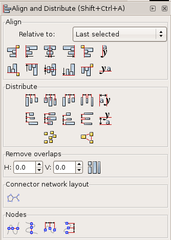
 The fill or stroke paint of an object can be set to:
No Paint
Plain Color
Linear Gradient
Radial Gradient
Pattern
Unset (used mostly for creating clones that are styled independently from their master)
In addition, there are a few settings that can really complicate the ease with which this ochreue might otherwise be understood:
Even-odd
Non-zero
Blur
Opacity
The fill or stroke paint of an object can be set to:
No Paint
Plain Color
Linear Gradient
Radial Gradient
Pattern
Unset (used mostly for creating clones that are styled independently from their master)
In addition, there are a few settings that can really complicate the ease with which this ochreue might otherwise be understood:
Even-odd
Non-zero
Blur
Opacity
 No paint or fill is visible in the object or stroke. This means that any visible object behind the invisible fill will show through it. Though it may seem counterintuitive, this is not the same as "Unset" since this is actually a fill type rather than no fill type.
Objects set to "No Paint" still act as normal shapes and paths when they are manipulated in path operations. For instance, a boolean operation will react to the path exactly the same whether it has no paint fill or any other kind of fill.
Note: any object with 0% opacity (completely transparent) on both fill and stroke is not selectable by normal click selection. Any other selection method should work for transparent objects.
No paint or fill is visible in the object or stroke. This means that any visible object behind the invisible fill will show through it. Though it may seem counterintuitive, this is not the same as "Unset" since this is actually a fill type rather than no fill type.
Objects set to "No Paint" still act as normal shapes and paths when they are manipulated in path operations. For instance, a boolean operation will react to the path exactly the same whether it has no paint fill or any other kind of fill.
Note: any object with 0% opacity (completely transparent) on both fill and stroke is not selectable by normal click selection. Any other selection method should work for transparent objects.
 A solid color paints the object or stroke. In both
  A linear gradient paints the object or stroke according to two settings. The gradient selector box chooses the gradient definition to use. The repeat type selector box chooses none (the gradient only fills once from it's beginning point to its end point), direct (repeats the gradient infinitely, likely causing an abrupt color change at the end of each repetition if the ends are different colors), or reflected (repeats the gradient infinitely also, except that each repetition flips the gradient so the color changes are always smooth at the end of each repetition).
The direction and extent of the gradient is adjusted by dragging the handles.
Gradients may also be duplicated or edited from this ochre panel using the provided buttons.
A linear gradient paints the object or stroke according to two settings. The gradient selector box chooses the gradient definition to use. The repeat type selector box chooses none (the gradient only fills once from it's beginning point to its end point), direct (repeats the gradient infinitely, likely causing an abrupt color change at the end of each repetition if the ends are different colors), or reflected (repeats the gradient infinitely also, except that each repetition flips the gradient so the color changes are always smooth at the end of each repetition).
The direction and extent of the gradient is adjusted by dragging the handles.
Gradients may also be duplicated or edited from this ochre panel using the provided buttons.
 This panel works the same as linear gradient except that the gradient is applied radially.
The elliptical "shape", placement and extent of the radius is controlled by the three handles.
This panel works the same as linear gradient except that the gradient is applied radially.
The elliptical "shape", placement and extent of the radius is controlled by the three handles.
 An SVG or bitmap pattern, selected from the selection box, paints the object.
To create your own pattern, select the object from which the pattern will be created. Then select
An SVG or bitmap pattern, selected from the selection box, paints the object.
To create your own pattern, select the object from which the pattern will be created. Then select  Unset fill is applied to a master object of clones in order to make the clones paintable. This must be applied individually to the object's fill and stroke to affect each. This will make the object's fill appear black and its stroke appear invisible.
 This setting is available only for an object's Fill. It causes the fill to be completely transparent wherever a path crosses over itself.
 This setting is available only for an object's Fill. It causes the fill to be shown wherever a path crosses over itself. This is the default setting.
 Blur is not actually a paint function at all - it is actually an SVG filter effect. However, it makes sense in
  Opacity sets the degree to which objects behind the affected object may be seen through it.
This opacity setting is separate from the color alpha setting, which is particular to either the fill or stroke paint. Like blur, opacity applies to the entire object, affecting both fill and stroke together.
Opacity sets the degree to which objects behind the affected object may be seen through it.
This opacity setting is separate from the color alpha setting, which is particular to either the fill or stroke paint. Like blur, opacity applies to the entire object, affecting both fill and stroke together.
 A brief list of stroke style options follows:
Width controls how thick the stroke is and your desired measurement unit.
Join controls the type of angle on a non-curve joint - miter (angled corners), round (rounded corners) or bevel (flat corners). This affects the outside of the join only.
Miter limit keeps corners mitered at set limits of corner angle; the higher the miter limit setting, the sharper the corner can be while retaining its miter.
Cap controls the type of cap that is on the end of an open path - butt cap (flat), round cap (half-circle) or end cap (flat but extended).
Dashes controls the dash pattern and its offset from the primary node.
Start Markers, Mid Markers and End Markers set a marker selection from the dropdown (there is a pre-set selection of arrow-heads, etc). Mid Markers places only one marker at the middle of the path.
A brief list of stroke style options follows:
Width controls how thick the stroke is and your desired measurement unit.
Join controls the type of angle on a non-curve joint - miter (angled corners), round (rounded corners) or bevel (flat corners). This affects the outside of the join only.
Miter limit keeps corners mitered at set limits of corner angle; the higher the miter limit setting, the sharper the corner can be while retaining its miter.
Cap controls the type of cap that is on the end of an open path - butt cap (flat), round cap (half-circle) or end cap (flat but extended).
Dashes controls the dash pattern and its offset from the primary node.
Start Markers, Mid Markers and End Markers set a marker selection from the dropdown (there is a pre-set selection of arrow-heads, etc). Mid Markers places only one marker at the middle of the path.


 And here is how the final document looks:
 You can also use the Live Preview option to see what you get.

 The download will begin automatically. You chould see a ochre like this (it may look different according to the browser you are using):
 Press 'Save File'. Your installation file will start downloading. You need to know where the file is downloading to. If you know where this is then you need to find the file on your computer. You should see an icon like this :
 You can click through the above introduction screen.
 The above is just the license agreement. If you don't agree to it then press cancel but this means you will not be able to install the software. If you wish to install the software click 'Next >' :
 The entire installation size is listed here as 215.9MB. If this is too big then you may wish to turn off some of the boxes with green arrows. The items with green arrows are optional, the best saving would be to turn of all the Translations (saves 45MB) - however this means you will not be able to use Inkscape in any language other than english. When you finished with the options click 'Next >' :
 The above window just tells you where Inkscape will be installed. Unless you have good reason to change the above settings then it is better to leave it as it is and press 'Install'. Then the installation window appears and reports the progress:
 When the install has finished you will see the following:
 To run Inkscape just leave the 'Run Inkscape 0.46' and press 'Finish'. Inkscape then appears:
