.active |
Adds a grey background color to the table row (<tr> or table cell (<td>) (same color used on hover) |
Try it
|
Tables |
.active |
Adds a gray background color to the active link in a default
navbar. Adds a black background and a white color to the current link inside an inverted navbar. |
Try it
|
Navbar |
.active |
Adds a blue background color to the active list item in a list group |
Try it
|
List Groups |
.active |
Adds a blue background color to simulate a "pressed" button |
Try it
|
Buttons |
.active |
Animates a striped progress bar |
Try it
|
Progress Bars |
.active |
Adds a blue background color to the active dropdown item in a dropdown |
Try it
|
Dropdowns |
.active |
Adds a blue background color to the active pagination link (to highlight the current page) |
Try it
|
Pagination |
.affix |
The Affix plugin allows an element to become affixed (locked/sticky) to an area on the page.
It toggles position:fixed on and off |
Try it
|
Affix |
.alert |
Creates an alert message box |
Try it
|
Alerts |
.alert-danger |
Red alert box.
Indicates a dangerous or potentially negative action |
Try it
|
Alerts |
.alert-dismissible |
Together with the .close class, this class is used to
close the alert |
Try it
|
Alerts |
.alert-info |
Light-blue alert box.
Indicates some information |
Try it
|
Alerts |
.alert-link |
Used on links inside alerts to add matching colored links |
Try it
|
Alerts |
.alert-success |
Green alert box.
Indicates a successful or positive action |
Try it
|
Alerts |
.alert-warning |
Yellow alert box.
Indicates caution should be taken with this action |
Try it
|
Alerts |
.badge |
Creates a circular badge (grey circle - often used as a numerical indicator) |
Try it
|
Badges |
.bg-danger |
Adds a red background color to an element.
Represents danger or a negative action |
Try it
|
Helpers |
.bg-info |
Adds a light-blue background color to an element.
Represents some information |
Try it
|
Helpers |
.bg-primary |
Adds a blue background color to an element.
Represents something important |
Try it
|
Helpers |
.bg-success |
Adds a green background color to an element.
Indicates success or a positive action |
Try it
|
Helpers |
.bg-warning |
Adds a yellow background color to an element.
Represents a warning or a negative action |
Try it
|
Helpers |
.breadcrumb |
A pagination.
Indicates the current page's location within a navigational hierarchy |
Try it
|
Pagination |
.btn |
Creates a basic button (gray background and rounded corners) |
Try it
|
Buttons |
.btn-block |
Creates a block level button that spans the entire width of the parent element |
Try it
|
Buttons |
.btn-danger |
Red button.
Indicates danger or a negative action |
Try it
|
Buttons |
.btn-default |
Default button.
White background and grey border |
Try it
|
Buttons |
.btn-group |
Groups buttons together on a single line |
Try it
|
Button Groups |
.btn-group-justified |
Makes a group of buttons span the entire width of the screen |
Try it
|
Button Groups |
.btn-group-lg |
Large button group (makes all buttons in a button group larger - increased font-size and padding) |
Try it
|
Button Groups |
.btn-group-sm |
Small button group (makes all buttons in a button group smaller) |
Try it
|
Button Groups |
.btn-group-xs |
Extra small button group (makes all buttons in a button group extra small) |
Try it
|
Button Groups |
.btn-group-vertical |
Makes a button group appear vertically stacked |
Try it
|
Button Groups |
.btn-info |
Light-blue button.
Represents information |
Try it
|
Buttons |
.btn-link |
Makes a button look like a link (get button behavior) |
Try it
|
Buttons |
.btn-lg |
Large button |
Try it
|
Buttons |
.btn-primary |
Blue button. |
Try it
|
Buttons |
.btn-sm |
Small button |
Try it
|
Buttons |
.btn-success |
Green button.
Indicates success or a positive action |
Try it
|
Buttons |
.btn-warning |
Yellow button.
Represents warning or a negative action |
Try it
|
Buttons |
.btn-xs |
Extra small button |
Try it
|
Buttons |
.caption |
Adds a caption text inside a .thumbnail |
Try it
|
Images |
.caret |
Creates a caret arrow icon , which indicates that the button is a dropdown |
Try it
|
Dropdowns |
.carousel |
Creates a carousel (slideshow) |
Try it
|
Carousel |
.carousel-caption |
Creates a caption text for each slide in the carousel |
Try it
|
Carousel |
.carousel-control |
Container for next and previous links |
Try it
|
Carousel |
.carousel-indicators |
Adds little dots/indicators at the bottom of each slide (which indicates how many slides there is in the carousel, and which slide the user are currently viewing) |
Try it
|
Carousel |
.carousel-inner |
Container for slide items |
Try it
|
Carousel |
.center-block |
Centers any element (Sets an element to display:block with margin-right:auto and margin-left:auto) |
Try it
|
Helpers |
.checkbox |
Container for checkboxes |
Try it
|
Inputs |
.checkbox-inline |
Makes multiple checkboxes appear on the same line |
Try it
|
Inputs |
.clearfix |
Clears floats |
Try it
|
Helpers |
.close |
Indicates a close icon |
Try it
|
Helpers |
.col-*-* |
Responsive grid (span 1-12 column).
Extra small devices Phones (< 768px), Small devices Tablets (≥768px), Medium devices Desktops (≥992px), Large devices Desktops (≥1200px).
Column values can be 1-12. |
Try it
|
Grid |
.col-*-offset-* |
Move columns to the right.
These classes increase the left margin of a column by * columns |
Try it
|
Grid |
.col-*-pull-* |
Changes the order of the grid columns |
Try it
|
Grid |
.col-*-push-* |
Changes the order of the grid columns |
Try it
|
Grid |
.collapse |
Indicates collapsible content - which can be hidden or shown on demand |
Try it
|
Collapse |
.collapse in |
Show the collapsible content by default |
Try it
|
Collapse |
.container |
Fixed width container with widths determined by screen sites.
Equal margin on the left and right. |
Try it
|
Containers |
.container-fluid |
A container that spans the full width of the screen |
Try it
|
Containers |
.control-label |
Allows a label to be used for form validation |
Try it
|
Forms |
.danger |
Adds a red background to the table row (<tr> or table cell (<td>).
Indicates a dangerous or potentially negative action |
Try it
|
Tables |
.disabled |
Disables a button (adds opacity and a "no-parking-sign" icon on hover) |
Try it
|
Buttons |
.disabled |
Disables a dropdown item (adds a grey text color and a "no-parking-sign" icon on hover) |
Try it
|
Dropdowns |
.disabled |
Disables a pagination link (cannot be clicked - adds a grey text color and a "no-parking-sign" icon on hover) |
Try it
|
Pagination |
.disabled |
Disables a list item in a list group (cannot be clicked - adds a grey background color and a "no-parking-sign" icon on hover) |
Try it
|
List Groups |
.divider |
Used to separate links in the dropdown menu with a thin horizontal border |
Try it
|
Dropdowns |
.dl-horizontal |
Lines up the terms <dt> and descriptions <dd> in <dl> elements side-by-side.
Starts off like default
<dl>s, but when the browser window expands, it will line up side-by-side |
Try it
|
Typography |
.dropdown |
Creates a toggleable menu that allows the user to choose one value from a predefined list |
Try it
|
Dropdowns |
.dropdown-header |
Used to add headers inside the dropdown menu |
Try it
|
Dropdowns |
.dropdown-menu |
Adds the default styles for the dropdown menu container |
Try it
|
Dropdowns |
.dropdown-menu-right |
Right-aligns a dropdown menu |
Try it
|
Dropdowns |
.dropdown-toggle |
Used on the button that should hide and show (toggle) the dropdown menu |
Try it
|
Dropdowns |
.dropup |
Indicates a dropup menu (upwards instead of downwards) |
Try it
|
Dropdowns |
.embed-responsive |
Container for embedded content.
Makes videos or slideshows scale properly on any device |
Try it
|
Images |
.embed-responsive-16by9 |
Container for embedded content.
Creates an 16:9 aspect ratio embedded content |
Try it
|
Images |
.embed-responsive-4by3 |
Container for embedded content.
Creates an 4:3 aspect ratio embedded content |
Try it
|
Images |
.embed-responsive-item |
Used inside .embed-responsive.
Scales the video nicely to the parent element |
Try it
|
Images |
.fade |
Adds a fading effect when closing an alert box |
Try it
|
Alerts |
.form-control |
Used on input, textarea, and select elements to span the entire width of the page and make them responsive |
Try it
|
Forms |
.form-control-feedback |
Form validation class |
Try it
|
Inputs 2 |
.form-control-static |
Adds plain text next to a form label within a horizontal form |
Try it
|
Inputs 2 |
.form-group |
Container for form input and label |
Try it
|
Forms |
.form-inline |
Makes a <form> left-aligned with inline-block controls (This only
applies to forms within viewports that are at least 768px wide) |
Try it |
Forms |
.form-horizontal |
Aligns labels and groups of form controls in a horizontal layout |
Try it |
Forms |
.glyphicon |
Creates an icon.
Bootstrap provides 260 free glyphicons from the Glyphicons Halflings set |
Try it
|
Glyphicons |
.has-danger |
Adds a red color to the label and a red border to the input, as well as an error icon inside the input (used together with .has-feedback) |
Try it
|
Forms |
.has-feedback |
Adds feedback icons for inputs (checkmark, warning and error signs) |
Try it
|
Forms |
.has-success |
Adds a green color to the label and a green border to the input, as well as a checkmark icon inside the input (used together with .has-feedback) |
Try it
|
Forms |
.has-warning |
Adds a yellow/orange color to the label and a yellow/orange border to the input, as well as a checkmark icon inside the input (used together with .has-feedback) |
Try it
|
Forms |
.help-block |
A block of help text that breaks onto a new line and may extend beyond one line. |
Try it
|
Input Sizing |
.hidden |
Forces an element to be hidden (display:none) |
Try it
|
Helpers |
.hidden-* |
Hides content depending on screen size |
Try it
|
Helpers |
.hide |
Deprecated. Use .hidden instead |
Try it
|
Helpers |
.h1 - .h6 |
Makes an element look like a heading of the chosen class (h1-h6) |
Try it
|
Typography |
.icon-bar |
Used in the navbar to create a hamburger menu (three horizontal bars) |
Try it
|
Navbar |
.icon-next |
Unicode icon (arrow pointing right), used in carousels.
This is often replaced with a glyphicon |
Try it
|
Carousel |
.icon-prev |
Unicode icon (arrow pointing left), used in carousels.
This is often replaced with a glyphicon |
Try it
|
Carousel |
.img-circle |
Shapes an image to a circle (not supported in IE8 and earlier) |
Try it
|
Images |
.img-responsive |
Makes an image responsive |
Try it
|
Images |
.img-rounded |
Adds rounded corners to an image |
Try it
|
Images |
.img-thumbnail |
Shapes an image to a thumbnail (borders) |
Try it
|
Images |
.in |
Fades in tabs |
Try it
|
Tabs |
.info |
Adds a light-blue background to the table row (<tr> or table cell (<td>).
Indicates a neutral informative change or action |
Try it
|
Tables |
.initialism |
Displays the text inside an <abbr> element in a slightly smaller font size |
Try it
|
Typography |
.input-group |
Container to enhance an input by adding an icon, text or a button in front or behind it as a "help text" |
Try it
|
Inputs |
.input-group-lg |
Large input group |
Try it
|
Inputs |
.input-group-sm |
Small input group |
Try it
|
Inputs |
.input-group-addon |
Together with the .input-group class, this class makes it possible to add an icon or help text next to the input field |
Try it
|
Inputs |
.input-group-btn |
Together with the .input-group class, this class attaches a button next to an input.
Often used as a search bar |
Try it
|
Inputs |
.input-lg |
Large input field |
Try it
|
Input Sizing |
.input-sm |
Small input field |
Try it
|
Input Sizing |
.invisible |
Makes an element invisible (visibility:hidden).
Note: Even though the element is invisible, it will take up space on the page |
Try it
|
Helpers |
.item |
Class added to each carousel item.
May be text or images |
Try it
|
Carousel |
.jumbotron |
Creates a padded grey box with rounded corners that enlarges the font sizes of the text inside it.
Creates a big box for calling extra attention to some special content or information |
Try it
|
Jumbotron |
.label |
Adds a grey rounded box to an element.
Provides additional information about something (e.g.
"New") |
Try it
|
Labels |
.label-danger |
Red label |
Try it
|
Labels |
.label-info |
Light-blue label |
Try it
|
Labels |
.label-success |
Green label |
Try it
|
Labels |
.label-warning |
Yellow label |
Try it
|
Labels |
.lead |
Increase the font size and line height of a paragraph |
Try it
|
Typography |
.left |
Used to identify the left carousel control |
Try it
|
Carousel |
.list-group |
Creates a bordered list group for <li> elements |
Try it
|
List Group |
.list-group-item |
Added to each <li> element in the list group |
Try it
|
List Group |
.list-group-item-heading |
Creates a list group heading (used on other elements besides <li>) |
Try it
|
List Group |
.list-group-item-text |
Used for item text inside the list group (used on other elements besides
<li>) |
Try it
|
List Group |
.list-group-item-danger |
Red background color for a list item in a list group |
Try it
|
List Group |
.list-group-item-info |
Light-blue background color for a list item in a list group |
Try it
|
List Group |
.list-group-item-success |
Green background color for a list item in a list group |
Try it
|
List Group |
.list-group-item-warning |
Yellow background color for a list item in a list group |
Try it
|
List Group |
.list-inline |
Places all list items on a single line (horizontal menu) |
Try it
|
Tabs |
.list-unstyled |
Removes all default list-style (bullets, left margin, etc.) styling from a
<ul> or <ol> list |
Try it
|
Typography |
.mark |
Highlights text: Highlighted text |
Try it
|
Typography |
.media |
Aligns media objects (like images or videos - often used for comments in a blog post etc) |
Try it
|
Media Objects |
.media-body |
Text that should appear next to a media object |
Try it
|
Media Objects |
.media-heading |
Creates a heading inside the media object |
Try it
|
Media Objects |
.media-list |
Nested media lists |
Try it
|
Media Objects |
.media-object |
Indicates a media object (image or video) |
Try it
|
Media Objects |
.modal |
Identifies the content as a modal and brings focus to it |
Try it
|
Modals |
.modal-body |
Defines the style for the body of the modal.
Add any HTML markup here (p, img, etc) |
Try it
|
Modals |
.modal-content |
Styles the modal (border, background-color, etc).
Inside this, add the modal's header, body and footer, if needed |
Try it
|
Modals |
.modal-dialog |
Sets the proper width and margin of the modal |
Try it
|
Modals |
.modal-footer |
The footer of the modal (often contains an action button and a close button) |
Try it
|
Modals |
.modal-header |
The header of the modal (often contains a title and a close button) |
Try it
|
Modals |
.modal-lg |
Large modal (wider than default) |
Try it
|
Modals |
.modal-open |
Used on the <body> element to prevent page scrolling (overflow:hidden) |
Try it
|
Modals |
.modal-sm |
Small modal (less width) |
Try it
|
Modals |
.modal-title |
The title of the modal |
Try it
|
Modals |
.nav nav-tabs |
Indicates a tabbed menu |
Try it
|
Tabs |
.nav nav-pills |
Indicates a pill menu |
Try it
|
Tabs |
.nav .navbar-nav |
Used on a <ul> container that contains the list items with links inside a navigation bar |
Try it
|
Navbar |
.nav-justified |
Centers tabs/pills.
Note that on screens smaller than 768px the items are stacked (content will remain centered) |
Try it
|
Tabs |
.nav-stacked |
Vertically stack tabs or pills |
Try it
|
Tabs |
.nav-tabs |
Creates a tabbed menu |
Try it
|
Tabs |
.navbar |
Creates a navigation bar |
Try it
|
Navbar |
.navbar-brand |
Added to a link or a header element inside the navbar to represent a logo or a header |
Try it
|
Navbar |
.navbar-btn |
Vertically aligns a button inside a navbar |
Try it
|
Navbar |
.navbar-collapse |
Collapses the navbar (hidden and replaced with a menu/hamburger icon on mobile phones and small tablets) |
Try it
|
Navbar |
.navbar-default |
Creates a default navigation bar (light-grey background color) |
Try it
|
Navbar |
.navbar-fixed-bottom |
Makes the navbar stay at the bottom of the screen (sticky/fixed) |
Try it
|
Navbar |
.navbar-fixed-top |
Makes the navbar stay at the top of the screen (sticky/fixed) |
Try it
|
Navbar |
.navbar-form |
Added to form elements inside the navbar to vertically center them (proper padding) |
Try it
|
Navbar |
.navbar-header |
Added to a container element that contains the link/element that represent a logo or a header |
Try it
|
Navbar |
.navbar-inverse |
Creates a black navigation bar (instead of light-grey) |
Try it
|
Navbar |
.navbar-left |
Aligns nav links, forms, buttons, or text, in the navbar to the left |
Try it
|
Navbar |
.navbar-link |
Styles an element to look like a link inside the navbar (anchors get proper padding and an underline on hover, while other elements like p or span gets a default hover effect - white color in an inversed navbar and a black color in a default navbar) |
Try it
|
Navbar |
.navbar-nav |
Used on a <ul> container that contains the list items with links inside a navigation bar |
Try it
|
Navbar |
.navbar-right |
Aligns nav links, forms, buttons, or text in the navbar to the right. |
Try it
|
Navbar |
.navbar-static-top |
Removes left, top and right borders (rounded corners) from the navbar (default navbar has a gray border and a 4px border-radius by default) |
Try it
|
Navbar |
.navbar-text |
Vertical align any elements inside the navbar that are not links (ensures proper padding) |
Try it
|
Navbar |
.navbar-toggle |
Styles the button that should open the navbar on small screens.
Often used together with three .icon-bar classes to indicate a toggleable menu icon (hamburger/bars) |
Try it
|
Navbar |
.next |
Used in the carousel control to identity the next control |
Try it
|
Carousel |
.next |
Used to align pager buttons to the right side of the page (next button) |
Try it
|
Pager |
.page-header |
Adds a horizontal line under the heading (+ adds some extra space around the element) |
Try it
|
Page Header |
.pager |
Creates previous/next buttons (used on <ul> elements) |
Try it
|
Pager |
.pagination |
Creates a pagination (Useful when you have a web site with lots of pages.
Used on <ul> elements) |
Try it
|
Pagination |
.pagination-lg |
Large pagination (each pagination link gets a font-size of 18px.
Default is 14px) |
Try it
|
Pagination |
.pagination-sm |
Small pagination (each pagination link gets a font-size of 12px.
Default is 14px) |
Try it
|
Pagination |
.panel |
Creates a bordered box with some padding around its content |
Try it
|
Panels |
.panel-body |
Container for content inside the panel |
Try it
|
Panels |
.panel-collapse |
Collapsible panel (toggle between hiding and showing panel(s)) |
Try it
|
Collapse |
.panel-danger |
Red panel.
Indicates danger |
Try it
|
Panels |
.panel-info |
Light-blue panel.
Indicates information |
Try it
|
Panels |
.panel-success |
Green panel.
Indicates success |
Try it
|
Panels |
.panel-warning |
Yellow panel.
Indicates warning |
Try it
|
Panels |
.panel-footer |
Creates a panel footer (light background color) |
Try it
|
Panels |
.panel-group |
Used to group many panels together.
This removes the bottom margin below each panel |
Try it
|
Panels |
.panel-heading |
Creates a panel header (light background color) |
Try it
|
Panels |
.panel-title |
Used inside a .panel-heading to adjust the styling of the text (removes margins and adds a font-size of 16px) |
Try it
|
Panels |
.popover |
Popup-box that appears when the user clicks on an element |
Try it
|
Popover |
.pre-scrollable |
Makes a <pre> element scrollable (max-height of 350px and provide a y-axis scrollbar) |
Try it
|
Helpers |
.prev |
Used in carousels to indicate a "previous" link |
Try it
|
Carousel |
.previous |
Used to align pager buttons to the left side of the page (previous button) |
Try it
|
Pager |
.progress |
Container for progress bars |
Try it
|
Progress Bars |
.progress-bar |
Creates a progress bar |
Try it
|
Progress Bars |
.progress-bar-danger |
Red progress bar.
Indicates danger |
Try it
|
Progress Bars |
.progress-bar-info |
Light-blue progress bar.
Indicates information |
Try it
|
Progress Bars |
.progress-bar-striped |
Creates a striped progress bar |
Try it
|
Progress Bars |
.progress-bar-success |
Green progress bar.
Indicates success |
Try it
|
Progress Bars |
.progress-bar-warning |
Yellow progress bar.
Indicates warning |
Try it
|
Progress Bars |
.pull-left |
Float an element to the left |
Try it
|
Helpers |
.pull-right |
Float an element to the right |
Try it
|
Helpers |
.right |
Used to identify the right carousel control |
Try it
|
Carousel |
.row |
Container for responsive columns |
Try it
|
Grid |
.row-no-gutters |
Removes the gutters from a row and its columns |
Try it
|
Grid |
.show |
Shows an element (display:block) |
Try it
|
Helpers |
.small |
Creates a lighter, secondary text in any heading |
Try it
|
Typography |
.sr-only |
Hides an element on all devices except for screen readers |
Try it
|
Helpers |
.sr-only-focusable |
Hides an element on all devices except for screen readers |
Try it
|
Helpers |
.success |
Adds a green background color to a table row (<tr> or table cell (<td>).
Indicates success or a positive action |
Try it
|
Tables |
.tab-content |
Used together with .tab-pane to creates toggleable/dynamic tabs/pills |
Try it
|
Tabs |
.tab-pane |
Used together with .tab-content to creates toggleable/dynamic tabs/pills |
Try it
|
Tabs |
.table |
Adds basic styling to a table (padding, bottom borders, etc) |
Try it
|
Tables |
.table-bordered |
Adds borders on all sides of the table and cells |
Try it
|
Tables |
.table-condensed |
Makes a table more compact by cutting cell padding in half |
Try it
|
Tables |
.table-hover |
Creates a hoverable table (adds a grey background color on table rows on hover) |
Try it
|
Tables |
.table-responsive |
Makes a table responsive (adds a horizontal scrollbar when needed) |
Try it
|
Tables |
.text-capitalize |
Indicates capitalized text |
Try it
|
Typography |
.text-center |
Center-aligns text |
Try it
|
Typography |
.text-danger |
Red text color.
Indicates danger |
Try it
|
Typography |
.text-hide |
Hides text (helps replace an element's text content with a background image) |
Try it
|
Typography |
.text-info |
Light-blue text color.
Indicates information |
Try it
|
Typography |
.text-justify |
Indicates justified text |
Try it
|
Typography |
.text-left |
Aligns the text to the left |
Try it
|
Typography |
.text-lowercase |
Changes text to lowercase |
Try it
|
Typography |
.text-muted |
Grey text color |
Try it
|
Typography |
.text-nowrap |
Prevents the text from wrapping |
Try it
|
Typography |
.text-primary |
Blue text color |
Try it
|
Typography |
.text-right |
Aligns text to the right |
Try it
|
Typography |
.text-success |
Green text color.
Indicates success |
Try it
|
Typography |
.text-uppercase |
Makes text uppercase |
Try it
|
Typography |
.text-warning |
Yellow/orange text color.
Indicates warning |
Try it
|
Typography |
.thumbnail |
Adds a border around an element (often images or videos) to make it look like a thumbnail |
Try it
|
Images |
.tooltip |
Popup-box that appears when the user moves the mouse pointer over an element |
Try it
|
Tooltip |
.visible-* |
Deprecated as of v3.2.0. Used to show and/or hide content by device.
Note: Use .hidden-* instead |
Try it
|
Helpers |
.visible-print-block |
Displays the element (display:block) in print (pre)view |
|
Helpers |
.visible-print-inline |
Displays the element (display:inline) in print (pre)view |
|
Helpers |
.visible-print-inline-block |
Displays the element (display:inline-block) in print (pre)view |
|
Helpers |
.hidden-print |
Hides the element (display:none) in print (pre)view |
|
Helpers |
.warning |
Adds a yellow background color to the table row (<tr> or table cell (<td>).
Indicates a warning |
Try it
|
Tables |
.well |
Adds a rounded border around an element with a gray background color and some padding |
Try it
|
Wells |
.well-lg |
Large well (more padding) |
Try it
|
Wells |
.well-sm |
Small well (less padding) |
Try it
|
Wells |
 Circle:
 Thumbnail:

 Lorem ipsum donec id elit non mi porta gravida at eget metus.
 Lorem ipsum donec id elit non mi porta gravida at eget metus.
 Lorem ipsum donec id elit non mi porta gravida at eget metus.
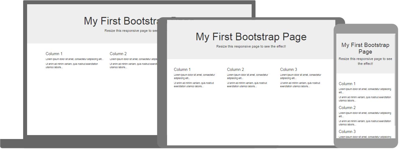
Note: You will learn more about the Grid System later in this tutorial (how to create a layout with different amount of columns).
Lorem ipsum donec id elit non mi porta gravida at eget metus.
Note: You will learn more about the Grid System later in this tutorial (how to create a layout with different amount of columns).

 Lorem ipsum dolor sit amet, consectetur adipisicing elit, sed do eiusmod tempor incididunt ut labore et dolore magna aliqua.
 Lorem ipsum dolor sit amet, consectetur adipisicing elit, sed do eiusmod tempor incididunt ut labore et dolore magna aliqua.
 Try it Yourself »
 Try it Yourself »
 Name
Name

 Circle: