Operators
Doing math in your CSS is very helpful. Sass has a handful of standard math operators like +, -, *, /, and %. In our example we're going to do some simple math to calculate widths for an aside & article.
SCSS Syntax
.container {
  width: 100%;
}

article[role="main"] {
  float: left;
  width: 600px / 960px * 100%;
}

aside[role="complementary"] {
  float: right;
  width: 300px / 960px * 100%;
}
Sass Syntax
.container
  width: 100%


article[role="main"]
  float: left
  width: 600px / 960px * 100%


aside[role="complementary"]
  float: right
  width: 300px / 960px * 100%
CSS Output
.container {
  width: 100%;
}

article[role="main"] {
  float: left;
  width: 62.5%;
}

aside[role="complementary"] {
  float: right;
  width: 31.25%;
}
We've created a very simple fluid grid, based on 960px. Operations in Sass let us do something like take pixel values and convert them to percentages without much hassle.
SASS Example
We can simply create SASS and SCSS example. To do so, use the following steps:
Create a HTML file having the following code:
See this example:
Now create a file named "style.scss". It is similar to CSS file. The only one difference is that it is saved with ".scss" extension. Put the both file inside the root folder.
Now, execute the following code: sass --watch style.scss:style.css
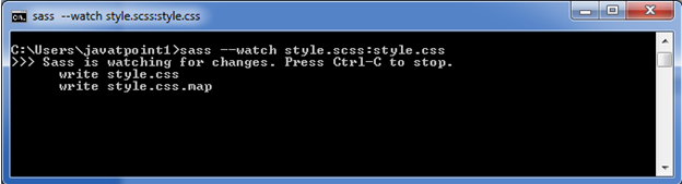
It will create a new CSS file named "style.css" inside the root folder automatically. Whenever you change the SCSS file, the style.css file will changed automatically.
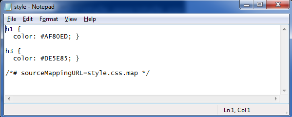
The style.css file has the following code:
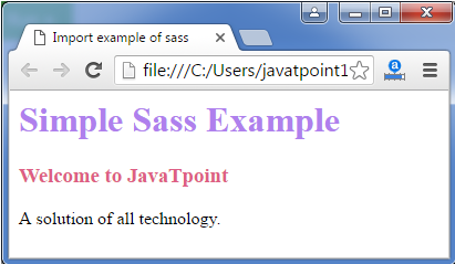
Now execute the HTML file. It will read the CSS file and the output would be like this:
Output:
Sass Style Guide
With more people than ever writing in Sass, it bears some consideration how we format it. CSS style guides are common, so perhaps we can extend those to cover choices unique to Sass.
Here are some ideas that I've been gravitating toward. Perhaps they are useful to you or help you formulate ideas of your own. If you're looking for more examples, Sass Guidelines is another good place to look.
Use Your Regular CSS Formatting Rules / Style Guide
This post is about Sass-specific stuff, but as a base to this, you should follow a whatever good CSS formatting guidelines you are already following. If you aren't yet, this roundup of style guides may help you. This includes things like:
- Be consistant with indentation
- Be consistant about where spaces before/after colons/braces go
- One selector per line, One rule per line
- List related properties together
- Have a plan for>
- Don't use ID's #hotdrama
- etc
List @extend(s) First
.weather {
  @extend %module;
  ...
}
Knowing right off the bat that this>
Knowing when to use @extend versus @include can be a little tricky. Harry does a nice job of differentiating the two plus offers thoughts on how to use them both.
List @include(s) Next
.weather {
  @extend %module;
  @include transition(all 0.3s ease-out);
  ...
}
Next up is your @includes for mixins and other functions. Again, this is nice to have near the top for reference, but also allows for overrides. You might also want to make the call on separating user-authored @includes and vendor-provided @includes.
List "Regular" Styles Next
.weather {
  @extend %module;
  @include transition(all 0.3s ease-out);
  background: LightCyan;
  ...
}
Adding out regular styles after the @extends and @includes allows us to properly override those properties, if needed.
Nested Pseudo
.weather {
  @extend %module;
  @include transition(all 0.3s ease-out);
  background: LightCyan;
  &:hover {
    background: DarkCyan;
  }
  &::before {
    content: "";
    display: block;
  }
  ...
}
Pseudo elements and pseudo>
Nested Selectors Last
.weather {
  @extend %module;
  @include transition(all 0.3s ease);
  background: LightCyan;
  &:hover {
    background: DarkCyan;
  }
  &::before {
    content: "";
    display: block;
  }
  > h3 {
    @include transform(rotate(90deg));
    border-bottom: 1px solid white;
  }
}
Nothing goes after the nested stuff. And the same order as above within the nested selector would apply.
Never Write Vendor Prefixes
Vendor prefixes are a time-sensitive thing. As browsers update over time, the need for them will fall away. If you use Autoprefixer, when compiling Sass, then you should never have to write them.
Alternatively, you can use @mixins provided by libraries like Compass and Bourbon. Or roll your own. Although using @mixins for vendor prefixes is still less convenient than Autoprefixer and still requires some maintenance, it still beats having to write things out manually.
Maximum Nesting: Three Levels Deep
.weather {
  .cities {
    li {
      // no more!
    }
  }
}
Chances are, if you're deeper than that, you're writing a crappy selector. Crappy in that it's too reliant on HTML structure (fragile), overly specific (too powerful), and not very reusable (not useful). It's also on the edge of being difficult to understand.
If you really want to use tag selectors because the>
.weather
  > h3 {
    @extend %line-under;
  }
}
Maximum Nesting: 50 Lines
If a nested block of Sass is longer than that, there is a good chance it doesn't fit on one code editor screen, and starts becoming difficult to understand. The whole point of nesting is convenience and to assist in mental grouping. Don't use it if it hurts that.
Global and Section-Specific Sass Files Are just Table of ContentsIn other words, no styles directly in them. Force yourself to keep all styles organized into component parts.
List Vendor/Global Dependencies First, Then Author Dependencies, Then Patterns, Then PartsIt ends up being an easy to understand table of contents:
/* Vendor Dependencies */
@import "compass";

/* Authored Dependencies */
@import "global/colors";
@import "global/mixins";

/* Patterns */
@import "global/tabs";
@import "global/modals";

/* Sections */
@import "global/header";
@import "global/footer";
The dependencies like Compass, colors, and mixins generate no compiled CSS at all, they are purely code dependencies. Listing the patterns next means that more specific "parts", which come after, have the power to override patterns without having a specificity war.
Break Into As Many Small Files As Makes Sense
There is no penalty to splitting into many small files. Do it as much as feels good to the project. I know I find it easier to jump to small specific files and navigate through them than fewer/larger ones.
...

@import "global/header/header/";
@import "global/header/logo/";
@import "global/header/dropdowns/";
@import "global/header/nav/";
@import "global/header/really-specific-thingy/";
I'd probably do this right in the global.scss, rather than have global @import a _header.scss file which has its own sub-imports. All that sub-importing could get out of hand.
Globbing might help if there starts to be too many to list.
Partials are named _partial.scss
This is a common naming convention that indicates this file isn't meant to be compiled by itself. It likely has dependencies that would make it impossible to compile by itself. Personally I like dashes in the "actual" filename though, like _dropdown-menu.scss.
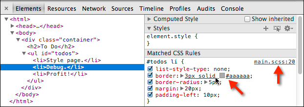
Locally, Compile with Source Maps
In development, it probably doesn't matter which format you compile your Sass in (e.g. expanded, compressed, etc) locally as long as you are producing source maps.
It's a flag when you compile Sass:
$ sass sass/screen.scss:stylesheets/screen.css --sourcemapAlthough you probably don't compile Sass like that typically, there is always some kind of way to configure the thing you're using to compile Sass to do it with source maps. When you have them, that means DevTools shows you where the Sass code is, which is super (duper) useful:
Here's a few relevant links on this:
- (Google) Working with CSS Preprocessors
- (The Sass Way) Using source maps with Sass 3.3
In Deployment, Compile Compressed
Live websites should only ever have compressed CSS. And gzipped with far-our expires headers to boot.
Don't Even Commit .css Files
This might take some DevOps work, but it's pretty nice if .css files aren't even in your repository. The compilation happens during deployment. So the only thing you see in the repo are your nicely formatted hand authored Sass files. This makes the diffs useful as well. A diff is a comparison view of what changed provided by version control providers. The diff for a compressed CSS file is useless.
Be Generous With Comments
It is rare to regret leaving a comment in code. It is either helpful or easily ignorable. Comments get stripped when compiling to compressed code, so there is no cost.
.overlay {
  // modals are 6000, saving messages are 5500, header is 2000
  z-index: 5000;
}
And speaking of comments, you may want to standardize on that. The // syntax in Sass is pretty nice especially for blocks of comments, so it is easier to comment/uncomment individual lines.
If you find yourself using a number other than 0 or 100% over and over, it likely deserves a variable. Since it likely has meaning and controls consistency, being able to tweak it en masse may be useful.
If a number clearly has strong meaning, that's a use case for variablizing as well.
$zHeader: 2000;
$zOverlay: 5000;
$zMessage: 5050;

.header {
  z-index: $zHeader;
}
.overlay {
  z-index: $zOverlay;
}
.message {
  z-index: $zMessage;
}
Ideally, those numbers should probably be kept in a separate file @import-ed as a dependency. That way you can keep track of your whole z-index stack in one place. If, however, the variables are scoped to the>
.accordion {
  $accordion-header-color: $primary-color;
  $accordion-padding: 1em;

  @extend %module;
  @include transition(all 0.3s ease-out);
  background: $accordion-header-color;
  padding: $accordion-padding;
}
Variablize All Colors
Except perhaps white and black. Chances are a color isn't one-off, and even if you think it is, once it's in a variable you might see uses for it elsewhere. Variations on that color can often be handled by the Sass color functions like lighten() and darken() - which make updating colors easier (change in one place, whole color scheme updates).
Nest and Name Your Media Queries
The ability to nest media queries in Sass means 1) you don't have to re-write the selector somewhere else which can be error prone 2) the rules that you are overriding are very clear and obvious, which is usually not the case when they are at the bottom of your CSS or in a different file.
.sidebar {
  float: right;
  width: 33.33%;
  @include bp(mama-bear) {
    width: 25%;
  }
}
More on this and the importance of naming them well.
Shame Last
In your global stylesheet, @import a _shame.scss file last.
@import "compass"

...

@import "shame"
If you need to make a quick fix, you can do it here. Later when you have proper time, you can move the fix into the proper structure/organization. See more.
Final Output Is On You
Sass doesn't do anything you don't tell it to do, so claiming that Sass output is bloated is just claiming that you write bloated code. Write Sass such that the final CSS output is just as you would have written it without Sass.