Mobile JavaScript Libraries and Frameworks


The Viewport Metatag (Mobile Web Part 1)

The skinny

Use this:

1
<meta name="viewport" content="width=device-width, initial-scale=1"/>

Introduction

This series of posts is intended to introduce web developers to basic techniques for designing for the mobile web. It assumes at least a basic knowledge of creating desktop websites.

The problem

Ok, so you've settled down to learn how to write a website for a mobile device using your current knowledge of building desktop websites. So you start off with some pretty basic HTML:

<!doctype html>
<html>
<head>
    <title>Hello world!</title>
</head>

<body>
<p>Hello world!</p>
</body>
</html>

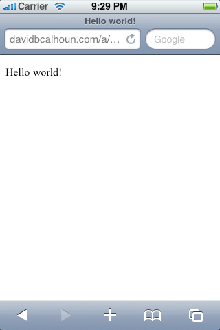
Ok! You can't get much simpler than that. You check it out and it looks good on all the desktop browsers, since there's really no opportunity yet for any cross-browser inconsistencies. And then you check it out on your mobile device:

Hello World on the iPhone, WITHOUT the viewport metatag

Doh! Where'd we go wrong? The text is obviously way too small to read without zooming in.

This is the first lesson in making mobile websites: width is your enemy. This is the first of many countless problems with device width you will encounter. Fair warning.

If you think about it logically, it seems to make sense: mobile Safari took a look at the page and assumed it was a document designed for the desktop, which is true of the vast majority of websites. So it gave the website a width of 980 pixels and presented it zoomed out. Which is why we can't read anything until we zoom into the page.

Viewport

But this is no good! What we need to do is tell the browser that this webpage is optimized for mobile. And this is where the viewport metatag comes into the picture.

Now we tweak our Hello World just a bit…

1
2
3
4
5
6
7
8
9
10
11
12
<!doctype html>
<html>
<head>
    <title>Hello world!</title>

    <meta name="viewport" content="width=device-width"/>
</head>

<body>
<p>Hello world!</p>
</body>
</html>

And we get this…

Hello World with the Viewport tag

Much better! By setting the viewport width equal to “device-width”, we're essentially telling it that the device width is 320px, not the default value of 980px that it guessed. If we set width=320 it would achieve the same result on the iPhone and a few other smartphones, but not all phones have this exact width, so it's best to simply set device-width and let the mobile browser figure it out.

This viewport metatag is supported on many smartphones, from iPhone to Android to webOS (Palm) to even Internet Explorer Mobile, Opera Mini and Opera Mobile.

At the end of the day here's what the standard viewport looks like, as grabbed from m.yahoo.com:

1
<meta name="viewport" content="width=device-width, initial-scale=1.0, maximum-scale=1.0, user-scalable=no"/>

EDIT: It's been discussed a bit, and it seems that preventing the user from scaling the page (pinch zooming) isn't necessarily desirable. So here's a version of the tag that allows the user to pinch zoom:

1
<meta name="viewport" content="width=device-width, initial-scale=1.0"/>

More fun with the viewport tag

In addition to solving our biggest concern with the width of the content, the viewport tag has more options to play with:

Property Description
width Width of the viewport in pixels (or device-width). If width isn't set, it defaults to a desktop size (980px on mobile Safari).
height Height of the viewport in pixels (or device-height). Generally you don't need to worry about setting this property.
initial-scale (0 to 10.0) Multiplier that sets the scale of the page after its initial display. Safe bet: if you need to set it, set it to 1.0. Larger values = zoomed in, smaller values = zoomed out
minimum-scale (0 to 10.0) The minimum multiplier the user can "zoom out" to. Defaults to 0.25 on mobile Safari.
maximum-scale (0 to 10.0) The minimum multiplier the user can "zoom in" to. Defaults to 1.6 on mobile Safari.
user-scalable (yes/no) Whether to allow a user from scaling in/out (zooming in/out). Default to "yes" on mobile Safari.

Feature phones: when viewport isn't available…

Note: this info is now very outdated and is preserved here just for historical reference. In general, you can ignore this stuff these days.

Unfortunately the viewport tag is relatively new and as such isn't universally supported, especially if you're working on older feature phones. But there are some older methods at your disposal for identifying your website as optimized for mobile:

1
<meta name="HandheldFriendly" content="true"/>

This tag was originally used to identify mobile content in AvantGo browsers, but has now been made the general standard for identifying mobile websites. However, it's unknown what range of browsers support this meta tag.

Another tag at your disposal is a Windows-proprietary meta tag that also took root and eventually became used as another means of identifying mobile content. The drawback with this tag is that a specific width must be given, which doesn't make it as flexible as the viewport tag (see above). Again, it's unknown what the support for this tag is:

1
<meta name="MobileOptimized" content="320"/>

Lastly, your website will be identified as a mobile optimized site if your doctype is either XHTML-MP or WML. However, this is becoming less and less the case these days, as browsers begin to support good old HTML4.01 and HTML5+.

(info for this section comes from Beginning Smartphone Web Development)

Custom Android properties

The official Android documentation lists a special property they've added to the meta tag: target-densitydpi. This property essentially allows developers to specify which screen resolution the page has been developed for, or more specifically how to handle the scaling of media such as images.

Here's an example of the tag in action:

1
<meta name="viewport" content="target-densitydpi=device-dpi" />

References

Safari HTML Reference: Supported Meta Tags
Mobile META Tags

Tools of the trade

You're no mobile developer unless you have the tools to develop on mobile! And while it's good to own at least one of the smartphones you're developing on, it's probably unrealistic to think that you're going to go out of your way to buy several other unlocked smartphones just to test with. So you should have the next best thing: an SDK!

But an SDK is just one of the tools of the trade. Here's links to more things to get you started!

SDKs, Emulators and Simulators

Short of having access to a real phone, the next best thing is to have an emulator/simulator. And good news: all the major smartphones have SDKs available for you!

iPhone SDK (Mac OS X only) – the quintessential SDK for the quintessential smartphone. Includes iPhone simulator.
Android SDK (Mac OS X, Windows, and Linux)
Palm webOS SDK (Mac OS X, Windows, and Linux) – emulator for Palm Pre, Pixi, etc. Also check out Ares, the browser-based tool for creating web apps.
Firefox Mobile emulator (aka Fennec) – mobile version of Firefox being developed for new Nokias and soon Androids
Opera Mobile emulator – this is the fastest emulator of the bunch, in terms of downloading and launching the program. Painless installation.
Opera Mini Simulator (Browser-based Java applet) – In-browser simulator. Note that Opera Mini is different than Opera Mobile.
Windows Phone 7 Series emulator

For a more complete list, see Maximiliano Firtman's Mobile Emulators & Simulators: The Ultimate Guide

Device labs

These are services which allow you to test on actual devices in a lab.

Perfecto Mobile

Keynote MITE (Mobile Interactive Testing Environment) (Windows only) – a glorified user agent switcher. Doesn't have testing of real devices.

DeviceAnywhere (Java-based software that runs on Windows and Mac OSX) – a service that lets you test on actual mobile devices sitting in labs around the world. It has a tendency to be a bit clunky, but there's no real alternatives on the market. Only subscribe to this if you intend on supporting more than just smartphones.

Mobile JavaScript libraries

I've created a separate entry for the mobile libraries and frameworks now available.

Hybrid (web + native)

The concept is simple: use what you know to create an app with HTML/CSS/JS and turn it into a marketable native app with one of these “wrapper” services.

PhoneGap
appcelerator's Titanium Mobile
QuickConnectFamily
Rhomobile (HTML-based)

User agent switchers

Many websites sniff a browser's user agent to detect if it's a mobile device. As a developer this presents a challenge, because a lot of development is done on a desktop browser. With a user agent switcher, a developer can masquerade their desktop browser as a mobile browser.

Firefox addon: User Agent Switcher

Safari: Enable the Develop toolbar (click on Safari -> Preferences -> Advanced) and click on Develop -> User Agent. Select a predefined user agent or enter a custom agent by selecting “Other…”

Chrome: There is no easy way to do this (note that the one user agent switcher extension for Chrome doesn't work). Currently the only way is to set command line flags:

To change the user agent of Chrome in Windows:

  1. Make a copy of the shortcut to Chrome.
  2. Right click the copy and select Properties.
  3. In the Target field append ––user-agent=”myagent”

Example Target: “C:\Documents and Settings\Username\Local Settings\Application Data\Google\Chrome\Application\chrome.exe” ––user-agent=”Mozilla/4.0 (compatible; MSIE 6.0; Windows NT 5.1)”

To change the user agent of Chrome in Mac OSX:

  1. Open Terminal
  2. Enter the following into terminal: /Applications/Google\ Chrome.app/Contents/MacOS/Google\ Chrome ––user-agent=”myagent”

Example command: /Applications/Google\ Chrome.app/Contents/MacOS/Google\ Chrome ––user-agent=”Mozilla/4.0 (compatible; MSIE 6.0; Windows NT 5.1)”

Mobile detection

On the server side, mobile detection is mostly done by user agent sniffing (thus the need for the user agent switchers above), but there are a few other methods.

“Lite” user agent detection: these methods implement a simple server-side function (commonly in PHP) to detect common mobile user agents. There's a few versions, mostly based on code by Andy Moore. There's one implemented in the WordPress Mobile Pack and a similar one described on the Nokia developer forums.

WURFL (Wireless Universal Resource File) – a 10+ year old project that is still being used and gaining momentum. It's beneficial because it's open source and it offers a lot of valuable information about devices.

DeviceAtlas – essentially a commercial version of WURFL

Reporting bugs

Everybody's human. All this new cutting-edge stuff isn't exactly bug-free. Help squash bugs by reporting them on the project's website. For best results, show a simplified example of the bug in action (try not to post big hunks of code!).

WebKit Bugzilla
Android: Report bugs

Blogs

Keep up to date! There's new stuff happening all the time on the mobile web.

QuirksBlog – blog of Peter-Paul Koch (PPK), who is known for documenting and researching cross-browser inconsistencies. As of the last several years he's been focusing on documenting mobile browser bugs.

Daring Fireball – John Gruber's blog with a cultlike following. Frequently reports on mobile happenings, especially stuff relating to Apple.

Surfin' Safari – The WebKit Blog
Android Developers blog
IE for Windows Phone Team Weblog
Opera Mobile Blog
Inside BlackBerry – The Official BlackBerry Blog

Yahoo! Mobile Blog
Google Mobile Blog

Miscellaneous

Yahoo! Blueprint – framework for normalizing cross-browser issues across thousands of devices

A button is something that seems to be made just for mobile: it's designed to be big and easy to activate, as opposed to small and harder to activate, like normal text links. This seems ideal for a mobile devices, which have a small display area and whose form of input is a person's (relatively) fat finger interacting with the screen. Contrast this with the desktop, where the display area is much larger and the input device, the mouse, is a much more highly refined and sensitive pointing device.

But you probably don't want to make everything into a button. After all, there's still a place for good old fashioned anchor tags. So what do you make into a button? Simple: areas of your website that get frequent usage. For instance, [mobile.twitter.com][1] has buttons for Search, Refresh results, and More (display more tweets), but leaves other things as anchors/hyperlinks, such as usernames and links in tweets. Basically, use common sense. You should have a mixture of both buttons and hyperlinks.

There's a distinction to be made between form input buttons and other things that look like buttons. The former occurs within a Form tag and can be used to submit a form of data when clicked (and you can [style it up all you want][2]!). The latter is simply an Anchor tag disguised as a big clickable button, which is the focus of this article.

A button can be a very useful thing, and can make the user experience much much better. Yet it's surprisingly easy to fail to create a proper button.

How to fail at creating a button

See if you can tell the difference between these two buttons:
More

If the difference isn’t immediately apparent, try mousing over the following buttons:

More

What’s the problem? The button on the top is only clickable when hovering over the text. In other words, it looks like a button but it acts just like a regular hyperlink. This is a common problem that I’ve seen a LOT, and I’ve even seen it on major websites (in fact, the faulty button is inspired by the live code on mobile.twitter.com).

How does this happen?

My theory is that when a design is passed down to a developer, the developer may think their job ends when their code produces output that looks like the original design documents. But they fail to take into consideration the actual usability of the website.

This is a simple mistake, but it definitely causes frustration when I find it on websites. And I find myself even more annoyed when I see this while browsing websites with my iPhone. It basically tells me that the developers don’t use their own website. That’s not a good impression to leave with your visitors.

Summary

In summary, buttons are an important part of your mobile website. They are designed to be easy to activate, so make sure that frequently used functions on your website are buttons. Also, don’t be lazy: TEST your code for usability and don’t assume that the product is done when it looks identical to the design specs.

The frontend engineer lives at the intersection between design and engineering, and this is perhaps nowhere more true than in the world of mobile. In order to make a usable desktop website, an engineer must have at least some sense of design, and fortunately a lot of this has been standardized over the years. But the world of mobile is full of more unknowns, and the field is changing rapidly, especially lately from the shift away from older feature phones to the focus on smartphones. As such, the mobile engineer has to be on their toes in the sense of both design and engineering.

The focus of this article is on mobile design in general. I'm by no means an expert, but these are some things I've found to be essential and basic topics. Hopefully you will find this useful!

Only one column?

Mobile websites should only have one column of main content. This point is stressed again and again in mobile design, and for good reason: the paradigm of multi-column layouts is fairly well-entrenched in desktop design, but it's simply not an option for a well-designed mobile site.

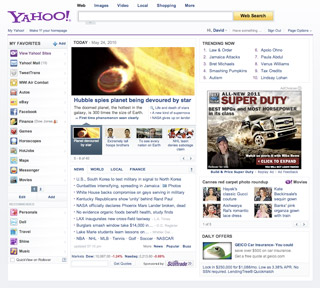
To illustrate this point, the following two images are both 320 pixels wide, which is a common smartphone width in portrait mode. The image on the left is the Yahoo! front page (yahoo.com) in its three-column fixed width desktop size, and the image on the right is Yahoo! mobile's front page (m.yahoo.com):

This might not be a fair comparison, as the desktop version isn't optimized for mobile, so you can't even read the text without zooming in. However, even if the size of the text was increased, it's apparent that three columns is just too much, both because of screen width concerns as well as concerns about too much content. There's simply too much information being crammed down the user's throat. Chances are the user only wants to check a few things and then put the phone back in their pocket, and this three-column version of the site is preventing them from doing that.

Modules, modules, modules

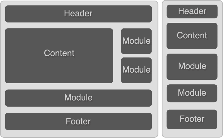
It's helpful to think of a webpage as being composed of modules. If you're converting a desktop website into a mobile site then you must essentially think of the website as bits of rearrangeable components:


What you're doing is essentially grabbing your most important components and making sure they appear at the top, then stacking each module on top of each other. And don't forget we do have variable screen widths on mobile (even on phones themselves, since they can be either in portrait or landscape mode), so we should be sure that each module is taking up 100% of the available screen space. In more technical terms, yes, this means we have to make a fluid layout.

Clarity and concision

It's important to be both clear and concise in presentation. On the desktop we can get away with a certain amount of screen bloat, but users always appreciate simple sites when they come across them. This is a huge part of what made Google so successful: users came to the site for one thing, search, and the site was kept simple to facilitate that interaction.

As it turns out, it's quite hard to be clear and concise. I like to compare this to writing papers for school. Often we were given assignments that needed to be a minimum of X amount of words or pages, and it was sometimes challenging to find information to meet this minimum. Fortunately (or unfortunately) many students developed a highly refined skill of BSing to fill the word limit. But were you ever given an assignment where there was a word/page MAXIMUM? This turns out to be much harder to write for, mostly because you can't BS it. You have to identify the fluff, the nonessential bits, and surgically remove them from your paper. (As a side note, in the area of computer science, notice how many HUGE tomes there are out there compared to smaller books. I would venture to guess that engineers have a hard time being concise.)

This is just the problem we now face with mobile. We know how to fill up webpages with fluff: add an RSS feed here, add a module that ties into Facebook there, add another feed here, stick a relatively unimportant module there, add an excessive amount of social sharing buttons, and presto, we have a website that looks pretty active. But how does that translate to mobile? The questions you're forced to ask yourself are: “do I really need this data feed displayed here?”, “do I need this huge Facebook module here taking up space?”. Or more positive questions like “what are the things users will come to my site to check, and how do I make it easier for them to find those things?”.

In the case of the last question, it's easy to see from the above screenshots what Yahoo mobile thought was most important: Mail, Search, and News, all of which are visible at the top of the page. Think about your website's main two or three features and try to make those just as visible.

W3C Mobile Web Best Practices 1.0
Tips and Tricks for developing Mobile Widgets

(updated June 27, 2011)

Mobile-specific HTML

Viewport tag

Use the viewport tag to properly fit the content to the screen:

1
<meta name="viewport" content="width=device-width, initial-scale=1.0"/>

Tel scheme (to initiate phone calls)

1
<a href="tel:18005555555">Call us at 1-800-555-5555</a>

Sms scheme (to initiate text messages)

1
2
3
<a href="sms:18005555555">
<a href="sms:18005555555,18005555556">                <!-- multiple recipients -->
<a href="sms:18005555555?body=Text%20goes%20here">    <!-- predefined message body -->

Disable automatic telephone number linking

1
<meta name="format-detection" content="telephone=no">

iOS-specific HTML (some work on Android as well)

You also have access to several Apple-specific tags to use in your iOS applications (iPhone, iPad, and don't forget the iPod Touch!).

1
2
3
4
5
6
7
8
9
10
11
12
13
14
15
16
17
18
19
20
<!-- iOS 1.1.3+: this is the icon that's used when the user adds your app to the home screen -->

<!-- also works on Android! -->
<link rel="apple-touch-icon" href="icon.png" />

<!-- iOS 2.0+: tell iOS not to apply any glare effects to the icon -->
<link rel="apple-touch-icon-precomposed" href="icon.png" />

<!-- iOS 4.2+ icons for different resolutions -->
<link rel="apple-touch-icon" sizes="72x72" href="touch-icon-ipad.png" />
<link rel="apple-touch-icon" sizes="114x114" href="touch-icon-iphone4.png" />

<!-- iOS 3+: full-screen startup splash screen image (must be 320x460) -->
<link rel="apple-touch-startup-image" href="startup.png" />

<!-- enable full-screen mode (only when launched from home screen) -->
<meta name="apple-mobile-web-app-capable" content="yes" />

<!-- controls the appearance of the status bar in full-screen mode -->
<meta name="apple-mobile-web-app-status-bar-style" content="black" />

Turn off autocorrect, autocomplete, and autocapitalize

And also some handy attributes to turn off annoying autocorrect features:

1
<input autocorrect="off" autocomplete="off" autocapitalize="off">

Mobile-specific CSS

position:fixed and overflow:scroll

Mobile browsers are now starting to support these basic CSS properties better. Position:fixed will work on Android 2.2+ and iOS 5+. Overflow:scroll works with one finger on iOS 5+.

Also, iOS 5 has additional CSS to give the native scrollbar and momentum/intertia to elements with overflow:scroll:

1
2
3
div {
  -webkit-overflow-scrolling: touch;
}

Media queries

Media queries enable you to target specific features (screen width, orientation, resolution) within CSS itself. Media queries themselves are actually quite old and are not mobile specific (they used to be popular for making a print-friendly version of webpages).

You can use them two ways: 1) inline in a CSS stylesheet or 2) as the “media” attribute in the link tag, which loads an external stylesheet. The following is an example of inline CSS that's applied only when the device is in portrait mode:

1
2
3
4
@media all and (orientation: portrait) {
  body { }
  div { }
}

Here's the same media query using the other method, which points to an external stylesheet (not recommended):

1
<link rel="stylesheet" media="all and (orientation: portrait)" href="portrait.css" />

This is not recommended because it creates an additional HTTP request (bad for performance). Also, in the case of screen orientation, the separate CSS stylesheet is NOT downloaded when the screen is rotated.

Here's a few examples of using inline CSS:

1
2
3
4
5
6
7
8
9
10
11
12
13
14
15
16
17
18
// target small screens (mobile devices or small desktop windows)
@media only screen and (max-width: 480px) {
  /* CSS goes here */
}

/* high resolution screens */
@media (-webkit-min-device-pixel-ratio: 2),
             (min--moz-device-pixel-ratio: 2),
             (min-resolution: 300dpi) {
  header { background-image: url(header-highres.png); }
}

/* low resolution screens */
@media (-webkit-max-device-pixel-ratio: 1.5),
             (max--moz-device-pixel-ratio: 1.5),
             (max-resolution: 299dpi) {
  header { background-image: url(header-lowres.png); }
}

Read more: Media queries (Mozilla Developer Center)

Miscellaneous CSS

  • -webkit-tap-highlight-color (iOS): override the semitransparent color overlay when a user clicks a link or clickable element. To completely disable it, set the value to ‘transparent' or ‘rgba(0,0,0,0)'

  • -webkit-user-select: none; - prevent the user from selecting text (also works on desktop WebKit)

  • -webkit-touch-callout: none; - prevent the callout toolbar from appearing when a user touches and holds an element such as an anchor tag.

Mobile-specific JavaScript

window.scrollTo(0,0);

This hides the address bar and takes advantage of the entire device screen. You'll have to set this in a timeout and make sure to get the timing right. See Remy Sharp's post for more details.

window.matchMedia()

(iOS 5+) Again, just as CSS media queries aren't specific to mobile, they do come in especially useful for mobile, so it's worth mentioning their JavaScript counterpart. window.matchMedia() is a JavaScript-based version of media queries. You can use respond.js as a polyfill for devices that don't support this functionality natively.

(Android 2.2+) Determine if the phone is running on WiFi, 3G, etc. Example:

1
2
3
if (navigator.connection.type==navigator.connection.WIFI) {
  // code for WiFi connections (high-bandwidth)
}

window.devicePixelRatio

Determine screen resolution (analogue to the CSS media query). (iPhone 4 has the value 2, while Nexus One has the value 1.5).

window.navigator.onLine

Not strictly mobile, but helpful for apps to determine if they're being run offline.

window.navigator.standalone

(iOS 2.1+): determine if it's running in full-screen mode

Touch and gesture events

Screen orientation (every 90 degrees)

  • orientationchange event: triggered every 90 degrees of rotation (portrait and landscape modes). The current orientation is available through window.orientation

Device orientation (more fine-grained)

The deviceorientation event will fire very frequently, and gives more fine-grained information about the device's orientation in three dimensions.
MozOrientation (or onmozorientation?) (Fennec/Firefox Mobile, Firefox 3.5+): also not strictly mobile. Gives access to the device's accelerometer (x-y-z orientation data), updated periodically. Works on Android phones running Mobile Firefox. On the desktop this works with laptops such as Thinkpads and MacBooks.

devicemotion (shake gestures, etc.)

  • devicemotion fires when the user shakes or moves their device. Devicemotion taps into the accelerometer, which is fires off when the device accelerates. Contrast this with the deviceorientation event, which taps into the device's gyroscope (if it has one), which only measures the 3D angle orientation, even when the device is at rest.

Media capture API

While iOS is still lacking basic file inputs, Android is forging ahead, giving developers fine-grained control over content users can upload.

1
2
3
4
5
6
7
8
9
10
11
<!-- regular file upload (Android 2.2+, NO iOS) -->
<input type="file"></input>

<!-- opens directly to the camera (Android 3.0+) -->
<input type="file" accept="image/*;capture=camera"></input>

<!-- opens directly to the camera in video mode (Android 3.0+) -->
<input type="file" accept="video/*;capture=camcorder"></input>

<!-- opens directly to the audio recorder (Android 3.0+) -->
<input type="file" accept="audio/*;capture=microphone"></input>

BlackBerry specific

If you're developing for a BlackBerry Widget, you have access to proprietary information through the blackberry object (which gives access to useful information such as blackberry.network [returns values such as CDMA and Wi-Fi] and blackberry.system).

You also have the option to use PhoneGap, which augments JavaScript and gives you access to more phone features that native apps would have access to.

Use a mobile-optimized JavaScript library

I've created a separate entry for the available mobile libraries and frameworks.

Because smartphone browsers are standards-based, the aim of a JavaScript library on mobile is less towards API normalization and more towards providing an actual UI framework, usually to emulate the feel of native apps (and to provide easier workarounds to lack of access to position:fixed). We've seen a few libraries released that emulate the iPhone UI, and in the future we might see libraries emulating the Android UI, as well as entirely new UIs.

There's also a bit to be said about simply loading full desktop JavaScript libraries into mobile clients. In my opinion this doesn't particularly make sense, especially in a world where latency and bandwidth are so much more of a concern. It doesn't make sense to force the user wait longer and download code that's ultimately useless to them (hacks for desktop browsers such as IE 6, etc).

Take advantage of new stuff!

While not specific to mobile, there's a lot of new stuff in general that you can use. If you limit yourself to the top smartphones (iPhone, Android, and maybe webOS), compared to the desktop you immediately have access to an even wider array of new stuff, especially many Webkit proprietary features, since most of these top smartphones have browsers based on Webkit.

-HTML: new tags (HTML5 (I'm sure you've heard of it by now…))
-CSS: 2d transforms, 3d transforms, animation, border radius, custom fonts with @font-face, etc.
-JavaScript: strict mode, constants, block scope, Date.now(), etc.

Slides

Introduction

If you read part 4 of this series, you'll know that because of the variety of screen sizes, the best way to develop for mobile is to develop fluid layouts that take 100% of the available space on the screen.

What you probably didn't think of is that there's different screen widths even on the same device! This is due to screen orientation. And when the user changes the screen orientation, stuff may break (hey, it's not a perfect world). In my experience this has meant needing to tweak percentage widths on elements, but I imagine there's even more needs. Imagine an image carousel that can only fit three images across in portrait mode but can possibly fit four images in landscape mode. It might be nice to re-initialize the carousel to accommodate a forth image when the phone is in landscape mode (then again, that might create a lot of unnecessary overhead…).

In any case, I hope you can agree that it would sometimes be useful to know the screen orientation.

window.orientation and the orientationchange event

Luckily on the latest smartphones you have some goodies available to you that you don't have on the desktop (since desktop users aren't in the habit of constantly turning their screens sideways!).

  • window.orientation: this property gives the current screen orientation: 0 in portrait mode, 90 when rotated left, -90 when rotated right (no special value when the screen is upside-down)

  • orientationchange event: this window event fires after every 90 degrees of rotation and, like other events, can be applied in various ways:

    // DOM Level 0 (avoid)
    window.onorientationchange = function(){};

    // DOM Level 2
    window.addEventListener(‘orientationchange', function(){}, false);

Some websites recommend using orientationchange to dynamically add an orient attribute on the body element and target the orientation with CSS selectors (body[orient=landscape]), but this is in error. As it turns out, orientationchange is only fired AFTER the screen has been rotated (which also triggers a CSS reflow), which means this attribute is updated later (after the reflow). And unfortunately editing this orient attribute doesn't trigger another CSS reflow. The result? When you rotate the device, these new CSS styles don't get applied!

The fix is to add the orientation as a CSS class, which does trigger a CSS reflow. So our code at this point will look something like this:

(function(){
var init = function() {
  var updateOrientation = function() {
    var orientation = window.orientation;
    
    switch(orientation) {
      case 90: case -90:
        orientation = 'landscape';
      break;
      default:
        orientation = 'portrait';
    }
    
    // set the class on the HTML element (i.e. )
    document.body.parentNode.setAttribute('class', orientation);
  };
  
  // event triggered every 90 degrees of rotation
  window.addEventListener('orientationchange', updateOrientation, false);
  
  // initialize the orientation
  updateOrientation();
}

window.addEventListener('DOMContentLoaded', init, false);

})();

Now we can target elements like this in CSS:

.portrait body div { width: 10%; }
.landscape body div { width: 15%; }

With a little help from media queries

You may have heard of media queries being used to target mobile devices (based on screen pixel width) or to target the iPhone 4's Retina display, but you may not have known that you can also target screen orientation!

@media all and (orientation: portrait) {
  body div { width: 10%; }
}

@media all and (orientation: landscape) {
  body div { width: 15%; }
}

The orientation media query is available on iOS 3.2+, Android 2.0+, and some other browsers.

This is a lot cleaner than the above JavaScript example in the sense that it's pure CSS, and it's part of the CSS that gets reflowed when the screen is rotated.

(Minor note: iOS 4 on the iPhone Simulator running 4.0.0 looks like it's stuck in landscape orientation, but the media queries work correctly on my 3GS with 4.0.1)

Fallback: when window.orientation and media queries aren't available…

If window.orientation isn't available on a device, chances are the orientationchange event and media queries (for orientation) will also not be available. Oh no, what do we do now?

Even though this isn't an entirely foolproof method, we can dynamically measure the window width and height and guess orientation based on that:

(function(){
var HTMLNode = document.body.parentNode;
var updateOrientation = function() {  
  // landscape when width is biggest, otherwise portrait
  var orientation = (window.innerWidth > window.innerHeight) ? 'landscape': 'portrait';
  
  // set the class on the HTML element (i.e. )
  HTMLNode.setAttribute('class', orientation);
}
var init = function() {
  // initialize the orientation
  updateOrientation();
  
  // update every 5 seconds
  setInterval(updateOrientation, 5000);
}
window.addEventListener('DOMContentLoaded', init, false);
})();

Ok, so it's not pretty, but it seems to work. The overhead in this fallback example is the fact that we have to use a polling technique (in this case every 5 seconds [5000 milliseconds]) to check for changes in orientation.

Note: there's also the strong possibility that these browsers will not support the DOMContentLoaded event, but we'll ignore that for the purposes of this article. (if you have problems, change DOMContentLoaded to load).

Putting it all together

Ok, so if you want the fallback example to work in addition to newer methods, unless you want to duplicate your CSS, then avoid using media queries to target orientation. Instead we'll rely on adding a class to the html tag (or the body tag if you prefer).

Once we put everything together, we get something that looks like this:

(function(){
var supportsOrientation = (typeof window.orientation == 'number' && typeof window.onorientationchange == 'object');
var HTMLNode = document.body.parentNode;
var updateOrientation = function() {
  // rewrite the function depending on what's supported
  if(supportsOrientation) {
    updateOrientation = function() {
      var orientation = window.orientation;
    
      switch(orientation) {
        case 90: case -90:
          orientation = 'landscape';
        break;
        default:
          orientation = 'portrait';
      }
      
      // set the class on the HTML element (i.e. )
      HTMLNode.setAttribute('class', orientation);
    }
  } else {
    updateOrientation = function() {
      // landscape when width is biggest, otherwise portrait
      var orientation = (window.innerWidth > window.innerHeight) ? 'landscape': 'portrait';

      // set the class on the HTML element (i.e. )
      HTMLNode.setAttribute('class', orientation);
    }
  }
  
  updateOrientation();
}
var init = function() {
  // initialize the orientation
  updateOrientation();
  
  if(supportsOrientation) {
    window.addEventListener('orientationchange', updateOrientation, false);
  } else {
    // fallback: update every 5 seconds
    setInterval(updateOrientation, 5000);
  }

}
window.addEventListener('DOMContentLoaded', init, false);
})();

Minified (540 bytes):

(function(){var e=typeof window.orientation=="number"&&typeof window.onorientationchange=="object",f=document.body.parentNode;function c(){c=e?function(){var d=window.orientation;switch(d){case 90:case -90:d="landscape";break;default:d="portrait"}f.setAttribute("class",d)}:function(){f.setAttribute("class",window.innerWidth>window.innerHeight?"landscape":"portrait")};c()}window.addEventListener("DOMContentLoaded",function(){c();e?window.addEventListener("orientationchange",c,false):setInterval(c,5E3)},false)})();

Conclusion

And that's it! Now we can reliably target different screen orientations with some straightforward CSS:

.portrait body div { width: 10%; }
.landscape body div { width: 15%; }

Again, in my experience I've used this to fix bugs. But I'm sure you can find more creative uses for it!

iPad web development tips (Nicholas C. Zakas)

iPhone window.onorientationchange Code (Ajaxian)

The orientation media query (Quirksmode)