http://alignedleft.com/tutorials/d3/
Downloading D3
Start by creating a new folder for your project. Within that folder, I recommend creating a sub-folder calledd3.
Then download the latest version of d3.v3.js into that sub-folder.
As of this writing, the current version of D3 is 3.4.2.
D3 is also provided in a “minified” version, d3.v3.min.js, from which whitespace has been removed for smaller file sizes and faster load times.
The functionality is the same, but typically you’d use the regular version while working on a project (for friendlier debugging), and then switch to the minified version once you’ve launched the project publicly (for optimized load times).
The choice is up to you, but in these tutorials we’ll be using the standard version.
A third option is to download the entire D3 repository, which gives you not just the JavaScript files, but also all of the component source code.
You can browse the repository contents first, or just download the whole thing as a compressed ZIP file.
Referencing D3
Create a simple HTML page within your project folder namedindex.html.
Your folder structure should now look something like this:
project-folder/
d3/
d3.v3.js
d3.v3.min.js (optional)
index.html
Now paste the following into your HTML file, so it references D3 in the head and provides room for your JavaScript code:
<!DOCTYPE html>
<html lang="en">
<head>
<meta charset="utf-8">
<title>D3 Test</title>
<script type="text/javascript" src="d3/d3.v3.js"></script>
</head>
<body>
<script type="text/javascript"> // Your beautiful D3 code will go here </script>
</body>
</html>
Viewing Your Page
In some cases, you can just open your HTML file in a web browser to view it. However, when loading external data sources, it is more reliable to run a local web server and view your page fromhttp://localhost:8888/. You could use a server like MAMP or see the notes on the wiki on activating a quick, temporary server.
Adding elements
One of your first steps will be to use D3 to create a new DOM element. Typically, this will be an SVG object for rendering a data visualization, but we’ll start simple, and just create ap paragraph element.
Begin with this simple HTML template:
<!DOCTYPE html>
<html lang="en">
<head>
<meta charset="utf-8">
<title>D3 Test</title>
<script type="text/javascript" src="d3/d3.v3.js"></script>
</head>
<body>
<script type="text/javascript"> // Your beautiful D3 code will go here </script>
</body>
</html>
Back in your HTML, replace the comment between the script tags with:
d3.select("body").append("p").text("New paragraph!");
Save and refresh (or view the corresponding demo page), and voilà! There is text in the formerly empty browser window
Let’s walk through what just happened.
In sequence, we:
Invoked D3's select method, which selects a single element from the DOM using CSS selector syntax.
(We selected the body.) Created a new p element and appended that to the end of our selection, meaning just before the closing </body> tag in this case.
Set the text content of that new, empty paragraph to “New paragraph!”
All of those crazy dots are just part of D3’s chain syntax.
Chaining methods
D3 smartly employs a technique called chain syntax, which you may recognize from jQuery. By “chaining” methods together with periods, you can perform several actions in a single line of code. It can be fast and easy, but it’s important to understand how it works, to save yourself hours of debugging headaches later. By the way, functions and methods are just two different words for the same concept: a chunk of code that accepts an argument as input, performs some action, and returns some data as output. Let’s revisit our first line of D3 code ( demo page here).d3.select("body").append("p").text("New paragraph!"); This may look like a big mess, especially if you’re new to programming.
So the first thing to know is that JavaScript, like HTML, doesn’t care about whitespace and line breaks, so you can put each method on its own line for legibility: d3.select("body") .append("p") .text("New paragraph!"); Everyone has their own coding style.
Use whatever indents, line breaks, and whitespace (tabs or spaces) works for you.
The Hand-off
Many, but not all, D3 methods return a selection (or, really, reference to a selection), which enables this handy technique of method chaining. Typically, a method returns a reference to the element that it just acted upon, but not always. So remember: When chaining methods, order matters. The output type of one method has to match the input type expected by the next method in the chain. If adjacent inputs and outputs are mismatched, the hand-off will function more like a dropped baton in a middle-school relay race. When sussing out what each function expects and returns, the API reference is your friend. It contains detailed information on each method, including whether or not it returns a selection.Going Chainless
Our sample code could be rewritten without chain syntax as:var body = d3.select("body");
var p = body.append("p");
p.text("New paragraph!");
Ugh! What a mess.
Yet there will be times you need to break the chain, such as when you are calling so many functions that it doesn't make sense to string them all together.
Or just because you want to organize your code in a way that makes more sense to you.
Binding data
What is binding, and why would I want to do it to my data? Data visualization is a process of mapping data to visuals. Data in, visual properties out. Maybe bigger numbers make taller bars, or special categories trigger brighter colors. The mapping rules are up to you. With D3, we bind our data input values to elements in the DOM. Binding is like “attaching” or associating data to specific elements, so that later you can reference those values to apply mapping rules. Without the binding step, we have a bunch of data-less, un-mappable DOM elements. No one wants that.In a Bind
We use D3’sselection.data() method to bind data to DOM elements.
But there are two things we need in place first, before we can bind data: - The data A selection of DOM elements
Data
D3 is smart about handling different kinds of data, so it will accept practically any array of numbers, strings, or objects (themselves containing other arrays or key/value pairs). It can handle JSON (and GeoJSON) gracefully, and even has a built-in method to help you load in CSV files. But to keep things simple, for now we will start with a boring array of numbers. Here is our sample data set:var dataset = [ 5, 10, 15, 20, 25 ];
Please Make Your Selection
First, you need to decide what to select. That is, what elements will your data be associated with? Again, let’s keep it super simple and say that we want to make a new paragraph for each value in the data set. So you might imagine something like this would be helpfuld3.select("body").selectAll("p") and you’d be right, but there’s a catch: The paragraphs we want to select don’t exist yet.
And this gets at one of the most common points of confusion with D3: How can we select elements that don’t yet exist? Bear with me, as the answer may require bending your mind a bit.
The answer lies with enter(), a truly magical method.
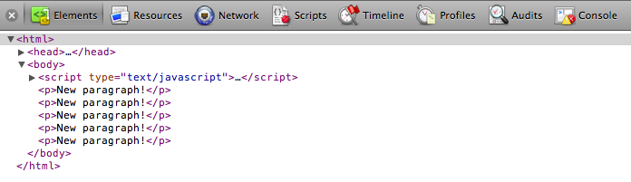
Here’s our final code for this example, which I’ll explain: d3.select("body").selectAll("p") .data(dataset) .enter() .append("p") .text("New paragraph!"); Now look at what that code does on this demo page. You see five new paragraphs, each with the same content.
Here’s what’s happening.
d3.select("body") — Finds the body in the DOM and hands a reference off to the next step in the chain.
.selectAll("p") — Selects all paragraphs in the DOM.
Since none exist yet, this returns an empty selection.
Think of this empty selection as representing the paragraphs that will soon exist.
.data(dataset) — Counts and parses our data values.
There are five values in our data set, so everything past this point is executed five times, once for each value.
.enter() — To create new, data-bound elements, you must use enter().
This method looks at the DOM, and then at the data being handed to it.
If there are more data values than corresponding DOM elements, then enter() creates a new placeholder element on which you may work your magic.
It then hands off a reference to this new placeholder to the next step in the chain.
.append("p") — Takes the placeholder selection created by enter() and inserts a p element into the DOM.
Hooray! Then it hands off a reference to the element it just created to the next step in the chain.
.text("New paragraph!") — Takes the reference to the newly created p and inserts a text value.
Bound and Determined
All right! Our data has been read, parsed, and bound to newp elements that we created in the DOM.
Don’t believe me? Head back to the demo page and whip out your web inspector.
 Okay, I see five paragraphs, but where’s the data? Click on Console, type in the following JavaScript/D3 code, and hit enter:
 console.log(d3.selectAll("p")) 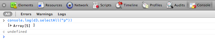 An array! Click the small, gray disclosure triangle to reveal more:
 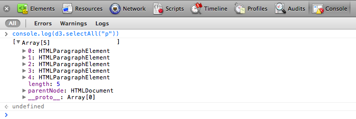 You’ll notice the five
 HTMLParagraphElements, numbered 0 through 4.
Click the disclosure triangle next to the first one (number zero).
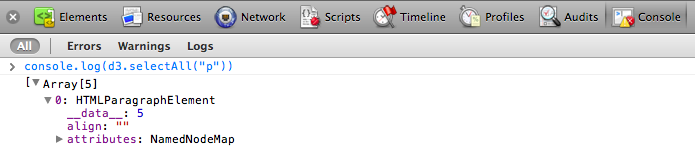 See it? Do you see it? I can barely contain myself.
There it is:
See it? Do you see it? I can barely contain myself.
There it is: 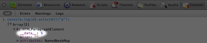 Our first data value, the number
 5, is showing up under the first paragraph’s __data__ attribute.
Click into the other paragraph elements, and you’ll see they also contain __data__ values: 10, 15, 20, and 25, just as we specified.
You see, when D3 binds data to an element, that data doesn’t exist in the DOM, but it does exist in memory as a __data__ attribute of that element.
And the console is where you can go to confirm whether or not your data was bound as expected.
The data is ready.
Let’s do something with it.
Using your data
Once you’ve loaded in your data and bound it to newly created elements in the DOM, how can you use it? Here’s our code from last time:var dataset = [ 5, 10, 15, 20, 25 ];d3.select("body").selectAll("p") .data(dataset) .enter() .append("p") .text("New paragraph!"); Let’s change the last line to: .text(function(d) { return d; });
Check out what the new code does on this demo page. Whoa! We used our data to populate the contents of each paragraph, all thanks to the magic of the data() method.
You see, when chaining methods together, anytime after you call data(), you can create an anonymous function that accepts d as input.
The magical data() method ensures that d is set to the corresponding value in your original data set, given the current element at hand.
The value of “the current element” changes over time as D3 loops through each element.
For example, when looping through the third time, our code creates the third p tag, and d will correspond to the third value in our data set (or dataset[2]).
So the third paragraph gets text content of “15”.
High-functioning
In case you’re new to writing your own functions (a.k.a. methods), the basic structure of a function definition is:function(input_value) { //Calculate something here return output_value;} The function we used above is dead simple, nothing fancy function(d) { return d;} and it’s wrapped within D3’s text() function, so whatever our function returns is handed off to text().
.text(function(d) { return d;}); But we can (and will) get much fancier, because you can customize these functions however you want.
Yes, it’s the pleasure and pain of writing your own JavaScript.
We can define our own custom functions however we want.
Maybe you’d like to add some extra text, which produces this result.
.text(function(d) { return "I can count up to " + d;});
Data Wants to be Held
You may be wondering why you have to write outfunction(d)... instead of just d on its own.
For example, this won’t work: .text("I can count up to " + d); In this context, without wrapping d in an anonymous function, d has no value.
Think of d as a lonely little placeholder value that just needs a warm, containing hug from a kind, caring function’s parantheses.
(Extending this metaphor further, yes, it is creepy that the hug is being given by an anonymous function — stranger danger! — but that only confuses matters.) Here is d being gently and appropriately held by a function: .text(function(d) { // <-- Note tender embrace at left return "I can count up to " + d;}); The reason for this syntax is that .text(), attr(), and many other D3 methods take a function as an argument.
For example, text() can take either simply a static string of text as an argument: .text("someString") … or the result of a function: .text(someFunction()) … or an anonymous function itself can be the argument, such as when you write: .text(function(d) { return d;}) Above, you are defining an anonymous function.
If D3 sees a function there, it will call that function, while handing off the current datum d as the function’s argument.
Without the function in place, D3 can’t know to whom it should hand off the argument d.
At first, this may seem silly and like a lot of extra work to just get at d, but the value of this approach will become clear as we work on more complex pieces.
Beyond Text
Things get a lot more interesting when we explore D3’s other methods, likeattr() and style(), which allow us to set HTML attributes and CSS properties on selections, respectively.
For example, adding one more line to our code produces this result.
.style("color", "red"); All the text is now red; big deal.
But we could use a custom function to make the text red only if the current datum exceeds a certain threshold.
So we revise that last line to use a function: .style("color", function(d) { if (d > 15) { //Threshold of 15 return "red"; } else { return "black"; }}); See that code in action. Notice how the first three lines are black, but once d exceeds the arbitrary threshold of 15, the text turns red.
In the next tutorial, we’ll use attr() and style() to manipulate divs, generating a simple bar chart — our first visualization!
Drawing divs
It’s time to start drawing with data. Let’s continue working with our simple data set from last time:var dataset = [ 5, 10, 15, 20, 25 ]; We’ll use this to generate a super-simple bar chart.
Bar charts are essentially just rectangles, and an HTML <div> is the easiest way to draw a rectangle.
(Then again, to a web browser, everything is a rectangle, so you could easily adapt this example to use spans or whatever element you prefer.) This div could work well as a data bar: <div style="display: inline-block; width: 20px; height: 75px; background-color: teal;"></div> (Among web standards folks, this is a semantic no-no.
Normally, one shouldn’t use an empty div for purely visual effect, but coding tutorials are notable exceptions.) Because this is a div, its width and height are set with CSS styles.
Each bar in our chart will share the same display properties (except for height), so I’ll put those shared styles into a class called bar:
div.bar { display: inline-block; width: 20px; height: 75px; /* We'll override this later */
background-color: teal;}
Now each div needs to be assigned the bar class, so our new CSS rule will apply.
If you were writing the HTML code by hand, you would write: <div class="bar"></div> Using D3, to add a class to an element, we use the selection.attr() method.
It’s important to understand the difference between attr() and its close cousin, style().
Setting Attributes
attr() is used to set an HTML attribute and its value on an element.
An HTML attribute is any property/value pair that you could include between an element’s <> brackets.
For example, these HTML elements
<p class="caption">
<select id="country">
<img src="logo.png" width="100px">
contain a total of five attributes (and corresponding values), alwbe set with attr(): class: caption, id: country, src: logo.png, width: 100px, alt: Logo To give our divs a class of bar, we can use: .attr("class", "bar")
A Note on Classes
Note that an element’s class is stored as an HTML attribute. The class, in turn, is used to reference a CSS style rule. This may cause some confusion because there is a difference between setting a class (from which styles are inferred) and applying a style directly to an element. You can do both with D3. Although you should use whatever approach makes the most sense to you, I recommend using classes for properties that are shared by multiple elements, and applying style rules directly only when deviating from the norm. (In fact, that’s what we’ll do in just a moment.) I also want to briefly mention another D3 method,classed(), which can be used to quickly apply or remove classes from elements.
The line of code above could be rewritten as: .classed("bar", true)
Back to the Bars
Putting it all together with our data set, here is the complete D3 code so far:var dataset = [ 5, 10, 15, 20, 25 ];d3.select("body").selectAll("div") .data(dataset) .enter() .append("div") .attr("class", "bar");  See this demo page with that code. Make sure to view the source, and open your web inspector to see what’s going on.
You should see five vertical bars, one generated for each point in our data set, although with no space between them, they look like one big rectangle.
See this demo page with that code. Make sure to view the source, and open your web inspector to see what’s going on.
You should see five vertical bars, one generated for each point in our data set, although with no space between them, they look like one big rectangle.
Setting Styles
Thestyle() method is used to apply a CSS property and value directly to an HTML element.
This is the equivalent of including CSS rules within a style attribute right in your HTML, as in: <div style="height: 75px;">
</div> In a bar chart, the height of each bar must be a function of the corresponding data value.
So let’s add this to the end of our D3 code: .style("height", function(d) { return d + "px";});  See this demo page with that code. You should see a very small bar chart! When D3 loops through each data point, the value of
 d will be set to that of the corresponding data point.
So we are setting a height value of d (the current data value) plus px (to specify the units are pixels).
The resulting heights will be 5px, 10px, 15px, 20px, and 25px.
This looks a little bit silly, so let’s make those bars taller .style("height", function(d) { var barHeight = d * 5; //Scale up by factor of 5 return barHeight + "px";}); and add some space to the right of each bar, to space things out: margin-right: 2px;  Nice! We could go to SIGGRAPH with that chart.
Here’s the final demo page with that code. Again, view the source and use the web inspector to contrast the original HTML against the final DOM.
Nice! We could go to SIGGRAPH with that chart.
Here’s the final demo page with that code. Again, view the source and use the web inspector to contrast the original HTML against the final DOM.
The power of data()
We left off with a simple bar chart, drawn withdivs and generated from our simple data set.
var dataset = [ 5, 10, 15, 20, 25 ];  This is great, but real-world data never looks like this.
Let’s modify our data.
This is great, but real-world data never looks like this.
Let’s modify our data.
var dataset = [ 25, 7, 5, 26, 11 ];  We’re not limited to five data points, of course.
Let’s add more!
We’re not limited to five data points, of course.
Let’s add more! var dataset = [ 25, 7, 5, 26, 11, 8, 25, 14, 23, 19, 14, 11, 22, 29, 11, 13, 12, 17, 18, 10, 24, 18, 25, 9, 3 ];  25 data points instead of five! How does D3 automatically expand our chart as needed?
 d3.select("body").selectAll("div") .data(dataset) // <-- The answer is here! .enter() .append("div") .attr("class", "bar") .style("height", function(d) { var barHeight = d * 5; return barHeight + "px"; }); Give data() ten values, and it will loop through ten times.
Give it one million values, and it will loop through one million times.
(Just be patient.) That is the power of data() — being smart enough to loop through the full length of whatever data set you throw at it, executing each method below it in the chain, while updating the context in which each method operates, so d always refers to the current datum at that point in the loop.
That may be a mouthful, and if it all doesn’t make sense yet, it will soon.
I encourage you to save the source code from the sample HTML pages above, tweak the dataset values, and note how the bar chart changes.
Remember, the data is driving the visualization — not the other way around.
Random Data
Sometimes it’s fun to generate random data values, for testing purposes or pure geekiness. That’s just what I’ve done here. Notice how each time you reload the page, the bars render differently.

 View the source, and you’ll see this code:
 var dataset = []; //Initialize empty arrayfor (var i = 0; i < 25; i++) { //Loop 25 times var newNumber = Math.random() * 30; /ew random number (0-30) dataset.push(newNumber); //Add new number to array} This code doesn’t use any D3 methods; it’s just JavaScript.
Without going into too much detail, this code: - Creates an empty array called
dataset.
Initiates a for loop, which is executed 25 times.
Each time, it generates a new random number with a value between zero and 30.
That new number is appended to the dataset array.
( push() is an array method that appends a new value to the end of an array.)console.log(dataset).
You should see the full array of 25 randomized data values.
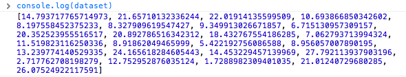 Notice that they are all decimal or floating point values (14.793717765714973), not whole numbers or integers (14) like we used initially.
For this example, decimal values are fine, but if you ever need whole numbers, you can use JavaScript’s
Notice that they are all decimal or floating point values (14.793717765714973), not whole numbers or integers (14) like we used initially.
For this example, decimal values are fine, but if you ever need whole numbers, you can use JavaScript’s Math.round() method.
For example, you could wrap the random number generator from this line var newNumber = Math.random() * 30; as follows: var newNumber = Math.round(Math.random() * 30); Try it out here, and use the console to verify that the numbers have indeed been rounded to integers:  Next we’ll expand our visual possibilities with SVG.
An SVG primer
D3 is most useful when used to generate and manipulate visuals as SVGs. Drawing withdivs and other native HTML elements is possible, but a bit clunky and subject to the usual inconsistencies across different browsers.
Using SVG is more reliable, visually consistent, and faster.
Vector drawing software like Illustrator can be used to generate SVG files, but we need to learn how to generate them with code.
The SVG Element
Scalable Vector Graphics is a text-based image format. Each SVG image is defined using markup code similar to HTML. SVG code can be included directly within any HTML document. Every web browser supports SVG except Internet Explorer versions 8 and older. SVG is XML-based, so you’ll notice that elements that don’t have a closing tag must be self-closing. For example:<element></element> <!-- Uses closing tag --><element/> <!-- Self-closing tag --> Before you can draw anything, you must create an SVG element.
Think of the SVG element as a canvas on which your visuals are rendered.
(In that respect, SVG is conceptually similar to HTML’s canvas element.) At a minimum, it’s good to specify width and height values.
If you don’t specify these, the SVG will take up as much room as it can within its enclosing element.
<svg width="500" height="50"></svg> Here is the SVG generated by that code: <svg width="500" height="50"></svg> Don’t see it? Right-click on the empty space above and choose “Inspect Element”.
Your web inspector should look something like this: 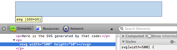 Note that there is an
 svg element (yay!), and that it occupies 500 horizontal pixels and 50 vertical pixels.
It just doesn’t look like much yet (boo!).
Also note that the browser assumed pixels as the default measurement units.
We specified dimensions of 500 and 50, not 500px and 50px.
We could have specified px explicitly, or any number of other supported units, including em, pt, in, cm, and mm.
Simple Shapes
There are a number of visual elements that you can include between thosesvg tags, including rect, circle, ellipse, line, text, and path.
If you’re familiar with computer graphics programming, you’ll recognize the usual pixel-based coordinates system in which 0,0 is the top-left corner of the drawing space.
Increasing x values move to the right, while increasing y values move down.
<svg width="505" height="65">
<line x1="5" y1="5" x2="5" y2="50" stroke="gray" stroke-width="1"/>
<line x1="5" y1="50" x2="0" y2="45" stroke="gray" stroke-width="1"/>
<line x1="5" y1="50" x2="10" y2="45" stroke="gray" stroke-width="1"/>
<line x1="5" y1="5" x2="500" y2="5" stroke="gray" stroke-width="1"/>
<line x1="500" y1="5" x2="495" y2="0" stroke="gray" stroke-width="1"/>
<line x1="500" y1="5" x2="495" y2="10" stroke="gray" stroke-width="1"/>
<circle cx="5" cy="5" r="3" fill="#008"/>
<text x="10" y="20">0,0</text>
<circle cx="105" cy="25" r="3" fill="#008"/>
<text x="110" y="40">100,20</text>
<circle cx="205" cy="45" r="3" fill="#008"/>
<text x="210" y="60">200,40</text>
</svg>
rect draws a rectangle.
Use x and y to specify the coordinates of the upper-left corner, and width and height to specify the dimensions.
This rectangle fills the entire space of our SVG:
<rect x="0" y="0" width="500" height="50"/>
<svg width="500" height="50">
<rect x="0" y="0" width="500" height="50"/>
</svg>
circle draws a circle.
Use cx and cy to specify the coordinates of the center, and r to specify the radius.
This circle is centered in the middle of our 500-pixel-wide SVG because its cx (“center-x”) value is 250.
<circle cx="250" cy="25" r="25"/>
<svg width="500" height="50">
<circle cx="250" cy="25" r="25"/>
</svg>
ellipse is similar, but expects separate radius values for each axis.
Instead of r, use rx and ry.
<ellipse cx="250" cy="25" rx="100" ry="25"/>
<svg width="500" height="50">
<ellipse cx="250" cy="25" rx="100" ry="25"/>
</svg>
line draws a line.
Use x1 and y1 to specify the coordinates of one end of the line, and x2 and y2 to specify the coordinates of the other end.
A stroke color must be specified for the line to be visible.
<line x1="0" y1="0" x2="500" y2="50" stroke="black"/>
<svg width="500" height="50">
<line x1="0" y1="0" x2="500" y2="50" stroke="black"/>
</svg>
text renders text.
Use x to specify the position of the left edge, and y to specify the vertical position of the type’s baseline.
<text x="250" y="25">Easy-peasy
</text>
<svg width="500" height="50">
<text x="250" y="25">Easy-peasy
</svg>
text will inherit the CSS-specified font styles of its parent element unless specified otherwise.
(More on styling text in a moment.) Notice how the formatting of the sample text above matches that of this paragraph.
We could override that formatting as follows:
<text x="250" y="25" font-family="sans-serif" font-size="25" fill="gray">Easy-peasy
</text>
<svg width="500" height="50">
<text x="250" y="25" font-family="sans-serif" font-size="25" fill="gray">Easy-peasy
</svg> Also note that when any visual element runs up against the edge of the SVG, it will be clipped.
Be careful when using text so your descenders don’t get cut off (ouch!).
You can see this happen when we set the baseline ( y) to 50, the same as the height of our SVG: <text x="250" y="50" font-family="sans-serif" font-size="25" fill="gray">Easy-peasy</text> <svg width="500" height="50"> path is for drawing anything more complex than the shapes above (like country outlines for geomaps), and will be explained separately.
For now, we’ll work with simple shapes.
Styling SVG Elements
SVG’s default style is a black fill with no stroke. If you want anything else, you’ll have to apply styles to your elements. Common SVG properties are:fill — A color value.
Just as with CSS, colors can be specified as
named colors — orange
hex values — #3388aa or #38a
RGB values — rgb(10, 150, 20)
RGB with alpha transparency — rgba(10, 150, 20, 0.5)
\ stroke — A color value.
stroke-width — A numeric measurement (typically in pixels).
opacity — A numeric value between 0.0 (completely transparent) and 1.0 (completely opaque).
\ With text, you can also use these properties, which work just like in CSS:
font-family
font-size
\ In another parallel to CSS, there are two ways to apply styles to an SVG element: either directly (inline) as an attribute of the element, or with a CSS style rule.
Here are some style properties applied directly to a circle as attributes:
<circle cx="25" cy="25" r="22" fill="yellow" stroke="orange" stroke-width="5"/>
Alternatively, we could strip the style attributes, assign the circle a class (just as if it were a normal HTML element)
<circle cx="25" cy="25" r="22" class="pumpkin"/> and then put the fill, stroke, and stroke-width rules into a CSS style that targets the new class:
.pumpkin { fill: yellow; stroke: orange; stroke-width: 5; } The CSS approach has a few obvious benefits:
You can specify a style once and have it be applied to multiple elements.
CSS code is generally easier to read than inline attributes.
For those reasons, the CSS approach may be more maintainable and make design changes faster to implement.
Using CSS to apply SVG styles, however, can be disconcerting for some.
fill, stroke, and stroke-width, after all, are not CSS properties.
(The nearest CSS equivalents are background-color and border.) If it helps you remember which rules in your stylesheet are SVG-specific, consider including svg in those selectors: svg .pumpkin { /* ...
*/ }
Layering and Drawing Order
There are no “layers” in SVG, and no real concept of depth. SVG does not support CSS’sz-index property, so shapes can only be arranged within the two-dimensional x/y plane.
And yet, if we draw multiple shapes, they overlap:
<rect x="0" y="0" width="30" height="30" fill="purple"/>
<rect x="20" y="5" width="30" height="30" fill="blue"/>
<rect x="40" y="10" width="30" height="30" fill="green"/>
<rect x="60" y="15" width="30" height="30" fill="yellow"/>
<rect x="80" y="20" width="30" height="30" fill="red"/>
The order in which elements are coded determines their depth order.
The purple square appears first in the code, so it is rendered first.
Then, the blue square is rendered “on top” of the purple one, then the green square on top of that, and so on.
Think of SVG shapes as being rendered like paint on a canvas.
The pixel-paint that is applied later obscures any earlier paint, and thus appears to be “in front.” This aspect of drawing order becomes important when you have some visual elements that should not be obscured by others.
For example, you may have axes or value labels that appear on a scatterplot.
The axes and labels should be added to the SVG last, so they appear in front of any other elements.
Transparency
Transparency can be useful when elements in your visualization overlap but must remain visible, or you want to de-emphasize some elements while highlighting others. There are two ways to apply transparency: use an RGB color with alpha, or set anopacity value.
You can use rgba() anywhere you specify a color, such as with fill or stroke.
rgba() expects three values between 0 and 255 for red, green, and blue, plus an alpha (transparency) value between 0.0 and 1.0.
<circle cx="25" cy="25" r="20" fill="rgba(128, 0, 128, 1.0)"/><circle cx="50" cy="25" r="20" fill="rgba(0, 0, 255, 0.75)"/><circle cx="75" cy="25" r="20" fill="rgba(0, 255, 0, 0.5)"/><circle cx="100" cy="25" r="20" fill="rgba(255, 255, 0, 0.25)"/><circle cx="125" cy="25" r="20" fill="rgba(255, 0, 0, 0.1)"/> <svg width="500" height="50"> <circle cx="25" cy="25" r="20" fill="rgba(128, 0, 128, 1.0)"/> <circle cx="50" cy="25" r="20" fill="rgba(0, 0, 255, 0.75)"/> <circle cx="75" cy="25" r="20" fill="rgba(0, 255, 0, 0.5)"/> <circle cx="100" cy="25" r="20" fill="rgba(255, 255, 0, 0.25)"/> <circle cx="125" cy="25" r="20" fill="rgba(255, 0, 0, 0.1)"/></svg> Note that with rgba(), transparency is applied to the fill and stroke colors independently.
The following circles’ fill is 75% opaque, while their strokes are only 25% opaque.
<circle cx="25" cy="25" r="20" fill="rgba(128, 0, 128, 0.75)" stroke="rgba(0, 255, 0, 0.25)" stroke-width="10"/><circle cx="75" cy="25" r="20" fill="rgba(0, 255, 0, 0.75)" stroke="rgba(0, 0, 255, 0.25)" stroke-width="10"/><circle cx="125" cy="25" r="20" fill="rgba(255, 255, 0, 0.75)" stroke="rgba(255, 0, 0, 0.25)" stroke-width="10"/> <svg width="500" height="50"> <circle cx="25" cy="25" r="20" fill="rgba(128, 0, 128, 0.75)" stroke="rgba(0, 255, 0, 0.25)" stroke-width="10"/> <circle cx="75" cy="25" r="20" fill="rgba(0, 255, 0, 0.75)" stroke="rgba(0, 0, 255, 0.25)" stroke-width="10"/> <circle cx="125" cy="25" r="20" fill="rgba(255, 255, 0, 0.75)" stroke="rgba(255, 0, 0, 0.25)" stroke-width="10"/></svg> To apply transparency to an entire element, set an opacity attribute.
Here are some completely opaque circles <svg width="500" height="50"> <circle cx="25" cy="25" r="20" fill="purple" stroke="green" stroke-width="10"/> <circle cx="65" cy="25" r="20" fill="green" stroke="blue" stroke-width="10"/> <circle cx="105" cy="25" r="20" fill="yellow" stroke="red" stroke-width="10"/></svg> followed by the same circles, with opacity values: <circle cx="25" cy="25" r="20" fill="purple" stroke="green" stroke-width="10" opacity="0.9"/><circle cx="65" cy="25" r="20" fill="green" stroke="blue" stroke-width="10" opacity="0.5"/><circle cx="105" cy="25" r="20" fill="yellow" stroke="red" stroke-width="10" opacity="0.1"/> <svg width="500" height="50"> <circle cx="25" cy="25" r="20" fill="purple" stroke="green" stroke-width="10" opacity="0.9"/> <circle cx="65" cy="25" r="20" fill="green" stroke="blue" stroke-width="10" opacity="0.5"/> <circle cx="105" cy="25" r="20" fill="yellow" stroke="red" stroke-width="10" opacity="0.1"/></svg> You can employ opacity on an element that also has colors set with rgba().
When doing so, the transparencies are multiplied.
The following circles use the same RGBA values for fill and stroke.
The first circle below has no element opacity set, but the other two do: <circle cx="25" cy="25" r="20" fill="rgba(128, 0, 128, 0.75)" stroke="rgba(0, 255, 0, 0.25)" stroke-width="10"/><circle cx="65" cy="25" r="20" fill="rgba(128, 0, 128, 0.75)" stroke="rgba(0, 255, 0, 0.25)" stroke-width="10" opacity="0.5"/><circle cx="105" cy="25" r="20" fill="rgba(128, 0, 128, 0.75)" stroke="rgba(0, 255, 0, 0.25)" stroke-width="10" opacity="0.2"/> <svg width="500" height="50"> <circle cx="25" cy="25" r="20" fill="rgba(128, 0, 128, 0.75)" stroke="rgba(0, 255, 0, 0.25)" stroke-width="10"/> <circle cx="65" cy="25" r="20" fill="rgba(128, 0, 128, 0.75)" stroke="rgba(0, 255, 0, 0.25)" stroke-width="10" opacity="0.5"/> <circle cx="105" cy="25" r="20" fill="rgba(128, 0, 128, 0.75)" stroke="rgba(0, 255, 0, 0.25)" stroke-width="10" opacity="0.2"/></svg> Notice how the third circle’s opacity is 0.2 or 20%.
Yet its purple fill already has an alpha value of 0.75 or 75%.
The purple area, then, has a final transparency of 0.2 times 0.75 = 0.15 or 15%.
For more on SVG — including patterns, animation, paths, clip-paths, masks, and filters — see the “ Pocket Guide to Writing SVG” by Joni Trythall as well as “ An SVG Primer for Today’s Browsers” by David Dailey.
Drawing SVGs
Now that we’re familiar with the basic structure of an SVG image and its elements, how can we start generating shapes from our data? You may have noticed that all properties of SVG elements are specified as attributes. That is, they are included as property/value pairs within each element tag, like this:<element property="value"/> Hmm, that looks strangely like HTML! <p class="eureka"> We have already used D3’s handy append() and attr() methods to create new HTML elements and set their attributes.
Since SVG elements exist in the DOM, just as HTML elements do, we can use append() and attr() in exactly the same way to generate SVG images!
Create the SVG
First, we need to create the SVG element in which to place all our shapes.d3.select("body").append("svg"); That will find the body and append a new svg element just before the closing </body> tag.
While that will work, I recommend: var svg = d3.select("body").append("svg"); Remember how most D3 methods return a reference to the DOM element on which they act? By creating a new variable svg, we are able to capture the reference handed back by append().
Think of svg not as a “variable” but as a “reference pointing to the SVG object that we just created.” This reference will save us a lot of code later.
Instead of having to search for that SVG each time — as in d3.select("svg") — we just say svg.
svg.attr("width", 500) .attr("height", 50); Alternatively, that could all be written as one line of code: var svg = d3.select("body") .append("svg") .attr("width", 500) .attr("height", 50); See the demo for that code. Inspect the DOM and notice that there is, indeed, an empty SVG element.
To simplify your life, I recommend putting the width and height values into variables at the top of your code, like this (view the source): //Width and heightvar w = 500;var h = 50; I’ll be doing that with all future examples.
By variabalizing the size values, they can be easily referenced throughout your code, as in: var svg = d3.select("body") .append("svg") .attr("width", w) // <-- Here .attr("height", h); // <-- and here! Also, if you send me a petition to make “variabalize” a real word, I will gladly sign it.
Data-driven Shapes
Time to add some shapes. I’ll bring back our trusty old data setvar dataset = [ 5, 10, 15, 20, 25 ]; and then use data() to iterate through each data point, creating a circle for each one: svg.selectAll("circle") .data(dataset) .enter() .append("circle"); Remember, selectAll() will return empty references to all circles (which don’t exist yet), data() binds our data to the elements we’re about to create, enter() returns a placeholder reference to the new element, and append() finally adds a circle to the DOM.
To make it easy to reference all of the circles later, we can create a new variable to store references to them all: var circles = svg.selectAll("circle") .data(dataset) .enter() .append("circle"); Great, but all these circles still need positions and sizes.
Be warned: The following code may blow your mind.
circles.attr("cx", function(d, i) { return (i * 50) + 25; }) .attr("cy", h/2) .attr("r", function(d) { return d; });  Feast your eyes on the demo. Let’s step through the code.
circles.attr("cx", function(d, i) { return (i * 50) + 25; }) Takes the reference to all circles and sets the cx attribute for each one.
Our data has already been bound to the circle elements, so for each circle, the value d matches the corresponding value in our original data set (5, 10, 15, 20, or 25).
Another value, i, is also automatically populated for us.
i is a numeric index value of the current element.
Counting starts at zero, so for our “first” circle i == 0, the second circle’s i == 1 and so on.
We’re using i to push each subsequent circle over to the right, because each subsequent loop through, the value of i increases.
(0 * 50) + 25 returns 25(1 * 50) + 25 returns 75(2 * 50) + 25 returns 125(3 * 50) + 25 returns 175(4 * 50) + 25 returns 225 To make sure i is available to your custom function, you must include it as an argument in the function definition ( function(d, i)).
You must also include d, even if you don’t use d within your function (as in the case above).
On to the next line.
.attr("cy", h/2) h is the height of the entire SVG, so h/2 is one-half of its height.
This has the effect of aligning all circles in the vertical center.
.attr("r", function(d) { return d;}); Finally, the radius r of each circle is simply set to d, the corresponding data value.
Pretty Colors, Oooh!
Color fills and strokes are just other attributes which you can set using the same methods. Simply by appending this code.attr("fill", "yellow").attr("stroke", "orange").attr("stroke-width", function(d) { return d/2;}); we get the following ( see demo):  Of course, you can mix and match attributes and custom functions to apply any combination of properties.
The trick with data visualization, of course, is choosing appropriate mappings, so the visual expression of your data is understandable and useful for the viewer.
Of course, you can mix and match attributes and custom functions to apply any combination of properties.
The trick with data visualization, of course, is choosing appropriate mappings, so the visual expression of your data is understandable and useful for the viewer.
Types of data
D3 is extremely flexible about its input data. This topic introduces data structures commonly used with JavaScript and D3.Variables
A variable is a datum, the smallest building block of data. The variable is the foundation of all other data structures, which are simply different configurations of variables. If you’re new to JavaScript, know that it is a loosely typed language, meaning you don’t have to specify what type of information will be stored in a variable in advance. Many other languages, like Java (which is completely different from Java Script!), require you to declare a variable’s type, such asint, float, boolean, or String.
//Declaring variables in Javaint number = 5;float value = 12.3467;boolean active = true;String text = "Crystal clear"; JavaScript, however, automatically types a variable based on what kind of information you assign to it.
(Note that '' or "" indicate string values.
I prefer double quotation marks "", but some people like singles ''.) //Declaring variables in JavaScriptvar number = 5;var value = 12.3467;var active = true;var text = "Crystal clear"; How boring — var, var, var, var! — yet handy, as we can declare and name variables before we even know what type of data will go into them.
You can even change a variable’s type on-the-fly without JavaScript freaking out on you.
var value = 100;value = 99.9999;value = false;value = "This can't possibly work.";value = "Argh, it does work! No errorzzzz!";
Arrays
An array is a sequence of values, conveniently stored in a single variable. Keeping track of related values in separate variables is inefficient:var numberA = 5;var numberB = 10;var numberC = 15;var numberD = 20;var numberE = 25; Rewritten as an array, those values are much simpler.
Hard brackets [] indicate an array, while each value is separated by a comma: var numbers = [ 5, 10, 15, 20, 25 ]; Arrays are ubiquitous in data visualization, so you should become very comfortable with them.
You can access (retrieve) a value in an array by using bracket notation: numbers[2] //Returns 15 The numeral in the bracket refers to a corresponding position in the array.
Remember, array positions begin counting at zero, so the first position is 0, the second position is 1, and so on.
numbers[0] //Returns 5numbers[1] //Returns 10numbers[2] //Returns 15numbers[3] //Returns 20numbers[4] //Returns 25 Some people find it helpful to think of arrays in spatial terms, as though they have rows and columns, like in a spreadsheet: ID | Value------------ 0 | 5 1 | 10 2 | 15 3 | 20 4 | 25 Arrays can contain any type of data, not just integers.
var percentages = [ 0.55, 0.32, 0.91 ];var names = [ "Ernie", "Bert", "Oscar" ];percentages[1] //Returns 0.32names[1] //Returns "Bert"
What Arrays Are Made for()
Code-based data visualization would not be possible without arrays and the mightyfor() loop.
Together, they form a data geek’s dynamic duo.
(If you do not consider yourself a “data geek,” then may I remind you that you are reading a document titled “Types of data.”) An array organizes lots of data values in one convenient place.
Then for() can quickly “loop” through every value in an array and perform some action with it — such as, express the value as a visual form.
D3 often manages this looping for us, with its magical data() method, but it’s important to be able to write your own loops.
I won’t go into the mechanics of for() loops here; that’s a whole separate tutorial.
But note this example, which loops through the numbers values from above.
for (var i = 0; i < numbers.length; i++) { console.log(numbers[i]); //Print value to console} See that numbers.length? That’s the beautiful part.
If numbers is ten positions long, the loop will run ten times.
If it’s ten million positions long… yeah, you get it.
This is what computers are good at: taking a set of instructions and executing them over and over.
And this is at the heart of why data visualization can be so rewarding — you design and code the visualization system, and the system will respond appropriately, even as you feed it different data.
The system’s mapping rules are consistent, even when the data are not.
Objects
Arrays are great for simple lists of values, but with more complex data sets, you’ll want to put your data into an object. For our purposes, think of a JavaScript object as a custom data structure. We use curly brackets{} to indicate an object.
In between the brackets, we include indices and values.
A colon : separates each index and its value, and a comma separates each index/value pair.
var fruit = { kind: "grape", color: "red", quantity: 12, tasty: true}; To reference each value, we use dot notation, specifying the name of the index: fruit.kind //Returns "grape"fruit.color //Returns "red"fruit.quantity //Returns 12fruit.tasty //Returns true Think of the value as “belonging” to the object.
Oh, look, some fruit.
“What kind of fruit is that?” you might ask.
As it turns out, fruit.kind is "grape".
“Are they tasty?” Oh, definitely, because fruit.tasty is true.
Objects + Arrays
You can combine these two structures to create arrays of objects, or objects of arrays, or objects of objects or, well, basically whatever structure makes sense for your data set. Let’s say we have acquired a couple more pieces of fruit, and we want to expand our catalogue accordingly. We use hard brackets[] on the outside, to indicate an array, followed by curly brackets {} and object notation on the inside, with each object separated by a comma.
var fruits = [ { kind: "grape", color: "red", quantity: 12, tasty: true }, { kind: "kiwi", color: "brown", quantity: 98, tasty: true }, { kind: "banana", color: "yellow", quantity: 0, tasty: true }]; To access this data, we just follow the trail of indices down to the values we want.
Remember, [] means array, and {} means object.
fruits is an array, so first we use bracket notation to specify an array index: fruits[1] Next, each array element is an object, so just tack on a dot and an index: fruits[1].quantity //Returns 98 Here’s a map of how to access every value in the fruits array of objects: fruits[0].kind == "grape"fruits[0].color == "red"fruits[0].quantity == 12fruits[0].tasty == truefruits[1].kind == "kiwi"fruits[1].color == "brown"fruits[1].quantity == 98fruits[1].tasty == truefruits[2].kind == "banana"fruits[2].color == "yellow"fruits[2].quantity == 0fruits[2].tasty == true Yes, that’s right, we have fruits[2].quantity bananas.
JSON
At some point in your D3 career, you will encounter JavaScript Object Notation. You can read up on the details, but JSON is basically a specific syntax for organizing data as JavaScript objects. The syntax is optimized for use with JavaScript (obviously) and AJAX requests, which is why you’ll see a lot of web-based APIs that spit out data as JSON. It’s faster and easier to parse with JavaScript than XML, and of course D3 works well with it. All that, and it doesn’t look much weirder than what we’ve already seen:var jsonFruit = { "kind": "grape", "color": "red", "quantity": 12, "tasty": true}; The only difference here is that our indices are now surrounded by double quotation marks "", making them string values.
GeoJSON
Just as JSON is just a formalization of existing JavaScript object syntax, GeoJSON is a formalized syntax of JSON objects, optimized for storing geodata. All GeoJSON object are JSON objects, and all JSON objects are JavaScript objects. GeoJSON can store points in geographical space (typically as longitude/latitude coordinates), but also shapes (like lines and polygons) and other spatial features. If you have a lot of geodata, it’s worth it to parse it into GeoJSON format for best use with D3. We’ll get into the details of GeoJSON when we talk about geomaps, but for now, just know that this is what simple GeoJSON data could look like:var geodata = { "type": "FeatureCollection", "features": [ { "type": "Feature", "geometry": { "type": "Point", "coordinates": [ 150.1282427, -24.471803 ] }, "properties": { "type": "town" } } ]}; (Confusingly, longitude is always listed before latitude.
Get used to thinking in terms of lon/lat instead of lat/lon.)
Making a bar chart
Now we’ll integrate everything we’ve learned so far to generate a simple bar chart with D3. We’ll start by reviewing the bar chart we made earlier usingdiv elements.
Then we’ll adapt that code to draw the bars with SVG instead, giving us more flexibility over the visual presentation.
Finally, we’ll add labels, so we can see the data values clearly.
The Old Chart
Here’s what we had last time, with some new data.var dataset = [ 5, 10, 13, 19, 21, 25, 22, 18, 15, 13, 11, 12, 15, 20, 18, 17, 16, 18, 23, 25 ];d3.select("body").selectAll("div") .data(dataset) .enter() .append("div") .attr("class", "bar") .style("height", function(d) { var barHeight = d * 5; return barHeight + "px"; });  It may be hard to imagine, but we can definitely improve on this simple bar chart made of
 divs.
The New Chart
First things first, we need to decide on the size of the new SVG://Width and heightvar w = 500;var h = 100; (Of course, you could name w and h something else, like svgWidth and svgHeight.
Use whatever is most clear to you.
JavaScript has a cultural fixation on efficiency, so you’ll often see single-character variable names, code written with no spaces, and other hard-to-read, yet programmatically efficient, syntax.) Then, we tell D3 to create an empty SVG element and add it to the DOM: //Create SVG elementvar svg = d3.select("body") .append("svg") .attr("width", w) .attr("height", h); This inserts a new <svg> element just before the closing </body> tag, and assigns the SVG a width and height of 500 by 100 pixels.
This statement also puts the result into our new variable called svg, so we can easily reference the new SVG without having to reselect it later using something like d3.select("svg").
Next, instead of creating divs, we generate rects and add them to svg.
svg.selectAll("rect") .data(dataset) .enter() .append("rect") .attr("x", 0) .attr("y", 0) .attr("width", 20) .attr("height", 100); This code selects all rects inside of svg.
Of course, there aren’t any yet, so an empty selection is returned.
(Weird, yes, but stay with me.
With D3, you always have to first select whatever it is you’re about to act on, even if that selection is momentarily empty.) Then, data(dataset) sees that we have 20 values in the data set, so it calls enter() 20 times.
enter(), in turn, returns a placeholder selection for each data point that does not yet have a corresponding rect — which is to say, all of them.
For each of the 20 placeholders, append("rect") inserts a rect into the DOM.
As we learned in the SVG primer, every rect must have x, y, width, and height values.
We use attr() to add those attributes onto each newly created rect.
Beautiful, no?  Okay, maybe not.
All of the bars are there (check the DOM of the demo page with your web inspector), but they all share the same
Okay, maybe not.
All of the bars are there (check the DOM of the demo page with your web inspector), but they all share the same x, y, width, and height values, with the result that they all overlap.
This isn’t a visualization of data yet.
Let’s fix the overlap issue first.
Instead of an x of zero, we’ll assign a dynamic value that corresponds to i, or each value’s position in the data set.
So the first bar will be at zero, but subsequent bars will be at 21, then 42, and so on.
.attr("x", function(d, i) { return i * 21; //Bar width of 20 plus 1 for padding})  Here’s that code in action. That works, but it’s not particularly flexible.
If our data set were longer, then the bars would just run off to the right, past the end of the SVG! Since each bar is 20 pixels wide, plus 1 pixel of padding, then a 500-pixel wide SVG can only accommodate 23 data points.
Note how the 24th bar here gets clipped:
Here’s that code in action. That works, but it’s not particularly flexible.
If our data set were longer, then the bars would just run off to the right, past the end of the SVG! Since each bar is 20 pixels wide, plus 1 pixel of padding, then a 500-pixel wide SVG can only accommodate 23 data points.
Note how the 24th bar here gets clipped:  It’s good practice to use flexible, dynamic coordinates — heights, widths, x values, and y values — so your visualization can scale appropriately along with your data.
As with anything else in programming, there are a thousand ways to achieve that end.
I’ll use a simple one.
First, I’ll amend the line where we set each bar’s
It’s good practice to use flexible, dynamic coordinates — heights, widths, x values, and y values — so your visualization can scale appropriately along with your data.
As with anything else in programming, there are a thousand ways to achieve that end.
I’ll use a simple one.
First, I’ll amend the line where we set each bar’s x position: .attr("x", function(d, i) { return i * (w / dataset.length);}) Notice how the x value is now tied directly to the width of the SVG ( w) and the number of values in the data set ( dataset.length).
This is exciting, because now our bars will be evenly spaced, whether we have 20 data values  or only five:
  Here’s the working code so far. Now we should set the bar widths to be proportional, too, so they get narrower as more data is added, or wider when there are fewer values.
I’ll add a new variable near where we set the SVG’s width and height
Here’s the working code so far. Now we should set the bar widths to be proportional, too, so they get narrower as more data is added, or wider when there are fewer values.
I’ll add a new variable near where we set the SVG’s width and height //Width and heightvar w = 500;var h = 100;var barPadding = 1; // <-- New! and then reference that variable in the line where we set each bar’s width.
Instead of a static value of 20, the width will now be set as a fraction of the SVG width and number of data points, minus a padding value: .attr("width", w / dataset.length - barPadding)  It works! The bar widths and x positions scale correctly whether there are 20 points, only five
  or even 100:
  Finally, we encode our data as the height of each bar.
You would hope it were as easy as referencing the
Finally, we encode our data as the height of each bar.
You would hope it were as easy as referencing the d data value when setting each bar’s height: .attr("height", function(d) { return d;});  Hmm, that looks funky.
Maybe we can just scale up our numbers a bit?
Hmm, that looks funky.
Maybe we can just scale up our numbers a bit? .attr("height", function(d) { return d * 4; // <-- Times four!});  Alas, it is not that easy — we want our bars to grow upward from the bottom edge, not down from the top — but don’t blame D3, blame SVG.
You’ll recall from the SVG primer that, when drawing
Alas, it is not that easy — we want our bars to grow upward from the bottom edge, not down from the top — but don’t blame D3, blame SVG.
You’ll recall from the SVG primer that, when drawing rects, the x and y values specify the coordinates of the upper-left corner.
That is, the origin or reference point for every rect is its top-left.
For our purposes, it would be soooooo much easier to set the origin point as the bottom-left corner, but that’s just not how SVG does it, and, frankly, SVG is pretty indifferent about your feelings on the matter.
Given that our bars do have to “grow down from the top,” then where is “the top” of each bar in relationship to the top of the SVG? Well, the top of each bar could be expressed as a relationship between the height of the SVG and the corresponding data value, as in: .attr("y", function(d) { return h - d; //Height minus data value}) Then, to put the “bottom” of the bar on the bottom of the SVG, each rects height can be just the data value itself: .attr("height", function(d) { return d; //Just the data value});  Let’s scale things up a bit by changing
 d to d * 4.
(Note: Later we’ll learn about D3 scales, which offer better ways to accomplish this.) 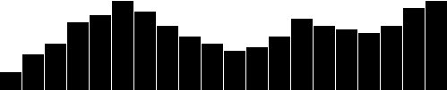 Here’s the working code for our growing-down-from-above bar chart.
Color
Adding color is easy. Just useattr() to set a fill: .attr("fill", "teal");  Here’s an all-teal bar chart. But often, you’ll want a shape’s color to reflect some quality of the data.
That is, you may want to encode the data as color.
(In the case of our bar chart, that makes a dual encoding, in which the same data value is encoded in two different visual properties: height and color.) Using data to drive color is as easy as writing a custom function that again references
Here’s an all-teal bar chart. But often, you’ll want a shape’s color to reflect some quality of the data.
That is, you may want to encode the data as color.
(In the case of our bar chart, that makes a dual encoding, in which the same data value is encoded in two different visual properties: height and color.) Using data to drive color is as easy as writing a custom function that again references d.
Here, we replace "teal" with a custom function: .attr("fill", function(d) { return "rgb(0, 0, " + (d * 10) + ")";});  Here’s that code. This is not a particularly useful visual encoding, but you can get the idea of how to translate data into color.
Here,
Here’s that code. This is not a particularly useful visual encoding, but you can get the idea of how to translate data into color.
Here, d is multiplied by 10, and then used as the blue value in an rgb() color definition.
So the greater values of d (taller bars) will be more blue.
Smaller values of d (shorter bars) will be less blue (closer to black).
Labels
Visuals are great, but sometimes you need to show the actual data values as text within the visualization. Here’s where value labels come in, and they are very, very easy to generate with D3. You’ll recall from the SVG primer that you can addtext elements to an SVG element.
We‘ll start with: svg.selectAll("text") .data(dataset) .enter() .append("text") Look familiar? Just as we did for the rects, here we do for the texts.
First, select what you want, bring in the data, enter the new elements (which are just placeholders at this point), and finally append the new text elements to the DOM.
We’ll extend that code to include a data value within each text element by using the text() method .text(function(d) { return d; }) and then extend it further, by including x and y values to position the text.
It’s easiest if I just copy and paste the same x/y code we used above for the bars: .attr("x", function(d, i) { return i * (w / dataset.length); }) .attr("y", function(d) { return h - (d * 4); }); 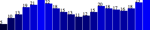 Aha! Value labels! But some are getting cut off at the top.
Let’s try moving them down, inside the bars, by adding a small amount to the
Aha! Value labels! But some are getting cut off at the top.
Let’s try moving them down, inside the bars, by adding a small amount to the x and y calculations: .attr("x", function(d, i) { return i * (w / dataset.length) + 5; // +5 }) .attr("y", function(d) { return h - (d * 4) + 15; // +15 }); 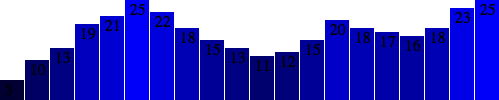 Better, but not legible.
Fortunately, we can fix that:
Better, but not legible.
Fortunately, we can fix that: .attr("font-family", "sans-serif") .attr("font-size", "11px") .attr("fill", "white");  Fantasti-code! If you are not typographically obsessive, then you’re all done.
If, however, you are like me, you’ll notice that the value labels aren’t perfectly aligned within their bars.
That’s easy enough to fix.
Let’s use the SVG
Fantasti-code! If you are not typographically obsessive, then you’re all done.
If, however, you are like me, you’ll notice that the value labels aren’t perfectly aligned within their bars.
That’s easy enough to fix.
Let’s use the SVG text-anchor attribute to center the text horizontally at the assigned x value: .attr("text-anchor", "middle") Then, let’s change the way we calculate the x position by setting it to the left edge of each bar plus half the bar width: .attr("x", function(d, i) { return i * (w / dataset.length) + (w / dataset.length - barPadding) / 2; }) And I’ll also bring the labels up one pixel for perfect spacing: .attr("y", function(d) { return h - (d * 4) + 14; //15 is now 14 }) 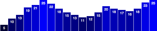 Done! Now, let’s branch out from bar charts.
Making a scatterplot
So far, we’ve drawn only bar charts with simple data — just one-dimensional sets of numbers. But when you have two sets of values to plot against each other, you need a second dimension. The scatterplot is a common type of visualization that represents two sets of corresponding values on two different axes: horizontal and vertical, x and y.The Data
As you saw in Types of data, you have a lot of flexibility around how you structure your data set. For our scatterplot, I’m going to use an array of arrays. The primary array will contain one element for each data “point.” Each of those “point” elements will be another array, with just two values: one for the x value, and one for y.var dataset = [ [5, 20], [480, 90], [250, 50], [100, 33], [330, 95], [410, 12], [475, 44], [25, 67], [85, 21], [220, 88] ]; Remember, [] means array, so nested hard brackets [[]] indicate an array within another array.
We separate array elements with commas, so an array containing three other arrays would look like: [[],[],[]] We could rewrite our data set so it’s easier to read, like so: var dataset = [ [ 5, 20 ], [ 480, 90 ], [ 250, 50 ], [ 100, 33 ], [ 330, 95 ], [ 410, 12 ], [ 475, 44 ], [ 25, 67 ], [ 85, 21 ], [ 220, 88 ] ]; Now you can see that each of these 10 rows will correspond to one point in our visualization.
With the row [5, 20], for example, we’ll use 5 as the x value, and 20 for the y.
The Scatterplot
Let’s carry over most of the code from our bar chart experiments, including the piece that creates the SVG element://Create SVG elementvar svg = d3.select("body") .append("svg") .attr("width", w) .attr("height", h); Instead of creating rects, however, we’ll make a circle for each data point: svg.selectAll("circle") .data(dataset) .enter() .append("circle") Also, instead of specifying the rect attributes of x, y, width, and height, our circles need cx, cy, and r: .attr("cx", function(d) { return d[0]; }) .attr("cy", function(d) { return d[1]; }) .attr("r", 5);  Here’s that working scatterplot. Notice how we access the data values and use them for the
 cx and cy values.
When using function(d), D3 automatically hands off the current data value as d to your function.
In this case, the current data value is one of the small arrays in our larger dataset array.
When d is an array of values (and not just a single value, like 3.14159), you need to use bracket notation to access its values.
Hence, instead of return d, we have return d[0] and return d[1], which return the first and second values of the array, respectively.
For example, in the case of our first data point [5, 20], the first value (array position 0) is 5, and the second value (array position 1) is 20.
Thus: d[0] returns 5d[1] returns 20 By the way, if you ever want to access any value in the larger data set (outside of D3, say), you can do so using bracket notation.
For example: dataset[5] returns [410, 12] You can string brackets together, to access values within nested arrays: dataset[5][1] returns 12 Don’t believe me? Take another look at the scatterplot, open your JavaScript console, and try typing in dataset[5] or dataset[5][1] and see what happens.
Size
Maybe you want the circles to be different sizes, so their radii correspond to their y values. Instead of setting allr values to 5, try: .attr("r", function(d) { return Math.sqrt(h - d[1]);}); 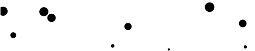 This is neither pretty nor useful, but it illustrates how you might use
 d, along with bracket notation, to reference data values and set r accordingly.
Labels
Let’s label our data points withtext elements.
I’ll adapt the label code from our bar chart experiments, starting with: svg.selectAll("text") .data(dataset) .enter() .append("text") So far, this looks for all text elements in the SVG (there aren’t any yet), and then appends a new text element for each data point.
Use the text() method to specify each element’s contents: .text(function(d) { return d[0] + "," + d[1]; }) This looks messy, but bear with me.
Once again, we’re using function(d) to access each data point.
Then, within the function, we’re using both d[0] and d[1] to get both values within that data point array.
The plus + symbols, when used with strings, such as the comma between quotation marks ",", act as append operators.
So what this one line of code is really saying is: Get the values of d[0] and d[1] and smush them together with a comma in the middle.
The end result should be something like 5,20 or 25,67.
Next, we specify where the text should be placed with x and y values.
For now, let’s just use d[0] and d[1], the same values that we used to specify the circle positions.
.attr("x", function(d) { return d[0]; }) .attr("y", function(d) { return d[1]; }) Finally, add a bit of font styling with: .attr("font-family", "sans-serif") .attr("font-size", "11px") .attr("fill", "red"); 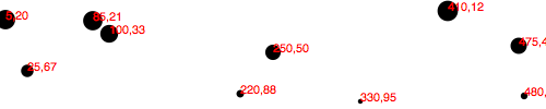 Here’s that working code.
Next Steps
Hopefully, some core concepts of D3 are becoming clear: Loading data, generating new elements, and using data values to derive attribute values for those elements. Yet the image above is barely passable as a data visualization. The scatterplot is hard to read, and the code doesn’t use our data flexibly. To be honest, we haven’t yet improved on — gag — Excel’s Chart Wizard! Not to worry: D3 is way cooler than Chart Wizard (not to mention Clippy), but generating a shiny, interactive chart involves taking our D3 skills to the next level. To use data flexibly, we’ll learn about D3’s scales. To make our scatterplot easier to read, we’ll learn about axis generators and axis labels. Following that, we’ll make things interactive and learn how to update data on the fly.Scales
“Scales are functions that map from an input domain to an output range.” That’s Mike Bostock’s definition of D3 scales. The values in any data set are unlikely to correspond exactly to pixel measurements for use in your visualization. Scales provide a convenient way to map those data values to new values useful for visualization purposes. D3 scales are functions whose parameters you define. Once they are created, you call the scale function, pass it a data value, and it nicely returns a scaled output value. You can define and use as many scales as you like. It may be tempting to think of a scale as something that appears visually in the final image — like a set of tick marks, indicating a progression of values. Do not be fooled! Those tick marks are part of an axis, which is essentially a visual representation of a scale. A scale is a mathematical relationship, with no direct visual output. I encourage you to think of scales and axes as two different, yet related, elements. This topic addresses only linear scales, since they are most common and understandable. Once you understand linear scales, the others will be a piece of cake.Apples and Pixels
Imagine that the following data set represents the number of apples sold at a roadside fruit stand each month:var dataset = [ 100, 200, 300, 400, 500 ]; First of all, this is great news, as the stand is selling 100 additional apples each month! Business is booming.
To showcase this success, you want to make a bar chart illustrating the steep upward climb of apple sales, with each data value corresponding to the height of one bar.
Until now, we’ve used data values directly as display values, ignoring unit differences.
So if 500 apples were sold, the corresponding bar would be 500 pixels tall.
That could work, but what about next month, when 600 apples are sold? And a year later, when 1,800 apples are sold? Your audience would have to purchase ever-larger displays, just to be able to see the full height of those very tall apple-bars! (Mmm, apple bars!) This is where scales come in.
Because apples are not pixels (which are also not oranges), we need scales to translate between them.
Domains and Ranges
A scale’s input domain is the range of possible input data values. Given the apples data above, appropriate input domains would be either 100 and 500 (the minimum and maximum values of the data set) or zero and 500. A scale’s output range is the range of possible output values, commonly used as display values in pixel units. The output range is completely up to you, as the information designer. If you decide the shortest apple-bar will be 10 pixels tall, and the tallest will be 350 pixels tall, then you could set an output range of 10 and 350. For example, create a scale with an input domain of100,500 and an output range of 10,350.
If you gave that scale the value 100, it would return 10.
If you gave it 500, it would spit back 350.
If you gave it 300, it would hand 180 back to you on a silver platter.
( 300 is in the center of the domain, and 180 is in the center of the range.) We could visualize the domain and range as corresponding axes, side-by-side: <svg width="505" height="115"> Normalization
If you’re familiar with the concept of normalization, it may be helpful to know that, with a linear scale, that’s all that is really going on here. Normalization is the process of mapping a numeric value to a new value between 0 and 1, based on the possible minimum and maximum values. For example, with 365 days in the year, day number 310 maps to about 0.85, or 85% of the way through the year. With linear scales, we are just letting D3 handle the math of the normalization process. The input value is normalized according to the domain, and then the normalized value is scaled to the output range.Creating a Scale
D3’s scale generators are accessed withd3.scale followed by the type of scale you want.
var scale = d3.scale.linear(); Congratulations! Now scale is a function to which you can pass input values.
(Don’t be misled by the var above; remember that in JavaScript, variables can store functions.) scale(2.5); //Returns 2.5 Since we haven't set a domain and a range yet, this function is mapping input to output on a 1:1 scale.
That is, whatever we input will be returned unchanged.
We can set the scale’s input domain to 100,500 by passing those values to the domain() method as an array: scale.domain([100, 500]); Set the output range in similar fashion, with range(): scale.range([10, 350]); These steps can be done separately, as above, or chained together into one line of code: var scale = d3.scale.linear() .domain([100, 500]) .range([10, 350]); Either way, our scale is ready to use! scale(100); //Returns 10scale(300); //Returns 180scale(500); //Returns 350 Typically, you will call scale functions from within an attr() method or similar, not on their own.
Let’s modify our scatterplot visualization to use dynamic scales.
Scaling the Scatterplot
To revisit our data set from the scatterplot:var dataset = [ [5, 20], [480, 90], [250, 50], [100, 33], [330, 95], [410, 12], [475, 44], [25, 67], [85, 21], [220, 88] ]; You’ll recall that dataset is an array of arrays.
We mapped the first value in each array onto the x axis, and the second value onto the y axis.
Let’s start with the x axis.
Just by eyeballing the x values, it looks like they range from 5 to 480, so a reasonable input domain to specify might be 0,500, right? … Why are you giving me that look? Oh, because you want to keep your code flexible and scalable, so it will continue to work even if the data change in the future.
Very smart! Instead of specifying fixed values for the domain, we can use convenient array functions like min() and max() to analyze our data set on the fly.
For example, this loops through each of the x values in our arrays and returns the value of the greatest one: d3.max(dataset, function(d) { //Returns 480 return d[0]; //References first value in each sub-array}); Putting it all together, let’s create the scale function for our x axis: var xScale = d3.scale.linear() .domain([0, d3.max(dataset, function(d) { return d[0]; })]) .range([0, w]); First, notice I named it xScale.
Of course, you can name your scales whatever you want, but a name like xScale helps me remember what this function does.
Second, notice I set the low end of the input domain to zero.
(Alternatively, you could use min() to calculate a dynamic value.) The upper end of the domain is set to the maximum value in dataset (which is 480).
Finally, observe that the output range is set to 0 and w, the SVG’s width.
We’ll use very similar code to create the scale function for the y axis: var yScale = d3.scale.linear() .domain([0, d3.max(dataset, function(d) { return d[1]; })]) .range([0, h]); Note that the max() function references d[1], the y value of each sub-array.
Also, the upper end of range() is set to h instead of w.
The scale functions are in place! Now all we need to do is use them.
Simply modify the code where we create a circle for each data value .attr("cx", function(d) { return d[0];}) to return a scaled value (instead of the original value): .attr("cx", function(d) { return xScale(d[0]);}) Likewise, for the y axis, this .attr("cy", function(d) { return d[1];}) is modified as: .attr("cy", function(d) { return yScale(d[1]);}) For good measure, let’s make the same change where we set the coordinates for the text labels, so these lines .attr("x", function(d) { return d[0];}).attr("y", function(d) { return d[1];}) become this: .attr("x", function(d) { return xScale(d[0]);}).attr("y", function(d) { return yScale(d[1]);}) And there we are! 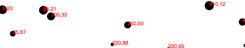 Here’s the working code. Visually, it is disappointingly similar to our original scatterplot! Yet we are making more progress than may be apparent.
Refining the Plot
You may have noticed that smaller y values are at the top of the plot, and the larger y values are toward the bottom. Now that we’re using scales, it’s super easy to reverse that, so greater values are higher up, as you would expect. It’s just a matter of changing the output range ofyScale from .range([0, h]); to .range([h, 0]); 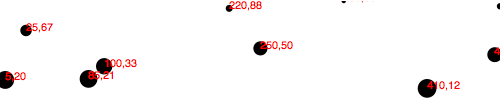 Here’s that code. Yes, now a smaller input to
 yScale will produce a larger output value, thereby pushing those circles and text elements down, closer to the base of the image.
I know, it’s almost too easy! Yet some elements are getting cut off.
Let’s introduce a padding variable: var padding = 20; Then we’ll incorporate the padding amount when setting the range of both scales.
The range for xScale was range([0, w]), but now it’s .range([padding, w - padding]); The range for yScale was range([h, 0]), but now it’s .range([h - padding, padding]); This should provide us with 20 pixels of extra room on the left, right, top, and bottom edges of the SVG.
And it does! 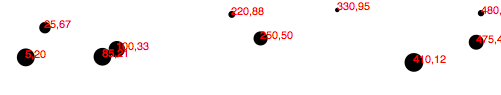 But the text labels on the far right are still getting cut off, so I’ll double the amount of
 xScale’s padding on the right side by multiplying by two: .range([padding, w - padding * 2]); 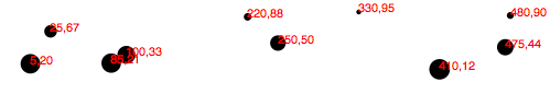 Better! Here’s the code so far. But there’s one more change I’d like to make.
Instead of setting the radius of each
Better! Here’s the code so far. But there’s one more change I’d like to make.
Instead of setting the radius of each circle as the square root of its y value (which was a bit of a hack, and not useful in any case), why not create another custom scale? var rScale = d3.scale.linear() .domain([0, d3.max(dataset, function(d) { return d[1]; })]) .range([2, 5]); Then, setting the radius looks like this: .attr("r", function(d) { return rScale(d[1]);}); This is exciting, because we are guaranteeing that our radius values will always fall within the range of 2,5.
(Or almost always: See reference to clamp() below.) So data values of 0 (the minimum input) will get circles of radius 2 (or a diameter of 4 pixels).
The very largest data value will get a circle of radius 5 (diameter of 10 pixels).
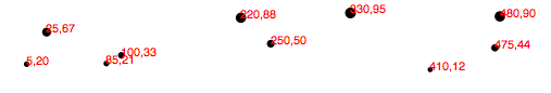 Voila: Our first scale used for a visual property other than an axis value.
Finally, just in case the power of scales hasn’t yet blown your mind, I’d like to add one more array to the data set:
Voila: Our first scale used for a visual property other than an axis value.
Finally, just in case the power of scales hasn’t yet blown your mind, I’d like to add one more array to the data set: [600, 150] 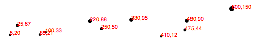 Boom! Here’s the code. Notice how all the old points maintained their relative positions, but have migrated closer together, down and to the left, to accommodate the newcomer.
And now, one final revelation: We can now very easily change the size of our SVG, and everything scales accordingly.
Here, I’ve increased the value of
Boom! Here’s the code. Notice how all the old points maintained their relative positions, but have migrated closer together, down and to the left, to accommodate the newcomer.
And now, one final revelation: We can now very easily change the size of our SVG, and everything scales accordingly.
Here, I’ve increased the value of h from 100 to 300 and made no other changes:  Boom, again! Here’s the updated code. Hopefully, you are seeing this and realizing: No more late nights tweaking your code because the client decided the graphic should be 800 pixels wide instead of 600.
Yes, you will get more sleep because of me (and D3’s brilliant built-in methods).
Being well-rested is a competitive advantage.
You can thank me later.
Boom, again! Here’s the updated code. Hopefully, you are seeing this and realizing: No more late nights tweaking your code because the client decided the graphic should be 800 pixels wide instead of 600.
Yes, you will get more sleep because of me (and D3’s brilliant built-in methods).
Being well-rested is a competitive advantage.
You can thank me later.
Other Methods
d3.scale.linear() has several other handy methods that deserve a brief mention here: nice() — This tells the scale to take whatever input domain that you gave to range() and expand both ends to the nearest round value.
From the D3 wiki: “For example, for a domain of [0.20147987687960267, 0.996679553296417], the nice domain is [0.2, 1].” This is useful for normal people, who find it hard to read numbers like 0.20147987687960267.
rangeRound() — Use rangeRound() in place of range() and all values output by the scale will be rounded to the nearest whole number.
This is useful if you want shapes to have exact pixel values, to avoid the fuzzy edges that may arise with antialiasing.
clamp() — By default, a linear scale can return values outside of the specified range.
For example, if given a value outside of its expected input domain, a scale will return a number also outside of the output range.
Calling .clamp(true) on a scale, however, forces all output values to be within the specified range.
Meaning, excessive values will be rounded to the range’s low or high value (whichever is nearest).\
Other Scales
In addition tolinear scales (discussed above), D3 has several other scale methods built-in: identity — A 1:1 scale, useful primarily for pixel values sqrt — A square root scale pow — A power scale (good for the gym) log — A logarithmic scale quantize — A linear scale with discrete values for its output range, for when you want to sort data into “buckets” quantile — Similar to above, but with discrete values for its input domain (when you already have “buckets”) ordinal — Ordinal scales use non-quantitative values (like category names) for output; perfect for comparing apples and oranges\
Axes
Having mastered the use of D3 scales, we now have this scatterplot: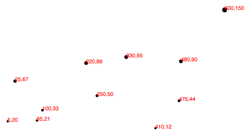 Let’s add horizontal and vertical axes, so we can do away with the horrible red numbers cluttering up our chart.
Introducing Axes
Much like the scale functions, D3’s axes are actually functions whose parameters you define. Unlike scales, when an axis function is called, it doesn’t return a value, but generates the visual elements of the axis, including lines, labels, and ticks. Note that the axis functions are SVG-specific, as they generate SVG elements. Also, axes are intended for use with quantitative scales (as opposed to ordinal ones).Setting up an Axis
Used3.svg.axis() to create a generic axis function: var xAxis = d3.svg.axis(); At a minimum, each axis also needs to be told on what scale to operate.
Here we’ll pass in the xScale from the scatterplot code: xAxis.scale(xScale); We can also specify where the labels should appear relative to the axis itself.
The default is bottom, meaning the labels will appear below the axis line.
(Although this is the default, it can’t hurt to specify it explicitly.) xAxis.orient("bottom"); Of course, we can be more concise and string all this together into one line: var xAxis = d3.svg.axis() .scale(xScale) .orient("bottom"); Finally, to actually generate the axis and insert all those little lines and labels into our SVG, we must call the xAxis function.
I’ll put this code at the end of our script, so the axis is generated after the other elements in the SVG: svg.append("g") .call(xAxis); D3’s call() function takes a selection as input and hands that selection off to any function.
So, in this case, we have just appended a new g group element to contain all of our about-to-be-generated axis elements.
(The g isn’t strictly necessary, but keeps the elements organized and allows us to apply a class to the entire group, which we’ll do in a moment.) That g becomes the selection for the next link in the chain.
call() hands that selection off to the xAxis function, so our axis is generated within the new g.
That snippet of code above is just nice, clean shorthand for this exact equivalent: svg.append("g") .call(d3.svg.axis() .scale(xScale) .orient("bottom")); See, you could cram the whole axis function within call(), but it’s usually easier on our brains to define functions first, then call them later.
In any case, here’s what that looks like: 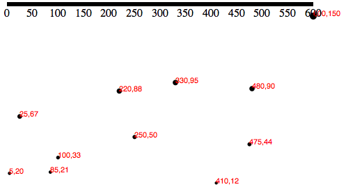
Cleaning it Up
Technically, that is an axis, but it’s neither pretty nor useful. To clean it up, let’s first assign a class ofaxis to the new g element, so we can target it with CSS: svg.append("g") .attr("class", "axis") //Assign "axis" class .call(xAxis); Then, we introduce our first CSS styles, up in the <head> of our page: .axis path,.axis line { fill: none; stroke: black; shape-rendering: crispEdges;}.axis text { font-family: sans-serif; font-size: 11px;} The shape-rendering property is an SVG attribute, used here to make sure our axis and its tick mark lines are pixel-perfect.
No blurry axes for us! 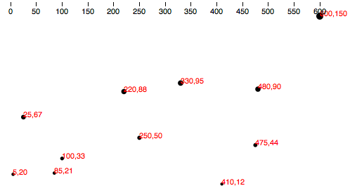 That’s better, but the top of the axis is cut off, and we want it down at the base the chart anyway.
We can
That’s better, but the top of the axis is cut off, and we want it down at the base the chart anyway.
We can transform the entire axis group, pushing it to the bottom: svg.append("g") .attr("class", "axis") .attr("transform", "translate(0," + (h - padding) + ")") .call(xAxis); Note the use of (h - padding), so the group’s top edge is set to h, the height of the entire image, minus the padding value we created earlier.
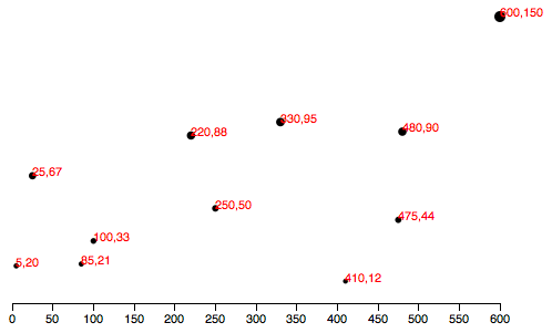 Much better! Here’s the code so far.
Check for Ticks
Some ticks spread disease, but D3’s ticks communicate information. Yet more ticks are not necessarily better, and at a certain point they begin to clutter your chart. You’ll notice that we never specified how many ticks to include on the axis, nor at what intervals they should appear. Without clear instruction, D3 has auto-magically examined our scalexScale and made informed judgements about how many ticks to include, and at what intervals (every 50, in this case).
As you would imagine, you can customize all aspects of your axes, starting with the rough number of ticks, using ticks(): var xAxis = d3.svg.axis() .scale(xScale) .orient("bottom") .ticks(5); //Set rough # of ticks 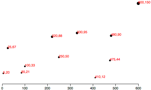 Here’s that code. You probably noticed that, while we specified only five ticks, D3 has made an executive decision and ordered up a total of seven.
That’s because D3 has got your back, and figured out that including only five ticks would require slicing the input domain into less-than-gorgeous values — in this case, 0, 150, 300, 450, and 600.
D3 inteprets the
Here’s that code. You probably noticed that, while we specified only five ticks, D3 has made an executive decision and ordered up a total of seven.
That’s because D3 has got your back, and figured out that including only five ticks would require slicing the input domain into less-than-gorgeous values — in this case, 0, 150, 300, 450, and 600.
D3 inteprets the ticks() value as merely a suggestion, and will override your suggestion with what it determines to be the most clean and human-readable values — in this case, intervals of 100 — even when that requires including slightly more or fewer ticks than you requested.
This is actually a totally brilliant feature that increases the scalability of your design; as the data set changes, and the input domain expands or contracts (bigger numbers or smaller numbers), D3 ensures that the tick labels remain clear and easy to read.
Y Not?
Time to label the vertical axis! By copying and tweaking the code we already wrote for thexAxis, we add this near the top of of our code //Define Y axisvar yAxis = d3.svg.axis() .scale(yScale) .orient("left") .ticks(5); and this, near the bottom: //Create Y axissvg.append("g") .attr("class", "axis") .attr("transform", "translate(" + padding + ",0)") .call(yAxis); Note that the labels will be oriented left and that the yAxis group g is translated to the right by the amount padding.
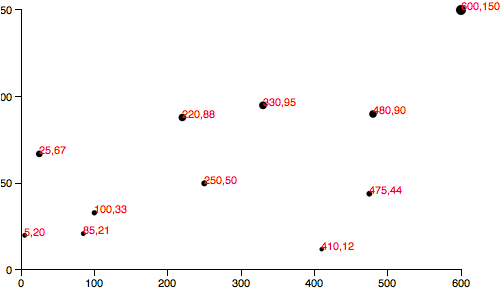 This is starting to look like something real! But the
 yAxis labels are getting cut off.
To give them more room on the left, I’ll bump up the value of padding from 20 to 30: var padding = 30; Of course, you could also introduce separate padding variables for each axis, say xPadding and yPadding, for more control over the layout.
Here’s the code, and here’s what it looks like: 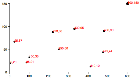
Final Touches
To prove to you that our new axis are dynamic and scalable, I’d like to switch from using a static data set to using randomized numbers://Dynamic, random datasetvar dataset = [];var numDataPoints = 50;var xRange = Math.random() * 1000;var yRange = Math.random() * 1000;for (var i = 0; i < numDataPoints; i++) { var newNumber1 = Math.round(Math.random() * xRange); var newNumber2 = Math.round(Math.random() * yRange); dataset.push([newNumber1, newNumber2]);} This code initializes an empty array, then loops through 50 times, chooses two random numbers each time, and adds (“pushes”) that pair of values to the dataset array.
 Try the code here. Each time you reload the page, you’ll get different data values.
Notice how both axes scale to fit the new domains, and ticks and label values are chosen accordingly.
Having made my point, I think we can finally cut those horrible, red labels, by commenting out the relevant lines of code:
Try the code here. Each time you reload the page, you’ll get different data values.
Notice how both axes scale to fit the new domains, and ticks and label values are chosen accordingly.
Having made my point, I think we can finally cut those horrible, red labels, by commenting out the relevant lines of code: 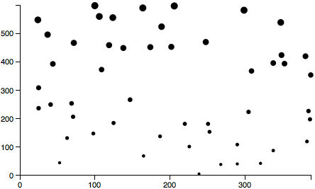 Our final scatterplot code!
Formatting Tick Labels
One last thing: So far, we’ve been working with integers — whole numbers — which are nice and easy. But data is often messier, and in those cases, you may want more control over how the axis labels are formatted. EntertickFormat(), which enables you to specify how your numbers should be formatted.
For example, you may want to include three places after the decimal point, or display values as percentages, or both.
In that case, you could first define a new number formatting function.
This one, for example, says to treat values as percentages with one decimal point precision.
(See the reference entry for d3.format() for more options.) var formatAsPercentage = d3.format(".1%"); Then, tell your axis to use that formatting function for its ticks, e.g.: xAxis.tickFormat(formatAsPercentage); Development tip: I find it easiest to test these formatting functions out in the JavaScript console.
For example, just open any page that loads D3, such as our final scatterplot, and type your format rule into the console.
Then test it by feeding it a value, as you would with any other function: 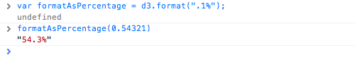 You can see here that a data value of
 0.54321 is converted to 54.3% for display purposes — perfect! Give that code a try here. A percentage format doesn’t make sense with our scatterplot’s current data set, but as an exercise, you could try tweaking how the random numbers are generated, for more appropriate, non-whole number values, or experiment with the format function itself.
D3 API Reference
D3 is a collection of modules that are designed to work together; you can use the modules independently, or you can use them together as part of the default build. The source and documentation for each module is available in its repository. Follow the links below to learn more. For changes between major versions, see CHANGES; see also the release notes and the 3.x reference.Data-Driven Documents
Introduction
Selections
Modifying documents using the W3C DOM API is tedious: the method names are verbose, and the imperative approach requires manual iteration and bookkeeping of temporary state. For example, to change the text color of paragraph elements:var paragraphs = document.getElementsByTagName("p");
for (var i = 0; i < paragraphs.length; i++) {
var paragraph = paragraphs.item(i);
paragraph.style.setProperty("color", "blue", null);
}
D3 employs a declarative approach, operating on arbitrary sets of nodes called selections.
For example, you can rewrite the above loop as:
d3.selectAll("p").style("color", "blue");
Yet, you can still manipulate individual nodes as needed:
d3.select("body").style("background-color", "black");
Selectors are defined by the W3C Selectors API and supported natively by modern browsers.
The above examples select nodes by tag name ("p" and "body", respectively).
Elements may be selected using a variety of predicates, including containment, attribute values, class and ID.
D3 provides numerous methods for mutating nodes: setting attributes or styles; registering event listeners; adding, removing or sorting nodes; and changing HTML or text content.
These suffice for the vast majority of needs.
Direct access to the underlying DOM is also possible, as each D3 selection is simply an array of nodes.
Dynamic Properties
Readers familiar with other DOM frameworks such as jQuery should immediately recognize similarities with D3. Yet styles, attributes, and other properties can be specified as functions of data in D3, not just simple constants. Despite their apparent simplicity, these functions can be surprisingly powerful; the d3.geoPath function, for example, projects geographic coordinates into SVG path data. D3 provides many built-in reusable functions and function factories, such as graphical primitives for area, line and pie charts. For example, to randomly color paragraphs:d3.selectAll("p").style("color", function() {
return "hsl(" + Math.random() * 360 + ",100%,50%)";
});
To alternate shades of gray for even and odd nodes:
d3.selectAll("p").style("color", function(d, i) {
return i % 2 ? "#fff" : "#eee";
});
Computed properties often refer to bound data.
Data is specified as an array of values, and each value is passed as the first argument (d) to selection functions.
With the default join-by-index, the first element in the data array is passed to the first node in the selection, the second element to the second node, and so on.
For example, if you bind an array of numbers to paragraph elements, you can use these numbers to compute dynamic font sizes:
d3.selectAll("p")
.data([4, 8, 15, 16, 23, 42])
.style("font-size", function(d) { return d + "px"; });
Once the data has been bound to the document, you can omit the data operator; D3 will retrieve the previously-bound data.
This allows you to recompute properties without rebinding.
Enter and Exit
Using D3’s enter and exit selections, you can create new nodes for incoming data and remove outgoing nodes that are no longer needed. When data is bound to a selection, each element in the data array is paired with the corresponding node in the selection. If there are fewer nodes than data, the extra data elements form the enter selection, which you can instantiate by appending to theenter selection.
For example:
d3.select("body")
.selectAll("p")
.data([4, 8, 15, 16, 23, 42])
.enter().append("p")
.text(function(d) { return "I’m number " + d + "!"; });
Updating nodes are the default selection—the result of the data operator.
Thus, if you forget about the enter and exit selections, you will automatically select only the elements for which there exists corresponding data.
A common pattern is to break the initial selection into three parts: the updating nodes to modify, the entering nodes to add, and the exiting nodes to remove.
// Update…
var p = d3.select("body")
.selectAll("p")
.data([4, 8, 15, 16, 23, 42])
.text(function(d) { return d; });
// Enter…
p.enter().append("p")
.text(function(d) { return d; });
// Exit…
p.exit().remove();
By handling these three cases separately, you specify precisely which operations run on which nodes.
This improves performance and offers greater control over transitions.
For example, with a bar chart you might initialize entering bars using the old scale, and then transition entering bars to the new scale along with the updating and exiting bars.
D3 lets you transform documents based on data; this includes both creating and destroying elements.
D3 allows you to change an existing document in response to user interaction, animation over time, or even asynchronous notification from a third-party.
A hybrid approach is even possible, where the document is initially rendered on the server, and updated on the client via D3.
Transformation, not Representation
D3 does not introduce a new visual representation. Unlike Processing or Protovis, D3’s vocabulary of graphical marks comes directly from web standards: HTML, SVG, and CSS. For example, you can create SVG elements using D3 and style them with external stylesheets. You can use composite filter effects, dashed strokes and clipping. If browser vendors introduce new features tomorrow, you’ll be able to use them immediately—no toolkit update required. And, if you decide in the future to use a toolkit other than D3, you can take your knowledge of standards with you! Best of all, D3 is easy to debug using the browser’s built-in element inspector: the nodes that you manipulate with D3 are exactly those that the browser understands natively.Transitions
D3’s focus on transformation extends naturally to animated transitions. Transitions gradually interpolate styles and attributes over time. Tweening can be controlled via easing functions such as “elastic”, “cubic-in-out” and “linear”. D3’s interpolators support both primitives, such as numbers and numbers embedded within strings (font sizes, path data, etc.), and compound values. You can even extend D3’s interpolator registry to support complex properties and data structures. For example, to fade the background of the page to black:d3.select("body").transition()
.style("background-color", "black");
Or, to resize circles in a symbol map with a staggered delay:
d3.selectAll("circle").transition()
.duration(750)
.delay(function(d, i) { return i * 10; })
.attr("r", function(d) { return Math.sqrt(d * scale); });
By modifying only the attributes that actually change, D3 reduces overhead and allows greater graphical complexity at high frame rates.
D3 also allows sequencing of complex transitions via events.
And, you can still use CSS3 transitions; D3 does not replace the browser’s toolbox, but exposes it in a way that is easier to use.